85+ iPhone PSD Mockups (Free + Premium) 2024

Featured Imgs 23

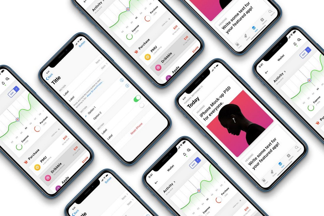
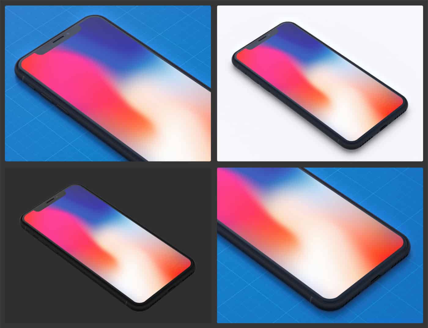
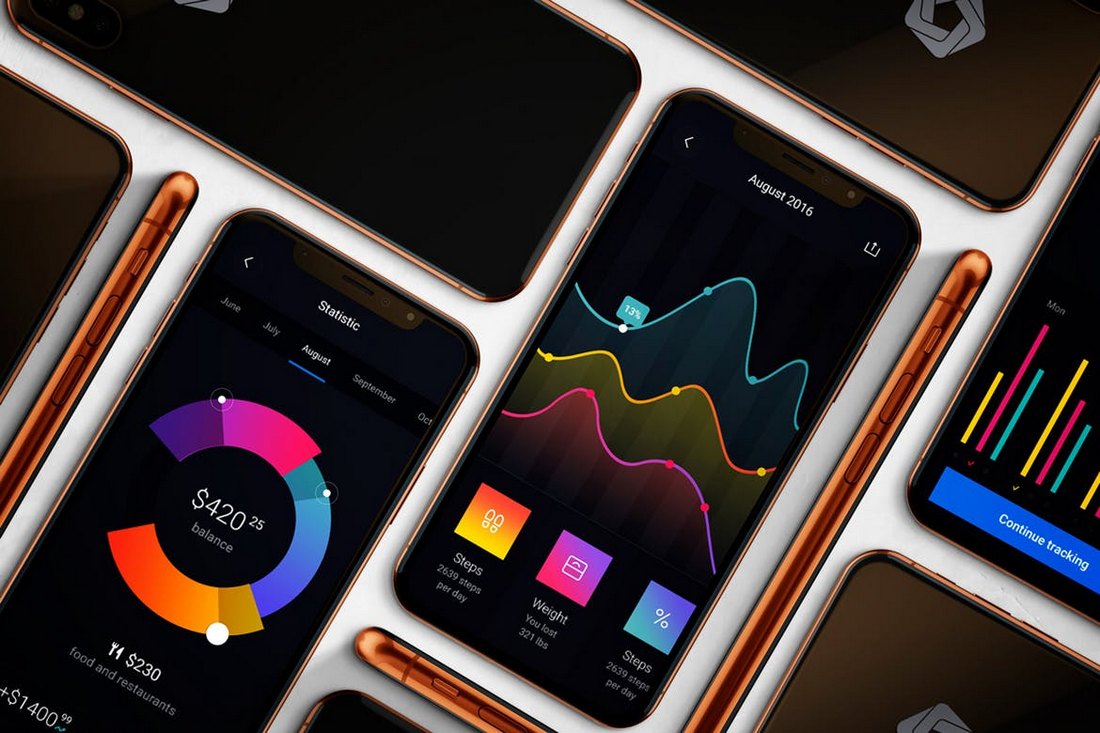
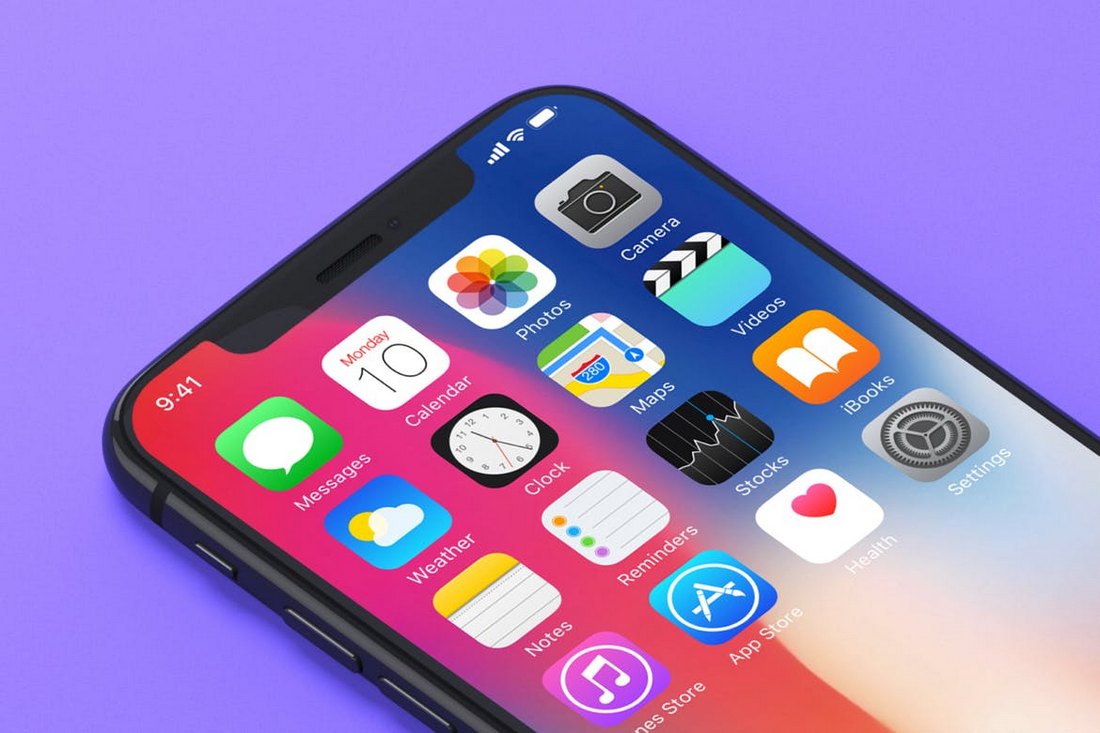
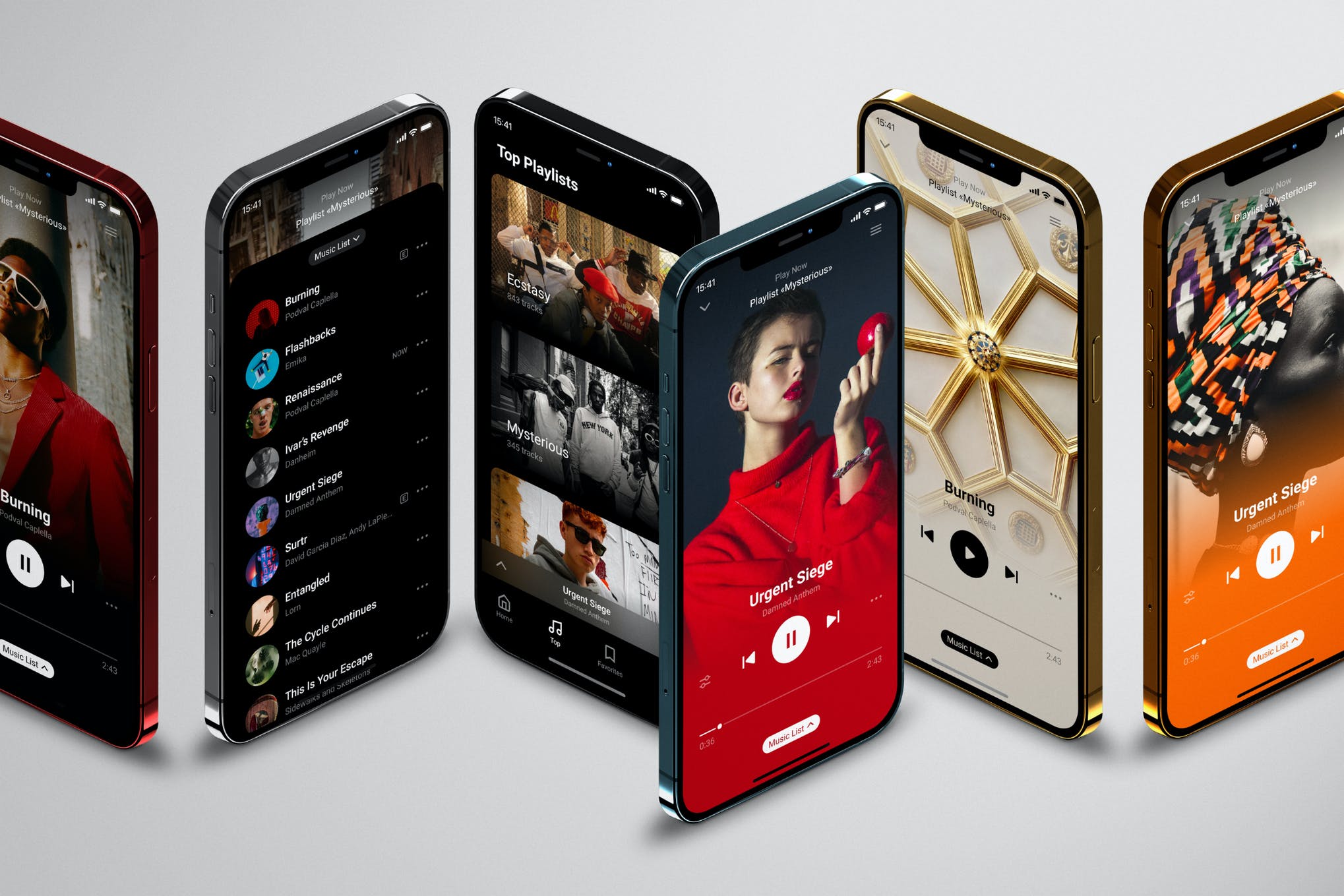
An iPhone mockup graphic is the perfect way to demonstrate your app, website, or user interface. We’ve collected dozens of the best iPhone mockup PSDs and vectors, in all shapes and sizes, for your next project.

A well-designed mockup can make your app or website interface stand out from the crowd, and it’s the perfect way to present your design to a client. Our iPhone mockup picks vary between photograph-based PSDs, or vectors that can scale to any size. Some are free, some cost a few dollars, but all of them are a great way to showcase your app.

We’ve also collected a mix of iPhone mockups for different versions of the phone — from the iPhone 7, to the iPhone 16, covering every type of device.

How to Customize Your iPhone Mockup

Before we dive into our list of iPhone mockups, it’s worth offering a quick reminder on how to work with these graphics, and how to customize a mockup. We’ve written a great guide on how to customize an iPhone or iPad mockup which will walk you through the process step-by-step!

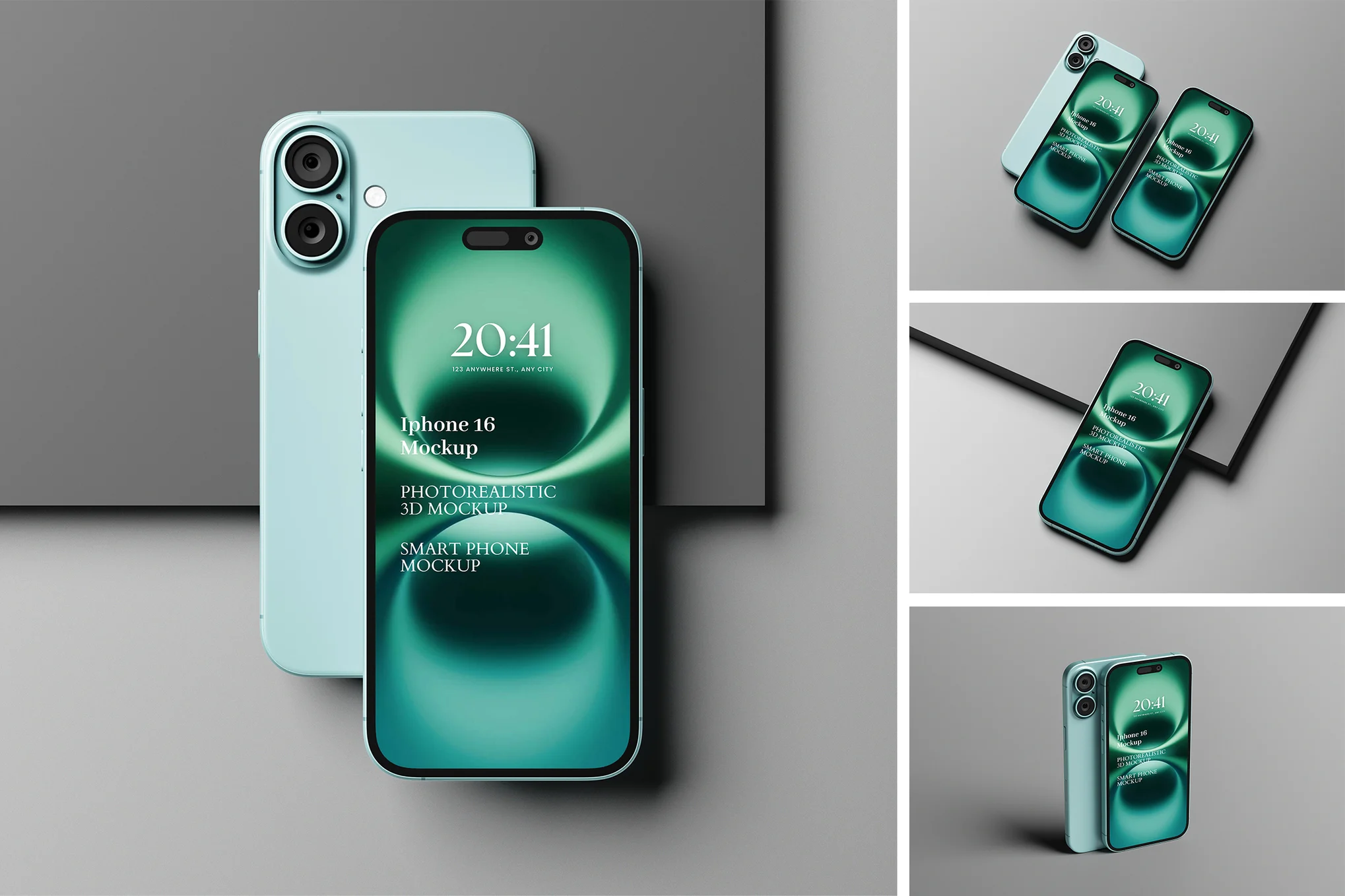
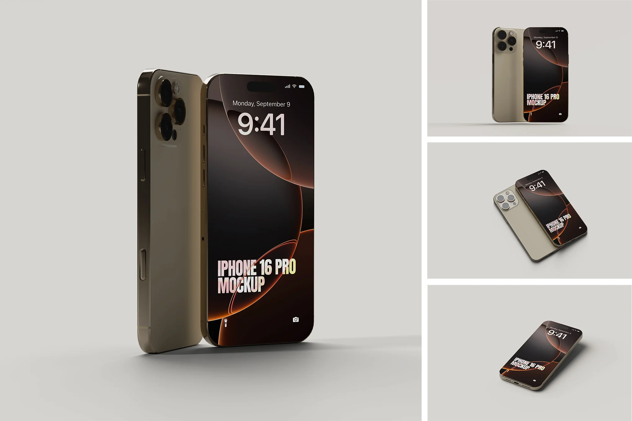
iPhone 16 Pro Mockup

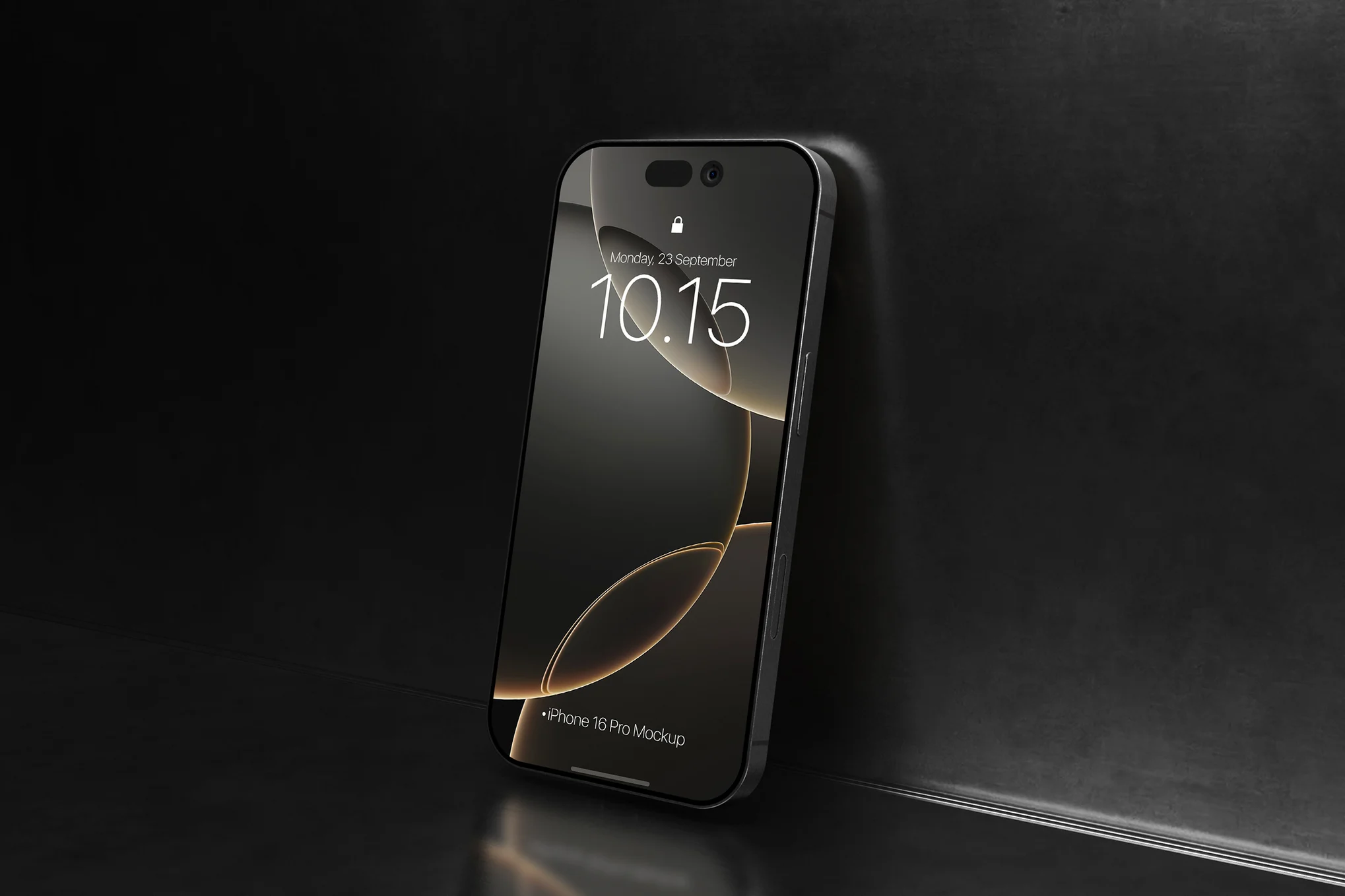
iPhone 16 Pro Mockup

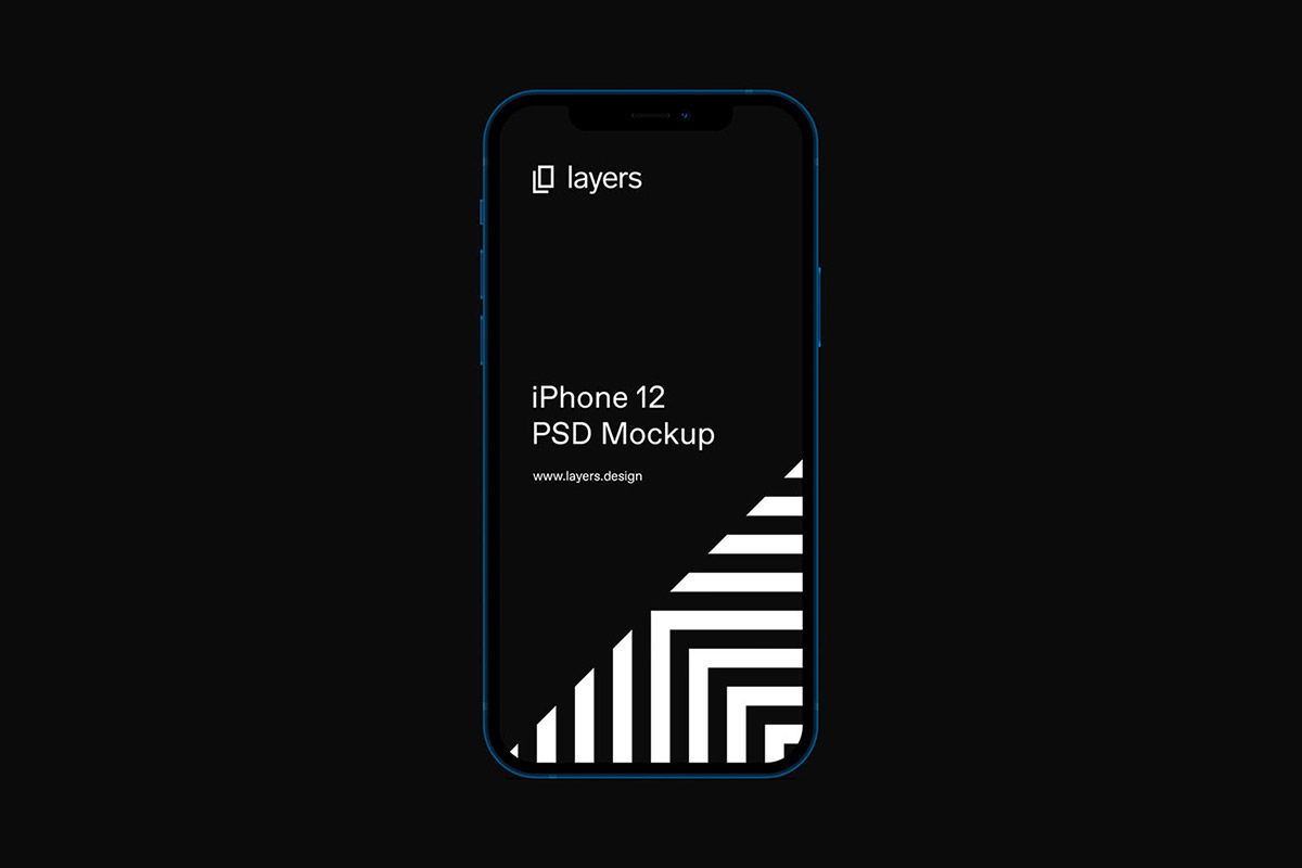
This is a fantastic iPhone 16 Pro mockup for displaying your designs in a professional, realistic 3D format. With its dark backdrop, PSD Photoshop compatibility and smart object layers, this high-resolution template makes swapping in your designs a breeze.

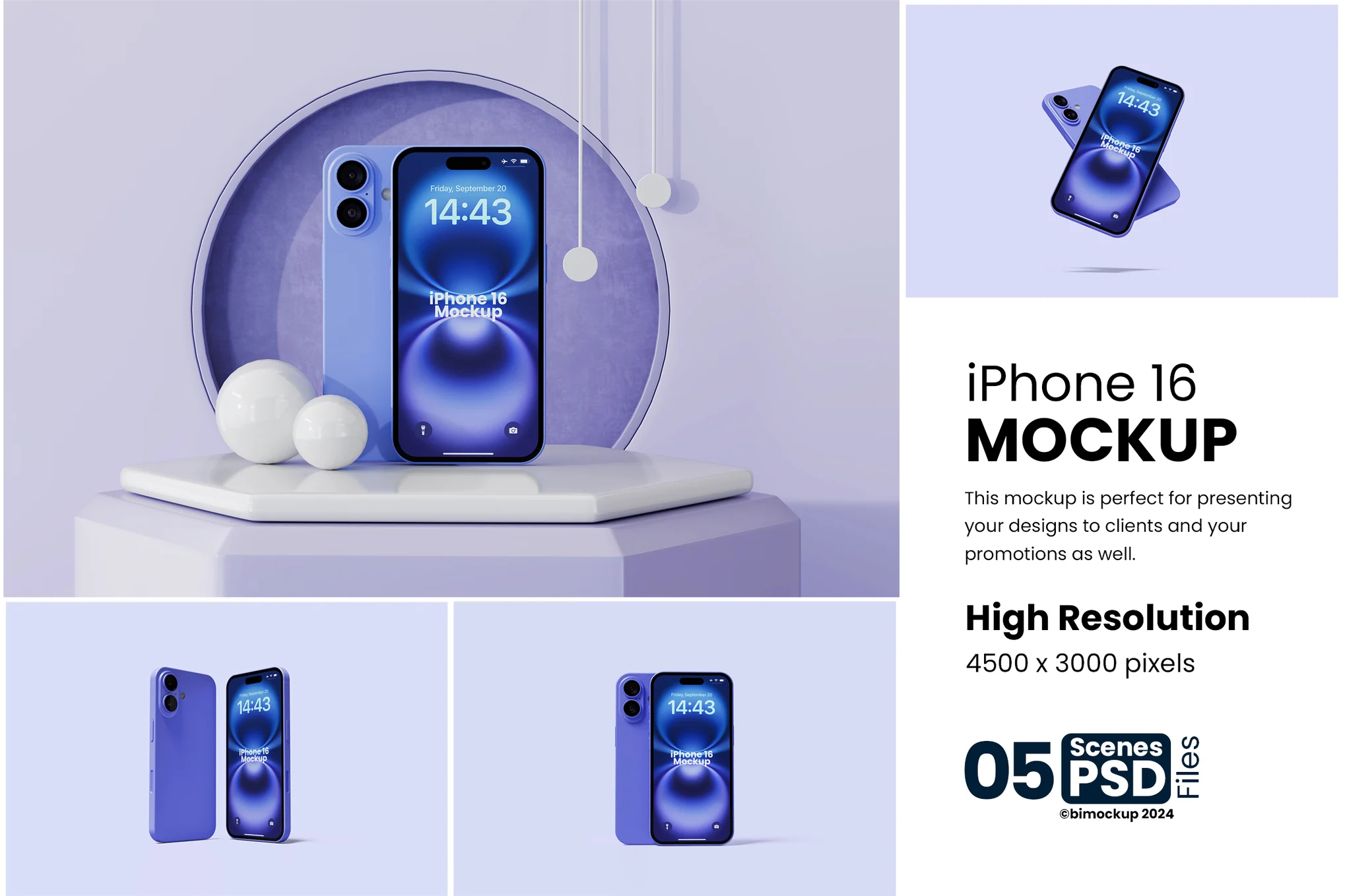
Creative iPhone 16 Mockup

Creative iPhone 16 Mockup

This iPhone 16 mockup is a versatile template that includes PSD files with neatly organized layers. The quality is impeccable, and the design is entirely customizable to your needs. Its smart object facility allows a seamless transition of your designs onto the mockup.

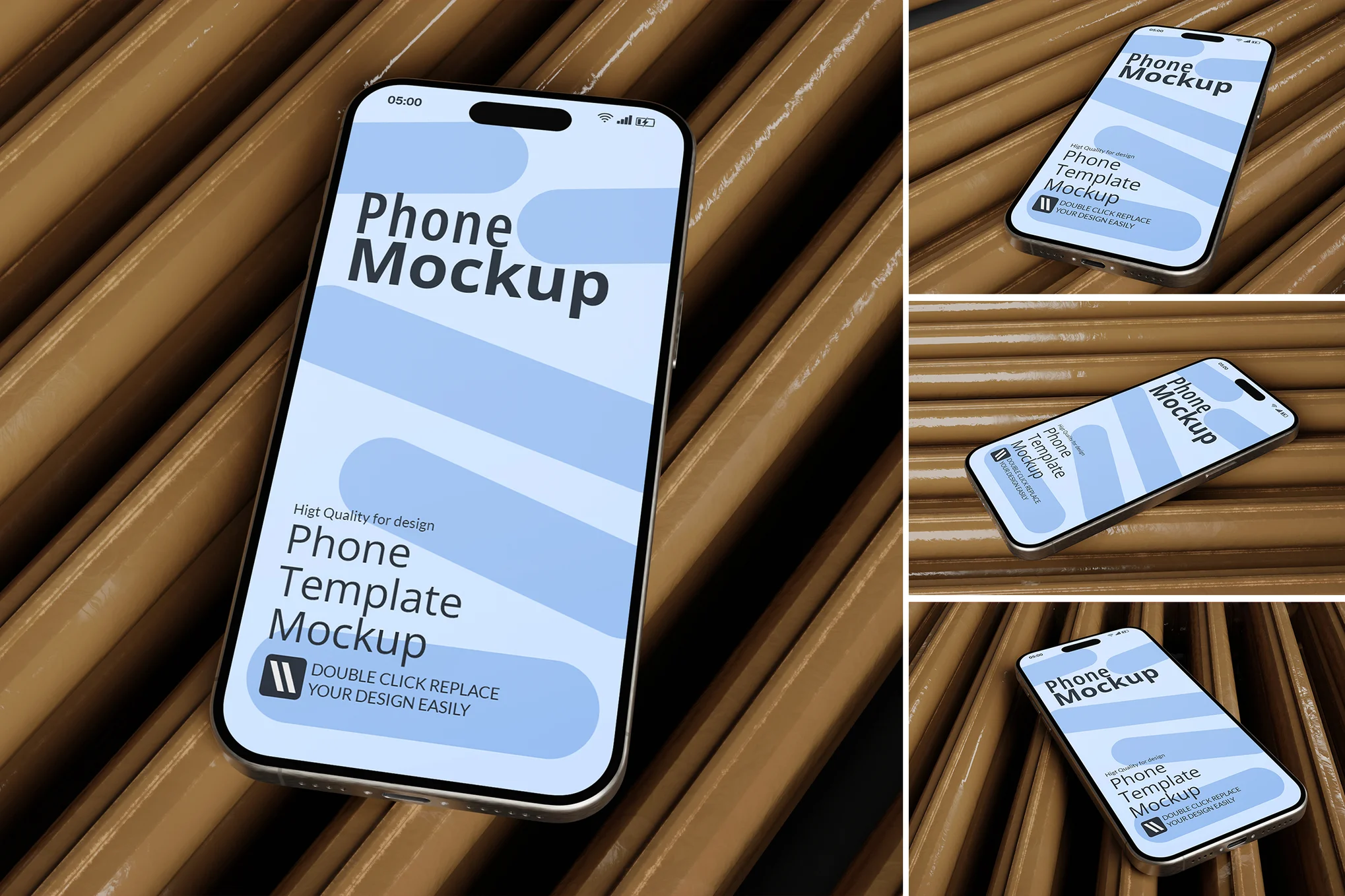
Blue iPhone 16 Mockup

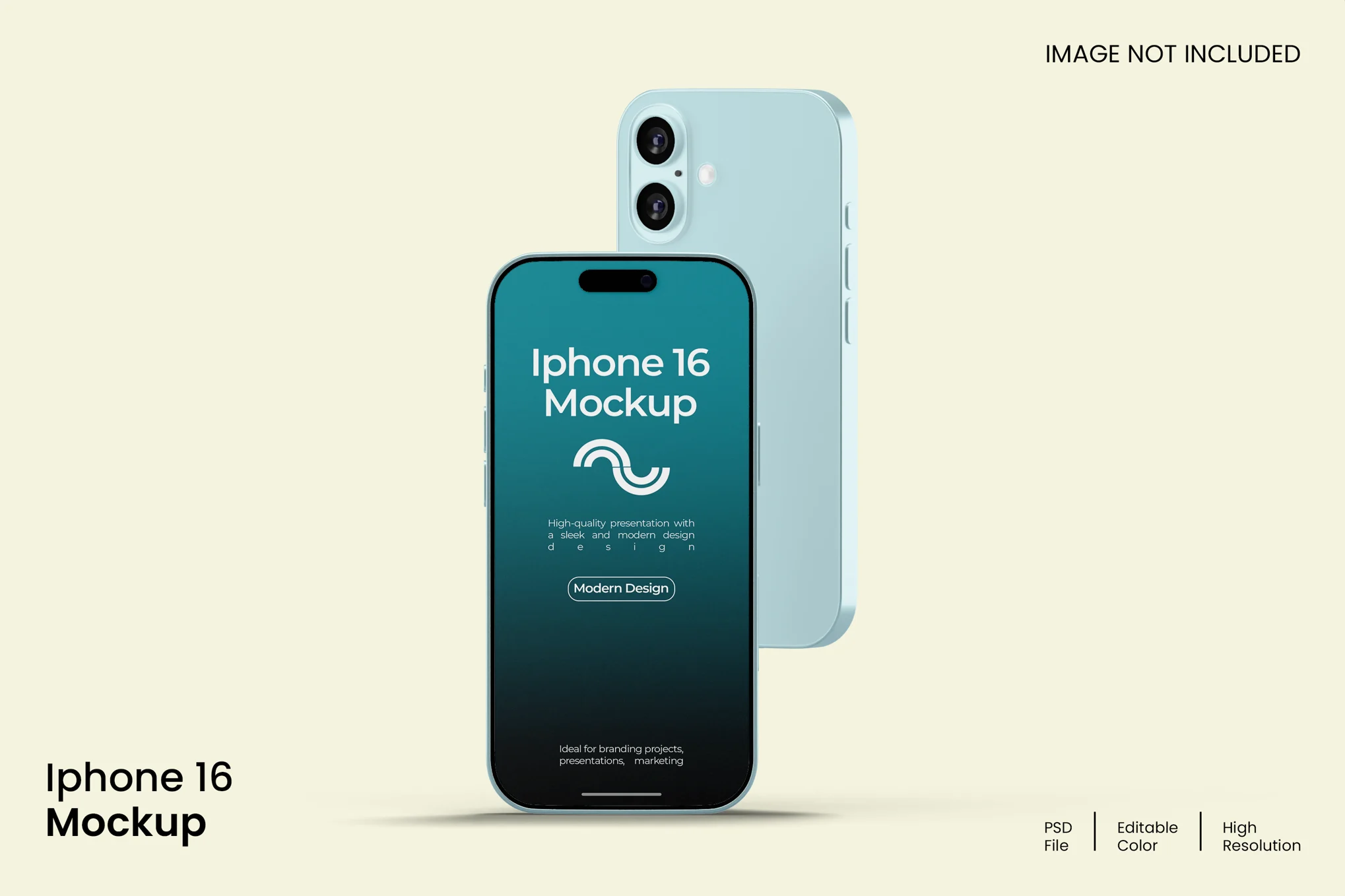
Blue iPhone 16 Mockup

A high-quality, highly customizable iPhone 16 mockup. With its meticulously arranged layers and smart-object functionality, you can effortlessly incorporate your own designs. The asset boasts an impressive resolution of 3000 x 2000 px with 300 dpi ensuring stunning visuals.

iPhone 16 Mockup Pack

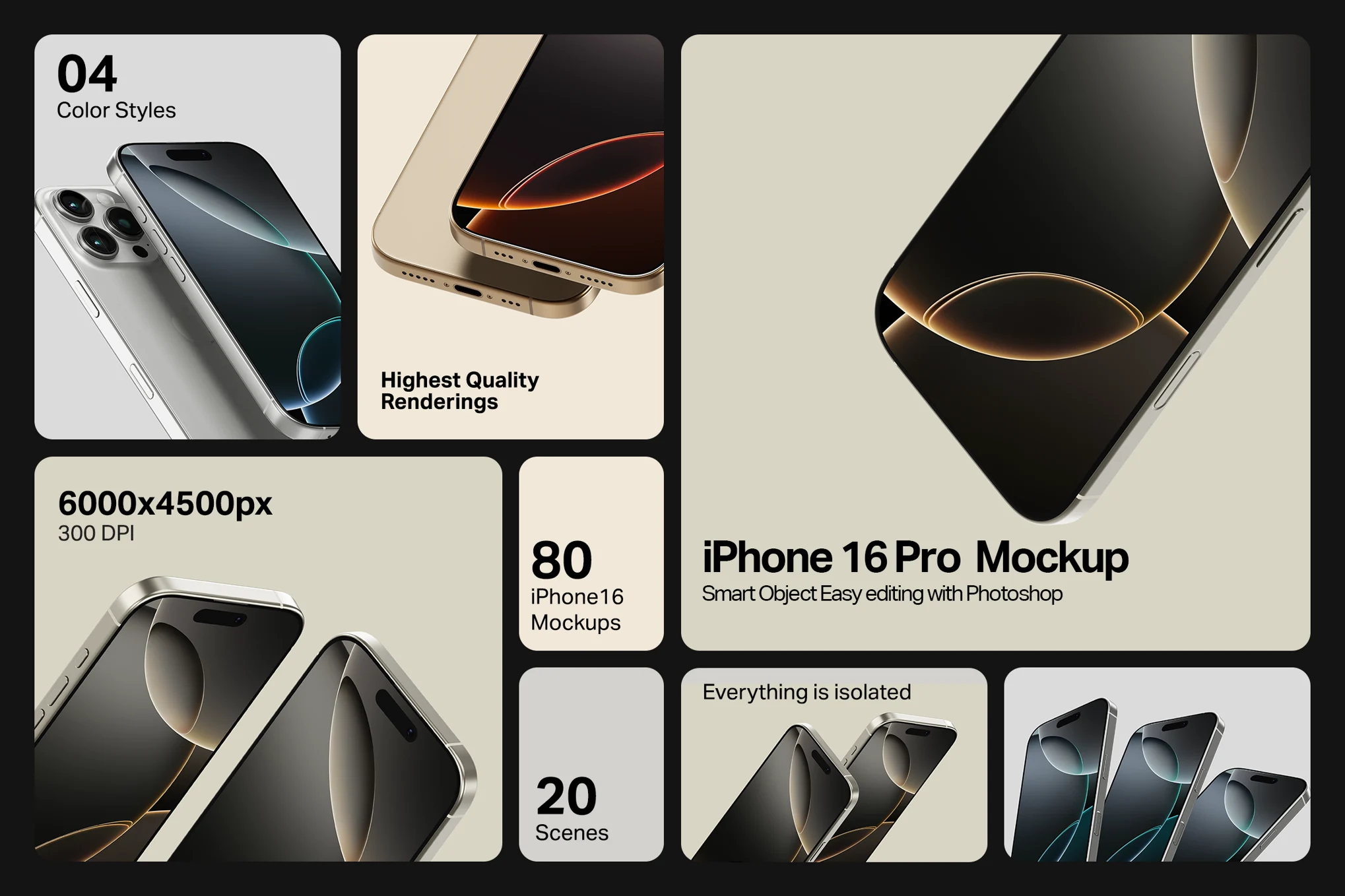
iPhone 16 Mockup Pack

This is an exceptional iPhone 16 mockup pack for UI designers, offering a unique platform to exhibit their designs. It contains 80 high-quality mockups in 4 diverse colors (Black Titanium, Desert Titanium, Natural Titanium, White Titanium), set over 20 scenes.

Aesthetic iPhone 16 Mockup

Aesthetic iPhone 16 Mockup

A set of four professionally designed iPhone 16 mockups, suitable for showcasing your unique designs. These high-resolution mockups come in a PSD Photoshop format, featuring smart-object capabilities for swift and easy editing. They offer an organized layout, allowing for customization of background colors and lighting.

Elegant iPhone 16 Mockup

Elegant iPhone 16 Mockup

This iPhone 16 mockup pack provides a sophisticated way for showcasing your design concepts with ease. Offered in a high-resolution PSD Photoshop format, smart-object features allow for effortless swapping between your creations. With customizable lighting, shadow, and background color options, these assets amplify the realism of your 3D display.

Editable iPhone 16 Mockup

Editable iPhone 16 Mockup

A professional, user-friendly iPhone 16 mockup kit perfect for testing design concepts before final implementation. It comes with four Photoshop files for easy editing and is of high resolution (3000×2000 px). This asset provides an engaging visual aid for branding presentations, strengthens your brand message, and leaves a memorable impression with viewers.

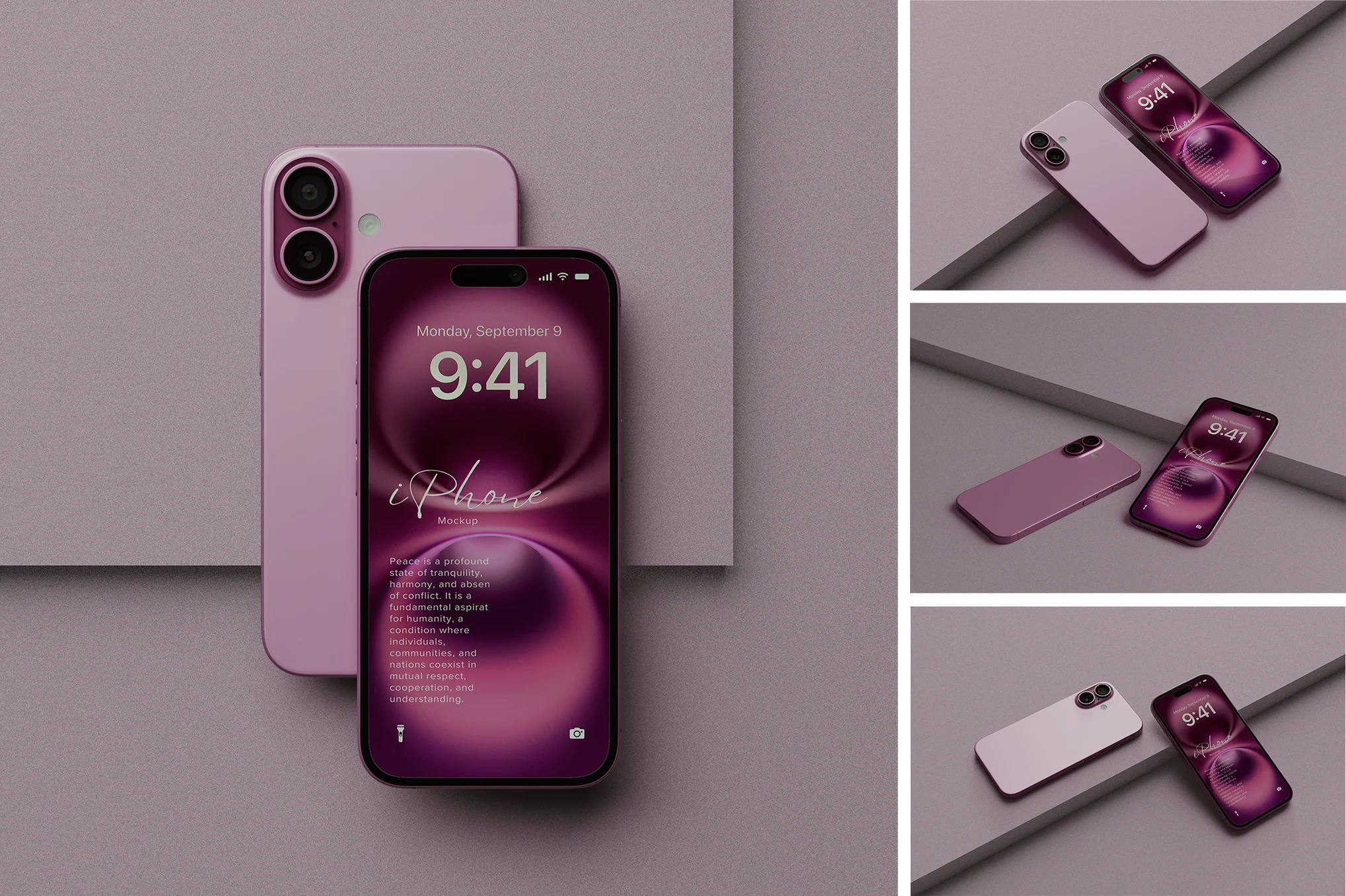
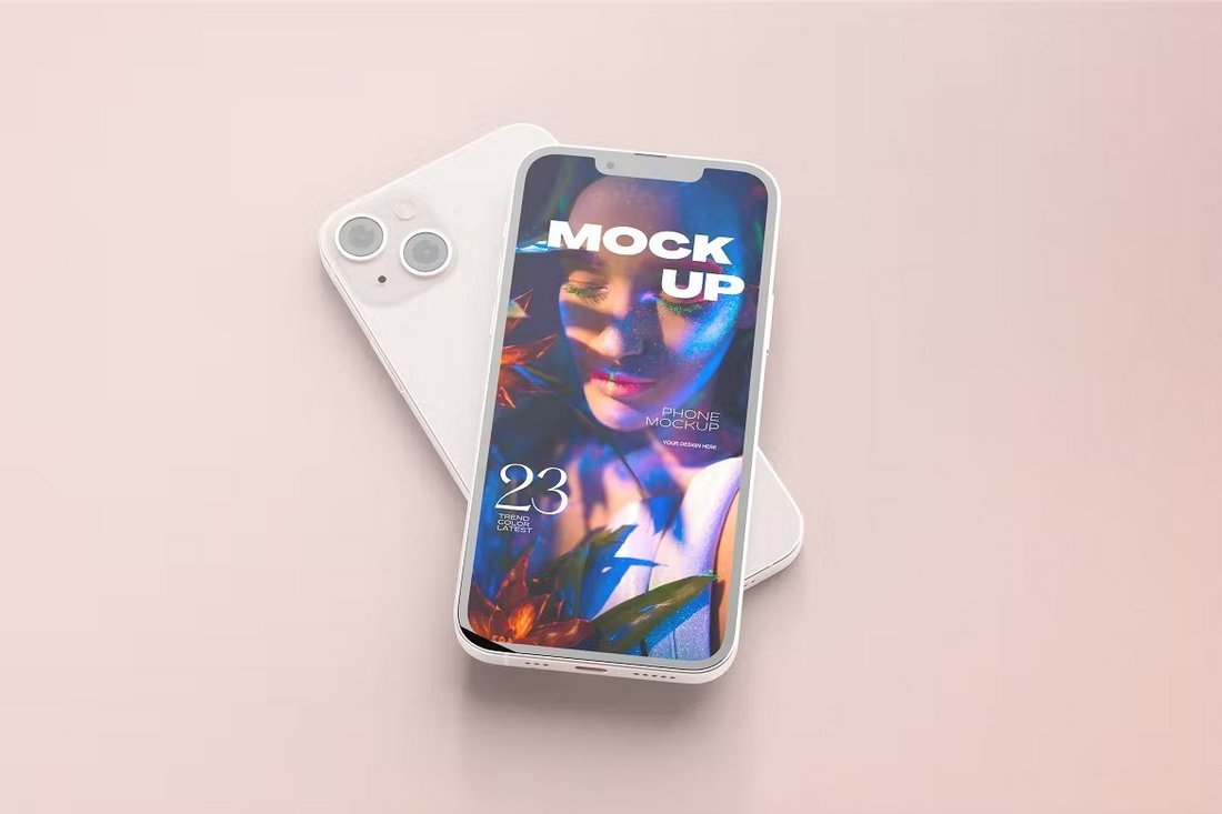
iPhone 16 Pink Mockup

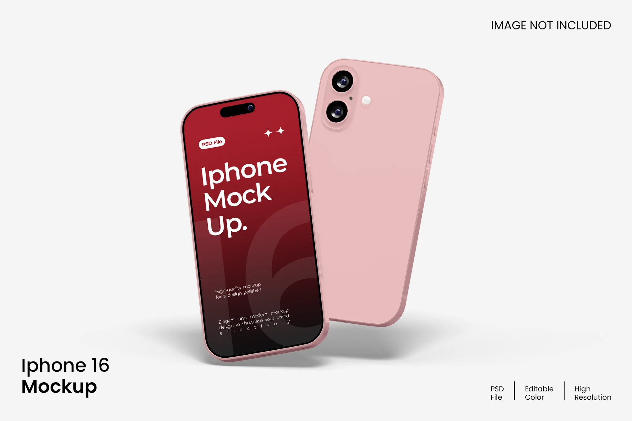
iPhone 16 Pink Mockup

This is a versatile iPhone 16 mockup kit ideal for professionally presenting your designs. It contains four high-resolution (4500 x 3000px, 300 dpi) PSD Photoshop files with smart-object features, enabling easy and quick design replacement. Its organized layers and customizable background colours cater to both bright and dark designs, and offer adjustable lighting.

Modern iPhone 16 Pro Mockups

Modern iPhone 16 Pro Mockups

This iPhone 16 mockup pack is perfect for displaying your designs professionally in a realistic 3D format. These high-resolution PSD files (4500x3000px at 300 DPI) are well-organized and come with smart-object features for effortless design replacement. You also have the option to change the background color.

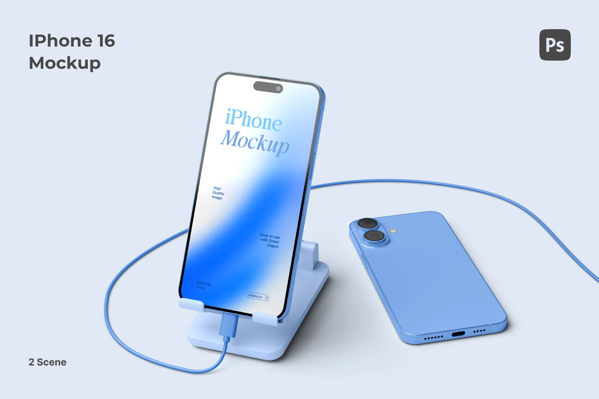
iPhone 16 Charging Mockup

iPhone 16 Charging Mockup

This iPhone 16 mockup offers a high-resolution depiction of the stylish iPhone 16, terrific for exhibiting apps, websites, or other digital concepts. It’s user-friendly with changeable backgrounds and organized layers for easy editing.

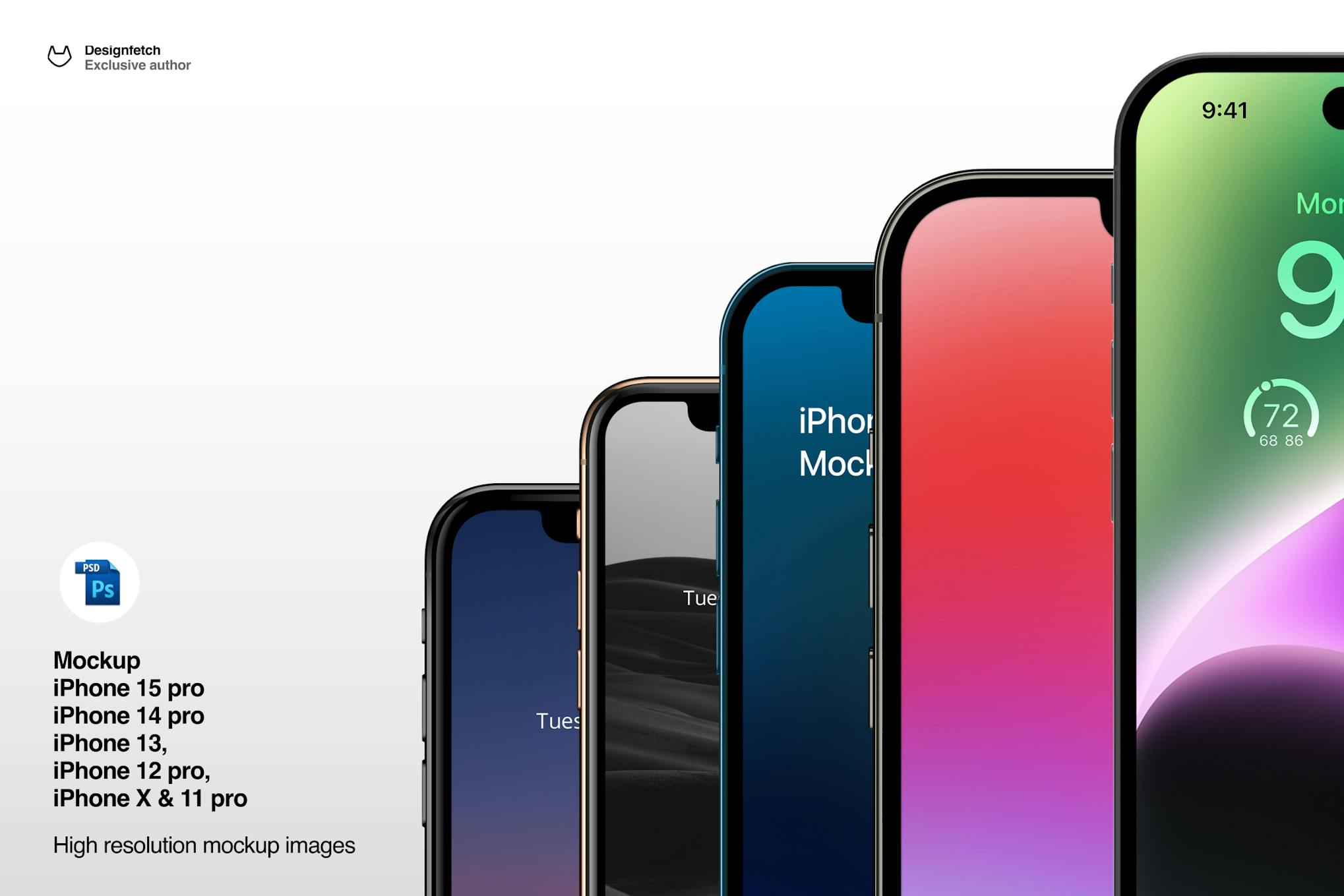
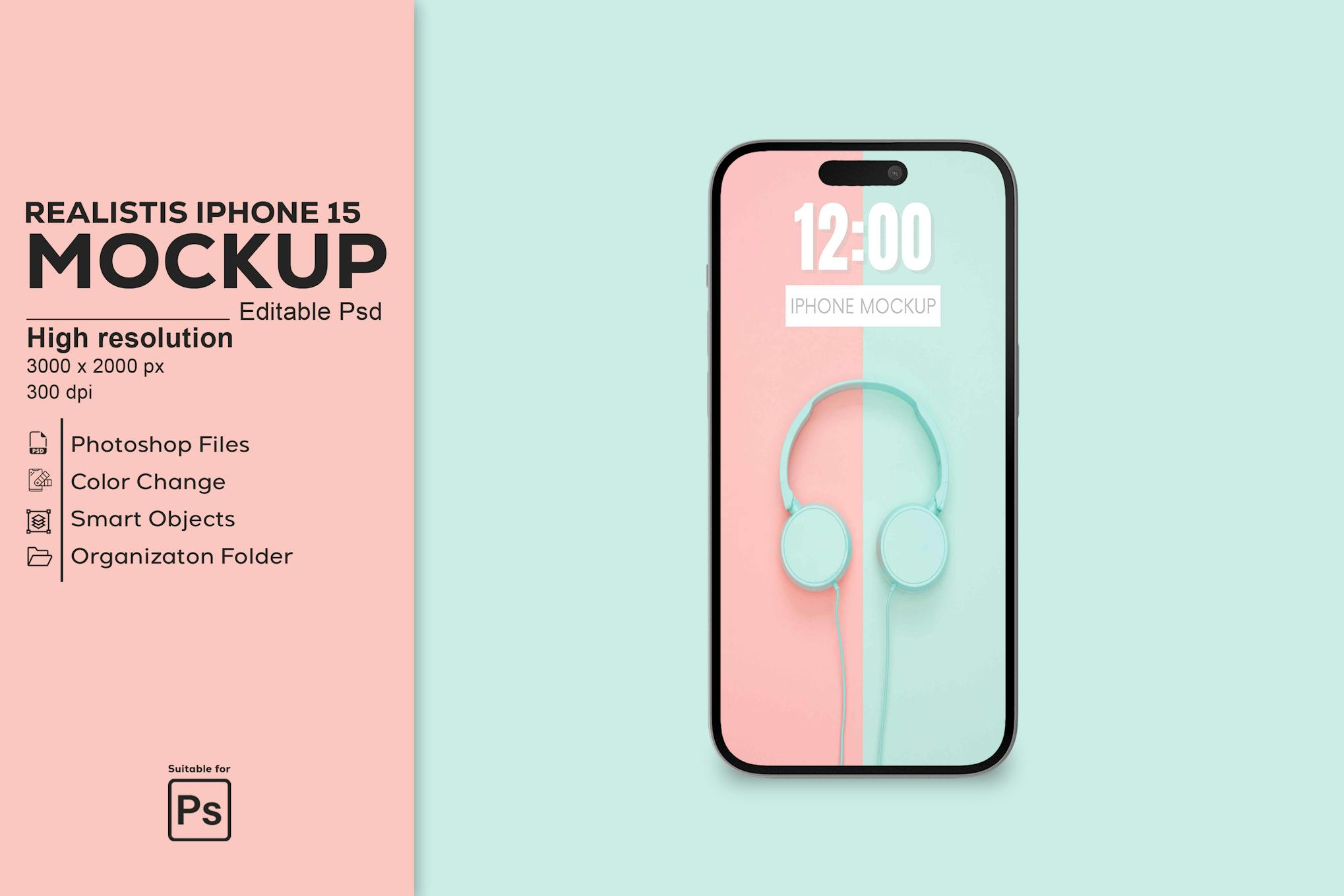
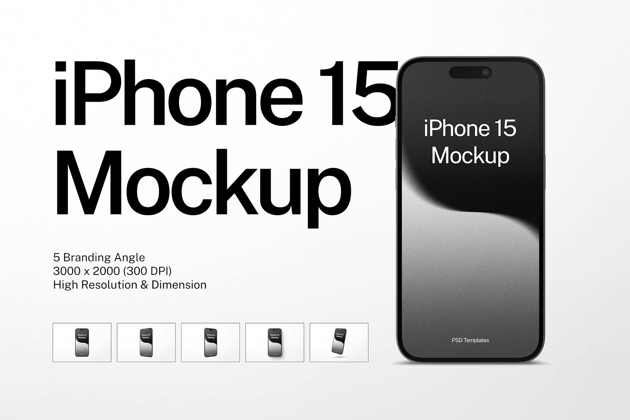
Mockup of iPhone 15 Pro

Mockup of iPhone 15 Pro

The “Mockup of iPhone 15 Pro” is a creative asset presenting super-realistic, ultra-HD, vector-based PSD mockups for iPhones from versions X to 15 Pro. With 30 PSD files included, it effortlessly wraps your app designs onto the phone using smart objects, making your artwork seem realistic in an instant. Use this brilliant tool to enhance your UI design presentation for clients.

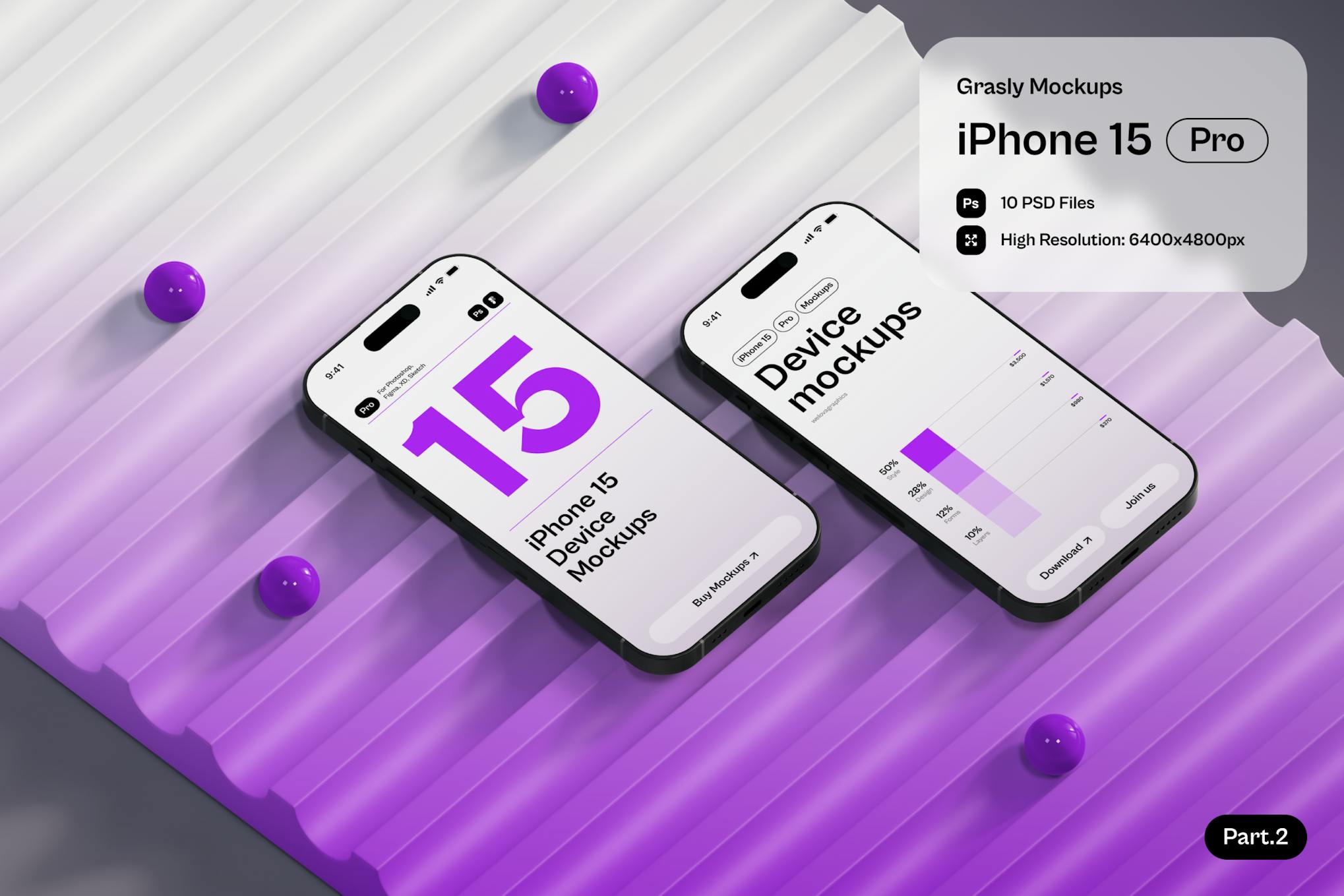
Grasly – iPhone 15 Mockups

Grasly - iPhone 15 Mockups

The Grasly – iPhone 15 Pro mockups provide high-quality, easy-to-use assets for showcasing your designs. They flaunt a minimalistic style in high resolution (6400×4800 pixels), allowing for a distinct, modern presentation. With full customization, you can change colors to suit your needs, add your designs via Smart Objects, and ultimately refine the appeal of your project.

Clean iPhone 15 Mockup

Clean iPhone 15 Mockup

The Clean iPhone 15 Mockup is a high-quality, versatile asset for presenting your app, UI, UX, template, or logo designs in an authentic context. Fully customizable in PSD Photoshop format, it offers smart-object features for swift design replacement. Edit background colors, light settings, and enjoy 3000 x 2000 px resolution at 300 DPI. Please note, only the mockup is provided, not the preview image.

Pro iPhone 15 Mockup

Pro iPhone 15 Mockup

The Pro iPhone 15 Mockup is a visual prototype that enables you to see how your final design might look, assisting in refining the design before actual development. With high-resolution images, easy-to-edit smart objects and organized layers in Adobe Photoshop files, this mockup offers a simple yet effective way to visually translate your ideas.

Simple iPhone 15 Mockup

Simple iPhone 15 Mockup

Looking for a practical tool to present your design ideas? Consider the Simple iPhone 15 Mockup, a convenient and editable template that lets you preview your concepts as they would look on an actual device. It includes five Adobe Photoshop files, easily customized through Smart Objects and with high-resolution effects. The organized layers and included PDF help file make it simple to use, enabling you to effortlessly bring your design previews to life. Enjoy creating with this straightforward mockup.

iPhone 14 Pro Max Mockup

iPhone 14 Pro Max Mockup

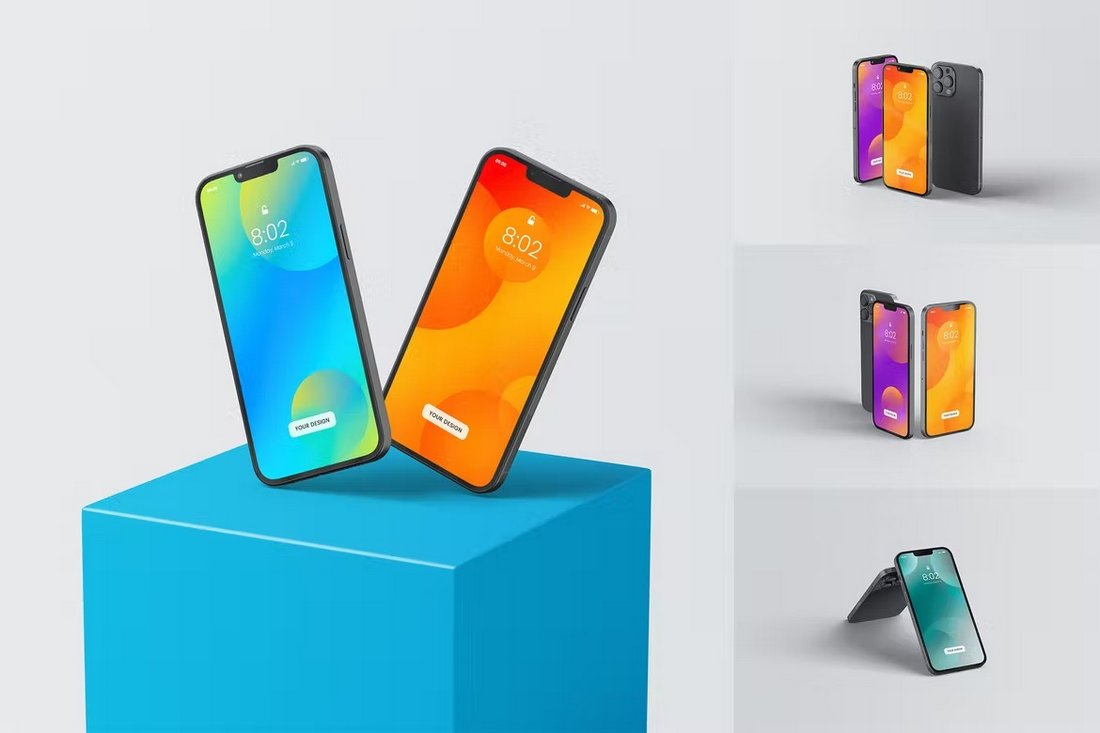
Looking for a shiny new iPhone 14 to showcase your designs? Then be sure to grab this mockup kit. It includes a floating mockup of the new iPhone 14 Pro Max in 4 different color schemes, deep purple, gold, silver, and space black.

iPhone 14 Mockup Templates Kit

iPhone 14 Mockup Templates Kit

If you want to showcase your designs from multiple angles and views, this mockup bundle is for you. It includes mockups of the new iPhone 14 device in several different angles and in fully customizable PSD format.

iPhone 14 Pro Screen Mockups

iPhone 14 Pro Screen MockUps

This is a big collection of iPhone 14 Pro mockup templates that show a close-up view of the device screen. It’s perfect for showing off your designs. There are 18 different iPhone mockups in this pack.

iPhone 14 Pro White Case Mockups

iPhone 14 Pro White Case Mockups

Working on cover designs for iPhone 14? Then grab this mockup kit to showcase and promote your designs to your audience. It includes 10 different mockups showing the back side of the iPhone 14 in various views and angles.

Minimal iPhone 14 Pro Mockup

Minimal iPhone 14 Pro Mockup

This iPhone 14 mockup kit features 5 different mockup templates, including ones showing the front, side, and back views of the device. The templates are available in fully editable PSD files.

Multipurpose iPhone 14 Mockups

Multipurpose iPhone 14 Mockups

With this mockup pack, there are so many different styles of mockups for you to choose from. It features the new iPhone 14 device from 14 different angles. Each mockup comes with smart object to let you customize the mockup with just a few clicks.

Free iPhone 14 Pro Mockup

Free iPhone 14 Pro Mockup

This free iPhone 14 Pro mockup comes in 4 different color versions featuring the official colors of the Apple device. The mockups are available in high-resolution PSD, Sketch, and Figma formats.

Free iPhone 14 Dynamic Island Mockup

Free iPhone 14 Dynamic Island Mockup

The Dynamic Island is the most unique feature of the iPhone 14. With this mockup kit, you can showcase all the creative things your app or designs can do with the Dynamic Island. The mockup is free to download.

Stylish iPhone 13 Mockups PSD

Stylish iPhone 13 Mockups

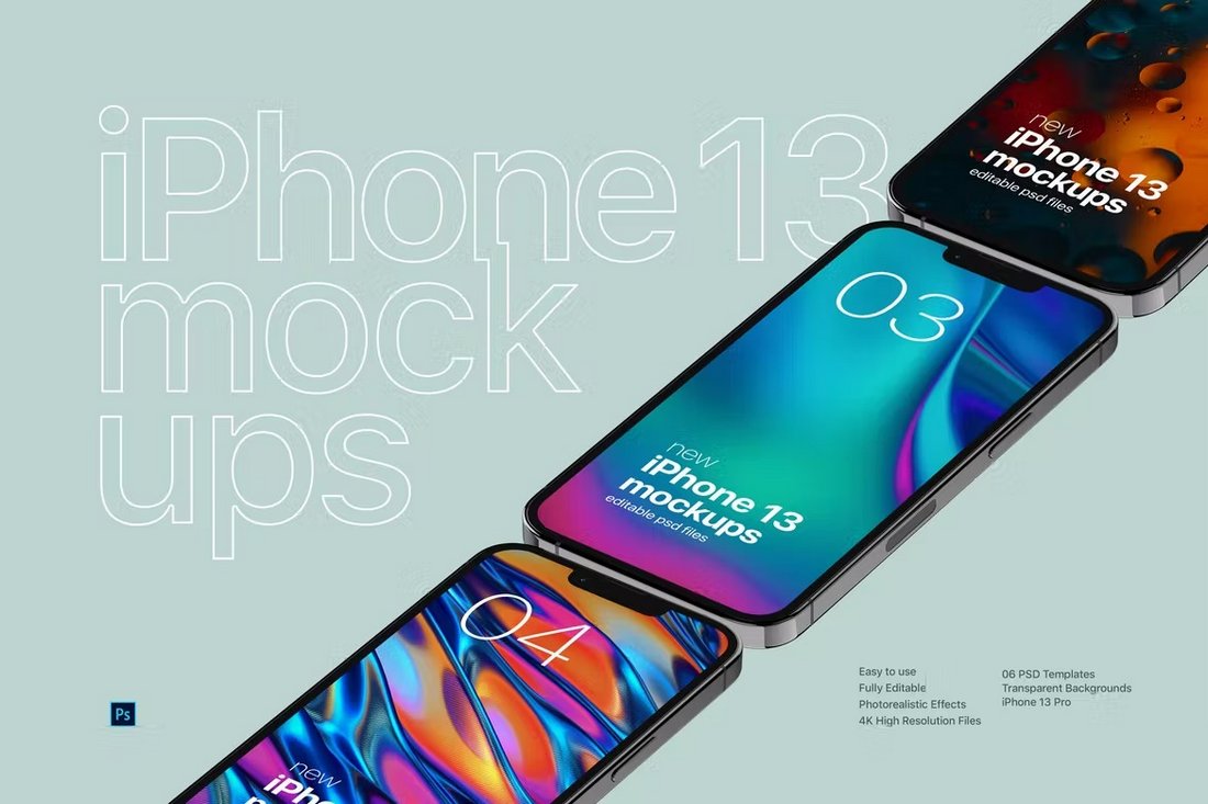
This mockups bundle comes with a set of high-resolution iPhone 13 mockups featuring many different styles of isometric scenes. There are 6 different mockups included in this pack that comes in PSD file format and in 4K resolution. You can change the background and edit the layouts with just a few clicks as well.

Colorful iPhone 13 Pro Mockup Templates

Colorful iPhone 13 Pro Mockup Templates

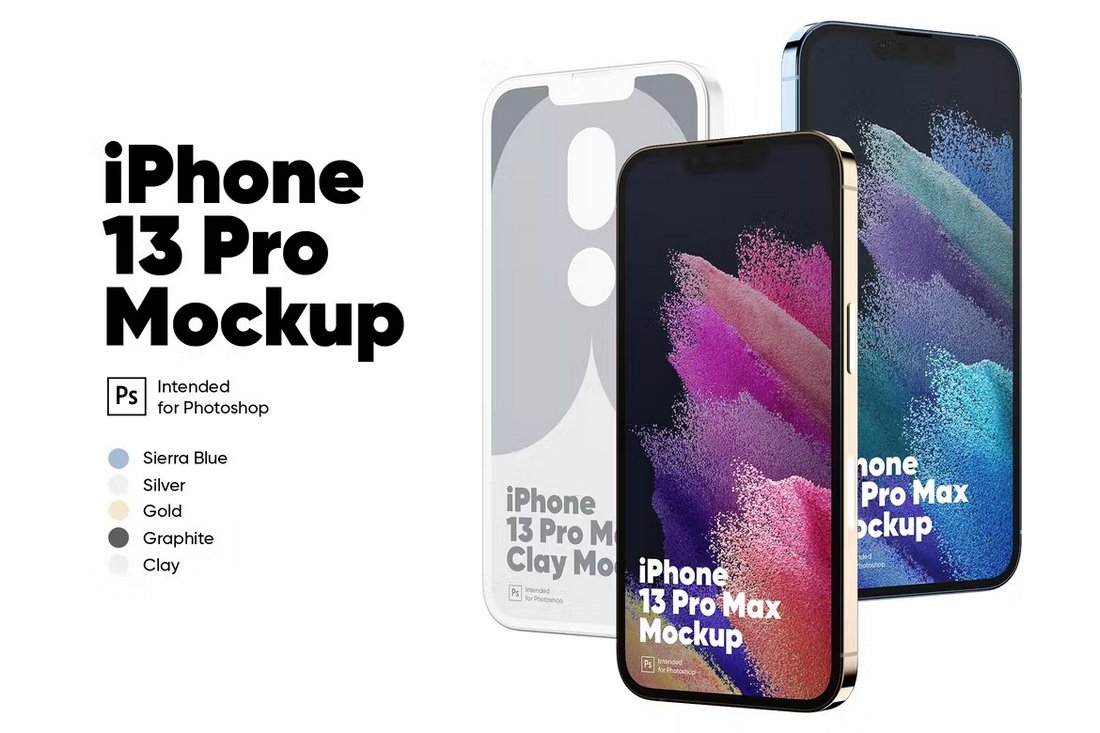
If you want to show off your products and designs using iPhone devices with different color variations, this mockup kit is a must-have for you. It includes the new iPhone 13 Pro in 5 official colors. As a bonus, you’ll get a clay-style iPhone mockup template as well.

Trendy iPhone 13 Mockup Templates

Trendy iPhone 13 Mockup Templates

This iPhone mockups collection has some of the most creative and stylish mockups we’ve seen. It includes 5 unique mockups that allow you to show off your designs in beautiful scenes and environments. They are especially perfect for social media campaigns.

Outdoors iPhone PSD Mockups

Outdoors iPhone PSD Mockups

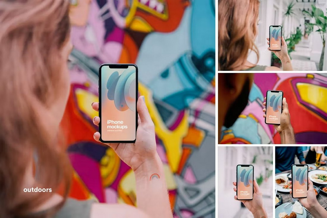
A collection of photo-realistic iPhone mockups featuring beautiful outdoor backgrounds. This pack features 6 different mockups that are based on real photos. They feature a woman holding an iPhone. The templates come in portrait and landscape-style scenes as well.

Free iPhone 13 Mockup Templates

Free iPhone 13 Mockup Templates

This is a free iPhone 13 mockup template that features both front and back views of the device. It also includes the device in all 5 official color variants. And you can easily customize the templates to your preference.

9K iPhone 13 Pro Mockup PSD

9K iPhone 13 Pro Mockup PSD

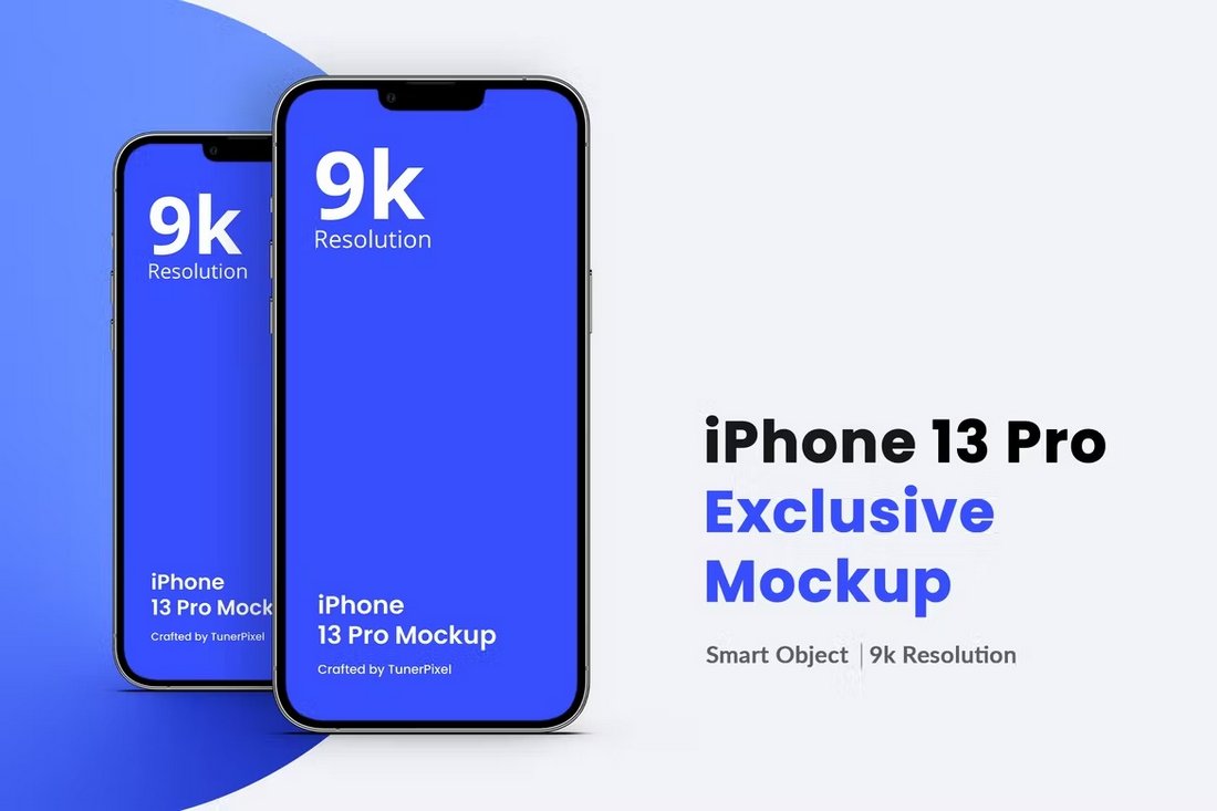
If you’re looking for a high-resolution iPhone mockup for a big project, you probably won’t find a better mockup than this one. It features an iPhone 13 mockup in 9K resolution. And it comes fully equipped with smart objects and separated shadows.

Credit Card & iPhone Mockup Template

Credit Card & iPhone Mockup Template

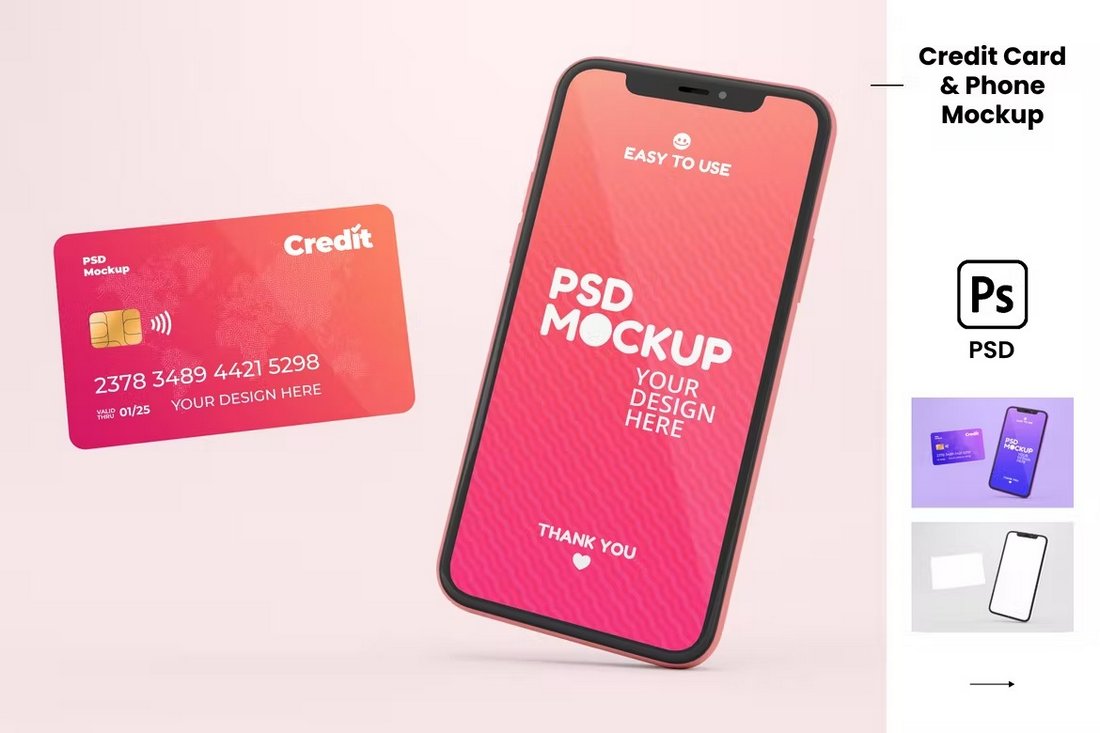
A great iPhone mockup you can use in your eCommerce-themed design presentations. This mockup includes an iPhone next to a credit card. You can use both to show credit card and app designs. And it features editable colors too.

iPhone Cases Mockup Template

iPhone Cases Mockup Template

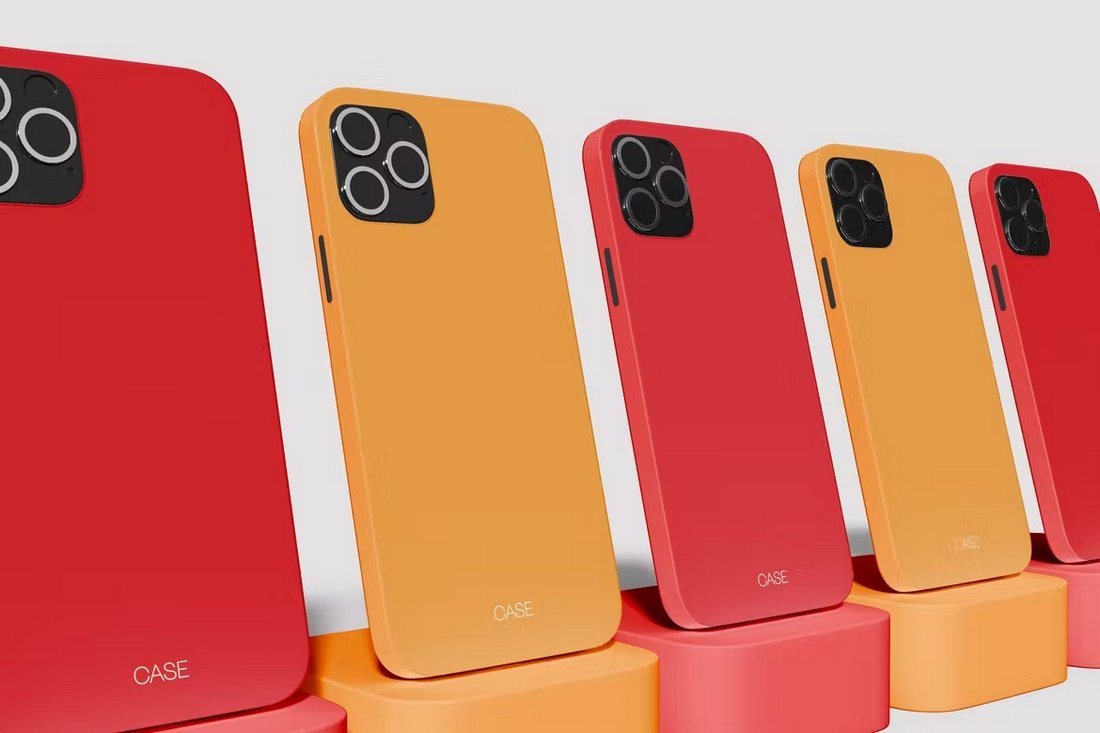
This mockup is great for showcasing your iPhone case designs. It includes multiple devices in the scene where you can show off different variations of your case designs. A must-have mockup for DIY crafters and Etsy sellers.

iPhone 13 Pro Max Mockup PSD

Phone 13 Pro Max Mockup PSD

A collection of 4 stylish iPhone mockups featuring the new iPhone 13 Pro Max device. The bundle features multiple views of the device in creative scenes. You can also change the colors, shadows, and rearrange objects to your preference.

Free iPhone 13 Pro Mockups PSD

Free iPhone 13 Pro Mockups PSD

Another free iPhone mockup featuring the new iPhone 13 Pro model. This mockup comes in 4 different mockups with 4 official color versions of the device. Each mockup can be customized with Photoshop, Sketch, and Figma.

iPhone 12 Pro Max Mockup Template

iPhone 12 Pro Max Mockup Template

Show off your new designs and app screens on the latest iPhone 12 Pro Max using this mockup. This beautiful iPhone 12 mockup comes in both black and blue models. The realistic design will make your portfolio look even more authentic as well.

Modern iPhone Mockup Template

Showcase your iPhone design using this modern and stylish mockup template that allows you to skate through the editing process- thanks to the smart object layer. Just drop in your design, hit save and you’re good to go!

Isometric iPhone 12 Mockup Template

Isometric iPhone 12 Mockup Template

If you’re looking for a high-resolution mockup template, this iPhone 12 mockup will come in handy. It’s available in 5K resolution featuring an isometric view of the device. It’s perfect for website headers and even big billboard designs.

iPhone 12 Mockup Templates – 21 Scenes

iPhone 12 Mockup Template - 21 Scenes

This is a bundle of iPhone 12 mockups that feature 21 scenes with different views and angles of the device. The mockups are all available in 5K resolution PSD files. You can easily edit the mockup using smart objects as well.

iPhone PSD Mockups

iphone mockup

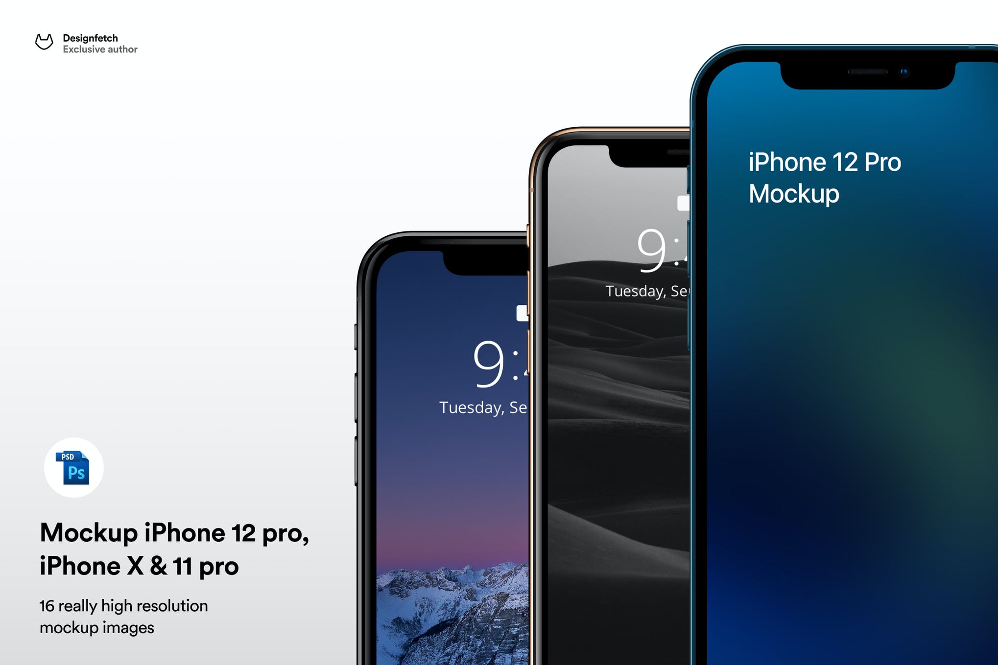
Here we have an amazing Photoshop collection containing iPhone 12 Pro, iPhone 11, and iPhone X mockups in incredibly realistic settings. You can use these mockups to elevate your UI designs and make a solid impression on your clients.

Minimal Flat Design Smartphones Mockup

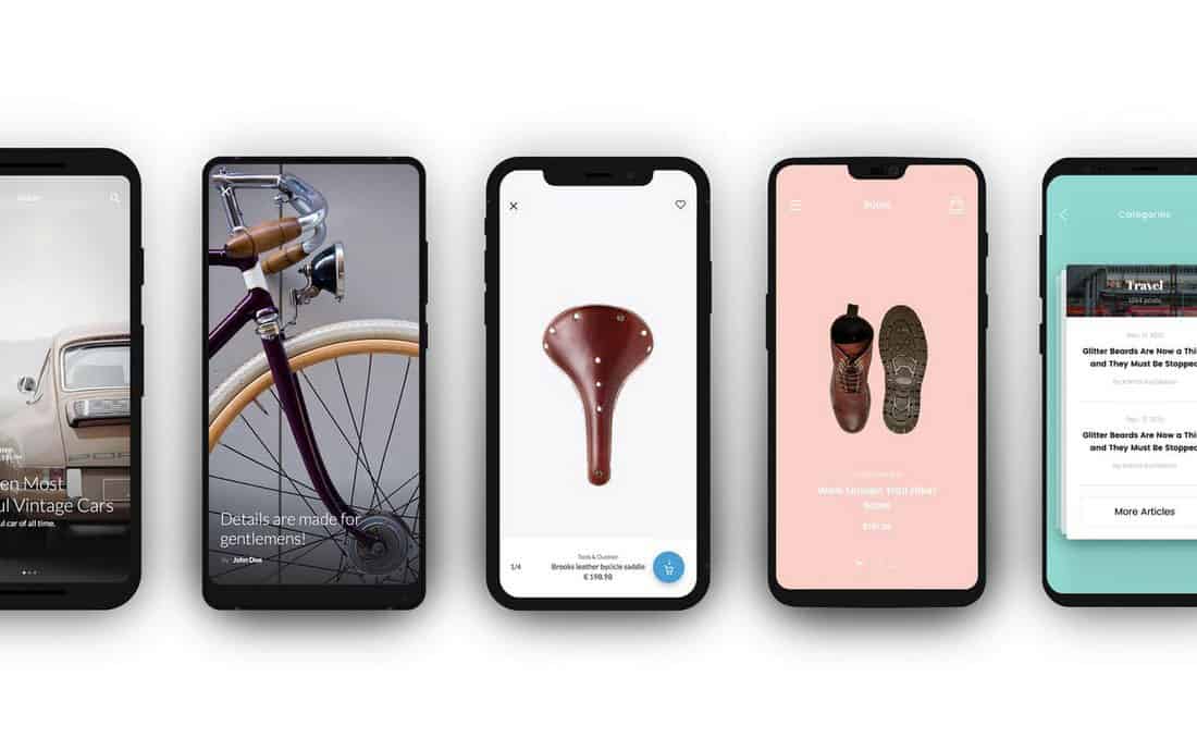
This is an all-in-one mockup template that will come in handy when you’re showcasing your app screens or designs across multiple device types. It includes mockups of iPhone X, Samsung S9, Xiaomi 2, One Plus, and Google Pixel, all in the same place.

The size of the graphic is huge – 6000 × 6000px, making it suitable for a wide range of uses. Plus, the PSD file features vector elements making the designs easily scalable to any size as well. This one stands out from lots of the others in this roundup, as it features a range of phones and devices. It’s a great mockup for the latest iPhone, but also for various other phone makes and models as well.

iPhone X Plus PSD Mockup

iphone mockup

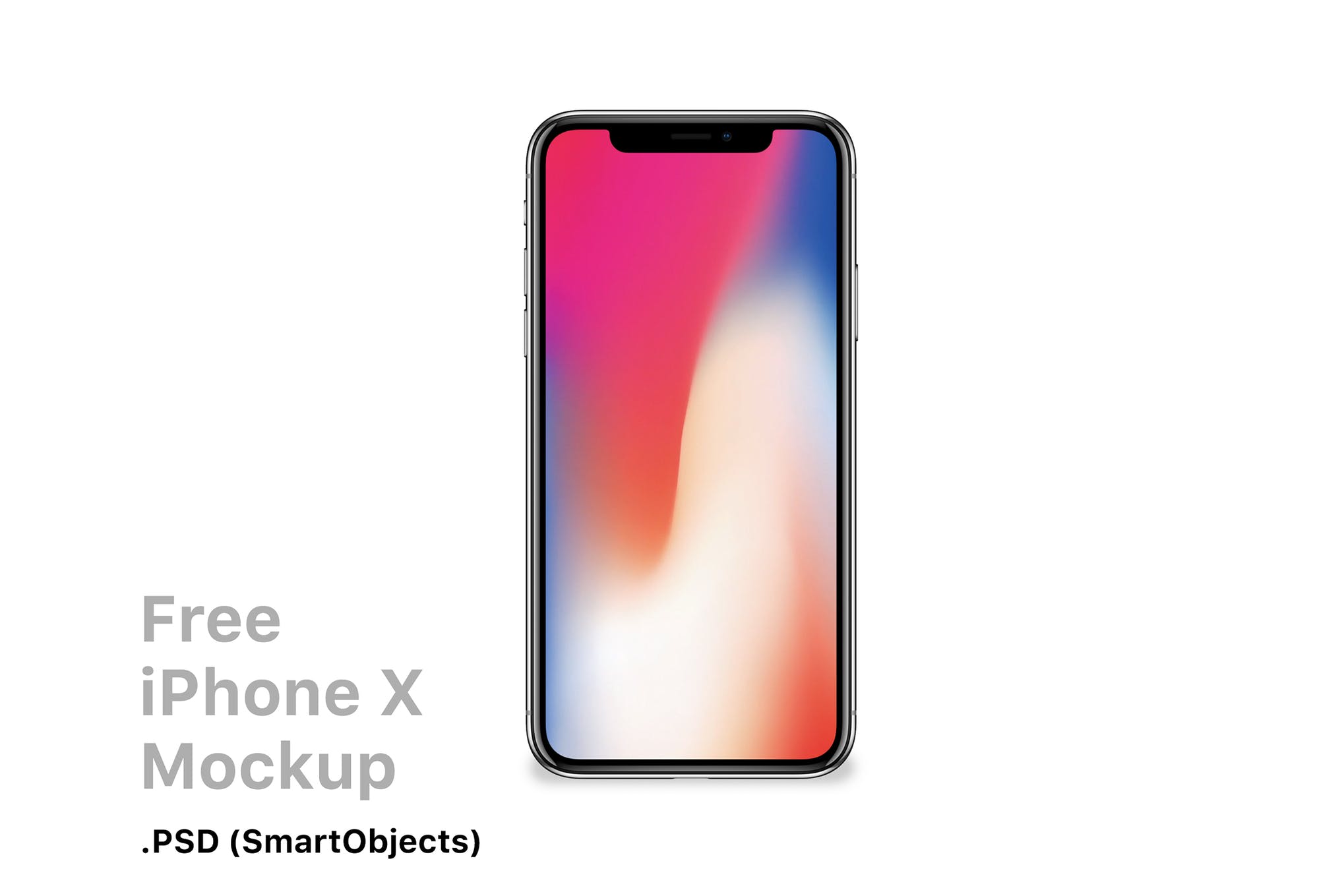
Create beautiful designs using this iPhone X mockup with one-click easy-to-use settings. It comes with a smart object functionality that will make you skate through the editing process. But don’t just go by our words, take this mockup for a spin, and see for yourself.

Free iPhone 12 PSD Mockup

iphone mockup psd

Next in our list of the best iPhone mockups is this modern and innovative option that will help present your designs in the best way possible. Available in PSD format, the mockup comes with a range of colors, allowing you to choose the one that best suits your vision.

Professional iPhone Mockup PSD Collection

Iphone mockup

If you’re searching for high-resolution, easy-to-edit iPhone mockups that produce photorealistic results, this PSD template is well worth checking out. A perfect choice for developers, and designers, this iPhone mockup template is a worthy contender for your cash.

iPhone 11 Pro Mockup

iPhone 11 Pro Mockup

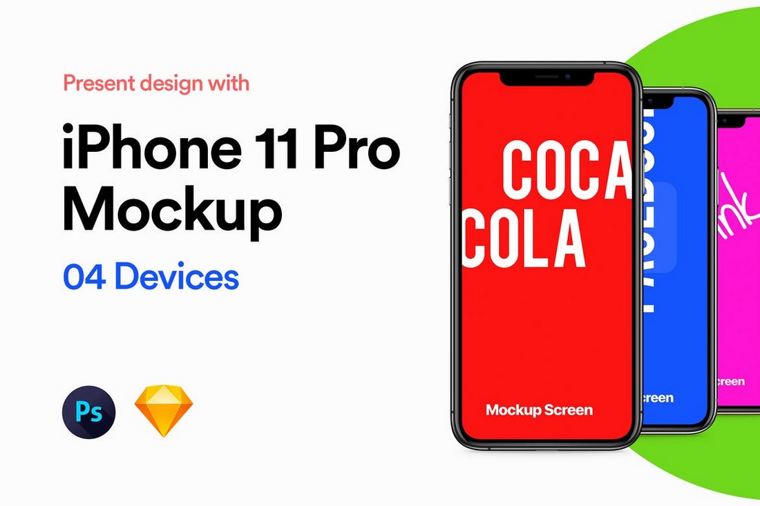
Showcase your designs using the all-new iPhone 11 Pro with this mockup set. It includes the new handset in 4 different color versions. The mockup is also available in Photoshop, Sketch, and Adobe XD versions as well.

iPhone 11 Pro Mockup Scene

iPhone 11 Pro Mockup Scene

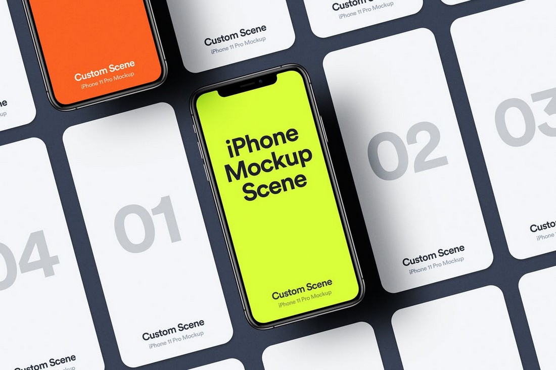
Another new iPhone 11 Pro mockup. This mockup comes with lots of additional elements in separate layers. You can use them to make a creative mockup scene. The template features smart objects for easy editing as well.

Creative iPhone 11 Pro Mockup

Creative iPhone 11 Pro Mockup

You can use this mockup to showcase multiple screens of your app or website designs in one place. It’s also suitable for website designs as well. This mockup also features the new iPhone 11 Pro device with smart objects.

Professional iPhone Mockups

Profesisonal iPhone Mockups

A set of professional and minimal mockups featuring the iPhone X. It includes 7 different mockup templates with various layouts. They are perfect for creative website designs and portfolios.

Free iPhone 11 Pro Max Mockup

Free iPhone 11 Pro Max Mockup

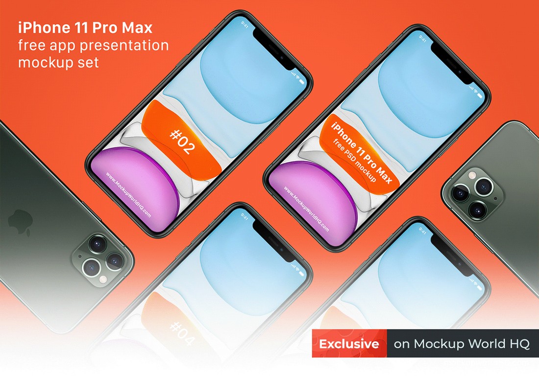
This is a free mockup template featuring the new iPhone 11 Pro Max. This template is designed with app presentations in mind. You can also use it to make website headers as well.

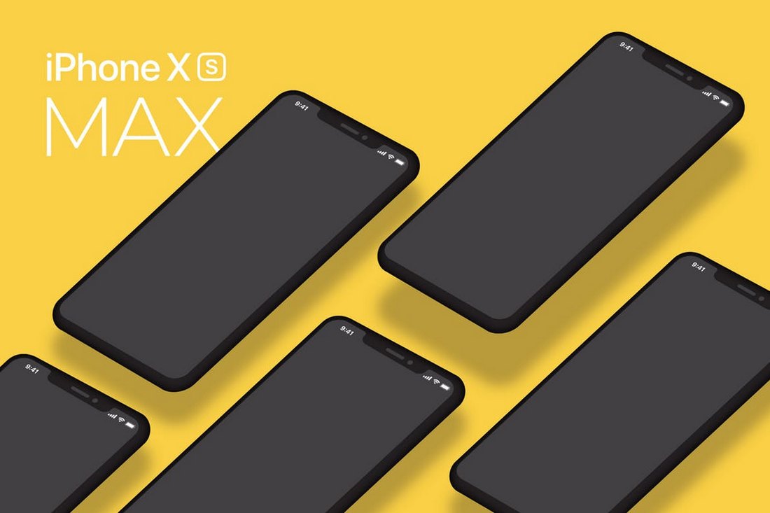
iPhone XS MAX Isometric Mockup

iPhone XS MAX Isometric Mockup

A minimalist flat design inspired mockups of the new iPhone XS Max. This mockup features an isometric view of the device and it comes in colored designs. The mockup is available in 3 different styles and in both Photoshop and Illustrator file formats.

New iPhone XS Mockup

New iPhone XS Mockup

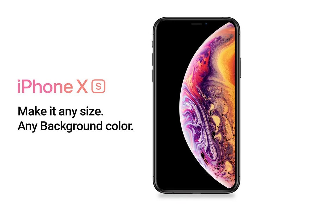
A showcase mockup of the latest iPhone XS. This mockup is perfect for showcasing your app screens on a website header, social media cover, or a portfolio. You can easily customize the PSD files to replace the screens and resize the devices.

iPhone XS Vector Mockup

iPhone XS Vector Mockup

A fully customizable vector mockup of the new iPhone XS. This mockup comes to you as a completely vector-based mockup with a customizable background. You can edit the screen with just one-click using smart objects as well.

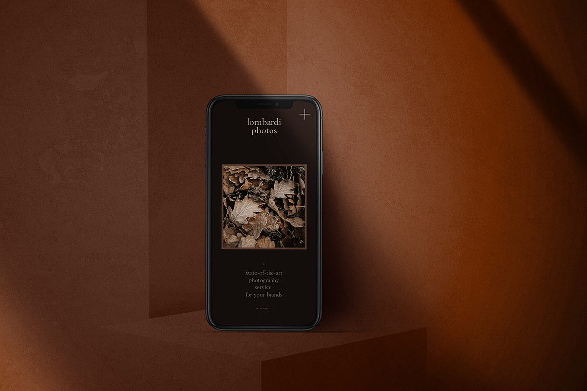
Free iPhone Dark Mode Mockup

iphone mockup psd

For a dark, and moody vibe, consider this iPhone mockup for showcasing your app design in a professional yet creative manner. The mockup oozes elegance, and luxury, and is certainly one of our favorite choices when it comes to the best iPhone mockups.

iPhone XR Mockups

iPhone XR Mockups

An iPhone XR mockup with perspective view. Featuring easily customizable PSD file with smart object, this mockup is perfect for showcasing your app screens on a website design or a portfolio website.

Free iPhone Mockup PSD Pack

This pack includes a well-structured PSD file with high-resolution mockups in multiple colors. The mockups are editable, so you can change both the backgrounds and transparency. Excellent for presentations and hero images.

Just drop your designs in the smart object, and you’re all set! They’re super high-res, at 2,400 x 1,800px. Free to use for both personal and commercial projects.

Not all free mockups are created equal, and this one really stands out. It’s pixel-perfect, has no usage restrictions, and has a bunch of different styles and configurations to get just the look you’re after.

Realistic iPhone Mockup

Realistic iPhone X Mockup

Another professional iPhone X mockup template for showcasing your designs and presentations. The mockup is available in 6 different styles and in 4500×3000 px resolution PSD files.

7 iPhone X Mockups

7 iPhone X Mockups

A collection of iPhone X mockups featuring different styles of views and angles of the device, including a close-up look at the device. The bundle includes 7 mockups in PSD files.

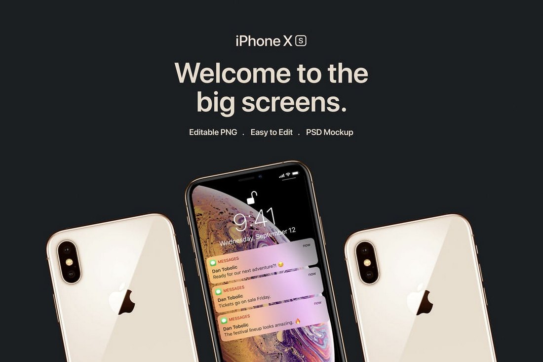
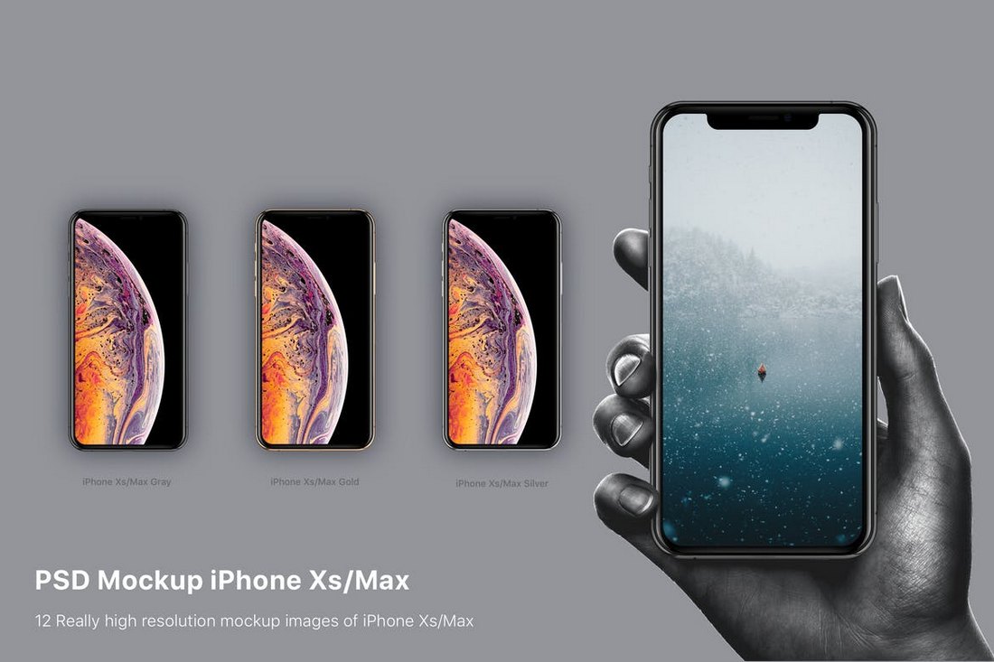
PSD Mockup iPhone XS & XS Max

PSD Mockup iPhone XS & XS Max

This bundle includes 12 different mockups of the new iPhone XS and the XS Max devices. It features PSD mockups that can be easily customized with smart objects and changeable backgrounds.

iPhone X Mockup PSD

The latest edition to join the iPhone family, iPhone X is truly a beauty. This new mockup is designed to help you showcase your work using a creatively placed duo of iPhone X devices. It’s perfect for designing a beautiful website header image or a landing page.

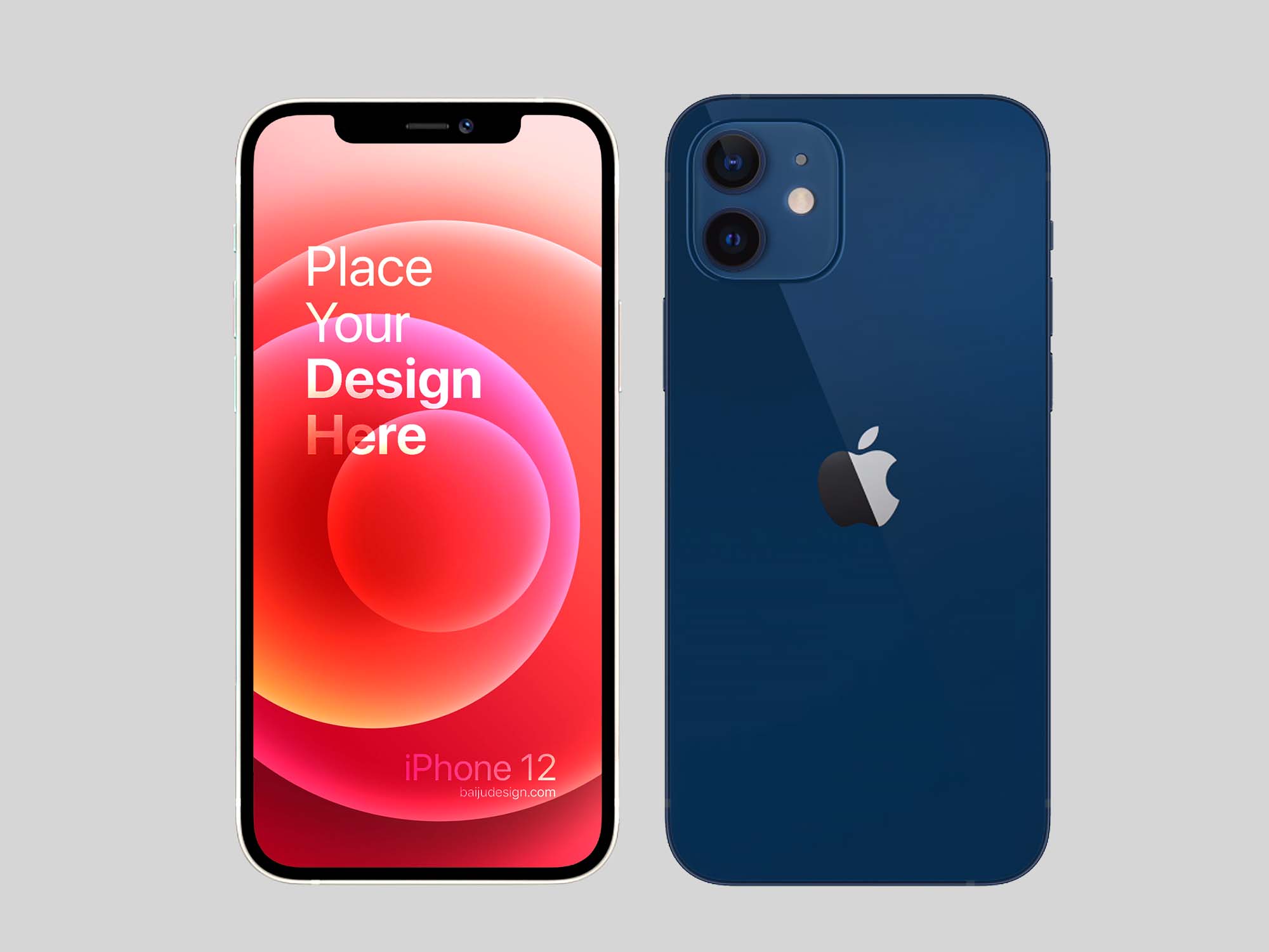
Free iPhone 12 Mockup Template

This gorgeous mockup template is specifically designed for iPhone 12 featuring 4 scenes with distinct perspectives to present your designs to your clients in an impressive and effective manner. Test it out yourself!

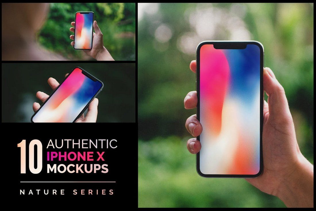
10 Authentic iPhone X Mockups

This bundle comes with 10 iPhone X mockups featuring several different angles and views of the latest smartphone. It allows you to present your various designs in different ways using photorealistic mockup templates.

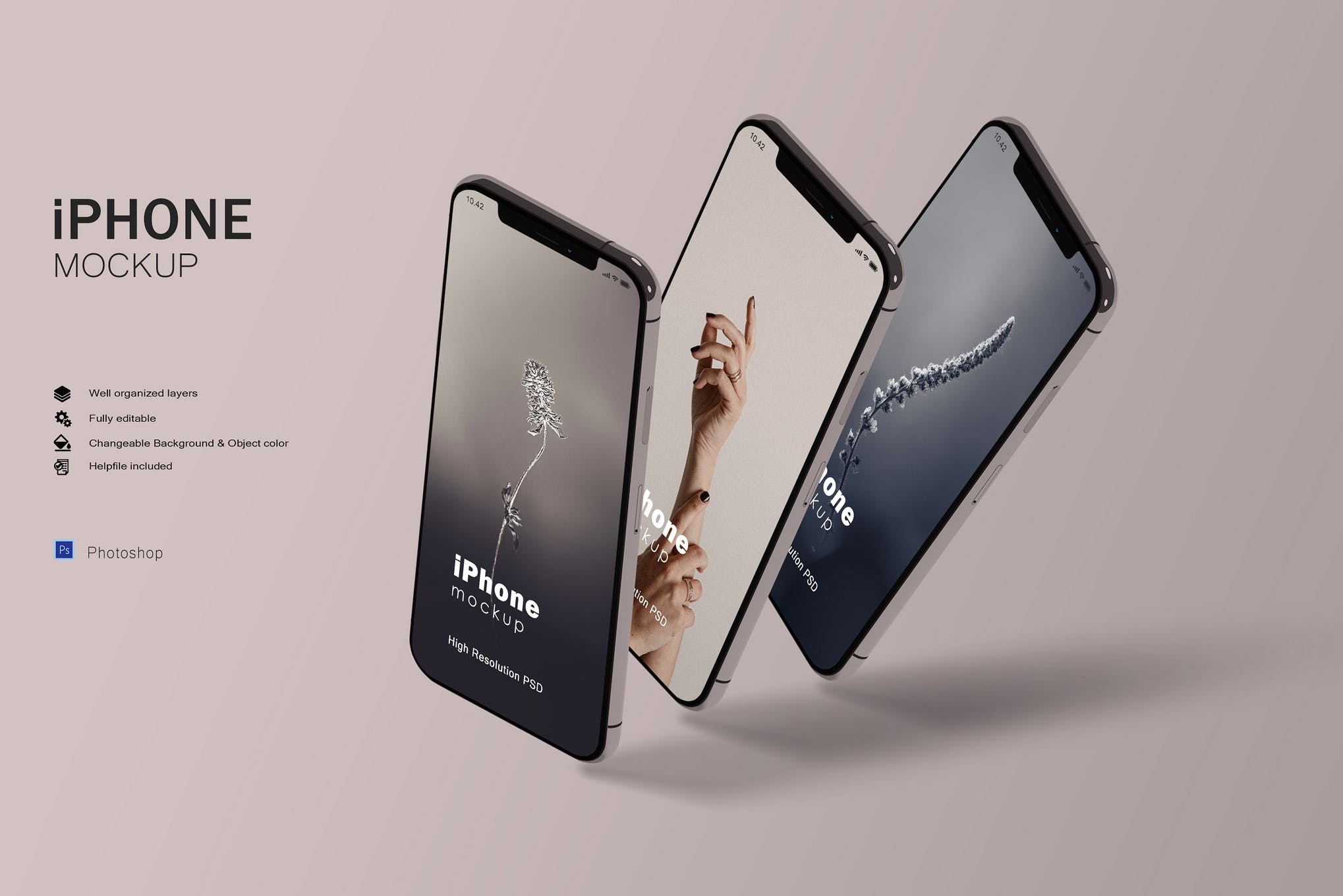
Stylish iPhone Mockup Template

Impress your clients with this stylish iPhone mockup template that has everything you need to make your project look realistic. It features well-organized layers, changeable background and object color, and a lot more.

iPhone 12 Isometric Mockup Template

Check out this fantastic isometric mockup template for iPhone 12 that will help your designs stand out. It comes in high-resolution and allows you to tweak the color, and graphics with just a few easy mouse clicks.

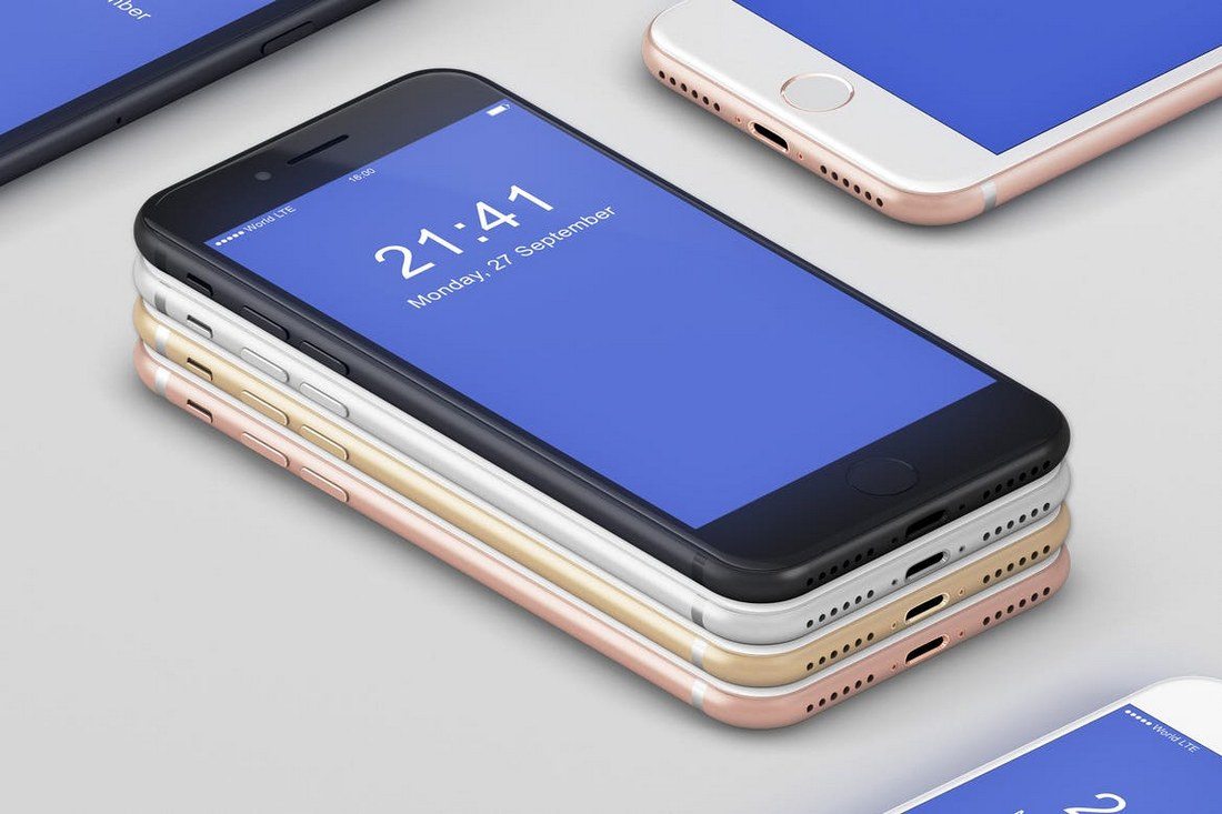
iPhone 8 Mockup

A customizable mockup template featuring a stack of iPhone 8 devices. The specialty of this mockup is that it allows you to turn on and off many of its features, including fingerprints, glowing display, shadows, change backgrounds, and much more.

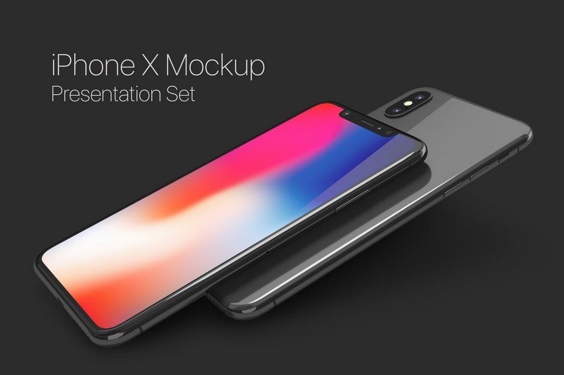
iPhone X Mockup Set

Yet another professionally designed iPhone X mockup featuring a tilted perspective of the new smartphone. This mockup pack also comes with 9 different scenes you can use with your various design projects from website design to product showcases and more.

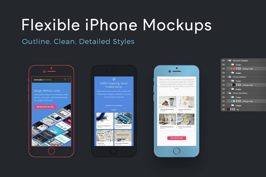
Flexible iPhone Mockups

Mockup templates usually feature limited customizable features. This one is an exceptional mockup that comes with flexible features, which even allows you to change the color of the device to your preference.

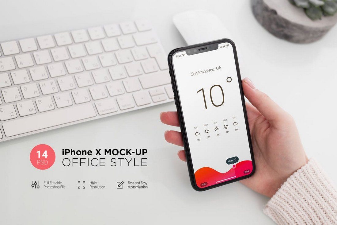
iPhone X Mockup Office Style

A pack of iPhone X mockups featuring an office environment. This mockup will come in handy for showcasing your designs and projects related to creative and business work. It includes 14 different mockup PSD files.

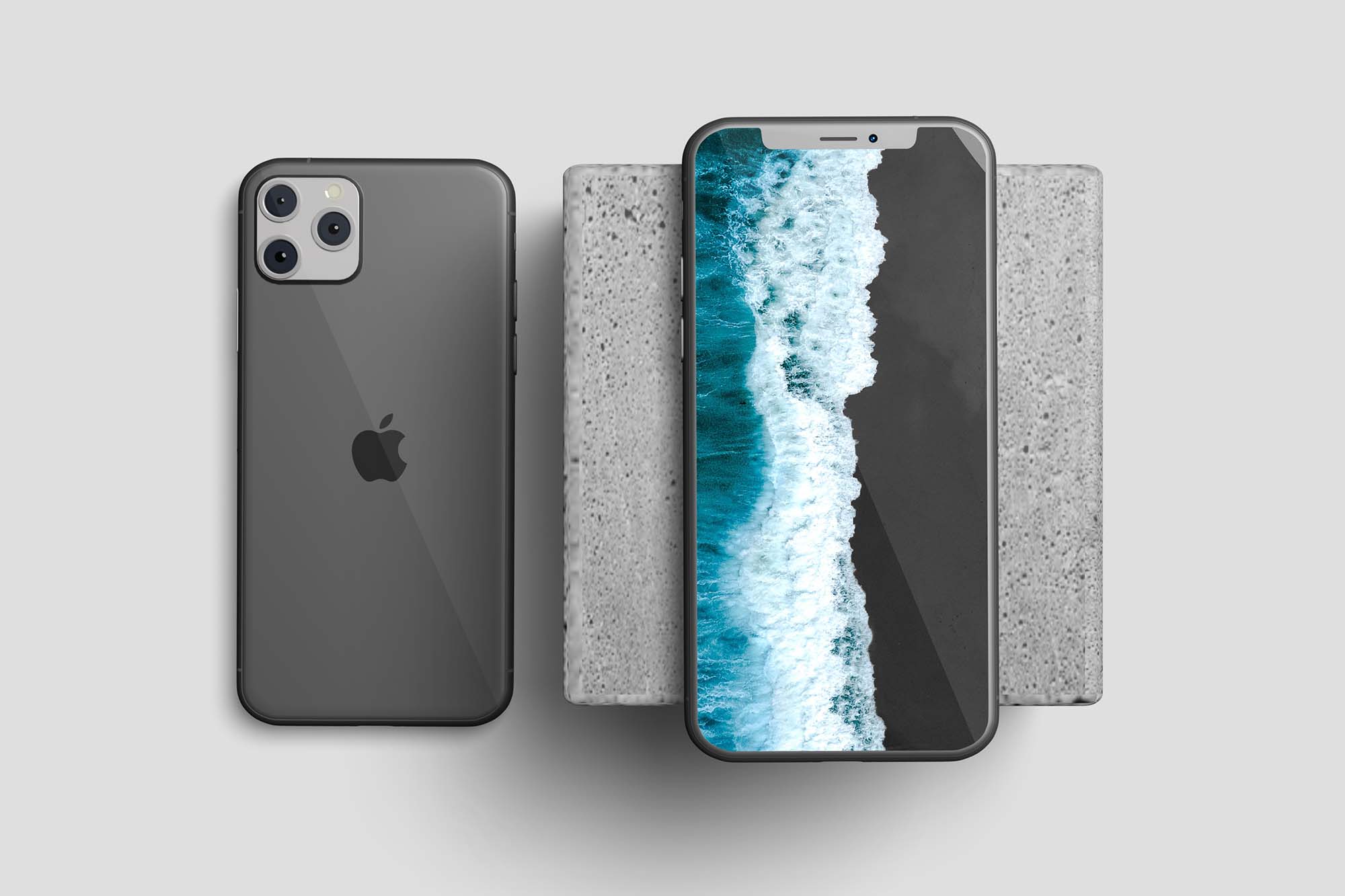
Free iPhone 11 Mockup Template

Next up is a treat for all visual designers out there. This iPhone 11 mockup template comes with 2 scenes with different perspectives and views. The iPhone is placed on a concrete slab. The best part is that the template is available for free download.

iPhone X – 4K Mockups

The iPhone X mockups in this bundle come in 4K resolution. They’re perfect for print campaigns and high-resolution website designs. The PSD file also comes fully layered for easy customization.

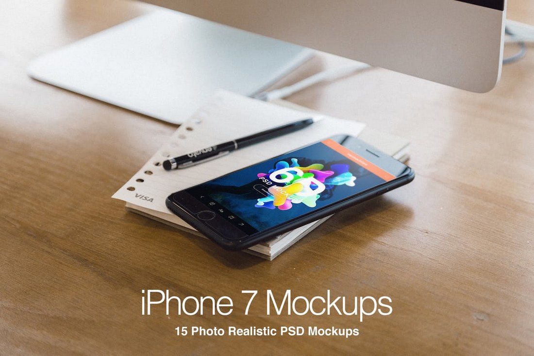
iPhone 7 Plus Realistic PSD Mockups

A set of highly creative iPhone 7 mockups that features a beautiful and a creative environment. This pack comes with 15 different PSD mockup files featuring different scenes and perspectives of the device.

iPhone 7 Plus Mockup 6

This mockup features a natural background of a coffee shop environment. It’s ideal for presenting your website and other types of designs related to restaurants, coffee shops, and hotels.

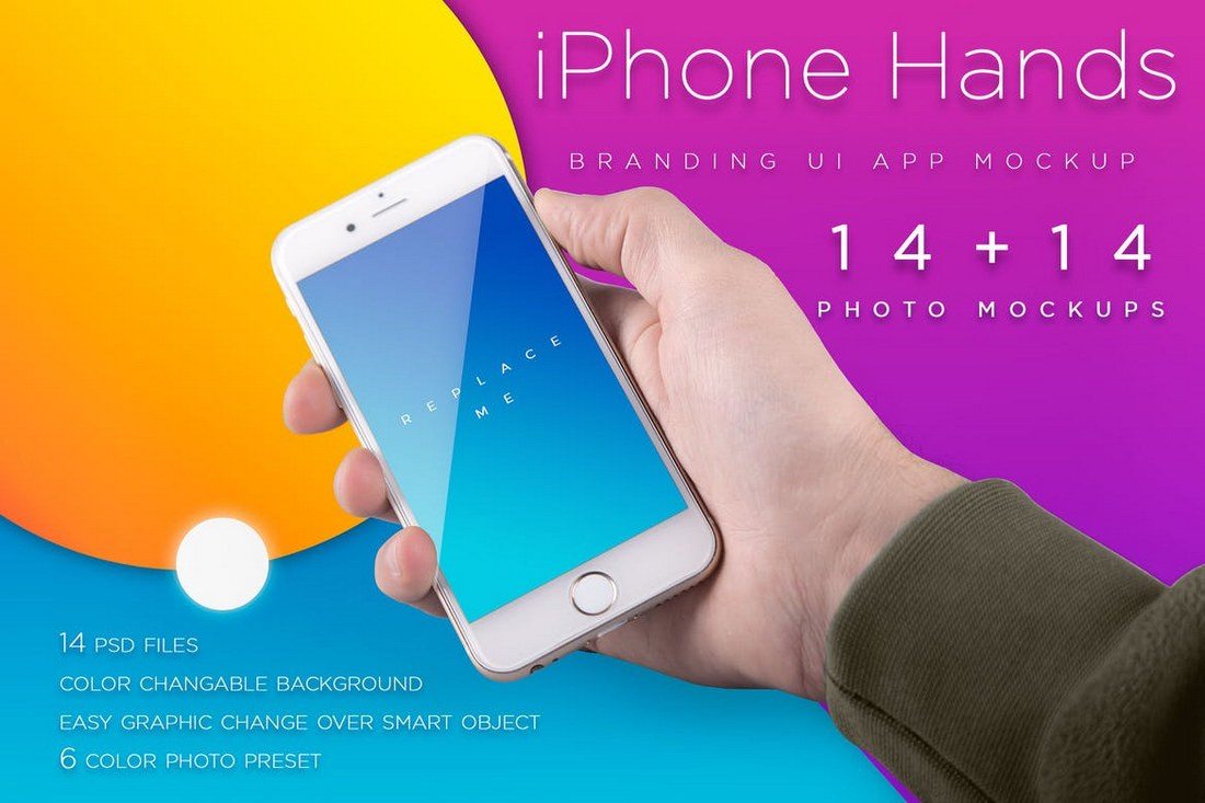
Colorful iPhone Mockups With Hand

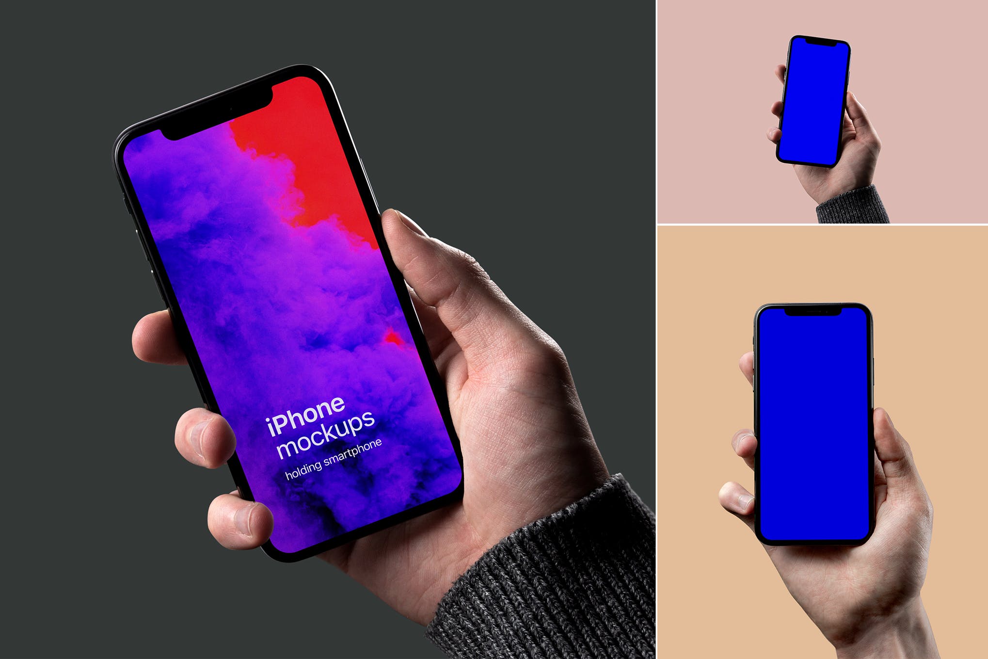
A bundle of 14 iPhone mockups that shows the device being held by a hand. These mockups also come with 14 colorful backgrounds as well as retina-ready resolution.

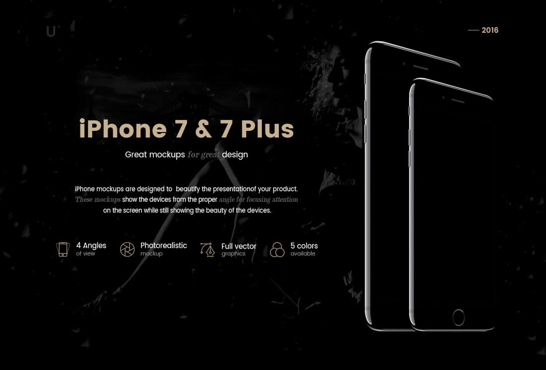
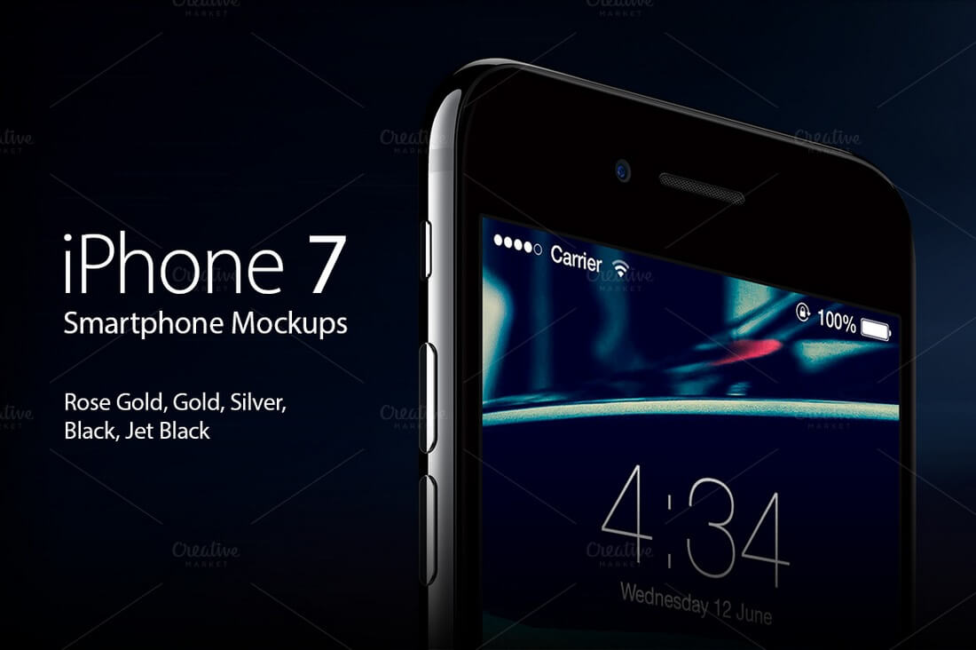
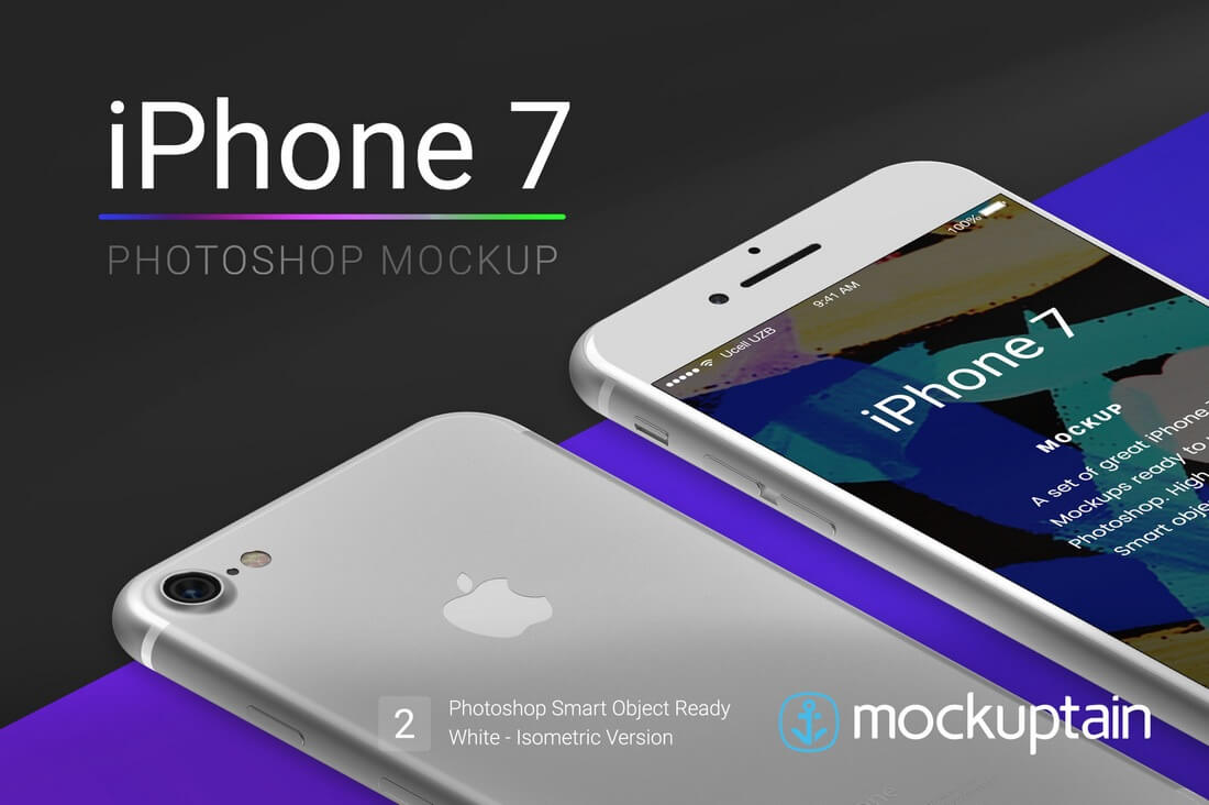
iPhone 7 & 7+ Mockups

iphone-7-7-plus-mockups

You’ll find mockups for both iPhone 7 and iPhone 7 Plus in this bundle, in all 5 colors (Jet Black, Black, Gold, Rose Gold, Silver). The bundle includes 15 PSD files featuring 4 different angles of the devices.

iPhone 7 Mockups Pack

iphone-7-mockups-pack

This bundle includes mockups of the new iPhone 7, featuring all 5 colors and 4 different views of the device along with a few ready-made combinations.

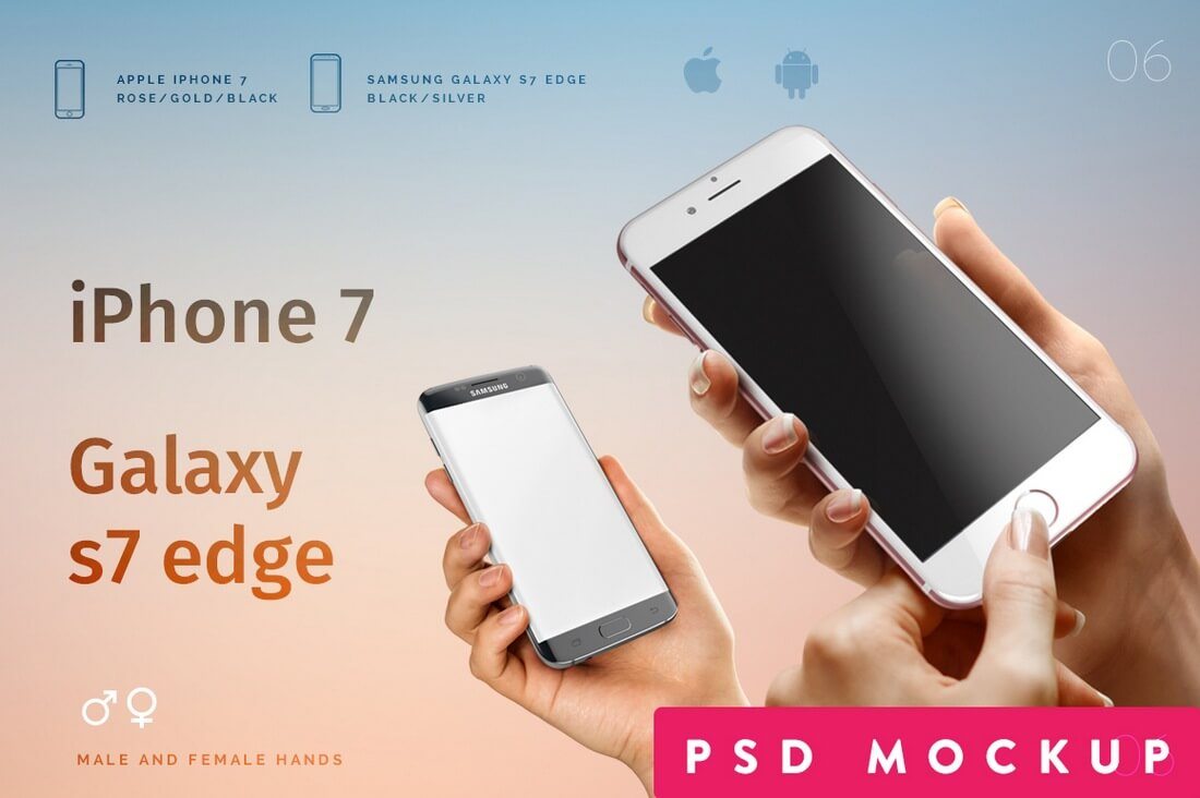
iPhone 7 / Android S7 PSD Mockup

iphone-7-android-s7-psd-mockup-06

If you’re promoting an app or a product that works on both iOS and Android platforms, this mockup will definitely come in handy because it includes both iPhone 7 and Samsung Galaxy S7 mockups, in 8 different variations.

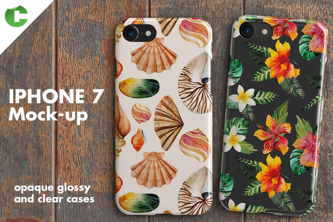
iPhone 7 Case + Device Mock-Up

iphone-7-case-device-mock-up

Another beautiful iPhone 7 case mockup, featuring all 5 color variations and changeable background.

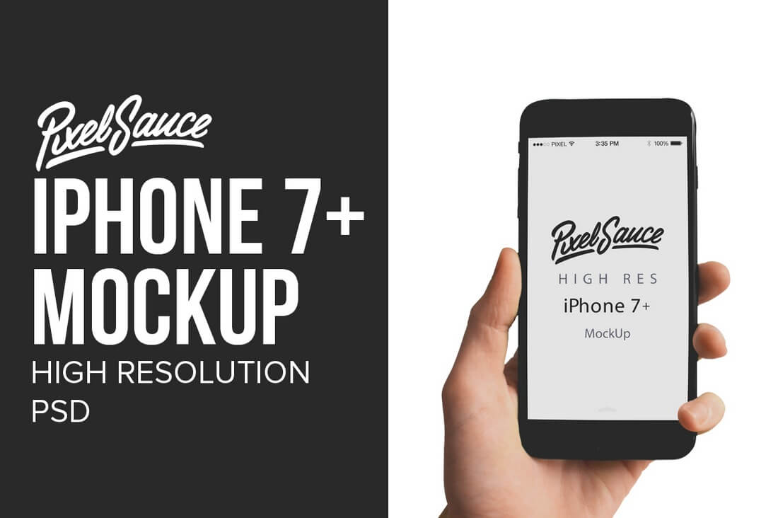
iPhone 7+ Mockup – High Resolution

iphone-7-mock-up-high-resolution

A high-resolution iPhone 7 Plus mockup that will fit in with almost any type of a background.

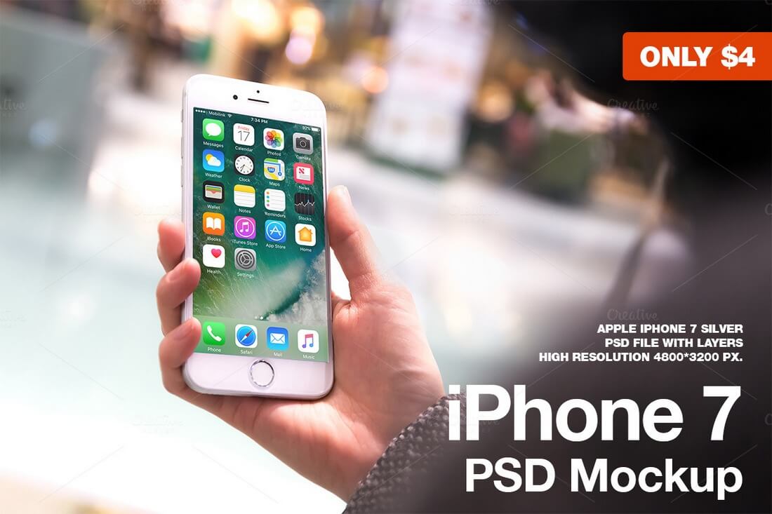
iPhone 7 Silver PSD Mockup

iphone-7-silver-psd-mockup

This realistic iPhone 7 mockup features the Silver color model of the latest Apple handset.

iPhone 7 Mockup Flying Black

iphone-7-mockup-flying-black

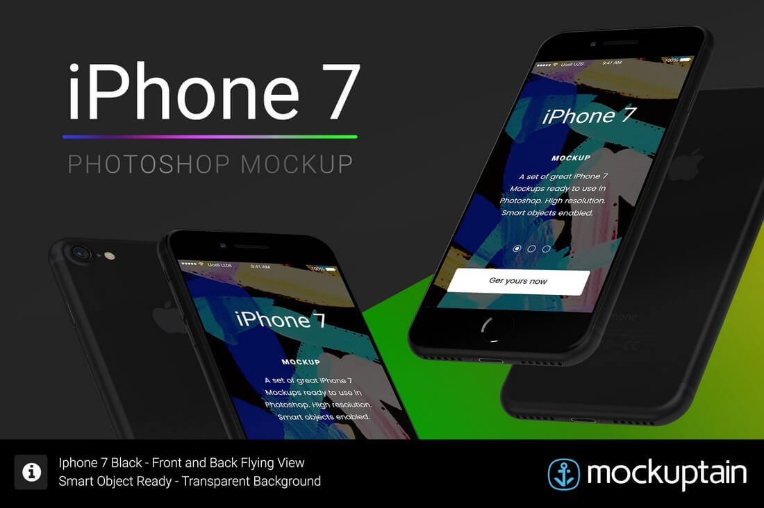
A stylish mockup of the true black iPhone 7, including views of both front and back of the device.

iPhone 7 Mockup

iphone-7-mock-up

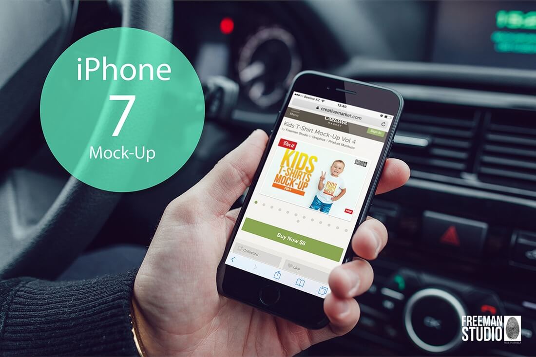
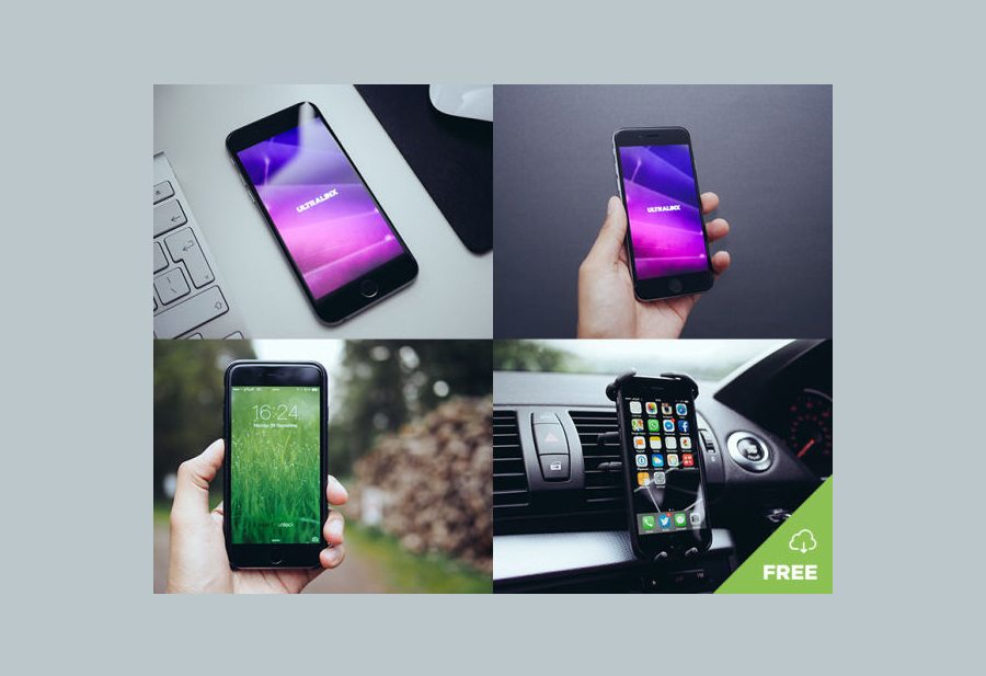
An iPhone 7 mockup pack featuring 7 templates, including outdoor and in-car environments.

iPhone 7 Jet Black Mockup

iphone-7-jet-black-mockup

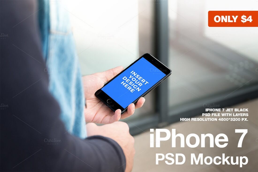
This mockup showcases the iPhone 7 as it’s being held by a man.

iPhone 7 Duo Mockup

iphone-7-duo-mockup

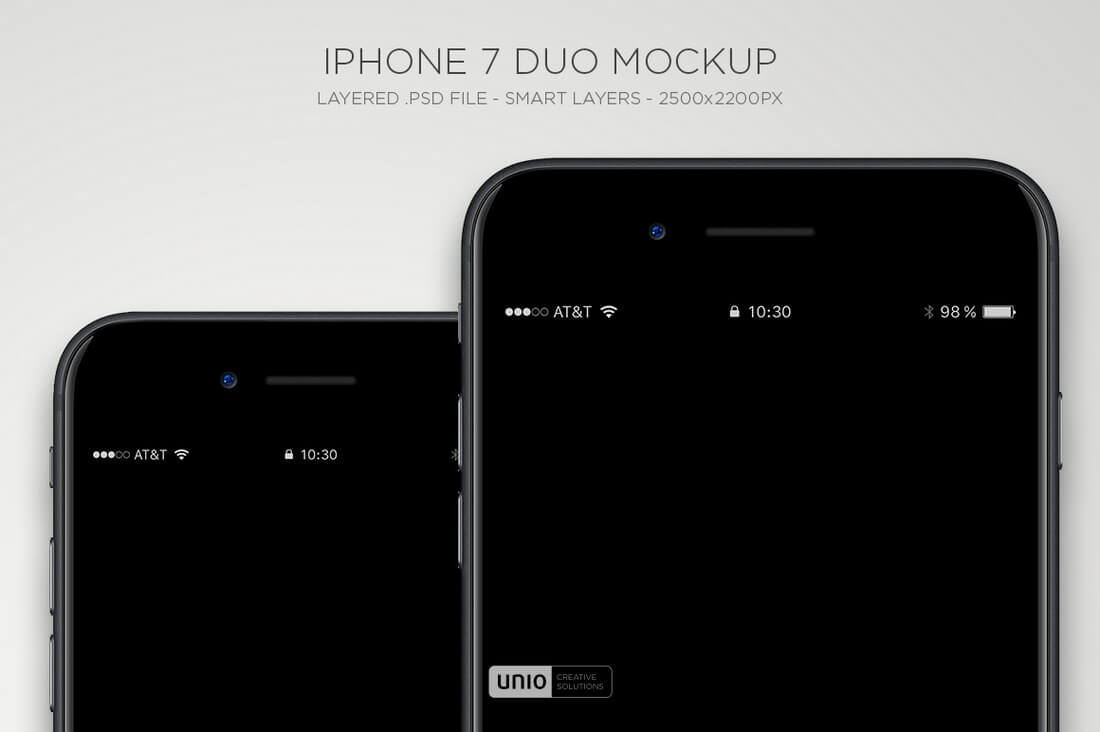
This mockup bundle includes PSD mockups of the both iPhone 7 and 7 Plus, with the ability to turn on or off shadows and reflections.

iPhone 7 Mockup Isometric White

iphone-7-mockup-isometric-white

An iPhone 7 mockup that looks perfect for UX design and web design projects.

iPhone Office Work Station Mockup

uxplmn5cxgsf3wl2camo6ocdvm8bojvncjmndyink6gvaxtl37grfyqs9vusyu8a-o

A gorgeous photo of a home office workstation, complete with Keyboard, Phone, Headphones, Stationary and Office Supplies.

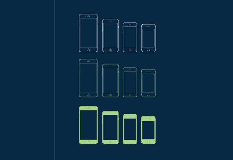
iPhone Vector Templates

1 (1)

Simple outline iPhone Mockups. What else can we say? Beautiful, simple, and sleek.

8 Natural iPhone Mockups

1 (1)

There are eight different mockups in the ZIP file for you to download and put your screenshots on, from a vareity of different scenarios and settings.

I Used AI to Create a Marketing Plan 2 Ways — Here’s How You Can Too

Featured Imgs 23

The prevalence of artificial intelligence (AI) has many concerned about job security.

AI writing, AI images, AI videos — while the final products are far from perfect, they raise the question of what jobs AI could eventually replace, even if we don’t want them to.

But, heck, if AI can create a marketing plan for me, I say, "Welcome to the team!"

Download Now: How to Use AI to Create a  Marketing Plan

A marketing plan is a foundational piece of any marketing strategy. It keeps businesses organized and focused on their goals. However, with all the details it should consider and capture, it can be extremely time-consuming and tedious to put together.

That’s where I’ve discovered AI can help.

After years of researching and compiling documents by hand, I recently used AI to create a marketing plan to see what it could deliver. Let’s break down the steps I took, how the plans turned out, and how you can replicate them.

Why use AI to create a marketing plan?

We at HubSpot probably sound like a broken record by now, but AI can help marketers work smarter, not harder.

Don’t get me wrong — plagiarism, bias, data insecurity, and poor quality are all concerns when generating content with AI. But when it comes to planning and research? The tools can save massive amounts of time and money.

In fact, one of our recent studies found that 75% of marketers say AI and automation help them spend less time on manual tasks like research.

AI assistants like ChatGPT, Gemini, and even HubSpot’s Breeze perform research and optimization in real time.

The speed at which they can pull information from multiple data sources just isn’t humanly possible. Add in tasks like data analysis, calculations, and formatting, and it’s no wonder marketers report getting 12.5 hours back weekly.

By using AI to create, or at least draft, your marketing plan, you can spend less time and money planning and more actually executing.

Now, speaking of spending less time on planning, enough of this background info. Let’s get to the real action.

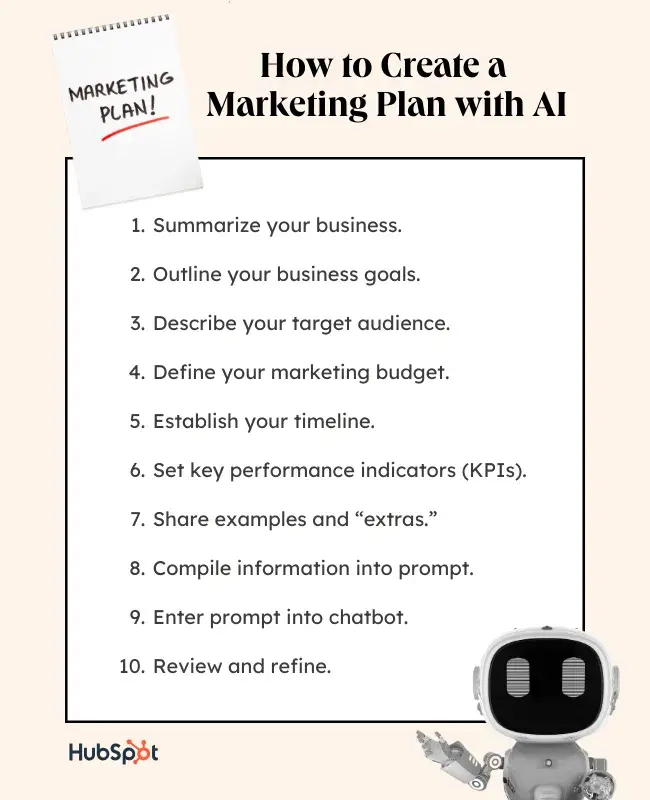
How to Create a Marketing Plan with AI

I tested two AI tools and approaches for creating a marketing plan: a chatbot and a generator.

Below, I’ll break down my process into specific steps and share my thoughts on how they did, along with some tips I learned along the way.

Creating a Marketing Plan with a Chatbot

Graphic listing the steps for creating a marketing plan using an AI chatbot

A few months back, HubSpot’s Kieran Flanagan and CMO Kipp Bodnar used ChatGPT to create a marketing plan for the Marketing Against the Grain podcast.

I used this as my jumping-off point.

As they discussed, the quality you get from a chatbot or AI assistant like ChatGPT depends on the quality of your prompt. It’s like your creative brief.

You can’t talk to AI like a search engine with incomplete sentences and keywords.

Instead, you want to speak to it like you would another person. Give your chatbot the same detailed information you would give your intern or freelancer to complete a task.

Most of the steps described below are focused on doing just that.

1. Summarize your business (i.e., Your product, company, unique selling points).

To quote one of my favorite Bollywood movies, “Who are you?”

Gif from Hindi film Kabhi Khushi Kabhie Gham depicting Kareena Kapoor saying “Who are you?”

Before AI could develop my marketing plan, it needed to know what it was marketing and who exactly my company was.

What I included: Following Bodnar and Flanagan’s lead, I kept it simple, including being “head of marketing for a technology company that sells a SaaS product for Sales Teams.”

But this is really the bare minimum a tool needs to know about your company to craft a marketing plan. To get the best results, you’ll want to dive into:

  • Your product/offering
  • What makes it different (specific features, capabilities, etc.)
  • Company mission
  • Company values

Pro tip: You may even want to provide a SWOT analysis or competitive analysis so the AI knows the full scope of what you’re dealing with. No information is too much.

For example, I borrowed this market information from Flanagan to include in my prompt:

“The market is getting crowded; there are a lot of apps with similar features. I also have to be concerned that the CRMs we integrate with will build the feature when they see its popularity grow. This means I need to scale demand and the product fast to take advantage of the opportunity.”

2. Outline your business goals.

What is your marketing team working on? What is it trying to achieve? Document these goals so your AI tool knows what all its suggestions need to work toward.

Use the SMART framework for goals — in other words, make sure they are specific, measurable, attainable, relevant, and time-bound. This leaves less room for ambiguity in whether you accomplished what you were supposed to.

For example, in the past, I’ve seen clients try to set vague goals like “Increase my presence on TikTok.” But a SMART version could be, “Increase my TikTok following by 30% by June.”

Notice the difference?

In the first, “presence” could mean posting more videos, attracting more followers, or even getting more views. The SMART version makes it clear the focus is follower count.

What I included: “The goal of the marketing plan is to close 5000 new customers in the next 12 months.”

Pro tip: Including your average conversion rates and buyer behavior can help AI better understand your sales cycle and determine which strategies will be more effective for you.

For example, I added this line, “Assume the conversion rate from traffic to customer will be 5%, which means I'll need roughly 100,000 website visits. “

3. Describe your target audience.

Who is your buyer? Who does your marketing plan need to reach? AI needs to know this information to ensure its strategic suggestions align.

You can share a full buyer persona with your AI tool, but at the least, you want to include the following in your prompt:

  • Age
  • Location
  • Company, job title, industry (if B2B)
  • Goals
  • Personal challenges
  • Pain points you solve

What I included: “Our audience is primarily sales reps at small-to-medium-sized businesses. Their teams are usually small, with 2-4 reps on the team total. They are concerned with meeting their sales goals, prioritizing the right prospects, and streamlining their sales process. Our CRM offers automation and data enrichment tools to make this easier.”

4. Define your marketing budget.

This point is pretty straightforward — How much can your company spend on your marketing plan to achieve your goals? Defining your market budget in your prompt gives the chatbot parameters to work with.

You know, so it doesn’t suggest running a Super Bowl commercial or recruiting Beyonce as a celebrity ambassador.

What I included: “Our marketing budget is $10,000 for the year. Cost-effectiveness is a top priority.” I added the second line to clarify that while I have this total to spend, I want it to be distributed in proven areas.

5. Establish your timeline.

Like your budget, your timeline gives your chatbot further direction on what suggestions are plausible and which aren’t.

For example, if your timeline is only one month, it wouldn’t make sense to suggest leaning into SEO and blog articles, as those can take months to gain traction.

What I included: My timeline of “12 months” was established in my goal and referenced throughout my prompt.

6. Set key performance indicators (KPIs).

How will you track and report on your success? Some company stakeholders expect to see specific data. If so, your prompt is your chance to loop your chatbot in on this expectation.

But if you don’t include them, it’s not make or break.

Usually, KPIs are linked to your tactics and strategies. So, if you’re waiting to see what our marketing plan suggests to set metrics, no worries.

Pro tip: You can also ask the chatbot to suggest KPIs based on its proposed strategy.

What I included: I left KPIs out of my prompt so ChatGPT would focus on tactics and strategy.

7. Share examples and “extras.”

Do you have specific campaigns you admire? How about marketing frameworks like StoryBrand or thought leaders like Ann Handley or Neil Patel?

Once again, sharing these examples with your chatbot in your prompt helps it understand what you’re looking for from your marketing plan.

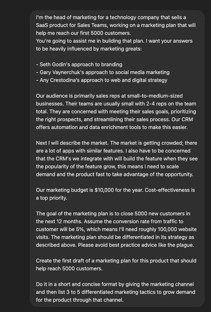
What I included: I added to my prompt: “I want your answers to be heavily influenced by marketing greats:

  • Seth Godin's approach to branding
  • Gary Vaynerchuk's approach to social media marketing
  • Andy Crestodina’s approach to web and digital strategy”

You can also take this time to add what I call “extras” to your prompt.

For instance, Flanagan made it a point to tell ChatGPT that he didn’t want to see best practices. You can mention if there are specific channels you want to include or exclude, or maybe even global holidays.

8. Compile information into a prompt.

Once you’ve got all the pieces from steps 1-9, compile them into one prompt. Make sure that it’s conversational, and each sentence is short and precise.

Screenshot of my prompt for creating a marketing plan with ChatGPT

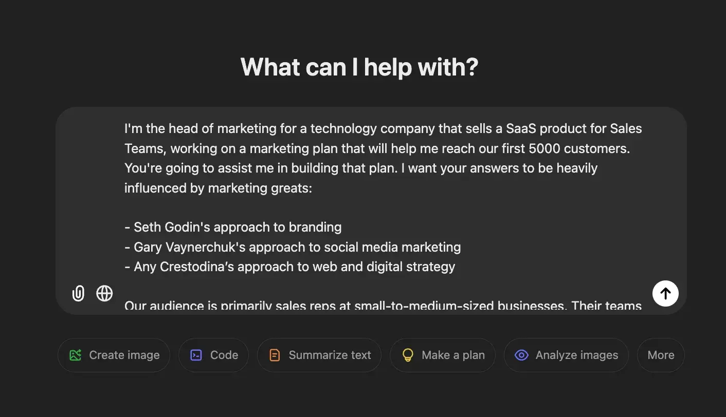
9. Enter the prompt into a chatbot.

Screenshot of marketing plan prompt being entered into ChatGPT

10. Review and refine.

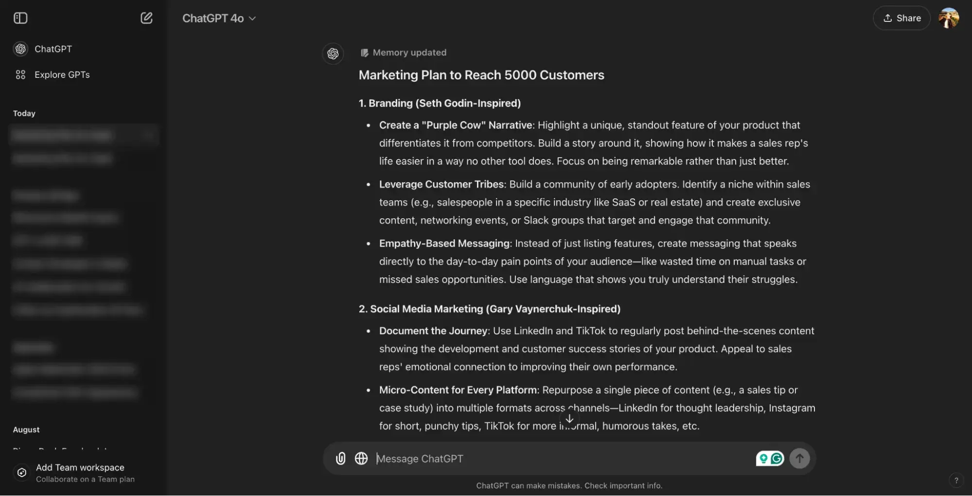
Once you get your results (like mine below), you can use this as a first draft to elaborate on or ask for edits.

Screenshot of ChatGPT’s response to my marketing plan prompt

Flanagan asked ChatGPT to flesh out specifics about the suggested campaigns and tactics and make them more actionable. Remember, ChatGPT is like your intern or freelancer. Refine and clarify until the finished product meets your needs.

Honestly, I wasn’t super impressed by the results I got from my initial prompt.

The answers were quite similar to what Flanagan and Bodnar got which goes to show you, how generic your results can be if you don’t give specific details about your business.

But perhaps if I made follow-up requests like they did in the podcast episode, I could have uncovered some unique gems.

What did I like about this AI marketing plan?
  • Easy to skim through the ideas
  • Clearly considered my examples and requests
  • The conversational nature of the chatbot made it easy to use.
What could be improved?
  • Suggestions were fairly generic
  • It takes iterations to get more detailed and specific results
  • Putting together the creative brief is very time-consuming
  • Formatting is informal
Who is this best for?

Small-to-medium-sized marketing teams that need help brainstorming strategies but don’t necessarily need anything cutting-edge.

By the way, marketing plans aren’t the only things ChatGPT can do with the right prompt.

Our free guide, How to Use ChatGPT at Work,” talks through some of the most effective use cases and shares over 100 prompts you can use immediately.

Marketing Plan Generator

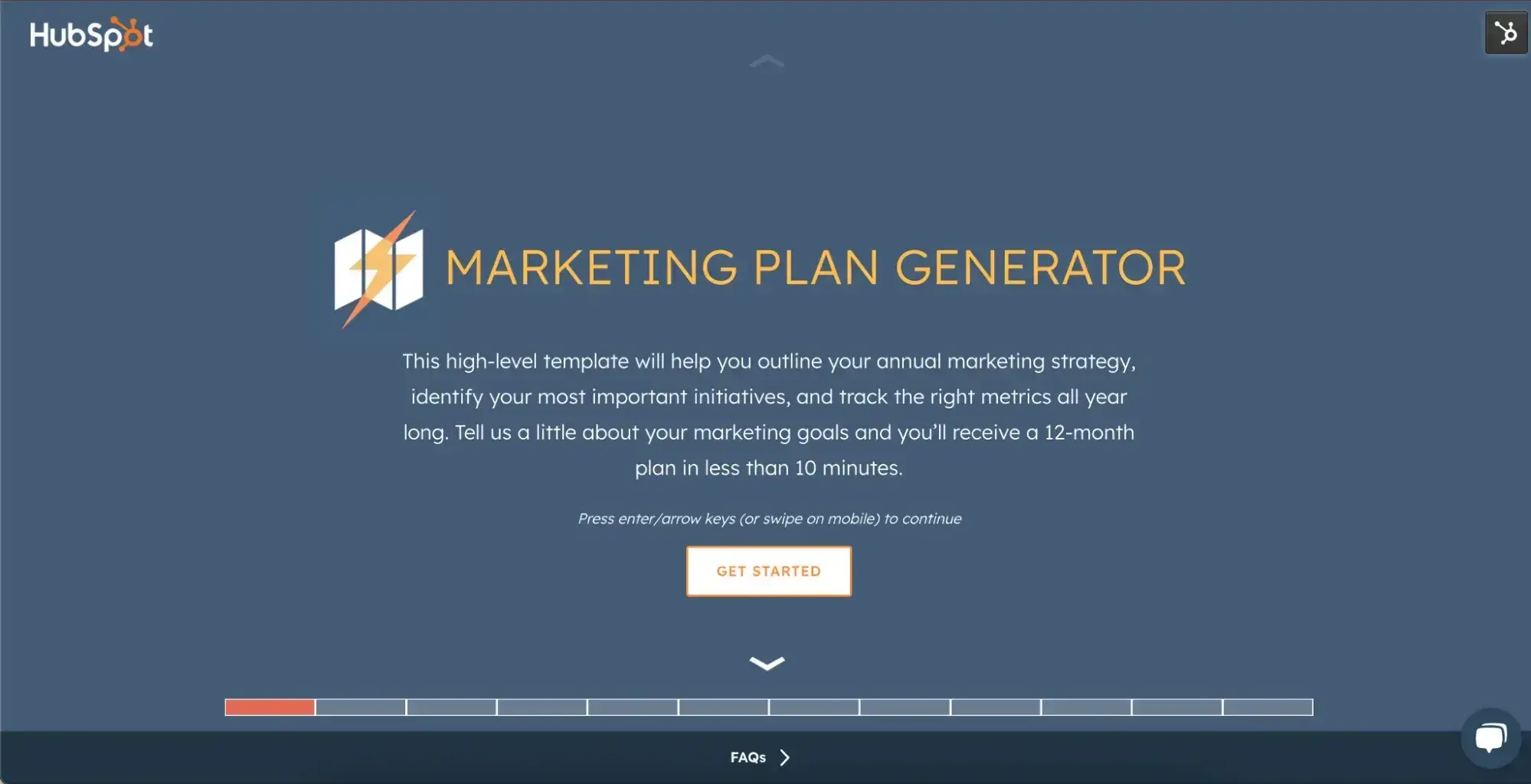
After ChatGPT, I tried HubSpot’s AI-powered Marketing Plan Generator.

Screenshot of HubSpot’s marketing plan generator

Try our free Marketing Plan Generator here.

Here, I still needed all the information we discussed above ready to go, but this tool did a great job of simplifying the compilation process and formatting it into a neat little document.

Rather than putting together an instructional prompt, all I had to do was ask a few questions. (I was essentially copying and pasting the details from earlier.)

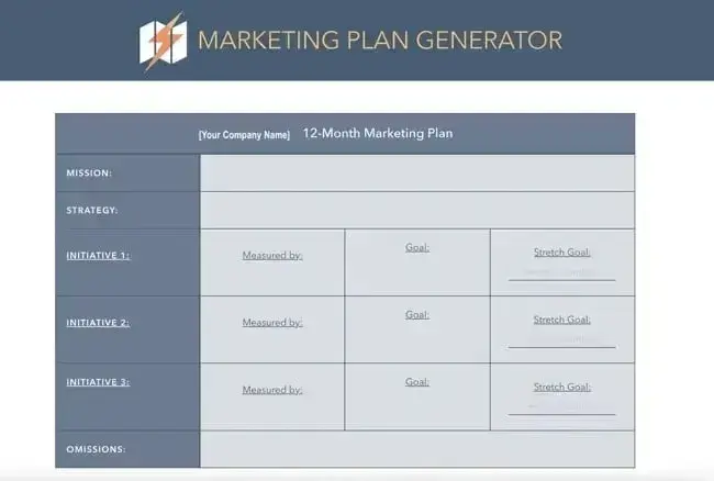
Then, the tool delivered a one-page document with a yearly marketing plan along with priority and strategy suggestions based on the goal I entered.

The document (shown in the image below) makes it easy to review the marketing plan at a glance and share it with teammates and stakeholders.

Screenshot of a sample marketing plan HubSpot’s marketing plan generator would produce

Pro tip: This AI marketing plan generator does a lot of formal formatting for you, but the quality it delivers is only as good as the information you give it to work off.

Before you use the generator, sit down and flesh out your:

  • Marketing mission statement: This is what your marketing is focused on for the year.
  • Strategy: What are you doing to reach your goals?
  • Marketing Initiatives (i.e., brand awareness or building a high-quality pipeline)
  • Target Goals (i.e., generating 100 leads per week)
  • Metrics

The tool will ask you about these things, and it’s better to consider them before making them up at that moment.

What did I like about this AI marketing plan?
  • Easy to skim one-page document
  • Form eliminates the stress of knowing how to write a good prompt
What could be improved?
  • More detailed strategy/suggestions
Who is this best for?

Businesses short on time or those new to creating marketing plans who want a starting point. It’s also great for those who haven’t mastered the art of chatbot prompts. (I’m still working on this, too.)

Final verdict: Treat AI like a running start.

These are just two of the ways you can create a marketing plan using AI. In fact, there are many other tools dedicated specifically to this need. However, no matter which you choose, remember to treat any results as a first draft.

Artificial intelligence only knows as much about your company, product, and audience as it’s been told. It doesn’t have your team’s first-hand experience or knowledge.

So, treat any results as a brainstorming tool and something to elaborate on.

Right now, AI can only give you a running start; it can’t take you to the finish line.

Jade Walters is Creating Opportunities for Students of Color on LinkedIn, Here’s How [+ Pro Tips for Gen Z]

Featured Imgs 23

Welcome to Breaking the Blueprint — a blog series that dives into the unique business challenges and opportunities of underrepresented business owners and entrepreneurs. Learn how they’ve grown or scaled their businesses, explored entrepreneurial ventures within their companies, or created side hustles, and how their stories can inspire and inform your own success.

Jade Walters is, easily, the Queen of Gen Z LinkedIn. And if you want to know why, taking a glance at the array of content on her early career resource platform, The Ninth Semester (also accessible through Instagram, TikTok, Apple Podcasts, and LinkedIn), will corroborate this claim.

Download Now: 101 Professional Networking Tips

Jade has spent the last year independently building up her LinkedIn following, making early career opportunities more visible for young professionals, specifically first generation students of color.

I had the honor and privilege of chatting (and gabbing, really) with her about pretty much everything LinkedIn-related, from developing the Ninth Semester to how Gen Z students of color can easily utilize LinkedIn as their secret weapon for securing jobs and connections.

In this article, I’ll share my takeaways from Jade’s playbook and suggestions for how emerging professionals can overcome the daunting landscapes of internships, networking, and rejection.

Let’s get into it.

Table of Contents:

How Jade Walters Helps Gen Z Get Hired

“I wanted a seat at the table… and no one would give me a seat, so I created my own table.”

When Jade and I hopped on Zoom for our conversation, one of the first things she said was that “helping Gen Z get hired” has always been the core of her mission, vision, and brand as an early career and recruitment specialist.

Of course, this authentic and steadfast commitment comes from adversities she’s faced — and overcome — all on her own.

Like much of Gen Z, Jade started on an untraditional, non-linear career path. She got her Bachelor of Arts degree from Howard University in Maternal and Child Health, but once her undergrad concluded, she found herself experiencing a career pivot.

Eventually, that limbo period led to an unexpected union between personal reflections she’d already been sharing (via her personal blog) and her affinity for early career recruiting.

Although Jade graduated a few years ago, much of Gen Z’s attitudes around jobs, post-grad life, and overcoming the competitive job market, has not changed. If anything, anxieties have heightened, making Gen Z’s race to the finish line even more frenzied.

According to the Class of 2025 Big Dreams, Bigger Challenges Report from Handshake, 63% of upcoming graduates revealed that competition for employment contributes to feelings of pessimism.

Additionally, of students who are pessimistic about starting their careers, 54% cite concerns about job security and 45% cite concerns about insufficient benefits and compensation.

recent data from handshake about gen z feeling anxious about job difficulty and the job market in 2024

Source: Handshake

The Big Dreams, Bigger Challenges Report also revealed that going to college is (shockingly) not enough to stand out in today’s job market; students must go above and beyond to get noticed by the right employer.

62% of students are working part-time during their senior year and 61% are pursuing an internship during it, too.

recent data from handshake about gen z feeling overwhelmed by the competitive job market in 2024

Source: Handshake

Nevertheless, Walters has seen the impact of all of this data with her own eyes, specifically via her LinkedIn audience which has a (very calm) 90,000 followers. “I realized there weren’t a lot of resources for early career professionals,” she told me.

jade walter's linkedin account

When Jade started out, she was applying to roles related to recruitment, but because of her educational and professional background, did not hear back about most of those roles.

She eventually carved her own lane in this space and has now paved the way for other early career content creators (e.g., Taylor Falls, Morgan Young) to do the same.

“I wanted to be the solution for a problem that I was having. I wanted to help others that were in my same shoes not have to struggle the way that I did,” she said.

Now, Jade dedicates most of her LinkedIn presence to sharing ways that Gen Z, specifically young professionals of color, can secure internships, grow their skill sets, and eventually get hired full-time.

a linkedin post from jade walters about 25+ career development opportunities for high school students and college underclassmen

How to Find Early Career Opportunities Through LinkedIn

When I asked Jade about the best ways for Gen Z to discover and acquire internships, externships, jobs, and networking opportunities, she put her answer plainly:

“I was that person who just used to log into LinkedIn to update my job experiences, talk about new accomplishments. But within the last year, I’ve noticed that there’s a lot of value in the [additional] content that people share [outside of just those things].”

These days, if you want to make the most of LinkedIn, per Jade’s advice, you’ve got to do more than just post a new job update and keep your work experiences fresh.

Here are a few of Jade’s recommendations for growing a strong community on LinkedIn:

1. Post as much as you scroll.

Jade says that you should post on LinkedIn just as often as you scroll through your feed.

“You can no longer just show up and post about your new job. You need to spend at least 15 minutes scrolling through, seeing what people are talking about, and catching up with industry facts and feelings,” she affirmed.

And she’s right. When Jade mentioned this, I was quickly reminded of my own progression on LinkedIn. When I first started taking the platform more seriously, I was simply sharing things that I thought should live on LinkedIn.

If I got a new internship? I’d post about it. If I completed a large-scale project for my college org? I was drafting an announcement as if it were a press release. It all made sense… until I saw another side of LinkedIn (aka “cool LinkedIn”).

You see, on cool LinkedIn, young people like me were talking about viral trends and sharing their one-of-a-kind perspectives on their internship experiences and all things Gen Z.

a funny linkedin post featuring a bunny rabbit posted by a gen z linkedin user

a funny linkedin post featuring a bunny rabbit posted by a gen z linkedin user

When I found this out, I was not only astounded but motivated to start doing the same. Even more so, seeing Jade’s content inspired me to start platforming my own gospel.

Now, I’m gradually working towards building a following based on creating content that speaks to all of me: my passions, humor, even what I’ve learned thus far in my (very early) career.

a post from jeanie thompson's linkedin account

So, if you’re looking for ways to keep your timeline fresh and connections strong on LinkedIn, be sure to interact and engage with the app in a meaningful way. What you put in is what you get out.

Pro tip: Translating your experiences and/or advice into various kinds of content creation — whether that be short-form video content or social media design – will definitely catch eyes on LinkedIn. You just need to find your personal branding “sweet spot” and run with it. Since starting my own journey, this has looked like offering '#jeanius' advice to my followers. 

2. Take advantage of self-paced education resources.

When it comes to filling in the gaps of experience or getting free learning, Jade suggests to get it in where you can fit it in.

“When I wanted to learn about early career and university recruiting, LinkedIn Learning was one of the first places I went. I was like, ‘Let me learn some realistic stuff, like, vetted by professionals.’”

Also, LinkedIn Learning is just a starting point. I cannot stress how resourceful companies like Extern and Parker Dewey are, especially for young Black/Brown professionals and students of color seeking to build up robust, real-world work experience.

extern's website and some opportunities that gen z students can apply to

Both Extern and Parker Dewey offer free access to paid short-term programs and micro-internship opportunities for college students across the country, for those enrolled in four-year institutions, community colleges, even historically Black colleges/universities (HBCUs).

All you have to do is ensure that you meet a program’s criteria and apply.

parker dewey's website and some opportunities that gen z students can apply to

Pro tip: HubSpot is partnered with Parker Dewey for its very own AI Bootcamp Program and LinkedIn Ambassador Program. As a Caribbean-American first-generation college graduate, this program (and anything offered through Parker Dewey) was extremely instrumental in helping me secure multiple internships and, eventually, my first full-time job.

3. Don’t be afraid to niche down, folks.

“I have mixed feelings and emotions about the different softwares coming up where you can send, like, 200 applications in one click. There’s always this question about whether or not it's a numbers game, and I do agree, it is a numbers game when it comes to applying for jobs but … it also needs to be strategic,” Jade says.

When applying for jobs, internships, or any sort of early career role, Jade recommends that folks figure out two things: exactly what opportunities they’re looking for and what opportunities suit their current background.

She told me: “For example, sometimes people just apply to things [that have ‘marketing’ in title]. They’re applying to campus marketer roles, email marketer roles, influencer marketing roles… but their resumes don’t reflect that.”

Jade says that looking for the right job/internship is simply like going to a restaurant: “You don’t just go like, ‘I want a burger.’ You pick something from the menu. You have to be intentional. So, let’s say you want to work in marketing. Okay. But what type of marketing? Influencer marketing? Copywriting? Social strategy? Once you narrow it down, you have a dream wish list.”

How to Use LinkedIn for Networking and Internship/Job Hunting

At the end of our conversation, Jade and I got into a rich discussion about the ways in which young people like me can use LinkedIn exclusively for networking and internship/job-hunting purposes.

As the job market gets heated and applicant tracking systems (ATS) become increasingly more difficult to surpass, Gen Z can’t just apply to their dream roles and hope for the best. Instead, Gen Z must now lean on alternative techniques to succeed, both in their hunt for employment and in interviews.

Thankfully, Jade knows exactly what to do, and here’s what she proposes (along with a small sprinkle of my own guidance):

1. LinkedIn has tons of free game for Gen Z.

If you’re wondering if it’s okay for you to start randomly connecting with people on LinkedIn, the answer is yes. Yes. Yes. In fact, this casual approach to LinkedIn can be incredibly fruitful.

“One of the biggest benefits of LinkedIn is that you can just, like, connect with people you don’t know or people that you want to work with. And it’s okay. Like, it’s normal,” Jade urged.

“Nine times out of ten, like, someone will probably accept your invitation to connect, and you could follow from their journey. And if they have the time, you can have a coffee chat. LinkedIn is a place where you could be connected with, like, the VP of Marketing at your dream company. And it’s not like you met them in an exclusive place… you met them on LinkedIn.”

In my own experience (as a former student of color turned young Black professional), Jade’s advice has worked out pretty well.

In the last three months alone, I’ve set-up several coffee chats — some with folks who work at companies I’ve always wanted to know more about, others with fellow young people of color who’ve found me and wanted to simply learn about my journey — and those conversations have been some of the most meaningful discussions I’ve had the pleasure of having.

However, they never would’ve if I wasn’t open to using LinkedIn for its sole purpose: community building.

At the end of the day, LinkedIn is a social networking platform, so don’t hesitate to use it for what it was made for.

2. Lean on your tribe while you need them.

When in doubt about your future job prospects, Jade reinforced that one of the best ways to get early access to internships or full-time role opportunities is, without fail, to talk to your people (especially your LinkedIn friends and followers).

“Befriend your professors, connect with them. Speak to your community about what you're looking for. That’s one of the best ways [to hear about opportunities before they go live online],” she said.

You may not know it now but folks you already know – professors, former managers, even faculty/administrators at your university – could have those coveted, close-knit connections to companies or leadership that you may have been looking to get in touch with for a while.

It’s all about maintaining your relationship with that person and, of course, how you approach the conversation you have.

3. Follow recruiters and early career content creators.

Finally, what better way to know what’s tea about job opportunities than to reach out to the very people who have a say in who gets hired?

Jade and I agree that connecting with recruiters on LinkedIn, especially those that specialize in early career talent acquisition, is the easiest way to go when searching for your next professional endeavor.

By reaching out to recruiters, you're essentially tapping into a hidden job market.

They can truly provide you with valuable information about companies, industries, and specific roles that might be a good fit for you.

When you do reach out, be sure to introduce yourself, inquire about the specific department you’re looking into, and ask for personalized guidance on your job search, from resume writing and interview preparation to networking strategies.

The Future of Gen Z Success Starts with LinkedIn

Clearly, LinkedIn has emerged as a powerful tool for Gen Z professionals, especially young professionals of color.

By embracing the scary unknown of the LinkedIn sphere and utilizing it strategically, Gen Z professionals, particularly students of color seeking an entryway into their next career opportunity, can unlock a world of possibilities and uniquely position themselves for success.

And just as Jade has so eloquently demonstrated, with determination, creativity, and a willingness to adapt, even the most unconventional career paths can lead to extraordinary outcomes.

Click the link to discover more Breaking the Blueprint Content.

6 of the Best Video Formats for 2025

Featured Imgs 23

As a video marketer, you know there’s no cookie-cutter approach to crafting engaging videos, but you should always ensure you‘re using the best video format for your content, regardless of the kind of video you’re creating.

There is no one-size-fits-all video format— not every computer, video platform, or website browser supports every video format.

→ Access Now: Video Marketing Starter Pack [Free Kit]

Fortunately, we've rounded up the best video formats and listed their pros and cons so you can learn which video format to use in different situations.

Once you know the best format for your videos, check out HubSpot's Clip Creator, our free AI-powered video maker, so you can easily make high-quality videos.

Table of Contents

6 of the Best Video Formats for 2025

1. MP4

Most digital devices and platforms support MP4, making it the most universal video format. MP4 can also store video, audio, text, and still images. Additionally, it can retain high video quality while maintaining relatively small file sizes.

Best for: MP4 formats are best for long-form video formats because MP4 files are relatively small but still of high quality.

“For my YouTube channel, I usually use the MP4 video format because a lot of the YouTube videos I made were as long as 20 minutes,” HubSpot Marketing Manager Erica Santiago says.

“MP4s are such small files that it would make rendering and uploading long-form videos a lot easier and more efficient. Plus, MP4s typically only experience a slight quality loss when uploaded to platforms like YouTube or TikTok.”

  • Pros: MP4 files are fairly small, making them quick to upload and easy to save without clogging up space on your device.
  • Cons: Because MP4 files are so straightforward and common to work with, they're also easy to pirate, which poses a concern for creators.

2. MOV

Developed by Apple, MOV is a video format specifically designed for QuickTime Player. However, since there’s a version of QuickTime Player for Windows, MOV is also compatible with Windows.

The MOV video format can store audio, text, and video effects, but since its quality is usually so high, it’ll take up significantly more space on people's computers.

Best for: The MOV format is best for editing on Apple devices since they're specifically formatted for QuickTime Player.

Pros: MOVs are loved by filmmakers because they contain audio, text, and video effects and can be separated into multiple tracks. Their high quality makes MOVs easy to edit and is the professional standard in video editing.

Cons: Unlike MP4s, MOV formats are not widely playable across different devices, and their super high quality also leads to large file sizes.

“I rarely use MOV formatting for my videos because, in my opinion, the high quality doesn't make up for how much file space they consume and how long they take to upload,” Santiago says.

3. WMV

Microsoft developed WMV, so your audience can play these types of videos on Windows Media Player. They can download a WMV player to play WMV videos if they have a Mac. Just like the MOV format, the WMV format boasts high video quality, but it's at the expense of a small file size.

Best for: WMVs are best for creators who want to ensure copyright protection for their work. The format contains copyright and licensing functions that check whether uses have the right to use them.

Pros: WMV files are so small they can even be played via Google Drive.

Cons: “While I like the small file size for editing, WMV files often lose image quality when they're getting uploaded and compressed, so I avoid using this format as well,” says Santiago.

4. FLV

Specifically designed for Adobe Flash Video Players, FLV is one of the most versatile and popular video formats. Every web browser and video platform supports it.

Best for: If your audience streams many videos on online platforms, like YouTube and Google Video, FLV is the video format for you.

Pros: Their file sizes are usually small, so people can quickly download them.

Cons: The only drawback of the video format is that it’s not compatible with iOS devices and many other mobile devices.

5. AVI

One of the oldest video formats, AVI, was developed by Microsoft in 1992. Since then, it has become one of the most versatile, compatible with Windows, Mac, and Linux, and supported by most web browsers.

  • Best for: AVI is best for short videos and television.
  • Pros: AVIs are compatible with most operating systems and boast excellent audio and video quality.
  • Cons: The AVI video format file size is large, which is more conducive for people to store on their computers than to stream or download.

6. AVCHD

Panasonic and Sony developed AVCHD, the highest-quality video format, specifically for digital camcorders, so it's perfect for those who regularly shoot high-end videos.

Powered by H.264/MPEG-4 video compression technology, the video format lets you store hours of high-quality video using only a tiny amount of data.

Additionally, the video format has both standard and high-definition variations, and its latest variation, AVCHD 2.0, even supports three-dimensional video.

  • Best for: AVCHD is best for creators shooting high-end videos.
  • Pros: AVCHD is small in file size and doesn't experience much loss in data quality.
  • Cons: This format has very limited compatibility because it's developed for use with Panasonic and Sony products.

Now that you know the best video format for your content, you're ready to create outstanding, engaging videos that will reach your audience.

25+ Best Gym, Fitness, & Yoga Fonts

Featured Imgs 23

When it comes to designing for the fitness industry, the right typography can make a powerful impact. Whether you’re creating a logo for a gym, a flyer for a yoga class, or social media graphics for a fitness brand, the right font sets the tone and energizes your design.

In this post, we’ve curated a selection that captures the strength, agility, and calmness associated with these active lifestyles. You’ll find fonts that embody the intensity of a gym workout, the elegance of a yoga studio, and everything in between. Each font is chosen for its ability to communicate a distinct vibe, helping you build a strong visual identity that resonates with fitness enthusiasts.

From bold and dynamic fonts that convey power and movement to sleek, modern styles for a clean and professional look, these fonts offer something for every type of fitness project. Have a look.

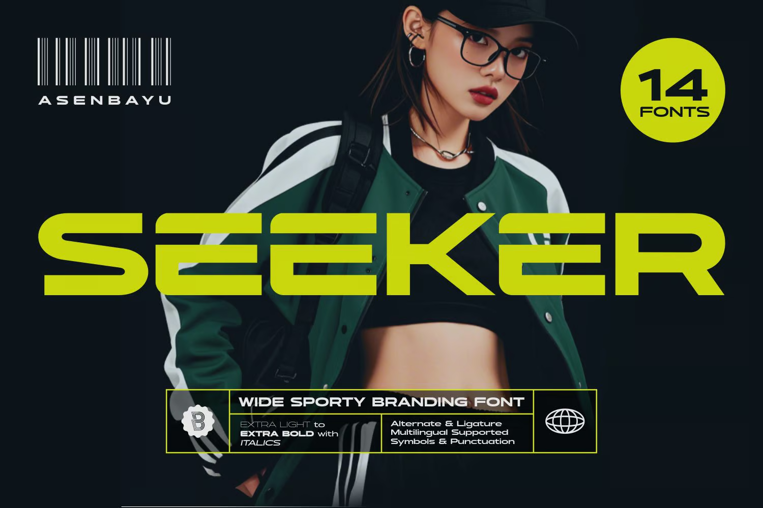
Seeker – Wide Gym & Fitness Font

Seeker - Wide Gym & Fitness Font

Seeker is an expansive and trendy gym and fitness font encapsulating the spirit of athleticism and urban chic. Designed to invoke a feeling of dynamism, power and modern aesthetics, its broad range of styles and features make it suitable for sports brands, fitness products, trendy packaging labels, distinctive logos, posters, and fashion brands.

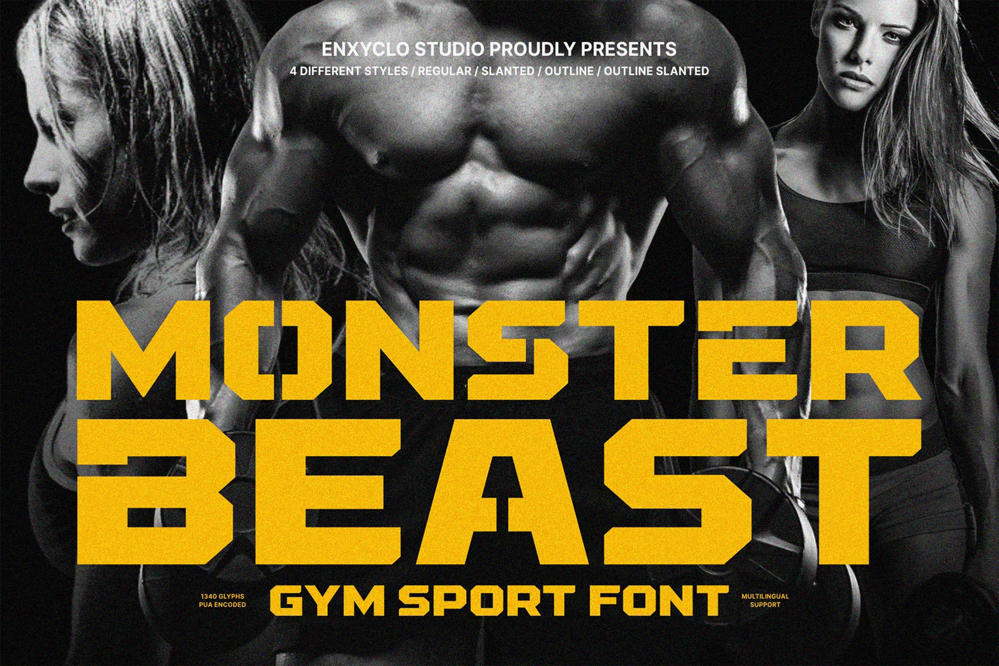
NCL Monster Beast – Gym Sport Font

NCL Monster Beast - Gym Sport Font

This is a versatile gym sports font, perfect for workout-related projects. Expertly crafted for large and small point sizes, it enhances any project, be it headlines, billboards, or logos. Offering a rich set of 1,340 glyphs in 4 styles, it supports 79 languages.

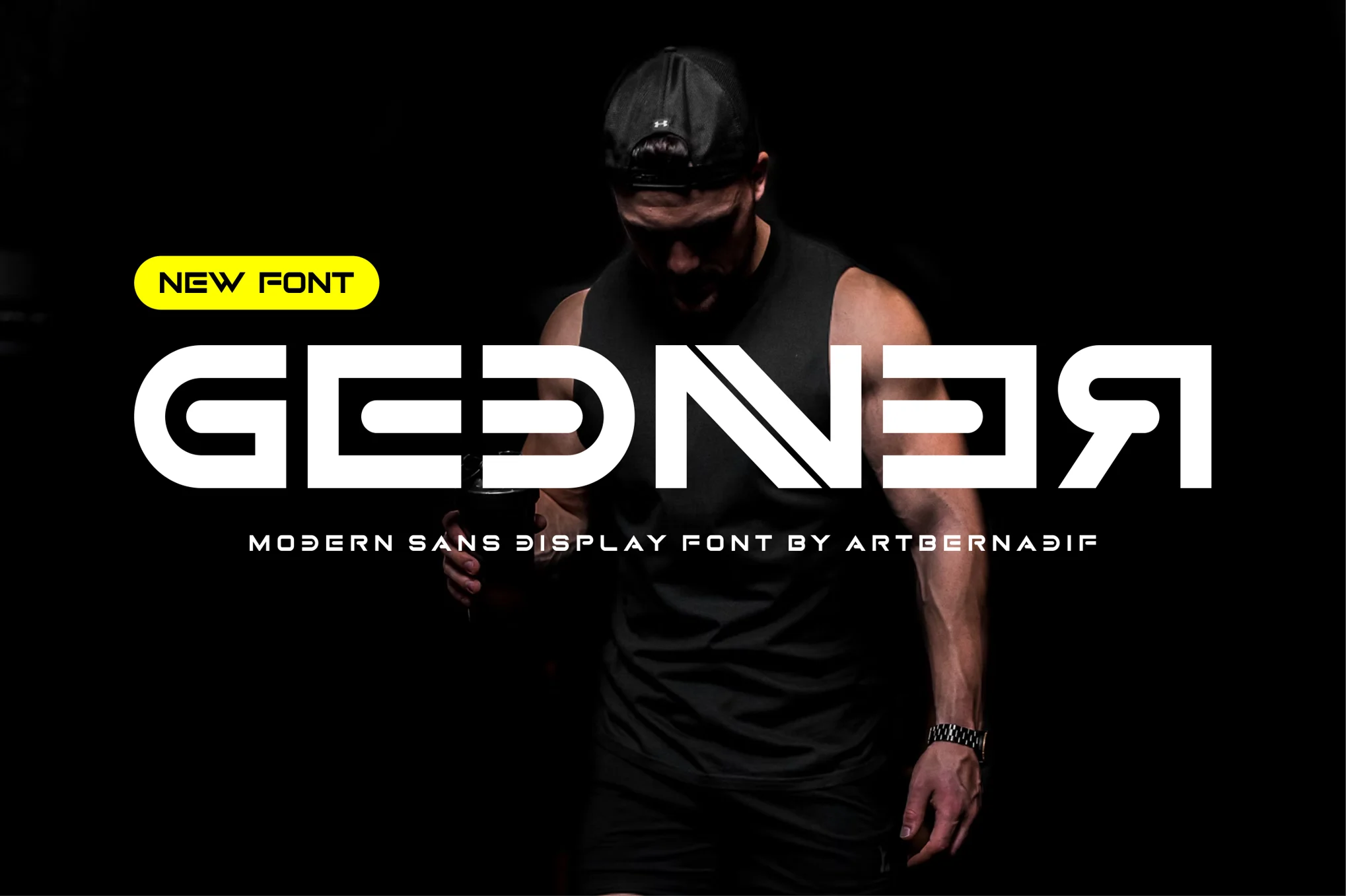
Gednner – Modern Gym & Fitness Font

Gednner - Modern Gym & Fitness Font

Gednner is a bold and authentic gym and fitness font suitable for a variety of branding projects such as logo design, t-shirt printing, or esports. Provided in both otf and ttf formats, this modern Sans Display Font also offers uppercase characters, ligatures, and alternatives, enabling versatility in a wide range of creative contexts.

Boldye – Fitness & Gym Font

 Boldye - Fitness & Gym Font

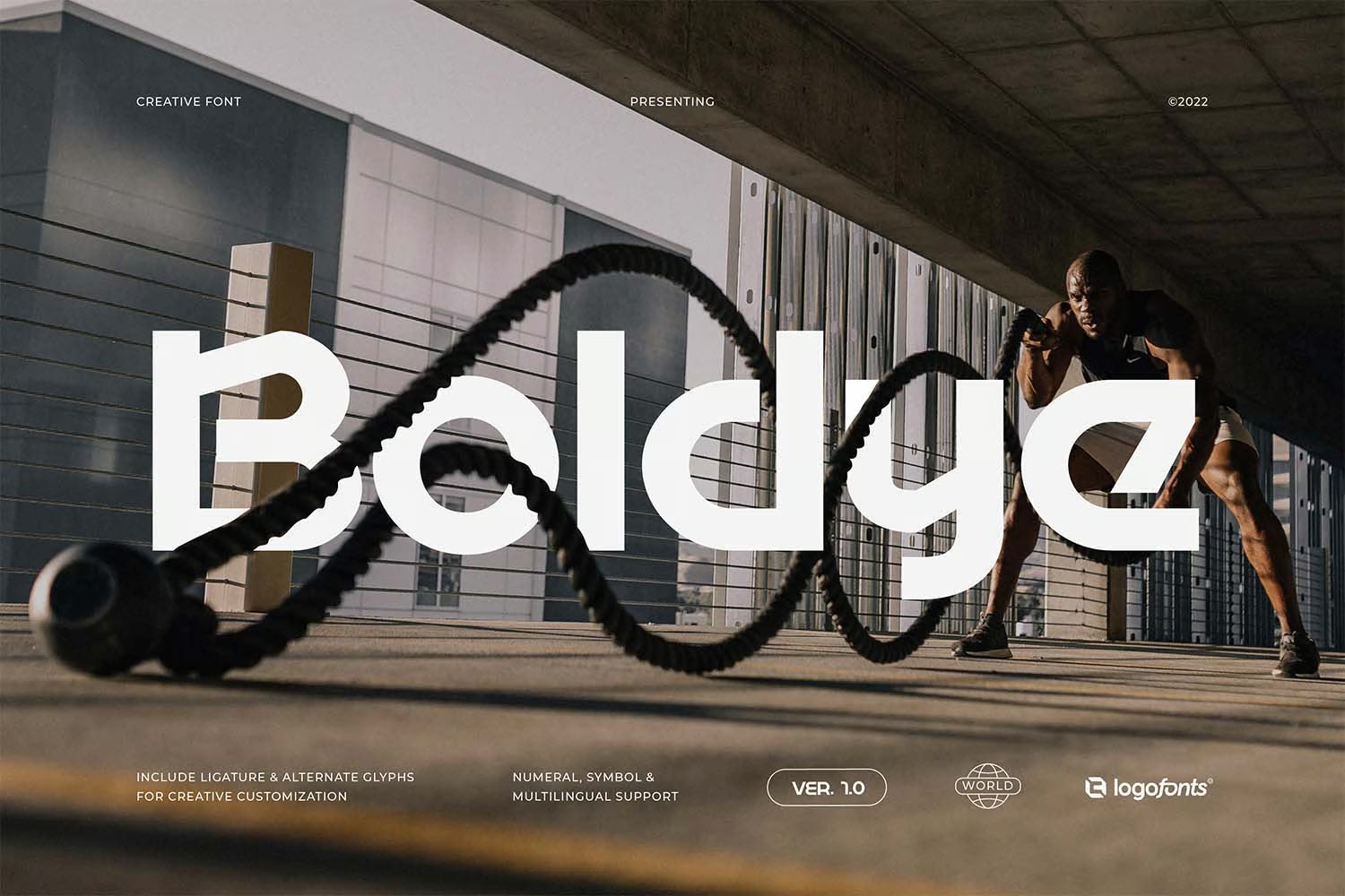
Boldye is a fitness-style font inspired by the robust style of the Reebok logo. It offers striking edgy letters with strong curves — perfect for sports-themed branding and logos. The font offers access to a multitude of unique alternatives and ease-of-use ligatures via its Open Type feature.

Spot Light – Bold Gym & Fitness Font

Spot Light - Bold Gym & Fitness Font

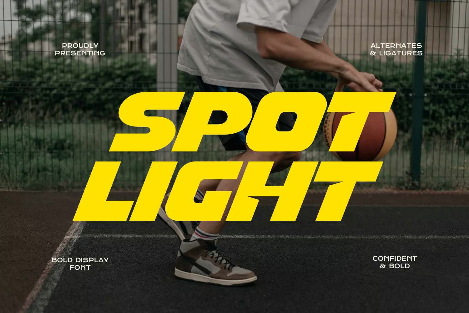
Spot Light is an expressive display sports font known for its visual elegance and smoothness. Its clear curves and distinct ligatures make your work captivating and professional. Versatile for both large and small sizes, it’s perfect for a range of applications from logos to product packaging, for a variety of business sectors.

Gymer – Sport & Fitness Font

Gymer - Sport & Fitness Font

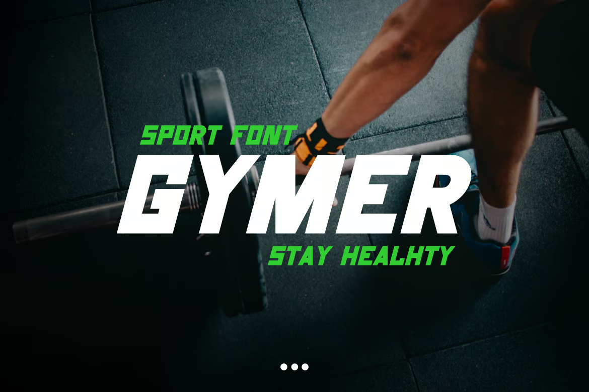
Gymer is an innovative typography option dedicated to the fitness and athletic sectors. Perfect for designing logos, badges or any other sport-related visual elements, it includes OpenType Font (OTF) and TrueType Font (TTF) formats. Its sleek design portrays a dynamic and energetic vibe, reflecting the essence of fitness in every character.

Pro Dunex – Gym & Fitness Font

Pro Dunex - Gym & Fitness Font

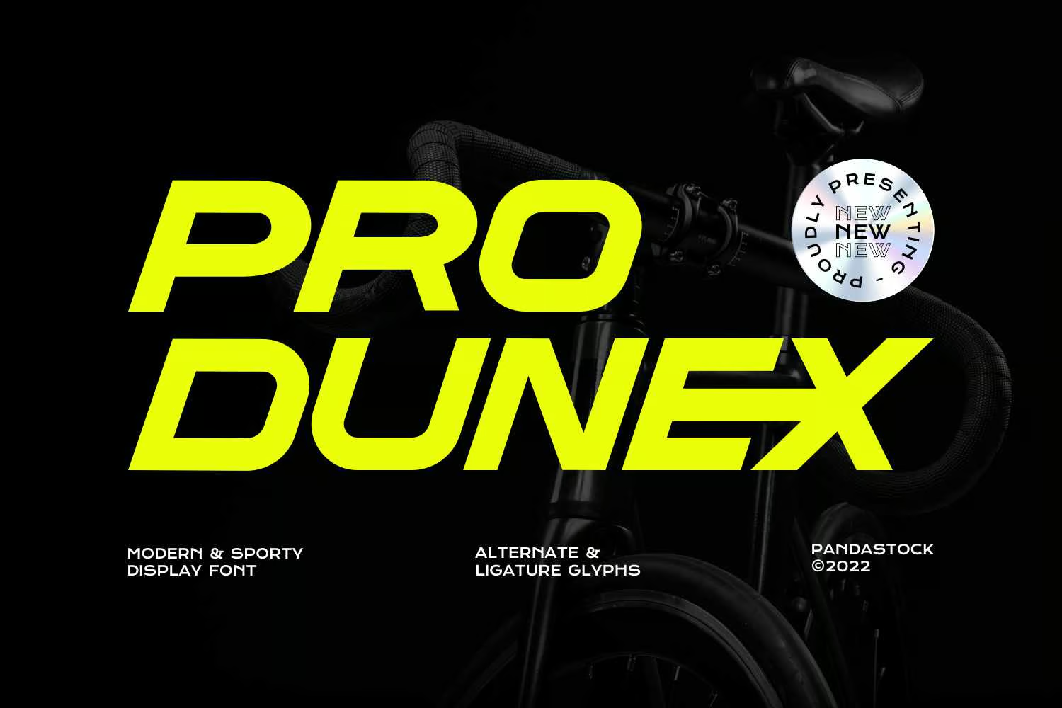
Pro Dunex offers a sleek blend of speed and visual elegance, with clean curves and distinctive ligatures. Optimized for a variety of sizes, this versatile font is ideal for numerous projects, from logos and branding to product packaging and posters. With multilingual support and a range of typographic options included, Pro Dunex is ideal for businesses across a range of sectors.

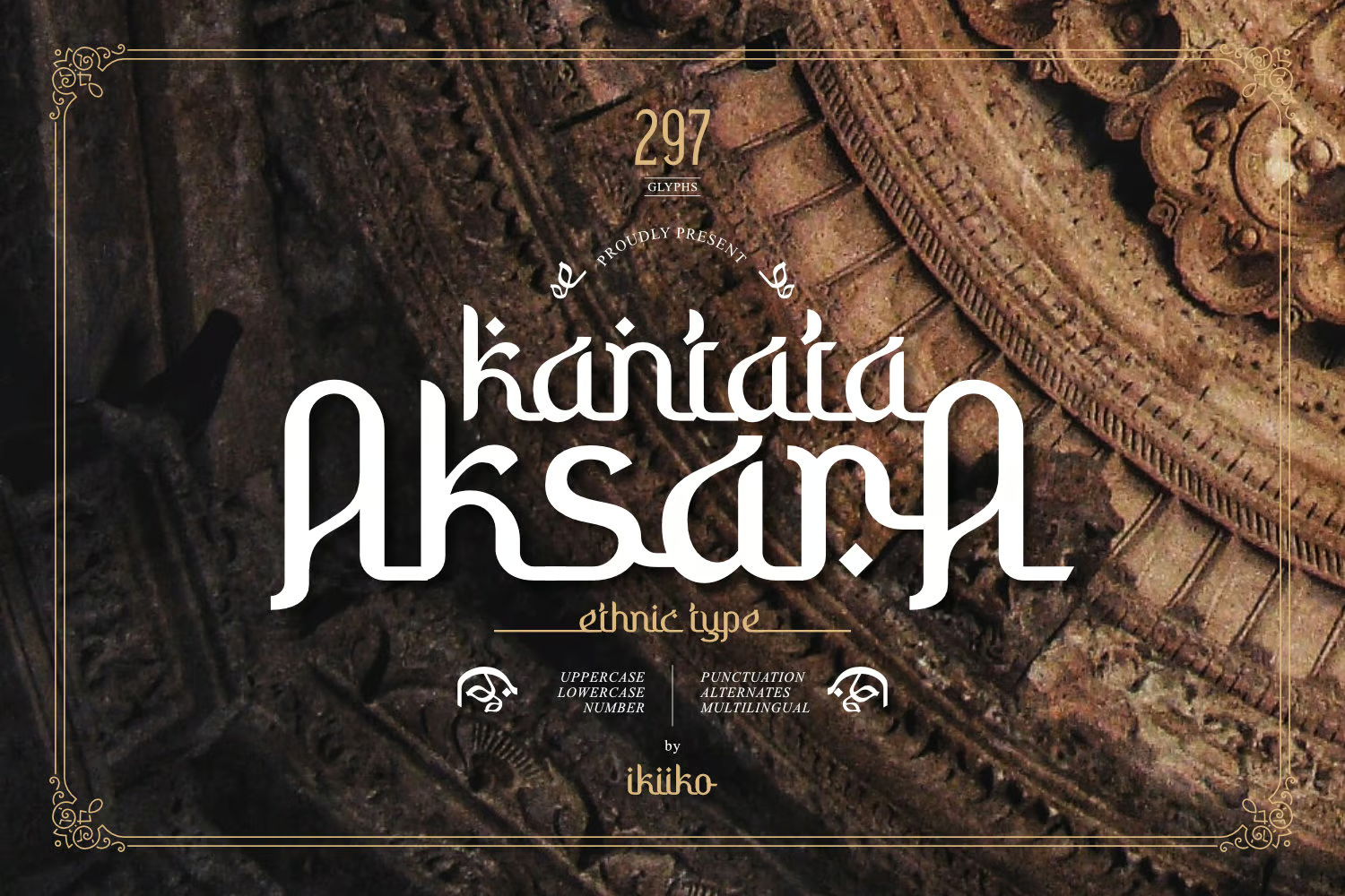
Kantata Aksara – Ethnic Yoga Font

Kantata Aksara - Ethnic Yoga Font

Kantata Aksara blends the grace of Indian culture into a unique and stylish display typeface. This font is versatile, finding its place in anything from cultural logos and yoga merchandise to product packaging and magazine content. With expansive features including uppercase and lowercase letters, numbers, punctuation, alternates, and multi-language support, Kantata Aksara enhances any project with an ethnic touch.

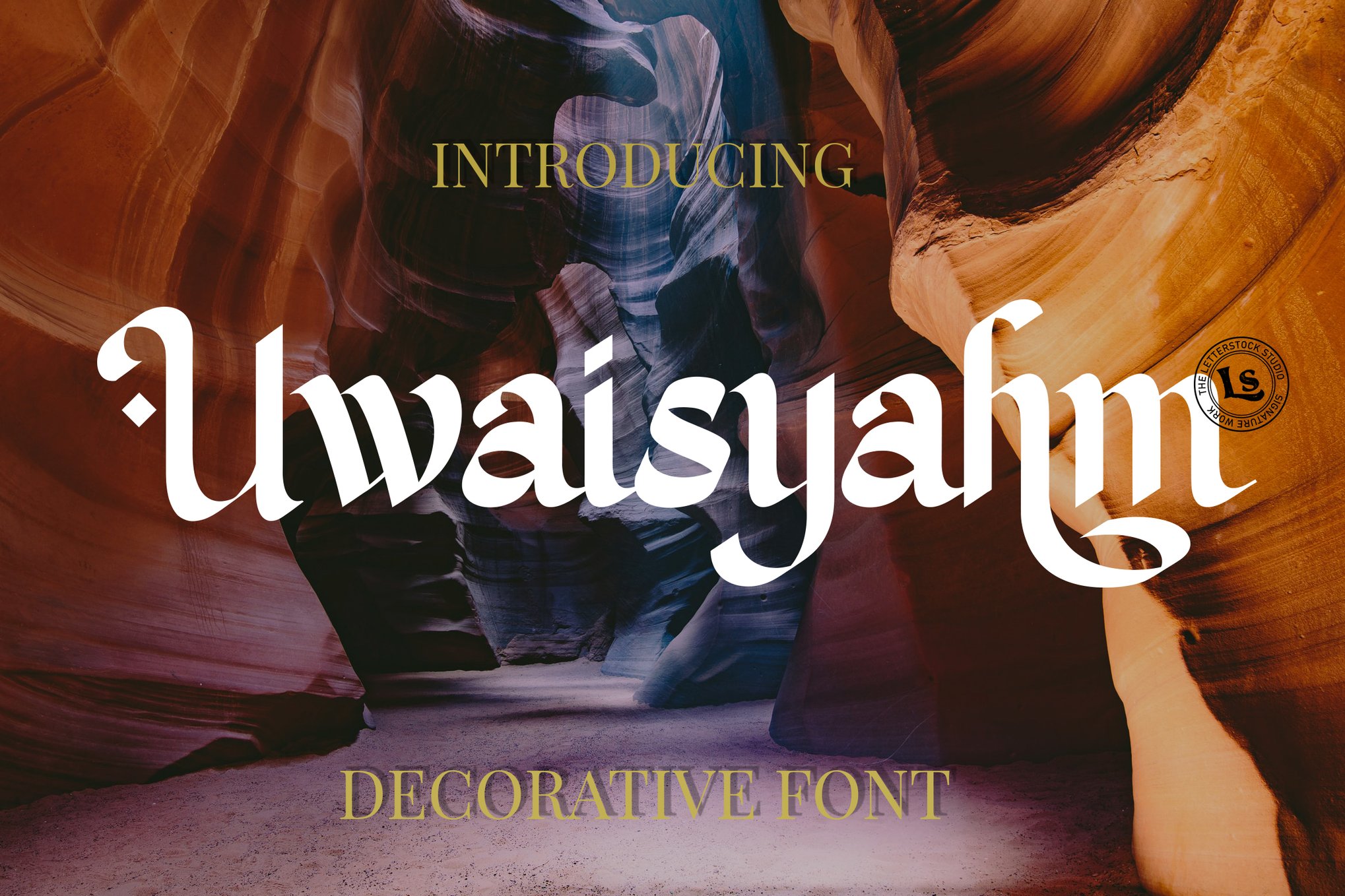
Uwaisyahm – Elegant Yoga Font

Uwaisyahm - Elegant Yoga Font

Uwaisyahm is a dynamic and authentic typeface that draws inspiration from Muslim movie posters. Crafted by hand for a natural, handmade feel, the font will catch your eye with its clean lines, and vibrant character set of 205 characters. Ideal for logos, labels, t-shirt prints, product packaging, promotional materials, and more.

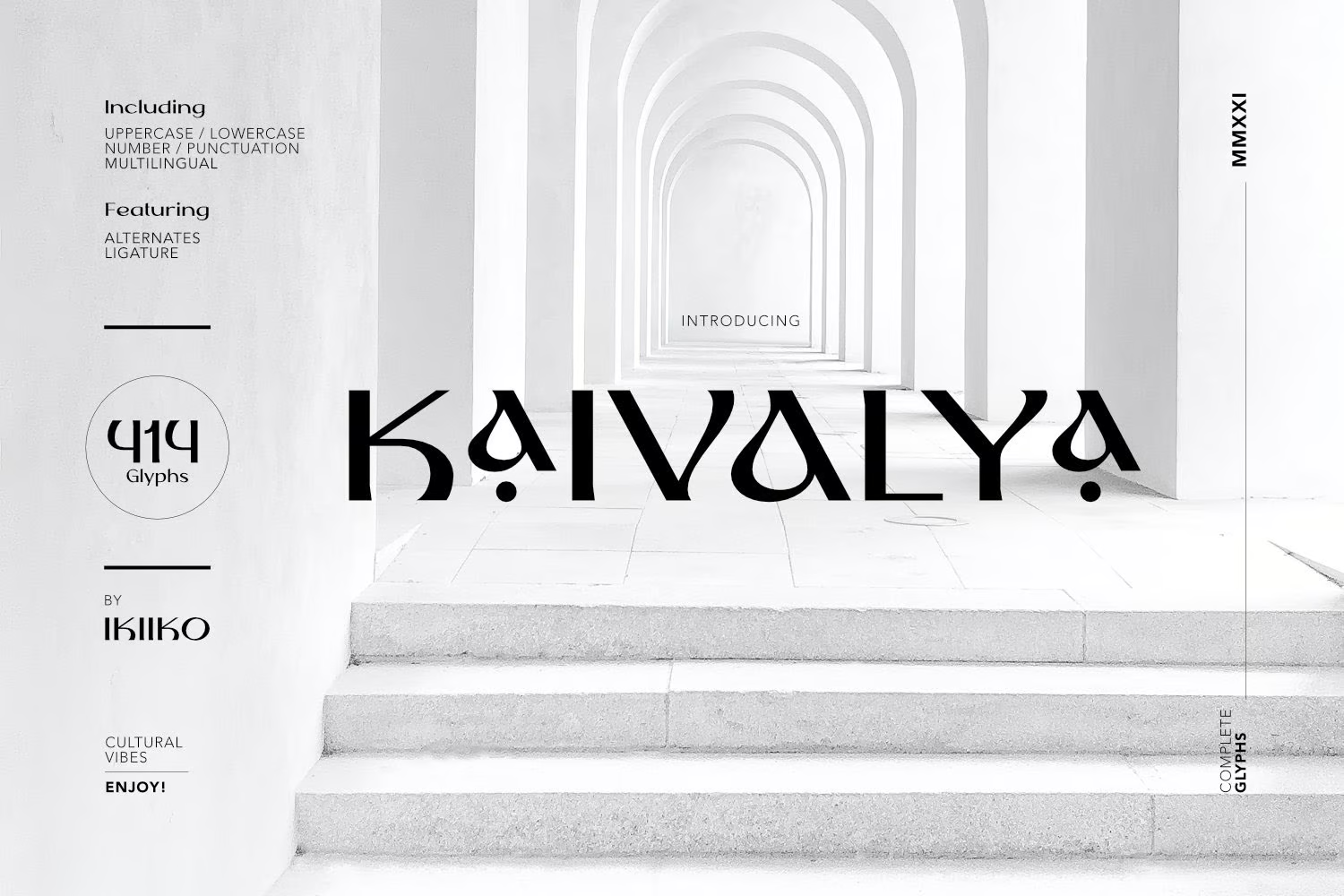
KAIVALYA – Clean Yoga Font

KAIVALYA - Clean Yoga Font

KAIVALYA is a clean yoga font by ikiiko that beautifully merges tradition and style. This culturally inspired serif typeface, with its multitude of stylistic alternatives, is perfect for yoga-related uses, beauty products, magazine spreads, and creating elegant logos. It comes with uppercase, lowercase, numbers, punctuation, and multilingual support in both TTF and OTF formats.

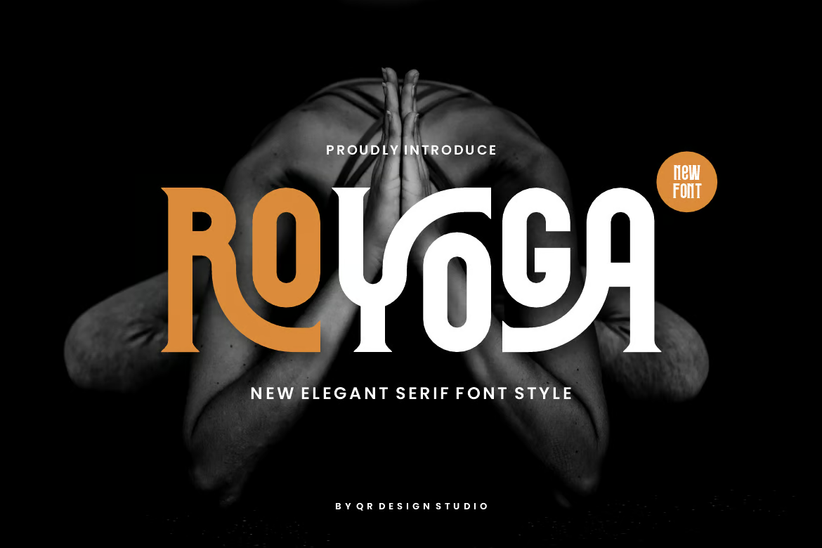
Royoga – Elegant Serif & Yoga Font

Royoga - Elegant Serif & Yoga Font

Royoga is a striking display font that stands out in various contexts, making it a versatile choice for branding projects. Perfect for creating unique logos, sporty poster designs, and more, this elegant serif and yoga-inspired font comes in three formats: OTF, TTF, and WOFF, catering to all your design needs.

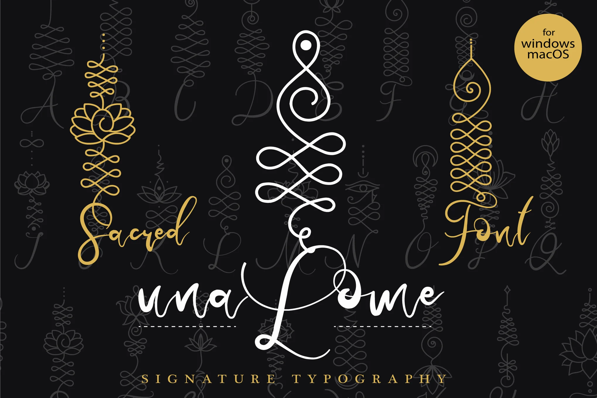
Unalome – Sacred Yoga Font

Unalome - Sacred Yoga Font

Unalome yoga font marries spiritual symbolism with the art of typography, creating a unique and meaningful font, perfect for personal and spiritual growth themes. Individual characters are imbued with qualities derived from the Unalome symbol, used in Buddism to represent the path to enlightenment.

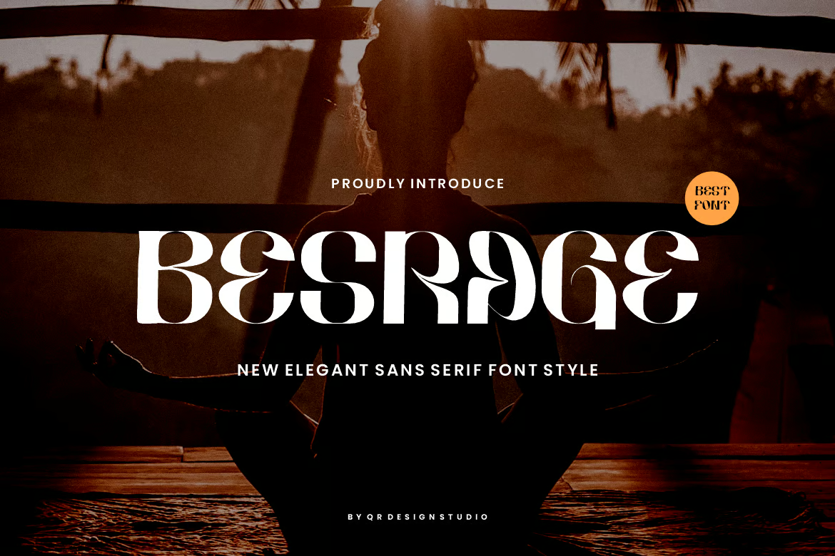
Besrage – Groovy & Yoga Font

Besrage - Groovy & Yoga Font

Imbue your branding projects with authenticity and boldness using the Besrage font. This groovy, yoga-themed display font shines in various contexts, such as posters, logos, sports, and many more. Included formats are: OTF, TTF, and WOFF. The Besrage Font offers the unique blend of grooviness and tranquility, making it an essential creative asset for your toolkit.

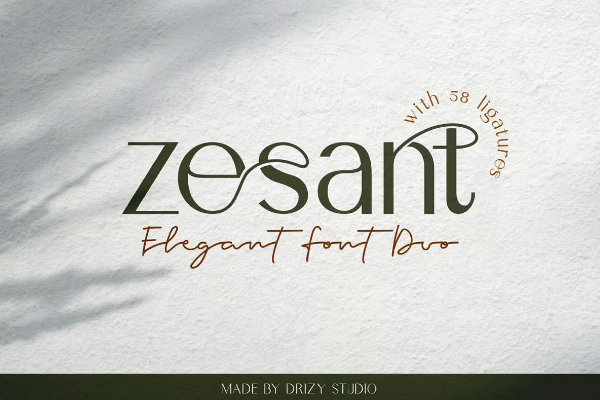
Zesant – Modern Yoga Font

Zesant - Modern Yoga Font

Zesant is a stylish and fluid san serif yoga font featuring a multitude of ligatures. This versatile typeface, suitable for creating striking logos and distinctive titles, offers compatibility with a range of other fonts and projects. Zesant supports multiple languages and is PUA encoded. It is wonderfully user-friendly and comes in OTF, TTF, and WOFF formats.

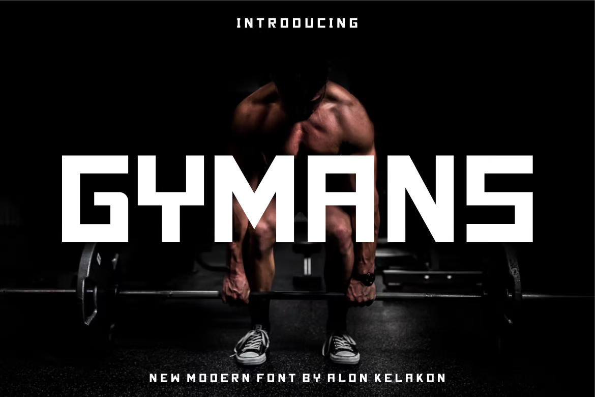
Gymans – Bold Gym Font

Gymans - Bold Gym Font

Gymans is an original and compelling choice for various design projects. From clothing labels to movie titles, album covers, and logos, its distinctiveness can enhance your work. The package includes OTF, TTF, and WOFF formats, giving you the flexibility and convenience to utilize it as desired.

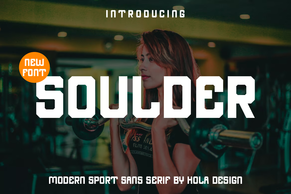
Soulder – Gym Font

Soulder - Gym Font

This is a strikingly unique font perfect for various design requirements. Its versatility lends well to labeling, movie scenes, posters, titles, album covers, logos, and much more. With high accessibility formats like OTF, TTF, and WOFF included, it ensures a user-friendly experience that enhances your design aesthetics.

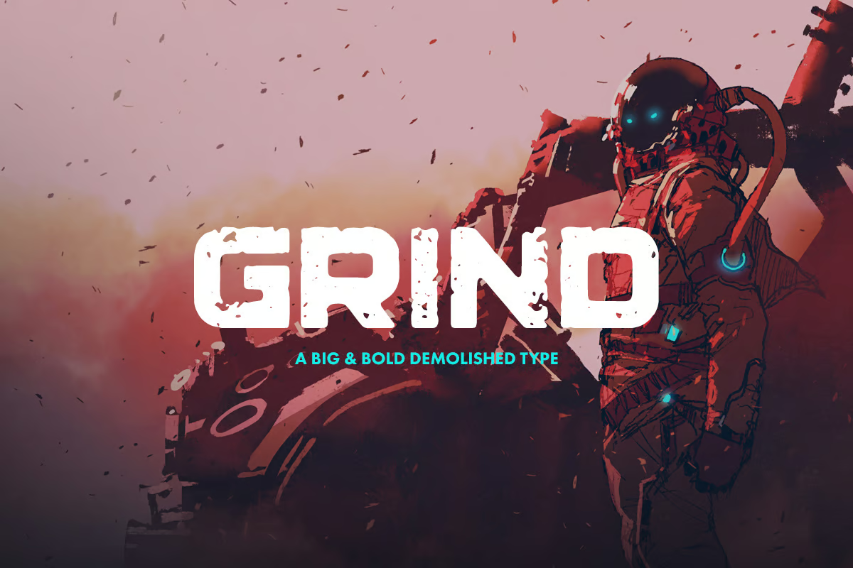
Grind – Demolished Gym Font

Grind - Demolished Gym Font

Grind is a striking display typeface that embodies power and resilience. This big and bold font exudes a masculine, rugged charm that instantly captures attention. It’s the perfect choice for striking headlines or to inject a dose of strength and determination into your project.

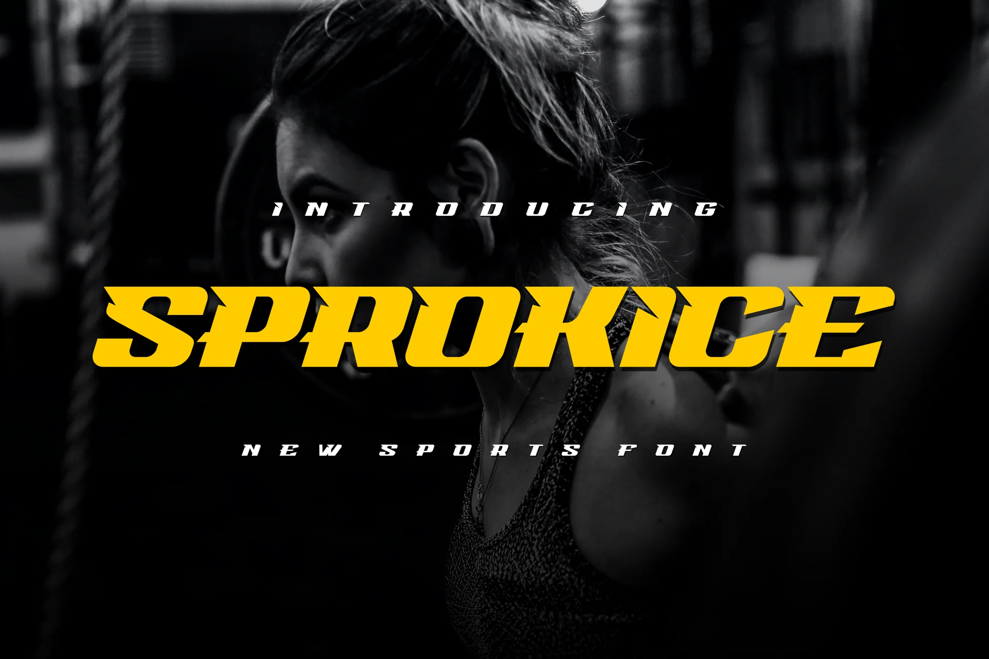
Sprokice – Gym Font

Sprokice - Gym Font

Sprokice is an innovative, genuine display font perfect for various branding projects, such as logo creation, t-shirt printing, or esport applications. Its contemporary design stands out in numerous contexts, offering uppercase characters in both otf and ttf formats.

Sport Master – Sport & Gym Font

Sport Master - Sport & Gym Font

Sport Master is an authentic and robust gym font perfect for diverse branding projects, from sports logos to other designs. Its confident display stands out in multiple contexts. The package offers regular and italic styles, available in .OTF, .TTF, and .WOFF formats, ensuring a perfect fit for various usage scenarios.

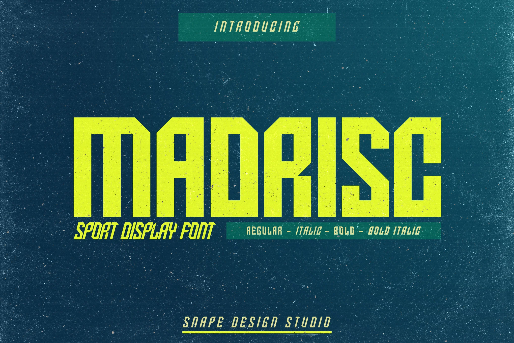
Madrisc – Gym & Sport Font

Madrisc - Gym & Sport Font

Madrisc is an assertive gym and sport font that brings any sport-inspired project to life with its striking appeal. Ideal for sports designs, jerseys, logos, movie titles, game covers, and more, it makes any work stand out. Its features include uppercase, lowercase, numbers, punctuation, and multilingual capabilities.

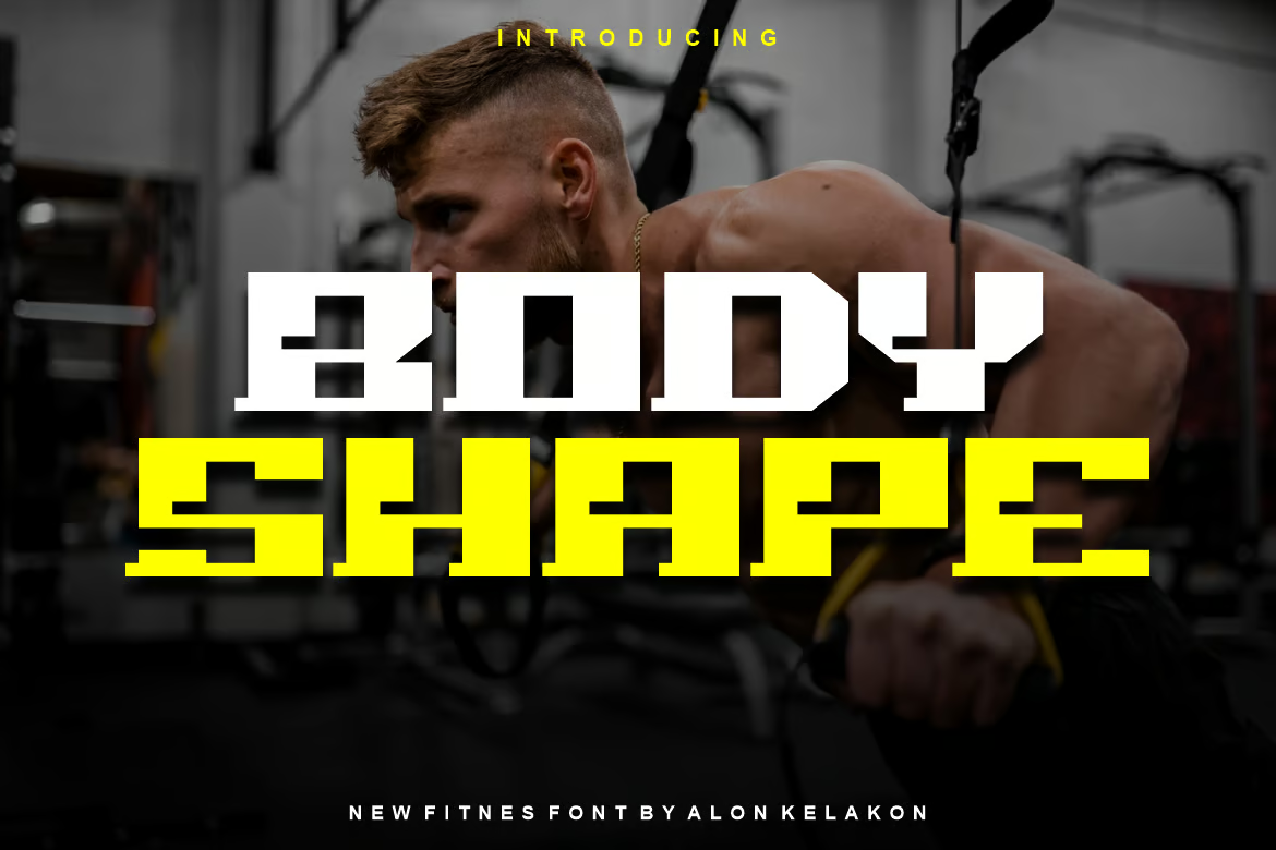
Body Shape – Fitness & Gym Font

Body Shape - Fitness & Gym Font

Body Shape is a distinct typography style for use in various designs like clothing labels, movie scenes, posters, album covers, and logos, among others. It’s ready-to-use and comes in OTF, TTF, and WOFF formats, allowing for flexibility and creativity in your design endeavors.

Vaghiro – Gym & Sport Font

Vaghiro - Gym & Sport Font

Vaghiro is a versatile and unique typeface that’s perfect for a range of uses including labeling, movie titles, posters, album covers, and logos. This font, available in OTF, TTF and WOFF formats, brings a fresh and edgy aesthetic that’s particularly suited to gym and sports-themed designs.

Free Fitness & Yoga Fonts

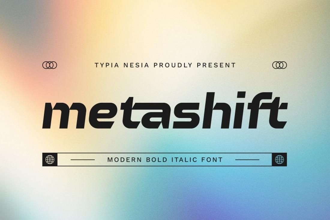
Metashift – Free Fitness Font

This free font features a stylishly bold and creative letter design that will help you design attractive logos, titles, and headings for your fitness and gym-themed design projects. The font includes both uppercase and lowercase characters. And it’s free for personal use.

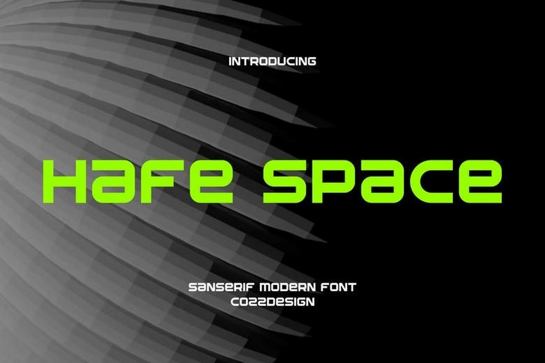
Hafespace- Free Sports & Gym Font

Hafespace is a bold and modern font that’s perfect for designing all kinds of typography related to sports and gym centers. The font has all-caps letters with a stylishly unique design. It’s free to use with personal projects.

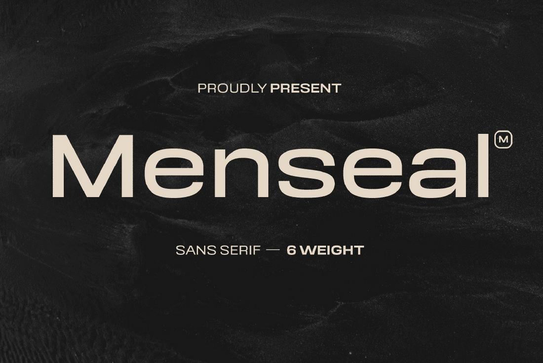
Menseal – Free Fitness Font

This font is also free to download and it comes with a simple and clean letter design. This font is most suitable for fitness-related branding designs, especially for masculine titles and headings. The font is free for personal use.
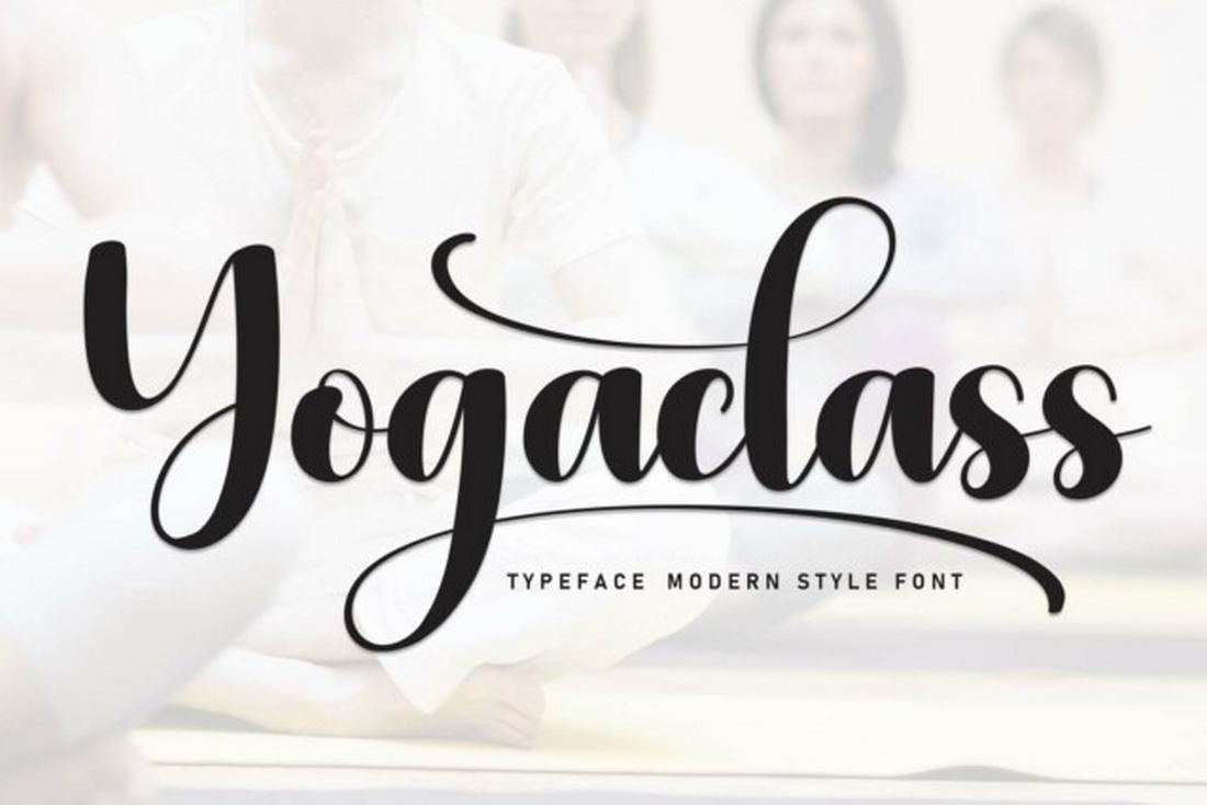
Yogaclass – Free Script Font

Craft a beautifully elegant title for your yoga class flyer or poster with this free script font. The font features elegantly curved letters with an elegant look and feel. It’s free to use with personal projects.

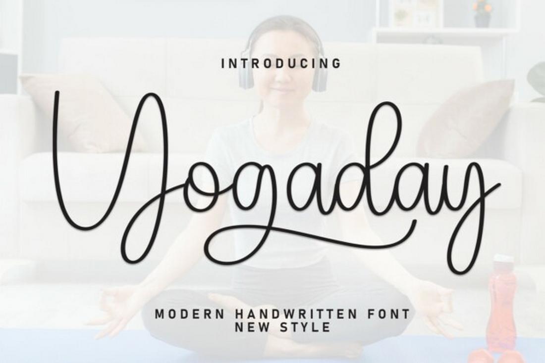
Yogaday – Free Script Yoga Font

This free font is also made with yoga and wellness typography designs in mind. It’s ideal for making headings, titles, logos, and business cards for your business. The font is free to download and use with personal projects.

Why Consistent Website Maintenance Matters: Top 10 Reasons to Keep It Updated

Featured Imgs 23

In today’s digital age, your website is often the first impression potential customers have of your business. Consistent website maintenance is essential to ensure your site remains functional, secure, and effective in meeting your business goals. Neglecting regular updates can lead to a range of issues that may impact user experience and your bottom line. …

The post Why Consistent Website Maintenance Matters: Top 10 Reasons to Keep It Updated first appeared on Lucid Softech.

xseries interval in chart

Featured Imgs 23

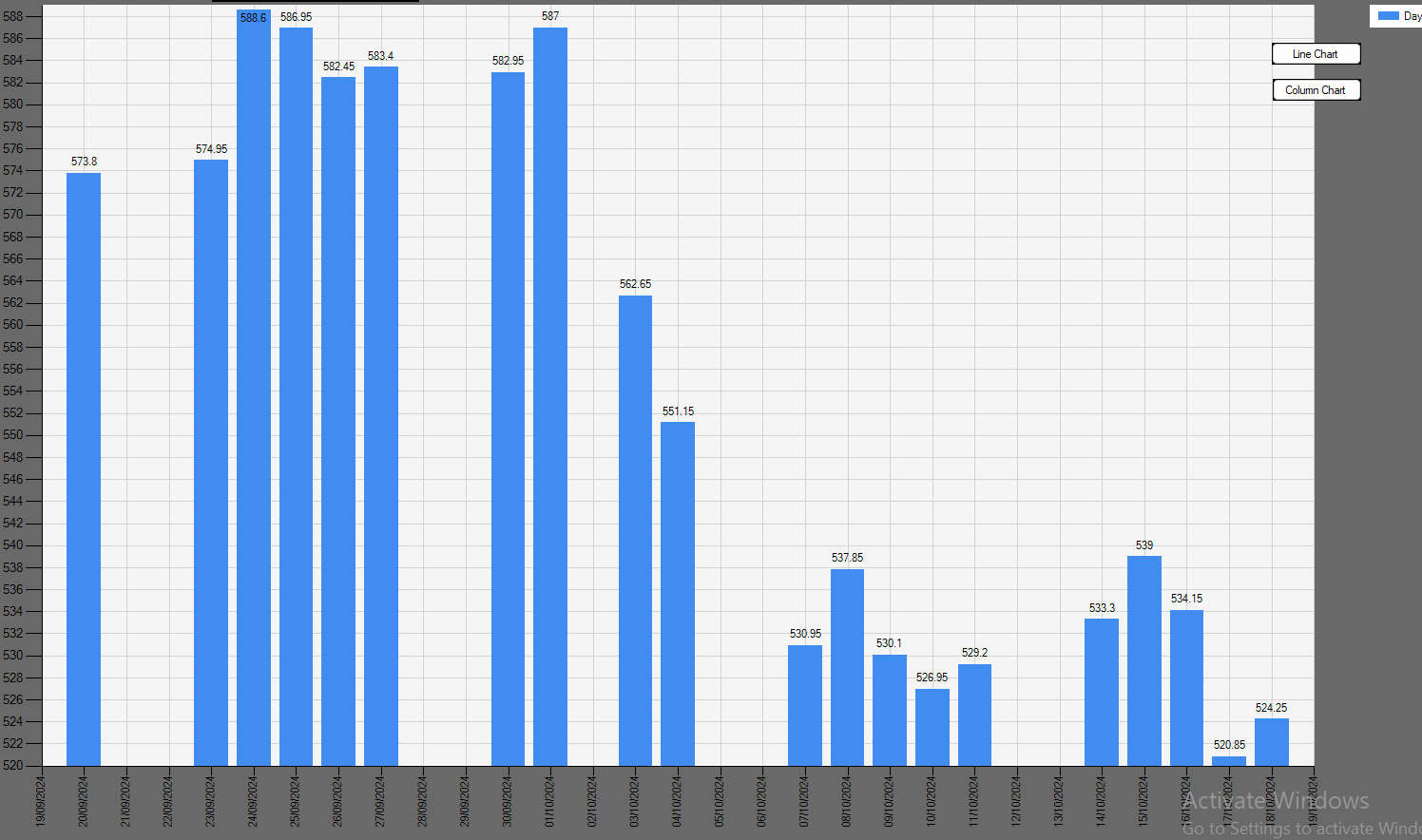
I have chart showing daily closing price of share for last 20 days. There is no closing price for Saturday and Sunday . However chart is showing blank space for these days i.e. total 29 days interval

i do not want blank spaces but only 20 columns. Not getting how to do it.

Chart1.Series(0).Points.Clear()

    'Getting Script Name 
    RSData("Select ScriptName from Bse_ScriptMaster where ISIN ='" & V_ISIN & "'")
    DBCnClose()

    If DBCnCommonDataTable.Rows.Count > 0 Then
        Label1.Text = (Trim(DBCnCommonDataTable(0)("ScriptName")))
    End If
    'getting data for the chart
    RSData("select top (20) DAYCLOSE,TIMESTAMP,TOTTRDVAL  from Tbl_Back_Data_Nse where Tbl_Back_Data_Nse.ISIN ='" & V_ISIN & " ' and SERIES ='EQ'  order by TIMESTAMP desc ")
    DBCnClose()
    ' MB(DBCnCommonDataTable.Rows.Count)
    Dim V_Average As Double = 0
    Dim V_15DaysRangeHigh As Double = 0
    Dim V_15DayRangeLow As Double = DBCnCommonDataTable(0)("DAYCLOSE")


    If DBCnCommonDataTable.Rows.Count > 0 Then

        For i = 0 To DBCnCommonDataTable.Rows.Count - 1
            'Price
            If DBCnCommonDataTable(i)("DAYCLOSE") > V_15DaysRangeHigh Then
                V_15DaysRangeHigh = (DBCnCommonDataTable(i)("DAYCLOSE"))

            End If

            If DBCnCommonDataTable(i)("DAYCLOSE") < V_15DayRangeLow Then
                V_15DayRangeLow = (DBCnCommonDataTable(i)("DAYCLOSE"))
            End If

            V_Average = V_Average + (DBCnCommonDataTable(i)("DAYCLOSE"))


        Next

    End If

    Dim V_Low As Integer = CDec(Math.Truncate(V_15DayRangeLow))
    Dim V_High As Integer = CDec(Math.Truncate(V_15DaysRangeHigh)) + 1
    Dim V_Range As Integer = V_High - V_Low

    Chart1.ChartAreas(0).AxisY.Minimum = V_Low
    Chart1.ChartAreas(0).AxisY.Maximum = V_High
    Chart1.ChartAreas(0).AxisX.LabelStyle.Angle = -90
    Chart1.Series("DayClose").BorderWidth = 3

    Chart1.ChartAreas(0).AxisX.MajorGrid.LineColor = Color.LightGray
    Chart1.ChartAreas(0).AxisY.MajorGrid.LineColor = Color.LightGray
    'Chart1.ChartAreas(0).AxisY.Enabled = False

    Dim axis = Chart1.ChartAreas(0).AxisX
    Dim yxis = Chart1.ChartAreas(0).AxisY

    axis.Interval = 1

    If V_Range < 20 Then
        yxis.Interval = 1

    Else

        If V_Range > 40 And V_Range < 80 Then
            yxis.Interval = 2
        Else
            yxis.Interval = CDec(Math.Truncate(V_Range / 40))
        End If

    End If


    If DBCnCommonDataTable.Rows.Count > 0 Then

        Dim Xval As Date
        For i = 0 To DBCnCommonDataTable.Rows.Count - 1

            Chart1.Series("DayClose").Points.AddXY(DBCnCommonDataTable(i)("TIMESTAMP"), MfunIndCurrencyFormat(DBCnCommonDataTable(i)("DAYCLOSE")))

        Next i
    End If

chaet.png

Paths in PHP not work.

Featured Imgs 23

How to figure out the paths, why the styles are not applied, the file is not found, I tried many methods, but as a rule nothing works, it happens that the main page applies styles, in other files there is none or there is no file at all, it is clear that you need to register the paths, but how? I tried $path = $_SERVER['DOCUMENT_ROOT']; this does not work

RAG with LangChain and Hugging Face Serverless Inference API

Featured Imgs 23

This article explains how to create a retrieval augmented generation (RAG) chatbot in LangChain using open-source models from Hugging Face serverless inference API.

You will see how to call large language models (LLMs) and embedding models from Hugging Face serverless inference API using LangChain. You will also see how to employ these LLMs and embedding models to create LangChain chatbots with and without memory.

So, let's begin without ado.

Installing and Import Required Libraries

We will first install the Python libraries required to run codes in this article.


!pip install langchain
!pip install langchain_community
!pip install pypdf
!pip install faiss-gpu
!pip install langchain-huggingface
!pip install --upgrade --quiet huggingface_hub

The script below imports the required libraries into your Python application.

Since we will be accessing the Hugging Face serverless inference API, you must obtain your access token from Hugging Face.

Note: The codes in this article are run with Google Colab, so I used the user data.get() method to access environment variables. You must use the method that is appropriate for your environment.

from langchain_core.prompts import ChatPromptTemplate
from langchain_core.output_parsers import StrOutputParser
from langchain_community.document_loaders import PyPDFLoader
from langchain.text_splitter import RecursiveCharacterTextSplitter
from langchain_huggingface import HuggingFaceEndpoint, ChatHuggingFace
from langchain_community.embeddings import (
    HuggingFaceInferenceAPIEmbeddings,
)
from langchain_community.vectorstores import FAISS
from langchain.chains.combine_documents import create_stuff_documents_chain
from langchain.chains import create_retrieval_chain
from langchain_core.documents import Document
from langchain.chains import create_history_aware_retriever
from langchain_core.prompts import MessagesPlaceholder
from langchain_core.messages import HumanMessage, AIMessage
from langchain_core.runnables.history import RunnableWithMessageHistory
from langchain.memory import ChatMessageHistory

import os
from google.colab import userdata

hf_token = userdata.get('HF_API_TOKEN')
Basic Example of Calling Hugging Face Inference API in LangChain

Let's first see a basic example of how to call a text generation model from Hugging Face serverless inference API.

You need to create an object of the HuggingFaceEndpoint() class and pass it your model repo ID and Hugging Face access token. The temperature and max_new_tokens variables are optional.

We will use the Qwen 2.5-72b model for response generation.

Next, pass the object of the HuggingFaceEndpoint to the ChatHuggingFace class constructor to create an LLM object.


repo_id = "Qwen/Qwen2.5-72B-Instruct"

llm = HuggingFaceEndpoint(
    repo_id=repo_id,
    temperature=0.5,
    huggingfacehub_api_token=hf_token,
    max_new_tokens=1024
)

llm = ChatHuggingFace(llm=llm)

You can use the LLM object defined in the above script like any other LangChain chat LLM model.

Let's see an example. In the following script, we create a prompt using the ChatPromptTemplate object that answers a user's question.

Next, we chain the prompt with the LLM and the output parser object.

Finally, we invoke the chain with a question to generate a final LLM response.

question = "Who won the Cricket World Cup 2019, who was the captain?"

template = """Answer the following question to the best of your knowledge.
Question: {question}
"""

prompt = ChatPromptTemplate.from_template(template)

output_parser = StrOutputParser()

llm_chain = prompt | llm | output_parser

llm_chain.invoke({"question": question})

Output:

The Cricket World Cup 2019 was won by England. The captain of the England team was Eoin Morgan.

You can see that once you have created an LLM using HuggingFaceEndpoint and ChatHuggingFace objects, the rest of the stuff is a standard LangChain response generation process.

Let's now create a simple chatbot that answers users' questions about a PDF document.

A RAG Chatbot Using Hugging Face Inference API

This section will show how to create a LangChain chatbot using LLMs and word embedding models from Hugging Face serverless API.

Creating Document Embeddings

We will create a chatbot that answers questions related to Google's 2024 Q1 earnings report.

The following script imports the PDF document and splits it into document chunks.


loader = PyPDFLoader("https://abc.xyz/assets/91/b3/3f9213d14ce3ae27e1038e01a0e0/2024q1-alphabet-earnings-release-pdf.pdf")
docs = loader.load_and_split()

Next, we will create vector embeddings from the PDF document and store them in a Vector store. The user queries will also be converted into vector embeddings.
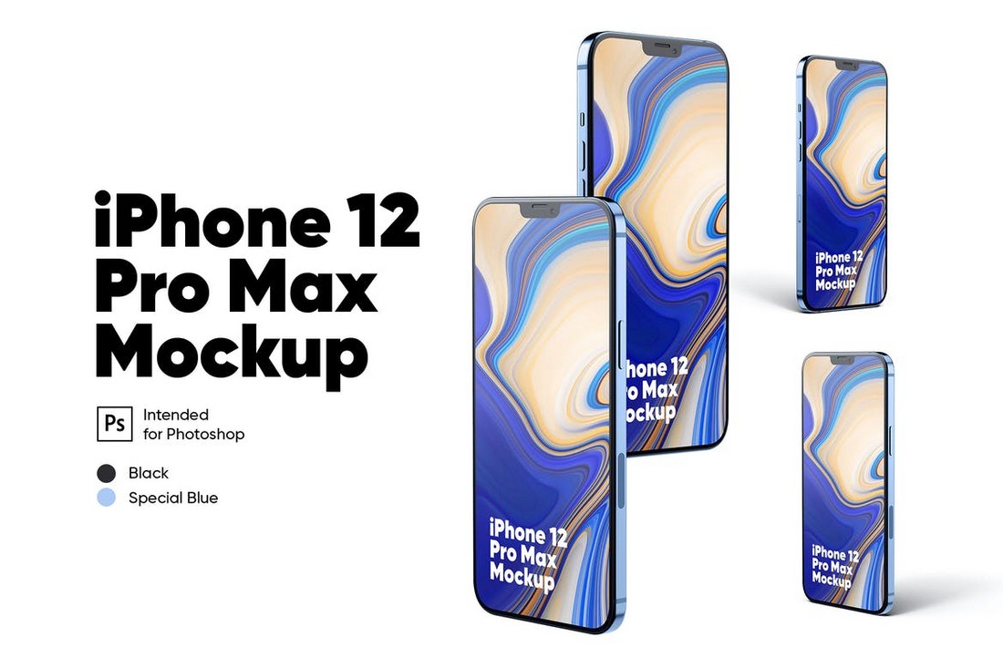
Finally, the text whose vector embeddings in the vector store match the vector embeddings of the user query will be retrieved to generate the final LLM response.

We will use the all-MiniLM-l6-v2 vector embedding model to generate vector embeddings. You can retrieve this model free from Hugging Face serverless inference API using the HuggingFaceInferenceAPIEmbeddings object.

The following script splits our input PDF document and generates vector embeddings using the all-MiniLM-l6-v2 vector embedding model. The vector embeddings are stored in FAISS vector store.

embeddings = HuggingFaceInferenceAPIEmbeddings(
    api_key=hf_token,
    model_name="sentence-transformers/all-MiniLM-l6-v2"
)

text_splitter = RecursiveCharacterTextSplitter()
documents = text_splitter.split_documents(docs)
vector = FAISS.from_documents(documents, embeddings)

We are now ready to create our chatbot using LangChain.

Creating a Chatbot Without Memory

We will first create a chatbot without memory. The first step is to create a prompt that uses context to answer user questions.
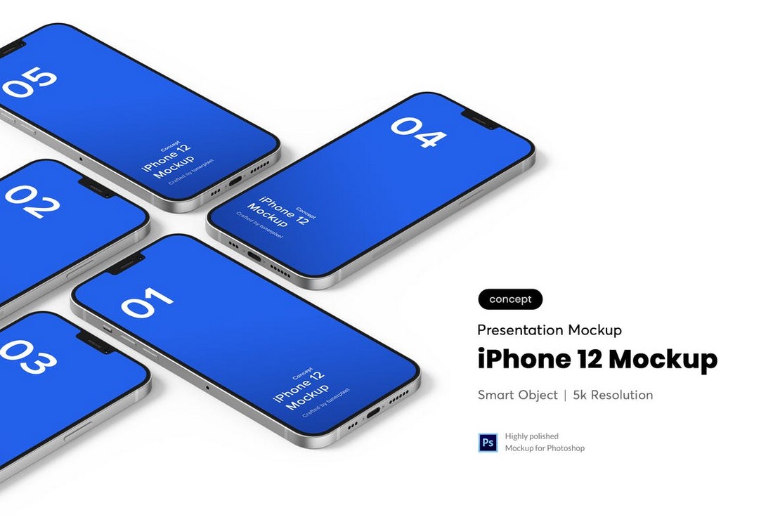
Next, we will create two chains: a stuff document chain and a retrieval chain. The stuff document chain will link the prompt with the LLM.
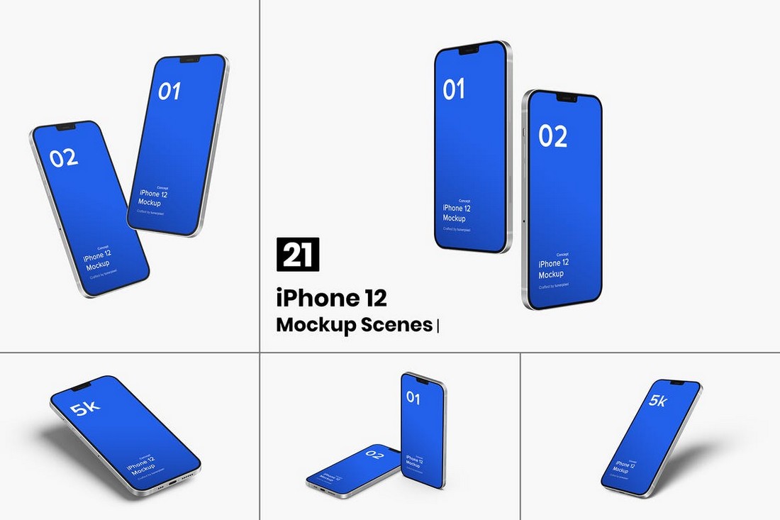
The retrieval chain will be responsible for retrieving vector store documents relevant to the user query and passing them to the context variable in the prompt.

prompt = ChatPromptTemplate.from_template("""Answer the following question based only on the provided context:

Question: {input}

Context: {context}
"""
)

document_chain = create_stuff_documents_chain(llm, prompt)

retriever = vector.as_retriever()
retrieval_chain = create_retrieval_chain(retriever, document_chain)

Finally, you can invoke the retrieval chain, ask it questions related to the Google earnings report, and get relevant responses.

For example, in the following script, we ask our chatbot about YouTube's add revenue for the first quarters of 2023 and 2024. The model returns correct responses. You can verify the response from the PDF document.

def generate_response(query):
    response = retrieval_chain.invoke({"input": query})
    print(response["answer"].rpartition("Assistant:")[-1].strip())

query = "What is the revenue from YouTube adds for the 1st Quarters of 2023 and 2024"
generate_response(query)

Output:

Based on the provided context, the revenue from YouTube ads for the first quarter of 2023 was $6,693 million, and for the first quarter of 2024, it was $8,090 million.

Next, we will add memory to our chatbot to remember the previous interaction.

Adding Memory to the Chatbot

To create a LangChain chatbot with memory, we need a history-aware retriever chain in addition to the stuff document and retrieval chain, as explained in the official documentation.

The following script defines the prompt for the history-aware retriever chain. This chain creates a standalone query using the new user query and the chat history. This new standalone query is then passed to the retrieval chain as we did before.

contextualize_q_system_prompt = (
    "Given a chat history and the latest user question "
    "which might reference context in the chat history, "
    "formulate a standalone question which can be understood "
    "without the chat history. Do NOT answer the question, "
    "just reformulate it if needed and otherwise return it as is."
)

prompt = ChatPromptTemplate.from_messages(
    [
        ("system", contextualize_q_system_prompt),
        MessagesPlaceholder("chat_history"),
        ("user", "{input}"),
    ]
)

history_retriever_chain = create_history_aware_retriever(llm, retriever, prompt)

The stuff document chain will now have a message placeholder that stores the chat history.


prompt = ChatPromptTemplate.from_messages([
    ("system", "Answer the user's questions based on the below context:\n\n{context}"),
    MessagesPlaceholder(variable_name="chat_history"),
    ("user", "{input}")
])
document_chain = create_stuff_documents_chain(llm, prompt)

Finally, the retrieval chain will combine the history retriever chain and the stuff document chain to create the final response generation chain.

retrieval_chain = create_retrieval_chain(history_retriever_chain, document_chain)

Next, we will initialize an empty list that stores our chat messages. Each call to the retrieval chain extends the chat message history with the user query and the model response.

The script below defines the generate_response_with_memory() function that generates chatbot responses with memory.


chat_history = []

def generate_response_with_memory(query):
    response = retrieval_chain.invoke({
    "chat_history": chat_history,
    "input": query
    })

    response = response["answer"].rpartition("Assistant:")[-1].strip()
    chat_history.extend([HumanMessage(content = query),
                       AIMessage(content = response)])

    return response

Finally, we can combine everything to create a simple console chatbot that answers user questions related to Google's earnings report. The chatbot will continue answering user questions until the user types' bye. `


print("=======================================================================")
print("Earnings Call Chatbot")
print("=======================================================================")

query = ""
while query != "bye":
    query = input("\033[1m User >>:\033[0m")

    if query == "bye":
        chat_history = []
        print("\033[1m Chatbot>>:\033[0m Thank you for your messages, have a good day!")
        break
    response = generate_response_with_memory(query)
    print(f"\033[1m Chatbot>>:\033[0m {response}")

Output:

img1.png

From the above output, you can see that that model generates responses based on chat history.

Conclusion

In this article, you saw how you can use LangChain and Hugging Face serverless inference API to create a document question-answering.

With Hugging Face's serverless inference API, you can call modern LLMs and embedding models without installing anything locally. This eliminates the need for expensive GPUs and hardware to run advanced LLMS.

I encourage you to use Hugging Face serverless inference API to develop your chatbot and LLM applications.

The Complete WordPress Security Guide 2024 – Step by Step

Featured Imgs 23

Note: You don’t need any other WordPress Security guide if you follow all the steps mentioned in this guide. Originally created for bloggers, WordPress has become a widely-used platform for website development and content management due to its ease of use, versatility, and reliability, making it an ideal choice for businesses of all sizes. As […]

The post The Complete WordPress Security Guide 2024 – Step by Step first appeared on WPArena and is written by Editorial Staff.

Combining forces, GSAP & Webflow!

Featured Imgs 23

Change can certainly be scary whenever a beloved, independent software library becomes a part of a larger organization. I’m feeling a bit more excitement than concern this time around, though.

If you haven’t heard, GSAP (GreenSock Animation Platform) is teaming up with the visual website builder, Webflow. This mutually beneficial advancement not only brings GSAP’s powerful animation capabilities to Webflow’s graphical user interface but also provides the GSAP team the resources necessary to take development to the next level.

GSAP has been independent software for nearly 15 years (since the Flash and ActionScript days!) primarily supported by Club GSAP memberships, their paid tiers which offer even more tools and plugins to enhance GSAP further. GSAP is currently used on more than 12 million websites.

I chatted with Cassie Evans — GSAP’s Lead Bestower of Animation Superpowers and CSS-Tricks contributor — who confidently expressed that GSAP will remain available for the wider web.

It’s a big change, but we think it’s going to be a good one – more resources for the core library, more people maintaining the GSAP codebase, money for events and merch and community support, a VISUAL GUI in the pipeline.

The Webflow community has cause for celebration as well, as direct integration with GSAP has been a wishlist item for a while.

The webflow community is so lovely and creative and supportive and friendly too. It’s a good fit.

I’m so happy for Jack, Cassie, and Rodrigo, as well as super excited to see what happens next. If you don’t want to take my word for it, check out what Brody has to say about it.


Combining forces, GSAP & Webflow! originally published on CSS-Tricks, which is part of the DigitalOcean family. You should get the newsletter.

Mastering theme.json: You might not need CSS

Featured Imgs 23

I totally get the goal here: make CSS more modular and scalable in WordPress. Put all your global WordPress theme styles in a single file, including variations. JSON offers a nicely structured syntax that’s easily consumable by JavaScript, thereby allowing the sweet affordance of loading exactly what we want when we want it.

The problem, to me, is that writing “CSS” in a theme.json file is a complete mental model switcher-oo. Rather than selectors, we have a whole set of objects we have to know about just to select something. We have JSON properties that look and feel like CSS properties, only they have to be camelCased being JavaScript and all. And we’re configuring features in the middle of the styles, meaning we’ve lost a clear separation of concerns.

I’m playing devil’s advocate, of course. There’s a lot of upside to abstracting CSS with JSON for the very niche purpose of theming CMS templates and components. But after a decade of “CSS-in-JS is the Way” I’m less inclined to buy into it. CSS is the bee’s knees just the way it is and I’m OK relying on it solely, whether it’s in the required style.css file or some other plain ol’ CSS file I generate. But that also means I’m losing out on the WordPress features that require you to write styles in a theme.json file, like style variations that can be toggled directly in the WordPress admin.

Regardless of all that, I’m linking this up because Justin does bang-up work (no surprise, really) explaining and illustrating the ways of CSS-in-WordPress. We have a complete guide that Ganesh rocked a couple of years ago. You might check that to get familiar with some terminology, jump into a nerdy deep dive on how WordPress generates classes from JSON, or just use the reference tables as a cheat sheet.


Mastering theme.json: You might not need CSS originally published on CSS-Tricks, which is part of the DigitalOcean family. You should get the newsletter.

Designing an Event Marketing Budget? Here’s What Experts Recommend

Featured Imgs 23

The year I turned 30, I started a new job. The role was a management position and carried strategic responsibility for marketing, communications and PR — all things I was excited about.

Also tucked in the job description? Event planning for a festival and various smaller events. I didn’t know it yet, but I was about to take a crash course in event marketing.

Event marketing is planning and executing an event with the goal of promoting a brand and its products and services. Events are opportunities for building brand awareness, engaging target audiences including new and existing customers, and generating leads.

Click here to download 8 free marketing budget templates.

Because the goals fall under marketing, the responsibility typically falls to the marketing team. Planning an event that attracts prospects and makes an impact starts with your event marketing budget.

I’ll walk you through how to create an event marketing budget with what to include and share tips from event planning experts along the way.

Deal? Let’s get started.

Table of Contents

How much of your marketing budget should be for events?

First, how much of your marketing budget should you dedicate to events? Experts say that companies spend around 10-20% of their marketing budgets on events on average.

Gartner found companies spend an average of 17.1% of marketing budgets on event marketing, while Amex found the number to be closer to 14%. This is on the rise, especially in the past two years. A Zuddl survey found that over 50% of marketers expect budget increases.

Of course, this number depends on many factors. What’s your industry? What is the goal and ROI of each event? Is the budget offset by ticket or sponsor revenue? Is your event in-person, virtual, or hybrid? Take all of these questions into consideration as you plan.

Event Marketing Budget Formula

Let’s take a ballpark percentage of 16% and calculate your event marketing budget from it.

Annual marketing budget X 0.16 = Event marketing budget

So if your marketing budget is $1 million, calculate 1M X 0.16 = $160,000 to estimate a good event budget.

What does an event marketing budget go toward?

Calculating a budget based on an industry average only gets you so far. To propose a realistic budget, you also need to research the estimated expenses to pull off your vision.

According to Knowland’s 2023 State of the Meetings Industry, increasing event expenses is one of the biggest concerns for event organizers. Almost half (46.3%) of event professionals said rising costs are their biggest obstacle when planning events.

Here’s how Zuddl found B2B companies broke down their event budgets.

event marketing budget breakdown

Image Source

Here’s what to consider as you plan your event.

1. Venue and Food/Beverage Cost

Venue and food/beverage is typically the largest budget item for events, eating up 15-35% of your overall budget. This goes far beyond room rental fees. Don’t forget to look for any hidden costs that might pop up.

Here are some factors to keep in mind:

  • Event location. Venues in major markets have a price tag to match. While some event organizers save on costs by moving their events to secondary markets, this can impact attendance. Conference attendees rate venue location and travel/accommodation costs as two of their top three priorities when deciding whether to attend an in-person event.
  • Food/beverage. Will you provide coffee, snacks, and meals, or expect attendees to purchase them on their own? Your choice impacts the event experience, especially if attendees need to leave the event to buy food. A Bizzabo survey found that catering alone accounted for 20% of event budgets.
  • A/V (Audiovisual) needs. For each room you rent, you likely need a lighting or IT technician to make sure everything’s running smoothly. 55.4% of event planners expect A/V costs to rise by over 20% in the near future. Bizzabo reports that event planners spend nearly 8% of event budgets on AV alone.
  • Set design. If you have a keynote stage, consider the set design and what it will cost to get the look you want.

2. Entertainment/Speaker Fees

Marketers spend 15% of an event budget on average on speakers and entertainment. Be sure to budget an honorarium and possibly accommodations for your keynote speakers and consider whether you’ll book a band or other entertainment to set the mood.

3. Technology

Technology has grown to become a huge part of the event experience. If you run a hybrid or virtual event, technology will make or break the experience and should make up a larger percentage of the budget.

event marketing budget technology

Image Source

Consider these event statistics:

Technology budget items to consider include registration and event management software, live or after-event streaming, and a mobile app.

4. Marketing

Your event can’t drive brand awareness or deals if your target audience isn’t there. So, marketing is key to making sure the right audience is there to hear your message. Consider these costs and channels to attract attendees.

  • Digital ad campaigns. Digital ads are one of the fastest and most cost-effective ways to market an event. For B2C events, consider location or interests when targeting your demographics for digital ads. For B2B, use social media retargeting or keyword search to connect with relevant audiences.
  • Direct mail campaign. Direct mail is more expensive but can be highly effective if you’re inviting members or current customers to your event. Printed invitations stand out from the digital noise and add gravitas to your event.
  • Print and out-of-home advertising. If you’re running a consumer event like a food festival, consider local ad placement on billboards, buses, or in local magazines to reach interested parties.
  • Sponsorships and cross-marketing. Work with industry groups or local partners to cross-market your event to similar audiences. This can be free (the best!) or can incur a sponsorship cost, like placing an event ad in a relevant email newsletter.
  • Agencies and consultants. Almost half of event planners work with a marketing agency for their events, according to the Amex 2024 Global Meetings and Events Forecast. An event marketing agency can market your event through creative design, advertising strategy in markets you don’t know well, or PR for media coverage.
  • Owned and organic channels. Remember that some of the best tactics like email marketing, organic social media marketing, and word-of-mouth carry little-to-no cost.

Keep in mind that new events will need a larger marketing effort than established ones since they don’t yet have brand recognition and returning attendees.

Consider allocating 10-15% of your event budget to marketing a recurring event and 15-20% of your budget to marketing a new one.

5. Signage and Swag

Don’t forget about the little things! Printed signage helps attendees navigate your event smoothly and can bring in more street traffic for unticketed events.

Name badges, branded pop-up banners, and other little touches serve both a functional and aesthetic purpose.

Swag and giveaways help to drive excitement about your event and give attendees a reason to remember the event after the fact.

6. Accessibility and Sustainability

Nearly 60% of event marketers have a plan for addressing accessibility and inclusivity, Zuddl found. Extra may include closed captioning and interpretation for sign language and multiple languages. Other costs may be wrapped into technology or venue choice to reach your inclusivity goals.

While sustainability is still a lower priority (prioritized by 34% of event organizers), it is growing. B2B event attendees rank sustainable practices as the fifth most important factor in attending an event, beating out registration cost, exhibitors, and speakers/content.

Strategies may include selecting green venues, local sourcing, or hosting virtual events. Another strategy could be investing in a refillable water station and branded water bottles instead of plastic ones. Like accessibility, sustainability can touch multiple budget categories like venue, food and drink, and swag.

7. Contingency and Insurance Fund

It happens. Snowstorms, venue damage, speaker cancellations, or higher costs than expected mean you could go over budget or even need to cancel without recouping costs. Allocate at least 5% of your budget to a contingency fund and insure your event in case you need to cancel and issue refunds.

How to Create an Event Marketing Budget

Now that you understand the main categories, it’s time to roll up your sleeves and get to work. If you’re creating an event marketing budget for the first time, follow these steps.

1. Define your event goals and objectives.

First, discuss your goals and objectives for the event (or events). Saying your goals out loud will help you cast a vision and get approval from higher-ups for the budget you need.

2. Research and estimate costs.

Next, put on your research hat and research how much it will cost to pull off this vision. It might be that you’ve already been given a budget from above, so you want to see if that budget is enough to reach your goals.

Go through the budget items listed above and reach out to vendors to estimate your costs. Some of this research can be informal, while others may need a formal RFP process.

While you can do some of this research online, Googling only gets you so far. I’ve found that a phone call with a vendor or a venue visit can be much more effective than online research. Call other marketing professionals in your network and ask them about venues and tips for creating a good experience.

How to Create an Event Marketing Budget

3. Determine fixed and variable costs.

In event planning, some costs are fixed while others are variable.

A venue rental is fixed, for example, while per-person catering fluctuates depending on registration numbers. Identifying these variations helps you understand how much money you need

This is also a good time to distinguish between must-have and wish-list budget items. For instance, you may determine that a mobile app is non-negotiable, but a floral budget may be a wish-list item to add only if you reach a certain revenue threshold.

4. Identify potential revenue sources.

When creating your budget, estimate how much you plan to bring in to offset your costs. The most common sources are ticket revenue, sponsorships, and merchandise. Estimate your target revenue and a minimum number you’ll need to bring in to break even.

5. Write a budget proposal and finalize your budget.

After all of the above steps, write a formal budget proposal outlining your event goals, budget breakdown, expected revenue, and fixed and variable costs.

If you have already received a budget number from leadership, you will need to make a compelling argument to increase that amount. Meet with leadership, answer any questions about the proposed budget, and consider creative adjustments until all parties are satisfied.

6. Track your budget.

Once you have the stamp of approval on your budget, get cracking on execution! Event planning takes months or even years, so tracking your spend is critical for success. There are a few different ways to track your budget.

Use a spreadsheet for budget tracking.

The simplest method is sometimes the best. Create a detailed budget spreadsheet with all of your projected expenses and revenues, and add in your revenue and spend as it comes in.

Get started by downloading HubSpot’s eight free budget tracking templates here.

event marketing budget

Image Source

Use budgeting software.

A dedicated budget and financial management software can help you track your budget plan, expenses, and receipts all in one place.

While common accounting software like QuickBooks can meet your needs, a dedicated events tool like Planning Pod, EventPro, or Cvent can manage budgeting in addition to registrations, project management, and other event functions.

Integrate with your marketing tracking.

Since event marketing is part of your overall marketing strategy, there’s a good argument for wrapping the spend tracking and ROI into your larger marketing tracking.

For instance, if you use HubSpot to manage your marketing campaigns, you can manage a campaign budget in Marketing Hub to promote your event. The tool will track your budget total, spend total, and remaining budget in real-time — and how many conversions resulted from the campaign.

7. Track and measure ROI.

Event ROI can be really tricky to measure. Registration numbers, attendee satisfaction surveys, session/booth engagement, and social media mentions are all good metrics to gauge success.

But here’s what’s even more valuable than reporting event registration numbers or budget totals — tracking the effectiveness of events on your KPIs, like leads and sales.

If your goal is marketing your brand and driving growth, you have to look deeper. When you track ROI, the results can be powerful. Zuddl survey participants reported that 44% see a 1-2X ROI, while 56% experience greater than 3X ROI.

event marketing budget ROI

Image Source

When it’s time for next year’s event budget cycle, you’ll need to prove that the event had some impact to justify the expense. Here’s one way that marketer Ryan Gunn used HubSpot to track the impact of in-person events on his pipeline.

“Measurement is always tough because events don't typically see results right away,” shared Drew Bush, senior events marketing manager at Propel.

“The influenced pipeline and positive feedback from customers and attendees will help drive future events and budgets, but it’s tough to define. I typically measure ROI by attendance and pipeline, deals, and upselling that are influenced by individuals who attended our event.”

Tips for Creating the Right Event Marketing Budget

I know I needed inspiration and mentorship to become a successful event planner. I asked experts for their best tips for event planning and budgeting. Here are the nuggets they shared.

1. Align stakeholders.

Creating an event marketing budget is often a collaborative, cross-departmental effort. It requires working with stakeholders in the initial budgeting process and continuing throughout the event lifecycle.

“Some of the toughest challenges are aligning with key stakeholders on the priorities for an event,” shared Bush.

“A great way to align on top priorities is to have kickoff meetings with stakeholders. In some cases, our teams have followed the RACI model and in others we've had weekly syncs with the executives to keep track of progress.”

2. Narrow down your ICP.

Understanding your audience is key to creating a successful event.

For instance, knowing that your audience values networking hours may lead you to prioritize food and beverage budgets for networking.

Conduct surveys year after year so you have the data to build the event your audience wants — and drive engagement and results.

Knowing your ideal customer profile (ICP) can also help you market your event more effectively and affordably.

“Our product team has worked really hard in determining our ICP so we know who to target,” shared Bush. “I’m a huge fan of social media, especially LinkedIn. This works well for our current team as we’ve determined our ICP.”

3. Consolidate vendors.

“If you're looking for a venue, you might want to go for a venue that will have all other vendors in-house,” recommended Lady Jane Acquah, Special Events Manager for Integral Care.

“From my experience, if you have a venue and you have to bring in people to bring in furniture, to do the floral arrangement, to provide AV or even catering — all of that is costly. But if you have one venue that can provide all of these services, it definitely cuts down on the price.”

The same goes for technology. The more you can consolidate tech platforms for registrations, event management, budgeting, advertising, and analytics, the more time and money you can save.

4. Leverage relationships.

While some costs are fixed, never underestimate the power of relationships in creating an effective event marketing budget. Work with good vendors again and again and don’t be afraid to negotiate to add services or cut costs.

Relationships and partnerships are also a free or low-cost way to market your event. Consider cross-marketing and strategic endorsements or event promotion from partners and longtime contacts to drive event interest.

Drive impact with a well-planned, well-executed event.

In my years planning events, the number-one thing I learned was to stay flexible.

No matter how well you plan, there will always be roadblocks and unexpected expenses that pop up.

Being detail-oriented is important, but the event planner who’s scrappy, creative, and negotiates well will succeed in event budget management.

From understanding how much to allocate to tracking expenses and measuring ROI, building a comprehensive event marketing budget sets you up for a seamless and impactful experience.

Remember to be flexible, consult experts when needed, and always keep your event goals and audience top of mind.

I Tested 7 AI Tools for Graphic Design, Here Are My Favorites

Featured Imgs 23

Graphic design has come a long way since I started in the arts nearly a decade and a half ago.

Improvements in tools like Photoshop or my personal favorite, Procreate, from then to now have helped remove creative roadblocks and speed up the design process. Then, user-friendly design tools like Canva have made design more accessible to non-specialists.

Download Now: 150+ Content Creation Templates [Free Kit]

Now, it’s 2024, and we find ourselves in the throes of the “AI revolution.” We’re met with a ton of AI tools for graphic design that promise to streamline our creative workflows and more.

But is the juice really worth the squeeze with these tools? Today, we find out.

Table of Contents

Why use AI for graphic design?

From removing creative blocks to saving time, here are three reasons to consider adding AI to your graphic design process.

Remove Creative Blocks

One of the main benefits I’ve found by using AI is that it helps me remove creative blocks.

So, when I’m writing and hit a wall, rather than staring at a blank screen, I might ask ChatGPT to generate an example use case for something. Even if the text it generates is clunky and unusable, it at least gives me a starting point.

When it comes to design, specifically, the same goes for something like color pairing. Without AI assistance or pre-created palettes, I struggle to choose more than one color for a design. (As you’ll see later, a specific AI tool for graphic design can help remove that creative block.)

Creative Experimentation

As an Illustration graduate who specialized in printmaking, I can tell you first-hand that creative experimentation in real life gets messy.

Not only is the process often messy, but it can take up a lot of space. Before you know it, multiple physical versions of your experimentations are mounting up, and the next issue is where to store them.

Aside from that, non-digital creative experimentation is often riskier. Without the faithful “Ctrl Z” or equivalent at your disposal, you’re always one move away from ruining a design. The crux? It’s enough to put you off even trying, and that’s not good for business.

But I’m not just some random ex-art grad on a soap box lecturing you about creative expression without just cause. I’m also a business owner shouting from the rooftops about one key fact: Experimentation is the driving force behind innovation.

So, the more you can encourage it in yourself and, if relevant, your organization, the better.

Save Yourself Time

There’s a reason 95% of professionals using AI say it helps them spend less time on manual tasks. And a further 83% say it helps them focus on the creative aspects of their role.

Through automation, AI can help you simplify your creative workflow, be it through bulk edits or generating designs in a few prompts. Also, by removing creative blocks and providing a way to experiment at speed, you can get from a concept to a final design much quicker.

That said, there’s something magical about creating a physical piece that you can hold in your hands. And without all those years spent in the print room or experimenting with different mediums — from textiles to gloopy oil paints — I don’t think I’d understand how to use AI to achieve my desired outcome.

How I Tested the Best AI Graphic Design Tools

I tested each tool against the following criteria:

  • Price. I wanted to know if you could get started with the tool for free. (As a side note, it’s worth exploring how much it will cost you to actually download and use the end product for commercial purposes.)
  • Ease of use. I wanted to test how intuitive and user-friendly the design platform was.
  • Design capabilities. I wanted to know how broad each tool’s design capabilities were. More specifically, I tried to understand whether the tools’ AI elements were overhyped or genuinely helpful.
  • Licenses and copyright. I wanted to know if you could use the end products commercially. Bonus points if the companies behind the tools actively protect people from potential legal action after using designs created through the platform.
  • Ethics. As a creative, I was curious about how each company trained the AI models. I personally would prefer not to use a tool that didn’t work with creatives fairly or didn’t openly state how it trained the models.

AI Tools for Graphic Design

I road-tested six tools for graphic design. Here’s what I found.

1. Adobe Express

Adobe Express is an all-in-one AI content creation app that allows users to make stunning social posts, marketing images, flyers, and more.

Its AI tools are powered by Adobe Firefly, a generative machine-learning model specifically for design. 

Though Adobe Express is available for everyone,  HubSpot's newest integration allows HubSpot users to use the AI content creation app to make aesthetically pleasing marketing materials without leaving HubSpot.

A popular use case for Adobe Express is to “create stunning, life-like images.” However, you can also use the tool for AI photo editing (i.e., changing backgrounds and removing unwanted elements from your images).

I decided to try Adobe Express for generating images from scratch. For context, remember what I said earlier about having an Illustration degree and spending a lot of time in a printmaking studio. So, I’d definitely say my bias is toward the more painterly/illustrative side of graphic design.

My prompt:A simple black outline of a mountain drawn in the style of Tolkien's Lord of the Rings drawings colored with random splotches of drawing ink in magenta, blue, purple, and gold.

Adobe Express AI image generator

Image Source

I was actually quite impressed with the output, especially considering I only prompted the tool and didn’t configure any of the settings initially.

But how does Adobe Express stack up when you get more specific with the settings? I chose Art as the content type to find out.

In my opinion, the setting change didn’t make that much difference to the output. But that could be because the original prompt was biased towards an “art” type of output anyway.

Adobe Express AI image ART-1

Image Source

As a further experiment, I also adjusted the prompt to bring more whitespace into the mountain portion of the design. Adobe Express interpreted that as more whitespace, in general, rather than in the mountain section itself. Long story short, that didn’t work out as I envisioned, so I ditched that portion of the prompt.

I will say that with something like this (personal work), it’s often about the journey as much as the destination. And even though it took mere seconds to produce, it wasn’t as fun to create this digitally as it would’ve been by using traditional printing or even with biro and drawing ink.

What I like: Adobe Firefly, which powers Adobe Express, first piqued my interest in 2023 when Sarah Rogers, a Contributing Artist at Cricut, posted about the tool on LinkedIn.

Best for: Adobe Express is best for individual graphic designers, design teams, students, students and teachers. And anyone looking to improve their design skills using a responsible AI tool.

Pricing: Get started for free.

A graphic designer comments on Adobe Firefly AI

Image Source

I’d followed Sarah’s thoughtful LinkedIn posts about AI for a while. And we both seemed to have a similar mindset regarding its use within creative endeavors. I don’t want to speak for Sarah, but as for me, here’s my mindset:

  • Yes, you might be able to speed up your creative process with AI — if you know how to use it.
  • No, you shouldn’t fire all of your creative team and replace them with AI.
  • And yes, you should keep a healthy level of skepticism regarding the application of AI within your business. (A healthy level of skepticism, specifically about the output of the tools, legal issues like licensing, and how the models are trained.)

So, what caught my eye the most about Sarah’s endorsement of Adobe Firefly was that Adobe is, seemingly at least, acting responsibly in this space.

AI tools for graphic design, Adobe Firefly AI comments on the responsible use of AI

Image Source

They’re arguably the most responsible folks in the design tool world regarding AI. That makes me feel more confident about any potential licensing issues and that “no creatives were harmed” in training the models.

2. Canva

Canva is a free online graphic design tool. You can use it to create a range of designs, such as social media posts, logos, and presentations.

Canva has integrated AI into its platform in several different ways, including Magic Design, a text-to-image generator, and Magic Studio, which includes AI-driven photo editing features and text-to-video generation.

AI for graphic design, exploring Magic Studio via Canva

Image Source

These days, I mostly use Canva to make (some might say, hilarious) memes for my LinkedIn.

However, I used the tool a lot when I offered social media marketing services, so I wanted to use Magic Studio to create a social media image.

I started with a time-saving social media template — an Instagram post specifically.

AI tools for graphic design, exploring Instagram post templates in Magic Studio via Canva

Image Source

I chose Cream Minimalist New Collection Instagram Post by Kinley Creative.

Cream Minimalist New Collection Instagram Post in Magic Studio via Canva best ai for graphic design

Image Source

I wanted to customize the image, so I uploaded a picture of some of my own artwork.

AI for graphic design, customizing an Instagram post in Magic Studio via Canva

Image Source

I also wanted to upload a font I’d recently downloaded from Type Colony. (This is TC Kuareen if you’re interested.)

Uploading a custom font in Canva ai for graphic design

Image Source

To upload the font, I clicked on the “new collection” templated text, selected the font drop-down menu, and clicked “Upload a font.”

best ai tools for graphic design, using a custom font in Canva

Image Source

Once I’d come this far, I realized I’d not used any AI features. So my next task was to try to find some. But, try as I might, I could only find two noticeable AI features within the image editor.

One of them was “Magic Write.” I could see that being helpful for designers or business owners who need help writing copy. That said, if you don’t know how to use AI well, it’s no replacement for working with a trained copywriter. Of course, the same goes for design.

The other AI feature was “Translate.” Once again, I could see this being helpful. However, like copy and design, AI translation is no replacement for having an actual translator to safeguard against translation mishaps.

The Translate feature in Canva

Image Source

This could be my misunderstanding of the tool, but I found it hard to see a specific AI use case for social media graphic creation.

But I think the tool could be really handy for AI image editing. For example, the “Magic Eraser” edit feature gets rid of unwanted design elements, and “Magic Edit” adds to, replaces, or edits an image in a few clicks.

AI image editing features in Canva, ai for graphic design

Image Source

What I like: Canva is really user-friendly. I feel like people with varying levels of design knowledge, and even those with little experience using design tools could use it.

I also like that the platform has introduced an “industry-leading collection of robust trust, safety, and privacy tools” through Canva Shield.

It seems like Canva is also safeguarding against intellectual property claims for Enterprise customers. Plus, they’re compensating Canva creatives for their work through an AI royalty program.

Best for: Individual graphic designers, design teams, and small to enterprise businesses.

Pricing: Get started for free.

3. Designs.ai

Designs.ai is an integrated Agency-as-a-Service platform powered by AI technology. It’s a one-stop shop for everything from logo design to social media and image generation.

You can even convert text to speech for voice-over content.

I tried creating a social media image to see how Designs.ai compares to Canva, mainly because I wanted to know if the AI aspects of this tool were more prominent.

Designs.ai social media image design

Image Source

My first thought was that if you’ve used Canva before, it won’t take you long to get to grips with the layout for this section of the tool. But even if you haven’t, the Designs.ai platform is straightforward and intuitive. I can see most people being able to pick up this tool and run with it to some degree.

Designs.ai social media image Wizard option - best ai tools for graphic design

Image Source

At first glance, the social media section is very similar to Canva in terms of picking templates to customize based on the channel (Facebook, Instagram, etc.). So, it’s pretty standard stuff, really. The “Wizard” option, however, caught my eye.

Inputting the variables into Designs.ai social media image creator

Image Source

The default format is “Business Card,” but you can choose from different options, such as “Quotes,” “Product Listings,” and “YouTube Thumbnail.” I picked “Instagram Post” to compare the results to Canva.

Choosing a predetermined category for Designs.ai social media image creator

Image Source

In addition to the different design format options, you can also choose from predetermined categories like “Events & Celebrations,” “Business, Legal & Finance,” and “Animal & Pet.” I selected “Art, Design & Inspiration.”

ai for graphic design, adding more variables into Designs.ai social media image creator

Image Source

As a side note, I had to sign up/sign in to upload my own title image. But I did everything until that point via the website without signing up for the platform.

After inputting the design variables, I hit Generate. The options the tool spat out weren’t standout designs, but they were better than I expected — a pleasant surprise!

ai tools for graphic design, the output from Designs.ai social media image creator

Image Source

Next, I selected one of the suggested designs to see what the image editor was like. As with much of Designs.ai, the layout is similar to Canva.

Testing Designs.ai social media image editor

Image Source

For the sake of continuity, I could’ve missed something, but unlike Canva, as far as I’m aware, you can’t upload your own fonts to Designs.ai.

Testing fonts in Designs.ai social media image editor, best ai for social media

Image Source

Overall, I found the platform easy to navigate and use. That said, I don’t think this would serve your needs if you wanted to create complex designs.

I also couldn’t find any information about how Designs.ai trained its models, so I’m wary of that aspect.

There is information about licensing, though. Generally, “finished projects made with our creative AI tools can be distributed to promote and advertise your business.” Still, there are specific Do’s and Don’ts segmented by each aspect of the tool (Logo, Social Media, Video, etc.) that you might want to pay attention to.

What I like: In terms of AI, Designs.ai goes a step beyond Canva. I can also see the “Bulk Edit” function coming in handy if you want to automate mass edits.

ai for graphic design, Designs.ai social media image editor Bulk Edit

Image Source

Best for: Small businesses at the start of their journey who don’t have the budget for a designer. Individual graphic designers or design teams specializing in holistic marketing.

Pricing: Get started for free.

4. AutoDraw

AutoDraw is an AI tool that combines machine learning and drawings from artists. You can use the tool to “draw stuff fast.” In terms of graphic design use cases, you could use AutoDraw to make learning materials and custom graphics.

And for any design that requires a quick outline, I can see Autodraw speeding up the process.

A warning: I don’t have my graphics tablet set up. So everything you’re about to witness — hilarious though it may be — was done with just a mouse. I’m guessing the tool’s capabilities are far greater with a tablet or a stylus at hand.

However, without giving too much away, it proves that you can input a terrible drawing into AutoDraw and get something better back.

ai for graphic design, a blank canvas in AutoDraw

Image Source

I decided to keep things simple with a good old smiley face. First, I used the “Shape” tool to create a circle outline, and then I used “AutoDraw” for the eyes and nose. As you can see, the AutoDraw elements inputted by me are … lacking finesse, shall we say.

Testing the AutoDraw feature in AutoDraw

Image Source

But that’s not a problem. The “Do you mean” section on the top toolbar gives various options to finesse your drawing. So even if your attempt to draw a smiley face with just a mouse didn’t turn out so well, one click on a smiley face up top, and you’re golden.

Testing the AutoDraw Do you mean feature in AutoDraw

Image Source

As you can see the smiley face is now a little less unbearable to behold. Next I used Select to select and then delete the initial circle shape I added. (It turned out to be unnecessary.) Et voila! A shiny happy clipart style person laughing … or something.

The end result of the AutoDraw Do you mean feature in AutoDraw, ai tools for graphic design

Image Source

Regarding training the models, Google usedthe same technology to guess what you’re trying to draw,” as Quick, Draw!, which relied upon “artists, designers, illustrators, and friends of Google” to add drawings to the doodling data set.

I doubt the artists were compensated for their work. Still, at least they shared designs willingly rather than having them scraped by AI without their consent.

What I like: I really like that the tool is simple to use, free, and, let’s be honest, fun! However, it wouldn’t be ideal for complex design work. That said, if you don’t have a lot of time and need to visualize an idea quickly, AutoDraw can help.

Best for: Anyone who needs to convey ideas and concepts at speed.

Pricing: Get started for free.

5. Khroma

Khroma is an AI graphic design tool that helps you match your favorite colors into a series of palettes. The tool also blocks the colors you don’t like, so they’ll never find their way into your palettes.

I love that this tool is so specialized for a specific purpose. And I can see this being a big time saver if you struggle with color pairing like me.

For context, I can pick a few colors that I like, no problem. But I’m not always confident they go together and can get lost in analysis paralysis. As a result, I tend to buy pre-made color palettes for my go-to illustrative tool, Procreate.

After I clicked Generate, I was prompted to choose 50 colors “to train a color generator algorithm” personalized to me. I dove right in and picked the colors that stood out to me at a glance.

Choosing colors in Khroma

Image Source

As I picked the colors, the “likes to go” section counted how many colors I still had to choose. The color bar also started filling up with the ones I’d selected so far.

best ai for graphic design, colors left to go in Khroma

Image Source

After picking my 50 colors, I hit Start Training.

Start Training in Khroma

Image Source

Then, the results came in. The layout for the color pairings is beautiful, and I see a lot of potential in this tool.

ai tools for graphic design, Khroma color pairings layout

Image Source

Another interesting element of Khroma is that you can visualize your color pairings in different ways, including “Type” (the view above) and “Gradient” (the view below). You can also see how your color choices look as posters, images, and within broader color palettes.

Exploring further Khroma color pairings layouts

Image Source

Since Khroma helps you pair colors already in existence, I can’t see it being exploitative to creators or needing specific licenses for commercial use. But I can’t say that for certain, so do your due diligence.

What I like: When you click the information icon against each color pairing, Khroma provides you with the color codes. That will be such a time saver if you want to color match in another design tool.

ai for graphic design, exploring further Khroma color pairings with codes

Image Source

Best for: Individual designers and design teams looking to save time on color selection and pairing.

Pricing: Get started for free.

6. Looka

Looka is a platform specifically for logo and brand design. It uses artificial intelligence and machine learning to create designs based on your input.

I started my test by entering an example company name and clicking Get started. From then on, Looka took me through a series of steps to help me create a logo.

Adding a company name to Looka, ai tools for graphic design

Image Source

The first step was to pick my industry. As you can see, there is a range of sectors to choose from.

Picking an industry in Looka

Image Source

I was then prompted to select some logos I liked, followed by some colors.

Picking logo examples and colors in Looka, ai for graphic design

Image Source

The following steps were to add a company name (again, for some reason?) accompanied by a slogan and then to choose some symbol types.

An observation: I liked that Looka gave me notes about my company name and slogan choices as I inputted them. This could be handy advice for beginners. Plus, you can also pick your own symbols if you want to be more hands-on with the design.

ai for graphic design, picking symbol types in Looka

Image Source

After that, Looka generated a few different logos for me. While they were competent logos, they were too “out of the box” for me and lacked the creative flair needed for brand differentiation. That said, I didn’t go too deep into customizing the logo.

Logos generated by Looka, ai for graphic design

Image Source

This tool shines more in the presentation of the designs than in the designs themselves. For example, I like that Looka provides design mock-ups so you can see how your logo will look on a business card, website, social media, and more.

Examples of logos generated by Looka added to mock-ups

Image Source

I couldn’t find any specifics about how Looka trained its AI models, but they at least address the potential negative impact on human designers here:

Looka mission statement

Image Source

In terms of licensing and copyright, Looka says:

You may not use any of Looka’s End Products outside of the Site, whether for commercial or personal use, without paying all applicable and respective Fees in advance. This includes both digital and physical use of the End Products.”

What I like: Overall, the platform is intuitive and easy to use. I like that Looka doesn’t use templates; rather, it generates each design based on your specific input. There is also a wide range of font, layout, and color options.

Best for: New businesses without the budget to work with a designer. Individual designers and design teams working specifically in branding.

Pricing: Get started for free.

Looking to pair your designs with AI-powered text? Get started with HubSpot AI today.

7. Kittl

Kittl is a free, easy-to-use online design platform that lets you create high-quality designs without the steep learning curve of traditional graphic design software.

Because it's web-based, Kittl is perfect for designers on the go or those seeking a simple design solution without the hassle of installations, updates, and storage space.

One of Kittl's most notable qualities is its emphasis on "quick and easy creation of professional designs," which makes it especially well-liked by users who need to quickly and easily create visually appealing social media images, typography, and logos.

But don't be fooled by its simplicity — Kittl provides sophisticated customization options that allow you to adjust every layout element with precision.

kittl graphic design

Image Source

Kittl offers several AI-based tools such as an AI logo generator, AI vectorizer, AI product background generator, and more. To have a better sense of the platform, I decided to specifically investigate their AI Image Generator.

While choosing what to create, I discovered tons of free templates for specific projects such as T-shirt designs, business cards, POD products, and more. I settled on designing a logo and aimed to create a modern yet natural look using a pre-made template, an AI image, and Kittl's extensive collection of fonts.

After logging in to Kittl, I started a New Project, navigated to templates, and selected a pre-made logo design from a pretty hefty template library. This added a new artboard to my project with a customizable design.

kittl graphic design template

Image Source

With my template selected, I needed to create my AI image. The Image Generator was very straightforward and even if you don’t have much experience using AI design tools, you should be able to navigate the features with ease. 

The concept for my logo design was, "a sleek, nature-inspired logo in muted earth tones, with elegant typography." The prompt I entered into the image generator was “a dreamy desert oasis.”

I was pleasantly surprised that I could choose from a variety of styles such as “cartoon,” and even “synthwave.” I settled on the “watercolor” style. 

Using the AI Background Remover, I got rid of the resulting image's white background with a click - and viola! I was left with the image below…which is pretty awesome.

kittl AI vectorizerImage Source

I didn’t think the bright image matched the natural look I wanted so I tried another AI tool: the AI Vectorizer. This was surprisingly easy to use and I was able to choose how many colors would remain in the vector image.

From here I tweaked some things, like the artboard color, text color, and font. The amount of unique fonts Kittl has made it difficult to choose! I even duplicated the artboard to experiment with other brand colors.

kittl graphic mockup

Image Source

After I finished the graphic I went to the mockup section and chose the sticker mockup how real does that look? The text wraps around the contours of the image!

kittl custom logoImage Source

All in all, creating a custom logo on Kittl was super straightforward. What stood out with Kittl was just the ease of navigation and use. It was incredibly easy to adjust each aspect with precision in just a few clicks.

What I like: If we’re thinking of AI tools, then I like how Kittl strikes a mix between ease of use and advanced capabilities. Because the design tools are simple to use, I could explore and make adjustments without any hassle.

Best for: Beginner or expert-level graphic designers, design teams, and POD creators. Kitt’s particularly good for individuals wanting professional quality designs without the steep learning curve of other design software. 

Pricing: Get started for free.

The Bottom Line on AI Tools for Graphic Design

Let’s be honest: A tool is only as good as the person wielding it. So, if you don’t know much about graphic design concepts to begin with, it’s unlikely you’ll create a brand-differentiating end product.

However, if you know your way around your colors, typography, alignment, visual hierarchy, balance, and the rest, AI can speed up your creative process.

Personally, I loved testing out Adobe Firefly. The end output exceeded that sterile “out of the box” template, which feels common with other tools. I also liked that you could create something painterly in style.

Plus, I love Adobe’s ethical approach to using AI. They are working with creatives to train their models responsibly and protecting product users against potential licensing and legal issues.

What is Marketing, and What’s Its Purpose?

Featured Imgs 23

If you’d asked me early in my career to define what marketing is, I would have no doubts. “Marketing is about promoting products,” I’d say. But today, it’s one of the toughest questions to answer. 

The term is so broad and flexible that it’s hard to pin down.

Marketing is present in all stages of the business, beginning to end. Without marketing, you can’t truly understand your audience, create a product that fits their needs, or successfully bring it to market.

→ Click here to download our free guide to digital marketing fundamentals  [Download Now].

Marketers have the firmest finger on the pulse of your consumer persona.

In this guide, I’ll show you in practice what marketing is, its different types, the 4 P's, and how it differs from advertising.

Plus, I’ll spice things up with some expert tips. Whether you’re a pro looking for a refresher or a newbie trying to get the hang of things, I’ve got you covered.

Table of Contents

Modern marketing began in the 1950s when people started to use more than just print media to endorse a product. As TV — and soon, the internet — entered households, marketers could conduct entire campaigns across multiple platforms.

And as you might expect, over the last 70 years, marketers have become increasingly important in fine-tuning how a business sells a product to consumers to optimize success.

In fact, the fundamental purpose of marketing is to attract consumers to your brand through messaging. Ideally, that messaging will be helpful and educational to your target audience so you can convert consumers into leads.

Today, there are literally dozens of places to carry out a marketing campaign — where does one even start?

3 Pillar Types of Marketing

Where your marketing campaigns live depends entirely on where your customers spend their time. It's up to you to conduct market research that determines which types of marketing — and which mix of tools within each type — is best for building your brand.

We have two main categories of marketing: digital and traditional. The third one, which isn’t so popular but extremely effective, also deserves a standalone place: neuromarketing. Let’s find out what comes with each.

1. Digital Marketing

Digital marketing is the use of online channels and platforms, like social media, email, and search engines, to promote and sell products or services.

The main parts of it are:

Search Engine Optimization

Abbreviated as “SEO,” this is the process of optimizing content on a website so that it appears in search engine results.

It‘s used by marketers to attract people who perform searches that imply they’re interested in learning about a particular industry.

29% of marketers consider SEO one of the leading trends they use. And just like in other areas, AI has made significant strides here too, greatly aiding in SEO.

Actually, 54% of marketers use AI tools for automating SEO tasks such as meta tags, link descriptions, and alt text.

Also, 45% of marketers believe AI/automation tools are best for optimizing websites, 40% say they improve the user experience, and 37% value them for saving time.

Blog Marketing

Blogs are no longer exclusive to the individual writer. Brands now publish blogs to write about their industry and nurture the interest of potential customers who browse the internet for information.

Today, most marketers use AI to assist with content creation. Nearly half (46%) rely on it for writing marketing copy, and over 40% use it to create outlines.

Personally, I love using it for proofreading — a time-saver for writers.

How marketers use AI for content creation

Social Media Marketing

Businesses can use Facebook, Instagram, Twitter, LinkedIn, and similar social networks to create impressions on their audience over time.

Social media platforms with the highest ROI

Social media is the top place where Gen Z and Millennials discover products, with 31% of people using it to find answers.

Additionally, 17% of users buy products on social media, and most sellers find it effective, with 59% seeing more sales in 2023 than in 2022.

It’s clear that investing time and energy in social media is worth it, and one of the best ways to speed things up is by, you guessed it — incorporating AI. In fact, 46% of marketers use AI to write social media posts.

Marketers using AI for different types of content

Download our free step-by-step guide and create your digital strategy.

Search Engine Marketing

This type of marketing is a bit different than SEO, which is described above. Businesses can now pay a search engine to place links on pages of its index that get high exposure to their audience. (It‘s a concept called "pay-per-click." I’ll show you an example of this in the next section.

Recent data shows that spending on SEM is expected to reach $306.7 billion in 2024 as businesses recognize its potential for targeting and converting high-intent customers.

SEM can deliver a strong ROI, especially with well-targeted strategies. On average, businesses get $2 back for every $1 spent on Google Ads, showing how powerful SEM can be when done right.

Video Marketing

While there were once just commercials, marketers now put money into creating and publishing all kinds of videos that entertain and educate their core customers.

Marketers are turning to TikTok, YouTube, and Instagram to connect with younger audiences who favor social video over search engines.

Short-form video is delivering the best ROI and is expected to grow the most in 2024, with a quarter of marketers planning to invest heavily in it.

marketing trends 2024: TikTok is leading platform for marketers

“Use social listening tools to identify key questions from prospects and customers, and then create content to answer them, or let brand advocates do it,” suggests Aja Frost, Senior Director of Global Growth at HubSpot.

P.S. If you’re interested in blending human and AI content for your social media, I recommend this podcast where Nathan Lands and Matt Wolfe dive into the latest AI video generators, like Gen 2 and Leonardo Motion, and how they’re changing the game for all of us:

2. Traditional Marketing

Compared to digital marketing, which is all online, traditional marketing focuses on offline connections with people.

Let’s break it down.

Print Marketing

As newspapers and magazines get better at understanding who subscribes to their print material, businesses continue to sponsor articles, photography, and similar content in the publications their customers are reading.

However, we must admit that print marketing is nowhere near what it used to be.

Digital marketing has totally shaken its dominance. According to Statista, global newspaper advertising spending was forecast to reach around $28.3 billion in 2022 — a major drop from its height in 2007 at $113 billion.

Newspaper advertising expenditure worldwide from 2000 to 2024

Image Source

Broadcast Marketing

38% of consumers discovered new products through TV ads, suggesting that broadcast marketing is still alive and way more popular than print ads.

TV spots hit the right audience during popular shows at peak times, while radio ads catch people in their daily groove, especially on the road.

Telemarketing

Telemarketing uses phone calls to reach potential or existing customers directly. It involves two main types:

  1. Outbound telemarketing: Businesses initiate cold calls to promote products, services, or gather feedback from customers.

However, based on Cognism research, the average success rate for cold calling is only 4.8%. This figure is significantly lower compared to other sales methods.

Cold calling success rates

Image Source

2. Inbound telemarketing: Customers call businesses in response to ads or promotions for inquiries, orders, or support.

Honestly, I don’t like telemarketing, especially cold calling. It often feels too pushy and irrelevant. However, it’s still a part of marketing, so we simply can’t ignore its existence. 🙂

3. Neuromarketing

Neuromarketing blends neuroscience with digital and traditional marketing to understand how people make choices and react to ads. It’s one of the most fascinating things I’ve been into lately, so let me show you how it works:

  • Brain Scans. Track brain activity with fMRI and PET to see reactions to marketing.
  • Electrical Brain Activity. Use EEG and ERP to measure real-time responses to ads.
  • Body Reactions. Measure stress and emotional responses with tools like skin conductance and heart rate monitors.
  • Eye Tracking. Follow where people look and for how long to gauge ad impact.
  • Behavior Tracking. Analyze decision speed and choices to understand preferences.
  • Neuroeconomics: Study decision-making by combining brain science, psychology, and economics.

Connection between brain areas and neuromarketing tactics

Image Source

Neuromarketing improves various sectors by enhancing customer experiences in retail, shaping perceptions in consumer electronics, boosting patient engagement in healthcare, understanding trust in BFSI, and tailoring content in media and entertainment, according to Business Research Insights,

Global neuromarketing market share by application

Image Source

Click here to get your free introductory ebook on marketing psychology.

Why is marketing important?

I could write a book on this because marketing is important for so many reasons. But here are the top six, according to the experts I’ve talked to.

1. Marketing builds brand loyalty and customer relationships.

“Focusing solely on short-term sales shouldn’t come at the expense of long-term customer relationships,” highlights Rosario Maccarrone, director and head of student services at OPIT.

Instead, focus on a strong marketing strategy that supports ongoing growth and builds brand loyalty. Rosario points out:

"One of the successful campaigns I led at OPIT involved the revision and promotion of our course offerings. Having noted a decline in subscribing to our advanced tech courses, we launched a campaign focused on showcasing real-life applications and success stories of past students."

He continues, "This drove immediate course registrations (short-term goal) while also building a strong alumni-student network, fostering huge potential for long-term engagement and brand loyalty."

Free Download: How Best In Class Companies Build Customer Loyalty

Marta Romaniak, VP of global branding at Avenga, agrees with Rosario, explaining that the commitment should not end once the service is delivered:

“We continue providing insights that could benefit them, which helps build long-term trust. On the same note, if a customer purchases a short-term service or solution, we send them personalized recommendations regarding services they might need in the future. So, a short-term cooperation turns into a long-term relationship.”

2. Marketing guides smart pricing decisions.

Marketing reveals what customers want and how much they’ll pay. It helps you get a read on customer behavior, keep tabs on competitors, and spot trends so you can set prices that attract customers.

“We once re-priced our master's degree in Data Science based on market feedback and competitor benchmarking. We reduced the cost by 15%, which resulted in a 25% increase in enrollment for the subsequent batch,” shares Greta Maiocchi, head of marketing & admissions at OPIT.

Competition-based pricing strategy

Debbie Moran, marketing manager at RecurPost, also shared one successful story from her company:

“One of the most impactful examples of re-pricing was with our ‘Enterprise Plan.’ Initially, it was priced too high for the features offered, leading to slow adoption. After restructuring based on user feedback, we saw a 50% increase in enterprise sign-ups within three months.”

3. Marketing builds brand recognition.

Marketing helps companies connect with new audiences and enter new markets. Through targeted advertising, social media campaigns, and partnerships, it can attract potential customers who might not have heard of the business before.

Ally Moisse from Pearl Lemon Group illustrates this through a recent multi-channel campaign — emails, cold calling, cold email outreach, and marketing activity on X:

“We engaged in industry conversations and shared insights, which helped us connect with leads in a more organic, non-intrusive way.”

The best thing about marketing is that it's not strictly tied to just one channel and opens up the possibility to spread the word about a business far and wide. Moise backs this up:

“The success of our campaign came from how these channels worked together. Each approach reinforced the other, creating a consistent presence that resulted in higher engagement and better conversions overall.”

4. Marketing helps you understand customer behavior.

Marketing often reveals why your customers might hesitate to buy. What concerns or objections do people have? Worries about price or fit? Through surveys, feedback, and watching their behavior, you can learn a lot.

By identifying these issues, you can improve products and make changes that help turn hesitations into sales.

Here’s what Elisa Montanari, head of organic growth at Wrike has to say about it:

“If customers are holding back because they can’t afford your products, that’s a whole different issue than them not seeing the value in your product. Dig deep into your marketing data to understand why people are hesitating — if it’s an issue with perceived value, you can change that with the right messaging.”

5. Marketing sells the experience and JTBDs.

We use marketing to sell, but marketing isn’t about selling products or services.

It’s about selling experiences and emotions. It helps shape how customers perceive and interact with a brand. Through storytelling, visuals, and messaging, marketing creates an emotional connection that encourages repeat business and builds a strong brand identity.

Moreover, smart marketing gives potential customers a feel for the jobs to be done (JTBDs). With that, consumers will find themselves easily signing up for your services or products.

When I promoted my freelance writing services on LinkedIn, I didn’t post something like “Look at my articles, work with me.” Nobody cares about it.

Instead, my posts were tailored to the JTBDs of content marketers, my target persona. For example, I shared how one of my articles went viral and ended up in dozens of high-quality links. Or my approach to editing or spicing up content with expert tips, and so on.

This type of marketing is all about sales and improving my personal brand, but the influence is indirect. I just show my potential clients that I’ll take a great deal of burden off their shoulders by providing content that ranks and is picked up by their target persona.

6. Marketing gives a competitive edge.

Marketing helps businesses shine in a super-crowded marketplace. But this won’t happen with one good ad going viral. Sure, people will notice your brand at that moment, but a lasting impression won’t happen.

I chatted about this with the amazing Marta Romaniak, who says, “Business owners sometimes mix up advertising with marketing.” She emphasizes that advertising is just a piece of the bigger marketing puzzle.

A solid marketing strategy is what really sets your brand apart from the competition.

But getting a competitive edge through marketing doesn’t happen overnight. You can’t expect instant results from a single campaign.

It’s about consistently pushing your message, connecting with your audience, and adjusting your strategy as you go. Real, lasting success comes from sticking with it and putting in the work over time.

Let’s now dive a bit deeper into marketing and advertising differences.

Marketing vs. Advertising: What’s the Difference?

If marketing is a wheel, advertising is one spoke of that wheel.

Marketing entails product development, market research, product distribution, sales strategy, public relations, and customer support.

Marketing is necessary in all stages of a business's selling journey, and it can use numerous platforms, social media channels, and teams within the organization to identify its audience, communicate with it, amplify its voice, and build brand loyalty over time.

On the other hand, advertising is just one component of marketing. It‘s a strategic effort, usually paid for, to spread awareness of a product or service as a part of the more holistic goals outlined above.

Put simply, it’s not the only method used by marketers to sell a product.

"If you just want to create ads when you hire a marketing specialist or set goals for your marketing team, that‘s fine, you are making their job easier. But don’t be surprised when the results turn out to be not what you expected," insists Romaniak.

"Advertisements are good for short-term solutions as part of your marketing strategy. Marketing, though, is a key to the long-term success of your brand."

Here‘s an example (keep reading — there’s a quiz at the end of it):

Let‘s say a business is rolling out a brand-new product and wants to create a campaign promoting that product to its customer base.

This company’s channels of choice are Facebook, Instagram, Google, and its company website. It uses all of these spaces to support its various campaigns every quarter and generate leads through those campaigns.

To broadcast its new product launch, it publishes a downloadable product guide to its website, posts a video to Instagram demonstrating its new product, and invests in a series of sponsored search results on Google directing traffic to a new product page on its website.

Now, which of the above decisions was marketing, and which was advertising?

The advertising took place on Instagram and Google. Instagram generally isn‘t an advertising channel, but when used for branding, you can develop a base of followers that’s primed for a gentle product announcement every now and again.

Google was definitely used for advertising in this example; the company paid for space on Google — a program known as pay-per-click (PPC) — on which to drive traffic to a specific page focused on its product. A classic online ad.

How to build a PPC campaign

Where did the marketing take place? This was a bit of a trick question, as the marketing was the entire process.

By aligning Instagram, Google, and its own website around a customer-focused initiative, the company ran a three-part marketing campaign that identified its audience, created a message for that audience, and delivered it across the industry to maximize its impact.

It’s important to know that this type of marketing campaign requires proper coordination and monitoring of multiple channels. You need to adapt your approach to each specific channel yet get them to yield the same results: to generate revenue.

This is where a unified marketing software solution can come in handy. It includes the tools necessary to monitor and manage campaigns across multiple channels — from websites to emails and online advertisements.

The 4 Ps of Marketing

In the 1960s, E Jerome McCarthy came up with the 4 Ps of marketing: Product, Price, Place, and Promotion.

Essentially, these 4 Ps explain how marketing interacts with each stage of the business.

Download Now: Free Marketing Mix Templates

Product

Let‘s say you come up with an idea for a product you want your business to sell. What’s next? You probably won't be successful if you just start selling it.

Instead, you need your marketing team to do market research, interpret marketing analytics data into actionable insights, and answer some critical questions: Who's your target audience? Is there a market fit for this product?

What messaging will increase product sales, and on which platforms? How should your product developers modify the product to increase likelihood of success? What do focus groups think of the product, and what questions or hesitations do they have?

Marketers use the answers to these questions to help businesses understand the demand for the product and increase product quality by mentioning concerns stemming from focus groups or survey participants.

Price

Your marketing team will check out competitors‘ product prices, or use focus groups and surveys, to estimate how much your ideal customer is willing to pay.

Price it too high, and you’ll lose out on a solid customer base. If you price it too low, you might lose more money than you gain. Fortunately, marketers can use industry research and consumer analysis to gauge a good price range.

Place

It‘s critical that your marketing department uses their understanding and analysis of your business’s consumers to offer suggestions for how and where to sell your product.

Perhaps they believe an ecommerce site works better than a retail location, or vice versa. Or, maybe they can offer insights into which locations would be most viable to sell your product, either nationally and internationally.

Promotion

This P is likely the one you expected from the get-go: promotion entails any online or print advertisement, event, or discount your marketing team creates to increase awareness and interest in your product and, ultimately, lead to more sales.

During this stage, you'll likely see methods like public relations campaigns, advertisements, or social media promotions.

Hopefully, our definition and the four Ps help you understand marketing‘s purpose and how to define it. Marketing intersects with all areas of a business, so it’s important you understand how to use marketing to increase your business's efficiency and success.

Marketing is your eyes and ears.

While we can sum up the definition of marketing in one sentence, it will always feel incomplete. That’s because marketing is a mix of everything and the core of every business.

Without marketing, you don’t exist. No one will see you. No one will hear you. No one will recognize you. Without marketing, you won’t understand your audience's needs. You won’t create the products or services they are looking for.

That’s why you need a smart marketing strategy that targets where your audience is, what they need, and shapes everything around that.

If they’re on LinkedIn, spend most of your time and effort there. If they’re on TikTok, make videos. Entertain them. Educate them. Give them what they want, and chances are, they’ll give you what you want in return.

Editor's note: This post was originally published in May 2018 and has been updated for comprehensiveness.

The Future of WordPress: Trends, Developments, and Innovations

Featured Imgs 23

WordPress has come a long way since its inception in 2003 as a simple blogging platform. Today, it powers over 40% of the web, making it the world’s most popular content management system (CMS). As technology evolves, so does WordPress, with new updates, features, and tools being introduced regularly.  In this article, we will explore […]

The post The Future of WordPress: Trends, Developments, and Innovations first appeared on WPArena and is written by Ghulam.

30+ Photography Trends for 2025

Featured Imgs 23

Photography trends can be a major influence on how print and digital designs come together. From filters to styles to photo angles that are trending, this part of the visual aesthetic can greatly impact how a project comes together.

Photography trends are dictated by a few things. The visual style of photographers, techniques that are gaining popularity in projects, the ability for images to work with other design elements, and even things such as social media filters.

The same photography trends that you might see in stock images (which we use as examples here) have parallels with custom photos as well. Understanding photography trends is important for any designer because you’ll want to discuss photo options (and looks) before you begin a photo shoot for any design project to ensure that your visions are on the same page.

1. AI-Assisted Editing

ai photo editing adobe

(Credit: Adobe)

Artificial Intelligence (AI) revolutionized the way we edit photos. The tasks that took hours to complete can now be done instantly with a single click of a button or writing a text prompt. And that’s been the biggest game-changer in photography in this decade.

Whether you’re using Photoshop or Lightroom, AI-powered tools are now a core part of almost every photographer’s workflow. Especially when it comes to making selections and removing unwanted objects, AI tools are helping photographers be more productive and work more efficiently.

AI-assisted photo editing will only get better with time and we can’t wait to see what will come next.

2. Sustainable Photography

paper shoot camera

(Credit: Paper Shoot Camera)

When was the last time you held an actual photograph in print format? Or put a film into an analog camera? Probably not in a long time, right? Well, there’s a reason for that.

Even though using analog cameras, films, and polaroids are still part of photography, they are slowly being replaced by more sustainable practices. Photographers now prefer digital cameras that consume less power, rechargeable batteries that last longer, digital photo formats that take less space, and avoid print formats as much as possible.

Using eco-conscious practices in photography is slowly becoming the norm among not just photographers but also clients. It’s inspiring to see people seeking and hiring photographers who use more sustainable gear to help save our planet in any and every way they can.

3. Cinematic Storytelling

Pantone rain editing poster

(Credit: Pantone)

Photography has always been an art form and it’s exciting to see photographers keep it alive with incredible photographs that look even more mesmerizing than cinematic scenes from movies.

Rather than using photos with the same stock look and feel, many designers are now using more cinematic-looking photos in their designs. Whether it’s a minimalist poster design, billboard ad, or website background, using cinematic photos that tell a story is one of the most effective methods of attracting attention.

These cinematic photographs are not just about visuals, they are mainly focused on storytelling that gives a meaningful message through art.

4. Bold Colors

Bold Colors

This vibrant, creative, and colorful photography trend allows you to be bold by using high-contrasting and bright color compositions. The goal of this trend is to create an unexpected look with a futuristic approach that instantly grabs attention.

As a result, you’ll likely see this trend being used by popular brands, especially in fashion, to make bold statements, which also allows them to stand out. It also provides photographers with an opportunity to get creative and experiment with different color combinations.

5. Old Money Aesthetic

Old Money Aesthetic

This is one of the new trends popularized by social media, where you use subtle, mute color palettes in combination with formal-looking attire to create a “quiet luxury” vibe. In this type of photography, you avoid using luxury backdrops and expensive jewelry. Instead, you create that classic luxury look through a combination of subtle scenery, colors, and lighting.

There’s no wonder why this trend became so popular among influencers as it allows them to create breathtakingly luxurious vibes with minimal effort. We also saw many brands adopt this photography trend to promote their new clothing lines, jewelry, and even vehicles.

6. Unique Perspectives

British Airways ad

(Credit: British Airways)

Photographers are always seeking unique perspectives to capture images that go beyond the lens of their cameras. With drone photography, we saw a significant change that allowed photographers to reach amazing perspective views beyond their wildest dreams.

However, not having a drone or the most expensive camera has never limited the capabilities of a creative photographer. They always find a way to capture scenes from unique perspectives and we’ve been seeing many examples of that through the photos used by recent promotional campaigns, like the ad campaign by British Airways.

7. Drone Shots

drone shots

We’ve been seeing beautiful aerial views of cities and iconic locations thanks to drone photography for a while. But that was before drones were so cheap and affordable. Now, almost every aspiring and amateur photographer and content creator has a drone capable of shooting beautiful aerial shots.

Even when browsing sites like Instagram and TikTok, more often than not you now see photos and videos shot with drones. Drones allow content creators and photographers to reach new heights (literally) and take shots at angles that were otherwise impossible to achieve.

So, don’t be surprised if you see lots of drone photography and videography throughout this year as well.

8. Retro and Vintage

Retro and Vintage

Modern photography with retro and vintage aesthetics is on the rise again. This style encourages photographers to explore various styles from various eras to create classic 90s-style film looks, beautiful early 1900s looks, Victorian-era gothic vibes, classic retro looks from the 80s, and more.

Creating a nostalgic feel is the ultimate goal of this trend and it’s achieved through a perfect combination of faded colors, lighting, and other effects such as film grains and light leaks.

9. Modern Aesthetic

Modern Aesthetic

This is a trend that was popular in stock photography but now almost every product photo, fashion photoshoot, and even the Instagram photo of everyone’s breakfast looks much more modern with an aesthetic feel.

New filters and effects developed by apps like VSCO, Instagram, and the iPhone camera app are responsible for making this new modern aesthetic look more popular than it ever was.

In a way, it’s a style that adds a beautifully calm, simple, and minimalist look to photography that we can all appreciate. Especially when the focus is on a single subject, this style does wonders to create a bold aesthetic feel.

10. Cinematic

Cinematic

Taking photos that look like a still from a movie is something that every photographer strives for. While it’s not exactly a new trend, many photographers are now turning a new spin on this photography style by adding movement.

Capturing a photo when the subject is in motion is quite difficult. And making that shot look more cinematic is even more difficult. That’s exactly why this is a trend that’s hard to master but one we hope will catch on this year and beyond.

11. High Contrast

High Contrast

The timeless, dramatic, and classic high contrast look, or the black and white look, is a trend that stood the test of time and it will continue to survive through many more years.

This trend is all about balancing light and darkness to create compositions that are more than just a pretty picture but also tell a deep meaningful story. The high contrast look is capable of depicting a wide range of emotional looks ranging from melancholy to nostalgia. And it’s a style that not many can master.

12. Experimental

Experimental

The experimental photography trend sees a new tradition of breaking the rules to create unique, weird, and uncommon looks. Photographers create these experimental shots by playing around with camera focus, lenses, effects, and filters.

We always love seeing trends that encourage photographers to create art through their photography as it allows them to express their creativity and emotions even more openly.

13. Pattern-Focused

Pattern-Focused

You may have noticed weird patterns in some photos. Whether it’s a photo of a building, a desert after a sandstorm, or even a dress worn by a model, it’s like this trend is everywhere.

Photography that focuses on patterns and textures is a new trend where photographers deliberately capture photos that create semi-abstract looks. The world is full of these patterns. If you look closely, you’ll see them too.

14. Golden Hour Lighting

photography trends

Photographers love two hours of the day because of the amazing lighting they create for photos. The “golden hour” is the last hour before sunset and the first hour after sunrise and photos during that time can have stunning color.

These photos are showing up in everything with a focus on natural photography, rather than some of the over-filtered, highly-Photoshopped images that have been popular in recent years.

You can take almost any image during the golden hour, but the most jaw-dropping photos are scenes and portraits in beautiful locations.

15. Faceless Stock

photography trends

Everyone has to use stock photos at some point and the way to keep the images from looking too unlike your brand is to opt for faceless stock. These photos feature people doing things but are composed in such a way that you don’t see the faces of the subjects.

Faceless stock allows designers to work with a variety of images that work for projects without looking too artificial or posed. The best faceless stock images are rich in detail, such as the example above where there is action, you can tell the age of the person, and there’s a rich color for strong visual interest.

16. Rustic Backgrounds

photography trends

Backgrounds that have a rustic, natural appeal set the scene for many generated photos for everything from food photography to product placements.

These more rustic backgrounds provide a neutral backdrop that’s generally harmonious and appealing and has nice color and texture without getting in the way of the key elements of the photo itself.

To qualify for this rustic look that background will likely have an organic feel and be an item from nature.

Options for rustic backgrounds for photos include:

  • Rock elements such as slate (pictured above)
  • Wood grains
  • Grass
  • Trees/grass
  • Stumps or logs

17. High Drama

photography trends

High-drama photos can have a big impact on projects. These stunning images are trending in a major way and can be taken naturally, but for the most part, dramatic elements are edited in.

High drama photography includes:

  • Something that almost doesn’t look real
  • Striking or unusual color
  • Super close zooms
  • Beautiful natural elements such as colorful skies
  • High contrast elements such as color on black and white
  • Lighting effects
  • Emphasized elements that are bigger or seem bigger than life

18. Science Inspired

photography trends

Maybe it’s all the conversation about vaccines that have people thinking from a scientific mindset. That concept is beginning to be the framework for a photography trend as well.

You are likely to see more images of people wearing aprons, masks, or gloves in a more sterile setting. You may also see more beakers or test tubes or measured items that feel detailed and specific. Space themes may also apply here.

This trend is rooted in the idea of hypotheses and exploration and what could be possible.

19. Silhouettes

photography trends

Silhouettes are back in a major way.

Think of them in a few different ways. You might see a closeup of a person framed in light or a more wide-angle scene where the background is really the focal point and the silhouetted person (or people) serves as more of an accent in the image.

What’s nice about these images is that they can provide different areas of focus, such as a scene, without highlighting the individual in the image. This makes silhouette options great if you are working with stock photos or don’t want to show specific individuals or worry about elements such as style trends (clothing options on models can quickly date photos).

20. Masks and Distance

photography trends

Much of the world has adopted mask-wearing and more socially distant practices due to the pandemic. That’s something that’s showing in photography as well.

Good, timely photography accurately portrays reality and the use of masks in photos is a representation of the time period we live in. Images may show full masks on people in the photos or people partially wearing them, which is also a thing in some circles.

Showing people who aren’t close together or in big crowds is another element of this photography trend because it is representative of the current environment.

21. Solo Outdoors

photography trends

The COVID-19 pandemic has spurred another photography trend – images of solo outdoor adventures. From images of amazing hikes to jogging to bike adventures, people are getting outside more than ever and these beautiful images show it.

Solo outdoor photography may also be the result of booms in some outdoor-based product lines and businesses (also somewhat pandemic related).

Regardless of the how and why of these images, this photo trend is awe-inspiring and beautiful.

22. Subtle Filters

photography trends

The impact of social media is evident in the use of subtle filters, even for photos that aren’t on Instagram.

The most popular use of the trend is with a softening of the light in images that create a bit of a color cast. The almost-muted tone is subtle and creates a distinct feel for the image.

23. Imagery with Art

photography trends

This is another trend that’s carrying over from social media: A mashup of reality in images against art.

These photos are often bright and fun with a lot of focus on an art element, such as a mural or graffiti. The subject of the photo might be clearly defined or just provide a hint of human connection, such as the image above that features only hands against a strong artistic background.

Color, depth, and a sense of creativity power these images.

24. Bird’s Eye View

photography trends

Thanks to drone photography, more projects are using images that feature a bird-eye-view of something. It’s a popular technique with images that capture events or places.

What makes this trend work most stunningly is a solid composition. Not any old drone photo will do. It takes the right eye to create a birds-eye-view image that demands attention.

Look for images with strong shapes, identifiable markers, and an overall sense of creativity. It’s hard to explain but you’ll know it when you see it here. The images will draw you in, such as the photo above, as you try to take in all the details of the scene.

25. Authentic Imagery

photography trends

Photos that look like they are being used without retouching or overdone effects resonate with users and help them connect better to the design. This is because the imagery is more relatable and authentic.

Authentic images also seem to lack the stage or posed quality that is often associated with commercial photography. The models aren’t overly made up and the background isn’t exactly flawless (although it still looks good).

This photo trend applies to photos for websites, brands, and printed brochures and projects. (You won’t see it so much when it comes to weddings or portraits.)

What’s nice about this more authentic photo style is that images do create a connection between the design and the user.

26. Cinematographs

photography trends

Cinemagraphs are still images with a hint of motion. (In the image above, the water moves although there is no other motion.)

What’s cool about this photo — or video? — trend is that images surprise the user just enough to keep them engaged with the design. Photos have plenty of depth, balance, and visual interest in this style that only works with digital design projects.

27. Color

photography trends

The same bright colors that are dominating design projects are also creeping into more photos as well. Color can be used in very much the same way with photography as in general design.

Backgrounds, foregrounds, and bright accents can help draw users into photos and help them understand the content even better. It can also make images stand out so that they are more visually intriguing as a design element on their own.

28. Staged Still Life

photography trends

Staged still-life photos have become quite popular for website hero header design and are beginning to grow in popularity for printed designs as well.

This photography trend involves a photographer gathering items to stage an image — often for a product or brand — that showcases a scene of items arranged neatly or in a specific way. While there’s no rule as to what angle the image is taken from, most of these images seem to be photographed from above so that you are looking down into the scene.

Many of these photos feature a simple table or background that you almost don’t see with a focus on the textured and colorful elements in the foreground.

29. Vertical Photos

photography trends

Are you noticing more vertical photos in projects? While vertical photography is not new, most projects have focused on horizontal or more square images.

Thanks to native social media formats and mobile usage, that’s changing. And photographers are jumping on the trend with more vertical photo options.

The trick to this photography trend is that the photo and design teams need to have a conversation about photo shapes before images are commissioned. There are a lot of considerations that go into photo shape, including print medium or usage.

30. Selfie Style

photography trends


Not only is the “selfie” photo a trending element, but it also has a look of its own. (Note that the image isn’t actually a selfie, but rather a photo of people taking a selfie.)

In this trend, the style is often exemplified by a group of young people smiling at a camera phone. The twist is that the person in the photo is trying to create some distance among themselves or with much smaller groups than in the past.

This style of photo is practically everywhere and is on the verge of becoming a cliche in itself.