Frances Berriman asks us to give the gift of consideration to those who are using the web on constricted devices such as low-end smart phones or feature phones. Christmas is a time of good will to all, and as Bugsy Malone reminds us, you give a little love and it all comes back to you.
If I was given the job of Father Christmas with all my human limitations, apparently it would take me something like 6 months at non-stop full speed to deliver gifts to every kid on the planet. The real Father Christmas has the luxury of magic when it comes to delivering millions of gifts in just one night, but the only magical platform at my disposal is the world wide web, so I propose switching to digital gift cards and saving the reindeer feed.
300 million people are set to come online for the very first time in 2020, and a majority of those will be doing so via mobile phones (smart- and feature-phones). If we want those new users to have a great time online, spending those gift cards, we need to start thinking about their needs and limitations.
Suit up
We might not be hopping on the sleigh for these deliveries, but let’s suit up for the journey and get the tools we need to start testing and checking how our online gift-receivers will be enjoying their online shopping experience.
Of course, the variety of phones and OSs out there is huge and varied, but we have a few options out there to get a sense for the median. Here’s a few suggestions on where to start:
Never has there been a better time to advocate at your workplace for a device testing suite or lab.
You can also just pick up a low-end phone for a few bucks and spend some real time using it and getting a sense for how it feels to live with it every day. May I suggest the Nokia 2 or the Moto E6 - both very representative devices of the sort our new visitors will be on.
You’ve also got WebPageTest.org at your disposal, where you can emulate various phones and see your sites rendered in real-time to get a sense of what an experience may look like for your users.
You’ll also want to set yourself some goals. A performance budget, for example, is a good way to know if the code you’re shipping hits the mark in a more programmatic way.
Gift wrap
Many of us began our internet lives on desktop machines, and thanks to Moore’s law, these machines have been getting ever more powerful every year with more CPUs and memory at our disposal. The mobile phone landscape somewhat resets us on what hardware capacity is available on the client-side of our code, so it’s time to lighten the load.
What we see in the landscape of phones today is a huge spread of capabilities and CPU speeds, storage capacity and memory. And the gap between the haves and the have-nots is widening, so we have a huge task to deal with in meeting the needs of such a varied audience.
As far as possible, we should try to:
Keep processing off the client - do anything you can server-side. Consider a server-side render (hold the <script>, thanks) for anything relatively static (including cached frequent queries and results) to keep client-side JavaScript to the minimum. This way you’re spending your CPU, not the user’s.
Aggressively cache assets to prevent re-downloading anything you’ve sent before. Don’t make the user pay twice if they don’t have to.
Progressively load additional assets and information as the user requests them, rather than a big upfront payload, that way you’re giving the end user a little more choice about whether they want or need that extra data set.
This is all to say that as web developers, we have a lot more control over how and when we deliver the meat of our products - unlike native apps that generally send the whole experience down as one multi-megabyte download that our 4G and data-strapped users can’t afford.
Make a wish
Finally, it’s time for your gift recipients to go out onto the web and find whatever their greatest wish is. For many, that’s going to begin when they first turn on their phone and see all those enticing icons on their home screen. Opening a browser may not be their first port of call.
They’ll be primed to look for sites and information through the icon-heavy menu that most mobile OSs use today, and they will be encouraged to find new experiences through the provided app store interface.
The good news is that web experience can be found in many modern app-stores today.
For example, if you build an app using Trusted Web Activities, the Google Play Store will list your web site right alongside native apps and allow users to install them on their phones. Samsung and Microsoft have similar options without the extra step of creating a TWA - they’ll list any Progressive Web App in their stores. Tools like Microsoft’s PWA Builder and Llama Pack are making this easier than ever.
If your users are primed to search for new experiences via a search engine instead, then they’ll benefit from the work you’ve put in to list them in app stores regardless, as PWAs are first and foremost about making websites mobile-friendly, regardless of point of sale. A PWA will provide them with offline support, service works, notifications and much more.
We do have a grinch in this story, however.
Apple’s iOS explicitly does not allow your website to be listed in their app store, so sadly you’ll have a harder time reaching those users. But it is possible! Fortunately, iOS isn’t as all-dominating world wide as it is in the tech community, selling only around 10-15% of smartphones out in the world.
The best present
The WWW is a wonderful gift that we received over 30 years ago and, as web developers, we get to steward and share this truly global, open, platform with millions of people every day. Let’s take care of it by building and sharing experiences that truly meet the needs of everyone.
About the author
Frances Berriman is a San Francisco-based British-born designer and web developer who blogs at fberriman.com. She’s done all sorts of things, but has a special soft spot for public sector projects, and has worked for the Government Digital Service, building GOV.UK, Code for America, Nature Publishing and the BBC and is currently Head of UX and Product Design at Netlify.
Andy Clarke digs deep into snow to find ways flat design can be brought back to life in CSS with the use of techniques to create a sense of depth. Like spring after an everlasting winter, perhaps it’s time to let a different style of design flourish. What a relief.
A reaction to overly ornamental designs, flat design has been the dominant aesthetic for almost a decade. As gradients, patterns, shadows, and three-dimensional skeuomorphism fell out of fashion, designers embraced solid colours, square corners, and sharp edges.
Anti-skeuomorphism no doubt helped designers focus on feature design and usability without the distraction of what some might still see as flourishes. But, reducing both product and website designs to a bare minimum has had unfortunate repercussions. With little to differentiate their designs, products and websites have adopted a regrettable uniformity which makes it difficult to distinguish between them.
Still, all fashions fade eventually. I’m hopeful that with the styling tools we have today, we’ll move beyond flatness and add an extra dimension. Here are five CSS properties which will bring depth and richness to your designs.
To illustrate how you might use them, I’ve made this design for the 1961 Austin Seven 850, the small car which helped define the swinging sixties.
The original Mini. Red, (British Racing) green, blue designs.
Transparency with alpha values
The simplest way to add transparency to a background colour, border, or text element is using alpha values in your colour styles. These values have been available in combination with RGB (red, green, blue) for years. In RGBA, decimal values below 1 make any colour progressively more transparent. 0 is the most transparent, 1 is the most opaque:
body {
  color: rgba(255, 0, 153, .75);
}
Alpha values allow colour from a background to bleed through.
Alpha values also combine with HSL (hue, saturation, lightness) to form HSLA:
body {
  color: hsla(0, 0, 100, .75);
}
Currently a Working Draft, CSS Color Module Level 4 enables alpha values in RGB and HSL without the additional “A”:
This new module also introduces hexadecimal colours with alpha values. In this new value, the last two digits represent the transparency level, with FF producing 100% opacity and 00 resulting in 100% transparency. For the 75% opacity in my design, I add BF to my white hexadecimal colour:
body {
  color: #ffffffbf;
}
Although there’s already wide support for hexadecimal, HSL, and RGB with alpha values in most modern browsers, the current version of Microsoft Edge for Windows has lagged behind. This situation will no doubt change when Microsoft move Edge to Chromium.
2. Use opacity
Using the opacity property specifies the amount of opacity of any element (obviously) which allows elements below them in the stacking order to be all or partially visible. A value of 0 is most transparent, whereas 1 is most opaque.
Opacity tints images with colour from elements behind them.
This property is especially useful for tinting the colour of elements by allowing any colour behind them to bleed through. The British Motor Corporation logo in the footer of my design is solid white, but reducing its opacity allows it to take on the colour of the body element behind:
[src*="footer"] {
  opacity: .75;
}
You might otherwise choose to use opacity values as part of a CSS filter. 0% opacity is fully transparent, while 100% is fully opaque and appears as if no filter has been applied. Applying a CSS filter is straightforward. First, declare the filter-function and then a value in parentheses:
[src*="footer"] {
  filter: opacity(75%);
}
3. Start blending
Almost universally, contemporary browsers support the same compositing tools we’ve used in graphic design and photo editing software for years. Blend modes including luminosity, multiply, overlay, and screen can easily and quickly add depth to a design. There are two types of blend-mode.
background-blend-mode defines how background layers blend with the background colour behind them, and with each other. My layered design requires three background images applied to the body element:
From left: Three background images. Far right: How images combine in a browser.
You can apply different background-blend modes for each background image. Specify them in the same order as your background images and separate them with a comma:
body {
  background-blend-mode: multiply, soft-light, hard-light;
}
Six background-blend-mode variations.
When I need to apply an alternative colour palette, there’s no need to export new background assets. I can achieve results simply by changing the background colour and these background-blend modes.
Backgrounds blend behind this brilliant little car.
Sadly, there’s not yet support for blending modes in Edge, so provide an alternative background image for that browser:
@supports not (background-blend-mode: normal) {
  body {
    background-image: url(ihatetimvandamme.png);
  }
}
mix-blend-mode, on the other hand, defines how an element’s content should blend with its ancestors.
From left: Screen, overlay, and soft-light mix-blend-mode.
To blend my Mini image with the background colours and images on the body, I add a value of hard-light, plus a filter which converts my full-colour picture to greyscale:
You can also use mix-blend-mode to add depth to text elements, like this headline and large footer paragraph in a green and yellow version of my design:
Whereas old-fashioned layout methods reinforced a rigid structure on website designs, CSS Grid opens up the possibility to layer elements without positioning or resorting to margin hacks. The HTML for my design is semantic and simple:
<body>

<p>You’ve never seen a car like it</p>

<h1><em>1961:</em> small car of the year</h1>

<figure>
  <img src="figure.png" alt="Austin Seven 850">
  <figcaption>
    <ul>
      <li>Austin Super Seven</li>
      <li>Morris Super Mini-Minor</li>
      <li>Austin Seven Cooper</li>
      <li>Morris Mini-Cooper</li>
    </ul>
  <figcaption>
</figure>

<footer>
  <p>Today’s car is a Mini</p>
  <p>Austin Seven 850</p>
  <img src="footer.png" alt="Austin Seven 850">
<footer>

</body>
I begin by applying a three-column symmetrical grid to the body element:
@media screen and (min-width : 48em) {

  body {
    display: grid;
    grid-template-columns: 1fr 1fr 1fr;
  }

}
Three-column symmetrical grid with column and row lines over my design.
Then, I place my elements onto that grid using line numbers:
Left: This conventional alignment lacks energy. Right: Overlapping content adds movement which makes my design more interesting overall.
Previewing the result in a browser shows me the energy associated with driving this little car is missing. To add movement to my design, I change the image’s grid-column values so it occupies the same space as my caption:
In geometry, the x axis represents horizontal, the y axis represents vertical. In CSS, the z axis represents depth. Z-index values can be either negative or positive and the element with the highest value appears closest to a viewer, regardless of its position in the flow. If you give more than one element the same z-index value, the one which comes last in source order will appear on top.
Visualisation of z-index illustrates the depth in this design.
It’s important to remember that z-index is only applied to elements which have their position property set to either relative or absolute. Without positioning, there is no stacking. However, z-index can be used on elements placed onto a grid.
All techniques combined to form a design which has richness and depth.
As the previous figure image and figcaption occupy the same grid columns and row, I apply a higher z-index value to my caption to bring it closer to the viewer, despite it appearing before the picture in the flow of my content:
While I’m not advocating a return to the worst excesses of skeuomorphism, I hope product and website designers will realise the value of a more vibrant approach to design; one which appreciates how design can distinguish a brand from its competition.
I’m incredibly grateful to Drew and his team of volunteers for inviting me to write for this incredible publication every year for the past fifteen years. As I closed my first article here on this day all those years ago, “Have a great holiday season!” Z’s still not dead baby, Z’s still not dead.
About the author
Andy Clarke is one of the world’s best-known website designers, consultant, speaker, and writer on art direction and design for products and websites. Andy founded Stuff & Nonsense in 1998 and for 20 years has helped companies big and small to improve their website and product designs. Andy’s the author of four web design books including ‘Transcending CSS,’ ‘Hardboiled Web Design’ and ‘Art Direction for the Web’. He really, really loves gorillas.
Laura Kalbag discusses the gift of personal data we give to Big Tech when we share information on its platforms, and how reviving ye olde personal website can be one way to stay in control of the content we share and the data we leak. Christmas is a time for giving, but know what you’re giving to whom.
Is it just me or does nobody have their own website anymore? OK, some people do. But a lot of these sites are outdated, or just a list of links to profiles on big tech platforms. Despite being people who build websites, who love to share on the web, we don’t share much on our own sites.
Of course there are good reasons people don’t have their own websites. For one, having your own site is something of a privilege. Understanding hosting packages, hooking up a domain name, and writing a basic HTML page are not considered the most difficult challenges for a web designer or developer – but they often require intimidating choices, and the ability to wield that knowledge with confidence tends to come with repeated experience.
Buying a domain and renting web hosting doesn’t cost much, but it does cost money, and not everyone can afford that as an ongoing commitment. Building and maintaining a site also takes time. Usually time nobody else is going to pay you for doing the work. Time you could be be spending making the money you need to pay the bills, or time you could be spending with your family and friends.
A personal website also creates personal pressure. Pressure to have things worth sharing. Pressure to be cool and interesting enough for a personal site. Pressure to have a flashy design, or a witty design, or the cleverest and cleanest code. Pressure to keep the site updated, not look like you lost interest, or stopped existing after your site was last updated in 2016.
We are sharing
Most of us share loads of expressive and personal stuff with each other: status updates, photos, videos, code snippets, articles and tutorials. Some people only do these things in social contexts, like those who live on Instagram. Some only in workplace contexts, like the performative professionalism of LinkedIn. And plenty of people mix the two together, like those of us who mix dog photos and tech news on Twitter.
Many of us find sharing what we learn, and learning from each other, to be one of the few joys of working in the web community. One of the reasons web design and development as practices are accessible to people regardless of their background is because of those who believe sharing back is a fundamental element of community. A lot of us taught ourselves how to design and code because of those who shared before us. Our work often depends on free and open frameworks and packages. Our practices evolve at a rapid rate because we share what we’ve learned, our successes and our failures, to benefit others who are working towards the same goals.
But we’re sharing on other people’s platforms
Big Tech has given us a load of social platforms, and the content we’ve shared on those platforms has made them valuable. These platforms are designed to make it easy and convenient to share our thoughts and feelings. And they don’t cost us any money. The social nature of the platforms also make us feel validated. One button press for a like, a love, a star, a share, and we feel appreciated and connected. And it’s all for free. Except it isn’t.
Making technology that respects the rights of the people using it isn’t a fun responsibility to take on. It’s also a challenging exercise to weigh our convenience and privilege against exposing other people to harm when life feels difficult already. But we can’t sit back and expect other people/overseers/charities/ombudsmen/deities to fix our communities or industries for us. We’ve got to do some of the work, pay some of the costs, and take responsibility for ourselves. Especially if we are people who can afford it or have the time. We can’t keep prioritising our conveniences over the safety of other people.
One small way to get our independence and agency back from exploitative platforms is to build personal websites to share on instead. Of course, it’s a tiny tiny step. But it’s a step to taking back control, and building a web that neither relies upon, nor feeds, the harms of Big Tech.
Personal websites give us independence and agency
Personal doesn’t have to mean individualistic. Your website might be your own blog, portfolio or hobby project, but it could also be for your community, local team or cause. It could be all about a person, or anonymous. You could use it to showcase other people’s work that you appreciate, such as links to articles you’ve found valuable.
A website doesn’t have to be a fancy work of art that’ll be written up in a hundred publications, a website is just an HTML page. You can even add some CSS if you want to show off.
A home (or an office)
When people ask where to find you on the web, what do you tell them? Your personal website can be your home on the web. Or, if you don’t like to share your personal life in public, it can be more like your office. As with your home or your office, you can make it work for your own needs. Do you need a place that’s great for socialising, or somewhere to present your work? Without the constraints of somebody else’s platform, you get to choose what works for you.
Miriam Suzanne’s site is an example of bringing together a variety of work from different disciplines in one feed with loads of personality.
Your priorities
For a long time, I’ve been giving talks about being conscious of the impacts of our work. But when I talk about the principles of small technology or the ethical design manifesto, people often tell me how impossible it is take a stand against harmful practices at their job.
Personal sites give you the freedom to practice the design and development you care about, without the constraints of your boss’s bad business model or your manager’s questionable priorities. We can create accessible and inclusive sites that don’t exploit our visitors. We can experiment and play to work out what really matters to us. If we don’t like our personal site, we can start again from scratch, iterate, change, keep working to make it better.
Your own personal website means you choose the design. Rather than sharing on a blogging platform like Medium, we can make our design reflect our content and our principles. We don’t need to have ads, paywalls or article limits imposed on us.
When people ask me for examples of beautiful accessible and inclusive websites, I often point them in the direction of Tatiana Mac’s site – a striking and unique design that couldn’t be further from the generic templates offered up by platforms.
No tracking
It does rather defeat the point of having a personal website, if you then hook it up to all the tracking mechanisms of Big Tech. Google Analytics? No thanks. Twitter follow button? I’d rather not. Facebook Like button? You must be joking. One of the benefits of having your own personal site is that you can make your personal site a tracking-free haven for your site’s visitors. All the personal websites I’ve shared here are tracking-free. Trust me, it’s not easy to find websites that value their visitors like this!
One brilliant example of this is Karolina Szczur’s (also gorgeous) site which even includes a little “No tracking” bit of copy in the footer where other sites would often include a privacy policy detailing all the tracking they do.
Staying connected
A personal website doesn’t mean an antisocial website. Charlie Owen’s site comprises a feed of her notes, checkins, likes, replies, reposts and quotes, along with her longer-form posts and talks.
Freedom from the popularity contest (and much of the harassment)
There’s value to being sociable, but one of the perks of having your own personal site is freedom from follower counts, likes, claps, and other popularity contests that reduce your self-expressions into impressions. It’s nice to know when people like your work, or find it valuable, but the competition created from chasing impressive numbers results in unequal power structures, clickbait, and marginalised people having their work appropriated without credit. A personal site means your work can still be shared but is also more likely to stay in that location, at the same URL, for much longer. You also get the final say over who can comment on your work in your own space. Wave goodbye to the trolls, they can go mutter to themselves under their own bridges.
Your choice of code
As I mentioned earlier, your website doesn’t have to be anything more than an HTML page. (Just think how fast that would load!) With your own personal site, you get to choose what code you want to write (or not write) and which frameworks you want to use (or not use).
As an individual or a small group, you don’t need to worry about scale, or accommodating as many users as possible. You can choose what works for you, even what you find fun. So I thought I’d share with you the whats and whys of my own personal site setup.
Your choice of setup
I use iwantmyname to buy domain names and Greenhost for web hosting. (Greenhost kindly provides Small Technology Foundation with free hosting, as part of their Eclipsis hosting for “Internet freedom, liberation technology developers, administrators and digital rights activists.” You don’t get many benefits in this line of work, so I treasure Greenhost’s/Open Technology Fund’s kindness.)
My blog has ten years’ worth of posts, so I rely on a content management system (CMS) to keep me organised, and help me write new posts with as little fuss as possible. Two years ago, I moved from WordPress to Hugo, a static site generator. Hugo is fine. I wrote my own theme for Hugo because I can, and also because I value accessible HTML and CSS. The setup works well for a personal site.
Now my website is just a self-hosted static site, it’s noticeably faster. Importantly, I feel I have more ownership and control over my own site. The only third-party service my site needs is my web host. As it’s “serverless”, my site also doesn’t have the security risks associated with a server-side CMS/database.
Nowadays, static sites and JAMstack (JavaScript, APIs, Markup -stack) are ultra trendy. While static sites have the aforementioned benefits, I worry about the APIs bit in the JAMstack. With static site generators, we (can, if we want) take out a number of the privacy, security and performance concerns of serverside development, only to plug them all back in with APIs. Every time we use a third-party API for critical functionality, we become dependent on it. We add weakness in the deployment process because we rely on their uptime and performance, but we also become reliant on the organisations behind the API. Are they a big tech platform? What are we paying for their service? What do they get out of it? Does it compromise the privacy and security of our site’s visitors? Are we lending our loyalty to an organisation that causes harm, or provides infrastructure to entities that cause harm?
For all we speak of interoperability and standards, we know we’re unlikely to move away from a shady service, because it’s too deeply embedded in our organisational processes and/or developer conveniences. What if we don’t create that dependent relationship in the first place?
It’s why I use Site.js. Site.js is a small tech, free and open, alternative to web frameworks and tools of Big Tech. I use Site.js to run my own secure (Site.js provides automatic trusted TLS for localhost) development and production servers, and rapidly sync my site between them. It has no dependence on third-parties, no tracking, and comes as a single lightweight binary. It only took one line in the terminal to install it locally, and the same line to install it on my production server. I didn’t need to buy, bolt on or configure an SSL certificate. Site.js took care of it all.
In development, I use Site.js with Hugo to run my site on localhost. To test across devices, I run it on my hostname with ngrok (a tunnelling app) to expose my development machine.
My site running locally with Site.js and Hugo.
Site.js also provides me with ephemeral statistics, not analytics. I know what’s popular, what’s 404ing, and the referrer, but my site’s visitors are not tracked. The stats themselves are accessible from a cryptographically secure URL (no login required) so I could share this URL with whoever I wanted.
Stats for my site since my server was last restarted on the 27th of November. My site is most popular when people are requesting it via… RSS. I’m not sharing the URL with you because I’m embarrassed that I still haven’t sorted my web fonts out, or made an alias for the /feed URL. I’m not having you check up on me…
For those who want the dynamic functionality often afforded by third-party APIs, Site.js enables you to layer your own dynamic functionality on top of static functionality. We did this for Small Technology Foundation’s fund page. We wanted our patrons to be able to fund us without us relying on a big tech crowdfunding platform (and all the tracking that comes along with it). Aral integrated Stripe’s custom checkout functionality on top of our static site so we could have security for our patrons without relinquishing all our control over to a third party. You can even build a little chat app with Site.js.
Every decision has an impact
As designers and developers, it’s easy to accept the status quo. The big tech platforms already exist and are easy to use. There are so many decisions to be made as part of our work, we tend to just go with what’s popular and convenient. But those little decisions can have a big impact, especially on the people using what we build.
But all is not yet lost. We can still build alternatives and work towards technology that values human welfare over corporate profit. We’ve got to take control back bit by bit, and building our own personal websites is a start.
So go on, get going! Have you already got your own website already? Fabulous! Is there anything you can do to make it easier for those who don’t have their own sites yet? Could you help a person move their site away from a big platform? Could you write a tutorial or script that provides guidance and reassurance? Could you gift a person a domain name or hosting for a year?
Your own personal site might be a personal thing, but a community and culture of personal sites could make a significant difference.
About the author
Laura Kalbag is a British designer living in Ireland, and author of Accessibility For Everyone from A Book Apart. She’s one third of Small Technology Foundation, a tiny two-person-and-one-husky not-for-profit organisation. At Small Technology Foundation, Laura works on a web privacy tool called Better Blocker, and initiatives to advocate for and build small technology to protect personhood and democracy in the digital network age.
Andy Bell rings out a fresh call in support of the timeless concept of progressive enhancement. What does it mean to build a modern JavaScript-focussed web experience that still works well if part of the stack isn’t supported or fails? Andy shows us how that might be done.
Those that know me well know that I make a lot of side projects. I most definitely make too many, but there’s one really useful thing about making lots of side projects: it allows me to experiment in a low-risk setting.
Side projects also allow me to accidentally create a context where I can demonstrate a really affective, long-running methodology for building on the web: progressive enhancement. That context is a little Progressive Web App that I’m tinkering with called Jotter. It’s incredibly simple, but under the hood, there’s a really solid experience built on top of a minimum viable experience which after reading this article, you’ll hopefully apply this methodology to your own work.
What is a minimum viable experience?
The key to progressive enhancement is distilling the user experience to its lowest possible technical solution and then building on it to improve the user experience. In the context of Jotter, that is a humble <textarea> element. That humble <textarea> is our minimum viable experience.
Let me show you how it’s built up, progressively real quick. If you disable CSS and JavaScript, you get this:
This result is great because I know that regardless of what happens, the user can do what they needed to do when the loaded Jotter in their browser: take some notes. That’s our minimum viable experience, completed with a few lines of code that work in every single browser—even very old browsers. Don’t you just love good ol’ HTML?
Now it’s time to enhance that minimum viable experience, progressively. It’s a good idea to do that in smaller steps rather than just provide a 0% experience or a 100% experience, which is the approach that’s often favoured by JavaScript framework enthusiasts. I think that process is counter-intuitive to the web, though, so building up from a minimum viable experience is the optimal way to go, in my opinion.
Understanding how a minimum viable experience works can be a bit tough, admittedly, so I like to use a the following diagram to explain the process:
Let me break down this diagram for both folks who can and can’t see it. On the top row, there’s four stages of a broken-up car, starting with just a wheel, all the way up to a fully functioning car. The car enhances only in a way that it is still mostly useless until it gets to its final form when the person is finally happy.
On the second row, instead of building a car, we start with a skateboard which immediately does the job of getting the person from point A to point B. This enhances to a Micro Scooter and then to a Push Bike. Its final form is a fancy looking Motor Scooter. I choose that instead of a car deliberately because generally, when you progressively enhance a project, it turns out to be way simpler and lighter than a project that was built without progressive enhancement in mind.
Now that we know what a minimum viable experience is and how it works, let’s apply this methodology to Jotter!
Add some CSS
The first enhancement is CSS. Jotter has a very simple design, which is mostly a full height <textarea> with a little sidebar. A flexbox-based, auto-stacking layout, inspired by a layout called The Sidebar is used and we’re good to go.
Based on the diagram from earlier, we can comfortably say we’re in Skateboard territory now.
Add some JavaScript
We’ve got styles now, so let’s enhance the experience again. A user can currently load up the site and take notes. If the CSS loads, it’ll be a more pleasant experience, but if they refresh their browser, they’re going to lose all of their work.
We can fix that by adding some local storage into the mix.
The functionality flow is pretty straightforward. As a user inputs content, the JavaScript listens to an input event and pushes the content of the <textarea> into localStorage. If we then set that localStorage data to populate the <textarea> on load, that user’s experience is suddenly enhanced because they can’t lose their work by accidentally refreshing.
In around 13 lines of code (which you can see a working demo here), we’ve been able to enhance the user’s experience considerably, and if we think back to our diagram from earlier, we are very much in Micro Scooter territory now.
Making it a PWA
We’re in really good shape now, so let’s turn Jotter into a Motor Scooter and make this thing work offline as an installable Progressive Web App (PWA).
Making a PWA is really achievable and Google have even produced a handy checklist to help you get going. You can also get guidance from a Lighthouse audit.
For this little app, all we need is a manifest and a Service Worker to cache assets and serve them offline for us if needed.
The Service Worker is actually pretty slim, so here it is in its entirety:
const VERSION = '0.1.3';
const CACHE_KEYS = {
  MAIN: `main-${VERSION}`
};

// URLS that we want to be cached when the worker is installed
const PRE_CACHE_URLS = ['/', '/css/global.css', '/js/app.js', '/js/components/content.js'];

/**
 * Takes an array of strings and puts them in a named cache store
 *
 * @param {String} cacheName
 * @param {Array} items=[]
 */
const addItemsToCache = function(cacheName, items = []) {
  caches.open(cacheName).then(cache => cache.addAll(items));
};

self.addEventListener('install', evt => {
  self.skipWaiting();

  addItemsToCache(CACHE_KEYS.MAIN, PRE_CACHE_URLS);
});

self.addEventListener('activate', evt => {
  // Look for any old caches that don't match our set and clear them out
  evt.waitUntil(
    caches
      .keys()
      .then(cacheNames => {
        return cacheNames.filter(item => !Object.values(CACHE_KEYS).includes(item));
      })
      .then(itemsToDelete => {
        return Promise.all(
          itemsToDelete.map(item => {
            return caches.delete(item);
          })
        );
      })
      .then(() => self.clients.claim())
  );
});

self.addEventListener('fetch', evt => {
  evt.respondWith(
    caches.match(evt.request).then(cachedResponse => {
      // Item found in cache so return
      if (cachedResponse) {
        return cachedResponse;
      }

      // Nothing found so load up the request from the network
      return caches.open(CACHE_KEYS.MAIN).then(cache => {
        return fetch(evt.request)
          .then(response => {
            // Put the new response in cache and return it
            return cache.put(evt.request, response.clone()).then(() => {
              return response;
            });
          })
          .catch(ex => {
            return;
          });
      });
    })
  );
});
What the Service Worker does here is pre-cache our core assets that we define in PRE_CACHE_URLS. Then, for each fetch event which is called per request, it’ll try to fulfil the request from cache first. If it can’t do that, it’ll load the remote request for us. With this setup, we achieve two things:
We get offline support because we stick our critical assets in cache immediately so they will be accessible offline
Once those critical assets and any other requested assets are cached, the app will run faster by default
Importantly now, because we have a manifest, some shortcut icons and a Service Worker that gives us offline support, we have a fully installable PWA!
Wrapping up
I hope with this simplified example you can see how approaching web design and development with a progressive enhancement approach, everyone gets an acceptable experience instead of those who are lucky enough to get every aspect of the page at the right time.
Jotter is very much live and in the process of being enhanced further, which you can see on its little in-app roadmap, so go ahead and play around with it.
Before you know it, it’ll be a car itself, but remember: it’ll always start as a humble little <textarea>.
About the author
Andy Bell is an independent designer and front-end developer who’s trying to make everyone’s experience on the web better with a focus on progressive enhancement and accessibility.
Molly Wilson and Eileen Wagner battle the age old Christmas issues of right and wrong, good and evil, and how the messages we send through iconography design can impact the decisions users make around important issues of security. Are you icons wise men, or are they actually King Herod?
Congratulations, you’re locked out! The paradox of security visuals
Designers of technology are fortunate to have an established visual language at our fingertips. We try to use colors and symbols in a way that is consistent with people’s existing expectations. When a non-designer asks a designer to “make it intuitive,” what they’re really asking is, “please use elements people already know, even if the concept is new.”
Lots of options for security icons
We’re starting to see more consistency in the symbols that tech uses for privacy and security features, many of them built into robust, standardized icon sets and UI kits. To name a few: we collaborated with Adobe in 2018 to create the Vault UI Kit, which includes UI elements for security, like touch ID login and sending a secure copy of a file. Adobe has also released a UI kit for cookie banners.
Activity log from the Vault Secure UI Kit, by Adobe and Simply Secure.Cookie banner, from the Cookie Banner UI Kit, by Adobe.
Even UI kits that aren’t specialized in security and privacy include icons that can be used to communicate security concepts, like InVision’s Smart Home UI Kit. And, of course, nearly every icon set has security-related symbols, from Material Design to Iconic.
Many of these icons allude to physical analogies for the states and actions we’re trying to communicate. Locks and keys; shields for protection; warning signs and stop signs; happy faces and sad faces. Using these analogies helps build a bridge from the familiar, concrete world of door locks and keyrings to the unfamiliar, abstract realm of public- and private-key encryption.
flickr/Jim PennucciGPG Keychain, an open-source application for managing encryption keys. Image: tutsplus.com
When concepts don’t match up
Many of the concepts we’re working with are pairs of opposites. Locked or unlocked. Private or public. Trusted or untrusted. Blocked or allowed. Encouraged or discouraged. Good or evil. When those concept pairs appear simultaneously, however, we quickly run into UX problems.
Take the following example. Security is good, right? When something is locked, that means you’re being responsible and careful, and nobody else can access it. It’s protected. That’s cause for celebration. Being locked and protected is a good state.
“Congratulations, you’re locked out!”
Whoops.
If the user didn’t mean to lock something, or if the locked state is going to cause them any inconvenience, then extra security is definitely not good news.
Another case in point: Trust is good, right? Something trusted is welcome in people’s lives. It’s allowed to enter, not blocked, and it’s there because people wanted it there. So trusting and allowing something is good.
“Good job, you’ve downloaded malware!”
Nope. Doesn’t work at all. What if we try the opposite colors and iconography?
That’s even worse. Even though we, the designers, were trying both times to keep the user from downloading malware, the user’s actual behavior makes our design completely nonsensical.
Researchers from Google and UC Berkeley identified this problem in a 2016 USENIX paper analyzing connection security indicators. They pointed out that, when somebody clicks through a warning to an “insecure” website, the browser will show a “neutral or positive indicator” in the URL bar – leading them to think that the website is now safe. Unlike our example above, this may not look like nonsense from the user point of view, but from a security standpoint, suddenly showing “safe/good” without any actual change in safety is a pretty dangerous move.
The deeper issue
Now, one could file these phenomena under “mismatching iconography,” but we think there is a deeper issue here that concerns security UI in particular. Security interface design pretty much always has at least a whiff of “right vs. wrong.” How did this moralizing creep into an ostensibly technical realm?
Well, we usually have a pretty good idea what we’d like people to do with regards to security. Generally speaking, we’d like them to be more cautious than they are (at least, so long as we’re not trying to sneak around behind their backs with confusing consent forms and extracurricular data use). Our well-intentioned educational enthusiasm leads us to use little design nudges that foster better security practices, and that makes us reach into the realm of social and psychological signals. But these nudges can easily backfire and turn into total nonsense.
Another example: NoScript
“No UX designer would be dense enough to make these mistakes,” you might be thinking.
NoScript is a browser extension that helps you block potential malware from the websites you’re visiting. It needs to communicate a lot of states and actions to users. A single script can be blocked or allowed. A source of scripts can be trusted or untrusted. NoScript is a tool for the truly paranoid, so in general, wants to encourage blocking and not trusting. But:
“An icon with a crossed-out item is usually BAD, and a sign without anything is usually GOOD. But of course, here blocking something is actually GOOD, while blocking nothing is actually BAD. So whichever indicators NoScript chooses, they should either aim to indicate system state [allow/block] or recommendation [good/bad], but not both. And in any case, NoScript should probably stay away from standard colors and icons.”
So we ended up using hardly any of the many common security icons available. No shields, no alert! signs, no locked locks, no unlocked locks. And we completely avoided the red/green palette to keep from taking on unintended meaning.
Navigating the paradox
Security recommendations appear in most digital services are built nowadays. As we move into 2020, we expect to see a lot more conscious choice around colors, icons, and words related to security. For a start, Firefox already made a step in the right direction by streamlining indicators for SSL encryption as well as content blocking. (Spoilers: they avoided adding multiple dimensions of indicators, too!)
The most important thing to keep in mind, as you’re choosing language around security and privacy features, is: don’t conflate social and technical concepts. Trusting your partner is good. Trusting a website? Well, could be good, could be bad. Locking your bike? Good idea. Locking a file? That depends.
Think about the technical facts you’re trying to communicate. Then, and only then, consider if there’s also a behavioral nudge you want to send, and if you are, try to poke holes in your reasoning. Is there ever a case where your nudge could be dangerous? Colors, icons, and words give you a lot of control over how exactly people experience security and privacy features. Using them in a clear and consistent way will help people understand their choices and make more conscious decisions around security.
About the author
Molly Wilson is a designer by training and a teacher at heart: her passion is leveraging human-centered design to help make technology clear and understandable. She has been designing and leading programs in design thinking and innovation processes since 2010, first at the Stanford d.school in Palo Alto, CA and later at the Hasso-Plattner-Institut School of Design Thinking in Potsdam, Germany. Her work as an interaction designer has focused on complex products in finance, health, and education. Outside of work, talk to her about cross-cultural communication, feminism, DIY projects, and visual note-taking.
Molly holds a master’s degree in Learning, Design, and Technology from Stanford University, and a bachelor’s degree magna cum laude in History of Science from Harvard University. See more about her work and projects at http://molly.is.
Eileen Wagner is Simply Secure’s in-house logician. She advises teams and organizations on UX design, supports research and user testing, and produces open resources for the community. Her focus is on information architecture, content strategy, and interaction design. Sometimes she puts on her admin hat and makes sure her team has the required infrastructure to excel.
She previously campaigned for open data and civic tech at the Open Knowledge Foundation Germany. There she helped establish the first public funding program for open source projects in Germany, the Prototype Fund. Her background is in analytic philosophy (BA Cambridge) and mathematical logic (MSc Amsterdam), and she won’t stop talking about barbershop music.
Michelle Barker appears as one of a heavenly host, coming forth with scroll in hand to pronounce an end to janky scrolljacking! Unto us a new specification is born, in the city of TimBL, and its name shall be called Scroll Snap.
One area where the web has traditionally lagged behind native platforms is the perceived “slickness” of the app experience. In part, this perception comes from the way the UI responds to user interactions – including the act of scrolling through content.
Faced with the limitations of the web platform, developers frequently reach for JavaScript libraries and frameworks to alter the experience of scrolling a web page – sometimes called “scroll-jacking” – not always a good thing if implemented without due consideration of the user experience. More libraries can also lead to page bloat, and drag down a site’s performance. But with the relatively new CSS Scroll Snap specification, we have the ability to control the scrolling behaviour of a web page (to a degree) using web standards – without resorting to heavy libraries. Let’s take a look at how.
Scroll Snap
A user can control the scroll position of a web page in a number of ways, such as using a mouse, touch gesture or arrow keys. In contrast to a linear scrolling experience, where the rate of scroll reflects the rate of the controller, the Scroll Snap specification enables a web page to snap to specific points as the user scrolls. For this, we need a fixed-height element to act as the scroll container, and the direct children of that element will determine the snap points. To demonstrate this, here is some example HTML, which consists of a <div> containing four <section> elements:
Scroll snapping requires the presence of two main CSS properties: scroll-snap-type and scroll-snap-align. scroll-snap-type applies to the scroll container element, and takes two keyword values. It tells the browser:
The direction to snap
Whether snapping is mandatory
scroll-snap-align is applied to the child elements – in this case our <section>s.
We also need to set a fixed height on the scroll container, and set the relevant overflow property to scroll.
In the above example, I’m setting the direction in the scroll-snap-type property to y to specify vertical snapping. The second value specifies that snapping is mandatory. This means that when the user stops scrolling their scroll position will always snap to the nearest snap point. The alternative value is proximity, which determines that the user’s scroll position will be snapped only if they stop scrolling in the proximity of a snap point. (It’s down to the browser to determine what it considers to be the proximity threshold.)
If you have content of indeterminate length, which might feasibly be larger than the height of the scroll container (in this case 100vh), then using a value of mandatory can cause some content to be hidden above or below the visible area, so is not recommended. But if you know that your content will always fit within the viewport, then mandatory can produce a more consistent user experience.
In this example I’m setting both the scroll container and each of the sections to a height of 100vh, which affects the scroll experience of the entire web page. But scroll snapping can also be implemented on smaller components too. Setting scroll snapping on the x-axis (or inline axis) can produce something like a carousel effect.
In this demo, you can scroll horizontally scroll through the sections:
By implementing the CSS above, our web page already has a more native-like feel to it. To improve upon this further we could add some scroll-based transitions and animations. We’ll need to employ a bit of Javascript for this, using the Intersection Observer API. This allows us to create an observer that watches for elements intersecting with the viewport, triggering a callback function when this occurs. It is more efficient than libraries that rely on continuously listening for scroll events.
We can create an observer that watches for each of our scroll sections coming in and out of view:
In this example, a callback function is triggered whenever one of our sections intersects the container by 25% (using the threshold option). The callback adds a class of is-visible to the section if it is at least 25% in view when the intersection occurs (which will take effect when the element is coming into view), and removes it otherwise (when the element is moving out of view). Then we can add some CSS to transition in the content for each of those sections:
You could, of course, implement some much more fancy transition and animation effects in CSS or JS!
As an aside, it’s worth pointing out that, in practice, we shouldn’t be setting opacity: 0 as the default without considering the experience if JavaScript fails to load. In this case, the user would see no content at all! There are different ways to handle this: We could add a .no-js class to the body (which we remove on load with JS), and set default styles on it, or we could set the initial style (before transition) with JS instead of CSS.
Position: sticky
There’s one more CSS property that I think has the potential to aid the scroll experience, and that’s the position property. Unlike position: fixed, which locks the position of an element relative to the nearest relative ancestor and doesn’t change, position: sticky is more like a temporary lock. An element with a position value of sticky will become fixed only until it reaches the threshold of its parent, at which point it resumes relative positioning.
By “sticking” some elements within scroll sections we can give the impression of them being tied to the action of scrolling between sections. It’s pretty cool that we can instruct an element to respond to it’s position within a container with CSS alone!
Browser support and fallbacks
The scroll-snap-type and scroll-snap-align properties are fairly well-supported. The former requires a prefix for Edge and IE, and older versions of Safari do not support axis values. In newer versions of Safari it works quite well. Intersection Observer similarly has a good level of support, with the exception of IE.
By wrapping our scroll-related code in a feature query we can provide a regular scrolling experience as a fallback for users of older browsers, where accessing the content is most important. Browsers that do not support scroll-snap-type with an axis value would simply scroll as normal.
The above code would exclude MS Edge and IE, as they don’t support axis values. If you wanted to support them you could do so using a vendor prefix, and using @supports (scroll-snap-type: mandatory) instead.
Putting it all together
This demo combines all three of the effects discussed in this article.
Summary
Spending time on scroll-based styling might seem silly or frivolous to some. But I believe it’s an important part of positioning the web as a viable alternative to native applications, keeping it open and accessible. While these new CSS features don’t offer all of the control we might expect with a fully featured JS library, they have a major advantage: simplicity and reliability. By utilising web standards where possible, we can have the best of both worlds: Slick and eye-catching sites that satisfy clients’ expectations, with the added benefit of better performance for users.
About the author
Michelle is a Lead Front End Developer at Bristol web agency Atomic Smash, author of front-end blog CSS { In Real Life }, and a Mozilla Tech Speaker. She has written articles for CSS Tricks, Smashing Magazine, and Web Designer Magazine, to name a few. She enjoys experimenting with new CSS features and helping others learn about them.
Mandy Michael turns the corner on our variable font adventure and stumbles into a grotto of wonder and amazement. Not forgetting the need for a proper performance budget, Mandy shows how variable fonts can free your creativity from bygone technical constraints.
If you read Jason’s introductory article about variable fonts, you’ll understand the many benefits and opportunities that they offer in modern web development. From this point on we’ll assume that you have either read Jason’s introduction or have some prior knowledge of variable fonts so we can skip over the getting started information. If you haven’t read up on variable fonts before jump over to “Introduction to Variable Fonts: Everything you thought you knew about fonts just changed” first and then come join me back here so we can dive into using variable fonts for interactivity and animations!
Creative Opportunities
If we can use variable fonts to improve the performance of our websites while increasing the amount of style variations available to us, it means that we no longer need to trade off design for performance. Creativity can be the driving force behind our decisions, rather than performance and technical limitations.
Cookie text effect font: This Man is a Monster, by Comic Book Fonts.
My goal is to demonstrate how to create interactive, creative text on the web by combining variable fonts with CSS and JavaScript techniques that you may already be familiar with. With the introduction of variable fonts, designs which would have previously been a heavy burden on performance, or simply impossible due to technical limitations, are now completely possible.
Still I Rise Poem by Maya Angelou, Demo emphasising different words with variable fonts. View on Codepen.Variable fonts demo with CSS Grid using multiple weights and font sizes to emphasise different parts of the message. View on Codepen.
The tone and intent of our words can be more effectively represented with less worry over the impacts of loading in “too many font weights” (or other styles). This means that we can start a new path and focus on representing the content in more meaningful ways. For example, emphasising different words, or phrases depending on their importance in the story or content.
Note: using variable fonts does not negate the need for a good web font performance strategy! This is still important, because after all, they are still fonts. Keep that in mind and check out some of the great work done by Monica Dinculescu, Zach Leatherman or this incredible article by Helen Homes.
Variable Fonts & Animations
Because variable fonts can have an interpolated range of values we can leverage the flexibility and interactive nature of the web. Rather than using SVG, videos or JavaScript to accomplish these effects, we can create animations or transitions using real text, and we can do this using techniques we may already be familiar with. This means we can have editable, selectable, searchable, copy-pastable text, which is accessible via a screenreader.
For this effect, we use two custom axis – the first is called “inline” and is represented by the code INLI and the second is “skeleton worm” represented by the code SWRM. For both axes, the maximum value is 1000 and the minimum value is 0. For this effect, we’ll make the most of the full axis range.
Once we have the base set up, we can create the animation. There are a number of ways to animate variable fonts. In this demo, we’ll use CSS keyframe animations and the font-variation-settings property, but you can also use CSS transitions and JavaScript as well.
The code below will start with the “leaves” expanded and then shrink back until it disappears.
What this demonstrates is that typically, to accomplish effects like this, the heavy lifting is done by the font. We really only need a few lines of CSS for the animation, which if you think about it, is pretty incredible.
There are all sorts of interesting, creative applications of variable fonts, and a lot of incredible fonts you can make the most of. Whether you want to create that “hand-writing” effect that we often see represented with SVG, or something a little different, there are a lot of different options.
Duos Writer: Hand Writing
Demo of hand writing variable font, Duos Writer by Underware.
Snow Text Effect - Text fills up with snow and gets “heavier” at the bottom as more snow gathers. Featuring “Cheee” by OhNoTypeCo. View on Codepen.
Variable Fonts, Media Queries and Customisation
It’s not that these are just beautiful or cool effects, what they demonstrate is that as developers and designers we can now control the font itself and that that means is that variable fonts allow typography on the web to adapt to the flexible nature of our screens, environments and devices.
We can even make use of different CSS media queries to provide more control over our designs based on environments, light contrast and colour schemes.
Though the CSS Media Queries Level 5 Spec is still in draft stages, we can experiment with the prefers-color-scheme (also known as dark mode) media query right now!
The above example uses a font called “Cheee” by OhNoTypeCo and demonstrates how to make use of a CSS Transition and the prefers-color-scheme media query to transition the axis of a variable font.
Dark mode isn’t just about changing the colours, it’s important to consider things like weight as well. It’s the combination of the weight, colour and size of a font that determines how legible and accessible it is for the user. In the example above, I’m creating a fun effect – but more practically, dark mode allows us to modify the contrast and styles to ensure better legibility and usability in different environments.
What is even more exciting about variable fonts in this context is that if developers and designers can have this finer control over our fonts to create more legible, accessible text, it also means the user has access to this as well. As a result, users that create their own stylesheets to customise the experience to their specific requirements, can now adjust the pages font weight, width or other available axis to what best suits them. Providing users with this kind of flexibility is such an incredible opportunity that we have never had before!
As CSS develops, we’ll have access to different environmental and system features that allow us to take advantage of our users unique circumstances. We can start to design our typography to adjust to things like screen width - which might allow us to tweak the font weight, width, optical size or other axes to be more readable on smaller or larger screens. Where the viewport is wide we can have more detail, when its smaller in a more confined space we might look at reducing the width of the font—this helps to maintain the integrity of the design as the viewport gets smaller or, to fit text into a particular space.
We have all been in the situation where we just need the text to be slightly narrower to fit within the available space. If you use a variable font with a width axis you can slightly modify the width to adjust to the space available, and do so in a way that the font was designed to do, rather than using things like letter spacing which doesn’t consider the kerning of the characters.
Variable Fonts, JavaScript and Interactive Effects
We can take these concepts even further and mix in a little JavaScript to make use of a whole suite of different interactions, events, sensors and apis. The best part about this is whether you are using device orientation, light sensors, viewport resizes, scroll events or mouse movement, the base JavaScript doesn’t really change.
To demonstrate this, we’ll use a straightforward example – we’ll match our font weight to the size of our viewport – as the viewport gets smaller, the font weight gets heavier.
Demo: As the viewport width changes, the weight of the text “Jello” becomes heavier.
We’ll start off by setting our base values. We need to define the minimum and maximum axis values for the font weight, and the minimum and maximum event range, in this case the viewport size. Basically we’re defining the start and end points for both the font and the event.
// Font weight axis range
const minAxisValue = 200
const maxAxisValue = 900

// Viewport range
const minEventValue = 320px
const maxEventValue = 1440px
Next we determine the current viewport width, which we can access with something like window.innerWidth.
// Current viewport width
const windowWidth = window.innerWidth
Using the current viewport width value, we create the new scale for the viewport, so rather than the pixels values we convert it to a range of 0 - 0.99.
const windowSize = (windowWidth - minEventValue) / (maxEventValue - minEventValue)
// Outputs a value from 0 - 0.99
We then take that new viewport decimal value and use it to determine the font weight based on viewport scale.
const fontWeight = windowSize * (minAxisValue - maxAxisValue) + maxAxisValue;
// Outputs a value from 200 - 900 including decimal places
This final value is what we use to update our CSS. You can do this however you want – lately I like to use CSS Custom Properties. This will pass the newly calculated font weight value into our CSS and update the weight as needed.
Finally, we can put all this inside a function and inside an event listener for window resize. You can modify this however you need to in order to improve performance, but in essence, this is all you need to achieve the desired outcome.
function fluidAxisVariation() {
  // Current viewport width
  const windowWidth = window.innerWidth

  // Get new scales for viewport and font weight
  const viewportScale = (windowWidth - 320) / (1440 - 320);
  const fontWeightScale = viewportScale * (200 - 900) + 900;

  // Set in CSS using CSS Custom Property
  p.style.setProperty("--weight", fontWeightScale);
}

window.addEventListener("resize", fluidAxisVariation);
You can apply this to single elements, or multiple. In this case, I’m changing the paragraph font weights and different rates, but also reducing the width axis of the headline so it doesn’t wrap onto multiple lines.
As previously mentioned, this code can be used to create all sorts of really amazing, interesting effects. All that’s required is passing in different event and axis values.
In the following example, I’m using mouse position events to change the direction and rotation of the stretchy slinky effect provided by the font “Whoa” by Scribble Tone.
We can also take the dark mode/colour schemes idea further by making use of the Ambient Light Sensor to modify the font to be more legible and readable in low light environments.
This effect uses Tiny by Jack Halten Fahnestock from Velvetyne Type Foundry and demonstrates how we modify our text based by query the characteristics of the user’s display or light-level, sound or other sensors.
It’s only because Variable fonts give us more control over each of these elements that we can fine-tune the font characteristics to maximise the legibility, readability and overall accessibility of our website text. And while these examples might seem trivial, they are great demonstrations of the possibilities. This is a level of control over our fonts and text that is unprecedented.
Using device orientation to change the scale and weight of individual characters. View on Codepen.
Variable Fonts offer a new world of interactivity, usability and accessibility, but they are still a new technology. This means we have the opportunity to figure out how and what we can achieve with them. From where I stand, the possibilities are endless, so don’t be limited by what we can already do – the web is still young and there is so much for us to create. Variable fonts open up doors that never existed before and they give us an opportunity to think more creatively about how we can create better experiences for our users.
At the very least, we can improve the performance of our websites, but at best, we can make more usable, more accessible, and more meaningful content - and that, is what gets me really excited about the future of web typography with variable fonts.
About the author
Mandy is a community organiser, speaker, and developer working as the Front End Development Manager at Seven West Media in Western Australia. She is a co-organiser and Director of Mixin Conf, and the founder and co-organiser of Fenders, a local meetup for front-end developers providing events, mentoring and support to the Perth web community.
Mandy’s passion is CSS, HTML and JS and hopes to inspire that passion in others. She loves the supportive and collaborative nature of the web and strives to encourage this environment through the community groups she is a part of. Her aim is to create a community of web developers who can share, mentor, learn and grow together.
Jason Pamental forges a path through the freshly laid snowy landscape of variable fonts. Like a brave explorer in a strange new typography topology let Jason show you the route to some fantastic font feats. Everything you thought you knew has changed.
Everything you thought you knew about fonts just changed (for the better).
Typography has always been a keen interest of mine, long before we were able to use fonts on the web. And while we’ve had the ability to that now for ten years, we’ve always been constrained by balancing the number of fonts we want to use with the amount of data to be downloaded by the viewer. While good type and typography can bring huge benefits to design, readability, and overall experience—include too many fonts and you negatively impact performance and by extension, user experience. Three years ago, an evolution of the OpenType font format was introduced that changes things in some really remarkable ways.
Introducing OpenType Font Variations (aka ‘variable fonts’)
As long as I’ve used digital fonts, I’ve had to install separate files for every width, weight, or variant that I want to use. Bold in one file, light in another, condensed italic another one yet again. Installing a whole family for desktop use might involve nearly 100 files. The variable font format is an evolution of OpenType (the format we’ve all been using for years) that allows a single file to contain all of those previously separate files in a single, highly efficient one. The type designer can decide which axes to include, and define minimum and maximum values.
On the web, that means we can load a single file and use CSS to set any axis, anywhere along the allowable range, without any artificial distortion by the browser. Some fonts might only have one axis (weight being the most common), and some may have more. A few are defined as ‘registered’ axes, which are the most common: width, weight, slant, italic, and optical size—but the format is extensible expressly so that designers can define their own custom axes and allow any sort of variation they want to create. Let’s see how that works on the desktop.
Just like before, but different
One of the ways the new format preserves backwards compatibility with other applications that don’t yet explicitly support variable fonts is something called ’named instances’—which are essentially mapped aliases for what used to be separate files. So whatever the typeface designer had in mind for ‘bold condensed’ would simply map to the appropriate points on the variation axes for weight and width. If the font has been made correctly, those instances will allow the font to be installed and used in recent versions of Windows and the MacOS just like they always have been.
If the application fully supports variable fonts, then you would also be able to manipulate individual axes as you see fit. Currently that includes recent versions of Adobe Illustrator, Photoshop, and InDesign, and also recent versions of the popular web/UI design application Sketch.
Discovering the secrets of style
To get all of the specifics of what a font supports, especially for use on the web, you’ll want to do one of two things: check the following website, or download Firefox (or better, do both).
If you have the font file and access to the web, go check out Roel Nieskens’ WakamaiFondue.com (What Can My Font Do… get it?). Simply drag-and-drop your font file as directed, and you’ll get a report generated right there showing what features the font has, languages its supports, file size, number of glyphs, and all of the variable axes that font supports, with low/high/default values displayed. You even get a type tester and some sliders to let you play around with the different axes. Take note of the axes, values, and defaults. We’ll need that info as we get into writing our CSS.
If you don’t have access to the font file (if it’s hosted elsewhere, for example), you can still get the information you need simply by using it on a web page and inspecting it with the Firefox developer tools. There are lots of fantastic videos on them (like this one and this one), but here’s the short version.
Thanks to Jen Simmons and the FF dev tools team, we have some incredible tools to work with web fonts right in the browser. Inspect a text element in the font you’re looking to use, and then click on the ‘fonts’ tab over to the right. You’ll then be greeted with a panel of information that shows you everything about the font, size, style, and variation axes right there! You can even change any of those values and see it rendered right in the browser, and if you then click on the ‘changes’ tab, you can easily copy and paste the changed CSS to bring right back into your code.
Now that you have all of the available axes, values, defaults, and their corresponding 4-character axis ’tags’—let’s take a look at how to use this information in practice. The first thing to note is that the five ‘registered’ axes have lower-case tags (wght, wdth, ital, slnt, opsz), whereas custom axis tags are always uppercase. Browsers are taking note, and mismatching upper and lower case can lead to unpredictable results.
There are two ways to implement the registered axes: through their corresponding standard CSS attributes, and via a lower-level syntax of font-variation-settings. It’s very important to use the standard attributes wherever possible, as this is the only way for the browser to know what to do if for some reason the variable font does not load, or for any alternate browsing method to infer any kind of semantics from our CSS (i.e. a heavier font-weight value signifying bolder text). While font-variation-settings is exactly what we should be using for custom axes (and for now, with italics or italics and slant axes), font-weight (wght) and font-stretch (wdth) are both supported fully in every browser that supports variable fonts. Now let’s have a look at the five registered axes and how to use them.
Weight
Probably the most obvious axis is weight—since almost every typeface is designed with at least regular and bold weights, and quite often much lighter/thinner and bolder extremes. With a variable font, you can use the standard attribute of font-weight and supply a number somewhere between the minimum and maximum value defined for the font rather than just a keyword like normal or bold. According to the OpenType specification, 400 should equate to normal for any given font, but in practice you’ll see that at the moment it can be quite varied by typeface.
p {
  font-weight: 425;
}
strong {
  font-weight: 675;
}
Besides being able to make use of a broader range for things like big quotes in an extra-thin weight, or adding even more emphasis with a super-chonky one, you should try varying what it means for something to be ‘bold’. Using a ’slightly less bold’ value for bold text inline with body copy (i.e. the ’strong’ tag) can bring a bit more legibility to your text while still standing out. The heavier the weight, the more closed the letterforms will be, so by getting a bit more subtle at smaller sizes you can still gain emphasis while maintaining a bit more open feel. Try setting strong to a font-weight somewhere between 500-600 instead of the default 700.
Width
Another common variation in typeface design is width. It’s often seen referred to as ‘condensed’ or ‘compressed’ or ‘extended’—though the specifics of what these keywords mean is entirely subjective. According to the spec, 100 should equate to a ’normal’ width, and valid values can range from 1 to 1000. Like weight, it does map to an existing CSS attribute—in this case the unfortunately-named font-stretch attribute and is expressed as a percentage. In these early stages of adoption many type designers and foundries have not necessarily adhered to this standard with the numeric ranges, so it can look a little odd in your CSS. But a width range of 3%-5% is still valid, even if in this case 5% is actually the normal width. I’m hopeful that with more nudging we’ll see more standardization emerge.
One of the tricky things about responsive design is making sure your larger headings don’t end up as monstrous one-word-per-line ordeals on small screens. Besides tweaking font-size, try making your headings slightly narrower as well. You’ll fit more words per line without sacrificing emphasis or hierarchy by having to make the font-size even smaller.
Italic
The Italic axis is more or less what you’d expect. In most cases it’s a boolean 0 or 1: off (or upright) or on—usually meaning slanted strokes and often glyph replacements. Often times the lower case ‘a’ or ‘g’ have slightly different Italic forms. While it’s certainly possible to have a range rather than strictly 0 or 1, the off/on scenario is likely the most common that you’ll encounter. Unfortunately, while it is intended to map to font-style: italic, this is one of the areas where browsers have not fully resolved the implementation so we’re left having to rely upon the lower-level syntax of font-variation-settings. You might give some thought to using this in conjunction with a CSS custom property, or variable, so you don’t have to redeclare the whole string if you just want to alter the Italic/upright specification.
:root {
  --text-ital: 0;
}
body {
  font-variation-settings: 'ital' var(--text-ital);
}
em {
   --text-ital: 1;
}
Having Italics as well as upright, along with weight and any other axes available, means you can use one or two files instead of 4 to handle your body copy. And with the range of axes available, you might just not need anything else.
Slant
The slant axis is similar to Italic, but different in two key ways. First, it is expressed as a degree range, and according to the OpenType specification should be ‘greater than -90 and less than +90’, and second, does not include glyph substitution. Usually associated with sans-serif typeface designs, it allows for any value along the range specified. If the font you’re using only has a slant axis and no italics (I’ll talk about that in a bit), you can use the standard attribute of ‘font-style’ like so:
em {
   font-style: oblique 12deg;
}
If you have both axes, you’ll need to use font-variation-settings—though in this case you just supply a numeric value without the deg.
:root {
  --text-slnt: 0;
}
body {
  font-variation-settings: 'slnt' var(--text-slnt);
}
em {
   --text-slnt: 12;
}
The slant axis allows for anything within the defined range, so opportunities abound to set the angle a little differently, or add animation so that the text becomes italic just a little after the page loads. It’s a nice way to draw attention to a text element on the screen in a very subtle way.
Optical Size
This is a real gem. This is a practice that dates back over 400 years, whereby physically smaller type would be cut with slightly thicker strokes and a bit less contrast in order to ensure they would print well and be legible at smaller sizes. Other aspects can be tailored as well, like apertures being wider, terminals more angled, or bowls enlarged. Conversely, larger point sizes would be cut with greater delicacy, allowing for greater contrast and fine details. While this was in many ways due to poorer quality ink, paper, and type—it still had the effect of allowing a single typeface design to work optimally at a range of physical sizes. This practice was lost, however, with the shift to photo typesetting and then digital type. Both newer practices would take a single outline and scale it, so either the fine details would be lost for all, or the smaller sizes would end up getting spindly and frail (especially on early lower-resolution screens). Regaining this technique in the form of a variable axis gives tremendous range back to individual designs.
The concept is that the numeric value for this axis should match the rendered font-size, and a new attribute was introduced to go along with it: font-optical-sizing. The default is auto, and this is supported behavior in all shipping browsers (well, as soon as Chrome 79 ships). You can force it to off, or you can set an explicit value via font-variation-settings.
A good optical size axis makes type more legible at smaller sizes, and tailoring that to the size it’s used makes a remarkable difference. On the other end of the spectrum, the increased stroke contrast (and anything else the type designer decides to vary) can mean a single font can feel completely different when used larger for headings compared with body copy. Look no further than Roslindale from David Jonathan Ross’ Font of the Month Club, in use on my site to see how big a difference it can be. I’m using a single font for all the headings and body copy, and they feel completely different.
Slant & Italics
I’m not sure that the creators of the specification were thinking of this when it was written, but technically there is no reason you can’t have separate axes for slant (i.e. angle) and Italic (i.e. glyph substitution). And indeed both DJR and Stephen Nixon have done just that, with Roslindale Italic and Recursive, respectively. With Recursive, you can see how much greater flexibility you can get by separating the angle from the glyphs. It can impart a completely different feel to a block of text to have an angle without the alternate forms. With the state of Italic implementation and the fact that they share the same CSS attribute, this is on that requires the use of font-variation-settings in order to set the attributes separately.
Having these axes separated can give you greater design flexibility when creating your typographic system. In some cases you might opt for a slant only, in others both angle and glyph substitution. While it may not be the most critical of features, it does add an extra dimension to the utility and dynamic range of a font.
Custom axes
While so far there are only five ‘registered’ axes, type designers can also create their own. Any aspect of the typeface design could potentially become an axis. There are the more ‘expected’ ones like serif shape or perhaps x-height (the height of the lower case letters) to much more inventive ones like ‘gravity’ or ‘yeast’. I’ll let someone else elaborate on those, but I will show an example of one I hope will become more common in text and UI designs: grade.
Grade
The notion of ‘grade’ in a typeface was first introduced to compensate for ink gain on different kinds of paper and presses as a way to visually correct across workflows and have a typeface appear the same on every one. The concept is that you’re essentially altering the weight of the font without changing the spacing. Having this as a variable axis can be useful in a couple of ways. Creating a higher-contrast mode, where the text gets a bit heavier without reflowing, can make text more legible in lower-light situations or in designing for ‘dark mode’. And when animating interface elements it can be add a bit heavier text grade along with a background color shift on hover or tap. It can also come in handy in responding to lower-resolution screens, where type can easily become a bit spindly. Note that custom axes need to be specified in all caps.
I think the biggest use for a grade axis will be for accessibility—designing for things like a dark or high-contrast mode. But you’ll also be able to have some fun with UI animations, like making text heavier on buttons or navigation on hover or focus without altering the physical space occupied by the text.
Support
Happily support for variable fonts is quite good: recent versions of MacOS and Windows offer support at the OS level, meaning that they can be installed on your system and if the font has any ’named instances’, they will show up in any application’s font menu just as if they were separate fonts. If you have recent versions of Adobe CC applications Illustrator, Photoshop, or InDesign—or recent versions of Sketch—you can manipulate all of the available axes. In browsers, it’s better, and has been for quite some time. According to CanIUse.com it’s around 87%, but the more relevant bit for most is that both dominant mobile platforms and all the major shipping browsers support them.
The only really glaring exception is IE11, and given that you can easily use @supports to scope the inclusion of variable fonts it’s perfectly safe to put them in production today. That’s the strategy in use on the new web platform for the State of Georgia in the US, and it’s been deployed on over 40 sites so far and is happily serving static fonts to state employees (IE11 is their default browser) and variable ones to millions of citizens across the state.
p {
  font-family: YourStaticFontFamily;
}
@supports (font-variation-settings: normal) {
  p {
    font-family: YourVariableFontFamily;
  }
}
Since CSS is always parsed completely before any other action is taken, you can be sure that browsers will never download both assets.
Getting the fonts in your project
For now, many of you will likely be self-hosting your variable fonts as at this point only Google is offering them through their API, and so far only in beta. There are a few key differences in how you structure your @font-face declaration, so let’s have a look.
The first thing you might notice is that the src line is a bit different. I’ve included two syntaxes pointing to the same file, because the official specification has changed, but browsers haven’t caught up yet. Because we have color fonts on the horizon in addition to variable ones (and the possibility that some may be both variable and in color), the syntax needed to be more flexible. Thus the first entry—which could specify ‘woff2 supports variations color’ for a font that supports both. Once browsers understand that syntax, they’ll stop parsing the ’src’ line once they get here. For now, they’ll skip that and hit the second one with a format of woff2-variations, which all current browsers that support variable fonts will understand.
For weight (font-weight) and width (font-stretch), if there is a corresponding axis, supply the low and high values (with the percentage symbol for width values). If there is no corresponding axis, just use the keyword ‘normal’. If there is a slant axis, supply the low and high values with ‘deg’ after each number. It’s worth noting that if there is also an italic axis (or only an italic axis and no slant), it’s best at this point to simply omit the font-style line entirely.
By supplying these values, you create some guard rails that will help the browser know what to do if the CSS asks for a value outside the allowed range. This way if the weight range is 300-700 and you accidentally specify font-weight: 100, the browser will simply clamp to 300 and won’t try to synthesize a lighter weight. It’s worth noting that this only works with the standard CSS attributes like font-weight or font-stretch. If you use font-variation-settings to set values, the browser assumes you’re the expert and will attempt to synthesize the result even if it’s outside the normal range.
Google Fonts is on the case, too
Back in September, the Google Fonts team announced a beta version of their API that supports some variable fonts. That support is growing, and more fonts are on the way. If you want to play around with it today though, you can have a look at an article I wrote about how, and check out a CodePen I created that’s using it.
Where to find them
The first place you should look for variable fonts is Nick Sherman’s v-fonts.com, which has been serving as a de facto catalog site, listing pretty much every variable font available. You can also have a look on GitHub where you’ll find a bunch of projects (in varying stages of completeness, but there are some good ones to be found). Nick also maintains a Twitter account that will tweet/retweet lots of announcements and links, and I publish a newsletter on web typography where I’ll generally include a few links to noteworthy releases.
You can also check out Laurence Penney’s Axis-Praxis.org site, the original variable fonts playground where you can put many of them (or even upload your own) into a type testing page that can give you loads of additional detail about available font features.
In truth, many designers and foundries are experimenting with making them, so if you’re unsure about availability it’s always worthwhile to ask. Get in touch and I can probably help make the connection!
Why it all matters
While all of this might be interesting purely from an academic standpoint, there are some significant benefits and opportunities that come from adopting variable fonts. From a performance standpoint, while variable fonts may be larger than single-instance font files, they are still far smaller than the sum total of static files they replace—and often come in smaller than 3-4 single fonts. Which means that page load times could substantially improve. This is the driving motivation for Nielson/Norman Group’s inclusion of Source Sans Variable on their site last year, or what Google has been testing with Oswald Variable on sites 148 million times a day for the past several months. Basically just using them instead of a few static instances to reap the benefits of faster page loads and less code.
But beyond that, what really excites me are the design possibilities. Once we have variable fonts on our sites, we’re free to get infinitely more expressive. And with the sophistication of our publishing systems, building some of that flexibility into our publishing process should not be far behind. So creating things like my experiment below shouldn’t be one-off exceptions, but rather part of a regular practice of bringing design back into the publishing process.
I hope this has served as a good starting point to get into designing and developing with variable fonts. Send links and questions—I can’t wait to see what you make! And stay tuned—there just might be another post coming that goes even further ;)
In the meantime, if you want to learn more about integrating variable fonts with all sorts of other ideas, check out the ever-amazing Mandy Michael’s site variablefonts.dev.
About the author
Jason spends much of his time working with clients to establish their typographic systems and digital strategy, helping design and development teams works smarter and faster, and running workshops about all of the above. He is a seasoned design and user experience strategy leader with over 20 years’ experience on the web in both creative and technical roles, and an Invited Expert to the W3C Web Fonts Working Group. Clients range from type industry giants, Ivy League and High Tech, to the NFL and America’s Cup. He also researches and writes on typography for the web: he’s author of Responsive Typography from O’Reilly, articles for TYPE Magazine, .Net Magazine, PRINT Magazine, HOW, Monotype.com, and frequent podcast guest. Author of online courses for Aquent’s Gymnasium platform and Frontend Masters. He’s an experienced speaker and workshop leader, having presented at over 50 national and international conferences. The real story: mainly he just follows Tristan and Tillie around Turner Reservoir, posting photos on Instagram.
Alan Dalton uses this, the International Day of Persons with Disabilities, to look back at where we’ve come from, to evaluate where we are, and to look forward to what’s coming next in the future of accessibility guidelines.
Happy United Nations International Day of Persons with Disabilities! The United Nations have chosen “Promoting the participation of persons with disabilities and their leadership: taking action on the 2030 Development Agenda” for this year’s observance. Let’s see how the World Wide Web Consortium (W3C)’s Web Accessibility Initiative (WAI) guidelines of accessibility past, present, and yet-to-come can help us to follow that goal, and make sure that the websites—and everything else!—that we create can include as many potential users as possible.
Guidelines of Accessibility Past
The W3C published the Web Content Accessibility Guidelines (WCAG) 1.0 on 5th May 1999, when most of us were playing Snake on our Nokia 3210s’ 1.5” monochrome screens…a very long time ago in technology terms. From the start, those guidelines proved enlightening for designers and developers who wanted to avoid excluding users from their websites. For example, we learned how to provide alternatives to audio and images, how to structure information, and how to help users to find the information they needed. However, those guidelines were specific to the web technologies of the time, resulting in limitations such as requiring developers to “use W3C technologies when they are available […]”. Also, those guidelines became outdated; I doubt that you, gentle reader, consult their technical documentation about “directly accessible applets” or “Writing for browsers that do not support FRAME” in your day-to-day work.
The updated Web Content Accessibility Guidelines (WCAG) 2.1 arrived on 5th June last year—almost a 10-year wait for a “.1” update!—and added 17 new success criteria to help bring the guidelines up to date. Those new criteria focused on people using mobile devices and touchscreens, people with low vision, and people with cognitive and learning disabilities.
So, what’s next? Well, the W3C hope to release another minor update (WCAG 2.2) in November 2020. However, they also have a Task Force working on produce major new guidelines with wider scope (more people, more technologies) and fewer limitations (easier to understand, easier to use) in November 2022. These next guidelines will have a different name, because they will cover more than “Web” and “Content”. Andrew Kirkpatrick (Adobe’s Head of Accessibility) named the Task Force “Silver” (because the initials of “Accessibility Guidelines” form the symbol of the silver element).
The Silver Task Force want the next major accessibility guidelines to:
take account of more disabilities;
apply to more technologies than just the web, including virtual reality, augmented reality, voice assistants, and more;
consider all the technologies that people use, including authoring tools, browsers, media players, assistive technologies (including screen readers and screen magnifiers), application software, and operating systems.
That’s quite a challenge, and so the more people who can help, the better. The Silver Task Force wanted an alternative to W3C’s Working Groups, which are made up of employees of organisations who are members of the W3C, and invited experts. So, they created a Silver Community Group to allow everyone to contribute towards this crucial work. If you want to join right now, for free, just create a W3C account.
Like all good designers, the Silver Task Force and Silver Community Group began by researching. They examined the problems that people have had when using, conforming to, and maintaining the existing accessibility guidelines, and then summarised that research. From there, the Silver Community Group drafted ambitious design principles and requirements. You can read about what the Silver Community Group are currently working on, and decide whether you would like to get involved now, or at a later stage.
Emphasise expertise over empathy
Remember that today’s theme is “Promoting the participation of persons with disabilities and their leadership: taking action on the 2030 Development Agenda”. (The United Nations’ 2030 Development Agenda is outside the scope of this article, but if you’re looking to be inspired, read Alessia Aquaro’s article on Public Digital’s blog about how digital government can contribute to the UN’s Sustainable Development Goals.) In line with this theme, if you don’t have a disability and you want to contribute to the Silver Community Group, resist the temptation to try to empathise with people with disabilities. Instead, take 21 minutes during this festive season to enjoy the brilliant Liz Jackson explaining how empathy reifies disability stigmas, and follow her advice.
Choose the right route
I think we can expect the next Accessibility Guidelines to make their way into international standards and international law, just like their predecessors. We can also expect successful companies to apply them at scale. If you contribute to developing those guidelines, you can help to make sure that as many people as possible will be able to access digital information and services, in an era when that access will be crucial to every aspect of people’s lives. As Cennydd Bowles explained in “Building Better Worlds”, “There is no such thing as the future. There are instead a near-infinity of potential futures. The road as-yet-untravelled stretches before us in abundant directions. We get to choose the route. There is no fate but what we make.”
About the author
Alan Dalton worked for Ireland’s National Disability Authority for 9½ years, mostly as Accessibility Development Advisor. That involved working closely with public sector bodies to make websites, services, and information more accessible to all users, including users with disabilities. Before that, he was a consultant and trainer for Software Paths Ltd. in Dublin. In his spare time, he maintains StrongPasswordGenerator.com to help people stay safe online, tweets, and takes photos.
Amy Kapernick sings us through numerous ways of improving the robustness and reliability of our front end code with a comprehensive rundown of ideas, tools, and resources. The girls and boys won’t get any toys until all the tests are passing.
Anyone who’s spoken to me at some point in November may get the impression that I’m a bit of a grinch. But don’t get me wrong, I love Christmas, I love decorating my tree, singing carols, and doing Christmas cooking - in December. So for me to willingly be humming the 12 days of Christmas in October, it’s probably for something that I think is even more important than banning premature Christmas decorations, like front end testing.
On the 12th day of Christmas, my front end dev, she gave to me, 12 testing tools, 11 optimised images, 10 linting rules, 9 semantic headings, 8 types of colour blindness, 7(.0) contrast ratio, 6 front end tests, 5 browser types, 4 types of tests, 3 shaken trees, 2 image types, and a source controlled deployment pipeline.
Twelve Testing Tools
axe does automated accessibility testing. Run as part of your development build, it outputs warnings to your console to let you know what changes you need to make (referencing accessibility guides). You can also specify particular accessibility standard levels that you’d like to test against, eg. best-practice, wcag2a or wcag2aa, or you can pick and choose individual rules that you want to check for (full list of rules you can test with axe).
aXe Core can be used to automate accessibility testing, and has a range of extensions for different programming languages and frameworks.
BackstopJS runs visual regression tests on your website. Run separately, or as part of your deployment/PR process, you can use it to make sure your code changes aren’t bleeding into other areas of the website. By default, BackstopJS will set you up with a bunch of configuration options by running backstop init in your project to help get you started.
BackstopJS compares screenshots of your website to previous screenshots and compares the visual differences to see what’s changed.
Website Speed Test analyses the performance of your website specifically with respect to images, and the potential size savings if they were optimised.
Calibre runs several different types of tests by leveraging Lighthouse. You can run it over your live website through their web app or through the command line, it then monitors your website for performance and accessibility over time, providing metrics and notifications of any changes.
Calibre provides an easy to use interface and dashboard to test and monitor your website for performance, accessibility and several other areas.
Cypress is for end-to-end testing of your website. When visual regression testing may be a bit much for you, Cypress can help you test and make sure elements are still on the page and visible (even if they’re not pixel for pixel where they were last time).
pa11y is for automated accessibility testing. Run as part of your build process or using their CLI or dashboard, it tests your website against various Web Content Accessibility Guidelines (WCAG) criteria (including visual tests like colour contrast). While axe is run as part of your dev build and gives you an output to the console, it can be combined with pa11y to automate any changes as part of your build process.
whocanuse was created by Corey Ginnivan, and it allows you to view colour combinations as those with colour blindness would (as well as testing other visual deficiencies, and situational vision events), and test the colour contrast ratio based on those colours.
Colour contrast assessment of my brand colours, testing them for issues for people with various vision deficiencies, and situational vision events.
Accessible Brand Colors tests all your branding colours against each other (this is great to show designers what combinations they can safely use).
Accessible Brand Colors tests all colour combinations of background and text colours available from your branding colours, and checks them for compliance levels at various font sizes and weights.
Browser dev tools - Most of the modern browsers have been working hard on the features available in their dev tools:
Firefox: Accessibility Inspector, Contrast Ratio testing, Performance monitoring.
Chromium: (Chrome, Edge Beta, Brave, Vivaldi, Opera, etc) - Accessibility Inspector, Contrast Ratio testing, Performance Monitoring, Lighthouse Audits (testing performance, best practices, accessibility and more).
Firefox (left), Chrome, and Edge Beta (right) Dev Tools now analyse contrast ratios in the colour picker. The Chromium-based browsers also show curves on the colour picker to let you know which shades would meet the contrast requirements.
Linc is a continuous delivery platform that makes testing the front end easier by automatically deploying a version of your website for every commit on every branch. One of the biggest hurdles when testing the front end is needing a live version of the site to view and test against. Linc makes sure you always have one.
ESLint and Stylelint check your code for programmatic and stylistic errors, as well as helping keep formatting standard on projects with multiple developers. Adding a linter to your project not only helps you write better code, it can reduce simple errors that might be found during testing time. If you’re not writing JavaScript, there are plenty of alternatives for whatever language you’re writing in.
If you’re trying to run eslint in VS Code, make sure you don’t have the Beautify extension installed, as that will break things.
Eleven Optimised Images
When it comes to performance, images are where we take the biggest hit, with images accounting for over 50% of total transfer size for websites. Many websites are serving excessively large images “just in case”, but there’s actually a native HTML element that allows us to serve different image sizes based on the screen size or serve better image formats when the browser supports it (or both).
<!-- Serving different images based on the width of the screen -->
<picture>
    <source
        srcset="/img/banner_desktop.jpg"
        media="(min-width: 1200px)"
    />
    <source
        srcset="/img/banner_tablet.jpg"
        media="(min-width: 700px)"
    />
    <source
        srcset="/img/banner_mobile.jpg"
        media="(min-width: 300px)"
    />
    <img src="/img/banner_fallback.jpg">
</picture>

<!-- Serving different image formats based on browser compatibility -->
<picture>
    <source
        srcset="/banner.webp"
        type="image/webp"
    />
    <img src="/img/banner_fallback.jpg">
</picture>
Ten Linting Rules
A year ago, I didn’t use linting. It was mostly just me working on projects, and I can code properly right? But these days it’s one of the first things I add to a project as it saves me so much time (and has taught me a few things about JavaScript). Linting is a very personal choice, but there are plenty of customisations to make sure it’s doing what you want, and it’s available in a wide variety of languages (including linting for styling).
No, I’m not saying you should use 9 levels of headings, but your webpage should have an appropriate number of semantic headings. When your users are accessing your webpage with a screen reader, they rely on landmarks like headings to tell them about the page. Similarly to how we would scan a page visually, screen readers give users a list of all headings on a page to allow them to scan through the sections and access the information faster.
When there aren’t any headings on a page (or headings are being used for their formatting rather than their semantic meaning), it makes it more difficult for anyone using a screen reader to understand and navigate the page. Make sure that you don’t skip heading levels on your page, and remember, you can always change the formatting on a p tag if you need to have something that looks like a heading but isn’t one.
<h1>Heading 1 - Page Title</h2>
<p>Traditionally you'll only see one h1 per page as it's the main page title</p>
<h2>Heading 2</h2>
<p>h2 helps to define other sections within the page. h2 must follow h1, but you can also have h2 following another h2.</p>
<h3>Heading 3</h3>
<p>h3 is a sub-section of h2 and follows similar rules to h2. You can have a h3 after h3, but you can't go from h1 to h3.</p>
<h4>Heading 4</h4>
<p>h4 is a sub-section of h3. You get the pattern?</p>
Eight Types of Colour Blindness
Testing colour contrast may not always be enough, as everyone perceives colour differently. Take the below colour combination (ignoring the fact that it doesn’t actually look nice). It has decent colour contrast and would meet the WCAG colour contrast requirements for AA standards – but what if one of your users was red-green colour blind? Would they be able to tell the difference?
http://colorsafe.co/ empowers designers with beautiful and accessible colour palettes based on WCAG Guidelines of text and background contrast ratios.
Red-green colour blindness is the most common form of colour blindness, but there are 8 different types affecting different parts of the colour spectrum, all the way up to complete colour blindness.
Protanopia
Inability to see red end of the colour spectrum.
Protanomaly
Difficulty seeing some shades of red.
Deuteranopia
Inability to see the green portion of the colour spectrum.
Deuteranomaly
Difficulty seeing some shades of green.
Tritanopia
Inability to see blue end of the colour spectrum.
Tritanomaly
Difficulty seeing some shades of blue.
Achromatopsia
Inability to see all parts of the colour spectrum, only able to perceive black, white and shades of grey.
Achromatomaly
Difficulty seeing all parts of the colour spectrum.
Seven (.0) Contrast Ratio
Sufficient colour contrast is perhaps one of the best steps to take for accessibility, as it benefits everyone. Having adequate contrast doesn’t just make the experience better for those with vision impairments, but it also helps those with situational impairments. Have you ever been in the sun and tried to read something on your screen? Whether you can view something when there’s glare could be as easy as making sure there’s enough contrast between the text and its background colour.
The WCAG have defined a contrast ratio of at least 4.5:1 for normal text (18.5px) and 3:1 for large text (24px) to meet AA accessibility standards, but this should be an absolute minimum and isn’t always readable. All four below examples have sufficient contrast to pass AA standards, but you might be hard pressed to read them when there’s glare or you have a dodgy monitor (even more so considering most websites use below 18.5px for their base font size).
To meet the AAA standard you need to have a ratio of 7:1 for normal text and 4.5:1 for large text, which should be sufficient for those with 20/80 vision to read.
// cypress/integration/basic-test_home.js
describe('Blog Homepage', () => {
    beforeEach(() => {
        cy.visit('http://localhost:8000')
    })
    it('contains "Amy Goes to Perth" in the title', () => {
        cy.title().should('contain', 'Amy Goes to Perth')
    })
    it('contains posts in feed', () => {
        cy.get('.article-feed').find('article')
    })
    it('all posts contain title', () => {
        cy.get('.article-feed')
            .find('article')
            .get('h2')
    })
})
Running Cypress tests on a blog post template at various screen sizes:
// cypress/integration/basic-test_post.js

describe('Blog Post Template', () => {
    beforeEach(() => {
        cy.visit('http://localhost:8000/template')
    })
    it('contains "Amy Goes to Perth" in the title', () => {
        cy.title().should('contain', 'Amy Goes to Perth')
    })
    it('has visible post title', () => {
        cy.get('h1').should('be.visible')
    })
    it('has share icons', () => {
        cy.get('.share-icons a').should('be.visible')
    })
    it('has working share icons', () => {
        cy.get('.share-icons a').click({ multiple: true })
    })
    it('has a visible author profile image', () => {
        cy.get('.author img').should('be.visible')
    })
})

describe('Mobile Blog Post Template', () => {
    beforeEach(() => {
        cy.viewport('samsung-s10')
        cy.visit('http://localhost:8000/template')
    })
    it('contains "Amy Goes to Perth" in the title', () => {
        cy.title().should('contain', 'Amy Goes to Perth')
    })
    it('has visible post title', () => {
        cy.get('h1').should('be.visible')
    })
    it('has share icons', () => {
        cy.get('.share-icons .share-link').should('be.visible')
    })
    it('has a visible author profile image', () => {
        cy.get('.author img').should('be.visible')
    })
})
Five Browser Types
Browser testing may be the bane of our existence, but it’s gotten easier, especially when you know the secret:
Not every browser needs to look the same.
Now, this may differ depending on your circumstances, but your website doesn’t have to match pixel for pixel across all browsers. As long as it’s on-brand and is useable across all browsers (this is where a good solid HTML foundation is useful), it’s ok for your site to look a little different between browsers.
While the browsers you test in will differ depending on your user base, the main ones you want to be covering are:
Chrome/Chromium
Firefox
Safari
Internet Explorer
Edge
Make sure you’re testing these browsers on both desktop and mobile/tablet as well, sometimes their level of support or rendering engine will differ between devices – for example, iOS Chrome uses the Safari rendering engine, so something that works on Android Chrome may not work on iOS Chrome.
Four Types of Test
When it comes to testing the front end, there are a few different areas that we can cover:
Accessibility Testing: doing accessibility testing properly usually involves getting an expert to run through your website, but there are several automated tests that you can run against various standard levels.
Performance Testing: performance testing does technically bleed into the back end as well, but there are plenty of things that can be done from a front end perspective. Making sure the images are optimised, our code is clean and minified, and even optimising fonts using features like the font-display property. No amount of optimising the server and back end will matter if it takes forever for the front end to appear in a browser.
Visual Regression Testing: we’ve all been in the position where changing one line of CSS somewhere has affected another section of the website. Visual regression testing helps prevent that. By using a tool that compares before and after screenshots against one another to flag up what’s changed, you can be sure that style changes won’t bleed into unintended areas of the site.
Browser/device testing: while we all want our users to be running the most recent version of Chrome or Firefox, they may still be using the inbuilt browser on their DVD player – so we need to test various browsers, platforms and devices to make sure that our website can be accessed on whatever device they use.
Three Shaken Trees
Including (and therefore requiring your users to download) things that you’re not using affects the performance of your application. Are you forcing them to download the entire lodash library when you’re only using 2 functions? While a couple of unused lines of code may not seem like a huge performance hit, it can greatly affect users with slower devices or internet connections, as well as cluttering up your code with unused functions and dependencies. This can be set up on your bundler – Webpack and Parcel both have guides for tree shaking, and Gatsby has a plugin to enable it.
The image represents/conveys important information that isn’t conveyed by the content surrounding it.
Decorative
The image only adds visual decoration to a page.
From these two categories, we can then determine if we need to provide alternative text for an image. If an image is purely decorative, then we add alt="" to let screen readers know that it’s not important. But if an image is informative, then we need to be supplying a text alternative that describes the picture for anyone who’s using a screen reader or isn’t able to see the image (remember the days when a standard internet connection took a long time to load a page and you saw alt text before an image loaded).
<img src="./nice-picture.jpg" alt="" />
<img src="./important-graphic.png" alt="This is a picture of something important to help add meaning to the text around me" />
If you have a lot of images with missing alt text, look into services that can auto-generate alt text based on image recognition services.
One Source Controlled Deployment Pipeline
While front end tests are harder to automate, running them through a source control and deployment pipeline helps track changes and eliminates issues where “it works on my computer”. Whether you’re running tests as part of the PR process, or simply against every commit that comes through, running tests automatically as part of your process makes every developer’s life easier and helps keep code quality at a high standard.
We already knew that testing was important, and your project can’t be run unless all your unit and integration tests are written (and pass), but often we forget about testing the front end. There are so many different tests we need to be running on the front end, it’s hard to work out what your need to test for and where to start.
Hopefully this has given you a bit of insight to front end testing, and some Christmas cheer to take you into the holidays.
About the author
Amy wears many hats as a freelance developer, business owner and conference addict. She regularly shares her knowledge with her peers and the next generation of developers by mentoring, coaching, teaching and feeding into the tech community in many ways.
In her spare time Amy shares her knowledge and experience on her blogs and speaking at conferences. She has previously given keynotes at multiple events as well as speaking at several international conferences in the US and Europe.
Julie Grundy kicks off this, our fifteenth year, by diving headlong into the snowy issue of customising form inputs. Nothing makes a more special gift at Christmas that something you’ve designed and customised yourself. But can it be done while staying accessible to every user?
In my work as an accessibility consultant, there are some frequent problems I find on people’s websites. One that’s come up a lot recently is that people are making custom select inputs for their forms. I can tell that people are trying to make them accessible, because they’ve added ARIA attributes or visually-hidden instructions for screen reader users. Sometimes they use a plugin which claims to be accessible. And this is great, I love that folks want to do the right thing! But so far I’ve never come across a custom select input which actually meets all of the WCAG AA criteria.
Often I recommend to people that they use the native HTML select element instead. Yes, they’re super ugly, but as Scott Jehl shows us in his article Styling a Select Like It’s 2019 they are a lot easier to style than they used to be. They come with a lot of accessibility for free – they’re recognised and announced clearly by all screen reader software, they work reliably and predictably with keyboards and touch, and they look good in high contrast themes.
But sometimes, I can’t recommend the select input as a replacement. We want a way for someone to choose an item from a list of options, but it’s more complicated than just that. We want autocomplete options. We want to put images in there, not just text. The optgroup element is ugly, hard to style, and not announced by screen readers. The focus styles are low contrast. I had high hopes for the datalist element, but although it works well with screen readers, it’s no good for people with low vision who zoom or use high contrast themes.
Figure 1: a datalist zoomed in by 300%
Select inputs are limited in a lot of ways. They’re frustrating to work with when you have something which looks almost like what you want, but is too restricted to be useful. We know we can do better, so we make our own.
Let’s work out how to do that while keeping all the accessibility features of the original.
Semantic HTML
We’ll start with a solid, semantic HTML base. A select input is essentially a text input which restricts the possible answers, so let’s make a standard input.
For this input, we’re going to use ARIA attributes to represent the information in the icon, so we’ll give it an empty alt attribute so screen readers don’t announce its filename.
Finally, we want a list of options. An unordered list element is a sensible choice here. It also lets screen reader software understand that these bits of text are related to each other as part of a group.
You can dynamically add or remove options from this list whenever you need to. And, unlike our <option> element inside a <select>, we can add whatever we like inside the list item. So if you need images to distinguish between lots of very similar-named objects, or to add supplementary details, you can go right ahead. I’m going to add some extra text to mine, to help explain the differences between the choices.
This is a good base to begin with. But it looks nothing like a select input! We want to make sure our sighted users get something they’re familiar with and know how to use already.
Styling with CSS
I’ll add some basic styles similar to what’s in Scott Jehl’s article above.
We also need to make sure that people who customise their colours in high contrast modes can still tell what they’re looking at. After checking it in the default Windows high contrast theme, I’ve decided to add a left-hand border to the focus and hover styles, to make sure it’s clear which item is about to be chosen.
This would be a good time to add any dark-mode styles if that’s your jam. People who get migraines from bright screens will thank you!
JavaScript for behaviour
Of course, our custom select doesn’t actually do anything yet. We have a few tasks for it: to toggle the options list open and closed when we click the input, to filter the options when people type in the input, and for selecting an option to add it to the input and close the list. I’m going to tackle toggling first because it’s the easiest.
Toggling
Sometimes folks use opacity or height to hide content on screen, but that’s like using Harry Potter’s invisibility cloak. No-one can see what’s under there, but Harry doesn’t cease to exist and you can still poke him with a wand. In our case, screen reader and keyboard users can still reach an invisible list.
Instead of making the content see-through or smaller, I’m going to use display: none to hide the list. display: none removes the content from the accessibility tree, so it can’t be accessed by any user, not just people who can see. I always have a pair of utility classes for hiding things, as follows:
So now I can just toggle the CSS class .hidden-all on my list whenever I like.
Browsing the options
Opening up our list works well for our mouse and touch-screen users. Our styles give a nice big tap target for touch, and mouse users can click wherever they like.
We need to make sure our keyboard users are taken care of though. Some of our sighted users will be relying on the keyboard if they have mobility or dexterity issues. Usually our screen reader users are in Browse mode, which lets them click the arrow keys to navigate through content. However, custom selects are usually inside form elements. which pushes screen reader software to Forms Mode. In Forms mode, the screen reader software can only reach focusable items when the user clicks the Tab key, unless we provide an alternative. Our list items are not focusable by default, so let’s work on that alternative.
To do this, I’m adding a tabindex of -1 to each list item. This way I can send focus to them with JavaScript, but they won’t be part of the normal keyboard focus path of the page.
Now I can move the focus using the Up and Down arrow keys, as well as with a mouse or tapping the screen. The activeElement property of the document is a way of finding where the keyboard focus is at the moment. I can use that to loop through the elements in the list and move the focus point forward or back, depending on which key is pressed.
The Enter key is traditional for activating an element, and we want to match the original select input.
We add another case to the keypress detector…
case 'Enter':
  makeChoice(focusPoint)
  toggleList('Shut')
  setState('closed')
  break
… then make a function which grabs the currently focused item and puts it in our text input. Then we can close the list and move focus up to the input as well.
Standard select inputs have keyboard shortcuts – typing a letter will send focus to the first item in the option which begins with that letter. If you type the letter again, focus will move to the next option beginning with that letter.
This is useful, but there’s no clue to tell users how many options might be in this category, so they have to experiment to find out. We can make an improvement for our users by filtering to just the set of options which matches that letter or sequence of letters. Then sighted users can see exactly how many options they’ve got, and continue filtering by typing more if they like. (Our screen reader users can’t see the remaining options while they’re typing, but don’t worry – we’ll have a solution for them in the next section).
I’m going to use the .filter method to make a new array which only has the items which match the text value of the input. There are different ways you could do this part – my goal was to avoid having to use regex, but you should choose whatever method works best for your content.
function doFilter() {
  const terms = csInput.value
  const aFilteredOptions = aOptions.filter(option => {
    if (option.innerText.toUpperCase().startsWith(terms.toUpperCase())) {
    return true
    }
  })
  // hide all options
  csOptions.forEach(option => option.style.display = "none")
  // re-show the options which match our terms
  aFilteredOptions.forEach(function(option) {
    option.style.display = ""
  })
}
Nice! This is now looking and behaving really well. We’ve got one more problem though – for a screen reader user, this is a jumble of information. What’s being reported to the browser’s accessibility API is that there’s an input followed by some clickable text. Are they related? Who knows! What happens if we start typing, or click one of the clicky text things? It’s a mystery when you can’t see what’s happening. But we can fix that.
ARIA
ARIA attributes don’t provide much in the way of additional features. Adding an aria-expanded='true' attribute doesn’t actually make anything expand. What ARIA does is provide information about what’s happening to the accessibility API, which can then pass it on to any assistive technology which asks for it.
The WCAG requirements tell us that when we’re making custom elements, we need to make sure that as a whole, the widget tells us its name, its role, and its current value. Both Chrome and Firefox reveal the accessibility tree in their dev tools, so you can check how any of your widgets will be reported.
We already have a name for our input – it comes from the label we associated to the text input right at the start. We don’t need to name every other part of the field, as that makes it seem like more than one input is present. We also don’t need to add a value, because when we select an item from the list, it’s added to the text input and therefore is exposed to the API.
Figure 2: How Firefox reports our custom select to assistive technology.
But our screen readers are going to announce this custom select widget as a text entry field, with some images and a list nearby.
The ARIA Authoring Practices site has a pattern for comboboxes with listboxes attached. It tells you all the ARIA you need to make screen reader software give a useful description of our custom widget.
I’m going to add all this ARIA via JavaScript, instead of putting it in the HTML. If my JavaScript doesn’t work for any reason, the input can still be a plain text field, and we don’t want screen readers to announce it as anything fancier than that.
The next thing to do is let blind users know if the list is opened or closed. For that task I’m going to add an aria-expanded attribute to the group, and update it from false to true whenever the list changes state in our toggling function.
The final touch is to add a secret status message to the widget. We can use it to update the number of options available after we’ve filtered them by typing into the input. When there are a lot of options to choose from, this helps people who can’t see the list reducing know if they’re on the right track or not.
To do that we first have to give the status message a home in our HTML.
I’m using our visually-hidden style so that only screen readers will find it. I’m using aria-live so that it will be announced as often as it updates, not just when a screen reader user navigates past it. Live regions need to be present at page load, but we won’t have anything to say about the custom select then so we can leave it empty for now.
Next we add one line to our filtering function, to find the length of our current list.
updateStatus(aFilteredOptions.length)
Then we send that to a function which will update our live region.
Let’s review what we’ve done to make an awesome custom select input:
Used semantic HTML so that it’s easily interpreted by assistive technology while expanding the types of content we can include in it
Added CSS styles which are robust enough to survive different visual environments while also fitting into our branding needs
Used JavaScript to provide the basic functionality that the native element has
Added more JavaScript to get useful functionality that the native element lacks
Carefully added ARIA attributes to make sure that the purpose and results of using the element are available to assistive technology and are updated as the user interacts with it.
You can check out my custom select pattern on GitHub – I’ll be making additions as I test it on more assistive technology, and I welcome suggestions for improvements.
The ARIA pattern linked above has a variety of examples and customisations. I hope stepping through this example shows you why each of the requirements exists, and how you can make them fit your own needs.
I think the volume of custom select inputs out there shows the ways in which the native select input is insufficient for modern websites. You’ll be pleased to know that Greg Whitworth and Simon Pieters are working on improving several input types! You can let them know what features you’d like selects to have. But until that work pays off, let’s make our custom selects as accessible and robust as they can possibly be.
About the author
Julie Grundy is an accessibility expert who works for Intopia, a digital accessibility consultancy. She has over 15 years experience as a front-end web developer in the health and education sectors. She believes in the democratic web and aims to unlock digital worlds for as many people as possible. In her spare time, she knits very slowly and chases very quickly after her two whippets.
The newest installment of our monthly web dev collection is here and it is packed with amazing new frameworks, useful tools and other awesome resources.
WordPress is a perfect example of how the web has evolved from static to interactive, a shift driven by our desire to share thoughts and a great opportunity to promote our goods. A truly good WordPress theme goes beyond simply looking good to offer solid core functionality and administrative features. There are hundreds of WordPress […]
WordPress is an amazingly stable platform thanks to the dedication and talent of the hundreds of professionals contributing to it, and the strict code standards they follow. Even so, the huge variety of themes, plugins and server environments out there make it difficult to guarantee nothing will ever go wrong. This guide will help you […]


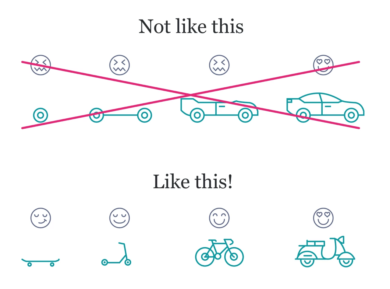

