Leave at Door: New Free WooCommerce Plugin Enables Contact-free Delivery

Category Image 091

As many countries around the world are currently in some form of lockdown to mitigate the spread of the coronavirus, the hospitality industry has been one of the hardest hit by the new restrictions. Restaurants and breweries in particular have had to radically change how they do business and either lay off or furlough the majority of their employees. Many of those that have survived the mandated dine-in closures are jump-starting delivery services in order to stay afloat.

Scott DeLuzio, a WordPress plugin developer and founder of Amplify Plugins, recently noticed a “leave at door” option when ordering food from a local restaurant. He thought it would be a helpful option for WooCommerce store owners to add and created a plugin that makes it easy.

Leave at Door is now available for free from the official WordPress Plugin Directory. It enables customers to maintain social distancing while receiving deliveries. The plugin adds a checkbox before the Place Order button at checkout, which reveals an optional text input for additional delivery instructions. If the customer chooses contact-free delivery, store owners will see it displayed on the admin order edit screen and in the order email. It will also be displayed on the customer’s order invoice.

DeLuzio’s Amplify Plugins shop focuses on plugins that improve the customer experience in WooCommerce. He reported that his products have seen more activity since social distancing recommendations were put in place. With the pandemic slowing down shipments from Amazon and other major retailers, local and independent stores have an opportunity to gain the confidence of new customers.

“I have definitely seen an uptick in plugin sales over the last month or so,” DeLuzio said. “I think, through talking to a few customers, this can probably be attributed to traditional brick and mortar stores and restaurants that are looking to move online to compensate for the lack of foot traffic that they are getting in their stores.”

The availability of contact-free delivery may be the deciding factor for some customers in quarantine, which could make all the difference for small business owners.

“There are probably a good number of local businesses that are struggling these days,” DeLuzio said. “Their customers are probably very concerned with the virus and maintaining social distancing, so if something like this plugin can help them out, even in a small way, I’m happy to have been able to put it together for them.”

Even when some economies begin opening up, there will undoubtedly be customers who will still be keen on having a contact-free delivery option, especially those among the populations most vulnerable to COVID-19. The notion of contact-free delivery may have a longer run beyond this current crisis and perhaps even become a permanent fixture on e-commerce checkout screens.

Advantages of VPS Web Hosting

Featured Imgs 07
Wondering why VPS web hosting is becoming increasingly popular? Read on to find the advantages of VPS Web Hosting and Why it’s the best Today!! Image source: https://www.pexels.com/photo/adult-books-business-coffee-374016/ Why Choose VPS Web Hosting Wondering why...

Does GeoIP ever change?

Category Image 041

We had a bug a little while back where we were accessing an old database for the GeoIP API.

That meant that, for users whose geolocation were mapped from their IP address, it was incorrect/unknown for IP subnets not in the database.

Now, 1-2 years later, can we go back and retroactively retrieve the correct location for each of those IP addresses with a more updated database? Or, is it possible, for example, that ISPs may recycle IP addresses across different cities/states?

CSS Scrollbar With Progress Meter

Category Image 052

Scrollbars are natural progress meters. How far the scrollbar is down or across is how much progress has been made scrolling through that element (often the entire page). But, they are more like progress indicators than meters, if you think of a meter as something that “fills up” as you go.

We can use some CSS trickery to make the scrollbar fill up as we go.

This will only work with -webkit- vendor-prefixed scrollbar-styling properties. In other words, these are non-standard. The standardized scrollbar styling properties are scrollbar-width and scrollbar-color, which can’t pull this kind of thing off, but are probably a safer bet in the long run. Still, the vendor-prefixed versions probably aren’t going anywhere, so if you consider this a weird form of progressive enhancement, that’s probably fine.

What’s the trick?

Essentially, it’s hanging a huge box-shadow off the top of the scrollbar thumb — or off the side if it’s a horizontally scrolling element.

:root {
  --shadow: #43a047;
  --scrollbarBG: #eee;
  --thumbBG: #66bb6a;
}
::-webkit-scrollbar {
  width: 16px;
}
::-webkit-scrollbar-track {
  background: var(--scrollbarBG);
}
::-webkit-scrollbar-thumb {
  background-color: var(--thumbBG);
  box-shadow: 0 -100vh 0 100vh var(--shadow), 0 0 15px 5px black;
}

Demo

I first saw this in a Pen by Myk.

That example didn’t differentiate the thumb part of the scrollbar at all, which makes it more meter-like, but also harder to use. My demo has a slightly different color thumb.

Can I really use this?

No! Aside from it being super weird and non-standard. Safari flips it’s lid and I have no idea how to fix it.

I do happen to have a favorite CSS trick that is highly related to this though.

I want to learn more about styling scrollbars

Cool, here you go.

The post CSS Scrollbar With Progress Meter appeared first on CSS-Tricks.

GitHub Makes Core Features Free to Everyone

Featured Imgs 23

GitHub has announced that private repositories with unlimited collaborators will now be free for everyone. Additionally, the company is lowering the cost of its paid plans in order to improve affordability for teams that require advanced features and personalized support.

How to Add Navigation Menu in WordPress (Beginner’s Guide)

Category Image 091

Do you want to add a navigation menu to your WordPress site?

WordPress comes with a drag and drop menu interface that you can use to create header menus, menus with dropdown options, and more.

In this step by step guide, we will show you how to easily add a navigation menu in WordPress.
How to Add Navigation Menu in WordPress

What is a Navigation Menu?

A navigation menu is a list of a links pointing to important areas of a website. They are usually presented as a horizontal bar of links at the top of every page on a website.

Navigation menus give your site structure and help visitors find what they’re looking for. Here’s how the navigation menu looks on WPBeginner:

The WPBeginner navigation menu

WordPress makes it really easy to add menus and sub-menus. You can add links to your most important pages, categories or topics, blog posts, and even custom links such as your social media profile.

The exact location of your menu will depend on your WordPress theme. Most themes will have several options, so you can create different menus that can be displayed in different places.

For instance, most WordPress themes come with a primary menu that appears on the top. Some themes may include a secondary menu, a footer menu, or a mobile navigation menu as well.

Creating Your First Custom Navigation Menu

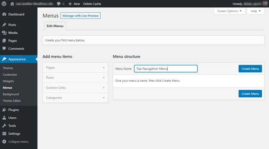
To create a navigation menu, you need to visit the Appearance » Menus page in your WordPress admin dashboard.
Creating a menu in WordPress

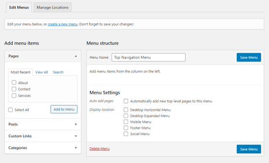
First, you need to provide a name for your menu, like ‘Top Navigation Menu’ and then click the ‘Create Menu’ button. This will expand the menu area, and it will look like this:
A newly created menu in WordPress

Next, you can choose the pages you want to add to the menu. You can either automatically add all new top-level pages, or you can select specific pages from the left column.

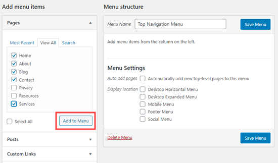
First, click the ‘View All’ tab to see all your site’s pages. After that click the box next to each of the pages you want to add to your menu, and then click on the ‘Add to Menu’ button.
Adding items to the navigation menu

Once your pages have been added, you can move them around by dragging and dropping them.
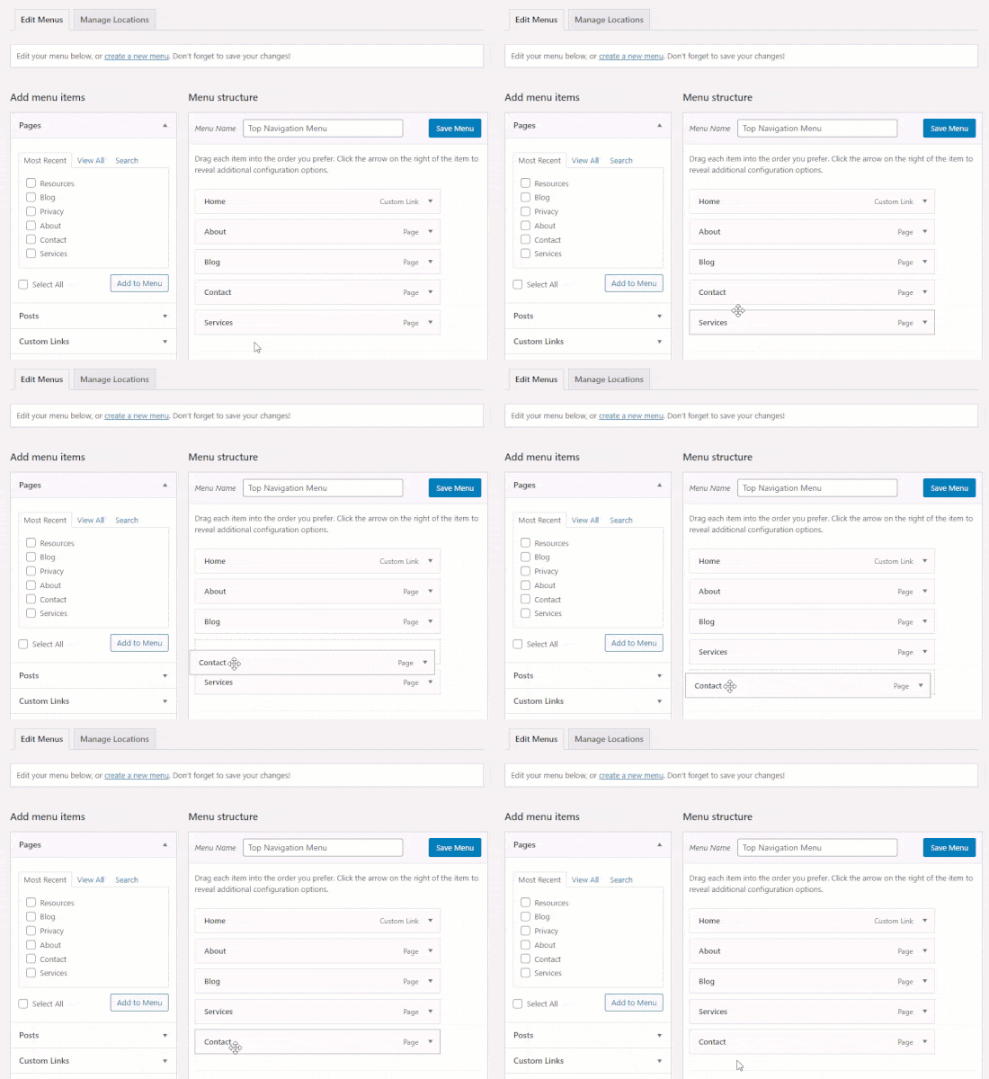
Dragging and dropping an item to move it in the menu

Note: All menus have their items listed in a vertical (top to bottom) list in the menu editor. When you put the menu live on your site, it’ll either display vertically or horizontally (left to right), depending on the location you select.

Most themes have several different locations where you can put menus. In this example, we’re using the default 2020 theme, which has 5 different locations.

After adding pages to the menu, select the location where you want to display the menu and click on the ‘Save Menu’ button.
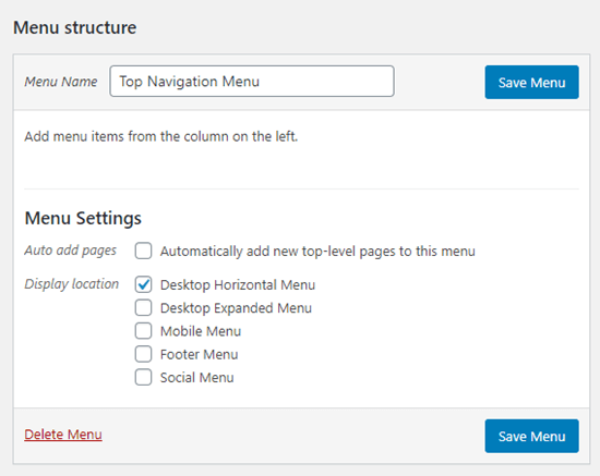
Selecting the display location for your menu

Tip: If you’re not sure where each location is, try saving the menu in different places, then visiting your site to see how it looks. You probably won’t want to use all the locations, but you might want to use more than one.

Here’s our finished menu on the site:

Finished Live Navigation Menu

Creating Drop-Down Menus in WordPress

Drop-down menus, sometimes called nested menus, are navigation menus with parent and child menu items. When you run your cursor over a parent item, all the child items will appear beneath it in a sub-menu.

To create a sub menu, drag an item below the parent item, and then drag it slightly to the right. We’ve done that with 3 sub-items beneath ‘Services’ in our menu:
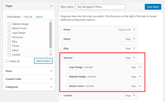
Add menu items as a sub-men

Here’s the sub-menu live on the site:
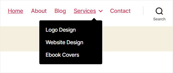
A drop-down sub menu in the site's navigation

You can even add multiple layers of dropdown, so that your sub menu can have a sub menu. This can end up looking at bit cluttered, and many themes do not support multi-layer drop-down menus.

In this example, you can see that ‘Logo Design’ (a child item of ‘Services’) has two child items of its own.
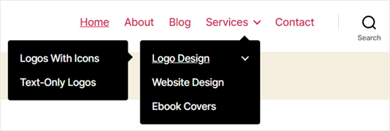
A nested drop-down menu

Adding Categories to WordPress Menus

If you’re using WordPress to run a blog, then you may want to add your blog categories as a drop-down in your WordPress menu. We do this on WPBeginner:
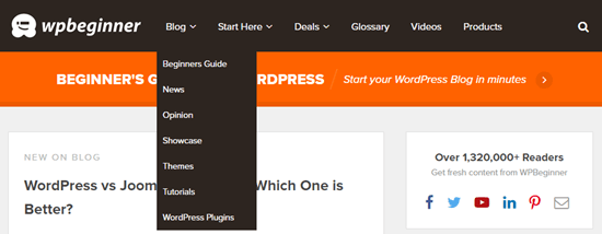
The WPBeginner menu showing the categories drop-down

You can easily add categories to your menu by clicking the Categories tab on the left side of the Menus screen. You may also need to click the ‘View All’ tab to see all your categories.

Simply select the categories you want to add to the menu, and then click the ‘Add to Menu’ button.
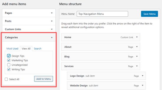
Adding categories to your menu

The categories will appear as regular menu items at the bottom of your menu. You can drag and drop them into position. We’re going to put all of these categories under the Blog menu item.
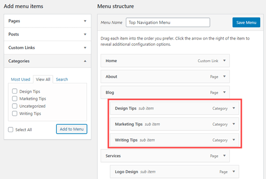
Putting the categories under the 'Blog' menu item

Do you want to have a blog page on your site that’s separate from your homepage? If so, check out our tutorial on how to create a separate page for blog posts in WordPress.

Adding Custom Links to Your WordPress Navigation Menus

Aside from categories and pages, WordPress also makes it super easy to add custom links to your menu. You can use it to link to your social media profiles, your online store, and / or other websites that you own.

You will need to use the ‘Custom Links’ tab on the Menu screen. Simply add the link along with the text you want to use in your menu.
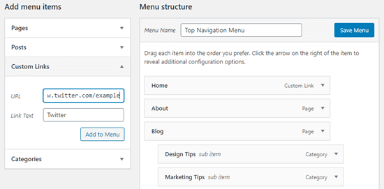
Adding a custom link to Twitter to the menu

You can even get creative and add social media icons in your menu.
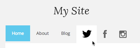
Social media menu

Editing or Removing a Menu Item in WordPress Navigation Menus

When you add pages or categories to your custom navigation menu, WordPress uses the page title or category name as the link text. You can change this if you want.

Any menu item can be edited by clicking on the downward arrow next to it.
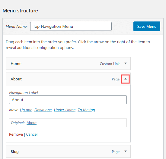
Expanding a menu item to edit its name

You can change the name of the menu item here. This is also where you can click ‘Remove’ to take the link off your menu altogether.

If you’re struggling with the drag and drop interface, then you can also move the menu item around by clicking the appropriate ‘Move’ link.

Adding WordPress Menus in Sidebars and Footers

You don’t have to just stick to the display locations for your theme. You can add navigation menus in any area that uses widgets, like your sidebar or footer.

Simply go to Appearance » Widgets and add the ‘Navigation Menu’ widget to your sidebar. Next, add a title for the widget and choose the correct menu from the ‘Select Menu’ drop down list.
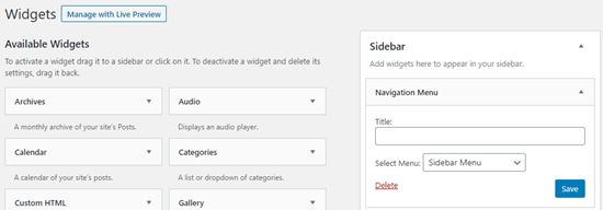
Adding a menu as a sidebar widget

Here’s an example of a custom WordPress footer menu built on Syed Balkhi website.

WordPress Footer Menu Example - Syed Balkhi

Going Further with Navigation Menus

If you want to create a truly epic menu with loads of links, we’ve got a tutorial on how to create a mega menu in WordPress. This lets you create a drop-down with lots of items including images.
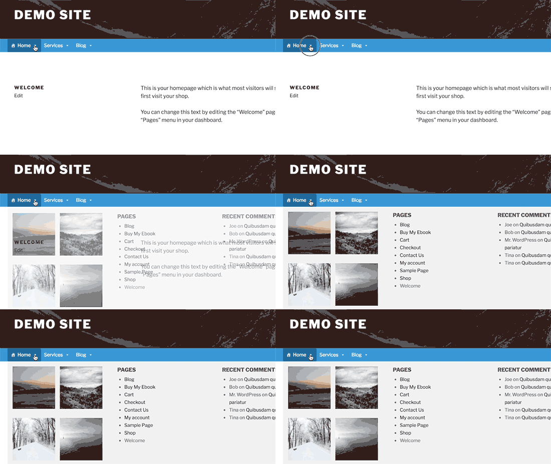
Mega menu preview

Mega menus are a great option if you have a large site, like an online store or news site. This type of menu is used by sites like Reuters, Buzzfeed, Starbucks, etc.

We hope this article helped you learn how to add a navigation menu in WordPress. You may also want to check out our guides on how to style navigation menus in WordPress and how to create a sticky floating navigation menu in WordPress.

If you liked this article, then please subscribe to our YouTube Channel for WordPress video tutorials. You can also find us on Twitter and Facebook.

The post How to Add Navigation Menu in WordPress (Beginner’s Guide) appeared first on WPBeginner.

No-Class CSS Frameworks

Featured Imgs 23

I linked up Water.css not long ago as an interesting sort of CSS framework. No classes. No <h2 class="is-title">. You just use semantic HTML and get styles. Is that going to “scale” very far? Probably not, but it sure is handy for styling things quickly, where — of course — you’re writing semantic HTML but don’t need to care tremendously about the look, other than it should look as decent as it can with low effort.

This week I saw MVP.css making the rounds. Same idea. There are a bunch more!

Even Foundation, while being a big honkin’ framework, does some pretty decent stuff classless-ly™.

The post No-Class CSS Frameworks appeared first on CSS-Tricks.

How to Start a WordPress Business

Featured Imgs 26

How To Start A WordPress Based BusinessIs it possible to build a successful business around WordPress today? The short answer is yes. In 2020 there are millions of freelancers earning a living online – and many of them have businesses they created around WordPress. There are solid reasons for this: WordPress continues to grow as a simple and versatile publishing platform […]
The post How to Start a WordPress Business appeared first on WPExplorer.

When debugging, your attitude matters

Category Image 052

Julia Evans:

I was debugging some CSS last week, and I think that post is missing something important: your attitude.

Now – I’m not a very good CSS developer yet. I’ve never written CSS professionally and I don’t understand a lot of basic CSS concepts (I think I finally understood for the first time recently how position: absolute works). And last week I was working on the most complicated CSS project I’d ever attempted.

While I was debugging my CSS, I noticed myself doing some bad things that I normally would not! I was:

• making random changes to my code in the hopes that it would work
• googling a lot of things and trying them without understanding what they did
• if something broke, reverting my changes and starting again

This strategy was exactly as effective as you might imagine (not very effective!), and it was because of my attitude about CSS! I had this unusual-for-me belief that CSS was Too Hard and impossible for me to understand. So let’s talk about that attitude a bit!

It’s super unfortunate this specific bug (a difference in z-index behavior between Chrome and Firefox) is what was giving Julia a hard time. Those kind of cross-browser differences are fewer and farther between these days, thankfully. I’m certainly sympathetic to CSS being super tricky sometimes, and it can be that way without dealing with an actual browser bug.

But I like the sentiment: if you go into a tricky problem with a positive I can do this attitude starting with the basics, you can do it.

I think literally everything in life is easier and better with a better attitude. Food tastes better! Reminds me of my favorite mis-remembered quote from good ol’ Uncle Iroh from The Last Airbender:

The best tasting tea is the tea you drink when you are in a good mood.

Direct Link to ArticlePermalink

The post When debugging, your attitude matters appeared first on CSS-Tricks.

Thinking in Behaviors, Not Screen Sizes

Category Image 052

Chase McCoy wrote a nifty post about the “gap problem” when making a grid of items. His argument might be summarized like this: how should we space elements with margins in CSS? He notes that the gap property isn’t quite ready for prime time when it comes to using it with flexbox, like this:

.grid {
  display: flex;
  gap: 10px;
}

Right now, using gap with flexbox is only supported in Firefox and I’ve already caught myself forgetting about that in a few projects. So watch out for that.

Anyway, the part about Chase’s blog post that I love is where he mentions Andy Bell’s technique for creating a responsive layout with no media queries, like this:

.grid {
  display: grid;
  grid-gap: 10px;
  grid-template-columns: repeat(auto-fill, minmax(150px, 1fr));
}

This CSS is doing the following:

  • Make a grid with a 10px gap between each column and row.
  • Each column should have a minimum width (150px).
  • Each column should also be equal width (1fr).
  • The grid should auto-fill as many columns that can fit.

The nifty thing about all this is that our grid is now effectively responsive because of minmax — if you resize the browser, then the grid will snap down into fewer columns, just like this:

No media queries at all! Although sure, there’s a few other ways that you could get this to work but I think this is neat not just because we’re avoiding media queries — instead, it’s because it teaches us to think in a new way when designing and building components.

Chase continues:

With this technique, instead of using breakpoints to specify the screen size where your items should stack, you specify the minimum size an element should be before it stacks. I like this because it encourages developers to think about responsive design in terms of behaviors instead of screen sizes.

“Behaviors instead of screen sizes” is such a great way to think about component design! A lot of the problems I’ve encountered when making components for a design system is when I’ve been thinking about screen sizes — mobile, tablet, desktop, etc. — and trying to make those components fit within those constraints.

Thinking in behaviors is always more effective because there are so many things that can impact a component beyond what screen or device width we’re working with. Perhaps we want that component to fit inside another component. Or we want to align some helper text to the side of it for comparison.

Either way, thinking about behaviors instead of screen sizes isn’t really going to be fully impossible until we have container queries, as Chris writes:

Container queries are always on the top of the list of requested improvements to CSS. The general sentiment is that if we had container queries, we wouldn’t write as many global media queries based on page size. That’s because we’re actually trying to control a more scoped container, and the only reason we use media queries for that now is because it’s the best tool we have in CSS. I absolutely believe that.

The post Thinking in Behaviors, Not Screen Sizes appeared first on CSS-Tricks.

CSS Foldable Display Polyfill

Category Image 052

Foldable phones are starting to be a thing. Early days, for sure, but some are already shipping, and they definitely have web browsers on them. Stands to reason that, as web designers, we are going to want to know where that fold is so we can design screens that fit onto the top half and bottom half… or left half and right half¹.

Looks like that’s going to make its way to us in the form of env() constants, just like all that notch stuff.

The code block in the polyfill repo is:

@media (spanning: single-fold-vertical) {
  body {
    flex-direction: row;
  }
  .map {
    flex: 1 1 env(fold-left)
  }
  .locations-list {
    flex: 1;
  }
}

I would also think it could be…

@media (spanning: single-fold-vertical) {
  .page-wrap {
    display: grid;
    grid-template-columns: env(fold-left) 1fr;
  }
}

Interesting how there is no fold-right, isn’t it? And aren’t we trying to stay away from directional terms like that and use logical properties? Why not fold-inline-start?

  1. It’ll be interesting to see how that sentence ages. Just watch the first really popular foldable phone will have three segments.

The post CSS Foldable Display Polyfill appeared first on CSS-Tricks.