Challenges Faced By Native & Indigenous Entrepreneurs [Data + Expert Tips]

Featured Imgs 23

Welcome to Breaking the Blueprint — a blog series that dives into the unique business challenges and opportunities of underrepresented business owners and entrepreneurs. Learn how they’ve grown or scaled their businesses, explored entrepreneurial ventures within their companies, or created side hustles, and how their stories can inspire and inform your own success.

For many Native entrepreneurs, it’s not active discrimination that proves the biggest issue in getting a business off the ground. In fact, per a recent Breaking the Blueprint HubSpot Blog survey, many Natives don’t feel like their heritage figures one way or the other into their entrepreneurship challenges.

Instead, it is the generational disadvantages that accompany past discrimination, such as a chronic lack of credit and capital access, alongside new issues like discoverability and scalability.Read more Breaking the Blueprint content

It’s unfortunate that these challenges can pose significant hurdles to entrepreneurs and business people looking to find success. But they are survivable.

I reached out to Native and Indigenous Entrepreneurs to hear their direct takes on these challenges and ask their advice for rising above and overcoming them. Here’s what they had to say.

Top Challenges Faced by Native & Indigenous Entrepreneurs

Respondents to the survey I mentioned above were asked to name their three biggest challenges.

Roughly 56 percent of respondents pointed to financial issues such as raising capital or budgeting, while 33 percent cited growing and scaling their businesses as a major issue.

Lastly, getting the word out and building awareness was an issue for 24 percent of respondents.

native-and-indigenous-challenges

1. Financial Challenges

Financial challenges make sense, says Heather Fleming (Navajo), executive director for Tuba City, Arizona-based business incubator Change Labs.

Fleming’s program works closely with Navajo and Hopi entrepreneurs to hone and grow their businesses. She sees these challenges facing participants firsthand — many of them are the symptoms of larger problems, like infrastructure issues and a chronic lack of access to credit in Indian Country.

“The financial challenges like securing capital have been a long-standing issue, just because of the way land is structured. You can’t use it as collateral if it’s reservation land, because it’s held in federal trust,” Fleming said.

“When we talk about scaling — there’s a specific challenge for many people because of the transition to e-commerce. I was just reading our annual reporting, and a lot of members talked about the lack of reliable internet. How do you grow a business if everything’s confined to your home and your internet reliability isn’t great?”

The lack of credit access is often worsened by exclusion from otherwise good-intentioned financial programs at large, nationwide banks. Chad Johnson (Cherokee), founder and president of farm logistics company The Akana Group, pointed to a shortage of such programs at nationwide financial institutions.

Due to a combination of aforementioned land laws and a lack of generational wealth, credit in Indian Country is a different beast - and without specialized financial programs, that means Indigenous entrepreneurs miss out, Johnson said.

“There are these big guys, and they have these programs, but they’re not there for Natives,” Johnson said. “The financial institutions really struggle with getting credit access to Native entrepreneurs.”

Quote 1

There are resources, such as community development financial institutions (CDFIs), which are often tailor-made for the Native communities they serve. But funding for Native CDFIs is limited - and when a business owner hits a certain point, microloans aren’t going to cover scaling costs, Johnson said.

For example, the Akana Group has partnered with farm equipment manufacturer John Deere to get equipment into Native producers’ hands and has started doing business internationally for other projects. That means scaling well beyond the capacity of many Native CDFIs to cover, Johnson said.

“There’s this missing gap between, ‘I’m a start-up,’ and ‘I need a $10 million line of credit,” Johnson said. “Where do Natives go when they need a $10 million loan?”

2. Getting the Word Out and Building Awareness

Then there’s the marketing. Justin Quis Quis (San Pasqual Band of Mission Indians) heads up Sacred Bev, a beverage company in California. Quis Quis says marketing is a complex thing that requires a lot of focus and long term vision to pan out.

He pointed to initial marketing efforts for his company’s product - a set of functional beverages using Indigenous ingredients - as a costly failure.

“I’ve already been through a marketing agency, nationwide, and it did nothing for me,” Quis Quis said. “I spent a bunch of money, and it did nothing.”

To get the word out and build awareness, Quis Quis suggests leveraging marketing, focusing on your product, starting small, and working smart.

He has since gone back to marketing his drink locally, working on finding a distributor and building success from there. He just ordered his fourth run of 20,000 cans of his product.

His advice on marketing, and securing investors, is to develop a long-term vision for the product or service and focus as much as possible on its uniqueness.

“Marketing is a necessary evil,” Quis Quis said. “You just have to be careful which route you go. Be realistic with your ideas, and don’t spend a ton of money to start off. It’s easy to get caught up in something that seems big and translates to you going big. Be judicious.”

Quote 2

Fleming said it could be difficult to stay on top of marketing trends while managing all the other aspects of starting a business. Instead, she recommended finding marketing blogs or podcasts that could do some of that legwork to keep the messaging as on-trend as possible.

Fleming said it’s also a good idea to find other Natives to collaborate with when marketing Native products or services. Change Labs has had a lot of success when pairing its program participants with Native graphic designers, for example, since it’s more likely they will understand another Native’s needs and vision.

Her third big tip was to get comfortable with digital tools. She watched many business owners struggle with moving to e-commerce during the advent of COVID-19 as flea markets and art shows shut down.

Aspiring entrepreneurs should familiarize themselves with programs like Canva, which can help design logos and visual messaging, and AI tools like ChatGPT.

“We hear a lot of people say things like ‘I don’t know what I want to say,’” Fleming said. “You have all these tools now that can help you with that - you can get the basic message out and then get it into ChatGPT and have that help you clean it up. There’s no excuse for bad copy when you have tools like that now.”

Quote 3

3. Growing and Scaling

Say the marketing efforts pay off, and it’s time to grow. That means scaling up production, shipping logistics, or service access - and that means money, said Quis Quis and Fleming.

Fleming referred back to internet connectivity. Large swathes of the Navajo reservation are offline due to scattershot physical infrastructure like signal towers and fiber optic lines.

Running an online side business from a local library or coworking space is one thing, but aiming to make a living usually means scaling that idea up.

That means consistent connectivity, which could mean anything from a hotspot to a Starlink modem, which can run around $500. Small improvements like that can create huge growth for businesses expanding into new markets.

But even with a thriving side business, many Natives, being among the poorest demographics in the United States, won’t have that spare $500 for a unit, stifling their growth.

That can be where places like Change Labs come in, Fleming said. The organization offers participants loans after completing workshops and other activities as part of a yearly cohort.

“I think it’s critical that we do that. Access to just a little bit of money would improve their ability to participate in e-commerce,” Fleming said. “I think when you‘re a business owner, it’s easy to overlook how important it is to have access to loans or financing in order to grow your business.”

Quis Quis said access to credit is crucial to getting anywhere with growth, however. That goes back to marketing: being able to present a product or service to investors or lenders as something that can scale up. Putting together a solid business plan and a clear vision can make that process much smoother.

“Money is competitive,” Quis Quis said. “You need a really good financial plan in order to look attractive to investors and to have that plan set out as tightly as you can.”Quote 4

Cherish the little victories, because those are hard to obtain.

As much of an uphill climb as Native entrepreneurship can be, the results can be incredible. As a business journalist, I’ve followed stories of people who make the climb and begin building wealth for their families and communities.

For example, I first shared a profile for Johnson’s Akana Group well before their first forays into international trade missions and overseas business.

But getting there takes patience and perseverance, says Quis Quis.

“You have to have that long-term vision - there’s no overnight success. That’s not meant to be discouraging, just to say that it takes determination and the ability to see down the road,” Quis Quis said. “There’s a lot of good things out there, but you’re going to go through a meat grinder to find it. If you understand those realities, you can fight through it and succeed.”

There are resources for Indigenous entrepreneurs at nearly any step of their journey: tribal grants for people just getting started, incubators for people hoping to learn where to go next, and financial institutions for taking bigger steps into bigger finances.

While gaps exist and the available resources have a long way to go, seeing what’s available is always a good first step.

Johnson said one of those resources should be mentorship and connectedness with other Native businesses. It’s easy to feel compartmentalized and isolated, but working with other Native businesses can help with figuring out solutions to problems that are sometimes uniquely Indigenous.

“When I talk to other Indigenous business owners, I say, you’re not going through anything that’s unique to you,” Johnson said. “We’ve got to come together and show up for each other. That’s a big part of it.”

Click the link to discover more Breaking the Blueprint Content.

3 Point-of-Need Advertising Opportunities — and How to Tap Into Them

Featured Imgs 23

Are you hoping to bypass overcrowded channels and engage your audience at the perfect moment? If your answer is yes, you may want to learn about Point-of-Need paid advertising opportunities.

Download Now: Free Ad Campaign Planning Kit

Too many advertisers stick to the basics — they pour money into Google keywords, Facebook ads, maybe even a few billboards or podcast spots.

But here’s the problem: these channels are overcrowded, and the competition is fierce. Ultimately, you end up paying top dollar for less impact, and the returns are dwindling.

If you’re ready to set yourself further away from the competition and tap into advertising channels where your audience is actually engaged, it’s time to rethink your approach. As Kieran and I discuss in a recent episode of Marketing Against the Grain, one high-impact way to do that is Point-of-Need advertising.

In this post, we dig into exactly what Point-of-Need advertising is and how you can use it to cut through the advertising noise and capture your audience’s attention when it matters most.

What is Point-of-Need advertising and why does it matter?

I’ll be honest: Point-of-Need (PoN) advertising is a term I made up. But it’s a potent, actionable strategy that Kieran and I frequently use to maximize our ad spend.

Point-of-Need (PoN) advertising is a tactic that targets your audience at the exact moment they’re most engaged and in need of something — like getting online during a flight, waiting for a taxi ride, or while watching their favorite show.

Especially when traditional ads are becoming increasingly ignored or skipped over, PoN advertising hits when your audience is already laser-focused. So instead of fighting for attention in crowded channels, you’re placing your brand in front of people when they’re most receptive and primed to pay close attention.

This boosts engagement and increases the chances that your message will stick and drive real results.

3 Ways to Incorporate Point-of-Need Advertising Opportunities

Not sure how to get started with PoN advertising? Kieran and I have you covered.

Learn how to reshape your marketing plans with these three, high-impact approaches, along with resources from HubSpot’s Free Advertising Plan Kit.

Let’s dive in!

1. WiFi Sponsorships

One of the most effective PoN advertising opportunities is WiFi sponsorships in transportation, like in airports or on trains. In fact, one of HubSpot’s most successful ad campaigns for both brand awareness and conversion came from testing WiFi ads on airplanes.

We hypothesized that this type of advertising would hit people when and where they’re more attentive — and we were right.

Think about it: when people are on a plane, train, or subway, they’re stuck. They can’t leave, they’re looking for something to do, and most importantly, they want to get online.

If the ‘price’ of WiFi is watching a short ad, they’re going to watch it until they get access to what they wanted in the first place — and that’s what makes this such a powerful PoN moment.

2. Gig Marketplaces

Another untapped PoN opportunity is in-app ads on gig marketplace platforms like Lyft or DoorDash. These are moments when users are waiting for a time-dependent service — a ride, a delivery — and they’re again actively engaged with the app, waiting for a status update.

Take a look at the customer experience when using Uber, for example. When you open the app to call a ride, you’re immediately locked into the experience — checking the driver’s location, ETA, car description, and other details.

Suddenly, an app that was built for transportation transforms into a robust advertising platform. Yet again, this is because users are completely glued to their screens, willingly giving you their undivided attention, until they get the service they originally ordered.

3. Free or Low-Cost Streaming Services

A final, often overlooked, PoN opportunity is Over-the-Top (OTT) advertising on free or low-cost streaming services like Hulu or the ad-supported version of Peacock.

What’s particularly powerful about this strategy is that OTT allows you to reach viewers who are already open to consuming content. They’ve already settled in to watch an entire film or episode — so what’s another 30 seconds?

Plus, with free streaming services, users already expect ads as part of the experience, making them more likely to engage with your message because it’s a transparent part of the deal.

To learn more about accessing untapped advertising opportunities, check out the full episode of Marketing Against the Grain below:

This blog series is in partnership with Marketing Against the Grain, the video podcast. It digs deeper into ideas shared by marketing leaders Kipp Bodnar (HubSpot’s CMO) and Kieran Flanagan (SVP, Marketing at HubSpot) as they unpack growth strategies and learn from standout founders and peers.

How (& Where) Consumers Discover Products on Social Media [New Data]

Featured Imgs 23

Marketing is all about meeting people where they are — and more often than not, they're on social media. For this reason, it's crucial to invest in social product discovery.

Download Now: The State of U.S. Consumer Trends [Free Report]

In other words, use social media as a vehicle for consumers to discover your products.

Of course, not all social media platforms are created equal, especially when it comes to product discovery. So, if you're looking to pinpoint the platforms consumers use the most for product research, you've come to the right place.

Here, we'll dive into:

Let's dive in.

Shopper research is critical for a better understanding of the customer journey from initial searches to website visits and eventual purchases.

Plus, the advent of digital- and mobile-first interactions has made this research even more important as the customer journey now includes multiple paths and touchpoints from start to finish.

For example, prospective buyers might hear about your brand from a friend, do their research on social media, and then interact with your e-commerce store through their mobile device.

Understanding all touchpoints along this journey can help companies create more seamless and streamlined experiences for consumers and increase overall ROI.

The Top Social Media Channels Consumers Use For Product Discovery

26% of consumers prefer to discover new products via social media, according to HubSpot's 2024 State of Consumer Trends Report. Let's take a closer look at the channels they leverage for product discovery:

Gen Z

40% of Gen Z have discovered new products on social media in the past three months, and 41% say it's their preferred channel for discovering new products. 

Almost half (48%) of Gen Z consumers prefer to discover new products via short-form video platforms like TikTok and Instagram Reels. Moreover, almost a third of Gen Z respondents say TikTok is their favorite app.

Millennials

The divide between Millennials and Gen Z seems to be narrowing in terms of how and where they discover new products. Like Gen Z, the majority of Millennials in our survey (43%) say they've discovered a new product via social media in the past three months. 

Furthermore, 47% prefer discovering new products on social media via short-form videos like Instagram Reels, TikToks, and YouTube Shorts. 

"Social media allows me to see the products in context," says consumer and HubSpot Marketing Manager Erica Santiago. "Whether it's an influencer or creator using the product or someone demonstrating how to use it—short-form videos allow me to quickly assess how a product works and if I want to buy it."

@erikeepswriting

To learn more, check out our post “Top Shopping Trends of 2024 and How They’ve Changed” on the HubSpot blog #marketing #shopping #hubspot

♬ Brunch (Lofi) - Muspace Lofi

Gen X

Gen X discovers new products on social media at the same rate as Gen Z, with 40% saying they've discovered a new product on social media in the last 3 months.

And like both Millennials and Gen Z, the majority of Gen X (36%) prefers short-form videos when it comes to finding new products on social media.

Baby Boomers

Social media falls flat for boomers—only a slim 20% have discovered a product on it in the past three months, and only 8% prefer purchasing a product through that medium.

That said, of those who use social media (43%) prefer discovering new products via social media marketplaces where purchases happen off the app. An example would be Facebook Marketplace. 

Copy of Linkedin - 1104x736 - Horizontal Bar Graph - Dark (9)

Social Media Product Strategy Examples

1. Dizzy With Excitement 

Dizzy With Excitement is a wallpaper brand known for its quirky and artistic designs.

To bring awareness to its brand, DWE collaborates with other creators and brands that focus on off-the-wall designs by incorporating those designs into the wallpaper. The brand then promotes these collaborations via short-form video platforms like TikTok. 

For example, DWE collaborated with TikToker Kaarin Joy, who specializes in unique, whimsical home DIY projects. DWE created wallpaper based on Joy's DIY projects, and Joy showed on TikTok the wallpaper being displayed in her home, tagging DWE in her posts.

@kaarinjoy

Finally adding some color to the walls in the house! This print will be available July 29th on the @dizzywithexcitement website!🩷

♬ ♡ ᶫᵒᵛᵉᵧₒᵤ ♡ - SoBerBoi

2. Heidi Daus

Heidi Daus is a brand specializing in dazzling, sparkly statement jewelry. While the brand doesn't have an official TikTok, it's starting to leverage TikTok by collaborating with creators like Andrea's Fashion Galaxy.

Andrea is a content creator focusing on fashion and style inspiration, and she often refers to herself as a magpie due to her love for shiny clothes and accessories.

So, it made sense Heidi Daus would collaborate with Andrea, who styles a few outfits around the shiny jewelry pieces. The video also features an exclusive discount code viewers can use to buy from the brand. 

Both Heidi Daus and Dizzy With Excitement are great examples of leveraging social media with influencer marketing.

@andreasfashiongalaxy

How to style sparkly jewellery outfits ft Heidi Daus #letsgetdressed AD

♬ original sound - andrea’s fashion galaxy

3. Fenty Beauty 

Makeup brand Fenty Beauty is known for leveraging influencer marketing in its strategy, which makes sense considering its founder and owner is one of the most influential pop stars in the world—Rihanna! 

However, Fenty Beauty added something else to its social media strategy—creating its own TikTok filter! TikTok allows creators to create their own filters and share them with other users.

Doing so sparks trends and encourages people to make and share more content using the filter.

In July, Fenty Beauty launched a TikTok filter called its "Lip Combo Generator." The generator cycles through pairs of Fenty lip liners and Fenty lipsticks before generating a combo that appears on the user's lips.

This filter promotes different Fenty products and allows users to see which combo works for them. 

@fentybeauty

#FentyLipCombo generator? Say less!! 💄 Tap into our NEW #TikTokEffect 🪄 to try out some of @Rihanna’s most iconic lip combos 💋✨ Which RiRi are you, #FentyFam?

♬ Pop like this Pt. 2 (Sped Up) - prodbycpkshawn

When leveraging different social media platforms, think of clever ways the platform's in-house tools can help you promote your products and give your audience and idea of how it would work for them.

For example, if you're a clothing brand, considering making a filter matching different items to the viewer. 

4. Gibson 

Iconic guitar manufacturing company Gibson Guitar leverages Instagram to promote its latest guitars and amps. Specifically, the brand leans into the art of videography and photography, displaying its productvia s crisp, clean, professional videos and photos. 

Most of the top performing videos feature professional videos of musicians playing the instruments or a carousel of photos highlighting the look and craftsmanship of the products. 

What types of product content do consumers watch or engage with?

If you're looking to leverage social media, it's a good idea to know what types of branded content consumers enjoy.

More than half of consumers (52%) find funny content the most memorable, followed by content showcasing the brand's products via demos, teasers, etc.

Facebook

Facebook has a whopping 3.07 billion monthly active users and has been around since the early 2000s. Most importantly, it provides many opportunities for consumers to discover new products. 

Free Promotion

By now, you probably know that any company can create a Facebook Business Page. Once you create a business page, you can share posts about your products and offerings.

If you have happy customers, you can even ask them to review your business on Facebook so prospects researching you can see how you've pleased your customers in the past.

In addition to creating a page to highlight your brand, you can also post your products on Facebook's Marketplace.

Although individual users often use the Marketplace to sell items they no longer want to other people, Facebook Business pages are also eligible to use this feature.

Our consumer trends survey found that a third of consumers prefer discovering new products via social media marketplaces where purchases happen outside the app. 

Marketplace listings can include product shots, pricing, product specifications, and purchasing information. You should also consider talking about your products or offerings on Facebook Stories.

This might take a little extra effort because it will require you to film or create content in the Story format, but it can help you better connect with prospective buyers who want a better sense of what your brand is about.

Paid Promotion

Because Facebook's feed algorithmically favors posts from individual accounts over businesses, you might decide that you want to put money into Facebook Ads.

Facebook Ads has a solid track record. It's estimated that Facebook Ads can help marketers reach as many as 2.249 billion users

With Facebook Ads, you can create advertisements with a certain goal in mind, such as conversions or in-store foot traffic. The detailed ads software also allows you to target specific audience demographics.

As a Facebook advertiser, you can either promote a post you've already created to ensure that it shows up on feeds of users in your demographic, or you can create native ads that might show up in feeds or on Facebook's sidebars. 

While promoted posts look like an average post with a simple tag stating they're promoted, the native ads look more like traditional ads to make it clear to users that the content they're seeing is paid for.

If you want to launch video-based ads, Facebook also allows you to promote video content or buy in-stream ad placements that appear in Facebook Live videos or longer videos that other users have uploaded.

YouTube

YouTube is also popular across multiple age groups. In the last three months, 68% of Millennials have visited YouTube, followed by 69% of Gen Z, and 65% of Gen X. More than half of Baby Boomers (51%) have used YouTube in the last three months.

With a branded YouTube channel, you can publish video content such as demos, tutorials, or customer testimonial videos that give insightful details about why your product is valuable.

By filming your own videos, you can insure that you're highlighting all the great aspects of your product that make it stand out from its competitors.

Alternatively, if you don't have time to create your own videos, sponsoring an influencer's content, tutorial, or review related to your product allows you to tap into that content creator's audience as they tell their followers more about your offerings.

Aside from creating your own account or hiring an influencer to give a review or tutorial, you could also consider paid advertisements. YouTube offers a few ad styles including TrueView, Preroll, and Bumpers.

These ads allow you to submit a short video ad to YouTube which is then placed at the beginning or in the middle of videos with metrics and demographics that match your brand's target.

It's worth noting that almost a quarter of consumers in our survey (24%) say they have discovered new products via YouTube ads in the past three months.

To learn the ins and outs of setting up an ad and determining which style is right for you, check out this guide.

YouTube Paid Ad Example

Instagram

Instagram is an excellent platform if you're targeting Gen-Z or millennials who make up the platform's primary audience.

For years, Instagram's visual layout has made it a hot spot for influencer marketing. Influencers regularly post sponsored photos and videos about their experiences with products.

Like YouTube, these influencers also regularly publish video posts or Stories that present tutorials, reviews, and unboxings related to a product.

Aside from influencer marketing, many brands also promote their products on Instagram Stories, Instagram Live, and through standard video or photo posts on Instagram Feed.

Here's an example where Kylie Jenner, the CEO and Founder of Kylie Cosmetics, films a Story-based product tutorial for her company's Instagram account:

Kylie Jenner promotes KylieCosmetics on the brand's Instagram Stories

Along with free strategies, Instagram offers Shoppable posts. With Shoppable posts, you can promote a product in an Instagram post that links to your Facebook Catalog. Here's an example of what a Shoppable Post looks like:

IMG_3969

Here's a blog post that goes into detail about how to use and optimize Shoppable posts.

Pinterest

Pinterest encourages people to pin image-based posts that inspire them to digital boards, mimicking the process of creating a physical inspiration board.

Because people come to this platform to be inspired to do something, such as travel or home decorating, they might find themselves pinning all sorts of product-oriented images on a themed board.

For example, someone who wants to redecorate their office might create an "Office Inspiration" board and pin photos of furniture or decorative items that they'd like to buy.

Here's an example of what these boards look like:

Pinterest board showing different ways to style a maxi skirt or dress

To make it easier for people to find your products, you could consider starting a Pinterest account and making a few boards to highlight your products. Even better, you can leverage Pinterest's product pins feature and create shippable posts like you would on Instagram. 

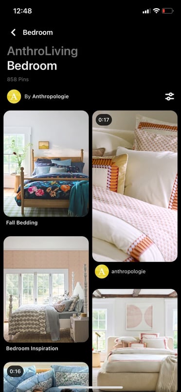
To give you a real-world example of how brands use Pinterest, below is a board created by Anthropologie called AnthroLiving, which features shippable posts featuring the brand's home decor products. 

Screenshot of AnthroLiving Pinterest board showing different home decor items such as bedding and throw pillows

If you have an advertising budget, you can also consider launching pay-per-click ads on Pinterest. Pinterest Ads enables your posts to be seen by people in a specific demographic that matches your own.

The platform also allows you to A/B test photos and target ads to Pinterest users on your contact lists.

Want to learn more about Pinterest Ads and effective experiments to run? Check out this blog post from a PPC and Pinterest expert.

Reddit

Reddit encourages users to create discussion threads in themed online communities, called subreddits. As the platform has evolved, many users have created both threads and subreddits devoted to talking about products, like fast-food restaurants or video games.

Below is an example of a subreddit, or online community, that Reddit users created to talk about all things related to Xbox One.

XboxOne Subreddit discussions on Reddit

However, because comments with promotional language in them often get downvoted or buried in feeds by more engaging Reddit threads, you'll need to be creative if you want to engage with audiences on this platform.

While you might want to keep an eye on Reddit or experiment with it, don't put all of your time and resources into it at least right now.

As it evolves, the platform may become an easier platform to market your brand on, but at the moment, Reddit marketing strategies still require more brainstorming and time than tactics on other social platforms.

Although this platform has been called one of the "trickiest" for marketers to crack, some bigger brands have figured out how to reach the platform's discussion-oriented users.

For example, some brands will create subreddits related to their product, while others will interact by commenting on threads related to their industry.

Aside from creating content for free on Reddit, you can alternatively pay for sponsored posts or ads, similar to Facebook or Twitter. These ads will appear in a user's feed or as a promoted comment in a thread or subreddit.

To learn more about the ins and outs of Reddit marketing, click here for tips and examples of how other brands have cultivated the platform.

Identifying the Right Platforms for Product Marketing

While running ads and product promotions on any social platform can help drive conversion, it’s a good idea to focus on platforms with audiences that already align well with your brand.

For example, broader audiences are actively looking for products or researching brands on Facebook, Instagram, YouTube, and Pinterest while Reddit users tend to be more trend-focused.

Similarly, if you're marketing a B2B company, you might see a better ROI from ads on a professional network like LinkedIn than ads on a more consumer-friendly platform like Instagram.

Use the information provided above, and start leveraging social media for lead conversion and product marketing.

How To Build Custom Data Visualizations Using Luzmo Flex

Featured Imgs 23

This article is a sponsored by Luzmo

In this article, I’ll introduce you to Luzmo Flex, a new feature from the Luzmo team who have been working hard making developer tooling to flatten the on-ramp for analytics reporting and data visualization.

With Luzmo Flex, you can hook up a dataset and create beautifully crafted, fully customizable interactive charts that meet your reporting needs. They easily integrate and interact with other components of your web app, allowing you to move away from a traditional “dashboard” interface and build more bespoke data products.

While many charting libraries offer similar features, I often found it challenging to get the data into the right shape that the library needed. In this article, I’ll show you how you can build beautiful data visualizations using the Google Analytics API, and you won’t have to spend any time “massaging” the data!

What Is Luzmo Flex?

Well, it’s two things, really. First of all, Luzmo is a low-code platform for embedded analytics. You can create datasets from just about anything, connect them to APIs like Google Analytics or your PostgreSQL database, or even upload static data in a .csv file and start creating data visualizations with drag and drop.

Secondly, Luzmo Flex is their new React component that can be configured to create custom data visualizations. Everything from the way you query your data to the way you display it can be achieved through code using the LuzmoVizItemComponent.

What makes Luzmo Flex unique is that you can reuse the core functionalities of Luzmo’s low-code embedded analytics platform in your custom-coded components.

That means, besides creating ready-to-use datasets, you can set up functions like the following out-of-the-box:

  • Multi-tenant analytics: Showing different data or visualizations to different users of your app.
  • Localization: Displaying charts in multiple languages, currencies, and timezones without much custom development.
  • Interactivity: Set up event listeners to create complex interactivity between Luzmo’s viz items and any non-Luzmo components in your app.

What Can You Build With Luzmo Flex?

By combining these off-the-shelf functions with flexibility through code, Luzmo Flex makes a great solution for building bespoke data products that go beyond the limits of a traditional dashboard interface. Below are a few examples of what that could look like.

Report Builder

A custom report builder that lets users search and filter a dataset and render it out using a number of different charts.

Filter Panel

Enable powerful filtering using HTML Select inputs, which will update each chart shown on the page.

Wearables Dashboard

Or how about a sleep tracker hooked up to your phone to track all those important snoozes?

When to Consider Luzmo Flex vs Chart Libraries

When building data-intensive applications, using something like Recharts, a well-known React charting library, you’ll likely need to reformat the data to fit the required shape. For instance, if I request the top 3 page views from the last seven days for my site, paulie.dev, I would have to use the Google Analytics API using the following query.

import dotenv from 'dotenv';
import { BetaAnalyticsDataClient } from '@google-analytics/data';
dotenv.config();

const credentials = JSON.parse(
  Buffer.from(process.env.GOOGLE_APPLICATION_CREDENTIALS_BASE64, 'base64').toString('utf-8')
);

const analyticsDataClient = new BetaAnalyticsDataClient({
  credentials,
});

const [{ rows }] = await analyticsDataClient.runReport({
  property: properties/${process.env.GA4_PROPERTY_ID},
  dateRanges: [
    {
      startDate: '7daysAgo',
      endDate: 'today',
    },
  ],
  dimensions: [
    {
      name: 'fullPageUrl',
    },
    {
      name: 'pageTitle',
    },
  ],
  metrics: [
    {
      name: 'totalUsers',
    },
  ],
  limit: 3,
  metricAggregations: ['MAXIMUM'],
});

The response would look something like this:

[
  {
    "dimensionValues": [
      {
        "value": "www.paulie.dev/",
        "oneValue": "value"
      },
      {
        "value": "Paul Scanlon | Home",
        "oneValue": "value"
      }
    ],
    "metricValues": [
      {
        "value": "61",
        "oneValue": "value"
      }
    ]
  },
  {
    "dimensionValues": [
      {
        "value": "www.paulie.dev/posts/2023/11/a-set-of-sign-in-with-google-buttons-made-with-tailwind/",
        "oneValue": "value"
      },
      {
        "value": "Paul Scanlon | A set of: \"Sign In With Google\" Buttons Made With Tailwind",
        "oneValue": "value"
      }
    ],
    "metricValues": [
      {
        "value": "41",
        "oneValue": "value"
      }
    ]
  },
  {
    "dimensionValues": [
      {
        "value": "www.paulie.dev/posts/2023/10/what-is-a-proxy-redirect/",
        "oneValue": "value"
      },
      {
        "value": "Paul Scanlon | What Is a Proxy Redirect?",
        "oneValue": "value"
      }
    ],
    "metricValues": [
      {
        "value": "23",
        "oneValue": "value"
      }
    ]
  }
]

To make that data work with Recharts, I’d need to reformat it so it conforms to the following data shape.

[
  {
    "name": "Paul Scanlon | Home",
    "value": 61
  },
  {
    "name": "Paul Scanlon | A set of: \"Sign In With Google\" Buttons Made With Tailwind",
    "value": 41
  },
  {
    "name": "Paul Scanlon | What Is a Proxy Redirect?",
    "value": 23
  }
]

To accomplish this, I’d need to use an Array.prototype.map() to iterate over each item, destructure the relevant data and return a key-value pair for the name and value for each.

const data = response.rows.map((row) => {
  const { dimensionValues, metricValues } = row;

  const pageTitle = dimensionValues[1].value;
  const totalUsers = parseInt(metricValues[0].value);

  return {
    name: pageTitle,
    value: totalUsers,
  };
});

And naturally, if you’re reformatting data this way in your application, you’d also want to write unit tests to ensure the data is always formatted correctly to avoid breaking your application… and all of this before you even get on to creating your charts!

With Luzmo Flex, all of this goes away, leaving you more time to focus on which data to display and how best to display it.

The First Steps to Building Bespoke Data Products

Typically, when building user interfaces that display data insights, your first job will be to figure out how to query the data source. This can take many forms, from RESTful API requests to direct database queries or sometimes reading from static files. Your next job will be figuring out when and how often these requests need to occur.

  • For data that rarely changes: Perhaps a query in the build step will work.
  • For data that changes regularly: A server-side request on page load.
  • For ever-changing data: A client-side request that polls an API on an interval.

Each will likely inform your application’s architecture, and there’s no single solution to this. Your last job, as mentioned, will be wrangling the responses, reformatting the data, and displaying it in the UI.

Below, I’ll show you how to do this using Luzmo Flex by using a simple example product.

What We’re Building: Custom Data Visualizations As Code

Here’s a screenshot of a simple data product I’ve built that displays three different charts for different reporting dimensions exposed by the Google Analytics API for page views for my site, paulie.dev, from the last seven days.

You can find all the code used in this article on the following link:

Getting Started With Luzmo

Before we get going, hop over to Luzmo and sign up for a free trial. You might also like to have a read of one of the getting started guides listed below. In this article, I’ll be using the Next.js starter.

Creating a Google Analytics Dataset

To create data visualization, you’ll first need data! To achieve this using Luzmo, head over to the dashboard, select Datasets from the navigation, and select GA4 Google Analytics. Follow the steps shown in the UI to connect Luzmo with your Google Analytics account.

With the setup complete, you can now select which reporting dimensions to add to your dataset. To follow along with this article, select Custom selection.

Lastly, select the following using the search input. Device Category, Page Title, Date, and Total users, then click Import when you’re ready.

You now have all the data required to build the Google Analytics dashboard. You can access the dataset ID from the URL address bar in your browser. You’ll need this in a later step.

If you’ve followed along from either of the first two getting started guides, you’ll have your API Key, API Token, App server, and API host environment variables set up and saved in a .env file.

Install Dependencies

If you’ve cloned one of the starter repositories, run the following to install the required dependencies.

npm install

Next, install the Luzmo React Embed dependency which exports the LuzmoVizItemComponent.

npm install  @luzmo/react-embed@latest

Now, find page.tsx located in the src/app directory, and add your dataset id as shown below.

Add the access object from the destructured response and pass access.datasets[0].id onto the LuzmoClientComponent component using a prop named datasetId.

// src/app/page.tsx


+ import dynamic from 'next/dynamic';

import Luzmo from '@luzmo/nodejs-sdk';
- import LuzmoClientComponent from './components/luzmo-client-component';
+ const LuzmoClientComponent = dynamic(() => import('./components/luzmo-client-component'), {
  ssr: false,
});


const client = new Luzmo({
  api_key: process.env.LUZMO_API_KEY!,
  api_token: process.env.LUZMO_API_TOKEN!,
  host: process.env.NEXT_PUBLIC_LUZMO_API_HOST!,
});

export default async function Home() {
  const response = await client.create('authorization', {
    type: 'embed',
    username: 'user id',
    name: 'first name last name',
    email: 'name@email.com',
    access: {
      datasets: [
        {
-          id: '<dataset_id>',
+          id: '42b43db3-24b2-45e7-98c5-3fcdef20b1a3',
          rights: 'use',
        },
      ],
    },
  });

-  const { id, token } = response;
+  const { id, token, access } = response;

-  return <LuzmoClientComponent authKey={id} authToken={token} />;
+  return <LuzmoClientComponent authKey={id} authToken={token} datasetId={access.datasets[0].id} />;
}

And lastly, find luzmo-client-component.tsx located in src/app/components. This is where you’ll be creating your charts.

Building a Donut Chart

The first chart you’ll create is a Donut chart that shows the various devices used by visitors to your site.

Add the following code to luzmo-client-component.tsx component.

// src/app/component/luzmo-client-component.tsx

'use client';

+ import { LuzmoVizItemComponent } from '@luzmo/react-embed';

interface Props {
  authKey: string;
  authToken: string;
+  datasetId: string;
}

- export default function LuzmoClientComponent({ authKey, authToken}: Props) {
+ export default function LuzmoClientComponent({ authKey, authToken, datasetId }: Props) {

+  const date = new Date(new Date().getTime() - 7 * 24 * 60 * 60 * 1000).toISOString(); // creates a date 7 days ago

  console.log({ authKey, authToken });

  return (
    <section>
+    <div className='w-1/2 h-80'>
+      <LuzmoVizItemComponent
+        appServer={process.env.NEXT_PUBLIC_LUZMO_APP_SERVER}
+        apiHost={process.env.NEXT_PUBLIC_LUZMO_API_HOST}
+        authKey={authKey}
+        authToken={authToken}
+        type='donut-chart'
+        options={{
+          title: {
+            en: Devices from last 7 days,
+          },
+          display: {
+            title: true,
+          },
+          mode: 'donut',
+          legend: {
+            position: 'bottom',
+          },
+        }}
+        slots={[
+          {
+            name: 'measure',
+            content: [
+              {
+                label: {
+                  en: 'Total users',
+                },
+                column: '<column id>', // Total users
+                set: datasetId,
+                type: 'numeric',
+                format: '.4f',
+              },
+            ],
+          },
+          {
+            name: 'category',
+            content: [
+              {
+                label: {
+                  en: 'Device category',
+                },
+                column: '<column id>', // Device category
+                set: datasetId,
+                type: 'hierarchy',
+              },
+            ],
+          },
+        ]}
+        filters={[
+          {
+            condition: 'or',
+            filters: [
+              {
+                expression: '? >= ?',
+                parameters: [
+                  {
+                    column_id: '<column id>', // Date
+                    dataset_id: datasetId,
+                  },
+                  date,
+                ],
+              },
+            ],
+          },
+        ]}
+      />
+    <div/>
    </section>
  );
}

There’s quite a lot going on in the above code snippet, and I will explain it all in due course, but first, I’ll need to cover a particularly tricky part of the configuration.

Column IDs

You’ll notice the filters parameters, measure, and category content all require a column id.

In the filters parameters, the key is named column_id, and in the measure and category, the key is named column. Both of these are actually the column IDs from the dataset. And here’s how you can find them.

Back in the Luzmo dashboard, click into your dataset and look for the “more dots” next to each column heading. From the menu, select Copy column id. Add each column ID to the keys in the configuration objects.

In my example, I’m using the Total users for the measure, the Device category for the category, and the Date for the filter.

If you’ve added the column IDs correctly, you should be able to see a rendered chart on your screen!

… and as promised, here’s a breakdown of the configuration.

Initial Props Donut chart

The first part is fairly straightforward. appServer and authKey are the environment variables you saved to your .env file, and authKey and authToken are destructured from the authorization request and passed into this component via props.

The type prop determines which type of chart to render. In my example, I’m using donut-chart, but you could choose from one of the many options available, area-chart, bar-chart, bubble-chart, box-plot, and many more. You can see all the available options in the Luzmo documentation under Chart docs.

<LuzmoVizItemComponent
  appServer={process.env.NEXT_PUBLIC_LUZMO_APP_SERVER}
  apiHost={process.env.NEXT_PUBLIC_LUZMO_API_HOST}
  authKey={authKey}
  authToken={authToken}
  type='donut-chart'

The one thing I should point out is my use of Tailwind classes: w-1/2 (width: 50%) and h-80 (height: 20rem). The LuzmoVizItemComponent ships with height 100%, so you’ll need to wrap the component with an element that has an actual height, or you won’t be able to see the chart on the page as it could be 100% of the height of an element with no height.

Donut Chart Options

The options object is where you can customize the appearance of your chart. It accepts many configuration options, among which:

  • A title for the chart that accepts a locale with corresponding text to display.
  • A display title value to determine if the title is shown or not.
  • A mode to determine if the chart is to be of type donut or pie chart.
  • A legend option to determine where the legend can be positioned.

All the available configuration options can be seen in the Donut chart documentation.

options={{
  title: {
    en: `Devices from last 7 days`,
  },
  display: {
    title: true,
  },
  mode: 'donut',
  legend: {
    position: 'bottom',
  },
}}

Donut Chart Slots

Slots are where you can configure which column from your dataset to use for the category and measure.

Slots can contain multiple measures, useful for displaying two columns of data per chart, but if more than two are used, one will become the measure.

Each measure contains a content array. The content array, among many other configurations, can include the following:

  • A label and locale,
  • The column id from the dataset,
  • The datasetId,
  • The type of data you’re displaying,
  • A format for the data.

The format used here is Python syntax for floating-point numbers; it’s similar to JavaScript’s .toFixed() method, e.g number.toFixed(4).

The hierarchy type is ​​the Luzmo standard data type. Any text column is considered as an hierarchical data type.

You can read more in the Donut chart documentation about available configuration options for slots.

slots={[
  {
    name: 'measure',
    content: [
      {
        label: {
          en: 'Total users',
        },
        column: '<column id>', // Total users
        set: datasetId,
        type: 'numeric',
        format: '.4f',
      },
    ],
  },
  {
    name: 'category',
    content: [
      {
        label: {
          en: 'Device category',
        },
        column: '<column id>', // Device category
        set: datasetId,
        type: 'hierarchy',
      },
    ],
  },
]}

Donut Chart Filters

The filters object is where you can apply conditions that will determine which data will be shown. In my example, I only want to show data from the last seven days. To accomplish this, I first create the date variable:

const date = new Date(new Date().getTime() - 7 * 24 * 60 * 60 * 1000).toISOString();

This would produce an ISO date string, e.g., 2024-08-21T14:25:40.088Z, which I can use with the filter. The filter uses Luzmo’s Filter Expressions, to determine if the date for each row of the data is greater than or equal to the date variable. You can read more about Filter Expressions in Luzmo’s Academy article.

filters={[
  {
    condition: 'or',
    filters: [
      {
        expression: '? >= ?',
        parameters: [
          {
            column_id: '<column id>', // Date
            dataset_id: datasetId,
          },
          date,
        ],
      },
    ],
  },
]}
Building a Line Chart

The second chart you’ll be creating is a Line chart that displays the number of page views on each date from the last seven days from folks who visit your site.

Initial Props Line Chart

As with the Donut chart, the initial props are pretty much the same, but the type has been changed to line-chart.

<LuzmoVizItemComponent
  appServer={process.env.NEXT_PUBLIC_LUZMO_APP_SERVER}
  apiHost={process.env.NEXT_PUBLIC_LUZMO_API_HOST}
  authKey={authKey}
  authToken={authToken}
  type='line-chart'

Line Chart Options

The options for the Line chart are as follows, and the mode has been changed to line-chart.

options={{
  title: {
    en: `Site visits from last 7 days`,
  },
  display: {
    title: true,
  },
  mode: 'grouped',
}}

Line Chart Slots

The slots object is almost the same as before with the Donut chart, but for the Line chart, I’m using the date column from the dataset instead of the device category, and instead of category, I’m using the x-axis slot type. To ensure I’m formatting the data correctly (by day), I’ve used level 5. You can read more about levels in the docs.

slots={[
  {
    name: 'measure',
    content: [
      {
        label: {
          en: 'Total users',
        },
        column: '<column id>', // Total users
        set: datasetId,
        type: 'numeric',
        format: '.4f',
      },
    ],
  },
  {
    name: 'x-axis',
    content: [
      {
        label: {
          en: 'Date',
        },
        column: '<column id>', // Date
        set: datasetId,
        type: 'datetime',
        level: 5,
      },
    ],
  },
]}

Line Chart Filters

I’ve used the same filters as I used in the Donut chart.

Building a Bar Chart

The last chart you’ll be creating is a Bar chart that displays the number of page views for the top ten most viewed pages on your site.

Initial Props Bar Chart

As with the Donut and Line chart, the initial props are pretty much the same, but the type has been changed to bar-chart.

<LuzmoVizItemComponent
  className='w-full h-80'
  appServer={process.env.NEXT_PUBLIC_LUZMO_APP_SERVER}
  apiHost={process.env.NEXT_PUBLIC_LUZMO_API_HOST}
  authKey={authKey}
  authToken={authToken}
  type='bar-chart'

Bar Chart Options

The options for the Bar chart are a little more involved. I’ve included some styling options for the border-radii of the bars, limited the number of results to 10, and sorted the data by the highest page view count first using the sort by measure and direction options.

options={{
  title: {
    en: `Page views from last 7 days`,
  },
  display: {
    title: true,
  },
  mode: 'grouped',
  bars: {
    roundedCorners: 5,
  },
  limit: {
    number: 10,
  },
  sort: {
    by: 'measure',
    direction: 'desc',
  },
}}

Line Chart Slots

As with the Line chart, I’ve used an axis for one of the columns from the dataset. In this case, it’s the y-axis which displays the page title.

slots={[
  {
    name: 'measure',
    content: [
      {
        label: {
          en: 'Total users',
        },
        column: '<column id>', // Total users
        set: datasetId,
        type: 'numeric',
        format: '.4f',
      },
    ],
  },
  {
    name: 'y-axis',
    content: [
      {
        label: {
          en: 'Page title',
        },
        column: '<column id>', // Page title
        set: datasetId,
        type: 'hierarchy',
      },
    ],
  },
]}

Bar Chart Filters

I’ve used the same filters as I used in the Donut and Line chart.

What’s Next

As you can see, there are plenty of types of charts and customization options. Because this is just an “ordinary” React component, you can very easily make it configurable by an end user by allowing options to be set and unset using HTML input elements, checkbox, select, date, and so on.

But for me, the real power behind this is not having to mutate data!

This is particularly pertinent when displaying multiple charts with different reporting dimensions. Typically, this would require each to have their own utility function or reformatting method. That said, setting column IDs and dataset IDs is a little fiddly, but once you have the component hooked up to the dataset, you can configure and reconfigure as much as you like, all without having to rewrite data formatting functions.

If you’re interested in bringing data to life in your application and want to get it done without the usual headaches, book a free demo with the Luzmo team to learn more!

How Much Should You Charge for Design Services?

Featured Imgs 23

It might be one of the most asked questions among freelance designers: what do you charge clients?

There can be so many variables in setting rates that you can stick to, and you have to make a choice between hourly and fixed options. Either way, a good pricing strategy can help you get the clients you want and earn a solid income from freelance work.

After you figure out pricing. Which is a challenge for almost anyone!

How Much Do Other Designers Charge?

The easiest way to figure out your rates is to see how much other designers are charging for their services.

indeed designer rates

Indeed, one of the largest online job boards, has a salary explorer tool that shows you the hourly rates and the salaries of professionals in each industry. The site allows you to browse the rates based on your country and even provides pricing data for different cities.

If you’re a freelancer, this is a great place to start your search for the ideal rate.

glassdoor designer rates

If you’re joining a company, agency, or seeking a full-time role, Glassdoor is the best place to learn about the salaries of other designers. Here you can explore the salaries submitted by fellow designers and even let you filter them based on your years of experience, industry, and more. Payscale is another website that provides similar information.

But don’t stop there. You can also ask directly from other designers. Use forums and sites like Reddit to ask other designers how much they are charging for different types of services. You’d be surprised how helpful the designer community can be.

It’s important to remember that these average rates are calculated based on the pricing data submitted by designers with various levels of experience and skills.

It will be difficult to find your exact number by looking at these websites. But, they will at least help you find a ballpark number to get started.

Set an Hourly Rate, for Starters

freelance prices

For most freelancers, setting an hourly rate is the place to start. It provides a baseline comparison to other freelancers in the market and is something clients can understand, as long as they are flexible with hours worked and pricing.

You can use time tracking software to keep up with exactly how much time you spend on projects – as long as you actually remember to use it and have solid focus while working on projects.

An hourly rate is great if you work at a moderate pace, take on projects that don’t shift a lot in time (clients don’t love getting revised pricing estimates) and like the flexibility of this time accounting method. On the other hand, some designers find that hourly rates hold them back because they can finish projects quickly and hours worked is not the only price consideration.

Be Competitive

If you decide to charge the same rates other designers are charging, it will be very difficult to land clients, unless you already have a good reputation.

In the beginning, it’s important to ask for a competitive rate that will position you above other designers. That doesn’t mean you need to charge cheaper and lower. You can still charge the same rates by providing more value.

For example, including additional tasks or services for free with your existing services is a great way to get the attention of the clients.

Consider Value-Based Pricing

If you’re an experienced designer with a variety of skill sets, years’ worth of knowledge, and success stories to back your claims, you should consider using a value-based pricing model.

This pricing strategy involves charging a rate based on the outcome of the project. For example, if you’re working on an advertising campaign for a high-profile client, you can charge them 10-20% of the sales they generate from the designs you make for them.

Most clients won’t be open to this type of pricing model and that will provide you with an even better opportunity to ask for a higher hourly rate or project price.

TheFutur YouTube channel has a great roleplay video that shows how this strategy plays out.

Know Your Costs

Your rate needs to reflect your costs plus take-home cash for yourself. Remember to include elements like taxes, rent and lights, software and other supplies when pricing projects. You need to be able to cover all costs before you’ll ever make any money as a freelancer.

The first thing you need to do is create a budget for your monthly and yearly expenses. This will help you find a yearly income goal. Simply put, it’s a way to figure out how much you need to earn.

Then figure out how many hours you are willing to work. This is an important factor that will help determine your hourly rate or even fixed rates for projects. If you’re willing to work longer hours, you’ll be able to charge competitive rates.

Again, income goals and work hours all depend on your skill set, experience, and location.

Price Hourly or by the Project

The alternative to hourly pricing is project pricing. Project pricing is preferred by a lot of designers who have been freelancing for a while.

This might be the best case for project pricing out there from Jake Jorgovan for Career Foundry:

When you charge based on the project, you are tying the price of the project to the client’s end result. The end result is all that the client cares about.

Shifting the focus of my freelancing away from the time I worked and toward the value I delivered changed everything. It completely changed my income potential and how much I made.

Setting project rates is a little trickier. Everyone does it a little differently. (Jorgovan even suggests making it up… kind of.)

Over the years, I have developed a little more of a strategy based on market and industry rates, creative flexibility with the project, client budget and potential long-term value, timeline and how I “feel about it” from the start.

  • Market and industry rates: What are others charging for similar services in your market? I tend to price well below agency pricing – I am a team of one and can’t provide the round the clock services of a full team – and in the middle of what other freelancers in my market charge based on how long I’ve been in the business.
  • Creative flexibility: The dirty secret is that I charge a little more for dud projects. No client will ever know who they are, but I do quote a little lower for a project that I really want to stretch my creative muscles. It helps me grow and expands my portfolio for later. The routine stuff gets more routine pricing.
  • Client budget and value: An accountant once said to me, charge every client what they are willing to pay. It took a while to really get this, but it all comes back to value. What is the project worth to them? The client is coming to you for your value and expertise. Price accordingly to show that your work is valuable. (A $5 logo never said “value” to anyone.)
  • Timetable: A project with a super-fast turn around is worth more to a client than something they need in 6 months. Think about scheduling to ensure that you can get it in and get it done on time. Think about whether you will have to price more to account for other projects getting bumped back.
  • The “feel:” Check your gut when you meet with a client for the first time. Do they know what they want? Or will they waffle? Clients that will require a lot of hand-holding along the way will take a lot more of your time for the same work. You should probably charge a little more here.

The biggest problem with project rates is that sometimes you’ll get it wrong. There are projects that will suck up your time and frustrate you to no end because you just estimated wrong. If this happens frequently, then you are an hourly rate kind of freelancer. If it only happens once in a while, project rates can be a great option.

Pro tip: Use a combination of project and hourly rates. Opt for hourly rates for small projects (or friends and family if you dare work with them) that will come in under $250. This includes simple logo design, a business card or poster for clients that you know and will almost always take the design as is with a few minor revisions. Use project rates for anything that requires a lot of setup or time, such as website redesigns, branding or large packets of information.

Include Contingencies

freelance prices

No matter what pricing structure you use, make sure to include a scope for each project and room for contingencies in the estimate.

Include some rules with client estimates to keep scope creep from eating away at potential earnings.

Include guidelines for:

  • What exactly the project entails, such as one website design with up to 10 pages.
  • Number of revisions included.
  • Rate for changes beyond the scope.
  • Payment guidelines; this is vital for big projects or large timelines where you might need to get some of the money up front.
  • Any additional fees, such as late charges, processing later or maintenance or upsells.

So What Should I Actually Charge?

bonsai-rate-calculator

As you can figure from all the information above, there’s no magic formula.

Price too low and you’ll worry about making enough money to pay the bills. (You can also run the risk of having too many clients because of underpricing.)

Price too high and you might have trouble getting projects.

You want to be somewhere in the middle, where you can take the clients you want and refer others elsewhere. And so much of it matters where you live and where the clients are based.

Contently has a solid database of freelance rates for writing, design and photography so you can see what people are actually getting paid. (Plus you can sort by category, rate or date.)

Bonsai also has a rates database that you can put in options such as design or development, skills, experience and location to get an idea of what hourly rates look like.

It can be tricky. The good news is that when you figure it out, you’ll know because your client mix will feel just right with a few large project, a few small projects and rewarding work.

Conclusion

OK, so maybe you did not get the exact answer you wanted. I could have told you to charge everyone $75 per hour for any project. But that would be a disservice to you.

It’s all about how you work and your client relationships. Feel them out. Understand their needs and work with clients to find just the right pricing strategy.

Freelancing 101 is an occasional series to help the increasing number of freelancers in the market. Whether you are a designer, writer, developer or wear multiple hats, we will share tips, resources and ideas to help you make the most of your small business. Is there something in particular you want to know? Let me know at carrie@designshack.net.

Creative commons photos by Death to the Stock Photo .

Tech Trends from Movies to Reality: How Sci-Fi Innovations are Becoming Real

Featured Imgs 23

Science fiction has long served as a playground for envisioning the future, presenting imaginative technologies and concepts that captivate our minds. What was once considered fantastical speculation in movies and novels is increasingly becoming a reality in today’s tech-driven world. From advanced robotics to artificial intelligence, many sci-fi innovations are making the leap from the …

The post Tech Trends from Movies to Reality: How Sci-Fi Innovations are Becoming Real first appeared on Lucid Softech.

How Newsletters Make Money

Featured Imgs 23

Welcome to Trends, a weekly newsletter with the zestiest business trends and actionable insights for entrepreneurs.

Summary

  • Great Margins: Newsletters are a simple yet profitable business (e.g., Ben Thompson’s Stratechery is estimated to gross between $6-7m.)
  • Ads or Subs: Core newsletter business models include ad-supported (The Skimm, Morning Brew) and subscription-based (Stratechery, 2PM)
  • Newsletter Media Firms Hitting 9-Figure Valuation: Notable media companies built through newsletter have hit multi-million dollar valuations. (The Athletic was acquired by the NYT for $550m.)
  • Multiple Business Lines: Media firms that begin as a newsletter can extend into other offerings (e.g., premium research, e-commerce, community forums, networking tools, podcasts)
  • Secret Sauce: Newsletters have a number of strengths vs. traditional media including a direct relationship with end users, higher engagement, and lean operating costs
  • What’s Next: Opportunities include B2B content niches and tools that provide curation (bundling) or paywall services

Boost Opens & CTRs with HubSpot’s Free Email Marketing Software

Bob Pittman—the creator of MTV, former CEO of Six Flags, Time Warner, AOL, and Century 21 Real Estate, and now current CEO of iHeartMedia—has had a hell of a career.

With an incredible background in the media business, Pittman turned heads in 2003 when he launched Pilot Group. The new venture was an incubator and investment fund for a business that many people wouldn’t have expected a media tycoon to get involved in: newsletters.

Trends readers have long expressed an interest in the nuts and bolts behind the newsletter business. This report will give you a behind-the-scenes look at how it works.

And in doing so, we’ll answer why Pittman (along with thousands of other entrepreneurs) have flocked to this simple, but surprisingly profitable business model.

Table of Contents

A Brief History of Newsletters and Profit

In 1996, Microsoft released Internet Mail and News 1.0, a feature for its Internet Explorer browser. This was later renamed Outlook.

That same year, other companies like Hotmail started offering free email services that could be used anywhere. And email was born.

Since then, email has become embedded in our culture. (The number of email users topped 4 billion globally in 2023, according to the research firm The Radicati Group.)

In those early years, companies primarily used email as a way to send marketing material.

However, when Pittman entered the industry, he changed the perception of email. Specifically, he showed that email newsletters can be a standalone business.

Pittman & The Pilot Group

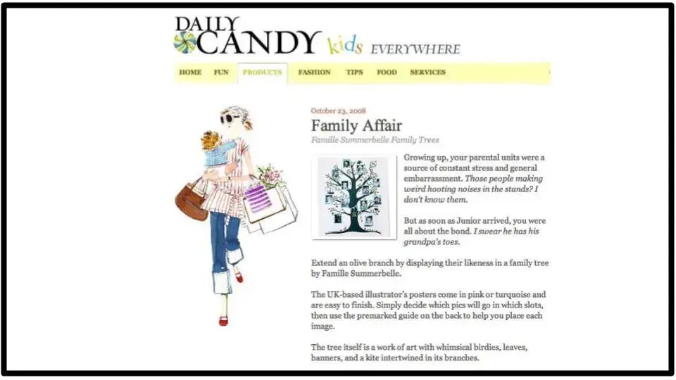
In December of 2003, Bob Pittman acquired DailyCandy, a trendy daily email for young women that featured tips on everything from restaurants and nightclubs to sample sales and beauty finds.

Pittman paid $3.5m for the business. At the time, DailyCandy consisted of 200k subscribers and a brilliant editor/founder named Danielle Levy.

The plan behind Pittman’s investment, say sources familiar with his strategy, was to help transform DailyCandy from a newsletter into a multimedia player that could extend its brand into magazines and books, stand-alone television shows, and perhaps even shopping or restaurant guides.

A screenshot of the DailyCandy website from 2008

A screenshot of the DailyCandy website from 2008

Over the next 5 years, DailyCandy went all-in on email.

By 2009 the company grew to 2.5m subscribers and, according to Pittman, $25m in revenue with EBITDA of over $10m. That same year, Comcast acquired DailyCandy for $125m.

Following the acquisition, Pittman launched The Pilot Group, an incubator dedicated to launching DailyCandy for other verticals.

Pilot’s companies included Thrillist (now a $500m media company), PureWow ($25m in revenue before it was acquired for $40m), Business Insider (sold for $500m), and dozens more.

Most recently, individuals such as Ben Thompson (Stratechery) and Bill Bishop (Sinocism) have proven that single-person newsletter operations can generate 7-figures in annual revenue.

Furthermore, in recent years media companies built through newsletters have been generating healthy 8 figures in revenue:

A salient example of the growing trend in newsletters is the rise of Substack. The startup provides tools for writers to write, distribute, build community and monetize newsletters. Since 2017, Substack has raised a total of $90.2m from investors like Y Combinator and Andreessen Horowitz.

The platform boasts 17k paid writers, with the top 10 collectively generating $25m annually.

Which Newsletter Business Model Should You Choose?

Warren Buffet famously loved newspapers. They were predictable and profitable.

In their place, newsletters have stepped in, with all the upside (low cost, direct-to-consumer benefits, an opportunity to find many profitable niches) and little of the downside.

There are two primary business models in the newsletter business: ad-supported and subscription-based.

Ad-Supported (Examples: Morning Brew, The Skimm, Axios)

For ad-supported newsletters, the key metrics include:

  • Subscribers
  • Sends
  • Cost per mille (CPM): Advertising rate based on 1k (subscribers or emails sent.)
  • Open rate: percentage of emails opened by a unique subscriber.
  • Cost per open (CPO): Advertising rate based on the number of unique opens.
  • Cost per click (CPC): Advertising rate based on the number of clicks.
  • Click through rate (CTR): Number of clicks advertisers receive on their ads per number of impressions

And key ad types include:

  • Sponsored Ads: Basic advertising placement. (standard copy from advertiser or copy written in the voice of the newsletter)
  • Advertorial: Advertisement that is formatted like an editorial. (Be cautious with this. Trust is easy to lose and hard to win back.)
  • Takeover: An ad campaign that takes over a large segment (or entirety) of a newsletter.

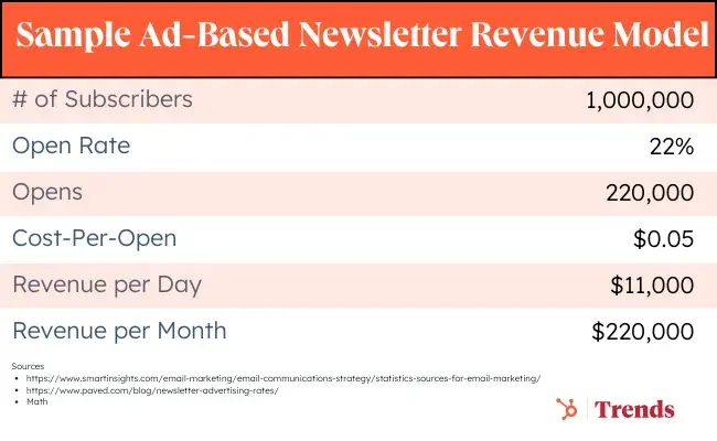
The sample ad-based model below looks at the monthly revenue for a newsletter sent five days a week with the following assumptions:

Based on these assumptions, the monthly ad revenue for this fictional average newsletter is $11k per day or $220k per month (5 sends per week.)

Graphic showing the ad-supported newsletter revenue model

Subscription-Based (Examples: Stratechery, The Athletic, 2PM)

Self-Published Model:

A DIY subscription-based newsletter typically works in the following manner:

  • A writer or team of writers provides content related to a specific niche in exchange for a monthly or yearly (discounted) subscription fee.
  • The writer will mail said content on a consistent schedule (e.g., every Monday and Thursday).
  • To attract new subscribers, the team will make X% of content free and paywall the remaining content

Stratechery, written by Ben Thompson, is a tech and business strategy newsletter launched in 2013. Thompson provides one free weekly article and three additional pay-walled reports per week.

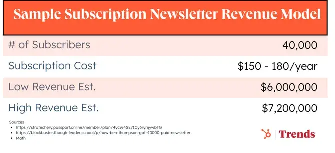
While Stratechery has not confirmed subscriber count in a number of years, Michael Simmons of Blockbuster Blueprint estimated it around 40k in late 2023. Simmons doesn’t offer a source, but in 2020 internet sleuths pinned Thompson's paying subscribers at a minimum of 25k, so 40k seems like a reasonable growth rate for 3 years.

As of now, subscription options stand at $150 annually or $15/mo. ($180 per year.)

If we can abuse statistics for a moment by ignoring factors like churn rate and subscriber retainment …ahem … based on this fairly rough guesstimate, Thompson brings in a gross profit somewhere between $6 - 7.2m per year.

Graphic showing estimates of Stratechery’s annual gross revenue

Substack Subscription-Based (Examples: Petition, TrueHoop)

Another option for a subscription-based newsletter is Substack.

With the self-published model, every aspect of the business falls to the author or editorial team. To successfully operate a newsletter business, an entrepreneur needs to be familiar with a whole host of tools and processes—membership software, forums, payments, content delivery networks, hosting, etc.

Substack has created a platform that offers a turnkey solution for these back-end services for creators (thus, allowing them to focus on content creation):

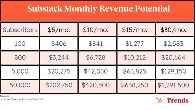
  • For newsletters with paid subscriptions, Substack takes a 10% cut of subscription revenue.
  • With additional payments (e.g., transaction fees), the Substack revenue calculator shows an ~80% profit margin for creators.

Graphic showing potential revenue from paid Substack subscriptions

For those wondering "when is it a good time to monetize", Substack has a great article based on the platform's data (Your Guide To Going Paid). The article is well worth reading but here are some notable bullet points:

  • Start with a revenue target that feels right to you. Remember to adjust for income tax, as well as Substack’s and Stripe’s fees (10% + 2.9% plus 30 cents per transaction, respectively).
  • Estimate your number of paying subscribers, based on the size of your free list. We commonly see conversion rates of 5–10%.
  • Divide your revenue target by your number of paying subscribers to get to your annual price, then work backwards to a monthly price.
  • We often see writers charge $5/month for newsletters in the personal interest category and $10/month for those in a business category, but challenge yourself to charge more than you think is possible. Set your price 20% higher than you normally would; you can always offer a 20% discount for your earliest subscribers.

Here are some methods that popular Substackers employ to draw more readers into subscriptions:

  • 1:X ratio of free-to-paid posts: Judd Legum of Popular Information publishes four days a week, Monday through Thursday—one free post and three paid posts. The free posts act as a lead magnet.
  • Weekly paid posts with free previews: Richard Rushfield of The Ankler writes an insiders’ newsletter about the entertainment industry. He publishes paid posts 1-2x/week with a free preview version. The preview acts as a teaser.
  • Private member community: Nadia Bolz-Weber of The Corners publishes occasional free posts (1-2x/month), but only paying subscribers get access to the community— including behind-the-scenes Q&As, community discussion threads, quarterly book clubs, and guest posts.
  • Exclusive bonus material: Flow State publishes recommendations for free music to work to every weekday. But they have to find it themselves. Paying subscribers get access to curated Spotify playlists.

And while Substack is the most well-known newsletter platform, it isn’t the only player. Beehiiv has become a new favorite among indie newsletter publishers. Another popular alternative “newsletter-as-a-service” tool is called Ghost. Instead of a transaction fee, Ghost charges a flat monthly rate that starts at as little as $9/mo.

And, of course, there are more traditional mass email-sending platforms that are adding increasingly more newsletter-style functionality. (Mailchimp, Constant Contact, and Marketing Hub come to mind.)

Additional Considerations For DIY Subscription vs. Substack:

While Substack provides a turnkey solution, the platform has a number of notable limitations for those looking to rev up paid subscription businesses:

  • The 10% fee is quite steep, especially when annual revenue gets into 7 figures.
  • There are limited customization options.
  • Newsletter websites typically have to use the _______.substack.com domain, which can stifle branding.
  • Substack's current offering doesn’t allow for additional revenue products (e.g., ecommerce) and their referral program only allows you to gift subscriptions.

7 Reasons to Jump Into Newsletter Marketing

1. The Mass Adoption of Email is Still Growing.

Every few years someone declares email marketing dead. We not-so-humbly disagree.

As mentioned above, there are 4B email users worldwide, as compared to 3.5B social media users. And annual growth in email use is projected at a steady 2-3% over the next three years, bringing more end users into the email universe.

2. Newsletters Have Better Engagement Than Social Media.

In addition to the wide (and still growing) adoption of email, the channel has better engagement than the largest social networks:

3. You Own Your Distribution and Relationship With Readers

Late last year, the entrepreneur and investor Naval Ravikant tweeted that “building a following on Twitter is building a castle out of sand.”

Large tech platforms such as Facebook, Twitter, Linkedin, and Google are famous for “changing algorithms” that can overturn the fortune of a media business overnight (see: Buzzfeed).

Because email is an open standard, when you build an audience via newsletters, you directly own the relationship with the reader and are not at the whim of an algorithm change.

4. …Which Helps To Control Customer Acquisition Costs

With an owned audience there’s less of a reliance on paying platforms (to get “boosted” on social media news feeds) or trying to please Google (to rank high in searches).

While ad price inflation is finally showing signs of cooling, in 2023 the cost of online advertising rose 4.4% YoY.

5. You Can Build A Community

The direct relationship with the end reader is also the perfect jumping point for building a broader community of like-minded people.

As Jenny Sowyrda, HubSpot’s manager of community strategy and operations puts it:

“If you aren’t building your community, your customers and prospects are already building one somewhere else.”

A newsletter allows you to steer that ship. And it becomes a virtuous cycle, as an engaged community can also generate newsletter subscriptions.

6. Newsletters Provide Upsell, Cross-sell, and Lead-Gen Opportunities

When you own a direct relationship with readers, you can offer additional products through the distribution channel:

7. Email is a Stable Medium

In a time when search engine and social media updates have marketers chewing their fingernails off, newsletters offer a predictable ROI.

And while iOS changes have made tracking email engagement more difficult, email itself is a well-established standard with steady conversion. It has not changed very much since its initial rise in the 90s. Moving forward, there will continue to be innovations in email clients (e.g., Superhuman, Hey), but the underlying standard is stable.

5 Challenges with Running Newsletters

1. You absolutely MUST learn about spam laws.

The rise of increasingly stringent digital privacy laws (GDPR in Europe, CCPA in California, CAN-SPAM in Canada) has forced companies to closely follow anti-spam rules including:

  • User permissions
  • Honest headlines
  • Clear identification for ads
  • Opt-out options and more.

2. It can be a very crowded space.

Every major publication has a number of newsletter offerings (e.g., New York Times, Washington Post, WSJ). Further, with the rise of turnkey services like Substack, countless newsletters are being launched every day. The newsletter opportunity is as big as ever, but it’s very important to find the content gaps (more on that below).

3. Consumers are experiencing subscription fatigue.

As more written content goes behind a paywall (not to mention paid audio and video streaming services), there is concern that readers will develop subscription fatigue. In recognition of this issue, some Substack publications are bundling together their offerings so readers only have to make one purchase decision.

4. Search visibility is low.

For subscription-based newsletters, the existence of paywalls means that the content is often hidden from search engine bots crawling the web. As a result, the content doesn’t show up in searches for relevant queries.

5. It’s difficult to go viral.

Another related challenge is that gated content has a harder time going viral, as people are less likely to share items that hit paywalls.

Newsletter Niche Opportunities

The opportunities involved in newslettering don’t just stop at running a newsletter yourself. We’ll start with those editorial opportunities, and jump off from there:

Content Gaps (Particularly B2B)

There are countless content niches that could use a dedicated newsletter.

The B2B space is particularly ripe for disruption and offers high revenue potential as industry insiders will pay top dollar for analytics and insights (aka the “corporate credit card effect”).

As Petition—the Substack bankruptcy newsletter—shows, there is great appetite to give traditionally dry, industry-specific trade publications a more approachable voice.

For inspiration, a Google search of popular trade publications shows dozens of opportunities in niche markets:

  • AdWeek (advertising)
  • Cranes Today (crane industry)
  • Game Industry Report Magazine (gambling)
  • Design News (designers)
  • Engineering News-Record (construction)
  • Architectural Record (architecture)
  • Hairdressers Journal International (hairdressers)
  • Global Custodian (custody and asset management)
  • Coach & Bus Weekly (transportation)

Curation, Bundling & Discovery Tools

As noted by Ben Thompson, whenever an industry goes from scarcity to abundance, there is great value in services that facilitate discovery and curation.

For example, Letterlist allows you to browse and surface newsletters and then subscribe with a single click.

Similarly, Substack’s internal discovery tool ranks the top paid and free publications.

Paywall Services

One of the key decisions for any subscription business is to decide how much free content is made available.

  • Freemium: Business Insider offers a lot of free content but also has a premium offering.
  • Metered Paywall: The New York Times uses a metering policy whereby you can read X amount of articles before you hit a paywall.
  • Hard Paywall: The Financial Times and The Information provide zero free content. You must subscribe to read.

Because of these varying strategies, there is an appetite for digital solutions that can register and subscribe readers as well as predict churn (or other related analytics) for paywalled content.

Piano is one such firm. But, based on the Trends team’s experience with the service, there is clearly an opportunity for a superior offering.

Newsletter Management

There are a ton of tools for newsletter senders, but what about newsletter readers?

Management tools are needed to handle the abundance of newsletter. There are a number of solutions that curate newsletter feeds (Feedly, Feedbin) and newsletter reading apps (Stoop, Slick).

Newsletter Examples to Learn From

Ad-Supported Examples

1. Daily Candy
  • Year Founded: 2000
  • Key People: Dany Levy
  • Theme: Pioneer daily email newsletter providing readers with hip and trendy events in their specific cities (started with NY and grew to dozens of other US cities).
  • Notes: Sold in 2009 for $125m (was doing $25m EBITDA) to Comcast. Shut down in 2014.
2. The Skimm
  • Year Founded: 2012
  • Key People: Danielle Weisberg, Carly Zakin
  • Theme: Daily newsletter (7m subscribers) summarizing news in an approachable manner and targeting young female millennial professionals
  • Notes: The Skimm has raised ~$30m in venture capital, including from investors such as GV (Google Ventures), Shonda Rhimes, Tyra Banks, and Sara Blakely. Investopedia estimates revenue is $350k per send.
3. Industry Dive
  • Year Founded: 2012
  • Key People: Sean Griffey, Ryan Willumson, Eli Dickinson
  • Theme: Media offering that provides 38 B2B newsletters (e.g., Banking, Biopharma, CFO, CIO, Construction, Education, Transport). In addition to ads, the firm also runs marketing services and a brand studio to help corporates (e.g., IBM) with content marketing initiatives.
  • Notes: Industry Dive was acquired by a PE firm in September 2019 for an undisclosed price. At the time, the firm was doing $22m in revenue, and acquisition estimates are in the $60-70m range.
4. Front Office Sports
  • Year Founded: 2014
  • Key People: Adam White
  • Theme: A newsletter providing news and insights at the intersection of sports and business.
  • Notes: In October of 2018, the company received an undisclosed investment from PE firm Stein’s. The firm has a number of additional offerings including video, podcast, webinars, and sports-related jobs listings.
5. Axios
  • Year Founder: 2016
  • Key People: Dan Primack, Jim VandeHei, Mike Allen, Roy Schwartz
  • Theme: Media firm with 30+ newsletters covering business, tech and politics— plus podcasts and live events.
  • Notes: Axios content is known for punchy, bullet-point summaries of the news. The entire media offering has an estimated revenue of $25-30m.
6. Morning Brew
  • Year Founder: 2015
  • Key People: Alex Lieberman, Austin Rief
  • Theme: Daily email newsletter covering the latest news from Wall St. to Silicon Valley.
  • Notes: The Morning Brew has grown to offer 15 niche sub-brands, including Marketing Brew, CFO Brew, Healthcare Brew, and… you get the idea. More brews than your local taphouse.

Subscription-Based

7. Stratechery

  • Year Founded: 2013
  • Key People: Ben Thompson
  • Theme: Leading tech strategy (hence name) newsletter that is considered a pioneer in the space of “individuals can make a living writing newsletters.”
  • Price: $15/month or $150/year
  • Notes: As noted above, a conservative estimate places the newsletter’s revenue at $6-7m a year.
8. 2PM
  • Year Founded: 2013
  • Key People: Web Smith
  • Theme: Daily newsletter that provides news and analysis on the intersection of business and media.
  • Price: $20/month or $200/year
  • Notes: A newsletter product that also offers data tools, networking opportunities, and curated expert insights.

9. The Information

  • Year Founded: 2013
  • Key People: Jessica Lessin
  • Price: $599/year for the first year
  • Theme: In-depth and exclusive tech stories read widely by the tech and investment community (~20k subscribers).
  • Notes: The Information is known for breaking tech-related news stories, producing comprehensive tech company org charts, and cultivating an influential network of tech professionals.

10. Petition

  • Year Founded: 2016
  • Key People: Anonymous Team
  • Theme: Bankruptcy and restructuring newsletter that provides insights in an imminently readable and snarky voice.
  • Price: $79/month or $799/year
  • Notes: Another 7-figure Substack publication with thousands of legal and finance professional subscribers.

Brand-Backed Examples

11. The Hustle

  • Year Founded: 2015
  • Key People: Sam Parr, Adam Ryan
  • Theme: Daily business and technology newsletter written in a fun and irreverent voice.
  • Notes: The Hustle was acquired by HubSpot in 2021 and has since grown to over 2m subscribers.

12. Trapital

  • Year Founded: 2018
  • Key People: Dan Runcie
  • Theme: Business strategy analysis of the hip hop industry.
  • Notes: A newsletter and podcast offering that provides the world’s best hip hop industry analysis. Trapital now only offers a free newsletter backed by their investment services.

13. The Athletic

  • Year Founded: 2016
  • Key People: Alex Mather, Adam Hansmann
  • Theme: Sports media that covers professional and college sports teams across North America, with recently expanded international soccer coverage.
  • Notes: The Athletic’s goal was to unbundle the sports section from newspapers. They were acquired by The New York Times for $550m in 2022.

Discussing seo strategies

Featured Imgs 23

User Experience & Intent Matching
Google's algorithms increasingly emphasize matching search intent. Focusing on content that answers specific user queries effectively, with concise, clear responses, improves rankings.
On-page user experience (UX), including site navigation, accessibility, and content structure, is critical to SEO performance.

Two Ways to Create Custom Translated Messaging for HTML Forms

Featured Imgs 23

HTML forms come with built-in ways to validate form inputs and other controls against predefined rules such as making an input required, setting min and max constraints on range sliders, or establishing a pattern on an email input to check for proper formatting. Native HTML and browsers give us a lot of “free” features that don’t require fancy scripts to validate form submissions.

And if something doesn’t properly validate? We get “free” error messaging to display to the person using the form.

These are usually good enough to get the job done, but we may need to override these messages if we need more specific error content — especially if we need to handle translated content across browsers. Here’s how that works.

The Constraints API

The Constraints API is used to override the default HTML form validation messages and allows us to define our own error messages. Chris Ferdinandi even covered it here on CSS-Tricks in great detail.

In short, the Constraints API is designed to provide control over input elements. The API can be called at individual input elements or directly from the form element.

For example, let’s say this simple form input is what we’re working with:

<form id="myForm">
  <label for="fullName">Full Name</label>
  <input type="text" id="fullName" name="fullName" placeholder="Enter your full name" required>
  <button id="btn" type="submit">Submit</button>
</form>

We can set our own error message by grabbing the <input> element and calling the setCustomValidity() method on it before passing it a custom message:

const fullNameInput = document.getElementById("fullName");
fullNameInput.setCustomValidity("This is a custom error message");

When the submit button is clicked, the specified message will show up in place of the default one.

A form field labeled "Full Name" with an input box to enter the name, a "Submit" button, and a displayed custom error message: "This is a custom error message" with a warning icon.

Translating custom form validation messages

One major use case for customizing error messages is to better handle internationalization. There are two main ways we can approach this. There are other ways to accomplish this, but what I’m covering here is what I believe to be the most straightforward of the bunch.

Method 1: Leverage the browser’s language setting

The first method is using the browser language setting. We can get the language setting from the browser and then check whether or not we support that language. If we support the language, then we can return the translated message. And if we do not support that specific language, we provide a fallback response.

Continuing with the HTML from before, we’ll create a translation object to hold your preferred languages (within the script tags). In this case, the object supports English, Swahili, and Arabic.

const translations = {
  en: {
    required: "Please fill this",
    email: "Please enter a valid email address",
 
  },
  sw: {
    required: "Sehemu hii inahitajika",
    email: "Tafadhali ingiza anwani sahihi ya barua pepe",
  },
  ar: {
    required: "هذه الخانة مطلوبه",
    email: "يرجى إدخال عنوان بريد إلكتروني صالح",
  }
};

Next, we need to extract the object’s labels and match them against the browser’s language.

// the translations object
const supportedLangs = Object.keys(translations);
const getUserLang = () => {
  // split to get the first part, browser is usually en-US
  const browserLang = navigator.language.split('-')[0];
  return supportedLangs.includes(browserLang) ? browserLang :'en';
};

// translated error messages
const errorMsgs = translations[getUserLang()];// form element
const form = document.getElementById("myForm");// button elementconst btn = document.getElementById("btn");// name input
const fullNameInput = document.getElementById("fullName");// wrapper for error messaging
const errorSpan = document.getElementById("error-span");

// when the button is clicked…
btn.addEventListener("click", function (event) {  // if the name input is not there…
  if (!fullNameInput.value) {    // …throw an error
    fullNameInput.setCustomValidity(errorMsgs.required);    // set an .error class on the input for styling
    fullNameInput.classList.add("error");
  }
});

Here the getUserLang() function does the comparison and returns the supported browser language or a fallback in English. Run the example and the custom error message should display when the button is clicked.

A form field labeled "Full Name" with a placeholder text "Enter your full name" is outlined in red with an error message saying "Please fill this" below it. There is also a "Submit" button next to the field.

Method 2: Setting a preferred language in local storage

A second way to go about this is with user-defined language settings in localStorage. In other words, we ask the person to first select their preferred language from a <select> element containing selectable <option> tags. Once a selection is made, we save their preference to localStorage so we can reference it.

<label for="languageSelect">Choose Language:</label>
<select id="languageSelect">
  <option value="en">English</option>
  <option value="sw">Swahili</option>
  <option value="ar">Arabic</option>
</select>

<form id="myForm">
  <label for="fullName">Full Name</label>
  <input type="text" id="fullName" name="fullName" placeholder="Enter your full name" required>
  <span id="error-span"></span>
  <button id="btn" type="submit">Submit</button>
</form>

With the <select> in place, we can create a script that checks localStorage and uses the saved preference to return a translated custom validation message:

// the <select> element
const languageSelect = document.getElementById("languageSelect");
// the <form> element
const form = document.getElementById("myForm");
// the button element
const btn = document.getElementById("btn");
// the name input
const fullNameInput = document.getElementById("fullName");
const errorSpan = document.getElementById("error-span");
// translated custom messages
const translations = {
  en: {
    required: "Please fill this",
    email: "Please enter a valid email address",
  },
  sw: {
    required: "Sehemu hii inahitajika",
    email: "Tafadhali ingiza anwani sahihi ya barua pepe",
  },
  ar: {
    required: "هذه الخانة مطلوبه",
    email: "يرجى إدخال عنوان بريد إلكتروني صالح",
  }
};
// the supported translations object
const supportedLangs = Object.keys(translations);
// get the language preferences from localStorage
const getUserLang = () => {
  const savedLang = localStorage.getItem("preferredLanguage");
  if (savedLang) return savedLang;

  // provide a fallback message
  const browserLang = navigator.language.split('-')[0];
  return supportedLangs.includes(browserLang) ? browserLang : 'en';
};

// set initial language
languageSelect.value = getUserLang();

// update local storage when user selects a new language
languageSelect.addEventListener("change", () => {
  localStorage.setItem("preferredLanguage", languageSelect.value);
});
// on button click
btn.addEventListener("click", function (event) {
  // take the translations
  const errorMsgs = translations[languageSelect.value];
  // ...and if there is no value in the name input
  if (!fullNameInput.value) {
    // ...trigger the translated custom validation message
    fullNameInput.setCustomValidity(errorMsgs.required);
    // set an .error class on the input for styling
    fullNameInput.classList.add("error");
  }
});

The script sets the initial value to the currently selected option, saves that value to localStorage, and then retrieves it from localStorage as needed. Meanwhile, the script updates the selected option on every change event fired by the <select> element, all the while maintaining the original fallback to ensure a good user experience.

A web form with a language selector set to Arabic, a text field for "Full Name," a "Submit" button, and an error message in Arabic that translates to "This field is required."

If we open up DevTools, we’ll see that the person’s preferred value is available in localStorage when a language preference is selected.

A screenshot of the Application tab in the Chrome DevTools interface. It shows the Storage section with "Local storage" for "http://127.0.0.1:5500" highlighted, and a key-value pair where the key is "preferredLanguage" and the value is "ar".

Wrapping up

And with that, we’re done! I hope this quick little tip helps out. I know I wish I had it a while back when I was figuring out how to use the Constraints API. It’s one of those things on the web you know is possible, but exactly how can be tough to find.

References


Two Ways to Create Custom Translated Messaging for HTML Forms originally published on CSS-Tricks, which is part of the DigitalOcean family. You should get the newsletter.

90+ Best Company Profile Templates (Word + PowerPoint) 2024

Featured Imgs 23

Creating a company profile brochure or slideshow is a big responsibility. You especially need to pay careful attention to the design, arranging content in a readable and attractive way. These company profile templates can be a huge time-saver!

Designed by professionals, these templates allow you to easily create a company profile brochure or a PowerPoint presentation without having to spend hours on perfecting the design.

We handpicked a collection of the best company profile templates for Word and PowerPoint, to help you create a modern company profile for your business. These templates are all easily customizable to boot.

What Is A Company Profile Template?

A company profile is mainly a document containing a detailed description of a company or a business made to educate customers, investors, and employees. It’s a multi-page document that includes all the details about the company, its mission, services, and more. Company profiles come in various sizes as well.

A company profile template is a template you can use to craft such documents with ease. These templates come fully formatted with paragraphs, columns, shapes, image placeholders, and more to let you easily design company profiles without having to spend hours perfecting the design.

The templates are also easily customizable. You’ll be able to edit pages, change colors, fonts, and replace images to create your own documents with just a few clicks.

Top Pick

Modern Company Profile Word Template

Modern Company Profile Word Template 2

This is the perfect template for crafting a modern and stylish company profile for any business ranging from corporate businesses to creative agencies and more.

The template comes with 28 unique page layouts, which you can easily customize to your preference. It’s available in both US Letter and A4 size as well.

Why This Is A Top Pick

This template comes with a clean and professional design and you can easily edit it using Microsoft Word. As an added bonus, it also includes an InDesign template for editing the template using the Adobe app.

Best Company Profile Word Templates

We are starting the list with the greatest Word templates you can use to create company profile brochures. Keep browsing to find the company profile PowerPoint templates.

Modern Company Profile Word Template

Modern Company Profile Word Template

With this Word template, you can design a highly professional company profile to showcase your brand and business. It includes 18 page layouts with fully editable designs and colors. The template also comes in InDesign and EPS formats.

Professional Company Profile Word Template

Professional Company Profile Word Template

It’s simple, modern, and effective. This template comes with all the right elements for making more professional company profile brochures for your business. There are 20 unique page layouts in this template and you can fully customize them using MS Word.

Benmoo – Minimalist Company Profile Word Template

Benmoo - Minimalist Company Profile Word Template

Benmoo is a versatile and user-friendly brochure template perfect for updating your company or institution’s profile. With 20 editable pages, flexible fonts and text, and the ability to easily change colors, text, and images, it is highly customizable. Compatible with Office Word and Canva applications, it is an effective resource to articulate your company’s uniqueness.

Modern Company Profile Word Template

Modern Company Profile Word Template

This is a highly versatile, professional-looking brochure template with 24 customizable pages. It is user-friendly, allowing you to alter colors and content with ease, and the layout maintains its readability regardless of the volume of content added. Compatibility with Microsoft Word, Adobe InDesign, Illustrator, and Canva ensures flexibility in design methods.

Stylish Company Profile Word Template

Stylish Company Profile Word Template

A versatile choice for creating distinctive company profiles. This A4-sized brochure template features 24 customized pages with easily editable texts, colors, objects, and images. It supports high resolution printing in 300 dpi CMYK and includes both newer and older versions of InDesign files, along with a Word Docx file.

Company Profile Template for Word and InDesign

Company Profile Template for Word and InDesign

An innovative brochure template designed to give your brand a refined appearance. Ideal for displaying your company’s history, services, and accolades, it provides an advanced layout for both Word and InDesign users. The template supports customizability across text, colors, and images.

20-Page Company Profile for Word, Canva, & InDesign

20-Page Company Profile for Word, Canva, & InDesign

This is a versatile digital brochure template. Suited for Microsoft Word, Canva, and Adobe InDesign, it boasts a customizable design that’s easy to edit and is optimized for print with CMYK color settings. Although photos aren’t provided, the available text boxes, tables, and separate layers for text, graphics, and shapes offer plenty of options to make your content shine.

Company Profile Brochure for Word

Company Profile Brochure for Word

Another stylish brochure template ready for customization in Microsoft Word and Adobe InDesign. You’ll enjoy twenty pages of editable content, with styling options and auto page numbering. This A4 size document is ideal for both digital and print use. It comes with a detailed file guide for ease of use, including instructions for text and image edits.

Professional Company Profile Word Template

Professional Company Profile Word Template

Give your business an impressive edge with this Word brochure template. Highly versatile and customizable, this template is available in Adobe InDesign files and is compatible with various versions of Adobe Indesign. It offers 20 unique layouts, organized layers, and adjustable text, colors, and images.

Visual Colony Company Profile

Visual Colony Company Profile

A 20-page InDesign brochure template available in US letter and A4 size. It’s compatible with various Adobe Indesign versions and features master pages, paragraph and character styles, and text, images, and backgrounds on separate layers for easy customization. A help file is included and it utilizes free fonts for convenience.

Modern Company Profile Template

Modern Company Profile Template

The Modern Company Profile Template from Visual Colony is a sleek, 20-page Indesign template compatible with CS4 onwards. It presents a unique blend of images, infographics, and text in a stylish layout, perfect for creating compelling company profiles. Available in both A4 and US Letter sizes, this template also includes master pages and a grid-based layout. Note: photos are not included.

Construction Company Profile

Construction Company Profile

The BuilderArch Construction Company Profile is a versatile, multipurpose asset useful for businesses seeking an annual report, proposal, portfolio, presentation, and more. Easy to customize, it offers adjustable fonts, colors, and backgrounds, and provides space to insert your own photos. The ready-to-print profile comes with 16 Adobe InDesign pages, additional covers, and preference for both A4 and US letter format.

Black & White Company Profile

Black & White Company Profile

The Black & White Company Profile is a versatile 20-page InDesign template, accommodating both A4 and US letter sizes. Perfect for showcasing your images, infographics and text in a stylish manner, it is ultra-flexible, working seamlessly with multiple versions of Adobe InDesign. It also features a grid-based layout and master pages, however, photographs are not included. It uses the Gothic A1 font, available for free download.

Modern Business Profile Template

Modern Business Profile Template

The Modern Business Profile Template is a professional, user-friendly InDesign template, intended for designing your own company profile. With features like paragraph styles, editable swatches, and unique layouts, it also includes 16 customizable layout pages, free fonts, and maintains a 300 DPI resolution. The template is compatible with both A4 and US Letter print sizes. Please note, this package does not include photos or mock-ups.

Simple Business Plan Word Template

Simple Business Plan Word Template

This Word template comes with a multipurpose design, allowing you to create both business plans and company profiles. It also has simple and minimalist page layouts with customizable colors, fonts, and paragraph styles. The template is available in Word and InDesign formats.

Minimal Company Profile Word Template

Minimal Company Profile Word Template

A clean and minimal design is always a good approach for making professional brochures such as company profiles. This template has such a clean and attractive design that’s ideal for business brochures. The template includes 32 pages and comes in multiple file formats, including Word and InDesign.

Company Profile Word & InDesign Template

Company Profile Word & InDesign Template

This company profile template has a stylish and professional design across all its pages. There are lots of space for adding visuals and colorful shapes too. The template comes with 20 unique page layouts in MS Word and InDesign formats.

Modern Company Profile Word Template

Modern Company Profile Word Template

The red accents used in this brochure template make each page more attractive than the next. This Word template is ideal for making company profiles for both small and corporate businesses. It includes 20 pages and comes in Word and Adobe Illustrator formats.

RUNSHELL – Company Profile Word Template

RUNSHELL Company Profile Word Template

Runshell is a simple company profile template that features minimalist page layouts with fewer visual elements. It has 24 different pages for showcasing every aspect of your company. And it comes in Word and InDesign file formats.

Word Company Profile A5 Landscape Template

Word Company Profile A5 Landscape Template

This Word company profile template uses a landscape layout and it’s available in A5 size. There are 20 unique page layouts included in this template and they all have fully editable text, colors, and graphics.

Agency & Company Profile Word Template

Agency & Company Profile Word Template

A professional brochure template with a clean design. It’s a great choice for crafting company profile documents for agencies, small businesses, corporate brands, and more. The template includes 24 unique pages and it comes in both InDesign and Word formats.

ENERGY – Word Company Profile Template

ENERGY - Word Company Profile Template

This brochure template uses a stylish page design for creating company profiles for modern brands. It has 14 unique pages with paragraph styles, editable colors, and free fonts. The brochure comes in A4 and US Letter sizes.

Business & Company Profile Word Template

Business & Company Profile Word Template

Another professional company profile template that’s ideal for various types of corporate and creative businesses. This template lets you choose from 18 page layouts and master pages to create high-quality brochures. It’s also available in Adobe InDesign format.

Professional Company Profile Word Brochure Template

Professional Company Profile Word Brochure Template

This company profile template features a minimal and professional design that allows you to create brochures for various types of businesses. It includes 20 unique page layouts with fully customizable designs. The template is available in MS Word and InDesign formats as well.

Clean Company Profile Word Template

Clean Company Profile Word Template

If you’re working on a company profile for a corporate agency, this template is perfect for creating a high-quality brochure. It comes with stylish page designs with creative paragraph styles and lots of visual elements. It also comes in Word and InDesign file formats.

Landscape A5 Company Profile Word Docx Template

Landscape A5 Company Profile Word Docx Template

Design an elegant and stylish landscape brochure using this company profile template. It features 20 page designs in A5 size. Each page can be easily customized to your preference using MS Word or InDesign.

Blue – Company Profile Word Template

Blue - Company Profile Word Template

Use this Word template to create company profiles for modern agencies, brands, and corporate businesses. It features 25 page layouts in A4 size with easily editable paragraph layouts. You can also change its colors, fonts, and graphics to your preference.

Modern Company Profile Word Template

Modern Company Profile Word Template

This company profile template comes in both MS Word and InDesign file formats. It features 16 unique page layouts complete with paragraph formatting and image placeholders. You can use this to craft modern and professional brochures for all kinds of businesses.

DIVERSE Professional Company Profile Template

DIVERSE Professional Company Profile Template

This brochure template is great for making a professional company profile for a corporate brand or agency. It includes 24 different page designs to showcase and highlight all the important facts about your business. The template is available in InDesign and MS Word formats.

Krypton – Corporate Business Profile Template

Krypton - Corporate Business Profile Template

Krypton is a multipurpose business profile template you can use to create various styles of company profile brochures. It features a minimal design with 16 different page layouts to choose from. It comes in both A4 and US Letter sizes as well.

CLEVIO – Modern Company Profile for Word

CLEVIO - Modern Company Profile for Word

Clevio is a modern company profile template you can use in MS Word and InDesign. The template features clean page layouts with attractive content formatting. There are 24 customizable page layouts in the template. And you can easily customize it to change colors, fonts, and images.

Business Proposal & Profile Word Template

Business Proposal & Profile Word Template

This is a business profile template that you could easily customize and use to make company profile brochures. It features a minimalist and clean page design that will fit in well with almost any type of brand. There are 24 page layouts in A4 and US Letter sizes.

Company Profile & Proposal Word Template

Company Profile & Proposal Word Template

This elegant and creative Word template is also crafted for making company proposals. But the page layouts are totally appropriate for making company profiles as well. This template includes 20 beautifully designed pages in A4 size.

Company Profile Brochure Word Template

Company Profile Brochure Word Template

A simple and clean Word template for crafting professional company profiles and brochures. This template comes with 16 different page designs that you can customize however you like. It’s available in InDesign format as well.

Business Plan & Profile Word Template

Business Plan & Profile Word Template

You can use this template to create both business plans and proposals. It includes 20 different page layouts in A4 size. You can easily edit each page layout to change fonts, colors, and add images. It’s available in InDesign format as well.

Elegant Company Profile & Proposal Word Template

Elegant Company Profile & Proposal Word Template

The modern and elegant design of this Word template makes it a great choice for startups and high-end brands for crafting company profiles. It has an easily editable design with 24 unique page layouts.

HEXA – Corporate Company Profile Word Template

HEXA - Corporate Company Profile Word Template

If you’re looking for a template to design a physical brochure of your company profile, this template is for you. It comes in both MS Word and InDesign file formats. And features 24 unique page layouts in A4 and US Letter sizes. You can easily customize the template to add your own images, change colors, and text as well.

BLADE – Business Profile Word Template

BLADE - Business Profile Word Template

Another company profile brochure template for Word and InDesign. This template is ideal for making business profiles for various companies and corporations. It includes 24 unique page layouts with editable paragraph styles and colors. It’s available in both US Letter and A4 sizes.

Landscape A5 Company Profile Template for Word

Landscape Company Profile Template for Word

This professional company profile template comes with a clean and simple design. Making it perfect for creating company profiles for modern agencies and corporate brands. The template is available in landscape A5 size and in MS Word format.

BIGREDS – Professional Company Profile Word Template

BIGREDS - Professional Company Profile Word Template

This company profile brochure template comes with a simple and professional design. It’s most suitable for corporate brands and companies. The template includes 24 page layouts with changeable colors and text. You can edit the template using MS Word or Adobe InDesign.

ZENETA – Agency Company Profile Template

ZENETA - Agency Company Profile Template

This beautiful and modern company profile template is designed for creative agencies in mind. It comes in both MS Word and InDesign file formats. And the template includes 14 unique page layouts you can use to craft a professional company profile brochure.

Multipurpose Company Profile Brochure Template

Multipurpose Company Profile Brochure Template

This is a multipurpose and multi-format company profile template. The template is available in PowerPoint, Keynote, InDesign, Photoshop and more to let you customize the template using any app you want.

Creative Word Company Profile Template

Creative Company Profile Word Template

This Word template features a multipurpose design, which will allow you to create brochures for different types of company profiles with ease. The template features 16 professionally designed page layouts and comes in A4 size. You can edit this template using Word and InDesign.

Minimalist Company Profile Word Template

Minimalist Company Profile Word Template

Minimalist design is a great way to showcase professionalism. This simple and clean company profile template will help you achieve that goal. It includes 16 page designs for including company information with easily editable text, colors, and images. The template is available in A4 size.

A5 Landscape Company Profile Template – Word

A5 Landscape Company Profile Template - Word

This Word template comes in A5 size and landscape design. It supports both InDesign and Word so you can easily edit and customize the template using your favorite app. The template is most suitable for creating company profiles for agencies and corporate businesses.

Company Annual Report Word Template

Company Annual Report Word Template

If you’re working on a company profile showcasing the annual progress and the report of the company, this Word template will come in handy. It features 16 page designs in A4 size, specifically crafted for making annual reports and company profiles. It’s available in Word and InDesign file formats.

Free Company Brochure Template for Word

Free Company Brochure Template for Word

This free Word template comes in a half-fold design, which makes it a great template for crafting a simple company profile to briefly summarize your business. It’s available in A3 size.

Free Business Marketing Brochure Word Template

Free Business Marketing Brochure Template

This is a free tri-fold brochure template that comes in multiple formats, including Word, Pages, InDesign, Photoshop, and more. You’ll be able to design a simple company profile brochure using this free template.

Creative Landscape Company Profile Template

Creative Landscape Company Profile Template

A creative company profile template with a landscape design. This template features a highly visual design that will allow you to create a modern and stylish company profile brochure. It can be customized with MS Word and InDesign and the template includes 18 page designs in A4 and US Letter size.

Best Company Profile PowerPoint Templates

These are some of the best PowerPoint templates for making company profile slideshows. You’ll find a lot of free templates in there too.

Cabaq – Company Profile Powerpoint Template

Cabaq - Company Profile Powerpoint Template

Cabaq is the ideal PowerPoint template for making company profile presentations for modern agencies and businesses. It features 27 colorful slides with trendy designs. There are editable charts and infographics as well.

ORBISS – Company Profile PowerPoint Template

ORBISS - Company Profile PowerPoint Template

You can use this PowerPoint template to make a data-driven company profile presentation with a stylish design. The template has 32 fully customizable slides. And it comes in both PowerPoint and Google Slides formats too.

BEUGH – Modern Company Profile PPT Template

BEUGH - Modern Company Profile PPT Template

Beugh is a company profile PowerPoint template featuring a clean and modern design. It includes 30 different slide layouts with editable vector graphics, customizable colors, fonts, and much more.

Alpha – Company Profile PowerPoint Template

Alpha Company Profile PowerPoint Template

This creative PowerPoint template is ideal for making company profile slideshows for modern marketing agencies, fintech brands, and various other businesses. The template includes 20 different slide layouts with editable colors, fonts, images, and shapes.

Sigma – Company Profile PowerPoint Presentation

Sigma Company Profile PowerPoint Presentation

If you’re working on a company profile presentation for a tech brand, NFT, or cryptocurrency-related business, this PowerPoint template is perfect for you to get a headstart in your project. It features 20 unique slide designs with fully customizable layouts.

NEOS – Company Profile PowerPoint Template

NEOS - Company Profile PowerPoint Template

Neos is a bright and colorful PowerPoint template made with modern brands and creative businesses in mind. It comes with bright yellow slide layouts, which you can easily customize to change colors. There are 32 different slides included in this template.

Creative Gray Yellow Company Profile PowerPoint Template

Creative Gray Yellow Company Profile PowerPoint Template

The bright and colorful design of this PowerPoint template makes it an ideal choice for making company profiles for modern tech companies and startups. It features 25 unique slides with editable vector graphics, an icon pack, and master slide layouts.

Real Estate Business Company Profile PowerPoint Template

Real Estate Business Company Profile PowerPoint Template

Making a professional company profile for your real estate business will be much easier when you have this PowerPoint template. It features modern and creative content layouts made specifically for showcasing your services and property listings. There are 29 slides in this template.

Black Yellow Company Profile PowerPoint Template

Black Yellow Company Profile PowerPoint Template

This PowerPoint template uses a sleek black and yellow color theme across the entire slideshow. It makes the template look quite modern and professional. The template is perfect for crafting unique company profile slideshows for agencies and corporate businesses.

Impress – Company Profile PowerPoint Presentation

Impress - Company Profile PowerPoint Presentation

Whether you want to design a company profile using a dark or light color theme, or want the freedom to customize the design with 42 different color schemes, this template has got you covered. It includes over 80 unique slides as well.

Free Basic Company Profile PowerPoint Template

Free Basic Company Profile PowerPoint Template

This free PowerPoint template comes with a very simple design and it’s ideal for making basic company profile presentations. There are 30 unique slides in the template full of shapes, icons, graphs, and tables.

Hobbits – Business Company Profile PowerPoint Template

Hobbits - Business Company Profile PowerPoint Template

Download this PowerPoint template if you want to design a modern and minimal company profile for your business. It includes 27 unique slides with changeable colors and fonts as well as editable vector graphs, infographics, and more.

Creativox – Company Profile PowerPoint Template

Creativox - Company Profile PowerPoint Template

You can use this PowerPoint template to make company profile presentations for all kinds of businesses, including digital agencies, interior design firms, SaaS startups, and more. The template includes editable graphics, customizable colors, changeable fonts, and much more.

White Red – Company Profile PowerPoint PPT

White Red Company Profile PowerPoint PPT

Another minimalist and creative company profile template for modern businesses and brands. This PowerPoint template has 30 unique slides for you to choose from. And it comes with lots of vector graphics, infographics, data charts, and a unique icon pack as well.

Raunds – Company Profile PowerPoint Template

Raunds - Company Profile PowerPoint Template

This colorful and creative PowerPoint template is perfect for making company profile presentations for digital agencies and creative brands. The template includes 30 unique slides with easily editable layouts.

Company Profile Presentation Template PPT

Company Profile Presentation Template PPT

Download this PowerPoint template to create company profile slideshows with professional designs. It includes 30 customizable slides with modern designs. You can also change its colors, fonts, and images with just a few clicks.

Purplo – Business Profile PowerPoint Template

Purplo - Business Profile Powerpoint Template

A great PowerPoint design plays a key role in creating a winning presentation. With this stylish and modern slideshow template, you can design a more effective business profile to present your brand and company. The template comes with 36 unique slide designs with editable layouts. It includes image placeholders and master slide layouts as well.

Creative – Company Profile PowerPoint Template

Creative - Company Profile Powerpoint Template

Making a presentation for a creative agency or a brand? Then this PowerPoint template will come in handy. It features a bright and attractive design that will allow you to craft an attention-grabbing slideshow to present your company profile. The template includes a total of 150 slides with 30 unique slides in 5 different color schemes.

Facile – Free Business Profile PowerPoint Template

Facile - Free Business Profile PowerPoint Template

This is a free PowerPoint template featuring a stylishly modern design. It includes 30 different slides with animations. You can use it to design various business-related presentations, including company profiles.

INDUXTRY – Company Profile PowerPoint Template

INDUXTRY - Company Profile Powerpoint Template

Induxtry is a PowerPoint template you can use to design presentations to showcase your company or business. It lets you choose from 30 unique slide layouts and customize them to make slideshows that suit your brand.

Company Profile PPT Presentation Template

Company Profile PPT Presentation Template

Another company profile PowerPoint template made with modern startups and corporate agencies in mind. This template includes 30 unique slides with master slide layouts. You can also customize each slide to your preference.

Barakuda – Free Company Profile PowerPoint Template

Barakuda - Free Company Profile PowerPoint Template

A free PowerPoint template for making company profile presentations. This template is most suitable for small agencies to showcase their services and business models. There are 28 slide layouts in this template.

Minimal Company Profile PowerPoint Template

Company Profile PowerPoint Presentation Template

If you’re looking for a simple PowerPoint template for making a clean company profile presentations, this template is made just for you. It includes a set of minimal slides that comes in 6 different pre-made color schemes.

Macari – Free Company Profile PowerPoint Template

Macari Company Profile PowerPoint Template

With this free PowerPoint template, you can design professional slideshows for making a company profile presentation. It comes with 39 unique slides with editable vector graphics and charts.

Consulting Agency Profile – Free PowerPoint Template

Consulting Agency Profile - Free PowerPoint Template

This is a free PowerPoint template you can use to create a basic company profile presentation for consulting and communication agencies. The template features 16 unique slides with customizable designs. It also comes with lots of editable graphics, maps, and a huge icon pack.

Martin – Business Profile PowerPoint Template

Martin – Business Profile PowerPoint Template

A business PowerPoint template featuring a dark and elegant design. This template is most suitable for designing company profiles and portfolio slideshows for luxury and high-end businesses. The template includes a total of 39 different slides that can be customized to your preference.

Balancer – Business PowerPoint Presentation Template

Balancer - Business PowerPoint Presentation Template

Balancer is another modern PowerPoint template you can use to make business and company profiles for all kinds of corporate brands. It comes with 30 unique slides featuring clean design and minimal layouts.

Dagon – Company Profile PowerPoint Template

Dagon - Company Profile PowerPoint Template

This colorful and stylish PowerPoint template will allow you to craft company profiles and many other business presentations with ease. It includes 39 different slides with editable graphics and vector shapes.

IDEA – Free Furniture Factory Company Profile

IDEA - Free Furniture Factory Company Profile

This is a free PowerPoint and Google Slides template you can use to design attractive slideshows for a furniture company. Of course, you can customize it to create presentations for other businesses as well. It includes 33 editable slides.

Digitech – IT & Technology Company Profile Template

Digitech - IT & Technology Company Profile Template

This company profile template is designed for businesses and brands in the tech and IT industries. It includes 37 unique slides featuring modern content layouts, editable colors, image placeholders, and master slides. You can use it to craft slideshows for various types of presentations including business showcase, portfolio, and more.

STARION – Startup Profile PowerPoint Template

STARION - Startup Profile Powerpoint Template

When talking about company profiles we can’t forget about startups. This is a unique PowerPoint template made specifically for making company profiles for startups. It not only features a colorful and stylish design but also comes with a casual design to match different types of startup concepts. The template itself includes 30 unique slides with editable designs.

Codora – Company Profile PowerPoint Template

Codora - Company Profile Powerpoint Template

A clean and minimal PowerPoint template for creating professional presentations. This template is perfect for making company profile presentations for various businesses, agencies, and brands. It lets you choose from 3 different pre-made color schemes and they are all available in light and dark themes as well.

Quick Beetle – Free Agency Profile PowerPoint Template

Quick Beetle - Free Agency Profile PowerPoint Template

You can use this free PowerPoint template to design a playful and creative presentation for a creative agency or a brand. The template features a set of colorful and beautiful slides filled with illustrations. It includes 15 unique slides and works with both PowerPoint and Google Slides.

ANTARA – Business Profile PowerPoint Template

ANTARA - Business Company & Profile PowerPoint Template

Antara is a creative PowerPoint template made specifically for crafting presentations for showcasing your business and company. The template includes 30 unique slide layouts in 5 different color schemes to choose from. It also features master slide layouts and image placeholders for easier editing.

Ovizer – Company Profile PowerPoint Template

Ovizer - Company Profile PowerPoint Template

Ovizer is a professional PowerPoint template that comes with a total of 36 slide designs. This template is also made with businesses in mind. You can easily customize its slides to create an effective presentation to highlight your business or agency.

Beexey – Free Business Profile PowerPoint Template

Beexey - Free Business Profile PowerPoint Template

This is a free business PowerPoint template you can use to create not just company profiles but many other types of professional presentations. It comes with 20 clean and modern slide designs featuring image placeholders and master slides.

Azurey – Corporate Profile PowerPoint Template

Azurey - Corporate Profile PowerPoint Template

Azurey is a modern PowerPoint template featuring a minimalist slide design. It’s perfect for designing company profiles for corporate brands. The template lets you choose from 39 different slides to create your own presentations.

Asmirah – Corporate Powerpoint Template

Asmirah - Corporate Powerpoint Template

This PowerPoint template is designed with modern corporate brands in mind. The colorful and highly visual design of this template will allow you to create more attractive presentations to showcase your company. The template features 40 different slides.

Snipship – Business PowerPoint Template

Snipship – Business PowerPoint Template

If you’re looking for a PowerPoint template with a clean and minimal layout to design a company profile presentation, this template is for you. It includes 39 slides with fully editable designs.

Ronin – Business PowerPoint Template

Ronin - Business PowerPoint Template

Ronin is a trendy and colorful PowerPoint template you can use to design company profiles and business portfolios for fashion and lifestyle brands. The template comes with master slide layouts, editable vector graphics, and much more.

Free Investment Fund Company Profile

Free Investment Fund Company Profile

Another free PowerPoint template for crafting company profile presentations for investment and financial companies. This template also comes with 34 different slides that you can easily customize to your preference.

INDUXTRY – Company Profile Powerpoint Template

INDUXTRY - Company Profile Powerpoint Template

This modern and colorful PowerPoint template is perfect for designing an effective company profile for presentations. The template includes 30 unique slide designs that can be easily customized to your preference.

Minimal Company Profile Presentation Template

Minimal Company Profile Presentation Template

This PowerPoint template features a clean and minimal design, making it a great choice for designing company profiles for modern businesses and agencies. The template comes with 30 unique slides with master slide designs.

LIBERO – Company Profile PowerPoint Template

LIBERO - Company Profile Powerpoint Template

Using a PowerPoint presentation to showcase your company profile is a great way to attract attention in meetings and conferences. This premium PowerPoint template will help you create a professional slideshow to present your company profile without an effort. It includes 30 unique slides in 5 different color schemes with image placeholders and editable designs.

Company Profile PowerPoint Template

Company Profile PowerPoint Template

This PowerPoint template comes with all the necessary slides you’ll need to make an effective company profile presentation. It includes slide designs for detailing company history, clients, objectives, finances, pricing, and much more. The template can be customized with 5 color designs and features a unique infographic as well.

MADDON – Company Profile Powerpoint Template

MADDON - Company Profile Powerpoint Template

Maddon is a PowerPoint template that comes with 30 slide designs featuring 5 different color schemes. The template is fully customizable and includes lots of editable graphics, master slides, and image placeholders for easier editing.

Clean Company Profile Presentation Template

Clean Company Profile Presentation

Another professional company profile PowerPoint template featuring a clean design. This template also lets you choose from 20 unique slide designs to create all kinds of company profile presentations.

Free Company Profile Powerpoint Presentation

Free Company Profile Powerpoint Presentation

With more than 20 unique slide designs to choose from, this free PowerPoint template will help you design a simple presentation to highlight your company profile. It includes master slide layouts and image placeholders as well.

Free Simple Company Profile PowerPoint Template

Free Simple Company Profile Presentation Template

A minimal PowerPoint template for crafting modern company profile presentations. This template comes with 20 unique slides with editable shapes and graphics. It’s also free to use.

FALCON – Company Profile Powerpoint Template

FALCON - Company Profile Powerpoint Template

Falcon is a creative PowerPoint template that comes with a total of 150 slide designs. You can choose from 5 different color schemes to create professional company profile presentations as well.

SINDE – Business Powerpoint Template

SINDE - Business Powerpoint Template

Sinde is a multipurpose PowerPoint template you can use to create all kinds of business presentations, including company profiles. The template includes 30 unique slides in 5 color schemes.

Business Pitch – PowerPoint Template

Business Pitch - Powerpoint Template

A great pitch deck is a must-have for presenting a startup or a business at an event or a meeting. This PowerPoint template is designed for creating those slideshows. It includes 30 unique slides with highly visual designs full of images, which you can easily edit and customize using drag and drop image placeholders.

QUANTUM – Company Profile PowerPoint Template

QUANTUM - Company Profile Powerpoint Template

Quantum is another powerful company profile template for making creative and modern slideshows for presenting your business. The template features a fully customizable design featuring a total of 150 slides and includes vector shapes, graphics, and much more.

Experience – PowerPoint Company Profile Template

Experience - Powerpoint Company Profile Template

This minimal and modern PowerPoint template features a complete slide deck you can use to create all kinds of company profiles for various presentations. It comes in 3 different color schemes as well as both dark and light color designs. The slide designs are easily editable as well.

Creative Company Profile PowerPoint Template

Creative Company Profile Powerpoint Template

This is a creative PowerPoint template that’s most suitable for making company profile slideshows for marketing agencies and businesses. The template comes with a total of 1200 slides featuring 5 different color variations. It’s available in both widescreen and standard sizes.

Informatics – IT Company PowerPoint Template

Informatics - IT Company PowerPoint Template

Informatics is a creative PowerPoint template designed for information and technology-related companies and businesses. The template is fully customizable and allows you to create all kinds of presentations slideshows, including company profiles. It comes with 54 unique slides with editable vector graphics, icons, and more.

AEGIS – Agency PowerPoint Template

AEGIS - Agency Powerpoint Template

Aegis is a company profile PowerPoint template made for small and corporate agencies. The template includes 30 unique slides in HD resolution and allows you to customize the slide designs with ease using its drag and drop image placeholders, editable charts, and other vector elements.

Porto & Profile PowerPoint Template

Porto & Profile Powerpoint Templatea

Porto is a multipurpose company profile PowerPoint template you can use to create both company profiles for corporations as well as to create personal profiles for creative professionals. The template includes 28 unique slides featuring portfolio slides, gallery slides, team profiles, and much more for making beautiful slideshow presentations.

Quin – Clean & Minimal Company Profile PowerPoint

Quin - Clean & Minimal Company Profile Powerpoint

This elegant and clean PowerPoint template features a total of 400 slides, allowing you to choose from 4 different color variations, easily edit images with placeholders, vector shapes, editable illustrations, and much more. This template is perfect for making a minimalist company profile presentation for modern businesses.

Check out our best Word brochure templates collection for more inspiration.

The Best AI Recruiting Tools in 2024

Featured Imgs 23

Recruiters and HR professionals have a lot on their plate. From time-consuming customer screening to scheduling interviews and predicting success, they have much to keep track of — especially when hiring at scale.

Download Now: The Annual State of Artificial Intelligence in 2024 [Free Report]

But in 2024, professionals across industries are starting to take advantage of AI as a handy assistant.

As a writer and entrepreneur, I lean on AI tools every day to help lighten my workload. Recruiters can (and should) be taking advantage of AI recruiting software to help streamline their processes, too.

AI recruiting tools can’t replace a great recruiter or HR person, but they can certainly make recruiting easier.

I’ll be diving into the benefits and limitations of AI tools for recruitment and identifying some variables to assess before you select a tool. Then I’ll take a look at 12 industry-favorite AI recruiting tools.

Table of Contents

Why use AI recruiting tools?

For recruiters and HR professionals, AI recruiting software can relieve a long list of the tasks that make up their to-do list. But AI can’t do everything. Here’s a look at the benefits — and limitations — of AI recruiting software.

Benefits

  • Improved candidate matching. Recruiting tools can read hundreds of applications and find the ones that best meet your job description, sorting by skills and experience. Some experts have found that AI can cut down on the time spent screening candidates by up to 75%.
  • Improving cost per hire (CPH). AI tools minimize the need for excessive job advertising. They also reduce the manpower necessary to hire by automating large parts of the process, driving down CPH.
  • Reaching a wider talent pool. AI recruiting software can source talent from multiple platforms and siphon through more applications than a team member could on their own, allowing HR professionals and recruiters to consider a broader variety of talent.
  • Filling positions faster. AI recruiting tools speed up the hiring process at multiple points. The screening and interview phase moves quicker with AI augmentation, and many AI tools automate various administrative tasks. In fact, AI tools may cut overall hiring time by nearly 90%.
  • Improving candidate experience. AI recruiting tools personalize communication with candidates and provide information about the company and job. But most importantly, since AI tools lead to faster hiring times, candidates don’t need to wait nearly as long to hear whether or not they got the position.

Limitations

  • Lack of personal touch. AI tools are limited in their ability to mirror humans. While they can personalize communications, messages generally won’t feel as human as they would if a person wrote them. Not to mention, these tools can’t use intuition to analyze resumes.
  • Privacy concerns. Recruiting tools may collect, store, and analyze personal data, infringing on job applicants’ privacy rights.
  • Bias. Recruiting software may be trained on biased information, which actually furthers bias, rather than improving it. In fact, Bloomberg reported AI may be worse than humans when it comes to race and gender bias.
  • Waste of time for less frequent users. There’s a learning curve that comes with many of these tools, so if an organization is a one-time user looking to analyze a small set of applications, it may not be as much of a time-saver and so not worth the cost.
  • Accuracy. Because AI technology lacks human judgment, there are times when the tool may not make accurate conclusions about best-fit candidates for a job placement. AI model error, as well as human error in building the model, contribute to questionable accuracy at times.

I spoke to Dan Kevin Roque, a senior recruiter from HRUCKUS, to hear his thoughts on the strengths and weaknesses of using AI at work.

“Anything that requires human interaction and empathy like interviews, addressing candidate concerns, deciding on who to hire, etc. — are things I will not entrust to AI,” said Roque. “But the majority of the stuff recruiters do, including sourcing and writing job descriptions, can be improved with AI.”

Each recruiter may have different reservations and comfort levels with various AI use cases, so it’s important to research your tool well so it helps — and does not hurt — your preferred hiring process.

How to Choose the Right AI Recruiting Software

Augmented vs. Automated

Before you can decide the exact right software for you, you need to consider the two broad types of AI technology: augmented or automated.

Augmented AI technologies assist humans in completing their tasks. If you’re using AI recruiting software, augmented technology would assist you in recruitment analysis and increase your productivity — but it wouldn’t replace you.

I find that augmented technology is generally a bit more comfortable to use — especially for folks who aren’t used to relying on AI. I can audit my results rather than sending them off without looking, which helps build trust for the tools.

Automated technologies complete tasks fully without any human intervention. In the case of recruiting technology, an automated tool could send emails, source profiles, and screen resumes without any human interaction.

Automated tools are faster than augmented tools, but result in lower rates of accuracy — but depending on the task, that may be okay. If your inbox is piling up with interviews to schedule or resumes to peek at, it might be worth considering finding a fully automated tool to lighten your workload.

Roque shared his preference between augmented and automated technology, stating that he likes “a combination of both.”

“I don't believe AI would truly be able to completely replace human input any time soon,” Roque continued, “but AI automation helps with minor tasks that can take a chunk of a recruiter's time, and AI augmentation helps support human decision-making and actions.”

Other Considerations

Some other variables I consider when I’m assessing an AI tool are:

  • Integration. Does the tool integrate well with your existing hiring process, or will it require a process overhaul?
  • Accuracy. How well does the tool identify and evaluate candidates — and how well do you need it to?

(If you’re using it as an augmentation, you won’t need as high a level of accuracy as you would if it’s fully automated.)

  • User interface. How easy is the tool to use and what’s the technological proficiency of the recruiting team using it?
  • Customization. Can the solution be tailored to fit your organization’s exact needs?
  • Support. Does the tool offer good customer support and resources for set-up, implementation, and troubleshooting?

The answers to these questions vary considerably based on the type of problem you’re tackling and the organization you’re working within. I generally prioritize user interface and accuracy when I’m assessing a tool.

Best AI Recruiting Tools

Now that you know the benefits and limitations of AI tools, as well as the type of tool you’re looking for, it’s time to find the right tool for your organization.

There are a lot of great recruiting tools on the market, so here’s a high-level list identifying the basics of the tool, what stood out to me about the software, and the pricing information.

1. iCIMS

ai recruiting tool, iCIMS screen with candidate list, interview scheduling, and offers graph.

iCIMS offers a broad range of capabilities and applications, from a career suite to job postings management to a CRM.

The software is extremely comprehensive, providing end-to-end assistance for recruiters and hiring teams.

There’s an analytics dashboard, applicant tracking, email and messaging capabilities, and a video suite that allows you to personalize and humanize your hiring process.

What I like: iCIMS is a long-standing vendor with a rich history of providing great tools to users. It’s easy to use and straight-forward, so it checks the box for teams who are a bit less tech savvy. I like its broad capabilities — it’s great for companies looking for a comprehensive tool.

Pricing: Custom

2. SeekOut

Screenshot of ai recruiting tool SeekOut’s Insight dashboard reading, “Am I meeting my diversity goals” with a percentage featured.

The SeekOut tool starts when you upload a job description. As talent applies, you can filter and sort results by things like skills, licenses, education, and diversity variables.

Once you’ve found the right candidates, you can take advantage of AI-powered engagement tools to create personalized outreach. The platform is also rich in analytics, with dashboards dedicated to helping you track your hiring goals.

What I like: SeekOut has exceptional filtering, so the tool relieves a lot of the work required to find the right candidates. I also like how the software emphasizes diversity in hiring, which shows up in multiple ways throughout their platform.

Pricing: Multi-tiered annual packages — discover price tag after demoing the software.

3. Paradox.ai

ai recruiting tool, paradox.ai’s messaging app

Paradox.ai offers a few different conversational tools, but their recruiting CRM lightens the administrative load for recruiters.

The AI tool can schedule interviews and respond to questions from candidates automatically. With an 82% decrease in time-to-hire and a 99% candidate satisfaction rating, Paradox.ai is clearly doing something right.

What I like: Everything about Paradox.ai is simple and candidate-centric. As much as I want a tool that’s easy for me to use, I also want to make sure it offers a great user experience to the end client or candidate. The Paradox.ai tool is really exceptional when it comes to creating a great candidate experience.

Pricing: Custom

4. Fetcher

ai recruiting tool, Fetcher hiring sequence screen

Fetcher combines AI tools with recruiting experts to source great candidates for your organization. Use Fetcher to manage and create a pipeline with AI automation, then gather insights about candidate activity and demographics.

You can also integrate tools like your ATS, email, calendar, CRM, and Slack to further improve your team’s productivity.

What I like: I love how Fetcher uses in-house experts to screen your candidates in conjunction with the AI tool. That means you get all the benefits of AI automation with added accuracy from human supervision.

The other thing I like about this tool is that you can add specific diversity initiatives to the search, battling the biases that AI tools sometimes have.

Pricing: Custom

5. Textio

ai recruiting tool Textio, form that reads “Let’s draft a job post.” Includes dropdowns for job title, role type, location, and company, as well as a text box for “Anything else that you want to include?”

Textio helps you improve the quality of your job listings by giving you insights into tone and word choice.

For recruiters, this means it can also help you choose language that appeals to specific age groups and demographics. It also learns as you use it, so the more frequently you rely on it, the better the output becomes.

What I like: Most AI recruiting tools are about screening automation, but Textio helps you optimize the actual content of your job descriptions. It’s a unique tool that could fit well with other AI software.

Pricing: Tiered packages starting at $15k annually for teams of 1-199.

6. HireVue

ai recruiting tool, an Overview dashboard featuring various KPI charts showing satisfaction and achievement in categories from HiveVue.

HireVue is a tool for interviewing and assessing candidates.

It has a video interview feature, as well as a rich library of AI assessments that allow recruiters to evaluate candidates comprehensively — looking for potential in addition to experience.

It also automates recruitment communication, significantly speeding up the hiring process. Finally, the tool offers analytics, reports, and great customer support.

What I like: HireVue does an exceptional job of reducing bias because of the type of algorithm they use. The tool doesn’t “learn” through increased use, which means that every candidate is assessed equally as time passes. As I start leaning more and more on AI tools, it’s important to me that they’re ethical, and HireVue does a great job of ensuring that.

Pricing: Packages start at $35K.

7. Manatal

best ai recruiting tools, Manatal’s candidate list screen

Manatal has a simple interface for sharing job posts and gathering a pipeline of qualified candidates.

The AI tool recommends candidates based on job requirements and helps you gather comprehensive information on the candidates from social media accounts.

What I like: Manatal pulls information from social media platforms like LinkedIn and Facebook to paint a full picture of the candidates applying to your job description. This makes for a really thorough understanding of candidates that recruiters would otherwise have had to create themselves.

Pricing: Plans start at $15 per user/month. For enterprise companies, the price reaches $55 per user/month — which is affordable compared to other options. There is also custom pricing.

8. Humanly

ai recruiting software, Humanly helping compose an email

Humanly is an automation platform for recruiters that value human interaction. It automates tasks that don’t need a human touch so recruiters can give more attention where it really counts.

The tool screens candidates and answers questions and then provides feedback for hiring teams. It’s great for companies that are hiring at scale who still want their candidates to have a personalized, positive experience.

What I like: Humanly is aptly named — it’s completely focused on a human-centric application of AI technology. The homepage of the site states that the tool is, “Loved by candidates and recruiting teams.”

I like AI tools that emphasize both the user and the customer and, for both parties to love the tool, they’re really doing something right.

Pricing: Custom

9. Arya

ai recruiting software, Arya, graphs displaying talent intelligence, education, industries, and skills.

Arya is an AI-driven candidate sourcing tool that finds great candidates quickly and automatically. The tool screens, scores, and ranks candidates based on hundreds of attributes and seven multidimensional data points to predict the candidate’s likelihood of success in the role.

What I like: Arya’s focus is data and analytics. As a result, you get extremely strategic outcomes from the tool. If you’re recruiting at scale, this sort of specificity and accuracy is incredibly important. I think Arya is a great choice for teams hiring lots of candidates on a frequent basis.

Pricing: Custom

10. Skillate

ai recruiting software, screenshot of the Skillate’s Customer Success Manager widget, displaying various candidates in the talent pool and their percentage of fitness for the role.

Skillate provides candidate prescreening, automatic scheduling, job description feedback, and predictive analytics to gauge a candidate’s likelihood of taking the offer. It’s a really comprehensive tool for recruiters looking to take a data-driven approach to the entire hiring process.

What I like: Skillate provides in-depth analysis of your company’s hiring trends. You can see insights based on location, experience, education, past companies, and skills. Finding trends like these can significantly speed up the hiring process so it’s great for companies hiring often or at scale.

Pricing: Custom

11. TurboHire

ai recruiting software, screenshot of TurboHire’s Candidate Calibration screen. The user is on the “Skills” form, which asks the user to define the capabilities and skills of their ideal candidate.

TurboHire is an end-to-end tool that optimizes the entire recruitment process from candidate sourcing to final selection.

The AI recruitment software sources talent from across channels, screens candidates, and provides workflow management. Interviews are automatically scheduled and the tool integrates with any ATS.

What I like: TurboHire claims to reduce time to hire by 78% and cost to hire by 65% while improving the quality of the hire by 5x. It’s hard not to appreciate a tool that can offer such staggering results!

Pricing: Custom

12. Workable

ai recruiting software, Workable’s automation capabilities

Workable helps you source, interview, and communicate with candidates throughout the hiring process.

You can use the AI tools in the recruiting software to generate job descriptions and interview questions, as well as automate time-consuming tasks like interview scheduling.

Plus, Workable helps you manage signed-on employees at no extra cost.

What I like: With one-click, your job posting can land on 200+ sites. If you’re looking for a highly specialized candidate, or if you want your applications to come in from a diverse number of pools, Workable is a great option.

Pricing: Workable offers a 15-day free trial plan followed by a tiered pricing plan that starts at $189/month.

Finding the Right Tool

There’s clearly no shortage of AI recruiting software on the market — which means teams can be confident there’s a tool out there that’s a perfect fit for their organization.

I think recruiters and HR hiring teams should start by determining what they’d like streamlined before they dive into finding the exact right tool.

Some of these tools target communication, others target job description prep, and others are more focused on administrative automation. If you can clearly define what you’d like done, you’re going to have an easier time finding the right tool.

5 Dos and Don’ts When Making a SMART Goal [+ Examples]

Featured Imgs 23

When I started applying SMART marketing objectives to organize my workflow and then for two teams of 20 people each, my entire perception of success changed.

Download your free marketing goal-setting template here. 

As long as I didn‘t set clear goals with reasonable deadlines, I was bogged down in mountains of work, seeming to have no light at the end of the tunnel.

I was extra-achieving, but I didn’t feel it was enough, which led to wrong priorities and piling up tasks in a backlog.

Only after reading books on SMART goals did I realize how amazing clear objectives could be for soaring productivity in less time.

So in this article, I will explain the five dos and don’ts of making a SMART goal, complete with examples and hands-on experience.

In this article:

What are SMART goals?

SMART goals are concrete targets that you aim to hit over a certain period.

These goals should be carefully drafted by a manager and their direct report to set them up for success. “SMART” is an acronym that describes the most important characteristics of each goal.

“SMART” stands for “specific,” “measurable,” “attainable,” “relevant,” and “time-bound.” Each SMART goal should have these five characteristics to ensure the goal can be reached and benefits the employee.

Find out what each characteristic means below and how to write a SMART goal that exemplifies them.

In the working world, the influence of SMART goals continues to grow. The reason why successful marketing teams always hit their numbers is that they also set and write SMART goals.

Research shows that 48% of people who set goals always write them down. It can help you get clear on what you want, stay focused, and track your progress.

Writing goals down turns vague ideas into concrete plans, and, of course, makes them easier to achieve.

48% of goal-setters always write their goals down

Image Source

Use this template to follow along and create your own SMART goals.

SMART Goal Acronym

Most trace the SMART acronym back to a 1981 paper by George Doran, "There’s a S.M.A.R.T. way to write management goals and objectives."

His colleagues Arthur Miller and James Cunningham are also credited for their work on this paper.

The “Objectives” section of this paper asks, “How do you write meaningful objectives?” Then goes on to define the SMART acronym as the following:

  • Specific — target a specific area for improvement.
  • Measurable — quantify or at least suggest an indicator of progress.
  • Assignable — specify who will do it.
  • Realistic — state what results can realistically be achieved, given available resources.
  • Time-related — specify when the result(s) can be achieved.

The meaning of each letter in this acronym can shift based on the user and how they want to apply this framework to their business. You can see the most popular terms and their best-known alternatives below:

SMART goals acronym

Image Source

The paper also states that not every goal needs to meet all five criteria. Instead, the goal was to use this acronym to create a benchmark for management excellence.

But today, the SMART acronym usually looks like this:

Measurable goals: Smart goals

SMART goals are:

  • Specific
  • Measurable
  • Attainable
  • Relevant
  • Time-bound

This framework continues to be useful because it's easy to remember and can help streamline the goal-setting process.

I’ll now talk more about each part of the SMART acronym and how you can apply this as you create measurable goals for yourself and your team.

S — Specific

Specific goals are clear and include precise details. Specificity makes your goal easy to understand and carry out.

To check if your goal is specific, I recommend you ask more than one person to review your goal and rephrase what you are trying to do. If your proofreaders come up with more than one idea of your final goal, it isn't specific enough.

M — Measurable

Measurable goals are targets that you can calculate and track over time. Goals that include a set measurement or metric are more concrete than anecdotal goals or plans based on someone’s opinion.

Measurable goals give you and your team a chance to track progress toward a goal and make changes over time. It also gives you a clear and specific picture of success.

To figure out how to make your goal measurable, look closely at your ultimate goal. Ask yourself:

  • How can we control this goal?
  • Is this goal clear and actionable?
  • Is there anything subjective about this goal?

Then, choose the metrics that most directly connect to your final goal. If you're not sure which metrics to choose, I think this is a useful guide to KPIs to help you get started.

A — Attainable

Attainable goals are challenging but achievable. This aspect of goal-setting should consider your team's unique qualities as well as the problems and blockers you work on together.

To set ambitious but attainable goals, start by thinking big. Create a list where you imagine the best possible outcomes.

Take a break for a day or two, then come back and edit your list with every question, challenge, and critique you can think of.

Goals that are too easy to meet won‘t motivate your team or lead to growth. But goals that are unrealistic can demoralize your team and strain resources. It’s important to find the right balance.

“Make your goal ambitious but achievable. Your goal should feel like a little bit of a stretch for you, so you stay motivated. If you set a goal that‘s too easy, you won’t feel inspired to do the work. On the other hand, the goal can't be impossible, or you will get frustrated.

To find the balance, take into account where you are today and what’s reasonable for you. Given the time and resources available to you, what is a goal that feels like a little bit of a stretch?” – Bernard Marr, CEO and Founder of Bernard Marr's Wine Cellar.

R — Relevant

Relevant goals support the mission, vision, and priorities of your business.

Start the goal and objective-setting process with a quick review to ensure that your SMART goals connect to your business goals.

I suggest reading through your company's mission and vision statements, or print and post them on the wall in a shared space. Then review quarterly business reports, recent memos, or any recent communication about business goals.

This will mean you start the process with what's relevant at the top of your mind.

After you draft your SMART goals, do another quick scan of these documents and review your goals for relevance.

It‘s easy to get excited about a new idea, even if it doesn’t align with company priorities. But the best ideas will support your most essential business goals.

T — Time-Bound

Time-bound goals have a specific deadline or timeframe. In my experience, without deadlines, assignments are uncompleted, and processes stagnate.

Human nature always seeks comfort and procrastination. Deadlines hold us accountable and pinpoint the lack of resources, knowledge, or other hurdles in a timely manner.

Also, adding a time constraint to your goal creates a sense of urgency.

Urgency combines importance with a need for action. This is sometimes because there‘s a fear of consequences. Other times employees feel it because they’re eager to prepare for the future or meet an exciting goal.

Time constraints are important to your goal-setting process. Tasks that are time-sensitive often feel more important than tasks without a timeframe attached.

This means that, no matter how essential a project is, it will drop in priority without a deadline.

Luckily, it's easy to create a feeling of urgency. Just add a realistic timeframe to your goal. I find that time-bound goals also set clear expectations for stakeholders, which improves communication.

Why are SMART goals important?

SMART goals are important to set as they:

  • Help you work with clear intentions, not broad or vague goals.
  • Provide a method to gauge your success by setting benchmarks to meet.
  • Give sensible objectives that are realistic and achievable.
  • Cut out unnecessary or irrelevant work that could take away from what’s important.
  • Set a clear beginning and end to adhere to in reaching your goals.

When you set specific, measurable, attainable, relevant, and time-bound goals, you increase your odds of success by verifying that the goal is achievable, identifying the metrics that define success, and creating a roadmap to reach those metrics.

If your goals are abstract, if you don‘t know what it will take to achieve success, or if you don’t give yourself a deadline to complete steps, you may lose focus and fall short of what you want to accomplish.

Do SMART goals actually work?

In short — yes, if done correctly.

I polled roughly 300 participants in the U.S. and found that 52% believe SMART goals help them achieve their goals more often than if they didn't use a SMART framework.

SMART goals statistic showing people believe SMART goals work

Setting unrealistic goals and trying to measure them without consideration of previous performance, overly short time frames, or including too many variables will lead you off course.

My experience shows how it works (and fails) in practice.

Prior to starting work with the District #1 Charitable Foundation, I drafted a consultant proposal that outlined services by priority, timeframe, and OKRs.

The purpose was to find and attract new donors for livelihood and development projects for people affected by the war in Ukraine.

Having extensive experience in cold and outbound sales for tech startups, I considered it possible to engage 15 new partners in the conversation in under three months from the database I'd built.

I misjudged the resources needed and the time required to build genuine relationships. As a result, I couldn’t finish all the work within the planned hours.

However, I did manage to establish connections with seven new partners, sign one contract, and attain several memorandums.

That said, I fell short of the desired 15 meetings but succeeded in building long-lasting partnerships.

Why am I telling you all this?

Well, even if your SMART goal doesn’t work out to the fullest, it will bring other positive outcomes or at least valuable lessons for the future. If you encounter failure, don’t give up on this approach just because of one setback.

And here’s how I set realistic goals.

First, I start from the top down, where I state my final and biggest goal. Then, I break down the process to achieve the goal through subsequent steps and tasks. Once I get to the bottom and my first task, I run it through the SMART methodology. Taking that, I do the following:

  • I rely on my past experience and lessons learned.
  • I estimate the time spent on a specific action item and record the actual time spent on a task.
  • If I have no relevant experience, I try to find benchmarks and speak to colleagues.
  • If there's no data on the web, I rely on the first two steps and my gut feeling and make tweaks on the go.
  • I also try to lay out roadblocks that might appear during the task and the time or resources it will take to resolve.

Let’s now discuss the data-backed benefits of SMART goals.

Benefits of SMART Goals

Offer Focus and Clarity

The process of goal completion is often more complicated than it seems. Distractions, side tasks, and other projects can all steer you away from completing your projects.

But SMART goals improve focus because they simplify the to-do list and offer an immediate reminder of why those specific tasks are important.

Boost Motivation

It's not unusual to experience stress or be overwhelmed in the workplace. One contributor is often a lack of clear goals. And that combination can make a serious impact on your motivation.

But a SMART goal can boost energy, improve direction, and motivate you and your team because:

  • It gets everyone more involved in the process.
  • It helps employees understand why their work is important.
  • It offers a new challenge and direction for people who are feeling stuck.

But, even with SMART goals, motivation levels can drop — sometimes really low. And it’s completely normal. We’re only humans after all. 🙂

Blending freelance writing with part-time work at a charitable fund can be draining. When this happens, here’s how I handle it — I focus on what I enjoy, excel at, and learn from.

When I feel overwhelmed, I pause to remind myself why I do it and what I gain. If I stepped back, would I pivot? The answer is no.

Motivation drives me, so I rely on precise goal setting and tracking to reach new heights, improve the quality of my work, and open more doors.

Improve Accountability

Fear of failure often stops people from doing their best work. To avoid this stressor, you might avoid making a commitment in the workplace.

But accountability is essential for high-growth teams. It helps you and your team engage, take ownership of your work, and take responsibility for progress.

In my experience, SMART goals improve accountability because they give teams and managers a simple way to track progress toward shared objectives.

This makes it easier for teams to understand the learning, coaching, and feedback they need to optimize performance.

According to Persuasion Nation research, people who submit weekly accountability reports tend to achieve 40% more than those who don’t.

Committing to your goals with these reports can really boost your chances of success. Weekly reports help you build a routine and reflect on your progress.

That’s how you get a clear view of what’s working and where you might need to adjust.

Persuasion Nation report on how SMART marketing objectives help you achieve your goals

Image Source

Strengthen Communication

According to 2023 data from Project.co, 68% of businesspeople have wasted time due to communication issues.

And only 7% of businesses rate their communication as “excellent.”

Clearly, effective communication is both difficult and essential to any business.

SMART goals help with effective communication. This is because they're goals that multiple coworkers, teams, and departments can quickly understand. This improves knowledge-sharing, collaborative efforts, and communication.

Help Manage Resources

Proper resource management can reduce costs, make processes more efficient, and increase productivity. But managing resources is tough.

Put simply, a business is a group of people, each with distinct knowledge and experience, working toward individual goals.

These individual goals eventually come together to meet common goals, but in the process, things can get a little wonky.

But SMART goals are great for resource management. This is because they offer a structure that makes it easier for teams to see where a process is creating blocks or challenges.

I’ve found this helps teams understand when priorities and resources are out of sync. It also creates a shared purpose that can inspire people to make necessary but difficult changes.

Increase Innovation

Innovation is a process that combines creativity and problem-solving skills to get original ideas. You may have heard the common belief that creativity requires a lack of boundaries.

And some critiques of SMART goals say that they can have negative impacts if goal-setting is too rigid or narrowly defined.

But there's extensive data, including this research from Harvard Business Review, that says constraints often positively impact innovation. SMART goals boost innovation because they create motivational challenges.

The motivation comes in part from the constraints teams need to work within.

Planning to create goals for the week, month, quarter, or year? Use this template to simplify the process of setting, calculating, and evaluating your SMART goals.

Enhance Performance

For managers, SMART goals offer a useful framework for improving employee performance. They make progress toward project goals clear.

This goal-setting framework can also apply to long-term personal goals for each member of your team.

For individuals, SMART goals can make it easier to balance and track work projects. I’ve found they can boost performance because they help you:

  • Measure progress.
  • Identify strengths and weaknesses.
  • Build positive momentum.

Setting and working toward SMART goals can also help you develop new behaviors that can improve performance.

So now, it’s time to examine some realistic examples of SMART goals to better understand them.

1. Blog Traffic Goal

  • Specific I want to boost our blog's traffic by increasing our weekly publishing frequency from five to eight times a week. Our two bloggers will increase their workload from writing two posts a week to three posts a week, and our editor will increase her workload from writing one post a week to two posts a week.
  • Measurable: Our goal is an 8% increase in traffic.
  • Attainable: Our blog traffic increased by 5% last month when we increased our weekly publishing frequency from three to five times a week.
  • Relevant: By increasing blog traffic, we'll boost brand awareness and generate more leads, giving sales more opportunities to close.
  • Time-Bound: End of this month.
  • SMART Goal: By increasing our weekly publishing frequency from five posts to eight posts, our blog will see an 8% lift in traffic by the end of this month.

smart marketing objective example on blog traffic

2. Facebook Video Views Goal

  • Specific: I want to boost our average views per native video by cutting our video content mix from eight topics to our five most popular topics.
  • Measurable: Our goal is a 25% increase in views.
  • Attainable: When we cut down our video content mix on Facebook from 10 topics to our eight most popular topics, our average views per native video increased by 20%.
  • Relevant: By increasing the average views per native video on Facebook, we'll boost our social media following and brand awareness, reaching more potential customers with our video content.
  • Time-Bound: In six months.
  • SMART Goal: In six months, we'll see a 25% increase in average video views per native video on Facebook by cutting our video content mix from eight topics to our five most popular topics.

3. Email Subscription Goal

  • Specific: I want to boost the number of email blog subscribers by increasing our Facebook advertising budget on blog posts that historically acquire the most email subscribers.
  • Measurable: Our goal is a 50% increase in subscribers.
  • Attainable: Since we started using this tactic three months ago, our email blog subscriptions have increased by 40%.
  • Relevant: By increasing the number of email blog subscribers, our blog will drive more traffic, boost brand awareness, and drive more leads to our sales team.
  • Time-Bound: In three months.
  • SMART Goal: In three months, we'll see a 50% increase in the number of email blog subscribers by increasing our Facebook advertising budget on posts that historically acquire the most blog subscribers.

4. Webinar Sign-Up Goal

  • Specific: I want to increase the number of sign-ups for our Facebook Messenger webinar by promoting it through social, email, our blog, and Facebook Messenger.
  • Measurable: Our goal is a 15% increase in sign-ups.
  • Attainable: Our last Facebook Messenger webinar saw a 10% increase in sign-ups when we only promoted it through social, email, and our blog.
  • Relevant: When our webinars generate more leads, sales have more opportunities to close.
  • Time-Bound: By June 1, the day of the webinar.
  • SMART Goal: By June 1, the day of our webinar, we'll see a 15% increase in sign-ups by promoting it through social, email, our blog, and Facebook Messenger.

smart marketing goal example on webinar sign-ups

5. Landing Page Performance Goal

  • Specific: I want our landing pages to generate more leads by switching from a one-column form to a two-column form.
  • Measurable: My goal is a 30% increase in lead generation.
  • Attainable: When we A/B tested our traditional one-column form versus a two-column form on our highest-traffic landing pages, we discovered that two-column forms convert 27% better than our traditional one-column forms, at a 99% significance level.
  • Relevant: If we generate more content leads, sales can close more customers.
  • Time-Bound: One year from now.
  • SMART Goal: One year from now, our landing pages will generate 30% more leads by switching their forms from one column to two columns.

6. Link-Building Strategy Goal

  • Specific: I want to increase our website's organic traffic by developing a link-building strategy that gets other publishers to link to our website. This increases our ranking in search engine results, allowing us to generate more organic traffic.
  • Measurable: Our goal is 40 backlinks to our company homepage.
  • Attainable: According to our SEO analysis tool, there are currently 500 low-quality links directing to our homepage from elsewhere on the internet. Given the number of partnerships we currently have with other businesses, and that we generate 10 new inbound links per month without any outreach on our part, an additional 40 inbound links from a single link-building campaign is a significant but feasible target.
  • Relevant: Organic traffic is our top source of new leads, and backlinks are one of the biggest ranking factors on search engines like Google. If we build links from high-quality publications, our organic ranking increases, boosting our traffic and leads as a result.
  • Time-Bound: Four months from now.
  • SMART Goal: Over the next four months, I will build 40 additional backlinks that direct to www.ourcompany.com. To do so, I will collaborate with Ellie and Andrew from our PR department to connect with publishers and develop an effective outreach strategy.

7. Reducing Churn Rate Goal

  • Specific: I want to reduce customer churn by 5% for my company because every customer loss is a reflection of our service’s quality and perception.
  • Measurable: Contact 30 at-risk customers per week and provide customer support daily for five new customers during their onboarding process.
  • Attainable: Our product offering has just improved and we have the means to invest more into our customer support team, and could potentially have five at-risk customers upscale monthly.
  • Relevant: We can set up a customer knowledge base to track customers’ progression in the buyer’s journey and prevent churn by contacting them before they lose interest.
  • Time-Bound: In 24 weeks.
  • SMART Goal: In 24 weeks, I will reduce the churn rate by 5% for my company. To do so, we will contact 30 at-risk customers per week and provide/invest in customer support to assist five new customers during onboarding daily and track their progress through a customer knowledge base.

8. Brand Affinity Goal

  • Specific: I want to increase our podcast listener count as we are trying to establish ourselves as thought leaders in our market.
  • Measurable: A 40% increase in listeners is our goal.
  • Attainable: We can increase our current budget and level our podcaster’s cadence to have the means to hold insightful conversations for our listeners to tune into.
  • Relevant: We created a podcast and have dedicated a team to source interesting guests, sound mixing, and eye-catching thumbnails to get it started.
  • Time-Bound: In four months.
  • SMART Goal: In four months, we'll see a 40% increase in average listener count in Apple Podcasts by providing our team the budget and cadence to make insightful podcasts with quality sound mixing and eye-catching thumbnails.

9. Podcast Listener Count Goal

  • Specific: I want to boost our podcast's listener count by promoting our podcast across social channels. We will post four quotes related to new podcast episodes throughout the month on our X account, and we will post six short videos of our podcast conversations with guests on our Instagram account throughout the month.
  • Measurable: Our goal is a 20% increase in podcast listeners.
  • Attainable: Our podcast listener count increased by 5% last month when we published two short videos of our podcast conversation on Instagram.
  • Relevant: By increasing podcast listener count, we'll boost brand awareness and generate more leads, giving sales more opportunities to close.
  • Time-Bound: End of this month.
  • SMART Goal: At the end of this month, our podcast will see a 20% increase in listeners by increasing our promotions from two Instagram posts to four X posts and six Instagram posts. So, if we achieve these numbers, we can say that we have met our SMART social media goals.

10. In-Person Event Attendee Goal

  • Specific: I want to boost attendance at our upcoming in-person event by 50% by sending out three email reminders to our subscriber lists each week before the event.
  • Measurable: Our goal is a 50% increase in attendees.
  • Attainable: Our attendee number increased by 20% last year when we sent out one email reminder to our subscriber lists.
  • Relevant: By increasing attendee count, we'll increase brand loyalty by providing value to our existing customers and generate more leads.
  • Time-Bound: August 30.
  • SMART Goal: By the time of our event on August 30th, our attendee number will increase by 50% from where it's at now (250 attendees), by sending out three email reminders to our subscriber lists.

Now that you’ve seen examples of SMART goals, let’s dive into how to make your own.

How to make a SMART goal: Do’s and Don’ts

1. Use specific wording.

When writing SMART goals, keep in mind that they are “specific” in that there‘s a hard and fast destination the employee is trying to reach.

"Get better at my job" isn’t a SMART goal because it isn't specific.

Instead, I suggest you ask yourself: What are you getting better at? How much better do you want to get?

If you're a marketing professional, your job probably revolves around key performance indicators (KPIs). Therefore, you might choose a particular KPI or metric that you want to improve on — like visitors, leads, or customers.

You should also identify the team members working toward this goal, the resources they have, and their plan of action.

In practice, a specific SMART goal might say, “Clifford and Braden will increase the blog's traffic from email...” You know exactly who‘s involved and what you’re trying to improve on.

Common SMART Goal Mistake: Vagueness

While you may need to keep some goals more open-ended, you should avoid vagueness that could confuse your team later on.

For example, instead of saying, “Clifford will boost email marketing experiences,” say “Clifford will boost email marketing click rates by 10%.”

2. Include measurable goals.

SMART goals should be “measurable” in that you can track and quantify the goal‘s progress. "Increase the blog’s traffic from email," by itself, isn‘t a SMART goal because you can’t measure the increase.

Instead, ask yourself: How much email marketing traffic should you strive for?

In my experience, if you want to gauge your team's progress, you need to quantify your goals, like achieving an X-percentage increase in visitors, leads, or customers.

Let‘s build on the SMART goal we stated above. Now, our measurable SMART goal might say, "Clifford and Braden will increase the blog’s traffic from email by 25% more sessions per month... " You know what you're increasing, and by how much.

Common SMART Goal Mistake: No KPIs

This is in the same vein as avoiding vagueness. While you might need qualitative or open-ended evidence to prove your success, you should still come up with a quantifiable KPI.

For example, instead of saying, “Customer service will improve customer happiness,” say, “We want the average call satisfaction score from customers to be a seven out of ten or higher.”

3. Aim for realistically attainable goals.

An “attainable” SMART goal considers the employee's ability to achieve it. Make sure that the X-percentage increase is rooted in reality.

If your blog traffic increased by 5% last month, try to increase it by 8-10% this month, rather than a lofty 25%.

I think it‘s crucial to base your goals on your own analytics, not industry benchmarks, or else you might bite off more than you can chew.

So, let’s add some “attainability” to the SMART goal we created earlier in this blog post: “Clifford and Braden will increase the blog's traffic from email by 8-10% more sessions per month... ” This way, you're not setting yourself up to fail.

Common SMART Goal Mistake: Unattainable Goals

Yes. You should always aim to improve. But reaching for completely unattainable goals may knock you off course and make it harder to track progress.

Rather than saying, “We want to make 10,000% of what we made in 2022,” consider something more attainable, like, “We want to increase sales by 150% this year,” or “We have a quarterly goal to reach a 20% year-over-year sales increase.”

4. Pick relevant goals that relate to your business.

SMART goals that are “relevant” relate to your company‘s overall business goals and account for current trends in your industry.

For instance, will growing your traffic from email lead to more revenue?

And, is it actually possible for you to significantly boost your blog’s email traffic, given your current email marketing campaigns?

If you're aware of these factors, you’re more likely to set goals that benefit your company — not just you or your department.

So, what does that do to our SMART goal? It might encourage you to adjust the metric you‘re using to track the goal’s progress.

For example, maybe your business has historically relied on organic traffic to generate leads and revenue, and research suggests you can generate more qualified leads this way.

Our SMART goal might instead say, “Clifford and Braden will increase the blog's organic traffic by 8-10% more sessions per month.” This way, your traffic increase is aligned with the business's revenue stream.

Common SMART Goal Mistake: Losing Sight of the Company

When your company is doing well, I know it can be easy to say you want to pivot or grow in another direction. While companies can successfully do this, you don't want your team to lose sight of how the core of your business works.

Rather than saying, “We want to start a new B2B business on top of our B2C business,” say something like, “We want to continue increasing B2C sales while researching the impact our products could have on the B2B space in the next year.”

5. Make goals time-bound by including a timeframe and deadline information.

A “time-bound” SMART goal keeps you on schedule.

Improving on a goal is great, but not if it takes too long. Attaching deadlines to your goals puts a healthy dose of pressure on your team to accomplish them.

I’ve found this helps me make consistent and significant progress in the long term.

For example, which would you prefer: increasing organic traffic by 5% every month, leading to a 30-35% increase in half a year? Or trying to increase traffic by 15% with no deadline and achieving that goal in the same timeframe?

If you picked the former, you're right.

So, what does our SMART goal look like once we bind it to a timeframe?

“Over the next three months, Clifford and Braden will work to increase the blog's organic traffic by 8-10%, reaching a total of 50,000 organic sessions by the end of August.”

As Frederik Binow, CEO at Walor, says, achieving goals is most effective when you set ambitious deadlines for yourself and your team. Without deadlines, tasks often lack specificity, leading to a decrease in motivation and urgency.

Deadlines serve as a motivating force and push individuals to overcome personal barriers through teamwork and determination.

And by consistently raising the bar, we foster a mindset where more goals seem attainable. In short, deadlines drive action and personal growth.

Common SMART Goal Mistake: No Time Frame

Having no timeframe or a really broad span of time noted in your goal will cause the effort to get reprioritized or make it hard for you to see if your team is on track.

Rather than saying, “This year, we want to launch a major campaign,” say, “In quarter one, we will focus on campaign production in order to launch the campaign in quarter two.”

Make Your SMART Goals SMART-er

Now that you know what a SMART goal is, why it‘s important, and the framework to create one, it’s time to put that information into practice.

Whether you‘re setting goals for a personal achievement or as part of hitting important marketing milestones, it’s good to start with what you want to achieve and then reverse-engineer it into a concrete SMART goal.

What I consider very important about setting goals is not to push yourself too hard. Don’t set limits beyond your capabilities.

Yes, we want to step out of our comfort zones, but that doesn’t mean we should destroy ourselves mentally and physically.

And worst of all, if you don’t achieve that goal in the end, it will eat you up inside.

This happened to me, and that’s why I’m trying to explain it to everyone now. Set your goals step by step. Don’t look for shortcuts. It doesn’t work that way.

Step by step. Realistic goals. Smart expectations. And, if things don’t go as planned, see it as a chance to learn from your mistakes.

Editor's note: This post was originally published in December 2019 and has been updated for comprehensiveness.

How to Create an Infographic in Under an Hour — the 2024 Guide [+ Free Templates]

Featured Imgs 23

I remember the first time I was asked by a client to create an infographic to support an article I was about to write.

→ Download Now: 15 Free Infographic Templates

I was new to content writing at the time and was not yet familiar with using graphics tools to create visuals, so I scoured the internet, where I found different tips from different authors. I eventually created the infographic, but it took me three days and multiple headaches to get it done.

But now I know that creating infographics doesn't have to take a lot of time, effort, and skill. There are a plethora of affordable and user-friendly tools that make it easier to create impactful graphics, especially if you’re working with a budget or are not very tech-savvy.

That, combined with the importance of visual content in marketing today, means that even if it’s overwhelming, you shouldn’t throw in the towel just yet.

In this article, you’ll learn different ways to create an infographic in under an hour.

Table of Contents

Creating an Infographic

Research from DemandSage shows that readers retain 65% of information when it's paired with a relevant infographic.

And, Venngage’s 2023 survey revealed that 43% of marketers found original graphics, like infographics and illustrations, to be the best-performing type of visual content.

Knowing how effective infographics are at helping readers digest your writing and understand the importance of a product, HubSpot created some Free Infographic Templates in PowerPoint, which makes it easy to create high-quality, professional infographics in no time.
Creating an infographic template from hubspot

With these templates, you can add your own content to premade outlines in a cinch. And if you need a helping hand, I’ll show you how to personalize your infographic in PowerPoint (and other tools).

If you prefer watching, this video shows the process of creating an infographic step-by-step:

1. Choose your desired infographic template.

First, choose an infographic template appropriate for representing your data.

The important thing is to choose a template that specifically works for the type of data set/content you want to present.

As you saw pictured above, you can download our 15 infographic templates in PowerPoint and choose the template that will best help you communicate your data.
HubSpot 15 free infographic templates resource

Download for Free

Choosing a template before creating a goal for your infographic can speed up your infographic creation process.

I find it can help you visualize how you will organize and present your data. This can help you narrow your focus before you get into designing your infographic.

Infographic templates also have premade sections or modules to help you structure your content. This makes it easy to understand how your information will fit within each section to give your infographic a logical flow.

Starting with a template can also spark creative ideas for your infographic and inspire original ways to tell your visual story.

Other important qualities I recommend considering as you choose a template include:

  • Whether your infographic is using quantitative, qualitative, or categorical data.
  • How complex your data set is.
  • Whether the infographic design elements align with your brand.
  • Accessibility, including readability for all audiences.

Some of your template options in the offer linked above include a timeline, flowchart, side-by-side comparison, and a data-driven infographic.

Pro tip: Choose a template that offers a range of layout options for different types of information. A template with diverse layouts can help you create more visually engaging and informative infographics.

Types of Infographics

If, like me when I was a new content writer, you’re not familiar with infographics, you might be wondering if there are different kinds of infographics.

So, I’ve compiled a list of some of the most common so you can choose an infographic template that suits the story you want your data to tell.

Side-By-Side Comparison Infographic

This infographic design can help prove the advantage of one concept over another. Or, you can simply explain the differences between two competing entities.
How to make an infographic example: Side-By-Side Comparison Infographic, HubSpot

Download this Template

Use this type of infographic for: Showing the head-to-head differences between two options or ideas.

Flowchart Infographic

This design is perfect for presenting a new workflow for your organization, how a linear or cyclical process works across your industry, or walking people through a decision.

I love seeing these types of flowcharts when brands have a humorous take on something. They also ramp up the fun factor with a playful way to show how one conclusion is completely obvious.
Creating an infographic example: Flowchart Infographic, HubSpot

Download this Template

Use this type of infographic for: Highlighting a decision tree or process.

Pro tip: If your brand is playful, your conclusions could be “Yes” and “Yes, but in red.”

Timeline Infographic

This design can tell a chronological story. This is great for showing the history of a business, industry, product, or concept.
How to make an infographic example: Timeline Infographic, HubSpot

Download this Template

Use this type of infographic for: Sharing a timeline to illustrate a journey from where you were to where you are now.

Graph-Based Infographic

This design is perfect if you’re publishing a high volume of data and statistical information, making it a good fit for expert-level audiences.

I love looking at these because they make it easy to review data and see how different categories or responses compare.
Creating an infographic example: Graph-Based Infographic, HubSpot

Download this Template

Use this type of infographic for: Simplifying or comparing massive amounts of data.

Image-Heavy Infographic

This design caters to content creators who are trying to reveal trends and information from shapes, designs, or photography — rather than just numbers and figures.

They usually fall on the complex side of things, but these infographics are worth the effort. You can compare and contrast multiple types of information in one image.
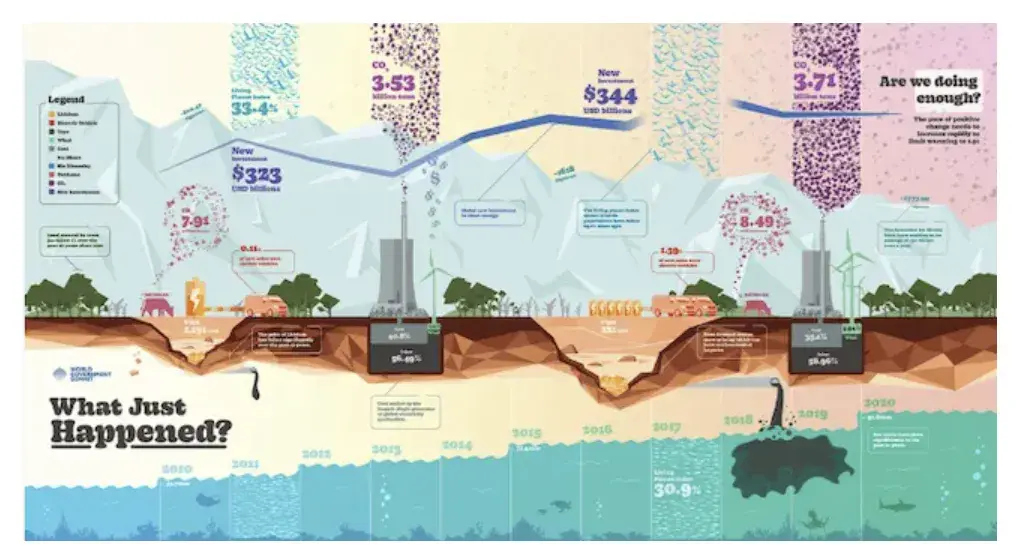
How to make an infographic example: Image-Heavy Infographic, Information is Beautiful

Image Source

Use this type of infographic for: Displaying a variety of information sources and categories to paint a comprehensive picture.

A word of caution: Be sure to consider where people will interact with your infographic so you can determine if it’s an appropriate size and sufficiently readable on different types of devices. Something like this image may work better in print than online.

2. Decide on a goal for your infographic.

Once you have the template you want to use, it’s time to get into the details. Without a clear goal, your infographic may include too much information or fail to convey your message.

Your goal should include the purpose of your infographic. Do you want to educate, persuade, inform, or inspire your audience?

An infographic can help you:

  • Quickly summarize complex topics.
  • Simplify complicated processes.
  • Highlight research or survey results.
  • Condense long-form content, like blog posts or case studies.
  • Analyze and compare different products or concepts.
  • Boost awareness about a topic.

And an infographic is for more than just presenting information. So, your goal should also include a desired action or response you want to elicit from your audience.

Do you want them to sign up for a newsletter, visit a website, or take another desired action?

Critically thinking about goals for your infographic helps you align each infographic with larger marketing targets.

3. Identify the audience for your infographic.
One of the most important parts of creating an infographic is defining your audience.

Image Source

Infographics don’t sell themselves on design alone.

They’re ultimately about communication. You need to deliver “info” that’s just as compelling as the “graphic,” and to do that, you need to know the audience your infographic intends to reach.

According to Harvard Business Review, five possible audiences can change how you choose and visualize your data: novice, generalist, managerial, expert, and executive.

Start by comparing your infographic’s ideal reader with one of these five audiences — which one applies to your reader?

Another way to look at this is that by identifying your audience, you can determine how advanced your information should be. For example:

  • A novice audience might need data that has a more obvious meaning.
  • A generalist may want to see how the information ties into the big picture.
  • A managerial audience might need to see how different groups or actions affect one another.
  • An expert might be more interested in getting into the weeds of your numbers and posing theories around them.
  • An executive has more in common with a novice audience in that they only have time for the simplest or most critical information and the impact it’ll have on the business.

In my experience, the audience is the most important part of communicating your data and information. So, once you identify who you want to see your infographic, dig deeper into that persona.

You should understand what interests that audience, what motivates them, and what specific information they need.

Then, think about how and where they’ll see your infographic. Will it be on a website, shared on social media, or presented at a conference? Then, I like to look at the potential ways to leverage the heck out of my content.

To that end, I recommend that you take time to consider how you might repurpose your infographic with your different channels in mind.

The bottom line here? The platform and situation should influence the design and format of your infographic. Keeping these details in mind will make your infographic stand out and make an impact.

Pro tip: Take audience awareness a step further by conducting research or gathering feedback from your target audience. These details make it easier to tailor your infographic to their specific needs.

4. Collect your content and relevant data.
Creating an infographic that is effective means collecting the data.">

Image Source

Using the audience you’ve chosen above, your next step is to organize all the content and data you’ll use in the infographic. You can either collect third-party data or use your own original data.

Choose your data.

For your data to be compelling, you must provide proper context. So, when collecting your data, make sure you have an idea about the story you want to tell. Data for the sake of data won’t add value to your infographic at all.

Choose data that’s interesting and gives a good understanding of the topic. You can compare numbers or look at trends over time to tell a story with your data.

I always like to look at abnormalities and see what might have caused them.

For example, a spike in website traffic from one month to the next doesn’t mean much — until, say, you reveal that traffic was on a steady decline over the previous three months.

Suddenly, you have a story of how you were able to reverse a downward trend.

Organize your data.
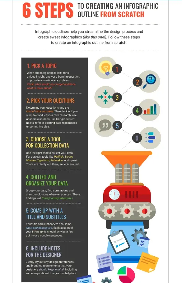
Creating an infographic means organizing your data in a way that makes sense to your audience.

Image Source

Make sure to organize your data in a way that makes sense so your audience can understand the story without having to work too hard.

To do this, spend some time thinking about what data points are most important and create a structure that emphasizes that data.

One of my favorite strategies is starting with a quick outline of your data story. Then, I match data points with each relevant section of the outline.

Cite your sources.

Most importantly of all, if you use third-party data, be sure you properly cite your sources — just like you would in any other good piece of content.

Beyond that, try to keep your infographic uncluttered by a ton of different source URLs. A great way to cite your sources is to include a simple URL at the bottom of your infographic that links to a page on your site.

You can also list the individual stats used in your infographic and their sources on a landing page. But if you do, don’t forget to link your landing page to an offer that includes your free infographic.

With these tips, your infographic will look clean and professional, and people will be able to access the sources no matter where the infographic gets shared or embedded. It may even drive visitors back to your site.

Pro tip: Think about different types of charts and graphs to present your data. Look for chances to turn complex statistics or concepts into easy-to-understand visualizations.

5. Download your template to PowerPoint.

For the sake of time (remember, our mission is to create an infographic in under an hour), I’m going to create an infographic with PowerPoint.

This is the easiest tool to use because it’s widely accessible software that’s already on most computers, so you can work on your infographic even without an internet connection.

The user interface is also familiar and user-friendly, making it easy for beginners.

This example is based on steps and best practices from our guide, How to Create Effective Inbound Marketing Campaigns.

I’ve picked the “World’s Greatest Timeline” infographic template from our collection of infographic templates.

This template is best suited for my data set since it will allow me to outline each step of the campaign creation process in chronological order.
creating an infographic, world’s greatest timeline infographic template example

If you’re ready to get started, just open the infographic template in PowerPoint.

This will create a new presentation based on the selected template. Then, you can start customizing.

6. Customize your infographic.

This is the most time-consuming part — plugging in the content you already have. With the right template, this step will go fast. All you need to do is replace the placeholder text and graphics with your own information.

Come up with a catchy title, plug in your data/content, and adjust your font sizes and formatting. Feel free to switch up the graphics and colors, too, so they’re relevant to your brand and the data you’re providing.

To customize the look of the infographic even more, you might add or change the colors or font styles to your liking.

Take a peek at the example below to see how I changed the text and updated the font colors to match HubSpot’s branding:
how to make an infographic, running an inbound marketing campaign infographic example

Remember, the template is just a starting point, and you can customize it however you want, using PowerPoint’s tools to create different types of visuals to support your data.

(Want a cheat sheet on how to use PowerPoint’s tools? Download our free infographic templates.)

As you adapt the template, focus on making sure the visuals are readable, make sense in the order they’re shared, and support and enhance your data.

Pro tip: I recommend using consistent visual cues such as icons, color schemes, or illustrations to create a consistent visual language for your infographic and reinforce your brand. What’s more, if you plan to use infographics on a regular basis, consider creating a style guide for your infographics.

7. Include a footer with your sources and logo.

Finally, include a link to your source (mine is here) and the company logo. This way, people will recognize your content if it gets shared on social media or embedded on other websites.

After all, one of the main benefits of creating infographics is their shareability. These details will also make your infographic feel more credible and authentic.

creating an infographic, header and footer example

Pro tip: Contributor details or acknowledgments can also boost the trustworthiness of your infographic.

8. Promote and publish your infographic.

The only thing left to do is to publish and promote your awesome new infographic. A few recommendations for promotion:

Publish your infographic on your blog.

Publishing an infographic on your blog improves the visual appeal of your content and gives your audience a tool to understand complex or new concepts.

But that’s not all. It can also give your SEO and user engagement a boost. (And, don’t forget to include your list of sources!)

Add a Pinterest button.

Want to go viral? Making it easy for people on your site to “pin” can give you added exposure. And if you’re going this route, don’t forget to add a caption for Pinterest sharing to help draw interest and boost engagement.
creating an infographic, running an inbound marketing campaign infographic made in under an hour

Create and add an embed code.

The easier you make it for people to share your infographic, the more likely you are to get those shares. Check out how I did it below.

Share This Image On Your Site

<p><strong>Please include attribution to blog.hubspot.com with this graphic.</strong><br /><br /><a rel=“noopener” target=“_blank” href=‘https://blog.hubspot.com/marketing/create-infographics-with-free-powerpoint-templates’><img src=‘https://blog.hubspot.com/hs-fs/hubfs/free_infographic_template_custom-1.png?t=1519094621186&width=1138&height=3412&name=free_infographic_template_custom-1.png’ alt=‘free_infographic_template_custom-1’ width=‘660px’ border=‘0’ /></a></p>

With the infographic complete and published, that’s a wrap. It won’t take you long to create some impressive infographics of your own once you get started — but before you begin, I’ve got some tools to make the creative process even smoother.

How to Make an Infographic for Free

Now, you may be wondering how much making an infographic will cost.

The good news is you can make engaging and effective infographics for free with many tools on the market.

Here are some of my favorites, and I’ll be testing one of them to show you how easy the process is.
1. Canva

creating an infographic, free infographic templates: Canva template

Image Source

Canva is a design platform that can help you create a variety of media like presentations, blog graphics, and posters in addition to infographics. It’s easy to get started using one of their templates.

The tool works by simply dragging and dropping the elements that you’d like to use into place. Once you’re satisfied with your graphic, you can easily download it in a variety of formats to share with your team.

What I like: Since I discovered Canva a couple of years ago, I’ve been obsessed with it. I love how easy it is to use and how much Canva is doing to stay ahead of the curve with new capabilities and tools that, in turn, make it easy for creators to develop trendy visual content.
2. HubSpot

creating an infographic, free infographic templates: HubSpot

Image Source

As I showcased earlier, HubSpot’s free, customizable infographic templates make it easy to quickly create new visuals for your project. Simply download the template and open it in PowerPoint.

From there, you can replace text by typing into the template and change the colors to suit your brand’s palette. Our offer comes with step-by-step directions to ensure a hiccup-free experience.

Branding and color schemes are crucial in creating a memorable and cohesive visual identity for organizations. They help establish brand recognition, build trust, and communicate the desired message to customers.

HubSpot’s color palette generator is a tool that allows you to select a primary color. It then automatically generates a complementary palette, ensuring consistency and professionalism in branding across various marketing channels.

What I like: Well, I may be biased, but our templates are pretty great. They give people with limited design know-how and less time the ability to create impactful graphics that wow their colleagues and clients.
3. Piktochart

creating an infographic, free infographic templates: Piktochart

Image Source

Piktochart is a free online tool to help you create infographics with zero design experience required. Where Piktochart shines is its many offerings to help visualize data.

The free version gives you access to pie charts, maps, bar charts, and pictographs to display data in a variety of formats.

Users have the option to upload a CSV, Google Sheet, or Excel file into the graph maker. They can also copy/paste data into the template. The brand stands by its user-friendliness, aiming to help novices create infographics in 30 minutes or less.
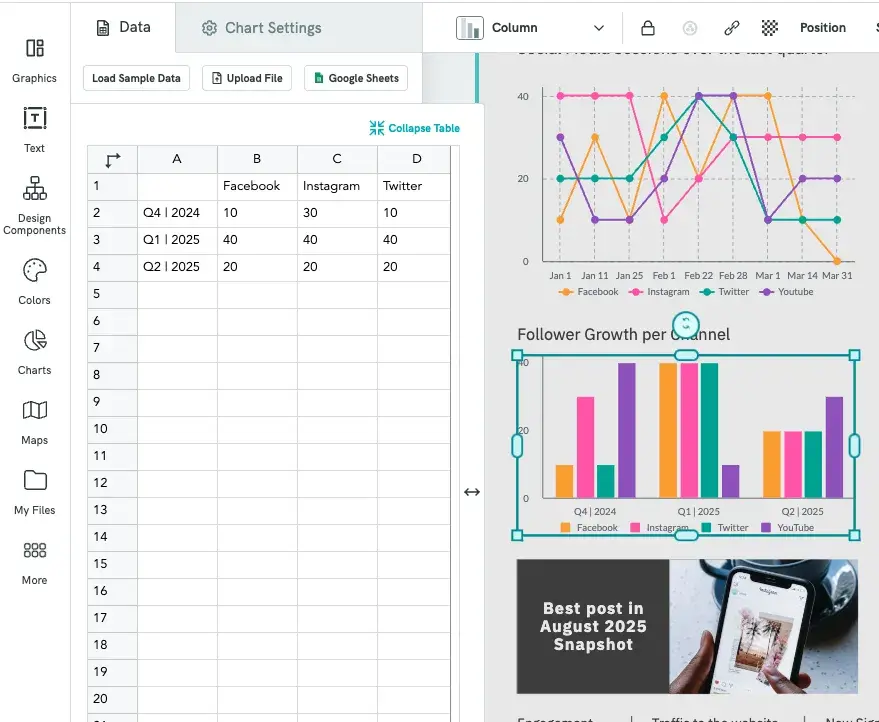
Piktochart makes creating an infographic easy with built-in methods for importing data.

Image Source

What I like: Piktochart offers a ton of different designs and styles and has an easy learning curve. I’ve found that creating professional-looking infographics is as easy as choosing a style and updating it.

Plus, with built-in chart-making capabilities, it takes my numbers and turns them into graphics that make sense with little to no manipulation on my part.
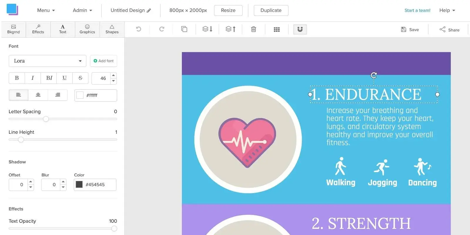
4. Snappa

how to make an infographic, free infographic templates: Snappa

Image Source

Snappa’s infographic maker pushes the limits of creating media on the fly — claiming users can make infographics in just five minutes.

Snappa offers a variety of ready-made templates and an easy drag-and-drop builder to help users quickly create the content they need.

Users have the option to add and take away graphics, text, and stock images to customize their creations. Once completed, the finished product can be easily downloaded for use.

Snappa also makes it easy to repurpose the infographics you’ve made by offering several formats for social sharing.

What I like: Snappa has (dare I say) a “Snappy” how-to video demonstrating how to repurpose their templates into something that fits your brand. Their templates are fresh and easy to use.
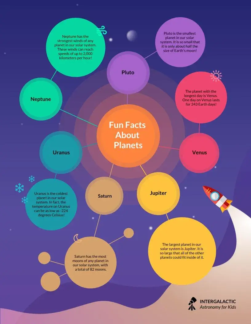
5. Venngage

how to make an infographic, free infographic templates: Venngage

Image Source

Similar to others on this list, Venngage uses a drag-and-drop editor and infographics maker to help users create infographics without any design experience.

Start with a template, then customize colors, text, and shapes as you see fit.

Venngage also has a robust stock photo library, with an impressive 40,000 icons and images available for use, plus another 3 million from Pixabay.

The only drawback is that the collaboration features and brand kit are only available with paid tiers.

What I like: When you first sign up, Venngage asks a few questions about how you plan to use its designs and tailors the page based on your preferences, making it easy to quickly find an infographic template to customize.
6. Visme

how to make an infographic, free infographic templates: Visme

Image Source

Visme helps users make graphics in three easy steps: choose a template, upload or input your data, and customize.

If you prefer to start a graphic from scratch, there is also an option to swap specific portions of your infographic using blocks instead of using a full template.

Once finished, users can opt to share their project with a link or download the infographic in a variety of formats. While the basic version of Visme is free, you’ll need to opt for a paid tier for access to the brand kit feature.

What I like: In addition to Visme’s templates, I love that they have design blocks you can use to quickly assemble your infographic, which makes it easy to pick and choose parts of a template that work for you and adapt other areas.

What’s more, if you plug in your website, it can extract your logo, fonts, and brand colors and start adapting templates to fit your brand.

Testing It Out

I’ve already shown how to use HubSpot’s free infographic templates to create your own infographics. But if you’d like to try out other free tools like the ones listed above, I’ll be testing Canva to show you how it works (the process is similar with the other tools).

The infographic I’ll create is one that explains how to create an infographic in no time (see what I did there?). Let’s proceed.

1. Create an account on Canva.

I already have a Canva account, so all I have to do is navigate to canva.com and start the process of creating the infographic. But if you don’t have an account yet, go ahead and sign up.

2. Choose a blank infographic canvas.

Once you’re done creating your account, your Canva dashboard will look like the image below.
create new infographic canvas

The next thing I do is click on Create a design and type “Infographic” into the search field, which results in a list of pre-built infographic options.

I choose the regular infographic canvas, which is the first option (it’s the one you’ll usually use, unless you want to create something more specific, like a resume or a video).

3. Choose an infographic template.

After clicking on Infographic, here’s what my screen looks like:
creating an infographic, blank infographic canvas on canva

There’s a blank rectangular canvas on which I can design my infographic on the right, and on the left, there are tons of free infographic templates I can choose from to create the infographic.

After browsing through the available options, I settle on a timeline infographic design as it will help me clearly outline the steps to take. Once I click on the design, it replaces the blank canvas like so:
choose your infographic template

4. Customize the design.

Now, I can start replacing the text and changing elements in the infographic to suit my needs.

After customizing it, here’s what it looks like:
customize the design of the infographic template

5. Download the infographic.

Finally, I give the infographic a name, How to create an infographic, and click the Share button on the top-right corner of my screen.

In the dropdown menu that pops up, I click Download, like so:
creating an infographic, download your infographic

Canva suggests that I download the infographic as a PDF document. If I want to go that route, I’d just click the purple Download button, and that’s it.

But I’d rather download it as a PNG image, so I click the dropdown arrow on the File type field and choose PNG. Then tap the purple Download button and, voila — my infographic’s ready.

If you’d like to create more complex infographics that include elements like charts (pie charts, bar charts, bubble charts, stacked charts, line charts, donut charts), progress bars (radial progress bars, progress rings), pictograms, maps, and hierarchies, Canva allows you to do that with templates like this:
creating an infographic with canva and adding charts/graphs

Tips for Creating a Great Infographic

Are you ready to get started on creating your own infographic? Here are some guidelines to keep in mind as you proceed.

1. The information you communicate matters more than its design.

You can make the most visually appealing infographic of the year, but if it doesn’t clearly communicate a purpose or message, then what’s the point?

Not to say that the infographic’s design is unimportant, but the information available on it should always be the priority.

A good infographic tells the audience what they need to know and adds more depth or dimension when coupled with a good design.

So when I develop content for infographics, I start with that exactly — the content — and ask three questions:

  • Why am I creating this infographic?
  • What do I want the person looking at it to walk away knowing?
  • What is the minimum amount of information that they need to get the story?

2. Know who you’re making the infographic for.

I realize I’ve already touched on the different types of audiences you write for, but it’s such an integral part of content creation that I wanted to reiterate it once more.

Regardless of what type of content you’re creating, it’s important to know your audience. This is true for copy, content, audio, video, and images.

That’s why before I start writing or creating anything, I spend some time thinking about the audience profile:

  • Who are they?
  • What do they already know?
  • What do they want to know or do?
  • How will this piece of content help them along the way?

Armed with that, it’s much easier to create content that appeals to your audience.

3. Avoid adding clutter to your infographic.

It’s easy to get carried away with icons, graphics, and word art. Trust me. I know — been there, done that, got the t-shirt. But, here’s the thing: If it’s distracting your reader, then it defeats the purpose of the infographic in the first place.

So, how do you keep it simple?

To keep my infographics looking clear and skimmable, I keep the reader in mind. They shouldn’t have to think too hard to find the information they need. Your infographic can also point to an “aha!” moment.

Truthfully, infographics aren’t always something you throw into your content. Once I see the infographic in a designed format, I often pare down the information to simplify it even further.

And, if I’m not sure if it’s simple enough or has the right information, I find that stepping away from the design for a bit can give me the clarity I need. When in doubt, I ask a trusted friend to take a look and share their perspective.

4. Ensure the visuals add value to your data.

Echoing my last point, the visuals that do make it to your infographic should be there to add value to the data beside it — this is the concept behind information design.

Whether you’re using graphs, diagrams, icons, or real-life imagery, I always remind clients that the goal is to take the key messages and provide enough context to tell the story.

This is especially true when you’re using numerical values. This way there’s an emotional element behind the messaging, not just bolding percentages.

5. Test for readability and user experience.

Web accessibility is becoming an increasingly important conversation, so it’s something that every design should take into consideration.

So, before you share your infographic, make sure it’s legible and accessible to a wide range of users. Test the font size, color contrast, and readability on different screens and devices.

I always keep in mind that a huge amount of people are looking at content on their mobile devices, which means it’s important to make sure the information is as clear on a small screen as on a large desktop monitor.

To that end, also make sure you’re considering any usability factors like navigation and calls-to-action.

Share Your Professional Infographic Today

This whole thing took me under an hour to put together — much less time (not to mention more professional looking) than it would’ve taken if I’d started from scratch.

Plus, it’s less expensive than hiring a designer and using the resources you might want to save for larger campaigns.

With these tools in hand, you’ll be able to start churning out professional and informative infographics, too!

Editor's note: This post was originally published in May 2020 and has been updated for comprehensiveness. This article was written by a human, but our team uses AI in our editorial process. Check out our full disclosure to learn more about how we use AI.

25+ Best Magazine Fonts for Stylish Titles & Cover Designs

Featured Imgs 23

Typography design is a fine balance of aesthetics and readability, and fonts play a crucial role in achieving that harmony. From sleek and modern typefaces to elegant serif fonts, the right typography can add character and distinction to your content.

In this post, we’ve gathered the best magazine fonts that will help you craft stunning, professional layouts that stand out on any print or digital platform. You’ll find fonts that excel in different aspects of magazine design, from bold and striking display fonts for headlines to clean and sophisticated fonts for body text.

Whether you’re working on a lifestyle magazine, fashion editorial, or business publication, these fonts offer the versatility and style you need to create polished, eye-catching designs.

Magazine – Elegant Serif Font

Magazine - Elegant Serif Font

This is an upscale and chic type font that adds sophistication to any branding and logo design. This multifaceted font is ideal for a variety of uses, like social media posts, packaging, photography, and invitations. Its high-level legibility ensures seamless integration across projects.

Vaqoeng – Modern Magazine Font

Vaqoeng - Modern Magazine Font

Vaqoeng offers a modern magazine and logo font that exudes elegance and authenticity. Provided in both OTF and TTF files, this distinct display font can be used to craft attractive titles for posters, book covers, magazines, and more. Vaqoeng is set to redefine your design aesthetics with its contemporary appeal and charming simplicity.

Display Magazine – Modern Title Font

Display Magazine - Modern Title Font

Brighten your creative projects with the Display Magazine font. This versatile font is perfect for both digital platforms and prints, ideal for anything from social media posts to personal projects. Similar to a Vogue magazine font, it lends a touch of sophistication to posters and branding. The set includes OTF, WOFF, and TTF files.

Biomorph – Magazine Font

Biomorph - Magazine Font

Biomorph is a versatile, newly-released sans font family, perfect for all your design needs. Ideal for branding, publishing, titles, books, and websites, Biomorph comes in a range of weights including thin, extra light, light, regular, medium, semibold, and bold. Its variety and sleek design give you the freedom to design just the way you want.

Stinker – Modern Magazine Font

Stinker - Modern Magazine Font

Stinker is an excellent choice for projects requiring a touch of elegance and style. Ideal for crafting striking logos, impressive magazine headers, or chic quotes, it offers a wealth of features including a variety of formats (TTF, OTF & WOFF), both uppercase and lowercase letters, ligatures, numerals, and punctuations, as well as regular and italic versions.

Daily Magazine – Serif Display Font

Daily Magazine - Serif Display Font

Discover our newest typography offering, Daily Magazine Serif Display Font. A sophisticated and modern choice for a multitude of creative projects, this font offers a versatile range of uses from logos to book covers and fashion branding. The design delicately balances both masculine and feminine tones making it a well-rounded choice.

The Real Magazine – Stylish Title Font

The Real Magazine - Stylish Title Font

The Real Magazine is a unique, dry-brushed marker font perfect for various applications. Use it to add flair to logos, packaging, t-shirts, posters, book covers, hipster designs, and greeting cards. It’s also ideal for any project requiring brush lettering. This stylish title font makes every creation stand out.

Aloha Magazine – Logo & Title font

Aloha Magazine - Logo & Title font

The Aloha Magazine logo and title font is a uniquely playful sans serif family boasting nine weights. Perfect for various design projects, it provides seamless typographic harmony, enhancing logos, branding, social media posts, advertisements, or product designs. The package includes Aloha Magazine .otf, .ttf, and .woff files.

Yoshida – Stylish Magazine Font

Yoshida - Stylish Magazine Font

Yoshida is an elegant, stylish magazine font that provides a distinguished look to your editorial content. Primarily intended for magazines or tabloids, it adds a classic yet fresh appeal to extended paragraphs. This font will significantly enhance readability and aesthetic appeal in your print or online publication.

CS Arthemis – Magazine Blackletter Font

CS Arthemis - Magazine Blackletter Font

CS Arthemis – Magazine Blackletter Font is a stunning blend of gothic charm and historical elegance. This Medieval display serif font features intricate design details, making it the perfect choice for projects requiring a combination of tradition, authority, and classic appeal. Ideal for luxury branding, formal invitations, and themed designs, CS Arthemis ensures your creations have a distinctive, timeless aesthetic.

Dickson – Geometric Magazine Fonts

Check out Dickson, a versatile sans font with a slim and bold style. Spanning 10 font styles, Dickson boasts of 10 straight-weight variations, perfect for any type of brand, logo, magazine, or movie. Its outlined copy ensures a modern feel to your projects while also offering multilingual support for languages including French, German, Spanish, and more for global accessibility.

Fancyou – Sharp Serif Magazine Font

Fancyou - Sharp Serif Magazine Font

Fancyou font elegantly merges vintage charm with contemporary dimensions. Its distinguishing feature lies in its sharp, stylish serifs, which are ideal for modern vintage designs. Available in eight diverse styles, this open-type format font is versatile enough for logos, websites, business cards, or branding initiatives.

Bolognia – Classic Serif Magazine Font

Bolognia - Classic Serif Magazine Font

The Bolognia is a sophisticated serif typeface, drawing inspiration from both classic and contemporary design elements. With a tall x-height, modern proportions, and contrasting strokes, Bolognia stands out in all the right ways. Versatile across six weights, it’s perfect for editorial content and headline creation that demands clarity and impact.

Merauq – Creative Magazine Font

Merauq - Creative Magazine Font

Merauq is a creative magazine font that provides strikingly harmonious typography across varied design projects. Available in 5 weights, it’s ideal for use in logos, branding, social media posts, advertisements, and product designs. The asset includes Meraq otf, ttf, and woff files, offering a great foundation for diverse and captivating designs.

RNS Miles – Trendy Magazine Font

RNS Miles - Trendy Magazine Font

RNS Miles is a versatile, modern magazine font family, featuring geometric and open forms for a harmonious, low-contrast look. It’s ideally suited for headlines and titles, with seven weights and matching italics. Extended OpenType features, like alternate glyphs and fractions, add to its utility.

Mouzambik – Narrow Magazine Font

Mouzambik - Narrow Magazine Font

Meet Mouzambik, a condensed sans-serif magazine font with a unique and intricate personality, designed to make your projects stand out. Available in regular, Inktrap, and Smooth styles, each with italics, it’s perfect for anything from headlines and branding to websites and posters. It shines in all sizes and includes an array of ligatures, alternates, and features.

Certia – Magazine Font

Certia - Magazine Font

Certia is a masterfully designed sans-serif font family boasting a blend of elegance and functionality. It includes 16 fonts, providing extensive language support for global communication needs. Ideal for editorial endeavors, branding projects, or digital interfaces, Certia maintains a consistent, readable form while exuding sophistication, closely aligning with varied design settings.

Etnier – Modern Display Magazine Font

Etnier - Modern Display Magazine Font

Etnier is a captivating modern display font perfect for magazine layouts. This sans-serif typeface offers a striking, squared appearance for superior readability. With a dynamic range of widths, italics, and a bold, robust quality, Etnier is excellent for UI, UX designs. Included in the package are 14 versatile styles available in OTF, TTF, WOFF formats.

Vangeda – Modern Serif Magazine Font

Vangeda - Modern Serif Magazine Font

The Vangeda is a modern and elegant serif font that comes in two styles: regular and italic. It has alternate and ligature glyph variations and supports multilingual input. Perfect for various design projects including logos, branding, advertising, and more, it adds a touch of sophistication to your work. Useful for both print and digital mediums, the Vangeda font is an asset to any designer.

Ricordo – Magazine Font

Ricordo - Magazine Font

Ricordo, a next-generation Magazine Font, is meticulously crafted for optimal engagement. This typeface has the flexibility to be used across all corporate tasks and a multitude of projects, from logos and headlines to digital ads. With nine weights and multiple file formats, including TTF, OTF, WOFF, and EOT.

Salmond – Clean Magazine Font

Salmond - Clean Magazine Font

Salmond is a clean, geometric, modern sans serif magazine font. With its tightly packed lettering and minimalist allure, it’s perfect for creating striking titles, brand logos, and impactful editorial work. Salmond offers six weight options, including Light, Regular, News, Medium, Semibold, and Bold.

Clover – Bold Magazine Font

Clover - Bold Magazine Font

A derivative of the Olive Typeface Family, the Clover display font is a distinctive, modern, and elegant asset delivering a bold magazine font ideal for Time Magazine-style title designs. It’s crafted with 16 versatile styles and comes in various formats like TTF, OTF, WOFF. Its strong capitals, smooth lowercase, and quirky warmth make it perfect for branding, headlines, or text overlays.

Free Magazine Fonts

Moderniz – Free Magazine Font

A beautiful, elegant display font for crafting attractive cover designs for magazine concepts. This free font comes with a stylishly bold letter design that will fit perfectly for bold magazines. It’s free to use with personal projects.

Risbeg – Free Magazine Font

Risbeg is another great free font you can use to craft magazine-style titles and headings for your design projects. This font has a professional-looking serif letter design. And it’s free to use with your personal projects.

Angrela Display – Free Magazine Font

This font is ideal for designing elegant magazine-like typography. The font comes with serif letters featuring beautiful curves and swashes. It’s free to use with personal projects.

Free Classic Magazine Font

You can download this font for free to craft stylish magazine-style titles with a classic feel. The font features a professional and minimalist design that will create a bold look for your typography. It’s free for personal use only.

Keryla – Free Magazine Font

A creative and unique font that comes with an elegant aesthetic. This font features a serif letter design with curves and serifs. The font is ideal for a modern magazine look. It’s free to use with personal projects.

Sanding UI

Featured Imgs 23

Jim hit a snag while working on a form. Placing labels next to inputs is trivial with flexbox, sure, but what happened in Jim’s case was a bit of dead-clicking between the labels and radio buttons.

The issue? Not the markup, that’s all semantic and cool. Turns out the gap he placed between the elements is non-interactive. Makes sense when you think about it, but frustrating nonetheless because it looks like a bug and feels like a bug even though there’s nothing wrong with the styles.

The solution’s easy enough: padding along the inside edge of the input extends its box dimensions, allowing the added space to remain interactive with visual spacing. Margin wouldn’t work since it’s akin to gap in that it pushes the element’s box instead of expanding it.

I’m linking up Jim’s article because it’s a perfect demonstration that CSS is capable of accomplishing the same thing in many ways. It’s easy to fall into the trap of “single-solution” thinking, but CSS doesn’t want anything to do with that. It’ll instead challenge you to adapt toward open-minded strategies, perhaps even defensive ones.


Sanding UI originally published on CSS-Tricks, which is part of the DigitalOcean family. You should get the newsletter.


from CSS-Tricks https://ift.tt/2icbH7D
Gain $200 in a week
via Read more

Anchor Positioning Quirks

Featured Imgs 23

I am thrilled to say, that from this week onwards, the CSS-tricks Almanac has an entry for each property, function, and at-rule related to the new Anchor Positioning API! For the last month, I have tried to fully understand this new module and explain it to the best of my ability. However, anchor positioning is still a new feature that brings even newer dynamics on how to position absolute elements, so it’s bound to have some weird quirks and maybe even a few bugs lurking around.

To celebrate the coverage, I wanted to discuss those head-scratchers I found while diving into this stuff and break them down so that hopefully, you won’t have to bang your head against the wall like I did at first.

The inset-modified containing block

A static element containing block is a fairly straightforward concept: it’s that element’s parent element’s content area. But things get tricky when talking about absolutely positioned elements. By default, an absolutely positioned element’s containing block is the viewport or the element’s closest ancestor with a position other than static, or certain values in properties like contain or filter.

All in all, the rules around an absolute element’s containing block aren’t so hard to remember. While anchor positioning and the containing block have their quirks (for example, the anchor element must be painted before the positioned element), I wanted to focus on the inset-modified containing block (which I’ll abbreviate as IMCB from here on out).

There isn’t a lot of information regarding the inset-modified containing block, and what information exists comes directly from the anchor positioning specification module. This tells me that, while it isn’t something new in CSS, it’s definitely something that has gained relevance thanks to anchor positioning.

The best explanation I could find comes directly from the spec:

For an absolutely positioned box, the inset properties effectively reduce the containing block into which it is sized and positioned by the specified amounts. The resulting rectangle is called the inset-modified containing block.

So if we inset an absolutely positioned element’s (with top, left, bottom, right, etc.), its containing block shrinks by the values on each property.

.absolute {
  position: absolute;
  top: 80px;
  right: 120px;
  bottom: 180px;
  left: 90px;
}

For this example, the element’s containing block is the full viewport, while its inset modified containing block is 80px away from the top, 120px away from the right, 180px away from the bottom, and 90px away from the left.

Example of an inset-modified containing block. It's shrinked 80px from the top, 120px from the right, 180px from the bottom and 90px from the left

Knowing how the IMCB works isn’t a top priority for learning CSS, but if you want to understand anchor positioning to its fullest, it’s a must-know concept. For instance, the position-area and position-try-order heavily rely on this concept.

In the case of the position-area property, a target containing block can be broken down into a grid divided by four imaginary lines:

  1. The start of the target’s containing block.
  2. The start of the anchor element or anchor(start).
  3. The end of the anchor element or anchor(end).
  4. The end of the target’s containing block.
Example of how we can think of the containing block of an anchor element as a 3x3 asymmetrical grid

The position-area property uses this 3×3 imaginary grid surrounding the target to position itself inside the grid. So, if we have two elements…

<div class="anchor">Anchor</div>
<div class="target">Target</div>

…attached with anchor positioning:

.anchor {
  anchor-name: --my-anchor;

  height: 50px;
  width: 50px;
}

.target {
  position: absolute;
  position-anchor: --my-anchor;

  height: 50px;
  width: 50px;
}

…we can position the .target element using the position-area property:

.target {
  position: absolute;
  position-anchor: --my-anchor;
  position-area: top left;

  height: 50px;
  width: 50px;
}

The IMCB is shrunk to fit inside the region of the grid we selected, in this case, the top-left region.

Example of the inset-modified containing block of a target element at the top left of the anchor

You can see it by setting both target’s dimensions to 100%:

The position-try-order also uses the IMCB dimensions to decide how to order the fallbacks declared in the position-try-fallbacks property. It checks which one of the fallbacks provides the IMCB with the largest available height or width, depending on whether you set the property with either the most-height or most-width values.

I had a hard time understanding this concept, but I think it’s perfectly shown in a visual tool by Una Kravets on https://chrome.dev/anchor-tool/.

Specification vs. implementation

The spec was my best friend while I researched anchor positioning. However, theory can only take you so far, and playing with a new feature is the fun part of understanding how it works. In the case of anchor positioning, some things were written in the spec but didn’t actually work in browsers (Chromium-based browsers at the time). After staring mindlessly at my screen, I found the issue was due to something so simple I didn’t even consider it: the browser and the spec didn’t match.

Anchor positioning is different from a lot of other features in how fast it shipped to browsers. The first draft was published on June 2023 and, just a year later, it was released on Chrome 125. To put it into perspective, the first draft for custom properties was published in 2012 and we waited four years to see it in implemented in browsers (although, Firefox shipped it years before other browsers).

I am excited to see browsers shipping new CSS features at a fast pace. While it’s awesome to get new stuff faster, it leaves less space between browsers and the CSSWG to remake features and polish existing drafts. Remember, once something is available in browsers, it’s hard to change or remove it. In the case of anchor positioning, browsers shipped certain properties and functions early on that were ultimately changed before the spec had fully settled into a Candidate Recommendation.

It’s a bit confusing, but as of Chrome 129+, this is the stuff that Chrome shipped that required changes:

position-area

The inset-area property was renamed to position-area (#10209), but it will be supported until Chrome 131.

.target {
  /* from */
  inset-area: top right;

  /* to */
  position-area: top right;
}

position-try-fallbacks

The position-try-options was renamed to position-try-fallbacks (#10395).

.target {
  /* from */
  position-try-options: flip-block, --smaller-target;

  /* to */
  position-try-fallbacks: flip-block, --smaller-target;
}

inset-area()

The inset-area() wrapper function doesn’t exist anymore for the position-try-fallbacks (#10320), you can just write the values without the wrapper
.target {
  /* from */
  position-try-options: inset-area(top left);

  /* to */
  position-try-fallbacks: top left;
}

anchor(center)

In the beginning, if we wanted to center a target from the center, we would have to write this convoluted syntax

.target {
  --center: anchor(--x 50%);
  --half-distance: min(abs(0% - var(--center)), abs(100% - var(--center)));
	
  left: calc(var(--center) - var(--half-distance));
  right: calc(var(--center) - var(--half-distance));
}

The CWSSG working group resolved (#8979) to add the anchor(center) argument for much-needed brevity.

.target {
  left: anchor(center);
}

Bugs!

Some bugs snuck into browser implementations of qnchor positioning. For example, the spec says that if an element doesn’t have a default anchor element, then the position-area property does nothing. This is a known issue (#10500) but it’s still possible to replicate, so please, just don’t do it.

The following code…

.container {
  position: relative;
}

.element {
  position: absolute;
  position-area: center;
  margin: auto;
}

…centers the .element inside its container as we can see in this demo from Temani Afif:

Another example comes from the position-visibility property. If your anchor element is off-screen, you typically want its target to be hidden as well. The spec says the default is anchors-visible, but browsers go with always instead.

Chrome currently isn’t reflecting the spec. It indeed is using always as the initial value. But the spec’s text is intentional — if your anchor is off-screen or otherwise scrolled off, you usually want it to hide (#10425).

Anchor positioning accessibility

While anchor positioning’s most straightforward use case is for stuff like tooltips, infoboxes, and popovers, it can be used for a lot of other stuff as well. Check this example by Silvestar Bistrović, for example, where he connects elements with lines. He’s tethered elements together for decorative purposes, so anchor positioning doesn’t mean there is a semantic relationship between the elements. As a consequence, non-visual agents, like screen readers, are left in the dark about how to interpret two seemingly unrelated elements.

If we’re aiming to link a tooltip to another element, we need to set up a relationship in the DOM and let anchor positioning handle the visuals. Happily, there are APIs (like the Popover API) that do this for us, even establishing an anchor relationship that we can take advantage of to create more compelling visuals.

In a general way, the spec describes an approach to create this relationship using ARIA attributes such as the aria-details or aria-describedby, along the role attribute on the target element.

So, while we could attach the following two elements…

<div class="anchor">anchor</div>
<div class="toolip">toolip</div>

…using anchor positioning:

.anchor {
  anchor-name: --my-anchor;
}

.toolip {
  position: absolute;
  position-anchor: --my-anchor;
  position-area: top;
}

…but screen readers only see two elements next to one another without any remarked relationship. That’s a bummer for accessibility, but we can easily fix it using the corresponding ARIA attribute:

<div class="anchor" aria-describedby="tooltipInfo">anchor</div>
<div class="toolip" role="tooltip" id="tooltipInfo">toolip</div>

And now they are both visually and semantically linked together! It would just be better if could pull it off without ARIA.

Conclusion

Being confused by a new feature just to finally understand it is one of the most satisfying experiences anyone in programming can feel. While there are still some things about anchor positioning that can be (and are) confusing, I’m pleased to say the CSS-Tricks Almanac now has a deluge of information to help clarify things.

The most exciting thing is that anchor positioning is still in an early stage. That means there are many more confusing things coming for us to discover and learn!


Anchor Positioning Quirks originally published on CSS-Tricks, which is part of the DigitalOcean family. You should get the newsletter.

Why Anticipatory Design Isn’t Working For Businesses

Featured Imgs 23

Consider the early days of the internet, when websites like NBC News and Amazon cluttered their pages with flashing banners and labyrinthine menus. In the early 2000s, Steve Krug’s book Don’t Make Me Think arrived like a lighthouse in a storm, advocating for simplicity and user-centric design.

Today’s digital world is flooded with choices, information, and data, which is both exciting and overwhelming. Unlike Krug’s time, today, the problem isn’t interaction complexity but opacity. AI-powered solutions often lack transparency and explainability, raising concerns about user trust and accountability. The era of click-and-command is fading, giving way to a more seamless and intelligent relationship between humans and machines.

Expanding on Krug’s Call for Clarity: The Pillars of Anticipatory Design

Krug’s emphasis on clarity in design is more relevant than ever. In anticipatory design, clarity is not just about simplicity or ease of use — it’s about transparency and accountability. These two pillars are crucial but often missing as businesses navigate this new paradigm. Users today find themselves in a digital landscape that is not only confusing but increasingly intrusive. AI predicts their desires based on past behavior but rarely explains how these predictions are made, leading to growing mistrust.

Transparency is the foundation of clarity. It involves openly communicating how AI-driven decisions are made, what data is being collected, and how it is being used to anticipate needs. By demystifying these processes, designers can alleviate user concerns about privacy and control, thereby building trust.

Accountability complements transparency by ensuring that anticipatory systems are designed with ethical considerations in mind. This means creating mechanisms for users to understand, question, and override automated decisions if needed. When users feel that the system is accountable to them, their trust in the technology — and the brand — deepens.

What Makes a Service Anticipatory?

Image AI like a waiter at a restaurant. Without AI, they wait for you to interact with them and place your order. But with anticipatory design powered by AI and ML, the waiter can analyze your past orders (historical data) and current behavior (contextual data) — perhaps, by noticing you always start with a glass of sparkling water.

This proactive approach has evolved since the late 1990s, with early examples like Amazon’s recommendation engine and TiVo’s predictive recording. These pioneering services demonstrated the potential of predictive analytics and ML to create personalized, seamless user experiences.

Amazon’s Recommendation Engine (Late 1990s)

Amazon was a pioneer in using data to predict and suggest products to customers, setting the standard for personalized experiences in e-commerce.

TiVo (1999)

TiVo’s ability to learn users’ viewing habits and automatically record shows marked an early step toward predictive, personalized entertainment.

Netflix’s Recommendation System (2006)

Netflix began offering personalized movie recommendations based on user ratings and viewing history in 2006. It helped popularize the idea of anticipatory design in the digital entertainment space.

How Businesses Can Achieve Anticipatory Design

Designing for anticipation is designing for a future that is not here yet but has already started moving toward us.

Designing for anticipation involves more than reacting to current trends; it requires businesses to plan strategically for future user needs. Two critical concepts in this process are forecasting and backcasting.

  • Forecasting analyzes past trends and data to predict future outcomes, helping businesses anticipate user needs.
  • Backcasting starts with a desired future outcome and works backward to identify the steps needed to achieve that goal.

Think of it like planning a dream vacation. Forecasting would involve looking at your past trips to guess where you might go next. But backcasting lets you pick your ideal destination first, then plan the perfect itinerary to get you there.

Forecasting: A Core Concept for Future-Oriented Design

This method helps in planning and decision-making based on probable future scenarios. Consider Netflix, which uses forecasting to analyze viewers’ past viewing habits and predict what they might want to watch next. By leveraging data from millions of users, Netflix can anticipate individual preferences and serve personalized recommendations that keep users engaged and satisfied.

Backcasting: Planning From the Desired Future

Backcasting takes a different approach. Instead of using data to predict the future, it starts with defining a desired future outcome — a clear user intent. The process then works backward to identify the steps needed to achieve that goal. This goal-oriented approach crafts an experience that actively guides users toward their desired future state.

For instance, a financial planning app might start with a user’s long-term financial goal, such as saving for retirement, and then design an experience that guides the user through each step necessary to reach that goal, from budgeting tips to investment recommendations.

Integrating Forecasting and Backcasting In Anticipatory Design

The true power of anticipatory design emerges when businesses efficiently integrate both forecasting and backcasting into their design processes.

For example, Tesla’s approach to electric vehicles exemplifies this integration. By forecasting market trends and user preferences, Tesla can introduce features that appeal to users today. Simultaneously, by backcasting from a vision of a sustainable future, Tesla designs its vehicles and infrastructure to guide society toward a world where electric cars are the norm and carbon emissions are significantly reduced.

Over-Promising and Under-Delivering: The Pitfalls of Anticipatory Design

As businesses increasingly adopt anticipatory design, the integration of forecasting and backcasting becomes essential. Forecasting allows businesses to predict and respond to immediate user needs, while backcasting ensures these responses align with long-term goals. Despite its potential, anticipatory design often fails in execution, leaving few examples of success.

Over the past decade, I’ve observed and documented the rise and fall of several ambitious anticipatory design ventures. Among them, three — Digit, LifeBEAM Vi Sense Headphones, and Mint — highlight the challenges of this approach.

Digit: Struggling with Contextual Understanding

Digit aimed to simplify personal finance with algorithms that automatically saved money based on user spending. However, the service often missed the mark, lacking the contextual awareness necessary to accurately assess users’ real-time financial situations. This led to unexpected withdrawals, frustrating users, especially those living paycheck to paycheck. The result was a breakdown in trust, with the service feeling more intrusive than supportive.

LifeBEAM Vi Sense Headphones: Complexity and User Experience Challenges

LifeBEAM Vi Sense Headphones was marketed as an AI-driven fitness coach, promising personalized guidance during workouts. In practice, the AI struggled to deliver tailored coaching, offering generic and unresponsive advice. As a result, users found the experience difficult to navigate, ultimately limiting the product’s appeal and effectiveness. This disconnection between the promised personalized experience and the actual user experience left many disappointed.

Mint: Misalignment with User Goals

Mint aimed to empower users to manage their finances by providing automated budgeting tools and financial advice. While the service had the potential to anticipate user needs, users often found that the suggestions were not tailored to their unique financial situations, resulting in generic advice that did not align with their personal goals.

The lack of personalized, actionable steps led to a mismatch between user expectations and service delivery. This misalignment caused some users to disengage, feeling that Mint was not fully attuned to their unique financial journeys.

The Risks of Over-promising and Under-Delivering

The stories of Digit, LifeBEAM Vi Sense, and Mint underscore a common pitfall: over-promising and under-delivering. These services focused too much on predictive power and not enough on user experience. When anticipatory systems fail to consider individual nuances, they breed frustration rather than satisfaction, highlighting the importance of aligning design with human experience.

Digit’s approach to automated savings, for instance, became problematic when users found its decisions opaque and unpredictable. Similarly, LifeBEAM’s Vi Sense headphones struggled to meet diverse user needs, while Mint’s rigid tools failed to offer the personalized insights users expected. These examples illustrate the delicate balance anticipatory design must strike between proactive assistance and user control.

Failure to Evolve with User Needs

Many anticipatory services rely heavily on data-driven forecasting, but predictions can fall short without understanding the broader user context. Mint initially provided value with basic budgeting tools but failed to evolve with users’ growing needs for more sophisticated financial advice. Digit, too, struggled to adapt to different financial habits, leading to dissatisfaction and limited success.

Complexity and Usability Issues

Balancing the complexity of predictive systems with usability and transparency is a key challenge in anticipatory design.

When systems become overly complex, as seen with LifeBEAM Vi Sense headphones, users may find them difficult to navigate or control, compromising trust and engagement. Mint’s generic recommendations, born from a failure to align immediate user needs with long-term goals, further illustrate the risks of complexity without clarity.

Privacy and Trust Issues

Trust is critical in anticipatory design, particularly in services handling sensitive data like finance or health. Digit and Mint both encountered trust issues as users grew skeptical of how decisions were made and whether these services truly had their best interests in mind. Without clear communication and control, even the most sophisticated systems risk alienating users.

Inadequate Handling of Edge Cases and Unpredictable Scenarios

While forecasting and backcasting work well for common scenarios, they can struggle with edge cases or unpredictable user behaviors. If an anticipatory service can’t handle these effectively, it risks providing a poor user experience and, in the worst-case scenario, harming the user. Anticipatory systems must be prepared to handle edge cases and unpredictable scenarios.

LifeBEAM Vi Sense headphones struggled when users deviated from expected fitness routines, offering a one-size-fits-all experience that failed to adapt to individual needs. This highlights the importance of allowing users control, even when a system proactively assists them.

Designing for Anticipatory Experiences
Anticipatory design should empower users to achieve their goals, not just automate tasks.

We can follow a layered approach to plan a service that can evolve according to user actions and explicit ever-evolving intent.

But how do we design for intent without misaligning anticipation and user control or mismatching user expectations and service delivery?

At the core of this approach is intent — the primary purpose or goal that the design must achieve. Surrounding this are workflows, which represent the structured tasks to achieve the intent. Finally, algorithms analyze user data and optimize these workflows.

For instance, Thrive (see the image below), a digital wellness platform, aligns algorithms and workflows with the core intent of improving well-being. By anticipating user needs and offering personalized programs, Thrive helps users achieve sustained behavior change.

It perfectly exemplifies the three-layered concentric representation for achieving behavior change through anticipatory design:

1. Innermost layer: Intent

Improve overall well-being: Thrive’s core intent is to help users achieve a healthier and more fulfilling life. This encompasses aspects like managing stress, improving sleep quality, and boosting energy levels.

2. Middle layer: Workflows

Personalized programs and support: Thrive uses user data (sleep patterns, activity levels, mood) to create programs tailored to their specific needs and goals. These programs involve various workflows, such as:

  • Guided meditations and breathing exercises to manage stress and anxiety.
  • Personalized sleep routines aimed at improving sleep quality.
  • Educational content and coaching tips to promote healthy habits and lifestyle changes.

3. Outermost layer: Algorithms

Data analysis and personalized recommendations: Thrive utilizes algorithms to analyze user data and generate actionable insights. These algorithms perform tasks like the following:

  • Identify patterns in sleep, activity, and mood to understand user challenges.
  • Predict user behavior to recommend interventions that address potential issues.
  • Optimize program recommendations based on user progress and data analysis.

By aligning algorithms and workflows with the core intent of improving well-being, Thrive provides a personalized and proactive approach to behavior change. Here’s how it benefits users:

  • Sustained behavior change: Personalized programs and ongoing support empower users to develop healthy habits for the long term.
  • Data-driven insights: User data analysis helps users gain valuable insights into their well-being and identify areas for improvement.
  • Proactive support: Anticipates potential issues and recommends interventions before problems arise.
The Future of Anticipatory Design: Combining Anticipation with Foresight

Anticipatory design is inherently future-oriented, making it both appealing and challenging. To succeed, businesses must combine anticipation — predicting future needs — with foresight, a systematic approach to analyzing and preparing for future changes.

Foresight involves considering alternative future scenarios and making informed decisions to navigate toward desired outcomes. For example, Digit and Mint struggled because they didn’t adequately handle edge cases or unpredictable scenarios, a failure in their foresight strategy (see an image below).

As mentioned, while forecasting and backcasting work well for common scenarios, they can struggle with edge cases or unpredictable user behaviors. Under anticipatory design, if we demote foresight for a second plan, the business will fail to account for and prepare for emerging trends and disruptive changes. Strategic foresight helps companies to prepare for the future and develop strategies to address possible challenges and opportunities.

The Foresight process generally involves interrelated activities, including data research, trend analysis, planning scenarios, and impact assessment. The ultimate goal is to gain a broader and deeper understanding of the future to make more informed and strategic decisions in the design process and foresee possible frictions and pitfalls in the user experience.

Actionable Insights for Designer

  • Enhance contextual awareness
    Help data scientists or engineers to ensure that the anticipatory systems can understand and respond to the full context of user needs, not just historical data. Plan for pitfalls so you can design safety measures where the user can control the system.
  • Maintain user control
    Provide users with options to customize or override automated decisions, ensuring they feel in control of their experiences.
  • Align short-term predictions with long-term goals
    Use forecasting and backcasting to create a balanced approach that meets immediate needs while guiding users toward their long-term objectives.
Proposing an Anticipatory Design Framework

Predicting the future is no easy task. However, design can borrow foresight techniques to imagine, anticipate, and shape a future where technology seamlessly integrates with users evolving needs. To effectively implement anticipatory design, it’s essential to balance human control with AI automation. Here’s a 3-step approach to integrate future thinking into your workflow:

  1. Anticipate Directions of Change
    Identify major trends shaping the future.
  2. Imagine Alternative Scenarios
    Explore potential futures to guide impactful design decisions.
  3. Shape Our Choices
    Leverage these scenarios to align design with user needs and long-term goals.

This proposed framework (see an image above) aims to integrate forecasting and backcasting while emphasizing user intent, transparency, and continuous improvement, ensuring that businesses create experiences that are both predictive and deeply aligned with user needs.

Step 1: Anticipate Directions of Change

Objective: Identify the major trends and forces shaping the future landscape.

Components:

1. Understand the User’s Intent

  • User Research: Conduct in-depth user research through interviews, surveys, and observations to uncover user goals, motivations, pain points, and long-term aspirations or Jobs-to-be-Done (JTBD). This foundational step helps clearly define the user’s intent.
  • Persona Development: Develop detailed user personas that represent the target audience, including their long-term goals and desired outcomes. Prioritize understanding how the service can adapt in real-time to changing user needs, offering recommendations, or taking actions aligned with the persona’s current context.

2. Forecasting: Predicting Near-Term User Needs

  • Data Collection and Analysis: Collaborate closely with data scientists and data engineers to analyze historical data (past interactions), user behavior, and external factors. This collaboration ensures that predictive analytics enhance overall user experience, allowing designers to better understand the implications of data on user behaviors.
  • Predictive Modeling: Implement continuous learning algorithms that refine predictions over time. Regularly assess how these models evolve, adapting to users’ changing needs and circumstances.
  • Explore the Delphi Method: This is a structured communication technique that gathers expert opinions to reach a consensus on future developments. It’s particularly useful for exploring complex issues with uncertain outcomes. Use the Delphi Method to gather insights from industry experts, user researchers, and stakeholders about future user needs and the best strategies to meet those needs. The consensus achieved can help in clearly defining the long-term goals and desired outcomes.

Activities:

  • Conduct interviews and workshops with experts using the Delphi Method to validate key trends.
  • Analyze data and trends to forecast future directions.

Step 2: Imagine Alternative Scenarios

Objective: Explore a range of potential futures based on these changing directions.

Components:

1. Scenario Planning

  • Scenario Development: It involves creating detailed, plausible future scenarios based on various external factors, such as technological advancements, social trends, and economic changes. Develop multiple future scenarios that represent different possible user contexts and their impact on their needs.
  • Scenario Analysis: From these scenarios, you can outline the long-term goals that users might have in each scenario and design services that anticipate and address these needs. Assess how these scenarios impact user needs and experiences.

2. Backcasting: Designing from the Desired Future

  • Define Desired Outcomes: Clearly outline the long-term goals or future states that users aim to achieve. Use backcasting to reduce cognitive load by designing a service that anticipates future needs, streamlining user interactions, and minimizing decision-making efforts.
    • Use Visioning Planning: This is a creative process that involves imagining the ideal future state you want to achieve. It helps in setting clear, long-term goals by focusing on the desired outcomes rather than current constraints. Facilitate workshops or brainstorming sessions with stakeholders to co-create a vision of the future. Define what success looks like from the user’s perspective and use this vision to guide the backcasting process.
  • Identify Steps to Reach Goals: Reverse-engineer the user journey by starting from the desired future state and working backward. Identify the necessary steps and milestones and ensure these are communicated transparently to users, allowing them control over their experience.
  • Create Roadmaps: Develop detailed roadmaps that outline the sequence of actions needed to transition from the current state to the desired future state. These roadmaps should anticipate obstacles, respect privacy, and avoid manipulative behaviors, empowering users rather than overwhelming them.

Activities:

  • Develop and analyze alternative scenarios to explore various potential futures.
  • Use backcasting to create actionable roadmaps from these scenarios, ensuring they align with long-term goals.

Step 3: Shape Our Choices

Objective: Leverage these scenarios to spark new ideas and guide impactful design decisions.

Components:

1. Integrate into the Human-Centered Design Process

  • Iterative Design with Forecasting and Backcasting: Embed insights from forecasting and backcasting into every stage of the design process. Use these insights to inform user research, prototype development, and usability testing, ensuring that solutions address both predicted future needs and desired outcomes. Continuously refine designs based on user feedback.
  • Agile Methodologies: Adopt agile development practices to remain flexible and responsive. Ensure that the service continuously learns from user interactions and feedback, refining its predictions and improving its ability to anticipate needs.

2. Implement and Monitor: Ensuring Ongoing Relevance

  • User Feedback Loops: Establish continuous feedback mechanisms to refine predictive models and workflows. Use this feedback to adjust forecasts and backcasted plans as necessary, keeping the design aligned with evolving user expectations.
  • Automation Tools: Collaborate with data scientists and engineers to deploy automation tools that execute workflows and monitor progress toward goals. These tools should adapt based on new data, evolving alongside user behavior and emerging trends.
  • Performance Metrics: Define key performance indicators (KPIs) to measure the effectiveness, accuracy, and quality of the anticipatory experience. Regularly review these metrics to ensure that the system remains aligned with intended outcomes.
  • Continuous Improvement: Maintain a cycle of continuous improvement where the system learns from each interaction, refining its predictions and recommendations over time to stay relevant and useful.
    • Use Trend Analysis: This involves identifying and analyzing patterns in data over time to predict future developments. This method helps you understand the direction in which user behaviors, technologies, and market conditions are heading. Use trend analysis to identify emerging trends that could influence user needs in the future. This will inform the desired outcomes by highlighting what users might require or expect from a service as these trends evolve.

Activities:

  • Implement design solutions based on scenario insights and iterate based on user feedback.
  • Regularly review and adjust designs using performance metrics and continuous improvement practices.
Conclusion: Navigating the Future of Anticipatory Design

Anticipatory design holds immense potential to revolutionize user experiences by predicting and fulfilling needs before they are even articulated. However, as seen in the examples discussed, the gap between expectation and execution can lead to user dissatisfaction and erode trust.

To navigate the future of anticipatory design successfully, businesses must prioritize transparency, accountability, and user empowerment. By enhancing contextual awareness, maintaining user control, and aligning short-term predictions with long-term goals, companies can create experiences that are not only innovative but also deeply resonant with their users’ needs.

Moreover, combining anticipation with foresight allows businesses to prepare for a range of future scenarios, ensuring that their designs remain relevant and effective even as circumstances change. The proposed 3-step framework — anticipating directions of change, imagining alternative scenarios, and shaping our choices — provides a practical roadmap for integrating these principles into the design process.

As we move forward, the challenge will be to balance the power of AI with the human need for clarity, control, and trust. By doing so, businesses can fulfill the promise of anticipatory design, creating products and services that are not only efficient and personalized but also ethical and user-centric.

In the end,

The success of anticipatory design will depend on its ability to enhance, rather than replace, the human experience.

It is a tool to empower users, not to dictate their choices. When done right, anticipatory design can lead to a future where technology seamlessly integrates with our lives, making everyday experiences simpler, more intuitive, and ultimately more satisfying.


Gain $200 in a week
from Articles on Smashing Magazine — For Web Designers And Developers https://ift.tt/7Wt509u