Cool Little CSS Grid Tricks for Your Blog
I discovered CSS about a decade ago while trying to modify the look of a blog I had created. Pretty soon, I was able to code cool things with more mathematical and, therefore, easier-to-understand features like transforms. However, other areas of CSS, such as layout, have remained a constant source of pain.
This post is about a problem I encountered about a decade ago and, until recently, did not know how to solve in a smart way. Specifically, it’s about how I found a solution to a long-running problem using a modern CSS grid technique that, in the process, gave me even cooler results than I originally imagined.
That this is not a tutorial on how to best use CSS grid, but more of a walk through my own learning process.
The problem
One of the first things I used to dump on that blog were random photos from the city, so I had this idea about having a grid of thumbnails with a fixed size. For a nicer look, I wanted this grid to be middle-aligned with respect to the paragraphs above and below it, but, at the same time, I wanted the thumbnails on the last row to be left-aligned with respect to the grid. Meanwhile, the width of the post (and the width of the grid within it) would depend on the viewport.
The HTML looks something like this:
<section class='post__content'>
  <p><!-- some text --></p>
  <div class='grid--thumbs'>
    <a href='full-size-image.jpg'>
      <img src='thumb-image.jpg' alt='image description'/>
    </a>
    <!-- more such thumbnails -->
  </div>
  <p><!-- some more text --></p>
</section>
It may seem simple, but it turned out to be one of the most difficult CSS problems I’ve ever encountered.
Less than ideal solutions
These are things I have tried or seen suggested over the years, but that never really got me anywhere.
Floating impossibility
Floats turned out to be a dead end because I couldn’t figure out how to make the grid be middle aligned this way.
.grid--thumbs { overflow: hidden; }

.grid--thumbs a { float: left; }
The demo below shows the float attempt. Resize the embed to see how they behave at different viewport widths.
inline-block madness
At first, this seemed like a better idea:
.grid--thumbs { text-align: center }

.grid--thumbs a { display: inline-block }
Except it turned out it wasn’t:
The last row isn’t left aligned in this case.
At a certain point, thanks to an accidental CSS auto-complete on CodePen, I found out about a property called text-align-last, which determines how the last line of a block is aligned.
Unfortunately, setting text-align-last: left on the grid wasn’t the solution I was looking for either:
At this point, I actually considered dropping the idea of a middle aligned grid. Could a combo of text-align: justified and text-align-last: left on the grid produce a better result?
Well, turns out it doesn’t. That is, unless there’s only a thumbnail on the last row and the gaps between the columns aren’t too big. Resize the embed below to see what I mean.
This is pretty where I was at two years ago, after nine years of trying and failing to come up with a solution to this problem.
Messy flexbox hacks
A flexbox solution that seemed like it would work at first was to add an ::after pseudo-element on the grid and set flex: 1 on both the thumbnails and this pseudo-element:
.grid--thumbs {
  display: flex;
  flex-wrap: wrap;

  a, &::after { flex: 1; }

  img { margin: auto; }

  &:after { content: 'AFTER'; }
}
The demo below shows how this method works. I’ve given the thumbnails and the ::after pseudo-element purple outlines to make it easier to see what is going on.
This is not quite what I wanted because the grid of thumbnails is not middle-aligned. Thats said, it doesn’t look too bad… as long as the last row has exactly one item less image than the others. As soon as that changes, however, the layout breaks if it’s missing more items or none.

::after hack is not reliable.That was one hacky idea. Another is to use a pseudo-element again, but add as many empty divs after the thumbnails as there are columns that we’re expecting to have. That number is something we should be able to approximate since the size of the thumbnails is fixed. We probably want to set a maximum width for the post since text that stretches across the width of a full screen can visually exhausting for eyes to read.
The first empty elements will take up the full width of the row that’s not completely filled with thumbnails, while the rest will spill into other rows. But since their height is zero, it won’t matter visually.
This kind of does the trick but, again, it’s hacky and still doesn’t produce the exact result I want since it sometimes ends up with big and kind of ugly-looking gaps between the columns.
A grid solution?
The grid layout has always sounded like the answer, given its name. The problem was that all examples I had seen by then were using a predefined number of columns and that doesn’t work for this particular pattern where the number of columns is determined by the viewport width.
Last year, while coding a collection of one element, pure CSS background patterns, I had the idea of generating a bunch of media queries that would modify a CSS variable, --n, corresponding to the number of columns used to set grid-template-columns.
$w: 13em;
$h: 19em;
$f: $h/$w;
$n: 7;
$g: 1em;

--h: #{$f*$w};
display: grid;
grid-template-columns: repeat(var(--n, #{$n}), var(--w, #{$w}));
grid-gap: $g;
place-content: center;

@for $i from 1 to $n {
  @media (max-width: ($n - $i + 1)*$w + ($n - $i + 2)*$g) {
    --n: #{$n - $i}
  }
}I was actually super proud of this idea at the time, even though I cringe looking back on it now. One media query for every number of columns possible is not exactly ideal, not to mention it doesn’t work so well when the grid width doesn’t equal the viewport width, but is still somewhat flexible and also depends on the width of its siblings.
A magic solution
I finally came across a better solution while working with CSS grid and failing to understand why the repeat() function wasn’t working in a particular situation. It was so frustrating and prompted me to go to MDN, where I happened to notice the auto-fit keyword and, while I didn’t understand the explanation, I had a hunch that it could help with this other problem, so I dropped everything else I was doing and gave it a try.
Here’s what I got:
.grid--thumbs {
  display: grid;
  justify-content: center;
  grid-gap: .25em;
  grid-template-columns: repeat(auto-fit, 8em);
}I also discovered the minmax() function, which can be used in place of fixed sizes on grid items. I still haven’t been able to understand exactly how minmax() works — and the more I play with it, the less I understand it — but what it looks like it does in this situation is create the grid then stretch its columns equally until they fill all of the available space:
grid-template-columns: repeat(auto-fit, minmax(8em, 1fr));Another cool thing we can do here is prevent the image from overflowing when it’s wider than the grid element. We can do this by replacing the minimum 8em with min(8em, 100%) That essentially ensures that images will never exceed 100%, but never below 8em. Thanks to Chris for this suggestion!
Note that the min() function doesn’t work in pre-Chromium Edge!
Keep in mind that this only produces a nice result if all of the images have the same Aspect ratio — like the square images I’ve used here. For my blog, this was not an issue since all photos were taken with my Sony Ericsson W800i phone, and they all had the same Aspect ratio. But if we were to drop images with different Aspect ratios, the grid wouldn’t look as good anymore:
We can, of course, set the image height to a fixed value, but that distorts the images… unless we set object-fit to cover, which solves our problem!
Another idea would be to turn the first thumbnail into a sort of banner that spans all grid columns. The one problem is that we don’t know the number of columns because that depends on the viewport. But, there is a solution — we can set grid-column-end to -1!
.grid--thumbs {
  /* same styles as before */

  a:first-child {
    grid-column: 1/ -1;

    img { height: 13em }
  }
}
The first image gets a bigger height than all the others.
Of course, if we wanted the image to span all columns except the last, one we’d set it to -2 and so on… negative column indices are a thing!
auto-fill is another grid property keyword I noticed on MDN. The explanations for both are long walls of text without visuals, so I didn’t find them particularly useful. Even worse, replacing auto-fit with auto-fill in any of the grid demos above produces absolutely no difference. How they really work and how they differ still remains a mystery, even after checking out articles or toying with examples.
However, trying out different things and seeing what happens in various scenarios at one point led me to the conclusion that, if we’re using a minmax() column width and not a fixed one (like 8em), then it’s probably better to use auto-fill instead of auto-fit because, the result looks better if we happen to only have a few images, as illustrated by the interactive demo below:
I think what I personally like best is the initial idea of a thumbnail grid that’s middle-aligned and has a mostly fixed column width (but still uses min(100%, 15em) instead of just 15em though). At the end of the day, it’s a matter of personal preference and what can be seen in the demo below just happens to look better to me:
I’m using auto-fit in this demo because it produces the same result as auto-fill and is one character shorter. However, what I didn’t understand when making this is that both keywords produce the same result because there are more items in the gallery than we need to fill a row.
But once that changes, auto-fit and auto-fill produce different results, as illustrated below. You can change the justify-content value and the number of items placed on the grid:
I’m not really sure which is the better choice. I guess this also depends on personal preference. Coupled with justify-content: center, auto-fill seems to be the more logical option, but, at the same time, auto-fit produces a better-looking result.
The post Cool Little CSS Grid Tricks for Your Blog appeared first on CSS-Tricks.
Slider Revolution WordPress Plugin Review & How To Guide
 Slider Revolution is a premium slider available as a WordPress plugin and Magento extension. It’s gained huge popularity in the WordPress community due to it’s wide range of features and ease of use. In this overview we’re going to cover the main features of the Slider Revolution WordPress Plugin, and then we’ll show you just […]
The post Slider Revolution WordPress Plugin Review & How To Guide appeared first on WPExplorer.
Online Writing Jobs: 30 Legit Websites Offering Part Time Writing Jobs
100 Realistic Pokemons Brought to Life through Art
Image SEO Optimizer: Optimize Images for Search Engines
 Images play a lot of vital roles in WordPress websites. For starters, they help you to split long blocks of text, which improves readability, hence user experience. Second, beautiful images add color and life to dull posts making your content more intriguing. And, they add meaning to your textual content, but only if you use […]
The post Image SEO Optimizer: Optimize Images for Search Engines appeared first on WPExplorer.
Hasura Introduces New GraphQL Data Federation Feature: Remote Joins
Hasura, a GraphQL data and services company, has introduced a new data federation feature: Remote Joins. Remote Joins allows developers to treat data across sources as a single database. The existing data sources do not need to be modified in order to utilize Remote Joins. With a point and click, a relationship across the sources is created and unified access is created through the GraphQL API.
50 Creative Law Firm Logos
32 Beautiful Summer Pictures That Will Refresh You
How to Add a Horizontal Line Separator in WordPress (5 Methods)
Do you want to add a horizontal line across your post or page in WordPress?
Horizontal line dividers are a great way to break long posts into smaller sections, highlight special announcements or promotion, and clearly separate different parts of a page.
In this article, we’ll show you how to easily add a horizontal line divider in WordPress.
Since this is a comprehensive guide on how to add a horizontal line divider in WordPress, you may find it helpful to use our table of content:
- How to Add a Horizontal Line Divider in Block Editor
- How to Add a Horizontal Line Divider in Classic Editor
- How to Add a Horizontal Line Divider with Manual HTML
- How to Add Other Types of Spacers and Page Breaks in WordPress
- How to Break a Long WordPress Forms into Multiple Sections
Adding a Horizontal Line in the WordPress Block Editor
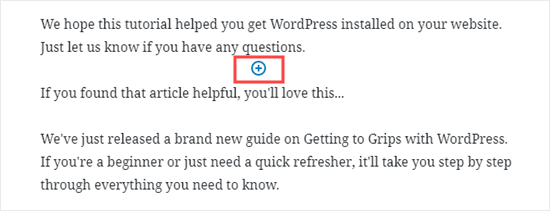
To add a horizontal line using the WordPress block editor, click the (+) icon to add a new block wherever you want the line to be.
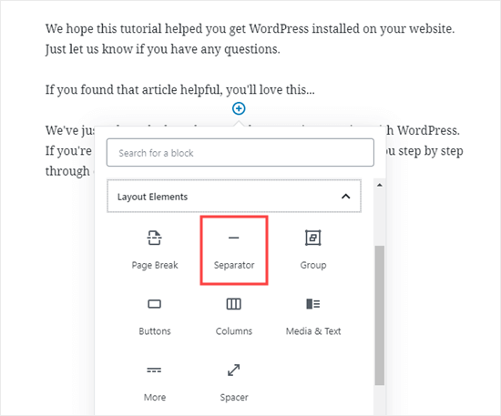
Next, select the Separator block from the Layout Elements section or search for it using the search bar.
Once added, you’ll see your horizontal line divider in your content area.
Styling the Horizontal Line in the WordPress Block Editor
By default, the horizontal divider is a pale gray line across the center of your post or page.
You can change how it looks by clicking on the line to select its block. Then, the ‘Block’ editing panel will open up on the right-hand side of your screen.
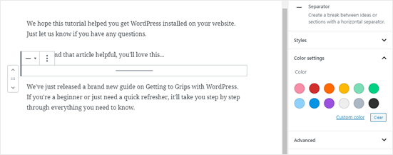
To change the style of your line, just click the little arrow next to Styles. Then, you’ll see the different options.
You can change the horizontal line to one of these, if you want:
- A wide line that covers the full width of your post’s content.
- Three dots that display in the center of your post.
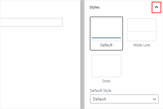
Note: In some WordPress themes, both the wide line and the default line will cover the whole width of your post.
You can also change the color of your horizontal line under the Color settings. Simply click on one of the options displayed, or use the ‘Custom color’ link to pick any color at all.
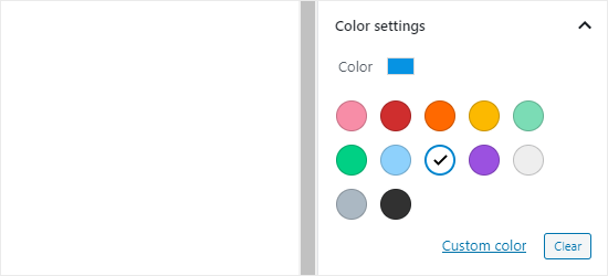
If you want to go back to the default gray color, just click ‘Clear’ button under the color options.
Here, our horizontal line is blue and uses the “wide” style.

Adding a Horizontal Line in the WordPress Classic Editor
If you’re still using the classic editor, then you can add basic horizontal lines. To do so, simply edit an existing post or page or create a new one.
If you only see one row of buttons in the toolbar above the post editor, then click on the Toolbar Toggle icon on the right:
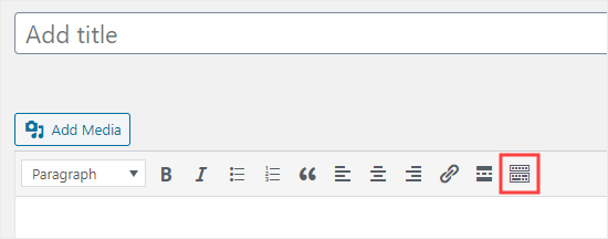
This will open up the second row of buttons, which includes the horizontal line option.
Now, go ahead and put a line break between the paragraphs where you want the horizontal line to go. You can then click the Horizontal Line button. It’s the second from the left on the second row:
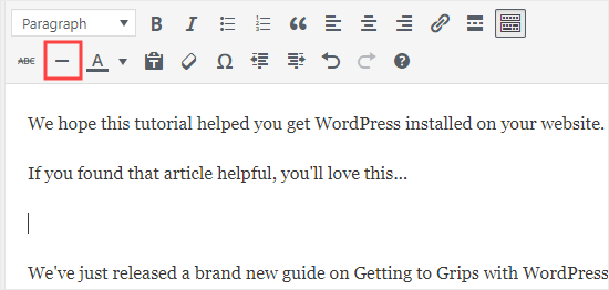
Your horizontal line will be light gray. It’ll cover the whole width of your post like this:

Manually adding a Horizontal Line divider using HTML
In some rare cases, you may need to manually add a horizontal line divider in your WordPress content.
If so, you can simply do that by using the hr HTML tag in your content:
<hr>
This will add the horizontal line separator in your post content.
Other Separators You Can Use in Your Posts and Pages
The default WordPress block editor allows you to add multiple types of separators to your posts and pages.
Aside from the horizontal line separator, the other options in the Layout Elements set of blocks include the Spacer, the More link, and the Page Break blocks.
The Spacer Block
The Spacer lets you add white space between blocks. For instance, if you want a slight gap at the end of your post before a special offer, you can use the Spacer.
You can customize the height of the spacer. Here’s how it looks when you’re creating your post in the block editor:

And here’s how the spacer appears on your site:

The More Block
If your theme shows full posts (rather than excerpts) on your main blog page, then adding a ‘More’ link will break off your post at that point. The visitor can click to read more.
Here’s how it looks when you’re creating your post:
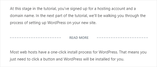
And here’s how the More link appears on your site:

You can learn more about excerpts, in our guide on how to easily customize excerpts in WordPress.
The Page Break Block
The Page Break lets you split long blog posts into multiple pages. You can’t customize it in any way. Here’s how it looks when you’re creating your post:

And here’s how the page break appears on your site:

Any of those could be good alternatives to adding a horizontal line in WordPress, depending on what you’re aiming to do.
Adding a Page Break in WordPress Forms Using WPForms
What if you want to put a break not in a post or page, but in a WordPress contact form? You can do that, too. We’re going to be using WPForms for this.
First, you’ll need to download, install, and activate the WPForms plugin. If you’re not sure how, just check out our step by step guide on how to install a WordPress plugin.
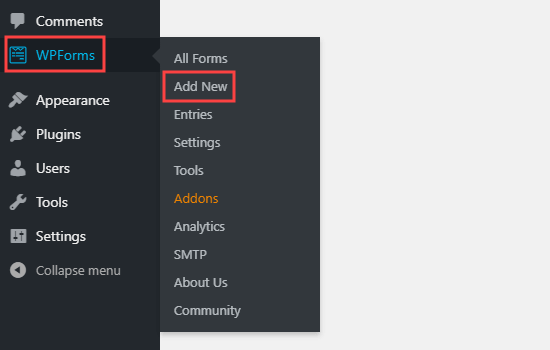
Next, go to WPForms » Add New in your WordPress dashboard.
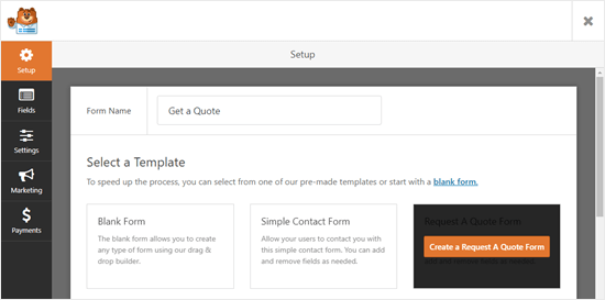
Enter a name for your form then pick a template. We’re going to use the ‘Request a Quote Form’ template for ours. Run your mouse cursor over the template and click the button to create your form.
Next, scroll down the Add Fields tab on the left hand side to the Fancy Fields section. Drag and drop the Page Break to wherever you want it on the form. We’re putting it just before the Request box.
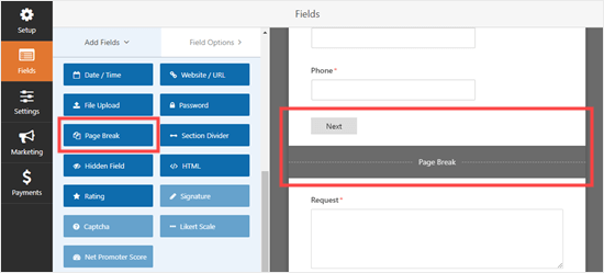
You’ll see that the form is now broken into two parts. WPForms has automatically added a ‘Next’ button, too.
You can change the ‘Next’ label if you want to and you can add a ‘Previous’ button to go on the second page of the form. Just click on the page break field to edit it.
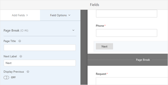
Save your form once you’re done, by clicking the Save button on the top right.
You can now add the form to your website. First, you’ll need to create a new post or page, or edit an existing one.
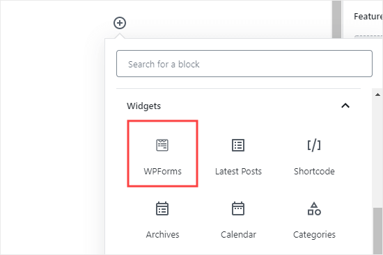
Click the (+) to add a new block to your post or page and find the WPForms block. You can use the search bar or look in the Widgets section. Add the block to your page.
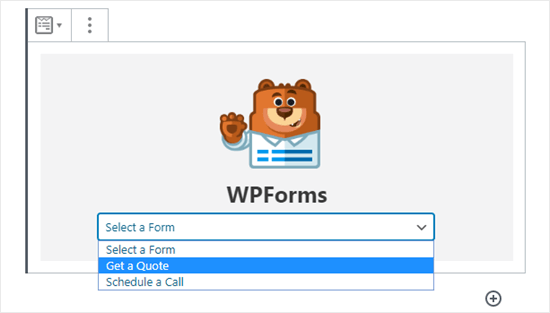
Now, select your form from the dropdown list.
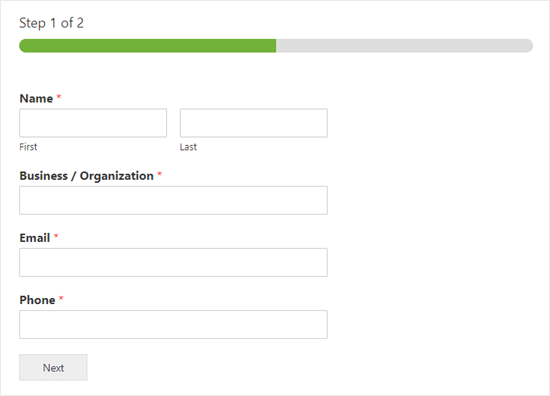
Once you’ve done that, you can publish the post or page and view how your form looks on your website.
We hope this tutorial helped you learn how to add a horizontal line separators in WordPress. If you want to add more design and layout elements to your posts and pages, check out our article on the best drag and drop WordPress page builders.
If you liked this article, then please subscribe to our YouTube Channel for WordPress video tutorials. You can also find us on Twitter and Facebook.
The post How to Add a Horizontal Line Separator in WordPress (5 Methods) appeared first on WPBeginner.
40 Macro Photography of Water Drops
Spectacular Examples of Typography Art
50 Most Impressive Photography Logos
49 Free Tattoo Fonts
Infographic: Evolution of Camera and Photography
Is Embedding Content via Instagram’s API Legal?
Ars Technica received notification via email earlier this week that Instagram does not extend its copyright license to cover content that is embedded on external websites via the Instagram API. This statement comes in light of an ongoing legal battle related to third-party use of the social plat
Why Does WordPress Sites Require Regular Database Optimization?
#include <iostream> #include <string> #include <iomanip> using namespace st
A.Employee and ProductionWorker Classes
Design a class named Employee. The class should keep the following information in
Employee name
Employee number
Hire date
Write one or more constructors and the appropriate set and get functions for the class.
Next, write a class named ProductionWorker that is derived from the Employee class. The ProductionWorker class should have member variables to hold the following information:
Shift (an integer)
Hourly pay rate (a double)
The workday is divided into two shifts: day and night. The shift variable will hold an integer value representing the shift that the employee works. The day shift is shift 1, and the night shift is shift 2. Write one or more constructors and the appropriate set and get functions for the class. Demonstrate the classes by writing a program that uses a ProductionWorker object.


