WordPress’ Support Team contributors are discussing how they can curb support requests for commercial products on the official WordPress.org forums. Users sometimes seek help for commercial product upgrades on the forums of the free version, not knowing that the moderators’ official policy is to refer them to the extension’s commercial support channel. In other instances, it is not immediately clear whether the issue is with the free version or a paid upgrade that the user has installed.
“This has come up a few times the past weeks, mostly in relation to plugins that have a free base product on WordPress.org, but sell addons on their own site, and where the line is drawn on who can get supported where,” WordPress contributor Marius Jensen said during the team’s most recent meeting. “Authors are not allowed to support their paid products on WordPress.org as is, but where do you draw the line, for example, when a base plugin causes issues with a paid addon, should then support be allowed for the base product on WordPress.org, since that’s the root issue, or should it be shipped off to the author’s own site, since it affects a paying user?”
This type of issue is common among products where WordPress.org is the main distribution channel for a popular free theme or plugin. The support relationship between the free and commercial products often intersects in an ambiguous way.
“The goal is to ensure that paying customers and free users get the best support they can, from the ones that can give it,” Jensen said. Volunteers do not have access to the commercial products, nor is it their job to support them. This is the crux of the matter.
“It’s an unacceptable misuse of volunteers time to support a product someone else has been paid to support,” Jensen said.
Contributors discussed how they can handle different scenarios where it’s unclear where the root of the problem is, in order to move the burden away from the support moderators, allowing the extension’s author to discern if the problem is with the free version or commercial add-on. Volunteers should not have to familiarize themselves with the minute distinctions between the features that are offered for free or as an upgrade.
On the other side of these support scenarios, where it isn’t clear where the problem originates, plugin and theme authors can be inconvenienced when support topics are hastily closed.
“It’s just that the closing of topics seems counter productive for those (users and devs alike) that get it wrong,” plugin developer Arnan de Gans said. “Since plugin/theme makers do not have any control over these forums we can’t do a thing after topics get closed. Which works against the user experience by creating confusion.” He suggested the team consider a grace period where the developer has a day or two to respond.
Ben Meredith, head of support for a freemium plugin, chimed in on the discussion, urging the support team to consider how closing issues can sometimes create a bad user experience:
An issue related to premium products is raised, and summarily closed by forum mods for being about a premium product. This creates a “googleable” record of the error message/problem that then attracts other visitors. Once the issue has been closed, we get copy-cat issues “I am having the same problem (link to closed post)” We get those replies in both followup forum posts and internal tickets. To the layperson who has no idea the distinction between “WordPress core volunteer” and “Company I just paid money to,” this creates a bad experience all around.
Premium users are treated like second-class citizens on the forums. They don’t know the guidelines, and reached out for help. This may be their first interaction with the WordPress community, and sometimes a well-meaning forum moderator can come across as wrist-slapping the exact people we want to give white-glove service to (they just paid us!).
Michelle Frechette, Head of Customer Success at GiveWP, also shared this sentiment regarding the user experience.
“Something I’m not seeing addressed much here is how alienating it can feel to be corrected by the mods (or even the plugin authors) to be directed from the forums back to the paid support page,” she said.
Ben Meredith said that despite sticky posts telling users not to post questions about commercial products, notes in the readme file, website notices, and canned replies, users will inevitably end up posting in the forums anyway. Steering them away to commercial support channels should be done in a way that does not make seeking help on WordPress.org an unwelcoming experience.
“I want for the forums to feel as welcoming as a WordCamp,” Meredith said.
“The current enforcement of the ‘premium plugins can’t get support here’ is not in line with that overarching goal: users using and enjoying WordPress. Currently, premium users (who are potential community members and community leaders!) are getting a first impression of the community that is ‘You’re doing it wrong!’
“I’d rather their first impression be ‘Happy to help! heads up, for questions like this in the future, we need you to go here.'”
In trying to ease the burden placed on volunteer support forum moderators, it’s important to consider how any new policy might also negatively impact developers hosting their plugins and themes on WordPress.org, and what kind of vibe the response gives to users in search of help. There are more suggestions for solutions in the comments on the post, and the discussion is open until Saturday, September 12, 2020, 07:00 PM CDT. The Support Team is seeking to get a wider range of viewpoints from plugin and theme authors before making a final decision on new guidelines for addressing requests for support on commercial products. Make sure to jump in on the comments within the next week if you have something to add to the discussion.
Virtual assistants and chatbots are great tools for improving customer service in any company. However, to be able to become a great customer service agent there is some work to do to make it fit your business needs.
Businesses today have their own way of naming things and the same way you would need to train any co-worker on the business vocabulary, you need to train the virtual assistant. That is when customization starts.
This is the September 2020 edition of “This Month in WordPress with CodeinWP.” Hello everyone! Let’s welcome autumn with a look into the most interesting happenings in our WordPress community from the past month.
Ever found yourself in a situation where you tried to update WordPress or a plugin only to be greeted by the white screen of death? Or maybe you love experimenting with new themes and plugins? Or adding custom functionality to your website and you’ve encountered the same thing? No matter what the case might be, […]
The city of Los Angeles has partnered with Airbnb to cut down on illegal rental listings from the Airbnb platform. In LA, short term rentals must be registered with the city. The city and Airbnb have implemented a programmatic system than can easily identify listings on Airbnb that have not registered.
CSS Grid is a collection of properties designed to make layout easier than it’s ever been. Like anything, there’s a bit of a learning curve, but Grid is honestly fun to work with once you get the hang of it. One area where it shines is dealing with headers and footers. With a little adjustment in our thinking, we can pull off headers and footers that behave like they are fixed, or have that “sticky” treatment (not position: sticky, but the kind of footer that hugs the bottom of the screen even if there isn’t enough content to push it there, and is pushed away with more content).
Hopefully this sparks further interest in modern layouts, and if it does, I can’t recommend Rachel Andrew’s book The New CSS Layout strongly enough: it covers both of the major modern layout techniques, grid and flexbox.
What we’re making
Let’s implement a fairly classic HTML layout that consist of a header, main content and footer.
We’ll make a truly fixed footer, one that stays at the bottom of the viewport where the main content scrolls within itself, as needed, then later update the footer to be a more traditional sticky footer that starts at the bottom of the viewport, even if the main content is small, but gets pushed down as needed. Further, to broaden our exposure to grid, let’s design our main content holder so that it can either span the whole width of the viewport, or take up a nicely centered strip down the middle.
A fixed footer is slightly unusual. Footers are commonly designed to start at the bottom of the viewport, and get pushed down by main content as needed. But a persistent footer isn’t unheard of. Charles Schwab does it on their homepage. Either way, it’ll be fun to implement!
But before we move on, feel free to actually peek at the fixed footer implemented on the Charles Schwab site. Unsurprisingly, it uses fixed positioning, which means it has a hard-coded size. In fact, if we crack open DevTools, we see that right off the bat:
Not only that, but there’s the balance of making sure the main content doesn’t get hidden behind that fixed footer, which it does by setting hard-coded paddings (including 15px on the bottom of the <footer> element), margins (including 20px on <ul> in the footer), and even line breaks.
Let’s try to pull this off without any of these restrictions.
Our baseline styles
Let’s sketch out a bare minimum UI to get us started, then enhance our grid to match our goals. There’s a CodeSandbox below, plus additional ones for the subsequent steps that get us to the end result.
First, let’s do some prep work. We’ll make sure we’re using the whole height of the viewport, so when we add our grid, it’ll be easy to put the footer at the bottom (and keep it there). There’s only going to be one element inside the document’s <body> with an ID of #app, which will hold the <header, <main> and <footer> elements.
Next, let’s set up our header, main, and footer sections, as well as the grid they’ll all sit in. To be clear, this will not work the way we want right out of the gate. It’s just to get us started, with a base to build from.
We’ve created a simple one-column layout, with a width of 1fr. If that 1fr is new to you, it essentially means “take the remaining space” which, in this case, is the entire width of the grid container, #app.
We’ve also defined three rows:
#app {
  /* etc. */
  grid-template-rows: auto 1fr auto;
  /* etc. */
}
The first and third rows, which will be our header and footer, respectively, are sized with auto, which means they’ll take up as much space as needed. In other words: no need for hard-coded sizes! This is a super important detail and a perfect example of how we benefit from using CSS Grid.
The middle row is where we’ll put our content. We’ve assigned it a size of 1fr which, again, just means it takes up all of the remaining space that’s left over from the other two rows. If you’re wondering why we aren’t making it auto as well, it’s because the entire grid spans the viewport’s whole height, so we need one section to grow and fill up any unused space. Note that we do not have, nor will we ever need at any point, any fixed heights, margins, paddings — or even line breaks! — to push things into place. Such is the good life when working with grid!
Shall we try some content?
You’ll notice in the Sandbox that I used React to build this demo, but since this isn’t a post about React, I won’t belabor those details; React has absolutely nothing to do with any of the CSS Grid work in this post. I’m only using it as an easy way to navigate between different chunks of markup. If you hate React, that’s fine: hopefully you can ignore it in this post.
We have Header, Main and Footer components that render the expected <header> , <main> and <footer> elements, respectively. And, of course, this all sits inside our #app container. Yes, in theory, #app should be an <article> element, semantically speaking, but that’s always looked weird to me. I just wanted to covey these details so we’re all one the same page as we plow ahead.
For the actual content, I have Billing and Settings sections that you can navigate between in the header. They both render fake, static content, and are only meant to show our layout in action. The Settings section will be the content that we put in a centered strip on our page, Billing will be the one that spans our whole page.
The Billing section looks good, but the Settings section pushes our footer off screen. Not only that, but if we scroll, the entire page scrolls, causing us to lose our header. That may be desirable in some cases, but we want both the header and footer to stay in view, so let’s fix that.
Fixed header, fixed footer
When we initially set up our grid, we gave it a height of 100vh, which is the entire height of the viewport. We then assigned the rows for the header and footer an auto height, and the main a height of 1fr to take up the remaining space. Unfortunately, when content exceeds the space available, it expanded beyond the viewport bounds, pushing our footer down and out of view.
The fix here is trivial: adding overflow: auto will cause our <main> element to scroll, while keeping our <header> and <footer> elements in place.
We want our <main> element to either span the whole width of the viewport, or be centered in a 600px space. You might think we could simply make <main> a 600px fixed width, with an auto margins on either side. But since this is a post about grid, let’s use moar grid. (Plus, as we’ll see later, a fixed width won’t work anyway).
To achieve our centered 600px element, we’ll actually make the <main> element a grid container. That’s right, a grid within a grid! Nesting grids is a totally legit approach, and will even get easier in the future when subgrid is officially supported across browsers. In this scenario, we’ll make <main> a grid with three column tracks of 1fr 600px 1fr or, stated simply, 600px in the middle, with the remaining space equally divided on the sides.
Now let’s position our the content in the grid. Our different modules all render in a <section> child. Let’s say that by default, content will occupy the middle section, unless it has a .full class, in which case it will span the entire grid width. We won’t use named areas here, and instead specify precise grid coordinates of the form [row-start] / [col-start] / [row-end] / [col-end]:
You might be surprised to see a col-end value of 4, given that there’s only three columns. This is because the column and row values are column and row grid lines. It takes four grid lines to draw three grid columns.
Our <section> will always be in the first row, which is the only row. By default it’ll span column lines 2 through 3, which is the middle column, unless the section has a full class on it, in which case it’ll span column lines 1 through 4, which is all three columns.
Here’s an updated demo with this code. It’ll probably look good, depending on your CodeSandbox layout, but there’s still a problem. If you shrink the display to smaller than 600px, the content is abruptly truncated. We don’t really want a fixed 600px width in the middle. We want a width of up to 600px. It turns out grid has just the tool for us: the minmax() function. We specify a minimum width and a maximum width, and the grid will compute a value that falls in that range. That’s how we prevent the content from blowing out of the grid.
All we need to do is swap out that 600px value with minmax(0, 600px):
Earlier, we decided to prevent the footer from being pushed off the screen and did that by setting the <main> element’s overflow property to auto.
But, as we briefly called out, that might be a desirable effect. In fact, it’s more of a classic “sticky” footer that solves that annoying issue, and places the footer on the bottom edge of the viewport when the content is super short.
Hey, get back to the bottom!
How could we keep all of our existing work, but allow the footer to get pushed down, instead of fixing itself to the bottom in persistent view?
Right now our content is in a grid with this HTML structure:
…where <main> is a grid container nested within the #app grid container, that contains one row and three columns that we use to position our module’s contents, which go in the <section> tag.
…and incorporate <footer> into the <main> element’s grid. We’ll start by updating our parent #app grid so that it now consists of two rows instead of three:
#app {
  /* same as before */


  grid-template-columns: 1fr;
  grid-template-rows: auto 1fr;
  grid-template-areas:
    'header'
    'main';
}
Just two rows, one for the header, and the other for everything else. Now let’s update the grid inside our <main> element:
We’ve introduced a new auto-sized row. That means we now have a 1fr row for our content, that holds our <section>, and an auto row for the footer.
Now we position our <footer> inside this grid, instead of directly in #app:
#app > footer {
  grid-area: 2 / 1 / 2 / 4;
}
Since <main> is the element that has scrolling, and since this element now has our footer, we’ve achieved the sticky footer we want! This way, if <main> has content that exceeds the viewport, the whole thing will scroll, and that scrolling content will now include our footer, which sits at the very bottom of the screen as we’d expect.
Here’s an updated demo. Note that the footer will be at the bottom of the screen if possible; otherwise it’ll scroll as needed.
I made a few other small changes, like minor adjustments to paddings here and there; we can’t have any left or right paddings on <main>, because the <footer> would no longer go edge-to-edge.
I also made a last-minute adjustment during final edits to the <section> element—the one we enabled adjustable width content on. Specifically, I set its display to flex, its width to 100%, and its immediate descendant to overflow: auto. I did this so the <section> element’s content can scroll horizontally, within itself, if it exceeds our grid column boundary, but without allowing any vertical scrolling.
Without this change, the work we did would amount to the fixed footer approach we covered earlier. Making section> a flex container forces its immediate child — the <div> that contains the content — to take up all of the available vertical space. And, of course, setting that child div to overflow: auto enables scrolling. If you’re wondering why I didn’t just set the section’s overflow-x to auto, and overflow-y to visible, well, it turns out that’s not possible.
Parting thoughts
We haven’t done anything revolutionary in this post, and certainly nothing that couldn’t be accomplished before CSS Grid. Our fixed width <main> container could have been a block element with a max-width value of 600px, and auto margins on the left and right. Our fixed footer could have been made with position: fixed (just make sure the main content doesn’t overlap with it). And, of course, there are various ways to get a more traditional “sticky footer.”
But CSS Grid provides a single, uniform layout mechanism to accomplish all of this, and it’s fun to work with — honestly fun. In fact, the idea of moving the footer from fixed to sticky wasn’t even something I planned at first. I threw it in at the last minute because I thought the post was a bit too light without it. It was trivial to accomplish, basically moving grid rows around, not unlike putting lego blocks together. And again, these UIs were trivial. Imagine how brightly grid will shine with more ambitious designs!
PriceAdvantage, a company that provides fuel price analytic services, has announced a new API that will allow fuel retailers to streamline integration with the platform. The company is hoping that the API will simplify the process of importing and exporting pricing data.
Just a little notification that our markdown parser is now in strict mode. That means that, when posting headings, there has to be a space after the initial hash symbol. In other words:
#This won't work

# This will work
Hopefully it will stop everyone who doesn't properly indent their code having #include<iostream> stop showing up as
Jeremey Herve, a Jetpack developer at Automattic, announced the release of Jetpack 8.9 earlier today. The update brings several major features to the plugin’s users. Jetpack now sports a new social preview option in the block editor, a newsletter signup form type, and a block for handling donations.
Version 8.9 also adds support for the AMP plugin. Herve noted that Google and Automattic have worked together over the past six months to make this integration happen. He also announced that the team would release an in-depth post on the Jetpack blog on how end-users can use the tools available.
Overall, the update seems to be a solid release. I have not run into any issues with the features I make use of thus far.
Social Network Preview for Posts
Social Previews popup modal.
The latest version of the plugin adds a new Social Previews tab under the Jetpack sidebar panel in the block editor. It lists a few social icons and a preview button. Clicking the button pops up a modal window that allows users to preview what their post will look like in various places.
Currently, only Google Search, Facebook, and Twitter previews are integrated. However, the announcement post noted that LinkedIn previews are in the works.
Social Previews is not a particularly groundbreaking feature. However, it is a nice value-add for Jetpack users and almost a given in today’s climate that is led by social networking sites. The feature is similar to what some SEO plugins, such as Yoast SEO Premium, offer.
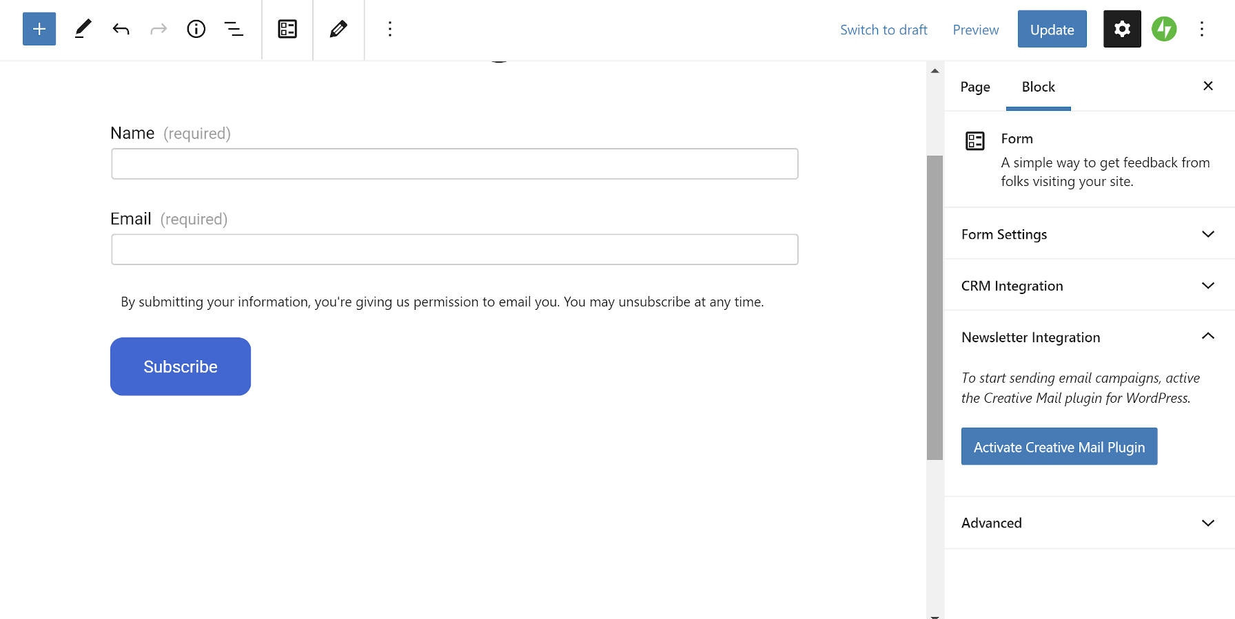
Newsletter Sign-up Form
Select Newsletter Sign-up Form
Form Appears with Necessary Fields
Jetpack 8.9 introduces a Newsletter Sign-up form type via its Form block. When creating a new form, users will see the new option. It works as you might expect, adding a name and email field along with a message that the visitor is granting permission to send emails.
It might not be immediately apparent for some users is that they will need to install and activate the third-party Creative Mail plugin for newsletters to work. Jetpack’s Newsletter Sign-up merely handles the form. The newsletter Aspect requires an account through the Creativ.eMail website. The free plan allows up to 5,000 emails per month, but you will need to upgrade to a paid tier after that, which will cost at least $4.95 each month.
If this sounds a bit convoluted, it’s because it is. Without reading the docs or opening the Newsletter Integration tab in the block options, some users may be wondering how this feature works.
The integration itself works fluidly. Users can install and activate the plugin directly from the block editor. However, they will need to run through the setup and signup steps to begin using email campaigns, such as a newsletter.
Donations Block
Donations block and options.
Requiring yet another third-party service is Jetpack’s new Donations block. Users will need to be on a paid Jetpack plan to use the block, which allows them to integrate their Stripe account for collecting payments.
The Donations block is a simple affair. With a paid account in place, it is pretty much a plug-and-play system. The block options should be straightforward for the average end-user.
At this point, the Donations block and system may be too limited for some campaigns. This feature seems to more squarely target users who are looking to accept basic donations without all the features that a more mature donation plugin would provide. For anything beyond accepting a few small donations each year, I would lean toward the GiveWP plugin. Its team is hyper-focused on making a great donation experience that scales to larger campaigns.
For users who are already using Jetpack and want to start small, it wouldn’t hurt to give this block a spin. It is always possible to move up to a dedicated donation plugin down the road.
Photographs are an incredible tool for preserving memories in tangible forms. Not only it captures your most treasured moments but also keeps the sentiment intact no matter when you look at it. PhotoBooks are where we maintain and keep our photographic collection. There are many reasons to make photo book in today’s technologically advancing world. They allow your loved ones and family to reminisce your special moments for years to come. When you create a PhotoBook you make sure your memorable moments stand the test of time. Since photo albums capture and preserve life’s moments, they make fantastic gifting options. They offer a unique window to your special moments (wedding, birthday party, etc.) to your friends and family. You can customize and tailor the album to the recipient’s personality and style. Spice it up with fun backgrounds, photo borders and stickers. The best custom photo books offer extraordinary design options.
Benefits of Photo Album Making Software To Various Industries
The ever increasing popularity of social media platforms which are more image centric has added to the need of photobook making software for variegated industries such as food, fashion, travel and retail industry to name a few. Needless to mention that these industries along with several others heavily rely on networks such as Pinterest and Instagram to connect with their target customers.
PhotoBook design software with customization capabilities enable businesses to enhance brand building and boost sales in an astonishing way. Using professional looking photos not only makes business stand out but also add to their credibility and allow them to create a robust social media strategy that works.
PhotoBook maker software
So how can you design your own personalized photo album book? Well, thanks to the convenience and popularity of web to print now you can customize and design almost everything that can be. There are numerous options for online photo book design tools. And they offer you following features and functions in case of personalization/customization
Editable Templates
Editable templates enable the authors to be flexible and create any template the way they want. It also acts the centre from where you can manage every feature of the template (layout, structure, initial content) and every component on the template. It’s more customizable as it gives you the control to what the author can see and use on the page. This includes finding if the components are editable, what are the design properties of the page/components, you can choose how the content is displayed on the screens of different devices. You can even choose to hide it on small screen.
Photo Upload and Editing
Helps you get the best out of your photograph collection. You can upload photographs from social media, such as instagram, etc. It also gives you advanced photo editing tools such as cropping, resizing, rotation, photographic effects. It also helps maintain printing resolution with its image resolution alert if the uploaded image is below required resolution for printing.
Page Layouts
This feature allows you to design pages with the help of editable text and photo boxes. You can either use a pre-designed layout or design your own to suit your expression. Customers can personalize their album using any type of layout.
You are also in control of how much safe margin you can put in your album. You can also customize front and back cover settings in addition to bleed, cut and margins
Backgrounds
It offers an incredible collection of background images/themes to help consumer express every sentiment they seek to via there custom photo book. The vast collection allows the customer to fill the pages with their own story as vividly as it can be.
Live Pricing Display
You can get the estimated pricing of your order in real time, with this feature as you design your card, depending on your card design, material used in the card, size of the order, type of finish. You can even request for an advance quote without designing the card itself by just stating the material to be used, type of finish and size of the order.
Here’s a video of this software that will allow you to design:
Summary
All these custom software for album design give you the freedom to create a photo album/book that best suits your vision. You can choose from a host of pre-available templates for design and layout and should they not hit the mark for you can create a design from scratch. With rising demand in web to print commerce (estimated to grow to $1.3 billion by the year 2022) it has become far more accessible to create a customized product (here for instance, a photo album) than it was a decade ago. And the stats speak for themselves, this is not a passing trend but a new ground in the field of customization and print commerce.
Google Images earlier offered a useful “search by size” option in advanced search to help you find logos, wallpapers and other images on the Internet by their exact size (or resolution).
For instance, you could limit your search for landscape photographs to image files that were at least 10 Megapixels in size. Or, if you are were using Google Image search to find wallpapers for the desktop, you could specify the image resolution as 1920x1080 pixels and Google would only return large images with those exact dimensions.
The “exact size” search option is no longer available in Google Image Search but you can still limit your image searches to a particular size by using the secret imagesize search operator in the query itself.
Here’s how.
Go to images.google.com and enter the search terms as before. Then append imagesize:WIDTHxHEIGHT to your query and hit Enter. Google Images will remove the operator from the query but the results will only display images that match the specified size.
The search by size operators works on the mobile version of Google as well so you may use the simple trick to find that perfect size wallpaper for your phone.
Parallax effect is an extremely popular design feature that is commonly used on WordPress websites. This special effect has featured in the gaming world for years but has more recently crossed over into web design. And so far this major trend doesn’t seem to be going anywhere, if anything it is being more widely used […]
Collections are the perfect way to group and share Pens. We’ve just given them a big round of improvements including reordering, sorting, and commenting!
Reordering
Many of you (including some of our own Team CodePen members) have been asking for the ability to reorder Collections. A simple request on the surface, but it required a lot of reworking and rethinking all the way from the database to the UI.
Now that we’ve done the heavy lifting, reordering is as simple as dragging & dropping or typing in an exact position!
Got a step-by-step process you want to share in a specific order? Want to feature some great examples of your new library? Order them however you like!
Fresher Look
Collections got a fresh coat of paint! The layout has been streamlined to keep the content front & center.
Sorting
By default Collections are sorted by the given order but you can also sort by the most recent additions, newest Pens and more!
Changing these controls also updates the URL so you can easily share a specific view.
Details & Comments
See more details down below and add comments, just like a Pen! Perhaps suggest some new Pens to add or get some more details on a technique.


 Ever found yourself in a situation where you tried to update WordPress or a plugin only to be greeted by the white screen of death? Or maybe you love experimenting with new themes and plugins? Or adding custom functionality to your website and you’ve encountered the same thing? No matter what the case might be, […]


 Parallax effect is an extremely popular design feature that is commonly used on WordPress websites. This special effect has featured in the gaming world for years but has more recently crossed over into web design. And so far this major trend doesn’t seem to be going anywhere, if anything it is being more widely used […]

