Weekly Platform News: Focus Rings, Donut Scope, More em Units, and Global Privacy Control

Category Image 091

In this week’s news, Chrome tackles focus rings, we learn how to get “donut” scope, Global Privacy Control gets big-name adoption, it’s time to ditch pixels in media queries, and a snippet that prevents annoying form validation styling.

Chrome will stop displaying focus rings when clicking buttons

Chrome, Edge, and other Chromium-based browsers display a focus indicator (a.k.a. focus ring) when the user clicks or taps a (styled) button. For comparison, Safari and Firefox don’t display a focus indicator when a button is clicked or tapped, but do only when the button is focused via the keyboard.

The focus ring will stay on the button until the user clicks somewhere else on the page.

Some developers find this behavior annoying and are using various workarounds to prevent the focus ring from appearing when a button is clicked or tapped. For example, the popular what-input library continuously tracks the user’s input method (mouse, keyboard or touch), allowing the page to suppress focus rings specifically for mouse clicks.

[data-whatintent="mouse"] :focus {
  outline: none;
}

A more recent workaround was enabled by the addition of the CSS :focus-visible pseudo-class to Chromium a few months ago. In the current version of Chrome, clicking or tapping a button invokes the button’s :focus state but not its :focus-visible state. that way, the page can use a suitable selector to suppress focus rings for clicks and taps without affecting keyboard users.

:focus:not(:focus-visible) {
  outline: none;
}

Fortunately, these workarounds will soon become unnecessary. Chromium’s user agent stylesheet recently switched from :focus to :focus-visible, and as a result of this change, button clicks and taps no longer invoke focus rings. The new behavior will first ship in Chrome 90 next month.

The enhanced CSS :not() selector enables “donut scope”

I recently wrote about the A:not(B *) selector pattern that allows authors to select all A elements that are not descendants of a B element. This pattern can be expanded to A B:not(C *) to create a “donut scope.”

For example, the selector article p:not(blockquote *) matches all <p> elements that are descendants of an <article> element but not descendants of a <blockquote> element. In other words, it selects all paragraphs in an article except the ones that are in a block quotation.

The donut shape that gives this scope its name

The New York Times now honors Global Privacy Control

Announced last October, Global Privacy Control (GPC) is a new privacy signal for the web that is designed to be legally enforceable. Essentially, it’s an HTTP Sec-GPC: 1 request header that tells websites that the user does not want their personal data to be shared or sold.

The DuckDuckGo Privacy Essentials extension enables GPC by default in the browser

The New York Times has become the first major publisher to honor GPC. A number of other publishers, including The Washington Post and Automattic (WordPress.com), have committed to honoring it “this coming quarter.”

From NYT’s privacy page:

Does The Times support the Global Privacy Control (GPC)?

Yes. When we detect a GPC signal from a reader’s browser where GDPR, CCPA or a similar privacy law applies, we stop sharing the reader’s personal data online with other companies (except with our service providers).

The case for em-based media queries

Some browsers allow the user to increase the default font size in the browser’s settings. Unfortunately, this user preference has no effect on websites that set their font sizes in pixels (e.g., font-size: 20px). In part for this reason, some websites (including CSS-Tricks) instead use font-relative units, such as em and rem, which do respond to the user’s font size preference.

Ideally, a website that uses font-relative units for font-size should also use em values in media queries (e.g., min-width: 80em instead of min-width: 1280px). Otherwise, the site’s responsive layout may not always work as expected.

For example, CSS-Tricks switches from a two-column to a one-column layout on narrow viewports to prevent the article’s lines from becoming too short. However, if the user increases the default font size in the browser to 24px, the text on the page will become larger (as it should) but the page layout will not change, resulting in extremely short lines at certain viewport widths.

If you’d like to try out em-based media queries on your website, there is a PostCSS plugin that automatically converts min-width, max-width, min-height, and max-height media queries from px to em.

(via Nick Gard)

A new push to bring CSS :user-invalid to browsers

In 2017, Peter-Paul Koch published a series of three articles about native form validation on the web. Part 1 points out the problems with the widely supported CSS :invalid pseudo-class:

  • The validity of <input> elements is re-evaluated on every key stroke, so a form field can become :invalid while the user is still typing the value.
  • If a form field is required (<input required>), it will become :invalid immediately on page load.

Both of these behaviors are potentially confusing (and annoying), so websites cannot rely solely on the :invalid selector to indicate that a value entered by the user is not valid. However, there is the option to combine :invalid with :not(:focus) and even :not(:placeholder-shown) to ensure that the page’s “invalid” styles do not apply to the <input> until the user has finished entering the value and moved focus to another element.

The CSS Selectors module defines a :user-invalid pseudo-class that avoids the problems of :invalid by only matching an <input> “after the user has significantly interacted with it.”

Firefox already supports this functionality via the :-moz-ui-invalid pseudo-class (see it in action). Mozilla now intends to un-prefix this pseudo-class and ship it under the standard :user-invalid name. There are still no signals from other browser vendors, but the Chromium and WebKit bugs for this feature have been filed.


The post Weekly Platform News: Focus Rings, Donut Scope, More em Units, and Global Privacy Control appeared first on CSS-Tricks.

You can support CSS-Tricks by being an MVP Supporter.

SEO Tactics and Trends for Websites in 2021

Featured Imgs 23

Every year, the SEO landscape evolves to meet the needs of algorithm updates, user demands, and other technological advances. Does that mean 2021 is going to introduce a lot of changes? Probably not. You will find that much of 2021 is going to reflect SEO trends from 2019 and 2020. That said, there are some trends that continue to hold strong, such as the saying “content quality is king.” 

To make your content all the more relevant, however, you need to fine tune your SEO strategy. Lucky for you, we have put together information on several SEO tactics and trends to get you ahead of the competition in 2021. Check them out. 

1. Your SERP (Search Engine Results Pages) is More Important Than Ever

One thing that many are noticing is the continuous fluctuation of search rankings. Whenever Google releases an algorithm update, your website’s ranking is going to be affected. Your ranking may move several spots. It is rare when a website’s SERP remains in the same spot. 

But that doesn’t mean you should ignore SEO and SERPs. Once your rankings have improved, website traffic will increase. 

Your position on that first result page is so, so crucial. Sometimes, there are less than 10 spots, depending on the ads and snippets and other information. If you aren’t ranking for a topic, you need to reconsider your SEO strategy. 

That’s the first step you should make: review your strategy for 2021 and figure out what is obsolete. 

2. The User Experience (UX) Must Be Emphasized

The user experience (UX) has swiftly grown in importance throughout the past couple of years. That is because Google has begun measuring UX and, if your site doesn’t have enough of it, the algorithms will keep you from a top ranking SERP. 

Ouch. 

But why is UX so pivotal in your site’s success? Consider this: a user who we’ll call Tom visits a website after making a query through Google. Within seconds, Tom decides to return to Google. Then, he checks a second website and never has to return to the search results. Google will notice how Tom reacts to both websites and will decide that the second site is much more satisfactory. 

This action between Tom, Google, and the websites is known as “pogo sticking,” where a user will visit a couple of sites before finding one that they stick to. To Google, it’s a display that says the user wasn’t satisfied with something on the sites they left. And when users aren’t appeased, Google isn’t either. 

So, how do you increase the user experience for 2021? Here are some tips: 

  • Add mobile-friendly elements. If the site doesn’t look good on a smartphone, you are going to get a lot of users ricocheting off and going back to Google within seconds. 
  • Make sure links and buttons all go to the correct destination. 
  • Increase the page load speed. A slowly loading page is the main reason someone returns to Google. 
  • Make sure of analytics, A/B testing, and heat maps to understand user behaviours. The more you understand their interests, what they search for, and why they leave, the better you can appeal to them. 

All of these are part of something called Core Web Vitals, or standards of website development. The more you fine tune your website design to meet those standards, the better off the UX will be.

3. Focus on Passages

Google recently announced in October 2020 that it will now index passages, not just web pages. This means that a web page with multiple paragraphs now has a chance to rank for every single piece of content rather than the emphasis being on the first sentence at the top of the page. 

Google described this new feature: “By better understanding the relevancy of specific passages…we can find that needle-in-a-haystack information you’re looking for.” In other words, if the final paragraph of a 20-paragraph page has relevant information, Google can now pinpoint that and show it as part of the search query result. 

What does this mean for you? It simply means you can develop your ideas more fully and not have to worry about cramming all kinds of information into the beginning of a web page. 

4. Featured Snippets

What is a featured snippet? You have seen them before—those little blurbs of text at the beginning of the SERPs that aim to answer your question. The content is automatically pulled from pages that are indexed by Google. Consider the featured snippet as #0, because it is above even the treasured #1 spot. 

Landing the featured snippet is highly advantageous. Not only does that give you a spot well above the competition, but you get seen. Sure, people might not click on the featured snippet for more information. It doesn’t matter. Your visibility increases dramatically, leading to more click-throughs. 

So, you should do some keyword research for a topic then create a set-up that would put you in the running for the featured snippet position. 

5. The Long and Short of It

Throughout the years, the best length for blogs and other content was always a point of contention. Some people said that longer content was better, while others claimed that short bits of information are more appealing. The answer as of 2021 is that it depends. 

It depends on the reader, the demographic, the keywords, and the amount of information it takes to answer all the questions someone could potentially have. You also have to ask yourself, “Do I really need a 3,000 word article when a 5-minute quick video has the same result?” There are some cases when a longer, more thorough discussion is going to be beneficial, but you can balance it out with shorter clips of information that are easily digestible. 

There is one thing you don’t have to worry about so much now, though. Google has stopped paying so much attention to the keyword densities and word count. Now, you can focus on the content and providing clear, concise information. That will help you rank more than fluffed up content ever will. 

6. Check Your Page Titles

The overlooked page title is more useful in 2021. Many lack optimization, and it ends up dragging you down in rankings. There are many ways to vary your page titles to draw more attention to them, such as dashes, complete sentences, and vertical pipes. 

For example, the title “The Best Hops for Homebrewing Beer,” can also be written as: 

  • Hops – Homebrewing – Beer 
  • Hop Varieties | Home Brew | Beer
  • and so on

You may have to test for which variance is most effective over a span of weeks. It may seem a bit difficult at first, because you might lose some ranks if the keyword relevancy doesn’t work as well as other variations, but you won’t know until you try. 

The key is to zone in on a keyword or long tail keyword then make multiple titles revolving around that keyword. You may add in a brand name or other details to help pinpoint a specific group of users, too. 

7. Check Your Content Headers

Similar to page titles, you can also adjust the headers throughout your website. Your instinct may be to over-simplify certain things, such as information about shipping and handling on your website. If you write a blog about it, you wouldn’t just call it “Shipping.” You would want people to know how certain elements of the shipping works, how orders are processed, what certain statements on their account mean, and so on. 

In the end, you might come up with a header like, “What You Need to Know About International Shipping and Handling.” Again, you can try multiple approaches to see which header is most favoured. 

8. Organic Backlinks

Recently, the quantity of backlinks leading to your page is far less important than the quality of those links. In fact, if you acquire far too many backlinks at once, Google will actually counter that attempt to rank quickly and hold your page back. One of the reasons for this is the black hat practice of buying links. 

So, in 2021, the best method for retrieving backlinks is to not concern yourself with them right away. Publish your content and focus on organic growth. Once your content has been live for a few months and has drawn some attention, you can then look for link prospects. It is more organic, and you will see more growth because of it. 

9. Optimize Alt Text, File Names, and Images

This is an age-old tip, but it certainly continues to influence rankings everywhere. If you want a better user experience, then you need to look at your images, files, and alt text. Faster load times can be unlocked if you decrease the size of image files. If you don’t know how yet, you can use an online tool called ImageOptim, which will get the job done quickly. 

You also want to name any files with keywords or something that will complement the alternative text. For example, if your blog is about the different kinds of cakes in the world, then you might have an image titled “Egypt-basbousa-cake.” You will then have alt text that states something like, “A sweet cake called basbousa from Egypt.”

10. Accessible Videos

Videos are an excellent way to boost website engagement, especially when you are posting them to social media. However, while those videos will get people interested in your brand and message, they are not always going to directly optimize your website. One useful hack that also adds to a page’s SEO is to provide a transcript. Not only does the additional text make your video more accessible to some users, but that content will help Google and other search engines zero in on the subject matter. 

You can automatically generate the transcript with services like Speechpad. Just clean it up before posting, and you have an easy, accessible post. 

11. Optimize Your New Content Immediately

By now, you should realize that every new page is a new chance to appease SEO standards, play up to UX, and work towards ranking on the SERPs. Whether you are making a single page or posting an entire cluster of information, you need to think about everything as having some kind of purpose. From the page titles, headers, subheaders, alt text, keywords, image names, captions, and so on, everything goes towards SEO. 

Don’t forget about any facet of your website. You should be doing long-tail keyword research, since that will give you a chance to tap into a specific demographic. In other words, your content should be answering questions, from top to bottom. Use those long-tail keywords to fine tune the content, potentially earning you more traffic, conversions, sales, and engagement. 

12. Embrace Voice Searches

Even if the technology has not yet been fully embraced, there are people who absolutely love to say, “Hey, Google,” and “Hey, Alexa,” somewhere close by. The reality is that voice searching can be a lot easier when your hands are full, and people are going to use what is available to them. Since devices like Echo and Alexa have grown in popularity, that means that voice searches are also increasing. 

While voice searches are no different from a regular search query done on the phone or computer, it does mean you have to consider how someone might naturally ask a question. Again, this is where long tail keywords come into play. People aren’t just going to say, “Buy space heater” to their Echo Dot, they’re going to speak as if talking to someone else: “Hey Echo, where can I buy a space heater?” 

Keep that in mind while making content! 

Final Thoughts 

With these tips and trends for SEO in 2021, you should be able to unleash more potential and absolutely dominate the search engine result pages. Quality of content will continue to hold sway over keywords and everything else you do. So commit fully to the user experience and entice people to stay longer on your site. From there, your rank should rise. 

Shopify Deprecates Kit Skills API

Featured Imgs 23

Shopify has announced that Shopify Kit Skills, an app extensions service that was intended to serve as a “free virtual employee,” will be deprecated as of April 1st, 2021. Developers utilizing the associated API will have until August 31, 2021, to accommodate this change. 

The Shopify documentation describes the purpose of Kit Skills as:

Analyze HTML Now Chill About Tabs

Featured Imgs 23

We use a linter called HTMLHint for our “Analyze HTML” feature. So that tool is what gives us the errors you might see when using that feature:

There is a particular rule in HTMLHint named space-tab-mixed-disabled, the purpose of which is to warn you when you are using inconsistent indentation. Like you are allowed to use spaces, or tabs, but not both, which is a good practice for clean code. We had that misconfigured where it wanted only spaces, so if you preferred tabs and set up your editor to use tabs (completely fine, of course), the Analyze HTML feature would bark at you about that. Now if you use tabs, and do so consistently, Analyze HTML will be chill about it.

The post Analyze HTML Now Chill About Tabs appeared first on CodePen Blog.

How to Fix the Missed Schedule Post Error in WordPress

Wp Plugins

Do you want to fix the missed schedule post error in WordPress?

WordPress comes with a built-in feature that allows you to easily schedule posts to be automatically published at a later time. However, sometimes you may notice that scheduled posts don’t get published at all.

In this article, we’ll show you how to easily fix the missed schedule post error in WordPress. This will allow you to ensure that your scheduled posts are published on time.

Fixing the missed schedule post error in WordPress

What Causes WordPress to Miss Scheduled Posts?

Your WordPress hosting environment or plugin conflicts may cause WordPress to miss scheduled posts.

Normally, when you schedule a WordPress post to be published later, WordPress uses a technology called ‘Cron’ or ‘WordPress Cron‘ to automatically publish your post on time.

However, if your WordPress hosting server or a plugin is affecting the cron jobs, then WordPress would miss the scheduled tasks such as publishing scheduled posts.

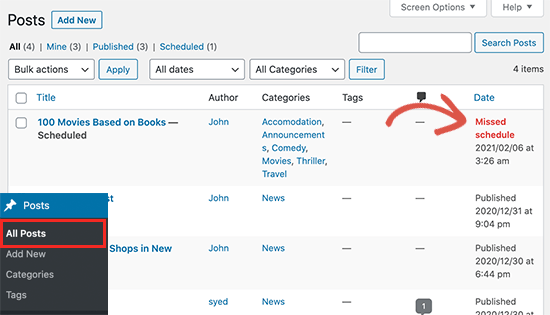
Missed schedule error for a blog post in WordPress

Your other cron jobs may still work occasionally like checking for updates or deleting auto-saved drafts. That’s because once the publishing time is missed WordPress will not publish the blog post on a different time.

For most users, it does not happen very often and for some users it can become a common WordPress issue.

That being said, let’s take a look at how to easily fix the missed schedule post error in WordPress.

Fixing The Missed Schedule Post Error in WordPress

First thing you need to do is install and activate the Missed Scheduled Post Publisher plugin. For more details, see our step by step guide on how to install a WordPress plugin.

The plugin works out of the box, and there are no settings for you to configure.

How does Missed Scheduled Post Publisher plugin work?

The plugin simply checks your website every 15 minutes to see if a scheduled WordPress post has missed schedule.

If it finds any missed schedule items, then it changes the status from scheduled to published.

It works for posts, pages, products, and any other custom post types that you may have on your WordPress website.

We built this plugin to ensure it doesn’t impact your WordPress site speed because we know speed is important for SEO. This is the plugin we’re using on our own sites.

Troubleshooting Missed Scheduled Posts Error in WordPress

If installing the plugin does not immediately fix scheduled posts error on your website, then the following are a few tips that you can try.

1. Check Your WordPress Timezone Settings

Setting your timezone is one of the first things to do after installing WordPress. However, sometimes users miss it and their WordPress timezone doesn’t match the timezone they want to use for publishing and managing their website.

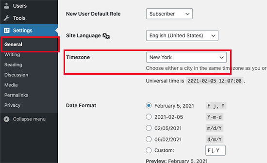
Simply go to Settings » General page and scroll down to the ‘Timezone’ section. From here, you need to select your timezone or the timezone you want to use for your WordPress website.

Set timezone in WordPress

Don’t forget to click on the Save Changes button to store your settings.

2. Clear WordPress cache

If your WordPress posts are still missing schedule, then it is likely due to a poorly configured caching plugin. Try clearing WordPress cache and make sure that your WordPress caching plugin is properly configured to automatically clear cache at regular intervals.

3. Increase WordPress memory limit

Your WordPress website may be struggling with low memory limit issue. You can fix that by allowing WordPress to use more server memory which let’s WordPress run better.

Simply add the following code to your wp-config.php file ust before the line that says ‘That’s all, stop editing! Happy publishing.’

define('WP_MEMORY_LIMIT', '500M');

For details, see our guide on how to increase memory limit in WordPress.

We hope this article helped you learn how to easily fix the missed schedule post error in WordPress. You may also want to see our guide on how to easily troubleshoot WordPress errors on your own.

If you liked this article, then please subscribe to our YouTube Channel for WordPress video tutorials. You can also find us on Twitter and Facebook.

The post How to Fix the Missed Schedule Post Error in WordPress appeared first on WPBeginner.

How to Animate the Details Element

Category Image 091

Here’s a nice simple demo from Moritz Gießmann on animating the triangle of a <details> element, which is the affordance that tells people this thing can be opened. Animating it, then is another kind of affordance that tells people this thing is opening now.

The tricks?

  1. Turn off the default triangle: details summary::-webkit-details-marker { display:none; }. You can’t animate that one.
  2. Make a replacement triangle with the CSS border trick and a pseudo element.
  3. Animate the new triangle when the state is open: details[open] > summary::before { transform: rotate(90deg); }.

This only animates the triangle. The content inside still “snaps” open. Wanna smooth things out? Louis Hoebregts’ “How to Animate the Details Element Using WAAPI” covers that.

Here’s a fork where I’ll combine them just because:

I see Moritz put the cursor: pointer; on the summary as well like Greg Gibson suggests.


The post How to Animate the Details Element appeared first on CSS-Tricks.

You can support CSS-Tricks by being an MVP Supporter.

YIELD App Adds API for Decentralized Financial Products

Featured Imgs 23

YIELD App, a provider of traditional and decentralized financial (DeFi) services, has announced a new API that is intended to provide third-party organizations with access to high-yield cryptocurrency products.

This new offering is announced in partnership with Finxflo, a popular liquidity aggregator, and will allow their customers to engage with YIELD App products without leaving the Finxflo ecosystem. 

Code Folding of Sass

Category Image 052

The .sass variant of Sass isn’t nearly as popular as SCSS. If I had to guess, it would be because SCSS is totally compatible with CSS in that any valid CSS file is a valid SCSS file, which makes SCSS easier to transition to both in terms of coding and the mental shift.

But anyway, the .sass variant is still kinda cool. It doesn’t use curly braces ({}) or semicolons (;) so it can be a little easier on the eyes, perhaps. It uses “white space” indentation, so like:

body
  background: red 
  margin: 1rem

What’s new around here is that you can now code fold that on CodePen, which never used to work. Here it is in action:

Hopefully this is useful to all y’all that like the .sass syntax.

The post Code Folding of Sass appeared first on CodePen Blog.