10 Tips for Designing Logos That Don’t Suck

Featured Imgs 23

So you’re designing a logo. It sounds like an easy enough task, right? Draw a circle, type in the company name and you’re done (I’ve literally heard a designer suggest that very process). Unfortunately, if you’re really worth the money the client is paying you, there’s a lot more to it than that.

There are a million people in the logo design industry today dishing out crappy logos in bulk for crowdsourcing sites. How do you as a serious professional stand out from the crowd and produce quality logos that don’t suck? Read on to find out.

Are you in the middle of a logo design project? Don’t forget to check out our in-depth guide on how to design a logo!

Pro Tip: Logo Templates & Logo Makers

If you’re looking for a quick start with a logo design, experimenting with a logo template can be a great initial step. It can help give you a starting point for your logo design, on which you can build and adapt.

Envato Elements has a collection of over 6,000 logo templates that you can access for a low monthly price of $17 (as well as icons, photos, graphic templates, and more). Here are a few of our favorites!

You could also experiment using a logo maker tool—an online app that asks you a few questions about your business, and suggests logo ideas and concepts that fit your brand.

1. Use a Visual Double Entendre

Some of my favorite logos in the world utilize a technique that I like to call a visual double entendre, which is an overly fancy way to say that it has two pictures wrapped into one through clever interpretation of a concept or idea.

The WinePlace logo below is a perfect example.

This logo takes on the shape of a thumbtack, which suggests “location” or “place,” but it also clearly looks like an upside down wine glass. Logo designs that use this technique come off as clever and memorable. Viewers love the little mind game that you’re playing and are more prone to appreciate a design because of it.

In the past, we’ve put together a post of clever negative space logos like the one below. Check it out if you love this type of logo design as much as I do!

2. Color is Vitally Important

One of the most important considerations for logo design is the color palette. This is not a superficial decision, color carries meanings and communicates ideas.

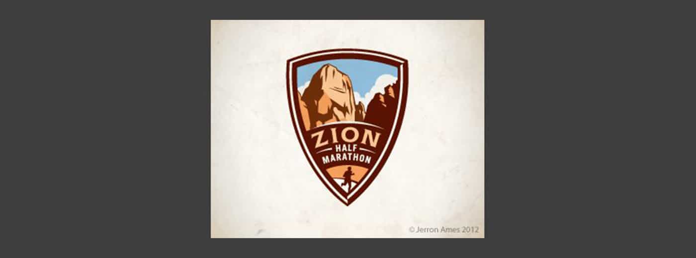
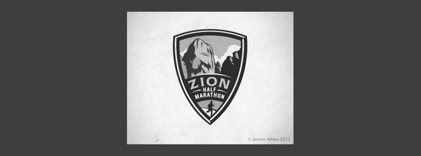
Sometimes you’re pegged to the colors of a brand, but other times you’ll have the freedom to explore. I love the rich palette used in the Zion logo below.

The colors here grab you and pull you in, they bring life to the illustration and give further context to the shape of the landscape. That being said, remember that a good logo is versatile and will still function well in grayscale:

Beyond a grayscale version, I like to also provide clients with a true single color version, using only black and negative space. This would be a little tricky with the logo above, but definitely possible.

Always consider what it is that the logo will be used for and whether or not the various use cases require different versions.

3. Avoid the Cliché

Every few years or so, some new fads come along in logo design. I personally love to study design trends and you might even find me suggesting jumping onto a few bandwagons to keep up with the times, but with logos, I just hate it when a bunch of designers use the same idea over and over.

Should you know about the latest logo design trends and understand what’s good and bad about them? Absolutely. Should you follow them to the letter? Absolutely not.

The basic archetype above is being used again and again in logo design right now and it’s getting old fast. Why not use a design that you actually thought up yourself rather than ripping off what everyone else is doing?

We have an entire article dedicated to showcasing logo design clichés, be sure to check it out to make sure you’re not guilty of uninspired logo design.

4. Make it Ownable

I don’t believe that “ownable” is a real word, but you nevertheless hear it quite a bit in marketing (marketers love to make up words). The concept is definitely an important one that ties closely to the previous tip.

Rather than following the herd and using a cliché design, you should instead strive for something that is uniquely recognizable. I’ve always appreciated the Evernote logo in this regard:

It’s really just an elephant head, which doesn’t sound like a very unique concept. However, the way it’s drawn with the curled trunk and page fold in the ear makes it instantly recognizable.

As you’re designing logos, consider whether or not your design is generic or unique. Is it likely that others will produce something similar? Remember, your first idea is typically your most generic (it’s also everyone else’s first idea). Try filling a notebook page or two with some rough sketches before choosing which ideas to pursue further.

5. Everybody Loves Custom Type

While we’re on the subject of being unique, there’s almost nothing that can give your logo a unique feel quite like some awesome custom lettering.

Too often we see logo design as simply a trip to the font menu to see which typeface makes the company name look best. If someone is paying you to “design” their logo, they probably expect you to put a little more effort into it.

Too often we see logo design as simply a trip to the font menu.

Custom type helps to ensure that your unique logo will stay that way. Lowlife designers will rip off your work in a heartbeat if they discover which typeface you’re using, but it takes some real skill to mimic custom hand-drawn type!

Keep in mind though that if your logo is famous enough, people will always try to rip it off. This certainly holds true for my favorite script logo:

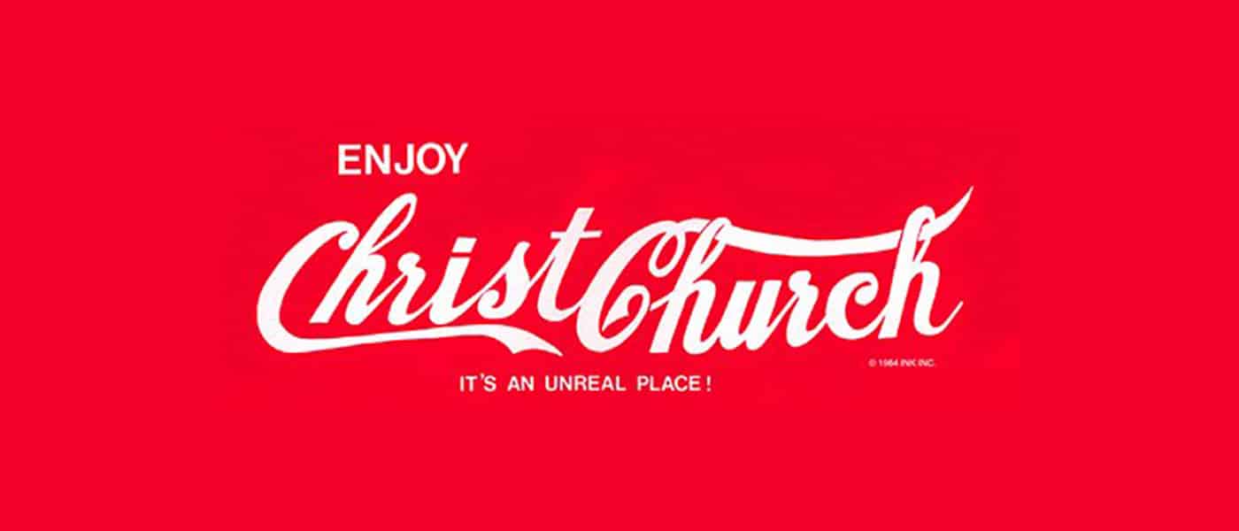
The awesome Coca-Cola script has been stolen countless times in awkward parodies throughout the last few decades.

6. Keep it Simple Stupid

Let’s face it, not everyone can bust out a beautiful, hand-drawn script on a whim. Just because you’re a designer doesn’t mean you’re an awesome illustrator or typographer (though it helps). If you fit this description, fear not, there’s nothing preventing you from making awesome logos.

In this situation, remember these four powerful words: keep it simple stupid! Simple but powerful logos permeate the business world and always prove to be the best icons for standing the test of time.

In considering how to construct one of these types of logos, let’s discuss the Apple logo. The silhouette of an apple is nothing special or memorable:

It’s that missing bite that takes it to the next level. It gives the logo character, makes it unique, and drives the meaning deeper (computers and bytes, get it?). Without the bite, the apple is boring, with it, the apple is suddenly iconic.

Always think about how you can go that extra mile and turn your boring logos into unmistakable brand marks.

7. Consider Proportion & Symmetry

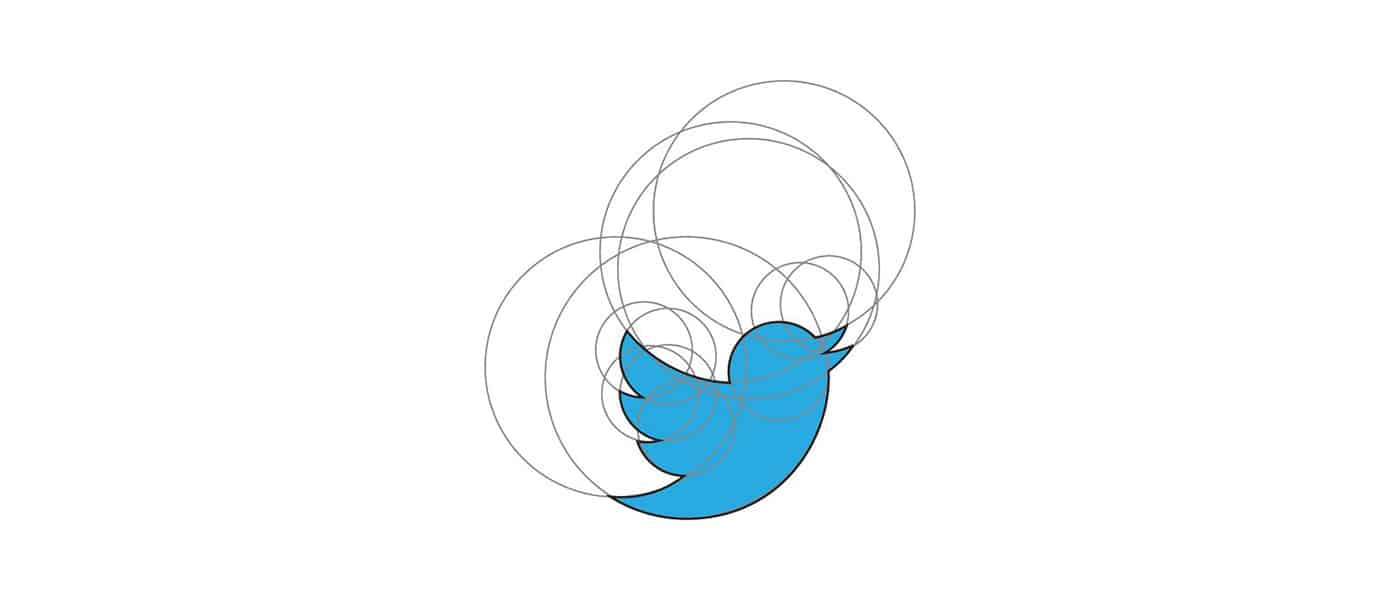
Some people can get carried away with discussions of proportion and symmetry (see the new Pepsi logo pitch), but if we strip out the crazy, there’s still some important lessons here. Consider the new Twitter logo as an example:

Here circles aren’t used to convince you of some strange cosmic tale that makes no sense, they’re simply used as a guide to create a well balanced logo with consistent curves and arcs.

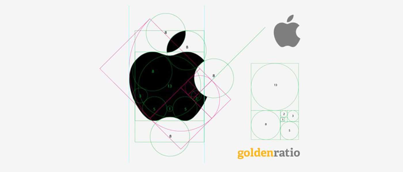
Despite the fact that the bite seems to violate the symmetry of the Apple logo above, if we dig deeper we can see that there was still a lot of through put into proportion and symmetry here (image source):

8. Think About Negative Space

Along the same vein as a double entendre is the age-old trick of utilizing the negative space in a logo in some clever way. The industry standard example of this technique is the FedEx logo and its hidden arrow.

Don’t see it yet? Keep looking, it’s there. That’s what I love about this logo, the use of negative space is so subtle. Most people in the U.S. see the FedEx logo daily or weekly for years as it drives by on the side of countless trucks and they never even notice the arrow.

Logopond is chock full of great logo designs that utilize negative space in a cool way. Check out the example below, which blends together the idea of bull horns and a wine glass.

9. Passive vs. Active

One interesting facet of logo design that I’ve been considering a lot lately is the concept of instilling motion or a sense of activity into a logo. This isn’t always appropriate (such as with the Apple logo), but sometimes it can really give a logo the boost it needs, both from a visual and conceptual standpoint.

As an example, let’s look again to the Twitter logo. Way back in the early days, the bird went from sitting perched and passive to becoming active and taking flight.

In the most recent iteration, they took this concept even further by pointing the bird in an upward direction to indicate that it’s climbing into the air rather than floating along the same old trajectory.

A sense of motion is especially important when it comes to logos with mascots. The image of the marlin below doesn’t depict the fish merely lying still, instead, it’s leaping into the air in a victorious pose.

screenshot

This concept even extends to typically inanimate objects. Consider how much better the logo below portrays the concept of “rough house” by instilling a sense of motion.

screenshot

10. Know What it Means

It’s great when you as a designer can show a client how much thought and reasoning went into the logo that you produced for them.

Every good logo has a story. Far beyond simply a pretty sketch, strong logos are filled with meaning, both obvious and hidden. We discussed this in several cases above. The FedEx logo’s arrow indicates moving forward and making deliveries, the Apple logo has a “byte” missing, and the Twitter bird is flying in an upward trajectory.

Half the time I wonder if logo designers don’t come up with the meaning after the logo is already produced, but regardless, it’s great when you as a designer can show a client how much thought and reasoning went into the logo that you produced for them.

Clients might think that all they want is something fresh and cool, but if you instead provide a logo that ties into the company’s core values and mission, you’ll blow their minds and they’ll love you for it.

If you’re into hidden logo meanings, check out our post titled “Five Fascinating Things You Didn’t Know About Famous Car Logos.”

Do Your Logos Suck?

Now that you’ve read our tips for designing logos that don’t suck, leave a comment below and let us know what you think of your own work in this area.

Are you an awesome logo designer or is it something that you struggle with? Which of the tips above are useful to you and what tips can you offer to other designers?

The Different (and Modern) Ways to Toggle Content

Featured Imgs 23

If all you have is a hammer, everything looks like a nail.

Abraham Maslow

It’s easy to default to what you know. When it comes to toggling content, that might be reaching for display: none or opacity: 0 with some JavaScript sprinkled in. But the web is more “modern” today, so perhaps now is the right time to get a birds-eye view of the different ways to toggle content — which native APIs are actually supported now, their pros and cons, and some things about them that you might not know (such as any pseudo-elements and other non-obvious stuff).

So, let’s spend some time looking at disclosures (<details> and <summary>), the Dialog API, the Popover API, and more. We’ll look at the right time to use each one depending on your needs. Modal or non-modal? JavaScript or pure HTML/CSS? Not sure? Don’t worry, we’ll go into all that.

Disclosures (<details> and <summary>)

Use case: Accessibly summarizing content while making the content details togglable independently, or as an accordion.

Going in release order, disclosures — known by their elements as <details> and <summary> — marked the first time we were able to toggle content without JavaScript or weird checkbox hacks. But lack of web browser support obviously holds new features back at first, and this one in particular came without keyboard accessibility. So I’d understand if you haven’t used it since it came to Chrome 12 way back in 2011. Out of sight, out of mind, right?

Here’s the low-down:

  • It’s functional without JavaScript (without any compromises).
  • It’s fully stylable without appearance: none or the like.
  • You can hide the marker without non-standard pseudo-selectors.
  • You can connect multiple disclosures to create an accordion.
  • Aaaand… it’s fully animatable, as of 2024.

Marking up disclosures

What you’re looking for is this:

<details>
  <summary>Content summary (always visible)</summary>
  Content (visibility is toggled when summary is clicked on)
</details>

Behind the scenes, the content’s wrapped in a pseudo-element that as of 2024 we can select using ::details-content. To add to this, there’s a ::marker pseudo-element that indicates whether the disclosure’s open or closed, which we can customize.

With that in mind, disclosures actually look like this under the hood:

<details>
  <summary><::marker></::marker>Content summary (always visible)</summary>
  <::details-content>
      Content (visibility is toggled when summary is clicked on)
  </::details-content>
</details>

To have the disclosure open by default, give <details> the open attribute, which is what happens behind the scenes when disclosures are opened anyway.

<details open> ... </details>

Styling disclosures

Let’s be real: you probably just want to lose that annoying marker. Well, you can do that by setting the display property of <summary> to anything but list-item:

summary {
  display: block; /* Or anything else that isn't list-item */
}

Alternatively, you can modify the marker. In fact, the example below utilizes Font Awesome to replace it with another icon, but keep in mind that ::marker doesn’t support many properties. The most flexible workaround is to wrap the content of <summary> in an element and select it in CSS.

<details>
  <summary><span>Content summary</span></summary>
  Content
</details>
details {
  
  /* The marker */
  summary::marker {
    content: "\f150";
    font-family: "Font Awesome 6 Free";
  }

  /* The marker when <details> is open */
  &[open] summary::marker {
    content: "\f151";
  }
  
  /* Because ::marker doesn’t support many properties */
  summary span {
    margin-left: 1ch;
    display: inline-block;
  }
  
}

Creating an accordion with multiple disclosures

To create an accordion, name multiple disclosures (they don’t even have to be siblings) with a name attribute and a matching value (similar to how you’d implement <input type="radio">):

<details name="starWars" open>
  <summary>Prequels</summary>
  <ul>
    <li>Episode I: The Phantom Menace</li>
    <li>Episode II: Attack of the Clones</li>
    <li>Episode III: Revenge of the Sith</li>
  </ul>
</details>

<details name="starWars">
  <summary>Originals</summary>
  <ul>
    <li>Episode IV: A New Hope</li>
    <li>Episode V: The Empire Strikes Back</li>
    <li>Episode VI: Return of the Jedi</li>
  </ul>
</details>

<details name="starWars">
  <summary>Sequels</summary>
  <ul>
    <li>Episode VII: The Force Awakens</li>
    <li>Episode VIII: The Last Jedi</li>
    <li>Episode IX: The Rise of Skywalker</li>
  </ul>
</details>

Using a wrapper, we can even turn these into horizontal tabs:

<div> <!-- Flex wrapper -->
  <details name="starWars" open> ... </details>
  <details name="starWars"> ... </details>
  <details name="starWars"> ... </details>
</div>
div {
  gap: 1ch;
  display: flex;
  position: relative;

  details {
    min-height: 106px; /* Prevents content shift */
      
    &[open] summary,
    &[open]::details-content {
      background: #eee;
    }

    &[open]::details-content {
      left: 0;
      position: absolute;
    } 
  }
}

…or, using 2024’s Anchor Positioning API, vertical tabs (same HTML):

div {
  
  display: inline-grid;
  anchor-name: --wrapper;

  details[open] {
      
    summary,
    &::details-content {
      background: #eee;
    }

    &::details-content {
      position: absolute;
      position-anchor: --wrapper;
      top: anchor(top);
      left: anchor(right);
    } 
  }
}

If you’re looking for some wild ideas on what we can do with the Popover API in CSS, check out John Rhea’s article in which he makes an interactive game solely out of disclosures!

Adding JavaScript functionality

Want to add some JavaScript functionality?

// Optional: select and loop multiple disclosures
document.querySelectorAll("details").forEach(details => {
  details.addEventListener("toggle", () => {
    // The disclosure was toggled
    if (details.open) {
      // The disclosure was opened
    } else {
      // The disclosure was closed
    }
  });    
});

Creating accessible disclosures

Disclosures are accessible as long as you follow a few rules. For example, <summary> is basically a <label>, meaning that its content is announced by screen readers when in focus. If there isn’t a <summary> or <summary> isn’t a direct child of <details> then the user agent will create a label for you that normally says “Details” both visually and in assistive tech. Older web browsers might insist that it be the first child, so it’s best to make it so.

To add to this, <summary> has the role of button, so whatever’s invalid inside a <button> is also invalid inside a <summary>. This includes headings, so you can style a <summary> as a heading, but you can’t actually insert a heading into a <summary>.

The Dialog element (<dialog>)

Use case: Modals

Now that we have the Popover API for non-modal overlays, I think it’s best if we start to think of dialogs as modals even though the show() method does allow for non-modal dialogs. The advantage that the popover attribute has over the <dialog> element is that you can use it to create non-modal overlays without JavaScript, so in my opinion there’s no benefit to non-modal dialogs anymore, which do require JavaScript. For clarity, a modal is an overlay that makes the main document inert, whereas with non-modal overlays the main document remains interactive. There are a few other features that modal dialogs have out-of-the-box as well, including:

  • a stylable backdrop,
  • an autofocus onto the first focusable element within the <dialog> (or, as a backup, the <dialog> itself — include an aria-label in this case),
  • a focus trap (as a result of the main document’s inertia),
  • the esc key closes the dialog, and
  • both the dialog and the backdrop are animatable.Marking up and activating dialogs

Start with the <dialog> element:

<dialog> ... </dialog>

It’s hidden by default and, similar to <details>, we can have it open when the page loads, although it isn’t modal in this scenario since it does not contain interactive content because it doesn’t opened with showModal().

<dialog open> ... </dialog>

I can’t say that I’ve ever needed this functionality. Instead, you’ll likely want to reveal the dialog upon some kind of interaction, such as the click of a button — so here’s that button:

<button data-dialog="dialogA">Open dialogA</button>

Wait, why are we using data attributes? Well, because we might want to hand over an identifier that tells the JavaScript which dialog to open, enabling us to add the dialog functionality to all dialogs in one snippet, like this:

// Select and loop all elements with that data attribute
document.querySelectorAll("[data-dialog]").forEach(button => {
  // Listen for interaction (click)
  button.addEventListener("click", () => {
    // Select the corresponding dialog
    const dialog = document.querySelector(`#${ button.dataset.dialog }`);
    // Open dialog
    dialog.showModal();      
    // Close dialog
    dialog.querySelector(".closeDialog").addEventListener("click", () => dialog.close());
  });
});

Don’t forget to add a matching id to the <dialog> so it’s associated with the <button> that shows it:

<dialog id="dialogA"> <!-- id and data-dialog = dialogA --> ... </dialog>

And, lastly, include the “close” button:

<dialog id="dialogA">
  <button class="closeDialog">Close dialogA</button>
</dialog>

Note: <form method="dialog"> (that has a <button>) or <button formmethod="dialog"> (wrapped in a <form>) also closes the dialog.

How to prevent scrolling when the dialog is open

Prevent scrolling while the modal’s open, with one line of CSS:

body:has(dialog:modal) { overflow: hidden; }

Styling the dialog’s backdrop

And finally, we have the backdrop to reduce distraction from what’s underneath the top layer (this applies to modals only). Its styles can be overwritten, like this:

::backdrop {
  background: hsl(0 0 0 / 90%);
  backdrop-filter: blur(3px); /* A fun property just for backdrops! */
}

On that note, the <dialog> itself comes with a border, a background, and some padding, which you might want to reset. Actually, popovers behave the same way.

Dealing with non-modal dialogs

To implement a non-modal dialog, use:

  • show() instead of showModal()
  • dialog[open] (targets both) instead of dialog:modal

Although, as I said before, the Popover API doesn’t require JavaScript, so for non-modal overlays I think it’s best to use that.

The Popover API (<element popover>)

Use case: Non-modal overlays

Popups, basically. Suitable use cases include tooltips (or toggletips — it’s important to know the difference), onboarding walkthroughs, notifications, togglable navigations, and other non-modal overlays where you don’t want to lose access to the main document. Obviously these use cases are different to those of dialogs, but nonetheless popovers are extremely awesome. Functionally they’re just like just dialogs, but not modal and don’t require JavaScript.

Marking up popovers

To begin, the popover needs an id as well as the popover attribute with the manual value (which means clicking outside of the popover doesn’t close it), the auto value (clicking outside of the popover does close it), or no value (which means the same thing). To be semantic, the popover can be a <dialog>.

<dialog id="tooltipA" popover> ... </dialog>

Next, add the popovertarget attribute to the <button> or <input type="button"> that we want to toggle the popover’s visibility, with a value matching the popover’s id attribute (this is optional since clicking outside of the popover will close it anyway, unless popover is set to manual):

<dialog id="tooltipA" popover>
  <button popovertarget="tooltipA">Hide tooltipA</button>
</dialog>

Place another one of those buttons in your main document, so that you can show the popover. That’s right, popovertarget is actually a toggle (unless you specify otherwise with the popovertargetaction attribute that accepts show, hide, or toggle as its value — more on that later).

Styling popovers

By default, popovers are centered within the top layer (like dialogs), but you probably don’t want them there as they’re not modals, after all.

<main>
  <button popovertarget="tooltipA">Show tooltipA</button>
</main>

<dialog id="tooltipA" popover>
  <button popovertarget="tooltipA">Hide tooltipA</button>
</dialog>

You can easily pull them into a corner using fixed positioning, but for a tooltip-style popover you’d want it to be relative to the trigger that opens it. CSS Anchor Positioning makes this super easy:

main [popovertarget] {
  anchor-name: --trigger;
}

[popover] {
  margin: 0;
  position-anchor: --trigger;
  top: calc(anchor(bottom) + 10px);
  justify-self: anchor-center;
}

/* This also works but isn’t needed
unless you’re using the display property
[popover]:popover-open {
    ...
}
*/

The problem though is that you have to name all of these anchors, which is fine for a tabbed component but overkill for a website with quite a few tooltips. Luckily, we can match an id attribute on the button to an anchor attribute on the popover, which isn’t well-supported as of November 2024 but will do for this demo:

<main>
  <!-- The id should match the anchor attribute -->
  <button id="anchorA" popovertarget="tooltipA">Show tooltipA</button>
  <button id="anchorB" popovertarget="tooltipB">Show tooltipB</button>
</main>

<dialog anchor="anchorA" id="tooltipA" popover>
  <button popovertarget="tooltipA">Hide tooltipA</button>
</dialog>

<dialog anchor="anchorB" id="tooltipB" popover>
  <button popovertarget="tooltipB">Hide tooltipB</button>
</dialog>
main [popovertarget] { anchor-name: --anchorA; } /* No longer needed */

[popover] {
  margin: 0;
  position-anchor: --anchorA; /* No longer needed */
  top: calc(anchor(bottom) + 10px);
  justify-self: anchor-center;
}

The next issue is that we expect tooltips to show on hover and this doesn’t do that, which means that we need to use JavaScript. While this seems complicated considering that we can create tooltips much more easily using ::before/::after/content:, popovers allow HTML content (in which case our tooltips are actually toggletips by the way) whereas content: only accepts text.

Adding JavaScript functionality

Which leads us to this…

Okay, so let’s take a look at what’s happening here. First, we’re using anchor attributes to avoid writing a CSS block for each anchor element. Popovers are very HTML-focused, so let’s use anchor positioning in the same way. Secondly, we’re using JavaScript to show the popovers (showPopover()) on mouseover. And lastly, we’re using JavaScript to hide the popovers (hidePopover()) on mouseout, but not if they contain a link as obviously we want them to be clickable (in this scenario, we also don’t hide the button that hides the popover).

<main>
  <button id="anchorLink" popovertarget="tooltipLink">Open tooltipLink</button>
  <button id="anchorNoLink" popovertarget="tooltipNoLink">Open tooltipNoLink</button>
</main>

<dialog anchor="anchorLink" id="tooltipLink" popover>Has <a href="#">a link</a>, so we can’t hide it on mouseout
  <button popovertarget="tooltipLink">Hide tooltipLink manually</button>
</dialog>

<dialog anchor="anchorNoLink" id="tooltipNoLink" popover>Doesn’t have a link, so it’s fine to hide it on mouseout automatically
  <button popovertarget="tooltipNoLink">Hide tooltipNoLink</button>
</dialog>
[popover] {
  
  margin: 0;
  top: calc(anchor(bottom) + 10px);
  justify-self: anchor-center;

  /* No link? No button needed */
  &:not(:has(a)) [popovertarget] {
    display: none;
  }
}
/* Select and loop all popover triggers */
document.querySelectorAll("main [popovertarget]").forEach((popovertarget) => {
  
  /* Select the corresponding popover */
  const popover = document.querySelector(`#${popovertarget.getAttribute("popovertarget")}`);
  
  /* Show popover on trigger mouseover */
  popovertarget.addEventListener("mouseover", () => {
    popover.showPopover();
  });

  /* Hide popover on trigger mouseout, but not if it has a link */
  if (popover.matches(":not(:has(a))")) {
    popovertarget.addEventListener("mouseout", () => {
      popover.hidePopover();
    });
  }
});

Implementing timed backdrops (and sequenced popovers)

At first, I was sure that popovers having backdrops was an oversight, the argument being that they shouldn’t obscure a focusable main document. But maybe it’s okay for a couple of seconds as long as we can resume what we were doing without being forced to close anything? At least, I think this works well for a set of onboarding tips:

<!-- Re-showing ‘A’ rolls the onboarding back to that step -->
<button popovertarget="onboardingTipA" popovertargetaction="show">Restart onboarding</button>
<!-- Hiding ‘A’ also hides subsequent tips as long as the popover attribute equates to auto -->
<button popovertarget="onboardingTipA" popovertargetaction="hide">Cancel onboarding</button>

<ul>
  <li id="toolA">Tool A</li>
  <li id="toolB">Tool B</li>
  <li id="toolC">Another tool, “C”</li>
  <li id="toolD">Another tool — let’s call this one “D”</li>
</ul>

<!-- onboardingTipA’s button triggers onboardingTipB -->
<dialog anchor="toolA" id="onboardingTipA" popover>
  onboardingTipA <button popovertarget="onboardingTipB" popovertargetaction="show">Next tip</button>
</dialog>

<!-- onboardingTipB’s button triggers onboardingTipC -->
<dialog anchor="toolB" id="onboardingTipB" popover>
  onboardingTipB <button popovertarget="onboardingTipC" popovertargetaction="show">Next tip</button>
</dialog>

<!-- onboardingTipC’s button triggers onboardingTipD -->
<dialog anchor="toolC" id="onboardingTipC" popover>
  onboardingTipC <button popovertarget="onboardingTipD" popovertargetaction="show">Next tip</button>
</dialog>

<!-- onboardingTipD’s button hides onboardingTipA, which in-turn hides all tips -->
<dialog anchor="toolD" id="onboardingTipD" popover>
  onboardingTipD <button popovertarget="onboardingTipA" popovertargetaction="hide">Finish onboarding</button>
</dialog>
::backdrop {
  animation: 2s fadeInOut;
}

[popover] {
  margin: 0;
  align-self: anchor-center;
  left: calc(anchor(right) + 10px);
}
/*
After users have had a couple of
seconds to breathe, start the onboarding
*/
setTimeout(() => {
  document.querySelector("#onboardingTipA").showPopover();
}, 2000);

Again, let’s unpack. Firstly, setTimeout() shows the first onboarding tip after two seconds. Secondly, a simple fade-in-fade-out background animation runs on the backdrop and all subsequent backdrops. The main document isn’t made inert and the backdrop doesn’t persist, so attention is diverted to the onboarding tips while not feeling invasive.

Thirdly, each popover has a button that triggers the next onboarding tip, which triggers another, and so on, chaining them to create a fully HTML onboarding flow. Typically, showing a popover closes other popovers, but this doesn’t appear to be the case if it’s triggered from within another popover. Also, re-showing a visible popover rolls the onboarding back to that step, and, hiding a popover hides it and all subsequent popovers — although that only appears to work when popover equates to auto. I don’t fully understand it but it’s enabled me to create “restart onboarding” and “cancel onboarding” buttons.

With just HTML. And you can cycle through the tips using esc and return.

Creating modal popovers

Hear me out. If you like the HTML-ness of popover but the semantic value of <dialog>, this JavaScript one-liner can make the main document inert, therefore making your popovers modal:

document.querySelectorAll("dialog[popover]").forEach(dialog => dialog.addEventListener("toggle", () => document.body.toggleAttribute("inert")));

However, the popovers must come after the main document; otherwise they’ll also become inert. Personally, this is what I’m doing for modals anyway, as they aren’t a part of the page’s content.

<body>
  <!-- All of this will become inert -->
</body>

<!-- Therefore, the modals must come after -->
<dialog popover> ... </dialog>

Aaaand… breathe

Yeah, that was a lot. But…I think it’s important to look at all of these APIs together now that they’re starting to mature, in order to really understand what they can, can’t, should, and shouldn’t be used for. As a parting gift, I’ll leave you with a transition-enabled version of each API:


The Different (and Modern) Ways to Toggle Content originally published on CSS-Tricks, which is part of the DigitalOcean family. You should get the newsletter.

What’s a Blog (& Why I’d Consider Starting One)

Featured Imgs 23

If you’re not sure what a blog is, you’ve definitely come across one at some point. Perhaps you’ve stumbled across a blog when you’ve searched “healthy dinner recipes.” Maybe you don’t know it, but you’re on a blog now.

I love blogging. I created my first blog in 2010 but stopped writing it just as I got my first-ever comment. Knowing what I know now, that was my biggest blogging mistake.

Now, I have my own blog — a blog about cycle touring. My blog has one goal: to help people get into cycle touring and travel the world. It’s what you’d call an affiliate blog.

Build your website with HubSpot's Free CMS Software

I also write blogs for HubSpot, and as an SEO I work with businesses on their blog strategy to generate traffic and leads for their website.

One of my clients generates 64% of their traffic via the blog. Thanks to analytics, we also know that $30,000 to $50,000 per month is generated from people who also viewed the blog.

A blog is not just a page you stumble across, and it’s not reserved for personal anecdotes; a blog can help you develop an online presence, prove yourself an expert in an industry, and attract more quality leads to all pages of your site.

I’m not the only one to think so — 76% of B2B marketers rate blogs as an effective tool for lead generation.

Professional blogs are sometimes called “news” or “knowledge centers” or “articles.” Many of these are, at their core, blogs.

If you're contemplating creating a blog for your business or want to know what one is, keep reading.

Table of Contents

A brief history — in 1994, Swarthmore College student Justin Hall is credited with the creation of the first blog, Links.net. At the time, however, it wasn't considered a blog … just a personal homepage.

In 1997, Jorn Barger, blogger for Robot Wisdom, coined the term “weblog,” which was meant to describe his process for “logging the web” as he surfed the internet. The term “weblog” was shortened to “blog” in 1999 by programmer Peter Merholz.

In the early stages, a blog was a personal web log or journal in which someone could share information or their opinion on a variety of topics. The information was posted reverse chronologically, so the most recent post would appear first.

Nowadays, a blog is a regularly updated website or web page, and can either be used for personal use or to fulfill a business need.

For instance, HubSpot blogs about various topics concerning marketing, sales, and service because HubSpot sells products related to those three subjects — so, more than likely, the type of readers HubSpot’s blog attracts are going to be similar to HubSpot’s core buyer persona.

My blog, Road to Frame, is a blog that documents my 24,000-mile bike ride across the world. It’s loaded with personal stories, travel tips, guides, kit lists, reviews, hotel recommendations, and more.

My blog doesn’t serve a larger company, it’s ‘just’ my passion: a blog written for an adventurous community who want to travel by bike.

Although my blog isn’t a business blog, it is still a monetized blog that makes a passive income month after month. Through my blog, I make money on ads, affiliate links, and product recommendations.

What is a blog post?

A blog post is an individual web page on your website that dives into a particular sub-topic of your blog.

For instance, let's say you start a fashion blog on your retail website. One blog post might be titled, “The Best Fall Shoes for 2024.”

The post ties back to your overall blog topic as a whole (fashion), but it also addresses a very particular sub-topic (fall shoes).

Blog posts allow you to rank on search engines for a variety of keywords. In the above example, your blog post could enable your business to rank on Google for “fall shoes.”

When someone searches for fall shoes and comes across your blog post, they can access the rest of your company's website. They might click “Products” after they read your post and take a look at the clothing items your company sells.

A blog post links back to your overall blog site. For instance, right now, you're on blog.hubspot.com/marketing/what-is-a-blog. The “what-is-a-blog” section of the URL is tied back to /marketing/, which is the blog.

If you need help creating a blog post, you can use HubSpot’s AI Blog Writer to do so.

What are the benefits of a blog?

There are many benefits of blogging, but here are the top three reasons to have a blog, in my opinion.

Audience Engagement

Your blog is a tool that allows you to engage more with an audience. On my blog, readers can comment on blog posts. A blog is more like a two-way conversation compared to the rest of a website.

The image below is taken from the comment section of one of my blog posts. This was a proud moment for me as a blogger.

There was an engaged commentary on the blog, but what stood out to me was that other readers were helping each other in the comments. The conversation was extending to a community, not just me and one reader. I loved it.

Screenshot from my blog shows people engaging in the comment section. One element of blogging that helps differentiate what a blog is, compared to a webpage is audience engagement.

I’ve seen comments like this on business blogs, too. For my client in the retail space, we sometimes get comments asking for elaboration on topics or related queries. The comment section inspires new blog posts and helps us understand our audience even more.

Pro tip: Make sure you reply to comments to encourage others to leave them. You can also invite people to comment within the content of the article.

Content Generation and Repurposing

Blogs are generally longer-form content. Once you’ve created a blog post, you’ve got content that can be repurposed and shared across your marketing channels, such as social media.

If you set up the right analytics, you can also share and analyze data about user interaction. For example, you can monitor how many readers share your blog posts on social, how much time people spend on a blog post, and how far a user scrolls.

All of this data can help with your business and marketing more generally. If the number of shares are high and users scroll to the bottom, then you can bet you’ve got a good blog that’s of high interest to your audience.

Pro tip: If you repurpose content onto visual platforms like Instagram or Pinterest, you’ll likely create an image, or maybe a video. If you do, embed the asset into the blog, too! Repurposing works both ways.

Traffic Generation

If you add a blog (or a news section) to your website, and start writing strategically, considering SEO, you are likely going to start ranking for a lot of keywords. Your blog will likely be home to the majority of keywords. Therefore, your blog drives traffic to your website.

It enables you to better convert that traffic into leads, it allows your business to establish authority in an industry, and it continues to help your business grow and attract new customers months and even years after publication.

Pro tip: Blogs can generate traffic long after they're written; that’s the great thing about a blog. One blog post has compounding benefits for years.

Blog vs. Website

A blog is typically a section of your business's website. HubSpot’s website is a good example of a business website that has a blog as part of it.

The screenshot below shows that the blog is a section of the website and is navigable via the main menu.

The screenshot of HubSpot’s mega menu helps answer the question “what is a blog,” because it shows how the blog is just one part of the website.

Your blog differs from your website pages.

Generally your website is quite static. You create pages with purposes (eg. homepages, service pages, product pages, about pages, contact us pages etc.).

These pages make up the website. Your services likely don’t change much and remain static until you make a (probably minor) update.

Blogs, on the other hand, are expected to be updated frequently. You might use your blog to write about industry trends, educational pieces to teach your audience something or showcase your expertise.

For businesses, I often think of the blog as a section of the website that supports the most important pages (e.g., the money-generating pages: products and services).

A blog can also be an entire website, and often, it is if the blog is for personal use alone — for instance, a travel blog or a recipe blog.

If you're starting from scratch and anxious about your first post, check out our step-by-step guide to writing a blog post.

What is the difference between a wiki and a blog?

A wiki is a collaborative space where anyone who visits the site can edit, share, or publish content — Wikipedia is one of the most popular examples of this.

On the other hand, there is typically only one person, or a team of people, with admin permissions to edit, share, or publish to a blog. Website visitors who come across the blog can potentially leave comments at the bottom of the blog post, but they cannot publish to the site or edit the posted material.

1. To help your company rank on search engines.

Typically, a business will use a blog to help the business's website rank on search engines. You can absolutely employ paid ads, to help your company homepage rank on page one of Google — but a more effective, long-term solution is blogging.

Often, blogging is synonymous with content strategy and SEO. If you want a successful blog that actually gets visitors, you need to think seriously about SEO.

Or, you need to share the content far and wide in other areas of marketing, social media and emails, for example.

To consider how your company can rank on search engines via a blog, I’ll start with an example — let’s say you work for a web design start-up with very little online presence.

You decide to spend the first year writing and posting regular blog content that strongly relates to web design. Over time, your traffic increases and other companies link to your site for information regarding web design.

When this happens, Google recognizes your company as a legitimate source for web design information. Eventually (with a lot of trial and error), your blog posts begin ranking on page one of Google for terms like “web design,” “website builder,” and “ecommerce website.”

Then, one day, you search “web design companies in X city” and find your company is now on page one. This is likely due, in large part, to your consistent blogging efforts.

Take a look at How HubSpot Uses Blogging to Rank #1 on Google to learn more about specific strategies you can implement to rank on search engines.

2. To share information about a given topic and become an expert in an industry.

In 2006, Boston-native Matt Kepnes quit his job and began traveling the world. He documented his travels in his now-infamous blog, NomadicMatt.com.

After about a year, thanks to tireless blogging efforts and SEO strategies that enabled him to rank on Google, he began pulling in $60,000. Matt also created ebooks, and used sponsorships and affiliate marketing to make money.

Additionally, he wrote a New York Times best-seller, “How to Travel the World on $50 a Day.”

Now, Matt's blog attracts 1.5 million visitors a month and grosses about $750,000 a year — and he's become a well-known expert in the travel space.

If you want to become known as an expert in a topic that interests you, from fashion to blogging to fitness, you can — and, oftentimes, it starts with a blog.

3. To attract visitors to your site and turn those visitors into leads.

There’s only so much traffic you can get from the homepage or About Us page of your company’s website. Of course, those pages are critical for leads who are already interested in your products — but they often won’t attract traffic from top-of-the-funnel. That’s where your blog comes into play.

Your blog can be a general resource to help your website visitors even before those visitors are ready to purchase from you.

For instance, let’s say you sell products for ecommerce stores. You might attract some ecommerce owners who are already searching online for your products, but in most cases, the ecommerce owner isn’t going to be ready to buy right out of the gate.

Alternatively, if you begin blogging about tips to help the retail owner who is just starting out — like “How to start a retail website,” or “Benefits of ecommerce vs. physical store” — you’ll slowly attract an audience who enjoys your content and finds it useful.

Then, when those site visitors’ ecommerce stores begin growing (thanks, in part, to your blog), they'll already know about your brand and already trust it as a helpful source. That's when they'll check out your product pages.

Here’s an example from ASOS showing how they attract leads via the blog. The screenshot below is taken from their blog “Every Shoe You’ll be Wearing This Autumn.” Within the blog they share an image, a styling tip, and, of course, a link to the product.

screenshot is taken from ASOS blog to help demonstrate what a blog is and how it’s used. The screenshot features a product image and the links to products from the blog.

Image Source

4. To cultivate an online community and engage with an audience.

At the very least, you might create a blog to engage with an online community of readers with similar interests. Maybe you start a food blog and ask readers to share their own recipes with you.

Alternatively, perhaps you start a blog that focuses on DIY projects. You post the fun, DIY projects you've completed in your own home, and you ask your readers to share their own DIY tips in exchange.

Why You Need a Blog

For businesses, a blog is a valuable tool to have in your marketing strategy. It’s a great way to get the word out about your brand and build rapport with your audience and potential customers.

Use it to provide your audience with useful industry-related information, share company news, and product updates. Blog content is also easy to repurpose for email marketing needs and across social channels.

Without one, you’re missing out on opportunities to promote your brand.

Creating engaging blog content may seem like a heavy lift at first. Luckily there are free tools like HubSpot’s AI Content Writer to help you write better content faster.

1. Choose your target audience.

When you're starting your own blog, it’s important to think of your target audience. Who are you creating the blog for? And who do you want reading your blog posts? Before you can get started, you have to consider the niche you’re writing about and what topics you'll cover and why.

Brainstorming your target audience is similar to creating a buyer persona for your company. Plus, this will give you an idea on what kind of content you want to produce.

2. Brainstorm content ideas frequently based on your market segment.

Once you’ve started a blog, you’ll want to churn out high-quality, consistent content on a regular basis. This isn't always easy. Creating content is a time-consuming task. You want to ensure your content is something your readers would be interested in and hopefully can help with your SEO — more on that in a minute.

To begin brainstorming content, consider what your competitors are doing. Look for gaps in their content that you can fulfill.

Additionally, you should also do SEO research to verify that users are searching for and interested in the topic you want to write about. Tools like SEMrush, Google Keyword Planner, and Answer The Public can help.

You'll want to brainstorm content frequently so you always have ideas that you can execute. Having content ideas in the pipeline is an easy hack that removes the need to think on the fly. Using a Blog Ideas Generator will help you to fill your pipeline with content ideas that are relevant and helpful to your target audience.

homepage for hubspot’s blog idea generator tool

Image Source

3. Research and review a content management system (CMS).

In order to create your blog, you'll most likely use a CMS. A CMS is a tool you can use to design, manage, and publish on your website. You’ve probably heard of examples like WordPress or Wix. I wrote a post on the best blogging platforms to help businesses and bloggers find the best platform for them.

If you don’t have a website yet, you’ll want to choose a CMS that has the ability to host a blog. If you already have a site, check if it has blogging options built in. If not, you may need to find a CMS that integrates with your site or choose an entirely new CMS altogether.

There are tons of options in the CMS world, including HubSpot. (You can try out our CMS here.)

HubSpot’s free blog maker provides everything you need, including free hosting and security tools. It’s easy to get started, with hundreds of free themes to choose from, and a simple visual editor.

4. Create a blog strategy and editorial calendar.

Just like creating a business, you can't create a blog without a strategy in mind. Your strategy should answer questions like:

  • Who are you targeting?
  • What type of content will you produce?
  • When will you post?
  • Where will you promote your content?

Overall, you should have a mission, vision, and goals for your blog.

Then, create an editorial calendar to keep you organized and on track. A calendar will help you track what posts are coming up, ensure writers are meeting deadlines, and assure you have enough content ideas for the foreseeable future.

5. Pay attention to article structure.

When you're writing your blog posts, it's important to consider the article structure. For instance, are you using subheads to break up the post so it's easy to digest? Are you using bullet points and images that make the post easy to scan? These are important factors that will help keep your reader on the page.

Additionally, you‘ll want to make sure that you’re using calls-to-action (CTAs), that will guide the reader on what you want them to do next. This is how you can start making money and generating leads from your blog.

6. Become an expert in marketing and promoting your blog.

Another element of blogging is marketing and promoting your blog posts. It's like the age-old adage, “When a tree falls in the woods and there is no one there to hear it, does it make a sound?”

Consequently, if you write a blog post but nobody reads it, will it have a positive impact on your company or brand? Probably not. That‘s why you’ll have to market your posts. You can use social media, SEO, your website, or your email newsletter to reach current and potential customers.

7. Learn about SEO.

Like I mentioned above, you want people to read your blog posts. One way to do that is to get organic traffic through SEO. If you want your blog to be successful, learn how to research keywords, how to rank in search engines, and how to build an SEO strategy.

I actually learned all about SEO through my blog. I started writing a blog, realized that I wanted people to read it, so I needed to learn SEO. I started employing SEO best practices from the few Google ranking factors that I knew at the time.

Before I knew it I had my first page one rank one for a long tail keyword and I was hooked!

My first page one blog rank is pictured below. The keyword is “cycling in Azerbaijan.” Pretty niche! Since not many people are doing it, it was, relatively speaking, easy for me to achieve.

If you’re starting in SEO, that’s what I’d recommend. Pick a long-tail, easy-to-rank-for keyword, even if it’s not ideal for business, just try and get something ranking and practice SEO.

Google results for cycling in Azerbaijan

8. Use a variety of blog post styles.

Your blog posts should be interesting to everyone who reads them, and especially for customers who read every single post.

For those that are active followers and ambassadors of your blog, you should use a variety of blog post styles so your blog doesn't get stale. Consider using how-to posts, list-based posts, or thought leadership.

9. Repurpose old content.

Producing blog content consistently can be hard. But you don't have to reinvent the wheel every time you write a blog post.

You can update old blog posts to keep them accurate and comprehensive.

Additionally, you can use other content of yours, perhaps a YouTube video or a podcast, and repurpose the content into a blog post.

HubSpot’s AI blog writer can help you generate an outline

Get started with HubSpot's Free AI Blog Writer

To freshen up old content, you can leverage HubSpot's Free AI Blog Writer — the software can help you generate ideas and write copy.

10. Perform a competitive analysis.

To understand your audience, run a competitive analysis on your top blog competitors. This will help you identify trends, uncover gaps in the content in your industry, and give you ideas on topics and ways to promote your blog.

Running a competitive analysis will help you build and iterate on your own blog strategy.

How to Promote Your Blog

If you’ve got your SEO sorted, visitors will largely find your blog through Google, but as mentioned earlier, a blog is an excellent channel to build awareness and promote your brand.

Here’s how to do it:

1. Link from your website.

This may seem obvious, but you should make your blog easy to find on your website. Consider using an attention-grabbing CTA or making it easily accessible from a dedicated spot on your homepage.

2. Repurpose blog content.

As previously mentioned, repurposing content will save you loads of time when creating content, but it also allows you to promote your brand across multiple channels whether through video, podcasts, email, or social.

3. Utilize internal linking.

Once you’ve started generating a significant amount of posts on your blog, it can be helpful to link to other posts or related topic pages within your blog.

This is good for SEO, but it will also help your readers find pertinent information on a topic they are interested in.

4. Promote on social media.

With the help of eye catching video or images, you can also leverage your social media channels to drive traffic to your blog. Additionally, consider placing a link to your blog on all of your social accounts.

5. Consider guest blogging.

Guest posting on another industry-related blog gives your brand the opportunity to introduce itself to new customers who may not have heard of you.

It’s also a great opportunity to network with other industry professionals and provide cross-promotion opportunities.

6. Leverage influencers.

Influencer marketing is a powerful tool you can use to give your brand some social proof credibility.

Similar to guest blogging, you’ll be able to tap into that person’s audience and introduce your brand to a new audience. Be sure to work on cultivating a relationship first before reaching out for a favor.

7. Explore paid options.

If you have the budget to do so, paid content promotion is another route you can take to get eyes on your content. Running ads or a boosted post on Facebook is a good entry point to paid promotion.

If you're officially ready to get started with your own blog, take a look at our guide to creating a successful blog strategy.

Blogging is beneficial for business.

With a blog, the sky’s the limit — and so are the benefits for your business, as I’ve seen with the many blogs I have created or written for myself. When new content is published regularly, engaging, and helpful to your audience, it’s an invaluable tool to have in your marketing kit.

Editor's note: This post was originally published in February 2019 and has been updated for comprehensiveness.

Google My Business Guide: Complete Overview & Expert Tips for 2025

Featured Imgs 23

If you're just getting started with local SEO, this Google My Business guide is the perfect spot to kick things off.

Even though GMB looks simple and pretty intuitive, there are a lot of things to pay attention to. You’ll really benefit from it only if your listing is set up right.

Download Now: Free Business Startup Kit

Remember — when people search for a product or service near them, they're usually very close to making a purchase. One in two people who conduct a local search (think “watch repair near me”) visit a store that day.

So it's important the information about your business that shows up when people search Google is as accurate, complete, and optimized as possible.

In this article, I’ll show you how to create your Google My Business account, verify your business, make your listing as strong as possible, and more — with some expert guidance along the way.

Table of Contents

But wait … do I need Google My Business or Google Business Profile? 🧐

They're the same thing. It used to be called Google My Business, and a lot of people still call it that, even though it’s now Google Business Profile. To keep things simple, in this piece, we’ll stick with the old name most folks are familiar with.

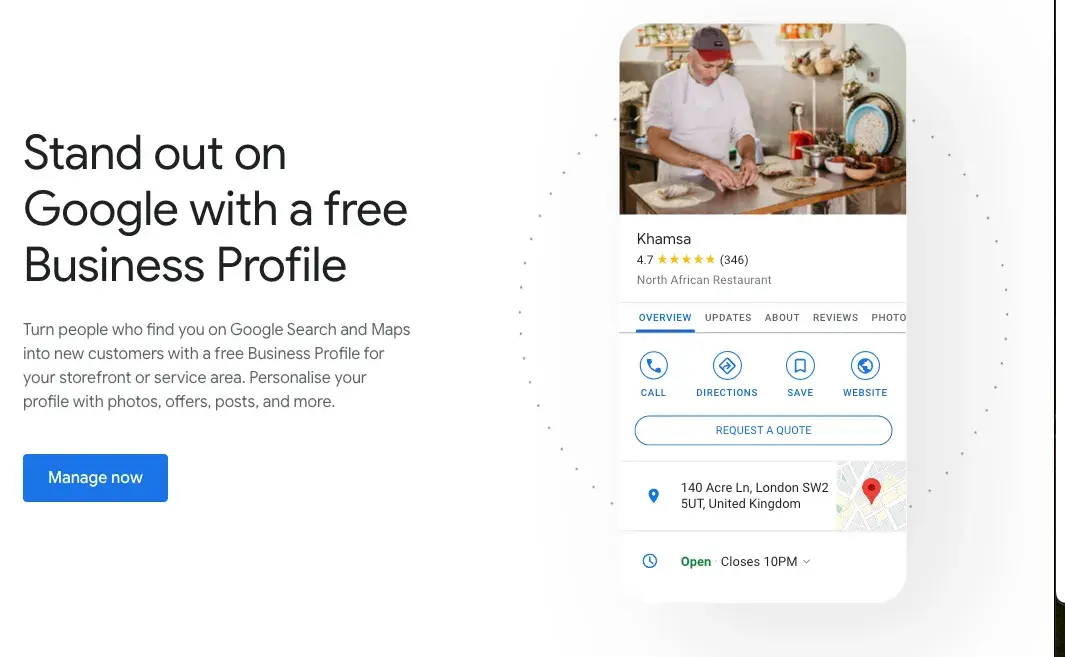
Google business profile example

Image Source

Google My Business Benefits

Let’s explore the key six benefits of Google Business Profile and how it can help you get noticed online and bring in more local customers by putting all the important info right where people can see it.

1. Increased Visibility and Better Rankings

According to Safari Digital, 46% of all Google searches are driven by local intent. Plus, 97% of people search online to find nearby stores, and in 2023, 28% of those local searches ended in a purchase.

So, what does Google My Business do for you?

It boosts your business’s presence in Google Search and Maps, especially in local searches. When someone searches for “near me" services, GMB ensures your business shows up in the top results — if relevant.

97% of users search online for local stores according to Safari Digital research.

Image Source

Google looks at various factors, including relevance, distance, and the prominence of the business in the local area. A complete and optimized GMB listing gives Google the data it needs to rank you higher.

  • Example: A local pizza place sets up its GMB profile with updated info, like opening hours, pictures of its dishes, and customer reviews. Now, when someone in the neighborhood searches for “pizza delivery,” this restaurant appears in the local 3-pack — the top 3 results on Google Maps — which gets it more foot traffic and delivery orders.

2. Enhanced Customer Engagement

You can directly interact with your customers through Q&A sections and reviews.

Pissed Consumer reports that 75.5% of consumers trust online reviews, so responding to both positive and negative feedback is important for building trust and keeping people engaged.

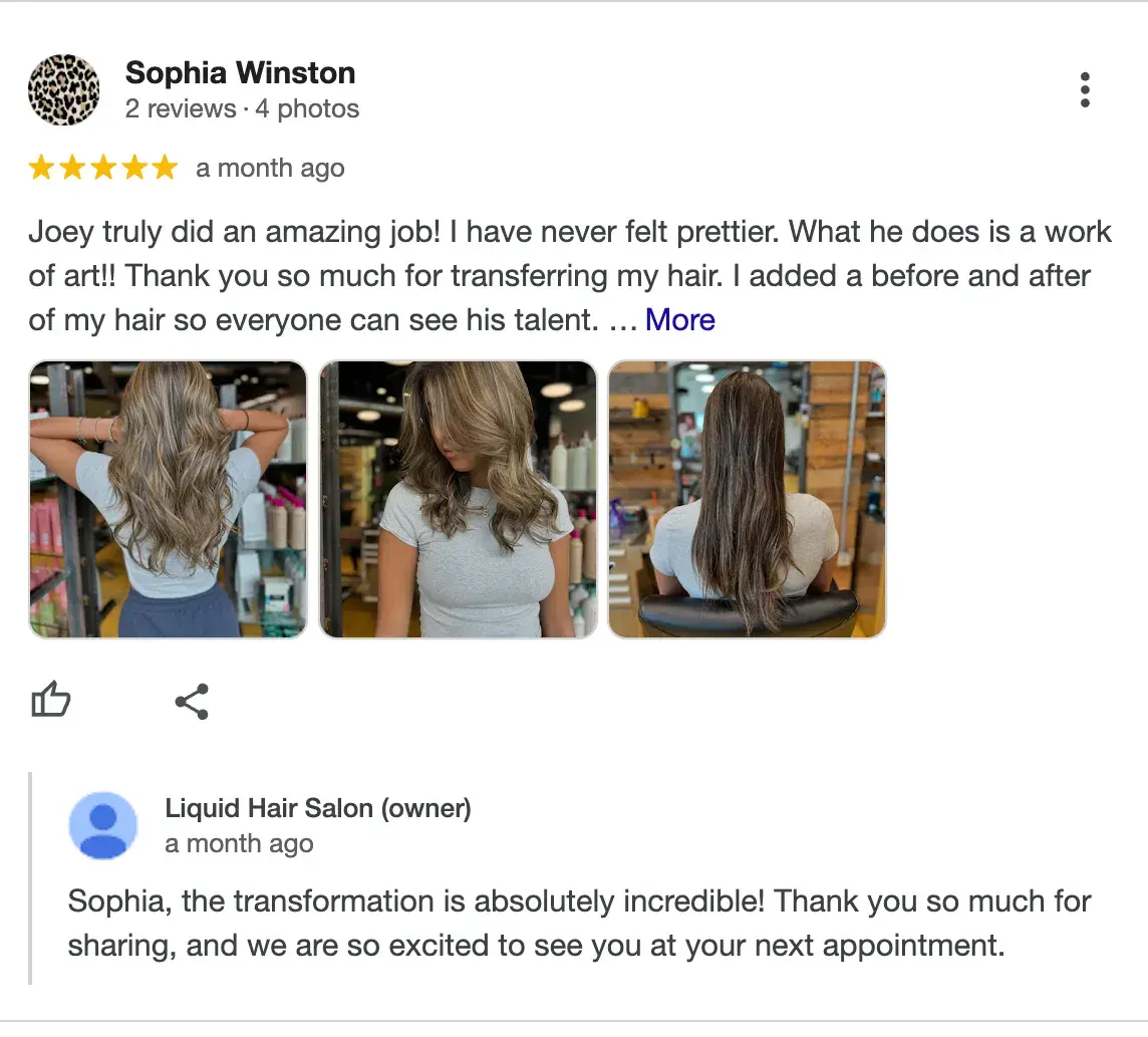
  • Example: A hair salon actively responds to reviews — thanking those who leave positive comments and resolving issues for those who leave negative feedback. This shows they care about customer satisfaction and, at the same time, encourage others to leave reviews.

Hair salon interacting with satisfied customer

Expert tip: “We use a tool called BrightLocal to manage all our client reviews in one place. It‘s super helpful for staying organized. Respond to every single review, whether it’s positive or negative. When you respond, try to naturally weave in keywords related to your business and location,” advises Marshal Davis, president of Ascendly Marketing

3. Valuable Insights and Analytics

One of the best things about GMB is its valuable insights into customer behavior.

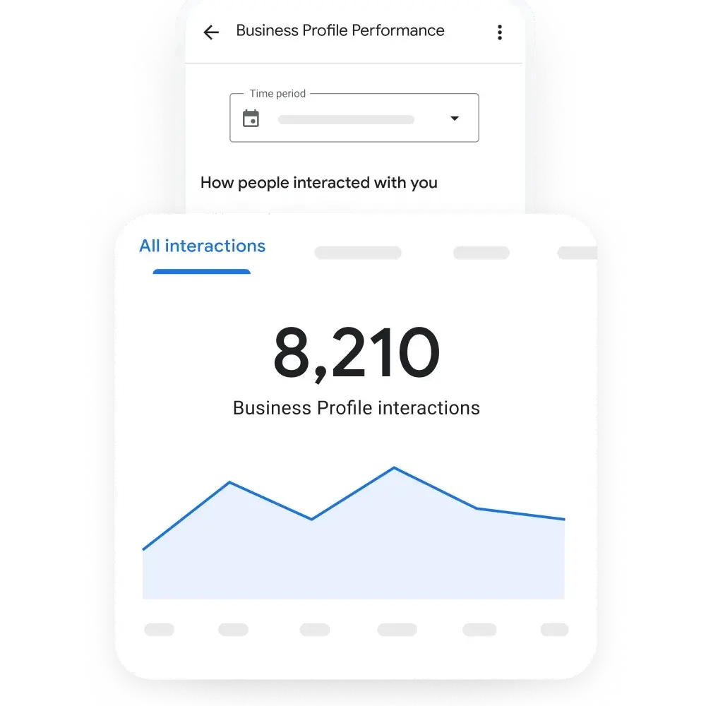
You can see how customers find your listing (search terms, location), what actions they take (such as calling your business or visiting your website), how many people check out your business via Maps, and how many users interact with you overall.

GMB interactions

Image Source

  • Example: A local café notices through GMB insights that many customers find them using the term “breakfast near me.” Seeing this trend, they decide to promote their breakfast menu more heavily in posts and in-store promotions, leading to an increase in morning visitors.

4. Free Marketing and Advertising

GMB offers free exposure by letting you showcase photos, product or service descriptions, and key updates. This helps potential customers get a solid sense of your business before they even click on your website or step into your store.

The better your profile is optimized, the higher the chances you’ll appear in search results without spending money on PPC ads.

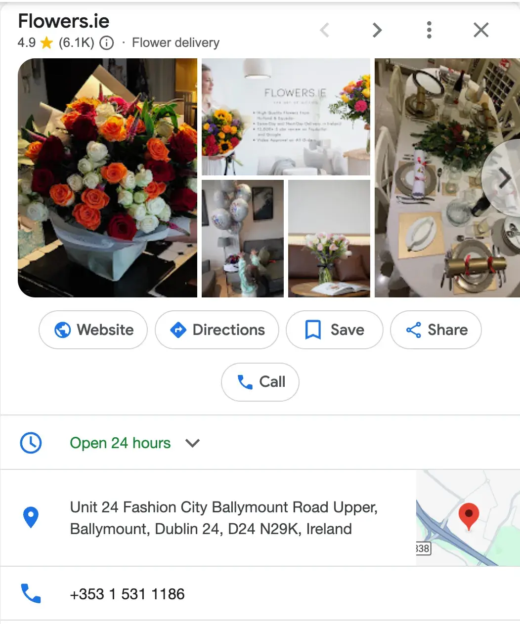
  • Example: A florist uses GMB to showcase bouquets and seasonal offers. When people search for “flower delivery,” they can see fresh photos of the latest arrangements, which leads to more calls for orders, especially during holidays like Valentine’s Day or Mother’s Day. Without any ad budget, they start appearing in local searches.

Flower delivery in Dublin

5. Mobile Access

All GMB listings are optimized for mobile, so when users search for businesses on their phones, they can quickly get all the info they need — directions, hours, reviews, etc.

This is crucial since 80% of Gen Z, 62% of millennials, 66% of Gen X, 35% of Boomers, and 52% of the general population primarily use mobile search.

  • Example: A bakery ensures their GMB listing is complete with an address, contact number, and hours of operation. When someone’s out shopping and searches for “bakery near me,” the listing pops up with a one-click option to call or get directions, driving foot traffic to the store.

Mobile version of GMB listing for a bakery in Miami

6. Simplified Appointment Booking

Service-based businesses can use GMB’s appointment booking feature to let customers schedule appointments directly from the listing. Actually, Publer states that 95% of companies receive appointment requests via Google My Business.

This reduces friction and improves the customer experience by making the process easy and seamless. And that’s exactly what users prefer.

  • Example: A beauty spa adds an appointment link to their GMB listing. Clients searching for “facials” or “massage therapy near me” can now book their services directly from the search result, increasing bookings without requiring customers to visit the website first.

GMB’s appointment booking feature

How to Create a Google My Business Listing

  • Step 1: Log into the Google Account you want to be associated with your business (or create a Google Account if you don’t already have one).
  • Step 2: Go to www.google.com/intl/en_us/business/ and select “Manage now.”
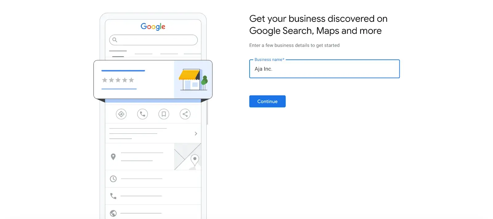
  • Step 3: Enter your business name.

how to create a Google My Business listing

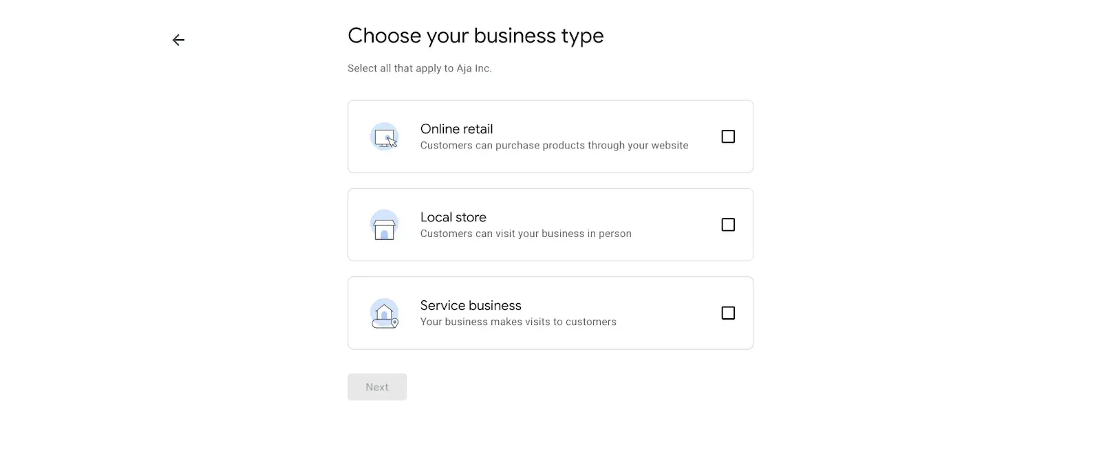
  • Step 4: Choose your business type — online retail, local store, or service business.

Choose your business type in GMB

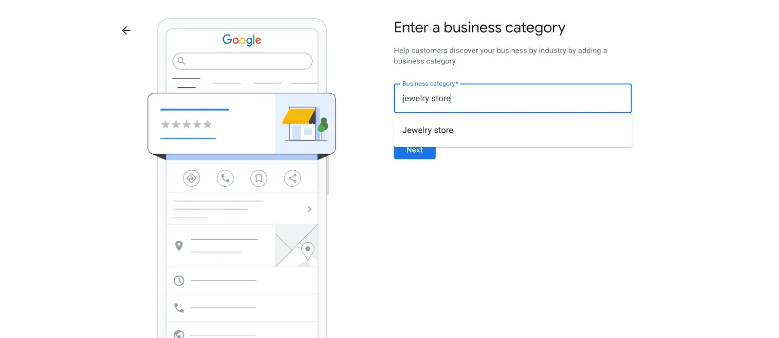
  • Step 5: Time to choose the category. Select the most accurate category possible — you’re essentially telling Google which type of customers should see your business listing.

Enter a business category in GMB

Expert tip:Fill out your profile fully, and don’t limit your brand to one category. GBP lets you add up to 10 different sub-categories to your business beyond your primary option, which can help Google better understand everything you do. Your business isn’t one-dimensional, so add different categories for the full spectrum of your products and services. The more categories you add, the more keywords you’re likely to rank for,” Elisa Daniela Montanari, head of SEO at Wrike.

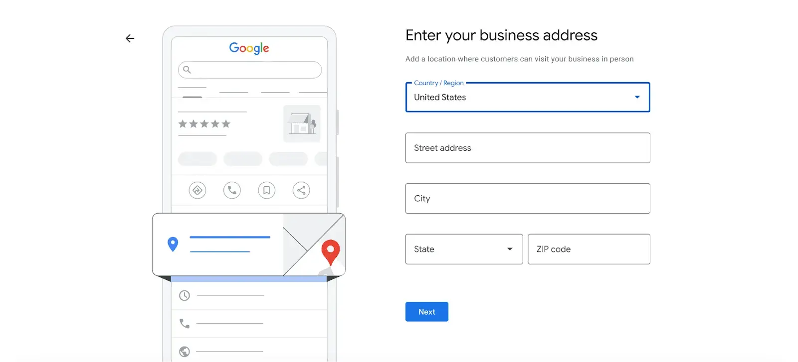
  • Step 6: Enter your business address.

Enter your business address in GMB

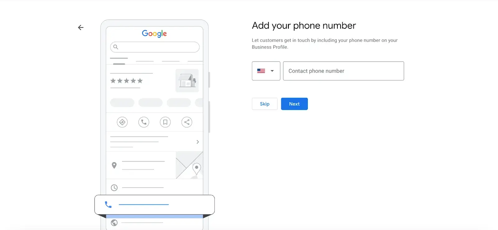
  • Step 7: Add your business phone number (optional).

Add your phone number in GMB

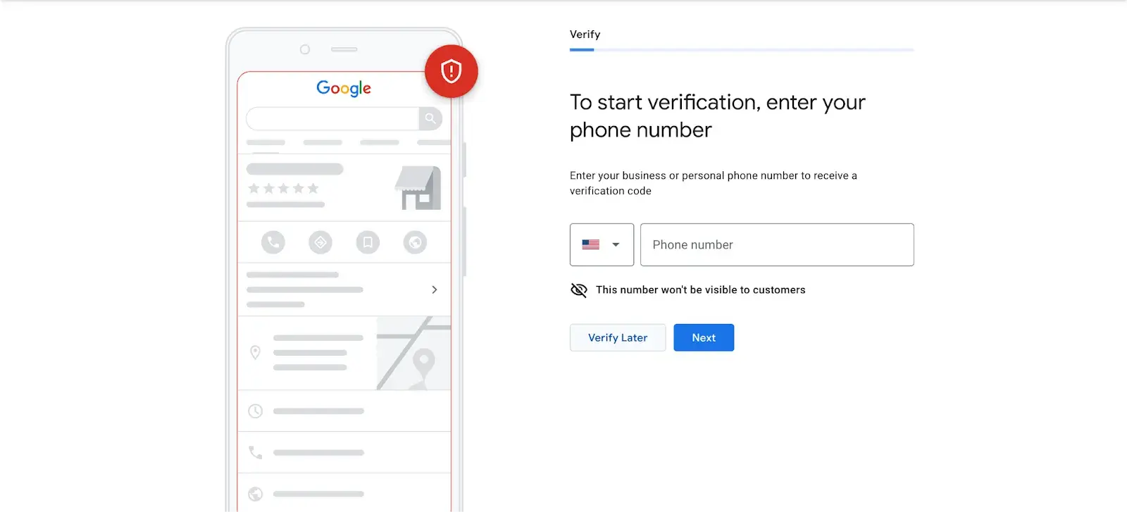
  • Step 8: Choose a verification option. If you’re not ready to verify your business yet, click “Try a different method” → “Verify Later.”

Verification in Google My Business

How to Verify Your Business on Google

There are several ways to verify your GMB listing:

  • By postcard
  • By phone
  • By email
  • Instant verification
  • Bulk verification

Postcard Verification

  • Step 1: If you aren‘t already logged into Google My Business, sign in now and choose the business you want to verify. (If you’re already logged in, you'll be at the verification step.)
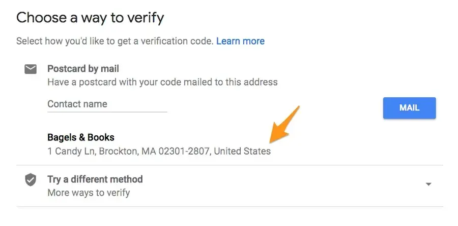
  • Step 2: Make sure your business address is correct. Optional: Add a contact name — that's who the postcard will be addressed to.

Verification in Google My Business

  • Step 3: Click “Mail.” The postcard should reach you in five days — make sure you don't edit your business name, address, or category (or request a new code) before it comes, because this could delay the process.
  • Step 4: Once you've gotten the postcard, log into Google My Business. If you have more than one business location, select the location you want to verify. If you only have one, select “Verify now.”
  • Step 5: In the Code field, enter the five-digit verification code on your postcard. Click “Submit.”

If your postcard never shows up or you lose it, you can request a new code by signing into Google My Business and clicking the “Request another code” blue banner at the top of the screen.

Phone Verification

Google lets some businesses verify their location by phone. If you‘re eligible, you’ll see the “Verify by phone” option when you start the verification process.

  • Step 1: If you aren‘t already logged into Google My Business, sign in now and choose the business you want to verify. (If you’re already logged in, you'll be at the verification step.)
  • Step 2: Make sure your phone number is correct, then choose “Verify by phone.”
  • Step 3: Enter the verification code from the text you receive.

Email Verification

Google lets some businesses verify their location by phone. If you‘re eligible, you’ll see the “Verify by email” option when you start the verification process.

  • Step 1: If you aren‘t already logged into Google My Business, sign in now and choose the business you want to verify. (If you’re already logged in, you'll be at the verification step.)
  • Step 2: Make sure your email address is correct, then choose “Verify by email.”
  • Step 3: Go to your inbox, open the email from Google My Business, and click the verification button in the email.

Instant Verification

If you‘ve already verified your business with Google Search Console (a free tool that lets you manage your website’s search performance and health), you might be able to instantly verify your email.

  • Step 1: Sign into Google My Business with the same account you used to verify your business with Google Search Console. (Some business categories aren‘t eligible for instant verification, so if you don’t get a notification asking you to verify the listing, you'll have to use a different verification method.)

Bulk Verification

If you operate more than 10 locations for the same business — and you're not a service business or an agency managing locations for multiple businesses — you might be eligible for bulk verification.

  • Step 1: If you aren't already logged into Google My Business, sign in now and choose a location. Click “Get verified” next to its name.
  • Step 2: Click “Chain.”
  • Step 3: Fill out the verification form with your business name (as well as the parent company, if applicable), country or countries where you operate, all contact names (i.e., everyone who will be using the Google My Business account), contact phone number, business manager email (someone at the business who can verify you're a representative of that business), and the email address of your Google Account Manager.
  • Step 4: Submit the verification form. It can take up to a week for Google to review and process your claim.

How to Optimize Your GMB Listing

Once you‘ve verified your business, it’s time to finish fleshing out your profile.

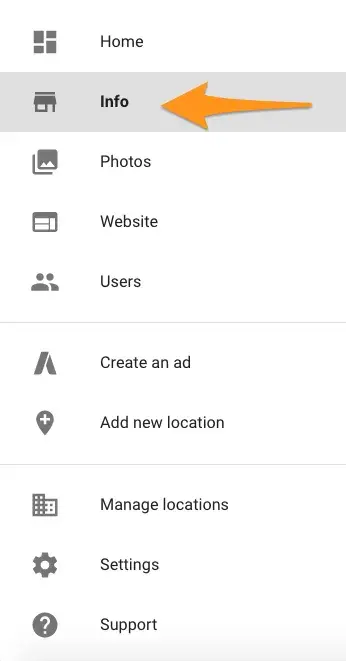
Go to the Google My Business dashboard, click the listing you'd like to work on, select “Info,” and then choose a section to fill out or update.

how to optimize your gmb listing

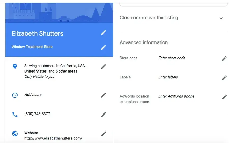
Add as much information and media as you can, including a business profile photo, the area you serve, your hours, attributes (e.g., “wheelchair accessible,” “free wifi”), the day and year you opened, and a public phone number and website URL.

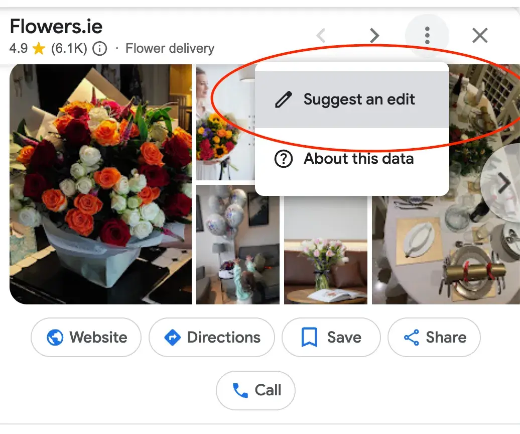
Anyone can “suggest an edit” to your listing by clicking on the three dots in the right corner, so it‘s important to A) get everything right the first time (so you don’t encourage random people to make their own changes) and B) periodically log into your GMB dashboard and make sure all the details look right.

suggest an edit to GMB

At any point in time, you can edit your business profile by logging into your GMB dashboard, clicking on “Info,” clicking the pencil next to the field you'd like to edit, making your change, and then choosing “Apply.”

how to edit your GMB

Expert tip: “Create a listing for each location and skip the copy-and-paste. Each description should be unique so Google can tell these are two different businesses operating under the same umbrella. If each profile is a carbon copy, it could look suspicious to Google, and your ranking may suffer. That said, you shouldn’t need to manage everything manually, so use a tool to manage multiple profiles from a centralized location,” says Brooke Webber, head of marketing at Ninja Patches

Regarding optimizing your listing, I also spoke with Sergey Galanin, the SEO director at Phonexa, who pointed out that one common mistake is not keeping the details on your website in sync with your GMB.

If there’s inconsistency between your site and GMB, it can confuse potential customers. They might come across conflicting information and get skeptical about your business and what you offer.

This can lead to lost customers, a negative online reputation, and even bad reviews. Worst case, Google could even penalize your business for having mismatched information.

Google My Business Photos

According to Google, businesses with photos see 35% more clicks to their website and 42% higher requests for driving directions in Google Maps.

Ditch the generic stock photos and showcase what makes your business unique.

Think photos of your team in action, happy customers enjoying your products, or behind-the-scenes peeks at your process, says Marshal Davis.

Photos should be at least 720 pixels wide by 720 pixels high and JPG or PNG files.

Not sure how many pictures to add — or what they should be of?

Cover photo

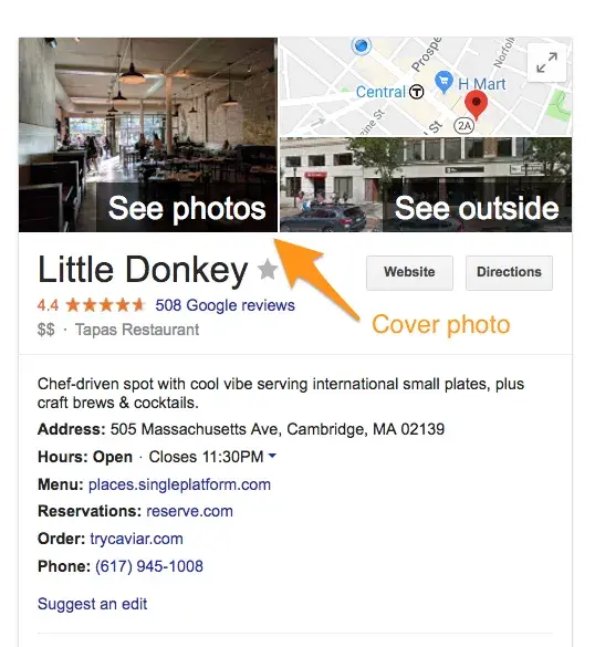
Your Google My Business cover photo is one of the most important, as it shows up front and center on your listing.

GMB cover photo

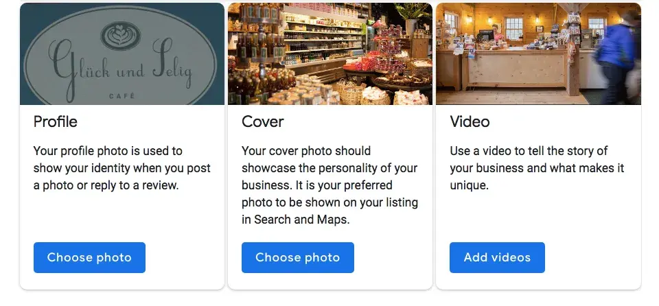
Profile photo

Your profile photo is what appears when you upload new photos, videos, or review responses.

your google my business profile photo

Along with your profile and cover photos, you can and should upload other pictures to make your listing more informative and engaging.

Type

Description

Google-recommended minimum

Suggestions

Exterior

The outside of your business from different directions.

Three photos

Use pictures from different times of day (morning, afternoon, evening) so customers always recognize your business.

Interior

The inside of your business, with a focus on decor and ambiance.

Three photos

Give customers an accurate idea of what it will look like to stand or sit inside your business.

Product

A representation of the types of products or services you offer.

One photo per product type or service

Show the products you're known for and make sure the photos are lit well.

Employees at work

“Action” shots of your employees delivering the types of services you offer.

Three

Try to capture your employees with satisfied customers.

Food and drink

Pictures that represent your most popular menu items.

Three

Consider hiring a food photographer — these are tricky to get right! If that's not in the budget, use bright, even lighting (i.e. no shadows or dimness).

Common areas

Photos of where your customers will spend time (think a lobby or lounge).

One photo per common area

Represent the variety of amenities you offer.

Rooms

Pictures of your different room and suite options (if applicable).

Three

Don't try to mislead guests — show your wallet-friendly and high-end options.

Team

A shot of your management team and staff.

Three

Use pictures that show your unique culture and team personality.

Google My Business Videos

You can also add videos. Videos must be:

  • 30 seconds or shorter
  • 100 MB or smaller
  • 720p resolution or higher

Videos can add some variety to your profile and make you stand out among other businesses in your category; however, don‘t worry if you don’t have any. Unlike photos, they're not a “must-have.”

Google My Business Reviews

One of the best ways to encourage future customers to leave positive reviews? Respond to current ones. Not only does leaving an appreciative response show the original reviewer you're thankful for their support, but it also makes that positive review stand out on your listing and influences people to leave their own reviews.

Here's a sample reply to a satisfied customer:

Thank you for your business, [name]! We‘re so glad you enjoyed [product, e.g., "the blueberry pie"] — it’s one of our favorites, as well. Hope to see you back at [business name] soon.

You should also respond to negative reviews to show you take them seriously and placate the unhappy buyer. But make sure you're extremely courteous — attacking them back will only make you look unprofessional and their review more credible.

Thank you for the feedback, [name], and I‘m incredibly sorry [product/experience] did not meet your expectations. [If you’ve made a change, mention it here — e.g., “We're now double-checking orders to make sure everyone gets exactly what they asked for.”] If you‘d like to come back in, we’d be happy to give you [product] on the house. In any case, thanks for your business, and I hope we can do better next time.

Google My Business App — Does It Exist?

The Google My Business app is gone. To keep your Business Profile fresh and connect with customers, use the Google Maps app and Google Search instead.

Simply open the Google Maps app on your phone and go to the “Business” tab to manage your profile easily. Use the same Google Account linked to your Business Profile.

The Google Maps app offers most features of the old Google My Business app. You can:

  • Add or claim your business to show up on Google.
  • Edit your business info, like address, hours, or photos.
  • Respond to customer messages or calls.
  • Set up notifications for your mobile device.
  • Manage your reviews.
  • Check your performance metrics.
  • Advertise your business.

Download the Google Maps app on both iOS and Android.

Do I need a Google My Business account?

As my final piece of advice: If you run a local business and don’t have Google My Business, it’s like shooting yourself in the foot.

I dare to say it’s your best chance to get noticed by customers nearby and show them exactly what you offer. Plus, it lets you connect with them through reviews and posts, which helps build trust in your community.

And thanks to all the insights you get from GMB analytics, it’s easier than ever to fine-tune your marketing and find what works.

Bottom line? Google My Business is a free, powerful tool that drives local traffic right to your door. Don't sleep on it. :)

P.S. Speaking of getting noticed, if you're ready to launch your own business, check out our free Business Startup Kit. It includes nine easy templates to help you come up with a catchy name, create a solid business plan, and pitch your idea to investors. Figuring out startup costs or planning your marketing strategy? This guide has everything you need to get started.

Editor's note: This post was originally published in April 2018 and has been updated for comprehensiveness.

Affiliate Marketing 2024: How to Launch and Succeed

Featured Imgs 23

Affiliate marketing continues to be a lucrative way for individuals and businesses to earn income online by promoting products or services and earning commissions on resulting sales. As we move into 2024, the landscape of affiliate marketing is evolving, presenting new opportunities and challenges. This guide will provide you with a comprehensive overview of how …

The post Affiliate Marketing 2024: How to Launch and Succeed first appeared on Lucid Softech.

65+ Best DaVinci Resolve Templates 2025 (Free & Pro)

Featured Imgs 23

DaVinci Resolve is the go-to video editing software for most professionals. High-quality editing tools, color correction, audio post-production tools, and the ability to use the software for free convinced more people to switch to DaVinci Resolve.

Now, there’s one more reason to use DaVinci Resolve— templates! Thanks to its massive growth, the community around the software doubled in size. With it came more professional-quality templates for you to use in your projects.

In this post, we showcase some of the best DaVinci Resolve templates we’ve found. There are templates for everything from creating intro scenes to adding lower-thirds, titles, and much more.

Check out the templates below, download them all (there are free ones in there), and experience the magic of DaVinci Resolve.

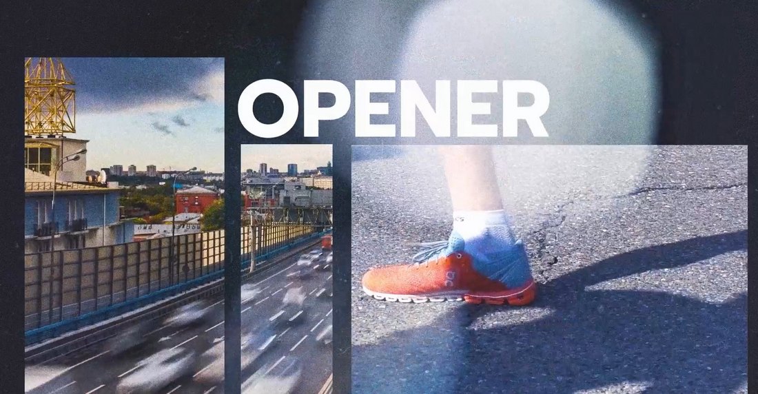
Urban Trendy Opener for DaVinci Resolve

Urban Trendy Opener for DaVinci Resolve

This DaVinci Resolve template will help you design modern and trendy openers for your videos with a stylish urban vibe. It includes cool and attractive animations and effects to add that Extra look to your projects. You can easily customize the template to your preference too.

Liquid Slides DaVinci Resolve Template

Liquid Slides DaVinci Resolve Template

A collection of creative slides for DaVinci Resolve. This template comes with multiple styles of slide layouts with liquid-style animations and effects. You can use these in your promo videos and create slideshows as well.

Fast Dynamic Intro Template for DaVinci Resolve

Fast Dynamic Intro Template for DaVinci Resolve

This DaVinci Resolve intro template has fast and dynamic animations that fit perfectly with energetic videos. It’s especially ideal for sports, gym, adventure, and fitness-themed videos. There are 13 media placeholders and 9 text placeholders in this template.

Colorful Opener Intro for DaVinci Resolve

Colorful Opener Intro for DaVinci Resolve

Featuring 7 media placeholders, 6 titles, and a logo placeholder, this DaVinci Resolve has the perfect design for making openers for both business and creative videos. The template has bright and colorful effects too.

Wedding Elegance – Free DaVinci Resolve Template

Wedding Elegance - Free DaVinci Resolve Template

This is a free DaVinci Resolve template you can use to create beautiful openers and slides for wedding-themed videos. It features sparkling text animations and easily editable media and text placeholders.

Newspaper History  – Free DaVinci Resolve Slideshow Template

Newspaper History - Free DaVinci Resolve Slideshow Template

You can use this free DaVinci Resolve template to design attractive, documentary-style photo slideshows. It features a newspaper-themed design with newspaper backgrounds and editable media placeholders.

Event Promo – Free DaVinci Resolve Template

Event Promo - Free DaVinci Resolve Template

This free DaVinci Resolve template is perfect for making quick and professional-looking promo videos to promote your events and conferences. The template is easily editable and it’s most suitable for adverts and social media promos.

Fashion Opener DaVinci Resolve Template

Fashion Opener DaVinci Resolve Template

This DaVinci Resolve template offers a trendy and stylish way to kick off your fashion videos. It provides engaging, easy-to-edit designs that can be customized to align with your brand’s aesthetic. The template creates a polished, professional look, making it an excellent tool for fashion content creators and enthusiasts alike.

YouTube Collage Slides for DaVinci Resolve

YouTube Collage Slides for DaVinci Resolve

This DaVinci Resolve template adds depth and dynamism to any slideshow and it’s especially perfect for creating YouTube videos. Simple yet engaging, its design caters to a wide range of uses, helping you craft more compelling YouTube presentations in no time.

Creative Scenes for DaVinci Resolve

Creative Scenes for DaVinci Resolve

A meticulously designed slideshow template ideal for all your creative projects. This versatile DaVinci Resolve template delivers high-quality visuals, enabling you to exhibit your content effectively. Simple yet striking, it amplifies your storytelling potential, elevating your projects to new heights.

Elegant Slides for DaVinci Resolve

Elegant Slides for DaVinci Resolve

This is a chic-style DaVinci Resolve template designed to enhance your elegant fashion and beauty slideshow videos. It highlights your content with a sophisticated touch with its stylish aesthetic and seamless functionality, it’s an exceptional addition for any DaVinci Resolve user seeking to elevate their video presentations.

News Intro DaVinci Resolve Template

News Intro DaVinci Resolve Template

An incredibly resourceful DaVinci Resolve template for producing professional, news-style introductions. This template is designed to facilitate seamless editing while creating high-quality news intros, enhancing the overall appeal of your broadcast.

Summer Sale Promo for DaVinci Resolve

Summer Sale Promo for DaVinci Resolve

Check out this summer sale promo DaVinci Resolve template for creating cool and breezy promo videos. It’s an excellent tool for crafting dynamic promotional videos, infusing a summery spirit into your sales messages. The template effortlessly helps enhance your visuals, balancing simplicity and engagement in a compelling package.

Travel Slides for DaVinci Resolve

Travel Slides for DaVinci Resolve

Get your audience’s wanderlust stirring with this travel slideshow DaVinci Resolve template. This slideshow template is perfect for showcasing your travel videos, capturing the essence of every destination beautifully. It comes with professional-grade design features that will enhance and uplift your travel content effortlessly.

Glitch Titles – Free DaVinci Resolve Templates

Glitch Titles - Free DaVinci Resolve Templates

If you’re looking to add a cool and creative look to your title designs, this free DaVinci Resolve template is made just for you. It comes with a stylishly modern and creative title design with glitch animations. It’s great for tech and gaming-themed videos.

Free Horizontal Split Frame DaVinci Resolve Transition

Free Horizontal Split Frame DaVinci Resolve Transition

This is a simple transition animation template for DaVinci Resolve template that features a subtle horizontal split frame animation. The basic and subtle design of this transition makes it a great choice for business, corporate, and professional videos.

Lower Thirds Templates for DaVinci Resolve

Lower Thirds Templates for DaVinci Resolve

This DaVinci Resolve template features a collection of professional lower-thirds for your video projects. It’s a useful toolkit for applying refined and professional lower-third graphical elements in your video editing process.

Neon Brush Transitions for DaVinci Resolve

Neon Brush Transitions for DaVinci Resolve

This creative DaVinci Resolve transitions pack delivers transitions infused with neon brush effects. Ideal for DaVinci Resolve users wanting to add an artistic flair to their video projects, these transitions truly stand out.

CRT Perspective Transitions for DaVinci Resolve

CRT Perspective Transitions for DaVinci Resolve

This collection of DaVinci Resolve transitions provides retro CRT-style effects, adding a distinctive and nostalgic appeal to your videos. They seamlessly blend old-school charm with modern digital editing, making your projects stand out in a creative and engaging way.

3D Lines Transitions for DaVinci Resolve

3D Lines Transitions for DaVinci Resolve

A unique DaVinci Resolve template for adding cool transitions to your videos. This one features a 3D lines effect that creates a mesmerizing effect. It’s ideal for promo videos, trailers, and even social media videos.

Neon Glitch DaVinci Resolve Transitions

Neon Glitch DaVinci Resolve Transitions

Another creative transition template pack for DaVinci Resolve. This template has a colorful neon glitching effect that bridges your scenes with a trendy animation. It’s perfect for YouTube and Instagram videos.

Tropical Logo Reveal for DaVinci Resolve

Tropical Logo Reveal for DaVinci Resolve

This is a logo reveal template for DaVinci Resolve that comes with an attractive CG scene featuring a tropical vibe. The template allows you to reveal your logo with a zoom-in effect in a nature-themed setting.

Zoom Transitions Vol. 01 for DaVinci Resolve

Zoom Transitions Vol. 01 for DaVinci Resolve

A collection of seamless transition effects for DaVinci Resolve. This bundle includes multiple transitions for DaVinci Resolve featuring different styles of zoom animations. They are very easy to use and customize to fit any type of video.

Free Distort And Twist DaVinci Resolve Transition

Free Distort And Twist DaVinci Resolve Transition

This DaVinci Resolve template is free to download. It features a simple twist and blurry distortion effect you can use as a transition in your videos.

Free Animated Lower Third DaVinci Resolve Template

Free Animated Lower Third DaVinci Resolve Template

You can add a simple and minimal lower third to your videos with this simple DaVinci Resolve template. It has a subtle animation with a clean look. It’s free to download.

Fast Logo Opener – DaVinci Resolve Template

Fast Logo Opener - DaVinci Resolve Template

Whether you’re working on a new YouTube video or a social media promo video, you’ll need a killer opener to get the attention of the audience. This logo opener template will help you achieve that goal. It features 9 media placeholders with 5 text layers that you can easily customize to create a stylish opening scene in DaVinci Resolve.

Hip Hop Intro Template for DaVinci Resolve

Hip Hop Intro Template for DaVinci Resolve

Creating the perfect intro sequence for a video can be tough. With this intro template, you’ll be able to get a head start on your project. It gives you a professionally crafted layout with media and text placeholders to create a trendy intro scene for various types of videos.

Modern Stylish Intro – DaVinci Resolve Template

Modern Stylish Intro - DaVinci Resolve Template

With 20 text placeholders and 9 media placeholders, this DaVinci Resolve Intro template allows you to create a modern and stylish intro scene for your videos without effort. It’s perfect for all kinds of lifestyle and creative films and promo videos as well.

Trap Action Opener – DaVinci Resolve Template

Trap Action Opener - DaVinci Resolve Template

Trap action opener is a unique DaVinci Resolve template that features a very professional design. It includes an upbeat transition animation that will fit in perfectly with sports and fitness videos. The template is fully customizable and it comes with 17 text and 17 media placeholders.

Event Slides Template for DaVinci Resolve

Event Slides Template for DaVinci Resolve

If you’re working on a showcase video for a conference or promo video for an event, this DaVinci Resolve template will help you design a modern slideshow video in just a few steps. The template features multiple slide designs with different animations and layouts. You can mix and match to create your own unique slideshow videos.

Simple Video Mask Title Free DaVinci Resolve Template

Simple Video Mask Title Free DaVinci Resolve Template

Add a simple, minimal, and clean title to your creative videos using this free DaVinci Resolve template. It’s easily customizable and you can edit the text and background to your preference as well.

Modern Titles Templates for DaVinci Resolve

Modern Titles Templates for DaVinci Resolve

If you want to add modern and trendy titles to your YouTube videos and business videos, this DaVinci Resolve templates pack is for you. It includes multiple title designs with unique designs. They are available in 4K resolution.

Multiscreen – 7 Split Screen DaVinci Resolve Templates

Multiscreen - 7 Split Screen DaVinci Resolve Templates

Multiscreen or split-screen frames is a commonly used effect in videos to showcase multiple scenes in one frame. With this DaVinci Resolve template, you can create those effects without effort. There are 7 split-screen templates in this bundle.

300 Transitions Pack for DaVinci Resolve

300 Transitions Pack for DaVinci Resolve

This bundle of DaVinci Resolve templates will give you more than enough transitions to last a lifetime of video editing. There are 300 different transitions in the collection featuring 11 categories. The transitions are available in up to 8K resolution.

Podcast Audio Visualization DaVinci Resolve Template

Podcast Audio Visualization DaVinci Resolve Template

Use this DaVinci Resolve template when uploading your podcasts to YouTube or social media platforms in video formats. It adds a cool audio visualization effect to make your podcast videos look more interesting.

Free Logo Reveal & Opener Template for DaVinci Resolve

Free Logo Reveal & Opener Template for DaVinci Resolve

This is a free DaVinci Resolve template that features a simple design. You can use it to make both logo reveals or openers for your videos. The template includes 8 media placeholders and 6 text placeholders.

Film Burn Transitions for DaVinci Resolve

Film Burn Transitions for DaVinci Resolve

This bundle of DaVinci Resolve transitions will help add a nostalgic effect to your videos. It includes 40 different transitions featuring film burn effects. There are 20 smooth and 20 dynamic transitions in the bundle.

Trending Titles for DaVinci Resolve

Trending Titles for Davinci Resolve

You can add minimalist and cool-looking titles for your videos with this collection of DaVinci Resolve title templates. There are many different styles of title layouts in this pack with trendy designs for you to choose from.

Christmas LUTs DaVinci Resolve Templates

Christmas LUTs Davinci Resolve Templates

Make your holiday-themed videos look extra festive with this DaVinci Resolve LUTs pack. These LUTs are designed to add a magical and warm filter to your videos. They will instantly transform your everyday videos into a masterpiece.

Cartoon Brushes Logo Opener Pack for DaVinci Resolve

Cartoon Brushes Logo Opener Pack for DaVinci Resolve

The colorful and creative design of these logo reveal templates makes them the perfect choice for all kinds of kids-themed videos. It features colorful cartoon-style effects for making attractive openers for various videos.

Free Basic Instagram Story Template for DaVinci Resolve

Free Basic Instagram Story Tempalte for DaVinci Resolve

You can use this DaVinci Resolve template to create simple but attractive Instagram story videos. It’s especially great for promoting products and events. The template is free to use.

Modern Corporate Intro DaVinci Resolve Template

Modern Corporate Intro DaVinci Resolve Template

This DaVinci Resolve template features a modern and energetic slideshow design that you can use to craft intros and promos for various business and corporate videos. You can also customize the template to change text and colors as well.

The Ultimate Transitions Pack for DaVinci Resolve

The Ultimate Transitions Pack for DaVinci Resolve

If you’re a fan of experimenting with different types of transition effects in DaVinci Resolve, this bundle is a must-have for you. It includes more than 170 different transition effects in 18 different categories you can use in your video projects.

Travel Broadcast Package for DaVinci Resolve

Travel Broadcast Package for DaVinci Resolve

A bundle of DaVinci Resolve templates designed specifically for travel vlogs and promo videos. It includes a complete collection of titles, intros, backgrounds, transitions, and more for creating professional videos related to travel and tourism.

Fire & Smoke Transitions DaVinci Resolve Templates

Fire & Smoke Transitions DaVinci Resolve Templates

With this collection, you can make explosive videos for YouTube and social media by adding cool fiery transition effects or smoke effects. The 2D transitions in this pack are perfect for creative and educational videos as well as for production promos and intro scenes.

Free Instagram Story DaVinci Resolve Template

Free Instagram Story DaVinci Resolve Template

This is a free DaVinci Resolve template you can use to craft a simple Instagram story video to promote a product. It features a simple drop-in shape animation with a video mask.

Line Drop Lower Third Free DaVinci Resolve Template

Line Drop Lower Third Free DaVinci Resolve Template

You can use this free DaVinci Resolve template to add a simple lower third to your YouTube videos. The template features a subtle animation to add more style as well.

Street Opener – DaVinci Resolve Template

Street Opener - DaVinci Resolve Template

If you want to add a bit of upbeat urban vibe to your videos, this DaVinci Resolve template is the perfect choice for you. It will allow you to easily create a stylish opener for lifestyle, fashion, and modern business videos in just a few minutes. The template can be customized to change colors, media, and text.

Corporate Slideshow – DaVinci Resolve Template

Corporate Slideshow - DaVinci Resolve Template

With this DaVinci Resolve template, you can create a modern slideshow presentation video for businesses. It features a simple mosaic transition animation with various effect styles. The template is simply perfect for corporate event and promo videos.

Power Typography Templates for DaVinci Resolve

Power Typography Templates for DaVinci Resolve

A big bold title scene is a must-have for every video for instantly grabbing the attention of your viewer. With this collection of typography templates, you won’t have trouble getting that job done. It includes various styles of modern typography designs with cool effects. You can easily add them to your own videos using DaVinci Resolve.

Modern Showreel Opener Template for DaVinci Resolve

Modern Showreel Opener Template for DaVinci Resolve

Create an energetic showreel opener for your videos using this modern DaVinci Resolve template. It features a stylish slideshow design with 34 media placeholders for adding videos and images. The template is easily customizable to your preference.

Square Photo Slideshow – DaVinci Resolve Template

Square Photo Slideshow - DaVinci Resolve Template

If you want to create a simple photo slideshow video, this DaVinci Resolve template will come in handy. It comes with a simple square photo design similar to Instagram posts. The template is also very easy to customize as it lets you drag and drop your photos to the layout.

YouTube Subscribe Box Free DaVinci Resolve Template

YouTube Subscribe Box Free DaVinci Resolve Template

Using this DaVinci Resolve template, you can promote your YouTube channel in your videos by adding a subscribe box. The template features an animated subscribe button as well.

Distort & Twist Transition Free DaVinci Resolve Effect

Distort & Twist Transition Free DaVinci Resolve Effect

This is a simple transition effect you can use when producing videos in DaVinci Resolve. It features a fast twist effect that’s suitable for various professional videos.

Dynamic Slideshow Template for DaVinci Resolve

Dynamic Slideshow Template for DaVinci Resolve

You can use this trendy video template to create a dynamic slideshow with different styles of attractive effects. The template comes with multiple media and text placeholders that you can easily edit however you like. And it works without any additional plugins.

Urban Opener – DaVinci Resolve Intro Template

Urban Opener - DaVinci Resolve Intro Template

This opener is perfect for various promo and creative videos. It’s especially suitable for motivational and upbeat YouTube videos. The template features a creative slideshow design with several text and media placeholders for easily adding your own content to the layout.

Photo Memory Slideshow Template for DaVinci Resolve

Photo Memory Slideshow Template for DaVinci Resolve

If you’re working on a photo album video, this DaVinci Resolve template will allow you to add a vintage-themed effect to your video. It also features several transition effects to give your photo slideshows a more professional look and feel.

Event Promo – DaVinci Resolve Template

Event Promo - DaVinci Resolve Template

This DaVinci Resolve video template is made with corporate brands and businesses in mind. It allows you to create a promo video to showcase an event or conference using a modern slideshow design. The template includes editable text layers and media placeholders.

YouTube Endscreens – DaVinci Resolve Templates

Youtube Endscreens - DaVinci Resolve Templates

The endscreen section in YouTube videos is a useful feature that allows you to promote your other videos to viewers. Of course, the design of this endscreen is also important. With this DaVinci Resolve template kit, you can create a stylishly animated endscreen for your own YouTube channel.

Vertical Split Frame Effect Free DaVinci Resolve Template

Vertical Split Frame Effect Free DaVinci Resolve Template

Another free DaVinci Resolve template featuring a simple transition effect. This effect is most suitable for YouTube films and videos as it has a subtle vertical split effect.

Dual Line Arrow Callout Free DaVinci Resolve Template

Dual Line Arrow Callout Free DaVinci Resolve Template

Add callouts to your product promo and showcase videos using this free template. It features a simple design with quick fade-in and fade-out animations.

Motion Title Templates for DaVinci Resolve

Motion Title Templates for DaVinci Resolve

This title pack for DaVinci Resolve is perfect for documentary and film projects. It features modern and minimal title designs with subtle animations that will add a professional look to your videos.

Wedding Slideshow – DaVinci Resolve Template

Wedding Slideshow - DaVinci Resolve Template

Creating a wedding photo album video will be a walk in the park when you have this DaVinci Resolve template at your side. It features a beautiful slideshow design with creative animation effects and transitions. The template is also easy to customize as it comes with text and media placeholders.

2D FX Liquid Transitions for DaVinci Resolve

2D FX Liquid Transitions for DaVinci Resolve

With this collection of transition effects, you’ll be able to add cool animated FX transitions between clips. It includes many different liquid-style transition effects that are great for creative video projects.

Modern Big Titles – DaVinci Resolve Templates

Modern Big Titles - DaVinci Resolve Templates

You can use this bundle of title templates to easily add bold titles to your videos. This DaVinci Resolve templates collection includes various styles of titles with different animations. They will go along great with all kinds of business, creative, and professional videos.

Real Estate Promo Template for DaVinci Resolve

Real Estate Promo Template for DaVinci Resolve

If you’re working on a promo video for a real estate business, this DaVinci Resolve template will help you add a section to showcase properties in a professional way. The template is easily customizable and comes in Full HD resolution.

Brush Opener – DaVinci Resolve Intro Templates

Brush Opener - DaVinci Resolve Intro Templates

Grab this opener template to add creative intro scenes for your YouTube and promo videos. The DaVinci Resolve template includes several different styles of brush animations and transition effects.

For more video templates, check out our best Premiere Pro templates collection.

Alternatives To Typical Technical Illustrations And Data Visualisations

Featured Imgs 23

Good technical illustrations and data visualisations allow users and clients to, in a manner of speaking, take time out, ponder and look at the information in a really accessible and engaging way. It can obviously also help you communicate certain categories of information and data.

The aim of the article is to inspire and show you how, by using different technical illustrations and data visualisations, you can really engage and communicate with your users and do much more good for the surrounding content.

Below are interesting and not commonly seen examples of technical illustration and data visualisation, that show data and information. As you know, more commonly seen examples are bar graphs and pie charts, but there is so much more than that!

So, keep reading and looking at the following examples, and I will show you some really cool stuff.

Technology

Typically, technical illustration and data visualisations were done using paper, pens, pencils, compasses, and rulers. But now everything is possible — you can do analog and digital. Since the mainstream introduction of the internet, around 1997, data (text, numerical, symbol) has flourished, and it has become the current day gold currency. It is easy for anyone to learn who has the software or knows the coding language. And it is much easier to do technical illustrations and data visualisation than in previous years. But that does not always mean that what is done today is better than what was done before.

What Makes Data And Information Good

  • It must be aesthetically pleasing, interesting, and stimulating to look at.
  • It must be of value and worth the effort to read and digest the information.
  • It must be easy to understand and logical.
  • To convey ideas effectively, both aesthetic form and functionality need to go hand in hand, as Vitaly Friedman in his article “Data Visualization and Infographics” has pointed out.
  • It must be legible and have well-named and easy-to-understand axes and labels.
  • It should help explain and show data and information in a more interesting way than if it were presented in tabular form.
  • It should help explain or unpack what is written in any surrounding text and make it come to life in an unusual and useful way.
  • It must be easy to compare and contrast the data against the other data.

The Importance Of Knowing About Different Audiences

There are some common categories of audiences:

  • Expert,
  • Intermediate,
  • Beginner,
  • Member of the public,
  • Child,
  • Teenager,
  • Middle-aged,
  • Ageing,
  • Has some prior knowledge,
  • Does not have any prior knowledge,
  • Person with some kind of disability (vision, physical, hearing, mobility).

Sara Dholakia in her article “A Guide To Getting Data Visualization Right” points out the following considerations:

  • The audience’s familiarity with the subject matter of your data;
  • How much context they already have versus what you should provide;
  • Their familiarity with various methods of data visualisation.

Just look at what we are more often than not presented with.

So, let us dive into some cool examples that you can understand and start using today that will also give your work and content a really cool edge and help it stand out and communicate better.

3D Flow Diagram

It provides a great way to show relationships and connections between items and different components, and the 3D style adds a lot to the diagram.

Card Diagram

It’s an effective way to highlight and select information or data in relation to its surrounding data and information.

Pyramid Graph

Being great at showing two categories of information and comparing them horizontally, they are an alternative to typical horizontal or vertical bar graphs.

3D Examples Of Common Graphs

They are an excellent way to enliven overused 2D pie and bar graphs. 3D examples of common graphs give a real sense of quality and depth whilst enhancing the data and information much more than 2D versions.

Sankey Flow Diagram

This diagram is a good way to show the progression and the journey of information and data and how they are connected in relation to their data value. It's not often seen, but it's really cool.

Stream Graph

A stream graph is a great way to show the data and how it relates to the other data — much more interesting than just using lines as is typically seen.

3D Map

It provides an excellent way to show a map in a different and more interesting form than the typically seen 2D version. It really gives the map a sense of environment, depth, and atmosphere.

Tree Map

It’s a great way to show the data spatially and how the data value relates, in terms of size, to the rest of the data.

Waterfall Chart

A waterfall chart is helpful in showing the data and how it relates in a vertical manner to the range of data values.

Doughnut Chart

It shows the data against the other data segments and also as a value within a range of data.

Lollipop Chart

A lollipop chart is an excellent method to demonstrate percentage values in a horizontal manner that also integrates the label and data value well.

Bubble Chart

It’s an effective way to illustrate data values in terms of size and sub-classification in relation to the surrounding data.

How To Start Doing Technical Illustration And Data Visualisation

There are many options available, including specialized software like Flourish, Tableau, and Klipfolio; familiar tools like Microsoft Word, Excel, or PowerPoint (with redrawing in software like Adobe Illustrator, Affinity Designer, or CorelDRAW); or learning coding languages such as D3, Three.js, P5.js, WebGL, or the Web Audio API, as Frederick O’Brien discusses in his article “Web Design Done Well: Delightful Data Visualization Examples.”

But there is one essential ingredient that you will always need, and that is a mind and vision for technical illustration and data visualisation.

Worthwhile Practitioners And Links To Look At

Python – MySQL – Too many connections?

Featured Imgs 23

A script that was working fine on 100 records per batch choked when I fed it 1,000 records.
It gave:

mysql.connector.errors.OperationalError: 1040 (08004): Too many connections

So I went ahead and made sure to connect.close() everywhere that I opened a connection, and the script made it much further but eventually crashed, giving the same error.
Obviously, increasing the connection limit would only encourage sloppy coding? It would be better if I developed a methodology to prevent this type of crash. Because if this were PHP it wouldn't be happening, I admit that.

How can I prevent this type of error from happening again, short of switching to PHP?

80+ Best Hand Lettering & Handwriting Fonts 2025

Featured Imgs 23

If you’re looking for a different type of a font to make your design stand out, a cursive font can be a great choice. Cursive and script fonts aren’t new, but they’re a less common choice for many designers. This gives you a chance to use cursive fonts to add some originality to your next project.

Fonts play an important role in every design. Whether you’re designing a book cover, a website header, social media post, greeting card, or a poster, the typography is the main aspect that captures everyone’s attention.

In this collection, we’re featuring some of the most beautiful and modern cursive fonts you can use for your various types of designs. Plus, a series of helpful tips for choosing a hand lettering font to help you make the right decision.

Top Pick

Delich- Handwritten Script Font

Delich- Handwritten Script Font

Delich is a calligraphy style handwritten font that features a smooth and creative character design. The font can be used as an all-rounder for designing everything from greeting cards to logos, posters, business cards, badges, and much more.

It also comes with lots of OpenType stylistic alternates, ligatures, swashes, and more to help make your designs look even more unique.

Why This Is A Top Pick

The simple yet flawless design of the letters is what makes this font stand out from the rest. It features a certain elegance that makes it a great choice for many different types of print and digital designs.

Salero – Script Handwritten Font

Salero - Script Handwritten Font

Salero is a script and handwritten font that offers a unique aesthetic merging fluid strokes with diligent details, exuding a refined artistic allure. Every glyph ensures a harmonious visual appeal, perfect for extensive text compositions. It supports multiple languages and features stylistic alternatives in the lowercase.

Torple – Handwritten Font

Torple - Handwritten Font

Torple is a distinct, slim, and condensed handwritten font. Its hand-drawn style brings an inviting charm, yet maintains clarity and readability. The package includes two styles, Torple Regular and Torple Caps, in an easily accessible OTF format.

Desimate Stonger – Script Handwritten Font

Desimate Stonger - Script Handwritten Font

Desimate Stronger is a beautifully brushed, hand-written font that gives an artistic flair to any design. Its versatility is enhanced by alternative characters, ligatures, and an All Caps feature, allowing it to adapt to any style seamlessly. Its multilingual support enables it to reach global audiences, making your work truly impactful.

Self Written – Script Handwritten Font

Self Written - Script Handwritten Font

Self Written is a well-balanced, expressive typeface, boasting a blend of elegance, firmness, and natural charm in its uppercase and lowercase forms, respectively. Its multilingual support ensures global accessibility, making cross-cultural connections easier. With carefully chosen ligatures, it guarantees a smooth continuity between letters.

Superbusy Activity – Fun Pairing Font

Superbusy Activity - Fun Pairing Font

Superbusy Activity is a dynamic handwritten font ideal for designers looking to inject humor and cheer into their creations. Offered in three lively styles – Regular, Outline, and Text, it is suited for attention-grabbing titles, logos, and much more. Providing uppercase display, numerals, punctuation, alternates and ligatures, it also supports over 60 Latin-based languages.

Stefanie Notes – Handwritten Font

Stefanie Notes - Handwritten Font

Stefanie Notes is a distinctive handwritten font that adds a uniquely authentic flair to any design. Its features include uppercase and lowercase letters, numerals, punctuation marks, symbols alternates, and multilingual support. This natural and amazing font comes in two files, OTF and TTF.

Childlike – Handwritten Font Duo

Childlike - Handwritten Font Duo

Childlike is a charming pair of fonts that encapsulates all that’s endearing about a child’s writing style. This duo, which includes a regular and condensed version, radiates sweetness and innocence while maintaining a refined look. Its flexibility allows you to either pair them or use separately.

Lulaboo – Handwritten Font

Lulaboo - Handwritten Font

Lulaboo is a charming handwritten Sanserif font that breathes life into logos, book designs, displays, and modern-style illustrations. Created by “Handwritten Fonts”, this versatile typeface comes complete with uppercase, lowercase, and punctuation, and is available in OTF, TTF, WOFF, and WOFF2 formats.

Rutabaga – Script Handwritten Font

Rutabaga - Script Handwritten Font

The Rutabaga is a unique typeface offering a personal touch to your content. With alternative characters, multilingual support, uppercase, lowercase, and punctuation features, it’s useful for a range of tasks from branding to social media. Its handwritten style can enhance invitations and packaging designs.

Anti-Romantic – Unique Handwritten Font

Anti-Romantic - Unique Handwritten Font

The Anti-Romantic is a unique handwritten font that brings forth a natural and unpolished allure. Drawing inspiration from ballpoint scribbles, its smooth and slightly imperfect lines create a relaxed feel that adds a personal touch to your casual designs. Ideal for journaling, crafting quotes, and any project seeking that hint of individual expression.

Nayaga – Handlettering Script Font

Nayaga - Handlettering Script Font

If you’re looking for a fresh and creative hand lettering font with a stylish look, this font is the perfect choice to start with. It comes with a set of calligraphy-style letters that features lots of swashes, alternate characters, and ligatures for crafting unique designs.

SENJAKU – Stylish Hand-Lettering Font

SENJAKU - Stylish Hand Lettering Font

The beautifully flowing design of this hand-lettering font makes it most suitable for designing titles and headings with a personal touch, especially for things like wedding invitations and greeting cards.

Ringtones – Modern Handlettered Font

Ringtones - Modern Handlettered Font

Ringtones is another beautiful hand-lettering font that features a modern character design. This font includes lots of glyphs, ligatures, alternate characters, and more to help you design amazing titles for all your print and digital designs.

Handbrake – Vintage Handlettering Font

Handbrake - Vintage Handlettering Font

Handbrake is a vintage script-style hand-lettering font that comes with a stylish and smooth character design. This font is perfect for everything from logo designs to product labels, packaging designs, and more.

Honey Shake – Free Handwritten Font

Honey Shake - Free Handwritten Font

This free handwriting font is perfect for crafting simple and cute titles for your designs. It features adorable characters with a casual look that will make your greeting cards, posters, and flyers look even more attractive.

Devilion – Creative Hand Lettering Script

Devilion - Creative Hand Lettering Script

Devilion is a creative hand-lettering font with a bold script letter design. This font comes with a classic style of characters inspired by vintage typography. It fits in perfectly with outdoor and adventure-themed designs, especially for custom T-shirts, mugs, and more.

Bad Ride – Script Handlettering Script

Bad Ride - Script Handlettering Script

Another modern hand-lettering font featuring stylish script characters. It includes uppercase and lowercase characters along with ligatures and alternates. The font is ideal for modern posters, labels, and business card designs.

Swansong – Elegant Handlettering Font

Swansong - Elegant Handlettering Font

At first glance, you’ll notice a wedding-style design in this font. The curvy letters and the elegant look make this font a great choice for crafting wedding invitations and greeting cards.

Roastypes – Retro Handlettering Script Font

Roastypes - Retro Handlettering Script Font

If you want to give a classic retro look to your modern title designs, give this hand-lettering font a try. It comes with a unique script design with chunky characters. You can use it to craft casual and fun-looking product labels and even logos and signage.

POST – Free Handwritten Font

POST - Free Handwritten Font

This free font features a set of handwriting letters with a true hand-crafted look and feel. It has rough textured letters that will look amazing on print designs. This font is free to use with personal and commercial projects.

Redpaws – Unique Handwriting Font

Redpaws - Unique Handwriting Font

If you’re looking for a handwriting font with a fun and quirky design, Redpaws is a great choice for you. This font is perfect for crafting titles and headings while adding a hand-made look for designs related to children.

Krispylottus – Handwritten Script Font

Handwriting Fonts

Check out this stunning handwritten typeface featuring bold strokes, skewed and playful character, and a range of amazing features that gives your design that extra edge and attention it’s worthy of. Do try it out!

Pictum – Modern Handwriting Font

Handwriting Fonts

If you are looking for a cute, and pretty font that truly stands out, consider Pictum, a carefully crafted typeface that can be used for virtually any purpose ranging from posters, flyers, food menus, logotypes, and other branding materials.

Magicstar – Bold Handwritten Font

Handwriting Fonts

Beautifully designed with brush pen strokes, Magicstar is a fantastic font capable of accentuating the overall appeal of any design project it’s used in, and definitely one of the best handwritten typefaces on our list!

Adorable – Handwritten Script Font

Adorable - Handwritten Script Font

This handwritten script font comes with a beautiful letter design just as its name suggests. You can use it to design everything from greeting cards to T-shirt designs, posters, social media posts, and much more.

The Softone – Casual Handwriting Font

The Softone - Casual Handwriting Font

Another simple handwriting font with a casual design. This font features a modern letter design that makes it suitable for all kinds of print and digital designs. It includes both uppercase and lowercase letters as well.

Southeast Better – Handwritten Script Font

Southeast Better - Handwritten Script Font

This modern handwriting font features a script design making it a great choice for crafting everything from logos, signatures, poster titles, and more. The font features both uppercase and lowercase letters as well as numbers and punctuations.

Southem – Clean Marker Font

Southem - Clean Marker Font

Southem is a modern marker font that comes with a handwriting design. The font features a smooth character design with both uppercase and lowercase letters. It’s perfect for social media, creative, and kid-friendly design projects.

Daytonia – Hand Lettering Script Font

Daytonia - Hand Lettering Script

Daytonia is a beautiful hand lettering scrip font featuring a modern-vintage design. The font comes with multilingual support, alternates, swashes, and more. It’s perfect for designing greeting cards, invitations, and posters.

Seabright – Modern Script Font

Seabright - Modern Script Font

Seabright is an elegant script font with a handwriting design. It includes both TrueType and OpenType versions with stylistic alternates, over 250 glyphs, and much more for crafting unique designs.

Matilda Anderson – Handwriting Font Duo

Matilda Anderson - Handwriting Font Duo

Matilda is another modern handwriting font with a creative design. It comes with alternate characters, multilingual support, and more. This font is most suitable for making wedding invitations, business cards, greeting cards, and labels.

Tokyo Street – Free Handwriting Font

Handwriting Fonts

Wanting to get your hands on a simple yet eye-catching font without spending a penny? Check out Tokyo Street, a gorgeously designed handwriting font that is sure to make a bold statement. It’s free and up for grabs.

Queens Signature – Free Handwritten Font

Handwriting Fonts

Next up we have Queens Signature, a pretty and dainty font that will give your designs a beautiful handwritten touch. It comes with a full set of uppercase and lowercase letters, numerals, punctuation, symbols, and more.

Sattersoon – Free Handwritten Font

Sattersoon - Free Handwritten Font

Sattersoon is a modern script font with a handwritten design. It features both uppercase and lowercase letters as well as numerals. It’s free to use with personal projects.

Impossible – Free Elegant Handwritten Font

Impossible - Free Elegant Handwritten Font

Impossible is an elegant free handwritten font that features a beautifully flowing set of character designs. It’s ideal for designing social media posts and greeting cards.

Wednesdom – Playful Handwriting Font

Wednesdom - Playful Handwriting Font

This is one of the most unique fonts you’ll ever come across. It features a true hand-crafted lettering design that will help add character and personality to your designs. The font itself is ideal for all sorts of creative design projects.

Grandyose – Handlettering Script Font

Grandyose - Handlettering Script Font

Grandyose is a hand-lettering script font that comes with a smoothly flowing letter design. Everything you type with this font will make it look natural and professional. The font also comes with lots of glyphs, alternates, and ligatures as well.

Malika – Handwriting Brush Script Typeface

Malika - Handwriting Brush Script Typeface

Malika is a brush script font that also features a letter design inspired by handwriting styles. The font is perfect for everything from label designs to logos and greeting cards. The vintage-themed design of the font will also fit in well with subtle logo designs.

Bella Sweety – Handwritten Signature Font

Bella Sweety - Handwritten Signature Font

This is a handwritten signature style font that’s ideal for making business cards, greeting cards, and even logos for various businesses and brands. The font comes with a classic design that will make your designs look more professional and authoritative.

Nathan – Free Vintage Handwritten Font

Nathan - Free Vintage Handwritten Font

Nathan is a free vintage font that comes with a stylish handwritten design. This font also features a vintage-themed design. It’s ideal for everything from logo designs to badges and signage. However, you can only use it with your personal projects.

Northville – Unique Handwritten Font

Northville - Unique Handwritten Font

This is a unique font that comes with a design inspired by the signboards from the early 1900s. It actually makes this font perfect for designing logos and signage. It comes in webfont versions as well.

Mystique – Handwritten Luxury Signature Font

Mystique - Handwritten Luxury Signature Font

Mystique is a modern handwritten signature font that features a beautiful design. This font includes plenty of stylistic characters, ligatures, and multilingual support for making various types of print and digital designs.

Beauty Heart – Lovely Calligraphy Font

Beauty Heart - Lovely Calligraphy Font

This beautiful script style calligraphy font also comes with a handwritten lettering style. It’s perfect for making stylish greeting cards and wedding invitations. The font includes lots of alternates and ligatures for adding stylistic characters as well.

Zarkafi – Stylish Handwritten Script Font

Zarkafi - Stylish Handwritten Script Font

This font features one of the most unique lettering designs we’ve seen. It comes with a hand-crafted stylish letter design that will surely make your print and digital work stand out from the crowd. The font includes both uppercase and lowercase letters.

Maria Script – Free Handwritten Script Font

Maria Script - Free Handwritten Script Font 2

Maria Script is a modern-vintage handwritten font that comes with a stylish lettering design. This font is ideal for vintage and retro-themed poster and flyer designs. The font is completely free to use, even with commercial projects.

Supremacy – Modern Script Font

Supremacy - Modern Script Font

Supremacy is a modern calligraphy font featuring an elegant design that’s ideal for making product labels, posters, and logos. The font includes both uppercase and lowercase letters as well as symbols.

Lovestrong – Elegant Script Font

Lovestrong - Elegant Script Font

Lovestrong features a beautiful hand lettering design which will add a unique personal touch to your designs. The font also features uppercase and lowercase letters and plenty of alternates and glyphs.

Dellatine – Creative Script Font

Dellatine - Creative Script Font

Dellatine is a stylish script font that comes with a unique hand lettering design. It features a playful and fun design that will fit in nicely with your casual and quirky greeting cards, posters, and many other types of designs.

Melissa – Luxury Script Font

Melissa - Luxury Script Font

Melissa is a modern script font featuring a luxury handwritten design. This font is perfect for making logos, labels, and business cards for luxury brands and high-end products.

Steelmond – Hand Lettering Font

Steelmond - Hand Lettering Font

Steelmond features a thick bold hand lettering design that will make your designs stand out from the crowd. It comes with 326 glyphs, 158 alternate characters, and much more.

Milea – Free Handwritten Brush Font

Milea - Handwritten Brush Font

Milea is a handwritten brush font you can download and use for free with your personal projects. It comes with a trendy design that makes it most suitable for modern poster and banner designs.

Geraldine – Free Handwritten Font

Geraldine - Free Handwritten Font

Geraldine is an elegant free handwritten font that comes with a beautiful set of letters. It’s perfect for designing luxury branding designs and invitations. The font is free to use with personal projects.

The Jacklyn – Hand Lettering Signature Font

The Jacklyn - Hand Lettering Signature Font

Jacklyn is an elegant hand lettering font you can use to design modern invitation cards, badges, posters, and more. The font includes lots of glyphs, alternates, and multilingual support.

Winchester – Signature Script Font

Winchester - Signature Script Font

Winchester is a beautiful signature font featuring a minimal design. This font is perfect for making business cards, labels, and greeting cards. It includes 240 glyphs, ligatures, alternates, and much more.

Shadowy Script – Cursive Font

Shadowy Script Cursive Font

Shadowy Script is a modern and elegant cursive script font that features a unique signature-style design. This font comes with 2 typefaces with lots of symbols, punctuations, and both uppercase and lowercase letters.

Rattem Hullax – Cursive Font

Rattem Hullax

Another modern and creative cursive font you can use to design both print and digital designs, especially for businesses and luxury brands. The font features stylish alternates, ligatures, and lots more.

Guilty – Brush Cursive Font

Guilty Brush

Guilty is a brush font that comes with a cursive design. It’s perfect for making website headers with bold titles, book covers, greeting cards, and much more. The font features a natural flowing design and includes numbers and symbols as well.

Rustelyn – Free Hand-Drawn Script Font

Rustelyn - Free Hand-Drawn Script Font

Rustelyn is a creative hand-drawn script font you can use to craft titles, headings, and even logos for creative design projects. It also comes in regular and slant styles as well.

Kingsland – Free Simple Handwritten Font

Kingsland - Free Simple Handwritten Font

Kingsland is a minimalist handwritten font featuring an elegant design. It’s ideal for designing wedding invitations and business cards. The font is free to use with personal and commercial projects.

Red Bright – Cursive Font

Red Bright

Red Bright is a unique cursive font that features a brush design with natural and rough brush strokes. The font can be used to design all kinds of print designs such as book covers, posters, greeting cards as well as web designs and social media posts.

Delight – Calligraphy Cursive Font

Delight Calligraphy

Delight is a stylish calligraphy font with a cursive design. The font is ideal for fashion and apparel related branding and design work. As a bonus, it comes with 34 creative brush strokes as well.

Boisterous – Signature Cursive Font

Boisterous Signature

A signature-style script cursive font that includes both OpenType and TrueType font formats. This font is ideal for crafting business cards, letterheads, and many other professional and branding designs.

Chaniago – Natural Brush Cursive Font

Chaniago Natural Brush

Chaniago is a cursive brush font that features a natural design with creative brush strokes. The font comes with lots of swashes, glyphs, ligatures, symbols, and much more.

Ematodas – Cursive Font

Ematodas

This cursive font also features a handwritten brush design. You can use it to design greeting cards, T-shirts, posters, banners, and all kinds of digital and print designs. The font features all basic ligatures and stylistic alternates.

Purnama – Cursive Font

Purnama

Purnama is a creative cursive font with a modern design. It’s most suitable for making website headers, logos, posters, and social media posts. The font features all standard letters, numbers, and punctuations.

Matilna Samuela Font Duo

This is a collection of two cursive calligraphy fonts that feature two different designs, one with clean typography and the other with a rough textured design. Both fonts are ideal for using with your branding designs, social media posts, posters, and website headers. The natural design of these fonts will definitely add a certain originality to your work.

Savo Bawdy – Cursive Typeface

Savo bawdy is a handcrafted cursive font that’s perfect for designing greeting cards, book covers, and wedding invitations. It comes with an elegant and a modern design with a slightly playful vibe. The font includes both uppercase and lowercase letters as well as 91 glyphs.

Cursive Brush Script

This font doubles as both a cursive and a brush font. It can handle all kinds of design projects from product packaging to wedding invitations, blog headers, social media posts, and greeting cards. The font includes all the basics with letters, numbers, and support for OpenType features.

Coffeelover Font

Coffelover is a cursive font with a modern design. It comes in three different versions, OpenType, TrueType, and a web font version along with the basic letters, numbers, and punctuations. The handmade design of the font gives it a unique look, unlike most other cursive and script fonts.

Goldiana – Font Script

Goldiana comes with a creative cursive design that quickly captures attention. It has a simple handmade style with smooth curved edges. The font will make your website header designs, logotypes, greeting cards, and many other types of designs look extraordinary.

Bakerie Font Family

Bakerie is a massive bundle of 42 fonts. It includes a family of fonts featuring 7 weights in 3 widths and 2 different versions. The fonts also feature both rough and smooth styles as well as alternate letters and ligatures. This font pack will fit in nicely with almost all types of your design work.

Banoffee font

Bonoffee is a handmade cursive font that features a quirky and a modern design. The font comes with a set of western, central, and south-eastern European glyphs. And it also includes a set of symbols and decorative ornaments, which makes it the perfect font for crafting professional greeting cards.

Sweet Mia – Modern calligraphy font

Calligraphy and cursive fonts have a very close relationship. This is a font that plays well with both categories. It features an elegant and a modern design that allows you to use it with your creative projects as well as greeting cards, wedding invitations, social media posts, and more.

Almond Font

Almond is a cursive font you can use with your logotype and branding designs. It comes with all the basic characters, numbers, and symbols. The font features a minimal and a clean layout that makes it compatible with any kind of design work.

Ramblin Font Duo

Ramblin is a rough handmade font that comes in 4 different versions, including clean, vintage, paint, and a sans font. The font is ideal for crafting signage, posters, website headers, and social media covers. As a bonus, you’ll also get a set of vectors for creating custom designs.

Reckless Font Trio

Reckless is a hand-drawn brush font pack that features 3 different styles. One with ragged edges, another with a shabby effect, and the other with sloppy outlines. The font will go along great with your greeting cards, posters, and social media posts.

Leviafan Font

This font comes with a very modern design that truly makes it stand out from the crowd. The script cursive font also comes in 3 different versions, including a regular, grotesque regular, and splashes regular. All fonts include ligatures, splatters, splashes, and alternate letters as well.

Tristan Brush Font

Tristan is a cursive brush font that features a luxurious design, that makes it perfect for fashion branding and high-end product based design work. The font also includes a web font versions and a set of swashes.

South River Font

This cursive font features a playful and a natural design. It’s most suitable for book covers, posters, logos, and other designs related to kids and children. The font comes with 2 versions with all the basic characters, numbers, and symbols.

Versaced – Handmade Font

A handmade font with a clean design. This font is great for designing a website header, banner, logo, and even posters. The font supports all platforms and works with all apps and software, including Word and Photoshop.

Rogan Winters Font

Despite its name, this font is not a winter-themed font. In fact, you can use this cursive font to craft greeting cards, posters, and banners for all seasons and holidays. It will also look great with your social media posts and blog header images as well.

Quacky Font

This script cursive font comes with a unique design that makes it the perfect choice for designing website header and backgrounds. It features an inconsistent design that quickly grabs attention.

Solecha Font

Another creative cursive font with an original design of its own. This font is ideal for crafting wedding invitations and other greeting cards. And it will also look great with t-shirt designs and logos as well.

Realm Font

Realm is a hand-lettered brush font with a cursive design. If you work with a lot of social media posts, banners, and blog headers, this font will definitely come in handy.

Bold Ink Simple Font

Bold ink is a font with an artistic and a natural design. It will give your designs a truly unique look making your typography look as if it’s hand-drawn. The font will look great with your logos, website headers, posters, and greeting cards.

Billyon Handwriting Font

Billyon Handwriting Font

Billyon is a stunningly modern and fresh script font that’s great for delivering any message with charm and style. Billyon handwritten fonts can also be used for various projects such as stationery invitations, social media, logos, weddings, branding, graphic design with the addition of several binders and swashes.

Seaside Handwriting Font

Seaside Handwriting Font

Seaside is perfect for product packaging, branding project, magazine, social media, weddings, or just used to express words above the background.

Clagista Handwriting Font

Clagista handwriting font

Clagista is a signature style font with the vibe of real hand lettering. It is perfect for luxury brands, beauty brands, fashion, artists, blogging, social media, wedding invites, cards, movie posters, and more.

Polkawars Handwriting Font

Polkawars Hand Writing Sans

Introducing, Polkawars. A simple and casual sans serif typeface. This item is really perfect for you who need a typeface for, especially logotype, apparel, invitation, branding, packaging, advertising etc.

Oston Handwriting Font

Oston Handwriting font

Oston Handwriting – is a new font that is authentic and suitable for many of your visual needs, like invitations, greeting cards, branding materials, business cards, quotes, posters, and more!

Ballistic – Handwritten Brush Font

handwritten font

Ballistic is an excellent typeface made for creatives who truly value standing out from the pack. Its modern approach for headlines, titles, logos, and a range of other branding and packaging projects makes it a solid contender for your cash.

Fishercat – Cool Handwritten Font

handwritten font

Fishercat is a cool and lively font with excellent readability. Use this font for your logo designs, movie titles, or headers, and it will surely add an element of joy to any design you use it on. We wholeheartedly recommend you try it out pronto!

Holymore – Modern Handwriting Font

handwritten font

Here we have Holymore, a modern and stunning font that will give your designs a natural handwritten look. It comes with a full set of uppercase and lowercase letters, numbers, punctuations, alternates, ligatures, and multilingual support.

Theodore – Multipurpose Handwriting Font

handwritten font

An ideal choice for invitations, quotes, posters, logos, and greeting cards, Theodore is a multipurpose font that will help you achieve a beautiful handwritten look in just a few minutes of hassle-free customization.

Dettachment – Contemporary Handwriting Font

handwritten font

For any project needing a handwritten aesthetic, Dettachment is the font to go for. It has a gorgeous design that works well for virtually any branding requirement ranging from product designs, and packaging to social media posts and advertisements.

5 Tips for Choosing a Hand Lettering Font

Not sure how to find the right hand-lettering font for your design? Then follow these simple tips to get started.

1. Pick a Font With a Flowing Design

A natural flowing of letters is a key characteristic of a great hand lettering font that makes them stand out from the rest. You can easily spot this type of great hand lettering fonts by taking a closer look at its lettering.

Patinson Script

If the characters interlink with each other in a creatively flowing way no matter what you type you’ll know you have an amazing hand-lettering font on your hands.

2. A Unique Hand-Crafted Look Is a Must-Have

Resshoir font

There can’t be two hand-lettering fonts with the same design. Since these are hand-crafted font designs, each has its own unique styles of letter designs. And each character should be distinctive from the rest.

3. Use an Appropriate Theme

Lindsay Brown Script

Even hand-lettering fonts are now being made based on specific themes to fit various industries, brands, and cultures. You’ll find hand-lettering fonts with vintage, feminine, modern, calligraphy, and many styles of designs. Pick the appropriate font theme according to your project.

4. Find the Right Pair

Another important thing to remember when searching for handwriting fonts is to find a pairable font. Maybe you already have a font picked out for paragraphs and subheadings or planning on picking one later, but how easy would it be to find a font that can be paired with your main handwriting font?

Pine Script

Keep this in mind when picking your fonts. If you pick a font that looks too unique it will be quite challenging to find a font that can be paired with it.

5. Can You Read It?

Dream Angle

Last by not least, make sure the font you picked doesn’t impact the user experience and readability. When used in long titles and paragraphs, handwriting fonts often make the text slightly harder to read. Find a font that anyone could easily read without an effort.

100+ MacBook Mockup PSD Templates 2025

Featured Imgs 23

Whether you’re looking for a MacBook mockup or a MacBook Pro mockup, we have you covered with this extensive collection. We’re featuring a mix of MacBook mockups, realistic illustrations, and flat/stylised versions of these MacBook notebooks for all types of use case.

Totaling over a hundred different MacBook mockups in all shapes and sizes, these are great for dropping in your own work, applications, wallpapers or examples to give them a unique look-and-feel.

Some are free, some cost a few dollars, but each of them is unique and interesting.

Aesthetic MacBook Mockup

Aesthetic MacBook Mockup

Add a flair of professionalism to your designs with this aesthetic MacBook mockup. This 3D display, high resolution creative mockup is perfectly crafted for showcasing your designs in a realistic manner. It’s provided in user-friendly PSD Photoshop format, with an easy-to-use smart-object feature enabling a swift and seamless design replacement process.

Dark MacBook Mockup

This is a high-resolution MacBook mockup with a sleek, dark background. This customizable template, offering smart object options for easy editing and well-organized layers for quick adjustments, uses RGB color space and possesses an impressive resolution of 3840 x 2560 px at 300dpi.

Angled MacBook Mockup

Angled MacBook Mockup

A high-quality and incredibly realistic virtual representation of a MacBook. Its key features include editable layers, smart object support, and organized layers, which are perfect for presenting your designs. Additionally, it has a sizeable file size (3840 x 2560 px 300 dpi) and an RGB color space, making it even more lifelike and professional.

MacBook On A Rock Mockup

MacBook On A Rock Mockup

This is a truly unique MacBook mockup that expertly combines minimalist design with stunningly natural textures. Suited for showcasing websites, apps, and branding, this high-quality PSD scene allows for simple drag-and-drop customization on the MacBook screen.

MacBook Screen Mockup

MacBook Screen Mockup

A user-friendly, high-resolution MacBook mockup designed specifically for website and app presentations. With easy-to-edit layers and smart objects, you can swiftly insert your design and adapt background colors, offering a realistic view of your work.

Long Scroll MacBook Mockup

Long Scroll MacBook Mockup

A creative MacBook mockup that presents a detailed view of a long-scroll website on an extended screen. It’s an excellent tool for showcasing full-page layouts and maintaining design consistency. Ease of editing is achieved through Smart Objects, with adjustable object and background colors.

Flying MacBook Pro Mockup

Flying MacBook Pro Mockup

Flying or floating mockups are the go-to choice for showcasing designs on websites and landing pages. You’ll see them often on official websites as well as personal portfolios. With this mockup, you can follow the same trend and look more professional.

Modern Realistic MacBook Mockup

Modern Realistic Macbook Mockup

This MacBook mockup allows you to show off your designs using a full top-down view of the device. It shows a clear view of the device including the screen and the keyboard. It’s great for website header designs.

MacBook Laptop Double Display Mockup

Macbook Laptop Double Display Mockup

Why use one MacBook to promote your designs when you can use two! This mockup includes two MacBook mockups side by side to help you present multiple designs at once. The mockup is fully customizable. You can even change the background and shadows.

MacBook Pro with Workspace Mockup

Macbook Pro with Touch-Bar Mockup

A collection of beautifully minimal MacBook mockups featuring a workspace environment. This bundle includes multiple mockup scenes with portrait and landscape views. It includes smart objects that let you replace the design with just a few clicks.

Free MacBook Pro with Vase Mockup

Free MacBook Pro with Vase Mockup

You can download this mockup template for free to showcase your designs in a modern and elegant way. It features a beautiful scene featuring a vase and other clay objects in the background.

MacBook Mockup With Stationery

MacBook Mockup With Stationery

This beautiful mockup template features a MacBook device alongside several stationery items. All the objects in the template have smart objects and you can use them to showcase a brand identity or stationery design project.

Modern & Stylish MacBook Mockup

Modern & Stylish MacBook Mockup

This mockup features a MacBook device in a stylish and modern environment. It will make your designs look more elegant and fashionable. This makes it a perfect choice for presenting designs related to fashion, beauty, and lifestyle.

Multiple MacBook Pro Mockups

Multiple MacBook Pro Mockups

The Multiple MacBook Pro Mockups is a creative asset that will professionally exhibit your designs in a 3D display, giving them a realistic touch. Made available in PSD Photoshop format, this mockup is convenient to use with its smart object features. Despite its high resolution and organized layers, it replaces designs seamlessly in a matter of seconds.

Multi Device MacBook Mockup

Multi Device MacBook Mockup

This Multi Device MacBook Mockup is a creative asset that allows you to display your design on a professional, well-styled laptop mockup. With smart-object features, it’s easy and quick to replace the current design with your own. The mockup provides high resolution images (4500x3000px and 300 DPI), customizable backgrounds, and adjustable lighting. An organized, well-layered PSD file and a PDF guide are included.

MacBook Pro & iPhone Mockup

MacBook Pro & iPhone Mockup

Boost your designs’ presentation with the MacBook Pro & iPhone 15 Mockup creative asset, delivering high-res layered PSD files for a professional appeal. With a speedy smart object feature, you can change your design in seconds. All objects & shadows are separate, and the background is adjustable. Though it’s easy to edit in Photoshop, a help file is included. Images for presentation, however, aren’t.

MacBook Air Black Mockup

MacBook Air Black Mockup

The MacBook Air Black Mockup Vol.2 is a versatile creative asset that offers ease of use for your projects. Enhanced with a smart object feature, editing your design takes mere seconds in Photoshop, with PDF instructions provided. With separated objects and shadows, this high-resolution PSD file offers quick backgrounds adjustments, creating a realistic look. Please note, presentation images are not included.

MacBook Air Mockup Set

MacBook Air Mockup Set

Explore your creative prowess with the MacBook Air Mockup Set; a uniquely layered and editable .psd file arrangement poised to showcase your custom designs using its simplified smart object editing mechanism. This high-resolution set (6000×4500 px, 300dpi) boasts of an organized layer/folder structure and includes three PSD mockups, along with a helpful PDF guide. Create personalized scenes at will with this top-notch tool! Remember, designs, fonts and photographs from previews are not included.

Orange Laptop Screen Mockup

Orange Laptop Screen Mockup

The Orange Laptop Screen Mockup is a versatile creative asset perfect for your unique digital needs. It includes Smart Object and a changeable background color, allowing for easy edits personalized to your brand. It boasts high-resolution 4K quality and brightness adjustment feature ensuring sleek visuals. Please note, it requires CS4 minimum and doesn’t include an image preview.

MacBook & Apple Devices Mockups

MacBook & Apple Devices Mockups

You can use this mockup to showcase your designs on multiple devices. It includes mockups for a MacBook, iPad, and iPhone. You can also customize the background as well.

Creative MacBook Mockup Set

Creative Mackbook Mockup Set

A collection of 5 creative MacBook mockups featuring unique views of the device. This bundle includes mockups of a MacBook shown from different angles to help show your designs in perspective.

Free MacBook Pro on Stairs Mockup

Free MacBook Pro on Stairs Mockup

Be sure to download this free MacBook Pro mockup to show off your projects on portfolios and websites like a pro. It features a beautiful scene based on a real photo background.

Technology-Themed MacBook Mockup

Technology-Themed MacBook Mockup

This MacBook mockup features a unique and dark environment, which is ideal for presenting designs related to technology, cryptocurrency, and startups. There are 4 mockup scenes in this pack showing the device from different views.

MacBook Pro with iPad Pro Mockups

Macbook Pro with iPad Pro Mockups

One of the most elegant-looking mockups on our list. This MacBook Pro mockup kit features the device in a stylish environment. It’s perfect for adding an extra stylish look to your already impressive designs.

MacBook Laptop & Tablet Mockups

MacBook Laptop And Tablet Mockup

This mockup bundle has multiple MacBook mockups featuring both the laptop and an iPad. There are 4 mockups in this pack featuring top-down and perspective views of the device. You can fully customize them to change backgrounds and colors.

MacBook & Stationery Set Mockup

MacBook & Stationery Set Mockup

A cute and creative stationery mockup featuring a MacBook device. You can use this mockup template to showcase your entire brand identity or branded stationery in one place.

Free MacBook Pro on a Couch Mockup

Free MacBook Pro on a Couch Mockup

This MacBook Pro mockup is also free to download. It has a stylish, relaxed look featuring the laptop resting on a couch. This is perfect for presenting your designs in a more casual environment.

Creative MacBook Laptop Mockup

Creative Macbook Laptop Mockup

This mockup template features a MacBook laptop on a small desk. The clean and simple scene of this mockup makes it a great choice for showcasing designs on portfolio websites and landing pages.

MacBook Screen & Web Showcase Mockup

Laptop Screen & Web Showcase Mockup

If you’re looking for the perfect mockup to showcase your website designs, look no further. This mockup set includes some of the best MacBook mockups for presenting web designs. It has multi-screen mockup templates where you can show off multiple screens in a single scene. There are 6 different mockups included in this pack.

Bold Macbook Mockup PSD

Bold Macbook Mockup PSD

A bold, modern, and stylish mockup featuring a MacBook device. This mockup is perfect for showcasing luxury and high-end designs. The dark and minimal background gives it a very unique look and feel as well.

Multipurpose MacBook Screen Mockup

Multipurpose Macbook Screen Mockup

This MacBook mockup bundle includes 6 cool scenes where you can showcase all kinds of designs and projects. Each mockup features MacBooks from various angles and views. You can easily customize them to your preference.

Free Long Scroll MacBook Mockup

Free Long Scroll MacBook Mockup

Another free MacBook mockup that’s specially made for presenting website designs. This mockup is quite special as it allows you to showcase a long-scroll screenshot of your website.

Standing Laptop MacBook Mockup

Standing Laptop MacBook Mockup

This beautiful chic-style MacBook mockup is perfect for showcasing various designs on portfolios and websites. The template comes in a high-resolution PSD file with smart objects and organized layers.

MacBook & iPad On Desk Mockup

MacBook & iPad On Desk Mockup

If you want to showcase your designs and screenshots on multiple platforms at once, this mockup template is made just for you. It includes a MacBook, iPhone, and iPad device mockups in one place. You can easily place your images using smart objects in each device and change the background to your preference.

MacBook Pro 16 On Bed Mockup

MacBook Pro 16 On Bed Mockup

Looking for a casual or working from home-themed mockup? Then this mockup will come in handy. It includes 3 different mockups featuring MacBook device mockups in a comfy environment. There’s also a version of this mockup showing a woman using the MacBook as well.

MacBook Website Mockup Templates

MacBook Website Mockup Templates

A bundle of 5 creative MacBook mockups showing different views and angles of the device. These mockups are designed for showcasing websites and app screens. They can be easily customized to change backgrounds, add your own images, and resize to fit your needs.

Free MacBook Pro 16 Mockup

Free MacBook Pro 16 Mockup

This is a free mockup template featuring the new MacBook Pro 16. You can change the background color and use smart object layers to place your designs in the mockup with just a few clicks.

Abstract MacBook Pro Mockup

Abstract MacBook Pro Mockup

This beautiful MacBook Pro mockup is perfect for creating a beautiful mockup scene for your website header and social media designs. It features a creatively designed abstract scene with a customizable layout.

Modern MacBook Air Mockups

Modern MacBook Air Mockups

A collection of MacBook Air devices featuring both old and newer versions of the Apple laptop. These mockups are most suitable for portfolio and app showcase presentations. All of the mockups include transparent backgrounds as well.

MacBook Air Mockup – 4 Scenes

Macbook Air Mockup - 4 Scenes

This bundle of MacBook mockups includes 4 different mockup scenes featuring various angles and views of the device. It also changeable backgrounds and smart objects. The mockups are also available in 4K resolution.

MacBook Laptop Display Mockup

Macbook Laptop Display Mockup

A realistic MacBook mockup for showcasing your web app designs, screenshots, and designing website headers. This mockup comes in multiple views and angles featuring different lighting conditions and editable scenes. It includes 6 mockup templates.

3D MacBook Mockup

Here we have a 3D MacBook Pro mockup that is hard to take eyes off. It comes in a 3000x2000px resolution, and offers well-organized layers, and can be fully customized to suit your needs. The package also offers a help file to guide you through the editing process.

MacBook & iPhone Mockup

Next up we have five styles of MacBook and iPhone helping you present your designs in the best light possible. The items come in 3000×2000 px high-resolution and the background color can be easily tweaked using smart object layers.

MacBook Pro Mockup Set

Check out this MacBook Pro mockup set containing three photorealistic styles to help you showcase your designs and create a solid impression on the clients. It comes in a 3000×2000 px, 300 DPI, and can be edited with ease. A great MacBook mockup in PSD format!

Free MacBook Pro On Couch Mockup

This monochromatic MacBook template shows the laptop kept on a couch and especially appeals to the young audience all thanks to its super chill appearance. Just drag and drop your designs using smart layers, and you are good to go!

Free MacBook Mockup PSD

mackbook mockup

If you are looking for a clean and minimal MacBook template to showcase your designs to prospective clients, consider this option that comes in in 5120 × 2880 pixels resolution at 300 PPI, and is available as a free download.

MacBook Pro Mockup Free PSD

MacBook Pro Mockup Free PSD

A free and creative MacBook Pro mockup that’s been made with a real photo. It’s easily editable and includes smart objects for placing your designs in the mockup with just one click.

MacBook Pro Mockup PSD Pack

This bundle of MacBook Pro mockups includes 10 different mockup templates featuring different angles of the new MacBook Pro with the touch bar. The mockups are also available in easily editable PSD files in 4K resolution.

Flying MacBook Editable Mockup

Flying MacBook Editable Mockup

Another stylish MacBook mockup template featuring a flying angle design. The mockup is fully editable and comes with separated layers and smart objects. It’s ideal for using with website headers and portfolios.

Clean MacBook Pro Mockup Template

Clean Macbook Pro Mockup Template

A bundle of minimal and clean MacBook Pro mockups. This pack includes 5 different MacBook mockups featuring different angles and views of the device. All of the templates include smart objects.

Abstract Responsive MacBook Mockup

Abstract Responsive MacBook Mockup

This mockup pack includes a complete collection of Apple device mockups, including MacBooks, iMacs, iPads, and iPhones. It comes with a total of 5 mockup templates.

MacBook Pro Mockup Template

Macbook Pro Mockup Template

With this realistic MacBook Pro mockup template, you’ll be able to show off your designs in a more professional way. This bundle includes 4 different mockups with different angle views of the device.

MacBook Laptop Web App Mockup

Another creative and real-photo MacBook template that can be used to design a beautiful header or a hero scene. It’s available in 6 high-resolution PSDs featuring different angles and views of the device.

Macbook PRO Mockup Front & Top Views

Macbook PRO Mockup Front & Top views

An elegant MacBook Pro mockup template that comes with 2 different scenes featuring the device in both front and top view angles. The mockup comes in PSD file format and it can be easily customized to your preference.

MacBook Pro Laptop Screen Mockups

MacBook Pro Laptop Screen Mockup

This is a bundle of MacBook Pro mockup template that includes 12 different views and angles of the device to let you showcase your designs in all types of designs. The mockups are available in 3800 x 2800 resolution.

Minimal White MacBook Mockup

Minimal White MacBook Mockup

A minimalist MacBook mockup you can use in your website designs and portfolio showcase. It includes 5 mockups in 4000 x 2667 resolution with various angles.

New Concept MacBook Pro Mockup

This stylish MacBook Pro mockup comes to you in 4K resolution. It’s fully equipped with changeable backgrounds and smart objects for easily editing and placing your own designs in the mockup. The template is available in 2 styles and supports both Photoshop and Sketch app.

3 MacBook Pro Desk Mockups

A collection of three high-res photo-mockups of a MacBook Pro. They include this MacBook on a wooden desk with a mouse, and another with the MacBook pushed up against the wall. The mockup comes with a smart layer for showcasing your design and a filter that makes your screenshot look right at place in this lighting.

Flexible MacBook Mockups

A highly flexible set of Macbook mockups that allows you to customize and edit the templates however you like. The PSD files are created with well-organized layers to allow you to change colors, shadows, and do much more to personalize the mockups.

MacBook Pro Screen Mockup

A professional MacBook Pro mockup template that’s ideal for showcasing your websites and web apps. The tilted angle of the mockup makes it also great for using it on your website headers.

MacBook Laptop Display Mockup

Showcase, present, and display your apps and website designs in a professional way using this high-quality mockup template. This MacBook mockup is fully customizable and comes with smart object layers to let you easily edit it to show off your designs.

21 MacBook Pro Screen Mockups

This is a bundle of 21 unique MacBook Pro mockup templates that feature mockups based on real photos and real-world backgrounds. The many different background settings and the angles of the MacBooks in these mockups will let you present your designs in several different ways.

MacBook Pro Mockup with Touch Panel

Another set of mockups of the new MacBook Pro with the touch bar. This pack includes mockups featuring 8 different views of the device and in all 3 color models of the MacBook. The templates are available in 4500 x 2500px resolution.

Outdoor MacBook Mockup

With a beautiful outdoor background, this mockup template gives a great view of the MacBook screen, allowing you to easily showcase your web apps and websites using the mockup template. It includes 11 different PSDs featuring different angles of the MacBook Pro.

3D Hero and Header Constructor

Create your own header or a hero image for a website using this bundle of mockup elements. It includes 31 office objects and 7 product mockups, including a MacBook, photo frames, and more that you can easily rearrange to create your own mockup scenes.

Modern MacBook Mockup Template

Another high-quality mockup for showcasing products and designs. This mockup template gives you a great angle of the MacBook for presenting your designs to clients. It also includes 5 other angles of the device as well.

Space Gray MacBook Mockup

This pack of mockup templates includes 6 mockup files featuring different angles of the MacBook. They all feature the elegant space gray model of the MacBook in high-resolution PSD files.

Papercraft Laptop Mockup

Even though this is technically not a MacBook mockup, you can use it to showcase your designs and products on websites or present it to clients in a creative way. It includes 6 PSD files featuring papercraft-style illustrated laptop mockups.

In the House II – 36 Device Mockups

This is a big bundle of mockups that includes 36 mockup files featuring various devices in natural backgrounds. It includes 17 MacBook Pro mockups, 17 iPad Pro mockups, 2 iMac mockups, and much more.

29 MacBook and iPad Photo Mock-Ups

This bundle of mockups comes with not one, not two, but 29 different 13-inch Retina MacBook Pro and iPad mockup templates. Each photo featured in the templates are completely unique and were taken by the creator. Who guarantees you won’t find them anywhere else.

iPad & MacBook Photo Mockups

A pack of 9 beautiful mockups of iPad and MacBook templates. Each template has been crafted with fully layered smart objects to make sure you can easily edit them to insert your own designs.

MacBook and iPhone on Table Mockup

This scene features a stylish shot of the latest 2016/2017 MacBook Pro with Touch Bar, next to a Jet Black iPhone. You can use this mockup PSD to showcase your Mac OS app designs, iPhone app designs, or any branding or graphics work. It’s free for both personal and commercial use.

PSD Mockup MacBook Office

This scenic MacBook mockup depicts a modern home office scene for you to showcase your designs in style. The PSD file is fully editable and features 3088 X 2056 resolution.

MacBook Mockup Desktop Scene

A MacBook mockup with a busy desktop scene. This template is ideal for creating a website header, social media covers, blog posts, and more.

MacBook, iPhone & iPad Mockups

This bundle of mockup templates comes with 5 mockup files, including 2 MacBook mockups, 2 iPhone mockups, and 1 iPad mockup. All featuring 3000 X 2000 resolution.

MacBook on Minimal Desk

A MacBook in a modern and a minimal desk environment. This mockup is perfect for a startup website header, social media, and other design needs.

Mockup MacBook on the desk

mockup-macbook-on-the-desk

This MacBook Pro mockup features a modern and a stylish background that will fit in nicely with your minimalist designs and presentations.

5 PSD Mockup MacBook Brainstorming

5-psd-mockup-macbook-brainstorming

This bundle features 5 different MacBook Pro mockups depicting different scenes from a brainstorming session.

Floating MacBook Mockup

macbook-2015-mockup

Featuring a stylishly elevated MacBook, this mockup allows you to customize its color in Silver, Space Gray, or Gold by easily switching layers.

Workspace Mockup Set 2

workspace-mockup-set-2

This is a bundle that includes 8 different mockups of both MacBook and iMac featuring a workplace environment.

10 Real Photo Apple Device Mock-Ups

10-real-photo-apple-device-mock-ups

10 high-resolution photos turned into easily editable mockups. This pack features several different mockups of MacBook Pro Retina and MacBook Air alongside iPhone 5s and iPad.

Flat Responsive Apple Web Mockups

flat-responsive-apple-web-mockups

This bundle features flat design mockups of the iPhone 6 (black, white), iPad Air (black, white), MacBook Pro, and iMac with 10 pre-made combinations to be used with your web-based design projects.

Retro Workspace Mockup

retro-workspace-iii

If you’re working on a project featuring a retro design, this MacBook Pro mockup is the best way to showcase and present your project.

MacBook Pro – 8 Photo Mockups

macbook-pro-8-photo-mockups

The beautifully minimalist desk background is what makes this MacBook Pro mockup more attractive. The pack includes 8 different mockups shot in different angles.

6 MacBook In House Mockups

6-macbook-in-the-house-mock-ups

Featuring in-house backgrounds, these MacBook mockups includes 6 mockups in 4 different settings, including bedroom, office/cabinet, and dining room.

Apple Mockups Creator

apple-mockups-creator

If you’d like to create your own unique scenes using Apple devices, this mockup bundle is the way to do it. The bundle includes 28 layered mockups of MacBook, iPhone, and iPad, which you can easily move around and customize to create different types of scenes.

MacBook Mockup

macbook-mockup

A stunningly realistic photo mockup of the MacBook Air. Ideal for showcasing your brand and web designs.

Flat MacBook Air Mockup

flat-macbook-air-mockup

Inspired by flat design, this vector based MacBook Air mockup will certainly make your flat design websites stand out from the crowd.

Elegant MacBook Mockups

elegant-macbook-mockups

Just as the name describes, this bundle features 5 stylish MacBook mockups featuring elegantly designed backgrounds. It looks ideal for showcasing creative and fashion related designs.

8 MacBook Retro Mockups

macbook-retro-vol-1-8-mockups

The attractive retro style theme of this mockups bundle makes it truly one of a kind. It includes 8 different MacBook mockups featuring different backgrounds and angles.

Macbook Pro Mockups

macbook mockup

This MacBook Pro template mimics the MacBook template straight from Apple’s website. It’s an excellent choice for anyone creating a web or graphic project for an electronics store.

Macbook Mockup

macbook mockup

If you want to showcase different elements of your design, consider this template. It comes with three MacBook mockups which can be edited via smart objects.

Macbook Mockups

macbook mockup

This collection includes 15 scalable MacBook Pro designs. All the designs are vector shapes, so they won’t lose any quality when you scale them. You can edit them easily, thanks to smart objects.

Floating Macbook Pro PSD Mockup

macbook mockup

Whether you want to present a website design, a poster design, or any other type of design, this template will come in handy. It features a space gray Macbook Pro that can easily be customized with smart objects.

Macbook Pro Mockup

macbook mockup

If you want an isometric mockup, consider using this template. It features a Macbook and an iPad mockup, and both designs can be customized with your design through smart objects.

The New MacBook PSD Mockup

1

A sleek, newly designed PSD mockup of MacBook Pro (that’s the new one, that came out fairly recently!)

Gold MacBook Vector

Vector-MacBook-Gold

A fully vector version of the new MacBook Pro, gold edition. Use this vector for a modern presentation, mockup, or other design. Can be scaled to any resolution you want.

Free Mockup MacBook Air

1

A beautiful MacBook Air mockup, available completely for free. Lovely stuff.

Hip MacBook Pro Mock-up

1

Not your typical coffee-cup-hand-holding-device-type of mockup. A hip, stylish and unique MacBook Pro mock up.

MacBook Pro PSD Template

macbook-air-psd-mockup-(9)

This is a free download of a MacBook Pro PSD (it’s the MacBook Pro with Retina display resolution of 2880 x 1800 @ 300DPI).

Sleek Apple Product Mockups

1

These are lovely realistic 3D mockups of four Apple products with long shadows including an iPhone, iPad, MacBook/MacBook Pro and iMac. Beautifully polished and simple enough to allow your own design to shine when shown in the mockup, we’re really pleased with these!

MacBook Pro Retina Display PSD

macbook-air-psd-mockup-(24)

A fully layered Retina MacBook Pro, is a super contribution to Premium Pixels from talented designer Nick Herasimenka.

MacBook Pro and Coffee Mug

MACBOOK-PRO-AND-COFFEE-CUP-MOCKUP

Here is a nice photo-realistic mockup to showcase your app or web design in a MacBook Pro display, plus you can add your logo in a coffee cup. This mockup was made for easy to use, as easy as double clicking and placing your design into the Smart Object.

Hero Header Mockup

1

This PSD (exclusively on Creative Market) has a unique perspective, which showcases your work with hyper realistic and professional results in just a few clicks.

MacBook Pro Mockups PSD

macbook-air-psd-mockup-(30)

These are 15 scalable, pixel-perfect and photorealistic mockups of the MacBook Pro with Retina display.

MacBook – 3 Finishes (+ Freebie)

1

This layered mockup allows you to quickly display (via smart object layers) your websites, app showcases and other designs.

MacBook Pro in Cafe

1

A simple scene depicting work on MacBook Pro at a restaurant/cafe, for you to use in demonstrating your work.

Retina MacBook Pro PSD

macbook-air-psd-mockup-(41)

I wanted something a bit more glossy with some alternative reflections and a view over the keyboard. So this is it!

MacBook Pro 13″ Mockup

1

This high-quality promotional shot is perfect to show off any kind of app, or website or media project, within the screen of the MacBook Pro.

MacBook PSD Mockup Hipster

1

This one is a premium photorealistic PSD mockup of the MacBook Pro named “Hipster”. You can see why! Easy to use because of smart layers. Ready to present your works.

MacBook Pro Photorealistic Set

Macbook-pro-photorealistic-mockup-set

A brand new set of four MacBook Pro photorealistic mockups. Photoshop files comes with smart objects & filters so its super easy to use and modify. Photo fliters can added or removed to add a personal touch.

MacBook Pro Hero Headers Mockups

1

Are you looking for a way to make your application or design presentation stand out? This collection of MacBook Pro mockups is sure to stop viewers dead in their tracks

MacBook Air Mockup + Smart Object

1

Bring your design to life with this gorgeous product mockup. Simply replace the carefully positioned smart object to see your design replace the blue section of the image. Perfect for use in presentations or meetings.

Vintage MacBook Photorealistic Mockups

Vintage-Macbook-photorealistic-mockups

This is an another set of four vintage MacBook mockups based on real photographs. The Photoshop files contains smart objects so adding your own screens is easy. Photo filters are also included in the file to change the vintage look.

MacBook PSD Mockup Valentine

1

Premium photorealistic PSD mockup of the Valentine’s Day (MacBook Pro). Easy to use because of smart layers. Ready to present your works.

MacBook Pro Retina PSD Mockup

macbook-mockup-psd-23

This one is a “plain free mockup” of MacBook Air. Simple!

MacBook Mockups Bundle

1

The pack contains 12 PSDs with MacBook, iPhone and iPad mockups. You can use them in any creative projects, through the well-organized PSD’s. All scenes are 300DPI ready for print or you can downsize them for web, and all scenes are powered by Smart Objects.

MacBook 2015 Vector Mockup

macbook-2015-o

A complete MacBook (2015) mockup that includes a full sized wallpaper, with Gold, Silver and Space Grey mockups.

MacBook Pro On Wooden Table Mockup

sh0kvrogeuys6fdaolmznnwhq47kt4zcfz293sdigqjva9twwcwmj5rfk3t2ihdr-o

A simple side view of MacBook Pro on a wooden table.

MacBook Air Mockup

preview2-o

Make your designs stand out with beautiful high quality mockups. Place your design into a MacBook Screen and give it a realistic look while presenting your designs for clients or customers.

Top View Mockup of MacBook Pro

preview2-o

A minimal, plain top-view of MacBook Pro, placed on a flat table.

Simple MacBook Pro Mockup

preview2-o

This one is a simple Apple MacBook Pro mockup with a plain coffee mug.

MacBook Pro Mockup Pack

preview2-o

This mockup comes with a filter effect so you can edit it as you like, change color tone and make it look like vintage/retro. The filters are similar to Instagram photo effect.

The Ultimate Guide to Statements of Work — Here’s Everything I Know

Featured Imgs 23

I have been freelancing for nearly 6 years now (gosh, time flies). Initially I didn’t formalize my agreements with clients — no signed documents or contracts.

But as I gained more experience, I realized that if I wanted to grow my business I had to set ground rules and put them in writing. Once I introduced contracts, which included a statement of work, working with clients became much easier.

→ Download Now: Free Business Proposal Template

There is something about contracts that encourages (most) people to follow the rules. The more work you take on, the more important it is to organize it properly.

Trust me, scaling your business without a contract is hard, if not impossible, to do. So in today’s post I am going to discuss what a statement of work is and how to create one.

Table of Contents

statement of work for a project proposal example

Download this free project proposal template from HubSpot.

SOW vs. Contract

A contract is a legal agreement between two companies, or an employer and employee, that describes the completion of specific work for an agreed rate.

While both SOWs and contracts are crucial in business and project management, they serve different functions.

Let’s take a more detailed look at how these two documents differ.

Purpose

An SOW acts as a detailed project plan that explains what must be done. It mainly focuses on tasks and deliverables.

A contract, on the other hand, creates a legal framework for the relationship between parties. It sets terms and conditions, which guide the relationship along with rights and responsibilities. It explains in detail what will happen if one of the parties fails to deliver on the agreed terms.

Content and Structure

An SOW covers project details, including tools, methodologies, timelines, acceptance criteria, etc. Unlike a contract, it’s written in easy to understand language, without any jargon.

Contracts include broader terms and conditions like liability, termination clauses, payment, and dispute resolution procedures. They use formal legal language to guarantee enforceability.

Legal Binding Nature

On its own a SOW is not legally binding. It mainly acts as project guidelines. A contract is a standalone legal agreement, which if breached can draw legal consequences.

Level of Detail

An SOW is project specific and therefore very detailed. It describes what needs to be done and when, and can include technical specifications. A contract is more generic, offering a high level overview of the relationship. You can use one contract for multiple projects.

Flexibility and Changes

SOWs can be modified if needed; if the scope of work changes or more work is required, you can simply add it to the SOW.

Just bear in mind that you might need approval from relevant stakeholders. It’s not as easy to modify a contract. It usually requires formal amendments and adherence to legal protocols. Also, changes can only be made through mutual agreement.

Use Cases

A SOW is often used in project management contexts, such as marketing campaigns or IT projects that call for specific deliverables and timelines. They’re particularly useful when multiple stakeholders are involved.

A contract can be used virtually in any context, including vendor contracts, employment, and service agreements. It’s especially beneficial to have one in place for long-term collaborations.

Statement of Work vs. Scope of Work

A scope of work is usually part of a statement of work. Occasionally, it can act as a standalone document. It includes information on project size, team goals, and steps required to finalize the project. While these two terms are often used interchangeably, they refer to different project management concepts. Here are the main differences.

Purpose

The main aim of an SOW is to give a detailed overview of the project and make sure that everyone involved understands their responsibilities and expectations.

The scope of work, as the name suggests, defines what a project includes — what’s covered and what’s not. Defining specific tasks and deliverables prevents scope creep.

Content and Structure

An SOW covers project objectives, roles and responsibilities, timeline, payment terms, etc. It focuses on both the “what” and “how” (i.e., the methodology).

The scope of work contains detailed information on the tasks and deliverables, such as a description of the work to be performed, project objectives and goals, key milestones, constraints, and exclusions.

Legal Binding Nature

Both of them can be legally binding if they’re included in the contract. As standalone documents, they have no legal power.

Level of Detail

Since an SOW covers many project details beyond the scope, it’s more comprehensive.

The scope of work focuses specifically on the work to be done, and includes high-level timelines and deliverables without going into depth on management and execution.

Flexibility and Changes

Modifying an entire SOW can be more challenging, as it covers multiple aspects of the project, and a single change can impact various components. It might also require formal approval.

The scope of work, on the other hand, is easier to change as it only applies to the work involved. While it might still require stakeholder approval, a change won’t necessarily impact other parts of the project.

Use Cases

The scope of work is part of an SOW, and both are used in complex projects that need detailed information to guarantee successful delivery. For simpler projects, the scope of work can be used as a separate document to define a task.

Both of these documents are often included within a contract to provide a full overview of the agreement.

Purpose of a Statement of Work

The main aim of the statement of work is to make sure that all parties clearly understand their roles and responsibilities. Whenever I start working with a new client, I sign a contract that includes a statement of work.

I outline when they have to deliver project briefs, how many revisions they’re entitled to, what will happen if they fail to provide feedback on time, and so on.

Including such details not only helps me deliver projects on time, but also helps avoid misunderstandings. It also allows for some flexibility in how we work together.

Types of SOWs

Design

Design SOWs revolve around the design and development of services or products, but you’ve probably figured it out on your own. They list specific design-related tasks, like research, prototyping, and testing.

The contractor’s role is to deliver a design, which is in line with client requirements. The SOW outlines milestones for design evaluations and approvals.

The website design template below gives you an idea of what this type of SOW could look like.

statement of work website design template for design sow

statement of work website design template for design sow

Level of Effort

If you’re unsure how long it will take you to finalize the project, or what resources you’ll need, it’s best to go with the level of effort SOW.

Also referred to as time and material, this approach involves paying for the hours worked along with any materials used to do the job.

This type of statement of work is usually used in consulting services or agile projects, which are prone to changing requirements.

statement of work consulting proposal template for level of effort sow

Image Source

Performance-Based

Performance-based SOWs prioritize project outcomes over the process. They provide an overview of the goals and objectives that contractors are obliged to achieve. Payments depend on the achievement of the predefined metrics.

This type of SOW is best used when you have a specific objective in mind, for example, increasing online sales by 30%.

statement of work payment template for performance-based sow

Image Source

Components of an SOW

Let’s take a look at what should be included in a statement of work. Since I am a freelance content marketer, I’ll use examples from my own projects related to SEO blog writing.

Introduction

This section explains the work that will be done and gives general information about the project, including who will be involved.

In my case, the introduction could be:

“This Statement of Work outlines the SEO blog writing services to be provided by Anna Rubkiewicz for HubSpot. The project involves creating optimized blog content to improve organic search rankings, drive traffic, and engage target audiences. Both parties agree to the terms outlined in this document.”

Purpose Statement

The purpose statement addresses the reasons for starting the project. It discusses the main objectives, covers deliverables, and defines what success looks like for different stakeholders.

Here is an example:

“The purpose of this project is to enhance HubSpot‘s online presence through SEO-focused blog content. The key objectives include increasing website traffic, improving search engine rankings, and providing valuable information to the target audience. The project aims to deliver 12 high-quality blog posts over the course of 4 months that align with the client’s content strategy.”

Scope of Work

This section lists all the tasks which should be completed on the project. It provides a detailed overview of the processes, including time frames (they can be estimated), and a project scope which includes all the vital information.

“Anna Rubkiewicz will provide the following services:

  • Research and identify relevant topics based on SEO keywords provided by the client.
  • Write 12 blog posts (approximately 1,500 words each) optimized for search engines.
  • Include internal and external links where appropriate.
  • Provide meta titles and descriptions for each blog post.
  • Include graphics with alt text.”

I complete projects on a monthly basis so if I agree to deliver three articles per month, I state in the SOW that I will deliver all articles by the end of the month.

Where the Work Will Be Done

This part explains where the work will be done, remotely or at a specific location.

It also details all the equipment and software that will be used. I work remotely and communicate with my clients via email or Slack, and deliver all articles in Google Docs.

Tasks

This section breaks down all the steps you included in the scope of work into more detailed tasks. Here is an example:

  • Keyword Research. Collaborate with the client to identify target keywords and topics.
  • Research and Outline Phase. Research the topic and create an outline.
  • Writing Phase. Draft and submit the blog post for client review.
  • Revisions. Implement feedback and finalize the blog posts.

Milestones

This is where you include the project timeline, such as the start and finish dates, billable hours, and any other scheduling specifics.

Since I usually work with clients long term, instead of including a finish date, I ask them for one month's notice if they wish to end our cooperation.

Deliverables

This section lists project deliverables with their due dates and detailed descriptions. It helps set expectations for all the stakeholders. My deliverables would include:

  • 3 SEO-optimized blog posts per month (approximately 1,500 words each).
  • Meta titles and descriptions for each blog post.
  • A report summarizing keyword research and topic selections.

Schedule

In the schedule section, you can include a detailed timeline for each deliverable.

Personally, I don’t include exact dates. Instead, I tell my clients how much time they have to complete a given step.

For example, I give them three days to provide feedback on the outline and three days to review the draft. From my perspective, setting a time limit is the only way to guarantee timely project completion.

Project Success

This part of the SOW defines the success metrics. It could be the delivery of high-quality blog posts that are well-written and SEO optimized and generate organic traffic after publication.

Project Requirements

List everything you need to successfully deliver the project, including tools and equipment.

Whenever the project involves keyword research, I ask the client to grant me access to Google Analytics and export the keywords they’re currently ranking for.

I also put a strong emphasis on regular communication and timely feedback.

Payment Terms

This is probably one of the most important sections for any freelancer or business owner. It outlines how you’ll get paid — upfront or after delivering the project — and details how much time the client has to settle the invoice.

I issue all my invoices at the end of the month and give my clients two weeks to pay via bank transfer.

Here is a ready work-order template from HubSpot that you can download to document the work you’ve performed and ask for payment.

Closure

The closure part explains how deliverables will be accepted and signed off. My clients simply have to email me to confirm that the final draft has been accepted and no further revisions are necessary.

If I submit the final draft and don’t hear back within five days, I assume the article requires no additional revisions and close the task. Naturally, this is something that my clients are aware of and have agreed to.

Start every project with a statement of work.

At first, you might think that creating a SOW is a lot of effort.

But when you consider all the benefits — such as avoiding misunderstandings, setting clear expectations, dividing tasks efficiently, and ensuring timely payments, it quickly proves to be worth it.

Believe me, you cannot grow your business or deliver work on time without creating some ground rules. And if you put those rules in writing, they'll have even more impact.

The Startup Distribution Engine: Why You Need One and How to Build It

Featured Imgs 23

As a startup founder or marketing leader, you've likely heard the mantra “distribution is everything.” But what does that really mean, and how do you put it into practice?

Building a great product is hard, but it’s only half the battle. The real challenge is getting that product in front of the right customers — repeatedly, and at scale.

Download Now: 2024 Entrepreneurship Trends Report

For most startups, this is where things fall apart. In my experience, many founders either get stuck trying to sell to fewer customers at a higher price or chase thousands of lower-priced customers. As a result, they end up stretching their resources too thin and fail to create sustainable growth.

The solution is to build a scalable distribution engine. But how do you set up a system that consistently delivers results, while still balancing your current channels and marketing strategy?

In a recent Marketing Against the Grain episode, Kieran and I unpack why startups need to prioritize distribution from day one — and how to design a distribution system that works.

Check Your Numbers: Why a Startup Distribution Strategy is Critical

Let's get real about the math. Most Series A or B startups are selling to mid-market companies with annual contract values of $5,000-$12,000. To achieve the growth investors expect, you have two options:

  1. Go upmarket and increase your ACV to $250,000+. This is incredibly difficult and, in my experience, most fail.
  2. Acquire thousands of customers at your current price point. This requires a powerful distribution engine.

The reality is, most startups never invest enough time in building that engine — and without it, they’re at a standstill.

The key is to design a distribution system that's both predictable and high-leverage. Why? Because predictability gives you forecasting power, while leverage allows you to acquire customers efficiently.

Here’s how to approach it.

How to Build a Startup Distribution Engine

Having worked with countless startups (and helped build HubSpot's own distribution engine from the ground up), Kieran and I have learned a thing or two about mastering distribution. Here are our top four tips.

1. Identify your product-channel fit.

Startups often talk about product-market fit — but just as critical is product-channel fit. In other words: which distribution channels best align with your product, attract customers, and allow for repeatable growth at scale?

At HubSpot, for example, we built our distribution strategy alongside our product development. Since our product was built around inbound marketing, we focused on channels like content marketing and SEO, which attracted our target audience while simultaneously (and conveniently) showcasing the actual value of our own product.

By aligning our distribution strategy with what HubSpot was designed to do — inbound marketing — we ensured that both our product and channels organically grew together in a way that was scalable and repeatable.

2. Balance predictability and creativity.

One of the toughest challenges of building a startup distribution engine is balancing predictability with creativity. You need reliable, predictable channels to fuel steady growth, but you also need to take creative risks to find the high-leverage opportunities that will propel your business forward.

A great example here is Abercrombie & Fitch. Once a brand in decline, they reimagined their distribution strategy by using influencers and social video to reach a new, younger audience.

While they still relied on predictable channels like social media, they added a creative twist by rebranding their image and using influencers to drive authenticity. This balance helped them thrive — outpacing even fast-growing companies like Nvidia for a period.

At HubSpot, we followed a similar path. In the early days, paid advertising drove about 50% of our demand, providing predictability. But as we scaled, we invested more in creative, high-leverage channels like search, flipping the ratio to where search eventually generated 60% of our demand — an absolute game changer for our scaling strategy.

Pro tip: Look at affiliate programs or creator collaborations to add creative twists to predictable channels. These types of partnerships can offer unique distribution angles that set you apart from competitors.

3. Find unique leverage points.

As Kieran points out during the podcast, the most successful distribution strategies find a unique angle within existing channels. Especially when a channel is already crowded, it’s no longer enough to just participate — you have to stand out.

A great example of this is Genius.com, which became the top lyric site by adding user-generated content like annotations to song lyrics. This feature increased each page’s value and helped them rank higher in search engines — not because they had the best product, but because they found a new way to use user interaction to boost visibility and engagement.

Pro tip: Segment your distribution channels into “known” (predictable) and “unknown” (risky, high-impact) categories. This helps you balance stable growth while testing new, high-upside channels.

4. Find asymmetric opportunities.

Distribution success often comes from identifying asymmetric opportunities — channels or strategies that offer disproportionately high returns with relatively low input. These opportunities typically arise from an ability to see what others miss.

As Kieran explains, “To get real leverage in distribution, you need someone who can creatively explore unproven areas while still applying process and rigor.” This means your team can’t just be focused on optimizing what’s already working — they need to be competitive, inventive, and unafraid to experiment.

A powerful example of this was a company I worked with in Brazil, which was targeting heads of logistics in a niche B2B market. Instead of going after traditional channels, we found an asymmetric opportunity by licensing popular business content (like James Clear's Atomic Habits) and adapting it into Portuguese. This created a unique, localized offering that resonated with their audience in a way no one else was doing.

Don’t Neglect Distribution

Distribution isn’t a side concern for startups — it’s everything. To scale your business, you need a startup distribution engine that’s both predictable and capable of delivering high-leverage growth.

By focusing on the right channels, balancing predictability with creativity, and always looking for asymmetric opportunities, you’ll be in a much stronger position to grow your business.

To learn more about marketing startup distribution engine strategies, check out the full episode of Marketing Against the Grain below:

This blog series is in partnership with Marketing Against the Grain, the video podcast. It digs deeper into ideas shared by marketing leaders Kipp Bodnar (HubSpot’s CMO) and Kieran Flanagan (SVP, Marketing at HubSpot) as they unpack growth strategies and learn from standout founders and peers.

My Comprehensive Guide to Micro-Influencer Marketing

Featured Imgs 23

I recently purchased an adorable cable-knit sweater on TikTok Shop merely because I saw an influencer post about it.

The pull influencers of all followings have on social media users today is strong.

After all, 63% of consumers will likely buy products promoted by an influencer they trust.

Download Now: Ultimate Guide to Influencer Marketing

In my role at Nickelodeon, I work in international influencer marketing, so I know how crucial an influencer strategy is to brands of all sizes.

However, we don’t always have the budget to hire the biggest influencers in the game. Enter micro-influencers.

In this guide, I’ll tell you everything you need to know about micro-influencers, including brands that are using them successfully and how you can connect with these individuals to promote your brand.

Table of Contents

Micro-influencers are social media users, unlike typical celebrities, experts, or public figures. They're individuals who work or specialize in a particular vertical and frequently share social media content about their interests.

Unlike traditional “influencers,” micro-influencers have a more modest number of followers, but they boast of hyper-engaged audiences.

What is influencer marketing?

Influencer marketing occurs when organizations partner with content creators — users with thousands or even millions of followers — to promote their products or services to the content creator's audience.

When brands partner with influencers, they can leverage the established trust amongst the influencer's audience. Consumers are more likely to buy from someone they know, so influencers are extremely effective when it comes to strategies like word-of-mouth marketing or increasing social proof.

Brands often pay influencers to either post content featuring their products or sponsor their events, capturing the influencers' large reach. However, organic content can also be achieved with some influencers if you establish a barter deal that doesn’t involve monetary payment.

Types of Influencers

Influencers are generally categorized into four groups based on their number of followers.

Nano-influencers

1,000 to 10,000 followers

Often, they’re regular people who have recently developed a higher following.

They are still on the smaller end and may not have the reach a brand is looking for, but their followers are dedicated and engaged in the influencer’s niche, authentic content.

Micro-influencers

10,000 to 100,000 followers

They are stronger than nano-influencers in terms of following while still maintaining a highly engaged audience.

Their content may still be niche, but they may be more likely to branch out to try new concepts and work on targeted marketing campaigns.

Macro-influencers

100,000 to 1,000,000 followers

These influencers are likely well-known by social media users and brands and may already receive several brand partnership requests.

While they have greater reach than nano- and micro-influencers, their content may have less engagement and personalization.

Mega-influencers

More than 1,000,000 followers

They are likely celebrities or massive personalities with huge fees to work with.

While an endorsement from one of these influencers would be huge for a brand, it may not be as worthwhile if they’re promoting many other brands or if their content is overall less genuine.

I think micro-influencers can be the perfect middle ground for brands beginning their influencer marketing strategy. Since they have smaller followings, their fees may be lower and availability greater. However, they still have a larger reach than nano-influencers, making micro-influencer marketing a powerful option.

The Value of Micro-Influencers

A micro-influencer marketing strategy may seem counterintuitive. Why would I seek out someone with a smaller following to promote my brand? Take a look at the following list of reasons micro-influencers might get better results.

Micro-influencers have better engagement rates.

In my experience, the number of followers doesn’t always equate to how well content resonates with those followers.

A great way to track how engaging an influencer’s content is by the number of likes, comments, shares, and saves it receives. This shows that users are going out of their way to interact with the influencer and the post.

Micro-influencers can produce up to 60% more engagement than other types of influencers.

For instance, the average engagement rate on TikTok for micro-influencers ranges from 8.37% to 17.96%, compared to just 4.96% for mega-influencers.

graphs showing that micro-influencers have a higher engagement rate than bigger influencers

Image Source

Micro-influencers have more targeted audiences.

Typically, micro-influencers have more targeted audiences since their content is more niche. People follow them not because they are a popular name but because they’re tuned into the influencer’s content or style.

If I’m a fashion brand building my influencer strategy, I can either partner with one mega-influencer or several micro-influencers. A mega-influencer with 1 million followers has an average engagement rate of 1.21%. That’s approximately 12,100 engagements per post.

However, since mega-influencers have such broad audiences, those 12,100 engagements are likely not all from followers interested in fashion.

Now, if I partner with seven fashion micro-influencers with 50,000 followers each and an average engagement rate of 3.86%, that’s a total of 13,510 engagements.

This method results in more engagements and targets followers interested in fashion who are more likely to become buyers.

Micro-influencers are more affordable.

The highest-paid mega-influencer in the world is Cristiano Ronaldo, who makes a whopping $3.2 million per sponsored post. I’d say most brands can’t afford such a staggering cost for a single post with an influencer.

Micro-influencers are typically much more affordable. Their fees can range from $100 to $1,000 per post, which can help brands afford a breadth of content spanning an entire campaign, rather than a single post.

To do a little more math, you’d have to work with 6,400 micro-influencers at a rate of $500 per post to reach the cost of one sponsored post with Ronaldo. While Ronaldo is obviously an outlier, it’s a good lesson on how brands can better allocate their funds.

At Nickelodeon, we sometimes even work with micro-influencers free of charge as part of a barter deal. For instance, we will produce a custom press mailer promoting a new series and send it to the influencer, who will post about the mailer in exchange for keeping the awesome new products.

Micro-influencers are more authentic.

Micro-influencers are real people, so their Instagram content is real, too.

Instagram users with a few thousand followers likely post their own content, reply to comments, and behave more authentically than a brand or a celebrity with a social media manager might.

If a micro-influencer creates a promotional post on Instagram, their followers might be more inclined to click to learn more about the brand they're posting about.

Instagram’s algorithm also prioritizes posts in users’ feeds from profiles they follow and interact with, as well as authentic, quality content. That means content from micro-influencers can be shown higher than that of mega-influencers since their content is considered more honest.

TikTok’s algorithm prioritizes content that is diverse and interesting and doesn’t necessarily prioritize content from creators with higher followings. Therefore, micro-influencers still have the chance to be seen more frequently in a user’s FYP (For You page).

Now that I’ve successfully convinced you of the value of micro-influencer marketing, read on for a guide to discovering micro-influencers to work with.

How to Find Micro-Influencers

1. Use influencer discovery tools.

This is my preferred method of discovering influencers. Many influencer discovery tools, such as Traackr and Tagger by Sprout Social, were built with capabilities for this exact purpose.

On the homepage of most influencer marketing tool websites, you will see a button to Request Demo. This allows you to schedule a live demo with a specialist to test if the tool has all the capabilities you need.

Micro influencer marketing: Tagger by Sprout Social homepage.

Image Source

The right influencer marketing tool should have discovery capabilities. This is a dashboard that allows you to search for influencers within the tool’s database.

Micro influencer marketing: Traackr influencer Discovery dashboard.

Image Source

For instance, I can use a tool’s Discovery dashboard to discover fashion micro-influencers. I would filter for influencers with 10K to 100K followers.

Then, I would add other filters, such as “Fashion” for the category or topic and “English” for the language. I can also filter for the influencer’s age, audience, average engagement rate, and preferred social media platforms.

When receiving demos, make sure the influencer discovery process is as seamless as possible. The tool should also offer all the information and metrics you need to know about the influencers, such as brand affinity, keywords, average fees, and contact information.

2. Use the search feature on social media platforms.

Another great option for brands starting out who may be wary of investing in an influencer management tool is finding influencers where they are: social media.

I use this method often as it’s quick and organic. Rather than entering lots of information and filters, I can simply scroll through various accounts and see who resonates.

On Instagram, I can search for a topic I’m interested in. For example, I searched “fashion style.” Then, I toggled over to Accounts, so I solely received results of profiles related to this topic, rather than actual posts or locations.

Micro influencer marketing: Results for “fashion style” searched on the Accounts tab on Instagram.

The first several results are usually big, pricey personalities and publications, so I scrolled down for a bit until I started viewing influencers with followers in the micro-influencer range.

The above screenshot shows an account with 66.2K followers.

Next, I clicked on accounts that interested me, such as @just_trish_style, and viewed their profiles. This gives me a good idea of the types of content they post, as well as any brand partnerships they have recently conducted. This information will help me decide if the influencers are a good fit.

Micro influencer marketing: Click on some of the profiles in the search results to see their follower count and content style.

Image Source

If I’d like to reach out to an influencer I discovered on social media, I can first check their bio. Many influencers share an email for their management directly in their bio, as seen in the example above. If there isn’t an email listed, I can send a direct message and express my interest in working with them.

A similar tactic involves searching for hashtags rather than keywords. Use the same search bar and type in a relevant hashtag. For instance, I searched #nycfashion in the Tags tab and got dozens of results for related hashtags.

Micro influencer marketing: Search results for #nycfashion on Instagram.

I want to avoid any hashtags with millions or hundreds of thousands of posts as this will make it more difficult to sift through the crowd of both influencers and regular users using those hashtags.

So, I scrolled down until I found #nycfashioninfluencer which had 1,000+ posts. I clicked on the hashtag, which automatically searched for it in the For you tab.

Micro influencer marketing: Search results for #nycfashioninfluencer in the “For you” tab.

I clicked on a post that interested me, which navigated me to that influencer’s profile.

 Micro influencer marketing: Click on posts using the searched hashtag to navigate to an influencer’s profile.

Image Source

The account has 49.1K followers, so it falls in the micro-influencer range. I like the rest of @bria__bryant’s profile, so I can then reach out to the email listed in her bio.

3. See who similar brands are partnering with.

Another option that also involves using social media is checking out the competition. While you likely don’t want to hire the same influencers competitors use, it’s helpful to get a sense of the types of influencers that have worked for similar brands.

Most brands will either incorporate the influencer directly into a post on their profile or create a collab post with an influencer. Otherwise, they may have re-shared an influencer’s post onto their Story or in-feed. Regardless, you should be able to view some of their influencer content on their account.

Get started by searching for related brand accounts on Instagram. For instance, if I work for a women’s fashion brand, I can search for Lisa Says Gah, a woman-run, ethical, independent boutique. Scrolling through their profile, I discovered a post in which the brand tagged various micro-influencers modeling its clothing.

 Micro influencer marketing: Lisa Says Gah Instagram post featuring micro-influencers.

Image Source

I like the vibe of @vivianyrl, so I navigated to her profile. Here, I clicked the Follow button. Instagram then auto-populates a row of Suggested for you accounts. These are profiles similar to or followed by the account I just followed.

Micro influencer marketing: Click the “Follow” button on an influencer’s profile to receive other suggested accounts.

Image Source

I decided to check out @aishafarida’s profile. Here, I can see that she’s also a micro-influencer with 25.7K followers.

Micro influencer marketing: Click on profiles from the “Suggested for you” section to discover similar accounts.

Image Source

I like the types of posts Aïsha posts, which are fashion-forward and aesthetically-curated. For one last check, I clicked on some of the posts in her photo gallery to see if she typically tags brands.

Micro influencer marketing: Click on photos in a micro-influencer’s gallery to see how they interact with brands.

Image Source

I can see that in most of Aïsha’s posts, she tags clothing and jewelry brands, which is a good sign. It shows that, if I were to work with Aïsha, it would be in her regular social media style to tag and showcase my fashion brand.

I can now reach out to Aïsha via the contact email listed in her Instagram bio and see if a partnership is possible.

4. Use a search engine.

If conducting this investigative work on social media feels daunting, fear not! You can do very similar research on a search engine.

Search for the kind of influencer you’re looking for. For example, I searched “fashion style micro-influencers” on Google and received several results surrounding my search query.

Micro influencer marketing: Google Search result for “fashion style micro-influencers.”

Upon clicking this link, I scrolled through the list of 10 options. Since this article is from February 2023, some of the influencers have grown in size and are no longer micro-influencers. However, I discovered several great options for fashion-niche micro-influencers, such as @heyimlindz.

Micro influencer marketing: Description of micro-influencer @heyimlindz.

Image Source

I liked the sound of her style, so I navigated to her Instagram account. I prefer scrolling on social media on my phone rather than on my laptop, so I manually searched her account there. However, many articles like this have direct links to social media profiles, which saves time.

Micro influencer marketing: Use website suggestions to navigate to micro-influencer profiles on social media.

Image Source

Lindsey’s profile fits the personality of my fashion brand and has 31K followers, falling in the micro-influencer range. I then checked out some of her posts as I did for Aisha’s Instagram.

Micro influencer marketing: Click on posts to see how influencers partner with other brands.

Image Source

I can see that Lindsey tags fashion brands and promotes their products directly.

She also mentions unique shop discount codes for her followers. This is someone I’d be interested in working with to get the word out about my brand, so I can reach out to the email in her bio or DM her.

I can follow this same process on a search engine to find other similar micro-influencers. If the search results don’t turn out satisfactorily or the results are too broad, test out different keywords. I suggest using keywords that best represent your brand.

For instance, if I wanted to be more specific, I could try “ethical fashion style micro-influencers” if that value is important to my brand.

Or if we are an NYC-based company looking to work with local influencers, I could search “nyc fashion micro-influencers.”

5. Hire an influencer marketing agency.

I get it — we don’t always have the time to do the boots-on-the-ground work. You may have an entire business to run and can’t continuously spend time doing meticulous research and outreach to dozens or hundreds of micro-influencers.

In this case, it’s smart to hire an agency to handle the legwork. Several influencer marketing agencies specialize in various aspects of an influencer campaign, including outreach, contracts, campaign tracking, and payments.

When researching agencies, keep in mind the following factors:

  • Payment. How do their fees compare to competitors? Do they take on an annual retainer or payment per campaign?
  • Influencer Database. How many influencers do they have access to? Do they only handle domestic influencers, or can they access influencers globally? Can they discover influencers with as few as 10K followers, or is there a higher follower minimum to filter into their system?
  • Clients. Have they worked with clients in your industry before? Do they have metrics to share on past campaign performance?

Once you find the right agency, they should be able to handle the entire influencer discovery and outreach process for you, so long as you brief them on the campaign summary and goals.

Now that you know how to find the right micro-influencers, I will walk you through how to work with those micro-influencers to ensure meaningful, effective campaigns.

How to Work With Micro-Influencers

1. Create an influencer brief for the campaign.

Like with any campaign, the best way to start is with a brief. This is a document that explains the campaign summary and goals to the influencer.

I usually like to keep this document as brief and simple as possible — after all, we don’t want to bore or overwhelm influencers with detailed jargon.

If possible, keep the brief to a single page and include the following:

  • Campaign name
  • Campaign summary
  • Goals
  • Messaging requirements
  • Target audience
  • Deliverables
  • Timeline

For example:

Campaign name: Black Friday Sale

Campaign summary: [Fashion brand] is having a massive Black Friday sale this year, and we need your help to get the word out! We will send you a collection of curated pieces that you can style on your social media in your own unique way. Show your audience that now is the time to treat themselves to ethical fashion perfect for a business lunch, family dinner, girls’ night out, and everything in between.

Goals:
  • Drive people to our website to make a new purchase.
  • Grow awareness of our brand and followers of our social media.
  • Show your followers that we are the hot new brand for young, trendy women.
Messaging requirements:
  • Use my code [NAME]10 for an additional 10% off your order!
  • All clothes, shoes, and accessories will be/are 30% off!
  • Follow [brand handle].
Target audience:
  • Gen Z and young Millennials (ages 15-35).
  • Females or anyone who appreciates feminine clothing.
Deliverables:
  • 1 long-form Reel/TikTok.
  • 2 short-form videos or static Stories.
Timeline:
  • Concepts due: November 1.
  • First drafts due: November 8.
  • Final edited versions due: November 15.
  • Story 1 post: Week of November 18.
  • Reel/TikTok post: Week of November 25.
  • Story 2 post: November 29 (day of).

This brief shows the influencer that I’m taking their work seriously while giving them the information and tools they need to be successful.

I try to share the brief at least one week before the first due date to provide the influencer with ample time to review and ask questions.

2. Encourage micro-influencers to use their own style and voice.

While the brief is important to guide the kinds of posts the micro-influencer will post, it’s also important to give them some creative liberty. After all, I selected them for a reason — and that reason is that I already enjoy their content.

I let the influencer know I want them to remain authentic to their brand and style while still following the brief. In my experience, this leads to a strong, trusting partnership, which results in high-quality posts that reflect both the brand and the influencer.

3. Review the proposed content before finalizing.

While I already included this in the brief, I can’t emphasize this enough: Always review the influencer’s content and provide feedback before finalization.

I originally worried this would remove the creative freedom and authenticity I just mentioned. However, a brand’s authenticity is equally as important as that of the micro-influencer. Even armed with a brief, the influencer won’t necessarily know how best to capture a brand’s voice in its content.

As the expert on your brand, you should always be the final eyes on the content to ensure it’s appropriate, gets the correct message across, and is in line with your company values.

4. Decide how the brand will get involved with the micro-influencer.

Once you’ve successfully secured a micro-influencer partnership, it’s important to plan how best to interact with the influencer’s social post to grow your brand’s social media presence. Ride the coattails of the influencer’s platform and use it to your advantage.

Brands can participate in the influencer’s post beyond just liking it. Take a look at @melissasonico’s sponsored post below.

Micro influencer marketing: Micro-influencer sponsored Instagram post with a sustainable fashion brand.

Image Source

The brand @mate_the_label commented on the post to engage. This helps increase brand visibility with Melissa’s followers and can inspire them to follow the brand, too.

Micro influencer marketing: Brands can comment on influencer posts to engage.

Image Source

Brands can also ask to post a collaboration post with the influencer. An Instagram collab post is co-created by multiple accounts and appears on all their feeds.

One user creates the post and invites others to collaborate. All collaborators’ usernames appear at the top of the post, as seen in the below collab post between @michelledugor and @vespucciconsignment.

Micro influencer marketing: Collaboration post between an influencer and a brand.

Image Source

Brands can also post the influencer’s content directly onto their own profile and tag them to give credit, as seen below in @girlfriend’s post featuring @alissa.iris.

Micro influencer marketing: Brands can post an influencer’s content on their own social.

Image Source

Brands can also re-share an influencer’s post onto their Story, like @womensbest did with micro-influencer @exercisingwitheleanor’s Reel.

Micro-influencer sponsored post with fitness apparel brand.

Image Source

BMicro influencer marketing: rand re-posted influencer’s Reel to its story and tagged her.

Image Source

There are plenty of ways to engage with an influencer’s post, so work with the influencer to decide which option works best for you both.

5. Ask for feedback.

At the end of the campaign, I naturally track the results using my company’s preferred analytics and influencer marketing tools. While those campaign results are imperative, so is the relationship with the micro-influencer.

That’s why I recommend asking them for feedback at the campaign’s completion.

What worked well, and what didn’t? Did the content and messaging feel authentic to their social media presence? Did they receive positive sentiment from the partnership? What would the influencer change if they were to work with your brand again?

These learnings will be essential if you want to partner with the same influencer again, but they’re also important for other future influencer partnerships. Keeping the influencer’s niche and brand at the forefront of the campaign will ensure favorable, successful, and painless collaborations.

Now that you’re armed with the tips and tricks to handle these micro-influencer partnerships, read on for examples of real brands already using these processes successfully.

4 Brands Using Micro-Influencers Successfully

1. Mejuri

Mejuri is a luxury, everyday jewelry brand that prioritizes creating high-quality, sustainable products.

A big part of the brand is showing that fine jewelry can still be accessible and relatable. Therefore, it makes sense that Mejuri partners with micro-influencers who can build off of that message of authenticity and relatability.

Mejuri works with micro-influencers to showcase its products worn in everyday settings by real humans.

I love two recent posts the brand did with @cheftarathomas which show the micro-influencer wearing her favorite pieces while in her natural element.

Mejuri Instagram posts featuring a chef micro-influencer.

Image Source

This is a perfect example of how micro-influencers can improve a brand campaign. With 18.1K followers, Tara has some reach but also the trust and loyalty of her few but mighty followers. Her inclusion in this campaign brings emotion, relatability, and credibility to Mejuri’s brand and products.

Several of Mejuri’s posts feature micro-influencers. Some, like Tara, may seem like an unconventional choice, but this unconventionality is what works so well. Mejuri positions itself as more than just a fashion and beauty-adjacent brand — it’s a lifestyle brand for everyone.

2. LaCroix Sparkling Water

LaCroix Sparkling Water uses micro-influencers to promote its brand in a competitive marketplace. The brand’s social media presence is bright, colorful, and effervescent — just like its iconic sparkling water packaging.

LaCroix identifies micro-influencers on Instagram and asks them to share product awareness posts. It finds micro-influencers by searching branded hashtags, such as #LiveLaCroix, and when users tag the brand on Instagram, as seen in @rachelmuse’s post below.

The brand comments and asks to repost the posts or offer product vouchers in exchange.

Micro-influencer post tagging @lacroixwater and using #LiveLaCroix.

Image Source

While LaCroix works with personalities as big as Katie Ledecky, it also targets profiles with lower follower counts to maintain a feeling of authentic “realness” that appeals to millennial and Gen Z Instagram users.

LaCroix also deeply understands its brand and finds micro-influencers who fit its vibrant, energetic, optimistic tone, like @kaylakane.

Micro influencer marketing: La Croix post featuring a micro-influencer.

Image Source

By tapping into smaller, more targeted networks of micro-influencers, LaCroix cultivates an authentic, fun social media presence and ensures its product is in front of the eyes of similar users.

If you have a physical product that looks great on camera (like an eye-popping can of LaCroix), try engaging with micro-influencers by sending free products for Instagram promotions.

3. ASOS

Fashion and cosmetics retailer ASOS collaborates with micro-influencers on Instagram to showcase new products. ASOS’s social media presence is trendy, moody, and aspirational, and the brand effortlessly incorporates micro-influencers with similar vibes, as seen in this example with @hannahkennie.

Micro influencer marketing: Product-focused Instagram post featuring a micro-influencer.

Image Source

What I appreciate about ASOS’s strategy is that the micro-influencers chosen are indistinguishable from ASOS’s actual models.

This reveals precision in the influencer selection process and a commitment to protecting and representing the brand.

Beyond this, in February 2024, ASOS relaunched its ASOS Insiders program, which had been discontinued in 2020 during the pandemic. The program includes 36 employees across various departments who were selected as brand influencers.

These ambassadors curate fashion picks, provide style inspiration, and are featured faces on ASOS’s social channels.

The fashion-forward employees were given new social handles with which they provided insider perspectives on the brand.

While these employees, like @asseenonmini, are still growing their new accounts, they typically fall in the nano- or micro-influencer range on their personal socials.

Micro influencer marketing: ASOS post featuring an ASOS Insider.

Image Source

ASOS prioritizes amplifying existing content, as well as creating new content.

This ties into its strategy of building genuine connections with customers — ASOS capitalizes on the trust and engagement micro-influencers have built with their audiences and uses it to amplify brand messaging without a need for constant content creation.

4. Samsung

Samsung has tapped into the power of micro-influencers for several campaigns to promote different products, from smartphones to smart TVs, as well as a way of life. Most influencers are selected from specific niches related to the Samsung brand, including tech, photography, gaming, music, and general lifestyle.

I love how Samsung shows real people using its products in real ways. For instance, the brand showcased award-winning artist influencer @aerosynlex creating all new artworks live, alongside a showcase of Samsung Frame TVs, which transforms TVs into works of art.

Micro influencer marketing: Samsung using micro influencer artist to promote its TVs

Image Source

The partnership makes total sense and allowed Aerosyn-Lex to remain authentic to his brand and craft while benefiting from Samsung’s platform and the opportunity to participate in the world's largest electronics show.

Similarly, travel and lifestyle micro-influencer @lauramourinhobelbut captured her summer travel memories on a Samsung Galaxy Z Flip6 phone. Again, the content was faithful to her typical style and effortlessly incorporated the brand’s new product.

Samsung video featuring a micro-influencer.

Image Source

Think Micro

There is often pushback from leadership to pull in the biggest influencers in the game, but I hope this post highlights the value of micro-influencer marketing.

Success on social media doesn’t always mean accessing the most possible people with each post. It’s about targeting the right people in the right way.

The key is choosing micro-influencers whose niches align with your brand’s niche and trusting them to create content that authentically conveys the message.

There’s also the bonus that selecting an influencer with a smaller audience may mean they’re loyal to your brand in a way that higher-profile influencers aren’t guaranteed to be.

You can feel confident that the influencer will likely work with you on multiple campaigns and won’t immediately be snatched up by a competitor.

My biggest piece of advice is to be open to micro-influencers who discover you, along with those you seek out. Look out for social media users tagging your brand or using branded hashtags, as they might just become your next big ambassador.

Editor's note: This post was originally published in March 2017 and has been updated for comprehensiveness.

60+ Best Microsoft Word Templates (Modern, Downloadable Word Documents)

Featured Imgs 23

Microsoft Word is a multipurpose tool you can use to create not just letters and documents but also resumes, brochures, flyers, and everything in between. This collection of Word templates will show you how versatile this software can be.

Whether you’re working on an important report for a client or making a simple flyer for an event, you can save a great amount of time by using a Word template. Templates come with pre-made designs so all you have to do is edit them to copy-paste your own content.

In this post, we share with you all kinds of Word templates you can use to quickly design professional documents without expert design experience.

Be sure to keep these Word templates saved on your computer so you can impress your team and clients with amazing document designs.

Bold Microsoft Word Portfolio Template

Bold Microsoft Word Portfolio Template

This is a versatile, stylish Word template featuring 16 unique pages, perfect for aesthetic portfolio brochures. This dynamic template is compatible with both Microsoft Word and Adobe InDesign. It’s easily customizable and provides automatic page numbering. Its print-ready format in CMYK color and 300 DPI resolution ensures a professional finish.

Modern Company Annual Report Word Template

Modern Company Annual Report Word Template

An efficient Word template for creating detailed annual reports. It’s user-friendly and versatile, compatible with applications like Office Word and Canva. The template is easy to customize as per your needs, supporting both creativity and efficiency. It includes 24 pages, editable fonts, text, options to alter colors, and organize layers.

Bold Architecture Company Profile Word Template

Bold Architecture Company Profile Word Template

This is a creative Word template ideal for personal or business profiles. Compatible with Office Word and Canva applications, it allows customization of fonts, texts, colors, and images within its well-organized, 24-page layout. It’s ideal for print and comes with a resolution of 300 dpi in CMYK.

Stylish Invoice Template for Word

Stylish Invoice Template for Word

A versatile and easy-to-edit Word template for crafting stylish invoices. It is compatible with Microsoft Word, InDesign, and Canva. Notable features include automatic page numbering, customizable objects, colors, text, and a print-ready format.

Aesthetic Microsoft Word Invoice Template

Aesthetic Microsoft Word Invoice Template

This is a classic, stylish Word template for your billing needs. It includes files for Word, InDesign, and Canva with automated page numbering and customizable objects, colors, and text. The template is print-ready in a high 300 DPI resolution and CMYK color.

Clean Resume Microsoft Word Template

Clean Resume Microsoft Word Template

A comprehensive resume template you can customize using MS Word. It’s compatible with various software platforms like Microsoft Word, Photoshop PSD, InDesign, Canva and more. The template is easily editable, print-ready, and offers great usability with well-organized layers and all objects, colors, and text are modifiable as well.

Minimal Microsoft Word Resume Template

Minimal Microsoft Word Resume Template

A modern Word resume template with a classic and minimalist look. It offers compatibility across multiple platforms like MS Word, Photoshop, InDesign, and Canva. Features include well-organized layers, editable objects, colors, and text, and a print-ready format in CMYK color at a high resolution.

Brand Guidelines Word Business Template

Brand Guidelines Word Business Template

This brochure template has one of the best designs for making brand guidelines documents. It has pages with clean layouts and beautifully organized structures for content. There are 20 pages in this template and it comes in Word and InDesign formats.

Annual Report Word Document Template

Annual Report Word Document Template

If you’re working on an annual report document with all the highlights of your company’s year, use this template to give your document a professional look. It has 20 unique page layouts with easily editable designs. It’s available in A4 size.

Project Proposal Document Word Template

Project Proposal Document Word Template

With this Word template, you can design an attractive project proposal document that wins over your clients. You can easily edit this template using MS Word or InDesign to change the colors, fonts, and images. There are 16 pages in this template.

Professional Brochure Word Template

Professional Brochure Word Template

This is a multipurpose Word brochure template that can be used to create many different types of documents. It has a flexible layout with customizable colors and fonts. The template features 16 pages and comes in A4 and US Letter sizes.

Free Event Planner Word Brochure Template

Free Event Planner Brochure Word Template

A free Word brochure template for making a simple event planner. This template includes 6 page layouts, including pages for budget planning, expenses, guest lists, and many others. It’s perfect for creating a planner for a small event.

Company Annual Report Word Template

Company Annual Report Word Template

Design a professional-looking annual report for your company using this Word template. It has 40 different page layouts to choose from with lots of options for customizing the colors and fonts to your preference.

Company Profile Word & InDesign Template

Company Profile Word & InDesign Template

This document template comes in both MS Word and Adobe InDesign formats. You can use whichever software you like to edit the design. The template includes 20 page layouts for making company profile brochures for various types of businesses.

Business Portfolio MS Word Template

Business Portfolio MS Word Template

Showcase your business portfolio in a professional way using this Word document template. It comes with 20 unique page layouts featuring auto page numbering, paragraph styles, and editable colors.

Brand & Business Profile Word Template

Brand & Business Profile Word Template

This is a high-quality Word template made for brands and businesses for creating company profiles. There are 20 pages in this template in A4 size. The template is also available in Adobe Illustrator format.

Free Simple Sales Planner Word Template

Free Simple Sales Planner Word Template

You can download and use this Word template for free to create a simple sales planner document. The template includes 4 page layouts with printable designs. It’s available in Google Docs and Apple Pages formats too.

Word Resume Template for Developers

Word Resume Template for Developers

This is an easy-to-edit Word resume template ideal for developers and designers looking to make a positive impression. With 100% editable elements, you can personalize colors and text to your liking. The downloadable file includes a resume and cover letter templates in MS Word, AI, and EPS formats.

Word Resume Template for Marketers

Word Resume Template for Marketers

A fully customizable, professionally designed Word resume template ideal for freelancers and marketers. With clearly labeled layers and customizable text and colors, the template ensures ease of use. It also supports various file formats including MS Word and Illustrator.

Business Plan Brochure Word Template

Business Plan Brochure Word Template

A comprehensive Word brochure template for creating professional business plan documents. It’s customizable in both Microsoft Word and Adobe Indesign, with full editing capabilities for text, color, and objects. This A4 size, 36-page doc can be printed or turned into a digital document as well.

Creative Invoice Template for Word

Creative Invoice Template for Word

A sleek and modern Word template for creating invoices. This A4 size template is fully customizable and print-ready, designed with well-organized layers and optimal 300 DPI, CMYK. The template is available in PSD and AI file formats as well.

Chic Invoice Template for Word

Chic Invoice Template for Word

This Word invoice template features a unique blend of sleek design and functionality. Tailored to exude a chic, feminine aesthetic, this template ensures your invoices reflect your style. It’s set to A4 size, with neatly organized layers and a print-ready resolution of 300 DPI in CMYK.

Conference Agenda Word Template

Conference Agenda Word Template

This is a versatile Word template for constructing professional conference agenda documents. It’s compatible with Microsoft Word and Adobe InDesign and can be printed or converted to PDF. The 16-page, editable A4-sized document allows customization of text, color, and objects. It includes automated page numbers and paragraph and character styles.

Corporate Brochure Word Template

Corporate Brochure Word Template

This Word brochure template is ideal for creating professional corporate documents. Supporting A4 size with a bleed area of 0.25 inches, this template offers 24 customizable pages, easy color, text, and image changes as well as page order adjustments. It’s compatible with InDesign, Photoshop, and MS Word.

Company Brochure Word Template

Company Brochure Word Template

Another stylish Word brochure template for modern firms and companies for creating captivating documents. With it, you can tailor A4-sized, 16-page brochures in Indesign, Photoshop, or MS Word. You can also adjust colors, text, images, and page layout conveniently.

Product Catalog Template for Word

Product Catalog Template for Word

This is an editable brochure template suitable for print or digital use. It’s perfect for creating minimalist product catalogs for modern furniture brands. The template is compatible with Microsoft Word and Adobe InDesign, and also features A4 size, a 6-page document setup, and editable text, color, and objects.

Nonprofit Fundraising Flyer Word Template

Nonprofit Fundraising Flyer Word Template

This is a fully editable brochure template for Word, perfect for creating flyers for nonprofit fundraising events. It’s a two-page document that can be used for both print and digital flyers. The template offers the flexibility for customizing text, colors, and objects, utilizing paragraph and character styles, and comes with a detailed file guide for easy editing.

Professional CV & Resume Word Template

Professional CV & Resume Word Template

Designing a resume is not just about creating a document of information, it also needs to be attractive enough to grab the attention of the employer. With a beautiful template like this, you’ll have a higher chance of making a CV that lands you an interview. It comes in multiple file formats and includes a cover letter design as well.

Creative Word Resume Template

Creative Word Resume Template

If you’re a creative professional applying for a job, this Word template will help you design a stylish CV that makes your application stand out from the rest. It comes in Word, Photoshop, and Illustrator file formats. And has a fully customizable design and layouts.

Kopec – Word Magazine Template

Kopec - Word Magazine Template

This Word document template is perfect for designing a modern magazine for a brand or business. It comes with minimal and stylish page layouts with a multipurpose design. The template is also available in Word, InDesign, and Illustrator file formats.

Skrup – Modern Magazine Word Template

Skrup - Modern Magazine Template

Another magazine template for making documents and brochures for showcasing your business. This template comes in A4 size with modern page layouts that you can easily customize to your preference. It’s also available in multiple file formats.

Free Elegant Word Invoice Template

Free Elegant Word Invoice Template

This is a simple free Word template you can use to create invoices. It has a clean and minimal design that’s ideal for creative professionals and freelancers. The template is free to download and use.

Event & Conference Flyer Word Template

Event & Conference Flyer Word Template

If you’re working on promoting an event or conference, this Word template will help you craft a modern and attractive flyer to promote the event. It includes two versions of flyers with different colors. And it comes in Word, Photoshop, and InDesign file formats as well.

Company Brochure Word Document Template

Company Brochure Word Document Template

With 32 different page layouts to choose from, this Word document template will allow you to design professional brochures for various types of companies. It has modern and visual page designs with editable paragraph styles. The template is also available in InDesign format.

Company Profile Word DOCX Template

Company Profile Word DOCX Template

This Word template is designed for making professional brochures for showcasing a company profile. It comes with 20 different page layouts with editable colors, shapes, paragraph styles, and much more.

Resume & Cover Letter Word Templates

Resume & Cover Letter Word Templates

A different style of a resume template that features a creative design. This resume lets you showcase your skills and experience in a visual way. It comes with a cover letter template as well. You can edit it using Word, InDesign, or Photoshop.

Free Word Resume CV Template for Freelancers

free word resume template for freelancers

This is a basic resume template designed with freelancers in mind. It’s ideal for putting together a simple CV when applying for remote jobs. The template features free Google Fonts and a fully editable layout.

Modern Word Resume Template

Modern Word Resume Template

This is one of the best Word resume templates we’ve ever seen. It features a truly one-of-a-kind design with many shapes and creative elements. If you want to create a resume that makes you stand out, this is the template for you. The template comes complete with a resume design, cover letter design, and portfolio template.

Classic MS Word CV Resume Template

Classic MS Word CV Resume Template

Even though this resume template has a modern look, it also features lots of classic vintage design elements as well. This makes it ideal for creating a resume for a creative professional. In addition to the Word templates, it’s available in several other formats including Photoshop, Illustrator, and EPS. So you can edit it using any software you like.

Word Resume & Cover Letter Template Kit

Word Resume & Cover Letter Template Kit

Another modern and creative Word resume template kit that includes a CV template, cover letter template, and portfolio template. It has everything you need to create a unique resume that will highlight your application among hundreds of others. The template is fully customizable and comes in multiple formats.

Project Proposal Word Document Template

Project Proposal Word Document Template

Many agencies and businesses still use the same old designs for creating documents. With this modern Word document template, you’ll be able to create brochures unlike anything your clients have seen before. It’s most suitable for creating project proposals but you can customize it to create other types of documents as well.

Business Plan MS Word Document Template

Business Plan MS Word Document Template

Looking for a Word document template to design a business brochure? Then this template will come in handy. It comes with 20 pages with multipurpose designs you can use to create business plan brochures, project proposals, company profiles, and much more. The template is available in both Word and InDesign formats.

Free Event Brochure Template for Word

You can use this Word template to create a tri-fold brochure to promote an event or a conference. The template is free to download and use. It also comes in multiple formats including Word, Apple Pages, and InDesign.

Free Tri-Fold Word Brochure Template

Free Corporate Word Brochure Template

This free Word template is perfect for creating brochures for corporate agencies and businesses. It features a dark and modern design that attracts attention. The template is available in Word, Google Docs, Apple Pages, and Photoshop formats.

Creative Word Letterhead Template

Creative Word Letterhead Template

Tired of using the same boring letterhead designs? Then this Word template will help you create a unique letterhead design for your brand. It features a very modern and creative design that will fit in perfectly for freelancers and agencies. You can easily edit the template to change colors and illustrations as well.

Word Letterhead & Envelope Template Kit

Word Letterhead & Envelope Template Kit

This is a complete stationery kit for Microsoft Word. It includes multiple letterheads and envelops templates in Word, Photoshop, and Illustrator file formats. The colorful and modern design of these templates makes them most suitable for creative agencies and brands.

Professional Newsletter Template for MS Word

Professional Newsletter Template for MS Word

This is a newsletter template that you can customize with Microsoft Word, InDesign, or Apple Pages. It comes with 16 page layouts with professional designs. You can customize each page to your preference to create an attractive newsletter for your brand or agency.

Minimal Word Newsletter Template

Minimal Word Newsletter Template

If you prefer to create a newsletter with rather a minimalist design, this template is made just for you. It features 4 different page layouts with editable layouts that are available in A4 and US Letter sizes. You can also edit the templates using both MS Word and Adobe InDesign.

Word Brochure Template for Agencies

Word Brochure Template for Agencies

A modern Word brochure template for making various documents for agencies. This template is perfect for crafting company profiles and agency portfolios. It includes 14 unique page layouts in A4 and US Letter sizes. The template is also available in Word and InDesign file formats.

Free Business Brochure Word Document Template

Free Business Brochure Word Document Template

This is a free Word document template you can use to create a basic brochure for a business. It includes beautiful page layouts that you can customize to your preference. The template also comes in A4 and US Letter sizes.

Free Bi-Fold Word Brochure Template

Free Elegant Bifold Word Brochure Template

You can use this Word template to create an elegant bi-fold brochure to promote a creative business. It’s most suitable for designers and photographers. The template can be customized with Word, Google Docs, Apple Pages, and InDesign.

Corporate Business Flyer Word Template

Corporate Business Flyer Word Template

Did you know that you can design posters and flyers using Microsoft Word? Here’s proof. This template allows you easily make a flyer in Word. It features a professional design that’s ideal for printing flyers for a small business or agency. The template also comes in Photoshop and Illustrator formats.

Meetup Event Flyer Word Template

Meetup Event Flyer Word Template

You can use this Word template to create a flyer for a meetup event. The bright colorful design will definitely help attract the attention of your audience more easily. The template is available in A4 and US letter sizes. You can customize it using InDesign, Photoshop, or Illustrator as well.

Trendy Word Letterhead Template

Trendy Word Letterhead Template

This Word template is perfect for creating unique letterheads for creative brands, agencies, and freelancers. It has a colorful design that will instantly grab the attention of your clients. The template is easily customizable and you can change its colors however you like.

Proposal Brochure Template for Word

Proposal Brochure Template for Word

Agencies and freelancers have to create project proposals all the time. Keep this Word template saved on your computer to easily make modern proposal brochures without effort. The template includes 26 unique page layouts in Word and InDesign file formats.

Modern Word Invoice Template

Modern Word Invoice Template

A good-looking invoice is a must for every creative business. This template will allow you to craft an attractive invoice design for your business. You can easily edit the template to change colors using Word, Illustrator, or Photoshop.

Clean & Minimal Word Invoice Template

Clean & Minimal Word Invoice Template

Another beautiful invoice template with a minimal design. This Word template is perfect for making sophisticated invoices for freelancers and creative agencies. The template can be customized with InDesign or MS Word.

Free Word Resume Template

Free Word Resume Template

Looking for a resume template with a simple design? Then this Word template is perfect for you. It features a modern and creative resume design that you can customize using Word, Adobe XD, Sketch, or Photoshop.

Free Creative Resume Template for MS Word

Free Creative Resume Template for MS Word

Another creative resume template for crafting CV resumes for designers and freelancers. This template features seven sections for showcasing your details, skills, and experience. It’s also available in multiple file formats.

Modern Company Profile Word Document Template

Modern Company Profile Word Document Template

If you want to create a brochure to showcase your company in an attractive way, this Word template will help. It includes 16 unique page layouts you can use to design different kinds of company profile brochures.

Elegant Word Letterhead Template

Elegant Word Letterhead Template

This letterhead template has a very elegant and classy design. It’s most suitable for high-end businesses and luxury brands. The template comes in light and dark color themes as well.

MS Word CV Resume Template

MS Word CV Resume Template

A creative and colorful resume template that’s ideal for freelancers. This template comes with a CV template, cover letter template, and portfolio template for creating a complete resume to showcase your skills.

Business Invoice Template for Word

Business Invoice Template for Word

You can use this Word template to design invoices for agencies, freelancers, or even corporate businesses. It’s easily editable and comes in Word, InDesign, Photoshop, and Illustrator file formats.

MS Word Stationery Templates Kit

MS Word Stationery Templates Kit

This is a complete kit of Word templates you can use to design a branded set of stationery for your business. It includes templates for letters, contracts, business cards, project proposals, and everything in between.

If you’re looking for more templates, check out our best Word brochure templates collection.

Temu coupon code 80% off — [acq661035]

Featured Imgs 23

Existing Customers at Temu receive a $100 discount on orders over $100 Use the code [acq661035] during checkout to get Temu Coupon $100 off For Existing Customers. You can save $100 off your first order with the coupon code available for a limited time only.

Extra 30% off for new and existing customers + Up to 90% off & more.

Temu coupon codes for Existing Customers- [acq661035]

Temu coupon $100 off for New customers

Shoppers can take advantage of a number of discounts and deals with the Teemu Coupon Bundle [acq661035]. Temu coupon $100 off for New customers"acq661035" will save you $100 on your order. To get a discount, click on the item to purchase and enter the code. You can think of it as a supercharged savings pack for all your shopping needs

Temu coupon code 80% off [acq661035]

Free Temu codes 50% off [acq661035]

Temu coupon $100 off [acq661035]

Temu buy to get $39 [acq661035]

Temu 129 coupon bundle [acq661035]

Temu buy 3 to get $99 [acq661035]

Exclusive $100 Off Temu Coupon Code

Temu $100 Off Coupon Code : (acq661035)

Temu Coupon Code $100 Bundle :(acq661035)

Free Gift On Temu : (acq661035)

Temu $40 Off Coupon Code : (acq661035)

Temu $100 off coupon code for Existing users : (acq661035)

Temu coupon code $100 off

Temu 90% OFF promo code "acq661035" will save you $100 on your order. To get a discount, click on the item to purchase and enter the code.

Yes, Temu offers $100 off coupon code acq661035 for first-time users. You can get a $100 bonus plus 30% off any purchase at Temu with the $100 Coupon Bundle at Temu if you sign up with the referral code [acq661035] and make a first purchase of $100 or more.

Temu coupon code 100 off-{acq661035}

Temu coupon code -{acq661035}

Temu coupon code $100 off-{acq661035}

Temu Coupon code [acq661035] for existing users can get up to 50% discount on product during checkout.

Temu Coupon Codes for Existing Customers-acq661035

Temu values its loyal customers and offers various promo codes, including the Legit Temu Coupon Code (acq661035]) or (acq661035), which existing users can use. This ensures that repeat shoppers can also benefit from significant discounts on their purchases. Keep an eye out for special promotions and offers that are periodically available to enhance your shopping experience.

WP Engine Honored as United Way of the Midlands’ New Business Partner of the Year

Featured Imgs 23

WP Engine is proud to be recognized as the New Business Partner of the Year by United Way of the Midlands, showcasing our commitment to driving meaningful change in the communities we live and work in.   The award honors first-time corporate partners whose significant contributions empower United Way of the Midlands to expand their reach

The post WP Engine Honored as United Way of the Midlands’ New Business Partner of the Year appeared first on WP Engine.

35+ Stylish Poster Color Schemes 2025

Featured Imgs 23

When it comes to designing a poster, a stylish color scheme can go a long way to bringing attention to the design. From bright colors and unusual combinations, to subtle and understated, this is a space where almost anything goes.

Here, we’re diving into some super cool color schemes that you can use in poster design, sharing the hex codes for each poster color scheme to get you started.

Plus, each example is actually available as a template as well, if you want to jump start your design and use any of these specific examples!

Duotone

#C22834#0F2D51

poster color scheme - Duotone

If your goal is to create a poster design with a bold, stylish, and edgy look, you can’t go wrong with a duotone color scheme. It’s one of the easiest color schemes you can create by combining a black halftone with either red, yellow, or blue. And it does wonders for making your core elements like titles and call to action pop from the background.

Soft Green, Yellow, and Red

#1BA557#EDBB4C#D24B37

poster color scheme - Soft Green and Yellow

Soft color palettes are one of the hottest trends in poster design these days. It’s especially effective for creating soothing color schemes reminiscent of the 80s and 90s. By pairing a soft green with a similarly light yellow color, this poster design has achieved a beautiful vibe. You’ll also notice how it has managed to sneak in a little bit of red to highlight the important elements.

Orange, Black, and Yellow

#F15524#151811#EEB939

poster color scheme - Orange, Black, and Yellow

This is a great color scheme you can use to create a subtle and minimalist poster that stands out from the crowd. The sharp orange color is the key here that allows other colors to shine bright. It makes the black and yellow elements to take center stage and instantly grab the attention of the users.

Neon Green

#E3E554#1C1F24

poster color scheme - Neon Green

Neon colors have been quite popular in poster designs over the past few months, as they especially do a great job of attracting attention. Whether you’re aiming for a modern and contemporary look or a futuristic, tech-themed vibe, these neon colors shine brighter than any other color.

Black and Gold

#D39E50#262729

poster color scheme - Black and Gold

Black and gold is one of the most iconic color schemes used not just in poster design but almost every other design. It’s a color combination that gives a classic and timeless look, especially for posters with luxury and high-end themes. As you can see in the example above, this color combo works perfectly both ways no matter how you use it.

Light Pink, Yellow, and Dark Blue

#EEA1C5#FACA5B#0D1E3C

poster color scheme - Light Pink, Yellow, and Dark Blue

This color scheme is most effective when used with a modern abstract poster design. It helps create a bold and striking look for the poster while also highlighting text and other shapes. The dark blue background takes the main role in this color scheme by offering a canvas for all the other colors and elements to stand out.

Purple, Pink, and Yellow

#8570B1#F76EB6#FAF14C

poster color scheme - Purple, Pink, and Yellow

You’ll see this color scheme used across various technology, gaming, and modern conference event poster designs. It’s a trendy and stylish color combination that allows you to design more colorful and creative posters with a contemporary vibe. The yellow-colored elements on the dark purple background come through perfectly as well.

Pastel Pink, Salmon, and Dark Grey-Blue

#FFEDE1#F27A69#294D67

poster color scheme - Pastel Pink, Salmon, and Dark Grey Blue

Creating a beautifully aesthetic poster design is much easier when you use a pastel color scheme, like this one. The use of the Salmon and the Dark Grey-Blue colors on top of the light pastel pink works brilliantly in this poster design to create not only a soothing and calming vibe but also an elegant look and feel.

Black and Yellow

#F4DC00#0A0809

poster color scheme - Black and Yellow

Yellow is a powerful choice for poster color schemes. It works perfectly with almost any other color you can pair it with, especially for highlighting specific elements and parts of your poster design. When you use it with a dark background, yellow is the ideal color for bringing more attention to your titles, text, and other important objects.

White and Yellow

#E9DB18#F2F3F8

poster color scheme - White and Yellow

As mentioned earlier, Yellow is the king of marketing color schemes. While it works beautifully with dark backgrounds for creating a bold and energetic look, you can also use it with light and white color backgrounds to create more subtly attractive and memorable poster designs.

Purple and Gray with Gradients

#564965#c8d0e5

poster color scheme

With a cool design and cool color scheme, you can create a stylish poster without a lot of color. This combination of deep purple and gray creates a certain mood that looks modern and with enough contrast for text elements of all sizes.

Gold Monotone

#fcb51a#ffe5c0

poster color scheme

From almost monotone to full monotone, this gold mono option is super trendy. The trick to making a color scheme like this work is using really different variations of the hue. The brightest gold color is deep and rich while the complementary gold is pale and muted.

Red and Black

#9a1c25#1e2a36

poster color scheme

Red and black combos are one of those poster color schemes that never seem to go out of style. For a more modern spin, go for a red with a more crimson tone and a black that’s richer and has a little more depth. By playing with atypical variations of color, you can create a stunning combo.

Blue and Peach

#147fa1#ed6b3f

poster color scheme

Blue and peach is an unexpected color combination that has a fun style that can work for a number of poster types. What’s nice about this due is that there’s so much contrast that it is easy to see the colors from a distance. They are also not “environmental neutrals” and will stand out in outdoor settings.

Bright Blue and White

#0099e5#ffffff

poster color scheme

Bright blue and white is a classic poster color combination that works for almost any use. The blue color has a somewhat neutral feel that works with images or not as well as text elements. A white background is crisp and lends itself to ease of printing.

Black and White and Magenta

#000000#ffffff#e72178

poster color scheme

This color palette, featuring a black and white background with magenta accents, is simply stunning. The contrast of these colors creates a striking aesthetic that can have a charged feel to it. The color scheme can work great for imagery that’s a little different or when you want to jump out to people who see the poster design.

Blue, Red, and Gold

#354e6c#e64241#eaac31

poster color scheme

This color scheme is a classic when it comes to posters and food promotion (as seen in this poster design). Red is engaging to the appetite while blue and gold help create more of a sense of trust and calm. Overall the color combination is daring and warm.

Yellow and Black

#f8bd31#ead2ae#353b39

poster color scheme

Shades of yellow and black can turn out one of two ways – looking like a bumblebee or with understated elegance. (Thankfully this design has the look of the latter.) Black and yellow create sharp contrast and the color pair works wonderfully with icons or non-photo art elements.

Emerald Monotone

#127678#30b5a4#b4d9d2

poster color scheme

Monotone color schemes can be great for poster design because they create a unified look for the design from top to bottom of the printed piece. A strong color – and color palette – can help draw the eye to the design, such as this emerald poster color scheme. It’s inviting and easy to use thanks to a variety of green choices.

Bluish-Purple and Pale Yellow

#354581#ffe074

poster color scheme

The bluish-purple and pale yellow combination in this poster color scheme is soft and inviting. The colors work well for a design that you really want people to feel welcomed into. The other bonus? The colors seem to work well with plenty of other color elements in the mix, from photos to icons to illustrations.

Pink and Mint Green

#e03c79#88c1b8

poster color scheme

When you think of a pink and mint green color palette, your first impression might not be positive. But this is a trending color combination that’s popular for both poster and website design as many people continue to play with bright color options.

Orange, Yellow, and Green

#fc6746#f5b307#008186

poster color scheme

This is another highly engaging and visually interesting color combination – orange, yellow, and green. It’s one of those color schemes you might not use for anything other than a poster, but it works for attracting attention from a distance.

Navy Monotone

#0f053a#ffffff

poster color scheme

A navy monotone color scheme is moody and classic. With so many variations of navy to work with this color palette can work with almost any other design elements to create an inviting poster.

Pastel Violets

#967f9b#ece0ea

poster color scheme

Another monotone color palette with violet hues creates a soft and appealing poster design. This color scheme is nice because it’s simple and doesn’t create too much of a mood. The colors work well if you need to use an image and the deeper violet color is great for text elements.

Purple, Pink, and Sky Blue

#372869#d50a80#37b0c3

poster color scheme

This might be the most “Material” of all the color schemes in this roundup with a trendy palette that looks like it fits right into Google’s design framework. The trio of colors blends well and creates a striking visual element that can be combine with images, icons, or other graphics.

Red, Navy, and Gold

#ce2625#18152a#dd9d39

poster color scheme

This color scheme is similar to one above but with deeper, more saturated colors it takes on a more serious feel. Deep red and gold almost seem to jump off a navy background. But what’s even nicer is that you can use those colors with a white background as well for a different feel.

Light Blue and Gray

#a2c0e2#4a434a#9c96a4

poster color scheme

Light blue and gray create an almost timeless aesthetic that works with almost any content. It’s simple and inviting.

Bright Blue and Gold

#4a57a5#f99935

poster color scheme

Bright color combinations are among some of the most popular in poster design because they do grab your attention from a distance. This bright blue and yellow combination is no exception. It’s also great that both colors have enough saturation to allow for reversed out (light color) typography if you like.

Teal and White

#297c8c#ffffff

poster color scheme

Teal and white is a modern take on using blue and white for a poster design. Teal is just a little bit less mainstream and has a nice appeal. A deep teal works great for accents and lettering and a lighter teal can help secondary design elements stand out.

Bright Green, Black, and White

#0db24c#000000#ffffff

poster color scheme

Are you sensing a commonality here? Many poster color palettes use black and white. This color scheme is no exception. Black and white help make green a focal point but ensure content is easy to read.

Orange and Yellow

#f48647#f7dd32

poster color scheme

Orange and Yellow make fun accent colors for a poster design that is image based. Often these colors aren’t the focus of an image and can have exceptional contrast to create an interesting design. They also have a light, inviting feel to them.

Warm and Cool Color Overlay

#e7584a#342260

poster color scheme

A combination of warm and cool colors – here red and blue – make a great color overlay. Play with the saturations and color mixes to achieve the ideal look for your background image.

Dark Green and Gold

#112629#17343a#ccb57f

poster color scheme

If you are looking for a touch of elegance, try a dark green and gold color scheme for your poster design. With a lot of contrast, this duo pops right off the paper.

Purple and Blue Gradient

#7272b2#4ac2da

poster color scheme

We can’t talk color schemes without including a gradient (one of the trendiest color options out there). This purple to blue gradient is simple and easy on the eyes.

Conclusion

What’s great about all these different color schemes is that they can really set the mood for events or anything your poster is promoting.

Just remember when picking out a color scheme for a poster that you want to ensure that everything is readable in the environment where the poster will be placed and for the size of the printed piece. That can make a big difference when it comes to what colors you choose. And have fun with picking colors for your poster projects!

Popping Comments With CSS Anchor Positioning and View-Driven Animations

Featured Imgs 23

The State of CSS 2024 survey wrapped up and the results are interesting, as always. Even though each section is worth analyzing, we are usually most hyped about the section on the most used CSS features. And if you are interested in writing about web development (maybe start writing with us 😉), you will specifically want to check out the feature’s Reading List section. It holds the features that survey respondents wish to read about after completing the survey and is usually composed of up-and-coming features with low community awareness.
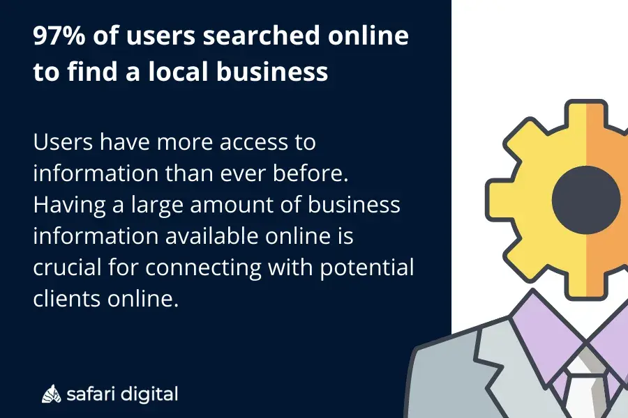
Reading List Results, showing Anchor Positioning and View Driven Animations at the top 5

One of the features I was excited to see was my 2024 top pick: CSS Anchor Positioning, ranking in the survey’s Top 4. Just below, you can find Scroll-Driven Animations, another amazing feature that gained broad browser support this year. Both are elegant and offer good DX, but combining them opens up new possibilities that clearly fall into what most of us would have considered JavaScript territory just last year.

I want to show one of those possibilities while learning more about both features. Specifically, we will make the following blog post in which footnotes pop up as comments on the sides of each text.
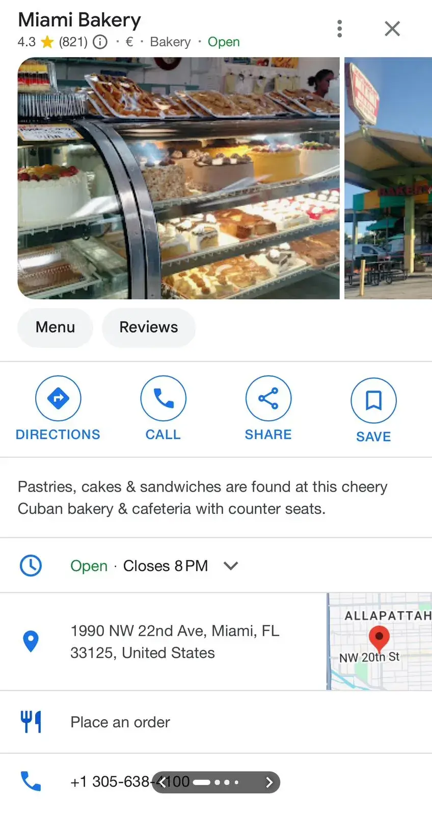
For this demo, our requirements will be:

  • Pop the footnotes up when they get into the screen.
  • Attach them to their corresponding texts.

  • The footnotes are on the sides of the screen, so we need a mobile fallback.
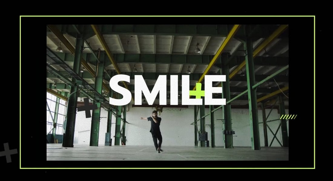
The Foundation

To start, we will use the following everyday example of a blog post layout: title, cover image, and body of text:

The only thing to notice about the markup is that now and then we have a paragraph with a footnote at the end:

<main class="post">

  <!-- etc. -->

  <p class="note">
    Super intereseting information!
    <span class="footnote"> A footnote about it </span>
  </p>
</main>

Positioning the Footnotes

In that demo, the footnotes are located inside the body of the post just after the text we want to note. However, we want them to be attached as floating bubbles on the side of the text. In the past, we would probably need a mix of absolute and relative positioning along with finding the correct inset properties for each footnote.

However, we can now use anchor positioning for the job, a feature that allows us to position absolute elements relative to other elements — rather than just relative to the containment context it is in. We will be talking about “anchors” and “targets” for a while, so a little terminology as we get going:

  • Anchor: This is the element used as a reference for positioning other elements, hence the anchor name.
  • Target: This is an absolutely-positioned element placed relative to one or more anchors. The target is the name we will use from now on, but you will often find it as just an “absolutely positioned element” in other resources.

I won’t get into each detail, but if you want to learn more about it I highly recommend our Anchor Positioning Guide for complete information and examples.

The Anchor and Target

It’s easy to know that each .footnote is a target element. Picking our anchor, however, requires more nuance. While it may look like each .note element should be an anchor element, it’s better to choose the whole .post as the anchor. Let me explain if we set the .footnote position to absolute:

.footnote {
  position: absolute;
}

You will notice that the .footnote elements on the post are removed from the normal document flow and they hover visually above their .note elements. This is great news! Since they are already aligned on the vertical axis, we just have to move them on the horizontal axis onto the sides using the post as an anchor.

Example of the footnotes inside the posts and where do we want them

This is when we would need to find the correct inset property to place them on the sides. While this is doable, it’s a painful choice since:

  1. You would have to rely on a magic number.
  2. It depends on the viewport.
  3. It depends on the footnote’s content since it changes its width.

Elements aren’t anchors by default, so to register the post as an anchor, we have to use the anchor-name property and give it a dashed-ident (a custom name starting with two dashes) as a name.

.post {
  anchor-name: --post;
}

In this case, our target element would be the .footnote. To use a target element, we can keep the absolute positioning and select an anchor element using the position-anchor property, which takes the anchor’s dashed ident. This will make .post the default anchor for the target in the following step.

.footnote {
  position: absolute;
  position-anchor: --post;
}

Moving the Target Around

Instead of choosing an arbitrary inset value for the .footnote‘s left or right properties, we can use the anchor() function. It returns a <length> value with the position of one side of the anchor, allowing us to always set the target’s inset properties correctly. So, we can connect the left side of the target to the right side of the anchor and vice versa:

.footnote {
  position: absolute;
  position-anchor: --post;

  /* To place them on the right */
  left: anchor(right);

  /* or to place them on the left*/
  right: anchor(left);

  /* Just one of them at a time! */
}

However, you will notice that it’s stuck to the side of the post with no space in between. Luckily, the margin property works just as you are hoping it does with target elements and gives a little space between the footnote target and the post anchor. We can also add a little more styles to make things prettier:

.footnote {
  /* ... */

  background-color: #fff;
  border-radius: 20px;
  margin: 0px 20px;
  padding: 20px;
}

Lastly, all our .footnote elements are on the same side of the post, if we want to arrange them one on each side, we can use the nth-of-type() selector to select the even and odd notes and set them on opposite sides.

.note:nth-of-type(odd) .footnote {
  left: anchor(right);
}

.note:nth-of-type(even) .footnote {
  right: anchor(left);
}

We use nth-of-type() instead of nth-child since we just want to iterate over .note elements and not all the siblings.

Just remember to remove the last inset declaration from .footnote, and tada! We have our footnotes on each side. You will notice I also added a little triangle on each footnote, but that’s beyond the scope of this post:

The View-Driven Animation

Let’s get into making the pop-up animation. I find the easiest part since both view and scroll-driven animation are built to be as intuitive as possible. We will start by registering an animation using an everyday @keyframes. What we want is for our footnotes to start being invisible and slowly become bigger and visible:

@keyframes pop-up {
  from {
    opacity: 0;
    transform: scale(0.5);
  }

  to {
    opacity: 1;
  }
}

That’s our animation, now we just have to add it to each .footnote:

.footnote {
  /* ... */
  animation: pop-up linear;
}

This by itself won’t do anything. We usually would have set an animation-duration for it to start. However, view-driven animations don’t run through a set time, rather the animation progression will depend on where the element is on the screen. To do so, we set the animation-timeline to view().

.footnote {
  /* ... */
  animation: pop-up linear;
  animation-timeline: view();
}

This makes the animation finish just as the element is leaving the screen. What we want is for it to finish somewhere more readable. The last touch is setting the animation-range to cover 0% cover 40%. This translates to, “I want the element to start its animation when it’s 0% in the view and end when it’s at 40% in the view.”

.footnote {
  /* ... */
  animation: pop-up linear;
  animation-timeline: view();
  animation-range: cover 0% cover 40%;
}

This amazing tool by Bramus focused on scroll and view-driven animation better shows how the animation-range property works.

What About Mobile?

You may have noticed that this approach to footnotes doesn’t work on smaller screens since there is no space at the sides of the post. The fix is easy. What we want is for the footnotes to display as normal notes on small screens and as comments on larger screens, we can do that by making our comments only available when the screen is bigger than a certain threshold, which is about 1200px. If it isn’t, then the notes are displayed on the body of the post as any other note you may find on the web.

.footnote {
  display: flex;
  gap: 10px;

  border-radius: 20px;
  padding: 20px;

  background-color: #fce6c2;

  &::before {
    content: "Note:";
    font-weight: 600;
  }
}

@media (width > 1200px) {
  /* Styles */
}

Now our comments should be displayed on the sides only when there is enough space for them:

Wrapping Up

If you also like writing about something you are passionate about, you will often find yourself going into random tangents or wanting to add a comment in each paragraph for extra context. At least, that’s my case, so having a way to dynamically show comments is a great addition. Especially when we achieved using only CSS — in a way that we couldn’t just a year ago!


Popping Comments With CSS Anchor Positioning and View-Driven Animations originally published on CSS-Tricks, which is part of the DigitalOcean family. You should get the newsletter.


from CSS-Tricks https://ift.tt/iahwJH6
Gain $200 in a week
via Read more