Business Models 101: Canvas and the Metrics Investors Want to See

Featured Imgs 23
Business Models 101: Canvas and the Metrics Investors Want to See

Let’s talk about business models from A to Z.

One of the reasons why startups fail is because they choose an unviable business model. If you want your business to be successful, start to analyze what business model to choose from the very beginning. We want to help you with that. That is why 2muchcoffee prepared this article explaining the most successful business models and what metrics you should pay attention to if your goal is to attract more investors.

Why do You Need a Business Model?

Experts argue that it is impossible to launch a successful project without a business model. It is explained as without a clear understanding of the business goals and ways to achieve them, it will be difficult for entrepreneurs to get investments for their business. This is exactly why we need a business model.

A business model is a companies core profit-making plan. This plan defines the product or services, its target audience, the market to cover, and any expected costs.

Today there are different approaches to what counts as a business model. They can all be combined by saying that the business model should explain what demand will be met by creating a company and how this idea is better than what competitors offer.

A business model is an outline of how a company plans to make money with its product and customer base in a specific market. That’s why the model should cover the following points:

  • Product (what does the startup offer?);

  • Consumers (who needs the product?);

  • Marketing (how will the sales be carried out?);

  • Suppliers and Manufacturing;

  • Market (volume and type);

  • The presence of competitors and their features;

  • Method of generating income;

  • Costs formation system;

  • Non-economic factors affecting the project.

What Business Model to Choose?

To describe the structure of a business model, you can use a ready-made template (for example, Lean Canvas). However, if you decide to choose a template, it is necessary to adapt its structure to the needs of a particular business so that it can correctly convey its requirements. At the same time, the structure should be MECE (mutually exclusive, collectible exhaustive) in order not to miss any important component of the business model.

Business Models 101: Canvas and the Metrics Investors Want to See

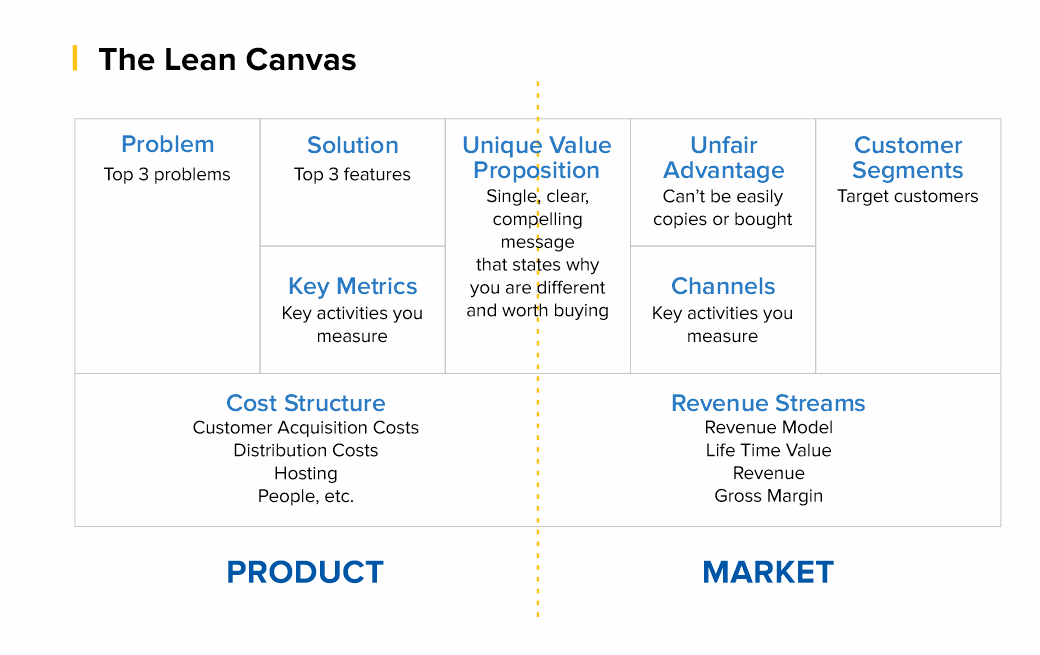
Thus, the Lean Canvas template, which was invented by Alexander Osterwalder and Yves Pignet, is a table with nine blocks, each of which is dedicated to a separate direction of business processes of the future project:

  1. Customer Segments - Who are you creating value for and who is your most important customer.

  2. Value proposition - what user problem you solve, what value you deliver to the customer, what package of products and/or services you provide to each segment of your customers.

  3. Channels of interaction - how you interact with the consumer and how you communicate your value proposition to them.

  4. Relationship with consumers - how do you interact with the client: directly, assigning a personal manager to each client, through customer self-service, through the community, through co-creation of a product, etc.

  5. Streams of income - what value the client is willing to pay for, in what ways do you plan to monetize your product.

  6. Key resources - what is needed for the product to be created and launched to the market, for the value of the product to be conveyed to the consumer and for the business to make a profit. Resources, for example, can be financial, material, intellectual, human.

  7. Key activities - what needs to be done to make the business work. This can be the organization of production, distribution, search for a solution to a problem for a specific client, organization of the platform/network.

  8. Key partners - all those thanks to whom the business functions: suppliers, dealers, support services.

  9. Costs - what costs are needed to keep your business running.

But does everyone need to consider complex financial models in excel in order to understand whether the business will work?

The answer is no since it all depends on the complexity of the business and the stage of its development. Sometimes, simple calculations in your head are enough to understand that the model is weak to implement and the product has required some improvement.

However, if you aim to attract additional financing, you should consider the precise metrics of your business model. Investors will want to see precise metrics supplemented by qualitative analysis on the slides. To accomplish this task and provide investors with all necessary information about your product it’s important to set the right metrics.

How to Set the Right Metrics?

Usually, entrepreneurs rely on the industry vertical they are in like Healthcare, FinTech, BioTech, etc.. But this approach is wrong!

The right way to think of metrics is how do you plan to charge your users. Depending on your business idea, there are 99% that your product will fit in one of these models.

Business Models 101: Canvas and the Metrics Investors Want to See

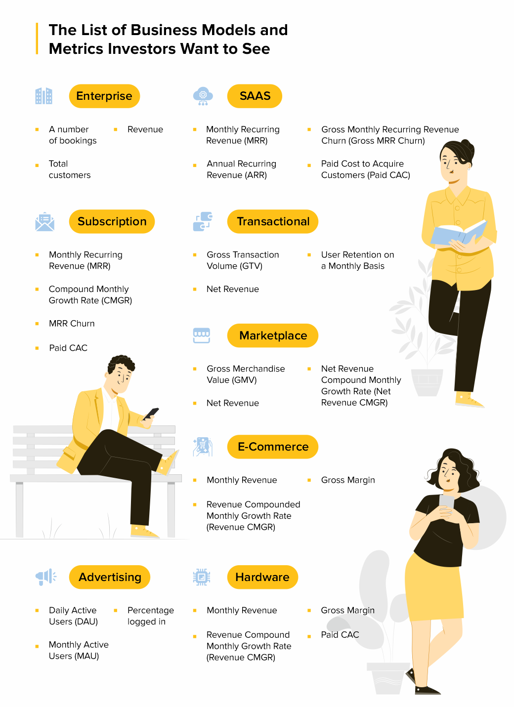
Anu Hariharan’s talk for Startup School by Y Combinator elaborates on these 9 business models and what metrics entrepreneurs should pay attention to. So, let’s discuss each of these business models and define what metrics you should be using in each case.

Enterprise

An enterprise company sells software or services to other large businesses like Facebook, Google, etc. When you work with enterprises it means you work in terms of contracts. This means it's your predominant focus from which you can frame your metrics.

Examples: Docker, Cloudera, FireEye

What are the key metrics to track?

  • A number of bookings meaning the total number of contracts/commitments your company has;

  • Total customers are the total number of unique customers that you get;

  • Revenue which is a value that you got after providing the required services.

Common mistakes for Enterprise model:

  • Confusing “Bookings” with “Revenues” and implementing contracts when working with the enterprises. The thing is, startups haven’t delivered any services unless the contract is fulfilled. So, you cannot report about the revenue since you haven’t delivered any service yet.

SaaS

The business that fits under this category sells subscription-based licenses for a cloud-hosted software solution. This model will charge users monthly for a provided software.

Examples: Mailchimp, Salesforce, Sendbird.

What are the key metrics to track?

  • Monthly Recurring Revenue (MRR) —— meaning that people like the product and agree to pay for the subscription every month;

  • Annual Recurring Revenue (ARR) shows the pace of revenue growth as compared with the absolute revenue number. This metric should be tracked in comparison with MRR, to show the annual situation of the business when it comes to subscribers;

  • Gross Monthly Recurring Revenue Churn (Gross MRR Churn) — pay attention to this metric if you are at the early stage of your business development and don’t have a large group of customers yet;

  • Paid Cost to Acquire Customers (Paid CAC) — this metric is for cases when you decide to experiment with advertising and are ready to pay to acquire users.

Common Mistakes for SaaS model:

You should not confuse ARR and ARRR and especially use them interchangeably. In this case, you won’t have a recurring revenue business if the users do not like the product and are not willing to pay for a subscription.

Subscription

A business model that is similar to a SaaS model but it usually has a lower revenue per customer. Examples of companies are Linkedin, Netflix and any other company that is usually targeting B2C, and that offers a cheaper monthly subscription affordable for every customer. The metrics are pretty much the same here as they are at a SaaS model.

Examples: The Athletic, Dollar Shave Club, Netflix

What are the key metrics to track?

  • Monthly Recurring Revenue (MRR) — users who are willing to pay to receive the full set of features of your product;

  • Compound Monthly Growth Rate (CMGR) — pay attention to this metric since quite often on a subscription-based company the subscription revenue is smaller;

  • MRR Churn — just like at a SaaS company this metric is important when you’re early stage and you only have a few customers, losing even one or two has a real impact on your revenues;

  • Paid CAC — this metric is for cases when you decide to experiment with advertising and are ready to pay to acquire users.

Common Mistakes for Subscription model:

Don’t measure CMGR as a simple average — use discrete monthly growth rates. What happens with averages? It makes your growth look good because you had some spikes.

Transactional

The type of business model that charges a fee for each transaction. For example, Stripe, PayPal, Coinbase, Brex — since these companies do use a fee from the user every time they use the product.

What are the key metrics to track?

  • Gross Transaction Volume (GTV) — this metric shows you that not all the volume of payments that goes through your platform is revenue. Since if you have 50 users that are going through your company processing you will have a large sum of money in total transactions, that’s GTV, but it won’t be your revenue;

  • Net Revenue — money that you take out of the transactions flowing through your platform, those that go into the company’s bank account.

  • User Retention on a Monthly Basis — due to the way of functioning of transactional businesses, you will most likely have a large volume of customers and because the customer has a high probability in gaining a lot of money, there should be no reason they stop using your platform, unless you have other problems with it that should be fixed as soon as possible.

Common Mistakes for Transactional model:

Instead of measuring CMGR as a simple average, try to use discrete monthly growth rates.

Marketplace

A type of company that acts as an intermediary between two consumers, connecting them to buy or sell a good or service. Examples of companies here include Airbnb, Ebay or Booking.com. Marketplaces connect sellers and buyers to exchange a good or service.

What are the key metrics to track?

  • Gross Merchandise Value (GMV) — for example if the user sets a price for a good he wants to rent or sell, from that price a percentage will go to the marketplace company.

  • Net Revenue is the percentage of the GMV that a marketplace company gets in their bank account.

  • Net Revenue Compound Monthly Growth Rate (Net Revenue CMGR). Since Marketplaces are typically B2C companies the volume of users matters that’s why you should always check User Retention because a consumer that only uses the platform once and doesn’t come back won’t help your revenue, and your company grow.

Common Mistakes for Marketplace model:

Common mistake for a marketplace business model is blending paid user acquisition with organic user acquisition. If you don’t separate out the two metrics, you won’t have a good sense if your growth will be sustainable.

E-Commerce

This is a company that sells physical goods online. Generally they manufacture and inventory those goods — a good example for this type of business model is Amazon. In e-commerce, you may make the products, but you can source the products as well — Amazon does that too with some of their products on the platform.

What are the key metrics to track?

  • Monthly Revenue — since there’s no recurring purchases you need to track the monthly revenue.

  • Revenue Compounded Monthly Growth Rate (Revenue CMGR) — measures the return on an investment over a certain period of time, and the revenue that comes from it.

  • Gross Margin is calculated by gross profit in a given month and divided in total revenue in the same month.

Common Mistakes for Marketplace model:

Not accounting for ALL costs that factor into Gross Profit. If you bought something and the cost is $10, a lot of companies wouldn’t include things like shipping costs, customer processing costs, and payment processing costs. If you don’t include those costs, you’re pricing it wrong.

Advertising

An advertising company is one that offers a free service, and derives revenue from selling advertisements placed inside the free service. Examples of companies that work on that model are Snapchat, Twitter, Reddit — basically platforms that are used by a high number of users, they are the most important part of your company — especially if you are early stage.

What are the key metrics to track?

  • Daily Active Users (DAU) — this is the number of unique active users in a 24 hour day, averaged over a period of time — the users who do not come back to your platform are not helping. You need to know how to keep them there.

  • Monthly Active Users (MAU) is the number of unique active users in a one month period, how many kept using your platform after day one.

  • Percentage logged in — users with a registered account that log in and log out over the same 30 day period.

  • Common Mistakes for Advertising model:

    A common mistake for an advertising company is how they calculate their retention when it comes to the users they have. Some founders even forget to take that into consideration at some point and they end up regretting it.

    Hardware

    And the last business model that Anu Hariharan talks about is hardware which is a company that sells physical devices to consumers. Examples of such companies are Fitbit, GoPro, Xiaomi. This type of business model is really similar to the e-commerce one and that is why all the key metrics are the same.

    What are the key metrics to track?

    • Monthly Revenue — there’s no recurring purchases, so simply track revenue per month.

    • Revenue Compound Monthly Growth Rate (Revenue CMGR) — since we are talking about users and tracking volume, and because averages aren’t the whole picture for this type of business you should track compounded.

    • Gross Margin where you need to make sure you’re making money on each transaction.

    • Paid CAC which is simply the average money you spend in obtaining a customer. Whatever business model your company has you should always take this matter into consideration so you can have a ROI (Return of Investment) from every action you do.

    • Final Words

      A business model is an outline of how a company plans to make money with its product and customer base in a specific market. Choosing a business model has a key impact on a startup's success. To determine the appropriate business model template, you need to work with Lean Canvas. This will help you to go your future project through nine points devoted to various business processes. As a result, detailed information will help you choose the main business models for a startup.

      The next step will be focusing on the precise metrics for your business model. These metrics should give you a clear picture of your business structure and goals to achieve. Focus on what metrics you think will be the best option for your business and go for it.

      If you have any questions, please, feel free to write to us. We appreciate your feedback and will answer you in the clearest and most precise way. Consider the experienced IT consultants from 2muchcoffee to support your software development plans and business growth.

      how can I add a counter variable loop for n?

      558fe5180e0e8fc922d31c23ef84d240
      #include <iostream>
      using namespace std;
      int main()
      {
          int a, b;
          char c, d;
          cin >> a >> b >> c >> d;
      
          for (int row = 1; row <= a; row++ ){
              cout << c;
              for (int cols = 1; cols <= b; cols++){
                  cout << d;
              }
          }
          cout << c;
      }
      // this code outputs 
      Sample Input 
      10 4 | -
      10 is the number of interval
      4 is the width of an interval
      / is the major mark
      * is the minor mark
      Sample Output 
      |----|----|----|----|----|----|----|----|----|----|
      
      I want to add another loop that when you type 'n' as a major mark
      the output would be:
      Sample Input
      3 2 n x
      Sample Output
      0xx1xx2xx3
      
      'n' value are numbers from 0, 1, 2, 3... and so on.

      Container Units Should Be Pretty Handy

      Category Image 052

      Container queries are going to solve this long-standing issue in web design where we want to make design choices based on the size of an element (the container) rather than the size of the entire page. So, if a container is 600px wide, perhaps it has a row-like design, but any narrower than that it has a column-like design, and we’ll have that kind of control. That’s much different than transitioning between layouts based on screen size.

      We can already size some things based on the size of an element, thanks to the % unit. For example, all these containers are 50% as wide as their parent container.

      The % here is 1-to-1 with the property in use, so width is a % of width. Likewise, I could use % for font-size, but it will be a % of the parent container’s font-size. There is nothing that lets me cross properties and set the font-size as a % of a container’s width.

      That is, unless we get container units! Here’s the table of units per the draft spec:

      unitrelative to
      qw1% of a query container’s width
      qh1% of a query container’s height
      qi1% of a query container’s inline size
      qb1% of a query container’s block size
      qminThe smaller value of qi or qb
      qmaxThe larger value of qi or qb

      With these, I could easily set the font-size to a percentage of the parent container’s width. Or line-height! Or gap! Or margin! Or whatever!

      Miriam notes that we can actually play with these units right now in Chrome Canary, as long as the container queries flag is on.

      I had a quick play too. I’ll just put a video here as that’ll be easier to see in these super early days.

      And some great exploratory work from Scott here as well:

      Ahmad Shadeed is also all over this!

      Query units can save us effort and time when dealing with things like font-sizepadding, and margin within a component. Instead of manually increasing the font size, we can use query units instead.

      Ahmad Shadeed, “CSS Container Query Units”

      Maybe container queries and container units will drop for real at the same time. 🤷


      The post Container Units Should Be Pretty Handy appeared first on CSS-Tricks. You can support CSS-Tricks by being an MVP Supporter.

      <how to solve this question>

      Category Image 006

      I have a problem to do price data and i don’t know to insert it into the coding

      this is question
      Screenshot_2021-09-23_015318.png

      this is the coding that i have made

      <?php
      
      $page_title = 'Yoho Express!';
      
      include ('includes/header.html');
      
      ?>
      <form action="q2.php" method="post">
      <p><h1><fieldset><legend>Enter your information in the form below:</legend></p></h1>
      <p><b>Departure day:</b> 
      <?php
      
      //This programme is display in an array.
      $day = array (1 =>'Select',
                        'Saturday', 
                        'Sunday', 
                        'Monday', 
                        'Tuesday',
                        'Wednesday', 
                        'Thursday', 
                        'Friday');
      //the programme is display using the pull-down menu.
      echo '<select name="day">';
      foreach ($day as $key => $value) {
      echo "<option value=\"$value\">$value</option>\n";
      }
      echo '</select>';
      
      ?></p>
      <p><b>Departure time:</b>
      <?php
      
      //This programme is display in an array.
      $time = array (1=>'Select',
                         '7:00', 
                         '10:00', 
                         '13:00', 
                         '16:00', 
                         '21:00');
      //the programme is display using the pull-down menu.
      echo '<select name="time">';
      foreach ($time as $key => $value) {
      echo "<option value=\"$value\">$value</option>\n";
      }
      echo '</select>';
      ?>
      </fieldset>
       <b><p><div align="left"><input type="submit" name="submit" value="Book" /></div></b></p>
      </form>
      
      <?php
      if($_SERVER['REQUEST_METHOD']=='POST'){
      //handler
      // Validate day
      if (!empty($_POST['day'])) {
       $day = $_POST['day'];
      } else {
       $day = NULL;
       echo '<p><b><font color="purple">You forgot to enter your departure day!</b></p>';
      }
      
      // Validate time
      if (!empty($_POST['time'])) {
       $time = $_POST['time'];
      } else {
       $time = NULL;
       echo'<p><b><font color="purple">You forgot to enter your departure time!</b></p>';
      }
      
      // Validate price
      if (!empty($_POST['price'])) {
          $price = $_POST['price'];
         } else {
          price= NULL;
         }
      
      // If everything is okay, print the message.
      if ($day && $time  && $price) {
       // Print the submitted information.
        echo "<b><font color='purple'>Below are your bus ticket details </font></b></p>
       <br /><b>Day:</b>$day
       <br /><b>Time:</b>$time
       <br /><b>Price No:</b>$price";
      } else {
       // One form element was not filled out properly.
       echo '<p><font color="red">Please go back and fill out the form again.</font></p>';
      }
      }
      
      include('includes/footer.html');
      ?>

      7 Practical Uses for the ::before and ::after Pseudo-Elements in CSS

      Category Image 091

      CSS ::before and ::after pseudo-elements allow you to insert “content” before and after any non-replaced element (e.g. they work on a <div> but not an <input>). This effectively allows you to show something on a web page that might not be present in the HTML content. You shouldn’t use it for actual content because it’s not very accessible in that you can’t even select and copy text inserted on the page this way —  it’s just decorative content.

      In this article, I’ll walk you through seven different examples that showcase how ::before and ::after can be used to create interesting effects.

      Note that for most examples, I am only explaining the parts of the code that deal specifically with CSS pseudo-elements. That said, all of the CSS is available in the embedded demos if you want to see the code for additional styling.

      Styling Broken images

      When a user visits your website, their internet connection (or a factor beyond your control) might prevent your images from downloading and, as a result, the browser shows a broken image icon and and the image’s alt text (if it’s actually there).

      A broken image icon with alt text that says Red and white Chevrolet.

      How about showing a custom placeholder instead? You can pull this off using ::before and ::after with a bit of CSS positioning.

      Two card elements, both with a large image, a title, and a description. The card on the left has a red Chevrolet Camaro image. The card on the right shows alt text centered in a gray placeholder area that says Red and white Chevrolet.

      First, we need to use relative positioning on the image element. We are going to use absolute positioning on one of the pseudo-elements in a bit, so this relative position makes sure make sure the pseudo-element is positioned within the content of the image element, rather than falling completely out of the document flow.

      img {
        display: block; /* Avoid the space under the image caused by line height */
        position: relative;
        width: 100%
      }

      Next, let’s create the region of the broken image effect using the image’s ::before pseudo-element. We’re going to style this with a light gray background and slightly darker border to start.

      img::before {
        background-color: hsl(0, 0%, 93.3%);
        border: 1px dashed hsl(0, 0%, 66.7%);
        /* ... */
      }

      <img> is a replaced element. Why are you using ::before pseudo-element on it? It wont work!. Correct. In this scenario the pseudo-element will show in Chrome and Firefox when the image fails to load, which is exactly what you want. Meanwhile, Safari only shows the styling applied to the alt text.

      The styling is applied to the top-left corner of the broken image.

      Two card elements, both with a large image, a title, and a description. The card on the left has a red Chevrolet Camaro image. The card on the right shows alt text that says Red and white Chevrolet.

      So far, so good. Now we can make it a block-level element (display: block) and give it a height that fills the entire available space.

      img::before {
        /* ... */
        display: block;
        height: 100%;
      }
      Two card elements, both with a large image, a title, and a description. The card on the left has a red Chevrolet Camaro image. The card on the right shows alt text that says Red and white Chevrolet inside of a gray placeholder area. That area is highlighted with a red border.
      Things are already starting to look better!

      We can refine the style a little more. For example, let’s round the corners. We should also give the alt text a little breathing room by giving the pseudo-element full width and absolute positioning for better control placing things where we want.

      img::before {
        /* ... */
        border-radius: 4px;
        content: "";
        position: absolute;
        width: 100%;
      }

      If you stopped here and checked your work, you might be scratching your head because the alt text is suddenly gone.

      Two card elements, both with a large image, a title, and a description. The card on the left has a red Chevrolet Camaro image. The card on the right shows a gray placeholder area.

      That’s because we set content to an empty string (which we need to display our generated content and styles) and cover the entire space, including the actual alt text. It’s there, we just can’t see it.

      We can see it if we display the alt text in an alternate (get it?) way, this time with help form the ::after pseudo-element. The content property is actually capable of displaying the image’s alt attribute text using the attr() function:

      img::after {
        content: attr(alt);
      
        /* Some light styling */
        font-weight: bold;
        position: absolute;
        height: 100%;
        left: 0px;
        text-align: center;
        top: 1px;
        width: 100%;
      }

      This is awesome! In Chrome, at least.

      Two card elements, both with a large image, a title, and a description. The card on the left has a red Chevrolet Camaro image. The card on the right shows alt text inside of a gray placeholder area.

      But, in Firefox, not so much.

      Two card elements, both with a large image, a title, and a description. The card on the left has a red Chevrolet Camaro image. The card on the right shows alt text on top of alt text inside of a gray placeholder area.
      The generated content is colliding with the actual alt text in Firefox.

      A quick fix is to target the alt attribute directly using an attribute selector (in this case, img[alt]), and target similar styles there so things match up with Chrome.

      img[alt] {
        text-align: center;
        font-weight: bold;
        color: hsl(0, 0%, 60%);
      }

      Now we have a great placeholder that’s consistent in Chrome and Firefox.

      Custom blockquote

      Blockquotes are quotes or an excerpts from a cited work. They’re also provide a really great opportunity to break up a wall of text with something that’s visually interesting.

      There are all kinds of ways to style blockquotes. Chris has a set of five styles that go all the way back to 2007.

      I want to look at another technique, one that incorporates ::before and ::after. Like we saw with the last example, we can use the content property to display generated content, and apply other properties to dress it up. Let’s put large quotation marks at the start and end of a blockquote.

      Firefox 91

      The HTML is straightforward:

      <blockquote>
        <!-- Your text here -->
      </blockquote>

      A few cosmetics in the CSS:

      blockquote {
        font-style: italic;
        line-height: 1.618;
        font-size: 1.2em;
        width: 30em;
        position: relative;
        padding: 40px 80px;
      }

      Note the position: relative in there because, as you’ll learn, it’s essential for positioning the blockquotes.

      As you’ve probably guessed, we’re going to use ::before for the first quotation mark, and ::after for the closing one. Now, we could simply call the content property on both and generate the marks in there. But, CSS has us covered with open-quote and close-quote values.

      blockquote::before {
        content: open-quote;
        /* Place it at the top-left */
        top: 0;
        left: 0;
      }
      
      blockquote::after {
        content: close-quote;
        /* Place it at thee bottom-right */
        bottom: 0;
        right: 0;
      }

      This gets us the quotation marks we want, but allow me to button up the styles a bit:

      blockquote::before,
      blockquote::after {
        background-color: #cccccc;
        display: block;
        width: 60px;
        height: 60px;
        line-height: 1.618;
        font-size: 3em;
        border-radius: 100%;
        text-align: center;
        position: absolute;
      }

      Icon Bullet List

      We have ordered (<ol>) and unordered (<ul>) lists in HTML. Both have default styling dictated by the browser’s User Agent stylesheet. But with ::before pseudo-element, we can override those “default” styles with something of our own. And guess what? We can use emojis (😊) on the content property!

      .name-list li::before {
        content: "😊";
        margin-right: 15px;
        font-size: 20px;
      }

      While this is great and all, it’s worth noting that we could actually reach for the ::marker pseudo-element, which is designed specifically for styling list markers. Eric Meyer shows us how that works and it’s probably a better way to go in the long run.

      Animated toggle switch

      One of the neatest tricks for styling forms is creating a toggle switch out of a standard HTML checkbox. In fact, Preethi Sam recently shared one approach for it when showing off a handful of other checkbox styling tricks using CSS masks.

      True to its name, a toggle switch is used to toggle or switch between the checked and unchecked states of a checkbox element.

      <form class="container">
        <label class="switch">
          <input type="checkbox" />
        </label>
      </form>

      The customization is all thanks to modifications added to the <input> element via the ::before and ::after pseudo-elements. But first, here is some baseline CSS for the <form> element:

      .container {
        background: #212221;
        background: linear-gradient(to right, #1560bd, #e90);
        border-radius: 50px;
        height: 40px;
        position: relative;
        width: 75px;    
      }
      We’re not quite there, but see how the checkbox element is displayed.

      We’re going to “hide” the checkbox’s default appearance while making it take up the full amount of space. Weird, right? It’s invisible but still technically there. We do that by:

      • changing its position to absolute,
      • setting the appearance to none, and
      • setting its width and height to 100%.
      input {
        -webkit-appearance: none; /* Safari */
        cursor: pointer; /* Show it's an interactive element */
        height: 100%;
        position: absolute;
        width: 100%;
      }

      Now, let’s style the <input> element with its ::before pseudo-element. This styling will change the appearance of the input, bringing us closer to the final result.

      input::before {
        background: #fff;
        border-radius: 50px;
        content: "";
        height: 70%;
        position: absolute;
        top: 50%;
        transform: translate(7px, -50%); /* Move styling to the center of the element */
        width: 85%;
      }

      What, wait? You’d think that ::before wouldn’t work with a replaced element, like <input>. And that’s true, but only when the input type is image which is equivalent to an <img> element. Other form controls, like a checkbox, are defined as non-replaced elements in the HTML spec.

      Next, we need to create the “toggle” button and it just so happens we still have the ::after pseudo-element available to make it. But, there are two things worth mentioning:

      1. The background is a linear-gradient.
      2. The “toggle” button is moved to the center of the <input> with the transform property.
      input::after {
        background: linear-gradient(to right, orange, #8e2de2);
        border-radius: 50px;
        content: "";
        height: 25px;
        opacity: 0.6;
        position: absolute;
        top: 50%;
        transform: translate(7px, -50%);
        transition: all .4s;
        width: 25px;
      }

      Try clicking on the toggle button. Nothing happens. That’s because we’re not actually changing the checked state of the <input>. And even if we were, the result is… unpleasant.

      The fix is to apply the :checked attribute to the ::after pseudo-element of the <input>. By specifically targeting the checked state of the checkbox and chaining it to the ::after pseudo-element, we can move the toggle back into place.

      input:checked::after {
        opacity: 1;
        transform: translate(170%, -50%);
      }

      Gradient border

      We can decorate images with borders to make them stand out or fit more seamlessly within a design. Did you know we can use a gradient on a border? Well, we can with ::before (there are other ways, too, of course).

      The core idea is to create a gradient over the image and use the CSS z-index property with a negative value. The negative value pulls the gradient below the image in the stacking order. This means the image always appears on top as long as the gradient has a negative z-index.

      .gradient-border::before {
        /* Renders the styles */
        content: "";
        /* Fills the entire space */
        position: absolute;
        top: 0;
        left: 0;
        bottom: 0;
        right: 0;
        /* Creates the gradient */
        background-image: linear-gradient(#1a1a1a, #1560bd);
        /* Stacks the gradient behind the image */
        z-index: -1;
      }
      
      figure {
        /* Removes the default margin */
        margin: 0;
        /* Squeezes the image, revealing the gradient behind it */
        padding: 10px;
      }

      Gradient overlays

      This is similar to what we did in the previous example, but here, we’re applying the gradient on top of the image. Why would we do that? It can be a nice way to add a little texture and depth to the image. Or perhaps it can be used to either lighten or darken an image if there’s text on top it that needs extra contrast for legibility.

      While this is similar to what we just did, you’ll notice a few glaring differences:

      figure::before {
        background-image: linear-gradient(to top right, #1a1a1a, transparent);
        content: "";
        height: 100%;
        position: absolute;
        width: 100%;
      }

      See that? There’s no z-index because it’s OK for the gradient to stack on top of the image. We’re also introducing transparency in the background gradient, which lets the image bleed through the gradient. You know, like an overlay.

      Custom radio buttons

      Most, if not all, of us try to customize the default styles of HTML radio buttons, and that’s usually accomplished with ::before and ::after, like we did with the checkbox earlier.

      Firefox 91

      We’re going to set a few base styles first, just to set the stage:

      /* Centers everything */
      .flex-center {
        align-items: center;
        display: flex;
        justify-content: center;
      }
      
      /* Styles the form element */
      .form {
        background: #ccc;
        height: 100vh;
        width: 100%;
      }
      
      /* Styles the inputs */
      .form-row {
        background: #fff;
        border-radius: 50px;
        height: 40px;
        margin: 10px;
        overflow: hidden;
        position: relative;
        width: 150px;
      }

      Now let’s remove the default styling of the radio buttons, again, with appearance: none;

      .form-input {
        -webkit-appearance: none; /* Safari */
        appearance: none;
      }

      ::before should be positioned at the top-left corner of the radio button, and when it’s checked, we change its background color.

      .form-input::before {
        /* Renders the styles */
        content: '';
        /* Shows that it's interactive */
        cursor: pointer;
        /* Positions it to the top-left corner of the input */
        position: absolute;
        top: 0;
        left: 0;
        /* Takes up the entire space */
        height: 100%;
        width: 100%;
      }
      
      /* When the input is in a checked state... */
      .form-input:checked::before {
        /* Change the background color */
        background: #21209c;
      }

      We still need to iron a few things out using ::after. Specifically, when the radio button is checked, we want to change the color of the circular ring to white because, in its current state, the rings are blue.

      .form-input::after {
        /* Renders the styles */
        content: '';
        /* Shows that it's interactive */
        cursor: pointer;
        /* A little border styling */
        border-radius: 50px;
        border: 4px solid #21209c;
        /* Positions the ring */
        position: absolute;
        left: 10%;
        top: 50%;
        transform: translate(0, -50%);
        /* Sets the dimensions */
        height: 15px;
        width: 15px;
      }
      
      /* When the input is in a checked state... */
      .form-input:checked::after {
        /* Change ::after's border to white */
        border: 4px solid #ffffff;
      }

      The form label is still unusable here. We need to target the form label directly to add color, and when the form input is checked, we change that color to something that’s visible.

      .form-label {
        color: #21209c;
        font-size: 1.1rem;
        margin-left: 10px;
      }

      Click the buttons, and still nothing happens. Here what’s going on. The position: absolute on ::before and ::after is covering things up when the radio buttons are checked, as anything that occurs in the HTML document hierarchy is covered up unless they are moved to a new location in the HTML document, or their position is altered with CSS. So, every time the radio button is checked, its label gets covered.

      You probably already know how to fix this since we solved the same sort of thing earlier in another example? We apply z-index: 1 (or position: absolute) to the form label.

      .form-label {
        color: #21209c;
        font-size: 1.1rem;
        margin-left: 10px;
        z-index: 1; /* Makes sure the label is stacked on top */
        /* position: absolute; This is an alternative option */
      }

      Wrapping up

      We covered seven different ways we can use the ::before and ::after pseudo-elements to create interesting effects, customize default styles, make useful placeholders, and add borders to images.

      By no means did we cover all of the possibilities that we can unlock when we take advantage of these additional elements that can be selected with CSS. Lynn Fisher, however, has made a hobby out of it, making amazing designs with a single element. And let’s not forget Diana Smith’s CSS art that uses pseudo-elements in several places to get realistic, painting-like effects.


      The post 7 Practical Uses for the ::before and ::after Pseudo-Elements in CSS appeared first on CSS-Tricks. You can support CSS-Tricks by being an MVP Supporter.

      What scans can I use to complement my first scan?

      Category Image 041

      I'm currently studying a peneteration/hacking course. I am trying to use nmap against a target to find all the ports that are filtered.

      I thought if I used an ACK-scan nmap would give me all the filtered ports. I used
      nmap -sA -p- target
      and the result was All the 65535 ports scanned are unfiltered. Is this even reasonable? What other scans can I use to complement my first scan?

      Caddy Smarter Side Cart for WooCommerce

      Set Up Woocommerce

      Caddy Smarter Side Carts for WooCommerceWooCommerce is one of the most popular e-commerce plugins for WordPress with over 5 million active installations at the time of writing. The plugin helps you to convert a mere WordPress site into a powerful e-commerce platform perfect for any online store you have in mind. It ships with a ton of features including shop, product, […]

      The post Caddy Smarter Side Cart for WooCommerce appeared first on WPExplorer.

      How to Fix Recovery Pending State in SQL Server Database

      Featured Imgs 26

      This post will explain why a database (DB) is tagged as a recovery pending. It will also discuss how to resolve the ‘SQL server database in recovery pending status' issue. You may fix the issue by running queries in SQL Server Management Studio (SSMS) or by utilizing a professional SQL database recovery tool.

      SQL Server Database States

      Setting background color of cell always show black

      558fe5180e0e8fc922d31c23ef84d240

      i have this line to set the background color of a cell but instead of the color i specified it set the cell to black.

      Tried with diferent colors to check and it always set it to black.

      why is that and how to fix it?

      ws['A1'].fill = PatternFill(fgColor="7FFFD4", fill_type="solid")
      ws['A1'].fill = PatternFill(start_color="8a2be2", end_color="8a2be2", fill_type="solid")
      ws['A1'].fill = PatternFill(start_color="8a2be2", fill_type="solid")
      ws['A1'].fill = PatternFill(bgColor="7FFFD4", fill_type="solid")

      Anyone know why this is not adding borders to my sheet

      558fe5180e0e8fc922d31c23ef84d240

      Anyone know why this is not adding borders to my sheet?

              thick = Side(border_style="thick", color='FF0707')
              ws['F1'].border = Border(top=thick, left=thick, right=thick, bottom=thick)
              for row in ws['A1:D10']:
                  for cell in row:
                      cell.border = Border(top=thick, left=thick, right=thick, bottom=thick)