Large language models (LLMS) are trained to predict the next token (set of characters) following an input sequence of tokens. This makes LLMs suitable for unstructured textual responses.
However, we often need to extract structured information from unstructured text. With the Python LangChain module, you can extract structured information in a Python Pydantic object.
In this article, you will see how to extract structured information from news articles. You will extract the article's tone, type, country, title, and conclusion. You will also see how to extract structured information from single and multiple text documents.
So, let's begin without ado.
Installing and Importing Required Libraries
As always, we will first install and import the required libraries.
The script below installs the LangChain and LangChain OpenAI libraries. We will extract structured data from the news articles using the OpenAI GPT-4 latest LLM.
!pip install -U langchain
!pip install -qU langchain-openai
Next, we will import the required libraries in a Python application.
import pandas as pd
import os
from typing import List, Optional
from langchain_core.pydantic_v1 import BaseModel, Field
from langchain_openai import OpenAI
from langchain_openai import ChatOpenAI
from langchain_core.prompts import ChatPromptTemplate
Importing the Dataset
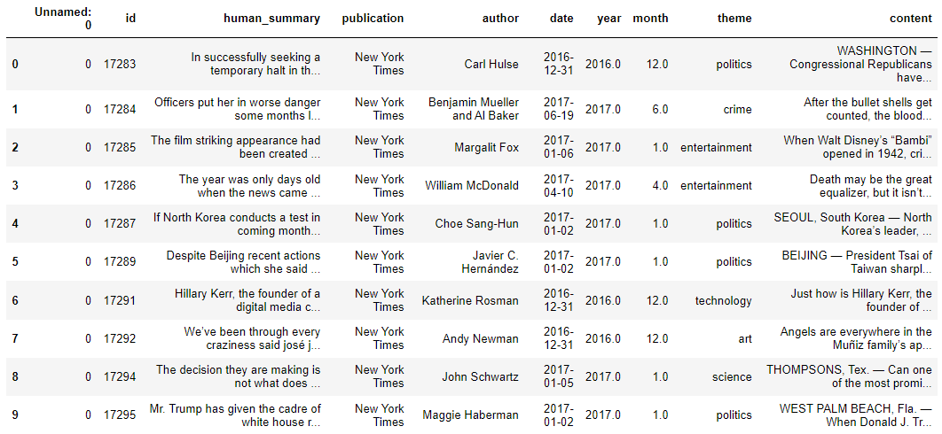
We will extract structured information from the articles in the News Article with Summary dataset.
The following script imports the data into a Pandas DataFrame.
dataset = pd.read_excel(r"D:\Datasets\dataset.xlsx")
dataset.head(10)
Output:
Defining the Structured Output Format
To extract structured output, we need to define the attributes of the structured output. We will extract the article title, type, tone, country, and conclusion. Furthermore, we want to categorize the article types and tones into the following categories.
article_types = [
    "informative",
    "critical",
    "opinion",
    "explanatory",
    "analytical",
    "persuasive",
    "narrative",
    "investigative",
    "feature",
    "review",
    "profile",
    "how-to/guide",
]

article_tones = [
    "aggressive",
    "neutral",
    "passive",
    "formal",
    "informal",
    "humorous",
    "serious",
    "optimistic",
    "pessimistic",
    "sarcastic",
    "enthusiastic",
    "melancholic",
    "objective",
    "subjective",
    "cautious",
    "assertive",
    "conciliatory",
    "urgent"
]
Next, you must define a class inheriting from the Pytdantic BaseModel class. Inside the class, you define the attributes containing the structured information.
For example, in the following script, the title attribute contains a string type article title. The LLM will use the attribute description to extract information for this attribute from the article text.
We will extract the title, type, tone, country, and conclusion.
class ArticleInformation(BaseModel):
    """Information about a news paper article"""


    title:str = Field(description= "This is the title of the article in less than 100 characters")
    article_type: str = Field(description = f"The type of the artile. It can be one of the following : {article_types}")
    tone: str = Field(description = f"The tone of the artile. It can be one of the following: {article_tones}")
    country: str = Field(description= """The country which is at the center of discussion in the article.
                                         Return global if the article is about the whole world.""")

    conclusion: str = Field(description= "The conclusion of the article in less than 100 words.")
Extracting the Structured Output from Text
Next, you must define an LLM to extract structured information from the news article. In the following script, we will use the latest OpenAI GPT-4o LLM.
OPENAI_API_KEY = os.environ.get('OPENAI_API_KEY')
llm = ChatOpenAI(api_key = OPENAI_API_KEY ,
                 temperature = 0,
                model_name = "gpt-4o-2024-08-06")
You need to define the prompt that instructs the LLM that he should act as an expert extraction algorithm while extracting structured outputs.
Subsequently, using the LangChain Expression Language, we will create a chain that passes the prompt to an LLM. Notice that here, we call the with_structured_output() method on the LLM object and pass it the ArticleInformation class to the schema attribute of the method. This ensures the output object contains attributes from the ArticleInformation class.
extraction_prompt = """
You are an expert extraction algorithm.
Only extract relevant information from the text.
If you do not know the value of an attribute asked to extract,
return null for the attribute's value."
"""

prompt = ChatPromptTemplate.from_messages([
    ("system", extraction_prompt),
    ("user", "{input}")
])

extraction_chain = prompt | llm.with_structured_output(schema = ArticleInformation)
Finally, we can call the invoke() function of the chain you just created and pass it the article text.
first_article = dataset["content"].iloc[0]
article_information = extraction_chain.invoke({"input":first_article})
print(article_information)
Output:

From the above output, you can see structured data extracted from the article.
Extracting a List of Formatted Items
In most cases, you will want to extract structured data from multiple text documents. To do so, you have two options: merge multiple documents into one document or iterate through multiple documents and extract structured data from each document.
Extracting List of Items From a Single Merged Document
You can merge multiple documents into a single document and then create a Pydantic class that contains a list of objects of the Pydantic class containing the structure data you want to extract. This approach is helpful if you have a small number of documents since merging multiple documents can result in the number of tokens greater than an LLM's context window.
To do so, we will create another Pydantic class with a list of objects from the initial Pydantic class containing structured data information.
For example, in the following script, we define the ArticleInfos class, which contains the articles list of the ArticleInformation class.
class ArticleInfos(BaseModel):
    """Extracted data about multiple articles."""

    # Creates a model so that we can extract multiple entities.
    articles: List[ArticleInformation]
Next, we will merge the first 10 documents from our dataset using the following script.
# Function to generate the formatted article
def format_articles(df, num_articles=10):
    formatted_articles = ""
    for i in range(min(num_articles, len(df))):
        article_info = f"================================================================\n"
        article_info += f"Article Number: {i+1}, {df.loc[i, 'author']}, {df.loc[i, 'date']}, {df.loc[i, 'year']}, {df.loc[i, 'month']}\n"
        article_info += "================================================================\n"
        article_info += f"{df.loc[i, 'content']}\n\n"
        formatted_articles += article_info
    return formatted_articles

# Get the formatted articles for the first 10
formatted_articles = format_articles(dataset, 10)

# Output the result
print(formatted_articles)
Output:
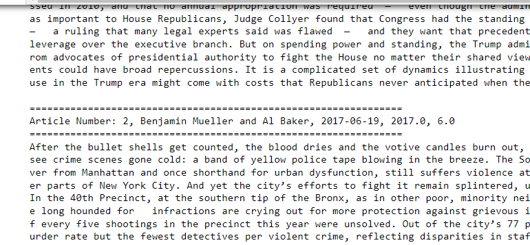
The above output shows one extensive document containing text from the first ten articles.
We will create a chain where the LLM uses the ArticleInfos class in the llm.with_structured_output() method.
Finally, we call the invoke() method and pass our document containing multiple articles, as shown in the following script.
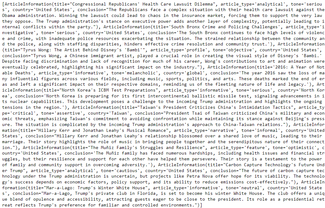
If you print the articles attribute from the LLM response, you will see that it contains a list of structured items corresponding to each article.
extraction_chain = prompt | llm.with_structured_output(schema = ArticleInfos)
article_information = extraction_chain.invoke({"input":formatted_articles})
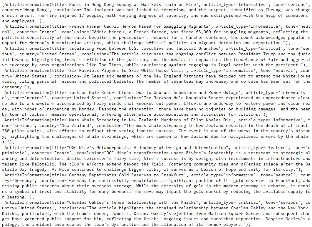
print(article_information.articles)
Output:
Using the script below, you can store the extracted information in a Pandas DataFrame.
# Converting the list of objects to a list of dictionaries
articles_data = [
{
"title": article.title,
"article_type": article.article_type,
"tone": article.tone,
"country": article.country,
"conclusion": article.conclusion
}
for article in article_information.articles
]
# Creating a DataFrame from the list of dictionaries
df = pd.DataFrame(articles_data)
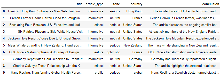
df.head(10)
Output:
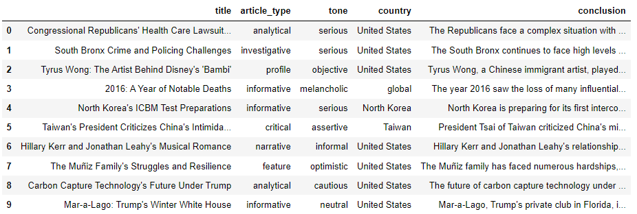
The above output shows the extracted article title, type, tone, country, and conclusion in a Pandas DataFrame.
Extracting List of Items From Multiple Documents
The second option for extracting structured data from multiple documents is to simply iterate over each document and use the Pydantic structured class to extract structured information. I prefer this approach if I have a large number of documents.
The following script iterates through the first 10 documents in the dataset, extracts structured data from each document, and stores the extracted data in a list.
extraction_chain = prompt | llm.with_structured_output(schema = ArticleInformation)

articles_information_list = []
for index, row in dataset.tail(10).iterrows():
    content_text = row['content']
    article_information = extraction_chain.invoke({"input":content_text})
    articles_information_list.append(article_information)

articles_information_list
Output:
Finally, we can convert the list of extracted data into a Pandas DataFrame using the following script.
# Converting the list of objects to a list of dictionaries
articles_data = [
    {
        "title": article.title,
        "article_type": article.article_type,
        "tone": article.tone,
        "country": article.country,
        "conclusion": article.conclusion
    }
    for article in articles_information_list
]

# Creating a DataFrame from the list of dictionaries
df = pd.DataFrame(articles_data)

# Displaying the DataFrame
df.head(10)
Output:
Conclusion
Extracting structured data from an LLM can be crucial, particularly for data engineering, preprocessing, analysis, and visualization tasks. In this article, you saw how to extract structured data using LLMs in LangChain, both from a single document and multiple documents.
If you have any feedback, please leave it in the comments section.