The key to winning your audience is a perfectly designed PowerPoint presentation. Whether you’re speaking at a conference, pitching to an investor, or talking about sales projections at a business meeting, this collection of the best PowerPoint templates will help you speak to your audience.
The way you design your PowerPoint slides will play a key role in the success of your presentation. You need to use the right colors in your slides, structure the content for readability, and visualize data with charts and graphs to deliver a compelling presentation.
It usually takes hours to design a great PowerPoint presentation. But, you don’t have to go through all that trouble. We’ve found some of the best new PowerPoint templates you can use to quickly set up a professional presentation slideshow within a few minutes.
We’ve also collated some helpful tips for choosing a PowerPoint template, and key advice for giving a successful presentation, and Powerpoint Template FAQs to help get you started!
What Is A PowerPoint Template?
A PowerPoint template is a set of pre-designed slides that you can open in PowerPoint and edit to create your own presentation slideshows.
Most PowerPoint templates come with dozens of unique slides featuring stylish content designs with paragraphs, icons, and images already arranged in professional layouts. All you have to do is copy and paste your content into the slides to create a beautiful slideshow. You’ll also be able to easily change colors, place images, and resize graphics in the templates as well.
To use a template, simply download the PowerPoint template file onto your computer and double click on the .PPTX file to open it in your PowerPoint app. Then you can customize it however you like (we have a handy guide further down this post on how to edit a PowerPoint template to help you out).
Top Pick
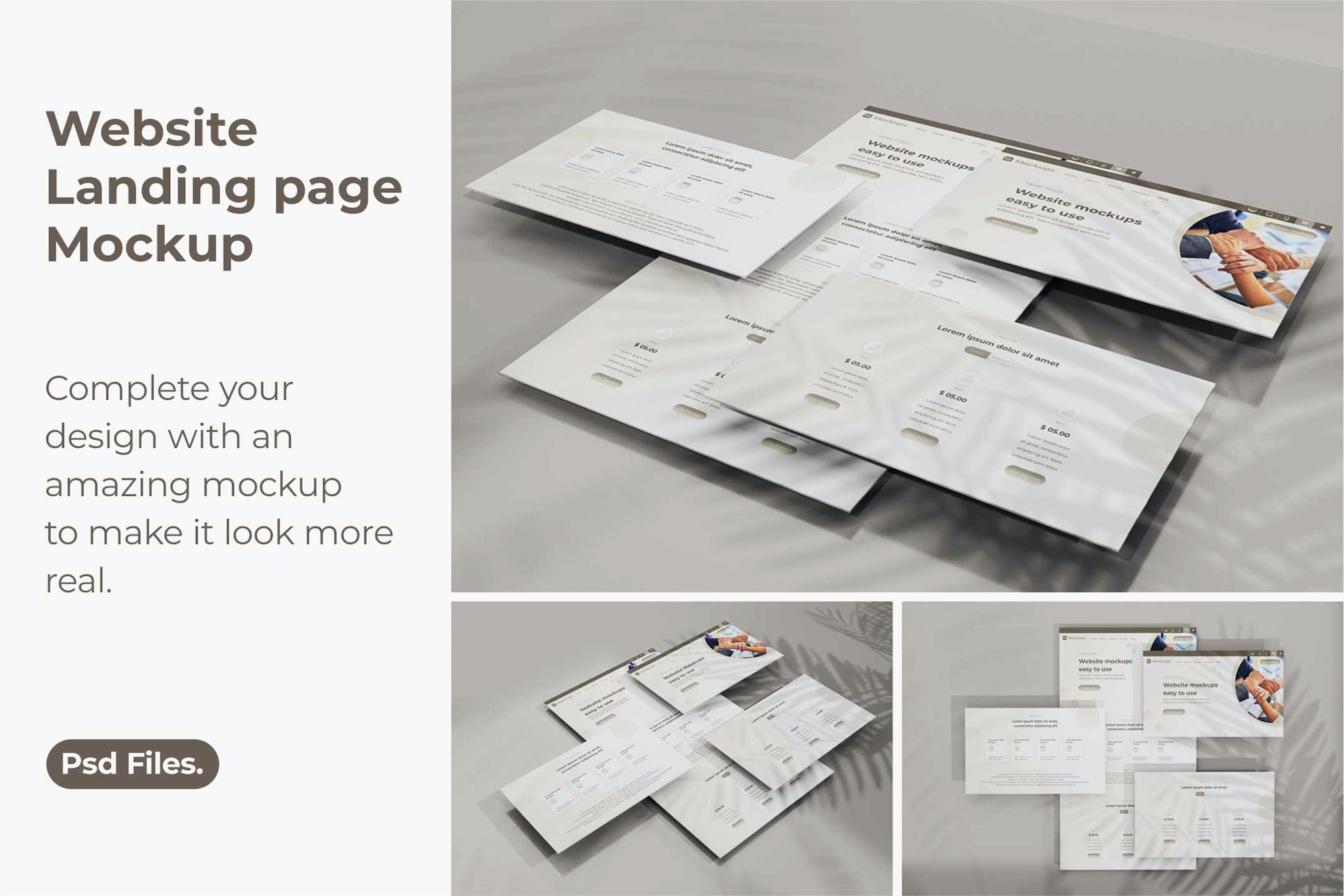
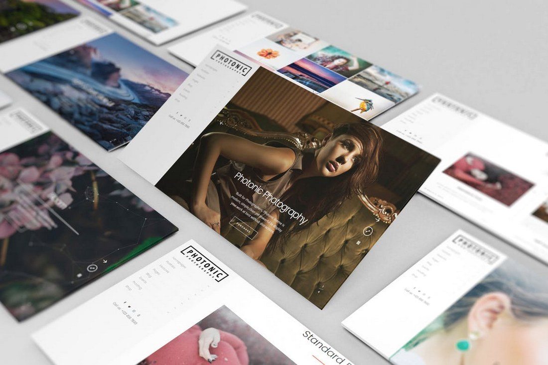
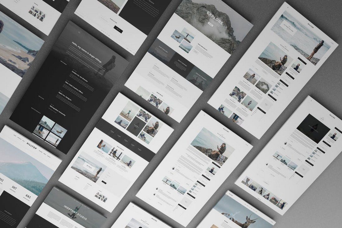
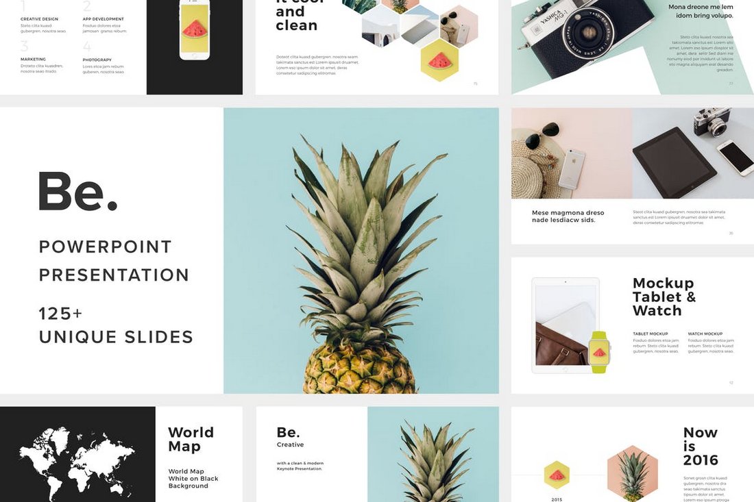
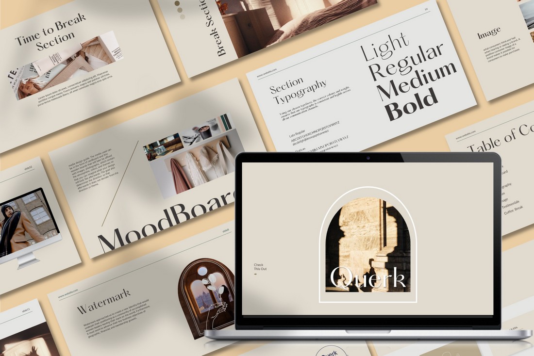
Be. is a beautifully minimalist and creative PowerPoint template that uses lots of images to attract attention with its highly visual slides.
The template includes 125 unique slides, 550 font icons, and image placeholders for easily replacing the images. It’s perfect for making design portfolios, product presentations, and much more.
Why This Is A Top Pick
The effective use of minimalist design is the key feature that sets this PowerPoint template apart from the rest. It uses a proper balance of image, text, and space to create each slide look more professional. Plus, you can also easily change colors, resize graphics, and drag and drop images to edit the template as well.
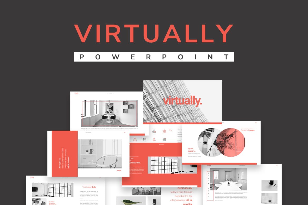
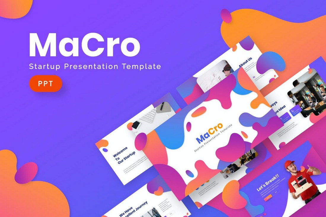
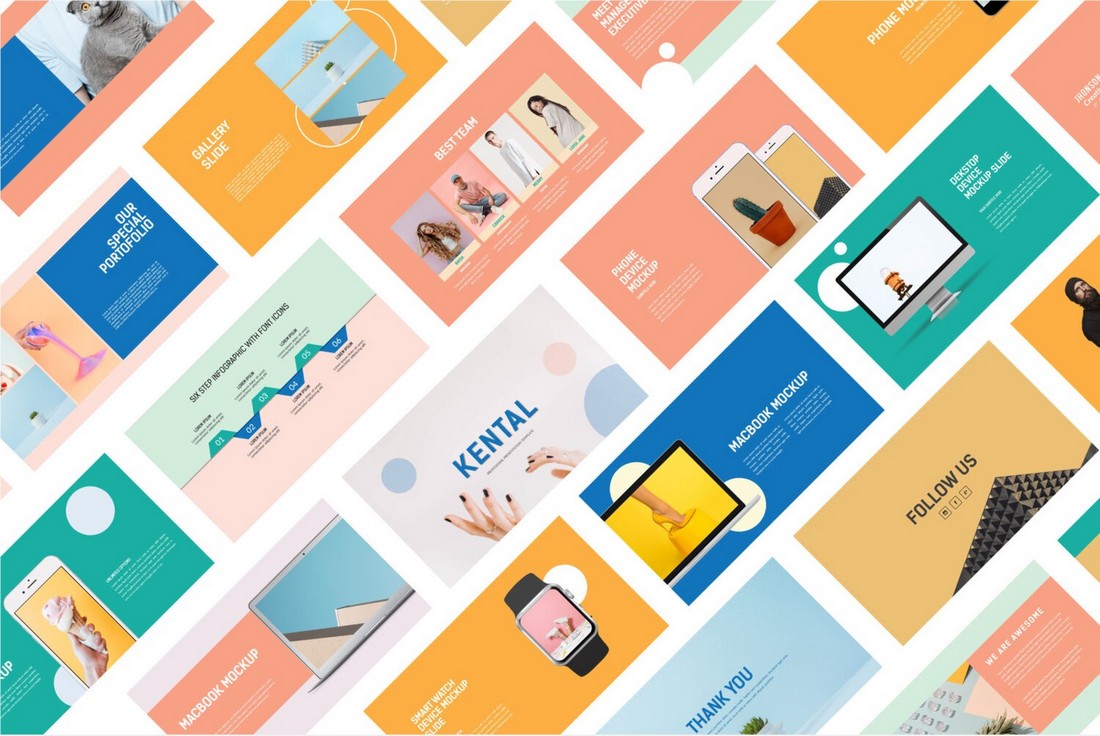
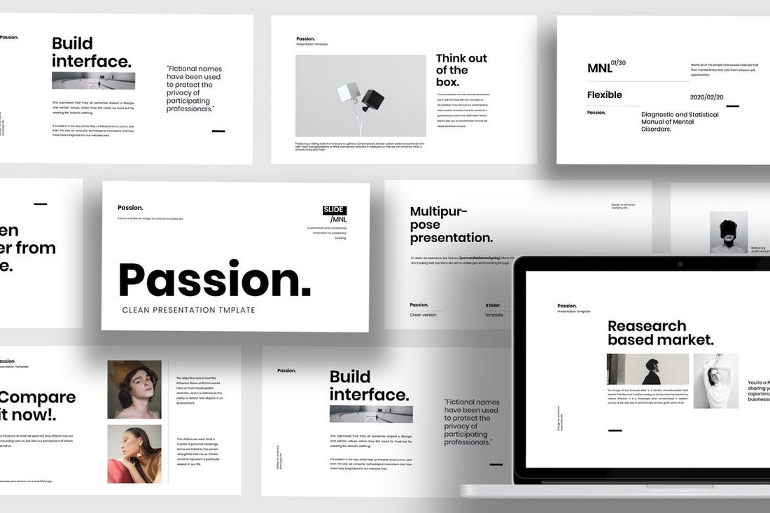
This is a versatile PowerPoint template ideal for various presentation needs. With its 20-page slides and 1920 x 1080 artboard size, it’s perfect for travel presentations, marketing, company profiles, and business plans.
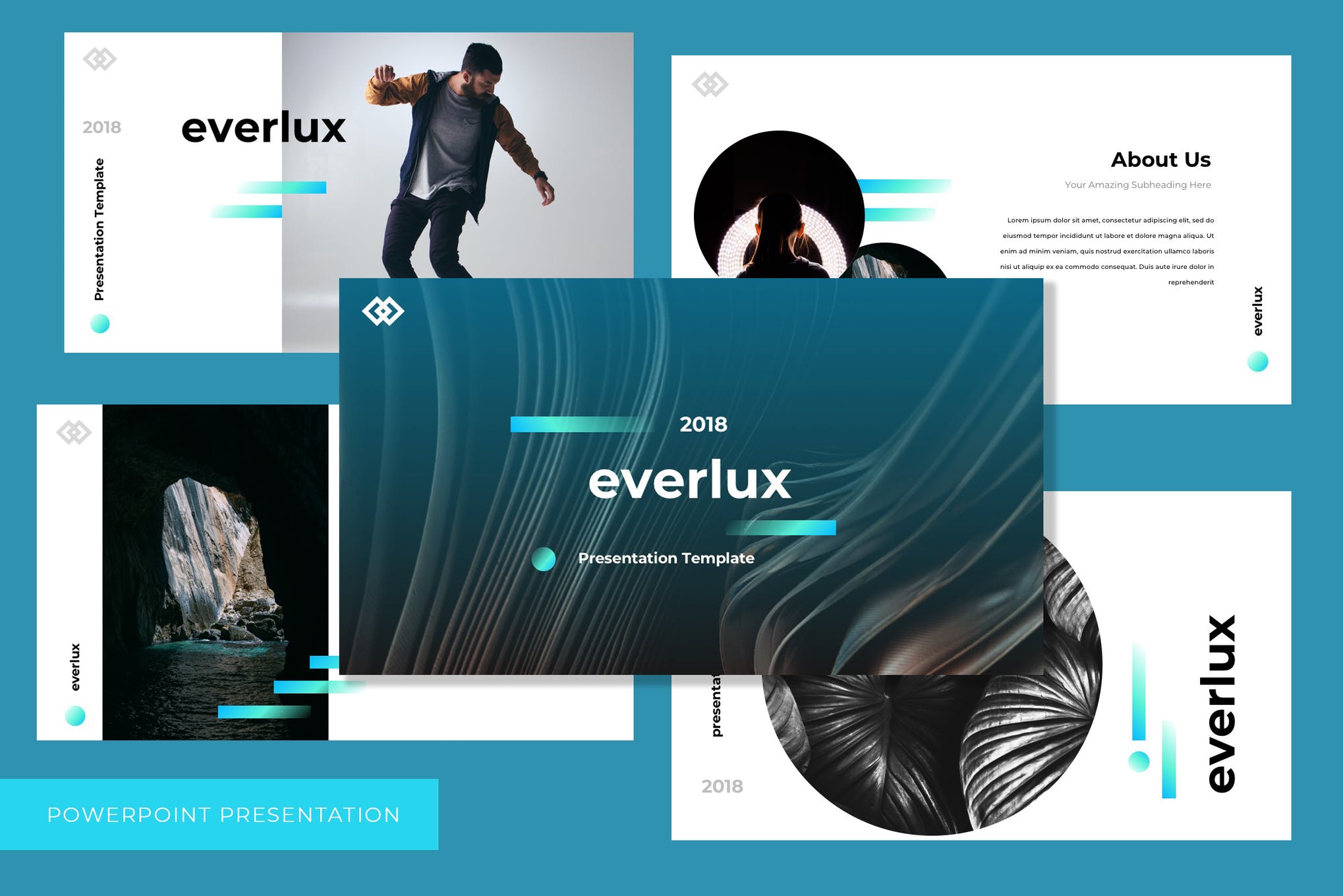
Neonne is a modern PowerPoint template ideal for presenting your ideas, businesses, or companies to a range of audiences, including customers and investors. Easy to use and fully editable, it includes 20 pages with a 16:9 aspect ratio.
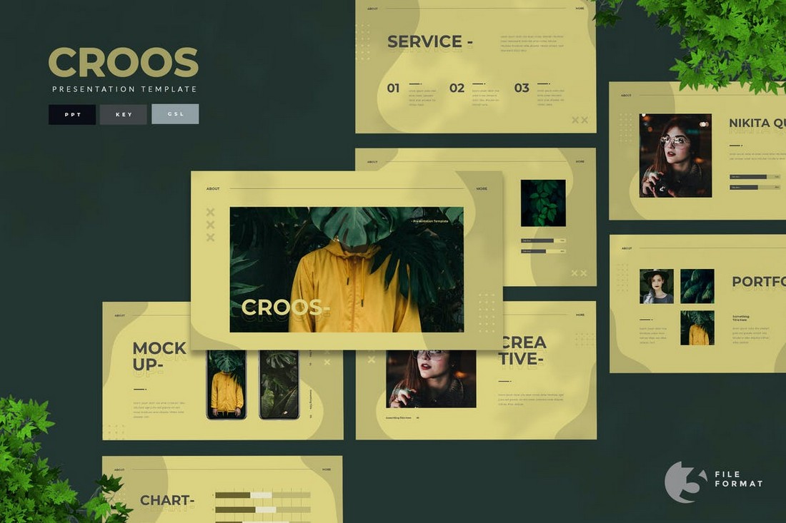
This stylishly designed PowerPoint template is suitable for diverse needs from business plans to marketing presentations. It features a distinctive geometric design across 20 engaging slide pages, compliant with app-supported PowerPoint.
A bold and versatile PowerPoint template suitable for a range of purposes including sports industry presentations, athlete training overviews, and company profiles among others. It features 24 easily-editable slides, with graphics that can be resized and an easy drag-and-drop picture placeholder.
This PowerPoint template is created especially for project managers, business analysts, and executives. It aids in effectively illustrating a project’s potential benefits and returns to key stakeholders and decision-makers. The template boasts high-quality graphics, image placeholders, and master slides.
This is a high-quality, professionally designed PowerPoint template for presenting economic insights and forecasts. With its easy customization and image placeholders, it’s an excellent tool for economists, financial analysts, and executives.
Danilla is a versatile PowerPoint template suitable for a wide range of businesses, from startups to creative agencies. It features over 30 editable slides, with resizable graphics and free icons based on master slides. The template is user-friendly, with drag-and-drop functionality making editing effortless.
This PowerPoint template offers a modern approach to business presentations. Equipped with 25 unique slides and a user-friendly interface, this widescreen template provides an enhanced experience for your audiences. It is ideal for various uses including company profiles and more.
This PowerPoint template offers a sleek design and organized layout, adaptable to any presentation need. This versatile asset also serves well for marketing kits or company profiles. It includes a 20-slide PPT file with artboard size of 1920 x 1080 and features free fonts.
A distinct and professional PowerPoint template for those seeking a stylish and straightforward presentation solution. With 24 unique, fully customizable slides in full HD 16:9 ratio, this template features a drag-and-drop photo replace capability and a theme color option to match your personal or company brand.
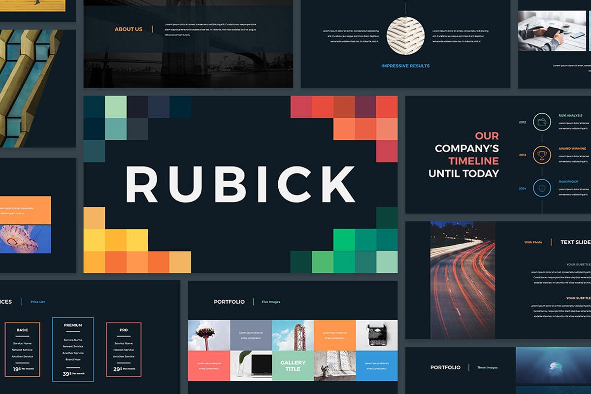
Rubick is a PowerPoint presentation template offering over 100 unique slides. This creative template comes with attractive photo and project galleries, editable charts, stylish infographics, efficient timelines, multilingual free fonts, and numerous free vector icons. Minimal fade transitions also enhance the aesthetic appeal of the presentation.
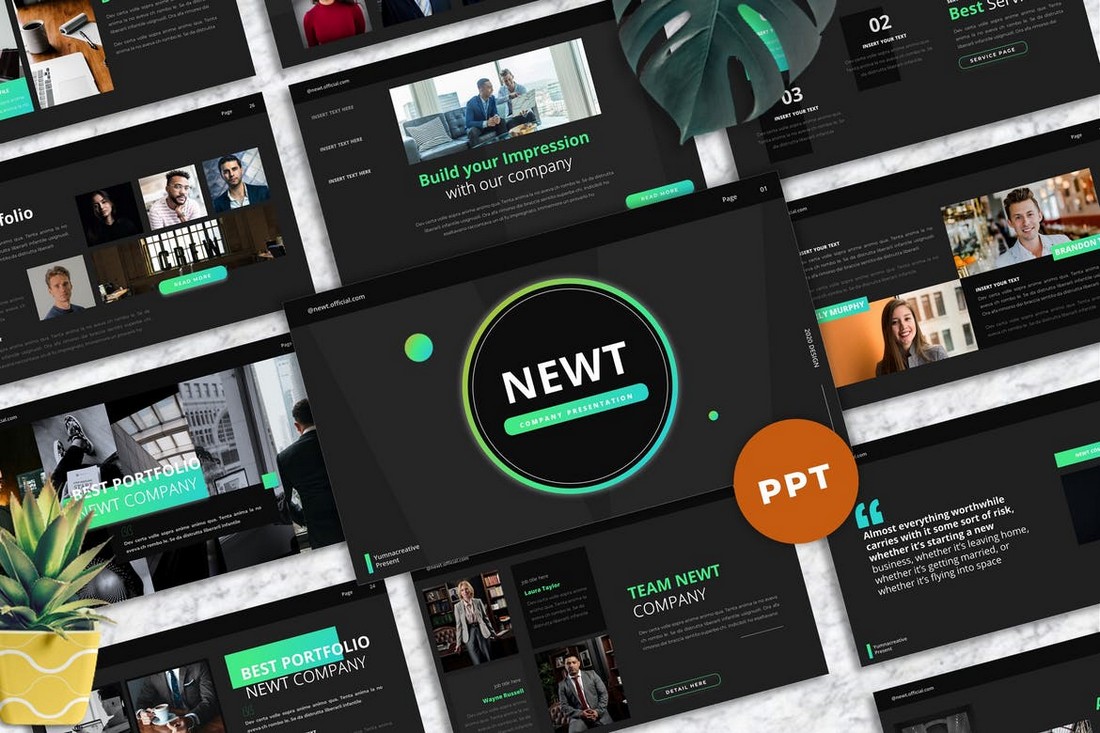
Dark Age is a fully customizable PowerPoint template designed for impactful presentations. It features a sleek, dark aesthetic across 45 unique slide designs featuring transition animations and full HD 16:9 screen layouts. The template is an ideal tool for conveying messages clearly, from thought leadership to regular employee communication.
This is a flexible, unique, and professional PowerPoint template for a wide range of presentations. Ideal for corporate presentations, agencies, startups, organizations, and personal projects, it features a minimalist, clean, and modern design. It comes packed with 25 unique, editable slides that cover an image gallery, data charts, infographics and allows easy image replacement.
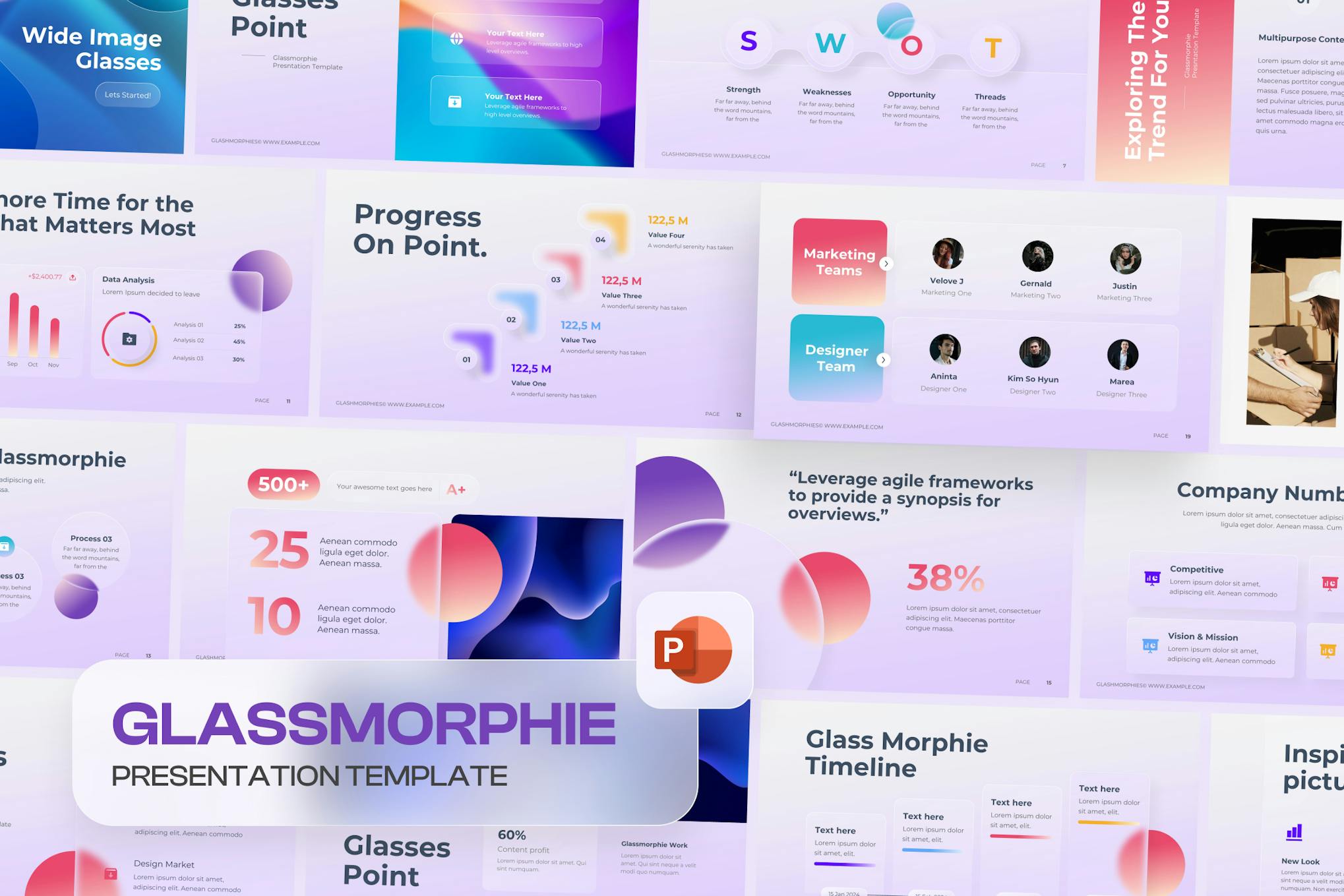
This PowerPoint template offers a GlassMorph-style slide design ideal for a myriad of uses including business presentations, project pitches, lookbook slides, and management or marketing presentations. The package comes with 25 unique slides, a light background, widescreen format, and editable graphics.
A versatile PowerPoint template, ideal for those looking to craft an engaging visual representation for their business presentations. The template offers 20 unique, minimalistic slides including portfolio, lookbook, gallery, and more. It’s also readily exportable in PDF format, making sharing with clients straightforward.
This is a sleek and modern PowerPoint template designed to dazzle any audience. Ideal for business plans, marketing strategies, and product portfolios, this fully customizable template ensures your visuals are always effective. Features include a 16:9 screen ratio, 25 eye-catching slides, easy-to-edit infographics, and a drag-and-drop picture placeholder.
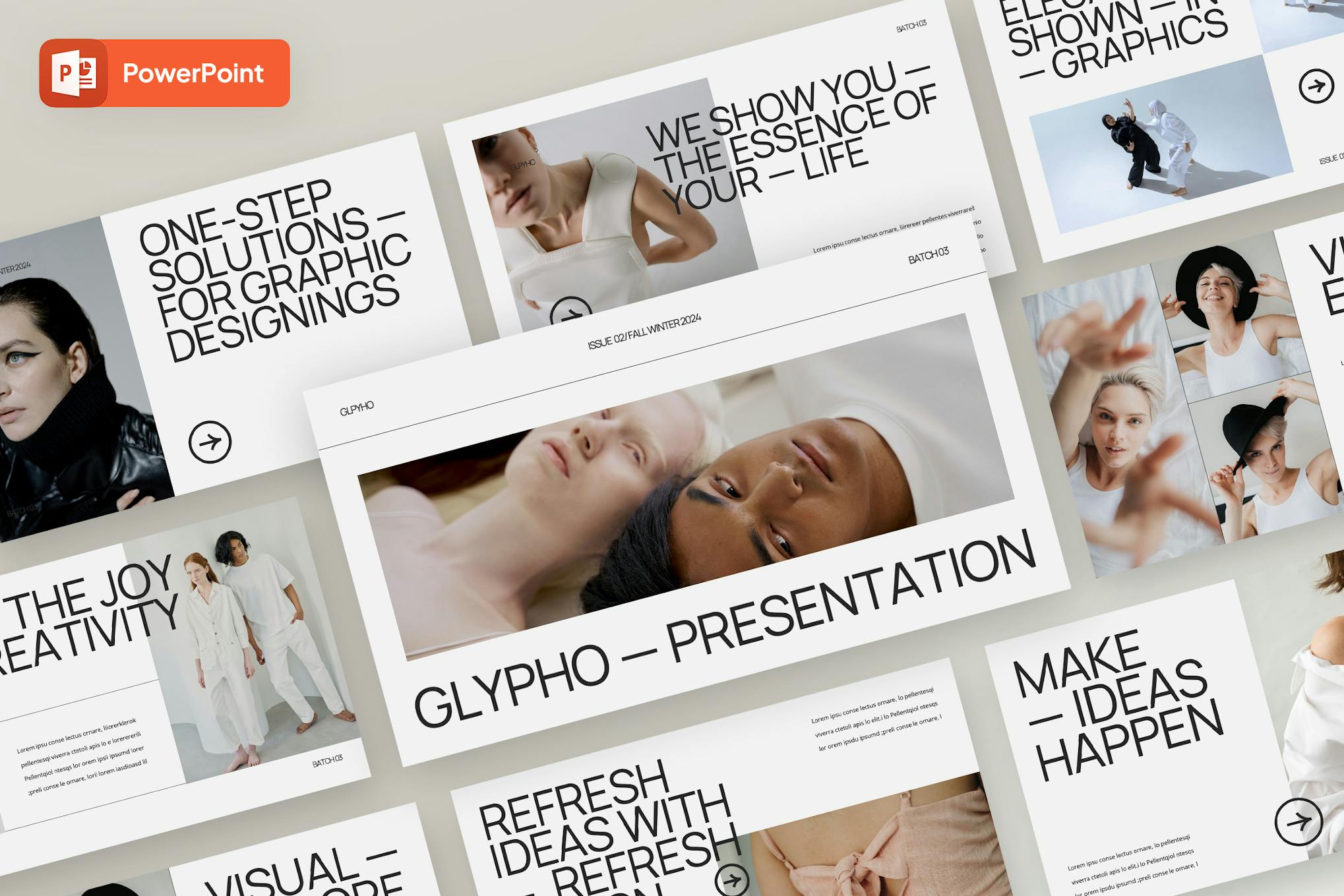
The Glypho is a minimalist PowerPoint template that offers a clean, modern design that’s easy to edit and customize. It’s ideal for a range of purposes including business pitches, brand guidelines, or product marketing presentations. Features include 30 slides, made with Slidemaster, high resolution, and a device mockup.
This is a versatile and professional PowerPoint template useful across a multitude of sectors, from startups to institutes. Its minimalist, creative design features 20 unique, easily editable slides with a 16:9 widescreen ratio. With resizable graphics, an image gallery, editable infographics, and a structured layout, you’re guaranteed to create a compelling presentation.
This is a versatile and modern professional presentation template most suitable for creative marketing agencies. Adapted for various needs, it fits perfectly in a pitch deck, business, portfolio presentation, or any creative agency needs. With 30 customizable, high-resolution slides, a 16:9 aspect ratio, this template is easy to personalize.
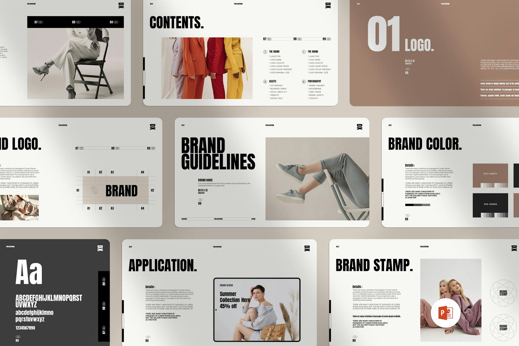
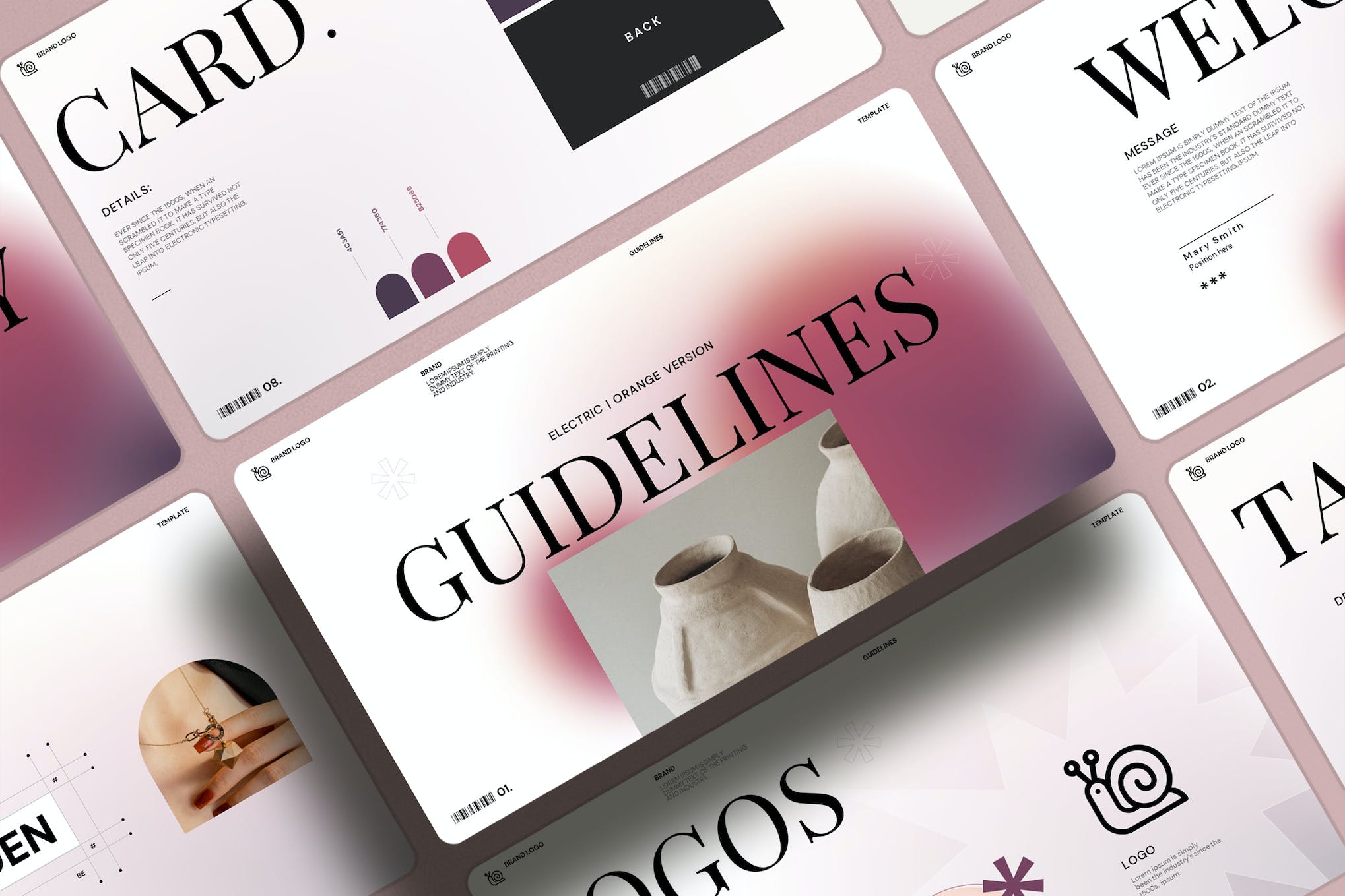
This is a time-saving PowerPoint template for those who need to compile a professional, comprehensive brand guideline document. Easy to customize, this presentation allows users to insert logos, swap colors, update typography, and input additional images without a hitch. Built on a minimalistic design, this fully resizable template includes 24 unique slides.
If you’re looking for a PowerPoint template with a modern and minimal design to make a killer business presentation, then this template is for you. It comes with 27 unique slide layouts with many professional designs for promoting your agency and services.
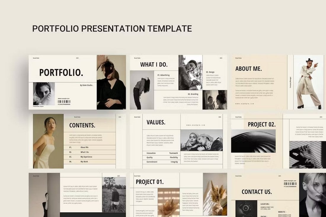
This beautiful PowerPoint template is ideal for making portfolio slideshows for all kinds of professionals. Whether you’re an artist, designer, photographer, or fashion model, it has some beautiful slides to show off your talents. The template has 12 unique slides.
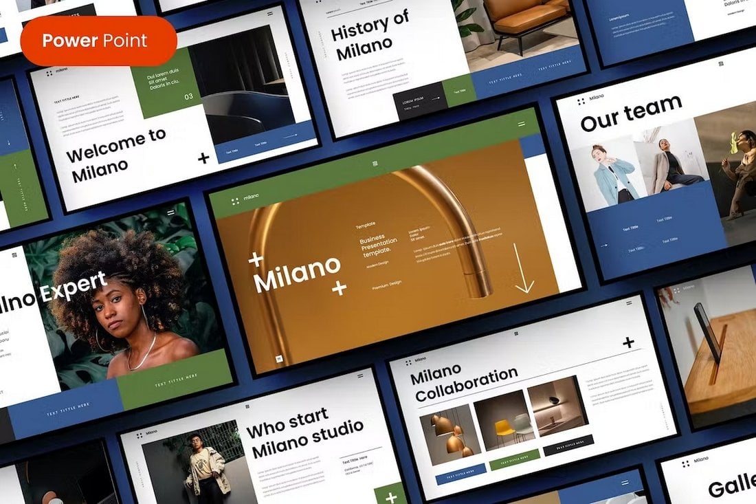
Milano is a professional business presentation template for modern brands and agencies. It comes with highly visual slide designs with plenty of space for adding large images. The template includes 32 unique slides with editable vector graphics and shapes.
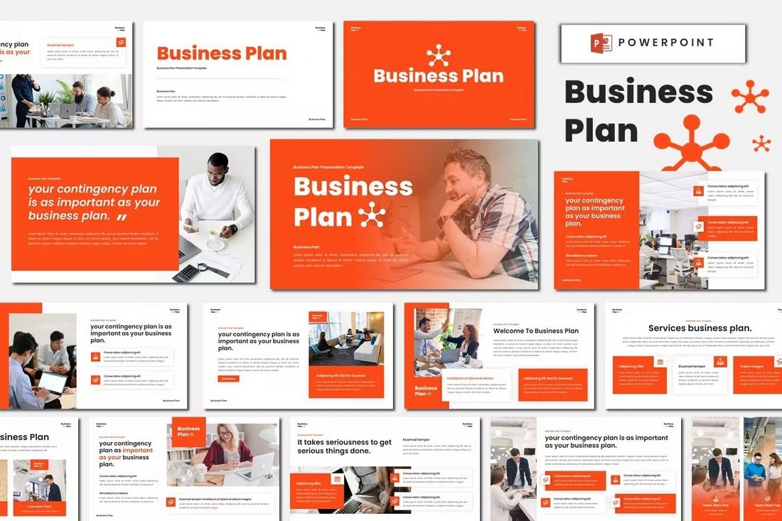
You can use this PowerPoint template to craft an effective business plan presentation for your creative company. It features a colorful design with stylish content layouts. There are more than 30 unique slides in this template with fully customizable layouts.
This free PowerPoint template is ideal for making presentations for your monthly sales review meetings. The template has 26 different slides full of colorful gradients and shapes.
This PowerPoint template is designed to showcase your brand in a modern and professional manner. Ideal for designers, photographers, bloggers and creatives of all types, this user-friendly template offers 25 unique slides, all featuring resizeable vector elements and a full HD 16:9 ratio.
This is an expertly designed tool for impactful presentations centered around AI technology. Offering 30 creatively crafted slides that are easy to customize, it caters to an array of presentation needs, be it business, education or marketing.
The Movie Lens PowerPoint template is a cutting-edge slideshow designed for entertainment-related presentations. It boasts over 30 unique slides presented in a widescreen format with a preset color scheme and editable elements.
This is a fully customizable, state-of-the-art template, perfect for showcasing your business development journey. It comes with 30 unique slides, 90+ XML files for theme color customization, along with light and dark background options.
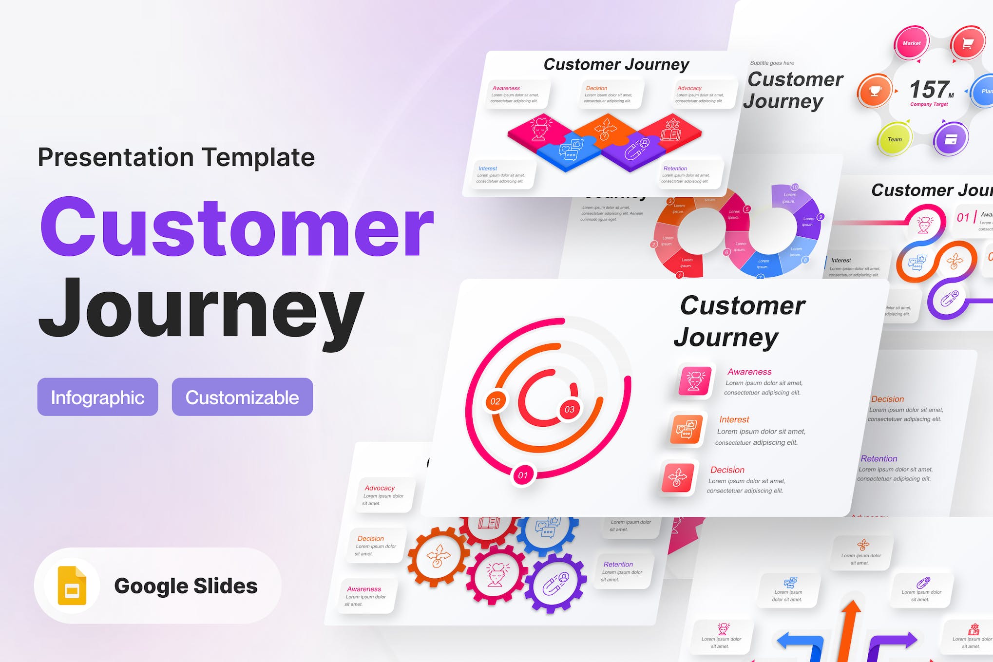
Explore the customer journey with this modern, fully customizable Infographic PowerPoint Template. Featuring configurable charts, diagrams, workflows, timelines, and more, it’s designed to visually represent data in a clear, engaging manner.
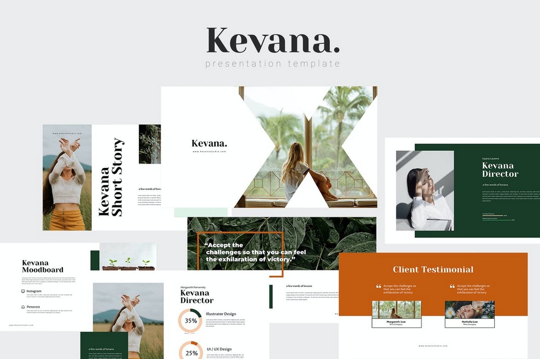
A versatile PowerPoint template with a clean, modern design. Its minimalist layout is inspired by the timeless aesthetic of the brand Aesop and complements various client needs. It includes 22 unique slides with adjustable vectors in full HD 16:9 ratio.
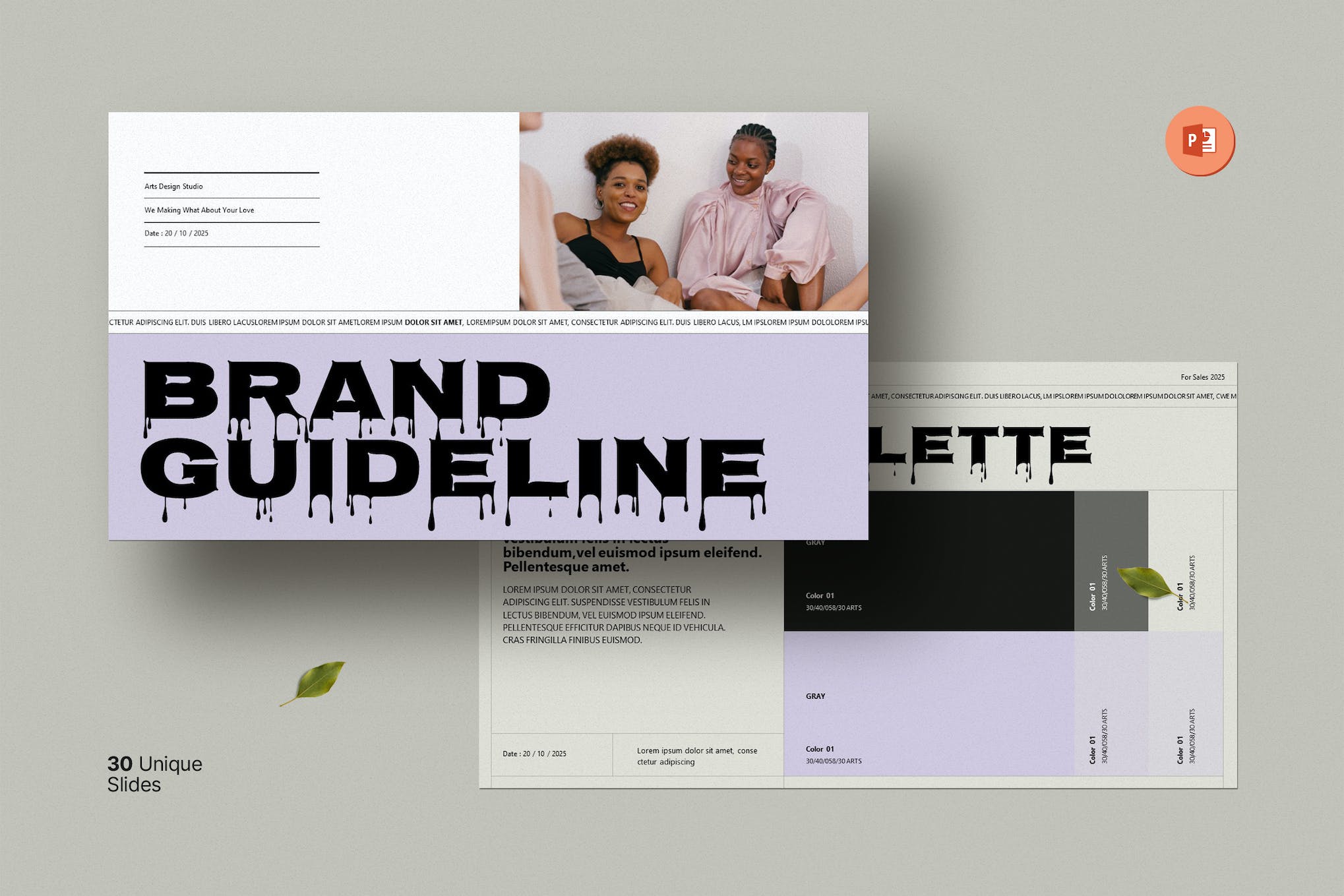
This PowerPoint template offers a finely tailored slide design for brand guidelines. This clean and professional template features 30 unique slides, easily customizable elements, and a drag-and-drop photo replace option.
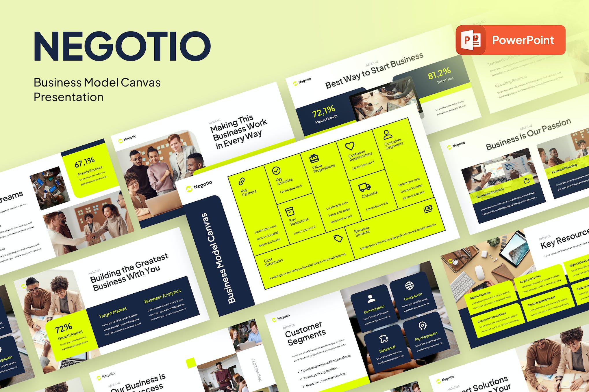
This PowerPoint template offers a fresh, contemporary design for any professional presentation, including brand and business model slideshows. Easy to customize and fully editable, this high-resolution template features 30 slides, a device mockup, and a clean 16:9 (HD) aspect ratio.
A professionally designed, multipurpose asset ideal for startups or technology-focused businesses. It boasts a modern, clean aesthetic, and an aspect ratio of 16:9 for HD presentations. Customization is easy with 30 fully editable slides, including device mockups and free font use.
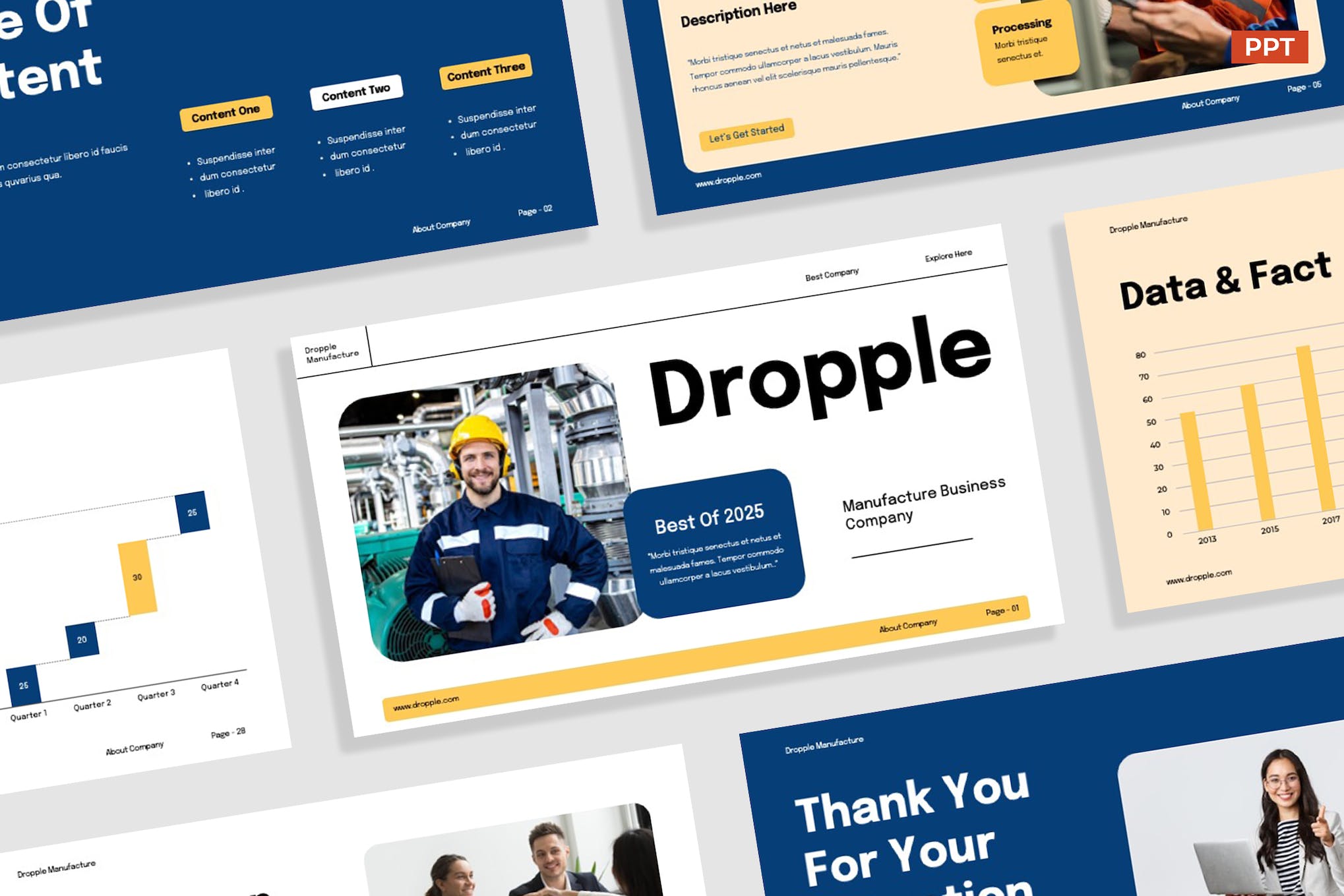
This PowerPoint template is a creative slideshow that’s ideal for modern manufacturing brands and companies. It provides 31 uniquely designed slides, all of which are versatile and fully editable, making it ideal for various uses like pitch decks, marketing strategies, and company profiles.
This PowerPoint template has the perfect design for making slideshows for startups and agencies. It uses clean and simple content layouts to bring more attention to your key points and content. There are 30 unique slide designs included in the template.
If you’re a fan of dark and modern slideshow designs, then be sure to grab this template. The 20 unique slides in this template use a bold and dark color theme. It’s most suitable for creative brands and digital agencies.
You can use this PowerPoint template to make modern portfolio presentations for studios, design agencies, and freelancers. It features many useful slide layouts, including ones for portfolio galleries and case studies. The template features 35 slides in light and dark themes.
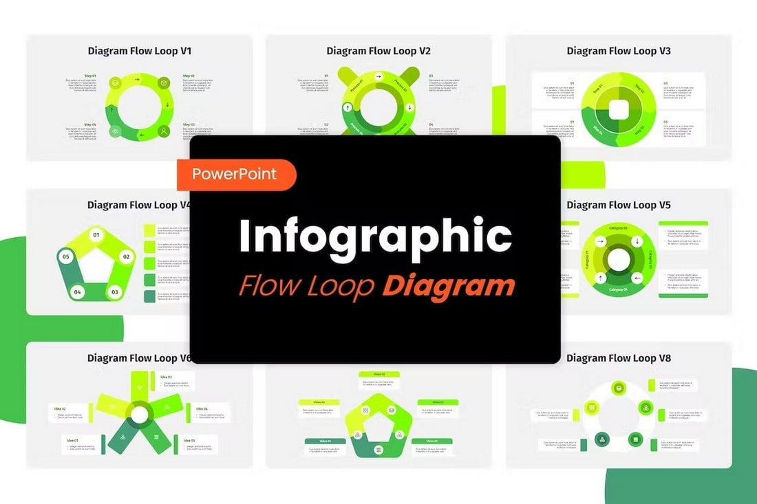
Diagrams and infographics are an important part of business presentations for showing data in visual form. This template includes 8 unique diagram flow loop designs for showing off data in various ways. You can fully customize each infographic to your preference as well.
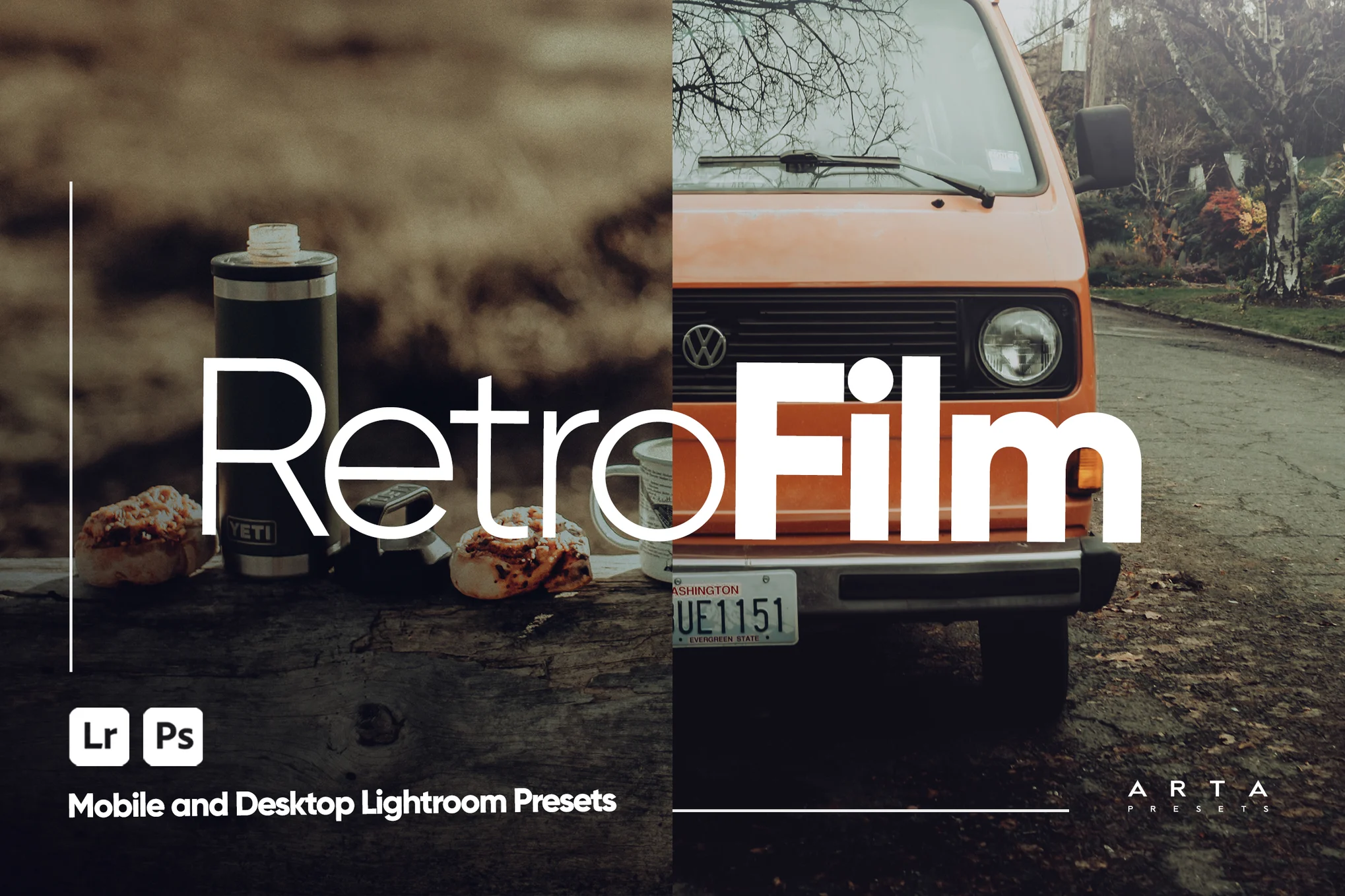
If you want to make your team meetings more fun and entertaining, this free PowerPoint template will come in handy. It uses very colorful and creative slide designs with a retro-tech vibe. There are 27 slides in the template.
This PowerPoint template comes with a professional and modern slide design allowing you to craft bold presentations for business meetings. It’s also great for business plans and startup pitch decks. There are 30 slides included in this template.
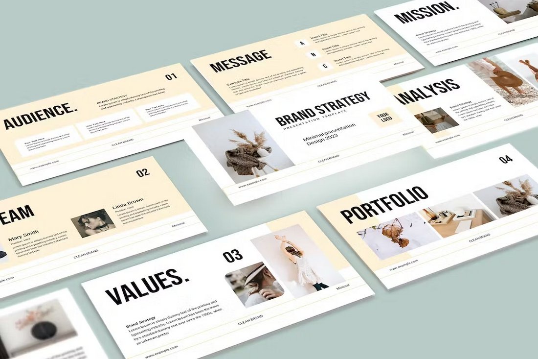
The unique and clean layouts used in this PowerPoint template make it a great choice for designing attractive business presentations. It’s especially ideal for brand strategy slideshows. It has 21 unique slides.
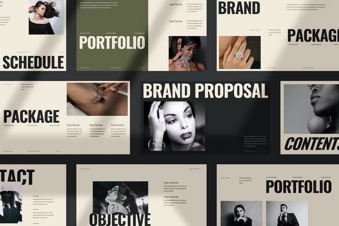
You can design beautiful brand proposals and portfolios using this PowerPoint template. It features a stylishly modern slide design with attractive visuals and content layouts. There are 22 unique slides included in this template.
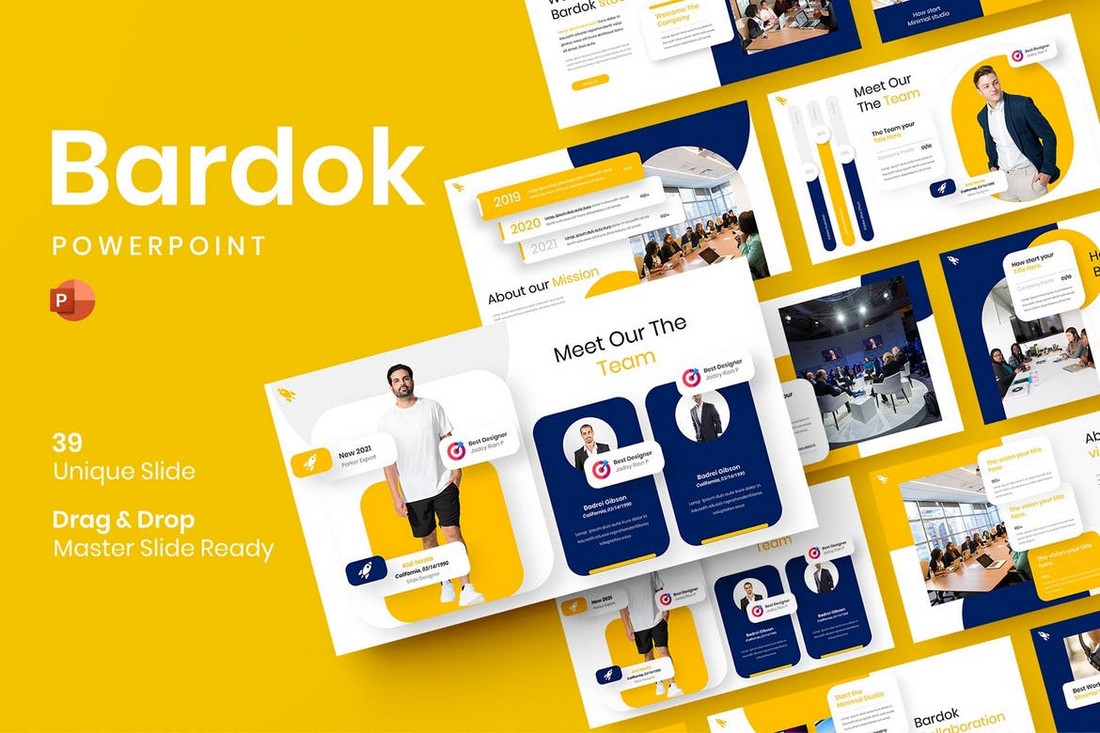
This PowerPoint template will help you create professional presentations for your project proposals and meetings. It includes 39 unique slides with editable vector graphics, free fonts, master slides, and more.
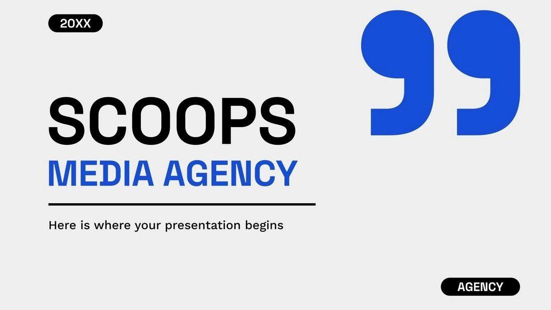
A free PowerPoint template with a bold and minimalist design. This template is designed with creative media agencies in mind. It includes 22 slides that are also available in Google Slides format.
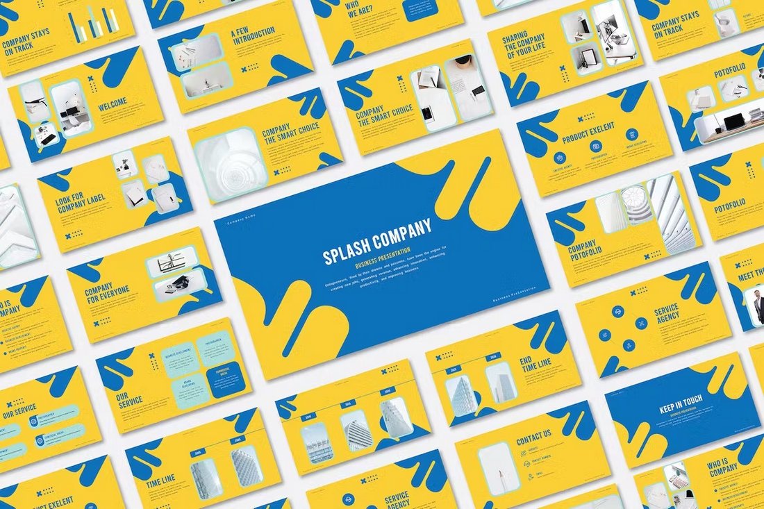
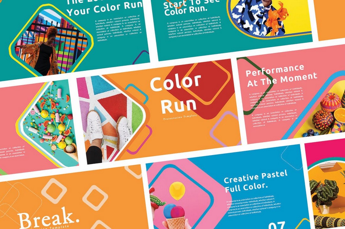
Splash is a colorful and creative PowerPoint template that features a beautiful slide design. It includes a creative theme that will fit perfectly for creative brands, small businesses, and agencies alike. There are 30 unique slides included in the template.
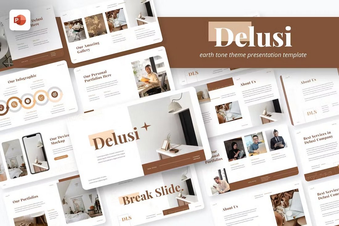
Delusi is another stylish PowerPoint template that uses a modern theme with an earthy color tone. It has 40 unique slides that include editable shapes, colors, graphics, and free fonts. The template is ideal for fashion and beauty brands.
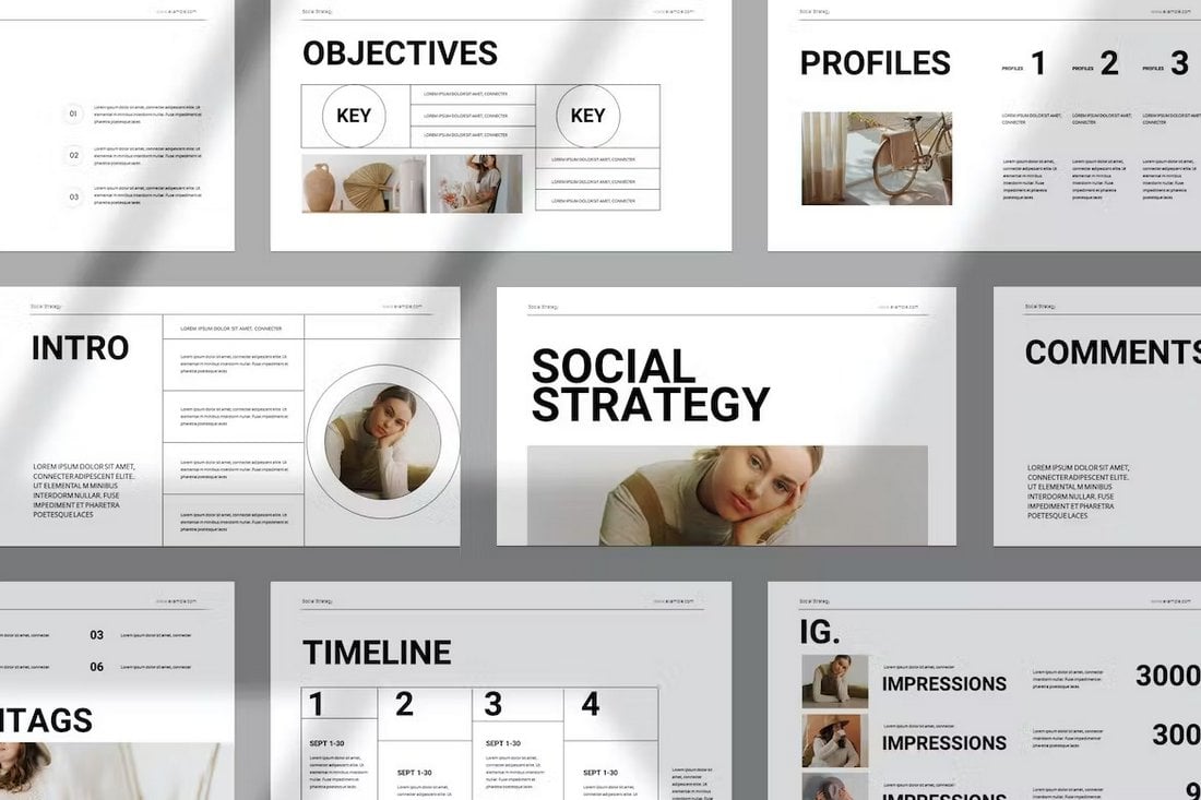
This template is great for social media marketing agencies as well as for modern businesses as it comes with a minimalist design for making social strategy slideshows. There are 22 slides included in this template.
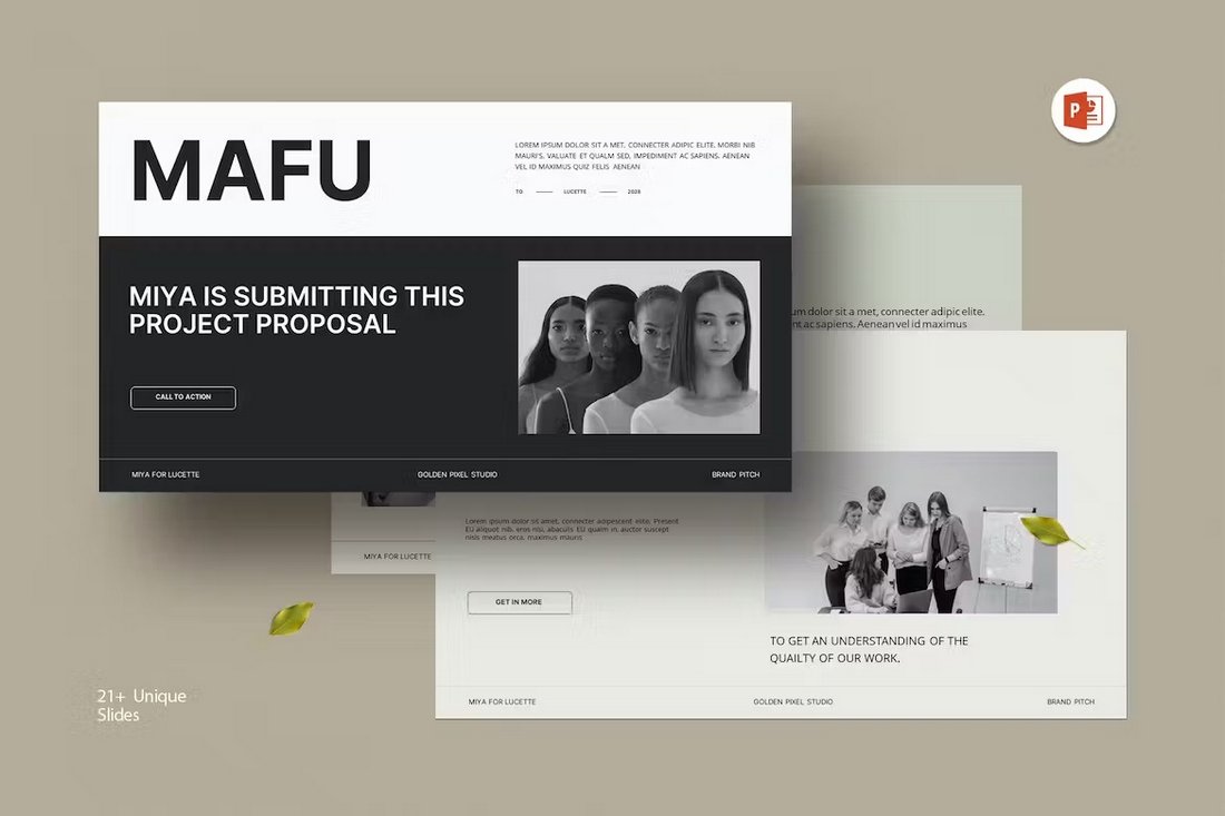
Mafu is a bold and trendy PowerPoint template that comes with a set of clean and simple slide designs. It’s designed with agencies and freelancers in mind. You can use it to make impactful project proposals. It has 21 different slides.
This free PowerPoint template includes lots of customizable infographics you can use in your product and business plan presentations. There are 32 different infographic slides in this template.
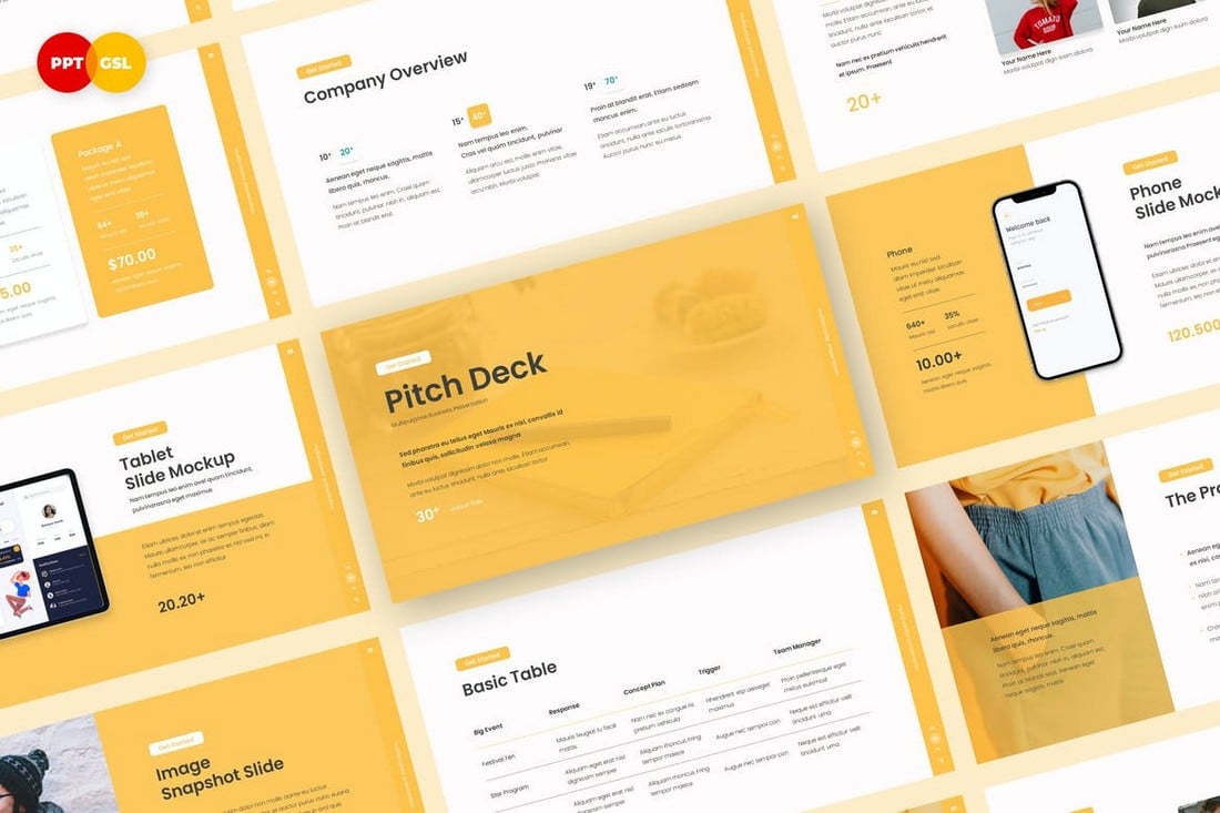
Yello is a beautiful, clean, and professional PowerPoint template that comes with 30 unique slides. It includes everything you need to make a more convincing pitch deck to present your startup and business ideas as well as projects in meetings.
This PowerPoint template features slides with multipurpose designs. They are ideal for making all kinds of business presentations from company profiles to agency portfolios. The template has 39 unique slides with editable vector graphics and icons.
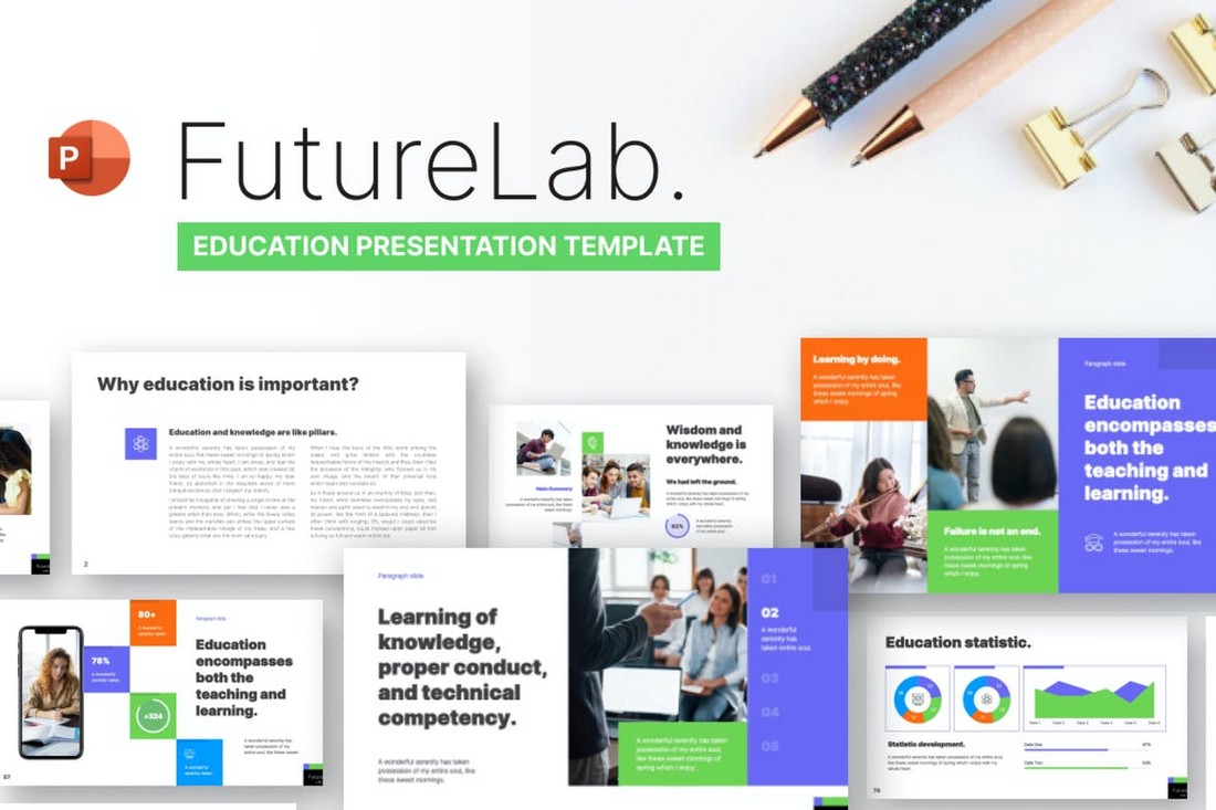
Future Lab is a PowerPoint template designed to help you present your ideas for new events, projects, courses, and everything related to education. You can use it as a pitch deck for showcasing your ideas more effectively. There are more than 80 unique slides in this template.
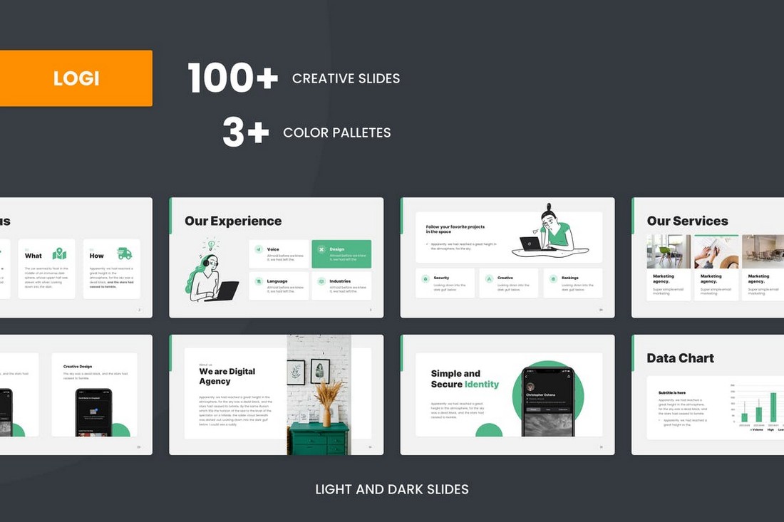
LOGI is a modern and minimal PowerPoint template that comes with over 100 unique slides. It’s perfect for making various types of business and creative presentations. You can also choose slides from 3 different color styles as well as dark and light color themes.
This is a free PowerPoint template that also comes in Google Slides format. It features 24 creative slides that are designed for showcasing your design portfolio to clients. While it’s made with fashion designers in mind, you can easily customize the slides to make presentations for various other professionals.
This PowerPoint template is designed with both modern business and corporate brands in mind. It comes with a very clean and professional design to craft attractive presentations. The template includes 30 customizable slides.
Another modern business PowerPoint template that’s ideal for agencies and small brands for designing stylish presentations. You can use this template to make all kinds of company profiles, portfolios, and proposal presentations. There are 39 different slide layouts to choose from.
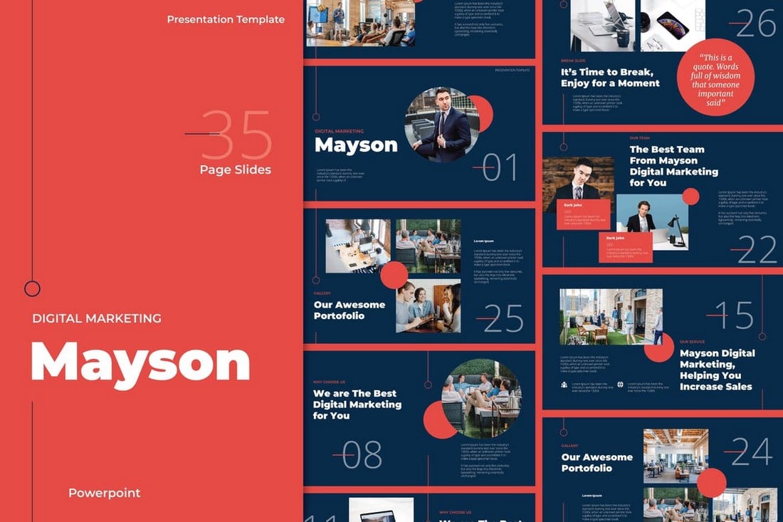
Mayson is the perfect PowerPoint template for making marketing-related presentations. It comes with a very professional design that you can easily customize to your preference to change colors, fonts, and images. The template includes 35 different slides.
The unique and creative design of this PowerPoint slideshow will help you craft presentations that make your brand and business stand out from the crowd. This template comes in both light and dark theme slides with 3 pre-made color schemes to choose from.
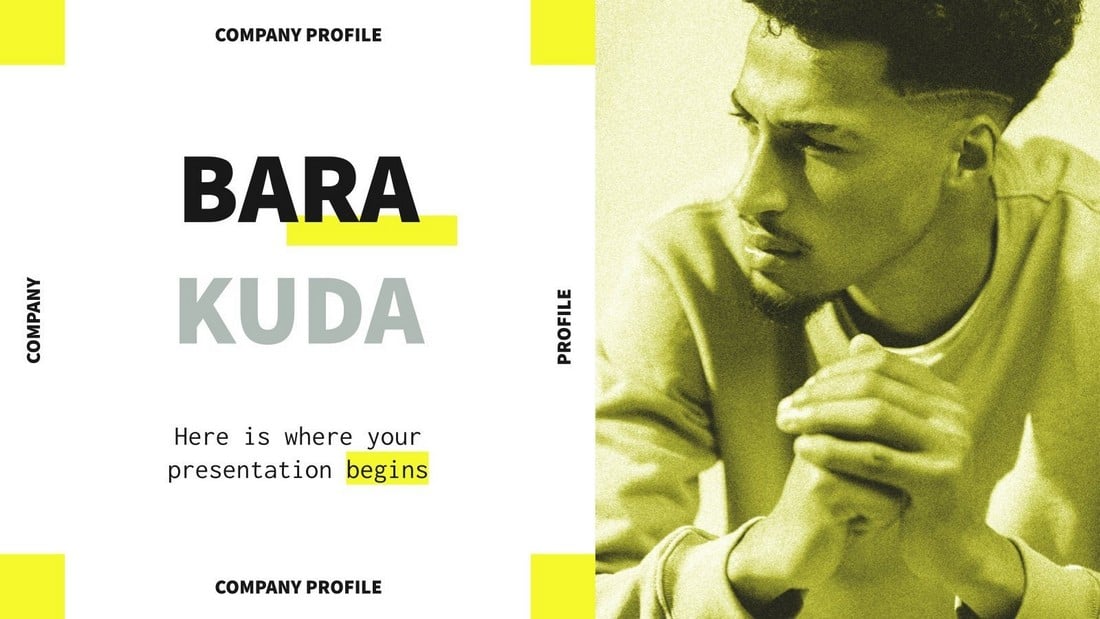
Barakuda is a free PowerPoint template you can use to design attractive company profile presentations. It includes 28 unique slide layouts with fully customizable designs. The template is available in Google Slides version as well.
A multipurpose PowerPoint template for making all kinds of business and professional presentations. This template 25 carefully designed slide layouts that can be customized to create various corporate and business slideshows. It includes image placeholders, editable charts, graphs, and much more.
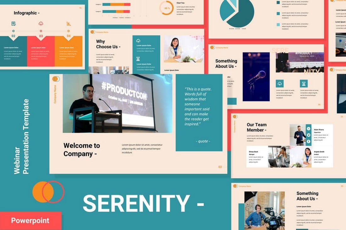
This PowerPoint template is a great choice for designing slide decks for webinars and online presentations. The colorful slides can be easily customized to your preference. You can also change its colors, charts, and edit the infographics as well.
The elegant and stylish design of this PowerPoint template makes it perfect for designing presentations related to fashion, lifestyle, and luxury brands. The template includes 36 unique slides with editable colors, fonts, and images.
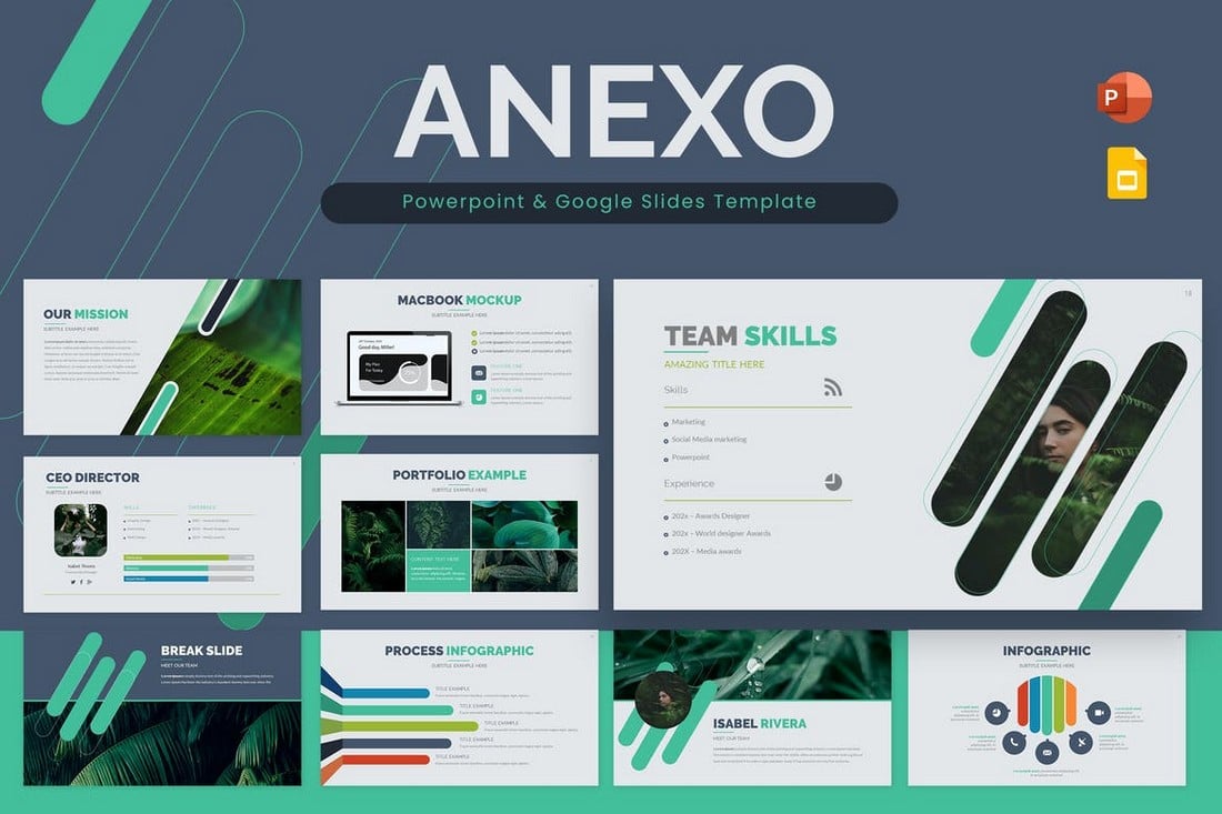
Anexo is a professional PowerPoint template that comes with a set of stylish slides. There are editable shapes, image placeholders, attractive colors, and custom icons in every slide of this template. There are a total of 36 slides as well.
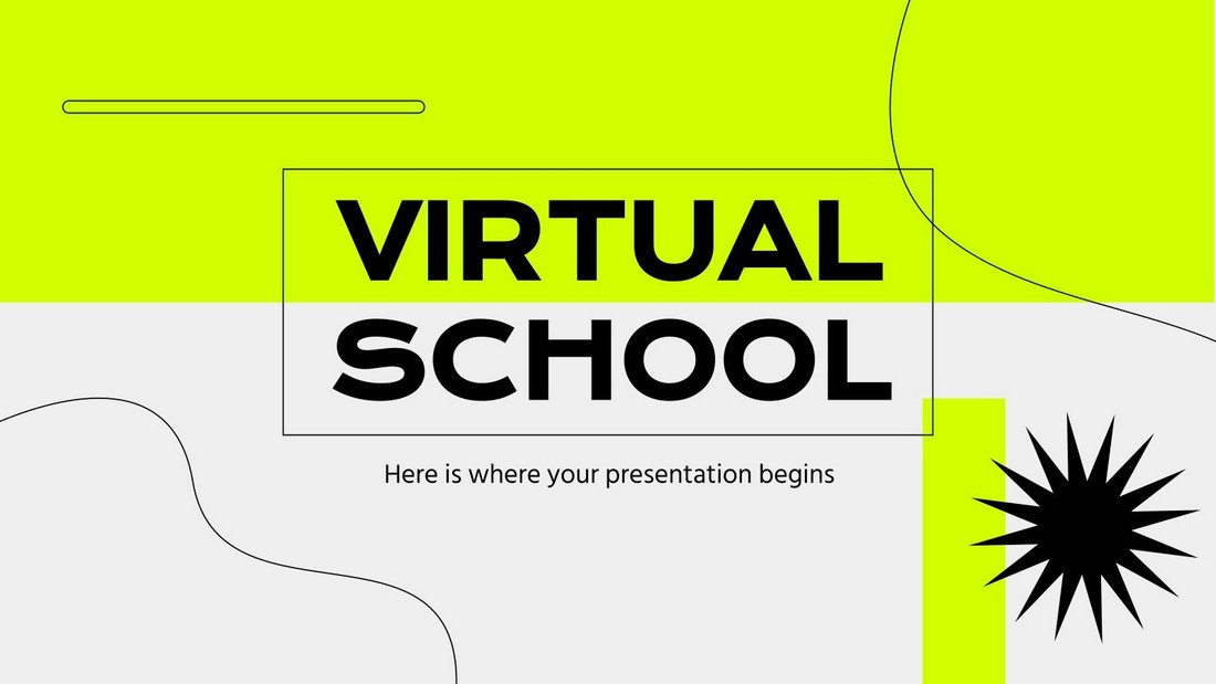
This free PowerPoint template is perfect for creating slideshows for educational presentations. It’s designed for online classes and school sessions in mind. There are 28 editable slides in this template.
A modern yet professional PowerPoint template you can use to design stylish presentations for creative brands, agencies, and businesses. This PowerPoint template includes a total of 39 slide layouts. Each slide features editable shapes, colors, and vector graphics that you can customize to your preference.
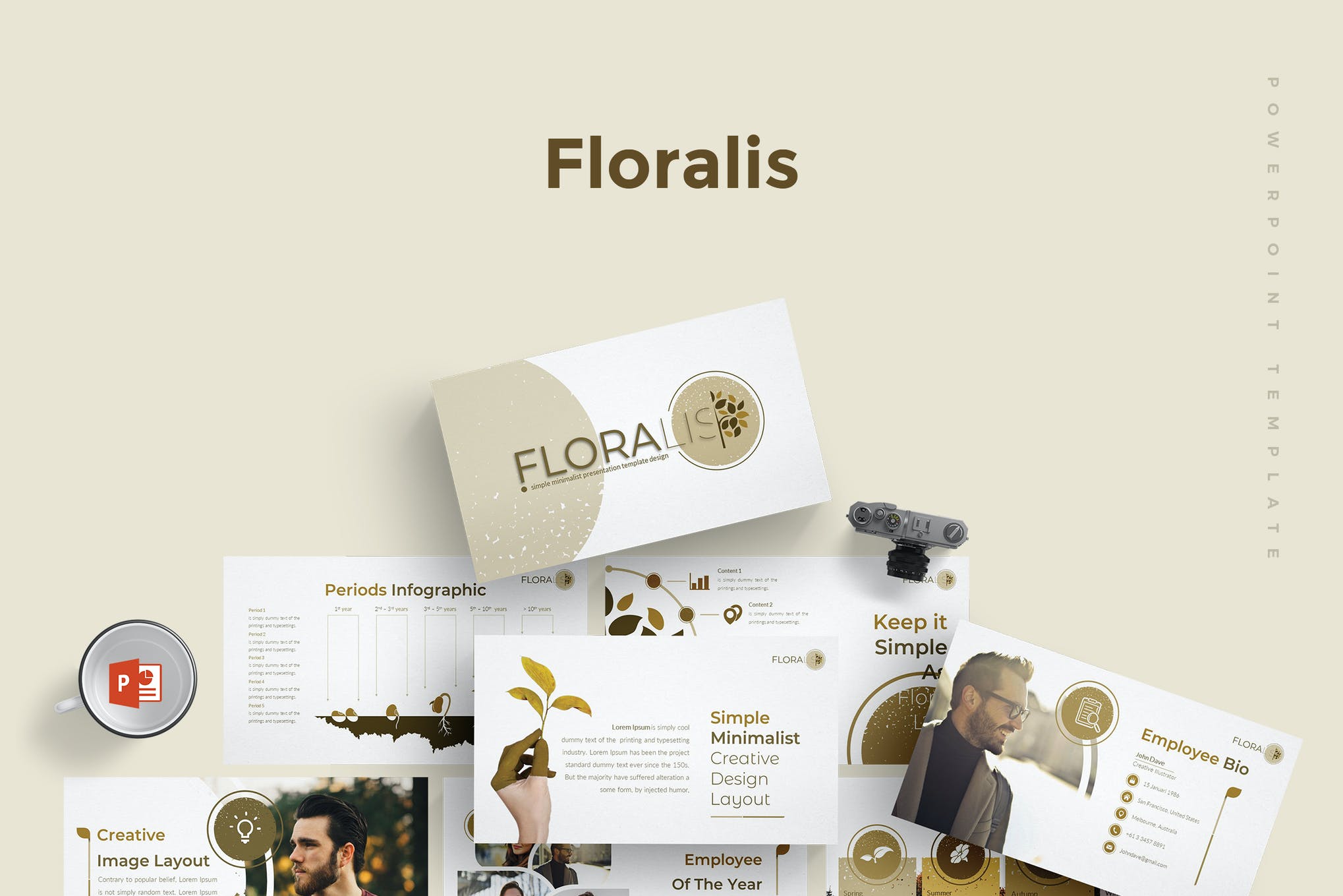
With a confident look and clean, creative slides Floralist is a versatile, flat design PowerPoint template. It’s got a modern style that blends plenty of colorful graphics, powerful charts, and minimal design elements.
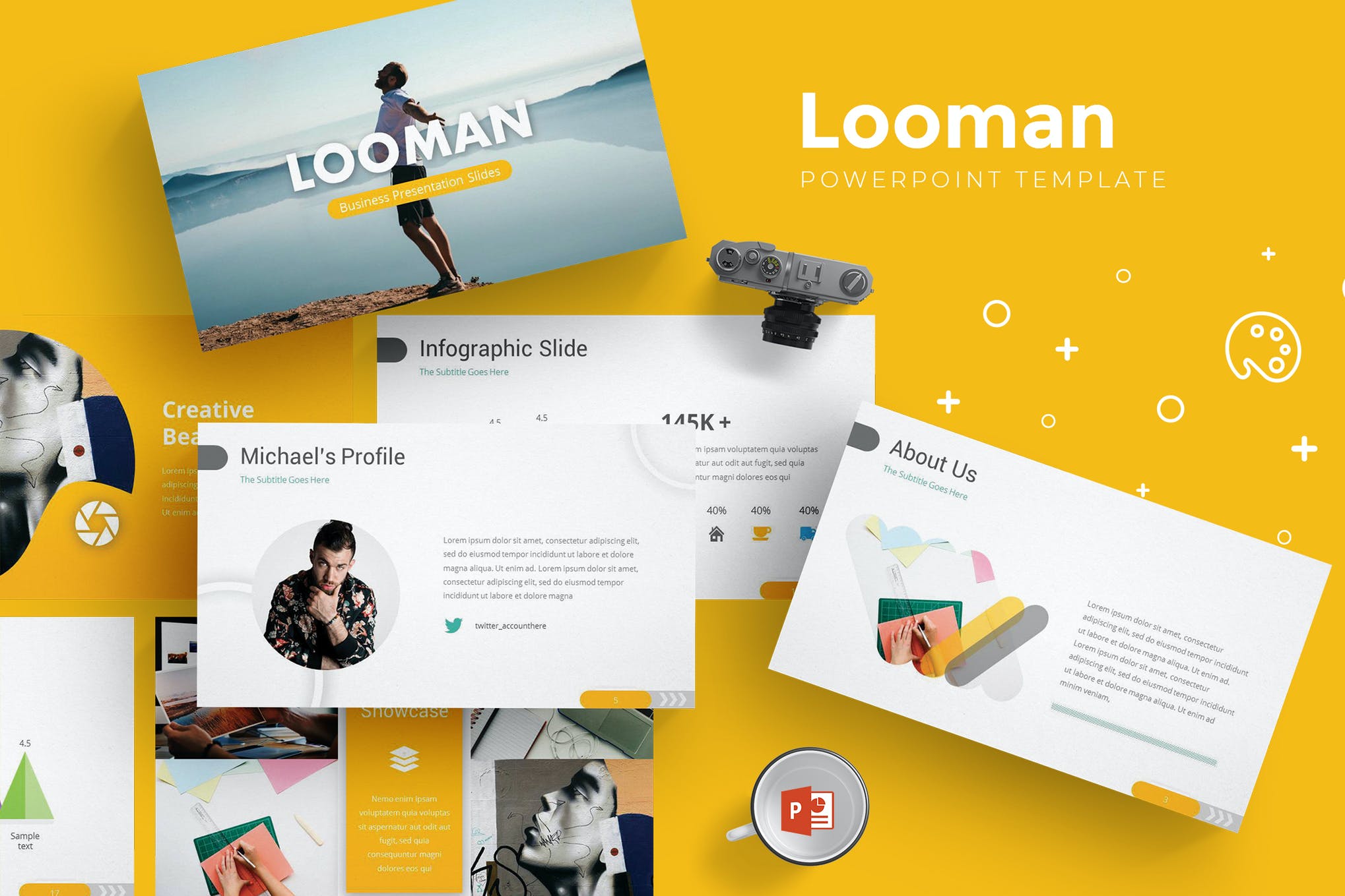
Need a PowerPoint presentation design template with a modern style? One that’s easy to customize? And comes packed with the right slide designs to communicate your message effectively? Look no further than Looman.
Use this PowerPoint template design to turn your ideas into persuasive and compelling presentations. From driving thought leadership to sales presentations, this theme will exceed your expectations.
If you like minimal PowerPoint design templates, check this out. This is a minimal PowerPoint presentation design with plenty of template options built in. If you’ve got important information to present, this set delivers. It’s perfect for personal or corporate use. And comes with a ton of easy-to-edit features that are 100% customizable.
Think big and get ready to go bold with this modern PowerPoint design theme. It’s got a powerful set of unique PPT slide designs that’ll help your message stand out.
This presentation comes in multiple formats, including PowerPoint and Keynote versions. It includes 30 unique slides featuring a creative color theme that will surely attract your audience’s attention. The template also features master slides and image placeholders as well.
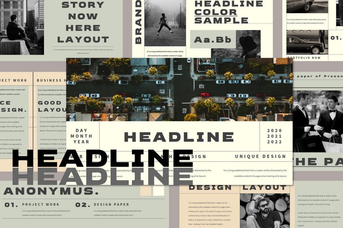
Headline is a very unique PowerPoint template that includes a set of slides with uncommon designs. The template comes with 20 different slide layouts that you can customize to your preference. The colors and fonts can be edited as well.
If you’re working on a presentation for a startup or creative agency, this PowerPoint template will help you craft a more attractive slideshow. It comes with 30 unique slides featuring a colorful design. Each slide is available in light and dark color themes. And you can customize it to your preference as well.
This PowerPoint template is made for all kinds of business and professional presentations. It includes a total of 150 slides, including 5 pre-made color schemes to choose from. Additionally, there are editable vector graphics, illustrations, and a hand-crafted infographic to help make your slideshow more effective.
Create a trendy presentation to showcase your lifestyle brand or fashion business using this unique PowerPoint template. It comes with a dark and modern slide design that includes options for easily changing the colors. The template features 40 different slide layouts.
Another creative PowerPoint template featuring a clean and minimal design. This template comes with a set of elegant slide layouts you can use to craft presentations for fashion and beauty brands. The colors, fonts, and shapes of the slides can be customized to your preference.
This is a free PowerPoint template you can download and use however you like, even with commercial projects. It includes 10 unique slide designs featuring colorful designs. There are lots of vector icons and graphics as well.
Sembre is a very unique PowerPoint template that features a modern and professional design. It’s ideal for making business presentations, especially for company profile and brand awareness slideshows. The template comes in PowerPoint, Keynote, and Google Slides versions. And it includes 30 unique slides.
A bold and modern PowerPoint template for delivering powerful presentations. This template uses a clean design inspired by nature to let you create a visual-centric slideshow for various occasions. It comes with 30 unique slides with editable vector icons, shapes, and image placeholders.
Using a slideshow with a dark color theme allows you to give more attention to your content and highlight images more effectively. This template also features a dark theme across its 40 custom slide layouts. All the graphics, colors, fonts, and images are fully customizable.
This PowerPoint template is a great choice for presenting fun and entertaining topics. It comes with more than 40 custom slides filled with lots of colors, icons, shapes, and more. The colors can be easily customized and you can replace the images using the placeholders as well.
This free PowerPoint template comes with a set of minimal slides that are perfect for creating a basic presentation for lifestyle and modern businesses. The free version of the template can be used with your personal projects.
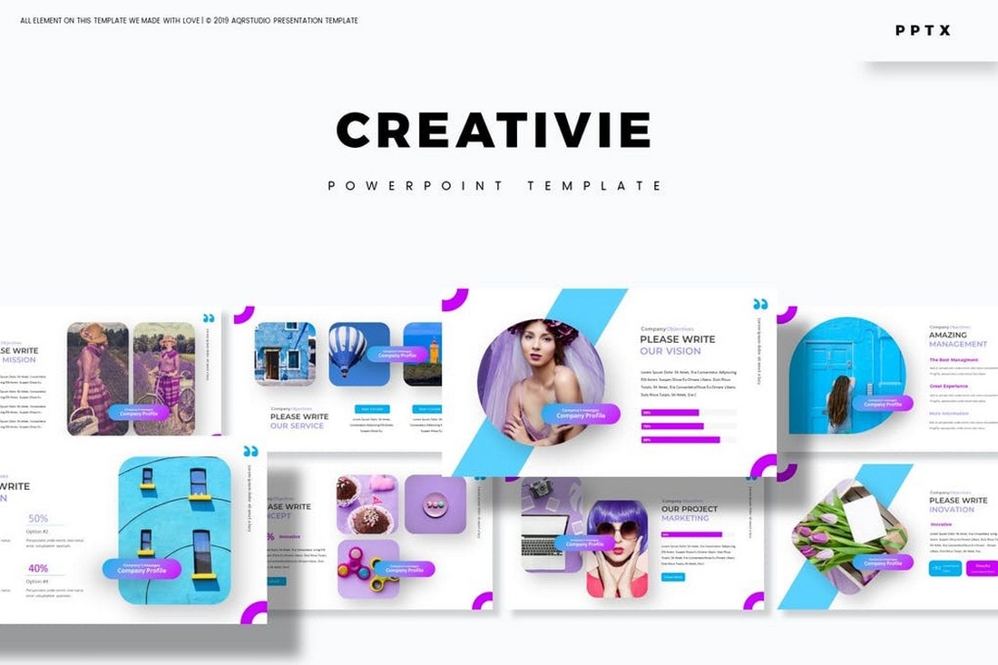
Creativie is a modern PowerPoint template that features a set of creative slide layouts. It includes a total of 150 slides with 5 different color schemes to choose from. The template also has plenty of master slides, image placeholders, and editable vector graphics to create more engaging presentations.
If you’re looking to create a colorful presentation filled with attractive slide designs, this template is perfect for you. It features 39 unique slide designs that can be easily customized to create various types of presentations. The colorful design makes it a great choice for creative agencies and freelancers.
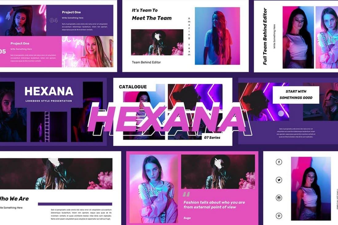
Hexana is a stylish PowerPoint template that includes a set of slides unlike any other template in our list. It features a unique style of content design that will surely attract anyone’s attention. This template comes with 40 unique slide designs with master slide layouts.
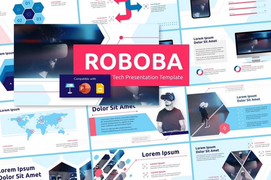
This is a multipurpose presentation template designed to work with not just PowerPoint but also with Keynote and Google Slides. As a result, it comes in multiple file formats. The template also includes 30 easily editable slide designs and it’s most suitable for technology-themed presentations.
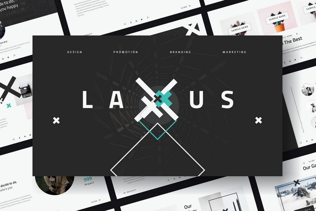
Laxus is a free PowerPoint template you can use to make modern presentations for business and professional purposes. The template comes with multiple slides with editable layouts and master slides as well.
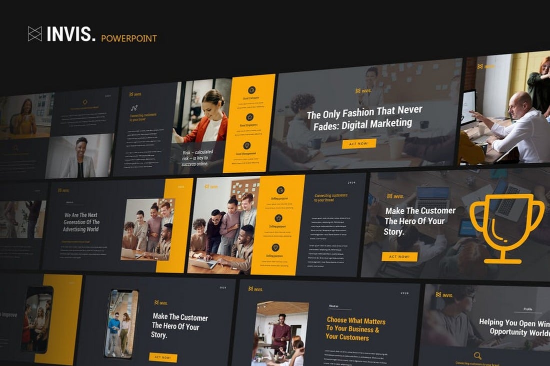
Invis is a modern PowerPoint template made specifically for creative agencies and freelancers. The template comes with a set of stylish slides featuring editable vector graphics, infographics, image placeholders, and much more. It includes a total of 30 unique slides.
Looking for a professional PowerPoint template to create a business presentation? Then this template will come in handy. It features 42 slides in Full HD resolution with image placeholders, editable vector graphics, and much more you can use to create unique presentations of your own.
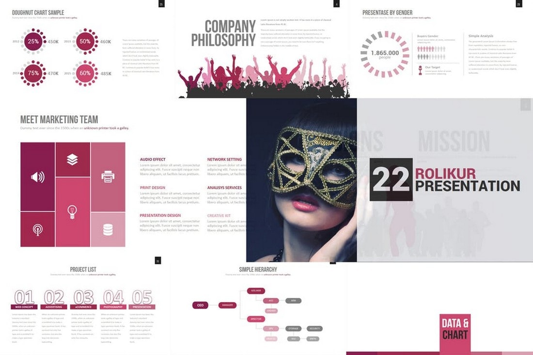
Rolikur is a minimalist PowerPoint template that features a very clean slide design. This template is most suitable for creating simple presentations where you want to includes slides filled with lots of details and descriptions. It includes 60 slide designs featuring 50 premade color themes.
Just as the name suggests, this PowerPoint template is made just for creating marketing related presentations. It lets you choose from more than 30 master slide layouts to create professional and creative presentations for various marketing presentations.
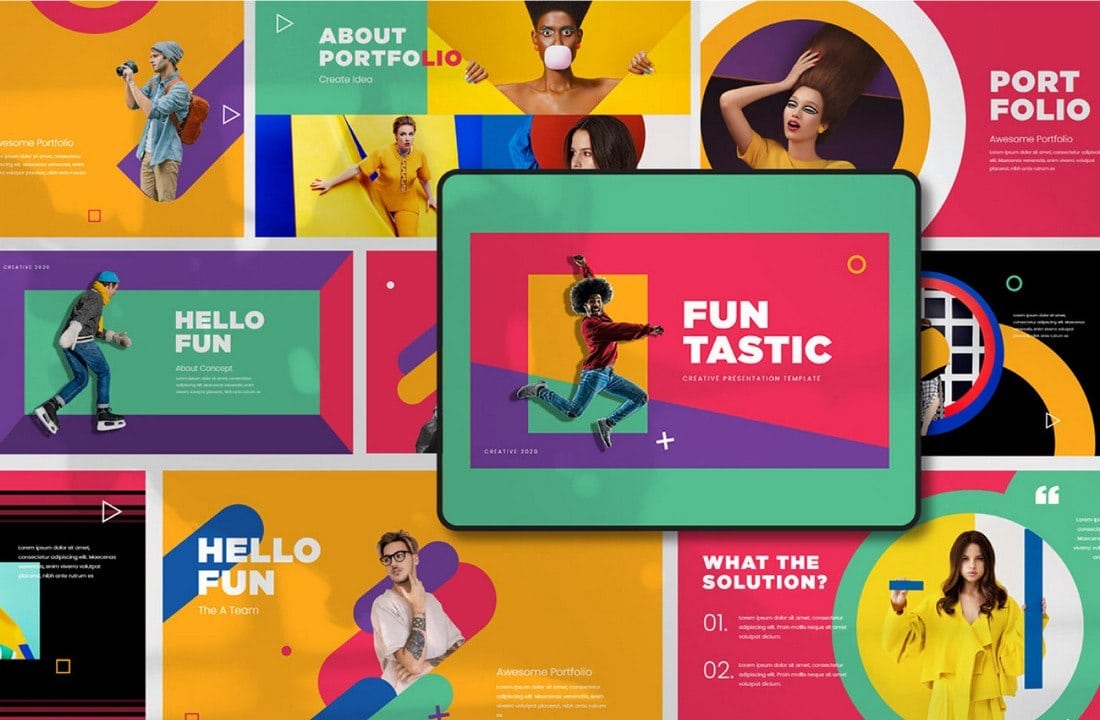
Funtastic is another great free PowerPoint template you can use to make modern and colorful slideshows for various presentations. The free template is ideal for making lookbook-style presentations for fashion and design brands.
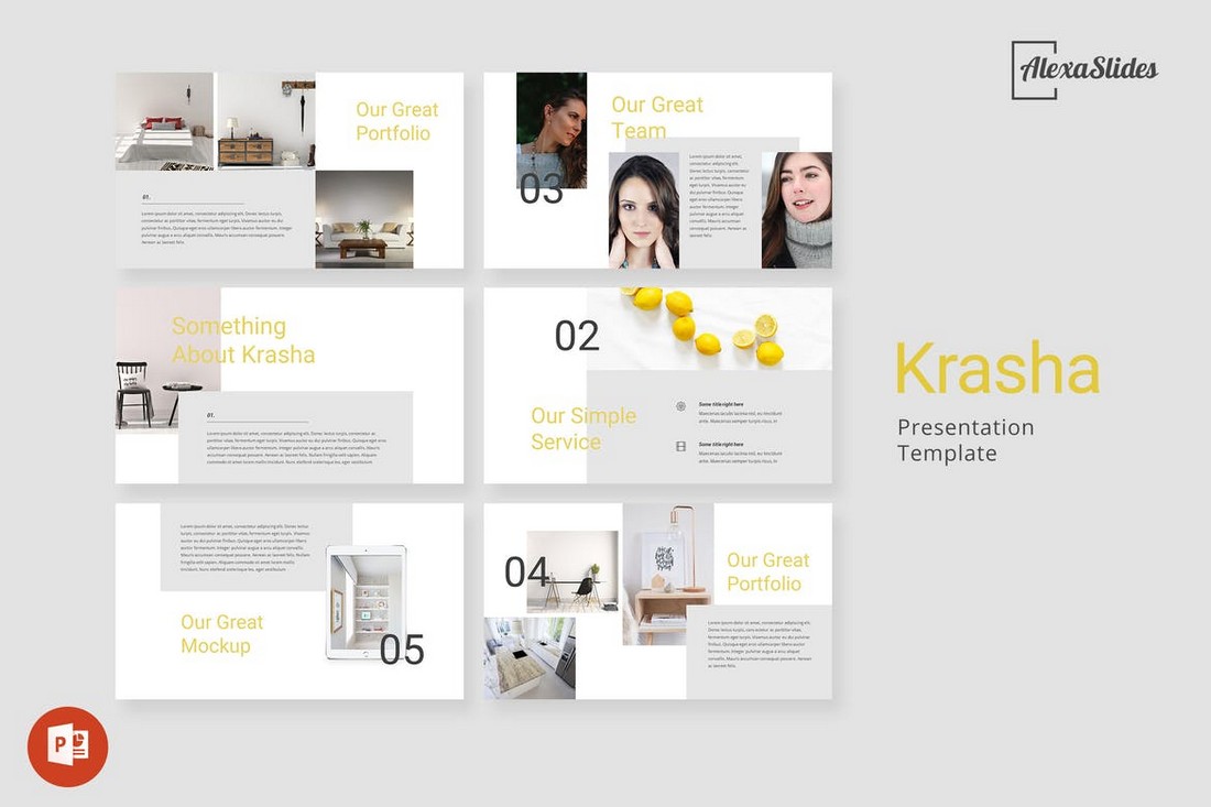
Krasha is a modern PowerPoint template that comes with a clean and creative set of slides. The template includes 30 unique slides with easily customizable layouts. It’s perfect for making presentations for modern agencies and businesses.
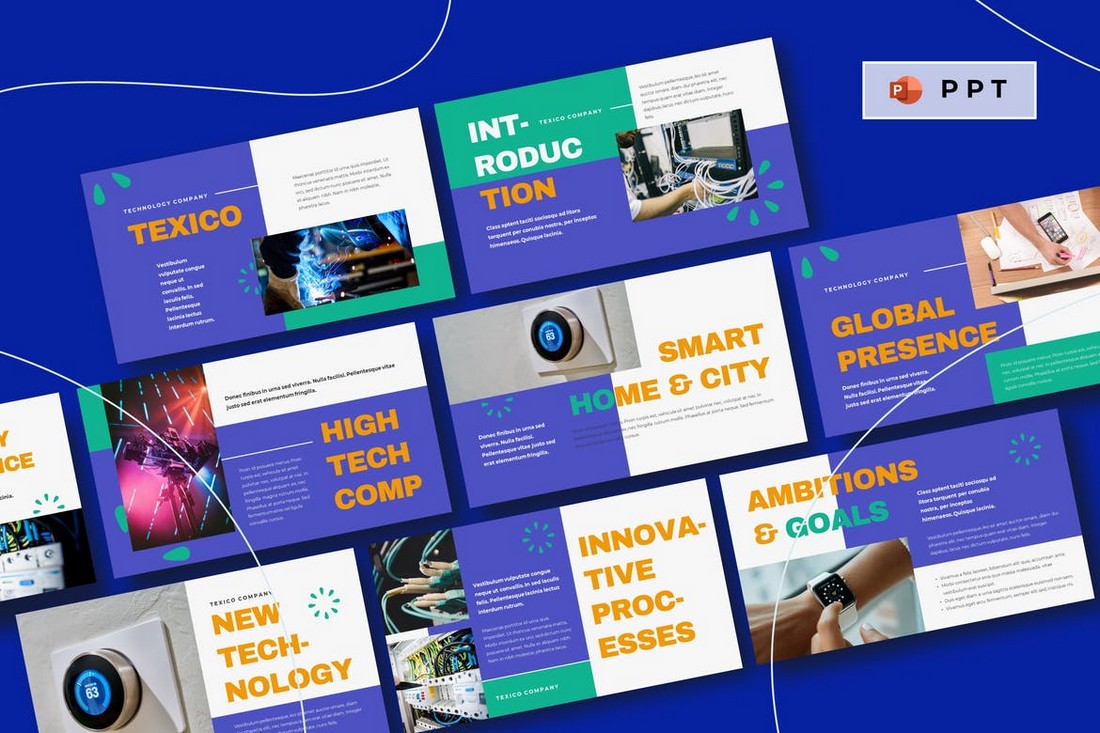
Texico is a creative PowerPoint template featuring a modern and colorful design. This template is most suitable for making presentations for startups and technology-related businesses. The template comes with 30 slide layouts.
This is a modern PowerPoint template you can use to make presentations to showcase portfolios and photography as well as fashion designs. It includes 32 unique slides with dark color themes. And lots of image placeholders for featuring photos and images.
You can use this creative PowerPOint template to design a presentation for many different entertainment-related projects, especially including video games. The template includes more than 50 unique slides. The colors can also be changed with just one click.
Voodoo is a free Keynote template that features a set of modern slide designs. The template is easily customizable and comes in both Keynote and PowerPoint versions.
When it comes to pitching a business idea or a project, your slideshow needs to be perfect. This PowerPoint template will help you create a winning pitch deck for your presentation. It includes 30 unique slides in 5 different color schemes.
Minimalism is a sign of elegance and class. This PowerPoint template comes filled with both those qualities. It features 50 unique slides with minimal and clean design. It includes vector icons, infographics, and editable graphics as well.
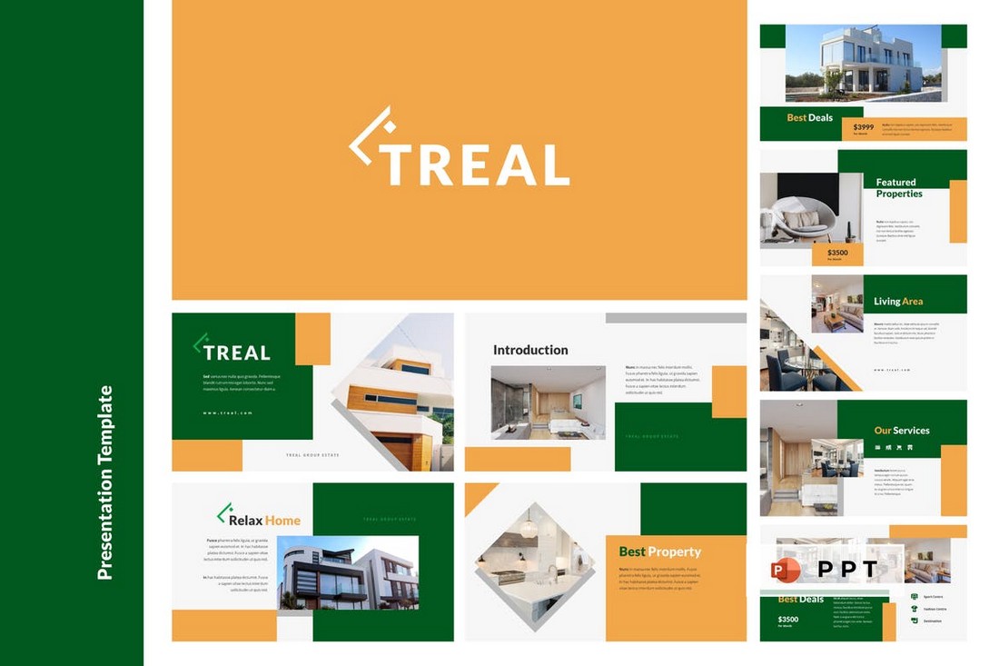
Treal is a modern PowerPoint template made specifically for crafting presentations related to real-estate businesses. The template includes 30 unique slides filled with custom graphics, shapes, and image placeholders.
This PowerPoint template comes with a creative and modern design that’s ideal for designing slideshows related to marketing and business presentations. The template includes 30 unique slides with easily editable designs.
Even though this template is designed for architecture presentations, it can be easily customized to create many other types of presentations as well. The template comes with a total of 150 slides featuring 5 different color schemes.
This is a free PowerPoint template you can use to design stylish fashion and design lookbook-style presentations. It includes 90 unique slides in 5 different color schemes. It’s free to use with personal projects.
Another high-quality free PowerPoint template for crafting modern and creative presentations. It comes with a set of visual and image-centric slides with easily editable designs. You can use it for free with both personal and commercial projects.
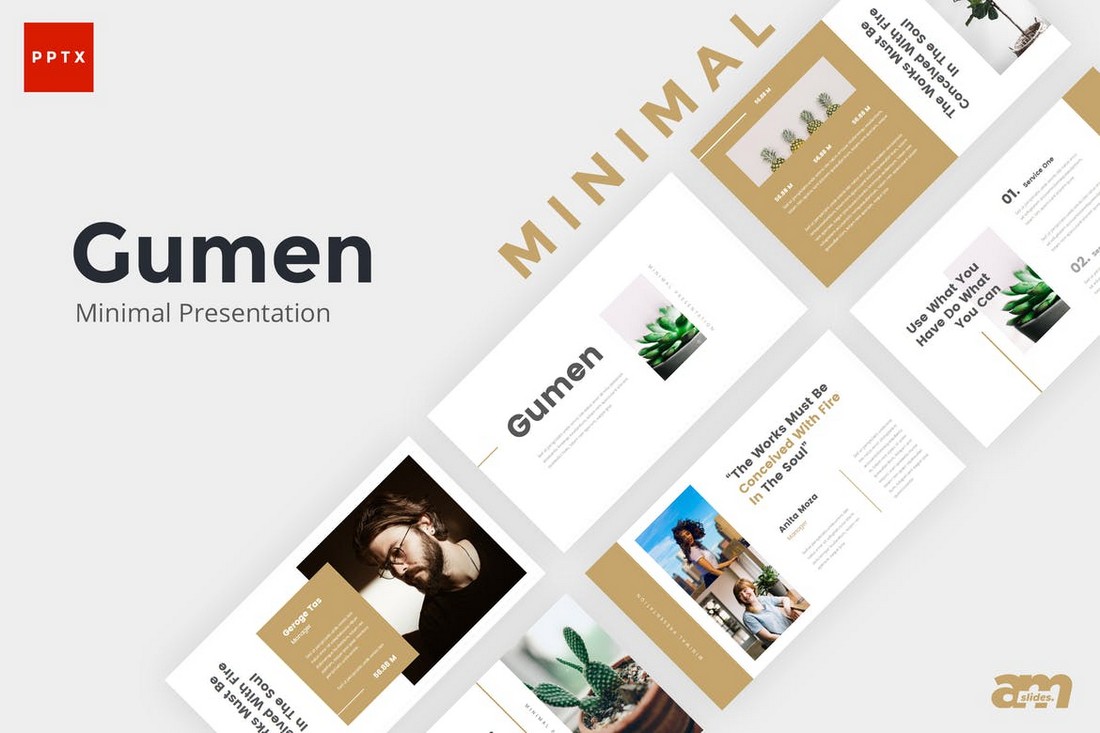
Gumen is a minimal yet modern PowerPoint template that comes with 30 unique slides. Each slide includes resizable graphics, shapes, and image placeholders. It also includes master slide layouts as well.
Featuring an elegant and clean design, this PowerPoint template includes a total of 150 slides. You can choose from 5 different color schemes to create various business and creative presentations.
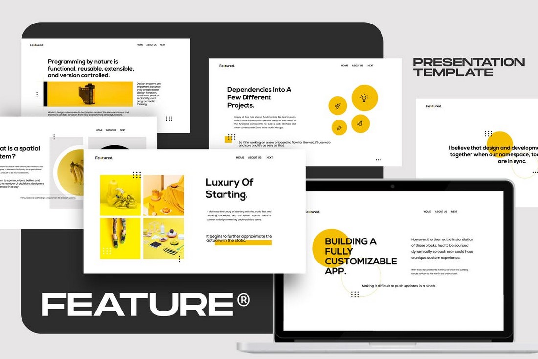
Feature is a modern PowerPoint template that comes with a set of slides made for designing brand guidelines presentations. It includes 50 unique slides featuring vector graphics, infographics, icons, and more.
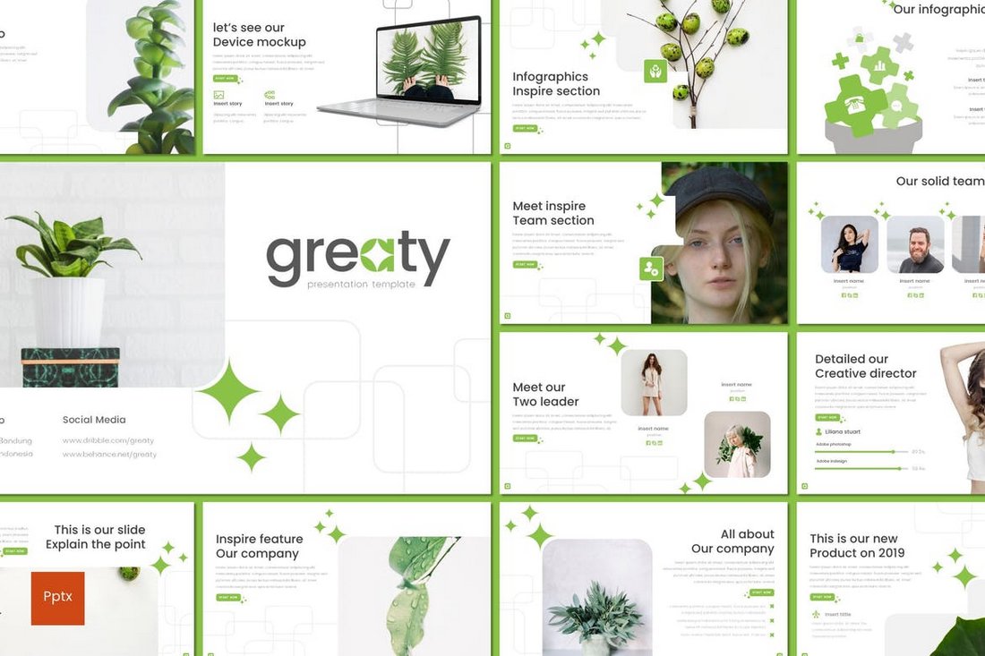
Greaty is a minimal PowerPoint template that features a simple and creative slide design. The template comes with 30 unique slide designs featuring 5 different color schemes to choose from. It also includes image placeholders and master slides as well.
This creative and colorful PowerPoint template comes with a stylish and fun design layout that will make your presentations stand out from the crowd. It’s perfect for both creative and business presentations. The template includes 50 unique slides.
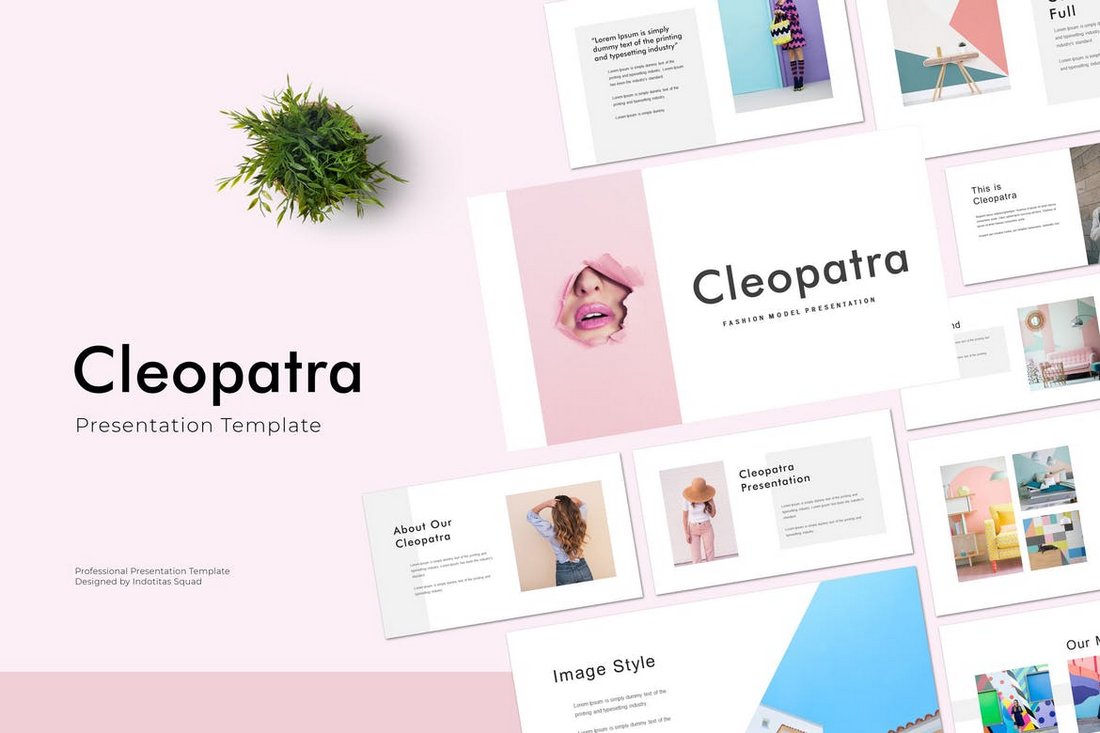
Cleaopatra is a minimal PowerPoint template you can use to design fashion, portfolio, and design presentations. The template comes with 36 unique slides that can be easily customized to your preference. It includes image placeholders as well.
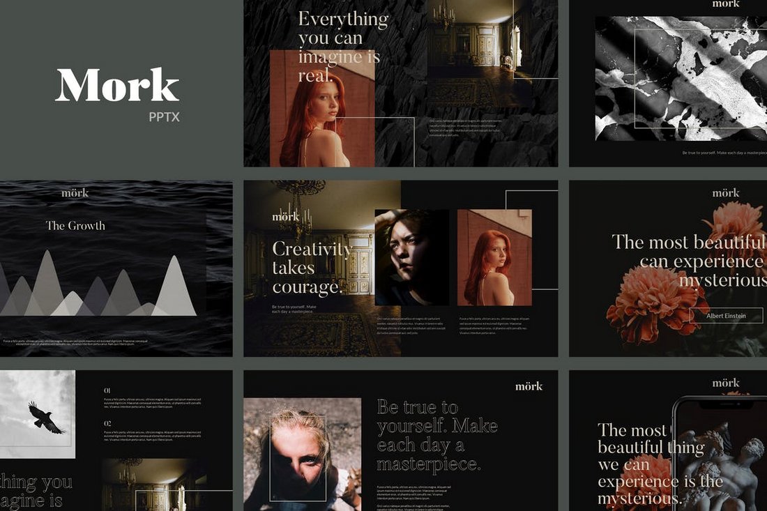
Mork is the ideal PowerPoint template for crafting presentations for photography and fashion brands. The template features a dark color theme that effectively highlights its content. It includes 30 unique slides with master slide layouts.
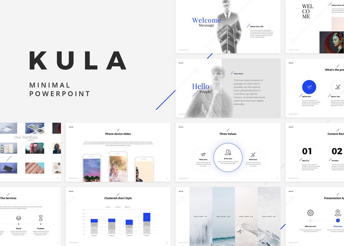
Kula is a beautifully minimal PowerPoint template you can use to design slideshows for professional and business presentations. The free template includes multiple sample slides you can use with personal projects.
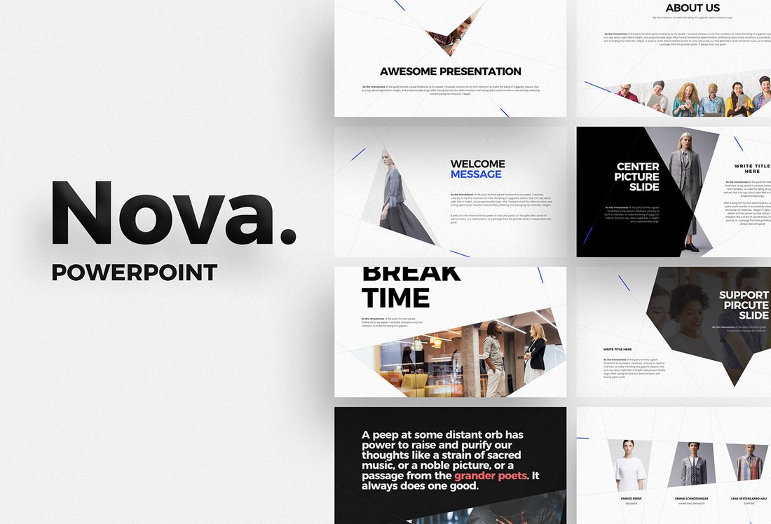
Nova is another free and clean PowerPoint template featuring a very professional slide layout design. The free version of the template can be used to create personal and creative presentations.
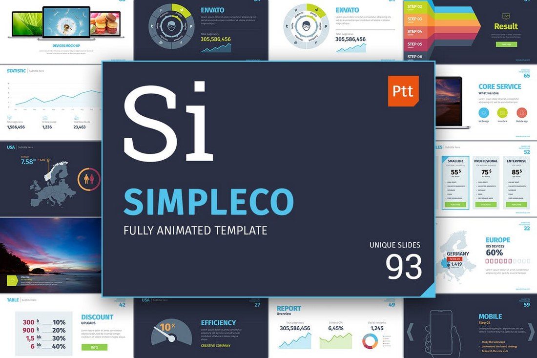
Simpleco is a powerful PowerPoint template you can use to design a slideshow for a marketing, SEO, and web design related presentations. The template includes 93 unique and fully-animated slides.
Ordinary is a stylish PowerPoint template featuring a set of modern slides most suitable for making fashion, design, and creative portfolio presentations. The template comes with image placeholders, easily editable colors, and multipurpose slide designs.
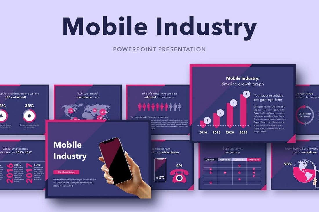
If you’re working on a presentation related to apps and mobile industry, this PowerPoint template will help you design a more compelling presentation. It comes with a set of unique slides that are crafted to help showcase stats, projections, and reports in a more professional way to attract your audience.
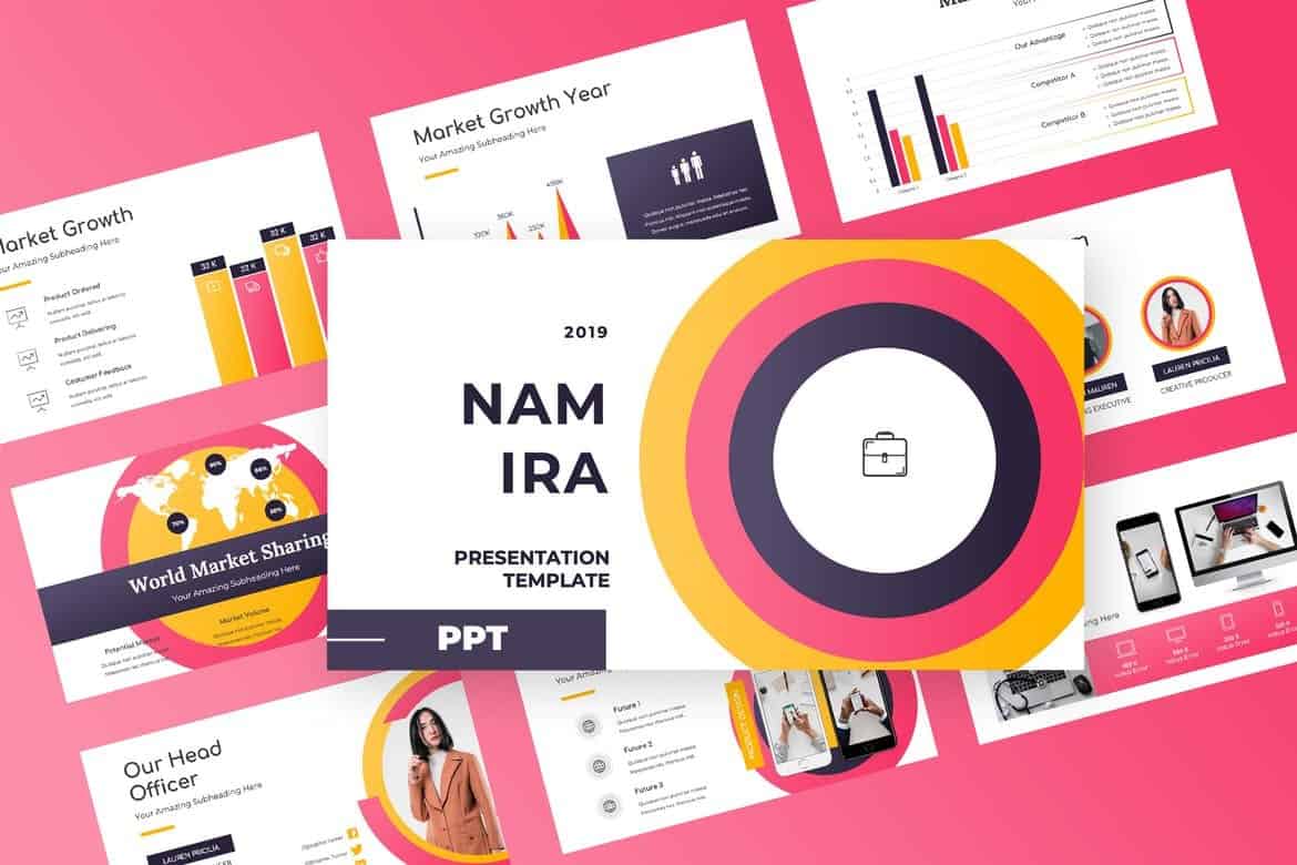
Namira is a modern and colorful PowerPoint presentation template filled with vibrant colors, beautiful shapes, and modern designs. The template comes with more than 50 unique slide designs with image placeholders, vector icons, graphics, and much more.
Featuring 80 beautiful and multipurpose slide designs, Glide is a one of a kind PowerPoint template you can download and use completely free of charge.
The template includes image placeholders, product mockups, and editable colors. You can use the template free with personal and commercial projects without any attribution.
Unlike most other free PowerPoint templates that only include a handful of slide designs, Glide includes a complete set of slides you can use to design all kinds of presentations. The slides are also easily customizable and use system fonts and custom icon packs as well.
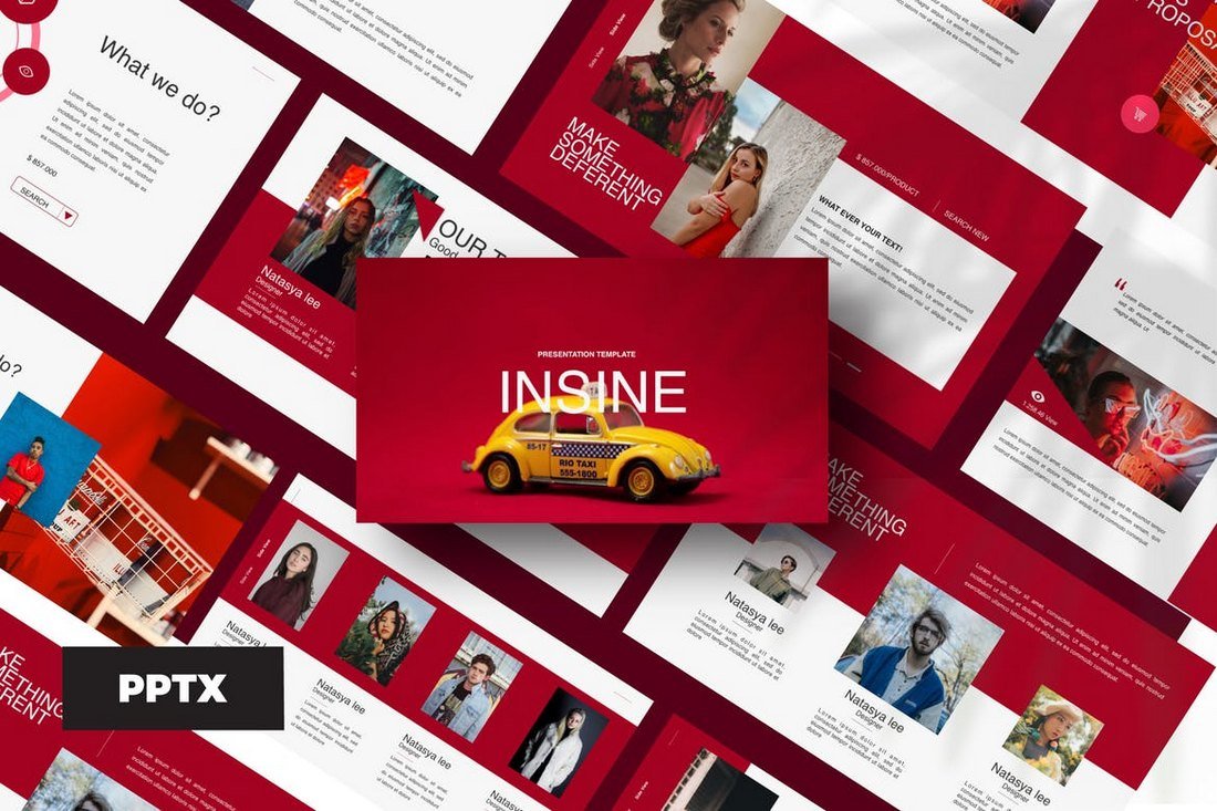
Insine PowerPoint template features a modern and an elegant design with lots of colorful slides. The template comes with 50 unique slides with lots of infographics, icons, and vector graphics.
This vibrant and colorful PowerPoint template is designed specifically for creating slideshows for businesses and creative professionals for presenting their ideas, projects, and pitching products. It comes with 20 master slides featuring unique vector graphics, image placeholders, and more.
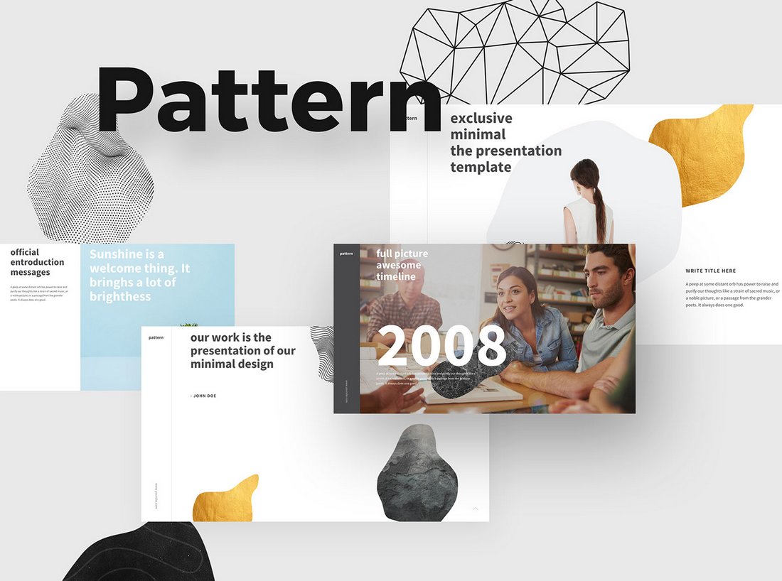
Pattern comes with a set of modern slides designed to highlight the key points of presentation with large headings and images. This free template includes 10 unique slide designs that are available in both Retina and Full HD resolutions.
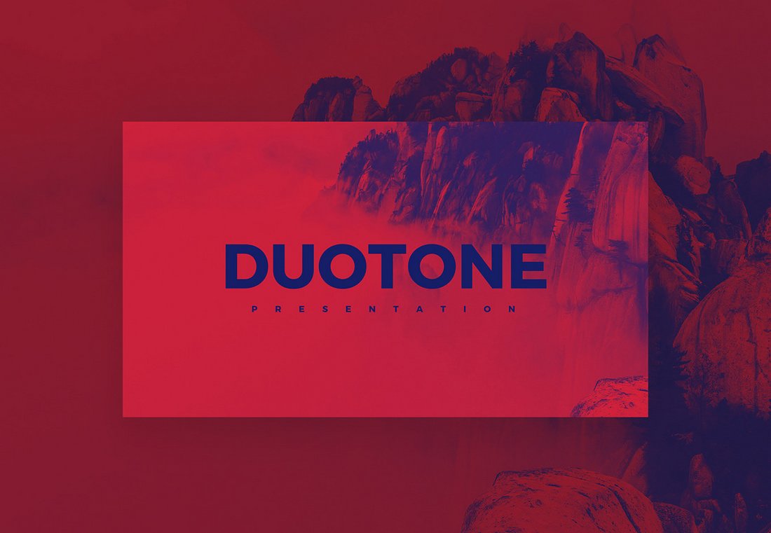
Duotone is a creative free PowerPoint template that features 18 unique slides with a duotone color effect. The template also comes with a duotone Photoshop action you can use to apply the color effect to your images to match the slide design.
This stylish PowerPoint template features plenty of slides filled with colorful gradient effects and vector graphics. It includes 150 total slides that are available in 5 color themes. You can also easily customize colors, change text, replace images, and edit icons as well.
Just as the name suggests, this PowerPoint template includes 50 unique slides filled with lots of colorful designs. It also comes with lots of vector graphics, icons, infographics, and shapes. The template is also easily customizable and you can change the colors to your preference as well.
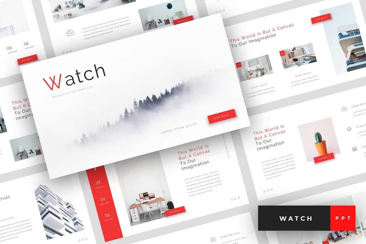
Watch is a minimalist PowerPoint template featuring a modern and elegant design that stands out from the crowd. The template has 30 unique slides with customizable drag and drop designs, image placeholders, vector graphics, and much more.
This PowerPoint template comes with a set of modern and professional slides that include highly visual designs. The slides in this template let you highlight your brand, business, and products with large images as well. It includes 30 unique slides in 5 color schemes.
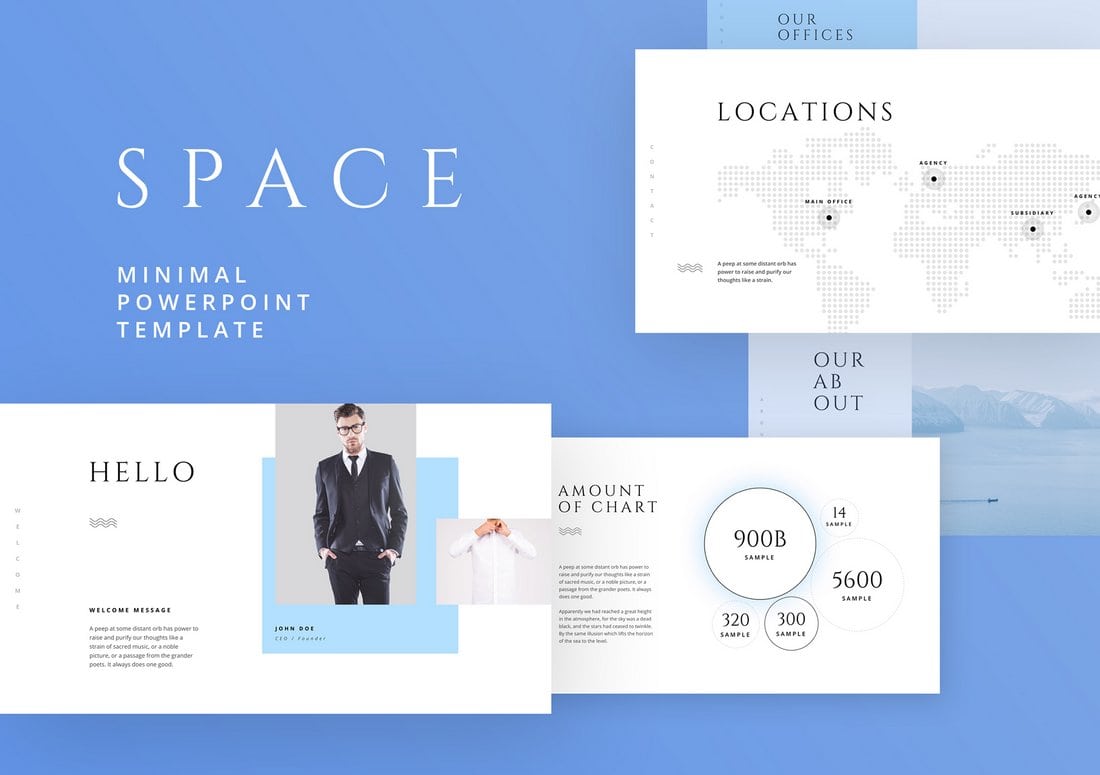
Space is a free PowerPoint template you can use to design all kinds of professional and business presentations. The free version of the template comes with multiple slides that can be customized to your preference.
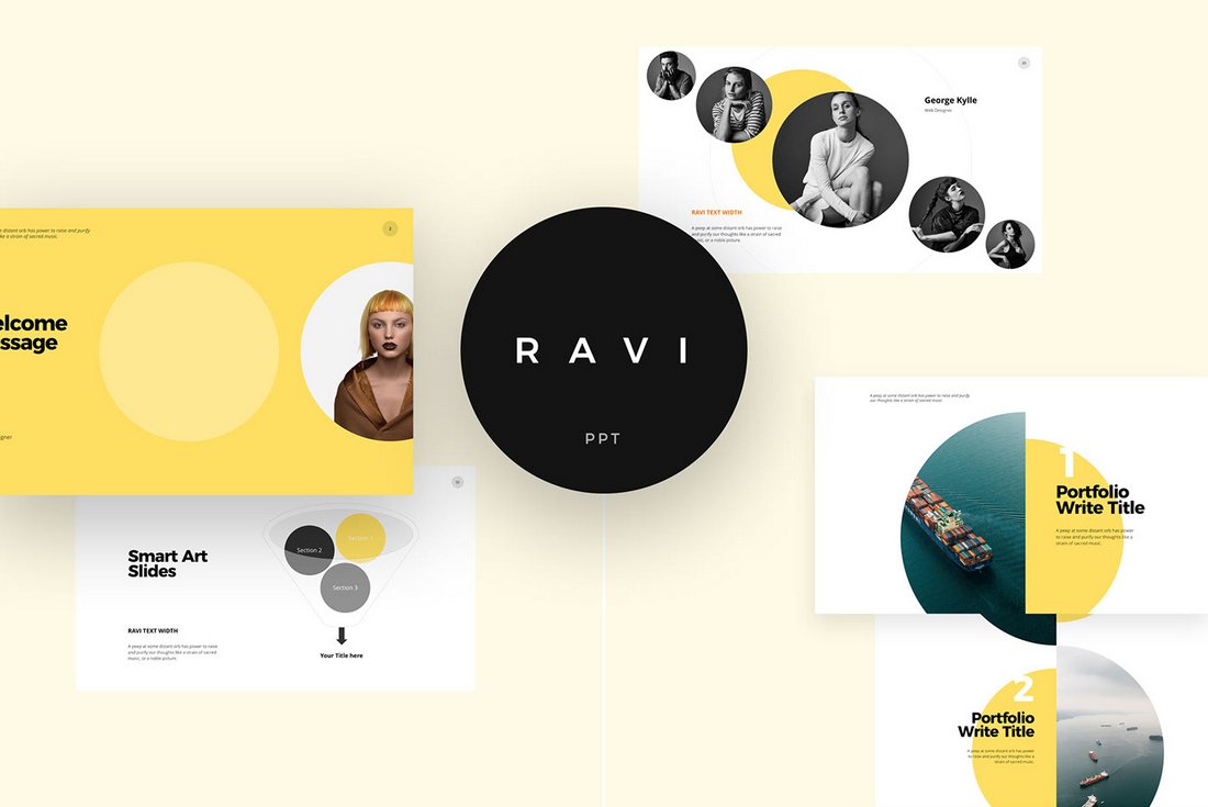
Ravi is a creative PowerPoint template that’s most suitable for designing presentations for fashion and apparel brands. The free template includes 10 unique slides in Retina and Full HD resolutions.
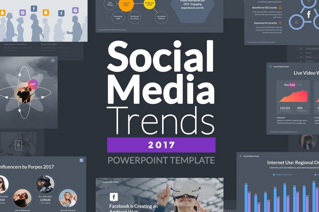
If you’re working on a presentation related to digital marketing or social media strategies, this PowerPoint template is for you. It includes 100 unique slides with plenty of customizable charts, icons, graphs, and other objects.
If you’re looking for a template to deliver a web design and app related presentation, this PowerPoint template will come in handy. This template features 60 slides in 5 different color schemes. It also includes 72 layouts in both light and dark versions.
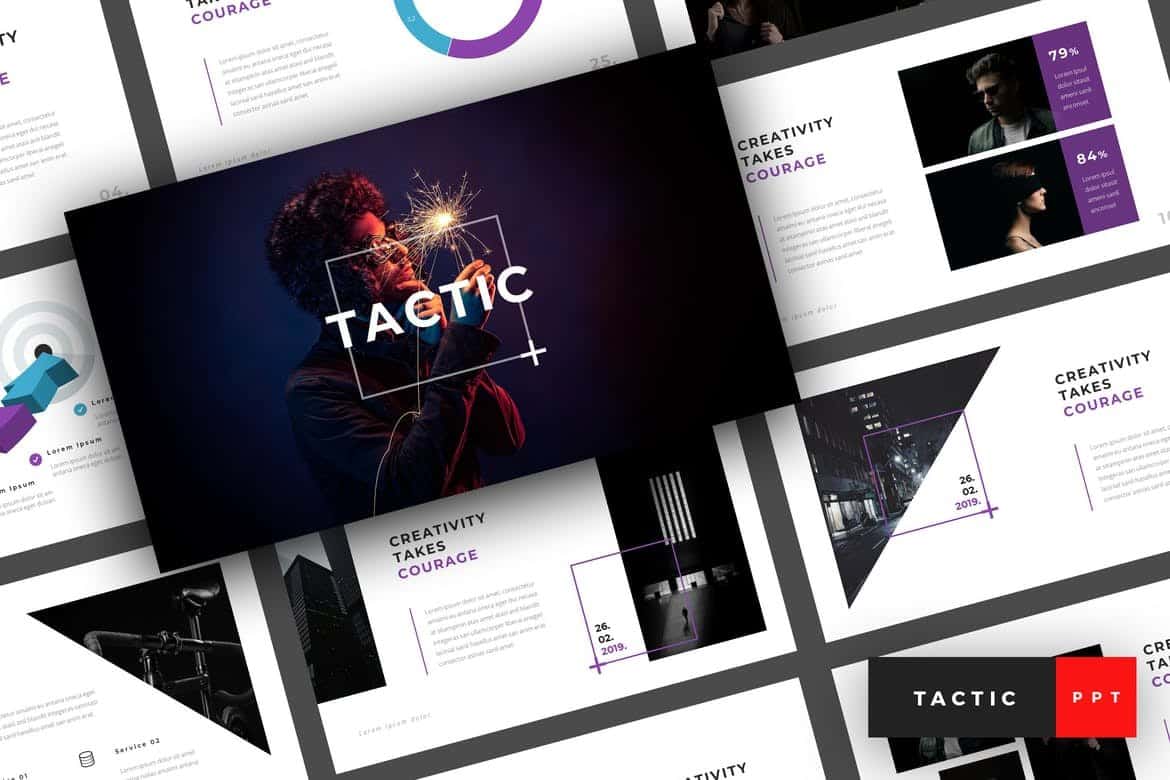
Tactic is a creative and visual PowerPoint template you can use to create presentations for modern businesses, startups, and design agencies. It includes 30 unique slides filled with editable graphics, image placeholders, and free fonts.
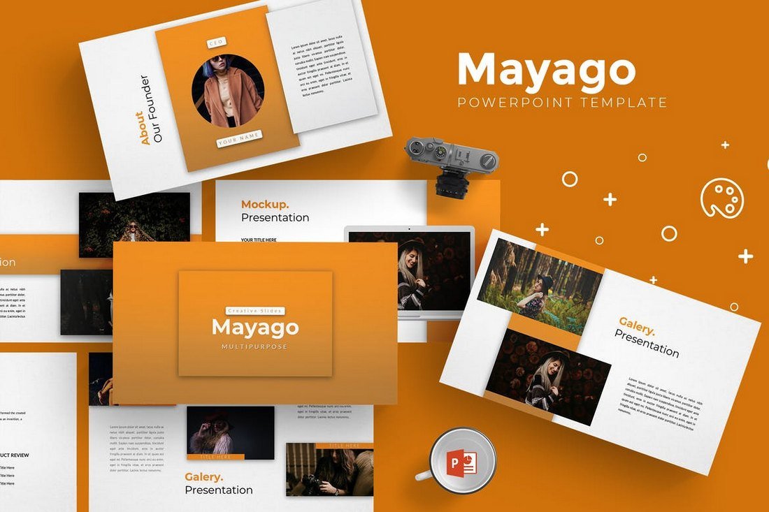
Mayago is a fully animated PowerPoint template you can use to create all kinds of slideshows for creative and professional presentations. It includes 30 unique slides filled with resizable vector graphics, icons, infographics, and much more. The template is also available in 5 different color schemes.
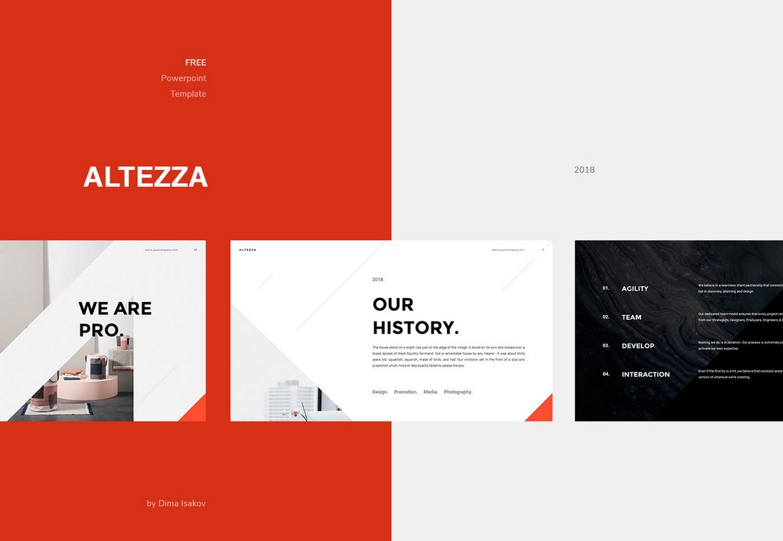
Altezza is a stylish PowerPoint template that comes with 11 creative and multipurpose slide layouts. It’s most suitable for making agency portfolios and professional presentations.
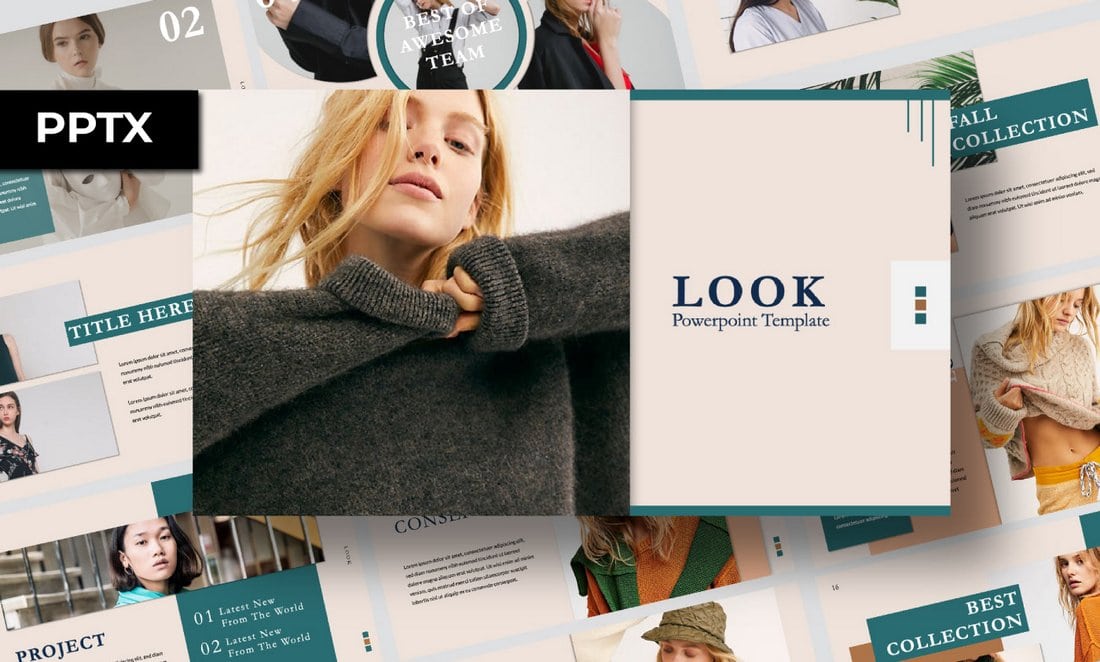
Look is another free PowerPoint template you can use to make slideshows for fashion and design related presentations. The template includes 55 unique slides you can use with your personal projects.
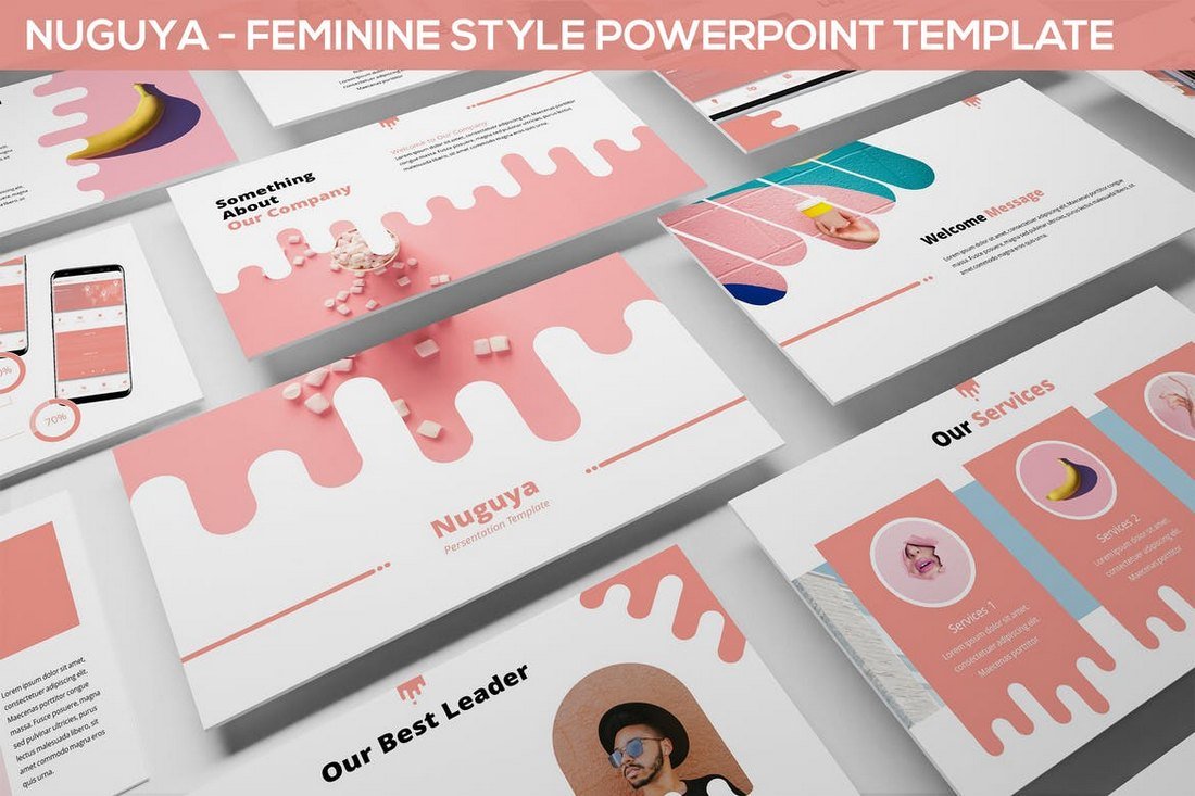
Nuguya is a PowerPoint template that comes with a feminine style slides design featuring lots of bright colors and layouts. This template is perfect for promoting and creating slideshows for creative and business presentations. The template includes a total of 360 slides in 12 premade colors.
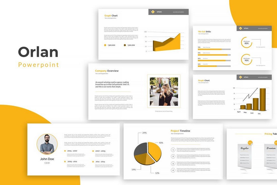
Orlan is a minimal PowerPoint template that’s most suitable for creating slideshows for creative and marketing related presentations. It includes 38 unique slides featuring free fonts and transition animations.
This modern and creative PowerPoint template comes in 3 different color themes, including light and dark color designs. It includes a total of 360 slides that are available in 12 different color schemes.
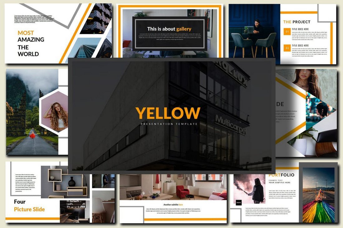
Yellow PowerPoint template comes with a modern design featuring 36 unique slides filled with lots of shapes, vectors, icons, and graphics, The template includes image placeholders for easy editing and free fonts.
Xanthopsia is a creative PowerPoint template that comes with 50 unique slides that are designed to give more focus to images. This makes it the perfect choice for creating presentations related to photography and fashion.
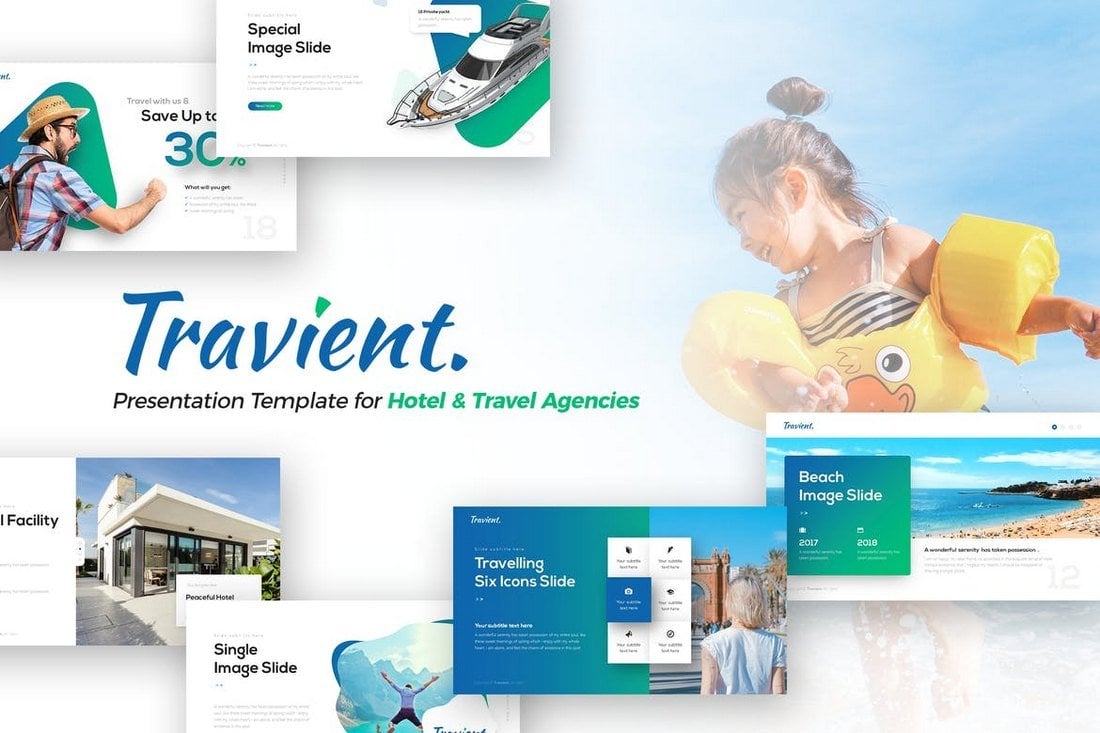
Travient is a modern PowerPoint template made for promoting hotels and travel agencies. It includes 80 unique slides that are available in 10 color schemes and 134 master slide layouts.
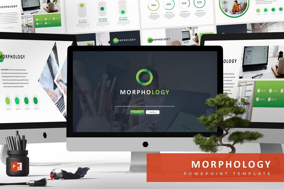
Morphology is an effective PowerPoint template you can use to create slideshows for modern business and startup presentations. The template comes with 30 unique slides in 5 different color schemes, making a total of 150 slides.
Theo is a colorful PowerPoint template that features lots of attractive illustrations, infographics, and charts for creating more engaging presentations for businesses, startups, and corporations. It includes 30 unique slides in 5 premade color schemes.
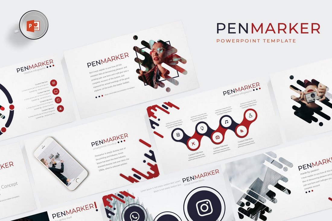
Penmarker is a beautifully minimalist PowerPoint template you can use to create presentations related to creative and design related projects and events. It comes with 30 unique slides in 5 different color schemes, making a total of 150 slides.
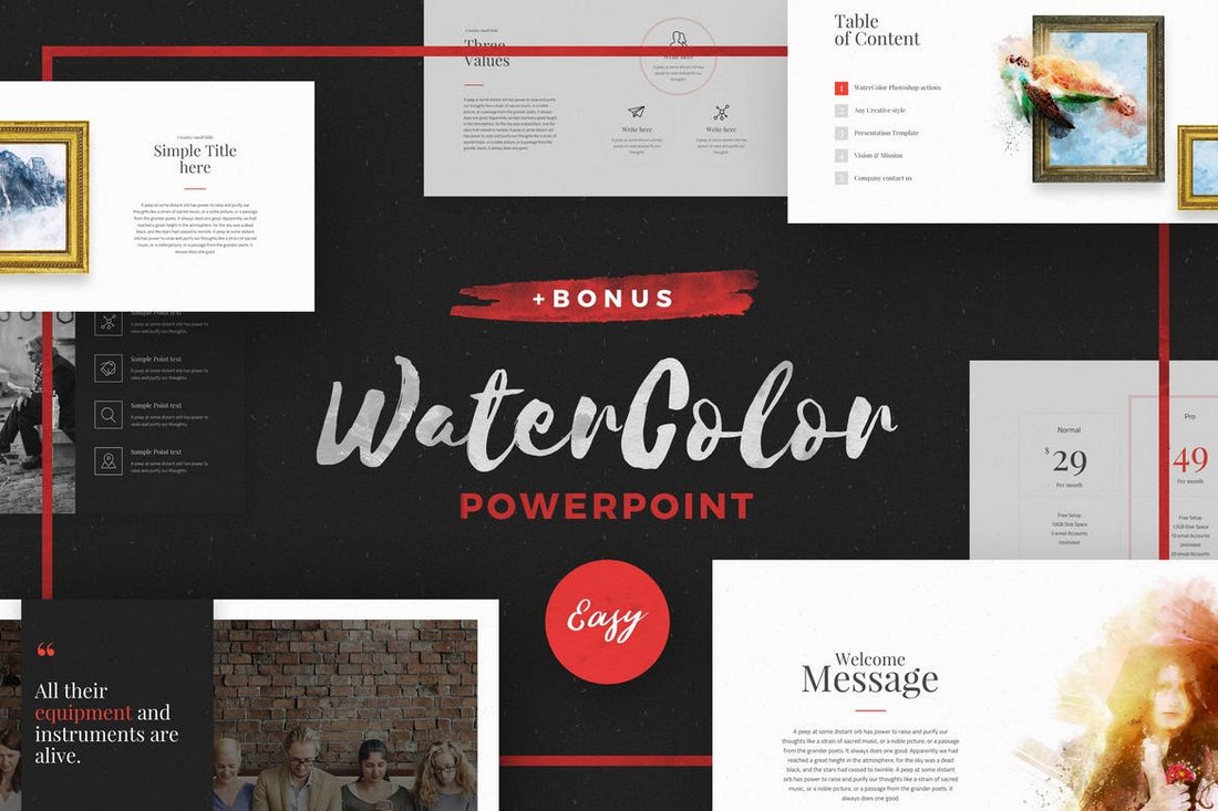
This unique PowerPoint template features lots of attractive watercolor designs, vectors, and illustrations that will surely add more color to your presentations. It comes with 80 unique slides featuring 40 curated colors.
This PowerPoint template comes with a very professional design that makes it most suitable for corporate and small business presentation slideshows. The template includes 150 slides featuring 5 color themes with gallery, portfolio, and other unique slides.
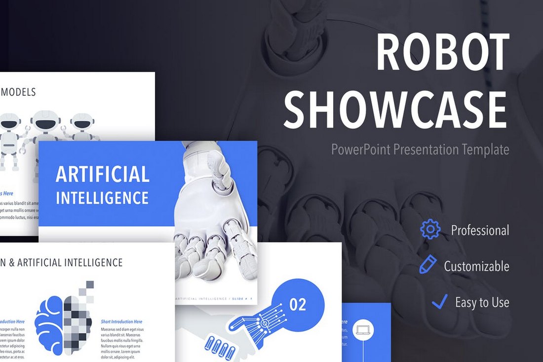
Robot Showcase is a unique PowerPoint template made for creating presentation slideshows for technology-related businesses and events. It comes with 20 master slides featuring lots of diagrams, charts, graphics, and more to help you visualize data in a professional way.
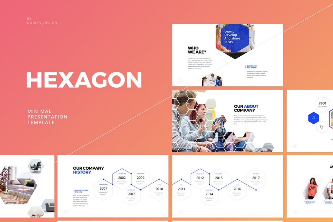
Hexagon is an attractive PowerPoint template that includes 110 unique slides. The template is filled with slides featuring graphics and image placeholders designed in the shape of hexagons. It also includes an editable icon pack and device mockups.
This PowerPoint template is ideal for designing presentations for apparel and fashion related businesses. The template features 50 unique slides with easily replaceable image placeholders, vector graphics, icons, and lots of other elements.
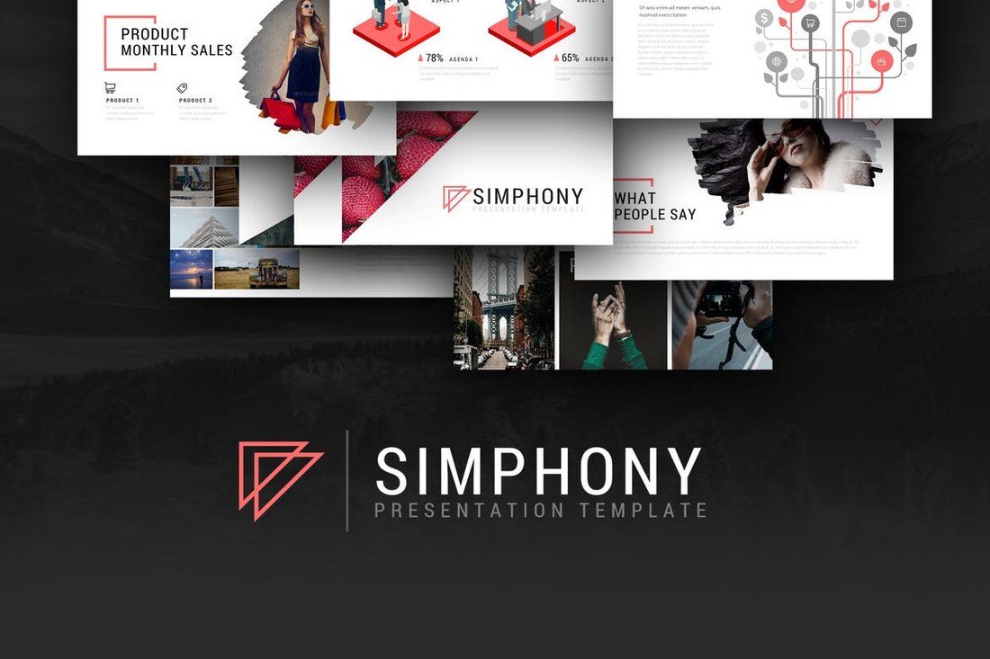
Simphony is an elegantly designed PowerPoint presentation template that comes with more than 5600 slides with the ability choose from 10 different color schemes. It also includes over 90 multipurpose slides for different types of presentations and 124 master slide layouts in both light and dark color themes.
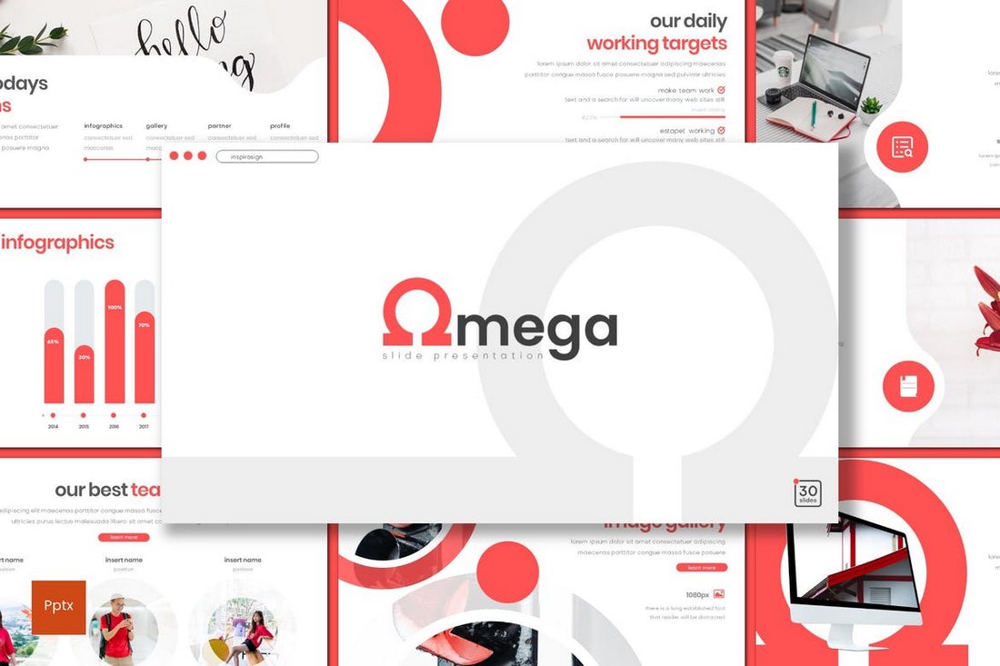
Omega is the perfect PowerPoint template for creative agencies. This template includes 35 unique slides featuring many different graphs, graphics, charts, and icons. The template is also available in dark and light versions.
A PowerPoint template featuring 70 unique slides. This template is designed to use in business and promotion presentations, especially related to eCommerce and product promotions. The template comes with 50 color schemes, 30 icons, infographics, diagrams, charts, and much more.
This is a powerful presentation template that includes more than 70 unique slides for delivering a great marketing presentation. It also includes many charts, infographics, icons, and objects for visualizing data.
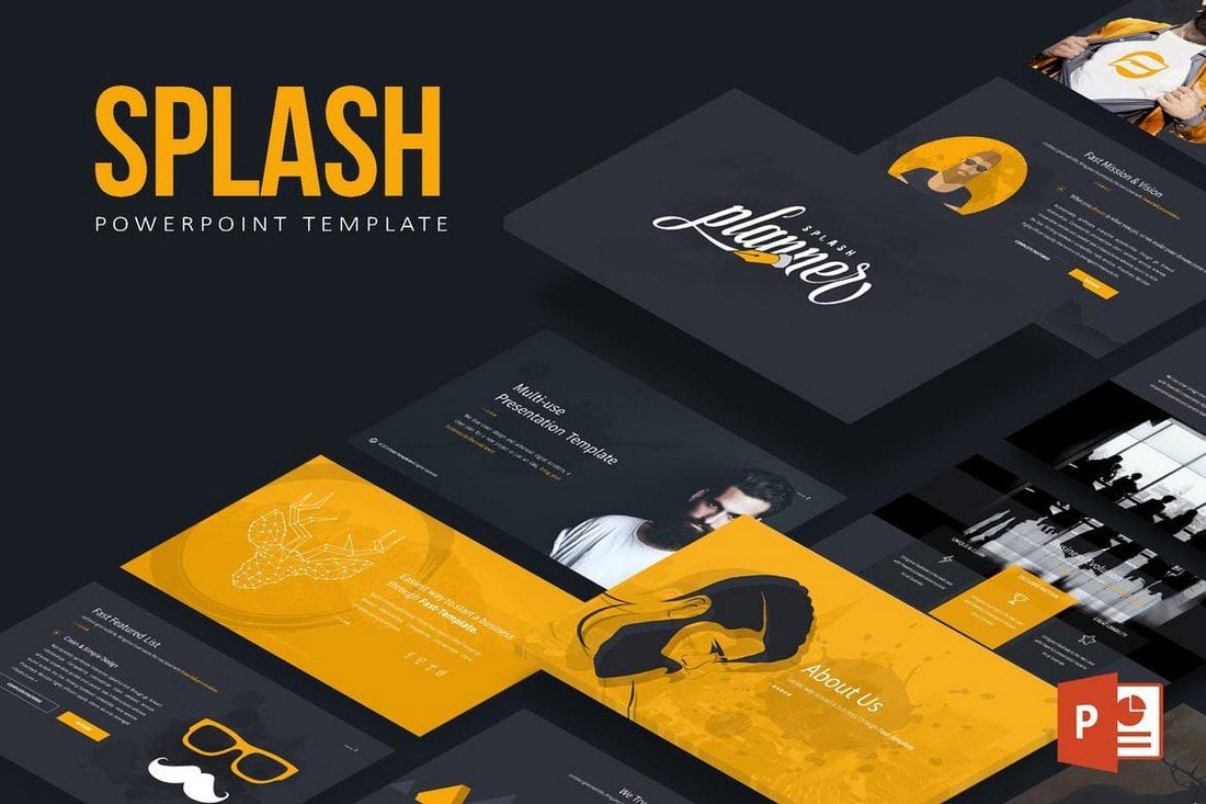
Splash is a professionally designed presentation template that’s perfect for both business and personal use. The template includes 30 unique slides in 5 different color schemes with lots of illustrations and graphics.
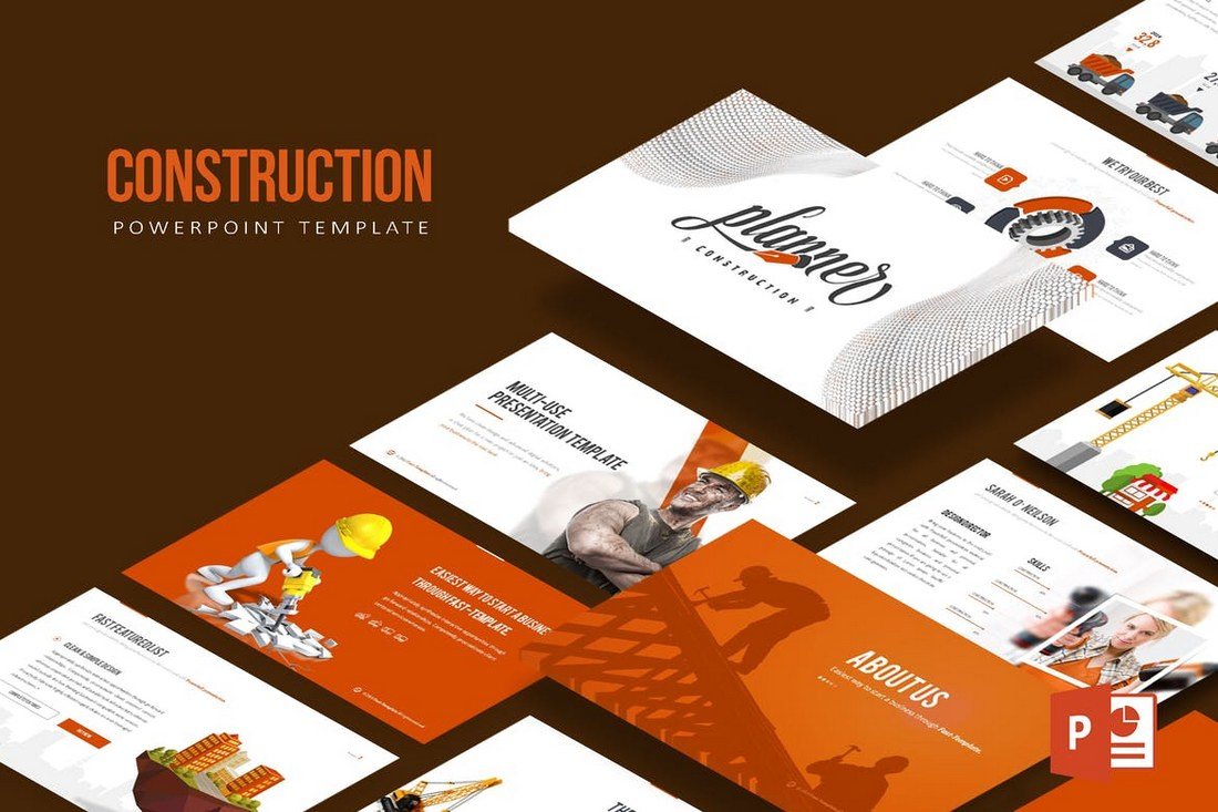
This is the perfect template you can use to design a construction or real-estate related presentation. The template includes 30 unique slides in 6 different color variations with many multipurpose slides and device mockups.
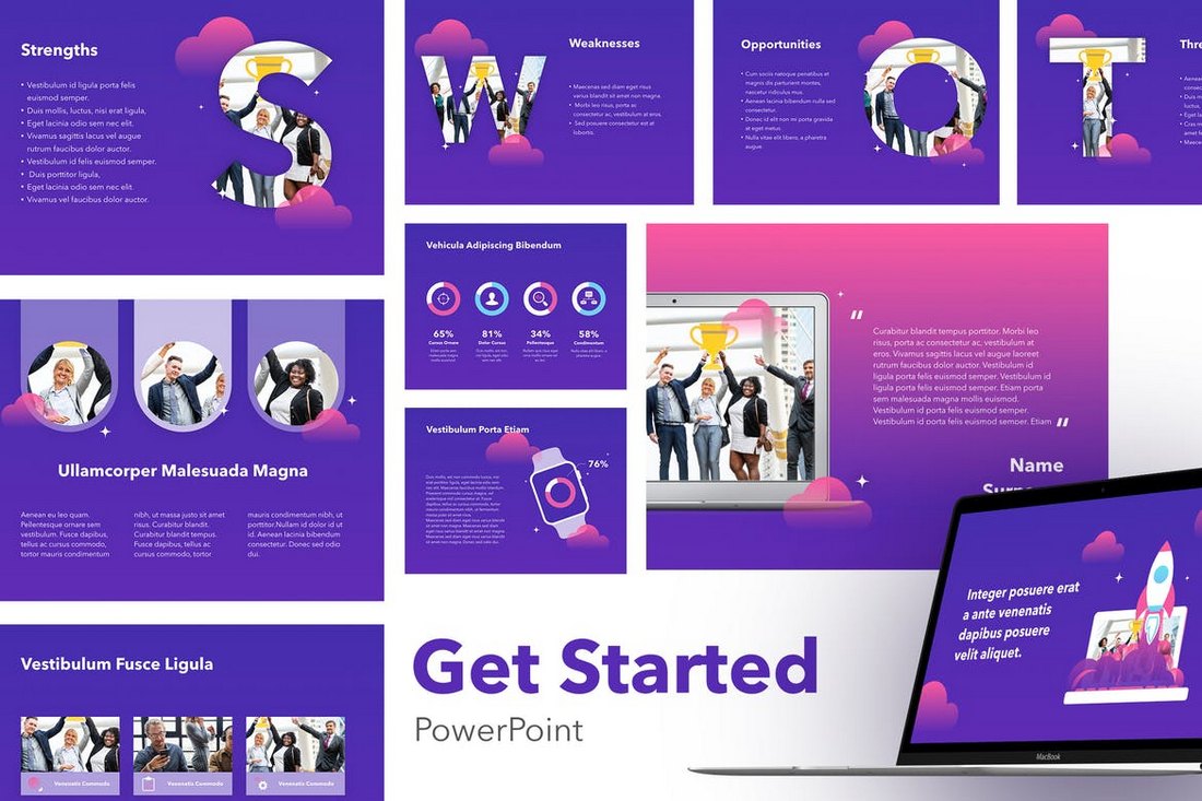
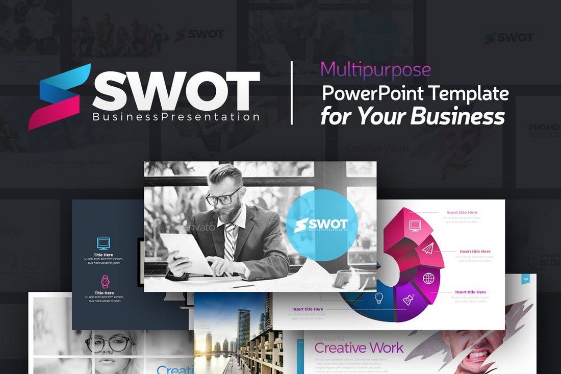
Swot is a PowerPoint template for business and corporate presentations. It comes with 111 unique slides, 112 master slide layouts, and in 20 different color schemes. It also includes gallery slides, price tables, infographics, and more.
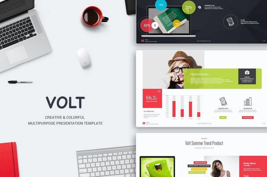
Volt is a multipurpose PowerPoint template that can be used to create many different types of presentations. It features 120 unique slides in both light and dark versions and with unlimited color options as well as charts, graphs, diagrams, tables, and more.
This is a great presentation template for promoting a product or an eCommerce business. The template includes 20 master slide layouts with a design that highlights products. It also includes lots of color customization options and graphical objects.
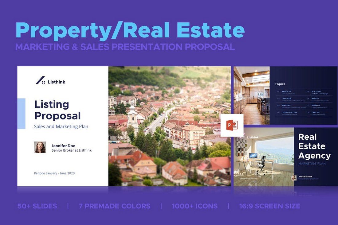
This is the perfect PowerPoint template you can use to create a presentation for a real estate or property related business. It comes with 50 unique slides in 7 different color schemes, making it a total of 350 slides.
Another creative PowerPoint template featuring a professional design. This template is perfect to be used in business, sales, and marketing related presentations. The template comes with 20 master slide layouts and lots of diagrams, charts, tables, and more.
This template is specifically designed for agency-related presentations. It comes with 21 unique slides in 7 different color schemes. The template is also easily customizable. You can edit the size, color, and shape of objects as well as replace images by simply dragging and dropping.
Just as the name describes, this PowerPoint template is designed as a pitch deck for pitching products, startups, and ideas. It comes with 150 unique slides in 10 different light and dark color versions. It includes a total of 3000 slides.
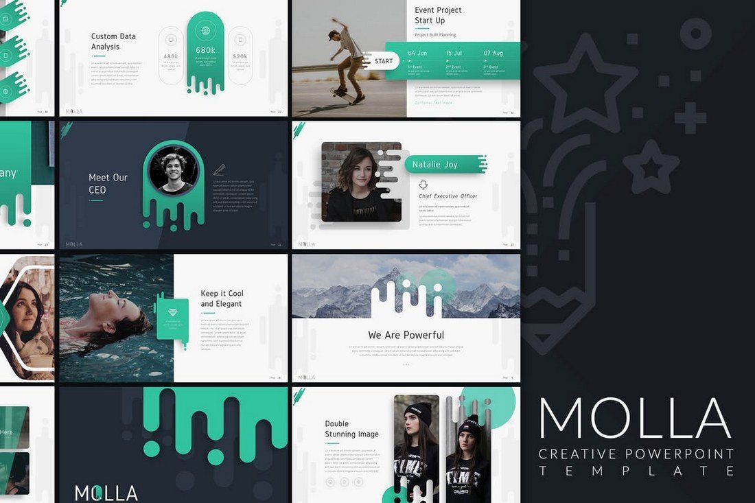
Molla is a stunning PowerPoint template that includes over 60 unique slides featuring a creative design. You can also choose the slides from 20 different color schemes and 100 master slides in light and dark color themes. It also includes an icon pack and an infographic as well.
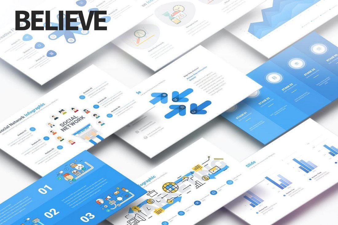
Believe is a multipurpose PowerPoint template, which means you can use it to craft many different types of presentation slideshows. It comes 213 unique slides in 10 different color variations, making a total of over 2100 slides.
This presentation template is perfect for all types of business and corporate presentation slideshows. It includes 30 unique slides in 3 color themes and dark and light background versions as well.
Another great presentation template for fashion and clothing related businesses. This template comes with 20 master layouts with lots of customizable charts, colors, and objects.
This modern and creative PowerPoint template features a design that makes it most suitable for marketing related presentations. It’s also great for business proposal and growth slideshows as it comes with lots of pictorial slides, charts, cycle, and 100 more types of slides.
Another modern PowerPoint presentation template featuring over 100 slides in 2 different color schemes. It also includes a customizable world map, icons, objects, and unlimited color options.
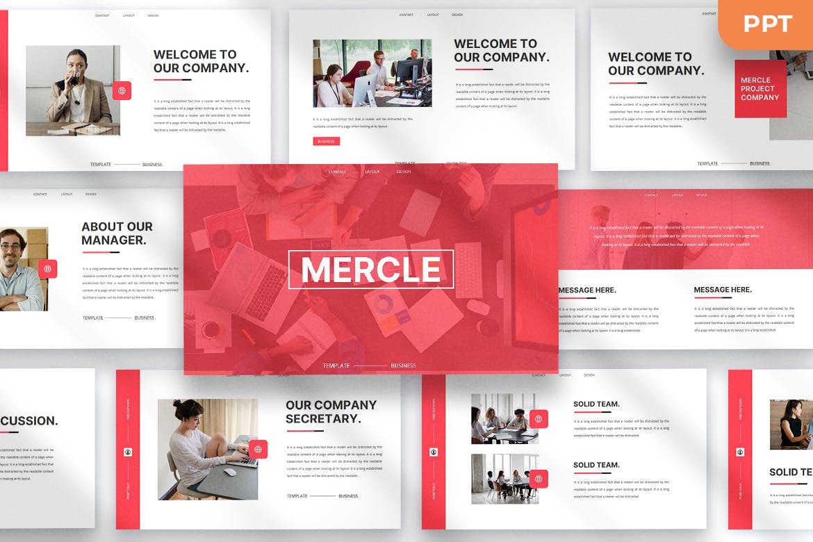
Mercle is a carefully crafted PowerPoint template that has an air of minimalism and simplicity, whilst still maintaining a creative look required in modern-day presentations. It comes packed with 30 professional slides that you can make your own with just a few easy clicks.
Manisof is a clean, modern, portfolio-style presentation format that is sure to grab the attention of your audience in an instant. It consists of 30 creative slides that can be easily edited in PowerPoint, Google Slides, or Keynote. It’s a worthy candidate for your cash and deserves to be added to your shortlist.
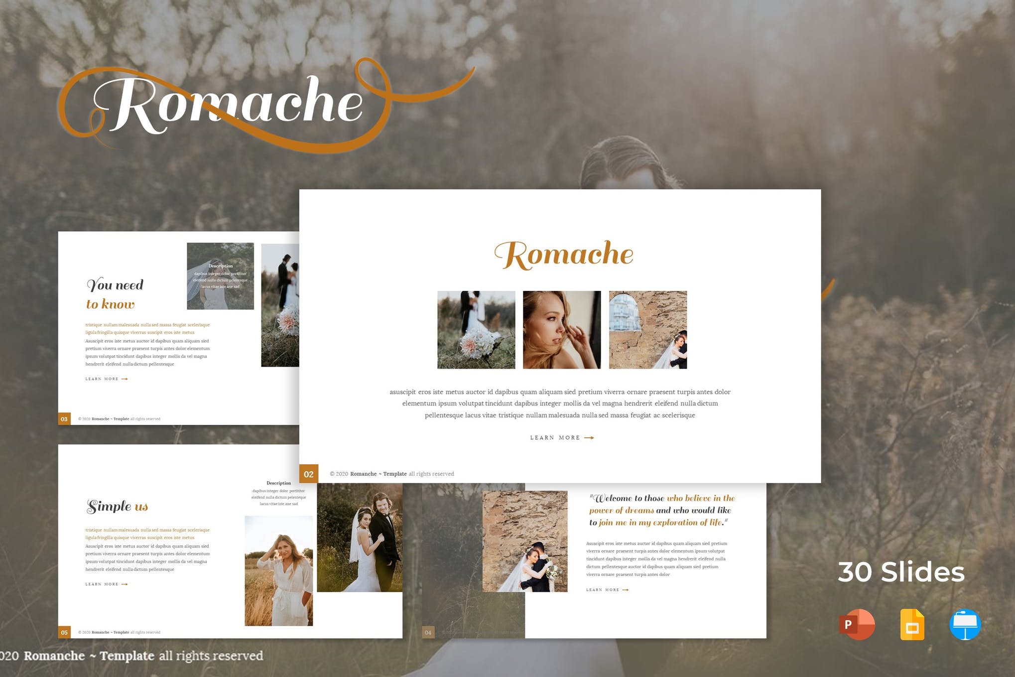
The next option in our list of the best PowerPoint presentation templates is Romache, a clean and modern design perfect for business, and product promotion purposes. It offers 30 unique slides, 5 color variations, pixel-perfect illustrations, and handcrafted infographics. Images can be easily customized using the drag and drop picture placeholder.
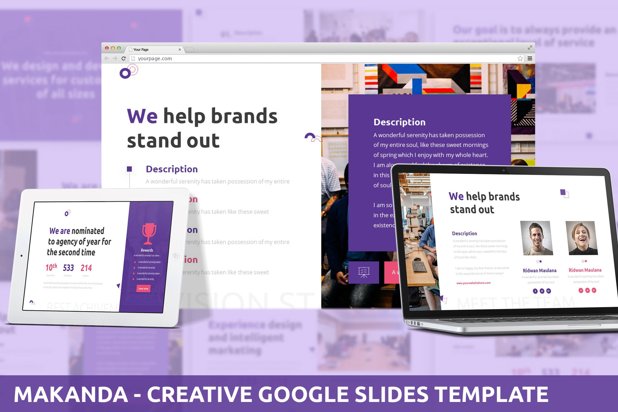
Ideal for development or creative agency, Makanda is a charming PowerPoint Presentation that features 30 beautiful slides, 3 premade color themes, animation effects, and picture placeholders. It comes with full documentation and is compatible with PowerPoint and Google Slides.
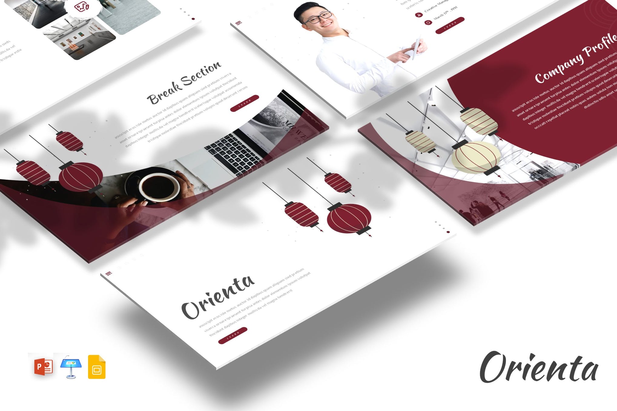
Next up, we have Orienta, a simple yet eye-catching set of 30 portfolio-styled slides compatible with Keynote, Google Slides, and PowerPoint. It comes with a 16:9 aspect ratio, free fonts, vector graphics, drag and drop picture placeholders plus a ton of customization options.
5 Tips for Choosing a PowerPoint Template
There are many different types of PowerPoint templates on our list. These tips will help you find the best one for your project.
1. Minimal Content Layout
In general, it’s always best to go with a minimalist content layout for your PowerPoint slide designs, especially when creating professional and business presentations.
With a minimal slide design, you’ll be able to easily highlight your content in each slide. So be sure to pick a template that comes with a clean and simple slide design that gives your content the main spotlight.
2. Multiple Color Schemes
PowerPoint templates are easily customizable. You can edit the template to change colors as well. But, wouldn’t be easier if a template comes with just the right colors that match your branding?
Thankfully, most premium PowerPoint templates let you choose from multiple color schemes to quickly design a presentation without having to worry about customizing the colors.
3. Different Design Themes
You can’t use the same PowerPoint template for every presentation you make. Even if you buy a template with a multipurpose design, it will only be able to make certain types of presentations.
For example, the PowerPoint template you use to make an annual business meeting presentation can’t be used to create an agency portfolio presentation. Make sure to grab a PowerPoint template with the right design theme that matches your brand and presentation.
4. Image Placeholders
Images take a major part in every presentation. They not only make your presentation look more visually appealing but also help add context to your messages.
When picking up a PowerPoint template with lots of images, check to see if it’s made with image placeholders. So that you can easily remove the dummy content place your own images into the slides without a hassle.
5. Graphs, Charts, and Vector Graphics
Your presentation will likely include data and statistics from different studies, research, and reports. You can use stylish graphs, pie charts, and infographics to visualize the data in your presentations.
Look for a PowerPoint template that comes bundled with editable vector graphics and icon packs to create a more effective presentation.
How to Edit a PowerPoint Template
Editing a PowerPoint template is quite simple. Follow these steps to get started.
- Extract the files in the ZIP file you’ve downloaded
- Inside the extracted folder you’ll find a PPTX file
- Double-click the PPTX file to open the template in PowerPoint
- Now you can edit the template to change its colors, fonts, and images however you like
- If you want to create a new slide using a master slide layout from the template, simply go to the View tab and then select Slide Master. From here you’ll be able to select a master slide layout from the available options
5 FAQs for Using a PowerPoint Template
These frequently asked questions about PowerPoint will help you get an idea of how to make the most of PowerPoint templates.
1. How to Install PowerPoint Templates?
Installing a PowerPoint template is quite easy. Simply follow the steps below.
- First, download the PowerPoint template
- If it comes in a ZIP file, UnZip and extract its files
- Inside the extracted files you’ll find a file called .PPTX
- Simply double-click on the PPTX file to load the template in PowerPoint
2. How to Use Master Slide Layouts in PowerPoint?
Master slide layouts are pre-made slide designs that come with PowerPoint templates. You can use them to create multiple slides of the same design.
To use and edit master slides, simply go to the View menu and select Slide Master.
3. How to Change Colors in PowerPoint Templates?
Most PowerPoint templates feature designs made with vector shapes. These shapes can be easily customized, resized, and you can even change colors.
You can change colors by selecting these shapes individually. However, the easiest way to change colors is to edit the master slide layouts. This allows you to use the same colors when making more slides of the same master layout.
Select the Colors option in the Slide Master panel to change colors. You can learn more from this guide.
4. How to Insert Images in PowerPoint Templates?
PowerPoint templates come with image placeholders to let you easily insert your own images into each slide with less effort. All you have to do is drag and drop an image file from your computer and into the image placeholder to place it in the exact same position.
5. How to Create Custom PowerPoint Templates?
Did you know that you can also create your own PowerPoint templates? For example, you can use templates to save the changes you’ve made to a PowerPoint template or share a design with a friend.
To do this simply go to the File menu and select Save As. On the Save As Type list, select PowerPoint Template. And you can save it as a custom PowerPoint template.
5 Tips for Giving a Successful Presentation
Designing the slideshow is the easy part, next comes the presentation. Use these simple tips to deliver a more impactful presentation.
1. Leverage Storytelling
Storytelling is a great strategy many expert speakers use to grab the attention of the audience and to keep their focus throughout the presentation. Just watch a few TED talks and you’ll notice how they all start with a great story.
You don’t have to share your own personal stories in each presentation. But, you can leverage some type of storytelling in your presentation. Whether it’s how you completed a project or even an anecdote is enough to make your presentation more entertaining.
2. Make Minimal and Simple Slides
Don’t create slides that take away too much attention from your presentation. Your main goal is to keep your audience focused on your speech.
Create slides with simple designs and shorter sentences to help deliver your key points more effectively. Use infographics and charts to visualize data and statistics as well.
3. Follow the 10/20/30 Rule
Guy Kawasaki, a brilliant marketing expert, introduced a clever strategy for delivering better presentations. He calls it the 10/20/30 rule. Basically, you keep your slideshow limited to 10 slides, last no more than 20 minutes, and keep the font size to minimum 30 points.
This is quite a strong rule to follow. While it may not work for certain types of slideshows, it’s effective for most presentations.
4. Make Your Objective Clear
When you pack so much content and information into a 20-minute presentation, the audience could easily get lost in the beautiful slides and miss out on the important key points of your speech.
Make sure to clarify your main objectives and key points of the presentation in a way that the audience can grasp easily.
5. Don’t Be Afraid to Improvise
Your audience will react to your presentation in many different ways. You’ll never be able to predict their emotions and reactions. Don’t be afraid to improvise when necessary. Engage with your audience to make your presentation more entertaining.
If you’re a Mac user, be sure to check out our handpicked collection of the best Keynote templates.


![→ Free Download: Free Marketing Reporting Templates [Access Now]](https://no-cache.hubspot.com/cta/default/53/0d883e85-c2e5-49bb-bef2-bfddb500d84b.png)


![Download Now: Lead Scoring Calculator [Free Template]](https://no-cache.hubspot.com/cta/default/53/ee17df5d-dff8-412f-906d-f91308678766.png)


![→ Free Templates: How to Use YouTube for Business [Download Now]](https://no-cache.hubspot.com/cta/default/53/b33cfd44-133a-49e3-a943-086c5679d485.png)


![Download Now: The 2024 Growth Blueprint [Free Report]](https://no-cache.hubspot.com/cta/default/53/354d57e4-0f09-4eb0-a331-6c5633fb1432.png)


![Download Now: Ultimate Google Ads PPC Guide [Free Kit]](https://no-cache.hubspot.com/cta/default/53/fbcf2b0b-3c92-4b5b-aee9-f9baf59d9721.png)


![Download Now: 100 ChatGPT Prompts for Marketers [Free Guide]](https://no-cache.hubspot.com/cta/default/53/c497a8fe-0f60-4244-9cb1-5bed4d1e5ab6.png)


