I'm quires about knowing how platform modernization transforms the digital business?
What is Platform modernization?


Tips, Expertise, Articles and Advice from the Pro's for Your Website or Blog to Succeed
I'm quires about knowing how platform modernization transforms the digital business?
DevOps is more than just a buzzword; it’s a transformative approach that integrates development and operations to improve collaboration, streamline workflows, and accelerate delivery. Successful DevOps implementation can lead to faster releases, improved quality, and enhanced customer satisfaction. This blueprint outlines essential strategies for achieving DevOps success, whether you’re starting from scratch or refining your …
Continue reading "Blueprint for DevOps Success Essential Strategies for Effective Implementation"
The post Blueprint for DevOps Success Essential Strategies for Effective Implementation first appeared on Lucid Softech.
to create a code in c++ for representing an adjacency matrix using templates and delete node function
In one of my previous articles, I explained how to generate stunning images for free using diffusion models and showed how to generate Stability AI's diffusion models for text-to-image generation.
Since then, the AI domain has progressed considerably, particularly in image generation. Black Forest Labs has released Flux.1 series of state-of-the-art vision models.
In this article, you will see how to use Flux.1 models for text-to-image generation and text-to-image modification. You will import Flux models from Hugging Face and generate images using Python code.
So, let's begin without ado.
Flux models are gated on Hugging Face, meaning you have to log into your account to access Flux models. To do so from a Python application, particularly Jupyter Notebook, you need to download the huggingface_hub module. In addition, you need to download the diffusers module from Hugging Face.
The script below downloads these two modules.
!pip install huggingface_hub
!pip install git+https://github.com/huggingface/diffusers.git
Note: To run scripts in this article, you will need Nvidia GPUs. You can use Google Colab, which provides free Nvidia GPUs.
Next, let's import the required libraries into our Python application:
from huggingface_hub import notebook_login
import torch
import matplotlib.pyplot as plt
from diffusers import FluxPipeline
from diffusers import FluxImg2ImgPipeline
from diffusers.utils import load_image

notebook_login() # you need to log into your hugging face account using access token
Flux models have two variants: timestep-distilled (FLUX.1-schnell) and guidance-distilled (FLUX.1-dev). The timestep-distilled model requires fewer sampling steps and has a maximum sequence length of 256, while the guidance-distilled variant needs about 50 sampling steps for good-quality generation and has no limitations on max sequence length.
We will use the guidance-distilled Flux.1-dev model for text-to-image generation.
The following script creates a Hugging Face pipeline by importing the pretrained Flux.1-dev model from Hugging Face.
pipe = FluxPipeline.from_pretrained("black-forest-labs/FLUX.1-dev", torch_dtype=torch.bfloat16)
pipe.enable_model_cpu_offload()
Next, for image generation, you must pass the text prompt, the output image's height and width, the guidance scale, the number of interference steps, and the maximum sequence length for the input text.
The guidance_scale parameter influences how closely the generated image adheres to the prompt. Its value ranges between 0 and 20. The num_inference_steps determines the number of denoising steps, affecting the quality and generation time. A higher number of inference steps results in a higher-quality image but takes more time to generate.
The following script will generate an image of a girl standing in front of the Eiffel Tower, holding a sign that says, "Welcome to Paris."
prompt = "A little girl standing in front of eifel tower holding a sign that says welcome to Paris"
image = pipe(
    prompt,
    height=1024,
    width=1024,
    guidance_scale=3.5,
    num_inference_steps=50,
    max_sequence_length=512,
    generator=torch.Generator("cpu").manual_seed(0)
).images[0]
image.save("girl-in-paris.png")
Output:

From the above output, you can see that the model can generate a photo-realistic image.
Let's see another example. We will generate an image of a baby riding a line in Times Square, NY, with an elephant in the background.
prompt = "A baby riding a lion in time square new york with elephants in the background"
image = pipe(
    prompt,
    height=1024,
    width=1024,
    guidance_scale=10,
    num_inference_steps=50,
    max_sequence_length=512,
    generator=torch.Generator("cpu").manual_seed(0)
).images[0]
image.save("baby_lion_time_square.png")
Output:

The above output shows that the model could generate all the details specified in the text prompt.
Finally, I will create a simple function that generates an image given a prompt and the output image name. You can use this function to generate images in your code.
def generate_image_from_text(prompt, image_name):
  image = pipe(
    prompt,
    height=1024,
    width=1024,
    guidance_scale=3.5,
    num_inference_steps=50,
    max_sequence_length=512,
    generator=torch.Generator("cpu").manual_seed(0)
  ).images[0]
  image.save(image_name + ".png")


prompt = "A golden duck swimming in a lake with mountains and sunset view in the background"
image_name = "duck_in_lake"
generate_image_from_text(prompt, image_name)
Output:

As you can see from the above output, the Flux.1-dev model generates very high-quality images based on text prompts.
In the next section, you will see how to modify existing images based on text prompts.
We will use the timestep-distilled Flux.1-schnell model for image modification.
The following script creates a Hugging Face pipeline for the Flux.1-schnell model.
device = "cuda"
mod_pipe = FluxImg2ImgPipeline.from_pretrained("black-forest-labs/FLUX.1-schnell", torch_dtype=torch.bfloat16)
mod_pipe = mod_pipe.to(device)
We will modify the following Wikipedia image of the Pyramid of Giza by adding birds, camels, and a river.
Input Image:

Image modification is similar to image generation, except we must also pass the strength parameter to the pipeline object. The strength parameter defines the extent to which the original image will be modified.
url = "https://upload.wikimedia.org/wikipedia/commons/thumb/a/af/All_Gizah_Pyramids.jpg/1920px-All_Gizah_Pyramids.jpg"
init_image = load_image(url)

prompt = "add birds, camels, and blue river"

images = mod_pipe(
    prompt=prompt,
    image=init_image,
    num_inference_steps=50,
    strength=0.75,
    guidance_scale= 7.5,
    ).images[0]

images.save("pyramids_modified.png")
Output:

In the above image, a few birds and camels are added to the original image.
Let's increase the values of the strength and guidance_scale parameters to see how this affects the original image.
images = mod_pipe(
    prompt=prompt,
    image=init_image,
    num_inference_steps=50,
    strength=0.85,
    guidance_scale= 10.0,
    ).images[0]

images.save("pyramids_modified2.png")
Output:

The above output shows that the original image has been modified much more extensively than the previous modification.
Finally, we will define the modify_image() function, which accepts the image URL, the prompt to modify the image, and the name for the modified image and modifies the passed image.
def modify_image(image_url, prompt, image_name):

  init_image = load_image(url)
  images = mod_pipe(
    prompt=prompt,
    image=init_image,
    num_inference_steps=50,
    strength=0.85,
    guidance_scale= 10.0,
    ).images[0]

  images.save(image_name + ".png")

prompt = "cars, horses"
url = "/content/1280px-Taj_Mahal,_Agra,_India_edit3.jpg"
name = "taj_mahal_modified"

modify_image(url, prompt, name)
Here is the input image.
Input Image:

And here is the modified output. You can see some cars and horses added to the image.
Output:

Flux.1 models are the state-of-the-art image generation models. In this article, you saw how to generate and modify images with text prompts using the Flux.1 models. I encourage you to play around with strength and guidance scale parameters to generate and modify your custom images. Let me know if you like the results.
The creator of CSS has said he originally envisaged CSS as the main web technology to control behavior on web pages, with scripting as a fallback when things weren’t possible declaratively in CSS. The rationale for a CSS-first approach was that “scripting is programming and programming is hard.” Since introducing the :hover pseudo-class, CSS has been standardizing patterns developers create in JavaScript and “harvesting” them into CSS standards. When you think about it like that, it’s almost as if JavaScript is the hack and CSS is the official way.
We can, therefore, feel less dirty implementing script-like behavior with CSS, and we shouldn’t be surprised that something like the new scroll-timeline feature has appeared with pretty good browser support. Too many developers implemented clever parallax scrolling websites, which has summoned the CSS feature genie we cannot put back in its bottle. If you don’t want janky main-thread animations for your next parallax-scrolling website, you must now come to the dark side of hacking CSS. Just kidding, there is also a new JavaScript API for scroll-linked animations if imperative programming better fits your use case.
It was satisfyingly simple to fork Chris Coyier’s pre-scroll-timeline example of a scroll-linked animation by replacing the CSS Chris was using to control the animations with just one line of CSS and completely deleting the JavaScript!
body, .progress, .cube {
  animation-timeline: scroll();
}Using the scroll() function without parameters sets up an “anonymous scroll progress timeline” meaning the browser will base the animation on the nearest ancestor that can scroll vertically if our writing mode is English. Unfortunately, it seems we can only choose to animate based on scrolling along the x or y-axis of a particular element but not both, which would be useful. Being a function, we can pass parameters to scroll(), which provides more control over how we want scrolling to run our animation.
Even better is the scroll-scope property. Applying that to a container element means we can animate properties on any chosen ancestor element based on any scrollable element that has the same assigned scope. That got me thinking… Since CSS Houdini lets us register animation-friendly, inheritable properties in CSS, we can combine animations on the same element based on multiple scrollable areas on the page. That opens the door for interesting instructional design possibilities such as my experiment below.
Scrolling the horizontal narrative on the light green card rotates the 3D NES console horizontally and scrolling the vertical narrative on the dark green card rotates the NES console vertically. In my previous article, I noted that my past CSS hacks have always boiled down to hiding and showing finite possibilities using CSS. What interests me about this scroll-based experiment is the combinatorial explosion of combined vertical and horizontal rotations. Animation timelines provide an interactivity in pure CSS that hasn’t been possible in the past.
The implementation details are less important than the timeline-scope usage and the custom properties. We register two custom angle properties:
@property --my-y-angle {
  syntax: "<angle>";
  inherits: true;
  initial-value: 0deg;
}

@property --my-x-angle {
  syntax: "<angle>";
  inherits: true;
  initial-value: -35deg;
}
Then, we “borrow” the NES 3D model from the samples in Julian Garner’s amazing CSS 3D modeling app. We update the .scene class for the 3D to base the rotation on our new variables like this:
.scene {
  transform: rotateY(var(--my-y-angle)) rotateX(var(--my-x-angle));
}
Next, we give the <body> element a timeline-scope with two custom-named scopes.
body {
  timeline-scope: --myScroller,--myScroller2;
}
I haven’t seen anything officially documented about passing in multiple scopes, but it does work in Google Chrome and Edge. If it’s not a formally supported feature, I hope it will become part of the standard because it is ridiculously handy.
Next, we define the named timelines for the two scrollable cards and the axes we want to trigger our animations.
.card:first-child {
  scroll-timeline-axis: x;
  scroll-timeline-name: --myScroller;
}

.card:nth-child(2) {
  scroll-timeline-axis: y;
  scroll-timeline-name: --myScroller2;
}
And add the animations to the scene:
.scene {
  animation: rotateHorizontal,rotateVertical;
  animation-timeline: --myScroller,--myScroller2;
}

@keyframes rotateHorizontal {
  to {
    --my-y-angle: 360deg;
  }
}

@keyframes rotateVertical {
  to {
    --my-x-angle: 360deg;
  }
}
Since the 3D model inherits the x and y angles from the document body, scrolling the cards now rotates the model in combinations of vertical and horizontal angle changes.
When you think about it, this behavior isn’t just useful for scroll-driven animations. In the above experiment, we are using the scrollable areas more like sliders that control the properties of our 3D model. After getting it working, I went for a walk and was daydreaming about how cool it would be if actual range inputs could control animation timelines. Then I found out they can! At least in Chrome. Pure CSS CMS anyone?
While we’re commandeering 3D models from Julian Garner, let’s see if we can use range inputs to control his X-wing model.
It’s mind-boggling that we can achieve this with just CSS, and we could do it with an arbitrary number of properties. It doesn’t go far enough for me. I would love to see other input controls that can manipulate animation timelines. Imagine text fields progressing animations as you fill them out, or buttons able to play or reverse animations. The latter can be somewhat achieved by combining the :active pseudo-class with the animation-play-state property. But in my experience when you try to use that to animate multiple custom properties, the browser can get confused. By contrast, animation timelines have been implemented with this use case in mind and therefore work smoothly and exactly as I expected.
I’m not the only one who has noticed the potential for hacking this emergent CSS feature. Someone has already implemented this clever Doom clone by combining scroll-timeline with checkbox hacks. The problem I have is it still doesn’t go far enough. We have enough in Chrome to implement avatar builders using scrollbars and range inputs as game controls. I am excited to experiment with unpredictable, sophisticated experiences that are unprecedented in the era before the scroll-timeline feature. After all, if you had to explain the definition of a video game to an alien, wouldn’t you say it is just a hyper-interactive animation?
Slide Through Unlimited Dimensions With CSS Scroll Timelines originally published on CSS-Tricks, which is part of the DigitalOcean family. You should get the newsletter.
By definition, an interface is a layer between the user and a system, serving the purpose of communication between them. Interacting with the interface usually requires users to perform certain actions.
Different actions can lead to various outcomes, some of which might be critical.
While we often need to provide additional protection in case users attempt to perform dangerous or irreversible actions, It’s good to remember that one of the ten usability heuristics called “Error Prevention” says:
“Good error messages are important, but the best designs carefully prevent problems from occurring in the first place. Either eliminate error-prone conditions or check for them and present users with a confirmation option before they commit to the action.”What Is A Dangerous Action?
Surprisingly, when we talk about dangerous actions, it doesn’t necessarily mean that something is being deleted.
Here’s an example of a dangerous action from the banking application I use:

The bank approved a loan for me, and as soon as I clicked “Get Money,” it meant that I had signed the necessary documents and accepted the loan. All I have to do is tap the yellow button, and I’ll get the money.
As a result of an accidental tap, you might end up taking a loan when you didn’t intend to, which is why this action can be considered significant and dangerous.
Therefore, a dangerous action does not necessarily mean deleting something.
Some examples may include the following:
There are many methods to prevent users from losing their data or taking irreversible actions unintentionally. One approach is to ask users to explicitly confirm their actions.
There are several ways to implement this, each with its own pros and cons.
First of all, we should understand the difference between modal and non-modal dialogs. It’s better to think about modality state since dialogs, popups, alerts — all of these might be presented either in the modal state or not. I will use the term dialogs as a general reference, but the keyword here is modality.
“Modality is a design technique that presents content in a separate, dedicated mode that prevents interaction with the parent view and requires an explicit action to dismiss.”
— Apple design guides
Modal dialogs require immediate user action. In other words, you cannot continue working with an application until you respond in some way.
Non-modal dialogs, on the other hand, allow you to keep using the application without interruption. A common example of a non-modal element is a toast message that appears in the corner of the screen and does not require you to do anything to continue using the app.
When used properly, modal dialogs are an effective way to prevent accidental clicks on dangerous actions.
The main problem with them is that if they are used to confirm routine actions (such as marking a task as done), they can cause irritation and create a habit of mindlessly confirming them on autopilot.
However, this is one of the most popular methods. Besides, it can be combined with other methods, so let’s dive into it deeper.
Use modal dialogs when a user action will have serious consequences, especially if the result of the action is irreversible. Typical cases include deleting a post or project, confirming a transaction, and so on.
It depends on what kind of action users want to take, but the main thing to keep in mind is how serious the consequences are and whether the action is reversible or not.

However, this might not be enough.
In some cases, you may require an extra action. A typical solution is to ask users to type something (e.g., a project name) to unblock the CTA button.
Here are a few examples:
ConvertKit asks users to type “DO IT” when removing subscribers.
Pro tip: Note that they placed the buttons on the left side! This is a nice example of applying proximity law. It seems reasonable since the submit button is closer to the form (even if it consists of only one input).

Resend asks users to type “DELETE” if they want to delete an API key, which could have very serious consequences. The API key might be used in many of your apps, and you don’t want to break anything.

This modal is one of the best examples of following the best practices:
Notice that Resend also places buttons on the left side, just as ConvertKit does.
Note: While generally disabling submit buttons is considered bad practice, this is one of the cases where it is acceptable. The dialog’s request is clear and straightforward both in ConvertKit and Resend examples.
Moreover, we can even skip the submit button altogether. This applies to cases where users are asked to input an OTP, PIN, or 2FA code. For example, the bank app I use does not even have a log in button.
On the one hand, we still ask users to perform an extra action (input the code). On the other hand, it eliminates the need for an additional click.

There is ongoing debate about whether or not to include a submit button when entering a simple OTP. By “simple,” I mean one that consists of 4-6 digits.
While I am not an accessibility expert, I don’t see any major downsides to omitting the submit button in straightforward cases like this.
First, the OTP step is typically an intermediate part of the user flow, meaning a form with four inputs appears during some process. The first input is automatically focused, and users can navigate through them using the Tab key.
The key point is that, due to the small amount of information required (four digits), it is generally acceptable to auto-submit the form as soon as the digits are entered, even if a mistake is made.
On the one hand, if we care about accessibility, nothing stops us from providing users control over the inputs. On the other hand, auto-submission streamlines the process in most cases, and in the rare event of an error, the user can easily re-enter the digits.
For the most critical actions, you may use the so-called “Danger zone” pattern.

A common way to implement this is to either have a dedicated page or place the set of actions at the bottom of the settings/account page.
It might contain one or more actions and is usually combined with other methods, e.g., a modal dialog. The more actions you have, the more likely you’ll need a dedicated page.

Use a Danger Zone to group actions that are irreversible or have a high potential for data loss or significant outcomes for users.
These actions typically include things like account deletion, data wiping, or permission changes that could affect the user’s access or data.
Recently, I discovered that some apps have started using inline confirmation. This means that when you click on a dangerous action, it changes its label and asks you to click again.
This pattern is used by apps like Zapier and Typefully. While at first it seems convenient, it has sparked a lot of discussion and questions on X and Linkedin.

I’ve seen attempts to try to fix accidental double-clicking by changing the position of the inline confirmation label that appears after the first click.
But this creates layout shifts. When users work with the app daily, it may cause more irritation than help.
As an option, we can solve this issue by adding a tiny delay, e.g., 100-200ms, to prevent double-clicking.
It also matters who your users are. Remember the good old days when we used to click a dozen times to launch Internet Explorer and ended up with dozens of open instances?
If your target audience is likely to do this, apparently, the pattern will not work.
However, for apps like Zapier or Typefully, my assumption is that the target audience might benefit from the pattern.
This method involves sending a confirmation request, with or without some kind of verification code, to another place, such as:
Notice: I’m not talking about authentication (namely, login process), but rather a confirmation action.
An example that I personally face a lot is an app for sending cryptocurrency. Since this is a sensitive request, apart from submitting the requisition from a website, I should also approve it via email.
![]()
It can be used for such operations as money transfers, ownership transfers, and account deletion (even if you have a danger zone). Most of us use this method quite often when we pay online, and our banks send us OTP (one-time password or one-time code).
It may go after the first initial protection method, e.g., a confirmation dialog.
As you can see, the methods are often combined and used together. We should not consider each of them in isolation but rather in the context of the whole business process.
Passkeys are a modern, password-less authentication method designed to enhance both security and user experience.
“Passkeys are a replacement for passwords. A password is something that can be remembered and typed, and a passkey is a secret stored on one’s devices, unlocked with biometrics.”
— passkeys.dev
There are a few pros of using passkeys over 2FA, both in terms of security and UX:
The passkeys are widely supported and more and more companies adopt it.

This is a mechanism when two users are involved in the process. We may call them initiator and approver.
In this case, the initiator makes a request to take some action while the approver decides whether to confirm it or not.
In both roles, a confirmation dialog or other UI patterns may be used. However, the main idea is to separate responsibilities and decrease the probability of a bad decision.
Actually, you have likely encountered this method many times before. For example, a developer submits a pull request, while a code reviewer decides whether to confirm it or decline.

It is best suited for situations when the seriousness of decisions requires few people involved.
There is a direct analogy from real life. Take a look at the picture below:

The Council of Physicians reminds us that in medicine, seeking a second opinion is crucial, as collaboration and diverse perspectives often result in more informed decisions and better patient care. This is a perfect example of when a second opinion or an approver is essential.
Here, you will find some apps that use this method:
But here is the thing: We can consider it a separate method or rather an approach for implementing business logic because even if another person confirms an action, it is still a dangerous action, with the only difference being that now it’s another person who should approve it.
So, all of the examples mentioned above are not exactly a standalone specific way to protect users from making wrong decisions from the UI point of view. It’s rather an approach that helps us to reduce the number of critical mistakes.
Do We Actually Need To Ask Users?When you ask users to take action, you should be aware of its original purpose.
The fact that users make actions does not mean that they make them consciously.
There are many behavioral phenomena that come from psychology, to name a few:
A reasonable question that may arise: What are the alternatives?
Even though we cannot entirely affect users’ behavior, there are a few tactics we can use.
In some scenarios, we can artificially delay the task execution in a graceful way.
One of my favorite examples is an app called Glovo, which is a food delivery app. Let’s have a look at the three screens you will see when you order something.

The first screen is a cart with items you chose to buy (and an annoying promotion of subscription that takes ⅓ of the screen).
After you tap the “confirm order” button, you’ll see the second screen, which asks you whether everything is correct. However, the information appears gradually with fade-in animation. Also, you can see there is a progress bar, which is a fake one.
After a few seconds, you’ll see another screen that shows that the app is trying to charge your card; this time, it’s a real process. After the transaction proceeds, you’ll see the status of the order and approximate delivery time.
Pro tip: When you show the status of the order and visually highlight or animate the first step, it makes users more confident that the order will be completed. Because of the trick that is called Goal-Gradient Effect.
You’ve just paid, and “something starts happening” (at least visually), which is a sign that “Oh, they should have already started preparing my order. That’s nice!”

The purpose of the screen with a fake progress bar is to let users verify the order details and confirm them.
But this is done in a very exquisite way:
In the previous version of the app, you couldn’t even skip the process; you could only cancel it. Now they added the “Continue” button, which is essentially “Yes, I’m sure” confirmation.
This means that we return back again to the drawbacks of classic confirmation modals since users can skip the process. But the approach is different: it’s a combination of a feedback loop from the app and skipping the process.
This combination makes users pay attention to the address, order, and price at least sometimes, and it gives them time to cancel the order, while in the classic approach, the confirmation is “yes or no?” which is more likely to be confirmed right away.
The undo pattern allows users to reverse an action they have just performed, providing a safety net that reduces anxiety around making mistakes.
Unlike confirmation modals that interrupt the workflow to ask for user confirmation, the undo pattern provides a smoother experience by allowing actions to be completed with the option to reverse them if needed.
It works perfectly fine for non-destructive, reversible actions &mdashl actions that don’t have significant and immediate consequences:
Combined with a timer, you can extend the number of options since such tasks as sending an email or making a money transfer could be undone.

It’s not suitable for actions that have serious consequences, such as the following:
The undo option is tightly related to the concept called soft deleting, which is widely used in backend frameworks such as Laravel.
The concept means that when users delete something via the UI, it looks like it has been deleted, but in the database, we keep the data but mark it as deleted. The data is not lost, which is why the undo option is possible since we don’t actually delete anything but rather mark it as deleted.
This is a good technique to ensure that data is never lost. However, not every table needs this.
For example, if you delete an account and don't want users to restore it (perhaps due to legal regulations), then you should erase the data completely. But in many cases, it might be a good idea to consider soft deleting. In the worst case, you’ll be able to manually restore user data if it cannot be done via the UI for some reason.
ConclusionThere’s something I want everyone to keep in mind, regardless of who you are or what you do.
Every situation is unique. A certain approach might work or fail for a variety of reasons. You might sometimes wonder why a specific decision was made, but you may not realize how many times the interface was revised based on real user feedback.
User behavior is affected by many factors, including country, age, culture, education, familiarity with certain patterns, disabilities, and more.
What’s crucial is to stay in control of your data and users and be prepared to respond when something goes wrong. Following best practices is important, but you must still verify if they work in your specific case.
Just like in chess, there are many rules — and even more exceptions.
Miriam Suzanne’s in the middle of a redesign of her personal website. It began in August 2022. She’s made an entire series out of the work that’s worth your time, but I wanted to call out the fifth and latest installment because she presents a problem that I think we can all relate to:
But the walls got in my way. Instead of minimal renovation, I got just far enough to live with it and then started a brand new Eleventy repo.
The plan was to prototype […] and bring back well-formed solutions. To echo Dave Rupert, prototyping is useful. It’s easier to play with new ideas when you’re not carrying a decade of content and old code along with you.
But prototyping evolved into what I would call tinkering (complimentary). Maybe I mean procrastinating (also complimentary), but it’s a wandering process that also helps me better understand what I want from a website. I might not make visible progress over two years, but I start to form a point of view […]. Keeping things easy is always where things get complicated. And it brings me back to where my redesign started – a desire to clarify the information architecture. Not only for visitors, but for myself.
Don’t even tell me you’ve never been there! Jim Neilsen blogged along similar lines. You get a stroke of inspiration that’s the kernel of some idea that motivates you to start, you know, working on it. There’s no real plan, perhaps. The idea and inspiration are more than enough to get you going… that is until you hit a snag. And what I appreciate about Miriam’s post is that she’s calling out content as the snag. Well, not so much a snag as a return to the founding principle for the redesign: a refined content architecture.
- Sometimes I do events where I speak, or teach a workshop, or perform. Events happen at a time and place.
- Sometimes I create artifacts like a book or an album, a website, or specification. Artifacts often have a home URL. They might have a launch date, but they are not date-specific.
- Some of my projects are other channels with their own feeds, their own events and artifacts.
- Those channels are often maintained by an organization that I work with long-term. A band, a web agency, a performance company, etc.
These boundaries aren’t always clean. A post that remains relevant could be considered an artifact. Events can generate artifacts, and vice versa. An entire organization might exist to curate a single channel.
So, Miriam’s done poking at visual prototypes and ready to pour the filling into the pie crust. I relate with this having recently futzed with the content architecure of this site. I find it tough to start with a solidified design before I know what content is going into it. But I also find it tough to work with no shape at all. In my case, CSS-Tricks has a well-established design that’s evolved, mostly outside of me. I love the design but it’s an inherited one and I’m integrating content around it. Design is the constraint. If I had the luxury of stripping the building to the studs, I might take a different approach because then I could “paint” around it. Content would be the constraint.
It’s yet another version of the Chicken-Egg dilemma. I still think of the (capital-W) Web as a content medium at least in a UA style sense in that it’s the default. It’s more than that, of course. I’m a content designer at heart (and trade) but I’m hesitant to cry “content is king” which reminded me of something I wrote for an end-of-year series we did here answering the question: What is one thing people can do to make their website better? My answer: Read your website.
We start to see the power of content when we open up our understanding of what it is, what it does, and where it’s used. That might make content one of the most extensible problem-solving tools in your metaphorical shed—it makes sites more accessible, extracts Google-juicing superpowers, converts sales, and creates pathways for users to accomplish what they need to do.
And as far as prioritizing content or design, or…?
The two work hand-in-hand. I’d even go so far as to say that a lot of design is about enhancing what is communicated on a page. There is no upstaging one or the other. Think of content and design as supporting one another, where the sum of both creates a compelling call-to-action, long-form post, hero banner, and so on. We often think of patterns in a design system as a collection of components that are stitched together to create something new. Pairing content and design works much the same way.
I’d forgotten those words, so I appreciate Miriam giving me a reason to revisit them. We all need to be recalibrated every so often — swap out air filters, top off the fluids, and rotate the ol’ tires. And an old dog like me needs it a little more often. I spent a few more minutes in that end-of-year series and found a few other choice quotes about the content-design continuum that may serve as inspiration for you, me, or maybe even Miriam as she continues the process of aggragating her distributed self.
This sounds serious, but don’t worry — the site’s purpose is key. If you’re building a personal portfolio, go wild! However, if someone’s trying to file a tax return, whimsical loading animations aren’t likely to be well-received. On the other hand, an animated progress bar could be a nice touch while providing visual feedback on the user’s action.
Cassie Evans, “Empathetic Animation”
Remember, the web is an interactive platform — take advantage of that, where appropriate (less is more, accessibility is integral, and you need to know your audience). Whether that’s scrollytelling, captioned video, and heck, maybe for your audience, now’s the time to start looking into AR/VR! Who knows. Sometimes you just need to try stuff out and see what sticks. Just be careful. Experimentation is great, but we need to make sure we’re bringing everyone along for the ride.
Mel Choyce, “Show, Don’t Tell”
Your personal site is a statement of who you are and what you want to do. If you showcase your favorite type of work, you’ll get more requests for similar projects or jobs — feeding back into a virtuous cycle of doing more of what you love.
Amelia Wattenberger, “Exactly What You Want”
And one of my favorites:
But the prime reason to have a personal website is in the name: it is your personalhome on the web. Since its early days, the web has been about sharing information and freedom of expression. Personal websites still deliver on that promise. Nowhere else do you have that much freedom to create and share your work and to tell your personal story. It is your chance to show what you stand for, to be different, and to be specific. Your site lets you be uniquely you and it can be whatever you imagine it to be.
So if you have a personal site, make sure to put in the work and attention to make it truly yours. Make it personal. Fine-tune the typography, add a theme switcher, or incorporate other quirky little details that add personality. As Sarah Drasner writes, you can feel it if a site is done with care and excitement. Those are the sites that are a joy to visit and will be remembered.
Matthias Ott, “Make it Personal”
That last one has the added perk of reminding me how incredibly great Sarah Drasner is.
Aggregating my distributed self originally published on CSS-Tricks, which is part of the DigitalOcean family. You should get the newsletter.
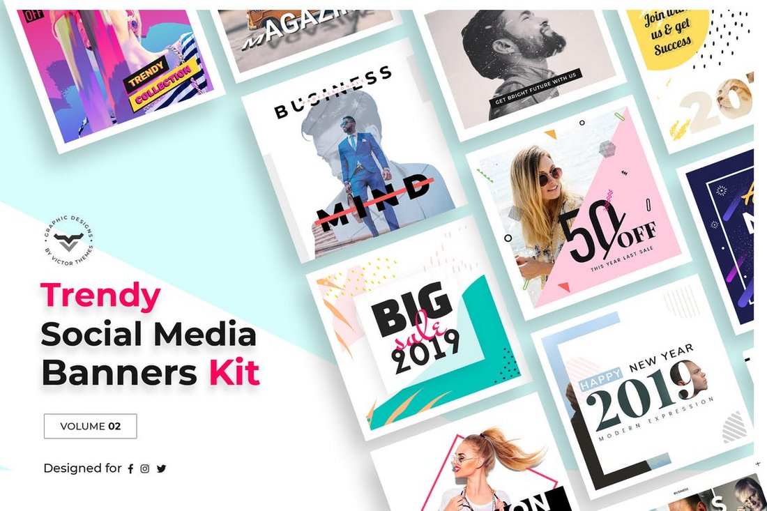
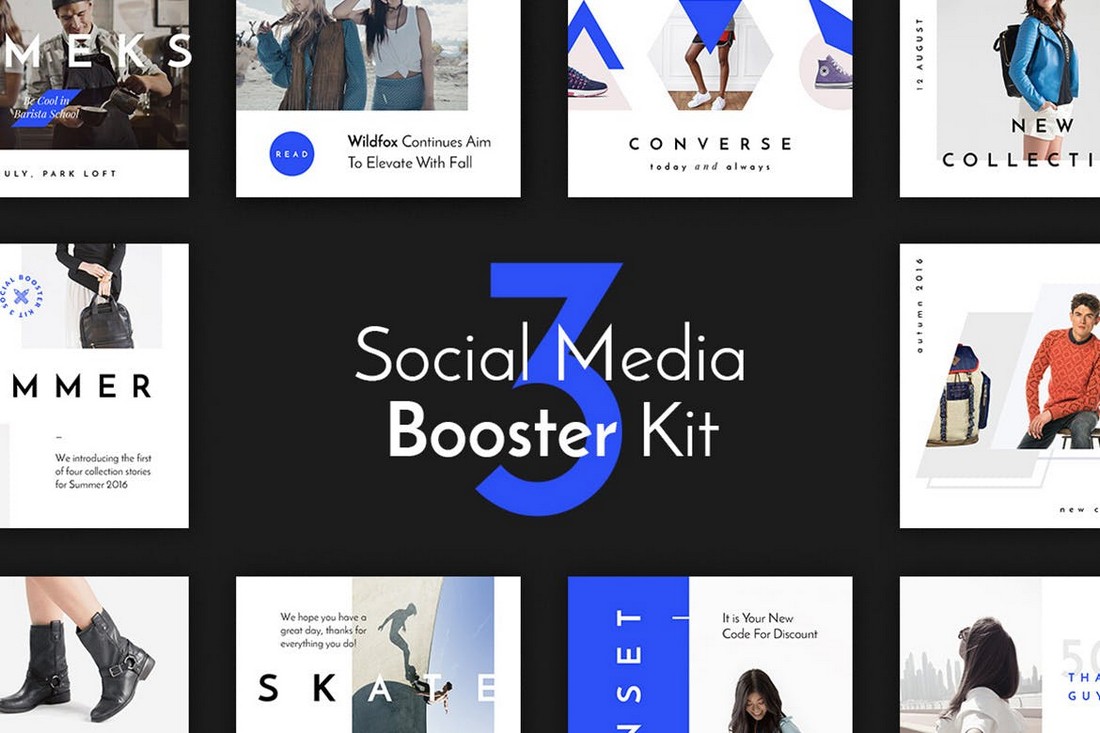
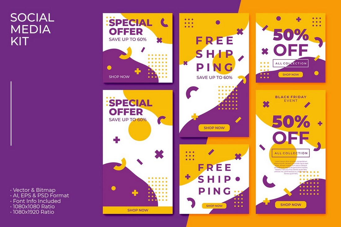
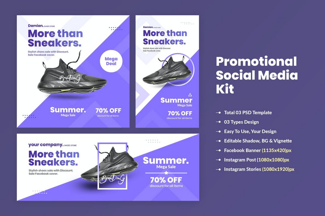
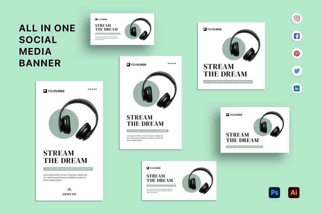
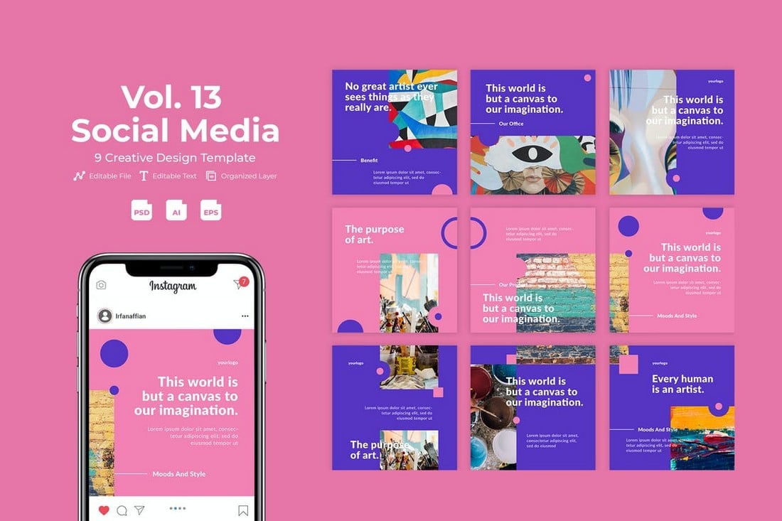
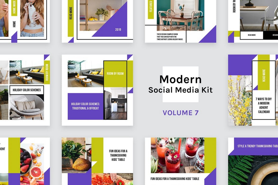
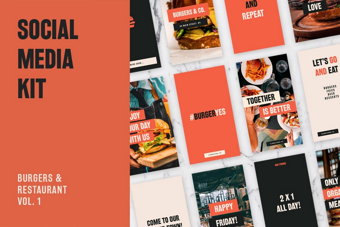
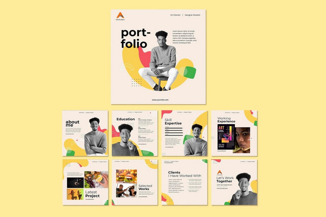
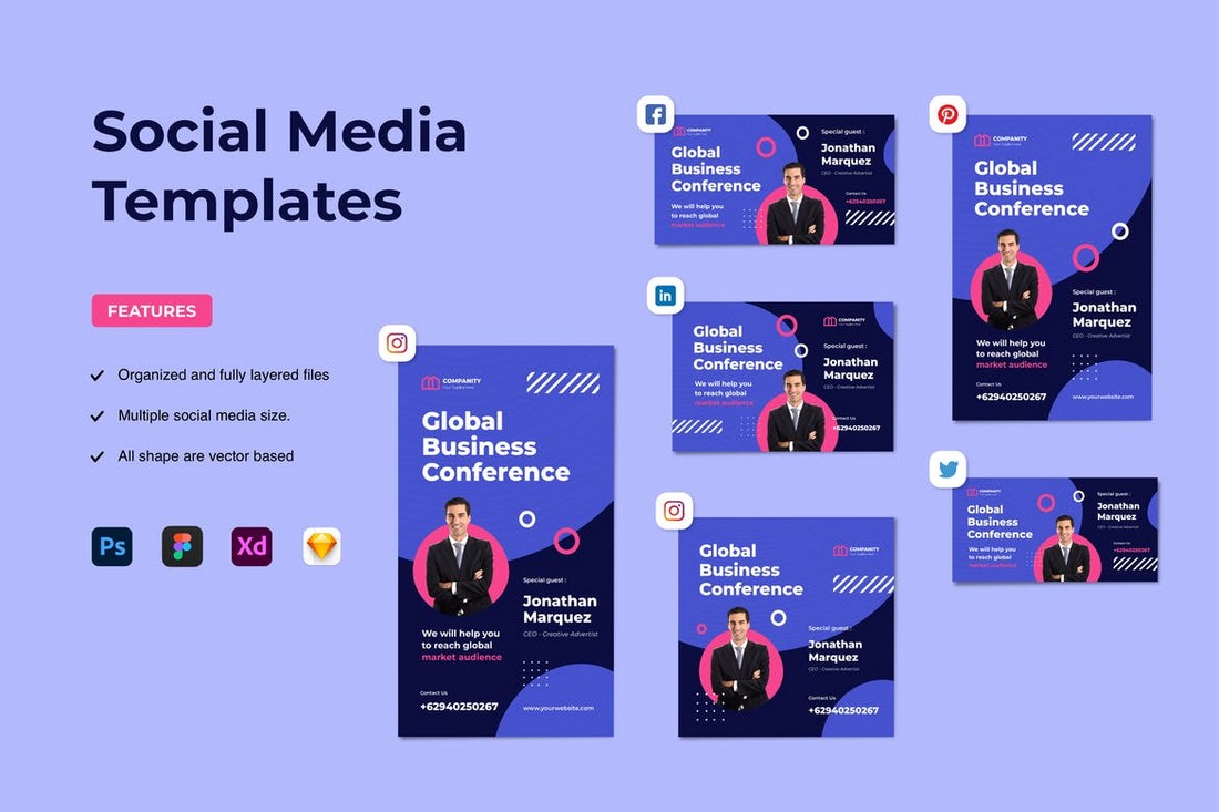
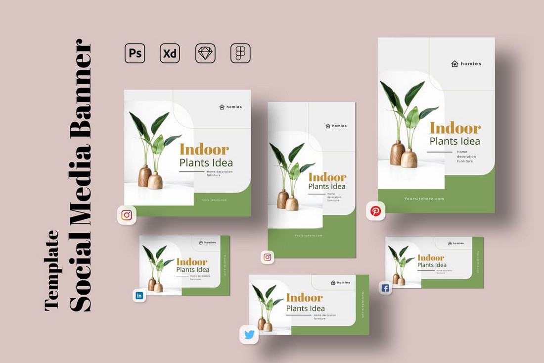
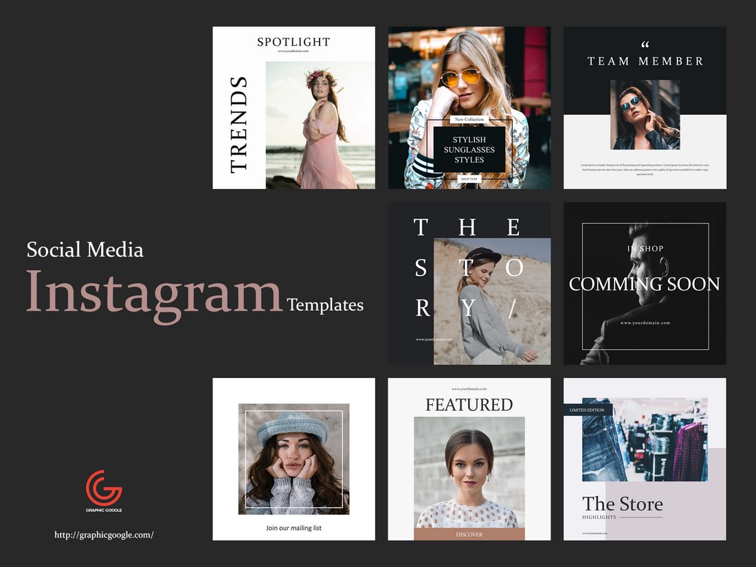
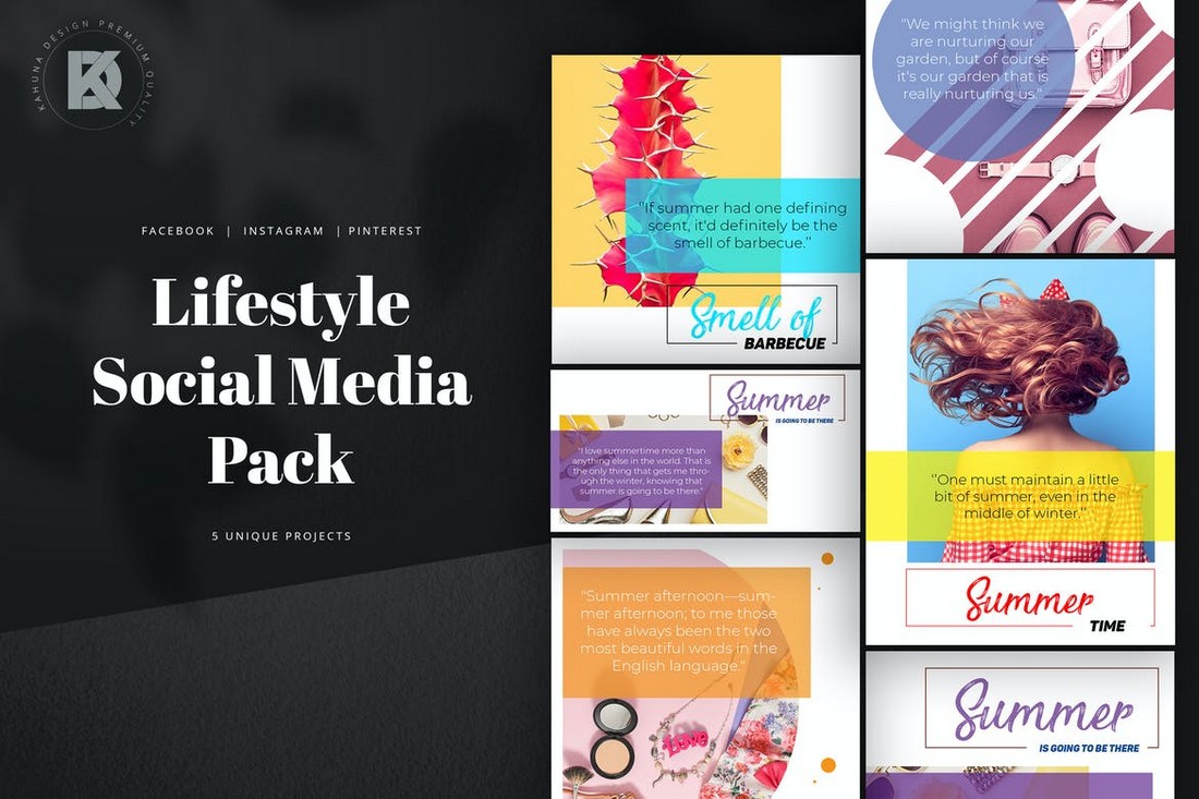
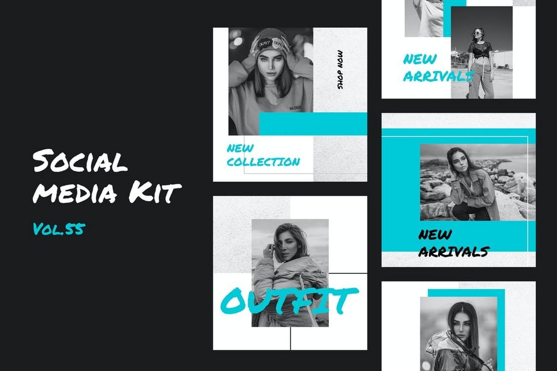
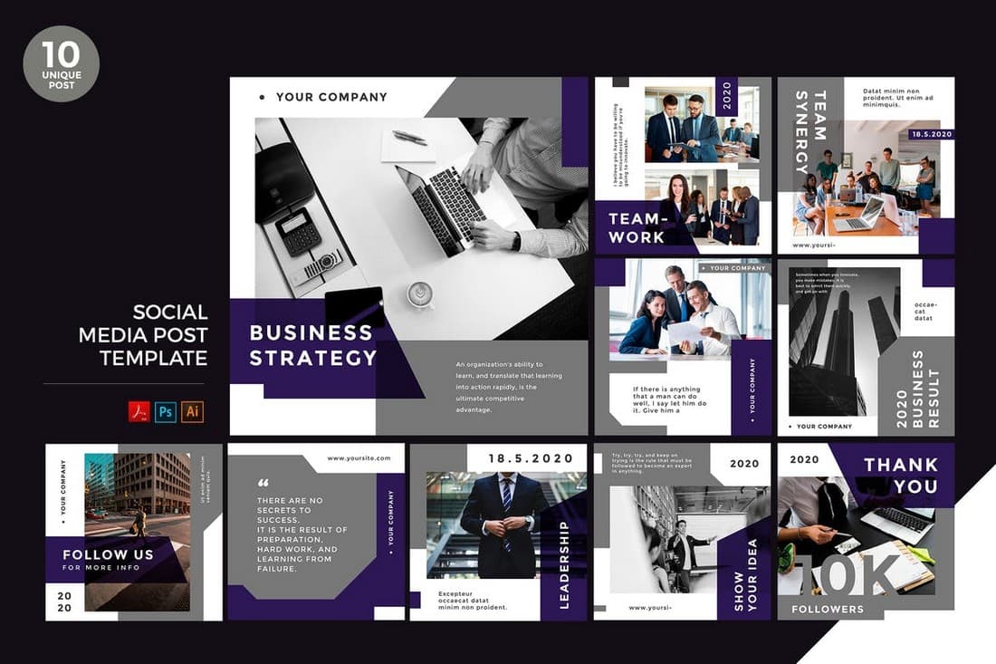
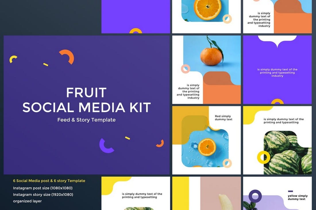
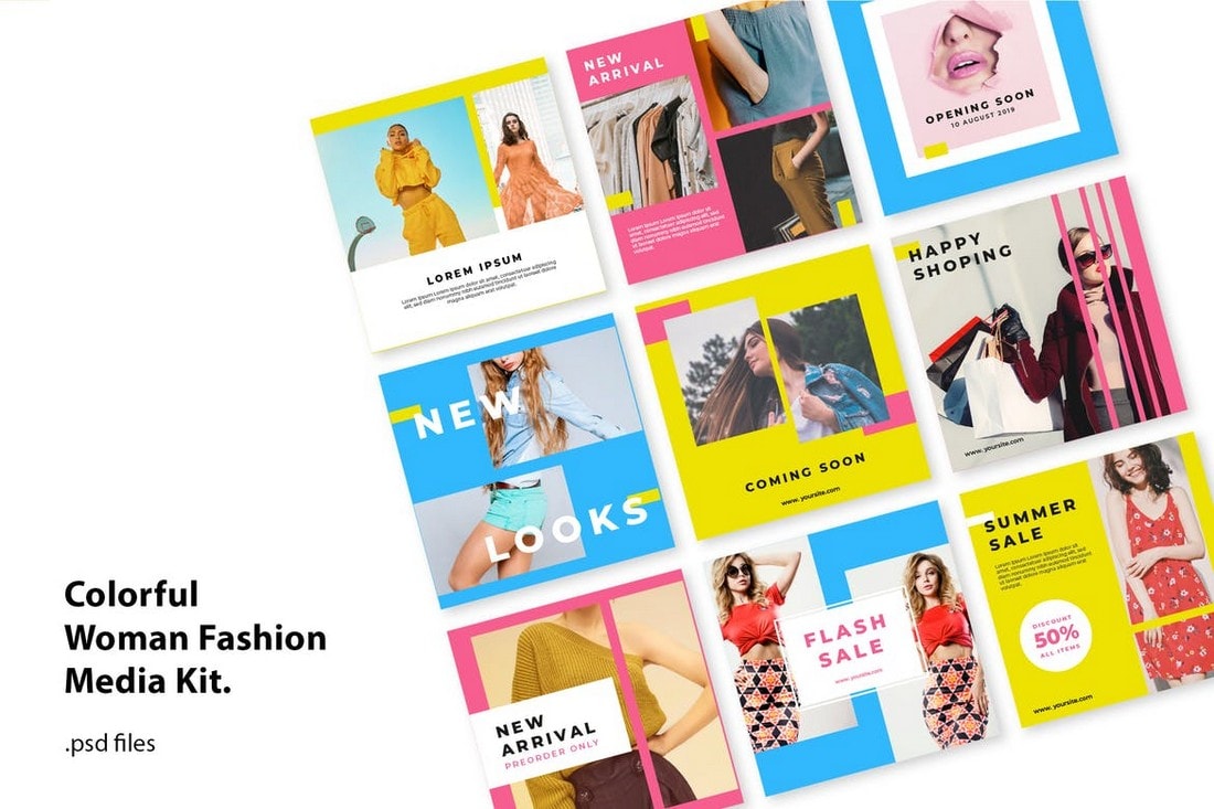
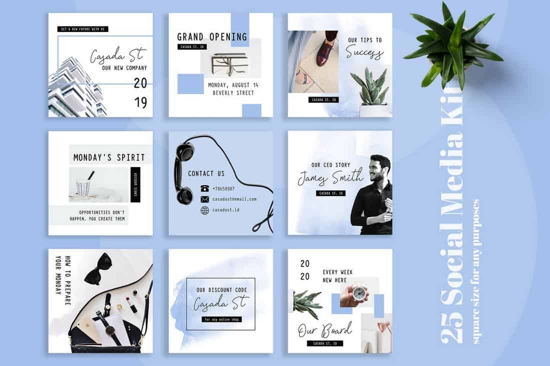
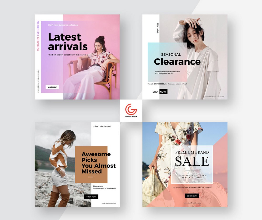
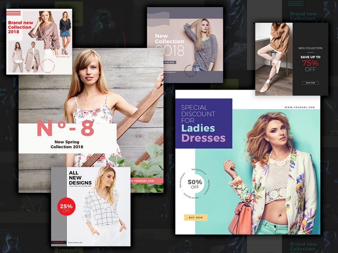
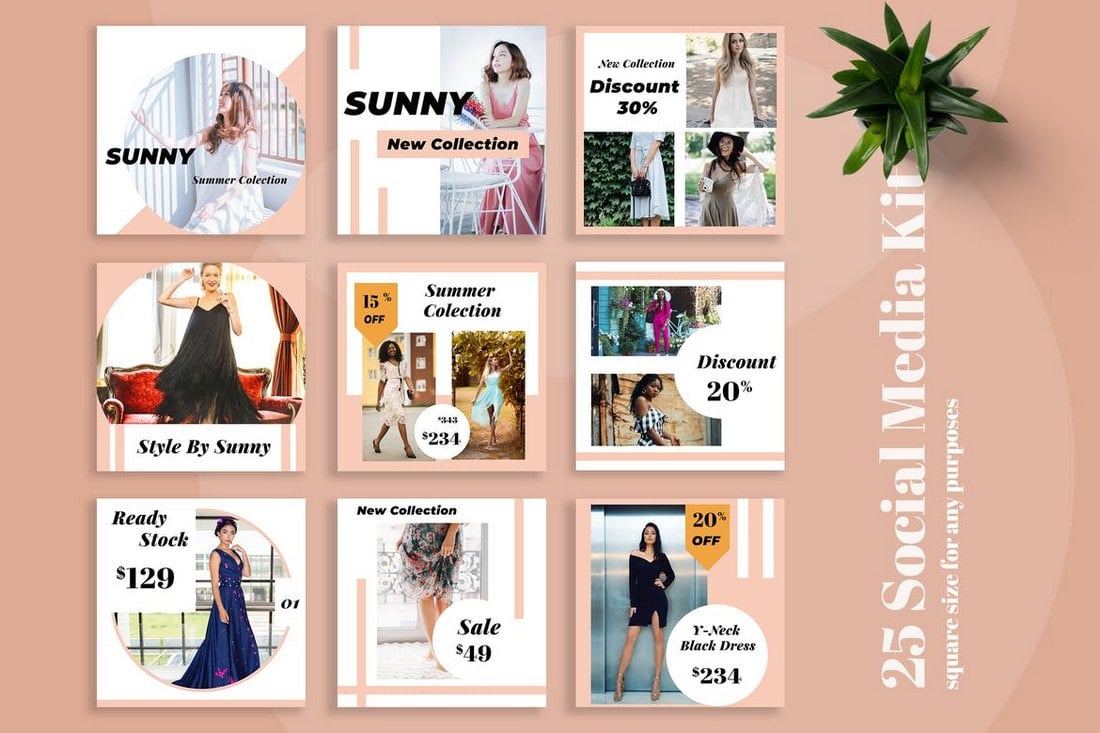
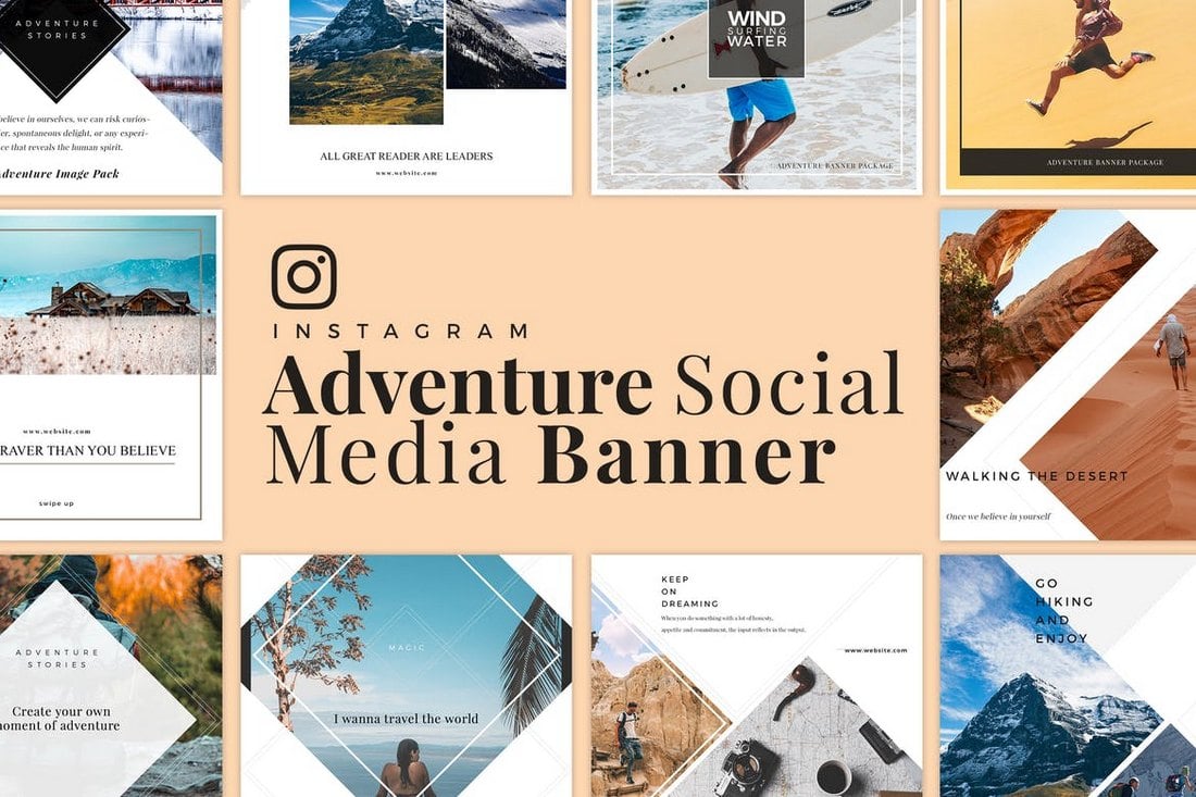
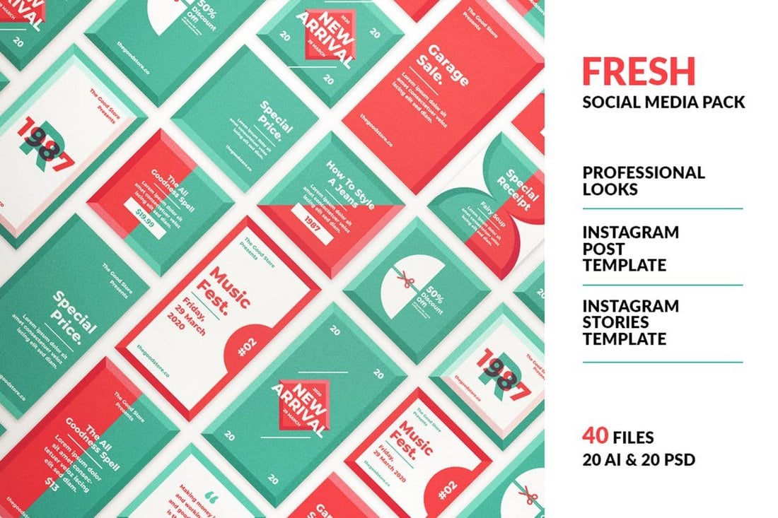
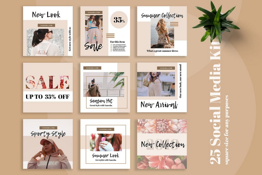
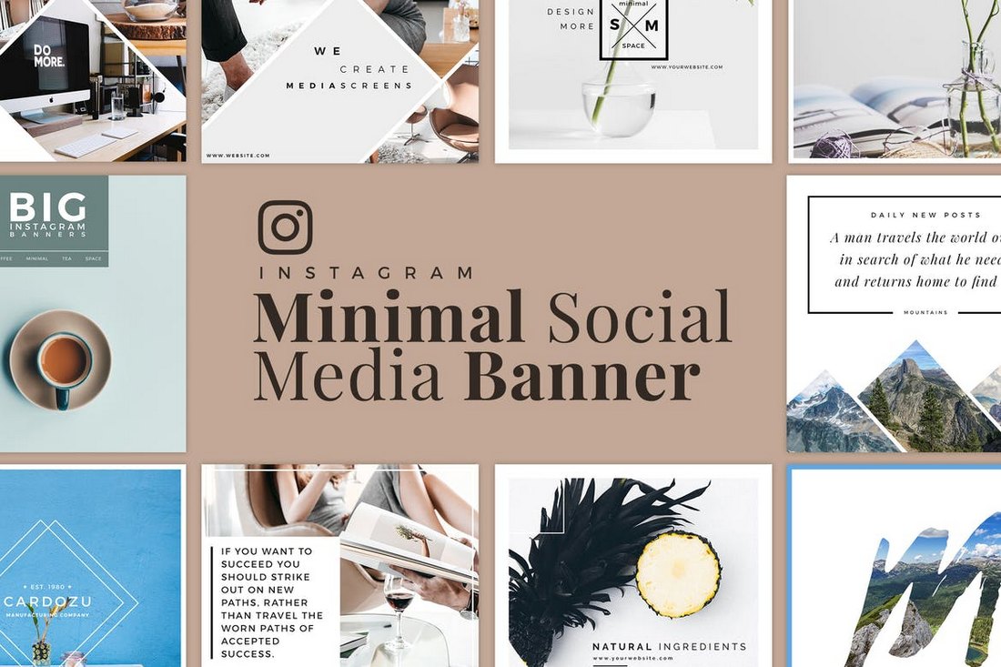
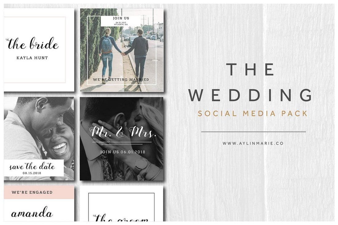
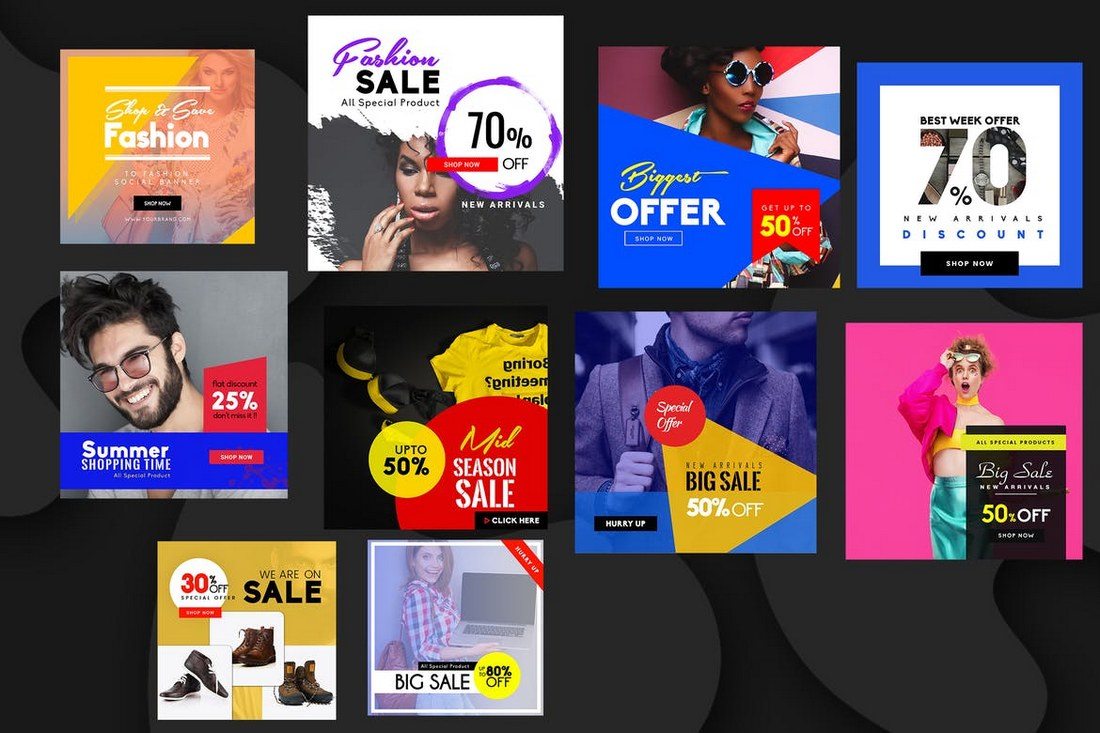
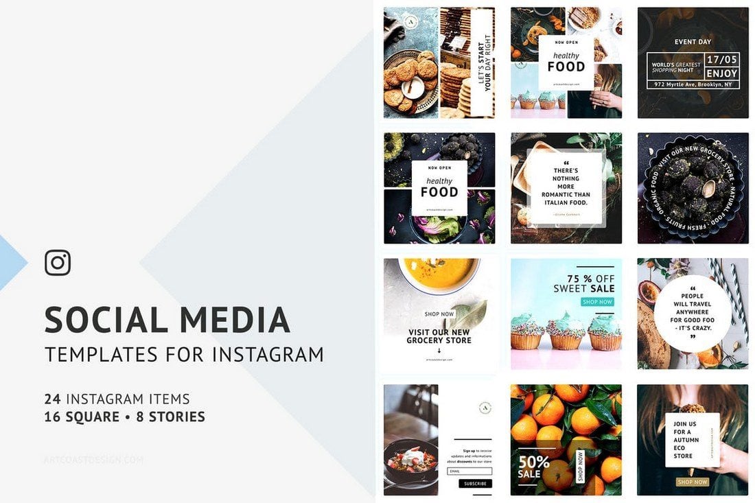
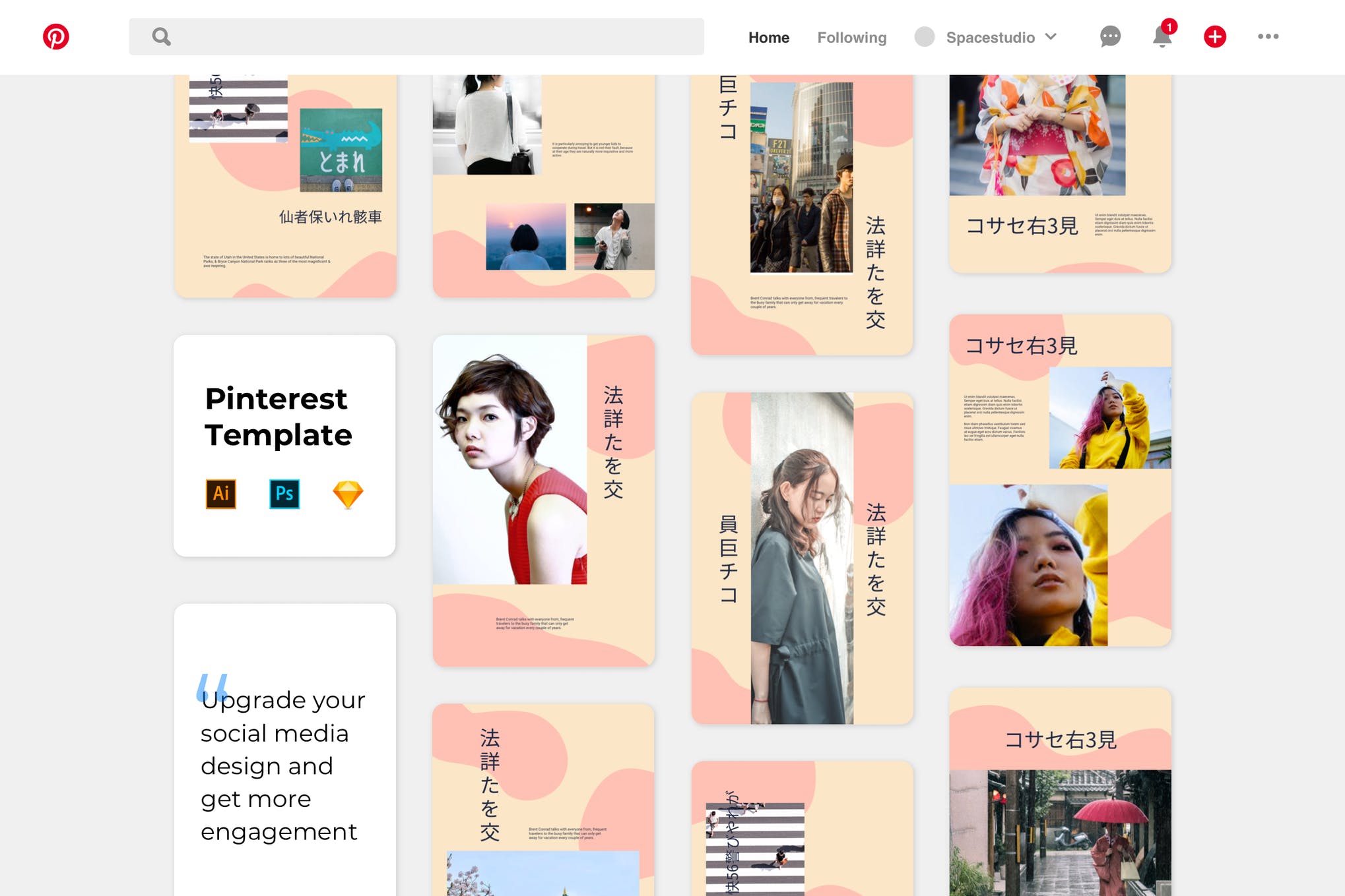
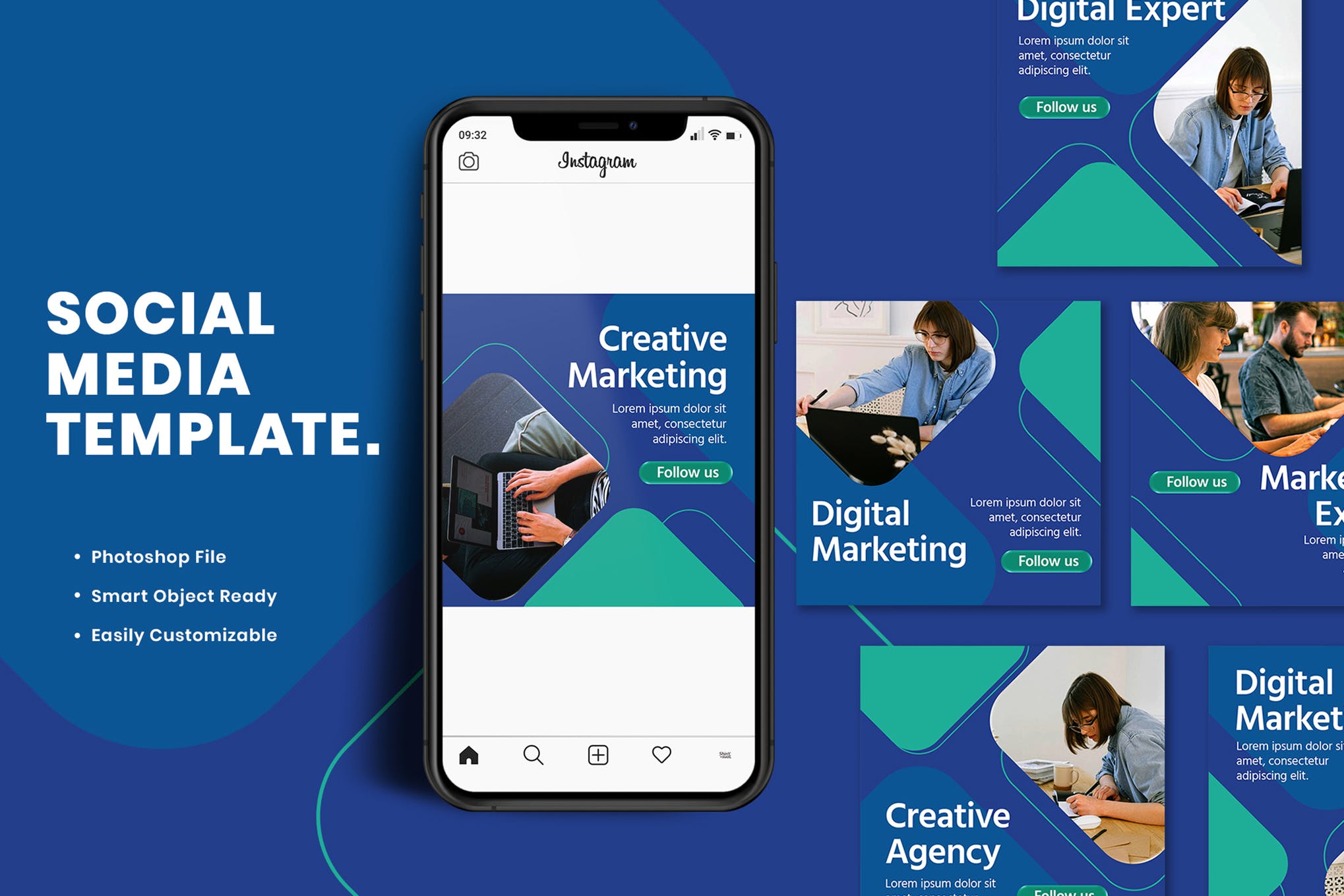
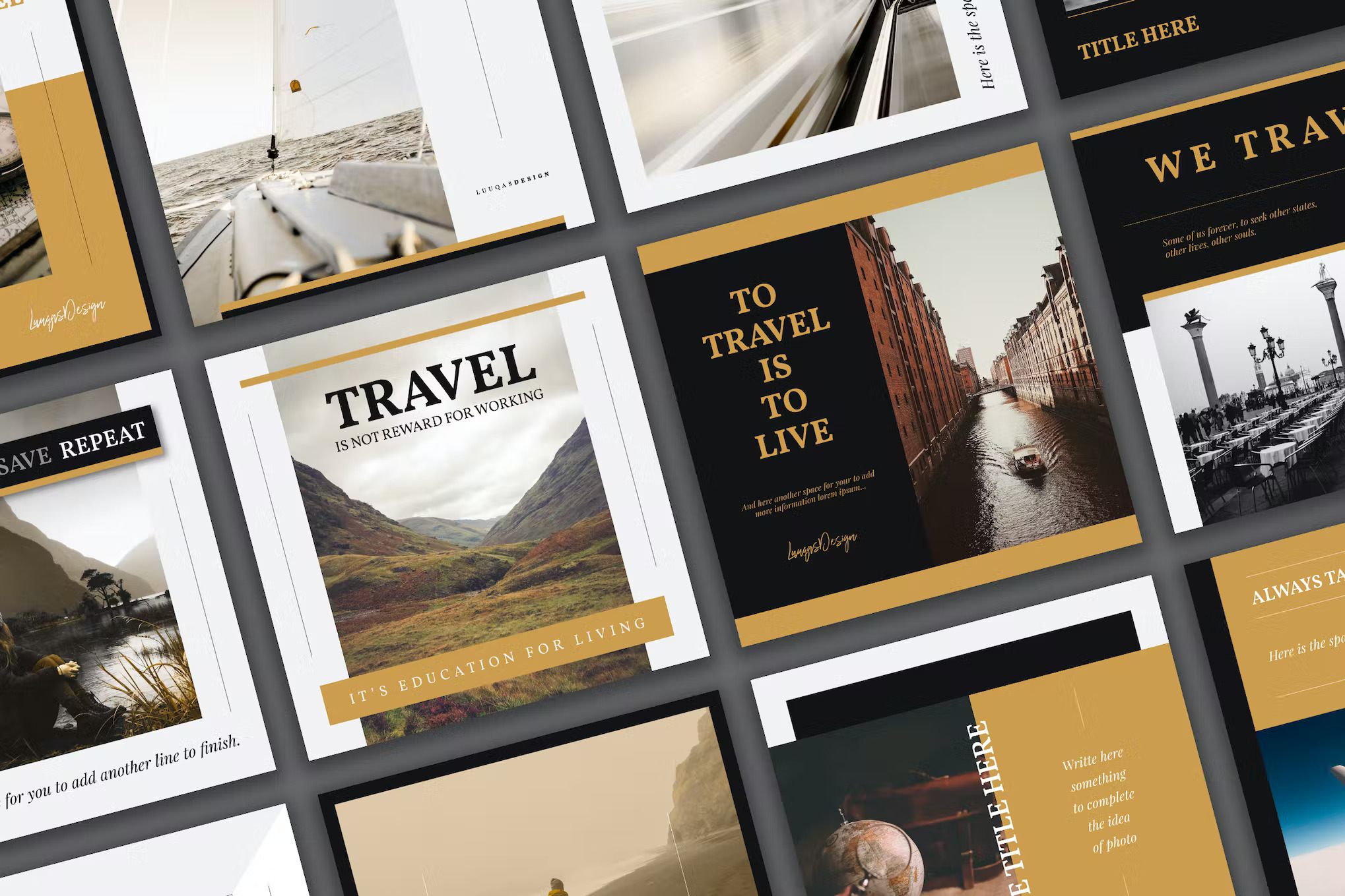
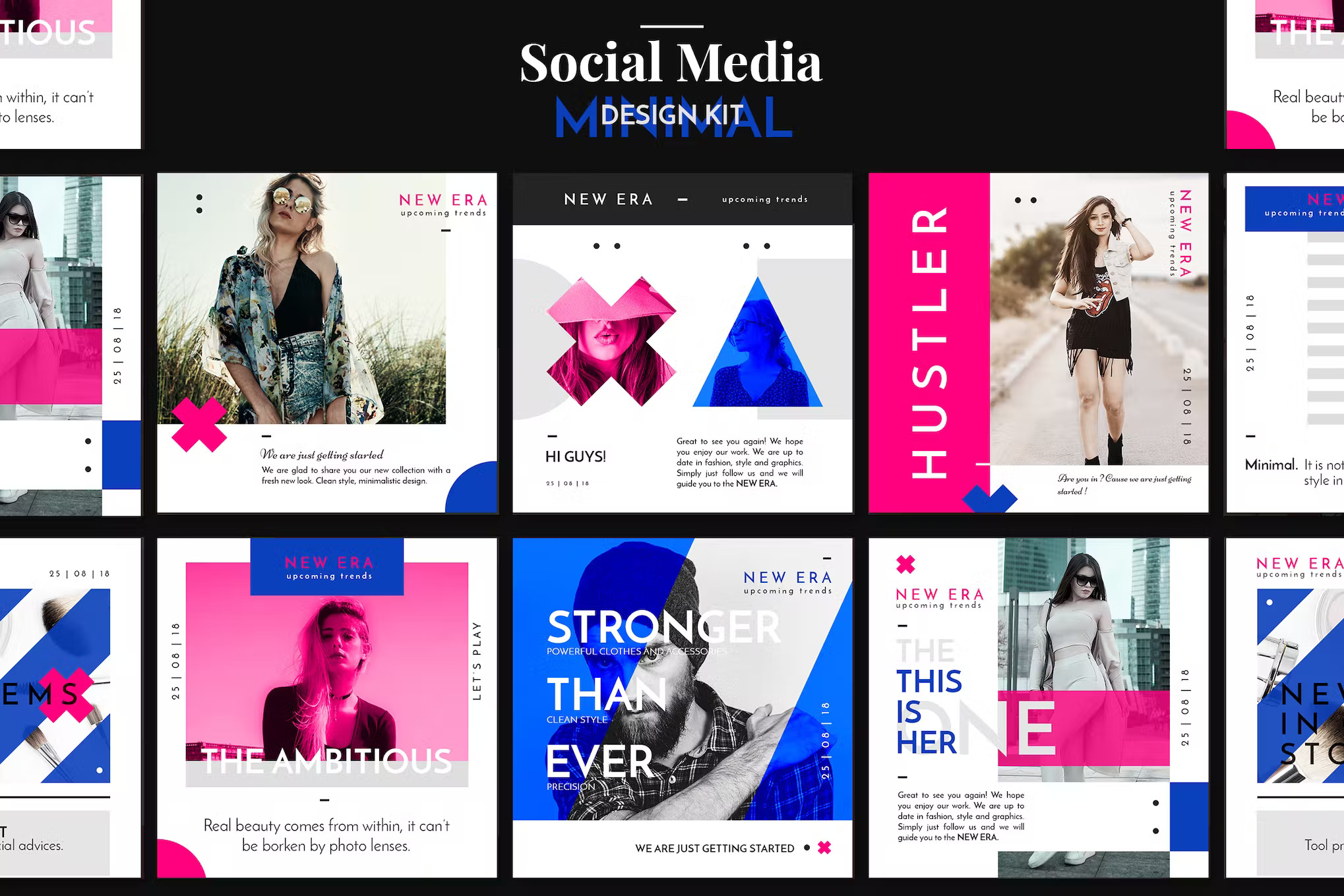
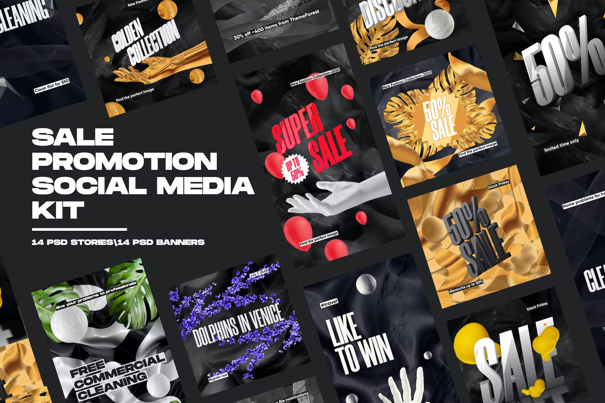
Are you working on crafting a content plan to promote your brand and business on social media? Then these social media kits and templates will help you design amazing graphics for your social media campaigns like a pro.
Preparing content for your social media promotions is a time-consuming process that most social media managers and marketers have to deal with.
But don’t worry. You can use these social media kits and graphics templates designed by professionals to quickly edit and use with your own social media campaigns. The best part is you can easily edit and customize them all by yourself (and we’re sharing some helpful social media template tips to help get you started!)

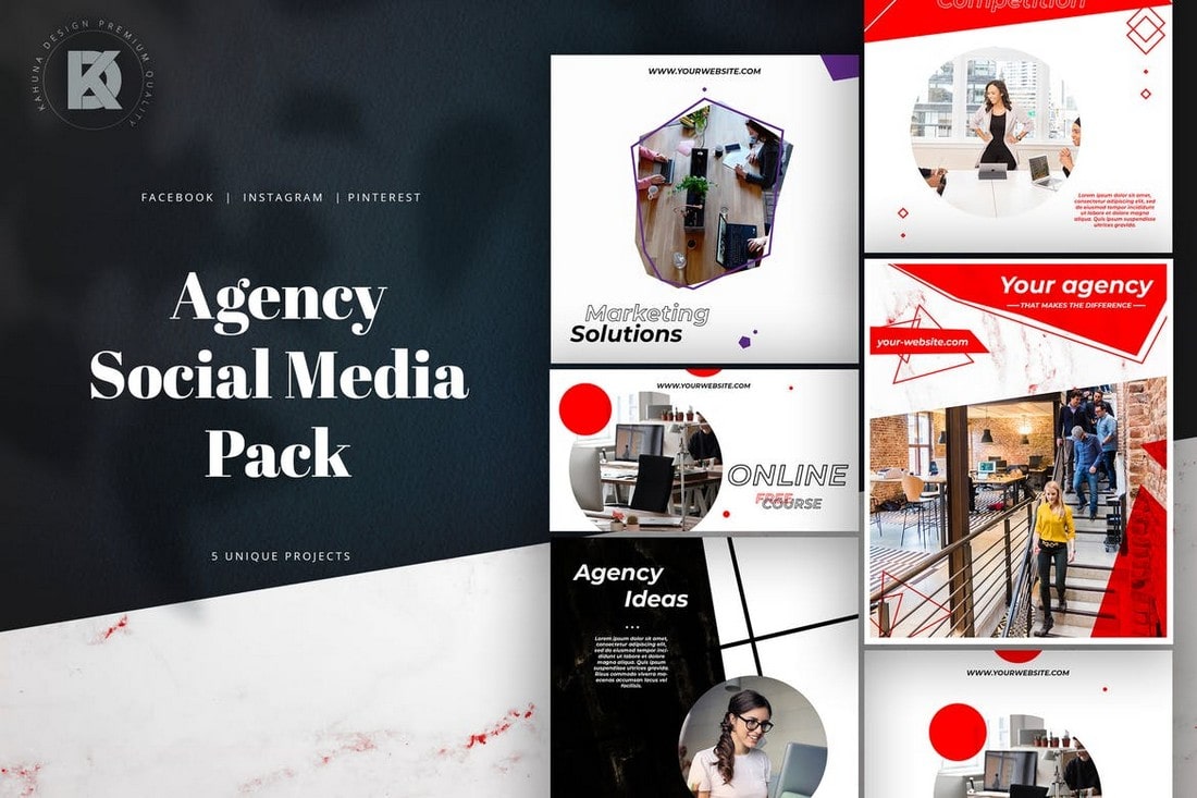
Motion Array is a one-stop-shop for all your graphic design needs. With their vast collection of video templates, audio, graphics, icons, and illustrations, you’ll find everything you need to make your projects stand out. Whether you’re a graphic designer, video editor, or content creator, Motion Array has something for you.
Their graphics library is extensive and diverse, with designs that cater to every niche and style. From retro to modern, you’ll find the perfect graphics to enhance your projects. Their social media template collection is equally impressive, with a vast array of styles and themes to choose from.
Motion Array’s Standard Universal License allows you to use unlimited assets from Motion Array marketplace in as many projects as you’d like. It’s all membership based, so you can sign up for a month or a year and grab any assets you need, when you need them (plus, you can cancel any time and keep the items you licensed).
Not only that, you can grab a $50 discount for annual subscriptions by clicking through the link above!
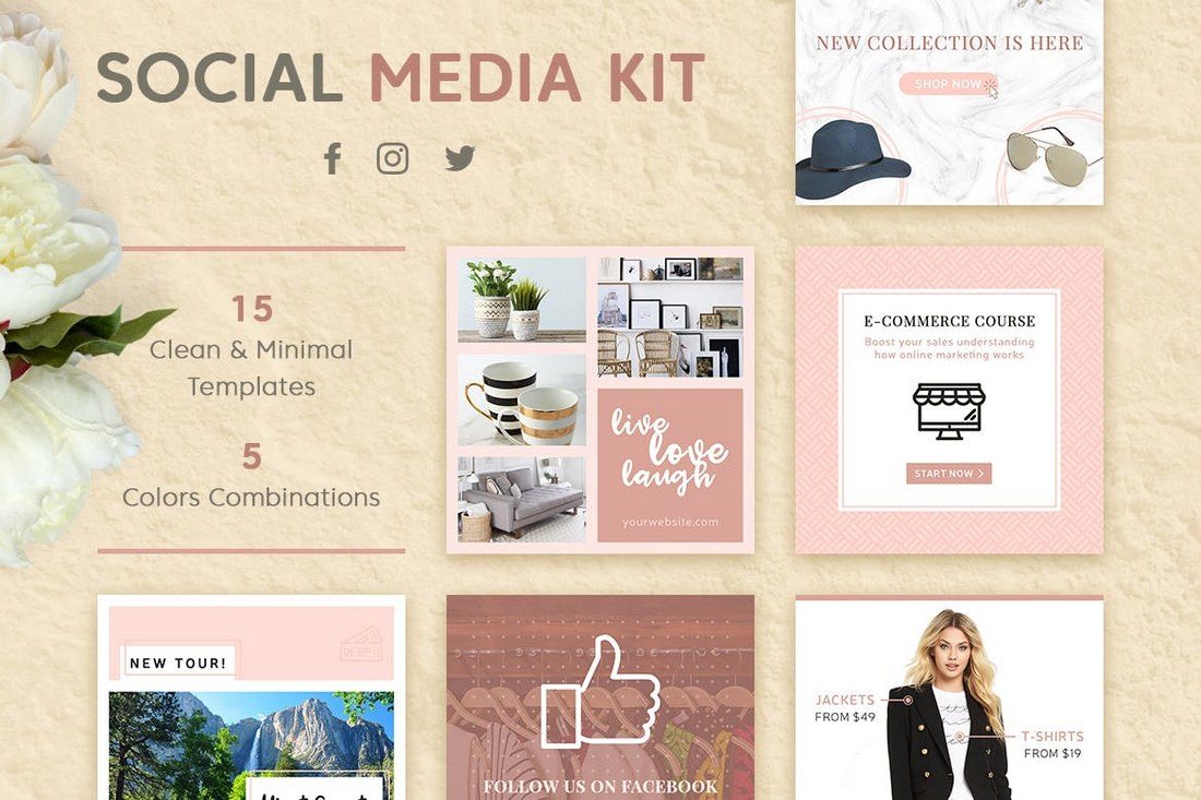
If you’re looking for an all-in-one pack of social media templates that are compatible with all popular social networking platforms, this bundle is for you.
This social media templates kit includes 20 different template designs optimized for Facebook, Instagram, and Twitter.
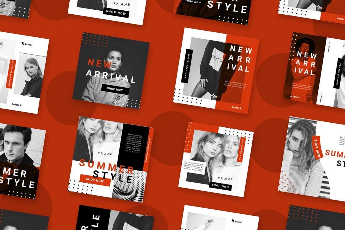
The templates in this pack feature designs in 5 different categories, including business, blog, fashion, magazine, and shop. This allows you to use this bundle to create posts for many different types of businesses.
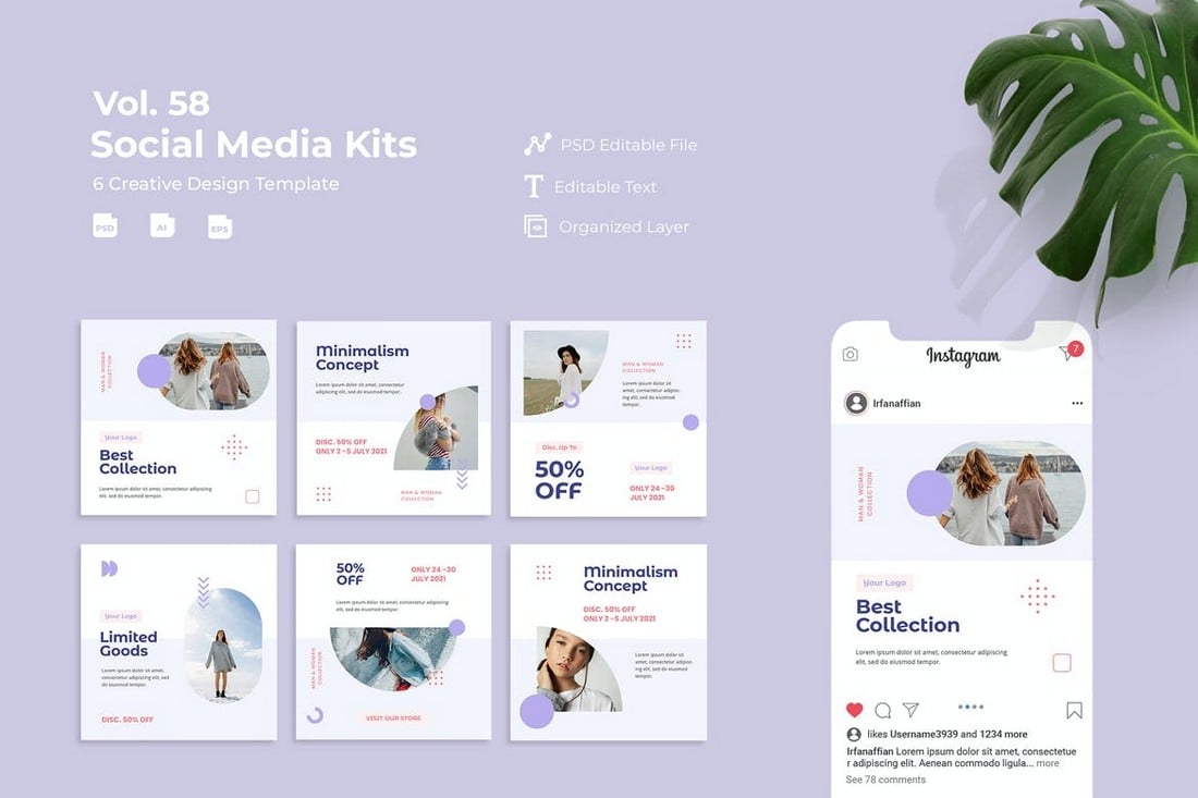
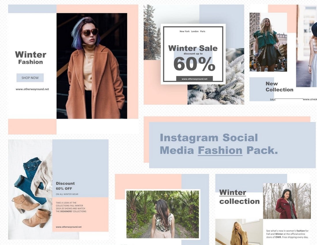
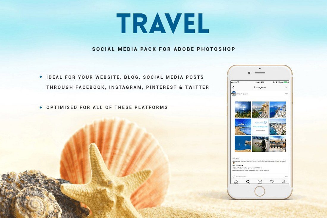
If you’re looking for a social media kit that has templates with multipurpose designs, this bundle is for you. It includes 15 social media post templates that can be customized to create banners for promoting all kinds of brands and businesses. Each template comes in 3 sizes for Instagram, Facebook, and Twitter.
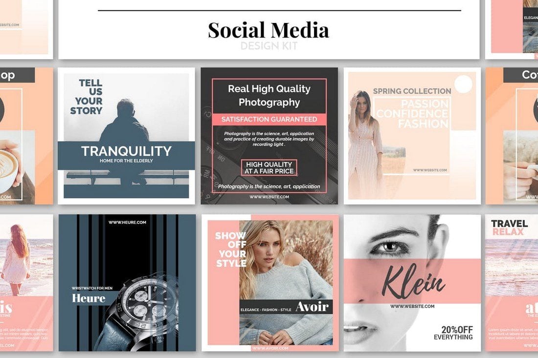
This is a social media kit for running promotional campaigns. In addition to its creative and colorful design, the template kit includes multiple post designs in two sizes for promoting sales and offers on Instagram and Facebook.
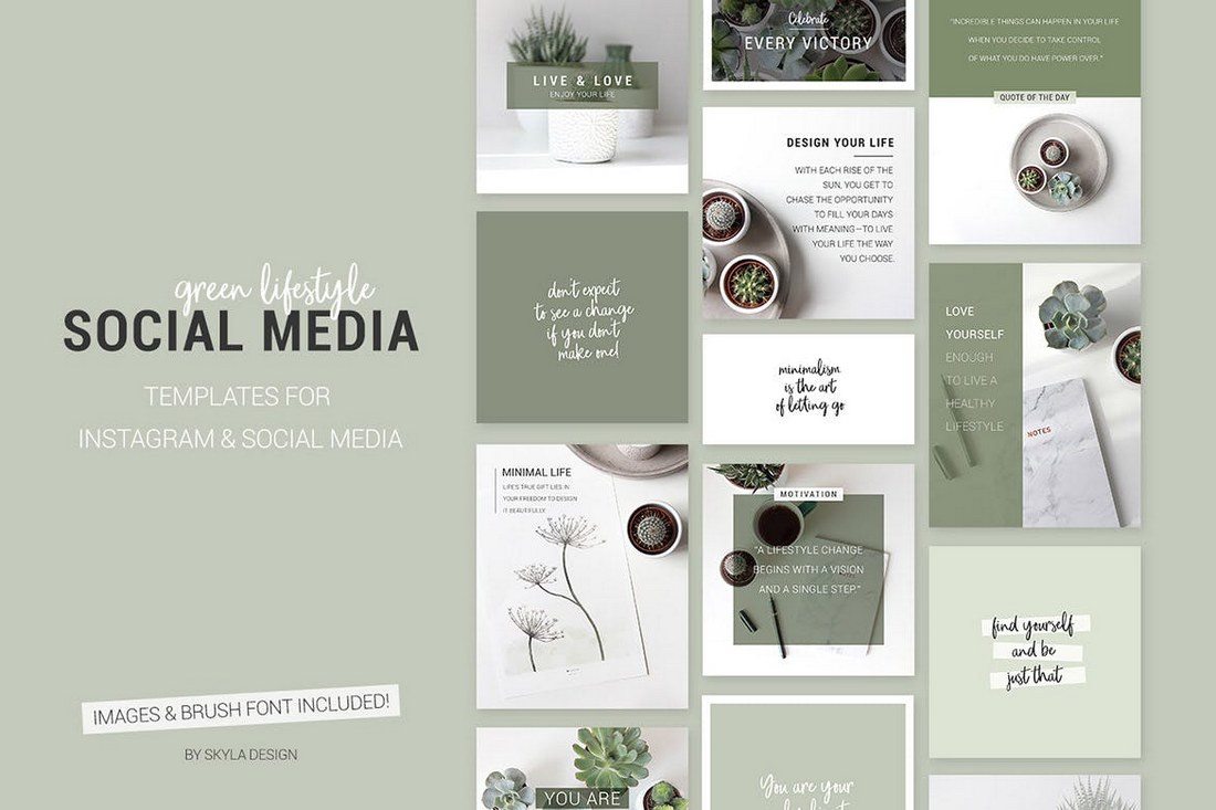
Running an effective product promotion will be a walk in the park with this modern social media kit. It includes 3 stylish social media post and banner templates with different designs. You can use them to run a cross-platform campaign on Instagram, Facebook, and Twitter.
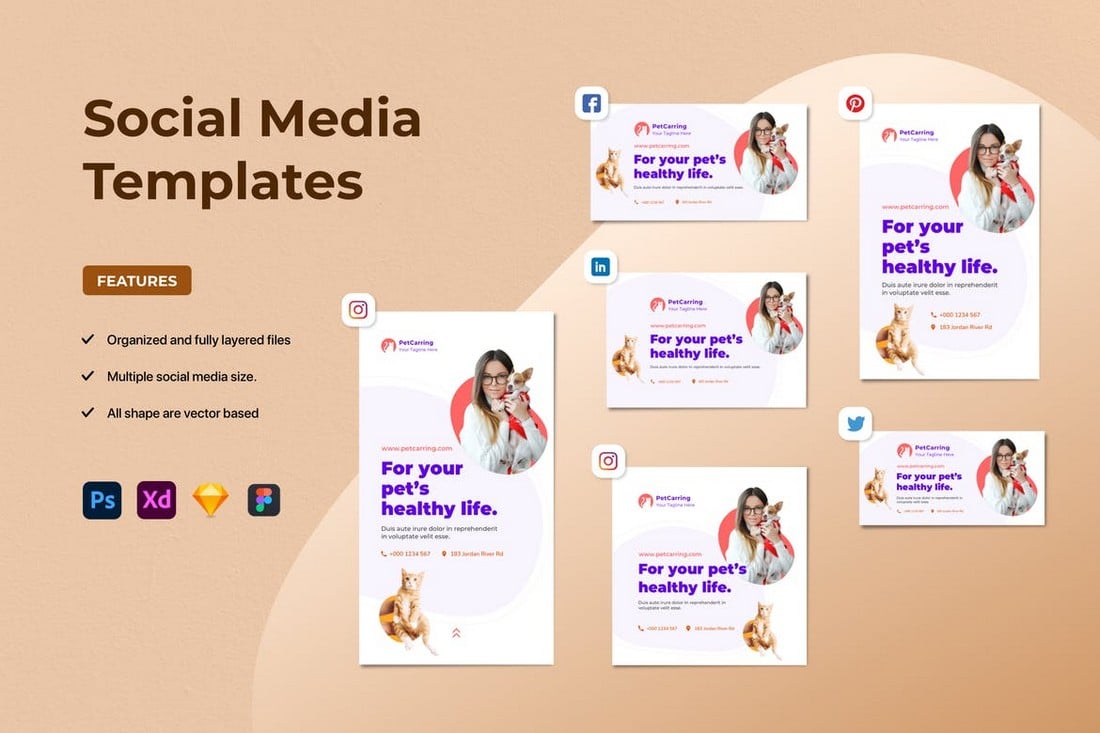
If you prefer social media posts with minimalist designs, this pack is a must-have for you. There are multiple sizes of templates in this bundle featuring optimized PSD and AI templates for Instagram, Facebook, Twitter, Pinterest, and LinkedIn.
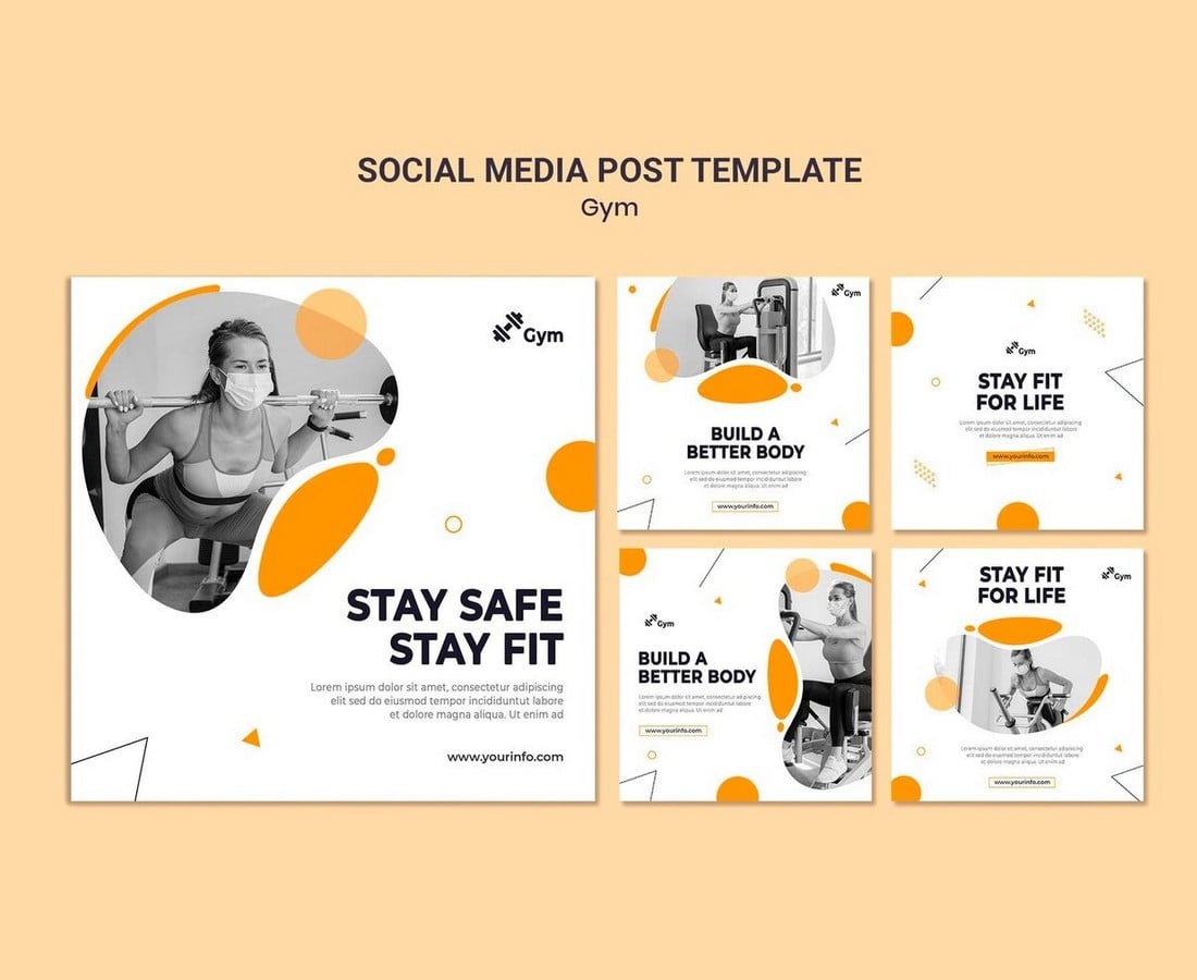
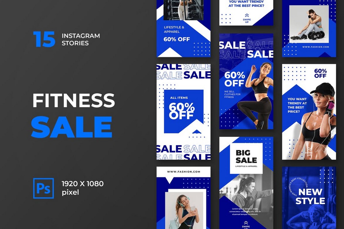
Promoting a gym or fitness center but low on budget? Then be sure to grab this free social media kit to create simple yet effective social media posts to promote your gym on Instagram and Facebook.

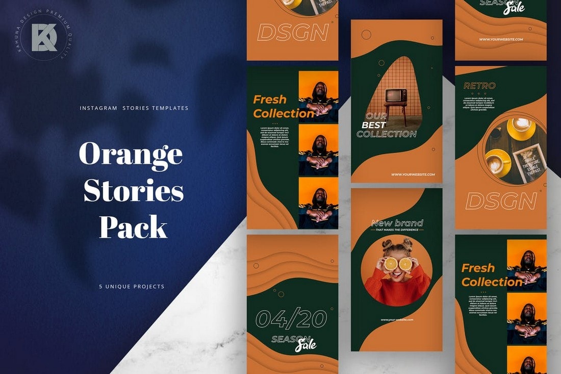
This is a trendy collection of editable Photoshop templates, perfect for promoting electronic music events on social media. Featuring neon colors and gradients on a holographic background, these minimalistic templates are ideal for multiple music genres. The kit provides Instagram story, post templates, and a Facebook event cover template.

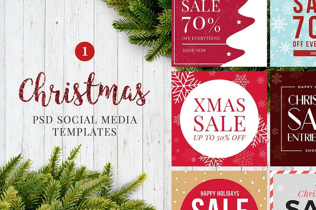
A collection of ready-to-customize social media post templates, ideal for promotions around the holiday. Whether you’re using Illustrator or Photoshop, these user-friendly templates allow for easy editing of texts, images, and graphics on separate layers.

Get an edge on promoting your fashion brand with the elegant and professional fashion sale Instagram post templates. This set of post templates, designed for Photoshop, is easy to use and fully editable. It lets you craft stylish Instagram posts that sparkle with beautiful graphics.

These social media templates are ideal for all your holiday sale promotions. The templates come with well-organized, customizable, and editable files that aid in quick designing of your social posts.

A collection of social media templates ideal for designers, entrepreneurs, and businesses looking to advertise on social media during the festive season. Its features include 12 different sizes for platforms such as Facebook, Instagram, Twitter, and Google Adwords.

Improve your Instagram posts this New Year’s Eve with this bundle of user-friendly templates. Offering a set of six unique, high-resolution designs, that can be edited according to your tastes. The templates are compatible with Adobe Illustrator and Photoshop.

Spruce up your streetwear brand’s Instagram account with FREDOW, a set of professional post templates. It’s an effortless way to enhance your profile, offering six fully customizable, drag-and-drop templates with editable text and image elements.

A collection of customizable social media templates ideal for promoting any podcast and live events. The package offers a user-friendly, well-organized file that facilitates quick design for your social media posts. The templates are ready-to-use PSD files with a resolution of 1200 x 1200 px.
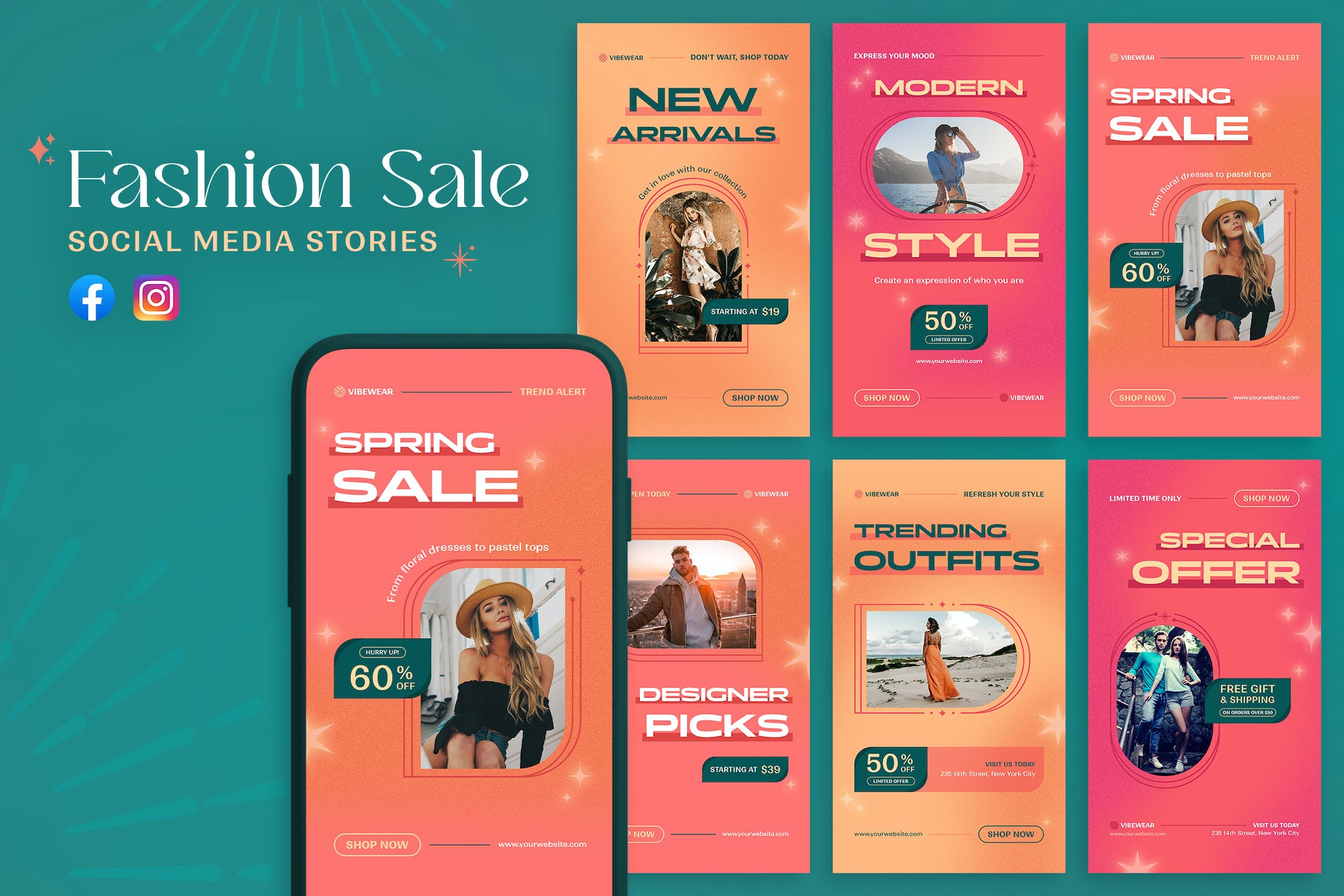
A set of Instagram story templates ideal for promoting fashion sales and brands on social media platforms. These templates are versatile and customizable; you can adapt the colors, text, images, and fonts to suit your brand. Whether you’re announcing new arrivals, advertising sales, or featuring customer reviews, these templates can help increase your visibility.

This template kit is for businesses aiming to boost their Instagram presence. It equips users with customizable story and post templates that can enhance visual engagement with their audience. Optimized for Adobe Illustrator CC and Adobe Photoshop CS4-C6, the kit also provides a well-organized layout for easy usability.
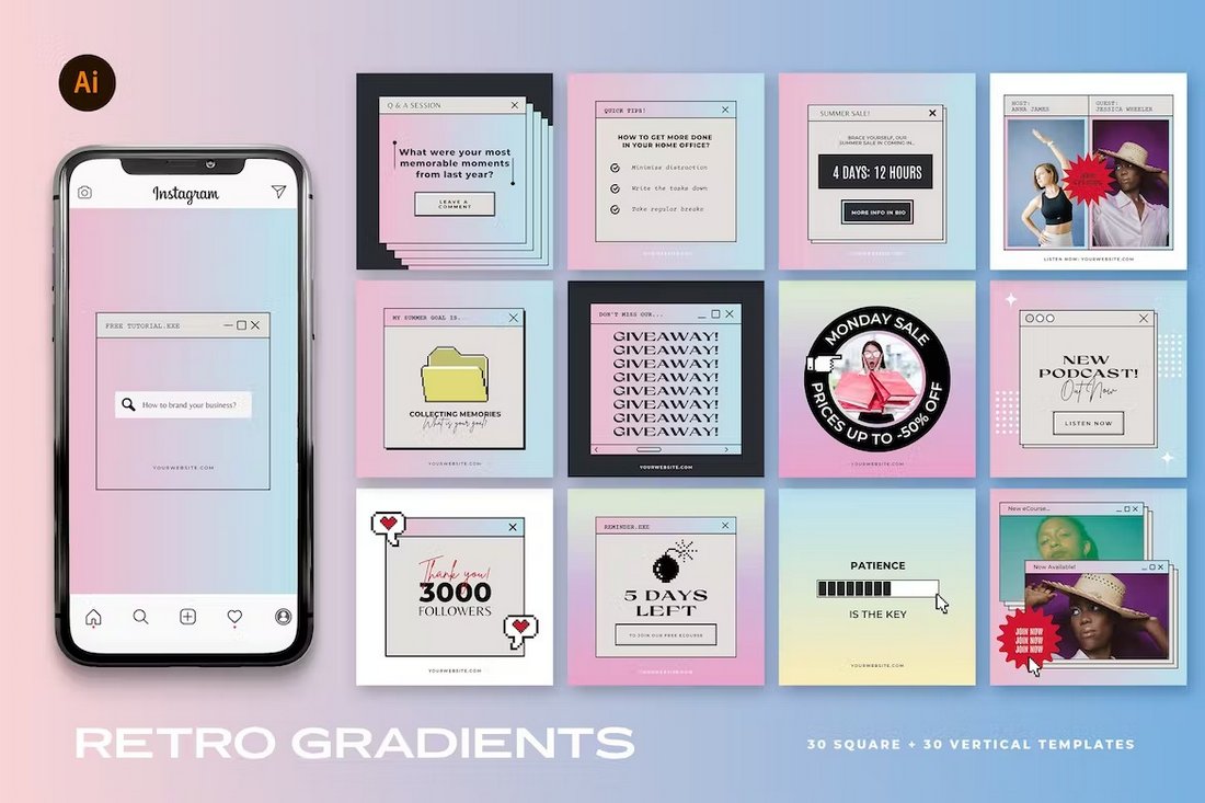
If you’re a fan of gradient colors and trendy designs, this Instagram template kit is perfect for your promotions. It features retro-themed Instagram post designs with beautiful gradient colors. There are 30 unique post layouts in this pack that are available in square and vertical sizes.

Add a splash of color to your Instagram feed using this colorful Instagram template kit. It features cool 90s-style Instagram post layouts with bright colors. The bundle has 12 different post designs that you can easily customize to change text, colors, and images.
The bold and modern designs of this template kit make them a perfect choice for sports, gym, and fitness-related brands. It has 6 templates that can be used to make both Instagram posts and stories.
Looking for a beautiful post template to make attractive quote posts? Then be sure to grab this collection of Instagram templates. It features 50 unique post layouts that are ideal for quotes. They are available in vertical format too.
A collection of free Instagram templates featuring colorful and trendy designs. This pack includes Instagram posts and story templates that are most suitable for fashion and lifestyle channels.
This premium social media kit features a set of templates for promoting lifestyle and fashion brands on Instagram. A collection of 6 unique templates are included in this pack that also feature easily editable designs. The templates come in AI and EPS formats.
With this beautiful social media kit, you can create banners and posts for various creative agencies and businesses. There are 9 different post templates in this bundle. And you can use them to create carousel posts as well.
A minimal post design with plenty of space for including images is the ideal way to promote furniture, interior design, and real estate brands. There are 12 unique templates in this pack that are most suitable for making banners for Instagram.
Whether you’re promoting a restaurant or a food truck, this social media kit has some of the best designs you can use to spread the word about your business. There’s a total of 24 templates in this pack, which includes 12 post designs for Instagram, Facebook, and Twitter. As well as 12 Instagram Story templates.
If you’re a freelancer promoting your personal brand on social media, this social media kit will surely come in handy. It allows you to promote your portfolio in style using multiple banner designs. And this kit is free to download as well.
This is a complete social media templates kit that features a professionally crafted post design for promoting businesses. The template comes in multiple layouts and sizes that are compatible with Facebook, Instagram, Pinterest, and more. It will allow you to create more consistent social media posts across all social media channels.
This template kit also includes its post design in multiple sizes. It’s available in PSD format featuring organized layers, editable vector shapes, and smart objects for easily placing your own images into the template design. It comes in Adobe XD, Figma, and Sketch formats as well.
A beautifully minimalist social media template collection for promoting luxury and high-end fashion brands. The templates in this pack are fully customizable with Photoshop and Illustrator. It includes 6 different post designs.
Promote your gym and fitness brands to your Instagram audience using this Instagram story templates bundle. It includes 15 different story designs with fully editable layouts. You can change their colors, fonts, and images with just a few clicks.

Uno is a collection of free social media templates that can be used to create both Facebook and Instagram posts. It includes 8 different designs in PSD format with fully customizable colors, text, and backgrounds.
Another complete social media post template kit featuring the same post design in multiple sizes and layouts. This template also includes multiple file-formats for editing the design in Photoshop, Sketch, and Figma. It has sizes for all popular social networks.
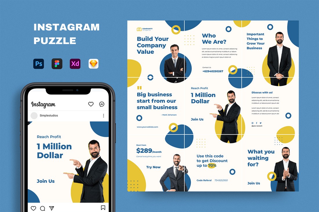
Instagram puzzles offer a creative way to design a unique profile feed. This template will allow you to create a similar Instagram puzzle design for your business or brand page. It’s easily editable and comes in multiple formats including PSD, Sketch, and Figma.
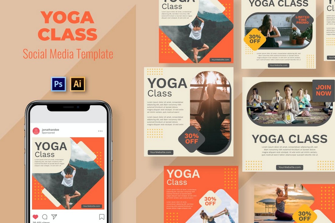
Promote your Yoga classes, courses, and training programs across your social media channels using this template kit. It features 9 different social media post designs with lots of space for describing your programs. It’s available in PSD and AI formats.
If you’re promoting a fashion or lifestyle brand, this social media templates kit will come in handy. It includes 3 Instagram story and 3 post templates for showcasing your apparel items and fashion products. The templates are available in Photoshop and Illustrator file formats.
This is a collection of 10 free Instagram templates that feature mood board style post layouts. They are perfect for showcasing your designs, fashion, and creative photography.
Featuring 6 different design layouts, this modern social media marketing kit is perfect for creating posts to promote your brand, products, and sales across multiple social media platforms. The templates are fully customizable and available in Illustrator file format.
If you’re looking for social media templates to promote a product on Instagram, Twitter, and Facebook, this bundle of templates will come in handy. It includes a set of editable templates that have been designed to highlight your products and features.
This set also includes 6 unique social mediate banner templates similar to the ones above. These templates are designed to help promote your seasonal offers and special sales on social media. The templates can be customized with Illustrator as well.
This bundle of social media banner templates is perfect for promoting the latest arrivals of your product lineup. It’s most suitable for fashion and apparel brands. The pack includes 10 unique template designs in Illustrator and EPS file formats.
Another beautifully minimalist social media templates pack featuring 9 unique post designs. These templates can be used to create Instagram, Twitter, and Facebook posts. The templates are available in PSD, AI, and EPS formats.
If you’re looking for an Instagram story template to streamline your business or brand story, this bundle will come in handy. It includes 10 fully customizable Instagram story templates you can use to create effective Instastories.
Soka is a bundle of unique social media templates that features highly professional designs. It includes 12 template designs in editable PSD files that are also compatible with all popular social networks.
This free social media templates pack comes with 8 different post designs you can use to promote fashion and luxury brands on Instagram. The templates are available in PSD files and are easily customizable.
The beautiful and colorful designs of these Instagram templates will definitely make your feed stand out from the crowd. This bundle comes with 6 different post templates you can use to create content for Instagram.
This is a multipurpose social media templates kit that comes with post templates in multiple resolutions. The posts are compatible with Facebook, Instagram, and Pinterest. You can customize them quite easily using Photoshop.
Promoting a business event on Instagram? Then use this template kit to create a professional Instagram story for your feed. The kit includes 6 different Instagram story designs with fully editable layouts.
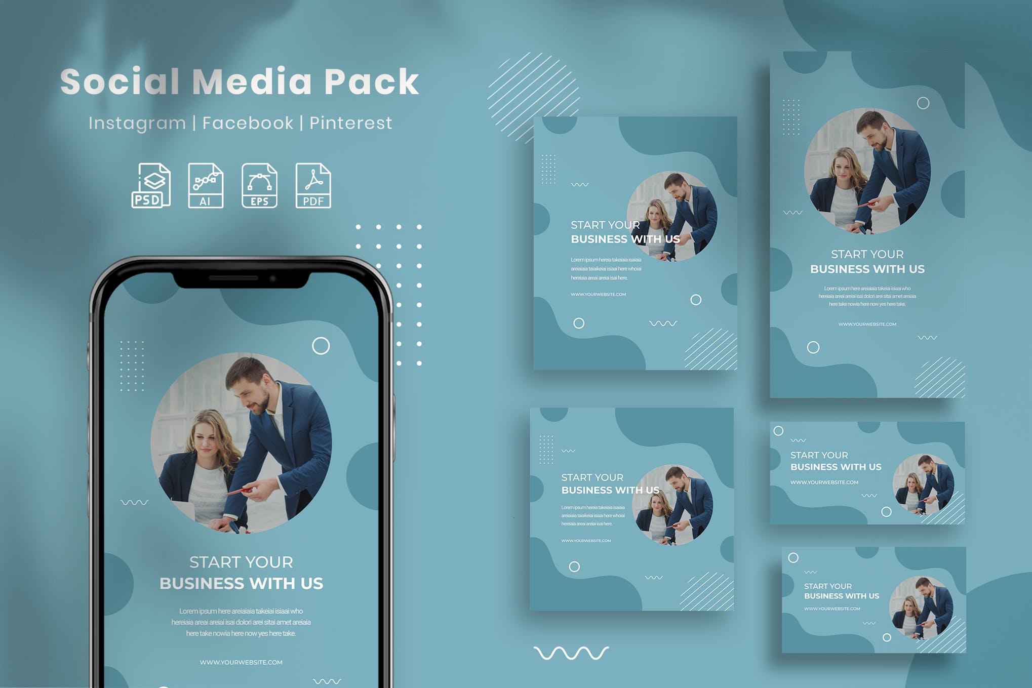
Business With Us is a modern, and professional social media pack that will surely make an impression on your target audience. It features 5 attention-grabbing square designs that can be used to post content on Facebook, Instagram, Pinterest, and other social media platforms.
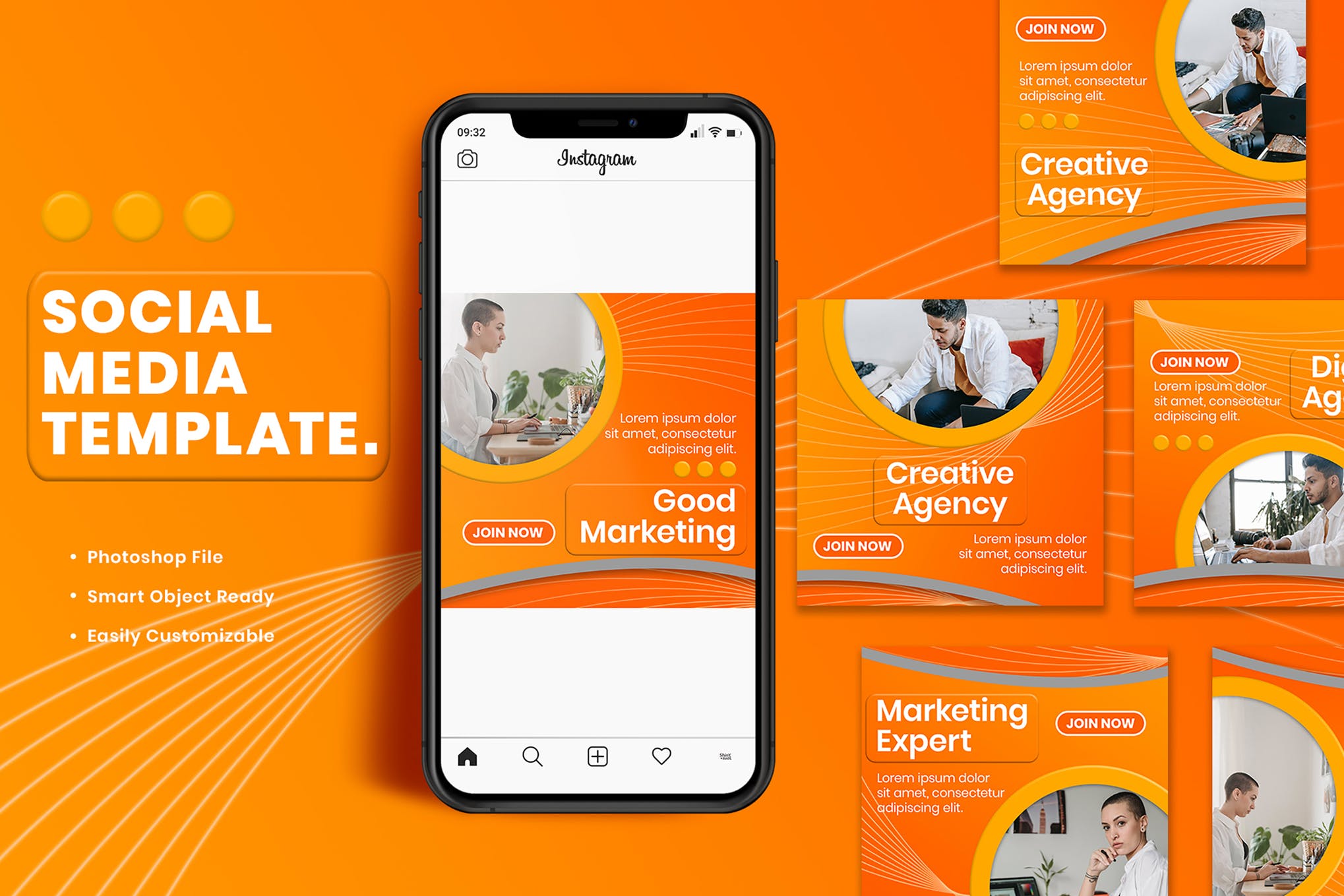
Next up we have a minimal, yet impressive set of social media templates that are designed with the sole purpose of boosting your brand visibility and engagement. There are 9 templates in total, and each can be fully customized to suit your needs.
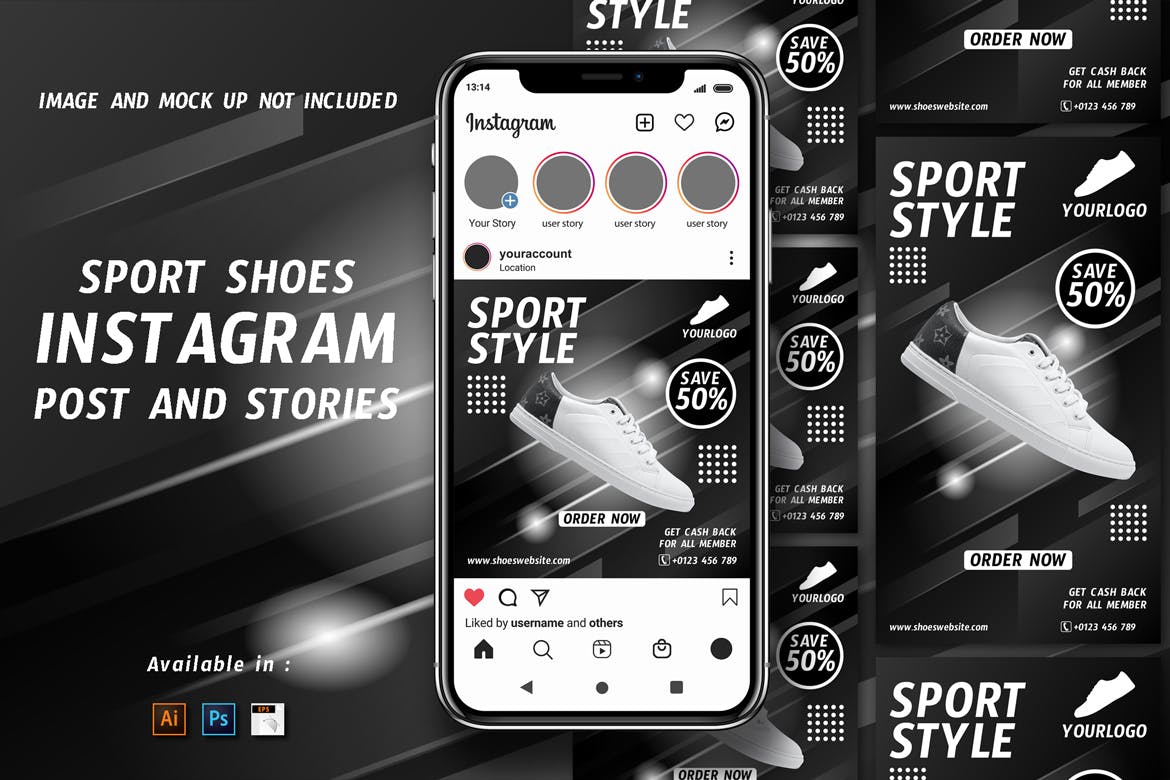
Designed to help reach your shoe business new heights, this social media templates kit comprises Instagram posts and stories layouts that you can mix and match to create personalized content that creates an impact on most of your followers.
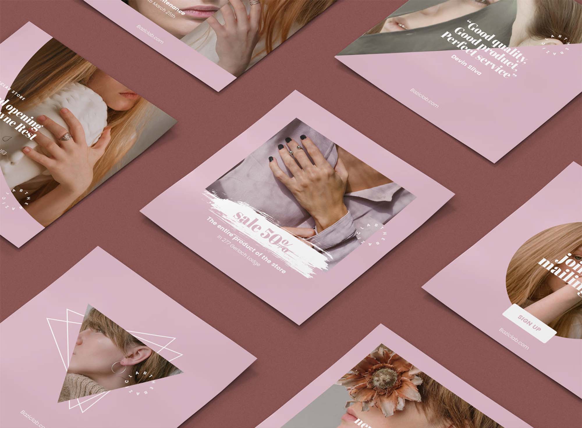
Stacked with 9 templates for various social media platforms, Rose is a perfect social media kit for your brand marketing. Although the kit can be used for virtually any industry under the sun, it best suits businesses dealing with feminine clothes, and products.
Blue Sky is a collection of 12 social media banners that will add a bright blue aesthetic to your feed. The beautiful design and ocean-esque color scheme instantly draw attention and make sure the audience is left in awe of your creative prowess.

No need to waste hours crafting Facebook covers for your client pages. Use this template pack to create a professional page or profile cover in minutes. This pack comes with 5 different cover designs optimized for Facebook.
Sienna is another great free social media kit featuring multiple templates in 2 different resolutions. They fit in well with both Instagram and Facebook feeds. You can create fashion, travel, and lifestyle posts using these templates for free.
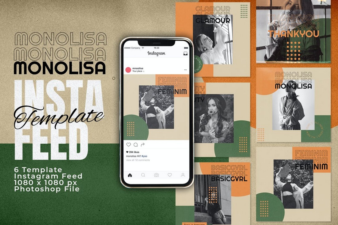
Monolisa is a collection of beautiful Instagram post templates. It features a stylish and trendy design with an attractive color scheme. The pack lets you choose from 6 unique template designs to create unique posts for your feed.
If you’re managing social media accounts for travel blogs or hotels, this social media template kit will come in handy. It includes 5 unique post designs for promoting travel locations and vacations. And they are compatible with Facebook, Instagram, and Pinterest.
A collection of social media templates designed for promoting lifestyle businesses and brands. This kit includes 5 templates in 3 different sizes to fit all photo-blogging social platforms. The templates can be easily customized with Photoshop.
If you prefer to create Instagram and Facebook posts with minimal and clean designs, this template kit is made just for you. It comes with 6 high-quality post templates with simple designs. They are easily customizable and comes with smart objects and organized layers.
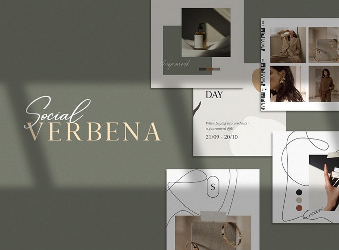
Verbena is a collection of beautiful Instagram post templates. You can use them to create content for modern lifestyle and fashion pages. It’s completely free to download and use.
Looking to promote a small business or a corporate brand on social media? Then grab this social media kit to easily create effective posts for your campaign. This bundle includes 10 different and customizable template designs. They are made for Instagram but you can use them with other social networks as well.
Promote your food-related brands and businesses on Instagram more easily using this social media kit. It includes a set of modern Instagram post designs. You can easily customize them to edit text and place your own images. The bundle features 6 different post layouts.
Use this Instagram story templates pack to design attractive stories for your social media promotions. The template features a modern and trendy design that will surely attract the attention of your audience. You can choose from 5 different story designs as well.
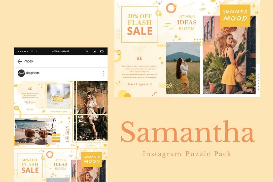
Instagram puzzles are quite popular among many users. This template kit allows you to create a similar Instagram puzzle on your profile feed. It includes 12 post slices that can be combined to create a unique puzzle while promoting your brand.
This is a free Instagram post templates kit made specifically for fashion brands. The templates can be used to promote your latest items and sales. It includes 10 templates you can customize to fit other social networking platforms as well.
If you’re promoting a casual brand targeting young audiences, this social media kit will come in handy. It features 9 unique Instagram post templates featuring bright and colorful designs. The templates are easily customizable with Photoshop.
Promote your creative and corporate agencies on various social networking platforms using this templates kit. It includes 5 different post designs. And they are available in 3 sizes to fit Facebook, Instagram, and Pinterest.
Pinterest is a great platform for promoting visuals. With this templates kit, you can design stylish banners to attract the attention of your Pinterest followers. The pack includes 9 unique designs in AI, PSD, and Sketch file formats.
This is a unique social media kit that features a set of 21 unique post designs with bright and attractive titles. The posts are designed with different colors and gradients to make them stand out from the crowd. You can use them to create unique posts for Instagram, Facebook, and other social networks.
Another free Instagram post templates kit. This kit includes 18 different post designs you can use to craft an Instagram grid. The templates are fully customizable and come in both light and dark color themes.
Promoting your business or agency on social media will get much easier with this social media kit that comes with 15 modern and minimal designs that are designed to help promote your brand and services in a professional way.
A set of 5 unique social media banner templates that’s most suitable for designing Instagram, Facebook, and Pinterest posts for educational businesses, schools, and agencies. The templates are fully customizable with Photoshop.
This modern social media kit comes with a set of creative banner templates with an attractive dark color theme. You can use these templates to promote fashion and creative brands across all social media platforms.
The minimalist and clean designs of this social media kit make it a great choice for creative agencies and small businesses. It includes 25 attractive social media banner and post templates in 2000 x 2000 resolution.
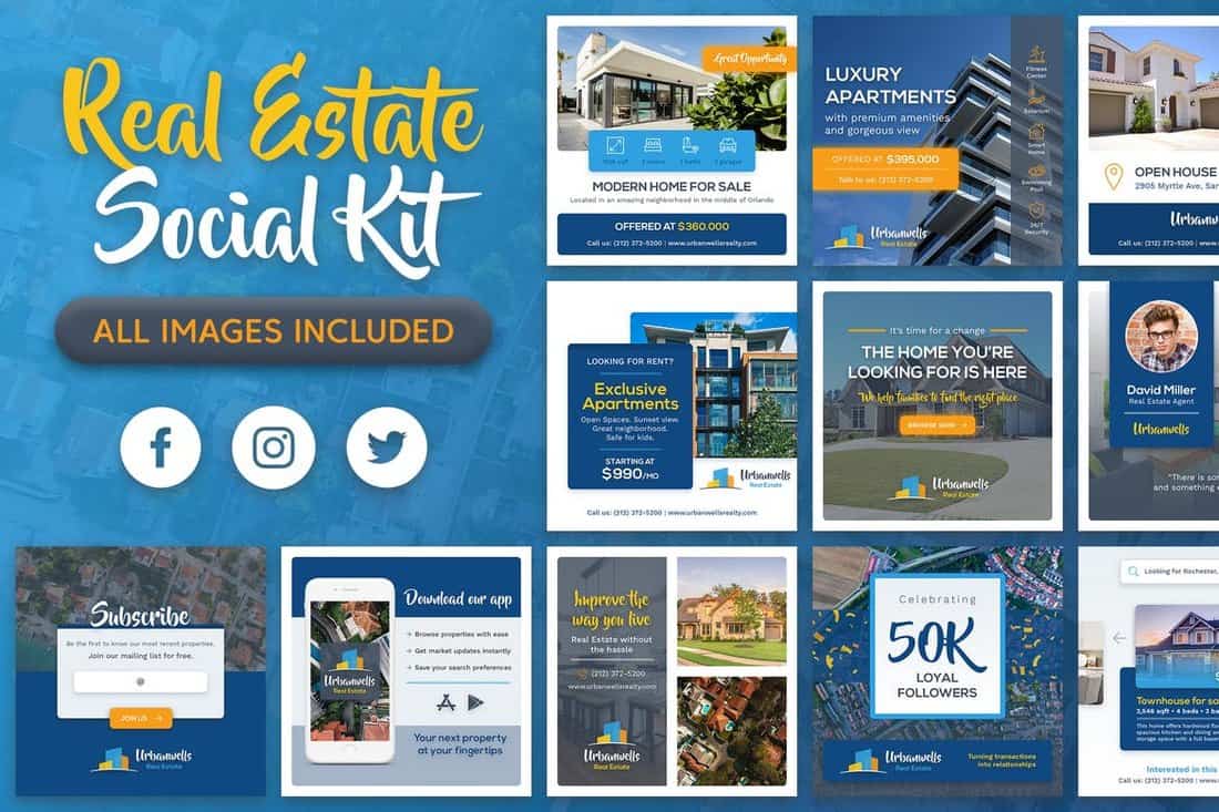
Having a strong social media presence is very important for growing a real estate business. This social media kit comes with 20 unique banner templates specifically designed for promoting real estate businesses. The templates are also available in 3 sizes to fit Facebook, Instagram, and Twitter.
Use these gorgeous free social media templates to promote your products and campaigns on Pinterest. The bundle features 15 professionally crafted templates you can easily customize however you like.
A set of creative Instagram post templates for showcasing and promoting products. The bundle includes 8 different templates you can easily edit using Photoshop and Sketch app.
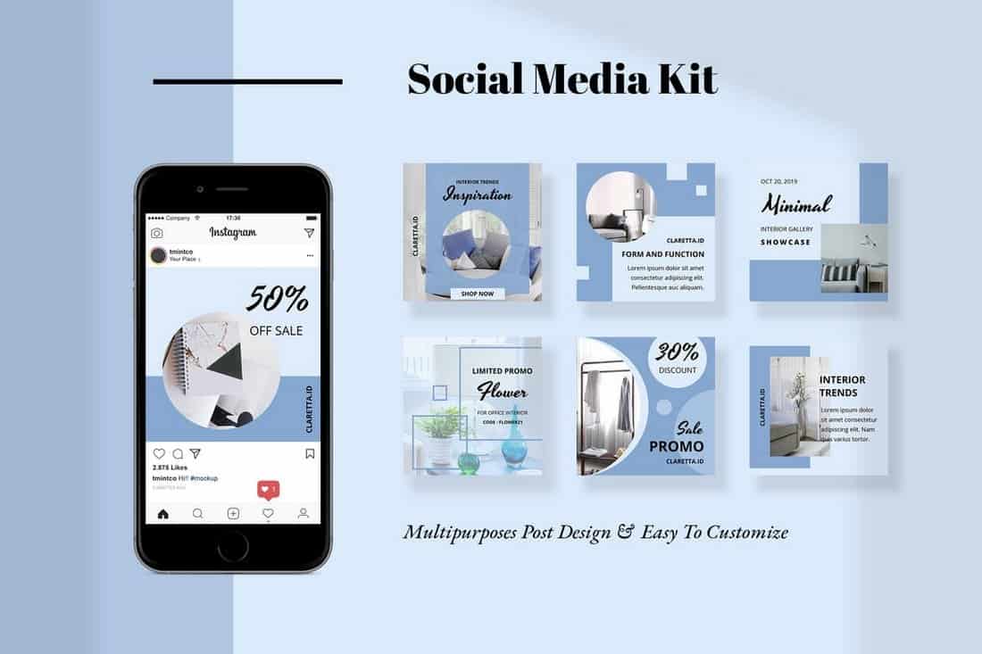
Claretta is a bundle of 10 creative social media banner templates you can use to promote an online store or a small business on Instagram and Twitter. It also comes with Instagram story templates as well.
This is a collection of branded social media templates that comes with a colorful design and professional layouts. These are ideal for promoting brands and businesses. The pack includes 6 different templates.
Calisto is a bundle of creative social media templates that comes with 25 different templates featuring colorful and attractive designs. These templates are most suitable for promoting digital marketing and creative agencies on social media.
This social media templates kit is specially designed for promoting fitness and gym related brands, products, and services on social media. It includes 6 unique templates featuring professional designs.
The professional banner templates in this pack are ideal for promoting fashion and clothing brands on Instagram and Facebook. The templates are available in 1500 x 1500px resolution PSD files.
A free set of social media templates made specifically for designers, allowing you to easily edit and customize the template designs for clients. It includes 6 unique designs in 800 x 800px resolution.
Sunny social media kit includes 25 clean and simple templates you can use to promote fashion brands and clothing products on social media. The templates are available in 2000 x 2000 resolution and in PSD file format.
If you’re an Instagram travel blogger, this social media templates kit will definitely come in handy. It includes 15 unique templates designed for travel-themed posts. Each template is available in two sizes for Instagram and Facebook.
A collection of professionally designed Instagram post and story templates for making posts for brands and businesses. This bundle includes 20 different templates and they are available in both Illustrator and Photoshop file formats.
This bundle of social media templates is designed for creating promotional campaigns for businesses and shops. The pack includes 10 unique templates in 4 different sizes optimized for Facebook, Twitter, Instagram, and Pinterest.
Vanesha is a set of modern social media templates specially designed for promoting fashion-related brands and products. It includes 25 easily customizable templates in PSD format.
A pack of minimalist and clean social media banner templates. This bundle includes 30 different templates you can use to promote many different types of brands and businesses, including travel, food, creative agency, and more.
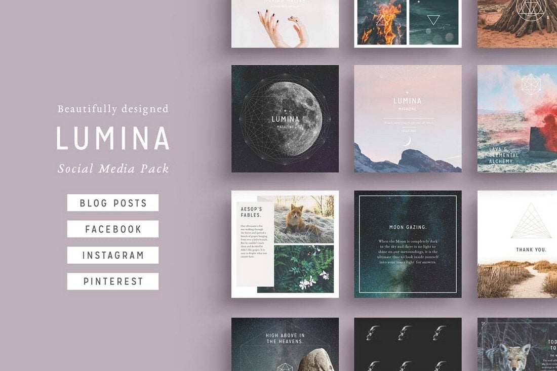
Lumina is a highly minimalist social media kit that comes with several different styles of designs. It includes 32 unique designs and they are available in square, rectangle, and vertical sizes optimized for blogs, Instagram, Facebook, Pinterest, and more. The files are available in PSD and InDesign versions.
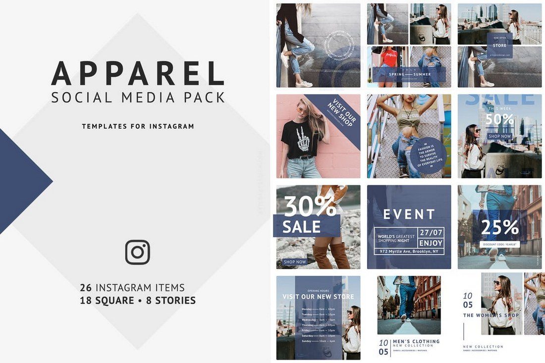
This social media kit is designed specifically for promoting fashion and clothing related brands. It’s fully optimized for Instagram as it comes with 18 square shaped post designs and 8 additional designs for creating Instagram Stories. The post templates are available in 1080 x 1080-pixel resolution.
If you’re promoting a luxury brand or a high-end product, this social media kit will come in handy. It includes 15 professionally designed post templates with different styles. The templates are available in 3 different sizes for Facebook, Instagram, and Twitter. You can also choose from 5 different color combinations to customize the designs as well.

This kit is perfect for creating social media content for fashion and travel brands. It includes 15 unique post templates, each in 3 different sizes and 5 color combinations. Thanks to its smart objects and vector shapes, editing the templates is also quite easy.
This is a bundle of social media post designs that are ideal for bloggers and business brands. The templates feature minimalist designs that highlight its text and content to help promote information. The pack includes 8 different post templates in square designs.
A set of clean and modern social media post templates for crafting graphics for Facebook, Instagram, and Twitter. The pack includes 15 templates in 5 different colors and easily customizable PSD files.
This bundle comes with 30 post templates in 3 different sizes for creating content for different social networks. The templates are available in fully-layered PSD files with vector shapes and smart objects, allowing you to quickly edit the designs to make them your own.
A set of fully-customizable social media templates that you can easily edit to fit all types of your promotions works. It includes 8 unique social media post templates in square sizes, specially optimized for Instagram.
This pack of social media templates is perfect for showing off green and healthy products. It’s designed with lifestyle brand promotions in mind but the templates can also be used for blogging, yoga, and other types of content as well. The pack includes 15 templates, each in square, horizontal, and vertical designs.
If you’re a photographer or a business related to wedding events, this bundle of social media post templates will be quite useful to you. It includes a set of creative social media templates with minimal designs to help promote your work with a special wedding vibe.
The templates in this bundle are designed for promoting your special offers, product sales, and seasonal offers across your social media channels. The bundle includes several different types of templates for you to use when promoting different types of promo offers. The templates can be easily edited using Photoshop.

Naturalis is a bundle of professionally designed social media templates that features a nature-inspired theme. It includes 32 unique designs in square, rectangle, and vertical sizes. As a bonus, you’ll also receive 50 original stock photos along with the templates as well.

Duotone is a popular design trend that you can often see on Instagram and Pinterest. This templates pack adopts the same trend in its templates. It includes 10 social media banner templates featuring the duotone effect. You can customize them easily to change the colors and shapes as well.
If you’re working on crafting a content plan for a food, bakery, restaurant, or a coffee shop social media campaign, grab this bundle to get a head start. This pack includes 24 beautiful Instagram post templates for promoting food-related brands. You can also use it to promote other types of businesses as well.
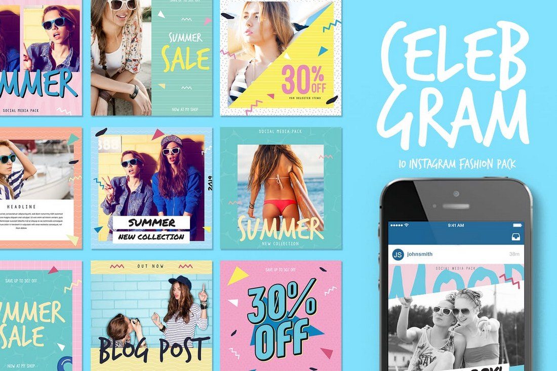
Celebgram is a fashion-themed social media packed that includes 10 unique Instagram post templates featuring pop-culture themed designs. The templates can be easily customized to use on Facebook, Twitter, and Pinterest as well.
Another pack of Instagram post templates. This bundle includes 10 Instagram post designs and 10 Instagram Story templates. Each with free images and easy to use smart objects.
This bundle of Instagram banners includes 40 different banner templates you can use to promote your brand, products, special offers, and seasonal deals on Instagram. The templates are available in easily editable PSD files with smart objects and vector shapes.
Another huge bundle of multipurpose Facebook banner templates for promoting your brand and products. This pack comes with 50 unique banner designs, each in 2 sizes and available in 5 different color combinations.
Creating an eye-catching post for your Instagram feed doesn’t have to be difficult. With this Instagram post template, you can create your own posts to drive new followers or new business. You can quickly add your own images, select your desired color palette, and adjust the copy.
Give your Pinterest account a design upgrade with the Japan Liquid Acid Fluid Memphis template. This template contains 9 fully editable and customizable templates that were designed in Sketch, Photoshop, and Illustrator to stand out from the crowd. This kit is ideal for bloggers, fashion brands, lifestyle bloggers, magazines, and techno blogs who doing sports-related activities or campaigns.
This social media pack is ideal for Instagram, Facebook, Twitter, and more, with the purpose to promote your brand to increase more followers. Change the text, colors, images, strokes, and shapes to achieve the best result you want. Mix and match to create your custom stories, and achieve the best impact on your followers.
The product includes 24 templates designed for Instagram. However, You can also use the design on your Twitter, LinkedIn, Blog etc. These are for Adobe illustrator, and also Photoshop. Each of them is easy to edit and customize, all you have to do is replace images with your artwork via Smart Objects or Clipping Mask and add your copy. That’s it!
Social Media Booster Kit includes 10 templates designed for Instagram, Twitter, and Facebook. Thanks to Smart Objects, you can easily customize the colors and fonts and replace photos. This kit is perfect for bloggers, fashion, and lifestyle brands.
The pack covers all basic design template variations for social media posts and headers to choose from and apply to your brand. Modern, clean and customizable, they are fully optimized for social platforms and ideal for promoting products, brands and businesses.
This pack is perfect for businesses selling luxury and elegance, high-quality professional b2b products and premium goods. Feel free to experiment with design within the pack, mix different backgrounds, visual elements, and colors to create your own new pictures.
If you haven’t used social media templates before these simple tips will help you get started.
The most important part of using templates for social media posts and covers is finding the templates that match the theme of your promotions or campaign.
For example, if you’re running a social media campaign to promote a Halloween sale then you should try to find templates with a Halloween theme. The same applies to finding templates that match your industry and niche as well.
There are many different types of social media templates crafted to perfection by professionals you can use to promote various types of campaigns. Which means you don’t have to use the same templates over and over again.
Whether you’re promoting a fashion brand, a digital product, a service, gym membership, or even a seasonal sale, be sure to pick a template design that matches your purpose.
Most of the pre-made social media templates won’t include images due to licensing requirements. You’ll have to find your own images. Thankfully, there are many great sites you can use to download high-quality and royalty-free images for free like Unsplash and Pexels. Edit your templates and Use the image placeholders to easily place your own images in the post designs.
Even though most social media templates look gorgeous as it is, you can always customize them however you like to change their colors and resize shapes to fit your needs.
Use the organized layers to make changes to the template design as necessary and use your own brand colors to personalize the designs.
Don’t like the look of the fonts used in the social media template? Then use a custom font that matches your brand and industry.
There are many great sources you can use to find all kinds of free and premium fonts with great designs. Use them to make your social media posts look even more unique.
If you’re working on an Instagram campaign, check out the Instagram templates and banners collection for more inspiration.
Welcome to Creator Columns, where we bring expert HubSpot Creator voices to the Blogs that inspire and help you grow better.
A habit that has woven itself through many facets of my life, like parenthood, my health, and entrepreneurship, is a consistent check-in I like to do with how I’m growing.
I often call it a ‘life inventory’ where I scoop up everything I’m working on, learning, and feeling, and ask myself about what’s going well and what needs to shift.

Inevitably, I spend a little bit of my check-in time wandering back down memory lane to the beginning stages of starting my business. With over a decade’s worth of experience, successes, trials, and a whole lot of teachable moments, it’s normal to wonder what I might’ve done differently if I knew then what I know now.
While I could wax poetic about all the things I wish I could share with my 20-something self, the advice I would give for starting my business is rather simple.
‘Keeping it simple’ might be the best way to summarize what I’ve learned about almost everything in life. So, take a step back with me to those early days while I share what I’d do first, without overthinking, if I was starting my business over today.
Maybe you’re looking for a fresh start in your business or a little insight from a seasoned entrepreneur as you start on your own business journey. I hope this advice helps not only give you that clearer starting line you’re looking for but also combats that pressure to start perfectly.
I know you want to mitigate risk and avoid as many pitfalls as possible. But the learning curve is part of the journey. In the meantime, let these five insights guide your vision and keep that process as light, fun, and adventurous as possible!
Starting an email list has to be my first piece of advice for you because I cannot count how often I’ve guided new business owners and entrepreneurs to do this over the years.
I learned how much easier growing a business can be when you don’t have to count on platforms you don’t own and can’t control to deliver your valuable messages to the people you’re creating for.
While social media is important it can also be a space where you waste time, money, and creative energy trying to engage your audience that lives on the other side of a strict, ever-changing social media algorithm.
My advice? Start an email list as soon as possible before any of those resources are spent in places that won’t deliver tangible results. A nurtured email list means you’re showing up in the inboxes of people who want to hear from you, buy from you, and stick around for your stories and growth.
On social media, they might tap that follow button, but from there, they might not see your content for weeks, months, or even years.
And unlike your social media pages, your email list isn’t one hacking incident away from being totally erased, it’s an asset that you own. That’s a powerful difference from what any other platform can offer you online.
As you create new offers (paid or free), you’re able to see if what you’re serving up is irresistible enough for people to want to exchange their email addresses for it. As a new business owner, this is an easy, free way to start gauging what your audience wants most from you.
Mentorship can feel like a big move for a new business owner … with an even bigger price tag. We crave answers and guidance in the beginning, but usually with a beginner budget, we tend to keep mentorship on the back burner.
I spent a little too much time piecing together my own plan out of stubbornness and feeling like I needed to earn all my advice.
But, as someone who eventually would become a mentor to many, I realized how much mentors want to give their advice to newbies! And not all mentorship needs to be one-on-one or costly. There are mentorship opportunities all around us if we know where to look.
First, look for free learning pathways. Tune into a podcast, like Goal Digger, my business and marketing podcast, where I share not only what I’m learning in business but open up conversations with amazing thought leaders, entrepreneurs, and visionaries to pull out their insight, too.
Plus, I even drop episodes that are live mentorship and coaching sessions with all kinds of people who are at their own starting lines or turning points in business.
Learning from other leaders who inspire you can also be as easy as taking a digital course. They can teach you through their course that can come at a more accessible price point while delivering their brilliance right to your screen.
Find someone who’s gone before you and is doing something similar to what you want to do or how you want to do it. Look for people who align with the kind of business owner you want to become. If they have a course, take it. If they have a book, read it. If they host live classes or have an online community, grab a seat.
Eventually, whenever you’re ready, you might even go out on a limb and ask them to mentor you in whatever capacity they can. You might just land your dream mentor!
This can be a tough part of starting a business because the pressure to be impressive or show off our success can keep us from showing the building process.
The journey doesn’t always look ‘pretty’, and it can be tempting to hide those parts (like when we clean up our entire house before the house cleaner comes over.)
But looking back, I regret those moments when I hid my learning process, waiting for everything to be ‘perfect,’ keeping me from growth because when is anything ever perfect? Letting people in on my journey is when my business completely shifted and growth started building in huge waves.
My audience responded to these seemingly messy or incomplete glimpses into my process with a resounding “This is so real!” We related on a whole new level and more people wanted to work with me, trust me as a client, and buy into my new offers.
Beyond ‘being relatable’, here’s why sharing your process and focus is so effective: you want your offers to make sense to the people you’re making them for. The only way they’re going to get the clearest picture of your offer is to let them in long before you finally share the ‘tada!’ moment.
Surprise drives way less results than anticipation. Show your people what you’re working on and allow them to support and champion you!
Starting your business is already a massively pride-worthy moment.
I was so proud to finally get out of my corporate, windowless office and launch into my career as a photographer and then as a digital marketer, but what I needed to get grounded with was my brand. Early on, I genuinely didn’t know the difference between my business and my brand.
An easy way to boil it down is that your business is simply your offer. It’s the solution you give your clients, the service you sell, the products you produce! But your brand is your personality behind every offer, service, and product. Sure, Audi makes cars, but how a person sells them makes all the difference, right?
From your social media, your website, your ads, your blogs, and everywhere else you show up online, your personality should be visible. Don’t hide behind your offers or think that they speak for themselves.
In fact, you’re their best advocate. Your excitement and confidence in what you’ve created is what resonates with your audience!
Your personality can show up long before you even have something to sell. Think about how you show up on social media.
If you’re struggling here, I’ve coined a social content approach called the JK5 that might help keep your creative flow simple.
Every time you go to create a post, choose one from your five unique content pillars that guide your content creation and show your brand personality to your followers. It could be parenthood, pets, style, interior design, poetry, or anything that shows who YOU are!

I learned this analogy through my experience as a photographer, juggling a variety of lenses in my camera bag. I felt this pressure when I was just starting out to have every single lens for every possible scenario.
As my business grew, I bought new lenses but learned that there were just a few that I would reach for over and over again. I didn’t need all the shiny tools right away, and in many cases, never needed them at all.
When you’re just starting your business, you’ll probably be inundated by all the options for the best tools and platforms out there. It’ll make your head spin.
But most of them aren’t necessary for what you need on day one. You don’t have to spend your time and money merely looking like a business when that could easily distract you from being able to do the real work.
Take a few steps back and analyze what your biggest needs are. Differentiate between the ‘nice to haves’ and the ‘need to haves’ to keep your growth moving forward.
A key to helping yourself know the difference is by looking at the tasks that are already on your to-do list vs the ones that you’re looking forward to doing in the future.
For instance, you might need to invest in accounting software before the bells and whistles for your website. In fact, I’ll fully admit that I didn’t have a real branded, designer-made logo until THIS year.
You can go farther than you ever imagined with much less than you think!
Overall, the biggest surprise to me is that I don’t actually want to redo any of it.
As someone who takes so much joy in the learning process itself, it’s only through the hiccups, the guesses, the mistakes, and the early days that I was able to awaken the unrelenting life-long learner and educator in me.
My learning journey is the only reason I can have hindsight enough to meet people at their starting lines or messy middles and be able to help them skip some of the confusion. I love helping smooth out the starting lines.
You’re so much more capable of amazing things than you might know, so any chance I get to help people like you get there is a joy.
So, while these are in some ways insights born out of moments of ‘regret,’ I would say I have a much greater appreciation for them as transformative experiences.
Honor your own flubs and challenges along the way! They’ve not only helped YOU become who you are and the skills you carry, but they’re also a pathway for you to help others make it through the mess as we’re all out here just trying to figure it out as we go.
Processes are mission-critical for businesses, especially when it’s time to document and scale a proven process.
In my experience, whether a process is digital or human-driven, it’s important to map it out so it’s easier to refine, optimize, and ultimately repeat.
That’s where data flow diagrams come in.
![Download Now: An Introduction to Data Visualization for Marketers [Free Guide]](https://no-cache.hubspot.com/cta/default/53/6ecf26a9-faff-4c16-a2d4-b70751ce8b65.png)
They help me get a visual understanding of the steps involved, their dependencies, and how each contributes to the end goal. Why does all this matter?
Whether I’m defining workflows for project management or creating a project ticketing system, data flow diagrams (DFDs) offer straightforward visuals that illustrate the touch points and opportunities for efficiencies or improvement.
As visual representations of the system, they make it easier to understand and refine business processes, keeping them as simple and effective as possible.
Let’s dig into the details of what DFDs are, how you can leverage them, and how to create your own.
Table of Contents

DFDs became popular in the 1970s and have maintained their widespread use by being easy to understand.
There are two types of DFDs — logical and physical.
Logical diagrams display the theoretical process of moving information through a system, like where the data comes from, where it goes, how it changes, and where it ends up.
Physical diagrams show you the practical process of moving information through a system. It can show how your system’s specific software, hardware, files, employees, and customers influence the flow of information.
You can either use logical or physical diagrams to describe that flow of information. You can also use them in conjunction to understand a process or system on a more granular level.
While these two types of diagrams have some similarities, let me clarify what makes each distinct.
Data flow diagrams are designed to provide a map for how your data will flow through a system. Unified Modeling Language (UML) takes it further, providing considerably more detail.
DFDs and UML are not mutually exclusive — you might use a DFD for people who need a high-level summary and then turn your DFD into UML diagrams when it comes time to actually create your system, providing sufficient detail for developers who need to know how to create the specifics.
To continue the roadmap analogy, DFD might provide the top-level overview and potentially even turn-by-turn directions, but UML offers the street-level view with all the context of building color, tree location, and traffic patterns.
DFDs are visual representations that can help almost anyone grasp a system’s or process’s logic and functions. Aside from being accessible, I find they provide much-needed clarity and improve productivity. Here's how.
Because visual information is easier to digest, DFDs typically explain complex concepts better than blocks of text can.
Visual presentations of how a process works can also hold people's attention longer — making it easier to retain the information.
DFDs clarify the systems and processes necessary for your team to do their best work. Whether implementing a new company-wide system or refining a department's existing process, a DFD gets you and your team on the same page.
Creating DFDs will give you clarity about business operations, too. I think a clearer understanding enables you to refine and track your business processes with less friction.
The accessibility and clarity created with DFDs will leave less room for error. Your team will better master systems and processes because they understand them.
Greater understanding — paired with a repeatable process — will likely boost team effectiveness and productivity.
On a broader level, DFDs can help you streamline your business operations. When mapping out your processes, you’ll gain insights into what does and doesn’t work.
These insights help boost you and your team's productivity. As a bonus, you can share any best practices across departments.
Before using a DFD, let me share the symbols you need to describe it.
Data flow diagram symbols are standardized notations, like rectangles, circles, arrows, and short-text labels. These symbols represent a system’s data flow direction, inputs, outputs, storage points, and sub-processes.
Four common methods of notation are used in DFDs: Yourdon & De Marco, Gene & Sarson, SSADM, and Unified.
All use the same labels and similar shapes to represent the four main elements of a DFD — external entity, process, data store, and data flow — so I’ll focus on explaining those, regardless of which notation method you choose.

External entities — which are also known as terminators, sources, sinks, or actors — are outside systems that send or receive data to and from the diagrammed system.
They’re either the sources or destinations of information, so they’re usually placed on the diagram’s edges.
External entity symbols are similar across models except for Unified, which uses a stick-figure drawing instead of a rectangle, circle, or square.
Process is a procedure that manipulates the data and its flow by taking incoming data, changing it, and producing an output. A process can do this by performing computations and using logic to sort the data or change its flow of direction.
Processes usually start from the top left of the DFD and finish on the bottom right of the diagram.
Data stores hold information for later use, like a file of documents waiting to be processed. Data inputs flow through a process and then through a data store, while data outputs flow out of a data store and then through a process.
Data flow is the path the system’s information takes from external entities through processes and data stores. With arrows and succinct labels, the DFD can show you the direction of the data flow.
DFDs can range from simple overviews to complex, granular representations of a system or process with multiple levels, starting with level 0.
The most common and intuitive DFDs are level 0 DFDs, also called context diagrams. They’re digestible, high-level overviews of the flow of information through a system or process, so almost anyone can understand it.
On the other extreme, level 3+ diagrams contain lots of detail and complexity.
This DFD level focuses on high-level system processes or functions and the data sources that flow to or from them. Level 0 diagrams are designed to be simple, straightforward overviews of a process or system.
While level 1 DFDs are still broad overviews of a system or process, they’re also more detailed — they break down the system’s single process node into subprocesses.
The next level of DFDs dives even deeper into detail by breaking down each level 1 process into granular subprocesses.
Level 3 and higher-numbered DFDs are uncommon. This is largely due to the amount of detail required, which defeats its original purpose of being easy to understand.
Professionals in various industries, like software engineering, IT, ecommerce, and product management & design, can use DFDs to better understand, refine, or implement a new system or process.
But what does a data flow diagram look like in practice — and how does it help your business? I’ll share three examples to help you contextualize DFDs' impact.

This Level 0 DFD provides a contextual map of a securities trading platform.
Data flows in one direction from the customer service assistant and the broker to the platform. It also flows in two directions from customers to the platform and back again.
As you can see, it is exceedingly simple and straightforward.

This Level 1 DFD breaks down the customer process in more detail, expanding it to include account creation, cash withdrawals, and eventual securities transactions.
As you can see, it breaks down the customer interactions into more specific actions, allowing viewers to grasp what the whole process looks like.

This Level 2 DFD decomposes the “Place Order” process to contextualize the steps required to place an order — either by a customer or by a broker.
It even accounts for a third-party stock exchange center where transaction details are forwarded after an order is placed. This provides a more granular depiction of a specific process.
Before you start mapping out data flow diagrams, you need to follow four best practices to create a valid DFD.
Begin by selecting a specific system or process you want to analyze. While any system or process can be turned into a DFD, the larger the process, the more complicated the diagram and the more difficult it will be to contextualize.
Wherever possible, I recommend starting with a small function or process you’re looking to improve.
Next, categorize all activities related to this process into external entities, data flows, processes, and data stores.
Consider a restaurant food ordering system. Customers are external entities, the food ordering system is a process, and the interaction between customers and the system (which goes in both directions) is the flow.
Also worth noting? The ordering system doubles as a data store, so for an SSADA model, this means drawing it as a rectangle with rounded corners and two horizontal lines inside to represent its dual function.
Now, it’s time to start drawing. DFDs can be created by hand, using free templates available online, or via browser extensions.
I like starting with a simple, Level 0 DFD. Begin with your process or system, then map all basic connections and flows.
Before diving into more complex DFDs, check the work you’ve already done to make sure it’s accurate and complete.
If you’ve missed (or added) a process, entity, or flow, your next-level DFDs may not make sense, and you may be forced to start over. Trust me, it’s worth double-checking your work after each step.
For each process or system described in your Level 0 DFD, create a new child diagram with its own entities and flows. Eventually, you can use these child diagrams to connect processes together.
Using your child diagrams, you can map more in-depth connections between each process. I find starting with the big picture, then systematically digging into the details ensures I don’t have any missing gaps.
In the case of our restaurant example, this could mean digging deeper into the food ordering system and its connection to suppliers, managers, customers, and kitchen staff.
Each process — no matter how large or small — can be reimagined as a Level 0 context diagram, and the cycle can begin again.
Repeat these steps as needed to create as many DFDs as required, or break processes down further to develop Level 2, 3, etc. DFDs.

When I created a new retainer service for clients that blended marketing strategy with copywriting and tactical support, I needed a way to create a system that would help me manage all the projects while also automating the time-consuming aspects.
Since it is not a typical large-scale copywriting aspect with defined deliverables, I knew there would be more moving parts to manage and that I wouldn’t want to do it manually. So, I created a DFD to help me get clear on how the process would work. Here’s what I learned along the way.
Sure, you can draw a diagram out by hand (and you may want to start there), but my best advice is to choose software you’re somewhat familiar with.
My go-to choices are Canva and Miro because their whiteboards expand in any direction and make it easy to edit or update.
Miro has a bit more functionality with different types of fields and back-end notes, but my comfort level is highest in Canva.
Because it’s important to understand every aspect of the process you’re defining.
In my case, the sales would already be complete, so my first action is to get clients into the system for onboarding.

Start with the basics. How do things currently work? Or, if you’re defining a new process like I was, start with the minimum viable actions.
Why? I’ve found there’s nothing worse than an overcomplicated process that requires too much work or too many manual actions.

My initial DFD started with how I define and set up projects, how I manage the initial work, and how to do revisions — aka the basics.
Once you define your current process, you can use your DFD to show opportunities for improvement.
Personally, manual emails and updates can be overwhelming. These elements are where I’m most likely to drop the occasional ball, so I identified opportunities for automation, specifically around notifications.

You can see in the purple items above where I noted opportunities for improvement and set up some preliminary automation in my project management software (ClickUp).
Now that you’ve dialed in your process and changes (and hopefully, put it into action), it’s time to see how it all works. Where are there holes? What is missing? What could be working better?
I found creating and setting up documents to be incredibly time-consuming, so I added in an automation to create them for me using a blend of ClickUp, Google Docs, and Zapier.

Keep in mind as your business, technology, and market changes, there will be new updates to your process. Your DFD is never 100% complete.
In addition to the processes you outline in your DFD, you may uncover areas where you need to go deeper. For example, in the DFD I shared above, there are additional processes that I can define and potentially streamline:
And while my DFD covers that after a project is complete, the process starts over. There are additional client touchpoints that aren’t related to the actual project management.
While there’s no such thing as a “perfect” data flow diagram, continued practice can help streamline the process and offer critical insight into what’s working, what isn’t, and where your business can make impactful improvements.
My example is considerably simple compared with DFDs I’ve created for much larger clients as we define their marketing and reporting processes to create systems where things don’t fall through the cracks.
After all, the more moving parts, the more important it is to dial in your processes so nothing gets dropped or missed.
Your best bet? Remember the rule: Keep it simple. Start with context, build out connected processes, and repeat as needed to map key connections, flows, and entities across your organization.
Editor's note: This post was originally published in September 2018 and has been updated for comprehensiveness.
Every year we see new trends emerge in the world of design. While most of these new trends fade away with time, some remain to change and influence the industry for the better.
In this post, we explore the ever-evolving world of illustration trends and designs. From the rise of AI-assisted drawings to the resurgence of retro and psychedelic art, these are the trends you can expect to see more of this year.
Let’s take a look at some of the top upcoming illustration trends and how you can apply them in your own designs and projects. Some of these trends will not only be popular but also groundbreaking by bringing in new advancements and innovations.

Designers have different opinions about the advancements of AI and how it’s impacting the industry. However, AI has clearly made work much easier for us. And that’s the main goal of using AI. It should not be used to replace designers but to enhance your workflow and make you more efficient.
Adobe understood this concept better than most other AI startups. During the Adobe MAX 2023 event, Adobe showed how they have improved Adobe Illustrator to help artists and designers create art more easily.
You can now generate vectors with text prompts, find exact matches for fonts, create icons, get variations of your illustrations, copy art styles, and more. These new tools will save you a ton of time and supercharge your process of finding inspiration, coming up with different concepts, and experimenting with different ideas.
One of the trends that we hope to see more of this year is illustrations that represent diversity, culture, and traditions. We saw many brands and companies use these beautiful illustrations on their marketing campaigns, websites, and social media platforms to promote inclusiveness and diverse representation.
This trend is not just about representation, it’s also about celebrating different cultures, expanding the boundaries of perspectives, and bringing people together. It’s a mission that we will always promote with an open heart.

Abstract illustrations have been a powerful visual form that amplifies storytelling for many years. This year, we expect to see this art trend continue to grow.
These beautiful illustrations excel at captivating audiences with colorful visuals and communicating ideas, moods, and messages much more effectively. Whether it’s for branding design or packaging design, colorful abstract illustrations fit perfectly for many types of projects as well.

We all have a soft spot for those classic and groovy illustrations full of vibrant colors and weird shapes. Last year, we saw many artists combine this retro style from the 70s and 80s with psychedelic-style art to create very uncommon and trippy illustrations.
We’ve been seeing these retro and psychedelic illustrations on everything from product packaging designs to website designs and even branding designs. It seems to be getting more popular with casual and lifestyle brands that target younger audiences as well.
The Art Deco design trend is commonly used in various types of packaging designs, brand identities, and graphic designs as a way of showing off elegance and sophistication. It’s a trend that’s been around for decades but over the past few years we saw this trend being used more commonly by modern brands.
This trend will likely continue to be popular in the world of design and illustrations thanks to its ability to combine vintage aesthetics with futuristic vibes. Especially when it comes to luxury and high-end illustrations, Art Deco is unmatched for creating unique nostalgic feels.
The illustrations done in comic book art style are another new trend that’s slowly gaining momentum in the design world. This trend helps add a playful, humorous, and exaggerated look to your illustrations to create a bold retro aesthetic for various types of designs.
Whether it’s website design, poster design, or packaging design, comic book-style art blends perfectly with many different types of mediums as well. It’s also quite effective for brand storytelling and creating designs that communicate with the audience more effectively.

No matter how old we get, we all have childhood memories that we always long for. Doodle art is a trend that’s designed to take you back to that wonderful childhood while evoking a sense of playfulness and free spirit. It’s one of the reasons why this trend has been around for such a long time and it will continue to be as effective as ever before.
Many popular brands have been using doodle art and illustrations as a way to create a more relaxed vibe and also bring out a sense of joy in the audience at the same time. The quirkiness and the imperfections of this art style allow any business or brand to strip away the formalities and create a close connection with its target audience.

The unreal, bizarre, and nightmare-ish surrealism illustration trend continues to surprise us every year by maintaining its popularity across many different industries. When it comes to creating designs that spark curiosity and imagination, nothing comes close to surrealist illustrations.
The distorted human figures, weird manipulations, and the weird elements used in surrealist illustrations often have hidden meanings and tell a story that explores controversial topics. And it opens up new doors for artists, media, and brands to share their narratives in mesmerizing ways.

We went through several different illustration trends over the years from flat design to minimal artwork and the latest to join this lineup is the textured illustrations trend. This new trend sees illustrations getting a much-needed texture upgrade that adds more depth to the overall look and feel.
Textured illustrations will be one of the most popular illustration trends this year for two main reasons. First, they add an authentic and hand-crafted look to digital illustrations. Second, they create a more rugged and tactile vibe for the illustrations, replacing the overly smooth, artificial look of ordinary digital art.

The great thing about line art illustrations is their versatility. Line art drawings can be as simple as a few lines or complex artwork but they will always maintain an overall simple and minimal look. This gives line art illustrations a classic yet timeless look.
Especially when designing illustrations for digital platforms, minimalist line art is an obvious choice as it reduces file sizes and helps improve performance. They are also quite effective in conveying ideas and creating adaptable art across different platforms and mediums.

3D art generation tools like Blender and Unreal Engine received significant updates last year that expanded their capabilities beyond our imagination. Designers have been using these tools to generate ultra-realistic 3D art and illustrations and the results were mind-blowing.
We will surely see more of these realistic 3D art and illustrations this year as well. Especially since the demand for this art is increasing as more industries seem to be embracing this new trend.

When it comes to creating art and illustrations that connect with the audience on a personal level, nostalgic art is the perfect way to go. These illustrations excel at evoking emotions and good memories from the past and go a long way to establishing a strong connection with the audience.
Many brands have been using this trend to create emotional connections with their customers while also celebrating the history and good times from the past.

There were many interesting art and design trends over the years that were inspired by the geometric style of art, including the popular Bauhaus style. And now, they are slowly influencing illustrations as well.
Illustrations inspired by geometric art styles have their own unique styles and we love how artists keep reinventing this trend while putting their own unique spins to create cool artworks.

Caroon and comic-themed illustrations do two things perfectly: They are great at adding a sense of whimsy to your creations and also conveying emotions more effectively.
When it comes to educational projects, casual and fun designs, and even creating mascots, and characters that represent brands, cartoon-style illustrations have been the ideal choice for decades.
Even though it’s not a new trend, we will surely see more cartoon and comic-style illustrations this year. Because it simply works wonders!
This is an illustration trend that will never go out of style. Because it’s the perfect style for creating art and illustrations that exude elegance and simplicity.
Outline drawings and illustrations have a particular way of creating a minimalist vibe for any other project. It helps create that subtle, fine art-style look that you can’t achieve with any other illustration style. And that’s why it will always be a trend you can rely on.

Recently, designers have been creating some radical and bold creations, much more than they used to. Mainly because modern brands and businesses now seek to create more open and authentic identities. And these brave and bold illustrations help achieve that goal.
This is a trend we would love to see more of this year. We are particularly curious how designers and artists will handle this experimental illustration style.
There will also be many other new trends this year, possibly ones we couldn’t even imagine. So be sure to keep an eye out for those. You can always check out our Trends category to stay on top of your game.
Happy fall, MiM-ers! Grab your pumpkin-spiced latte, settle in with Noah Kahan's Stick Season, and get ready to hear from a paid marketer who’s all-in on influencers, storytelling, and AI-targeted ads.
(I'm sorry I can’t offer up a more recent fall-inspired album. To be fair, I'm still obsessed with my "Summer 2019" mix.)
Keep reading to learn why Zapier's head of paid ads thinks the golden age of paid ads is over.

James de Feu says the golden age of paid advertising is over. And he's okay with it.
He's also the manager of paid ads at Zapier.
(I'm currently imagining Mad Men's Don Draper rolling over in his TV grave.)
De Feu is so confident about influencer marketing that he negotiated to bring it under his paid ads team. He succeeded because, moving forward, "we see that as our brand motion."
In fact, when I asked how he'd spend a hypothetical $1k, de Feu tells me he'd put a hefty 40% into influencers.
But don't delete your Google Ads account just yet. De Feu says he'd still give 50% of that hypothetical budget to paid ads. (The other 10% would go to SEO, if you got stuck trying to add this up to 100.)
As he acknowledges, "Paid ads will always be on, and we'll still spend a ton of money there. But paid ads live and die in that spending month. It's not getting us the reach it once did."
That's why de Feu isn’t putting all his eggs in one basket. Paid is still a good egg (err-basket?), but he's excited to seek out influencers who thrive on the same platforms where Zapier's customers hang out.
"I smirked when you mentioned influencers, because that's the name of the game — even for those of us in the B2B space,” he tells me. “It's no longer just about glossy teenage products anymore."
"In the world of paid ads, we get fixated on one single, siloed experience, and we just keep trying to optimize it until it's perfect," de Feu says. "But one thing we've learned is that storytelling is huge."
"Storytelling is huge" is exactly the same pitch I gave my parents when I was trying to convince them that majoring in creative writing was a sound financial decision — but de Feu isn't wrong. If there's one truth that remains consistent in the world of marketing, it's that humans have always, and will always, love a good story.
"Stretching something out, building a story, creating use cases, highlighting testimonials — I let go of that over the past couple of years, and I'm just grateful now that we've reset ourselves. Storytelling has always been, and will continue to be, our superpower as marketers."
So if you're unsure of where to start in the world of paid ads, try this: Talk to your customers, learn their pain points, and then communicate your solutions through a good ole-fashioned tale.
David Bowie preached it: You've got to keep up with all the changes happening in the advertising industry or risk throwing precious cash down the drain. (Those are the lyrics, right?)
For de Feu, that means doing tons of tests to learn how to use AI to personalize Zapier's ads — not just in creating assets, but in audience targeting, too.
"You have to be really on top of all these recent changes or you'll end up wasting money," he says.
An example could be an athletic brand that uses AI to target yoga apparel ads to their vinyasa-loving consumers while ensuring their golf apparel is sent to every guy on Wall Street.
In other words: The future of ads will look a lot more like high-intent, targeted content, and less like the generic, all-purpose ads we've come to know and hate.

Hello Gang! I'm grateful once again for the advice to use MySQL over Postgres. It's been a pretty smooth experience so far. Unfortunately I had to migrate to a different host and have been getting an undefined variable error.
Mysql is Running. I used the package manager to get python-mysql.connector installed. And yet I keep getting an undefined variable error.
Here is the output:
Exception creating initial db connection
Error:  module 'ssl' has no attribute 'wrap_socket'
Error type:  <class 'AttributeError'>
Here is some test code if you need to replicate it:
import base64
import mysql.connector as mysql
try:
    connection=mysql.connect( host="localhost", database="iheartdaniweb", user="funuser", password="supersekritpass")
except Exception as error:
    print("Exception creating initial db connection")
    print("Error: ", error)
    print("Error type: ", type(error))
connection.autocommit=True
Thanks in advance gang! Unfortunately the interwebs were no help with this one or I wouldn't bother you guys! Thanks again!! !!
Many of you — perhaps most of you — have been sitting on the sidelines while WordPress and WP Engine trade legal attacks on one another. It’s been widely covered as we watch it unfold in the open; ironically, in a sense.
These things can take twists and turns and it doesn’t help that this just so happens to be an emotionally charged topic in certain circles. WordPress is still the leading CMS after all these years and by a long shot. Many developers make their living in the WordPress ecosystem. All of those developers need hosting. WP Engine is still the leading WordPress-flavored host after many years. Many developers host their agencies there and use it to administrate their clients’ sites.
And I haven’t even gotten to the drama. That’s not really the point. The point is that there’s a bunch of heated words flying around and it can be difficult to know where they’re coming from, who they are aimed at, and most importantly, why they’re being said in the first place. So, I’m going to round up a few key voices contributing to the discussion for the sake of context and to help catch up.
Editor’s Note: Even though CSS-Tricks has no involvement with either company, I think it’s mentioning that Automattic was a looooooong time sponsor. This site was also once hosted by Flywheel, a company acquired by WP Engine before we moved to Cloudways following the DigitalOcean acquisition. Me? My personal site runs on WP Engine, but I’m not precious about it having only been there one year.
We had fair warning that something was coming up when WordPress co-founder Matt Mullenweg sent this out over X:
I know private equity and investors can be brutal (read the book Barbarians at the Gate). Please let me know if any employee faces firing or retaliation for speaking up about their company's participation (or lack thereof) in WordPress. We'll make sure it's a big public deal and…
— Matt Mullenweg (@photomatt) September 19, 2024
There’s the ammo: Don’t let private equity bully you into speaking up against the company you work for when its contributions to WordPress are on the slim side of things.
Private equity. Lack of participation in the WordPress community. Making a big public deal of it. Remember these things because this is one day before…
Matt spoke at WordCamp US (WCUS) 2024 in Portland, OR, last week. September 20 to be exact. Making big, bold statements at WCUS isn’t a new thing for Matt, as many of us still have “Learn JavaScript deeply” tattooed on the brain from 2016.
Matt’s statements this year were less inspirational (instructional?) as they took direct aim at WP Engine as part of a presentation on the merits of open-source collaboration. You can watch and listen to where the first jab was thrown roughly around the 10:05 marker of the recording.
Let’s break down the deal. Matt begins by comparing the open-source contributions to WordPress from his company, Automattic, to those of WP Engine. These things are tracked on WordPress.org as part of a campaign called “Five for the Future” that’s designed to give organizations an influential seat at the table to form the future of WordPress in exchange for open-source contributions back to the WordPress project. Automattic has a page totaling its contributions. So does WP Engine.
Before Matt reveals the numbers, he goes out of his way to call out the fact that both Automattic and WP Engine are large players in the neighborhood of $500 million dollars. That’s the setup for Matt to demonstrate how relatively little WP Engine contributes to WordPress against Matt’s own company. Granted, I have absolutely no clue what factors into contributions, nor how the pages are administrated or updated. But here’s what they show…

Quite the discrepancy! I’d imagine Automattic dwarfs every other company that’s pledged to the campaign. Maybe it would be better to compare the contributions of another non-Automattic pledge that has a fairly strong reputation for participating in WordPress community. 10up is one of the companies that comes straight to my mind and they are showing up for 191 hours per week, or roughly five times WP Engine’s reported time. I get conflicting info on 10up’s revenue, valuation, and size, so maybe the comparison isn’t fair. Or maybe it is fair because 10up is certainly smaller than WP Engine, and no estimate I saw was even close to the $500 million mark.
Whatever the case, bottom line: Matt calls out WP Engine for its lack of effort on a very public stage — maybe the largest — in WordPress Land. He doesn’t stop there, going on to namecheck Silver Lake, a ginormous private equity firm bankrolling the company. The insinuation is clear: there’s plenty of money and resources, so pony up.
That’s bad enough for attendees to raise eyebrows, but it doesn’t end there. Matt encourages users and developers alike to vote with money by not purchasing hosting from WP Engine (11:31) and seems to suggest (23:05) that he’ll provide financial support to any WP Engine employees who lose their jobs from speaking up against their employer.
I think I can get behind the general idea that some companies need a little prodding to pull their weight to something like the Five for the Future campaign. Encouraging developers to pull their projects from a company and employees to jeopardize their careers? Eek.
This is when I believe things got noisy. It’s one thing to strong-arm a company (or its investors) into doing more for the community. But in a post on his personal blog the day after WCUS, Matt ups the ante alleging that “WP Engine isn’t WordPress.” You’d think this is part of the tough-guy stance he had from the stage, but his argument is much different in this post. Notice it’s about how WP Engine uses WordPress in its business rather than how much the company invests in it:
WordPress is a content management system, and the content is sacred. Every change you make to every page, every post, is tracked in a revision system, just like the Wikipedia. This means if you make a mistake, you can always undo it. It also means if you’re trying to figure out why something is on a page, you can see precisely the history and edits that led to it. These revisions are stored in our database. This is very important, it’s at the core of the user promise of protecting your data, and it’s why WordPress is architected and designed to never lose anything.
WP Engine turns this off. They disable revisions because it costs them more money to store the history of the changes in the database, and they don’t want to spend that to protect your content. It strikes to the very heart of what WordPress does, and they shatter it, the integrity of your content.
OK, gloves off. This is more personal. It’s no longer about community contributions but community trust and how WP Engine erodes trust by preventing WordPress users from accessing core WordPress features for their own profit.
That’s where I’d like to end this, at least for now. Several days have elapsed since Matt’s blog post and there are many, many more words flying around from him, community members, other companies, and maybe even your Great Aunt. But if you’re looking for more signal than noise, I’ve rounded up a few choice selections that I feel contribute to the (heated) discussion.
Matt responds to the requisite calls for him to step down, starting with:
To be very clear, I was 100% cordial and polite to everyone at the booth, my message was:
* I know this isn’t about them, it’s happening several levels above, it’s even above their CEO, it’s coming from their owner, Silver Lake and particularly their board member Lee Wittlinger.
* Several people inside WP Engine have been anonymously leaking information to me about their bad behavior, and I wanted to let them know if they were caught or faced retaliation that I would support them in every way possible, including covering their salaries until they found a new job.
* That *if* we had to take down the WP Engine booth and ban WP Engine that evening, my colleague Chloé could print them all new personal badges if they still wanted to attend the conference personally, as they are community members, not just their company.
This was delivered calmly, and they said thank you, and their head of comms, Lauren Cox, who was there asked that they have time to regroup and discuss.
WP Engine issues a cease and desist letter designed to stop Matt from disparaging them publicly. But hold up, because there’s another juicy claim in there:
In the days leading up to Mr. Mullenweg’s September 20th keynote address at the WordCamp US Convention, Automattic suddenly began demanding that WP Engine pay Automattic large sums of money, and if it didn’t, Automattic would wage a war against WP Engine.
And yes, they did issue it from their own site’s /wp-content directory. That’s easy to lose, so I’ve downloaded it to link it for posterity.
Just today, Matt published a cease and desist letter to the Auttomatic blog where he alleges that WP Engine’s commercial modifications to WordPress Core violate the WordPress trademark. Again, this has become about licensing, not contributions:
WP Engine’s business model is based on extensive and unauthorized use of these trademarks in ways that mislead consumers into believing that WP Engine is synonymous with WordPress. It’s not.
This is trademark abuse, not fair competition.
This is no longer WordPress vs. WP Engine. It’s more like Automattic vs. WP Engine. But with Matt’s name quite literally in the name Automattic, let’s be real and call this Matt Mullenweg vs. WP Engine.
WP Tavern is still the closest thing we have to an official WordPress news outlet. Nevermind that it’s funded and hired by Automattic (among others). I respect it, though I honestly have been less attentive to it since the team turned over earlier this year. It’s still a great spot to catch up on the post-event coverage:
There’s another more recent WP Tavern article I want to call out because it’s a huge development in this saga…
Dang. This is the point of no return. It not only affects WP Engine proper, but the Flywheel hosting it also owns.
WordPress.org has blocked WP Engine customers from updating and installing plugins and themes via WP Admin.
I was able to update plugins on my site as recently as yesterday, but let’s see as of this morning.

Maybe I can still see details about my installed plugins…

This is a bad, bad situation. I have thoughts about it and neither side looks good. Using real people with no dog in the fight to make a point is never gonna be a good look. Then again, both sides have valid points and I can see where they’re coming from. I just hate to see it come to a head like this.
The story continues, of course — and it ain’t slowing down. WP Tavern is on the ball and publishing regular updates, although remember: it’s an Automattic publication at the end of the day. Matt’s been the most vocal player so far, so it stands to reason that WP Tavern might want to amplify things.
In any case…
Catching Up on the WordPress 🚫 WP Engine Sitch originally published on CSS-Tricks, which is part of the DigitalOcean family. You should get the newsletter.
A new tool from Eric Meyer, Brian Kardell, and Stephanie Stimac backed with Igalia’s support. Brian announced it on his blog, as did Eric, describing it like this:
What BCD Watch does is, it grabs releases of the Browser Compatibility Data (BCD) repository that underpins the support tables on MDN and services like caniuse.com. It then analyzes what’s changed since the previous release.
Every Monday, BCD Watch produces two reports. The Weekly Changes Report lists all the changes to BCD that happened in the previous week — what’s been added, removed, or renamed in the whole of BCD. It also tells you which of the Big Three browsers newly support (or dropped support for) each listed feature, along with a progress bar showing how close the feature is to attaining Baseline status.
Browser support data is at MDN. There’s also plenty at Caniuse.com. The two share data, in fact, though not all of it. We now have Baseline, which is also cited in MDN and Caniuse alike. It’s nice to see an effort at cracking a central spot for all this — organized by date, no less.
Oh, and hey, there’s a feed. Even better.

You can also poke at its repo. Thanks a bunch, Eric, Brian, Stephanie, and Igalia! This is super helpful and already part of my toolkit.
BCD Watch originally published on CSS-Tricks, which is part of the DigitalOcean family. You should get the newsletter.
Logo design plays a crucial role when it comes to the success of a business. And great logo mockup templates not only help you better present your logo design but can also make your logo design process more streamlined and efficient.
In order to help you present a logo design to your client in a super-polished way, we’ve gathered the best logo mockup templates from across the web.
All of these logo mockups are easy to use and can present your logo beautifully. Some are free, while others cost a few dollars.
Are you in the middle of a logo design project? Don’t forget to check out our in-depth guide on how to design a logo!
A logo mockup is a template you can use to present your logo designs in a more realistic and creative way.
Logo mockups come in all kinds of designs and with different background environments and layouts such as business cards, wood surfaces, signage, and more. These help you to present your logo designs to clients to show how the logos would look like in a real-life environment.
For example, if you’re designing a logo for a business card, you can use a logo mockup with a business card background design to show your client how the logo would look like when it’s printed on a business card.
Using a logo mockup is quite easy. Mockup templates are usually available in Photoshop PSD file format. Once you’ve downloaded the mockup template file, all you have to do is open the PSD file in Photoshop and then simply drag and drop your logo design onto the mockup template.
Most mockups even include smart object layers that makes it much easier to place your own logo designs in the mockup template with just a few clicks.
If you’d like to learn more, our tips for designing with a logo template are a great place to start.
This is a unique way to professionally display your logo designs on a realistic environment. Boasting a close-up view of a leather material, this PSD mockup comes bundled with smart-object features for swift and simple design replacement. The organized layers, folders, and 300 DPI make it more accessible and easier to use.
A thoughtfully designed logo mockup that will elevate your design presentations. Available in a high-resolution PSD Photoshop format, it is equipped with smart object features, enabling swift and seamless replacement of designs.
This is a high-quality logo mockup that allows you to showcase your logo designs on a realistic shop window background perfectly. With easy editing, smart object support and organized layers, it gives you full control over your end product.
A professional, easy-to-use logo mockup for showcasing designs. With its high resolution of 4500x3000px and 300 DPI, your designs will be at their best. It features a realistic-looking concrete wall background.
This mockup allows you to effortlessly bring your logo designs to life with a sophisticated metal effect. Easy to customize using smart object layers in Adobe Photoshop, this mockup features a high resolution of 3000 by 2000 PX at 300 DPI, with no additional plugins required.
A stunning and versatile logo mockup that will make any logo shine. Equipped with easy-to-edit, organized layers and smart object support, this high-quality template offers a realistic stainless steel finish.
This is one of the most realistic logo mockup templates on our list. You can use it to showcase various types of logo designs like a true professional. The template is fully customizable and you can easily place your logo design using smart object layers and even change the design of the backgrounds.
If you’re working on a logo design for a clothing or fashion brand, this mockup will help showcase your design in a more attractive way. It features a mockup that makes your logo look like a rubberized logo.
Whether you’re working on a logo or signage for a business, you can use this template to make your logo design appear more real and natural in your presentations. The template comes in a fully customizable PSD file with smart objects.
Showcase your logo designs in a creative and natural environment using this beautiful logo mockup. It comes in a PSD file with organized layers for you to edit the mockup design however you like.
This is a free logo mockup template you can use to give an engraved look to your logo designs. You can easily place your logo in the mockup using smart object layers and even switch between 3 backgrounds.
This mockup template comes with a realistic stamp-style design. It’s ideal for showcasing your badge and emblem logos. It allows you to show your logo design both on the stamp as well as the paper.
This pack includes 2 amazing mockup templates that let you showcase your logo designs with a debossed effect. It also features customizable backgrounds and smart objects for easily placing your design on the mockup.
A collection of paper mockups for showcasing your logo designs. These mockups feature realistic paper mockup designs that will surely be useful when showing off your logo and branding projects.
With this pack, you’ll get a two-in-one deal. It includes mockups for both your logo designs as well as your business card designs. There are 4 different mockup scenes in the bundle with organized layers and smart objects.
This is a free logo mockup template that features a rare design. It uses burlap material for the background, which will fit in perfectly with your logo designs for clothing and apparel brands.
Looking for a logo mockup template with a minimalist design? Then this mockup is for you. It allows you to showcase your logo in a realistic letterpress design. You can change its background color and adjust shadows as well.
You won’t find another leather debossed mockup with a realistic design than this one. It works perfectly for luxury brand logos. And it features an editable background for customizing the design.
Here we have a glass signage logo mockup that will help you showcase your design in a photorealistic way. It comes in 3000×2000 px resolution and 300 dpi, and thanks to smart layers, there’s absolutely no need to dread the work. Customizing it is as easy as pie!
Check out this collection of logo mockups, with each helping you visualize how your design would look on the wall of a corporate office. It comes in 3000×2000 pixel resolution and includes a range of lighting effects, and blur backgrounds.
Whether you need a logo for your street restaurant, salon, or patisserie, this mockup will come in very handy. Everything from the sign background color to the visual effects can be customized to suit your own branding. Check it out now!
Want to know how your logo would look like on a heavy wooden platform that’s attached to a brick wall? This free logo mockup comes in high-resolution and allows you to showcase your design in real-life settings. For a freebie, it offers a surprising amount of creative control in your hands.
Looking to give your logo an old-school, vintage look? Look no further than this glossy letterpress logo mockup. It’s sure to make the design beautiful and captivating, so much so that your clients will be left with no option but to give the suggested logo a thumbs up.
Here we have a super realistic, unique, useful, trendy, and stylish set of mockups. It provides you with the greatest way to present your creative logo design!
This mockup can be fully customized in Adobe Photoshop. You can edit the design with ease by using the smart object. An excellent product that you must give a shot to.
Check out this clean, and simple mock up that is great for presenting your logo designs. It is easy to edit your designs with smart objects as well as change background color to fit your designs.
The mockup comes in 4000 x 3000 pixels resolution so it enables you to share your logos in a high-quality scene rendered realistic thanks to the soaring seagulls, the shining sun, and the building details.
This Photoshop resource comes with multiple artwork placements, allowing you to pick your priority and choose between sharing the vinyl logotype of the store on its own or displaying it with window artwork for sales, new collections, or themed decoration.
A unique logo mockup template for presenting your logo designs with a papercut design. The template includes smart object layers for you to easily place your logo design in the mockup. As well as changeable backgrounds.
This logo mockup is perfect for showing luxury and high-end brand logos in an elegant way. The golden foil design with its editable background will definitely make your logo presentations look more professional.
This is a great free mockup template you can use to showcase your logo designs with a foil press effect. It features both gold and silver effects with a realistic leather texture to give your presentation an attractive look.
This is a collection of unique logo mockups featuring modern and creative designs. These are ideal for showcasing your logo designs in a more realistic environment. The bundle includes 6 different logo mockups in high-resolution and with real backgrounds. When using this pack of mockups, you’ll be able to choose from multiple designs. In addition, you can easily edit them using smart objects as well.
The realistic logo mockup templates in this bundle will make it tough to tell the difference whether it’s a real logo or not. This pack includes 11 PSD mockups you can use to showcase your logo designs in a professional way.
If you’re working on a logo design for a luxury brand, this pack of 11 mockups will help you showcase your logo designs in a professional way.
If you want to showcase your shop logo and signs in a more realistic environment, this mockup template is for you. It includes customizable effects and easily editable smart objects.
A bundle of high-quality logo mockups featuring hanging signs. It includes 6 different mockups with various designs. They are ideal for showcasing both logos and signage.
This free logo template is perfect for showcasing creative logo designs in your portfolio. It features a clean design with a textured background.
Another professional free logo mockup with a realistic background environment. This template lets you showcase logo designs with a 3D view. It includes smart objects for easier editing as well.
If you’re designing a logo for a brand or a product, this set of mockups will help you showcase your design as creatively designed labels. The pack comes with 7 different PSD mockups.
This is a bundle of 10 photorealistic logo mockups that allows you to showcase your logo and badge designs in various signage and shop environments.
A collection of hipster-themed logo mockups featuring modern-vintage designs. It includes 25 different mockups made up of real photos.
This is a bundle of 30 unique logo mockups you can use to showcase your logo designs in a professional way. The templates can be used with your personal and commercial projects.
If you want to showcase your logo design with a unique 3D-like look and feel, this mockup is perfect for you. It features a realistic 3D effect. And you can easily place your own logo in the mockup using smart object layers as well.
Use this logo mockup to showcase small business, store, and boutique logo designs as well as logo signs. This mockup is based on a real photo and comes fully layered with smart objects.
Working on a wall logo sign design? Then here’s a whole bundle of wall logo mockups you can use to present your designs. This bundle includes 6 different wall logo sign mockups featuring different background textures as well as overlay shadows.
This mockup template is perfect for showing off branded mug designs. The template allows you to easily showcase both logo and mug designs. It includes organized layers with separate shadows and changeable background.
This is a free logo mockup that lets you show off logo designs in the style of a wax seal. While this may not be a great mockup to showcase all kinds of logo designs, it’s certainly a unique approach to presenting designs.
Another wall sign logo mockup. This one features an opaque glass that offers a great way to show off logo and signage designs for restaurants, coffee shops, and even fashion stores.
A simple and clean mockup template for showcasing a logo template on a white paper. This mockup is ideal for presenting logo designs you’ve made for stationery such as business cards and letterheads.
This wall logo sign mockup is quite special. It allows you to showcase your logo as a wall sign while also giving it a 3D look and feel. The mockup is fully customizable and compatible with Photoshop CS4 and higher.
This is a collection of logo and wall sign mockups that are perfect for showcasing logo designs for luxury brands and businesses. The pack includes 4 mockups featuring different gold colors.
A pair of free logo mockup templates. It features 2 mockups that allow you to present your designs on paper and clothing. Both templates come fully layered and easily editable as well.
A set of 8 realistic shop and restaurant signage mockups that are perfect for showcasing your logo design. The templates are free to download and use.
A collection of 10 unique mockup templates for showcasing logo and badge designs. The mockups also feature real-photo based designs.
A set of 8 unique signage and logo mockup templates. The templates in this pack feature smart objects for easier editing as well.
This bundle of mockups templates including 10 different mockups in PSD formats for presenting your logo and label designs in a professional way.
Featuring metallic designs, this pack of mockup templates is perfect for showcasing your logo designs in a unique way with an engraved look and feel.
A simple yet elegant logo mockup for presenting modern logo designs. The template comes with smart objects and in a layered PSD file.
This collection of logo mockups feature 6 wood-based designs for showcasing your logo designs with a realistic engraved look.
This 3D wall mockup will allow you to show off your logo designs in a creative way. The template features smart objects to let you easily place your designs on the mockup as well.
This free mockup features a metal surface. You can use it to present your logo designs and show clients how the logo looks like on as a metal branding.
Showcase your logo designs on a building facade using this free logo mockup template. It’s easily customizable and free to use with your personal projects.
A stylish logo design mockup you can use to showcase your design with a 3D view. It’s also available in 3 different variations.
A bundle of 10 unique logo mockups made specifically for logo and label designs. These mockups have been made based on real photos as well.
The mockup templates in this bundle feature simple designs that will make your logo and text designs look 3D.
This beautiful and unique logo mockup template can be used to present many types of modern logo designs. And it’s free to use.
Here’s a very realistic rubber stamp mockup to help you create a distinctive showcase of your badge, logo or symbol.
Showcase your logo design on a stack of business cards. This logo mockup features a realistic background as well.
A bundle of logo mockups featuring paper-themed designs. These mockups are ideal for presenting business card logo designs.
If you’re working on a letterpress logo or label design, you can use this mockup to present your design to clients in a realistic environment.
The mockups in this pack also feature realistic backgrounds and include smart objects for easier editing. The bundle includes 10 mockups.
Another collection of 10 different logo and badge mockups. These mockups are available in 3000 x 2000 px resolution.
This is a two-in-one logo mockup template that allows you to showcase your logo design on both a label and a USB flash drive.
This free logo mockup is ideal for presenting your logo designs made for luxury brands and businesses.

The freebie of the day is an elegant, high quality PSD mockup that will allow you to showcase your logo, badge, monogram and more. The scene features a realistic wooden wax seal stamp with a wax sealed envelope. You can change the color of the wax seal according to your needs, and place your logo easily via smart objects.
This bundle includes 4 different mockup templates that include paper-based mockup designs in well-organized PSD files.
A collection of unique logo mockups featuring rusty and weathered backgrounds. These are perfect for vintage-themed logo and badge designs.
This free mockup template allows you to showcase your logo design on a wood wall. It’s available as an easily editable PSD file.
This is a collection of 9 unique mockup templates you can download and use for free to showcase your logo designs in various ways.
Another set of luxury-themed logo mockups featuring 10 different designs. These mockups also come in layered PSD files.
This is a complete bundle of mockups you’ll need to showcase your logo designs for a brand. It includes cardboard, letterpress, golden foil, and many other types of mockups.
A simple and an elegant logo mockup template you can use to showcase your modern and creative logo designs.
Make your logo design look like a wall sign using this free logo mockup template.
This professional and stylish logo mockup template will make your logo presentations look more authentic and stylish.
This set of mockups includes 5 different templates with various designs. You can use them to showcase all kinds of logo designs.
This bundle comes with 9 unique mockups that allow you to present your logo designs in a realistic environment.
A bundle of 7 unique mockup templates for showcasing branding-related logo designs. The mockups in this pack are available in layered PSD files.
Another collection of photorealistic logo mockup templates featuring paper-based backgrounds. These mockups come with smart objects as well.
Showcase your logo designs with a unique perspective view using this pack of logo mockups. It includes 6 unique mockup templates.
Whether you’re working on a signage design or a logo design you can use this free mockup to showcase your design in a professional way.
A realistic logo mockup featuring a paper-based design. This mockup comes to you as a fully layered PSD file with smart objects for easier editing.
Base on a real photo, this creative logo and label mockup template lets you showcase your designs in a realistic and creative environment.
Featuring a perspective view, this logo mockup template is perfect for presenting your logo design in a print paper background.
This unique logo mockup will make your logo design look like a paper cutout. The PSD file lets you easily edit the mockup using smart objects as well.
Showcase your logo design with a textured look and feel using this free mockup template. It’s available as a layered PSD file.
This massive bundle of logo mockups comes with 50 stylish overlay photographs for showcasing your logos. Each logo mockup in this pack features a mixed modern and vintage design and includes smart objects for easily placing your logos in the design.
A high-quality letterpress logo mockup that’s ideal for showcasing your designs in a stylish and a realistic way. This template is free to download and use for your personal projects.
This pack of logo mockups aims to make your logo designs looks as if it’s fresh out of the printing press. The realistic paper look will make your logos stand out in any presentation.
This free logo mockup template lets you showcase your logo designs in a photorealistic way. It comes with 2 PSDs in different perspectives.
If you’re working on a logo for a big brand store or a shop, this pack offers you plenty of store sign mockups for showcasing your logo designs in a professional way. The bundle includes 50 high-quality mockups in different sizes and beautiful surroundings.
This free template is perfect for showcasing logo designs you’re making for fashion-related brands. The template lets you show the logo designs as if it’s embroidered on clothing.
Showcase your logo in realistic cardboard labels, paper rolls, and more with this pack of logo mockups. This bundle includes 12 unique mockup templates for professional logo design presentations.
Another high-quality, yet free, logo mockup template for showcasing logo and signage designs. This mockup is more suitable for shoe, handbag, or other fashion branding work.
This is a curated collection of 8 logo mockups that offers several different ways of showcasing your logo, including on business cards, product tags, packaging, clothing, and more.
Show off your logo designs as a wall mounted sign using this free logo mockup template. The PSD is fully-layered and you can easily edit its smart objects to place your own design.
A collection of 6 beautiful logo mockups for showcasing your logo designs in a creative way. This mockups pack is ideal for showcasing your logo designs for a creative agency or a startup.
This minimalist mockup template features a vintage design for showcasing your logo design in a classic and a natural way. You can download this PSD for free.
The 11 unique logo mockups in this pack are simply perfect for showcasing your hand lettering logo designs and illustrations. The natural and creative look of the mockup backgrounds will certainly help add more value to your designs.
This mockups pack comes with 50 PSD mockup templates for showcasing your logo designs on real shops facades. It includes various types of shops, restaurants, bars, stores, and lets you showcase logos on windows, doors, entrances, and in many other ways.
The beautiful alternative and unique designs of the mockups in this bundle will let you show off your logo designs in a more original way. This bundle comes with 6 different mockup PSD files.
Create a realistic stamp impression for your logo or badge presentations with this new and original rubber stamp PSD mockup. This resource is completely editable and uses smart objects, so you can adjust it to your needs in no time.

Use this photorealistic hanging wall sign mockup to create a distinctive presentation for your next branding project. Just add your own logo inside the smart object and you’re good to go.
You can use this photorealistic mockup template to showcase logo or signage designs on a beer glass. The glass, logo, and the background of the template are also easily changeable.
A 3D logo mockup template for showcasing logo or signage designs on a building facade. It comes with fully organized layered, separated shadows, and editable colors for easier customization.
This bundle of logo mockups comes with 14 various mockup templates which you can use to present your logo designs in many different ways.
Create a distinctive establishment display for your logo, lettering or signage with this photorealistic hanging wall sign PSD mockup. All you have to do is place your own design inside the smart object and you’ll be done in no time.

A realistic PSD mockup of a classic coffee mug that will allow you to present a logo or typography piece in a natural way. To get a flawless result, drag and drop your design inside the smart object and change the background if needed.

Give your logo designs a creative hand-drawn look with this mockup set. The pack comes with 11 different mockup scenes and includes 5 special color fx filters for adding more style as well.

Showcasing your logo designs in an office interior environment will be easier with this bundle of mockup templates. It comes with 10 pre-made PSD files which you can edit to showcase your own logo and branding designs.

Realistic logo mockup with clean look and fine details, ready for your presentation. It works with any shape or text, using the Photoshop smart object feature.
This pack includes 6 vintage-style logo templates that you can use as part of your branding, labels and packaging, awesome t-shirt designs, and so much more! All fonts used in these templates are available freely for download and are listed in the help file.
Showcase your designs with this photorealistic PSD mockup template. Just place your logo inside the smart object layer and you’ll get this great 3D wooden logo effect.
A realistic logo mockup on burlap. The logo mockup PSD uses smart object layers in Photoshop, which requires CS4 or higher. All you need to do is double click the smart object and paste your transparent logo inside. For best results, Photoshop CS6 or higher is recommended.
A PSD scratched metal logo mockup, ideal to showcase your logo designs, text or flat objects in a different way – on a realistic-looking metal plate. Just drag and drop your final artwork, thanks to our smart layers.

This free fabric eco bag mockup can be easily edited using smart objects. It comes as a high quality 300 dpi PSD file, at a resolution of 3990 x 2475 pixels. The background is customizable, with the bag design located on a separate layer in Photoshop.
A simple perspective logo mockup template that allows you to preview your logo design on a fabric surface. The template also allows you to easily change the background color, for different looks.
Use this realistic fabric bag mockup to present your logos, artwork, badges or labels in a gorgeous way. The high quality PSD file is easy to edit via smart objects: the bag and the shadow are separated and you can change the background.
A distinctive and polished PSD logo mockup to illustrate any of your designs in a realistic manner. Place your work inside the smart layer and you’ll get a beautifully offset printed logo on natural paper effect.
A metallic foil printing effect, combined with embossing, to create a “fancy” presentation for your logo, signage or lettering. Use the smart layer to easily drag and drop your design.
Metallic foil stamping is a great way to add prestige to a design that calls for a polished style. With this PSD mockup, you can easily get that look directly in Photoshop. Use the smart object feature and create a great presentation in seconds.
A gold leather stamping logo mockup to help you create a beautiful display for your branding projects on leather. Add your image inside the smart object, then sit back and enjoy your work.
This freebie can be used to mockup your logo, badge or typography. Simply use the smart object layers to replace the current logo layer (“YOUR LOGO HERE”) with your own, and save to see the effect. Download and try it for free.
Create a realistic printed leather effect for your logo, badge or lettering. This PSD template uses the smart object feature, so you can easily replace the current logo with your own. Don’t forget to check out the actual pixels.
A high resolution and easily editable PSD file for your logo mockups.
This Photoshop mockup allows you to showcase your logo with a bit of shine. It uses smart objects to make it very easy for you to add your own design. The PSD file includes 3 metallic foil textures to choose from: gold, silver and copper.
Use this PSD template to create a realistic letterpress printing effect for your logo, lettering and more. Just drag and drop your design inside the PSD file and the smart objects will do the magic.
Using this freebie, you can quickly create your own perspective logo concepts in 3D embossed steel and present them to your clients. The PSD files come with smart object layers.

Another dramatic way to showcase your logo; this time, on red velvet leather. The PSD file contains smart object, at 2200×1400 pixels.
Want to showcase your logo in a vintage style? If so, this free PSD vintage logo mockup is for you! Just paste your design into a smart object and your artwork will be ready. The mockup displays your inscription on distressed wood.
Cool wood-engraved effect using inner shadow detail, giving a solid and realistic end result. The download pack includes a PSD file with the smart object.
Make a realistic presentation of your logo with this PSD letterpress mockup. Just drag any shape or text inside the PSB file and the smart objects will do the hard work. The template is available in high resolution so you can easily adapt it to your needs.
This is an elegant PSD silver foil effect to showcase your latest logo or branding design. Easily drag and drop your graphic with our smart layer.

A letterpress logo PSD mockup that lets you create realistic letterpress effects for your logo or text. Replace your logo inside the smart object layer, entitled “LOGO HERE”, and save the PSB file. It creates the effect before your eyes. You can also change the color of the mockup to suit your design by filling the “Color Fill” layer.
A vintage paper logo mockup to help you create a beautiful display for your branding projects. Add your image inside the smart object and enjoy the results.

Use this mockup to preview how your logo will look on a brown box cardboard texture. Use smart layers to easily integrate your own design.
With the right mockup template, you can make your logo designs look more realistic to attract the attention of clients and the audience. This free logo template will help you achieve that goal. It will make your logo designs look as if it’s actually printed on textured leather material.
A must-have mockup template for artists and creative designers. This mockup allows you to showcase your logo designs and even your artworks in a creative environment. It also adds a personalized hand-drawn look to your presentation as well.
With this mockup, you can make your logo appear as a rubber stamp. The mockup looks very realistic and includes smart object layers to help you easily place your design in the mockup, on both the surface of the stamp and the paper.
Another realistic free logo mockup template that will make your logo design presentations look more professional. The template features a textured paper background for making your logo appear on paper with an embossed effect.
This mockup template features a similar realistic design to the previous mockup but it has a different type of textured paper design. And you are free to use them with your personal and commercial projects.
Designing a logo using a template is one of the easiest things you can do. With these tips, you can take it a bit further and craft something unique using the template itself.
If you look at logos of any popular brand you’ll notice one key element that they all share. That’s the simplicity of the logo design. Whether it’s Apple, Nike, or Ferrari, they all have simple designs that are easier for anyone to remember and recognize.
That should be the main goal of any logo design. Even when using a logo template, try to take a simple approach. Don’t be afraid to get rid of unnecessary elements to create a minimal look.
Logo templates come with complete designs. You can use the template as it is to create a professional logo. However, it’s important that you don’t.
Templates are usually used by many others. To avoid running into confusion and to make your logo look unique, make sure to make a few changes. Make the design your own.
Logo templates usually feature free fonts. While these may look great, you should consider using a high-quality premium font for your logo designs. Logos usually sticks around for many years. There’s no downside to investing in a premium font to make your design look better.
Using a color palette is an important part of designing a logo. To make the logo template fit your brand, make sure to customize and change its colors using your own brand colors.

Logo templates come in all sorts of sizes and resolutions. Keep in mind that you’ll be using the logo in many different mediums and forms. It will likely get printed on small business cards to large posters and billboards. So use a high-resolution logo template that supports scalability.
As someone who has experimented with different AI marketing tools, I can confidently say that embracing AI can benefit marketing teams looking to become more efficient in reaching their goals.
![Download Now: The Annual State of Artificial Intelligence in 2024 [Free Report]](https://no-cache.hubspot.com/cta/default/53/b72f2b25-8cc9-4642-9a1b-1e675d3d273b.png)
While it can automate tasks, save time and costs, and boost productivity, there are some AI challenges marketers should be aware of.
Our 2024 AI Trends report found that 74% of marketers predict most people will use AI in the workplace by 2030. So, I figured I should explore the challenges marketers could face when working with AI, so they're prepared as it becomes a bigger part of their workflow.
I’ll also highlight expert insight from industry leaders so you can learn how to tackle these challenges and harness the power of AI in marketing.
Table of ContentsAlong with the benefits of using AI in marketing outlined in the image below, the challenges of implementing AI in marketing are vast.

This includes challenges related to the AI systems, processes, team buy-in, and more. We‘re working through the most significant challenges and the data that justifies these day-to-day challenges. You’re not the only one feeling the struggle.
Here are 10 common challenges when it comes to AI in marketing.

As brands like Coca-Cola and mega-celebrities like Nicki Minaj use generative AI in their marketing campaigns, many marketers worry that AI could stifle creativity.
Our marketing and AI survey found that 43% of marketers who use AI do so to create content.
With such a huge chunk of marketers using AI to create, it's understandable to have concerns that the marketing landscape could become oversaturated with AI and lose its creative spark.
However, there are several ways marketers can avoid this pitfall.
One key to overcoming the challenge is for marketers to use AI as an assistive tool that streamlines their process or gets the creative juices flowing.
If you‘re concerned that AI could undermine your competency as a marketer, you’re not alone.
According to our survey, 57% of marketers feel pressured to learn AI or risk becoming irrelevant. This translates to sentiments that AI could undermine a marketer's effort and competency at work.
Though AI is becoming increasingly ingrained in marketing, that doesn‘t mean marketers can’t remain competitive and shine in the workplace.
Marketers can overcome this challenge by learning more about AI's functionality, how different AI tools work, and finding ways AI can boost productivity or troubleshoot roadblocks.
If you want a sound output from AI, you need excellent input. That means you need to know what to ask for based on your goals.
Prompting AI for marketing is another thing to add to your swelling to-do list.
Like any new skill, prompting AI needs to be learned and practiced. The good news is that the time taken to prompt and use AI may be a case of short-term pain for long-term gain.
Based on our research, if you can prompt AI to deliver generative content that you're happy to publish, you could save as much as three hours and ten minutes when working on a single piece of marketing content from start to finish. Not bad.
In fact, our survey found that 75% of marketers use AI to reduce the time they spend on manual tasks.
A contributing factor to the challenge of time constraints when implementing AI is creating processes. However, navigating the challenges of AI will be easier with a working process.
If you use AI, you want all team members to work with it similarly. An AI process is required to help eliminate bias and ensure everything is fact-checked, and it naturally provides best practice tips to use AI tools efficiently.
In our state of AI in marketing research, we found that one of the top challenges for marketers implementing AI is pushback regarding inaccurate information.
It's unsurprising, considering almost half of the marketers surveyed have received incorrect information from generative AI.
Producing inaccurate information is undoubtedly a valid concern for conscientious marketers, and it could damage brand reputation and brand/consumer relations.
Similar to the challenge above, poor-quality content concerns conscientious marketers. But there's an argument that this does not need to be a challenge.
As I mentioned earlier, 43% of marketers in our survey use AI to create content.
With so many marketers leveraging AI in their creative processes, it‘s important to remember that AI isn’t always going to generate accurate results.
So, remember to fact-check AI outputs always.
There are broad concerns about privacy and data analysis regarding using AI.
When it comes to data analysis, marketers use AI to analyze customer data and understand user behavior. However, it has its own set of challenges. When implementing AI into your workflow or customer interactions, do the following:
The worry about job replacement has been around for a while, and it’s understandable.
In 2017, a McKinsey report studied considerations around the workplace in 2030 and how AI might impact it.
The report estimated that “between 400 million and 800 million individuals could be displaced by automation and need to find new jobs by 2030.”
The good news is the findings are yet to come to fruition. In fact, our report finds the opposite to be true. According to our AI Trends Report, 68% of marketers surveyed say has helped grow their career.
But the fear is still there. You might find some pushback when implementing AI with your team if they’re worried about job security.
Now, the subject of job replacement and AI is much more positive. Mike Maynard, the CEO at Napier, published an article titled Will AI Lead To The End Of Marketing Jobs? in Forbes.
Maynard said, “AI will inevitably replace certain aspects of traditional marketing, but by and large, it will probably be the tedious, mundane tasks, like analytics, that most of us aren’t enthusiastic about anyway."
He explained, “The truth is that although AI can potentially automate certain tasks and improve efficiency, it is unlikely to replace marketing teams for the foreseeable future completely.”
There are reasons to believe that AI is here to solve tasks and will never replace human teams in marketing. Naturally, marketing leaders must convince teams that their jobs are safe.

AI bias is a challenge that most marketers should be aware of.
Ultimately, AI will always be biased because humans are biased. Marketing leaders need a plan to meet the challenge of teams inputting bias into a system.
Bias is a serious consideration and challenge for businesses, and its impact can be serious. DataRobot’s 2022 survey found that the impact of data bias can result in as much as 62% lost revenue.

The field of AI is constantly evolving, and it’s growing fast. Marketers can feel overwhelmed keeping up with the latest trends and technologies.
It’s hard to know what to try, prioritize, and invest your time into. This challenge is particularly overwhelming if you have business heads pushing your team for more.
Okay, now we know what some of the biggest challenges are, let's find out how to overcome them in a way that helps you reach your marketing objectives while you reap all the AI benefits you’ve heard so much about.
Here are 12 tips to help you do just that.

Dan Robinson, Head of Marketing and e-Commerce at instantprint, recommends that businesses implement and enforce AI policies to aid smooth AI implementation.
The solutions he‘s integrated into instantprint’s AI implementations include:
“Employees must adhere to the guidelines we‘ve set out. We nurture an environment of trust but also provide our team with the rules and regulations they need to be aware of to use these tools effectively and safely. Our ‘AI Code of Conduct’ is set out by each platform we use, with do’s and don't for each tool.
“We want to make our AI policy a collaborative space. Those using AI and other models will get to know the platforms in great detail. Making policies a shared effort means that we're more likely to have rules that will work for our team, developed by our team, with the exception of legal and ethical frameworks as a standard.”
What we like: Robinson doesn‘t deny the importance of AI policies that are legal and ethical but doesn’t stop the team from adding their thoughts. With a collaborative effort to develop policies, you’re more likely to get buy-in from team members.
Rosella Dello Ioio, Head of Content at Enate, says, “Businesses should be clearly defining the data they can and can't share with public and private AI models. Consider hiring a Chief AI Officer to take the lead on security and governance within the business.
“Once the rules around these challenges have been clearly established, begin rolling out GenAI in your marketing department by identifying all the people whose job involves creating (writing, designing, and building) and let them find the best AI co-pilot for their tasks.
Creative roles such as Copywriting and Graphic Design are relatively low-risk in terms of sensitive data as opposed to a CRM Manager who wants to use GenAI to analyze customer feedback and complaints.
Test and procure low-risk tools to support these creative individuals in boosting productivity and slashing the time spent on mundane tasks while ensuring governance protocols are adhered to."
What we like: It's justified for marketers to be concerned about data and analysis by AI tools, but Dello Ioio has found a solution that allows marketing leaders to start implementing AI in a way that feels manageable and safe.
Sometimes, the first step is the most challenging, and once leaders get rolling with AI, they may be inspired to try more.
Look at HubSpot’s AI content assistant for low-risk AI experimentation. It’s free to demo, and you can write content, create emails, landing pages, and more.

Cassey Bowden, Director of Marketing at Promet Source, recommends that marketing leaders consider new AI tools with existing tech and your talented team.
She says, “When used effectively in combination with other tools and skills of our respective teams, the door is wide open for possibilities. I would encourage folks to look at AI as an assistive tool in their digital toolbox.
Those who will see the best results and realize the most benefits of AI, in my opinion, will be those who view this tech through a Venn diagram lens.
Leveraging this tech along with your existing tech stack in addition to your skilled team, where these overlap, is where we will find success."
What we like: Bowden’s tip could help marketing leaders close the gap on challenges that hamper creativity. If AI is used in addition to your skilled team, then there's everything to gain through collaboration.
Consider taking the best of AI and the best of that all-important human touch and find the areas where they can best support each other.
Communication is, of course, everything! When it comes to AI, marketing leaders can eliminate a lot of AI challenges with team buy-in and communication.
Jessica Packard, Content Strategy Manager at ClockShark, found that some reassurance allowed her team to see AI for what it is; a marketing tool that can aid their workflow.
Packard says, “Initially, my team of copywriters was apprehensive about how AI could potentially replace their work in the organization."
She continues, "The fear was understandable, but it was important to reassure them that the AI tools are still underdeveloped and they cannot create copy that successfully engages readers on an emotional level as humans do.
It’s also important to show them how leveraging AI can be beneficial to their work, from brainstorming content ideas to help writing creative titles and meta descriptions."
Montse Cano, International SEO & Digital Marketing Consultant at Montserrat Cano, shared similar tips for overcoming AI challenges. She follows a set of questions and uses AI in a way that helps teams.
She shares her process, “We identify what needs we have in our team that we could meet by using AI. Is it code generation, text content ideas, or images? Then, assess current resources to test and validate outputs, i.e., do we need any training, hire someone else.”
Johannes Larsson, Founder and CEO at Johannes Larsson, adds to the importance of communication with an onus on regular comms and empowerment.
Larsson says, “We regularly communicate with our team about the benefits of AI and how it can empower them rather than threaten them. We also aim to provide training and resources to help them develop new skills and expand their knowledge in areas where AI is involved.”
What we like: It might seem simple to suggest communication, but it’s easily forgotten when you’re all busy at work. Cano, Packard, and Larsson have recognized the why behind team challenges and recommended how you can solve this challenge through communication, reassurance, and future training.
In line with the importance of talking to your team, Kevin Miller, co-founder and CEO of GRO, encourages marketers to improve their workflow efficiency with AI.
He started with a solid goal, improving his team’s efficiency by 400%, and worked with his team to document AI success.
Miller shares his story, “We experimented with ChatGPT earlier this year to improve writing efficiency for long- and short-form content creation.
For our clients, we want to produce the highest-quality work possible to help them grow their domain authority and online traffic, so automation was a natural strategy to pursue that goal. That being said, it's not a one-stop-shop tool."
He continues, “Aiming to improve workflow efficiency by 400% by leveraging AI tools, we asked writers to adapt their workflows and give feedback on how well ChatGPT helped improve their writing and deliverability.
Although we did not hit those marks because of many natural obstacles and limitations of the software, we increased workflow efficiency by 200% through content templates and research assistance.
ChatGPT is fantastic for content generation and assessment, but can‘t do the work alone. It is still a part of many of our writers’ workflows to use as they see fit, and I am confident that it will continue to grow in capacity and use."
What we like: Miller and his team have experimented with ChatGPT and actively found that AI can improve team efficiency. We especially like the level of involvement Miller’s team had in AI experimentation.
With his team reporting back on their AI feedback, we feel Miller was more likely to get buy-in from team members.
Adam Smith, founder of The Content Machine, has mastered AI prompts. His test website was just 30 days old and boasted over 36,000 clicks and over 1 million impressions. All of his content was created using AI.

Smith says, "I’m using totally un-edited AI content, straight from ChatGPT. There's a big misconception that AI content is rubbish or garbage.
However you can create helpful content if you get your ChatGPT processes locked down! You aren't going to be creating high-quality content with ‘write me a 1,500 word article on x topic’ type prompts."
According to Smith, there’s more you can do to improve the quality of content, he advises you, “Add unique images, add internal links to other contextually relevant blog posts, add as much schema as possible, and embed related YouTube videos.”
What we like: With a well-thought-out prompting process, Adam Smith has proved that AI content can be helpful, and it can rank. (And it’s even better when the data backs up the claims.)
Using AI doesn't have to be an all-or-nothing scenario. You can find the opportunities or tasks that AI is most capable of solving; then you can do the rest.
Sara Cooper, Director of Web Strategy at SimPRO, found that her team found AI most beneficial at generating headlines or sections of copy.
Copper says, "One of the biggest challenges has been feeding AI the right directives to get the output we are looking for and learning to not ask for too much from AI upfront.
For example, as the team has started to leverage AI to generate more content across our website, it‘s clear that it’s most effective when supporting the personalization of headlines or sections of copy rather than generating whole landing pages from scratch."
Jessica Ruane, Senior Content Manager at Beekeeper, echoes Cooper. Ruane says, “A big challenge that surrounds AI is effectively utilizing it in Content Marketing. Companies are definitely using AI to varying degrees during the content creation process.
Some may be fully writing content with the use of AI, while others are utilizing it for research and inspiration. The best way to implement AI in content is — slowly. Focus on the ‘voice’ that you’d like to use, and experiment with rewriting phrases to get started.”
What we like: Ruane and Cooper agree that there’s a place for AI in content writing. Equally, they’re both seeing the role of AI vary based on what marketers find more useful. Consider using AI for different tasks and find what works for you and your team. AI doesn’t have to write everything.
Sofia Inga Tyson, SEO Content Editor at Juro, resolves the AI challenge of quality and brand with careful experimentation and full disclosure to key stakeholders.
Tyson says, “There are certainly concerns about the use of AI in content strategies diluting the quality and overall authority of the website.
Businesses are often keen to experiment with AI to scale their content production but content writers are naturally fearful that AI-generated content at scale will have a detrimental impact on the performance of existing, expertly crafted content.
I think it’s really important to manage stakeholder expectations in this regard and ensure that these risks are disclosed to other decision-makers in the business that might be encouraging this approach for aggressive growth.
I also think it’s important to be cautious about AI-generated content because the true impact won’t be felt immediately. It could be months or even years before the content is evaluated negatively based on the quality or use of AI.
Any experiments should be just that - careful, closely monitored and kept at a scale that means it can be reversed if needed. I think this approach will bring a lot of content writers comfort as it demonstrates that you’re approaching the use of AI with caution, not carelessly jeopardizing the online presence you have already."
What we like: Tyson’s holistic approach to AI covers brand reputation, the team, and stakeholders. She considers the desire to leverage AI with the needs of the team who use it. We love the reassurance for all involved when experimentation is monitored carefully.
Once you’re set up and using AI, you don’t want to neglect the all-important quality check.
Annika Haataja, Head of SEO at Seeker, says, “As you expand your use of AI, don‘t forget to monitor quality and accuracy. We all know that AI can sometimes make mistakes, which may hurt adoption if teams don’t trust the results.
Have people review a sample of AI output to catch errors, and empower them to have faith in their own expertise in the process.”
What we like: Diligence around AI output could decline as teams become comfortable with AI usage. Haataja reminds us to stay mindful of quality and accuracy as AI adoption scales, an important reminder for all of us.
Simon Brisk, Director at Click Intelligence Ltd., found AI bias a challenge. Interestingly, they found better data once his team refined the data sources.
He says, “One significant challenge we‘ve faced at Click Intelligence when integrating AI is ensuring data integrity. AI models are only as good as the data they’re trained on. Inaccurate or biased data can lead to misguided marketing decisions.
“For instance, while analyzing user behavior for an e-commerce client, skewed data initially suggested a preference for a specific product line. Only after refining data sources did we realize a more holistic preference trend, thereby recalibrating our marketing strategy.”
What we like: Brisk’s experience with AI bias shows the potential impact and the solution. By recalibrating data sources, Click Intelligence could recalibrate its marketing strategy based on reliable data.
The world of AI is developing fast. Chris Stott, Director at Seven Marketing, recommends staying ahead of AI developments.
He says, “Staying ahead of the competition is paramount. It's essential for us to consistently deliver exceptional value. This means rigorously testing all AI software to keep us on the cutting edge and guarantee that we provide top-tier results to our clients.”
What we like: Incorporating AI into your systems can be exciting and empowering. Testing AI from a place of experimentation is a great way to explore AI capabilities with your team. You’ll soon get a feel for what supports you and what you can live without.
Jessica Shee, Senior Tech Editor and Marketing Content Manager at iBoysoft, shares the importance of overcoming data integrity and change management.
She says, “Change management and data integrity are two significant obstacles to implementing AI in marketing. For accurate AI-driven insights and decision-making, it is essential to ensure high-quality, pure data.
Misaligned data can cause inaccurate forecasts and ineffective marketing campaigns. Invest in data cleansing, validation, and data integration tools to address this issue.
Change management is an additional obstacle. Integrating AI can disrupt existing workflows and require team members to acquire new skills. Transparent communication about the benefits of AI and training team members to cultivate acceptance and proficiency are necessary for a smooth implementation.
Working with AI experts, integrating teams in decision-making, and starting with trial projects can help integrate AI while resolving difficulties. A systematic strategy, continual training, and clear communication ensure a smoother transition and optimize AI marketing benefits."
What we like: Shee recognizes that you don’t have to do everything alone. You can bring in experts and start with trial projects to help support your team through AI implementation challenges.
There's no harm in experimenting with AI automation so long as you follow the guidelines I laid out in this post.
In the worst case, you‘ve run an experiment (and isn’t that what marketing is all about?), and in the best case, you've got the data to support the success of your AI endeavors. Getting buy-in from your team or stakeholders will be easier when they know AI drives marketing objectives.
Plus, with the top tips from marketing leaders, you’ll start with the best possible insights to make AI and marketing an absolute success.
Editor's note: This post was originally published in November 2023 and has been updated for comprehensiveness.
I remember my first day at HubSpot. I was so nervous and had a million concerns swimming around in my head. How long will it take for me to get the hang of things? Can I manage my workload and connect with my coworkers?

Fortunately, my outstanding manager at the time prepared a comprehensive checklist that followed the rhythm of a typical 30-60-90 day plan. It helped me slowly but steadily adapt to HubSpot.
Fast forward a few years, and I'm a rockstar at my job.
To help set your new employee, or yourself, up for success, here's what you need to know about crafting the best 30-60-90 day plan.
Table of Contents
A good plan is imperative to the success of a new employee. I know because my onboarding plan helped me set and reach attainable goals and acclimate to my new position.
One of the many benefits, I’d say. Here are a few more.
“No one likes showing up to their first day of work wondering what they‘re supposed to be doing or how they should fill the time between onboarding meetings,” says HubSpot’s Senior Manager of Content Meg Prater.
She's also my former manager.
Prater continues, "A solid plan gives folks a North Star to return to, with readings they can move through during slow periods, colleagues to meet, and training they‘ll receive. Setting clear expectations from an employee’s first day on your team ensures you're both on the same page and their first few weeks on your team are streamlined and focused."
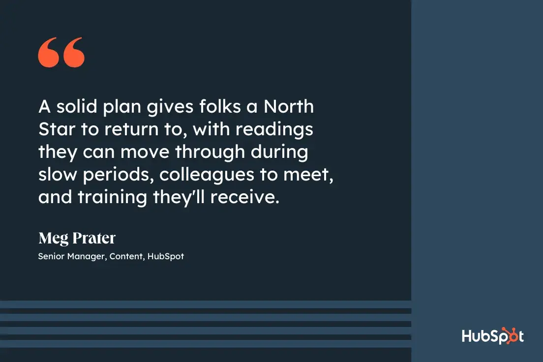
And I totally agree. A 30-60-90 day plan helps you:
Learning the nuances of your new role in less than three months isn’t always easy. But crafting a strong 30-60-90 day plan is your best bet for accelerating your development and adapting to your new work environment as quickly as possible.
You‘d write a 30-60-90 day plan in two situations: during the final stages of an interview and the first week of the job. More on each scenario below.
Some hiring managers ask candidates to think about and explain their potential 30-60-90 day plan as a new hire.
As a candidate, this confused me at times in the past. But I now understand they just want to see if a potential hire can organize their time, prioritize and anticipate their tasks, and strategize an approach based on the job description.
A well-thought-out 30-60-90 day plan is a great way to help hiring managers visualize you in the role. But how can you outline your goals before accepting a new job? How are you supposed to know what those goals are?
I've found that starting with the job description is an excellent stepping stone.
Typically, open job listings have separate sections for a job‘s responsibilities and a job’s qualifications. I recommend working to find commonalities in these two sections and turning those into goals for yourself.
Then, stagger those goals over three months.
For example, let‘s say a job requires three years of experience in Google Analytics, and the responsibilities include tracking the company’s website performance every month.
I would use these points to develop an action plan explaining how:
The second situation where you‘d write a 30-60-90 day plan is during the first week of a new job, which I highly recommend whether you’re a new employee or a manager working with a new hire.
If you're the hiring manager, this plan will allow you to learn how the new employee operates, address their concerns or preconceived notions about the role, and ultimately help them succeed.
If you‘re starting a new job and are not asked to craft a 30-60-90 day plan during the first week, it’s still a good idea to write one for yourself.
When I start a new job, sometimes it feels like a completely foreign environment during the first few months. Having a plan in place makes me feel more at home.
Pro tip: Even though 90 days is the standard grace period for new employees to learn the ropes, it's also the best time to make a great first impression — so use it wisely.
The purpose of your plan is to help you transition into your new role, but it should also be a catalyst for your career development.
Instead of just guiding you over your job's learning curve, the goals outlined in your plan should push you to perform up to your potential and raise the bar for success at every stage.
Prater suggests having a solid template for your plan that allows it to evolve.
“Anytime I onboard someone, I review all training docs and ensure they‘re up to date,” she says. “I also ask for feedback from the folks on the team who have most recently been onboarded. What did they like? What didn’t work for them?”
She also says moving the plan to a more interactive platform proved to be helpful to new employees.
“One of the most helpful shifts we‘ve made recently is moving our 30-60-90 plan (or 100-Days Plan) from a static Google Doc to Asana,” she says.
“The plan is organized by week, and each task contains relevant readings and links. It’s much easier for folks to move through, and it gives me better insight into where folks are in the plan.”
Meg onboarded me when I started at HubSpot, and I can confirm that my checklist in Asana was a game-changer because it helped me stay on task and visually track my progress.
The checklist below isn‘t mine, but it’s one she set up and follows the same format as the one she created for me.
An effective 30-60-90 day plan consists of three extensive phases — one for days 1-30, one for days 31-60, and one for days 61-90.
Each phase has its own goal. For example, my main goal in the first 30 days of my current job was to learn as much as possible about my new job.
The following 30 focus on using learned skills to contribute, and the last 30 are about demonstrating skill mastery with metrics and taking the lead on new challenges.
Each phase also contains a primer, theme, and goals that help define the desired outcomes.
The primer is a general overview of what you hope to achieve during the current 30-day period.
I prefer sitting down with my manager to pinpoint a primer that aligns with my goals and desired company outcomes, and I encourage you to do the same.
This ensures you and your manager are on the same page about expectations early on.
The theme is a quick-hitter sentence or statement summarizing your goals for the period. For example, your theme might be to “find new opportunities,” “take initiative,” or “be a sponge.”
Learning goals focus on skills you want to learn or improve to drive better outcomes at your job. For example, if you're responsible for creating website content at your company, you should learn new HTML or CSS skills.
At the start of my career with HubSpot, some marketing trends and jargon were unfamiliar, and I wasn‘t used to the company’s writing style.
As a result, my learning goals as a new blogger were to become more well-versed in marketing and to adapt to HubSpot's writing style.
Performance goals speak to specific metrics that demonstrate improvement. These include making one more weekly content post or reducing the revisions management requires.
For example, I was only writing one article per week when I started HubSpot, but it was my performance goal to be able to write multiple articles by the end of 30 days.
Initiative goals are about thinking outside the box to discover other ways you can contribute. For me, this meant asking my manager about taking ownership of new blog project or experiment.
Personal goals focus on company culture — are there ways you can improve relationships with your team members or demonstrate your willingness to contribute?
To reach my personal goal of building rapport with my team, I scheduled coffee chats to get to know my colleagues more closely throughout my onboarding period.
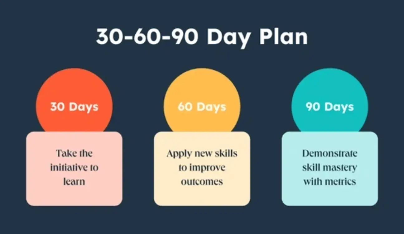
No matter what job level a company is hiring, improving an employee's skills requires concrete performance goals, so watch out for vagueness in the objectives you set for yourself.
“Writing a better blog post” or “getting better at brainstorming” are terrific ambitions, but they don‘t give you a way to measure your progress.
Set goals that are realistic, quantifiable, and focused. You’ll know exactly how to achieve them and gauge your success.
To write challenging yet feasible performance goals, you need to:
Try to understand the purpose behind your team‘s goals. It’ll give you more insight into why you and your team should achieve them, motivating you to work as hard as possible to meet those goals.
By connecting your responsibilities to your team‘s goals, you’ll know exactly how to align your tasks with the team's needs, which keeps you accountable and compels you to help your team achieve its goals.
Tracking your progress helps you gauge your performance and rate of improvement.
To see how you‘re doing, set up weekly meetings with your manager to ask what they think of your work and track the progress of your performance metrics, like the growth of your blog posts’ average views or the amount of qualified leads your eBooks generate.
My weekly one-on-one meetings with my manager were crucial to my success at HubSpot because I got constant feedback and tips on improving.
Reaching your performance goals is one of many paths toward future success in your new role.
You also need to study the ins and outs of your team and company, take the initiative, and develop relationships with coworkers — all things many new hires underestimate the importance of.
Consider setting the following types of goals during each stage of your 30-60-90-day plan:
Aiming to achieve these goals will help you hit the ground running in all the right areas of your job. And if you stick to your plan, you‘ll notice you’ll be able to spend less time learning and more time executing.
Prater also mentions the benefit of personalizing your 30-60-90 day plan so it’s tailored to your specific needs.
“I love when folks join the team and work with me to move deliverables around or add additional milestones to their plan,” she says. “This is a document meant to help you succeed, of course it will need to be different for each person who joins."
![30-60-90 day plan, quote graphic, [A 30-60-90 day plan] is a document meant to help you succeed. Of course, it will need to be different for each person who joins., Meg Prater, Senior Manager of Content, HubSpot](https://knowledge.hubspot.com/hs-fs/hubfs/30-60-90-day-plan-3-20240925-8938178.webp?width=650&height=433&name=30-60-90-day-plan-3-20240925-8938178.webp)
Almost all 30-60-90 day plans consist of a learning phase, a contributing phase, and a leading phase — which we'll review in the example plan below. This includes plans that are designed to guide people in new management roles.
What sets apart a manager‘s plan from any other is their obligation to their direct reports and the decisions they’re trusted to make for the business.
If you're accepting (or hiring for) a new manager role, consider any of the following goals and how to roll them out at a pace that sets you up for success.
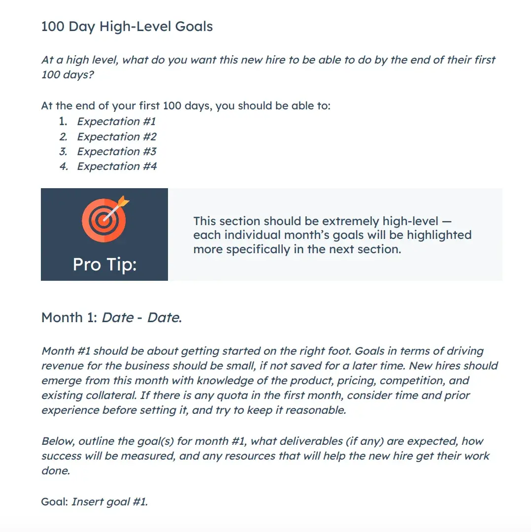
Download the Free Onboarding Template
Everyone is learning the ropes in their first month at a company. For managers, much of that learning happens by talking to the team.
If you're a new manager, grab time with your direct reports and get to know their roles. What do they like about them? What are their most significant pain points?
Making your team happy is a challenging goal, but it‘s an essential responsibility as a manager. Your first step is to figure out how you’ll manage and coach your employees through their day-to-day work.
Even though you‘re new to the company, you were hired for a reason: You’ve got skills. And you can bring these skills to the people you work with, particularly those who report to you.
After meeting with and learning about your new colleagues, you might use the second month of your onboarding plan to find skill gaps on your team that you can help fill.
Do you have expert-level experience with HubSpot, and your new company just started using HubSpot Marketing Hub? Teach them to do something on a platform they didn't know before.
Managers often have access to (and control over) the budget for their department's investments — software, office supplies, and new hires.
After you spend the first couple of months learning what the team spends its money on, consider using the final 30 days of your plan to make suggestions for new investments or how to reallocate money where you think it needs to be.
Is there a tool that can automate a task that‘s taking your team forever to do manually? Draft a financial strategy that includes this tool in the following quarter’s budget.
You won‘t be expected to promote people in the first three months of your new job, but you should still have learned more about your team to decide who’s good at what and how to coach them to where they want to be.
In the final 30 days of your 30-60-90 day plan, you might agree to a goal to develop a training strategy that outlines how to manage your direct reports and, ultimately, how to guide them into new roles in the future.
Executives are different from managers in that higher performance expectations come in. As an executive, you'll need to be highly engaged with the organization from the first day and implement high-impact changes in your role as soon as possible.
At the same time, context is essential, and you'll need to understand the culture, team, current operating processes, and challenges before you solve them.
Here are some critical steps to include in your 30-60-90 day plan in an executive role.
It's only a point in taking action with context, so start your ramp-up period by gathering information and charting the lay of the land.
That means reviewing existing documentation, attending as many meetings as possible, meeting with direct reports and skip levels, and asking many questions.
You'll meet new people in the first 30 days and understand their organizational roles. Ultimately, your job as an executive is to set the vision for the organization while removing roadblocks for your team as they strategize and execute it.
One of the best questions you can ask as you familiarize yourself and align with your team is, “In your opinion, what are some existing threats to our business (external or internal)?”
This shows you care about their opinion and trust their expertise while getting unique perspectives from multiple vantage points in the organization.
Plus, if you start hearing some of the same points from various team members, you can identify the most significant pains, equipping you to make the highest impact changes.
An A player is a member of your team that goes above and beyond what‘s expected in their role.
While not every employee will be an A player, you’ll want to ensure that critical roles and teams have at least one A player to lead, inspire, and strengthen camaraderie.
From there, you can figure out the existing gaps in staffing and training, whether it's team members who need a lot of guidance and must be coached up to performance or empty roles that need to be filled altogether.
When interviewing or shortly after being hired, you'll get a feel for the types of pains the executive team has and the objectives for bringing you on.
Once you have more context about how the organization works, you can translate this vision into concrete, measurable goals that will take your department to the next level.
Companies of all sizes run into operational issues as they implement processes that are efficient and work at scale. Sometimes, when an executive team isn't aligned with middle management, operations can become unwieldy.
Learn why things are done the way they are, and then figure out if there are workarounds you can implement to streamline operations. It's as simple as eliminating bottlenecks or adding automation to specific functions.
You know your A and B players, and you will have a plan to retain, invest in, and mentor them. However, you‘ll likely come across gaps you need to fill and positions that need to be created to eliminate bottlenecks.
From there, you’ll want to create a hiring plan to execute short-term, mid-term, and long-term needs.
Speaking of bottlenecks, the final 30 days of your plan should be focusing on the areas of the business that can achieve the results the fastest.
Once you've identified these, you can focus on removing these roadblocks to start hitting goals and achieving higher performance.
As an executive team member, you'll also be looped in on high-level company initiatives, and the other company executives will be relying on you to contribute your deep discipline, expertise, and experience.
Be ready to lean in on executive meetings and contribute to the vision and strategy of the organization as it moves forward.
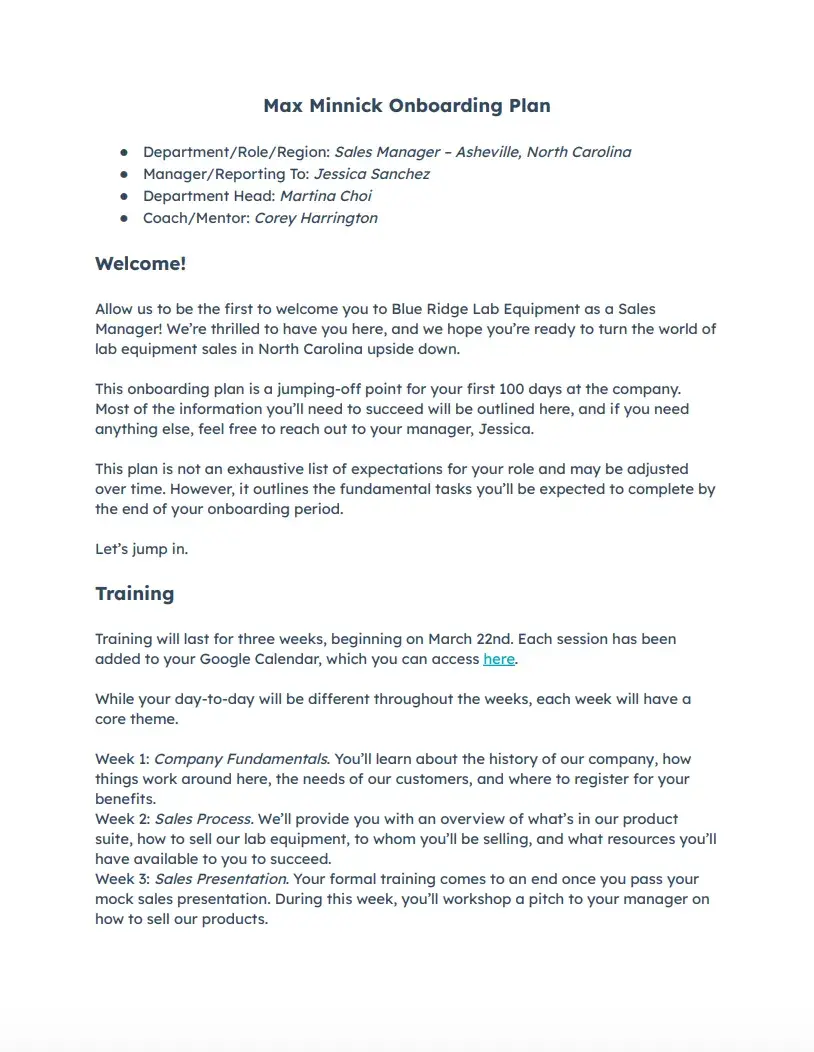
HubSpot's 30-60-90 day plan template includes space for all critical elements of your plan — primers, themes, and goals — making it easy for you and your manager to see exactly where you are in the plan, what comes next, and how things are going so far.
While our template is a great starting point, it‘s worth cross-referencing this high-level plan with a more detailed description of your goals and desired outcomes to ensure you’re aligned with company expectations.
We've created a quick 30-60-90 plan example for new employees using our template.

Many new hires are eager to impress, so they dive head-first into their work or try to make suggestions about their team's process with limited experience in how their new team operates. But have patience.
Understanding your company‘s vision and your team’s existing strategy is crucial for producing high-quality work and making an impact.
You need to know the purpose behind your role or the optimal way to perform to avoid missing the mark, and your early efforts won't pay off how you expect them to.
It‘s always better to over-prepare than under-prepare. And it’s okay to take time to learn the ropes — it pays enormous dividends in the long run.
In the first 30 days of your employment, your priority is to be a sponge and soak in as much information as possible. Once you do that, you can try to improve more specific parts of your team's work style.
Learning Goals
Performance Goals
Initiative Goals
Personal Goals
By the end of your first 60 days, you should ramp up your workload, start overachieving, and make a name for yourself on your team.
To do this, start speaking up more at meetings. Feel free to share your ideas about improving your team‘s processes.
This shows you’re quickly conquering the learning curve and recognizing some flaws your colleagues might have overlooked. You still have a fresh perspective on the company, so your insight is invaluable.
Learning Goals
Performance Goals
Initiative Goals
Personal Goals
By the end of your first three months, you should have a firm grasp of your role, feel confident about your abilities, and be on the cusp of making a breakthrough contribution to your team.
Instead of reacting to problems that pop up at random, be proactive and spearhead a new initiative for your team.
You should also know how to collaborate with other teams to improve your processes. By taking on some new projects outside of your primary role, you'll start turning some heads and catching the attention of the department at large.
Learning Goals
Performance Goals
Initiative Goals
Personal Goals
Join the yoga club.
Let's apply that template to a team leader role with another 30-60-90 plan example.
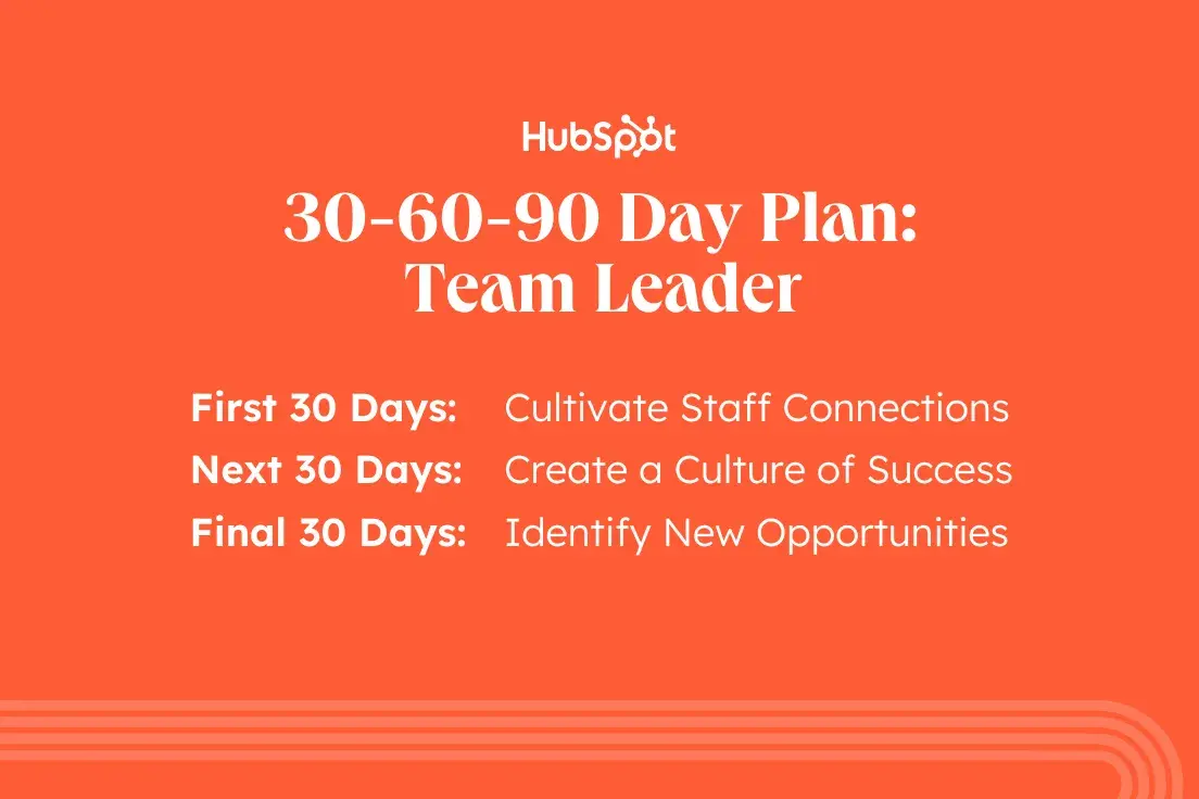
During the first 30 days, the goal of a team leader should be to cultivate connections with their team members and discover where they excel, where they struggle, and where they could use help.
Creating these relationships lays the foundation for solid communication over time, leading to better results.
Learning Goals
Performance Goals
Initiative Goals
Personal Goals
For the second month, team leaders should focus on putting the connections they've made to good use and creating a mindset of success across the department.
This means establishing clear goals and specific metrics and working alongside staff to deliver critical outcomes.
Learning Goals
Performance Goals
Initiative Goals
Personal Goals
The last month of your 30-60-90 plan may focus on ensuring the framework you've built can be replicated on the next team project and finding new opportunities for your team members to excel.
Learning Goals
Performance Goals
Initiative Goals
Personal Goals
Let's apply that template to a marketing strategist role with another 30-60-90 plan example.
During the first 30 days, the marketing strategist will analyze current campaign performance to discover what works, what doesn't, and how strategy can be improved.
The marketing strategist will also work with team members and stakeholders to learn about existing processes. Investigating performance lays the foundation for how strategy can improve in the future.
Learning Goals
Performance Goals
Initiative Goals
Personal Goals
By day 60, the marketing strategist will have identified performance gaps based on the work done during the first 30 days and begun work on brainstorming ways to close those gaps.
Learning Goals
Performance Goals
Initiative Goals
Personal Goals
For the third month, marketing strategists may focus on ensuring the research framework they've built can be replicated for new projects and launch experiments to close performance gaps.
Learning Goals
Performance Goals
Initiative Goals
Personal Goals
During the first few months at a new job, I always ask myself the following questions: Is the company a good fit? Can I meet (and exceed) expectations? What does my long-term career plan look like?
Over the years, I've learned building a robust 30-60-90 day plan can take some of the pressure off by providing a framework for success that combines big ideas with specific goals to help drive success.
If a 30-60-90 (or 100) day plan worked for me, I'm confident it will benefit you too.
Editor's note: This post was originally published in April 2019 and has been updated for comprehensiveness.
