You’re Not The Hero — Your Customer Is

Featured Imgs 23

April Sunshine Hawkins is a StoryBrand workshop facilitator, keynote speaker, and co-host of the Marketing Made Simple podcast (which has 2M downloads). 

She helps businesses streamline their messaging, and loves teaching business leaders to leverage the StoryBrand framework to simplify what they're trying to say. 

Keep reading to learn her three tips when it comes to storytelling, selling what you love, and making the customer the hero. 

Click Here to Subscribe to Masters in Marketing

1. Lead with what you love.

If this sounds a little too similar to the preachings of Liz Gilbert in Eat Pray Love, bear with me; it connects to marketing.

Don’t "do what brings you the most money"... Just do something for the joy of it. Plain and simple. 

"You need to be selling the products that bring you the most joy. Why are you pushing something you hate doing? Don't do that," Hawkins tells me. 

"I know so many people, especially in the SMB space, who are in a rut because they've backed themselves into selling something they don't actually like selling," she says. 

That doesn’t mean you need to stop offering those products entirely, especially if they’re keeping the lights on. 

But when you care about what you’re selling, Hawkins says, your customers can feel it. Lean into the stories or values that matter most to you, and you'll find yourself connecting more deeply with your audience.

Now how do I make a career out of reading rom-coms and drinking frozen margs? 

2. Your customer is the hero. Not you. 

Hawkins sees too many marketers position their brand as the heroes, and she says it's one of the biggest mistakes marketers can make.

"Everybody wakes up the hero of their own story. Your customers, the people you're trying to draw in… The story needs to be about them."

In other words, you’re not Batman — you’re Alfred.

Take a recent example: Hawkins was working with a jewelry brand that creates products in Malawi and pays their workers 3-5X the minimum wage. Naturally, they wanted to shout that from the rooftops. Who wouldn't?

But Hawkins stepped in and pointed out that the brand isn't supposed to be the hero. The customer is. 

"We rewrote the campaign to ask, 'How can these pieces help people celebrate a milestone — like a promotion, an anniversary, a birthday?" 

Suddenly, the jewelry wasn’t just jewelry; it became a badge of a customer's big (and small) life moments.

Have you ever landed on a website and read the first few sentences and thought, Wow, is this person in my head? That's the end-game: For your customers to feel like you get them. 

"When we can position our products to align with what our customers are feeling, it creates that 'ding, ding, ding' moment — 'That's me! This is for me!'" Hawkins says. "That's what we're looking for." 

3. Marketing is just storytelling. 

April Sunshine Hawkins is, as it turns out, exactly what you'd expect — bright, warm, and exceptionally joyful. 

She also loves a good story, which is why she works for a company (StoryBrand) that helps businesses sharpen their messaging through a provided framework. 

"It's just nice to have a framework to go to, so when you're like, 'Oh no, there's a blinking cursor again. What am I supposed to say?' You have a framework to work off of," she tells me. 

Here's the nugget of wisdom: As marketers, we don't always have to reinvent the wheel. If marketing is really just storytelling, then it's vital to treat your messaging the same way you'd write a novel — with a hero, a surmountable challenge, and a triumphant ending. 

Click Here to Subscribe to Masters in Marketing

50+ Best Spooky Halloween Fonts 2024

Featured Imgs 23

Halloween is a busy time. Not just for the kids, but also for professional designers. It’s that time of the year you start looking for Halloween-themed fonts, templates, vectors, and icons for designing all those spooky posters and greeting cards.

Well, this year you won’t have to spend hours searching for creative fonts for your Halloween designs. Because we already did the work for you and picked out the best spooky Halloween fonts that will make your work stand out from the crowd.

In this collection, we feature a collection of the best Halloween fonts that are suitable for all kinds of designs from posters, greeting cards, social media designs, and other Halloween and horror-themed designs. Have a look.

Hereday – Horror Halloween Font

Hereday - Horror Halloween Font

Hereday provides a premium, spiky typography design ideal for attention-grabbing titles for flyers, posters, packages, or logotypes. It is versatile, offering uppercase, lowercase, numbers, punctuation, and multilingual options. It comes in OTF, TTF, and WOFF formats, ensuring versatility for your Halloween project needs.

Horror Mansion – Halloween Font

Horror Mansion - Halloween Font

Horror Mansion is a whimsical and genuine Halloween font ideal for livening up blogs, logos, ads, or even personal projects like greeting cards or photo albums. Delivered in both OTF and TTF files, this decorative font brings an extra dash of Halloween spirit to any design it enhances.

Haunted House – Halloween Font

Haunted House - Halloween Font

Haunted House is an eye-catching decorative typeface that infuses any design with a touch of Halloween. The playful, authentic font lends itself to various projects, from blog posts to decorations, enhancing your creativity. The zip includes both OTF and TTF files, making it easy for you to incorporate it into your favorite designs.

Weird Thorny – Spooky Halloween Font

Weird Thorny - Spooky Halloween Font

Weird Thorny is a delightfully eerie, hand-drawn Halloween font that lends an air of the macabre to your projects. Ideal for creepy branding or unique social media posts, this typeface plays off the unsettling imagery of a twisted, thorny landscape. It comes in various forms such as regular, outline, italic, and outline italic.

Gravella – Halloween Horror Font

Gravella - Halloween Horror Font

Gravella is a hand-drawn typeface that delivers the ultimate creepy and scary feel. Perfect for Halloween-themed projects, social media posts, book covers, and merchandise, this font possesses an eerie charm and intriguing letterforms. With multilingual support, Gravella is a creepy yet fascinating font for anyone with a love for frightening atmospheres.

Spooky Laboratory – Halloween Font

Spooky Laboratory - Halloween Font

Spooky Laboratory is a delightfully eerie Halloween font. With its playful authenticity, it brings an element of spooky fun to various projects like blog posts, logos, branding, ads and more. Whether you’re decorating greeting cards or enhancing photo albums, this font is a superb addition that guarantees intriguing results.

Silly Creature – Cute Halloween Font

Silly Creature - Cute Halloween Font

This is a whimsical, all-caps font that adds a playful touch to any Halloween theme. Its condensed style comes with a variety of alternate characters and ligatures. This fun typography is enhanced by the addition of silly Ccreature doodles with quirky decorations for the letters.

Howdy Pumpkin – Halloween Font

Howdy Pumpkin - Halloween Font

Howdy Pumpkin is a festive, all-caps Halloween font infused with the aesthetics of autumn. This package features a straightforward OpenType version, along with two OpenType-SVG formats laden with alternating letter doodles. Experiment with these alternating styles to perfect your design.

Spooky Vibes – Halloween Font

Spooky Vibes - Halloween Font

Spooky Vibes is a unique Halloween-themed font that captures a playful and authentic atmosphere. Ideal for various projects like blog posts, branding, invitations, or photo albums, this decoration font adds a fun touch to your designs. Available in both OTF and TTF formats, Spooky Vibes font breathes life into your Halloween-themed designs.

Vision Of Sorrow – Halloween Font

Vision Of Sorrow - Halloween Font

Vision Of Sorrow is a chilling Halloween font that screams dread and mystery. Designed with strokes resembling shadows out of the dark, this spooky asset features numbers, symbols, ligatures, alternate punctuation, and multilingual support. Perfect for horror-themed designs, each letter is intricately fashioned to evoke a sense of terror making it an unforgettable choice for movie posters and terror-filled game designs.

Scary and Spicy – Creepy Halloween Font

Scary and Spicy - Creepy Halloween Font

This font has the perfect look of a Halloween font with bold and spooky letters. It also looks fun and creative enough to make your Halloween-themed designs look more joyful. The font is especially perfect for greeting cards, spooky posters, banners, and more.

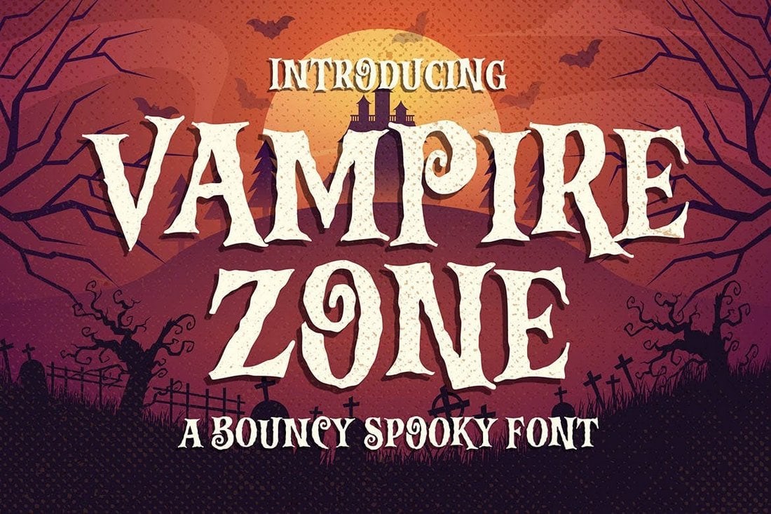
Vampire Zone – Spooky Scary Halloween Font

Vampire Zone - Spooky Scary Halloween Font

The creatively decorated design gives this font a very unique look and feel. It comes with both uppercase and lowercase characters. You can use this font to craft scary-looking titles for Halloween-themed social media posts, posters, and flyers.

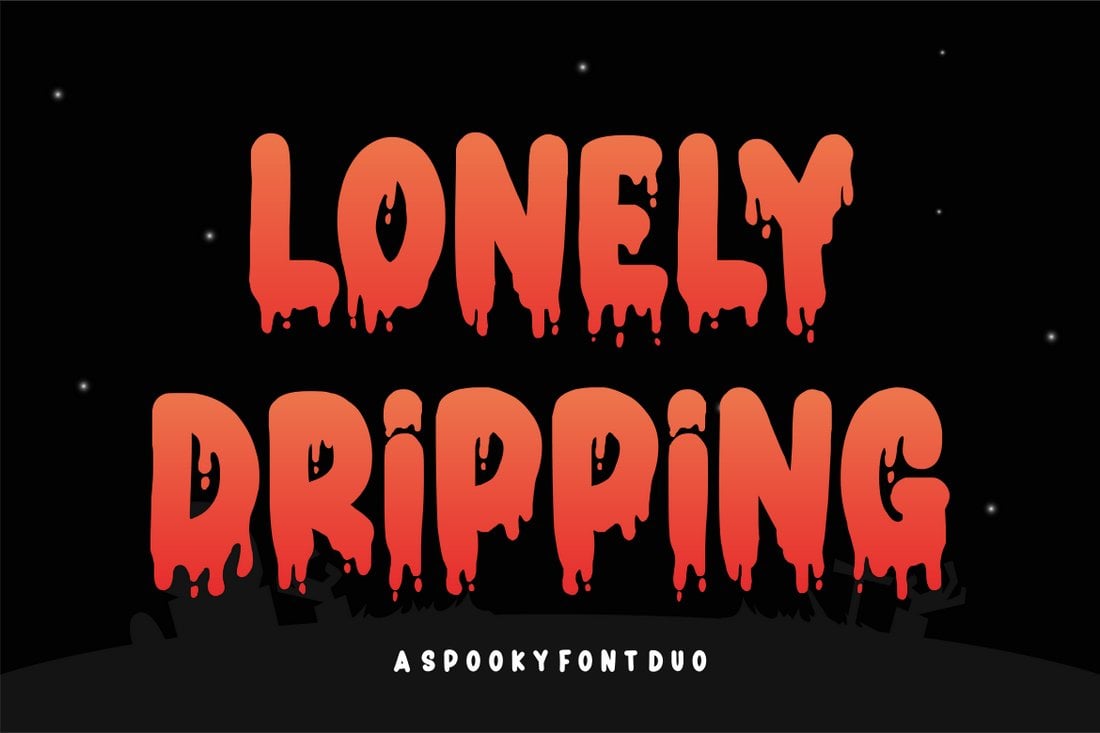
Lonely Dripping – Halloween Display Font

Lonely Dripping Halloween Display Font

Lonely Dripping Halloween font has a stylish paint-dripping effect that will add an extra spooky look to your title designs. The font includes uppercase and lowercase characters with multilingual support.

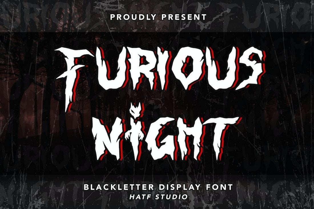
Furious Night – Scary Halloween Font

Furious Night - Scary Halloween Font

Inspired by gothic-style designs, this spooky Halloween font comes with a very scary-looking letter design. It includes lots of stylistic alternates, stylistic sets, and ligatures as well.

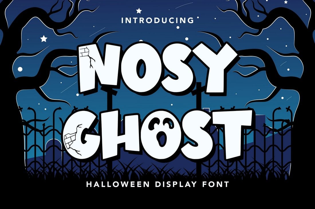
Nosy Ghost – Free Halloween Font

Nosy Ghost - Free Halloween Font

Nosy Ghost is a fun and joyful Halloween font you can download for free. It has a chunky letter design that’s been made for big and bold titles. You can use it for free with your personal projects.

Side Of Monster – Free Halloween Font

Side Of Monster - Free Halloween Font

Another free Halloween font with a spooky letter design. The letters of this font have unique decorative elements that make your typography look much more creative. It’s free for personal use.

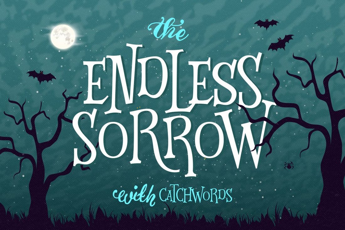
Endless Sorrow – Halloween Font

Endless Sorrow - Halloween Font

Making your Halloween designs look both scary and fun will be much easier when using this creative font. It features elements of both a quirky and a spooky design. The font comes with a hand-drawn look and in two styles: Regular and a bonus Catchwords typeface.

Monsteria – Spooky Script Font

spooky font

Monsteria is a horror fantasy font with a handwritten look guaranteed to freak the shit out of your audience. Great for Halloween-themed projects, Monsteria will look good on t-shirt designs, party posters, invitations, coffee mugs, logos, and more.

The Graveyard – Fun Halloween Font

spooky font

The Graveyard is a fun and playful typeface with an incredibly remarkable bouncy style sure to give your Halloween designs a spooky appearance. It comes packed with a full set of standard uppercase, and lowercase characters, and so much more.

Renold – Cute Spooky Font

spooky font

Renold is a cute, and cuddly halloween-themed font that will look awfully beautiful on posters, flyers, invitations, greeting cards, logos, and many more branding designs. It’s a kids friendly typeface sure to be loved by the little ones.

The Witch – Creepy Halloween Font

spooky font

The Witch is a creepy, and ominous font perfect for bringing that Halloween vibe into your design projects. It comes with uppercase, and lowercase letters, numerals, symbols, and seamless multilingual support. It’s certainly one of the best Halloween fonts out there.

Halloween Spooky – Free Halloween Font

Halloween Spooky - Free Halloween Font

Halloween Spooky has the perfect look for designing fun-looking typography for Halloween-themed greeting cards and posters. It comes with a set of extra graphic elements as well. You can use it for free with personal projects.

Cipitillo – Free Halloween Font

Cipitillo - Free Halloween Font

This Halloween font has a bold character design that fits perfectly with both horror and Halloween-themed designs. The font is completely free to use with your personal and commercial projects.

Spooky Finger – Halloween Font

spooky font

Spooky Finger is a scary font that is sure to draw your audience in at a glance. It will give an eerie twist to your branding designs, and make them look more fun, and appealing. It comes with uppercase, and lowercase characters, numbers, punctuation, and dingbats.

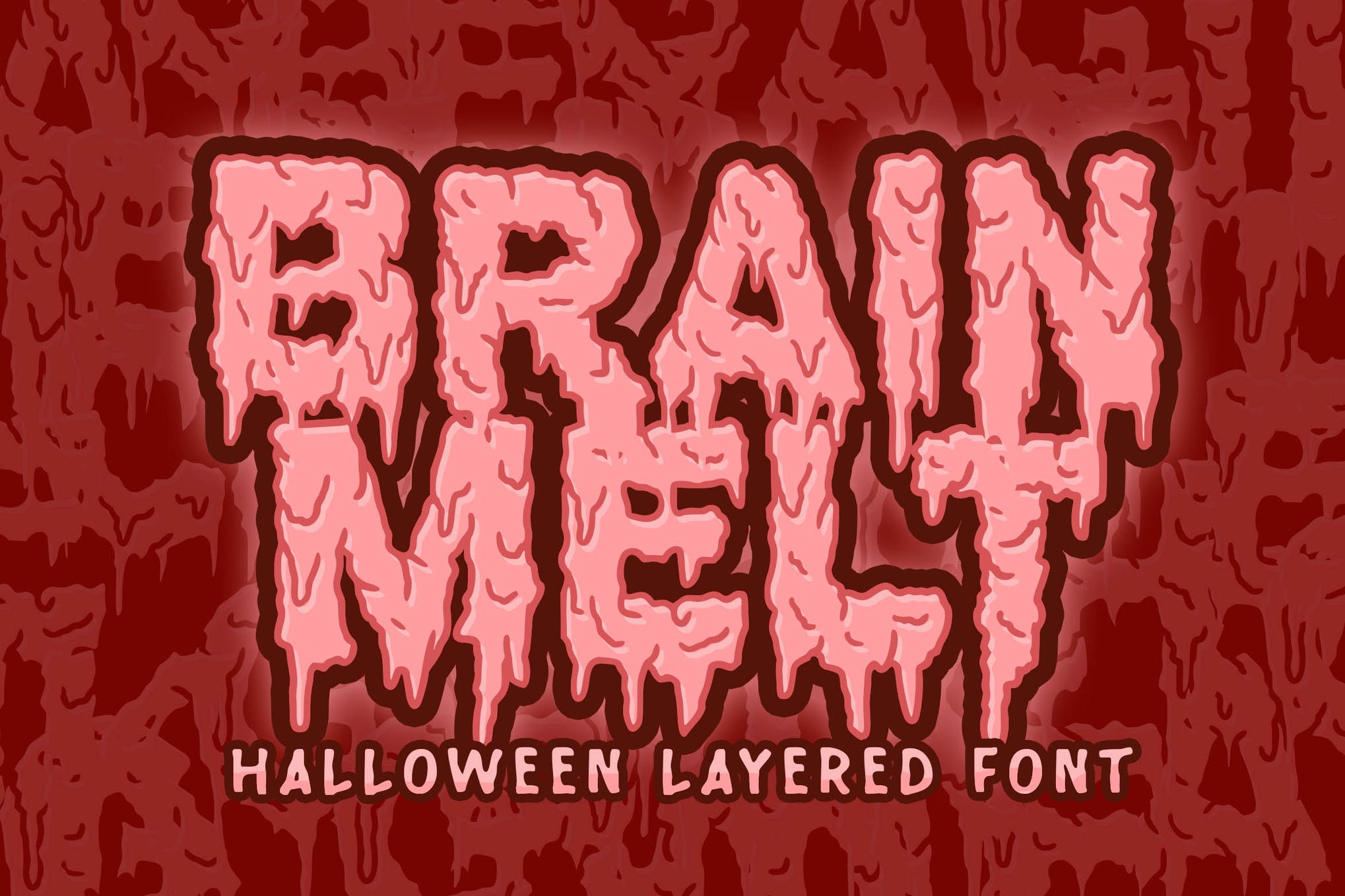
Brain Melt – Halloween Font

Spooky Halloween Font

Check out Brain Melt, a spooky font that oozes with the lure of Halloween. It has a melted design, perfectly fitting for any project needing an eerie and scary feel. We wholeheartedly recommend you try out Brain Melt for your upcoming Halloween project.

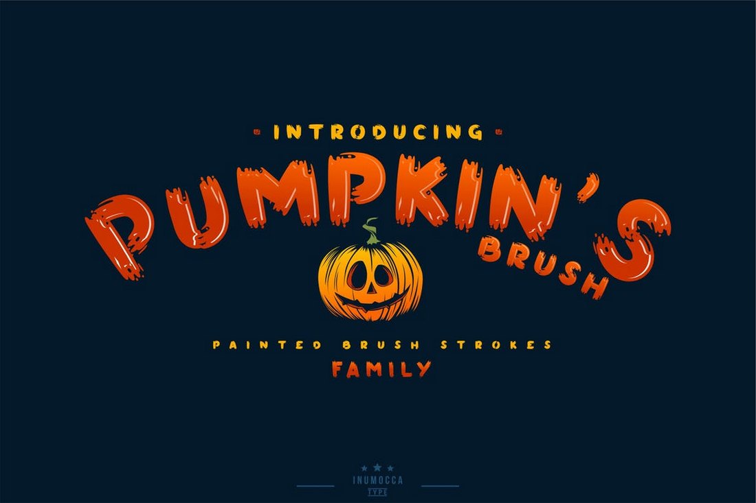
Pumpkin’s Brush – Halloween Font

Pumpkin's Brush - Halloween Font

Pumpkin’s Brush is a Halloween-themed font that comes with a classic design. It features a unique hand-painted design that’ll give a more creative look to your print and digital design works. The font comes in 3 different versions: Normal, slant, and a special character typeface.

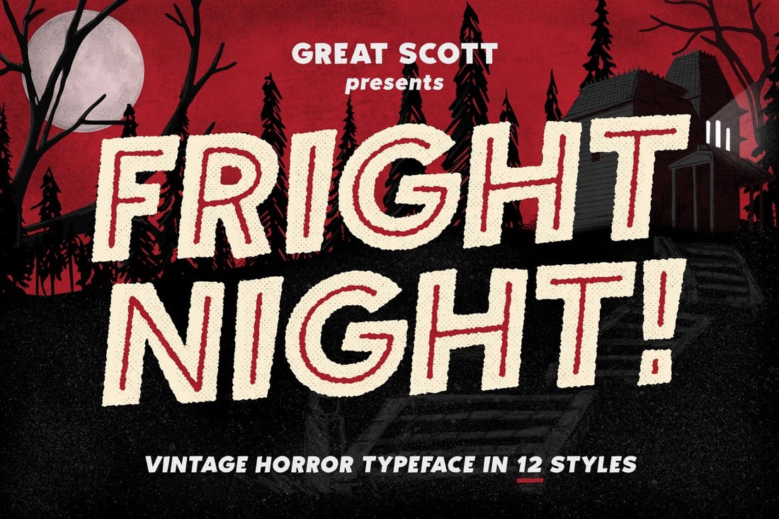
Fright Night – Vintage Horror Font

Fright Night - Vintage Horror Font

Fright Night is a horror-themed font that comes with a vintage design. This is the kind of font that you usually see in classic horror movie posters. It’s perfect for crafting a poster or a flyer for a Halloween-themed event. The font comes in 12 different styles and more than 300 glyphs.

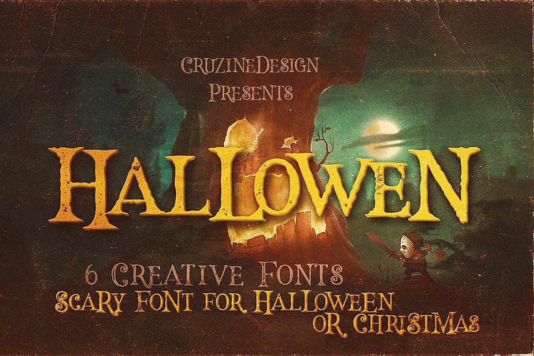
Hallowen – Creative Halloween Fonts

Hallowen - Creative Halloween Fonts

This retro-themed Halloween font features a true horror-filled design that makes it most suitable for designing flyers and posters for horror theme parks and carnivals. You can also use it for greeting card designs as well. The font is available in 6 different styles, including grunge and inline.

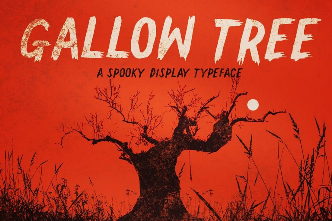
Gallow Tree – Spooky Halloween Font

Gallow Tree - Halloween Font

Gallow Tree is a creative Halloween-themed brush font featuring a spooky design. It features a natural hand-drawn design, which has been drawn using a Faber Castell brush pen and the font includes 370 glyphs as well.

Halloween Nightmare – Free Halloween Font

Halloween Nightmare - Free Halloween Font

Another free Halloween font that includes both uppercase and lowercase characters. This font has a very spooky vibe that adds a haunted look to your designs. It’s free for personal use only.

Halloween House – Free Spooky Font

Halloween House - Free Spooky Font

Halloween House is a simple Halloween-themed font that has a mellow-looking character design. Since it doesn’t look too spooky, the font is a great choice for many Halloween advertisements and promo campaigns. It’s free to use with personal projects.

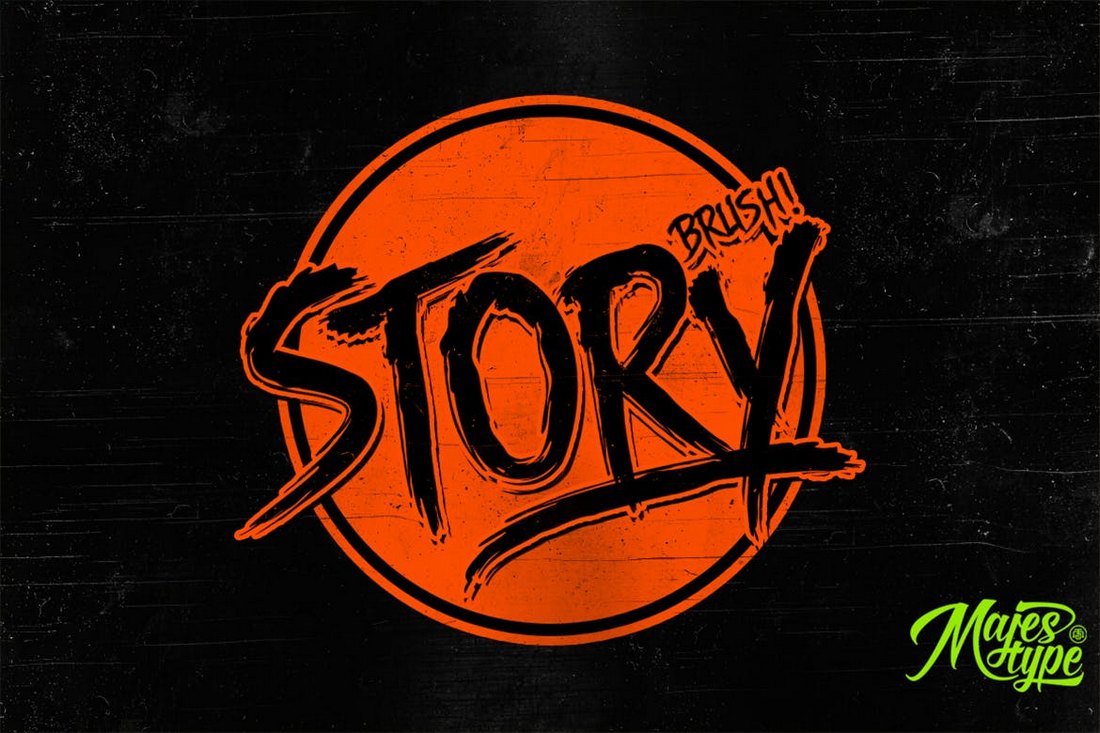
Story Brush – Halloween Font

Story Brush - Halloween Font

Another horror-themed font that’s ideal for designing both Halloween and horror-themed designs such as greeting cards, posters, flyers, and even title pages. The font comes in 2 styles: Regular and slanted. It also includes 240 glyphs.

Kreature – Halloween Horror Font

Spooky Halloween Font

If you want to nail the perfect Halloween horror look in your designs, Kreature is well worth checking out. It features a ghostly design that will look great on Halloween-themed posters, flyers, social media posts, t-shirts, mobile covers, and invitations.

Mukadua Font Duo – Halloween Font

Mukadua Font Duo - Halloween Font

Mukadua is a unique font that comes with two different styles of fonts. One version of the font features a horror-filled spooky design while the other has an enchanted and delightful design. It’s sort of like two fonts with designs for heaven and hell.

Another Danger – Halloween Font

Another Danger - Halloween Font

Featuring a true horror design, this Halloween font gives out a scary vibe that will allow you to create terrifying titles for movie posters, book covers, and various other design projects. The font is available in regular and slanted versions with all-caps letters.

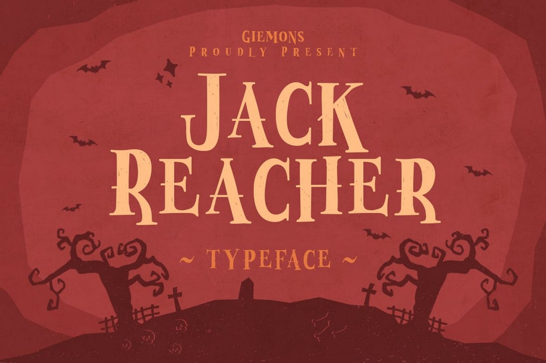
Jack Reacher – Halloween Font

Jack Reacher - Halloween Font

Jack Reacher is a display font that comes with a unique spooky design. Even though it has no relation to the books or the movie series of the same name, the font does have an interesting design that will add a scary look to your Halloween-themed greeting cards and posters.

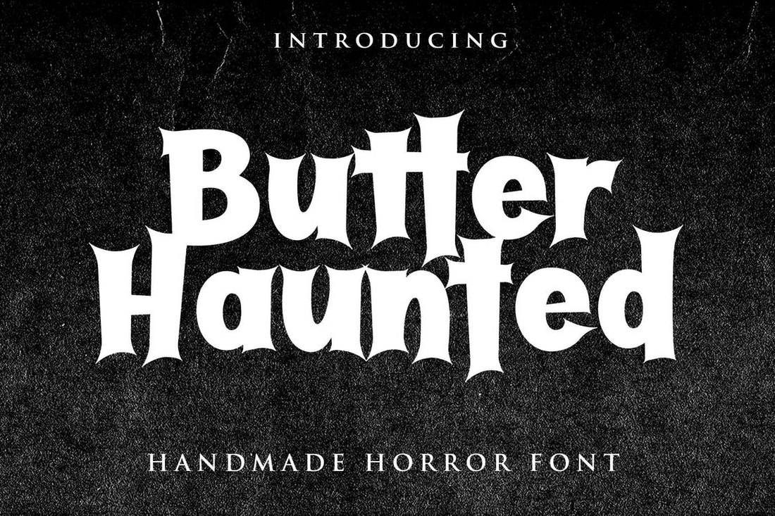
Butter Haunted – Halloween Font

Butter Haunted - Halloween Font

This handmade horror-themed font will probably remind you of the old movie titles from the 1960s Alfred Hitchcock movies. The font includes multilingual support and it’s ideal for designing posters, titles, greeting cards, and even T-shirt designs.

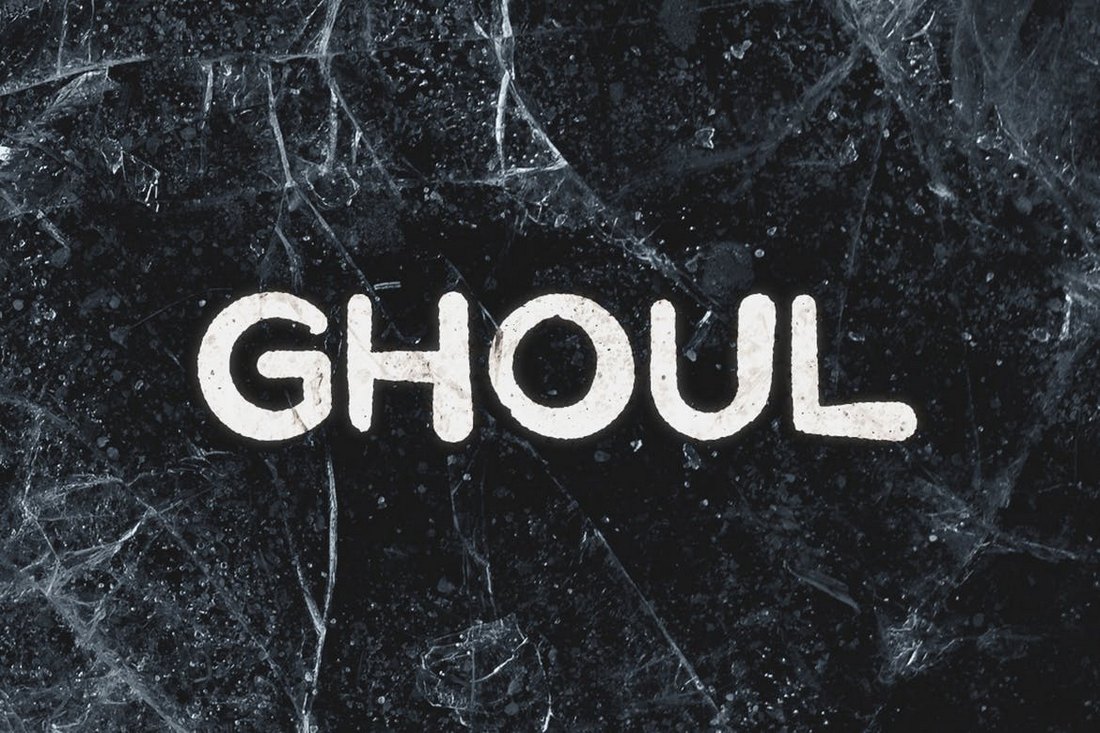
Ghoul – Spooky Halloween Font

Ghoul - Spooky Halloween Font

Ghoul is a creative Halloween-themed font that features a unique design with modern elements. The rounded edges and the quirky look of the font make it less scary and more suitable for kid’s themed poster and greeting card designs.

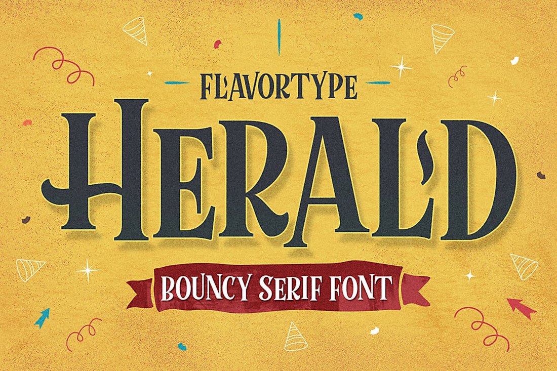
Herald – Halloween Font

Herald is a modern serif font with a quirky design. While it doesn’t have a spooky or a horror look, this font will fit in nicely with your Halloween greeting cards, posters, and flyers for children and fun occasions. It also comes bundled with a bunch of vector graphics and elements too.

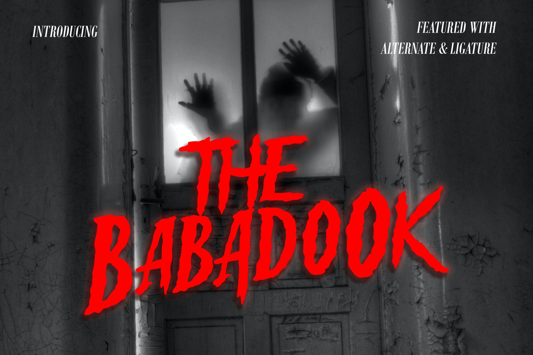
Babadook – Halloween Font

Spooky Halloween Font

Next up we have Babadook, a Halloween font that is guaranteed to send chills down the spine of your audience. It comes bundled with a range of amazing features, and is compatible with Adobe Photoshop, Adobe InDesign, Adobe Illustrator, and Microsoft Word.

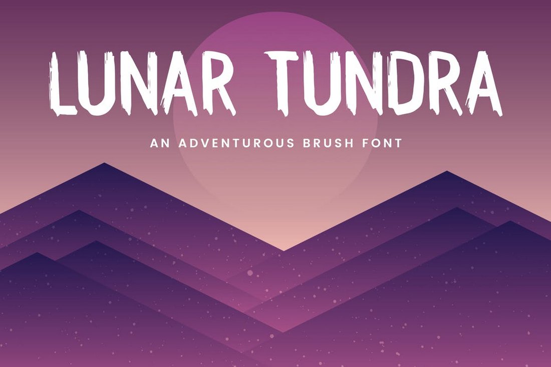
Lunar Tundra – Halloween Brush Font

Lunar Tundra - Halloween Brush Font

Lunar Tundra is a creative brush font that features a spooky design. It’s ideal for designing posters, T-shirts, social media posts, and various other designs related to Halloween. The font will also look great with a horror-themed design with the right mix of colors.

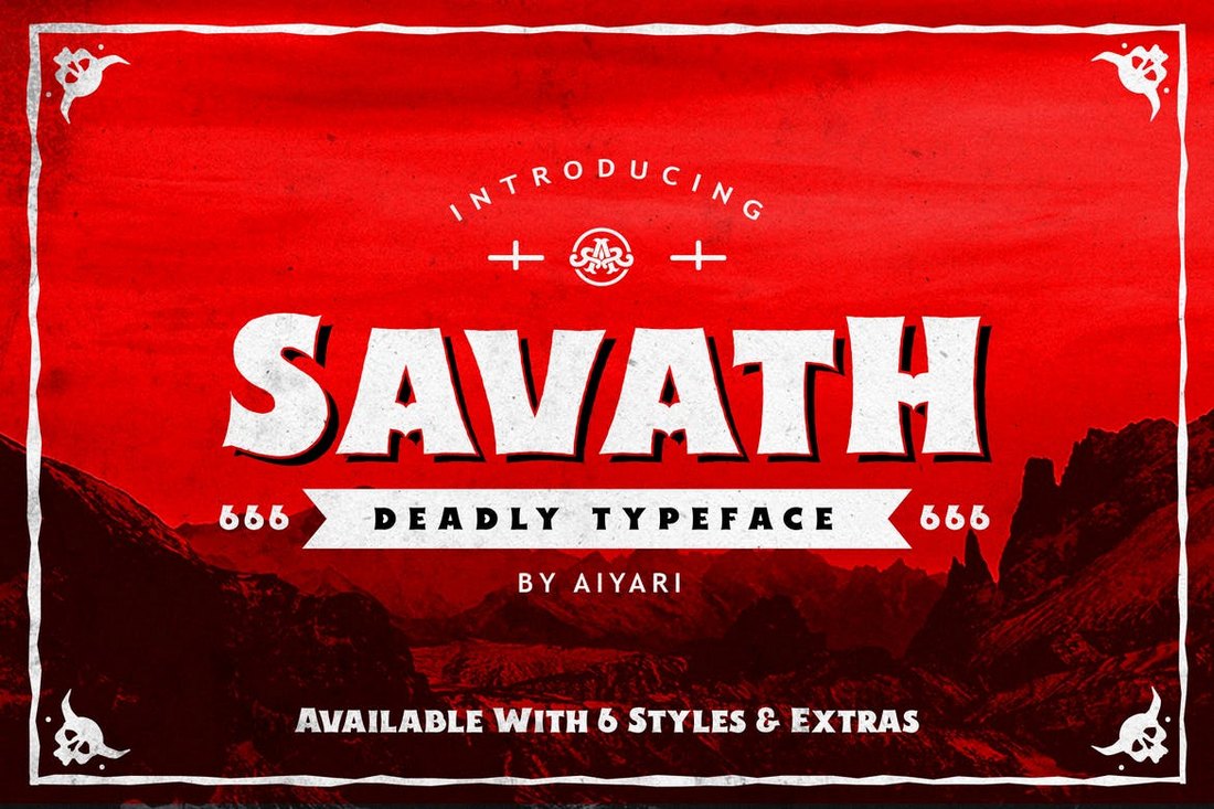
Savath – Halloween Font

Savath - Halloween Font

This spooky font features a gothic horror-themed design that makes it most suitable for designing posters, flyers, and titles for horror-themed designs. The font comes in 6 different versions, including regular, rust, rough, and variations with shadows.

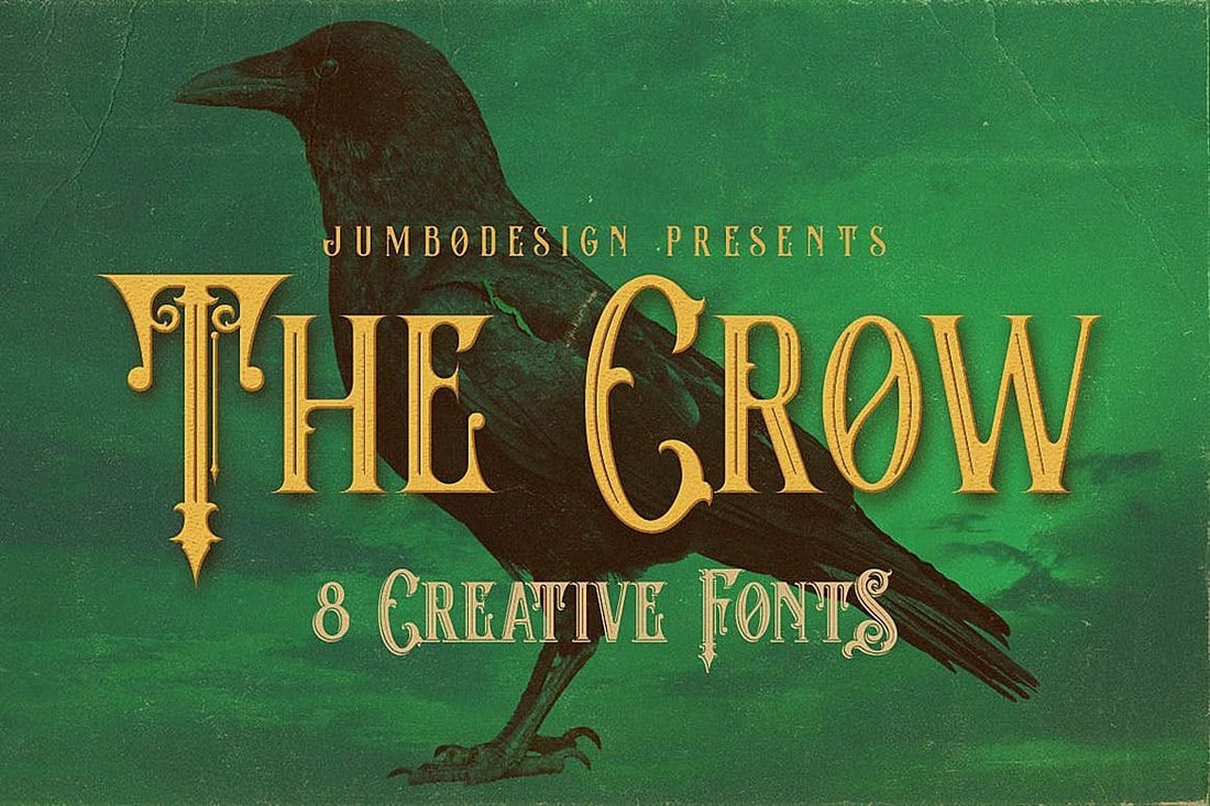
The Crow – Vintage Halloween Font

The Crow - Vintage Style Halloween Font

The Crow is another font that features a gothic-era inspired design. It comes with 6 different fonts featuring grunge, inline, and shadowed versions. You can use this font to give a unique look to your designs.

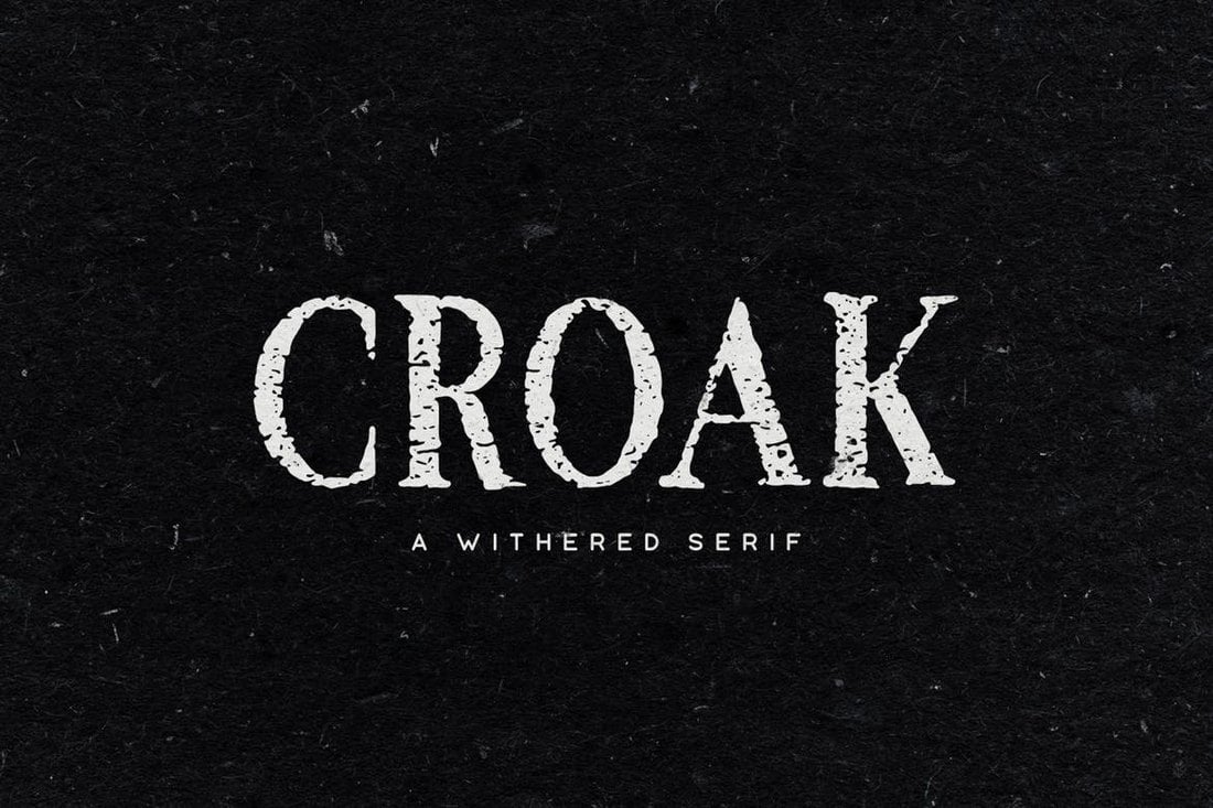
Croak – Halloween Font

Croak - Halloween Font

Croak is a spooky Halloween font with a withered design. The font features 2 different designs including a rough version of the font. It also features multilingual characters, numbers, and punctuations.

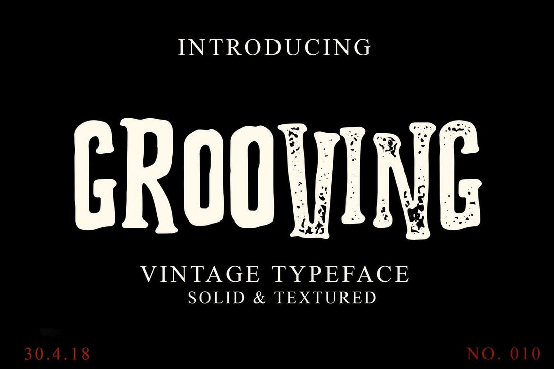
Grooving – Vintage Halloween Font

Grooving - Vintage Halloween Font

This creative font comes in two attractive designs, solid and textured, for designing unique posters, greeting cards, and T-shirts for your Halloween-themed design projects. The font also comes with lots of alternates, swashes, and ligatures as well.

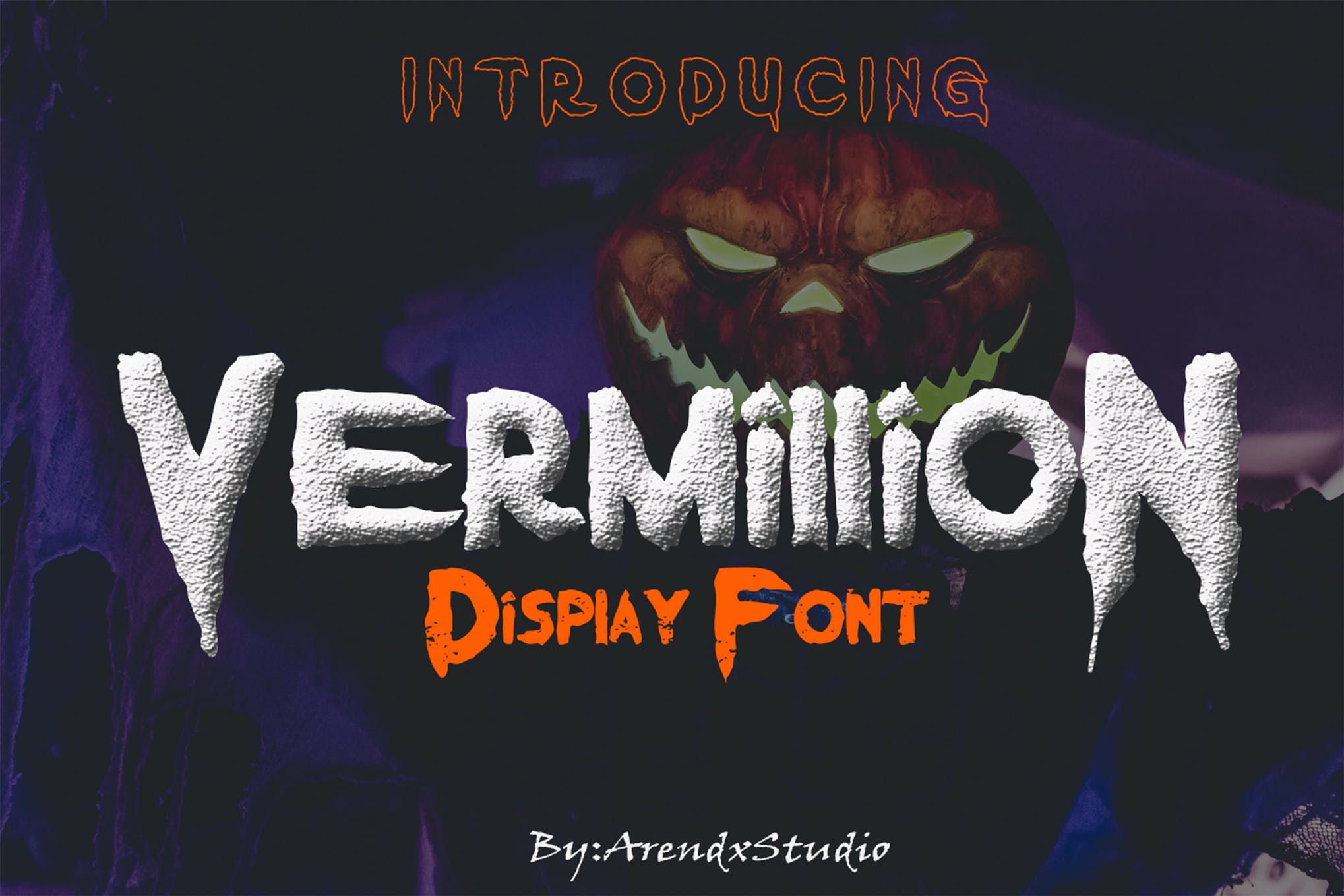
Vermillion – Bold Halloween Font

Spooky Halloween Font

Vermillion is a bold, and spine-chilling Halloween font featuring a puff-paint design with sharp edges. It comes in 3 styles namely regular, outline and grunge. Vermillion is one of the most unique spooky font on our list, and you should definitely try it out.

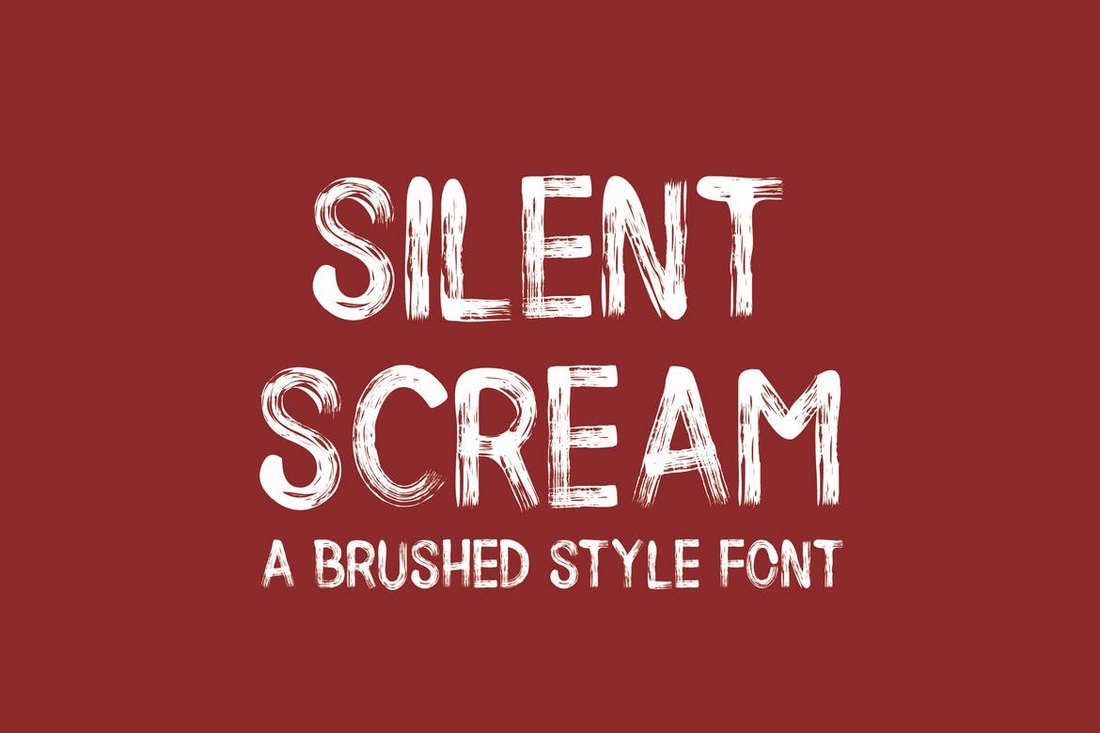
Silent Scream – Creative Halloween Fonts

Silent Scream - Creative Halloween Fonts

Silent Scream is a creative brush font with a Halloween-themed design. It comes in two versions: Regular and italic. You can use the font with various types of spooky designs.

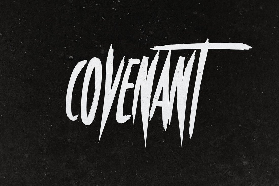
Covenant – Halloween Font

Covenant - Halloween Font

Covenant is a modern horror-themed font that features a spooky design. The narrow design of the font just makes it look even scarier. This font is perfect for crafting movie posters, book titles, and other horror designs.

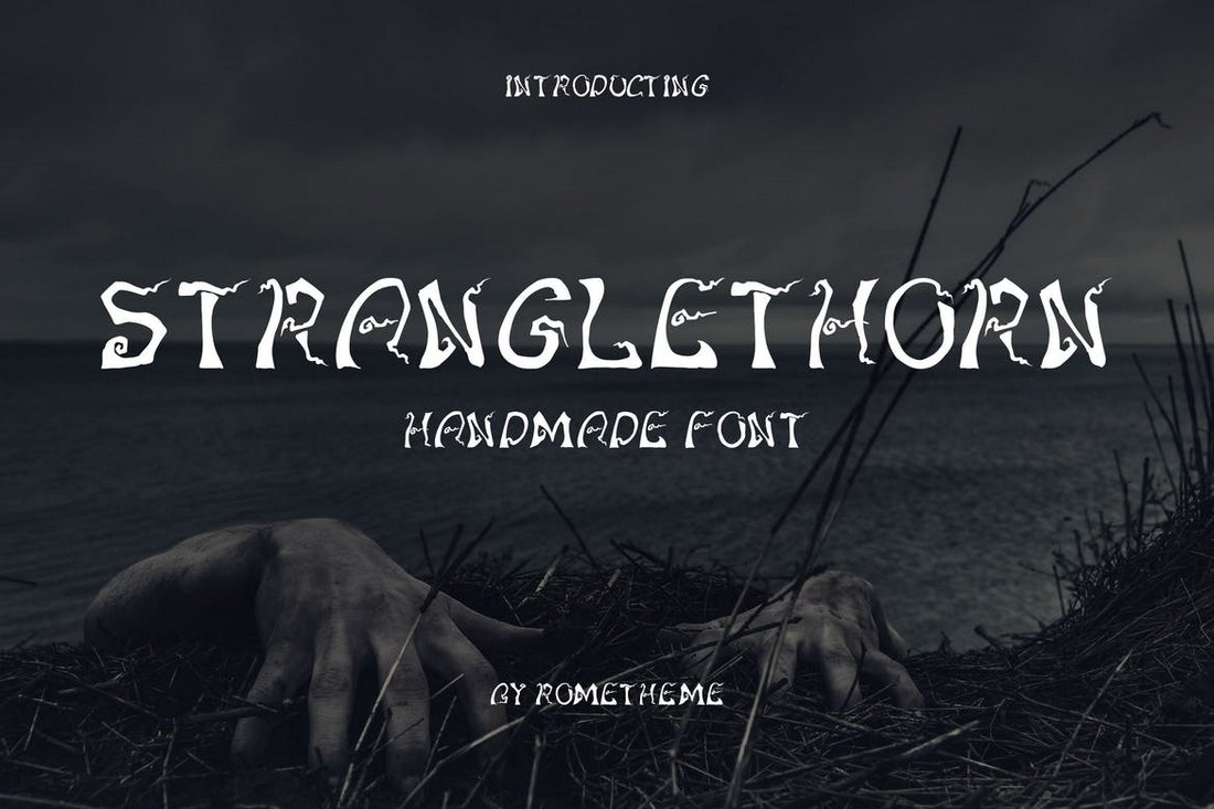
Stranglethorn – Spooky Halloween Font

Stranglethorn - Spooky Halloween Font

Another spooky Halloween font with a creative design. This font features a handmade design and includes both OTF and TTF formats. You can use it to design posters, book covers, greeting cards, and more.

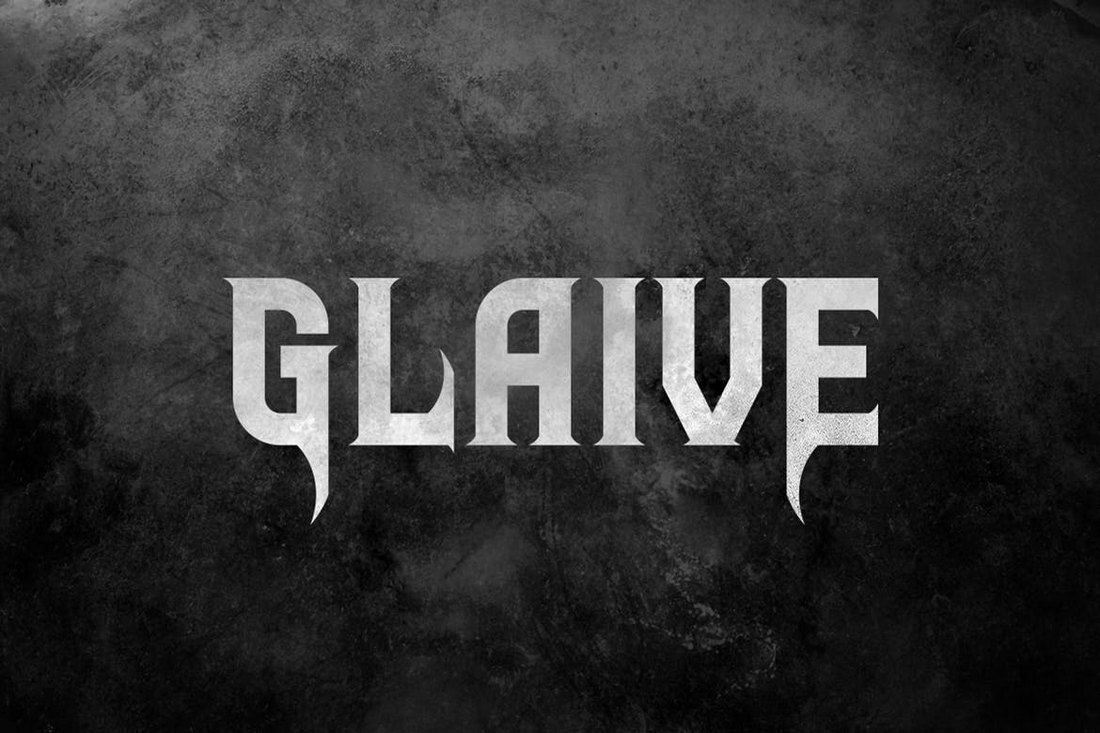
Glaive – Halloween Font

Glaive - Halloween Font

Glaive is a bold font with a creative design. This font is most suitable for designing posters, titles, book covers, and social media posts with a subtle spooky design. The font includes all-uppercase letters with alternates.

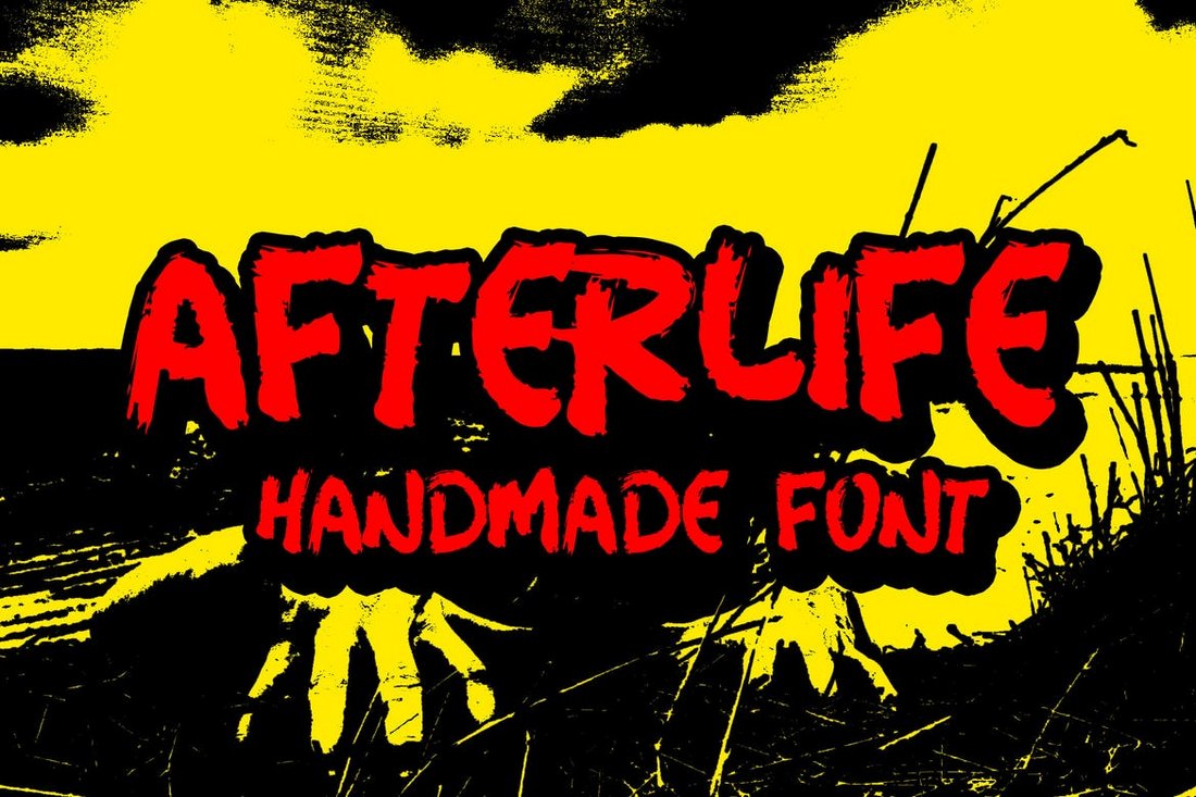
Afterlife Handmade – Halloween Font

Afterlife Handmade - Halloween Font

Afterlife is a unique handmade font that features a spooky design. It comes in both OpenType and TrueType formats. You can use the font to craft unique posters and flyers for various Halloween-themed events.

If you’re working on a different style of a poster, check out our collection of the best fonts for posters.

Convert Vb.net to C++

Featured Imgs 23

Greetings, I'm having an issue, I want to set my form to display at the very top right hand side corner of a screen, I've achieved this in vb.net using this code

Location = New Point(Screen.PrimaryScreen.WorkingArea.Width - Width, 0)

Does anyone know how I can do this in VC++?

20+ Best Hotel Presentation Templates (PowerPoint, Google Slides + More)

Featured Imgs 23

Creating a professional, visually captivating presentation is essential when promoting a hotel or hospitality business. Whether you’re pitching to investors, presenting to potential clients, or showcasing your brand to partners, the right presentation can make all the difference.

In this blog post, we’ve curated a collection of the best hotel presentation templates designed to help you deliver stunning and polished presentations with ease.

Whether you’re showcasing room amenities, event spaces, or the overall guest experience, these templates provide a structured, easy-to-edit framework to bring your vision to life. They offer everything you need to highlight key features of your hotel—beautiful imagery, engaging content layouts, and professional design elements that will impress any audience.

Hotellia – Hotel PowerPoint Template

Hotellia - Hotel PowerPoint Template

Hotellia is a stylish hotel PowerPoint template with a versatile and elegant design created for a variety of business needs. It features 30 unique, clean slides in HD widescreen format and offers a range of customizable infographics such as bar charts and circles. Its user-friendly nature requires no additional image editing software and allows for fully editable text, fitting any business’s style and need.

Hotel – PowerPoint Presentation Template

Hotel - PowerPoint Presentation Template

This is a superbly organized pitch deck template ideal for professionals intending to create an impressive presentation. It comprises 30 easily adjustable slides and a craft infographic feature. The asset is remarkable for its customization ability; you can change colors, resize, recolor, and more.

Hotel & Resort PowerPoint Template

Hotel & Resort PowerPoint Template

This hotel PowerPoint template offers a professional, contemporary design with a focus on detail. Perfectly suited for diverse presentations, from business and branding to advertising, it features over 38 unique slides, easy color change, and full HD quality. Its strength lies in its carefully crafted typography, usability, and extensive mockup capabilities.

California Hotel – PowerPoint Presentation Template

This hotel PowerPoint template is ideal for those in the hospitality and travel sectors. Boasting a clean, minimalist design, this template includes 100 uniquely creative slides, fully animated with resizable vector elements. The template supports retina and full HD display, and supports a variety of file types including pdf.

Travotel – Travel & Hotel PowerPoint Template

Travotel - Travel & Hotel PowerPoint Template

The Travotel is a comprehensive and professionally designed template ideal for a visual representation of offerings within the hotel or travel industry. With 20 modifiable slides and easy drag and drop features, it allows for captivating and customizable presentations. Designed to fit in a 16:9 Wide Screen Ratio and needing only free web fonts, its user-friendliness is commendable.

Hotel & Villa – PowerPoint Template

Hotel & Villa - PowerPoint Template

This is a sleek and modern hotel PowerPoint template, designed with detail and professionalism. It includes 10 completely customizable slides, featuring resizable and editable graphics, free recommended web fonts, and a widescreen ratio. The template is based on master slides and has a convenient drag-and-drop picture placeholder.

The Neuville – Luxury Hotel PowerPoint Template

The Neuville - Luxury Hotel PowerPoint Template

The Neuville is a versatile template—ideal for a range of uses from real estate or hotel presentations to company profiles or personal portfolios. With 30 slides, over 500 icons, and handy features like easy-to-edit graphics and simple drag and drop, creating an engaging, professional presentation is a breeze.

Hotel Management PowerPoint Template

Hotel Management PowerPoint Template

This is an excellent hotel PowerPoint template for hotel industry professionals looking to highlight strategies for optimizing operations and service. With its pleasing aesthetics and organized design, the template provides 20 slides with master slides and image placeholders included.

Hoteliano – Luxury Hotel PowerPoint Template

Hoteliano - Luxury Hotel PowerPoint Template

The Hoteliano is an elegantly designed tool for any presentation purpose, particularly within the luxury hospitality industry. The template features over 40 unique slides, all designed with careful attention to detail, usable typography, and modern aesthetics. The template package includes easy-to-use PPTX and PDF files.

Solace – Hotel & Travel PowerPoint Template

Solace - Hotel & Travel PowerPoint Template

Solace is a multipurpose, professional presentation tool ideal for various sectors like business, creative agencies, and portfolio presentations. The clean, modern design is easy to edit and customize. With over 30 slides, an HD aspect ratio, and a high resolution of 1920×1080 pixels, this template is adaptable and user-friendly.

Gracia – Luxury Hotel PowerPoint Template

Gracia - Luxury Hotel PowerPoint Template

Gracia hotel PowerPoint template offers a professional, ultra-modern design ideal for any presentation purpose. With over 40 unique slides, this template promises attention to detail, usability, and strong typography. The set includes PowerPoint PPT & PPTX files and PDF documentation, editable on master slides.

Holux – Hotel Marketing Presentation

Holux - Hotel Marketing Presentation

Holux is a brilliant tool designed to elevate your hotel’s marketing strategy. It’s developed as a PowerPoint presentation template equipped with unique layouts, high resolution, and easy customization for showcasing your brand and services.

De Luna – Hotel Marketing Presentation

De Luna - Hotel Marketing Presentation

The De Luna is a versatile PowerPoint template ideal for creating engaging and professional marketing presentations. Its clean, modern design offers ample room for creativity, with 50+ unique slides and various features such as easy-to-edit vector icons, drag-and-drop placeholders, and a selection of world map vectors.

Luxury Hotel Marketing PowerPoint Template

Luxury Hotel Marketing PowerPoint Template

This is a user-friendly, highly customizable hotel PowerPoint template perfect for showcasing your luxury hotel. It’s versatile, suitable for various businesses and promotional purposes. The template includes 20 pages in 1920px x 1080px size, with 72 DPI in RGB color, and utilizes free fonts.

Luxury Hotel & Resort PowerPoint Template

Luxury Hotel & Resort PowerPoint Template

This is a versatile, creatively designed hotel PowerPoint template perfect for businesses, corporate bodies, and agencies. Easy to use and fully customizable, its highlights include a size of 1920px x 1080px, 72 DPI, RGB color, and 16 pages. Free fonts are utilized and it comes with a Powerpoint PPTX file and a readme text.

D’Lux – Luxury Hotel Presentation Template

D'Lux - Luxury Hotel Presentation Template

D’Lux  is an exquisite asset that provides a sleek and modern design for presenting your luxury hotel brand. Containing flexible and fully editable elements – from infographics to vector icons, it’s suited for various business purposes, be it financial reviews, marketing strategies or training sessions. Its wide 16:9 screen ratio and free recommended fonts contribute to functionality, creating a visually compelling tool for your hotel’s success.

Toproom – Luxury Hotel PowerPoint

Toproom - Luxury Hotel PowerPoint

Toproom is a stylish yet professional hotel PowerPoint template for crafting compelling presentations. With 30 customizable slides, easy-to-use picture placeholders, and free recommended web fonts, it offers a multitude of options to highlight your unique designs. And don’t forget, mastering the art of visually striking and engaging presentations is made simple with its drag-and-drop feature and a 16:9 widescreen ratio.

Gold Hotel – PowerPoint Presentation Template

Gold Hotel - PowerPoint Presentation Template

This hotel PowerPoint template is ideal for a range of uses from corporate business to digital marketing. It features 22 master slides, all resizable and customizable, with a picture placeholder. This user-friendly template makes editing a breeze – simply drag and drop. It uses and recommends free web fonts.

Free Hotel Presentations Templates (Google Slides)

Free Hotel Pitch Deck Google Slides Template

Free Hotel Pitch Deck Google Slides Template

A beautifully elegant and stylish pitch deck template for your hotel presentations. This template is completely free to download and use. It comes with 31 slides and in both Google Slides and PowerPoint formats.

Free Hotel Marketing Plan Presentation

Free Hotel Marketing Plan Presentation

You can use this free hotel marketing plan presentation to create an effective slideshow to plan a campaign for your hotel marketing efforts. The template includes 27 editable slides and it comes in Google Slides format.

Free Luxury Hotel Company Profile Presentation

Free Luxury Hotel Company Profile Presentation

This free Google Slides template is ideal for crafting an elegant and high-end presentation for promoting your luxury hotel. It’s designed for making company profile slideshows and includes 28 slides.

Free Hotel Business Plan Presentation

Free Hotel Business Plan Presenation

Create an effective business plan for your hotel and resort business using this free Google Slides template. It comes with a colorful design with 35 customizable slide layouts.

Free Resort Hotel Marketing Plan Presentation

Free Resort Hotel Marketing Plan Presentation

This Google Slides template is also free to download. It’s designed specifically for making hotel marketing plan presentations. The template includes highly visual slide layouts with fully customizable design elements.

Brand Strategy 101: 7 Important Elements of a Company Branding Plan

Featured Imgs 23

We’re bombarded with tens of thousands of messages everyday — and most of them are extensions of brand strategies.

Instagram influencers tell us how to book a free first-class flight, the city bus is wrapped with an Apple ad, your favorite TV show has been interrupted by commercials ever since the streaming service raised prices.

Free Kit: How to Build a Brand [Download Now]

Vying for a place among these thousands and thousands of messages is a daunting task, but spending some time on strategic branding will help set you apart from the competition and build customer loyalty.

In this article, you’ll learn all about the branding methods and essential elements of a branding strategy you need to grow a brand that’ll stand the test of time. And then one day your brand will be wrapped on a city bus.

Table of Contents

A well-defined and -executed brand strategy affects all aspects of a business and is directly connected to consumer needs, emotions, and competitive environments.

First, let's clear up one of the biggest misconceptions about brand strategy: Your brand is not solely your product, your logo, your website, or your name.

Your brand is all that and more — it's the stuff that feels intangible, the hard-to-pin-down feelings that separate powerhouse brands from forgettable brands.

To understand a subjective matter that many marketers consider more art than science, we've broken down seven essential components of a comprehensive brand strategy that will help keep your company relevant for decades.

Elements of a brand strategy include:

  • Purpose
  • Consistency
  • Emotion
  • Flexibility
  • Employee Involvement
  • Loyalty
  • Competitive Awareness

The Elements of a Brand Strategy. Purpose, consistency, emotion, flexibility, employee involvement, loyalty, competitive awareness.

1. Purpose

Although your brand promise is necessary to your brand positioning, knowing why you wake up every day and go to work is also essential.

In other words, your purpose is more specific in that it serves as a differentiator between you and your competitors.

How can you define your business' purpose? According to Business Strategy Insider, purpose can be viewed in two ways:

  • Functional: This concept focuses on the evaluations of success in terms of immediate and commercial reasons — i.e., the purpose of the business is to make money.
  • Intentional: This concept focuses on success as it relates to the ability to make money and do good in the world.

While making money is part of almost every business, we admire brands that emphasize their willingness to achieve more than just profitability, like Patagonia:

Screencap of Patagonia’s website. “We guarantee everything we make. We take responsibility for our impact. We support grassroots activism. We keep your gear going. We give our profits to the planet.”

Image Source

Patagonia’s brand strategy isn’t just about profit, it’s about sustainability and responsibility.

This approach appeals to potential customers who share these values.

Key Takeaway

When defining your business' purpose, keep this example in mind. While making money is a priority, operating under that notion alone does little to set your brand apart from others in your industry.

Our advice? Dig a little deeper. If you need inspiration, check out the brands you admire, and see how they frame their mission and vision statements.

Pro Tips

In a 2022 interview with Cannabis Drinks Expo, marketer Rachel Boykins said that brands can “get a little too lofty” with respect to the roles they play in consumers’ lives. Boykins, who’s now the head of brand strategy at Pangea Money Transfer, got on Zoom with me to talk about this in more detail.

“When people look for examples of good branding,” she tells me, they often bring up big brands like Apple, Amazon, or Disney — “brands you can easily name off the top of your head because they’re so groundbreaking.”

Problem is, “there‘s really only one Apple. That’s not something that all brands should aspire or expect to be.”

“Work with your internal teams to understand your business’ objectives. These are what your bonuses and budgets are made off of. And those are obtainable goals.”—Rachel Boykins, Head of brand strategy, Pangea Money Transfer

Boykins’ advice: “Not every brand has to hit those heights to be successful. Work with your internal teams to really understand your business’ objectives. These are what your budgets and bonuses are made off of. And those are obtainable.”

2. Consistency

The key to consistency is to avoid talking about things that don’t relate to or enhance your brand.

For instance, if you add a photo to your business’ Facebook page, make sure it aligns with your message. If you’re just sharing the latest meme that made you laugh, you risk confusing or alienating your audience.

To give your brand a platform to stand on, you need to ensure your messaging is cohesive. Ultimately, consistency contributes to brand recognition, which fuels customer loyalty. (No pressure, right?)

To see a great example of consistency, let's look at Apple, the most recognizable brand in the world in 2024. As a result of its commitment to consistency, every element of the brand's marketing works harmoniously together.

Even though Apple’s Instagram account has nary a product photo in sight, the iPhone-shot photography tells the brand story.

Nine photos on Apple’s Instagram account.

Image Source

Compare that to product photos of the Apple Watch and AirPods on its website, which both feature the same bold, mysterious, colorful photography.

Screencap of Apple.com. On the right, the Apple Watch. On the left, AirPods 4.

Image Source

Key Takeaway

To make sure potential customers don’t struggle to put the disconnected pieces of your business together, consider the benefits of creating an internal style guide.

A style guide can encompass everything from the tone of voice you‘ll use to the color scheme you’ll employ to the way you'll position certain products or services.

By taking the time to define and agree upon these considerations, your brand will benefit as a whole.

3. Emotion

Emotion is a powerful branding tool.

Brand consultant Cornelis Jacobs tells me, “A brand is really a person’s gut feeling about a product or service or organization. It’s really emotional — it’s what someone feels.”

Harley-Davidson, for example, uses emotional branding by creating a community around the H-D brand. It founded HOG — Harley Owners Group — to connect its customers with the brand and with each other.

Screencap of Harley Owners Group.

Image Source

By providing customers with an opportunity to feel like they‘re part of a larger group that’s more tight-knit than just a bunch of motorcycle riders, Harley-Davidson positions itself as an obvious choice for someone looking to purchase a bike.

If you buy a Harley, you’re also buying into a community.

Research from psychologists Roy Baumeister and Mark Leary describes this need in their belongingness hypothesis, which states: “People have a basic psychological need to feel closely connected to others, and that caring, affectionate bonds from close relationships are a major part of human behavior.”

Not to mention that belongingness — the need for love, affection, and being part of groups — falls directly in the middle of Maslow's hierarchy of needs.

Key Takeaway

Find a way to connect with your customers on a deeper, more emotional level. Do you give them peace of mind? Make them feel like part of the family? Do you make life easier? Use emotional triggers like these to strengthen your relationship and foster loyalty.

4. Flexibility

In this fast-changing world, marketers must remain flexible to stay relevant. On the plus side, this frees you to be creative with your campaigns.

You may be thinking, “Wait a minute, how am I supposed to remain consistent while also being flexible?”

Good question. While consistency aims to set the standard for your brand, flexibility enables you to make adjustments that build interest and distinguish your approach from your competition.

A great example of this type of strategic balance comes from Old Spice. These days, Old Spice is one of the best examples of successful marketing across the board.

Up until recently, wearing Old Spice was pretty much an unspoken requirement for dads everywhere. Today, however, it's one of the most popular brands for men of all ages.

The secret? Flexibility.

Aware that it needed to do something to secure its place in the market, Old Spice teamed up with Wieden+Kennedy to position its brand for a new customer base.

Old Spice’s old branding on the left; its new branding on the right.

Image Source

Between new commercials, a new website, new packaging, and new product names, Old Spice attracted the attention of a younger generation by making strategic enhancements to its already strong brand.

Key Takeaway

If your old tactics aren’t working anymore, don’t be afraid to change. Just because it worked in the past doesn‘t mean it’s working now.

Take the opportunity to engage your followers in fresh, new ways. Are there some out-of-the-box partnerships your brand can make? Are there attributes about your product you never highlighted? Use those to connect with new customers and remind your old ones why they love you.

5. Employee Involvement

As we mentioned before, consistency is vital to brand recognition. And while a style guide can help you achieve a cohesive digital experience, it's equally essential for your employees to be well-versed in communicating with customers and representing the brand.

As Jacobs puts it, “Everyone should be a brand champion.”

If your brand is playful and bubbly on social media, you’ll send mixed messages if a customer calls in and is connected with a grumpy, monotone representative, right?

To avoid this type of mismatched experience, take note of Zappos' approach.

If you‘ve ever been on the line with a customer service representative from Zappos, you know what I’m talking about. If you haven't, check out this SlideShare, which details some of its most inspiring customer support stories.

Pro Tips

Boykins advocates for more diversity in corporate spaces. She tells me that she’s been in many meetings where she’s “the only Black person, and maybe only 10% of the time there’s another woman.”

“Consumers have high hopes and expectations” for diversity to be reflected in their favorite brands, she says. Every year, it seems that another brand releases a marketing campaign “and everybody is shocked about how culturally or racially insensitive it is. People are wondering how this is still happening.”

Tackling that requires more than superficial diversity — employees have to feel comfortable speaking up at every level of the company. Boykins is blunt about the stakes: “If brands are not concerned about diversity, they should be concerned about cancel culture. You don’t get a lot of chances.”

“If brands are not concerned about diversity, they should be concerned about cancel culture. You don’t get a lot of chances.”—Rachel Boykins, Head of brand strategy, Pangea Money Transfer

Key Takeaway

Your brand strategy should exemplify your core values, and potential employees should be able to easily discern whether their own values align. Every touch point with stakeholders should be consistent and cohesive.

6. Loyalty

If you already have customers who are deeply loyal to your brand, don’t sit back and take it for granted — reward them.

These customers have gone out of their way to write about you, tell their friends about you, and act as your brand ambassadors.

Cultivating loyalty from these people early on will yield more returning customers — and more profit for your business.

Sometimes, just a thank you is all that‘s needed. Other times, it’s better to go above and beyond. Write them a personalized letter. Send them some special swag. Ask them to write a review and feature them prominently on your website. (Or all of the above!)

When we reached 15,000 customers here at HubSpot, we wanted to say thank you in a big way while remaining true to our brand ... so we dropped 15,000 orange ping pong balls from our fourth-floor balcony and spelled out thank you in big metallic balloons.

And while it may have seemed a little out of the ordinary to some, the gesture made perfect sense for those who know our brand.

Key Takeaway

Loyalty is critical to your brand strategy, especially to support sales organizations.

Highlighting a positive relationship between you and your existing customers sets the tone for what potential customers can expect if they choose to do business with you.

7. Competitive Awareness

Take the competition as a challenge to improve your own strategy and create greater value in your overall brand. You are in the same business and going after the same customers, right? So watch what they do.

Do some of their tactics succeed? Do some fail? Tailor your brand positioning based on their experience to better your company.

Keeping tabs on your competitor's social mentions is easy with HubSpot’s social media management software. Check out this article to learn more about setting up custom social streams.

Key Takeaway

While staying in tune with your competitor‘s strategies is essential if you want to enhance your brand, don’t let them dictate every move you make.

Sure, you probably sell a similar product or service as many other companies, but you're in business because your brand is unique. By harping on every move your competitor makes, you lose that differentiation.

Let’s discuss each branding method.

1. Attitude Branding

This form of branding refers to a feeling or attitude that customers associate with your brand.

Nike’s “Just Do It” slogan promotes a lifestyle that customers can enjoy by wearing this brand of products.

With such a slogan, Nike promotes the idea that all customers are athletes when they're wearing Nike products.

2. Individual Branding

This type of branding is when a product or service gets a unique identity, perhaps in a different brand name to attract new customers in the market.

Unilever is an excellent example of a brand that uses individual branding. The company has three divisions, each creating some of the best-known brands in its niche.

Screencap of some of Unilever's brands. Dove, Hellmann’s, Knorr, Lifebuoy, LUX, and Magnum.

Image Source

3. Product Branding

Product branding is perhaps the most popular type of branding. Here, the brand associates a logo, name, color, and design with a product to create a unique identity for the product.

It’s one of the best branding methods because it gives life to products and increases uniqueness.

A great example is Apple’s MacBook offerings. “Air,” “Pro,” and “Mac” each convey a specific message that reinforces the quality of the product offering.

Image Source

4. Co-Branding

In co-branding, also known as a brand partnership, different brands contribute their identity to create a fused brand.

The advantage of this method is that it combines market strength, customer bases, and perceived value.

One of the most popular co-branding examples is the Nike and Michael Jordan collaboration. This collaboration has made Air Jordans some of the most sought-after and most recognizable footwear around the globe.

Screencap of the Air Jordan Collection from Nike.

Image Source

This type of branding is usually used by brands that prefer to let products speak for themselves.

5. Minimalist Branding

Mastercard is an excellent example of a brand that uses minimalist branding.

Screencap of Mastercard’s branding guidelines.

Image Source

Even without the word “Mastercard,” the overlapping red and yellow circles are instantly recognizable.

Pro tip: Need a logo your customers can recognize at a glance? Try our free logo creator and brand identity design tool.

6. Brand Extension

This unique branding method is when a company uses one of its popular or established brand names on a new product. The idea behind this method is to use the already existing brand equity to boost the latest product.

Companies that use it hope customers will be more receptive to the new offering because of the brand extension.

The Importance of Strategic Branding

Managing a brand is hard work, and it’s more challenging when you’re in an oversaturated market where every brand looks the same.

One of the crucial steps to growing in an oversaturated market is highlighting what makes your brand unique — which is what strategic branding is all about.

With strategic branding, you future-proof your brand and develop it in a way that differentiates you from others. By communicating uniqueness to customers, you strengthen your selling power, brand value, and customer loyalty.

How to Choose a Marketing Team Structure That Doesn’t Just Look Good on Paper

Featured Imgs 23

Most things in life are only as good as their foundation. Houses, ice cream sundaes, sand castles … marketing teams.

It’s true. A good marketing team structure is what helps you weather the storm when you’re facing the pressure to grow marketing revenue — all while keeping headcount to a minimum.

Not to toot our own horn, but HubSpot’s marketing team is pretty dang good.

Since we’ve cracked the code, I’m here to help you pick a team structure that’s built for growth and give you the tools to make the most out of your first (or next) marketing hire.

→ Download Now: The Illustrated Guide to Org Charts [Free Guide + Templates]

Table of Contents

But what do we do, exactly? Ah yes, the age-old question we as marketers try to answer any time someone asks what we do for a living.

At HubSpot, we’re essentially a bunch of marketers who market marketing software to other marketers. It’s a little bigger than that, but you get it.

What size should my marketing team be?

The size of your marketing team will depend on the size of your business.

When I worked for a small consulting firm of about 100 people, our marketing team consisted of about eight of us.

Now that I work at HubSpot with 7,000+ employees, you can probably imagine the proportion of marketers we have spread across functions.

As a general reference point:

  • Less than 25 employees = one kick-ass marketer
  • 25 to 49 employees = about three marketers
  • 50–249 employees = about eight marketers
  • 250+ employees = about 30 to 100+ marketers

But your marketing team size will also be informed by your goals and your budget.

If I had a cupcake business (big sweet treat fan over here) and I wanted to increase leads from TikTok, I’d focus on hiring more social media specialists.

And as a consumer packaged goods company, I’d aim to spend about 25% of my revenue on marketing based on the average marketing budgets by industry.

Then, I’d have to break that down further to determine where hiring fits into my overall marketing spend.

The bottom line: I’ll always argue quality over quantity. The quantity will come as you scale, but you’ll need to establish a high-quality structure from the start to support it.

How to Structure a Marketing Department

So, I can’t tell you exactly how to structure your marketing department. There are way too many factors to consider.

But what I can do is outline three of the most common types of structures: by function, by discipline, and by product.

1. Marketing Department Structure by Function

Best for: SMBs (5 to 100 employees) with a marketing “team” of one who wears many hats and small teams that have limited headcount, resources, budget, and bandwidth.

marketing team structure by functio, best for small to medium sized businesses, operations, creative, project management

The functional department structure is similar to that of a bare-bones agency and includes the pillars of taking a campaign from ideation to completion.

A team like this may be made up of a few full-time folks, part-time people, or it could be staffed completely by contractors.

Common teams within marketing departments that are structured by function include:

  • Operations
  • Creative
  • Project management

2. Marketing Department Structure by Discipline

Best for: Midsized companies (100 to 1,000 employees) where marketing owns a revenue number and is responsible for driving leads and contributing to the pipeline of the business.

marketing team structure by discipline, best for midsized businesses, social media, content, product, SEO, website

Marketing departments that are structured by discipline are the most common.

These teams will collaborate to execute campaigns frequently throughout the year in order to hit the company's revenue goals.

Common teams within marketing departments that are structured by discipline include:

  • Social media
  • Content marketing
  • Product
  • Search engine optimization (SEO)
  • Website

3. Marketing Department Structure by Product

Best for: Enterprise businesses (1,000+ employees) with predictable revenue patterns that don't need to run frequent, stand-alone marketing campaigns to generate business.

marketing team structure by product, best for enterprise businesses, brand, growth, acquisition, media

This marketing department structure organizes marketing teams by product.

If you have a proven marketing system in place to generate demand for the business, you can leverage a product-style marketing structure to grow in new, innovative ways.

Global teams may also appreciate this structure because it reduces role redundancy across regions and gives hiring managers an opportunity to recruit talent globally.

Common teams within marketing departments that are structured by product include:

  • Brand
  • Growth
  • Acquisition
  • Media

Types of Marketing Teams

I mentioned the marketing department structure by discipline is the most common structure, so I’ll break down some of the most common teams in that category.

Social Media

Your social media team will create and execute social media marketing efforts.

This team will need to have knowledge of how to make engaging content to drive brand awareness, generate leads, and connect with audiences.

Potential roles: Head Account Manager, Social Media Specialist, Content Creator, Social Media Analyst

Skills needed: Content creation, graphic design, social media management, project management, data analytics, and storytelling

General responsibilities:

  • Create, schedule, and measure the performance of social content
  • Develop social media images and videos using tools like Canva or Adobe
  • Using social media management tools to track success
  • Responding to customers who engage through social media tags or posts.

Making the most of your social media team structure:

  • SMBs: Your dedicated marketing team member should have a general comfortability with basic marketing practices and social media experience to build an online presence.
  • Midsized businesses: If you can afford multiple marketing roles, start specializing in marketing functions like social media manager, which can be its own role.
  • Enterprise businesses: Consider structuring your social media team by having specialists and managers to lead and oversee social media strategy, as well as roles for day-to-day social media activities.

Pro tip: To help small teams, social media management software provides marketers with the tools they need to execute an entire social media strategy, such as the tools within HubSpot's Marketing Hub.

Content Marketing

Your content creators (read: me) will be the ones making sure your brand has enough content to tell a cohesive, compelling story. The content they produce will be useful in every facet of your marketing functions, from video to blog posts.

Potential roles: Head of Content, Video Producer, Staff Writer, Content Creator, Jr. Content Creator

Skills needed: Writing, editing, organization, graphic design, project management, SEO, HTML, and storytelling

General responsibilities:

  • Create and edit content like blog posts, social media, and ebooks
  • Product high-quality multimedia assets like podcasts, videos, and webinars
  • Collaborate with creative teams and ensure messaging consistency across materials

Making the most of your content team structure:

  • SMBs: Your content creation team might also be your social media and product team, so make sure they have good organization and time-management skills in a fast-paced environment.
  • Midsized businesses: Take the time to hire a content creator who understands the story of your brand and brand voice.
  • Enterprise businesses: Larger companies hiring for a content creation team can hire by skill or by the needs of other teams. For example, social media agencies need content creators for every client or group of clients.

Product

The product team communicates the features and benefits of your product to the customer. They'll organize and drive the messages of a product and how it connects to your brand and your target audience.

Potential roles: Brand Specialist, Product Marketing Specialist

Skills needed: Research, analysis, strategic planning, cross-functionality, writing, customer service, a creative problem-solving mindset, technical knowledge, pricing strategy, and solving for the customer

General responsibilities:

  • Identify target audiences to communicate with through product pages and ad copy
  • Plan campaigns for new and existing products or services
  • Build product pages and strategize product promotion
  • Research, analyze metrics, use that knowledge to plan future campaigns
  • Demonstrate a deep understanding of overall marketing functions

Making the most of your product team structure:

  • SMBs: The product marketer you hire as a small business owner is likely your only marketer, so hire someone with a background or demonstrated knowledge in writing, presenting marketing, and business.
  • Midsized and enterprise businesses: Consider hiring product marketers by product stack (e.g., phones for a tech company) or by speciality (e.g., a role based solely on developing copy or producing strategy).

Search Engine Optimization

The SEO team will mainly be driving traffic to your webpages by optimizing content and ensuring your brand is ranking on the SERPs for topics related to your product or service.

To accomplish these goals, you need people with strong technical, programming, and writing skills.

Potential roles: SEO Strategist, Senior SEO Strategist, Historical Optimization Writer

Skills needed: Writing, editing, problem-solving, experience with programming and technical thinking, analytics, spreadsheets, drive, and the ability to adapt

General responsibilities:

  • Write, edit, and proofread content
  • Optimize content for search engines and key audiences
  • Conduct keyword research and identity ranking opportunities
  • Analyze content performance to inform future keyword strategies

Making the most of your SEO team structure:

  • SMBs: Make sure your SEO functions are being carried out by someone who has an understanding of analytics, optimizing content for search engines, and keyword research.
  • Midsized businesses: Consider hiring for different specialties within SEO like historical optimization, link-building management, and raising webpage traffic.
  • Enterprise businesses: Consider hiring managers who are SEO experts that can offer seasoned advice to other team members and manage multiple SEO projects at once.

Website

Of course, any business needs a website. And as your company grows, you may find the need to hire someone full-time to maintain your website.

This team will be responsible for all things dot com, so you should hire a creative proficient in web design, web strategy, and optimization.

Potential roles: Web Developer, Senior Web Developer, UX/UI Designer, Front-end Web Developer, Web Designer, Visual UX Developer, Graphic Design Specialist

Skills needed: Programming, Creative Suite programs, interpersonal communication, website and email design, UX orientation, content management software, understanding of web standards and best practices, and SEO

General responsibilities:

  • Demonstrate a mastery of programming and web design
  • Develop new web pages and refresh existing content
  • Build new web experiences and refine customer touchpoints
  • Improve user experience across the website
  • Serve as the point of contact for web-related issues

Making the most of your website team structure:

  • Businesses of all sizes: I’d recommend structuring your web design by need. If you can afford to build out an entire team, you can start hiring Senior Web Developers to bring your site up to current standards and maintain it.

Other Types of Marketing Teams

Here’s a quick and dirty rundown of the other types of teams I called out in the function and product structure categories.

Operations

Your operations team is responsible for managing the technical aspects of your marketing efforts. They'll maintain the tech stack, handle marketing automation, manage email marketing workflows, and schedule and produce webinars.

Skills needed: Workflows, automation, written and verbal communication skills, problem-solving, team-building

Creative

The creative team is in charge of what your clients or customers see when they come across your brand. This team will take on graphic design, copywriting, video production, and some web design.

Skills needed: Graphic design, written communication, video production, photography, copywriting, front-end web design

Project Management

To keep everything on schedule, within budget, and within scope, the project management team will step in. The individuals in this role will typically coordinate with both operations and creative in order to keep things moving.

Skills needed: Organization, project management, agile framework, budgeting, time management, written and verbal communication

Brand

Your brand team knows everything about your business and distills it in such a way that potential, new, and existing customers can relate to it and external entities can appreciate it.

Skills needed: Strategic thinking, written and verbal communication, creativity, copywriting, social media management, customer journey mapping, and buyer journey mapping

Growth

Your growth marketing team is responsible for generating demand and leads for the business either in existing or new markets.

Skills needed: Content marketing, content strategy, SEO, copywriting, web design, UI/UX design, and HTML

Acquisition

Your acquisition team will be made up of people who live and breathe methods for delighting the customer through every step of their buyer‘s journey. You’ll look to your acquisition-ers to secure leads and fill the pipeline for sales.

Skills needed: Conversion rate optimization, UI / UX design, HTML, content development, content design, and data analysis

Media

Your media team should encompass many of the functions listed above, but it does so with an emphasis on the audience experience. Your media team understands that media products are best built when your brand has a strong foothold in the market.

Skills needed: Video production, video editing, public speaking, creative writing, research, data analysis, and journalism

Common Marketing Team Roles

Any successful marketing department structure needs a leadership and individual contributor hierarchy.

How deep or wide you choose to organize your team is up to you, but here are the primary roles you can expect to see in any marketing team.

Marketing People Leader Roles

marketing team structure, common marketing team roles, marketing people leader roles, CMO, VP of Marketing, Director of Marketing, Marketing Manager

  • Chief Marketing Officer (CMO): Decision maker, owns the vision and champions the team culture. Reports to the CEO.
  • Vice President (VP) of Marketing: Sets the strategy for the marketing department at a high level. Reports to the CMO.
  • Director of Marketing: Sometimes referred to as the “Head” of Marketing. Puts the strategy from the VP into an actionable plan that managers can rally their teams around.
  • Marketing Manager: People leaders on the front lines who manage individual contributors and are responsible for guiding their team toward meeting the goals of the larger strategy.

Marketing Individual Contributor Roles

marketing team structure, common marketing team roles, marketing individual contributor roles, Marketing Consultant, Principal Marketer, Senior Marketer, Marketing Specialist, Marketing Coordinator or Associate, Marketing Intern

  • Marketing Consultant: Typically an expert in a specific discipline like SEO or content creation. They are hired as a freelancer, contractor, or even on a part-time basis to help marketing teams reach their goals.
  • Principal Marketer: Highest-level full-time roles an individual contributor can attain in their career. Masters of their discipline rather than a jack of all trades.
  • Senior Marketer: Actively honing their skills in a specific discipline, but may take on projects with a wider scope to build other soft and hard skills.
  • Marketing Specialist: Plays more of a generalist role on the team. Encouraged to explore marketing disciplines to gain an understanding of how tactics work together to achieve the strategy.
  • Marketing Coordinator or Associate: Entry level position for recent graduates or new marketing professionals who want to change careers. They'll take on ad-hoc assignments in various marketing departments and begin to build relationships with more senior team members.
  • Marketing Intern: Temporary employee that is completing a degree of some kind, usually in an area of marketing or communications. May be offered a full-time position as a marketing associate or coordinator upon graduation.

How to Build a Marketing Team

Now that we’ve covered marketing team sizes, department structures, and common roles, it’s time to dive into what you’ve all been waiting for … the how.

1. Create a hiring strategy.

Start here: Before you can hire anyone, you need to put a strategy in place for building your marketing team. To do this, you‘ll need a clear understanding of your organization’s hierarchy.

You’ll also need to consider the needs of the business.

Are there specific areas where you need additional support? Maybe you have a social media specialist that’s great at the day-to-day, but you need someone at the manager level to really drive your strategy.

Are there any gaps in your marketing department? If you’re focused on bringing in leads but don’t have a dedicated acquisition expert, this is your opportunity to bring one on.

More often than not, hiring without a strategy leads to redundancy and role confusion.

2. Write the job descriptions.

Once you nail down your strategy, it’s time to write the job descriptions and begin recruiting.

Luckily, we have an entire post dedicated to job description best practices.

However, I believe the most important way to write a good job description is to make sure you have a clear understanding of your target candidate.

I’ve written several marketing job descriptions in the past, and this understanding always mapped back to the needs our team identified in step one.

Once you know who you’re looking to hire, this will make it easier to create a job description that’s concise, realistic, and free of any bias.

3. Source candidates.

Before you begin recruiting candidates from external sources, try looking for interest internally first.

Internal candidates give you an opportunity to help an employee progress their career. Plus, it saves you time and resources that you'd otherwise spend looking for external talent.

If you've exhausted your internal talent pool or you need a more specialized skill set, there are several resources available to make this happen.

You can look to recruiters, headhunters, and candidate sources to help with the search. You can also browse candidate collectives or private membership groups like Black Marketers Association of America to list your job posting.

LinkedIn is also a great place for sourcing and vetting candidates. Why not work with your mutual connections to find your next great hire?

I’m sure you’ve seen the #OpenToWork and #Hiring photo frames by now. Read here to see if they actually work.

4. Extend an offer.

There's a lot of discourse about how to interview for top marketing talent. How many interviews are too many? How do you know which candidate is the right fit? How long should the process take?

We know that can be a challenge for small and large companies alike, so use this free resource to understand what you need to ask to evaluate your candidates objectively.

Once you're ready to extend an offer, consider all the variables: their experience, their interview performance, their formal marketing training (courses, degrees, certifications), and any special skills that will help round out your team.

Use this information to craft a fair offer that aligns what they bring to the table with what the market demands.

Be prepared for negotiations and questions about commonly overlooked benefits like insurance, on-call responsibilities, and professional development allowances.

5. Onboard your new hires.

After you‘ve done the hiring, you aren’t done building a great team. The work continues long after the offer letter is signed.

Create or refine your onboarding process so it helps your new employees understand the business, the team culture, and their role. Both parties (you and the new hire) should feel like they made the right decision by joining the company.

Plus, research shows that organizations with strong onboarding processes increase new hire retention by 82% and improve productivity by 70%. Win.

One Step Closer to Your Marketing Dream Team

Hiring the best talent will require knowing the best skills for each role. Even if you only have the capacity to hire for one or two marketing roles right now, it's a good idea to invest in people with the potential to grow into new roles in the future.

When you start with the right structure for your business type, put the right steps in place for hiring, and get the team aligned on a common vision, you'll have a marketing team that will make even the Fortune 100 companies jealous.

Editor's note: This post was originally published in November 2014 and has been updated for comprehensiveness.

The Ultimate Guide to Instagram for Business [+ Data From 650+ Marketers]

Featured Imgs 23

More companies than ever are using Instagram for business — over 200 million businesses, to be exact. 

Download Now: How to Use Instagram for Business [Free Guide + Templates]

Instagram has proven to be a worthwhile investment for marketing purposes. We surveyed 650+ global marketers in Jan. 2024, and they were more likely to rate Instagram as having high ROI than any other platform, and it’s the platform that will get the most investment from them in 2024. 

If you’ve only ever used Instagram for personal use, it might seem daunting to start using it for business purposes. Here, we’re going to explore how you can be using Instagram for business to promote your business on Instagram. 

Table of Contents

How to Use Instagram for Business

Let's delve into the six strategies you'll need to employ to get the most out of Instagram.

1. Add value with your content.

First and foremost, Instagram is a visual platform. To attract an audience, it's critical you spend time delivering high-quality, thoughtful content.

To succeed on Instagram, it's essential you create valuable content that attracts an audience and encourages them to engage with your business. Consider how you can delight your customers while staying true to your brand.

For instance, Hot Pockets sells microwaveable pocket sandwiches. Admittedly, I wasn't much of a fan of Hot Pockets — until I began following their business's Instagram account.

There are only so many times you can post a picture of a sandwich. Hot Pockets goes in a different direction. Instead, it appeals to its audience through humor, often posting relevant memes or funny quotes.

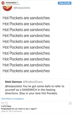
For instance, in response to @ShallowDivers' claim that Hot Pockets aren't sandwiches, Hot Pockets responded with this:

using instagram for business: hot pockets instagram posting "hot pockets are sandwiches" multiple times

Ultimately, it might take trial and error to find the content that works best for your business.

While Hot Pockets relies on humor, other brands like The North Face use impressive adventure images to appeal to its demographic.

The point is, brands need to add value to Instagram's community rather than using the platform for advertisements alone. This is critical for your long-term success.

Looking for a few more tips on how to use Instagram to positively impact your business? Check out these Instagram hacks in the video below.

Put these tips to work, and update your marketing mantra from "content is king" to "valuable content is king."

2. Maintain a consistent theme.

Imagine each Instagram post as an individual page of your website.

While each post should be good on its own, ideally, you'll need to create a cohesive theme to maintain an audience's loyalty. In fact, using a consistent voice and aesthetic across your Instagram page is the #3 strategy Instagram marketers are leveraging this year. 

stop instagram strategies of 2024

It's important to note, I mean "theme" in the broad sense, as it relates to everything from hashtags and captions to pictures and videos. You'll need to create a consistent tone of voice and a unified feed aesthetic.

Ultimately, the more specific and consistent you are with your posts, the more likely you are to attract your most authentic audience.

You might think it's better to appeal to more people through various themes, but ultimately, staking your claim in a specific niche will help you create stronger, more genuine connections.

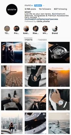
For instance, consider MVMT. Its feed is undoubtedly consistent, with similar filters and color palette, and an emphasis on darker, edgier images:

using instagram for business: mvmt instagram showing edgy theme

Its consistency is equally obvious in its captions, with phrases like "Create a life you can't wait to wake up to," and "Unexplored paths lead to undiscovered stories." In every post, you'll see the same hashtag: #jointhemvmt.

Undoubtedly, its followers both expect and prefer this type of content, or they wouldn't have followed in the first place. To continue delighting customers, it's essential MVMT keeps true to its theme.

3. Engage with your audience.

Engaging with your audience helps your followers feel valued and, as a result, more connected to your business.

There are plenty of ways to engage with your audience. You might reply to comments on your posts, participate in comment threads, run contests or giveaways, use Instagram Stories polls feature, or give shout-outs to followers on your Stories, particularly if they post something relevant to your brand.

Halo Top Creamery does a fantastic job of engaging with its audience.

It frequently posts cute ice cream pictures with the caption "Ice cream is better with friends. Tag a friend you'd like to eat this with."

A simple "tag a friend" caption is an effective strategy for growing your audience since your followers will then tag friends who might not know about you yet.

Additionally, Halo Top often does contests and giveaways, like this one:

using instagram for business: Halo Top giveaway post on Instagram

By tagging winners in its posts, Halo Top incentivizes other followers to engage with the brand in the future. Additionally, Halo Top's giveaways demonstrate genuine commitment to connecting with its audience.

4. Consider influencer marketing.

As a consumer, you've likely seen the recent influx of influencer marketers on Instagram — and for good reason.

Social media marketers we surveyed in 2024 said that Instagram offers the second-highest ROI of all platforms when working with influencers/creators. 

By leveraging the power of an influencer, who is already authentically connected with her audience and seen as a trusted source of information, you're able to spread brand awareness and drive sales.

Micro-influencing in particular is a strong opportunity for brand endorsement.

You could use your budget and resources to invest in traditional advertising, but it's often easier to create a more targeted, effective marketing campaign through influencer marketing.

Ultimately, influencers have already cultivated an engaged, loyal following — by identifying the right influencers for your niche, you're much more likely to find followers who will truly enjoy and support your products or services.

5. Build an ad campaign.

There are two reasons you might use Instagram ads: to spread brand awareness or to increase sales.

It's critical you focus on one goal when creating an effective ad campaign. An Instagram ad aiming to sell a product will look vastly different from one intending to attract followers.

For instance, consider this Greenchef ad that showed up on my Instagram feed.

With various images of delicious food and an enticing "$40 OFF" discount, it's likely a high-converting ad. It's very clear what Greenchef's goal is: to get people to buy their product.

using instagram for business: greenchef in-feed ad

YouTube, on the other hand, invested in Instagram ads for an entirely different reason.

Its advertisements, featuring well-known singers like Camila Cabello, entice followers to simply follow YouTube Music's Instagram channel (and, ideally, YouTube's music channel itself).

using instagram for business: YouTube sponsored ad on Instagram

To implement an effective campaign, it's essential you decide what you're hoping to achieve before you begin creating it.

Once you've chosen a goal, you'll want to create the ad creative. Similar to what we discussed in strategy one, you'll need to create high-value visual content if you want your ad to be successful. Take a look at other ads on Instagram and consider how you might emulate them.

Additionally, A/B test multiple variations of the same ad (changing the copy, image, or targeted audience for each version), to figure out what works best for your business.

When you're ready to create your ad, you'll need to use Facebook Ads Manager. Among other things, Ads Manager lets you narrow in on your target audience (including location, age, and various interests of your ideal demographic), choose your ad objective, and analyze ad performance.

6. Utilize shoppable posts.

If you’re using Instagram for business, then, Shoppable Posts is one feature you’ll want to know well.

It allows you to create posts and tag your products and/services to create a seamless shopping experience directly on the platform. It creates less friction for your followers, increasing the odds of turning them into customers.

using instagram for business: shoppable post example

Before you begin executing these strategies, you’ll need one thing: an Instagram Business Profile.


A business profile legitimizes your Instagram account and enables you to add critical information like your company's business hours, location, and phone number.

Pros and Cons of an Instagram Business Profile

Whoa, whoa, whoa,” you might be thinking. “I don’t know how I feel about committing to all that.”

Here are some helpful pros and cons so you can determine if a business profile is right for you before jumping in:

Pros

  • Access to metrics on how your posts and stories perform.
  • Ability to track how your followers engage with your content.
  • Access to features necessary to run ad campaigns.
  • Gain feature for adding URLs to Stories so you can send warm traffic to your site.

Cons

  • Being labeled as a business.
  • May experience less organic reach and visibility.
  • Must also have a Facebook account to access ad features.

For most brands, the benefits of a business profile outweigh the cons due to the additional features and analytics. However, it’s important to consider your goals before taking action.

How to Create a Business Instagram Profile

In order to create a business profile on Instagram, you must first create a personal Instagram account and then switch it to a business profile.

If you already have an Instagram account, skip to the next section for instructions on making the switch.

If you don’t already have an Instagram account, there are two ways to get one:

  • From the computer
  • From a mobile device (IOS and Android)

For detailed steps, check out our comprehensive article on how to create a business account on Instagram.

How to Switch to Your Business Profile

When you have an Instagram set up, follow these easy steps when you’re ready to make the switch:

1. Go to your profile on the mobile app and select the hamburger menu (three stacked horizontal bars) in the top right corner.

how to switch to Instagram business profile

2. Scroll down to “Your insights and tools” and tap “Account type and tools.”

account-type

3. Under “Account type,” select “Switch to a professional account.”

switch-to-professional

4. Click “Continue” in the pop-up menu.

continue

5. Select the best category descriptor for your account, like blogger or digital creator, then click “Done.”

category-descriptor

You can also toggle the “Display on profile” button so the category you choose is visible to your profile visitors. The button is pictured below. 

display-on-profile

And here’s what the button looks like on a profile:

cailee

6. Next, choose whether you’re a creator or a business. 

The descriptions under each type let you know what’s most applicable to you based on the category you chose. Once selected, click “Next.”

creator-or-business

If you do not have a Facebook Business Page, you will need to create one before completing this step. If your Facebook page is already linked, move on to the next step.

7. Follow the prompts to continue setting up your account and customizing your profile. 

set-up-account

8. Select Done.

You’re now ready to begin implementing your social media strategy on Instagram.

From here, you’ll want to determine the audience you want to target, the aesthetic and tone you want to convey, and the content you want to create.

Top Instagram Promotion Tactics of 2024 [Data]

Here, we’ll review some of the top Instagram promotion tactics gleaned from our 2024 Instagram Engagement Report report.

Audience Interaction

Marketers' primary goal on Instagram in 2024 is increasing engagement, so it makes sense that the most popular Instagram marketing strategy is interacting with audiences. 

instagram-strategies copy-1

Interacting with your audience offers so much more than just engagement. It helps build a sense of community with your followers and allows you to get to know them better.

Content Engagement

Audience interaction takes the #1 spot for the most popular strategy, but survey respondents say they plan to invest the most money in creating content that encourages engagement on the platform. 

strategies-most-investment copy

What’s more is that 44% of marketers say that creating content that encourages engagement offers the highest ROI. 

Engagement on social media signals that your content is resonating with your audience. Whether it’s an in-feed post, a Story, or a live stream, engagement can be a great indicator of your page’s health.

Wondering how to make your content more engaging? Try creating content that champions your products/services. Our research shows that this type of content performs the best on the platform. 

content-with-high-performance copy

You can also try the funny route. It offers the second-highest performance, which adds up because funny content tends to be relatable and usually gets someone to stop scrolling and pay attention. 

The format also influences engagement, with most marketers posting images more than anything else. Seventy percent of marketers surveyed post Images on the platform saying it has the highest ROI of all content formats. 

roi-of-instagram-formats copy

Videos are another effective tool, and the data shows that sharing video content brings in the most reach/impressions of all other formats.

Product Advertising

As Instagram shopping continues to grow, it’s no surprise that marketers' #2 goal for 2024 is advertising their products/services. 

Our research shows that running advertisement campaigns is among the top five Instagram strategies, getting the most investment in 2024. And, as mentioned above, sharing content that showcases products/services offers the highest ROI of any content type 

Instagram shopping tools are still evolving, but 71% of social media marketers who sell products in the Instagram app say the features have high ROI. Most survey respondents also say that 25-50% of clicks on shoppable and linked posts lead to purchases. 

shoppable-clicks copy

Over to You

Whatever your goal is, whether it's increasing brand awareness or generating more revenue, using Instagram for business gets you one step closer to achieving it. While not all of Instagram's tools will offer a high ROI, they are all worth trying to see what works best for your audience. 

Editor's Note: This post was originally published in May 2020 and has been updated for comprehensiveness.

Maximizing Data Efficiency in Manufacturing with Cloud Computing

Featured Imgs 23

In the fast-evolving manufacturing sector, leveraging data effectively is crucial for staying competitive. Cloud computing offers transformative capabilities that can significantly enhance data efficiency in manufacturing operations. By migrating to the cloud, manufacturers can achieve better scalability, improved data analysis, and streamlined operations. This blog explores how cloud computing can maximize data efficiency in manufacturing …

The post Maximizing Data Efficiency in Manufacturing with Cloud Computing first appeared on Lucid Softech.

Key Tools and Tips for Efficient Web Development

Featured Imgs 23

Hi Everyone,

Web development can be both exciting and challenging, but having the right tools makes all the difference. If you're starting out or looking to improve your workflow, consider using popular frameworks like React or Vue for streamlined front-end development.

On the back end, Node.js and Django are solid options for building robust applications. Don't forget about version control with GitHub to manage your code and track changes.

Additionally, browser developer tools are invaluable for debugging. What are your go-to resources and tools for web development? Feel free to share tips and tricks that improve productivity and project efficiency!

25+ Diwali Mockups, Icons, Graphics & Resources

Featured Imgs 23

Diwali, the vibrant Festival of Lights, is one of the most celebrated and cherished Hindu festivals, symbolizing the triumph of light over darkness and good over evil.

As families and communities come together to celebrate this joyous occasion, designers and marketers often seek visually captivating ways to honor the festival through their projects.

In this blog post, we’ve curated a beautiful collection of Diwali-themed templates, icons, graphics, and resources to help you craft stunning visuals for your flyers, posters, social media, and more. From traditional oil lamps (diyas) and rangoli patterns to fireworks and festive symbols, these design assets capture the essence of Diwali in a visually engaging way.

Diwali Celebration Flyer Templates

Modern Diwali Flyer Template

Modern Diwali Flyer Template

This flyer template is a fantastic resource for anyone organizing Diwali events, parties, or festivals. This easy-to-customize, well-organized template comes in both PSD and Ai files that are ready-to-print, featuring a modern design that truly stands out. The artboard is A4 size and layered for easy editing.

Diwali Festival Flyer Template

Diwali Festival Flyer Template

This is a must-have for any Diwali event or celebration. This easy-to-customize and thoroughly organized asset contains both PSD and Ai files – all set to an A4 artboard size and are print-ready at 300 DPI in CMYK. A readme file accompanying the pack provides details about the fonts used.

Happy Diwali Flyer Template

Happy Diwali Flyer Template

This is an artistically designed flyer template for your special Diwali event. It’s amazingly flexible, available in both Ai and PSD files, with well-organized layers that are fully editable. Sized at 21×29.7 cm + bleed and equipped with a CMYK 300 DPI color mode, the flyer ensures high-quality prints promising to leave a lasting impression.

Creative Happy Diwali Flyer Template

Creative Happy Diwali Flyer Template

This is a vibrant and dynamic asset perfect for any Diwali event, be it parties, festive functions, or special events. It is an A4 size template that is simple to edit, allowing customization of color, font, and text. You can easily personalize it by inserting your event’s title, date, and time as well as your website name. It includes various files, including Adobe Photoshop and Illustrator, and a help file.

Flat Design Diwali Flyer Set

Flat Design Diwali Flyer Set

A vibrant flyer template perfect for any Diwali event or project. This comprehensive set includes templates for flyers, Instagram posts and stories, and Facebook posts, all with a colorful flat design that can be customized via Adobe Illustrator or Photoshop. Although fonts and images are not included, the files are well-organized, making customization a breeze.

Diwali Event Flyer Template

Diwali Event Flyer Template

This flyer template is ideal for organizing any Diwali related events. These easily customizable templates, compatible with Adobe Illustrator CC and Adobe Photoshop CS4 or later, come with finely separated layers for texts, images, and graphics for your convenience.

Bold Diwali Celebration Flyer Set

Bold Diwali Celebration Flyer Set

This is a bold and vibrant flyer template set perfect for any Diwali festivities. The set includes a flyer, social media feeds, and a social media story, all with ready-to-print or post dimensions. Downloadables include AI, PSD, and EPS files along with a font link.

Diwali Celebration Flyer Template

Diwali Celebration Flyer Template

An excellent choice for any Diwali events, parties or festivals. The template is customizable, editable and can be quickly adapted to your unique needs. It features a creative design, comes in PSD and Ai files and is print-ready at 300 DPI. The template uses the commercial-free fonts MONTSERRAT and Kingthings Foundation for a touch of elegance.

Editable Diwali Flyer Template

Editable Diwali Flyer Template

Bring Diwali, the iconic Indian Festival of Lights, to life with this bright and customizable flyer template. The design, featuring festive Diya Lamps, is perfect to promote Diwali celebrations or other Indian-themed events, including Indian weddings, Republic Day, or Rama Navami. It is available in Illustrator Ai, Photoshop PSD, and Vector EPS formats, with an A4 final printed size in a CMYK color space.

Simple Happy Diwali Flyer Template

Simple Happy Diwali Flyer Template

This is a creatively designed flyer template for your special Diwali celebration event. This flyer, available in both Ai and PSD files, features neat and well-organized layers that are fully editable. With dimensions of 21×29.7 cm + bleed, and a clean, CMYK 300 DPI, CS5 specification, it allows for stunning visuals and easy customization.

Diwali Festival Icons

50 Diwali Icons Set

50 Diwali Icons Set

Add an Indian touch to your marketing campaigns with the 50 Diwali icons set. From Diwali lamps and ornate décor to lively firecrackers, this inclusive pack captures the essence of India’s vibrant festival. Whether you want to adjust the color, size or text, these 100% vector icons are fully customizable across various editing programs.

Creative Diwali Icon Set

Creative Diwali Icon Set

Explore the creative Diwali icon set, an ensemble of 12 aesthetically pleasing designs themed around Diwali. Each icon is easily customizable, with the ability to alter colors to match individual preferences. Icons are perfect for any design area and are conveniently available in both AI and SVG formats, making them a versatile addition to your creative toolkit.

Diwali Festival Elements Set

Diwali Festival Elements Set

This is a delightful assortment of Diwali-themed icons in a sleek flat design. It offers a range of quaint illustrations, from festive lanterns, candles, garlands, fireworks, to intricate mandalas and traditional Indian ornaments. Available in multiple formats such as EPS10, AI, JPG, PDF, PNG, and SVG, it’s a wonderfully vibrant way to celebrate the festival of lights in your projects.

Diwali 3D Icons Pack

Diwali 3D Icons Pack

This Diwali 3D icons pack is a striking collection of 3D icons that can enhance your design work significantly. Crafted with attention to detail, these icons bring depth and sophistication to your projects. Included formats are PNG for web use, SVG for lossless resizing, and PSD for customization in Adobe Photoshop.

30 Diwali Element Icons

This icon pack offers a range of beautifully designed flat vector icons, all based on a 48px grid. Available in multiple file formats, including AI, EPS, SVG and PNG, these icons are compatible with Adobe Illustrator CS6 and CC. The package includes individual PNG files in 5 sizes and an Iconjar, making it versatile for a variety of creative projects.

15 Diwali Icons Set

15 Diwali Icons Set

This is a vibrant assemblage of Diwali-themed symbols, featuring a lotus flower, candle, gift, firework, flag, footprints, the Hindu Om symbol, a Diwali emblem, among others. These are served in a range of formats such as PNG (64px to 512px), SVG, PSD, and vector, facilitating easy incorporation into your project or customization in their original formats.

Diwali Graphics & Illustrations

Happy Diwali Illustration

Happy Diwali Illustration

Explore the vibrancy of Diwali with this beautiful illustration. This unique design showcases children holding traditional lanterns in front of a colorful rangoli, all set against a striking purple backdrop. The file includes an EPS 10 and a high-resolution 300DPI JPG, making for a versatile, ready-to-use asset.

Celebrating Diwali Illustration

Celebrating Diwali Illustration

This is a vibrant, beautifully constructed vector image in both SVG and PNG format. Perfect for highlighting the sparkling Indian festival of lights, this asset can effortlessly add a dash of cultural richness to your Diwali or holiday-themed projects.

16 Diwali Illustrations Set

16 Diwali Illustrations Set

This is a vibrant and authentic collection of images and motifs associated with the Hindu festival, Diwali. Ideal for individuals and professionals alike, it adds an ethnic touch to wedding invitations, banners, and promotions. This versatile set, including images of diyas and lamps, is available in Illustrator Ai, Vector EPS, Clipart PNG, and Vector SVG formats with a final print size of 3000 x 2000px.

Happy Diwali Vector Clipart Pack

Happy Diwali Vector Clipart Pack

This is a delight for those who want to bring the festive spirit of Diwali to life. This is an exciting collection of 20 vector objects that includes favourites like an Indian boy and girl, vibrant mandalas, decorative lamps, and more. All elements are available in various formats like AI, EPS, PDF, PNG, and SVG, and are illustrated in a playful, cartoon style, making this clipart pack as fun as it is functional.

Flat Design Diwali Illustration Set

Flat Design Diwali Illustration Set

This is an ideal graphics pack for your next Diwali celebration design. Comprising fully customizable and editable Adobe Illustrator files, it allows you to create your own scene composition perfectly suited to any presentation or landing page.

Diwali Festival of Light Illustration Set

Diwali Festival of Light Illustration Set

Immerse yourself in the vibrant Diwali festival illustration set. This captivating collection includes images of children joyously brandishing oil lamps and sparklers amidst a backdrop of hanging Indian lanterns and enchanting sky lanterns. Available in EPS 10, high-resolution 300DPI JPG, and PNG formats with transparent background, these illustrations are ready to enhance your creative projects!

Free Diwali Mockups & Graphics

Free Happy Diwali Background

Free Happy Diwali Background

This is a free Diwali template that features a beautiful background for showcasing your Diwali-themed designs. It features a Diwali-themed starry background surrounding the scene as well.

Free Diwali Mockup Template

Free Diwali Mockup Template

If you’re working on a Diwali celebration card, invitation, or greeting card, this free mockup template is perfect for showcasing your design. The template has a realistic design with lots of beautiful Diwali elements.

Free Diwali Banner Template

Free Diwali Banner Template

You can use this free Diwali banner template to create an attractive design to spread the word about your Diwali festivals and special events. It comes in PSD format and you can fully customize it to your preference.

Free Diwali Poster Template

Free Diwali Poster Template

You can download this poster template for free to promote your Dwaili festival events like a pro. The template features a stylish scene that includes details about the event as well. It’s available in PSD format.

Free Diwali Sale Flyer Template

Free Diwali Sale Flyer Template

This flyer template is also free to download. It includes a beautiful Diwali-themed scene featuring a natural-looking setting for promoting your special festival season sales and discounts. The template is easily customizable to your preference.

CSS Masonry & CSS Grid

Featured Imgs 23

An approach for creating masonry layouts in vanilla CSS is one of those “holy grail” aspirations. I actually tend to plop masonry and the classic “Holy Grail” layout in the same general era of web design. They’re different types of layouts, of course, but the Holy Grail was a done deal when we got CSS Grid.

That leaves masonry as perhaps the last standing layout from the CSS 3 era that is left without a baked-in solution. I might argue that masonry is no longer en vogue so to speak, but there clearly are use cases for packing items with varying sizes into columns based on available space. And masonry is still very much in the wild.

Steam is picking up on a formal solution. We even have a CSSWG draft specification for it. But notice how the draft breaks things out.

Table screenshot from the CSS specification with information on two competing syntaxes for CSS masonry.

Grid-integrated syntax? Grid-independent syntax? We’ve done gone and multiplied CSS!

That’s the context for this batch of notes. There are two competing proposals for CSS masonry at the time of writing and many opinions are flying around advocating one or the other. I have personal thoughts on it, but that’s not important. I’ll be happy with whatever the consensus happens to be. Both proposals have merits and come with potential challenges — it’s a matter of what you prioritize which, in this case, I believe is a choice between leveraging existing CSS layout features and the ergonomics of a fresh new approach.

But let’s get to some notes from discussions that are already happening to help get a clearer picture of things!

What is masonry layout?

Think of it like erecting a wall of stones or bricks.

Closeup of a slate gray stone wall.

The sizes of the bricks and stones don’t matter — the column (or less commonly a row) is the boss of sizing things. Pack as many stones or bricks in the nearest column and then those adapt to the column’s width. Or more concisely, we’re laying out unevenly sized items in a column such that there aren’t uneven gaps between them.

Examples, please?

Here’s perhaps the most widely seen example in a CodePen, courtesy of Dave DeSandro, using his Masonry.js tool:

I use this example because, if I remember correctly, Masonry.js was what stoked the masonry trend in, like 2010 or something. Dave implemented it on Beyoncé’s website which certainly gave masonry a highly visible profile. Sometimes you might hear masonry called a “Pinterest-style” layout because, well, that’s been the site’s signature design — perhaps even its brand — since day one.

Pinterest webpage with a masonry layout of inspirational quotes.

Here’s a faux example Jhey put together using flexbox:

Chris also rounded up a bunch of other workarounds in 2019 that get us somewhat there, under ideal conditions. But none of these are based on standardized approaches or features. I mean, columns and flexbox are specced but weren’t designed with masonry in mind. But with masonry having a long track record of being used, it most certainly deserves a place in the CSS specs.

There are two competing proposals

This isn’t exactly news. In fact, we can get earlier whiffs of this looking back to 2020. Rachel Andrew introduced the concept of making masonry a sub-feature of grid in a Smashing Magazine article.

Let’s fast-forward to 2022. We had an editor’s draft for CSS Masonry baked into the CSS Grid Layout Module 3 specification. Jenn Simmons motioned for the CSSWG to move it forward to be a first public working draft. Five days later, Chromium engineer Ian Kilpatrick raised two concerns about moving things forward as part of the CSS Grid Layout module, the first being related to sizing column tracks and grid’s layout algorithm:

Grid works by placing everything in the grid ahead of time, then sizing the rows/columns to fit the items. Masonry fundamentally doesn’t work this way as you need to size the rows/columns ahead of time – then place items within those rows/columns.

As a result the way the current specification re-uses the grid sizing logic leads to poor results when intrinsically sizing tracks, and if the grid is intrinsically-sized itself (e.g. if its within a grid/flex/table, etc).

Good point! Grid places grid items in advance ahead of sizing them to fit into the available space. Again, it’s the column’s size that bosses things around in masonry. It logically follows that we would need to declare masonry and configure the column track sizes in advance to place things according to space. The other concern concerns accessibility as far as visual and reading order.

That stopped Jenn’s motion for first public working draft status dead in its tracks in early 2023. If we fast-forward to July of this year, we get Ian’s points for an alternative path forward for masonry. That garnered support from all sorts of CSS heavyweights, including Rachel Andrew who authored the CSS Grid specification.

And, just a mere three weeks ago from today, fantasai shared a draft for an alternate proposal put together with Tab Atkins. This proposal, you’ll see, is specific to masonry as its own module.

And thus we have two competing proposals to solve masonry in CSS.

The case for merging masonry and grid

Rounding up comments from GitHub tickets and blog posts…

Flexbox is really designed for putting things into a line and distributing spare space. So that initial behaviour of putting all your things in a row is a great starting point for whatever you might want to do. It may be all you need to do. It’s not difficult as a teacher to then unpack how to add space inside or outside items, align them, or make it a column rather than a row. Step by step, from the defaults.

I want to be able to take the same approach with display: masonry.

[…]

We can’t do that as easily with grid, because of the pre-existing initial values. The good defaults for grid don’t work as well for masonry. Currently you’d need to:

  1. Add display: grid, to get a single column grid layout.
  2. Add grid-template-columns: <track-listing>, and at the moment there’s no way to auto-fill auto sized tracks so you’ll need to decide on how many. Using grid-template-columns: repeat(3, auto), for example.
  3. Add grid-template-rows: masonry.
  4. Want to define rows instead? Switch the masonry value to apply to  grid-template-columns and now define your rows. Once again, you have to explicitly define rows.
Rachel Andrew, Masonry and good defaults”

For what it’s worth, Rachel has been waving this flag since at least 2020. The ergonomics of display: masonry with default configurations that solve baseline functionality are clear and compelling. The default behavior oughta match the feature’s purpose and grid just ain’t a great set of default configurations to jump into a masonry layout. Rachel’s point is that teaching and learning grid to get to understand masonry behavior unnecessarily lumps two different formatting contexts into one, which is a certain path to confusion. I find it tough to refute this, as I also come at this from a teaching perspective. Seen this way, we might say that merging features is another lost entry point into front-end development.

In recent years, the two primary methods we’ve used to pull off masonry layouts are:

  • Flexbox for consistent row sizes. We adjust the flex-basis based on the item’s expected percentage of the total row width.
  • Grid for consistent column sizes. We set the row span based on the expected aspect ratio of the content, either server-side for imagery or client-side for dynamic content.

What I’ve personally observed is:

  • Neither feels more intuitive than the other as a starting point for masonry. So it feels a little itchy to single out Grid as a foundation.
  • While there is friction when teaching folks when to use a Flexbox versus a Grid, it’s a much bigger leap for contributors to wrap their heads around properties that significantly change behavior (such as flex-wrap or grid-auto-flow: dense).
Tyler Sticka, commenting on GitHub Issue #9041

It’s true! If I had to single out either flexbox or grid as the starting poit for masonry (and I doubt I would either way), I might lean flexbox purely for the default behavior of aligning flexible items in a column.

The syntax and semantics of the CSS that will drive masonry layout is a concern that is separate from the actual layout mechanics itself, which internally in implementation by user agents can still re-use parts of the existing mechanics for grids, including subgrids. For cases where masonry is nested inside grid, or grid inside masonry, the relationship between the two can be made explicit.

@jgotten, commenting on GitHub Issue #9041

Rachel again, this time speaking on behalf of the Chrome team:

There are two related reasons why we feel that masonry is better defined outside of grid layout—the potential of layout performance issues, and the fact that both masonry and grid have features that make sense in one layout method but not the other.

The case for keeping masonry separate from grid

One of the key benefits of integrating masonry into the grid layout (as in CASE 2) is the ability to leverage existing grid features, such as subgrids. Subgrids allow for cohesive designs among child elements within a grid, something highly desirable in many masonry layouts as well. Additionally, I believe that future enhancements to the grid layout will also be beneficial for masonry, making their integration even more valuable. By treating masonry as an extension of the grid layout, developers would be able to start using it immediately, without needing to learn a completely new system.

Kokomi, commenting on GitHub Issue #9041

It really would be a shame if keeping masonry separate from grid prevents masonry from being as powerful as it could be with access to grid’s feature set:

I think the arguments for a separate display: masonry focus too much on the potential simplicity at the expense of functionality. Excluding Grid’s powerful features would hinder developers who want or need more than basic layouts. Plus, introducing another display type could lead to confusion and fragmentation in the layout ecosystem.

Angel Ponce, commenting on GitHub Issue #9041

Rachel counters that, though.

I want express my strong support for adding masonry to display:grid. The fact that it gracefully degrades to a traditional grid is a huge benefit IMO. But also, masonry layout is already possible (with some constraints) in Grid layout today!

Naman Goel, Angel Ponce, commenting on GitHub Issue #9041

Chris mildly voiced interest in merging the two in 2020 before the debate got larger and more heated. Not exactly a ringing endorsement, but rather an acknowledgment that it could make sense:

I like the grid-template-rows: masonry; syntax because I think it clearly communicates: “You aren’t setting these rows. In fact, there aren’t even really rows at all anymore, we’ll take care of that.” Which I guess means there are no rows to inherit in subgrid, which also makes sense.

Where we at?

Collecting feedback. Rachel, Ian, and Tab published a joint call for folks like you and me to add our thoughts to the bag. That was eight days ago as of this writing. Not only is it a call to action, but it’s also an excellent overview of the two competing ideas and considerations for each one. You’ll want to add your feedback to GitHub Issue #9041.


CSS Masonry & CSS Grid originally published on CSS-Tricks, which is part of the DigitalOcean family. You should get the newsletter.


from CSS-Tricks https://ift.tt/LFZlqTO
Gain $200 in a week
via Read more

Crows, Ghosts, And Autumn Bliss (October 2024 Wallpapers Edition)

Featured Imgs 23

The leaves are shining in the most beautiful colors and pumpkins are taking over the front porches. It’s time to welcome the spookiest of all months: October! To get your desktop ready for fall and the upcoming Halloween season, artists and designers from across the globe once again got their ideas flowing and designed inspiring wallpapers for you to indulge in.

The wallpapers in this post come in versions with and without a calendar for October 2024 and can be downloaded for free. And since so many beautiful and unique designs evolve around our little wallpapers challenge every month (we’ve been running it for more than 13 years already, can you believe it?!), we also added some timeless October treasures from our wallpapers archives to the collection. Maybe you’ll spot one of your almost-forgotten favorites in here, too?

A huge thank you to everyone who shared their wallpapers with us this month — this post wouldn’t exist without you. Happy October!

  • You can click on every image to see a larger preview,
  • We respect and carefully consider the ideas and motivation behind each and every artist’s work. This is why we give all artists the full freedom to explore their creativity and express emotions and experience through their works. This is also why the themes of the wallpapers weren’t anyhow influenced by us but rather designed from scratch by the artists themselves.
  • Submit a wallpaper!
    Did you know that you could get featured in our next wallpapers post, too? We are always looking for creative talent.
Happy Halloween

Designed by Ricardo Gimenes from Spain.

Reptile Awareness Day

“Let’s celebrate reptiles and raise awareness of their vital role in ecosystems. Many species face threats, so let’s learn, appreciate, and protect these incredible creatures and their habitats!” — Designed by PopArt Studio from Serbia.

Make Today A Good Day

“‘Make today a good day’ is a simple yet powerful reminder to take control of the present moment. It emphasizes that our attitude and actions shape our experience, encouraging positivity and purpose. Each day brings new opportunities, and by choosing to make it good, we invite growth, joy, and fulfilment into our lives.” — Designed by Hitesh Puri from Delhi, India.

The Dungeon Master

Designed by Ricardo Gimenes from Spain.

Happy Dussehra

“I was inspired by Dussehra’s rich symbolism and cultural significance while creating this design. The festival celebrates the triumph of good over evil. The bow and arrow become the central focus, while the bold red background, golden accents, and the temple’s silhouette add a sense of grandeur and spirituality.” — Designed by Cronix from the United States.

The Crow And The Ghosts

“If my heart were a season, it would be autumn.” — Designed by Lívia Lénárt from Hungary.

The Night Drive

Designed by Vlad Gerasimov from Georgia.

Autumn’s Splendor

“The transition to autumn brings forth a rich visual tapestry of warm colors and falling leaves, making it a natural choice for a wallpaper theme.” — Designed by Farhan Srambiyan from India.

National Fossil Day

“Join us in commemorating National Fossil Day, a day dedicated to honoring the wonders of Earth’s prehistoric past. On this special day, we invite you to step back in time and explore the remarkable world of fossils. These ancient remnants of life on our planet offer a glimpse into the evolution of life, from the tiniest microorganisms to the towering giants that once roamed the Earth.” — Designed by PopArt Studio from Serbia.

Magical October

“‘I’m so glad I live in a world where there are Octobers.’ (L. M. Montgomery, Anne of Green Gables)” — Designed by Lívi Lénárt from Hungary.

Bird Migration Portal

“October is a significant month for me because it is when my favorite type of bird travels south. For that reason I have chosen to write about the swallow. When I was young, I had a bird’s nest not so far from my room window. I watched the birds almost every day; because those swallows always left their nests in October. As a child, I dreamt that they all flew together to a nicer place, where they were not so cold.” — Designed by Eline Claeys from Belgium.

Ghostbusters

Designed by Ricardo Gimenes from Spain.

Spooky Town

Designed by Xenia Latii from Germany.

Hello Autumn

“Did you know that squirrels don’t just eat nuts? They really like to eat fruit, too. Since apples are the seasonal fruit of October, I decided to combine both things into a beautiful image.” — Designed by Erin Troch from Belgium.

Hanlu

“The term ‘Hanlu’ literally translates as ‘Cold Dew.’ The cold dew brings brisk mornings and evenings. Eventually the briskness will turn cold, as winter is coming soon. And chrysanthemum is the iconic flower of Cold Dew.” — Designed by Hong, ZI-Qing from Taiwan.

Discovering The Universe

“Autumn is the best moment for discovering the universe. I am looking for a new galaxy or maybe… a UFO!” — Designed by Verónica Valenzuela from Spain.

King Of The Pirates

Designed by Ricardo Gimenes from Spain.

Goddess Makosh

“At the end of the kolodar, as everything begins to ripen, the village sets out to harvesting. Together with the farmers goes Makosh, the Goddess of fields and crops, ensuring a prosperous harvest. What she gave her life and health all year round is now mature and rich, thus, as a sign of gratitude, the girls bring her bread and wine. The beautiful game of the goddess makes the hard harvest easier, while the song of the farmer permeates the field.” — Designed by PopArt Studio from Serbia.

Game Night And Hot Chocolate

“To me, October is all about cozy evenings with hot chocolate, freshly baked cookies, and a game night with friends or family.” — Designed by Lieselot Geirnaert from Belgium.

Strange October Journey

“October makes the leaves fall to cover the land with lovely auburn colors and brings out all types of weird with them.” — Designed by Mi Ni Studio from Serbia.

Autumn Deer

Designed by Amy Hamilton from Canada.

Dope Code

“October is the month when the weather in Poland starts to get colder, and it gets very rainy, too. You can’t always spend your free time outside, so it’s the perfect opportunity to get some hot coffee and work on your next cool web project!” — Designed by Robert Brodziak from Poland.

Transitions

“To me, October is a transitional month. We gradually slide from summer to autumn. That’s why I chose to use a lot of gradients. I also wanted to work with simple shapes, because I think of October as the ‘back to nature/back to basics month’.” — Designed by Jelle Denturck from Belgium.

Autumn In The Forest

“Autumn is a wonderful time to go for walks in the forest!” — Designed by Hilda Rytteke from Sweden.

Shades Of Gold

“We are about to experience the magical imagery of nature, with all the yellows, ochers, oranges, and reds coming our way this fall. With all the subtle sunrises and the burning sunsets before us, we feel so joyful that we are going to shout it out to the world from the top of the mountains.” — Designed by PopArt Studio from Serbia.

Happy Fall!

“Fall is my favorite season!” — Designed by Thuy Truong from the United States.

Ghostober

Designed by Ricardo Delgado from Mexico City.

First Scarf And The Beach

“When I was little, my parents always took me and my sister for a walk at the beach in Nieuwpoort. We didn't really do those beach walks in the summer but always when the sky started to turn gray and the days became colder. My sister and I always took out our warmest scarfs and played in the sand while my parents walked behind us. I really loved those Saturday or Sunday mornings where we were all together. I think October (when it’s not raining) is the perfect month to go to the beach for ‘uitwaaien’ (to blow out), to walk in the wind and take a break and clear your head, relieve the stress or forget one’s problems.” — Designed by Gwen Bogaert from Belgium.

Turtles In Space

“Finished September, with October comes the month of routines. This year we share it with turtles that explore space.” — Designed by Veronica Valenzuela from Spain.

Roger That Rogue Rover

“The story is a mash-up of retro science fiction and zombie infection. What would happen if a Mars rover came into contact with an unknown Martian material and got infected with a virus? What if it reversed its intended purpose of research and exploration? Instead choosing a life of chaos and evil. What if they all ran rogue on Mars? Would humans ever dare to voyage to the red planet?” Designed by Frank Candamil from the United States.

Summer, Don’t Go!

“It would be nice if we could bring summer back, wouldn’t it?” — Designed by Terezija Katona from Serbia.

Embracing Autumn’s Beauty

“We were inspired by the breathtaking beauty of autumn, with its colorful foliage and the symbolic pumpkin, which epitomizes the season. Incorporating typography allows us to blend aesthetics and functionality, making the calendar not only visually appealing but also useful.” — Designed by WPclerks from India.

A Positive Fall

“October is the month when fall truly begins, and many people feel tired and depressed in this season. The jumping fox wants you to be happy! Also, foxes always have reminded me of fall because of their beautiful fur colors.” — Designed by Elena Sanchez from Spain.


Gain $200 in a week
from Articles on Smashing Magazine — For Web Designers And Developers https://ift.tt/1wNjUH6

80+ Annual Report Templates (Word & InDesign) 2024

Featured Imgs 23

Are you working on an annual report? Looking for a way to impress your client or boss with this report? Then use a simple annual report template to make your document look more professional.

Preparing an annual report is not an easy job. You shouldn’t have to spend hours making it look pretty as well. That’s why we handpicked this collection of annual report templates so you can quickly load them up with InDesign or MS Word to edit and copy over your content. It’s that easy.

Whether you’re working on an annual sales report, financial report, or a marketing report, we found templates to fit all kinds of documents. This collection includes both free and premium templates, as well as our tips for designing the perfect annual report to get you off to a great start.

Top Pick

Modern Minimal Annual Report Template

Modern Minimal Annual Report Template

This is a modern and elegant annual report template you can use to create reports for many different types of agencies, brands, and businesses.

This InDesign template comes with 24 unique page layouts you can easily customize to your preference to add your own text, change colors, and add your own images as well.

Why This Is A Top Pick

The beautifully minimalist and clean design is what makes this annual report template quite special. It also features a multipurpose design, which you can take advantage of to create not just annual reports but also make company profiles as well.

Corporate Annual Report Template

Corporate Annual Report Template

This InDesign template is perfect for presenting corporate annual reports in a modern and professional approach. Easy to edit and customize, this template includes 20 A4-sized pages with a 3mm bleed, follows a CMYK color scheme, and you can fully customize the fonts and images as well.

Modern Annual Report Template

Modern Annual Report Template

This InDesign annual report template is perfect for reflecting your company’s financial data and profile. Adaptable to both digital and print, this portrait-oriented brochure template has an elegant and modern look, making it an ideal choice for crafting annual reports for modern agencies and brands.

Bone – Annual Report Template

Bone - Annual Report Template

This is a polished, entirely customizable InDesign template ideal for designers working on proposals and annual reports. It’s a user-friendly, 16-page template with adjustable text, fonts, images, and colors. The package comes with free fonts, master pages, and is available in A4 & US Letter sizes.

Modern Blur – Annual Report Template

Modern Blur - Annual Report Template

This is a well-structured annual report template for creating informative, year-end company reports. Presented in a tasteful gradient color design with a 20-page capacity, this InDesign template allows for easy insertion of images and text, thanks to its drag-and-drop feature. Also included are INDD & IDML files and a helpful font link.

Modern Annual Report for Word & INDD

Modern Annual Report for Word & INDD

This annual report for Word and InDesign is an easily customizable template that elevates your reporting to a new level of professionalism. With a sleek, modern design, this 16-page layout can be effortlessly edited with your content, without affecting its quality or size. The package supports multiple platforms including Canva, Microsoft Word, Adobe InDesign, and Illustrator.

Annual Report Brochure for MS Word

Annual Report Brochure for MS Word

This is a meticulously designed, annual report template convenient for corporate businesses. Its two sections allow for vivid storytelling through photos and narratives, alongside a concise display of financial specifics. Packed with customization options, from text to colors and images. The template supports A4 and US Letter sizes, and spans Adobe InDesign, Word, and PDF formats.

Bold Annual Report Template for Word

Bold Annual Report Template for Word

An accessible and effective annual report template for constructing comprehensive corporate reports. It offers a polished, modern design with user-friendly features like paragraph styles, changeable colors and automatic page numbering. Equipped for print readiness, this high-quality template accommodates 28 pages of A4 or letter-sized content.

Clean Annual Report Template INDD

Clean Annual Report Template INDD

This is a versatile annual report template suited for contemporary businesses. Compatible with Microsoft Word 2010 and Adobe InDesign CS4 or higher, it offers a 16-page layout that can be customized for print or digital usage. Editing features allow manipulation of text, color, and objects, with a detailed guide provided for ease of use.

Gradioo – Annual Financial Report

Gradioo is a stylish annual report template and an ideal choice for your company’s end-of-year financial summary. With over 30 customisable pages, this user-friendly template is compatible with Office Word and Canva, providing an accessible and efficient way to showcase your financial performance.

Mintech – Minimalist Annual Report Template

Mintech - Minimalist Annual Report Template

Mintech is a straightforward, easy-to-use template perfect for your company’s annual report. It features 28 pages that are completely customizable, offering flexibility to change colors, texts, and images. The template fits an A4 size and is ready for print with a 300 DPI CMYK. It’s also compatible with Office Word and Canva and includes various file types.

Creative Annual Report Brochure Template

Creative Annual Report Brochure Template

This annual report template offers a minimal and professional design for crafting comprehensive annual reports. Available in Adobe InDesign, Microsoft Word, and PDF formats, the template features 20 unique layouts and is editable to suit individual needs. It offers automatic page numbering, organized layers, and customizable text, color, and image options.

Minimal Annual Report Word Template

Minimal Annual Report Word Template

This is a customizable, professional-grade annual report template to help companies superbly present their year-end accounts. This user-friendly template accommodates text, images, and financial data on 20 unique layouts optimized for Adobe InDesign, Microsoft Word, and PDF formats in A4 and US Letter sizes.

Green Annual Report Word & INDD Template

Green Annual Report Word & INDD Template

This template provides a modern and professional way to present your company’s annual report. It combines engaging photography and narrative storytelling with clear financial graphs for a visually impressive display. Compatible with Adobe InDesign and Microsoft Word, it’s easy to edit and ensures a polished, comprehensive annual report.

Professional Annual Report Template

Professional Annual Report Template

This annual report template comes with a structured layout for a compelling and comprehensive business overview. Serving fascinating snapshots of company narrative coupled with financial figures, the template is compatible with Adobe InDesign and Microsoft Word. The design comprises 24 layouts, editable text, colors, and images, and auto page numbering.

Stylish InDesign Annual Report Template

Stylish InDesign Annual Report Template

Boasting a stylish, modern design, this Annual Report template for InDesign is the perfect tool for presenting your company’s yearly achievements. Its professional, clean design showcases data and infographics effectively, enhancing your narrative. The 16-page document is easy to edit, ready to print, and uses a free font.

Business Annual Report Template

Business Annual Report Template

A versatile InDesign template ideal for modern corporations and brands. This 24-page document comes in both A4 and US Letter format, equipped with automatic page numbering and paragraph styling. The template can be fully customized to change fonts, images, and colors as well.

Hovel – Simple Annual Report Template

Hovel - Simple Annual Report Template

This is a professional, easy-to-edit InDesign template designed for business annual reports. It features a 16-page layout which is fully customizable including texts, fonts, images, and colors. The template is compatible with multiple Adobe InDesign versions, supports A4 and US letter sizes, and is print-ready in CMYK color.

Professional Annual Report Template

Professional Annual Report Template

A fully customizable and comprehensive annual report template featuring a 20-page design that’s suitable for various sectors. It’s well organized and designed to accommodate all necessary company details, from organizational structure to financial health, with rich graphical elements, tables, and charts.

Company Annual Report Template

Company Annual Report Template

This professional annual report template is perfect for modern companies to use in creating an engaging annual report. Compatible with InDesign and featuring a clean, easily editable 16-page design, the template is ideal for showcasing your business highlights, financial data, and future goals.

Annual Report with Clear Reduced Design

Annual Report with Clear Reduced Design

An adaptable InDesign template perfect for crafting an annual report with a modern aesthetic. It offers a minimalist, modern design that can be personalized with ease. The template features professional text styles and colors, 20 pages, and high-quality graphics.

Friday – Annual Report Template

Friday - Annual Report Template

If you’re making an annual report for a modern business, startup, or a corporate agency, this gorgeous template will help you craft a beautiful brochure. It features 15 ready-made page layouts with paragraph styles, master pages, and more. It’s available in A4 size and you can edit the template using Adobe InDesign.

Modern Annual Report INDD Template

Modern Annual Report INDD Template

A modern agency requires modern print publications. Use this creative annual report template to design an attractive report for your business. It comes with 16 page layouts in both A4 and US Letter size. You can edit and customize the template using InDesign CS4 or higher.

Business Annual Report Template

Business Annual Report Template

This template has everything you need to create a professional annual report. It has a bright and colorful design, 20 different page layouts to choose from, and fully customizable designs. It’s perfect for small businesses and corporate companies. The template also comes in Adobe InDesign and Microsoft Word formats.

Dark Annual Report Template for InDesign

Dark Annual Report Template for InDesign

If you want to create an annual report with a dark and elegant design, this template is perfect for you. It includes 20 page layouts in A4 size. And it has master page layouts with editable paragraph styles, page numbering, and more. This template is also available in Word and InDesign formats.

Modern Annual Report Template

Modern Annual Report Template

This annual report template features a very modern and stylish design that will make your brochures stand out from the crowd. There are 23 different page layouts in this template available in US Letter size. It’s most suitable for creative agencies and modern brands.

Annual Report Template Word & InDesign

Annual Report Template Word & InDesign

You can create a clean, minimal, and professional-looking annual report using this template. It has beautiful page layouts with stylish paragraph formatting and lots of space for showcasing images. The template includes 42 pages and comes in A4 and US Letter sizes.

Free Annual Report Brochure Template

Free Annual Report Brochure Template

This is a free annual report template that you can download and customize using Adobe InDesign. It has a creative design that you can easily edit to your preference. There are 12 different page layouts in the template.

Abstract Annual Report Brochure Template

Abstract Annual Report Brochure Template

The creative abstract shapes used in this brochure design give this template a very unique look and feel. It features beautiful page layouts with a modern approach. There are 16 different page designs included in this template in A4 size.

Modern Annual Report InDesign Template

Modern Annual Report InDesign Template

Designing a high-quality annual report filled with statistics, graphs, charts, and data will be much easier when you have this template. It has 12 unique pages full of charts, tables, and more for showcasing your data in visual form.

Provide – Simple Annual Report Template

Provide - Simple Annual Report Template

This annual report template comes with a simple yet creative design. It uses a beautiful color theme across all of its pages alongside shapes and elegant background design. The template includes 20 different pages with customizable layouts.

Minimal Annual Report Template for InDesign

Minimal Annual Report Template for InDesign

This minimal annual report template uses bright colors to grab the attention of the readers. It also uses colors quite well to highlight specific parts of your document. There are 12 unique page designs in this template.

Free White Paper Report Brochure Template

Free White Paper Report Brochure Template

This is a simple and free brochure template you can use to design basic white papers and reports for various business projects. The template comes in InDesign format and it includes 12 pages in total.

Red – Annual Report Template for Word & InDesign

Red - Annual Report Template for Word & InDesign

You can use and edit this template with both MS Word and Adobe InDesign. It comes in both file formats as well as a professional design. The template contains 24 unique pages in A4 and US Letter sizes. You can also fully customize the template to change colors, fonts, and paragraph styles to your preference.

Bold & Modern Annual Report Template

Bold & Modern Annual Report Template

If you prefer documents with bold and dark color themes, this InDesign template is perfect for your project. It comes with a modern design featuring dark colors. There are 12 different page layouts in the template in A4 size.

Corporate Business Brochure Template

Corporate Business Brochure template

This brochure template is made with corporate brands and agencies in mind. It has a colorful yet professional design that can be used to make all kinds of business reports, corporate brochures, and company profile documents. The template includes 20 pages.

Creative Annual Report Template for InDesign

Creative Annual Report Template for InDesign

You can use this template to design a minimal and modern annual report document for a modern agency or business. It has customizable page layouts in A4 size where you can fully personalize the design to match your brand.

Free Company Brochure InDesign Template

Free Company Brochure InDesign Template

This free brochure template comes with a minimal and clean design. It has multipurpose page layouts you can use to make business reports, magazines, portfolios, and many other types of brochures.

Creative Annual Report Template for InDesign

Creative Annual Report Template for InDesign

If you’re working on an annual report for a digital agency or creative brand, start with this template. It has a beautiful design filled with colorful shapes and images. And includes 20 unique page layouts. You can change the colors, fonts, and formatting to your preference as well.

Red and Beige Annual Report Template

Red and Beige Annual Report Template

The bright and colorful design of this template makes it most suitable for modern marketing agencies and brands. It uses a red and beige color theme across all pages of the brochure. The template has 32 pages in A4 size.

Annual Report Business InDesign Template

Annual Report Business InDesign Template

Use this InDesign annual report template to create brochures for corporate companies and businesses. The template includes 20 pages with clean layouts and master page designs. It comes in A4 size.

Clean Annual Report Brochure Template

Clean Annual Report Brochure Template

This brochure template is ideal for making a more visual-centric annual report for your business. It has 28 page layouts with many different styles of page designs, including ones that use full-page image backgrounds.

Free School Annual Report Brochure Template

Free School Annual Report Brochure Template

This is a simple and free annual report template you can use to make a very basic report for a school or educational business. It includes 5 page layouts with clean and minimal designs. You can download it in MS Word and Google Docs formats.

Merah – Business Annual Report Word & INDD

Merah - Business Annual Report Word & INDD

Whether you’re a fan of Adobe InDesign or Microsoft Word, you can edit this annual report template using both software. It comes in INDD and Word file formats featuring 24 unique page layouts in A4 size. You can edit and change everything in the template quite easily as well.

Elegant Business Annual Report Template

Elegant Business Annual Report Template

Use this InDesign template to craft a professional annual report for your corporate agency or company. The template features 15 page designs. You can change the fonts, paragraphs, and even the colors with just a few clicks. The brochure comes in A4 size.

Free Corporate Annual Report Template

Free Corporate Annual Report Template

This is a free brochure template that’s been designed for creating all kinds of reports, including annual reports. The template comes with a set of highly visual page designs, which you can customize using Adobe InDesign.

Modern Annual Report Word & INDD Template

Modern Annual Report Word & InDesign Template

The clean and aesthetic feel of this brochure design makes it a perfect choice for designing annual reports for modern brands. This template comes in both InDesign and Word file formats. You can customize each page layout to your preference to change colors, fonts, and paragraph styles however you like.

Minimalist Annual Report InDesign Template

Minimalist Annual Report InDesign Template

If you want to make your annual report look completely minimalist with fewer colors and more focus on its content, this InDesign template is for you. It features 20 unique pages with easily editable layouts. You can customize it using InDesign CS4 or higher.

Agency Annual Report InDesign Template

Agency Annual Report InDesign Template

This is the perfect InDesign template for making annual reports for marketing agencies and brands. The template lets you choose from 20 unique page layouts that are available in A4 size. The colors, fonts, and paragraph styles are also fully customizable.

Creative Annual Report InDesign Template

Creative Annual Report InDesign Template

Grab this InDesign template to make your annual reports look more modern and creative. It comes with a set of modern page layouts that feature colorful shapes and designs. There are 12 page layouts in this template with easily editable designs.

Free Annual Report Word Template

Free Annual Report Word Template

This is a free Microsoft Word brochure template that you can use to make simple and short annual reports. It includes 6 page layouts with editable colors, shapes, and fonts. The template is perfect for quick annual report brochures.

Creative Annual Report INDD Template

Creative Annual Report INDD Template

This creative annual report template is perfect for modern businesses and agencies for designing attractive brochures. It includes 20 different page layouts you can customize with InDesign. It also comes in A4 and US Letter sizes.

Versatile Annual Report InDesign Template

annual report template

If you’re looking for a flexible, and multipurpose annual report template, the above-featured product is well worth checking out. It offers a minimal and sophisticated design that is perfect for strictly professional corporate environments.

Modern Annual Report InDesign Template

annual report template

Here we have a clean, and modern annual report template for Adobe Indesign that can be fully customized to your specific requirements in just a few easy clicks of the mouse. It consists of 20 painstakingly designed pages in A4 size, CMYK color space, 300 dpi, free fonts, and more.

Microsoft Word Annual Report Template

annual report template

Check out this minimal, and professional annual report template that can be fully modified in Microsoft Word or Adobe InDesign. The package includes a 48-page annual report, business card, and letterhead templates. Get your hands on it today.

Premium Annual Report Template

annual report template

This is a high-quality annual report template that can also be very well used as a magazine, proposal, e-book, and company brochure. If you choose to spend your hard-earned cash on this product, be rest assured that you won’t get disappointed.

Square Annual Report InDesign Template

annual report template

If you’re looking for an ultra-modern, and unique annual report template, the abeove-featured product is the best bang for your buck. it features a square design, 20 custom pages, 300 DPI, CMYK color space, 3mmbleed, free fonts, and so much more. Grab it now.

Annual Report 28-Page InDesign Template

Annual Report 28-Page InDesign Template

Another modern annual report template with a multipurpose design. This template comes with 28 different page layouts you can use to craft various types of annual reports. The template is compatible with InDesign CS4 and higher.

Minimalist Annual Report Template for InDesign

Minimalist Annual Report Template for InDesign

If you’re looking for an annual report with a minimal design, this template will come in handy. It features a simple black and white page design for making professional annual reports. There are 20 pages in A4 size.

Annual Report Template for Word & INDD

Annual Report Template for Word & INDD

You can easily edit this template using either MS Word or InDesign to make a professional-looking annual report. It comes with 20 page layouts with paragraph styles, formatting, and editable colors.

Business Annual Report Brochure Template

Business Annual Report Brochure Template

Use this brochure template to craft a modern annual report for a corporate brand or business. It comes with a stylish and colorful design across 26 different page layouts. The template can be customized with InDesign CS4 and above.

Clean Annual Report Template for Word

Clean Annual Report Template for Word

This annual report template comes in A4 and US Letter sizes. It’s also available in InDesign and Microsoft Word formats. You can easily edit and customize it to create a clean and simple annual report.

Free Minimal Corporate Brochure Template

Free Minimal Corporate Brochure Report Template

This free brochure template comes with a multipurpose design you can use to create all kinds of business brochures and annual reports. It includes 14 unique page layouts with easily editable designs and resizable vector graphics.

Professional InDesign Annual Report Template

Professional InDesign Annual Report Template

Another stylish brochure template for crafting annual reports for modern agencies and businesses. This template includes 20 page layouts with fully customizable designs. You can change the colors, paragraph styles, fonts, and much more to your liking.

Annual Financial Report Template for InDesign

Annual Financial Report Template for InDesign

Design a colorful and creative annual report for your brand using this high-quality template. You can customize this template using InDesign to create an attractive annual report for various businesses. It includes 12 page layouts.

Orblack – Annual Report Template

Orblack - Annual Report Template

A colorful and modern annual report template for startups and modern agencies. This template comes with all the necessary tweaks and improvements such as automatic page numbering and easy color change using palettes. It includes 15 page layouts.

Global – Business Annual Report Template

Global - Business Annual Report Template

As you can see from the preview image, this elegant annual report is suitable for all kinds of businesses and companies. It features a modern and visual-centric design. And comes with 20 page layouts you can easily customize to your preference.

Minimal Annual Report Template

Minimal Annual Report Template

Show off professionalism with this minimalist annual report template. This template is ideal for making an annual report that gives the center stage to its written content. The template features 32 unique page layouts in A4 and US Letter size.

Free Multipurpose InDesign Report Template

Free Multipurpose InDesign Report Template

This is a free and multipurpose InDesign template. You can use it to craft all kinds of brochures and reports as it comes with easily customizable page layouts. The template is available in A4 and US Letter size.

Colorful Annual Report InDesign Template

Coloful Annual Report InDesign Template

Whether you’re designing an annual report or a project report, this template will work well for both purposes. The InDesign template comes with 28 unique page layouts with editable designs. The colors and formatting can be easily customized as well.

Dark InDesign Annual Report Template

Dark InDesign Annual Report Template

If you’re looking for an InDesign template to design an annual report for a high-end or luxury brand, this template will come in handy. It features a dark and elegant color theme that will highlight your business quite well. The template includes 16 page layouts in A4 and US Letter size.

Creative Annual Report INDD Template

Creative Annual Report INDD Template

This annual report template is perfect for creative brands and agencies. It features a colorful and stylish design filled with editable shapes and stylish paragraph styles. The template includes 24 page layouts that can be customized with InDesign CS4 and higher.

Annual Report – Creative InDesign Template

Annual Report - Creative InDesign Template

Using this beautiful InDesign template, you can create a professional annual report to showcase all the details, stats, and data related to your business. It features a bright and creative design that attracts attention. As well as easily editable page layouts and paragraph styles. The template is available in A4 and US Letter sizes.

Olio – Business Annual Report Template

Olio - Business Annual Report Template

Another modern and stylish annual report template you can use to create professional business reports. This template includes 25 unique page layouts with fully customizable designs. It’s available in A4 size and comes in both InDesign and Microsoft Word file formats.

Red – Word & InDesign Annual Report Template

Red - Word & InDesign Annual Report Template

If you’re looking to create an annual report with a minimal and a clean design, this template is perfect for you. It features a very professional design with a clean layout. It also comes in Word and InDesign file formats featuring 25 custom page layouts.

Biru – Business Annual Report Template

Biru - Business Annual Report Template

The color blue somehow has a strong connection to businesses. This template comes with a design filled with a professional color scheme. It also lets you choose from 25 different page layouts to create annual reports in A4 size. Both Word and InDesign file formats are included.

Free Financial Report InDesign Template

Free Financial Report InDesign Template

This is a free InDesign template you can use to create financial reports for businesses. The template includes multiple page layouts you can easily customize to create annual reports as well.

White Paper Corporate Report Template

White Paper Corporate Report Template

Working on a white paper report for a corporate business? Then use this template to create a high-quality brochure. The template features 12 custom page designs in A4 size. You can also customize the colors and styles of the template using InDesign.

Annual Report Modern InDesign Template

Annual Report Modern InDesign Template

This annual report template comes with a modern and stylish design. It’s perfect for creating reports for digital startups, modern businesses, agencies, and corporations. The template comes in A4 and US Letter sizes featuring 28 custom page layouts.

Business Report – Multipurpose Template

Annual Report Modern InDesign Template

A multipurpose and multi-format business report template you can use in many different ways. This template comes in InDesign, Photoshop, Illustrator, PowerPoint, and many other file formats. You can use it to create business report brochures as well as presentations.

White Paper Company Report InDesign Template

White Paper Company Report InDesign Template

Another creative InDesign template for crafting professional white paper reports for various businesses. This template features a minimal and clean design. It also includes 12 unique page layouts in A4 size. You can easily customize it to change colors and fonts as well.

Free Corporate Business Brochure Template

Free Corporate Business Brochure Template

This is a multipurpose InDesign template that you can use for free. It features 14 unique page layouts. Since the template has a fully customizable design, you can create various types of business brochures, including annual reports, using the template.

Elegant Annual Report InDesign Template

Elegant Annual Report InDesign Template

If you’re looking for an annual report template with lots of images and visuals to highlight give a creative look to your brochure, this InDesign template will come in handy. It features 20 unique page designs with images, text, and backgrounds organized in separate layers, making it easier for you to edit the designs however you like.

A4 Annual Report InDesign Template

A4 Annual Report InDesign Template

This modern annual report template comes in both A4 and US Letter sizes featuring 24 unique pages for crafting a complete annual report for your agency or business. The template is compatible with InDesign CS4 and higher.

Company Annual Report Brochure Word Template

Company Annual Report Brochure Word Template

With 16 unique page designs to choose from, this template is suitable for making all kinds of annual report brochures using either Microsoft Word or Adobe InDesign. The colors, text, and the images in the brochure template are easily editable as well.

Business Plan & Report Word Template

Business Plan & Report Word Template

If you’re making a business plan or a projection report in the style of an annual report, this template will help you create a professional brochure showcasing your business or brand. The template includes 16 pages in MS Word and InDesign formats.

Black & White Annual Report Template

Black & White Annual Report Template

This is a highly minimalist annual report template featuring a black and white color design. Although, if you’re not a fan of B&W colors, you can easily change the colors to your preference as well. The template features 36 page layouts in A4 and US Letter size.

Minimal Annual Report InDesign Template

Minimal Annual Report InDesign Template

This minimal annual report template is ideal for making corporate and agency brochures. The template features 20 unique page layouts in A4 size with fully formatted designs that can be easily customized to your preference.

Free Annual Report Bi-Fold Brochure Template

Free Annual Report Bi-Fold Brochure Template

This is a free bi-fold annual report template that comes in multiple formats, including MS Word, InDesign, Photoshop, and more. It’s most suitable for making a simple annual report brochure with a summary of your annual report.

Modern Annual Report Template (28 Pages)

Modern Annual Report Template (28 Pages)

A modern annual report template featuring 28 page layouts. This template comes with a multipurpose design that allows you to make various business and corporate reports with ease. You can easily customize it using InDesign.

Minimal Annual Report Template

Minimal Annual Report Template

A creative brochure template featuring a minimal design. This InDesign template is also perfect for making annual reports for modern businesses. The template includes 20 unique page designs in A4 and US Letter sizes.

Multipurpose Annual Report Template

Multipurpose Annual Report Template

This annual report can be transformed into making any type of annual report for both small businesses and big corporations. The template comes with 30 unique page layouts with fully customizable designs. It’s also compatible with InDesign CS4 and higher.

Modern Business Brochure & Report Template

Modern Business Brochure & Report Template

This modern brochure template is a great choice for designing corporate brochures and annual reports for all kinds of purposes. The template features multiple page designs. And it comes in multiple file formats, including InDesign, Photoshop, Illustrator, and even as a PowerPoint presentation.

Free Minimal Business Annual Report Template

Free Minimal Business Annual Report Template

Another great free template you can use to create a more detailed annual report. This template includes several page designs with forms and charts for showcasing all the data from your report. The template is available in Apple Pages, MS Word, and Google Docs formats.

Corporate Annual Report InDesign Template

Corporate Annual Report InDesign Template

This modern annual report template is most suitable for making brochures for corporate agencies and companies. It includes 16 unique pages in A4 size and it’s compatible with InDesign CS4 and higher.

Multipurpose Annual Report Template

Multipurpose Annual Report Template

Another creative annual report template featuring a multipurpose design. This template comes in 2 different color schemes, which you can also easily customize to your preference. It includes a total of 48 page layouts as well.

Minimal Annual Report InDesign Template

Minimal Annual Report InDesign Template

This simple and clean InDesign template will help you create a modern annual report to showcase your business and progress in a professional way. The template comes with 40 pages and it’s available in A4 and US Letter size.

Modern Annual Report Template

Modern Annual Report Template

This modern annual report template comes with 30 unique page designs for creating professional annual reports for different types of businesses. The template is available in A4 and US Letter sizes. You can edit it using InDesign.

Victorio Annual Report Template

Victorio Annual Report Template

A professional annual report template featuring creative page designs with fully layered layouts for easily customizing it however you like. The template includes 30 custom pages and it’s compatible with InDesign CS4 or higher.

Free Corporate Business Brochure Template

Free Corporate Business Brochure Template

A multipurpose brochure template you can download and use for free to create all kinds of business brochures, including annual reports. This template features 14 unique page designs you can customize with InDesign.

Free Modern Corporate Annual Report Template

Free Modern Corporate Annual Report Template

A modern and minimalist annual report template featuring a clean design. This template comes in both MS Word and Apple Pages formats. The template also includes an easily editable design.

Modern Corporate Annual Report Template

Modern Corporate Annual Report Template

This creative and colorful annual report template is ideal for corporate businesses and agencies, especially for creating reports related to sales and marketing. It includes 30 custom pages in A4 and US Letter sizes.

Material Annual Report Template

Material Annual Report Template

This modern annual report template comes with a material design inspired color theme and with a landscape style design. The template features 30 different page designs with drag and drop image placeholders.

Blue Annual Report Template

Blue Annual Report Template

Another stylish annual report template you can use to craft different types of business-related reports and brochures. The template comes in both A4 and US Letter sizes featuring different photo display options and free fonts.

Corporate Landscape Annual Report

Corporate Landscape Annual Report

You can design a modern annual report with a landscape design using this stylish InDesign template. It comes with 30 custom designed pages featuring customizable layouts and organized layers.

Swiss Annual Report Template

Swiss Annual Report Template

This annual report template is most suitable for designing reports for corporate businesses and brands. The template includes organized layers, image placeholders, icon fonts, and more.

Free Minimal Bifold Brochure Template

Free Minimal Bifold Brochure Template

This creative brochure template comes in a bi-fold design, making it a perfect choice for crafting modern annual reports for agencies and creative businesses. The template includes 14 unique page designs in US Letter size.

Free Simple Annual Report Template

Free Simple Annual Report Template

Another free annual report template featuring a simple and clean design. The template comes in MS Word and Apple Pages file formats to let you easily customize and edit it to your preference.

Citizen Annual Report Business Template

Citizen Annual Report Business Template

An annual report template for modern businesses and professionals. This template also includes 30 unique page designs and it’s available in A4 and US Letter sizes.

Business Report Brochure Template

Business Report Brochure Template

This minimalist business report template can be easily customized to create many different types of reports and brochures. It comes with 12 unique pages with auto page numbers, free fonts, and more.

Dark Business Brochure Template

Dark Business Brochure Template

Design a short and simple annual report brochure using this stylish template design. It includes 12-page designs featuring an attractive dark color theme with organized layers and free fonts.

Creative Annual Report Template

Creative Annual Report

This creative annual report template is perfect for making a document for a marketing or a sales related report. The InDesign template comes with 16 beautifully designed pages and in A4 size. You can also customize the colors with just one-click.

Annual Report Template InDesign

Annual Report Template InDesign

This colorful annual report template is most suitable for businesses related to environment, nature, and non-profits. The template features an attractive design filled with lots of images and colors. It features 30 unique pages and comes in both A4 and US Letter sizes.

Minimal Annual Report Template

Minimal Annual Report Template

Featuring an elegant and a minimalist design, this annual report template will allow you to design an attractive document with up to 18 pages. The document features a grid-based layout, which will allow you to easily expand the content without affecting the layout of the pages.

CorpoBiz – Business Company Profile Template

CorpoBiz – Business Company Profile Template

An annual report template made specifically for corporate businesses and service providers. This template features a multipurpose design that makes it suitable for annual reports, company profiles, proposals, and much more. The template includes 16 pages and 3 different cover designs.

Free Annual Report Template Word

Free Annual Report Template Word

This free annual and business report template comes with a multipurpose design for creating many different types of reports. You can easily download and edit this template using Microsoft Word.

18-Page Annual Report Template

18-Page Annual Report Template

Another minimalist annual report template featuring a minimal and a clean design. This template comes with 18 pages made with a grid-based content layout. You can easily customize this template using InDesign CS4 or better.

Red Annual Report Template

Red Annual Report Template

This annual report template is ideal for marketing and promotional related annual reports. It features 32 colored pages in A4 and US Letter sizes. The colors can be easily customized and the images can be replaced via placeholders as well.

Classic Annual Report Template

Classic Annual Report Template

A clean annual report template featuring a classic black and white design. It features 50 pages with well-organized layers and customizable colors. If you’re looking for a way to stand out and make bold statements, this template will come in handy.

Modern Annual Report Template

Modern Annual Report Template

An annual report template featuring a modern design. This template also comes with 20 unique pages in A4 size. You can easily customize the template using InDesign CS4 or better to change colors, images, and text with a few clicks.

Colorful Annual Report Template

Colorful Annual Report Template

This creative annual report template comes with plenty of graphics and visuals, making it ideal for designing a document for a design agency or a web design company. The template includes 30 different pages with unique designs, including paragraph styles and character styles.

Free Word Business Report Template

Free Word Business Report Template

A professionally designed business report template you can use to make an annual or monthly report related to different types of businesses and services. The template can be customized with MS Word.

Corporate Annual Report Template

Corporate Annual Report

Another annual report template made for corporate businesses and agencies. This template comes with 32 unique pages in both A4 and US Letter sizes. It features easily customizable colors and graphics.

Square Annual Report Template

Square Annual Report Template

A square-shaped annual report template for those of you who are looking to get creative with their document designs. This template features 28 pages in 210×210 mm size. It can be easily customized with InDesign CS4 or better.

BuilderArch – Construction Company Template

BuilderArch – Construction Company Template

If you’re designing an annual report, a company profile, or a business proposal for a construction company, you can use this template to craft a professional-looking design. The template includes 16 pages with customizable features.

Annual Report Landscape Template

Annual Report Landscape Template

This annual report template features a classic landscape design. It includes 24 pages with a ready-to-print design. You can easily edit the pages to change colors and images with just a few clicks.

Free Yearly Business Report – Word

Free Yearly Business Report - Word

Another attractive business report template for MS Word. This template comes with a colorful cover page and customizable page designs featuring three headings for breaking down your information.

Gold Hammer – Annual Report Template

Gold Hammer Annual Report Template

This elegant annual report template is perfect for designing a document for a luxury brand or a business. It comes with 30 pages with uncommon designs featuring attractive shapes, graphics, and elements.

Elegant Annual Report Template

Elegant Annual Report Template

An annual report template with a creative design. This template comes with 28 pages for designing reports related to many different types of businesses. It’s compatible with InDesign CS4 or better.

Annual Report Template 2018

Annual Report Template 2018

This annual report template features a very attractive design that makes it suitable for all kinds of businesses from startups to corporate agencies. It includes 38 pages and comes in A4 and US Letter sizes.

Clean Annual Report Template

Clean Annual Report Template

This clean and minimal annual report template comes with 32 unique page designs you can use to craft documents and reports for different types of financial and marketing related businesses. It’s available in A4 and US letter sizes.

Free Word Business Report Notebook Kit

Free Word Business Report Notebook Kit

This customizable Word template is ideal for designing professional reports for many different types of businesses. The template includes a cover, binder spine inserts, divider tabs, and much more.

5 Tips for Creating an Annual Report

First and foremost, grab a great template to make your annual report look more professional. Then follow these tips to make the content more impactful.

1. Tell a Story

It doesn’t matter if you’re a big corporate brand or a small agency, your annual report shouldn’t look like yet another boring technical document. Every annual report should include some sort of a story to captivate the audience.

Annual Report 1

By including an interesting story and composing the content around it, you can make your annual report to be more than just a report. Create a narrative or use a specific theme to show the importance of your mission and goals.

2. Use Images, Shapes, and Infographics

Don’t just tell your readers how well you’ve performed throughout the year, show them! Use charts and infographics to visualize and streamline data to make them more interesting.

Annual Report 2

Also, be sure to add lots of images throughout your document and use shapes to stylize page designs and content formatting.

3. Take Advantage of Color Psychology

Colors play an important role in every aspect of our life. According to color psychology, different colors can be used to arouse different emotions in humans. Use this to your advantage.

Annual Report 3

For example, if you’re making an annual report for a non-profit organization, use the colors that arouse the emotions of empathy, love, and kindness to make a bigger impact with your report.

4. Show the Human Side of Your Business

An annual report is often considered a technical document used by corporations and multinational companies. You can change that perspective.

Annual Report 4

Be brave enough to share your brand story and your origins. Tell the audience how your business operates, share a few behind-the-scenes photos, show the human side of your brand and business.

5. Edit to Perfection

annual report 5

Last but not least, edit your report not just once but twice to get rid of all the jargon. Avoid the usual cliches and boastful statements that most companies use and let facts and data do the work for you. Also, use proper formatting to arrange paragraphs, images, and shapes in a way that improves readability.

Be sure to check out our tri-fold brochure templates collection for more beautiful templates.

Top 5 Use Cases for AI Personalization in Marketing

Featured Imgs 23

It’s no secret that AI is driving marketing industry growth. As a writer in the marketing industry, I've seen it myself.

AI can help with everything from brainstorming to content creation. But another marketing task that AI excels at? Personalization.Download Now: The Annual State of Artificial Intelligence in 2024 [Free Report]

I’ve received plenty of personalized marketing assets, and it’s obvious when something uses surface-level personalization and when something is tailored to my specific interests and behaviors — and the latter always grabs my attention.

If you’re interested in using AI personalization in marketing to reach your customers, I put together this guide to help.

Table of Contents

Why use AI for marketing personalization?

In my experience, the biggest reason to use AI to personalize your marketing is that it enables you to scale your personalization efforts.

Marketers are no strangers to using marketing automation tools to personalize emails, generate leads, or set up workflows. Automation tools are great for streamlining recurring marketing tasks.

The difference with using AI for marketing personalization, however, is that AI is dynamic. AI can gather and interpret data, identify opportunities, and adapt to the data being presented.

This means that rather than being a tool to help streamline personalizations, AI can help you personalize your marketing on a deeper level.

Not only does personalization help increase sales, but 96% of marketers also say that a personalized experience increases the chances of buyers becoming repeat customers.

Benefits of AI Personalization Marketing

If you’re like most marketers I know, you already have reliable marketing automations set up. But if you’re curious about taking your automations up a notch, consider adding AI personalization into the mix.

According to marketers I spoke with, here are just a few of the benefits.

Personalization at Scale

According to HubSpot’s 2024 State of Marketing Report, 77% of marketers who use generative AI say it helps them create more personalized content. On top of that, 56% of those same marketers say their AI-generated content performs the same or better than their fully human-created content.

This demonstrates that AI isn’t a replacement for your current personalization efforts but rather a tool to help you scale them. When you provide the right prompts and have a clear vision of what kind of data you’re looking for, AI can help you reach more customers in a personalized way.

As James Brooks, marketer and founder of Journorobo, puts it: “AI gives us the opportunity to scale the unscalable.”

Brooks adds: “The key is using this creatively, thoughtfully, and putting the effort in upfront. If you put the effort in on the front end and create a great, thorough prompt, it will serve you for months or years to come, every day, on autopilot.”

Lauren Petrullo, CEO and founder of award-winning digital marketing agency Mongoose Media, adds to this sentiment: “The personalization that you can leverage with AI allows the consumer or the subscriber to feel like you’re talking to them one-on-one versus one-to-many,” she says.

Improved Marketing Automations

As I mentioned earlier, every marketer uses marketing automations to streamline their tasks. AI tools can improve your current automations by making them more intelligent and data-driven.

For example, say I have an automation that segments my target audience. AI can take that a step further by identifying patterns and predicting the behaviors of that audience.

This can help me make more informed marketing and business decisions.

Greater Customer Value

Finally, with greater personalization comes greater customer value.

The more details you have about your target audience, the more tailored your marketing will be. This results in them receiving more value than they would have through generic marketing tactics.

Challenges of AI Personalization Marketing

AI personalization tools are not without their flaws. Let’s break down a few of the challenges and how marketers can address them.

Crafting Prompts

The most common challenge I hear about when using AI — and have experienced myself — is with prompting.

AI is smart, but it’s still learning. In fact, most tools need time and a lot of practice (i.e., receiving prompts) to adjust to your voice, tone, and requests.

This can be a challenge when using AI for personalization. Brooks suggests being as specific as possible to generate better prompts:

“Look at a language learning model (LLM) as a person — a VERY intelligent and knowledgable person, but still a person,” he says.

“It cannot read your mind. Set very specific prompts. Tell the LLM exactly what you want: how you want them to write, what you want the outcome to be, how you want things formatted, what you do want, and what you don't want.”

Technical Knowledge

Another challenge marketers may run into is having a lack of technical knowledge.

Marketing personalization at scale requires a bit more technical expertise than using ChatGPT, for instance.

You may need to understand APIs and have a deeper grasp of how AI works to create personalization workflows and automatic outputs.

“Fortunately, with the rise in ‘no-code’ tools, it's never been easier to tap into APIs and automate your marketing,” says Brooks.

“I recommend checking out tools like Make.com and Zapier that natively connect with your favorite marketing tools and AI platforms like OpenAI. A little YouTube-ing can also go a long way to learning this stuff.”

Top 5 Use Cases for AI Personalization Marketing

1. Email Marketing

Sending personalized emails is nothing new. We’ve all been on the receiving end of a marketing email that’s addressed to us, or one reminding us of the item we just viewed while online shopping.

But AI tools can help marketers take it up a notch.

You can use AI to gather customer details such as their birthday, hobbies, professional expertise, and even passions. Then, enter that information into an LLM before sending your marketing emails.

Doing this allows you to send emails that truly speak their language, suggests Brooks.

“You can do this in an automated way using various no-code tools,” he says. “Personally, I use Bento for my emails. “It can make an API call for each email it sends out, meaning that you can send unique emails, per person, even if you are effectively sending a ‘Broadcast’ to thousands of people.”

2. Thought Leadership

Yes, you can use AI to identify thought leadership opportunities.

Let me explain.

As I was researching use cases for this article, I turned to X to ask marketers for examples of how they use AI for personalization.

A tweet I shared about AI personalization marketing

Image Source

This tweet is how I connected with Brooks, the founder of Journorobo.

He was notified of my tweet through his AI tool, which looks for journalist requests (like the one I shared) and cross-references its user database to send personalized emails to users who match the request.

It even provides recommended talking points based on the users’ bio.

a personalized email generated by AI, AI personalization marketing

Using AI tools like this one can help marketers discover thought leadership and PR opportunities instantly.

Rather than waiting around for a journalist to reach out and cover your company or interview your marketing leaders, you can be proactive with your thought leadership strategy.

Pro tip: AI can help you jump on an opportunity way before your competition, too. Brooks was one of the first people to respond to my request, and I have no doubt he was able to get ahead because of the personalized AI email he received.

3. Chatbots

AI can also be used to personalize your chatbots.

Whether you have one set up on your website or for Facebook or Instagram, chatbots are essential for personalizing customer interactions.

You can use AI to create a customizable chatbot, like this one from HubSpot, to scale customer support, generate leads, and book more meetings.

HubSpot’s chatbot, AI personalization marketinghttps://www.hubspot.com/products/crm/chatbot-builder

An AI chatbot streamlines this process and, thanks to its dynamic memory and adaptability, makes the conversation even more personal.

“AI provides a memory of the conversation that you can incorporate into future messages,” says Petrullo. “You can also have AI read the tonality of someone’s responses, allowing you to respond at the energy level that someone is inputting.”

4. Landing Pages

Another great opportunity to use AI is for programmatic SEO.

Programmatic SEO involves creating landing pages (usually hundreds, sometimes thousands) to automatically target keywords. This process is done in bulk, which means it can take hundreds of hours if you were to do it manually.

AI can help you do this at scale. You can use AI to create hundreds of programmatic landing pages that meet search terms based on industry or location.

Upwork is a great example of this. You can search for any type of freelance service in any city, and Upwork will have a landing page. For example, I searched for “freelance graphic designers Austin,” and this is what showed up.

Upwork directory, AI personalization marketinghttps://www.upwork.com/hire/copywriters/us/los-angeles-ca/

Image Source

I then searched for “freelance copywriter los angeles,” on Google and an identical landing page from Upwork showed up in the results.

“I‘ve got websites with broad audiences with many different niche interests,” says Brooks. “I’ve used AI to build thousands of landing pages that speak very directly to those niche audiences, making relevant cultural references and using the colloquial language of those niches (even if I know nothing about them!).”

5. Localization and Translation

If you’re expanding into international markets, you can use AI to localize your content by translating it into different languages for your various target markets.

This can be done for programmatic landing pages, as mentioned above. You can also localize ads, product marketing assets, and SEO content.

You don’t necessarily need to be expanding to different countries to take advantage of localization. If your audience is global and you want to personalize the ads or landing pages to their language, AI can automatically translate for you.

It can take years for someone on your team to learn a new language to the point where they can translate marketing content. Even if you have translators on your team, it’s difficult to scale personalized content when you’re manually translating.

“While AI is not equipped to do full empathy mapping and empathy matching, it does have a strong command of language,” says Petrullo. “You can use it as an intersection of common language at scale.”

Scale Your Marketing Personalization With AI

After speaking with marketers and researching different use cases for AI for marketing personalization, my biggest takeaway is that it’s essential if you want to scale.

Personalizing your marketing efforts goes beyond addressing your audience by name in emails. Marketing personalization is about getting to know your customers on a deeper level.

It’s about understanding their interests, behaviors, and how they speak so you can market your products or services in a way that resonates with them more.

Using AI personalization in your marketing means being more data-driven. AI tools will help you identify marketing opportunities, predict customer behaviors, localize your content, and tailor your messaging.

And if you want to do this at scale, employing AI is a must.

3 Easy Steps to Build Your Brand Promise [+ Examples]

Featured Imgs 23

A few months after starting a former job, I attended a workshop in which we discussed our brand promise.

It was a clarifying moment for me — despite having a solid mission and vision statement, it was the brand promise that really defined the heart of the company and what my role was.

Free Kit: How to Build a Brand [Download Now]

A brand promise isn‘t just a tagline — it’s a way to show customers what your brand can offer that no one else can.

Like other kinds of promises, brand promises can get complicated. They set high expectations, offer ambitious commitments, and impact relationships.

Let’s talk about what a brand promise is, how to create a brand promise, and see examples from popular B2B and B2C brands. We’ll also share a brand promise template to help you draft your own.

Keep reading or jump ahead to the section you're looking for:

Your brand promise should be central to your company, something that remains constant even as the company grows and evolves.

Not every brand promise is explicit — it could also be more of an internal mantra that's shared with employees, investors, and partners.

But if you’ve built a strong brand identity and clear messaging, your brand promise will be evident to your target audience. (And if you're still working on your brand identity and messaging, we've got a free guide to help.)

Brand Promise vs. Tagline

There‘s often some confusion between a brand promise and a tagline, so let’s break it down.

What’s the difference between a brand promise and a tagline?

While it can be just as short as a tagline, a brand promise establishes and nurtures a relationship with consumers by telling them, "Hey, this is what you can expect every single time you interact with our brand."

A brand promise isn’t lofty — it’s grounded in the realities of your business. It can:

  • Help internal and external stakeholders know what to expect from you.
  • Gain consumer trust.
  • Be the foundation for your company’s consumer interactions.

A Quick Brand Promise Definition

Brand promises are short statements. They make a commitment to your customer about what your brand will deliver.

It is a promise, after all. So if you break it, it can affect your reputation and your revenue.

For instance, let‘s say your brand promise is "Innovation at every turn," but your company hasn’t released a new product in five years. That can deter potential consumers who have been promised progress but instead get stagnation.

Here are the most common types of brand promises:

  • Emotional: A promise appealing to emotion.
  • Action-based: A promise tied to a specific action.
  • Social: A promise based on ethical or social responsibility.

Why Your Brand Promise Is Important

This message can have a big impact on customer sentiment, brand reputation, and more. A brand promise is a social contract between your company and the customer or consumer.

You may not have a legally binding document swearing that your company will innovate at every turn, but it’s understood that consumers are giving you something (like their hard-earned money) in exchange for a product or service.

It’s the scaled, commercial version of a pinky promise, with your brand holding up one finger and your target audience holding up the other.

And if you’re not taking your brand promise as seriously as a legally binding document, you’re at risk of losing not just your customers, but your market valuation, employees, and other stakeholders.

Delivering on your brand promise can help your business grow by building trust with your target audiences and boosting sales.

But how can you pack all that power into a single message? Let's talk about how to create your brand promise.

How to Write a Brand Promise

1. Focus on your audience.

Your brand promise outlines your commitment to your audience. So, to figure out what your promise should be, your first step is determining what your audience wants from you.

It goes beyond a specific product or service, it‘s more specific to the experience you’re providing.

For instance, Planet Fitness's brand promise is based on people's reluctance to join the gym for fear of judgment and embarrassment. The Planet Fitness brand promises to create an environment that encourages people at all fitness levels to go to the gym and feel comfortable working out.

Another goal of your brand promise is to set you apart from your competitors. What makes you unique — your customer service, your product, your mission, your values? Build on that to make a promise that's distinctive.

In Planet Fitness' case, the brand did something no one else had done: Address the problem with the gym environment, not its users.

As you learn about what your audience wants, keep asking questions. How much do they know about your industry? What information do they need before making a purchase?

It‘s important to remember that your brand promise isn’t simply a slogan or commitment. It's the first step in building a community with shared values. The better you understand your audience, the more likely you are to engage them.

If you haven't already, develop buyer personas and workshop messages that could resonate with each persona.

Featured Resource: Make My Persona

2. Think about your customer touch points.

Your brand promise is your guarantee to customers.

Whether your customer is in-store, on social media, or buying online, place yourself in their shoes and envision how you want those interactions to go. Is there a specific feeling involved? What do they have to gain?

For example, say a customer spends a lot of time on your website but hasn‘t made a purchase. Do you know why they’re hesitating? If you were speaking to this customer in person, what would you say to help them move to the next step?

Once you put those feelings into words, you'll be able to craft a brand promise that reflects the experience you want to promote.

As an exercise, you may find it useful to draft three or more secondary promises for each touch point. They can help you home in on your main brand promise and narrow your focus to how different touch points impact customer experience.

Your ultimate brand promise should be consistent across every touch point. So, the more time you spend looking at it from every angle, the more likely you are to create a powerful brand promise.

Featured Resource: Customer Journey Map Template

3. Keep it simple, unique, and inspiring.

Your brand promise should be clear and to the point — something you can say in one sentence. It won't necessarily be as fun as a tagline, but it should definitely inspire trust and confidence.

Be thoughtful about which words you choose and who your audience is.

Does your brand promise need industry-specific terms? Is your brand promise about selling an offer or explaining your product? Answering these questions can help you find the right vocabulary for your promise.

Next, introduce some play into your writing. Think about your company culture, awakening the senses, and the details that can paint a picture for your audience.

This process will probably give you more copy than you need, but it can help you find an authentic and empathetic voice.

Then you can edit your brand promise into a single succinct statement that is useful, positive, and hopeful.

If you can‘t articulate your promise in this way, perhaps you haven’t fully fleshed out your brand's purpose.

If that's the case, start by asking yourself these questions:

  • What should my customers expect from me?
  • What does my company stand for?
  • What makes us different from our competitors?

What makes a brand promise successful?

“A brand promise,” brand consultant Cornelis Jacobs tells me, “is basically your identity. If your brand didn’t exist, what would the world miss?”

“A brand promise is basically your identity. If your brand didn’t exist, what would the world miss?”—Cornelis Jacobs, brand consultant.

That world doesn’t have to be at a global scale — the target market for a corner bakery might be a single neighborhood. Whether you’re selling cupcakes or iPads, your brand promise has to create and nurture a relationship.

“It’s creating trust,” says Jacobs. “I give money in exchange for a product or service. There’s trust that the brand will deliver on that promise.” Jacobs sees two components to that trust: reliability and delight.

An inability to deliver on your brand promise — “that’s game over,” says Jacobs.

The long-term effects on brand perception can be devastating if you lose credibility by breaking a promise.

Here are four key elements to consider as you craft your brand promise:

4 Key Elements of a Brand Promise. Credibility. Actionable. Memorable and Emotional. Business Impact.

Credibility

Your brand promise should be something that your business or product is qualified to offer, and it should be something that you are able to deliver on with excellence, reliability, and delight.

Volvo’s brand promise, for example, hinges on safety. If it was unable to consistently engineer cars with high safety standards, it would lose all credibility.

This statement can also show your commitment to solving a specific problem for your customers.

Actionable

A brand promise is an offer that a business needs to keep. This means that the promise must be something your company can act on.

As you review your brand promise, ask yourself:

  • Is your brand promise also a call-to-action?
  • What do your customers get in return if they commit to your brand?
  • How can your audience engage or get involved with your brand promise?
  • What other questions might someone ask after seeing your brand promise?

To be effective, your brand promise needs to be something your stakeholders can act on or see you taking action on, plus why that action is valuable. If your promise is vague or static, you may need to keep working.

Memorable and Emotional

A brand promise “is emotive,” says Jacobs. “It’s not the mind; it’s the heart.”

To evoke strong emotions, ask yourself what emotions you want your customers or audience to feel when they solve a problem using your product or service.

This act of seeing from your customer's perspective can help you create a "sticky" brand promise.

Business Impact

“Brand strategy is ultimately business strategy,” Jacobs tells me. “In economic terms, your brand is probably the single most important asset of any company.”

Your brand promise doesn’t just support what matters most to your business, it is the business.

That means that your brand promise has to be evident in every single touch point: what vendors you choose, what your website looks like, and even how you answer the phone. Jacobs says your brand promise is to “all stakeholders, not just your consumer.”

And there’s really only two options: “You either deliver on the promise, or you don’t.”

It might convey product excellence, drive sales, or expand brand influence. And as people in your organization make decisions, they should do so as champions of the brand.

Brand Promise Template

There isn‘t an exact formula to create your brand promise. But we’ve mentioned that it’s a blend of a few things that make up your company. So here’s a formula you can use to create your promise:

Positioning + Vision + Value Proposition = Your Brand Promise

Write your answers down and start blending these concepts together into one succinct idea.

Crafting your brand promise should be a top priority when developing your identity. Without this core message, you will likely struggle to develop your brand identity and strong messaging to connect with your target audience.

A pro tip from Jacobs: “A brand isn’t what you, the company, says it is. It’s what your customers say it is.”

Your brand promise should be so strong that “there should be no divergence” — that is, your customers should be able to describe your brand promise exactly as you do.

It may take a few sessions to flesh it out — and that's okay. Because once you have it, it will become ingrained both internally and externally as your company grows.

Brand Promise Examples

Brand promise examples.

Keep in mind that some of these examples of brand promises are assumed and some have been shared by the companies (and a couple are completely fictional). Use them as inspiration when crafting your own.

To help you think about your own brand promise from multiple angles, I’ve also included hypothetical situations of what it might look like if some of these brands failed to deliver on their brand promises.

Build the best products in the world and enrich people’s lives. (Apple)

In a 2022 interview with Popular Mechanics, Apple CEO Tim Cook said that he tries to “carry on the mission that [Steve Jobs] set in place, to build the best products in the world that enrich people‘s lives. And that hasn’t changed. Lots of things change with time. But the reason for our being is the same.”

Well established as a design and product innovator, Apple’s brand promise is centered around innovation, quality, reliability, and user-friendly design.

If it couldn’t deliver on its brand promise, we might see Apple shipping shoddily designed products that don’t solve any problems for its consumers, something that would do swift and irreparable damage to its brand.

To inspire and nurture the human spirit — one person, one cup, one neighborhood at a time. (Starbucks)

Starbucks might even add “one street at time,” so ubiquitous are its stores across America and most corners of the globe.

Starbucks’ core brand promise is customer-focused, establishing its reputation as a customer service company that happens to sell coffee.

Feel empowered and emboldened. (Anima Iris)

Screencap of Anima Iris’ website.

Image Source

Tennis accessories brand Anima Iris seeks an emotional connection with its target audience by promising that they will feel empowered and emboldened.

Those words also set it apart from competitors and establish some of the expectations its customers should have.

Redefine luxury as accessible and inclusive. (Telfar)

Telfar’s vegan leather shopping bags became a must-have accessory over the last decade or so, thanks to its positioning as an affordable luxury. That’s a tricky sweet spot to maintain, but it’s central to the brand promise.

If it failed to deliver on its brand promise, it could be reflected in prices shooting up beyond what its target consumers could afford, and/or a steep decline in quality.

Inclusion since inception. (Tru Colour)

Screencap from Tru Colour’s website.

Image Source

Rooted firmly in diversity and inclusion, Tru Colour “believes in the beauty of the individual and exists to provide skin-tone shade bandages and kinesiology tape for everyone.”

Its brand promise indicates that inclusion is a foundational principle, one that will continue to drive the brand as it grows.

Create a safe space for POC to travel and discover new adventures. (Noirbnb)

The stakes are high for Noirbnb, which promises “a safe space for people of color to travel and discover new adventures.”

As such, it’s also a memorable brand promise, particularly for its target audience of people of color who may have felt unsafe on previous travel adventures. This is also a highly actionable brand promise.

Safety for all. (Volvo)

Screencap of Volvo’s Equal Vehicles for All initiative.

Image Source

Volvo’s EVA initiative prioritizes Equal Vehicles for All, “regardless of gender, age, height, weight, or shape.”

If you’ve ever buckled up in a car to find the seat belt at throat height, Volvo’s promise will pique your interest.

This is another highly actionable brand promise, since the burden of proof — and literal life-or-death stakes — rests on Volvo.

Unparalleled luxury and personalized service. (Four Seasons)

Screencap from Four Seasons’ website.

Image Source

When your name is synonymous with luxury, you’d best be able to deliver on your brand promise.

Customers of Four Seasons properties expect a level of personalized service that sets the brand apart not only from other hotels and resorts, but from other luxury hotel brands. This brand promise is memorable and emotional, appealing to consumers’ desire to be treated like royalty.

Bring stories to life — safely. (Inkheart)

Pretend I’ve been handed the money and the magic needed to build an adventure tour company for fictional places.

My imaginary company is inspired by Cornelia Funke’s 2003 YA book Inkheart, in which a girl learns that her father can bring characters to life simply by reading from them.

Inkheart’s brand promise, “Bring stories to life — safely,” assures its imaginary audience that they can enjoy immersive experiences in their favorite fictional worlds without fear of ogres, vampires, or evil masterminds.

We scare because we care. (Monsters Inc.)

A real brand promise from a fictional brand, Disney Pixar animated classic Monsters Inc. features a company by the same name. Monsters Inc. employs monsters to scare children, whose screams produce clean energy.

Doing double duty as a tagline, “We scare because we care” evokes emotion and establishes the brand’s distinctiveness — while promising legitimate frights.

What‘s common across all these promises is that they never refer to a particular offering or numerical goal. Instead, they are statements that encompass the brand’s broader purpose.

Examples of Brand Promises for B2B

Business-to-business brand promises can be difficult to craft. This is because these relationships are often more about efficiency and ROI than meeting emotional needs.

Check out these B2B brand promise examples to spark your imagination.

Help millions of companies grow better. (HubSpot)

Screencap of Hubspot.com

Image Source

Here at HubSpot, we offer a complete customer platform that helps businesses connect and grow better. (Psst, that customer platform includes Marketing Hub.)

Our brand promise has broad appeal — “millions of companies” — and demonstrates our commitment to and focus on growth.

See inside any stack, any app, at any scale, anywhere. (Datadog)

Screencap from Datadog’s website.

Image Source

The repeated “any” in Datadog’s brand promise indicates the product’s flexibility, an actionable claim that also differentiates it from its competitors.

Keep a good thing growing. (Recurly)

Recurly, a subscription management service, makes an emotional appeal in its brand promise with the word “growing.” That sense of nurturing is backed up by the actionable claim that it has “a good thing.”

Easy scheduling ahead. (Calendly)

I use Calendly regularly, and I appreciate that it’s simple to use. Calendly’s brand promise focuses on a positive user experience, which directly impact’s the brand’s bottom line.

Unlock the power of gifting at scale. (Reachdesk)

Screencap of Reachdesk’s brand promises: Measurable, transparent, sustainable, and fast.

Image Source

Reachdesk uses AI to power personalized corporate gifting. Its brand promise hints at the “power” in store for companies that wow and delight their customers.

If it couldn’t deliver on its brand promise: Glitchy AI could lead to gifts that didn’t feel thoughtful or personal, or worse, be embarrassing.

Manage tomorrow’s surprises today. (LogicManager)

LogicManager uses the word “surprises” to indicate that it understands the realities of risk management. That establishes an emotional relationship with its customers — it’s that “hey, you get me” moment.

That emotional plea is backed up by a credible and actionable promise that the enterprise risk management company can predict future risks before they get out of control.

Smarter PR with powerful, easy-to-use software. (Muck Rack)

Muck Rack’s brand promise begins with a superlative, “smarter,” appealing to customers’ desires for growth and improvement. Coupled with “powerful” and “easy-to-use,” Muck Rack sets up an actionable brand promise.

Engineering the extraordinary to alleviate pain, restore health, and extend life. (Medtronic)

Medtronic, a healthcare tech company, has to persuade potential customers that it can improve (and even extend) quality of life with devices like high-tech pacemakers. That’s a high bar to clear, so it goes straight for an emotional appeal with a brand promise that uses strong verbs like “alleviate” and “restore.”

Empowering small businesses and entrepreneurs with financial tools and services that are accessible, innovative, and user-friendly. (Square)

If you’ve interacted with small businesses, like your neighborhood bookstore or a vendor at the local farmers’ market, you’ve likely used Square to make a payment. Square’s brand promise hinges on accessibility and user-friendliness above all — an inability to deliver would make it unusable by the audience it targets.

Build Your Brand Promise for Lasting Results

Some promises last a lifetime. To make sure that you're creating a brand promise for the long haul, don’t rush through the process.

Drafting a quick slogan is tempting when your team is up against a deadline — but this is a promise to your all your stakeholders, so consider it carefully.

Take a look at the tips, templates, and examples above, and let your creativity run wild. Your brand may already have a strong identity, but how are you committing to your customers? Tell them today, with your brand promise.

Relationship Cultivation Strategies: 3 Ways to Build Event Connections

Featured Imgs 23

Welcome to Creator Columns, where we bring expert HubSpot Creator voices to the Blogs that inspire and help you grow better.

Technology offers new ways to communicate, but real human interaction remains the cornerstone of building trust and fostering genuine relationships.

This is where event organizers play a crucial role — not just in coordinating logistics or securing speakers, but in creating environments that encourage meaningful connections among attendees.

Download Now: 101 Professional Networking Tips

From industry conferences to corporate retreats, the true measure of an event’s success is often found in the connections made and relationships built.

By intentionally designing spaces and experiences that foster authentic interaction, event organizers hold the key to transforming a standard event into a catalyst for personal and professional growth.

Now more than ever, facilitating these connections isn’t just a bonus — it’s a necessity for attendees seeking value beyond the agenda.

Although technological advances often take center stage, nothing beats connecting with people IRL. We’re literally wired for community and deep human connection remains the cornerstone of building trust and an activated community.

In a time when people are feeling lonelier than ever before, event marketers are tasked with creating and nurturing an environment that fosters authentic connections.

Intentionality is key in designing experiences and spaces and event organizers can reimagine what it means to build an event that provides deep value and resonates with attendees in a meaningful way.

Maya Angelo said it best, “People remember how you made them feel” and when people leave events, having made meaningful connections — it’s an incredible feeling. Here are three ways marketers can nurture connections at their events to create connections and form lasting relationships.

Relationship Cultivation Strategies For Your Next Event

1. Create Both Structured + Passive Networking Opportunities

Remember the first day of school? Your teacher likely had some sort of ice-breaker activity set up that each student was required to participate in. Perhaps it was two truths and a lie or the classic ‘fun fact’ reveal.

We all rolled our eyes but secretly, we loved it. Why? These structured activities established common ground, leveled the playing field, and took the edge off having to make cold introductions. Because we all had to participate, there was a veil of safety that surrounded us.

Structured Networking Opportunities or “Icebreakers” alleviate the awkwardness and social discomfort that come from being in unfamiliar places and meeting new people for the first time.

Examples of structured networking include themed bingo cards, fun prompts that categorize people into small groups, and hot-take questions that guests will likely have an opinion on.

In addition to setting the tone with structured networking opportunities, it’s also great to create space for more passive ways for people to connect.

Too much structure can feel rigid and stale so spice things up with activities that attendees can interact with on their own time. These activities catalyze meet-cutes and people love a reason to find commonality.

At CultureCon, we love sprinkling passive meet-cute opportunities all around the campus — from the ‘Leave Your Fears’ wall where attendees can leave any limiting beliefs on the wall and take an affirmation with them to our “What Are You Working On” monument — a large scale passive activation where guests can share what projects they are currently enjoying and others can add how they can support the effort in their own way.

From film projects to job hires — tons of connections have been made from the “What Are You Working On” wall!

2. Prioritize Play

I’m not sure exactly when it happens, but as we venture into adulthood — play fades into the background. As if there is an age limit on it, we lean into our careers and responsibilities and put the idea of play on a shelf.

However, prioritizing play as an adult is incredibly essential. Play isn’t only a childhood playtime, it offers amazing benefits that can increase creativity, productivity, and imagination. Play invites guests to tap into their inner child by encouraging spontaneity and refusing the notion of taking oneself too seriously.

We can suspend the realities of adulthood and instead, lean into joy and novelty.

Remember when we talked about the importance of making people “feel?”

Playtime activates the release of endorphins, reducing stress and overall improving your mood. For attendees who are constantly prioritizing work and life stress, inviting them to be playful at your event can nurture their inner child, invite curiosity, and lay a strong foundation for connection.

You can infuse play into your event in a myriad of ways. One of my favorite techniques is to ask 9-year-old Imani what she would like to do at this event. Sometimes she answers, “A bingo card would be fun” or “What if you had a coloring station?”

Play is inherently social. Whether creating friendship bracelets or coloring — playful interactions deepen relationships and help strengthen social bonds. Play fosters a sense of belonging and happiness. It’s absolutely necessary to facilitate an event where you want attendees to leave feeling seen and valued.

Trust me when I say your guests will be so surprised to see the juxtaposition of an adult event prioritizing the needs of their inner child. The result? An event steeped in joy and connection.

3. Bookend Your Programming with Free Time

Although it can be tempting to prioritize time to mingle at the top of the event as guests settle, event marketers should also leave ample time post-programming for guests to connect.

There’s nothing worse than finally settling into an event — ready to say your first hello and having it end abruptly, just as you’ve gotten comfortable.

People are usually more ready to connect post-event so as you plan out the run of show, sprinkle in coffee and networking breaks at the top, middle, and end of the event to allow guests to connect throughout the day.

This will allow guests to dip their toes in the water throughout the event and enjoy all of those passive activities you’ve created.

If you are planning a tighter event like a dinner, versus an all-day conference, think about planning out breathing room at the top of the event with a cocktail hour and time post-dinner for photos, smaller-group chats, and connection-building.

I’m so excited for you to use these strategies as you look to infuse your event with mindfulness and encourage your attendees to leave more connected than when they came!

25+ Best Jungle & Safari Fonts for Forest-Themed Designs

Featured Imgs 23

With bold, organic shapes and natural textures, jungle and safari fonts are perfect for creating designs that stand out and convey the spirit of the great outdoors.

In this post, we’ve curated a selection of fonts that will help you create visually striking, forest-themed designs. Whether you’re working on branding for eco-friendly products, adventure-themed projects, or wildlife conservation campaigns, these fonts evoke the lush greenery and rugged beauty of the jungle.

These fonts bring a sense of adventure and wilderness to your designs, making them ideal for posters, flyers, packaging, or website headers with a nature-inspired theme.

Tropical Jungle – Fun Jungle Style Font

Tropical Jungle - Fun Jungle Style Font

Tropical Jungle is an enchanting font with a creative design. This bold yet playful typeface takes inspiration from the thrilling wildlife of tropical rainforests around the globe. With over 500 glyphs, featuring jungle animals and a joyous spirit, you’ll find it effortlessly readable and perfect for your creative ventures. It offers support for 76 languages along with swashes, ligatures, and stylistic alternatives.

Jungle Land – Jungle Font

Jungle Land - Jungle Font

Jungle Land is a display font featuring both uppercase and lowercase characters, numbers, punctuation, and ligature. With its stylish script marrying attractive curves and a fresh urban edge, this font can enhance any design. Its simple installation is compatible with both PC and MAC and supports 17 languages from English to Zulu, making it a versatile fit for logos, brand imagery, product packaging, or social media posts.

Jungle – Handbrush Jungle Font

Jungle - Handbrush Jungle Font

This is a playful yet robust jungle font inspired by children’s books and handmade street typography. Its versatile design makes it an ideal choice for various projects, including movie titles, logos, branding, social media, blog posts, and even wedding invites. The package includes a range of font formats, punctuation, numerals, ligatures, swashes, and web fonts making it a comprehensive font.

Pine Jungle – Jungle Style Font

Pine Jungle - Jungle Style Font

Pine Jungle is a jungle-themed font designed with a unique pine forest vibe. It incorporates stars into the design to cultivate a spiritual impression. This font is the perfect fit for all design types, especially those oriented towards nature. Pine Jungle comes in both ‘clean’ TTF and OTF formats, giving you flexibility in your creative ventures.

Woodpecker – Unique Jungle Font

Woodpecker - Unique Jungle Font

Dive into the wild with the Woodpecker, a unique jungle-themed font. Shaped like chopped wood planks, it perfectly captures the spirit of outdoor adventures and wilderness. Ideal for survival games, jungle posters or park adventures, this font is available in TTF, OTF, and WOFF formats, adding that rustic touch your projects need.

Jungle Cruise – Display Font

Jungle Cruise is a versatile display font that adapts well to any creative project. Its captivating simplicity and legibility make it an ideal choice for a wide range of design applications, from quotes, shirt designs, websites, branding, children’s designs, blogs, logos, to invitations. Provided in OTF, TTF, WOFF, and WOFF2 formats.

Safari – Silhouette Font

Safari - Silhouette Font

Safar is a captivating jungle-themed font that brings the spirit of the wild to your design work. It’s conveniently available in both OTF & TTF formats with extended licensing. This creative asset, which can be instantly downloaded, also offers free updates. And, if you face any problems, prompt customer support is always ready to lend a helping hand.

Graffitopia – Urban Jungle Graffiti Font

Graffitopia - Urban Jungle Graffiti Font

Discover the electric vibrancy of Graffitopia – an urban jungle graffiti font that channels the unique spirit of street art. With its distinctive letterforms, every word becomes an impactful artistic statement, bringing raw, underground vibes to your digital designs. Ideal for contemporary projects, edgy logos, and attention-grabbing posters, this font authentically encapsulates the daring creativity of city landscapes.

Urban Stars – Graffiti Urban Jungle Font

Urban Stars - Graffiti Urban Jungle Font

Urban Stars is a graffiti-style font, embodying the spirit of urban jungle street art. These dynamic and expressive letterforms are craftily inspired by real graffiti tags, adding bold authenticity to your design work. Ideal for various creative projects, its eye-catching appeal sets your designs apart with a rebellious attitude. Offering versatility and visual impact, Urban Stars ensures a powerful, trendy statement on any platform, from posters to social media graphics.
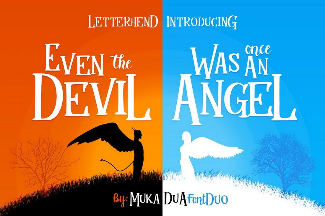
Pine Forest – Jungle Font

Pine Forest - Jungle Font

Pine Forest is a playful, hand-drawn typeface, inspired by outdoor adventures. It includes two style options – rough and press – each evoking a uniquely rustic feel. This versatile font is perfect for a variety of designs from logos and branding, to invitations and posters, effortlessly conveying a sense of fun and natural charm.
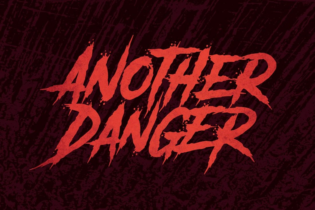
Forests – Layered Forest Font

Forests - Layered Forest Font

This is an engaging jungle font particularly designed with a forest theme. It boasts a simple usability, offering you the flexibility of utilising one, two or all three layers and even adjust their colors to create distinctive effects. Only remember to keep CAPS on as it exclusively supports uppercase letters and numbers.

Jungle Ranger – Playful Jungle Font

Jungle Ranger - Playful Jungle Font

Venture into the captivating world of gaming with Jungle Ranger, a playful and lively font designed to excite children and those young at heart. Its bold letters infused with jungle-inspired elements, like leaves and vines, evoke a sense of fun and adventure, making it an ideal choice for not just games, but also movies, posters, and more.

Dense Forest – Unique Jungle Font

Dense Forest - Unique Jungle Font

Dense Forest is an intriguing typography forest font perfect for bringing an exotic twist to your projects. Ideal for movie titles, album covers, logos, labels, and posters, this font brings the mystery and wildness of the jungle directly into your design. Provided in OTF, TTF, and WOFF formats, it enhances creativity and transforms simple ideas into enchanting visuals.

Roaring Jungle – Fun Jungle Font

Unleash the wildness of your designs with Roaring Jungle font. This jungle-inspired font jumbles together attractive curves, stone-style writing and unique shapes. With regular and rough forms, it is perfect for vintage creations, logo designs, packaging, and even merchandise. A versatile asset with a unique flair and multilingual support to make your work not only look terrific, but also universally appealing.

Mystic Forest – Distressed Forest Font

Mystic Forest - Distressed Forest Font

Mystic Forest is a distinctively stylized type face, ideal for enhancing logos, titles, and brief texts. Its distressed effect can also work effectively as a stencil font for street art. The font package includes uppercase and lowercase letters, symbols, punctuation, numerals, alternates, ligatures, and even supports multiple languages, packaged in OTF, TTF, WOFF and WOFF2 formats.

Jungle Adventurer – Jungle Font

Jungle Adventurer - Jungle Font

Jungle Adventurer is a bold, all caps gaming font that boasts a powerful shape with stern sans-serif and sharp corners. Ideal for online games, posters, media pages, and more, this font comes in OTF, TTF, and WOFF for easy compatibility. Offering simple installation on both PC and Mac, the Jungle Adventurer font supports basic latin A-Z, numerical, and punctuation characters.

Northern Passage – Urban Jungle Font

Northern Passage - Urban Jungle Font

Northern Passage is a handmade display font reflecting love for outdoor adventures with an aged, cabin-in-the-woods feel. An all-caps font ideal for design projects requiring a rustic, woodland aesthetic, it’s readily available for download in otf format.

Forest Trophy – Textured Jungle Font

Forest Trophy - Textured Jungle Font

Forest Trophy is a classic display font featuring a vintage feel with its unique rugged texture. It includes profiles in OTF, TTF, and WOFF formats. Offering an array of uppercase and lowercase letters and numerals, this font also supports punctuation and multiple languages. It’s made even more versatile by its availability in three styles – clean, rounded, and textured.

Pinebrick – Modern Urban Jungle Font

Pinebrick - Modern Urban Jungle Font

Pinebrick is a modern, urban jungle-themed font that authentically captures the mood of nature and forest. Handcrafted, it features a bold, sketchy and rough style, perfect for creating a standout design on posters, shirts or other design requirements. Its array of glyphs, inclusive of uppercase, lowercase, numerals and punctuations, offers a wide variety for creative mixing and matching.

Mirkwood – Elvish Forest Style Font

Mirkwood - Elvish Forest Style Font

Mirkwood is an Elvish forest-themed font, ideal for all things mythological and magical. Courtesy of Gienlee Cartoon, Mirkwood incorporates uppercase glyphs, operating smoothly on both PC and Mac without any special software required. When you download, you receive a user-friendly Mirkwood-Regular OTF file.

Forest Line – Condensed Forest Font

Forest Line - Condensed Forest Font

Forest Line is a jungle-themed True Type Web font, available in three styles: Light, Regular and Bold. As a creative rendition of the Forest Line Extended Font, it presents a trendier and compact alternative, retaining an air of creativity and usefulness.

Tropica Jungles – Playful Jungle Font

Tropica Jungles - Playful Jungle Font

Tropica Jungles is a unique textured display font with a playful, cartoony twist. Perfect for a wide range of applications from logos to novel covers and wedding cards, this creative asset offers upper and lower case letters, numbers, punctuation and multilingual support.

Free Jungle & Forest Fonts

Theforest – Free Serif Font

Theforest - Free Serif Font

Theforest is a free serif font that features a unique Jungle-themed letter design. This font is ideal for all sorts of elegant, nature-inspired typography designs. It’s especially perfect for luxury and high-end branding designs. It’s free for personal use.

Forester – Free Urban Jungle Font

Forester - Free Urban Jungle Font

Forester is another stylish urban jungle-themed font. This font has a creative handbrush-style letter design that will instantly attract attention. The font is free to use with your personal projects.

Jungle Camp – Free Display Font

Jungle Camp - Free Display Font

This free font comes with a fun and playful letter design that makes it a great choice for crafting titles and headings related to children’s designs. The font is free for personal use only.

The Jungle – Free Handwritten Font

The Jungle - Free Handwritten Font

Another unique handwritten font featuring a jungle-themed design. This font comes with a creative look that will fit in well with t-shirts, posters, banners, greeting cards, and various other designs. It’s free to use with personal projects.

Jungle Tribe – Free Cartoon Font

Jungle Tribe - Free Cartoon Font

This font is also free to download. Jungle Tribe is a playful cartoon-style font that also features a jungle-themed vibe. The font is ideal for children’s book covers, educational graphics, video games, and much more. It’s free for personal use.