Visit The Site For More...
How to Code a Clean Minimalist HTML CSS Website Layout
How to Use Envato Elements to Create Online
When presented with the task of creating things for the Internet, knowing where to start can be half the battle. If you lack design skills or if you’re pressed for time, using some premade resources can be extremely helpful. The first order of business is locating a resource that has what you need. The second? Searching within this resource for templates, tools, and items that can aid you in making content.
Thankfully, we can handle the first part easily. Envato Elements is truly a one-stop resource for so many templates, themes, graphics, illustrations, photos, and more that you can use immediately in your work. Once you sign up, you gain access to thousands of items.
But if you’re not convinced, let’s talk about some of the ways you can use Envato Elements to make stellar online content starting immediately.
Build a Website Using a Template
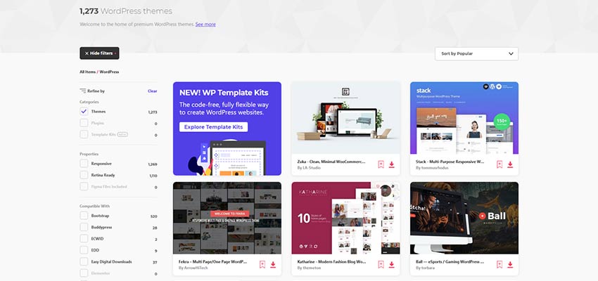
If you’re creating online, you need a website. And Envato Elements makes it super easy to do this. It features a wide array of templates that make it easy to build and launch a site quickly. There’s no shortage of options as well, so you can choose anything from an HTML template to a full CMS template. Here’s the full breakdown of the types of templates offered here:
And within these options you can narrow your search by features (responsiveness, eCommerce, PSD files included) by focus (admin, landing page, or site) and topic (beauty, corporate, fitness, etc).
Create Presentations to Accompany Online Courses
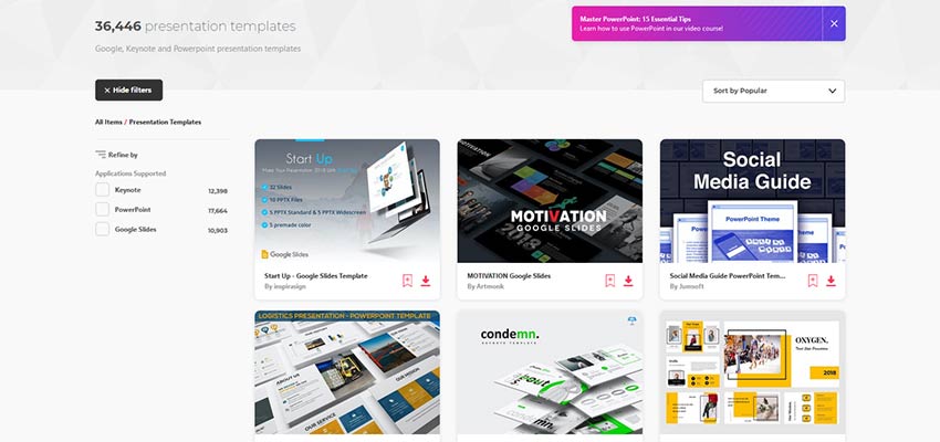
If you want to offer or sell online courses, you may wish to create and share this content via presentations. This means you’ll need some solid templates on hand if you want to make a real impact. Lucky for you, Envato Elements offers these as well. You can select from templates for Keynote, PowerPoint, and Google Slides, all of which are super professional-looking and easy to use. Just download the template, add your custom content, and export it. That’s all there is to it.
The crux of the situation here is that you shouldn’t have to labor over these elements of your work if you don’t have to.
Create Graphics for Social Media
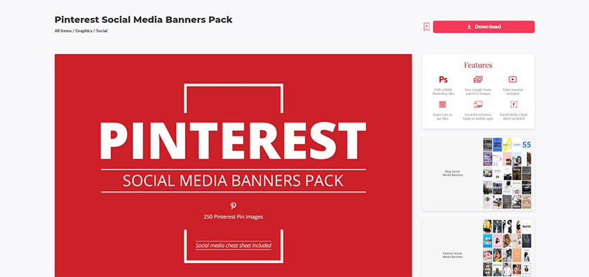
If you run a business online, you should have a social media presence. But yet again, that’s another thing you have to create consistent content for. If coming up with an endless supply of compelling graphics doesn’t sound fun to you, Envato Elements can help. Its graphic templates section is loaded with a wide variety of options including templates for infographics and logos.
They also have scene generators or mockups, which make it easy to display your product or app on a background that’s been carefully (and stylishly) presented.
You can pair these templates with some other resources as well like the selection of graphics available. You can select from graphics that encompass the following categories:
They also have a dedicated Social category that you can browse for social media platform specific templates.
As if all of that weren’t enough, there’s also a Photo category that includes thousands of photographs you can use for anything under the sun.
Make Explainer and Promotional Videos
The last thing we’ll discuss here today is how you can make videos using resources on Envato Elements. If you haven’t already dipped your toes into the video-making market, now’s the time. Video is extremely popular and it’s been proven to increase visitor engagement. Because of this, many opted to create promotional videos or explainer videos that describe something practical. And while you may need to film some footage yourself, having stock footage on hand is beneficial. Wouldn’t you know it that Elements has this as well?
Hundreds of thousands of stock videos and motion graphics are available to choose from to add to your creations.
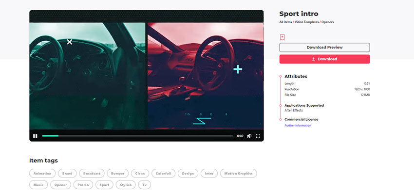
Or, if you need a templated solution, there are thousands of video templates to pick from as well. They cover categories like:
- Logo stings
- Openers
- Product promos
- Titles
- Video Displays
- And more
And you can find specific options for the likes of After Effects, Premiere Pro, Apple Motion, and Final Cut Pro.
When you’re in edit mode, you can add in sound effects or music as well. The sky’s the limit here.
Don’t Wait to Start Creating
So you see, you really have no excuses not to start creating unique content for your online presence, whatever that may look like for you. From websites to videos, Envato Elements has you covered from top to bottom.
What will you create next?
20 Minimal HTML Templates for Business Websites
When creating a business website, it’s vital to have a design and layout that serves your content well. But this can feel like a monumental task if you don’t have design skills yourself. That’s why minimal HTML templates are so useful, of course. They save you time, and for just a small upfront investment, you can get a fantastic-looking site that suits your company for years to come.
Today, we’ve compiled twenty minimal HTML templates for creating effective business websites. The minimal design is key here: it means your content stands out and won’t be lost in a sea of clutter.
UNLIMITED DOWNLOADS: Email, admin, landing page & website templates
Starting at only $16.50 per month!
Ocularus
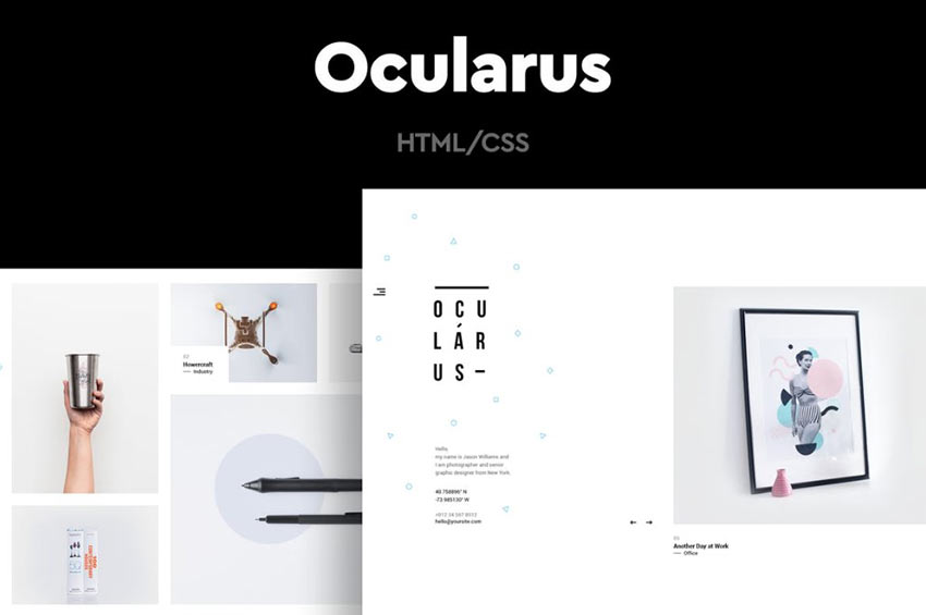
The Ocularus HTML template is easy on the eyes, mostly because there isn’t a whole lot to look at. And that’s a good thing. Its minimal design allows your content to shine.
Blossom
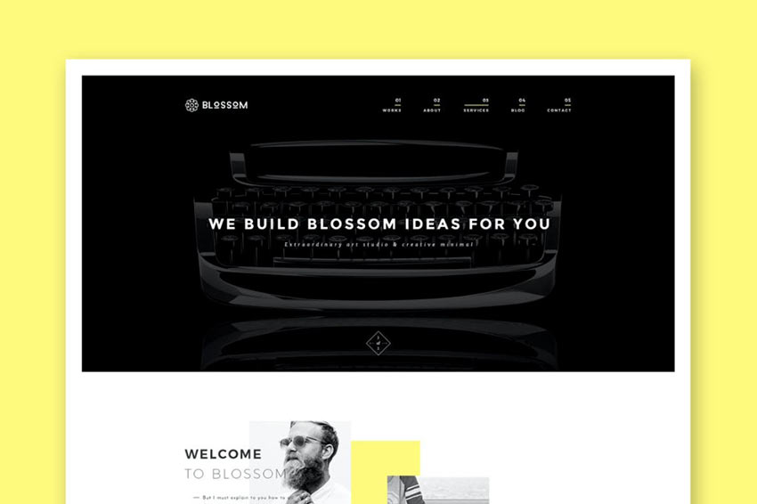
Another option is the Blossom template. This one offers a simple layout that you can use to create any type of company website you can imagine. Add images, add text with ease here.
Sora
The Sora template is aimed at photographers and but could be used for any type of business with a graphical focus.
Krome
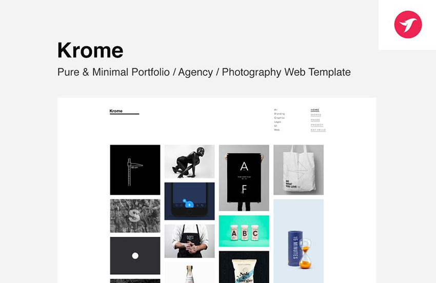
Krome is a fantastic template that is suitable for portfolios, agency websites, and more. It uses a grid-based layout for showcasing images in an eye-catching way.
Leto
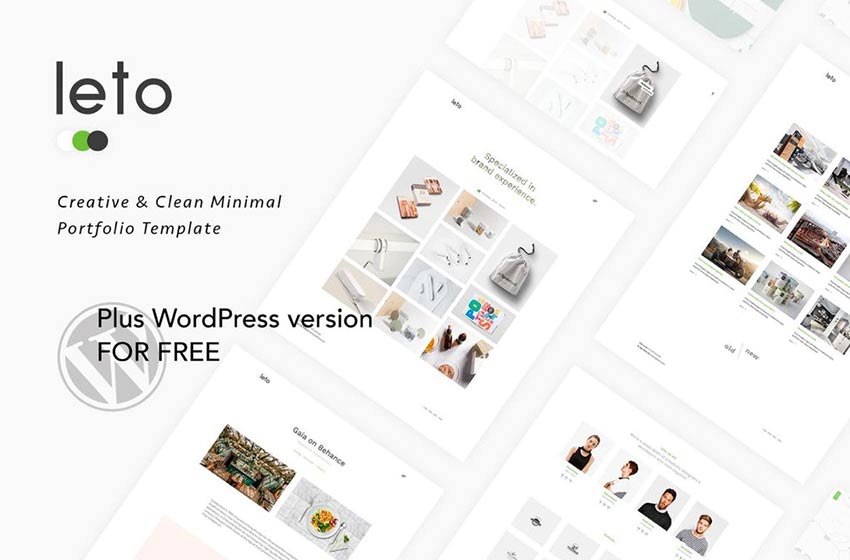
Leto is another minimal template that can be used for portfolios. Its grid-based design makes it easy to display graphics and images succinctly.
Minel
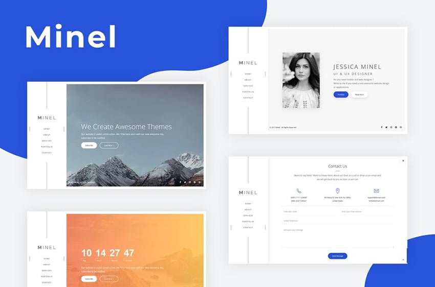
The Minel template could be customized for a wide range of businesses. It offers an interesting menu layout, call-to-action buttons, and compelling graphics.
Opium
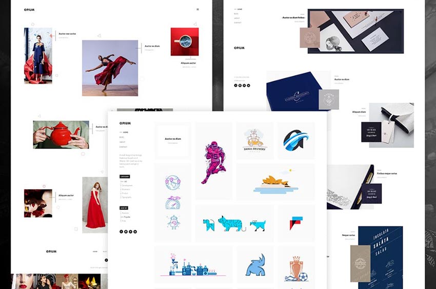
Opium is another HTML template that uses a minimal design to great effect. Enjoy the grid layout, and timeline page option to make for a unique “about us” page, and that’s just for starters.
Minimalize
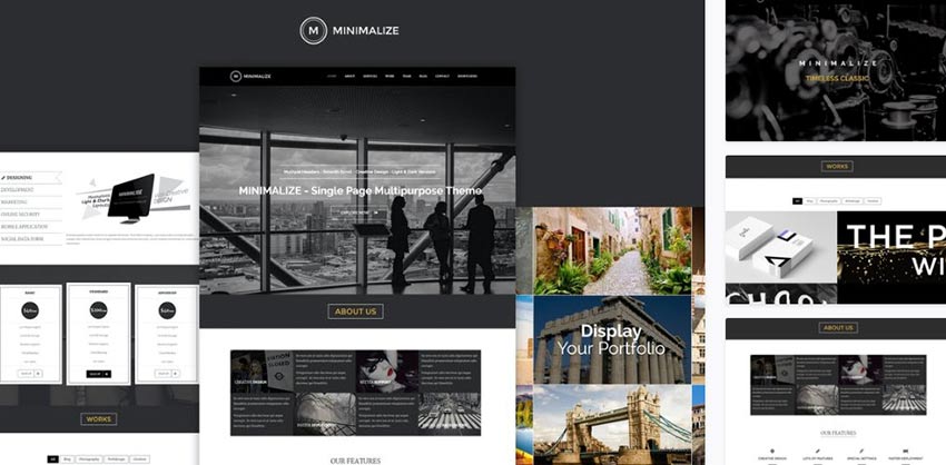
Minimalize is a lovely-to-look at HTML template that utilizes the one-page motif to create an engaging scrolling experience for your visitors.
Vinero
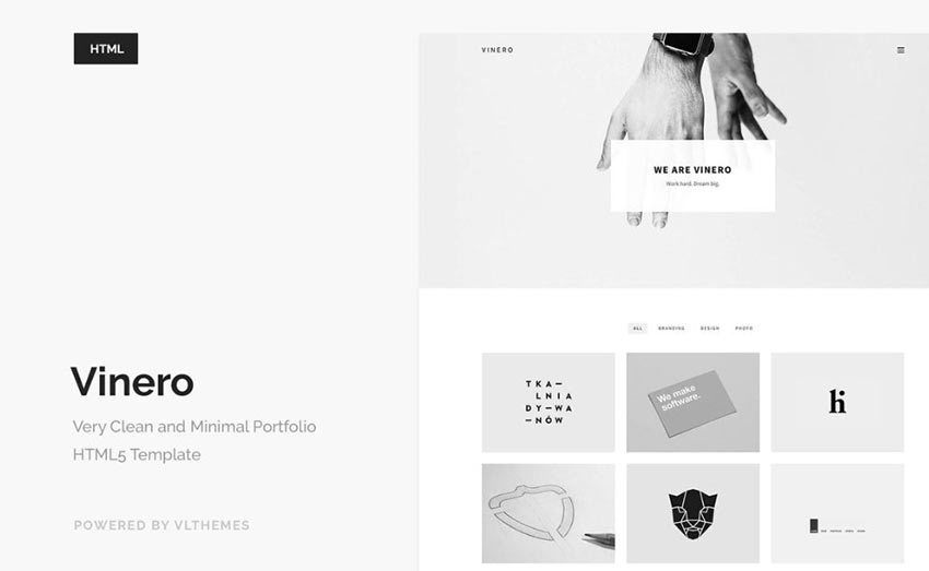
Vinero is another minimal theme, this time using a monochromatic color scheme, a grid-based layout, and an overall clean look that complements your content well.
Pisend
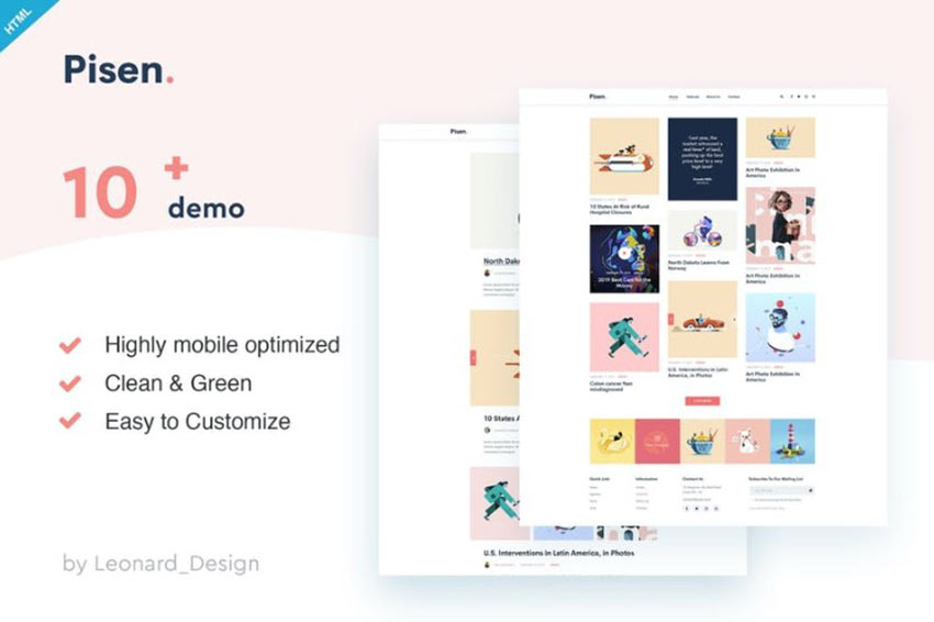
Another option is the Pisend HTML template. This one offers a minimal design, this time for blogs. It comes with 10 demos, too, so you can opt for one and get started with inserting your content immediately.
Origin
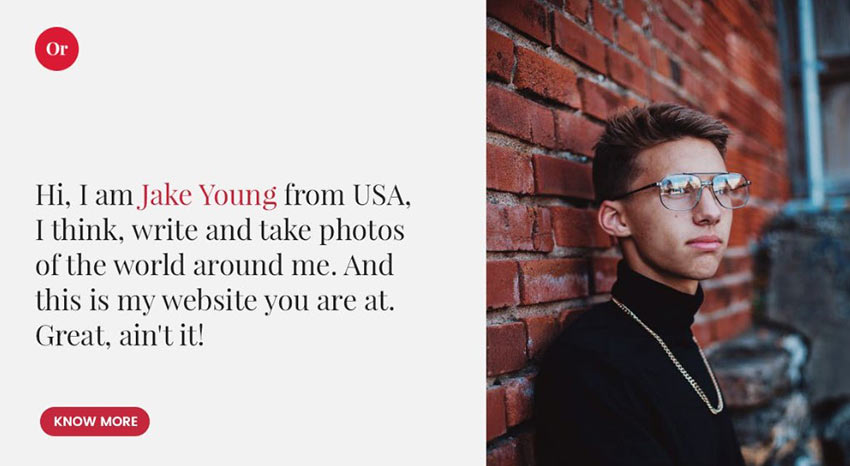
If you’re looking for a portfolio HTML template, this minimal option is a good fit. Origin offers large text, large images, and easily identifiable call-to-action buttons that leave your visitors guided through an intuitive browsing experience.
Pekko
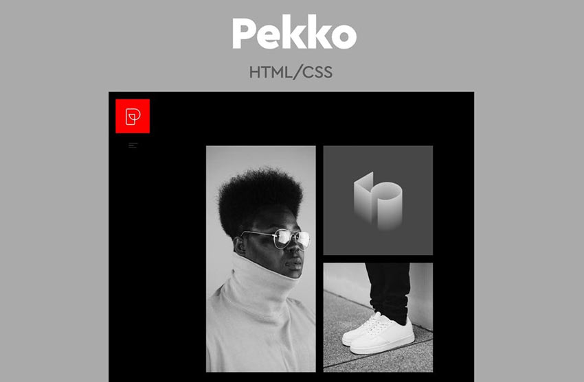
Pekko is another HTML template that is sure to catch the eye. Its monochrome design allows you to feature your best work front and center with zero distractions getting in the way.
Jestem
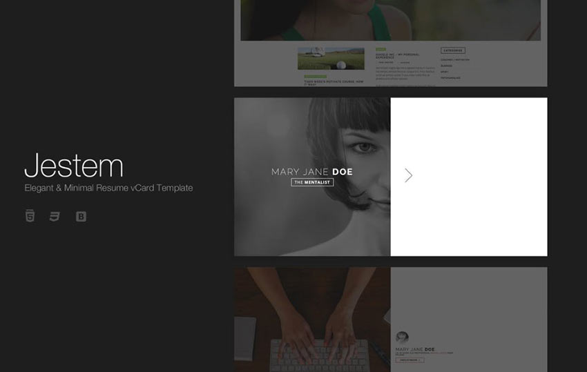
Jestem is a lovely minimal HTML template that can be used in a wide variety of ways from website to vCard to online resume. It’s easy to set up for presenting your contact info, at the very least.
T-ONE
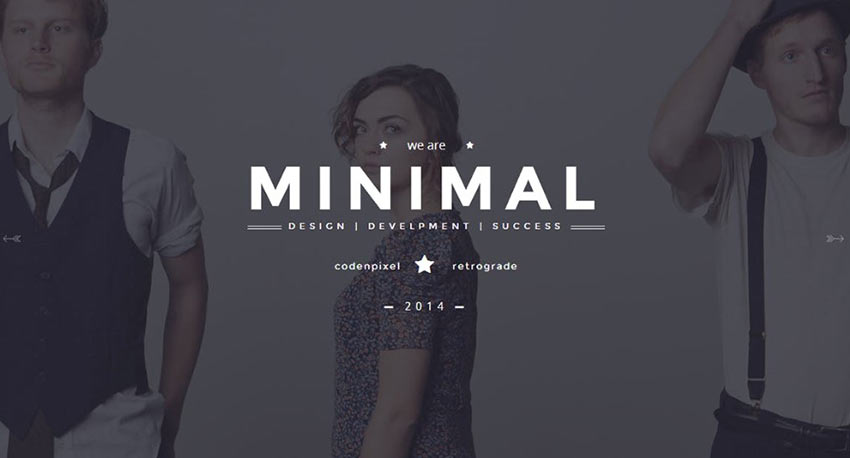
T-ONE offers a minimal design that gives you plenty of opportunity to showcase full-width images, compelling overlaid text, graphics, and CTAs.
Omnia
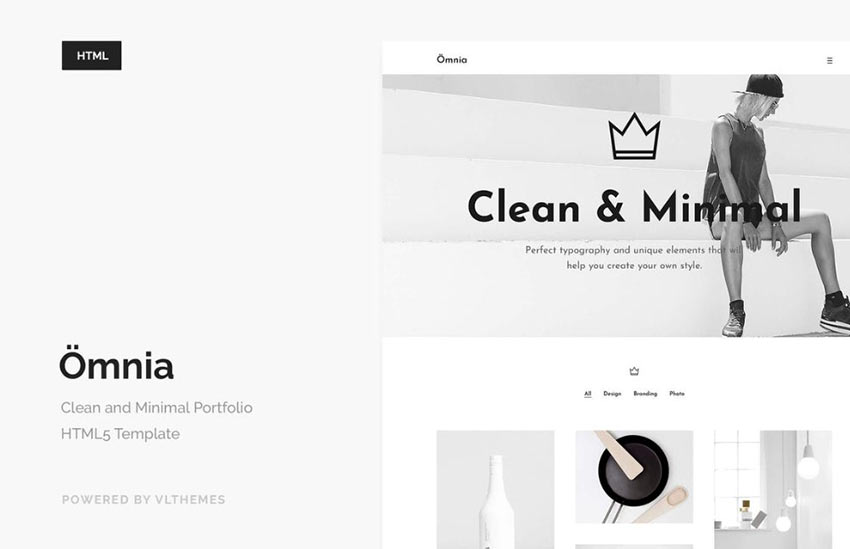
Omnia is a minimal HTML template that prioritizes whitespace above all else. And to dramatic effect, I might add. Customize with your own photography and you’ll be impressed with the results.
Laboq
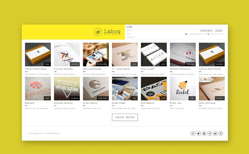
Another option is the Laboq template. This one could be customized to support a grid-based portfolio or even an online store.
Aether
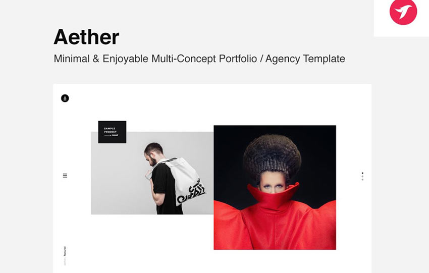
Or you may wish to consider Aether. This minimal HTML template is multipurpose and can be used for any type of site. However, it does have a penchant for agency and portfolio company websites.
Mimilism
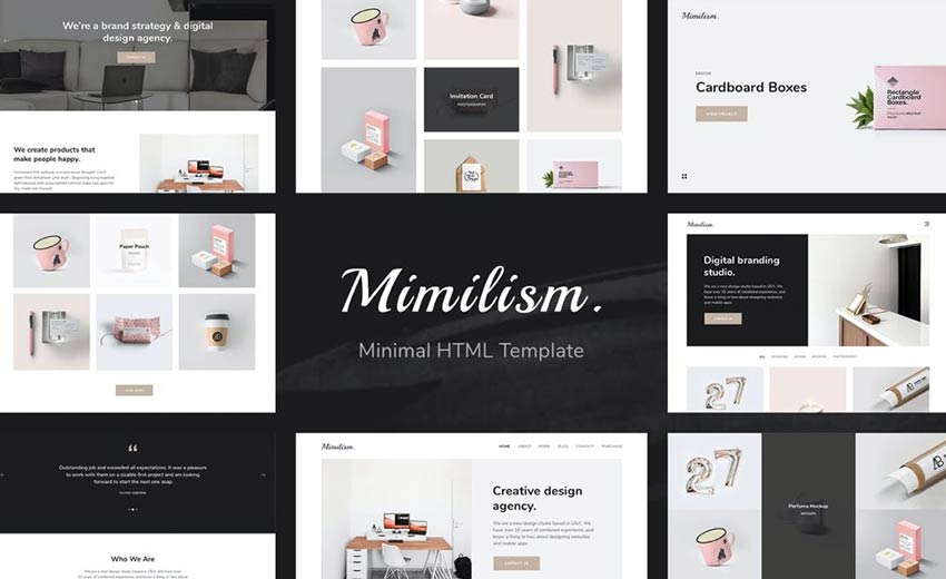
Mimilism offers a cohesive, grid-based design that makes it easy to display your best work or examples of your service in an appealing way. Customize, add buttons, and flavor text however you see fit. The fact remains, this template provides flexibility for creating the look you want.
Nubia
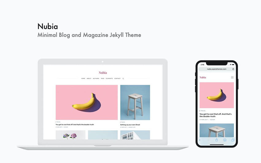
The Nubia HTML template really embraces minimalism in an eye-catching way. It has all the hallmarks: whitespace, grid-based layout, and a simple color scheme. But it presents content in such an appealing way that it looks like your site could be a magazine.
Keepsake
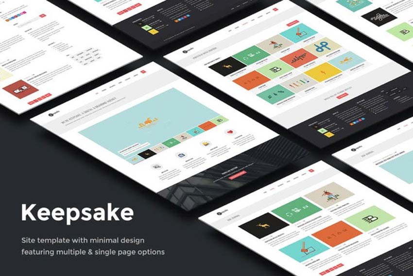
Last on our list is the Keepsake template. This one offers a minimal design with a grid layout that could serve a blog, portfolio, or service agency site well.
Set Up a Minimal HTML Template for Your Business
Now that you have twenty minimal HTML templates to choose from, you can hopefully get started with setting up your own business website quickly. So many of these offer demos as well, so you can import that data, add your own images and content and get rolling with launching your new site in a matter of hours. Which is pretty great if you ask us.
How to Use Heat Maps to Improve Website Design
Everyone who uses the web knows the difference between a poorly and well-designed site. Great websites seem to flow naturally from one page or another. You get a smooth experience from the second your browser lands on the web page until you leave. Only UX developers know that none of this is actually natural. It’s […]
The post How to Use Heat Maps to Improve Website Design appeared first on designrfix.com.
30 Web Design Statistics That’ll Change How You View Your Website
30 Web Design Statistics That’ll Change How You View Your Website Read More →
8 Reasons Why You Need a Professional Website Designer
Have you ever noticed that the website you have for your business isn’t really performing the way it should be? Maybe the design isn’t attractive, the traffic is poor, and you have no idea why this is happening. The reason is pretty simple. The website was designed by an amateur, or maybe it was you […]
The post 8 Reasons Why You Need a Professional Website Designer appeared first on designrfix.com.
Top reasons to go for a responsive web design
As there is an exponential growth in the number of mobile and tablet, it is important for the brands to ensure that their website design is user responsive and makes it easy for them to navigate easily. Listed below are the top reasons for choosing responsive web design: Mobile Usage Is on The Rise As […]
The post Top reasons to go for a responsive web design appeared first on designrfix.com.
20+ Deliciously Dark Website Designs
Dark website designs are where it’s at. Don’t believe me? They’ve become increasingly popular over the past year. Dark designs are thought to be easier on eye strain and make for a more pleasant viewing experience. They can also add atmosphere to your site.
As more and more websites have shifted to dark mode in 2020, we thought it imperative to highlight some designs that really capture the concept of dark designs well. What follows is a list of over 20 delightfully dark website designs you’ll definitely want to check out.
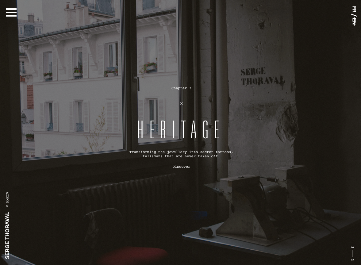
Serge Thoraval: Atelier
The Serge Thoraval: Atelier website doesn’t just offer a dark design — it also features some really interesting effects. From a mouse hover effect when the site is loading to transition effects when you scroll down the page, this site sets itself apart.
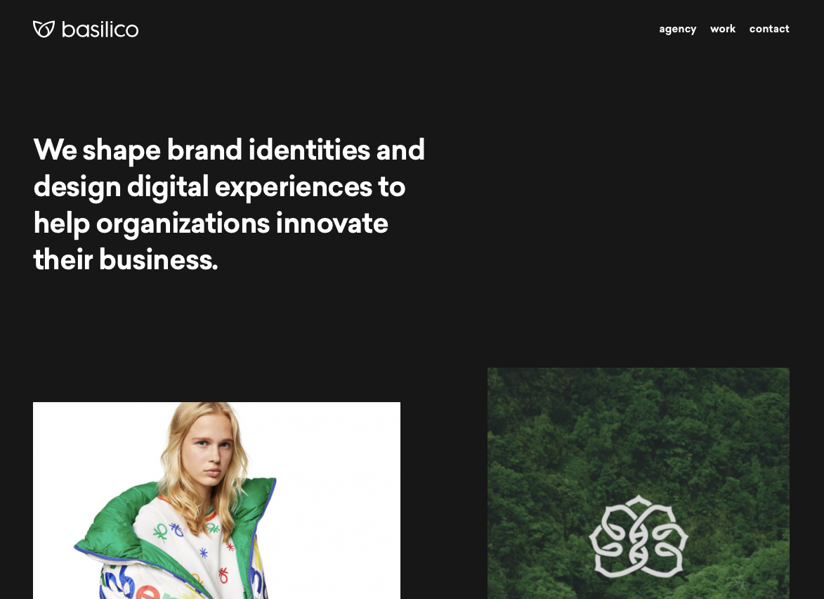
Basilico
This site offers a dark design that makes each portfolio piece really stand out. Plus, when you hover over each item, they color shift and descriptive text scrolls across it from right to left.
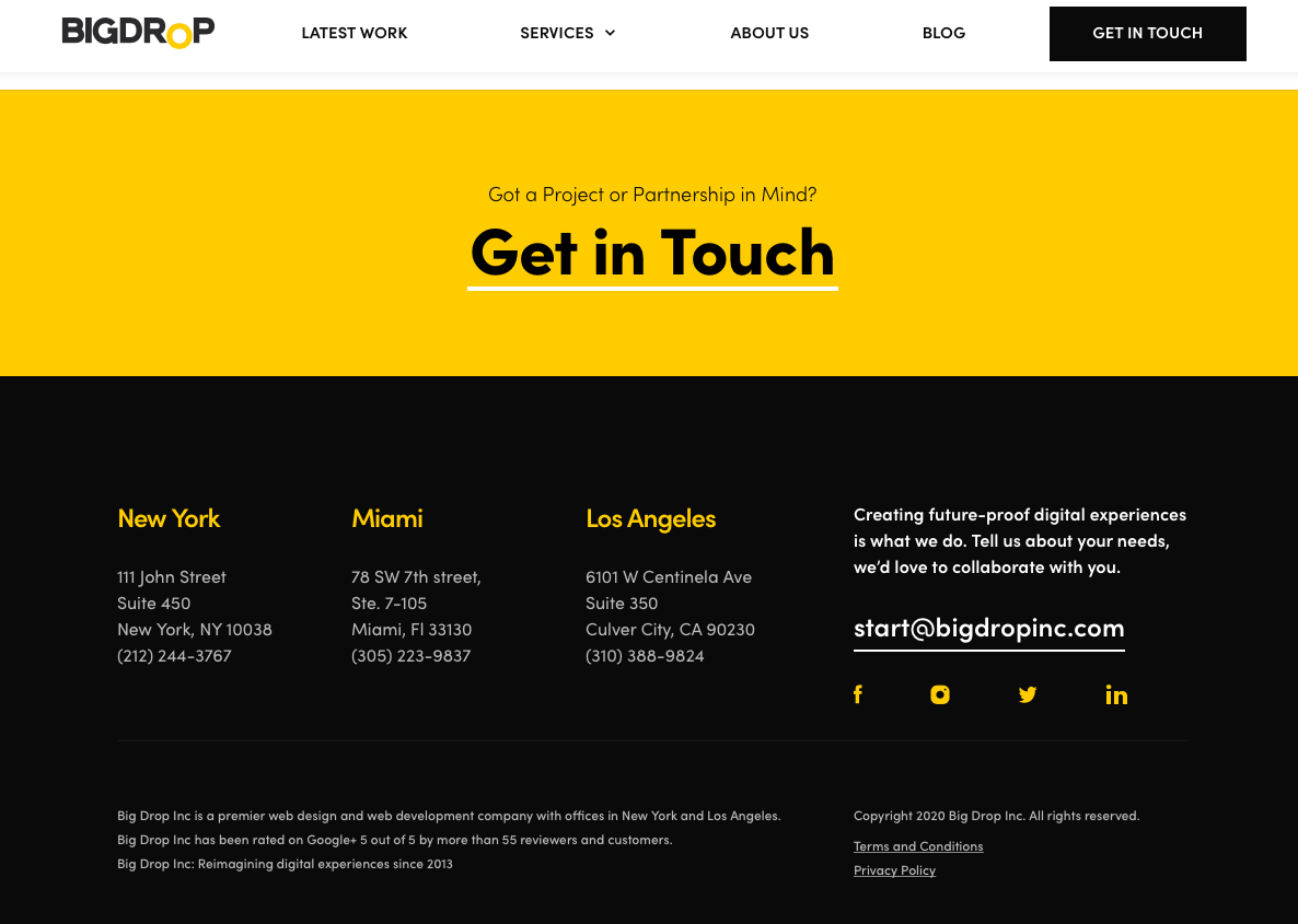
Big Drop Inc
Big Drop Inc has a combination of light and dark designs that are both appealing and effective.
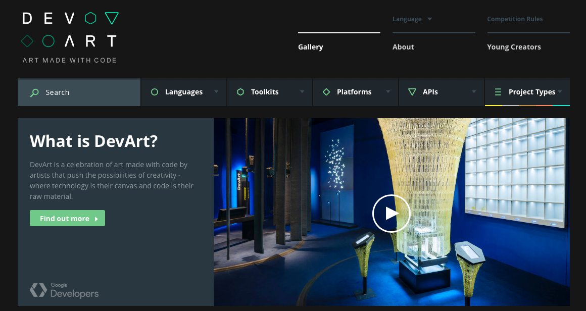
DevArt
DevArt is another site with a dark design that helps to make the artwork it features stand out. It’s also easier on the eyes than sites with brighter backgrounds.
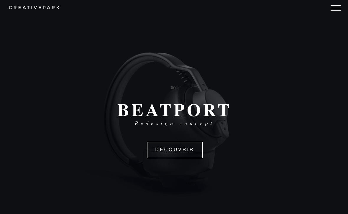
Creative Park
The Creative Park website offers up a delightfully dark design that allows the subject of photos to really stand out. It also has some really interesting transition effects for changing slides, clicking links, and opening menus.
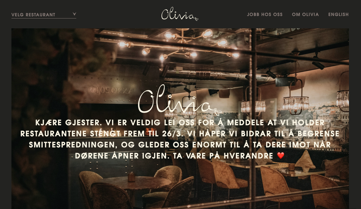
Olivia Restaurant
The Olivia Restaurant website mimics the mood inside of the restaurant itself — dark, cozy, and inviting.
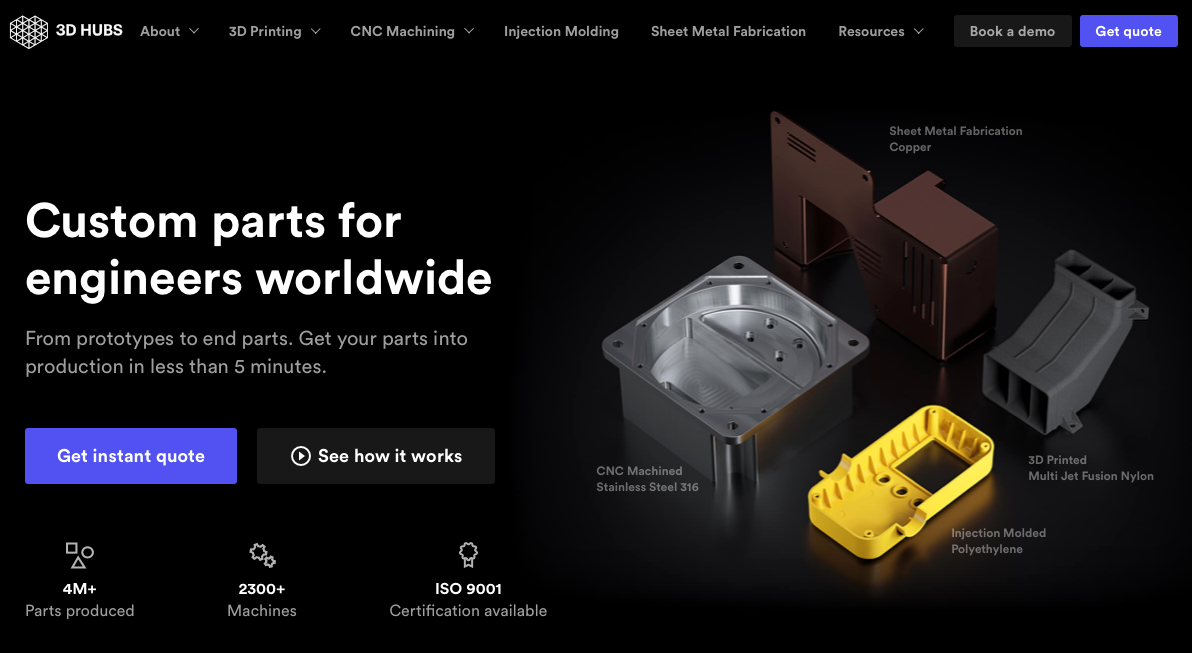
3D Hubs
The 3D Hubs website leverages its dark design to make the components it features stand out. This also works well for displaying video and individual items the company offers.
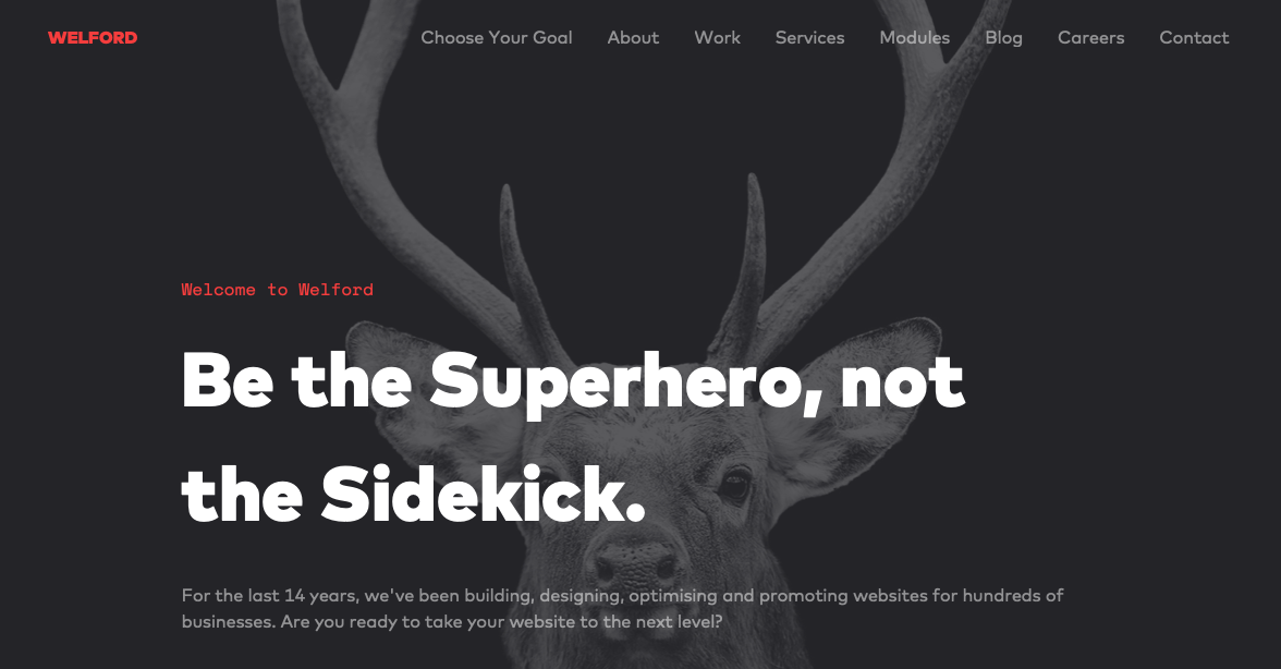
Welford Media
Welford Media is a web design firm that uses a dark design on its website to engage visitors. This design choice allows the company’s tagline stand out at a glance and builds immediate interest.
Meaning 2020
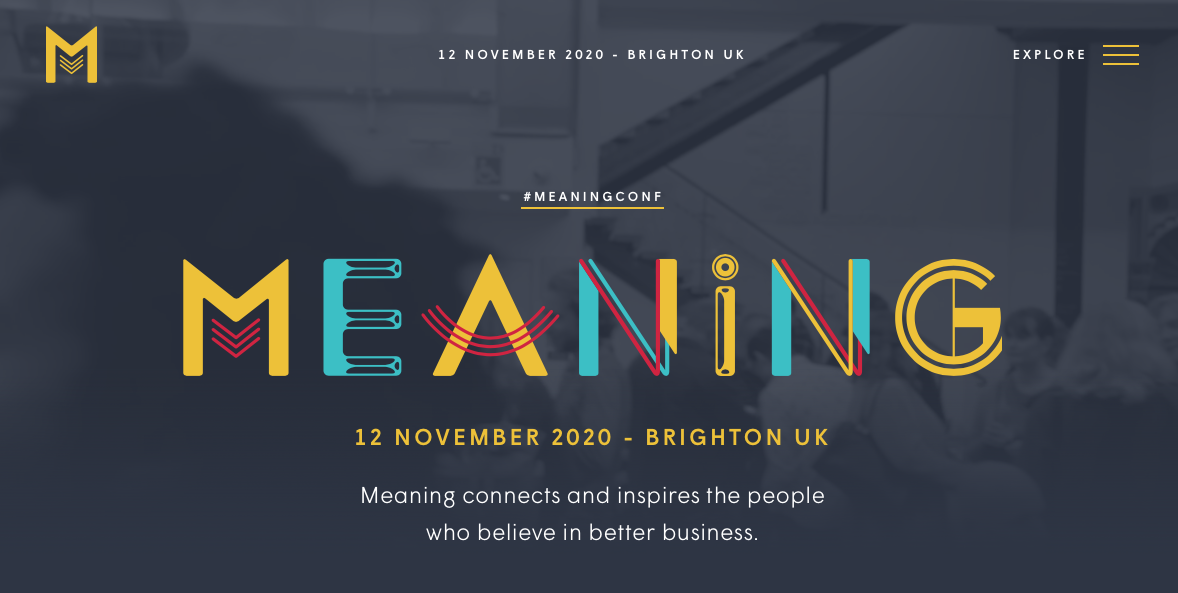
The website for the Meaning 2020 Conference has a dark design as well. The gray background allows the colorful logo to stand out and offers a subdued backdrop onto which videos and photos are placed.
Rich Brown
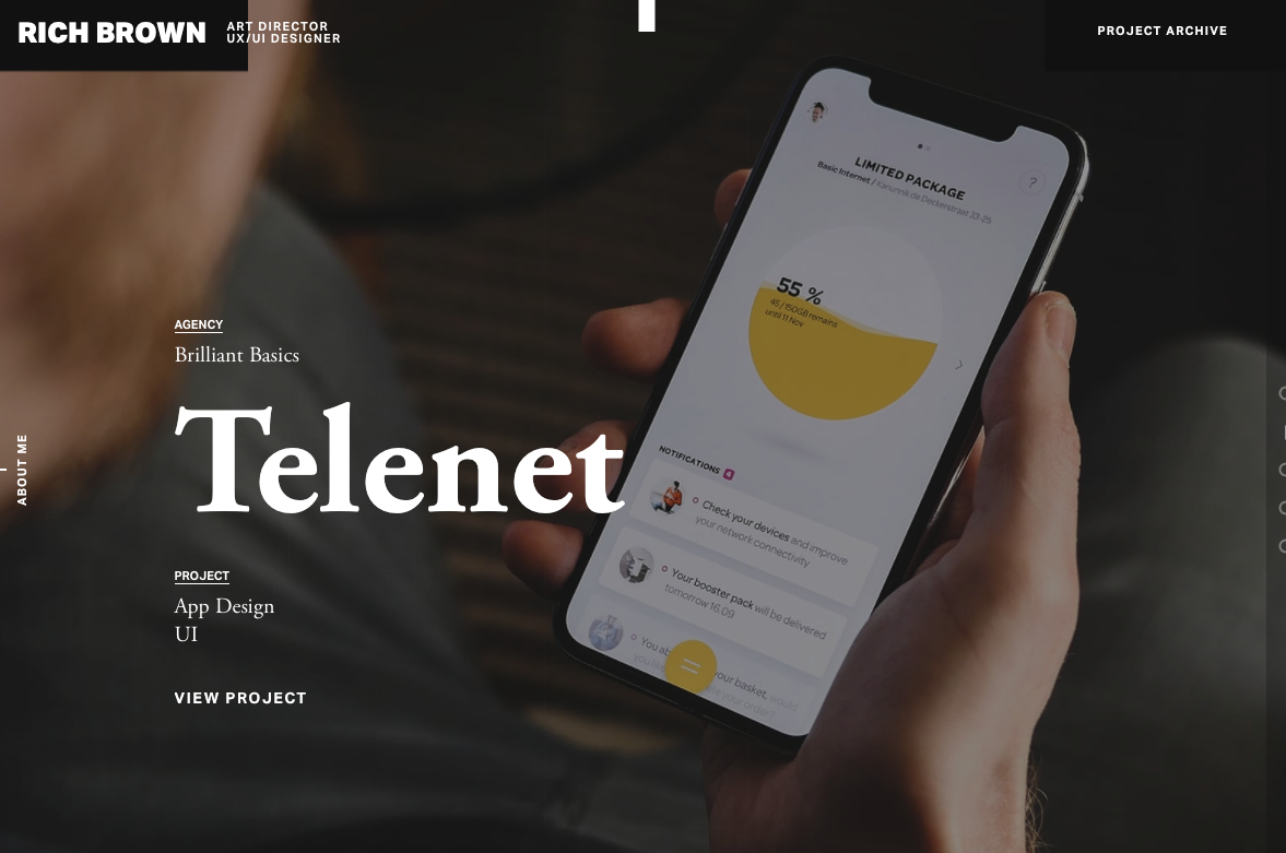
This is a website dedicated to the work of Rich Brown, an art director and UX/UI designer. The site itself features a dark design onto which video backgrounds play seamlessly.
Artem Pivovarov
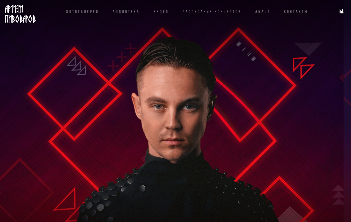
The design on this website is super interesting. Artem Pivovarov has a dark design with a prominent photo background. It also has interactive elements in this background that react on hover.
Formigari Srl
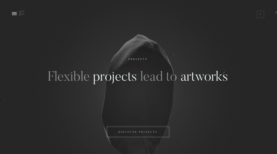
Formigari Srl is another site you should check out for dark design inspiration. It highlights videos and photos on a deep gray background that makes the entirety of the content feel immersive.
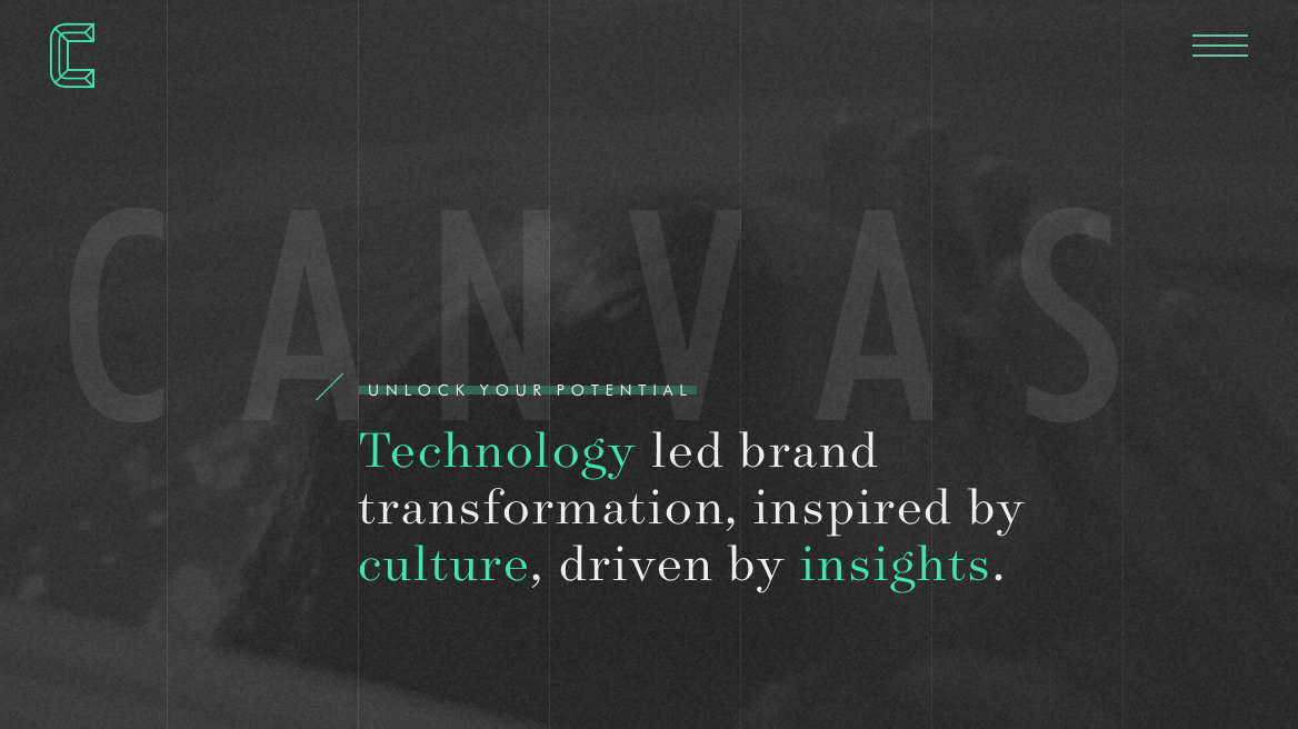
Canvas United
Still another site you should check out is Canvas United. This site is for a New York-based digital agency that provides some cool transition effects and an immersive experience.
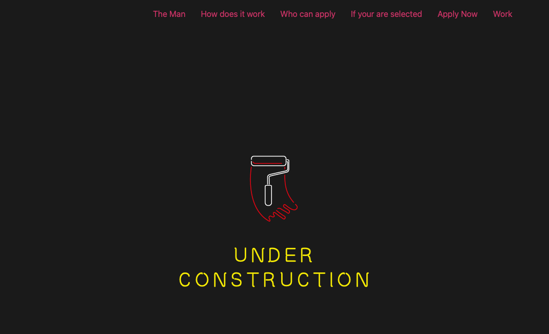
The Kennedys
The Kennedys website currently features an under construction sign that’s set on a dark background.
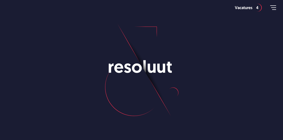
Resoluut
The Resoluut website offers a dark purple background with images that appear as though they’re hovering on top of it. There is a lot of play with depth of field here.
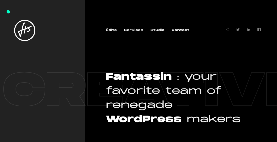
Fantassin
Still another option is the Fantassin website, which features a dark background and tons of cool scroll effects that draw the eye further down the page.
Cody Petts Studio
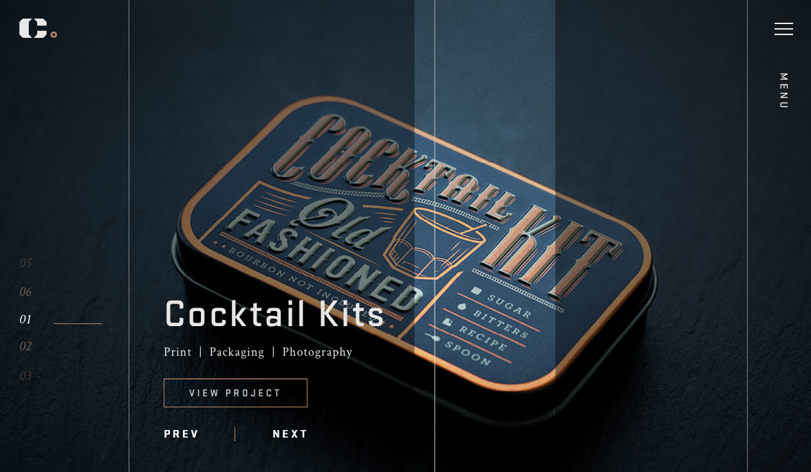
The Cody Petts Studio website highlights the work of Cody Petts, including print and packaging designs as well as photography. It’s dark, gritty, and extremely compelling.
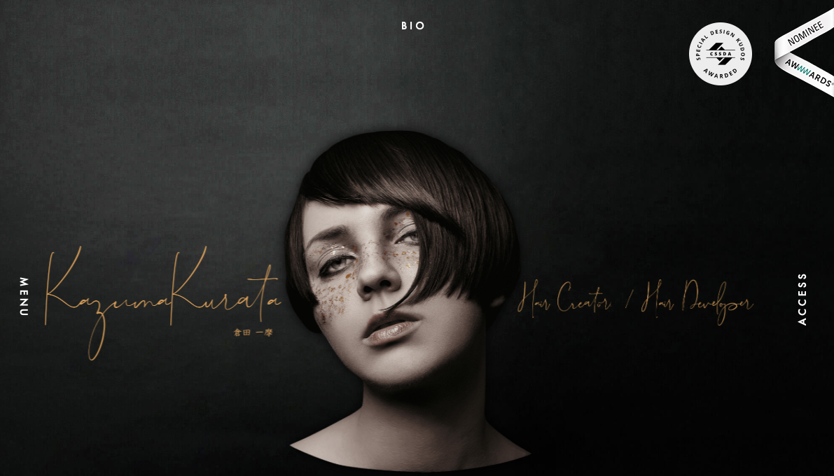
Kazuma Kurata
The design for the Kazuma Kurata website offers a dark background that’s intimately inviting. It makes the colorful Aspects of featured photos stand out even more. The design and function of the site make it clear why it’s deserving of its AWWWARDs Nominee status.
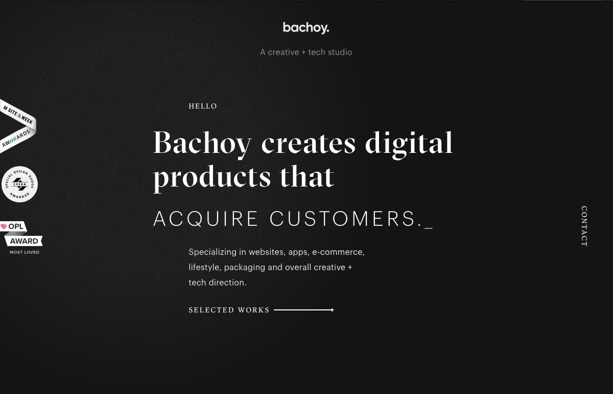
Bachoy
The Bachoy website highlights a creative and tech studio. The dark design featured here uses a cool spotlight hover effect and interesting interactions with photos as you scroll down the page.
Agency Legend
The Agency Legend website has a truly appealing site that takes advantage of superhero motifs to increase engagement.

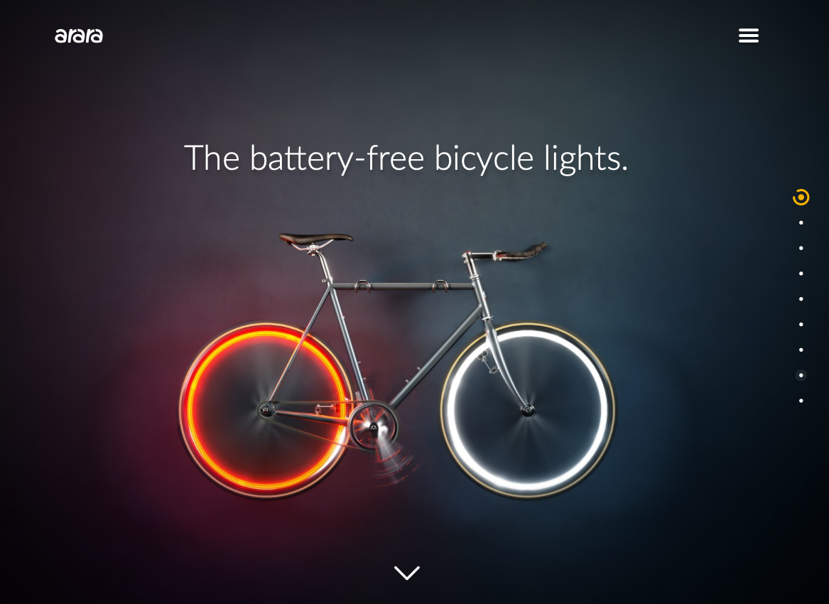
Arara
Last on our list is the website for Arara, which offers battery-free bicycle lights. This site is dark but not brooding, and instead uses the darker background to make the bright colors featured in images and videos “pop.”
Dark Website Designs Can Serve You Well
As you can see from the examples listed above, dark website designs can really take the overall look of your website to the next level — whatever that means for you. Whether you want to make colors look more vibrant, ease eye strain, or provide a mood, dark designs offer flexibility in both form and function. Have fun playing with them!
How a Bit of HTML and CSS Can Help You Improve Your WordPress
15+ Front-End Tools You Should Know About: My Favorite Finds for 2020
Web Design Trends – Predictions For 2020
Every year we see new web design trends emerge, and every year experts and pontificators alike come up with their predictions of what we will see. While some web designers and developers may choose to buck these trends or try …
How to Get Started in Freelance Web Design
The keys to improving your web design approach
There is no getting around the fact that in this exceedingly digitally inclined era, the presence of the online landscape that is the worldwide web is becoming more and more central to the way that we live our lives in this modern world. Considering this, it should come as no surprise that websites are becoming […]
The post The keys to improving your web design approach appeared first on designrfix.com.
Top 11 Web Design and UI Trends for 2020
2020 New Year’s Resolutions For Web Designers
A new year is upon us and that means many people take a moment to pause and reflect on the goals they wish to achieve for themselves over the course of the next 12 months. Setting resolutions looks different for …
Design Trends in 2016 & What to Expect in 2017
The year ahead should be a really exciting one for design, with the introduction of wider support for SVG and a host of new things we can do with CSS as CSS4 gains broader acceptance. In taking a look back at what made a big splash this year, I hope you will be inspired to […]
The post Design Trends in 2016 & What to Expect in 2017 appeared first on Web Designer Wall.


