Web Design

Posts about Web Design written by Nick Schäferhoff, Colin Newcomer, Rana Bano, Melissa King, Jenny McKaig Speed, and The WordPress.com Team

Tips, Expertise, Articles and Advice from the Pro's for Your Website or Blog to Succeed

 If you’ve always wanted to know how to start an online magazine, this is your lucky day. We created the following guide just for you!
Online magazines are a great way to express yourself and create something that reflects your unique style and interests. Whether you’re looking to create a magazine for a hobby or start a business, this step-by-step guide will help you get started.
If you’ve always wanted to know how to start an online magazine, this is your lucky day. We created the following guide just for you!
Online magazines are a great way to express yourself and create something that reflects your unique style and interests. Whether you’re looking to create a magazine for a hobby or start a business, this step-by-step guide will help you get started.
Offering an array of choices might seem like an excellent way to cater to diverse user preferences, but more often than not, it can cause decision fatigue, negatively impacting the user experience and conversion rates. So, how do we strategically minimize this fatigue through effective web design?
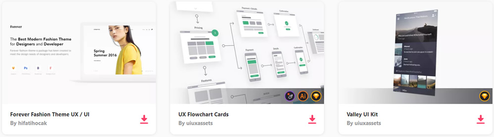
Unlimited Downloads: 500,000+ Wireframe & UX Templates, UI Kits & Design Assets
Starting at only $16.50 per month!
Decision fatigue can lead to a decline in the quality of decisions after a continuous decision-making process. In web design, users can experience this fatigue when faced with too many choices, leading to indecisiveness, frustration, and eventual disengagement.
Hick’s Law plays a part in this, suggesting that the time to make a decision increases with the number and complexity of choices. Nonetheless, Hick’s Law is just a fraction of a much broader picture. Balancing user choices and decision fatigue effectively also requires understanding principles like settling for the first reasonable option, avoiding potential losses, and making decisions based on readily available information.
To help users make confident decisions without causing fatigue, several tactics can be implemented.
Develop a logical, intuitive navigation path to eliminate unnecessary decision-making. For example, clear categorization in a website’s menu helps users find what they need without going through numerous options.
Present the users with essential choices first and omit irrelevant ones. A home page showcasing the most popular products instead of an extensive catalog can prevent choice overload.
Limit the number of options at each decision point to avoid overwhelming users. For instance, in a subscription selection, offering three plans – basic, premium, and advanced, can be more effective than having numerous slightly differing options.
Strategic design choices can further alleviate decision fatigue.
Keeping design elements consistent throughout the website simplifies cognitive processing. For instance, maintaining the same style for all buttons or icons aids user recognition and reduces the cognitive load.
Use recognizable icons and layouts to reduce cognitive effort and decision-making time. Employing standard symbols for shopping carts or menus enables users to interact with your website effortlessly.
Predicting user actions and simplifying processes can lessen the number of decisions a user needs to make. Autofilling forms based on past user data is one such example.
Minimize frustration and decision fatigue by guiding users effectively when errors occur. For instance, a clear error message with a suggested solution can keep a user engaged, even in the event of a mistake.
Taking into account the principles of decision fatigue and integrating the mentioned design strategies, your web design can become more user-friendly, reducing decision fatigue. Our overview aims to set you on the right path but remember, UX practices often involve deeper explorations and constant testing. Your understanding of decision fatigue will deepen as you engage more with UX research and real-world testing.
While we’re grappling with the complexities of choice, remember there’s another potent tool at your disposal – social proof. Using elements like reviews, testimonials, or popularity indicators can steer users toward decisions others have already made, thus easing their decision-making process. To learn more about how social proof can reinforce user decisions, we invite you to read our article on the topic.
In a world where choice overload is a reality, appreciating the power of simplicity and efficiency in decision-making is invaluable. It’s about striking that optimal balance – giving users ample choice without sparking decision fatigue.
Sydney is a beacon of innovation and artistic flair, renowned for its picturesque landmarks like the Opera House and the Harbour Bridge and its vibrant digital marketplace. Having a solid online presence is indispensable in...
The post Elevating Conversion Rates with Innovative Web Design in Sydney appeared first on 85ideas.com.
The fitness sector is at the intersection of tradition and technology in an era driven by digital breakthroughs. As the fitness industry develops, one thing is certain: gyms that want to survive in this fast-paced...
The post Unlock Your Potential: Maximizing Your Gym’s Visibility in the Digital Age appeared first on 85ideas.com.
In the digital world we live in, the importance of mobile devices in everyday life is undeniable. Websites, therefore, must be versatile in adapting to the diverse sizes and resolutions of these devices. Adaptive web...
The post Adaptive Web Design: Shaping the Future of Mobile-Friendly Websites appeared first on 85ideas.com.
In the modern digital age, a convincing online presence is crucial for both businesses and individuals. One of the key elements that define the triumph of a website is its design. Being more than just...
The post Why Web Design is Important? appeared first on 85ideas.com.
 Website builders are popular because of their simplicity. Namely, you get everything you need to create and run a website, and you don’t have to be particularly skillful to get a good result. In this Squarespace vs Weebly comparison, we are going to analyze two of the most popular such solutions that are out there.
 In today’s age, a well-designed and strategically organized website can have a significant impact on its success. One essential Aspect of creating an effective website is choosing which types of web pages to include, and making sure that those pages cater to the needs of your audience.
 When signing up for a Wix.com account, you have two options for building your site: Wix ADI vs Wix Editor. In this article, we compare them to show how many of their features are the same, but that other areas are drastically different. Keep reading to learn about the artificial intelligence-supported Wix ADI, and how it stacks up to the drag-and-drop Wix Editor.
CSS offers an array of tools that, when used correctly, can improve the visual experience on your website. In this tutorial, we’ll explore a straightforward way to design a retro text effect with pure CSS. The approach, while not overly complex, yields a visually appealing result and serves as a foundation for further customization.
We’ll begin with our markup, containing the text we’ll be styling – “1stWebDesigner“.
<div class=”retro-text”> 1stWebDesigner</div>
The div class .retro-text will be the hook for our CSS styling.
Next, let’s move on to our CSS file to create the retro text effect.
@import url(‘https://fonts.googleapis.com/css2?family=Lobster+Two:wght@700&display=swap’);
body {
background: #6868AC; /* Retro background color */
}
.retro-text {
font-family: ‘Lobster Two’, serif; /* Stylish, retro font */
font-size: 10vw; /* Responsive font size */
position: relative; /* Enables use of z-index */
color: #F9f1cc; /* Primary color of the text */
text-shadow: -2px 2px 0 #FFB650, /* Orange shadow */
-4px 4px 0 #FF80BF, /* Pink shadow */
-6px 6px 0 #6868AC; /* Dark blue shadow */
transform: skewX(-10deg); /* Skew the text on the X-axis */
transition: all 0.5s ease; /* Smooth transition for hover effects */
z-index: 2; /* Ensures text is layered above any potential background or border */
}
.retro-text:hover {
color: #FFFFFF; /* Brighter color on hover */
font-size: 15vw; /* Slightly larger text on hover */
text-shadow: -2px 2px 0 #FFC162, /* Brighter orange shadow on hover */
-4px 4px 0 #FF92D0, /* Brighter pink shadow on hover */
-6px 6px 0 #8888D3; /* Brighter blue shadow on hover */
}
To explain our CSS setup:
font-family: ‘Lobster Two’, serif;: We’re using Lobster Two, a stylish retro font.
font-size: 10vw;: Sets a responsive font size that adapts to the viewport width.
position: relative;: The relative positioning is necessary for the use of the z-index property.
color: #F9f1cc;: This determines the primary color of the text. Here, we’re using #F9f1cc, a light cream color.
text-shadow: -2px 2px 0 #FFB650, -4px 4px 0 #FF80BF, -6px 6px 0 #6868AC;: Three layers of text-shadow (orange, pink, and dark blue) are added, creating a 3D effect that enhances the retro feel.
transform: skewX(-10deg);: The text is skewed on the X-axis to add a dynamic touch.
transition: all 0.5s ease;: Smooth transition for hover effects.
z-index: 2;: A z-index of 2 ensures the text is always layered above any potential background or border.
:hover: The hover state includes a brighter color, slightly larger text size, and brighter shadows.
Here’s how the above code renders:
See the Pen
Retro CSS Text Effects by 1stWebDesigner (@firstwebdesigner)
on CodePen.
As you can see, CSS provides numerous opportunities to enhance your design. Using our retro text effect as a launching pad, you could experiment with further tweaks like altering text shadows, adjusting opacities or incorporating gradient backgrounds to intensify the retro vibe.
However, it’s crucial to remember the function of your text. The aim is to create a visually engaging site while maintaining readability. This is particularly important when using viewport units like vw for font sizes, which we used in our example. These units allow your text to adjust with the viewport size, ensuring a responsive design.
Yet, care is required. In some contexts, such as headings, vw units could cause your text to appear disproportionately large or small. To prevent this, consider using a mix of viewport and fixed units like em or rem, or setting max/min font sizes with media queries. Always remember: while design is important, it should never compromise the user’s ability to comfortably read and understand your content.
So, whether you’re introducing new elements, tweaking existing ones, or harnessing advanced techniques, every step you take helps you create unique styles that reflect your design aspirations.
Web design can serve as a playful exploration ground for learning new techniques. In today’s guide, we’ll dive into the creation of an underwater CSS text effect, not just for the visual outcome, but to deepen our understanding of how different CSS properties harmonize to create dynamic text effects.
Unlimited Downloads: 500,000+ Web Templates, Icon Sets, Themes & Design Assets
Starting at only $16.50/month!
Our journey into the deep sea starts with a simple HTML structure: a div element with the class underwater, wrapping around an h1 tag.
<div class=”underwater”>
<h1>1stWebDesigner</h1>
</div>
For our underwater CSS text effect, we introduce a range of CSS properties such as background-image, animation, and -webkit-background-clip.
@import url(‘https://fonts.googleapis.com/css2?family=Maven+Pro:wght@700&display=swap’);
body{
/* Using a dark background color for optimal contrast */
background-color: #000;
font-family: ‘Maven Pro’, sans-serif;
}
.underwater h1{
/* Font settings: sizing and a semi-transparent color */
font-size: 2.5rem;
color: #2c3e5010;
/* Assigning an underwater image as the background */
background-image: url(‘https://w7.pngwing.com/pngs/183/509/png-transparent-under-water-scenery-sunlight-underwater-ray-star-ocean-atmosphere-cloud-computer-wallpaper.png’);
/* Clipping the background image to the outline of the text */
-webkit-background-clip:text;
/* Setting a 10s infinite animation for a dynamic effect */
animation: waterEffect 10s infinite;
}
/* Animation to simulate flowing water */
@keyframes waterEffect {
0% { background-position: left 0 top 0; }
100% { background-position: left 100% top 0; }
}
Breaking down our CSS code, the first point of interest is the background-image property. By setting an underwater image as the background, we immediately set the tone for our effect.
The -webkit-background-clip:text property clips the background image to the shape of the text. It allows the underwater image to fill the text, setting the stage for our effect.
The color property plays a vital role as well. We’re using a semi-transparent color (color: #2c3e5010;), where the last two digits 10 represent the alpha channel in hexadecimal format, controlling the transparency. This enables the background image to shine through, enhancing the underwater illusion.
The animation property sets our waterEffect animation into motion. Defined by the @keyframes rule, it continuously shifts the background-position from left 0 top 0 to left 100% top 0, creating the illusion of water flowing over the text.
See the Pen
Underwater Text Effect by 1stWebDesigner (@firstwebdesigner)
on CodePen.
Different methods can achieve similar effects. An alternate approach involves utilizing the clip-path property with CSS animations, yielding a wavy text appearance akin to an underwater CSS text effect. This method manipulates the clip region of an element over time, evoking a dynamic sense of movement reminiscent of water’s rhythmic flow. In addition, the technique doesn’t necessitate a background image, instead, it transforms the appearance of the text directly. By turning to this method, you’re exposed to yet another aspect of CSS and its potential for dynamic text effects.

Achieving digital accessibility and optimizing your platform for screen readers, can be a strategic decision with multifaceted benefits. Not only does it reflect empathy and inclusivity for visually impaired users, but it also potentially expands your audience and the reach of your message.
Let’s delve into the importance of UX design for screen readers, practical adaptation strategies, and the continuing commitment toward digital accessibility.
Unlimited Downloads: 500,000+ Wireframe & UX Templates, UI Kits & Design Assets Starting at only $16.50 per month!
Screen readers act as interpreters between the digital content and the visually impaired users, transforming visual data into speech or Braille output. A well-crafted UX design for these tools acknowledges the linear and sequential content interpretation that screen readers follow. To put it simply, a screen reader reads the content line by line, from top to bottom, requiring designers to create logical and understandable content flow.
Modifying your UX design for screen readers is an iterative process that requires planning, attention to detail, and ongoing enhancements. Let’s explore some actionable suggestions.
The fundamental principles of accessibility are predictability and consistency. Applying these principles to your web page design, with uniform layouts, allows users to intuitively anticipate the positioning of elements. Consistent placement of menus and sidebars across various pages, for example, fosters efficient navigation, especially for those relying on screen readers.
Pay attention to the labeling of interactive elements. A button labeled as “Download Tutorial” gives users a clear direction, as opposed to a vague “Click Here.” Descriptive labels significantly improve navigability, making your site more user-friendly for visually impaired users.
Make your visual content accessible to screen readers with comprehensive alt text. Alt text serves as a narrative for images, assisting screen readers in conveying the purpose and context. Alt text like “Pie chart showing website traffic sources” is a valuable nugget of information for users reliant on screen readers.
Think about how your form controls can be understood by screen readers. Accurate labeling of each form field, such as indicating “Enter your name” in a name field, can improve interaction for users relying on screen readers.
Well-structured, logically ordered content is crucial when designing for screen readers. As these tools interpret content from top to bottom, it’s essential to place significant messages and calls to action strategically for maximum impact.
An insightful study by the Nielsen Norman Group illustrates the hurdles that screen reader users encounter, especially on mobile devices. The study emphasizes that although third-party solutions can be part of the answer, solely relying on them may fall short. While they might tick the boxes for standard accessibility requirements, these tools don’t necessarily account for the specific needs of your users.
Thus, integrating accessibility improvements within your design process provides a more inclusive and tailored user experience. The goal is to create a balanced approach, incorporating third-party tools as a starting point while continuously refining your design based on user feedback and evolving accessibility standards.
Optimizing your UX design for screen readers isn’t a task you complete and forget. It’s an ongoing process, driven by user feedback and the changing landscape of accessibility standards.
Taking on this task presents the potential to cater to a wider audience, delivering both ethical and commercial benefits. The strategy of improving website accessibility can also foster business value, extending your reach to a more diverse user base.
Ensuring digital accessibility is a commitment to understanding and learning from the experiences of all users. It’s not just about compliance but about providing a seamless user experience irrespective of abilities.

Google’s Material Design guidelines introduced the ripple effect, a subtle animation that indicates user action. The ripple effect rapidly gained popularity in web design as a sophisticated visual feedback form that refines user interaction, particularly on buttons. Today, we’ll show you how to create a ripple button effect using nothing but pure CSS.

The basic structure of our button is quite simple. It’s a single line of HTML:
<button class="btn-ripple">CLICK ME</button>
This is a standard button element with a class btn-ripple attached to it, which will be our reference when we define the ripple effect in CSS.
/* Styling for the ripple button */
.btn-ripple {
  border: none; /* Removing the default button border */
  border-radius: 6px; /* Giving our button rounded corners */
  padding: 12px 16px; /* Providing some padding around the button text */
  font-size: 1.2em; /* Increasing the font size of the button text */
  cursor: pointer; /* Changing the cursor to a hand icon when hovering over the button */
  color: white; /* Making the button text color white */
  background-color: #fa6e83; /* Setting the initial button background color */
  outline: none; /* Removing the outline from the button */
  background-position: center; /* Setting the position of the background image to center */
  transition: background 1s; /* Adding a transition to the background color */
}

/* Defining the hover state */
.btn-ripple:hover {
  background: #f94b71 radial-gradient(circle, transparent 1%, #f94b71 1%)
    center/15000%; /* Creating a radial gradient background on hover */
}

/* Defining the active (clicked) state */
.btn-ripple:active {
  background-color: #f97c85; /* Changing the button color when active */
  background-size: 100%; /* Increasing the size of the background image */
  transition: background 0s; /* Removing the transition from the background color */
}
Let’s break down the CSS setup:
.btn-ripple class sets up the basic appearance of the button. The background-color is initially set to #FA6E83, a light color, and the background-position is centered to ensure our ripple effect starts from the middle of the button.:hover pseudo-class is activated. It changes the background to a radial gradient that’s centered where the pointer is located, simulating the ripple effect. The gradient starts as transparent (transparent 1%) and transitions to the button color (#F94B71 1%), creating a soft ripple effect.:active pseudo-class takes effect. It changes the background-color to a darker shade (#F97C85) and expands the background-size to 100%, reinforcing the ripple effect. The transition for the background is also set to 0s, making the effect appear instantaneously when the button is clicked.See the Pen Pure CSS Ripple Button Effect by 1stWebDesigner (@firstwebdesigner) on CodePen.
We demonstrated a classic example of how simple CSS can be used to create appealing interactivity in a user interface. But as you strive to refine your UI, it’s critical to remember that each interface element might require different tweaks.
Consider the context in which your buttons are used. A button for submitting form data might benefit from a more subdued ripple effect, while a call-to-action button could be more prominent with a stronger one.
For more intricate animations or synchronizing with other UI events, JavaScript could be leveraged for more granular control. CSS provides a solid base for styling and basic animations, but JavaScript opens up more advanced possibilities.
And of course, customization is key. While we used specific colors for our ripple button here, feel free to experiment with colors, shapes, and transitions that align with your brand and design aesthetic.
Web design takes a captivating turn when CSS comes into play. It enables a world of transformations, such as taking static text elements and infusing them with life. Our focus today is one such engaging transformation – animate gradient text using CSS.
So, let’s demonstrate how a seemingly complex effect can be achieved with a few lines of code.
We begin by defining our text element in HTML, which in this case is a simple heading:
<h1 class="animated-gradient">1stWebDesigner</h1>
Here, we create an <h1> element with a class called “animated-gradient”. This class becomes our anchor for creating the gradient animation in CSS.
The core part lies within our CSS. Let’s define the gradient and set it in motion with the following code:
/* Google Fonts for Open Sans */
@import url('https://fonts.googleapis.com/css2?family=Open+Sans:wght@700&display=swap');

/* Define animation */
@keyframes gradient-shift {
  0% {background-position: 0%}
  100% {background-position: 100%}
}

/* Styling our animated gradient text */
.animated-gradient {
  font-family: 'Open Sans', sans-serif;
  font-size: 2em;
  background: linear-gradient(270deg, #ff4b59, #ff9057, #ffc764, #50e3c2, #4a90e2, #b8e986, #ff4b59);
  background-size: 200%;
  -webkit-background-clip: text;
  -webkit-text-fill-color: transparent;
  animation: gradient-shift 3s ease-in-out infinite;
}
Our CSS setup does the following:
@import url: This directive fetches the Open Sans font from Google Fonts, noted for its modern and clean aesthetics.@keyframes: Here, we define an animation named gradient-shift. This animation creates the illusion of motion in the gradient by shifting the background’s position from 0% to 100%.font-family and font-size: These properties set our text’s font to Open Sans and its size to 2em.background: This property generates a linear gradient using a striking array of colors. The gradient direction is set to 270 degrees, providing a left-to-right color flow.background-size: This property, set to 200%, enlarges the background, contributing to the illusion of movement.-webkit-background-clip and -webkit-text-fill-color: These properties render the text transparent, allowing the animated gradient to shine through.animation: Lastly, we deploy our gradient-shift animation. It uses an ease-in-out timing function for smooth transitions and loops indefinitely, creating an ever-changing cascade of colors.And there we have it! Check out the vibrant, animated gradient text:
See the Pen Animated Gradient Text by 1stWebDesigner (@firstwebdesigner) on CodePen.
The process of creating the animated gradient text effect is surprisingly straightforward, but the creative opportunities it unveils are far-reaching. With this foundational knowledge, you can experiment with different color schemes and gradient directions, apply the animation to various elements like buttons or headers, and even incorporate subtle animated accents into your design.
Remember, the real beauty of CSS is in its flexibility and power – it provides a vast canvas for creativity. You could also explore further with CSS keyframes to manipulate other properties and add more dynamic animations to your design. Feel free to dive deeper into the world of CSS animations with our guide on CSS keyframes.
 Launching a website can be a daunting task for beginners, especially since there are different avenues to consider. For example, you might not know whether to hire a designer or have a go at it yourself. However, it’s even harder to make a decision without knowing the average cost of website design for small business. To help you out, we’ve put together a breakdown of web design costs for small businesses.
 GoDaddy vs Squarespace is a comparison that many business owners and developers encounter. Neither is a bad choice. Creating a website on GoDaddy has many advantages. And it’s the same with Squarespace. In this post we'll compare them across four different factors so you can decide which is right for you.