How to Prevent Changes to Plugins, Themes, and WordPress Core Files

This is a common question I get from folks in the WordPress community. How can I “lock things down” and prevent any changes to plugins, themes, and WordPress core files. For example, how to prevent any themes and/or plugins from being updated or deleted, and how to prevent any new plugins from being installed. This is useful for certain projects where it’s necessary to lock a website to a static version. Fortunately, WordPress makes this super easy with a couple of PHP constants. Let’s take a quick look..

Contents

Prevent Changes via File Editor

Did you know that WordPress provides a Plugin File Editor and Theme File Editor in the WP Admin Area. You can find them:

  • Under the Appearance menu ▸ Theme File Editor
  • Under the Plugins menu ▸ Plugin File Editor

These tools enable admins to make changes to any plugin or theme files. Huge convenience for those that need it. For those that don’t, you can disable any changes via the file editors by adding the following line to your site’s wp-config.php file, which resides in the root WordPress directory:

// disable file changes via plugin and theme editors
define('DISALLOW_FILE_EDIT', true);

Once this line is included in the site’s configuration file, all file-editing via the Admin Area will be disabled. No menu items, no editing, nada. It’s another layer of security that effectively minimizes your site’s attack surface, so sensitive files cannot be modified by any user, including admins. This helps to protect against any changes that could compromise or crash your site.

Note: As explained at WordPress.org, disabling the file editors via DISALLOW_FILE_EDIT constant may affect any plugins that check for sufficient capabilities using current_user_can('edit_plugins'). Plugins should check if the constant is set, and if so display an appropriate error message.

Prevent All Changes via Admin Area

While the previous technique disables changes to plugins and themes via the file editors, this next technique prevents all changes to any files from inside the Admin Area. This includes:

  • Updating, deleting, installing plugins
  • Updating, deleting, installing themes
  • Updating the WordPress core files

It also includes changes made via the plugin and theme file editors. Basically this technique staticizes a site to its current version. So if that sounds like you, here is the magic code to lock it down:

// disable all changes to all files via admin area
define('DISALLOW_FILE_MODS', true);

Once this line is included in the site’s configuration file, all changes (installing, updating, deleting) to plugins and themes will be disabled. Note that the above line also disables updates to the WordPress core files, so trying to update WordPress via Dashboard ▸ Updates will not work.

Of course, it always is possible for changes to be made directly on the server via SFTP or similar method. But any file changes from within the Admin Area will be disabled completely.

Note: As mentioned, the above line disables all changes from anywhere within the Admin Area, including the file editors. So you do not need to set both DISALLOW_FILE_MODS and DISALLOW_FILE_EDIT. Just including DISALLOW_FILE_MODS takes care of everything.
Note: Be careful when adding DISALLOW_FILE_MODS to your site’s wp-config.php file. WordPress needs to be able to make changes in order to keep plugins, themes, and core files current via updates. So only disable changes if you are 100% certain that you don’t want any updates on your WordPress site.

The Difference Between Taxonomies, Categories, and Tags (Oh My!)

A common question for new WordPress users is, “what’s the difference between categories and tags?” Like everyone knows what a “category” is, but the idea of “tags” can seem very similar. And then you throw in related WordPress concepts like “taxonomy”, and things can get confusing very quickly. But no worries, it’s really not that complicated. Let’s break it down..

Contents

Taxonomies

In WordPress, Taxonomies are used to organize posts. There are different types of taxonomies. The two most familiar types of Taxonomies are Categories and Tags. Both are enabled by default when you install WordPress. So when you create a post, you can choose which categories and tags should be assigned.

Currently, WordPress provides three taxonomies by default:

  • Categories – hierarchical taxonomy
  • Tags – non-hierarchical taxonomy
  • Post Formats – non-hierarchical taxonomy

In addition to these default taxonomies, a WordPress site also may support some Custom Taxonomies that are provided by plugins. For example, an e-commerce plugin may add custom taxonomies for things like “Product Type”, “Price Range”, “Brand Name”, or any other attribute. And for each of these taxonomies, you can add any number of terms.

Note: You can learn more about Post Formats at WordPress.org.

Notice in the above list of default taxonomies, that Categories are hierarchical while Tags are not. This means that categories can have sub-categories (aka child categories), like this:

  • Hats
  • Shirts
  • Pants
  • Shoes
    • Fast shoes
    • Slow shoes
    • Nice shoes
      • Smooth shoes
      • Fancy shoes
      • Funny shoes

Categories can have as many sub-categories as needed. Tags on the other hand, are non-hierarchical, so there are no child tags or grandchild tags. It’s a “flat” taxonomy. Further, any custom taxonomies may be either hierarchical or non-hierarchical, depending on how they are configured.

Note: Some themes also provide their own custom taxonomies, although they shouldn’t. According to WordPress best practices, adding custom taxonomies is “plugin territory”. Only plugins should provide custom taxonomies.

Simple example

To illustrate, say we have a post that describes a store product, like shoes. It might have the following taxonomies (left column) and terms (right column):

Post = Shoes that don't leave any footprints

	Category:      Store
	Tags:          stealth, speed
	Product Type:  shoes
	Price Range:   $100-$300
	Brand Name:    Rolf Ahl

This shows how taxonomies are used to define relationships between posts. So on the front end, visitors can sort items based on their category, tags, product type, and so forth. Indeed, any aspect of your posts can be classified and organized with taxonomies.

Real-world example

To check out an effective use of taxonomies, visit Amazon.com and do a search for something like “shoes”. Then look in the sidebar at all the different ways to sort the results. Each of those sidebar sections (like “Shoe Size” and “Shoe Width”) are added via custom taxonomies. Amazon doesn’t actually run on WordPress, but it’s a great example of taxonomies.

Search results for 'shoe' at Amazon.com
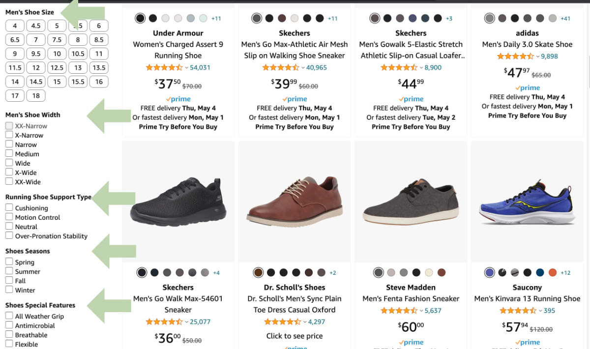
All the sidebar options are examples of custom taxonomies.

As shown here, taxonomies enable your visitors to easily sort through your posts and find related and similar content.

Categories vs. Tags

As discussed, both Categories and Tags are types of Taxonomies. The only technical difference is that Categories are hierarchical, while Tags are not. So with categories, you can create sub-categories (or child categories). With tags, you cannot. Tags always have a “flat” organizational structure.

Other than that, the main difference between Categories and Tags has to do with scope. With WordPress:

  • Categories are used to broadly organize posts into groups
  • Tags are used to denote any specific post characteristics

I know that’s a bit abstract, so let’s go through some “real-world” examples..

Categories: real-world example

Let’s say it’s our job to clean up a house that has tons of junk in it. There are piles of stuff all over the place, and it’s our job to go in there and clean it all up. First we create two piles: “stuff that stays”, and “stuff that goes”. Those two piles represent categories.

After hauling away the “stuff that goes” pile, it’s time to organize the “stuff that stays”. Again, we use categories to make things easier. There are many ways we could categorize all the remaining items. We could organize by room, so our categories would be like:

  • Living Room
  • Kitchen
  • Bathroom
  • Bedroom

Makes sense, right? It’s the same idea with WordPress posts. Categories simply group similar types of posts together. For the purpose of organizing content and making it easier for visitors to find.

Categories: another example

Generally categories represent broad similarities among items, but you can get as specific as you’d like. For example, it’s common for a web-development site to group posts into the following categories:

  • CSS
  • HTML
  • PHP
  • JavaScript
  • Etc.

..such that each coding language gets its own category. That’s gonna keep posts broadly organized based just on the language. All posts about CSS go into the “CSS” category. All posts about HTML into the “HTML” category, and so forth.

But you can get more specific with categories. Say our tutorial site has a LOT of posts on all the coding languages. We might want to refine our categories to include version information, for example:

  • CSS
    • CSS 1.0
    • CSS 2.0
    • CSS 3.0
  • HTML
    • HTML 4.0
    • HTML 5.0
  • Etc.

Because categories can be hierarchical, we can get as specific or as broad as is necessary to organize your posts. And to organize things even further, we can throw tags into the mix..

Tags: real-world example

Returning to our “hoarder house” example, let’s look at how we can use tags to help further organize things. Recall that all the stuff currently is organized by room. So our categories are:

  • Living Room
  • Kitchen
  • Bathroom
  • Bedroom

In each room, we can further organize things by adding a tag to each item. For example, we tag the “chairs”, “tables”, “desks”, “electronics”, “clothes”, “food”, “towels”, and so on. And the nice thing about tags is that they can be added across categories. There may be “chairs” in both Living Room and Kitchen categories. Or there may be “electronics” in all categories. So when visitors arrive at your house, they can click the “food” tag and eat all of your food, regardless of which room it’s in :)

10-second summary

The difference between Taxonomies, Categories, and Tags:

  • Taxonomies are used to organize posts. WordPress provides two default Taxonomies: Categories and Tags. It’s also possible to create Custom Taxonomies. Taxonomies may be hierarchical or non-hierarchical.
  • Categories are used to broadly organize posts into groups. Categories may have a hierarchical structure.
  • Tags denote any specific post characteristics. Tags are non-hierarchical, flat organizational structure.

Resources


Best 10 WooCommerce Themes to Consider in 2022

Are you looking for a WordPress theme to open an online store? 

Your best bet of course would be to select a theme that has WooCommerce-oriented features. Features that you’ll need to build your online shop quickly and get it done right.

With the right WooCommerce theme, you can have a store up and running quickly. All you’ll need to do when it’s finished is stock the shelves (digitally of course), launch your site, and you’re in business.

Choosing the best WooCommerce theme for your job isn’t as easy as you might think. 

Not every WooCommerce theme that advertises itself as offering a retail-oriented solution will have all the key features you’ll need to run your store easily and efficiently.

We’ve done the heavy lifting for you by drawing together this list of 10 best WooCommerce themes on the market. All you have to do is pick one that you believe will best fit your business objectives – and there’s more than one that will do precisely that!

1. BeTheme – The Biggest WordPress & WooCommerce Theme 

BeTheme is big, beautiful, and fast WooCommerce theme, and has all the design tools and aides you need to build your perfect online store. Well-known for its 650+ customizable pre-built websites that provide a head start on building any website type you can think of, Be also is one of the best WordPress themes with WooCommerce which features a set of tools made to order for building your online shop.

  • There’s BeBuilder, the fastest and most flexible page builder for WordPress.  Drag, drop, customize, and position elements to produce a pixel-perfect website fit for any device.
  • With BeBuilder Woo you can create your own store layout or use predefined layouts, create custom attribute swatches, and provide drop-down login, wish list, and quick preview features along with an eye-catching cart.
  • Be’s Header and Footer builders give you even more flexibility in designing your store.
  • Simply stock the shelves (product pages) and you’ll be ready to launch.

Click on the banner and check out these and BeTheme’s other core features (40+ of them) and see why 250,000+ others have made it their theme of choice.

2. WoodMart 

Customer satisfaction along with a bucketful of cool online shop-building features are no doubt prime factors in making WoodMart the ThemeForest’s highest rated eCommerce theme; many features of which will not be found in most eCommerce-oriented themes.

  • Customization options give you all the flexibility you’ll ever need and the shop and product page Elementor drag and drop builders keep workflow times to a minimum.
  • The full AJAX shop pagination, filter, product swatches, and search capabilities can double your conversion rate by making it twice as easy for customers to complete an order. Products don’t have to be opened on a new tab to complete a purchase.
  • WoodMart’s library of pre-made websites, special pages, and 400 templates together with an array of product page display options help you turn the vision of your online store into reality quickly and efficiently.

Click on the banner and see what WoodMart could do for you.

3. Rey Theme

With Rey you will experience design, performance, and innovation as never before, especially in the way it addresses filtering, search, templating, and navigation – the four pillars of eCommerce.

Rey has done so through its integrations into Elementor, WooCommerce, and WordPress.

A sampling of what you can expect.

  • Elementor’s built-in features are at your fingertips
  • an ability to easily create WooCommerce-customized headers and footers
  • Ajax Search and an ability to browse products without reloading pages (Ajax Filtering)
  • flexibility in creating product pages, including a selection of pre-designed plug and play pages
  • Ajax Navigation including page navigation and infinite loading
  • advanced cart checkout features

Rey is SEO Optimized, Responsive, and Developer Friendly. Click on the banner to see what this remarkable, performance-oriented theme can do for you.

4. Uncode – Creative & WooCommerce Theme

With Uncode, you’ll experience –

  • the performance that more than 100.000 buyers have already experienced – making Uncode an Envato best seller
  • the joy of working with Uncode’s WooCommerce custom builder and other advanced WooCommerce features, and its Wireframes plugin with its 550+ section templates.

Uncode is also ideal for building blog, magazine, and portfolio sites. Visit Uncode’s user-created website gallery and see what Uncode could do for you.

5. TheGem – Creative Multi-Purpose WooCommerce Theme

TheGem is a best-selling premium WordPress WooCommerce-oriented theme. Its versatile online shop toolbox offers unlimited customizations, 400+ creative modern WooCommerce designs for your store to stand out, and fastest loading with top performance.

With TheGem you can –

  • create unique product, cart, and checkout pages with TheGem’s WooCommerce Builder and the popular Elementor and WPBakery page builders
  • utilize premium WooCommerce features like versatile product grids, Ajax filters, shop mega menu, wish list, variation swatches, Ajax live search and more.

6. Total WordPress Theme

This aptly named and easy to use WooCommerce-oriented WordPress theme gives you the tools and flexibility you need.

Total offers

  • an abundance of WooCommerce styling options for colors, fonts, social sharing, product pages, and archives.
  • 50+ quick start demos, 90+ ready-made section templates, and 100+ site builder elements
  • a custom font manager

Total is compatible with most popular plugins including bbPress, Uber Menu, Easy Digital Downloads, WPML, Yoast, Ultimate Addons and others.

7. Hongo – Modern & Multipurpose WooCommerce WordPress Theme

Hongo is a modern multipurpose WordPress theme which is especially curated for creating WooCommerce stores, company websites and blogging sites.

Among Hongo’s wealth of useful features you’ll –

  • find premium WPBakery page builder and Revolution Slider plugins
  • experience excellent loading speeds and healthy SEO results
  • have 12 store demos, 200 plus creative elements and a library of 250 templates plus out of the box premium product-oriented features at your fingertips.

8. XStore – Best WordPress WooCommerce Theme for eCommerce

Over the past 10+ years XStore has been put to good use by more than 30,000+ satisfied customers with its – 

  • collection of more than 120 ready-to-customize shops
  • use of the popular Elementor and WPBakery page builders
  • live Ajax theme option, $500 worth of hand-picked “must have” premium plugins, a single product page builder, and single product layout options.

9. Jupiter X

Jupiter X2 is the most recent major update to the Jupiter X WordPress theme with a heavy focus on WooCommerce and full-site-editing:

Features include –

  • a Layout Builder with superior full site editing capabilities
  • an advance Product Catalog Builder filled with industry-first capabilities
  • a Checkout Builder to manage checkout form fields, add custom fields to your billing or shipping fields, and build multi-step and single-step checkouts
  • Jupiter-only checkout optimization features such as sales Funnels, order bumps, dynamic discounts, smart coupons and checkout notices.

With Jupiter X, building Shopify-like checkouts right inside WooCommerce is now a breeze!

10. Avada Theme

Avada is the all-time best selling theme on the market. That in itself is a good reason to choose this WordPress theme with WooCommerce, but there are plenty of others including – 

  • total WooCommerce compatibility 
  • 80+ one-click importable demos to start off your project
  • easy access to every popular WordPress plugin
  • $200 worth of website-building tools
  • An impressive array of page and design options

Avada is a fast WooCommerce theme, 100% responsive, and a favorite of 800,000 happy users. 

Creating an exciting web design for your online store is not always an easy, straightforward task. Luckily, there is an abundance of fast WooCommerce themes to choose from. But you have to pick one that includes the proper eCommerce store-building tools.

That’s because launching an online shop can be a time-consuming and costly venture if a theme lacks certain WooCommerce tools or features. For this reason, you must pay real attention when you pick WordPress themes with WooCommerce features.

10 Best WordPress Themes to Use in 2022

The online world is increasing exponentially, or so it seems, as roughly one thousand new websites come online every hour of the day.

No matter the size of your business niche, your competition is only going to increase with time. An attractive website won’t be as productive the future as it may have been in the past.

And if your website isn’t fully responsive it won’t be very productive at all, no matter how attractive it is.

When we say fully responsive, we mean flawlessly responsive. When you choose one of the best WordPress themes to build or remake a website you need to know how to find one that will get the job done.

With thousands of popular WordPress themes to choose from, finding the right one could take time. That is precisely why we’ve compiled this list of the top WordPress themes going into 2022. It’s designed to save you time and help you make the right choice.

1. BeTheme – The Biggest Multipurpose WordPress Theme with 650+ pre-built websites

BeTheme is the biggest WordPress and WooCommerce theme of them all with its more than 650 pre-built websites, tons of design aids and options in its 40+ core features, and its more than 240,000 customers.

A BeTheme-built website will be flawlessly responsive, SEO friendly, and super attractive as well.

  • Be’s 650+ pre-built websites are responsive, customizable, and can be configured to address any website type, style, or niche
  • The Live Builder is fast, it features an ergonomically-designed UI, and it has incredibly powerful page building capabilities that include live content editing, and autosave, update, and backup options
  • The WooCommerce Builder features template-building tools, Single Product layouts, product wish lists, carts, and other customer-centric functions and elements
  • Other tools include a Live Search function and Muffin and Header builders, plus BeTheme is Mobile-ready and Elementor-ready.

BeTheme is always kept up to date and offers free lifetime updates. Click on the banner to learn more about this powerful website-building tool.

2. Total WordPress Theme 

As its name implies, Total is a complete WordPress theme that enables you to create stunning, fully responsive WordPress-powered websites with ease.

Totals’s 48,000+ users have easy access to the following:

  • An extended version of the popular WPBakery page builder with more than 100 builder elements to use in creating layouts
  • A new template library with 90+ quick-start section templates and 45+ quick import demos
  • Live customizer settings to change colors, fonts, widths and other main settings plus a dynamic template function for creating custom layouts for post types, advanced page setting features, and more
  • Local scroll, full screen rows and sliders for building impressive one page sites and landing pages
  • Total is developer-friendly with a library of action hooks, custom code snippets, filters, and more

Click on the banner to learn more about everything Total can accomplish for you.

3. Avada Theme

Avada has become the #1 bestselling popular theme of all time for several reasons, the main one being that it allows you to design and build anything that goes through your mind, build it the way you want it, and build it without writing a single line of code. 

This website-building machine is built around three core pillars: Fusion Theme Options, Fusion Page Options, and Fusion Builder. What these three features offer will make you feel like the proverbial kid in the candy store.

A few examples –

  • 40+ one-click importable demos and 50+ design elements with hundreds of options
  • A Drag and Drop page builder
  • $200 worth of tools and premium plugins
  • A tried and tested responsive framework that adapts to every screen size
  • WooCommerce design tools

Click on the banner to find out more about what Avada’s 450,000+ satisfied customers already know.

4. TheGem – Creative Multi-Purpose & WooCommerce WordPress Theme

This ThemeForest best seller offers such an amazing multiplicity of website-building tools that it has been called the Swiss Army knife of WordPress Themes.

  • For starters, TheGem theme features 400+ customizable creative pre-built one page and multipage websites and templates plus 300+ unique pre-made page sections, all insertable and combinable with just few clicks 
  • For professionals, TheGem theme offers extended set of customization tools allowing to achieve any imaginable design results in a very fast and easy way 
  • TheGem is fully compatible with and available for WPBakery and Elementor page builders and features extended WooCommerce site-building tools as well
  • It offers very high performance, fast loading speed and includes premium plugins like WP Rocket and Revolution Slider – all in one package 

TheGem is 5-star rated and trusted by 60,000 customers.

5. Uncode – Creative & WooCommerce WordPress Theme

Uncode is a pixel-perfect creative theme that lets you create websites that exhibit the same characteristics that are embedded in the theme itself.

  • It is an excellent choice for building WooCommerce, portfolio, magazine, and blog sites
  • Key components include 450+ Wireframes section templates, a juiced-up Frontend Editor, and the WooCommerce Custom Builder

Uncode has enjoyed more than 90.000 sales to date.

6. WoodMart

The Woodmart WooCommerce multipurpose theme is an excellent choice for creating any type of corporate or business-related website.

With its unlimited customizations, Woodmart is the best-rated eCommerce theme on ThemeForest. Among its many site-building features you’ll find –

  • 75+ pre-made websites, a library of 400+ high-quality templates, and multiple Product and Shop options
  • A full drag and drop builder, an intuitive setup wizard, and full AJAX shop filters

Woodmart is performance and SEO optimized.

7. Rey Theme for WooCommerce

With Rey you can take your design efforts to the next level thanks to this theme’s powerful integrations into WooCommerce, Elementor, WordPress’s sophisticated engine itself.

Features include –

  • Ajax navigation, filtering, search, and presentation capabilities
  • Powerful Elementor extensions that provide unlimited flexibility
  • Google and Adobe fonts integration

Rey is performance oriented, SEO and developer friendly, and (naturally) responsive.

8. XStore – Best Premium WordPress WooCommerce Theme for eCommerce

You can build virtually any type of online shop when you have a ton of tools and design options to work with; exactly what XStore provides.

Features include –

  • Full support for Elementor and WPBakery page builders, a Header builder, and a Single Product page builder
  • Design aids include 500+ pre-built blocks, 100+ ready-to-customize shops, $500 worth of premium plugins, and a Live Ajax theme option
  • Product options including product hovers and 360 degree product view

9. Impeka – Creative Multipurpose WordPress Theme

Impeka guarantees your website will be fast, optimized for SEO, and fully responsive.

Impeka is WooCommerce ready, and you don’t need any design or coding skills to work with it.

You get to choose among 3 popular page builders –

  • WPBakery with 53+ handcrafted elements
  • Elementor with 50+ handcrafted widgets
  • Gutenberg with 10 handcrafted blocks

Impeka is ideal for beginners and full of potential for advanced users.

10. Litho – Multipurpose Elementor WordPress Theme

While Litho can be used to create virtually any type of website, it is especially suited for building portfolio, blog, eCommerce, and business niche sites.

Litho’s site-building features include –

  • The Slider Revolution premium plugin
  • Cool selections of home pages, templates, and creative design elements
  • Fully compatible and built with Elementor, the world’s #1 page builder

Litho also gives your site fast loading speeds and healthy SEO results.


Existing cool WordPress themes number in the millions. Unless you have plenty of time to spare, you don’t want to get involved in searching for the best fit for your needs.

You don’t want to “take a chance” either.

The best approach is to leave it up to the experts to determine what the top WordPress themes are as we enter 2022. That is what we’ve done here. It may take some thought to find the best theme to fit your needs, but there’s not a bad or wrong choice in the bunch.

The post 10 Best WordPress Themes to Use in 2022 appeared first on Codrops.

8 Design Tips to Make Your Blog or Shop Stand Out

You probably don’t need us to tell you that there’s a lot of competition on the internet. Your users have near-limitless options for where they can spend their time online. Because of that variety, finding a way to stand out can feel like an impossible task. 

Fortunately, a little bit of creative design can go a long way. By learning a few top-tier strategies, you can help your website become a must-see destination for your target audience.

Using Codetipi’s popular and number one rated Zeen theme as a reference, we’ll show you eight modern ways to take your website to the next level. Let’s get straight to it:

#1. Attract Attention With a Marquee Block

A marquee block is a section of your site that features moving text which helps draw your visitors’ eyes toward whatever information you’re trying to highlight. It was wildly popular on websites in the 90s and has recently made a roaring comeback to breathe new life and interactivity to modern websites:

Zeen’s lovely Marquee block in action

The slow speed gives users a chance to read the text. However, the fact that it flows slowly from right to left also helps to engage readers. This feature can also effectively guide your audience’s eyes across the rest of the screen, similar to a slideshow feature.

Themes that stay up to date with the latest trends, such as Zeen, make it easy to create marquee blocks. However, there are some factors to keep in mind to maximise the effectiveness of your marquee. 

Firstly, try not to include too much text. Shorter sentences help make sure that you don’t exceed a visitor’s attention span. Moreover, they can also avoid creating a rushed feeling. 

Secondly, pause the animation when hovering over it with a mouse. Zeen’s Marquee implementation does this, which is very needed to give visitors a sense of control over the site. This setting can help make sure that your message gets across and also further boosts the website’s overall interactivity feel.

Finally, we recommend that you try to include clickable Calls To Action (CTAs) in the text. A brief and clear directive can take advantage of this active design element. In Zeen’s demo site, the marquee links to a featured product category.

#2. Dark Mode

You probably put a lot of time and effort into choosing a color scheme for your website. Nevertheless, brighter designs may be off-putting to certain users. That’s why offering a darker alternative can be a stand-out and welcome feature.

Most people find that dark mode is a bit easier on the eyes, particularly when surfing the net at night. This is even more true if users want to read long-form articles.

Fortunately, you don’t have to design an entire site around a calming color palette or create a dark site. Instead, you can help your users toggle between contrasting shades at will via a Reading Mode feature:

Zeen’s Dark Mode in action

This toggle feature eases the browsing experience, so we recommend placing it in a fairly prominent area. However, it shouldn’t be large or intrusive – even a simple icon near the top of your page can do the trick, as visitors who prefer dark mode will not miss it.

This simple, interactive feature is easy to add to your designs. Zeen even comes with an advanced dark mode system that can save the user’s last reading preference via a cookie. In other words, your website can remember your visitors’ desired preference for when they next visit your site. 

#3. Remind Visitors of Their Shopping Carts

A lot of modern blogs have shops to sell merchandise or other goodies, and cart abandonment can be a big issue. The lack of an easy shopping journey means potential buyers who add products to their cart can lose focus or get distracted and end up abandoning their cart completely. If the cart inventory doesn’t expire on purpose, it might also cause locked-away stocking problems that could lead to further loss of sales from other potential buyers. 

Design can be a deciding factor here: up to 18% of people abandoned their carts because the site made it too complicated to complete their purchases. If you want to appeal to this portion of customers more effectively, consider making the checkout process as seamless as possible.

A simple way to do this is with a floating sticky cart block. This subtle design element keeps your customer’s cart close without taking up too much space.

Additionally, you can double down on this concept with an ajax powered cart that appears without a page refresh. Giving users the freedom to go directly from a product to the checkout process can help reduce friction that might prevent them from purchasing:

Zeen’s Floating Cart feature

Zeen is a theme primarily aimed at magazines and blogs, however, it comes with advanced WooCommerce integration and features that can put eCommerce-first marketed themes to shame.

We recommend that you try and integrate a shopping cart element into your overall design. For example, a large button can be intrusive and distracting. Consider using a smaller alternative and choosing vibrant colors that are easy to spot instead. 

#4. Use Delayed Transitions

You’re probably already familiar with the importance of smooth transitions. The freedom to move seamlessly around your site is a subtle yet essential part of the user experience. If these changes seem jittery, your overall design might be less enjoyable.

However, you don’t have to stop at smooth transitions. Adding clever delays to your element’s transitions can create a subtle and stylish staggered effect:

Zeen’s staggered animations

Users may not consciously notice these changes. However, the cascading effect can make the browsing process seem more elegant. It may also help highlight how well different aspects of the site work together.

If you want to use delayed transitions, we highly recommend applying them across your site. Not every small action needs to be delayed, but the larger ones probably should be. That way, you can maintain consistency across your website.

#5. User Engagement

The best designs don’t focus on appearance alone. Search Engine Optimization (SEO) is also a concern for most sites. As such, integrating modern technologies into your design strategy can help more first-time users discover and engage with your website.

You can consider Google’s voice search as an example. This feature enables people to browse the web via voice commands. If you’re following best practices for standard SEO, you’re already giving yourself a leg up.

Zeen comes with Voice Search integration

However, it’s not just about voice searches. High on-site engagement functionality can also help your site stand out.

That’s why you might want to consider adding something like emoji reactions. You’re probably familiar with Facebook’s version already:

A feature such as this makes interaction easy: users can express themselves with a single click. However, you don’t have to use standard reactions. You may want to consider personalizing them to your brand. That way, the responses will also reflect what makes your site unique.

Zeen’s Emoji functionality – choose from 14 different emotions

#6. Include Excellent Navigation Tools

The easier it is for users to find content, the more likely they are to consume it. As such, you probably don’t need us to tell you that navigation is an essential part of web design.

Fortunately, there are a few tried-and-true ways to provide high-quality navigation for your visitors. For example, try to ensure that no part of your website is more than three clicks from the homepage. This design can cut down on the amount of searching your users need to do.

Additionally, try to make these pathways obvious with clearly labelled menus. You may also want to place them in prominent areas like The New Yorker website does:

However, not all of your audience members will want to hunt through menu choices. That’s where a powerful search function comes in. With this simple addition, you can save users time with a direct route to the content they want.

To make a search function even more convenient, consider designing your page around it. That way, moving around your site will be as easy as possible:

Modern Search Design
Zeen’s Freebie Digital Products Demo

Lastly, your search bar doesn’t have to be boring. Consider including a few background animations around it to draw your user’s attention toward the navigational resource.

#7. Use Different Image Aspect Ratios

Consistency is a pretty important part of website design. However, it’s far from the only one. Visual variety plays a crucial role in offering a dynamic visual experience.

Different image aspects ratios help keep readers stay interested and stimulated. Instead of blocking all your content into standardized areas, consider switching it up. 

Zeen’s Food blog demo showcases this concept, by mixing portrait, circular and landscape images in a variety of column arrangements on the homepage:

That way, you avoid making a website with a repetitive design. Additionally, this feature can be a great way to highlight multiple pieces of content.

While the aspect ratios can vary, you may want to consider making each area link to similar content. In the above example, the top three sections all link to recipes. With this setup, your users will be looking at different options rather than different subjects altogether.

#8. Focus On Your Photos

High-quality photos aren’t always easy to come by. They can take a lot of time and dedication to perfect. That’s why we recommend that you give them the spotlight. 

Highlighting your photos can serve a few purposes. For one thing, you’ll be getting the maximum value out of work spent on the images.

It also presents design benefits. For example, a few large photos can create a commanding visual overview of your brand. You can also use them to show off featured products.

By the same token, photos are crucial if you’re trying to promote a product. Most users want to know a lot about whatever they’ll be spending money on – and as the old saying goes, a picture’s worth a thousand words. 
Pinterest doubles down on this concept with large imagery that also reflects the interface’s design. That way, users have a preview of what they can expect after signing up:

If you’re looking for another way to make the most out of this design strategy, we recommend including colorful backgrounds. A subtle choice can help your photos stand out without distracting from what you’re trying to advertise:

Zeen’s Undo Demo:

If your design concept doesn’t necessarily mesh well with these tips, never fear! You could also include interactive photos. Consider adding a thumbnail hover effect to ensure that your users can engage with your images.  

Conclusion

Designing a website that stands out from the crowd isn’t always the easiest task. Fortunately, there are a few rules of thumb that can guide you toward success. By applying these tips and tricks, you can create a unique and high-quality site.

In this article, we showed you a few ways to create a top-tier website. We focused on dynamic elements, practical considerations, and other ways to appeal to new and returning users alike. 

Do you have any questions or any tips of your own about designing a stand-out site? Let us know in the comments section below!

The post 8 Design Tips to Make Your Blog or Shop Stand Out appeared first on Codrops.

Qi Theme

Qi Theme 21

Qi Theme is a free WordPress theme created by Qode Interactive – an award-winning studio. This theme perfectly combines top speed and performance with a beautiful design.

It comes with 100 demos, allowing you to easily set up any type of website, whether it’s an online store, an artist’s portfolio, or a simple blog. If you can think it up, this theme will help you build it – it will even grant you free access to premium stock photos.

Qi Theme is fully supported by video tutorials as well as an extensive knowledge base, so you’ll always have a place to look for help.

How to Disable Gutenberg Styles on the Frontend

By default the Gutenberg Block Editor loads its default CSS/stylesheet on the front-end of your WordPress site. This is fine for most cases, but there may be situations where you want to disable the Gutenberg styles for whatever reason. For example, my free WordPress plugin, Disable Gutenberg, enables users to disable the Gutenberg Block Editor and restore the Classic Editor. Included in the plugin settings is an option called “Enable Frontend” that lets users enable or disable the Gutenberg CSS/styles as desired. This quick DigWP tutorial explains programmatically how to disable Gutenberg styles on the front-end.

Bonus: Disable Gutenberg plugin also enables restoring of Classic Widgets!

Why?

One reason why people may want to remove extraneous/unnecessary CSS/stylesheets from loading is improved site performance. So by disabling the Gutenberg CSS when it’s not needed, that’s one less asset that needs to load for every page request. That can have a huge cumulative effect on the performance of your WordPress site.

FYI the default Gutenberg stylesheet looks like this when included in the source code of your web pages:

<link rel='stylesheet' id='wp-block-library-css'  href='https://example.com/wp-includes/css/dist/block-library/style.min.css' type='text/css' media='all' />

So you know what to look for.

Disable Gutenberg styles on the front-end

Without further ado, here is the magic code snippet sauce to add to your WordPress-powered site. You can add this code using a plugin such as Code Snippets, or you can add directly via theme (or child theme) functions.php, or add via simple custom plugin. Many ways to add the following code:

// disable gutenberg frontend styles @ https://m0n.co/15
function disable_gutenberg_wp_enqueue_scripts() {
	
	wp_dequeue_style('wp-block-library');
	wp_dequeue_style('wp-block-library-theme');
	
}
add_filter('wp_enqueue_scripts', 'disable_gutenberg_wp_enqueue_scripts', 100);

This script disables the default Gutenberg stylesheet wp-block-library, and it also disables the theme-specific Gutenberg stylesheet (if applicable) wp-block-library-theme. That’s all it does, plain and simple.

Note: To re-enable the Gutenberg styles, simply remove the above code snippet.

Bonus: Disable other block stylesheets

In general, any WordPress stylesheet can be disabled using the WP core function, wp_dequeue_style(). For example, if you are using WooCommerce and the Storefront theme, you may want to prevent their related Gutenberg Block CSS/stylesheets from loading on the front-end. To do it, modify the previous code snippet so it looks like this:

// disable gutenberg frontend styles @ https://m0n.co/15
function disable_gutenberg_wp_enqueue_scripts() {
	
	wp_dequeue_style('wp-block-library');
	wp_dequeue_style('wp-block-library-theme');
	
	wp_dequeue_style('wc-block-style'); // disable woocommerce frontend block styles
	wp_dequeue_style('storefront-gutenberg-blocks'); // disable storefront frontend block styles
	
}
add_filter('wp_enqueue_scripts', 'disable_gutenberg_wp_enqueue_scripts', 100);

The wp_dequeue_style() function is what’s doing all the work here. It is very effective and can be used to disable any stylesheet that is registered with WordPress. Check the docs at WordPress.org for more details.

One for the road..

The code techniques so far are kept very minimal for the sake of clarity. But as you probably know, there is much more that can be done when customizing asset loading and so forth. For example, you can add conditional logic so the stylesheets will be disabled only under certain conditions.

To give you an idea of the possibilities, here is a “real-world” example showing how Disable Gutenberg conditionally disables the front-end styles depending on user preference in the plugin settings.

// disable gutenberg frontend styles @ https://m0n.co/15
function disable_gutenberg_wp_enqueue_scripts() {
	
	global $wp_query;
	
	if (is_admin()) return;
	
	$post_id = isset($wp_query->post->ID) ? $wp_query->post->ID : null;
	
	$options = get_option('disable_gutenberg_options');
	
	$enable = isset($options['styles-enable']) ? $options['styles-enable'] : false;
	
	if (!$enable && !disable_gutenberg_whitelist($post_id)) {
		
		wp_dequeue_style('wp-block-library');
		wp_dequeue_style('wp-block-library-theme');
		
	}
	
}
add_filter('wp_enqueue_scripts', 'disable_gutenberg_wp_enqueue_scripts', 100);

Again this is just an example taken from an actively developed plugin. So much more is possible, as WordPress core provides all sorts of useful functions with which to work. So have fun and build something creative :)

Note: The above code snippet taken from the Disable Gutenberg plugin is for example purposes only; so don’t try to use it on any live site. Instead if you want to explore, download the plugin and examine the source code.

Related Posts

More of our posts on Gutenberg Block Editor:


Be: The Fastest and Easiest Way to Build Your Portfolio Site

The website for your design business should not only explain who you are and what you do, but show off the impressive body of work you’ve created. It’s the strongest tool in your sales and marketing arsenal. 

But as a web designer, you know how long it can take to build a really great website for a client. If you’re ready to start attracting awesome leads and adding new clients to your business now, you might not want to spend that much time building your portfolio site. 

The good news is that you don’t have to. 

BeTheme’s new Muffin Builder is like upgrading from a Ford to a Ferrari. You’ll be shocked at how quickly you get your website to the finish line — and with superior results, no less. 

Let’s take a closer look:

New Muffin Builder features that’ll knock your socks off

Time is money when you’re a web designer. So, it’s important to build a portfolio site and get it online as soon as possible. 

Here are 6 features from the new Muffin Builder (and BeTheme) that will enable you to quickly and painlessly create something you’re proud of and that will undoubtedly impress prospective clients:

Feature #1: A professional-looking portfolio site already built for you

There are certain pages and features every portfolio should have: An attractive home page, convincing client testimonials, a selection of works, and so on. 

But just because the structure of your site will mirror other portfolio sites, that doesn’t mean it has to look like everyone else’s. 

As of today, BeTheme has over 600 pre-built sites, with dozens of portfolio site options to choose from: 

While these portfolio sites might be built for different types of creatives, pay attention to the different styles. Whether you want to give your site a futuristic edge or you want to infuse the design with some femininity, you’ll find the perfect portfolio-equipped site for your business here. 

What’s more, each pre-built portfolio site is compatible with Muffin Builder, so you’ll have the added benefit of being able to edit your pre-built site with this powerful website builder. 

Feature #2: Intuitive customization options

Realistically, you could have a new portfolio site designed and loaded into WordPress in under a minute with BeTheme. 

While each site comes with well-chosen imagery and helpful placeholder text, you’ll still need to customize the content and maybe even tweak the design in order to make it your own.

Once you’re inside the new and improved Muffin Builder, you’ll see how easy this is to do.

The first customization feature to take advantage of is the global settings editor, which you’ll find under Betheme > Theme Options in WordPress: 

Quickly update colors, fonts, layouts, and styles and apply them globally to the site from this panel. 

To make changes on a smaller scale, use the Muffin Editor within your Pages. The section toolbar will allow you to make adjustments to each container: 

You have the same level of control over the content within each block. The settings you find here all depend on what kind of content is in the block. For example: 

You have the flexibility to customize your content however you prefer: Use the text editor or take advantage of Muffin Builder’s predefined settings.

Feature #3: Importable and reusable section templates

It’s not just the base of your site that’s already built for you with BeTheme. 

Let’s say you’ve imported a great-looking portfolio pre-built site like Portfolio 2

You like the current layout of the About us page on this site, but you want to add a Google reviews section between the “My offer” and “How I work” sections. 

With the Muffin Builder, you can easily import pre-built sections using the icon on the right toolbar or by clicking “Pre-built sections” when you add a new section to the page: 

Chances are good that whatever you envisioned adding to the page can be found there. Like this:

As you can see, it’s all placeholder content. That said, the structure and design are taken care of, so all you need to do is fill in the content. 

Feature #4: Custom layouts and headers

Pre-built sites are a great starting point. In many cases, you can use them right out of the box. 

However, if you want to alter the layout across the site or on a specific page or two, Muffin Builder can help you make those adjustments:

Under the Layouts section in WordPress, set up your custom layout — which includes changing the header, too, if you prefer — and save it.

To apply it to your pages, scroll down below the Muffin Builder on each page and select the layout from the list: 

This way, you’re not just empowered to swap out your content for BeTheme’s placeholder content. With Muffin Builder, you get to customize as much or as little of the pre-built site as you want. 

Feature #5: Backup and restoration

It’s not uncommon to “sleep on it” and decide you liked the way the site looked or the way you wrote something previously. 

Thanks to the Muffin Builder’s revision panel and backups, you can quickly and painlessly roll back your portfolio site.

First, open the revisions panel: 

Then choose the revision (if there’s more than one) you want to restore: 

If you’ve ever stressed about an update you made to your portfolio and wished you could instantly go back to the way it was before, this new Muffin Builder feature is going to be a lifesaver.

Coming soon: The Front-end builder

If you prefer to design from the front-end of the website, a new Muffin Builder feature will be headed your way the Summer of 2021:

There are a number of reasons why many website builder tools (including WordPress’s own Gutenberg) have a front-end editing experience: 

  • It saves you the trouble of having to switch between the editor and website preview to check your work. 
  • Some people prefer to do their editing within the full context of the website as it’s easier to make decisions when looking at the big picture. 
  • It’s more client-friendly than the typical backend editor, so this feature can empower your clients and other non-tech-savvy users to make tweaks to their sites.

If you’ve been looking for a live visual editor to use in WordPress, this new feature is just around the corner!

The fast and easy way to build a portfolio: BeTheme + Muffin Builder

If you’re looking for a fast and easy way to build your digital portfolio, the solution is obvious: 

Start with a beautiful BeTheme pre-built site and then customize it with the intuitive Muffin Builder.

Who knows? This potent combo could end up changing the way you build websites for your clients going forward. 

Learn more about BeTheme, explore the more than 600 pre-built sites available, and check out Muffin Builder’s newest features here.

The post Be: The Fastest and Easiest Way to Build Your Portfolio Site appeared first on Codrops.

How to Check if Post has Taxonomy Term

Something I did not know about when working with Custom Post Types and Custom Taxonomies. Normally when checking if a regular WP Post belongs to a specific category, we can use the WordPress function in_category(). But that does not work with Custom Post Types. To check if a CPT belongs to a specific term in a Custom Taxonomy, use has_term() instead.

Check if WP Post belongs to specific category

To check if the current post belongs to a specific category, use in_category(). For example in your theme's single.php template, you can do this:

if (in_category(1)) {
	
	// post is in category with ID = 1
	
}

Here we are checking if the post belongs to category with ID = 1. You can change that to any category ID, name or slug, or an array containing multiple values.

Here is an example where mutliple categories are checked:

if (in_category('donuts')) {
	
	// post belongs to "donuts" category
	
} elseif (in_category(array('coffee', 'beer'))) {
	
	// post belongs to either "coffee" or "beer"
	
} else {
	
	// post does not belong to any of the above categories
	
}

Notice the use of an array in the elseif condition. You can specify as many categories as needed using an array of category IDs, names, or slugs.

Check if CPT belongs to specific taxonomy term

Now for the main point of this tutorial. To check if the current post belongs to a specific term in a custom taxonomy. For example, if we have a taxonomy named download_category and want to check if the current post belongs to the term combo, we can do this:

if (has_term('combo', 'download_category')) {
	
	// post belongs to "combo" in "download_category" taxonomy
	
}

When calling has_term(), the first parameter is the name of the term, and the second parameter is the name of the taxonomy.

To check multiple terms, use an array of term IDs, names, or slugs. For example:

if (has_term(array('combo', 'book', 'deal'), 'download_category')) {
	
	// post belongs to "combo", "book", or "deal" in "download_category" taxonomy
	
}

So this example will check if the current post belongs to "combo", "book", or "deal" in the "download_category" taxonomy.

Bonus Tip: Check for *any* taxonomy term

To check if the current post belongs to any term in a given taxonomy, simply leave the first parameter empty/blank. Example:

if (has_term('', 'download_category')) {
	
	// post belongs to a term in the "download_category" taxonomy
	
}

Here we are checking if the current post belongs to any term in the "download_category" taxonomy.

That's the thick and thin of it.

Bottom line is just remember:

  • Check post for category — use in_category()
  • Check post for tax term — use has_term()

10+ Examples of Responsive Websites That Got It Right

When designing a new website, there’s a long list of specifications and requirements you have to fulfill. It’s just the nature of web design these days. And at the top of that list sits responsive web design.

Thankfully, high-quality WordPress themes like BeTheme make it insanely easy to check off all the technical requirements you’re expected to meet — including responsive design. But why does it matter so much?

Well, for starters, more than half of all website traffic takes place on mobile according to data from StatCounter.

While desktop has put up a good fight for a couple years, mobile has prevailed as the winner. It will continue to do so, too, considering how much more convenient it is to access the web from the palm of one’s hand.

Plus, Google has made it clear that it rewards responsive web designs and mobile-friendly websites with better search rankings, so there’s no hiding from it now.

Responsive web design is a must.

Just keep in mind that following the rules for good mobile design doesn’t mean you ignore desktop users. By prioritizing the mobile experience, you can design more beautiful and efficient websites for all users.

Let’s look at some examples that demonstrate how to do this well.

Responsive web designs that encourage leaner desktop experiences

Just because you have more space to work with when designing for desktop users doesn’t mean you need to make the most of every pixel.

In fact, as Internet-enabled devices have grown smaller in size, it’s encouraged many designers to create leaner and more efficient experiences on desktop.

Take the website for designer/developer Rob Grabowski, for example.

This is how his website appears on a mobile screen:

With minimized logo and navigation out of the way, this allows the focus to remain on his photo and welcome message. Desktop visitors encounter the same thing:

This consistency in design is great because it enables visitors to seamlessly transition from viewing a website on one device to another (which happens often).

Mobile web designs that improve the decision-making process

Consumers today struggle with an overabundance of choice. It might be easier to find that thing or service they’re looking for, but that doesn’t make choosing between similar options any easier.

One of the benefits of responsive design is that it forces web designers to create websites in a modular fashion so that, as the screen size shrinks, each section falls in line beneath the others.

In turn, this makes it easier for customers to review options one-by-one. BeRepair, one of the 500+ pre-built sites from BeTheme, demonstrates this point really well:

This is one of the services offered. Notice how the responsive layout allows the visitor to really focus on the details before them and not get distracted by too much information.

This works well for other types of websites. Take, for instance, the BeRestaurant pre-built desktop site:

It’s a great-looking restaurant website. The mobile counterpart looks just as great, but minimizes the distractions so the core elements can really shine:

Rather than try to fit the menu to the right of the food images, the responsive website maintains the integrity of the original design by tucking it into the hamburger menu icon in the top-right.

Again, this is all about giving your visitors the ability to pause and really focus on the key actions you’re asking them to take. A navigation bar in full view would only distract from that.

Responsive designs that cut out the excess

Think about the last time you went to an art gallery or museum and the kinds of paintings you encountered:

  • The landscape murals that have a central focus but beautiful details surrounding it.
  • The portraits with a singular focus that’s chock-full of intimate details.

What’s cool about responsive websites is that they allow us to display the same web page in both formats.

Desktop screens thereby display landscape murals and mobile screens display portraits. But it’s important to know where the excess is in the desktop view so you can trim it back enough to make the mobile experience worthwhile.

For instance, this is the desktop site for BeITService:

This is a great looking hero banner on the home page. It’s well-balanced, the colors are carefully chosen, and the message is crystal-clear.

This is a good example of how smart designers have become when it comes to choosing responsive images for websites.

Here’s that same image and banner from above, but now displayed on mobile:

The image may not appear in full, but there’s nothing lost in this translation from desktop to mobile. What’s more, the message remains front and center.

Culturally Connected does something similar:

On desktop, it shows an elaborate background graphic that enhances the overall design. On mobile, however, it turns into this:

Even with the image now reduced and placed at the bottom, it’s still a striking design that allows the message to really shine through.

Another great example is BeTutor. This is how the desktop version looks like:

Here we have the main title and some more info using smaller text. In order not to cramp the mobile view, the design omits the extra content and focuses on the primary message:

The mobile view stays uncluttered without loosing any of the important subject matter that reveals the type of service offered.

Responsive websites that leverage their space

While a small screen requires reducing content in most of the cases, some responsive web designs leverage the space and use the different ratio to their advantage.

Take 1987 Masters for example:

While the desktop version focuses on their main tagline, the mobile version makes use of the vertical space and shows more content, giving the mobile visitor an option to learn more about the company right away:

So a mobile design don’t necessarily have to show less content in order to work well.

The mobile screen ratio allows for making use of the vertical space, like it’s shown in this example of BeCosmetics. Check out the desktop view:

The mobile view has more vertical space so the introductory content can be shown along with the button that invites the user to explore all products:

Once again, these examples demonstrate that less space doesn’t need to mean less useful content for the mobile website user.

Responsive websites that enhance readability

When laying out text on a desktop website, you have to be careful about how much you show to a reader at once. Put too many words on a line or not include enough spacing between letters, and your visitors might skip reading it altogether.

It’s a tricky balance to maintain and usually requires visual elements to balance out the text. Take, for example, the BeDanceSchool site:

Thanks to the funky designs and eye-catching graphics around the text, it’s easy for visitors to focus on the content and read it all the way through.

This won’t work on mobile though, which is why it’s important to understand the strengths of each screen size. Here you can see how that same text from above should be handled on mobile:

The design is paired back immensely so that all the visitor can see is the content. But that’s okay because the text is still beautifully styled which helps keep attention.

That said, text presented to mobile visitors doesn’t always have to be so heavily styled. If you select the right font size and type, you can create something that’s readable and engaging just as Base Coat does:

Just be mindful of the vertical length of text on mobile. While it might be easy to see where it ends on desktop, it can seem daunting on mobile if it appears to go on and on.

Mobile sites that put a spotlight on visual content

Responsive web designs aren’t just useful for websites with lots of text. Because of the way content responds to smaller screen sizes, visual storytelling elements look great on mobile, too.

Here’s what visitors see on the BeBand website on desktop:

Mobile screens don’t have the ability to play with balance as in the example above, but they do have the ability to shine a spotlight on the images you’ve chosen:

Websites that contain eye-catching images like this one would certainly benefit from responsive web design.

It’s not just static images that this works with either. The Scott Resort, for example, invites first-time visitors to watch a video:

Regardless of what kind of device the visitor is on, the video automatically conforms to the width of the screen.

This is the video on desktop:

And this is the video on mobile:

With a mobile responsive design, you really allow your content to adapt to the device and experience your users want.

Mobile responsive sites that collect more leads

Although more website traffic comes from mobile devices, it’s still quite difficult to get mobile users to convert as much as they do on desktop. That’ll come with time, but we’re not there just yet.

In the meantime, your responsive site needs to be prepared to capture leads whenever it can to improve those conversion rates.

Let’s take a look at how this works.

This is the pre-built site for BeClub:

This “Newsletter” section stands out beautifully on the homepage. And because it’s so convenient (e.g. it’s light on text and requires only one field be filled out), it’s likely to get a ton of subscribers.

This is how that same subscriber form appears on mobile:

Again, it’s really well done — and the smaller, dedicated space on mobile might be an even more effective way to catch the attention of potential subscribers.

So, if you can design your responsive site to collect visitors’ email addresses, you’ll empower them to reconnect with your website from their preferred device. As a result, you can increase the number of conversions it gets.

Responsive web designs for the win

When WordPress users go looking for a theme to design their website with, they look for qualities like:

  • Ease of use
  • Cost efficiency
  • Features
  • Customizability
  • Overall design quality

It’s easy to take responsive web designs for granted because we see them everywhere, but, the truth is, not every WordPress theme is built with the mobile user in mind.

BeTheme is different. Each of its 500+ pre-built sites comes with mobile responsiveness baked in.

So, when you use BeTheme, you can spend less time stressing over how to make your website look like the responsive designs above and more time getting your new website online and in front of consumers.

10+ Examples of Responsive Websites That Got It Right was written by Bogdan Sandu and published on Codrops.

Manon – Portfolio & Agency Theme

Manon is a true game-changer in the WordPress sphere. This unparalleled portfolio & agency theme lets you create a wonderfully fluid website that will surely stand out in the crowd.
It comes completely decked-out with powerful features and a collection of 12 terrific homepages. Impressively designed, adorned with jaw-dropping animation effects and stunning elements, Manon’s portfolio lists and singles are just what you need to exhibit your skillset in a fresh and exciting way. With more than 30 different portfolio elements, you can showcase your creative genius in virtually any way imaginable. Each layout can be easily customized to your liking and adapted to your unique style.
It’s pretty clear that the authors of Manon understand what all creatives need, and they’ve tailored the theme exactly to fit those needs.

The post Manon – Portfolio & Agency Theme appeared first on WeLoveWP.

A Showcase of Creative Websites and How to Build Uniquely Special Ones for Your Clients

As the digital market continues to expand, it means more business for web designers and front-end developers. That’s of course good news, but there’s a catch. Today’s clients are becoming more and more sophisticated about what they expect from their online presence. Today’s web professionals are bound and determined to do their best to satisfy those clients and their demands.

You’re no different, but you’ll have to work harder (and/or smarter) to get your share of good assignments. You have to deliver websites that stand out from the rest and use tools that enable you to do just that – a tool like Be Theme for example.

Be Theme is the largest and most versatile WordPress theme on the market. It will do much if not most of the creative effort for you. It will do all the heavy lifting involved in putting together an attention-grabbing deliverable.

Let’s have a look at what Be Theme offers, along with some practical advice on how to build strikingly creative websites. With plenty of cool examples it will put you in good shape. This way you can create impressive, engaging, and visitor-converting creative websites.

Overuse “white” space? Not a bad idea.

Seemingly empty space has more going for it than you might think. In fact, it’s not all that easy to “overuse” the design element we refer to as white space. “More is better” is actually a pretty good rule of thumb to follow.

The Urban Village Project’s clean design enables the eye to focus on the main message and key elements:

UrbanVillage

Stylist illustrates how white space can enhance brand elements and bring focus to a design.

BeStylist

The Drive New York also shows how sophisticated use of white space can enhance the uniqueness of the brand:

Andstudio has a striking minimal look that employs white space as one of the main design elements:

AndStudio

Making white space a part of the brand is an excellent way to drive the message home.

BePrint 2 is an excellent example of how plenty of white space can be used in combination with distinctive typography:

Show visitors how your creativity benefits them

Don’t make the mistake of trying to impress your client on how creative you are. Web design isn’t about you. It’s about what you can do for your visitors or those of your clients. A little creativity can be highly effective when it helps visitors imagine themselves actually using your product or service.

BeYoga 3 offers a clear message and shows what the service can help its customers to achieve:

Travelshift engages visitors in an experience they want to be part of:

In this BeBlogger 3 example the mood is set for adventure and thrilling storytelling:

BeExtreme 2 provides an excellent foundation for a travel agency, a travel blogger’s site, or a destination site. It can also be a source of inspiration that encourages viewers to get off the sofa and see more of the world.

Use sharp, crystal-clear photos and creative illustrations

Crystal clear photos and illustrations are important in different ways:

  1. The images themselves contribute to the message you want to convey
  2. They are more likely to be remembered as a brand element
  3. They reflect the professional care and craftsmanship involved in creating the design of the website.

Mechanic 4’s distinctive illustration and brand colors will make it very likely be remembered and it shows how an everyday service can be elevated with an unexpected design:

MetaMusic’s landing page design is composed of a noteworthy line illustration that gives a distinct character to the web presence and works in harmony with the other elements, like the typography:

BeCode 2 is another example by Be Theme that conveys how creative illustrations in combination with interesting shapes can bring a design to the next level and help provide a fresh perception of the service:

BeCafe 2 shows how using spellbinding “signature” images can make a web presence special and give it the unique touch that every brand seeks for:

Papas Nativas, a dedicated page by Emergence Magazine, has a wonderful design with color filtered images that set the mood for the story:

The portfolio of Daphné Launay welcomes the visitor with one of her remarkable works. The design is built around the exquisite mood she sets with her subjects:

Sheep Inc’s eminent design and layout work in combination with a unique image style that won’t be forgotten:

Select a spellbinding color palette

The color palette you select and work from can make the difference between a website that isn’t all that different from most others to one that gets a ton of attention. You don’t have to be a certified interior decorator or an award winning artist to get colors right. Following a couple of simple rules is all you need to do.

  • Choose colors that will attract immediate attention.
  • Support the brand as well as the message you’re trying to convey with your color selection.

BeLanguage 3 uses bright and bold, attention-grabbing colors to suggest how learning a new language can be both fun and rewarding.

BeScienceCentre pre-built website is an example of using a color palette that grabs your attention and make you want to browse more:

Shake proficiently uses their brand color to create a memorable experience of their website. The fade-out animation to white allows them to continue a minimal flow without having to compromise their impactful initial statement:

BePolyglot’s pleasing color theme positively enhances the idea behind the service and creates an inviting yet professional mood:

BeApp 4 is a great example of how colors and motif can be carried through the design:

BeProductions has a very minimal, yet impactful color approach. It cleverly uses the main brand color to amplify key elements of the design:

Make your CTAs easy to find and impossible to ignore

It can take more than a little time and effort to create a website that draws visitors in and gets them engaged, but if they have to hunt for a CTA button, or the button isn’t well integrated into the website’s flow, that time and effort can go for naught.

Put in another way: those buttons should practically beg to be clicked on.

Intact has an excellent way of highlighting the important actions on the site that goes well with the entire color theme and style of the website:

BeITService 2’s CTA buttons are easy to locate. They acts as a gate that invites you to explore further to find the information or explore their products:.

BeProduct 4’s CTAs complement the brand’s color theme, creating a clever contrast that attracts the eye and highlights the goal of exploring the service first, before purchasing it:

Starface World’s quirky color theme incorporates few but catchy colors that make it impossible to miss the most important action the site:

CTA buttons don’t necessarily have to stand out from every other element on a page. You can have them match other design elements and still attract attention if they are placed judiciously. BeBikeRental is a good example:

Building Creative Websites: Summing up

The secret to your success requires imagination and creativity on your part. The practical tips presented here provide you with a framework to work from. They are straightforward and not particularly difficult to execute. If you keep them in mind and have quality website tools to work with you should have little trouble putting them to good use.

You also want a tool that won’t bog you down or place unnecessary limitations on what you want to create. You want one that allows you to manage a quick pace as business begins to increase – which it will.

With Be Theme’s extensive gallery of nearly 500 creative websites you will get boundless ideas for your next project. Every website is based on the principles mentioned before and being highly customizable, you can focus on your client’s needs. You’ll be surprised with the speed an easy you can craft a unique website with a powerful building tool like Be Theme.

A Showcase of Creative Websites and How to Build Uniquely Special Ones for Your Clients was written by Bogdan Sandu and published on Codrops.

How to Add Custom Content to WordPress Feeds

There are numerous ways to add custom content to your WordPress feeds. If you're not using a plugin, it's possible to just add a code snippet to your theme's functions.php file. For most cases, I think probably going the plugin route is the easiest way to add custom content to your WordPress RSS/feeds. Just install, activate, add your content and done. But for WordPress developers and designers who want more fine-grained control, this article explains how to add custom feed content programmatically using the WP API. So whether you need to add copyright text, advertisements, hyperlinks, or virtually anything at all, this post explains how to make it happen.

Add custom content to feed content

Often the easiest way to explain something is to just show it:

// add custom content to all feeds
function shapeSpace_add_content_to_all_feeds($content) {

	$before = '<p>Custom content displayed before content.</p>';
	$after = '<p>Custom content displayed after content.</p>';

	if (is_feed()) {

		return $before . $content . $after;

	} else {

		return $content;

	}

}
add_filter('the_content_feed', 'shapeSpace_add_content_to_all_feeds');

This snippet adds the specified custom content to each item in your WordPress feeds. You can add this code to your WordPress site by including it in your theme, or you can make a simple plugin and go that route. Either way is fine, totally up to you.

How it works

In the previous code, our function shapeSpace_add_content_to_all_feeds() first defines the custom content that we want to add $before the feed content and $after the feed content. Using either/both of these variables, you can define virtually any custom content, text, markup, or whatever you wish.

After defining the custom content, the function continues with a conditional check via the is_feed() tag. If the request is for any of WordPress’ feeds, then the custom content will be included with the feed content. Otherwise, if the request is not for any feed, then the original content is returned unmodified.

FYI: Technically the conditional is_feed() check is not necessary, but it's useful to show how a conditional tag might be used in this context.

By itself, our shapeSpace_add_content_to_all_feeds() function won't do anything. To get it to work, we need to call it. And because this is WordPress, we can use add_filter() to choose exactly when and where the function should be called. For WP feeds, we can hook our function into the_content_feed, so our custom content will be added to the <content> tag of every WordPress feed.

Example of feed output

To help visualize what happens when custom content is added to WordPress feeds, here is an example of what the feed markup (XML) will look like after adding our custom $before and $after content using the method above:

<item>
	<title>Securing the WP REST API</title>
	<link>https://digwp.com/2018/08/secure-wp-rest-api/</link>
	<comments>https://digwp.com/2018/08/secure-wp-rest-api/#comments</comments>
	<pubDate>Mon, 27 Aug 2018 19:40:33 +0000</pubDate>
	<dc:creator>Jeff Starr</dc:creator>
	<category><![CDATA[ Security ]]></category>
	<guid isPermaLink="false">https://digwp.com/?p=8446</guid>
	<description>
		<![CDATA[ I think many WordPress users probably underestimate the amount of data that is made available via the REST API. Just about everything is available to anyone or anything that asks for it: posts, pages, categories, tags, comments, taxonomies, media, users, settings, and more. [&#8230;] ]]>
	</description>
	<content:encoded>
		<![CDATA[
		<p>Custom content displayed before content.</p>

		<p>I think many WordPress users probably underestimate the amount of data that is made available via the <a href="https://developer.wordpress.org/rest-api/" title="REST API Handbook">REST API</a>. Just about everything is available to anyone or anything that <strong>asks for it</strong>: posts, pages, categories, tags, comments, taxonomies, media, users, settings, and more. ...</p>
		<p>Post content continues here...</p>

		<p>Custom content displayed after content.</p>
		]]>
	</content:encoded>
	<wfw:commentRss>https://digwp.com/2018/08/secure-wp-rest-api/</wfw:commentRss>
	<slash:comments>1</slash:comments>
</item>

Here you can see the "before" and "after" custom content added to the <content> tag. And that's pretty much all there is to it. Now let's change it up and add our custom content to the feed description (i.e., excerpt).

Add custom content to feed description

In the previous section, we cover how to add our custom content to the the <content> tag. To instead display the custom content in the <description> tag, we simply need to change the hook that is used by our add-content function. So instead of doing this:

add_filter('the_content_feed', 'shapeSpace_add_content_to_all_feeds');

..we hook our function into the_excerpt_rss, like so:

add_filter('the_excerpt_rss', 'shapeSpace_add_content_to_all_feeds');

Here is the result of using this new tag:

<item>
	<title>Securing the WP REST API</title>
	<link>https://digwp.com/2018/08/secure-wp-rest-api/</link>
	<comments>https://digwp.com/2018/08/secure-wp-rest-api/#comments</comments>
	<pubDate>Mon, 27 Aug 2018 19:40:33 +0000</pubDate>
	<dc:creator>Jeff Starr</dc:creator>
	<category><![CDATA[ Security ]]></category>
	<guid isPermaLink="false">https://digwp.com/?p=8446</guid>
	<description>
		<![CDATA[
		<p>Custom content displayed before content.</p>
		
		I think many WordPress users probably underestimate the amount of data that is made available via the REST API. Just about everything is available to anyone or anything that asks for it: posts, pages, categories, tags, comments, taxonomies, media, users, settings, and more.  [&#8230;] 
		
		<p>Custom content displayed after content.</p>
		]]>
	</description>
	<content:encoded>
		<![CDATA[
		
		<p>I think many WordPress users probably underestimate the amount of data that is made available via the <a href="https://developer.wordpress.org/rest-api/" title="REST API Handbook">REST API</a>. Just about everything is available to anyone or anything that <strong>asks for it</strong>: posts, pages, categories, tags, comments, taxonomies, media, users, settings, and more. ...</p>
		<p>Post content continues here...</p>
		
		]]>
	</content:encoded>
	<wfw:commentRss>https://digwp.com/2018/08/secure-wp-rest-api/</wfw:commentRss>
	<slash:comments>1</slash:comments>
</item>

By hooking our function into the_excerpt_rss, our "before" and "after" content is added to the <description> instead of the <content>. So it follows that we can add to BOTH description AND content by calling our function with BOTH hooks, something like this:

add_filter('the_content_feed', 'shapeSpace_add_content_to_all_feeds');
add_filter('the_excerpt_rss', 'shapeSpace_add_content_to_all_feeds');

Take home message

Basic thing to remember:

  • the_excerpt_rss — filters feed <description>
  • the_content_feed — filters feed <content>

You can call your "content-adding" function using either or both of these hooks. Then you can configure just about any sort of custom feed content that you can imagine. BTW, I find myself using this technique somewhat frequently, so I wrote a plugin to help automate the process of adding custom content to feeds, posts, pages, or any combination — gives you lots of flexibility.


IntelliJ Themes Contest 2019: Add More Color to Your IDE!

We are thrilled to announce IntelliJ Themes Contest 2019! Create the community’s most-loved theme plugin for any IntelliJ-based IDEs: IntelliJ IDEA, PhpStorm, PyCharm, RubyMine, WebStorm, DataGrip, GoLand, CLion, Rider, or AppCode, and win a prize!

IntelliJ IDEA 2019.1 arrived last month with official support for color customization of the IDE appearance, which means it’s up to you to decide what your IDE looks like! You can customize the colors of most of its parts, from toolbars, windows, buttons and icons, to the background, the editor scheme, and much more.

Blogasm

Blogasm is a minimal, elegant, clean and responsive free WordPress blog theme with a pleasing design and minimalist color combination to emphasize your blog posts. Create your awesome blog for personal, fashion, lifestyle, food, travel, photography, portfolio, technology or any other types of blog sites. Built-in One-click demo importer option helps to get started quickly.

The post Blogasm appeared first on WeLoveWP.