If you have a WordPress (or any other type of) website for any length of time, it’s likely you’ll run into the need to move it to a new host at some point. Figuring out how to migrate a WordPress website is one of those site maintenance tasks a lot of people would rather avoid as it can seem unruly, unpredictable, and time-consuming.
And sometimes, it really is all of those things. However, if you plan ahead and have a good set of instructions to walk you through the process, you should be good to go.
Why Migrate?
Site owners find they need to migrate WordPress sites for a number of different reasons. A lot of the time, it’s a matter of finding a better hosting deal elsewhere. The promise of saving money is always enticing. Another common reason to migrate your site is due to a lack of satisfaction with your current service provider. Whether they offer poor customer service or slow server response times, there are many reasons to switch.
Here are a few more common reasons people decide to migrate a WordPress website:
- Seeking better site performance. If your site is currently too slow, an upgrade to a new host might be the right call.
- A need for greater bandwidth. If your site is growing rapidly, migrating to a host that can handle your increased traffic needs is a must.
- A need for more storage space. If your site is multimedia-heavy, migrating to a host with greater storage capacity might be the right choice for you.
- More hands-on customer support. If you run an extensive website with a lot of moving parts (customers, clients, accounts, etc), the need for a more responsive customer support team might be more pronounced and necessary.
- Better pricing. Sometimes, the price tag tells the whole story. If you find a better hosting deal elsewhere, migrating your WordPress site might be your best bet.
- Expanded feature set. If your current host is lacking in features, you may find you need to migrate to one that offers more.
With the “why” spelled out, let’s move onto the “how.” We’ll cover how to manually migrate WordPress, along with some plugins that will do the hard work for you.

How to Manually Migrate a WordPress Site
You will need an FTP client to complete this process. A few options include:
Step 1: Backup Your Site
Before you can move your site anywhere, you need to back it up. This means going through the process of downloading every single file of your WordPress site from a remote location. You will need an FTP client for this. Though I typically use FileZilla for this process, I’ll keep the steps fairly generic. Apply as needed to your chosen FTP client:
- Connect to your old site’s server.
- Go to the
public_html folder.
- Select all files in this folder.
- Download the files.
Next, you’ll need to create and download a backup of your site’s MySQL database as well. To do this, you’ll need to go to the control panel of your web host. Most of the time, this will be cPanel. Go to phpMyAdmin and select the database associated with your WordPress site. Click Export and the database will be downloaded to your computer.
If you’d rather have this process be somewhat automated, go to cPanel (if your host supports it) and access the File Manager. In here, you can create a .zip file that contains all of your site’s files and its database for easy downloading. If you’re not super familiar with FTP, this might be the preferred method to use.
Step 2: Upload Your Files to the New WordPress Host
The next step to migrate a WordPress website is to upload your site’s files to the new host. You’ll need your trusty FTP client again. Once connected, you’ll need to go to the public_html folder on this new hosting account. Next, you’ll need to upload all the files from your site – make sure to decompress them first!
Step 3: Upload Your WordPress Database to the New Host
Once the files are uploaded, you’ll need to upload your WordPress MySQL database, too.
To do this, go to the cPanel or other control panel connected to your new hosting account. There should be a section specifically for MySQL databases. From there you’ll need to:
- Create a new database. Make note in a safe place of the database name, username, and password associated with this new database.
- Go to phpMyAdmin. The new database should be listed. Select it.
- Click Import. Then, select the MySQL database file you’d previously downloaded. Upload it and save your settings.
Step 4: Edit the wp-config.php File
Now that everything has been uploaded to the new host, you’ll need to do some fine-tuning to ensure all of the new host’s settings work with your site. This will require using your FTP client again, but this time, find the wp-config.php file.
Once you’ve located this file, you’ll need to modify some code. According to SiteGround, you need to locate this section of code within the file:
/** The name of the database for WordPress */
define('DB_NAME', 'user_wrdp1');

/** MySQL database username */
define('DB_USER', 'user_wrdp1');

/** MySQL database password */
define('DB_PASSWORD', 'password');

/** MySQL hostname */
define('DB_HOST', 'hostname');
Once you’ve located this section of code, you need to replace bits of it with information about the WordPress database you created. Here’s what you need to replace:
- Change the database name, if necessary
- Set username to your database’s username
- Set password to your database’s password
- Swap out hostname for localhost or a custom name provided by your host
Save the changes you made. In a lot of cases, this will be the last step you need to take. Your site should now be up and running on the new host.
Step 5: Update the DNS
In some cases, you’ll need to update Domain Name Server or DNS information on your new host. This will ensure that when someone types in your site’s URL, they wind up on your actual site and not a blank page. This is common practice when you’re switching domain servers, hosting plans, and hosting companies.
According to WPEngine, you’ll need DNS info about your new host and access to the registrar from whom you bought your domain name in the first place. Specifically, you’ll need:
- CNAME record
- A NAME for your site.
Input this info in your domain registrar account. This can sometimes take up to a few days to complete processing.
Plugins for Migrating WordPress Sites
If all of the above sounds like a lot of work, you can rely on plugin-based solutions to do the heavy lifting for you. These plugins are sometimes referred to as “cloning” plugins but for our purposes, we’re considering them all methods of migrating WordPress websites.
Now, you will still likely need to adjust a few settings on your new site server manually, but these plugins will definitely take care of the backing up, exporting, and importing processes.

The Duplicator plugin makes it much easier to migrate WordPress by streamlining the process. It works by making click-of-a-button copies of your site’s files and database. Then you can download all of this information in a handy .zip file with minimal effort.

Another great option is the All-in-One WP Migration plugin. This one allows you to make backups of your site’s content and database as well and import this information over to your new host, all from within the plugin.
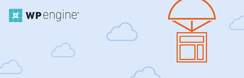
Our last recommendation is the WP Engine Automated Migration plugin. This one copies your files and WordPress database and allows you to upload them to your new site server with ease. So long as you have your hosting account details on hand, the plugin will handle much of the site migration process for you. Just note that this plugin only works with the WP Engine hosting provider.
Migrate Your Site Now
Whether you decide to migrate a WordPress site manually or you opt for the plugin route, you hopefully now have a stronger understanding of what the process entails, how it works, and what you need to do to prepare. Again, it might seem like a lot of work on the surface but the end result is often well worth it when you end up with a better home for your website.
Best of luck!