Mastering Typography In Logo Design

Typography Definitions Cover

Typography is much more than just text on a page — it forms the core of your design. As a designer, I always approach selecting types from two angles: as a creative adventure and as a technical challenge.

Choosing the right typeface for a company, product, or service is an immensely important task. At that moment, you’re not only aligning with the brand’s identity but also laying the foundation to reinforce the company or service’s brand. Finding the right typeface can be a time-consuming process that often begins with an endless search. During this search, you can get tangled up in the many different typefaces, which, over time, all start to look the same.

In this article, I aim to provide you with the essential background and tools to enhance your typography journey and apply this knowledge to your logo design. We will focus on three key pillars:

  1. Font Choice
  2. Font Weight
  3. Letter Spacing

We will travel back in time to uncover the origins of various typefaces. By exploring different categories, we will illustrate the distinctions with examples and describe the unique characteristics of each category.

Additionally, we will discuss the different font weights and offer advice on when to use each variant. We will delve into letter-spacing and kerning, explaining what they are and how to effectively apply them in your logo designs.

Finally, we will examine how the right typeface choices can significantly influence the impact and success of a brand. With this structured approach, I will show you how to create a logo that is not only expressive but also purposeful and well-thought-out.

Understanding Typography in Logo Design

From the invention of the Gutenberg press in the mid-15th century through the creation of the first Slab Serif in 1815 and the design of the first digital typeface in 1968, the number of available fonts has grown exponentially. Today, websites like WhatFontIs, a font finder platform, catalogs over a million fonts.

So, the one downside of not being born in the 15th century is that your task of choosing the right font has grown enormously. And once you’ve made the right choice out of a million-plus fonts, there are still many pitfalls to watch out for.

Fortunately for us, all these fonts have already been categorized. In this article, we refer to the following four categories: serif, sans serif, script, and display typefaces. But why do we have these categories, and how do we benefit from them today?

Each category has its specific uses. Serif typefaces are often used for books due to their enhancement of readability on paper, while sans serif typefaces are ideal for screens because of their clean lines. Different typefaces also evoke different emotions: for example, script can convey elegance, while sans serif offers a more modern look. Additionally, typeface categories have a rich history, with Old Style Serifs inspired by Roman inscriptions and Modern Serifs designed for greater contrast.

Today, these categories provide a fundamental basis for choosing the right typeface for any project.

As mentioned, different typefaces evoke different emotions; like people, they convey distinct characteristics:

  • Serif fonts are seen as traditional and trustworthy;
  • Sans Serif fonts are seen as modern and clear;
  • Script fonts can come across as elegant and/or informal depending on the style;
  • Display fonts are often bold and dynamic.

Historically, typefaces reflected cultural identities, but the “new typography” movement sought a universal style. Designers emphasized that typefaces should match the character of the text, a view also supported by the Bauhaus school.

Different Fonts And Their Characteristics

We have touched upon the history of different typeface categories. Now, to make a good font choice, we need to explore these categories and see what sets them apart, as each one has specific characteristics. In this article, we refer to the following four categories:

Let’s take a closer look at each category.

A serif typeface is a typeface that features small lines or decorative elements at the ends of the strokes. These small lines are called “serifs”.

A sans-serif typeface is a typeface that lacks the small lines or decorative elements at the ends of the strokes, resulting in a clean and modern appearance. The term “sans-serif” comes from the French word “sans,” meaning “without,” so sans-serif translates to “without serif.”

A script typeface is a typeface that mimics the fluid strokes of handwriting or calligraphy, featuring connected letters and flowing strokes for an elegant or artistic appearance.

A display typeface is a typeface designed for large sizes, such as headlines or titles, characterized by bold, decorative elements that make a striking visual impact.

Typeface Persona in Practice

Experts link typeface characteristics to physical traits. Sans serif faces are perceived as cleaner and more modern, while rounded serifs are friendly and squared serifs are more official. Light typefaces are seen as delicate and feminine, and heavy ones are seen as strong and masculine. Some typefaces are designed to be child-friendly with smoother shapes. Traditional serifs are often considered bookish, while sans serifs are seen as modern and no-nonsense.

Based on the provided context, we can assign the following characteristics per category:

  • Serif: Bookish, Traditional, Serious, Official, Respectable, Trustworthy.
  • Sans Serif: Clean, Modern, Technical, No-nonsense, Machine-like, Clear.
  • Script: Elegant, Informal, Feminine, Friendly, Flowing.
  • Display: Dramatic, Sophisticated, Urban, Theatrical, Bold, Dynamic.

Let me provide you with a real real-life logo example to help visualize how different typeface categories convey these characteristics.

We’re focusing on ING, a major bank headquartered in the Netherlands. Before we dive into the logo itself, let’s first zoom in on some brand values. On their website, it is stated that they “value integrity above all” and “will not ignore, tolerate, or excuse behavior that breaches our values. To do so would break the trust of society and the trust of the thousands of colleagues who do the right thing.”

Given the strong emphasis on integrity, trust, and adherence to values, the most suitable typeface category would likely be a serif.

The serif font in the ING logo conveys a sense of authority, professionalism, and experience associated with the brand.

Let’s choose a different font for the logo. The font used in the example is Poppins Bold, a geometric sans-serif typeface.

The sans-serif typeface in this version of the ING logo conveys modernity, simplicity, and accessibility. These are all great traits for a company to convey, but they align less with the brand’s chosen values of integrity, trust, and adherence to tradition. A serif typeface often represents these traits more effectively. While the sans-serif version of the logo may be more accessible and modern, it could also convey a sense of casualness that misaligns with the brand’s values.

So let’s see these traits in action with a game called “Assign the Trait.” The rules are simple: you are shown two different fonts, and you choose which font best represents the given trait.

Understanding these typeface personas is crucial when aligning typography with a company’s brand identity. The choice of typeface should reflect and reinforce the brand’s characteristics and values, ensuring a cohesive and impactful visual identity.

We covered a lot of ground, and I hope you now have a better understanding of different typeface categories and their characteristics. I also hope that the little game of “Assign the Trait” has given you a better grasp of the differences between them. This game would also be great to play while you’re walking your dog or going for a run. See a certain logo on the back of a lorry? Which typeface category does it belong to, and what traits does it convey?

Now, let’s further explore the importance of aligning the typeface with the brand identity.

Brand Identity and Consistency

The most important Aspect when choosing a typeface is that it aligns with the company’s brand identity. We have reviewed various typeface options, and each has its unique characteristics. You can link these characteristics to those of the company.

As discussed in the previous section, a sans-serif is more “modern” and “no-nonsense”. So, for a modern company, a sleek sans-serif typeface often fits better than a classic Serif typeface. In the previous section, we examined the ING logo and how the use of a sans-serif typeface gave it a more modern appearance, but it also reduced the emphasis on certain traits that ING wants to convey with its brand.

To further illustrate the impact of typeface on logo design, let’s explore some more ‘extreme’ examples.

Our first ‘Extreme’ example is Haribo, which is an iconic gummy candy brand. They use a custom sans-serif typeface.

Let’s zoom in on a couple of characteristics of the typeface and explore why this is a great match for the brand.

  • Playfulness: The rounded, bold shapes give the logo a playful and child-friendly feel, aligning with its target audience of children and families.
  • Simplicity: The simple, easily readable sans-serif design makes it instantly recognizable and accessible.
  • Friendliness: The soft, rounded edges of the letters convey a sense of friendliness and positivity.

The second up is Fanta, a global soft drink brand that also uses a custom sans-serif typeface.

  • Handcrafted, Cut-Paper Aesthetic: The letters are crafted to appear as though they’ve been cut from paper, giving the typeface a distinct, hand-made look that adds warmth and creativity.
  • Expressive: The logo design is energetic and packed with personality, perfectly embodying Fanta’s fun, playful, and youthful vibe.

Using these ‘extreme’ cases, we can really see the power that a well-aligned typeface can have. Both cases embody the fun and friendly values of the brand. While the nuances may be more subtle in other cases, the power is still there.

Now, let’s delve deeper into the different typefaces and also look at weight, style, and letter spacing.

Elements of Typography in Logo Design

Now that we have a background of the different typeface categories, let’s zoom in on three other elements of typography in logo design:

Typefaces

Each category of typefaces has a multitude of options. The choice of the right typeface is crucial and perhaps the most important decision when designing a logo. It’s important to realize that often, there isn’t a single ‘best’ choice. To illustrate, we have four variations of the Adidas logo below. Each typeface could be considered a good choice. It’s crucial not to get fixated on finding the perfect typeface. Instead, ensure it aligns with the brand identity and looks good in practical use.

These four typefaces could arguably all be great choices for the Adidas brand, as they each possess the clean, bold, and sans-serif qualities that align with the brand’s values of innovation, courage, and ownership. While the details of typeface selection are important, it’s essential not to get overly fixated on them. The key is to ensure that the typeface resonates with the brand’s identity and communicates its core values effectively. Ultimately, the right typeface is one that not only looks good but also embodies the spirit and essence of the brand.

Let’s zoom in on the different weights and styles each typeface offers.

Weight and Style

Each typeface can range from 1 to more than 10 different styles, including choices such as Roman and Italic and various weights like Light, Regular, Semi-Bold, and Bold.

Personally, I often lean towards a Roman in Semi-Bold or Bold variant, but this choice heavily depends on the desired appearance, brand name, and brand identity. So, how do you know which font weight to choose?

When to choose bold fonts

  • Brand Identity
    If the brand is associated with strength, confidence, and modernity, bold fonts can effectively communicate these attributes.
  • Visibility and Readability
    Bold fonts are easy to read from a distance, making them perfect for signage, billboards, and other large formats.
  • Minimalist Design
    Using bold fonts in minimalist logos not only ensures that the logo stands out but also aligns with the principles of minimalism, where less is more.

Letter-spacing & Kerning

An important Aspect of typography is overall word spacing, also known as tracking. This refers to the overall spacing between characters in a block of text. By adjusting the tracking in logo design, we can influence the overall look of the logo. We can make a logo more spacious and open or more compact and tight with minimal adjustments.

Designer and design educator Ellen Lupton states that kerning adjusts the spacing between individual characters in a typeface to ensure visual uniformity. When letters are spaced too uniformly, gaps can appear around certain letters like W, Y, V, T, and L. Modern digital typefaces use kerning pairs tables to control these spaces and create a more balanced look.

Tracking and kerning are often confused. To clarify, tracking (letter-spacing) adjusts the space between all letters uniformly, while kerning specifically involves adjusting the distance between individual pairs of letters to improve the readability and aesthetics of the text.

In the example shown below, we observe the concept of kerning in typography. The middle instance of “LEAF” displays the word without any kerning adjustments, where the spacing between each letter is uniform and unaltered.

In the first “LEAF,” kerning adjustments have been applied between the letters ‘A’ and ‘F’, reducing the space between them to create a more visually appealing and cohesive pair.

In the last “LEAF,” kerning has been applied differently, adjusting the space between ‘E’ and ‘A’. This alteration shifts the visual balance of the word, showing how kerning can change the aesthetics and readability of text (or logo) by fine-tuning the spacing between individual letter pairs.

Essential Techniques for Selecting Typefaces

Matching Typeface Characteristics with Brand Identity

As we discussed earlier, different categories of typefaces have unique characteristics that can align well with, or deviate from, the brand identity you want to convey. This is a great starting point on which to base your initial choice.

Inspiration

A large part of the creative process is seeking inspiration. Especially now that you’ve been able to make a choice regarding category, it’s interesting to see the different typefaces in action. This helps you visualize what does and doesn’t work for your brand. Below, I share a selection of my favorite inspiration sources:

Trust the Crowd

Some typefaces are used more frequently than others. Therefore, choosing typefaces that have been tried and tested over the years is a good starting point. It’s important to distinguish between a popular typeface and a trendy one. In this context, I refer to typefaces that have been “popular” for a long time. Let’s break down some of these typefaces.

Helvetica

One of the most well-known typefaces is Helvetica, renowned for its intrinsic legibility and clarity since its 1957 debut. Helvetica’s tall x-height, open counters, and neutral letterforms allow it to lend a clean and professional look to any logo.

Some well-known brands that use Helvetica are BMW, Lufthansa, and Nestlé.

Futura

Futura) has been helping brands convey their identity for almost a century. Designed in 1927, it is celebrated for its geometric simplicity and modernist design. Futura’s precise and clean lines give it a distinctive and timeless look.

Some well-known brands that use Futura are Louis Vuitton, Red Bull, and FedEx.

That said, you naturally have all the creative freedom, and making a bold choice can turn out fantastic, especially for brands where this is desirable.

Two’s Company, Three’s a Crowd

Combining typefaces is a challenging task. But if you want to create a logo with two different typefaces, make sure there is enough contrast between the two. For example, combine a serif with a sans-serif. If the two typefaces look too similar, it’s better to stick to one typeface. That said, I would never choose more than two typefaces for your logo.

Let’s Build a Brand Logo

Now that we’ve gone through the above steps, it seems a good time for a practical example. Theory is useful, but only when you put it into practice will you notice that you become more adept at it.

TIP: Try creating a text logo yourself. First, we’ll need to do a company briefing where we come up with a name, define various characteristics, and create a brand identity. This is a great way to get to know your fictional brand.

Bonus challenge: If you want to go one step further, you can also include a logo mark in the briefing. In the following steps, we are going to choose a typeface that suits the brand’s identity and characteristics. For an added challenge, include the logo mark at the start so the typeface has to match your logo mark as well. You can find great graphics at Iconfinder.

Company Briefing

Company Name: EcoWave

Characteristics:

  • Sustainable and eco-friendly products.
  • Innovative technologies focused on energy saving.
  • Wide range of ecological solutions.
  • Focus on quality and reliability.
  • Promotion of a green lifestyle.
  • Dedicated to addressing marine pollution.

Brand Identity: EcoWave is committed to a greener future. We provide sustainable and eco-friendly products that are essential for a better environment. Our advanced technologies and high-quality solutions enable customers to save energy and minimize their ecological footprint. EcoWave is more than just a brand; we represent a movement towards a more sustainable world with a special focus on combating marine pollution.

Keyword: Sustainability

Now that we’ve been briefed, we can start with the following steps:

  1. Identify key characteristics: Compile the top three defining characteristics of the company. You can add related words to each characteristic for more detail.
  2. Match the characteristics: Try to match these characteristics with the characteristics of the typeface category.
  3. Get inspired: Check the suggested links for inspiration and search for Sans-Serif fonts, for example. Look at popular fonts, but also search for fonts that fit what you want to convey about the brand (create a mood board).
  4. Make a preliminary choice: Use the gathered information to make an initial choice for the typeface. Adjust the weight and letter spacing until you are satisfied with the design of your logo.
  5. Evaluate your design: You now have the first version of your logo. Try it out on different backgrounds and photos that depict the desired look of the company. Assess whether it fits the intended identity and whether you are satisfied with the look. Not satisfied? Go back to your mood board and try a different typeface.

Let’s go over the steps for EcoWave:

1. Sustainable, Trustworthy, Innovative.

2. The briefing and brand focus primarily on innovation. When we match this Aspect with the characteristics of typefaces, everything points to a Sans-Serif font, which offers a modern and innovative look.

3. Example Mood Board

4. Ultimately, I chose the IBM Plex Sans typeface. This modern, sans-serif typeface offers a fresh and contemporary look. It fits excellently with the innovative and sustainable characteristics of EcoWave. Below are the steps from the initial choice to the final result:

IBM Plex Sans Regular

IBM Plex Sans Bold

IBM Plex Sans Bold & Custom letter-spacing

IBM Plex Sans Bold & Custom edges

5. Here, you see the typeface in action. For me, this is a perfect match with the brand’s identity. The look feels just right.

Expert Insights and Trends in Typographic Logo Design

Those interested in typography might find ‘The Elements of Typographic Style’ by Robert Bringhurst insightful. In this section, I want to share an interesting part about the importance of choosing a typeface that suits the specific task.

“Choose faces that suit the task as well as the subject. You are designing, let us say, a book about bicycle racing. You have found in the specimen books a typeface called Bicycle, which has spokes in the O, an A in the shape of a racing seat, a T that resembles a set of racing handlebars, and tiny cleated shoes perched on the long, one-sided serifs of ascenders and descenders, like pumping feet on the pedals. Surely this is the perfect face for your book?

Actually, typefaces and racing bikes are very much alike. Both are ideas as well as machines, and neither should be burdened with excess drag or baggage. Pictures of pumping feet will not make the type go faster, any more than smoke trails, pictures of rocket ships, or imitation lightning bolts tied to the frame will improve the speed of the bike.

The best type for a book about bicycle racing will be, first of all, an inherently good type. Second, it will be a good type for books, which means a good type for comfortable long-distance reading. Third, it will be a type sympathetic to the theme. It will probably be lean, strong, and swift; perhaps it will also be Italian. But it is unlikely to be carrying excess ornament or freight and unlikely to be indulging in a masquerade.”

— Robert Bringhurst

As Robert Bringhurst illustrates, choosing a typeface should be appropriate not only for the subject but also for the specific task. What lessons can we draw from this for our typeface choice in our logo?

Functional and Aesthetic Considerations

The typeface must be legible in various sizes and on different mediums, from business cards to billboards. A well-designed logo should be easy to reproduce without loss of clarity.

Brand Identity

Suppose we have a brand in the bicycle industry, an innovative and modern company. In Robert Bringhurst’s example, we choose the typeface Bicycle, which, due to its name, seems to perfectly match bicycles. However, the typeface described by Robert is a serif font with many decorative elements, which does not align with the desired modern and innovative look of our brand. Therefore, this would be a mismatch.

Trends

“Styles come and go. Good design is a language, not a style.”

In this part, we discuss some new trends. However, it is also important to highlight the above quote. The basic principles we mention have been applicable for a long time and will continue to be. It can be both fun and challenging to follow the latest trends, but it is essential to integrate them with your basic principles.

Minimalism and Simplicity

Minimalism in Logo Design remains one of the major trends this year. The most characteristic Aspect of this style is to limit the logo to the most essential elements. This creates a clear and timeless character. In typography, this is beneficial for readability and, at the same time, effectively communicating the brand identity in a timeless manner. We also see this well reflected in the rebranding of the fast-food chain Ashton.

Customization and Uniqueness

Another growing trend is customization in typography, where designers create personalized typefaces or modify existing typefaces to give the brand a unique look. This can range from subtle adjustments in letterforms to developing a completely custom typeface. Such an approach can contribute to a distinctive visual identity. A good example of this can be seen in the Apex logo, where the ‘A’ and ‘e’ are specifically adjusted.

Conclusion

We now know that choosing the right typeface for a logo goes beyond personal taste. It has a significant impact on how powerful and recognizable a brand becomes. In this article, we have seen that finding the perfect typeface is a challenge that requires both creativity and a practical approach. With a strong focus on three key Aspects:

  • Font choice,
  • Font weight,
  • Letter spacing.

We have seen that finding the right typeface can be a quest, and personal preferences certainly play a role, but with the right tools, this process can be made much easier. The goal is to create a logo that is not only beautiful but also truly adds value by resonating with the people you want to reach and strengthening the brand’s key values.

We also looked at how trends can influence the longevity of your logo. It is important to be trendy, but it is equally important to remain true to timeless principles.

In summary,

Truly understanding both the technical details and the emotional impact of typefaces is enormously important for designing a logo. This knowledge helps to develop brands that not only look good but also have a deeper strategic impact — a strong brand.

And for those of you who are interested in diving deeper, I’ve tried to capture the fundamentals we’ve discussed in this article, focusing on good typeface choices, font weights, and letter spacing in a tool huisstijl. While it’s not perfect yet, I hope it can help some people create a simple brand identity that they love.

If I Was Starting My Career Today: Thoughts After 15 Years Spent In UX Design (Part 2)

Typography Definitions Cover

In the previous article in my two-part series, I have explained how important it is to start by mastering your design tools, to work on your portfolio (even if you have very little work experience — which is to be expected at this stage), and to carefully prepare for your first design interviews.

If all goes according to plan, and with a little bit of luck, you’ll land your first junior UX job — and then, of course, you’ll be facing more challenges, about which I am about to speak in this second article in my two-part article series.

In Your New Junior UX Job: On the Way to Grow

You have probably heard of the Pareto Rule, which states that 20% of actions provide 80% of the results.

“The Pareto Principle is a concept that specifies that 80% of consequences come from 20% of the causes, asserting an unequal relationship between inputs and outputs. The principle was named after the economist Vilfredo Pareto.”

— “The Pareto Principle, a.k.a. the Pareto Rule

This means that some of your actions will help you grow much faster than others.

But before we go into the details, let’s briefly consider the junior UX designer path. I think it’s clear that, at first, juniors usually assist other designers with simple but time-consuming tasks. Then, the level of complexity and your responsibilities start increasing, depending on your performance.

So, you got your first design job? Great! Here are a few things you can focus on if you want to be growing at a faster pace.

Chase For Challenges

The simple but slow way to go is to do your work and then wait until your superiors notice how good you are and start giving you more complex tasks. The problem is that people focus on themselves too much.

So, to “cut some corners,” you need to actively look for challenges. It’s scary, I know, but remember, people who invented any new groundbreaking UX approach or a new framework you see in books and manuals now used their intuition first. You have the whole World Wide Web full of articles and lectures about that. So, define the skill you want to develop, spend a day reading about this topic, find a real problem, and practice. Then, share what you did and get some feedback. After a few iterations, I bet you will be assigned the first real task for your practice!

Use Interfaces Consciously

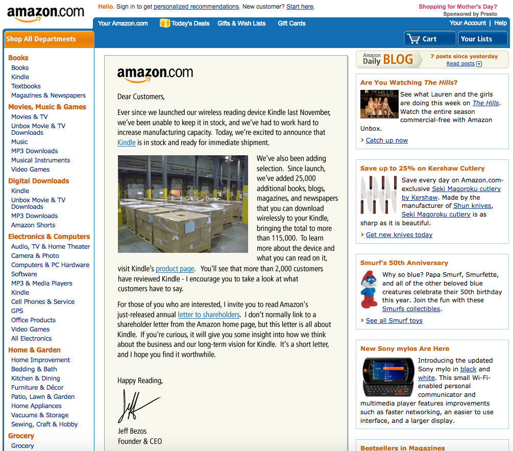
Take the time to look again at the screenshot of the Amazon website (from Part One):

User interfaces didn’t appear in their present form right from the start. Instead, they evolved to their current state over the span of many years. And you all were part of their evolution, albeit passively — you registered on different websites, reset your passwords quite a few times, clicked onboarding screens, filled out short and long web forms, used search, and so on.

In your design work, all tasks (or 99% of them, at least at the beginning) will be based on those UX patterns. You don’t need to reinvent the bicycle; you only need to remember what you already know and pay attention to the details while using the interfaces of the apps on your smartphone and on your computer. Ask yourself:

  • Why was this designed this way?
  • What is not clear enough for me as a user?
  • What is thought out well and what is not?

All of today’s great design solutions were built based on common sense and then documented so that other people can learn how to re-use this knowledge. Develop your own “common sense” skill every day by being a careful observer and by living your life consciously. Notice the patterns of good design, try to understand and memorize them, and then implement and rethink them in your own work.

I can also highly recommend the Smart Interface Design Patterns course with Vitaly Friedman. It provides guidelines and best practices for common components in modern interfaces. Inventing a new solution for every problem takes time, and too often, it’s just unnecessary. Instead, we can rely on bulletproof design patterns to avoid issues down the line. This course helps with just that. In the course, you will study hundreds of hand-picked examples, from complex navigation to filters, tables, and forms, and you will work on actual real-life challenges.

Learn How to Present Your Work

The ability to convey complex thoughts and ideas in the form of clear sentences defines how effectively you will be able to interact with other people.

This is a core work skill — a skill that you’ll be actually using your whole life, and not only in your work. I have written about this topic in much detail previously:

“Good communication is about sharing your ideas as clearly as possible.”

— “Effective Communication For Everyday Meetings” (Smashing Magazine)

In my article, I have described all the general principles that apply to effective communication, with the most important being: to develop a skill, you need to practice.

As a quick exercise, try telling your friends about the work you do and not to be boring while explaining the details. You will feel that you are on the right track if they do not try to change the topic and instead ask you additional questions!

Gather Feedback

Don’t wait for your yearly review to hear about what you were doing right and wrong. Ask people for feedback and suggestions, and ask them often.

To help them start, first, tell them about your weak side and ask them to tell you their own impressions. Try encouraging them to expand their input and ask for recommendations on how you could fix your weaknesses. Don’t forget to tell them when you are trying to apply their suggestions in practice. After all, these people helped you become better, so be thankful.

Learn Business

I see a lot of designers trying to apply all of their experience to every project, and they often complain that it doesn’t work — customers refuse to follow the entire classical UX process, such as defining User Personas, creating the Information Architecture (IA), outlining the customer journey map, and so on. Sometimes, it happens because clients don’t have the time and budget for it, or they don’t see the value because the designer can’t explain it in a proper way.

But remember that many great products were built without using all of today’s available and tested UX approaches &mdahs; this doesn’t mean those approaches are useless. But initially, there was only common sense and many attempts to get better results, and only then did someone describe something as a working approach and specify all the details. So, before trying to apply any of these UX techniques, think about what you need to achieve. Is there any other way to get there within your time and budget?

Learn how the business works. Talk to customers in business language and communicate the value you create and not the specific approach, framework, or tool that you’ll be using.

“Good UX design is where value comes into the picture. We add value when we transform a product or service from delivering a poor experience to providing a good experience.”

— “The Value of Great UX,” by Jared Spool
Learn How to Make Interfaces Nice-looking

Yes, user experience should be first, but let’s be honest — we also love nice things! The same goes for your customers; they can’t always see the UX part of your work but can always say whether the interface is good-looking. So, learn the composition and color theory, use elegant illustrations and icons, learn typography, and always strive to make your work visually appealing. Some would say that it’s not so important, but trust me, it is.

As an exercise, try to copy the design of a few beautifully looking interfaces. Take a look at an interface screen, then close it and try to make a copy of it from memory. When you are done, compare the two and then make a few more adjustments in order to have as close a copy of the interface as possible. Try to understand why the original was built the way it is. I bet this process of reproducing an interface will help you understand many things you haven’t been noticing before.

Save the People’s Time and Efforts

Prepare to get some new tasks in advance. Create a list of questions, and don’t forget to ask about the deadlines. Align your plan and the number of iterations so people know precisely what and when to expect from you. Be curious (but not annoying) by asking or sending questions every few hours (but try to first search for the answers online). Even if you don’t find the exact answer, it’ll help you formulate the right questions better and get a better view of the “big picture.” Remember, one day, you will get a task directly from the customer, so fetching the data you need to complete tasks correctly is an excellent skill to develop.

Structurize Your Knowledge and Create a Learning Plan

When you are just beginning to learn, too many articles about UX design will look like absolute “must-reads” to you. But you will drown in the information if you try to read them all in no particular order. Better, instead of just trying to read everything, try first to find a mentor who will help you build a learning plan and will advise you along the way.

Another good way to start is to complete a solid UX online course. If you can’t, take the learning program of any popular UX course out there and research the topics from the course’s list one by one. Also, you can use such a structured list (going from easier to more complex UX topics) for filtering articles you are going to read.

There are many excellent courses out there, and here are a few suggestions:
  • Selection of free UX design courses, including those offering certifications,” by Cheshta Dua
    In this article, the author shares a few free UX design courses which helped her get started as a UX designer.
  • Best free UX design courses — 2024,” by Cynthia Vinney (UX Design Institute)
    This is a comparison of a few free UX design courses, both online and in-person.
  • The 10 Best Free UX Design Courses in 2024,” by Rachel Meltze (CareerFoundry)
    A selection of free UX design courses — using these you can learn the fundamentals of UX design, the tools designers use, and more about the UX design career path.
  • The HTML/CSS Basics (.dev),” by Geoff Graham
    The Basics is an excellent online course that teaches the basic principles of front-end development. It’s a good “entry point” for those just coming into front-end development or perhaps for someone with experience writing code from years ago who wants to jump into modern-day development.
Practice, Practice, Practice

Bruce Lee once said:

“I fear not the man who has practiced 10,000 kicks once, but the man who has practiced one kick 10,000 times.”

— Bruce Lee

You may have read a lot about some new revolutionary UX approaches, but only practicing allows you to convert this knowledge into a skill. Our brain continually works to clear out unnecessary information from our memory. Therefore, actively practicing the ideas and knowledge that you have learned is the only way to signal to your brain that this knowledge is essential to be retained and re-used.

On a related note, you will likely remember also the popular “10,000-hour rule,” which was popularized by Malcolm Gladwell’s bestseller book Outliers).

As Malcolm says, the rule goes like this: it takes 10,000 hours of intensive practice to achieve mastery of complex skills and materials, like playing the violin or getting as good as Bill Gates at computer programming. Turns out, practice is important, and it’s surprising how much time and effort it may take to master something complicated. But later research also suggests that someone could practice for thousands of hours and still not be a master performer. They could be outperformed by someone who practiced less but had a teacher who showed them just what to focus on at a key moment in their practice.

So, remember my advice from the previous section? Try to find a mentor because, as I said earlier, learning and practicing with a mentor and a good plan will often lead to better results.

Conclusion

Instead of a conclusion (or trying to give you the answer to the ultimate question of life, the universe, and everything), only a few final words of advice.

Remember, there doesn’t exist a single correct way to do things because there are no absolute criteria to define “things done properly.” You can apply all your knowledge and required steps in the classical design process, and the product may fail.

At the same time, someone could quickly develop a minimum viable product (MVP) without using all of the standard design phases — and still conquer the market. Don’t believe me?

The first Apple iPhone, introduced 17 years ago, didn’t have even a basic copy/paste feature yet we all know how the iPhone conquered the world (and it’s not only the iPhone, there are many other successful MVP examples out there, often conceived by small startups). It’s because Apple engineers and designers got the core product design concept right; they could release a product that didn’t yet have everything in it.

So yes, you need to read a lot about UX and UI design, watch tutorials, learn the design theory, try different approaches, speak to the people using your product (or the first alpha or beta version of it), and practice. But in the end, always ask yourself, “Is this the most efficient way to bring value to people and get the needed results?” If the answer is “No,” update your design plan. Because things are not happening by themselves. Instead, we, humans, make things happen.

You are the pilot of your plane, so don’t expect someone else to care about your success more than you. Do your best. Make corrections and iterate. Learn, learn, learn. And sooner or later, you’ll reach success!

Further Reading

A Selection Of Design Resources (Part One, Part Two)

  • Photoshop CS Down & Dirty Tricks, a book by Scott Kelby
    Bestselling author Scott Kelby shares an amazing collection of Photoshop tricks, including how to create the same exact effects you see every day in magazines, at the movies, on the Web, and more. These are real-world techniques, the same ones you see used by leading Photoshop photographers, designers, and special effect masters.
  • Why Designers Aren’t Understood,” by Vitaly Friedman (Smashing Magazine)
    How do we conduct UX research when there is no or only limited access to users? Here are some workarounds to run UX research or make a strong case for it. (This article is an upcoming part of the “Smart Interface Design Patterns.” — Editor’s Note)
  • UXchallenge,” by Yachin You
    This website will help you learn how to solve real problems that customers face and present case studies that are related to these problems.
  • Kano analysis: The Kano model explained(Qualtrics)
    Kano analysis (also known as the “Customer Delight vs. Implementation Investment” approach) is a tool that helps you enhance your products and services based on customer emotions. This guide will help you understand what is Kano analysis and how you can use it in practice.
  • Kano Model: What It Is & How to Use It to Increase Customer Satisfaction(Userpilot)
    The Kano model uses quick and powerful data analysis to design your product roadmap. In this article, you will learn a brief history of the Kano model, a practical explanation of how it works, five categories of potential customer reactions to new features, and a four-step process for effective Kano analysis.
  • The Pareto Principle(Investopedia)
    The Pareto Principle is a concept that specifies that 80% of consequences come from 20% of the causes, asserting an unequal relationship between inputs and outputs. Named after the economist Vilfredo Pareto, this principle serves as a general reminder that the relationship between inputs and outputs is not balanced. The Pareto Principle is also known as the Pareto Rule or the 80/20 Rule.
  • Figma Portfolio Templates & Examples(UX Crush)
    A curated selection of portfolio templates for Figma Design.
  • How to Define a User Persona,” by Raven Veal (CareerFoundry)
    As you break into a career in UX, user personas are one tool you’ll certainly want to have available as you gather user research and find design solutions to solve problems and create more human-friendly products and experiences.
  • How to design a customer journey map,” by Emily Stevens (UX Design Institute)
    A customer journey map is a visual representation of how a user interacts with your product. This detailed guide will teach you how to create such a customer journey map.
  • “Building Components For Consumption, Not Complexity” (Part 1, Part 2),” by Luis Ouriach (Smashing Magazine)
    In this two-part series of articles, Luis shares his experience with design systems and how you can overcome the potential pitfalls, starting from how to make designers on your team adopt the complex and well-built system that you created to what are the best naming conventions and how to handle the auto-layout of components, indexing/search, and more.
  • Effective Communication For Everyday Meetings,” by Andrii Zhdan (Smashing Magazine)
    Before any meeting starts, we often have many ideas about what to say and how it should go. But when the meeting happens, reality may “crash” all of our plans. This article is about conducting productive meetings. The author will give you a step-by-step guide on preparing a solid meeting structure that will let you follow the original plan and reach the meeting goals.
  • The Value of Great UX,” by Jared Spool
    This crossover from poor UX design to good UX design is where value comes into the picture. We add value when we transform a product or service from delivering a poor experience to providing a good experience.
  • How Designers Should Ask For (And Receive) High-Quality Feedback,” by Andy Budd (Smashing Magazine)
    Designers often complain about the quality of feedback they get from senior stakeholders. In this article, Andy Budd shares a better way of requesting feedback: rather than sharing a linear case study that explains every design revision, the first thing to do would be to better frame the problem.
  • Designing A Better Design Handoff File In Figma,” by Ben Shih (Smashing Magazine)
    Practical tips to enhance the handoff process between design and development in product development, with provided guidelines for effective communication, documentation, design details, version control, and plugin usage.
  • The HTML/CSS Basics (.dev),” by Geoff Graham
    The Basics is an online course that teaches the basic principles of front-end development, focusing specifically on HTML and CSS. A good “entry point” for those just coming into front-end development and perhaps for someone with experience writing code years ago who wants to jump into modern-day development.
  • Selection of free UX design courses, including those offering certifications,” by Cheshta Dua
    In this article, the author shares a few free UX design courses that helped her get started as a UX designer.
  • Best free UX design courses — 2024,” by Cynthia Vinney (UX Design Institute)
    Check this comparison of several free UX design courses currently on the market, both online and in-person.
  • The 10 Best Free UX Design Courses in 2024,” by Rachel Meltze (CareerFoundry)
    A selection of free UX design courses where you can learn the fundamentals of UX design, the tools designers use, and the UX design career path. This guide provides a range of courses, from micro-tutorials to full-featured UI/UX courses.
  • Researcher Behind ‘10,000-Hour Rule’ Says Good Teaching Matters, Not Just Practice,” by Jeffrey Young (EdSurge Magazine)
    It takes 10,000 hours of intensive practice to achieve mastery of complex skills and materials, like playing the violin or getting as good as Bill Gates at computer programming. Turns out, a study also shows that there’s another important variable that Gladwell originally didn’t focus on: how good a student’s teacher is.
  • An Apple engineer details why the first iPhone didn’t have copy and paste,” by Filipe Espósito (9to5Mac)
    Apple introduced the first iPhone 17 years ago, and a lot has changed since then, but it’s hard to believe that long ago, the iPhone didn’t even have copy-and-paste options. Now, former Apple software engineer Ken Kocienda has revealed details about why the first iPhone didn’t have such features.
  • Fifteen examples of successful MVPs,” Ross Krawczyk (RST Software)
    Startups need to get their products to the market faster than ever in an increasingly competitive world. The minimum viable product is the way to achieve this, but you must be really able to provide the right key features that give value to a wide customer base in order to attract clients and investors on time.

It’s Time To Talk About “CSS5”

Typography Definitions Cover

We have been talking about CSS3 for a long time. Call me a fossil, but I still remember the new border-radius property feeling like the most incredible CSS3 feature. We have moved on since we got border-radius and a slew of new features dropped in a single CSS3 release back in 2009.

CSS, too, has moved on as a language, and yet “CSS3” is still in our lexicon as the last “official” semantically-versioned release of the CSS language.

It’s not as though we haven’t gotten any new and exciting CSS features between 2009 and 2024; it’s more that the process of developing, shipping, and implementing new CSS features is a guessing game of sorts.

We see CSS Working Group (CSSWG) discussions happening in the open. We have the draft specifications and an archive of versions at our disposal. The resources are there! But the develop-ship-implement flow remains elusive and leaves many of us developers wondering: When is the next CSS release, and what’s in it?

This is a challenging balancing act. We have spec authors, code authors, and user agents working both interdependently and independently and the communication gaps are numerous and wide. The result? New features take longer to be implemented, leading to developers taking longer to adopt them. We might even consider CSS3 to be the last great big “marketing” push for CSS as a language.

That’s what the CSS-Next community is grappling with at this very moment. If you haven’t heard of the group, you’re not alone, but either way, it’s high time we shed light on it and the ideas coming from it. As someone participating in the group, I thought I would share the conversations we’re having and how we’re approaching the way CSS releases are communicated.

Meet The CSS-Next Community

Before we formally “meet” the CSS-Next group, it’s worth knowing that it is still officially referred to as the CSS4 Community Group as far as the W3C is concerned.

And that might be the very first thing you ought to know about CSS-Next: it is part of the W3C and consists of CSSWG members, developers, designers, user agents, and, really, anyone passionate about the web and who wants to participate in the discussion. W3C groups like CSS-Next are open to everyone to bring our disparate groups together, opening opportunities to shape tomorrow’s vision of the web.

CSS-Next, in particular, is where people gather to discuss the possibility of raising awareness of CSS evolutions during the last decade. At its core, the group is discussing approaches for bundling CSS features that have shipped since CSS3 was released in 2009 and how to name the bundle (or bundles, perhaps) so we have a way of referring to this particular “era” of CSS and pushing those features forward.

Why We Need A Group Like CSS-Next

Let’s go back a few years. More specifically, let’s return to the year 2020.

It all started when Safari Evangelist Jen Simmons posted an open issue in the CSSWG’s GitHub repo for CSS draft specifications requesting a definition for a “CSS4” release.

This might be one of the biggest responses — if not the biggest response — to a CSSWG issue based solely on emoji reactions.

The idea of defining CSS4 had some back-ups by Chris Coyier, Nicole Sullivan, and PPK. The idea is to push technologies forward and help educators and site owners, even if it’s just for the sake of marketing.

But why is this important? Why should we care about another level or “CSS Saga”? To get to that point, we might need to talk about CSS3 and what exactly it defines.

What Exactly Is “CSS3”?

The CSS3 grouping of features included level-3 specs for features from typography to selectors and backgrounds. From this point on, each CSS spec has been numbered individually.

However, CSS3 is still the most common term developers use to define the capabilities of modern CSS. We see this across the web, from the way educational institutions teach CSS to the job requirements on resumes.

The term CSS3 loses meaning year-over-year. You can see the dilution everywhere. The earliest CSS3 drafts were published in June 1999 — before many of my colleagues were even born — and yet CSS is one of the fastest-growing languages in the current webscape.

What About The CSS3 Logo?

When we look at job postings, we run into vacancies asking for knowledge of CSS3, which is over 10 years old. Without an updated level, we’re just asking if you’ve written CSS since the border-radius property came out. Furthermore, when we want to learn CSS, a CSS3 logo next to educational materials no longer signals current material. It kind of feels like time has stood still.

Here’s an example job posting that illustrates the issue:

But that’s not all. If you do a Google search on “Learn CSS” and check the images, you might be surprised how many CSS3 logos you can spot:

About 50% of the images show the CSS3 badge. To me, this clearly signals:

  1. People want badges or logos to aid in signaling skills.
  2. The CSS3 brand has made a large impact on the web ecosystem.
  3. The CSS3 logo has reached the end of its efficacy.

CSS3 had still has a huge impact on the ecosystem. The same logo is trying to say it teaches Flexbox all the way to color-mix() — a spread of hundreds of CSS features.

What Exactly Does “Modern CSS” Mean?

CSS3 and HTML5 were big improvements to those respective languages — we’ve come a long way since then. We have features that people didn’t even think were possible back in 2012 (when we officially spoke of CSS3 as a level).

For example, there was a time when people thought that containers didn’t know anything and it never be possible to style an element based on the width of its parent. But now, of course, we have CSS Container Queries, and all of this is possible today. The things that are possible with CSS changed over time, as so beautifully told by Miriam Suzanne at CSS Day 2023.

We do not want to ignore the success of CSS3 and say it is wrong; in fact, we believe it’s time to repeat the tremendous success of CSS3.

Imagine yourself 10 years from now reading a “modern” CSS feature that was introduced as many as 10 years ago. It wouldn’t add up, right? Modern is not a future-proof name, something that Geoff Graham opined when asking the correct question, “What exactly is ‘Modern CSS’?

Naming is always hard, yet it’s just something we have to do in CSS to properly select things. I think it’s time we start naming [CSS releases] like this, too. It’s only a matter of time before “modern” isn’t “modern” anymore.”

— Geoff Graham

This is exactly where the CSS-Next community group comes in.

Let’s Talk About “CSS Eras”

The CSS-Next community group aims to align and modernize the general understanding of CSS in the wider developer community by labeling feature sets that have shipped since the initial set of CSS3 features, helping developers upskill their understanding of CSS across the ecosystem.

Why Isn’t This Part Of The Web Platform Baseline?

The definition of what is “current” CSS changes with time. Sometimes, specs are incomplete or haven’t even been drafted. While Baseline looks at the current browser support of a feature in CSS, we want to take a look at the evolution of the language itself. The CSS levels should not care about which browser implemented it first.

It might be more nuanced than this in reality, but that’s pretty much the gist. We also don’t want it to become another “modern CSS” bucket. Indeed, referring to CSS3 as an “era” has helped compartmentalize how we can shift into CSS4, CSS5, and beyond. For example, labeling something as a “CSS4” feature provides a hint as far as when that feature was born. A feature that reaches “baseline” meanwhile merely indicates the status of that feature’s browser implementation, which is a separate concern.

Identifying features by era and implementation status are both indicators and provide meta information about a CSS feature but with different purposes.

Why Not Work With An Annual Snapshot Instead Of A Numbered Era?

It’s fair to wonder if a potential solution is to take a “snapshot” of the CSS feature set each year and use that as a mile marker for CSS feature releases. However, an annual picture of the language is less effective than defining a particular era in which specific features are introduced.

There were a handful of years when CSS was relatively quiet compared to the mad dash of the last few years. Imagine a year in which nothing, or maybe very few, CSS features are shipped, and the snapshot for that year is nearly identical to the previous year’s snapshot. Now imagine CSS explodes the following year with a deluge of new features that result in a massive delta between snapshots. It takes mental agility to compare complete snapshots of the entire language and find what’s new.

Goals And Non-Goals

I think I’ve effectively established that the term “CSS” alone isn’t clear or helpful enough to illustrate the evolution of the CSS, just as calling a certain feature “modern” degrades over time.

Grouping features in levels that represent different eras of releases — even from a marketing standpoint — offers a good deal of meaning and has a track record of success, as we’ve seen with CSS3.

All of this comes back to a set of goals that the CSS-Next group is rallying around:

  • Help developers learn CSS.
  • Help educators teach CSS.
  • Help employers define modern web skills.
  • Help the community understand the progression of CSS capabilities over time.
  • Create a shared vernacular for describing how CSS evolves.

What we do not want is to:

  • Affect spec definitions.
    CSS-Next is not a group that would define the working process of or influence working groups such as the CSSWG.
  • Create official developer documentation.
    Making something like a new version of MDN doesn’t get us closer to a better understanding of how the language changes between eras.
  • Define browser specification work.
    This should be conducted in relevant standardization or pre-standardization forums (such as the CSSWG or OpenUI).
  • Educate developers on CSS best practices.
    That has much more to do with feature implementations than the features themselves.
  • Manage browser compatibility data.
    Baseline is already doing that, and besides, we’ve already established that feature specifications and implementations are separate concerns.

This doesn’t mean that everything in the last list is null and void. We could, for example, have CSS eras that list all the features specced in that period. And inside that list, there could be a baseline reference for the implementations of those features, making it easier to bring forward some ideas for the next Interop, which informs Baseline.

This leaves the CSS-Next group with a super-clear focus to:

  • Research the community’s understanding of modern CSS,
  • Build a shared understanding of CSS feature evolution since CSS3,
  • Grouping those features into easily-digestible levels (i.e., CSS4, CSS5, and so on), and
  • Educate the community about modern CSS features.

We’d Likely Start With The “CSS5” Era

A lot of thought and work has gone into the way CSS is described in eras. The initial idea was to pick up where CSS3 left off and jump straight into CSS4. But the number of features released between the two eras would be massive, even if we narrowed it down to just the features released since 2020, never mind 2009.

It makes sense, instead, to split the difference and call CSS4 a done deal as of, say, 2018 and a fundamental part of CSS in its current state as we begin with the next logical period: CSS5.

Here’s how the definitions are currently defined:

CSS3 (~2009-2012):
Level 3 CSS specs as defined by the CSSWG. (immutable)

CSS4 (~2013-2018):
Essential features that were not part of CSS3 but are already a fundamental part of CSS.

CSS5 (~2019-2024):
Newer features whose adoption is steadily growing.

CSS6 (~2025+):
Early-stage features that are planned for future CSS.

Uncle Sam CSS Wants You!

We released a request for comments last May for community input from developers like you. We’ve received a few comments that have been taken into account, but we need much more feedback to help inform our approach.

We want a big representative response from the community! But that takes awareness, and we need you to make that happen. Anything you can do to let your teams and colleagues that the CSS-Next group is a thing and that we’re trying to solve the way we talk about CSS features is greatly appreciated. We want to know what you and others think about the things we’re wrestling with, like whether or not the way we’re grouping eras above is a sound approach, where you think those lines should be drawn, and if you agree that we’re aiming for the right goals.

We also want you to participate. Anyone is welcome to join the CSS-Next group and we could certainly use help brainstorming ideas. There’s even an incubation group that conducts a biweekly hour-long session that takes place on Mondays at 8:00 a.m. Pacific Time (2:00 p.m. GMT).

On a completely personal note, I’d like to add that I joined the CSS-Next group purely out of interest but became much more actively involved once the mission became very clear to me. As a developer working in an agency, I see how fast CSS changes and have struggled, like many of you, to keep up.

A seasoned colleague of mine commented the other day that they wouldn’t even know how to approach vanilla CSS on a fresh website project. There is no shame in that! I know many of us feel the same way. So, why not bring it to marketing terms and figure out a better way to frame discussions about CSS features based on eras? You can help get us there!

And if you think I’m blameless when it comes to talking about CSS in generic “modern” terms, all it takes is a quick look at the headline of another Smashing article I authoredthis year!

Let’s get going with CSS5 and spread the word! Let me hear your thoughts.

Resources

Build Design Systems With Penpot Components

Typography Definitions Cover

This article is a sponsored by Penpot

If you’ve been following along with our Penpot series, you’re already familiar with this exciting open-source design tool and how it is changing the game for designer-developer collaboration. Previously, we’ve explored Penpot’s Flex Layout and Grid Layout features, which bring the power of CSS directly into the hands of designers.

Today, we’re diving into another crucial aspect of modern web design and development: components. This feature is a part of Penpot’s major 2.0 release, which introduces a host of new capabilities to bridge the gap between design and code further. Let’s explore how Penpot’s implementation of components can supercharge your design workflow and foster even better collaboration across teams.

About Components

Components are reusable building blocks that form the foundation of modern user interfaces. They encapsulate a piece of UI or functionality that can be reused across your application. This concept of composability — building complex systems from smaller, reusable parts — is a cornerstone of modern web development.

Why does composability matter? There are several key benefits:

  • Single source of truth
    Changes to a component are reflected everywhere it’s used, ensuring consistency.
  • Flexibility with simpler dependencies
    Components can be easily swapped or updated without affecting the entire system.
  • Easier maintenance and scalability
    As your system grows, components help manage complexity.

In the realm of design, this philosophy is best expressed in the concept of design systems. When done right, design systems help to bring your design and code together, reducing ambiguity and streamlining the processes.

However, that’s not so easy to achieve when your designs are built using logic and standards that are much different from the code they’re related to. Penpot works to solve this challenge through its unique approach. Instead of building visual artifacts that only mimic real-world interfaces, UIs in Penpots are built using the same technologies and standards as real working products.

This gives us much better parity between the media and allows designers to build interfaces that are already expressed as code. It fosters easier collaboration as designers and developers can speak the same language when discussing their components. The final result is more maintainable, too. Changes created by designers can propagate consistently, making it easier to manage large-scale systems.

Now, let’s take a look at how components in Penpot work in practice! As an example, I’m going to use the following fictional product page and recreate it in Penpot:

Components In Penpot

Creating Components

To create a component in Penpot, simply select the objects you want to include and select “Create component” from the context menu. This transforms your selection into a reusable element.

Creating Component Variants

Penpot allows you to create variants of your components. These are alternative versions that share the same basic structure but differ in specific aspects like color, size, or state.

You can create variants by using slashes (/) in the components name, for example, by naming your buttons Button/primary and Button/secondary. This will allow you to easily switch between types of a Button component later.

Nesting Components And Using External Libraries

Components in Penpot can be nested, allowing you to build complex UI elements from simpler parts. This mirrors how developers often structure their code. In other words, you can place components inside one another.

Moreover, the components you use don’t have to come from the same file or even from the same organization. You can easily share libraries of components across projects just as you would import code from various dependencies into your codebase. You can also import components from external libraries, such as UI kits and icon sets. Penpot maintains a growing list of such resources for you to choose from, including everything from the large design systems like Material Design to the most popular icon libraries.

Organizing Your Design System

The new major release of Penpot comes with a redesigned Assets panel, which is where your components live. In the Assets panel, you can easily access your components and drag and drop them into designs.

For the better maintenance of design systems, Penpot allows you to store your colors and typography as reusable styles. Same as components, you can name your styles and organize them into hierarchical structures.

Configuring Components

One of the main benefits of using composable components in front-end libraries such as React is their support of props. Component props (short for properties) allow you a great deal of flexibility in how you configure and customize your components, depending on how, where, and when they are used.

Penpot offers similar capabilities in a design tool with variants and overrides. You can switch variants, hide elements, change styles, swap nested components within instances, or even change the whole layout of a component, providing flexibility while maintaining the link to the original component.

Creating Flexible, Scalable Systems

Allowing you to modify Flex and Grid layouts in component instances is where Penpot really shines. However, the power of these layout features goes beyond the components themselves.

With Flex Layout and Grid Layout, you can build components that are much more faithful to their code and easier to modify and maintain. But having those powerful features at your fingertips means that you can also place your components in other Grid and Flex layouts. That’s a big deal as it allows you to test your components in scenarios much closer to their real environment. Directly in a design tool, you can see how your component would behave if you put it in various places on your website or app. This allows you to fine-tune how your components fit into a larger system. It can dramatically reduce friction between design and code and streamline the handoff process.

Generating Components Code

As Penpot’s components are just web-ready code, one of the greatest benefits of using it is how easily you can export code for your components. This feature, like all of Penpot’s capabilities, is completely free.

Using Penpot’s Inspect panel, you can quickly grab all the layout properties and styles as well as the full code snippets for all components.

Documentation And Annotations

To make design systems in Penpot even more maintainable, it includes annotation features to help you document your components. This is crucial for maintaining a clear design system and ensuring a smooth handoff to developers.

Summary

Penpot’s implementation of components and its support for real CSS layouts make it a standout tool for designers who want to work closely with developers. By embracing web standards and providing powerful, flexible components, Penpot enables designers to create more developer-friendly designs without sacrificing creativity or control.

All of Penpot’s features are completely free for both designers and developers. As open-source software, Penpot lets you fully own your design tool experience and makes it accessible for everyone, regardless of team size and budget.

Ready to dive in? You can explore the file used in this article by downloading it and importing into your Penpot account.

As the design tool landscape continues to evolve, Penpot is taking charge of bringing designers and developers closer together. Whether you’re a designer looking to understand the development process or a developer seeking to streamline your workflow with designers, Penpot’s component system is worth exploring.

Chris’ Corner: Let’s Look at Type!

Typography Definitions Cover

Dan Mall has my favorite post on picking a typeface. I’m no master typographer, but I know enough that I don’t want to be talked to like an absolute beginner where you teach me what a serif is. Dan gets into more realistic decision making steps, like intentionally not picking something ultra popular, admitting that you have to be around a lot of type to make good type decisions, and that ultimately choosing is akin to improvising in jazz: it’s just gotta feel right.

If you are a beginner, or really just like type, you’d do well carving out half an hour to watch the 6 parts of Practicing Typography Basics from Tim Brown who sounds like he’s at absolute zen at all times. Each of these videos only has a few thousand views which feels like a damn shame to me as they are super good and hit all the most important stuff about typography.

Now let’s have more fun and just look at some actual typefaces I’ve bookmarked lately.

MD IO

I just love this so much it’s one of those typefaces that make me want to find a project just to use it on.

Jgs

Jgs Font glyphs can be combined from one character to another, from one line to another. Thus from single characters it is possible to draw continuous lines, frames and patterns.

Nudica

The pricing atipo foundry does for their fonts (“pay what you want”) is awfully generous.

mononoki

a font for programming and code review

I’ve got this on my list of potential fonts to add to CodePen when I get to doing another round of that.

F.C. Variable

An exploration by Rob en Robin about using the axes of variable fonts to control illustrations. Wild!


Oh and kinda just for myself, I want to remember two fonts Dan mentioned. He said he doesn’t pick these as they are almost too popular, but I don’t know them well and that popularity kinda intrigues me honestly.

Two of the most popular typefaces on Typewolf are Grilli Type’s GT America and Lineto’s Circular. You can’t go wrong with those. They look great and they won’t offend anyone.

Chris’ Corner: Monaspace

Typography Definitions Cover

I’m a sucker for a new coding font. I generally don’t think what coding font you use affects productivity in any significant way (unless it’s distracting) so farting around and switching it up is just a fun little thing to do. Like pushing around the furniture in your room or taking a different bike route to work.

So count me in for playing with GitHub’s new set of monospace coding fonts: Monaspace.

(Before I get too far without mentioning it, you can use them on CodePen just by visiting your editor settings and picking one.)

The fact that there is five different stylized versions alone is pretty note worthy, but there are a variety of other features that are pretty darn cool. Texture Healing feels like a made up term, but what it does is pretty easy to understand and clearly useful.

It basically makes it so wide letters don’t have to scrunch themselves and narrow letters don’t have to exaggerate themselves. They say:

Texture healing works by finding each pair of adjacent characters where one wants more space, and one has too much. Narrow characters are swapped for ones that cede some of their whitespace, and wider characters are swapped for ones that extend to the very edge of their box.

Which is done with the OpenType feature “contextual alternates”. It’s a little bit like a ligature, where certain character combinations flop out into a new glyph that works best with them together, only, ya know, slightly different.

Monaspace has ligatures too. Ligatures are pretty controversial in coding fonts. For instance some people really hate that != might turn into as a ligature as that is like a deviation from the literal syntax of the language you may be writing. They aren’t my favorite but it’s not a firmly held opinion and it’s easy enough just to not use them. (They aren’t enabled on CodePen, as it seems like it might be confusing for some beginners.)

They come as a variable font, which I love because variable fonts rule. And it’s not a phoned in variable font with one measly axis, it’s weight, and width, and slant, which is wonderful.

The download comes both with variable and non-variable versions. If you don’t plan to use the variable-ness, the variable fonts are an order of magnitude larger so probably use the non-variable versions. If it’s not on the web it probably doesn’t matter. Also curious they only shipped .woff and not .woff2?

My very favorite idea they have around this “superfamily” is the idea of mixing and matching them for different reasons in the same UI.

The idea of having an italic monospace is starting to be more and more common. Gotta shout out the OG Operator for breaking that ground. Setting comments in italics is still just a super cool idea to me. Now we could use Radon for that, a different typeface entirely designed for it. In the image above, they suggest JSDoc-style comments using Xenon and GitHub CoPilot using Krypton. I love it. Ship it. (But I don’t think it’s possible in VS Code yet, but considering Microsoft makes both, you’d think it’s coming.)

To make that possible, essentially, you need syntax highlighting tools to provide tokens/classes that make it easy to identify different Aspects of code. It’s certainly possible, and probably not even that hard, but it’s probably a somewhat tricky thing to roll out with so many third-party themes out there.

But anyway, how great is this?


If you’re into playing with different coding fonts, well make sure to explore the fact that we have over 20 of them on CodePen to switch between. But of course there are far more than that out in the wild. A great read about the landscape of “playful and fun” coding fonts is Doug Wilson’s Coding with Character. Doug dug (ha) up this great example of IBM “SELECTRIC” TYPE SAMPLES (literally different typewriter fonts you could swap between by replacing a metal ball in the typewriter):

So cool! I love that this new wave of coding fonts is kind of a callback to what was happening here, whether everyone recognizes it or not. The first one Doug mentions is Operator which I used for years and years after it came out and still love. The second is Comic Code:

My first thought: This has to be a joke, right?! Comic Sans has a bad reputation and was never meant to be used for coding—but what if…? That is what crazy mastermind Toshi Omagari seemed to ask.

He says, “Comic Code is a monospaced adaptation of the most over-hated typeface.” I haven’t asked, but I feel his thought process may have been something like this GIF.

Believe it or not, I think it actually works and certainly brings a smile—or at least a smirk—to your face

Totally agree! It works!


While I was in our code base putting in the Monaspace fonts, of course I couldn’t resist doing general code cleanup. The Monaspace fonts only ship in .woff, so the @font-face in CSS is pretty much as simple as:

@font-face {
  font-family: 'Font Name';
  src: url('./fonts/font.woff') format('woff');
}

You can get away with only shipping in woff2 these days, so some of our fonts that have that format, that’s exactly what I’m doing. The simplicity there just feels great since this used to be such a complex bit of code in the past with loads of formats.

Then I recently learned from an Ollie Williams blog post that you don’t have to put the format as a string anymore, keywords work, so:

@font-face {
  font-family: 'Font Name';
  src: url('./fonts/font.woff2') format(woff2);
}

Gotta appreciate those little things 😍. Check out Ollie’s post for other cleanups with @font-face including how you specify variable fonts, color fonts, other other font “tech”.

Chris’ Corner: Type

Typography Definitions Cover

I’m in the mood for a typography focused edition. I have some links saved up I’ve been meaning to read. I’m going to start reading now and the links that turn out any good I’ll put below.


Mike Mai put together a Typography Manual (for type on the web). It’s a pretty random spattering of 11 bits of advice. Originally a Pen! I can’t help but read through each of them and raise my Well, Actually finger, but I shall keep my finger down because more and more I like eliminating nuance in this industry. Just do this advice is pretty valuable. If you have no idea where to start, well, just follow the advice, and once you’ve leveled up you can do your own rule breaking.
Like #1 is “Use One Font” but Henry, as a very experienced designer, can do what he wants.


This was mid-last-year, but I still think Stephanie Eckles has the best guide at the moment for modern fluid type. There was this whole period where “fluid type” meant using viewport units (e.g. vw), ideally in a calc(), to set type size (and sometimes line-height). Then things got a little better when we got clamp() because the code got a lot more straightforward (by the way, this is a helpful mind trick). Now things are changing one more time, because we have container units and they change the approach again.

Just as 1vw equals 1% of the viewport width, so does 1cqi equal 1% of a container’s inline size. We’ll be using cqi for purposes of defining fluid typography since we want the size to be associated with the horizontal axis of the writing mode.


Speaking of relatively new units, we now have units that represent the current line height (and “root” line height) in CSS: lh and rlh. Paweł Grzybek writes about how to use them to acheive the idea of “vertical rhythm”:

Vertical rhythm is a design concept that helps to create a harmonious layout by following consistent spacing between elements, typically using the height of a line as a base. I learned it in my design days when printed media was still a thing.

It’s kind of an invisible idea that theoretically makes a page more pleasant to look at.

In the past this was quite a bit harder to pull off, and these units are yet another example of a new CSS technology making an old idea a lot easier.


The why of typography is interesting. There are aesthetics. Making type look good is an art, but it’s an art with everyday consequences. Poor typography can make people feel a product is shoddy, a restaurant doesn’t care, or a service isn’t trustworthy. Great type can be a cheat code in making people choose one thing over another simply through aesthetics. But another Aspect of typography is legibility. If you want people to read text, and you do (and maybe even have them feel a certain way while reading it) then you’re very concerned with legibility.

Mary C. Dyson has a whole new book on this: Legibility. It’s certainly a book-worthy topic, as Mary makes clear in an early chapter:

Within typographic and graphic design, we might consider whether signs are legible (in particular from a distance), whether we can decipher small print (especially later in life), if icons can be easily identified or recognised (without text labels), if a novel or textbook is set in a readable type (encouraging us to read on). These questions emphasise that it is not only the physical characteristics of the text or symbol that need to be considered in determining whether or not the designs are legible, or how legible they are. The purpose for reading, the context of reading, and the characteristics of the reader also determine legibility.

My mind goes: pick fonts that are obviously readable, be generous with line height, don’t make the line length too long, and go big (but not too big). But that’s like legibility 101, and there is a lot more to consider, and a lot more depth to those basics.


Where do you actually go to find fresh fonts? I wish I had a perfect answer for you, but there are hundreds of font foundries with individual websites that all do things differently. My best advice is to bookmark them when you come across them, and when it’s time to pick fonts, make plenty of time to go window shopping.

Here’s one to save for sure though, because although I’m usually quite happy to pay for fonts, not every project has that in the budget, so free is what is needed. Google fonts, as ever, has a lot of potential there, but in the greater world of fonts is more limited than you might think. OK here is is for real: Collletttivo.

Collletttivo is an Open-Source type foundry and a network of people promoting the practice of type design through mutual exchange and collaboration.

It’s a pretty darn nice group of typefaces already.


I bet you know there are some generic keywords for fonts in CSS already, like serif and sans-serif. More recently, we’ve gotten keywords like system-ui which is supposed to pick whatever font that operating system uses primarily (which is awesome). There are more in that vein:

font-family: system-ui;
font-family: ui-serif;
font-family: ui-sans-serif;
font-family: ui-monospace;
font-family: ui-rounded;

There is now discussion in the W3C for more generic font families, a lot of which is centered around fonts for non-Latin languages. I think that’s a fantastic idea. Imagine how disappointing it would be to choose a custom font for a non-Latin language, have there be some problem in loading it, and have the next font down the list not support the language you need.

These new generic font choices have practical consequences and apply in situations where your browser could cause readers problems if it falls back to a random font: either because different fonts are conventionally used to distinguish one part of text from another (eg. headings from body text,), or because the text may become unreadable with the wrong font (eg. non-nastaliq styles in Kashmir). It’s more than just presentational preferences.


Variable fonts: still cool.

Mandy Michael resurrected her site with the perfect URL: https://variablefonts.dev/

I’m tempted to say that variable fonts didn’t hit as hard as I thought they would hit when they were coming out. But… I might be wrong about that. They are supported across the board on the web. There are tons of them. Their support in design tools is pretty darn good. There are lots of good resource sites like Mandy’s. People generally know about them and think they are a good idea. So that’s a pretty darn good. I just feel like I don’t see them in use a ton. The biggest strike against them is how big they tend to be, and I think that scares people off.


How about we end with an actual font: Playpen Sans! It’s like a classy version of Comic Sans. I think it’s both more legible (a feat, as Comic Sans is already super legible) and more fun. I really like how there are a ton of alternate glyphs for each letter that automatically activate, meaning it actually looks like handwriting a lot more than if there is only one like most fonts. Plus it’s FREE so that rules.

Reminds me of Comic Code (which we offer as a code font family on CodePen) and all the variations of the Inkwell family.

Sweet Nostalgia In August (2024 Wallpapers Edition)

Typography Definitions Cover

Everybody loves a beautiful wallpaper to freshen up their desktops and home screens, right? To cater for new and unique artworks on a regular basis, we started our monthly wallpapers series more than 13 years ago, and from the very beginning to today, artists and designers from across the globe have accepted the challenge and submitted their designs to it. Just like this month.

In this post, you’ll find their wallpaper designs for August 2024. All of them come in versions with and without a calendar and can be downloaded for free. As a little bonus goodie, we also added a selection of August favorites from our wallpapers archives that are just too good to be forgotten. A big thank-you to everyone who shared their designs with us this month! Happy August!

  • You can click on every image to see a larger preview,
  • We respect and carefully consider the ideas and motivation behind each and every artist’s work. This is why we give all artists the full freedom to explore their creativity and express emotions and experience through their works. This is also why the themes of the wallpapers weren’t anyhow influenced by us but rather designed from scratch by the artists themselves.
  • Submit a wallpaper!
    Did you know that you could get featured in our next wallpapers post, too? We are always looking for creative talent.

Nostalgia

“August, the final breath of summer, brings with it a wistful nostalgia for a season not yet past.” — Designed by Ami Totorean from Romania.

Relax In Bora-Bora

“As we have taken a liking to diving through the coral reefs, we’ll also spend August diving and took the leap to Bora-Bora. There we enjoy the sea and nature and above all, we rest to gain strength for the new course that is to come.” — Designed by Veronica Valenzuela from Spain.

Sandcastle Day

“Join us on Sandcastle Day for a fun-filled beach adventure, where creativity meets the sand — build, play, and enjoy the sun!” — Designed by PopArt Studio from Serbia.

Banana!

Designed by Ricardo Gimenes from Spain.

Cullion

Designed by Bhabna Basak from India.

Pirate Aged Rum

Designed by Ricardo Gimenes from Spain.

World Friendship Day

“Cherish the bonds of friendship, share smiles, and create beautiful memories with your friends. Let’s spread love and joy together!” — Designed by Reethu from London.

Summer Day

Designed by Kasturi Palmal from India.

Retro Road Trip

“As the sun dips below the horizon, casting a warm glow upon the open road, the retro van finds a resting place for the night. A campsite bathed in moonlight or a cozy motel straight from a postcard become havens where weary travelers can rest, rejuvenate, and prepare for the adventures that await with the dawn of a new day.” — Designed by PopArt Studio from Serbia.

Spooky Campfire Stories

Designed by Ricardo Gimenes from Spain.

Happiness Happens In August

“Many people find August one of the happiest months of the year because of holidays. You can spend days sunbathing, swimming, birdwatching, listening to their joyful chirping, and indulging in sheer summer bliss. August 8th is also known as the Happiness Happens Day, so make it worthwhile.” — Designed by PopArt Studio from Serbia.

Bee Happy!

“August means that fall is just around the corner, so I designed this wallpaper to remind everyone to ‘bee happy’ even though summer is almost over. Sweeter things are ahead!” — Designed by Emily Haines from the United States.

Colorful Summer

“‘Always keep mint on your windowsill in August, to ensure that the buzzing flies will stay outside where they belong. Don’t think summer is over, even when roses droop and turn brown and the stars shift position in the sky. Never presume August is a safe or reliable time of the year.’ (Alice Hoffman)” — Designed by Lívi from Hungary.

Psst, It’s Camping Time…

“August is one of my favorite months, when the nights are long and deep and crackling fire makes you think of many things at once and nothing at all at the same time. It’s about heat and cold which allow you to touch the eternity for a few moments.” — Designed by Igor Izhik from Canada.

Oh La La… Paris’ Night

“I like the Paris’ night! All is very bright!” — Designed by Verónica Valenzuela from Spain.

Summer Nap

Designed by Dorvan Davoudi from Canada.

Shrimp Party

“A nice summer shrimp party!” — Designed by Pedro Rolo from Portugal.

Cowabunga

Designed by Ricardo Gimenes from Spain.

Childhood Memories

Designed by Francesco Paratici from Australia.

Live In The Moment

“My dog Sami inspired me for this one. He lives in the moment and enjoys every second with a big smile on his face. I wish we could learn to enjoy life like he does! Happy August everyone!” — Designed by Westie Vibes from Portugal.

Swimming In The Summer

“It’s the perfect evening and the water is so warm! Can you feel it? You move your legs just a little bit and you feel the water bubbles dancing around you! It’s just you in there, floating in the clean lake and small sparkly lights shining above you! It’s a wonderful feeling, isn’t it?” — Designed by Creative Pinky from the Netherlands.

It’s Vacation O’Clock!

“It’s vacation o’clock! Or is it? While we bend our backs in front of a screen, it’s hard not to think about sandy beaches, flipping the pages of a corny book under the umbrella while waves splash continuously. Summer days! So hard to bear them in the city, so pleasant when you’re living the dolce far niente.” — Designed by ActiveCollab from the United States.

Launch

“The warm, clear summer nights make me notice the stars more — that’s what inspired this space-themed design!” — Designed by James Mitchell from the United Kingdom.

Ahoy

Designed by Webshift 2.0 from South Africa.

Rain, Rain Go Away!

“Remember the nursery rhyme where the little boy pleads the rain to go away? It is one of the most pleasant and beautiful seasons when the whole universe buckles up to dance to the rhythm of the drizzles that splash across the earth. And, it is August, the time of the year when monsoons add a lot of color and beauty to nature. We welcome everyone to enjoy the awesomeness of monsoons.” — Designed by Acodez from India.

Olympic Summer

“The Summer Olympic Games promise two weeks of superhuman struggle for eternal glory. Support your favorites and enjoy hot August.” — Designed by PopArt Studio from Serbia.

Handwritten August

“I love typography handwritten style.” — Designed by Chalermkiat Oncharoen from Thailand.

Hello Again

“In Melbourne it is the last month of quite a cool winter so we are looking forward to some warmer days to come.” — Designed by Tazi from Australia.

El Pollo Pepe

“Summer is beach and swimming pool, but it means countryside, too. We enjoy those summer afternoons with our friend ‘El pollo Pepe’. Happy summer!” — Designed by Veronica Valenzuela from Spain.

Coffee Break Time

Designed by Ricardo Gimenes from Spain.

Subtle August Chamomiles

“Our designers wanted to create something summery, but not very colorful, something more subtle. The first thing that came to mind was chamomile because there are a lot of them in Ukraine and their smell is associated with a summer field.” — Designed by MasterBundles from Ukraine.

Work Hard, Play Hard

“It seems the feeling of summer breaks we had back in school never leaves us. The mere thought of alarm clocks feels wrong in the summer, especially if you’ve recently come back from a trip to the seaside. So, we try to do our best during working hours and then compensate with fun activities and plenty of rest. Cheers!” — Designed by ActiveCollab from the United States.

Chris’ Corner: More Like CSBest

Typography Definitions Cover

We gotta talk about CSS! That’s my favorite thing! It’s always on the table for a good Chris’ Corner edition, but sometimes focusing on it entirely is best.

Klint Finley called it “The modern web’s underrated powerhouse” for GitHub’s publication The ReadME Project back in February, and I’m inclined to agree. Although the days of CSS being considered underrated are waning. I get the sense that plenty of people find it complicated or generally just don’t like it, but those same people still respect its power. There is also one big undeniable fact: every website uses it. All of ’em. And it controls nearly every Aspect of how a website looks, which, ya know, if you care at all about how successfully your website does what it sets out to do, matters a whole heck of a lot.

Anyway, rather than listen to me prattle on about how good CSS is, let’s look at some interesting ideas pulled off in CSS, new things coming to CSS, dealing with browser support, and future ideas.


It used to be that if you used CSS to set the width and height of an image and the Aspect ratio that those two numbers formed didn’t match the Aspect ratio of the image, it would squish the image awkwardly. Almost certainly not the effect you want. But now we’ve got the object-fit property in CSS, and specifically the cover and contain values, which prevent the squishing. With cover, the image might crop, so you’re sending more image data than you needed to, perhaps, but you’ll be achieving the design you’re after.

With that as a foundation, let me let Henry Desroches take over in Using Focal Points, Aspect Ratio & Object-Fit To Crop Images Correctly. In conjunction with object-fit there is object-position which allows you to set an XY coordinate from where the image scales.

Try clicking different positions on the source image and see how the sized images change which part of the image they show. This is just good to know. If you’re ultimately cropping images, you don’t have to settle for the defaults.


You’d think “position this element over by this other element” would be easy peasy for CSS, but you’d be wrong. There has been no mechanism for that up until now. The new thing is called anchor positioning, and Jhey Tompkins has the scoop in Tether elements to each other with CSS anchor positioning.

The big obvious use case to all this for me is basically: tooltips powered by footnotes. Essentially I want bits of UI (a phrase, link, or [?] button) that can be hovered or otherwise interacted with to reveal a bit more information. But that information is elsewhere in the DOM. Wherever I want in the DOM that makes sense for my project. Finally, I’ll be able to do that (once is supported across all browsers or if I use the polyfill).

I had a little play with this myself, thanks to Jhey’s guidance in this post.

I didn’t get into all the scrolling stuff you have to think about or the @try style positioning, but I do think all that is very cool. Edge detection stuff is another thing that we’d have to lean on JavaScript to do normally, but never love having to do so.


As good as CSS has been lately with new features working across browsers, it’s still a thing we have to think about. Fortunately, CSS saw this coming long ago and has @supports rules that can help us conditionally apply CSS in supporting (or not) situations.

Stephanie Eckles has the most up-to-date information on all this in Testing Feature Support for Modern CSS.

An example I can think of is the kick-ass :has() selector. As I write, :has() isn’t supported in Firefox yet. So if we wanted to know that in CSS before we use it, we could do:

@supports selector(:has(a)) {
  /* styles when :has() is supported */
}

It is useful to think about what your plan is for detection, though. Like does it matter if Firefox doesn’t support :has() for what you are trying to do? Are you prepared to do it some other way if it’s not? As an example, I was talking to Eric Meyer the other day, and somehow table row/column highlighting came up, and he made a demo with :has().

Now you’d have to decide: how important is that effect? As written, in Firefox, just the cell you hover over highlights, so you could decide that’s fine, and then you don’t need any feature detection at all; you just let it fail. Alternatively, you could decide to use a @supports query in CSS and highlight the entire row if :has() isn’t supported, which is a similar effect (if not quite as cool).

Another decision you could make is to do the test in JavaScript and use a JavaScript-powered fallback if necessary. Good news, Stephanie has a JavaScript testing tool just for this. It uses a number of different techniques to report if a feature is supported or not. Ultimately you could use it for our :has() test like:

<script type="module">
  import * as SupportsCSS from "https://cdn.skypack.dev/supports-css@0.1.5";
  const tests = ["has"];
  SupportsCSS.init({ tests });

  if (!SupportsCSSTests.results.has) {
    document.head.insertAdjacentHTML(
      "beforeend",
      "<style>tr:hover { background: rgba(255,0,0,0.33); }</style>"
    );
  }
</script>

Ya know, just while we’re talking about feature detection in CSS, a typography-specific feature tester crossed my desk the other day, font-tech and font-format:

@supports font-tech(palettes) {
  .palette {
    display: block;
  }
}

@supports font-format(woff2) {
  div {
    display: block;
  }
}

Just interesting to me; I’ve never seen those specific functions before.


Wait, wait, I gotta do one more about feature detection. There are some things that you cannot detect in CSS, and is kind of a pain in the butt to detect in JavaScript also. Ahmad Shadeed made this point in Do we need CSS flex-wrap detection? The point has been made again and again that we need certain state detections like a :stuck selector for position: sticky; elements, and it sounds likely we’ll get that. But “is wrapped or not” is another form of state, I’d say. Ahmad’s use case was like… if a line in a flexbox layout wraps, it’s saying: “there isn’t room for these on one line”. But where that is is totally arbitrary based on content and element size. But if we knew exactly when that break was, we could, for example, use that exact moment to break a line of navigation into a hamburger rather than guessing at some magic number size. Strong point, I think.


I have an unnatural affinity for the “yellow fade technique”. It’s this idea that works with the :target selector in CSS and on-page anchor links. Imagine a table of contents where you click a link, and it jumps the page down (or scrolls, I suppose if you use scroll-behavior: smooth). How do you know exactly where the page is trying to take you to and draw your attention toward? The element is probably at the top of the page, but it might not be if the page is too short. The yellow fade technique just makes it way more clear. When that jump happens, that element becomes the :target, and you apply a background-color animation to it (light yellow!) that draws attention to it. It’s just nice, I think. There are some classic examples on CodePen, naturally.

The idea can also be applied to an element being added to the DOM, drawing attention to the fact that it just appeared. That’s what Bramus Van Damme does in The Yellow Fade Technique with Modern CSS using @starting-style.

Erm… @starting-style, what’s that? It’s basically built for the yellow fade technique. 😍.

div {
  transition: background-color 0.5s;
  background-color: transparent;

  @starting-style {
    background-color: yellow;
  }
}

With that, you don’t need a once-running @keyframes which ends up being more verbose and harder to understand. This way the transition essentially runs once on <div>s being added to the DOM. So I guess it’s not as perfect for the table of contents use-case, but it’s still pretty cool. Now I’m thinking about other DOM-entrance animations, like list items that slide in, or modals that fade in.


Sometimes we get new CSS stuff, and it’s just great right on the surface. Oh, the oklch() color function? Neat, it can do vibrant P3 colors. Neat, it has perceptually uniform lightness. Neat, the gradient interpolation is arguably nicer for some color pairings.

But then, over time, it turns out it’s how the new CSS feature is combined and interacts with other features that makes that feature shine even more. Aww, that was sweet, wasn’t it? We’re all better with a little help from our friends.

That’s what I was thinking about reading Adam Argyle’s A color-contrast() strategy for complimentary translucent backgrounds. If you haven’t seen color-contrast() yet, it’s a function that will pick the most visually contrasting color from a list of colors against a given color. That given color is probably a --custom-property meaning it can change and thus you don’t know ahead of time what the most contrasting color is. That’s awesome! But Adam takes it a little bit further. He wants to kick up the contrast even more by putting a slightly transparent black or white color behind the text.

html {
  --bg: hsl(var(--hue) 50% 50%);
}
  
h1 {
  --text: color-contrast(var(--bg) vs black, white);
  color: var(--text);
  background: hsl(0 0% 0% / 40%);
}
  
@supports (background: hsl(from red h s l)) {
  h1 {
    background: oklch(from color-contrast(var(--text) vs black,white) l c h / 40%);
  }
}

So cool. So individually, color-contrast() is neat, OKLCH is neat, @supports is neat, and the relative color syntax is neat, but combined, they really shine.

Chris’ Corner: Fresh Type

Typography Definitions Cover

I like the feeling of a good fresh typeface. Like design itself, type design has trends, and without being able to articulate it particularly well, I feel like I can feel a fresh type look from a stale one. That’s probably the thinking of an amateur, and I’m sure the world’s fanciest designers probably used one typeface their entire career and would scold my fickle soul. But also whatever. I’m cool with being the ever-changing Pepsi logo to the never-changing Coca-Cola logo.

Saikrishna Vanneldas did a good job of rounding up some newer fonts in the article Bored with Poppins & Inter, Here are Some New fresh Sans-Serif For 2023. They are all free / open-source, so that’s nice, not that I don’t think we all should be paying for type (we should, just not all situations call for that).

Jakarata Sans on Google Fonts
Manrope on Google Fonts

You know how a “viewport unit” in CSS (e.g. vw, dvh, vmax, etc) essentially boil down to “1% of the browser window” in the given direction? Well hopefully you know that we also have container units now (supported across the board) which are very similar but “1% of the nearest container” in the given direction.

If you’ve been interested in implementing the idea of fluid type over the years, you know that a lot of it is done with viewport units and clamp() to achieve fluid type sizing across different size screens while capping the min and max sizes against extremes.

It’s worth thinking about making container units a part of this story. It’s pretty clear to most that container queries are the best way to style an element based on its size. But that doesn’t help as directly with things like sizing type. Container units certainly do.

It might be as simple as something like this:

.card {
  container: card / inline-size;
  ...

  h2 {
    font-size: clamp(1.4rem, 1rem + 5cqi, 4rem);
  }
}
Example Pen

I’m using cqi here which you can think of like “container units in the inline direction” and I think it’ll be a commonly used container unit.

Stephanie Eckles has the best deep dive article on this in Container Query Units and Fluid Typography. Stephanie covers setting up a proper system for all this with fallbacks and such.


Say you were going to publish a book online as a web page. A book, implying a whole lot of text. Call it 100,000 words. You need to think about the experience of that. Are there chapters of decently small length such that each of them could be almost like a blog post with an individual URL and you can proceed through them in a linked manner? Would you make the entire thing one massive single HTML page that you just scroll through? Maybe go old-school cool and use a library like Turn.js to make epic skeuomorphic page turns??

(Naturally, there are a bunch of cool examples of page turning on CodePen.)

There is no one right answer, but I have seen some good examples recently:

  1. Robin Sloan’s e-book template Perfect Edition uses horizontal scroll-snapping to create a book reading experience that is how most modern e-book readers look/work to me.
  2. Mat Marquis’ JavaScript for Web Designers by A Book Apart is published online for free and has an extremely classy paginated-blog-posts look.
  3. Jeremy Keith’s Resilient Web Design works offline (assuming you’ve been there once), which is a nice touch.
Perfect Edition

Elliot Jay Stocks has a new podcast called Hello, type friends! which is an easy subscribe for me. Elliot says they won’t get into visual nuance of typography on the show, because audio would suck for that, but everyone involved will be type people so sounds fun to me. I enjoyed the first one with Jessica Hische.


There is this thing called Emoji Kitchen which allows you to combine emoji together:

But in order to use it, it’s baked into Gboard, a keyboard replacement thingy with all sorts of random features (works on Android and iOS though which is cool). They do now have a page that lets you browser the combinations right from the web.

The UI was a smidge confusing to me at first. You pick one from the top, then that middle panel just shows you the combinations it can make. You don’t get to pick any two random emojis and see what happens. Still super cool.

What’s funny, though, is even though Emoji Kitchen is only a year old and they don’t really say how it works, don’t you kinda just assume it’s AI-powered? If they did these by hand, I bet they probably wouldn’t now, just a year later. Facebook is making stickers with AI which isn’t terribly different than this really, except for, ya know, it’s totally un-curated and can make questionable stuff.


Random periodic reminder that variable fonts are awesome, this time from Jason Pamental who has been tooting that horn for a lot of years. Fixel is an awfully nice new one. If by some chance you’re using a variable font, but find the file size a little worrying, know that there is an app to remove the axes you aren’t using which can have pretty big savings.

How to Select and Use Nested Blocks in WordPress

Typography Definitions Cover

Do you want to learn how to select and use nested blocks in WordPress?

The WordPress Gutenberg nested blocks feature allows you to add multiple blocks within a parent block. Then, you can customize different block elements at the same time, organize post content efficiently, and access more design flexibility.

In this article, we will show you how to easily select and use WordPress nested blocks.

Select and use nested blocks in WordPress

What Are WordPress Nested Blocks?

The WordPress Gutenberg nested block feature allows you to insert (or ‘nest’) one or more blocks within another block.

Nested blocks help you create more complex layouts on your WordPress website by adding multiple blocks inside each other. This allows for more flexibility when designing and formatting content for pages and posts.

For instance, you can nest multiple Image blocks within a Group block to display a set of photos from a particular event or a series of artworks created using a particular technique.

Preview of WordPress nested blocks

Moreover, the nested block feature allows you to edit individual blocks separately. This means that you can customize each block according to your needs without affecting the other blocks. In turn, this results in better content organization, makes your content more attractive, and streamlines your content creation process.

That being said, let’s see how you can easily select and use WordPress Gutenberg nested blocks.

How to Use WordPress Nested Blocks

You can easily nest multiple blocks together using the Group or Columns block in the Gutenberg block editor.

First, you need to open up an existing or new post in the block editor from the WordPress admin sidebar.

From here, simply click on the ‘+’ button in the top left corner of the screen and find the ‘Group’ block. Upon clicking it and adding it to the page, you will need to select a layout for the blocks that you will nest together.

For this tutorial, we will be selecting the ‘Group’ layout.

Select Group block from the block menu

Next, simply click on the ‘+’ button on the screen to start adding content within the parent block.

For the sake of this tutorial, we will be adding an Image block.

Add an image block within the Group block

Upon adding the Image block, just click the ‘Group’ button in the block toolbar at the top to select the parent block.

Next, you need to click the ‘+’ button to open up the block menu, from where you can choose other blocks to add.

Open the block menu to add another block within the Group block

How to Configure WordPress Nested Block Settings

Once you have nested multiple blocks, you can configure their individual settings by clicking on each block. This will open up the block settings in the right column on the screen.

From here, you can adjust the background color, text color, and size of the individual blocks without affecting the other blocks that are nested within it.

Configure the individual block settings

To configure the settings of all the nested blocks together, you will have to click the ‘Group’ button in the block toolbar at the top. This will open up the parent block settings in the right column.

You can now configure the justification, orientation, background color, text color, and typography of all the nested blocks.

Keep in mind that these settings will affect all the blocks nested within the parent block.

Configure the settings of the Group block

You can also convert an existing individual block into nested blocks by clicking the ‘Options’ button in the top toolbar of any block.

This will open up a menu prompt, where you need to select the ‘Create Reusable block’ option.

Choose the Create Reusable Block option

Once you have done that, a new reusable block will be created where you can add multiple blocks.

After you are done, don’t forget to click the ‘Publish’ or ‘Update’ button to save your changes.

Create nested blocks

In our example, we have nested a Title, Image, and Paragraph block within a Group block. This is how the nested blocks looked on our demo website.

Preview of WordPress nested blocks

Bonus: Use the Wayfinder Plugin to Easily Select Nested Blocks

Sometimes, it can be difficult to select an individual block and configure it when there are multiple blocks nested together.

Luckily, the Wayfinder plugin makes it super easy to select nested blocks from a parent block and even tells you the type and class of the blocks.

First, you will need to install and activate the Wayfinder plugin. For more instructions, you may want to see our guide on how to install a WordPress plugin.

Upon activation, head over to the Settings » Wayfinder page from the WordPress admin sidebar.

Once you are there, all the settings will already be activated. You simply need to uncheck the box next to the settings that you don’t want to use.

For example, if you want Wayfinder to display block types for all the blocks in the editor, then keep the box checked next to the ‘Display block type’ option.

Configure the Wayfinder plugin settings

However, if you don’t want the plugin to display block classes, simply uncheck the box next to that option.

After configuring the settings, don’t forget to click the ‘Save Changes’ button.

Next, you need to open up an existing or new post from the WordPress admin sidebar.

Once you are there, hovering your mouse over any block will show an outline with its name. You will also be able to see the outline and name of any nested blocks within the parent block.

GIF for the Wayfinder plugin

This will help you identify all the different blocks that are nested within a Group or Columns block.

From here, you can easily select an individual block from the parent block to configure its settings.

Use Wayfinder plugin to easily select a block

You can also select all the nested blocks at the same time by simply clicking on the ‘Columns’ or ‘Group’ heading. This will open up the parent block settings in the right column.

Once you have configured the block settings, simply click the ‘Update’ or ‘Publish’ button to save your changes.

Click the Group block outline to open its settings

We hope this article helped you learn how to select and use WordPress nested blocks. You may also want to see our tutorial on how to change block height and width in WordPress and our top picks for the must-have WordPress plugins to help grow your site.

If you liked this article, then please subscribe to our YouTube Channel for WordPress video tutorials. You can also find us on Twitter and Facebook.

The post How to Select and Use Nested Blocks in WordPress first appeared on WPBeginner.

Chris’ Corner: Dreamy, Folded, Bendy CSS

Typography Definitions Cover

Yuan Chuan with a funny blog post opener commenting about how much they liked their friend’s photos:

I was attracted by their slight blur and the subtle glowing effects, and wondered what kind of filter function was used. But then she told me it’s just because the camera lens wasn’t wiped clean.

Turns out you can get that same kind of “dreamy” effect with some fancy dancing with filters.


Semantic HTML? Pffffft. Why bother? Unicode is all you really need.

Terence Eden says he is very sorry for this.

I probably should have just copied the unicode above into this email rather than screenshotting it, but it made me too nervous for some reason. Partially because I’d worry it looks like spam to some email servers.


Here’s a nice walkthrough of 3D in CSS by Brad Woods.

One of the demos has you grabbing the corner of an element with regular text in it, and as you drag it folds back in space, with, you guessed it 3D in CSS.

Seeing text in 3D is somehow extra satisfying for me, perhaps because it’s more rare to see. And hey, that reminds me of Codrops recent On-Scroll Typography Animations which are very very cool. Make sure to scroll far enough to see the “Unfolding” one which is my favorite.


I always though that the math behind calculating the perfect nested border-radius would be complex somehow. But Paul Hebert has it figured out for us:

outerRadius - gap = innerRadius

Gotta get this right folks! See how awkward it can be on the left vs. fixed on the right.