One thing people can do to make their websites better is to remember that you are not representative of all your users. Our life experiences and how we interact with the web are not indicative of how everyone interacts with the web.
We must care about accessibility.
Some users rely on assistive technology to navigate web pages.
We must care about multi-language support.
Layouts that make sense to me, as a native English speaker (a left-to-right language) don’t necessarily make sense in Arabic (a right-to-left language) and can’t simply be swapped from a content perspective.
We must care about common/familiar UX paradigms.
What may be obvious to you may not be obvious to other users.
Take the time to research your key user markets and understand how these users expect your website or product to function. Don’t forget accessibility. Don’t forget internationalization. And don’t forget that you are not the representation of all users.
You love to see it. DevTools have a massive impact on how front-end developers think about, build, and of course, debug websites. Stuff like seeing the numbered grid lines visually is a huge deal. I’ve done enough mentally counting what rows/columns I want to place things on, thank you very much.
Chrome is experimenting with @container, a property within the CSS Working Group Containment Level 3 spec being championed by Miriam Suzanne of Oddbird, and a group of engineers across the web platform. @container brings us the ability to style elements based on the size of their parent container.
The @container API is not stable, and is subject to syntax changes. If you try it out on your own, you may encounter a few bugs. Please report those bugs to the appropriate browser engine!
You can think of these like a media query (@media), but instead of relying on the viewport to adjust styles, the parent container of the element you’re targeting can adjust those styles.
Container queries will be the single biggest change in web styling since CSS3, altering our perspective of what “responsive design” means.
No longer will the viewport and user agent be the only targets we have to create responsive layout and UI styles. With container queries, elements will be able to target their own parents and apply their own styles accordingly. This means that the same element that lives in the sidebar, body, or hero could look completely different based on its available size and dynamics.
@container in action
In this example, I’m using two cards within a parent with the following markup:
Then, I’m setting containment (the contain property) on the parent on which I’ll be querying the container styles (.card-container). I’m also setting a relative grid layout on the parent of .card-container, so its inline-size will change based on that grid. This is what I’m querying for with @container:
Now, I can query for container styles to adjust styles! This is very similar to how you would set styles using width-based media queries, using max-width to set styles when an element is smaller than a certain size, and min-width when it is larger.
/* when the parent container is smaller than 850px,
remove the .links div and decrease the font size on
the episode time marker */

@container (max-width: 850px) {
  .links {
    display: none;
  }

  .time {
    font-size: 1.25rem;
  }

  /* ... */
}

/* when the parent container is smaller than 650px,
decrease the .card element's grid gap to 1rem */

@container (max-width: 650px) {
  .card {
    gap: 1rem;
  }

  /* ... */
}
Container Queries + Media Queries
One of the best features of container queries is the ability to separate micro layouts from macro layouts. You can style individual elements with container queries, creating nuanced micro layouts, and style entire page layouts with media queries, the macro layout. This creates a new level of control that enables even more responsive interfaces.
Here’s another example that shows the power of using media queries for macro layout (i.e. the calendar going from single-panel to multi-panel), and micro layout (i.e. the date layout/size and event margins/size shifting), to create a beautiful orchestra of queries.
Container Queries + CSS Grid
One of my personal favorite ways to see the impact of container queries is to see how they work within a grid. Take the following example of a plant commerce UI:
No media queries are used on this website at all. Instead, we are only using container queries along with CSS grid to display the shopping card component in different views.
In the product grid, the layout is created with grid-template-columns: repeat(auto-fit, minmax(230px, 1fr));. This creates a layout that tells the cards to take up the available fractional space until they hit 230px in size, and then to flow to the next row. Check out more grid tricks at 1linelayouts.com.
Then, we have a container query that styles the cards to take on a vertical block layout when they are less than 350px wide, and shifts to a horizontal inline layout by applying display: flex (which has an inline flow by default).
This means that each card owns its own responsive styling. This yet another example of where you can create a macro layout with the product grid, and a micro layout with the product cards. Pretty cool!
Usage
In order to use @container, you first need to create a parent element that has containment. In order to do so, you’ll need to set contain: layout inline-size on the parent. You can use inline-size since we currently can only apply container queries to the inline axis. This prevents your layout from breaking in the block direction.
Setting contain: layout inline-size creates a new containing block and new block formatting context, letting the browser separate it from the rest of the layout. Now, we can query!
Limitations
Currently, you cannot use height-based container queries, using only the block axis. In order to make grid children work with @container, you’ll need to add a wrapper element. Despite this, adding a wrapper lets you still get the effects you want.
Try it out
You can experiment with the @container property in Chromium today, by navigating to: chrome://flags in Chrome Canary and turning on the #experimental-container-queries flag.
You’ve seen the iconic image. Perhaps some of what makes that image so iconic is that people see what they want to see in it. If you see it as a critique of CSS being silly, weird, or confusing, you can see that in the image. If you see it as CSS being powerful and flexible, you’ve got that too. That’s what Jim Neilsen is saying here, reacting to a presentation by Hidde de Vries:
This is the power of CSS. It gives you options. Use them or don’t.
Want it to overflow visibly? It can. Want it to lop off overflowing content? It can. Want it to stretch? It can. Want it to ellipse? It can. Want it to wrap or not wrap? It can. Want to scale the type to fit? It can. If you love CSS, this is probably exactly why.
Mandy Michael has a great thread on this from a few years back:
Or you know, how about we just make the box bigger so it fits the text, we could just get rid of the explicit width and height and everything will just work.
Brandon Smith wrote about all this a few years back as well. I remain chuffed that Eric Meyer asked the original creator of the image, Steve Frank of Panic, about it and Steve once stopped by to explain the real origin:
It was 2009 and I’d spent what seemed like hours trying to do something in CSS that I already knew I could do in seconds with tables. I was trying really hard to do it with CSS because that’s what you’re supposed to do, but I just wasn’t very good at it (spoiler alert: I’m still not very good at it).
I do have a slightly better grasp on the concept of overflow now, but at the time it just blew my mind that someone thought the default behavior should be to just have the text honk right out of the box, instead of just making the box bigger like my nice, sensible tables had always done.
Anyway, I just had this moment of pure frustration and, instead of solving the problem properly, I spent 5 minutes creating a snarky mug and went back to using tables. Because that’s my signature move in times of crisis.
So, the original is indeed born out of frustration, but has nonetheless inspired many love letters to CSS. It has also certainly earned its place in CSS infamy, right alongside Peter Griffin struggling with window blinds, as one of the most iconic CSS images ever.
File this under stuff you don’t need to know just yet, but I think the :has CSS selector is going to have a big impact on how we write CSS in the future. In fact, if it ever ships in browsers, I think it breaks my mental model for how CSS fundamentally works because it would be the first example of a parent selector in CSS.
Before I explain all that, let’s look at an example:
div:has(p) {
  background: red;
}
Although it’s not supported in any browser today, this line of CSS would change the background of a divonly if it has a paragraph within it. So, if there’s a div with no paragraphs in it, then these styles would not apply.
That’s pretty handy and yet exceptionally weird, right? Here’s another example:
div:has(+ div) {
  color: blue;
}
This CSS would only apply to any div that directly has another div following it.
The way I think about :has is this: it’s a parent selector pseudo-class. That is CSS-speak for “it lets you change the parent element if it has a child or another element that follows it.” This is so utterly strange to me because it breaks with my mental model of how CSS works. This is how I’m used to thinking about CSS:
/* Not valid CSS, just an illustration */
.parent {
  .child {
    color: red;
  }
}
You can only style down, from parent to child, but never back up the tree. :has completely changes this because up until now there have been no parent selectors in CSS and there are some good reasons why. Because of the way in which browsers parse HTML and CSS, selecting the parent if certain conditions are met could lead to all sorts of performance concerns.
Putting those concerns aside though, if I just sit down and think about all the ways I might use :has today then I sort of get a headache. It would open up this pandora’s box of opportunities that have never been possible with CSS alone.
Okay, one last example: let’s say we want to only apply styles to links that have images in them:
a:has(> img) {
  border: 20px solid white;
}
This would be helpful from time to time. I can also see :has being used for conditionally adding margin and padding to elements depending on their content. That would be neat.
Although :has isn’t supported in browsers right now (probably for those performance reasons), it is part of the CSS Selectors Level 4 specification which is the same spec that has the extremely useful :not pseudo-class. Unlike :has, :notdoes have pretty decent browser support and I used it for the first time the other day:
ul li:not(:first-of-type) {
  color: red;
}
That’s great I also love how gosh darn readable it is; you don’t ever have to have seen this line of code to understand what it does.
Another way you can use :not is for margins:
ul li:not(:last-of-type) {
  margin-bottom: 20px;
}
So every element that is not the last item gets a margin. This is useful if you have a bunch of elements in a card, like this:
CSS Selectors Level 4 is also the same spec that has the :is selector that can be used like this today in a lot of browsers:
:is(section, article, aside, nav) :is(h1, h2, h3, h4, h5, h6) {
  color: #BADA55;
}

/* ... which would be the equivalent of: */
section h1, section h2, section h3, section h4, section h5, section h6,
article h1, article h2, article h3, article h4, article h5, article h6,
aside h1, aside h2, aside h3, aside h4, aside h5, aside h6,
nav h1, nav h2, nav h3, nav h4, nav h5, nav h6 {
  color: #BADA55;
}
So that’s it! :has might not be useful today but its cousins :is and :not can be fabulously helpful already and that’s only a tiny glimpse — just three CSS pseudo-classes — that are available in this new spec.
Every letter in this “font” by Davor Suljic is a single div and drawn only with border. That means employing some trickery like border-radius with exotic syntax like border-radius: 100% 100% 0 0 / 37.5% 37.5% 0 0; which rounds just the top of an element with a certain chillness that works here. Plus, using pseudo-elements. I love all the wacky variations with colors, shadows, and border styles, leaning into the limits of CSS.
Drawing things with CSS has long fascinated people. Icons are a popular choice (famously, Nicolas Gallagher’s Pure CSS GUI icons from 2010), since we can draw so many shapes with CSS without even needing to lean on the all-powerful clip-path.
For some time, many CSS developers had been holding off on incorporating the CSS Grid Layout specification in real projects. This was due to either volatility of the spec, lack of browser support, or possibly not having the time to invest in learning a new layout technique. We're now at the stage that Grid Layout is safe to use in most projects, so I hope this CSS Grid Layout tutorial will help if you haven't yet fully examined this CSS feature.
Zach takes a look at some fundamental HTML+CSS usage for fluid, responsive images. Most of it, I’d say, is what you’d expect, but things get weird when srcset gets involved.
I poked my way through, and in addition to the weird thing Zach noted, wanted to add one more thing. Let’s start like this:
<img src="./img.jpg" alt="" />
With no other CSS involved, this renders at the “intrinsic size” of the image. Say the original image is 400px wide, it renders 400px wide.
We should be putting width and height attributes on images, because it allows the browser to make space for them even before they are downloaded (even when they are fluid, which is super cool). So:
Also nothing terribly weird there. Even if we slap max-width: 100% in the CSS, that’ll do what we want: preserving space, behave fluidly, and not growing bigger than it should.
But let’s hold off on the max-width: 100% thing for a second. If we just use srcset and set up multiple sources.
That won’t render at 200px or 400px—it’ll actually render at 100vw, believe it or not. I think that’s because that’s the default sizes value. I normally think of the sizes attribute as not information about anything to do with actual layout, but just information for the browser to choose a source. But that’s not true here. It really does effect layout (in all browsers I tested). Here’s proof:
See the little one below it where all I change is the sizes.
Anyway that’s not what Zach honed in on, but it’s similar. Let’s put back the responsible thing and add in width and height attributes.
No more blowout (with or without sizes) but now we have a new weird problem. This is basically like saying max-width: 200px. Even though we have sources that are wider than 200px, we’ve capped the width at 200px. Zach puts it like:
Using max-width: 100% constrains the image to the container, but be careful when you use this with srcset—it may cap smaller than you want when using [width]! Pair with width: auto to fix this.
Zach’s final snippet is this, which I think reigns in all the weirdness:
Robin Weser’s “The Shorthand-Longhand Problem in Atomic CSS” in an interesting journey through a tricky problem. The point is that when you take on the job of converting something HTML and CSS-like into actual HTML and CSS, there are edge cases that you’ll have to program yourself out of, if you even can at all. In this case, Fela (which we just mentioned), turns CSS into “atomic” classes, but when you mix together shorthand and longhand, the resulting classes, mixed with the cascade, can cause mistakes.
I think this whole idea of CSS-in-JS that produces Atomic CSS is pretty interesting, so let’s take a quick step back and look at that.
Atomic CSS means one class = one job
Like this:
.mb-8 {
  margin-bottom: 2rem;
}
Now imagine, like, thousands of those that are available to use and can do just about anything CSS can do.
Why would you do that?
Here’s some reasons:
If you go all-in on that idea, it means that you’ll ship less CSS because there are no property/value pairs that are repeated, and there are are no made-up-for-authoring-reasons class names. I would guess an all-atomic stylesheet (trimmed for usage, which we’ll get to) is a quarter the size of a hand-authored stylesheet, or smaller. Shipping less CSS is significant because CSS is a blocking resource.
You get to avoid naming things.
You get some degree of design consistency “for free” if you limit the available classes.
Some people just prefer it and say it makes them faster.
How do you get Atomic CSS?
There is nothing stopping you from just doing it yourself. That’s what GitHub did with Primer and Facebook did in FB5 (not that you should do what mega corporations do!). They decided on a bunch of utility styles and shipped it (to themselves, largely) as a package.
Perhaps the originator of the whole idea was Tachyons, which is a just a big ol’ opinionated pile of classes you can grab as use as-is.
But for the most part…
Tailwind is the big player.
Tailwind has a bunch of nice defaults, but it does some very smart things beyond being a collection of atomic styles:
It’s configurable. You tell it what you want all those classes to do.
It encourages you to “purge” the unused classes. You really need to get this part right, as you aren’t really getting the benefit of Atomic CSS if you don’t.
It’s got a UI library so you can get moving right away.
Wait weren’t we talking about automatically-generated Atomic CSS?
Oh right.
It’s worth mentioning that Yahoo was also an early player here. Their big idea is that you’d essentially use functions as class names (e.g. class="P(20px)") and that would be processed into a class (both in the HTML and CSS) during a build step. I’m not sure how popular that got really, but you can see how it’s not terribly dissimilar to Tailwind.
These days, you don’t have to write Atomic CSS to get Atomic CSS. From Robin’s article:
It allows us to write our styles in a familiar “monolithic” way, but get Atomic CSS out. This increases reusability and decreases the final CSS bundle size. Each property-value pair is only rendered once, namely on its first occurence. From there on, every time we use that specific pair again, we can reuse the same class name from a cache. Some libraries that do that are:
In my honest opinion, I think that this is the only reasonable way to actually use Atomic CSS as it does not impact the developer experience when writing styles. I would not recommend to write Atomic CSS by hand.
I think that’s neat. I’ve tried writing Atomic CSS directly a number of times and I just don’t like it. Who knows why. I’ve learned lots of new things in my life, and this one just doesn’t click with me. But I definitely like the idea of computers doing whatever they have to do to boost web performance in production. If a build step turns my authored CSS into Atomic CSS… hey that’s cool. There are five libraries above that do it, so the concept certainly has legs.
It makes sense that the approaches are based on CSS-in-JS, as they absolutely need to process both the markup and the CSS — so that’s the context that makes the most sense.
I think it’s great that the CSS Working Group does these. It’s like planting a flag in the ground saying this is what CSS looks like at this specific point in time. They do specifically say it’s not for us CSS authors though…
This document collects together into one definition all the specs that together form the current state of Cascading Style Sheets (CSS) as of 2020. The primary audience is CSS implementers, not CSS authors, as this definition includes modules by specification stability, not Web browser adoption rate.
Remember “CSS3”? That was the closest thing we had to a “snapshot” that was designed for CSS authors (and learners). Because CSS3 was so wildly successful, we saw a short round of enthusiasm for CSS4, me included. There is zero marketing panache on that snapshot page, which is exactly what CSS4 would need to succeed. Remember, HTML5 and friends (including CSS3) even had fancy logos!
If someone were to say to me “Chris, when CSS3 came around, I boned up on all that, but I haven’t kept up with CSS since, what should I learn?” I’d say “That’s a damn fine question, developer that has a normal healthy relationship with technology.” But honestly, I might struggle to answer cohesively.
I’d say: Uhm, CSS grid for sure. Custom properties. Clipping and Offset paths I suppose. prefers-reduced-motion. I dunno. There are probably like 100 things, but there is no great single reference point to see them all together.
I’ll work on putting a list together. I don’t think I’ll have the gumption to call it CSS4, but at least I’ll be able to answer that question. Feel free to suggest ideas in the comments.
Something I learned (or, I guess, re-learned) this year is how important it is to pay close attention to the bit depth of images. Way back in the day, we used to obsessively choose between 2-, 4-, or 8-bit color depth on our GIFs, because when lots of users were using dialup modems to surf the web, every kilobyte counted.
Now that a huge number of us access the web via broadband, guess what? Every kilobyte still counts. Because not everyone has access to broadband, particularly in the mobile space; and also, any time we can shave off page rendering is worth pursuing. I’d assumed that optimization tools handled things as trivial as color depth optimization that for us, but discovered I was wrong there.
This is particularly true for PNGs. By default, lots of image editing tools save PNGs with 2^24 color depth, just in case.
For a photograph, that makes some sense (though if it’s a photograph, you should probably save it as JPG or WebP) but for things like logos and icons, that’s approximately 2^24 more colors than you’re going to be using.
So in Acorn, my image editor of choice, I’ve been taking special care to crank down the bit depth on PNGs in the export dialog. In many cases, I’ve cut image weight 80% or more by indexing colors to a palette of 256 or fewer values, with no loss of visual fidelity. (Again, these aren’t photographs I’m talking about.)
Here’s an example:
PNG export from Acorn
That PNG at full-color depth is about 379KB. Restricted to a palette of 32 colors, it’s 61KB. And that’s just at the export time: once I run them through ImageOptim, the optimized sizes are 359KB and 48KB. That’s a weight savings of about 85%, just by lowering the color depth. And if I deployed the image and discovered it needs a few more colors, I could re-run the process to use 64 colors: the final size, in that case, is 73KB, still enormous savings.
Image run through ImageOptim, reducing size by another 22%
Reducing color depth by eye is clearly more onerous than throwing an optimization script at a directory of images, but in my experience, the results are much more efficient in terms of image weight and therefore user experience. And that’s really what all this is about, isn’t it?
I feel we, the community, have to acknowledge that CSS is easy to get started with and hard to master. Let’s reflect on the language and find out what makes it hard.
Tim’s reasons CSS is hard (in my own words):
You can look at a matching Ruleset, and still not have the whole styling story. There might be multiple matching rulesets in disparate places, including in places that only apply conditionally, like within @media queries.
Even if you think you’ve got a complete handle on the styling information in the CSS, you still may not, because styling is DOM-dependent. You need information from both places to know how something will be styled.
You have no control over the device, browser, version, resolution, input mode, etc., all of which can be CSS concerns.
Making changes to CSS can be scary because it’s hard to understand everywhere it applies.
I’m not sure people making sweeping generalizations about CSS either being too hard or too easy is helpful for anyone. It’s much more interesting to look at what can be straightforward about CSS and what can be tricky, like Tim has done here.
In an age where so much web design is already neat, clean, and simple, I can think of three ways to distinguish your site from the norm:
Stunning visuals that cannot be created in UI vector editors, like Figma and Sketch
Beautifully-animated interactions that cannot be dreamt in the language of Stacks of Rectangles
Typography
The third is the most accessible, and an awesome place to differentiate your brand. Accordingly, look for a renaissance of type — a flourishing of serifs, throwbacks, quirky fonts, and genre-bending typefaces. Expect that font pairing will become an even more important skill, and picking great fonts for your brand will carry even more weight in the near future.
After all, it’s basically a design cheat code.
🔥 There are only two “cheatcodes” in UI design. The first is: USE GOOD FONTS. Here, the popular but slightly too goofy Abril Fatface pales in comparison to stately Freight. (10/50)
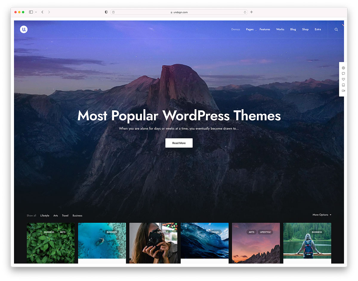
This year, I learned that there is a wide world of free stock imagery available beyond Unsplash and Pexels. You see, I’ve been working on designing WordPress themes this year, and all images need to be compatible with the GPL. Unsplash and Pexels both have free and open licenses, but unfortunately, aren’t compatible. Many other free stock photos sites don’t have the highest quality photos, so I’ve had to get creative about where I get the imagery I use in my mockups.
I discovered the solution to my stock imagery problem, ironically, on Unsplash. I started noticing photos from sources like the British Library, Birmingham Museums Trust, and Library of Congress. Who often has archives of public domain imagery? Libraries, museums, and governments. The sites are never a site like Unsplash, but they work well if you have the time and patience to dive through their archives. Plus? You can find some pretty cool photography, art, and illustrations that have a very different vibe than most stock photo resources.
Many museums have started digitizing their collections in the past few years, such as the Smithsonian’s National Museum of Asian Art, the Met, and the Art Institute of Chicago. As the museums are often digitizing the work themselves, they have the luxury of releasing the images into the public domain. Museums are a fantastic resource for art, and for photos of objects like ceramics and jewelry that work well in e-commerce mockups.
Governments
US Government agencies like NASA tend to release a ton of their own media for public use, and I’ve discovered that space images look great in blog post mockups. Need some COVID photos? The CDC’s got you covered. Need some black & white nature photos? Check out the National Park Service’s “Open Parks Network.”
Finding high-quality, totally free stock imagery can be a huge hassle. But I’ve found, with some creativity and some patience, there are far more options than I knew!
The survey results from the State of CSS aren’t out yet, but they made this landing page that randomly shows you what one person wrote to answer that question. Just clicking the reload button a bunch, I get the sense that the top answers are:
Container Queries
Parent Selectors
Nesting
Something extremely odd that doesn’t really make sense and makes me wonder about people
Great tutorial from Alex Trost (based on some demos, like this one, from Andy Barefoot) showcasing how, while CSS grid has straight grid lines across and down, you can place items across grid lines creating a staggered effect that looks pretty rad. Grid-like, but it appears to align to diagonal lines rather than horizontal and vertical lines because of the staggering. And you still get all the flexibility of grid!
There’s certainly no shortage of CSS flexbox tutorials and similar content online promoting and teaching flexbox to beginners. The now-ubiquitous layout technique can be learned from a number of different resources. But I hope this CSS flexbox tutorial for beginners will be a little different.
In yesterday’s twice-monthly meeting, the WordPress Themes Team made a couple of important changes to the official theme directory guidelines. They removed a requirement of some CSS classes that have long been sitting on the chopping block. They also implemented the third stage in their long-term plan to make all WordPress themes accessibility-ready.
For years, theme authors have needed to either style several WordPress classes via CSS or add empty, unused selectors. It was a bit irritating for authors who fell in the latter group. The list includes several classes like .sticky (for sticky posts) and .bypostauthor (for post author comments). Now, styling these classes are optional.
The one question mark in this decision is probably around the classes for handling left, right, and center alignment. While the newer block editor stylesheet does support these classes on the front end, it could leave end-users in the dust if they are using the classic editor and a theme author decides to drop support. Any images in posts could become misaligned. Theme authors should test this and consider any problems before deciding to remove these from their stylesheets. For the other classes, those are mostly design decisions.
This change will not be official until the Theme Check plugin is updated to allow themes without these classes through the system.
The second big change is the reignition of the push toward creating more accessible themes in the directory. All themes in the directory are now required to distinguish links in “content” areas via an underline.
When links appear within a larger body of block-level content, they must be clearly distinguishable from surrounding content (Post content, comment content, text widgets, custom options with large blocks of texts).
Links in navigation-like contexts (e.g., menus, lists of upcoming posts in widgets, grouped post meta data) do not need to be specifically distinguished from surrounding content.
The underline is the only accepted method of indicating links within content. Bold, italicized, or color-differentiated text is ambiguous and will not pass.
While this is a simple change, it is a bold one. Thus far, there has not been any pushback from theme authors on the announcement post or in the team meeting. However, some may be expected as the news trickles through the theme design community.
The one question that arose about the requirement was whether theme authors could add an option to allow end-users to opt-out of this behavior. The team said this was allowed as long as the underlined links were enabled by default.
The Road to Accessibility
In July 2019, the Themes Team made a commitment to push theme authors to make their themes more accessible. It was not a switch they were going to flip overnight. Instead, the team made a goal of implementing a new accessibility-related requirement every two months or so. These periods would give both theme authors and reviewers ample time to familiarize themselves with each change.
This is the third requirement added to the guidelines since the team implemented the plan. The team started with some low-hanging fruit and added a requirement that themes ship with a skip-to-content link. That guideline addition went over relatively smoothly. The team quickly added a new guideline requiring that visitors be able to navigate menus via keyboard.
That second guideline landed in August 2019. From the outside looking in, the project was initially going well. However, until yesterday, the team had not added any new accessibility guidelines. Over a year had passed, and the plan seemed to be grinding to a halt. Accessibility advocates were probably wondering what happened.
In a discussion with the Themes Team reps a few months ago, they were not sure when they would implement the next guideline. The project was not going as planned.
“We have not added anything else above that because theme authors are still not releasing themes with working implementations of skip links and usable keyboard navigation,” said team representative William Patton at the time. “When those two things become habitual it will be time to introduce another Aspect as a requirement. The fact that this has taken so long for authors to get this right probably indicates that we need to do better at guiding them to resources to learn how to do it and why it is important. Perhaps that is a better avenue to pursue than looking to implement additional asks of them.”
Team rep Carolina Nymark shared similar sentiments. She mentioned that underlined links were up next on the list. However, they did not have a deadline in mind yet.
“Skip links and keyboard navigation are still a headache to some extent for some authors,” said Ganga Kafle, a team representative. He said that theme authors who regularly submit themes are doing so with these requirements in mind. However, keyboard navigation remains the biggest pain point, particularly on mobile views.
“But almost all the themes we get are with skip links working properly,” he said. “That is a good thing so far. The new requirement is not so huge and tough. And I think we need to add such small things in a timely manner.”
For now, the team seems to be picking up where they left off. There is still a long path to go before the project is complete.
The best thing that theme authors can do right now is to follow all of the optional accessibility guidelines. This will prepare them for a future in which they are all required.


