Do you want to add custom fonts in WordPress? Custom fonts allow you to use beautiful combination of different fonts on your website to improve typography and user experience.
Apart from looking good, custom fonts can also help you improve readability, create a brand image, and increase time users spend on your website.
In this article, we will show you how to add custom fonts in WordPress using Google Fonts, TypeKit, and CSS3 @Font-Face method.
Note: Loading too many fonts can slow down your website. We recommend choosing two fonts and use them across your website. We’ll also show you how to properly load them without slowing down your website.
Before we look at how to add custom fonts in WordPress, let’s take a look at finding custom fonts that you can use.
If you don’t know how to mix and match fonts, then try Font Pair. It helps designers pair beautiful Google fonts together.
As you are picking your fonts, remember that using too many custom fonts will slow down your website. This is why you should select two fonts and use them throughout your design. This will also bring consistency to your design.
Video Tutorial
If you don’t like the video or prefer the written guide, then please continue reading.
Adding Custom Fonts in WordPress from Google Fonts
Google Fonts is the largest, free, and most commonly used font library among website developers. There are multiple ways you can add and use Google Fonts in WordPress.
Method 1: Adding Custom Fonts Using Easy Google Fonts Plugin
If you want to add and use Google Fonts on your website, then this method is by far the easiest and recommended for beginners.
Upon activation, you can go to Appearance » Customizer page. This will open the live theme customizer interface where you’ll see the new Typography section.
Clicking on Typography will you show different sections of your website where you can apply Google Fonts. Simply click on ‘Edit Font’ below the section you want to edit.
Under the font family section, you can choose any Google Font you want to use on your website. You can also choose font style, font size, padding, margin, and more.
Depending on your theme, the number of sections here could be limited and you may not be able to directly change font selection for many different areas of your website.
To fix this, the plugin also allows you to create your own controls and use them to change fonts on your website.
First, you need to visit Settings » Google Fonts page and provide a name for your font control. Use something that helps you quickly understand where you will be using this font control.
Next, click on the ‘Create font control’ button and then you will be asked to enter CSS selectors.
You can add HTML elements you want to target (for instance, h1, h2, p, blockquote) or use CSS classes.
You can use Inspect tool in your browser to find out which CSS classes are used by the particular area you want to change.
Now click on the ‘Save font control’ button to store your settings. You can create as many font controllers as you need for different sections of your website.
To use these font controllers, you need to head over to Appearance » Customizer and click on the Typography tab.
Under Typography, you will now see a ‘Theme Typography’ Option as well. Clicking on it will show your custom font controls you created earlier. You can now just click on the edit button to select the fonts and appearance for this control.
Don’t forget to click on the save or publish button to save your changes.
Method 2: Manually Add Google Fonts in WordPress
This method requires you to add code to your WordPress theme files. If you haven’t done this before, then see our guide on how to copy and paste code in WordPress.
First, visit the Google fonts library and select a font that you want to use. Next, click on the quick use button below the font.
On the font page, you’ll see the styles available for that font. Select the styles that you want to use in your project and then click on the sidebar button at the top.
Next, you will need to switch to the ‘Embed’ tab in the sidebar to copy the embed code.
There are two ways you can add this code to your WordPress site.
First, you can simply edit your theme’s header.php file and paste the code before the <body> tag.
However, if you are unfamiliar with code editing in WordPress, then you can use a plugin to add this code.
Upon activation, go to Settings » Insert Headers and Footers page and paste the embed code in the ‘Scripts in header’ box.
Don’t forget to click on the Save button to store your changes. The plugin will now start loading the Google Font embed code on all pages of your website.
You can use this font in your theme’s stylesheet like this:
Typekit by Adobe Fonts is another free and premium resource for awesome fonts that you can use in your design projects. They have a paid subscription as well as a limited free plan that you can use.
Simply signup for an Adobe Fonts account and visit the browse fonts section. From here you need to click on the </> button to select a font and create a project.
Next, you’ll see the embed code with your project ID. It will also show you how to use the font in your theme’s CSS.
You need to copy and paste this code inside the <head> section of your website.
There are two ways you can add this code to your WordPress site.
First, you can simply edit your theme’s header.php file and paste the code before the <body> tag.
However, if you are unfamiliar with code editing in WordPress, then you can use a plugin to add this code.
Adding Custom Fonts in WordPress Using CSS3 @font-face
The most direct way of adding custom fonts in WordPress is by adding the fonts using CSS3 @font-face method. This method allows you to use any font that you like on your website.
First thing you need to do is download the font that you like in a web format. If you do not have the web format for your font, then you can convert it using the FontSquirrel Webfont generator.
Once you have the webfont files, you would need to upload it on your WordPress hosting server.
The best place to upload the fonts is inside a new “fonts” folder in your theme or child theme‘s directory.
You can use FTP or File Manager of your cPanel to upload the font.
Once you have uploaded the font, you need to load the font in your theme’s stylesheet using CSS3 @font-face rule like this:
Loading fonts directly using CSS3 @font-face is not always the best solution. If you are using a font from Google Fonts or Typekit, then it is best to serve the font directly from their server for optimal performance.
PPK digs into the subject, which he found woefully undercovered in web tech documentation. Our entry doesn't mention them at all, which I'll aim to fix.
Agree on this situation:
This is by far the most common use case for negative margins. You give a container a padding so that its contents have some breathing space. However, you want the header to span the entire container, ignoring the padding. Negative margins are the way to go.
Like this:
Anecdotally, I find negative margins fairly intuitive. Although that's surprising since there are so many oddities, like how they sometimes affect the element applied to itself (e.g. move itself to the left) and sometimes affect other elements (e.g. move other elements upward) — plus the fact that it affects margin collapsing which is weird anyway.
Funny timing on this I was just looking at the website for Utopia (which is a responsive type project which I hate to admit I don't fully understand) and I came across some CSS they show off that looked like this:
See anything weird there? That code is using mathematical operators, but there is no calc() function wrapped around it.
Just as my curiosity set in, Trys Mudford, a creator of Utopia, blogged it:
The value after the : in the CSS custom property does not have to be valid CSS. It won’t cause any errors, nor invalidate the custom property. It won’t be evaluated in the browser until used, or more specifically, placed in a calc() function.
Here's a contrived example:
:root {
  --padding: 1rem;

  /* These are meaningless alone */
  --padding-S: var(--padding) / 2;
  --padding-L: var(--padding) * 2;
}

.module--large {
  /* But they evaluate once they are in a calc() */
  padding: calc(var(--padding-L));
}
In my limited understanding, currying is like functions that return functions. I suppose this is sorta like that in that the alternate padding properties above are sort of like derivative functions of the main padding function (if you can call it that), and you only call them and execute them as needed.
Have you ever clicked on an image on a webpage that opens up a larger version of the image with navigation to view other photos?
Some folks call it a pop-up. Others call it a lightbox. Bootstrap calls it a modal. I mention Bootstrap because I want to use it to make the same sort of thing. So, let’s call it a modal from here on out.
Why Bootstrap? you might ask. Well, a few reasons:
I’m already using Bootstrap on the site where I want this effect, so there’s no additional overhead in terms of loading resources.
I want something where I have complete and easy control over aesthetics. Bootstrap is a clean slate compared to most modal plugins I’ve come across.
The functionality I need is fairly simple. There isn’t much to be gained by coding everything from scratch. I consider the time I save using the Bootstrap framework to be more beneficial than any potential drawbacks.
Here’s where we’ll end up:
Let’s go through that, bit by bit.
Step 1: Create the image gallery grid
Let’s start with the markup for a grid layout of images. We can use Bootstrap’s grid system for that.
Now we need data attributes to make those images interactive. Bootstrap looks at data attributes to figure out which elements should be interactive and what they should do. In this case, we’ll be creating interactions that open the modal component and allow scrolling through the images using the carousel component.
About those data attributes:
We’ll add data-toggle="modal" and data-target="#exampleModal" to the parent element (#gallery). This makes it so clicking anything in the gallery opens the modal. We should also add the data-target value (#exampleModal) as the ID of the modal itself, but we’ll do that once we get to the modal markup.
Let’s add data-target="#carouselExample" and a data-slide-to attribute to each image. We could add those to the image wrappers instead, but we’ll go with the images in this post. Later on, we’ll want to use the data-target value (#carouselExample) as the ID for the carousel, so note that for when we get there. The values for data-slide-to are based on the order of the images.
This is a carousel inside a modal, both of which are standard Bootstrap components. We’re just nesting one inside the other here. Pretty much a straight copy-and-paste job from the Bootstrap documentation.
Here’s some important parts to watch for though:
The modal ID should match the data-target of the gallery element.
The carousel ID should match the data-target of the images in the gallery.
The carousel slides should match the gallery images and must be in the same order.
Here’s the markup for the modal with our attributes in place:
Looks like a lot of code, right? Again, it’s basically straight from the Bootstrap docs, only with our attributes and images.
Step 3: Deal with image sizes
This isn’t necessary, but if the images in the carousel have different dimensions, we can crop them with CSS to keep things consistent. Note that we're using Sass here.
You may have noticed that the markup uses the same image files in the gallery as we do in the modal. That doesn’t need to be the case. In fact, it’s a better idea to use smaller, more performant versions of the images for the gallery. We’re going to be blowing up the images to their full size version anyway in the modal, so there’s no need to have the best quality up front.
The good thing about Bootstrap’s approach here is that we can use different images in the gallery than we do in the modal. They’re not mutually exclusive where they have to point to the same file.
So, for that, I’d suggest updating the gallery markup with lower-quality images:
<div class="row" id="gallery" data-toggle="modal" data-target="#exampleModal">
  <div class="col-12 col-sm-6 col-lg-3">
    <img class="w-100" src="/image-1-small.jpg" data-target="#carouselExample" data-slide-to="0">

  <!-- and so on... -->
</div>
That’s it!
The site where I’m using this has already themed Bootstrap. That means everything is already styled to spec. That said, even if you haven't themed Bootstrap you can still easily add custom styles! With this approach (Bootstrap vs. plugins), customization is painless because you have complete control over the markup and Bootstrap styling is relatively sparse.
Eventually, I settled on a list of questions I would ask myself for each problem as it arose. I found that asking these questions, in order, helped me make the best decision possible:
1) Is this really a problem? 2) Does the problem need to be solved? 3) Does the problem need to be solved now? 4) Does the problem need to be solved by me? 5) Is there a simpler problem I can solve instead?
We've talked about what it takes to be a senior developer before, and I'd say this kind of thinking should be on that list as well.
The mark of a good programmer or coder is the one who documents their code properly. Coding is one of those skills that demand a good amount of background in documenting the code being written....
Let’s create a pure CSS effect that changes the color of a text link on hover… but slide that new color in instead of simply swapping colors.
There are four different techniques we can use to do this. Let’s look at those while being mindful of important things, like accessibility, performance, and browser support in mind.
Let’s get started!
Technique 1: Using background-clip: text
At the time of writing, the background-clip: text property is an experimental feature and is not supported in Internet Explorer 11 and below.
This technique involves creating knockout text with a hard stop gradient. The markup consists of a single HTML link (<a>) element to create a hyperlink:
<a href="#">Link Hover</a>
We can start adding styles to the hyperlink. Using overflow: hidden will clip any content outside of the hyperlink during the hover transition:
We will need to use a linear gradient with a hard stop at 50% to the starting color we want the link to be as well as the color that it will change to:
a {
  /* Same as before */
  background: linear-gradient(to right, midnightblue, midnightblue 50%, royalblue 50%);
}
Let’s use background-clip to clip the gradient and the text value to display the text. We will also use the background-size and background-position properties to have the starting color appear:
a {
  /* Same as before */
  background-clip: text;
  -webkit-background-clip: text;
  -webkit-text-fill-color: transparent;
  background-size: 200% 100%;
  background-position: 100%;
}
Finally, let’s add the transition CSS property and :hover CSS pseudo-class to the hyperlink. To have the link fill from left to right on hover, use the background-position property:
a {
  /* Same as before */
  transition: background-position 275ms ease;
}
a:hover {
  background-position: 0 100%;
}
While this technique does achieve the hover effect, Safari and Chrome will clip text decorations and shadows, meaning they won’t be displayed. Applying text styles, such as an underline, with the text-decoration CSS property will not work. Perhaps consider using other approaches when creating underlines.
Technique 2: Using width/height
This works by using a data attribute containing the same text as the one in the <a> tag and setting the width (filling the text from left-to-right or right-to-left) or height (filling the text from top-to-bottom or bottom-to-top), from 0% to 100% on hover.
This is when we need to use the content from the data-content attribute. It will be positioned above the content in the <a> tag. We get to use the nice little trick of copying the text in the data attribute and displaying it via the attr() function on the content property of the element’s ::before pseudo-element.
a::before {
  position: absolute;
  content: attr(data-content); /* Prints the value of the attribute */
  top: 0;
  left: 0;
  color: midnightblue;
  text-decoration: underline;
  overflow: hidden;
  transition: width 275ms ease;
}
To keep the text from wrapping to the next line, white-space: nowrap will be applied. To change the link fill color, set the value for the color CSS property using the ::before pseudo-element and having the width start at 0:
a::before {
  /* Same as before */
  width: 0;
  white-space: nowrap;
}
Increase the width to 100% to the ::before pseudo element to complete the text effect on hover:
a:hover::before {
  width: 100%;
}
While this technique does the trick, using the width or height properties will not produce a performant CSS transition. It is best to use either the transform or opacity properties to achieve a smooth, 60fps transition.
Using the text-decoration CSS property can allow for different underline styles to appear in the CSS transition. I created a demo showcasing this using the next technique: the clip-path CSS property.
Technique 3: Using clip-path
For this technique, we will be using the clip-path CSS property with a polygon shape. The polygon will have four vertices, with two of them expanding to the right on hover:
The markup is the same as the previous technique. We will use a ::before pseudo-element again, but the CSS is different:
Unlike the previous techniques, text-decoration: underline must be declared to the ::before pseudo-element for the color to fill the underline on hover.
Now let’s look into the CSS for the clip-path technique:
clip-path: polygon(0 0, 0 0, 0% 100%, 0 100%);
The polygon’s vertices of the clip-path property are set in percentages to define coordinates by the order written:
0 0 = top left
0 0 = top right
100% 0 = bottom right
0 100% = bottom left
The direction of the fill effect can be changed by modifying the coordinates. Now that we have an idea for the coordinates, we can make the polygon expand to the right on hover:
This technique works pretty well, but note that support for the clip-path property varies between browsers. Creating a CSS transition with clip-path is a better alternative than using the width/height technique; however, it does affect the browser paint.
Technique 4: Using transform
The markup for this technique uses a masking method with a <span> element. Since we will be using duplicated content in a separate element, we will use aria-hidden="true" to improve accessibility — that will hide it from screen readers so the content isn’t read twice:
Next, we need to get the <span> to slide the right like this:
To do this, we will use the translateX() CSS function and set it to 0:
a:hover span {
  transform: translateX(0);
}
Then, we will use the ::before pseudo-element for the <span>, again using the data-content attribute we did before. We’ll set the position by translating it 100% along the x-axis.
While this technique is the the most cross-browser compatible of the bunch, it requires more markup and CSS to get there. That said, using the transform CSS property is great for performance as it does not trigger repaints and thus produces smooth, 60fps CSS transitions.
There we have it!
We just looked at four different techniques to achieve the same effect. Although each has its pros and cons, you can see that it’s totally possible to slide in a color change on text. It’s a neat little effect that makes links feel a little more interactive.
Have you ever found yourself either writing a CSS selector that winds up looking confusing as heck, or seen one while reading through someone's code? That happened to me the other day.
At the end of it, I honestly couldn't even explain what it does to myself. LOL, that probably means there was a better way to write it.
But Hugo Giraudel has this handy new tool that will explain any selector you throw at it.
Here's how it explained mine:
An <ellipse> element provided it is the first child of its parent somewhere … within a <svg> element … itself directly within an <a> element provided it is hovered … itself somewhere … within an element with class site-footer__nav.
Bravo! It even spits out the specificity of the selector to boot. 👏
Nice demo from Sebastiano Guerriero. When a fixed-position header moves from overlapping differently-colored backgrounds, the colors flop out to be appropriate for that background. Sebastiano's technique is very clever, involving multiple copies of the header within each section (where the copies are hidden from screenreaders) which are all positioned on top of each other and then revealed as the new section comes, thanks to each section having a clip-path around it.
A bonafide CSS trick if I've ever seen one.
It makes me wish there was an easier way of doing it. Like, what if there was some magical value of mix-blend-mode that would handle it? I got close enough that it gives me hope.
Web design is an interesting field that can be challenging and highly entertaining. Anyone can use WordPress as a platform for their blog, but if you know what happens behind the design of a web...
I was recently working on a modern take of the blogroll. The idea was to offer readers a selection of latest posts from those blogs in a magazine-style layout, instead of just popping a list of our favorite blogs in the sidebar.
The easy part was grabbing a list of posts with excerpts from our favorite RSS feeds. For that, we used a WordPress plugin, Feedzy lite, which can aggregate multiple feeds into a single time-ordered list — perfect for showcasing their latest offerings. The hard part was making it all look awesome.
The plugin’s default list UI is rather bland, so I wanted to style it to look like a newspaper or magazine website with a mixture of smaller and larger “featured content” panels.
This seems like an ideal case for CSS Grid! Create a grid layout for different layouts, say, one five-column layout and one three-column layout, then use media queries to switch between them at different break points. Right? But do we actually need those media queries — and all the hassle of identifying break points — when we can use grid’s auto-fit options to automatically create a fluid responsive grid for us?
The approach sounded tempting, but when I started introducing column-spanning elements, I ran into trouble with the grid overflowing on narrow screens. Media queries appeared to be the only solution. That is, until I found a workaround!
After looking at several tutorials on CSS Grid, I found that they largely fall into two camps:
Tutorials that show you how to create an interesting layout with spanned elements, but for a fixed number of columns.
Tutorials that explain how to make a responsive grid that resizes automatically, but with all of the grid items the same width (i.e. without any spanned columns).
I want to make the grid do both: create a fully responsive fluid layout that includes responsively resizing multi-column elements as well.
The beauty is that once you understand the limitations of responsive grids, and why and when column spans break grid responsiveness, it is possible to define a responsive magazine/news style layout in just a dozen lines of code plus one simple media query (or even with no media queries if you are willing to limit your span options).
Here’s a visual showing the RSS plugin right out of the box and what it’ll look like after we style it up.
This magazine-style grid layout is fully responsive with the colored featured panels adjusting dynamically as the number of columns change. The page displays around 50 posts, but the layout code is agnostic as to the number of items displayed. Ramp up the plugin to show 100 items and the layout stays interesting all the way down.
All of this is achieved using only CSS and with only a single media query to deal with a single column display on the narrowest of screens (i.e. smaller than 460px).
Incredibly, this layout only took 21 lines of CSS (excluding global content styling). However, to achieve such flexibility in such a few lines of code, I had to dig deep into the more obscure parts of some of CSS Grid and learn how to work around some of its inherent limitations.
The essential elements of the code that produce this layout is incredibly short and a testament to the awesomeness of CSS Grid:
The techniques in this article could be used equally well to style any dynamically generated content such as the output from a latest posts widget, archive pages or search results.
Creating a responsive grid
I have set up seventeen items displaying a variety of mock content — headlines, images and excerpts — which are all contained in a wrapper
The code that turns these items into a responsive grid is remarkably compact:
.archive {
  /* Define the element as a grid container */
  display: grid;
  /* Auto-fit as many items on a row as possible without going under 180px */
  grid-template-columns: repeat(auto-fit, minmax(180px, 1fr));
  /* A little spacing between articles */
  grid-gap: 1em;
}
Notice how the heights of the rows automatically adjust to accommodate the tallest content in the row. If you change the width of the Pen, you will see the items grow and shrink fluidly and the number of columns change from one to five, respectively.
The CSS Grid magic at play here is the auto-fit keyword that works hand-in-hand with the minmax() function that’s applied to grid-template-columns.
How it works
We could have achieved the five-column layout alone using this:
However, this would create five columns that grow and shrink with different screen widths, but always stay at five columns, resulting in them becoming ridiculously narrow on small screens. The first thought might be to create a bunch of media queries and redefine the grid with different numbers of columns. That would work fine, but with the auto-fit keyword, it is all done automatically.
For auto-fit to work the way we want, we need to use the minmax() function. This tells the browser how small the columns can be squeezed down to followed by the maximum width they can expand to. Any smaller, and it will automatically reduce the number of columns. Any larger, and the number of columns increases.
In this example, the browser will fit in as many columns as it can 180px wide. If there is space left over the columns will all grow equally by sharing the remaining space between them — that’s what the 1fr value is saying: make the columns equal fractions of the available width.
Drag the window out and as the available space increases the columns all grow equally to use up any additional space. The columns will keep growing until the available space allows for an additional 180px column, at which point a whole new column appears. Decrease the screen width, and the process reverses, perfectly adjusting the grid all the way down to a single column layout. Magic!
And you get all this responsiveness out of just one line of code. How cool is that?
Creating spans with “autoflow: dense”
So far, we have a responsive grid but all items the same width. For a news or magazine layout we need some content to be featured by spanning two or more columns or even, perhaps, to span all the columns.
To create multi-column spans we can add the column-span feature to the grid items we want to take up more space. For example, if we want the third item in our list to be two columns wide we can add:
.article:nth-child(3) {
  grid-column: span 2;
}
However, once we start adding spans a number of problems can arise. First, gaps may appear in the grid because a wide item may may not fit on the row, so grid auto-fit pushes it onto the next line, leaving a gap where it would have been:
The easy fix is adding grid-auto-flow: dense to the grid element which tells the browser to fill in any gaps with other items, effectively making the narrower content flow around the wider items like this:
Note that the items are now out of order, with the fourth item coming before the third item, which is double the width. There is no way round this as far as I can tell, and it is one of the limitations you have to accept with CSS Grid.
There are several ways to indicate how many columns an item should span. The easiest is to apply grid-columns: span [n] to one of the items, where n is the number of columns the element will span. The third item in our layout has grid-column: span 2, which explains why it is double the width of other items that only span a single column.
Grid lines can be specified from left-to-right using positive values (e.g. 1, 2, 3) or negative values (e.g. -1, -2, -3) to go from right-to-left. These can be used to place items on the grid using the grid-column property like this:
So, this gives us additional ways to specify a spanned item. This is especially flexible as either the start or end value can be replaced with the span keyword. For example, the three-column blue box in the example above could be created by adding any of the following to the eighth grid item:
grid-column: 3 / 6
grid-column: -4 / -1
grid-column: 3 / span 3
grid-column: -4 / span 3
grid-column: span 3 / -1
Etc.
On a non-responsive (i.e. fixed columns) grid, these all produce the same effect (like the blue box above), however, if the grid is responsive and the number of columns changes, their differences start to become apparent. Certain column spans break the layout with an auto-flowing grid, making the two techniques appear incompatible. Fortunately, there are some solutions which allow us to combine the two successfully.
First, however, we need to understand the problem.
Overflow side-scrolling problems
Here are some featured areas created using the notation above:
It all looks good at full-width (five columns) but when resized to what should be two columns, the layout breaks like this:
As you can see, our grid has lost its responsiveness and, although the container has shrunk, the grid is trying to maintain all five columns. To do so, it has given up trying to keep equal-width columns, and the grid is breaking out of the right-hand side of its container, causing horizontal scrolling.
Why is this? The problem comes about because the browser is trying to honor the explicit grid lines we named. At this width, the auto-fit grid should implicitly be displaying two columns, but our grid line numbering system contradicts this by explicitly referring to the fifth grid line. This contradiction leads to the mess. To display our implicit two-column grid correctly, the only line numbers allowed are 1, 2 and 3 and -3, -2, -1, like this:
But if any of our grid items contains grid-column references that lie outside this, such as grid line number 4, 5 or 6 (or -4, -5 or -6), the browser is getting mixed messages. On the one hand, we have asked it to automatic create flexible columns (which should implicitly give us two columns at this screen width) but we have also explicitly referred to grid lines that don’t appear in a two-column grid. When there is a conflict between implicit (automatic) columns and an explicit number of columns, grid always defers to the explicit grid; hence the unwanted columns and horizontal overflow (which has also been aptly named CSS data loss). Just like using grid line numbers, spans can also create explicit columns. So, grid-column: span 3 (the eighth grid item in the demo) forces the grid to explicitly adopt at least three columns, whereas we want it, implicitly display two.
At this point it might seem like the only way forward is to use media queries to change the grid-column values at the width where our layout breaks — but not so fast! That’s what I assumed at first. But after thinking it though a bit more and playing around with various options, I found there are a limited set of workarounds that work all the way down to two columns, leaving just one media query to cover a single column layout for the narrowest screens.
The solutions
The trick, I realized, is to only specify spans using grid lines that appear in the narrowest grid you intend to display. That is a two-column grid in this case. (We will use a media query to cover the single column scenario for very narrow screens.) That means we can safely use grid lines 1, 2 and 3 (or -3, -2 and -1) without breaking the grid.
I initially thought that meant limiting myself to a maximum span of two columns, using combinations of the following:
grid column: span 2
grid-column: 1 /3
grid-column: -3 / -1
Which remains perfectly responsive right down to two columns:
Although this works, it is rather limiting from a design perspective, and not particularly exciting. I wanted to be able to create spans that would be three, four or even five columns wide on large screens. But how? My first thought was that I would have to resort to media queries (OMG old habits die hard!) but I was trying to get away from that approach and think differently about responsive design.
Taking another look at what we can do with just 1 to 3 and -3 to -1, I gradually realized that I could mix positive and negative line numbers for the grid column’s start and end values ,such as 1/-3 and 2/-2. At first glance, this does not seem very interesting. That changes when you realize where these lines are located as you resize the grid: these spanned elements change width with the screen size. This opened up a whole new set of possibilities for responsive column spans: items that will span different numbers of columns as the screen gets wider, without needing media queries.
The first example I discovered is grid-column: 1/-1.This makes the item act like a full-width banner, spanning from the first to the last column at all column numbers. it even works down to one column wide!
By using grid-column: 1/-2, a left-aligned nearly-full-width span could be created that would always leave a one column item to the right of it. When shrunk to two columns it would shrink responsively to a single column. Surprisingly, it even works when shrunk to a single column layout. (The reason seems to be that grid will not collapse an item to zero width, so it remains one column wide, as does grid-column: 1/1.) I assumed grid-column: 2/-1 would work similarly, but aligned with the right-hand edge, and for the most part it does, except at one column display when it causes overflow.
Next I tried 1/-3 which worked fine on wider screen, showing at least three columns, and smaller screens, showing one column. I thought it would do something weird on a two-column grid as the first grid line is the same as the grid line with -3. To my surprise, it still displays fine as a single-column item.
After a lot of playing around, I came up with eleven possible grid column values using grid line numbers from the two-column grid. Surprisingly, three of these work right down to single-column layouts. Seven more work down to two columns and would only need a single media query to deal with single column display.
Here is the full list:
Responsive grid-column values, showing how they display at different screen sizes in an auto-fit grid. (Demo)
As you can see, although this is a limited subset of every possible responsive span, there are actually a lot of possibilities.
2/-2 is interesting as it creates a centered span which works all the way down to one column!
3/-1 is least useful as it causes overflow even with two-columns.
3/-3 was a surprise.
By using a variety of grid-column values from this list, it is possible to create an interesting and fully responsive layout. Using a single media query for the narrowest single-column display, we have ten different grid-column span patterns to play with.
The single-column media query is generally straightforward as well. The one on this final demo reverts to using flexbox at smaller screens:
Using :nth-child() to repeat variable length displays
The last trick I used to get my code down to two dozen lines was the :nth-child(n) selector which I used to style multiple items in my grid. I wanted my span styling to apply to multiple items in my feed, so that the featured post boxes appeared regularly throughout the page. To start with I used a comma-separated selector list, like this:
But I soon found this cumbersome, especially as I had to repeat this list for each child element I wanted to style within each article — such as the title, links and so on. During prototyping, if I wanted to play around with the position of my spanned elements, I had to manually change the numbers in each of these lists, which was tedious and error-prone.
That’s when I realized that I could use a powerful feature :nth-child pseudo-selector instead of a simple integer as I had used in the list above. :nth-child(n) can also take an equation, such as :nth-child(2n+ 2), which will target every second child element.
Here is how I used the :nth-child([formula]) to create the blue full-width panels in my grid which appear at the very top of the page, and is repeated just over half way down:
The bit in the brackets (31n + 1 ) ensures that the 1st, 32nd, 63rd, etc. child is selected. The browser runs a loop starting with n=0 (in which case 31 * 0 + 1 = 1), then n=1 (31 * 1 + 1 = 32), then n=2 (31 * 2 + 1 = 63). In the last case, the browser realizes that there is no 63rd child item so it ignores that, stops looping, and applies the CSS to the 1st and 32nd children.
I do something similar for the purple boxes which alternate down the page from right-to-left:
The first selector is for the right-hand purple boxes. The 16n + 2 makes sure that the styling applies to every 16th grid item, starting with the second item.
The second selector targets the right-hand boxes. It uses the same spacing (16n) but with a different offset (10). As a result, these boxes appear regularly on the right-hand side for grid items 10, 26, 42, etc.
When it comes to the visual styling for these grid items and their contents, I used another trick to reduce repetition. For styles that both boxes share (such as the background-color, for example) a single selector can be used to target both:
This will target items 2, 10, 18, 26, 34, 42, 50, and so forth. In other words, it selects both the left- and right-hand featured boxes.
It works because 8n is exactly half of 16n, and because the offsets used in the two separate selectors have a difference of 8 (i.e. the difference between +10 and +2 is 8)
Final thoughts
Right now, CSS Grid can be used to create flexible responsive grids with minimal code, but this does come with some significant limitations on positioning elements without the retrograde step of using media queries.
It would be great to be able to specify spans that would not force overflow on smaller screens. At the moment, we effectively tell the browser, “Make a responsive grid, please,” which it does beautifully. But when we continue by saying, “Oh, and make this grid item span four columns,” it throws a hissy-fit on narrow screens, prioritizing the four-column span request rather than the responsive grid. It would be great to be able to tell grid to prioritize responsiveness over our span request. Something like this:
.article {
  grid-column: span 3, autofit;
}
Another issue with responsive grids is the last row. As the screen width changes the last row will frequently not be filled. I spent a long time looking for a way to make the last grid item span (and hence fill) the remaining columns, but it seems you can’t do it in Grid right now. It would be nice if we could specify the item’s start position with a keyword like auto meaning, “Please leave the left-hand edge wherever it falls.” Like this:
.article {
  grid-column: auto, -1;
}
…which would make the left-hand edge span to the end of the row.
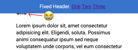
The problem: you click a jump link like <a href="#header-3">Jump</a> which links to something like <h3 id="header-3">Header</h3>. That's totally fine, until you have a position: fixed; header at the top of the page obscuring the header you're trying to link to!
Fixed headers have a nasty habit of hiding the element you're trying to link to.
There used to be all kinds of wild hacks to get around this problem. In fact, in the design of CSS-Tricks as I write, I was like, "Screw it, I'll just have a big generous padding-top on my in-article headers because I don't mind that look anyway."
But there is actually a really straightforward way of handling this in CSS now.
h3 {
  scroll-margin-top: 5rem; /* whatever is a nice number that gets you past the header */
}
We have an Almanac article on it, which includes browser support, which is essentially everywhere. It's often talked about in conjunction with scroll snapping, but I find this use case even more practical.
Here's a simple demo:
In a related vein, that weird (but cool) "text fragments" link that Chrome shipped takes you to the middle of the page instead, which I think is nice.
I don’t want every possible padding and margin and colour and flexbox configuration in the world. I just want the ones that I know I end up using in every project. So here is monica.css: my very own CSS framework, which I copy paste at the beginning of every CSS file and take it from there.
I love it when people make their own CSS starter. I like Sanitize, but even that feels like a bit much for most things I poke around at. If I was making one for myself, I'd probably steal some of this stuff from Monica. I'd definitely pull the margin off body as I find myself writing that line a lot. I'd probably steal some of that [class] stuff from Andy's. My center class would probably just be text-align and I'd give myself some other centering class for my other favorite centering: display: grid; place-items: center;.
Mezo Istvan does a good job of covering the problem and a solution to it in a blog post on Medium¹.
If you tap on something that has a :hover state but you don't leave the page then, on a mobile device, there is a chance that :hover state "sticks." You'll see this with stuff like jump-links used as tabs or buttons that trigger on-page functionality.
It almost feels like we have to apologize to linking to things on Medium lately. I have no idea what you're going to experience when you get there. Will you just be able to read it? Will it be a teaser where you have to log in to read more? Will it be behind a paywall? I have no idea. In this case, hopefully, this link post has enough info in it that isn't not blocking you from learning anything.
The <details> and <summary> elements in HTML are useful for making content toggles for bits of text. By default, you see the <summary> element with a toggle triangle (▶︎) next to it. Click that to expand the rest of the text inside the <details> element.
But let's say you want to be able to click it open and that's that. Interactivity over. I saw this used in one of those "Read more" article designs, where you click that "Read more" button and the article expands, but there is no going back.
I'll preface this by saying that I'm not sure that this is a great idea in general. Removing controls just doesn't feel great, nor does slapping too much important content within a <details> element. But, hey, the web is a big place and you never know what you might need. The fact that this can be done in a few lines of HTML/CSS is compelling and might reduce the need for heavier solutions.
The main trick here is to hide the summary when details is open.
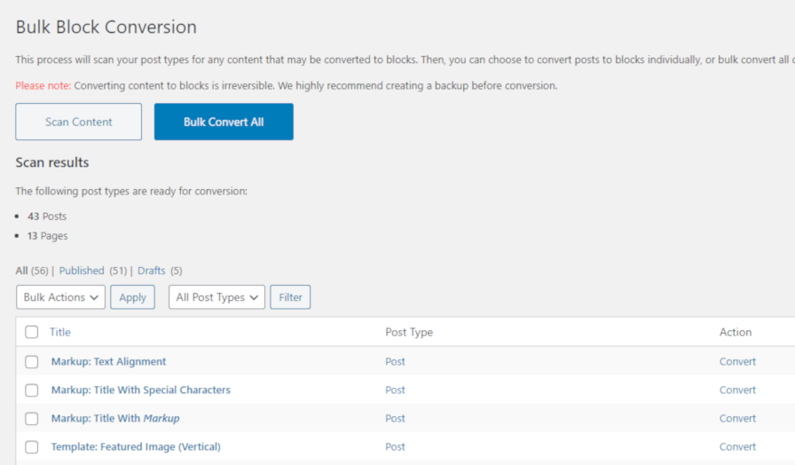
Organic Themes released the Bulk Block Converter WordPress plugin last month and updated it in the past week. The plugin allows users to convert classic content, written in the old editor, to the new block format.
Unless end-users have the Classic Editor plugin installed, their old content is placed into the classic block in the newer block editor. WordPress provides an option for transforming this content into individual blocks from the block-editor interface. However, this must be done on a per-post basis.
“Going back and converting each post and page with a classic block to individual blocks can be a very long and tedious process,” said David Morgan, co-founder of Organic Themes. “The Bulk Block Converter plugin quickly scans all your posts and pages for classic blocks, and allows you to quickly convert them all to individual blocks within one interface.”
Originally, Organic Themes built the plugin for internal use at their company. “We developed the plugin to help us convert the content of our theme demos to blocks more efficiently,” said Morgan. The company had to convert over 40 theme-demo sites with an average of 50 posts and pages per site. They built this plugin to avoid a long and painstaking process. Then decided to share it. “We thought the tool could be very useful for other users migrating to Gutenberg.”
For users with a lot of old content, Bulk Block Converter could be the key to moving it all to the new block editor system. Based on the conversions I ran on a couple of test installations, it worked flawlessly.
How the Plugin Works
Bulk Block Converter admin screen for converting content.
The Bulk Block Converter plugin adds a new “Block Conversion” sub-menu item to the WordPress “Tools” menu in the admin. Once on that screen, it provides a “Scan Content” button. When clicked, it checks all of your posts, pages, and other custom post types for classic content. It then builds a list table of all the content.
From that point, you can choose between converting each post individually or running a bulk conversion of all posts. I always recommend being cautious with such plugins by converting and checking a couple of individual posts before trying bulk conversions.
The process for converting posts was snappy during my tests. In just a few moments, I converted all of my old content over without issue.
Like any plugin that modifies content in this way, it is prudent to store a backup of your site before converting the posts. This is also a one-way conversion process. Once a post is transformed, there is no going back.
The reason “CSS3” worked is because it was real. It was the successor to “CSS2.1”. Everything after CSS2.1 was considered to be under the umbrella of “CSS3”.
The gist is that CSS4 isn't real, so won't work, and we don't need it anyway. Perhaps I overestimate the power of marketing, but I'd wager Louis underestimates it a bit. When an idea takes hold, basis in truth or not, it has tremendous power and money follows. See: politics and pet rocks.
Amelia Bellamy-Royds pointed out that there is a real thing we could point to, and those are "CSS Snapshots" that the working group produces that could be marketed as yearly versions. Like we have ES2019, we could have CSS2020.
... the little voice in your head says ... “I should know all of this. Do I even know what I'm doing?” Why do web developers the world over feel like this?
The overall vibe is that of catharsis in that, hopefully, none of this matters as much as it seems like it might. I'd like to think we try to deliver that, through a bit of levity, on ShopTalk Show as well.
Oh hey and Panic started a podcast too, a must-subscribe from me as a long-time fan of all their interesting work.