Spice Up Your Sites: Customize Your WordPress Multisite Admin Areas With Branda

Category Image 052

Branda is your ultimate tool for customizing your multisite network. Inject a slice of personality into each of your sites’ admin areas and decide whether this power sits with just the Network Admin, or with individual site admins.

In this article, we’re showing you how to manage user access to Branda on your multisite network, and then diving into the features best-suited to customizing your multisite admin.

More specifically, we’ll be covering how to:

1. Control Who Can Access Branda
2. Change Your Module Permissions
3. Personalize Your Sites
4. Choose a Custom Color Scheme
5. Add Notes to Your Admin Footer
6. Customize Your Admin Menu
7. Reorganize Your Admin Bar
8. Add Extra Customization With CSS
9. Customize Your Cookie Notices
10. Create Coming Soon and Maintenance Mode Pages
11. Create Unique Login Screens
12. Customize Your Favicons

1. Control Who Can Access Branda

As a Network Administrator, you can control who has access to Branda.

If you want to be the only one in charge of Branda’s features, you don’t need to do anything, as Branda is hidden from all other users straight out of the box.

If you want to grant your site admins access to Branda, you can do so by heading to Settings > Permissions and checking the box.

Screenshot of user permissions showing only admin ticked
You can give access to any user role from this menu.

If you would rather handpick which users get access to Branda, you can do this by scrolling down and selecting ‘Custom Users’.

You can grant your site admins (plus any other user roles) access to Branda from this menu.

2. Change Your Module Permissions

Branda’s customization options are split up into modules. If you make changes to a module in the Network Admin plugin settings, it will take effect across all of your networked sites.

If you want to give your site admins the ability to override the network customizations, you can do so within the settings menu.

Screenshot of the subsite permissions showing none ticked
Choose individual modules or simply select ‘All’ to give full control.

3. Personalize Your Sites

Whilst the sites of your multisite network may be related and all fall under the same brand, personalizing your admin areas using Branda is an easy way to give them a little bit of personality, rather than feeling like they’re all merging into one.

Simple changes you can make include the color scheme, admin footers, and personalizing the admin menu.

Below is a quick overview of how to do all of these and more.

4. Choose a Custom Color Scheme

You can easily select one of the default color schemes if your only aim is to easily distinguish your admin areas from one another. However, the real magic of Branda lies in the ability to create your own custom color scheme.

You can customize the color of each Aspect of your admin area, right down to the links and hover colors.

If you make these changes as the Network Admin, the color scheme will just change within the Network Admin area.

If you want to apply the same color scheme to all of your sites, you can select ‘Force color scheme’.

Screenshot of the force colour scheme option
You can also set a default color scheme for new users.

If you want your admins to be able to set their own color schemes for their sites/profiles, simply give them access in Settings > Permissions and select the Color Schemes module.

You can add a personalized note in your admin footer using Branda, even on a multisite network.

This can be done either across the network, or per site.

All you need to do is activate the Admin Footer module, then add your message.

Screenshot of the admin footer text option with the message Kirstan's Multisite Network entered
You add your note in the same way whether you do it on one site or across the network.

Your message will then display at the bottom of every page within the admin area.

Screenshot showing a custom footer note of Kirstan';s multisite network.
You can even add images as well as text!

Your admins can choose to change the footer for each individual site – it’s just another way that Branda can help you to differentiate between the sites on your network.

When you’re running a multisite network, you may have differences between your sites which means that the same admin setup across all of them just isn’t practical.

With Branda, you can easily remove, add, and edit the items in your admin menu.

You can easily tidy up the admin menu of each of your sites.

To do this, simply head to the Admin Menu module and select Customize.

There are extensive customization options for each admin item.

You can also add your own custom menu items to ensure that your sites are full of links and shortcuts to make your admin duties run as efficiently as possible.

Branda also offers the power to remove the dashboard link from user profiles which aren’t connected to one of the sites in your network.

Screenshot of the dashboard link checkbox.
This can be done through the Admin Menu module within the Network Admin area.

This means that if someone’s profile isn’t linked to a site, all they will be able to access is their profile screen.

7. Reorganize Your Admin Bar

Just like the admin menu, you admin bar is a valuable tool when it comes to navigating the back-end of your site, helping you to work smoothly and efficiently.

If there are links on it that you only want to make available to certain user roles, you can restrict access within the admin bar module.

Screenshot of the admin bar permission checkboxes.
Uncheck the boxes of the user roles that you don’t want to see the admin bar.

You are then free to customize it in the same way as you did your admin menu, either through the network admin settings or per site.

You can hide specific items, add custom ones, and reorder the whole menu.

Line your links up exactly as you want them.

8. Add Extra Customization with CSS

Whilst Branda is packed full of features to help you tailor your admin area to your needs, there are times where you might need to tweak an extra thing or two.

Adding extra CSS to a site can cause issues if you don’t know exactly what you’re doing, so understandably, this feature is disabled by default for everyone but the Network Admins.

If you want to delegate this power to your site admins, you can do this from the Permissions section of the Settings menu.

If you want to reserve the Custom CSS field for the Network Admins, it can come in handy if you want more control over your site permissions.

For example, you can use it to hide the activate or deactivate buttons of your plugins.

Just remember to remove CSS permissions for other users so that no one can undo your changes!

Adding your own cookie notice is very simple with Branda. You can easily add the same notice to all sites, or if your sites require different wording, you can add them individually.

You can choose your own text, add images, link to your privacy policy, and make changes to the color and design.

Screenshot of a sample cookie message
This is an example of a simple cookie notice created using Branda.

There is also the option to update the version number of the cookie notice, which will force all users to view the notice again, and you have the ability to choose how long cookies are stored for.

If you want your site admins to be able to override the network cookie notice with their own personalized ones for each site, you need to ensure you give them permission by heading to Settings > Permissions.

10. Using Coming Soon and Maintenance Mode

When you’re running a multisite, adding a new site may be a common occurrence.

This means that you might need to enable coming soon mode to ensure that your potential customers know what’s going on, and also to give your SEO a head start by letting Google know you’re on your way.

Branda allows you to design your own unique pages to keep your visitors in the loop.

If you want to do this as the network admin, you can use a standard coming soon page which you could apply across all new sites.

Screenshot of a custom coming soon page using an image of laptops and paperwork planning on a desk
A general image and message can be used across all your sites, but you can still be the one to create it!

Or if you wanted to delegate this power to your site admins, you can have a more personalized page for each site.

Screenshot of a custom login screen for J Smith photography
You can add your own personalized touch to each of your sites to tease your visitors.

The same counts for maintenance mode – you can use the same methods to create front-facing pages which will let your visitors know what’s going on.

All you need to do is head into Branda’s Website Mode, which will allow you to turn each of these modes on and off, as well as customize their designs.

11. Create Unique Login Screens

An easy way to distinguish the sites in your network from each other is through personalized login screens.

Never try to log into the wrong site again!

You can add your own background images, logos, and change the text labels and links.

To create a login screen, head to the Customize Login Screen module and then check out this guide which shows you exactly how to craft the perfect login page.

12. Customizing Your Favicons

Favicons are the little images that display in your site’s browser tab.

Screenshot of WPMU DEV favicons
They usually consist of simple icons or logos.

When running a multisite, Branda gives you the option to have the same icons across all of your sites, or add different ones.

As Network Admin, all you need to do is head to Branda’s Utility section and choose the Images module.

From there, you can upload your own favicon and then choose whether or not your subsites will inherit it.

Screenshot of the menu where you can upload your custom favicons
Select Custom to choose sites and then upload individual favicons for them.

Multisite Customization Made Easy

Branda is fully compatible with your multisite network, meaning that anything you can do on an individual WordPress installation, you can do on your multisite.

In fact, customizing many areas of multisite admin works the same way as customizing a regular WordPress site admin. We’ve covered these extensively in this post.

Once you have the hang of distributing the permissions between your other users, the possibilities are endless. Check out the full documentation to see the full extent of Branda’s powers, and keep an eye on the roadmap to see what new features are on the horizon.

To grid or not to grid

Category Image 052

Sarah Higley does accessibility work and finds that “tables and grids are over-represented in accessibility bugs.”

The drum has been banged a million times: don’t use a <table> for layout. But what goes around comes around. What’s the the #1 item in a list of “some of the ways tables and grids can go wrong”?

Using a grid when a table is needed, or vice versa

The day has come. CSS grid has dug its way into usage so deeply that developers are using it by default instead of using a classic <table>. And we don’t even have flying cars yet!

Sarah shows clear examples of both techniques and how the same information can be presented in different ways both visually and semantically. For example, a list of upcoming concerts can be displayed as a <table>, and that might be fine if you can imagine the purpose of the table being used for sorting or comparing, but it can also be presented as a grid, which has other advantages, like headers that are easier to skim.

Direct Link to ArticlePermalink


The post To grid or not to grid appeared first on CSS-Tricks.

You can support CSS-Tricks by being an MVP Supporter.

Can you get valid CSS property values from the browser?

Category Image 052

I had someone write in with this very legit question. Lea just blogged about how you can get valid CSS properties themselves from the browser. That’s like this.

That gives you, for example, the fact that cursor is a thing. But then how do you know what valid values are for cursor? We know from documentation that there are values like auto, none, help, context-menu, pointer, progress, wait, and many more.

But where does that list come from? Well, there is a list right in the spec so that’s helpful. But that doesn’t guarantee the complete list of values that any given browser actually supports. There could be cursor: skull-and-crossbones and we wouldn’t even know!

We can test by applying it to an element and looking in DevTools:

Damn.

But unless we launch a huge dictionary attack against that value, we don’t actually know what values it directly in-browser. Maybe Houdini will help somehow in browsers getting better at CSS introspection?

You can also use the CSS object to run tests like CSS.supports(property, value):

Damn.

You’d think we could have like CSS.validValues("text-decoration-thickness") and get like ["<length>", "<percentage>", "auto", "from-font"] or the like, but alas, not a thing.


The post Can you get valid CSS property values from the browser? appeared first on CSS-Tricks.

You can support CSS-Tricks by being an MVP Supporter.

18 Grid Layouts for Building Stunning Websites

Category Image 052

When building a new website, it’s always a good idea to sit down and think about all the content you truly want to feature. If you find that you have a lot to say, grid layouts are always a solid choice. For starters, most are responsive and will automatically adjust orientation based on the screen size each visitor is viewing it on.

But they’re also a good choice because they offer a convenient way to display a lot of information in a condensed space without being overwhelming. What follows is a list of free and premium grid layouts sourced from a variety of places including ThemeForest and CodePen, that offer flexibility and function for your website’s design.

Web Designer Toolbox: Unlimited Downloads Starting at $16.50/Month
Website Kits

Website Kits
16,000+ Web Designs

UX & UI Kits

UX & UI Kits
14,000+ UX & UI Kits

Graphic Assets

Graphic Assets
33,000+ Graphics

DOWNLOAD NOW
Envato Elements


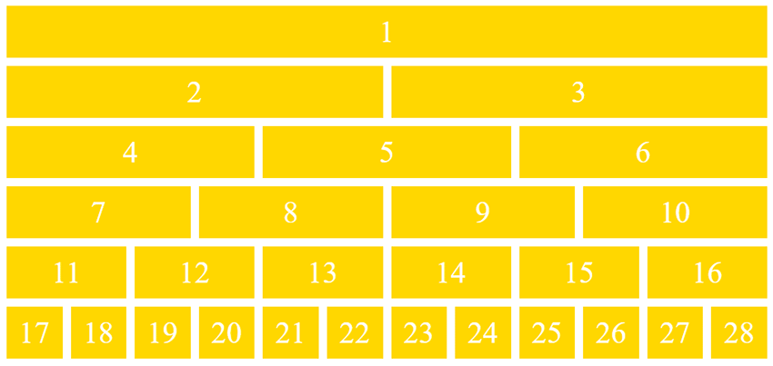
12 Column Grid

Example of 12 Column Grid

Create up to a twelve-column grid with this grid layout template. It’s simple, straightforward but definitely gets the job done.

CSS Grid Layout – Template Areas

See the Pen
CSS Grid Layout – Template Areas
by Mozilla Developers (@mozilladevelopers)
on CodePen.

Another option is this CSS Grid layout. It offers templated areas into which you can add custom content. It also offers multiple fill options.

Roph

Example of Roph

Now here’s a WordPress theme that provides a grid layout you can use in a multitude of ways. It’s designed for portfolio websites and the sky’s the limit for how you can envision using it.

CSS Grid Layout

See the Pen
CSS Grid Layout – New Terminology
by Stacy (@stacy)
on CodePen.

This CSS Grid layout is super simple, but would definitely make it a lot easier to create a custom website capable of conveying a lot of information at once. It also supports lovely hover effects.

Mono

Example of Mono

This is an HTML5 template that offers a stylish grid layout you can use in a variety of ways. With multiple templates, color schemes, and settings to select from, you’re sure to find something that suits your needs here.

CSS Grid Layout with @support Flexbox Fallback

See the Pen
CSS Grid Layout with @support flexbox fallback
by Gustaf Holm (@primalivet)
on CodePen.

Or you could use this CSS Grid layout with a Flexbox fallback that offers interesting effects and an engaging look.

Stash

Example of Stash

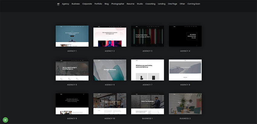
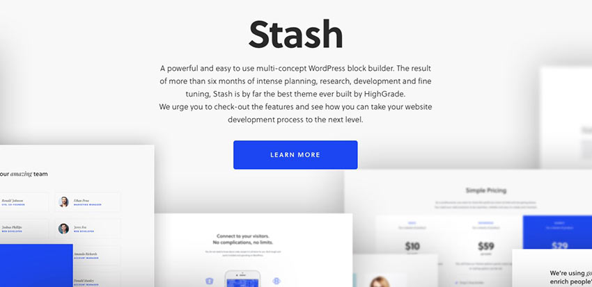
Stash is a WordPress block builder theme that you can use to create a high-quality website for businesses, corporate sites, and e-commerce sites.

Juno

Example of Juno

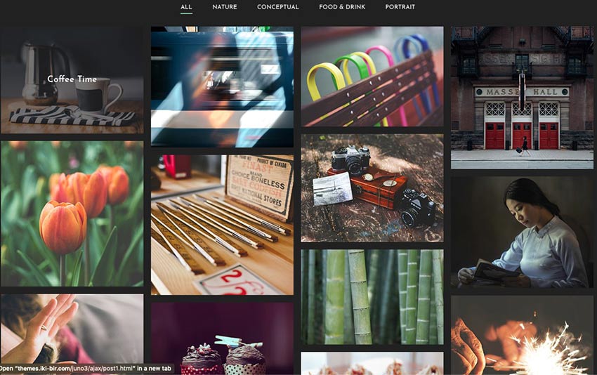
This is such a lovely layout! Juno is an ideal WordPress theme for portfolios and photography websites.

True Masonry with Grid Layout

See the Pen
True Masonry with Grid Layout
by Balázs Sziklai (@balazs_sziklai)
on CodePen.

This is another super simple option that offers a masonry grid layout that you can customize in a variety of configurations.

CSS Grid Layout Demo

See the Pen
CSS Grid Layout Demo 5 – Grid Gap
by Stacy (@stacy)
on CodePen.

Another great option is this CSS Grid layout. Change the width of each column, adjust the number of rows, and change their configuration.

CSS Grid Layout – Blog Post Template

See the Pen
CSS Grid Layout – Blog Post Template
by Stacy (@stacy)
on CodePen.

This is another grid layout template that offers a blog post layout you can use for your HTML-based blog.

Flexbox Grid Layout w/Mobile Menu

See the Pen
Flexbox grid layout w/ Mobile Menu
by Lindsey (@cssgirl)
on CodePen.

Or you can use this Flexbox grid layout for a blog post template. It includes a mobile menu, too.

Magazine Grid Layout Vol. II

See the Pen
Magazine Grid Layout Vol. II
by ilithya (@ilithya)
on CodePen.

If you’re looking to create a publication, this magazine grid layout ought to do the trick.

Content Grid System

See the Pen
Content Grid System (CSS Grid Layout)
by Tobias Gerlach (@Gerlach360)
on CodePen.

Here’s another great option. It’s a content grid system that you can use to display a lot of information at once.

Flex and Grid Demo

See the Pen
Flex and Grid demo
by rachelandrew (@rachelandrew)
on CodePen.

The Flexbox and CSS Grid demo layout is ideal for showcasing info on cards across a portion of your website. Think descriptions of your services or pricing tables.

CSS Grid Layout + Mondrian

See the Pen
CSS Grid Layout + Mondrian = <3
by Toaster (@ToasterCo)
on CodePen.

This grid layout can be used for highlighting content or creating your own work of art. It’s up to you.

Masonry Grid Layout

See the Pen
Masonry Grid Layout
by Marco Biedermann (@marcobiedermann)
on CodePen.

Create something monochromatic and impactful with this masonry grid layout. Use it for a portfolio, to display photography, or to create an experience.

Flex 12 Column Grid

See the Pen
Flex 12 Column Grid
by Nick Else (@nickelse)
on CodePen.

The Flex 12 Column Grid layout is the last one on our list and another solid option. Display as much information as you need in an organized and eye-catching way, easily.

Build Your Best Website Yet with Grid Layouts

And there you have it! Another list completed. We hope it will serve you well. This collection of grid layouts feature selections that are all easy-to-use and nice to look at. Enjoy selecting one that will serve your content well.

Good luck!

System UIcons

Category Image 052

This is a great collection of icons by Corey Ginnivan that’s both free and with no attribution required when you use them. The style is super simple. Each icon looks like older versions of the icons from macOS to me because they’re cute but not too cute.

Also? The icon picker UI is slick and looks something like this today:

Oh and also, as I was looking around Corey’s personal site I noticed this lovely UI effect when you scroll —each card stacks on top of each other:

Direct Link to ArticlePermalink


The post System UIcons appeared first on CSS-Tricks.

You can support CSS-Tricks by being an MVP Supporter.

zerodivs.com

Category Image 052

Pretty neat little website from Joan Perals, inspired by stuff like Lynn’s A Single Div. With multiple hard-stop background-image gradients, you don’t need extra HTML elements to draw shapes — you can draw as many shapes as you want on a single element. There is even a stacking order to work with. Drawing with backgrounds is certainly CSS trickery!

The site stores your drawing IDs in localStorage so you’ve got basic CRUD functionality right there. I bet the whole thing is a little hop away from being an offline PWA.

Direct Link to ArticlePermalink


The post zerodivs.com appeared first on CSS-Tricks.

You can support CSS-Tricks by being an MVP Supporter.

What does 100% mean in CSS?

Featured Imgs 23

When using percentage values in CSS like this…

.element {
  margin-top: 40%;
}

…what does that % value mean here? What is it a percentage of? There’ve been so many times when I’ll be using percentages and something weird happens. I typically shrug, change the value to something else and move on with my day.

But Amelia Wattenberger says no! in this remarkable deep dive into how percentages work in CSS and all the peculiar things we need to know about them. And as is par for the course at this point, any post by Amelia has a ton of wonderful demos that perfectly describe how the CSS in any given example works. And this post is no different.

Direct Link to ArticlePermalink


The post What does 100% mean in CSS? appeared first on CSS-Tricks.

You can support CSS-Tricks by being an MVP Supporter.

How To Completely Customize The WordPress Admin Area With Branda

Featured Imgs 13

Branda gives you the power to white label WordPress, letting your brand flow from the front to the back-end of your site. In this guide, we’ll show you how to renovate your admin area with some of Branda’s most impressive features.

White labeling your WordPress site has never been easier. Branda splits every one of her features into easy to digest modules which can be activated and removed as necessary.

Branda lets you white label every Aspect of WordPress

No job is too big or small – you can customize anything from your color scheme and dashboard widgets, right down to the text labels on your login page, and the icons in your admin toolbar.

In this guide, we’ll show you not only how to completely white label the back-end of your WordPress installation using Branda, but also how to personalize and reorganize your tools and menus to ensure peak efficiency when working within your admin area.

We’ll be covering how to:

  1. Customize Your Login Screen
  2. Change the WordPress Logo
  3. Rework the Admin Bar
  4. Personalize Your Widgets
  5. Organize Your Admin Menu
  6. Add Text to Your Footer
  7. Text Replacement
  8. Change the Color Scheme

Read on to find out how Branda can help you put your own stamp on your WordPress admin.

1. Customize Your Login Screen

When customizing your WordPress admin, it makes sense to start at the first page you’ll always see – the login screen.

Branda can help you create a completely new login screen that will impress your clients and inject some personality into your WordPress back-end.

There are seven preset templates you can select, or you can create your own from scratch.

Screenshot of Branda's login screen templates.
Click ‘Start from scratch’ to create your own template.

If you start from scratch, the main changes will come in the form of your background and logo.

First up is the logo – you can either upload your own image, or import one from a URL.

Screenshot of the logo option where you can upload your own image.
You can also choose to completely hide the logo.

Once you’ve added your logo, you can choose a new background to complement it.

Screenshot of a custom login screen made using Branda and an image of some notepads.
Just make sure your background image is a minimum of 1024px wide.

You’re free to take it even further and edit or hide the labels, display a message, or add custom error messages.

Add custom messages for users when they log in.

A few tweaks and you can completely revamp your login section.

If you’re a developer working on a lot of sites, or if you’re trying to create a personalized experience for a new client, the ability to switch out the WordPress logo in the admin bar can make a lot of difference.

It can let you know at a quick glance which site you’re currently logged into and it can be the icing on a cake for a client that you’re trying to impress.

With Branda, it takes seconds to change the logo to something more personal.

This setting is found within Admin Area > Admin Bar.

As you can see below, it’s such a simple change but it takes white labeling WordPress to the next level.

Screenshot of the admin bar with a custom logo in it
It’s your site, so it makes sense to replace the WordPress logo with your own.

3. Rework the Admin Bar

If you find the admin bar more unsightly than useful, there are a couple of ways Branda can help you manage this.

You can remove the admin bar from your front-end if you want to quickly view your site without it getting in the way by heading to Admin Area > Admin Bar.

Screenshot of the options to set the toolbar visibility by user account.
Untick the boxes of the user roles you wish to hide the toolbar from on the front-end.

If you don’t want to hide the toolbar completely, you can customize the items it shows.

Start by choosing the items you wish to hide:

Screenshot of the various options you can hide from the toolbar.
Better still, you can apply these settings to specific user roles.

If you really dislike the toolbar, you can even go as far as removing all its links in the back-end:

Screenshot of a toolbar with all the items removed.
Branda can help your admin area go from ‘messy’ to ‘minimalist’ in just a few clicks.

If you’d prefer an admin bar that is practical and personalized to fit your needs, you can create this by adding custom items to it.

Screenshot of the option to add a custom admin bar item.
Just below the option to hide your items, you’ll find the option to add custom ones.

Once you click to add a custom item, you will need to select a title, icon and a link destination.

Screenshot of the the option to select a title and icon for a custom admin menu item.
There are tons of icons to choose from – you’ll be spoilt for choice.

Add a submenu if required, and set the visibility of your new menu item per user role.

Screenshot of a custom admin bar menu item with a submenu.
You can use these settings to easily navigate to your most important pages, as well as a host of other ideas.

4. Personalize Your Widgets

With all the standard widgets active, your dashboard can begin to look a bit cluttered.

If you head into Branda and to Widgets > Dashboard Widgets, you can hide any that you don’t use.

Screenshot of the widgets you can hide.
With all these options ticked, your dashboard will be completely free of widgets.

You can then begin to repopulate your dashboard with widgets that are more useful to you, as Branda has the option to create your own custom widgets.

Screenshot of the option to add a new text widget.
You can create your own unique widget and then choose which user roles will see it.

Widgets can contain notes, company updates, stock reminders – you have total freedom.

Screenshot of a custom widget showing some upcoming appointments.
They’re so quick and easy to update.

Your admin menu is the heart and soul of your WordPress admin area. If you want to customize the back-end of your site, it makes sense to tailor the admin menu to your needs.

Head to Admin Area > Admin Menu > Customize Admin Menu and you will be presented with a ton of options to help you get the most out of your admin menu.

First up, you can customize each item in your admin bar per user role and can opt to hide each item.

Screenshot of the option to edit your dashboard menu item.
You can also duplicate items from this menu.

When you click to edit one of the items, you are first offered the chance to rename it as well as change the CSS ID and class.

Screenshot of the option to change the ID and class of the menu item.
Click ‘submenu’ to change the name and IDs/classes of the submenu items.

If you scroll down a little further, you can choose a new icon from tons of presets.

Screenshot showing some of the icons Branda comes preloaded with,.
You can even upload your own icons.

Once you are satisfied with how your menu item looks, it’s time to decide what happens when you click on it.

Underneath the icons, you will find the option to change the link, as well choose whether or not it opens in a new tab.

Screenshot of the option to add a link to the custom menu item.
While you may not need to change the link on existing menu items, it’s handy if you create new ones.

Once you have amended your existing menu items to your taste, you can scroll to the bottom of the list to add your own custom items.

This is useful if you want shortcuts to external websites or areas of your site that take a while to navigate to.

You can add text or even media to the bottom right of your admin area.

This could be anything from an important message or update, to your company motto, or even just your site name.

Screenshot of custom admin footer text which says Kirstan's Blog, 2020.
You can also make the text a link.

It’s just another quick way to break out of WordPress’ usual template and add a bit of brand/personality to your admin area.

7. Text Replacement

A handy feature found within the utilities section of Branda allows you to replace words and phrases throughout your site.

This can be especially beneficial when it comes to white labeling your admin area.

You can control whether the rules are case sensitive, and whether they apply everywhere or just on your front or back-end.

Screenshot of the option to add a text replacement rule showing Howdy replaced with Welcome Back
Even apply it to specific themes or plugins using the text domain option.

Using this feature, you can easily change the ‘Howdy’ message on the right-hand side of your admin bar, to something more to your taste.

Screenshot of the admin bar showing a custom Howdy message which say Welcome Back.
You can add as many separate rules as you like.

8. Change Your Color Scheme

If you’re dedicated to truly whitelabeling and personalizing your site, then changing the color scheme should definitely be on your to-do list.

Branda comes loaded with 8 color schemes for you to choose from.

Screenshot of the preset color schemes which come with Branda.
You can set the theme for each user individually or apply to all.

If your plan is to match your admin area to your brand, you can extensively edit the color schemes to your exact requirements.

Below is just a taste of how many options you have to create your own scheme.

You can color each element of your admin area separately, and tweak things such as hover and focus color.

Screenshot of the admin area using the theme Ocean.
This is ‘Ocean’, one of Branda’s preset color schemes.

WordPress Who?

Branda has so many options for customization and white labeling that you can put the same love and care into the back-end of your site as you do the front. No longer will you have to gaze upon the WordPress logo or endure every site you work on looking exactly the same from the back-end. With Branda, you can truly make each site your own.

If you’re eager to find out what else Branda can do, check out the documentation for a complete run down and visit our roadmap to see what else she’s got in store. Better yet, get Branda installed and experience the power of personalizing WordPress with Branda for yourself.

Warp SVG Online

Category Image 052

The warping is certainly the cool part here. Some fancy math literally transforms the path data to do the warping. But the UX detail work here is just as nice. Scrolling the page zooms in and out via a transform: scale() on the SVG wrapper (clever!). Likewise, holding the spacebar lets you pan around which is as simple as transform: translate() on another wrapper (smart!). To warp your own SVG files, you just drag-and-drop them on the page (easy!).

Direct Link to ArticlePermalink


The post Warp SVG Online appeared first on CSS-Tricks.

You can support CSS-Tricks by being an MVP Supporter.

Remove or Improve – Is It Time to Get Rid of Your WordPress Admin Bar?

Category Image 052

Fed up with your WordPress admin bar getting in your way when viewing your site? Need a simple plugin to help you tweak it a little, or if your mind’s set on it, remove it completely? Read on for a roundup of the best.

Your admin bar may be full of useful options, but it can easily get to a point where it’s more of a nuisance than a help. When you’ve made changes to your site, you might want to go straight to the frontend and admire your new masterpiece without the top 32px being taken up by your admin bar.

While plugins are the answers to most WordPress questions, you can check out this tutorial if you’d rather go down the code route to remove or customize your admin bar.

You can also remove your admin bar within the WordPress settings by going to Users > Toolbar.

Screenshot from wordpress of the remove toolbar button.
Untick the box to remove the toolbar from your frontend.

Just bear in mind that this will only remove the bar from your own account. If you want to have control over the access for all user accounts, you’re better off sticking with a plugin.

In this article, I’ll show you a bunch of great plugins that will let you reposition your admin bar, change the links, take away some of its opacity, or if you’ll never make friends, remove it completely.


Option 1 – Personalize Your Admin Bar

  • Branda

    We can’t talk about anything to do with WordPress admin and not include our very own Branda. When it comes to the admin toolbar, she certainly has a few tricks up her sleeve.

    You can hide the admin bar from different user roles, and even choose to display certain elements of it to guests. You also have the option to hide specific elements from the admin bar, as well as add new ones.

    Screenshot of Branda's custom menu item options.
    Branda always has to take it one step further…

    There are tons of icons for you to choose from, and you can even enter custom URLs. This means that you can pack your admin bar full of useful links to streamline and speed up your admin duties.

    Using Branda, you can also change your admin bar logo as well as add your own custom CSS to tailor it exactly to your needs.

  • AG Custom Admin

    Now this little plugin is pretty powerful – there isn’t much it can’t do to your WordPress admin.

    In regards to your admin bar, you can remove elements such as the logo (which you can change if you’d prefer), the pending updates notification, your site name and the +New block. You can really make your admin bar as minimalist as you’d like, and even go as far as hiding it completely. The ‘howdy’ text as well as the logo link can also be changed.

    Whilst most of the customization options are purely practical, you can also change the colors across your entire admin dashboard and bar, as well as add custom CSS and JS if you fancy a few extra tweaks.

  • Toolbar Extras

    Toolbar Extras is packed full of, ahem, extras, to help your WordPress admin bar make your life easier. If you’re one of the 5 million + people who still rely on Elementor to build beautiful websites, then this little plugin will give you super-quick access to a bunch of useful tools, right from your admin bar.

    Screenshot of the menu in toolbar extras.

    There are extra options for customization such as the ability to customize the labels and icons, as well as change the welcome message in the top-right corner.

    Screenshot of the custom greeting menu.
    You can personalize the message to include the user’s name or display name.

    If you’re not an Elementor user, you can link this plugin with the default block editor, although you’ll be presented with fewer options.

  • Admin Page Spider

    It isn’t often that you stumble across a plugin that feels so normal and that you can’t believe it’s not actually part of WordPress itself.

    Admin Page Spider falls into this category. Such a simple change to the admin bar allows you to quickly access posts and pages to edit with just one click.

    You can select it to display either pages, posts, or both.

    This is all you can really do with the free version (you can upgrade to Pro for a ton more features) but it adds such a good boost of practicality to your admin bar, that you’ll never look back.

    Interested in Admin Page Spider?

  • Admin Bar Position

    Ever thought that your frontend would look so much better with the admin bar at the bottom?

    Make your dreams a reality with this tidy little plugin. All you have to do is install and activate and your admin bar will move straight to its new home at the bottom of your screen – it’s that simple!

    Interested in Admin Bar Position?

Option 2 – Hide Your Admin Bar

  • Auto Hide Admin Bar

    Often the simple plugins are the best – the ones where you can just install, activate, and voila…extra WP functionality!

    Auto Hide Admin Bar is one of these plugins – all you have to do is activate it and your admin bar will be neatly tucked away when viewing the frontend of your website. Just hover at the top of your page and it will reappear like magic.

    Interested in Auto Hide Admin Bar?

  • Remove Admin Bar

    Sometimes, a simple tweak is all you need. This plugin does literally what it says on the tin; once you activate it, your admin toolbar will no longer ruin the masterpiece of your site when visiting as a logged-in user.

    There are a fair few plugins in the WP repo which do the same thing, so feel free to take your pick. I’m including Remove Admin Bar in this list because I’ve tested it myself and can confirm it works like a charm!

  • Admin Bar & Dashboard Access Control

    If you don’t want to completely scrap the admin toolbar from the frontend view, you can display it based on the user’s role.

    Whilst this is actually super simple to do with a couple of lines of code, we understand that some users choose not to make edits to code which is completely fine (and why plugins exist!).

    Install this plugin if you want to have more control over who sees the admin bar.

    Interested in Admin Bar & Dashboard Access Control?

  • Admin Bar Disabler

    If you’re set on hiding your admin bar but need a plugin for this which is compatible with multisite, look no further than Admin Bar Disabler.

    It offers per-site and per-network options, as well as allowing you to set permissions based on user roles.

    Interested in Admin Bar Disabler?

  • Better Admin Bar

    Better Admin Bar is a very practical plugin that helps you have control over exactly how much your admin bar interferes with the rest of your screen.

    If you want to remove the bar completely, you can do just that. If you’d prefer to lower the opacity of the bar, only show it to admins, or only show it on hover, just take your pick.

Remove or Improve?

So you’ve seen both options: customize your admin bar and turn it into something useful and practical, or wave goodbye to it – now the choice is yours.

If reading this has inspired you to go in for a complete WordPress admin overhaul, you should probably check out Branda’s other features. She’s the original whitelabeling goddess and will help you completely transform your admin area.


CSS Vocabulary

Featured Imgs 25

This is a neat interactive page by Ville V. Vanninen to reference the names of things in the CSS syntax. I feel like the easy ones to remember are “selector,” “property,” and “value,” but even as a person who writes about CSS a lot, I forget some of the others. Like the property and value together (with the colon) is called a declaration. And all the declarations together, including the curly brackets (but not the selector)? That’s a declaration block, which is slightly more specific than a block, because a block might be inside an at-rule and thus contain other complete rule-sets.

Direct Link to ArticlePermalink


The post CSS Vocabulary appeared first on CSS-Tricks.

You can support CSS-Tricks by being an MVP Supporter.

Posters! (for CSS Flexbox and CSS Grid)

Featured Imgs 23

Any time I chat with a fellow web person and CSS-Tricks comes up in conversation, there is a good chance they’ll say: oh yeah, that guide on CSS flexbox, I use that all the time!

Indeed that page, and it’s cousin the CSS grid guide, are among our top trafficked pages. I try to take extra care with them making sure the information on them is current, useful, and the page loads speedily and properly. A while back, in a round of updates I was doing on the guides, I reached out to Lynn Fisher, who always does incredible work on everything, to see if she’d be up for re-doing the illustrations on the guides. Miraculously, she agreed, and we have the much more charismatic illustrations that live on the guides today.

In a second miracle, I asked Lynn again if she’d be up for making physical paper poster designs of the guides, and see agreed again! And so they live!

Here they are:

You better believe I have it right next to me in my office:

They are $25 each which includes shipping anywhere in the world.

The post Posters! (for CSS Flexbox and CSS Grid) appeared first on CSS-Tricks.

How-to guide for creating edge-to-edge color bars that work with a grid

Category Image 052

Hard-stop gradients are one of my favorite CSS tricks. Here, Marcel Moreau combines that idea with CSS grid to solve an issue that’s otherwise a pain in the butt. Say you have like a 300px right sidebar on a desktop layout with a unique background color. Easy enough. But then say you want that background color to stretch to the right edge of the browser window even though the grid itself is width-constrained. Tricker.

Direct Link to ArticlePermalink

The post How-to guide for creating edge-to-edge color bars that work with a grid appeared first on CSS-Tricks.