I think that the above additions could help to educate developers about CSS tremendously. The only downside I can think of is that additional information might overwhelm developers, but I would take that risk in favor of more people learning CSS properly.
I’d be for it. The crossed-off UI for the “losing” selectors is attempting to teach this, but without actually teaching it. I wouldn’t be that worried about the information being overwhelming. I think if they are considerate about the design, it can be done tastefully. DevTools is a very information-dense place anyway.
It’s a joke idea I stole from HTMHell. I hope adding some fun and sarcasm to learning might help raising awareness of how !important a good CSS code is.
Ooo look at this mighty SEO flex from Google: Learn CSS! Well deserved — this is great content. Twenty-three chapters taking you through all the fundamentals of CSS with extra content, like relevant podcasts, interactive examples, and even quizzes to make sure you retained what you read.
An interactive tool for learning grid syntax from Etesam Ansari. In the Learn section, it teaches you some concepts (involving multiple bits of the grid syntax) then gives you a task to complete by filling out the right syntax. I’m sharing because I think this sort of thing really clicks with people — I know Flexbox Froggy did. Once you know the possibility, there is no shame in memorizing all the details, that’s what our guides are for: we have them for flexbox and grid. Generators can be awfully helpful too, like Sarah’s Grid Generator.
Aside: I wonder what Euismod means. Google suggests it is Latin for Performance.
You love to see it. DevTools have a massive impact on how front-end developers think about, build, and of course, debug websites. Stuff like seeing the numbered grid lines visually is a huge deal. I’ve done enough mentally counting what rows/columns I want to place things on, thank you very much.
My friends at Sparkbox are doing a survey on design systems, as they do each year. Go ahead and fill it out if you please. Here are the results from last year. In both 2019 and 2020, the vibe was that design systems (both as an idea and as a real thing that real companies really use) are maturing. But still, it was only a quarter of folks who said their actual design system was mature. I wonder if that’ll go up this year.
In my circles, “design system” isn’t the buzzword it was a few years ago, but it doesn’t mean it’s less popular. If anything, they are more popular almost entering the territory of assumed, like responsive design is. I do feel like if you’re building a website from components, well, you’ve got a component library at least, which is how I think of design systems (as a dude who pretty much exclusively works on websites).
I’d better be careful though. I know design systems mean different things to different people. Speaking of which, I’d be remiss if I didn’t also shout out the fact that Ethan has a handful of totally free courses he’s created on design systems.
As you might have guessed from the titles, we’ve broadly organized the courses around roles: whether you’re a designer, a developer, or a product manager, we’ve got something for you. Each course focuses on what I think are the fundamentals of design systems work, so I’ve designed them to be both high-level and packed with information.
While I’m 85% certain you’ve seen and used Can I Use…, I bet there is only a 13% chance that you’ve seen and used Can I Email…. It’s the same vibe—detailed support information for web platform features—except instead of support information for web browsers, it is email clients. Campaign Monitor has maintained a guide for a long time as well, but I admit I like the design style pioneered by Can I Use….
HTML email is often joked about in how you have to code for it in such an antiquated way (<table> tags galore!) but that’s perhaps not a fair shake. Kevin Mandeville talked about how he used CSS grid (not kidding) in an email back in 2017:
Our Apple Mail audience at Litmus is approximately 30%, so a good portion of our subscriber base is able to see the grid desktop layout.
Where CSS Grid isn’t supported (and for device/window widths of less than 850 pixels), we fell back to a one-column layout.
Just like websites, right? They don’t have to look the same everywhere, as long as the experience is acceptable everywhere.
Me, I don’t do nearly as as much HTML email work as I do for-web-browsers work, but I do some! For example, the newsletter for CSS-Tricks is an RSS feed that feeds a MailChimp template. The email we send out to announce new shows for ShopTalk is similar. Both of those are pretty simple MailChimp templates that are customized with a bit of CSS.
But the most direct CSSin’ I do with HTML email is the templates for CodePen emails. We have all sorts of them, from totally custom templates, to special templates for The Spark and Challenges and, of course, transactional emails.
Those are all entirely from-scratch email templates. I’s very nice to know what kind of CSS features I can count on using. For example, I was surprised by how well flexbox is supported in email.
It’s always worth thinking about fallbacks. There is nothing stopping you from creating an email that is completely laid out with CSS grid. Some email clients will support it, and some won’t. When it is supported, a fancy layout happens. When it is not supported, assuming you leave the source order intelligible, you just get a column of blocks (which is what most emails are anyway) and should be perfectly workable.
Progressive enhancement is almost more straightforward in email where there is rarely any functionality to be concerned with.
One of the default keyboard shortcuts I really like from VS Code is the ability to move lines around. I went a long time in my career as a developer never doing this, but once I learned the commands, I use them as naturally as copy and paste. Anytime you’re on a line (or have a selection), you can press Option Up (or Down) and move that line up or down, essentially swapping it with the line above (or below).
It’s very satisfying:
That’s me doing it in CodePen, as we have that feature now with the exact same keyboard command as default VS Code.
We technically supported this feature before, but it was undocumented (we need to improve the key binding documentation in general). The trick was you needed to have Sublime Text key bindings turned on (you do that in your global Editor Settings), and even then, the keyboard command was different. It turns out that Option Up/Down was already taken, but what it was doing was also undocumented, and could be easily moved. What it was doing was, in the CSS editor only, if your cursor happened to be over a number, Option Up/Down would increment that number by 0.1 in the appropriate direction. Emmet has several of those options, here there are all still working:
Sublime Text still has some additional goodies in it, that I really like, for example Command-Shift-D for duplicating lines. That pairs nicely with these new moving lines commands.
This was a great “Today I Learned” for me from Josh W. Comeau. If the font-size of an <input> is 16px or larger, Safari on iOS will focus into the input normally. But as soon as the font-size is 15px or less, the viewport will zoom into that input. Presumably, because it considers that type too small and wants you to see what you are doing. So it zooms in to help you. Accessibility. If you don’t want that, make the font big enough.
🔥 Set your form inputs to have a font-size of 1rem (16px) or larger to prevent iOS Safari from automatically zooming in when tapped.
In general, I’d say I like this feature. It helps people see what they are doing and discourages super-tiny font sizes. What is a slight bummer — and I really don’t blame anyone here — is that not all typefaces are created equal in terms of readability at different sizes. For example, here’s San Francisco versus Caveat at 16px.
San Francisco on the left, Cavet on the right. Caveat looks visually much smaller even though the font-size is the same.
You can view that example in Debug Mode to see for yourself and change the font size to see what does and doesn’t zoom.
I was just chatting with Eric Meyer the other day and I remembered an Eric Meyer story from my formative years. I wrote a blog post about CSS specificity, and Eric took the time to point out the misleading nature of it (I remember scurrying to update it). What was so misleading? The way I was portraying specificity as a base-10 number system.
Say you select an element with ul.nav. I insinuated in the post that the specificity of that selector was 0011 (eleven, essentially), which is a number in a base-10 system. So I was saying tags = 0, classes = 10, IDs = 100, and a style attribute = 1000. If specificity was calculated in a base-10 number system like that, a selector like ul.nav.nav.nav.nav.nav.nav.nav.nav.nav.nav.nav (11 class names) would have a specificity of 0111, which would be the same as ul#nav.top. That’s not true. The reality is that it would be (0, 0, 11, 1) vs. (0, 1, 0, 1) with the latter easily winning.
That comma-separated syntax like I just used solves two problems:
It doesn’t insinuate a base-10 number system (or any number system)
It has a distinct and readable look
I like the (X, X, X, X) look. I could see limiting it to (X, X, X) since a style attribute isn’t exactly a selector and usually isn’t talked about in the same kind of conversations. The parens make it more clear to me, but I could also see a X-X-X (dash-separated) syntax that wouldn’t need them, or a (X / X / X) syntax that probably would benefit from the parens.
Jenny B Kowalski has been posting a-letter-a-day on Instagram exploring multi-axis variable/responsive letterforms. They are very clever in that one of the axes controls an uppercase-to-lowercase conversion, literally morphing the shape of the letters from an uppercase version to a lowercase version. The other axis is a stroke weight, which also dramatically changes the feel of the letters.
Google is working with other browser vendors and industry partners to fix the top five browser compatibility pain points for web developers. The areas of focus are CSS Flexbox, CSS Grid, position: sticky, aspect-ratio, and CSS transforms.
[…] The goal in 2021 is to eliminate browser compatibility problems in five key focus areas so developers can confidently build on them as reliable foundations.
I’d say slow clap, but I don’t want to sound sarcastic. Full on, regular clapping.
Ten, fifteen years ago, the job of a web designer and developer was heavily thinking about, planning for, and dealing with cross-browser compatibility. These days, it’s still a thing, but it’s not about dealing with bugs, quirks, and frustrating implementation differences like it was then. It’s more edge-case stuff with more obvious work-arounds. And when we’re thinking about the browser and device landscape, we’re doing it through the lens of meeting our users where they are and embracing that landscape. Doing our best, anyway.
If the powers that be can keep chipping away at compatibility problems, that further cements the web as the correct place to build.
I vote for some kind of proper stab at reliable viewport units in 2022, that somehow sensibly handle scrollbars and other browser chrome.
This isn’t actually a podcast actually talking about what CodePen is. Well, it kinda is. But actually it’s Stephen and Chris talking about and planning for what they would say if they only had five minutes (or so) to explain what CodePen is. So we need to hash out what the most important things are, what to lede with, and how to cover all the most vital things with clarity in such a short amount of time. We’ll have to get around to actually trying to shoot a video like this soon!
Jetpack Boost is a brand spankin’ new plugin from the Jetpack / Automattic gang. Jetpack has some very powerful performance features it offers, like giving you a global CDN for your images and core-WordPress-specific CSS and JavaScript. That particular feature is still a part of the Jetpack core plugin, but many performance-specific features are moving their way over to Jetpack Boost. Like Lazy Image loading (a huge performance win) is now in Jetpack Boost and you can turn it on with the flip of a switch. The most amazing, and brand new, feature of Jetpack Boost is that it does Critical CSS handling for you, which is also a big performance win and very difficult to do by hand.
I simply do not understand it. For at least the better part of a decade, theme authors have asked for the tools to create more complex layouts with WordPress. They have asked for the ability to allow end-users to more easily recreate their demos. They have wanted methods to bypass the “restrictive” theme review guidelines.
Over the past couple of years, WordPress has consistently delivered features that theme authors have asked for. Yet, themes that use them are few and far between.
During my weekly perusal of the latest themes to land in the directory, a new wedding theme caught my attention last week. Of course, I downloaded, installed, and activated it only to find that I had no idea how to recreate the homepage design. There were no instructions. The theme options in the customizer seemed to make little sense. Nearly all of the decorative images were non-existent in the theme folder.
Did I need to upgrade to the pro version to get what was in the screenshot? There seems to be a plan for such a version, but it is not available yet.
Classic Wedding theme screenshot.
I am no rookie, but I was stuck. I liked the simplicity of the design. However, I could not imagine setting up a wedding site with this theme. From a user’s standpoint, it should not take more than a few mouse clicks. After that point, it should only be a matter of customizing the content.
I recognize that there is still a sort of love/hate divide for the block editor in the inner WordPress community. However, theme authors are not doing any favors for the overall WordPress user base by not taking advantage of the tools available.
So, I recreated the Classic Wedding theme homepage from scratch. Using the block editor. With a theme that supports it.
Creating a Wedding Homepage
My goal was simple. There was no demo to work from, and all I had to go on was an 800-pixel wide screenshot from the theme page on the author’s site. Like I recreated the Music Artist homepage several weeks ago, I wanted to do the same for Classic Wedding. With a couple of exceptions, which could have been handled by the theme, I was successful.
Because Classic Wedding does not support the block editor itself, I could not recreate its homepage via the block editor while using the theme. It was not happening — I tried. I knew that the Eksell WordPress theme had a “canvas” template that allowed users to edit the entire page, so it was an easy choice.
I also loaded the Kaushan Script and Lora fonts to more closely match the original theme. This was unnecessary for the experiment, but I wanted my recreation to at least look somewhat similar.
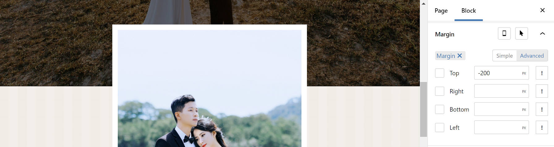
I immediately knew that I would have one hurdle to overcome. The theme used an image that overlapped both the section above and below it. This requires margin controls, particularly the ability to add negative margins. Unfortunately, this is a missing component of the block editor today. It does not mean that theme authors cannot do it with custom block styles or patterns. It simply means that end-users are unable to control it from the interface.
Because I did not want to spend my time writing the code for this, I leaned on my usual safety net, the Editor Plus plugin. While it can be a little clunky sometimes and feel like overkill, it does include those missing features like margin options.
Adding negative margin to an image.
I used px units there because it was easy. In a real-world project, % or rem would have been better. But I was just doing a quick proof-of-concept.
Everything else in the content area was straightforward. I needed a Cover block with an Image, Heading, Paragraph, and Button tucked inside. I needed a Group block as a container for Image, Heading, and Paragraphs in the bottom section.
Because the theme did not package its decorative images — again, how would users recreate the homepage without them? — I opted for a simple striped SVG background instead of the flowers in the original. Since I already had Editor Plus installed, I added an SVG from Hero Icons as the main background.
Wedding page content recreation.
My original idea was to recreate the “content” part of the homepage only. However, it was a bit boring on its own. Therefore, I transformed everything into a Columns block and added the sidebar. I recreated the primary elements using the Image, Heading, Paragraph, and Navigation blocks. Then, I added a Social Icons block for fun.
Full wedding homepage design.
I did hit one snag with the Navigation block. WordPress does not currently offer a method of centering each link in the list when using the vertical block variation. I had to write a couple of lines of CSS to make this happen. This seems like an oversight and one area where the block editor failed to meet my expectations. Of course, this could be handled on the theme side of things.
Overall, this was a relatively simple project. However, this experiment added some complexities that were not present when I recreated the Music Artist homepage. Margin controls and vertical Navigation block alignments are must-haves. Using a third-party plugin and writing custom CSS is not ideal, and these were requirements to make this happen straight from the editor.
All of this is possible from the theme end. Each piece of this design could have been packaged as a block pattern. The overlapping image effect would have made for a neat block style. I just wish that theme authors would start utilizing the features that are being hand-fed to them.
The default browser style for <hr> is so weird. It’s basically:
border-style: inset;
border-width: 1px;
The default border-color is black, but the border doesn’t actually look black, because the inset border “adds a split tone to the line that makes the element appear slightly depressed.”
If I kick up the border-width to 40px you can see it more clearly:
I often reset an <hr> to be “just a line” and it always gets me because I’ll try something, like height: 1px with a background at first, but that’s not right. The easier way to clear it is to turn off all the borders then only use border-top or border-bottom. Or, turn off all the borders, set a height, and use a background.
Annnyway… Sara has some of the nicest horizontal rules in town on the current design of her site, and she’s written it all up. Guess what? They aren’t even <hr> elements! It turns out the only styling hook you have is CSS, which wasn’t as adaptive as Sara needed, so she ended up with a <div role="separator"> (TIL!) and inline SVG.
The best way to get the full flexibility of an SVG is by inlining it. But the <hr> element is content-less — it has no opening and closing tags within which you can place other elements.
The only way to work around the limitations of <hr> while preserving semantics for screen reader users is to use a div and provide the semantics of an hr using ARIA.
This is a tremendous CSS-focused tutorial from Adam Argyle. I really like the “just for gap” concept here. Grid is extremely powerful, but you don’t have to use all its abilities every time you reach for it. Here, Adam reaches for it for very light reasons like using it as an in-between border alternative as well as more generic spacing. I guess he’s putting money where his mouth is in terms of gap superseding margin!
I also really like calling out Una Kravet’s awesome name for flexible grids: RAM. Perhaps you’ve seen the flexible-number-of-columns trick with CSS grid? The bonus trick here (which I first saw from Evan Minto) is to use min(). That way, not only are large layouts covered, but even the very smallest layouts have no hard-coded minimum (like if 100% is smaller than 10ch here):
There is a ton more trickery in the blog post. The “color pops” with :focus-within is fun and clever. So much practical CSS in building something so practical! 🧡 more blog posts like this, please. Fortunately, we don’t have to wait, as Adam has other component-focused posts like this one on Tabs and this one on Sidenav.