Reminds me of a little feature I like in Notion where if you type dash-arrow (like ->) it turns into → — but intelligently — like it doesn’t do that with inline code or a code block.
There are hidden HDR videos playing at the corners of this page. When a HDR-capable browser encounters one, it switches to HDR mode. For some reason, CSS backdrop-filter + brightness >100% combo seems to behave like HDR—reaching beyond the user-controlled display brightness, up to the maximum HDR brightness—while the everything in between follow[s] along. At least that’s the overall idea, but I still don’t know exactly why it works; especially why with those two CSS properties.
As I look at that demo in Chrome, I see an extra-white text-shadow. In Safari, I see extra-white text. In Firefox, the whites match so I see nothing. Probably a bug.
I wouldn’t recommend actually using the trick, as I’d think the extra-whiteness almost certainly takes extra battery power that a user isn’t opting into, even without the video playing—even though it does feel like a bummer that our screens are capable of whiter whites than we normally have access to. The good news is that the gamut of color on the web is expanding, generally.
Donnie D’Amato built a whole site around the thesis that “digital designers still expect to use the grid while experienced layout engineers have moved beyond it.” The idea isn’t that we should never literally use display: grid; but rather that strict adherence to an overall page grid isn’t necessary. Brad’s reaction was interesting, as someone in and out of a lot more projects than I am:
One of the most frequent, confusing conversations w/ designers is “No, the pink lines that overlay design comps aren’t all that helpful for how things actually work in the browser.”
[…] throw your transparent pink 12-column grids in the trash can.
Donnie feels this is all in the spirit of responsive design, and I’m inclined to agree, except that browser technology has evolved quite a bit since the coining of responsive design and it might be time to call it something new. “Content-driven design” is one of Donnie’s headers and that’s a nice phrase.
This all resonated with Michelle as well:
CSS layout features like flexbox and Grid enable us to build more flexible layouts that prioritise content. We talk about intrinsic and extrinsic sizing in CSS — sizing based on both content and context. The promised container queries specification will put even more power in the hands of developers. But it feels to me like the design process is still stuck in the past.
[…] you should truly consider all other options before using a [browser window size] breakpoint. Ask, is the component expected to always be related to the page size (headers, modals, etc.)? Then a breakpoint might be acceptable. However, components that are placed deep within the page should not be using breakpoints to inform their layout.
Joshua Comeau digs into how styled-components works by re-building the basics. A fun and useful journey.
styled-components seems like the biggest player in the CSS-in-React market. Despite being in that world, I haven’t yet been fully compelled by it. I’m a big fan of the basics: scoped styles by way of unique class names. I also like that it works with hot module reloading as it all happens in JavaScript. But I get those through css-modules, and I like the file-separation and Sass support I get through css-modules. There are a few things I’m starting to come around on though (a little):
Even with css-modules, you still have to think of names. Even if it’s just like .root or whatever. With styled-components you attach the styles right to the component and don’t really name anything.
With css-modules, you’re applying the styles directly to an HTML element only. With styled-components you can apply the styles to custom components and it will slap the styles on by way of spreading props later.
Because the styles are literally in the JavaScript files, you get JavaScript stuff you can use—ternaries, prop access, fancy math, etc.
Here’s a really good ol’ post from way back in 2015 all about the nine states of design and how we should think all the edge cases whenever we’re building interfaces. Vince Speelman writes:
Modern UI teams are designing components first; Interfaces are merely the thoughtful composition of components. This leaves an often glaring hole for users on “the unhappy path” — The places where users may, intentionally or not, stray from your idealized flow. As we learn to craft systems rather than pages, we must invest effort into shaping these often missed states of design and create with a component lifecycle that can support everyone. Here’s the lifecycle as I see it:
Nothing state
Loading
None
One
Some
Too many
Incorrect
Correct
Done
During the design process I think everyone (including me!) tends to focus on the ideal state of a component or interface, often leaving the extremely important edge cases forgotten until the last moment. I think I need to stick this list to my screen so I don’t forget it in my next project.
Do you want to remove the WordPress version number from your website?
Many believe that removing the WordPress version number from your website’s source code can prevent some common online attacks.
In this article, we’ll show you how to easily remove WordPress version number the right way.
Why Remove WordPress Version Number?
By default, WordPress leaves its footprints on your site for the sake of tracking. That is how we know that WordPress is the top website builder in the world.
However, sometimes this footprint might be a security leak on your site if you are not running the most updated version of WordPress. It provides the hacker with useful information by telling them which version you are running.
We recommend using the latest version of WordPress on all your websites so you don’t have to worry about this. However, if for some reason you are running an older version of WordPress, then you should definitely follow this tutorial.
It is quite difficult to remove all traces of which WordPress version you are using on your website. A sophisticated attack may still be able to find that information.
However, it will prevent automatic scanners and other less sophisticated attempts from guessing your WordPress version.
That being said, let’s take a look at some ways to easily remove version number from your WordPress website.
Method 1. Remove WordPress Version Number using Sucuri
This method is easier and recommended for all users.
Upon activation, the plugin will automatically hide WordPress version information. You can verify it by visiting Sucuri Security » Settings and switching to the Hardening tab.
Method 2. Manually Remove WordPress Version Information
This method doesn’t work as a new theme update will automatically replace the old template with the new file.
Another commonly recommended, but inefficient method is to put this code in your theme’s functions.php or site-specific plugin:
remove_action('wp_head', 'wp_generator');
This will only remove the information from the WordPress header. The version number will still be visible in your website’s RSS feeds.
The right way to remove WordPress version information is by disabling the function responsible for displaying it.
In order for you to completely remove your WordPress version number from both your head file and RSS feeds, you will need to add the following code to a site-specific plugin or code snippets plugin.
function wpbeginner_remove_version() {
return '';
}
add_filter('the_generator', 'wpbeginner_remove_version');
By adding this code, you will remove the WordPress version number from WordPress RSS feeds and your website’s head section.
Can You Completely Hide WordPress Version?
WordPress may still add the version information in various other places throughout your website. For instance, it is included as the query string in source code for CSS and JS files.
Removing all instances of WordPress version information can be time-consuming, complicated, and may not always work.
From a security perspective, removing the obvious generator tags can protect you from some very common attacks.
However, if someone is determined to break into your website, then hiding your WordPress version number does little to stop this.
You need to implement a proper WordPress security setup in place to make your website more secure. This adds layers of security around your website making it harder to hack into.
The marketing for Core Web Vitals (CWV) has been a massive success. I guess that’s what happens when the world’s dominant search engine tells people that something’s going to be an SEO factor. Ya know what language can play a huge role in those CWV scores? I’ll wait five minutes for you to think of it. Just kidding, it’s CSS.
Absolutely positioning things takes them out of flow and prevents layout shifting (but please don’t read that as we should absolute position everything).
Don’t load images you don’t have to (e.g. use a CSS gradient instead), which lends a bit of credibility to this.
There are a bunch more practical ideas in the article and they’re all good ideas (because good performance is good for lots of reasons), even if the SEO angle isn’t compelling to you.
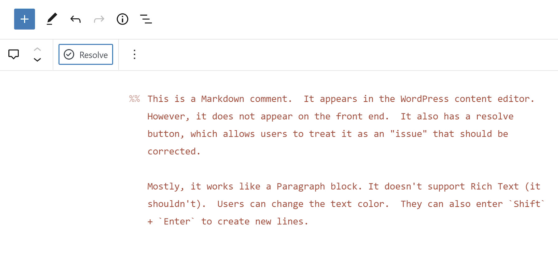
Rich Tabor, the Senior Product Manager of WordPress Experience at GoDaddy, tweeted that he had an idea for a new block at the end of last week. Shortly after, the Markdown Comment Block plugin appeared on WordPress.org.
The plugin is a one-off block. It allows users to enter notes directly into the post editor that will not appear on the front end of the site. Tabor said he came up with the idea when working on an article for building single-block plugins.
There are few things I love more than simple plugins with a tight focus, performing a single function. Markdown Comment Block lands in this category.
The plugin creates a new block that works nearly the same as a typical Paragraph block:
Adding inline comments to a post.
Users can change the text color, but they will not have access to the typical Rich Text controls. Those should be unnecessary anyway.
As someone who does long-form writing almost exclusively in Markdown, the block’s use of the double percent-sign syntax for comments intrigued me. Technically, the Markdown spec does not support any sort of special characters for them. It handles HTML comments. However, those appear in the source code on the front end when the document is rendered. I have only seen the %% mark to denote comments in the Inspire Writer app for Windows. Tabor said he had seen the same in Ulysses. The feature also exists in the Iceberg editor for WordPress, which Tabor created alongside Jeffrey Carandang.
The plugin also introduces the %% keyboard shortcut. Typing it directly in the editor will create a new Markdown Comment block.
My primary use case for the plugin would be leaving notes for my later self. However, it could also be handy in users’ publishing flows. The block adds a “Resolve” button to the toolbar. Clicking it deletes the comment.
Clicking the “Resolve” button will delete the block.
The block itself will not likely offer a robust enough feature set for complex workflows. However, pairing it with a plugin like Post Descriptions could round out the experience for larger teams of writers and copyeditors.
The Post Descriptions plugin allows users to add notes on the post level. These notes appear on the post-management screen, letting other team members know when to check an article. However, it may be hard to provide the full context of what issues need to be resolved before publishing. Markdown Comment Block adds an inline comments system, letting team members pass in-text notes.
Theme developers should appreciate that the block uses CSS custom properties too, which makes it easy to overwrite its default style rules. In moments, I was able to make it match my theme:
Custom color, font, and line-height styles.
The --markdown-comment-font-size, --markdown-comment-line-height, and --markdown-comment-color variables are available for theme developers who want to add in support.
The one complaint I had about the block is its title: “Comment.” It is easy to confuse it with the six other comment-related blocks already in the WordPress block list. And, there will only be more in upcoming versions. Giving it a title of “Markdown Comment” would better distinguish it from others.
I use this line, or one like it, in a lot of quick demos. Not that it’s not a production-worthy line of code—I just tend to be a bit more explicit on bigger projects.
html {
  font: 110%/1.4 system-ui;
}
Someone wrote in confused by it, and I could see how a line like that is a bit bewildering at first.
The first thing to know is that it is called shorthand. The font property in CSS gives you the opportunity to set a bunch of font-* properties all at once. In this case, we’re setting:
html {
  font-family: system-ui;
  font-size: 110%;
  line-height: 1.4;
}
There are a few more little specific things to know. For example, the order matters.
/* invalid */
html {
  font: system-ui 100%/1.4;
}
You also can’t set the line-height without also setting the font-size. If you’re going to set line-height, you have to set both. Be extra careful there because something like 20px is both a valid line-height and font-size, and if you only set one, it’ll be the font-size. If you go for a unitless number, which is a great idea for line-height, and try to set it alone, it’ll just fail.
Well, --accent-color is declared, so it’s definitely not orange (the fallback).
The value for the background is revert, so it’s essentially background: revert;
The background property doesn’t inherit though, and even if you force it to, it would inherit from the <body>, not the root.
So… transparent.
Nope.
Lea:
[Because the value is revert it] cancels out any author styles, and resets back to whatever value the property would have from the user stylesheet and UA stylesheet. Assuming there is no --accent-color declaration in the user stylesheet, and of course UA stylesheets don’t set custom properties, then that means the property doesn’t have a value.
Since custom properties are inherited properties (unless they are registered with inherits: false, but this one is not), this means the inherited value trickles in, which is — you guessed it — skyblue.
OK, well, --color is declared, so it’s not blue (the fallback).
It’s not red because the second declaration will override that one.
So, it’s essentially like p { color: inherit; }.
The <p> will inherit yellow from the <body>, which it would have done naturally anyway, but whatever, it’s still yellow.
Nope.
Apparently inherit there is actually inheriting from the next place up the tree that sets it, which html does, so green. That actually is now normal inheriting works. It’s just a brain twister because it’s easy to conflate color the property with --color the custom property.
It also might be useful to know that when you actually declare a custom property with @property you can say whether you want it to inherit or not. So that would change the game with these brain twisters!
PPK looks at aspect-ratio, a CSS property for layout that, for the most part, does exactly what you would think it does. It’s getting more interesting as it’s behind a flag in Firefox and Safari now, so we’ll have universal support pretty darn soon. I liked how he called it a “weak declaration” which I’m fairly sure isn’t an official term but a good way to think about it.
Because you’ve explicitly set the height and width, that is what will be respected. The aspect-ratio is weak in that it will never override a dimension that is set in any other way.
And it’s not just height and width, it could be max-height that takes effect, so maybe the element follows the Aspect ratio sometimes, but will always respect a max-* value and break the Aspect ratio if it has to.
It’s so weak that not only can other CSS break the Aspect ratio, but content inside the element can break it as well. For example, if you’ve got a ton of text inside an element where the height is only constrained by aspect-ratio, it actually won’t be constrained; the content will expand the element.
I think this is all… good. It feels intuitive. It feels like good default behavior that prevents unwanted side effects. If you really need to force an Aspect ratio on a box with content, the padding trick still works for that. This is just a much nicer syntax that replaces the safe ways of doing the padding trick.
PPK’s article gets into aspect-ratio behavior in flexbox and grid, which definitely has some gotchas. For example, if you are doing align-content: stretch;—that’s one of those things that can break an Aspect ratio. Like he said: weak declaration.
Una is calling it the new responsive. A nod to the era we were most certainly in, the era of responsive design. Where responsive design was fluid grids, flexible media, and media queries, the new responsive is those things too, but slotted into a wider scope: user preference queries, viewport and form factor, macro layouts, and container styles.
I like the thinking and grouping here and I kinda like the name. It eludes to an evolution and extension of responsive web design rather than a rejection and replacement.
This isn’t the first crack at identifying and naming a shift between eras. Back in 2018, Jen Simmons was doing a talked called “Everything You Know About Web Design Just Changed” where she identified that responsive design was a major shift in how we did layout on the web. And yet, it was firmly defined in an era where layout tools like flexbox and grid didn’t even exist. Now, they do exist, and with them a bevy of other new features that bring more capable graphic design to the web. She called itIntrinsic Design.
I almost like Intrinsic Design more now than I did in 2018, because now, if we attempt to lump in @container queries, the name makes more intuitive sense. We (hopefully will soon) make styling choices based on the intrinsic size of elements. We make styling choices based on the intrinsic nature of the individual users we serve. We make styling choices off the intrinsic qualities of the browser.
I wouldn’t say either of the terms have really caught on though. It’s hard to make a name stick. That little burst of ideating around CSS4 sure didn’t go anywhere.
If somebody says a comment isn’t adding any value, I would ask: to whom?
Personally, I’ve never liked the advice that writing obvious comments is bad practice—probably because I write obvious comments all the time.
Jim showed off some examples of “code comments that are at the same level of fidelity as the code itself.” Those are the hardest calls with code comments.
// this function adds two numbers
function add(a, b) {
  return a + b;
}
Easy to point at that and call it not useful. I tend not to leave this type of comment, but it’s fair play for Jim to question that. Comments can be used for a wide swath of people whom may at some point interact with that code, so why gate-keep it?
[…] comments can serve a very different purpose when they’re being read vs. when they’re being written. Those are almost two different kinds of activities.
I’d add they serve a different purpose when re-visiting old code vs actively working. Also different when you’re trying to code review versus directly contribute.
Learn CSS is a very cool project from a whole team of people at Google (and outside). It does a great job of documenting where is right now, in a fairly comprehensive way. Learn CSS was spearheaded by Una Kravets and Andy Bell did the bulk of the writing, so they are two extra-special guests to have on the show to talk about it. Why CodePen Radio though? Because there are literally hundreds of Embedded Pens used in this course, all using a style guide base and are live editors in the site itself. Cool!
Did you know, the Learn CSS course has over 200 demos in it all powered by two CodePens?
26:58 How difficult was it to sell Google on this?
Sponsor: WooCommerce
WooCommerce supports Apple Pay at checkout now, which is a nice thing to offer. Some people have pretty strong preferences for how they pay online, and it’s best to meet them there rather than force one particular payment method.
Does that make your eye twitch a little bit? Like… it’s a typo. It should be target="_blank" with an underscore to start the value. As in…
<a target="_blank" href="https://codepen.io">
  Open CodePen in a New Tab
</a>
Welp, that’s correct syntax!
In the case of the no-underscore target="blank", the blank part is just a name. It could be anything. It could be target="foo" or, perhaps to foreshadow the purpose here: target="open-new-links-in-this-space".
The difference:
target="_blank" is a special keyword that will open links in a new tab every time.
target="blank" will open the first-clicked link in a new tab, but any future links that share target="blank" will open in that same newly-opened tab.
I created a very basic demo page to show off the functionality (code). Watch as a new tab opens when I click the first link. Then, subsequent clicks from either also open tab open that link in that new second tab.
Why?
I think use cases here are few and far between. Heck, I’m not even that big of a fan of target="_blank". But here’s one I could imagine: documentation.
Say you’ve got a web app where people actively do work. It might make sense to open links to documentation from within that app in a new tab, so they aren’t navigating away from active work. But, maybe you think they don’t need a new tab for every documentation link. You could do like…
Blocks in WordPress are great. Drop some into the page, arrange them how you like, and you’ve got a pretty sweet landing page with little effort. But what if the default blocks in WordPress need a little tweaking? Like, what if we could remove the alignment options in the Cover block settings? Or how about control sizing for the Button block?
There are plenty of options when it comes to extending the functionality of core blocks in WordPress. We can add a custom CSS class to a block in the editor, add a custom style, or create a block variation. But even those might not be enough to get what you need, and you find yourself needing to filter the core block to add or remove features, or building an entirely new block from scratch.
I’ll show you how to extend core blocks with filters and also touch on when it’s best to build a custom block instead of extending a core one.
A quick note on these examples
Before we dive in, I’d like to note that code snippets in this article are taken out of context on purpose to focus on filters rather than build tools and file structure. If I included the full code for the filters, the article would be hard to follow. With that said, I understand that it’s not obvious for someone who is just starting out where to put the snippets or how to run build scripts and make the whole thing work.
To make things easier for you, I made a WordPress plugin with examples from this article available on my GitHub. Feel free to download it and explore the file structure, dependencies and build scripts. There is a README that will help you get started.
Block filters in an nutshell
The concept of filters is not new to WordPress. Most of us are familiar with the add_filter() function in PHP. It allows developers to modify various types of data using hooks.
A simple example of a PHP filter could look something like this:
In this snippet, we create a function that receives a string representing a post title, then wrap it in a <strong> tag and return a modified title. We then use add_filter() to tell WordPress to use that function on a post title.
JavaScript filters work in a similar way. There is a JavaScript function called addFilter() that lives in the wp.hooks package and works almost like its PHP sibling. In its simplest form, a JavaScript filter looks something like this:
function filterSomething(something) {
  // Code for modifying something goes here.
  return something;
}

wp.hooks.addFilter( 'hookName', 'namespace', filterSomething );
Looks pretty similar, right? One notable difference is addFilter() has a namespace as a second argument. As per the WordPress Handbook, “Namespace uniquely identifies a callback in the the form vendor/plugin/function.” However, examples in the handbook follow different patterns: plugin/what-filter-does or plugin/component-name/what-filter-does. I usually follow the latter because it keeps the handles unique throughout the project.
What makes JavaScript filters challenging to understand and use is the different nature of what they can filter. Some filter strings, some filter JavaScript objects, and others filter React components and require understanding the concept of Higher Order Components.
On top of that, you’ll most likely need to use JSX which means you can’t just drop the code into your theme or plugin and expect it to work. You need to transpile it to vanilla JavaScript that browsers understand. All that can be intimidating at the beginning, especially if you are coming from a PHP background and have limited knowledge of ES6, JSX, and React.
But fear not! We have two examples that cover the basics of block filters to help you grasp the idea and feel comfortable working with JavaScript filters in WordPress. As a reminder, if writing this code for the Block Editor is new to you, explore the plugin with examples from this article.
Without any further ado, let’s take a look at the first example.
Removing the Cover block’s alignment options
We’re going to filter the core Cover block and remove the Left, Center, Right, and Wide alignment options from its block settings. This may be useful on projects where the Cover block is only used as a page hero, or a banner of some sort and does not need to be left- or right-aligned.
We’ll use the blocks.registerBlockType filter. It receives the settings of the block and its name and must return a filtered settings object. Filtering settings allows us to update the supports object that contains the array of available alignments. Let’s do it step-by-step.
We’ll start by adding the filter that just logs the settings and the name of the block to the console, to see what we are working with:
Let’s break it down. The first line is a basic destructuring of the wp.hooks object. It allows us to write addFilter() in the rest of the file, instead of wp.hooks.addFilter(). This may seem redundant in this case, but it is useful when using multiple filters in the same file (as we’ll get to in the next example).
Next, we defined the filterCoverBlockAlignments() function that does the filtering. For now, it only logs the settings object and the name of the block to the console and returns the settings as is.
All filter functions receive data, and must return filtered data. Otherwise, the editor will break.
And, lastly, we initiated the filter with addFilter() function. We provided it with the name of the hook we are going to use, the filter namespace, and a function that does the filtering.
If we’ve done everything right, we should see a lot of messages in the console. But note that not all of them refer to the Cover block.
This is correct because the filter is applied to all blocks rather than the specific one we want. To fix that, we need to make sure that we apply the filter only to the core/cover block:
function filterCoverBlockAlignments(settings, name) {
  if (name === 'core/cover') {
    console.log({ settings, name });
  }
  return settings;
}
With that in place, we should see something like this now in the console:
Don’t worry if you see more log statements than Cover blocks on the page. I have yet to figure out why that’s the case. If you happen to know why, please share in the comments!
And here comes the fun part: the actual filtering. If you have built blocks from scratch before, then you know that alignment options are defined with Supports API. Let me quickly remind you how it works — we can either set it to true to allow all alignments, like this:
supports: {
  align: true
}
…or provide an array of alignments to support. The snippet below does the same thing, as the one above:
I’d like to pause here to draw your attention to the assign and merge lodash methods. We use those to create and return a brand new object and make sure that the original settings object remains intact. The filter will still work if we do something like this:
/* 👎 WRONG APPROACH! DO NOT COPY & PASTE! */
settings.supports.align = ['full'];
return settings;
…but that is an object mutation, which is considered a bad practice and should be avoided unless you know what you are doing. Zell Liew discusses why mutation can be scary over at A List Apart.
Going back to our example, there should now only be one alignment option in the block toolbar:
I removed the “center” alignment option because the alignment toolbar allows you to toggle the alignment “on” and “off.” This means that Cover blocks now have default and “Full width” states.
This wasn’t hard at all, right? You are now equipped with a basic understanding of how filters work with blocks. Let’s level it up and take a look at a slightly more advanced example.
Adding a size control to the Button block
Now let’s add a size control to the core Button block. It will be a bit more advanced as we will need to make a few filters work together. The plan is to add a control that will allow the user to choose from three sizes for a button: Small,Regular, and Large.
The goal is to get that new “Size settings” section up and running.
It may seem complicated, but once we break it down, you’ll see that it’s actually pretty straightforward.
1. Add a size attribute to the Button block
First thing we need to do is add an additional attribute that stores the size of the button. We’ll use the already familiar blocks.registerBlockType filter from the previous example:
The difference between what we’re doing here versus what we did earlier is that we’re filtering attributes rather than the supports object. This snippet alone doesn’t do much and you won’t notice any difference in the editor, but having an attribute for the size is essential for the whole thing to work.
2. Add the size control to the Button block
We’re working with a new filter, editor.BlockEdit. It allows us to modify the Inspector Controls panel (i.e. the settings panel on the right of the Block editor).
This may look like a lot, but we’ll break it down and see how straightforward it actually is.
The first thing you may have noticed is the createHigherOrderComponent construct. Unlike other filters in this example, editor.BlockEdit receives a component and must return a component. That’s why we need to use a Higher Order Component pattern derived from React.
In its purest form, the filter for adding controls looks something like this:
This will do nothing but allow you to inspect the <BlockEdit /> component and its props in the console. Hopefully the construct itself makes sense now, and we can keep breaking down the filter.
This is done so we can use name, setAttributes, and size in the scope of the filter, where:
size is the attribute of the block that we’ve added in step 1.
setAttributes is a function that lets us update the block’s attribute values.
name is a name of the block. which is core/button in our case.
Next, we avoid inadvertantly adding controls to other blocks:
if (name !== 'core/button') {
  return <BlockEdit {...props} />;
}
And if we are dealing with a Button block, we wrap the settings panel in a <Fragment /> (a component that renders its children without a wrapping element) and add an additional control for picking the button size:
return (
  <Fragment>
    <BlockEdit {...props} />
    {/* Additional controls go here */}
  </Fragment>
);
Finally, additional controls are created like this:
Again, if you have built blocks before, you may already be familiar with this part. If not, I encourage you to study the library of components that WordPress comes with.
At this point we should see an additional section in the inspector controls for each Button block:
We are also able to save the size, but that won’t reflect in the editor or on the front end. Let’s fix that.
3. Add a size class to the block in the editor
As the title suggests, the plan for this step is to add a CSS class to the Button block so that the selected size is reflected in the editor itself.
We’ll use the editor.BlockListBlock filter. It is similar to editor.BlockEdit in the sense that it receives the component and must return the component; but instead of filtering the block inspector panel, if filters the block component that is displayed in the editor.
I’m using the classnames utility here, and it’s not a requirement — I just find using it a bit cleaner than doing manual concatenations. It prevents me from worrying about forgetting to add a space in front of a class, or dealing with double spaces.
4. Add the size class to the block on the front end
All we have done up to this point is related to the Block Editor view, which is sort of like a preview of what we might expect on the front end. If we change the button size, save the post and check the button markup on the front end, notice that button class is not being applied to the block.
To fix this, we need to make sure we are actually saving the changes and adding the class to the block on the front end. We do it with blocks.getSaveContent.extraProps filter, which hooks into the block’s save() function and allows us to modify the saved properties. This filter receives block props, the type of the block, and block attributes, and must return modified block props.
import classnames from 'classnames';
const { assign } = lodash;
const { addFilter } = wp.hooks;

/**
 * Add size class to the block on the front end
 *
 * @param  {Object} props      Additional props applied to save element.
 * @param  {Object} block      Block type.
 * @param  {Object} attributes Current block attributes.
 * @return {Object}            Filtered props applied to save element.
 */
function addSizeClassFrontEnd(props, block, attributes) {
  if (block.name !== 'core/button') {
    return props;
  }

  const { className } = props;
  const { size } = attributes;

  return assign({}, props, {
    className: classnames(className, size ? `has-size-${size}` : ''),
  });
}

addFilter(
  'blocks.getSaveContent.extraProps',
  'intro-to-filters/button-block/add-front-end-class',
  addSizeClassFrontEnd,
);
In the snippet above we do three things:
Check if we are working with a core/button block and do a quick return if we are not.
Extract the className and size variables from props and attributes objects respectively.
Create a new props object with an updated className property that includes a size class if necessary.
Here’s what we should expect to see in the markup, complete with our size class:
If you are building a custom theme, you can include these front-end styles in the theme’s stylesheet. I created a plugin for the default Twenty Twenty One theme, so, in my case, I had to create a separate stylesheet and include it using wp_enqueue_style(). You could just as easily work directly in functions.php if that’s where you manage functions.
Similar to the front end, we need to make sure that buttons are properly styled in the editor. We can include the same styles using the enqueue_block_editor_assets action:
We should now should have styles for large and small buttons on the front end and in the editor!
As I mentioned earlier, these examples are available in as a WordPress plugin I created just for this article. So, if you want to see how all these pieces work together, download it over at GitHub and hack away. And if something isn’t clear, feel free to ask in the comments.
Use filters or create a new block?
This is a tricky question to answer without knowing the context. But there’s one tip I can offer.
Have you ever seen an error like this?
It usually occurs when the markup of the block on the page is different from the markup that is generated by the block’s save() function. What I’m getting at is it’s very easy to trigger this error when messing around with the markup of a block with filters.
So, if you need to significantly change the markup of a block beyond adding a class, I would consider writing a custom block instead of filtering an existing one. That is, unless you are fine with keeping the markup consistent for the editor and only changing the front-end markup. In that case, you can use PHP filter.
Speaking of which…
Bonus tip: render_block()
This article would not be complete without mentioning the render_block hook. It filters block markup before it’s rendered. It comes in handy when you need to update the markup of the block beyond adding a new class.
The big upside of this approach is that it won’t cause any validation errors in the editor. That said, the downside is that it only works on the front end. If I were to rewrite the button size example using this approach, I would first need to remove the code we wrote in the fourth step, and add this:
This isn’t the cleanest approach because we are injecting a CSS class using str_replace() — but that’s sometimes the only option. A classic example might be working with a third-party block where we need to add a <div> with a class around it for styling.
Wrapping up
WordPress block filters are powerful. I like how it allows you to disable a lot of unused block options, like we did with the Cover block in the first example. This can reduce the amount of CSS you need to write which, in turn, means a leaner stylesheet and less maintenance — and less cognitive overhead for anyone using the block settings.
But as I mentioned before, using block filters for heavy modifications can become tricky because you need to keep block validation in mind.
That said, I usually reach for block filters if I need to:
disable certain block features,
add an option to a block and can’t/don’t want to do it with custom style (and that option must not modify the markup of the block beyond adding/removing a custom class), or
modify the markup only on the front end (using a PHP filter).
I also usually end up writing custom blocks when core blocks require heavy markup adjustments both on the front end and in the editor.
If you have worked with block filters and have other thoughts, questions, or comments, let me know!
I recently visited a blog called "Does CSS loading cause blockage?" I opened it with a learning attitude, but it seemed that what was said was not completely correct, so I searched all kinds of information everywhere, and then I summarized it myself,
Will CSS Loading Cause Blockage?
First of all, the answer is definitely yes. The loading of css will not only block the parsing of HTML, but also block the execution of JS.