Recent Post Shortcode

Fotolia Subscription Monthly 4685447 Xl Stock

WordPress shortcodes are a simple way to set up functions to create macro codes for use in post content. For instance, the following shortcode (in the post/page content) would add your recent posts into the page: It’s pretty simple and brings your WordPress blog alive with ease. Recent Post Short Code In WordPress 1 Add this code to your functions.php file. 2 … Read more

The post Recent Post Shortcode appeared first on Web Design Weekly.

Rethinking The Role Of Your UX Teams And Move Beyond Firefighting

Fotolia Subscription Monthly 4685447 Xl Stock

In my experience of building and supporting UX teams, most of them are significantly under-resourced. In fact, the term "team" can often be a stretch, with many user experience professionals finding themselves alone in their roles.

Typically, there are way more projects that impact the user experience than the team can realistically work on. Consequently, most UX teams are in a constant state of firefighting and achieve relatively little in improving the overall experience.

We can complain about being under-resourced as much as we want, but the truth is that our teams are unlikely to grow to a size where we have sufficient staff to address every detail of the experience. Therefore, in this post, I want to step back and reconsider the role of user experience professionals and how UX teams can best improve the user experience of an organization.

What Is The Role Of A UX Professional?

There is a danger that as UX professionals, we focus too much on the tools of our trade rather than the desired outcome.

In other words, we tend to think that our role involves activities such as:

  • Prototyping
  • User research
  • Interface design
  • Testing with users

But these are merely the means to an end, not the end goal itself. These activities are also time-consuming and resource-intensive, potentially monopolizing the attention of a small UX team.

Our true role is to improve the user experience as they interact with our organization's digital channels.

The ultimate goal for a UX team should be to tangibly enhance the customer experience, rather than solely focusing on executing design artifacts.

This reframing of our role opens up new possibilities for how we can best serve our organizations and their customers. Instead of solely focusing on the tactical activities of UX, we must proactively identify the most impactful opportunities to enhance the overall customer experience.

Changing How We Approach Our Role

If our goal is to elevate the customer experience, rather than solely executing UX activities, we need to change how we approach our role, especially in under-resourced teams.

To maximize our impact, we must shift from a tactical, project-based mindset to a more strategic, leadership-oriented one.

We need to become experience evangelists who can influence the broader organization and inspire others to prioritize and champion user experience improvements across the business.

As I help shape UX teams in organizations, I achieve this by focusing on four critical areas:

Let’s explore these in turn.

The Creation Of Resources

It is important for any UX team to demonstrate its value to the organization. One way to achieve this is by creating a set of tangible resources that can be utilized by others throughout the organization.

Therefore, when creating a new UX team, I initially focus on establishing a core set of resources that provide value and leave an impressive impression.

Some of the resources I typically focus on producing include:

  • User Experience Playbook
    An online learning resource featuring articles, guides, and cheatsheets that cover topics ranging from conducting surveys to performing AB testing.
  • Design System
    A set of user interface components that can be used by teams to quickly prototype ideas and fast-track their development projects.
  • Recommended Supplier List
    A list of UX specialists that have been vetted by the team, so departments can be confident in hiring them if they want help improving the user experience.
  • User Research Assets
    A collection of personas, journey maps, and data on user behavior for each of the most common audiences that the organization interacts with.

These resources need to be viewed as living services that your UX team supports and refines over time. Note as well that these resources include educational elements. The importance of education and training cannot be overstated.

The Provision Of Training

By providing training and educational resources, your UX team can empower and upskill the broader organization, enabling them to better prioritize and champion user experience improvements. This approach effectively extends the team’s reach beyond its limited internal headcount, seeking to turn everybody into user experience practitioners.

This training provision should include a blend of 'live' learning and self-learning materials, with a greater focus on the latter since it can be created once and updated periodically.

Most of the self-learning content will be integrated into the playbook and will either be custom-created by your UX team (when specific to your organization) or purchased (when more generic).

In addition to this self-learning content, the team can also offer longer workshops, lunchtime inspirational presentations, and possibly even in-house conferences.

Of course, the devil can be in the details when it comes to the user experience, so colleagues across the organization will also need individual support.

The Offering Of Consultative Services

Although your UX team may not have the capacity to work directly on every customer experience initiative, you can provide consultative services to guide and support other teams. This strategic approach enables your UX team to have a more significant impact by empowering and upskilling the broader organization, rather than solely concentrating on executing design artifacts.

Services I tend to offer include:

  • UX reviews
    A chance for those running digital services to ask a UX professional to review their existing services and identify areas for improvement.
  • UX discovery
    A chance for those considering developing a digital service to get it assessed based on whether there is a user need.
  • Workshop facilitation
    Your UX team could offer a range of UX workshops to help colleagues understand user needs better or formulate project ideas through design thinking.
  • Consultancy clinics
    Regular timeslots where those with questions about UX can “drop in” and talk with a UX expert.

But it is important that your UX team limits their involvement and resists the urge to get deeply involved in the execution of every project. Their role is to be an advisor, not an implementer.

Through the provision of these consultative services, your UX team will start identifying individuals across the organization who value user experience and recognize its importance to some degree. The ultimate goal is to transform these individuals into advocates for UX, a process that can be facilitated by establishing a UX community within your organization.

Building A UX Community

Building a UX community within the organization can amplify the impact of your UX team's efforts and create a cohesive culture focused on customer experience. This community can serve as a network of champions and advocates for user experience, helping spread awareness and best practices throughout the organization.

Begin by creating a mailing list or a Teams/Slack channel. Using these platforms, your UX team can exchange best practices, tips, and success stories. Additionally, you can interact with the community by posing questions, creating challenges, and organizing group activities.

For example, your UX team could facilitate the creation of design principles by the community, which could then be promoted organization-wide. The team could also nurture a sense of friendly competition by encouraging community members to rate their digital services against the System Usability Scale or another metric.

The goal is to keep UX advocates engaged and advocating for UX within their teams, with a continual focus on growing the group and bringing more people into the fold.

Finally, this community can be rewarded for their contributions. For example, they could have priority access to services or early access to educational programs. Anything to make them feel like they are a part of something special.

An Approach Not Without Its Challenges

I understand that many of my suggestions may seem unattainable. Undoubtedly, you are deeply immersed in day-to-day project tasks and troubleshooting. I acknowledge that it is much easier to establish this model when starting from a blank canvas. However, it is possible to transition an existing UX team from tactical project work to UX leadership.

The key to success lies in establishing a new, clear mandate for the group, rather than having it defined by past expectations. This new mandate needs to be supported by senior management, which means securing their buy-in and understanding of the broader value that user experience can provide to the organization.

I tend to approach this by suggesting that your UX team be redefined as a center of excellence (CoE). A CoE refers to a team or department that develops specialized expertise in a particular area and then disseminates that knowledge throughout the organization.

This term is familiar to management and helps shift management and colleague thinking away from viewing the team as UX implementors to a leadership role. Alongside this new definition, I also seek to establish new objectives and key performance indicators with management.

These new objectives should focus on education and empowerment, not implementation. When it comes to key performance indicators, they should revolve around the organization's understanding of UX, overall user satisfaction, and productivity metrics, rather than the success or failure of individual projects.

It is not an easy shift to make, but if you do it successfully, your UX team can evolve into a powerful force for driving customer-centric innovation throughout the organization.

Chris’ Corner: Variables

Fotolia Subscription Monthly 4685447 Xl Stock

CSS has a feature called Custom Properties. You know this.

html {
  --brandColor: red;
}

.card {
  border-color: var(--brandColor);
  
  h2 {
    color: var(--brandColor);
  }
}

People also — somewhat interchangeably — refer to these as CSS variables. Somehow, that doesn’t bother me, even though I tend to be a stickler about naming things. For instance, there is no such thing as a frontend developer. There are front-end developers who focus on the front end.

But here, the names feel like they make sense despite me not exactly nailing down how I like to see them being used. Like, Custom Property feels right. When I create --something, that’s used as a property in CSS but I just made up the name myself. It’s a… custom… property. And then I use it later with the var() function, which obviously stands for “variable”, because now this custom properties value has turned into a dynamic variable. So calling what is happening here a “CSS variable” seems entirely fine.

OK moving on I guess we need to talk about CSS variables for an entire issue.


Just the other week I was trying to see if there was a clean way to ask CSS what the value of cos(25deg) was. I feel like I got so close, trying both setting the value to a property that takes a unitless number and typing the variable first, but I couldn’t quite get it. There is a lesson here about never giving up, as Bramus proved by giving it a fresh college try and proving it absolutely can be done.


You totally do need to type variables sometimes, the 99% use case is allowing them to be animated which the browser can (mostly) on do if it knows the type. You could also consider it a form of “type safety” so hardcore TypeScript nerds will probably like it.


Above is about as niche of a situation as you can get.

What are CSS variables actually useful for?

I like thinking of the most common use case for things. The most common use case for grid is to put two things side by side. The most common use case for a <dialog> is an important confirm/cancel question. The most common use case for a popover is a footnote. The most common use case for SVG is a logo. For CSS variables, it’s a brand color.

Even on a fairly simple website, I’d bet there is one particular important color that you end up having to set a number of times. Using a variable for it just keeps things DRY and allows you to tweak it easily. That’s exactly the code I started this post out with. But variables are more and more powerful. Just that --brandColor is tweakable without changing it…

footer {
  background: color-mix(in oklch, var(--brandColor), black 20%);
}

Now if we tweak that brand color, we’re tweaking the tweaks (man).


Even wilder to me is that setting one custom property (see how effortless I can switch the term back and forth?) can have effects all over the place. This is thanks to container style queries.

Consider code like this:

@container style(--darkBackground) {
  > * { color: white; }
}

Now if --darkBackground is set (to any value at all) on any element, all direct children of it have white text. Support for this is pretty limited, so it’ll be a while until any of us have any strong understanding of how this will affect how we write CSS. To me, this is similar to :has() in how a change anywhere on the page can affect changes elsewhere in (I’d argue) unexpected ways. Powerful ways. Maybe useful ways. But unexpected ways. CSS used to be a pretty darn top-down language and that’s changing.


How about a feature with such limited support there… isn’t any. One of those things is the if() statement (woah), which is only useful for testing CSS variables. I’m a fan, but let’s not get all into that here. Another Lea Verou post is Proposal: CSS Variable Groups. Check it:

:root {
  --color-green: {
    100: oklch(95% 13% 135);
    200: oklch(95% 15% 135);
    /* ... */
    900: oklch(25% 20% 135);
  };
}

This turns into variables that are used like var(--color-green-200). Such a chill way to declare a set of variables without so much repetition. It’s just for authors, but that’s fine I think. CSS variables I feel like exist mostly in a post-pre-processing era (heh), so even though we’d probably abstract this with a loop or whatever in the past, we don’t have that anymore, so need syntactical help.

Getting To The Bottom Of Minimum WCAG-Conformant Interactive Element Size

Fotolia Subscription Monthly 4685447 Xl Stock

There are many rumors and misconceptions about conforming to WCAG criteria for the minimum sizing of interactive elements. I’d like to use this post to demystify what is needed for baseline compliance and to point out an approach for making successful and inclusive interactive experiences using ample target sizes.

Minimum Conformant Pixel Size

Getting right to it: When it comes to pure Web Content Accessibility Guidelines (WCAG) conformance, the bare minimum pixel size for an interactive, non-inline element is 24×24 pixels. This is outlined in Success Criterion 2.5.8: Target Size (Minimum).

Success Criterion 2.5.8 is level AA, which is the most commonly used level for public, mass-consumed websites. This Success Criterion (or SC for short) is sometimes confused for SC 2.5.5 Target Size (Enhanced), which is level AAA. The two are distinct and provide separate guidance for properly sizing interactive elements, even if they appear similar at first glance.

SC 2.5.8 is relatively new to WCAG, having been released as part of WCAG version 2.2, which was published on October 5th, 2023. WCAG 2.2 is the most current version of the standard, but this newer release date means that knowledge of its existence isn’t as widespread as the older SC, especially outside of web accessibility circles. That said, WCAG 2.2 will remain the standard until WCAG 3.0 is released, something that is likely going to take 10–15 years or more to happen.

SC 2.5.5 calls for larger interactive elements sizes that are at least 44×44 pixels (compared to the SC 2.5.8 requirement of 24×24 pixels). At the same time, notice that SC 2.5.5 is level AAA (compared to SC 2.5.8, level AA) which is a level reserved for specialized support beyond level AA.

Sites that need to be fully WCAG Level AAA conformant are rare. Chances are that if you are making a website or web app, you’ll only need to support level AA. Level AAA is often reserved for large or highly specialized institutions.

Making Interactive Elements Larger With CSS Padding

The family of padding-related properties in CSS can be used to extend the interactive area of an element to make it conformant. For example, declaring padding: 4px; on an element that measures 16×16 pixels invisibly increases its bounding box to a total of 24×24 pixels. This, in turn, means the interactive element satisfies SC 2.5.8.

This is a good trick for making smaller interactive elements easier to click and tap. If you want more information about this sort of thing, I enthusiastically recommend Ahmad Shadeed’s post, “Designing better target sizes”.

I think it’s also worth noting that CSS margin could also hypothetically be used to achieve level AA conformance since the SC includes a spacing exception:

The size of the target for pointer inputs is at least 24×24 CSS pixels, except where:

Spacing: Undersized targets (those less than 24×24 CSS pixels) are positioned so that if a 24 CSS pixel diameter circle is centered on the bounding box of each, the circles do not intersect another target or the circle for another undersized target;

[…]

The difference here is that padding extends the interactive area, while margin does not. Through this lens, you’ll want to honor the spirit of the success criterion because partial conformance is adversarial conformance. At the end of the day, we want to help people successfully click or tap interactive elements, such as buttons.

What About Inline Interactive Elements?

We tend to think of targets in terms of block elements — elements that are displayed on their own line, such as a button at the end of a call-to-action. However, interactive elements can be inline elements as well. Think of links in a paragraph of text.

Inline interactive elements, such as text links in paragraphs, do not need to meet the 24×24 pixel minimum requirement. Just as margin is an exception in SC 2.5.8: Target Size (Minimum), so are inline elements with an interactive target:

The size of the target for pointer inputs is at least 24×24 CSS pixels, except where:

[…]

Inline: The target is in a sentence or its size is otherwise constrained×the line-height of non-target text;

[…]

Apple And Android: The Source Of More Confusion

If the differences between interactive elements that are inline and block are still confusing, that’s probably because the whole situation is even further muddied by third-party human interface guidelines requiring interactive sizes closer to what the level AAA Success Criterion 2.5.5 Target Size (Enhanced) demands.

For example, Apple’s “Human Interface Guidelines” and Google’s “Material Design” are guidelines for how to design interfaces for their respective platforms. Apple’s guidelines recommend that interactive elements are 44×44 points, whereas Google’s guides stipulate target sizes that are at least 48×48 using density-independent pixels.

These may satisfy Apple and Google requirements for designing interfaces, but are they WCAG-conformant Apple and Google — not to mention any other organization with UI guidelines — can specify whatever interface requirements they want, but are they copasetic with WCAG SC 2.5.5 and SC 2.5.8?

It’s important to ask this question because there is a hierarchy when it comes to accessibility compliance, and it contains legal levels:

Human interface guidelines often inform design systems, which, in turn, influence the sites and apps that are built by authors like us. But they’re not the “authority” on accessibility compliance. Notice how everything is (and ought to be) influenced by WCAG at the very top of the chain.

Even if these third-party interface guidelines conform to SC 2.5.5 and 2.5.8, it’s still tough to tell when they are expressed in “points” and “density independent pixels” which aren’t pixels, but often get conflated as such. I’d advise not getting too deep into researching what a pixel truly is-pixel%3F). Trust me when I say it’s a road you don’t want to go down. But whatever the case, the inconsistent use of unit sizes exacerbates the issue.

Can’t We Just Use A Media Query?

I’ve also observed some developers attempting to use the pointer media feature as a clever “trick” to detect when a touchscreen is present, then conditionally adjust an interactive element’s size as a way to get around the WCAG requirement.

After all, mouse cursors are for fine movements, and touchscreens are for more broad gestures, right? Not always. The thing is, devices are multimodal. They can support many different kinds of input and don’t require a special switch to flip or button to press to do so. A straightforward example of this is switching between a trackpad and a keyboard while you browse the web. A less considered example is a device with a touchscreen that also supports a trackpad, keyboard, mouse, and voice input.

You might think that the combination of trackpad, keyboard, mouse, and voice inputs sounds like some sort of absurd, obscure Frankencomputer, but what I just described is a Microsoft Surface laptop, and guess what? They’re pretty popular.

Responsive Design Vs. Inclusive Design

There is a difference between the two, even though they are often used interchangeably. Let’s delineate the two as clearly as possible:

  • Responsive Design is about designing for an unknown device.
  • Inclusive Design is about designing for an unknown user.

The other end of this consideration is that people with motor control conditions — like hand tremors or arthritis — can and do use mice inputs. This means that fine input actions may be painful and difficult, yet ultimately still possible to perform.

People also use more precise input mechanisms for touchscreens all the time, including both official accessories and aftermarket devices. In other words, some devices designed to accommodate coarse input can also be used for fine detail work.

I’d be remiss if I didn’t also point out that people plug mice and keyboards into smartphones. We cannot automatically say that they only support coarse pointers:

Context Is King

Conformant and successful interactive areas — both large and small — require knowing the ultimate goals of your website or web app. When you arm yourself with this context, you are empowered to make informed decisions about the kinds of people who use your service, why they use the service, and how you can accommodate them.

For example, the Glow Baby app uses larger interactive elements because it knows the user is likely holding an adorable, albeit squirmy and fussy, baby while using the application. This allows Glow Baby to emphasize the interactive targets in the interface to accommodate parents who have their hands full.

In the same vein, SC SC 2.5.8 acknowledges that smaller touch targets — such as those used in map apps — may contextually be exempt:

For example, in digital maps, the position of pins is analogous to the position of places shown on the map. If there are many pins close together, the spacing between pins and neighboring pins will often be below 24 CSS pixels. It is essential to show the pins at the correct map location; therefore, the Essential exception applies.

[…]

When the "Essential" exception is applicable, authors are strongly encouraged to provide equivalent functionality through alternative means to the extent practical.

Note that this exemption language is not carte blanche to make your own work an exception to the rule. It is more of a mechanism, and an acknowledgment that broadly applied rules may have exceptions that are worth thinking through and documenting for future reference.

Further Considerations

We also want to consider the larger context of the device itself as well as the environment the device will be used in.

Larger, more fixed position touchscreens compel larger interactive areas. Smaller devices that are moved around in space a lot (e.g., smartwatches) may benefit from alternate input mechanisms such as voice commands.

What about people who are driving in a car? People in this context probably ought to be provided straightforward, simple interactions that are facilitated via large interactive areas to prevent them from taking their eyes off the road. The same could also be said for high-stress environments like hospitals and oil rigs.

Similarly, devices and apps that are designed for children may require interactive areas that are larger than WCAG requirements for interactive areas. So would experiences aimed at older demographics, where age-derived vision and motor control disability factors tend to be more present.

Minimum conformant interactive area experiences may also make sense in their own contexts. Data-rich, information-dense experiences like the Bloomberg terminal come to mind here.

Design Systems Are Also Worth Noting

While you can control what components you include in a design system, you cannot control where and how they’ll be used by those who adopt and use that design system. Because of this, I suggest defensively baking accessible defaults into your design systems because they can go a long way toward incorporating accessible practices when they’re integrated right out of the box.

One option worth consideration is providing an accessible range of choices. Components, like buttons, can have size variants (e.g., small, medium, and large), and you can provide a minimally conformant interactive target on the smallest variant and then offer larger, equally conformant versions.

So, How Do We Know When We’re Good?

There is no magic number or formula to get you that perfect Goldilocks “not too small, not too large, but just right” interactive area size. It requires knowledge of what the people who want to use your service want, and how they go about getting it.

The best way to learn that? Ask people.

Accessibility research includes more than just asking people who use screen readers what they think. It’s also a lot easier to conduct than you might think! For example, prototypes are a great way to quickly and inexpensively evaluate and de-risk your ideas before committing to writing production code. “Conducting Accessibility Research In An Inaccessible Ecosystem” by Dr. Michele A. Williams is chock full of tips, strategies, and resources you can use to help you get started with accessibility research.

Wrapping Up

The bottom line is that

“Compliant” does not always equate to “usable.” But compliance does help set baseline requirements that benefit everyone.

To sum things up:

  • 24×24 pixels is the bare minimum in terms of WCAG conformance.
  • Inline interactive elements, such as links placed in paragraphs, are exempt.
  • 44×44 pixels is for WCAG level AAA support, and level AAA is reserved for specialized experiences.
  • Human interface guidelines by the likes of Apple, Android, and other companies must ultimately confirm to WCAG.
  • Devices are multimodal and can use different kinds of input concurrently.
  • Baking sensible accessible defaults into design systems can go a long way to ensuring widespread compliance.
  • Larger interactive element sizes may be helpful in many situations, but might not be recognized as an interactive element if they are too large.
  • User research can help you learn about your audience.

And, perhaps most importantly, all of this is about people and enabling them to get what they need.

Further Reading

When Friction Is A Good Thing: Designing Sustainable E-Commerce Experiences

Fotolia Subscription Monthly 4685447 Xl Stock

As lavish influencer lifestyles, wealth flaunting, and hauls dominate social media feeds, we shouldn’t be surprised that excessive consumption has become the default way of living. We see closets filled to the brim with cheap, throw-away items and having the latest gadget arsenal as signifiers of an aspirational life.

Consumerism, however, is more than a cultural trend; it’s the backbone of our economic system. Companies eagerly drive excessive consumption as an increase in sales is directly connected to an increase in profit.

While we learned to accept this level of material consumption as normal, we need to be reminded of the massive environmental impact that comes along with it. As Yvon Chouinard, founder of Patagonia, writes in a New York Times article:

“Obsession with the latest tech gadgets drives open pit mining for precious minerals. Demand for rubber continues to decimate rainforests. Turning these and other raw materials into final products releases one-fifth of all carbon emissions.”

— Yvon Chouinard

In the paper, Scientists’ Warning on Affluence, a group of researchers concluded that reducing material consumption today is essential to avoid the worst of the looming climate change in the coming years. This need for lowering consumption is also reflected in the UN’s Sustainability goals, specifically Goal 17, “Ensuring sustainable consumption and production patterns”.

For a long time, design has been a tool for consumer engineering by for example, designing products with artificially limited useful life (planned obsolescence) to ensure continuous consumption. And if we want to understand specifically UX design’s role in influencing how much and what people buy, we have to take a deeper look at pushy online shopping experiences.

Design Shaping Shopping Habits: The Problem With Current E-commerce Design

Today, most online shopping experiences are designed with persuasion, gamification, nudging and even deception to get unsuspecting users to add more things to their basket.

There are “Hurry, only one item left in stock” type messages and countdown clocks that exploit well-known cognitive biases to nudge users to make impulse purchase decisions. As Michael Keenan explains,

“The scarcity bias says that humans place a higher value on items they believe to be rare and a lower value on things that seem abundant. Scarcity marketing harnesses this bias to make brands more desirable and increase product sales. Online stores use limited releases, flash sales, and countdown timers to induce FOMO — the fear of missing out — among shoppers.”

— Michael Keenan

To make buying things quick and effortless, we remove friction from the checkout process, for example, with the one-click-buy button. As practitioners of user-centered design, we might implement the button and say: thanks to this frictionless and easy checkout process, we improved the customer experience. Or did we just do a huge disservice to our users?

Gliding through the checkout process in seconds leaves no time for the user to ask, “Do I actually want this?” or “Do I have the money for this?”. Indeed, putting users on autopilot to make thoughtless decisions is the goal.

As a business.com article says: “Click to buy helps customers complete shopping within seconds and reduces the amount of time they have to reconsider their purchase.”

Amanda Mull writes from a user perspective about how it has become “too easy to buy stuff you don’t want”:

“The order took maybe 15 seconds. I selected my size and put the shoes in my cart, and my phone automatically filled in my login credentials and added my new credit card number. You can always return them, I thought to myself as I tapped the “Buy” button. [...] I had completed some version of the online checkout process a million times before, but I never could remember it being quite so spontaneous and thoughtless. If it’s going to be that easy all the time, I thought to myself, I’m cooked.”

— Amanda Mull

This quote also highlights that this thoughtless consumption is not only harmful to the environment but also to the very same user we say we center our design process around. The rising popularity of buy-now-pay-later services, credit card debt, and personal finance gurus to help “Overcoming Overspending” are indicators that people are spending more than they can afford, a huge source of stress for many.

The one-click-buy button is not about improving user experience but building an environment where users are “more likely to buy more and buy often.” If we care to put this bluntly, frictionless and persuasive e-commerce design is not user-centered but business-centered design.

While it is not unusual for design to be a tool to achieve business goals, we, designers, should be clear about who we are serving and at what cost with the power of design. To reckon with our impact, first, we have to understand the source of power we yield — the power asymmetry between the designer and the user.

Power Asymmetry Between User And Designer

Imagine a scale: on one end sits the designer and the user on the other. Now, let’s take an inventory of the sources of power each party has in their hands in an online shopping situation and see how the scale balances.

Designers

Designers are equipped with knowledge about psychology, biases, nudging, and persuasion techniques. If we don’t have the time to learn all that, we can reach for an out-of-the-box solution that uses those exact psychological and behavioral insights. For example, Nudgify, a Woocommerce integration, promises to help “you get more sales and reduce shopping cart abandonment by creating Urgency and removing Friction.”

Erika Hall puts it this way: “When you are designing, you are making choices on behalf of other people.” We even have a word for this: choice architecture. Choice architecture refers to the deliberate crafting of decision-making environments. By subtly shaping how options are presented, choice architecture influences individual decision-making, often without their explicit awareness.

On top of this, we also collect funnel metrics, behavioral data, and A/B test things to make sure our designs work as intended. In other words, we control the environment where the user is going to make decisions, and we are knowledgeable about how to tweak it in a way to encourage the decisions we want the user to make. Or, as Vitaly Friedman says in one of his articles:

“We’ve learned how to craft truly beautiful interfaces and well-orchestrated interactions. And we’ve also learned how to encourage action to meet the project’s requirements and drive business metrics. In fact, we can make pretty much anything work, really.”

— Vitaly Friedman

User

On the other end of the scale, we have the user who is usually unaware of our persuasion efforts, oblivious about their own biases, let alone understanding when and how those are triggered.

Luckily, regulation around Deceptive Design on e-commerce is increasing. For example, companies are not allowed to use fake countdown timers. However, these regulations are not universal, and enforcement is lax, so often users are still not protected by law against pushy shopping experiences.

After this overview, let’s see how the scale balances:

When we understand this power asymmetry between designer and user, we need to ask ourselves:

  • What do I use my power for?
  • What kind of “real life” user behavior am I designing for?
  • What is the impact of the users’ behavior resulting from my design?

If we look at e-commerce design today, more often than not, the unfortunate answer is mindless and excessive consumption.

This needs to change. We need to use the power of design to encourage sustainable user behavior and thus move us toward a sustainable future.

What Is Sustainable E-commerce?

The discussion about sustainable e-commerce usually revolves around recyclable packaging, green delivery, and making the site energy-efficient with sustainable UX. All these actions and angles are important and should be part of our design process, but can we build a truly sustainable e-commerce if we are still encouraging unsustainable user behavior by design?

To achieve truly sustainable e-commerce, designers must shift from encouraging impulse purchases to supporting thoughtful decisions. Instead of using persuasion, gamification, and deception to boost sales, we should use our design skills to provide users with the time, space, and information they need to make mindful purchase decisions. I call this approach Kind Commerce.

But The Business?!

While the intent of designing Kind Commerce is noble, we have a bitter reality to deal with: we live and work in an economic system based on perpetual growth. We are often measured on achieving KPIs like “increased conversion” or “reduced cart abandonment rate”. We are expected to use UX to achieve aggressive sales goals, and often, we are not in a position to change that.

It is a frustrating situation to be in because we can argue that the system needs to change, so it is possible for UXers to move away from persuasive e-commerce design. However, system change won’t happen unless we push for it. A catch-22 situation. So, what are the things we could do today?

  • Pitch Kind Commerce as a way to build strong customer relationships that will have higher lifetime value than the quick buck we would make with persuasive tricks.
  • Highlight reduced costs. As Vitaly writes, using deceptive design can be costly for the company:
“Add to basket” is beautifully highlighted in green, indicating a way forward, with insurance added in automatically. That’s a clear dark pattern, of course. The design, however, is likely to drive business KPIs, i.e., increase a spend per customer. But it will also generate a wrong purchase. The implications of it for businesses might be severe and irreversible — with plenty of complaints, customer support inquiries, and high costs of processing returns.”

— Vitaly Friedman

Helping users find the right products and make decisions they won’t regret can help the company save all the resources they would need to spend on dealing with complaints and returns. On top of this, the company can save millions of dollars by avoiding lawsuits for unfair commercial practices.

  • Highlight the increasing customer demand for sustainable companies.
  • If you feel that your company is not open to change practices and you are frustrated about the dissonance between your day job and values, consider looking for a position where you can support a company or a cause that aligns with your values.
A Few Principles To Design Mindful E-commerce

Add Friction

I know, I know, it sounds like an insane proposition in a profession obsessed with eliminating friction, but hear me out. Instead of “helping” users glide through the checkout process with one-click buy buttons, adding a step to review their order and give them a pause could help reduce unnecessary purchases. A positive reframing for this technique could be helpful to express our true intentions.

Instead of saying “adding friction,” we could say “adding a protective step”. Another example of “adding a protective step” could be getting rid of the “Quick Add” buttons and making users go to the product page to take a look at what they are going to buy. For example, Organic Basics doesn’t have a “Quick Add” button; users can only add things to their cart from the product page.

Inform

Once we make sure users will visit product pages, we can help them make more informed decisions. We can be transparent about the social and environmental impact of an item or provide guidelines on how to care for the product to last a long time.

For example, Asket has a section called “Lifecycle” where they highlight how to care for, repair and recycle their products. There is also a “Full Transparency” section to inform about the cost and impact of the garment.

Design Calm Pages

Aggressive landing pages where everything is moving, blinking, modals popping up, 10 different discounts are presented are overwhelming, confusing and distracting, a fertile environment for impulse decisions.

Respect your user’s attention by designing pages that don’t raise their blood pressure to 180 the second they open them. No modals automatically popping up, no flashing carousels, and no discount dumping. Aim for static banners and display offers in a clear and transparent way. For example, H&M shows only one banner highlighting a discount on their landing page, and that’s it. If a fast fashion brand like H&M can design calm pages, there is no excuse why others couldn’t.

Be Honest In Your Messaging

Fake urgency and social proof can not only get you fined for millions of dollars but also can turn users away. So simply do not add urgency messages and countdown clocks where there is no real deadline behind an offer. Don’t use fake social proof messages. Don’t say something has a limited supply when it doesn’t.

I would even take this a step further and recommend using persuasion sparingly, even if they are honest. Instead of overloading the product page with every possible persuasion method (urgency, social proof, incentive, assuming they are all honest), choose one yet impactful persuasion point.

Disclaimer

To make it clear, I’m not advocating for designing bad or cumbersome user experiences to obstruct customers from buying things. Of course, I want a delightful and easy way to buy things we need.

I’m also well aware that design is never neutral. We need to present options and arrange user flows, and whichever way we choose to do that will influence user decisions and actions.

What I’m advocating for is at least putting the user back in the center of our design process. We read earlier that users think it is “too easy to buy things you don’t need” and feel that the current state of e-commerce design is contributing to their excessive spending. Understanding this and calling ourselves user-centered, we ought to change our approach significantly.

On top of this, I’m advocating for expanding our perspective to consider the wider environmental and social impact of our designs and align our work with the move toward a sustainable future.

Mindful Consumption Beyond E-commerce Design

E-commerce design is a practical example of how design is a part of encouraging excessive, unnecessary consumption today. In this article, we looked at what we can do on this practical level to help our users shop more mindfully. However, transforming online shopping experiences is only a part of a bigger mission: moving away from a culture where excessive consumption is the aspiration for customers and the ultimate goal of companies.

As Cliff Kuang says in his article,

“The designers of the coming era need to think of themselves as inventing a new way of living that doesn’t privilege consumption as the only expression of cultural value. At the very least, we need to start framing consumption differently.”

— Cliff Kuang

Or, as Manuel Lima puts in his book, The New Designer,

“We need the design to refocus its attention where it is needed — not in creating things that harm the environment for hundreds of years or in selling things we don’t need in a continuous push down the sales funnel but, instead, in helping people and the planet solve real problems. [...] Designs’s ultimate project is to reimagine how we produce, deliver, consume products, physical or digital, to rethink the existing business models.”

— Manuel Lima

So buckle up, designers, we have work to do!

To Sum It Up

Today, design is part of the problem of encouraging and facilitating excessive consumption through persuasive e-commerce design and through designing for companies with linear and exploitative business models. For a liveable future, we need to change this. On a tactical level, we need to start advocating and designing mindful shopping experiences, and on a strategic level, we need to use our knowledge and skills to elevate sustainable businesses.

I’m not saying that it is going to be an easy or quick transition, but the best time to start is now. In a dire state of need for sustainable transformation, designers with power and agency can’t stay silent or continue proliferating the problem.

“As designers, we need to see ourselves as gatekeepers of what we are bringing into the world and what we choose not to bring into the world. Design is a craft with responsibility. The responsibility to help create a better world for all.”

— Mike Monteiro

Chris’ Corner: Incremental Adoption

Fotolia Subscription Monthly 4685447 Xl Stock

One of the reasons I can’t stop thinking about native Web Components is how you can use them anywhere. “Incremental adoption” is the fancy phrase, I suppose.

We’ve even started using them on the new editor for CodePen we’re still hard at work on to solve some interesting issues I’m sure we’ll talk about someday. We’re using React/Next there, which isn’t famous for it’s support of Web Components, but it’s mostly been fine. Other JavaScript frameworks are much more friendly, and of course if you aren’t using a JavaScript framework you haven’t a care in the world; Web Components can be part of your world.

Because they are pretty easy to slip in anywhere, they work pretty well on CodePen. I mentioned a list of “stand alone” Web Components the other week here at the ol’ Corner, then I converted them into Pens just to prove that. A lot of web components are published to npm to using a site like esm.sh makes linking up the resources pretty easy.

What’s cool about using web components like I have above is that they just might last forever. I ranted a little about this on Mastodon the other day. The fewer dependencies a web component has, the longer it will last. It will certainly outlive your JavaScript framework, as Jake Lazaroff put it:

If we want our work to be accessible in five or ten or even 20 years, we need to use the web with no layers in between. For all its warts, the web has become the most resilient, portable, future-proof computing platform we’ve ever created — at least, if we build with that in mind.

I think that’s cool.

I makes me think what will break about those demos I posted. Like, what is going to make this Pen stop working someday? If CodePen goes offline, it will. But we’ve just had our 12th birthday are are going strong. You’d have to fight me to the death for that to happen. The web component is linked up from esm.sh so if that went down it would stop working. That’s definitely possible, we’ve seen free CDN-like websites like this come and go. But you could just change to a different one. The code is on npm, so that could die or the author could pull it down. But there doesn’t seem to be a lot of risk of that, and it’s open source so mirrors will exist. Pretty resilient, I’d say! Although different projects have different needs there and you could always get stronger by reducing even those dependencies.

Oh hey speaking of web components and things that are super cool… check out David Darnes new one just for us: <code-pen>.

The idea is that it’s a convienient way to use our Post to Prefill API. So you’d author code like this:

<script type="module" src="code-pen.js"></script>

<code-pen>
  <pre>
    <code>&lt;p&gt;Hello world&lt;/p&gt;</code>
  </pre>
  <pre>
    <code>:root { color: hotpink; }</code>
  </pre>
  <pre>
    <code>document.querySelector(&quot;p&quot;).style.backgroundColor = &quot;orange&quot;;</code>
  </pre>
</code-pen>

(Or you could use Markdown triple backticks and avoid the code escaping, among other options)

Then it builds an “Open in CodePen” button that users can click to open that code in a real Pen. The point is usually stuff like documentation and blog posts where you want to manage all the code yourself, not maintain both the text and the Pens separately. Thanks David, this is super cool.

David also recently published a free eBook called The Case for Web Components you might want to check out if you’re looking to be further convinced or need more learnings on the basic to decide. In it, he mentioned the use case of “design systems”, which seems like an awful big one to me. These days, if you’re creating a design system, doing it in anything other than web components seems weird. Web components will last and be movable between frameworks as your project evolves, with little if any downside.

While we’re on the subject let’s just get a little more into the weeds.

Ultimately a Web Component is a class in JavaScript. It has standard methods, like a constructor that is called when the class is instantiated. It also has a method connectedCallback that runs when on each instance of a web component when it shows up in the DOM. This is a bit of a subtle difference and can be quite a gotcha, as Nolan Lawson says. If your component needs to do stuff that might be unique to each instance, that belongs in connectedCallback. I think it’s a real superpower of web components! For example, it’s kinda like getting event delegation for free.

There is an approach to web components called HTML web components which is essentially:

  1. Take some perfectly acceptable HTML
  2. Wrap it in a <web-component> to extend the functionality

That’s fun and obviously useful (e.g. a blog post with a web component would render fine over RSS). It’s related but not quite the same declarative shadow DOM. Raymond Camden explores something interesting here… how does a web component know if the HTML inside it changes? Unfortunately there is no obvious solution or helper API for this… other than the platform itself. The trick is that you use a MutationObserver on itself internally to watch for changes and then do whatever you gotta do. Interesting stuff. I’d be tempted to rip the whole thing out of the DOM and replace it just so connectedCallback does it’s thing, rather than craft every web component such that it’s watching for it’s own changes.

I hadn’t really thought that much about watching for changes like that before, as it just hasn’t come up for me. Similarly, Ben Nadel points out that the contents of a <template> can be mutated at any time, and new components instantiated off it will use that new content. That makes sense to me, it’s just a twist of how I normally think of components. I think of the template as this static thing which takes data and does what it needs to do. Less so do I think of a template itself that is dynamic based on data.

Useful Customer Journey Maps (+ Figma & Miro Templates)

Fotolia Subscription Monthly 4685447 Xl Stock

User journey maps are a remarkably effective way to visualize the user’s experience for the entire team. Instead of pointing to documents scattered across remote fringes of Sharepoint, we bring key insights together — in one single place.

Let’s explore a couple of helpful customer journey templates to get started and how companies use them in practice.

This article is part of our ongoing series on UX. You might want to take a look at Smart Interface Design Patterns 🍣 and the upcoming live UX training as well. Use code BIRDIE to save 15% off.

AirBnB Customer Journey Blueprint

AirBnB Customer Journey Blueprint (also check Google Drive example) is a wonderful practical example of how to visualize the entire customer experience for two personas, across eight touch points, with user policies, UI screens and all interactions with the customer service — all on one single page.

Now, unlike AirBnB, your product might not need a mapping against user policies. However, it might need other lanes that would be more relevant for your team. For example, include relevant findings and recommendations from UX research. List key actions needed for the next stage. Include relevant UX metrics and unsuccessful touchpoints.

Whatever works for you, works for you — just make sure to avoid assumptions and refer to facts and insights from research.

Spotify Customer Journey Map

Spotify Customer Journey Blueprint (high resolution) breaks down customer experiences by distinct user profiles, and for each includes mobile and desktop views, pain points, thoughts, and actions. Also, notice branches for customers who skip authentication or admin tasks.

Getting Started With Journey Maps

To get started with user journey maps, we first choose a lens: Are we reflecting the current state or projecting a future state? Then, we choose a customer who experiences the journey — and we capture the situation/goals that they are focusing on.

Next, we list high-level actions users are going through. We start by defining the first and last stages and fill in between. Don’t get too granular: list key actions needed for the next stage. Add the user’s thoughts, feelings, sentiments, and emotional curves.

Eventually, add user’s key touchpoints with people, services, tools. Map user journey across mobile and desktop screens. Transfer insights from other research (e.g., customer support). Fill in stage after stage until the entire map is complete.

Then, identify pain points and highlight them with red dots. Add relevant jobs-to-be-done, metrics, channels if needed. Attach links to quotes, photos, videos, prototypes, Figma files. Finally, explore ideas and opportunities to address pain points.

Free Customer Journey Maps Templates (Miro, Figma)

You don’t have to reinvent the wheel from scratch. Below, you will find a few useful starter kits to get up and running fast. However, please make sure to customize these templates for your needs, as every product will require its own specific details, dependencies, and decisions.

Wrapping Up

Keep in mind that customer journeys are often non-linear, with unpredictable entry points and integrations way beyond the final stage of a customer journey map. It’s in those moments when things leave a perfect path that a product’s UX is actually stress-tested.

So consider mapping unsuccessful touchpoints as well — failures, error messages, conflicts, incompatibilities, warnings, connectivity issues, eventual lock-outs and frequent log-outs, authentication issues, outages, and urgent support inquiries.

Also, make sure to question assumptions and biases early. Once they live in your UX map, they grow roots — and it might not take long until they are seen as the foundation of everything, which can be remarkably difficult to challenge or question later. Good luck, everyone!

Meet Smart Interface Design Patterns

If you are interested in UX and design patterns, take a look at Smart Interface Design Patterns, our 10h-video course with 100s of practical examples from real-life projects — with a live UX training later this year. Everything from mega-dropdowns to complex enterprise tables — with 5 new segments added every year. Jump to a free preview. Use code BIRDIE to save 15% off.

Meet Smart Interface Design Patterns, our video course on interface design & UX.

100 design patterns & real-life examples.
10h-video course + live UX training. Free preview.

Tales Of An Eternal Summer (July 2024 Wallpapers Edition)

Fotolia Subscription Monthly 4685447 Xl Stock

For many of us, July is the epitome of summer. The time for spending every free minute outside to enjoy the sun and those seemingly endless summer days, be it in a nearby park, by a lake, or on a trip exploring new places. So why not bring a bit of that summer joy to your desktop, too?

For this month’s wallpapers post, artists and designers from across the globe once again tickled their creativity to capture the July feeling in a collection of desktop wallpapers. They all come in versions with and without a calendar for July 2024 and can be downloaded for free — as it has been a Smashing tradition for more than 13 years already. A huge thank-you to everyone who submitted their artworks this month — this post wouldn’t exist without you!

As a little bonus goodie, we also compiled a selection of July favorites from our wallpapers archives at the end of this post. So maybe you’ll discover one of your almost-forgotten favorites in here, too? Have a fantastic July, no matter what your plans are!

  • You can click on every image to see a larger preview,
  • We respect and carefully consider the ideas and motivation behind each and every artist’s work. This is why we give all artists the full freedom to explore their creativity and express emotions and experience through their works. This is also why the themes of the wallpapers weren’t anyhow influenced by us but rather designed from scratch by the artists themselves.
  • Submit a wallpaper!
    Did you know that you could get featured in our next wallpapers post, too? We are always looking for creative talent.

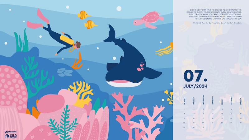
Diving Among Corals

“The long-awaited vacation is coming closer. After working all year, we find ourselves with months that, although we don’t stop completely, are lived differently. We enjoy the days and nights more, and if we can, the beach will keep us company. Therefore, we’ll spend this month in Australia, enjoying the coral reefs and diving without limits.” — Designed by Veronica Valenzuela from Spain.

Level Up

“Join gamers worldwide on National Video Game Day to honor the rich history and vibrant culture of gaming. Enjoy exclusive discounts on top titles, participate in exciting online tournaments, and dive into special events featuring your favorite games. Whether you're a casual player or a dedicated enthusiast, there’s something for everyone to celebrate on this epic day!” — Designed by PopArt Studio from Serbia.

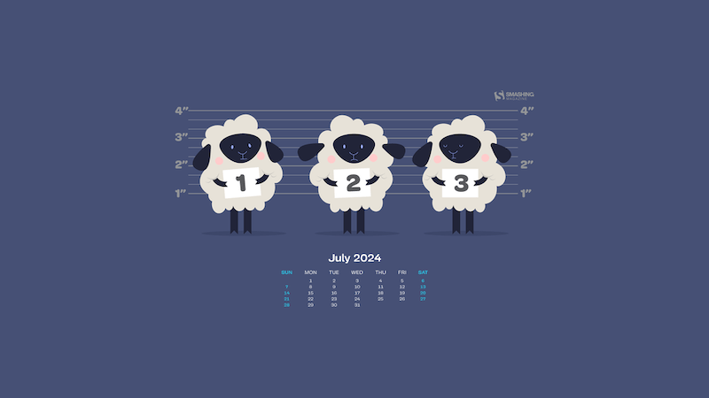
Bigfoot And The Little Girl

“This heartwarming moment captures an unlikely friendship of a gentle Bigfoot and an adorable little girl set against the backdrop of a magical and serene evening in nature.” — Designed by Reethu M from London.

Good Night

Designed by Ricardo Gimenes from Sweden.

Floral Elegance Of July

“The inspiration came from the lush gardens and floral landscapes that thrive in the height of summer. I wanted to bring the elegance and tranquility of these blooming flowers into a calendar that people can enjoy throughout the month of July.” — Designed by Hyfa K from India.

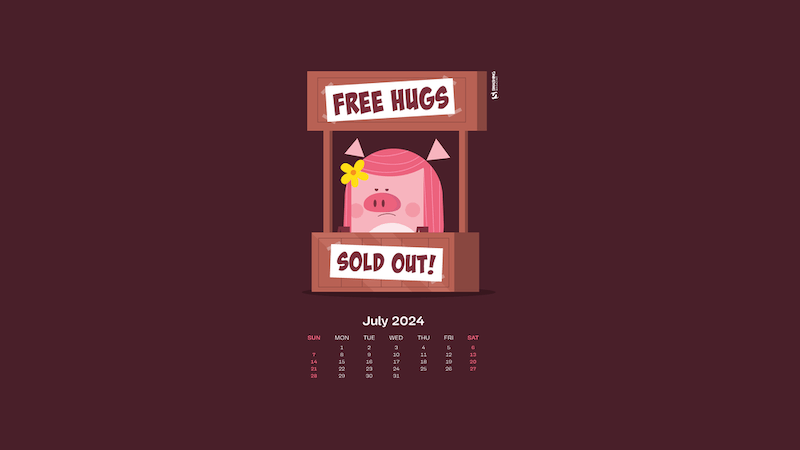
No More Hugs

Designed by Ricardo Gimenes from Sweden.

Olympics Stadium

“We have been waiting for it for many months: The Paris 2024 Olympics Games are coming in July! My drawing is a vision of the joyful activity of athletes in the stadium, with only colored tracks. I chose to use the colors of the Olympics rings. Let’s go to Paris or watch it on TV.” — Designed by Philippe Brouard from France.

Full Buck Moon

“July is the month of the full buck moon, named after the fact that many deer regrow their antlers around this time. It is also when the United States celebrate their Independence Day with fireworks and fun. I decided to combine these aspects into a magical encounter during the fourth of July. It takes place in a field of larkspur which is a flower associated with July.” — Designed by Quincy van Geffen from the Netherlands.

Celebrating World Chocolate Day

“World Chocolate Day, celebrated on July 7th, invites chocolate lovers worldwide to indulge in their favorite treat. Commemorating chocolate’s introduction to Europe, this day celebrates its global popularity. Enjoy dark, milk, or white chocolate, bake delicious desserts, and share the sweetness with loved ones.” — Designed by Reethu M from London.

Birdie July

Designed by Lívi Lénárt from Hungary.

Summer Cannonball

“Summer is coming in the northern hemisphere and what better way to enjoy it than with watermelons and cannonballs.” — Designed by Maria Keller from Mexico.

In Space

Designed by Lieke Dol from the Netherlands.

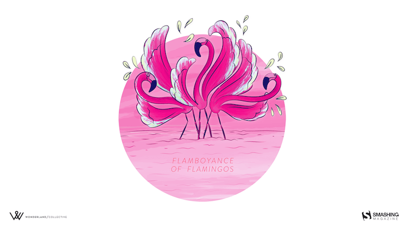
A Flamboyance Of Flamingos

“July in South Africa is dreary and wintery so we give all the southern hemisphere dwellers a bit of color for those gray days. And for the northern hemisphere dwellers a bit of pop for their summer!” — Designed by Wonderland Collective from South Africa.

Eternal Summer

“And once you let your imagination go, you find yourself surrounded by eternal summer, unexplored worlds, and all-pervading warmth, where there are no rules of physics and colors tint the sky under your feet.” — Designed by Ana Masnikosa from Belgrade, Serbia.

Day Turns To Night

Designed by Xenia Latii from Germany.

Tropical Lilies

“I enjoy creating tropical designs. They fuel my wanderlust and passion for the exotic, instantaneously transporting me to a tropical destination.” — Designed by Tamsin Raslan from the United States.

Road Trip In July

“July is the middle of summer, when most of us go on road trips, so I designed a calendar inspired by my love of traveling and summer holidays.” — Designed by Patricia Coroi from Romania.

The Ancient Device

Designed by Ricardo Gimenes from Sweden.

Taste Like Summer

“In times of clean eating and the world of superfoods there is one vegetable missing. An old, forgotten one. A flower actually. Rare and special. Once it had a royal reputation (I cheated a bit with the blue). The artichocke — this is my superhero in the garden! I am a food lover — you too? Enjoy it — dip it!” — Designed by Alexandra Tamgnoué from Germany.

Island River

“Make sure you have a refreshing source of ideas, plans and hopes this July. Especially if you are to escape from urban life for a while.” — Designed by Igor Izhik from Canada.

Cactus Hug

Designed by Ilaria Bagnasco from Italy.

Under The Enchanting Moonlight

“Two friends sat under the enchanting moonlight, enjoying the serene ambiance as they savoured their cups of tea. It was a rare and precious connection that transcended the ordinary, kindled by the magic of the moonlight. Eventually, as the night began to wane, they reluctantly stood, their empty cups in hand. They carried with them the memories and the tranquility of the moonlit tea session, knowing that they would return to this special place to create new memories in the future.” — Designed by Bhabna Basak from India.

DJ Little Bird

Designed by Ricardo Gimenes from Sweden.

Heated Mountains

“Warm summer weather inspired the color palette.” — Designed by Marijana Pivac from Croatia.

July Flavor

Designed by Natalia Szendzielorz from Poland.

Summer Heat

Designed by Xenia Latii from Berlin, Germany.

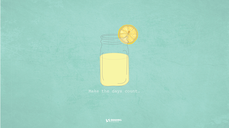
Mason Jar

“Make the days count this summer!” — Designed by Meghan Pascarella from the United States.

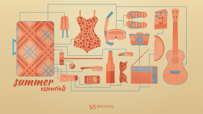
Summer Essentials

“A few essential items for the summertime weather at the beach, park, and everywhere in-between.” — Designed by Zach Vandehey from the United States.

Captain Amphicar

“My son and I are obsessed with the Amphicar right now, so why not have a little fun with it?” — Designed by 3 Bicycles Creative from the United States.

Hotdog

Designed by Ricardo Gimenes from Sweden.

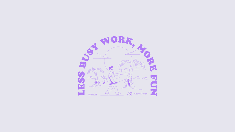
Less Busy Work, More Fun!

Designed by ActiveCollab from the United States.

Sweet Summer

“In summer everything inspires me.” — Designed by Maria Karapaunova from Bulgaria.

Fire Camp

“What’s better than a starry summer night with an (unexpected) friend around a fire camp with some marshmallows? Happy July!” — Designed by Etienne Mansard from the UK.

Riding In The Drizzle

“Rain has come, showering the existence with new seeds of life. Everywhere life is blooming, as if they were asleep and the falling music of raindrops have awakened them. Feel the drops of rain. Feel this beautiful mystery of life. Listen to its music, melt into it.” — Designed by DMS Software from India.

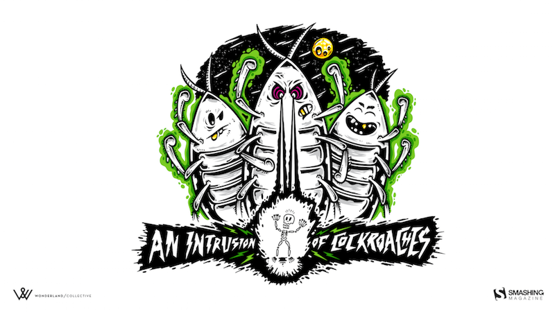
An Intrusion Of Cockroaches

“Ever watched Joe’s Apartment when you were a kid? Well, that movie left a soft spot in my heart for the little critters. Don’t get me wrong: I won’t invite them over for dinner, but I won’t grab my flip flop and bring the wrath upon them when I see one running in the house. So there you have it… three roaches… bringing the smack down on that pesky human… ZZZZZZZAP!!” — Designed by Wonderland Collective from South Africa.

July Rocks!

Designed by Joana Moreira from Portugal.

Frogs In The Night

“July is coming and the nights are warmer. Frogs look at the moon while they talk about their day.” — Designed by Veronica Valenzuela from Spain.

How To Make A Strong Case For Accessibility

Fotolia Subscription Monthly 4685447 Xl Stock

Getting support for accessibility efforts isn’t easy. There are many accessibility myths, wrong assumptions, and expectations that make accessibility look like a complex, expensive, and time-consuming project. Let’s fix that!

Below are some practical techniques that have been working well for me to convince stakeholders to support and promote accessibility in small and large companies.

This article is part of our ongoing series on UX. You might want to take a look at Smart Interface Design Patterns 🍣 and the upcoming live UX training as well. Use code BIRDIE to save 15% off.

Launching Accessibility Efforts

A common way to address accessibility is to speak to stakeholders through the lens of corporate responsibility and ethical and legal implications. Personally, I’ve never been very successful with this strategy. People typically dismiss concerns that they can’t relate to, and as designers, we can’t build empathy with facts, charts, or legal concerns.

The problem is that people often don’t know how accessibility applies to them. There is a common assumption that accessibility is dull and boring and leads to “unexciting” and unattractive products. Unsurprisingly, businesses often neglect it as an irrelevant edge case.

So, I use another strategy. I start conversations about accessibility by visualizing it. I explain the different types of accessibility needs, ranging from permanent to temporary to situational — and I try to explain what exactly it actually means to our products. Mapping a more generic understanding of accessibility to the specifics of a product helps everyone explore accessibility from a point that they can relate to.

And then I launch a small effort — just a few usability sessions, to get a better understanding of where our customers struggle and where they might be blocked. If I can’t get access to customers, I try to proxy test via sales, customer success, or support. Nothing is more impactful than seeing real customers struggling in their real-life scenario with real products that a company is building.

From there, I move forward. I explain inclusive design, accessibility, neurodiversity, EAA, WCAG, ARIA. I bring people with disabilities into testing as we need a proper representation of our customer base. I ask for small commitments first, then ask for more. I reiterate over and over and over again that accessibility doesn’t have to be expensive or tedious if done early, but it can be very expensive when retrofitted or done late.

Throughout that entire journey, I try to anticipate objections about costs, timing, competition, slowdowns, dullness — and keep explaining how accessibility can reduce costs, increase revenue, grow user base, minimize risks, and improve our standing in new markets. For that, I use a few templates that I always keep nearby just in case an argument or doubts arise.

Useful Templates To Make A Strong Case For Accessibility

1. “But Accessibility Is An Edge Case!”

❌ “But accessibility is an edge case. Given the state of finances right now, unfortunately, we really can’t invest in it right now.”

🙅🏽♀️ “I respectfully disagree. 1 in 6 people around the world experience disabilities. In fact, our competitors [X, Y, Z] have launched accessibility efforts ([references]), and we seem to be lagging behind. Plus, it doesn’t have to be expensive. But it will be very expensive once we retrofit much later.”

2. “But There Is No Business Value In Accessibility!”

❌ “We know that accessibility is important, but at the moment, we need to focus on efforts that will directly benefit business.”

🙅🏼♂️ “I understand what you are saying, but actually, accessibility directly benefits business. Globally, the extended market is estimated at 2.3 billion people, who control an incremental $6.9 trillion in annual disposable income. Prioritizing accessibility very much aligns with your goal to increase leads, customer engagement, mitigate risk, and reduce costs.” (via Yichan Wang)

3. “But We Don’t Have Disabled Users!”

❌ “Why should we prioritize accessibility? Looking at our data, we don’t really have any disabled users at all. Seems like a waste of time and resources.”

🙅♀️ “Well, if a product is inaccessible, users with disabilities can’t and won’t be using it. But if we do make our product more accessible, we open the door for prospect users for years to come. Even small improvements can have a high impact. It doesn’t have to be expensive nor time-consuming.”

4. “Screen Readers Won’t Work With Our Complex System!”

❌ “Our application is very complex and used by expert users. Would it even work at all with screen readers?”

🙅🏻♀️ “It’s not about designing only for screen readers. Accessibility can be permanent, but it can also be temporary and situational — e.g., when you hold a baby in your arms or if you had an accident. Actually, it’s universally useful and beneficial for everyone.”

5. “We Can’t Win Market With Accessibility Features!”

❌ “To increase our market share, we need features that benefit everyone and improve our standing against competition. We can’t win the market with accessibility.”

🙅🏾♂️ “Modern products succeed not by designing more features, but by designing better features that improve customer’s efficiency, success rate, and satisfaction. And accessibility is one of these features. For example, voice control and auto-complete were developed for accessibility but are now widely used by everyone. In fact, the entire customer base benefits from accessibility features.”

6. “Our Customers Can’t Relate To Accessibility Needs”

❌ “Our research clearly shows that our customers are young and healthy, and they don't have accessibility needs. We have other priorities, and accessibility isn’t one of them.”

🙅♀️ “I respectfully disagree. People of all ages can have accessibility needs. In fact, accessibility features show your commitment to inclusivity, reaching out to every potential customer of any age, regardless of their abilities.

This not only resonates with a diverse audience but also positions your brand as socially responsible and empathetic. As you know, our young user base increasingly values corporate responsibility, and this can be a significant differentiator for us, helping to build a loyal customer base for years to come.” (via Yichan Wang)

7. “Let’s Add Accessibility Later”

❌ “At the moment, we need to focus on the core features of our product. We can always add accessibility later once the product is more stable.”

🙅🏼 “I understand concerns about timing and costs. However, it’s important to note that integrating accessibility from the start is far more cost-effective than retrofitting it later. If accessibility is considered after development is complete, we will face significant additional expenses for auditing accessibility, followed by potentially extensive work involving a redesign and redevelopment.

This process can be significantly more expensive than embedding accessibility from the beginning. Furthermore, delaying accessibility can expose your business to legal risks. With the increasing number of lawsuits for non-compliance with accessibility standards, the cost of legal repercussions could far exceed the expense of implementing accessibility now. The financially prudent move is to work on accessibility now.”

You can find more useful ready-to-use templates in Yichan Wang’s Designer’s Accessibility Advocacy Toolkit — a fantastic resource to keep nearby.

Building Accessibility Practices From Scratch

As mentioned above, nothing is more impactful than visualizing accessibility. However, it requires building accessibility research and accessibility practices from scratch, and it might feel like an impossible task, especially in large corporations. In “How We’ve Built Accessibility Research at Booking.com”, Maya Alvarado presents a fantastic case study on how to build accessibility practices and inclusive design into UX research from scratch.

Maya rightfully points out that automated accessibility testing alone isn’t reliable. Compliance means that a user can use your product, but it doesn’t mean that it’s a great user experience. With manual testing, we make sure that customers actually meet their goals and do so effectively.

Start by gathering colleagues and stakeholders interested in accessibility. Document what research was done already and where the gaps are. And then whenever possible, include 5–12 users with disabilities in accessibility testing.

Then, run a small accessibility initiative around key flows. Tap into critical touch points and research them. As you are making progress, extend to components, patterns, flows, and service design. And eventually, incorporate inclusive sampling into all research projects — at least 15% of usability testers should have a disability.

Companies often struggle to recruit testers with disabilities. One way to find participants is to reach out to local chapters, local training centers, non-profits, and public communities of users with disabilities in your country. Ask the admin’s permission to post your research announcement, and it won’t be rejected. If you test on site, add extra $25–$50 depending on disability transportation.

I absolutely love the idea of extending Microsoft's Inclusive Design Toolkit to meet specific user needs of a product. It adds a different dimension to disability considerations which might be less abstract and much easier to relate for the entire organization.

As Maya noted, inclusive design is about building a door that can be opened by anyone and lets everyone in. Accessibility isn’t a checklist — it’s a practice that goes beyond compliance. A practice that involves actual people with actual disabilities throughout all UX research activities.

Wrapping Up

To many people, accessibility is a big mystery box. They might have never seen a customer with disabilities using their product, and they don’t really understand what it involves and requires. But we can make accessibility relatable, approachable, and visible by bringing accessibility testing to our companies — even if it’s just a handful of tests with people with disabilities.

No manager really wants to deliberately ignore the needs of their paying customers — they just need to understand these needs first. Ask for small commitments, and get the ball rolling from there.

Set up an accessibility roadmap with actions, timelines, roles and goals. Frankly, this strategy has been working for me much better than arguing about legal and moral obligations, which typically makes stakeholders defensive and reluctant to commit.

Fingers crossed! And a huge thank-you to everyone working on and improving accessibility in your day-to-day work, often without recognition and often fueled by your own enthusiasm and passion — thank you for your incredible work in pushing accessibility forward! 👏🏼👏🏽👏🏾

Useful Resources

Making A Case For Accessibility

Accessibility Testing

Meet Smart Interface Design Patterns

If you are interested in UX and design patterns, take a look at Smart Interface Design Patterns, our 10h-video course with 100s of practical examples from real-life projects — with a live UX training later this year. Everything from mega-dropdowns to complex enterprise tables — with 5 new segments added every year. Jump to a free preview. Use code BIRDIE to save 15% off.

Meet Smart Interface Design Patterns, our video course on interface design & UX.

100 design patterns & real-life examples.
10h-video course + live UX training. Free preview.

Useful Email Newsletters For Designers

Fotolia Subscription Monthly 4685447 Xl Stock

Struggling to keep our inboxes under control and aim for that magical state of inbox zero, the notification announcing an incoming email isn’t the most appreciated sound for many of us. However, there are some emails to actually look forward to: A newsletter, curated and written with love and care, can be a nice break in your daily routine, providing new insights and sparking ideas and inspiration for your work.

With so many wonderful design newsletters out there, we know it can be a challenge to decide which newsletter (or newsletters) to subscribe to. That’s why we want to shine a light on some newsletter gems today to make your decision at least a bit easier — and help you discover newsletters you might not have heard of yet. Ranging from design systems to UX writing, motion design, and user research, there sure is something in it for you.

A huge thank you to everyone who writes, edits, and publishes these newsletters to help us all get better at our craft. You are truly smashing! 👏🏼👏🏽👏🏾

Table of Contents

Below you’ll find quick jumps to newsletters on specific topics you might be interested in. Scroll down to browse the complete list or skip the table of contents.

Design & Front-End

HeyDesigner

🗓 Delivered every Monday
🖋 Written by Tamas Sari

Aimed at product people, UXers, PMs, and design engineers, the HeyDesigner newsletter is packed with a carefully curated selection of the latest design and front-end articles, tools, and resources.

Pixels of the Week

🗓 Delivered weekly
🖋 Written by Stéphanie Walter

Stéphanie Walter’s Pixels of the Week newsletter keeps you informed about the latest UX research, design, tech (HTML, CSS, SVG) news, tools, methods, and other resources that caught Stéphanie’s interest.

TLDR Design

🗓 Delivered daily
🖋 Written by Dan Ni

You’re looking for some bite-sized design inspiration? TLDR Design is a daily newsletter highlighting news, tools, tutorials, trends, and inspiration for design professionals.

DesignOps

🗓 Delivered every two weeks
🖋 Written by Ch'an Armstrong

The DesignOps newsletter provides the DesignOps community with the best hand-picked articles all around design, code, AI, design tools, no-code tools, developer tools, and, of course, design ops.

Adam Silver’s Newsletter

🗓 Delivered weekly
🖋 Written by Adam Silver

Every week, Adam Silver sends out a newsletter aimed at designers, content designers, and front-end developers. It includes short and sweet, evidence-based design tips, mostly about forms UX, but not always.

Smashing Newsletter

🗓 Delivered every Tuesday
🖋 Written by the Smashing Editorial team

Every Tuesday, we publish the Smashing Newsletter with useful tips and techniques on front-end and UX, covering everything from design systems and UX research to CSS and JavaScript. Each issue is curated, written, and edited with love and care, no third-party mailings or hidden advertising.

UX

UX Design Weekly

🗓 Delivered every Monday
🖋 Written by Kenny Chen

UX Design Weekly provides you with a weekly dose of hand-picked user experience design links. Every issue features articles, tools and resources, a UX portfolio, and a quote to spark ideas and get you thinking.

UX Collective

🗓 Delivered weekly
🖋 Written by Fabricio Teixeira and Caio Braga

“Designers are thinkers as much as they are makers.” Following this credo, the UX Collective newsletter helps designers think more critically about their work. Every issue highlights thought-provoking reads, little gems, tools, and resources.

Built For Mars

🗓 Delivered every few weeks
🖋 Written by Peter Ramsey

The Built for Mars newsletter brings Peter Ramsey’s UX research straight to your inbox. It includes in-depth UX case studies and bite-sized UX ideas and experiments.

NN Group

🗓 Delivered weekly
🖋 Written by the Nielsen Norman Group

Studying users around the world, the Nielsen Norman Group provides research-based UX guidance. If you don’t want to miss their latest articles and videos about usability, design, and UX research, you can subscribe to the NN/g newsletter to stay up-to-date.

UX Notebook

🗓 Delivered weekly
🖋 Written by Sarah Doody

The UX Notebook Newsletter is aimed at UX and product professionals who want to learn how to apply UX and design principles to design and grow their teams, products, and careers.

Smart Interface Design Patterns

🗓 Delivered weekly
🖋 Written by Vitaly Friedman

Every issue of the Smart Interface Design Patterns newsletter is dedicated to a common interface challenge and how to solve it to avoid issues down the line. A treasure chest of design patterns and UX techniques.

UX Weekly

🗓 Delivered weekly
🖋 Written by the Interaction Design Foundation

The Interaction Design Foundation is known for their UX courses and webinars for both aspiring designers and advanced professionals. Their UX Weekly newsletter delivers design tips and educational material to help you leverage the power of design.

Design With Care

🗓 Delivered every first Tuesday of a month
🖋 Written by Alex Bilstein

Healthcare systems desparately need UX designers to improve the status quo for both healthcare professionals and patients. The Design With Care newsletter empowers UX designers to create better healthcare experiences and make an impact that matters.

UX Writing & Content Strategy

The UX Gal

🗓 Delivered every Monday
🖋 Written by Slater Katz

Whether you’re about to start your UX content education or want to get better at UX writing, The UX Gal newsletter is for you. Every Monday, Slater Katz sends out a new newsletter with prompts, thoughts, and exercises to build your UX writing and content design skills.

UX Content Collective

🗓 Delivered weekly
🖋 Written by the UX Content Collective

The newsletter by the UX Content Collective is perfect for anyone interested in content design. In it, you’ll find curated UX writing resources, new job openings, and exclusive discounts.

GatherContent

🗓 Delivered weekly
🖋 Written by the GatherContent team

The GatherContent newsletter is a weekly email full of content strategy goodies. It features articles, webinars and masterclasses, new books, free templates, and industry news.

User Research

User Research Academy

🗓 Delivered weekly
🖋 Written by Nikki Anderson

If you want to get more creative and confident when conducting user research, the User Research Academy might be for you. With carefully curated articles, podcasts, events, books, and academic resources all around user research, the newsletter is perfect for beginners and senior UX researchers alike.

User Weekly

🗓 Delivered weekly
🖋 Written by Jan Ahrend

What mattered in UX research this week? To keep you up-to-date on trends, methods, and insights across the UX research industry, Jan Ahrend captures the pulse of the UX research community in his User Weekly newsletter.

User Interviews

🗓 Delivered weekly
🖋 Written by the User Interviews team

The UX Research Newsletter by the folks at User Interviews delivers the latest UX research articles, reports, podcast episodes, and special features. For professional user researchers just like teams who need to conduct user research without a dedicated research team.

Baymard Institute

🗓 Delivered weekly
🖋 Written by the Baymard Institute

User experience, web design, and e-commerce are the topics which the Baymard Institute newsletter covers. It features ad-free full-length research articles to give you precious insights into the field.

Interaction Design

Design Spells

🗓 Delivered every other Sunday
🖋 Written by Chester How, Duncan Leo, and Rick Lee

Whether it’s micro-interactions or easter eggs, Design Spells celebrates the design details that feel like magic and add a spark of delight to a design.

Justin Volz’s Newsletter

🖋 Written by Justin Volz

Getting you ready for the future of motion design is the goal of Justin Volz’s newsletter. It features UX motion design trends, new UX motion design articles, and more to “make your UI tap dance.”

Design Systems & Figma

Design System Guide

🗓 Delivered weekly
🖋 Written by Romina Kavcic

Accompanying her interactive step-by-step guide to design systems, Romina Kavcic sends out the weekly Design System Guide newsletter on all things design systems, design process, and design strategy.

Figmalion

🗓 Delivered weekly
🖋 Written by Eugene Fedorenko

The Figmalion newsletter keeps you up-to-date on what is happening in the Figma community, with curated design resources and a weekly roundup of Figma and design tool news.

Information Architecture

Informa(c)tion

🗓 Delivered every other Sunday
🖋 Written by Jorge Arango

The Informa(c)tion newsletter explores the intersection of information, cognition, and design. Each issue includes an essay about information architecture and/or personal knowledge management and a list of interesting links.

Product Design

Product Design Challenges

🗓 Delivered weekly
🖋 Written by Artiom Dashinsky

How about a weekly design challenge to work on your core design skills, improve your portfolio, or prepare for your next job interview? The Weekly Product Design Challenges newsletter has got you covered. Every week, Artiom Dashinsky shares a new exercise inspired and used by companies like Facebook, Google, and WeWork to interview UX design candidates.

Fundament

🗓 Delivered every other Thursday
🖋 Written by Arkadiusz Radek and Mateusz Litarowicz

With Fundament, Arkadiusz Radek and Mateusz Litarowicz created a place to share what they’ve learned in their ten-year UX and Product Design careers. The newsletter is about the things that matter in design, the practicalities of the job, the lesser-known bits, and content that will help you grow as a UX or Product Designer.

Case Study Club

🗓 Delivered weekly
🖋 Written by Jan Haaland

How do people design digital products? With curated UX case studies, the Case Study Club newsletter grants insights into other designers’ processes.

Ethical Design & Sustainability

Ethical Design Network

🗓 Delivered monthly
🖋 Written by Trine Falbe

The Ethical Design Network is a space for digital professionals to share, discuss, and self-educate about ethical design. You can sign up to the newsletter to receive monthly news, resources, and event updates all around ethical design.

Sustainable UX

🗓 Delivered monthly
🖋 Written by Thorsten Jonas

As designers, we have to take responsibility for more than our users. Shining a light on how to design and build more sustainable digital products, the SUX Newsletter by the Sustainable UX Network helps you stand up to that responsibility.

AI

AI Goodies

🗓 Delivered weekly
🖋 Written by Ioana Teleanu

A brand-new newsletter on AI, design, and UX goodies comes from Ioana Teleanu: AI Goodies. Every week, it covers the latest resources, trends, news, and tools from the world of AI.

Business

d.MBA

🗓 Delivered weekly
🖋 Written by Alen Faljic

Learning business can help you become a better designer. The d.MBA newsletter is your weekly source of briefings from the business world, hand-picked for the design community by Alen Faljic and the d.MBA team.

Career & Leadership

Dan Mall Teaches

🗓 Delivered weekly
🖋 Written by Dan Mall

Tips, tricks, and tools about design systems, process, and leadership, delivered to your inbox every week. That’s the Dan Mall Teaches newsletter.

Stratatics

🗓 Delivered weekly
🖋 Written by Ryan Rumsey

To do things differently, you must look at your work in a new light. That’s the idea behind the Stratatics newsletter. Each week, Ryan Rumsey provides design leaders and executives (and those who work alongside them) with a new idea to reimagine and deliver their best work.

Spread The Word

Do you have a favorite newsletter that isn’t featured in the post? Or maybe you’re writing and publishing a newsletter yourself? We’d love to hear about it in the comments below!

2-Page Login Pattern, And How To Fix It

Fotolia Subscription Monthly 4685447 Xl Stock

Why do we see login forms split into multiple screens everywhere? Instead of typing email and password, we have to type email, move to the next page, and then type password there. This seems to be inefficient, to say the least.

Let’s see why login forms are split across screens, what problem they solve, and how to design a better experience for better authentication UX (video).

This article is part of our ongoing series on design patterns. It’s also an upcoming part of the 10h-video library on Smart Interface Design Patterns 🍣 and the upcoming live UX training as well. Use code BIRDIE to save 15% off.

The Problem With Login Forms

If there is one thing we’ve learned over the years in UX, it’s that designing for people is hard. This applies to login forms as well. People are remarkably forgetful. They often forget what email they signed up with or what service they signed in with last time (Google, Twitter, Apple, and so on)

One idea is to remind customers what they signed in with last time and perhaps make it a default option. However, it reveals directly what the user’s account was, which might be a privacy or security issue:

What if instead of showing all options to all customers all the time, we ask for email first, and then look up what service they used last time, and redirect customers to the right place automatically? Well, that’s exactly the idea behind 2-page logins.

Meet 2-Page-Logins

You might have seen them already. If a few years ago, most login forms asked for email and password on one page, these days it’s more common to ask only for email first. When the user chooses to continue, the form will ask for a password in a separate step. Brad explores some problems of this pattern.

A common reason for splitting the login form across pages is Single Sign-On (SSO) authentication. Large companies typically use SSO for corporate sign-ins of their employees. With it, employees log in only once every day and use only one set of credentials, which improves enterprise security.

The UX Intricacies of Single Sign-On (SSO)

SSO also helps with regulatory compliance, and it’s much easier to provision users with appropriate permissions and revoke them later at once. So, if an employee leaves, all their accounts and data can be deleted at once.

To support both business customers and private customers, companies use 2-step-login. Users need to type in their email first, then the validator checks what provider the email is associated with and redirects users there.

Users rarely love this experience. Sometimes, they have multiple accounts (private and business) with one service. Also, 2-step-logins often break autofill and password managers. And for most users, login/pass is way faster than 2-step-login.

Of course, typically, there are dedicated corporate login pages for employees to sign in, but they often head directly to Gmail, Figma, and so on instead and try to sign in there. However, they won’t be able to log in as they must sign in through SSO.

Bottom line: the pattern works well for SSO users, but for non-SSO users, it results in a frustrating UX.

Alternative Solution: Conditional Reveal of SSO

There is a way to work around these challenges (see the image below). We could use a single-page look-up with email and password input fields as a default. Once a user has typed in their email, we detect if the SSO authentication is enabled.

If Single Sign-On (SSO) is enabled for that email, we show a Single Sign-On option and default to it. We could also make the password field optional or disabled.

If SSO isn’t enabled for that email, we proceed with the regular email/password login. This is not much hassle, but it saves trouble for both private and business accounts.

Key Takeaways

🤔 People often forget what email they signed up with.
🤔 They also forget the auth service they signed in with.
🤔 Companies use Single Sign-On (SSO) for corporate sign-in.
🤔 Individual accounts still need email and password for login.
✅ 2-step login: ask for email, then redirect to the right service.

✅ 2-step-login replaces “social” sign-in for repeat users.
✅ It directs users rather than giving them roadblocks.
🤔 Users still keep forgetting the email they signed in with.
🤔 Sometimes, users have multiple accounts with one service.
🚫 2-step logins often break autofill and password managers.
🚫 For most users, login/pass is way faster than 2-step-login.

✅ Better: start with one single page with login and password.
✅ As users type their email, detect if SSO is enabled for them.
✅ If it is, reveal an SSO-login option and set a default to it.
✅ Otherwise, proceed with the regular password login.
✅ If users must use SSO, disable the password field — don’t hide it.

Wrapping Up

Personally, I haven’t tested the approach, but it might be a good alternative to 2-page logins — both for SSO and non-SSO users. Keep in mind, though, that SSO authentication might or might not require a password, as sometimes login happens via Yubikey or Touch-ID or third parties (e.g., OAuth).

Also, eventually, users will be locked out; it’s just a matter of time. So, do use magic links for password recovery or access recovery, but don’t mandate it as a regular login option. Switching between applications is slow and causes mistakes. Instead, nudge users to enable 2FA: it’s both usable and secure.

And most importantly, test your login flow with the tools that your customers rely on. You might be surprised how broken their experience is if they rely on password managers or security tools to log in. Good luck, everyone!

Useful Resources

Meet Smart Interface Design Patterns

If you are interested in similar insights around UX, take a look at Smart Interface Design Patterns, our 10h-video course with 100s of practical examples from real-life projects — with a live UX training later this year. Everything from mega-dropdowns to complex enterprise tables — with 5 new segments added every year. Jump to a free preview.

Meet Smart Interface Design Patterns, our video course on interface design & UX.

100 design patterns & real-life examples.
10h-video course + live UX training. Free preview.

The Scent Of UX: The Unrealized Potential Of Olfactory Design

Fotolia Subscription Monthly 4685447 Xl Stock

Imagine that you could smell this page. The introduction would emit a subtle scent of sage and lavender to set the mood. Each paragraph would fill your room with the coconut oil aroma, helping you concentrate and immerse in reading. The fragrance of the comments section, resembling a busy farmer’s market, would nudge you to share your thoughts and debate with strangers.

How would the presence of smells change your experience reading this text or influence your takeaways?

Scents are everywhere. They fill our spaces, bind our senses to objects and people, alert us to dangers, and arouse us. Smells have so much influence over our mood and behavior that hundreds of companies are busy designing fragrances for retail, enticing visitors to purchase more, hotels, making customers feel at home, and amusement parks, evoking a warm sense of nostalgia.

At the same time, the digital world, where we spend our lives working, studying, shopping, and resting, remains entirely odorless. Our smart devices are not designed to emit or recognize scents, and every corner of the Internet, including this page, smells exactly the same.

We watch movies, play games, study, and order dinner, but our sense of smell is left unengaged. The lack of odors rarely bothers us, but occasionally, we choose analog things like books merely because their digital counterparts fail to connect with us at the same level.

Could the presence of smells improve our digital experiences? What would it take to build the “smelly” Internet, and why hasn't it been done before? Last but not least, what power do scents hold over our senses, memory, and health, and how could we harness it for the digital world?

Let’s dive deep into a fascinating and underexplored realm of odors.

Olfactory Design For The Real World

Why Do We Remember Smells?

In his novel In Search of Lost Time, French writer Marcel Proust describes a sense of déjà vu he experienced after tasting a piece of cake dipped in tea:

“Immediately the old gray house upon the street rose up like a stage set… the house, the town, the square where I was sent before lunch, the streets along which I used to run errands, the country roads we took… the whole of Combray and of its surroundings… sprang into being, town and gardens alike, all from my cup of tea.”

— Marcel Proust

The Proust Effect, the phenomenon of an ‘involuntary memory’ evoked by scents, is a common occurrence. It explains how the presence of a familiar smell activates areas in our brain responsible for odor recognition, causing us to experience a strong, warm, positive sense of nostalgia.

Smells have a potent and almost magical impact on our ability to remember and recognize objects and events. “The nose makes the eyes remember”, as a renowned Finnish architect Juhani Pallasmaa puts it: a single droplet of a familiar fragrance is often enough to bring up a wild cocktail of emotions and recollections, even those that have long been forgotten.

A memory of a place, a person, or an experience is often a memory of their smell that lingers long after the odor is gone. J. Douglas Porteous, Professor of Geography at the University of Victoria, coined the term Smellscape to describe how a collective of smells in each particular area form our perception, define our attitude, and craft our recollection of it.

To put it simply, we choose to avoid beautiful places and forget delicious meals when their odors are not to our liking. Pleasant aromas, on the other hand, alter our memory, make us overlook flaws and defects, or even fall in love.

With such an immense power that scents hold over our perception of reality, it comes as no surprise they have long become a tool in the hands of brand and service designers.

Scented Advertising

What do a luxury car brand, a cosmetics store, and a carnival ride have in common? The answer is that they all have their own distinct scents.

Carefully crafted fragrances are widely used to create brand identities, make powerful impressions, and differentiate brands “emotionally and memorably”.

Some choose to complement visual identities with subtle, tailored aromas. 12.29, a creative “olfactive branding company,” developed the “scent identity” for Cadillac, a “symbol of self-expression representing the irrepressible pursuit of life.”

The branded Cadillac scent is diffused in dealerships and auto shows around the world, evoking a sense of luxury and class. Customers are expected to remember Cadillac better for its “signature nutty coffee, dark leather, and resinous amber notes”, forging a strong emotional connection with the brand.

Next time they think of Cadillac, their brain will recall its signature fragrance and the way it made them feel. Cadillac is ready to bet they will not even consider other brands afterwards.

Others may be less subtle and employ more aggressive, fragrant marketing tactics. LUSH, a British cosmetics retailer, is known for its distinct smells. Although even the company co-founder admits that odors can be overwhelming for some, LUSH’s scents play an important role in crafting the brand’s identity.

Indeed, the aroma of their stores is so recognizable that it lures customers in from afar with ease, and few walk away without forever remembering the brand’s distinct smell.

However, retail is not the only area that employs discernible smells.

Disney takes a holistic approach to service design, carefully considering every aspect that influences customer satisfaction. Smells have long been a part of the signature “Disney experience”: the main street smells like pastry and popcorn, Spaceship Earth is filled with the burning wood aroma, and Soarin’ is accompanied by notes of orange and pine.

Dozens of scent-emitting devices, Smellitzers, are responsible for adding scents to each experience. Deployed around each park and perfectly synced with every other sensory stimulus, they “shoot scents toward passersby” and “trigger memories of childhood nostalgia.”

As shown in the patent, Smellitzer is a rather simple odor delivery system designed to “enhance the sense of flight created in the minds of the passengers.” Scents are carefully curated and manufactured to evoke precise emotions without disrupting the ride experience.

Disney’s attractions, lanes, and theaters are packed with smell-emitting gadgets that distribute sweet and savoury notes. The visitors barely notice the presence of added scents, but later inevitably experience a sudden but persistent urge to return to the park.

Could it be something in the air, perhaps?

Well-curated, timely delivered, recognizable scents can be a powerful ally in the hands of a designer.

They can soothe a passenger during a long flight with the subtle notes of chamomile and mint or seduce a hungry shopper with the familiar aroma of freshly baked cinnamon buns. Scents can create and evoke great memories, amplify positive emotions, or turn casual buyers into eager and loyal consumers.

Unfortunately, smells can also ruin otherwise decent experiences.

Scented Entertainment

Why Fragrant Cinema Failed

In 1912, Aldous Huxley, author of the dystopian novel Brave New World, published an essay “Silence is Golden”, reflecting on his first experience watching a sound film. Huxley despised cinema, calling it the “most frightful creation-saving device for the production of standardized amusement”, and the addition of sound made the writer concerned for the future of entertainment. Films engaged multiple senses but demanded no intellectual involvement, becoming more accessible, more immersive, and, as Huxley feared, more influential.

“Brave New World,” published in 1932, features the cinema of the future — a multisensory entertainment complex designed to distract society from seeking a deeper sense of purpose in life. Attendees enjoy a ​​“scent organ” playing “a delightfully refreshing Herbal Capriccio — rippling arpeggios of thyme and lavender, of rosemary, basil, myrtle, tarragon,” and get to experience every physical stimulation imaginable.

Huxley’s critical take on the state of the entertainment industry was spot-on. Obsessed with the idea of multisensory entertainment, studios did not take long to begin investing in immersive experiences. The 1950s were the age of experiments designed to attract more viewers: colored cinema, 3D films, and, of course, scented movies.

In 1960, two films hit the American theaters: Scent of Mystery, accompanied by the odor-delivery technology called “Smell–O–Vision”, and Behind the Great Wall, employing the process named AromaRama. Smell–O–Vision was designed to transport scents through tubes to each seat, much like Disney’s Smellitzers, whereas AromaRama distributed smells through the theater’s ventilation.

Both scented movies were panned by critics and viewers alike. In his review for the New York Times, Bosley Crowther wrote that “...synthetic smells [...] occasionally befit what one is viewing, but more often they confuse the atmosphere”. Audiences complained about smells being either too subtle or too overpowering and the machines disrupting the viewing experience.

The groundbreaking technologies were soon forgotten, and all plans to release more scented films were scrapped.

Why did odors, so efficient at manufacturing nostalgic memories of an amusement park, fail to entertain the audience at the movies? On the one hand, it may attributed to the technological limitations of the time. For instance, AromaRama diffused the smells into the ventilation, which significantly delayed the delivery and required scents to be removed between scenes. Suffice it to say the viewers did not enjoy the experience.

However, there could be other possible explanations.

First of all, digital entertainment is traditionally odorless. Viewers do not anticipate movies to be accompanied by smells, and their brains are conditioned to ignore them. Researchers call it “inattentional anosmia”: people connect their enjoyment with what they see on the screen, not what they smell or taste.

Moreover, background odors tend to fade and become less pronounced with time. A short exposure to a pleasant odor may be complimentary. For instance, viewers could smell orange as the character in “Behind the Great Wall” cut and squeezed the fruit: an “impressive” moment, as admitted by critics. However, left to linger, even the most pleasant scents can leave the viewer uninvolved or irritated.

Finally, cinema does not require active sensory involvement. Viewers sit still in silence, rarely even moving their heads, while their sight and hearing are busy consuming and interpreting the information. Immersion requires suspension of disbelief: well-crafted films force the viewer to forget the reality around them, but the addition of scents may disrupt this state, especially if scents are not relevant or well-crafted.

For the scented movie to engage the audience, smells must be integrated into the film’s events and play an important role in the viewing experience. Their delivery must be impeccable: discreet, smooth, and perfectly timed. In time, perhaps, we may see the revival of scented cinema. Until then, rare auteur experiments and 4D–cinema booths at carnivals will remain the only places where fragrant films will live on.

Fortunately, the lessons from the early experiments helped others pave the way for the future of fragrant entertainment.

Immersive Gaming

Unlike movies, video games require active participation. Players are involved in crafting the narrative of the game and, as such, may expect (and appreciate) a higher degree of realism. Virtual Reality is a good example of technology designed for full sensory stimulation.

Modern headsets are impressive, but several companies are already working hard on the next-gen tech for immersive gaming. Meta and Manus are developing gloves that make virtual elements tangible. Teslasuit built a full-body suit that captures motion and biometry, provides haptic feedback, and emulates sensations for objects in virtual reality. We may be just a few steps away from virtual multi-sensory entertainment being as widespread as mobile phones.

Scents are coming to VR, too, albeit at a slower pace, with a few companies already selling devices for fragrant entertainment. For instance, GameScent has developed a cube that can distribute up to 8 smells, from “gunfire” and “explosion” to “forest” and “storm”, using AI to sync the odors with the events in the game.

The vast majority of experiments, however, occur in the labs, where researchers attempt to understand how smells impact gamers and test various concepts. Some assign smells to locations in a VR game and distribute them to players; others have the participants use a hand-held device to “smell” objects in the game.

The majority of studies demonstrate promising results. The addition of fragrances creates a deeper sense of immersion and enhances realism in virtual reality and in a traditional gaming setting.

A notable example of the latter is “Tainted”, an immersive game based on South-East Asian folklore, developed by researchers in 2017. The objective of the game is to discover and burn banana trees, where the main antagonist of the story — a mythical vengeful spirit named Pontianak — is traditionally believed to hide.

The way “Tainted” incorporates smells into the gameplay is quite unique. A scent-emitting module, placed in front of the player, diffuses fragrances to complement the narrative. For instance, the smell of banana signals the ghost’s presence, whereas pineapple aroma means that a flammable object required to complete the quest is nearby. Odors inform the player of dangers, give directions, and become an integral part of the gaming experience, like visuals and sound.

Some of the most creative examples of scented learning come from places that combine education and entertainment, most notably, museums.

Jorvik Viking Centre is famous for its use of “smells of Viking-age York” to capture the unique atmosphere of the past. Its scented halls, holograms, and entertainment programs turn a former archeological site into a carnival ride that teleports visitors into the 10th century to immerse them into the daily life of the Vikings.

Authentic smells are the center’s distinct feature, an integral part of its branding and marketing, and an important addition to its collection. Smells are responsible for making Jorvik exhibitions so memorable, and hopefully, for visitors walking away with a few Viking trivia facts firmly stuck in their heads.

At the same time, learning is becoming increasingly more digital, from mobile apps for foreign languages to student portals and online universities. Smart devices strive to replace classrooms with their analog textbooks, papers, gel pens, and teachers. Virtual Reality is a step towards the future of immersive digital education, and odors may play a more significant role in making it even more efficient.

Education will undoubtedly continue leveraging the achievements of the digital revolution to complement its existing tools. Tablets and Kindles are on their way to replace textbooks and pens. Phones are no longer deemed a harmful distraction that causes brain cancer.

Odors, in turn, are becoming “learning supplements”. Teachers and parents have access to personalized diffusers that distribute the smell of peppermint to enhance students’ attention. Large scent-emitting devices for educational facilities are available on the market, too.

At the same time, inspired to figure out the way to upload knowledge straight into our brains, we’ve discovered a way to learn things in our sleep using smells. Several studies have shown that exposure to scents during sleep significantly improves cognitive abilities and memory. More than that, smells can activate our memory while we sleep and solidify what we have learnt while awake.

Odors may not replace textbooks and lectures, but their addition will make remembering and recalling things significantly easier. In fact, researchers from MIT built and tested a wearable scent-emitting device that can be used for targeted memory reactivation.

In time, we will undoubtedly see more smart devices that make use of scents for memory enhancement, training, and entertainment. Integrated into the ecosystems of gadgets, olfactory wearables and smart home appliances will improve our well-being, increase productivity, and even detect early symptoms of illnesses.

There is, however, a caveat.

The Challenging UX Of Scents

We know very little about smells.

Until 2004, when Richard Axel and Linda Buck received a Nobel Prize for identifying the genes that control odor receptors, we didn’t even know how our bodies processed smells or that different areas in our brains were activated by different odors.

We know that our experience with smells is deep and intimate, from the memories they create to the emotions they evoke. We are aware that unpleasant scents linger longer and have a stronger impact on our mental state and memory. Finally, we understand that intensity, context, and delivery matter as much as the scent itself and that a decent aroma diffused out of place ruins the experience.

Thus, if we wish to build devices that make the best use of scents, we need to follow a few simple principles.

Design Principle #1: Tailor The Scents To Each User

In his article about Smellscapes, J. Douglas Porteous writes:

“The smell of a certain institutional soap may carry a person back to the purgatory of boarding school. A particular floral fragrance reminds one of a lost love. A gust of odour from an ethnic spice emporium may waft one back, in memory, to Calcutta.”

— J. Douglas Porteous

Smells revive hidden memories and evoke strong emotions, but their connection to our minds is deeply personal. A rich, spicy aroma of freshly roasted coffee beans will not have the same impact on different people, and in order to use scents in learning, we need to tailor the experience to each user.

In order to maximize the potential of odors in immersion and learning, we need to understand which smells have the most impact on the user. By filtering out the smells that the user finds unpleasant or associates with sad events in their past, we can reduce any potential negative effect on their wellness or memory.

Design Principle #2: Stick To The Simpler Smells

Humans are notoriously bad at describing odors.

Very few languages in the world feature specific terms for smells. For instance, the speakers of Jahai, a language in Malaysia, enjoy the privilege of having specific names for scents like “bloody smell that attracts tigers” and “wild mango, wild ginger roots, bat caves, and petrol”.

English, on the other hand, often uses adjectives associated with flavor (“smoky vanilla”) or comparison (“smells like orange”) to describe scents. For centuries, we have been trying to work out a system that could help cluster odors.

Aristotle classified all odors into six groups: sweet, acid, severe, fatty, sour, and fetid (unpleasant). Carl Linnaeus expanded it to 7 types: aromatic, fragrant, alliaceous (garlic), ambrosial (musky), hircinous (goaty), repulsive, and nauseous. Hans Henning arranged all scent groups in a prism. None of the existing classifications, however, help accurately describe complex smells, which inevitably makes it harder to recreate them.

Academics have developed several comprehensive lists, for instance, the Odor Character Profiling that contains 146 unique descriptors. Pleasant smells from the list are easier to reproduce than unique and sophisticated odors.

Although an aroma of the “warm touch of an early summer sun” may work better for a particular user than the smell of an apple pie, the high price of getting the scent wrong makes it a reasonable trade-off.

Design Principle #3: Ensure Stable And Convenient Delivery

Nothing can ruin a good olfactory experience more than an imperfect delivery system.

Disney’s Smellitzers and Jorvik’s scented exhibition set the standard for discreet, contextual, and consistent inclusion of smells to complement the experience. Their diffusers are well-concealed, and odors do not come off as overwhelming or out of place.

On the other hand, the failure of scented movies from the 1950s can at least partially be attributed to poorly designed aroma delivery systems. Critics remembered that even the purifying treatment that was used to clear the theater air between scenes left a “sticky, sweet” and “upsetting” smell.

Good delivery systems are often simple and focus on augmenting the experience without disrupting it. For instance, eScent, a scent-enhanced FFP3 mask, is engineered to reduce stress and improve the well-being of frontline workers. The mask features a slot for applicators infused with essential oil; users can choose fragrances and swap the applicator whenever they want. Beside that, eScent is no different from its “analog” predecessor: it does not require special equipment or preparation, and the addition of smells does not alter the experience of wearing a mask.

In The Not Too Distant Future

We may know little about smells, but we are steadily getting closer to harnessing their power.

In 2022, Alex Wiltschko, a former Google staff research scientist, founded Osmo, a company dedicated to “giving computers a sense of smell.” In the long run, Osmo aspires to use its knowledge to manufacture scents on demand from sustainable synthetic materials.

Today, the company operates as a research lab, using a trained AI to predict the smell of a substance by analyzing its molecular structure. Osmo’s first tests demonstrated some promising results, with machine accurately describing the scents in 53% of cases.

Should Osmo succeed at building a machine capable of recognizing and predicting smells, it will change the digital world forever. How will we interact with our smart devices? How will we use their newly discovered sense of smell to exchange information, share precious memories with each other, or relive moments from the past? Is now the right time for us to come up with ideas, products, and services for the future?

Odors are a booming industry that offers designers and engineers a unique opportunity to explore new and brave concepts. With the help of smells, we can transform entire industries, from education to healthcare, crafting immersive multi-sensory experiences for learning and leisure.

Smells are a powerful tool that requires precision and perfection to reach the desired effect. Our past shortcomings may have tainted the reputation of scented experiences, but recent progress demonstrates that we have learnt our lessons well. Modern technologies make it even easier to continue the explorations and develop new ways to use smells in entertainment, learning, and wellness — in the real world and beyond.

Our digital spaces may be devoid of scents, but they will not remain odorless for long.

How To Hack Your Google Lighthouse Scores In 2024

Fotolia Subscription Monthly 4685447 Xl Stock

This article is a sponsored by Sentry.io

Google Lighthouse has been one of the most effective ways to gamify and promote web page performance among developers. Using Lighthouse, we can assess web pages based on overall performance, accessibility, SEO, and what Google considers “best practices”, all with the click of a button.

We might use these tests to evaluate out-of-the-box performance for front-end frameworks or to celebrate performance improvements gained by some diligent refactoring. And you know you love sharing screenshots of your perfect Lighthouse scores on social media. It’s a well-deserved badge of honor worthy of a confetti celebration.

Just the fact that Lighthouse gets developers like us talking about performance is a win. But, whilst I don’t want to be a party pooper, the truth is that web performance is far more nuanced than this. In this article, we’ll examine how Google Lighthouse calculates its performance scores, and, using this information, we will attempt to “hack” those scores in our favor, all in the name of fun and science — because in the end, Lighthouse is simply a good, but rough guide for debugging performance. We’ll have some fun with it and see to what extent we can “trick” Lighthouse into handing out better scores than we may deserve.

But first, let’s talk about data.

Field Data Is Important

Local performance testing is a great way to understand if your website performance is trending in the right direction, but it won’t paint a full picture of reality. The World Wide Web is the Wild West, and collectively, we’ve almost certainly lost track of the variety of device types, internet connection speeds, screen sizes, browsers, and browser versions that people are using to access websites — all of which can have an impact on page performance and user experience.

Field data — and lots of it — collected by an application performance monitoring tool like Sentry from real people using your website on their devices will give you a far more accurate report of your website performance than your lab data collected from a small sample size using a high-spec super-powered dev machine under a set of controlled conditions. Philip Walton reported in 2021 that “almost half of all pages that scored 100 on Lighthouse didn’t meet the recommended Core Web Vitals thresholds” based on data from the HTTP Archive.

Web performance is more than a single core web vital metric or Lighthouse performance score. What we’re talking about goes way beyond the type of raw data we’re working with.

Web Performance Is More Than Numbers

Speed is often the first thing that comes up when talking about web performance — just how long does a page take to load? This isn’t the worst thing to measure, but we must bear in mind that speed is probably influenced heavily by business KPIs and sales targets. Google released a report in 2018 suggesting that the probability of bounces increases by 32% if the page load time reaches higher than three seconds, and soars to 123% if the page load time reaches 10 seconds. So, we must conclude that converting more sales requires reducing bounce rates. And to reduce bounce rates, we must make our pages load faster.

But what does “load faster” even mean? At some point, we’re physically incapable of making a web page load any faster. Humans — and the servers that connect them — are spread around the globe, and modern internet infrastructure can only deliver so many bytes at a time.

The bottom line is that page load is not a single moment in time. In an article titled “What is speed?” Google explains that a page load event is:

[…] “an experience that no single metric can fully capture. There are multiple moments during the load experience that can affect whether a user perceives it as ‘fast’, and if you just focus solely on one, you might miss bad experiences that happen during the rest of the time.”

The key word here is experience. Real web performance is less about numbers and speed than it is about how we experience page load and page usability as users. And this segues nicely into a discussion of how Google Lighthouse calculates performance scores. (It’s much less about pure speed than you might think.)

How Google Lighthouse Performance Scores Are Calculated

The Google Lighthouse performance score is calculated using a weighted combination of scores based on core web vital metrics (i.e., First Contentful Paint (FCP), Largest Contentful Paint (LCP), Cumulative Layout Shift (CLS)) and other speed-related metrics (i.e., Speed Index (SI) and Total Blocking Time (TBT)) that are observable throughout the page load timeline.

This is how the metrics are weighted in the overall score:

Metric Weighting (%)
Total Blocking Time 30
Cumulative Layout Shift 25
Largest Contentful Paint 25
First Contentful Paint 10
Speed Index 10

The weighting assigned to each score gives us insight into how Google prioritizes the different building blocks of a good user experience:

1. A Web Page Should Respond to User Input

The highest weighted metric is Total Blocking Time (TBT), a metric that looks at the total time after the First Contentful Paint (FCP) to help indicate where the main thread may be blocked long enough to prevent speedy responses to user input. The main thread is considered “blocked” any time there’s a JavaScript task running on the main thread for more than 50ms. Minimizing TBT ensures that a web page responds to physical user input (e.g., key presses, mouse clicks, and so on).

2. A Web Page Should Load Useful Content With No Unexpected Visual Shifts

The next most weighted Lighthouse metrics are Largest Contentful Paint (LCP) and Cumulative Layout Shift (CLS). LCP marks the point in the page load timeline when the page’s main content has likely loaded and is therefore useful.

At the point where the main content has likely loaded, you also want to maintain visual stability to ensure that users can use the page and are not affected by unexpected visual shifts (CLS). A good LCP score is anything less than 2.5 seconds (which is a lot higher than we might have thought, given we are often trying to make our websites as fast as possible).

3. A Web Page Should Load Something

The First Contentful Paint (FCP) metric marks the first point in the page load timeline where the user can see something on the screen, and the Speed Index (SI) measures how quickly content is visually displayed during page load over time until the page is “complete”.

Your page is scored based on the speed indices of real websites using performance data from the HTTP Archive. A good FCP score is less than 1.8 seconds and a good SI score is less than 3.4 seconds. Both of these thresholds are higher than you might expect when thinking about speed.

Usability Is Favored Over Raw Speed

Google Lighthouse’s performance scoring is, without a doubt, less about speed and more about usability. Your SI and FCP could be super quick, but if your LCP takes too long to paint, and if CLS is caused by large images or external content taking some time to load and shifting things visually, then your overall performance score will be lower than if your page was a little slower to render the FCP but didn’t cause any CLS. Ultimately, if the page is unresponsive due to JavaScript blocking the main thread for more than 50ms, your performance score will suffer more than if the page was a little slow to paint the FCP.

To understand more about how the weightings of each metric contribute to the final performance score, you can play about with the sliders on the Lighthouse Scoring Calculator, and here’s a rudimentary table demonstrating the effect of skewed individual metric weightings on the overall performance score, proving that page usability and responsiveness is favored over raw speed.

Description FCP (ms) SI (ms) LCP (ms) TBT (ms) CLS Overall Score
Slow to show something on screen 6000 0 0 0 0 90
Slow to load content over time 0 5000 0 0 0 90
Slow to load the largest part of the page 0 0 6000 0 0 76
Visual shifts occurring during page load 0 0 0 0 0.82 76
Page is unresponsive to user input 0 0 0 2000 0 70

The overall Google Lighthouse performance score is calculated by converting each raw metric value into a score from 0 to 100 according to where it falls on its Lighthouse scoring distribution, which is a log-normal distribution derived from the performance metrics of real website performance data from the HTTP Archive. There are two main takeaways from this mathematically overloaded information:

  1. Your Lighthouse performance score is plotted against real website performance data, not in isolation.
  2. Given that the scoring uses log-normal distribution, the relationship between the individual metric values and the overall score is non-linear, meaning you can make substantial improvements to low-performance scores quite easily, but it becomes more difficult to improve an already high score.

Read more about how metric scores are determined, including a visualization of the log-normal distribution curve on developer.chrome.com.

Can We “Trick” Google Lighthouse?

I appreciate Google’s focus on usability over pure speed in the web performance conversation. It urges developers to think less about aiming for raw numbers and more about the real experiences we build. That being said, I’ve wondered whether today in 2024, it’s possible to fool Google Lighthouse into believing that a bad page in terms of usability and usefulness is actually a great one.

I put on my lab coat and science goggles to investigate. All tests were conducted:

  • Using the Chromium Lighthouse plugin,
  • In an incognito window in the Arc browser,
  • Using the “navigation” and “mobile” settings (apart from where described differently),
  • By me, in a lab (i.e., no field data).

That all being said, I fully acknowledge that my controlled test environment contradicts my advice at the top of this post, but the experiment is an interesting ride nonetheless. What I hope you’ll take away from this is that Lighthouse scores are only one piece — and a tiny one at that — of a very large and complex web performance puzzle. And, without field data, I’m not sure any of this matters anyway.

How to Hack FCP and LCP Scores

TL;DR: Show the smallest amount of LCP-qualifying content on load to boost the FCP and LCP scores until the Lighthouse test has likely finished.

FCP marks the first point in the page load timeline where the user can see anything at all on the screen, while LCP marks the point in the page load timeline when the main page content (i.e., the largest text or image element) has likely loaded. A fast LCP helps reassure the user that the page is useful. “Likely” and “useful” are the important words to bear in mind here.

What Counts as an LCP Element

The types of elements on a web page considered by Lighthouse for LCP are:

  • <img> elements,
  • <image> elements inside an <svg> element,
  • <video> elements,
  • An element with a background image loaded using the url() function, (and not a CSS gradient), and
  • Block-level elements containing text nodes or other inline-level text elements.

The following elements are excluded from LCP consideration due to the likelihood they do not contain useful content:

  • Elements with zero opacity (invisible to the user),
  • Elements that cover the full viewport (likely to be background elements), and
  • Placeholder images or other images with low entropy (i.e., low informational content, such as a solid-colored image).

However, the notion of an image or text element being useful is completely subjective in this case and generally out of the realm of what machine code can reliably determine. For example, I built a page containing nothing but a <h1> element where, after 10 seconds, JavaScript inserts more descriptive text into the DOM and hides the <h1> element.

Lighthouse considers the heading element to be the LCP element in this experiment. At this point, the page load timeline has finished, but the page’s main content has not loaded, even though Lighthouse thinks it is likely to have loaded within those 10 seconds. Lighthouse still awards us with a perfect score of 100 even if the heading is replaced by a single punctuation mark, such as a full stop, which is even less useful.

This test suggests that if you need to load page content via client-side JavaScript, we‘ll want to avoid displaying a skeleton loader screen since that requires loading more elements on the page. And since we know the process will take some time — and that we can offload the network request from the main thread to a web worker so it won’t affect the TBT — we can use some arbitrary “splash screen” that contains a minimal viable LCP element (for better FCP scoring). This way, we’re giving Lighthouse the impression that the page is useful to users quicker than it actually is.

All we need to do is include a valid LCP element that contains something that counts as the FCP. While I would never recommend loading your main page content via client-side JavaScript in 2024 (serve static HTML from a CDN instead or build as much of the page as you can on a server), I would definitely not recommend this “hack” for a good user experience, regardless of what the Lighthouse performance score tells you. This approach also won’t earn you any favors with search engines indexing your site, as the robots are unable to discover the main content while it is absent from the DOM.

I also tried this experiment with a variety of random images representing the LCP to make the page even less useful. But given that I used small file sizes — made smaller and converted into “next-gen” image formats using a third-party image API to help with page load speed — it seemed that Lighthouse interpreted the elements as “placeholder images” or images with “low entropy”. As a result, those images were disqualified as LCP elements, which is a good thing and makes the LCP slightly less hackable.

View the demo page and use Chromium DevTools in an incognito window to see the results yourself.

This hack, however, probably won’t hold up in many other use cases. Discord, for example, uses the “splash screen” approach when you hard-refresh the app in the browser, and it receives a sad 29 performance score.

Compared to my DOM-injected demo, the LCP element was calculated as some content behind the splash screen rather than elements contained within the splash screen content itself, given there were one or more large images in the focussed text channel I tested on. One could argue that Lighthouse scores are less important for apps that are behind authentication anyway: they don’t need to be indexed by search engines.

There are likely many other situations where apps serve user-generated content and you might be unable to control the LCP element entirely, particularly regarding images.

For example, if you can control the sizes of all the images on your web pages, you might be able to take advantage of an interesting hack or “optimization” (in very large quotes) to arbitrarily game the system, as was the case of RentPath. In 2021, developers at RentPath managed to improve their Lighthouse performance score by 17 points when increasing the size of image thumbnails on a web page. They convinced Lighthouse to calculate the LCP element as one of the larger thumbnails instead of a Google Map tile on the page, which takes considerably longer to load via JavaScript.

The bottom line is that you can gain higher Lighthouse performance scores if you are aware of your LCP element and in control of it, whether that’s through a hack like RentPath’s or mine or a real-deal improvement. That being said, whilst I’ve described the splash screen approach as a hack in this post, that doesn’t mean this type of experience couldn’t offer a purposeful and joyful experience. Performance and user experience are about understanding what’s happening during page load, and it’s also about intent.

How to Hack CLS Scores

TL;DR: Defer loading content that causes layout shifts until the Lighthouse test has likely finished to make the test think it has enough data. CSS transforms do not negatively impact CLS, except if used in conjunction with new elements added to the DOM.

CLS is measured on a decimal scale; a good score is less than 0.1, and a poor score is greater than 0.25. Lighthouse calculates CLS from the largest burst of unexpected layout shifts that occur during a user’s time on the page based on a combination of the viewport size and the movement of unstable elements in the viewport between two rendered frames. Smaller one-off instances of layout shift may be inconsequential, but a bunch of layout shifts happening one after the other will negatively impact your score.

If you know your page contains annoying layout shifts on load, you can defer them until after the page load event has been completed, thus fooling Lighthouse into thinking there is no CLS. This demo page I created, for example, earns a CLS score of 0.143 even though JavaScript immediately starts adding new text elements to the page, shifting the original content up. By pausing the JavaScript that adds new nodes to the DOM by an arbitrary five seconds with a setTimeout(), Lighthouse doesn’t capture the CLS that takes place.

This other demo page earns a performance score of 100, even though it is arguably less useful and useable than the last page given that the added elements pop in seemingly at random without any user interaction.

Whilst it is possible to defer layout shift events for a page load test, this hack definitely won’t work for field data and user experience over time (which is a more important focal point, as we discussed earlier). If we perform a “time span” test in Lighthouse on the page with deferred layout shifts, Lighthouse will correctly report a non-green CLS score of around 0.186.

If you do want to intentionally create a chaotic experience similar to the demo, you can use CSS animations and transforms to more purposefully pop the content into view on the page. In Google’s guide to CLS, they state that “content that moves gradually and naturally from one position to another can often help the user better understand what’s going on and guide them between state changes” — again, highlighting the importance of user experience in context.

On this next demo page, I’m using CSS transform to scale() the text elements from 0 to 1 and move them around the page. The transforms fail to trigger CLS because the text nodes are already in the DOM when the page loads. That said, I did observe in my testing that if the text nodes are added to the DOM programmatically after the page loads via JavaScript and then animated, Lighthouse will indeed detect CLS and score things accordingly.

You Can’t Hack a Speed Index Score

The Speed Index score is based on the visual progress of the page as it loads. The quicker your content loads nearer the beginning of the page load timeline, the better.

It is possible to do some hack to trick the Speed Index into thinking a page load timeline is slower than it is. Conversely, there’s no real way to “fake” loading content faster than it does. The only way to make your Speed Index score better is to optimize your web page for loading as much of the page as possible, as soon as possible. Whilst not entirely realistic in the web landscape of 2024 (mainly because it would put designers out of a job), you could go all-in to lower your Speed Index as much as possible by:

  • Delivering static HTML web pages only (no server-side rendering) straight from a CDN,
  • Avoiding images on the page,
  • Minimizing or eliminating CSS, and
  • Preventing JavaScript or any external dependencies from loading.
You Also Can’t (Really) Hack A TBT Score

TBT measures the total time after the FCP where the main thread was blocked by JavaScript tasks for long enough to prevent responses to user input. A good TBT score is anything lower than 200ms.

JavaScript-heavy web applications (such as single-page applications) that perform complex state calculations and DOM manipulation on the client on page load (rather than on the server before sending rendered HTML) are prone to suffering poor TBT scores. In this case, you could probably hack your TBT score by deferring all JavaScript until after the Lighthouse test has finished. That said, you’d need to provide some kind of placeholder content or loading screen to satisfy the FCP and LCP and to inform users that something will happen at some point. Plus, you’d have to go to extra lengths to hack around the front-end framework you’re using. (You don’t want to load a placeholder page that, at some point in the page load timeline, loads a separate React app after an arbitrary amount of time!)

What’s interesting is that while we’re still doing all sorts of fancy things with JavaScript in the client, advances in the modern web ecosystem are helping us all reduce the probability of a less-than-stellar TBT score. Many front-end frameworks, in partnership with modern hosting providers, are capable of rendering pages and processing complex logic on demand without any client-side JavaScript. While eliminating JavaScript on the client is not the goal, we certainly have a lot of options to use a lot less of it, thus minimizing the risk of doing too much computation on the main thread on page load.

Bottom Line: Lighthouse Is Still Just A Rough Guide

Google Lighthouse can’t detect everything that’s wrong with a particular website. Whilst Lighthouse performance scores prioritize page usability in terms of responding to user input, it still can’t detect every terrible usability or accessibility issue in 2024.

In 2019, Manuel Matuzović published an experiment where he intentionally created a terrible page that Lighthouse thought was pretty great. I hypothesized that five years later, Lighthouse might do better; but it doesn’t.

On this final demo page I put together, input events are disabled by CSS and JavaScript, making the page technically unresponsive to user input. After five seconds, JavaScript flips a switch and allows you to click the button. The page still scores 100 for both performance and accessibility.

You really can’t rely on Lighthouse as a substitute for usability testing and common sense.

Some More Silly Hacks

As with everything in life, there’s always a way to game the system. Here are some more tried and tested guaranteed hacks to make sure your Lighthouse performance score artificially knocks everyone else’s out of the park:

  • Only run Lighthouse tests using the fastest and highest-spec hardware.
  • Make sure your internet connection is the fastest it can be; relocate if you need to.
  • Never use field data, only lab data, collected using the aforementioned fastest and highest-spec hardware and super-speed internet connection.
  • Rerun the tests in the lab using different conditions and all the special code hacks I described in this post until you get the result(s) you want to impress your friends, colleagues, and random people on the internet.

Note: The best way to learn about web performance and how to optimize your websites is to do the complete opposite of everything we’ve covered in this article all of the time. And finally, to seriously level up your performance skills, use an application monitoring tool like Sentry. Think of Lighthouse as the canary and Sentry as the real-deal production-data-capturing, lean, mean, web vitals machine.

And finally-finally, here’s the link to the full demo site for educational purposes.

How to Avoid Keyword Stuffing & Fix Over Optimization in SEO

Fotolia Subscription Monthly 4685447 Xl Stock

Are you worried that you’ve stuffed too many keywords into your content?

When it comes to optimizing your site for search engines, many new users have a tendency to stuff their content with keywords. However, this is not a good practice and could lead to over-optimization, which can then lead to being penalized by search engines like Google.

In this article, we will show you how to avoid keyword stuffing and fix over-optimization in SEO.

How to avoid keyword stuffing and fix over optimization in SEO

What is Keyword Stuffing?

Keyword stuffing is filling a web page with keywords to manipulate search engines in the hopes of getting higher rankings.

In the early days of search engine optimization (SEO), it was easy to exploit search engines and use keyword stuffing to boost ranking. However, search engines like Google have become a lot smarter and can penalize sites that use this as an exploit.

There are different ways you can do keyword stuffing in your content. For instance, repeating words and phrases unnecessarily, listing or grouping text together unnaturally, or inserting blocks of keywords that appear out of context.

Here’s an example of how using the same keyphrase repeatedly in a single paragraph can lead to keyword stuffing.

Keyword stuffing example

Another way site owners can stuff search terms is by adding hidden text to the source code of the page. Users won’t be able to see this, but search engine crawlers will. Google does not like this practice.

That said, let’s look at how keyword stuffing can impact your site’s SEO.

Why is Keyword Stuffing Bad for SEO?

If you’re starting out with WordPress SEO, then it can be easy to get carried away and add the same keyword lots of times in the content. However, you should know that it goes against the web search policies of Google.

This could lead to a penalty from Google, where your site can be demoted in rankings. In worst cases, Google can also remove your page from its search engine results.

Besides that, keyword stuffing also leads to poor user experience because the content can be come hard to read. People might not find your content useful and exit the website. As a result, your site might look spammy and you won’t be able to build a healthy relationship with your audience.

Having said that, let’s look at different ways you can fix over-optimization and avoid keyword stuffing.

1. Measure Your Content’s Keyword Density

The easiest way of avoiding keyword stuffing is by measuring the keyword density of your content. Keyword density checks how many times a search term is used within the content.

You can use WPBeginner Keyword Density Checker to get started. It is a free tool that doesn’t require signup, registration, or installation.

Simply enter the URL or text of your content into the tool and click the ‘Check’ button.

WPBeginner keyword density checker tool

Next, the tool will analyze your content and show you the results.

You can then see how many times a keyword is being used on the web page. For instance, in the screenshot below, you can see the word ‘parrotfish’ occurs 28 times or has a 13.66% density.

The Free WPBeginner Keyword Density Checker Tool

After finding the density of the search term, you can then edit your content and remove words and phrases that are repeated multiple times.

A best SEO practice suggests that keyword density should be around 2%. You can use this as a guideline and ensure your content isn’t over-optimized.

2. Assign a Primary Keyword to Each Content

Another way you can fix over-optimization for SEO is by assigning a primary keyword or phrase to each blog post and page.

You should conduct keyword research and pick a search term that best represents the main topic of your content. This way, your content will focus on a specific issue and you’ll be better able to fulfill the search intent

If you try to optimize a web page with multiple keywords with different intent, then you’ll leave your site in a big mess. It will confuse search engines from understanding your content and who it is for, which will prevent your page from ranking for the right keyword.

There are different keyword research tools you can use to find the primary search term for your content. We recommend using Semrush, as it is a complete SEO tool that offers powerful features.

The Semrush keyword overview tools

You get a detailed overview of the keyword along with other valuable information. For instance, Semrush shows search volume, intent, keyword difficulty, and more for the search term.

Once you’ve found a primary keyword, you can use the All in One SEO (AIOSEO) plugin to optimize your content for the search term. AIOSEO is the best SEO plugin for WordPress that lets you add focus keyphrases to each post and page.

Adding focus keyphrase for your blog post

The plugin analyzes your content for the keyphrase, shows a score, and provides tips to improve keyword optimization. AIOSEO also integrates with Semrush to help you find more related keywords.

To learn more, please see our guide on how to properly use focus keyphrases in WordPress.

3. Use Synonyms and Related Keywords

You can avoid keyword stuffing by using LSI (latent semantic indexing) or related keywords for your content.

These are search terms that are closely related to the primary keyword. Related keywords also help search engines better understand your content.

Using different variations of keywords, synonyms, or long tail phrases can also help avoid keyword stuffing. It gives you more flexibility in incorporating different topics into your article.

You can find related keywords using the WPBeginner’s Keyword Generator tool. Simply enter your main search term or topic in the search bar and click the ‘Analyze’ button.

Keyword generator tool

The tool is 100% free to use and generates over 300 keyword ideas.

You can then use different variations in your article to avoid keyword stuffing.

keyword analysis report

Besides that, you can also search the primary keyword on Google and then scroll down to see related searches.

This will give you even more keyword variations to use in your content and fix over-optimization issues.

Related searches

4. Add Value by Extending the Word Count

Next, you can create long-format content to cover the topic in detail and help achieve higher rankings.

Extending the word count gives you the opportunity to cover multiple sub-topics, answer different questions users might have, and easily use keyword variations to avoid stuffing.

This also helps you use different search terms naturally instead of forcing them in every sentence. Plus, it offers a better reading experience for users.

While extending the word count will help avoid keyword stuffing, you should also focus on content quality. Google and other search engines emphasize creating content that’s valuable. So, we recommend writing for your users instead of focusing on keyword placement.

One way of extending the word count and diversifying the use of keywords is by adding a FAQ section at the bottom of the post.

Include a FAQ section

5. Include Keywords in On-Page SEO Optimization

You can also avoid keyword stuffing and fix over optimization by placing the target search term in different places during the on-page SEO process.

On-page SEO is optimizing a webpage for search engines and users. It refers to anything you do on the page itself to boost its rankings in search engine page results (SERP).

By spreading the placement of keywords across different page elements, you can easily fix keyword stuffing issues. For instance, there are different page elements where you can add the main keyword. These include the title, meta description, subheadings, permalink, and more.

With AIOSEO, it is very easy to perform on-page SEO and ensure your content is properly optimized. You can add meta descriptions, focus keyphrases, build internal links, and get suggestions for improvement.

Post title and meta description example

Similarly, adding keywords to image alt text lets you rank for image search and allows you to diversify the use of primary search terms across the content.

It can help show screenshots from your blog post as featured snippets, helping you get more traffic.

Adding alt text, a description, caption, and more to images in WordPress

You can learn more by following our tips to optimize your blog posts for SEO.

We hope this article helped you learn how to avoid keyword stuffing and fix over-optimization in SEO. You may also want to see our guide on a 13-point WordPress SEO checklist for beginners and must-have WordPress plugins for business sites.

If you liked this article, then please subscribe to our YouTube Channel for WordPress video tutorials. You can also find us on Twitter and Facebook.

The post How to Avoid Keyword Stuffing & Fix Over Optimization in SEO first appeared on WPBeginner.

Exploring The Features And Flexibility Of Astro

Fotolia Subscription Monthly 4685447 Xl Stock

Over the past few years, many new frontend frameworks have been released, offering developers a wide range of options to choose the one that best fits their projects. In this article, we will analyze Astro, an open-source project released with an MIT license. The first version, v1.0, was released in August 2022 as a web framework tailored for high-speed and content-focused websites.

One year later, in August 2023, they released Astro 3.0 with a lot of new features like view transitions, faster-rendering performance, SSR enhancements for serverless, and optimized build output, which we will cover later in the article. On October 12, 2023, they announced Astro 3.3 with exciting updates, such as the <Picture/> component for image handling.