What’s the Difference Between Width/Height in CSS and Width/Height HTML attributes?

Featured Imgs 23

Some HTML elements accept width and height as attributes. Some do not. For example:

<!-- valid, works, is a good idea -->
<img width="500" height="400" src="..." alt="...">
<iframe width="600" height="400" src="..."></iframe>
<svg width="20" height="20"></svg>

<!-- not valid, doesn't work, not a good idea -->
<div width="40" height="40"></div>
<span width="100" height="10"></span>

Those attributes are sometimes referred to as presentational attributes. The thing to know about them is that they are overridden by any other styling information whatsoever. That makes them ideal as a fallback.

So, if CSS loads and has a declaration like:

img {
  width: 400px;
}

...that is going to override the width="500" on the <img> tag above. Presentational attributes are the weakest kind of styling, so they are overridden by any CSS, even selectors with very low specificity.

What might be a smidge confusing is that presentational attributes seem like they would have high specificity. These inline styles, for instance, are very strong:

<img style="width: 500px; height: 400px;" src="..." alt="...">

Using an inline style (which works on any element, not a select few), we've moved from the weakest way to apply width and height to one of the strongest. Regular CSS will not override this, with a selector of any specificity strength. If we need to override them from CSS, we'll need !important rules.

img {
  width: 400px !important;
}

To reiterate, presentational attributes on elements that accept them (e.g. <img>, <iframe>, <canvas>, <svg>, <video>) are a good idea. They are fallback sizing and sizing information as the page is loading. They are particularly useful on <svg>, which may size themselves enormously in an awkward way if they have a viewBox and lack width and height attributes. Browsers even do special magic with images, where the width and height are used to reserve the correct aspect-ratio derived space in a situation with fluid images, which is great for a smooth page loading experience.

But presentational attributes are also weak and are usually overridden in the CSS.

The post What’s the Difference Between Width/Height in CSS and Width/Height HTML attributes? appeared first on CSS-Tricks.

Min and Max Width/Height in CSS

Featured Imgs 23

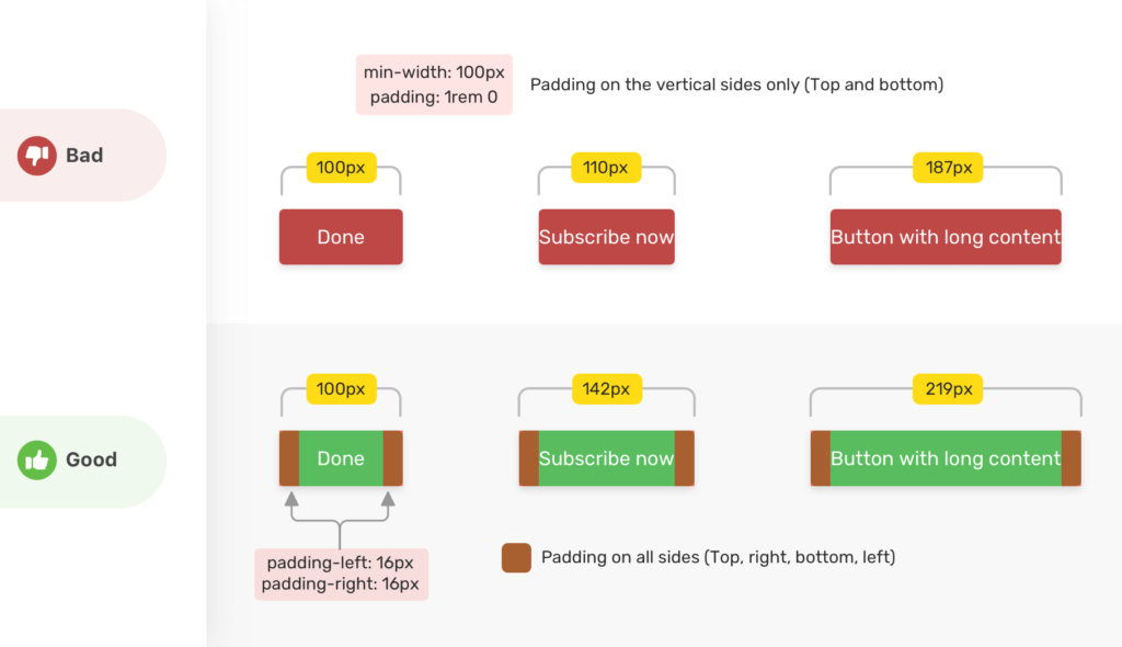
Here's a nice deep dive into min-width / min-height / max-width / max-height from Ahmad Shadeed. I like how Ahmad applies the properties to real-world design situations in addition to explaining how it works. In the very first demo, for example, he shows a button where min-width is used as a method for (trying to) make sure a button has space on its sides. It works if the text is short enough, and fails when the text is longer. That's the kind of "CSS thinking" that is fundamental to this trade.

Direct Link to ArticlePermalink

The post Min and Max Width/Height in CSS appeared first on CSS-Tricks.

Component-Level CMSs

Category Image 052

When a component lives in an environment where the data queries populating it live nearby, there is a pretty direct line between the visual component and the database where that exact content lives. That is opening up doors to site editing experiences that travel that line. We're starting to see CMSs that directly leverage that.

Original Dribble shot.

For example, if I build my site where I'm writing GraphQL queries with a <Query /> component to grab the data I need, it makes sense that I could change that data and put it back with a <Mutation />.

Take a look at TinaCMS, which is turning a lot of heads.

I just saw BodilessJS, which is up the same exact alley. They are trying to coin a new term here — where the content for a headless site comes from a headless CMS (via an API, as in, the content is elsewhere, rather than alongside the site itself) and a bodiless site has the content alongside the site in the same repo. Eh, I'm not huge on the word, but that kind of site probably does deserve some kind of classification.

Stackbit has a product in the works ("Stackbit Live") that is another one down this alley. Here's a screenshot from their interactive demo to give you an idea:

All of these seem to focus on React with a "probably other stuff later" vibe.

The (sponsored) video I did with Webflow last year had a CMS experience very much like this. It's incredible what their CMS is able to do because of that direct line between the visual component and the data behind it.

Editing a site from the "front end" in Webflow

The desire for this kind of site experience has been around forever. I remember services that were like, "Just put our special class on your elements and FTP credentials," which would allow you to log into their site and edit the content on elements with a UI. It literally uploaded the changes back to static files on your server. I'm not sure any of those are around anymore as they went out of vogue for a while.

In a slightly more modern vein, Lea Verou's Mavo is like this. The only place you can edit content is from the front end.

I think there will always sites where this type of editing experience is highly desirable.

The post Component-Level CMSs appeared first on CSS-Tricks.

New Pen Settings Design

Featured Imgs 23

The Pen Settings area in the Pen Editor is a highly important bit of UI in CodePen! You'll see this area when doing anything from changing a preprocessor to changing the description of a Pen to turning on and off Auto-Updating.

We're also working on some new features that will ultimately be a part of Pen Settings, so we thought it was time to spruce up the design.

For the most part, things are under the same "tabs" as they used to be, with just a smidge of re-arranging. Things like Code Indentation and Indent Width are "Editor" concerns so we've broken that into its own tab, while Behavior is the remaining things concerning the behavior of the whole Pen. Also, Privacy has its own tab rather than being combined with Pen Details. But the most important little toggle, Public/Private, is available in the footer so can be changed from anywhere.

Note that you'll see different tabs depending on if you own the Pen or not (e.g. you can't change a Pen's title/description/tags if you don't own it, so we don't even show you that tab). You can change other settings as you play with the Pen, just note they won't actually save unless you fork the Pen for yourself.

Should be plenty friendly on the mobile editor:

High five to Klare who led up this one!

The post New Pen Settings Design appeared first on CodePen Blog.

The Modern Lovers

Category Image 052

I love stuff like this.

  1. The Modern Lovers, a rock band in the 70's, play a show in Boston, probably having some poster of their own for the show.
  2. Mike Joyce is inspired by the music and combines his love of it with the design style of Swiss Modernism to create a new poster for it.
  3. Pete Barr is inspired by Mike's Swissted project and animates the design for it, giving it a ton of new life.

This is what makes the internet cool. I'd bet none of these people have ever met each other.

And this is just one example. Mike has designed hundreds of these posters, and Pete has animated a number of them. Here's another lovely example.

The post The Modern Lovers appeared first on CSS-Tricks.

The Design Squiggle

Category Image 052

I think we all have an intuitive understanding that, at the beginning of projects that require our creativity (be it design or code), things feel uncertain and messy. Then, as we go, things tend to straighten out. There is still some wiggling and setbacks, but by the end, we find a single solution and ship it.

Apparently this feeling has a logo: The Design Squiggle

The Process of Design Squiggle by Damien Newman, thedesignsquiggle.com

It comes from Damien Newman who says that a client gave him 30 seconds to sell them on the value of design, and this did the trick.

I find it a little funny to take this little concept and give it such a grandiose presentation. A dedicated website! A story with a boatload of name dropping! Very specific attribution instructions! But hey, I don't have any famous doodles, and I gotta admit, this does a great job of expressing a complex thing quite quickly.

Reminds me of a boss a buddy of mine had who claims to have invented the Curiously Strong motto for Altoids, and didn't mind telling people about it.

Direct Link to ArticlePermalink

The post The Design Squiggle appeared first on CSS-Tricks.

How many CSS properties are there?

Featured Imgs 23

Tomasz Łakomy posted a joke tweet about naming all the CSS attributes and Tejas Kumar replied with a joke answer, going as far as making an npm module. You can even run a terminal command to see them:

npx get-all-css-properties

You'll get 259 of them. The source code uses the website quackit.com for the data, which I'd never heard of. 🤷‍♂️

I would have probably looked at MDN, where some quick querySelectorAll handiwork in the console yields a different number: 584. But ooops, that's full of selectors, at-rules, and other stuff. Their reference only lists 72, but says it's incomplete.

W3Schools lists 228 of them. HTML Dog lists 125. Our almanac has 176, and I know we omit stuff on purpose (e.g. we file margin-left under margin instead of making its own entry).

The horse's mouth?

520 distinct property names from 66 technical reports and 66 editors' drafts.

The post How many CSS properties are there? appeared first on CSS-Tricks.

Re-creating the ‘His Dark Materials’ Logo in CSS

Featured Imgs 23

The text logo has a slash cut through the text. You set two copies on top of one another, cropping both of them with the clip-path property.

What's interesting to me is how many cool design effects require multiple copies of an element to do something cool. To get the extra copy, at least with text, we can sometimes use a pseudo-element. For more elaborate content, there is an element() function in CSS, but it's limited to a prefixed property in Firefox. Still, it enables awesome stuff, like making a mini-map of long content.

You can style it differently with a pseudo-element, which was useful here. Might be cool to see a way to clone elements on a page and apply styling all through CSS... someday.

See the Pen
His Dark Materials TV series logo with CSS
by Michelle Barker (@michellebarker)
on CodePen.

Direct Link to ArticlePermalink

The post Re-creating the ‘His Dark Materials’ Logo in CSS appeared first on CSS-Tricks.

Water.css

Featured Imgs 23

It's notable that Water.css was the #1 clicked thing from Louis Lazaris' Web Tools Weekly in 2019. It's from a 13-year old developer named Felix!

It's just a little bit of CSS you apply to class-free semantic HTML to give it nice basic responsive styles — the perfect kind of thing for a Pen when you are just tossing some markup together and want it to look nice.

Direct Link to ArticlePermalink

The post Water.css appeared first on CSS-Tricks.

Is it better to use ems/rems than px for font-size?

Category Image 052

The answer used to be absolutely yes because, if you used px units, you prevented the text from being resized by the user at all.

But browser zoom is the default method for making everything bigger (including text) these days and it works great even if you use px.

But... Kathleen McMahon really digs into this and finds that it's still worth setting all your type (both font-size and line-height) in relative units because:

  1. setting type in px prevents browser settings from making font size adjustments (which some people definitely use) and
  2. setting type in relative units maintains greater design fidelity as users use browser zoom (which a lot of people definitely use).

Direct Link to ArticlePermalink

The post Is it better to use ems/rems than px for font-size? appeared first on CSS-Tricks.

Is “is” Useful?

Category Image 052

God I'm funny.

Anytime we have fairly repetitive selectors that have a common parent, it's probably a place we can use the :is() pseudo-selector.

Holger Bartel demonstrates like this:

section section h1, section article h1, section aside h1, section nav h1,
article section h1, article article h1, article aside h1, article nav h1,
aside section h1, aside article h1, aside aside h1, aside nav h1,
nav section h1, nav article h1, nav aside h1, nav nav h1 {
  font-size: 20px;
}

Becomes:

:is(section, article, aside, nav)
:is(section, article, aside, nav) h1 {
  font-size: 20px;
}

Adam Argyle demonstrated like this:

MDN has an extra dramatic one:

ol ol ul,     ol ul ul,     ol menu ul,     ol dir ul,
ol ol menu,   ol ul menu,   ol menu menu,   ol dir menu,
ol ol dir,    ol ul dir,    ol menu dir,    ol dir dir,
ul ol ul,     ul ul ul,     ul menu ul,     ul dir ul,
ul ol menu,   ul ul menu,   ul menu menu,   ul dir menu,
ul ol dir,    ul ul dir,    ul menu dir,    ul dir dir,
menu ol ul,   menu ul ul,   menu menu ul,   menu dir ul,
menu ol menu, menu ul menu, menu menu menu, menu dir menu,
menu ol dir,  menu ul dir,  menu menu dir,  menu dir dir,
dir ol ul,    dir ul ul,    dir menu ul,    dir dir ul,
dir ol menu,  dir ul menu,  dir menu menu,  dir dir menu,
dir ol dir,   dir ul dir,   dir menu dir,   dir dir dir {
  list-style-type: square;
}
:is(ol, ul, menu, dir) :is(ol, ul, menu, dir) ul,
:is(ol, ul, menu, dir) :is(ol, ul, menu, dir) menu,
:is(ol, ul, menu, dir) :is(ol, ul, menu, dir) dir {
  list-style-type: square;
}

It's less code and easier to reason.

Kezz Bracey notes that pairing it with :not() can be nice as well:

:not(article, section, aside) :is(h1, h2, h3, h4, h5, h6) {
  font-weight: 400;
}

Browser support is just starting to get there and polyfilling is hard, so we aren't at day-to-day no-brainer use levels quite yet. I'd bet it's not too far away.

The post Is “is” Useful? appeared first on CSS-Tricks.