CodePen is full of prototypes and loaded with full-blown art. Generative art is common, since hey, we’re working with code anyway, might as well make some of the code randomized and adjustable. There is a great project that has been around years and years that is purpose-built for giving users a UI to change values on-the-fly called dat.GUI. I once blogged about it right here on the CodePen Blog because I wanted to showcase how useful it can be for generative art Pens. While dat.GUI is still pretty cool and perfectly usable, there is a new player on the block.
To me, the API and configuration is really clear and usable. I like how it is also modernized by using stuff like <input type="range"> for the sliders rather than re-inventing that. And the focus on changing CSS custom properties is very clever. Plus, you can style the controls themselves.
I snagged it and updated my Gray Burst idea from the other day to have a stroke-width knob:
[On horizontal scrolling, like Netflix] This pattern is accessible, responsive and consistent across screen sizes. And it’s pretty easy to implement.
Too cold:
That’s a lot of pros for a pattern that in reality has some critical downsides.
Just right:
[On rows of content with “View All” links] This way, the content isn’t hidden; it’s easy to drill down into a category; data isn’t wasted; and an unconventional, labour intensive pattern is avoided.
Get that desk more cuter, fam. Amy (@sailorhg) has this perfectly cute minisite with assorted desktop backgrounds, fonts, editor themes, keyboard stuff, and other accessories. These rainbow cables are great.
Back in August 2020, when the content-visiblity property in CSS trickled its way into Chrome browsers, Una Kravets and Vladimir Levin wrote about it and we covered it. The weirdest part is that to get the performance value out of it, you pair it with contain-intrinsic-size on these big chunks of the page where you insert some arbitrary guess at a height. I wrote:
That part seems super weird to me. Just guess at a height? What if I’m wrong? Can I hurt performance? Can (or should) I change that value at different viewports if the height difference between small and large screens is drastic?
Jake Archibald and Das Surma just did a video on all this and it helped clarify that a bit. You can see at about 7:30 in just how confusing it is. Jake used this massive HTML spec page as a demo, and made <section> wrappers around big chunks of HTML, and applied:
section {
  content-visibility: auto; /* this is the thing that delays painting */
  contain-intrinsic-size: 1px 5000px; /* this is the guess at the height of the content, and also saying width doesn't matter */
}
Apparently that 5000px isn’t the height of the element, it’s the size of the content of that element. I guess that matters because it will push that parent element taller by that number, unless the parent element overrides that with a height of its own. The magic comes from the fact that the browser will only paint¹ the first section (where it’s very likely the viewport isn’t over 5000px tall) and defer the painting on the rest. Sorta like lazy loading, but everything rather than media alone. It assumes the next section is 5000px tall, but once the top of it becomes visible, it will actually get painted and the correct height will be known. So assuming your page is just big ass blocks on top of each other, using an extremely large number should work fine there. Godspeed if your site is more complicated than that, I guess.
It’s a good video and you should watch it:
This is yet another thing where you have to inform the browser about your site so that it can Do Performance Good™. It is information that it can figure out by itself, but not until it has done things that have a performance cost. So you have to tell it up front, allowing it to avoid doing certain types of work. With responsive images, if we give images a srcset attribute with images and tell the browser in advance how big they are, including a sizes attribute with information about how our CSS behaves, it can do calculations ahead of time that only download the best possible image. Likewise, with the will-change property in CSS, we can tell the browser when we’re going to be doing movement ahead of time so it can pre-optimize for that in a way it couldn’t otherwise. It’s understandable, but a little tiresome. It’s like we need a stuff-you-need-to-know.manifest file to give browsers before it does anything else — only that would be an additional request!
The accessibility implications are important too. Steve Faulkner did a test applying content-visibility: auto to images and paragraphs:
The content is visually hidden, but in both JAWS and NVDA the hidden<img> is announced but the content of the <p> element is not. This has to do with how the img and the p element content are represented in the browser accessibility tree: The img is exposed in the accessibility tree with the alt text as the accessible name. The content of the p element is not present in the accessibility tree.
He notes that content hidden this way should not be available to screen readers, per the spec. I could see it going either way, like hide it all as if it was display: none, meaning none of it is in the accessibility tree. Or, leave it all in the accessibility tree. Right now it’s a tweener where you might see a bunch of stray images in the accessibility tree without any other context than their alt text. This is an interesting example of new tech going out with more rough edges than you might like to see.
Speaking of alt text, we all know those shouldn’t be empty when they represent important content that needs to be described to someone who can’t see them. They should be like paragraphs, says Dave:
I finally made the simplest of all connections: alt text is like a paragraph. Word pictures. Basic I know, but it helps me contextualize how to write goodalt text as well as source order of my code.
I don’t want to be overly negative here! The performance gains for setting up a long-scrolling page with content-visibility is huge and that’s awesome. Being able to inform the browser about what is OK not to paint in two lines of code is pretty nice.
I keep saying “paint” but I’m not sure if that’s really the right term or if it means something more specific. The spec says stuff like “allowing user agents to potentially omit large swathes of layout and rendering work until it becomes needed” (emphasis mine).
We’ve covered techniques before for when you want a full-width element within a constrained-width column, like an edge-to-edge image within a narrower column of text. There are loads of techniques.
That works as long as the column is centered and you don’t mind having to hide overflow-x on the column (or the body) as this can trigger horizontal overflow otherwise.
There was a little back and forth on some other ideas lately…
Josh Comeau blogged that you could set up a three-column grid, and mostly place content in the middle column, but then have the opportunity to bust out of it:
I think this is clever. I’d probably use it. But I admit there are bits that feel weird to me. For instance…
Now everything within the container is a grid element. Not a huge deal, but the elements will behave slightly differently. No margin collapsing, for one.
You have to apply the default behavior you want to every single element. Rather than elements naturally stacking on top of each other, you have to select them and tell them where to go and let them stack themselves. Feels a little less like just going with the web’s grain. Then you still need a utility class to do the full bleed behavior.
What I really like about the idea is that it gives you this literal grid to work with. For example, your left spacer could be half the width of the right and that’s totally fine. It’s setting up that space to be potentially used, like Ethan talked about in his article on constrained grids.
Kilian Valkhof responded to the article with this idea:
Also very clever. This constrains the width of everything (in whatever container, and it wouldn’t have to be the body) except the elements you want to bust out (which could be a utility class there too, and not necessarily images and videos).
Again, to me, this feeling that I have to select every single element and provide it this fundamental information about layout feels slightly weird. Not like “don’t use it” weird, just not something I’m used to doing. Historically, I’m more comfortable sizing and positioning a container and letting the content in that container lay itself out without much further instruction.
You know what I like the most? That we have so many powerful layout tools in CSS and we have conversations about the pros and cons of pulling off exactly what we’re going for.
If you’ve ever thought to yourself, gosh, self, I wish I could have an Abstract Syntax Tree (AST) of this CSS selector, Lea has your back.
If you’ve ever thought that same thing for an entire CSS file, that’s what PostCSS is, which has gone v8. PostCSS doesn’t do anything by itself, remember. It just makes an AST out of CSS and gives it a plugin interface so plugins can be written to transform CSS with it. No shade on PostCSS, but it is funny how saying “We use PostCSS” doesn’t mean anything the way “We use Sass” does.
In 2018, Rachel Nabors made the point that browser diversity is similar to biological ecosystem diversity. There are literal advantages to more diversity. That article was before the Edge engines were shut, and now the big shakeups at Mozilla have the topic of browser diversity on people’s minds again.
I really like Dave’s take on the matter. The diversity of browser engines makes web tech slow. Frustratingly slow, to many, but that slowness can bring value.
There’s a lot of value in slow thinking. You use the non-lizard side of your brain. You make more deliberate decisions. You prioritize design over instant gratification. You can check your gut instincts and validate your hypothesis before incurring mountains of technical debt.
I’d bet you a dollar that the less engines we have, the faster things get. Fast can be satisfying in the moment, but doesn’t make for the best brisket.
If we do see a major reduction in browser diversity, I think we lose the intentional slowness and the cooperation mechanisms we have in place. Who knows what will happen, but my hope is that just like iron can sharpen iron, maybe chromium can sharpen chromium.
I can’t tell you how many times over the years I’ve implemented a custom ‘button’ like CSS implementation. Over the years I’ve used images, backgrounds, gradients, and opacity to effectively ‘highlight’ a control. All that works of course, but the problem with most of these approaches is that one way or the other you’re hard coding a color value, image, or gradient.
You certainly have a lot more control if you specify exact colors, but if you can pull off brightening, darkening, or even a hue-shift in a way that feels cohesive on your site, it’s certainly a lot less code to maintain,
.button.specific-button {
  background: #4CAF50;
}
.button.specific-button:focus,
.button.specific-button:hover {
  background: #A5D6A7;
}

/* vs. */
.button:focus,
.button:hover {
  filter: brightness(120%);
}

/* or maybe you're super hardcore and do it everywhere */
:focus,
:hover {
  filter: brightness(120%) saturate(120%);
}
Remy documented this the other day. Firefox supports a Highlight keyword and both Chrome and Safari support a -webkit-focus-ring-color keyword. So if you, for example, have removed focus from something and want to put it back in the same style as the browser default, or want to apply a focus style to an element when it isn’t directly in focus itself, this can be useful.
For example:
button:focus + span {
  outline: 5px auto Highlight;
  outline: 5px auto -webkit-focus-ring-color;
}
Looks good to me. It’s especially helpful with the sorta weird new Chrome double-outline style that would be slightly tricky to replicate otherwise.
Sarah Higley does accessibility work and finds that“tables and grids are over-represented in accessibility bugs.”
The drum has been banged a million times: don’t use a <table> for layout. But what goes around comes around. What’s the the #1 item in a list of “some of the ways tables and grids can go wrong”?
Using a grid when a table is needed, or vice versa
The day has come. CSS grid has dug its way into usage so deeply that developers are using it by default instead of using a classic <table>. And we don’t even have flying cars yet!
Sarah shows clear examples of both techniques and how the same information can be presented in different ways both visually and semantically. For example, a list of upcoming concerts can be displayed as a <table>, and that might be fine if you can imagine the purpose of the table being used for sorting or comparing, but it can also be presented as a grid, which has other advantages, like headers that are easier to skim.
I had someone write in with this very legit question. Lea just blogged about how you can get valid CSS properties themselves from the browser. That’s like this.
That gives you, for example, the fact that cursor is a thing. But then how do you know what valid values are for cursor? We know from documentation that there are values like auto, none, help, context-menu, pointer, progress, wait, and many more.
But where does that list come from? Well, there is a list right in the spec so that’s helpful. But that doesn’t guarantee the complete list of values that any given browser actually supports. There could be cursor: skull-and-crossbones and we wouldn’t even know!
We can test by applying it to an element and looking in DevTools:
Damn.
But unless we launch a huge dictionary attack against that value, we don’t actually know what values it directly in-browser. Maybe Houdini will help somehow in browsers getting better at CSS introspection?
You can also use the CSS object to run tests like CSS.supports(property, value):
Damn.
You’d think we could have like CSS.validValues("text-decoration-thickness") and get like ["<length>", "<percentage>", "auto", "from-font"] or the like, but alas, not a thing.
Pretty neat little website from Joan Perals, inspired by stuff like Lynn’s A Single Div. With multiple hard-stopbackground-image gradients, you don’t need extra HTML elements to draw shapes — you can draw as many shapes as you want on a single element. There is even a stacking order to work with. Drawing with backgrounds is certainly CSS trickery!
The site stores your drawing IDs in localStorage so you’ve got basic CRUD functionality right there. I bet the whole thing is a little hop away from being an offline PWA.
The warping is certainly the cool part here. Some fancy math literally transforms the path data to do the warping. But the UX detail work here is just as nice. Scrolling the page zooms in and out via a transform: scale() on the SVG wrapper (clever!). Likewise, holding the spacebar lets you pan around which is as simple as transform: translate() on another wrapper (smart!). To warp your own SVG files, you just drag-and-drop them on the page (easy!).
Una doing an amazing job of showing just how (dare I say it?) easy CSS layout has gotten. There is plenty to learn, but what you learn makes sense, and once you have, it’s quite empowering.
This is a neat interactive page by Ville V. Vanninen to reference the names of things in the CSS syntax. I feel like the easy ones to remember are “selector,” “property,” and “value,” but even as a person who writes about CSS a lot, I forget some of the others. Like the property and value together (with the colon) is called a declaration. And all the declarations together, including the curly brackets (but not the selector)? That’s a declaration block, which is slightly more specific than a block, because a block might be inside an at-rule and thus contain other complete rule-sets.
With all this recent work we did upgrading our Asset Hosting feature, there were some side-benefits around the app as well.
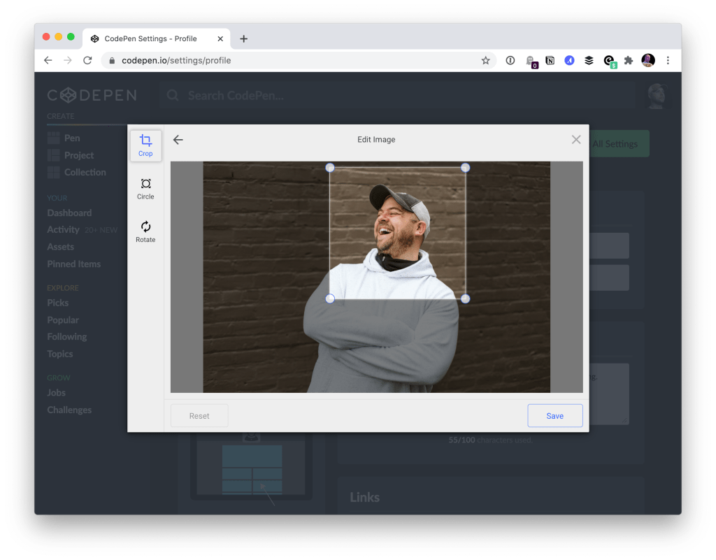
For example, as a PRO member, you can upload replacement screenshots for your Pens if you wish to. The uploader for those is the much nicer Filestack uploader now. Here’s how that works:
Similarly, avatar uploading users the new upload experience. So you can upload whatever ol’ image you have around (to your profile settings), even if it’s gigantic or the wrong size, and you’ll have the opportunity to crop it as you upload it:
We’ll take care of making sure it’s sized properly and being served as snappily as we can!
We even use this stuff internally. For example, when we build the email we send out each week for the CodePen Challenges, we have this slick little uploader to use for ourselves, making our own workflows just all that much smoother.
Any time I chat with a fellow web person and CSS-Tricks comes up in conversation, there is a good chance they’ll say: oh yeah, that guide on CSS flexbox, I use that all the time!
Indeed that page, and it’s cousin the CSS grid guide, are among our top trafficked pages. I try to take extra care with them making sure the information on them is current, useful, and the page loads speedily and properly. A while back, in a round of updates I was doing on the guides, I reached out to Lynn Fisher, who always does incredible work on everything, to see if she’d be up for re-doing the illustrations on the guides. Miraculously, she agreed, and we have the much more charismatic illustrations that live on the guides today.
In a second miracle, I asked Lynn again if she’d be up for making physical paper poster designs of the guides, and see agreed again! And so they live!
Here they are:
You better believe I have it right next to me in my office:
They are $25 each which includes shipping anywhere in the world.
Lots of fun with gradients from Bennett Feely: stars, stripes, banners, bursts… I love being able to use nice patterns with either no image requests at all, or very little SVG.
Reminder: Bennett does all sorts of cool stuff. I’ve probably used Clippy about a million times.