10 SEO Habits That Will Increase Website Traffic

Featured Imgs 23

Everyone wants more website traffic, right? But are you doing all the little things that help boost search engine ranking with every new image upload or content update?

Creating the right habits from the start will keep your website in tip-top shape and hopefully result in bonus points from the Google algorithm.

The good news is that this list is packed with actionable, everyday tips. Start with a solid website framework and then employ these techniques with every update to get on the path to creating great SEO habits that won’t be tough to maintain.

1. Write for Humans, Not Search Engines

Write for Humans, Not Search Engines

You will come across all kinds of advice, tips, and SEO strategies in your search for improving your website but don’t forget the main purpose of your website—serve people!

When preparing your content strategy, always prepare it with a human-first approach. Research for topics that help solve the problems people are having and aim to fill the gaps and areas that lack quality content. And publish content that you can be proud of, even several years after publishing them.

Even when optimizing your content for keywords, remember not to create keyword-stuffed garbage that serves no one. If a person comes to your website by searching for “how to do an oil change in a car”, make sure to provide the right information with clear instructions. And don’t take 2,000 words to get to the point.

2. Google E.E.A.T

E.E.A.T, which stands for Experience, Expertise, Authoritativeness, and Trustworthiness, is the quality rater guidelines Google uses to analyze the quality and effectiveness of the content available on a website.

google eeat

Google uses this framework to list only the most reliable and high-quality websites on its search results pages for every term people search for. Needless to say, it’s crucial that you also follow this framework when creating content.

It basically means you should stick to your area of expertise when sharing informative content. After all, a food blog sharing advice on how to do an oil change in a car wouldn’t make sense.

3. Keywords vs Key-Phrases

We used to search in very specific and short keywords for a long time. But today, most people search through AI assistants like Siri and Google Gemini by speaking to their phones.

As a result, the old methods of optimizing content for keywords may not work anymore. Instead, aim to optimize your content for key phrases or search phrases.

answerthepublic

AnswerThePublic is a great tool for this task to find effective key phrases.

4. Create Quality Content

SEO

Good search rankings start with quality content. There’s a reason marketers say “content is king.”

Quality content includes text, images, video and elements that users want to interact with. It can be fun or informative, a game or e-commerce, short or long-form. There’s no truly magic formula; they key is that content relates to what your website is about and is well constructed and composed. And then write killer headlines to match, so that users can find this great content.

Quality content includes text, images, video and elements that users want to interact with.

Characteristics of quality content include:

  • Content that is rooted in data or factual information. It should be easy to read – think around an eighth-grade level and free from grammatical errors.
  • Content should relate to your website or brand goals. Don’t write about ponies and unicorns if your website is about baseball. The connection should be obvious.
  • Content is shareable on social media, and users interact with it. While this concept doesn’t help you in the creation of content, it can be a measuring stick as to what types of content work for you and your users.
  • Content should have enough length – the best estimate seems to be about 300 words or more per page – to actually say something of value.
  • Content should establish your credibility and authority in your field. Testimonials, case studies, and reviews are a good place to start.

5. Link to Reputable Sources

SEO

Don’t cram your content with meaningless links just to build a history; use links that are meaningful and add actual value to the story you are trying to tell.

Certain domains have more credibility and authority than others, so opt for those links.

A good set of links includes internal links – you want users to move around within your website – as well as external links. Aim for a mix of both types (where applicable on each page).

And think about the kinds of websites you are linking to. Do they also relate to your type of product, brand or business? Those links are valuable. Unrelated links are a waste of your time.

The authority of those links is equally important. Certain domains have more credibility and authority than others, so opt for those links. Here’s a guideline for authoritative rank:

  1. .gov
  2. .edu
  3. .org
  4. .com
  5. .everything else

Try to include a mix of links from a mix of places. But please, don’t cram the content with too many links; users will abandon the page. (Don’t forget social media. Those links count as reputable sources, too!)

6. Build for Speed

SEO

Websites need to be fast. This applies to renderings on every device type. A website is only as fast as the slowest place it loads.

A big part of optimizing for speed is thinking about how to make the most of file sizes. Don’t overload your website with junk. Use icon fonts rather than images for icons, consider SVG rather than PNG for image files and stop uploading full-size images to your website. That’s just overkill.

Here are a few other things you can do:

  • Consider adding a tool that will help compress images that are too big.
  • Run Google’s PageSpeed Insights to see what issues might be bogging your website down.
  • Use a caching plugin, especially if you are running on WordPress.
  • Opt for asynchronous scripts.
  • Ditch unused plugins, tools and code that can weigh your website down.

7. Use Words for Everything

SEO

Search engines can only read words. (Right now anyway.) That means you have to tell search engines what the other types of content your website contains. What is in that video or photo?

You can do that in two ways. Use the file name to your advantage. Name the file based on what is in the image or video.

Descriptive image file names look like this: <img src=”dog-playing-fetch.jpg” alt=”dog playing fetch”/>. The source is the actual file name (use hyphens between words) and the alt is a similar description without hyphens between words.

Here’s another trick. Tell search engines exactly what is in the video on your website by embedding a video on a page with a transcription of the content in the video.

8. Don’t Duplicate, Update!

SEO

Many websites have a tendency to use the same boilerplate copy over and over and over on multiple pages. Why are you doing that? If the copy needs to be on every page, put it in the footer. Problem solved!

If the copy is popped on pages to boost SEO because it is stuffed with keywords or to add to content, stop. Google is dinging you for all that duplication.

If you have content that is static, or mostly static, just update it and reshare links. Don’t duplicate posts. (This happens more commonly than you might think.)

9. Practice Internal Linking

Internal linking is just as important as linking to other authoritative sites and building backlinks to your website. It’s all about linking to other useful pages on your website through existing pages.

This not only enhances your content for SEO by showcasing authority but also helps retain users on your website for longer periods of time by encouraging them to explore more about the topic.

Experts suggest that building internal links to unpopular pages on your website also helps improve their rankings on search engines.

10. Do Content Audits

Nothing stays the same on the Internet for too long. Even the most ever-green content you create will be outdated after a while. So, it’s a good practice to do a content audit of your website from time to time.

A content audit involves fully analyzing your website and its content to identify outdated content and then developing a strategy to update them. This usually includes everything from updating your website’s user interface, SEO keywords, written copy, images, and more.

Conclusion

If you are starting today with these habits and maybe haven’t been diligent about SEO in the past, consider going back to correct missteps on older pages. Make it a goal to go back and use the proper header, alt and meta tags on pages that you want users to see.

Remember to run Google’s PageSpeed Insights on your website periodically to see what issues might be bogging your website down. And create content that users want to engage with; nothing will boost SEO and drive traffic like stellar information.

Creative Commons photos by Unsplash.

Pitch Deck Design: 10 Tips to Stand Out

Featured Imgs 23

A good pitch deck is designed for specifically one thing – to help your startup get funding from investors. But how do you stand out from the crowd, and make a memorable impression?

There’s a delicate balance to creating a deck with just enough slides to entice potential funders, without providing so much information that they are overwhelmed.

Most pitch decks contain less than 20 slides. So how do you create a pitch deck design that stands out? Here are our ten tips to help you get started.

1. Pick a Template or Palette

In most cases, a simple template is the best option.

Whether you are designing a pitch deck from scratch or starting with a template, you need to stick to a visual theme. Slides should have a consistent color and type palette as well as design elements, such as page number or a header/footer.

Streamline your deck to a handful of slide types that fit your content so that the design is consistent from the first to the final slide.

In most cases, a simple pitch deck template is the best option. Look for something with darker text on a light or white background. This color combination is easy to read on screens or in darker rooms when projected onto a wall. (It also makes for easy printing if you want to provide a handout copy to meeting participants.)

2. Use Your Branding

pitch deck design

Use your brand throughout so that it starts to stick with the people you are talking to.

By the time you are ready to talk with investors, you should have a simple brand established. This includes a logo or wordmark and basic color palette. It should also include a list of keywords that you use to talk about your business.

Use all of this in your pitch deck. As you create a slide design, make sure the template incorporates your colors and branding.

These visual elements can make a lasting impression. Make it count.

And don’t make this mistake. Too often, pitch decks “save” the branding as a surprise for the end of the presentation. Don’t. Use your brand throughout so that it starts to stick with the people you are talking to. Give them more opportunity to fall in love with your idea, brand, and company.

3. Include Charts to Simplify Content

Pitch decks are packed with heavy content, including plenty of numbers.

Use charts to simplify this content. Are you experiencing revenue growth? Chart it. A chart is an easy way to see and understand that information quickly. Plus, bar and pie charts are easy to create. (Just make sure to label everything clearly.)

Bonus tip: You can also use pie charts to highlight statistics, again making a text element more visual and understandable.

4. Use Stellar Images

pitch deck design

Don’t feel like you have to have an image on every slide if they get repetitive.

Put forth the effort to get some great images for your pitch deck. Not stock images. Actual photos of your team, product or service.

You know that people are more likely to engage with an image than text and that goes for memory as well. A good image will stand out in someone’s memory longer than a slide full of words.

The challenge is that not everyone has a visual product or service. That’s where you’ll have to be a little more creative, show the team in action or create a diagram or illustration.

Don’t feel like you have to have an image on every slide if they get repetitive. Get a few images that best represent what you are selling with the pitch deck and stick to those. Scatter them strategically throughout the pitch deck.

5. Organize with Icons

pitch deck design

Another visual element to consider is icons. These small illustrations can help organize complex ideas and provide visual flow throughout a single slide or the entire design.

Pick an icon set that matches your visual theme and use them to break up the copy, create a grouping, and keep the visual flow moving.

6. Try Tiled Layouts for Complex Information

pitch deck design

When it comes to presenting complex information, consider a modular tiled layout style. Titles can help you break down information into smaller, more digestible parts.

These bite-sized bits can eliminate the need for using multiple slides for a handful of facts or figures as well.

Design tiles with color blocks or use icons in each to establish different pieces of content visually.

7. Use Professional Headshots for Team Members

pitch deck design

If you plan to include images of your team in the pitch deck (many companies do), invest in professional headshots so that photos are consistent and represent your startup brand well.

This isn’t to say they have to be boring. Photos with personality are acceptable, but all team headshots should be in the same style with similar coloring and backgrounds.

Think about the type of investor you are trying to get money from, what type of photo would appeal to them? Consider that for the style of your team headshots or group photo.

8. Create a Type Hierarchy

pitch deck design

Just like with any other type of design, create a hierarchy for text elements.

  • Title
  • Header
  • Secondary header or subhead
  • Main body text
  • Bulleted text
  • Captions
  • Infographic text
  • Footer text

9. Design with Contrast in Mind

pitch deck design

Every element in your pitch deck should include plenty of contrast against the background and other elements. Avoid the temptation to use a template where everything has a similar color or contrast, while these might look great on a screen, they can present readability issues and don’t often render well when projected or printed.

It’s important to balance modern design with readability. It is vital that potential investors understand everything about your startup company when they view the pitch deck. Don’t let “overdesigned” slides get in the way.

10. Get Creative with Text-Heavy Slides

pitch deck design

There are some content types and information that will just seem heavy.

The history of your company or business trends, lists or SWOT analyses can get a little overwhelming on a slide. Use more visual formats with less focus on every actual work to communicate this information.

Try slides that use word cloud, timeline formats or XY graphs to present text-heavy or complex information in a more visual way. Even though these slides will still be somewhat thick, they’ll be easier to visually digest.

Conclusion

When creating your pitch deck, remember to keep your business goals in mind. Everything about the deck shows potential investors that you understand your company and business.

The design of your presentation communicates this as well. A professional, easy to understand deck is just one tool in the path of growing your startup.

How Much Should You Charge for Design Services?

Featured Imgs 23

It might be one of the most asked questions among freelance designers: what do you charge clients?

There can be so many variables in setting rates that you can stick to, and you have to make a choice between hourly and fixed options. Either way, a good pricing strategy can help you get the clients you want and earn a solid income from freelance work.

After you figure out pricing. Which is a challenge for almost anyone!

How Much Do Other Designers Charge?

The easiest way to figure out your rates is to see how much other designers are charging for their services.

indeed designer rates

Indeed, one of the largest online job boards, has a salary explorer tool that shows you the hourly rates and the salaries of professionals in each industry. The site allows you to browse the rates based on your country and even provides pricing data for different cities.

If you’re a freelancer, this is a great place to start your search for the ideal rate.

glassdoor designer rates

If you’re joining a company, agency, or seeking a full-time role, Glassdoor is the best place to learn about the salaries of other designers. Here you can explore the salaries submitted by fellow designers and even let you filter them based on your years of experience, industry, and more. Payscale is another website that provides similar information.

But don’t stop there. You can also ask directly from other designers. Use forums and sites like Reddit to ask other designers how much they are charging for different types of services. You’d be surprised how helpful the designer community can be.

It’s important to remember that these average rates are calculated based on the pricing data submitted by designers with various levels of experience and skills.

It will be difficult to find your exact number by looking at these websites. But, they will at least help you find a ballpark number to get started.

Set an Hourly Rate, for Starters

freelance prices

For most freelancers, setting an hourly rate is the place to start. It provides a baseline comparison to other freelancers in the market and is something clients can understand, as long as they are flexible with hours worked and pricing.

You can use time tracking software to keep up with exactly how much time you spend on projects – as long as you actually remember to use it and have solid focus while working on projects.

An hourly rate is great if you work at a moderate pace, take on projects that don’t shift a lot in time (clients don’t love getting revised pricing estimates) and like the flexibility of this time accounting method. On the other hand, some designers find that hourly rates hold them back because they can finish projects quickly and hours worked is not the only price consideration.

Be Competitive

If you decide to charge the same rates other designers are charging, it will be very difficult to land clients, unless you already have a good reputation.

In the beginning, it’s important to ask for a competitive rate that will position you above other designers. That doesn’t mean you need to charge cheaper and lower. You can still charge the same rates by providing more value.

For example, including additional tasks or services for free with your existing services is a great way to get the attention of the clients.

Consider Value-Based Pricing

If you’re an experienced designer with a variety of skill sets, years’ worth of knowledge, and success stories to back your claims, you should consider using a value-based pricing model.

This pricing strategy involves charging a rate based on the outcome of the project. For example, if you’re working on an advertising campaign for a high-profile client, you can charge them 10-20% of the sales they generate from the designs you make for them.

Most clients won’t be open to this type of pricing model and that will provide you with an even better opportunity to ask for a higher hourly rate or project price.

TheFutur YouTube channel has a great roleplay video that shows how this strategy plays out.

Know Your Costs

Your rate needs to reflect your costs plus take-home cash for yourself. Remember to include elements like taxes, rent and lights, software and other supplies when pricing projects. You need to be able to cover all costs before you’ll ever make any money as a freelancer.

The first thing you need to do is create a budget for your monthly and yearly expenses. This will help you find a yearly income goal. Simply put, it’s a way to figure out how much you need to earn.

Then figure out how many hours you are willing to work. This is an important factor that will help determine your hourly rate or even fixed rates for projects. If you’re willing to work longer hours, you’ll be able to charge competitive rates.

Again, income goals and work hours all depend on your skill set, experience, and location.

Price Hourly or by the Project

The alternative to hourly pricing is project pricing. Project pricing is preferred by a lot of designers who have been freelancing for a while.

This might be the best case for project pricing out there from Jake Jorgovan for Career Foundry:

When you charge based on the project, you are tying the price of the project to the client’s end result. The end result is all that the client cares about.

Shifting the focus of my freelancing away from the time I worked and toward the value I delivered changed everything. It completely changed my income potential and how much I made.

Setting project rates is a little trickier. Everyone does it a little differently. (Jorgovan even suggests making it up… kind of.)

Over the years, I have developed a little more of a strategy based on market and industry rates, creative flexibility with the project, client budget and potential long-term value, timeline and how I “feel about it” from the start.

  • Market and industry rates: What are others charging for similar services in your market? I tend to price well below agency pricing – I am a team of one and can’t provide the round the clock services of a full team – and in the middle of what other freelancers in my market charge based on how long I’ve been in the business.
  • Creative flexibility: The dirty secret is that I charge a little more for dud projects. No client will ever know who they are, but I do quote a little lower for a project that I really want to stretch my creative muscles. It helps me grow and expands my portfolio for later. The routine stuff gets more routine pricing.
  • Client budget and value: An accountant once said to me, charge every client what they are willing to pay. It took a while to really get this, but it all comes back to value. What is the project worth to them? The client is coming to you for your value and expertise. Price accordingly to show that your work is valuable. (A $5 logo never said “value” to anyone.)
  • Timetable: A project with a super-fast turn around is worth more to a client than something they need in 6 months. Think about scheduling to ensure that you can get it in and get it done on time. Think about whether you will have to price more to account for other projects getting bumped back.
  • The “feel:” Check your gut when you meet with a client for the first time. Do they know what they want? Or will they waffle? Clients that will require a lot of hand-holding along the way will take a lot more of your time for the same work. You should probably charge a little more here.

The biggest problem with project rates is that sometimes you’ll get it wrong. There are projects that will suck up your time and frustrate you to no end because you just estimated wrong. If this happens frequently, then you are an hourly rate kind of freelancer. If it only happens once in a while, project rates can be a great option.

Pro tip: Use a combination of project and hourly rates. Opt for hourly rates for small projects (or friends and family if you dare work with them) that will come in under $250. This includes simple logo design, a business card or poster for clients that you know and will almost always take the design as is with a few minor revisions. Use project rates for anything that requires a lot of setup or time, such as website redesigns, branding or large packets of information.

Include Contingencies

freelance prices

No matter what pricing structure you use, make sure to include a scope for each project and room for contingencies in the estimate.

Include some rules with client estimates to keep scope creep from eating away at potential earnings.

Include guidelines for:

  • What exactly the project entails, such as one website design with up to 10 pages.
  • Number of revisions included.
  • Rate for changes beyond the scope.
  • Payment guidelines; this is vital for big projects or large timelines where you might need to get some of the money up front.
  • Any additional fees, such as late charges, processing later or maintenance or upsells.

So What Should I Actually Charge?

bonsai-rate-calculator

As you can figure from all the information above, there’s no magic formula.

Price too low and you’ll worry about making enough money to pay the bills. (You can also run the risk of having too many clients because of underpricing.)

Price too high and you might have trouble getting projects.

You want to be somewhere in the middle, where you can take the clients you want and refer others elsewhere. And so much of it matters where you live and where the clients are based.

Contently has a solid database of freelance rates for writing, design and photography so you can see what people are actually getting paid. (Plus you can sort by category, rate or date.)

Bonsai also has a rates database that you can put in options such as design or development, skills, experience and location to get an idea of what hourly rates look like.

It can be tricky. The good news is that when you figure it out, you’ll know because your client mix will feel just right with a few large project, a few small projects and rewarding work.

Conclusion

OK, so maybe you did not get the exact answer you wanted. I could have told you to charge everyone $75 per hour for any project. But that would be a disservice to you.

It’s all about how you work and your client relationships. Feel them out. Understand their needs and work with clients to find just the right pricing strategy.

Freelancing 101 is an occasional series to help the increasing number of freelancers in the market. Whether you are a designer, writer, developer or wear multiple hats, we will share tips, resources and ideas to help you make the most of your small business. Is there something in particular you want to know? Let me know at carrie@designshack.net.

Creative commons photos by Death to the Stock Photo .

30+ Background Design Trends & Styles for 2024

Featured Imgs 23

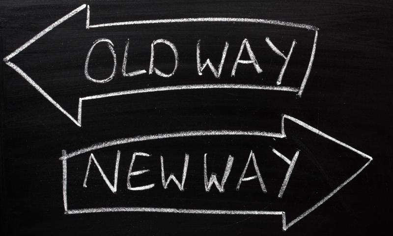
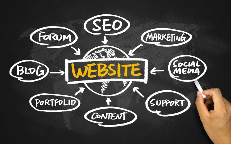
One of the most important early design decisions you will make is what kind of background will carry a project. Should it be a single color, colorless, use trendy elements such as geometric shapes, gradients, or wood grain patterns? Or would a solid background design can help make a project shine?

Staying on trend with background design styles is important as well. A trendy background choice shows that a website design is modern and the content is new. A modern visual framework can even signal a user that you are thinking about their needs and making the most of the tools that will make their experience better.

So how do you do it? Here’s a look at background design trends and styles, with a few great options to try.
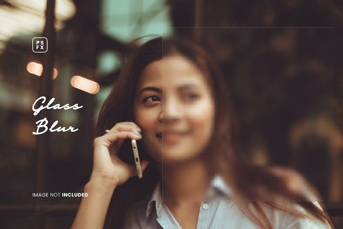
Glass Blur Effect

Glass Blur Effect

Adding a subtle glass blur effect to a background may look simple, but it has many benefits. It not only adds depth to the overall design but also makes it much easier to create contrast between the background and the text.

The glass blur background effect works perfectly with both image and gradient color backgrounds. However, it’s much more effective when used with gradient color backgrounds as it helps create a subtle glass-like aesthetic look for websites and graphic designs.

One To Try

glass blur 2

Applying a simple Gaussian blur effect to an image won’t help you recreate this design style. You’ll need a glass blur effect for this one. The easiest way to create this effect is to use a glass blur Photoshop template and apply it directly to your background image.
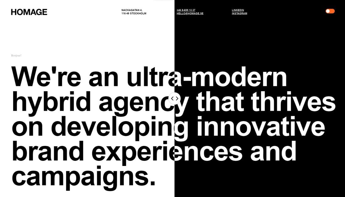
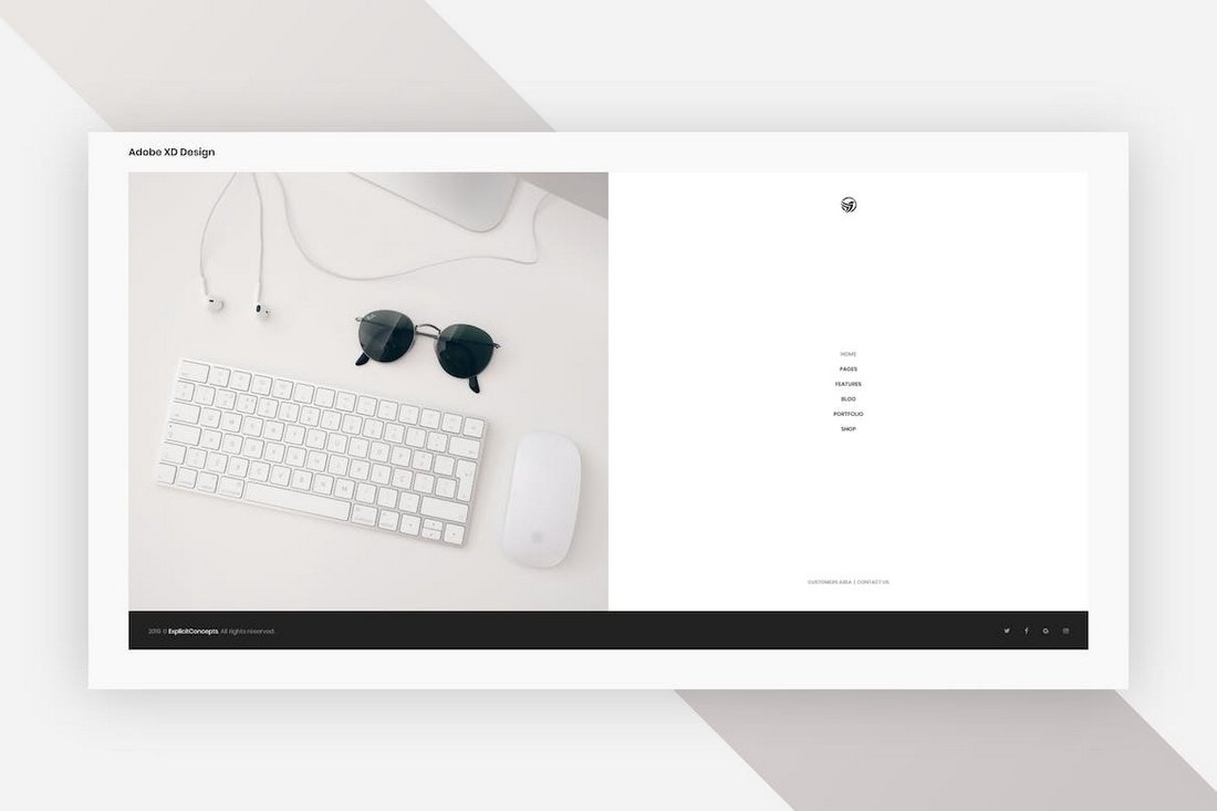
Split Background

Split Background

The split background design trend differs from the popular split website layout trend. This trend involves creating backgrounds that are split into multiple sections.

But it’s not just about adding two images side by side or using two different colors. It’s about creating balance and separating sections more innovatively.

In the above example, the website uses a slider that you can move around to change the divider, which is quite interesting for boosting engagement as well.

One To Try

Split Background 2

The best way to create this effect is to use CSS. But you can also start with a split layout template like this split homepage template for Adobe XD.
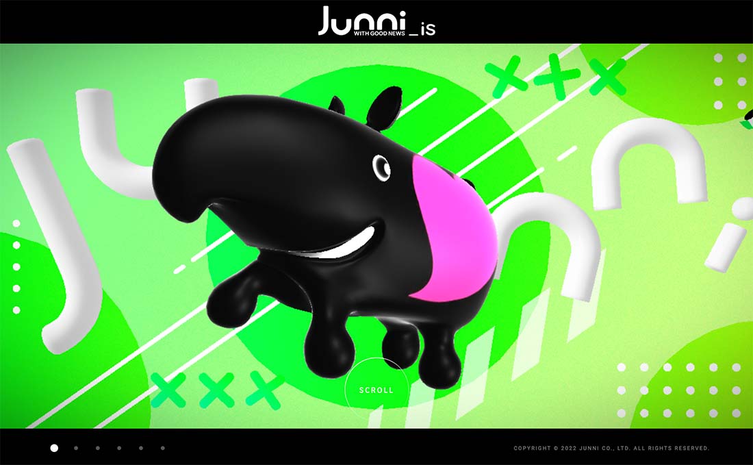
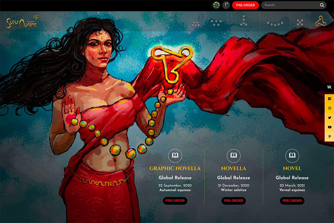
Fun Illustrations

Fun Illustrations

One of the best ways to create emotionally engaging and memorable website designs is to use fun illustrations. We see handcrafted illustrations on almost every website these days but most of them are quite random and chaotic. When used properly, the illustrations give a unique personality to each and every design.

The trick is to make the illustrations fun and relatable in a subtle way. Of course, it has to blend with your overall design and theme as well.

Some websites and brands also use illustrations as a way to convey their messages in visual form. And they also use fun characters and mascots to make more memorable designs. But for backgrounds, a big, fun, and creative illustration will do the trick.

One To Try

Fun Illustrations 2

You don’t always have to handcraft illustrations. A good illustration pack will give you plenty of options to choose from.
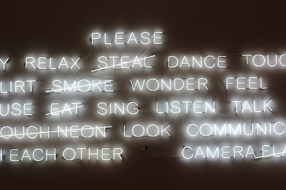
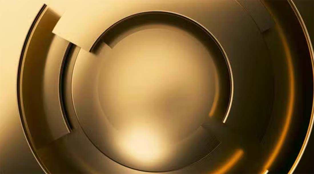
Glowing Effect

Glowing Lights

The neon glowing effect is something that always grabs your attention. It often works perfectly for adding a dark and moody vibe to the overall look of the design. The glowing background effect uses a similar approach but without the classic retro neon colors.

The soft, luminous light effect also creates depth and contrast between the content and the background. You’ll see this style used more commonly on technology-themed designs.

This background style works perfectly for product landing pages and for promotional adverts like flyers and posters. It creates a bright and bold look while bringing all the attention to the main content.

One To Try

Glowing Lights 2

The abstract modern backgrounds is a collection of high-resolution backgrounds that includes 15 different styles of images featuring glowing effects.

Grainy Textures

Grainy Textures

The grainy texture background style succeeds beautifully when it comes to adding a tactile feel to website designs. It creates a unique handcrafted look to digital designs with its sandy and organic textures.

The main goal of using this background style is to give a more natural, rugged, and raw look to your designs. It’s also perfect for creating a retro and nostalgic look for your digital and print designs, especially for brands that seek to achieve a more grounded aesthetic.

One To Try

Grainy Textures 2

You can use this grainy fabric effect Photoshop template to easily apply a grainy texture effect to your background images.
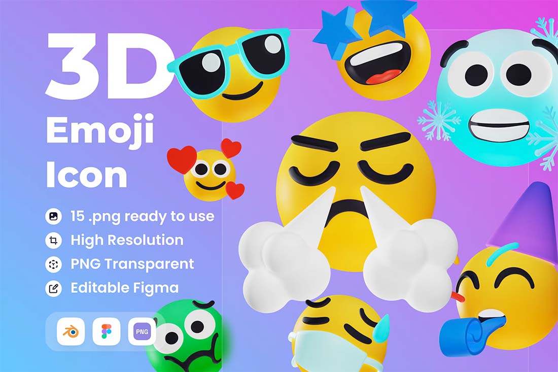
3D Illustration

background design trends

Three-dimensional anything is a big trend this year. Illustrations with a 3D feel are funky and light for a design that has a certain feel.

The trick to this background style is to pick 3D elements that really work with your content. Illustrations can be a full scene or use 3D icons that create texture or a sort of repeating pattern.

This style emits a certain feel from the get-go. It is lighter and less serious than some other styles, so you want to make sure you are using it with just the right type of content. Otherwise, you could end up with an odd disconnect.

Create your own illustrations or find a UI kit with the elements you need. Add another level of visual interest with a touch of animation, such as the example above.

One To Try

background design trends

Emoticon 3D Illustration is a fun option with big faces that you can drop in a background grid or with a more random placement.
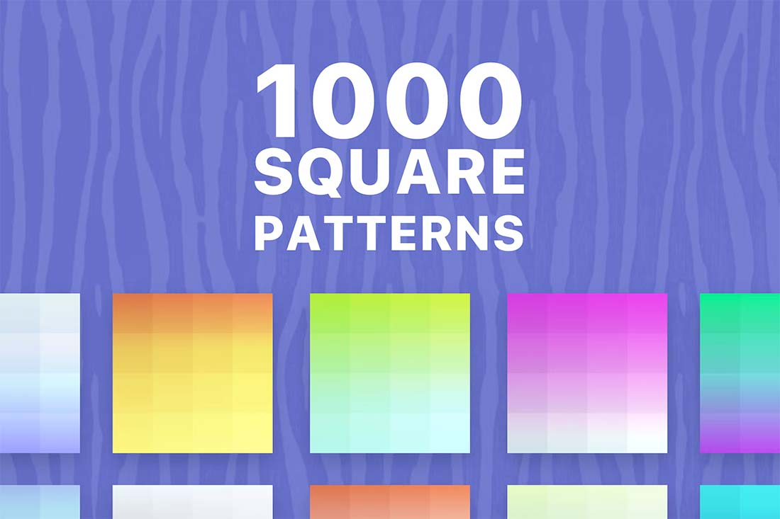
Pastel Gradient

background design trends

A pastel gradient background can be soft or brilliant, but the trend is leaning more toward softer hues and subtle graduation of color.

What’s nice about this type of background is that it adds visual interest with an element of depth. The style can work with any type of content and almost every brand color combination, making it a super practical option if you want to refresh your website design.

One To Try

background design trends

1000 Square Patterns includes plenty of fun repeating elements in a gradient style that can add depth to any website background.

Video

background design trends

Background video is becoming more common in website design projects. Think of this as b-roll or video that’s more for visual purposes than storytelling.

Motion can help keep attention on a design a little longer or create interest with content that might be lacking visual spunk.

If you click through the example above, it uses two layers of animation – video in the background and moving text in the foreground to create a fun display with a lot of impact. The video background is a stylish contributor to this aesthetic.

One To Try

background design trends

Gold Modern Business Video Background has simple motion that can work in any space.
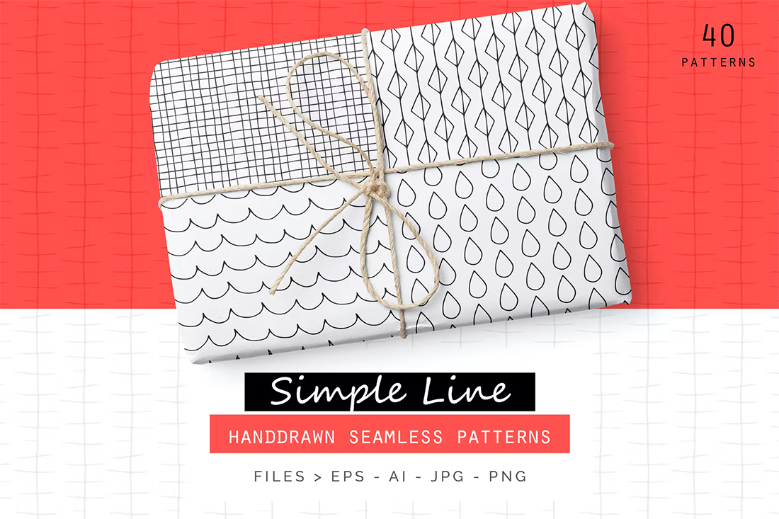
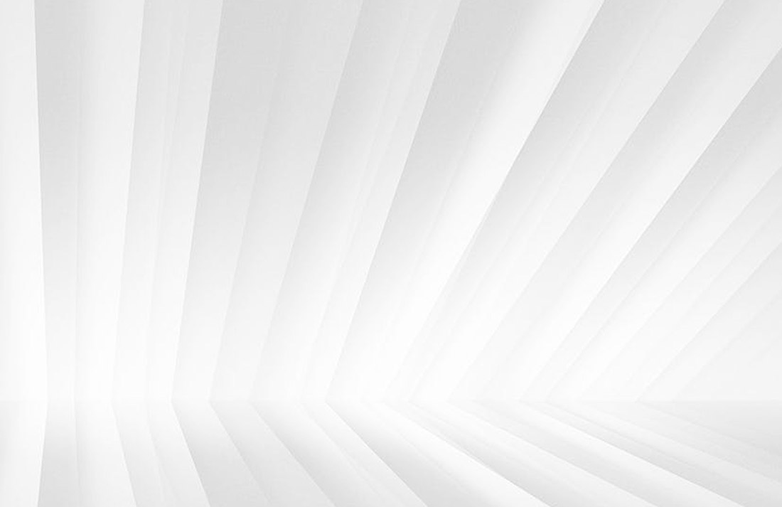
Light Shapes

background design trends

Geometric shapes can be a nice addition as a subtle layer behind other elements in a website design. Elements with thin lines and not a lot of color will create something that’s visually interesting and does not get in the way of the rest of the design.

You can take these effects to another level by using them in similar ways throughout the design and ensuring the shape and style that you use are relevant to the website content as a whole.

Don’t be afraid to use them in multiple ways as well, such as reversed out, with super subtle color, or slight animations. It’s all about creating the right feel for the design with an extra element to engage in the background.

One To Try

background design trends

Simple Laine Handdrawn Patterns has thin lines that fit this design trend perfectly. Play around with size and placement to make it work for you.

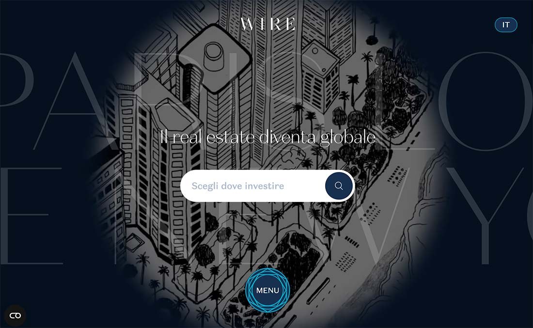
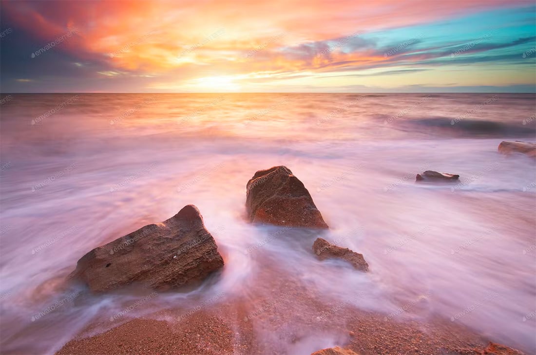
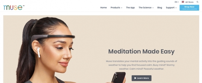
Layered Background Image

background design trends

This is a background trend that we didn’t expect – photo backgrounds behind other layers, including text, other images, or videos.

These images tend to be wide-angle, easy-to -understand images that set the stage for the content on the website. They are most valuable when they provide extra information to make everything easier to understand. The challenge is that they can clutter or overwhelm the design if not done well.

Look for images that you can fade easily and content that’s easy to understand at a glance. Generally, the best options pull from the overall website color palette or include a lot of unused space that fades from one part of the background to another.

One To Try

background design trends

Beautiful Seascape is an example of a photo background that could work because it just establishes a sense of location and the color could be muted, if necessary. For this design trend, an image that helps create a locational element can be helpful.

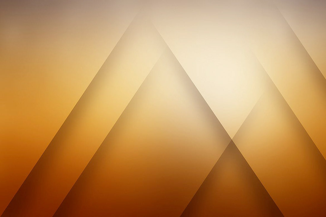
Three-Dimensional Feel

background design trends

Three-dimensional and tactile backgrounds draw users in because they look and feel like something real. Users can almost dive into the design and be part of what they are seeing on the screen, and there’s a strong visual appeal to that.

The modern 3D background trend is more than just shadows and shapes for depth. They also include animation and texture that enhance the realistic vibe.

The key to making a 3D background work is it has to be believable, meaning the effect replicates reality, or it has to be so far-fetched that it is obviously imaginary. There’s a delicate line there that takes practice to do exceptionally well.

One To Try

background design trends

Abstract 3D Background mixes depth effects with motion for a groovy background. The elements of motion can add to a 3D background, but you have to be careful so that you don’t end up with a dizzying effect.

Layered Elements

background design trends

Background and foreground elements no longer have to be completely separated on the screen. The merging of background pieces with other parts of the design can create amazing depth, contribute to a three-dimensional effect (as featured above), and help users feel like part of the design.

This background trend is an extension of merging illustration and reality in imagery that we saw trending in 2020 and 2021. Now the trend seems to be more focused on geometric shapes and color with image layers to create this depth effect in a way that’s less cartoonish.

Bright color choices can help propel these designs forward with extra elements of visual interest with shadows or other depth-building techniques.

One To Try

background design trends

Background Abstract Landing Page is a good starter to create this effect. To get just the right layering of shapes and elements, start with a background element that contains shapes that you like and then add images to the mix.
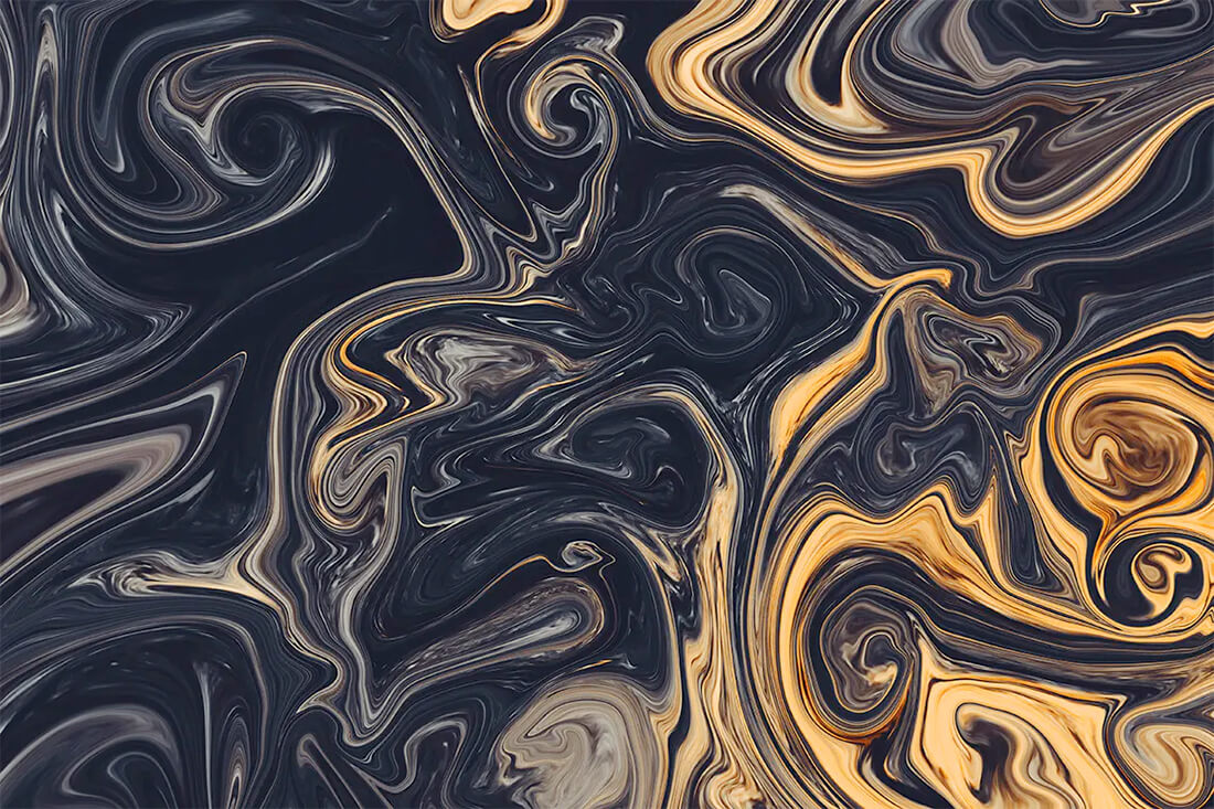
Liquid Backgrounds

background design trends

Liquid backgrounds are increasingly popular because they are just so visually interesting.

You might find them in one of two ways:

  • As a subtle liquid image behind other elements
  • As a flowing animation in the background

Both concepts are neat to look at and even in a still liquid background, it evokes feelings of motion. The waterlike feel of a liquid animation or background often has a somewhat calming effect as well because of the natural flow on the screen.

One To Try

background design trends

Liquid Backgrounds includes high-resolution backgrounds in a few color schemes. Each has an interesting texture and could work at fully saturated color or muted.

Photos with an Overlay

background design trends

Background images never seem to get old and designers are playing with different ways to add contrast to images with overlays and effects that bring the whole scene together.

Overlays are interesting because there are so many different ways to do it, from full-color screens to partial overlays to adding color and other design elements on top of images.

The real key to making a photo overlay background work is using enough color to make foreground elements highly visible without hiding too much of the background image.

One To Try

background design trends

Epic Photo Overlays includes some trend overlay options that both darken images and provide a dreamy effect. (This is popular on social media and starting to creep into more web projects as well.)

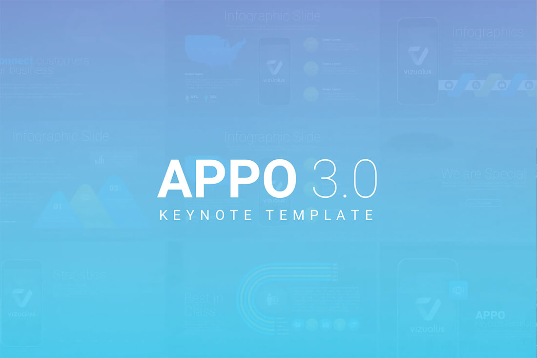
Thick Transparencies

background design trends

In stark contrast, the trend above is using thick color transparency over an image or video. While this effect creates a lot of contrast, it almost renders the background image unreadable.

And that’s what the designer is trying to accomplish with this look. It works best in instances where artwork isn’t strong and primarily serves to provide additional texture so that the background isn’t just a solid color block.

Take care with images or videos used behind thick transparency. They shouldn’t be so interesting that people try to understand them. These images should fade into the background with ease.

One To Try

background design trends

APPO 3.0 template is designed for presentations but shows what you can do with a thick transparency. Take your color or gradient way up to enhance text elements in the foreground.
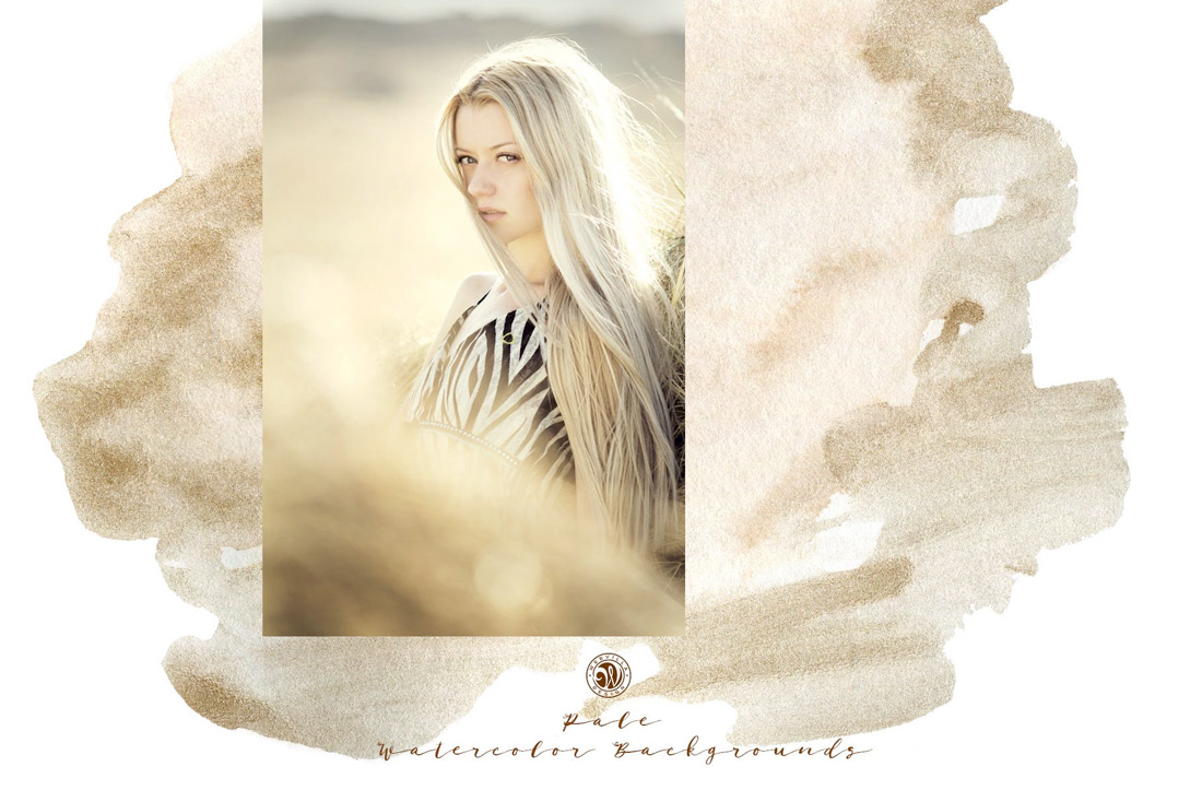
Watercolors

background design trends

Watercolor backgrounds are a new take on illustrations and scenes in website design. This trend includes anything that has a bit of a hand-painted texture to it.

What’s nice about watercolors – and likely what makes them popular – is that the style has a certain softness to it that some harsher background options lack. Watercolor also has an authentic feel that communicates the uniqueness of the content you are about to explore.

Finally, watercolor styles emanate a bit of whimsy. This concept seems to be a design feeling that more projects are trying to replicate right now.

One To Try

background design trends

Watercolor Backgrounds with Modern Shapes combines a couple of trends – watercolor texture with geometric shapes. The result is pretty stunning and this set of files can help you set the scene for a variety of projects.

Full Screen Video

background design trends

Video has been a go-to background design element for a couple of years, but it’s being reinvented somewhat with this trend: full-screen background video.

Responsive shapes are allowing designers to scale video to fill the landing screen. Like the example above, this trend focuses on the video with minimal effects and elements surrounding it.

The almost cinematic experience draws users in and can be highly engaging with the right video clip. To make the most of this background design trend, look for a video that has a lot of movement and action.

Options To Try

Envato Elements has a solid collection of stock video – more than 500,000 clips – if you need to jumpstart a video background and don’t have anything to work with.

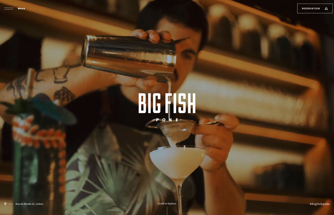
Text in the Background

background design trends

You might not think about text as a background element, but it can be.

Powerful typefaces with big words can carry the background with image elements surrounding them or even encroaching into the space.

This might be one of the trickiest background trends to pull off because you need to maintain a balance between lettering, images, and responsiveness all while maintaining readability.

One To Try

background design trends

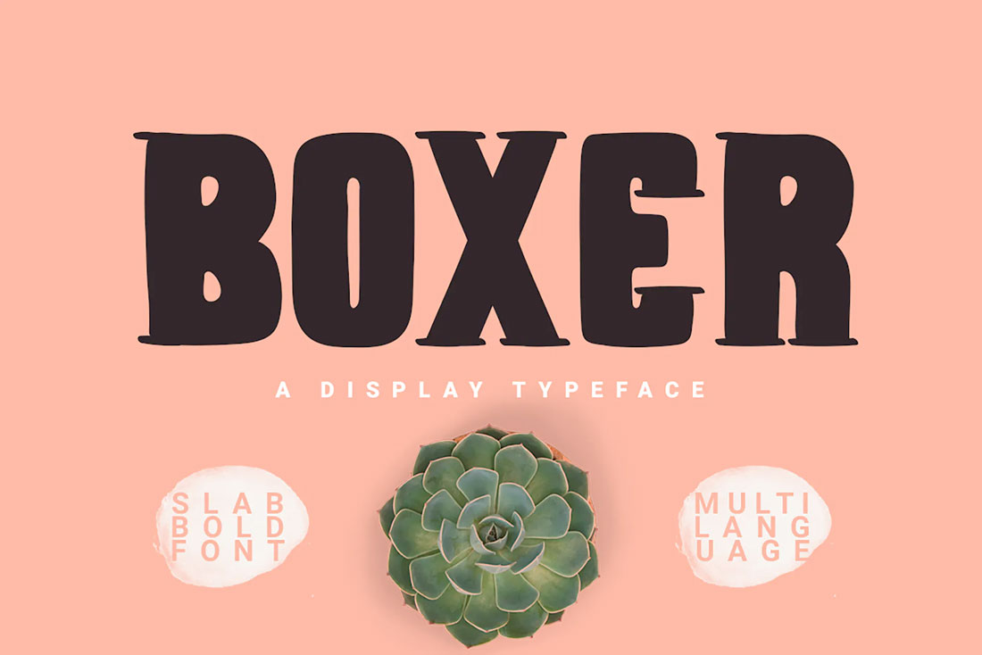
Boxer Typeface is a funky, slab display typeface that’s almost made for background use thanks to thick lines.

Subtle Textures

background design trends

Subtle textures in the background can add depth and dimension to a project.

There are all kinds of texture patterns to try, but the dominant trend seems to be specks (most commonly white) over a solid color.

This style of texture provides a rough element to the background and adds a feeling that the design isn’t overly polished. The best part of this trend might be that it works with practically anything and you can even partner it with other background trends. (The example above uses video and texture.)

One To Try

background design trends

Procreate Texture Brushes is a cool add-on packed with subtle sand textures for users of the iPad app.
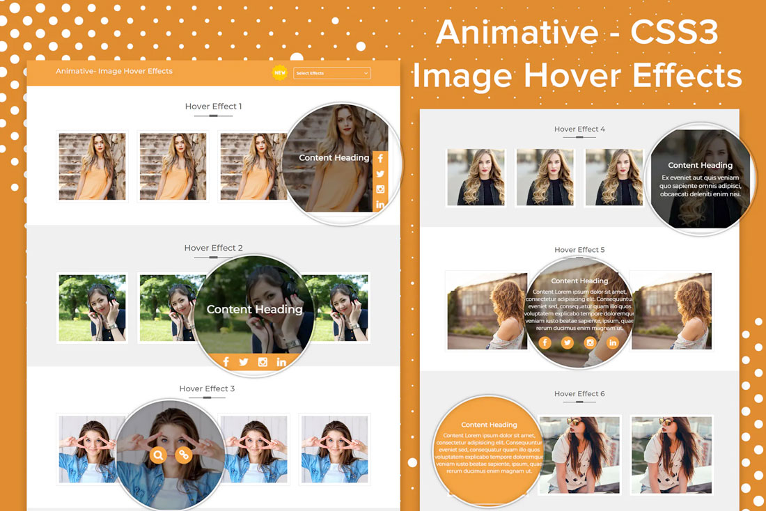
Hover Animation

background design trends

Who said background images have to be static?

Perfectly placed hover actions add the right amount of movement to otherwise static backgrounds. This technique works with photos, illustrations, and even patterns or textures.

The trick is that it adds an unexpected element of delight to the user experience. Until the hover action presents itself, users don’t even know it is there.

To make the most of this background trend, create a subtle bit of motion. In the example above, the image has a little bounce when activated.

One To Try

background design trends

Animative is a collection of image hover effects that you can use on your website.

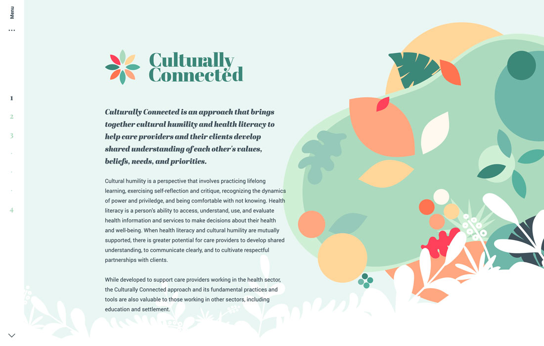
Layered, Scene Illustrations

background design trends

Another background trend that’s evolving is the use of illustrations. While designers have used illustrations in the background for quite some time, these illustrations are more elaborate with layered scenes and even some animation.

An illustration can be attention-grabbing and memorable. The thing that’s difficult about an illustration is that these background designs can be rather busy, and you’ll have to carefully plan the placement and style of other elements.

The use of the illustration in the example above is almost perfect. With an off-center placement and hints of animation, it complements the text and the rest of the design well.

One To Try

background design trends

Creative Flat Design Business Concept has a trending flat design with a color palette and styles that are highly usable. The creator has multiple illustration options available in this style.
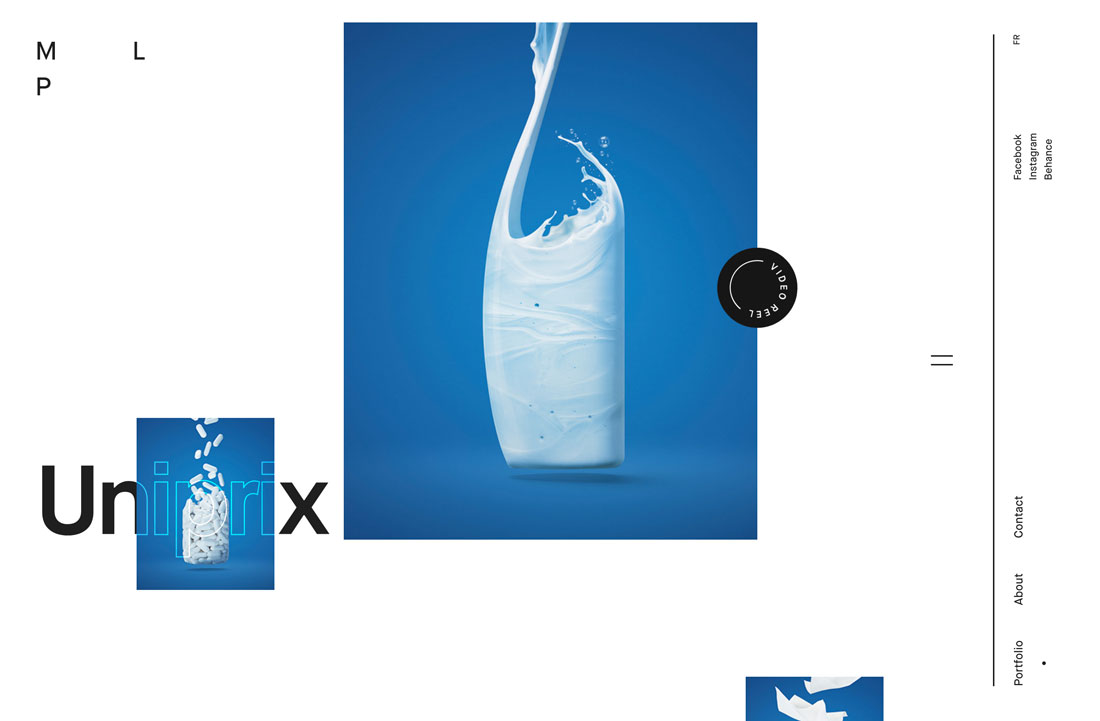
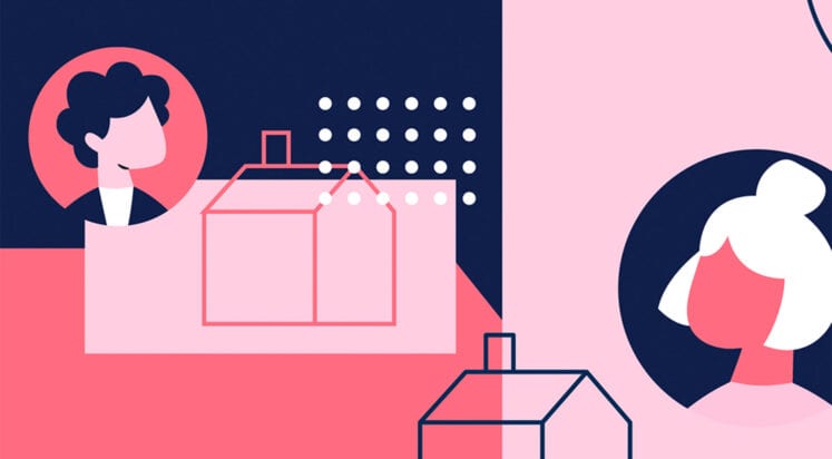
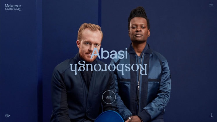
Color Block Layers

background design trends

Color blocking has been a design trend that transcends disciplines. You’ll find it in fashion, home décor, and website design.

What’s great about this style for design backgrounds is that it can be bright, and with layering, visually interesting. It works with a variety of color palettes – which can be great for brands – and doesn’t create a background that’s overly complex or difficult to achieve.

Use a color-blocked layer with a bright or light background and then add a second “background” in another color. You can see this in the portfolio website example above with a white background and then individual elements in blue boxes.

Flat Color

background design trends

One of the parts of flat design that have never really gone away is the colors of the style. These colors are coming back around as background colors.

Not only is the style to use bolder hues for the background, but to use them flatly. No gradients, no variation, just a solid color background in a single hue.

These backgrounds often have realistic layers on top and sometimes a border or another background behind them to create depth. (You can see this full effect from the example above with white edging around a beige background with an image on top.)
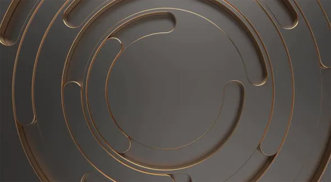
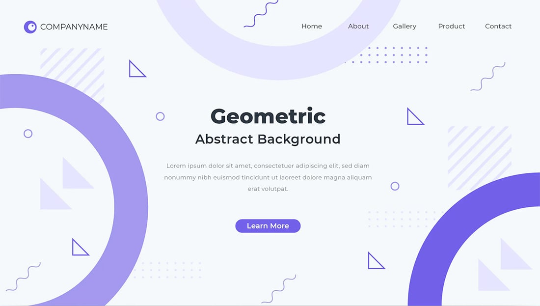
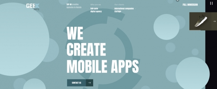
Geometric Shapes

background design trends

Circles, polygons, and other geometric elements are a big part of background design in 2021.

The shapes can be reminiscent of childhood or just a fun alternative to all the flat, single-color backgrounds that had been previously trending. For a modern flair on geometry, stick to a monotone color palette and use elements with a lot of contrast to make the most of the background.

These background styles can be somewhat flashy, such as the example above, or include a muted color palette with subtle geometric undertones.

One To Try

background design trends

Linear Shadow Backgrounds includes 10 large and small geo (or poly) shapes with fun colors and gradients.
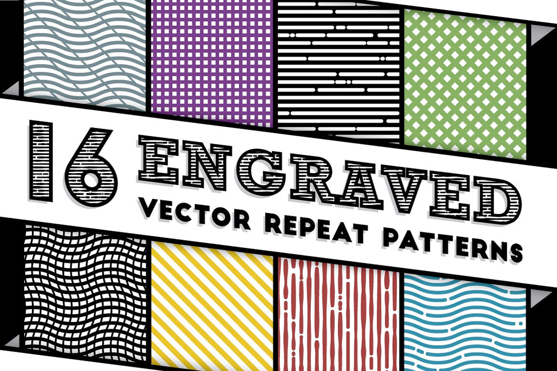
Line Patterns

background design trends

From subtle curves to bold strokes, line patterns are growing in popularity as a background design element.

What makes lines work is that they mean something. The best line patterns help draw the user into the design and lead the eye to other visual elements, such as the custom line pattern in the example above.

Line patterns can be large or tiny, and both can be effective depending on the goals of your project.

One To Try

background design trends

Engraved Vector Patterns includes 16 repeat patterns for backgrounds. The kit includes almost any line style you might like with straight lines, blocks and curved lines. (Repeating patterns are nice because you don’t have to worry about “seams” where patterns meet.)

Gradients

background design trends

If you are at all like me, then you are one of those designers that truly has a love affair with gradients. (I can’t get enough of them.)

This trend is so flexible with background gradients that are only color, background gradients that overlay an image or video, or even animated background gradients that change color or seem to float across the design.

With so many options, it’s almost certain that you can find a workable solution that works with your color palette and design scheme.
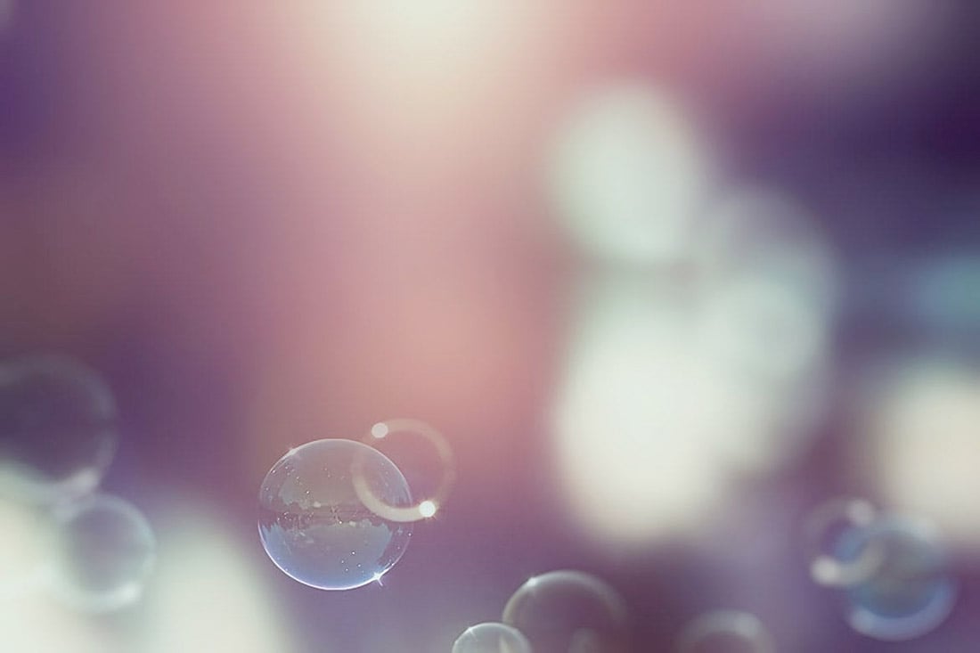
Bubbles and Blobs

background design trends

While bubbles and blobs might resemble geometric shapes, they are often different in that many of these elements include some motion and the shapes are rather imperfect.

This trend tends to work in two ways as a background element:

  • As an actual background with bubble or blob-shaped elements that are there only for visual interest or to add a little color to the overall design.
  • As a “foreground” background element, such as the example above. Bubbles and blobs are often moving shapes that float up through the design to create a more layered effect but are “background elements” because they serve no functional role other than to help grab user attention.

One To Try

background design trends

Vintage Bubble Backgrounds has a true-to-life bubble style appeal, with 10 faded bubble images.
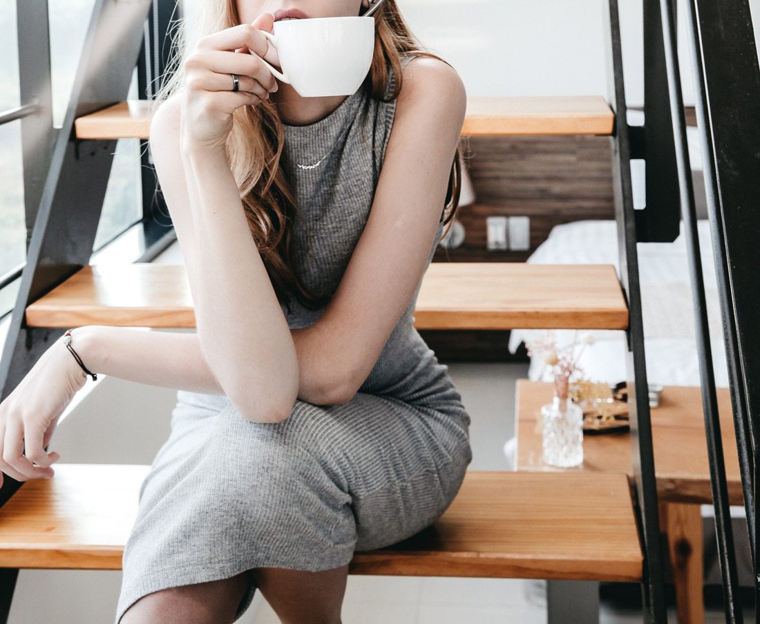
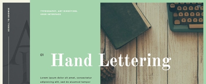
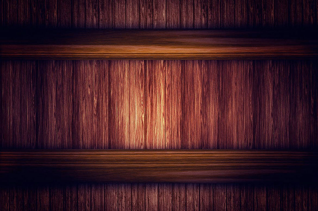
Wood Grain

background design trends

Woodgrain backgrounds are popular when it comes to product photography and scene-style designs.

Both work well with this element because the wood grain background provides a natural setting that isn’t flat. It’s interesting, but not overwhelming. It provides an interesting location to help bring focus to the thing sitting in the background.

To make the most of wood grain styles, try to match the coloring of wood to foreground elements and look for planks that are wide or thin based on foreground elements as well. Try to avoid elements that fall into the “cracks” between planks.

One To Try

background design trends

Wooden Backgrounds includes 10 different options with color and lighting changes with images that are more than 3,000 pixels wide.

White and Gray

background design trends

Light-colored – white and gray – backgrounds are a trend that continues to hang on. Mostly derived from the minimalism trend, these backgrounds are simple and easy on the user. They provide ample space and contrast for other elements on the screen.

Most white and gray backgrounds have some element of texture, such as a pale gradient, use of shadows to create separation with foreground elements, or some sort of overall pattern or texture.

One To Try

background design trends

Showcase Backgrounds includes 12 background images with a light color scheme with only white a pale gray, making these a perfect fade-into-the-distance design option.

Conclusion

Change up an old design with a new background. Something as simple as changing the look of the design canvas can refresh a project.

Look for something with a touch of trendiness to add a more modern touch to your design. Plus, all of the “one to try” options above are ready to download and use.

Top 11 Web Design and UI Trends for 2020

Category Image 076
Top 11 Web Design and UI Trends for 2020
New year, new web design trends. We are already starting to see some design elements that will be hot in 2020 (and maybe beyond). Most of these trending web design themes are continuations of things that have been building in …