Google Officially Releases Its Web Stories for WordPress Plugin

Wp Plugins
Web Stories for WordPress dashboard screen.
Web Stories for WordPress dashboard.

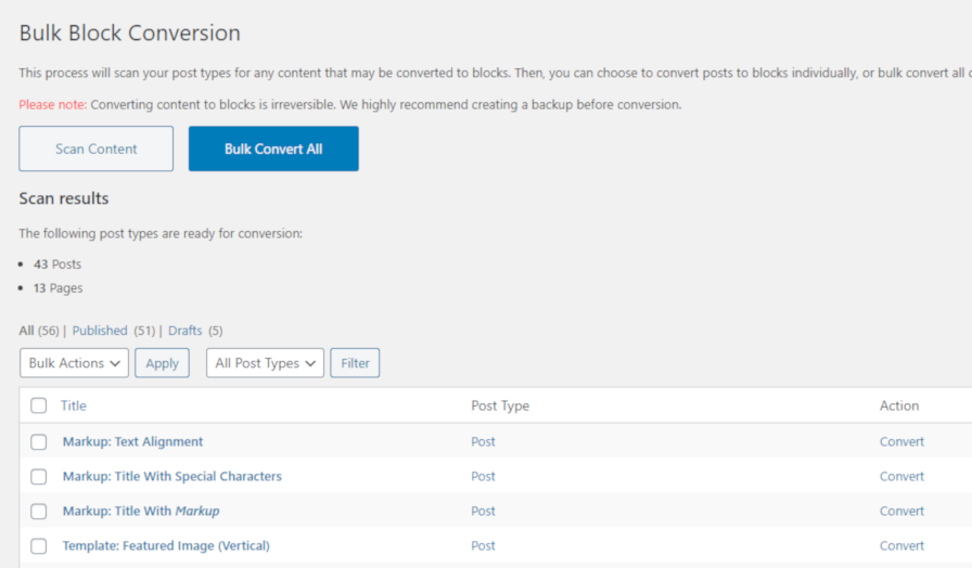
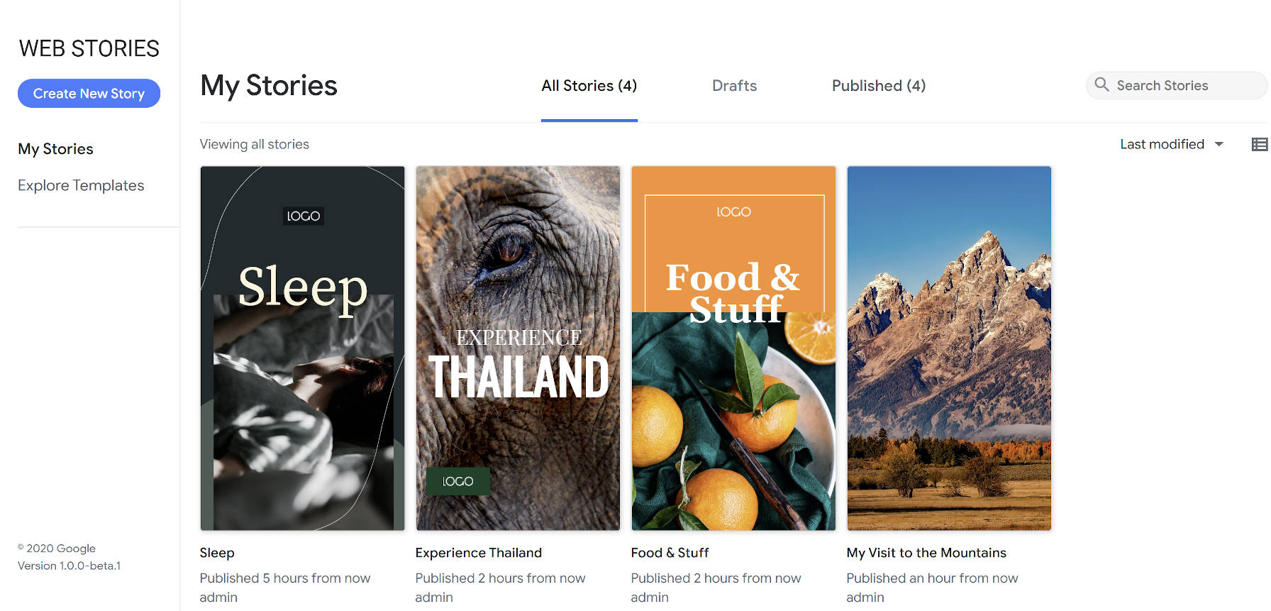
Two and a half months after the launch of its public beta, Google released its Web Stories for WordPress plugin. So far, the plugin has over 10,000 active installations and has garnered a solid five-star rating from four reviews.

Google created the Web Stories format through its AMP Project to allow publishers to create visually-rich stories. It is primarily geared toward mobile site visitors, allowing them to quickly jump through story pages with small chunks of content.

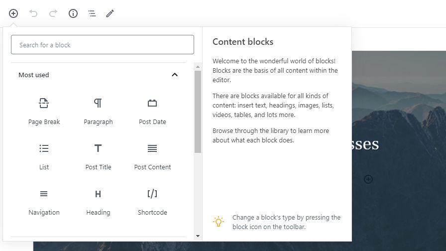
The Web Stories plugin creates a visual interface within WordPress for creating Stories. It breaks away from the traditional WordPress interface and introduces users to an almost Photoshop-like experience for building out individual Stories. The Stories editor is completely drag-and-drop.

The plugin also offers eight predesigned templates out of the box that cover a small range of niches. However, according to Google’s announcement, the company plans to add more templates in future updates.

Web Stories Are for Storytelling

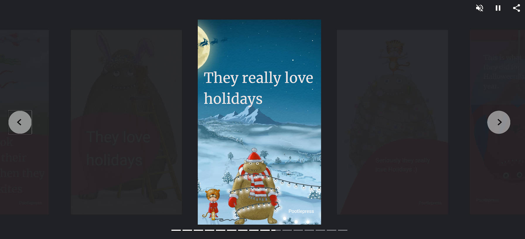
“Firstly…the power of Stories,” wrote Jamie Marsland, founder of Pootlepress, in a Twitter thread. “Stories are how we (humans) see the world and share our experiences. Up to now the platforms that we have to tell stories have been limited to books/films/tv/websites/blogs/instagram stories etc.”

“Websites are ok for telling stories but in many ways the format doesn’t really fit the linear arc of storytelling. When Marshall McLuhan said ‘the medium is the message’ in 1964 he was talking about how the medium itself has a social impact, and change the communication itself…and the possibilities for what is communicated and how it is perceived. But we should keep coming back to Stories. Stories are the key here imo. Now we have an open format to tell Stories, and we have an open platform (WordPress) where those Stories can be told easily.”

Marsland finished his thread by saying that using Stories as a replacement for a brochure or website is a missed opportunity. He said that it was a platform for storytelling and should be used as such.

It is far too early to tell if Web Stories will simply be a fad or still in wide use years from now. The technology certainly lends itself well to telling stories, particularly in mobile format, but I doubt we have seen the best of what is possible on the web. The format feels too limited to be the end-all-be-all of storytelling. It is merely one medium that will live and die by its popularity with users.

With the right design skills, some people will craft beautiful Web Stories. And, that is just what Marsland has done with the first Story he shared:

Page from Jamie Marsland's first Web Story.
Page from the Wilson and Pootle Web Story by Jamie Marsland.

I agree with his conclusion. Web Stories should be about storytelling. When you move outside of that zone, the technology feels out of place.

Where I disagree is that websites are not ideal for storytelling. Ultimately, the WordPress block editor will allow artistic end-users to craft intricate stories, mixing content and design in ways that we have not seen. We are just now scratching the surface. I expect our community of developers to build more intricate tools than what the Web Stories plugin currently allows, and we can do so in a way that revolutionizes storytelling on the web.

New Features

The story editor for Google's Web Stories for WordPress plugin.
Story editor with Unsplash photo integration.

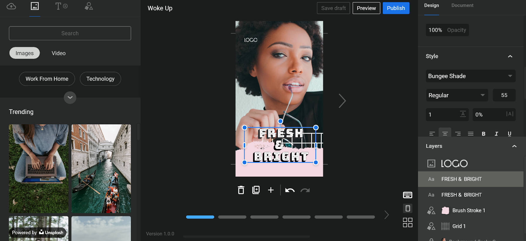
The Web Stories plugin now adds support for Unsplash images and Coverr videos out of the box. The plugin adds a new tab with a “media” icon. For users of the first beta version of the plugin, this may be a bit confusing. The previous media icon was for a tab that displayed the user’s media. Now, the user’s media is under the tab with the “upload” icon.

It is also not immediately clear that the Unsplash images and Coverr videos are not hosted on the site itself. There is a “powered by” notice at the bottom of the tab, but it can be easy to miss because it blends in with the media in the background.

Media from Unsplash and Coverr is hosted off-site and not downloaded to the user’s WordPress media library. I could find no mention of this in the plugin’s documentation. Such hotlinking was a cause for debate over the recent official release of the Unsplash plugin.

Google also announced it planned to add more “stock media integrations” in the near future. According to a document shared via a GitHub ticket, such future integrations may include Google Photos and GIF-sharing site Tenor.

Jetpack 8.9 Adds Donations Block, Newsletter Form, and Social Previews

Category Image 102

Jeremey Herve, a Jetpack developer at Automattic, announced the release of Jetpack 8.9 earlier today. The update brings several major features to the plugin’s users. Jetpack now sports a new social preview option in the block editor, a newsletter signup form type, and a block for handling donations.

Version 8.9 also adds support for the AMP plugin. Herve noted that Google and Automattic have worked together over the past six months to make this integration happen. He also announced that the team would release an in-depth post on the Jetpack blog on how end-users can use the tools available.

Overall, the update seems to be a solid release. I have not run into any issues with the features I make use of thus far.

Social Network Preview for Posts

Social Previews modal from the Jetpack plugin.
Social Previews popup modal.

The latest version of the plugin adds a new Social Previews tab under the Jetpack sidebar panel in the block editor. It lists a few social icons and a preview button. Clicking the button pops up a modal window that allows users to preview what their post will look like in various places.

Currently, only Google Search, Facebook, and Twitter previews are integrated. However, the announcement post noted that LinkedIn previews are in the works.

Social Previews is not a particularly groundbreaking feature. However, it is a nice value-add for Jetpack users and almost a given in today’s climate that is led by social networking sites. The feature is similar to what some SEO plugins, such as Yoast SEO Premium, offer.

Newsletter Sign-up Form

Jetpack 8.9 introduces a Newsletter Sign-up form type via its Form block. When creating a new form, users will see the new option. It works as you might expect, adding a name and email field along with a message that the visitor is granting permission to send emails.

It might not be immediately apparent for some users is that they will need to install and activate the third-party Creative Mail plugin for newsletters to work. Jetpack’s Newsletter Sign-up merely handles the form. The newsletter Aspect requires an account through the Creativ.eMail website. The free plan allows up to 5,000 emails per month, but you will need to upgrade to a paid tier after that, which will cost at least $4.95 each month.

If this sounds a bit convoluted, it’s because it is. Without reading the docs or opening the Newsletter Integration tab in the block options, some users may be wondering how this feature works.

The integration itself works fluidly. Users can install and activate the plugin directly from the block editor. However, they will need to run through the setup and signup steps to begin using email campaigns, such as a newsletter.

Donations Block

Jetpack's Donations block in the post editor.
Donations block and options.

Requiring yet another third-party service is Jetpack’s new Donations block. Users will need to be on a paid Jetpack plan to use the block, which allows them to integrate their Stripe account for collecting payments.

The Donations block is a simple affair. With a paid account in place, it is pretty much a plug-and-play system. The block options should be straightforward for the average end-user.

At this point, the Donations block and system may be too limited for some campaigns. This feature seems to more squarely target users who are looking to accept basic donations without all the features that a more mature donation plugin would provide. For anything beyond accepting a few small donations each year, I would lean toward the GiveWP plugin. Its team is hyper-focused on making a great donation experience that scales to larger campaigns.

For users who are already using Jetpack and want to start small, it wouldn’t hurt to give this block a spin. It is always possible to move up to a dedicated donation plugin down the road.

WordPress Should Bump PHP Support on a Transparent and Predictable Schedule

Featured Imgs 08

Juliette Reinders Folmer released a proposal for WordPress to drop old PHP version support on a fixed schedule. She wrote the proposal after Matt Mullenweg, WordPress co-founder and project lead, reached out to discuss solutions. This was after he closed a Trac ticket last week that sought to drop support for PHP 5.6 and bump the minimum version to 7.1 for the next major WordPress release this year.

The proposal lays out a position that many in the WordPress community could get behind. It is a clear-cut, transparent path for the platform’s future PHP support.

Folmer essentially put forward two roadmaps in the proposal. The first roadmap decides at what stage WordPress would drop support for a particular PHP version. The platform would remove support for a PHP minor release that is more than five years old each December. This would coincide with whatever major release of WordPress is upcoming. The following schedule lays out the minimum-supported PHP version each year:

  • December 2020 – PHP 7.1
  • December 2021 – PHP 7.2
  • December 2022 – PHP 7.3
  • December 2023 – PHP 7.4
  • December 2024 – PHP 8.0

The second part of the proposal creates a rolling schedule for backporting security updates to WordPress. Currently, WordPress releases security updates all the way back to the version 3.7 branch. If adopted, Folmer’s recommendation would support only the previous four years of WordPress releases.

Such a change would mean that when WordPress 5.6 is released in December 2020, the WordPress project would be committed to backporting security fixes as far back as WordPress 4.7, released in December 2016.

Folmer also proposes backporting PHP upgrade notices from the site health project to the currently-supported older versions of WordPress. This measure would inform users of PHP version issues before they make the jump to a newer version of WordPress.

The overlap of bumping the minimum PHP support into the future and backporting security fixes gives users a potentially huge window of nine years in which they could stay on whatever version of PHP they are currently on. Nine years may seem like a lifetime on the web with its constantly-changing technology, and it was a point of contention from some people in the comments of the post. However, it is a plan of action, something the WordPress community has not had the pleasure of experiencing with regards to PHP support. Developers will undoubtedly argue over the dates and versions, but that is secondary to actually having a predictable timeline.

A fixed version bump schedule is welcome. It puts everyone from developers to end-users to web hosts on the same page. This level of transparency is necessary if we ever intend to move forward without rehashing the same arguments.

The system of waiting around to see when a specific PHP version’s usage stats drop below a certain percentage just muddies things. The result is typically a long-winded argument that does not move the needle. Each side picks its stats. Each side digs its heels in. And each side has plenty of good points to make. Ultimately, everyone wants the same thing — to move the entire project forward and use up-to-date tools. However, they always disagree on how we get there. Eventually, the minimum PHP version gets bumped and the community gears up for the next round. It leaves us in a constant state of tug of war between those who want quicker advancement and those who do not want to leave users behind.

The truth is that no one is ever completely right in these arguments. There is no roadmap to follow. We have no guiding principle other than “this has what’s been done before.”

WordPress needs to set clear expectations.

This is not just a problem with the minimum PHP version — many want a more-detailed roadmap for the entire project. However, minimum PHP support is one problematic area that we could have a solution for, and Folmer has carved out a path. We need only follow it.

Should WordPress Themes Add a Top-Level Admin Menu Item?

Featured Imgs 08

WordPress has almost always provided a top-level admin menu item for themes. It is clearly labeled “Appearance.” It is the single location that all WordPress users know to visit to modify any appearance-related things for their WordPress site. However, there is a movement within the Themes Team to allow themes to place an additional top-level menu link in the admin. The big question: should this idea move forward?

When the Themes Team (originally called the Theme Review Team) was formed, its members created a set of guidelines that would be shaped and reshaped over the years. They were a set of living guidelines that could always be changed with the times.

One of the oldest guidelines required that themes must place any custom admin pages under the Appearance menu item. It made sense. WordPress provided a standard location for any theme-related pages. The custom header and background features lived under Appearance. Widgets, also defined by the current theme, were housed as a sub-page. Eventually, WordPress’s custom nav menu system came along and was — you guessed it — situated under Appearance. The core developers even put the customizer link in the same place.

For over a decade, there was a well-defined standard. Sure, commercial themes outside of the official directory would sometimes break the mold. However, themes from the directory followed the pattern.

Now, the Themes Team is proposing that themes should be able to break from tradition.

The discussion arose after a question of whether themes should be able to add a custom panel to the block editor sidebar, which is not allowed.

“To keep the editor free from clutter, advertising and upsell, with the customizer being used less, and no dashboard widgets being allowed, can we give theme authors a better place to include their information, and limit upsell to that area?” wrote Carolina Nymark in last week’s team meeting notes.

The proposal seems to settle on the idea that themes will lose visibility as WordPress moves toward full-site editing and the customizer becomes less important. The customizer is not an ideal place for anything but theme options, but that notion seems to have been overlooked in the discussion. Nevertheless, the original guideline that disallowed themes from creating top-level menu items preceded the advent of the customizer by several years. Advertising, documentation, plugin recommendations, and similar pages were always allowed under the existing Appearance menu. The usefulness of the customizer was never a necessary part of that conversation.

Ultimately, the question should be about what is best for users. There is no data to support making the change or sticking with the status quo. However, we do have a standard that has existed for years.

The Proposed Guidelines

The proposal would create several new guidelines for theme authors to follow and reviewers to check, assuming the theme created a top-level admin menu item:

  • No admin menu priority may be used.
  • No UI or color changes are allowed for the menu item.
  • The title must be kept short and not include spam.
  • No more than three sub-pages.
  • Child themes are limited to one sub-page or can remove the parent’s pages and add its own.

Some of these make sense and follow along with existing guidelines, such as not spamming or changing the admin UI. However, others could be problematic.

If moving forward with the proposal, setting a menu item priority should be required rather than not allowed. If anything, it would make sense to require a specific priority to place the custom menu item immediately after the existing Appearance item. This would at least group them together by default. If changing the place where users are accustomed to seeing theme-related pages, it is probably best not to break too far from the standard location.

No more than three sub-pages? Surely there will be a theme with a top-level admin menu item that needs four sub-pages at some point. If giving theme authors the freedom to take up valuable real estate in the admin, a limit of three sub-pages seems like a rule to fix the mistake of allowing the top-level item in the first place. It is an arbitrary number at best. There would be no reason to cap it once making the guideline change. It also adds one more item that the team will need to police.

The limitation of sub-pages for child themes seems just as arbitrary. No such limitation exists when placing sub-pages under the standard Appearance screen.

The entire proposal is little more than extra work on a team that is already strained for resources.

Instead of the simple rule that has existed for years, the proposal adds a new rule with several sub-rules. If the team desires the extra work, I suppose this point doesn’t matter.

The Elephant in the Room

There is one Aspect of this discussion that everyone knows about but few are willing to broach. Underneath all the guidelines from the Themes Team and whether most theme authors support a particular decision is how this affects the financial bottom line. When we talk about visibility of a theme’s admin pages, we are primarily talking about providing another avenue for commercial upsells.

Some of this discussion on visibility is shrouded in concepts such as surfacing end-user documentation or adding a visible readme for the user’s benefit. These are legitimate concerns, especially when theme developers have watched tickets to address such downfalls seemingly dwindle into obscurity over the years. Whether a top-level admin menu item makes sense for exposing theme documentation might be worth discussing, but there is no world in which this would be the primary use case.

The topic of visibility rests on the idea of upselling the pro version of the theme, add-ons, or other services.

Far too many plugins already go overboard, creating a billboard of the WordPress admin. One of the things users could almost be assured of is that themes from the official directory were constrained enough that they were not the hot mess that plugins have become as of late. However, that could all change.

Do we really want an extra top-level admin menu item that will be, for all intents and purposes, to advertise?

Maybe it doesn’t matter in the end. Users are so accustomed to the clutter produced by the dozens of plugins on their sites. One more may not matter at this point.

Or, should we be having a different conversation altogether? If this ultimately boils down to advertising, are there ways we can open this up for theme authors while still creating a user experience that keeps the WordPress admin free of clutter?

After 11 Years, Users Will Be Able to Update Themes and Plugins via a ZIP File

Wp Plugins

It has been a long road. Eleven long years. WordPress will finally allow end-users to update an installed plugin or theme by uploading a ZIP file. After over a decade, most people who had hoped to see this day have likely moved on. However, for those of us still waiting for this long sought after feature, it will land in WordPress 5.5.

A little patience never hurt anyone. Over the years, we have seen plugins crop up to handle this missing feature. There has been a clear and present need for it. Easy Theme and Plugin Upgrades by Chris Jean has over 200,000 active installs. Update Theme and Plugins from Zip File by Jeff Sherk has another 20,000. The community owes the developers of these plugins at least a small bit of thanks for taking on a job that should have long ago been a part of the core experience.

There was a time when this feature would have been one of the most important tools to land in WordPress. This was a time when one-click updates were not a thing. This was long before the idea of automatic theme and plugin updates, a feature that is also coming in WordPress 5.5, was conceived. While it is still exciting to finally get a feature that has long been on the waiting list, it is far less useful than it once was.

This missing feature has also likely at least partially spurred commercial theme and plugin shops to come up with custom solutions. This represents arguably one of the largest segments of users that still need the feature, at least for those using products from shops that do not provide one-click or automatic updates.

Updating themes via a ZIP file is a bit old-school, but there are scenarios where that is the better or preferred option for some users.

I routinely use a third-party plugin to handle this for various sites I am involved with where I might maintain a custom theme. This is particularly true if I don’t have FTP or other access to the server. It is simple to upload a ZIP file in those cases.

Despite less of a need for this feature in 2020 than in 2009, I can still use it. Judging by the download numbers of existing plugins, a couple hundred thousand others can too.

How Updating via ZIP Works

The new feature is not immediately apparent. However, it is more of a power-user feature that users will need to know about before attempting to use.

Updating a theme or plugin works in the same fashion as uploading a new one. By visiting the Add New plugin or theme screen in the WordPress admin and clicking the upload button, users can drop the ZIP file from their computer. After clicking the Install Now button, WordPress will direct users to a new screen that compares the currently-installed extension with the uploaded versions. Users can then choose between continuing with the installation or canceling.

After clicking the “Upload Plugin” button via the new plugin screen, the uploader currently reads, “If you have a plugin in a .zip format, you may install it by uploading it here.” There is no mention that users may upload a plugin that is already installed. A tweak to the language could help make it clear.

The comparison feature is a welcome addition, which should curb users accidentally uploading something they already have installed or rolling back when they already have a newer version active on the site. Some of the existing solutions from third-party plugins do not handle this feature, so this should make for a good upgrade.

Add Per-Block Notes and Create Draft Blocks With the Wholesome Publishing Plugin

Wp Plugins

Matt Watson, through his Wholesome Code brand, released a plugin called Wholesome Publishing on the WordPress plugin directory on Tuesday. Version 1.0 of the plugin adds a couple of simple but useful editing features that should help teams of writers or content designers. The plugin allows users to add nested comments on a per-block basis and mark individual blocks as drafts.

At this point, the plugin is not a fully-fledged pro editing plugin. However, its basic features go a long way toward improving collaborative publishing. It is a good first showing for a version 1.0. I hope that it continues to grow and bring new editing features to the block editor.

The plugin works with both core WordPress and third-party blocks. Overall, it performed well in my tests, but I did find a few minor issues that could be easily addressed in a future update. If you are looking for such a plugin, it is well worth a test run to see if it fits into your publishing workflow. I am seriously considering it for use here on WP Tavern, if that provides an indication of its potential.

Nested Block Comments

Adding per-block nested comments in the block editor via the Wholesome Publishing plugin.
Adding nested comments to a Cover block.

The primary feature that drew me to this plugin was the ability to leave simple notes via the block editor. Even here on the Tavern, we have an old editorial notes system, but it is no longer a user-friendly option with the block editor. Notes are tucked away at the bottom of the editing screen along with other old-school meta boxes. A new system, particularly one that allowed comments on a per-block basis, was definitely worth exploring.

Block comments — not to be confused with post comments on the front end — are simple to add. On the post editing screen, users merely need to click the comment button in the toolbar, which will open a comments sidebar panel. The panel will show a text box to add a new comment for the currently-selected block.

Comments belong to individual blocks. However, it is not clear in the comments sidebar panel which block a comment is for when there are multiple comments. Clicking on a single comment selects the block in question, which helps, but the user experience would be better with two additions:

  • The selected block’s comments should be highlighted while unrelated comments fade out.
  • There should be an indicator in the comments sidebar that points out the block each comment is assigned to.

Unfortunately, it is not possible to see or leave a comment unless you are an administrator. I am unsure if this is intentional or a bug. It is at least a user experience issue because the comments sidebar panel still appears, regardless of whether the user can read the block comments.

Despite the need for a bit of polishing to improve the experience, this feature was reasonably easy to pick up and use right away.

The plugin does clean up after itself. If a user deletes a block, its comments are also deleted.

I do have one big feature request for the plugin author. An opt-in setting for enabling an email system would be a nice touch. The post author and anyone who leaves a comment on the post should be notified when a new comment is made.

Create Draft Blocks

Marking a block as a draft in the editor via the Wholesome Publishing plugin.
Setting a Gallery block to draft status.

The second plugin feature goes hand in hand with the first. Wholesome Publishing allows end-users to mark any block in the post as a draft, which means the block will not appear on the front end of the site. The reason it works well with the comments feature is that users can explain why the block was marked as a draft. This could be particularly useful on teams of multiple writers.

In the block options panel, users should see a new tab titled “Publishing.” The tab will have a single on/off switch for setting the given block as a draft. Unlike the block comments system, any user can put an individual user into draft mode as long as they have access to edit the post.

I did run into one issue with draft blocks. When clicking the on/off toggle, all of the block options tabs would reset to the default open or closed state. It is a trivial issue that might become irritating for some. Outside of that, the feature worked well.

Gutenberg Times to Hold Live Q&A on Block-Based Themes and Full-Site Editing

Category Image 091

On Friday, June 26, Gutenberg Times will be holding a live Q&A on block-based themes and full-site editing. The Zoom webinar will begin at 18:00 UTC and last for around one hour, depending on how many questions are asked by viewers.

The target audience of the event will be theme developers or anyone interested in designing using the upcoming system that relies on blocks to build the entire front end. To attend, viewers should register via Zoom. By registering, Zoom will send viewers reminders about the event and allow them to ask questions to the panel. The session will also be streamed live via the Gutenberg Times YouTube Channel.

Birgit Pauli-Haack, the owner of Gutenberg Times, is hosting the event. The following developers from the WordPress theming community will join her on the panel:

  • Eileen Violini – Design Engineer at Sidetrack Studio and Customer Success Engineer at CastosHQ.
  • Carolina Nymark – WordPress Themes Team representative and creator of the Full Site Editing Course.
  • Kjell Reigstad – Designer at Automattic who works on the Gutenberg project.

“I find the four-people-Brady-Bunch-on-screen format the most appealing and gives people the opportunity to get their questions answered,” said Pauli-Haack.

Friday’s event will begin with a five-minute demo from Reigstad. The goal is to show how theme authors can create a page header and footer by taking those concepts and applying them to a block-based theme. It is an introduction point that theme authors can use in their existing themes without starting from scratch.

The second part of the event will center on answering questions that Nymark often gets from other developers, such as how to put block code within template files. Reigstad will be showcasing demos based on those questions.

“After that, it’s all about the audience questions that I will read and the panel answers,” said Pauli-Haack. “The discussion and demo are all conversation starters. In other Q&As, after introductions, I had my own questions, and then made it all about the audience questions.”

Potential viewers can watch past Q&A events from the Gutenberg Times archive to get a feel for the format.

There is no set direction for the event beyond showing the initial demos. Pauli-Haack wants to put the audience in the driver’s seat and allow the discussion to go wherever it needs to go. The panel is open to exploring all Aspects of building themes with blocks, and it is a good opportunity for theme authors to communicate with developers who are at the forefront of the transition into full-site editing.

“I have the feeling it will be more about how to transition from the old way to the new way and how all the pieces fit together,” she said. “Beyond the demos, there probably won’t be many code examples. We will discuss the resources out there and how to approach them.”

Gutenberg Times is in its third year of sharing information about the Gutenberg project. Pauli-Haack describes it as her passion project. “The goal has been to collect all the fragmented information while Gutenberg was in beta before the release in Dec 2018,” she said. However, the site has continued going beyond its initial phase. Pauli-Haack has been holding live Q&As since 2018 on the site.

Proposal to Rename the ‘Master’ Branch of WordPress-Owned Git Repositories

Featured Imgs 23

Yesterday, core contributor Aaron Jorbin proposed renaming the default “master” branch for all WordPress-owned Git repositories to “main.” The proposal comes among a flurry of related terminology changes that the larger tech community is considering around oppressive language.

Based on the ongoing discussion in the comments of the proposal, the term “trunk” has gained popularity, and the original post has been updated in favor of that term. If it moves forward, trunk would be more in line with core WordPress, which uses Subversion (SVN). It would also make sense along with the “branch” terminology already in use with both SVN and Git — tree, trunk, and branches.

“As a part of tearing down the systems of oppression that exist in the world, WordPress should remove references to master and replace them with trunk in all git repositories,” wrote Jorbin.

Amidst the backdrop of the Black Lives Matter movement and following the death of George Floyd, the tech community has been taking a deeper look into its systems and determining what changes it can make. While there are larger systemic issues at play, many are determined to remove any potentially oppressive or discriminatory terminology. The idea is not that these minor changes will create an evolution overnight but that they are small pieces of the much bigger picture — cogs in the machine that must move for the wheel to turn.

“This is a small move, but if it makes one more person comfortable contributing to a WordPress project, it will be worth it,” wrote Jorbin.

GitHub should soon be making a similar change across its platform. In response to a tweet calling for GitHub to lead the charge and rename the default “master” branch to “main,” CEO Nat Friedman said they were already working on a solution. It is unclear how this will work going forward and whether it would affect existing repositories. For now, it seems GitHub is on board.

Thus far, the WordPress proposal has been mostly met with support. However, there was some dissent.

Core contributor Zebulan Stanphill argued that language is oppressive based on context and, in this context, the change does not make sense. “Similarly, no one in their right mind is going to think you support human slavery when you use the term ‘master branch,'” he wrote in the comments of the proposal. “The term ‘master’ itself is already used far outside of the context of slavery. Think novice->pro->master. Think also: mastering the craft, remastering music, and etc.”

As harmless as the word “main” seems in most Western cultures, a comment posted by Mike Schroder (original Japanese text by Takayuki Miyoshi and translation by Shinichi Nishikawa) pointed out that it was problematic in Japanese culture. “In Japan, for example, to put ‘main’ and ‘others’ as different groups has been utilized as an excuse to justify discrimination,” said Miyoshi. “Not caring about suppressing the Ainu people and their culture at all is possible because of the assumption that Yamato folk is the main and others are secondary. I now came to a point to think we should consider that to set one thing as ‘main’ creates marginals that get oppressed.”

Language is not always easy, especially when addressing a global community, each with their own terms that are possibly discriminatory. For now, trunk seems to be a good fit while throwing a nod to WordPress’s SVN roots.

This would not be the first time that WordPress has made a move to change terminology such as this. David Artiss, a support engineer at Automattic, created a ticket seven months ago to rename “comment blacklist” to “comment blocklist.” The change, which replaced only the user-facing text, went largely unnoticed and landed in WordPress 5.4.

Jason Coleman, CEO of Stranger Studios, also opened a more extensive ticket two days ago. It calls for changes of any use of “blacklist” to “blocklist” and “whitelist” to “safelist,” even within the code and database options. Such changes would be backward compatible and not break sites upon upgrade.

Change is almost certainly coming. The big decision is going to be around what the new terms will be.

For developers who want to rename the default branches of their own Git repositories, there is an existing project with instructions and a GitHub action for doing so.

Automattic Launches Malware and Vulnerability Scanning Service for Jetpack

Category Image 006
Decorative image of a mobile and desktop view for the Jetpack Scan feature.

On Tuesday, Automattic launched Jetpack Scan, an automated malware and vulnerability scanning service. It is a premium service offered to sites connected to a WordPress.com account and the third major add-on launched on top of the plugin in recent months.

Jetpack Scan is available for $7 per month or $70 for an annual subscription. Both options are 30% off the regular price of $10 and $100, respectively. Currently, the feature runs daily scans for security threats. However, the plan is to add a real-time scanning option, presumably at a higher price point.

“It’s like having a security guard monitoring your site,” said Paolo Belcastro, Head of Product for Jetpack. “You can rest easy knowing that someone’s watching out for you 24/7. And if we find any threats, you’ll receive an instant email alert so you can fix it right away and get back to running your business. We can even repair the majority of security threats for you with just one click.”

The service comes on the heels of two other big Jetpack launches in the last couple of months. In April, the Jetpack team re-launched Jetpack Search as a standalone service. The team then opened the Jetpack Backup service in May, which was the first step in selling what is essentially a two-part security solution for site owners — backups and security scanning go hand in hand. The backup service is $30 per year for daily backups and $200 per year for real-time backups. For a complete security solution, end-users will probably combine the Jetpack Scan service with Jetpack Backup, which will run at a minimum of $100 every year. These numbers are based on introductory rates, which are expected to increase in the future.

Backup and security scanning services are major moves. Jetpack is likely to gobble up a huge slice of the security pie in the coming months and years, which is a sector that is currently represented by several other big businesses in the industry. With over five million self-installed WordPress users and millions more at WordPress.com, it will be an easy choice for many to opt into Jetpack’s solution rather than look elsewhere.

Jetpack Scan Features and Interface

Jetpack Scan automatically scans connected websites each day. Once a user sets up the feature, they no longer need to perform any actions for routine security maintenance. The feature offloads the actual scanning to Automattic’s servers instead of running checks directly on the user’s site. This also has the benefit of making scan results accessible even if the user’s site is down for some reason.

If the scanning system finds an issue, it sends an email directly to the user. The system comes with a one-click fix feature. “Just press a button and Jetpack will fix the majority of known malware problems so you can get your site back up and running,” wrote Rob Pugh, Director of Product Marketing at Automattic, in the announcement post.

Jetpack Scan also integrates with the Jetpack Backup service, which will allow end-users to completely restore their site to a previous point in time in the case of site hacks.

For new Scan and Backup customers, they will be able to enjoy a new all-in-one interface on the Jetpack website. The team will bring the upgraded experience to existing customers soon.

“Even the best security tools can become useless if they require advanced skills to configure complicated settings,” said Filipe Varela, of Jetpack Design. “That’s why it was so important for us to build an accessible and streamlined service. We’re proud to announce a fresh, dedicated interface for Jetpack Scan on Jetpack.com. It will be the central hub for managing all your Jetpack Security products. You can scan your website, check the results, respond to issues, and, when combined with Jetpack Backup, quickly restore your site to working order all in one place.”

PHP and WordPress Version Checks Coming to Themes

Category Image 052

PHP and WordPress version checks are coming to the WordPress theme system — finally. The feature was pulled into core WordPress three days ago. It will prevent end-users from installing or activating a theme that is incompatible with their current version of PHP or WordPress. The change is slated to land in WordPress 5.5.

This feature has long been on many theme authors’ wish lists, particularly PHP version checking. Plugins authors gained the ability to support specific PHP versions starting with WordPress 5.2. However, theme authors were left feeling like the second-class citizens they usually are when it comes to the addition of core features, waiting patiently as plugin authors received the new and shiny tools they were looking forward to.

Previously, the code for manually handling version checking within individual themes was more complex than in plugins. Theme authors needed to run compatibility checks after theme switch and block theme previews in the customizer using two different methods, depending on the user’s WordPress version. That is assuming theme authors were covering all their bases.

Users had no real way of knowing whether a theme would work on their site before installing and attempting to activate it. It was a poor user experience, even when a theme gracefully failed for the end-user.

This user experience has also held back some theme authors from transitioning to newer versions of PHP. For years, many were supporting PHP 5.2. Slowly, some of these same authors are now making the move toward newer features up to PHP 5.6, which is now the minimum that WordPress supports. However, not many have made the jump to PHP 7 and newer.

Until now, there has been no mechanism for letting the user know they need to upgrade their PHP to use a particular theme.

Some theme authors may choose to continue supporting older versions of PHP, such as 5.6, for a potentially wider user base. However, developers who want to switch to newer features can now do so with the support of the core platform.

Changes for Users

Twenty Twenty theme page from WordPress.org theme repository.
New WordPress and PHP versions added to Twenty Twenty theme.

Users who are browsing the WordPress theme directory may begin to notice new information available for some themes. Similar to plugins, visitors should see a WordPress Version and PHP Version listed for some themes. For example, the Twenty Twenty theme now lists the following minimum requirements:

  • WordPress Version: 4.7 or higher
  • PHP Version: 5.2.4 or higher

Not all themes will have these numbers listed yet. It will take some time before older themes are updated with the data required to populate these fields.

In WordPress 5.5, the admin interface for themes will change. When attempting to install or activate a theme, WordPress will prevent such actions. If a user searches for a theme that has an incompatible WordPress or PHP version, the normal installation button will be replaced with a disabled button that reads “Cannot Install.” If a theme is installed but not activated, the activation link will similarly be replaced with a disabled “Cannot Activate” button. Users will also not be allowed to live preview incompatible themes.

Attempting to activate Twenty Twenty theme without PHP support.
Cannot activate Twenty Twenty theme with incompatible PHP version.

The feature works the same from within the customizer interface as it does via the themes screen in the WordPress admin.

Changes for Theme Authors

The WordPress Themes Team recently announced two new required headers for theme authors to place in their style.css files. The first required field is Tested up to, which is the latest version of WordPress the theme has been tested against. The second is a Requires PHP field, which is the minimum PHP version the theme supports.

It is unclear is why the team decided to require those two fields but not the Requires at least field, which represents the minimum WordPress version needed. Most likely, theme authors will want to place all three headers in their themes.

Theme authors who will still support versions of WordPress earlier than 5.5 will want to continue using their old compatibility checks. However, this is the first step in phasing such code out.

Highlight, Underline, and Control Font Size with RichText Extension

Category Image 052

Last week, Tetsuaki Hamano contributed his first plugin to the official WordPress plugin repository. RichText Extension grants additional options for inline text in the block editor.

RichText is a component in the editor that allows end-users to add and edit text. Typically, users may think of this component when dealing with paragraphs. However, it also applies to headings, lists, quotes, image captions, and any other area where textual content can be added.

Many plugins add settings on the block level. This means when you apply a particular style, it applies to the entire block. Inline text refers to the individual characters and words within the block. By default, WordPress allows end-users to control inline text by adding links, creating italic or bold characters, changing the text color, and more. Superscript and subscript inline options have already landed in the Gutenberg plugin, which should ship with WordPress 5.5.

RichText Extension extends the editor toolbar to add new options for highlighting, underlining, and changing the font size of inline text. It also adds an option to clear all formatting.

Overall, the plugin is a solid outing for a first-time contributor to the plugin directory. With luck, we will get to see more of Hamano’s work in the future.

Plugin Features

The primary feature of RichText Extension is its highlighter option, which allows users to highlight text. The plugin adds a paintbrush icon to the toolbar. Once clicked, it opens four highlighting options. By default, users can add a red or yellow marker effect or background directly behind a piece of text. This feature can be useful for adding a bit of flair to make specific words or characters to stand out.

Screenshot of the RichText Extension plugin's highlighter feature in the editor.
Using the marker highlight in a pullquote.

The plugin also adds a font size option to the toolbar. I am unsure how useful changing the font size for inline text is for the average end-user. Typically, this is best left to the block level. However, there may be some edge cases that others will want to use it for.

Along with the core editor’s inline options in the toolbar’s dropdown menu, RichText extension adds Clear Format and Underline options. The former allows users to clear all inline formatting. The latter underlines text.

Each of the plugin’s features can be configured via the plugin’s settings screen. Users can change the highlight colors, their thickness, and transparency. The four available font sizes can be adjusted. It also allows users to enable or disable each feature.

Screenshot of the RichText Extension WordPress plugin's options page.
RichText Extension’s settings screen.

It would be nice to see the plugin’s highlighting and font-size features use the theme-defined color palette and font sizes, respectively. The plugin could further allow users to define custom colors and sizes outside of those added by the theme.

More than anything, I would like to see a fully-featured plugin tackle every conceivable inline text option with the ability to enable or disable each. This would give end-users ultimate flexibility over how they write their content. Perhaps RichText Extension can be that plugin in the future. Otherwise, another developer may step in and do the job.

Need to Smile Today? Stay WordPress Strong

Featured Imgs 23
Lyrics: Zack Katz, Jonathan Mann | Music: Jonathan Mann
Video licensed under Creative Commons – Attribution

For the first time, at least 19 people from the WordPress community can literally call themselves WordPress rock stars without it sounding like an outdated marketing gimmick.

GravityView dropped a community music video and website named WordPress Strong earlier today. It is fun. It is inspirational. It will leave a smile on your face. The video features a wide range of faces, voices, and musical talent from around the planet.

Much of the world is looking for small ways to cope with the ongoing COVID-19 pandemic. Each day is about finding the things we should be thankful for while waiting for life to feel like normal. The WordPress community has been a beacon of hope for many. It has continued providing purpose to people despite their daily lives being upended. This project is one more way to show the strength of our community.

“People were scrambling to adjust to the new reality of living in a pandemic, and there was a rush of uncertainty,” said Zack Katz, the creator of GravityView, on starting the project. “In the middle of all that uncertainty, I felt lucky to be part of the WordPress community: doing what we do, working on an open and thriving platform, with a culture of people who are kind to each other and support each other.”

Many GravityView customers began using the plugin to enable COVID-19 responses, such as sites like Support Redditch, which coordinates relief efforts. “I sensed a movement of coming together to help each other, and I wanted to get the word out: if you need help, ask the community,” said Katz. “We’re here for you. We’ll get through this together.”

A total of 19 volunteers contributed to the music video, including WordPress co-founder Matt Mullenweg. However, the true star of the group was Tracy Apps, the owner of tracy apps design, who laid down the beat on the drums.

“It involved asking a lot of people!” said Katz of finding willing subjects. “I get why people are reluctant. I even waited until the last minute to record my video! Something special happens when people are invited to go beyond their comfort zone, especially when it comes to creative endeavors. It was moving to have the emails come in with their videos. People were willing to share a different part of themselves.”

The #WordPressStrong hashtag is open for anyone to contribute to on Twitter. The project is calling for volunteers to join in on the fun. If you can sing, play an instrument, or dance — or if you can’t — you can be a part of this movement for our community to become stronger. If nothing else, it will give you something to do to pass the time. Tag yourself doing something and share it. I am certain it will brighten at least one person’s day.

The WordPress Strong Project

Katz began the project in March. He shared some initial lyric ideas with Jonathan Mann who then wrote and recorded WordPress Strong. The GravityView team reached out to members of the WordPress community and asked them to lend their voices.

“I deeply respect [Mann] as a musician and how he exposes himself through his music,” said Katz. “His album I Used to Love My Body was my soundtrack for last year.”

Mann is the voice of the GravityView brand and has previously created a song for the product. Katz and Mann also worked on the WordPress Wiggle song in 2017.

“When creating WordPress Strong, I shared a poem with [Mann] and expressed the tone that I wanted to convey,” said Katz. “The email had the subject line ‘WordPress Hope Song.’ He wrote and recorded WordPress Strong, and I think you agree, it’s a great WordPress Hope Song.”

The plan for the WordPress Strong website goes beyond releasing a song. Katz wants to expand the site to be a place where people from the community can ask and receive help during the pandemic. The team is currently working on a part of the site where community members can request assistance or offer help anonymously.

“I was hoping artists of all stripes would be interested in sharing their work on the WordPress Strong website,” said Katz. “Sharing creativity together empowers us to be vulnerable in our despair as well as our hope. I would like to help foster that.”

Should the Block Editor Have a Grid System?

Category Image 052

Laying out a webpage design and getting every element aligned perfectly can be a tough job. Even many developers rely on CSS grid frameworks. Granted, with the introduction of the flexbox and grid systems in the CSS language, such frameworks are becoming unnecessary. Whether it is getting the vertical and horizontal rhythm down or simply aligning an image next to a bit of text, page layouts are often done best via some sort of grid system.

This becomes even more apparent when building a page layout visually through the WordPress block editor. The current iteration of the editor does a fine job of being a general content editor while providing the ability to insert various elements into the page.

However, it is not by any means a page builder — yet.

The question is, before we engage in full-site editing, global styles, block patterns, and other upcoming tools, whether a grid system should be a part of the equation. If so, how should that system work? Will it be configurable by theme authors? How will it handle tablet and mobile views? Will the grid be visible to users or a hidden thing in the background?

As more block plugins are released, particularly with those that may have multiple elements that may need to be aligned, it might be time we consider a grid system. Such a system may benefit existing core blocks right now, such as Columns and Media & Text. Or, it may be better as a separate, standalone block.

Including a grid system also has the additional benefit of standardizing on layout-related class names that theme authors can use in their CSS, even outside the content editor. This would bring better compatibility across the board when users inevitably switch themes.

A Starting Point: Layout Grid Block

Screenshot of the Layout Grid block in the block editor with a basic three columns.
Three-column layout with Layout Grid Block.

Automattic, as part of its Block Experiments project, has released the Layout Grid Block plugin. It is essentially a beefed-up version of the core Columns block. The major difference is that column alignment snaps to a specific point in the grid. This grid is also displayed in the background while editing the post.

The tricky thing with grids is not simple alignment in columns in desktop view. It is dealing with how those columns transform on smaller devices like tablets and smartphones. Sometimes that is a guessing game from a theme design perspective because the theme author is not privy to the actual content that needs to be aligned. In turn, designers make best-guess decisions and hope it works for most.

The Layout Grid block has a “Responsive Breakpoints” tab under the block options panel that allows users to configure this based on device. Users can decide how individual columns span the grid. The grid system is based on a varying number of grid sections based on the device:

  • Desktop: 12 Sections
  • Tablet: 8 Sections
  • Mobile: 4 Sections

Imagine wanting to display a simple image with text to the next of it. There are various ways to do this currently in the block editor. Each has its pros and cons, depending on what you want to do. From a user experience and visual standpoint, I love seeing the grid lines in place as I determine how it should be displayed.

Screenshot of a pizza restaurant menu item with the Layout Grid block.
Aligning an image and text on a grid.

Another upside of having a grid system is consistency in design. If users can scale the width of columns based on arbitrary numbers, much like they can now do with the Media & Text block, there is no consistency with sizing items horizontally on the page. A grid system changes that.

Layout Grid Block still needs some polishing at this point. There are some trivial pain points in the UI that could be improved. On the whole, my experience with this block offered a compelling argument for including a grid system in core.

The plugin addresses simple one, two, three, and four columns right now. The grid system in CSS is much more powerful than basic horizontal columns. However, starting with the basics would give us a place to build from.

Should Core Include a Grid?

There is at least one open ticket on the Gutenberg repository for addressing a grid system. Mark Uraine, the author of the ticket, posted seven key questions:

  1. Should the grid system be responsive?
  2. Should there be a default Gutenberg grid system, but allow themes to register their own?
  3. Should the grid system conform to the current structure of Gutenberg blocks, or should it be its own thing that we need to restructure the blocks to in the editor?
  4. Should the grid include gutters?
  5. Should the grid include, or allow, any vertical alignment snaps?
  6. What should the grid be based on? (ie. 12 columns, pixel grid, etc.)
  7. Should the grid allow toggling on/off? And also include a setting to show, or not, when resizing objects in the editor?

The ticket had some solid discussion nearly a year ago but not much as of late. Would you like to see a grid system in the editor? If so, how would you want it to work?

Gutenberg Hub Launches Online Block Template Builder

Category Image 091

Gutenberg Hub launched the first version of its block template builder last week. The template builder allows users to select from the team’s existing library of nearly 200 templates. It is essentially an online builder that allows users to craft a full page layout by mixing and matching various sections. They can then copy the resulting output at the click of a button and paste it into the editor on their sites.

“I intend to speed up the workflow for WordPress users to spin up beautiful Gutenberg pages, even full websites, faster,” said Munir Kamal, founder of Gutenberg Hub. “So all I am trying to do is headed in that direction.”

Kamal has also released a Chrome browser extension that allows end-users to add templates from the growing library of options.

“The idea is to help DIYers, freelancers, or anyone with creating new website pages faster,” he said. “I have many feature ideas to make this builder great, but I want to hear out the feedback and suggestions from the community about it.”

Currently, Kamal is calling this version of the builder a “prototype” because he wants to validate the idea with the community before moving forward with new features.

Using the Template Builder

Building a template or full page is simple. Users merely need to visit the template builder page. On the page, the builder has an “Add Section” button, which will slide the template library panel open. From that point, users can choose from an extensive list of templates that includes designs for hero sections, testimonials, sliders, and more.

Screenshot of Gutenberg Hub's template builder library.
Gutenberg Hub’s templates library.

The idea is to build a full page by combining multiple sections. Users will want to add new sections and organize them for their needs. Each section can be trashed, duplicated, or moved up/down using the available buttons.

Trying my hand at building a simple product page, I was able to pick and choose the sections I wanted to add in just a few minutes.

Screenshot of a custom combination of templates in Gutenberg Hub's template builder.
Custom combination of templates with the builder.

Once everything is in place, users can copy the full template code and paste it their block editor. From that point, they can edit it on their own site.

Sometimes, it may be necessary to copy additional CSS and insert it via the WordPress customizer or through a plugin like Blocks CSS. Some options also require users to install a plugin to use specific blocks.

This is the type of power I want in the hands of WordPress users. Plug-and-play template systems like this will push the platform into the future. However, such systems need to be integrated directly into WordPress. Copying and pasting from a third-party website is merely a stepping stone toward that future, catering to user needs in the here and now.

The Future of the Builder and More

Long term, Gutenberg Hub’s work may be a better fit into the upcoming pattern system. The team could release a plugin that would integrate seamlessly into the block editor. That way, end-users could build their templates without ever leaving the comfort of the post-editing screen, or at least avoid switching between browser tabs. However, patterns are still months away from inclusion in core WordPress. In the meantime, this feels like a solid stop-gap. Plus, the team can build a nice library and garner feedback and data from users on the most popular templates/patterns.

While Kamal wants to hear feedback before moving forward, he does have some big ideas of his own for the builder. “For example, this builder may let you create projects, and under projects, you may create multiple pages,” he said. “For each project, you may define custom branding (typography, color scheme, etc.), and all the templates from the library will adapt to that branding when you create pages under a specific project.”

The most important thing he wants to accomplish is to build tools that speed up workflows for everyone.

He will also open the template library to third-party developers and designers soon. There will be a public submission process. If enough people contribute, the library could balloon to an untold number of options that would be directly available as part of the builder.

“Besides the templates and builder, I am planning something around the Gutenberg Templates API,” said Kamal. He stresses that it is still in the planning phase. If the previous work that he has put out is any indication, this could be an interesting project. He is also working on a form builder plugin for the block editor, which is currently seeing regular updates.

Font Awesome Releases New COVID-19 Awareness Icons

Featured Imgs 23
Screenshot of all the new icons included in Font Awesome 5.13 related to COVID-19.
COVID-19 awareness icons added to Font Awesome.

On Monday, the Font Awesome team launched a new set of icons to promote awareness around COVID-19. The solid icons available in the Font Awesome 5.13 update are all available for free and are open-source. The regular, light, and duotone versions of the icons are a part of the pro package.

The goal of the new icons is to help websites and apps boost awareness around the global pandemic. The latest update adds 47 new icons that range from medical use to promoting hygienic practices such as hand washing. Some icons represent viruses and social/physical distancing. There is even a couple of toilet paper icons thrown in for good measure. Apparently, those are necessary in today’s world of mass panic buying.

“Based on recommendations from The World Health Organization and others, you’ll find symbols to communicate good hygiene and social distancing,” wrote Jory Raphael, Icon Design Lead at Font Awesome. “While we can’t be on the front lines like brave medical professionals across the globe, we hope these icons aid in communicating some of the most important things people can do to protect themselves and their communities.”

The icons were originally requested two weeks ago on the Font Awesome GitHub repository. The design team moved quickly to make them available. There are additional icon tickets for liquid soap and a bar of soap open.

Like all Font Awesome icons, the new icons are available as part of the font package or for download as individual SVG files.

The fonts may come in handy for website owners, designers, and developers who are building sites or pages with content related to COVID-19. Icons can add context to content or focus attention where needed.

Users of the Font Awesome WordPress plugin should have immediate access to the new icons if needed. The plugin relies on the external Font Awesome CDN or Font Awesome kits. Users can also choose which version of the library of icons they wish to use, which includes the latest release.

If you know of any other icon sets or resources for designers and developers related to COVID-19, please share them in the comments.

Yoast Publishes Free Online Training Course for the Block Editor

Category Image 006

Yoast, the company behind the popular Yoast SEO plugin, launched its free block editor training course today. The course is available to anyone by signing up for Yoast Academy, which also includes multiple other free and paid courses. Users can learn everything from SEO and copy writing to basic WordPress skills. The Academy team’s latest course promises to get first-time users up to speed on using the block editor.

“At Yoast, we are huge fans of the block editor,” wrote Marieke van de Rakt, CEO of Yoast in the training course announcement. “Admittedly -not right from the start-, but we’re now block-editor fanboys and fangirls. That’s why we created an awesome free block editor course! We hope it will help everybody to use the block editor to the fullest!”

Currently, the course on block editor training has at least two or three hours of content to work through, depending on how quickly users digest the content. The course offers three major sections:

  • What is the block editor?
  • Using the block editor
  • Extras

Each of these is further broken down between one and three sub-sections. At the moment, there are seven lessons in total, which range between 7 and 49 minutes based on Yoast’s estimated time.

The courses are similar to taking a school class. The Academy team provides short videos that cover individual topics around the block editor. The team also provides a PDF version of the lesson for those who prefer text over video format. At the end of the lesson, users take a quiz and move on to the next lesson. A score of 80% or more is considered a passing grade.

The team keeps each lesson digestible enough to complete in a short bout. Even if watching the videos, the PDF version of the lessons, which are high quality and have loads of useful information with links to third-party resources, are recommended reading.

The team has provided a preview of the block editor course via YouTube:

Moving to the Block Editor and Building Training Courses

Joost de Valk, founder and CPO of Yoast, said the team would continue building on the training course over time as new features are added to the block editor. There are no plans to update it on a strict schedule, but the team wants to keep it current.

Yoast, as a company, focuses on SEO. Therefore, some of the advice offered through the course puts focus on creating content that is useful for people and friendly for search engines. One of the primary topics the course touches on is publishing “resources” and how this is made better by the block editor. “Resources are larger articles, evergreen content or in our SEO terminology ‘cornerstone content’: the stuff you want to rank within the search results,” said de Valk. “You can’t just throw some words on a page and expect to rank anymore. You’ll have to try a bit harder. Gutenberg makes that extremely easy.”

The Yoast team has been moving its massive site to the block editor over time. “The post types I deal with regularly are all written with the block editor, but we might have some areas of the site that aren’t there yet,” said de Valk. “It’s a rather large site, with e-commerce, training, jobs, etc. all built into one giant WordPress multi-site install, so that was a bit of an undertaking. We always try to dog-food stuff though, so we moved everything over quite quickly.”

Getting the 11 million users who are using Yoast’s products to make the switch is not quite as easy. Not everyone has embraced the block editor. “The usage of the block editor is definitely improving, but it’s not going as fast as we’d like to see,” said de Valk. “We honestly think a lot of people don’t understand the chances the block editor brings yet, one of the reasons for releasing this course and trying to help more people to start using it.”

The team’s latest SEO course had over 10,000 signups within a week. While that number is a drop in the bucket in comparison to their full user count, it is promising. With a similar turnout for the block editor training course, it may convert more users from the older classic editor.

Putting together full training courses is a large undertaking, but these are the types of resources the WordPress community needs moving forward. “It’s a lot of work,” said de Valk. “We have four people in our Academy team, a crew that records our videos, and our design team designs all the PDFs and slides within the videos. It’s a non-trivial investment, but we’re happy to make that if it helps make more people enthusiastic for the block editor.”

Gutenberg 7.6 Includes Rotating Tips List and New Full-Site Editing Blocks

Category Image 091

Yesterday, the Gutenberg team released version 7.6 of the plugin. Most of the work in this update went toward the upcoming full-site editing feature. The team continues to pump out new dynamic, placeholder blocks for post data. The biggest user-facing feature was the addition of a rotating list of tips in the block inserter.

Version 7.5, released two weeks ago, was the last major release of the plugin that will have features to land in WordPress 5.4, which is currently scheduled for release on March 31. However, bug fixes from 7.6 were ported to the most recent WordPress 5.4 beta updates.

Version 7.6 does not include as many major feature additions as earlier releases. Aside from experimental work on full-site editing, it primarily includes bug fixes.

The announcement post boasts a considerable speed improvement in loading time and keypress events. In comparison to version 7.5, loading time was reduced to 7.7 seconds from 8.5 seconds and keypress event speed was reduced to 48.59 milliseconds from 55.45 milliseconds. These tests are run against a post of approximately 36,000 words and 1,000 blocks.

Rotating Tips In Block Inserter

Screenshot of the block inserter, which shows the tip section that rotates messages.
Block inserter tip section now rotates messages.

In the past, the block inserter had a single tip at the bottom right that read, “While writing, you can press / to quickly insert new blocks.” It was a useful tip, but it was easy to ignore because it never changed. After seeing the same message a couple dozen times, it had become little better than wasted space.

Version 7.6 creates a rotating list of tips. Each time a user opens the inserter, a new tip appears. At the moment, the list only contains five messages but more are sure to come in the future.

There are open tickets to add contextual tips based on block search queries and block-specific tips. Both of those tickets could continue to help users learn the block system and provide a path for block creators to teach users how to use custom blocks.

Currently, the list of tips is static. However, it may be possible for plugin authors to extend it in the future. I’m already contemplating writing a plugin to replace the tips with quotes from Joss Whedon’s Firefly.

Full Steam Ahead with Full-Site Editing

Screenshot of the block inserter, showcasing the post-related blocks for full-site editing.
Growing list of post data blocks for full-site editing.

Gutenberg 7.6 added four new dynamic, placeholder blocks related to post data: featured image, tags, comments count, and comments form. This brings the total to around 12 blocks for full-site editing, which is still a few dozen short of where the platform will need to be before the feature is ready. Most work thus far has gone toward building out blocks that handle post data. Eventually, the team will need to expand to other areas that will need block representation on the front end.

Theme authors looking to test out full-site editing should make sure to check out the block-based theme experiments repository, which continues to see regular updates.

Users can now set the heading level of the site title block. It can also be set to a paragraph. However, it does not include all of the design settings, such as text size or colors, that would come with a regular paragraph block. This is a good first step in recognizing the various ways the site title block will be used, but it will need to evolve into a much more robust block to allow users to do all the things they will eventually want to do with the site title.

At this point, it is hard to gauge what full-site editing will look like. Everything is experimental. It only covers the most basic use cases. I am still cautious about its potential. On the other hand, I am ready to skip ahead a year and see how it all turns out. Every plugin update brings us a step closer, but it is tough waiting to see what the bigger picture looks like as it comes together.

Convert Classic Content to Blocks With the Bulk Block Converter Plugin

Category Image 052

Organic Themes released the Bulk Block Converter WordPress plugin last month and updated it in the past week. The plugin allows users to convert classic content, written in the old editor, to the new block format.

Unless end-users have the Classic Editor plugin installed, their old content is placed into the classic block in the newer block editor. WordPress provides an option for transforming this content into individual blocks from the block-editor interface. However, this must be done on a per-post basis.

“Going back and converting each post and page with a classic block to individual blocks can be a very long and tedious process,” said David Morgan, co-founder of Organic Themes. “The Bulk Block Converter plugin quickly scans all your posts and pages for classic blocks, and allows you to quickly convert them all to individual blocks within one interface.”

Originally, Organic Themes built the plugin for internal use at their company. “We developed the plugin to help us convert the content of our theme demos to blocks more efficiently,” said Morgan. The company had to convert over 40 theme-demo sites with an average of 50 posts and pages per site. They built this plugin to avoid a long and painstaking process. Then decided to share it. “We thought the tool could be very useful for other users migrating to Gutenberg.”

For users with a lot of old content, Bulk Block Converter could be the key to moving it all to the new block editor system. Based on the conversions I ran on a couple of test installations, it worked flawlessly.

How the Plugin Works

Screenshot of the Tools > Block Conversion plugin screen in the admin.
Bulk Block Converter admin screen for converting content.

The Bulk Block Converter plugin adds a new “Block Conversion” sub-menu item to the WordPress “Tools” menu in the admin. Once on that screen, it provides a “Scan Content” button. When clicked, it checks all of your posts, pages, and other custom post types for classic content. It then builds a list table of all the content.

From that point, you can choose between converting each post individually or running a bulk conversion of all posts. I always recommend being cautious with such plugins by converting and checking a couple of individual posts before trying bulk conversions.

The process for converting posts was snappy during my tests. In just a few moments, I converted all of my old content over without issue.

Like any plugin that modifies content in this way, it is prudent to store a backup of your site before converting the posts. This is also a one-way conversion process. Once a post is transformed, there is no going back.