Gutenberg 13.2 Adds Persistent User Preferences and a Visualizer for Margin and Padding Controls

Category Image 091

Gutenberg 13.2 was released earlier today. While much of the developer community is gearing up for the WordPress 6.0 release in two weeks, work continues steadily on the plugin, driving future updates. The latest release is not as hefty on enhancements as previous updates but includes around four dozen bug fixes.

Despite a heavy focus on squashing bugs, there are several welcome improvements in the plugin update. Persistent user preferences will make for fewer surprises when opening the editor. New visual updates for block spacing and the Post Comments Form block make it easier to design layouts.

Developers should look at the early work on a new settings hook. This represents one step toward creating the concept of “sections” that can house settings and styles for block instances and descendants. Patterns are a prime example of the necessity of sections. Matias Ventura covered the various uses in a separate open ticket.

The latest release also removes spotlight mode for template parts, and I say, good riddance. The editor already has such a mode for all blocks, and users who prefer it can enable it.

Persistent Editor Preferences

WordPress post editor with the 'welcome to the block editor' modal that pops up when first using it.
Welcome to the editor popup.

Have you ever visited the WordPress editor and noticed the “welcome” popup, despite dismissing it ages ago? Or, logged in with a new browser only to reconfigure settings, such as enabling top toolbar support and turning off fullscreen mode? Annoying, right?

This has been a long-standing issue caused by WordPress storing user preferences in the browser. In Gutenberg 13.2, these preferences are now saved as user metadata in the database and should no longer pose an issue.

Sarah Gooding took a deeper dive into this problem and solution in an earlier post on the Tavern.

Padding and Margin Visualizers

WordPress block editor with a Group block in the content canvas.  Above and below it are boxes that visually represent margin being added to it.
Adding margin to the Group block.

Landing in the pretty-neat-and-nice-to-have category is a new “visualizer” feature for block margin and padding. Essentially, it displays a colored box, representing the space when one of the two options is adjusted. It quickly fades out and returns the canvas to its default look.

I am a fan of this change. It draws the eyes back to the canvas and allows users to visualize how the block spacing is applied.

Comments Form in the Editor

WordPress site editor.  The canvas area displays a comments form as if viewed by a logged-in user.  It has a title, message box, and submit button.
Comments Form Block in the site editor.

The Post Comments Form block was simply a placeholder in the editor in past releases. This did not allow end-users to see how it would look on the front end of their sites.

Gutenberg 13.2 updates this to show something closer to what it will look like on the front end, at least for logged-in users. This also lets the user see how color and typography customizations will be displayed.

This is a two-part change. The Comments Query Loop block now outputs the form within its default template. This way, users and creators will not need to build out each part of the overall comments area.

There is still much work to do for the Post Comments Form block in the long term. It needs a broader selection of design tools for starters. However, it could also use a revamp that provides fine-grain control over the various elements shown for logged-in and logged-out users. That may even mean splitting the form into multiple blocks. For now, the additional visualization will have to suffice.

Margin Support for Separators

WordPress post editor that has two paragraphs separated by a Separator block with large sections of whitespace in between.
Adding top and bottom margin to a Separator block.

The Separator block now supports top and bottom margins. Users can adjust it from the spacing tools in the sidebar.

It is a small change but a welcome one. Users could previously increase the space between a Separator and sibling block through other means, such as setting the margin on the sibling or using a Spacer. However, those were often unintuitive solutions. And decreasing the space sometimes seemed an impossible task.


Munir Kamal Updates and Overhauls the Block Slider Plugin

Category Image 091

A couple of weeks ago, Munir Kamal updated his Block Slider plugin for WordPress. While not as popular as some of the other projects he has spearheaded, such as Editor Plus, he wanted to breathe some fresh life into it.

The original plugin allowed users to insert a slider block and create the slides directly from the post or page editor. The new approach is similar. However, end-users can only edit it from a new “Block Slider” post type.

WordPress block editor with an interface for inserting slides into a slider.
Creating a slide in the block slider.

Existing users should note that the new version breaks compatibility with their old galleries. It would be wise to make a backup to revert to if necessary.

Kamal listed several benefits to the updated approach:

  • A clean and wider slide editing/creation interface. Comparatively, the ‘block’ had less room to work with.
  • The fact we have a separate interface/post type, I took the opportunity to modify it a bit to make the slide creation easier for users.
  • This approach lets users create and manage sliders easily from one place (post type) compared to in-page block.
  • Using the slider to multiple pages/posts is easier with this approach.
  • The best part and the most important reason is that the slider can be used outside Gutenberg editor or anywhere with any page builder using the shortcode (or I could provide more ways to use it in the future).

Depending on the user, some of those can be advantages. However, for others, they are not. For example, not all websites would benefit from a dedicated slider management admin screen. Sometimes, a one-off slider is all that is wanted for something like the front page. The new approach creates more work and adds an unnecessary admin menu for those use cases. For users who add multiple sliders to their sites, it should simplify management.

Kamal touts using the block shortcode anywhere, but this feels like a step back from the earlier version of the plugin. It is now impossible to see what a slider looks like mixed with page content without previewing it on the front end. When laying out a full-page design via the editor, having the live preview can be vital to putting it all together.

“I am working on a block that lets you insert a slider (and maybe do a bit more),” Kamal said when I questioned him on the implementation. “It should be out in the next update soon.”

Overall, the user experience of creating and customizing sliders feels smooth. It is easy to attach new slides via the “Add Slide” button fixed to the bottom of the screen and navigate to others.

WordPress block editor with a Block Slider block that has multiple slides and buttons for navigating it at the bottom of the screen.
Adding multiple image slides.

Other than a minor spacing issue where the right navigation arrow butted against the side of the screen, I had no trouble using it. It worked well in the editor and on the front end.

Block Slider has a commercial version that begins at $29 per year. It includes updates and support for one site. There are also five-site and unlimited tiers for $49 and $99, respectively.

However, most users will likely not need the upgrade. Other than a handful of options, including a carousel view and a few customizations, most features are in the free version. And the plugin does not lack out-of-the-box options.

If anything, the number of settings is almost dizzying. Users who want ultimate customizability should enjoy tinkering with the design tools. Those who prefer a scaled-back interface can always leave the defaults in place. Otherwise, diving into them can be overwhelming.

Kamal shared an intro video to the plugin that barely scratches the surface of what the plugin can do:

I like where Kamal seems to be going with the plugin. His target audience focuses on users who love plenty of options and an easy way to manage their sliders. For one-off use cases, it is best to look elsewhere. Some bits still feel a little rough, like using a shortcode when placing the slider on a page, but that can always be addressed later.

Phi Phan Launches Block Enhancements WordPress Plugin

Category Image 091

WordPress developer Phi Phan has been making small splashes lately, but in a sea of 1,000s of plugins, it is increasingly tough to make a wave. Over the weekend, he released the Block Enhancements plugin, the first pass on a project that he plans to iterate on with new ideas.

WordPress post editor with four different buttons in the content canvas.  The inspector panel shows a set of icon related options and the "fill" color is highlighted for an SVG icon.
Adding icons to buttons with Block Enhancements.

However, this is not his first block-related plugin. Last year, he launched Content Blocks Builder, a plugin that allows developers and users to create blocks from others, patterns, and variations. In February, he released Meta Field Block. He then followed it up with the launch of SVG Block and Block Enhancements last week.

I have quietly tested each as they strolled into the WordPress plugin directory, but they kept getting relegated to the back of the draft posts list. Most seemed like solid plugins at the time, and a reminder from two different people in the past week to check out Phan’s work lit a fire under me. It was time to share what he has been doing with WP Tavern readers.

The SVG Block plugin is a unique take compared to some existing solutions. Users can output the SVG as an image or implement it as a divider.

Phan is not short on ideas for new blocks and enhancements. He rattled off a hefty list of features that he plans to build when questioned.

“A simple separator with an icon,” he noted as an idea. “I’ve tried to support icons in the core/separator, but it requires changing the markup. So I may create a new tiny block just for it. Maybe a wavy divider designer block. I know there are already some on the plugin directory, but they are not fit for some use cases. I’m kind of obsessing with SVG stuff. A ‘toggle’ button block for showing modal, off-canvas, or collapse layout.”

BoldBlocks is his upcoming website, which he will eventually use to promote his plugins. He has yet to launch it—likely because he has been too busy developing new projects.

“[Content Blocks Builder] is my main business focus in the long term,” said Phan. “It’s a tool allowing users to create blocks from other blocks. It helps to create responsive ‘boring’ grid layouts or carousel layouts easily without touching code. I used to create layouts like those with the ACF repeater field, but I didn’t like that kind of workflow in the Gutenberg world anymore. That plugin has many more features than the description on the plugin page, but I’ve not finished rewriting the description and user guides.”

The Block Enhancements Plugin

Block Enhancements is not a block in and of itself. It takes a similar route as EditorsKit and Editor Plus, adding features on top of the system.

The first version of the plugin adds a single feature that allows end-users to stick icons into the core Button, Heading, and List blocks.

WordPress post editor with a Heading and List block in the content canvas. Both have custom icons selected with different fill colors. The inspector panel shows a list of icon-related options.
Inserting icons for the Heading and List blocks.

Maybe the plugin does not offer enough features to grab everyone’s attention, but it is off to a solid start. Phan does not go overboard with the UI, keeping it simple and following WordPress standards. The icons feature had just the right amount of customizability that I never felt like I needed anything more.

While not listed anywhere in the plugin description, the default library looks to be a mix of Ionicons, Bootstrap, and core WordPress icons. In total, there are over 3,500 options for users to choose from.

Popup overlay screen in the WordPress post editor that lists a library of icons in a grid.
Block Enhancements icon library overlay.

If the library does not offer enough choices, the block allows users to directly paste in SVG code.

This is the start of something new, and Phan has already created what looks to be an exciting to-do list for Block Enhancements’ future. Some potential features include:

  • Box-shadow builder.
  • Multi-border design options.
  • 2D transformations via translate, rotate, skew, and scale.
  • Fancy border-radius implementation a la 9elements’ project.
  • Responsive text alignment.
  • Animated reveal effects.
  • Copy/paste styles.
  • Child blocks selector.

If Phan continues iterating on Block Enhancements with these and other features, it will be a plugin to keep an eye on.

The Archeo WordPress Theme Blends Mayan History With Magazine-Style Block Patterns

Category Image 091

The day has finally arrived when a block theme does something interesting with the featured image on single post views. One of my biggest pet peeves is when themers simply dump it at the top of the content and call it a day.

I nearly always bolt straight for the site editor to remove the single-post featured image upon installing block themes from some authors. However, after installing Archeo, Automattic’s latest, I simply let it be. At least in this instance, the implementation did not make me wonder if we were ever going to get this whole block-based theme venture right.

Single post title on a WordPress post page view.  The date and title are on the left.  The featured image is on the right.
Split-screen post title and featured image.

Perhaps the most impressive thing about the single-post header design is that it works with the limited toolset offered by the current Featured Image block.

If there is one knit-pick I have it is that the post and site titles do not align on the left side of the page, at least on wide-desktop views.

So, the single-post header is well-designed. How does the rest of the theme hold up? I am getting to that, but every now and again, something special about a design catches my eye. And, I cannot wait to let others know about it.

Automattic is the most prolific block theme creator to date. Its Theme Team has rolled out a dozen designs to the WordPress directory over the last year. Many of its initial outings had a familiar feel — tiny variations on a simple base. However, things have livened up recently. Livro, the dark theme that made me dislike dark themes a little less, and Skatepark, a unique experiment in its own right, represented a fresh start after the previous months began to feel stale.

Archeo continues that momentum. The theme is bold when it needs to be while making enough use of whitespace to not overwhelm readers.

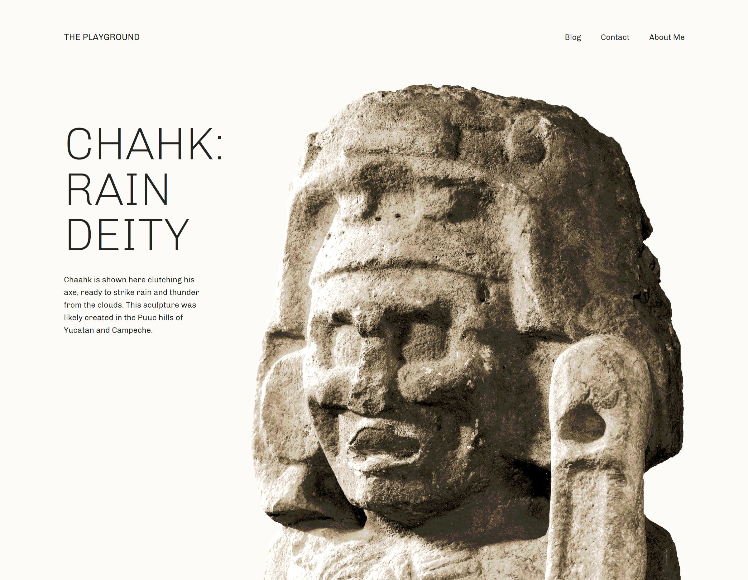
A sculpture of a deity from Mayan culture inside of a a two-column design with text on the left.
Intro section of Archeo’s homepage.

It is one of the few faithful representations of magazine designs that I have seen. No, I am not talking about the muddied term in some circles that confuses it with news design. It reminds me of those stunning feature layouts that would draw a reader into a story as they flipped through the latest gloss-covered print that arrived in the mail. I am a product of my generation and will always have a sense of nostalgia for the dying art form, and I love seeing web-based implementations of it when they work well.

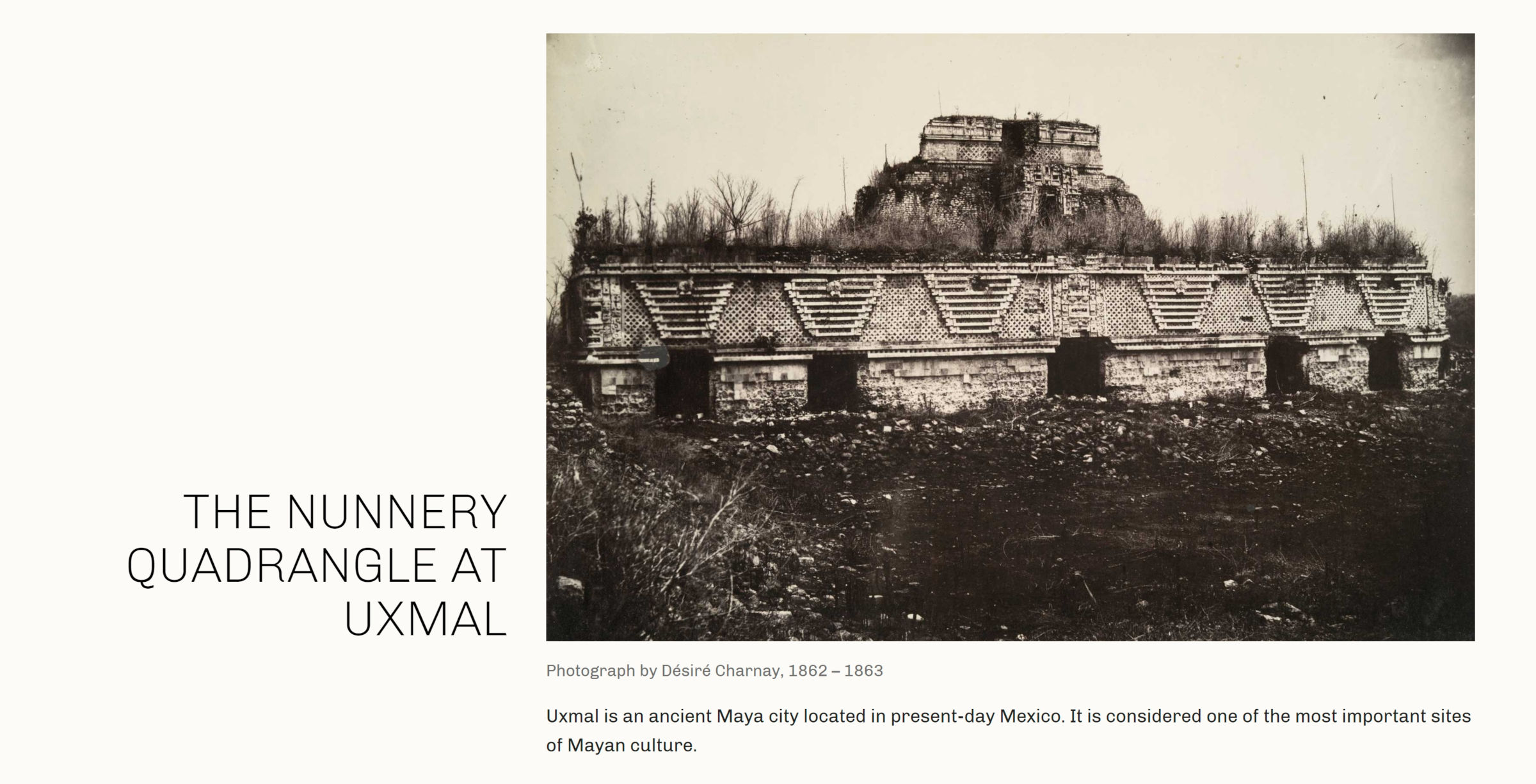
Nearly every one of Archeo’s image-categorized patterns captures that essence of a magazine featured article. The following is one of my favorites.

On the left of a two-column layout sits a large heading.  On the right is an image with a caption.  Underneath is a longer description.
Two-column image pattern with header on the left and additional text.

The theme is described as being inspired by Mayan history and culture. Archeo’s patterns are littered with tidbits of historical text and images that make me want to learn more about the subject. Great design can speak to us in ways that we were not expecting.

As an aside, I would love to see creators who describe their designs as “inspired by” something to provide more insight into the subject via a blog post. For those unfamiliar with whatever that subject may be, it would pull back the curtain a bit, giving us a glimpse into why it was important to the designer.

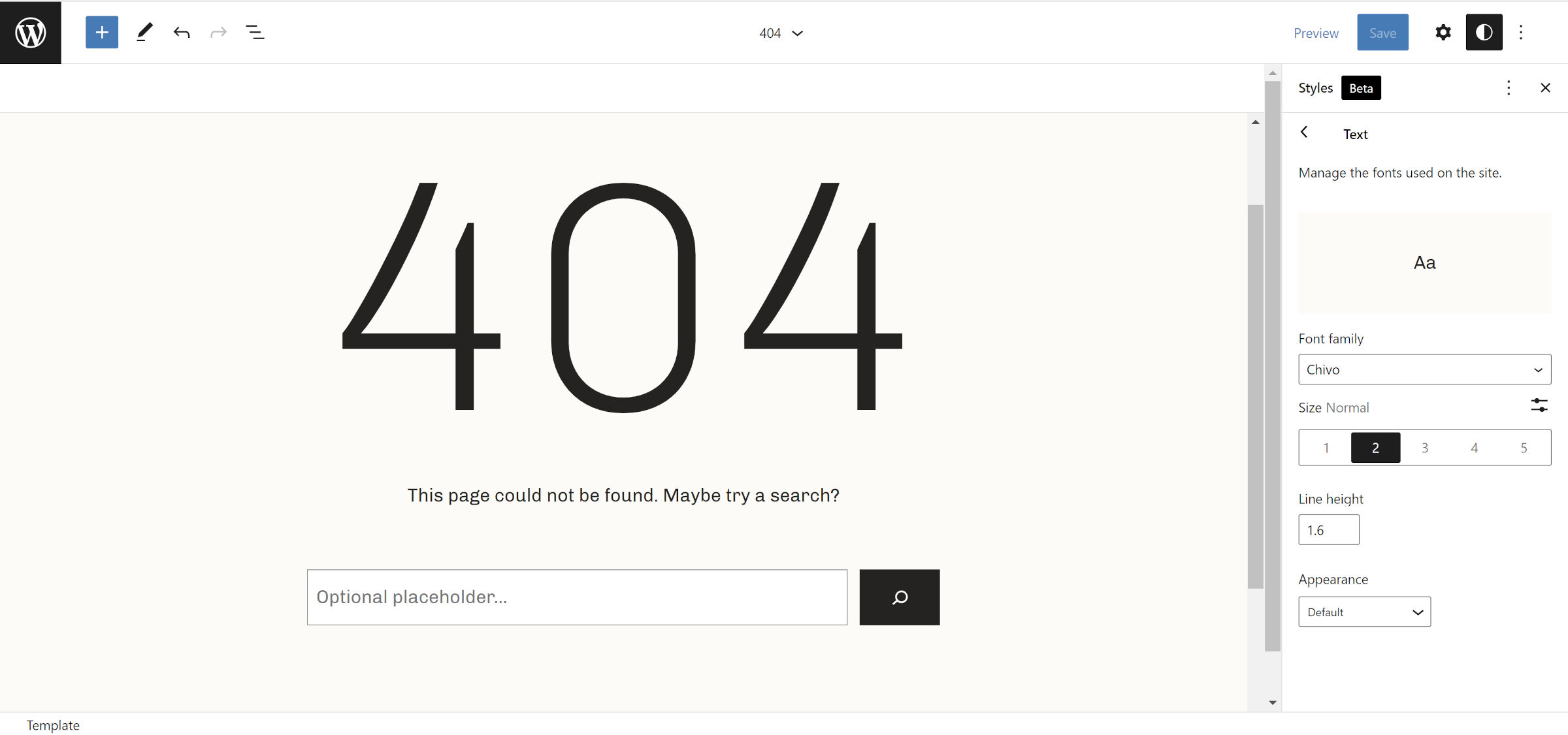
Archeo is the first theme that I have seen use the upcoming web fonts API expected to land in WordPress 6.0. Users with the Gutenberg plugin installed should see the theme’s only font, Chivo, gracing the front end and editor. Those without the plugin should see their system’s default sans-serif font.

The following screenshot is of the theme’s 404 template and shows the Chivo font:

WordPress site editor open to the 404 template.  In the content canvas is a huge "404" title.
404 page template in site editor.

It looks far better than the default, at least on Windows. I recommend running this theme alongside the Gutenberg plugin for the ideal result.

I am surprised the Theme Team did not include a backward-compatible method of handling web fonts for WordPress 5.9 users. It would not have taken much code: a single hook and a check for whether the wp_webfonts() function exists.

Archeo is now the 59th block theme to land in the WordPress.org directory. I am eager to see more from Automattic’s Theme Team, especially if this will be its minimum standard with future designs.

GiveWP Launches Standalone Donation Form Block for Stripe

Category Image 052

GiveWP quietly released its new plugin, Donation Form Block for Stripe, in the WordPress directory last week. It is a standalone block that allows users to accept donations almost instantly. No complicated setup. Just install, activate, connect to Stripe, and play.

I named the GiveWP plugin my favorite of 2019. The team behind the donation plugin has consistently produced top-tier plugins and extensions, and I have long been of fan of the company’s work. It did not take me long to install and activate its latest plugin.

Donation Form Block for Stripe is essentially a lite version of GiveWP. The primary product is far more powerful and has an entire ecosystem of extensions built around it. In general, it is geared more toward charities, non-profits, and other fundraising efforts where users might need more flexibility, reporting, and integration with third-party systems. It can be overkill for someone who merely needs a simple donation form.

The one-off donation form block is better-suited for those “buy me a coffee” scenarios than well-organized fundraisers. I am glad to see GiveWP tackling this side of the donation arena.

Inserting the block is as easy as adding any other. However, before using it, users should connect their Stripe account, and the plugin provides a handy button for doing so in the block sidebar:

Donation form in the WordPress editor in the middle of connecting it to Stripe.
Connecting to Stripe.

The Stripe connection persists, so it only needs to be configured once. From that point, everything is relatively straightforward. Plug in a few details and publish.

In a couple of minutes, I had created and published a fictional fundraiser for cleaning a local basketball court.

Fictional donation form for cleaning a local basketball court.  Has a header image, text, and buttons for donating various amounts.
Full donation form on the front end.

As much as I love the idea of this block, I was not entirely happy with the user experience. However, keeping in mind that this is version 1.0.x, it has a ton of potential.

GiveWP’s donation form managed to break nearly every one of my block-related cardinal sins while still managing to be an exceptional product.

Users must add an image, custom text, and donation field text via the block options sidebar. This means there is no Rich Text input, so users cannot even add simple bold and italic styles. It also feels unintuitive working from the sidebar instead of modifying the fields directly from the content canvas.

Form block in the content canvas of the WordPress editor but its fields are in the sidebar for editing.
Text editing in the sidebar instead of the block in the content canvas.

A more ideal approach would have used the “inner blocks” feature to put Heading, Paragraph, and Image/Cover blocks — locked in place — into the main donation form. It could have done the same with the buttons and other form elements via custom blocks.

Ultimately, most of the problems are related to control over the design. One of the worst things block plugins can do is overrule everything the theme styles on the front end.

Do not get me wrong; blocks should ensure quality control over their own output. Their functionality should be unencumbered, and their layout should work well regardless of the theme.

However, this donation block takes its duties a step too far, using JavaScript to inject CSS into the page and doubling up on the specificity with !important. Even if a theme wanted to integrate with the block, it is next to impossible to style the donation form elements. Is there really any reason that the inputs are required to have 2px, solid, rounded borders?

And, why are my theme and user-registered colors not even available for the single color option provided?

Colored buttons in the WordPress editor inside of a donation form.  The sidebar color option shows custom colors instead of theme/user-registered ones.
Theme colors not selectable.

That is what frustrates me the most — not just with this block. WordPress has built this standardized system that allows communication between the platform, plugins, themes, and end-users. It lets developers build output that should always be customizable. By no means does it cover every Aspect of design. However, the foundational components are in place. Colors and font sizes have been around for over three years. Extended typography and border controls are available now.

There is no way to make a wide or full-width form. The block does not support alignments, and even when wrapping a Group block, the plugin limits it to a maximum width of 650 pixels.

Some of these problems are similar to the issues I was writing about nearly two years ago with the release of GiveWP 2.7. I would have liked to have seen them addressed on an entirely new plugin release from the outset.

Despite my complaints, the plugin does the one thing it must do correctly, at least as good as anyone and better than most. It makes accepting donations as simple as inserting a block into a page, customizing a handful of fields, and hitting the publish button. If the dev team never added another enhancement, that would be all most of its users need.

WordPress Community Designers Create the Museum of Block Art

Category Image 091

Anne McCarthy announced the launch of the Museum of Block Art earlier today via the Gutenberg Times blog. The site’s goal is to showcase creative uses of blocks and inspire the WordPress community to push the limits of what is possible with the block editor.

The site showcases 22 pieces of block art from 11 people in the WordPress space. Ann McCarthy, Tammie Lister, Beatriz Fialho, Allan Cole, Rich Tabor, Nick Hamze, Brian Gardner, Javier Arce, Mel Choyce-Dwan, Channing Ritter, and Francisco Vera all contributed to this first outing.

A 6-column grid showcasing various art designs created via the WordPress block editor.
Multiple block art styles.

The concept builds upon an earlier project by Lister. In October 2021, she announced Patternspiration, a site where she created and released a new block pattern every day for the entire month.

“She was showing me those, sharing problems she was running into, the intent around ‘how quickly can I create a pattern/what can I create in 30 minutes per day,’ etc.,” said McCarthy. “I brought it up on a hallway hangout, and the idea just hit me as we were chatting (that’s the moment in the video). I found her approach to be so beyond creative and beautiful compared to some of the necessarily practical items in the block pattern directory.”

The pattern directory on WordPress.org must take a lot of factors into consideration to ensure patterns work across themes for millions of users. This limits what designers can do. However, such limitations are unnecessary on third-party sites.

“I wanted to take it a step further because it felt so compelling to look at something and not have an ‘I bet that was made with WordPress’ feeling that many of us have had,” said McCarthy.

Because the Museum of Block Art allows for more artistry in its showcase, it can also create inconsistent results if end-users blindly copy/paste the code. For example, one of my favorite patterns is the It’s Me (Super Mario) design by Hamze, which brings back at least a decade of childhood memories:

Super Mario "pixelated" image made out of Button blocks in the WordPress editor.
Super Mario block art.

However, it relies on color names that are not likely to exist in every theme. Copying the pattern code and pasting it into the editor should create the correct layout, but the colors might be off.

Other patterns require users to download the correct images and add them to their posts. Abstractions Study No.8 by Cole relies on custom CSS, which is provided via a downloadable Blockbase child theme.

Image of multiple abstract shapes created via WordPress blocks.
Abstract block art.

This sort of hodge-podge of methods is OK for a project like this. The goal is to inspire, not necessarily to make downloadable patterns. When designers experiment and push the boundaries, it can also help evolve the block system’s tools as they report limitations upstream.

Aside from Lister’s Patternspiration work, I had caught Ritter’s blog post in January sharing how she had created block art. At the time, I was unaware that it would be a part of the then-unknown Museum of Block Art project.

WordPress block art made from a gallery of various city images.
City Textures block art.

McCarthy added that she encouraged Ritter to publish the post, noting that it helps to “demystify” how it was done.

“I started pinging people who I thought would be interested in doing it,” said McCarthy of the block art included on the site. “It was all very grassroots and sometimes would just randomly come up in conversation. I tried to keep the ask very small since so much is going in with WordPress and the world. Probably less than half of the people I contacted actually submitted art pieces.”

The initial plan was to launch the site alongside the WordPress 5.9 release. However, it was pushed back as contributors needed more time.

There is no submission form for third-party contributions to the museum. However, McCarthy encourages designers to use the #WPBlockArt hashtag across social media to share their work. It could get picked up for inclusion on the site.

“I’m mainly looking for pieces via the hashtag, but if I see a big demand for folks wanting to submit, I’d be game to open up something more official,” said McCarthy. “This has been a side project on top of 5.9, the FSE Outreach program, etc., so I wanted to be mindful about the opportunity cost of sinking more time into an off-the-wall idea.”

Nesting and Grids: Super List Block Supercharges Lists in WordPress

Featured Imgs 08

Freelance WordPress developer Aurooba Ahmed released the Super List Block plugin earlier today. Essentially, it is like the core WordPress List block — just supercharged. It is her first publicly-released extension on WordPress.org.

The primary use case for the plugin is adding other blocks within the list items. However, its options allow users to take it further by supporting grid-based layouts.

WordPress does not currently allow end-users to nest other blocks into list items via the editor. It is rich text or nothing, and it can be an irritating part of the editing experience when you need this seemingly run-of-the-mill feature. It is an issue that makes you wonder why we moved on to FSE before smoothing out the content experience. HTML list item elements are, after all, containers for other content.

For me, at least, it is not something I often need. When I do, I code it via the Custom HTML block. That works if the list’s content is simple but not when you want to nest more complex elements like other blocks.

The Super List block turns its nested Super List Item blocks into containers for pretty much anything. One typical use case would be to add multiple paragraphs or other text-based blocks like headings as single list items.

Ordered list in the WordPress editor with three items.  Each has a heading and faux demo content in paragraphs.
Headings and multiple paragraphs under single list items.

However, the plugin does not limit users to text. They can stick whatever they want in, even nesting a Super List within a Super List Item block. Unfortunately, its indentation is zeroed out in that scenario, so its items do not appear nested.

The plugin’s claim to fame may be its grid feature. The closest things in WordPress are the Columns and Gallery blocks. However, Columns are limited to a single row, and Gallery only allows images.

This is also where the Super List block needs a little refinement. When selecting the horizontal (“grid”) orientation, a new box appears to allow users to set the maximum width of all sub-list items.

A four-by-four grid of squares in the WordPress editor.  The first and last squares have a demo image.  The second and third squares have demo quote text.
Four-by-four grid of quotes and images.

Wanting to create a four-by-four grid (two rows of two columns), I immediately selected 50%. It made the most sense. However, I did not get any columns. The value was too large and did not account for the gutter space between the items. I then lowered it until I hit a number that worked: 47%. I could have looked at the page’s source code and simply did the math, but it would be a guessing game for the average end-user.

A more intuitive interface would be to switch the max-width option to a column-number setting. Technically, this would limit the flexibility of the block in a few scenarios. However, it would cover the vast majority of cases where users just want a grid of equal-width columns that span the width of their container.

This assumes that the plugin does not eventually allow users to micro-manage each list item in grid mode. There is an open ticket in the plugin’s repository to add the option to individual Super List Item blocks.

Whatever future direction the plugin goes, an easy-to-use block for quickly setting up a grid of items will likely land in many developer and site-owner toolboxes.

Three features make this plugin simpler to use than many core WordPress or third-party blocks. The first is when the user has the Super List selected in the editor. Instead of only the “+” icon to nest another block, it appends the text label “Add Super List Item.”

An unordered list in the WordPress editor.  In the bottom right, it has a button that reads, "+ Add Super List Item."
Add new Super List Item button.

It is easy to get confused about where new blocks will be inserted after clicking the “+” editor icon. Super List Block’s text label makes it dead simple to understand. I would love to see WordPress and other third-party plugins take the same or a similar approach.

The other two nice-to-have features appear in the toolbar for the Super List Item block. The first is a “Settings” button for jumping back to the parent block. The second is a circular “+” icon for appending another item to the list.

Unordered list in the WordPress editor with one of the items highlighted.  In the toolbar, there is a link to the parent list's settings and a button for appending another item to the list.
Settings and append buttons in the toolbar.

Both options seemed to reduce misclicks when selecting blocks or buttons in the editor. However, I prefer WordPress’s approach to making some parent block settings available in the child block’s toolbar. Social Links is a prime example of this, allowing users to change justification and alignment without jumping back and forth.

Overall, I am impressed with Super List Block as a first release. I will be keeping my eye on it to see how it matures. It is well worth deploying on any site that requires its features now.

Creating Speech Balloons With the WordPress Block Editor

Wp Plugins

I do not know how I overlooked LIQUID SPEECH BALLOON. The plugin is less than a month shy of being three years old, and I follow block-related projects religiously. This one slipped through the cracks, at least until I haphazardly stumbled upon it when searching for something else entirely.

It is also relatively popular for a single-block plugin. There are not that many with more than 10,000 active installs. I had to know what it was doing to draw such a crowd.

In the comments on yesterday’s post about Automattic’s Livro theme, Nick Hamze wanted to know where all the fun theme designs were. Perhaps it was fortuitous timing that I also happened to be playing around with a plugin that might fit the bill. Sure, it is not a theme, but it can definitely be used to spruce up an otherwise boring or plain design.

So, I spun up a few Speech Balloon blocks and just had fun creating a chat with a some cartoon animals:

Four rows of speech balloons with cartoon animals making sounds.  Includes a cat, lion, chimp, and panda.
Inserting and customizing multiple Speech Balloon blocks.

I tend to gravitate toward clean, open-canvas themes because they allow me to add all the fun elements via the post content. That is why I love finding plugins like LIQUID SPEECH BALLOON. They add that visual flair to pages that can sometimes be boring.

Using the plugin’s Speech Balloon block is straightforward. It presents users with a single section for inserting rich text content.

A speech balloon with a default user avatar and placeholder text, "Speech," in the WordPress block editor.
Default Speech Balloon block.

In the block options sidebar, users can choose an avatar. They can also make several design adjustments, including background and text colors.

The block is falling slightly behind the times, though. Since the plugin’s release nearly three years ago, WordPress has added several new design components that could be used to make its block even better, such as padding, border, and typography controls.

The plugin can also be used for testimonials or other types of reviews. It works well enough for more business-friendly layouts if that is the sort of thing you are after.

Two columns of testimonials. Both show a user avatar on the left and a text review in the box on their right.
Creating testimonials with the Speech Balloon block.

The plugin’s biggest failure is in how it handles avatars. It is also why it does not make for the best option for testimonials. Users cannot add avatars directly via the block. Instead, they must register them via an entirely separate admin screen. Then, they can select from their saved avatars list within the block.

Under the Settings > LIQUID SPEECH BALLOON page, the plugin presents users with several rows of fields. They can add a name and image URL for each avatar.

10 rows of input fields in a settings form.  Each row has a Name field and an Image URL field.
Plugin’s avatar settings.

This is where the user experience falls apart a bit. There is no way to upload avatars on this screen. Instead, users must upload them via their media library, copy the URL, and paste it into the image URL field.

The plugin provides the necessary documentation and links to work through this process. The overall experience is simply lackluster.

However, if users only need a limited number of avatars, the system works well enough once everything is uploaded. The images are always available whenever inserting the Speech Bubble block — no need to search through the media library or upload a new one.

I am not sure if this will go in my plugin toolbox. Outside of a few stylistic elements, such as the speech bubble’s tail, users could readily recreate something similar with a few blocks, as shown in the following screenshot:

Two speech bubbles.  The first has a Panda next to it.  The text reads, "Hello, how are you doing?"  The second has a zebra and the same text.
Custom speech bubbles pattern.

Within a few minutes, I created this with what is already available in core WordPress, and I actually had several more design choices by doing so. I could see keeping a block pattern on hand for such a layout in the future.

For those who want a quick and easy solution without all the fuss of mixing and matching blocks, LIQUID SPEECH BALLOON would be the better option.

Anariel Design Releases Bricksy, Its Third WordPress Block Theme

Featured Imgs 08

Yesterday, Anariel Design’s third block theme, Bricksy, went live in the WordPress.org directory. Ana Segota, the co-founder and self-proclaimed “creative motor” of the company, has almost become a master at block-based theme design at this point, and this project is just her showing off her skills.

I actually took the theme for a spin over the weekend when I saw it was waiting in the review queue, so I have had a few days to play around with it. Despite a few trivial issues, it has quickly become one of my favorite block themes.

Bricksy WordPress theme home/blog page.  Header shows logo and menu. It is followed by a three-column section of Cover blocks with background images that include a header and button. Following that is a two-column grid of posts.
Bricksy blog page design.

While I have generally liked Anariel Design’s two previous block themes, Naledi and Clove, I could not see myself installing them on a real-world project. They were simply not my personal style. However, Bricksy is a theme I would definitely use if I had a project for it at the moment.

One of my favorite design elements is the cursive handwriting for the site logo, which is also used across various patterns.

Offset three columns of team member sections with images, names, roles, and social links.  In the center, there is a cursive header that reads "freedom," followed by "Our Team".
Team Alternative pattern with cursive header image.

The downside is that these are images, so they are not easily recreated by end-users without Photoshop chops. I would like to see the team reconsider using a handwriting-style font — maybe one from Google Fonts — that allows users to add custom text directly from the editor.

Bricksy has, hands down, some of the most beautifully-designed patterns I have seen in a block theme yet. In total, there are 32.

WordPress block pattern explorer, which displays a categories panel on the left and a three-column grid of patterns on the right.
Bricksy’s general block patterns.

It is making an early bid for my favorite theme of 2022, but I will not get ahead of myself. We still have almost an entire 12 months to go before I make that call.

It even includes a custom social links layout. More and more themes are bundling their own takes on this pattern, but Bricksy’s color scheme and default Cover block image stand out.

Cover block with a background of a pier over a lake. Content contains image, title, subtitle, link buttons, and a social links menu.
Social Links block pattern.

With 32 patterns, I could dedicate an entire post to them all, but I am limited on time. For the most part, they are layout-focused rather than industry-focused patterns. This means they can be used on a vast range of sites. However, the pricing tables and team sections make sense for small businesses. Bricksy also supports WooCommerce.

The most striking thing about each pattern is that they all seem to fit within the theme’s overall design. Often, when themes include dozens of block patterns, some of them can feel like an additional option simply for the sake of adding one more thing in. And, that never feels like the case with Bricksy.

For long-form content, the theme is decent. However, it could be better. Its 720px content width and 18px font size can quickly grow hard to read. Cutting the width anywhere from 80px to 120px makes it much more comfortable. Bumping the font size up a couple of extra pixels works too.

When I first activated the theme, I thought it was utterly broken. I had wondered how it managed to slip through the review system. The theme’s header was outputting seemingly random demo content. But, it was also familiar. I was positive it was a test post from my install.

Header of a website is erroneously displaying the content of a post, which is a table, image, and list.
Nav menu showing a blog post’s content.

The issue was tough to hunt down. After everything from deactivating plugins to scrubbing templates from the database, I finally found it. The ref key for the Navigation block in the theme’s header.html template part was the culprit. Bricksy pointed to a specific post ID in the code:

<!-- wp:navigation {"ref":4790,"layout":{"type":"flex","setCascadingProperties":true,"justifyContent":"right"}} /-->

4790 is the ID of a literal post on my test install, so the Navigation block showed its content instead of a menu. Most likely, this was directly copied or exported from the site editor. Theme authors need to watch out for specific ID references in their code when building from the editor, making sure to remove them before shipping.

Aside from a couple of trivial issues and a single OMGBBQ one after activation, I enjoyed using the theme. It has found its place in my recommended-themes list.

10up Releases the Publisher Media Kit WordPress Plugin

Featured Imgs 08

Earlier today, version 1.0 of 10up’s Publisher Media Kit went live in the WordPress plugin directory. It is a preconfigured set of blocks and patterns for jump-starting a media kit page for small and medium-sized publications.

When I first noticed the plugin, my mind immediately jumped to press kits and branding pages for businesses. Not enough companies within the WordPress space have such pages, and it can often be hard for journalists and other writers to find information. While this plugin is geared toward publications, small businesses can still get some use out of the plugin with a few changes.

Given that WP Tavern just launched its new design yesterday, this might be an opportunity for us to lead the way. The plugin does give me a few ideas on what we could do with a similar page here on the site.

Publisher Media Kit has been tested with Twenty Twenty-One, Newspack, and several Newspack child themes. I did run it through most of those to check for compatibility, and the plugin worked admirably. However, I primarily tested it with Twenty Twenty-Two, the upcoming default WordPress theme. Aside from a few layout alignment quirks, it worked well.

The plugin automatically creates a new “Media Kit” draft page on the website once it is activated. The content is a set of pre-defined sections built from eight patterns and an accompanying Tabs block.

Media kit page that opens with a hero/intro section, followed by audience profiles and statistics.
Partial screenshot of Media Kit page.

This allows users to quickly fill in their own content and make customizations. Once done, it is just a matter of hitting the publish button.

However, end-users can take things into their own hands by using the various patterns on any post or page of their site. The cover, stats, and questions/contact patterns work well as general-use patterns.

Three column grid of block patterns for the Publisher Media Kit plugin in the WordPress pattern explorer.
The plugin’s custom block patterns.

Note: I deleted a couple of the patterns from the screenshot above. For some reason, they were rendered invalid in the patterns explorer but worked fine when inserted into the content canvas.

I would love to see a standalone version of the Tabs block included with the plugin. It is showcased in the rates and digital ad specs patterns, but it is so easy to create new tabbed content that I cannot help but want to use it with other projects.

In the WordPress block editor, the Publisher Media Kit plugin's tabs block shows an ad rate table.
Tabs block in the editor.

It could become a popular tabs solution with a few design options like colors, borders, and typography. It is minimal at the moment, but its user experience would make for an ideal foundation for a single-block plugin.

One of my favorite things about the block system is that it makes plugins like Publisher Media Kit feasible. In the past, it was virtually impossible to ship a content-focused plugin and expect it to work with most themes, at least not without a lot of custom design work. That meant that solid solutions would often stay in-house with agencies with no ideal way of shipping them.

The standardization of blocks has bridged much of that gap. As the system continues evolving, especially with more design options, I expect to see similar plugins in the future.

How Do Post Formats Fit Into a Block Theme World?

Featured Imgs 08

Over the weekend, Nick Bohle asked Ellen Bauer of Elma Studio how post formats fit into the block-theming world. The question was a proposal for her a WordPress theme and FSE chat she held yesterday via Twitter Spaces. I could not attend and see if Bauer touched on the subject, but the question is something I have given a lot of thought to not that long ago.

Over the summer, I tweeted out a screenshot of an experiment around post formats. A part of me was trying to figure out if we could revive a dying feature, one I continue to use today.

Archive page in WordPress showing aside posts, each with a different-colored background.
Aside post format archive.

I have been using post formats since before they were a thing. “Asides” were one of the precursors to the feature landing in WordPress. I wrote my first on my personal blog back in 2006. I had borrowed some code that WordPress cofounder Matt Mullenweg had posted two years earlier. It was a concept he had borrowed from others.

For me, it was a way to give a unique layout to quick posts and links without all the beefiness of a long-form article.

In 2011, WordPress 3.1 launched with a new taxonomy. Users could choose between nine different formats for their posts, assuming their theme supported one or more of them. The goal was to allow theme authors to design custom layouts around each one.

For much of the community, it felt like WordPress was chasing Tumblr’s post content feature. The allure quickly wore off after it seemed to have hit a standstill beyond its initial release. Besides a few fixes and trivial enhancements under the hood, post formats never amounted to much.

They have remained a niche feature over the years. A few theme authors still add in support. Some of us old-school bloggers who have been using them in some form or fashion are still hanging on. But, post formats have been dead for a long time.

Therefore, I decided to try to make them work for block themes.

One of the most frustrating things I encountered with post formats in this block-based theme project was how powerless I felt over making them work “the old way.” The dynamic nature of classic theming meant that I could switch post content templates out on pages that listed multiple posts. Query Loop and its inner Post Template block do not allow me to show a different template for a quote or gallery-formatted post, for example.

This was frustrating because that part of the design process was out of my hands. If I wanted to do something as simple as show an entirely different design for an aside post within a mix of normal posts, I could not do so as the theme designer, at least not without doing some hacky workarounds.

My “light bulb” moment was when I realized that it was OK to not have that control. I needed to get outside of the mindset that the design was mine and mine alone. That is viewing creation through a classic theming lens. My approach was wrong. Instead, I had to start thinking about how to hand over these design tools to the user.

The question became: Can I create something that utilizes that original post format concept while giving users the freedom to do what they want?

Then, it dawned on me. The following is the response I tweeted to Jeff Chandler, who had asked if I thought post formats would work as patterns:

I think of blocks themselves as an evolution of post formats. Video, audio, embeds (basically cool links), quotes, etc. Most of the elements are already there. Patterns just give users an easy way to insert various designs, which could build off those blocks.

Maybe post formats as they currently exist are dead. However, the idea of designing a layout around specific types of posts is very much alive.

If users want to embed a single video into a post, it is just a matter of copying and pasting a link. To share a quote they found from their favorite author, they merely need to drop it into a Quote block. Other than chat posts (let’s just gloss over those entirely), the concept of post formats has simply been replaced with blocks.

However, theme authors still have a role to play. If all the elements for post formats have been essentially replaced by blocks themselves, that means designers can have a field day building patterns around them.

The WordPress patterns explorer with the Post Formats category open.  On the right, it shows three aside designs and one quote design.
Patterns built for post formats.

That led me to build off my original idea for asides, my favorite post format. Instead of offering a single design, I built three different patterns for users to choose from. End-users could mix and match how they appeared on the front end.

I also built a custom taxonomy-post_format-aside.html template to showcase them on their archive page. It merely displayed the published date and the post content, which the user controls.

I went back to the drawing board and built a quote pattern that I liked. Again, it would be up to the user whether they wanted that particular design. They could always go in a different direction.

A quote block within the WordPress editor.  It is wrapped in a Group block with a light blue background.
Quote block pattern and custom style.

In some ways, post formats were always limiting. The feature was never fleshed out, and there were only nine allowed formats. At the end of the day, each was merely a term within a taxonomy. There were never any rules about how it all was supposed to work. Maybe that is not such a bad thing. Now, posts can be anything users want them to be.

Tidying the Media Library With WP Ninjas’ Remove Unused Media Plugin

Featured Imgs 14

A few weeks ago, WP Ninjas announced it was stepping into the media optimization plugin market. The team released its Remove Unused Media plugin as a commercial project for tidying storage space. I received a full copy of it and put it through the ropes.

With so many commercial plugins, I am accustomed to the developers creating an entirely new menu item, taking up precious admin real estate. This happens even with those that just have a single screen too. However, I was happy to see the WP Ninjas team tucked everything neatly under “Media” as a sub-menu. We were off to a good start, and things only got better.

When I review plugins, there is one thing that I consistently preach: simplicity. That begins with following the core WordPress UI and sticking as closely to it as the plugin’s features will allow. In essence, don’t make me think about how to use your plugin.

For the most part, Remove Unused Media got the user experience right.

I could nitpick a few design choices with the interface, such as modifying the list table with rounded corners and extra padding. The “filter” sub-navigation also deviates from the standard. And, the “last analysis” message should receive the WordPress admin notice treatment so that it stands out.

These are all core UI elements with unnecessary customizations. However, they did not diminish the experience on the whole. The plugin mostly stuck with the WordPress standard.

The real question is whether the plugin does what it says on the tin. What is the experience of removing unused media like?

It was easy. Users merely need to click the “Start Analysis” button and wait a few seconds. The plugin then has three tabs:

  • Unused Media
  • Used Media
  • Ignored

The Unused Media tab presents an overview of all media that the plugin could not find used on the site. There is a possibility that it missed something. However, I only found one old-school scenario where this happened, which I will dive into later.

Screen that shows media that the plugin detects as unused. Attachments presented in a list table.
Unused media screen.

From this point, end-users can manually delete individual media attachments or use the bulk-delete option. Before doing so, the plugin recommends making a backup of the site — solid advice for any such plugin.

My favorite feature of the plugin was not its primary feature of deleting media. It was actually the “Used Media” screen. Its “Where?” and “How?” columns break down where images, videos, and other files are used and in what context.

Screen from the Remove Unused Media plugin that shows media where and how it is used across the site.
Used media screen.

It reminded me of the “instances” screen for the WordPress admin block directory proposal from 2019. The concept showed where specific blocks were used across the site. Remove Unused Media does the same thing for media files.

The “Ignore” tab for the plugin keeps track of media files that should not be deleted, even if they are unused. Users can click a link from the other screens to add them to the list. This persists after running a new analysis too.

The plugin scans several third-party plugins like Elementor, Beaver Builder, ACF, and Yoast SEO. Some store media instances outside of the post content, such as in custom post meta, and Remove Unused Media searches those specific fields.

Pricing starts at 39€ ($45.38 at today’s exchange rate) for one year of support and updates for a single site. It also has a five-site option at 149€ and a 100-site tier at 299€.

For the first version, the user experience felt solid. However, it does not have much in the way of customizability. That could be a sticking point for users who are looking for a more flexible premium option.

Exploring Alternatives

The plugin is not the first of its kind. The Media Cleaner plugin by Meow Apps is free, routinely updated, and has over 40,000 active installations. It also has a commercial version with more features, such as third-party plugin integration, WP-CLI support, filesystem scan, and live-site analysis.

The issues list from the Media Cleaner plugin in the WordPress admin, showing a list of unused media items.
Media Cleaner plugin results.

The UI for Remove Unused Media feels more like WordPress. Its “Used” tab also shows where (i.e., what posts) and how (e.g., content, featured image) specific media files are used across the site. This feature alone makes it worthwhile for me.

One area where Media Cleaner shines is its option for ignoring (not deleting) attached media. This is a vital feature if users have ever added the old gallery shortcode. At one point, WordPress simply displayed all attached images as a gallery. Eventually, it specified the IDs in the shortcode. However, for those older instances, this was not the case. Without enabling this option, those media items might get queued up for deletion.

The Remove Unused Media plugin does not have such an option. Attached images that are not explicitly used are considered unused. This may not be an issue for most users, but those with old gallery shortcodes should be aware of potential problems.

The baseline features for both are similar. Remove Unused Media gets the edge in its default user interface and experience. However, Media Cleaner has many more options for customizing how the plugin works. Plus, users who cannot afford an upgrade can always run the free version.

This is not to say either is better or worse than the other. Both were solid options in my tests. I just want to merge the best features from each, snagging the interface from Remove Unused Media and the configurability of Media Cleaner.

The HeroPress Network Launches as a Multi-Project Portal

Featured Imgs 26

Husband-and-wife duo Topher and Cate DeRosia announced the launch of the The HeroPress Network earlier today. It is a collection of content from various sites they are working on in a centralized location.

“Its overarching goal is to be a hub,” said Cate DeRosia. “It will display the newest items from around the HeroPress Network, as well as news from the community (to be added in shortly). We can also post information that we think is helpful or educational.”

The “hub” will incorporate content from at least eight projects:

The team launched WP Podcasts two weeks ago, making over 7,000 current episodes from dozens of WordPress shows available in one place. Find It WP is currently in beta and will be the next project to launch on or before October 19. They will soon launch the public Slack group with dedicated channels for different types of professionals.

Screenshot of a portal-style website that pulls in content from various sources.
The HeroPress Network homepage.

“You could say it’s like the portals of yesteryear,” said DeRosia. “With HeroPress expanding into 8+ or more entities, we wanted one place for people to go and get the most current glimpse of what’s happening.”

She also teased the idea of expanding their educational offerings in the announcement post. However, news on that will have to wait until they build out the projects currently underway.

The team will open funding options on October 24. The HeroPress Network is a for-profit company, but its goal is to make all of its content available for free to the community as a whole.

The original HeroPress.com website did not hit its funding goal in 2015. It attracted 33 backers who pledged $21,855 of its $60,000 AUD goal on Kickstarter. There was some early pushback, particularly from WordPress lead developer Andrew Nacin who cited its “unambiguous hero worship” and the initial male-only lineup of speakers as problems. However, much has changed in the six years since the fundraiser.

DeRosia called the first fundraising event a test to see how the community would receive it. The project has never been funded financially since then. Hosting and resources have been provided for the project, and a few other companies have occasionally donated toward their time and tools.

Despite failing to raise their initial funds, the project continued onward. Today, HeroPress has been a success by simply providing a platform for people to share their journeys in the WordPress world.

Andrey “Rarst” Savchenko wrote the first essay in March 2015. Since then, the site has published over 200 others.

“It’s always been a challenge to figure out how to fund the project,” said DeRosia. “When the pandemic hit and sponsors had money they couldn’t use on WordCamps, they started some conversations with us. We’ve been kicking around ideas since then and feel The HeroPress Network gives us the best resource for reasonable funding. We want to be giving value back to both the community and supporters, and the diversity of what makes up the Network provides more options.”

If everything falls into place, DeRosia herself or one of their daughters could have a salaried position for the project. Her background is in English and journalism, and she described it as a “dream job.”

I asked DeRosia why she was personally vested in this project. What was it that got her up every morning to build it?

“Topher and I both grew up rural poor here in the US,” she said. “We come from communities dying because there aren’t jobs. WordPress has always been such an excellent answer to this.

“With HeroPress.com we’re able to provide a stage where people can tell their stories of how they’ve built their lives regardless of where they lived or what circumstances they were living in. That’s great, but it only goes so far.

“Now with The HeroPress Network, we can provide simplified, searchable access to practical tools that anyone can use to craft the life they want using the WordPress platform. We can also demonstrate how community and business can work together to get the best for both.

“If the option for something better is out there, I want to help people find it. Helping new people get started in WordPress brings a richness to the community that it needs to thrive. Helping established businesses connect with people and resources continues the growth.

“It’s just so incredible to have the privilege to see people build relationships that allow them to flourish. And who wouldn’t get out of bed every morning to do that?”

Preview WordPress Block Pattern and Theme Combinations via New Site

Category Image 091
A screenshot of 6 block patterns from the WP Block Patterns homepage.
Viewing patterns from the WP Block Patterns homepage.

Andrew Starr, the owner of UXL Themes, has cobbled together a new project around block patterns. His new site, aptly named WP Block Patterns, allows users to preview any WordPress.org-hosted block themes and patterns together.

The project does not allow visitors to download anything or ask them to sign up. It is a basic demo system, one that WordPress.org should consider at some point.

Visitors can choose any block pattern. Then, they can select any theme to see what they look like together. It is a quick way to test patterns and themes without actually adding them to your WordPress installation.

For example, a user can view the Team Social Cards pattern — one that I had a hand in creating — along with Anders Norén’s Tove theme.

Three-columned team social cards layout pattern.

Or, the Image and a Quote on a Background pattern with Anariel Design’s Naledi theme.

Two sections, each with a fruit and a quote.

From Gutenberg Hub’s landing page templates to EditorsKit’s ShareABlock collection, the block system has allowed developers to experiment with unique sites for end-users. Because everything is built upon a standard, I am guessing we will see even more of these creative projects in the future. WP Block Patterns is another step in that journey.

This was not always the plan for the WP Block Patterns site. Starr set out to blog about patterns after their feature release in WordPress 5.5. After only publishing a single post, the project fell to the wayside. Fortunately, inspiration struck.

“I have a site that I use as my reference point when providing support for my themes,” he said. “This site has a blend of varying content and code that allows me to quickly switch/preview any of my themes, without the need to actually change the active theme in the admin, or maintain a different site for every theme.”

In the process of making improvements to his theme-switching functionality, the domain came up for renewal. He had planned to let it expire but decided to see if he could come up with something to do with the site.

“I got the inspiration to use the theme switcher in conjunction with content from block patterns,” said Starr. “If I hadn’t been working on my script at the same time as I coincidently received the domain expiration message, I probably wouldn’t have had this idea.”

Currently, he is manually installing the themes on the site but may have to automate it in the future as more block themes are released. However, he is pulling patterns and categories directly from the WordPress.org API, which is periodically updated.

The site only showcases 100% block themes. Technically, it should work with any that supports editor styles. Starr said it had never crossed his mind to showcase non-block themes.

“I have been keeping my eye on the releases of FSE themes, checking out every block theme that I come across, and it just sort of seems that block themes are the future, and classic themes feel like a step backwards now after investing so much time working with block themes,” he said. “The site would work just fine with classic themes, but there are so many available I’m not sure how to make it manageable or select which themes to feature (and which ones to leave out). I guess that’s also something I’ll have to think about as the number of block themes increases.”

Thus far, Starr has released two block themes, Hansen and Pria, through his UXL Themes brand. Users can preview both via the site. However, he is already working on his next project.

“As a proof of concept, I am working on a classic theme that will have the functionality to also be a block-based theme when FSE is available in core,” he said. “The idea is that the user will not notice any front-end differences when the theme ‘switches’ from classic to block-based, but the user will gain the new FSE admin tools, with the user’s classic customizer modifications switched over intact to the new Site Editor. I have found that there are compromises that need to be made when getting classic and FSE to work together seamlessly in a single theme, so I am not sure whether this will be released generally.”

He also teased a project related to FSE that is neither a theme nor a plugin. However, he was not ready to share any details just yet.

Add Custom SVGs via the Icon Block WordPress Plugin

Category Image 091

Nick Diego released the Icon Block plugin last week. Unlike similar blocks that are available, it does not rely on a third-party library. Instead, it caters to the developer and DIY crowd, allowing them to add any SVG directly to the editor.

Diego is the author of the Block Visibility plugin, which is just a little over a year old and shaping up to be the best project in the space. Over the summer, he expanded it with a pro version that adds value with more niche options. When it comes to the block editor, he has thus far shown a willingness to find creative solutions to problems with a focus on a well-rounded user experience. His latest plugin seems to be no different.

Piecing together the pricing page for Block Visibility is what pushed him to create Icon Block. He had a massive feature list and was hand-coding the icons via the HTML block.

Screenshot of the pricing table from the Block Visibility's pricing page.  On the left is a list of features. On the right, are checkmarks and "x" icons.
Block Visibility pricing table.

“I threw this little block together this week after becoming very annoyed at using HTML blocks for SVG icons (and not wanting to use a block library),” said Diego. “My goal was to build a simple SVG icon block using basically all native WP components. And as more functionality is added to core (margin, responsive controls, etc.), I will add them to the block.”

The result was a success. It checks a lot of boxes for such an icon solution that leans into the WordPress block system.

At its core, it allows end-users to copy and paste any SVG code into a text field and have it render in the editor and on the front end.

The WordPress logo icon in black.
Adding a basic icon.

However, it does not stop there. It uses a range of core components and block-supported features to round out the solution. It supports must-have features like colors and alignment. Users can adjust the icon size, padding, and the border-radius while linking it to any URL.

One feature I want to see tacked on is a set of border style, width, and color controls. That is more of a nice-to-have extra than a priority.

The WordPress logo as an icon with a blue background and white icon.
Adjusting the icon’s colors, size, spacing, and border-radius.

Supporting core components would have been fine for a launch, but Diego took that extra step and added custom functionality. The Icon block has a “rotate” button that allows users to turn the icon in 90° increments. It also has buttons for flipping the icon horizontally and vertically.

There are tons of use cases for such icon plugins in the WordPress editor. One of the more common scenarios is a simple set of boxes with a graphic at the top.

Three boxes in a row with a circular icon and text below it.
Boxes with icons.

With Icon Block, this is simple enough to do by using the Columns block, dropping in custom icons, and customizing them. However, there is so much more that is possible.

The missing pieces are on WordPress’s end. Currently, there are not many robust solutions for building horizontal layouts. It makes it tough to align icons next to text.

The recently-added Row variation on the Group block shows promise. The experience is a bit fussy, but it is possible to place the Icon block next to a Paragraph, as shown in the following screenshot. I built a quick pricing table with check icons.

A two-column pricing table that showcases using the Icon Block as checkmarks in a list.
Pricing columns with icon list.

There is no way to control the spacing between items in each row from the interface yet. I wanted my icons a bit closer to the text.

The other issue is that this should be a list. There is no reason to repurpose other blocks to build the layout. However, the List block does not allow users to nest blocks.

These are not issues of the Icon Block plugin. It just shows a reasonably common use case that WordPress should make possible. This would make these types of plugins far more powerful.

There is support for an icon block to land in the Gutenberg plugin and, eventually, make it to WordPress. Gutenberg Project Lead Matías Ventura opened a ticket in 2019 to explore the idea of allowing users to insert SVGs directly into the editor. If this ever made it in, it would more likely be a visual selector that does not allow end-users to add custom code. Diego’s block might still exist as an alternative solution with more flexibility in that case.

While the plugin could serve as a perfect solution in its current form to a large share of the WordPress community, Diego has plans for improving it. He is considering adding an icon selector for users who do not want to add SVG code. By default, this would show the built-in WordPress icons. However, he also has plans to allow third-party developers to extend it with custom “icon packs.”

Adding Custom HTML Attributes With the Block Attributes Plugin

Category Image 052

Earlier this week, websevendev released its fourth WordPress plugin to the official directory named Block Attributes. The extension allows end-users to add any HTML attribute to nearly any block.

One of the problems with the WordPress editor is that it can be a bit fussy about customizing HTML. Blocks are built on a set of standards, and the markup is supposed to meet those expectations. If something does not fit, users see an invalid markup warning.

However, there are times when users need to drop in a custom HTML attribute for various reasons. For example, I sometimes need to add a custom data- attribute for working with a bit of JavaScript. Since I know my way around code well enough, I typically write out the HTML in those situations via the Custom HTML block. But, that does not make sense when minor attribute additions are called for.

WordPress currently allows users to add classes and IDs (called an “HTML anchor” in the admin) to almost every block. It does not allow for direct input of the dozens of other possible attributes that HTML supports. The use cases for the average user are few and far between.

For those scenarios where some users could use the extra feature, the Block Attributes plugin is handy.

The plugin is straightforward to use. It adds a new field named “Additional attributes” under the Advanced tab of every block. Users can add the attribute name and click the “Add” button. From there, it creates a new field for adding the attribute value.

Adding a custom attribute for JavaScript handling to a Button block in the WordPress editor via the Block Attributes plugin panel.
Adding an onclick attribute to a Button block.

The plugin also supports multiple attributes. Once you add one, you simply use the same input field to create more.

For my first test drive, I added a simple onclick attribute with a value of myFunction(). Then, I hopped over to my theme and created that function via JavaScript to output a simple message in the console. Everything looked good under the hood, and it worked.

Most of the use cases I have in mind are for integrating with JavaScript, and this was a simple example of what is possible. There are far more complex things a developer could do with such a feature. That is reason enough to keep this plugin in the toolbox — sometimes you need a wrench instead of a hammer.

I could also see Block Attributes being used for adding ARIA attributes in other situations where it might aid accessibility.

Users could add custom styles to a specific block via a style attribute with the plugin. However, unless this is a simple one-off, I would recommend against it. For more advanced use cases, Blocks CSS is a far more suitable plugin. It has a built-in syntax highlighter. Plus, a textarea is friendlier than a one-line text input box.

The only downside to Block Attributes I have seen is upon deactivation. You will see the dreaded “this block contains unexpected or invalid content” message in the editor if you have added any custom attributes. The editor has managed to resolve any issues I have run into with the core blocks.

Side-by-side view of the block resolution popup modal in the WordPress editor.
Resolving block warning after deactivating plugin.

Deactivating the plugin should not affect the front-end output. Because the custom attributes are a part of the HTML markup, they will still be there. The error message should only show in the editor.

Emoji Toolbar Plugin Brings an Emoji Picker Back to the WordPress Editor

Category Image 091

Earlier today, theme.es released its Emoji Toolbar project to the plugin directory. It is a simple picker that integrates with the WordPress Rich Text toolbar, allowing users to insert emoji directly from the editor interface.

After Nick Hamze pulled his Emoji Conbini plugin from WordPress.org last year, there has been an emoji-sized hole in my editor toolbox. The plugin was the perfect implementation for quickly plopping a quick smiley face or any of the other thousands of characters available. Unfortunately, his departure from the WordPress space meant losing one of my favorite block-related plugins — and several others that I enjoyed.

It was also on par with 10up’s Insert Special Characters plugin, a solution for users missing a similar picker from the classic editor era.

Emoji Toolbar is filling that void and is a solid alternative for those who need a solution. The difference between the two implementations is the location. Emoji Conbini added the picker button directly to the toolbar, and Emoji Toolbar adds it to the “more” dropdown.

Dropdown button list from the Emoji Toolbar plugin in the WordPress editor.
Clicking the Emoji button in the Rich Text toolbar.

Placing the picker button inside of the dropdown makes it a little harder to find. It also requires an additional mouse click to insert emoji. What matters is that the implementation works, but I would love to see it as a top-level toolbar item.

Using the plugin is a simple matter. When in a Rich Text field, which includes blocks like Paragraph, Heading, List, and more, the Emoji Toolbar appears in the block toolbar. After clicking it, the plugin creates a popup of the emoji picker.

Popup emoji picker in the WordPress editor from the Emoji Toolbar plugin.
Emoji Toolbar popup picker.

From that point, users merely need to click the emoji they want to insert into the post.

The plugin bundles the Emoji Mart library, which has quickly become almost a standard for emoji pickers. The component is a Slack-like box that categorizes each of the characters, and it provides a field for searching for that perfect emoji.

There is still at least one emoji inserter alternative. Instead of adding a picker to the block toolbar, Emoji Autocomplete Gutenberg allows users to type : and use keywords for inserting characters. For those who prefer to work from the keyboard, it is a quicker method.

Emoji Toolbar shines over Emoji Autocomplete Gutenberg and the now-retired Emoji Conbini based on how it formats its output. It inserts the actual characters into the content, but the other plugins insert an <img> tag instead. That method results in output that is not forward-compatible with any changes in the future or alternative libraries. Users who also prefer to disable image output on the front end cannot do so. This is a non-issue with Emoji Toolbar — it plays well with other solutions.

On the whole, the plugin is solid. It has well-written code and provides an easy-to-use picker for inserting emoji.

WordPress 5.8 Media Library Changes You Should Know About

Category Image 080

It is hard not to look through a list of upcoming WordPress 5.8 changes and not find at least a little something to whet your appetite. With so many enhancements headed our way, even we have not been able to keep up with them all here at WP Tavern. The next release will bring a few much-needed media-related upgrades.

Users should enjoy WebP image format support and a copy-to-clipboard button on the media upload screen. Developers have a new hook for filtering the image output format, and the platform is dropping infinite scrolling.

WordPress 5.8 is scheduled to ship on July 20, so these changes will be landing in less than a week. If you have not already done so, give WordPress 5.8 Release Candidate 3 a test run and report any issues.

Infinite Scroll Replaced With Ajax Button

The upcoming core release will drop infinite scrolling for media in favor of an Ajax-powered “Load more” button. The admin screen and editor’s media overlay will cap the initial and subsequent “pages” to 40 media items each.

This change is a part of an effort from the WordPress accessibility team to improve the experience for end-users. Team member and core contributor Andrea Fercia noted two a11y problems with infinite scrolling. The first is that it is impossible or nearly for keyboard users to reach content appended to the screen. Second, there is no audible feedback or instructions about how infinite scrolling works for screen readers.

He also noted usability and performance issues. Infinite scroll can break the browser’s history, and there is no JavaScript fallback. And loading hundreds or more large-sized images increases the memory footprint.

While the media library is getting the Ajax treatment in WordPress 5.8, we should expect similar updates for other areas in the future, including:

  • Add Themes Screen
  • Customizer > Add Menu Items
  • Editor > Link > Search

Copy URL From Add New Media Screen

Screenshot of the Add New Media screen after an image has been uploaded.  It now shows a "Copy URL to clipboard" button.
Copy URL to clipboard button on the Add New Media screen.

This change is an enhancement that rids the platform of a small but noticeable nuisance that has plagued it for years. When uploading an image from the Media > Add New screen in the WordPress admin, there was no way to grab its URL without clicking over to the edit screen.

WordPress 5.8 introduces a “Copy URL to clipboard” button that appears after the image has been uploaded. No need to leave the page and track down the URL. The change also makes the user experience consistent with the Media Library screen and overlay in the post editor.

More often than not, browsing Trac means seeing many of the same names. This time around, it seems that a regular user wanted a feature. They created an account — perhaps for this purpose alone –, wrote a support forum post, was directed to Trac, and created their first ticket. It took eight months to work its way into WordPress, but it is one of those success stories of an average user making things happen by just providing feedback. Thanks for the contribution, @anotia.

WebP Image Format Support

WordPress is allowing a new image format. And, no, it is not SVG (technically not an image). There are still security hurdles to jump for that to ever happen. However, it now supports WebP, which carries with it the promise of better performance for those who use it.

As Sarah Gooding reported for WP Tavern last month:

This modern image file format was created by Google in September 2010, and is now supported by 95% of the web browsers in use worldwide. It has distinct advantages over more commonly used formats, providing both lossless and lossy compression that is 26% smaller in size compared to PNGs and 25-34% smaller than comparable JPEG images.

In the report, she noted that only 1.6% (currently at 1.8%) of the top 10 million websites used the WebP format. With WordPress now adding support, that percentage is likely to rise in the coming years.

Developers: Image Editor Output Format Hook

For developers who want to transform images with one mime type to another, 5.8 introduces the image_editor_output_format filter hook. Plugin authors can convert all newly uploaded images or only overwrite specific formats.

The following example converts JPG images to the new WebP format:

add_filter( 'image_editor_output_format', function( $formats ) {
        $formats['image/jpeg'] = 'image/webp';

        return $formats;
} );

The output format will be applied to all image sub-sizes as they are created. However, this will only work for WebP images if the webserver supports it.