For UX researchers and designers, our journey doesn’t end with meticulously gathered data or well-crafted design concepts saved on our laptops or in the cloud. Our true impact lies in effectively communicating research findings and design concepts to key stakeholders and securing their buy-in for implementing our user-centered solutions. This is where persuasion and communication theory become powerful tools, empowering UX practitioners to bridge the gap between research and action.
I shared a framework for conducting UX research in my previous article on infusing communication theory and UX. In this article, I’ll focus on communication and persuasion considerations for presenting our research and design concepts to key stakeholder groups.
A Word On Persuasion: Guiding Understanding, Not ManipulationUX professionals can strategically use persuasion techniques to turn complex research results into clear, practical recommendations that stakeholders can understand and act on. It’s crucial to remember that persuasion is about helping people understand what to do, not tricking them. When stakeholders see the value of designing with the user in mind, they become strong partners in creating products and services that truly meet user needs. We’re not trying to manipulate anyone; we’re trying to make sure our ideas get the attention they deserve in a busy world.
The Hovland-Yale Model Of Persuasion
The Hovland-Yale model, a framework for understanding how persuasion works, was developed by Carl Hovland and his team at Yale University in the 1950s. Their research was inspired by World War II propaganda, as they wanted to figure out what made some messages more convincing than others.
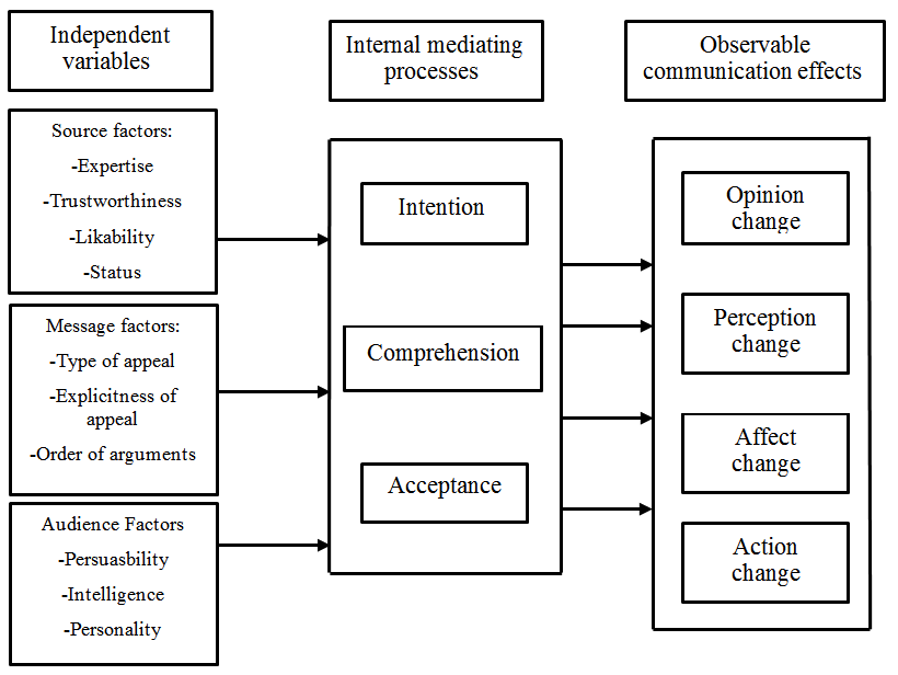
In the Hovland-Yale model, persuasion is understood as a process involving the Independent variables of Source, Message, and Audience. The elements of each factor then lead to the Audience having internal mediating processes around the topic, which, if independent variables are strong enough, can strengthen or change attitudes or behaviors. The interplay of the internal mediating processes leads to persuasion or not, which then leads to the observable effect of the communication (or not, if the message is ineffective). The model proposes that if these elements are carefully crafted and applied, the intended change in attitude or behavior (Effect) is more likely to be successful.
The diagram below helps identify the parts of persuasive communication. It shows what you can control as a presenter, how people think about the message and the impact it has. If done well, it can lead to change. I’ll focus exclusively on the independent variables in the far left side of the diagram in this article because, theoretically, this is what you, as the outside source creating a persuasive message, are in control of and, if done well, would lead to the appropriate mediating processes and desired observable effects.
Effective communication can reinforce currently held positions. You don’t always need to change minds when presenting research; much of what we find and present might align with currently held beliefs and support actions our stakeholders are already considering.
Over the years, researchers have explored the usefulness and limitations of this model in various contexts. I’ve provided a list of citations at the end of this article if you are interested in exploring academic literature on the Hovland-Yale model. Reflecting on some of the research findings can help shape how we create and deliver our persuasive communication. Some consistent from academia highlight that:
- Source credibility significantly influences the acceptance of a persuasive message. A high-credibility source is more persuasive than a low-credibility one.
- Messages that are logically structured, clear, and relatively concise are more likely to be persuasive.
- An audience’s attitude change is also dependent on the channel of communication. Mass media is found to be less effective in changing attitudes than face-to-face communication.
- The audience’s initial attitude, intelligence, and self-esteem have a significant role in the persuasion process. Research suggests that individuals with high intelligence are typically more resistant to persuasion efforts, and those with moderate self-esteem are easier to persuade than those with low or high self-esteem.
- The effect of persuasive messages tends to fade over time, especially if delivered by a non-credible source. This suggests a need to reinforce even effective messages on a regular basis to maintain an effect.
I’ll cover the impact of each of these bullets on UX research and design presentations in the relevant sections below.
It’s important to note that while the Hovland-Yale model provides valuable insight into persuasive communication, it remains a simplification of a complex process. Actual attitude change and decision-making can be influenced by a multitude of other factors not covered in this model, like emotional states, group dynamics, and more, necessitating a multi-faceted approach to persuasion. However, the model provides a manageable framework to strengthen the communication of UX research findings, with a focus on elements that are within the control of the researcher and product team. I’ll break down the process of presenting findings to various audiences in the following section.
Let’s move into applying the models to our work as UX practitioners with a focus on how the model applies to how we prepare and present our findings to various stakeholders. You can reference the diagram above as needed as we move through the Independent variables.
Applying The Hovland-Yale Model To Presenting Your UX Research FindingsLet’s break down the key parts of the Hovland-Yale model and see how we can use them when presenting our UX research and design ideas.
SourceRevised: The Hovland-Yale model stresses that where a message comes from greatly affects how believable and effective it is. Research shows that a convincing source needs to be seen as dependable, informed, and trustworthy. In UX research, this source is usually the researcher(s) and other UX team members who present findings, suggest actions, lead workshops, and share design ideas. It’s crucial for the UX team to build trust with their audience, which often includes users, stakeholders, and designers.
You can demonstrate and strengthen your credibility throughout the research process and once again when presenting your findings.
How Can You Make Yourself More Credible?
You should start building your expertise and credibility before you even finish your research. Often, stakeholders will have already formed an opinion about your work before you even walk into the room. Here are a couple of ways to boost your reputation before or at the beginning of a project:
Case Studies
A well-written case study about your past work can be a great way to show stakeholders the benefits of user-centered design. Make sure your case studies match what your stakeholders care about. Don’t just tell an interesting story; tell a story that matters to them. Understand their priorities and tailor your case study to show how your UX work has helped achieve goals like higher ROI, happier customers, or lower turnover. Share these case studies as a document before the project starts so stakeholders can review them and get a positive impression of your work.

Thought Leadership
Sharing insights and expertise that your UX team has developed is another way to build credibility. This kind of “thought leadership” can establish your team as the experts in your field. It can take many forms, like blog posts, articles in industry publications, white papers, presentations, podcasts, or videos. You can share this content on your website, social media, or directly with stakeholders.
For example, if you’re about to start a project on gathering customer feedback, share any relevant articles or guides your team has created with your stakeholders before the project kickoff. If you are about to start developing a voice of the customer program and you happen to have Victor or Dana on your team, share their article on creating a VoC to your group of stakeholders prior to the kickoff meeting. [Shameless self-promotion and a big smile emoji].
You can also build credibility and trust while discussing your research and design, both during the project and when you present your final results.
Business Goals Alignment
To really connect with stakeholders, make sure your UX goals and the company’s business goals work together. Always tie your research findings and design ideas back to the bigger picture. This means showing how your work can affect things like customer happiness, more sales, lower costs, or other important business measures. You can even work with stakeholders to figure out which measures matter most to them. When you present your designs, point out how they’ll help the company reach its goals through good UX.
Industry Benchmarks
These days, it’s easier to find data on how other companies in your industry are doing. Use this to your advantage! Compare your findings to these benchmarks or even to your competitors. This can help stakeholders feel more confident in your work. Show them how your research fits in with industry trends or how it uncovers new ways to stand out. When you talk about your designs, highlight how you’ve used industry best practices or made changes based on what you’ve learned from users.
Methodological Transparency
Be open and honest about how you did your research. This shows you know what you’re doing and that you can be trusted. For example, if you were looking into why fewer people are renewing their subscriptions to a fitness app, explain how you planned your research, who you talked to, how you analyzed the data, and any challenges you faced. This transparency helps people accept your research results and builds trust.
Increasing Credibility Through Design Concepts
Here are some specific ways to make your design concepts more believable and trustworthy to stakeholders:
Ground Yourself in Research. You’ve done the research, so use it! Make sure your design decisions are based on your findings and user data. When you present, highlight the data that supports your choices.
Go Beyond Mockups. It’s helpful for stakeholders to see your designs in action. Static mockups are a good start, but try creating interactive prototypes that show how users will move through and use your design. This is especially important if you’re creating something new that stakeholders might have trouble visualizing.
User Quotes and Testimonials. Include quotes or stories from users in your presentation. This makes the process more personal and shows that you’re focused on user needs. You can use these quotes to explain specific design choices.
Before & After Impact. Use visuals or user journey maps to show how your design solution improves the user experience. If you’ve mapped out the current user journey or documented existing problems, show how your new design fixes those problems. Don’t leave stakeholders guessing about your design choices. Briefly explain why you made key decisions and how they help users or achieve business goals. You should have research and stakeholder input to back up your decisions.
Show Your Process. When presenting a more developed concept, show the work that led up to it. Don’t just share the final product. Include early sketches, wireframes, or simple prototypes to show how the design evolved and the reasoning behind your choices. This is especially helpful for executives or stakeholders who haven’t been involved in the whole process.
Be Open to Feedback and Iteration. Work together with stakeholders. Show that you’re open to their feedback and explain how their input can help you improve your designs.
Much of what I’ve covered above are also general best practices for presenting. Remember, these are just suggestions. You don’t have to use every single one to make your presentations more persuasive. Try different things, see what works best for you and your stakeholders, and have fun with it! The goal is to build trust and credibility with your UX team.
MessageThe Hovland-Yale model, along with most other communication models, suggests that what you communicate is just as important as how you communicate it. In UX research, your message is usually your insights, data analysis, findings, and recommendations.
I’ve touched on this in the previous section because it’s hard to separate the source (who’s talking) from the message (what they’re saying). For example, building trust involves being transparent about your research methods, which is part of your message. So, some of what I’m about to say might sound familiar.
For this article, let’s define the message as your research findings and everything that goes with them (e.g., what you say in your presentation, the slides you use, other media), as well as your design concepts (how you show your design solutions, including drawings, wireframes, prototypes, and so on).
The Hovland-Yale model says it’s important to make your message easy to understand, relevant, and impactful. For example, instead of just saying,
“30% of users found the signup process difficult.”
you could say,
“30% of users struggled to sign up because the process was too complicated. This could lead to fewer renewals. Making the signup process easier could increase renewals and improve the overall experience.”
Storytelling is also a powerful way to get your message across. Weaving your findings into a narrative helps people connect with your data on a human level and remember your key points. Using real quotes or stories from users makes your presentation even more compelling.
Here are some other tips for delivering a persuasive message:
- Practice Makes Perfect
Rehearse your presentation. This will help you smooth out any rough spots, anticipate questions, and feel more confident. - Anticipate Concerns
Think about any objections stakeholders might have and be ready to address them with data. - Welcome Feedback
Encourage open discussion during your presentation. Listen to what stakeholders have to say and show that you’re willing to adapt your recommendations based on their concerns. This builds trust and makes everyone feel like they’re part of the process. - Follow Through is Key
After your presentation, send a clear summary of the main points and action items. This shows you’re professional and makes it easy for stakeholders to refer back to your findings.
When presenting design concepts, it’s important to tell, not just show, what you’re proposing. Stakeholders might not have a deep understanding of UX, so just showing them screenshots might not be enough. Use user stories to walk them through the redesigned experience. This helps them understand how users will interact with your design and what benefits it will bring. Static screens show the “what,” but user stories reveal the “why” and “how.” By focusing on the user journey, you can demonstrate how your design solves problems and improves the overall experience.
For example, if you’re suggesting changes to the search bar and adding tooltips, you could say:
“Imagine a user lands on the homepage and sees the new, larger search bar. They enter their search term and get results. If they see an unfamiliar tool or a new action, they can hover over it to see a brief description.”
Here are some other ways to make your design concepts clearer and more persuasive:
- Clear Design Language
Use a consistent and visually appealing design language in your mockups and prototypes. This shows professionalism and attention to detail. - Accessibility Best Practices
Make sure your design is accessible to everyone. This shows that you care about inclusivity and user-centered design.
One final note on the message is that research has found the likelihood of an audience’s attitude change is also dependent on the channel of communication. Mass media is found to be less effective in changing attitudes than face-to-face communication. Distributed teams and remote employees can employ several strategies to compensate for any potential impact reduction of asynchronous communication:
- Interactive Elements
Incorporate interactive elements into presentations, such as polls, quizzes, or clickable prototypes. This can increase engagement and make the experience more dynamic for remote viewers. - Video Summaries
Create short video summaries of key findings and recommendations. This adds a personal touch and can help convey nuances that might be lost in text or static slides. - Virtual Q&A Sessions
Schedule dedicated virtual Q&A sessions where stakeholders can ask questions and engage in discussions. This allows for real-time interaction and clarification, mimicking the benefits of face-to-face communication. - Follow-up Communication
Actively follow up with stakeholders after they’ve reviewed the materials. Offer to discuss the content, answer questions, and gather feedback. This demonstrates a commitment to communication and can help solidify key takeaways.
Framing Your Message for Maximum Impact
The way you frame an issue can greatly influence how stakeholders see it. Framing is a persuasion technique that can help your message resonate more deeply with specific stakeholders. Essentially, you want to frame your message in a way that aligns with your stakeholders’ attitudes and values and presents your solution as the next logical step. There are many resources on how to frame messages, as this technique has been used often in public safety and public health research to encourage behavior change. This article discusses applying framing techniques for digital design.
You can also frame issues in a way that motivates your stakeholders. For example, instead of calling usability issues “problems,” I like to call them “opportunities.” This emphasizes the potential for improvement. Let’s say your research on a hospital website finds that the appointment booking process is confusing. You could frame this as an opportunity to improve patient satisfaction and maybe even reduce call center volume by creating a simpler online booking system. This way, your solution is a win-win for both patients and the hospital. Highlighting the positive outcomes of your proposed changes and using language that focuses on business benefits and user satisfaction can make a big difference.
AudienceUnderstanding your audience’s goals is essential before embarking on any research or design project. It serves as the foundation for tailoring content, supporting decision-making processes, ensuring clarity and focus, enhancing communication effectiveness, and establishing metrics for evaluation.
One specific aspect to consider is securing buy-in from the product and delivery teams prior to beginning any research or design. Without their investment in the outcomes and input on the process, it can be challenging to find stakeholders who see value in a project you created in a vacuum. Engaging with these teams early on helps align expectations, foster collaboration, and ensure that the research and design efforts are informed by the organization’s objectives.
Once you’ve identified your key stakeholders and secured buy-in, you should then Map the Decision-Making Process or understand the decision-making process your audience goes through, including the pain points, considerations, and influencing factors.
- How are decisions made, and who makes them?
- Is it group consensus?
- Are there key voices that overrule all others?
- Is there even a decision to be made in regard to the work you will do?
Understanding the decision-making process will enable you to provide the necessary information and support at each stage.
Finally, prior to engaging in any work, set clear objectives with your key stakeholders. Your UX team needs to collaborate with the product and delivery teams to establish clear objectives for the research or design project. These objectives should align with the organization’s goals and the audience’s needs.
By understanding your audience’s goals and involving the product and delivery teams from the outset, you can create research and design outcomes that are relevant, impactful, and aligned with the organization’s objectives.
As the source of your message, it’s your job to understand who you’re talking to and how they see the issue. Different stakeholders have different interests, goals, and levels of knowledge. It’s important to tailor your communication to each of these perspectives. Adjust your language, what you emphasize, and the complexity of your message to suit your audience. Technical jargon might be fine for technical stakeholders, but it could alienate those without a technical background.
Audience Characteristics: Know Your Stakeholders
Remember, your audience’s existing opinions, intelligence, and self-esteem play a big role in how persuasive you can be. Research suggests that people with higher intelligence tend to be more resistant to persuasion, while those with moderate self-esteem are easier to persuade than those with very low or very high self-esteem. Understanding your audience is key to giving a persuasive presentation of your UX research and design concepts. Tailoring your communication to address the specific concerns and interests of your stakeholders can significantly increase the impact of your findings.
To truly know your audience, you need information about who you’ll be presenting to, and the more you know, the better. At the very least, you should identify the different groups of stakeholders in your audience. This could include designers, developers, product managers, and executives. If possible, try to learn more about your key stakeholders. You could interview them at the beginning of your process, or you could give them a short survey to gauge their attitudes and behaviors toward the area your UX team is exploring.
Then, your UX team needs to decide the following:
- How can you best keep all stakeholders engaged and informed as the project unfolds?
- How will your presentation or concepts appeal to different interests and roles?
- How can you best encourage discussion and decision-making with the different stakeholders present?
- Should you hold separate presentations because of the wide range of stakeholders you need to share your findings with?
- How will you prioritize information?
Your answers to the previous questions will help you focus on what matters most to each stakeholder group. For example, designers might be more interested in usability issues, while executives might care more about the business impact. If you’re presenting to a mixed audience, include a mix of information and be ready to highlight what’s relevant to each group in a way that grabs their attention. Adapt your communication style to match each group’s preferences. Provide technical details for developers and emphasize user experience benefits for executives.
Example
Let’s say you did UX research for a mobile banking app, and your audience includes designers, developers, and product managers.
Designers:
- Focus on: Design-related findings like what users prefer in the interface, navigation problems, and suggestions for the visual design.
- How to communicate: Use visuals like heatmaps and user journey maps to show design challenges. Talk about how fixing these issues can make the overall user experience better.
Developers:
- Focus on: Technical stuff, like performance problems, bugs, or challenges with building the app.
- How to communicate: Share code snippets or technical details about the problems you found. Discuss possible solutions that the developers can actually build. Be realistic about how much work it will take and be ready to talk about a “minimum viable product” (MVP).
Product Managers:
- Focus on: Findings that affect how users engage with the app, how long they keep using it, and the overall business goals.
- How to communicate: Use numbers and data to show how UX improvements can help the business. Explain how the research and your ideas fit into the product roadmap and long-term strategy.
By tailoring your presentation to each group, you make sure your message really hits home. This makes it more likely that they’ll support your UX research findings and work together to make decisions.
The Effect (Impact)
The end goal of presenting your findings and design concepts is to get key stakeholders to take action based on what you learned from users. Make sure the impact of your research is crystal clear. Talk about how your findings relate to business goals, customer happiness, and market success (if those are relevant to your product). Suggest clear, actionable next steps in the form of design concepts and encourage feedback and collaboration from stakeholders. This builds excitement and gets people invested. Make sure to answer any questions and ask for more feedback to show that you value their input. Remember, stakeholders play a big role in the product’s future, so getting them involved increases the value of your research.
The Call to Action (CTA)
Your audience needs to know what you want them to do. End your presentation with a strong call to action (CTA). But to do this well, you need to be clear on what you want them to do and understand any limitations they might have.
For example, if you’re presenting to the CEO, tailor your CTA to their priorities. Focus on the return on investment (ROI) of user-centered design. Show how your recommendations can increase sales, improve customer satisfaction, or give the company a competitive edge. Use clear visuals and explain how user needs translate into business benefits. End with a strong, action-oriented statement, like
“Let’s set up a meeting to discuss how we can implement these user-centered design recommendations to reach your strategic goals.”
If you’re presenting to product managers and business unit leaders, focus on the business goals they care about, like increasing revenue or reducing customer churn. Explain your research findings in terms of ROI. For example, a strong CTA could be:
“Let’s try out the redesigned checkout process and aim for a 10% increase in conversion rates next quarter.”
Remember, the effects of persuasive messages can fade over time, especially if the source isn’t seen as credible. This means you need to keep reinforcing your message to maintain its impact.
Understanding Limitations and Addressing Concerns
Persuasion is about guiding understanding, not tricking people. Be upfront about any limitations your audience might have, like budget constraints or limited development resources. Anticipate their concerns and address them in your CTA. For example, you could say,
“I know implementing the entire redesign might need more resources, so let’s prioritize the high-impact changes we found in our research to improve the checkout process within our current budget.”
By considering both your desired outcome and your audience’s perspective, you can create a clear, compelling, and actionable CTA that resonates with stakeholders and drives user-centered design decisions.
Finally, remember that presenting your research findings and design concepts isn’t the end of the road. The effects of persuasive messages can fade over time. Your team should keep looking for ways to reinforce key messages and decisions as you move forward with implementing solutions. Keep your presentations and concepts in a shared folder, remind people of the reasoning behind decisions, and be flexible if there are multiple ways to achieve the desired outcome. Showing how you’ve addressed stakeholder goals and concerns in your solution will go a long way in maintaining credibility and trust for future projects.
A Tool to Track Your Alignment to the Hovland-Yale Model
You and your UX team are likely already incorporating elements of persuasion into your work. It might be helpful to track how you are doing this to reflect on what works, what doesn’t, and where there are gaps. I’ve provided a spreadsheet in Figure 3 below for you to modify and use as you might see fit. I’ve included sample data to provide an example of what type of information you might want to record. You can set up the structure of a spreadsheet like this as you think about kicking off your next project, or you can fill it in with information from a recently completed project and reflect on what you can incorporate more in the future.
Please use the spreadsheet below as a suggestion and make additions, deletions, or changes as best suited to meet your needs. You don’t need to be dogmatic in adhering to what I’ve covered here. Experiment, find what works best for you, and have fun.
| Project Phase | Persuasion Element | Topic | Description | Example | Notes/ Reflection |
|---|---|---|---|---|---|
| Pre-Presentation | Audience | Stakeholder Group | Identify the specific audience segment (e.g., executives, product managers, marketing team) | Executives | |
| Message | Message Objectives | What specific goals do you aim to achieve with each group? (e.g., garner funding, secure buy-in for specific features) | Secure funding for continued app redesign | ||
| Source | Source Credibility | How will you establish your expertise and trustworthiness to each group? (e.g., past projects, relevant data) | Highlighted successful previous UX research projects & strong user data analysis skills | ||
| Message | Message Clarity & Relevance | Tailor your presentation language and content to resonate with each audience’s interests and knowledge level | Presented a concise summary of key findings with a focus on potential ROI and revenue growth for executives | ||
| Presentation & Feedback | Source | Attention Techniques | How did you grab each group’s interest? (e.g., visuals, personal anecdotes, surprising data) | Opened presentation with a dramatic statistic about mobile banking app usage | |
| Message | Comprehension Strategies | Did you ensure understanding of key information? (e.g., analogies, visuals, Q&A) | Used relatable real-world examples and interactive charts to explain user research findings | ||
| Message | Emotional Appeals | Did you evoke relevant emotions to motivate action? (e.g., fear of missing out, excitement for potential) | Highlighted potential revenue growth and improved customer satisfaction with app redesign | ||
| Message | Retention & Application | What steps did you take to solidify key takeaways and encourage action? (e.g., clear call to action, follow-up materials) | Ended with a concise call to action for funding approval and provided detailed research reports for further reference | ||
| Audience | Stakeholder Feedback | Record their reactions, questions, and feedback during and after the presentation | Executives impressed with user insights, product managers requested specific data breakdowns | ||
| Analysis & Reflection | Effect | Effective Strategies & Outcomes | Identify techniques that worked well and their impact on each group | Executives responded well to the emphasis on business impact, leading to conditional funding approval | |
| Feedback | Improvements for Future Presentations | Note areas for improvement in tailoring messages and engaging each stakeholder group | Consider incorporating more interactive elements for product managers and diversifying data visualizations for wider appeal | ||
| Analysis | Quantitative Metrics | Track changes in stakeholder attitudes | Conducted a follow-up survey to measure stakeholder agreement with design recommendations before and after the presentation | Assess effectiveness of the presentation |
Figure 3: Example of spreadsheet categories to track the application of the Hovland-Yale model to your presentation of UX Research findings.
References
Foundational Works
- Hovland, C. I., Janis, I. L., & Kelley, H. H. (1953). Communication and persuasion. New Haven, CT: Yale University Press. (The cornerstone text on the Hovland-Yale model).
- Weiner, B. J., & Hovland, C. I. (1956). Participating vs. nonparticipating persuasive presentations: A further study of the effects of audience participation. Journal of Abnormal and Social Psychology, 52(2), 105-110. (Examines the impact of audience participation in persuasive communication).
- Kelley, H. H., & Hovland, C. I. (1958). The communication of persuasive content. Psychological Review, 65(4), 314-320. (Delves into the communication of persuasive messages and their effects).
Contemporary Applications
- Pfau, M., & Dalton, M. J. (2008). The persuasive effects of fear appeals and positive emotion appeals on risky sexual behavior intentions. Journal of Communication, 58(2), 244-265. (Applies the Hovland-Yale model to study the effectiveness of fear appeals).
- Chen, G., & Sun, J. (2010). The effects of source credibility and message framing on consumer online health information seeking. Journal of Interactive Advertising, 10(2), 75-88. (Analyzes the impact of source credibility and message framing, concepts within the model, on health information seeking).
- Hornik, R., & McHale, J. L. (2009). The persuasive effects of emotional appeals: A meta-analysis of research on advertising emotions and consumer behavior. Journal of Consumer Psychology, 19(3), 394-403. (Analyzes the role of emotions in persuasion, a key aspect of the model, in advertising).