Accessibility is key in modern web design. A site that doesn’t consider how its user experience may differ for various audiences — especially those with disabilities — will fail to engage and serve everyone equally. One of the best ways to prevent this is to approach your site from a bottom-up perspective.
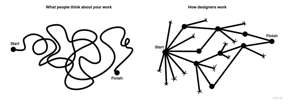
Understanding Bottom-Up DesignConventional, top-down design approaches start with the big picture before breaking these goals and concepts into smaller details. Bottom-up philosophies, by contrast, consider the minute details first, eventually achieving the broader goal piece by piece.
This alternative way of thinking is important for accessibility in general because it reflects how neurodivergent people commonly think. While non-autistic people tend to think from a top-down perspective, those with autism often employ a bottom-up way of thinking.
Of course, there is considerable variation, and researchers have identified at least three specialist thinking types within the autism spectrum:
- Visual thinkers who think in images;
- Pattern thinkers who think of concepts in terms of patterns and relationships;
- Verbal thinkers who think only in word detail.
Still, research shows that people with autism and ADHD show a bias toward bottom-up thinking rather than the top-down approach you often see in neurotypical users. Consequently, a top-down strategy means you may miss details your audience may notice, and your site may not feel easily usable for all users.

As a real-world example, consider the task of writing an essay. Many students are instructed to start an essay assignment by thinking about the main point they want to convey and then create an outline with points that support the main argument. This is top-down thinking — starting with the big picture of the topic and then gradually breaking down the topic into points and then later into words that articulate these points.

In contrast, someone who uses a bottom-up thinking approach might start an essay with no outline but rather just by freely jotting down every idea that comes to mind as it comes to mind — perhaps starting with one particular idea or example that the writer finds interesting and wants to explore further and branching off from there. Then, once all the ideas have been written out, the writer goes back to group related ideas together and arrange them into a logical outline. This writer starts with the small details of the essay and then works these details into the big picture of the final form.
In web design, in particular, a bottom-up approach means starting with the specifics of the user experience instead of the desired effect. You may determine a readable layout for a single blog post, then ask how that page relates to others and slowly build on these decisions until you have several well-organized website categories.
You may even get more granular. Say you start your site design by placing a menu at the bottom of a mobile site to make it easier to tap with one hand, improving ease of use. Then, you build a drop-down menu around that choice — placing the most popular or needed options at the bottom instead of the top for easy tapping. From there, you may have to rethink larger-scale layouts to work around those interactive elements being lower on the screen, slowly addressing larger categories until you have a finished site design.

In either case, the idea of bottom-up design is to begin with the most specific problems someone might have. You then address them in sequence instead of determining the big picture first.
Benefits Of A Bottom-Up Approach For Accessible DesignWhile neither bottom-up nor top-down approaches dominate the industry, some web engineers prefer the bottom-up approach due to the various accessibility benefits this process provides. This strategy has several accessibility benefits.
Putting User Needs First
The biggest benefit of bottom-up methods is that they prioritize the user’s needs.
Top-down approaches seem organized, but they often result in a site that reflects the designer’s choices and beliefs more than it serves your audience.
Consider some of the complaints that social media users have made over the years related to usability and accessibility for the everyday user. For example, many users complain that their Facebook feed will randomly refresh as they scroll for the sake of providing users with the most up-to-date content. However, the feature makes it virtually impossible to get back to a post a user viewed that they didn’t think to save. Likewise, TikTok’s watch history feature has come and gone over the years and still today is difficult for many users to find without viewing an outside tutorial on the subject.
This is a common problem: 95.9% of the largest one million homepages have Web Content Accessibility Guidelines (WCAG) errors. While a bottom-up alternative doesn’t mean you won’t make any mistakes, it may make them less likely, as bottom-up thinking often improves your awareness of new stimuli so you can catch things you’d otherwise overlook. It’s easier to meet user’s needs when you build your entire site around their experience instead of looking at UX as an afterthought.

Consider this example from Berkshire Hathaway, a multi-billion-dollar holding company. The overall design philosophy is understandable: It’s simple and direct, choosing to focus on information instead of fancy aesthetics that may not suit the company image. However, you could argue it loses itself in this big picture.
While it is simple, the lack of menus or color contrast and the small font make it harder to read and a little overwhelming. This confusion can counteract any accessibility benefits of its simplicity.

Alternatively, even a simple website redesign could include intuitive menus, additional contrast, and accessible font for easy navigation across the site.

The homepage for U.K. charity Scope offers a better example of web design centered around users’ needs. Concise, clear menus line the top of the page to aid quicker, easier navigation. The color scheme is simple enough to avoid confusion but provides enough contrast to make everything easy to read — something the sans-serif font further helps.
Ensuring Accessibility From The Start
A top-down method also makes catering to a diverse audience difficult because you may need to shoehorn features into an existing design.
For example, say, a local government agency creates a website focused on providing information and services to a general audience of residents. The site originally featured high-resolution images, bright colors, and interactive charts.

However, they realize the images are not accessible to people navigating the site with screen readers, while multiple layers of submenus are difficult for keyboard-only users. Further, the bright colors make it hard for visually impaired users to read the site’s information.
The agency, realizing these accessibility concerns, adds captions to each image. However, the captions disrupt the originally intended visual aesthetics and user flow. Further, adjusting the bright colors would involve completely rethinking the site’s entire color palette. If these considerations had been made before the site was built, the site build could have specifically accommodated these elements while still creating an aesthetically pleasing and user-friendly result.

Alternatively, a site initially built with high contrast, a calm color scheme, clear typography, simple menus, and reduced imagery would make this site much more accessible to a wide user base from the get-go.

As a real-world example, consider the Awwwards website. There are plenty of menus to condense information and ease navigation without overloading the screen — a solid accessibility choice. However, there does not seem to be consistent thought in these menus’ placement or organization.

There are far too many menus; some are at the top while others are at the bottom, and a scrolling top bar adds further distractions. It seems like Awwwards may have added additional menus as an afterthought to improve navigation. This leads to inconsistencies and crowding because they did not begin with this thought.
In contrast,
Bottom-up alternatives address usability issues from the beginning, which results in a more functional, accessible website.
Redesigning a system to address a usability issue it didn’t originally make room for is challenging. It can lead to errors like broken links and other unintended consequences that may hinder access for other visitors. Some sites have even claimed to lose 90% of their traffic after a redesign. While bottom-up approaches won’t eliminate those possibilities, they make them less likely by centering everything around usage from the start.

The website for the Vasa Museum in Stockholm, Sweden, showcases a more cohesive approach to ensuring accessibility. Like Awwwards, it uses menus to aid navigation and organization, but there seems to be more forethought into these features. All menus are at the top, and there are fewer of them, resulting in less clutter and a faster way to find what you’re looking for. The overall design complements this by keeping things simple and neat so that the menus stand out.
Increasing Awareness
Similarly, bottom-up design ensures you don’t miss as many accessibility concerns. When you start at the top, before determining what details fit within it, you may not consider all the factors that influence it. Beginning with the specifics instead makes it easier to spot and address problems you would’ve missed otherwise.
This awareness is particularly important for serving a diverse population. An estimated 16% of the global population — 1.6 billion people — have a significant disability. That means there’s a huge range of varying needs to account for, but most people lack firsthand experience living with these conditions. Consequently, it’s easy to miss things impacting others’ UX. You can overcome that knowledge gap by asking how everyone can use your site first.

As these benefits show, a bottom-up design philosophy can be helpful when building an accessible site. Still, top-down methods can be advantageous at times, too. Which is best depends on your situation.
Top-down approaches are a good way to ensure a consistent brand image, as you start with the overall idea and base future decisions on this concept. It also makes it easier to create a design hierarchy to facilitate decision-making within your team. When anyone has a question, they can turn to whoever is above them or refer to the broader goals. Such organization can also mean faster design processes.
Bottom-up methods, by contrast, are better when accessibility for a diverse audience is your main concern. It may be harder to keep everyone on the same overall design philosophy page, but it usually produces a more functional website. You can catch and solve problems early and pay great attention to detail. However, this can mean longer design cycles, which can incur extra costs.
It may come down to what your team is most comfortable with. People think and work differently, with some preferring a top-down approach while others find bottom-up more natural. Combining the two — starting with a top-down model before tackling updates from a bottom-up perspective — can be beneficial, too.
Strategies For Implementing A Bottom-Up Design ModelShould you decide a bottom-up design method is best for your goals, here are some ways you can embrace this philosophy.
Talk To Your Existing User Base
One of the most important factors in bottom-up web design is to center everything around your users. As a result, your existing user base — whether from a separate part of your business or another site you run — is the perfect place to start.
Survey customers and web visitors about their experience on your sites and others. Ask what pain points they have and what features they’d appreciate. Any commonalities between responses deserve attention. You can also turn to WCAG standards for inspiration on accessible functionality, but first-hand user feedback should form the core of your mission.
Look To Past Projects For Accessibility Gaps
Past sites and business projects can also reveal what specifics you should start with. Look for any accessibility gaps by combing through old customer feedback and update histories and using these sites yourself to find issues. Take note of any barriers or usability concerns to address in your next website.
Remember to document everything you find as you go. Up to 90% of organizations’ data is unstructured, making it difficult to analyze later. Reversing that trend by organizing your findings and recording your accessible design process will streamline future accessibility optimization efforts.
Divide Tasks But Communicate Often
Keep in mind that a bottom-up strategy can be time-consuming. One of the reasons why top-down alternatives are popular is because they’re efficient. You can overcome this gap by splitting tasks between smaller teams. However, these groups must communicate frequently to ensure separate design considerations work as a cohesive whole.
A DevOps approach is helpful here. DevOps has helped 49% of its adopters achieve a faster time to market, and 61% report higher-quality deliverables. It also includes space for both detailed work and team-wide meetings to keep everyone on track. Such benefits ensure you can remain productive in a bottom-up strategy.
Accessible Websites Need A Bottom-Up Design ApproachYou can’t overstate the importance of accessible website design. By the same token, bottom-up philosophies are crucial in modern site-building. A detail-oriented approach makes it easier to serve a more diverse audience along several fronts. Making the most of this opportunity will both extend your reach to new niches and make the web a more equitable place.
The Web Accessibility Initiative’s WCAG standards are a good place to start. While these guidelines don’t necessarily describe how to apply a bottom-up approach, they do outline critical user needs and accessibility concerns your design should consider. The site also offers a free and comprehensive Digital Accessibility Foundations course for designers and developers.
Familiarizing yourself with these standards and best practices will make it easier to understand your audience before you begin designing your site. You can then build a more accessible platform from the ground up.
Additionally, the following are some valuable related reads that can act as inspiration in accessibility-centered and user-centric design.
- Inclusive Design for a Digital World: Designing with Accessibility in Mind by Regine M. Gilbert
- Practical Web Inclusion and Accessibility: A Comprehensive Guide to Access Needs by Ashley Firth
- Don’t Make Me Think, Revisited: A Common Sense Approach to Web Usability by Steve Krug
By employing bottom-up thinking as well as resources like these in your design approach, you can create websites that not only meet current accessibility standards but actively encourage site use among users of all backgrounds and abilities.
Further Reading On SmashingMag
- “Getting To The Bottom Of Minimum WCAG-Conformant Interactive Element Size,” Eric Bailey
- “How To Make A Strong Case For Accessibility,” Vitaly Friedman
- “A Guide To Accessible Form Validation,” Sandrina Pereira
- “Creating A High-Contrast Design System With CSS Custom Properties,” Brecht De Ruyte


