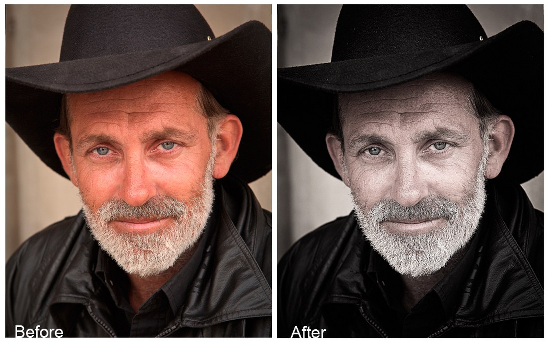
Fluid Everything Else

Featured Imgs 23

We all know how to do responsive design, right? We use media queries. Well no, we use container queries now, don’t we? Sometimes we get inventive with flexbox or autoflowing grids. If we’re feeling really adventurous we can reach for fluid typography.

I’m a bit uncomfortable that responsive design is often pushed into discreet chunks, like “layout A up to this size, then layout B until there’s enough space for layout C.” It’s OK, it works and fits into a workflow where screens are designed as static layouts in PhotoFigVa (caveat, I made that up). But the process feels like a compromise to me. I’ve long believed that responsive design should be almost invisible to the user. When they visit my site on a mobile device while waiting in line for K-Pop tickets, they shouldn’t notice that it’s different from just an hour ago, sitting at the huge curved gaming monitor they persuaded their boss they needed.

Consider this simple hero banner and its mobile equivalent. Sorry for the unsophisticated design. The image is AI generated, but It’s the only thing about this article that is.

Hero banner displaying a meerkat standing on its hind legs next to a white heading to the right. A mobile version is next to thjat with the heading above the meerkat.

The meerkat and the text are all positioned and sized differently. The traditional way to pull this off is to have two layouts, selected by a media, sorry, container query. There might be some flexibility in each layout, perhaps centering the content, and a little fluid typography on the font-size, but we’re going to choose a point at which we flip the layout in and out of the stacked version. As a result, there are likely to be widths near the breakpoint where the layout looks either a little empty or a little congested.

Is there another way?

It turns out there is. We can apply the concept of fluid typography to almost anything. This way we can have a layout that fluidly changes with the size of its parent container. Few users will ever see the transition, but they will all appreciate the results. Honestly, they will.

Let’s get this styled up

For the first step, let’s style the layouts individually, a little like we would when using width queries and a breakpoint. In fact, let’s use a container query and a breakpoint together so that we can easily see what properties need to change.

This is the markup for our hero, and it won’t change:

<div id="hero">
  <div class="details">
    <h1>LookOut</h1>
    <p>Eagle Defense System</p>
  </div>
</div>

This is the relevant CSS for the wide version:

#hero {
  container-type: inline-size;
  max-width: 1200px;
  min-width: 360px;

  .details {
    position: absolute;
    z-index: 2;

    top: 220px;
    left: 565px;

    h1 { font-size: 5rem; }

    p { font-size: 2.5rem; }
  }

  &::before {
    content: '';
    position: absolute;
    z-index: 1;

    top: 0; left: 0; right: 0; bottom: 0;

    background-image: url(../meerkat.jpg);
    background-origin: content-box;
    background-repeat: no-repeat;

    background-position-x: 0;
    background-position-y: 0;
    background-size: auto 589px;
  }
}

I’ve attached the background image to a ::before pseudo-element so I can use container queries on it (because containers cannot query themselves). We’ll keep this later on so that we can use inline container query (cqi) units. For now, here’s the container query that just shows the values we’re going to make fluid:

@container (max-width: 800px) {
  #hero {
    .details {
      top: 50px;
      left: 20px;

      h1 { font-size: 3.5rem; }

      p { font-size: 2rem; }
    }

    &::before {
      background-position-x: -310px;
      background-position-y: -25px;
      background-size: auto 710px;
    }
  }
}

You can see the code running in a live demo — it’s entirely static to show the limitations of a typical approach.

Let’s get fluid

Now we can take those start and end points for the size and position of both the text and background and make them fluid. The text size uses fluid typography in a way you are already familiar with. Here’s the result — I’ll explain the expressions once you’ve looked at the code.

First the changes to the position and size of the text:

/* Line changes
 * -12,27 +12,32
 */
  
.details {
  /* ... lines 14-16 unchanged */
  /* Evaluates to 50px for a 360px wide container, and 220px for 1200px */
  top: clamp(50px, 20.238cqi - 22.857px, 220px);

  /* Evaluates to 20px for a 360px wide container, and 565px for 1200px */
  left: clamp(20px, 64.881cqi - 213.571px, 565px);
  
  /* ... lines 20-25 unchanged */
  h1 {
    /* Evaluates to 3.5rem for a 360px wide container, and 5rem for 1200px */
    font-size: clamp(3.5rem, 2.857rem + 2.857cqi, 5rem);
    /* ... font-weight unchanged */

  }

  p {
    /* Evaluates to 2rem for a 360px wide container, and 2.5rem for 1200px */
    font-size: clamp(2rem, 1.786rem + 0.952cqi, 2.5rem);
  }
}

And here’s the background position and size for the meerkat image:

/* Line changes
 * -50,3 +55,8
 */

/* Evaluates to -310px for a 360px wide container, and 0px for 1200px */
background-position-x: clamp(-310px, 36.905cqi - 442.857px, 0px);
/* Evaluates to -25px for a 360px wide container, and 0px for 1200px */
background-position-y: clamp(-25px, 2.976cqi);
/* Evaluates to 710px for a 360px wide container, and 589px for 1200px */
background-size: auto clamp(589px, 761.857px - 14.405cqi, 710px);

Now we can drop the container query entirely.

Let’s explain those clamp() expressions. We’ll start with the expression for the top property.

/* Evaluates to 50px for a 360px wide container, and 220px for 1200px */
top: clamp(50px, 20.238cqi - 22.857px, 220px);

You’ll have noticed there’s a comment there. These expressions are a good example of how magic numbers are a bad thing. But we can’t avoid them here, as they are the result of solving some simultaneous equations — which CSS cannot do!

The upper and lower bounds passed to clamp() are clear enough, but the expression in the middle comes from these simultaneous equations:

f + 12v = 220
f + 3.6v = 50

…where f is the number of fixed-size length units (i.e., px) and v is the variable-sized unit (cqi). In the first equation, we are saying that we want the expression to evaluate to 220px when 1cqi is equal to 12px. In the second equation, we’re saying we want 50px when 1cqi is 3.6px, which solves to:

f = -22.857
v = 20.238

…and this tidies up to 20.238cqi – 22.857px in a calc()-friendly expression.

When the fixed unit is different, we must change the size of the variable units accordingly. So for the <h1> element’s font-size we have;

/* Evaluates to 2rem for a 360px wide container, and 2.5rem for 1200px */
font-size: clamp(2rem, 1.786rem + 0.952cqi, 2.5rem);

This is solving these equations because, at a container width of 1200px, 1cqi is the same as 0.75rem (my rems are relative to the default UA stylesheet, 16px), and at 360px wide, 1cqi is 0.225rem.

f + 0.75v = 2.5
f + 0.225v = 2

This is important to note: The equations are different depending on what unit you are targeting.

Honestly, this is boring math to do every time, so I made a calculator you can use. Not only does it solve the equations for you (to three decimal places to keep your CSS clean) it also provides that helpful comment to use alongside the expression so that you can see where they came from and avoid magic numbers. Feel free to use it. Yes, there are many similar calculators out there, but they concentrate on typography, and so (rightly) fixate on rem units. You could probably port the JavaScript if you’re using a CSS preprocessor.

The clamp() function isn’t strictly necessary at this point. In each case, the bounds of clamp() are set to the values of when the container is either 360px or 1200px wide. Since the container itself is constrained to those limits — by setting min-width and max-width values — the clamp() expression should never invoke either bound. However, I prefer to keep clamp() there in case we ever change our minds (which we are about to do) because implicit bounds like these are difficult to spot and maintain.

Avoiding injury

We could consider our work finished, but we aren’t. The layout still doesn’t quite work. The text passes right over the top of the meerkat’s head. While I have been assured this causes the meerkat no harm, I don’t like the look of it. So, let’s make some changes to make the text avoid hitting the meerkat.

The first is simple. We’ll move the meerkat to the left more quickly so that it gets out of the way. This is done most easily by changing the lower end of the interpolation to a wider container. We’ll set it so that the meerkat is fully left by 450px rather than down to 360px. There’s no reason the start and end points for all of our fluid expressions need to align with the same widths, so we can keep the other expressions fluid down to 360px.

Using my trusty calculator, all we need to do is change the clamp() expressions for the background-position properties:

/* Line changes
 * -55,5 +55,5
 */

/* Evaluates to -310px for a 450px wide container, and 0px for 1200px */
background-position-x: clamp(-310px, 41.333cqi - 496px, 0px);

/* Evaluates to -25px for a 450px wide container, and 0px for 1200px */
background-position-y: clamp(-25px, 3.333cqi - 40px, 0px);

This improves things, but not totally. I don’t want to move it any quicker, so next we’ll look at the path the text takes. At the moment it moves in a straight line, like this:

Showing the path the heading travels as the hero banner goes from a desktop size to a tablet size to a mobile size.

But can we bend it? Yes, we can.

A Bend in the path

One way we can do this is by defining two different interpolations for the top coordinate that places the line at different angles and then choosing the smallest one. This way, it allows the steeper line to “win” at larger container widths, and the shallower line becomes the value that wins when the container is narrower than about 780px. The result is a line with a bend that misses the meerkat.

All we’re changing is the top value, but we must calculate two intermediate values first:

/* Line changes
 * -18,2 +18,9 @@
 */

/* Evaluates to 220px for a 1200px wide container, and -50px for 360px */
--top-a: calc(32.143cqi - 165.714px);

/* Evaluates to 120px for a 1200px wide container, and 50px for 360px */
--top-b: calc(20px + 8.333cqi);

/* By taking the max, --topA is used at lower widths, with --topB taking over when wider.
We only need to apply clamp when the value is actually used */
top: clamp(50px, max(var(--top-a), var(--top-b)), 220px);

For these values, rather than calculating them formally using a carefully chosen midpoint, I experimented with the endpoints until I got the result I wanted. Experimentation is just as valid as calculation as a way of getting the result you need. In this case, I started with duplicates of the interpolation in custom variables. I could have split the path into explicit sections using a container query, but that doesn’t reduce the math overhead, and using the min() function is cleaner to my eye. Besides, this article isn’t strictly about container queries, is it?

Now the text moves along this path. Open up the live demo to see it in action.

Showing the path the heading travels as the hero banner goes from a desktop size to a tablet size to a mobile size. The path makes a sharp angle as it travels over the meerkat.

CSS can’t do everything

As a final note on the calculations, it’s worth pointing out that there are restrictions as far as what we can and can’t do. The first, which we have already mitigated a little, is that these interpolations are linear. This means that easing in or out, or other complex behavior, is not possible.

Another major restriction is that CSS can only generate length values this way, so there is no way in pure CSS to apply, for example, opacity or a rotation angle that is fluid based on the container or viewport size. Preprocessors can’t help us here either because the limitation is on the way calc() works in the browser.

Both of these restrictions can be lifted if you’re prepared to rely on a little JavaScript. A few lines to observe the width of the container and set a CSS custom property that is unitless is all that’s needed. I’m going to use that to make the text follow a quadratic Bezier curve, like this:

Showing the path the heading travels as the hero banner goes from a desktop size to a tablet size to a mobile size. The path makes a smooth curve as it travels over the meerkat.

There’s too much code to list here, and too much math to explain the Bezier curve, but go take a look at it in action in this live demo.

We wouldn’t even need JavaScript if expressions like calc(1vw / 1px) didn’t fail in CSS. There is no reason for them to fail since they represent a ratio between two lengths. Just as there are 2.54cm in 1in, there are 8px in 1vw when the viewport is 800px wide, so calc(1vw / 1px) should evaluate to a unitless 8 value.

They do fail though, so all we can do is state our case and move on.

Fluid everything doesn’t solve all layouts

There will always be some layouts that need size queries, of course; some designs will simply need to snap changes at fixed breakpoints. There is no reason to avoid that if it’s right. There is also no reason to avoid mixing the two, for example, by fluidly sizing and positioning the background while using a query to snap between grid definitions for the text placement. My meerkat example is deliberately contrived to be simple for the sake of demonstration.

One thing I’ll add is that I’m rather excited by the possibility of using the new Anchor Positioning API for fluid positioning. There’s the possibility of using anchor positioning to define how two elements might flow around the screen together, but that’s for another time.


Fluid Everything Else originally published on CSS-Tricks, which is part of the DigitalOcean family. You should get the newsletter.

90+ Best Instagram Filters for Photoshop 2025

Featured Imgs 23

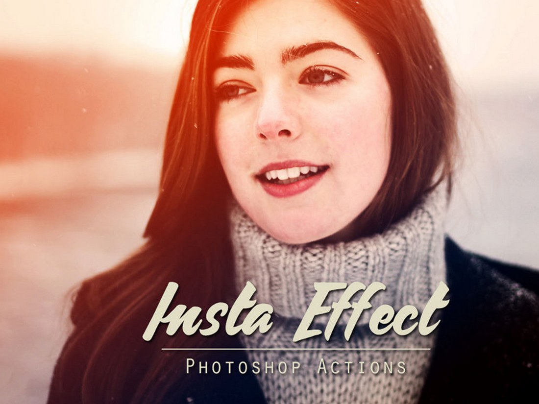
Filters are one of the best features of Instagram. Everyone loves the idea of prettifying their photos in an instant and sharing them with their friends and family. But have you ever wanted a set of Instagram filters for Photoshop? I know I have.

The good news is, you don’t just need the Instagram app to apply filters to your photos. You can actually create even more beautiful photos with customizable filters using Photoshop actions and upload them to not just Instagram, but any other social network you want.

We handpicked a collection of free and premium Instagram Photoshop actions for creating creative and stylish Instagram filter effects in Photoshop. With a single click, you can apply these effects to your photos and customize them to your preference.

We’re also sharing our tips and advice on how to use Instagram filters in Photoshop.

Top Pick

Glamour Photography Photoshop Actions

Glamour Photography Photoshop Actions

Instagram mostly consists of lifestyle and fashion bloggers who regularly share glamourous photos of their lives. This is a pack of Photoshop actions made specifically for those users.

This pack includes 15 unique Photoshop actions that are designed for enhancing lifestyle portrait photos to make them more attractive and beautiful.

Why This Is A Top Pick

With this Photoshop actions bundle, you’ll be able to make your smartphone photos look just as good as photos taken with an expensive DSLR. All of the filter effects are non-destructive and fully customizable as well.

Vintage Film Effect Photoshop Filter

Vintage Film Effect Photoshop Filter

This Photoshop filter gives your photos an appealing, Instagram-style vintage look. This easy-to-use filter includes Smart Object layers for customization, making the whole process straightforward. Simply replace the placeholder with your image, save it, and revel in the modified artwork.

Grain Film Instagram Photoshop Filter

Grain Film Instagram Photoshop Filter

A unique Photoshop effect that can completely change the appearance of your images. Designed to convert your photos with a grainy film look, this filter lets you fully customize the look and feel with adjustment layers as well. Ideal for photos with resolutions between 1000 and 3000 pixels.

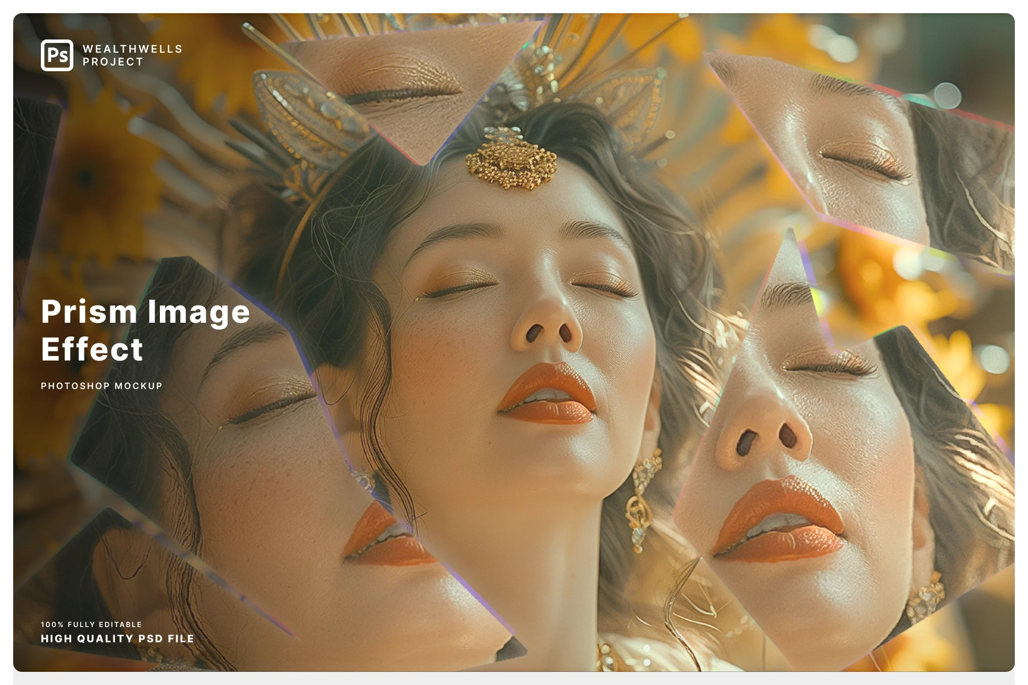
Prism Image Effect for Photoshop

Prism Image Effect for Photoshop

This is a dynamic Photoshop effect perfect for enhancing your portraits and selfies with a unique vibe. Ideal for influencers and content creators, this template offers simple-to-use, customizable effects with prism-like look.

Gradient Grunge Instagram Photoshop Filter

Gradient Grunge Instagram Photoshop Filter

Inject a touch of trendy grunge into your images with this Photoshop filter. It offers a distinctive digital art-like look mixed with duotone colors. This high-resolution, customizable template is tailored for Photoshop, providing fast editing via smart objects and an editable color background.

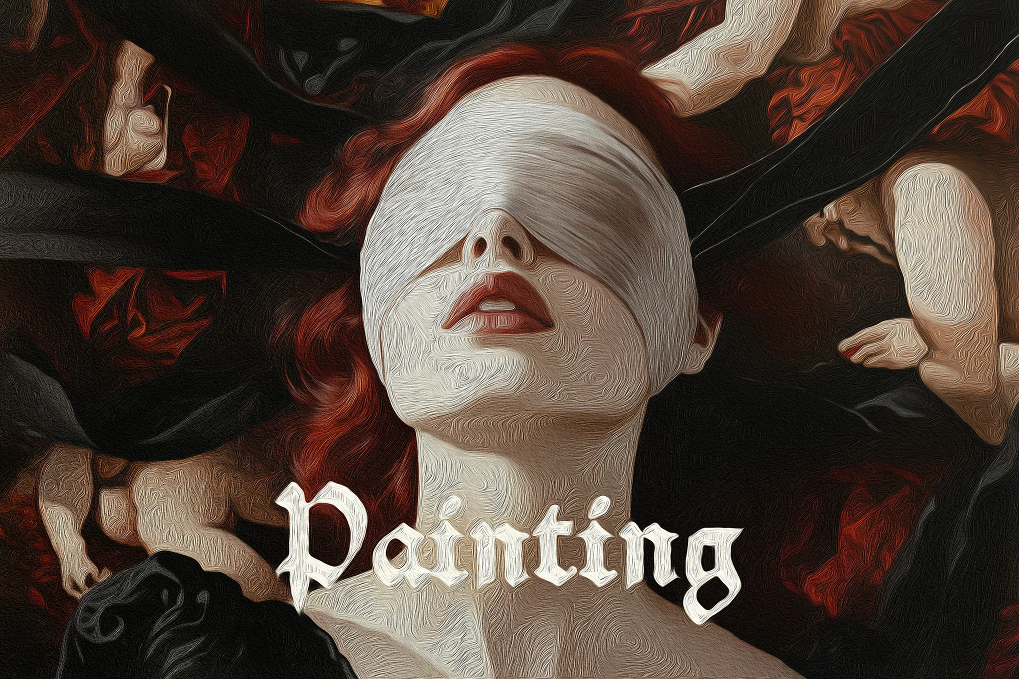
Oil Painting Photo Effect for Photoshop

Oil Painting Photo Effect for Photoshop

A creative Photoshop effect that enhances your Instagram images into mesmerizing, high-quality works of art with just a few clicks. With Smart Object layers for full customization and easy-to-use features, you can simply add your graphics, save, and watch as your designs transform.

Dreamy Sparkle Instagram Photoshop Filter

Dreamy Sparkle Instagram Photoshop Filter

This Photoshop filter offers a captivating way to enhance your images with a dreamy sparkling look. This creative asset includes 2 high-quality PSD files with a resolution of 4500 x 3000 px and 3000 x 4500 px, at 300 dpi, plus a helpful guide.

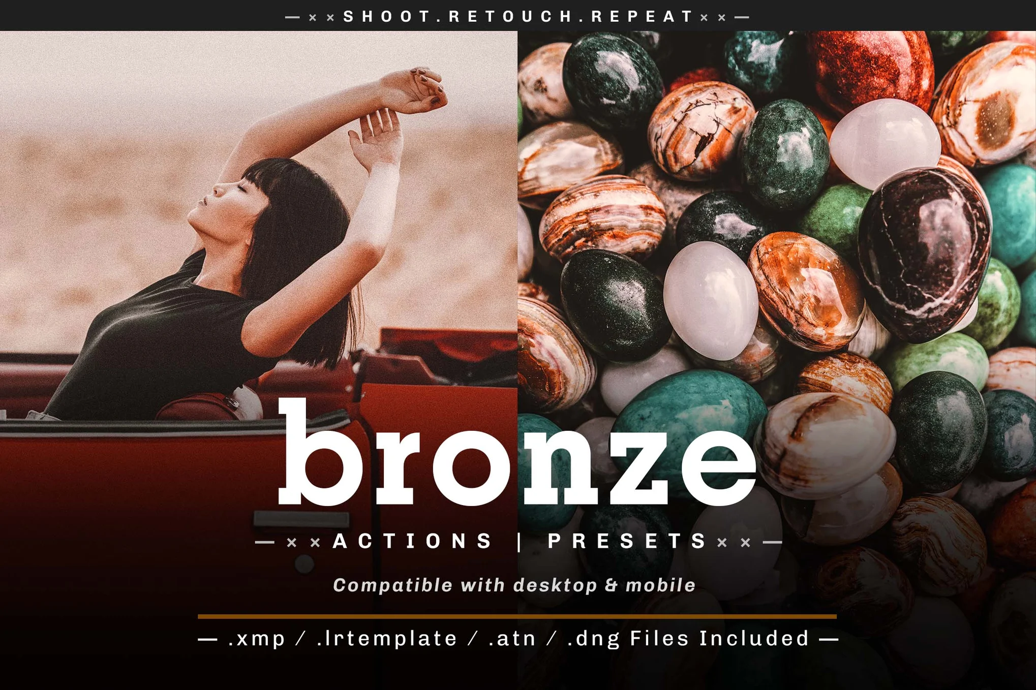
Bronze Instagram Effect Photoshop Actions

Bronze Instagram Effect Photoshop Actions

This Photoshop action enhances your visuals with a bronze-gold glow. Ideal for portraits, landscapes, and Instagram selfies, these actions can be applied with a single click, making your editing process efficient. Catering to photographers, influencers, and graphic designers alike, the package includes Lightroom presets, Photoshop actions, and camera raw presets.

Retro Glitch Acid Photo Effect for Photoshop

Retro Glitch Acid Photo Effect for Photoshop

This is a Photoshop template that comes with a cool acid photo-style retro glitch effect. It’s one of the most unique filters on our list that will help you transform your regular selfies and photos into unique designs. You can use smart objects to apply the filter to your photos with just a few clicks.

Old Sepia Burn Photo Effect for Photoshop

Old Sepia Burn Photo Effect for Photoshop

If you prefer classic vintage filters for adding a nostalgic look to your photography, then this Photoshop effect is a must-have for you. It features a realistic-looking sepia burn effect. This template also comes with organized layers and smart objects for easy editing.

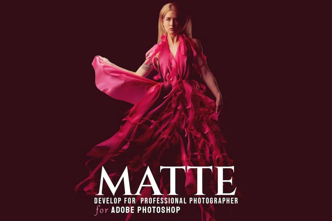
Matte Look Instagram Filters Photoshop Action

Matte Look Instagram Photoshop Action

This Photoshop action features a creative matte effect that’s ideal for enhancing your Instagram photos. The PS action is designed by a group of professional photographers and it has a subtle retro-vintage style filter that’s ideal for outdoor photography.

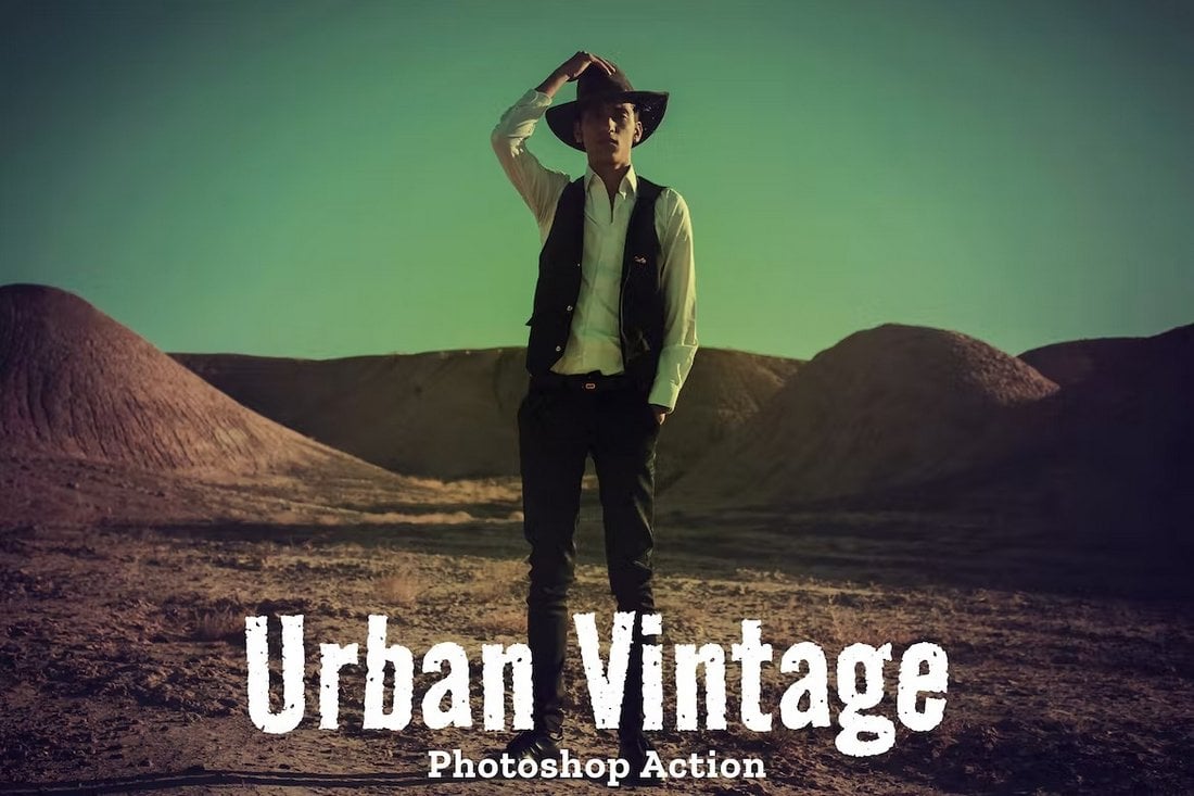
Urban Vintage Instagram Filter Photoshop Action

Urban Vintage Instagram Filter Photoshop Action

Your outdoor portraits and selfies will look much more attractive with this Photoshop filter. It features an urban vintage effect that adds a classic nostalgic look to your photos. The PS action is easy to use and has customizable features.

Lens Distortion Free Instagram Filter PSD

Lens Distortion Free Instagram Filter PSD

You can download this Instagram filter for free to add a subtle lens distortion effect to your photos. It comes as an editable Photoshop template with smart objects. You can easily replace the photo in the PSD file to apply the effect.

Fisheye Lens Photo Effect Template

Fisheye Lens Photo Effect Template

This Photoshop photo effect template offers a unique way to transform your images with a fisheye lens-style effect. Ideal for photographers, digital artists, and graphic designers, it provides a dynamic twist to your projects using glitch, blur, and grunge effects.

Colorful Exposure Photo Effect PSD

Colorful Exposure Photo Effect PSD

This Photoshop photo effect can transform your photos into vibrant pieces of art in a few clicks. It features smart object layers for seamless customization and versatility. Replace the placeholder shot with your graphic, save, and see your creation come to life.

Grain Film Photo Effect for Photoshop

Grain Film Photo Effect for Photoshop

This Photoshop photo effect is perfect for a multitude of images including fashion, lifestyle, and moody product shots. It adds a unique vintage-style grainy film look to your photos. The download includes a PSD file and a helpful guide.

Painted Canvas Photoshop Effect

Painted Canvas Photoshop Effect

This Photoshop template allows anyone to create a painted canvas look on any image easily and quickly. It uses smart object layers for user-friendly customization, letting you add your own graphics just by opening a specific layer. The package includes two PSD files in high resolution.

Smudged Scan Line Photocopy Effect

Smudged Scan Line Photocopy Effect

Perfect for photographers and graphic designers, this Photoshop photo effect comes in Photoshop action that creates an alluring aesthetic look with just one click. Compatible with all Photoshop CC versions, it’s a straightforward way to elevate your photos, particularly for Instagram.

Cartoonist Avatar Photoshop Action

Cartoonist Avatar Photoshop Action

A handy Photoshop photo effect for photographers and graphic designers, enabling them to apply cartoon-style effects to portraits with just one click. Suitable for use with Photoshop CC and later versions, it offers a range of effects including HDR, oily and portrait oil effects, and even a classic oil painting effect.

Retro Vintage Photoshop Film Effect

Retro Vintage Photoshop Film Effect

This is an excellent Photoshop photo effect for photographers and graphic designers. It provides an easy way to achieve the beautiful, nostalgic look seen in many classic photos. It offers a convenient one-click editing solution that’s perfect for enhancing your everyday or Instagram photos.

Bokeh Lights Effect for Photoshop

Bokeh Lights Effect for Photoshop

This Photoshop bundle empowers graphic designers and photographers with professional actions. It helps achieve a sought-after aesthetic look for photo posts with just a quick click. Ideal for enhancing Instagram photos and taking everyday pictures to the next level.

Halftone Image Effect for Photoshop

Halftone Image Effect for Photoshop

This is a photo effect that allows you to produce beautiful, high-quality halftone images. It uses Smart Object layers for full customization simplicity. It’s as easy as deleting the placeholder photo, inserting your graphics, and letting the design magic unfold.

Triangle Prism Photo Effect for Photoshop

Triangle Prism Photo Effect for Photoshop

With Smart Object layers for seamless customization, this Photoshop photo effect lets you transform your images into high-quality captivating visuals. The package includes 2 PSD files with fully customizable layouts and high-quality prismatic effects.

Ultra HDR Instagram Filter Photoshop Action

Ultra HDR Instagram Filter Photoshop Action

With this Photoshop action, you can add a realistic ultra HDR look to your everyday photos. It will simply make your photos look sharp and detailed, just like a photo taken with a DSLR camera.

Painted Art Photoshop Filter for Instagram

Painted Art Photoshop Filter for Instagram

Just as the name suggests, this Photoshop action allows you to completely transform your photos into painted art. It works perfectly for portrait photos, especially for indoor photography. The effect itself can be customized to your preference.

Film Grain Photo Effect Instagram Filter

Film Grain Photo Effect Instagram Filter

Use this Photoshop template to apply a retro filter to your Instagram photos. It comes with a nostalgic film grain effect that will make your selfies and portrait photos look extra special. The PSD file includes organized layers and smart objects.

Old Times Photo Filter for Instagram

Old Times Photo Filter for Instagram

Make your modern photos look like vintage black and white portraits with this Photoshop photo filter. It features a realistic-looking filter that applies a vintage weathered effect to your photos.

Free Oil Painting Instagram Filter for Photoshop

Free Oil Painting Instagram Filter for Photoshop

This free Photoshop action will make your photos look like oil paintings. It features a highly detailed effect that works best with portrait photos. The effect can be customized to your preference as well.

Asian Cinema – Instagram Photoshop Actions & Presets

Asian Cinema - Instagram Photoshop Actions & Presets

This Photoshop action pack features a beautiful cinematic effect inspired by Asian cinema. It’s perfect for giving a colorful warm look to your Instagram photos. The filters are available in both Photoshop action and Lightroom preset formats.

Glitch Effect Photoshop Action for Instagram

Glitch Effect Photoshop Action for Instagram

This action will come in handy when creating unique and promotional posts for Instagram. It allows you to create a cool glitch effect using your portrait photos. The action is very easy to use and it’s compatible with Photoshop CC.

Double Exposure – Instagram Photoshop Action

Double Exposure - Instagram Photoshop Action

Easily create a stylish double exposure effect with your photos using this Photoshop action. It features an easily customizable effect that you can use to combine photos to create cool double-exposure filters for Instagram posts.

Avocado – Natural Instagram Photoshop Actions

Avocado - Natural Instagram Actions & Presets

Inspired by natural color tones, this Photoshop action pack allows you to enhance your portraits and outdoor photos with proper lighting and exposure with just a few clicks. There are 7 different Photoshop actions and Lightroom presets in this bundle.

Cine – Cinematic Instagram Photoshop Action

Cine - Cinematic Instagram Photoshop Action

A Photoshop action made for professional photographers. This action comes with a stylish cinematic filter that gives a Hollywood movie look to your ordinary photos. The effect can be customized to your preference.

Rustic – Free Instagram Photoshop Action

Rustic - Free Instagram Photoshop Action

This free Photoshop action will instantly give your Instagram photos a dreamy look and feel. It has a rustic-theme effect that enhances the colors to bring out a retro look in your photos.

Soft Painting – Photoshop Action for Instagram Portraits

Soft Painting - Photoshop Action for Instagram Portraits

Want to make your Instagram portrait photos look like paintings? Then give this Photoshop action a try. It allows you to easily create a soft painting look for your selfies. It works with Photoshop CS3 and higher.

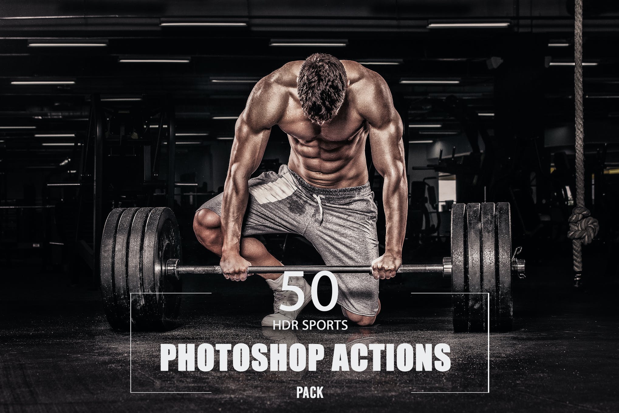
HDR Sports Instagram Filters for Photoshop

instagram filters for photoshop

Here we have a collection of 50 Photoshop Instagram filters that lets you create incredibly amazing photos in mere minutes. The actions are non-destructive, work well with Photoshop CS4 and above versions, and are very easy to use. Try it out today!

Modern Instagram Filters For Photoshop

Wanting to give an appealing look to your pictures? Look no further than this premium Photoshop Action for Instagram that is sure to create an impression and make you Instagram famous overnight.

Stylish Photoshop Instagram Filters

Use this pack of Instagram filters for Photoshop and make your feed scroll-worthy. It comes with a range of professional Photoshop Actions that will give a complete makeover to your pictures and blow your followers away.

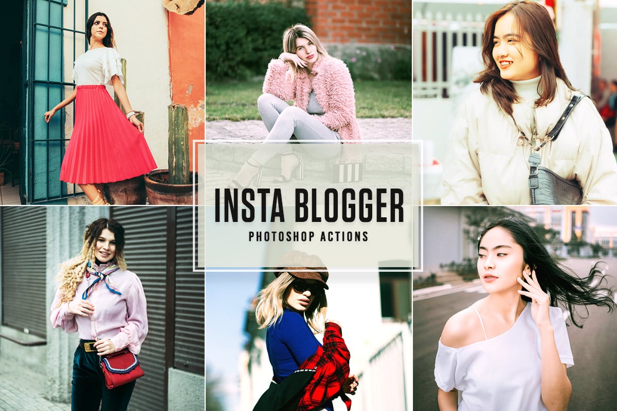
Insta Blogger – Free Photoshop Instagram Filters

Ideal for amateurs and professionals alike, this collection of Photoshop Actions will help you achieve beautiful tones and make your pictures Instagram-ready in just a few easy mouse clicks. The best part? The presets are available for free download.

CineStock Moody Photoshop Actions

CineStock Moody Photoshop Actions

CineStock is a collection of professional Photoshop actions that feature 18 different filters you can use to add a moody toning effect to your outdoor landscape photos and nature photography.

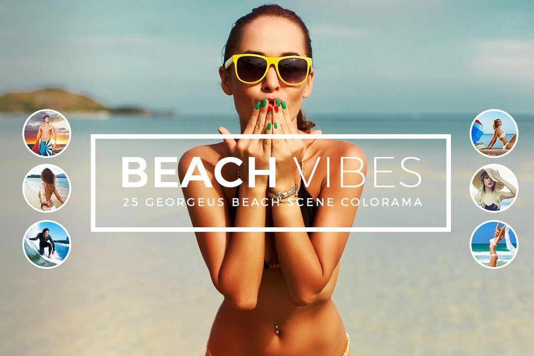
Beach Vibes 25 Photoshop Actions

Beach Vibes Photoshop Actions

Make your beach photos look even more beautiful and professional using this bundle of Photoshop actions. It includes 25 different actions with various Instagram-like filter effects.

Selective Color Creative Photoshop Action

Selective Color Creative Photoshop Action

Selective color is a popular design technique used mostly in promotional materials for luxury and jewelry brands, especially for highlighting products. This Photoshop action will allow you to create the same effect in your photos to create better marketing graphics to promote your brand on Instagram.

Infrared IR – Instagram Photoshop Actions

Infrared IR - Instagram Photoshop Actions

Infrared IR is a collection of modern and creative Photoshop actions that features a set of effects similar to the filters you use on Instagram. This bundle includes 12 different Photoshop actions with smart filters, allowing you to easily customize the effect however you like.

Lightleaks Photoshop Instagram Filters

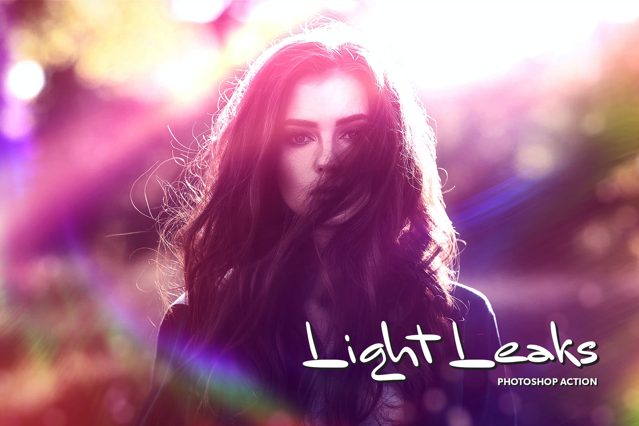
Create a beautiful effect on your photos using this Photoshop Action that comes with a range of color filters, light leaks, plus a video tutorial to help you make the most of the effect. Test it out for your Instagram pictures!

Free Photoshop Instagram Filters

Transform your pictures into a summer dream with the help of these professionally crafted Instagram filters for Photoshop. It’s an expansive package containing 50 Photoshop Actions each working to bring out the tropical vibe in your photographs.

Oil Painting Instagram Photoshop Action

Oil Painting Instagram Photoshop Action

Have you ever wished there was a Prisma-like filter available on Instagram? Well, you don’t have to use any of those apps if you get this Photoshop action. This PS action will instantly transform your photo into a painting with a realistic effect.

Free Greece Instagram Photoshop Actions

Free Greece Instagram Photoshop Actions

This is a premium-quality Photoshop action that features a filter effect inspired by the beautiful locations of Greece. It’s perfect for enhancing your outdoor landscape and travel photos.

Free Cats Love Photoshop Actions

Free Cats Love Photoshop Actions

Want to make your cat photos look even cuter for Instagram? Then use this free Photoshop action to add more color and vibrance to your adorable cat pictures.

50 Matte Photoshop Actions

50 Matte Photoshop Actions

The matte effect is perfect for enhancing all kinds of Instagram photos from your selfies to photos of adorable dogs. That’s why this bundle comes with 50 different Photoshop actions with the matte effect.

50 Vintage Photoshop Actions

50 Vintage Photoshop Actions

If you’re a fan of the vintage-style filters, use this bundle of vintage Photoshop actions. It includes 50 different vintage effects ranging from subtle retro look to classic vintage effects.

Streetographie – Cinematic Photoshop Actions

Streetographie - Cinematic Photoshop Actions

Give a colorful look and feel to your cityscape photos with this pack of Photoshop actions. This bundle comes with 7 filters that enhance the colors of your city and street photos to create an incredible look and feel.

Color Festival Photoshop Action

Color Festival Photoshop Action

The colored powder effect is a popular effect used in poster and flyer designs. But this effect can also be quite useful for Instagram users, especially when promoting products and fashion designs. With this action, you can generate a similar colored dust and powder effect with just a few clicks.

Cyber Poster Photoshop Action

Cyber Poster Photoshop Action

This is a unique Photoshop action that allows you to create a stylish poster-like effect to give a colorful and futuristic look to your photos. This filter is perfect for fashion and lifestyle brands to promote their products on Instagram. The action comes with brushes, shapes, and patterns as well.

Nude Instagram Filters for Photoshop

instagram filters for photoshop

If you’re looking to add nude tones to your pictures, keeping them as natural as possible, this collection of 10 Photoshop actions can do it easily enough. Given that the actions can be used for a variety of photos, we recommend you give these Photoshop Instagram filters a try.

Free Newborn Instagram Filters for Photoshop

photoshop instagram filters

Here we have a set of 2 Photoshop actions, with each working to provide your pictures a soft glow, enhancing your facial features with a beautiful pastel effect. These Photoshop Instagram filters are great for improving the overall appeal of your pictures and will save you a lot of time.

Cartoonize Photoshop Action

Cartoonize Photoshop Action

Want to stand out from your fellow Instagram bloggers? Then this Photoshop action will help. It allows you to transform your photos and make them look like cartoon sketches. This action is most suitable for portrait photos and selfies. It works with Photoshop CS3 and higher.

Duotone Pro Photoshop Actions

Duotone Pro Photoshop Actions

The duotone effect is everywhere. It fits right in with almost any type of photo and graphic and as a result, everyone loves it. With this collection of 50 Photoshop actions, you can easily add a high-quality duotone filter to your Instagram photos with just one-click.

Free Vintage Heaven Photoshop Action

Free Vintage Heaven Photoshop Action

With this free Photoshop action, you can add a stylish vintage filter and make the photos look colorful at the same time. It works well with both portraits and landscape photos. But it’s most suitable for outdoor photos.

Hologram Photoshop Action

Hologram Photoshop Action

Your cat and pet Instagram photos will never look the same with this amazing Photoshop action. With this action, you can add a stylish hologram-like effect to make your photos look more futuristic and stylish. It includes 6 different color variations as well.

Nighty Photoshop Actions

Nighty Photoshop Actions

Nighty is a modern Photoshop action bundle that features a dark and gritty effect. These actions are perfect for giving a moody look and feel to your photos. The bundle includes 9 different actions that work great with both portraits and landscape photos.

Anaglyph Photoshop Actions

Anaglyph Photoshop Actions

Anaglyph Photoshop action is designed to add a glitch-style effect to your portraits and selfies. It comes with more than 10 different filters you can easily apply to your photos with just a few clicks. The effect is easily customizable.

Realistic Cartoon Instagram Filters for Photoshop

instagram filters for photoshop

Give your pictures an authentic cartoonic look with these Photoshop filters for Instagram, and knock the socks off your audience in style. These filters provide you with a unique way to stay relevant on Instagram without having to put an extra effort at all.

Free Professional Instagram Filters for Photoshop

instagram filters for photoshop

Set your eyes on this extensive collection of Photoshop filters for Instagram that virtually has every effect you might ever need to amp up your social media game. It consists of a whopping 300 filters ranging from HDR and matte effects to retouching, and winter filters.

True Watercolor Photoshop Action

True Watercolor Photoshop Action

Want to make your Instagram photos look like a watercolor painting? Then try this Photoshop action. It lets you add a realistic painting effect to your portrait and landscape photos and make them look more creative.

Free Subtle Matte Photoshop Action

Free Subtle Matte Photoshop Action

Add a subtle faded look to your selfies and portrait photos using this free Photoshop action. This filter is perfect for your regular and everyday lifestyle photos. You can apply the effect with just one click.

50 High Contrast Photoshop Actions

50 High Contrast Photoshop Actions

This is a massive bundle of Photoshop actions that includes a set of filters for adding a high-contrast effect to your photos. It’s perfect for optimizing your photos taken in low-light conditions before uploading them on Instagram.

Into The Jungle – Instagram Photoshop Filters

Into The Jungle - Instagram Photoshop Filters

Instagram bloggers are known to take a lot of selfies and photos outdoors. This pack of Photoshop actions is a must-have for those Instagram users. It includes 10 filters that will enhance your outdoor photos with the perfect combination of a retro-effect and mood.

Landscape Instagram Photoshop Actions

Landscape Instagram Photoshop Actions

If you’re a fan of travel photography, use this set of Photoshop actions to enhance your photos to make them look extra special before uploading them to social media platforms. This bundle comes with 20 different filters with various styles of effects.

Imagine – Free Instagram Photoshop Action

Imagine - Free Instagram Photoshop Action

Imagine is a free Photoshop action that allows you to optimize your Instagram selfies by adding a colorful and retro-inspired filter. It can be used with both portrait and outdoor landscape photos.

Free Friends Forever Photoshop Actions

Free Friends Forever Photoshop Actions

Make all the photos you take with your friends look more professional using this free Photoshop action. It will also work well for enhancing your portrait photos and selfies as well.

100+ Duotone Photoshop Action Bundle

100+ Duotone Photoshop Action Bundle

The duotone effect is quite popular among all Instagram users. This massive bundle comes with more than 100 different styles of duotone Photoshop actions. You can use these filters with all kinds of photos.

Anaglyph Photoshop Actions

Anaglyph Photoshop Actions

This unique Photoshop action lets you create a stylish anaglyph effect with just a single click. This filter will help you create unique photos that stand out from the crowd.

Dark Photography Photoshop Actions

Dark Photography Photoshop Actions

Give your Instagram selfies and photos a dark and gritty look and feel using this pack of Photoshop actions. This pack comes with 10 professionally crafted filters you can instantly apply to your photos with just a few clicks.

Light Monochrome Free Instagram Photoshop Action

Light Monochrome Free Instagram Photoshop Action

Want to give a washed out look to your Instagram photos? This Photoshop action will help. This filter applies a light monochrome effect to your photos to give them a unique and washed out look.

Free California Lightroom & Photoshop Actions

Free California Lightroom & Photoshop Actions

This free Photoshop action features a beautiful filter that adds the same warm color tone of California landscape to your photos. The effect is also available as a Lightroom preset.

Instant Hipster – 27 Photoshop Instagram Filters

Instant Hipster – 27 Photoshop Instagram Filters

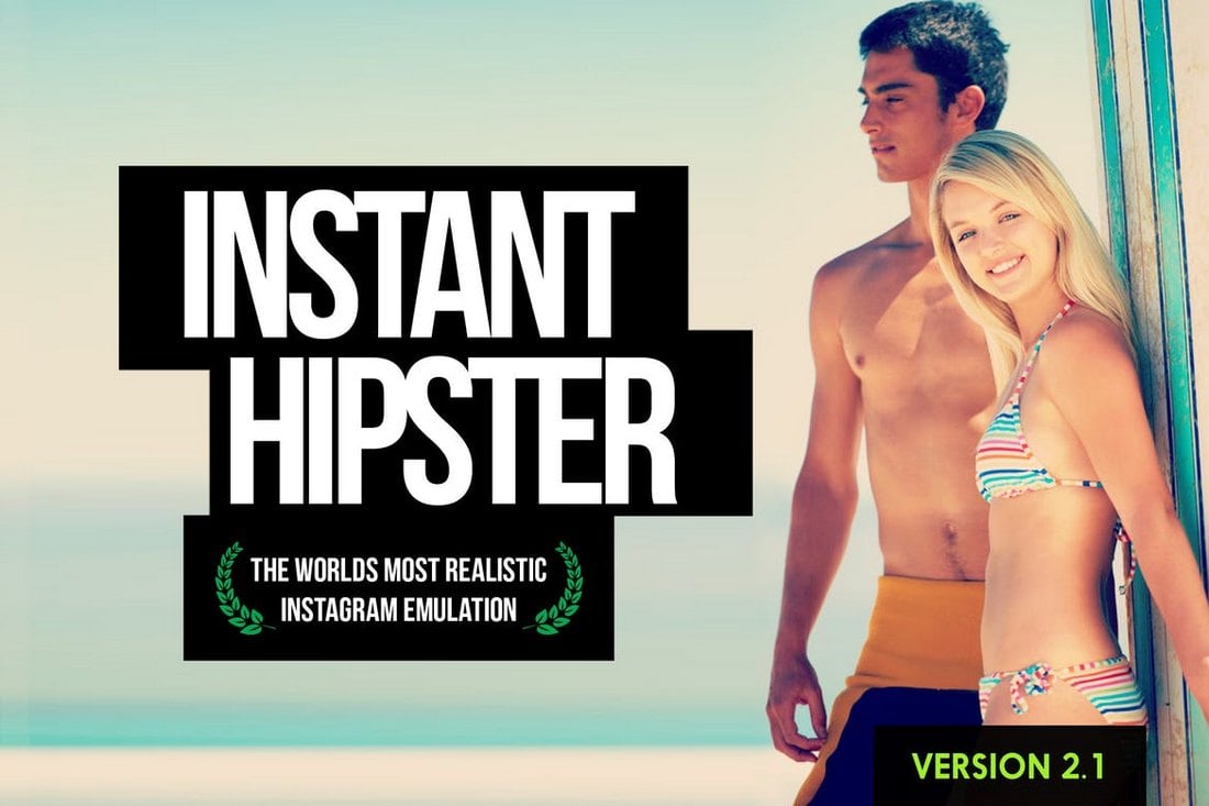
Instant hipster comes with a collection of 27 different Photoshop actions that allows you to create the same Instagram-style effects in Photoshop with just a single click. The actions feature warm, cool, retro, and many other types of effects. Each action can also be easily customized to adjust the effect for different types of photos as well.

Insta Blog – Instagram Filters For Photoshop

Insta Blog Photoshop Instagram Filters

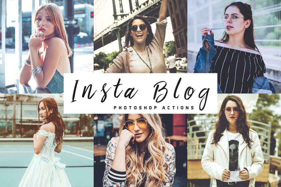
This is a collection of Photoshop actions that have been made for social media users who just love taking photos of everything everywhere they go. It features several different actions with various effects for adding more style to your selfies and travel photos.

Faded Films – 75 Photoshop Film & Retro Effects

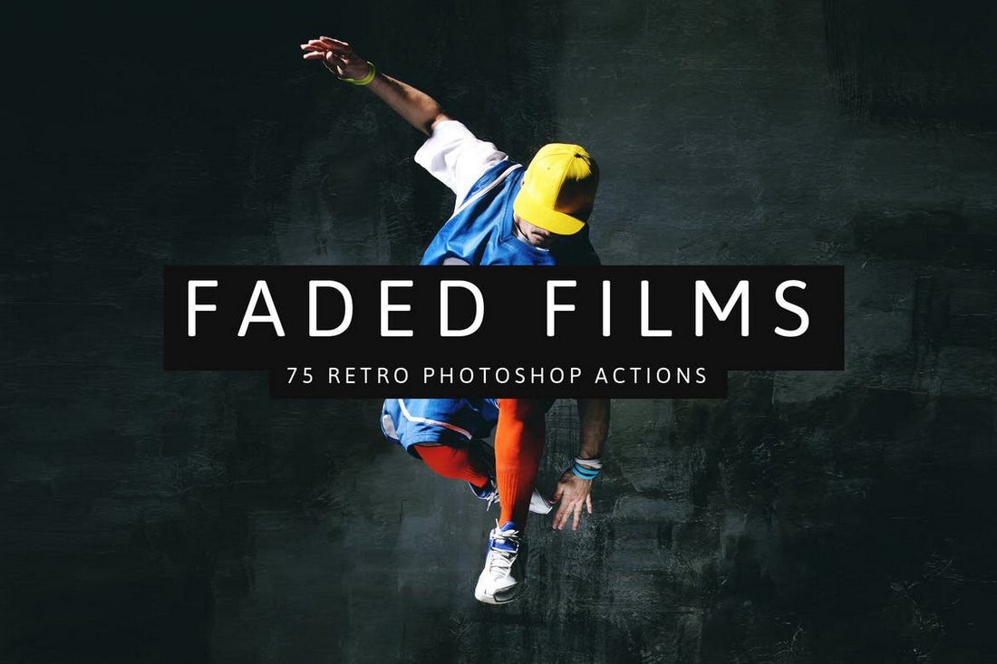
Faded Films come with 75 different Photoshop actions that allow you to give a unique look to your photos with a stylish faded color effect. The bundle includes 75 different actions, featuring 11 Instagram faded effects, 31 film effects, and 25 SparkleStock faded effects, that are also customizable.

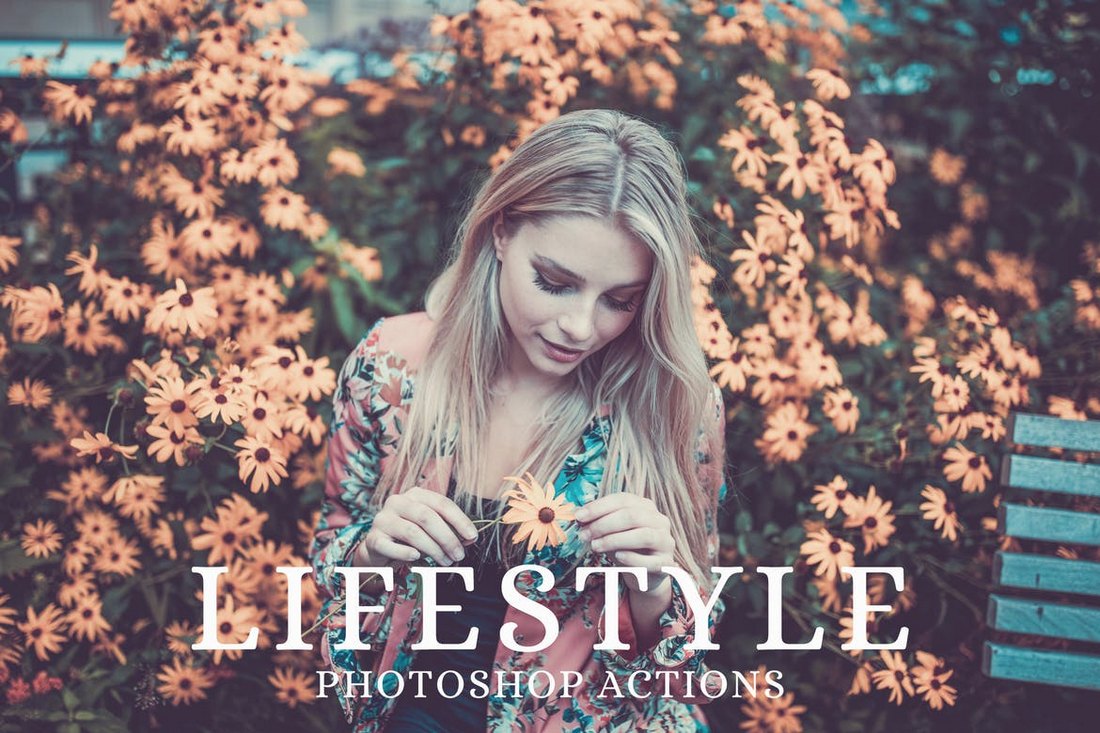
25 Lifestyle Instagram Photoshop Actions

25 Lifestyle Instagram Photoshop Actions

This set of Instagram Photoshop actions feature effects that have been optimized for improving your everyday selfies, lifestyle photos, travel photos, and fashion photography. It includes 25 different actions that are compatible with Photoshop CS5 and above.

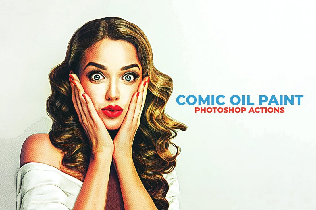
Comic Oil Paint Photoshop Actions

Comic Oil Paint Photoshop Actions

The Prisma app was quite popular among social media users for the filter that turned ordinary photos into paintings. With this Photoshop action, you can achieve the same effect with better customization options. It includes 10 different variations for giving a unique oil painting look to your photos.

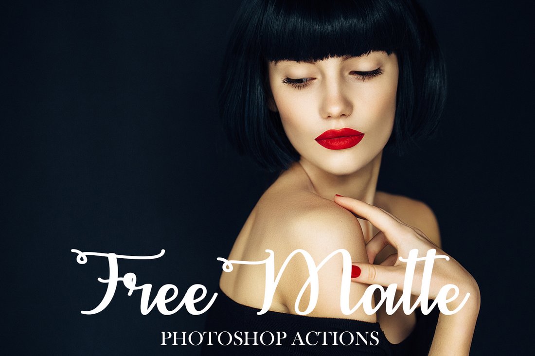
Free Matte Photoshop Actions

Free Matte Photoshop Actions

Make your fashion and glamour photos look more professional using this bundle of free Photoshop actions. It includes a stylish matte filter effect made specifically for improving fashion photos.

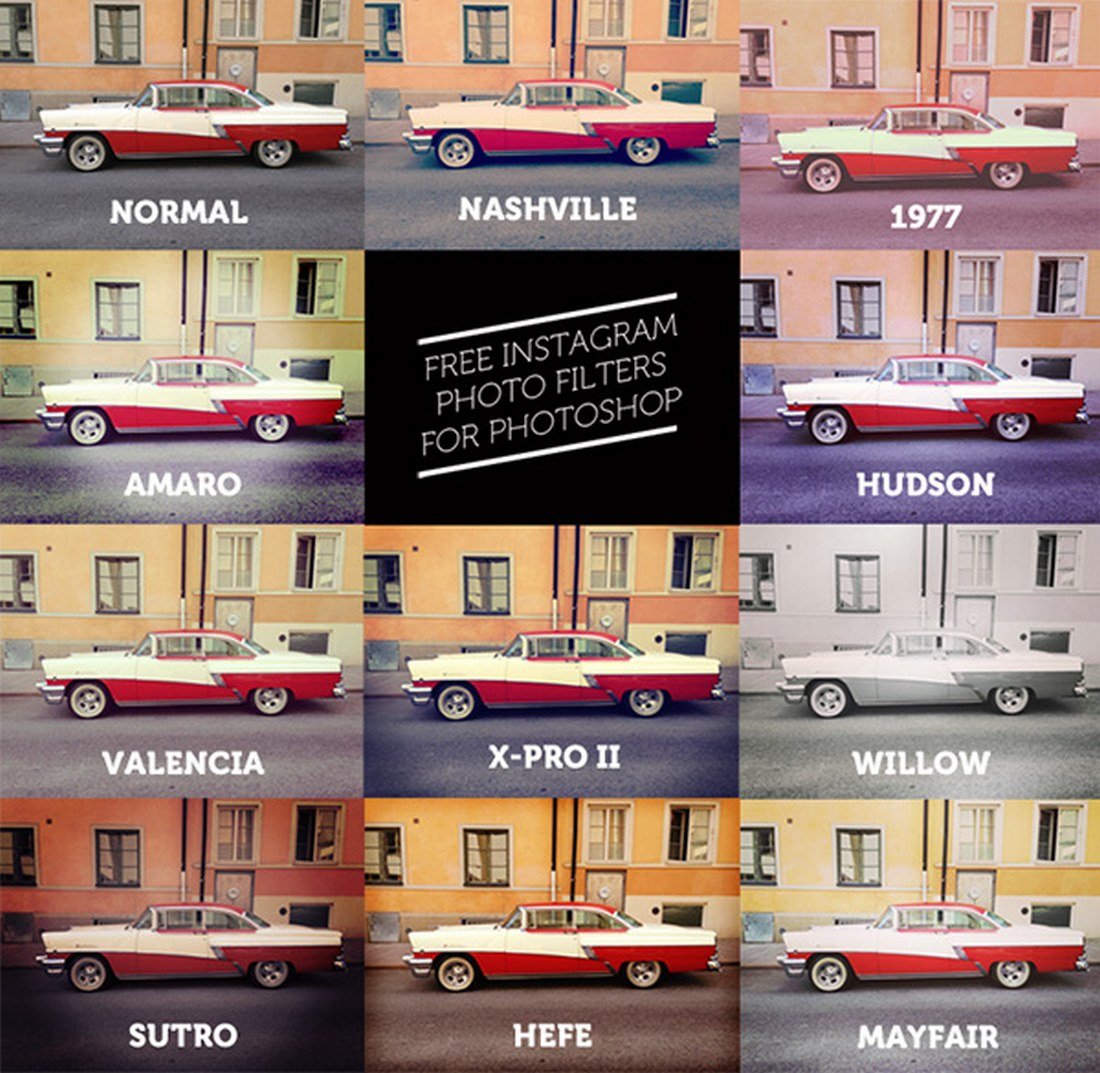
11 Free Instagram Filters For Photoshop Actions

11 Free Instagram Filters For Photoshop Actions

This is a collection of free Instagram-style effects that includes several unique retro and matte-style filters. The Photoshop actions create non-destructive and customizable effects.

45 Free Instagram Filters For Photoshop

45 Free Instagram Filters For Photoshop

Featuring a collection of retro, vintage, matte, and many other Photoshop actions, this bundle comes with 25 creative Photoshop actions. You can download the pack for free to create your own Instagram filters.

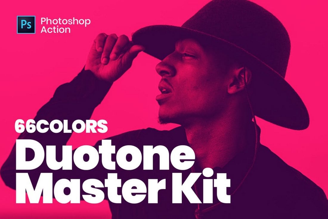
Duotone Master Kit – Photoshop Instagram Filters

Duotone Master Kit - Instagram Photoshop Actions

The duotone effect is quite popular among Instagram users and Pinterest users. With this bundle, you can create as many duotone effects as you like while combining many different colors. It includes 66 different Photoshop actions for creating editable duotone effects.

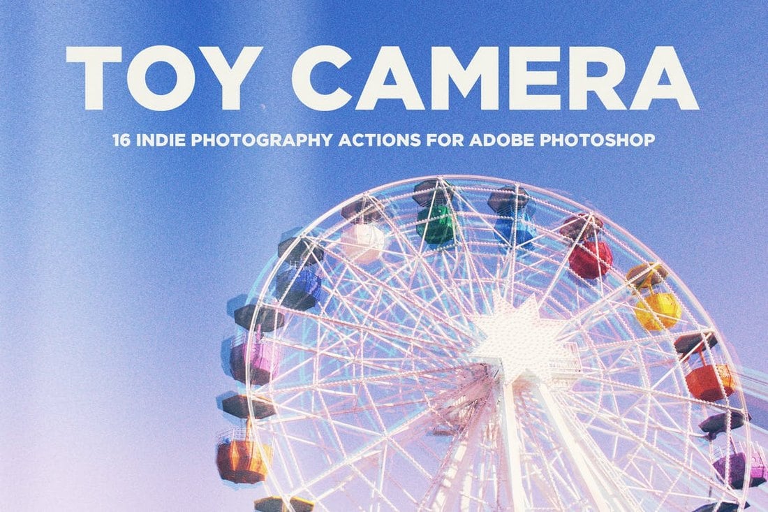
Toy Camera – Instagram Photoshop Actions

Toy Camera - Instagram Photoshop Actions

Give your landscape and portrait photos a unique and colorful look with this collection of Photoshop actions. This bundle comes with 16 Instagram filter effects inspired by toy cameras.

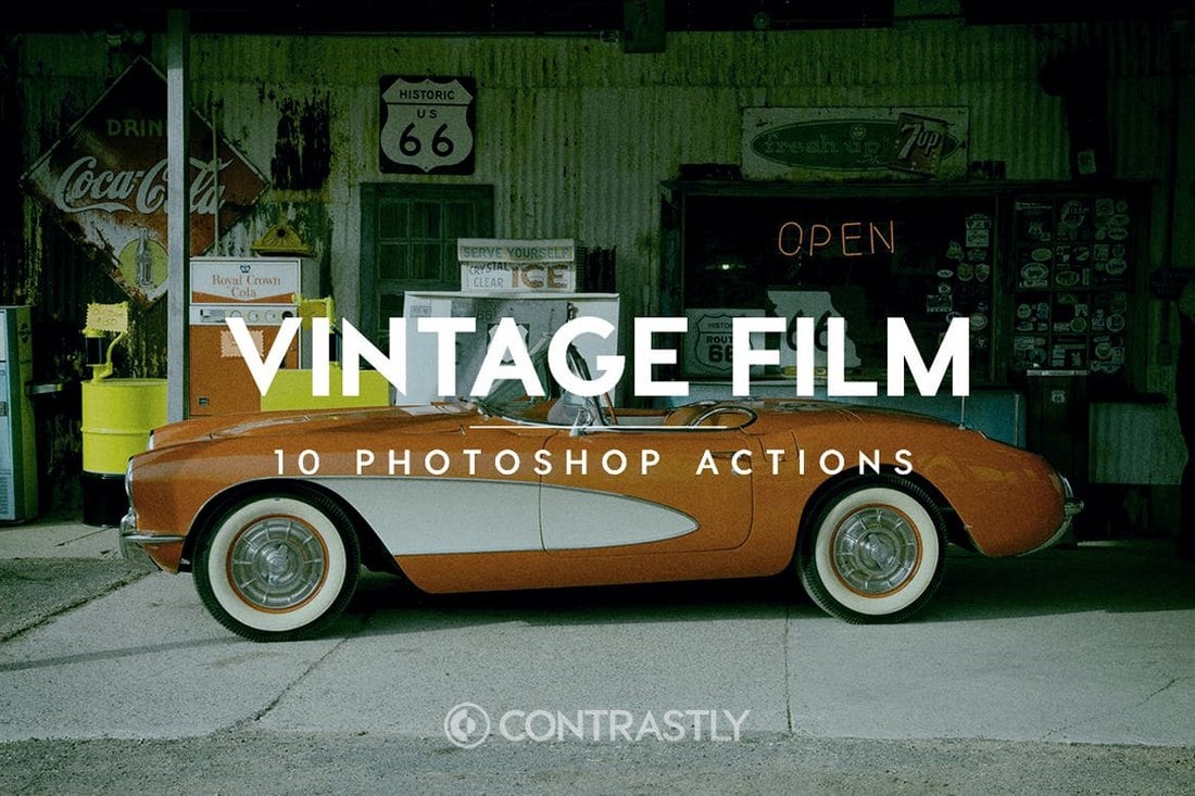
Vintage Film – Instagram Filters For Photoshop

Vintage Film - Instagram Filters For Photoshop

Create an authentic vintage film effect to make your photos look even more amazing with 1 unique Photoshop actions. This pack comes with a set of actions that will make your photos look as if they were taken with an old-school Fujifilm, Agfa, or Kodak camera.

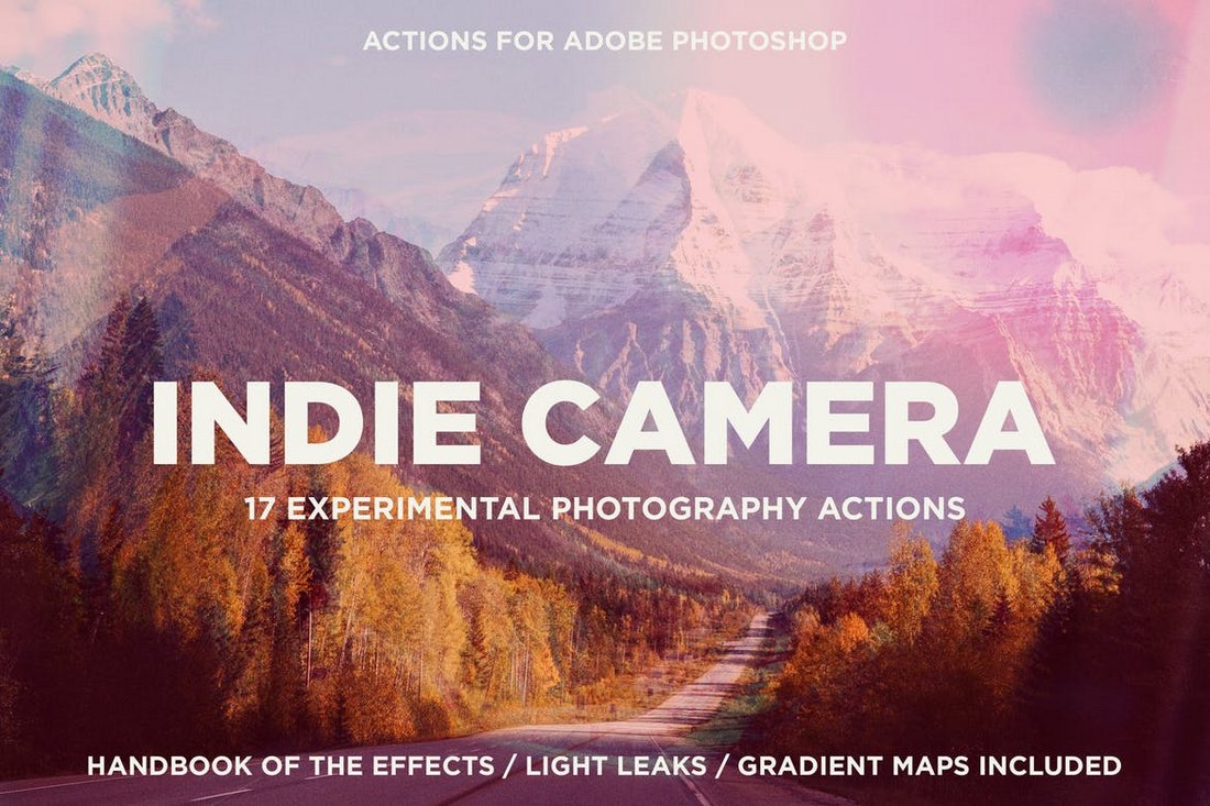
Indie Camera – Instagram Photoshop Actions

Indie Camera - Instagram Photoshop Actions

If you’re a fan of pastel colors and colorful effects, this collection of Photoshop actions are perfect for you. It includes 17 different Instagram filter effects with 110 gradient maps and 21 PNG light leak overlays for customizing the effects however you like.

50 Free Summer Photoshop Instagram Filters Actions

50 Free Summer Photoshop Instagram Filters Actions

A massive bundle of free Photoshop actions inspired by Instagram filters. You’ll get plenty of choices with this pack as it includes 50 different effects. The actions are compatible with Photoshop CS3 and above.

Free Elegant B&W Photoshop Actions Set

Free Elegant B&W Photoshop Actions Set

Sometimes a black and white filter is the perfect choice for giving your Instagram photos a natural and vintage look. This free Photoshop action will help you create the perfect B&W effect for your photos.

Free Faded Cross Process Photoshop Instagram Filter

Free Faded Cross Process Photoshop Instagram Filter

This free Photoshop action is perfect for improving your selfies and portrait photos that you take on low-light conditions. It will instantly enhance your photos to look more professional.

Double Exposure – Photoshop Action

Double Exposure - Photoshop Action

The double exposure effect is not one of the Instagram filters, but it should be. This effect allows you to combine two photos into one to make an amazing piece of art. Use this Photoshop action to create photos that stand out from the crowd.

22 Soft Pastel Photoshop Instagram Filters

22 Soft Pastel Photoshop Instagram Filters

This bundle comes with 22 beautiful Instagram filter effects that are perfect for adding a colorful look to your selfies and travel photos. The Photoshop actions in this pack are non-destructive and are easily customizable.

Suburbia – Instagram Filters For Photoshop

Suburbia - Instagram Filters For Photoshop

Suburbia is a collection of Photoshop actions that allows you to optimize and improve your outdoor portrait and landscape photos using 6 different Photoshop actions. These are perfect for improving your outdoor fashion photos, wedding photos, and nature photos as well.

HDR Pro – Photoshop Instagram Filters

HDR Pro - Photoshop Instagram Filters

You don’t need an expensive DSLR camera to make your photos look HDR. With these Photoshop actions, you can make your smartphone photos look just as good. The bundle includes 10 HDR effects in various styles.

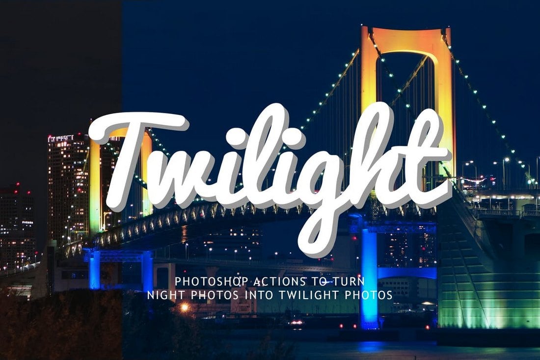
Night to Twilight – Photoshop Instagram Actions

Night to Twilight Photoshop Actions

This set of Photoshop actions are designed to make your nighttime photos even more beautiful by giving a twilight effect to the photos. It includes several variants of the action and allows you to edit the effect to your preference as well.

Orange and Teal Pro – Photoshop Instagram Filters

Orange and Teal Pro - Photoshop Instagram Filters

This unique Photoshop action lets you create a stylish orange and teal effect to make your photos look like a scene from the Blade Runner movie. It comes with 16 different Photoshop actions and Lightroom varients of the actions as well.

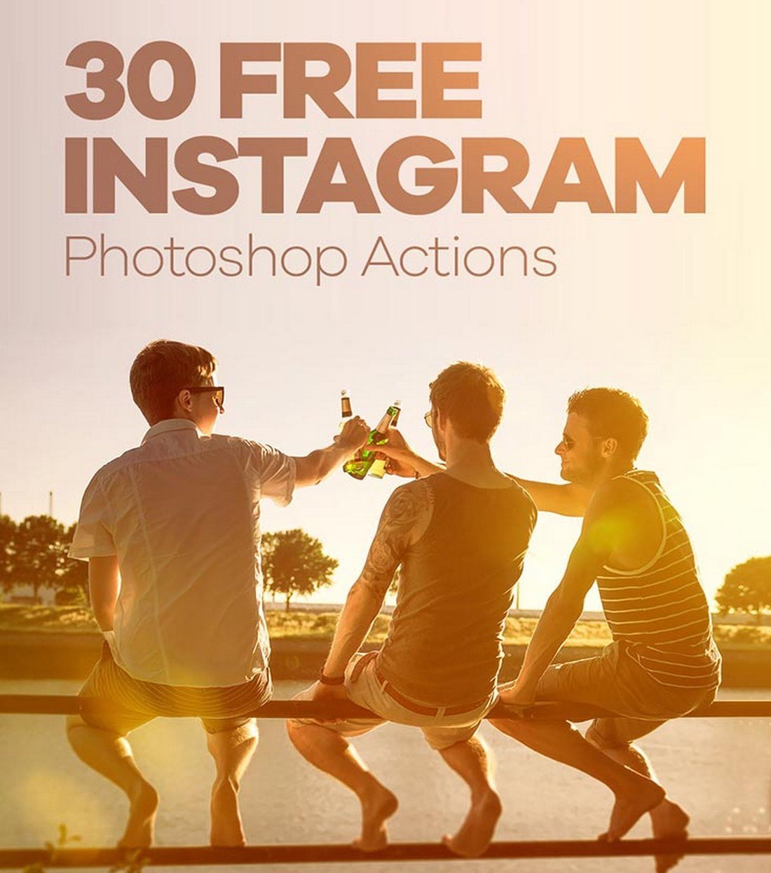
30 Free Instagram Photoshop Filters Actions

30 Free Instagram Photoshop Filters Actions

This bundle comes with 30 different Photoshop actions for recreating the same Instagram filter effects in Photoshop. The pack is perfect for adding effects to outdoor and landscape photos.

Free Portrait Instagram Photoshop Filter

Free Portrait Instagram Photoshop Filter

This free Photoshop action is designed to improve your photos by adding an Instagram-like faded color filter effect. It’s easily customizable and you even get to choose the settings for the effect strength as well.

Free Autumn Instagram Photoshop Filter Action

Free Autumn Instagram Photoshop Filter Action

Another free Photoshop action that transforms ordinary photos by making them look more vibrant with enhanced colors. The effect is easily customizable and works with Photoshop CS3 and above.

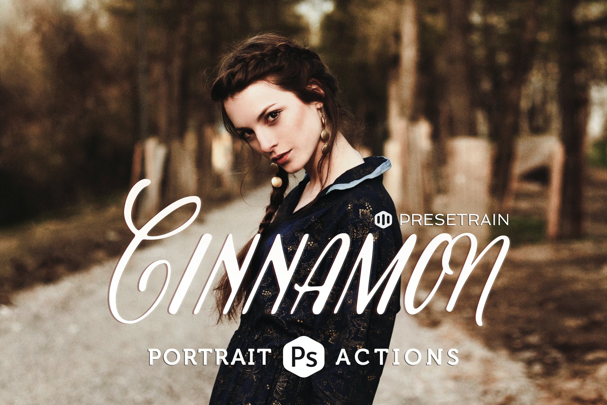
Cinnamon Instagram Photoshop Filter Actions

Cinnamon Portrait Actions

Cinnamon features 6 creative fantasy toning actions for Adobe Photoshop. Wild, mysterious, and enigmatic, Cinnamon actions can be used to process your portrait, fashion, editorial, or fine-art imagery.

Liquidum Instagram Photoshop Filter Action

Liquidum - Transparent Painting Photoshop Action

Here we have a unique Photoshop action to transform your photo into a transparent “camouflage” object with color painting elements. It provides a highly detailed result, a lot of possibilities to easily customize and improve. Video tutorial included.

Carbonium Instagram Photoshop Filter Action

Carbonium - Black & White PS Actions

This is a huge collection of Black & White grading actions presets from vintage look to modern touch of photography.

Premium Instagram Photoshop Actions

Instagram Photoshop Actions

Here we have a set of Photoshop actions that are sure to make your everyday dull pictures Instagram-worthy. The product comes packed with a detailed instructions guide on how to effectively use the actions, ensuring you make the most out of your purchase.

10 Instagram Photoshop Actions

Instagram Photoshop Actions

If you’re on the hunt for the best Instagram Photoshop actions, this product must make it to your shortlist. It comprises 10 actions, each designed with attention to detail so you’re able to create photos that instantly grab eyeballs.

Wedding Instagram Photoshop Actions

Instagram Photoshop Actions

Make your wedding pictures stand out with this bundle of 10 orange and teal Photoshop actions. Easy to use for both amateurs, and professionals alike, this product will instantly add a beautiful cinematic effect to your photos, and impress your friends, relatives, and followers.

Double Light Instagram Photoshop Action

Instagram Photoshop Actions

This is an incredibly unique Photoshop action that adds a breathtaking double light effect to your images, making them look more appealing, and enthralling. It works well on PC and MAC and comes with a video tutorial, walking you through each and every step of installing and customizing the action.

Real Estate Instagram Photoshop Actions

Instagram Photoshop Actions

If you want to advertise your real estate pictures in the best light possible, this collection of 25 Photoshop actions is well worth checking out. The actions will give your pictures a sharp, clear, and detailed look that’s guaranteed to entice potential buyers.

How to Use Instagram Filters: 3 Useful Tips

Unlike the filters on the Instagram app, when using Photoshop to add Instagram filter effects to your photos you’ll have all the freedom in the world to customize the effect and make adjustments however you like. Just make sure to follow these simple tips before getting started.

1. Use Non-Destructive Actions

The first and the most important thing to remember when using Photoshop actions is to use non-destructive actions.

Some Photoshop actions apply effects and flatten the image without leaving any adjustment layers for you to customize the effect. Try to avoid such filters and use Photoshop actions that create editable and non-destructive effects.

2. Choose the Right Filter Effects

Most Photoshop actions are also designed for improving specific types of photos. For example, there are actions for enhancing outdoor portrait photos and different actions for optimizing travel photos.

When choosing filter effects for your photos, make sure to pick Photoshop actions that are designed for the type of photos you’re working on.

3. Customize the Effect

Photoshop actions are quite easy to use. In fact, you can run the action and apply an Instagram filter to your photos with just a single click.

However, don’t forget that you can customize the filter effect afterward. Use the adjustment layers to optimize the filter effect and adjust the strength of the filter to match your photo.

Looking for cool post ideas to share on your Instagram? Then check out our feature on Instagram templates.

Why Optimizing Your Lighthouse Score Is Not Enough For A Fast Website

Featured Imgs 23

This article is a sponsored by DebugBear

We’ve all had that moment. You’re optimizing the performance of some website, scrutinizing every millisecond it takes for the current page to load. You’ve fired up Google Lighthouse from Chrome’s DevTools because everyone and their uncle uses it to evaluate performance.

After running your 151st report and completing all of the recommended improvements, you experience nirvana: a perfect 100% performance score!

Time to pat yourself on the back for a job well done. Maybe you can use this to get that pay raise you’ve been wanting! Except, don’t — at least not using Google Lighthouse as your sole proof. I know a perfect score produces all kinds of good feelings. That’s what we’re aiming for, after all!

Google Lighthouse is merely one tool in a complete performance toolkit. What it’s not is a complete picture of how your website performs in the real world. Sure, we can glean plenty of insights about a site’s performance and even spot issues that ought to be addressed to speed things up. But again, it’s an incomplete picture.

What Google Lighthouse Is Great At

I hear other developers boasting about perfect Lighthouse scores and see the screenshots published all over socials. Hey, I just did that myself in the introduction of this article!

Lighthouse might be the most widely used web performance reporting tool. I’d wager its ubiquity is due to convenience more than the quality of its reports.

Open DevTools, click the Lighthouse tab, and generate the report! There are even many ways we can configure Lighthouse to measure performance in simulated situations, such as slow internet connection speeds or creating separate reports for mobile and desktop. It’s a very powerful tool for something that comes baked into a free browser. It’s also baked right into Google’s PageSpeed Insights tool!

And it’s fast. Run a report in Lighthouse, and you’ll get something back in about 10-15 seconds. Try running reports with other tools, and you’ll find yourself refilling your coffee, hitting the bathroom, and maybe checking your email (in varying order) while waiting for the results. There’s a good reason for that, but all I want to call out is that Google Lighthouse is lightning fast as far as performance reporting goes.

To recap: Lighthouse is great at many things!

  • It’s convenient to access,
  • It provides a good deal of configuration for different levels of troubleshooting,
  • And it spits out reports in record time.

And what about that bright and lovely animated green score — who doesn’t love that?!

OK, that’s the rosy side of Lighthouse reports. It’s only fair to highlight its limitations as well. This isn’t to dissuade you or anyone else from using Lighthouse, but more of a heads-up that your score may not perfectly reflect reality — or even match the scores you’d get in other tools, including Google’s own PageSpeed Insights.

It Doesn’t Match “Real” Users

Not all data is created equal in capital Web Performance. It’s important to know this because data represents assumptions that reporting tools make when evaluating performance metrics.

The data Lighthouse relies on for its reporting is called simulated data. You might already have a solid guess at what that means: it’s synthetic data. Now, before kicking simulated data in the knees for not being “real” data, know that it’s the reason Lighthouse is super fast.

You know how there’s a setting to “throttle” the internet connection speed? That simulates different conditions that either slow down or speed up the connection speed, something that you configure directly in Lighthouse. By default, Lighthouse collects data on a fast connection, but we can configure it to something slower to gain insights on slow page loads. But beware! Lighthouse then estimates how quickly the page would have loaded on a different connection.

DebugBear founder Matt Zeunert outlines how data runs in a simulated throttling environment, explaining how Lighthouse uses “optimistic” and “pessimistic” averages for making conclusions:

“[Simulated throttling] reduces variability between tests. But if there’s a single slow render-blocking request that shares an origin with several fast responses, then Lighthouse will underestimate page load time.

Lighthouse averages optimistic and pessimistic estimates when it’s unsure exactly which nodes block rendering. In practice, metrics may be closer to either one of these, depending on which dependency graph is more correct.”

And again, the environment is a configuration, not reality. It’s unlikely that your throttled conditions match the connection speeds of an average real user on the website, as they may have a faster network connection or run on a slower CPU. What Lighthouse provides is more like “on-demand” testing that’s immediately available.

That makes simulated data great for running tests quickly and under certain artificially sweetened conditions. However, it sacrifices accuracy by making assumptions about the connection speeds of site visitors and averages things in a way that divorces it from reality.

While simulated throttling is the default in Lighthouse, it also supports more realistic throttling methods. Running those tests will take more time but give you more accurate data. The easiest way to run Lighthouse with more realistic settings is using an online tool like the DebugBear website speed test or WebPageTest.

It Doesn’t Impact Core Web Vitals Scores

These Core Web Vitals everyone talks about are Google’s standard metrics for measuring performance. They go beyond simple “Your page loaded in X seconds” reports by looking at a slew of more pertinent details that are diagnostic of how the page loads, resources that might be blocking other resources, slow user interactions, and how much the page shifts around from loading resources and content. Zeunert has another great post here on Smashing Magazine that discusses each metric in detail.

The main point here is that the simulated data Lighthouse produces may (and often does) differ from performance metrics from other tools. I spent a good deal explaining this in another article. The gist of it is that Lighthouse scores do not impact Core Web Vitals data. The reason for that is Core Web Vitals relies on data about real users pulled from the monthly-updated Chrome User Experience (CrUX) report. While CrUX data may be limited by how recently the data was pulled, it is a more accurate reflection of user behaviors and browsing conditions than the simulated data in Lighthouse.

The ultimate point I’m getting at is that Lighthouse is simply ineffective at measuring Core Web Vitals performance metrics. Here’s how I explain it in my bespoke article:

“[Synthetic] data is fundamentally limited by the fact that it only looks at a single experience in a pre-defined environment. This environment often doesn’t even match the average real user on the website, who may have a faster network connection or a slower CPU.”

I emphasized the important part. In real life, users are likely to have more than one experience on a particular page. It’s not as though you navigate to a site, let it load, sit there, and then close the page; you’re more likely to do something on that page. And for a Core Web Vital metric that looks for slow paint in response to user input — namely, Interaction to Next Paint (INP) — there’s no way for Lighthouse to measure that at all!

It’s the same deal for a metric like Cumulative Layout Shift (CLS) that measures the “visible stability” of a page layout because layout shifts often happen lower on the page after a user has scrolled down. If Lighthouse relied on CrUX data (which it doesn’t), then it would be able to make assumptions based on real users who interact with the page and can experience CLS. Instead, Lighthouse waits patiently for the full page load and never interacts with parts of the page, thus having no way of knowing anything about CLS.

But It’s Still a “Good Start”

That’s what I want you to walk away with at the end of the day. A Lighthouse report is incredibly good at producing reports quickly, thanks to the simulated data it uses. In that sense, I’d say that Lighthouse is a handy “gut check” and maybe even a first step to identifying opportunities to optimize performance.

But a complete picture, it’s not. For that, what we’d want is a tool that leans on real user data. Tools that integrate CrUX data are pretty good there. But again, that data is pulled every month (28 days to be exact) so it may not reflect the most recent user behaviors and interactions, although it is updated daily on a rolling basis and it is indeed possible to query historical records for larger sample sizes.

Even better is using a tool that monitors users in real-time.

Data pulled directly from the site of origin is truly the gold standard data we want because it comes from the source of truth. That makes tools that integrate with your site the best way to gain insights and diagnose issues because they tell you exactly how your visitors are experiencing your site.

I’ve written about using the Performance API in JavaScript to evaluate custom and Core Web Vitals metrics, so it’s possible to roll that on your own. But there are plenty of existing services out there that do this for you, complete with visualizations, historical records, and true real-time user monitoring (often abbreviated as RUM). What services? Well, DebugBear is a great place to start. I cited Matt Zeunert earlier, and DebugBear is his product.

So, if what you want is a complete picture of your site’s performance, go ahead and start with Lighthouse. But don’t stop there because you’re only seeing part of the picture. You’ll want to augment your findings and diagnose performance with real-user monitoring for the most complete, accurate picture.


Gain $200 in a week
from Articles on Smashing Magazine — For Web Designers And Developers https://ift.tt/A2ChNPD

60+ Best PowerPoint Portfolio Templates 2025

Featured Imgs 23

The main purpose of a portfolio is to show off your skills and experience. Usually, it’s done by showing examples of your work. But, when it comes to portfolio presentations, you need to think about the design of the slideshow as well.

The layout and the design of your portfolio presentations play a key role in making a great first impression. Of course, you don’t have to spend days trying to come up with a great slide design. That’s what PowerPoint templates are for!

We handpicked a collection of PowerPoint portfolio templates to help you find the perfect design for your presentation. There are designs to cover all types of portfolio presentations from creative agency portfolios to fashion lookbooks and more.

Have a look. There are a few free templates on the list too.

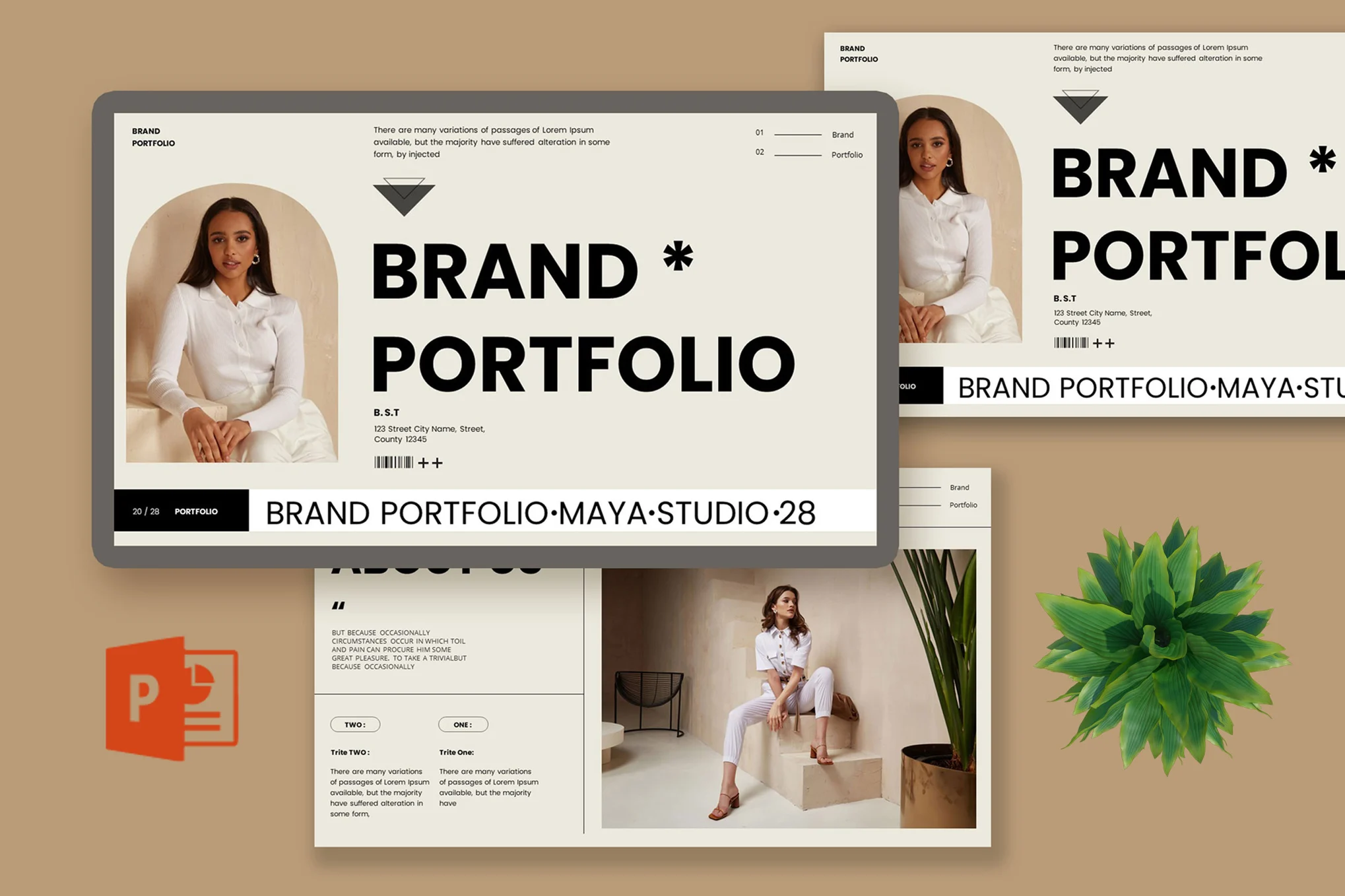
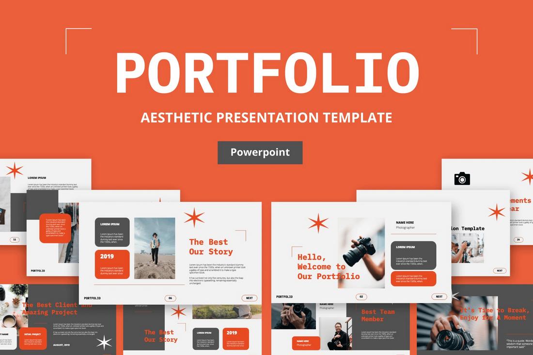
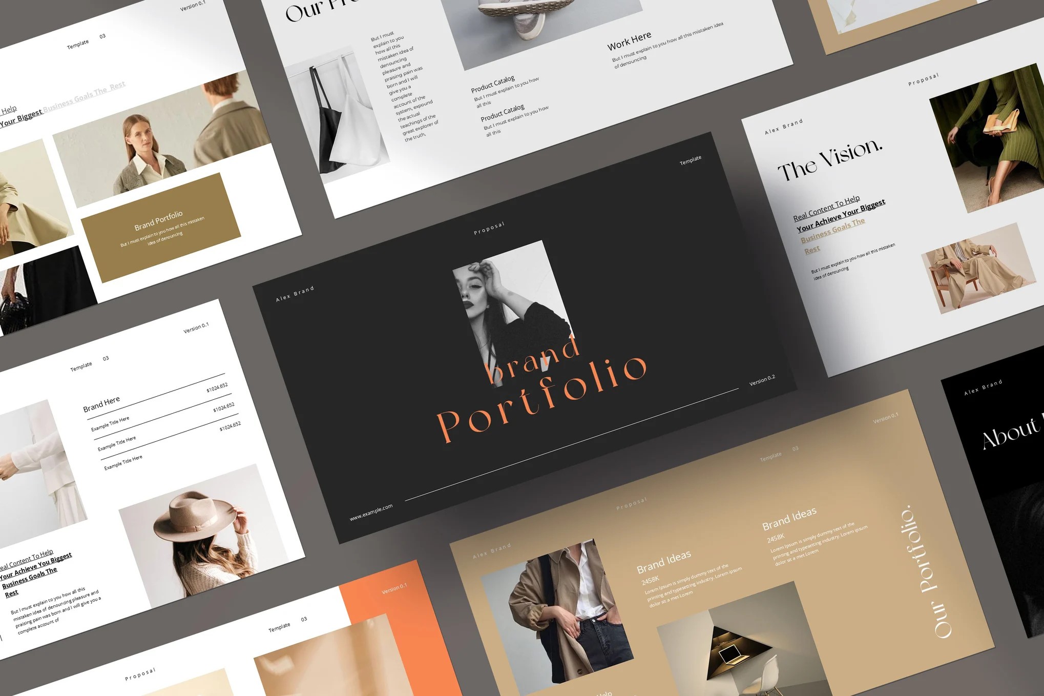
Modern Brand Portfolio PowerPoint Template

Modern Brand Portfolio PowerPoint Template

This is an impressively designed PowerPoint template for creating eye-catching brand portfolios. Featuring 16 editable slides, the template makes use of free recommended web fonts, Google fonts, and provides resizable graphics. It’s designed with a wide screen ratio of 16:9 and incorporates master slides for easy editing.

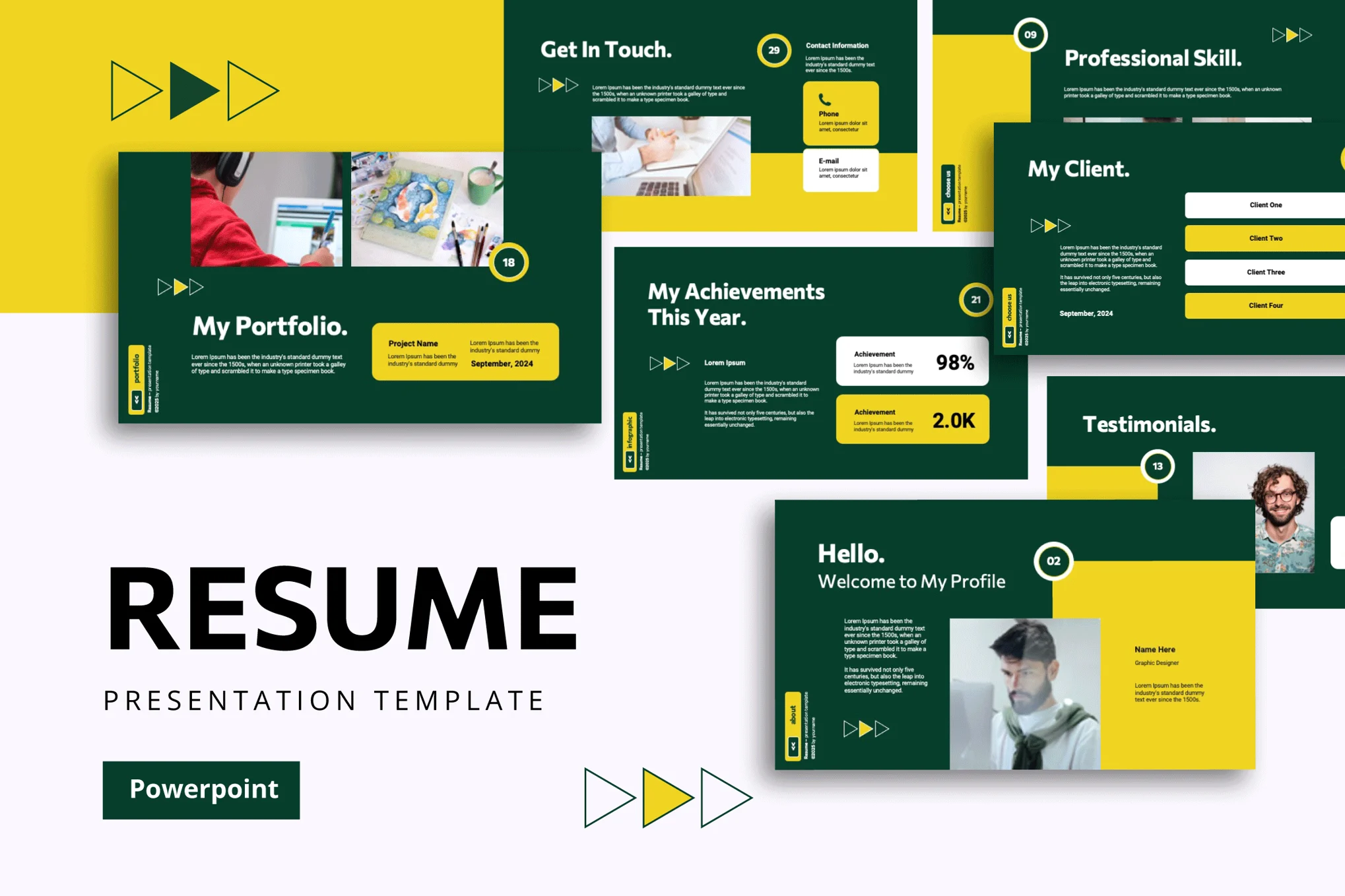
Resume Portfolio PowerPoint Template

Resume Portfolio PowerPoint Template

An ideal PowerPoint template for job seekers and professionals looking to showcase their skills, work, and data in an appealing format. Its modern and professional design features 35 customizable slides, incorporating charts, graphs, and easy-to-use image placeholders for visual content.

Aesthetic Portfolio PowerPoint Template

Perfect for a multitude of professions, including artists, job seekers, and developers, this PowerPoint portfolio template boasts a sleek, professional design. Its unique feature set includes 35 customizable slides, drag-and-drop image placeholders, and numerous charts and graphs for presenting data.

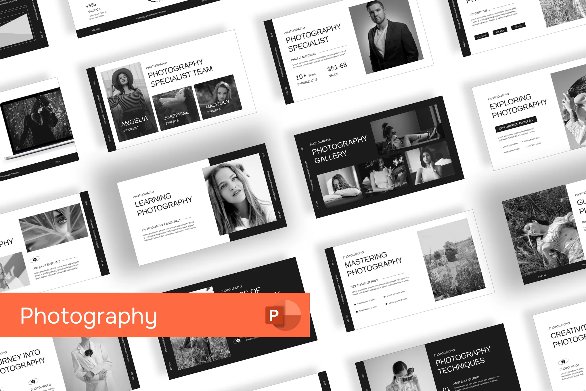
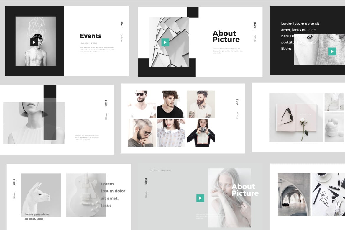
Minimal Photography Portfolio PowerPoint Template

Minimal Photography Portfolio PowerPoint Template

This is a sleek, professional portfolio PowerPoint template designed primarily for the visual arts sector. This user-friendly template optimizes the display of your photographic portfolio or creative projects, emphasizing their beauty and impact. Its customizable graphics, drag and drop image placeholders, and widescreen proportions make it versatile and easy to use.

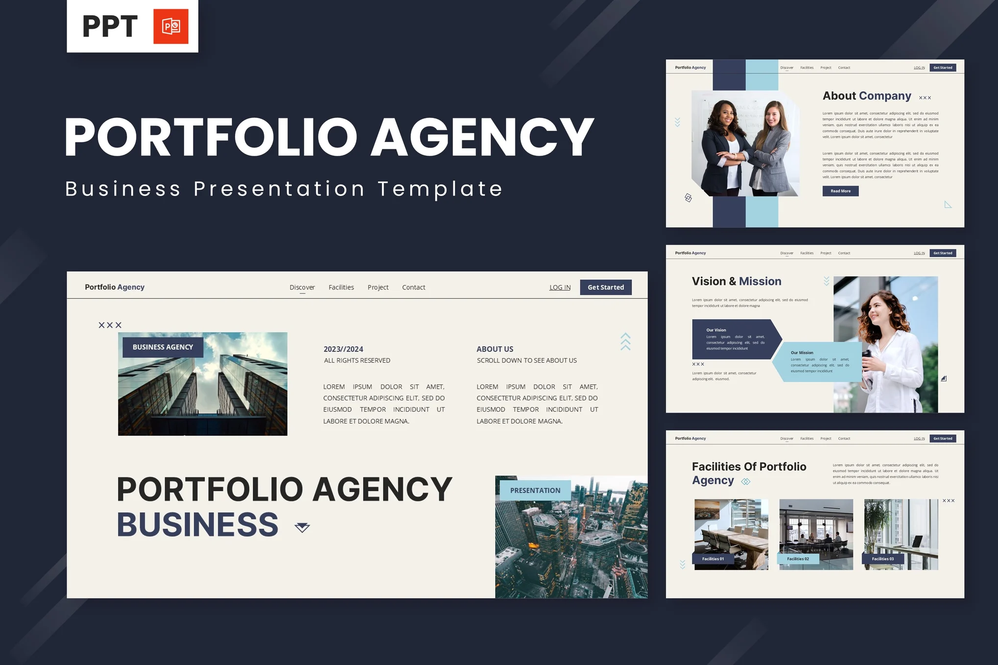
Agency Portfolio PowerPoint Template

Agency Portfolio PowerPoint Template

A versatile PowerPoint template suited for professional portfolios. Ideal for agencies, businesses, or for personal use, features include editable graphics, easy color changes, and customizable master slides. Its 16:9 wide screen ratio, picture placeholder, and simple editability make it a reliable choice.

Bold Modern Brand Portfolio PowerPoint Template

Bold Modern Brand Portfolio PowerPoint Template

This PowerPoint template offers a comprehensive layout for presenting important aspects of your brand portfolio. Including 20 versatile, full HD slides suitable for showcasing your best work and clients, the slideshow includes editable colors, fonts, and graphics as well.

Grafica – Modern Portfolio PowerPoint Template

Grafica - Modern Portfolio PowerPoint Template

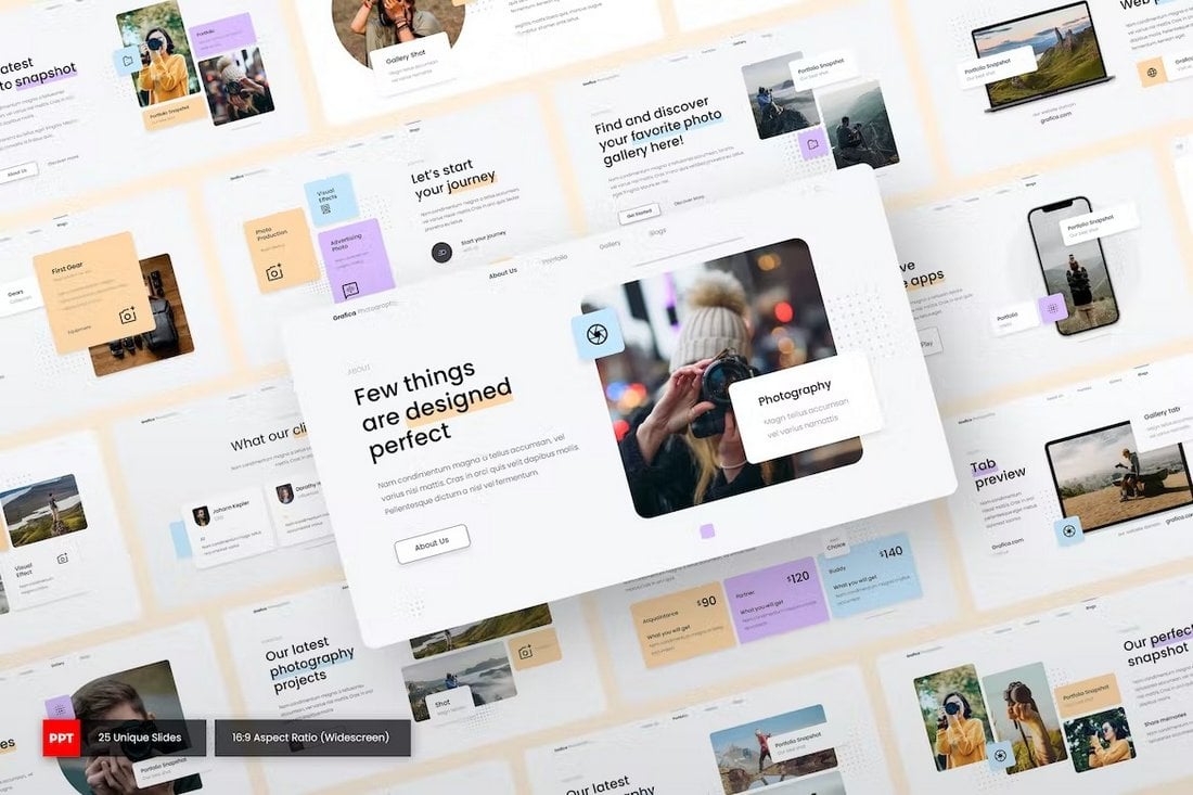
This modern, colorful, and creative PowerPoint template has the perfect design for crafting a convincing presentation that highlights your skills and services. There are 25 fully customizable slide layouts to choose from with editable graphics.

Creative Tan Black Orange Photography Portfolio PPT

Creative Tan Black Orange Photography Portfolio PPT

The combination of the tan, black, and orange colors gives this PowerPoint template a very creative look and feel. It’s ideal for making portfolios for photographers, studios, and for various other businesses. The template includes 27 different slides.

Gofolio – Simple PowerPoint Portfolio Template

Gofolio - Simple Portfolio PowerPoint Template

Gofolio is a simple PowerPoint template that comes with a set of clean slide layouts. You can choose from 30 unique slide layouts to craft a professional presentation for showing off your skills. The template can be easily customized to change colors and fonts as well.

Hilam – Minimal PowerPoint Portfolio Template

Hilam - Minimal PowerPoint Portfolio Template

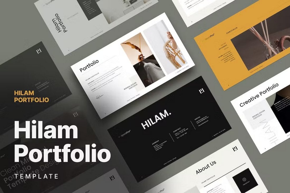
Another minimal and clean PowerPoint template for professionals. This template is made with designers and photographers in mind. There are 30 elegant slide layouts in this template with editable vector graphics, image placeholders, and more.

Free Lead Designer Portfolio Infographics PPT

Free Lead Designer Portfolio Infographics PPT

This PowerPoint template includes a set of infographics for showcasing your skills, talent, and experience in a unique way. It’s ideal for freelance designers for creating an effective portfolio slideshow. The template has 32 different slides.

PRONTO – Photography Portfolio PowerPoint Template

PRONTO - Photography Portfolio PowerPoint Template

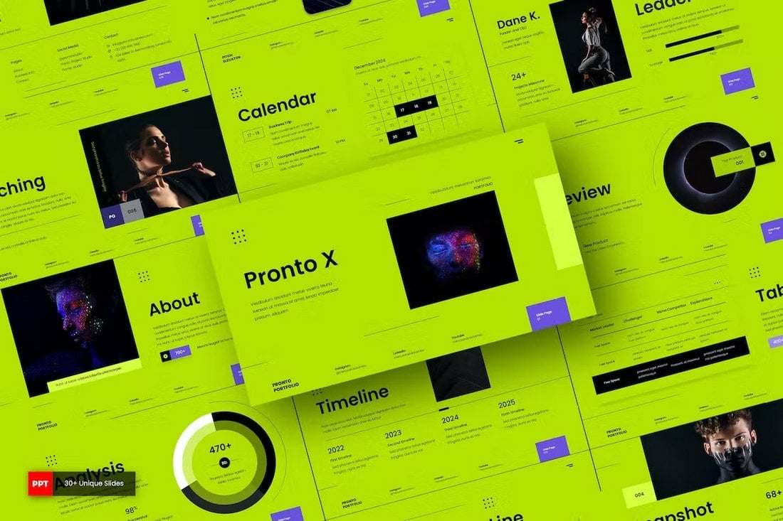
If you’re a fan of colorful slide designs and bold layouts, this PowerPoint template is perfect for you. It will help you design a professional portfolio presentation to showcase your photography skills. There are 31 unique slides in this template.

Wako – Elegant PowerPoint Portfolio Template

Wako - Elegant PowerPoint Portfolio Template

Wako is a minimal PowerPoint template that comes with an elegant slide design. It’s ideal for making presentations for showcasing interior design, architecture, and fashion portfolios. The template includes 44 fully animated slide designs.

JSON – Freelancer Portfolio Powerpoint Template

JSON - Freelancer Portfolio Powerpoint Template

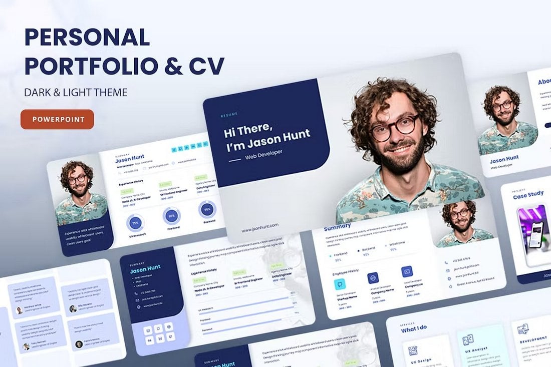
This PowerPoint portfolio template is most suitable for web designers and developers. It includes 24 unique slides for showcasing your programming and design skills like a pro. The slideshow also comes in both light and dark design themes.

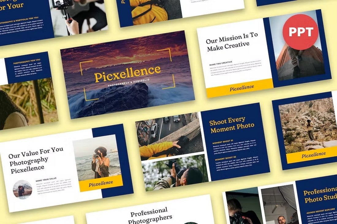
Picxellence – Photography & Portfolio Powerpoint Template

Picxellence - Photography & Portfolio Powerpoint Template

You can use this PowerPoint template to craft a beautiful portfolio presentation to showcase your photography skills. The template has 30 different slides with large image placeholders that highlights your photos above all else.

Free Boho Style PowerPoint Portfolio Template

Free Boho Style PowerPoint Portfolio Template

This free PowerPoint template comes filled with beautiful doodles and drawings to give a personal touch to your slideshow. It uses a boho-style design across the presentation as well. The template includes 25 slides.

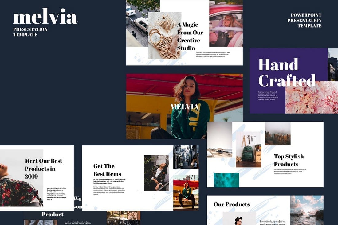
MELVIA – Creative Portfolio PowerPoint Template

MELVIA - Creative Portfolio Powerpoint Template

Melvia is a multipurpose PowerPoint template that comes with a sleek and modern content design. It can be used to create different types of portfolios for agencies and creatives. As well as for making business profiles and product showcase presentations. The template includes 30 unique slide layouts.

Photography Portfolio PowerPoint Template

Photography Porfolio PowerPoint Template

If you’re a photographer or studio promoting your services, this PowerPoint template will allow you to showcase your portfolio in a professional way. It lets you choose from more than 60 unique slide layouts to craft an effective portfolio presentation. Each slide includes image placeholders for easy drag and drop editing.

Legacy – Portfolio PowerPoint Template

Legacy – Portfolio PowerPoint Template

Legacy is a modern PowerPoint template you can use to create professional portfolio presentations. It’s perfect for corporate businesses as well as freelancers. The template comes with a total of 39 slides featuring editable layouts and vector graphics.

Furman – Product Portfolio PowerPoint Template

portfolio ppt

Check out Furman, a gorgeously designed PowerPoint template that allows you to showcase your products in the best light possible. It comes with 30 multipurpose slide designs that can be customized to suit any business or industry under the sun.

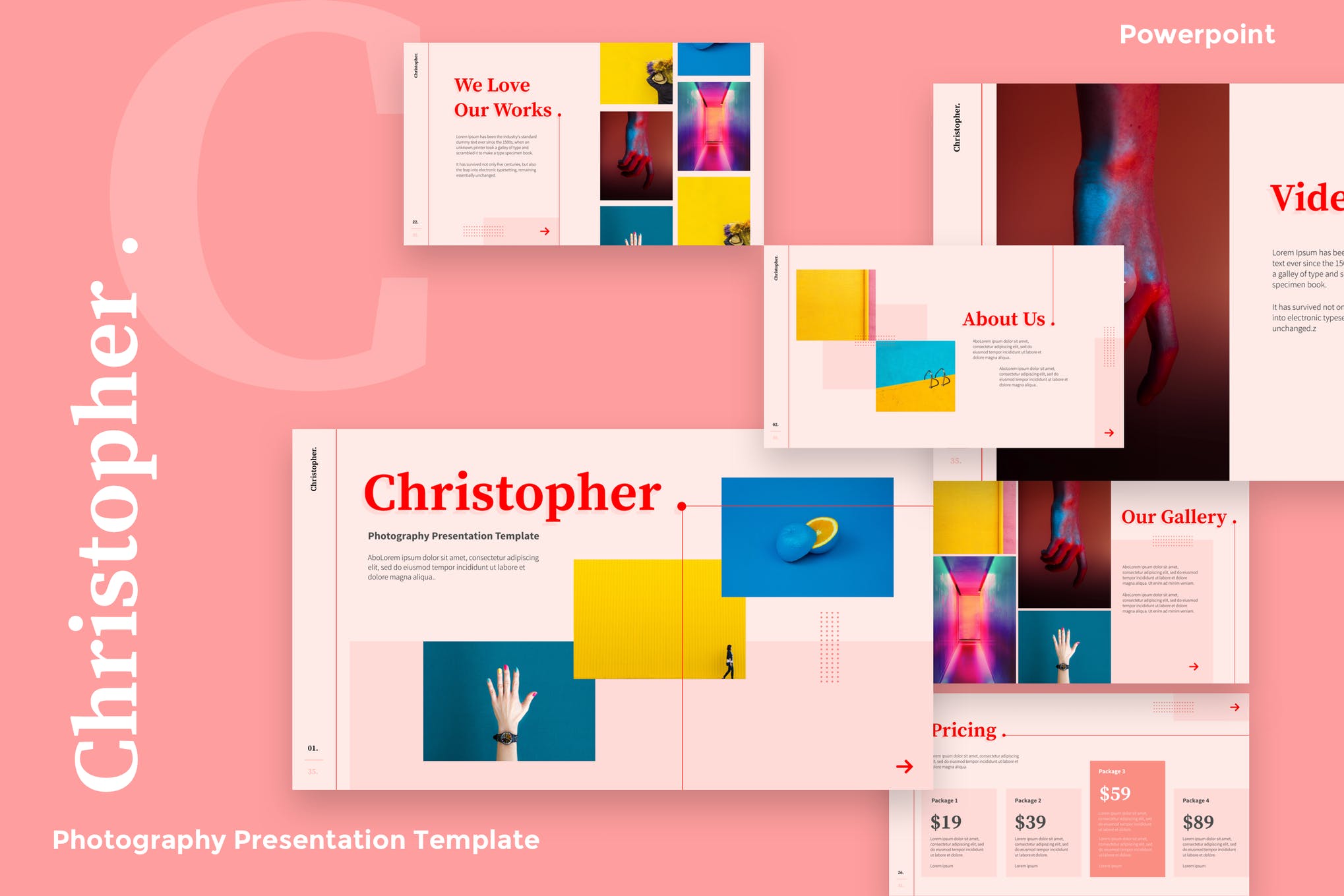
Christopher – Portfolio PowerPoint Template

portfolio ppt

Next up we have Christopher, a modern and professional PowerPoint template purpose-built to show off your photography portfolio in an impressive fashion. It offers 35 unique slides, creative infographics, timelines, free fonts, and a lot more.

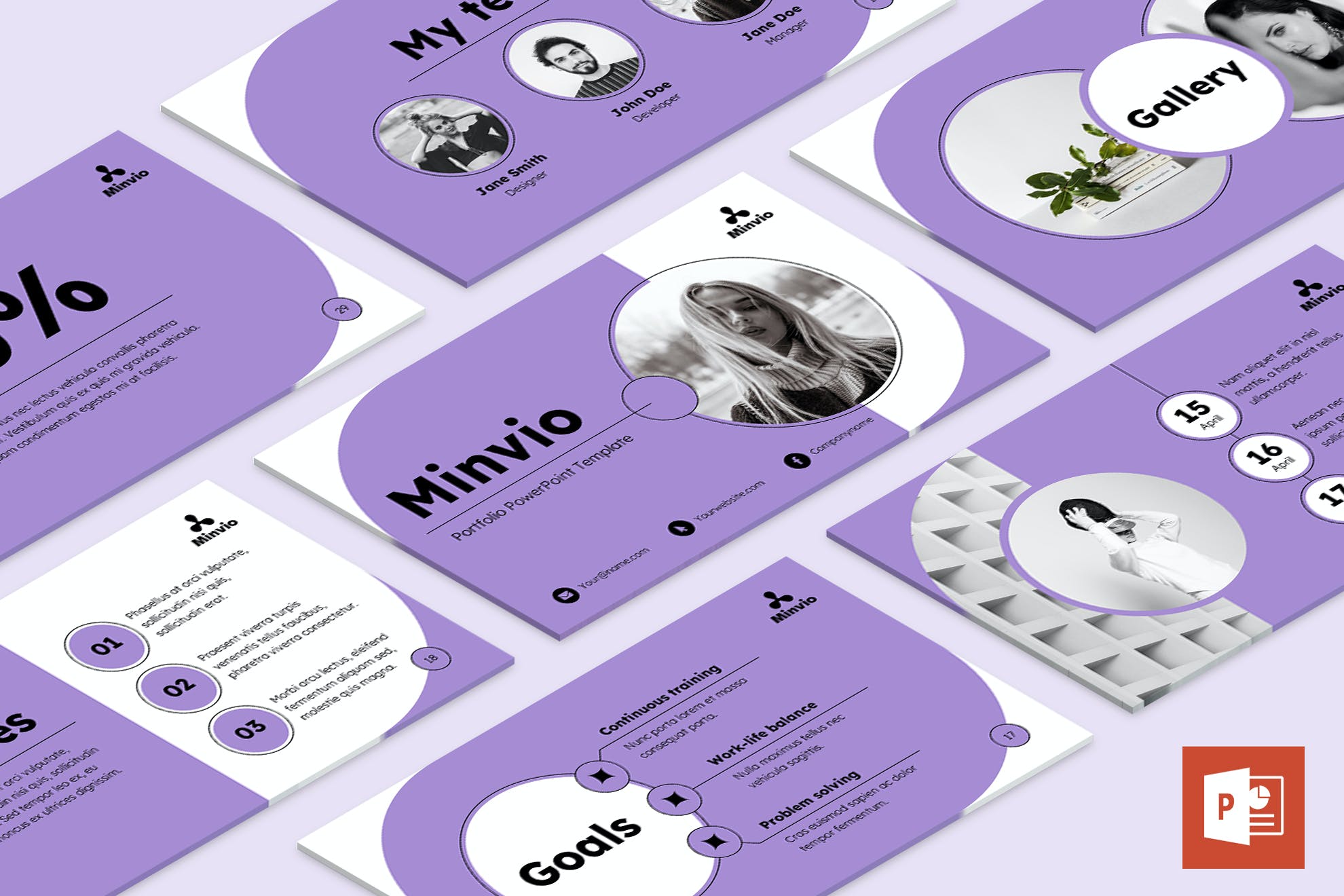
Minvio – Portfolio PowerPoint Template

portfolio ppt

Minivo is a minimal, eye-catching portfolio template for PowerPoint that equips you with everything you need to prepare a praise-worthy presentation, saving you hours of work. It has 50 beautiful, fully animated slides, a range of color themes, and much more.

Free Portfolio PowerPoint Template

portfolio ppt

If you are looking for a minimal and sophisticated portfolio presentation that still manages to bring a unique personality to the table, consider this PowerPoint template featuring 25 clean and organized slide designs. It’s free and up for grabs!

Imaginary – PowerPoint Portfolio Template

Imaginary - Portfolio PowerPoint Template

This PowerPoint template features a highly visual slide design with lots of space for showcasing your portfolio items with images. There are 50 unique slide layouts you can use to craft a professional portfolio slideshow. Each slide is easily customizable as well.

MOSOKSE – Minimal PowerPoint Portfolio Template

MOSOKSE - Minimal PowerPoint Portfolio Template

You can use this PowerPoint portfolio template to design a simple and minimal presentation to showcase your portfolio. It includes fully editable slides featuring image placeholders, device mockups, free fonts, and much more.

Hire – Business Portfolio PowerPoint Template

Hire - Business Portfolio Powerpoint Template

This PowerPoint portfolio template is made specifically for creative and freelance professionals. It lets you create a presentation highlighting your best work and promoting your services. The template includes 30 unique slides with transition animations, master slide layouts, and much more.

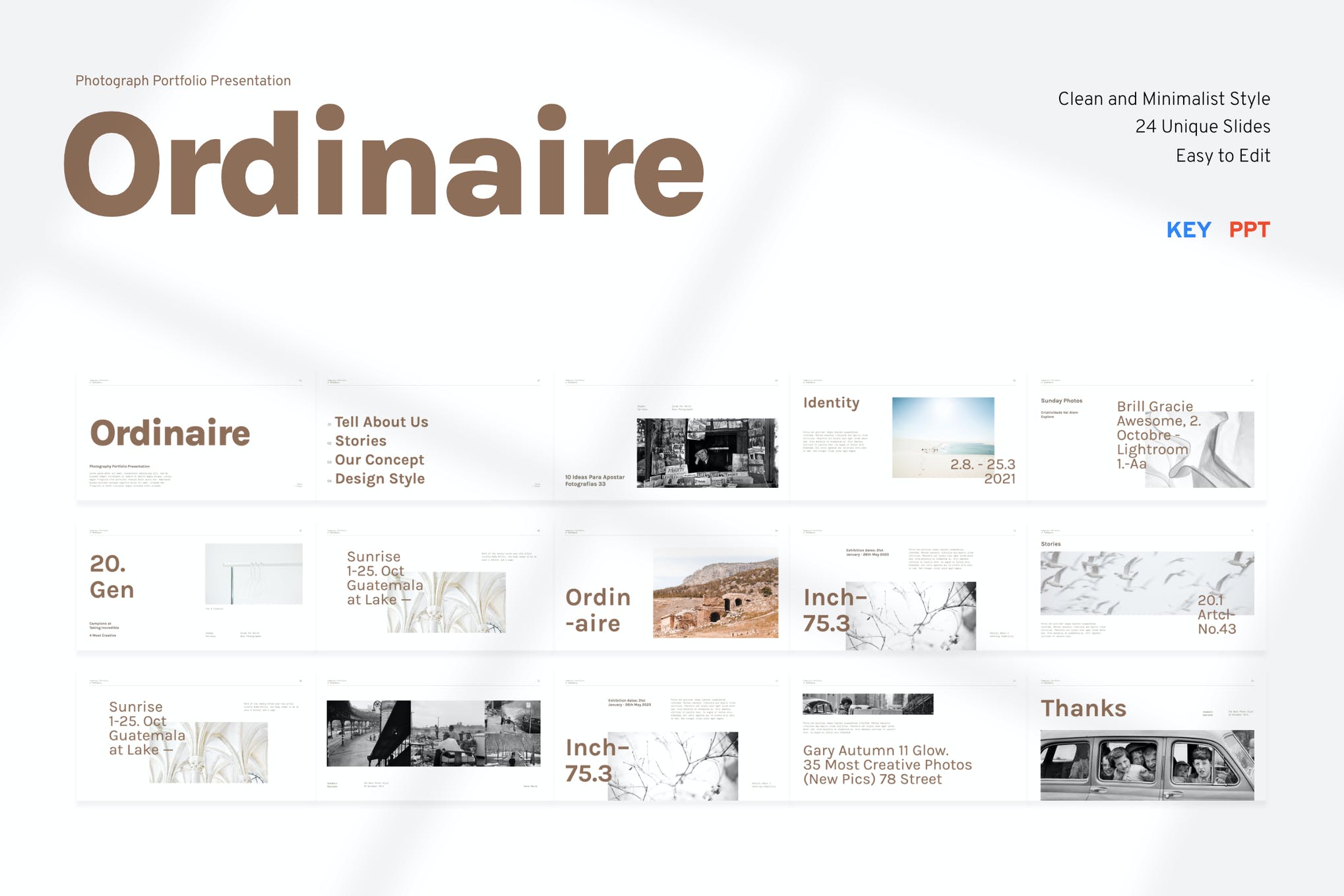
Ordinaire – Portfolio PowerPoint Template

PowerPoint Portfolio Template

Ordinaire is a clean and modern PowerPoint template that is perfect to use for a photography portfolio or your own portfolio with a modern layout.

Clevio – Personal Portfolio PowerPoint Template

PowerPoint Portfolio Template

If you are wanting a gorgeous looking PowerPoint template for your personal portfolio, look no further than Clevio. It’s a creatively crafted template consisting of 40 slides that you’re surely going to have a great time customizing to your heart’s content.

Creative Portfolio PowerPoint Template

PowerPoint Portfolio Template

This is a professional, modern, and uniquely designed slide template, where each slide is created with attention to detail. Each slide is editable and can easily adapt to your project purpose. This product will save you time, as it’s a whole lot quicker than trying to design a deck from scratch.

Free Fashion Portfolio PowerPoint Template

PowerPoint Portfolio Template

Here we have a beautiful and lovely portfolio template for the creative presentation of your design projects. You can use this awesome template for your works such as branding, fashion designer, photographer, business feed, and more!

The New – Free Portfolio PowerPoint Template

PowerPoint Portfolio Template

The New Powerpoint template is a multipurpose option that can be used for any type of presentation: business, portfolio, corporate, branding, advertising, etc. The template is divided into several categories: (opening slides, our team, our services, portfolio, and many others).

Windy – Modern Portfolio PowerPoint Presentation

Windy - Modern Portfolio Powerpoint Presentation

Windy is a bright and attractive PowerPoint template you can use to showcase portfolios for creative brands and agencies. It comes with 30 slides filled with vivid colors, stylish fonts, and creative shapes. Everything in the template is fully customizable to your preference.

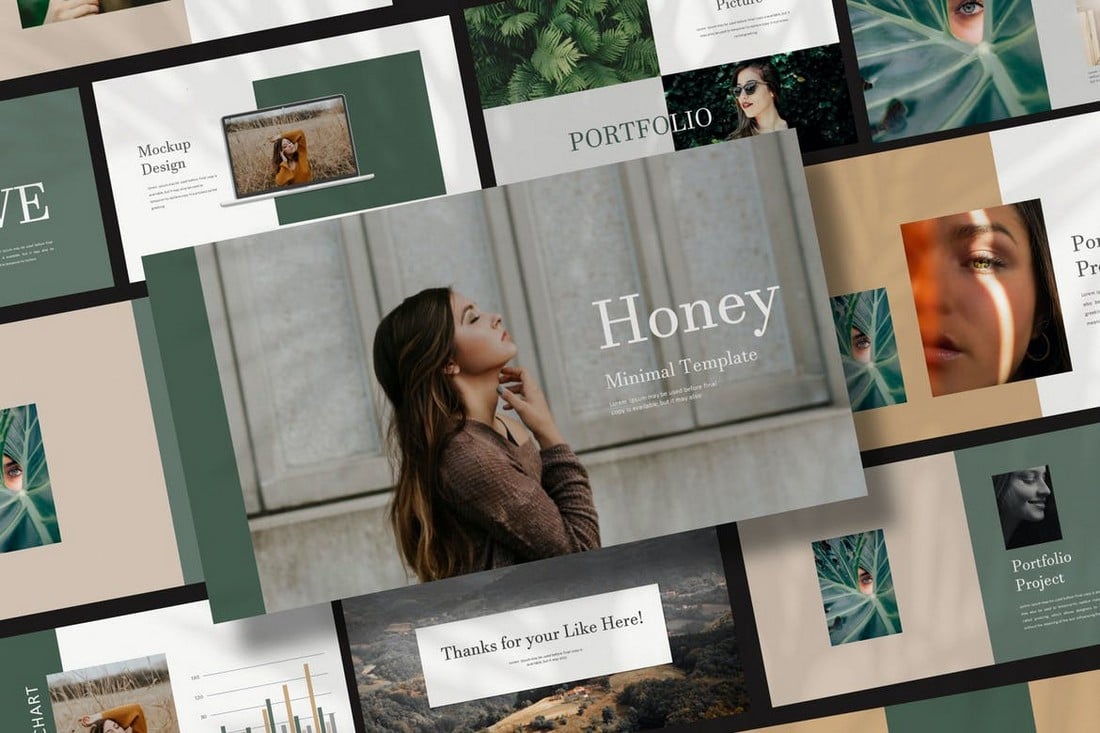
Honey – Fashion Portfolio PowerPoint Template

Honey - Fashion Portfolio Powerpoint Template

If you’re looking to create a PowerPoint portfolio with a modern and visual-centric design, this template is perfect for you. It comes with a highly visual design where you can showcase your portfolio items using large images. The template itself contains easily customizable slides with editable vector graphics, image placeholders, icon packs, and more.

Designer Portfolio Free PowerPoint Template

Designer Portfolio Free PowerPoint Template

This is a free PowerPoint template you can use to create a high-quality portfolio for all types of designers. It includes 11 unique slides with editable layouts. The template is also available in Google Slides version.

Free Photographer Portfolio Template

Wanting to get your hands on a free PowerPoint template to display your photography portfolio in style? Look no further than this colorful ppt that will surely make a solid impression on your clients, and get you the project you’re after.

Old School – Free Creative PowerPoint Portfolio Template

Old School - Free Creative PowerPoint Portfolio Template

This free PowerPoint template comes with a very unique style of slide design. It uses a vintage-themed slide layout where you can showcase your best work in a creative way. It’s perfect for illustrators and tattoo artists.

Kintel – Modern Portfolio PowerPoint Template

Kintel - Modern Portfolio Powerpoint Template

Kintel is a PowerPoint portfolio template that’s most suitable for creative professionals and agencies. The template comes with a modern slide design giving images the center stage. You can choose from more than 75 unique slides to create a killer portfolio presentation.

Personas – Personal Portfolio PowerPoint Template

Personas - Personal Portfolio PowerPoint Template

Personas is a portfolio presentation template with a clean and visual design. It’s designed with freelancers, artists, and individual professionals in mind. The template includes 40 different slides with fully customizable layouts. As well as master slide layouts and image placeholders.

Polariz – Colorful Portfolio PowerPoint Template

Polariz - Colorful Portfolio Powerpoint Template

If you want to show off your creativity alongside your portfolio showcase, this PowerPoint template is perfect for you. It comes with a very colorful and attractive slide design where you can present your portfolio with large images. There are a total of 36 slides included with this template.

Portfolio – Fashion Lookbook PowerPoint Template

Portfolio - Fashion Lookbook PowerPoint Template

This PowerPoint template is most suitable for creating fashion lookbook-style portfolios and showcase presentations. It comes with a set of unique slides featuring editable graphics, icons, and shapes. You can customize each slide to change colors and replace images quite easily as well.

UNIGRAPH – Elegant PowerPoint Portfolio Template

UNIGRAPH - Elegant PowerPoint Portfolio Template

An elegant PowerPoint template with a dark color theme. This portfolio presentation features dark backgrounds that will make your visual content more highlighted in each slide. The template includes lots of vector shapes, infographics, charts, timelines, master slides, and much more.

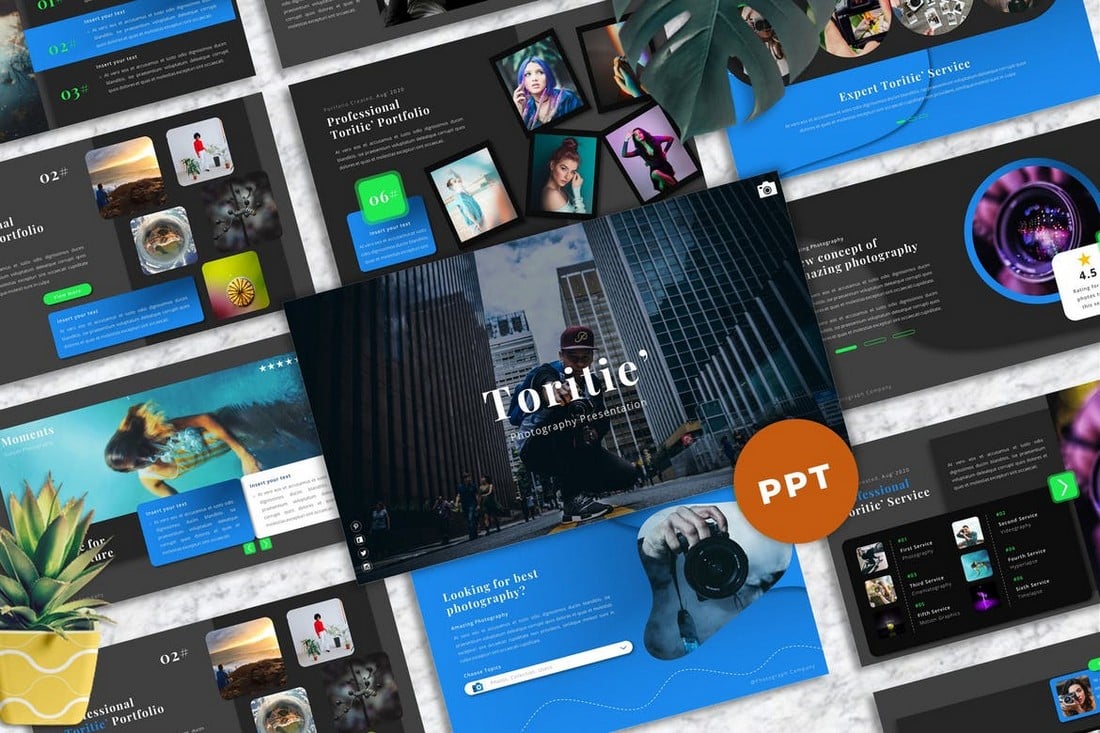
Toritie – Photography PowerPoint Portfolio Template

Toritie - Photography Powerpoint Portfolio Template

Creating PowerPoint portfolios for professional photographers will get much easier when you have this template. It comes with 40 slides with master slide layouts you can use to showcase a portfolio full of images and visuals. Each slide can be customized to change colors, sizes, and images to your preference.

Free Clean PowerPoint Portfolio Template

Free Clean PowerPoint Portfolio Template

This clean and minimal PowerPoint portfolio comes with more than 20 unique slide layouts. Each slide can be easily customized to showcase your work in a professional way. The template is free to use with your personal projects.

Free LookBook PowerPoint Template

Free LookBook PowerPoint Template

You can use this free PowerPoint template to create a trendy fashion lookbook presentation. It comes with 20 unique slides featuring image placeholders, editable shapes, and master slide layouts.

Posh – Fashion Showcase Powerpoint Template

Posh - Fashion Showcase Powerpoint Template

A stylish fashion-themed PowerPoint template you can use to craft presentations to showcase fashion catalogs and design portfolios. The template features 30 unique slides with transition animations, editable shapes, image placeholders, and much more.

Brand Portfolio PowerPoint Template

Brand Portfolio PowerPoint Template

This colorful and creative PowerPoint portfolio template is designed with modern brands and startups in mind. It comes with a set of trendy slide designs that allows you to show off the creative side of your brand. The template includes unique slides complete with image placeholders, editable colors, graphics, and more.

CAPTIS – Portfolio Powerpoint Template

CAPTIS - Portfolio Powerpoint Template

Captis is another great PowerPoint portfolio template made for professional photographers and studios. The template includes 30 unique slides that you can easily customize to change fonts, text, and replace images. You can also use the template to create business profile and service showcase presentations as well.

PORTO – Creative Powerpoint Portfolio Template

PORTO - Creative Powerpoint Portfolio Template

This PowerPoint template features a stylishly minimal content design. It will allow you to create a modern portfolio presentation while showing off your best work as well as your services in a creative way. The template includes 30 unique slides with 50 different pre-made XML color schemes to choose from. As well as light and dark color themes.

Lexus – Modern Portfolio Powerpoint Template

Lexus - Modern Portfolio Powerpoint Template

At first glance, you can tell that this PowerPoint template is a perfect choice for making small business and corporate portfolios. It features a very professional slide design with easily editable layouts. You can choose from 30 different slide layouts to create your own portfolio presentations.

Resume – Free PowerPoint Portfolio Template

Resume - Free PowerPoint Portfolio Template

This is a PowerPoint template done in the style of a resume. It features all the necessary slides for showcasing your professional services, skills, and portfolio in a slideshow presentation. The template is free to use with your personal projects.

Hyphes – Free Modern PowerPoint Portfolio Template

Hyphes - Free Modern PowerPoint Portfolio Template

Filled with colorful shapes and abstract geometric elements, this PowerPoint template allows you to craft modern portfolio slideshows with ease. It includes 24 fully editable slides. And it comes in Google Slides version as well. All for free!

Card – Minimal PowerPoint Portfolio Template

Card - Minimal PowerPoint Portfolio Template

A modern and minimalist PowerPoint template that’s ideal for showcasing the portfolios of creative brands and startups. This template features 40 different slide designs. Each slide contains editable and resizable shapes, changeable colors, and drag and drop image placeholders.

Profil – Personal Portfolio PowerPoint Template

Profil - Personal Portfolio PowerPoint Template

Create a simple and professional portfolio to showcase your professional career and freelance services using this PowerPoint template. It comes with 40 unique slide layouts featuring master slides, editable shapes, icons, and image placeholders for easily customizing the slideshow.

Pixelatte – Photography Portfolio Powerpoint Template

Pixelatte - Photography Portfolio Powerpoint Template

You can create an incredible photography portfolio slideshow using this stylish PowerPoint template. It comes with 30 unique slide layouts with fully customizable designs. The template also includes 5 pre-made color schemes in both light and dark themes.

Iconic – Lookbook Fashion Powerpoint Template

Iconic - Lookbook Fashion Powerpoint Template

This PowerPoint template is perfect for designing an elegant fashion lookbook presentation. It’s especially suitable for luxury fashion and clothing brands. The template features easily editable slides with infographics, editable vectors, icons, and more.

Focalism – Portfolio PowerPoint Template

portfolio powerpoint template

Focalism is a modern, and stylish photography PowerPoint template that will surely make a solid impression on your clients. With 36 customizable slides, free fonts, a drag and drop picture placeholder, and a 16:9 widescreen ratio, Focalism is one of the best PowerPoint photography templates on our list.

Flopy – PowerPoint Portfolio Template

portfolio powerpoint template

Scouring the internet for a nice photography composition PowerPoint template? Check out Flopy. It’s a clean, and eye-catching magazine style presentaion template featuring 34+ unique slides, fully personalizable to your needs. Don’t hesitate to take this amazing PowerPoint photography template for a spin.

One – Photography Composition PowerPoint Template

portfolio powerpoint template

One is a simple, and modern photography presentation template that allows you to showcase your portfolio in the best way possible. It provides you with 20 slides in each of the 6 templates, 3 color themes, and a seamless customizability. Free PowerPoint photography templates are usually not so impressive.

Modern Portfolio PPT Template

portfolio powerpoint template

The above-featured product is a great choice for anyone looking for an elegant photo presentation template. It will take only a couple of minutes for you to personalize this template. Just download it, fill it in with text, and photos, and voila; you’re all ready to wow your clients.

Drone X – Aerial Photography PowerPoint Template

portfolio powerpoint template

Wanting a professional, and ultra-modern template for your upcoming aerial photography and videography presentation? Look no further than Drone X. Featuring 44+ slide designs to customize, this Photography ppt template is designed with attention to detail, and a strong focus on typography and usability.

Check out our best animated PowerPoint templates collection for more inspiration.

Optimizing B2B Conversion Rates — All My Tips and Strategies

Featured Imgs 23

One of my favorite things to do is watch college football. And if you think I’m going to compare optimizing B2B conversion rates to football, you’re absolutely right.

Just like each player of the team needs to work together to score a touchdown, the parts of your B2B conversion strategy need to work in harmony to catch website visitors and turn them into paying customers.

Download Now: Free 8-Week Conversion Rate Optimization Planner

If there’s a weak link in your strategy (like a player on the team not performing at their best), you’ll need to tweak it or pull it from the roster.

For this post, I sat down with Daniel Lynch, President and Owner of Empathy First Media, to discuss optimizing B2B conversion rates. Settle in as we go over the differences between B2B CRO and B2C CRO, and I’ll share some of his tips to help you plan a winning conversion strategy.

Table of Contents

What is B2B conversion rate optimization?

Before I go too far into it, let’s take a moment to define B2B conversion rate optimization.

B2B conversion rate optimization (CRO) is a strategy to improve the number of desired actions on your website and landing pages. Ideally, your desired action, whether it’s a new sign-up in your forms, a new subscriber to your channel, or a click on a demo link, leads to a new conversion.

I like the way Lynch puts it. “In my opinion, where conversion rate optimization is going for B2B is not just the form fill,” he explained.

“Instead, it’s the first impression of what your brand offers. Like customizing it to that person and then having very detailed automated responses with sequences and chatbots. Then, using conversational artificial intelligence data enrichment to foster those conversations.”

Lynch said conversion rate optimization should really be dubbed “conversation rate optimization.” He said, “A conversation rate optimization is more than just a conversion. The conversion can be a vanity metric. But, conversations are what the goals should always be with marketing.”

CRO boils down to understanding the customer journey, identifying ways to improve it, and making it more appealing to potential customers to start a conversation. As your customers journey through your sales funnel, they come in contact with elements designed to grab their attention and spur them to action.

Those touch points include:

  • Sales and landing pages
  • Sign-up forms
  • Pop-ups
  • Call-to-actions (CTAs)
  • Compelling content and copy
  • Free trials and freemium tools

Making an effort to optimize each of these things can help convert a lead to a loyal customer. You’ll want to track and analyze each part of your conversion strategy to fully understand where you need to make changes to encourage more clicks or sign-ups.

Thankfully, there are tons of conversion rate optimization tools that can help you analyze your sales funnel and optimize your strategies. These tools can help you make appropriate, meaningful changes, as changing the wrong strategy or tweaking the wrong layer of your funnel could negatively impact your CRO.

You also don’t want to make a ton of changes at once. Instead, consider using a conversion rate optimization planner to help make small, meaningful, and measurable changes.

B2B CRO vs. B2C CRO

Let’s face it: Conversion rates vary across markets.

Even though over 60% of B2B and B2C leaders are leveraging AI tools for marketing, the marketing and conversion strategies that work well for each market are very different.

This means you can’t really use the same B2C tactics to optimize your B2B conversion rates. Logically, it’s still marketing, and it seems like the strategies you’d use for B2C sales should apply, but the B2B market is a whole different ball game.

Here’s why.

Target Audience

b2b vs b2c cro, target audience

As marketers, you and I both know how important it is to understand our target audience. You’ve likely spent time creating an audience persona to gain a deeper understanding of what makes your audience tick.

But, when it comes to B2C marketing, the audience persona is likely just one individual. Instead of appealing to a broad group of people, B2C marketers can get oddly specific in their personalized marketing strategies.
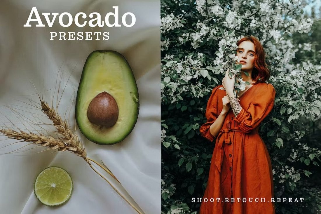
This is often easier because you really only need to influence one person to convert a sale — the individual buyer.

In B2B sales, though, the target audience is a wide range of people, from the CEO to the director of marketing to the content marketing manager.

For instance, let’s pretend your company sells engagement software designed to make connecting with customers easier. To really drive home the benefits of your software, you need to think about how it improves the workflows of each department within an organization.

This means you need to segment your audience into subcategories.

Going back to the engagement software example, your sales team will use that software differently than your marketing and customer support departments.

So, to really nail down how to connect with these groups, you’ll need to think about how your software can best serve them and tailor your approach to speak to those solutions.

Segmenting your audience isn’t just a good idea for companies — it’s a great strategy to bring in more revenue. 70% of companies use segmentation to better market to their customers. And, of those who use this strategy, 80% of those businesses see an increase in their profits.

So, if you want a better ROI and optimized conversion rates, consider segmenting your target audience.

Decision-Makers and Research

b2b vs b2c cro, research

As I mentioned, in B2C sales, a purchase is usually an individual decision. However, in B2B sales, the decision to make a purchase is a group activity.

With more stakeholders involved, there are more decision-makers. If those decision-makers are anything like me and have to research a product from all angles before purchasing, it means there will be double or triple the research notes before the group as a whole decides to purchase a product or service.

With more people helping to make a decision, individual research will likely uncover more purchase options for group consideration.

According to B2B SaaS Reviews, 27% of B2B buyers consider six or more options before making a purchase, compared to just 17% of B2C buyers.

This means that to convert visitors on your website who are somewhat interested in your product, you really need to position your product or service as the solution to their B2B needs — or you risk losing a lead to your competition.

Sales Cycle

b2b vs b2c cro, sales cycle

Remember the days when you watched infomercials in the middle of the night and were persuaded to purchase new exercise equipment that would solve all your insomnia problems?

For me, it took just thirty minutes into one infomercial to decide to buy a new piece of gym equipment.

The point of that story? The B2C sales cycle is relatively short. It often goes like this: You see something that catches your eye, you think about how it’ll solve all your most pressing problems, and then you plunk your card down and go home with something new.

Seems like a relatively effective sales cycle, right? It is — for B2C.

That’s not how it works in the B2B world, though.

B2B sales often take more than 30 minutes to reach the end goal. In fact, the average B2B sales cycle is just over two months long.

During this time, your sales team will need to make every effort to convert leads, strike up a conversation, and close a sale. That might mean that you invite decision-makers to lunch, call them to follow up and re-pitch (and re-pitch!) your services, or schedule a live product demonstration.

These are all tactics you wouldn’t use to close the B2C sales cycle.

Messaging and Marketing

b2b vs b2c cro, marketing

How you market your products or services also varies slightly depending on your market. Content marketing, influencer partnerships, and social media marketing are all effective conversion methods, but some work better than others for B2B sales.

For example, influencer partnerships are a fantastic idea for promoting your brand, but they work best for B2C brands, as they can be more persuasive to the individual.

Content marketing is a great option for getting the word out about your products or services, and 91% of B2B marketers include it in their overall strategy.

For B2B marketing, writing how-to tutorials, offering case studies, or sharing videos of product walk-throughs is a great way to produce highly engaging content that converts leads to sales.

Content marketing works for B2C brands, and 86% of B2C marketers include it in their strategy. But, the more effective content they share, like short-form, trendy videos, is different.

Customer Journey

b2b vs b2c cro, customer journey

Finally, the biggest reason B2B CRO varies compared to B2C is that the customer journey is different.

B2C brands know that they’re often selling a one-time purchase product. This doesn’t mean they won’t have repeat customers — they will. However, it does mean their focus is on getting customers to their site as quickly as possible to make a low-value purchase.

B2B purchases, though, are high-value purchases. This means your customers aren’t just purchasing a product; they’re purchasing an experience.

They need to know upfront the value they’re getting from your product or service before agreeing to a contract. It’s why your B2B customer journey should be filled with as much valuable content as possible.

Instead, you should focus on providing various resources, including explainer videos, case studies, and tutorials, to help influence their purchasing decision before encouraging them to contact your sales reps.

Oddly enough, involving your sales reps too soon can be detrimental. Garner found that 44% of millennials don’t want to interact with a sales rep before making a B2B purchase.

Lynch said this is because we (as consumers) are selfish with our time. That’s why text-based marketing, like chatbots, works so well in B2B marketing and sales.

Now that we know the differences between B2B and B2C conversions, let’s look at some of Lynch’s favorite B2B conversion rate optimization strategies.

B2B Conversion Rate Optimization Strategies

B2B Conversion Rate Optimization Strategies

1. Monitor your website.

Heat Mapping and Recording Sessions

Your website is a gold mine of information, and you can uncover valuable information about your website visitors with the right AI tools.

And I’m not just talking about metrics relating to form fills or bounce rates. Lynch told me the key to optimizing B2B conversion rates is implementing AI tools for heat map tracking and session recording.
These conversion rate tools provide users with a visual representation of the most visited places on their websites. This gives you a better understanding of the kinds of things, like your calls-to-action or graphics, that catch your visitors’ eyes.
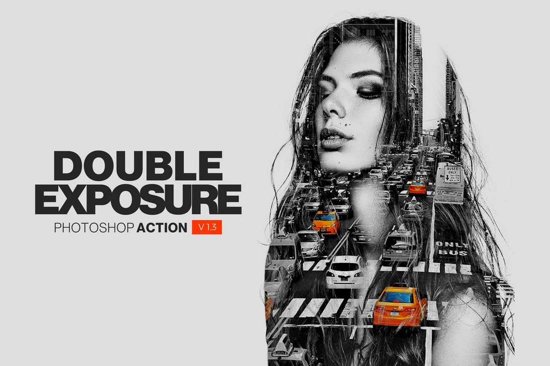
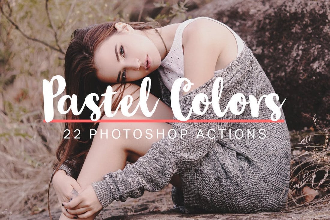
Lynch told me he likes using heat maps because they create a timeline where you determine the sequence of button clicks by users. He said, “It's super important that you identify with their cursor. What did they highlight? What did they focus on their screen?”
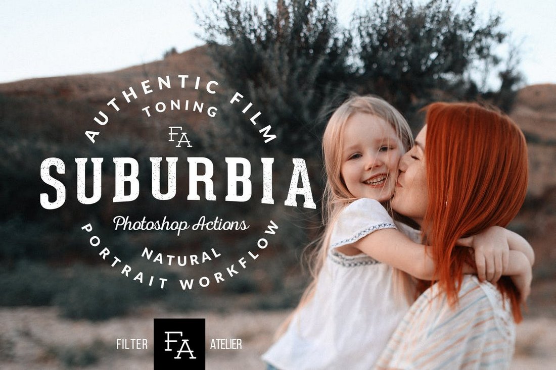
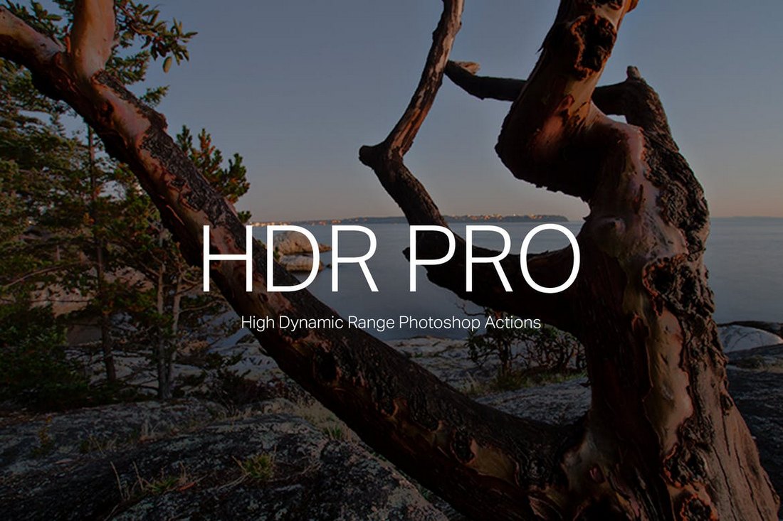
Once you understand their interests, you can filter out your product or service features your leads don’t care about and only focus on the things they do. Not only does this cut down on wasted time, but by targeting their interests you’re on your way to opening a meaningful conversation (and conversion!) with your leads.

User Experience

This strategy might sound repetitive, but the user experience does affect your overall conversion rate. In our conversation, Lynch made it a point to tell me that a well-designed landing page doesn’t necessarily mean it’s chock full of interactive elements. Instead, less is more.

He said, “What a lot of people don‘t realize is that the best landing pages are the ones that don’t look the best. You want them low, quick, to serve the purpose, and have some visual aesthetic to them. But less is more.

“Minimalistic is what drives conversions. You just want to get them to sign up, so you can talk to them and move on. And the more you add to that page, the longer it takes to load. And the longer it takes to load, the lower your conversion rate will be.”

If you’re not sure which landing page converts the most users, consider A/B testing. A/B testing can help you easily identify which elements of your landing pages lend to the best user experience.

2. Optimize lead forms.

Although your lead forms are only a small part of your conversion rate optimization strategy, they still hold some weight. And a bad form will send your visitors running in the wrong direction.

According to Lynch, “There‘s plenty of data that every additional form field you add lowers your conversion rate because it’s one more field that people have to take time to complete.”

And he’s right. 27% of people will abandon a form because it’s too long. Thankfully, there are AI conversion rate tools available to help optimize your forms. He wholeheartedly recommends using them, too.

AI-optimized forms work by collecting user data as a visitor roams around on your website. Think data — like company name, industry, and position within the company. Then, when they land on a form, your AI tool can change the form to collect only the necessary data.

This can drastically reduce the number of form fields a user needs to complete, which in turn can help increase your conversion rates.

3. Use social proof.

Remember how I mentioned 44% of millennials don’t want to talk to a sales rep when making a B2B purchase? It’s important to keep this stat at the forefront of your mind when tweaking your conversion rate strategies.

One way to show off your brand without involving a salesperson is to use social proof. Lynch said, “Testimonials, reviews and trust badges help leverage your authority and position you as an expert in that industry.”

Considering 84% of B2B buyers use review sites, it’s worth it to take some time collecting customer reviews. You’ll also want to scour the internet for any mention of your product or service on review sites like G2, TechCrunch, and TechRadar.

It’s also not a bad idea to ask your loyal fans to record a short video for your website and social media platforms. If other B2B customers sing the praises of your product or services, it’s easier to convince another business to work with you.

No sales reps needed.

4. Incorporate conversational AI.

When I asked Lynch for his thoughts about millennials not wanting to speak to a salesperson, he wasn’t surprised. Instead, he told me that’s why incorporating conversational AI tools, like chatbots, into your website is so important.

He said, “A lot more people are going to be less hesitant to anonymously engage with chatbots.”

AI-powered chatbots can be trained on your visitors’ behavior and your company data, including your company’s knowledge-base library and your tutorials.

So, when a visitor lands on your website, your chatbot is equipped with the best, most up-to-date information to help guide visitors to fill out your forms or book a demo call.

Plus, chatbots provide immediate support. Lynch mentioned that potential customers, as a whole, are selfish with their time and don’t necessarily want to wait on a response from a sales rep.

He said, “They want to have real-time conversations. The beautiful thing about chatbots is you give them that instant dopamine, versus having to wait for someone to call them and schedule it. A scheduled call doesn't respect your time as much as an instant one does.”

While AI chatbots can’t do everything to close the loop on your B2B sales cycle, they do lend a helping hand to help speed up the lead generation process before potential leads lose interest in your brand — talk about optimizing your conversion rates.

5. Dynamic content optimization.

There’s no doubt you’re creating content based on your ideal customer profile (ICP). But, because there are so many decision-makers in a B2B purchase, it can be challenging to nail down the right call-to-actions or the most effective copy.

Enter: dynamic content optimization. Using AI and its data to optimize your copy and content takes the guesswork out of your advertising. AI can detect who in the decision-making team is looking at your landing pages. Then, it can optimize your call-to-actions to better encourage sign-ups or clicks.

For example, if a CEO is on your webpage, your CTA might be “book a call.” Compared to a content manager who might need approval before scheduling a demo, the CTA might say, “Request more information.”

Lynch likes to think of this approach as “marketing with the scientific method.” He told me, “That‘s why the data is so important. If you cannot improve your copywriting optimization, unless you’re willing to assume you're wrong. Look at the data to adjust your approach, adjust your copy, and go from there.”

6. Account-based marketing.

Going back to the football reference that I started out with, to optimize your conversion rates, you need to think of the B2B decision-makers as individuals on a team.

Each individual has their own role, whether that’s the CEO, a department manager, or a department director. Each of these roles functions differently within a company. How they interact with and use your product or service will be different, too.

It’s best to think of how each decision-maker will use your product or service and market it based on that.

But you shouldn’t just think about how they’ll individually use your product, you also need to map out who has the most buying power and pull within the team.

Lynch explained it to me like this. The CEO holds quite a bit of power in the buying decision, but they also don’t want to spend time wrestling with the decision — they’re busy. They have things to do, and they trust their team to make the best decision.

On the other hand, there will be someone in the decision team who thinks it’s better to go with your competitors. These are the people you should focus your marketing efforts on.

And, it’s where account-based marketing comes in.

Danial said, “Account-based marketing is identifying buying roles in the process that match your ICP and audience personas. You can associate the different buying roles and identify them as the gatekeeper, the champion, the blocker. The champion is the one who wants to choose you … [and] is advocating for you to the team.”

According to Danial, the blocker is someone who wants to go with someone else.

“And if they‘re a blocker and you’ve identified that, you can even put them into a list to be retargeted with certain emails, LinkedIn messages, Facebook ads, or LinkedIn ads to try to change their mind by giving them more trust with your brand,” Danial says.

This is also why it’s really important to create compelling content, like case studies and ebooks. You can send those materials to help persuade team members to start a conversation with your brand.

Optimizing B2B conversion rates starts with a conversation.

Your B2B conversion rate strategy doesn’t have to fall flat. Instead, consider using AI to help optimize your conversions and generate better leads.

After all, like Lynch told me, conversions boil down to conversations. And, using the data your AI tools collect, you’re better equipped to have more meaningful conversations with interested prospects, without needing to go over the preliminaries and risk wasting valuable time.

From Pretty Logos to Real Impact: How I Shifted My Focus from Visual to Emotional Branding

Featured Imgs 23

Welcome to Creator Columns, where we bring expert HubSpot Creator voices to the Blogs that inspire and help you grow better.

I never wanted a business that only looked good from the outside. Creating only to satisfy the eyes of onlookers, audiences, and critics would be, and will always be, a waste of my time.

Over a decade ago, I walked away from a dull, corporate job because it felt like a trap — a suffocating environment designed to put me on a creatively draining conveyor belt headed for “Welcome to 65 and retirement!”

Frankly, that wasn’t for me. I became an entrepreneur so that I could build a business that is a free-flowing, evolving extension of who I am, rather than morphing it to fit what I think the industry wants it to be.

Download Now: 150+ Content Creation Templates [Free Kit]

For most of my career, I’ve been a “figure it out” sort of girl. I’ve DIY-ed my way to success, including creating my own logos and coding my old websites. So, when I realized the visual aspects of my business didn’t necessarily align with the heart of it, I paused, evaluated, and made a shift.

In the process, I learned the vital difference between visual and emotional branding. This evolution took time because, with my background in photography, I am a very visually-inspired person!

Eventually, I learned how to harness my obsession with pretty logos, fun fonts, and gorgeous aesthetics and integrate the deeper work of cultivating a brand that creates meaningful connections with my audience. When connection is your brand’s primary goal, it drives real (and better) results.

Your brand needs your heart and soul. Whether it’s a small side gig or your full-time work, your branding (visuals and messaging alike) can and should be the bridge between you and your audience.

Without emotionally driven branding, you’re having to bridge the gap yourself — and likely exhausting yourself in the process.

So, let’s walk through my experience in learning not only the difference between visual and emotional branding but also how I made the change in my business for the long haul.

The Difference Between Visual and Emotional Branding

I know “branding” encapsulates a lot of aspects of what you do — it’s basically the identity of your business. When you create a brand, you’re likely creating a series of logos, color stories, typography, and other visual design elements.

The visual aspects of your brand matter because they’re how your customers recognize you and differentiate you from everyone else. You can use these elements to appeal to your audience’s aesthetic, saying, “Hey, you and I probably like the same things!”

Based on design, like the appeal of a book cover, your audience will generally gravitate toward you. This is the first impression.

However, your brand’s impression doesn’t stop at the visuals. This is merely a quick glimpse, a drive-by. You want more than just a shallow connection because this can be replicated (or faked) by anyone.

We’ve all unwrapped (literally or figuratively) something only to find that what’s underneath is not what the advertisement sold to us. You can be shiny, but you want emotional depth.

That’s how you build long-term loyalty and connection in a crowded marketplace.

Most people think branding stops with the visuals, but I’d argue that’s only where it starts. A true brand is the personality behind your offers — going way beyond a font or palette.

Emotional branding allows your brand to show up with feeling, not just an appealing look. Creating an emotional brand can drive deeper bonds with your customers as you show your shared values, beliefs, and emotional experiences. Social media made this way more possible.

In fact, as brands and businesses began to show up on social media, the audience demanded a deeper connection from them. Since that day, brands have needed to become good storytellers.

Emotional branding may be about sharing yourself.

I remember the marked change that happened in my photography career when I transitioned from sharing solely client images to sharing myself.

I shared myself editing with my dogs lying over my feet, the reality of what being an entrepreneur looked like, I shared as I decorated my first home with thrift store finds, and the puppies we fostered.

I was showing who I was and ultimately what I loved and that resulted in my clients seeing an image of someone who felt like a friend. It wasn’t just about how I edited my photos; now they could see who edited the photos. They could envision me in my life, chasing dogs, or hanging pictures on the wall.

I went from a business to a brand, a personality. They wanted me there with them on their special days, not solely the results I would deliver to them. Because I understood that pretty much above all else, on a wedding day, you want good people bringing the good vibes.

And that’s exactly who I was and what I was delivering!

People want to be able to interact (or relate) with their favorite brands. Here are some easily recognizable companies that rely on emotional connections to their brand:

  • Nike: Inspiring customers to achieve their personal best.
  • Apple: Fostering a sense of innovation and belonging.
  • Coca-Cola: Associating the brand with happiness and togetherness.

While these companies are massive, global superbrands, I think we can pull a lesson or two from how they show up: they tell us a story about who they are.

They’re not just flaunting what they do, but they want us to feel good about associating with them. They create a space for a customer to enter, belong, and connect to a message, rather than just use a product or hire a service.

The difference can feel subtle, but shifting can make a (literal) world of difference.

How I Shifted to Emotional Branding

The shift started in my gut at first. I realized I’ve never felt a pull to show up as perfect, polished, or shiny. I craved more realness so that manifested in what and how I created.

From there, I examined how my audience across multiple social media platforms responded to my brand. I watched what questions I got asked over and over again — were they curious about my life, my relationships, my work, my processes?

The messages, replies, blog comments, email inquiries, client testimonials, and even podcast reviews helped me piece together the stories I was telling and the way my audience was perceiving me.

I took time to make sure that aligned with how I wanted them to perceive me. Did it align with my vision for my business and brand?

My business is me, so I want to make sure people remember that I am a real, living human who has a perspective I love to share.

What I am selling isn’t some regurgitation of what anyone could search for on Google. It’s processes that are learned, lived, and pieced together by me. That’s a major selling point and differentiator.

You could easily learn business from a million different places and people, but you can only learn my methods from ME in ONE place: my digital courses. So, I needed to make sure that the me-element is consistently visible and unmistakable in how I present my brand online.

It’s not about the name (or even the premise) of the course as much as it’s about knowing you’re going to sit down and learn from me. People want that kind of connection.

When I read the testimonials, this is extremely evident. My students rave about the course by saying things like “Learning from Jenna changed my business!” What you don’t hear is “This course changed my business” or “I loved the ads I saw for this course!” Ha, of course not, but you see the difference.

My digital course landing pages still present a results-oriented purpose to my potential students, but the brand itself is driving a connection between myself and my customers.

The way we approach copywriting, page layout, color choices, and our main offer’s primary selling points stems from the desire to make sure our customers feel seen, understood, and guided. I want them to feel a sweet relief when they read my sales pages because I build my offers to be entire solutions.

They’re complete, they’re effective, and they’re created to actually help and simplify. I want my customer to feel like I’ve met their gaze and to know without a doubt that I really do understand their needs because I used to stand where they are now.

The Impact of My Evolved Brand on My Business

Shifting to an emotional brand has led to more buy-in on the front end as my audience is excited about my offers before I even drop them. I no longer have to put all my energy into hoping an ad or announcement alone catches their eye.

Algorithms, unfortunately, don’t work like that. Warm leads going into a paid offer is far better than “Oh, I didn’t know you were working on anything!” Or “You hardly show up in my feed anymore!”

More interaction with your customers means more access to knowing what they want and need from you. Feedback is a critical part of connection. It can help you measure success and optimize your business as you go, rather than veering way off course and having to make big, sweeping changes down the road.

I am seeing a better connection to what I am all about. The questions I get about my life are evidence of that, too. I get fewer questions about what I do and more questions about how people can get involved or learn more from me.

I feel seen and understood by much of my audience which means I get to spend better, more meaningful time engaging with them, rather than explaining who I am or repeating myself.

The profit shift looks like less time and money spent on screaming about offers online (i.e. less ad spend in the wrong places, less external apps and tools needed to get the word out there).

Instead, I have customers who have emotional buy-in to my offers, my experiences, and new creative endeavors I will do in the future. They feel that my brand is being led and shaped by their needs and see it evolve with them, which means they want to stick with it!

And ultimately, I feel aligned with my brand. That’s a vital piece of the puzzle. You need to feel confident about how your business shows up online. You know when you feel good when you walk out your front door and when you don’t quite feel like yourself, right?

We all know the difference between that feeling of “Yeah, I like me!” and “Oh, please don’t perceive me today.” I wanted to have that “I like me!” feeling flood my mind every time I post a blog, publish a podcast episode, or link up my audience to a new offer. I want to know I’m showing up as clearly me.

Being able to show up through an emotional brand allows me to do that!

How to Keep Your Emotional Brand Evolving

1. Be willing to listen and learn as you go.

Yes, the internet changes all the time, but here’s what’s even more true: you are changing all the time. And if that is true, the same goes for your audience. Their needs, attitudes, lives, and circumstances are constantly shifting.

Unless you’re a rare sort of clairvoyant, the only way you’re going to know what their shifts are is by asking them. Leverage that newly strengthened connection between you and your audience by getting in the habit of keeping the conversation open.

Feedback will help you not only get information on what they want to see from you but that check-in will make your audience feel seen and known.

2. Schedule time to check in with your brand.

Instead of feeling the pressure to keep your brand in constant edit mode (that’s exhausting and unnecessary), schedule moments to check in with your brand.

Whether it’s annually or quarterly, carve out time to analyze how you feel about your brand. Assess the visuals; are they still representing who you are well? Read through your website copy and feel out the tone; is the voice still right? Review your social media posts and look for what’s been delivering results. What’s the common thread? Drop a feedback request to your audience and ask how they’re doing and what they want from you.

These check-ins might put a little homework on your list, but more often than not, you’ll get to walk away knowing your brand is doing exactly what it needs to do.

3. Focus on how you make people feel.

The visuals of your brand will always play a role but don’t get lost in the fonts or how flashy your videos are. Instead, focus on how you make people feel.

While I still get excited about color theory, fresh graphic design elements, and ways to make my website pages load quickly and flow well, I know how secondary those pieces are to my bottom line. Remember that those elements can’t go far without your vision and personality injected into them.

When your tagline feels like your mantra, then your audience won’t just have brand recognition. They’ll read your tagline, your social media posts, and your latest offers and see themselves in them, too. An emotional brand means that your mantra can become theirs.

The Future of Google: Web Strategists Predict How AI Overviews & Other Search Changes Will Impact Traffic [New Data]

Featured Imgs 23

More than 300 marketing pros told us whether their worst fears or wildest dreams have come to fruition since the launch of Google’s AI Overviews (formerly SGE) in May 2024.

The much-hyped and much-criticized event, which Google immediately scaled back after AI Overviews (AIO) served users with incorrect and potentially harmful info, marked the wide launch of AI-generated search on the world’s biggest search engine.

Download Now: The Annual State of Artificial Intelligence in 2024 [Free Report]

Now that Google has patched up its early missteps and SEOs have had time to observe traffic changes, we conducted a survey to determine whether the white-knuckled AI anxiety is backed by any evidence.

We’ve got the numbers on AIO’s effects on traffic, what SEO changes to look for in the coming year, and pro tips from SEO experts on how to adapt and optimize your web and content strategies.

Table of Contents

What is AI Overviews?

During its beta phase, Google’s AI-powered search was called SGE, or Search Generative Experience. It’s now more commonly known as AI Overviews, and it’s Google’s response to AI-powered search engines like Perplexity, Brave, and Microsoft’s Copilot.

It runs on Google’s AI model called Gemini, formerly Google Bard.

Regular ol’ Google Search still uses a three-stage process, though Google notes that not every page will make it through each stage. Google Search first crawls web pages, downloading text, images, and videos; it then indexes that information and stores it in a database; finally, it serves search results to the user.

AI Overviews (AIO) integrates generative AI capabilities with Google Search results. Using natural language processing (NLP), AIO can effectively repackage search results as answers to your questions, not just a page of links.

Not every query will trigger an AIO response — a Google spokesperson reiterated to me that AIO is designed to appear when it’s helpful beyond the usual SERPs. And since web content changes and evolves, AIO is also dynamic.

If you’re not seeing any AIO, make sure you’re logged in to your Google account, and check Google’s growing list of countries where it’s available.

As of October 28, 2024, Google added more than 100 countries and territories to AIO list, including the U.K, Japan, Canada, Mexico, and Brazil. If you’re in Spain, France, Germany, or Ireland, you’ll still see only the traditional SERPs.

Here’s an example of how AIO differs from the usual SERPs. If I search “world without gravity,” AIO answers the questions it thinks I have, with source links for each point:

Screencap of Google results page, including an AI Overview, for the query “world without gravity.”

Image Source

Google unfortunately couldn’t have anticipated the amount of anxiety this search just caused me, but in terms of search intent, it’s done a pretty good job.

It found a number of popular science websites that have covered the question, which are listed on the right, and it used that information to organize questions and answers in natural language.

The more familiar SERPs still appear below the AIO:

Screencap of Google results page for the query “world without gravity.”

Image Source

What other changes are coming to Google Search?

It’s likely that we’ll see more changes as Google fine-tunes AIO, especially with other AI-powered search engines gaining traction among users.

Braden Becker, a former HubSpotter who’s currently the global SEO lead at Faire, began with an important caveat about the effects of evolving AI in search, generally speaking: “I will say it depends on the industry. I think that‘s one thing I don’t hear enough of — this is not going to affect everyone equally.”

Some industries may be already feeling the effects, and some may not see any noticeable traffic changes for years.

“I will say it depends on the industry. I think that's one thing I don't hear enough of — [AI search] is not going to affect everyone equally.”—Braden Becker, Global SEO lead, Faire

Amanda Sellers, manager of EN blog strategy at HubSpot, says that “AI’s increasing ability to enforce E-E-A-T standards could push marketers to create content that’s richer, more nuanced and specific, and better accounts for search intent.”

Aleyda Solís, international SEO consultant and founder at Orainti, adds that Google is in a challenging position right now.

It has to make some choices about how it proceeds in the AI search landscape, and it has to match the quality, speed, and user satisfaction of these new players in the AI search game. The paradigm shift could, for the first time ever, pose a real threat to the search giant.

In other words, if users abandoned Google for other AI-powered search engines, it would obviously be bad for Google — “but it would be equally bad if [Google] tried to compete with ChatGPT or completely change their search interface all of a sudden. They cannot do that because they have skin in the game; they have a lot of adverts to show. So they’re trying to react [to AI searches] accordingly without harming their business model, which is extra challenging.”

“Google is trying to react [to AI searches] accordingly without harming their business model, which is extra challenging.”

Google seems to be stepping up to the challenge. In October 2024, Google announced a handful of updates that suggest a focus on alternate search channels, like video and voice.

In brief, if you use the Google app on mobile, you may see these updates:

  • Generative AI now works with Google Lens, so you can point your camera, ask a question, and get an AIO response.
  • Video understanding capabilities and voice questions: You can ask a question while taking a video or a photo to get an AIO response.
  • Shop what you see: Snap a photo of a product you like, and Google’s AI models and the Google Shopping Graph will identify the item.
  • Circle to Search: Available on Android devices, this lets you identify songs without switching apps.
  • Search results pages organized with AI: Google promises that this will return “relevant results organized just for you.”

So how will AI Overviews change in 2025?

The better question might be, “How will AI Overviews change marketing in 2025?”

How will AI Overviews change marketing in 2025? Consider the following as you build and adapt your content marketing strategies: Renew your focus on search intent and follow-up queries. Evaluate where your content is reaching your customers, and whether that best serves your interests as AI searches increase. Evaluate the specificity and helpfulness of your content.

Most of the SEOs I’ve spoken with this year have noted a few patterns emerging from the last year of algorithm updates, and they generally see a need for content marketers to make these considerations:

Renew your focus on search intent and follow-up queries.

Continue writing content for your audience — not search engines — by considering user intent and follow-up queries.

Sellers says, “Google is so big as a distribution channel for primarily text-based content. And that means they are often the driver for best practices on our websites. But Google is emphasizing that we shouldn't be writing content for Google — we should be writing content for our audience.”

“Google is often the driver for best practices on our websites. But Google is emphasizing that we shouldn’t be writing content for Google — we should be writing content for our audience.”—Amanda Sellers, Manager, EN blog strategy, HubSpot

Evaluate where your content is reaching your customers, and whether that best serves your interests as AI searches increase.

If you’re in an industry where people even think your product or service is replaceable with AI — even if they’re incorrect — “you need to pay attention, and you need to adapt,“ says Becker. “You’ll definitely need to shore up your product-market fit positioning on how you use top-of-funnel content,” he says, “to clarify how you‘re different and why you’re still valuable.”

On the other hand, if you’re in “an extremely congested market where it's likely that folks will research their options a bit differently using AI, tofu content — top-of-funnel content — might not be your biggest lever anymore.”

In those cases, Becker says that “you might consider investing more in middle-of-funnel content, trying to reach folks when they've already done the bulk of the research.”

Beckers see this as a welcome change. “I think it ultimately reduces content bloat and forces businesses to take a closer look at who they're really trying to market to.”

Evaluate the specificity and helpfulness of your content.

At the end of the day, creating as much content as possible for a very general audience isn’t going to help your brand unless you’re considering whether your content is actually helpful.

Aja Frost, senior director of global growth at HubSpot, says to take the “experience” in Google’s E-E-A-T quality rating guidelines seriously. “It does really require explaining why you or the author are uniquely positioned to give advice,” she says.

An author bio is a good starting point, but ideally, those explanations should be woven into the content itself. (And it’s why I interview experts for my own articles.)

How does AI Overviews affect web traffic?

Since the launch of AIO in May 2024, SEOs everywhere have been closely monitoring web traffic.

Good news: By and large, publishers are reporting minimal changes to traffic. Dotdash Meredith (DDM), which owns more than 40 digital properties (including People, Food & Wine, and Travel & Leisure), reported a “negligible” impact on traffic.

In its Q2 report to shareholders, DDM’s parent company, IAC, wrote (emphasis mine):

“Since Google began to roll out AI Overviews in mid-May, the impact on our traffic has been negligible. Referrals from Google search queries produce less than half of our traffic, and based on our analysis, AI-generated answers are being served on roughly 15% of searches across our categories, with the highest frequency in Health, Technology, and Finance. Click-through rate differentials between pages with and without AI Overviews are minor so far, but it is still early and products change quickly, so the past isn’t prologue.”

AI Search’s Effects on Traffic graph.

In a HubSpot survey of more than 300 marketers whose role includes SEO, website management, web strategy, and/or web analytics, 42% told us that they didn’t have reason to believe that AIO or other AI-powered search had impacted their traffic. In fact, 41% said they’ve gotten more traffic since AI search has been implemented.

One way to stay on top of your AIO/SEO game is to evaluate the types of content you’re publishing.

In our survey, here’s the type of content that our respondents think will perform the best as generative AI search becomes even more integrated (note that they could choose up to three, so totals add up to a number far higher than 100):

  • How-to, step-by-step guides, and other educational content (45%)
  • Review/comparison content (e.g., product reviews, comparing top hiking trails, etc.) (37%)
  • Opinion pieces or thought leadership content (27%)
  • Content reflecting on personal stories/experiences (24%)
  • Trendy/newsy content (19%)
  • Templates/cheat sheets (16%)
  • Webpages or posts featuring video or images (16%)
  • Case studies (13%)
  • Content featuring original data unique to your website/blog (12%)
  • Expert interviews/profiles (12%)
  • Listicle-style content (12%)
  • Webpages featuring interactive elements (9%)
  • Ecommerce or product-listing pages (8%)
  • Gated/paywalled resource landing pages with lead-generation forms (2%)
  • Other (1%)

AI Search’s Effects on Content graph.

Of course, it’s always possible that we’ll see more traffic shifts as more time passes and more data accumulates (and when and if it does, you can bet that we’ll be on top of it!). And, as Becker told me, when and how your company feels the effects of AI search will depend a lot on what industry you’re in.

Until then: Stay focused on adding personal experience to your content; consider bolstering certain types of content, like how-tos and reviews; and keep a close eye on those traffic analytics.

Editor's note: This post was originally published in July 2023 and has been updated for comprehensiveness.

The Ultimate Collection of Free Typewriter Fonts

Featured Imgs 23

If you’re craving that classic typewriter charm for your next project, you’re in luck! Whether you’re designing a vintage-themed flyer, adding a touch of nostalgia to a personal letter, or simply exploring new fonts, typewriter fonts deliver a unique character that’s hard to beat. There’s just something about the slightly uneven, mechanical feel of these fonts that brings text to life in a way that’s both retro and authentic.

These free typewriter fonts come in handy for a range of creative ideas. Want to capture the essence of old-school journalism, detective novels, or WWII-era telegrams? Or maybe you’re looking for a quirky, DIY vibe for a zine or blog? The right typewriter font can give your work that distinctive edge without the expense of specialty typography.

What Font Do Typewriters Use?

The original typewriters, especially vintage ones, usually featured monospaced fonts where each character occupied the same width. This classic look is captured in fonts like Courier and American Typewriter, but with today’s digital tools, the options are nearly endless. While some modern fonts mimic this exact spacing, others take creative liberties, adding a touch of elegance, roughness, or even a worn texture for that extra bit of personality.

This collection is hand-picked to include the very best typewriter-inspired fonts that are completely free. So, if you’re ready to elevate your designs with an authentic, old-school feel, dive into our list of free typewriter fonts that capture the mechanical beauty of yesteryear.

X Typewriter Monospaced Font

X Typewriter Monospaced Font

Download

Harting – Typewriter Font

Harting Typewriter Font

Download

Radio Newsman Font

Radio Newsman Font

Download

TT2020 – Typewriter Font

TT2020

Download

Jackwrite Font

Jackwrite Font

Download

RM Typerighter Old Font

RM Typerighter old Font

Download

Noir Lullaby Font

Noir Lullaby Font

Download

Special Elite Typewriter Font

Special Elite Typewriter Font

Download

CarbonType

CarbonType

Download

Gabriele Font

Gabriele Font

Download

Hermetico Typeface

Hermetico Typeface

Download

Royal Quiet Deluxe Font

Royal Quiet Deluxe Font

Download

Bygonest – Old Typewriter Font (Premium)

Bygonest

Download

Courier Prime Typewriter Font

Courier Prime Typewriter Font

Download

Mencary – A Old Typewriter Font (Premium)

Mencary

Download

Adler Font

Adler Font

Download

TypedeerMono – Typewriter Stamp Display Font (Premium)

TypedeerMono

Download

Drafting Mono

Drafting Mono

Download

OldTyping – Typewriter Sans Font (Premium)

OldTyping

Download

Elite Math Font

Elite Math Font

Download

Veteran Typewriter Font

Veteran Typewriter Font

Download

Metacopy Font

Metacopy Font

Download

Tranfer – A Typewriter Font (Premium)

Tranfer

Download

Xerography Font

Xerography Font

Download

Gelato Typewriter – Minimal Vintage Stamp Font (Premium)

Gelato Typewriter

Download

Sears Tower

Sears Tower

Download

TheCase – Typewriter Font (Premium)

TheCase

Download

Underwood Champion Font

Underwood Champion Font

Download

Mom’s Typewriter

Mom's Typewriter

Download

The post The Ultimate Collection of Free Typewriter Fonts appeared first on CSS Author.

25+ Web Design Trends to Watch in 2025

Featured Imgs 23

The average life of a website is three years. And design elements – such as color and typography – often get updated more frequently than that. That’s why it is so important to keep up with web design trends.

Doing this allows you to make small tweaks to your design today so that it won’t be out of date tomorrow.

This guide will help you create an on-point design plan all year long, incorporating some of the best trends for 2025.

1. AI-Assisted Web Design

framer ai

The rapid advancements in artificial intelligence (AI) and generative AI have made huge impacts in every industry, including web design. Soon, AI-powered tools will take a big role in your web design process and change the way you design websites.

Many website builders already utilize innovative AI-powered features. Platforms like Wix and Framer allow users to create entire websites by entering simple prompts. Divi has also integrated AI tools into its WordPress website builder, which allows you to generate images, text, and even modules using AI.

Even if you don’t use website builders in the process, you will (eventually) be using AI tools to make your work more effortless. ChatGPT will help write copy for your websites and Midjourney will help generate unique art, icons, and illustrations for the site design.

Surely, we will see more AI-generated art across many different types of websites as well as AI-made videos, animations, interactive elements, and much more throughout this year.

2. 3D Experiences

3d website example

Websites are no longer just about sharing information or promoting a business, they are also about delivering an immersive and memorable experience to each and every visitor.

Many big brands are now investing heavily in building websites with immersive 3D experiences that allow users to experience their shops, products, and services in a more virtual-like environment.

These new 3D web experiences have two major benefits. First, they make websites much more memorable for the users. Visitors are more likely to remember such websites for a long time and share it with friends and family.

ikea 3d website

The second benefit is giving users a more interactive feel of the business and its products. IKEA’s new Favoritos 3D Store website and Puma’s product landing page for Deviate Nitro 2 are great examples that show how brands are leveraging 3D and interactive web designs to their advantage.

This year, the websites that utilize 3D experiences will have a good advantage over the traditional static websites. And it will especially give brands and businesses a competitive edge.

3. Retro and Nostalgic Designs

retro design

Soon, AI art and 3D websites will be everywhere. All these new design trends and technologies will also have people craving a dose of nostalgia and the good old days.

This offers a great opportunity for designers to craft websites with classic nostalgic website layouts, like from the early 2000s. As well as to take inspiration from designs from the early 90s to create websites that transport visitors back to much simpler times. While also integrating modern design trends, of course.

This style of retro-themed web design will be a popular trend this year and it will create a healthy balance in the industry to avoid filling the entire web with AI-generated websites.

4. Better Web Accessibility With AI

accessibe ai

Many designers have mixed feelings about the impact of AI in the industry. But, if there’s one thing we can all agree on, is how AI will help improve web accessibility.

Unfortunately, making websites more accessible to disabled people is still a struggle. The adoption rate of accessibility features by business websites is still low and some aren’t even aware of the laws related to accessibility. Surely, things will improve with the help of AI.

Platforms like AccessiBe are already using AI and machine learning to improve their web accessibility tools. And have introduced AI-powered screen readers and keyboard navigation tools to improve websites and make them more accessible to everyone.

We can only imagine how big of an impact AI will have on web accessibility. Hopefully, soon, AI-powered browsers will automatically optimize websites according to a user’s needs. Or even have AI assistants for websites to help guide users with disabilities.

5. Illustrative Storytelling

web design trend - Illustrative Storytelling

Over the years, websites slowly evolved from being a hub of information to mediums for telling stories. Today, many brands and businesses use websites to offer more memorable experiences to users and storytelling takes a key role in that process.

Storytelling in websites is nothing new but we’ve been seeing a new trend in web design that uses illustrations to tell stories that are able to connect with the audience on a much deeper level.

These illustrations are most useful in creating the scene to present big stories while allowing you to capture and maintain the attention of the user.

As the saying goes, a picture is worth a thousand words. And that same rule applies to this trend as well as it helps to convey sophisticated ideas, messages, and concepts in a much more accessible way.

6. Innovative Content Loaders

web design trend - content loaders

Back in the day, we used to hate pre-loading screens. Staring at that same old boring spinning circle while waiting for a website to load was a true test of patience and was also a big reason for leaving a website before it even fully loaded.

Well, those content loaders are making a comeback, but in a good way. Many websites have been utilizing these website pre-loaders, or content loaders, as a way to arouse interest in the visitor.

By ditching the basic spinning circle design and replacing it with more innovative and creative content-loading screens, these websites make the wait more exciting. In fact, these unique content loaders give a unique and memorable identity to websites as well.

7. Gamified Experiences

web design trend -gamified

Gamification has long been a part of website design. Most websites incorporate micro-interactions and animations as a way to keep the visitors hooked on exploring more of the website. However, web designers are now going far beyond those elements to create more attractive gamified experiences through websites.

A great example is the Dubai, Always website developed by the Department of Economy and Tourism in Dubai. Instead of using the traditional travel-themed website layout with a bunch of links and images, this website has created a gamified experience that encourages visitors to explore the tourist activities available in Dubai just like playing a point-and-click video game.

While this strategy may not work for all types of websites, it shows how relevant a website can be in offering not just information but an engaging experience to users.

8. Soft Colors

web design trend - soft colors

We went through many different design styles and color schemes over the years, starting with flat design colors to gradients, bright neon colors, and material design. The latest trend to join this lineup is the soft pastel colors.

Using soft colors is not just about creating designs that are easy on the eyes. These soft colors also have a big impact on offering soothing experiences that evoke emotions. Whether it’s to convey a sense of calmness, growth, sadness, or even romance, these soft colors are much more effective at influencing the user’s mind.

Lately, we’ve been seeing many small businesses and even big brand websites switch over to these new soft and pastel color schemes. And it will likely be a popular choice in web design this year.

9. Trippy Animations

web design trend - trippy animations

Website animations have evolved beyond simple transitions and hover effects into much bigger and more creative forms of engagement. Much like staring at an animated GIF, these unique animations make users stop and stare to experience something new and different.

The Panelki website is a great example of this new style of trippy and mind-bending animations on web design. When you click on a button on this website, a huge boulder swings across and smashes into the building. And then it offers an option for you to rebuild the structure, which also prompts another cool animation.

Another example is the JUNNI Corporate website. It has some of the most unique hover and scroll animations we’ve seen, which almost feels like a hallucination.

It’s inspiring to see web designers and developers coming up with these unique styles of animations and effects to create more engaging experiences for users.

10. Engaging Interactive Elements

interactive design

Recent studies have found that users spend about 45 seconds on a website on average. But with the many distractions in the digital realm, the attention span of people seems to be dropping to all-time lows. This makes it much more of a challenge to maintain the attention and engagement of users on a website.

One of the effective ways designers are tackling this problem is by including more interactive elements on websites. With interactive elements, users are encouraged to engage and interact with parts of the website in order to explore more. This makes browsing a website feel like an activity that users can participate in, rather than having to mindlessly scroll down on a page.

interactive design 2

While it’s not always the ideal approach for designing websites, making websites more interactive is the best way to help users learn and consume information more effectively. The fire safety awareness website, Escape Plan is a great example of that.

11. Dynamic Layouts

dynamic layout

For many years, website designs were made with specific guidelines and rules in mind. Almost every website used grids or columns to keep content structured and organized by dividing them into left and right sides.

This traditional method of website layout design is evolving and turning into more dynamic layouts. We saw this change slowly happening over the last year and soon this will be the norm for website design.

With dynamic layouts, content is spread across the page rather than neatly stacked into strict grids or columns. This greatly enhances the user experience by giving them the freedom to explore the website on their own terms.

12. Neon Glows

neon glow

Neon glowing backgrounds are making a comeback. Even though it’s not an entirely new trend, we saw many new websites adopting this trend, especially to make headers look more colorful and attractive.

Adding a neon glowing effect is a great way to fill the background of a website header while also creating a strong contrast between the text and the background.

Some designers took this even further to create cool interactions and animations using neon glowing effects.

13. Intricate Illustrations

web design trends

If you want to add an artistic or more personal touch to your website design, this is the trend for you. Intricate illustrations add a level of detail and authenticity to website designs that connect with users immediately.

These designs can be beautiful, engaging, and time-consuming to create because they often contain fine lines, hidden details, gradients, patterns, or massive scenes.

We like this design trend as a full site aesthetic, but it can be used for a single image, iconography, or even team photos. What’s interesting is that styles can vary widely with one commonality – the illustrations contain a superior level of detail.

Other things you might see with this design trend include color, texture, elements of realism, busy scenes, cartoonish look and style, and minimal animation.

Try it: Coffee Shop Vector Illustration

14. Creative Scroll Arrows

web design trends

Scrolling is something that’s here to stay. So why not make your scroll arrows and instructions more fun and creative?

There are no distinct rules to follow here – just have fun and be creative! The more interesting your scroll arrow and animation, the more likely it is to generate engagement. Common design elements and effects include animations, colors, shapes, and other elements that tie the arrow to the rest of the design while helping direct users.

Think about connecting hover states to arrows as well for an even deeper element of engagement.

Try it: Handdrawn Arrows Collection

15. Risograph Style Backgrounds

web design trends

From double exposures to other print-inspired backgrounds, the Risograph style is making a mark on website design. These backgrounds are rich and deep in color and textures with charming imperfections and plenty of experimentation.

Color is a key design element in this trend and the emergence of Risograph styles likely emerged from some of the color trends of late. The color palette in the riso style is often rather limited and might even be reminiscent of a duotone or include a dot grain or halftone effect.

The part of this trend that might be most interesting – and charming – is that these backgrounds often include plenty of minor imperfections in the design. This might include elements that look hand-drawn or lines and elements that don’t quite finish or match others in the background.

web design trends

Try it: Risograph Double Exposure Effect

16. Type Only Heroes

web design trends

When you don’t have the perfect image or video, beautiful typography can steal the show. This design trend focuses on amazing typography pairs and sets to help propel designs forward.

With just text elements and maybe some color-blocking in the hero area, these projects focus on what people need to take away immediately from the design.

A combination of beautiful lettering styles and a secondary typeface to pull it all together are important to make this trend work. Everything needs to be highly readable and the typefaces need to have a distinct flair without being overwhelming.

Look for a personality-filled sans serif or a readable novelty option and pair it with something neutral for the most impact.

web design trends

Try it: Causten Font Family

17. Cinema-Style Homepage


web design trends

On the other end of the design spectrum are cinema-style homepages which feature full-screen video stories and little else.

This style of design makes the user feel like they are part of the video and immersed in the scene at hand. Other elements – from text elements to navigation – are often minimalized and tucked into the corners of the screen to give plenty of room to the video.

Here’s the other thing that many of these projects have in common: They use cinema-style effects as well, such as slow motion (as seen above), vignettes, or other effects that often feel unique to video or movies.

web design trends

Try it: Slow Beats Slides Opener

18. Light/Dark Mode Toggle

web design trends

The ability to toggle between dark mode and light mode is an in-demand feature you might not know you need. Users love to be able to control the core visual base of a website or app, and most phones allow for this. Adding a toggle to your website only enhances that user experience.

Remember that when it comes to light and dark mode, just switching from black to white or vice versa isn’t enough. Your design scheme should contain palettes for both modes.

You can learn more about how to design for dark mode here.

web design trends

Try it: Fitness Statistics Mobile App Kit

19. Modern Split Screens

web design trends

Split-screen design is a trend that keeps going … and evolving.

What’s great about modern split screens is that they provide more interactivity and encourage engagement. The example above is a great look at how to use this design aesthetic with plenty of interactive elements that have video-esque and three-dimensional elements to them.

The trick to making this trend work is to make it your own. Split screens can provide this-or-that interaction choices for users or simply provide a bit of visual balance between text and image elements.

web design trends

Try it: Split IOS UI Kit

20. Off-Screen Elements

web design trends

Sometimes what makes a design interesting is what you can’t see.

The off-screen elements trend plays on this idea with moving graphics, text, or other elements that seem to move right off the screen. Motion can happen on its own or as a result of hover or scroll interactions.

What’s great about this trend is that it encourages website visitors to look at the design and think about what they are seeing and what it means. Conversely, if there is too much happening the message can be lost. So this trend works best with simple elements that are easily understood.

web design trends

Try it: Lewis-Creative Portfolio & Agency HTML Template

21. Experimental Typefaces

web design trends

New, different, funky, and unique typefaces can push a design to the next level. With more projects using a visual pattern with a focus on typography, experimental typefaces are a must-have design tool.

The key characteristic of experimental typefaces is that they are different. Some may even be unfinished designs that typographer release early or can be custom-created.

You may see shapes and lines that you couldn’t expect, three-dimensional fonts, animation or color, and a feel that’s quite different. Experimental fonts work best for large, hero headlines on homepages. They aren’t often suited for body text or smaller copy blocks.

web design trends

Try it: Exa Metline Font

22. Overlapping Design Elements

web design trends

Every design element does not have to have its own container. They can overlap.

Overlapping design elements creates depth and dimension as well as provides an eye-tracking path from one element to the next in design projects.

Here’s the catch to this design trend: You have to create and layer elements in such a way that everything remains readable and “collapses” in a way that maintains that readability on mobile devices. Otherwise, this trend can fall flat fast.

web design trends

Try it: Tourist Guide Card Widget

23. Super Minimal Aesthetics

web design trends

A clean homepage can help drive users to explore the rest of the design. Super minimal aesthetics, particularly for homepages, are a majorly trending style.

Options range from flat backgrounds with text, such as the example featured above, to photo or video homepages with almost no navigation and just a headline.

These super minimal aesthetics strip almost everything out of the design. The trendy look is streamlined and clean but you are taking a risk with so few interactive options.

web design trends

Try it: Vinero Very Clean and Minimal Portfolio WordPress Theme

24. Typography Featuring Fills and Outlines

web design trends

Combinations of filled and outline typography (often in the same typeface) are in full effect.

The trend features typography duos with and without interactive features. The website above, for example, uses filled text as a hover state to cue users that the element is clickable. Outline states are for non-hover elements.

The results are super interesting and create a fun typographic effect that you can use in plenty of different ways. Plus, it makes font pairing a breeze since you are using one font two different ways.

web design trends

Try it: Visia Duo (Natural and Outline) Typeface

25. So Many Serifs

web design trends

Serif typography – which was once deemed “unreadable” on the web – is popping up everywhere. From short, simple serifs to elaborate lettering with longer strokes and tails, this type is designed to be read.

The biggest contributor to this trend might be high-resolution screens (and their dominance in the marketplace). There’s no blur or distortion with these typefaces.

Serifs of almost any style can work beautifully, including modern and transitional styles to slabs. Serifs are appropriate for display text as well as body copy.

web design trends

Try this: Aaron Serif Font Family

26. Exaggerated White Space

web design trends

Minimal styles are getting even more minimal with exaggerated white space in designs.

One reason that white space is so popular is that it can help bring focus to a certain part of the design – the space occupied by something, rather than nothing.

White space also has a beautiful, classic feel that’s easy to adjust for any number of projects.

27. Micro-Animations

web design trends

Thanks to all those cool little gifs on Instagram stories, websites are featuring more micro-animations in form of sticker-style gifs.

Even websites that you wouldn’t expect, such as the e-commerce design above, are using this style to draw user attention. It can be anything from tiny images popping up on the screen to moving text elements.

web design trends

Try it: Simple Text Rotator WordPress Plugin

28. Video Everything

web design trends

If you aren’t using video in website design projects already, this is the year it will probably happen. Video content is huge. And it’s becoming more accessible all the time.

From moving backgrounds, above, the video stories that are the content driving the design, this type of storytelling is the wave of the future. Users like it. There’s no denying that. And for that reason, it will just keep growing in popularity.

web design trends

Try it: Photo/Video Slideshow Template

Conclusion

How often are you making small changes to your website design to stay fresh? While it can be an intimidating idea, making small changes all the time actually becomes part of your routine and can help keep the design feeling fresh. (It can also keep you from getting bored by it so quickly.)

Speed up the process with design tools, such as the ones featured in this article, so that you can stay on-trend without worry!