Web-Slinger.css: Like Wow.js But With CSS-y Scroll Animations

Featured Imgs 23

We had fun in my previous article exploring the goodness of scrolly animations supported in today’s versions of Chrome and Edge (and behind a feature flag in Firefox for now). Those are by and large referred to as “scroll-driven” animations. However, “scroll triggering” is something the Chrome team is still working on. It refers to the behavior you might have seen in the wild in which a point of no return activates a complete animation like a trap after our hapless scrolling user ventures past a certain point. You can see JavaScript examples of this on the Wow.js homepage which assembles itself in a sequence of animated entrances as you scroll down. There is no current official CSS solution for scroll-triggered animations — but Ryan Mulligan has shown how we can make it work by cleverly combining the animation-timeline property with custom properties and style queries.

That is a very cool way to combine new CSS features. But I am not done being overly demanding toward the awesome emergent animation timeline technology I didn’t know existed before I read up on it last month. I noticed scroll timelines and view timelines are geared toward animations that play backward when you scroll back up, unlike the Wow.js example where the dogs roll in and then stay. Bramus mentions the same point in his exploration of scroll-triggered animations. The animations run in reverse when scrolling back up. This is not always feasible. As a divorced Dad, I can attest that the Tinder UI is another example of a pattern in which scrolling and swiping can have irreversible consequences.

Scroll till the cows come home with Web-Slinger.css

Believe it or not, with a small amount of SCSS and no JavaScript, we can build a pure CSS replacement of the Wow.js library, which I hereby christen “Web-Slinger.css.” It feels good to use the scroll-driven optimized standards already supported by some major browsers to make a prototype library. Here’s the finished demo and then we will break down how it works. I have always enjoyed the deliberately lo-fi aesthetic of the original Wow.js page, so it’s nice to have an excuse to create a parody. Much profession, so impress.

Teach scrolling elements to roll over and stay

Web-Slinger.css introduces a set of class names in the format .scroll-trigger-n and .on-scroll-trigger-n. It also defines --scroll-trigger-n custom properties, which are inherited from the document root so we can access them from any CSS class. These conventions are more verbose than Wow.js but also more powerful. The two types of CSS classes decouple the triggers of our one-off animations from the elements they trigger, which means we can animate anything on the page based on the user reaching any scroll marker.

Here’s a basic example that triggers the Animate.css animation “flipInY” when the user has scrolled to the <div> marked as .scroll-trigger-8.

<div class="scroll-trigger-8"></div>
<img 
  class="on-scroll-trigger-8 animate__animated animate__flipInY" 
  src="https://i.imgur.com/wTWuv0U.jpeg"
>

A more advanced use is the sticky “Cownter” (trademark pending) at the top of the demo page, which takes advantage of the ability of one trigger to activate an arbitrary number of animations anywhere in the document. The Cownter increments as new cows appear then displays a reset button once we reach the final scroll trigger at the bottom of the page.

Here is the markup for the Cownter:

<div class="header">
  <h2 class="cownter"></h2>
  <div class="animate__animated  animate__backInDown on-scroll-trigger-12">
    <br>
    <a href="#" class="reset">🔁 Play again</a>
  </div>
</div>

…and the CSS:

.header {
  .cownter::after {
    --cownter: calc(var(--scroll-trigger-2) + var(--scroll-trigger-4) + var(--scroll-trigger-8) + var(--scroll-trigger-11));
    --pluralised-cow: 'cows';

    counter-set: cownter var(--cownter);
    content: "Have " counter(cownter) " " var(--pluralised-cow) ", man";
  }

  @container style(--scroll-trigger-2: 1) and style(--scroll-trigger-4: 0) {
    .cownter::after {
      --pluralised-cow: 'cow';
    }
  }
  
  a {
    text-decoration: none;
    color:blue;
  }
}

:root:has(.reset:active) * {
  animation-name: none;
}

The demo CodePen references Web-Slinger.css from a separate CodePen, which I reference in my final demo the same way I would an external resource.

Sidenote: If you have doubts about the utility of style queries, behold the age-old cow pluralization problem solved in pure CSS.

How does Web Slinger like to sling it?

The secret is based on an iconic thought experiment by the philosopher Friedrich Nietzsche who once asked: If the view() function lets you style an element once it comes into view, what if you take that opportunity to style it so it can never be scrolled out of view? Would that element not stare back into you for eternity?

.scroll-trigger {
  animation-timeline: view();
  animation-name: stick-to-the-top;
  animation-fill-mode: both;
  animation-duration: 1ms;
}

@keyframes stick-to-the-top {
  .1%, to {
    position: fixed;
    top: 0;
  }
}

This idea sounded too good to be true, reminiscent of the urge when you meet a genie to ask for unlimited wishes. But it works! The next puzzle piece is how to use this one-way animation technique to control something we’d want to display to the user. Divs that instantly stick to the ceiling as soon as they enter the viewport might have their place on a page discussing the movie Alien, but most of the time this type of animation won’t be something we want the user to see.

That’s where named view progress timelines come in. The empty scroll trigger element only has the job of sticking to the top of the viewport as soon as it enters. Next, we set the timeline-scope property of the <body> element so that it matches the sticky element’s view-timeline-name. Now we can apply Ryan’s toggle custom property and style query tricks to let each sticky element trigger arbitrary one-off animations anywhere on the page!

View CSS code
/** Each trigger element will cause a toggle named with 
  * the convention `--scroll-trigger-n` to be flipped 
  * from 0 to 1, which will unpause the animation on
  * any element with the class .on-scroll-trigger-n
 **/

:root {
  animation-name: run-scroll-trigger-1, run-scroll-trigger-2 /*etc*/;
  animation-duration: 1ms;
  animation-fill-mode: forwards;
  animation-timeline: --trigger-timeline-1, --trigger-timeline-2 /*etc*/;
  timeline-scope: --trigger-timeline-1, --trigger-timeline-2 /*etc*/;
}

@property --scroll-trigger-1 {
  syntax: "<integer>";
  initial-value: 0;
  inherits: true;
}
@keyframes run-scroll-trigger-1 {
  to {
    --scroll-trigger-1: 1;
  }
}

/** Add this class to arbitrary elements we want 
  * to only animate once `.scroll-trigger-1` has come 
  * into view, default them to paused state otherwise
 **/
.on-scroll-trigger-1 {
  animation-play-state: paused;
}

/** The style query hack will run the animations on
  * the element once the toggle is set to true
 **/
@container style(--scroll-trigger-1: 1) {
  .on-scroll-trigger-1 {
    animation-play-state: running;
  }
}

/** The trigger element which sticks to the top of 
  * the viewport and activates the one-way  animation 
  * that will unpause the animation on the 
  * corresponding element marked with `.on-scroll-trigger-n` 
  **/
.scroll-trigger-1 {
  view-timeline-name: --trigger-timeline-1;
} 

Trigger warning

We generate the genericized Web-Slinger.css in 95 lines of SCSS, which isn’t too bad. The drawback is that the more triggers we need, the larger the compiled CSS file. The numbered CSS classes also aren’t semantic, so it would be great to have native support for linking a scroll-triggered element to its trigger based on IDs, reminiscent of the popovertarget attribute for HTML buttons — except this hypothetical attribute would go on each target element and specify the ID of the trigger, which is the opposite of the way popovertarget works.

<!-- This is speculative — do not use -->
<scroll-trigger id="my-scroll-trigger"></scroll-trigger>
<div class="rollIn" scrolltrigger="my-scroll-trigger">Hello world</div>

Do androids dream of standardized scroll triggers?

As I mentioned at the start, Bramus has teased that scroll-triggered animations are something we’d like to ship in a future version of Chrome, but it still needs a bit of work before we can do that. I’m looking forward to standardized scroll-triggered animations built into the browser. We could do worse than a convention resembling Web-Slinger.css for declaratively defining scroll-triggered animations, but I know I am not objective about Web Slinger as its creator. It’s become a bit of a sacred cow for me so I shall stop milking the topic — for now.

Feel free to reference the prototype Web-Slinger.css library in your experimental CodePens, or fork the library itself if you have better ideas about how scroll-triggered animations could be standardized.


Web-Slinger.css: Like Wow.js But With CSS-y Scroll Animations originally published on CSS-Tricks, which is part of the DigitalOcean family. You should get the newsletter.


from CSS-Tricks https://ift.tt/j5oQL0A
Gain $200 in a week
via Read more

Gothic Style Design: A Modern Font & Graphic Trend

Featured Imgs 23

One recent emerging trend is an increased use of gothic styles and themes. This trend captures everything from imagery and color schemes to fonts and overall styling.

It’s an almost natural progression and evolution from all of the dark mode designs we’ve seen in recent years to reversion to gothic style.

Here, we’ll look at gothic style design and how you can make this design trend – potentially – work for you. Whether that’s in a poster, flyer, typographic choice, or a website. Let’s dive in!

What is Gothic Style?

Gothic style derived from architecture in the 18th century and was later applied to graphic design. It is characterized by its use of ornate, intricate details, pointed arches, and vertical lines and is a design style that has ebbed and flowed over time.

In modern graphic design, gothic style design often refers to a contemporary interpretation of this historic design style. You’ll often find bold, blocky, or ornate lettering and graphics with a dark, moody color palette.

Characteristics of the Gothic Style

The first identifier of gothic style is often imagery. If you’ve been watching the Netflix series, “Wednesday,” you are no stranger to this style. There’s a distinct gothic vibe from the title typography to every image promoting the series and therein.

The gothic style has a distinctive influence on graphic design and can be seen in various design elements. Here are some other things to look for in gothic design elements:

  • Ornate and intricate details: Pay special attention to borders, patterns, and typography.
  • Dark color palette: You’ll find a lot of black, gray, and dark red or purple, which can create a sense of drama and mystery.
  • Textures: Stone, metal, or wood to create a sense of authenticity and age.
  • Symbolism and iconography: Symbolic elements, such as crosses, skulls, or gargoyles can be used to convey a sense of power, mystery, or horror.
  • Emphasis on verticality: Vertical lines and forms, which can create a sense of height and grandeur are popular and often come across in visuals such as tall, narrow windows or pointed arches.
  • Rough edges: Sharp lines might be offset by ragged or rough edges for lines, type elements, or even image containers.
  • Gothic typography: Blackletter fonts are a common characteristic of Gothic design, often used in titles, headlines, and logos.

Gothic Fonts

There are two schools of gothic typography – more traditional blackletter or Old English fonts and modern, more experimental styles that pay homage to the old style.

Modern gothic fonts often have sharp, angular shapes and intricate details, which can evoke a sense of mystery, elegance, and sophistication. They are commonly used in branding and advertising for products and services that target a younger, edgier demographic.

Regardless of the time period, almost all of the typography in a gothic style shares some common visual details.

  • Sharp, pointed edges that create a sense of drama and intensity. The letters often have pointed serifs or sharp, triangular shapes.
  • Intricate details with highly decorative loops, swirls, and embellishments to create an ornate appearance.
  • Vertical emphasis with tall, narrow letterforms that create a sense of height and grandeur.
  • Lack of curves focusing on straight lines and sharp angles.
  • Old-world charm that evokes historical roots, feelings of tradition or elegance, and maybe a hint of spookiness.

Tips for Using this Trend Well

The gothic style can be a striking choice, but it isn’t for every type of project. Context is extremely important here; the wrong content with a gothic style can feel off-base and jarring.

There are, though, many ways you can use gothic styles. Use this design trend with content that has historical or traditional themes, gothic-inspired products or services, elements that need high drama, or to create a high-end feel.

Pair gothic images and typefaces with more simple and neutral elements so the design doesn’t get overwhelming.

Remember that gothic doesn’t have to feel “dark.” It can also feel traditional.

The gothic style has a long history and is associated with many different historical periods and artistic movements, so it can be used to evoke a sense of authenticity and tradition.

You’ll find this style is often associated with heavy metal music, establishing that hard-edge connection between the visual aesthetic and the audio. For the same reason, you’ll often find gothic design themes with scary movies and medieval themes.

Gothic design can work exceptionally well for projects that have an intense vibe. Bold shapes and dark color help put extra emphasis on this feeling. Additionally, this can create a sense of authority and power.

Pair gothic images and typefaces with more simple and neutral elements so the design doesn’t get overwhelming. That may include simple complementary textures, backgrounds, images, and body text in a regular sans-serif style.

Finally, you might associate elements of a gothic style with high-end luxury. This can be especially true when gothicism is minimalized but elements are there, such as just using typography in this style. This creates a sense of elegance and sophistication, to help reinforce a brand’s premium status.

Templates with Gothic Styles

Start projects in a gothic style a little bit quicker with a template or font that’s in a gothic style. Here are a few downloadable options from Envato Elements that we love.

Gothic Birthday Invitation

Live Music YouTube Thumbnail

Moustache Party Flyer

Trotont Gothic Font

Cambridge Bold Decorative Gothic Font

Samaz Gothic Vintage Typeface

Conclusion

A gothic style can be a moody and fun way to design something a little differently. Just keep in mind that it may not be suitable in all design contexts. You’ll likely avoid gothic elements in designs aimed at children or those that require a more playful or whimsical aesthetic.

This design trend has come and gone a few times, and it’ll be interesting to see how much staying power it has now.

Automattic vs. WP Engine – The Battle of Titans!

Featured Imgs 23

Throughout the history, mankind has fought battles over battles to gain the most desirous state of their existence i.e. POWER!. Power has enabled its custodians to hold on to resources that are crucial for their survival. The chronicles do explain though that Power always look for more Power! Likewise, we are witnessing a highly uptight […]

The post Automattic vs. WP Engine – The Battle of Titans! first appeared on WPArena and is written by Munazza Shaheen.

What Is D2C Marketing? Here Are 11 Tips I Found For Doing It Right [+ Examples]

Featured Imgs 23

When I first heard I had to write about D2C marketing, I did what many professionals do when presented with something they know nothing about — I quietly panicked and then asked ChatGPT.

To my surprise, however, I learned D2C marketing isn’t as foreign to me as I thought. And it likely isn’t to you, either.

Download Now: Free Marketing Plan Template [Get Your Copy]

Dollar Shave Club, Blue Apron, and Glossier are all well-known brands built on the business model and considered masterclasses in marketing — let alone D2C marketing.

With D2C business sales predicted to reach nearly $230 billion by 2025, here’s what you need to know about the model and marketing within it.

Table of Contents

B2C vs D2C Marketing

If you’re anything like me, D2C marketing probably sounds a lot like business-to-consumer (B2C) marketing. I mean, they’re both going after private consumers, right?

Well, while that’s true, D2C is still unique. ChatGPT explained it well using the metaphor of a lemonade stand.

Image Source

Lemonade stands as we know them — people making lemonade and selling it at stands outside of events or their homes — are inherently D2C. You make the lemonade (as a manufacturer), put out a sign (as a marketer), and hand it directly to the people buying it (the consumer).

However, if you decided to go B2C with your lemonade enterprise, you wouldn’t sell directly to people on the street, let alone have a stand. Instead, you’d give it to a third-party storefront or another retailer to sell it to people for you.

You see, B2C works with third parties or “middlemen” like wholesalers, retailers, or distributors to get your product into consumer hands. Retailers often even help shoulder some of the marketing to drive sales.

D2C doesn’t have any of that help. Your product goes straight from the manufacturers to the consumer who bought it through the brand’s website, store, or popup. Overall, it’s a more direct line to the buyer than B2C.

But why has this model become so popular in recent years?

Pros & Benefits of D2C Marketing

Truthfully, a lot of D2C’s rise came out of necessity.

During the COVID-19 lockdown, people couldn’t leave their homes. They were forced to shop online, and with the rough economic environment, many opted to shop small. Many D2C brands are digital or ecommerce-focused, so they thrived in this climate. (Take Peloton, for one.)

But even more established, traditional brands like L’Oreal began investing in D2C branches for a number of reasons.

Low Barriers to Entry

Thanks to services like Shopify, Square, and on-demand manufacturing, it’s pretty easy to start a D2C venture. All you need is an idea and the Internet.

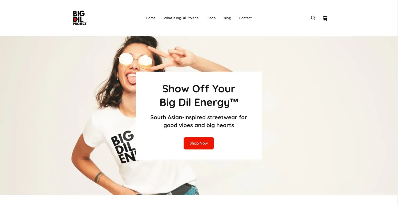
In fact, as I dug deeper into this topic, I realized I’ve even dabbled in D2C with my on-demand clothing brand.

Screenshot of the Big Dil Project homepage showing a South Asian woman in sunglasses.

Image Source

I built it entirely on free tools, and every sale offsets any manufacturing expense.

Speaking of which …

Lower Costs

By cutting out the “middlemen,” D2C brands save money.

They don’t have to pay their partners, so they have lower costs and a higher profit margin. In turn, they can pass those savings on to buyers in the form of a lower price tag, and lower prices can lead to more sales. It’s a beautiful cycle.

More Control

D2C brands handle every stage of the buyer’s journey, which means they have total control over how things are done and the customer experience. This means more responsibility, of course, but it also leaves less room for inconsistency.

Better Data

By controlling the entire product cycle and buyer’s journey, D2C brands can access more, and usually better, data.

This gives them a more complete picture of their business to understand where it’s doing well and where it needs improvement. It also enables them to provide a better customer experience through personalization.

Better Customer Experience & Relationships

In a crowded market, 86% of consumers say they will pay more for a superior customer experience. In fact, 70% of customers expect anyone they interact with at a business to have the full context of their previous engagement and actions.

With their streamlined processes, control, and data, D2C brands are better equipped to offer the personalized experience and attention to detail that modern buyers look for.

Improved Brand Loyalty

Great customer experience and affordable prices foster brand loyalty and improve customer lifetime value (LTV). For brands, this means longer-term repeat business and even referrals to new customers.

Cons of D2C Marketing

Now, we can’t talk about the good things about D2C marketing and not address the bad.

With full control comes full responsibility for any issues that arise.

For example, it’s common for a D2C business to face supply and fulfillment issues.

Like if the shirt type I chose for certain designs on my website is no longer made or goes out of stock, it will halt production and fulfillment until I make adjustments.

This can be especially hard to manage if your team is small (or, like me, a team of one). You can only work on so many things, so it’s easy to feel spread thin.

D2C business also requires you to be a 'jack of all trades.'

You need knowledge of product development, supply chain management, marketing, sales, and more. Add the highly personalized customer service people expect from D2C businesses, and you’ll find your venture challenging to scale.

It can be a lot of pressure, but it can also be extremely fulfilling. If you’re running a D2C business or considering it, familiarize yourself with D2C marketing strategy.

D2C Marketing Strategy

With much of their online presence, D2C marketing is pretty grounded in digital strategy. These include but aren’t limited to:

  • Content Marketing & Search Engine Optimization (SEO): These two strategies work together to offer value to your customers and get found in their hunts for answers.
  • Website Strategy & Conversion Rate Optimization (CRO): These are tactics centered around making your website as intuitive and helpful as possible so visitors will be more likely to convert on a form or purchase.
  • Email Marketing: Once you have someone’s contact information, you can deliver more pointed, personalized content directly to their email inboxes. These are commonly focused on sharing sale or discount information or delivering other content related to their past engagement with you.
  • Social Media Marketing: Social media is another place where D2C brands are getting found and building brand awareness through engaging content.
  • Pay-per-click (PPC): Whether on social media, search engines, or otherwise, PPC ads help brands surpass algorithms and reach their target audiences. This kind of exposure is powerful for D2C brands without a physical storefront or additional partners.
  • Influencer Marketing: Without retail or wholesale partners, having relevant influencers and creators promote your product can significantly impact how people perceive your brand.

With these areas in mind, let’s dig into some specific D2C marketing tips and D2C ecommerce best practices.

D2C Marketing Tips

1. Create a sense of community.

Building a community is a powerful strategy for brands in general, let alone D2C.

It brings like-minded people together, not just because they like your product or service for practical reasons but because they like what your brand stands for.

They share your values and mission, and your community offers them a sense of belonging.

Community gives consumers something larger and deeper to promote and want to talk about. And all of that helps your brand awareness.

Beauty brand LiveTinted has done a great job of fostering community through social media.

Brand founder Deepica Mutyala has always loved makeup but never saw the faces of people like her represented in the industry, not to mention shades or solutions for her skin tone.

She started LiveTinted to change that and foster a community where everyone could feel included and seen.

LiveTinted started as a solely D2C brand but can now also be found in ULTA stores.

The community it created is arguably one of the biggest reasons it was able to expand to such a large scale.

How do you create a sense of community around your brand?

  • Engage with your audience: Respond to comments, ask questions, and spark conversations.
  • Create shared experiences: Offer exclusive content and host live events where people can connect in person or through streaming events where people can engage in real-time online.
  • Establish a private space: Think a newsletter, a Facebook or LinkedIn Group, or even a members-only online forum.
  • Encourage user-generated content (UGC): More on that shortly.

Learn more about communities in marketing in The Ultimate Guide to Community Management [According to Experts Who Do It Daily].

2. Lean into your mission.

What does your brand care about? Does it have a unique mission? Does every purchase support a charitable cause?

Highlighting these things in your marketing makes buying from you that much more meaningful. Each sale is no longer just a transaction to a consumer but a small act of good.

For example, the shoe brand Allbirds is rooted in sustainability.

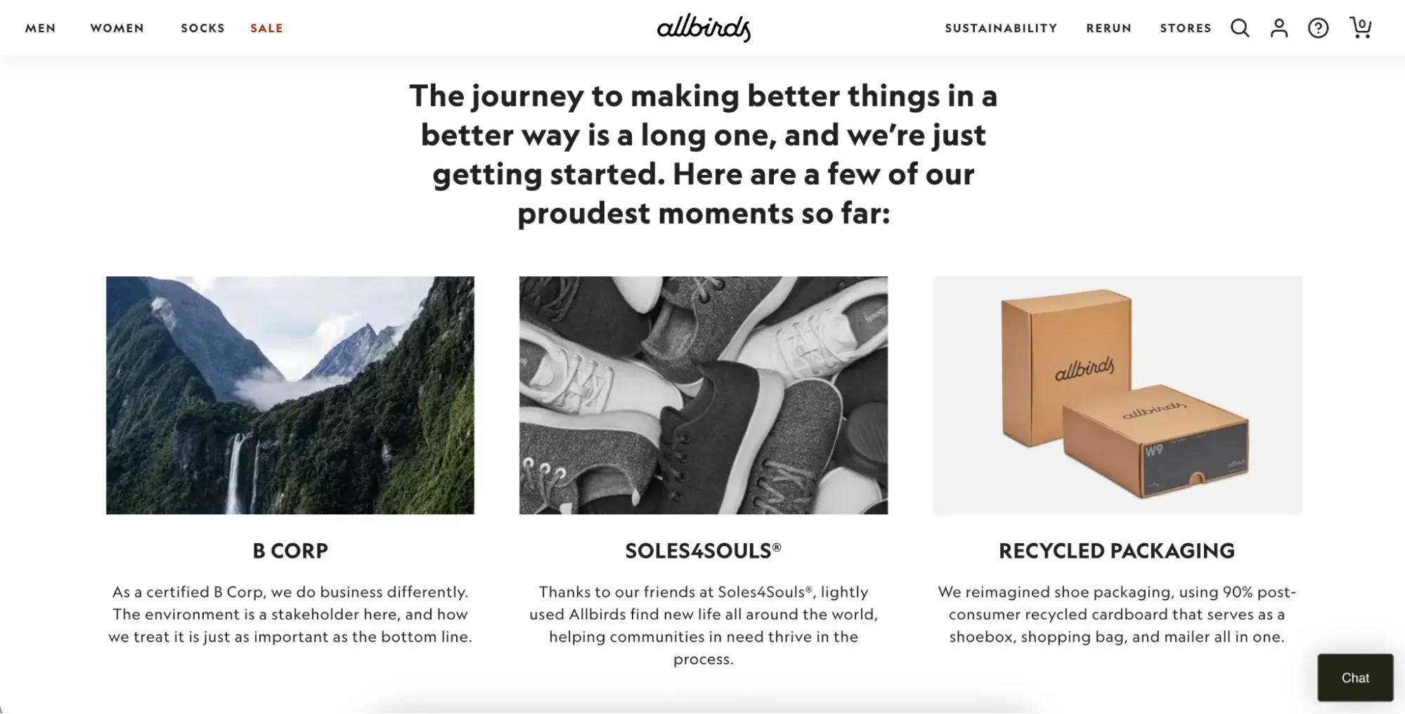
Not only are its shoes made from natural resources, but its packaging is made from 90% recycled materials. The company also works with the non-profit SOLES4SOULS® to donate lightly used products to charity.

These practices are discussed in detail on the Allbirds website.

Screenshot of Allbirds About page showing their sustainable efforts.

Image Source

The brand even releases an annual sustainability report to hold itself accountable for these claims.

But remember, don’t just embrace a cause or mission because you think it’ll help you sell more. People can sense performative activism from a mile away.

If you have something that genuinely fits your product or even inspired your founding, like Allbirds, using your platform and resources gives your audience something greater to want to support.

3. Show your sense of humor and personality.

Probably the most well-known D2C brand out there is Dollar Shave Club (DSC).

Since its launch in 2012, the brand has become a case study in marketing, largely because of the signature personality and humor it exudes in everything it does.

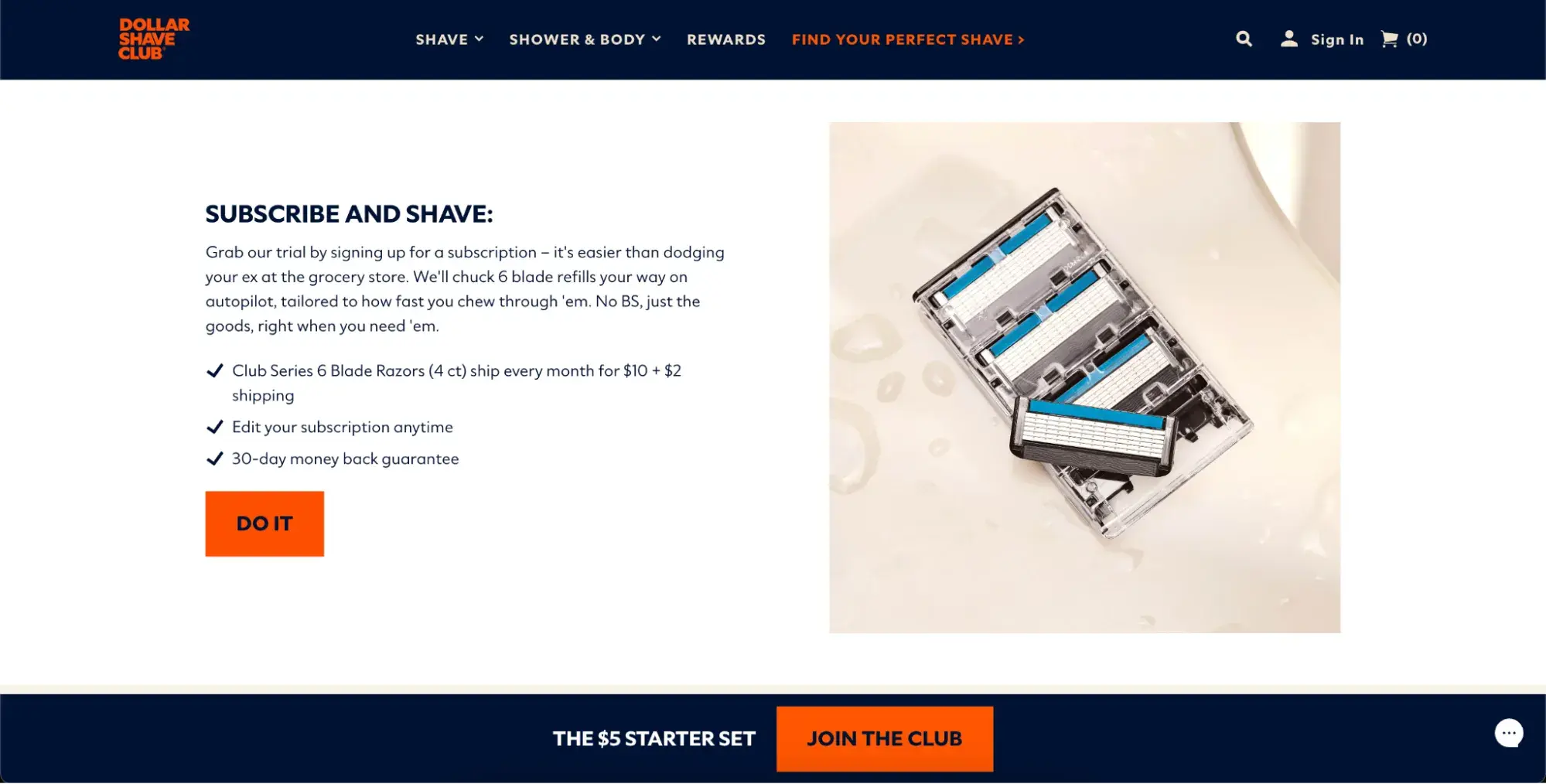
From its legendary launch video (above) and social media content (below) to its website copy and actual subscription boxes, Dollar Shave Club makes a boring industry fun to talk about.

Screenshot of Dollar Shave Club website showing witty copy.

Image Source

People can buy razors at pretty much any store, but they order from DSC because of the witty and relatable lifestyle they represent and the memorable personality that comes with it.

4. Share educational content to build trust.

An experiment by Conductor found consumers who read early-stage educational content are 131% more likely to buy from a brand immediately after than those who don’t. Use this to your advantage.

Think about your industry or product and what your target audience wants and needs to know about it. What do they need to know before making a purchase?

How do they choose the right option for them? Or what do you know that can improve their daily lives?

By sharing honest, valuable information like this via blog articles or social media, people will learn what you offer and begin to see you as a trusted expert in the space they want to buy from.

Fitness brand Peloton, for instance, regularly shares health tips and advice on its social media:

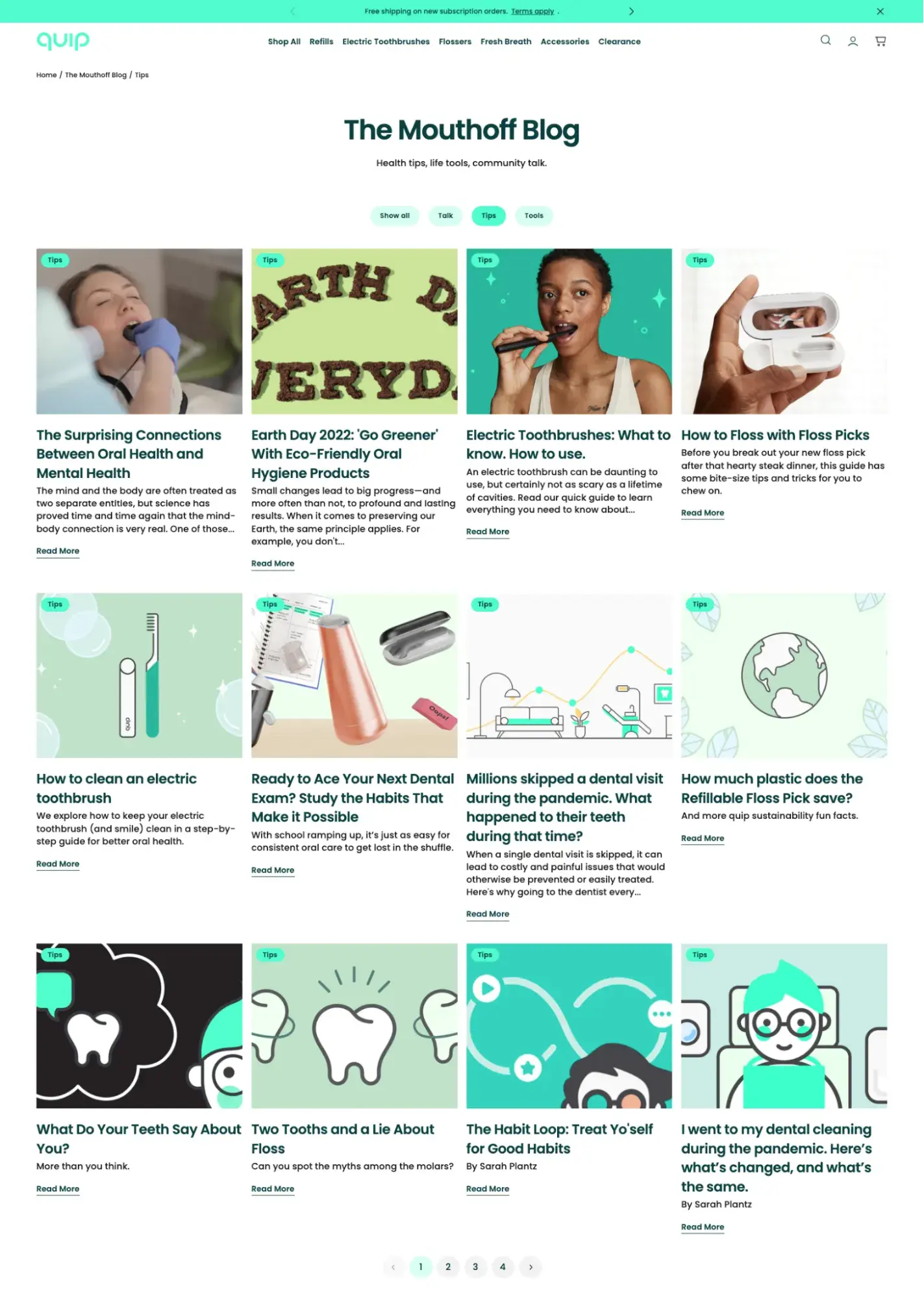
Electric toothbrush company Quip takes a similar approach, sharing oral health care advice on its blog.

Screenshot of Quip blog showing educational content about oral health.

Image Source

5. Encourage and highlight user-generated content (UGC).

Encourage your customers to create and post content about your brands on social media.

Aside from showing appreciation for your customers, this content is social proof for your claims. It shows potential new customers that you’re not all talk; you actually provide the results and experience you promise.

Take this example from Daily Harvest.

Not only do followers get to see what their product actually looks like and how others enjoy it, but the brand gets content for their social media.

The easiest way to source UGC is by creating a branded hashtag like Coke’s #shareacoke or Nike’s #justdoit, but you can consider creating create an ambassador or loyalty program.

This can also help with creating a sense of community, which is a nice bonus.

Check out How to Leverage User-Generated Content in Your Marketing Strategy to learn more about UGC.

6. Work with relevant creators and influencers.

69% of consumers trust information from influencers and their family and friends over brands. That means teaming up with trusted influencers or creators in your space can arguably do more for your D2C brand than other types of marketing.

Working with influencers can help you reach new audiences, build brand awareness, and generate social proof.

Influencer collaborations are a regular part of Happy Socks’ strategy:

Learn more about your options for influencer marketing.

7. Invest in paid ads.

With so much competition, getting organic traction on social media and search engines is increasingly difficult.

Paid advertising offerings like Google Ads and Facebook Ads can help you surpass algorithms and get in front of your target audience.

Glossier, for instance, is no stranger to using ads on TikTok.

Screenshot showing an example of a Glossier TikTok ad with a blue call-to-action button Screenshot showing an example of a Glossier TikTok ad with a blue call-to-action button

The D2C beauty brand uses sponsored creator content to highlight its products and includes a call to action to purchase the featured products on its website.

But make no mistake: You shouldn’t start running ads lightly. Isabelle Lam, co-founder and Chief Operating Officer of the Canadian-based snack brand Remix Snacks, urges D2C marketers to consider their costs and margins before investing in ads.

She shared in conversation, “When we first started growing our D2C platform, we put a lot of money towards hiring an ads agency and increasing our ads budget to increase our website traffic and sales. However, we slowly realized that our gross margins were making it very difficult to make a profit, no matter how many sales we made.”

“This was likely due to high shipping costs, and we ultimately had to go back to square one and re-evaluate our pricing strategy to ensure we had healthy margins.”

8. Personalize your customer experience.

One of the biggest differentiators of D2C brands is the personalized experiences they can offer their consumers. In fact, people buy from D2C brands expecting them.

Thankfully, with fewer middlemen, you likely have access to the data needed to craft these experiences in your marketing.

What are some ways you can personalize your marketing?

  • Address your buyer by name in emails or even on your website.
  • Make product recommendations based on past purchases
  • Send emails with content suggestions based on purchases or past behavior (i.e., pages they’ve visited or offers they’ve downloaded.)
  • Have team members respond to all social media engagement. Don’t automate.

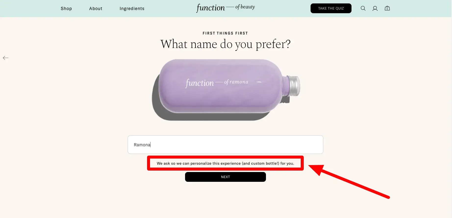
Function of Beauty’s entire business is centered around personalization.

It sells haircare products customized to your specific concerns and lifestyle and it sets the stage for its personalized experience by asking you for your name before anything else.

Screenshot showing how Function of Beauty collects personal information to personalize its website experience.

Pro tip: HubSpot users can use personalization tokens to personalize their emails and even website copy. They can also use smart lists and email automation to deliver segment users and better deliver timely content.

D2C Ecommerce Best Practices

Find more ecommerce sales and marketing tools in our free Ecommerce Planning Kit.

9. Enable social shopping.

HubSpot research shows social media is the preferred product discovery channel for Gen Z, Millennials, and Gen X and one in four consumers have already bought products directly in social media apps.

That’s a large chunk of the consumer market. With this in mind, in addition to marketing your product on social media, consider setting up social shopping.

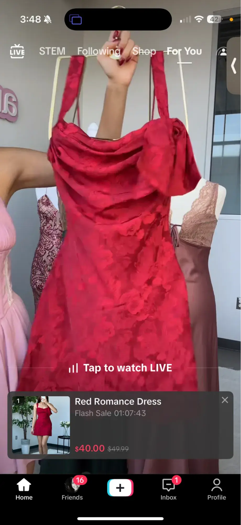
Instagram, TikTok (see below), and Facebook all have native features that allow audiences to purchase without ever leaving their platforms.

Screenshot showing an example of a product in a TikTok shop.

After someone sees your product on social media, say through an ad, a piece of your content, or even an influencer post, they can take action immediately.

Businesses get to close more deals and buyers have an easier shopping experience.

10. Reduce friction in your shopping experience.

On the subject of removing friction, work on reducing friction in all of your shopping experiences, including your website.

What does this look like?

  • Minimizing the number of clicks it takes to complete a purchase
  • Making relevant add-on suggestions
  • Having abandoned cart emails and retargeting setup
  • Enabling digital payments (i.e., Apple Pay or Google Pay)

Cornell University research found that “one-click” checkout leads to more website visits, buyers purchasing a more comprehensive range of merchandise, and an average spending of 28.5% more. And it makes sense.

The easier you make it for people to take action, the more likely they will.

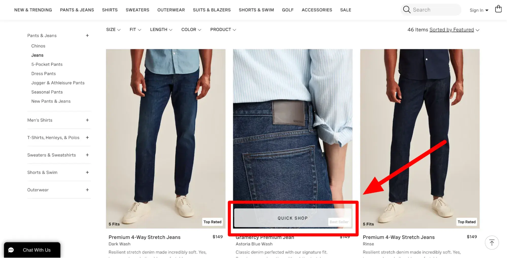
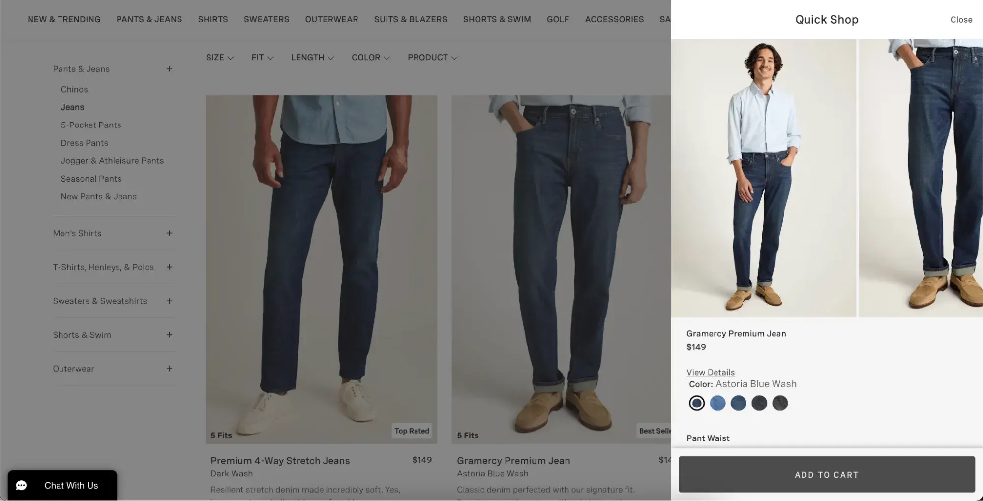
Men’s clothing brand Bonobos does a great job of streamline its shopping experience with the “quick shop” option on its website.

Screenshot showing BONOBOS’ quick shop button.

Screenshot showing what happens when you click the BONOBOS’ quick shop button.

Pro tip: Thoroughly test every change you make to your website.

Isabelle Lam stressed quality testing after making UX updates, saying, “It‘s easy to miss things like features or pages not working properly, so have multiple people go through your website as if they were visitors."

"These little mistakes may seem like nothing, but they can make a huge difference to your customer’s experience, especially if it's their first time on your website.”

In addition to quality, test performance. Did things improve or decline after these changes? Monitor your website metrics and lean into what works.

11. Run sales, discounts, and deals.

According to Capital One, 89% of Americans say price plays a major role in their purchase decisions more than any other factor. In fact, the company found discounts are a major factor for 74% of U.S. online shoppers.

While you certainly don’t want to discount your way into ruin, don’t underestimate the power of sales or premiums. Away Suitcases uses UGC and influencers to draw attention to its sales:

Getting Closer to Consumers

At the end of the day, D2C marketing is a unique endeavor. Whether direct-to-consumer is your sole sales channel as a business or one of many, start testing out these tips and best practices to see what your audience responds to.

When done right, they can only bring you closer to your consumers and closer to even the most ambitious profit and growth goals.

I’ve Discovered 160 of the Best Email Subject Lines I’ve Ever Seen

Featured Imgs 23

I'd venture to guess you get tons of emails in your inbox every day. From coupons to daily deal sites to family invites, it's a lot to sift through—and you'll likely only click if an email has one of the best subject lines to capture your attention.

According to HubSpot Research, 65% of surveyed marketers say that subject lines have the greatest impact on open rates. After all, subject line is your very first impression of the email.

Download Now: 100 Email Subject Line Examples

A good email subject line conveys urgency, curiosity, personalization, and so much more.

If you need help crafting the best email subject line, I've got you covered with over 60 email subject line examples to glean for inspiration, 100 you can download, plus an Out-of-Office Email Generator to make your email address even more delightful to your contacts.

Table of Contents

Retargeting Email Subject Line Examples

A retargeting email subject line is one that encourages recipients who have already interacted with a website to take action.

So, let's say I'm shopping online at my favorite store and I place a bunch of items in my virtual cart before clicking out of the website without buying anything. 

I might get an email from that website encouraging me to complete my purchase. The subject line could be something simple like "You still have items in your cart!"

Here are some examples of retargeting email subject lines.

Best email subject line examples: Retargeting

1. "We Saw You Checking Us Out 😏"

Sender: DollsKill

A clothing brand like DollsKill uses cookies to monitor what its customers have been eyeing. Sending an email subject line reminding them of items they admired can reel customers right back into their next purchase.

What I like: The statement itself has a playful, conversational tone that comes off flirty, a reflection of its company branding.

The emoji also adds more fun and temptation to the message — reiterating that "you know you want to" feeling regarding items they have already clicked on before.

2. "Uh-oh, your prescription is expiring."

Sender: Warby Parker

Not too long ago, a HubSpot alum received this email two weeks before he needed to renew his prescription — talk about great timing.

And when your eye prescription is expiring, it happens to be an excellent time to upgrade your glasses. By sending an email at the right time, Warby Parker increased its chances of this email getting opened.

But timing isn't the sole reason I included this example. This subject line is brilliant because it appeared at the right time and with the right tone.

What I like: Using conversational words like "uh-oh," keeping the subject line sentence case, and leaving out the period at the end, the subject line comes across as helpful and friendly — not as a company trying to upsell you.

3. "The timer’s going off on your cart!"

Sender: King Arthur Flour

Similar to Warby Parker, this subject line uses urgency. If I don't take action on my King Arthur Flour shopping cart — like actually buying the items — it will be cleared, and I'll have to start all over again.

Okay, so maybe this is a low-risk scenario. But when it comes to my baking goods, I personally don't like to take any chance of forgetting what I was going to buy.

That's where the personalization aspect of this subject line comes in:

King Arthur Flour — especially its online shop — tends to attract both professional and home bakers who take all things culinary a bit more seriously than, say, someone who only buys flour on occasion from the supermarket.

And wouldn't you know? Those are the same bakers who probably don't want to spend time building their shopping carts from scratch.

Pro tip: Know your audience when you're writing email subject lines. Is there something that they take seriously more than others? If so, incorporate that into your copy.

4. "What Did You Think? Write a Review."

Sender: REI

I received an email with this subject line about a week after buying a portable stove at REI. I had just gotten back from a camping trip, too. It was perfect timing for them to ask me what I thought of it.

Companies ask satisfied customers to write reviews all the time. But when you specifically send these requests to the people who just purchased something from you, you're being smart with your mailing list and reaching recipients whose interest is still warm.

What I like: It's not expecting a good review. REI is genuinely asking me what I thought of the stove I bought. Maybe I hated it (though I didn't). The company just wanted me to speak up.

5. "A Sneak Peek for VIPs Only."

Sender: Serena & Lily

Loyal subscribers can preview clothing collections via email, as seen here with Serena & Lily.

By offering a "sneak peek", customers know they have more exclusive access and will want to click open the email to see what they want before the general public can see it.

This concept keeps the customer relationship alive and coming back for more if the email marketing is done right.

Pro tip: Incentivise your customers with exclusive deals that can be accessed via email. This will entice them to click so they don't miss any opportunities to save. 

6. "Foxing VIP Upgrades - Brooklyn Bowl Philly"

This email subject line comes from a music venue in Philadelphia, Pennsylvania, and was found in a colleague's inbox.

"Foxing is a band that I really enjoy," said recipient and HubSpot staff writer Erica Santiago. "I bought a ticket to see them at Brooklyn Bowl and, a week before the show, the venue sent an email about upgrading to VIP."

What I like: The subject line is simple and contains the most important information: the band name, the VIP opportunity, and the venue.

Straightforward Email Subject Line Examples

Sometimes it's best to just cut through the fluff, but being straightforward doesn't have to be boring. Straightforward email subject lines leave room for emojies, puns, and other easy ways to engage your audience.

Best email subject line examples: Straightforward

7. "👗 Free (Cool!) Clothes Alert 👖"

Sender: Clover

First of all, I have a not-so-secret love for emojis in email subject lines. Personally, I'm partial to turquoise — so when I see an email implying that I might somehow be able to obtain free turquoise clothes, chances are, I'm clicking.

That's part of what makes this subject line work. It draws the recipients' eye by using visual content (emojis), and it hints at an offer of something free. That hint is an incentive to open the email because there's something to gain inside.

Pro tip: Don't be afraid to use an emoji or two to add a little pizazz to your subject lines. Just don't overdo it. No more than two will suffice.

8. "🐶 Want a Custom Emoji of Tullamore & 6 Months FREE Walks? Book a Walk Today for Your Chance to Win!"

Sender: Wag!

For reference, Tullamore is the name of my colleague Amanda Zantal-Wiener 's dog. And the subject line she received, written above, is another winning example of perfect emoji placement — especially when it's a cute dog.

Here's a great example of how personalization goes beyond the email recipient's name. Wag!, an on-demand dog-walking app, includes the names of its customers' pets in a portion of its email subject lines.

But this type of personalization is more than just a first-name basis. If there's anything my colleague Amanda loves more than free stuff and baking goods, it's her pup.

Wag! knows that, and by mentioning Tullamore by name in the subject line — in tandem with an offer, no less — it caught her attention and piqued her interest.

Pro tip: Add a personal touch to your subject lines that your recipients will appreciate. Just make sure you're not being creepy only use information they gave you with consent and that is relevant to the email.

9. "Best of Groupon: The Deals That Make Us Proud (Unlike Our Nephew, Steve)"

Sender: Groupon

It's hard to be funny in your marketing, but Groupon's one of those brands that seems to nail it repeatedly. After all, who can forget this classic unsubscribe video?

This subject line is no exception. The quip, "(Unlike Our Nephew Steve)," actually had uslaughing out loud. Why? It's completely unexpected.

What I like: The first part of the subject line looks like a typical subject line you'd get from Groupon, highlighting a new deal. The parenthetical content? Not so much — making this one a delightful gem to find in your inbox.

10. "Rock the color of the year."

Sender: Etsy

In six words, Etsy was able to promote a product solely by its color, and inform you that there is apparently a "color of the year." The email is truly too intriguing not to open.

Etsy is an e-commerce website for user-created marketplaces. I was impressed by its subject line because it uses mystery to drive value into a suite of products. This email isn't an invitation to buy clothing or jewelry; it's an invitation to find out what the color of the year is.

Pro tip: Take advantage of the fact that straightforward email subject lines leave room for mystery. Try not reveal too much and leave recipients wanted more so they'll read the full email.

11. "How to Live at Home 24/7"

Sender: Feather

If you’re anything like me, the COVID-19 pandemic had you wearing PJs from day to night, only changing when you had Zoom meetings at work.

As a social distancing precaution, you likely used delivery services instead of going out and getting food on your own — which means that you were effectively living at home 24 hours per day, seven days a week.

This email from Feather, a furniture rental store, perfectly encapsulates a frustration many of us faced: How do you live at home 24/7 without feeling like you’re going crazy? With this subject line, Feather promises to help you find a solution by using furniture that makes it easier to stay at home for extended periods.

Pro tip: Use a "How To" subject line to tell recipients what they can achieve with your products. Then, in your email, include links to the products that will help them achieve those goals.

12. "Take $20 off your order of $25 or more."

Sender: UberEats

You don’t always have to make your email subject line flashy. In this case with UberEats, just the offer alone is good enough to make any hungry customer click.

Pro tip: Your product offering, if it’s appealing, can speak for itself in your subject line. Customers know they can take advantage of the opportunity in the body of the email, as I will for dinner tonight.

13. "Where to Drink Beer Right Now"

Sender: Eater Boston

Okay, you caught me: I'm a beer lover. But that's not what hooked me here. The subject line arrived in my inbox just at the time I needed it: at 6:45 on a Wednesday evening. Absolutely. Genius.

Think about it: You're just over hump day and want to decompress with a few coworkers after work. Right as you're about to head out, you get a notification on your phone that says, "Where to Drink Beer Right Now." Perfect timing makes this subject line something you can't help but click on.

Pro tip: For your own emails, think about how timing will affect how people perceive your emails. Even if you send an email in an off-peak hour, you could get higher engagement — if you have the right subject line.

14. "1,750 points for you. Valentine's flowers & more for them."

Sender: JetBlue

It's such a specific number — 1,750 — of course you're going to open this.

Coming from an airline, an offering of "points" might as well be gold to someone who likes to travel. And, if that recipient also has a significant other, sending this email leading up to Valentine's Day is a home run.

What I like: The best part about the subject line above is how particular JetBlue was about the number of points available.

Instead of, say, "20% off your next return flight of 1,000 miles or more," this subject line gives it to you straight: 1,750 points, and all you have to do is buy flowers for your loved one.

You're already wondering how far you can fly with 1,750 points, I can tell.

15. "Free Oversized V-Neck"

Sender: Los Angeles Apparel

I don’t know about you, but free is my favorite price when it comes to apparel. This brand has a simplistic and straightforward approach to its subject line by letting customers know what they can get in their next order.

And by keeping it short, it makes the subject line even more effective because the only other context the customer can see — is when they click open the email.

16. "Here’s that discount you wanted."

Sender: LAMODA

This subject line almost feels like it’s reading my mind. When I scroll through my endless emails, considering the businesses I want to buy from, I’m waiting for a discount or sale to be announced.

It’s straightforward and knows exactly what its customers want — key to getting clicks.

Pro tip: Nothing is more exciting to customers than a chance to save money. Spo make sure that is front and center in your subject line whenever a deal is on the table.

17. "3 Ways to Improve Your Pins"

Sender: Pinterest

For those who love to curate their social feed, Pinterest is one of the best places to do it. For those trying to grow their following, they’re probably looking for all the advice they can get from the website itself.

Providing a numeric list of strategies to use in the ever-changing algorithm can prove useful to click on Pinterest’s emails periodically.

This uncomplicated messaging in a subject line presents users with exactly what they’re looking for right in their inbox.

Pro tip: Never spell out the number! Use the numeric symbol. It saves space and captures the eye.

18. BOGO $1 Deals: Men's Denim and Cargos👖

Sender: Rue21

Rue21 kept its subject line simple and to the point. At a mere glance you already know what you're getting into.

Professional Email Subject Line Examples

Professional email subject lines have to strike a careful balance between authority and creativity.

These emails are often brisk and to the point. Full of transactional or time-sensitive content, there isn't a lot of room in these emails for fun. This puts most of the creative weight on crafting a powerful email subject line.

The examples below can show you how to command, tease, and entice any subscriber to click on your professional emails.

Best email subject line examples: Professional

18. "[Client] sent you a payment - it’s arriving [date]"

Sender: Bill.com

Bill.com is a popular tool for accounts payable, expense management, and more for small businesses. One of the secrets to their popularity is their useful automations. These workflows include emails that are direct, useful, and easy to scan.

For example, this email subject line is exactly what any freelancer or vendor wants to see in their inbox. In one short phrase, it tells them they’re getting paid, who's paying them, and when it will land in their account.

What I like: This is another valuable example of why you want to personalize your emails. This subject line saves time while creating a great user experience.

19. "Signing completed for Screening Criteria"

Sender: Urban Development + Partners

Finding a new place to live can be stressful. The application process alone can take many steps, and it also usually includes sharing private information like rental history or recent pay stubs.

It can sometimes feel like one tiny mistake will mean losing the home of your dreams.

This professional email series solves that problem with a unique email and subject line for every step in the process. The subject quickly covers which step is complete and why.

So, when the next email, like "Your Rental Application", appears in the inbox it's clear that's the next step in the process.

What I like: It shows how the right subject line can simplify the entire buying process for your audience.

20. "Your TSA PreCheck Eligibility Notice"

Sender: Universal Enroll

Some professional processes take longer than others. In fact, some processes can take months before everything is set. And no matter how patient you are, you might refresh your inbox hundreds of times waiting for that important update.

TSA PreCheck can be one of those processes, especially if an exciting trip is on the horizon.

What I like: This effective subject line gets right to the point. Any reader knows that once they open this email, they'll have the answer they've been waiting for.

21. "[Action Required] Verify your email address"

Sender: Amazon Chime

One of the most valuable things that a professional email can do is motivate someone to take action. Vague email subject copy can lead to a situation where someone might open and read, but then again, they might not.

By using brackets in this subject line, Amazon emphasizes that the most important thing about this email is taking action. Then, it quickly outlines what needs to happen.

But while brackets are a great way to draw attention, try to use them sparingly. If every email includes brackets it will be easy for your readers to skip over them.

And the copy you include in brackets matters.

Pro tip: Adding quirky or creative copy in brackets could be a fun creative decision, but it will erode your ability to add urgency to emails with brackets if you need to later.

22. "Parking Receipt - Parking Kitty"

Sender: Parking Kitty

Over 300 billion emails go out each day. While some users open every email, most email inboxes are an archive of emails that you don't need to open now, but you save them because you may need them someday.

For example, email receipts. When you're ready to find those emails in your inbox, they should be easy to find. But how many times have you scanned your inbox looking for a receipt and every email subject line is the same?

That means opening and scanning every email, and a lot of wasted time for you.

Parking Kitty is the clever name of a parking mobile pay app in the Pacific Northwest. If you're looking for expense report receipts after a recent trip, this email is easy to find in your inbox.

It's also smart for brand awareness because it reinforces their memorable business name.

Pro tip: Craft a message that coincides with your branding, or craft a brand that will coincide with most of your messaging. Either way, cohesion is the key.

23. "Your free PDF is attached: Great Talks Most People Have Never Heard"

Sender: James Clear

Lifetime learning is essential in the business world, and this professional email subject line is perfect for busy thought leaders. It starts with a quick reminder that a free PDF is here. Then it shares the title of the PDF.

This may seem like an obvious subject line, but that's what makes it just right. First, it reminds the recipient that they have a gift in their inbox. Next, it reminds them what that gift is. All the details are in the subject.

It's an enticing offer, so there's a good chance it will get opened right away. But it's also crisp and clear, so it will be easy to find and download later.

Pro tip: Remember, people receive tons of emails a day, so make sure to keep the most important information in your professional email subject line so it doesn't get lost in the shuffle.

24. "Whoops — we hadn't had our coffee this morning"

Sender: Catchafire

Accidents happen to everyone. But professional emails often go out to thousands, if not hundreds of thousands of people. This can make a small accident feel like a very big deal.

This subject line is gentle, funny, and honest. It uses a popular theme to acknowledge that the Catchafire team sent an email by mistake.

It sets the stage for a quick apology and lets the person on the other end know that they can disregard that email.

While it can be tough to acknowledge an error, it's often a great way to build a sense of trust with your email list. It can also save the time it would take to draft more individual responses to the email they sent in error.

Pro tip: Exercise caution in cases like this. Minor mistakes can be approached with funny, affable subject lines, but more serious issues should be handled with care. So, read the room.

25. "Your Wednesday evening trip with Uber"

Sender: Uber

Uber sends emails detailing recent trips almost immediately afterward so it's still fresh in your mind. I like this subject line because it is simple and elegant and includes the who, what, and when of the trip.

Attention-Grabbing Email Subject Line Examples

Attention-grabbing emails subject lines can contain one or more of the following elements: 

  • Sense of urgency
  • Humor
  • Emojis
  • Interesting questions
  • Engaging language

Here are some examples.

Best email subject line examples: Attention-grabbing

26. "*Don't Open This Email*"

Sender: Manicube

Ever been told to not do something? Being asked to refrain from something can actually have the opposite effect — you now want to do that thing even more.

That's the strategy behind Manicube's subject line. It's a simple but effective way to make people curious enough to open your email.

Pro tip: Just be sure that the contents of your email have something worthy of that subject line.

27. "Important Weather Advisory"

Sender: RCN

Any time we see a weather-related alert, our ears perk up. In RCN's case, it isn't just a way to lure recipients into opening an email.

The subject line above is RCN's way of updating its customers about potential power outages and driving attention to the brand that provides them with cable and Wi-Fi — even during inclement weather.

Pro tip: If you can hitch your email marketing campaign to an event you know people pay attention to, and have something helpful to offer in response, you'll see your email open rate soar.

28. "What Can You Afford?"

Sender: Zillow

Imagine getting this subject line in your inbox from a website showing apartments for rent. It's both exciting and encouraging ("Here are a bunch of apartments right in your budget. Yay!"), but also kind of competitive — pitting your cash against what the market offers.

Would you click it? I certainly would.

Personalizing emails to cater to your audience's emotions — for which there's a broad spectrum when it comes to real estate — is key to getting people to open your emails.

You don't have to be a psychologist to know how to take advantage of them, either. In addition to principles like urgency, crafting an email subject line that implies scarcity is another great way to increase your conversion rates.

What I like: This email appeals to the concerns of its recipients. 

29. "As You Wish"

Sender: UncommonGoods

When writing emails, you should also think about the recognizable names and references that make people tick.

For example, take this subject line from UncommonGoods forwarded to us from HubSpot's Content Director, Corey Wainwright, who happens to be a die-hard fan of The Princess Bride.

Apparently, "As You Wish" is a pretty big reference to that movie, so when she saw this subject line in her inbox, she just HAD to click.

Even though she knew the email was part of a larger-scale send, it almost seemed like it was tailored for her personally — after all, why else would it include a reference to Princess Bride in the title?

UncommonGoods knows its buyer persona like the back of its metaphorical hand.

What I like: While it may not send emails to individual subscribers with references to their favorite movies in the title, it does have a general understanding of its subscribers and their interests.

30. "Not Cool, Guys"

Sender: BuzzFeed

I love BuzzFeed. If nothing else, its staff knows how to write great copy — and that sentiment includes an exceptional email marketing team.

Many of my colleagues have signed up for BuzzFeed's daily emails, and pretty much any day of the week, it wins for best subject line in their inboxes.

While there are a few of BuzzFeed's subject lines here and there that aren't anything to write home about, it's the combination of subject lines and the preview text that is golden. They're friendly, conversational, and, above all, snarky.

Here's the text that followed the subject line above: "Okay, WHO left the passive-aggressive sticky note on my fridge. Honestly, who acts like this?"

That conversational tone and snark pull us in over and over again — and it's the preview text that completes the experience for me.

We're not all equipped to be snarky writers, but most email platforms have the preview text easily available to edit. How can you use that little extra space to delight your customers (oh, and probably improve your email metrics)?

Maybe you could use the subject line as a question, and the preview text area as the answer. Or maybe it's a dialogue: The subject line is one person, and the preview text is another.

You get the idea. By using that space, you have more opportunities to attract new subscribers.

What I like: The subject line reads like an email from a friend who has an issue that needs to be addressed. And who wouldn't read an email from a concerend friend?

31. "DO NOT Commit These Instagram Atrocities"

Sender: Thrillist

No matter how humble people are, most don't like to do things wrong. So why not play on that natural human tendency in an email subject line, especially if you're in the business of helping clients (or prospective clients) succeed?

Thrillist certainly does in the subject line above, and it makes the language even more vibrant by using do not — a great takeaway for B2B marketers.

Instead of using the typical contraction "don't," Thrillist spells it out and adds the all-caps for effect. That way, you'll notice the subject line in your inbox, and then find it harder to resist clicking on it.

Pro tip: Think about how going negative in your marketing emails might be a good thing. For example, many of us have anxiety about looking silly, so figure out how you can play to those emotions in subject lines.

Of course, it's important to back up that subject line with encouraging, helpful content, so that you're not just ranting at people all day.

Getting negative can get your subscribers' attention — this subject line certainly caught mine.

32. "Everything you wanted to know about email copy but were too afraid to ask"

Sender: Copy Hackers

Here's another great example of leveraging your audience's full plate to your email marketing advantage. Who hasn't refrained from asking a question out of fear of looking foolish or out of the loop? Excuse me while I sheepishly raise my hand.

" ... but were too afraid to ask" is one of those phrases that, to us, probably won't go out of style for a long time.

People seek insights from Copy Hackers — an organization dedicated to helping marketers and other professionals write better copy, as the name suggests — because, well, they have questions.

They want to improve. And when that audience is too afraid to ask those questions, here's Copy Hackers, ready to come to the rescue with answers.

Pro tip: What does your audience want to know, but might be too embarrassed to ask? Use that information to craft your content — including your email subject lines.

33. "Abra-cord-abra! Yeah, we said it."

Sender: Quircky

This punny email subject line from Quirky is plain fun. We're suckers for puns in the right situation.

What I like most is the second part: "Yeah, we said it."

The pun in the beginning is great and all — it refers to a new invention featured on Quirky's site to help everyday consumers detangle their numerous plugs and cords — but the second sentence is conversational and self-referential.

That's exactly what many of us would say after making a really cheesy joke in real life.

Many brands could stand to be more conversational and goofy in their emails. While it may not be appropriate to go as far as Quirky's subject line, being goofy might just be the way to delight your email recipients.

Pro tip: Remember to have fun with your emails. A little personality and quirkiness never hurt anyone. 

34. "🔥 Hot freebie alert! 15 free gifts, you pick 5."

Sender: Shutterfly

Shutterfly, a company that allows you to print your photos on interesting products or other frames, gets visual with its subject lines by occasionally using an emoji.

Due to the company's nature and creative audience, the fire emoji in this subject line draws the eye without feeling desperate.

The email subject line also pops because it has a lot of buzzwords, including "hot," "freebie," "gifts," and "alert." In just one line, it can give the potential reader a good reason to open it, especially if they love using Shutterfly.

What I like: The content inside the email aligns perfectly with the subject line by announcing a freebie promotion. This strong alignment between the subject line and message keeps people from skimming the email.

35. "From chaos to calm ✨🏡"

Sender: Open Spaces

If you’ve ever had a cluttered home, you know how chaotic it can feel. Open Spaces takes advantage of that by suggesting how you’ll feel after you use the company’s products.

Its emoji choices also indicate how your home will look and feel: Sparkling clean. I’m not a huge fan of cleaning, but Open Spaces promises to make it easy in the simplicity of their subject line.

The brand also proves that it knows its target customer exceedingly well — if you want to create "open spaces," you likely won’t tolerate chaos in your home.

In the same way, try to allude to the feelings that your target customers want to feel, as well as their goals and inner desires.

Pro tip: You can also let emojis speak for you. For instance, if Open Spaces had used the subject line "From chaos to calm: Get a sparkling clean home," the focus would be off of the "from chaos to calm" piece, which is what readers most care about.

36. "Welcome Gift! Offer Inside 👀..."

Sender: EyeBuyDirect

When you subscribe to a business you’re new to, you’d hope you can get a perk before your first purchase. EyeBuyDirect makes its statement in a subject line that makes the prospect feel like subscribing was a good choice, and strikes curiosity.

What I like: Without specifying what the offer is, the customer has no choice but to click and see what they can take advantage of.

37. "Colorful things for colorful homes"

Sender: Baggu

I can’t speak for you but I’m a sucker for all things bright in color. And what makes this an attention-grabbing email subject line is that this brand is known for making reusable bags (hence the name).

What I like: This email makes its customers imagine a new type of product they could be revealing, and when I clicked, I was surprised to see all new items like towels, bedsheets, and more.

Now that we’ve covered the best subject lines in general, let’s dive into the best newsletter subject lines.

Newsletter Subject Lines

Newsletter subject lines must work harder to get the recipient’s attention because they allude to information only. In contrast, a subject line offering a discount will automatically make the recipient want to click.

Newsletter subject lines must hook the reader and get them to click. The examples below do an excellent job of it.

best-email-subject-lines-list_6

38. "China Falls, Sleepy Unicorns, And The Deals Aren’t Bigger In Texas"

Sender: Crunchbase

The Crunchbase Insights email has an interesting way of wrapping details about all the stories it will present to you in one subject line.

This is eye-catching because it seems like an odd mashup of words, but gets to the point about three complicated stories at the same time.

When it comes to email, Crunchbase is known for its longer, text-based emails. They all read like a more conversational letter to the email recipient and casually discuss and hyperlink Crunchbase's top stories.

While the subject lines feel interesting and eye-catching, the emails often report deeper business news that cut right to the chase.

What I like: This subject line shows how you can be punchy, but also fun and creative when trying to pull in your audience.

39. "Watch Out for This Amazon Phishing Scam."

Sender: WIRED

In this subject line, WIRED includes Amazon, a large company name.

Including the name of a big brand can be a great way to boost open rates because people who enjoy or use products from big brands might click into a subject line that discusses them.

Additionally, when a brand name is combined with negative words like "phishing" or "scam," people might open the email much more urgently so they can learn how to avoid running into the issue being discussed.

WIRED also lists the story last in its newsletter. This is an interesting way to get your readers to scroll through the entire email and see the other stories before they get to the story that led them to click into it.

Pro tip: Experiment with having the subject hihglight the punchiest part of your newsletter, but keeping the content it's referring to further toward the bottom. This may not work in every scenerio but there's a strong chance it can improve your click through rate. 

40. "Buffer has been hacked — here is what's going on"

Sender: Buffer

Next is a subject line from Buffer. A few years ago, Buffer got hacked — every tech company's worst nightmare. But Buffer handled it exceptionally well, especially on the email front.

What I admire about the subject line is that it's concise and direct. In a crisis, it's better to steer clear of puns, snarky comments, and emojis. People want to see that you're taking the situation seriously and be reassured that the world isn't ending.

What I like: Because of the way the subject line is worded and formatted, you feel like Buffer is calm and collected about the issue, and is considering your personal safety. That's pretty hard to do in just a few words.

41. "Google sees smartphone heroics in Oreo. It's The Daily Crunch."

Sender: TechCrunch

If you're subscribed to a newsletter from a publication like TechCrunch, chances are, you signed up because you're either interested in or want to learn more about technology.

To reflect that, the media outlet crafts its daily email roundups ("The Daily Crunch") with a subject line that reflects one of the latest, most compelling news items in the industry.

Here's the thing: Staying on the cutting edge is hard, especially with something that evolves as quickly as technology.

So, by writing email subject lines that reflect something recent and relevant, TechCrunch is signaling to email recipients that opening the message will help them stay informed and up-to-date on the latest industry news.

Pro tip: Think about the things that your audience struggles to keep up with — then, craft an email roundup and matching subject line that reflects the latest news in that category.

42. "Black Friday shoppers are the worst customers"

Sender: LinkedIn

This subject line is likely the boldest of the Black Friday emails you'd see in your inbox in the days before Thanksgiving.

Yes, it's a bit judgmental, but it actually came in a LinkedIn Pulse newsletter, promoting an article one of its users wrote on the topic of holiday marketing.

And there's no doubt the title resonates with how some people feel during the most hectic holiday shopping day of the year.

Pro tip: LinkedIn has nothing to sell on Black Friday, so the subject line above does little harm to its business. Nonetheless, commenting on a popular cultural observation can show your confidence and help you relate to your community.

43. "New recipe alert 🚨"

Sender: Hello Fresh

While Hello Fresh is a food service that delivers meal packages to its customers, it also provides customers with home kitchen tips and tricks in email newsletters.

These extra resources encourage home cooks to try new things, and being offered new recipe ideas is an exciting opportunity.

What I like: Using an emoji here is simple and draws the customer’s attention, while the offer itself can only be viewed in full when clicked — an easy way to draw in more aspiring home cooks.

44. "Tips to increase remote collaboration"

Sender: Asana

This simple subject line from Asana, a project management platform, gets straight to the point: If you open the email, you’ll find remote work tips and beyond.

The subject line also effectively capitalizes on an increasingly common trend that rose during and after the COVID-19 pandemic. Its simplicity and trendiness ensure that you’ll want to open the email.

And chances are that if you’re using Asana, you’re likely using it to collaborate with colleagues whom you might not see every day, even if you’re not fully remote.

What I like: Asana effectively appeals to a wide range of potential users and buyers with this subject line.

45. "I got Botox — & THIS is what it looked like"

Sender: Refinery29

Okay, so maybe your business doesn't involve Botox. But still — are you intrigued? I am, and despite my better judgment, I clicked.

That's the power of leading your emails with a story: It sparks curiosity, which works in two ways. There are times when our natural curiosity can pique our interest without context, such as the example above.

But in this case, the subject line implies that there's an intriguing story ahead. Why the heck did this person get Botox? And what did it look like? As the saying goes, "Inquiring minds want to know."

Pro tip: Think of the stories behind your industry, then find ways to include them in email newsletters and frame them within the subject line in a way that piques your recipients' collective curiosity.

46. "Improve Your Website from Concept to Code 💻"

Sender: Namecheap

Want people to open your newsletter? Tell them how they’ll benefit straight away like in this newsletter subject line by Namecheap.

It used this subject line for Inspire, its monthly newsletter, and like in the WIRED example, it left the subject line story last so users would scroll through the entire email.

What I like: Like many examples on this list, it uses an emoji to draw the eye and keeps the tone of the conversation more casual and fun. In contrast, the subject line "Improve Your Website from Concept to Code" feels much more wooden and unfriendly.

47. "The best options for grocery delivery"

Sender: Wirecutter

Simple, right? But effective. This newsletter's subject line from Wirecutter gets straight to the point and solves one of the biggest challenges we faced during the pandemic: How to get groceries while social distancing.

If you’d never used grocery delivery services up until that point, you’d likely be at a loss for what services to use.

Wirecutter realizes that and immediately invites you to open the email with a simple and actionable subject line.

What I like: Think of a challenge your consumers are likley facing and present your subject line as an introduciton to your solution. 

48. "Mark your calendar for these key dates!"

Sender: Omaze

Omaze is known for raising money for charities across the globe in the form of raffling once-in-a-lifetime opportunities with each donation. Contributors love to learn more about the charities at hand, and the sweet prizes they could win along with them on a monthly basis.

What I like: By announcing its upcoming opportunities, it can help people choose which causes they’ll want to give toward, and be excited to contribute when the time comes.

49. "‘I didn't realize architecture was so dangerous’"

Sender: Dezeen

Dezeen is an architecture and design publication whose newsletter subject lines always feature a comment from a user. Only one comment is chosen every week.

This approach is brilliant for various reasons:

  1. It makes you wonder why the user made that comment and will make you click through.
  2. It makes you want to comment on the publication’s posts to potentially get featured.
  3. It takes the work out of writing a subject line. Indeed, Dezeen doesn’t have to write a subject line at all, because its readers do it for them.

Here are a few comments that have been featured of late:

  • "Absolute garbage"
  • "The cardboard box aesthetic"
  • "Meet The Flintstones"
  • "Does it come with a smoke machine?"

Pro tip: If you have a publication that’s often commented upon, consider using one of the comments as your subject line.

HubSpot Email Marketers' Favorite Subject Lines

Above are some of the best subject lines we've gathered, but I asked both former and current marketers on our team to give some additional favorites and what makes them so good:

Best email subject line examples: HubSpot recommendations

50. "Hmm...No writing activity last week?"

Sender: Grammarly

"If or when you turn their plugin off, Grammarly’s retention strategy is great. They reach out with subject lines like these that immediately drive me to click through and turn their plugin back on. Very well done."

Jordan Pritikin

51. "Drooling over email designs 🤤"

Sender: Really Good Emails

"Emojis always catch my eye amongst the 100+ emails I receive daily. As an email geek myself, this subject line matched my interests and piqued my curiosity."

Ashley Riordan

52. "Can you help me name this dance, [First Name]?"

Sender: Marie Forleo

"It’s personalized and piques my interest because A) I’m being asked for input and B) I want to be in the know about this mysterious dance (#fomo)."

— Christina Perricone

53. "Who you gonna call?"

"If you can make a pun, include a social reference, or even just a familiar phrase, it’ll catch people’s attention."

Clint Fontanella

54. "Shoes You Can Wear All Damn Day"

Sender: Everlane

"Swearing is controversial in email marketing, but I think it worked really well in this email from Everlane. Not only was it a clever and concise way to introduce their new line of footwear called 'The Day Collection,' but it also aligned with the brand voice they use in other emails and across their website."

— Anna Fitzgerald

55. "You were on point last week 🎯"

Sender: Grammarly

"Grammarly is so good about rewarding you and making you feel good about your writing."

— Jordan Pritikin

56. "Show them what you’re made of"

Sender: Canva

"Using empowering, positive, and defiant language to leverage the use of Canva tools — love it."

— Lucy Reddan

57. "‘Not intended for swimming’"

Sender: Dezeen

"I’m a sucker for architecture, and Dezeen’s weekly newsletter tells me the top new projects that come up, as well as their reader’s responses to them. My question is: What’s not intended for swimming? And if it’s not intended for swimming, why did the architect build it? Boom, you’ve got my interest. And my click."

Ivelisse Rodriguez

58. "Our #1 most asked question…"

Sender: Supergoop

"What an easy way to get me to click — by trailing off and leaving the rest of the content in the email. Nicely done, Supergoop."

— Ivelisse Rodriguez

59. "[First Name]! You're One of HubSpot's Top Blog Readers 🎉"

Sender: HubSpot

"No one actually likes taking feedback surveys. Not unless you earn money, and not many of them offer that. When I received the above email from our very own HubSpot blog, I clicked straight through, and voila! There it was: A feedback request. Turns out, flattery does work."

— Ivelisse Rodriguez

60. "[Artist's Name] made you something special."

Sender: Spotify

"Sometimes bands and artists will release exclusive merch or vinyls that are only available to Spotify listeners. When this happens, Spotify will notify fans that the artist 'made you something special.' It works because I only get an email if it's an artist I listen to frequently, and I'm silly enough to think the artist knows who I am."

The best email subject lines are simple and on-brand.

When writing subject lines for your emails, keep it engaging, simple, and on-brand.

Don’t forget to appeal to the emotions and needs of your target buyers, and most importantly, have fun — include emojis, puns, or references to pop culture. Your emails will get opened, guaranteed.

Editor's note: This post was originally published in November 2013 and has been updated for comprehensiveness.

15 Real Estate Social Media Marketing Strategies That’ll Bring in New Business

Featured Imgs 23

Buying or selling a home is an important financial (and emotional) decision, and your clients want an agent they trust to protect their interests and help them navigate the complexities of the process.

That's where real estate social media marketing comes in. When applied correctly, it can be a great way to start conversations, share advice, and grow an ongoing relationship with buyers, sellers, and renters.

Download Now: Ultimate Real Estate Marketing [Free Kit]

So, I’m diving into the value of using social media as a real estate agent, a list of tips and trends, and examples of social media posts you can incorporate into your real estate marketing strategy.

Table of Contents

The Power of Real Estate Social Media Marketing

A social media presence helps you build brand awareness and generate trust with your audience.

They may not be ready to make a purchase yet or even reach out to begin a conversion. But if they see you’re consistently active on your platforms or they come across one of your advertisements, they may make a mental note of what you offer and come back to you when they’re prepared to begin their process.

Not convinced? Here are a few stats to help you understand the power of social media marketing to grow your real estate business:

So, statistically speaking, your audience is already on social media — why not meet them where they are? What’s more, outside of the organic strategies I’m sharing here, social media also offers targeted advertising options tailored to audiences in specific locations.

Ready to put it into action? Let’s dive into some of the top strategies to build your real estate social network.

1. Promote the town, not just the house.

Homebuyers want to know the good, bad, and ugly of each town to which they're considering a move. Yet, most real estate blogs simply give buyers basic demographic statistics and perhaps some flowery language about the area.

Instead, use your social media channels to provide potential clients a far richer understanding of the markets you serve, letting them know the pros and cons of each neighborhood.

Many cities have a “@CityOf ...” social media handle, which you can mention directly in your posts. Use these handles to promote properties you have listed in that city. City accounts tend to be receptive to these shout-outs and might repost you — increasing your post's reach to their followers.

Instagram Business accounts are also prime real estate (pun absolutely intended) for you to post beautiful photos of the town in which your properties are listed.

2. Be yourself.

I‘ve heard of many realtors who pay a ghostwriter to write their marketing copy, yet this approach has its shortcomings. The copy simply doesn’t ring true; it fails to give clients a sense of who you really are.

Studies show that consumers want to make a personal connection with those whom they do business with, and there's no shortcut to writing your own authentic social media content that resembles who you are as a real estate agency.

Let your personality shine through across each social network you‘re on. It’s a great way to open a dialogue with a client before they ever pick up the phone. I love this TikTok example of two realtors showing off their personalities.

@indianahomegirls Our newest listing in Fishers has space for all the things! Comment STEP CLASS for more info 😂 #stepbrothers #funnyvideos #realestatetiktok #listingvideo #indianarealtor #fishersindiana #lipsync ♬ original sound - Amazon Prime Video Australia - Prime Video AU & NZ

3. Educate your buyers.

Some of the most trying days as a real estate agent prove to be great lessons we can share with our clients.

Talking about common real estate pitfalls makes your buyers smarter, giving them a smoother browsing experience and qualifying them to work with you.

Social media is the perfect outlet for this. If you have a blog, consider writing articles about home-buying tips. You can then use social media to promote them.

Perhaps you can tweet a “Real Estate Fact of the Day,” hashtagging #realestate while you're at it.

4. Chat with your followers.

Home buyers today expect instant responses to their questions, but where they ask those questions has changed.

Home buyers are calling real estate agents much less than they used to with questions about a property or neighborhood.

They're going online, using Facebook's Recommendations feature, and tweeting at real estate offices on Twitter.

Be ready for this outreach, answer them, and use these questions as an opportunity to start dialogue with followers who might be in the early stages of the buying process.

5. Respond to comments, good and bad.

Respond promptly and courteously to engage readers who post comments on your social media sites. One caveat: Don't feel compelled to respond to those who post abusive comments.

Social media does lure its share of online bullies, and not every remark aimed at you is worth your breath.

Resist the temptation to get into battle with your harshest critics, and acknowledge those who praise your service.

A lot of people who reach out to you are simply looking for more information about a listing — or a listing they might've thought was still available, but has been sold or rented.

Absorb their frustration and use their comment as an opportunity to pivot their interest to other properties.

6. Capture attention with hooks.

People’s attention spans are shorter than ever, which means to catch the attention of your target audience, you need to get them to stop scrolling for long enough to consume your content and (hopefully) take action.

The key here is to hook your audience with something that makes them stand up and say, “Heck, yeah, I want to know more about that.”

This video does a great job of sharing some great hooks (especially in video format):

@onbrandbysarah Hook examples for Realtors! This was hughly requested and there are tons of ways to make your videos more personal and compelling!!! Try it out ❤️ #hookexamples #videohooks #socialmediamarketing #realtors #realtoroftiktok #contentstrategy #businessmentor ♬ original sound - Sarah | Business Mentor 🪩

7. Be playful.

What’s something other real estate agents do that makes you giggle or roll your eyes? Play with it. This video is real and fun:

@stevenkimhomes ✨magic✨ real estate hack! #realtor #realtoroftiktok #realtorhumor #funny #forsale #magic #toronto #richmondhill #realestate ♬ The Reason - Hoobastank

8. Don’t just shout about your home listings.

It‘s fine to let people know about the homes you’re marketing, but don‘t make the house itself the primary topic of your conversation.

Think about common questions home buyers and sellers ask you, and turn these into posts. Provide valuable content and you’ll keep people coming back.

9. Be sure to use video.

There are more than 1 billion daily video views on TikTok.

It's tempting to skip the expense of shooting and editing a video, but online video is an important element of home marketing.

Think about it: Home buyers are visual buyers, and if done well, a video creates an emotional connection with them that they might not have from just a photo-based listing.

YouTube videos also improve your website's ranking in search engines like Google — a common place where home buyers and renters start their search for a new home.

10. Remember, you’re not only connecting with first-time buyers.

According to a recent report by the National Association of Realtors (NAR), 24% of home buyers in America are 41-50 years old or younger.

Just 26% of them are first-time buyers. If you think you're only talking to first-time home buyers on social media, think again.

Social networks like Facebook are great places to engage “fans” and learn what they‘re looking for from their agent, but keep in mind, they’re not all new to the buying process.

Have content suited for all levels of home-buying experience ready to serve up to your fans and followers — you never know whom you'll be connecting with.

11. Focus on your audience.

A post, link, photo, or tweet on your profile might look nice to you, but it means very little if it doesn't resonate with the people who are following your page.

Social media is more about listening than about talking. Pay attention to what people are saying about you and your brand.

Solicit and gather feedback through informal polls to your audience or via free survey services like Survey Monkey or Google Forms.

This will ensure each and every piece of content you share on social media reflects the interests of your customers.

12. Remember your existing clients.

Invite your previous buyers and sellers to join you on social media — they’re one of the most important parts of your real estate social networks.

That way, your sites become richer communities of shared experiences and objective advice from those who recently completed the home buying/selling journey.

13. Prioritize connections and relationships over going viral.

While going viral can feel good, it doesn’t mean you’re connecting with people who are actually potential clients.

After all, going viral likely means you’re getting views from people with little to no local interests, and in real estate, local is everything.

Instead, focus on creating meaningful connections with people who live in your area and help them get to know you. Sure, you can share your listings, but focus on why they’d hire you.

This could mean creating content that empathizes with their pain points and sharing behind-the-scenes photos and videos.

However, it also means going into forums and engaging with posts, responding to comments and questions, and being generally helpful.

14. Don’t go all in on one type of post.

Variety is the spice of life and of your real estate social media marketing plan. Or it should be.

Play around with different types of content and change things up periodically to continue building your audience and connecting with what they want. One way to do this is to pay attention to big trends and find ways to capitalize on them.

Test video, still images, humor, and different ways to highlight what your audience can expect when working with you.

15. Repurpose your content.

Shooting a video? Think about whether you can post clips to other platforms.

You may not want to share the same content exactly since different platforms have different audiences (and expectations), but you don’t have to create something new every single day.

You may be able to get a lot of mileage out of a single video or conversation and create dozens of posts from one original recording.

Post-Pandemic Social Media Real-Estate Trends

While social media has always been a valuable tool for realtors to leverage, COVID-19 restrictions led to trends that have continued to take center stage years after the pandemic ended.

Virtual Showings

Some agencies reserved virtual viewings for specific circumstances or luxury homes, but it has now become a common practice: “We used to keep our virtual tours for our luxury homes, but we’ve found it adds to the home buying experience for our clients,” says Lisa Alexander, president of Del-Co Realty.

Video Walkthroughs

When I sold a house in 2020 and bought one in a new city, beautiful photography and videography was a must for understanding the layout.

After that experience, I wouldn’t consider working with a realtor who wasn’t actively planning to use those resources to sell my home.

While these existed pre-pandemic, they’re now elevated to a must. After all, in addition to helping buyers get a sense of the home, video performs really well on social media.

3D House Tours

My favorite feature as a buyer was when realtors created 3D home tours on Zillow that could be shared everywhere, including other listing sites and social media. It gets 60% more views and 79% more saves, which means that many more interested eyes are on your listing.

While the pandemic is in the rear-view mirror (thank goodness!), it had a lasting impact on real estate social media marketing — which comes in incredibly handy for buyers who need to move quickly in highly competitive markets and potentially buy homes sight-unseen and for sellers who want their homes to sell for top dollar.

Social Media Marketing Platforms for Realtors

Not sure what platform you should use?

The short answer is to go where your buyers are — and the longer answer is to also use a platform you’re comfortable with.

With that said, here’s a quick rundown of the top platforms for real estate social networking.

Facebook

Facebook is an excellent tool for real estate professionals, especially when it comes to advertising.

It offers various high-quality options: targeted ads for local listings, Facebook Messenger for conversations with clients, and the ability to share multiple forms of multimedia: images, videos, and even live video.

Instagram

On Instagram, Realtors can create a business account and include contact CTA buttons so those who land on your profile can send you a message on the platform, an email about a property image they saw that intrigued them, or other personalized options.

The platform is great for sharing high-quality image and video content, and the image below is an example of a new property announcement.

Just listed posts are great real estate social media marketing trends

Image Source

TikTok

I fully admit to being obsessed with TikTok. I’ve shared several examples of how you can use it to connect with your audience.

One of the best reasons is that you can build a following by being real without investing in high-quality or professional-grade content.

This is especially true considering that TikTokers favor behind-the-scenes type content, which is exactly what house walkthroughs are (the video below is an example).

Real Estate Social Media Content Ideas

Now that you’ve got your platform, what should you share? Here are a few ideas.

Go live for open houses and virtual showings.

Realtors can do this on Instagram, Facebook, and TikTok, and a benefit to going live is that the videos can be saved and later shared to your profile, acting as an additional form of content.

Answer audience questions.

All social media platforms are a great place to answer audience questions, as you can engage with your audience and develop a rapport that leads to a working relationship.

Another benefit to answering questions publicly is that it’s public, and everyone can see your responses. This can help interested buyers approach you with qualified, further-down-the-funnel questions.

Share customer testimonials and success stories.

All platforms are a great place to share customer testimonials, helping you use user-generated content to establish legitimacy and credibility with your audience. The Facebook post below is an example of a client testimonial.

client testimonials are fantastic real estate social media marketing ideas

Image Source

Share property photos, videos, and tours.

I touched on the virtual tours and videos above, but don’t forget to share them to social!

Property photos are a must for realtors on social media, especially on Instagram and Facebook. You can give clients a sneak peek of what to expect from the property and entice them to reach out to you to learn more through a virtual or in-person tour.

Here’s an example of high-quality property photos on Instagram:

You can share property photos on TikTok as still images, but the platform is better suited for video. Check out this example:

@the608angelica Girly has so much potenial💕 @Dom Murray . . . #housetour #realestate #oldhouse #victorianhome #wisconsin #historichome #hgtv #homedecor #home ♬ Sunshine - WIRA

And here’s an example from Instagram:

Share your realtor bio.

Relationships between agents and clients are important, as they trust you to take to heart the things that they care about and point them in the right direction.

As a result, using social media to share realtor bios is worth considering. Your audience can learn more about what you offer and reach out if it feels like a good match.

Have fun!

There’s a place for polished content, but you can also have fun with it, like this video that always makes me smile:

@nmccaslin I cant believe this home hasn’t sold… but I’m not giving up yet 😝 #realbroker #dancingrealtor #27goingon65 #sobertok #soberfun #realestate #owensboroky #realtortok #givemethemusic #persistant #treatyoself #marketyourself #workout ♬ everybody dance now танцуют все - 💫РЕТРОЛЁТ💫

Social media is (part of) the future of real estate.

One thing is clear to me — unless there’s a major change in our future, social media is a big piece of the puzzle for real estate marketing.

If you take the time to create a social media presence that includes high-quality photos of the properties you sell, you interact with clients, and you follow a consistent schedule, you’ll likely find yourself generating new clients and closing on more homes.

What’s more, at the end of the day, your followers may prove themselves to be your strongest property advocates.

This guest post was written by Leslie Mann, a real estate agent with Gibson Sotheby's International Realty of Weston, MA.

Editor's note: This post was originally published in September 2021 and has been updated for comprehensiveness.

40+ Stylish PowerPoint Color Schemes 2025

Featured Imgs 23

Color is an element that can make or break a design, and that rule holds true for presentation design as well. Choosing the right PowerPoint color scheme is super important.

But there’s one extra thing to consider – where your presentation will be given. A PowerPoint presentation can look quite different on a computer or tablet versus on a projected screen.

When it comes to selecting a PowerPoint color scheme, this is an important consideration. We’ve rounded nearly stylish PowerPoint color schemes as inspiration. While darker color schemes might look great close-up on screens, opt for lighter backgrounds (for enhanced readability) for projected presentations.
Note: The last color in each scheme is for the slide background.

1. Shocking Orange

#E24A32#E5E4E2
Midsvel Pitch Deck - Powerpoint

When it comes to marketing and creative presentations, the orange color is the go-to choice among professionals. It not only works perfectly with both light and dark color pairings but also helps highlight all the important parts of a slide more clearly than any other color.

In this example, the bright orange (identified as Shocking Orange) instantly grabs the attention on top of the white background and makes the black typography highly visible and much easier to read.

2. Neon Green

#CBF400#0F0F0F#DDDDDD
Neon Minimalist Company Profile Presentation

Neon-themed high-contrast colors are a popular choice among marketers these days as they are quite effective as an accent color. These bright colors instantly pop out, highlighting key objects and text above all else.

Colors like Neon Green work best with a darker background. When you combine it with white color typography, you will come up with a color scheme that delivers results.

3. Orange and Greyish Turquoise

#FC993E#667C6F#FCFCFC
Marketing Project - Digital Marketing PowerPoint

As we mentioned before, orange color is a popular choice in PowerPoint color schemes. But it doesn’t always have to be the dominating color. Sometimes, when you pair it with another light, secondary color, it gives you a pleasant and soothing color scheme.

In this example, you can see a light orange color being used to highlight the call to actions (CTAs) across the slideshow while a greyish-turquoise color is used to bring balance to the overall look and feel.

4. Bright Purple and Dark Blue

#B165FB#181B24
Education Powerpoint Templates

When creating a PowerPoint color scheme, choosing the right accent color is the key to achieving a professional vibe for the entire presentation. The important thing is to choose a color that sticks out without taking away the attention from the rest of the elements.

A color scheme with a bright purple accent goes perfectly with a dark background. Then you can add another dark blue to the mix to create another accent color to balance the attention.

5. Blue and Orange

#224088#F57325#E8E9E3
Marketing Business Presentation - Markup

A great thing about the orange color is how it goes well together with many other colors. It’s the king of accent colors. Blue is another color that comes out on top of the list.

Much like orange, the color blue is a great choice for creating attractive accents. And it works even better when you put those colors together.

6. Black and Gold

#BF9A4A#000000
Business Presentation - Gold

If your goal is to create a high-end and luxurious vibe across a PowerPoint slideshow, then no other color scheme works better than the simple yet elegant black and gold.

The classic black and gold color combination is considered one of the most iconic color schemes that have been used for decades by everyone from high-end fashion brands to luxury hotels and more. It’s the ideal color pairing for a classic, timeless look.

7. Pink and Gray

#FCCBC4#EEEDE9
Dakka - Interactive Research Proposal Powerpoint

If you’re a fan of soft, pastel colors, this color scheme will work wonders for your presentation design. It’s especially an effective choice for lifestyle and fashion-related slideshows.

In this example slideshow design, you will see multiple shades of Pink, sometimes even as gradients, for the accents. This color blends beautifully with the light grayish background.

8. Red and White

#C00002#ffffff
red powerpoint template

PowerPoint color schemes don’t always have to be so complicated. Sometimes, a simple basic color combination is more than enough to create a compelling presentation design. This red and white color scheme shows how it’s done.

The color red is often associated with courage and authority. As a result, it is a go-to choice among modern brands and businesses for creating presentations that showcase their dominance in the market.

9. Cream and Green

#FFE1C7#40695B
Taluna - Catering Food Powerpoint Templates

This beautiful and soft color combination is a great choice for adding a soothing aesthetic to your presentation. It’s perfect for making PowerPoint slideshows for fashion, lifestyle, and travel-related topics.

In this design, the cream color works in harmony with the green to create a well-balanced look for the entire presentation. The color scheme also makes it much easier to bring more attention to the text and images.

10. Gray and Yellow

#4B5A5F#FBE969
Solar Power Energy PowerPoint

The color yellow is a great choice for accents but with the wrong color combination, it could mean disaster.

The gray color used in the above example is made of a combination of blue and cyan, which gives the design a unique background to effectively highlight the yellow accents without straining the viewer’s eyes.

11. Blue, Gray Green & Orange

#044c73#8db6b0#ef6337#ffffff

powerpoint color schemes

With a bright overall scheme that’s easy on the eyes, this color scheme can help you create a modern PowerPoint presentation that’s readable and friendly. You can even tweak the colors somewhat to better work with your brand, if necessary.

The best thing about this color palette is that it lends itself to plenty of different presentation styles and applications.

12. Violet Gradient

#5038a6#ddd8f7#ffffff

powerpoint color schemes

Using the first two colors noted above, you can create a dark-to-light monotone gradient that can make for a modern PowerPoint design style.

Take this concept and expand it to any other colors you like for your spin on this modern color scheme.

13. Mint and Orange

#21e9c5#ff8513#000000

powerpoint color schemes

On paper, these colors don’t seem to blend all that well, but with the right application min and orange on a black background can work.

Use a pair of colors like this for presentations where you are trying to make a bold statement or impact. This concept is often great for trendy topics or ideas that are a little unconventional.

14. Bright Blue and Light

#1007dc#ffffff

powerpoint color schemes

The brighter, the better! Bright blue color schemes are a major trend in PowerPoint design … and for good reason. The color combination creates a bright, light feel with easy readability. Those are two things that pretty much everyone wants in a presentation template design.

The other thing that’s great about a color scheme like this – which focuses on one color – is that it matches practically everything else in the design with ease. It’s great for image-heavy presentations or those where text elements are a key focal point.

15. Teal and Lime

#007c7f#bbd445#eceef0

powerpoint color schemes

Two colors that you might not expect to see paired create a classy combo that’s interesting and engaging. Both teal and lime are considered “new neutrals” and work with a variety of colors easily. (What’s somewhat unexpected is putting them together.)

What’s great about this PowerPoint color scheme is that the extra interest from the hues can help generate extra attention for slides. The template in the example also mixes and matches teal and green primary color blocks to keep it interesting from slide to slide.

16. Colorful Gradients

#00cee6#00ca74#ff9370#000000

powerpoint color schemes

Gradients are a color trend that just keeps reinventing and resurfacing. In the latest iteration, gradients are bright with a lot of color. Designers are working across the color wheel for gradients that have more of a rainbow effect throughout the design, even if individual gradients are more subtle.

What you are likely to see is a variety of different gradients throughout a project with different colors, but maybe a dominant color to carry the theme. Use this for presentation designs that are meant to be more fun, lighter, and highly engaging.

17. Light Blue Minimal

#acdcf9#204458#ffffff

powerpoint color schemes

This color scheme with light blue and a minimal aesthetic is super trendy and so easy to read. You can add a lot of style with a black-and-white style for images or a deep blue accent for header text.

While a pale blue is ideal here, you could also consider experimenting with other pastels and the same overall theme for a modern presentation design.

18. Bright with Dark Background

#ed5b4c#f5ae03#455469

powerpoint color schemes

The combination of bright colors on a dark background can be fun and quite different from the traditional PowerPoint color schemes that are often on white or light backgrounds. This design style for a presentation is bold and engaging but can be a challenge if you aren’t comfortable with that much color.

When you use a style like this, it is important to think about the presentation environment to ensure that everything will look as intended. A design like this, for example, can work well on screens, but not as well on a projector or in a large room.

19. Navy and Orange

#06436e#f49415#ffffff

powerpoint color schemes

The navy and orange color combination is stylish and classic for presentation design. To add a fresh touch consider some of the effects such as the template above, with color blocking and overlays to add extra interest.

What makes this color combination pop is the element of contrast between a dark and a bright pair. The navy here is almost a neutral hue and works with almost any other design element.

20. Dark and Light Green

#0b4524#dafae5#ffffff

powerpoint color schemes

A modern take on a monotone color scheme involves using two similar colors that aren’t exactly tints and tones of one another. This pairing of dark green and light (almost minty) green does precisely that.

What’s nice about this color scheme is that the colors can be used almost interchangeably as primary elements or accents. It provides a lot of flexibility in the presentation design.

21. Bright Crystal Blue

#17a7b8#0d525a#ffffff

powerpoint color schemes

Blue presentation color schemes will always be in style. The only thing that changes is the variance of the hue. This pair of blues – a bright crystal blue with a darker teal – works in almost the same way as the pair of greens above.

What’s nice about this color palette though is that the dark color is the accent here. That’s a modern twist on color design for presentations.

22. Blue and Yellow

#164794#ffc100#ffffff

powerpoint color schemes

Blue and yellow are classic pairings and can make for a striking presentation color combination. With a bright white background, these hues stand out in a major way.

What works here is the element of contrast. A darker blue with a brighter yellow creates an almost yin and yang effect with color. The only real caution is to take care with yellow on a white or light background with fonts or other light elements.

23. Teal

#188488#d69500#ffffff

powerpoint color schemes

Teal is a personality-packed color choice. If you are looking for a bold statement with a PowerPoint template, start here.

While the above color scheme also includes a hint of yellow for accents, the teal color option is strong enough to stand alone. You could consider a tint or tone for a mono-look. It also pairs amazingly well with black-and-white images.

Teal is a fun color option that will provide a lot of practical use with your slide deck.

24. Bright Coral

#ff625c#ff7168#ffffff

powerpoint color schemes

This color scheme is one of those that you will either love or hate. The bright coral color is powerful and generates an immediate reaction.

It’s also quite trendy and will stand out from many of the other more bland PowerPoint colors that you may encounter. This is a great option for a startup that wants to present with a bang or a brand that has a similar color in its palette. It may not work so well for more traditional brands or those that are more conservative with their slide designs.

25. Dark Mode Colors

#302146#3b5c58#000000

powerpoint color schemes

A dark mode color scheme might be the biggest trend in all of design right now, and that also applies to presentation design.

This purple and emerald color paired with black with white text looks amazing. It is sleek, modern, and has high visual appeal without having to use a lot of images.

This works best for digital presentations when you don’t have concerns about room lighting to worry about.

If you aren’t ready to jump into dark mode on your own, the Harber template above is a great start with nice color, gradients, and interesting shapes throughout the slide types.

26. Navy and Lime

#120280#bac500#ffffff

powerpoint color schemes

A navy and lime combination is a modern take on colorful neutrals that are anything but boring.

These colors have a nice balance with a white or light background and are fairly easy to use. With so many brands already using blue in their base color palette, this is an option that works and is an extension of existing elements for many brands. (Use your blue and add the lime to it.)

Also, with this color combination, the idea of a minimal overall slide structure is nice so that the power of the colors and impact comes through. They work beside images in full color or black and white.

27. Modern Blue

#1a4e66#e26c22#ffffff

powerpoint color schemes

When you aren’t planning to use brand colors – or maybe as a startup or independent contractor so you don’t have them yet – a modern color combination can add the right flair to a PowerPoint presentation.

The bright grayish-blue in the Lekro PowerPoint template – you can find it here – adds the right amount of color without overwhelming the content. Plus, subtle orange accents help guide the eye throughout this PowerPoint color scheme. https://elements.envato.com/lekro-powerpoint-presentation-67YW3M

28. Blackish and Yellow

#3a3839#fed650#ffffff

powerpoint color schemes

While at first pass, black and yellow might seem like a harsh color combination, it can set the tone for a project that should emanate strength. This PowerPoint color scheme softens the harshness of the duo with a blackish color, that’s grayer and has a softer feel.

Pair this combo on a light background or with black and white images for a stylish, mod look.

29. Orange and White

# ff6908#ffffff

powerpoint color schemes

A bright color can soften the harshness of a stark PowerPoint design. Especially when used for larger portions of the content area, such as background swatches or to help accent particular elements.

The Sprint template makes great use of color with a simple palette – orange and white with black text – but has slide ideas that incorporate the color throughout for something with a more “designed” look to it. (And if you aren’t a fan of the orange, change the color for use with this template to keep the modern feel.)

30. Purple

#695c78#08121b#ffffff

powerpoint color schemes

Purple presentations are in. The color, which was once avoided by many in design projects, has flourished with recent color trends.

Because more funky, bright colors are popular, a presentation with a purple focus can be acceptable for a variety of uses. The use in Batagor template has a modern design with a deep header in the featured color, which works best with images that aren’t incredibly bold in terms of color.

31. Blue-Green Gradients

#0784ba#1e997c#ffffff

powerpoint color schemes

Another trending item in color is the use of gradients. This trend can be applied to PowerPOint presentations as well.

Use a blue-to-green gradient for a soft and harmonious color scheme that won’t get in the way of content. Use each hue alone for accents and informational divots throughout the presentation design.

32. Black and White

#ececec#000000#fffff

powerpoint color schemes

Minimalism is a design trend that never goes away. A black-and-white (or gray) presentation screams class and sophistication.

It can also be easy to work with when you don’t want the color to get in the way of your message. And if a design can stand alone without color, you know it works.

33. Reds and Black

# e90039#ff1800#2b2b2d

powerpoint color schemes

If you are designing a presentation for viewing on screens, such as desktops or tablets, a dark background with bright color accents and white text can work well. (This combination gets a lot trickier on projector displays.)

While reverse text and red aren’t always recommended, you can see from the Nova template that they can be a stunning combination. But note, this modern color scheme is best for specific content and audiences.

34. Blue and Pink

#264190#f68484#ffffff

powerpoint color schemes

This color scheme is a spin on Pantone’s colors of the year from 2016. https://designshack.net/articles/graphics/how-to-use-the-pantone-color-of-the-year-in-design-projects/ The brighter, bolder versions of rose quartz and serenity and fun and sophisticated.

The unexpected combo sets the tone with a strong, trustworthy blue and adds softness with the paler pink. The colors work equally well with white or darker backgrounds.

35. Blue and Green

#95a78d#b0dcff#ffffff

powerpoint color schemes

Blue and green accents can help a black or white background come to life in a presentation template. The colors here can work with either background style, based on how you plan to display your presentation.

What’s nice about these colors is that they are pretty neutral – since both are found in nature – and can be used with ease for design or text elements in a PowerPoint color scheme.

36. Beige and Gray

#eddacc#ddded9#ffffff

powerpoint color schemes

If you are looking for a softer color palette, consider beige and gray. These hues can work well on screens or projected, making them a versatile option.

The nice thing about such a neutral palette is that it gives content plenty of room, so that will be the true focus of the presentation.

37. Tints and Tones

#525368#7a7a7a#ffffff

powerpoint color schemes

While the purplish blue-gray in the Business PowerPoint Presentation template is stunning, it represents a greater trend in presentation design. Pick a color – maybe your dominant brand color – and use tints and tones for the presentation color scheme.

By mixing the color with white or black and gray, you’ll end up with a stunning set of color variations that match your messaging.

38. Bold Rainbow

#702e52# f2503b#febe28 #fffff

powerpoint color schemes

While most of the color schemes featured here only include a color or two, bright color schemes with wider color variations are trending.

This distinct “rainbow style” can be somewhat difficult to use without rules for each color. Proceed with caution.

39. Bright Neutrals

#89b374#b5c266#e4e4e4

powerpoint color schemes

Lime green is the brightest “neutral” you might ever use. A fun palette that’s versatile can be a solid foundation for a color palette.

It works exceptionally well in the Rouka PowerPoint template thanks to a pairing with a subtle gray background. Using a light, but not white, background can be great for screens and projected presentations because it takes away some of the harshness of a white background. The subtle coloring is easier on the eyes for reading and viewing.

40. Rich Browns

#90816a#272727#fffff

powerpoint color schemes

Browns aren’t often what comes to mind when thinking of building a color scheme, but rich browns can be a modern option.

Pair a neutral beige-brown with a darker color for an interesting contrast that works with almost any style of content.

41. Mint Green

#3eb9a5#e9a02f#ffffff

powerpoint color schemes

Go super trendy with a modern and streamlined palette of mint green and gray on white. While this combination can have a minimal feel, it also adds a touch of funkiness to the design.

Add another hint of color – think orange – for extra accents.

42. Dark Gray and Blue

#387490#01acb6#2b2b2d

powerpoint color schemes

It doesn’t get more classy than a combination of grays and blues. This new take on a classic color scheme adds another brighter blue as well to pick up on modern trends.

Just be careful with text using a dark background such as this one. White is probably your best option for typography (and look for a font with thicker strokes!)