20+ Russian Style Fonts for Bold Statements

Featured Imgs 23

Looking to make a bold and striking impression in your designs? A Russian-style font might be just what you need.

In this post, we’ve curated a collection of the best Russian-style fonts, perfect for making bold statements in your projects. From fonts inspired by Soviet-era propaganda posters to more modern interpretations, these typefaces bring a rugged yet refined feel to any design.

Characterized by their strong, angular shapes and often heavy, block-like forms, these fonts evoke a sense of power, history, and artistic flair. They’re ideal for capturing the essence of boldness and authority while adding an intriguing, cultural touch. Check out all the fonts and start downloading.

Sputnik – Russian Style Font

Sputnik - Russian Style Font

Sputnik font, inspired by vintage USSR propaganda posters, embodies a distinctive Russian style. It features uppercase English letters, punctuations, numbers, and some alternates, packaged within four unique font styles. Applying it in red enhances its appeal, truly capturing the essence of its vintage inspiration.

TF-Revolucion – Russian Style Font

TF-Revolucion - Russian Style Font

Experience the powerful impact of the TF-Revolucion Russian-style font. Inspired by the robust lettering in old Soviet propaganda, this bold and blocky font guarantees an immediate visual punch. Ideal for design projects requiring stand-out elements, from t-shirts to posters, banners, signage, and labels.

Vnaguard Valor – Soviet Inspired Font

Vnaguard Valor - Soviet Inspired Font

Vanguard Valor is a vintage typeface steeped in the influential aesthetics of the Soviet era. It authentically captures the vigor and unity of a defining historical period, blending robust geometric constructs with stark angularity. Ideal for projects needing historical weight or a sense of collective strength, Vanguard Valor enables your designs to invoke the unyielding spirit of the past.

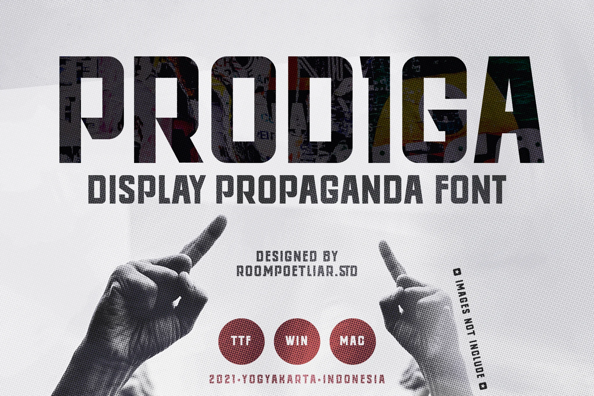
Prodiga – Russian Propaganda Font

Prodiga - Russian Propaganda Font

Inject a dose of intense, Russian-inspired design into your projects with the Prodiga font. Powerful and striking, its sharp, boxy appearance makes a bold statement. Ideal for bold headlines, eye-catching posters, E-Sport logos, sports jersey text, and more. The package includes both TTF and WOFF versions.

Pinkrabbit – Russian Style Font

Pinkrabbit - Russian Style Font

Pinkrabbit is a distinctive Russian-style font that stands out with its non-Western charm. This versatile typeface comes with both upper and lower case letters, numerals, and punctuation, making it ideal for logos, social media posts, brochures, magazines, and more. Available in TFF and OTF files, Pinkrabbit could be the perfect addition to your creative toolkit.

Republica Minor 2.0 – Russian Style Font

Republica Minor 2.0 - Russian Style Font

The Republica Minor 2.0 font gives the original design of its Russian-style letters a refreshing makeover. With enhanced features including altered punctuation and refined capital ‘M’ and ‘R’ designs, it remains a top pick for robust logos, TV shows, and video games. It now includes Kerning for classes, support for Macedonian and Serbian italics, and anticipates some overlap from tight spacing and European accents.

TF-Russya – Russian Style Font

TF-Russya - Russian Style Font

TF-Russya is a bold, Russian-style font featuring sharp, boxy characteristics. Perfect for creating standout posters, captivating headlines, engaging typography projects, dynamic E-Sport logos, or adding a unique touch to sports jerseys, it serves as an excellent creative asset for various design needs.

Kyber Ricon – Russian Style Font Family

Kyber Ricon - Russian Style Font Family

Kyber Ricon, a Russian style font, is a unique monospaced sans serif family noted for its diverse width and weight options. It offers robust support for over 400 Latin-based languages and extensive Cyrillic and Greek support, making it ideal for use in Russian, Bulgarian, Ukrainian, and many other languages.

Deutschlander 2.0 – Russian Inspired Font

Deutschlander 2.0 - Russian Inspired Font

The Deutschlander 2.0 is a novel Russian-inspired font, boasting a refined design that includes enhanced spacing and remodeled characters. Apt for compact spaces like business cards and movie credits, it supports a wide spectrum of languages and characters including basic Latin, extended Latin, Cyrillic, Greek, fractions, alternates, and more.

Heathergreen – Russian Style Font

Heathergreen - Russian Style Font

Heathergreen is a unique font with a blend of aesthetics designed to occupy more vertical space. It boasts being nearly 20% taller than its relative, Deutschlander. Unlike typical display fonts, Heathergreen is suited for body text and titles. It supports basic and extended Latin, Greek, Cyrillic, and other European accents.

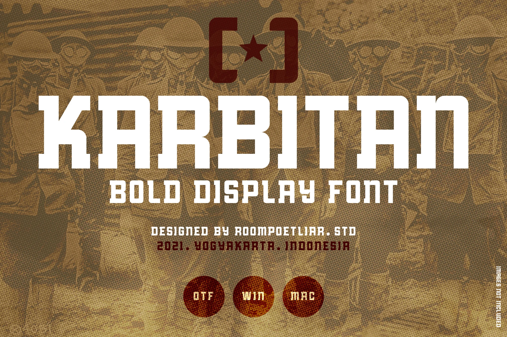
Karbitan – Russian Style Font

Karbitan - Russian Style Font

The Karbitan Font, inspired by Russian style typography, delivers a strong, sharp, and boxy feel that stands out, making it perfect for poster designs, headlines, and typography projects centered around themes like construction, resistance, or revolution. With its striking appeal, it’s also suitable for E-sport logos and sports jersey text.

Myla – Russian Inspired Font

Myla - Russian Inspired Font

With roots in retro Soviet design, the “Myla” font is a multi-functional asset perfect for an array of projects. Its three variations – Regular, Bold, and Black in regular and italic styles – convey a sense of history. Ideal for everything from clothing labels to album covers, it provides a unique blend of cultural aesthetics.

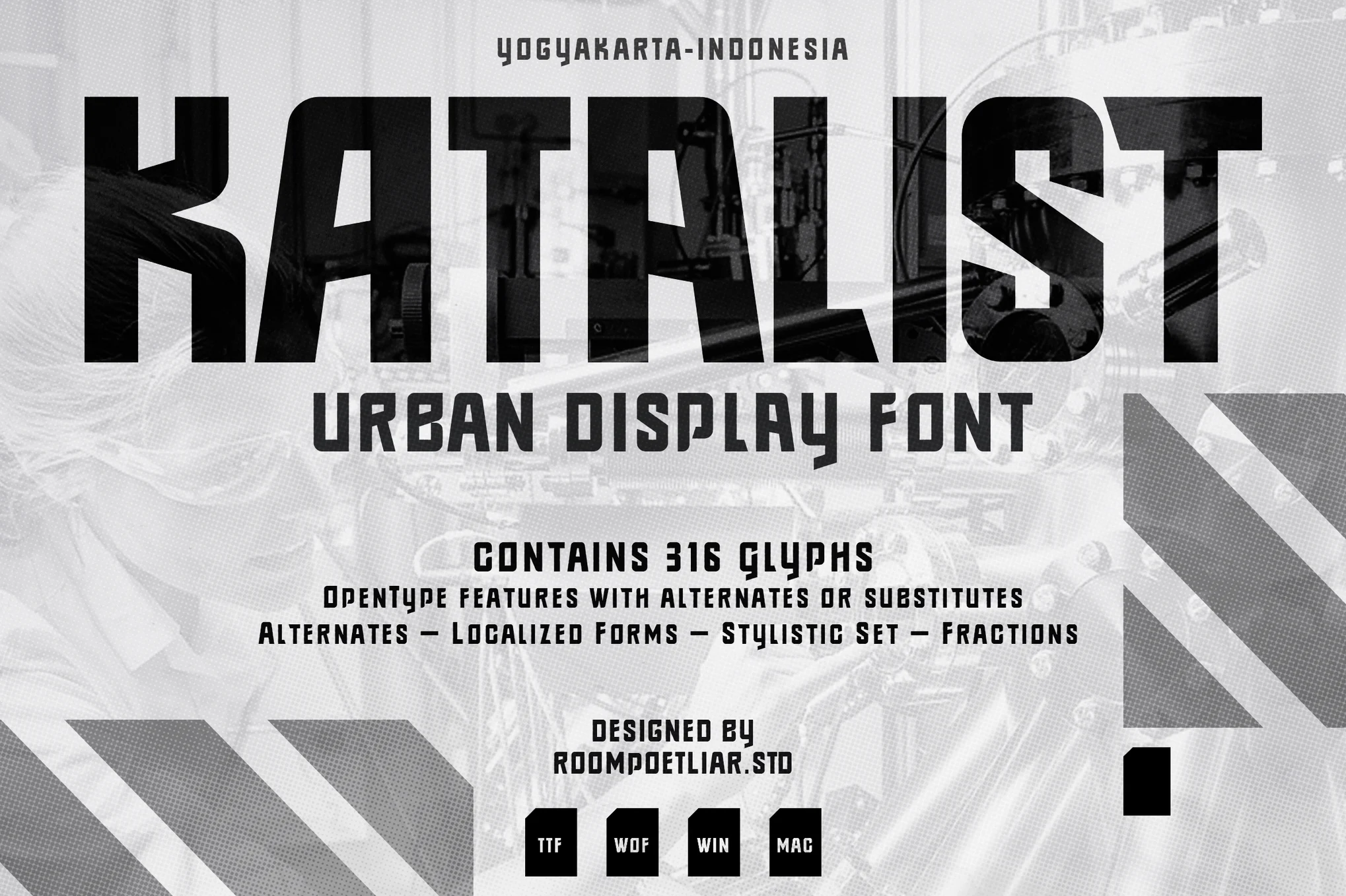
Katalist – Russian Style Font

Katalist - Russian Style Font

The Katalist is a bold Russian-style font that brings a strong and striking appeal with its boxy, sharp design. It fits ideally with poster designs, headlines, typography projects encompassing themes from streetwear to revolution, religious events, and sports jersey texts. The package is made complete with 316 glyphs, 64 language options, alternate styles, localized forms, and more.

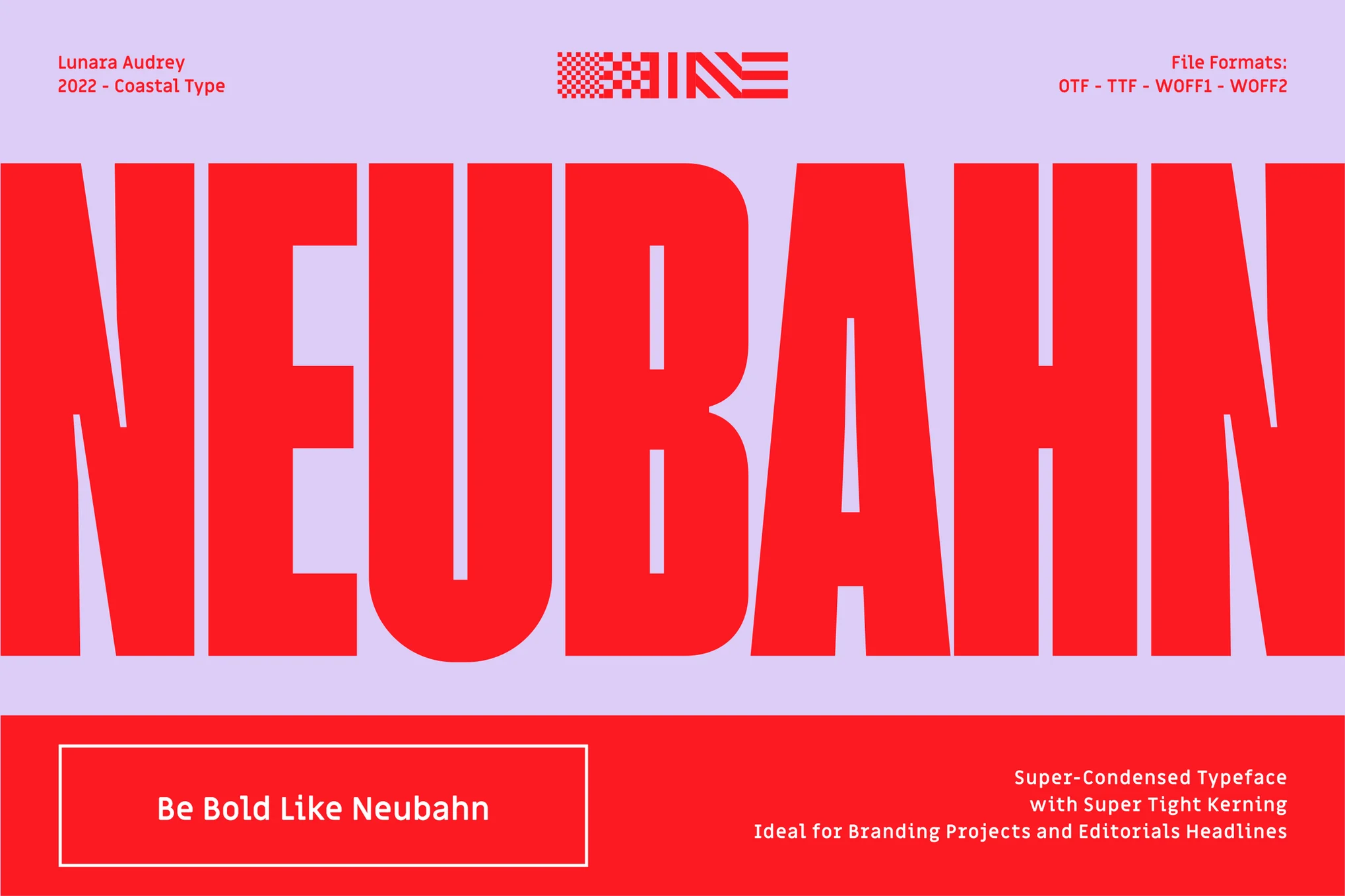
Neubahn – Russian Style Font

Neubahn - Russian Style Font

The Neubahn is a bold, super-condensed typeface, inspired by Russian style fonts. It features tight kerning, making it perfect for impactful branding projects and attention-grabbing editorial headlines. Neubahn comes in various formats including OTF, TTF, WOFF, and WOFF2, with uppercase and lowercase letters, punctuation, numbers, and ligatures included.

Cd Freiburg – Russian Style Font

Cd Freiburg - Russian Style Font

Cd Freiburg is a distinctive, vintage typeface that beautifully captures the spirit of wartime propaganda art. With its blocky, bold serifs and the weathered texture of each character, this font creates a strong and impactful aesthetic. Boasting both upper and lowercase letters, ligatures, stylistic alternates, and a variety of numbering styles, it provides wide versatility.

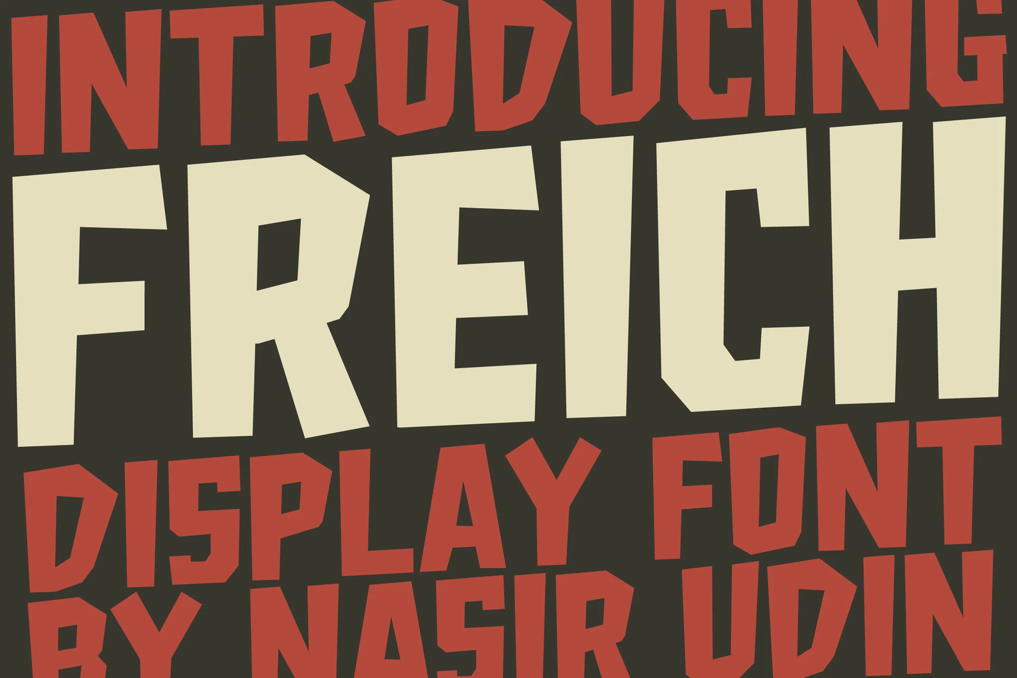
Freich – Russian Style Font

Freich - Russian Style Font

Freich is a bold Russian-style font with a vintage flair, ideal for superhero, rebellious, or propaganda-themed posters. Its powerful letter forms make statements command attention. The font set includes Freich, Freich Inline, and Freich Fill in both otf and ttf formats, with 327 glyphs and special ligatures.

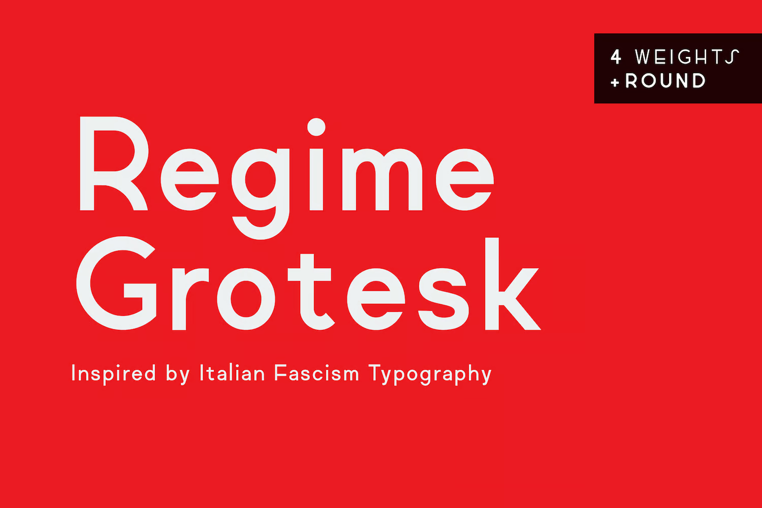
Regime Grotesk – Russian Inspired Font Family

Regime Grotesk - Russian Inspired Font Family

Regime Grotesk is a versatile, sans-serif font family inspired by the Russian-style typography, embodying attributes from the fonts of the time like Futura and Mostra. With its distinctive sloping “S” and low crossbars, it offers a modern yet timeless aesthetic. Featuring four weights, a round version, and matching obliques, it’s designed to adapt to web, print, and signage.

Free Russian Fonts

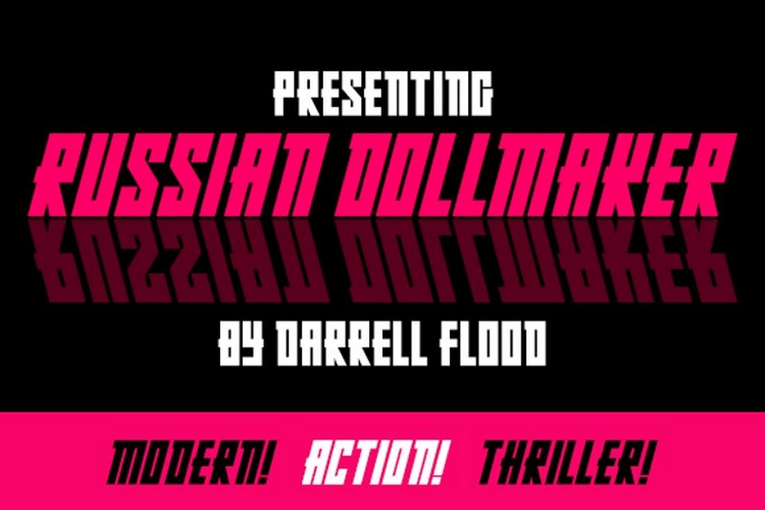
Russian Dollmaker – Free Russian Font

This stylish font comes with a set of creative letterforms with designs inspired by Russian typography. The font is ideal for crafting bold titles that instantly grab attention. It’s free to use with your personal projects.

Russian Spring – Free Russian Looking Font

Another free Russian-style font that features many decorative elements inspired by Russian-style letters. This font is also great for crafting titles for propaganda-themed designs. It’s free for personal use only.

Fontograd – Free Russian Style Font

A bold and striking font that you can download for free. Fontograd is a modern font inspired by Russian-themed typography. It has an ideal design for crafting big titles for posters and flyers.

Kyber Ricon – Free Russian Font Family

This free font comes with a monospaced letter design with Russian-inspired characters. It’s ideal for designing attention-grabbing titles and headings. The font is free to use with personal projects.

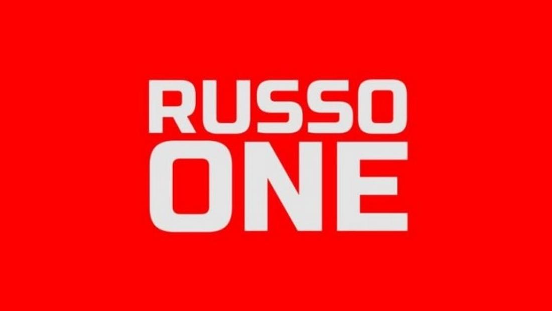
Russo One – Free Russian Style Font

Russo One is a clean and simple title font that features a subtle Russian-themed letter design. This font is perfect for making big and bold titles for your posters and banners. The font is free for personal and commercial use.

70+ Best Animated PowerPoint Templates 2024 (Free + Premium)

Featured Imgs 23

In this collection, we’re featuring some of the best, animated PowerPoint templates (both premium and free) to create stunning presentations filled with stylish object and transition animations.

Designing a PowerPoint presentation is not an easy job. It requires a lot of work and time. When crafting presentations, most people completely ignore one of the key elements of a creative slideshow: animation. Adding creative animations and effects not only makes your presentation slides interactive, but it’s also useful when emphasizing key points and data.

Of course, you don’t have to be a PowerPoint expert to design animated slideshows. You can simply use a pre-made animated PowerPoint template. We handpicked these templates just for you.

We’re also featuring a series of tips for creating animations and transitions in PowerPoint with some extra pointers and advice.

Top Pick

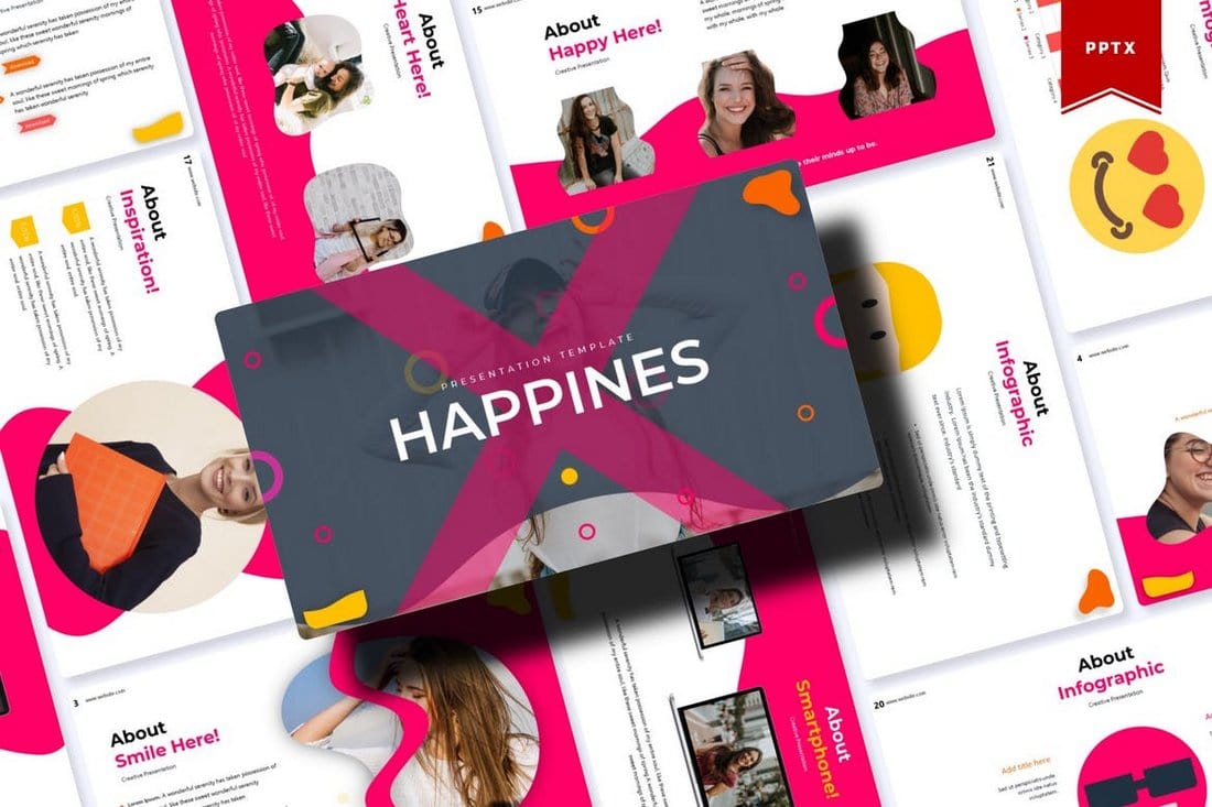
Happines – Animated PowerPoint Template

Happines - Animated PowerPoint Template

Happines is a modern PowerPoint template that features a colorful and attractive design. All of the slides in this template are fully animated with just the right effects so you won’t have to spend any extra time adding animations.

This PowerPoint template also comes with 30 unique slides. You’ll also be able to choose from 5 different color schemes to create stylish presentations.

Why This Is A Top Pick

In addition to its beautiful slide design that comes filled with animations, the template also includes lots of editable vector graphics, illustrations, and infographics. Which makes it a great choice for making professional presentations.

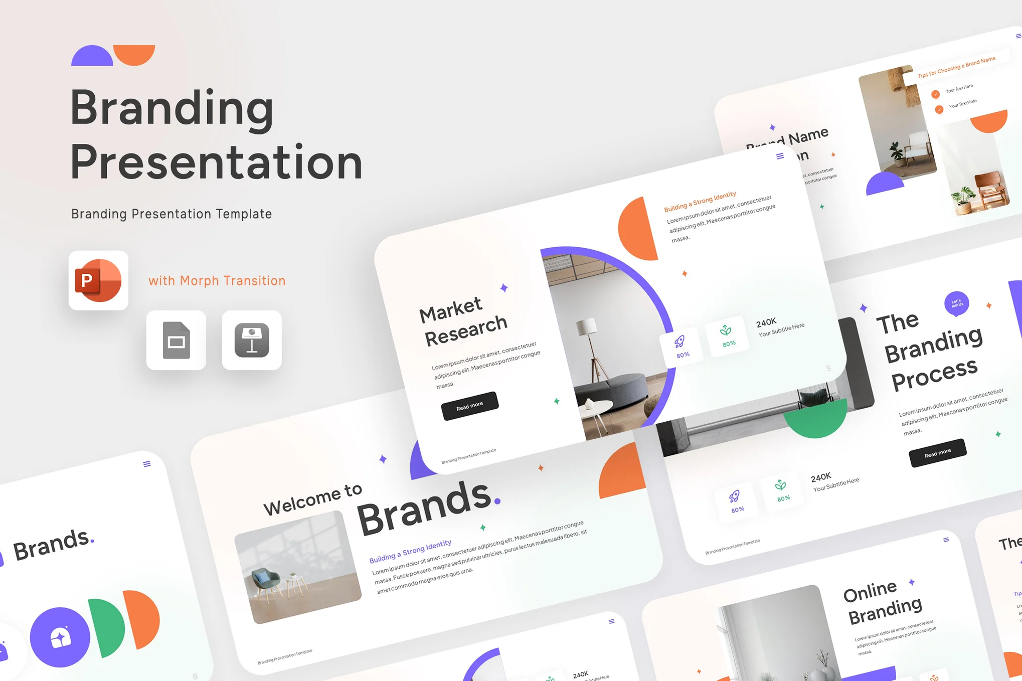
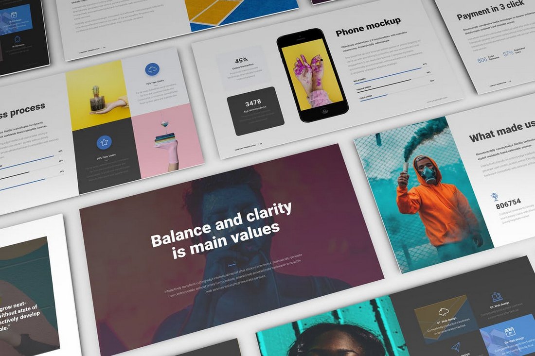
Neumorphic Branding Presentation PPT

Neumorphic Branding Presentation PPT

This is a flexible, creative, and elegant animated PowerPoint template. It employs a Neumorphic style design, perfect for both corporate and personal presentations. With its stellar features like the Widescreen Ratio 16:9, Morph Transition, and easy customizability, this template can significantly enhance your presentation’s quality, ultimately attracting more customers.

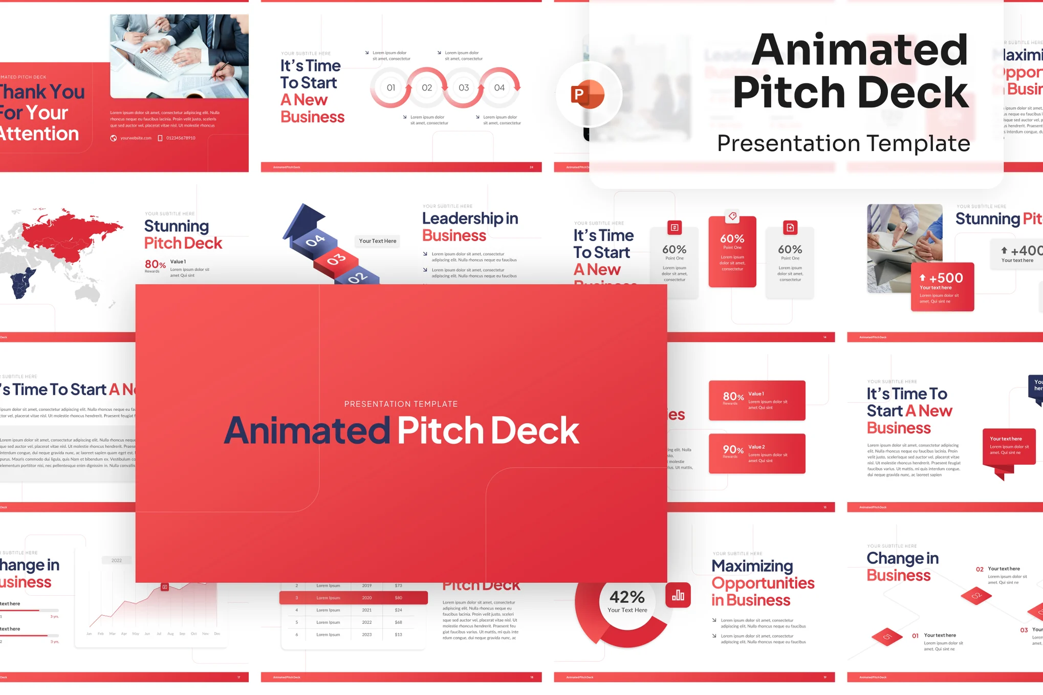
Animated Pitch Deck PowerPoint Template

Animated Pitch Deck PowerPoint Template

An exceptional PowerPoint template, perfect for boosting your business presentations. It’s packed with unique slide variations, editable charts, and elements that are ideal for illustrating your business development stages. The easy-to-use widescreen format, together with its preset color scheme and font theme, provides a holistic branding experience

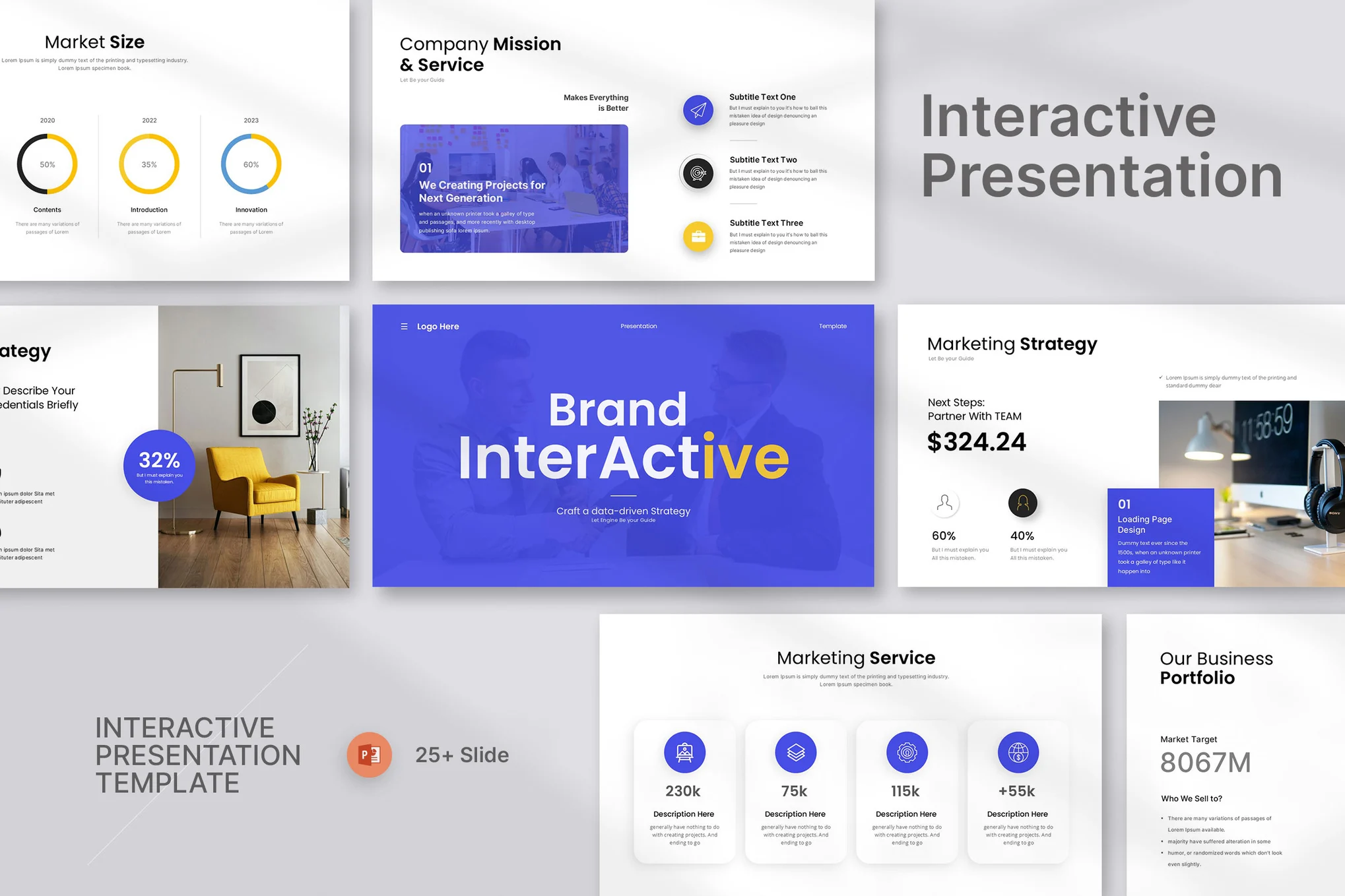
Morph – Interactive PowerPoint Template

Morph - Interactive PowerPoint Template

With this animated PowerPoint template, bringing life to your business presentations is effortless. This dynamic template, optimal for project management presentations and corporate meetings, offers 25 editable, wide-screen slides, all based on master slides for uniformity.

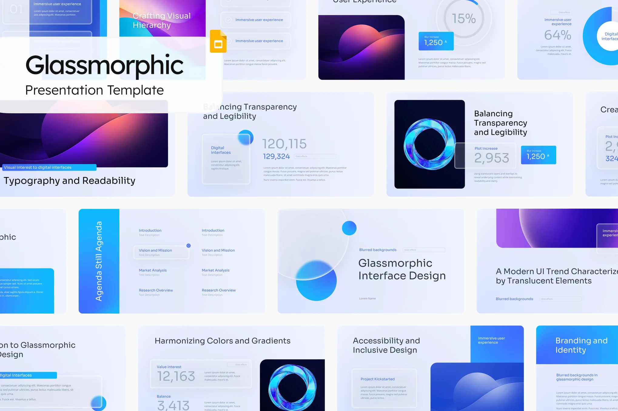
Glassmorphic Pitch Deck Animated PowerPoint Template

Glassmorphic Pitch Deck Animated PowerPoint Template

Need a sleek, modern PowerPoint template? Check out the Glassmorphic animated PowerPoint template, perfect for startups and businesses. With a design style featuring trendy “glassmorphism” elements – think translucent, frosted glass-like elements – it’s sure to make your pitch deck unforgettable. Features include a font theme, color scheme, and placeholder image.

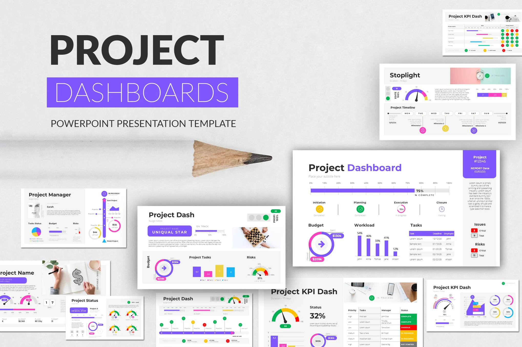
Project Dashboards PowerPoint Template

Project Dashboards PowerPoint Template

This is an animated PowerPoint template comprising 30 unique slides customizable to depict your project progress and results vividly. Equipped with 5 color schemes in both dark and light versions and a 16:9 aspect ratio, this dynamic tool is ready to simply ‘Drag and Drop’ your content and present it with style and clarity.

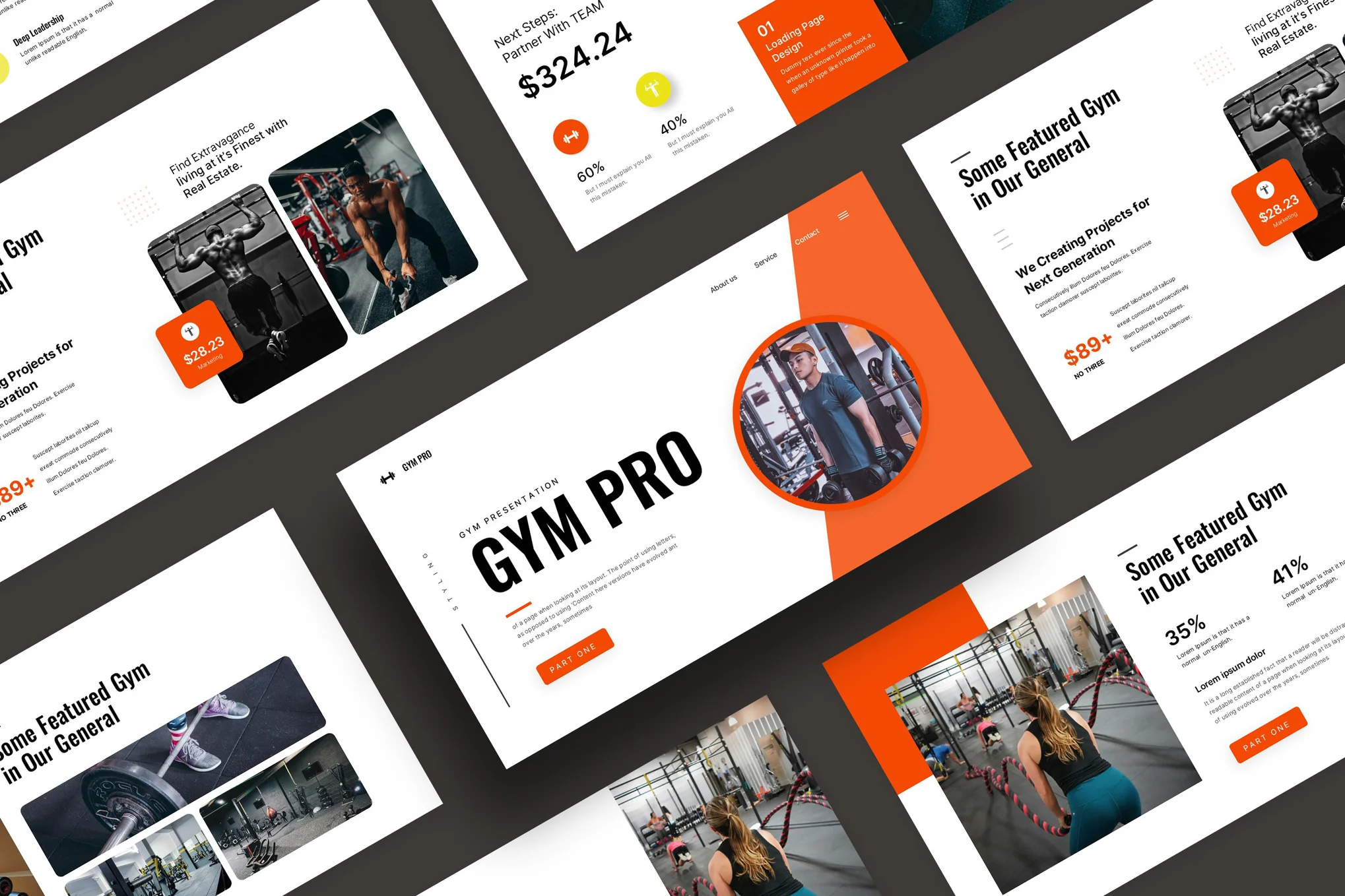
Gym & Fitness Animated PowerPoint Template

Gym & Fitness Animated PowerPoint Template

An adaptable, high-resolution animated PowerPoint template for presenting fitness-related content. Its distinguishing features include 24 unique slides, editable charts and infographics, and stunning animated effects. Perfect for both technical and non-technical users, its modifiable layouts and drag-and-drop photo replacement system makes it a breeze to use.

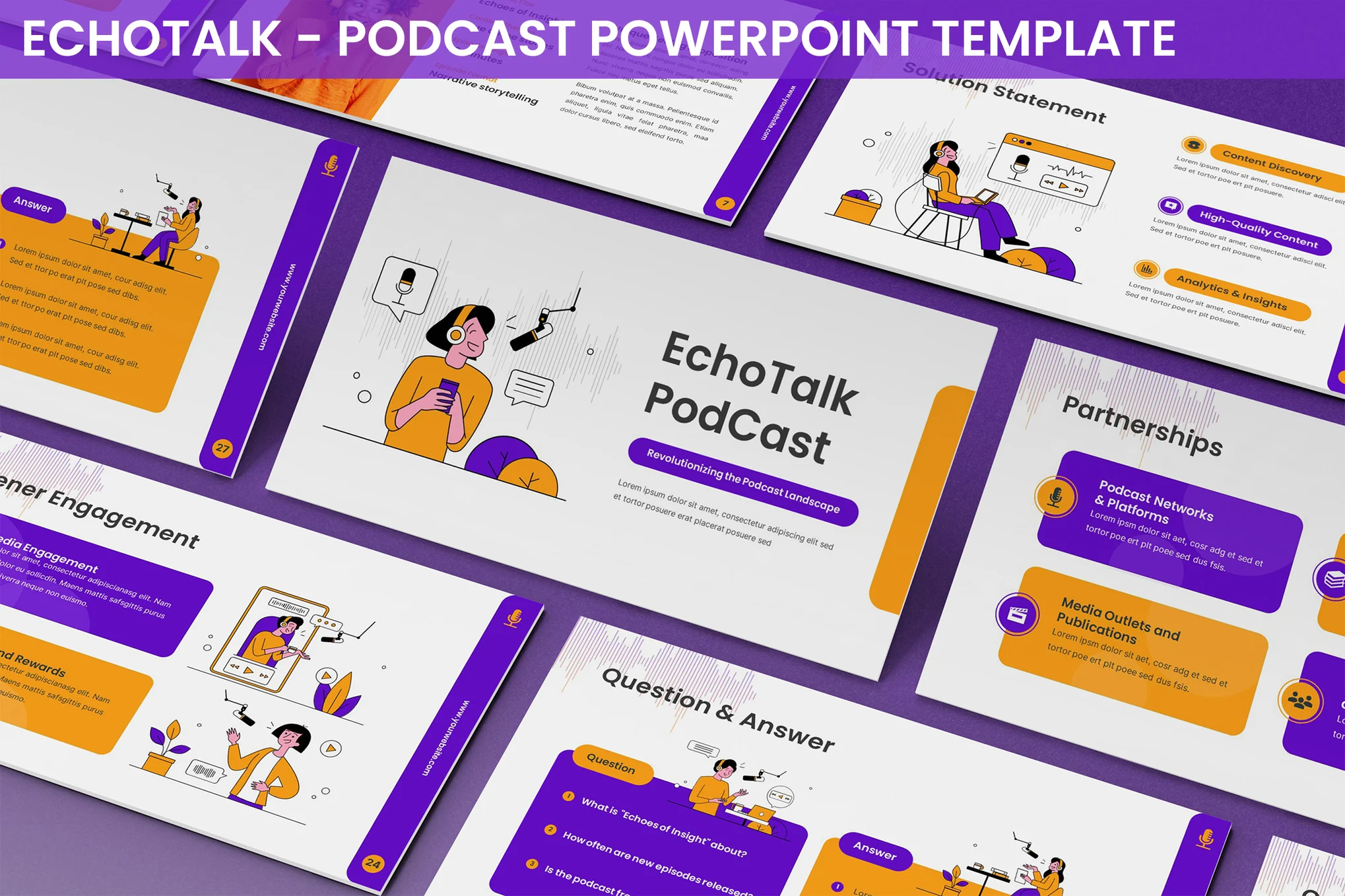
Echotalk – Podcast PowerPoint Template

Echotalk - Podcast PowerPoint Template

Echotalk is a lively PowerPoint template designed for podcast presentations. It’s filled with engaging animations, modern designs, and customizable features that cater to the needs of aspiring podcasters and marketing teams. This template comes with numerous unique slides which include episode details, listener engagement tactics, SWOT analysis, content strategy and more.

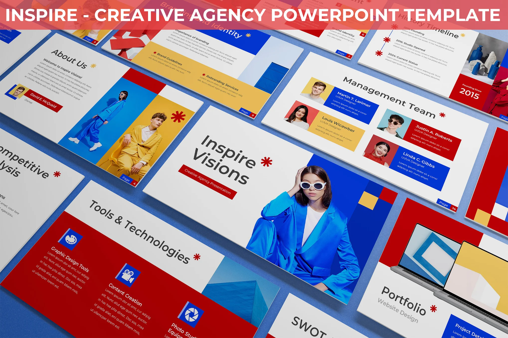
Inspire – Creative Agency PowerPoint Template

Inspire - Creative Agency PowerPoint Template

Inspire is a highly customizable animated PowerPoint template that can enhance any agency’s presentations. Complete with 30 unique slides, it boasts of modern layouts and compelling visuals perfect for showcasing portfolios, proposals, and marketing initiatives. The template, easily adaptable to your agency’s brand, comes with animated features, and light and dark background options.

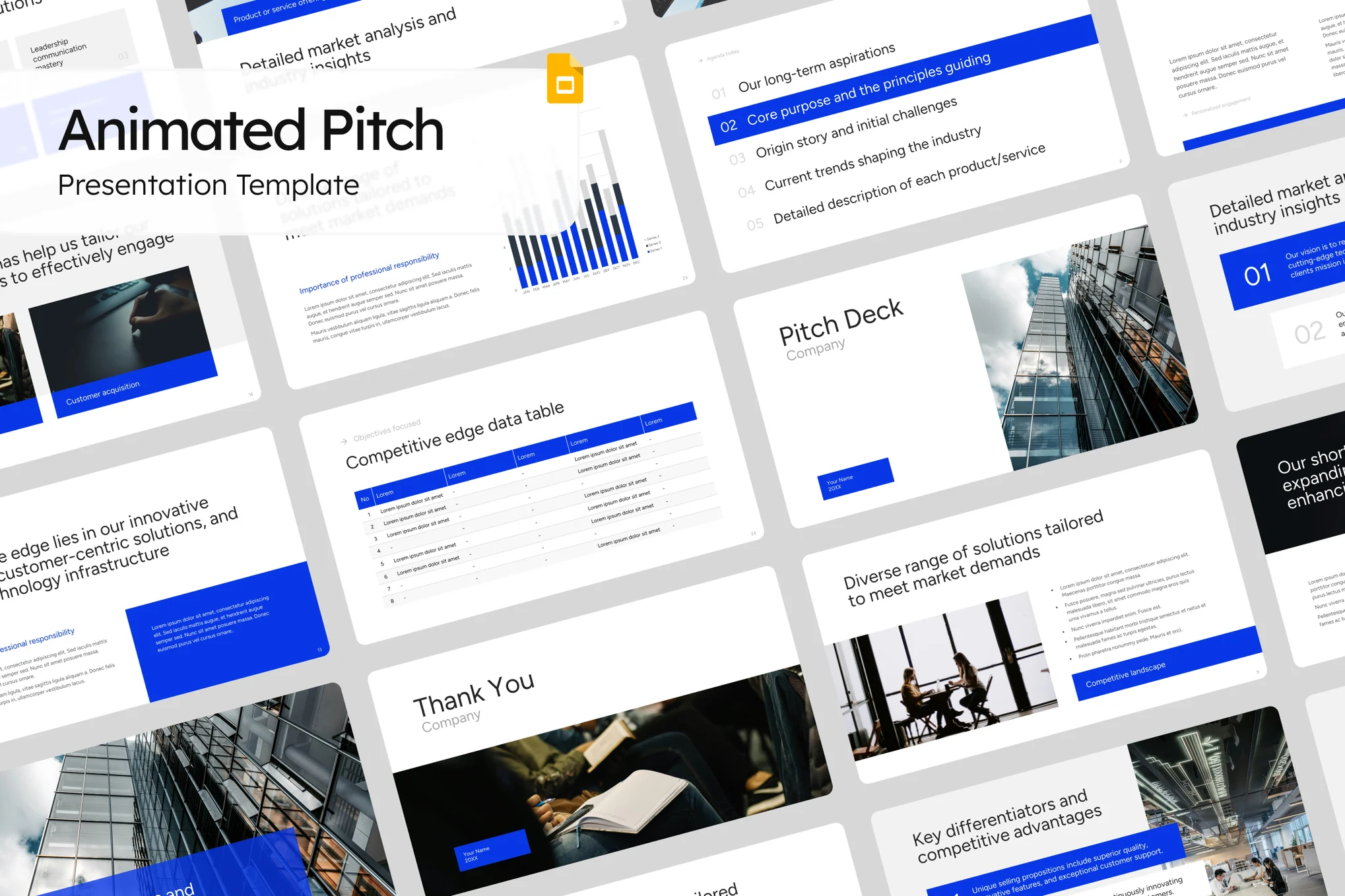
Animated Pitch Deck PowerPoint Template

Animated Pitch Deck PowerPoint Template

This is a vibrant, lively template specifically built for entrepreneurs and businesses to deliver captivating presentations. Packed with striking animations and transitions, this template aids in grabbing attention from potential investors, partners or clients. It comes with an adaptable color scheme, free fonts, and placeholder images, making it extremely user-friendly.

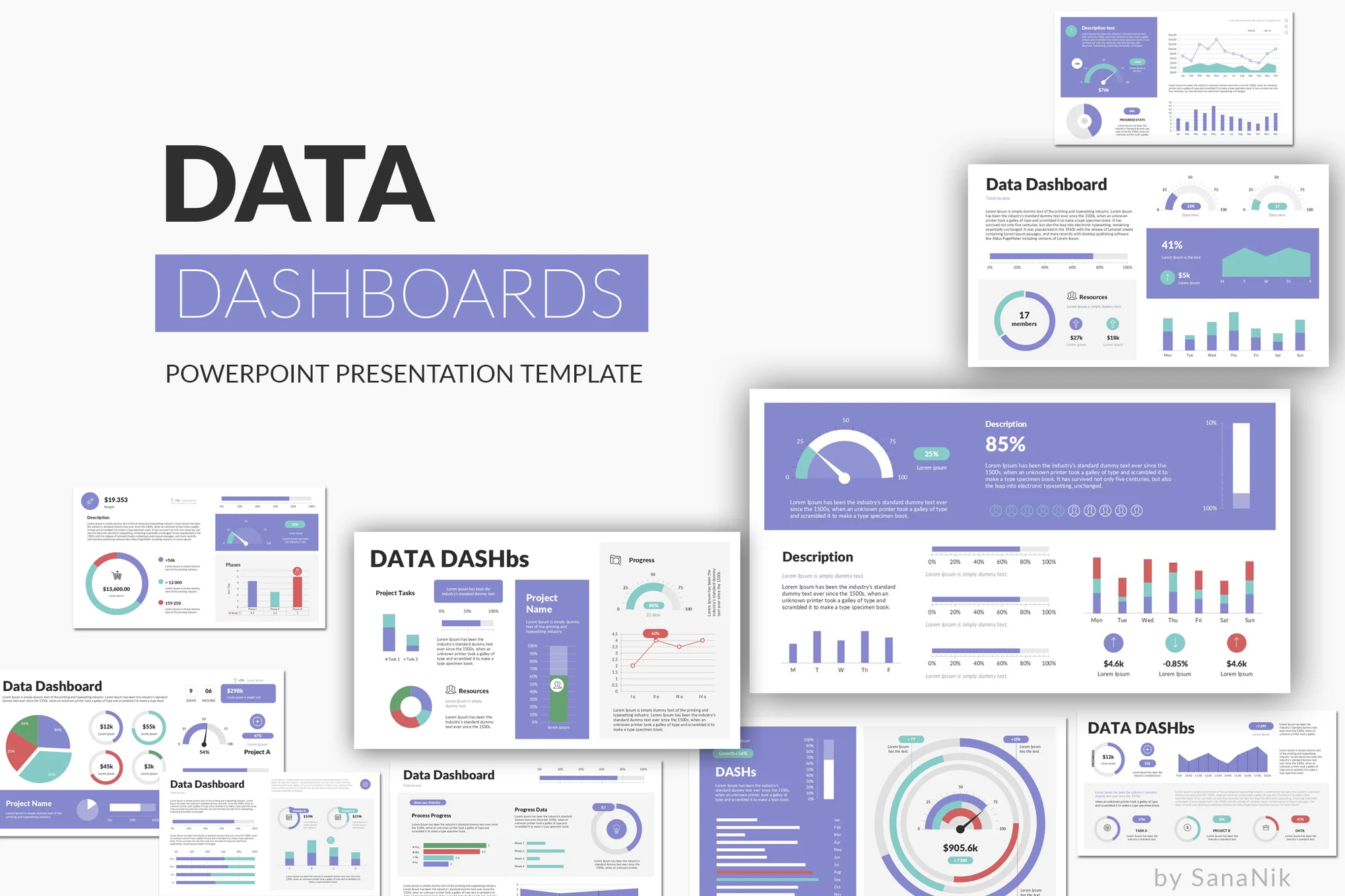
Data Dashboards – Animated PowerPoint Template

Data Dashboards - Animated PowerPoint Template

Data Dashboards is a versatile and visually appealing tool perfect for presenting your data effectively. It offers 30 unique slides with custom animations, 10 PPTX files, and an easy-to-edit setup. The package includes five color schemes suited for both light and dark backgrounds, user-friendly Excel-editable charts, and free updates.

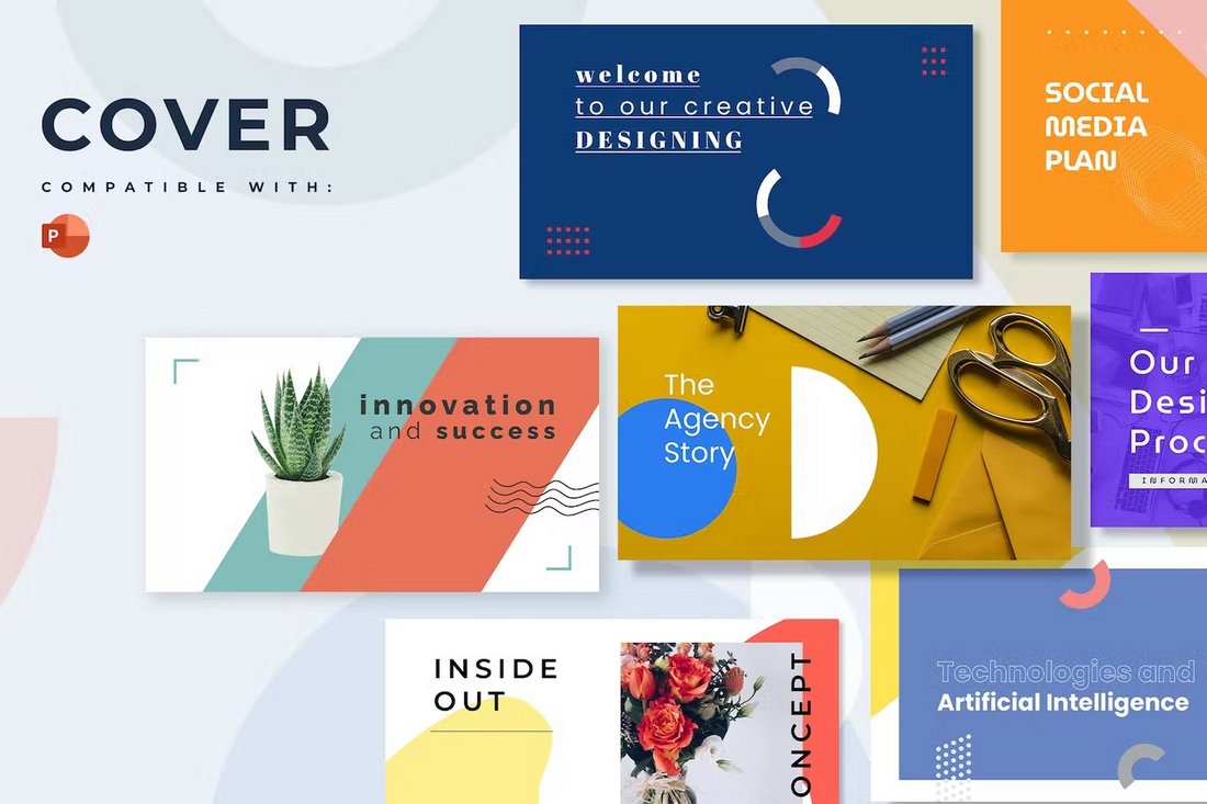
Cover – Modern Animated PowerPoint Template

Cover - Modern Animated PowerPoint Template

Cover is a modern and visual-centric PowerPoint template that features a set of unique slide designs. This template is perfect for your creative agency and marketing presentations. It includes more than 20 slides with customizable elements and animations.

Animated PowerPoint Presentation for Business

Animated PowerPoint Presentation for Business

This PowerPoint template features a multipurpose design with lots of modern and stylish slides to choose from. It’s ideal for making every kind of presentation from business meeting slideshows to startup pitch decks and more.

Business Finance Animated PowerPoint Infographics

Business Finance Animated PowerPoint Infographics

Showcasing and highlighting your business finance reports in presentations will get much easier with the help of this template. It includes 20 different infographic slides for creating beautiful graphics for finance stats and data.

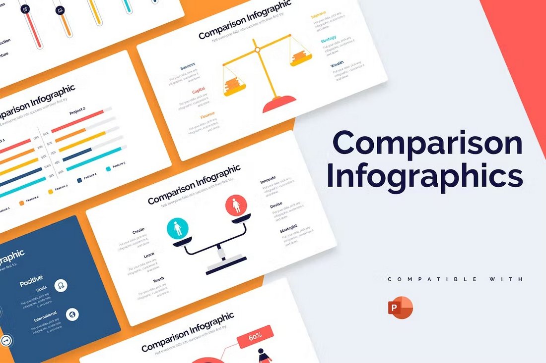
Business Comparison PowerPoint Infographics Template

Business Comparison PowerPoint Infographics Template

You can use this PowerPoint template to create cool slides that compare products, features, and competitors in visual form. There are 20 unique slide layouts in this template filled with colorful illustrations, icons, and graphics. You can easily customize them to your preference.

Free Business Proposal Animated PPT Template

Free Business Proposal Animated PPT Template

Planning on organizing a business trip? Then you can use this free PowerPoint template to create a presentation for the meeting. It comes with 30 slides. You can also customize it to create other types of presentations.

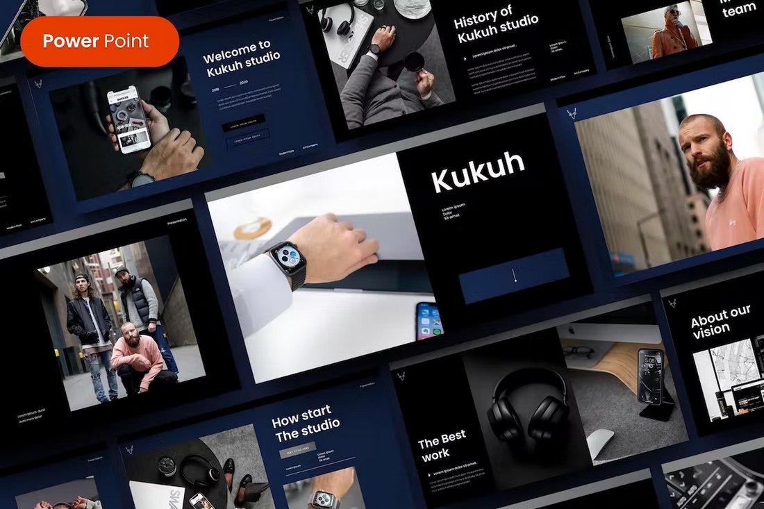
Kukuh – Animated Business PowerPoint Template

Kukuh - Animated Business PowerPoint Template

The stylishly dark and modern design of this PowerPoint template makes it an ideal choice for creating presentations for luxury brands and high-end businesses. It has 39 unique slides with fully customizable layouts, including editable graphics, colors, and fonts.

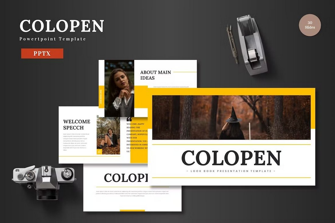
Colopen – Animated Creative PowerPoint Template

Colopen - Animated Creative Powerpoint Template

Colopen is a creative PowerPoint template that you can use to make various agency and marketing presentations. It’s especially great for presenting projects and business profiles. The template includes 30 unique slides that come in 5 different color schemes.

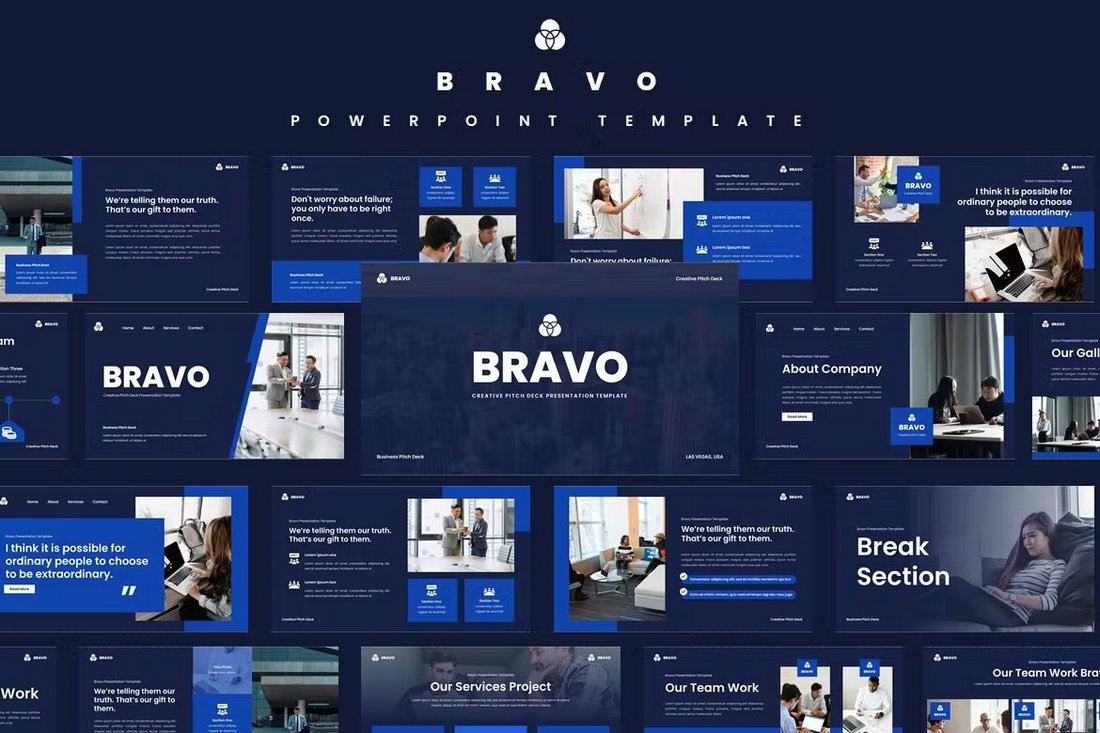
Bravo – Animated Pitch Deck PowerPoint Template

Bravo - Animated Pitch Deck Powerpoint Template

This PowerPoint template has the perfect design for making bold and attractive business presentations. It includes fully animated slides full of stylish designs, infographics, editable vector graphics, icons, and more. There are more than 35 slide layouts in this template.

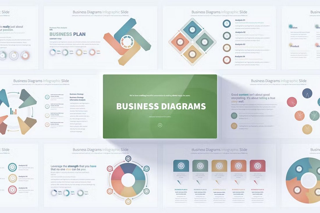
Business Diagrams Animated PowerPoint Slides

Business Diagrams Animated PowerPoint Slides

You will never run out of unique diagram designs for your business presentations when you have this PowerPoint template. It has 17 unique diagram designs that are available in 12 different color schemes. Each infographic is handmade to perfection.

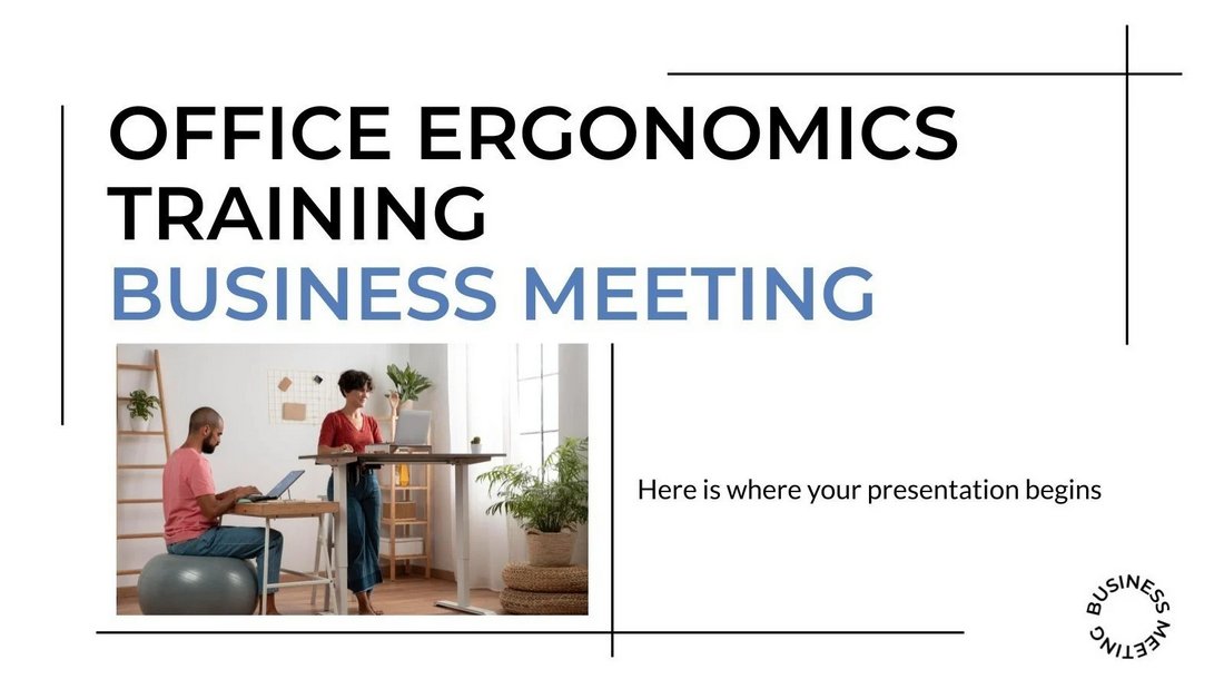
Free Business Meeting Animated PowerPoint Template

Free Business Meeting Animated PowerPoint Template

This free PowerPoint template is most suitable for crafting presentations for business meetings. It features a clean and minimal slide design with beautifully animated objects and transitions. There are 13 slides included in the template.

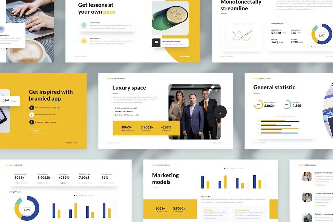
Clean Business Presentation PowerPoint Template

Clean Business Presentation PowerPoint Template

Create modern business presentations with clean slides using this PowerPoint template. It features 40 unique slides with editable graphics, charts, and transition animations. You can also choose from 10 different color themes for the template.

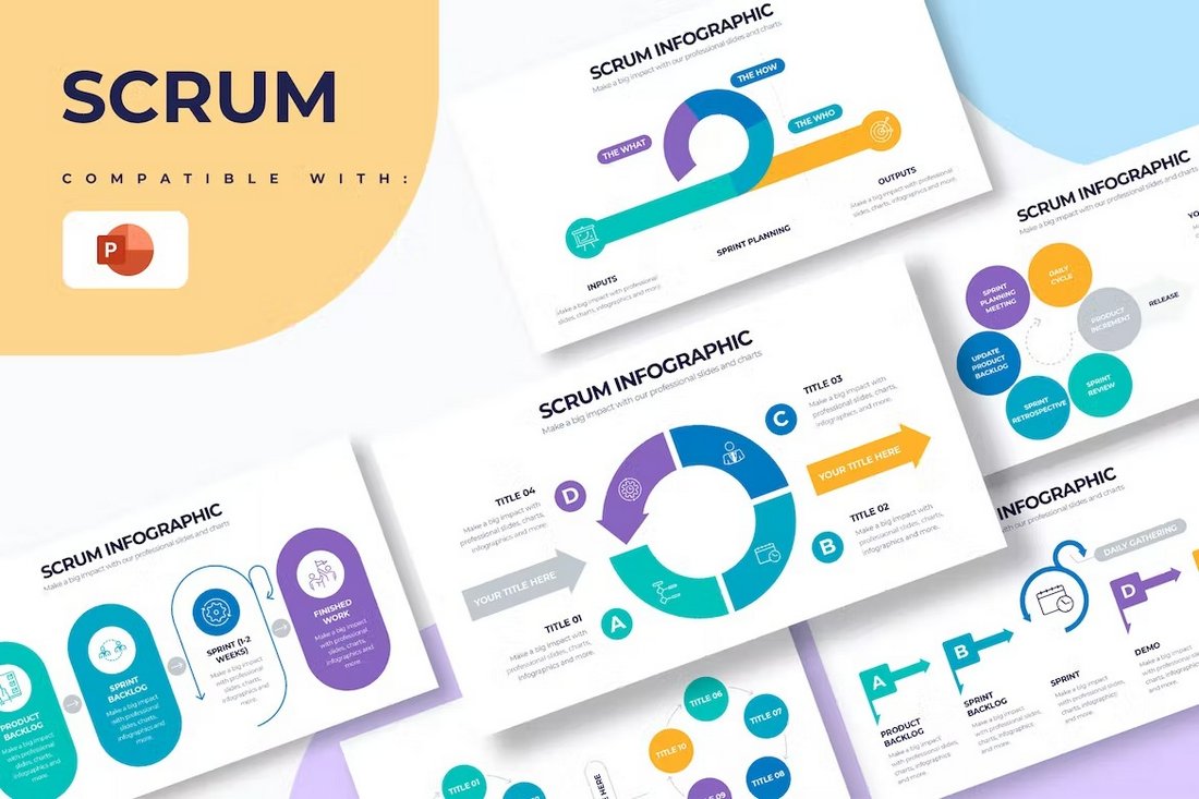
Scrum PowerPoint Infographics Animated Template

Scrum PowerPoint Infographics Animated Template

Use these PowerPoint slides to present your Scrum solutions for business problems in a professional way. It includes more than 20 slides with unique infographics and customizable elements.

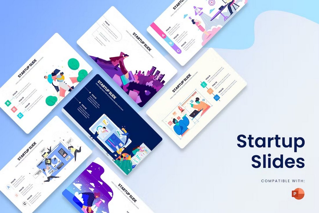
Startup Slides Animated PowerPoint Templates

Startup Slides Animated PowerPoint Template

This PowerPoint template includes several beautiful slides featuring illustrations and graphics especially made for startups and small businesses. The colors, fonts, images, and everything on each slide can be customized to your preference.

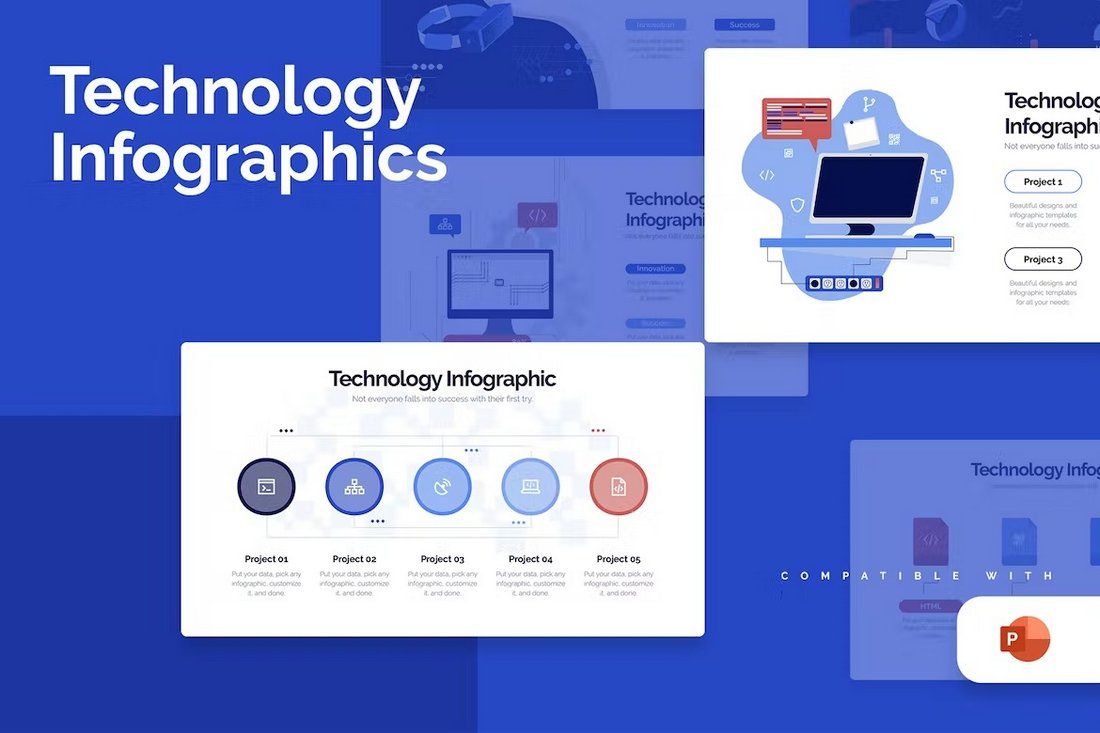
Technology Infographics Animated PowerPoint Template

Technology Infographics Animated PowerPoint Template

With this PowerPoint template, you can design minimal slideshows for technology-related presentations. There are over 20 slides included in the template with several different styles of designs.

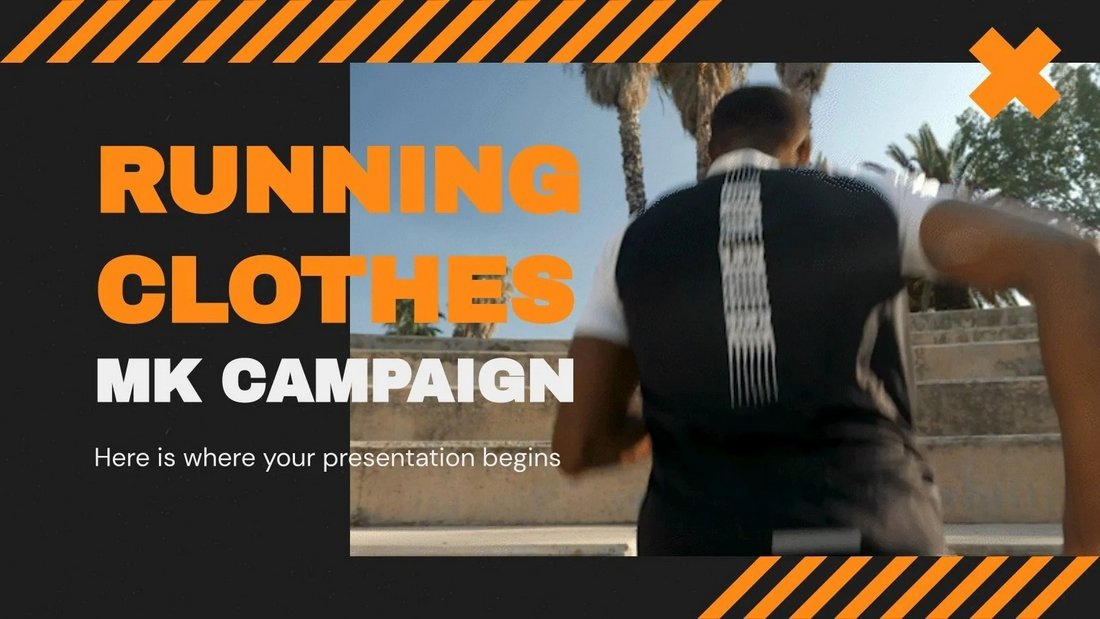
Marketing Campaign Free Animated PowerPoint Template

Marketing Campaign Free Animated PowerPoint Template

This is a free PowerPoint template you can use for making modern marketing presentations. It’s especially suitable for digital agencies and brands. The template includes 32 different slides.

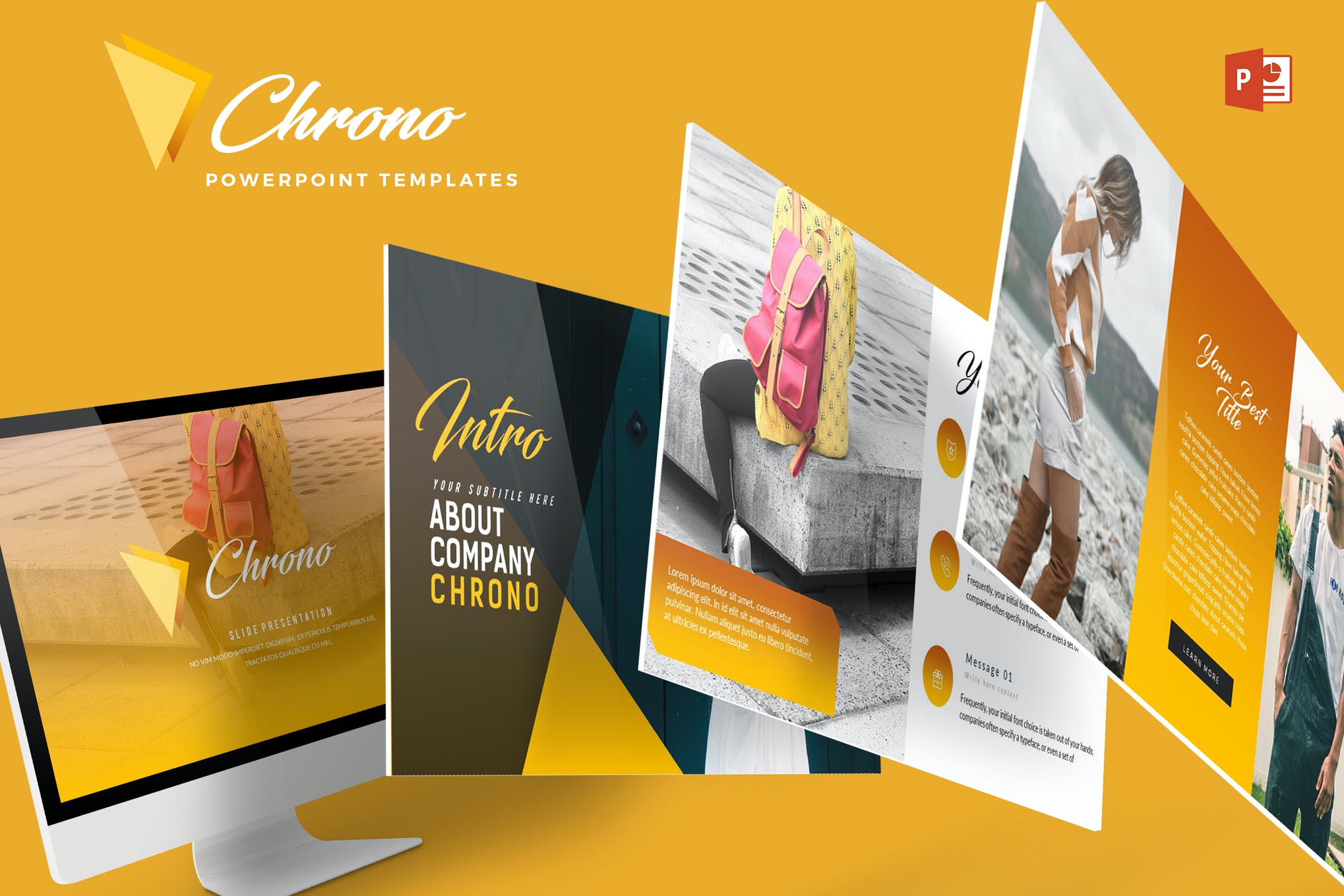
Chrono – Creative Agency PowerPoint Template

Chrono - Powerpoint Template

For an effortlessly stylish presentation, consider Chrome. It’s a beautifully designed PowerPoint template that will captivate your audience at a glance. This animated template offers a range of fully customizable slides, color variations, and picture-perfect illustrations.

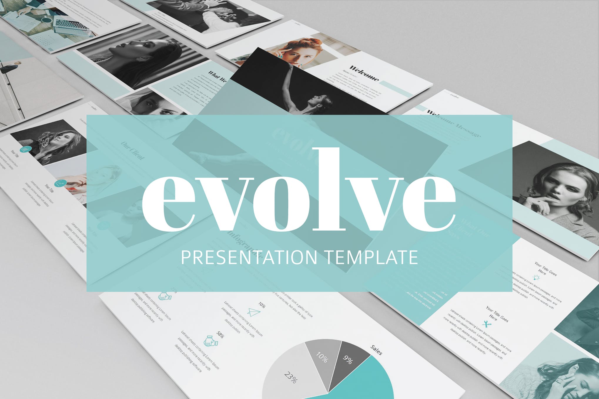
Evolve – Animated PowerPoint Template

Evolve - Animated Powerpoint Template

Evolve is an animated PowerPoint template that exudes elegance in each of its 40 slides. It comes in both animated, and non-animated versions, allowing you to choose the one that best fits your needs. There is also a choice between light and dark color themes.

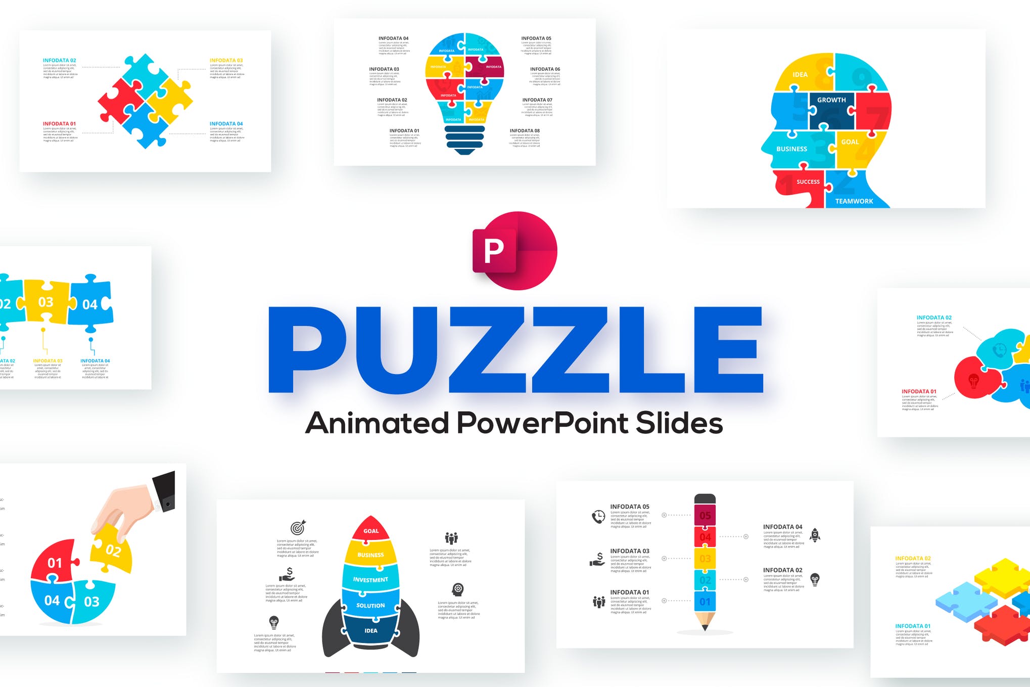
Puzzle – Animated PowerPoint Template

Puzzle Animated PowerPoint Presentation

Puzzle is an infographic PowerPoint template fitting to a large pool of business purposes. Whether you need a presentation to discuss the business processes, marketing steps, or timeline, this animated template surely deserves a spot in your PowerPoint resource kit.

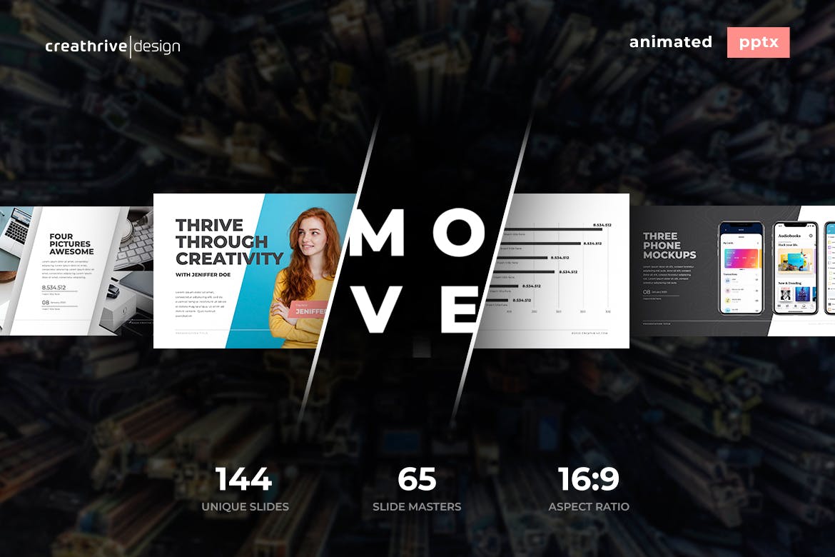
Move – Animated PowerPoint Template

Move Animated PowerPoint Template

Move is a multipurpose PowerPoint template featuring 144 animated slides, drag, and drop picture placeholder, free fonts, and a lot more. Ideal for modern presentations Move is worth giving a shot or adding to your shortlist at the very least.

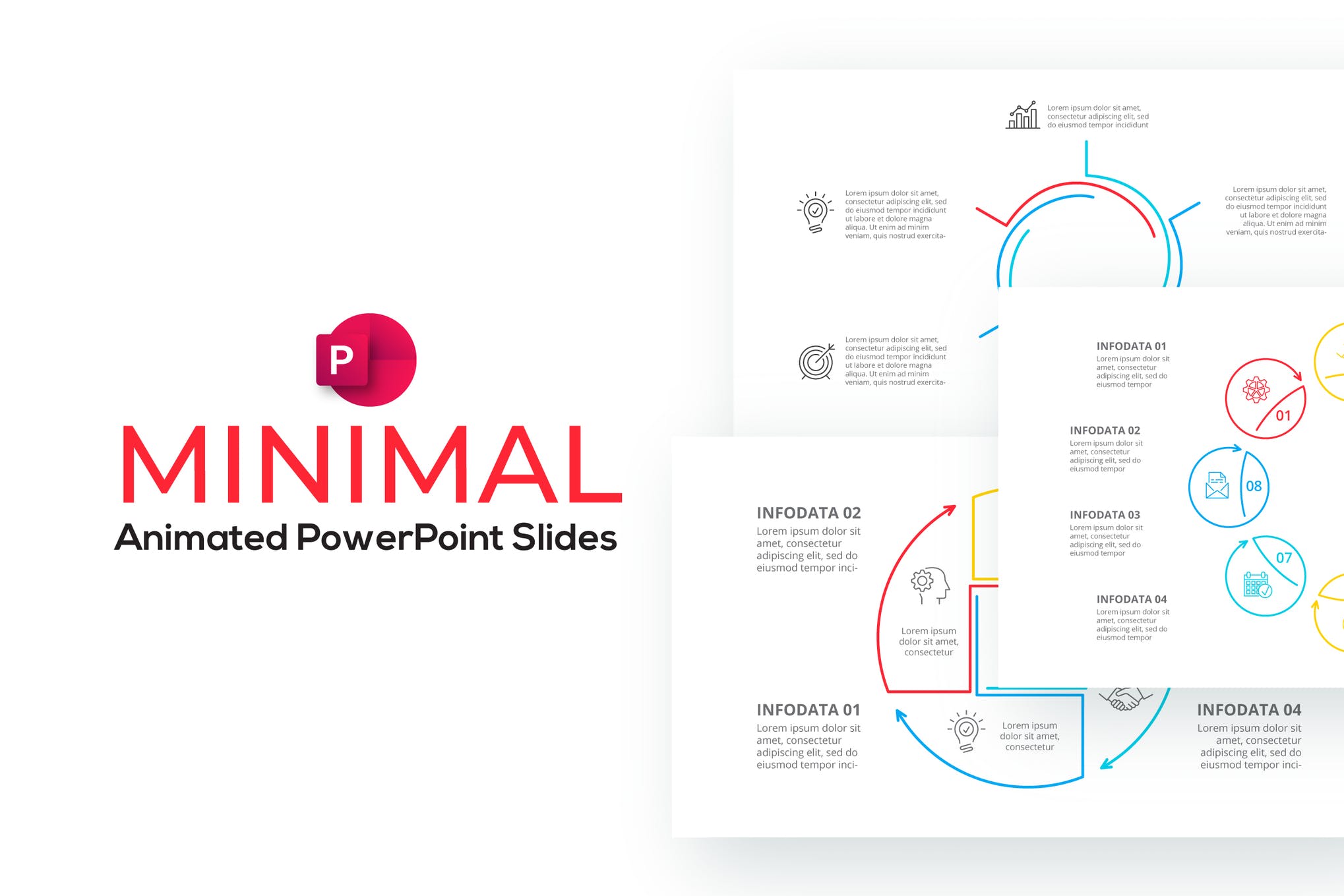
Minimal Infographic PowerPoint Template

Minimal Animated PowerPoint Infographics

Next up we have a minimalistic template purpose-built for data visualization presentations. It comprises 18 fully animated slides, a range of color themes to choose from, and vector shapes. All elements can be easily edited in Microsoft PowerPoint, and a dark version comes included.

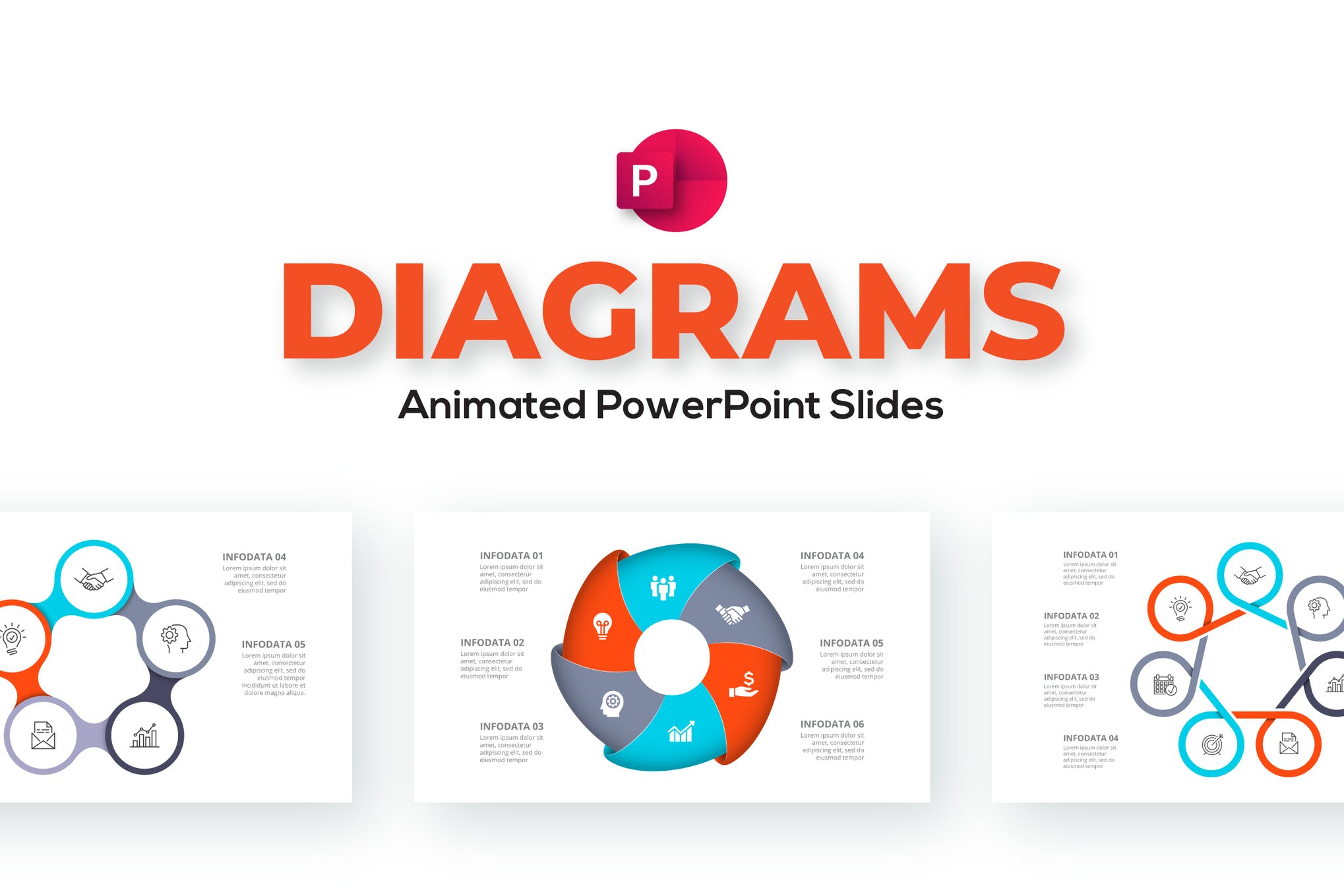
Diagrams – Animated PowerPoint Template

animated powerpoint template

If you’re looking for an animated PowerPoint template with lots of diagrams, check out the above featured product. It consists of 18 fully animated slides that can be customized to your specific requirements in no time at all.

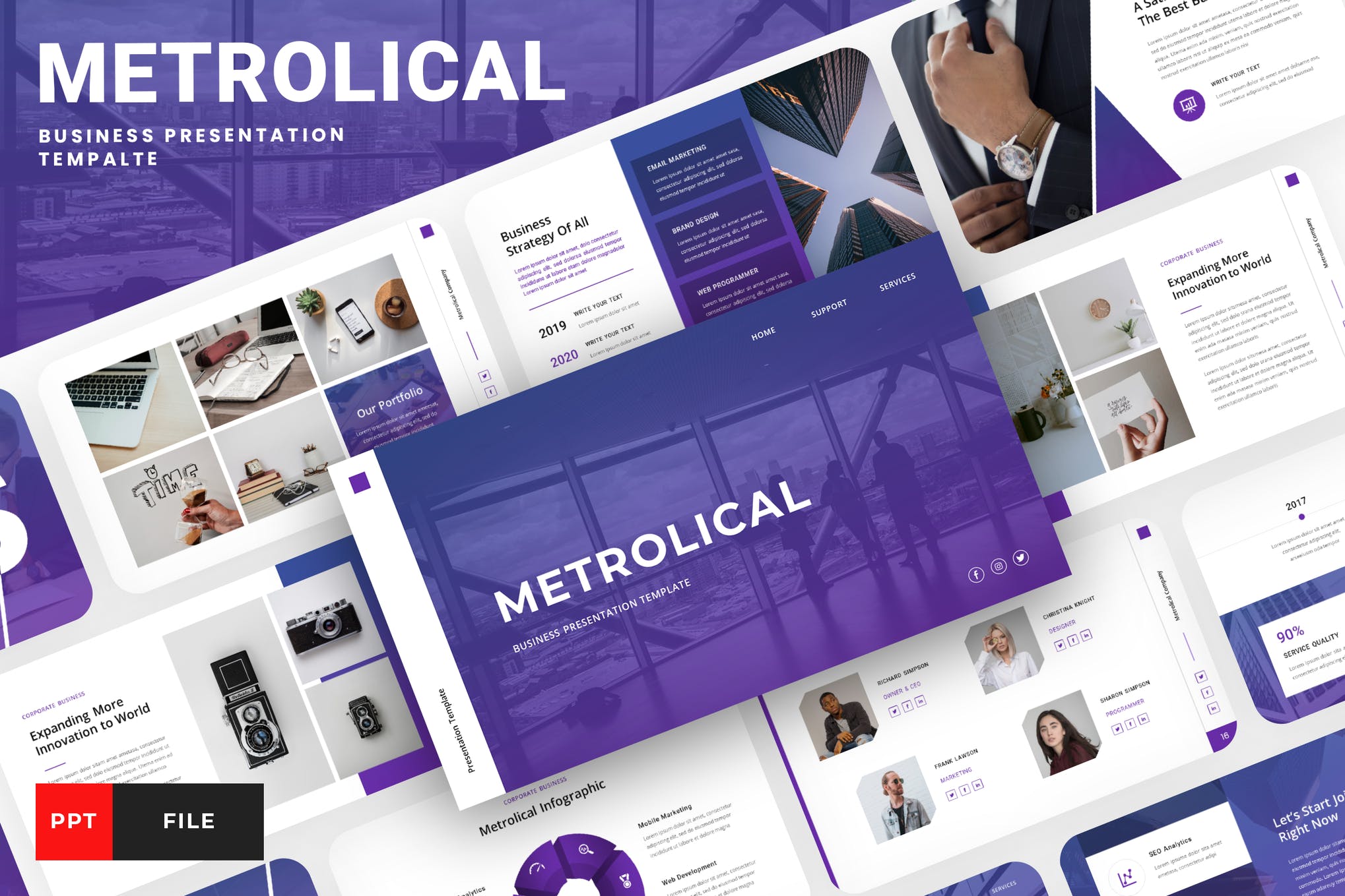
Metrolica – Animated PowerPoint Template

animated powerpoint template

Metrolica is a modern, and professional template that can be used for virtually any purpose under the sun. It’s a solid choice for anyone looking to add the best animated PowerPoint templates to their collection. Grab it now.

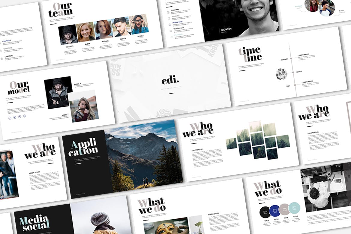
Edi – Animated PowerPoint Template

animated powerpoint template

Designed for creative professionals, Edi is a minimal yet eye-catching template that’s sure to create an impression. It comes with both animated and non-animated slides, fully customizable to your brand’s aesthetic, and image.

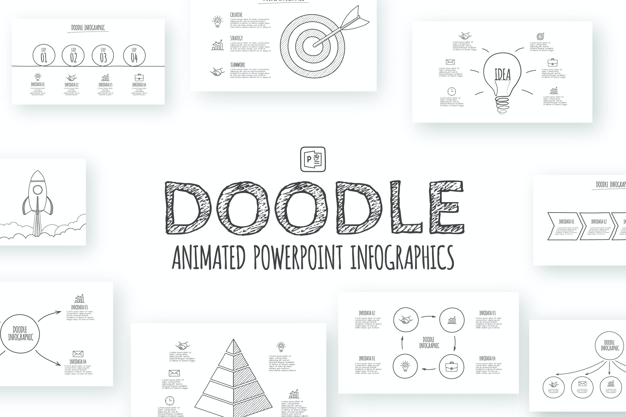
Doodle – Animated PowerPoint Template

animated powerpoint template

Here we have another template that is set with pyramid, goal, circles and other abstract elements. Add it to your shortlist ASAP.

Business Pro – Animated PowerPoint Template

Business Pro - Animated Powerpoint Template

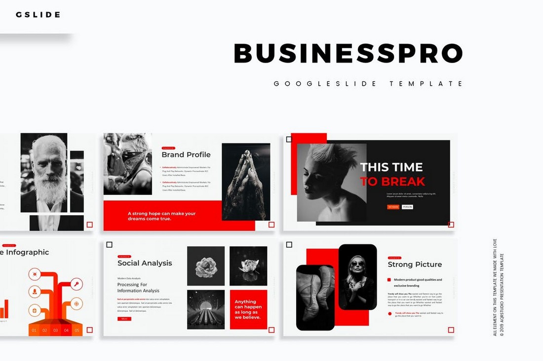
Business Pro is a radical PowerPoint template made for businesses. It comes fully loaded with transition animations and a total of 150 slide designs while keeping its professional looks. You’ll also be able to choose the slides from 5 different color schemes as well.

The Mnml – Minimal PowerPoint Template

The Mnml - Minimal PowerPoint Template

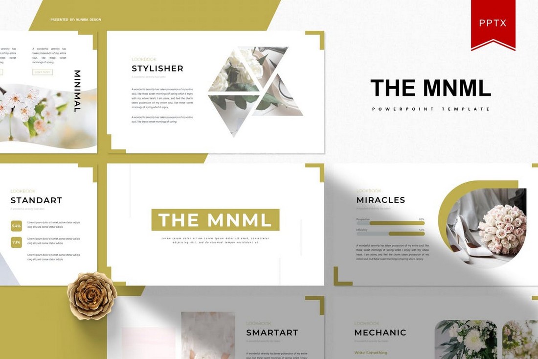
The Mnml features a set of slides with minimal designs. The template includes 30 unique slide layouts. Each slide is available in 5 different color schemes. Along with master slides, image placeholders, and more to let you easily customize the slides.

Fecestyle – Modern Animated PowerPoint Template

Fecestyle - Modern Animated PowerPoint Template

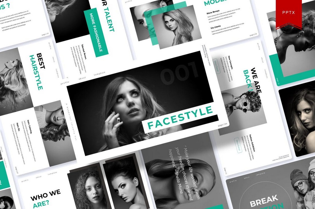
A modern PowerPoint template featuring creative slide designs and transition animations. This template is perfect for creatives and freelancers for making presentations to highlight your skills and promote services. It includes 150 slides.

Shining – Creative Animated PowerPoint Template

Shining - Creative Animated PowerPoint Template

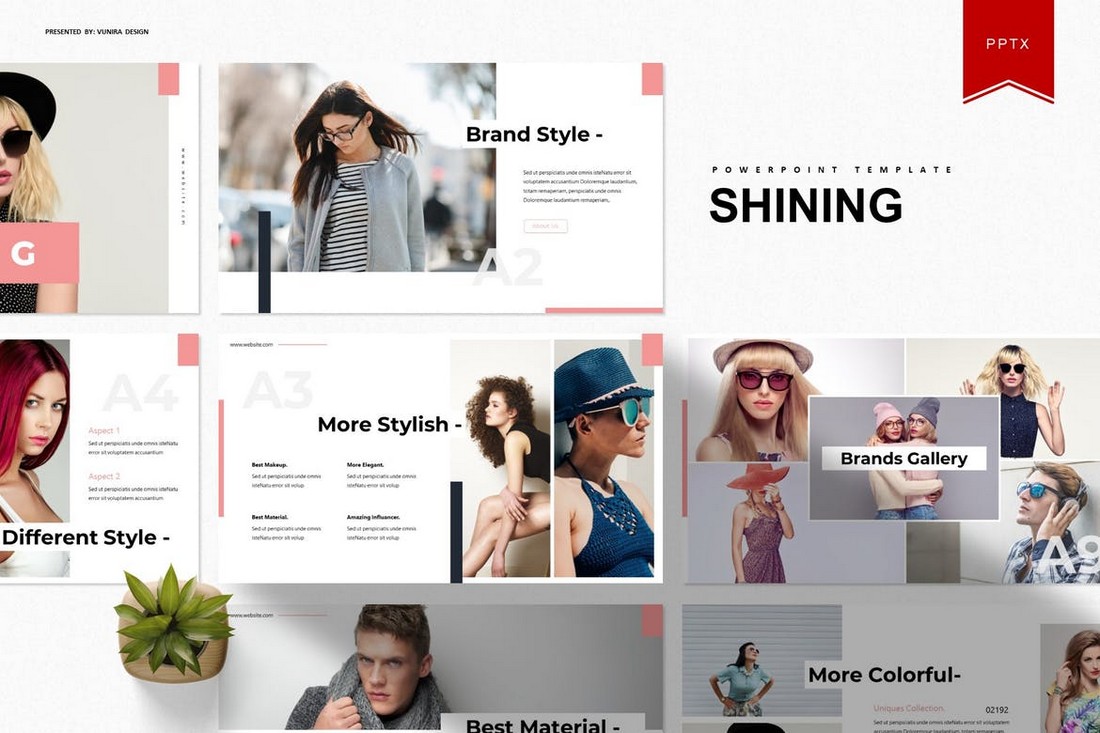
Shining is an animated PowerPoint template that comes with 30 unique slides. The slides are available in 5 different color schemes. It also features master slide layouts, animations, editable graphics, illustrations, and much more as well.

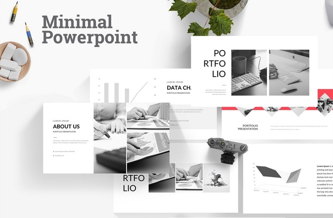
Free Animated Minimal PowerPoint Template

Free Animated Minimal Powerpoint Template

This is a free PowerPoint template featuring a minimal and clean slide design. This template includes 22 unique slides featuring stylish animations. You can use it to create professional portfolios, business profiles, and more.

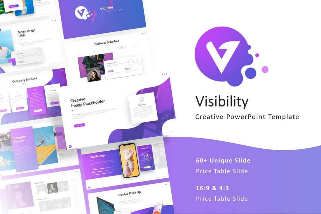
Visibility – Multipurpose PowerPoint Template

Visibility - Multipurpose PowerPoint Template

Featuring a beautiful and modern design, this PowerPoint template allows you to design creative presentations for various occasions. The template includes 50 fully animated slides that are available in both light and dark color themes. Each slide is easily customizable as well.

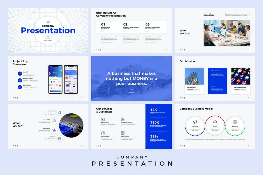
Company Presentation – PowerPoint Template

Company Presentation - Animated PowerPoint Template

This animated PowerPoint template is perfect for creating presentations for business events and meetings. The template includes a total of 500 slides featuring 50 unique slides in 5 different color schemes. It also comes with master slide layouts, editable vector graphics, and more.

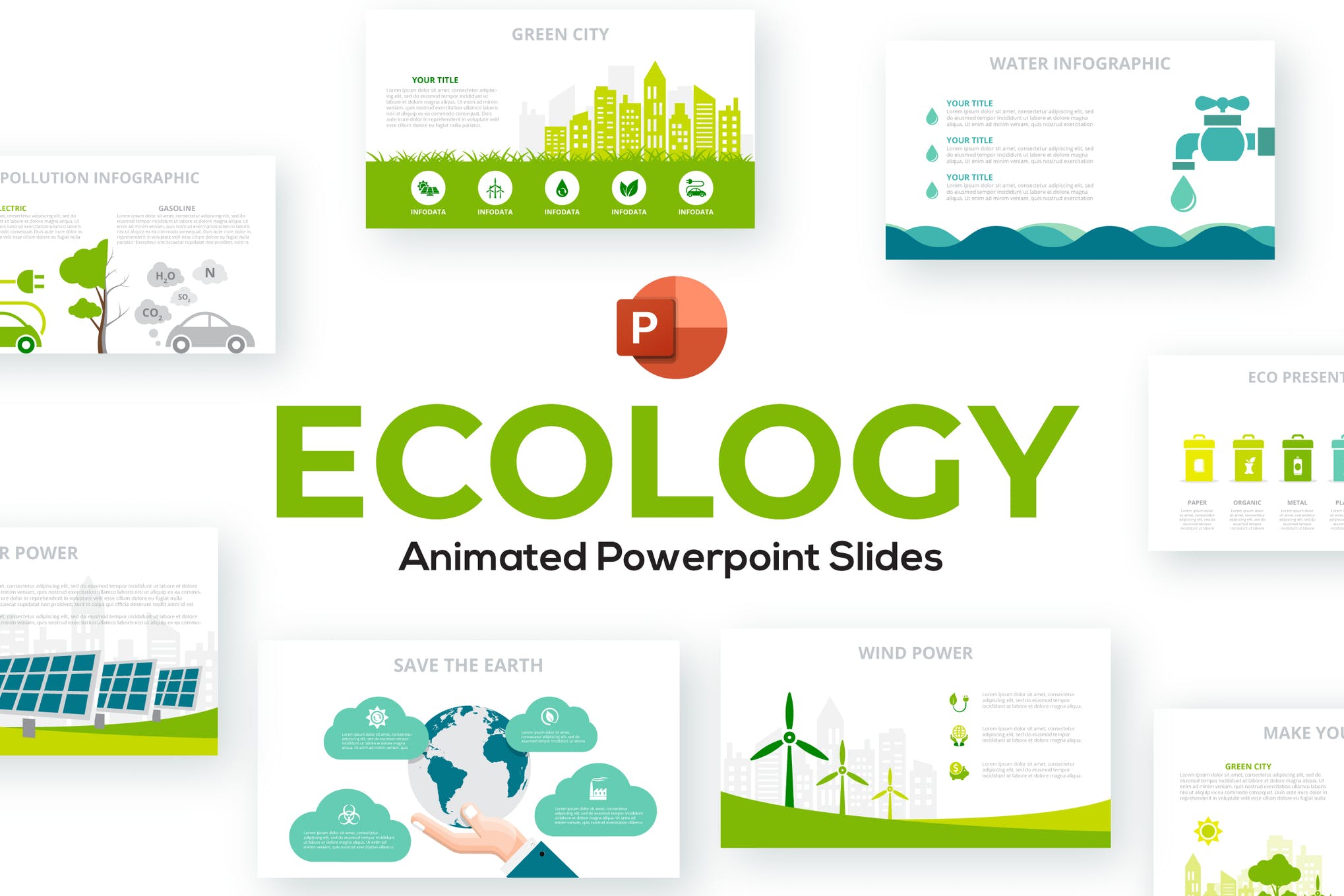
Ecology – Animated PowerPoint Template

animated powerpoint templates

Next in our list of the best animated PowerPoint templates is Ecology, a beautifully crafted presentation format consisting of 28 infographic slide designs, a range of color themes, and easy to edit vector elements.

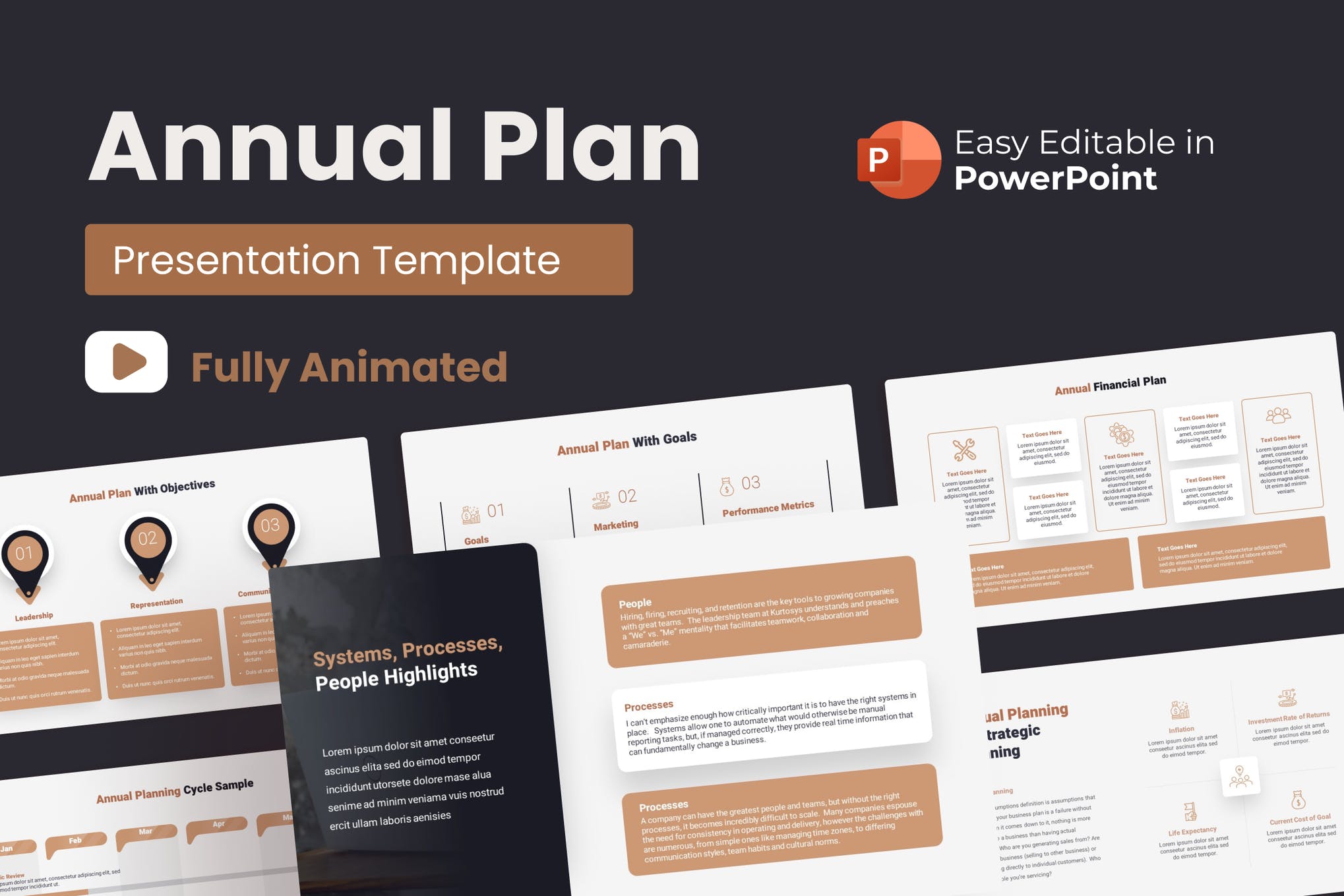
Annual Plan Animated PowerPoint Template

animated powerpoint templates

Use this template to present your plan for the forthcoming year in the most impressive manner. It’s a versatile template that can be easily adjusted for other topics as well. With 35 stunning slides, 10 color modes, and 30 business concepts, it’s one of the best animated PowerPoint templates on our list.

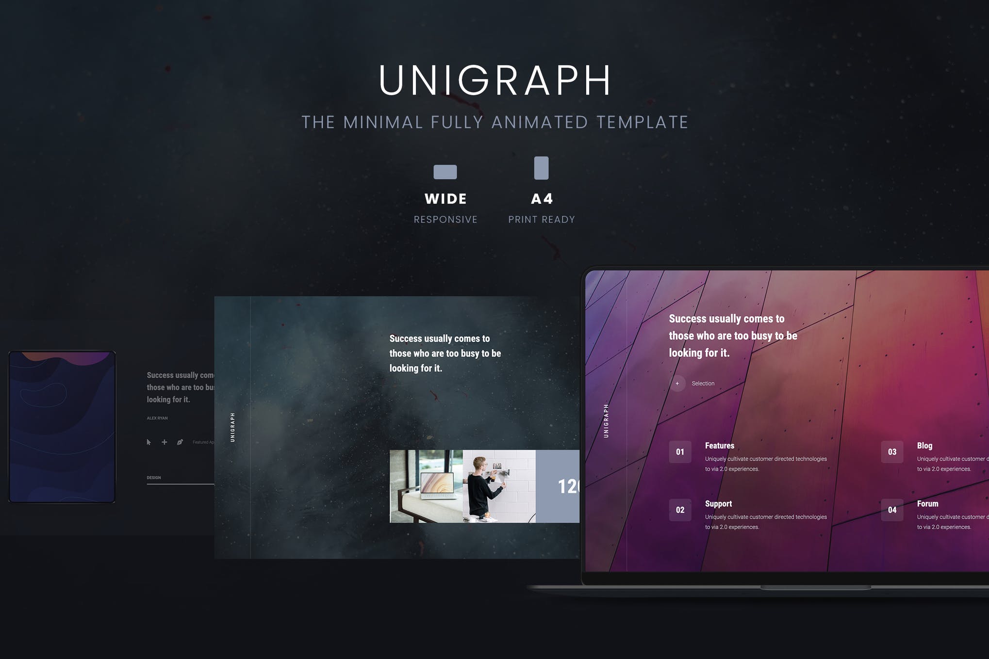
Unigraph – Animated PowerPoint Template

animated powerpoint templates

Unigraph is a minimalistic business template that presents your content in the best way possible. It features an on-trend design, engaging and attention-grabbing slides ensuring you definitely nail your upcoming presentation.

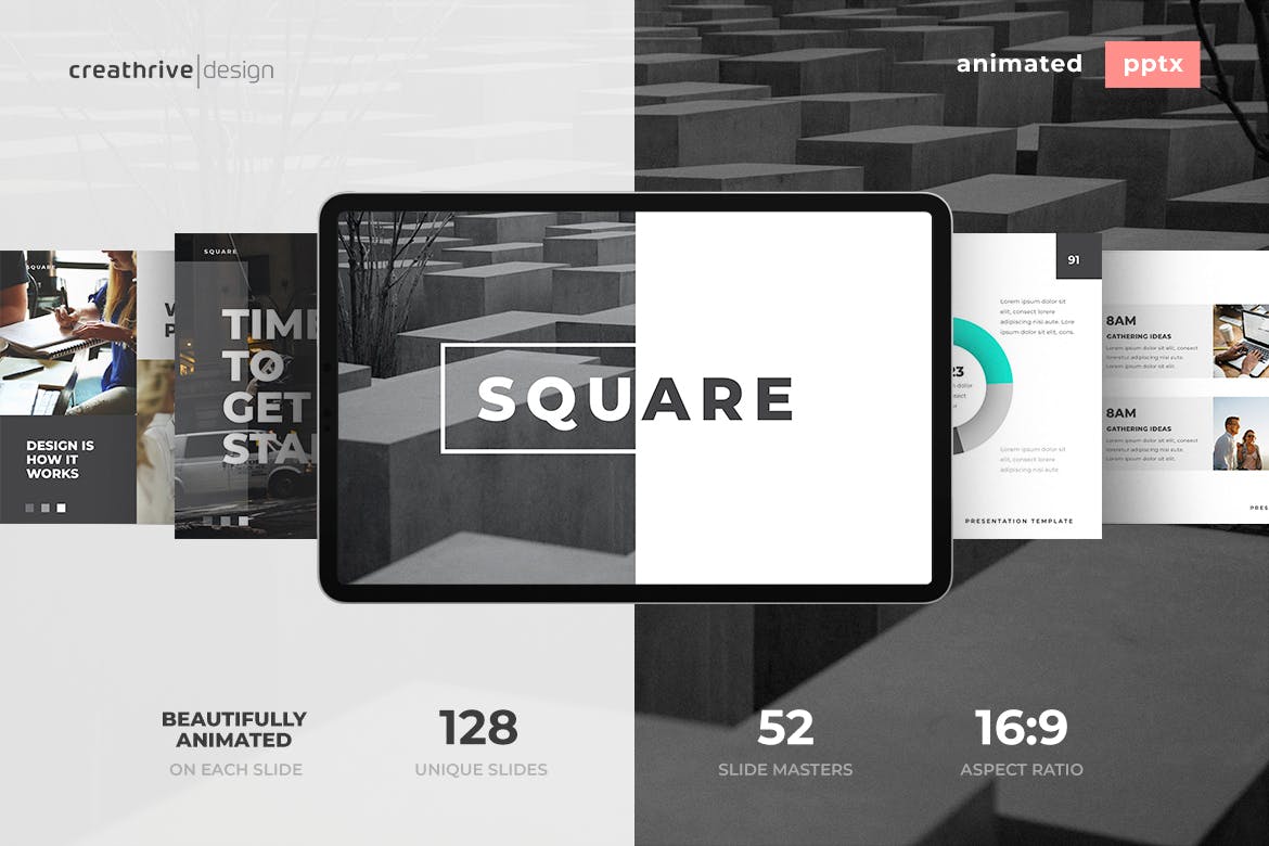
Square – Animated PowerPoint Template

animated powerpoint templates

If you have got a presentation tomorrow, you need a visually engaging and professional template designed as quickly as possible. Consider Square, a gorgeously animated template containing everything you need to get an appreciation for your presentation.

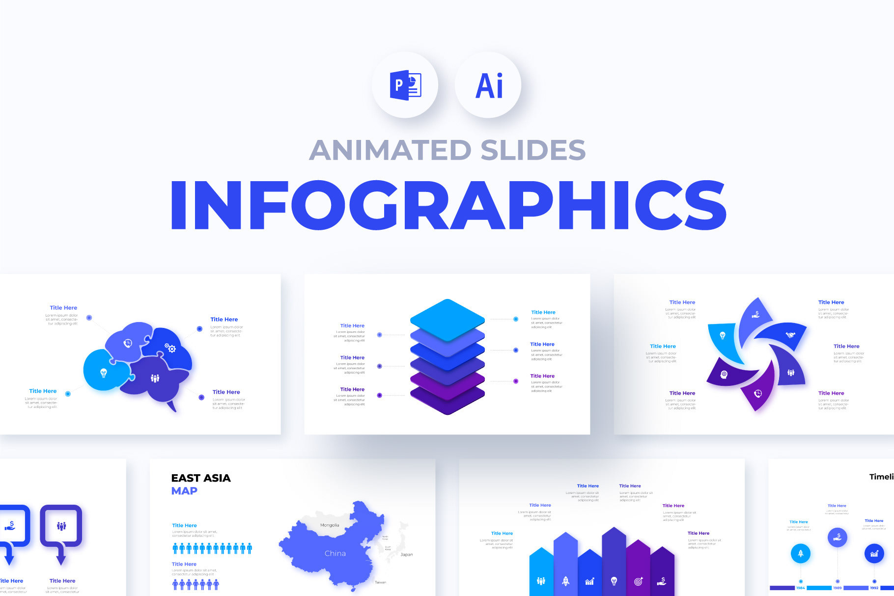
Free Animated PowerPoint Template

animated powerpoint templates

Here we have a fantastic infographics template featuring 10 simple and elegant slides, free fonts, smooth animation, and fully customizable elements. It’s one of the best free animated PowerPoint templates out there!

Allegrasia – Animated Powerpoint Template

Allegrasia - Animated Powerpoint Template

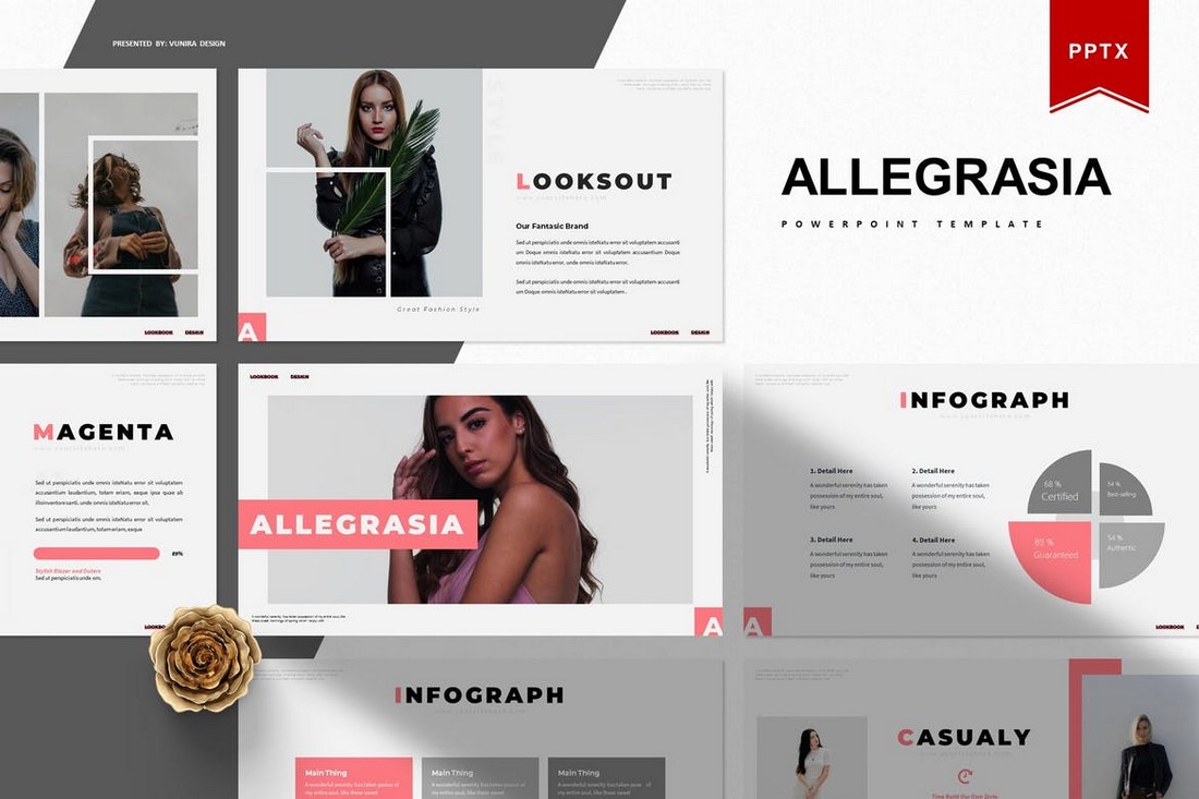
Allegrasia is a modern PowerPoint template that comes with an elegant design. This template includes 30 unique slides in 5 color schemes, making it a total of 300 slides. The template is perfect for creating slideshows for design and lifestyle presentations.

Babel – Minimal Animated Powerpoint Template

Babel - Minimal Animated Powerpoint Template

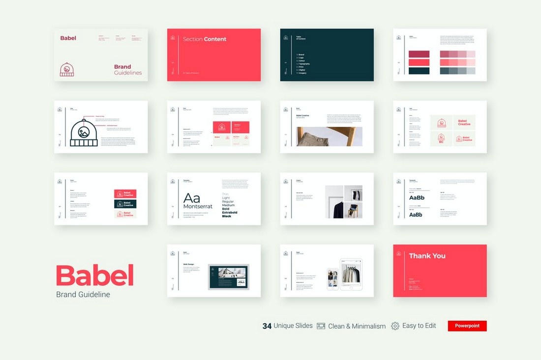
Babel is a unique PowerPoint template you can use to showcase your brand identity and style guide in a presentation. The template is fully animated and comes with 34 unique slides featuring beautifully minimal designs.

Selfone – Free Presentation Template

Selfone - Free Presentation Template

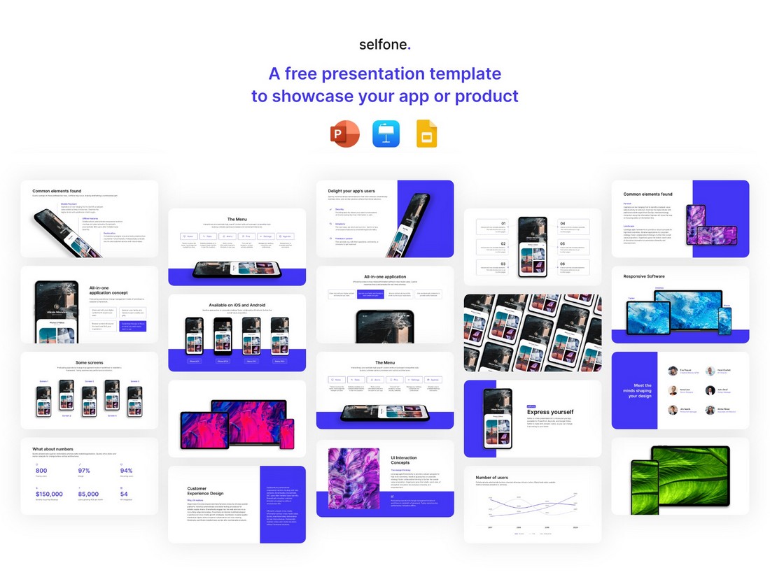
This is a completely free presentation template you can use to create app presentation slideshows. The template comes in multiple formats including PowerPoint, Keynote, and Google Slides as well.

Rivka – Minimal PowerPoint Template

Rivka - Minimal PowerPoint Template

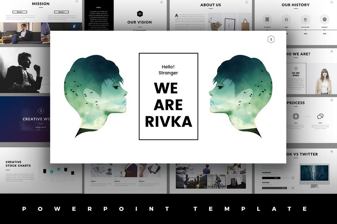
Rivka is a stylish PowerPoint template that features a very visual slide design. There are lots of image placeholders where you can showcase your portfolios, product images, and more in a presentation. The template includes 63 unique slides.

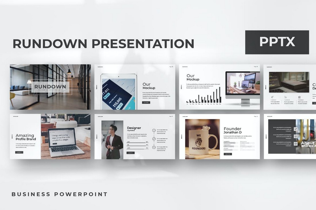
Rundown – Modern Animated Powerpoint Template

Rundown - Modern Animated Powerpoint Template

A modern PowerPoint template with a simple design. This template is ideal for showcasing products and startups. The template comes with more than 50 unique slides with animations. And it includes editable vector graphics, image placeholders, and colors as well.

Viersa – Business Presentation Template

Viersa - Business Presentation Template

The perfect PowerPoint template for designing fashion and design presentations. This template includes an easily customizable design where you can change colors, fonts, and images to design a unique presentation of your own.

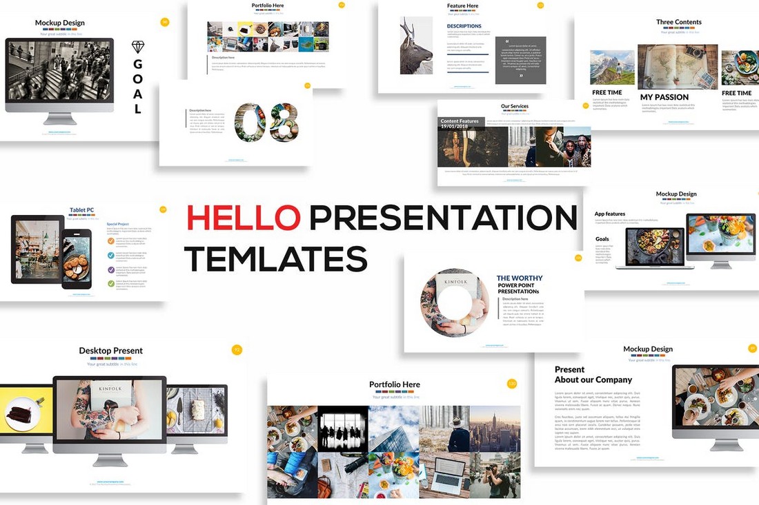
Hello – Animated Powerpoint Presentation

Hello - Animated Powerpoint Presentation

If you’re working on a presentation to showcase a product, service, or a business, this PowerPoint template will come in handy. It comes with a set of modern slides featuring a unique icon pack, free fonts, and simple animations.

Smash – Free Animated PowerPoint Template

Smash - Free Animated PowerPoint Template

Smash is a beautiful and modern PowerPoint template featuring a dark and elegant color theme. This template is free for you to download and use. It features more than 100 animated slides.

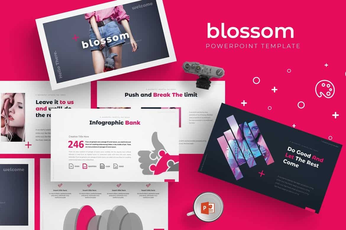
Blossom – Animated PowerPoint Template

Blossom - Animated Powerpoint Template

Blossom is a modern PowerPoint presentation template that comes with a set of fully animated slides. It includes a total of 150 slides in 5 different premade color schemes with 30 unique slides in each template. This template is perfect for modern business and startup presentations.

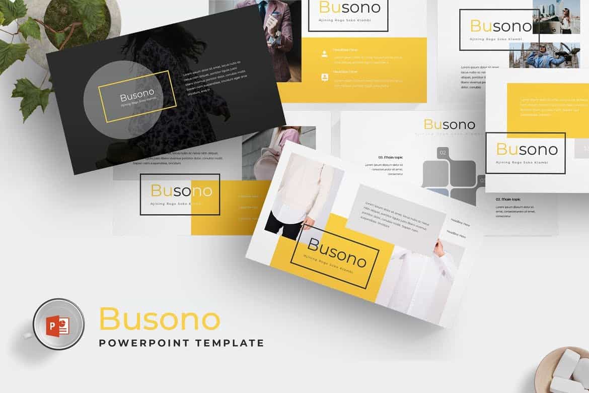
Busono – Creative PowerPoint Template

Busono - Creative Powerpoint Template

Busono features a creative and minimal design that makes it the perfect choice for designing creative design and marketing related presentations. The template comes with 30 unique slides and you get to choose from 5 different color themes to match your branding.

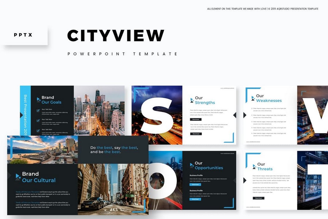
Cityview – Visual PowerPoint Template

Cityview - Visual Powerpoint Template

Cityview is a stylish PowerPoint template that features a modern slide design with plenty of space for showcasing images. The template includes 150 total slides and comes with creative slide animations as well.

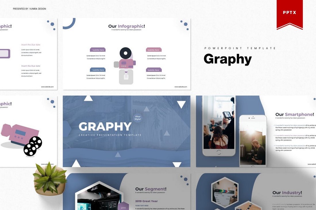
Graphy – Creative PowerPoint Template

Graphy - Creative Powerpoint Template

If you’re looking for a clean and minimal PowerPoint template to deliver a presentation driven by statistics and data, this template is perfect for you. It includes 30 unique slides in 5 color schemes featuring slide designs for visualizing data.

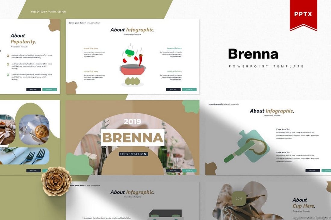
Brenna – Modern PowerPoint Template

Brenna - Modern Powerpoint Template

Brenna is another creative and minimalist PowerPoint template that’s ideal for making presentations for creative agencies, startups, and shops. The template comes with a total of 150 slides featuring vector graphics, infographics, and more.

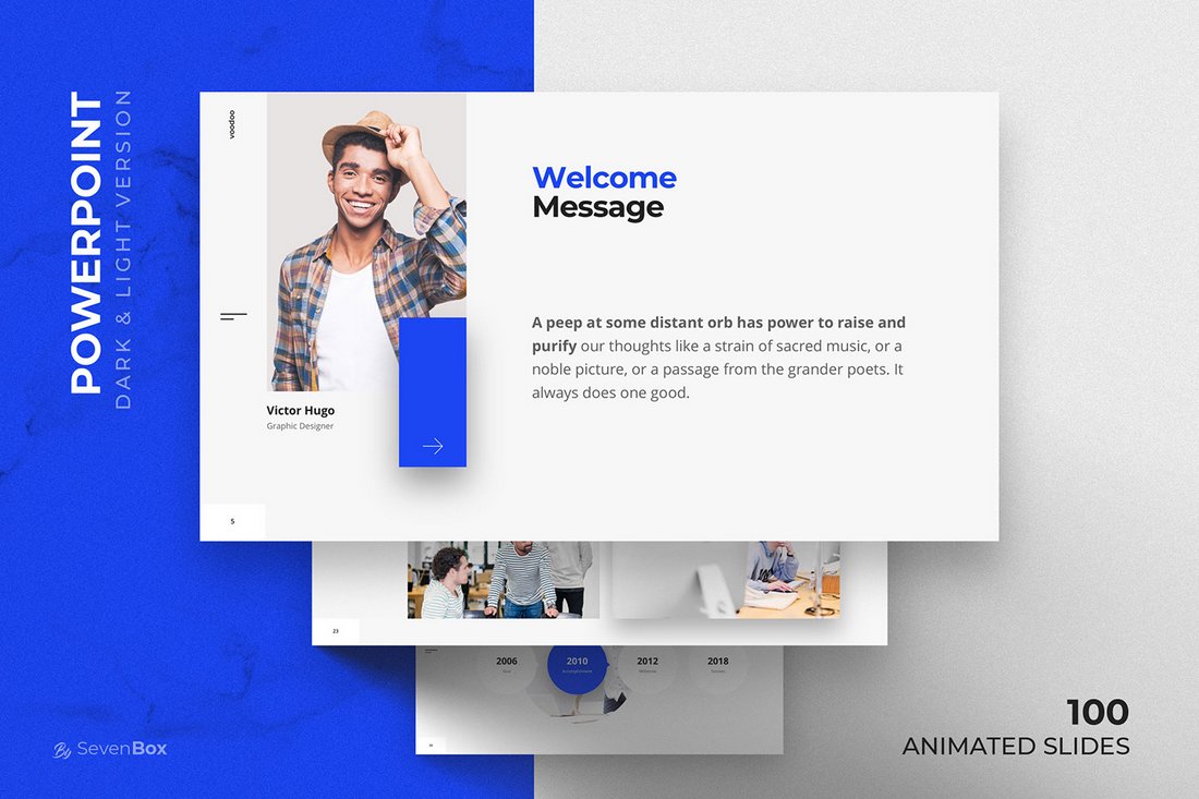
Voodoo – Free Animated PowerPoint Template

Voodoo - Free Animated PowerPoint Template

VooDoo is a clean and modern PowerPoint template you can use for free with your personal projects. The free version of the template includes 10 unique slides in light and dark color themes.

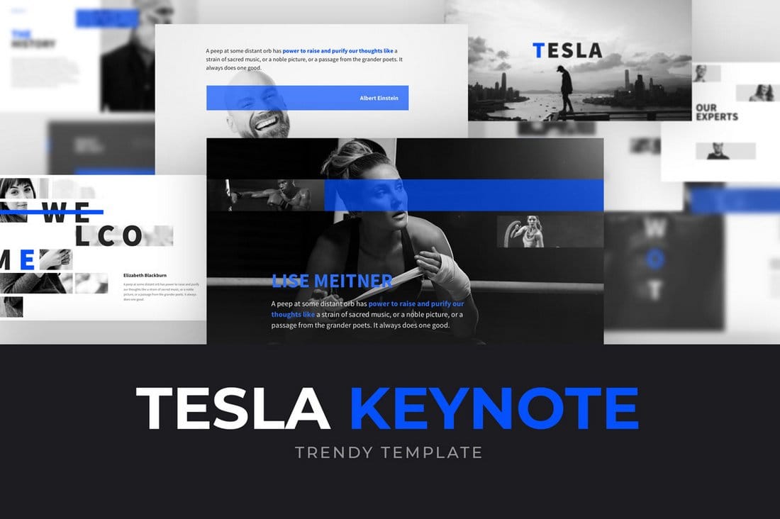
Tesla – Free PowerPoint Template

Tesla - Free Powerpoint Template

Tesla is a professional PowerPoint template you can use to create business and professional presentations. The template includes 10 free slides with editable designs.

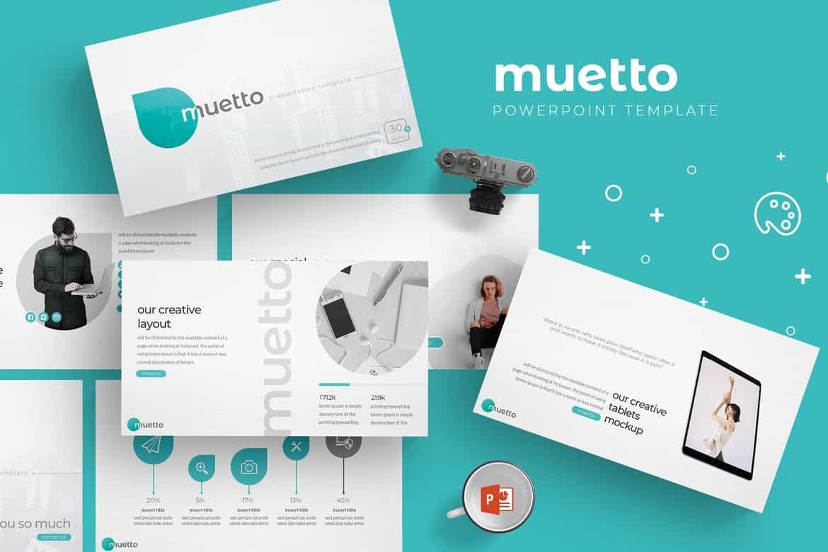
Muetto – Modern PowerPoint Template

Muetto - Modern Powerpoint Template

Muetto is a minimalist and fully animated PowerPoint presentation template featuring all kinds of slides, such as gallery slides and portfolio slides as well as lots of infographics, illustrations, icons, image placeholders, and much more to customize the design of the slides.

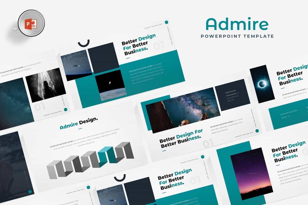
Admire – Design Portfolio PowerPoint Template

Admire - Design Portfolio Powerpoint Template

Admire is most suitable for making portfolio presentations for creative professionals and design agencies. The PowerPoint template includes a total of 150 slides featuring editable vector graphics and image placeholders.

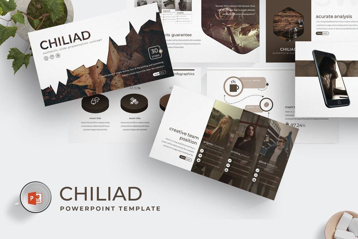
Chiliad – Visual PowerPoint Template

Chiliad - Visual Powerpoint Template

Chiliad is a highly visual PowerPoint template that allows you to tell your story and message with slides filled lots of images. The template comes with 30 unique slides in 5 premade color schemes. All of the slides are fully animated as well.

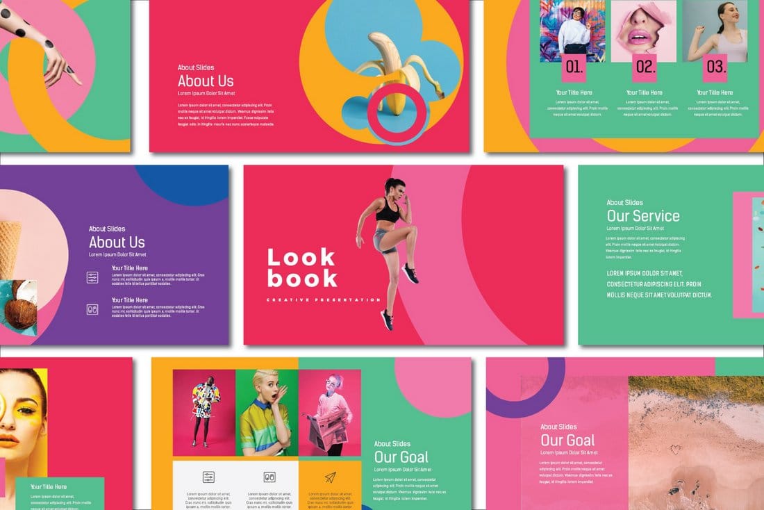
Lookbook – Free Pastel Presentation Template

Lookbook - Free Pastel Presentation Template

This free creative and colorful PowerPoint template is perfect for making attractive slideshows for design and fashion related presentations. It’s free to use with your personal projects.

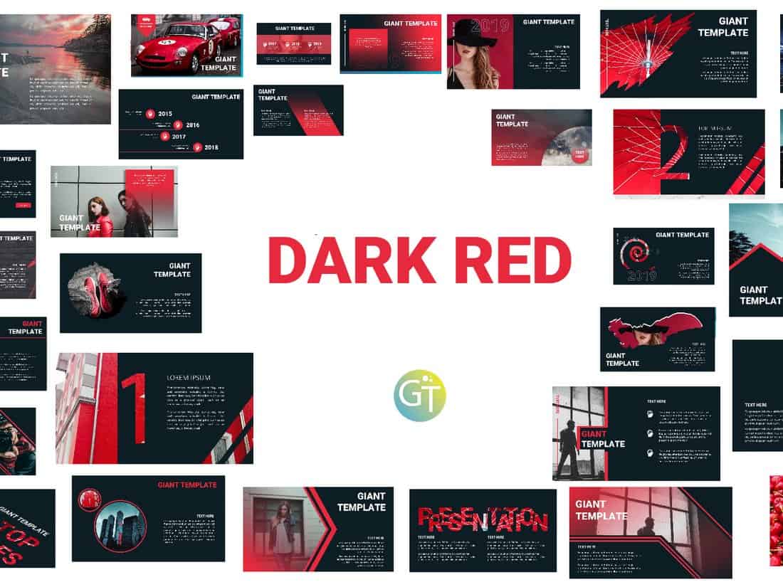
Dark Red – Free PowerPoint Template

Dark Red - Free Powerpoint Template

Dark Red is a professionally designed PowerPoint template featuring 30 unique slides. You can download the template for free and use it with your personal projects to create modern presentations.

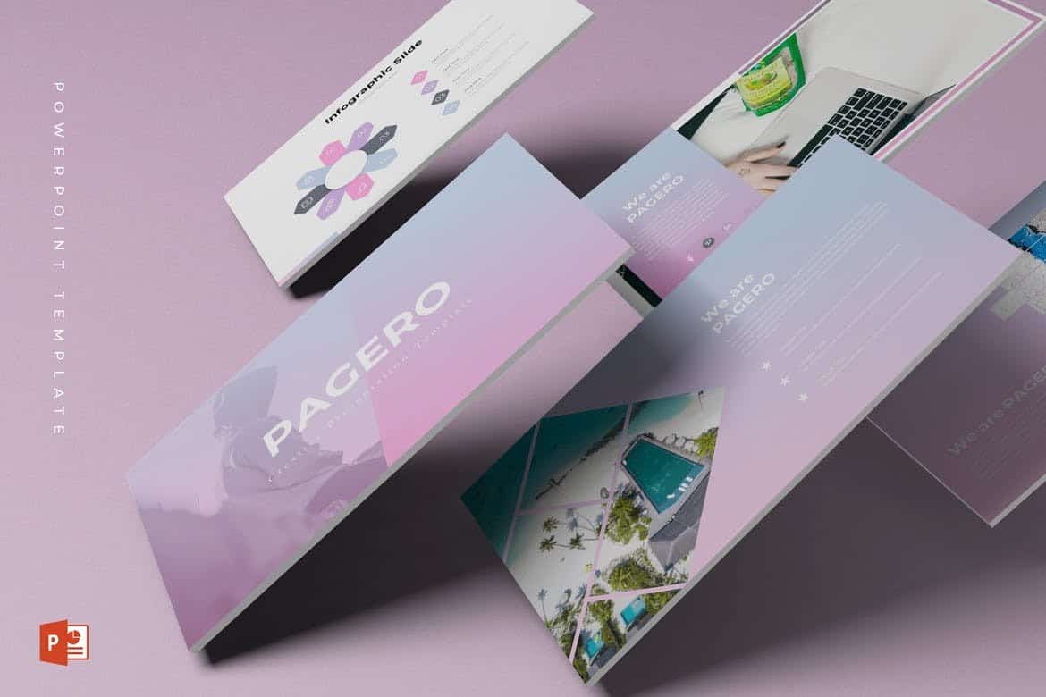
Pagero – Stylish PowerPoint Template

Pagero - Stylish Powerpoint Template

Pagero PowerPoint template comes with a colorful and attractive design. It’s most suitable for making presentations for fashion design and beauty related product presentations. The template can also be customized to fit other types of presentations as well.

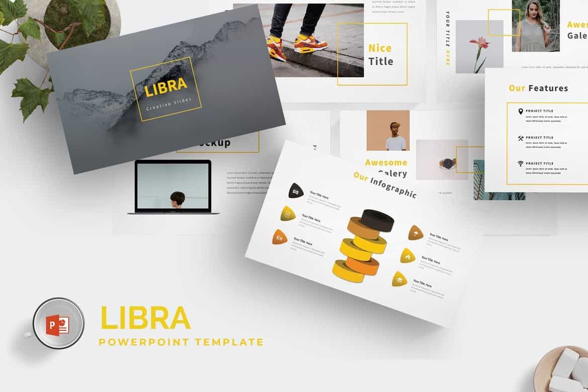
Libra – Business PowerPoint Template

Libra - Business Powerpoint Template

Libra is a creative PowerPoint template you can use to make professional and modern slideshows for business and marketing related presentations. The template comes with a total of 150 slides featuring 5 different color themes.

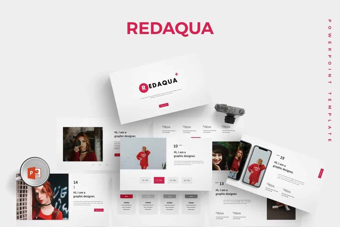
Redaqua – Minimal PowerPoint Template

Redaqua - Minimal Powerpoint Template

Redaqua features an attractive and minimalist slide design for making presentations for creative professional, startup, and agency related events. The template also includes lots of device mockups, infographics, image placeholders, and icon packs as well.

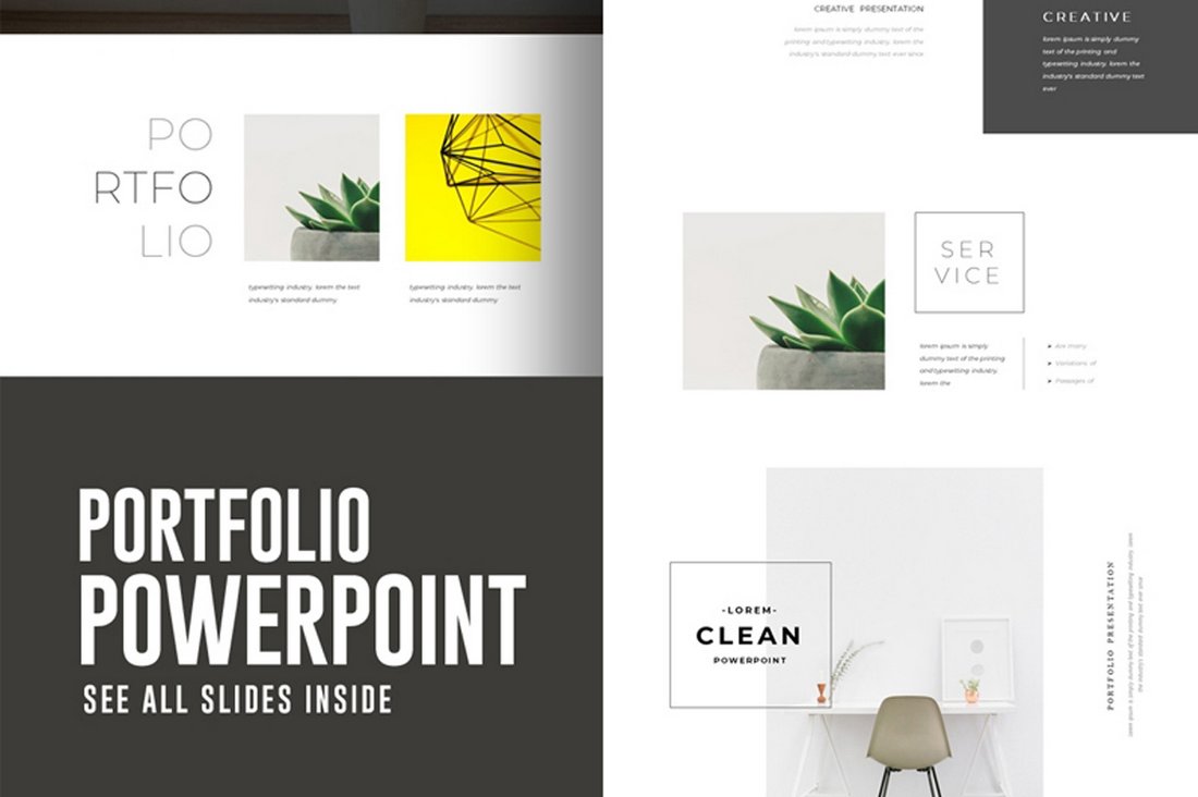
Portfolio – Free PowerPoint Presentation Template

Portfolio - Free PowerPoint Presentation Template

If you’re looking for a simple PowerPoint template to showcase your portfolio, this free template will come in handy. It features 10 unique slides with easily editable layouts and drag and drop image placeholders.

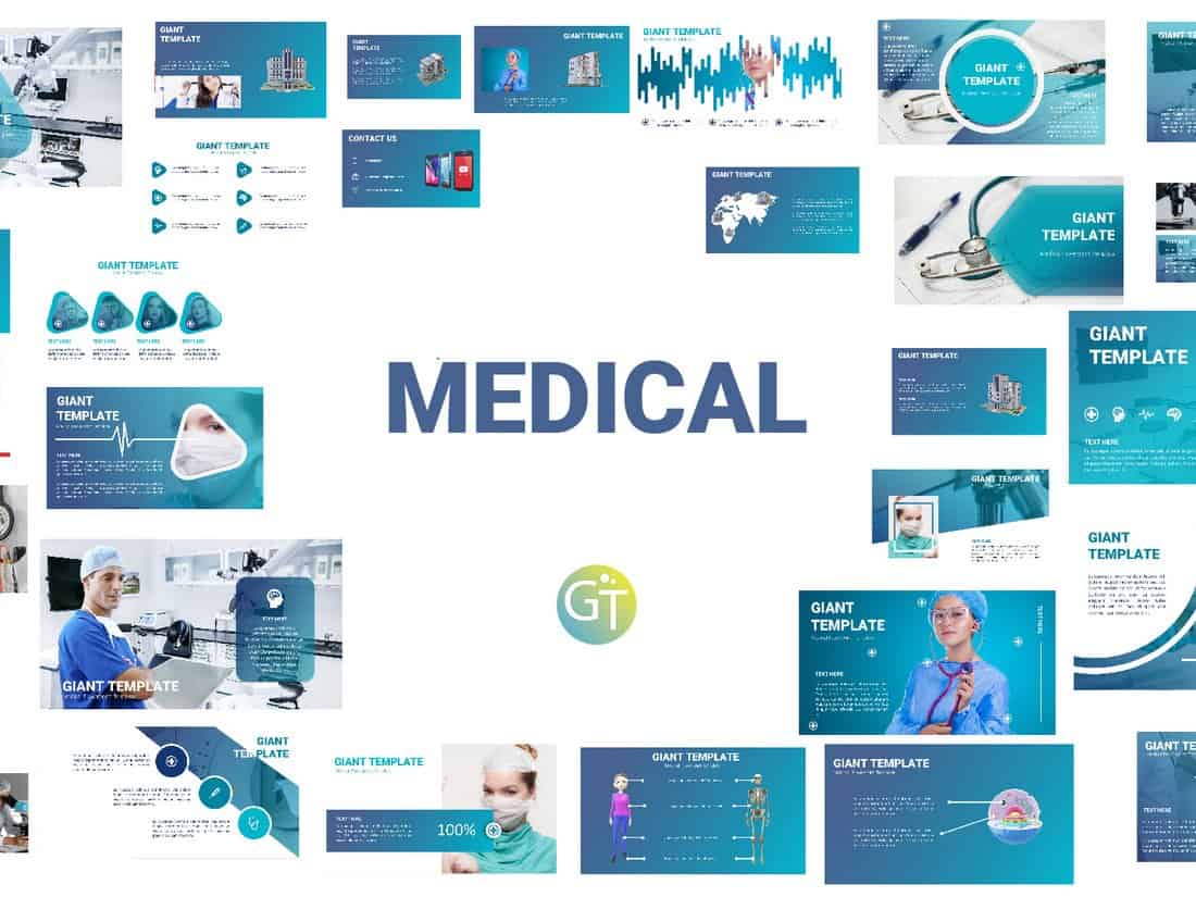
Free Animated Medical PowerPoint Template

Free Animated Medical PowerPoint Template

This free PowerPoint template comes with 30 unique slides designed for making medical themed presentations. All of the slides are fully animated to make your presentation look more attractive.

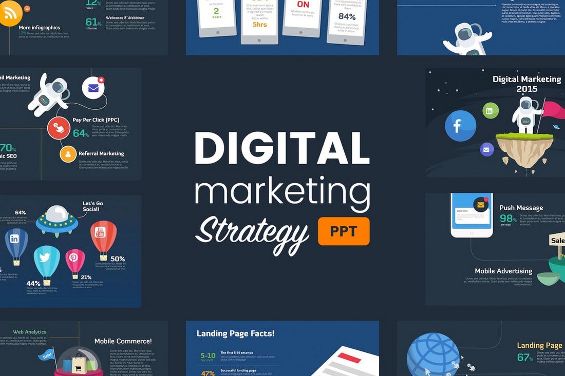
Digital Marketing Animated Powerpoint Template

Digital Marketing Strategy Powerpoint Template

This beautifully designed PowerPoint template comes with more than 40 unique slides filled with transition effects and object animations. The template is designed specifically for creating marketing and promotional presentations and it includes 2 pre-made themes.

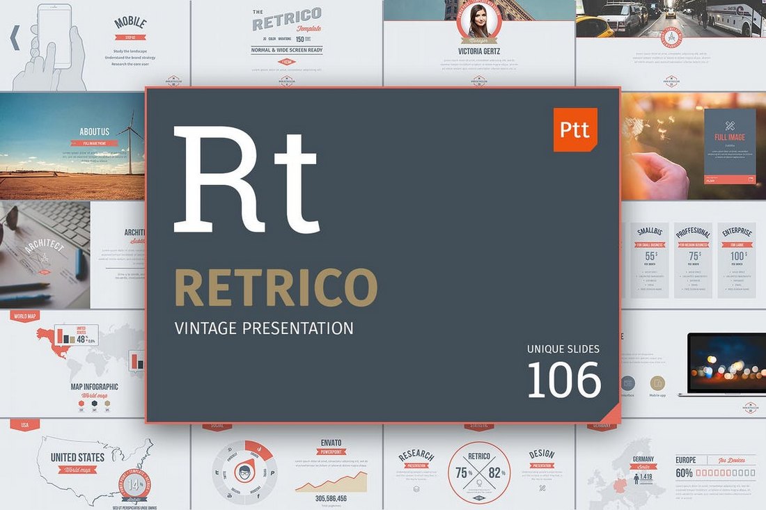
Retrico – Vintage Slides PowerPoint Template

Retrico - Vintage Slides PowerPoint Template

Retrico is an elegant PowerPoint template that features classic retro-themed slide designs. It includes more than 100 unique slides with animations. The presentation template is also available in 3 different color schemes.

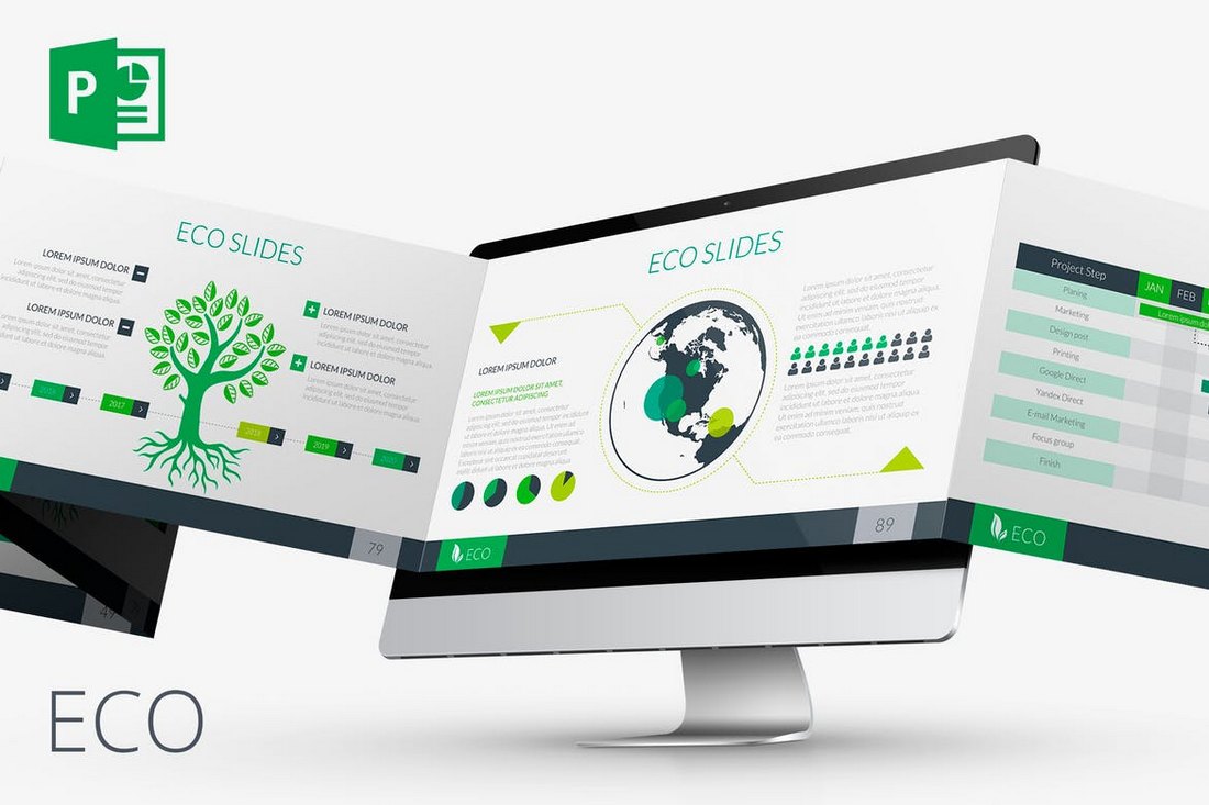
ECO – Animated PowerPoint Template

ECO Animated PowerPoint Template

This PowerPoint template is made for creating presentations for environmental and nature-themed slideshows. It features a very green and eco design and includes 80 unique slides. The template is available in both animated and non-animated versions as well.

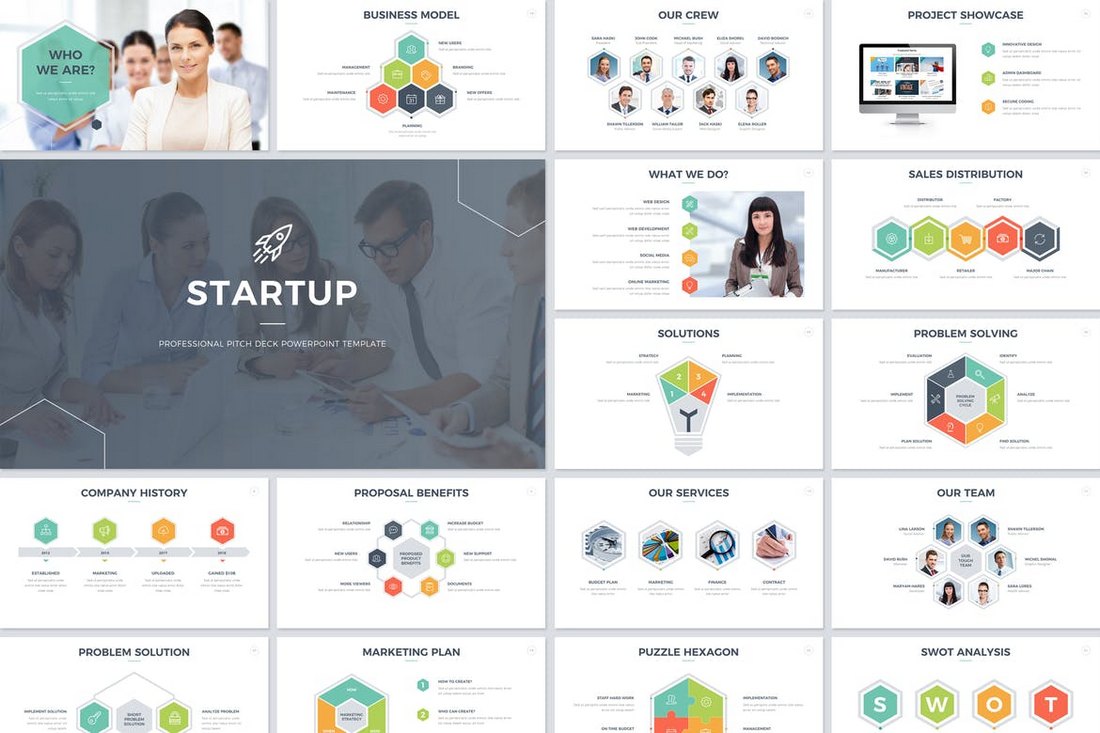
Startup Pitch Deck PowerPoint Template

Startup Pitch Deck PowerPoint Template

If you’re working on a presentation to pitch a startup or a product to investors, this PowerPoint template will come in handy. It comes with a total of 200 slides featuring transition animations and effects. A non-animated version is also included in this bundle.

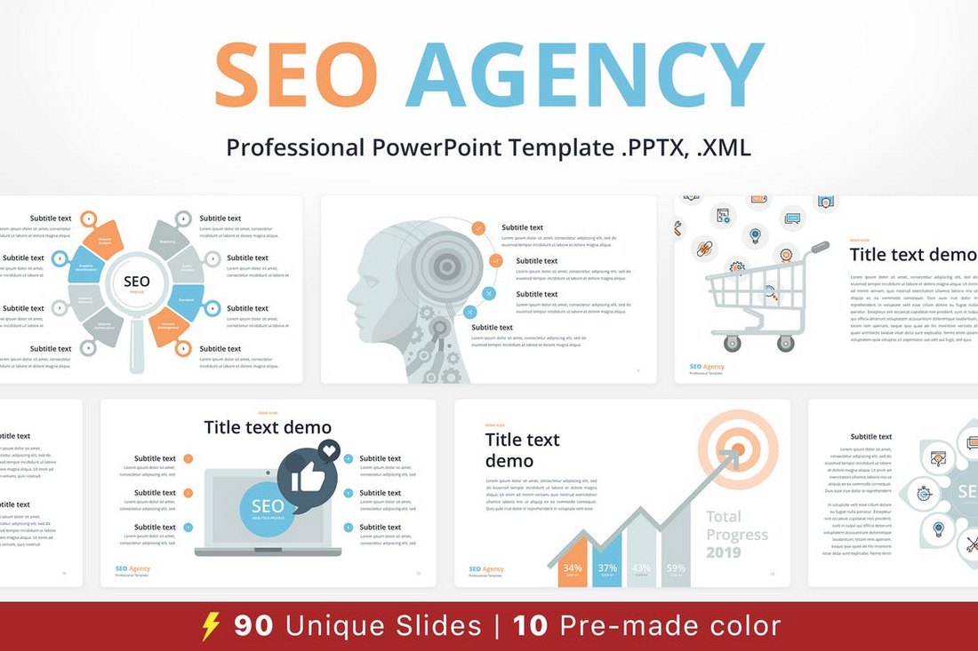
SEO Agency – Animated PowerPoint Template

SEO Agency - Animated PowerPoint Template

Promoting SEO services and convincing clients of its importance can be difficult at times, this animated PowerPoint template is crafted to ease up that process. This template includes 90 unique slides and it comes with 10 different color schemes.

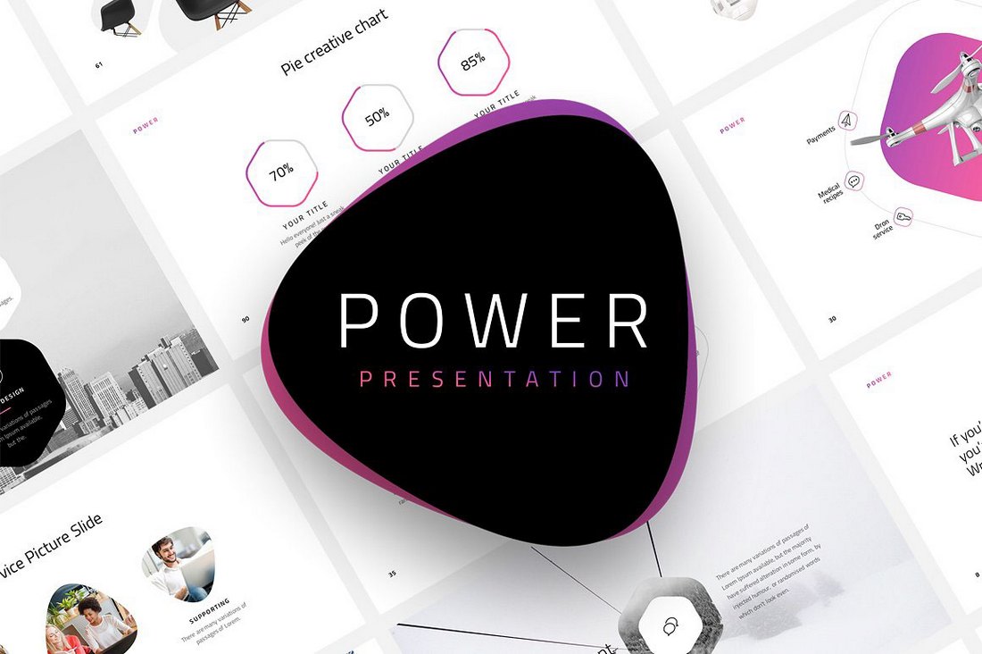
Power – Dynamic Animated PowerPoint Template

Power - Dynamic Animated PowerPoint Template

Power is a beautiful PowerPoint template that features dynamic animations and transition effects. This premium-quality presentation template comes with 120 unique slides and in 20 different color themes. You can use it for your personal and commercial projects.

POP ART – Free Pastel PowerPoint Template

POP ART – Free Pastel PowerPoint Template

Pop Art is a free PowerPoint template that comes with a stylish slide design featuring attractive pastel colors. It’s ideal for showcasing products and portfolios.

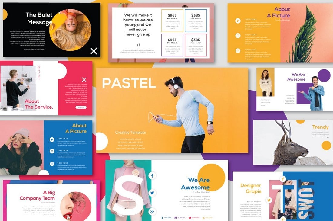
Pastel  – Free Modern PowerPoint Template

Pastel - Free Modern PowerPoint Template

Pastel is another colorful PowerPoint template featuring lots of attractive slides for showcasing fashion and apparel designs. The template can be used for various business, agency, and creative presentations.

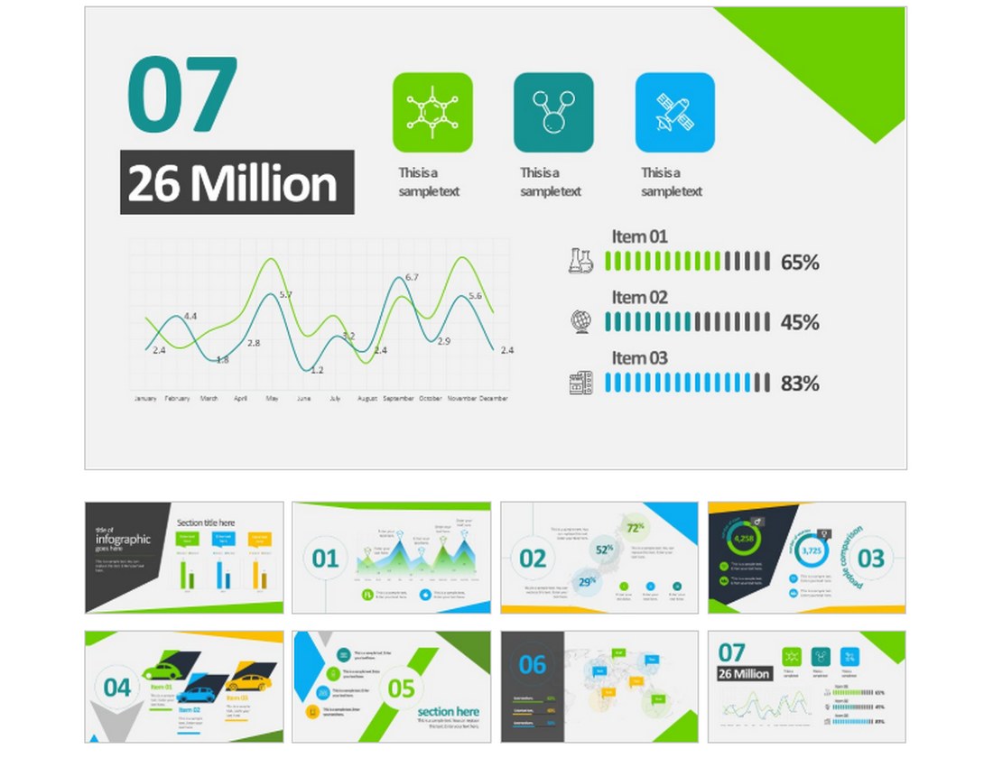
Animated Business Infographics PowerPoint Template

Animated Business Infographics PowerPoint Template

This free PowerPoint template features a set of slides filled with unique and customizable infographics and charts. You can use these graphs and charts to effectively present your data to your audience.

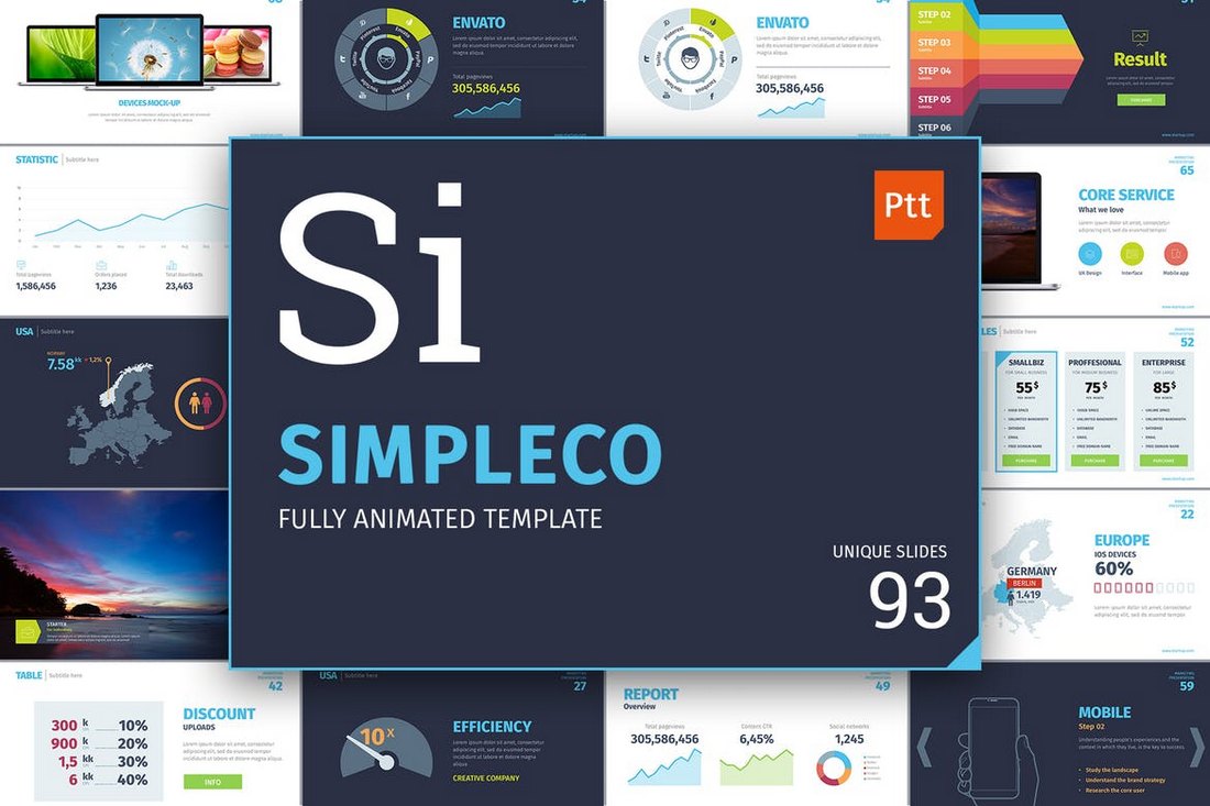
SIMPLECO – Animated Powerpoint Template

SIMPLECO - Animated Powerpoint Template

Simpleco is a colorful PowerPoint template that includes 93 unique slides featuring lots of charts, graphs, infographics, and more. All of the slides in this template are animated and designed based on master slides. The template is available in 2 different color themes.

Clean Business Presentation Template

Clean Business Presentation Template

This clean and minimal PowerPoint template is perfect for presenting your business, product, or startup to clients and investors. It includes 50 unique slides and comes with lots of transition effects and animations.

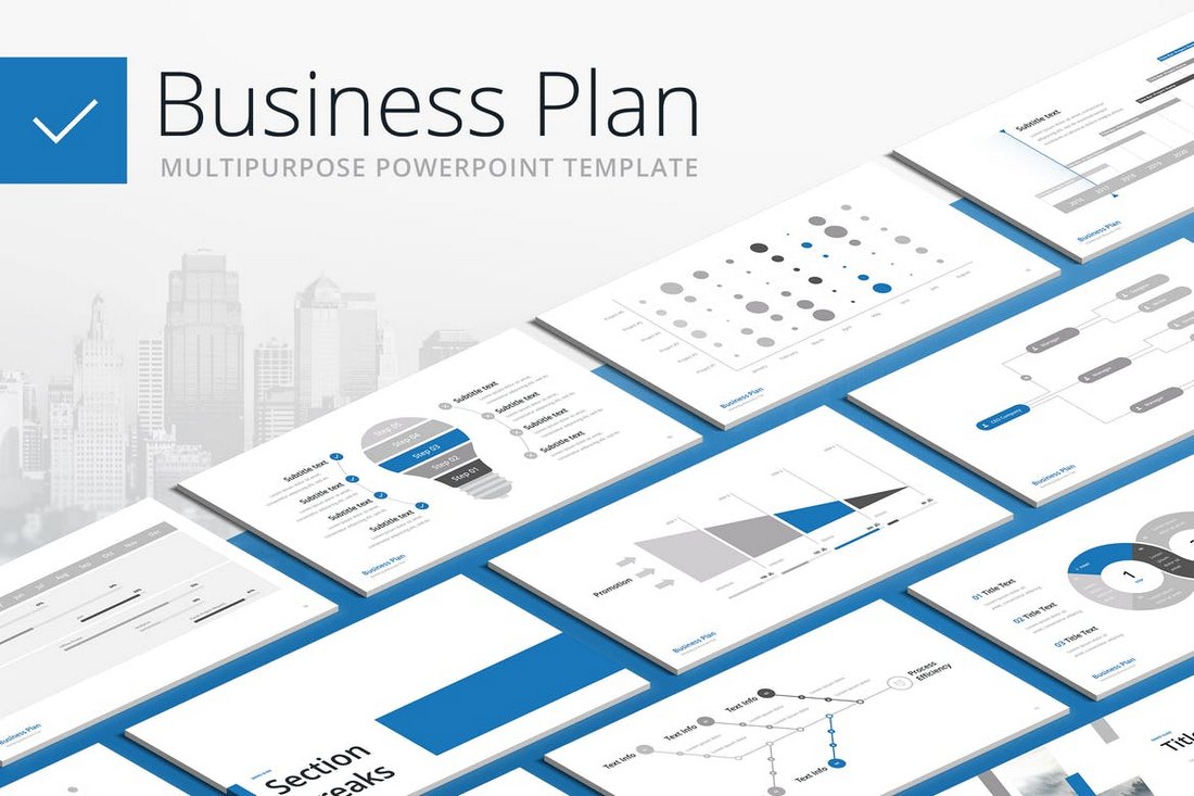
Business Plan – Multipurpose PowerPoint Template

Business Plan - Multipurpose PowerPoint Template

Make your business plan look more effective and engaging by using this animated PowerPoint template. This template comes with a design that can be used to craft many different types of business related presentations. It includes 100 unique slides in 20 different color themes.

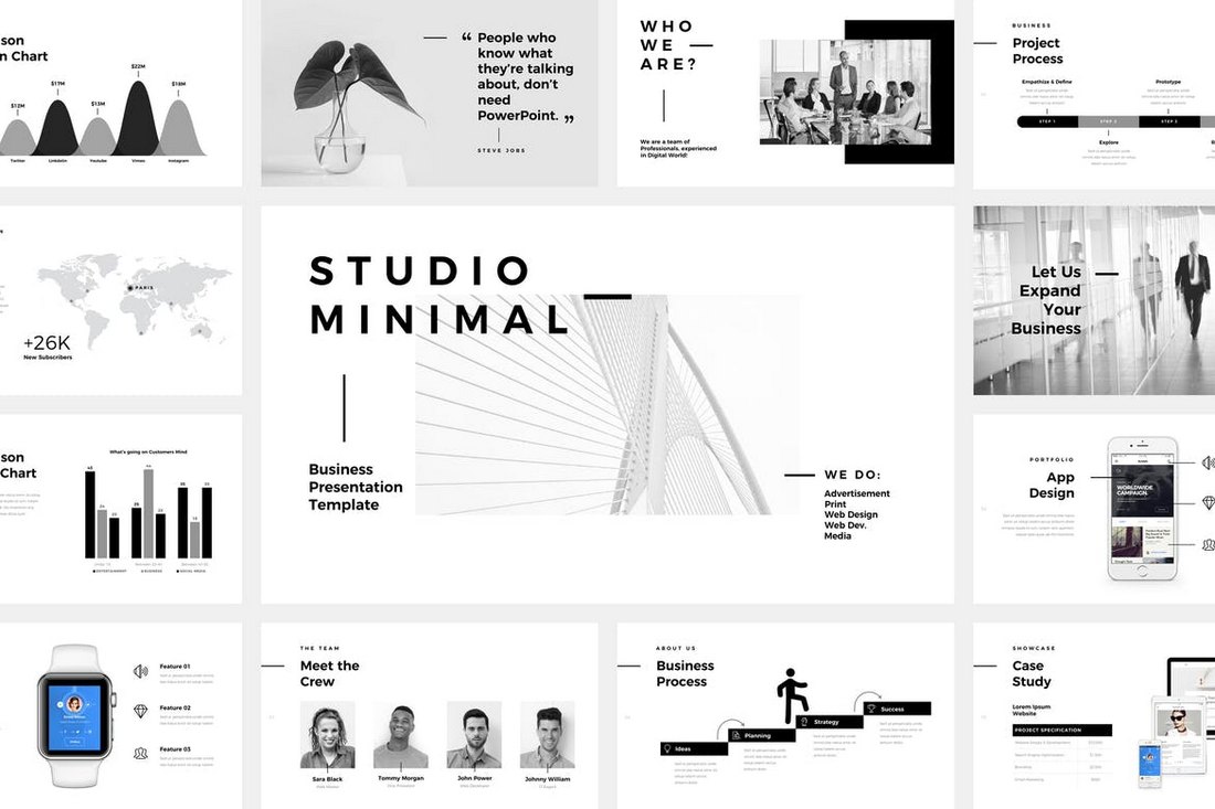
Studio Minimal – PowerPoint Template

Studio Minimal - PowerPoint Template

This PowerPoint presentation template comes with a minimalist and a clean design. It’s made specifically for creative professionals and agencies. The template includes 120 unique slides featuring stylish animations and more than 4000 line and vector icons.

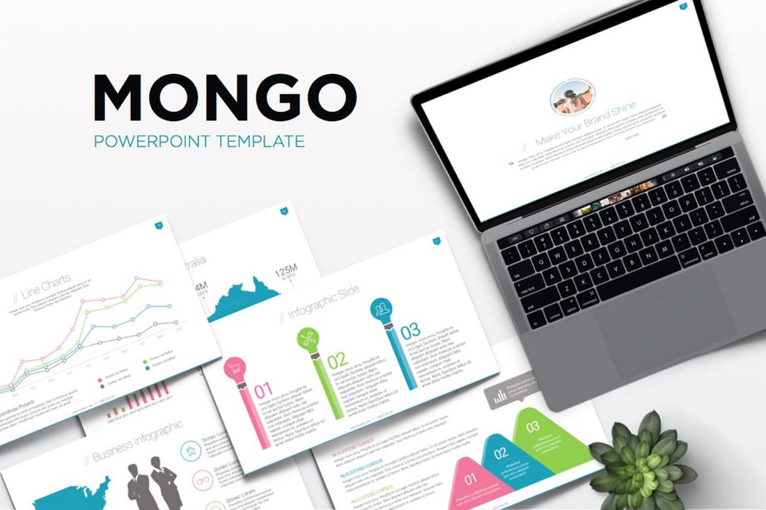
Mongo – Animated Powerpoint Template

Mongo - Animated Powerpoint Template

Mongo is a professional PowerPoint template made for businesses and corporate agencies. It includes a total of 300 slides in both light and dark color themes. The template is available in 3 different color versions and includes placeholders for easy editing.

Free Business Strategy Powerpoint Template

Free Business Strategy Powerpoint Template

This free PowerPoint template comes with a set of minimalist slides featuring creative transition effects and animations. It’s perfect for presenting a simple business strategy during a meeting or to your target audience.

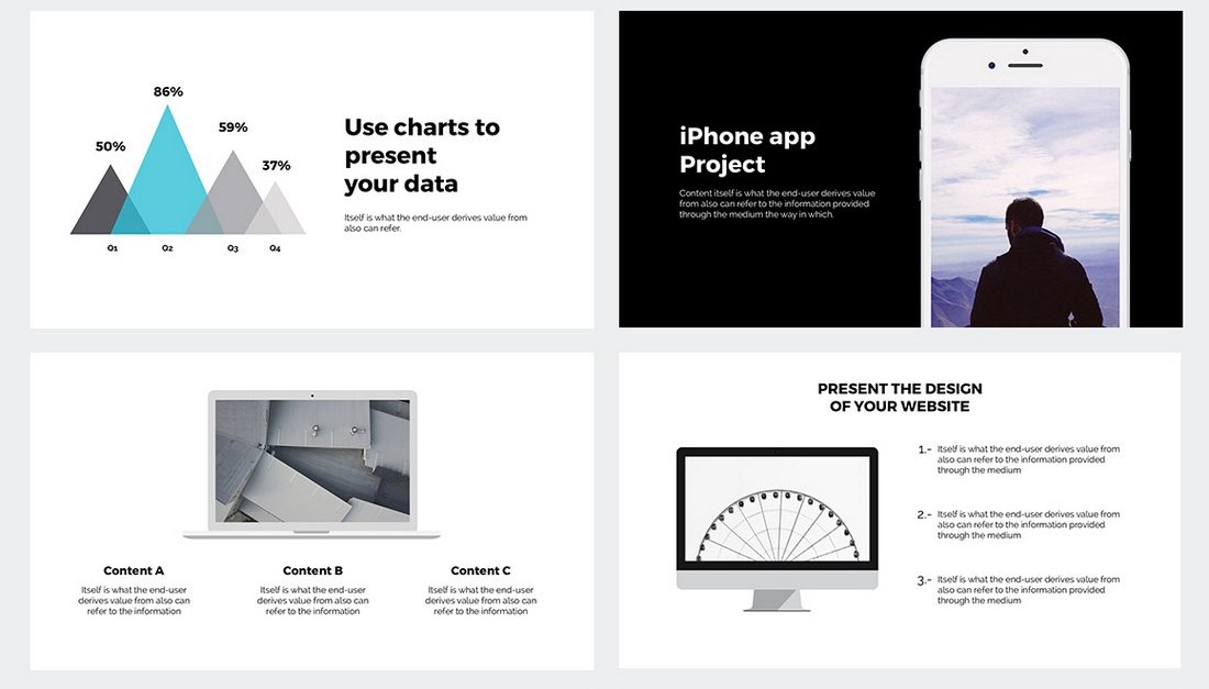
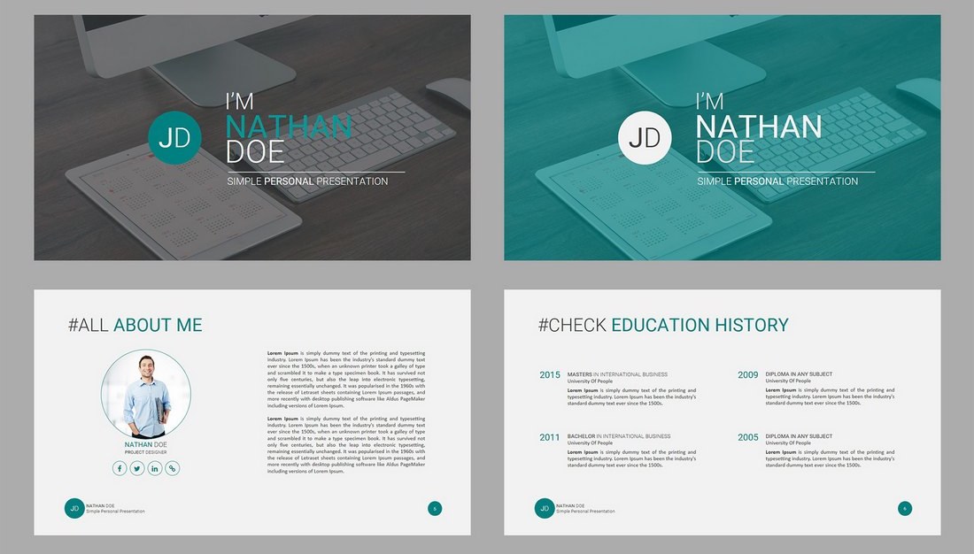
JD – Personal Powerpoint Presentation Template

JD - Personal Powerpoint Presentation Template

Another free and animated PowerPoint template that comes with high-quality slides made specifically for promoting your skills and services. This template is ideal for freelancers, coaches, and instructors.

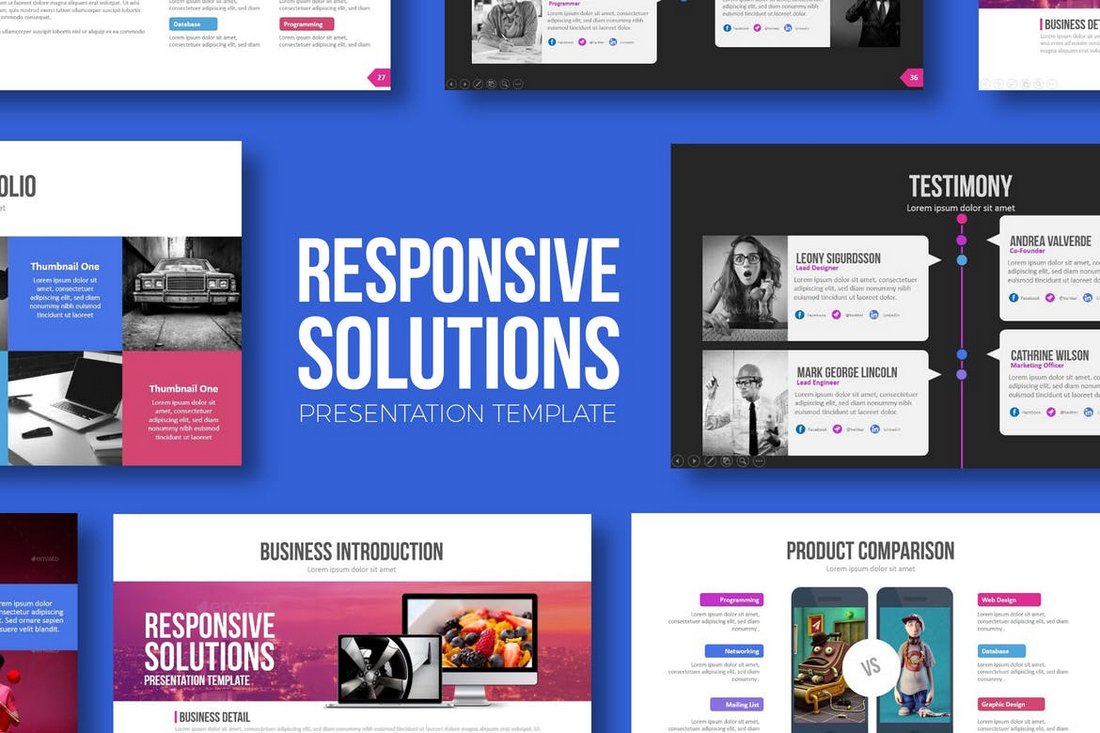
Responsive Solutions – Powerpoint Template

Responsive Solutions Powerpoint Template

This creative PowerPoint presentation template comes with a total of 480 slides featuring 60 unique slides. The template is available in 5 different color schemes and in both light and dark color themes.

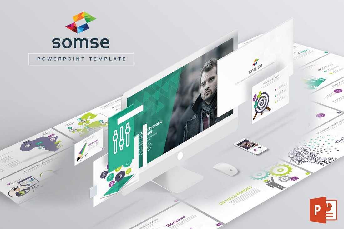
Somse – Animated Powerpoint Template

Somse Powerpoint Template

Somse is a PowerPoint presentation template that features a minimal design for creating both personal and business related presentations. It includes 108 multipurpose slides filled with custom object animations and effects.

Monthly Planner – PowerPoint Template

Monthly Planner PowerPoint Template

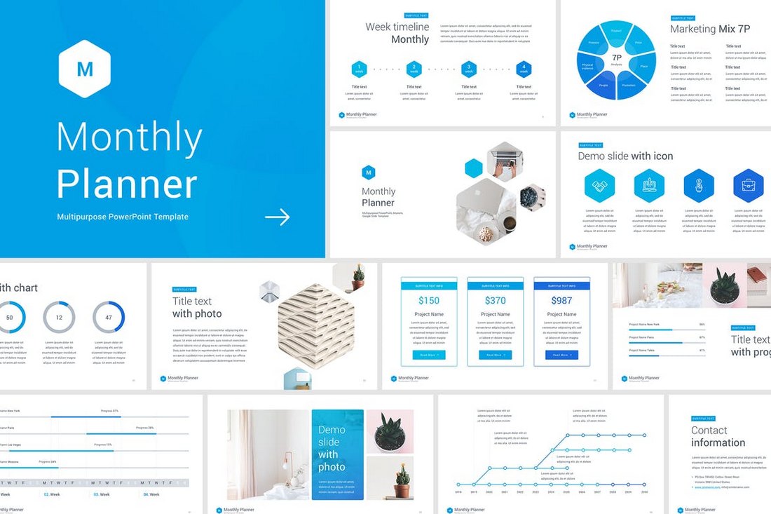
This is a unique PowerPoint presentation template that’s made specifically for creating slideshows for your monthly and annual business meetings. It includes 50 unique slides in 10 different premade color schemes. The slides also feature infographics, charts, and vector illustrations as well.

Quadro – Corporate Powerpoint Template

Quadro - Corporate Powerpoint Template

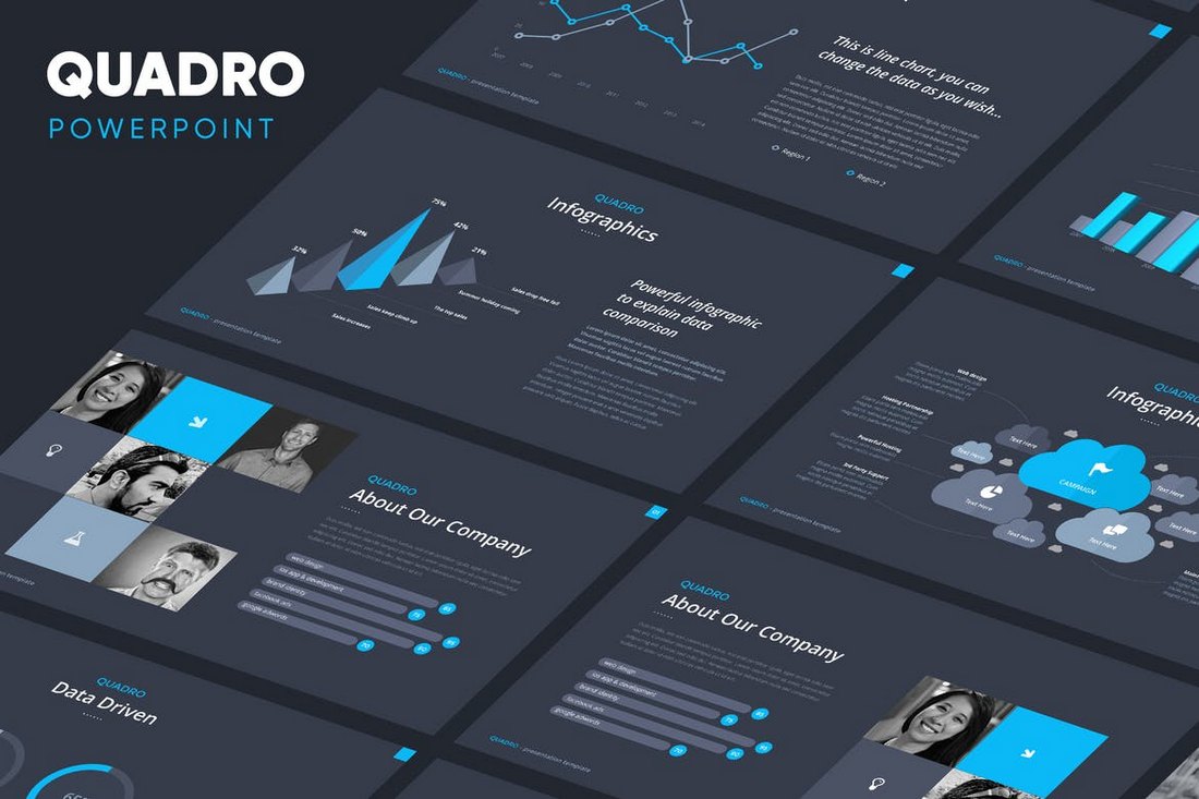
Quadro is an elegant PowerPoint presentation template that comes with 80 unique slides and its available in 4 different color schemes. The template is easily customizable and includes lots of editable device mockups, graphs, and graphics.

Beres – Animated Powerpoint Template

Beres - Powerpoint Template

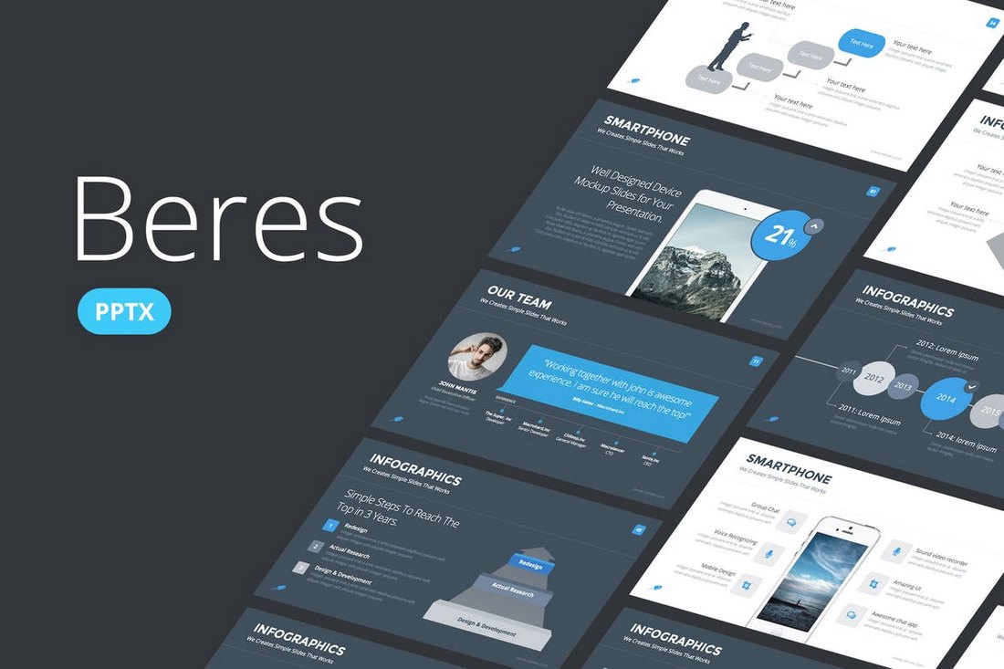
This PowerPoint presentation template includes more than 100 unique slides and you also get to choose from 8 different color schemes to create a professional slideshow. The template is available in both animated and non-animated versions as well.

Magnum – Animated PowerPoint Template

Magnum PowerPoint Template

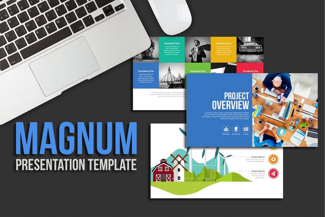
Magnum is a colorful PowerPoint presentation template that includes more than 970 slides filled with images, graphics, icons, and illustrations. It’s ideal for creating a slideshow for a creative presentations or a business meeting. The template is also available in light and dark color themes.

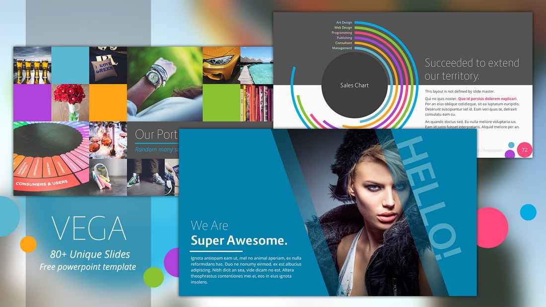
Vega – Animated PowerPoint Template Free

Vega - Animated PowerPoint Template Free

Vega is a colorful and a creative PowerPoint template that you can use free of charge. It comes with 80 unique slides featuring animations and creative vector graphics. You can easily customize it to your preference as well.

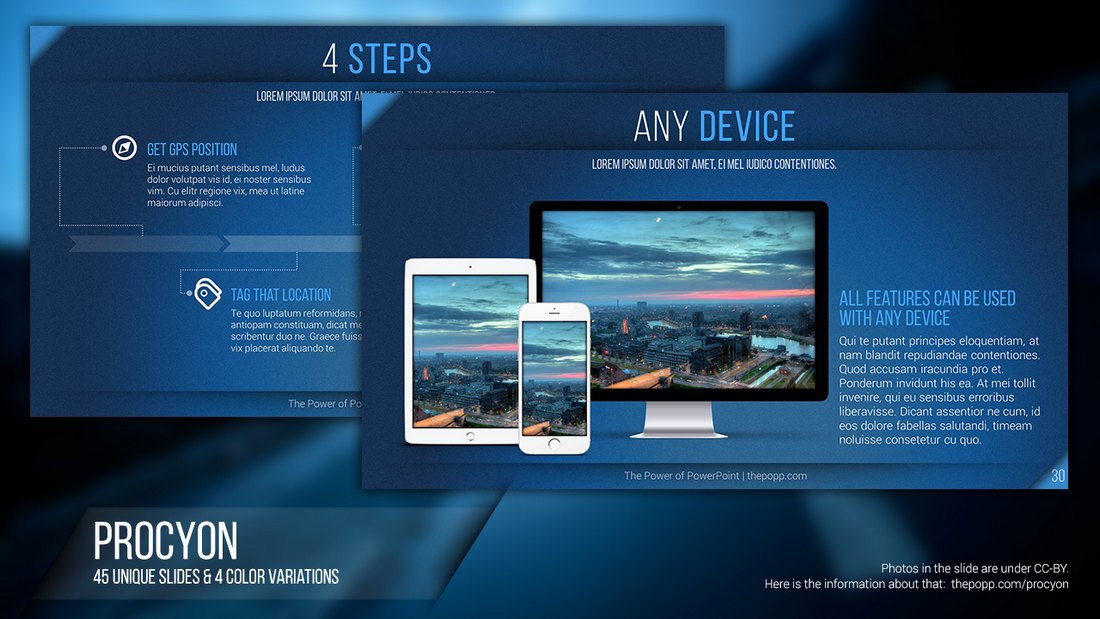
Procyon – Animated Presentation Slideshow

Procyon - Animated Presentation Slideshow

This free PowerPoint template includes 45 slides featuring transition effects as well as lots of graphs, infographics, charts, and more. You can use it to create a basic presentation slideshow for free.

5 Tips for Creating Animations & Transitions in PowerPoint

Adding animation to your PowerPoint slideshows can greatly enhance the experience you offer through your presentation. If you’re new to PowerPoint, follow these tips to get started with animations.

1. Transition vs Object Animations

One of the first things you need to be aware of when using PowerPoint animations is the difference between transition animations and object animations.

On PowerPoint, you can animate each object you add to your slides. While this can be useful when presenting key points in a presentation, you should try to keep object animations to a minimum.

You can also add transition animations to your slides. These animations help create smoother transitions between slides.

2. Time It Perfectly

Each and every animation you add in PowerPoint can be customized to your preference by setting times for the duration of the animation as well as adding delays.

It’s up to you to experiment with different settings to find the right time and delays for your animations. Try to keep animations short and sweet.

3. Stack Multiple Animations

Another useful feature of PowerPoint animations is the ability to stack multiple animations for objects. For example, you can add both entrance and exit animations for each object on your slide by stacking different animation effects.

Stacking animations can drastically increase the duration of your slideshow presentations so use this feature only when necessary.

4. Automatic vs Controlled Animations

Controlled animations offer a great advantage when you’re delivering specific types of presentations like product reveals and feature showcases. For example, if you want to talk about key points in your speech, you can use controlled animations to reveal those points one at a time upon your mouse click or using a remote.

You can also set your animations to play automatically so they flow through your slide presentations without having to click for each slide to start.

5. Keep It Simple

Overall, you should try to keep animations to a minimum and avoid using the more flashy animations in your presentations. For example, it’s perfectly fine to add a fade-in transition effect to your slides. However, adding flashing and bouncing animations may hurt your reputation as a professional.

Stick to the simple and minimal animations to make your presentations more entertaining and easier to look at.

The 9 Best Marketing Frameworks You Need to Know

Featured Imgs 23

Tackling marketing without a solid plan is like putting together a puzzle without all the pieces — I know this firsthand.

Before using a marketing strategic framework, my efforts often felt scattered, with no real direction. But once I started implementing these frameworks, things started to click.

Suddenly, my campaigns were more focused, organized, and way more effective. I noticed the sky looked bluer, and the flowers smelled sweeter. Well, maybe that last part isn’t true, but everything seemed to run much more smoothly.

Download Now: Free Marketing Plan Template [Get Your Copy]

A good marketing framework doesn’t just give you clarity: it turns your entire strategy into a well-oiled machine, helping you run campaigns confidently and get real, measurable results.

In this post, I’ll walk you through nine marketing frameworks that will help you bring order to your marketing strategy and deliver consistent results.

Table of Contents

You can think of it like this: You wouldn’t dream of approaching your marketing with a “throw spaghetti at the wall and see what sticks” attitude because it would be a disaster for your organization.

Instead, you'll likely spend days, weeks, and even months identifying your target audience, where they spend time, determining the perfect way to reach them, and communicating the benefits of your product or service in a marketing plan.

Your marketing strategy framework takes this all a step further and, as mentioned above, ensures your marketing plan is successful because you’ll share content with your audiences at the right time in the most relevant channels that are more likely to drive results.

The Benefits of a Marketing Framework

A marketing strategic framework does more than just keep you focused on the task at hand. As your company grows and your team grows along with it, you must find a way to communicate with every member of the marketing department, no matter where they work or what tasks they are responsible for.

Creating a marketing framework is the best way to ensure that everyone knows what they need to do and how they need to do it. Additional benefits of utilizing a marketing framework include:

  • Creates a home for templates, guides, tools, and assets that all marketers in your organization will need to access.
  • Establishes and communicates approved verbiage for the organization.
  • Improving marketing enhances the growth and bottom line of the company.
  • Allows the team to compare different strategies and determine the best route.
  • Communicates who is responsible for what and makes transferring people from one role to another easier.
  • Saves time by limiting “redos” — areas often susceptible to errors that need work.

In addition, your framework will help you predict your customer’s behavior and the revenue you can expect to see. As a result, it will help your team function more efficiently and produce more effectively.

The Best Marketing Frameworks

Marketing has probably existed since prehistoric days when entrepreneurial cavemen designed state-of-the-art spears and tried selling them to their less “handy” counterparts.

Okay, that might not be true, but marketing has been a necessary aspect of business for a long time, and, over that time, savvy marketers have designed models and frameworks to make their (and your) job easier. Let’s take a look at some traditional models as well as some newer frameworks.

Traditional Marketing Models

1. 7Ps Marketing Mix

The 7Ps Marketing Mix is the ultimate checklist for getting your product or service into the world.

It started in the '60s with just four Ps — Product, Price, Place, and Promotion — but as businesses and markets became more complex, it expanded to include People, Process, and Physical Evidence.

Think of it as covering all the bases to ensure you’re not missing anything crucial when planning your marketing strategy.

When to Use It

I’ve found that the 7Ps framework really comes in handy when you’re in the planning stages of something new or when you need to take a fresh look at what you’re already offering. It’s a great way to make sure you’re thinking about everything, from how much you’re charging to how you’re delivering your product to customers.

How to Use It
  1. Product: What exactly are you selling? Make sure you’re crystal clear on the features, benefits, and what makes it stand out from the competition.
  2. Price: Figure out how much you’re going to charge. Consider production costs, what your competitors charge, and how much value your customers see in your product.
  3. Place: Where are you going to sell it? Whether in a physical store, online, or both, the key is ensuring your target audience can easily get their hands on it.
  4. Promotion: How are you going to get the word out? This covers everything from ads to social media to email campaigns — anything that helps you connect with your audience.
  5. People: Who’s involved in delivering your product? From your sales team to customer support, having the right people in place can make a difference in how your customers experience your brand.
  6. Process: What’s the process for getting your product to your customers? It’s important to map this out to keep things running smoothly and ensure your customers are happy.
  7. Physical Evidence: What tangible proof do you have that your business is legit? This could be anything from your packaging to online reviews — anything that gives your customers confidence in your brand.

Pro tip: I’ve learned that the 7Ps framework isn’t something you do once and forget about. Markets change, customer needs evolve, and you must revisit your marketing mix regularly to stay ahead.

Example: Let’s say my company is launching a new software tool. For “Promotion,” I’m going to zero in on digital marketing channels like social media ads and email campaigns, knowing that’s where my tech-savvy audience hangs out.

When it comes to “Process,” I’m going to streamline the customer journey from discovery to purchase by ensuring our website is optimized for conversions, with clear CTAs, a quick checkout process, and automated follow-up emails to nurture leads.

7Ps Marketing Mix diagram representing a marketing strategic framework with interconnected circles labeled Product, Price, Promotion, Place, People, Process, and Physical Evidence.

2. STP Marketing Model

The STP Marketing Model is all about getting laser-focused on who your customers are and how to best reach them. STP stands for Segmentation, Targeting, and Positioning (it also stands for the seminal ‘90s alt-rock band Stone Temple Pilots, but that’s not what we’re talking about here).

STP is a top-down approach that helps you break down your audience into smaller segments, determine who’s most likely to be interested in your product, and then position your brand to appeal directly to them. In my experience, it’s like crafting a personalized message for each group rather than a one-size-fits-all approach.

When to Use It

I’ve found the STP model to be super useful when you’re looking to refine your marketing efforts, especially if you’ve got a diverse audience.

Whether launching a new product or trying to make your existing campaigns more effective, this model helps you zero in on the most receptive segments and tailor your messaging accordingly.

How to Use It
  1. Segmentation: Start by dividing your overall market into smaller segments based on different criteria like demographics, behaviors, or needs. The goal is to identify distinct groups within your broader audience.
  2. Targeting: Once you have your segments, it’s time to decide which ones are worth focusing on. Pick the groups most likely to convert or bring the highest value.
  3. Positioning: Finally, position your product in a way that resonates with your chosen segments. Craft a message highlighting how your product meets their needs and sets you apart.

Pro tip: From my experience, don’t shy away from revisiting your segments and targets as your business grows. Your audience’s needs can change over time, and staying flexible with your STP strategy can help keep your messaging relevant and effective.

Example: Let’s say I’m launching a new line of eco-friendly products. For “Segmentation,” I’ll break down our audience by eco-consciousness and lifestyle choices. Then, in the “Targeting” phase, I could focus on young professionals passionate about sustainability.

Finally, for “Positioning,” I can emphasize our products' environmental benefits and unique features, positioning them as the perfect choice for people who want to make a difference without sacrificing quality.

STP Marketing Model diagram illustrating a marketing strategic framework with sections for Segmentation, Targeting, and Positioning, each with bullet points explaining their functions.

3. Porter’s Five Forces

​​Porter’s Five Forces is one of those frameworks I turn to when I need to understand the bigger picture better.

While most marketing frameworks focus on the product and the audience, this one looks outward at the external influences that can impact profitability.

Developed by Michael Porter, a Harvard Business School professor and expert in competitive strategy, this framework helps you evaluate five key forces that shape any industry’s profitability and competition:

  1. Threat of new entrants.
  2. Bargaining power of suppliers.
  3. Bargaining power of buyers.
  4. Threat of substitute products or services.
  5. Intensity of competitive rivalry.

Porter’s extensive work in competitive strategy has made this model a cornerstone in business strategy, helping companies understand the complexities of their competitive environment.

When to Use It

I find this framework especially useful during strategic planning, whether entering a new market or launching a new product.

Even if you’re not in the early stages, it’s a great way to reassess your position and identify where to gain a competitive edge. It’s also handy for established businesses to understand how industry dynamics are shifting.

How to Use It

To apply Porter’s Five Forces, start by analyzing each of the five forces in the context of your industry.

  1. Threat of New Entry: Consider your industry and assess how difficult it is for competitors to enter. Are there significant barriers, such as high capital costs or strict regulations? Or is it relatively easy for new businesses to join? If you're in a mature industry, you may be less worried about new competitors, but this can be a major concern in emerging, dynamic markets.
  2. Bargaining Power of Suppliers: Next, assess the power suppliers have over your pricing. If there are only a few suppliers, they hold more power, which can hurt margins. For example, if I’m launching a new product dependent on unique materials, I’m going to feel the squeeze on my costs. But if there are many suppliers, shopping around and negotiating is easier.
  3. Bargaining Power of Buyers: Look at how much power buyers hold. If there are only a few large buyers, they can negotiate for lower prices or special terms. But when there are many buyers, controlling the terms is easier. I’ve found this is especially relevant in industries with big B2B contracts where a single buyer can significantly influence a company’s sales.
  4. Threat of Substitution: Substitutes are always lurking, especially in tech-driven industries. I stay attuned to alternative products or services that could easily replace ours. For example, if introducing a SaaS tool, you’ll want to watch out for free or cheaper DIY solutions that could lure customers away from your product.
  5. Competitive Rivalry: Finally, assess the competition. High rivalry often means price wars, increased marketing spend, and the need to differentiate aggressively. This force is especially intense in markets with low differentiation and many competitors — think airlines or fast food. Focus on building brand loyalty and offering something unique to stand out.

Pro tip: When conducting a Porter’s Five Forces analysis, consider future trends and how these forces might evolve. This can help you stay ahead and adjust your strategy proactively. Download a free Porter's Five Forces model template to try it yourself.

Porter's Five Forces diagram illustrating a marketing strategic framework with five components: Supplier Power, Buyer Power, Competitive Rivalry, Threat of New Entry, and Threat of Substitution.

Modern Marketing Models

Now, let’s look at some of the newer models to hit the marketing scene. While they may not have been around as long as the more traditional models, they take into account the current marketing climate and often focus on startups.

4. Pirate Metrics or “AARRR!”

Don’t worry — you don’t need to wear an eye patch or adopt a parrot to use this one. Pirate Metrics, or AARRR, is a framework developed by startup guru Dave McClure. It’s all about tracking the customer journey, from discovering your brand to the point where they’re so happy they’re telling everyone about you.

The name comes from the five stages it focuses on: Acquisition, Activation, Retention, Revenue, and Referral. In my experience, this model is great for startups or any business looking to understand how to optimize each step of the customer journey.

When to Use It

I’ve found Pirate Metrics to be incredibly useful when you’re trying to get a clear picture of where your customers are coming from, how they’re interacting with your product, and what’s keeping them around.

If you’re focused on growth and looking for ways to improve your customer lifecycle, this framework is definitely worth a look.

How to Use It
  1. Acquisition: This is all about finding out where your customers are coming from. Are they discovering you through Instagram ads, organic search, or maybe word of mouth? Knowing this helps you double down on what’s working.
  2. Activation: Once they’ve found you, what’s the first action they take? Maybe they sign up for your newsletter, create an account, or download a free guide. The goal here is to track these initial steps and make sure they’re as smooth as possible.
  3. Retention: Okay, so they’ve interacted with you once — now, are they coming back? Retention is key because it’s always easier (and cheaper) to keep a customer than to acquire a new one. Look at things like repeat visits, product usage, or subscription renewals to see how well you’re doing here.|
  4. Revenue: This is where the money comes in. How are you earning revenue from your customers? Whether it’s through one-time purchases, subscriptions, or upsells, tracking revenue helps you understand the financial health of your customer base.
  5. Referral: Finally, happy customers tend to spread the word. Are your customers telling their friends, leaving reviews, or sharing your product on social media? Referrals are golden because they lower your customer acquisition costs and bring in new business.

Pro tip: In my experience, Pirate Metrics works best when you track each stage regularly and look for patterns. If you notice a drop-off in one area, that’s your signal to dig in and see what’s going on.

For example, if you’re struggling with retention, maybe it’s time to enhance your onboarding process or offer more value to keep customers coming back.

Example: Let’s say I’m using the Pirate Metrics framework to launch a new app. For “Acquisition,” I’d focus on the most effective channels, like social media ads, and double down on those. In the “Activation” stage, I’d streamline the sign-up process to boost conversions.

For “Retention,” I’d engage users with regular tips or updates to keep them coming back. To drive “Revenue,” I’d optimize upsell offers at key points in the user journey. Finally, for “Referrals,” I’d add a share button to encourage word-of-mouth growth.

Pirate Metrics (AARRR) diagram illustrating a marketing strategic framework with stages: Acquisition, Activation, Retention, Revenue, and Referral, each with brief descriptions.

5. Lean Analytics Stages

The Lean Analytics Stages framework is a must-know for anyone involved in a startup or looking to scale a new product.

Developed by Alistair Croll and Ben Yoskovitz, two well-respected figures in the startup and tech community, this framework helps startups focus on the right metrics at the right time, moving from an idea to a scalable business.

When to Use It

I’ve found the Lean Analytics Stages framework particularly useful for early-stage startups or when launching a new product. It helps you identify what to measure and when to measure it, so you can make informed decisions that drive growth.

How to Use It
  1. Empathy: It all starts with getting to know your customers. You spend time listening to their challenges, gathering feedback, and really understanding the problem you’re trying to solve. It’s all about empathy at this stage, and the goal is to create a minimum viable product (MVP) that addresses a real need.
  2. Stickiness: Once you’ve got your MVP, the focus shifts to engagement and retention. Are people coming back? Are they finding value in what you’re offering? At this stage, it’s crucial to fine-tune your product to keep users engaged and reduce churn.
  3. Virality: Now that you’ve got a core group of users, it’s time to think about growth. Before you start spending big on ads, you want to make sure your existing customers are spreading the word. Organic growth through referrals is a strong indicator that you’re on the right track.
  4. Revenue: This stage is all about making money. You need to figure out how to turn your engaged users into paying customers. Whether through subscriptions, one-time purchases or upsells, the focus is on generating sustainable revenue.
  5. Scale: Finally, once you’ve nailed down your revenue model, it’s time to scale. This means increasing your reach, entering new markets, or launching new products. The key here is to build on the data and insights you’ve gathered in the earlier stages to fuel growth.

Pro tip: In my experience, it’s important not to rush through these stages. Each one builds on the last, and if you skip a step, you might miss critical insights that could make or break your business. Take the time to dig into the data and really understand what’s driving your growth.

Example: Let’s say I’m scaling a new SaaS product using the Lean Analytics Stages framework. In the “Empathy” stage, I’d conduct interviews with potential users to pinpoint their biggest challenges, which would help shape the MVP.

I’d then test “Stickiness” by tracking how well users engage and return to the product. As we move into “Virality,” I’d encourage referrals to grow our customer base organically. Once “Revenue” is steady, I’d focus on “Scaling” by expanding into new markets and adding more features.

Analytics Stages diagram illustrating a marketing strategic framework with five stages: Empathy, Stickiness, Virality, Revenue, and Scale, each with descriptions.

6. The Hook Model

No, it has nothing to do with the previously mentioned Pirate Metrics, but it does complement the stickiness and virality discussed during Lean Analytics.

The Hook Model focuses on building products that people can’t resist coming back to. It was developed by Nir Eyal, author of Hooked: How to Build Habit-Forming Products, and it focuses on creating habits that keep users engaged over the long term.

In my experience, this model is a game-changer for anyone looking to build products that users feel they can’t live without. It’s about understanding what drives user behavior and using that knowledge to create a cycle of engagement.

When to Use It

I’ve found The Hook Model to be particularly useful when you’re trying to design products or services that require ongoing user engagement. Whether you’re building an app, a website, or even a subscription service, this framework helps you think about how to make your product a regular part of your users’ lives.

How to Use It
  1. Trigger: This is where the user journey begins. Triggers can be external, like a push notification, or internal, like a feeling of boredom or stress. The key is to identify what will prompt users to engage with your product.
  2. Action: Once triggered, the user needs to take an action. This should be something simple and easy, like clicking a button or scrolling through a feed. The easier it is, the more likely users are to do it.
  3. Variable reward: This is where the magic happens. The reward has to be satisfying, but the key is that it’s variable. That little bit of unpredictability keeps users coming back, eager to see what they’ll get next.
  4. Investment: Finally, users need to invest something in the product, whether it’s time, effort, or data. The more they invest, the more likely they are to return because they’ve put something of themselves into the product.

Pro tip: One thing I’ve learned is that the best hooks are those that feel natural to the user. It shouldn’t feel like you’re manipulating them; it should feel like you’re genuinely solving a problem or adding value to their lives. When you get that balance right, users won’t just engage with your product — they’ll become loyal advocates.

Example: Let’s say I’m applying the Hook Model to a fitness app. The “Trigger” would be a daily reminder to log workouts, helping users stay consistent. For the “Action”, I’d make it as easy as possible, like entering workout details with just a few taps.

The “Variable Reward” could be random badges or milestones to keep users curious about what they’ll unlock next. Lastly, “Investment” would come from users tracking their progress over time, making them more committed as they see their improvements.

 Hook Model diagram depicting a marketing strategic framework with stages labeled as Trigger, Action, Reward, and Investment, forming an infinity loop.

Image Source

7. The ICE Score

The ICE Score is a simple yet powerful framework for prioritizing ideas. Developed by Sean Ellis, often called the Father of Growth Marketing, this framework helps you quickly evaluate potential growth initiatives.

ICE — which stands for Impact, Confidence, and Ease — is a straightforward way to decide which ideas are worth pursuing based on these three factors. In my experience, the ICE Score is a lifesaver when you’re juggling multiple projects and need to make smart, fast decisions.

When to Use It

I’ve found the ICE Score to be incredibly useful when you’ve got a list of potential projects or strategies and need to prioritize them.

Whether you’re working on marketing campaigns, product features, or even internal processes, this framework helps you cut through the noise and focus on what’s most likely to move the needle.

How to Use It
  1. Impact: Start by asking yourself, “What’s the potential impact if this idea works?” You want to focus on ideas that could make a significant difference to your business or project goals. The bigger the potential impact, the higher the score.
  2. Confidence: Next, consider how confident you are that this idea will succeed. This is about gut feeling combined with data. If you’ve seen similar strategies work before, or if you’ve got solid research backing it up, give it a higher score.
  3. Ease: Finally, think about how easy it is to implement. This includes factors like time, cost, and resources. The easier something is to execute, the higher the score it should get.

Once you’ve rated each idea on a scale (usually from 1 to 10) for Impact, Confidence, and Ease, you add up the scores. The ideas with the highest total scores are the ones you should prioritize.

Pro tip: One thing I’ve learned is that the ICE Score is just a starting point. It gives you a quick way to prioritize, but don’t be afraid to adjust your approach if new information comes in or if something doesn’t feel right. Flexibility is key to making the most of this framework.

Example: Let’s say I’m using the ICE Score to decide which marketing channels to prioritize for a product launch. For “Impact,” I’d score social media ads the highest since they can quickly reach a large audience.

For “Confidence,” content marketing might score well because we’ve had past success with our content team.

For “Ease,” influencer partnerships would rank highest if we already had existing relationships. After adding up the scores, I’d focus on the strategies that offer the best return on investment.

ICE Score diagram explaining a marketing strategic framework with components: Impact, Confidence, and Ease, each rated on a scale of 1-10 to determine the overall ICE Score.

8. STEPPS

STEPPS is a framework designed to help you create content that naturally spreads from person to person. Developed by Jonah Berger, a marketing professor and author of Contagious: Why Things Catch On, this model identifies six key ingredients that make content go viral.

STEPPS stands for Social Currency, Triggers, Emotion, Public, Practical Value, and Stories. From my experience, this framework offers a clear roadmap for crafting content that grabs attention and encourages people to share it.

When to Use It

I’ve found STEPPS to be particularly effective when you’re aiming to create content that generates excitement and widespread discussion. Whether it’s a blog post, a video, or a social media campaign, this framework helps ensure your content has the right elements to spark conversation and sharing.

How to Use It
  1. Social Currency: People enjoy sharing things that enhance their image or make them feel like insiders. Consider how your content can give your audience something they’ll be proud to share, making them look good in the process.
  2. Triggers: Identify what will prompt people to think about and discuss your content. Triggers are everyday cues that can remind people of your message, encouraging them to share it. The key is to tie your content to something people frequently encounter.
  3. Emotion: Content that evokes strong emotions — be it happiness, surprise, anger, or fear — is more likely to be shared. The stronger the emotional response, the more shareable your content becomes.
  4. Public: Make sure your content is highly visible and easy to share. The more people see others engaging with your product or message, the more likely they are to join in. Visibility drives sharing.
  5. Practical value: People are naturally inclined to share helpful information. If your content provides valuable tips, advice, or solutions, it’s more likely to be passed along to others who might find it helpful.
  6. Stories: We’re naturally drawn to stories, and they make your content more engaging and memorable. If you can weave your message into a compelling narrative, it will resonate more deeply with your audience and encourage sharing.

Pro tip: In my experience, the real power of STEPPS lies in combining these elements. For example, a story that evokes strong emotions and offers practical value is much more likely to go viral than content that only hits one or two of these points.

Example: Let’s say I’m using the STEPPS framework for a product launch campaign. For “Social Currency,” I’d create an exclusive early access program to make participants feel like VIPs. I’d incorporate “Triggers” by linking the product to a popular industry trend.

To tap into “Emotion,” I’d tell a compelling story about how the product solves a real-world problem. For “Public” visibility, I’d encourage users to share their experiences on social channels with a branded hashtag.

AddingPractical Value” could include offering tips and hacks related to the product, and finally, I’d wrap it all up in a strong “Story” to drive buzz and sharing.

marketing strategic framework; STEPPS Framework diagram detailing a marketing strategic framework with six elements: Social Currency, Triggers, Emotion, Public, Practical Value, and Stories, each with brief descriptions.

9. They Ask, You Answer

They Ask, You Answer is a straightforward but powerful approach to content marketing that’s all about transparency and trust.

This framework was developed by Marcus Sheridan after he saved his pool company from the brink of failure during the Great Recession by simply answering his customers’ most pressing questions online.

The idea is to address the questions your customers are already asking — no matter how tough or uncomfortable those questions might be — and do it with complete honesty. In my experience, this approach builds trust and positions you as a go-to resource in your industry.

When to Use It

I've found that They Ask, You Answer is particularly effective when you want to establish a strong connection with your audience and position yourself as a trusted authority.

If you aim to create content that resonates deeply with potential customers and addresses their concerns head-on, this framework is a fantastic guide.

At the core of They Ask, You Answer are what Sheridan called “The Big 5”: five topics that every company needs to cover thoroughly and honestly on their website.

  1. Price. Explain the cost of everything you sell, including the factors that make that number go up and down.
  2. ‘Best of’ lists. Give your buyers lists of the top options they should consider when making a purchase.
  3. Reviews. Provide expert reviews of everything related to what you sell—even if you don’t directly sell it yourself.
  4. Problems. Openly address the drawbacks of your products or services. Explain who is (and isn’t) a good fit to buy from you.
  5. Comparisons. Offer head-to-head comparisons to help buyers make an informed decision."

Together, these topics form the foundation of a content marketing framework that can build a strong connection with your intended audience.

How to Use It
  1. Identify common questions: Start by gathering the most common questions your customers ask. This could be about pricing, product comparisons, potential problems, or even questions about your competitors. The more you understand what your customers want to know, the better you can serve them.
  2. Answer transparently: Answer the key questions honestly and thoroughly. Don't avoid discussing complex topics like price or potential drawbacks. Transparency is key to building trust.
  3. Create content around these questions: Use the questions as the foundation for your content strategy. Whether it’s blog posts, videos, FAQs, or even product pages, make sure you’re addressing these questions in a way that’s easy for your audience to find and understand.
  4. Promote the content: Ensure that the content is easily accessible to your audience. Share it across your social media channels, include it in your newsletters, and make it prominent on your website. The goal is to make sure that when customers search for answers, they find your content first.

Pro tip: In my experience, the most successful They Ask, You Answer strategies are those that truly embrace honesty — even when it’s uncomfortable. Addressing your customers’ concerns openly builds trust and helps you stand out in a crowded market.

Example: Let’s say I’m using the They Ask, You Answer marketing strategic framework when my sales team tells me that potential customers are hesitating around pricing. Instead of avoiding the issue, I’d create a detailed blog post breaking down the pricing structure, explaining why it’s set up that way, and comparing it to alternatives.

This transparency demystifies costs and leads to more informed and confident purchasing decisions.

Selecting the Best Marketing Framework for Your Business

With so many marketing frameworks to choose from, finding the one that best fits your business can feel overwhelming. It’s important to remember that not all frameworks are created equal, and what works for one organization may not be the best fit for another.

To make an informed decision, you’ll need to consider several key factors that will guide you in selecting the most effective framework for your specific needs.

1. What are the top priorities of the business?

Start by clearly defining your business’s main priorities. Are you focused on growth, improving customer retention, entering new markets, or enhancing brand awareness?

Understanding your top priorities will help you choose a framework that aligns with your strategic goals. For example, if your priority is creating a highly engaging product that users keep coming back to, the Hook Model might be an ideal choice as it helps build habit-forming products.

2. What is the role of marketing within the organization?

Next, consider how marketing functions within your organization. Is it primarily focused on lead generation, brand building, customer engagement, or a combination of these?

The role that marketing plays will influence which framework you should adopt. For instance, if your marketing team is heavily involved in content creation and brand storytelling, frameworks like STEPPS or They Ask, You Answer might be particularly useful.

3. How is success defined and measured within marketing?

Understanding how success is measured is crucial for selecting the right framework. Does your company prioritize metrics like customer acquisition cost (CAC), return on investment (ROI), or customer lifetime value (CLV)? Choose a framework that supports the metrics that matter most to your organization.

For example, if customer retention and lifetime value are key metrics, the Hook Model could help you design strategies that encourage repeat engagement and long-term loyalty.

4. What is the marketing department capable of, and what improvements would you like to make?

Assess the current capabilities of your marketing team. What are their strengths, and where are there opportunities for improvement?

If your team excels at data-driven decision-making, frameworks like Lean Analytics Stages could help you maximize that strength. On the other hand, if you’re looking to improve customer segmentation and targeting, the STP Marketing Model might be the right choice.

5. Where would you like to see the most impact due to marketing efforts, and what’s the easiest way to ensure that impact?

Identify the areas where you want marketing to have the greatest impact. Is it driving more qualified leads, increasing brand awareness, or improving conversion rates?

Once you’ve pinpointed these areas, look for a framework that directly supports your objectives. For example, if driving conversions is your main goal, the Pirate Metrics (AARRR) framework could help you optimize each stage of the customer journey, from acquisition to referral.

Choosing the right marketing strategy framework is about more than just picking a popular model — it’s about finding the one that best aligns with your business’s unique needs and goals.

By carefully considering your business’s priorities, the role of marketing, success metrics, team capabilities, and desired impact, you can select a framework that supports your current objectives and provides a solid foundation for future growth.

Over To You

Marketing is undoubtedly one of the most challenging roles, no matter what product or service you're promoting. Without the right marketing efforts, even the most innovative products or services might never reach the people who need them most.

One thing that has consistently surprised me is how much easier marketing becomes when I have a solid framework to guide me. I used to think that creativity alone could drive success, but I quickly realized that structure and strategy are just as important.

In my experience, implementing a marketing framework has been a game-changer. It helps keep the entire team aligned, ensures that everyone is working towards the same goals, and provides a clear path forward when things get complicated.

If there’s one piece of advice I can offer, it’s this: don’t try to wing it. Let a marketing framework guide you, and you’ll find that the path to achieving your goals becomes much clearer — and a lot less stressful.

Editor's note: This post was originally published in January 2022 and has been updated for comprehensiveness.

Sustainable Marketing: Key Principles & How to Leverage It [+ Examples]

Featured Imgs 23

Price, shipping, and reviews are all factors I consider when making a purchase. But there’s another factor that can tip the scales for me, and that’s sustainability.

When choosing between similar products, I’m often more likely to choose the brand with sustainable practices.

I know from research that I’m not alone.

Download Now: The State of U.S. Consumer Trends [Free Report]

Our State of Consumer Trends report found that buyers take a company’s environmental impact, DEI commitment, and ethical production practices into consideration.

And they’re willing to pay more for brands with sustainable practices.

Smart brands are bringing this to the forefront with sustainability marketing. So, how does a brand leverage sustainable marketing to appeal to a growing, socially conscious audience? We’ll cover that and more below.

Table of Contents

Green Marketing vs. Sustainable Marketing

While both terms are often used interchangeably, there is a difference between green marketing and sustainability marketing.

Green marketing focuses on strategies that promote environmental awareness and protection. Sustainable marketing, on the other hand, is a little broader.

It encompasses green marketing, but it also includes practices that go beyond the environment, such as social and economic issues.

Sustainable Marketing Principles

As you build sustainability into the DNA of your brand and marketing strategies, it’s important to know which approach to take. Familiarize yourself with these three core sustainable marketing principles, which I’ll explain below.

1. Customer-Value Marketing

You can earn customer loyalty by designing products, services, and marketing strategies that align with customer values. For sustainable marketing, this often means highlighting eco-friendly attributes, values like diversity and inclusion, or the long-term benefits of sustainable products.

2. Sustainable Pricing Strategies

This principle involves educating customers about the full life-cycle costs to create a sustainable product, including sourcing and downstream costs of re-use and recycling. The right education and messaging can convince customers that the benefits are worth paying more for.

3. Societal Benefit Marketing

Also called societal marketing, societal benefit marketing emphasizes the long-term benefits to society beyond a company’s profit or the immediate benefit to the consumer.

For instance, Ben & Jerry’s positions its marketing around its three core values: human rights and dignity, social and economic justice, and the environment. “We believe ice cream can change the world,” they state. Then, they back those principles up with action.

Ben & Jerry’s sustainable marketing principles

Image Source

Do customers care about sustainability? [New Data]

While once seen as a luxury or niche tactic, sustainability has gained traction as a mainstream, cross-generational preference. In a world where I can buy the same product from dozens of online sellers, I look for one that’s local, that supports fair trade, or that supports a cause or charity I like.

In 2024, we surveyed over 700 consumers to learn about their shopping habits. Here’s what I learned:

  • 76% believe companies should try to improve the well-being of their employees
  • 64% believe companies should actively reduce their environmental impact
  • 58% believe companies should donate a portion of their profits to charity
  • 55% believe companies should advocate for racial justice and gender equality
  • 50% believe companies should do more to advocate for social issues, with the top issues being affordable healthcare (47%), climate change (35%), and income inequality (35%)

social issues that matter most to customers

These values are reflected in consumers' purchasing decisions, especially for younger generations. While only 5% of Boomers say a brand’s environmental impact is a top purchasing factor for them, that jumps to 16% for Gen Z.

The difference is even starker for a company’s charity support and employee well-being.

So, to answer the question posed at the beginning of this question: Yes, consumers of all ages care about sustainability.

So, even if your brand isn’t rooted in this mission, you will still find value in investing time and resources in sustainable practices and marketing to attract more customers.

Learn more about consumers in our latest State of Consumer Trends report.

1. Have a larger purpose.

Brands typically judge their success by the numbers. How much revenue they have or will generate in any given period is usually the biggest KPI.

Sustainability shifts this perspective by having brands evaluate themselves by something other than profit.

As a brand, you have to promote something that’s bigger than your products and services and transcends any particular industry.

Do you have a clear social mission? If not, spend time discovering what that is and how your brand plays a role in furthering that mission.

Autumn Adeigbo sustainable marketing campaign

Image Source

For instance, fashion brand Autumn Adeigbo sells clothing, accessories, and home decor items. However, its mission, as stated on its website, is to impact the lives of women on a global scale.

They do so by using female-owned production facilities and employing female artisans, among other practices.

2. Think long term.

Sustainability marketing is all about building long-term value. Too often, brands focus on gaining immediate results.

For instance, many marketing tactics like running Google Ads and blogging are great lead generators. However, what happens once your lead has made a purchase and turned into a customer? Sustainable marketing looks at ways to nurture and educate consumers during the entire buyer’s journey.

Sustainability initiatives — like replacing styrofoam with paper or reducing your carbon footprint — can take years to implement. Releasing sustainability plans and updating customers on your progress go a long way in building trust, but they won’t yield immediate, attributable growth.

Education is one way to build loyalty with your audience early on, from the first point of discovery to post-purchase. For instance, a food brand could educate its audience on the importance of ethical farming on social media and continue this process post-purchase with package recycling tips.

This works well to build trust and loyalty in the long term: A Vericast study found a strong correlation between consumer preference for sustainable practices and consumer preference for buying from brands they already know and trust.

3. Be customer oriented.

You might be thinking, “Isn’t being consumer-oriented what all marketing is?” Ideally, yes, but not always.

In traditional marketing, a brand often tries to push a product or service to a customer. With consumer-oriented marketing, it’s more about understanding your customers’ needs and tailoring your marketing to that.

First, leverage user research to find out what’s important to your customers. For instance, say your audience is craving more transparency in your sourcing practices or wants you to be more vocal on social issues.

You could use that information for your next campaign or even pivot your business practices to differentiate yourselves from everyone else in your space.

4. Back up your claims.

Sustainability marketing doesn’t work if it’s not authentic.

Imagine finding out a business that claims to be sustainable has failed to implement any practices to promote its mission. Consumers would distrust that brand, and it would be difficult to earn it back.

Make sure your brand is looking at sustainability from a holistic lens.

Are you preaching about sustainability but using unsustainable resources to build your product? Are you collaborating with brands that conflict with your mission? Is your team representative of the future you want to promote?

These are the questions you should ask to determine if your brand reflects the mission you’ve set out to achieve. Identify the areas that need work and go to the drawing board to figure out strategies that align with your mission.

Audiences don’t expect perfection. They do, however, value transparency. It’s OK (and recommended) to share where you currently fall short and how you plan to remedy these issues.

5. Engage stakeholders.

Since sustainability requires real change instead of shallow value-signaling, it takes collaboration. Sustainability is a big effort, and it requires leadership outside of marketing. Engage internal teams, shareholders, supplies, and community partners in conversations and research around sustainability.

In some cases, your organizational structure may make sustainable practices difficult, like getting buy-in for a more expensive but more sustainable supplier when a company has a mandate to increase profit.

Smaller companies can consider re-organizing as a benefit corporation or achieving B Corp status to formalize their sustainability commitments.

6. Go against the grain.

In marketing, it can seem like everyone’s playing a game of copycat, using the same promotions and tactics over and over again. Posting on social media about Earth Day or International Women’s Day, for instance, is a good practice but won’t stand out against the thousands of other brand posts.

Breaking with your industry runs a risk of failure — but it could also pay off in a big way. Take outdoor brand REI, for instance. When Black Friday sales reached a peak fever pitch, the brand shocked the public by closing its stores that day and instead encouraging people to #OptOutside.

While it loses in-store revenue each year on that day, it gains loyalty from its members and employees who would rather spend time outside than in a store.

#OptOutside sustainable marketing campaign, REI

Image Source

Sustainable Marketing Examples

Need some inspiration for how to market your sustainability practices? Learn from these five brands who belong in the sustainability hall of fame.

1. Thinx

Thinx is an underwear brand whose mission is to provide sustainable solutions to menstruation and incontinence. Everything the brand puts out marketing-wise is centered around this core value.

Thinx sustainable marketing example

Image Source

The brand’s social media pages feature a mix of product promotion, educational content, and mission-focused announcements.

The key to sustainable marketing is doing it in an authentic way that feels embedded in the brand, as opposed to an add-on that’s leveraged when convenient. Thinx is a great example of how to do it right.

2. Kind Socks

This clothing company was started based on the founder’s desire to find a socks company with a sustainable and ethical vision.

While most brands focus on inviting their consumers to purchase, Kind Socks takes the exact opposite approach: Asking them to spend less and more thoughtfully.

Kind Socks sustainable marketing example

Image Source

This strategy may seem counterintuitive to many companies, but emphasizing the brand’s mission can help build trust with its audience and increase their brand loyalty.

3. Pangiai

Materials science company Pangiai wants to save the environment. Every piece of marketing the brand puts out is centered around this core mission, including this video campaign.

In it, the brand explains its mission to “reverse the cycle from the unnatural to natural, from plastic to plants […], from the new to the recycled.” What’s effective about this ad is that Pangiai describes the future it wants to see and outlines the strategies it will implement to get there.

Throughout the ad, you see Pangiai products but they’re not the focus. This tells viewers the mission drives the products, not the other way around — and that’s sustainable marketing done right.

4. Nada Duele

In the previous section, we discussed the importance of having a holistic approach to sustainability marketing.

With Nada Duele, their mission is reflected in everything: from their name, which represents the idea that products should not cause harm, to the initiatives they take part in.

Nada Duele sustainable marketing

Image Source

When you visit their “How We Work” section, you learn about their collaboration with a Guatemalan institute dedicated to protecting the forestry sector.

Pro tip: It’s important that the partnerships your brand takes on align with your values. Otherwise, you risk losing credibility and trust.

5. Satya + Sage

Social media is one of the best and easiest ways to implement a sustainable marketing strategy. You can share a range of content, from educating your followers on sustainable practices to sharing ways your brand is being sustainable.

In this example, the candle company Satya + Sage shares tips on how to use the seed paper that comes with every candle.

Satya + Sage sustainable marketing candles

Image Source

Pro tip: On social media, in particular, pay attention to the questions your followers ask and the comments they make, as that can inform which marketing strategies you test in the future.

Sustainable Marketing and AI

As companies rush to explore how to integrate AI into every area of their business (including marketing!), it’s important to slow down and consider the holistic impacts. AI has the potential to reduce waste and the human footprint by performing tasks more efficiently, but the ripple effects are much wider.

Consider these facts and questions as you go about integrating AI:

  • Carbon footprint of AI. Training and running an AI system requires a huge amount of computing power and electricity, increasing CO2 emissions. According to an MIT report, the data center power requirement in North America nearly doubled from 2022 to 2023 — outpacing the demand of over 70% of countries.
  • Bias in AI systems. It’s well-documented that AI systems can replicate bias against groups like women and minorities. If you are integrating AI to interact with customers or creating marketing content with AI, consider the potential effects on these populations.
  • Employee impacts. Our survey revealed that customers are paying attention to how companies treat their employees. As companies replace some functions like customer service with automation, think about your affected employees. Can you reskill them for new AI jobs or support them through a career transition?

While AI can have some negative impacts, it also has the potential to help you reach your sustainability goals.

For instance, you can build a model to analyze your systems and suggest ways to reduce your carbon footprint by optimizing your supply chain. You can also leverage an AI chatbot to educate customers on sustainable practices.

Is marketing with AI more sustainable?

I can’t give you a definite answer for whether leveraging AI is more sustainable for your brand. It really comes down to the sustainability priorities that you’ve identified and whether AI helps or hurts those.

Take Dove beauty brand, for example. One of their longtime values has been recognizing real beauty and showing authentic women’s bodies.

In 2023, Dove released an ad campaign declaring that they would never use AI-generated women in ads, because it would run counter to their values of elevating real beauty.

Dove AI sustainable marketing campaign

Image Source

While Dove may integrate AI in other ways internally, they realized it was important to state how they wouldn’t use it.

Engage customers with sustainable marketing.

From DEI to environmental impact, it’s clear to me that customers are starting to care more about where their products come from and the people behind them.

My main takeaway for you is this: Sustainable marketing isn’t just a box to tick off, it’s a whole-company practice and a cultural shift. It’s a long-term strategy that wins trust, loyalty, and customers over time.

As you consider new factors like AI in marketing and climate change, stay close to your customers to hear what they want to see from your brand.

Above all, customers value transparency and want to hear about your journey, even if you haven’t reached your goals yet. So don’t be afraid to start small and bring your customers along with you.

Editor's Note: This post was originally published in Oct. 2021 and has been updated for comprehensiveness.

Thanksgiving Design Ideas: Flyers, Posters, Graphics & More

Featured Imgs 23

With Thanksgiving just around the corner, it’s the perfect time to start planning your festive designs for events, promotions, or community gatherings.

Whether you’re creating flyers for a local Thanksgiving dinner, posters for seasonal sales, or social media graphics to spread holiday cheer, having the right design elements can make all the difference.

In this post, we’ve put together a collection of Thanksgiving design templates, including flyers, posters, graphics, and more, to help you capture the warmth and joy of the holiday season.

Thanksgiving is all about togetherness, gratitude, and celebration, and your designs should reflect that spirit. From rich autumnal color palettes to cozy, welcoming imagery, these templates and graphics are designed to evoke the essence of the holiday. Have a look.

Creative Thanksgiving Flyer Template

Creative Thanksgiving Flyer Template

This is a thoughtfully designed, fully editable Thanksgiving flyer in PSD format. Sized at A4 with a 3mm bleed, it’s prepared for professional printing, supporting CMYK colors at a high resolution of 300 dpi. It’s especially perfect for promoting various events and celebrations.

Stylish Thanksgiving Flyer Template

Stylish Thanksgiving Flyer Template

This a versatile Thanksgiving flyer template for promoting your special event. Designed with meticulous attention to detail, this fully editable template offers well-organized layers and top-quality resolution (CMYK 300 DPI). Spanning 21 x 29.7 cm with bleed, the template is compatible with Adobe Illustrator and Photoshop (CS5).

Simple Thanksgiving Flyer Template

Simple Thanksgiving Flyer Template

A minimalist Thanksgiving flyer template with customization options to fit your needs. Its specifications include a Photoshop file (CS5), 8.27 x 11.69 inch dimensions including bleeds, 300 dpi CMYK resolution for print-ready convenience, editable fonts and text, and an easy color-change option.

Modern Thanksgiving Flyer & Poster Template

Modern Thanksgiving Flyer & Poster Template

This is a contemporary, easy-to-use Thanksgiving flyer template for business promotions. It comes packaged as a print-ready PSD file neatly organized into layers for straightforward editing. All elements including colors, images, and text can be tailored to suit your needs. An A4 size with extra bleed ensures a professional finish.

2 Thanksgiving Flyer Templates

2 Thanksgiving Flyer Templates

A perfect pair of flyer templates ideal for Thanksgiving-themed projects. They’re fully layered PSDs, making them easy to edit and customize. Designed in 300 DPI and CMYK colors, they’re print-ready in a 4×6 size.

Red Thanksgiving Flyer Template

Red Thanksgiving Flyer Template

This is a customizable Thanksgiving flyer template for your special November event planning. With its appealing red theme, and well-organized, fully editable layers, this A4 size PSD file is easy to use. Everything you need is included, even the free font, which can be found in the readme file.

Colorful Thanksgiving Flyer & Poster Template

Colorful Thanksgiving Flyer & Poster Template

Add a splash of color to your Thanksgiving promotions with this vibrant flyer and poster template. It’s simple to customize, with editable text and an easy color change system. The template, which is available in Ai CS 6, CS 3, and Eps files, also boasts organized layers for straightforward editing.

Thanksgiving Festival Flyer Template

Thanksgiving Festival Flyer Template

An easily customizable Thanksgiving flyer template suitable for seasonal promotions. It includes files in AI, PSD, PDF, PNG, EPS formats and features 300 dpi CMYK resolution. The template is a vector at Ai, ideal for print, and allows for editable fonts/text and color changes.

Thanksgiving Event Flyer Template

Thanksgiving Event Flyer Template

This is an ideal flyer template for any Thanksgiving-related event, party, or festival. It offers a customizable, editable, and well-organized PSD and Ai file, conveniently sized to A4 and ready to print. Fonts used in this tastefully designed template are outlined in the readme file and are free for commercial use.

Thanksgiving Celebration Flyer Template

Thanksgiving Celebration Flyer Template

An easily customizable PSD flyer designed for your Thanksgiving festivities. Sized at 8.27 x 11.69 inches (A4) with bleed, its 100% print-ready format includes well-organized layers for straightforward changes to color, image, text, and other elements. It also provides a readme file detailing used fonts.

Thanksgiving Party Flyer Template

Thanksgiving Party Flyer Template

This flyer template is perfect for any fall gathering or Thanksgiving dinner. This Photoshop file is remarkably easy to customize, organized in well-labeled layers and folders. Adjust colors, pictures, elements and text in just a few clicks. It’s print-ready, featuring a 300DPI resolution and multiple color variations.

Happy Thanksgiving Flyer Template

Happy Thanksgiving Flyer Template

Another Thanksgiving flyer template creatively designed for any project. It’s easy to customize with editable fonts/text, adjustable colors, and well-organized layers. The package includes Ai, PSD, PDF, PNG, and EPS files, all in 8.27×11.69 inch dimensions with 300 dpi CMYK resolution, ready for print.

Cute Thanksgiving Poster Template

Cute Thanksgiving Poster Template

Check out this adorable Thanksgiving poster template! It comes well-organized in 3 PSD files, all 100% editable and print-ready. Its size is 8.27 x 11.69 inch, designed in full CMYK 300 DPI. The charming design is entirely vector-based for high-quality results.

Thanksgiving Dinner Party Flyer Template

Thanksgiving Dinner Party Flyer Template

An easily editable Thanksgiving flyer template ideal for your festive gatherings. Provided in both Ai CS6 and Psd formats, it’s fully vectorized and print-ready with sharp 300 DPI CMYK color format, perfectly adaptable to A4 size.

Elegant Thanksgiving Poster Template

Elegant Thanksgiving Poster Template

This Thanksgiving poster template pack offers a modern and sophisticated aesthetic, perfect for promoting any kind of event. This pack includes various flyer and poster sizes, professionally designed in Illustrator and Photoshop. Its customizability and clean design present your work in a visually appealing manner.

Thanksgiving Social Media Template Kit

Thanksgiving Social Media Template Kit

A creative Thanksgiving-themed social media template pack, perfect for amplifying your festive posts. It includes 10 templates, tailored to fit the dimensions of Facebook, Instagram, and Twitter posts. The kit provides a fully layered PSD file that’s customizable and editable, along with JPG files for reference.

Thanksgiving Party Social Media Template Pack

Thanksgiving Party Social Media Template Pack

Another Thanksgiving social media template pack that offers versatile and professional-grade design templates to help businesses enhance their social media presence. This pack covers 24 different sizes suitable for popular platforms like Facebook, Instagram, Twitter, and more.

Thanksgiving Instagram Story Templates

Thanksgiving Instagram Story Templates

This Thanksgiving Instagram story template pack is an excellent tool for enhancing your business’s social media presence. Ideal for eCommerce, fashion, or design blogs, the templates are easy to use and adjust- just replace text and images to reflect your brand. Customizable aspects include color, text, images, and overall design.

Thanksgiving Day Social Media Banner Templates

Thanksgiving Day Social Media Banner Templates

If you’re looking to spruce up your social media presence this Thanksgiving, consider using this Thanksgiving social media template kit. These easy-to-use, editable templates are perfect for any business or blog, offering high resolution, vector-based designs in multiple sizes appropriate for Instagram, Facebook, Pinterest, Twitter and LinkedIn.

Thanksgiving Social Media Templates Pack

Thanksgiving Social Media Templates Pack

This Thanksgiving social media template kit provides six professionally designed, customizable banner post templates for several social platforms (including Instagram, Facebook, Twitter, Pinterest, and LinkedIn). With editable text and colors and easy image placement, these templates allow your holiday social media ads to shine.

Two-Side Thanksgiving Greeting Card Template

Two-Side Thanksgiving Greeting Card Template

A professionally designed Thanksgiving greeting card template offering a two-sided card design. This versatile kit includes an AI (Adobe Illustrator) file, a PSD (Adobe Photoshop) file, and an EPS file for customization. With a size of 7×5 inches plus bleed, it’s 100% ready to print and neatly arranged in layers.

Thanksgiving Greetings Card Templates

Thanksgiving Greetings Card Templates

This is a set of elegantly rustic Thanksgiving greeting card templates that enrich your holiday wishes. Featuring line art borders of autumnal elements and a variety of layouts, it’s perfect for Thanksgiving flyers and invitations. They are provided in Photoshop PSD and Illustrator AI files, these 5×7″ printed size templates.

Free Thanksgiving Flyer Templates

Free Thanksgiving Flyer & Poster Template

This is a free flyer template you can use to promote all kinds of Thanksgiving events, dinner parties, and more. The template comes in PSD format with easily editable elements.

Free Happy Thanksgiving Flyer

Another free Thanksgiving flyer template with a colorful design. It has lots of decorative elements with creative typography and image placeholders to help you craft a more attractive flyer for your event.

Free Simple Thanksgiving Flyer Template

This free PSD template is perfect for your modern Thanksgiving flyer designs. It features a simple layout with minimal decorations and plenty of space to include details about your event.

Free Dark Thanksgiving Flyer Template

If you prefer darker designs, this free Thanksgiving flyer template is perfect for your event. It comes with a bold and dark design that effectively highlights you content above all else.

Free Creative Thanksgiving Flyer Template

Another free Thanksgiving flyer template for various events and celebrations. This template also comes in PSD format and it features beautiful hand-drawn illustrations that give the design a hand-crafted look and feel.

Revamping Healthcare Software: Key Strategies for Modernization

Featured Imgs 23

In an era where technology continually transforms every sector, healthcare is no exception. Modernizing healthcare software is crucial to improving patient outcomes, enhancing operational efficiency, and staying competitive in a rapidly evolving industry. Whether you’re dealing with legacy systems or looking to integrate new technologies, revamping healthcare software can be a complex but rewarding endeavor. …

The post Revamping Healthcare Software: Key Strategies for Modernization first appeared on Lucid Softech.

WordPress vs Angular: Choosing the Right Platform for Your Website 

Featured Imgs 23

Building a website can be exciting, but choosing the right platform can be overwhelming. Two popular options are WordPress and Angular, each catering to different needs. So, which one is right for you? Let’s dive into the strengths and weaknesses of each platform. WordPress WordPress is a powerful content management system (CMS) used by millions […]

The post WordPress vs Angular: Choosing the Right Platform for Your Website  first appeared on WPArena and is written by Dilip Kumar.

Database Design – Timestamps

Featured Imgs 23

This week I'm working on the data warehousing capabilities of my application. Now most people here who have built more than a couple of applications can tell you how useful it is to include a datestamp on records or requests as they come in. The advantages are numerous.

So much so that I'm now fighting the temptation to include a datestamp on every table. Won't that bloat my database?

I suppose what I'm looking for is guidance on making a per table decision to include or exclude the datestamp. Because if space were free I'd put one on every darn table! But space isn't free and my app is likely to generate a factor of five to ten times the amount of metadata per data and so datestamps would put me in danger of doubling that again, or trebling it. That's fine up to a point but will impact load times.

How AI is Changing the Future of Remote Hiring and Virtual Recruitment

Featured Imgs 23

The second half of the pandemic has entrenched remote hiring, while AI attempts to improve the virtual hiring experience by removing any inefficiencies. Virtual recruitment automation tools, such as Pitch N Hire, are arming the arms of a recruiter, so over the process of hiring employees remotely, one would move from virtual interviews to evaluation.

Some of the advantages of remote hiring with the help of AI include:

  1. Video Interview Enhancement through AI: Recorded or live video interviews use AI to give more than just a convenient way to discuss which candidates are better. Video interviews can also help analyze how the person behaves in front of the camera. It allows understanding of the nuances if interviewing persons on OTT.
  2. Virtual Niche Recruitment: The assessment takes the form of a well-structured, engaging mini-game with hints that test the candidates abilities avocation and sense competently without superfluities that waste both HR & candidates time.
  3. Seamless Candidate Communication: AI-powered chatbots will keep the candidates warm and in the loop throughout the remote hiring process, providing relevant updates, answering questions, and avoiding communication bottlenecks.

Consequently, AI uses data in the recruitment process hence it enhances effectiveness of remote recruitment saving on the time taken and enabling faster recruitment of talent without compromising on quality hire.

CSS Tricks That Use Only One Gradient

Featured Imgs 23

CSS gradients have been so long that there’s no need to rehash what they are and how to use them. You have surely encountered them at some point in your front-end journey, and if you follow me, you also know that I use them all the time. I use them for CSS patterns, nice CSS decorations, and even CSS loaders. But even so, gradients have a tough syntax that can get very complicated very quickly if you’re not paying attention.

In this article, we are not going to make complex stuff with CSS gradients. Instead, we’re keeping things simple and I am going to walk through all of the incredible things we can do with just one gradient.

Only one gradient? In this case, reading the doc should be enough, no?

No, not really. Follow along and you will see that gradients are easy at their most basic, but are super powerful if we push them — or in this case, just one — to their limits.

CSS patterns

One of the first things you learn with gradients is that we can establish repeatable patterns with them. You’ve probably seen some examples of checkerboard patterns in the wild. That’s something we can quickly pull off with a single CSS gradient. In this case, we can reach for the repeating-conic-gradient() function:

background: 
  repeating-conic-gradient(#000 0 25%, #fff 0 50%) 
  0 / 100px 100px;

A more verbose version of that without the background shorthand:

background-image: repeating-conic-gradient(#000 0 25%, #fff 0 50%);
background-size: 100px 100px;

Either way, the result is the same:

Pretty simple so far, right? You have two colors that you can easily swap out for other colors, plus the background-size property to control the square shapes.

If we change the color stops — where one color stops and another starts — we get another cool pattern based on triangles:

background: 
  repeating-conic-gradient(#000 0 12.5%, #fff 0 25%) 
  0 / 100px 100px;

If you compare the CSS for the two demos we’ve seen so far, you’ll see that all I did was divide the color stops in half, 25% to 12.5% and 50% to 25%.

Another one? Let’s go!

This time I’m working with CSS variables. I like this because variables make it infinitely easier to configure the gradients by updating a few values without actually touching the syntax. The calculation is a little more complex this time around, as it relies on trigonometric functions to get accurate values.

I know what you are thinking: Trigonometry? That sounds hard. That is certainly true, particularly if you’re new to CSS gradients. A good way to visualize the pattern is to disable the repetition using the no-repeat value. This isolates the pattern to one instance so that you clearly see what’s getting repeated. The following example declares background-image without a background-size so you can see the tile that repeats and better understand each gradient:

I want to avoid a step-by-step tutorial for each and every example we’re covering so that I can share lots more examples without getting lost in the weeds. Instead, I’ll point you to three articles you can refer to that get into those weeds and allow you to pick apart our examples.

I’ll also encourage you to open my online collection of patterns for even more examples. Most of the examples are made with multiple gradients, but there are plenty that use only one. The goal of this article is to learn a few “single gradient” tricks — but the ultimate goal is to be able to combine as many gradients as possible to create cool stuff!

Grid lines

Let’s start with the following example:

You might claim that this belongs under “Patterns” — and you are right! But let’s make it more flexible by adding variables for controlling the thickness and the total number of cells. In other words, let’s create a grid!

.grid-lines {
  --n: 3; /* number of rows */
  --m: 5; /* number of columns */
  --s: 80px; /* control the size of the grid */
  --t: 2px; /* the thickness */

  width: calc(var(--m)*var(--s) + var(--t));
  height: calc(var(--n)*var(--s) + var(--t));
  background:  
    conic-gradient(from 90deg at var(--t) var(--t), #0000 25%, #000 0)
      0 0/var(--s) var(--s);
}

First of all, let’s isolate the gradient to better understand the repetition (like we did in the previous section).

One repetition will give us a horizontal and a vertical line. The size of the gradient is controlled by the variable --s, so we define the width and height as a multiplier to get as many lines as we want to establish the grid pattern.

What’s with “+ var(--t)” in the equation?

The grid winds up like this without it:

We are missing lines at the right and the bottom which is logical considering the gradient we are using. To fix this, the gradient needs to be repeated one more time, but not at full size. For this reason, we are adding the thickness to the equation to have enough space for the extra repetition and the get the missing lines.

And what about a responsive configuration where the number of columns depends on the available space? We remove the --m variable and define the width like this:

width: calc(round(down, 100%, var(--s)) + var(--t));

Instead of multiplying things, we use the round() function to tell the browser to make the element full width and round the value to be a multiple of --s. In other words, the browser will find the multiplier for us!

Resize the below and see how the grid behaves:

In the future, we will also be able to do this with the calc-size() function:

width: calc-size(auto, round(down, size, var(--s)) + var(--t));

Using calc-size() is essentially the same as the last example, but instead of using 100% we consider auto to be the width value. It’s still early to adopt such syntax. You can test the result in the latest version of Chrome at the time of this writing:

Dashed lines

Let’s try something different: vertical (or horizontal) dashed lines where we can control everything.

.dashed-lines {
  --t: 2px;  /* thickness of the lines */
  --g: 50px; /* gap between lines */
  --s: 12px; /* size of the dashes */
  
  background:
    conic-gradient(at var(--t) 50%, #0000 75%, #000 0)
    var(--g)/calc(var(--g) + var(--t)) var(--s);
}

Can you figure out how it works? Here is a figure with hints:

Outline of a rectangle with dashed green borders. Variables for t, g, and s are labeled.

Try creating the horizontal version on your own. Here’s a demo that shows how I tackled it, but give it a try before peeking at it.

What about a grid with dashed lines — is that possible?

Yes, but using two gradients instead of one. The code is published over at my collection of CSS shapes. And yes, the responsive behavior is there as well!

Rainbow gradient

How would you create the following gradient in CSS?

The color spectrum from left to right.

You might start by picking as many color values along the rainbow as you can, then chaining them in a linear-gradient:

linear-gradient(90deg, red, yellow, green, /* etc. */, red);

Good idea, but it won’t get you all the way there. Plus, it requires you to juggle color stops and fuss with them until you get things just right.

There is a simpler solution. We can accomplish this with just one color!

background: linear-gradient(90deg in hsl longer hue, red 0 0);

I know, the syntax looks strange if you’re seeing the new color interpolation for the first time.

If I only declare this:

background: linear-gradient(90deg, red, red); /* or (90deg, red 0 0) */

…the browser creates a gradient that goes from red to red… red everywhere! When we set this “in hsl“, we’re changing the color space used for the interpolation between the colors:

background: linear-gradient(90deg in hsl, red, red);

Now, the browser will create a gradient that goes from red to red… this time using the HSL color space rather than the default RGB color space. Nothing changes visually… still see red everywhere.

The longer hue bit is what’s interesting. When we’re in the HSL color space, the hue channel’s value is an angle unit (e.g., 25deg). You can see the HSL color space as a circle where the angle defines the position of the color within that circle.

3D models of the RGB and HSL color spaces.

Since it’s a circle, we can move between two points using a “short” path or “long” path.

Showing the long and short ends of the hue in a color circle.

If we consider the same point (red in our case) it means that the “short” path contains only red and the “long” path runs into all the colors as it traverses the color space.

Adam Argyle published a very detailed guide on high-definition colors in CSS. I recommend reading it because you will find all the features we’re covering (this section in particular) to get more context on how everything comes together.

We can use the same technique to create a color wheel using a conic-gradient:

background: conic-gradient(in hsl longer hue,red 0 0);

And while we are on the topic of CSS colors, I shared another fun trick that allows you to define an array of color values… yes, in CSS! And it only uses a single gradient as well.

Hover effects

Let’s do another exercise, this time working with hover effects. We tend to rely on pseudo-elements and extra elements when it comes to things like applying underlines and overlays on hover, and we tend to forget that gradients are equally, if not more, effective for getting the job done.

Case in point. Let’s use a single gradient to form an underline that slides on hover:

h3 {
  background: 
    linear-gradient(#1095c1 0 0) no-repeat
    var(--p,0) 100%/var(--p, 0) .1em;
  transition: 0.4s, background-position 0s;
}

h3:hover {
  --p: 100%;
}

You likely would have used a pseudo-element for this, right? I think that’s probably how most people would approach it. It’s a viable solution but I find that using a gradient instead results in cleaner, more concise CSS.

You might be interested in another article I wrote for CSS-Tricks where I use the same technique to create a wide variety of cool hover effects.

CSS shapes

Creating shapes with gradients is my favorite thing to do in CSS. I’ve been doing it for what feels like forever and love it so much that I published a “Modern Guide for Making CSS Shapes” over at Smashing Magazine earlier this year. I hope you check it out not only to learn more tricks but to see just how many shapes we can create with such a small amount of code — many that rely only on a single CSS gradient.

Some of my favorites include zig-zag borders:

…and “scooped” corners:

…as well as sparkles:

…and common icons like the plus sign:

I won’t get into the details of creating these shapes to avoid making this article long and boring. Read the guide and visit my CSS Shape collection and you’ll have everything you need to make these, and more!

Border image tricks

Let’s do one more before we put a cap on this. Earlier this year, I discovered how awesome the CSS border-image property is for creating different kinds of decorations and shapes. And guess what? border-image limits us to using just one gradient, so we are obliged to follow that restriction.

Again, just one gradient and we get a bunch of fun results. I’ll drop in my favorites like I did in the last section. Starting with a gradient overlay:

We can use this technique for a full-width background:

…as well as heading dividers:

…and even ribbons:

All of these have traditionally required hacks, magic numbers, and other workarounds. It’s awesome to see modern CSS making things more effortless. Go read my article on this topic to find all the interesting stuff you can make using border-image.

Wrapping up

I hope you enjoyed this collection of “single-gradient” tricks. Most folks I know tend to use gradients to create, well, gradients. But as we’ve seen, they are more powerful and can be used for lots of other things, like drawing shapes.

I like to add a reminder at the end of an article like this that the goal is not to restrict yourself to using one gradient. You can use more! The goal is to get a better handle on how gradients work and push them in interesting ways — that, in turn, makes us better at writing CSS. So, go forth and experiment — I’d love to see what you make!


CSS Tricks That Use Only One Gradient originally published on CSS-Tricks, which is part of the DigitalOcean family. You should get the newsletter.


from CSS-Tricks https://ift.tt/upZhgGI
Gain $200 in a week
via Read more

Qwen vs Llama – Who is winning the Open Source LLM Race

Featured Imgs 23

Open-source LLMS, owing to their comparable performance with advanced proprietary LLMs, have been gaining immense popularity lately. Open-source LLMs are free to use, and you can easily modify their source code or fine-tune them on your systems.

Alibaba's Qwen and Meta's Llama series of models are two major players in the open source LLM arena. In this article, we will compare the performance of Qwen 2.5-72b and Llama 3.1-70b models for zero-shot text classification and summarization.

By the end of this article, you will have a rough idea of which model to use for your NLP tasks.

So, lets begin without ado.

Installing and Importing Required Libraries

We will call the Hugging Face inference API to access the Qwen and LLama models. In addition, we will need the rouge-score library to calculate ROUGE scores for text summarization tasks. The script below installs the required libraries for this article.


!pip install huggingface_hub==0.24.7
!pip install rouge-score
!pip install --upgrade openpyxl
!pip install pandas openpyxl

The script below installs the required libraries.


from huggingface_hub import InferenceClient
import os
import pandas as pd
from rouge_score import rouge_scorer
from sklearn.metrics import accuracy_score
from collections import defaultdict
Calling Qwen 2.5 and Llama 3.1 Using Hugging Face Inference API

To access models via the Hugging Face inference API, you will need your Hugging Face User Access tokens.

Next, create a client object for the corresponding model using the InferenceClient class from the huggingface_hub library.
You must pass the Hugging Face model path and the access token to the InferenceClientclass constructor.

The script below creates model clients for Qwen 2.5-72b and Llama 3.1-70b models.


hf_token = os.environ.get('HF_TOKEN')

#qwen 2.5 endpoint
#https://huggingface.co/Qwen/Qwen2.5-72B-Instruct
qwen_model_client = InferenceClient(
    "Qwen/Qwen2.5-72B-Instruct",
    token=hf_token
)

#Llama 3.1 endpoint
#https://huggingface.co/meta-llama/Llama-3.1-70B-Instruct
llama_model_client = InferenceClient(
    "meta-llama/Llama-3.1-70B-Instruct",
    token=hf_token
)

To get a response from the model, you can call the chat_completion() method and pass a list of system and user messages to the messages attribute of the method.

The script below defines the make_prediction() method, which accepts the model client, the system role prompt, and the user query and generates a response using the model client.


def make_prediction(model, system_role, user_query):

    response = model.chat_completion(
    messages=[{"role": "system", "content": system_role},
        {"role": "user", "content": user_query}],
    max_tokens=10,
    )

    return response.choices[0].message.content

Let's first generate a dummy response using the Qwen 2.5-72b.


system_role = "Assign positive, negative, or neutral sentiment to the movie review. Return only a single word in your response"
user_query = "I like this movie a lot"
make_prediction(qwen_model_client,
               system_role,
               user_query)

Output:

'positive'

The above output shows that the Qwen model generates the expected response.

Let's try the Llama 3.1-70b model now.

system_role = "Assign positive, negative, or neutral sentiment to the movie review. Return only a single word in your response"
user_query = "I hate this movie a lot"
make_prediction(llama_model_client,
               system_role,
               user_query)

Output:

'negative'

And voila, the Llama also makes correct predictions.

In the following two sections, we will compare the performance of the two models on custom datasets. We see how the two models fare for zero-shot text classification and summarization.

Qwen 2.5-72b vs Llama 3.1-70b For Text Classification

For text classification, we will use the Twitter US Airline Sentiment, which consists of positive, negative, and neutral tweets for various US airlines.

The following script imports the dataset into a Pandas DataFrame.


## Dataset download link
## https://www.kaggle.com/datasets/crowdflower/twitter-airline-sentiment?select=Tweets.csv

dataset = pd.read_csv(r"D:\Datasets\Tweets.csv")
dataset.head()

Output:

img1.png

We will preprocess our dataset and select 100 tweets (34 neutral and 33 each for positive and negative sentiments).


# Remove rows where 'airline_sentiment' or 'text' are NaN
dataset = dataset.dropna(subset=['airline_sentiment', 'text'])

# Remove rows where 'airline_sentiment' or 'text' are empty strings
dataset = dataset[(dataset['airline_sentiment'].str.strip() != '') & (dataset['text'].str.strip() != '')]

# Filter the DataFrame for each sentiment
neutral_df = dataset[dataset['airline_sentiment'] == 'neutral']
positive_df = dataset[dataset['airline_sentiment'] == 'positive']
negative_df = dataset[dataset['airline_sentiment'] == 'negative']

# Randomly sample records from each sentiment
neutral_sample = neutral_df.sample(n=34)
positive_sample = positive_df.sample(n=33)
negative_sample = negative_df.sample(n=33)

# Concatenate the samples into one DataFrame
dataset = pd.concat([neutral_sample, positive_sample, negative_sample])

# Reset index if needed
dataset.reset_index(drop=True, inplace=True)

# print value counts
print(dataset["airline_sentiment"].value_counts())

Output:


airline_sentiment
neutral     34
positive    33
negative    33
Name: count, dtype: int64

Next, we will define the predict_sentiment() function, which accepts the model client, the system prompt, and the user query and generates a model response.


def predict_sentiment(model, system_role, user_query):

    response = model.chat_completion(
    messages=[{"role": "system", "content": system_role},
        {"role": "user", "content": user_query}],
    max_tokens=10,
    )

    return response.choices[0].message.content

In the next step, we will iterate through the 100 tweets in our dataset and predict sentiment for each tweet using the Qwen 2.5-72b and Llama 3.1-70b models, as shown in the following script.


models = {
    "qwen2.5-72b": qwen_model_client,
    "llama3.1-70b": llama_model_client
}

tweets_list = dataset["text"].tolist()
all_sentiments = []
exceptions = 0

for i, tweet in enumerate(tweets_list, 1):
    for model_name, model_client in models.items():
        try:
            print(f"Processing tweet {i} with model {model_name}")

            system_role = "You are an expert in annotating tweets with positive, negative, and neutral emotions"

            user_query = (
                f"What is the sentiment expressed in the following tweet about an airline? "
                f"Select sentiment value from positive, negative, or neutral. "
                f"Return only the sentiment value in small letters.\n\n"
                f"tweet: {tweet}"
            )

            sentiment_value = predict_sentiment(model_client, system_role, user_query)
            all_sentiments.append({
                'tweet_id': i,
                'model': model_name,
                'sentiment': sentiment_value
            })
            print(i, model_name, sentiment_value)

        except Exception as e:
            print("===================")
            print("Exception occurred with model:", model_name, "| Tweet:", i, "| Error:", e)
            exceptions += 1

print("Total exception count:", exceptions)

Output:

img2.png

Finally, we will convert the predictions for both models into a Pandas Dataframe. We will then fetch the predictions for the individual models and compare them with the actual sentiment values in the datasets to calculate accuracy.

# Convert results to DataFrame and calculate accuracy for each model
results_df = pd.DataFrame(all_sentiments)

for model_name in models.keys():
    model_results = results_df[results_df['model'] == model_name]
    accuracy = accuracy_score(model_results['sentiment'], dataset["airline_sentiment"].iloc[:len(model_results)])
    print(f"Accuracy for {model_name}: {accuracy}")

Output:

Accuracy for qwen2.5-72b: 0.8
Accuracy for llama3.1-70b: 0.77

The above output shows that the Qwen 2.5-72b model achieves 80% accuracy while the Llama-3.1-70b model achieves 77% accuracy. Qwen 2.5-72b model wins the battle for zero-shot text classification.

Let's now see which model performs better for zero-shot text summarization.

Qwen 2.5-72b vs Llama 3.1-70b For Text Summarization

We will use the News Articles Dataset to summarise text using the Qwen and Llama models.

The following script imports the dataset into Pandas DataFrame.

# Kaggle dataset download link
# https://github.com/reddzzz/DataScience_FP/blob/main/dataset.xlsx

dataset = pd.read_excel(r"D:\Datasets\dataset.xlsx")
dataset = dataset.sample(frac=1)
print(dataset.shape)
dataset.head()

Output:

img3.png

Next, we will check the average number of characters in all summaries. We will use this number as output tokens in the LLM model response.

dataset['summary_length'] = dataset['human_summary'].apply(len)
average_length = dataset['summary_length'].mean()
print(f"Average length of summaries: {average_length:.2f} characters")

Output:

Average length of summaries: 1168.78 characters

We will define the generate_summary() helper method, which takes in the model client, the system prompt, and the user query as parameters and returns the model client response.

def generate_summary(model, system_role, user_query):

    response = model.chat_completion(
    messages=[{"role": "system", "content": system_role},
        {"role": "user", "content": user_query}],
    max_tokens=1200,
    )

    return response.choices[0].message.content

We will also define the calculate_rouge helper method that takes in actual and predicted summaries as parameters and returns ROUGE scores.


# Function to calculate ROUGE scores
def calculate_rouge(reference, candidate):
    scorer = rouge_scorer.RougeScorer(['rouge1', 'rouge2', 'rougeL'], use_stemmer=True)
    scores = scorer.score(reference, candidate)
    return {key: value.fmeasure for key, value in scores.items()}

Finally, we will iterate through the first 20 articles in the dataset and summarize them using the Qwen 2.5-72b and Llama 3.1-70b models. We will use the generate_summary() function to generate the summary of the model and then use the calculate_rouge() method to calculate ROUGE scores for the prediction.

We create a Pandas DataFrame that contains ROUGE scores for all article summaries generated via the Qwen 2.5-72b and Llama 3.1-70b models.

models = {"qwen2.5-72b": qwen_model_client,
          "llama3.1-70b": llama_model_client}

results = []

i = 0
for _, row in dataset[:20].iterrows():
    article = row['content']
    human_summary = row['human_summary']

    i = i + 1

    for model_name, model_client in models.items():

        print(f"Summarizing article {i} with model {model_name}")
        system_role = "You are an expert in creating summaries from text"
        user_query = f"Summarize the following article in 1150 characters. The summary should look like human created:\n\n{article}\n\nSummary:"

        generated_summary = generate_summary(model_client, system_role, user_query)
        rouge_scores = calculate_rouge(human_summary, generated_summary)

        results.append({
            'model': model_name,
            'article_id': row.id,
            'generated_summary': generated_summary,
            'rouge1': rouge_scores['rouge1'],
            'rouge2': rouge_scores['rouge2'],
            'rougeL': rouge_scores['rougeL']
        })

# Create a DataFrame with results
results_df = pd.DataFrame(results)

Output:

img4.png

Finally, we can take the average ROUGE scores of all the article summaries to compare the two models.

average_scores = results_df.groupby('model')[['rouge1', 'rouge2', 'rougeL']].mean()
average_scores_sorted = average_scores.sort_values(by='rouge1', ascending=False)
print("Average ROUGE scores by model:")
average_scores_sorted.head()

Output:

img5.png

The Qwen model wins here as well for all ROUGE scores.

Conclusion

Open-source LLMs are quickly catching up with proprietary models. Qwen 2.5-72B has already surpassed GPT-4 turbo, introduced at the beginning of this year.

In this article, you saw a comparison between Qwen 2.5-72b and Llama 3.1-70b models for zero-shot text classification and summarization. The Qwen model performs better than Llama on both tasks.

I encourage you to use the Qwen model for text generation tasks like Chatbot development and share your work with us.

How to Successfully Use ChatGPT for SEO

Featured Imgs 23

Large Language Models (LLMs) can significantly improve your SEO success and at the same time lower your workload. Here are the Dos and Don'ts of using ChatGPT for SEO.

chat-gpt-seo.jpg

What's the best way to integrate AI into keyword research? How to create engaging content with ChatGPT? And what other ways are there to streamline your SEO with LLMs?

Here are my 2 cents on the topic as an SEO consultant with 15 years experience. The following guide offers some (maybe unexpected) ways to integrate AI into your workflows, while at the same time improving quality and reducing hours.

#1 Trouble Shooting

One often overlooked way to boost your SEO is to use ChatGPT for troubleshooting. It is excellent at helping you fix technical errors pretty much anything that might affect the Core Vitals in Google Search Console or lower your score on the web.dev checker. Got a weird CLS- or LCP-error affecting your WordPress site? Need to fix someone else's PHP code on a 9-year-old stand-alone page? Talk it through with ChatGPT and you might be surprised how easy some fixes come these days.

I previously used to spend countless hours looking through old threads on different message boards when troubleshooting. Now it's one short chat with my assistant, and I usually find more elegant fixes than before too. To clarify: ChatGPT does not "fix" anything by itself. But it assists you in locating the source of an error and resolving it. Of course, you have to provide the context, goal, and, if applicable, relevant code snippets.

#2 Keyword Research

Keyword research is still a mostly "manual" task and I use quotation marks here because it has relied on various tools since the beginning of SEO such as the Google Keyword Planner, list generators, suggestion-tools, etc. In my opinion, AI hasn't really impacted the initial steps and strategies of keyword research yet. However, ChatGPT and other LLMs are good at identifying things you might have overlooked.

When I start to compile my keyword list, I show every column of the list separately to an LLM and ask it to suggest additions. This helps me to identify expressions that I might not have considered. The rest of the process is mostly as before: I use a tool from pre-AI times to automatically compile all possible combinations of my keyword columns. After checking the search volume for all those phrases, I am left with a list of potentially useful keywords. This list I show to an LLM once more, just to double check that I didn't miss anything obvious.

There is a variety of plugins for keyword research with ChatGPT available, but in my experience, they don't contribute much more than the standard version (4o at the time of writing).

#3 Content Writing

Using LLMs for creating written content is a controversial topic on the one hand, it can be difficult (if not impossible) to identify texts written by AI; on the other hand, AI is often applied so unprofessionally, that it is painfully obvious when a text was written this way. Even worse, we have seen content like that rank much higher than it should for a while. Google tried to address the issue with a core update to its algorithm earlier this year, but there is still lack of consensus among SEO experts as to how successful this was.

In my experience, LLMs can be helpful for phrasing if you provide the right input, structure, context, and ideas. Don't try to have the chatbot come up with the content for the text, it will most likely spit out something bland. Give it clear instructions and it will provide fitting phrasing for almost every context, or at least be able to suggest (sometimes better) alternative formulations that you can use to improve your own writing. Moreover, it's best not to try to make an LLM write an entire landing page at once. Better take it step by step and only ask for single parts/slides/paragraphs/headlines etc. Also: Claude is much better at this than ChatGPT at the moment.

#4 Image Generation

If there is one thing I am certain about regarding Google's search algorithm, then it is that it absolutely loves relevant, unique photos and illustrations. DALL-E is great for generating images that just perfectly fit the content of your site, and it also makes it much easier to create your own infographics.

Please note that DALL-E couldn't create an entire infographic, as it is not meant to accurately visualize data, and it has serious troubles spelling anything correctly that is more than a few characters or words. For such things, we still rely on image editing software. But DALL-E can provide individual elements, icons, frames, etc. and ChatGPT is helpful for bouncing ideas for data visualization.

If I use a photo generated by AI 1:1 on a website, I always adjust the dimensions and filename and delete the metadata just to be sure I don't make it too easy for bots to identify it as generated content. You're not sure how to delete a file's metadata? Ask ChatGPT! ;)

Conclusion: Increase Quality & Decrease Hours

I'd estimate that AI tools have improved the quality of my work in SEO by at least 20% and slightly reduced my hours at the same time.

Other ways of successfully integrating AI into SEO are definitely on the horizon, and I'd advise all SEO professionals to familiarize themselves with the latest tools and to stay up to date. In my opinion, AI is today approximately where the Internet was in 1998, and the landscape will most likely continue to change rapidly. Hence, what works today might not work tomorrow bear that in mind when developing your long-term SEO strategies. Stay flexible, keep learning, and be prepared to adapt as AI continue to evolve.

Understanding B2B2C Marketing: A Comprehensive Overview

Featured Imgs 23

As a content writer in the digital marketing space, I spend a lot of time breaking down industry terms, concepts, and strategies, some of which can be more confusing or difficult to grasp than others.

However, I have also found that some terms, including “B2B2C marketing,” might seem to be overly complicated at first, but turn out to be much easier to understand once you investigate them.

Download Now: Free Marketing Plan Template [Get Your Copy]

In this post, I’ll guide you through what B2B2C marketing is and how it works, as well as provide a few examples of popular and effective B2B2C marketing strategies.

Table of Contents

Importantly, B2B2C marketing is distinct from B2B or B2C marketing, in which businesses sell exclusively to other businesses or directly to consumers.

B2B2C marketing is actually incredibly common, and most of us engage with businesses utilizing this model on a regular basis.

In fact, B2B2C marketing has been around for ages but has grown increasingly prevalent over the years as technological innovation has made it easier and more beneficial for businesses to collaborate.

b2b2c marketing flowchart https://business.adobe.com/blog/basics/the-b2b2c-model-what-it-is-and-how-it-works

Now that I’ve provided you with a basic definition of B2B2C marketing, let’s look at exactly why — and how — it works and explore some real-world examples.

Why B2B2C Marketing Works

Personally, I have seen B2B2C marketing take many forms and be used in various contexts across industries.

In many cases, these have been simple arrangements between two businesses, in which the underlying strategies and mutually beneficial nature of the partnerships were incredibly straightforward.

And in others, the inner workings and processes have been considerably more intricate, sometimes including a product manufacturer, global distributor, and hundreds of independent retail organizations operating around the world.

However, in virtually every example I’ve encountered, B2B2C marketing strategies tend to follow the same basic set of rules and target similar outcomes. Here are some of the ways that this model is beneficial for businesses.

Shared Benefits of Partnership and Collaboration

The first thing to understand is that B2B2C marketing is essentially a partnership or collaboration between businesses.

These partnerships are typically formed by recognizing that each business has something the other needs or can benefit from.

In most cases, the first business has a particular product, and the second, intermediary business has access to consumers who would be interested in buying that product.

Put simply, when B2B2C marketing is utilized effectively, everybody wins.

Elevated Brand Awareness and Growth

It’s also important to note that the benefits of B2B2C marketing often go far beyond increasing sales.

For one, collaborative content creation and marketing efforts between businesses help build brand awareness and grow each company’s consumer base.

Increased Access to Consumer Data and Insights

Additionally, in many cases the first business will gain access to valuable consumer data and insights, allowing them to better identify and understand their target audience. This in turn helps them provide more personalized experiences.

How B2B2C Marketing Works

Now that I’ve given a general description of why B2B2C marketing works and how it benefits businesses, I’d like to highlight a few examples of companies that use this model.

The examples I’m about to share will demonstrate how B2B2C marketing strategies can vary depending on the product and/or industry.

B2B2C Marketing Strategy Example 1: Frito-Lay

Frito-Lay is a great company to start with because it offers one of the oldest, most basic iterations of B2B2C marketing.

As a manufacturer of popular snacks, Frito-Lay partners with grocery stores around the world, which act as intermediaries that buy, market, and sell its products directly to consumers.

One common aspect of B2B2C marketing to keep in mind as we go through these examples is that consumers will always be aware of the partnership.

In this example, when I go to the grocery store to buy my favorite chips, I understand that I am buying the chips from the store, but also that the chips originated from and were manufactured at one of Frito-Lay’s facilities.

B2B2C Marketing Strategy Example 2: Instacart

Sticking with groceries as a product category, Instacart is another, more modern example of B2B2C marketing in action. In this case, however, the grocery store is the first business and Instacart is the intermediary.

More specifically, if I own and operate a grocery store, I am limited to selling my products to consumers who walk into the physical location to purchase groceries.

But by partnering with a delivery service like Instacart, I now have a way to sell my products to people in their home, and without the need to worry about the logistics involved with food delivery.

B2B2C Marketing Strategy Example 3: Apple

Moving on to the tech industry, Apple is an excellent example to look at for a few reasons. For one, it engages in different B2B2C strategies related to both hardware and digital services.

Secondly, Apple is an example of a company whose business model consists of B2B, B2C, and B2B2C all at once.

In terms of hardware, Apple sells its iPhones to telecommunications companies, such as Verizon and T-Mobile, who then sell the iPhones directly to consumers (B2B2C). At the same time, Apple also sells its products directly to consumers at its own stores and on its website (B2C).

Regarding digital services, Apple provides its marketplace, the App Store, to software developers who can then sell their mobile applications to consumers (B2B2C).

Meanwhile, Apple also sells its own software solutions and platforms, such as Apple Business Manager, directly to business owners to support their operations (B2B).

B2B2C Marketing Strategy Example 4: Amazon

Amazon runs one of the largest and most successful B2B2C marketing operations in the world.

By providing an ecommerce marketplace, along with warehouse, customer support, and delivery services, businesses and manufacturers across industries gain the ability to sell their products to a wider range of consumers than they would normally have access to.

It’s also worth mentioning that, like Apple, Amazon also manufactures and sells its own products to consumers on its website (B2C), while also producing and distributing its own software solutions to businesses (B2B).

By this point, I hope you’ve gained a better understanding of what B2B2C marketing is and how it works in different industries and contexts.

Now, I want to examine a few specific strategies that can help businesses maximize the impact of their B2B2C marketing efforts.

3 Effective B2B2C Marketing Strategies

From what I’ve seen, the most successful B2B2C marketing strategies are those in which both businesses lean into the collaborative element of their partnership, finding creating ways for each to benefit while optimizing the experiences and satisfaction of the end consumer.

For example, I once worked for a small clothing company with a uniquely talented creative team and exclusive access to influential brand ambassadors. But they also had extremely limited capital, ecommerce capabilities, and access to consumers.

By partnering with a much larger, more established fashion brand, they were able to execute a collaborative campaign and get their products in front of a larger audience — all while providing their partner with high-quality creative content and a valuable influencer co-sign to help revive the brand’s image.

Here are just a few effective B2B2C marketing strategies that emphasize collaboration and mutually beneficial outcomes.

1. Collaborative Marketing Campaigns

Fostering brand awareness is often important to both businesses within a B2B2C marketing partnership.

As such, broadcasting your collaboration via creative advertising campaigns can be a great way to call attention to both brands as well as their specific services and product offerings.

For example, influencer marketing has become an increasingly effective way to reach online consumers and bring brands into the spotlight.

Whether it’s launched on social media or in the form of a television or streaming service advertisement, engaging a celebrity to promote the collaboration between brands will help ensure the partnership doesn’t fly under the radar.

Best for: B2B2C partnerships in which both companies have a significant consumer-facing element. For instance, if Samsung and Verizon collaborate on a campaign advertising a new mobile device combined with a service promotion, both businesses can increase sales based on the same campaign.

Pro tip: Using unified marketing software like Marketing Hub can be a big help here as you collaborate on campaigns.

2. Referral Programs

While by no means a new concept, establishing a referral program remains one of the most effective ways for businesses to collaborate to each party’s benefit.

In the case of B2B2C marketing specifically, this can allow an intermediary to be compensated for the sale of the first business’s product rather than merely supporting them or providing access to consumers.

Referral programs can be rolled out in a variety of ways, but in many cases, it’s as simple as agreeing on a fair commission for the intermediary based on each individual sale of a product or service.

As an example, if I own a SaaS company and partner with an online marketplace to sell my solutions, it might make sense to offer a 10% commission on each sale, particularly considering the sale wouldn’t have been possible without their services.

Best for: Businesses selling high-ticket items or services, such as SaaS and FinTech companies. In B2B2C marketing, referral programs tend to work best when the products being sold are more expensive.

Put simply, high-ticket items provide a better incentive for the intermediary, and the financial impact of the referral arrangement for both parties is much easier to estimate and track.

3. Personalization Based on Data Sharing

Finally, in many B2B2C partnerships, data sharing is one of the most important and valuable components of the relationship.

This is primarily because it allows businesses to gather and analyze consumer insights to create more personalized experiences, ensuring both a customer’s immediate satisfaction and making it easier to market similar products to them in the future.

For example, if I run an ecommerce platform that hosts and sells a company’s products, evaluating data related to that company’s consumer base will tell me more about who they are and what they like.

I can then use this information to offer those consumers additional products that align with their past purchases, behaviors, and preferences.

Best for: Businesses across industries that have advanced data management capabilities and processes. Personalization is an excellent tool, but there are certain instances in which data sharing is not a part of the B2B2C marketing partnership, or in which a business may not have the level of digital maturity or marketing software needed to make sufficient use of consumer data.

B2B2C marketing is a versatile solution.

The main thing I’ve learned from this post — and I hope you have too — is that B2B2C marketing is an incredibly diverse business model. It can take on virtually limitless forms and be implemented via a wide range of strategies.

The bottom line is that B2B2C marketing is a versatile solution for addressing a variety of needs. While the specific way it’s implemented will depend on both the businesses’ capabilities and what they’re looking to accomplish, it definitely has something to offer companies at all stages of their journey.

New Product Development Process: Everything You Need to Know

Featured Imgs 23

If you need a refresher — or a first-time lesson — on the new product development process, you’ve come to the right place.

In trying to understand for myself how to generate a new idea and bring it to market, I found so much vague advice scattered around that I decided to reach out to product development pros to round up their tips for success.

And with a cache of information in hand, the path to propelling a product from idea to launch got much clearer.

→ Download Now: Free Product Marketing Kit [Free Templates]

The first major lesson I learned from the pros is that whether you’re a small business owner developing your first idea or a successful company itching to open a new market, new product development is a long and winding road.

And that’s exactly why you need a strategic process with step-by-step guidance — like the one I’m about to describe — to move the vision from your mind into the real world, where it can be picked up and purchased by the right people.

In this guide, I’ll walk you through the steps, how to implement them, and what mistakes to sidestep. Plus, I’ll dive into some real-world examples of new product development and the take-home lessons I learned from studying their successes and failures.

Table of Contents

What is product development?

Before we get too deep into this, let’s define “product development.”

The easiest way to think of it is like a lifecycle. It’s the journey of creating a product, from its conception to its release into the market, and even beyond, as you measure its success.

New product development (NPD), then, is the journey of an entirely new concept onto the market. This is different from improving an existing product or building a product on an idea that’s already proven successful.

In either case, the goal of product development is finding solutions to meet customer needs.

When do you need an NPD process?

Any time you’re developing a new product, you’ll need a stable and strategic process in place to organize your workflow and teams and, ultimately, to help ensure success.

This way, you can break down tasks into parts, make sure you don’t miss any key steps, and collaborate across teams so that all the expertise you have at your fingertips doesn’t go to waste.

And it doesn’t matter if the product you’re creating is a physical object or designed for ecommerce, as the process is largely the same.

It involves identifying a market need, building out a concept, designing a mockup, and launching a product — with lots and lots of research and iteration at every stage along the way.

This is why one of the key pieces of advice I heard from the people on the ground was to gather all your teams and get them working together as early in the process as possible.

Who should be involved in the new product development process?

So, exactly who should you tap for collaboration? It will depend on the product you’re creating and the size of your outfit, but in general, you’ll want to include marketing, design, engineering, manufacturing, development, and sales teams.

In addition, you’ll likely need a product manager to lead the whole NPD process and oversee tasks across teams. And if the project is big, you may also want to bring a project manager on board for goal tracking.

“I get all relevant teams involved right from day one, starting from development all the way to marketing,” John Russo, a VP of healthcare solutions at OSP, tells me. This can help you avoid a breakdown in communication later down the line.

Plus, “siloed teams hinder innovation,” Simon Lee, CEO of Glance, adds. “When we built our first app, I brought in a marketing expert early on to help shape user personas and messaging.” This type of collaboration can go a long way in developing products that resonate better with users.

The thing to keep in mind is that building a new product is not only a strategic endeavor — it’s also a creative one. And so, that’s the kind of collaborative team you’ll want to promote before you even begin.

Lastly, you’ll need to involve potential users at every stage of the process. Since users are at the heart of NPD, their feedback can make or break your product’s success.

What is the new product development process?

As I discovered from the experts, there can be a lot of variation in how the new product development process is carried out, depending on your industry, company size, and product.

But, that being said, every company — big or small — goes through seven essential stages to develop a new product.

If you stick to the steps below, and learn from the ups and downs of people who have been through this before, you can rest assured you’ll be on the right track.

Although, as I found out, the NPD track is a bumpy one. Hiccups will certainly arise — but that’s just a part of the process.

Remember, while product development can be a lengthy process that requires iteration, it’s all done to ensure that your product is the best it can be before it hits the market and reaches your customers. The point is to solve their needs in the best possible way, and that’s what this process will help you do.

And now, let’s discuss the different stages of the new product development process.

7 stages new product development process

1. Idea Generation

The new product development process begins with idea generation, where you brainstorm an idea (or ideas) that will help you solve a customer problem in a new and innovative way.

As you’re coming up with ideas that will help you solve customer needs, it’s important to have a robust understanding of your target market and the pain points they have that you want to solve.

But how do you get to know your target market and its pain points? This is the question I posed to the pros, and they had all sorts of advice.

“Social listening,” says Michael Nemeroff, the CEO and co-founder of RushOrderTees, “is a great jumping-off point if you’re getting into NPD and don’t know where to start.” This is the practice of using social media conversations as data to see what’s being said about your company and the competition online.

“You get to listen in on what’s working and not working for customers in the current market so you can improve and differentiate new offerings,” says Nemeroff.

John Russo has another tactic. “I often drive brainstorming sessions through analysis of emerging trends, customer feedback, and technological advancements. The key here is ideation from the user's perspective — what problem is it that they want to solve?”

“Immerse yourself in customer environments,” Simon Lee advises me. “Spend time where your users live or work. For instance, while developing a productivity app, I attended local coworking spaces to observe behaviors and interactions.”

And that firsthand observation revealed a critical need for a new tool.

The important point here is that you can’t ideate in a vacuum. Even if you’re just tossing out ideas, you’ll still need a little bit of research to get you started.

2. Research

Once you’ve developed and selected a product idea or two, the next step is to conduct more in-depth research to flesh out those ideas. There are various steps you can take to do this, like:

  • Market research to understand the current sentiment in your industry and if there are any holes that your product will fit into, or if there will be demand for it.
  • Competitor analysis to understand if customers think there are things your competitors‘ products or services lack that you can incorporate into your product to better fit your target market’s needs.

During this stage, you should also get more feedback from customers about what they think of your ideas before coming up with a final definition for your product.

This type of validation is to ensure you don’t waste time, money, or energy on a product that won’t sell.

One of the best ways to get this feedback from existing customers is through surveys, where you can easily and quickly collect information.

A high-quality tool like Lucky Orange can help you create these surveys, and with it, you can ask multiple-choice questions about types of products they may be interested in, or open-ended questions that give you more insight into customer opinions.

This stage will likely require a bit of iteration because your research may tell you that you need to refine your original ideas and adjust your research scope before moving on to the next stage.

When I asked Rob Stevenson, founder of BackupVault, about his approach, he replied, “In my first NPD experience, I realized how easy it is to get excited about the product features without fully grasping the problem you’re trying to solve.”

While his team was initially focused on adding tons of features, “what users really needed was simplicity and reliability.”

Following this shift in focus, users’ needs guided their decisions at every stage.

3. Planning

The third stage is planning, where you clarify your final product idea/definition and begin coming up with plans to bring it to life. This step can look like a blueprint or sketch, where you map out all the details.

For example, if you’re creating a physical product, here is where you’ll need to source the necessary materials or find production partners that will assist in manufacturing.

Planning also involves solidifying your marketing strategy to help you effectively market your product when it’s completed. What pricing models make sense? What will customers pay?

Now is the time for the nitty gritty. But you can make this step easier by automating your marketing efforts with HubSpot’s Marketing Hub to unify customer insights and help you generate leads.

Still, having a plan doesn’t mean it’s carved in stone.

“Build flexibility into your development process,” Rob Stevenson tells me. “Being rigid with your roadmap can actually limit the potential of your product.”

4. Prototyping

The prototyping phase is when you come up with a sample product to demonstrate what will be created during mass production.This is when your idea goes from 2D to 3D.

Your prototype — which is a very rough sample — helps you to identify risks before you move into full production.

It’s also something tangible that you can show to stakeholders and potential users to get them on board, as Nemeroff pointed out to me. Even if you have a small team, “learn CAD and 3D print your prototype,” he recommends.

This prototype will later become your minimum viable product (MVP), which is the most basic version of your tool that’s ready for release. Prototyping will help you get a sense of how your product functions and identify any areas that need to be improved before you build a costlier product.

pull quote about the importance of prototyping in product development process

You may make multiple prototypes and go back and forth between this stage and the testing stage before you have a finalized prototype.

“The biggest lesson I learned in the NPD process is to have a systematic approach to prototyping,” product developer Gavin Yi recounts from his experience as CEO of Yijin Hardware.

“Prototyping is the time to experiment, but some product developers get carried away and spend too much time at this stage. Prototypes should not focus on perfecting the design but on testing assumptions and validating solutions.”

5. Testing

Before launching your product you need to test it to ensure it will work as advertised and effectively solve your customer needs. So, during this stage, you’ll share your prototypes with target audiences and ask for actionable feedback on how the product works.

Essentially, you want your product to be used in situations that are similar to real-world use cases so you know exactly what works and what doesn’t. Sometimes the results of your testing will require you to go back and make changes to your prototype, as mentioned above.

“One thing I learned was that moving too fast can sometimes mean cutting corners, which can hurt in the long run,” Rob Stevenson notes. When you release early versions of your product to gather feedback, make sure you maintain a certain level of quality.

“If the product is buggy or doesn’t deliver as promised, early adopters won’t come back. Striking a balance between speed and quality was something we had to master quickly,” he tells me.

Once you feel as though your prototype is finished and ready to solve your customer needs, you’ll begin production.

6. Production

This stage involves creating the final product that will be commercialized once completed. You’ll use the insights gained from testing your prototypes to make final touches to your product and begin mass production.

Depending on your type of business, you’ll likely have a different process for production. For example, if you’re a SaaS business, your internal software development or programming teams will likely work to finalize code.

If you create a physical product, you may outsource labor for certain components and assemble final products in your warehouse.

No matter your process, your planning stage should have helped you identify how the production stage will go.

For small businesses especially, Brooke Webber, head of marketing at Ninja Patches, advises me that it’s essential to lock in the manufacturing details early to avoid delays. The smallest changes at this stage can increase production time. Modifying “even a simple stitch,” she says, can throw off your schedule.

7. Commercialization

The final stage of your new product development process is commercialization, where you introduce your products to market. This is the culmination of your brainstorming, research, and iteration, where your audiences can finally make use of what you created.

You’ll enact your marketing plans to make your audiences aware of your new product, and initiate campaigns that will entice them to become customers.

Although this is the final stage, many businesses launch their products and, over time, return to make improvements to their products based on customer feedback and market changes to ensure they’re always providing the best possible customer experience.

“Embrace the MVP mindset,” Lee advises. “Focus on launching the simplest version of your product that solves a core problem.” This way, consistent iteration is baked into the process.

And it’s worth remembering that sometimes the market just isn’t ready for a new idea. Russo tells me that “a very common pitfall is under- or overestimation of market readiness.” Don’t be discouraged. It might just be the wrong time for your new and awesome idea.

Examples of New Product Development

My favorite approach to understanding expert advice in practice is to look at real-world examples. And case studies – especially when they’re familiar – are the perfect way to discover patterns and learn from the past.

To that end, I gathered up three classic cases of products that either succeeded or failed on the market in an epic way. And while not every product is going to be such a headliner, the take-home lessons from these cases can be applied to any NPD process (even yours).

Amazon Kindle

new product development process, first Amazon Kindle 2007

Image Source

While Amazon didn’t produce the first e-reader, it was the first to succeed massively. In 2007, the year the first Kindle was launched, Amazon was an online bookseller — not a hardware developer. Yet, it knew its target market (readers) and that reading online was an uncomfortable experience.

Its goal was to make an e-reader that was thin, light, and comfortable to hold (like paper). It embedded a dictionary, search function, and built-in wireless — a unique feature at the time — which allowed almost 90,000 titles to become available instantly.

The new device was like reading a book, but with thousands of titles.

The first Kindle sold out in five and a half hours after its release. But even with the huge success, Amazon continued to iterate the product. Each package included a thank you note with an email address to submit feedback. And from that, it later added new features that users wanted, solidifying the Kindle’s place in the market.

My Key Takeaways: Know your users’ pain points in and out. Develop a product that addresses these pain points and only add features that build toward the specific solution. And, even if you’re successful, you still have to iterate and listen to feedback to continue that success into the future.

Nintendo Entertainment System (NES)

new product development process, original Nintendo Entertainment System (NES) console

Image Source

Nintendo has had tons of products over the years, but the 1983 NES changed the face of video gaming by pivoting its design, marketing, and overall concept to enter the U.S. market.

In the early 80s, U.S. consumers were oversaturated with video games, which made the prospect of marketing a new gaming console difficult. To counter this, Nintendo turned away from video game marketing and called its new product an “entertainment system.”

Also, since household computing was on the rise and all the rage, it incorporated this trend with a gray, block-like design (reflecting early home computers) and cartridges that were inserted into the console much like VHS tapes into a VCR (technology that was both familiar and state of the art then).

Each time that it tested its product with consumers, Nintendo adapted its concept to get closer to the final product before launch, which eventually marked its place in history.

My Key Takeaways: Flexibility and adaptation to the market can make or break a product. Understand not just what users need, but also how to approach the larger market to see where your product fits. Be willing to adjust at all levels, from concept and design to branding and market approach.

Google Glass

new product development process, Google Glass prototype

Image Source

Successes are not the only (or maybe even the best) way to learn by example. Sometimes looking at a massive failure can teach a meaningful lesson.

In the case of Google — with its much-hyped smart glasses that failed to catch on with consumers after multiple re-releases — there were problems with design, technology, and marketing from the outset.

Google Glass went on and off the market various times from 2013 to 2023, when the product was finally scrapped for good.

Worn on the face like any pair of glasses, the technology offered a built-in camera and hands-free computing, among other features, like the ability to look at an object and identify it through an automatic Google search.

But problems started as soon as the prototype was released to a small, high-profile group with the intent to drum up press. Early on, users noted short battery life, poor-quality photos, and discomfort in wearing the product.

Plus, without proper marketing, there was a storm of privacy concerns around the product’s functions. Between the tech and design problems, the high price tag, and a lack of public understanding about the purpose, users weren’t ready to buy.

My Key Takeaways: Understand your users’ core needs and don’t rely on assumptions. The coolest product in the world won’t sell if it doesn’t solve a real-world problem.

From Brainstorming To Reality

So now you’re ready to get started. Following the new product development process will allow you to bring your brainstorming ideas to fruition and create a product or service that solves a customer need.

And if you find success, you’ll have established a valuable strategy to replicate that will help you continuously innovate and create new products to give customers the delightful experiences they desire.

Editor's note: This post was originally published in December 2021 and has been updated for comprehensiveness.
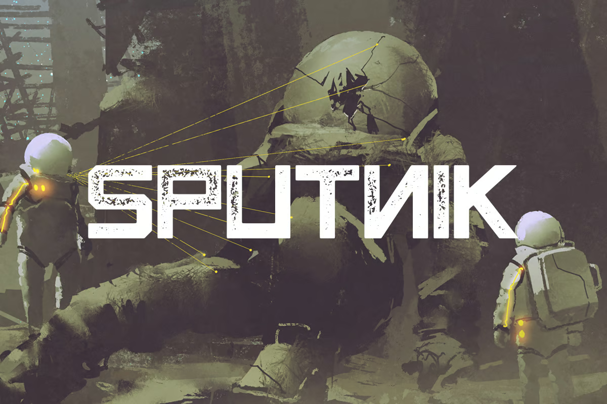
Using Multimodal AI models For Your Applications (Part 3)

Featured Imgs 23

In this third and final part of a three-part series, we’re taking a more streamlined approach to an application that supports vision-language (VLM) and text-to-speech (TTS). This time, we’ll use different models that are designed for all three modalities — images or videos, text, and audio( including speech-to-text) — in one model. These “any-to-any” models make things easier by allowing us to avoid switching between models.

Specifically, we’ll focus on two powerful models: Reka and Gemini 1.5 Pro.

Both models take things to the next level compared to the tools we used earlier. They eliminate the need for separate speech recognition models, providing a unified solution for multimodal tasks. With this in mind, our goal in this article is to explore how Reka and Gemini simplify building advanced applications that handle images, text, and audio all at once.

Overview Of Multimodal AI Models

The architecture of multimodal models has evolved to enable seamless handling of various inputs, including text, images, and audio, among others. Traditional models often require separate components for each modality, but recent advancements in “any-to-any” models like Next-GPT or 4M allow developers to build systems that process multiple modalities within a unified architecture.

Gato, for instance, utilizes a 1.2 billion parameter decoder-only transformer architecture with 24 layers, embedding sizes of 2048 and a hidden size of 8196 in its feed-forward layers. This structure is optimized for general tasks across various inputs, but it still relies on extensive task-specific fine-tuning.

GPT-4o, on the other hand, takes a different approach with training on multiple media types within a single architecture. This means it’s a single model trained to handle a variety of inputs (e.g., text, images, code) without the need for separate systems for each. This training method allows for smoother task-switching and better generalization across tasks.

Similarly, CoDi employs a multistage training scheme to handle a linear number of tasks while supporting input-output combinations across different modalities. CoDi’s architecture builds a shared multimodal space, enabling synchronized generation for intertwined modalities like video and audio, making it ideal for more dynamic multimedia tasks.

Most “any-to-any” models, including the ones we’ve discussed, rely on a few key concepts to handle different tasks and inputs smoothly:

  • Shared representation space
    These models convert different types of inputs — text, images, audio — into a common feature space. Text is encoded into vectors, images into feature maps, and audio into spectrograms or embeddings. This shared space allows the model to process various inputs in a unified way.
  • Attention mechanisms
    Attention layers help the model focus on the most relevant parts of each input, whether it’s understanding the text, generating captions from images, or interpreting audio.
  • Cross-modal interaction
    In many models, inputs from one modality (e.g., text) can guide the generation or interpretation of another modality (e.g., images), allowing for more integrated and cohesive outputs.
  • Pre-training and fine-tuning
    Models are typically pre-trained on large datasets across different types of data and then fine-tuned for specific tasks, enhancing their performance in real-world applications.
Reka Models

Reka is an AI research company that helps developers build powerful applications by offering models for a range of tasks. These tasks include generating text from videos and images, translating speech, and answering complex questions from long multimodal documents. Reka’s models can even write and execute code, providing flexible, real-world solutions for developers.

These are the three main models Reka offers:

  1. Reka Core
    A 67-billion-parameter multimodal language model designed for complex tasks. It supports inputs like images, videos, and texts while excelling in advanced reasoning and coding.
  2. Reka Flash
    A faster model with a 21-billion-parameter, designed for flexibility and rapid performance in multimodal settings.
  3. Reka Edge (PDF)
    A smaller 7-billion-parameter model was built for on-device and low-latency applications, making it efficient for local use and local or latency-sensitive applications.

Reka’s models can be fine-tuned and deployed securely, whether on the cloud, on-premises, or even on-device. Let’s start by testing Reka’s capabilities directly through its playground. This allows us to experiment with its multimodal features without writing any code, providing a hands-on way to see how the models handle various tasks, such as image and video comprehension.

Alright, we’ll kick things off by uploading an image of a diagram outline of the PaliGemma architecture and ask Reka for a detailed explanation.

Can you provide a more detailed explanation of this image?

Here’s what we get from Reka Core:

“This image is a schematic representation of a machine-learning model named PaliGemma. The model appears to be designed for multimodal input, combining both image and text data. At the top, there are two input sources: ‘Image Input’ and ‘Text Input’. The image input is processed by a ‘SigLIP Image Encoder’, which likely stands for a specific type of image encoding technique. The output of this encoder is then subjected to a ‘Linear Projection’, which is a common step in machine learning to transform data into a lower-dimensional space. The text input is directly fed into the model. Both the projected image data and the text input are then concatenated into ‘Concatenated Tokens’, which are then processed by a component labeled ‘Gemma’. The final output of the model is ‘Text Output’, which suggests that the model is designed to generate text based on the input data.”

It’s a clear and detailed breakdown of the PaliGemma architecture. The model accurately identifies image and text inputs, the SigLIP image encoder, and the linear projection step. It also grasps how the image and text inputs are combined and processed to generate text output. I should admit that the response is quite neat, offering a solid explanation of the architecture.

Let’s try a video input instead. We’ll upload the video about Genny, a software, and ask a question to see how well Reka Core handles video comprehension.

What is this video about?
“This video is a screen recording of a group of friends discussing their plans for the weekend.”

Well, it’s not a good answer compared to what LLaVA gave us in the previous article. Now let’s try a longer video, but with the Reka Flash model. The video is about a TTS model called Parler TTS. Instead of asking what the video is about, let’s prompt it like this:

I’m an AI developer, and I’m not sure how this TTS model can help me in my projects. Can you explain how I can use it or what it’s useful for?

Reka Flash generates a solid answer this time:

“Of course! This TTS (Text-to-Speech) model can be incredibly useful for developers, especially those working on projects that involve creating more human-like interactions or providing audio feedback to users. Here are some ways you can leverage this TTS model in your projects:
  1. Accessibility: TTS models can greatly enhance the accessibility of your applications for users with visual impairments or reading difficulties. By providing spoken feedback or narrating content, you can make your applications more inclusive
  2. Voice Assistants: You can integrate this TTS model into voice assistants or chatbots, allowing them to generate more natural-sounding responses. This can improve user experience and make interactions with your bots more engaging.
  3. Multimedia Applications: This TTS model can be used in multimedia applications, such as e-books, educational tools, or games, to provide spoken narration or instructions. This can make the content more engaging and easier to understand.
  4. Audio Notifications: You can use the TTS model to generate audio notifications for your applications, providing users with spoken alerts or reminders. This can be particularly useful for users who may not always have their screens visible.
  5. Language Learning: The TTS model can be used in language learning applications to provide users with correct pronunciation and intonation. It can also generate spoken feedback or narrate lessons, making the learning process more immersive.
  6. Audio Books: You can use the TTS model to generate audio books, allowing users to listen to written content instead of reading it. This can be especially helpful for users who prefer auditory learning or have difficulty reading.
  7. Explainer Videos: The TTS model can be used to generate voiceovers for explainer videos, providing users with spoken narration that explains the content on the screen. This can make the content more engaging and easier to understand.
  8. Audio Feedback: You can use the TTS model to generate audio feedback for users in your applications, such as confirming actions, providing instructions, or giving feedback on their performance. This can make the interactions more natural and intuitive.
In summary, the TTS model can be a valuable tool for developers looking to create more human-like interactions, improve accessibility, and enhance the user experience in various applications.”

It’s a good answer that’s informative and quite practical for developers. Let’s compare what happens when we try the Reka Edge model with a PDF input titled “Meta AI — Responsible Use Guide” (PDF).

As an AI developer, how can I ensure that I am following the responsible AI guidelines outlined in this document?
“To ensure that your use of AI aligns with the principles outlined in this guide, you can follow these steps and best practices:
  1. Familiarize yourself with the principles of responsible AI, such as transparency, accountability, and user empowerment, as outlined in the guide.
  2. Understand the potential impacts of AI on users and society, and be aware of the risks and challenges associated with the development and deployment of AI systems.
  3. Embrace an iterative model-development mindset, continuously striving for improvement and learning from feedback and errors.
  4. Build a responsible AI ecosystem by working with partners, experts, and communities to develop and share best practices, tools, and benchmarking resources.
  5. Follow the guidelines and best practices outlined in the guide for each stage of model development, from data collection and preparation to fine-tuning, evaluation, and deployment.
  6. Consider the specific use case and requirements for your AI system, and tailor your approach accordingly.
  7. Regularly monitor and evaluate the performance and safety of your AI system and make adjustments as needed to ensure it aligns with the principles outlined in the guide.
  8. Be transparent and accountable in your interactions with users and stakeholders, and be open to feedback and suggestions for improvement.
  9. Stay informed about the latest developments and research in the field of AI, and be prepared to adapt your approach as needed to address new challenges and opportunities.
  10. Follow the specific guidelines and best practices outlined in the addendum for Code Llama, such as defining content policies, evaluating and benchmarking models, and addressing input- and output-level risks.”

Reka Edge’s answer is quite thorough and detailed, too!

If you want to dive into coding, start by creating a Reka account and getting an API key. Then you can follow along with this notebook. Try out their Python SDK, and make sure to explore the different models available. It’s a great way to see how these tools work under the hood!

Gemini Models

Gemini 1.5, developed by Google DeepMind, is designed to handle complex tasks efficiently, thanks to the new Mixture-of-Experts (MoE) system. MoE is like packing several specialized models inside one big model. Instead of using the whole network for every task, Gemini 1.5 activates only the parts (or what they call “experts”) that are most relevant. This means Gemini 1.5 can tackle complex tasks with less processing power than a typical monolithic model.

We can explore Gemini’s features in Google AI Studio since it’s already baked right in. We’ll begin by uploading the following image illustrating VLM capabilities.

We’ll ask Gemini to analyze the image and extract details or concepts:

Explain this image. What are the specific details or concepts it represents?
“The image is a flowchart illustrating different types of image understanding tasks with a Vision Language Model.
  • Object Localization: This task aims to identify the precise location of objects within an image. The example question asks, “Is one cat behind another?”
  • Zero-shot Segmentation: This task involves segmenting an image into different regions based on a given label, even if the model has never seen that specific label before. The example question asks to segment “striped cat.”
  • Zero-shot Visual QA: This task requires answering questions about an image, even if the model has not been specifically trained to answer that type of question. The example question asks, “What is the breed of these cats?”
  • One-shot Learning with Instructions: This task involves providing the model with a single example and instruction to learn a new concept and apply it to other images. The example question asks, “Striped cats are called tabby cats. What is the breed of the cats in the image?”

Well, Gemini nailed it — it clearly understood the image and recognized the tasks a VLM handles. This is exactly what you’d expect from a model designed for advanced image analysis.

Now, we’ll upload another image — this time of an Italian dish — and ask Gemini if it can recognize the dishes and list the ingredients needed for them. This type of “food recognition task” will help us test its ability to identify foods and ingredients.

List the different dishes in this image, also from which country, and give me the ingredients I need to make them.
“The image shows an Italian feast with the following dishes:
  1. Seafood Stew: A rich and flavorful stew with seafood like clams, mussels, shrimp, fish, and vegetables in a tomato broth.
  2. Spaghetti with Tomato Sauce: Classic spaghetti pasta tossed in a simple yet flavorful tomato sauce.
  3. Meatballs in Tomato Sauce: Tender and juicy meatballs simmered in a rich tomato sauce.
  4. Lasagna: Layered pasta with meat sauce, cheese, and tomato sauce.
  5. Side Salad: A refreshing side salad with mixed greens, tomatoes, and other vegetables.
  6. Garlic Bread: Toasted bread slices rubbed with garlic and olive oil.
  7. Marinara Sauce: A simple tomato-based sauce.
This is a typical Italian meal with various dishes showcasing the flavors of Italian cuisine.

As for the ingredients, you’ll need tomatoes for many of these dishes, specifically for the sauces and the side salad.”

Well, the model did a good job recognizing the dishes, but it also didn’t give me all the necessary ingredients. Let’s see how it does with videos instead, using the same video we used earlier with the Reka models. This time, the task will focus on action recognition.

What is the purpose of this video, and what key actions or processes are being demonstrated?
“The video is a tutorial about the importance of friendship and how it can impact our lives. It demonstrates the use of a video editing software called “Genmy” to create a video and add text subtitles. The video creator is using Genmy to:
  • Record their voice: This is seen at the top of the screen with the mic icon.
  • Add text to speech: You see the “Text to Speech” option, which is likely being used to generate subtitles or captions for the video.
  • Edit the timeline: They’re working with a video timeline, adding and arranging different elements.
  • Add voice-over: The speaker is adding commentary to the video.
  • Create a visually appealing presentation: They’re using a combination of video footage, text, and voice-over to create an engaging tutorial.”

Well, Gemini gave a clear breakdown of the video, identifying it as a tutorial demonstrating the Genmy video editing software to highlight how it’s used for recording voice, adding text-to-speech, editing video timelines, and allowing voice-over. Impressive!

Let’s upload one more video, the same one we used for Reka about the Parler TTS model, and ask Gemini to analyze and summarize the contents.

Summarize this video and explain how the contents might be relevant or helpful for software engineers.
“This video showcases different voice samples generated by a text-to-speech (TTS) system called “Parler-TTS.” The video highlights various voice characteristics like gender, pace, pitch, and even the simulated environment. For software engineers, this video demonstrates the progress made in TTS technology. These are some insights:
  • Voice Variety: The video shows that Parler-TTS can create diverse voices, potentially useful for applications needing different personas or tones.
  • Fine-grained Control: The video emphasizes the ability to control voice parameters like pace and pitch, showcasing the potential for customizability.
  • Quality and Naturalness: The video focuses on the quality of the generated speech, demonstrating the advancements made in speech synthesis, which is crucial for user experience.”

Nicely done! I can go with that answer. Gemini explains adjusting voice settings, like pitch and speed, and how having different voices can be useful. Gemini also emphasizes the importance of natural, high-quality speech, which is handy for developers working with TTS systems!

Alright, for coding, you can grab the code from Google AI Studio by clicking the Get Code button. You can choose between formatting the code in Python, Swift, and Java, among other languages.

Conclusion

Both Reka and Gemini are strong multimodal models for AI applications, but there are key differences between them to consider. Here’s a table that breaks those down:

Feature Reka Gemini 1.5
Multimodal Capabilities Image, video, and text processing Image, video, text, with extended token context
Efficiency Optimized for multimodal tasks Built with MoE for efficiency
Context Window Standard token window Up to two million tokens (with Flash variant)
Architecture Focused on multimodal task flow MoE improves specialization
Training/Serving High performance with efficient model switching More efficient training with MoE architecture
Deployment Supports on-device deployment Primarily cloud-based, with Vertex AI integration
Use Cases Interactive apps, edge deployment Suited for large-scale, long-context applications
Languages Supported Multiple languages Supports many languages with long context windows

Reka stands out for on-device deployment, which is super useful for apps requiring offline capabilities or low-latency processing.

On the other hand, Gemini 1.5 Pro shines with its long context windows, making it a great option for handling large documents or complex queries in the cloud.


Gain $200 in a week
from Articles on Smashing Magazine — For Web Designers And Developers https://ift.tt/jVtfH01

30+ Key Logo Design Trends for 2025

Featured Imgs 23

Need a new logo? Whether you’re starting from scratch or just planning a tweak to a current mark, understanding shifts in logo design trends can help you create a design with a modern touch.

The theme in logo design is to create something simple and distinctive. With so many new websites and brands and companies coming online almost every day, it’s no wonder that logos are trending toward designs that stand out.

Here’s a look at a few logo design trends, and how you can make them work for you (and while you’re at it, be sure to look through our full guide on how to design a logo!)

Bold Minimalism

new lamborghini logo
new paypal logo

One of the key logo design trends that’s been growing in popularity is the bold minimalist logo designs. Over the past couple of years, we saw many brands transition from colorful, creative logos with shapes and intricate details into extremely minimalist designs. And this trend doesn’t appear to be going away anytime soon.

In 2024, we saw several brands adopt this new bold minimalist logo design trend as well. The new Lamborghini and PayPal logos were the most noticeable of them all. Lamborghini switched to a highly minimalist logo after 20 years, ditching its iconic gold-colored symbol. PayPal also removed all of its colors and replaced the instantly recognizable lettermark with a more simplistic design. We will likely see more brand follow this trend in the coming months.

Here’s how to make the most out of this logo design trend:

  • Use fewer colors, shapes, and details in your designs
  • Utilize thin lines and geometric shapes
  • Use simple typography with fewer decorative elements

Responsive Logos

Examples of Responsive Logo Design

One of the main reasons why brands have been adopting the bold minimalism trend is to make their logos responsive and flexible. Unlike the good old days, logos now need to be dynamic enough to be displayed flawlessly across multiple platforms and mediums, including the many different sizes of device screens.

Crafting responsive logos is the answer to this process as it allows brands to create multiple variations of their logos for different platforms. As a result, every reputable and popular brand now has responsive logo designs.

This is a trend that you should study carefully as it will be an important part of your future logo design projects. From now on, every logo you design will need to be responsive!

Here’s how to make the most out of this logo design trend:

  • Craft minimal logos that can be easily displayed across different platforms
  • Design multiple variants of a logo suitable for each platform
  • Design with scalability in mind

Negative Space Designs

bolt negative space logo
reddit negative space logo

The negative space logo design is nothing new. They have been around for decades. But it seems the trend is resurfacing in a new way.

More than a few of the recent logo remakes featured negative space designs. The new Reddit and Bolt logos are the most noticeable pair in the bunch. Many other brands like Propel and Indiana also switched from classic logo designs to more minimal logos with negative space elements.

Negative space logos spark creativity and offer a refreshingly unique look for brands. So this is a logo trend we’re excited to see grow throughout this year.

How to make the most out of this logo design trend:

  • Find clever ways to use negative space to create symbols and shapes
  • Use fonts that with dynamic letterforms

Chaotic Typography

chaotic typogrpahy logo 1
chaotic typogrpahy logo 2

If the text on a design is unreadable, we usually consider it a bad design. But that seems to be changing. This latest logo design trend utilizes chaotic, edgy, and basically unreadable text to create a bold look for brands.

The example above comes from a reputable design studio that has designed the chaotic logo for a fashion brand called Queen of Chaos, which specializes in designing uniquely weird apparel for celebrities like Lady Gaga.

This chaotic typography logo approach would fit perfectly well for brands and companies that seek to create an edgy look.

How to make the most out of this logo design trend:

  • Go crazy with typography and add your own decorative elements
  • Use weird and edgy-looking fonts
  • Use your imagination!

Illustrative Logos

Illustrative Logos

Even though most of the latest trends are all about minimalism and simplicity, we always love to see logos with intricate details and stylish designs. This new logo trend will keep that trend alive and strong for a long time.

It’s great seeing illustrative logos making a comeback. These logos see more complex designs that feature detailed illustrations. They also use creative design trends such as Art Deco and vintage geometric designs to make each logo look much more attractive.

This logo trend is quite popular among luxury and high-end brands, especially in hotel, jewelry, and fashion brands.

Here’s how to make the most out of this logo design trend:

  • Incorporate your line art illustrations into your logo designs
  • Use thin lines, shapes, and outline fonts
  • Utilize gold, black, silver, and other colors to give a luxury vibe to the logo

Dark Color Tones

facebook logo redesign
pepsi logo redesign

Dark color schemes are making a comeback! There have been many different logo design trends over the past few years with different styles of color themes like flat colors, pastel colors, material design, and more. And we’ve circled back to dark and bright colors once again.

In 2023, we saw several different brands redesigning their logos by changing the color tones. The most notable logo redesign came from Facebook. The company casually changed the color by making the blue color much darker. It was a subtle change but very noticeable.

Pepsi also made rounds in the news with its unexpected brand redesign. Their iconic light blue color was replaced with a much darker blue and with a brighter red. This new redesign came 15 years after its last branding change.

Here’s how to make the most out of this logo design trend:

  • Consider adjusting the tone of your logo’s existing color
  • Use darker color tones in your logo designs
  • Be mindful of the color combinations

Retro 3D Look

7up logo redesign
Jell-O redesign

If there’s one logo design trend we can never get tired of it’s classic retro designs. While some brands rushed to redesign their logos with modern looks in 2023, we saw several companies take the opposite approach with their logo redesigns.

7Up’s brand-new retro-themed logo redesign was the most noteworthy one to follow this new trend. It featured a classic retro look with elaborate 3D-like lines that highlighted the logo in an entirely new way.

Several other brands also followed this trend, including the iconic Jell-O. The outdated logo was replaced with a retro 3D look.

This new retro 3D logo trend was mostly adopted by much older brands that have been around for many decades. It is the perfect way to evoke emotions through nostalgia.

Here’s how to make the most out of this logo design trend:

  • Consider using retro color palettes. Find inspiration from classic logo designs from the 1960s and 70s
  • Add elaborate 3D looks to text and objects
  • Aim to make logos look more fun with a bit of nostalgia

Single Color Logo Design

fanta logo redesign
channel 4 redesign

The multicolor logo designs appear to be slowly fading away. Except for a few brands, like Google and eBay, many brands are now switching over to single-color logo designs. Even Google has replaced its multicolor logo with a single-color logo on the dark theme version of the homepage.

Channel 4 replaced its multicolor logo with a single-colored logo design in 2023. Several other brands also adopted this new trend in 2023. Including Wise ( previously Transferwise), Fanta, and Minute Maid.

We can expect to see more brands following this trend this year to replace multicolor logos with single-color designs.

Here’s how to make the most out of this logo design trend:

  • Replace your color palette with a single color that represents the brand
  • Use brighter or darker color tones to make the logo stand out

Edgy Typographic Logos

nokia logo rebrand
x logo redesign

While retro logo designs look cool, it’s not suitable for all types of brands. Especially for tech-related brands, going for a cool and edgy look is the ideal approach. At least that was the case for several tech brands that rebranded with new edgy typography logo designs in 2023.

The X (previously Twitter) logo redesign was the most notable one from the bunch. Following Elon Musk’s acquisition, X’s rebranding of Twitter was quite a radical change. And it saw the cute Twitter bird logo being replaced with a more edgy monogram-style typographic logo.

Nokia also introduced a brand redesign featuring an edgy typographic logo with a very stylish look. We’ll probably see more tech brands following this trend this year as well.

Here’s how to make the most out of this logo design trend:

  • Experiment with edgy and futuristic fonts
  • Think outside the box and try removing parts of letters to achieve a unique look

Psychedelic Vibes

psychedelic logo 1
psychedelic logo 2

Typographic logos with psychedelic designs have been trending for a while. We saw a rise in this trend in the past year and it will surely be adopted by more brands this year. And we’re not complaining.

Psychedelic logo designs take inspiration from classic trippy text designs from the 1960s and the 70s. They add a fun and funky look to logo designs to make brands look much more casual and human.

Here’s how to make the most out of this logo design trend:

  • Use fonts with funky and psychedelic designs
  • Manipulate letters to make them look more squiggly and trippy
  • Use retro color palettes with either soft or dark colors

Classic Cartoony Mascots

Classic Mascots 1
Classic Mascots 2

When it comes to mascot logos, nothing beats the classic vintage mascots from the 1930s brands. Those old cartoony mascot logos still look perfect for many different types of brands. And it’s probably why the trend appears to be making a comeback.

Vintage mascot logos are appropriate for various types of brands from food brands to coffee shops, restaurants, and especially for product packaging. They always immediately stand out from the crowd as well.

Here’s how to make the most out of this logo design trend:

  • Consider designing the mascot themed around a product of the brand
  • Find inspiration from classic mascots from the 1930s
  • Use vintage fonts for typography

Liquid Blobs

liquid blob logo 1
liquid logo scholar rock

Liquid-style logos often fit perfectly with food and drink brands. However, we’ve been seeing various alternate styles of this trend being used by other types of brands as well.

Liquid-like text and blob-like shapes are the key features of this logo design trend and it perfectly serves a brand that focuses on making a casual and friendly appearance.

When used properly, this trend is also suitable for travel and nature-themed brands.

Here’s how to make the most out of this logo design trend:

  • Use fonts with liquid-style letter designs. Blob, bubble, and psychedelic fonts are ideal
  • Try to incorporate liquid or blob-style shapes or backdrops to logo icons

Circle Icons

logo design trends

logo design trends

Circles are always a trending element in logo design. There are so many nice qualities about a circle that make it a popular option from the shape and meanings to being able to create an icon that works anywhere.

Here, we are seeing more circle icons that can work with text elements or alone to highlight a logo and brand. The thing that stands out here is that text elements are not inside the circle.

Here’s how to make the most out of this logo design trend:

  • Create a circle icon that’s interesting and works well at a small or large size.
  • Consider line art, such as There’s More to Life, above.
  • Place text outside the circle for added flexibility.

Sideways Orientation

logo design trends

logo design trends

Switch up your brand or add an element of whimsy with a sideways orientation for a logo design.

Each of the examples here did it a different way, but all work well as part of this logo design trend. Dictionary of Online Behavior uses a logo design that seems to shrink away from you and isn’t straight-on, Echt uses a logotype that reads from bottom to top on one side, and Adidas Metaverse takes the traditional three-stripes logo and rotates it 90 degrees.

Each different variation is an option if you want to explore logo styles that have a sideways orientation.

Here’s how to make the most out of this logo design trend:

  • Play with type that rotates if you have short words. This can be a lot more tricky for longer brand names.
  • Turn a common mark sideways for an alternative brand style.
  • Consider a subtle twist; you don’t have to completely turn the logo.

Outlined Typefaces

logo design trends

logo design trends

Outline typefaces have been trending in all facets of graphic design for some time and are starting to show up in logos as well. Outlined typefaces can be interesting, help create contrast between text elements, and even provide a lighter feel for a logo.

On the other hand, outline styles can almost get lost if not weighted properly in context with the rest of the design, so it is important to use a typeface that can carry the logo.

Outlined typefaces can serve as the lettering for an entire logo, such as Shannon (above), or for part of the brand name, such as GolfSpace (above). Both options can look great and provide visual focus.

Here’s how to make the most out of this logo design trend:

  • Pick an outline font that has enough weight for the overall brand feel.
  • Use an outline font for a simple brand icon, such as Felipe Castro (above).
  • Consider the trendiness of this style. If outline fonts fade out of fashion, your logo could look dated and it’s not something you want to redesign regularly in most cases.

Exaggerated Spacing

logo design trends

logo design trends

In almost every industry, there’s a conversation around elements that disrupt and bring attention to different things. That’s what this logo design trend does. Exaggerated spacing – between words, between letters, or between lines of text – makes you look a little longer at the logo design.

There are pros and cons to this style of spacing. While it can look extremely interesting, it can be more difficult to read, putting a greater cognitive load on the user. The exaggerated spacing provides a certain feel that’s lighter but can take up more space for the overall logo. This style has a great deal of variability so you can make it your own, but it can be difficult to use with some other design elements because it is a powerful element on its own.

Use exaggerated spacing in a logo to help create a pause between words or phrases in the name, like a natural speech pattern. It can actually help convey meaning for your brand.

Here’s how to make the most out of this logo design trend:

  • Try to contain the text elements in a container so that they don’t get confused with other parts of the design.
  • Stick to a single typeface if you can to help hold it together.
  • Play with variations of spacing. Does it work better vertically or horizontally? Are the words or phrases understandable?

Custom or Experimental Typefaces

logo design trends

logo design trends

Custom or experimental typefaces can be a lot of fun and really show the personality of a brand, making them a popular – and trendy – design choice for logos.

What’s nice about these styles is that everything about your logo design will feel uniquely custom and yours. The downside is that they can take some time to develop. (But what brand doesn’t take some time to get off the ground?)

Here’s how to make the most out of this logo design trend:

  • Determine how custom you want your logo font to be. Do you want a truly custom typeface or is a more commercially-available experimental design viable?
  • Weigh the pros and cons of typeface features such as color or animation to determine what your needs are. A color font, for example, isn’t the best choice if you foresee needing a one-color logo regularly.
  • Ask for exclusivity if you are determined to have something that’s 100% yours and unique. You can come to an agreement with a type designer about licensing and usage rights.

Simple Logotypes

logo design trends

logo design trends

logo design trends

It’s hard to beat the innate beauty of a simple logotype. These logos use beautiful lettering to pull together brand identity and it’s something that we are seeing a lot more of.

You can almost think of a logotype as a gateway logo for a startup or new company. For many, this is the first envisioning of a brand mark and company name before the business gets truly established. Some of these logos last forever while others eventually evolve.

One of the reasons this trend is so popular may be because of the number of freelancers, entrepreneurs, and small businesses popping up everywhere.

Here’s how to make the most out of this logo design trend:

  • Don’t assume that a logotype is easier, cheaper, or faster to create than other types of logos. Working with just the right lettering can be a challenge.
  • Don’t get hung up on a font or style until you see it with your brand name in print. Some fonts look great and then fall flat due to certain character combinations. Type out the words you plan to use in the font style of your choosing as a starting point. If you hate it, move on.
  • The more elaborate the typeface, the less you need other embellishments. Aim for a logotype that represents the simplicity or complexity and mood and voice of your brand.

Logos That Look Like Buttons

logo design trends

logo design trends

logo design trends

Logos for website design can be a funny thing. One of the trends we are seeing is logos that have a button-style look. This includes square outlining or elements that look click- or tappable.

What’s nice about this trend from a usability perspective is that it further enhances the idea that the logo is a home button in the website design. (So, make sure that the logo does include a home click-action.)

The tricky part is to design a logo that still looks like a brand mark with the button style. You’ll want to use a different color or style of button throughout the design to differentiate the two.

Three ways to try it:

  • Use a ghost or outline style around your logo. This can create the idea of a button and allow the logo to stand on its own as well.
  • Use a button-like element with another text element for an almost yin and yang effect with contrasting styles in the logo design.
  • Use a graphic element, such as an icon, that represents something to click. The example above from Data Shield is a solid example with a “play” button next to the company name. It almost demands to be clicked.

Simplified Logos

logo design trends

logo design trends

logo design trends

All the big brands are doing it. And that’s when most big trends start to steamroll.

There’s a shift to simplify logos with easy-to-understand fonts with clean lines and simple imagery. (Or sometimes, no imagery at all.)

Many times, these logos are evolutions of previous versions that result in some simplification, but new designs can start with a simple outline as well.

Here’s how to make the most out of this logo design trend:

  • Pick a shape or color and stick to this theme.
  • Develop a design that feels true to your brand, and redesigns should carry the essence of the logo being redeveloped.
  • Don’t overthink it; simplicity is key.

Gradients

logo design trends

logo design trends

logo design trends

It seems like we just can’t get enough gradients in design projects. Logo design trends are no exception.

Like the trend above, this is another place where big brands are using gradient options in their logos. And while pinks, purples, and oranges are necessarily part of this trend, it is a popular color palette.

What’s nice about gradients is that they add depth to an image. It can be a little tricky with logo designs because of the variance in size for logo usage. The gradient choice has to look good at huge sizes – such as billboards – and for tiny sizes – such as phone app icons.

Design a gradient that’s interesting but not overwhelming to make the most of this trend.

Three ways to try it:

  • Layer different colors of gradients throughout the logo design for a more elaborate look.
  • Use a gradient pattern within thick lines to create visual interest.
  • Create more of a stacked gradient with an ombre effect, but using a monotone color palette.

Animated Logos

logo design trends

logo design trends

Animated logos are starting to become more of a website staple. Many brands are animating existing logos or creating newer, trendier animated options.

What’s great about an animated logo is that it makes you look. Think about common website patterns: There’s often a logo in the top left corner. Do you even look at it anymore?

Animated logos break up the monotony of this design pattern with a motion that almost forces you to look at the logo. It’s pretty smart when you think about it.

Here’s how to make the most of this trend:

  • Keep the animation simple. Too much movement can have the opposite of the intended effect if the logo is hard to read or understand.
  • Consider speed carefully. Quick animations can be dizzying; slow animations feel off; it takes a lot of practice to find the speed that’s just right.
  • Don’t forget to create your animated logos in color and one-color options.
  • Squares

    logo design trends

    logo design trends

    logo design trends

    The change in shape is natural. With so many circle logos – thanks to social media icon shapes – more logo designs are featuring distinctive squares.

    The change in shape is simple. A square also fits inside a circle logo but looks different. It’s a subtle change that can make a brand or logo stand out.

    Most designers are using squares in a way that stacks elements, such as a square icon or brand mark with typography next to or above it that creates more of a rectangle. When used in those circular icon shapes, the logo drops to just the icon element.

    Ways to make it work for you:

    • Create modular elements that you can mix and match in the logo design.
    • Keep the overall element to a simple icon-style graphic. Overly complex pieces can be tough to break apart or read at small sizes.
    • Don’t forget lettering. It’s easy to create a cool square element, but you need a brand identifier to really make it work in the long run.

    Clean Lines

    logo design trends

    logo design trends

    logo design trends

    Clean lines and geometric patterns can create classic logos that work practically anywhere. There’s a great deal of flexibility in this trending style, which is one reason that it’s so popular.

    Clean lines give this logo variation a classic feel, unlike some of the hand-drawn styles that have trended in the past. These logos are simple and elegant and the concept can be combined with other design trends as well. (Just look back to the Instagram logo, it features gradients and clean lines.)

    How to make clean line logos work for you:

    • Keep imagery and lettering separated. Overlapping can end up making both design elements hard to read.
    • Choose a typeface with a similar stroke width as the line drawing to create harmonious consistency.
    • Don’t be afraid of color. While many line styles, feature one color, you can have more fun and stretch the palette somewhat.

    Small Serif Logotypes

    logo design trends

    logo design trends

    logo design trends

    A logo doesn’t have to be complicated to be elegant and effective. More brands are turning to small serif logotypes to portray who they are.

    When we refer to small serifs, it’s less about the font size and more about the size of strokes used within the type family. This trend is exemplified by characters that include tiny serifs. They are simple, light, and almost fall into the background of the lettering.

    These serifs might be sharp or rounder and as with any logotype are a contributing factor in how the brand should feel to users.

    Small serifs can be a great option because:

    • They are different. With so many sans serif logotypes out there, this style immediately stands out.
    • Serifs communicate a little more about a brand without imagery. These divots can establish mood and feel in a logotype where no other “art” is used.
    • These typefaces are interesting without being hard to read. While simple minimalism has been a trend for a while, there’s a movement toward somewhat more complex design elements.

    Overlapping Elements

    logo design trends

    logo design trends

    logo design trends

    It’s one of those design rules that you don’t expect to be broken with small elements such as logos. But designers are breaking this rule … and it works.

    From big brands like PayPal to smaller studios such as Moxy and Oust, logo designs are using elements that stack and overlap to create depth and visual interest. Overlapping styles tend to work best for logos that have a simple mark or lettering and that are contained to s specific part of the logo.

    PayPal, for example, uses an overlapped letter for its iconic “P” but the word “PayPal does not use this treatment.

    How do you use overlapping logo elements?

    • Pick one element to overlap; too much overlapping can get difficult to understand.
    • Use an overlapping element to create depth. Think about what the design technique does for an understanding of the mark.
    • Use color. This trending technique is made for high-color designs. (You might even consider an overprint style.)

    Intricate Details

    logo design trends

    logo design trends

    logo design trends

    This logo design trend is a fresh take on visual elements after such a long period of minimalism – logos with intricate details.

    From line-style logos has come an extension to more detailed logos with plenty of varying lines, color variations, type choices, and plenty of small elements that bring it all together.

    This logo style can be a lot of work to create, but the result can be pretty amazing and creates a piece of art that is more than a logo. A great intricate design can be used everywhere at any size and maintains that same level of interest.

    These designs beg users to look and then continue to engage with the design, trying to see every hidden stroke and meaning of the brand mark.

    Here’s how you use the intricate detail logo design trend:

    • Take care with color. Too much color in an intricate style can get overwhelming quickly.
    • Make every detail count. The design should not be complicated because it can; it should be complex and intricate because it should be.
    • Pair simple typefaces with complicated artwork for readable balance.

    Lowercase Lettering

    logo design trends

    logo design trends

    logo design trends

    These logos would make e.e. cummings proud. The style features great typography in all lowercase characters.

    With so many designers focusing on typography for their projects, the shift to a type-based logo isn’t that far-fetched. Using all lowercase letters is a little more unusual and can be an attention-grabbing solution.

    The catch is whether this use of your brand or company name meets visual standards and usage.

    Here’s how to make it work for you:

    • Use a beautiful typeface. Any old sans-serif won’t do here.
    • Amp up the contrast between letters and the background to ensure that the smaller stance is seen.
    • Take care with readability. Is the word clear in all lowercase letters?
    • Opt for a heavier weight. Lowercase letters have a little less heft and presence than title or uppercase options. Create that balance with a thicker stroke weight.
    • Give it plenty of room. Whitespace can add weight and visual interest to a simple lowercase logotype.
    • Try it with short and simple words. Too many letters or words without capitals can get a little cumbersome in terms of readability.
    • Don’t crowd it with other elements. Lowercase lettering is the design trick with this logo style. Avoid other effects to maximize its impact.

    Simple Shapes and Lines

    logo design trends

    logo design trends

    logo design trends

    The use of geometric shapes and lines is another popular trend for design projects overall that’s rapidly becoming a logo staple. With clean lines, simple shapes, and splashes of color, geometry is a logo must.

    It’s important to note that many of these shapes are simple and fit into a square or circle format with uniform (or close to it) heights and widths. This initiative could be in part due to the need to have such a shape for common online mediums and logo usage, such as social media profiles.

    Tips to make the most of the logo trend:

    • Don’t overthink it. A bold line or stroke can make simple lettering pop.
    • If you love the idea of a simple shape or geometry, but can’t quite make it work for the main logo, consider this treatment as a secondary option.
    • Give purpose to divots and shapes so that they frame or accent lettering, just dropping elements around a word isn’t quite enough to be effective.

    Flat Design

    logo design trends

    logo design trends

    logo design trends

    Flat design remains a popular logo option because it is so easy to work with. While flat design as a whole is beginning to recede from the trends radar, logos are still using flat treatment.

    Flat logos remain trendy because of how they are used. Many design projects feature full-screen video or images, particularly in website design, in full color. Flat logos often rest on a foreground layer and need to have some separation from the background.

    Even brands that have more ornate logos often create a secondary, flat-style logo for this kind of use.

    Going flat? Get the best result with these tips:

    • Use one (or just a few) colors in the design. Black or white options are the most popular.
    • Stick to simple typography that matches an icon or visual element in the logo.
    • Remember the basics of flat design and don’t feel tempted to add design techniques; simple is better if you want a logo that’s truly flat.
    • Consider a combination of a visual divot and text to tie the logo together.
    • Don’t overthink it. Often there’s not a lot of substance to a flat logo. The logo is often made to fall into the rest of the design.

    Initials

    logo design trends

    logo design trends

    logo design trends

    LOL. OMG. SMH. It seems like the whole world talks in acronyms and initials these days. And logo design is no different.

    While most commonly used for secondary logos, initials are everywhere. While there are three examples above, this collection could have easily included hundreds of designs with a three-letter (or less) logotype.

    Most of these logos feature interesting or custom typography that’s designed to have a personal feel. The logo should speak right to the user and create an instant connection. The idea is further emphasized by the fact that the user needs to know what the letters actually mean (or have the desire to find out).

    Here’s how you do it:

    • For designers or portfolio sites, use your initials to create a logotype that reflects your personality.
    • Add a simple animation to draw more interest to a logo that likely doesn’t carry a lot of visual weight in the design.
    • Consider boxing the letters to add more emphasis.
    • Acronyms and initials for logos are often secondary messaging and are subtle in placement and scale.

    Circles

    logo design trends

    logo design trends

    logo design trends

    Circles are fluid and associated with energy, power, harmony, and infinity. And that’s why the shape is a trending logo design element.

    Circles are also easy to plug into other places where a logo needs to appear, such as social media profiles, and in corner locations on printed designs, such as business cards or letterhead. Like many of the other elements that are trending in logo design, circles have become a more popular shape in website design overall in recent months.

    Here are a few tips for using round logo shapes:

    • Don’t force it. Some words and elements just don’t fit into round shapes.
    • Match the meaning of your brand and the shape. Do the associations match?
    • Use a circle with a harmonious color palette to create a sense of balance between the logo and branding.
    • Don’t get stuck inside the shape; consider elements that break through the perfect roundness of the shape.
    • Opt for lettering that goes outside of the circle, particularly if words are long. (Short words are less of an issue.

    One Color

    logo design trends

    logo design trends

    logo design trends

    Aside from black or white, logos with a single color a wildly popular.

    While it’s not something that you would jump to design, these logos are classically beautiful with a simplicity that showcases the associated brands well. By chance or maybe as a color trend of its own, each of the examples above features a one-color logo style that uses a variant of orange.

    Tips for designing a one-color logo:

    • Think of the design as colorless. Even with black and/or white and one color, use will be much like a true single-color logo.
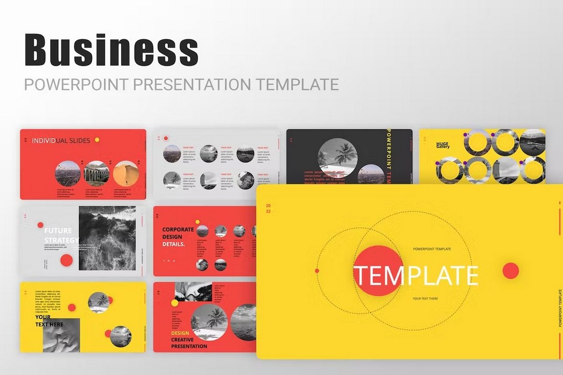
    • With only one color, the meaning of that hue will speak volumes. Be mindful of color choice.
    • Don’t force too much color. A small swatch in a subtle location can have an impact.
    • Add color in a way that means something. Does it make your logo, brand, or product easier to understand?

    Conclusion

    Logo trends are interesting elements because, while what’s popular is always changing, logos are made to be constant. This creates an innate struggle for designers that are trying to create a logo that’s both modern and will withstand time. (It’s a pretty tall order.)

    For the best chance at longevity, opt for a trend that includes some classic styling and is rooted in design theory. Design a logo that has a great aesthetic quality, is recognizable and readable and you’ll have the best chance at it lasting for years to come.

    Reevaluating Link Building: Its Relevance in 2024

    Featured Imgs 23

    In the ever-changing world of SEO, link building has long been a cornerstone strategy for improving website rankings and driving organic traffic. As we move into 2024, the question arises: Is link building still relevant, and how should businesses approach it in the current digital landscape? In this blog, we’ll explore the evolving role of …

    The post Reevaluating Link Building: Its Relevance in 2024 first appeared on Lucid Softech.

    Removing an old MS Exchange account

    Featured Imgs 23

    Hello DaniWeb community. I haven't been on the site in quite some time - it's so intense now that I almost feel a bit silly for asking a simple question but here goes. I have a personal account set up with Microsoft 365 and all is well for the most part on my Lenovo laptop but, when I try to use the email hyperlinks on webpages, outlook tries to open my old work MS exchange outlook account which has a defunct work email address. Here are some screenshots of the user accounts from the control panel and the perpetual message I receive when I try to remove the account from email list in control panel.
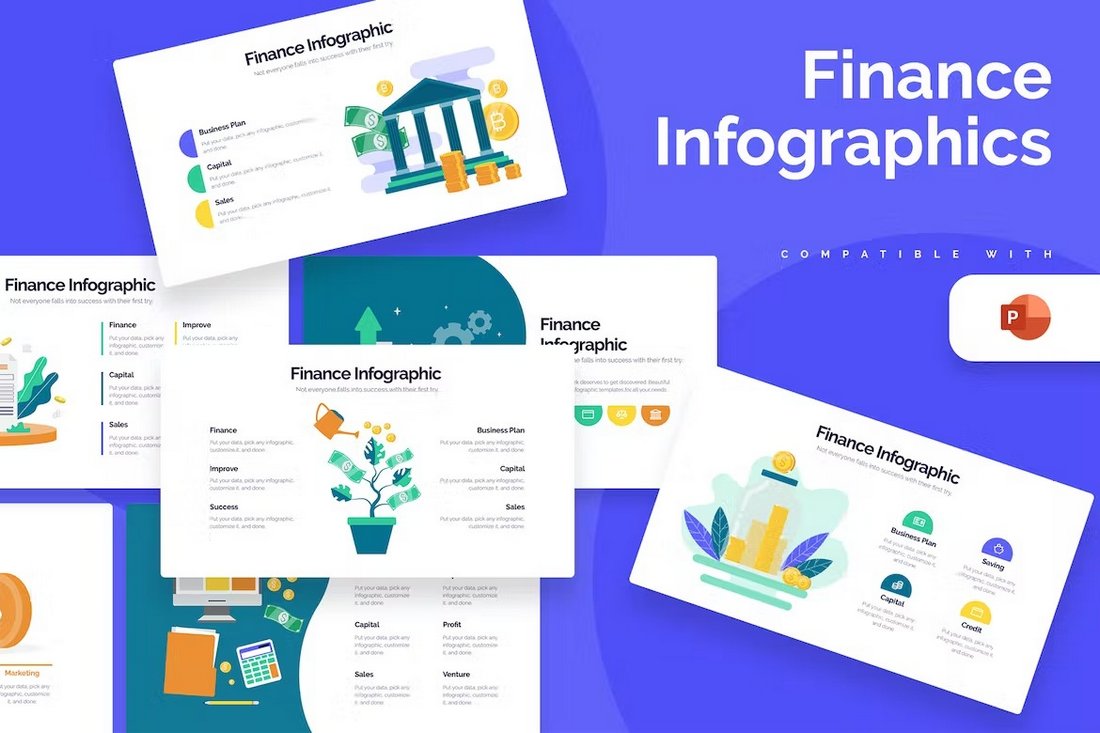
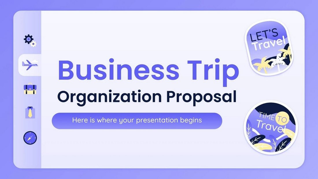
    Screenshot_(10).png

    Screenshot_(9).png