Essential Steps for Building a Mobile App for Your Brand

Featured Imgs 23

Having a mobile app for your brand has become a necessity. A well-designed app can improve customer engagement, brand loyalty, and provide a competitive edge in your industry. Whether you’re a small business owner or a marketer in a large corporation, building an app can seem scary. However, by following a structured approach, you can create an app that not only meets your needs but also delights your users.

In this article, we’ll walk you through the essential steps to build a mobile app for your brand.

1. Define Your Goals

Define Your Goals

Before you get into the technical aspects, take a moment to define the purpose of your app. Ask yourself:

  • What problem does my app solve?
  • Who is my target audience?
  • What features will my users find most valuable?

Clearly outlining your goals will help you stay focused throughout the development process and guide decisions about design and functionality.

2. Research Your Market

Research Your Market

Understanding your competition and market trends is crucial. Analyze existing apps in your niche to identify strengths and weaknesses. Look for opportunities where your app can stand out. Conduct surveys or interviews with potential users to gather insights into their preferences and pain points. This research will inform your app’s features and design.

If you’re targeting a global audience, you will want to conduct surveys that include as wide a range of customers as possible. In that case, using VPN for Chrome will help you reach worldwide customers and secure the data you collect through surveys and interviews.

3. Create a Wireframe

Create a Wireframe

A wireframe is a blueprint of your app, showcasing its layout and navigation. This step lets you visualize the user experience without getting bogged down in design details. Use simple tools to create wireframes that outline each screen and how users will interact with your app. Focus on the flow from one screen to another, ensuring it’s intuitive and user-friendly.

4. Design the User Interface (UI)

Design the User Interface

Once you have a wireframe, it’s time to bring your app to life with a user-friendly design. Choose a color scheme, typography, and icons that align with your brand identity. Tools like Adobe XD or Figma can help you design stunning interfaces. Keep the following design principles in mind:

Simplicity : A clean and straightforward design helps users navigate easily.

Consistency : Use the same styles and elements throughout the app for a cohesive look.

Feedback : Provide visual feedback for user actions (like button presses) to enhance the experience.

5. Develop the App

 Develop the App

At this stage, you can either code the app yourself or hire a developer. If you’re not tech-savvy, consider using app builders like Appy Pie or Adalo, which allow you to create apps without extensive coding knowledge. If you choose to hire a developer, ensure they understand your vision and requirements.

6. Test Your App

Testing is a critical phase in the app development process. It helps you identify bugs and usability issues before launching. Conduct various tests, including:

Functionality Testing : Ensure all features work as intended.

Usability Testing : Gather feedback from real users to identify areas for improvement.

Performance Testing : Check the app’s speed and responsiveness on different devices.

7. Launch Your App

Once you’re satisfied with the app’s performance, it’s time to launch it on app stores. Prepare a marketing strategy to promote your app using social media, email newsletters, and your website. Engaging visuals and clear descriptions in the app store will attract potential users.

8. Gather Feedback and Iterate

After launching your app, encourage users to provide feedback. Monitor reviews and analytics to understand user behavior. Use this information to make improvements in future updates. Continuous iteration is key to keeping your app relevant and engaging.

Remember, this process takes time, so be patient and open to learning along the way. With dedication and the right approach, your app can become a powerful tool for connecting with customers and improving your brand’s presence in the digital space.

The post Essential Steps for Building a Mobile App for Your Brand appeared first on CSS Author.

55+ Best After Effects Slideshow Templates 2024

Featured Imgs 23

Adobe After Effects is one of the most popular and effective tools for making attractive motion graphics. With the ability to use pre-made templates, After Effects can be a powerful tool even at the hands of a beginner.

Especially when making wedding photo album videos, presentations, and promotional campaigns, After Effects is quite useful in turning ordinary photos and videos into gorgeously animated slideshows.

To help you find inspiration, we handpicked a collection of After Effects slideshow templates you can use to easily make professional motion graphics without an effort.

All you have to do is edit the template and drop the images into the placeholders.

Top Pick

Urban Melodic Slideshow Template

Urban Melodic Slideshow Template

This After Effects slideshow template features a beautifully minimalist design that allows you to create modern and elegant slideshow videos for all kinds of creative projects, startups, businesses, and more.

The template is easily customizable and features stylish melodic animations that will make your videos more entertaining to watch.

Why This Is A Top Pick

The multipurpose and minimal design of this After Effects template allows you to create various types of slideshows with ease. The melodic transitions and the creative effects also add more value to the template.

Modern Photo Slideshow for After Effects

This After Effects template is a stunningly contemporary design ideal for assembling your photo slideshows. It brings together visual expertise and cutting-edge effects to present your images in the most captivating manner, effortlessly transforming ordinary photo collections into visually gripping masterpieces.

Modern Collages After Effects Slideshow

A creative After Effects slideshow template that levels up your photo presentations. With a collage-style layout, this After Effects slideshow template allows you to weave together multiple images in a visually captivating manner. It’s perfect for an engaging display of personal, professional, or event photos.

Handmade Paper Slides for After Effects

Explore the timeless beauty of simplicity with this creative paper-style After Effects slideshow template. This template allows you to forge paper-style slideshows, providing an organic and artistic touch to your digital creations. It’s a fantastic solution for adding unique personality and depth to your visual presentations, videos, and more.

Happy Halloween Slideshow for After Effects

This is a unique template designed for creating striking Halloween-themed promotional slideshows. This aesthetically engaging asset allows you to unleash your creativity and carve out an unforgettable visual experience for your audience. It’s a brilliant resource that saves time without compromising on quality and effect.

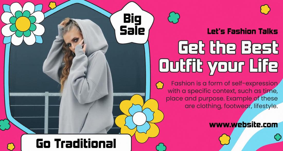
Fashion Sale After Effects Slideshow

A brilliantly designed After Effects slideshow template ideal for showcasing fashion sale promos. Its engaging visual effects and smooth transitions ensure an appealing user journey, making it a valuable resource for retailers wanting to add some creative flair to their promotional pursuits.

Split Screen Instagram Slideshow for After Effects

This is an innovative After Effects slideshow template designed to energize your Instagram videos. It employs a multi-frame layout that allows you to share multiple visuals simultaneously, creating a vibrant, dynamic, and engaging viewer experience. This template is an excellent tool to make your Instagram content stand out.

Colorful Fashion – After Effects Slideshow Template

bright colorful fashion-adobe-after-effects-template

This stylish After Effects slideshow template is specially designed for showcasing fashion and apparel design photos. It comes with vibrant and colorful designs that make your photos look like pages out of a fashion magazine.

Chrono Corporation – After Effects Slideshow Template

chrono-adobe-after-effects-template

Chrono is a professionally designed After Effects slideshow template you can use to create company profile, startup pitch, and other videos related to business and corporations.

Colorful Fashion Slideshow Template

Colorful Fashion Slideshow Template

If you’re working on a promotional video for a product or a fashion brand, this After Effects template will come in handy. It features a creative layout for effectively showcasing different products like gadgets, clothing, and more. The template is quite useful for Instagram promotions.

Fast Dynamic Slideshow Template

Fast Dynamic Slideshow

This slideshow template comes with a modern and hipster-style layout design featuring multiple transition animations. The template can be easily customized to add your own text, audio, and change colors as well.

Free Simple Corporate Slideshow Template

Free Simple Corporate Slideshow Template

Whether you’re making a slideshow for a startup or a corporate agency, this free After Effect template will help you design a more professional slideshow without an effort.

Free Dynamic Colorful Slideshow Template

Free Dynamic Colorful Slideshow Template

This free slideshow template comes with an easily editable layout you can use to create a dynamic slideshow for a YouTube video or a social media promotional video. It’s available in Full HD resolution.

Creative Education After Effects Slideshow Template

Creative Education After Effects Slideshow Template

This After Effects template is perfect for designing an attractive slideshow for creating education-themed videos. It’s especially suitable for college presentations, exhibitions, and events. It features modern slide designs with editable elements. You can change text and colors to your preference.

Multi Sliders After Effects Slideshow Template

Multi Sliders After Effects Slideshow Template

Want to create a slideshow with colorful and trendy designs? Then this After Effects template is perfect for you. It features a multi-slide layout where you can showcase multiple images or video clips at the same time. There are lots of different transition animations and effects in the template as well.

New Season Sale Promo After Effects Template

New Season Sale Promo After Effects Template

Be sure to download this After Effects template to make your seasonal promo videos look more attractive. The template has a multipurpose layout that you can use to promote various products and businesses for different seasons.

Merry Christmas Slideshow After Effects Template

Merry Christmas Slideshow After Effects Template

If you’re looking for an After Effects slideshow to create a Christmas-themed video, this template is made just for you. It features a beautiful slide design that’s suitable for everything from Christmas sale promos to photo albums and more.

Free Grid Photo Slideshow After Effects Template

Free Grid Photo Slideshow After Effects Template

This free After Effects template allows you to make a simple slideshow video with a creative grid overlay effect. It also features simple fall-out animation that will give a professional look to your videos.

Digital Marketing Agency Slideshow for After Effects

Digital Marketing Agency Slideshow for After Effects

This is a very colorful and creative slideshow template for After Effects. It features multiple slides with bright colors with an attractive design for promoting your marketing agency services. You can easily customize it to your preference as well.

Grid Slideshow with Brushes for After Effects

Grid Slideshow with Brushes for After Effects

This slideshow template comes with lots of different styles of slides, animated effects, and transitions to help you make slideshow videos for all kinds of purposes. It has 56 media placeholders and 11 different scenes with grid layouts. Each scene features cool brush-style effects too.

Online Fashion Store Slideshow After Effects Template

Online Fashion Store Slideshow After Effects Template

The beautiful aesthetic feel of this slideshow design makes it a great choice for making videos related to fashion, beauty, and cosmetics. The template includes multiple slide layouts with editable colors, fonts, and media placeholders. It’s great for Instagram and Facebook promo videos.

Frame Wedding Photo Slideshow for After Effects

Frame Wedding Photo Slideshow for After Effects

You can design a beautiful photo frame slideshow for wedding videos using this After Effects slideshow template. It includes multiple styles of slide layouts with attractive animations, particle effects, and much more.

Free Glass Fade Slideshow After Effects Template

Free Glass Fade Slideshow After Effects Template

This free Slideshow template for After Effects features a simple glass fade animation that will make your videos look much more beautiful and romantic. It’s perfect for weddings and romantic photo slideshow videos.

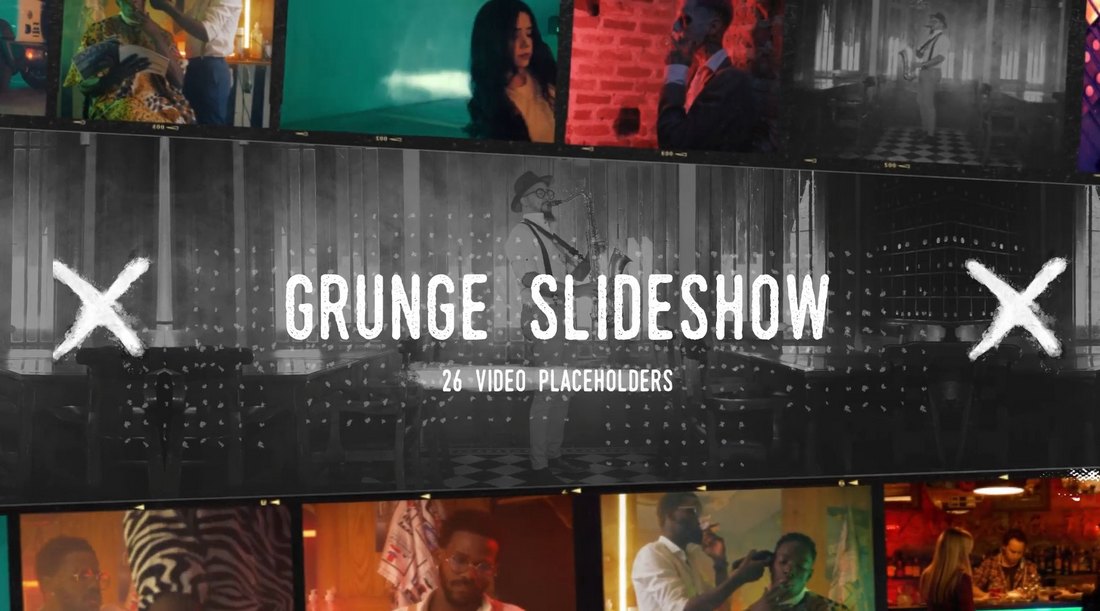
Grunge Vintage Slideshow & Titles for After Effects

Grunge Vintage Slideshow & Titles for After Effects

This After Effects template is perfect for creating beautiful slideshows with a grunge vintage look and feel. It includes 15 animated titles with 29 placeholders for showcasing images and video clips. The template is compatible with After Effects CC.

Wooden Frames Slideshow Template for After Effects

Wooden Frames Slideshow Template for After Effects

If you want to add creative frames to your photo slideshows, this template is made just for you. It allows you to create video slideshows with a photobook-style design. The template comes with 29 placeholders and multiple styles of animations.

Fantasy Slideshow After Effects Template

Fantasy Slideshow After Effects Template

You can add a magical fantasy look to your slideshow videos with this amazing After Effects template. It features mesmerizing animations that create a beautiful fantasy look. The template includes 17 media placeholders.

Dynamic Parallax Slideshow After Effects Template

Dynamic Parallax Slideshow After Effects Template

A simple yet effective slideshow template for After Effects. This template features a clean slideshow layout with subtle animations for showcasing your images and video footage.

Free Letterbox Slideshow After Effects Template

Free Letterbox Slideshow After Effects Template

This free After Effects template is a great choice for designing simple slideshows for corporate and business videos. It features a letterbox-style design with creative slide transitions.

History Slideshow & Timeline Template for After Effects

History Slideshow & Timeline Template for After Effects

This After Effects template comes with a vintage design that allows you to create documentary timelines and slideshows for history-related videos. It includes multiples styles of slide layouts with creative animations for showcasing images and video clips.

Pages – Photo Gallery After Effects Slideshow Template

Pages - Photo Gallery After Effects Slideshow Template

A creative After Effects slideshow template featuring page-flipping animations. This slideshow template is perfect for showcasing product features as well as creating photo albums. The template comes in both short and long versions.

Magic Parallax Slideshow Template for After Effects

Magic Parallax Slideshow Template for After Effects

You can create beautiful slideshows with a cinematic look and feel using this After Effects template. It features a magic-themed slideshow design that also comes in short and long versions. There are 31 placeholders in each template as well.

Particles Slideshow Template for After Effects

Particles Slideshow Template for After Effects

Create fast and simple slideshows with particle effects using this slideshow template. It features a clean slideshow design with simple animations and text placeholders. It’s compatible with After Effects CS5 and higher.

Free Photo Frame Slideshow After Effects Template

Free Photo Frame Slideshow After Effects Template

Another free After Effects slideshow template with photo frame slide designs. This template works great for creating photo album videos as well as for product showcase videos.

INK Titles – After Effects Slideshow Template

ink title-adobe-after-effects-template

Ink Titles comes with an amazing slideshow design featuring creative ink-themed effects. The After Effects template can be easily customized to add up to 19 images or videos. It’s also available in 5 different colors presets.

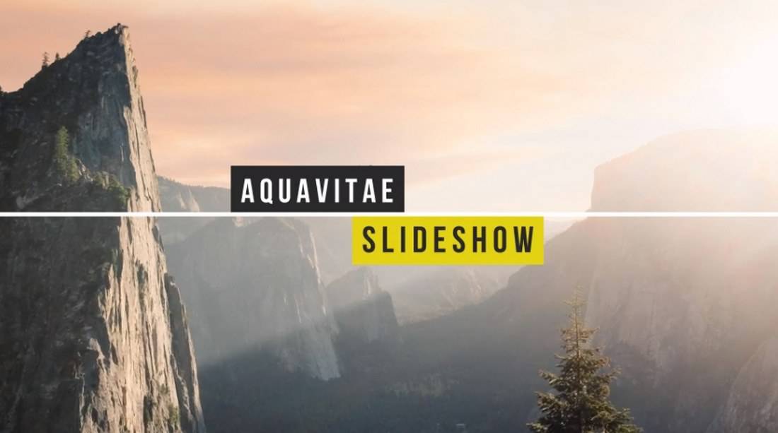
Aquavitae – After Effects Slideshow Template

aquavitae-adobe-after-effects-template

Aquavitae is a minimalist and a modern After Effects slideshow template that comes with 30 placeholders for making a slideshow of photos or video clips. The template also supports color controls for all the elements and includes a video tutorial on how to edit the template as well.

Ultimate Slideshow Construction Kit After Effects Template

ultimate slideshow kit-adobe-after-effects-template

Ultimate Slideshow is a complete bundle of After Effects templates that allows you to make your own unique slideshow videos. The template provides you with unlimited placeholders and includes automatic text animations.

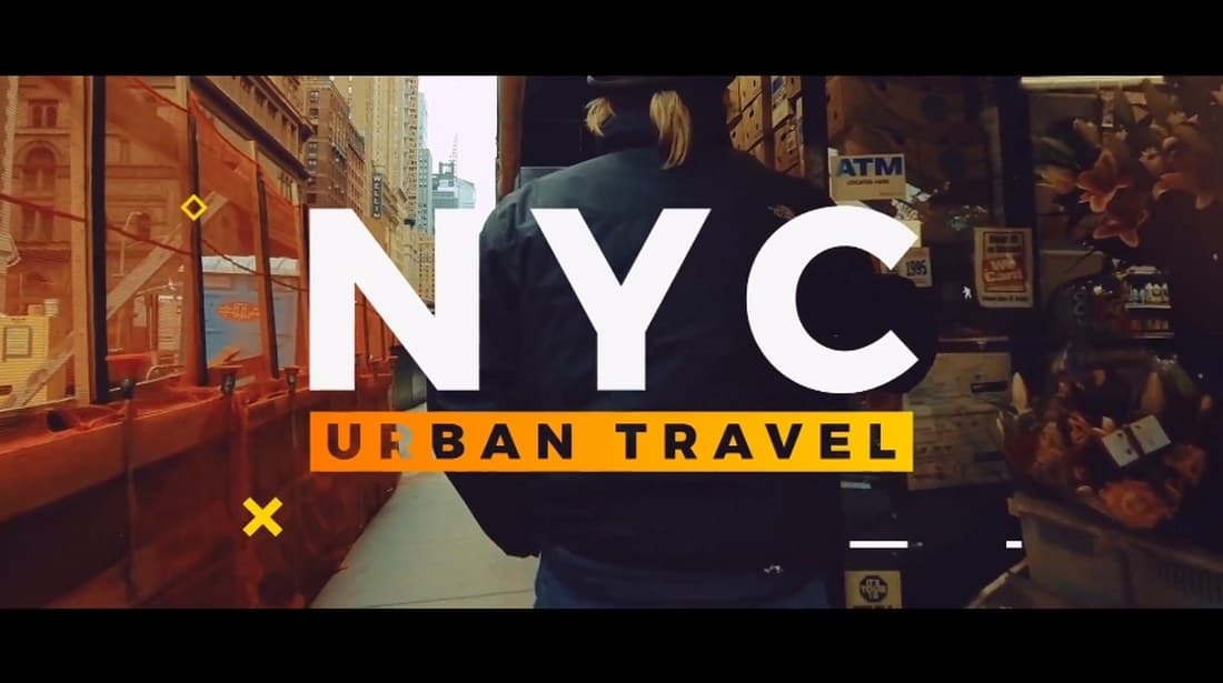
Urban Slideshow – After Effects Template

urban slideshow-adobe-after-effects-template

This After Effects slideshow template features a modern design with an urban theme, which makes it ideal for photography, fashion, and documentary style slideshow videos and title scenes.

Free Inspiring Summer Slideshow Template

Free Inspiring Summer Slideshow Template

This free slideshow template features a colorful summer-inspired slideshow design. You can use it to create and promote your travel photos, Instagram videos, and much more.

Free Clean Slideshow Template

Free Clean Slideshow Template

The clean and minimal design of this slideshow template makes it a great choice for crafting creative design, fashion, and photography slideshows. The template is available in Full HD resolution.

Numeral Slideshow – After Effects Template

numeral slideshow-adobe-after-effects-template

Featuring a unique retro-themed design, this After Effects slideshow template will help you create a professional video opener or a slideshow that stands out from the crowd. The template is available in Full HD resolution.

Bright Photo Slideshow After Effects Template

bright photo-adobe-after-effects-template

This creative After Effects slideshow template lets you showcase your photos in an amazing way with its floating image placeholders. It will also give your slideshow a 3D-like look and feel.

Wonderful Memories – After Effects Slideshow Template

wonderful memory-adobe-after-effects-template

Another creative After Effects slideshow template that features a complete After Effects environment and with dynamic camera movements. It includes 12 main scenes and 300 image placeholders.

Corporate Presentation – After Effects Slideshow Template

corporate presentaion-adobe-after-effects-template

This After Effects slideshow template is designed specifically for making presentation videos for business and corporate events. It features modern transition effects and designs fit for professional purposes. The template is available in Full HD resolution.

Bold Slideshow – After Effects Template

bold slideshow-adobe-after-effects-template

A bold and beautiful After Effects slideshow template featuring a creative design. This template is ideal for making fashion and photography slideshow videos. It’s available in Full HD resolution.

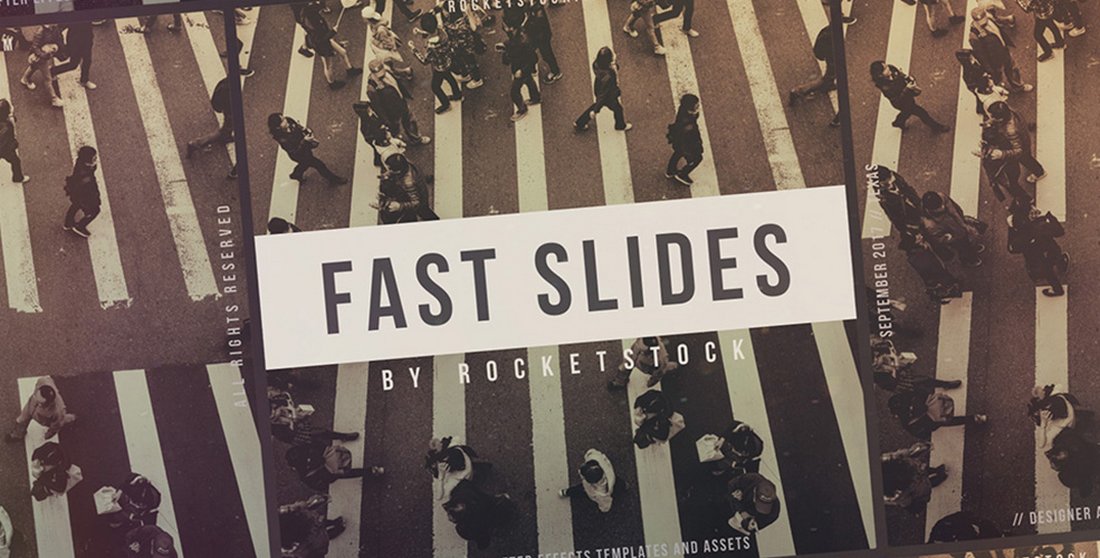
Fast Slides – Free After Effects Slideshow

Fast Slides - Free After Effects Slideshow 2

A professional and modern slideshow template for making creative videos for startups and corporate businesses. The template is easily customizable and works with both photo and video compositions.

Free Modern Zoom Telescopic Slideshow

Modern Zoom Telescopic Slideshow

This simple and minimal slideshow template is perfect for creating photo slideshows of your family photos and creative projects. The template comes in Full HD resolution and lets you showcase 6 images.

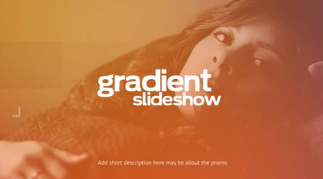
Gradient Slideshow – After Effects Template

gradient-adobe-after-effects-template

This unique After Effects slideshow template adds a colorful gradient overlay effect to your photos to make a colorful slideshow video while also highlight its text. It includes 10 image placeholders and 24 text holders.

Watercolor & Ink – After Effects Slideshow Template

watercolor ink-adobe-after-effects-template

This stylish After Effects slideshow template comes in two versions with short and long slideshows. It lets you feature up to 40 images or videos and includes 30 different ink and watercolor effects you can use to customizing the slideshow design.

Atmospheric – After Effects Slideshow Template

atmospheric-adobe-after-effects-template

Atmospheric is a creative After Effects slideshow template featuring simple and minimalist effects and transitions for making a professional slideshow video. It’s available in 3 versions with up to 45 image placeholders.

Romantic Slideshow – After Effects Template

romantic slideshow-adobe-after-effects-template

This After Effects slideshow template is perfect for making a montage video for romantic events, weddings, and Valentine’s Day. The template is available in Full HD resolution.

Universal – After Effects Slideshow Template

universal slideshow-adobe-after-effects-template

A multipurpose After Effects slideshow template that can be used to make all kinds of slideshows and presentations. It can be easily customized to your preference and the template is available in Full HD.

Creative – After Effects Slideshow Template

creative-adobe-after-effects-template

Another creative After Effects slideshow template that comes with colorful and vibrant effects that let you make an attractive slideshow video. The template supports both videos and images.

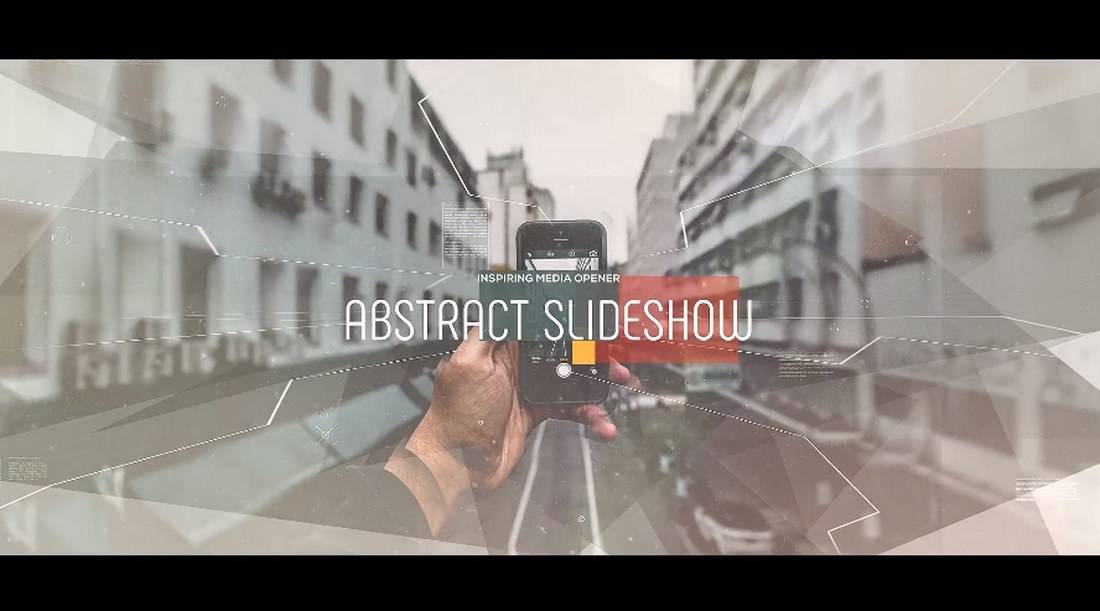
Abstract Parallax – After Effects Slideshow Template

abstract-adobe-after-effects-template

This After Effects slideshow template features a creative presentation design filled with abstract shapes and transitions. It’s ideal for photography, fashion, and other slideshow videos.

Romance – After Effects Slideshow Template

romance slideshow-adobe-after-effects-template

This beautiful and elegant After Effects slideshow template is designed specifically for romantic-themed videos. It’s most suitable for making wedding album videos and presentations. The template can be customized with After Effects CS4 and higher.

Refraction – After Effects Slideshow Template

refraction-adobe-after-effects-template

Refraction is a two-in-one After Effects slideshow template that comes with customizable slideshow designs and transition effects.  It’s available in Full HD resolution.

Travel Slideshow – After Effects Template

travel slideshow-adobe-after-effects-template

If you’re looking for a template to make a travel-themed video, this After Effects slideshow template will come in handy. It’s perfect for showcasing travel destinations and journeys.

What Are the Best Alternatives to Google? How Brands Can Succeed Off Google Search

Featured Imgs 23

When I think back to my school days when we were asked to complete research papers using good old-fashioned books from the library, and I genuinely don’t think I could do that today.

I’ve become so accustomed to the wide accessibility of information on the Internet that I’m willing to do anything to maintain that access, including risking inaccurate information or an inefficient experience.

And I’m not the only one who feels this way.

Download Now: The State of U.S. Consumer Trends [Free Report]

In HubSpot’s Consumer Trends study surveying more than 700 consumers in January 2024, 78% of consumers said they search for brands online using a search engine like Google, and 79% use search engines like Google to search for answers to questions, as opposed to AI chatbots or social media.

However, only 51% find search engines like Google very effective at answering their questions.

This means many of us blindly use Google because it’s what we know best and not because we think it’s good at what we need it to do. But we don’t need to suffer anymore — there are tons of great search engine options that aren’t Google.

Table of Contents

What to Look For in an Alternative to Google

1. Ad-Free Experience

Google has become quite an oversaturated advertising platform, and it makes sense why. The platform can increase brand awareness by up to 80%, so it’s not shocking that 96% of brands use Google Pay-Per-Click Ads.

While it’s great as a business owner or marketer to use this strategy and can also be beneficial to consumers as a way to discover new brands, I can also sympathize with the frustration of struggling to find the best and quickest answer to a question because I’m bombarded with only slightly relevant links.

Therefore, looking for search engine alternatives that limit the ad experience or support no ads can be ideal to increase the efficiency and efficacy of your search journey.

2. High-Quality Answers

It’s quite interesting to me that, as a society, we’ve developed such a habit of searching queries on Google. After all, in my experience, I rarely receive a direct answer to my questions on this search engine.

Yes, Google can direct me to countless resources that likely have the answers I’m looking for, but it only occasionally populates the best answer when using its AI model Gemini.

I’ve found that Gemini doesn’t always automatically weigh in on my search results, so I then need to skim through various links and select random websites to come to conclusions.

Top search engines should do this work for me by analyzing all the available resources online and offering high-quality answers to my questions.

3. Privacy

Privacy is a real concern for many consumers. 75% of consumers agree that data privacy is a human right and that they should have complete control over how a company uses their data.

While 85% of adults globally want to do more to protect their online privacy using services like Google, 62% believe it’s impossible to go through their daily lives without companies like Google collecting their private data.

There is a way, though, to take more control over your privacy: by using a search engine that emphasizes and specializes in data protection. This is an important consideration when looking for Google alternatives.

4. Special Features

While the main purpose of using a search engine is to search for answers and information, many other traits can set a platform apart from competitors.

For instance, some search engines have an environmental focus and will put ad revenue towards eco-friendly causes, and the same applies to all sorts of charitable causes.

There are also family-friendly search engines, AI search engines, news-focused search engines, and many more options that can align with your interests and needs.

Once you’ve assessed which of these considerations are most important in your review of new search engines, take a look at my list of the best Google alternatives.

What are the best alternatives to Google?

Best Ad-Free or Low-Ad Search Engines

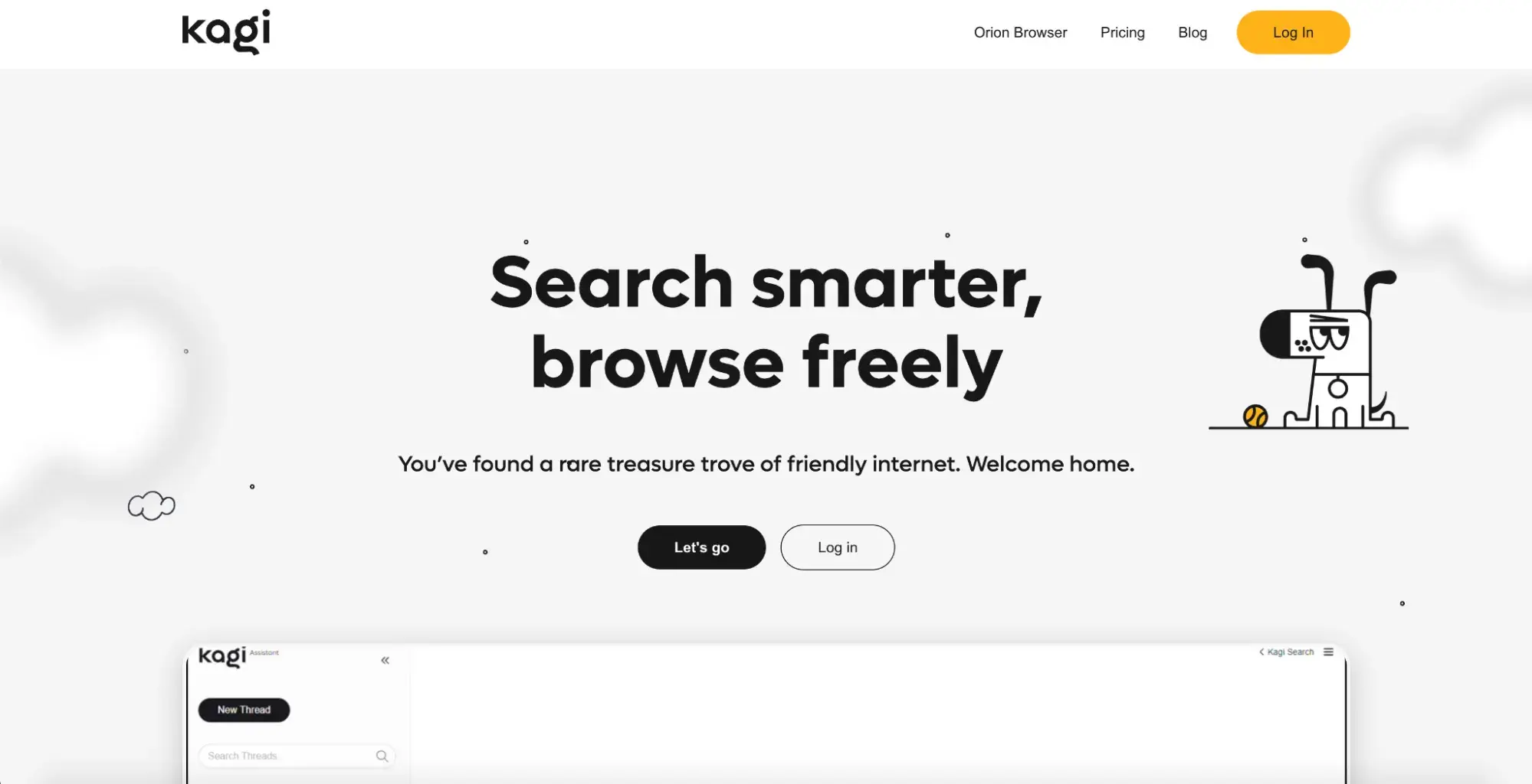
1. Kagi

best alternatives to Google, Kagi homepage.

Kagi stresses high-quality, accurate search results without any ads. To maintain its ad-free status, the platform charges a subscription fee of $5 per month which replaces the required revenue to run the platform that would otherwise come from advertising.

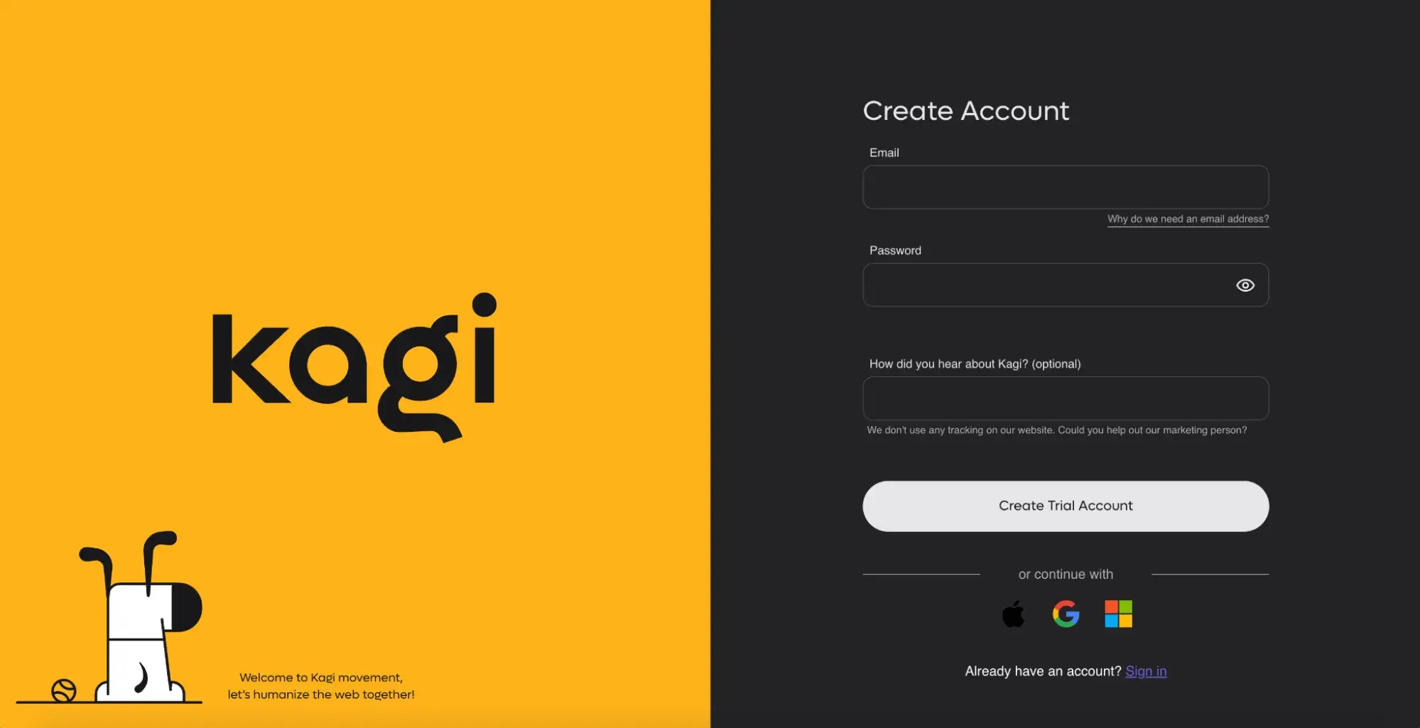
Create an account to use Kagi, an ad-free alternative search engine.

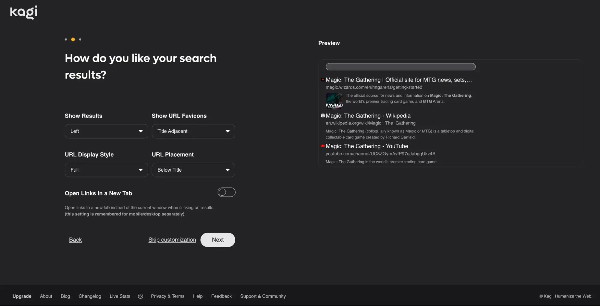
I set up my account and opted for the free trial which allows for 100 search results. Then, I was able to customize the appearance of the search engine in many ways.

Customize how you want your search results to appear.

After I updated some of these settings, I searched for my first test question.

What I Like
  • Being able to customize my search experience on Kagi is unique. I never realized how much of a difference it makes when I can update whether or not I see the website’s icon or full URL in the search results. This makes Kagi feel very personalized and user-centric.
  • The interface closely resembles Google, so it should be easy for users to adapt to this new search engine.
  • Rather than click through multiple pages of search results, I just kept scrolling down to see more and more URLs. I enjoyed this, as I’ve realized I often get dissuaded from looking beyond the first page of search results on Google, which limits my results.
  • Kagi lists the date the website was published, which quickly helps me decide if it’s appropriate to click on.
What I Don’t Like
  • It’s not ideal to have to pay for a subscription, and I’m not sure many people will feel inclined to do so when there are so many free alternatives. However, it makes sense why they have this model, so they can avoid advertising — which is what many other businesses like streaming services do.
Pricing
  • Starter plan: $5/month (300 searches per month)
  • Professional plan: $10/month (Unlimited searches per month)
  • Ultimate plan: $25/month (Unlimited searches + Kagi Assistant)

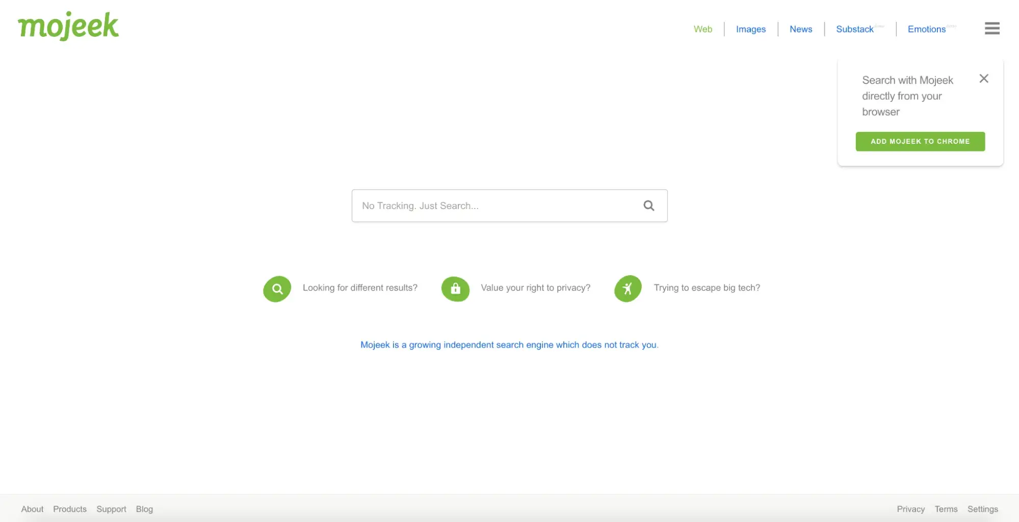
2. Mojeek

what is the best alternative to google, Mojeek homepage.

Mojeek is not completely ad-free as it does display some text ads in search results. However, the ads on this platform are based only on search keywords and location and not on any data pulled from the user search engine.

Mojeek is also much less ad-intensive than other search engines, like Google. It has its own web crawler and information index. Unlike Google, Mojeek has an independent ad platform where brands can place ads directly on and separately from major search engines.

alternative search engines to google, Results when I clicked “Summarize these results.”

What I Like
  • Mojeek is very straightforward and no-nonsense. As soon as I entered this search engine, I could immediately begin searching, so it was quick to learn.
  • Its interface also closely resembles Google, making it easily recognizable.
  • The “Summarize these results” feature, which shows up on the right side of the screen beside the search results, uses large language models to generate a summary of the search results. This is a great way to incorporate AI for those like me looking for it, while also providing a straight search engine experience for others.
What I Don’t Like
  • Mojeek gives options to search the same query with other search engines, such as Brave or Startpage. I found this quite odd as it encourages users to leave Mojeek for competitors.
  • Since Mojeek isn’t fully ad-free, I don’t think it’s as impressive an option as Kagi.
Pricing
  • Free

Best Search Engines for High-Quality Answers

3. Perplexity

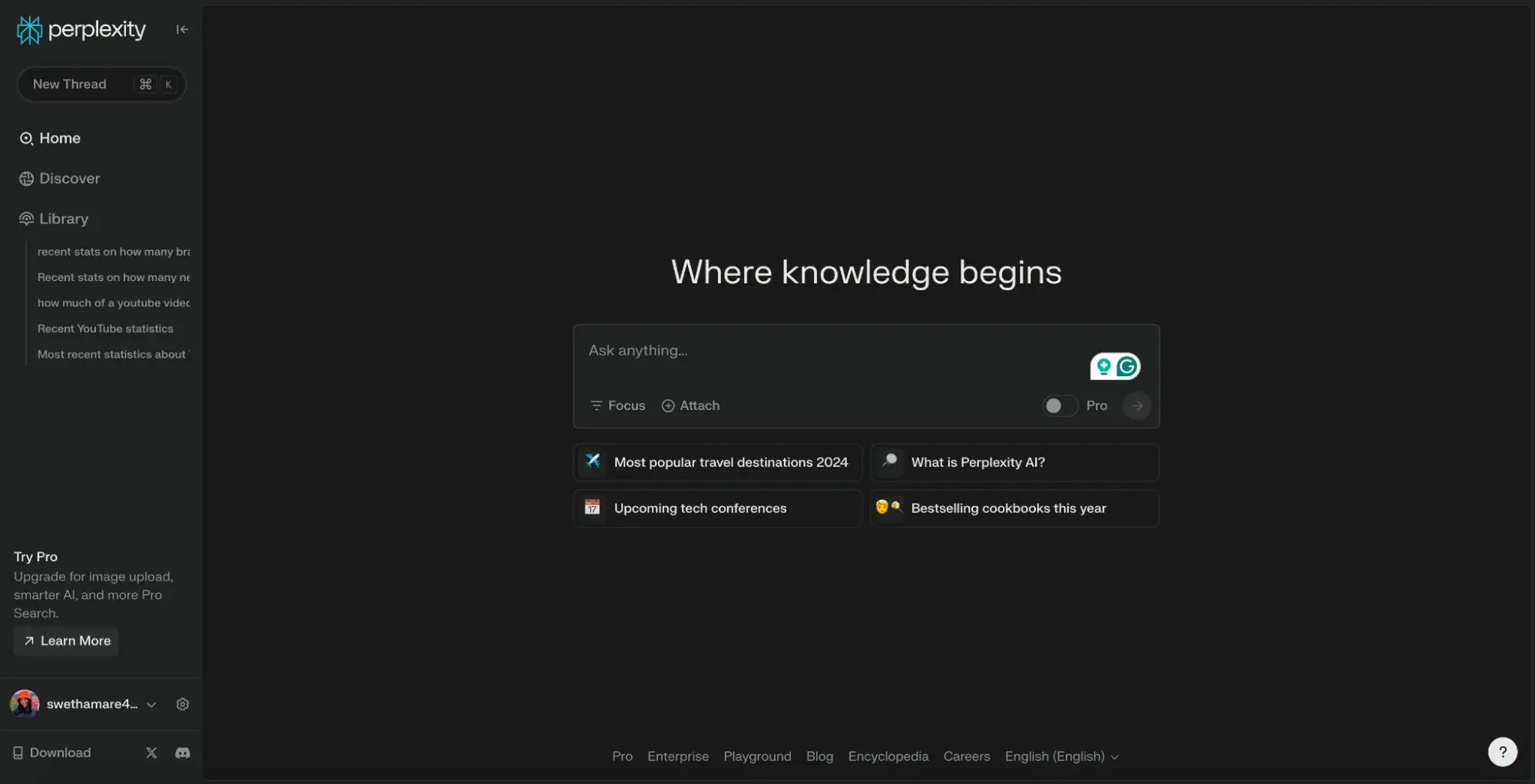
what is the best alternative to google, Perplexity homepage.

Perplexity is an AI search engine that collects, analyzes, and deconstructs information from various sources to provide a high-quality, human-like response to any question or prompt. It’s more than a regular search engine as its AI power means you don’t need to scroll through and skim various links to answers.

Perplexity combines the communication and synthesis abilities of a chatbot like ChatGPT with a search engine’s web crawling and information-gathering capabilities to provide precise and detailed responses to any prompt.

What makes it a strong Google alternative is that it, too, doesn’t rely on an innate knowledge base but can quickly scour the internet for relevant, related sources to pull together its findings.

What I Like
  • The interface is reminiscent of ChatGPT, which is a plus for users like me who have already mastered ChatGPT.
  • Despite being an AI search engine, unlike some other Google alternatives on this list, Perplexity does promise accurate answers. It cites sources at the top of each answer and throughout its copy, so I can review the source material myself.
  • Compared to regular search engines, Perplexity saves me so much time. It’s way more efficient to receive a straightforward answer rather than clicking through several potentially useful links on Google.
  • Since Perplexity is AI-powered, it comprehends my questions and prompts — even when misspelled or grammatically incorrect — much more easily than Google, which regularly needs to ask me “Did you mean...?”
  • Perplexity is currently ad-free. While it has plans to introduce ads in the future, it intends to integrate native ads into its “Related Questions” section in a manner that doesn’t disrupt the natural user experience.
What I Don’t Like
  • Some of the smarter AI capabilities are only available for Perplexity Pro users.
Pricing
  • Standard plan: Free
  • Professional plan: $20/month

4. Wolfram Alpha

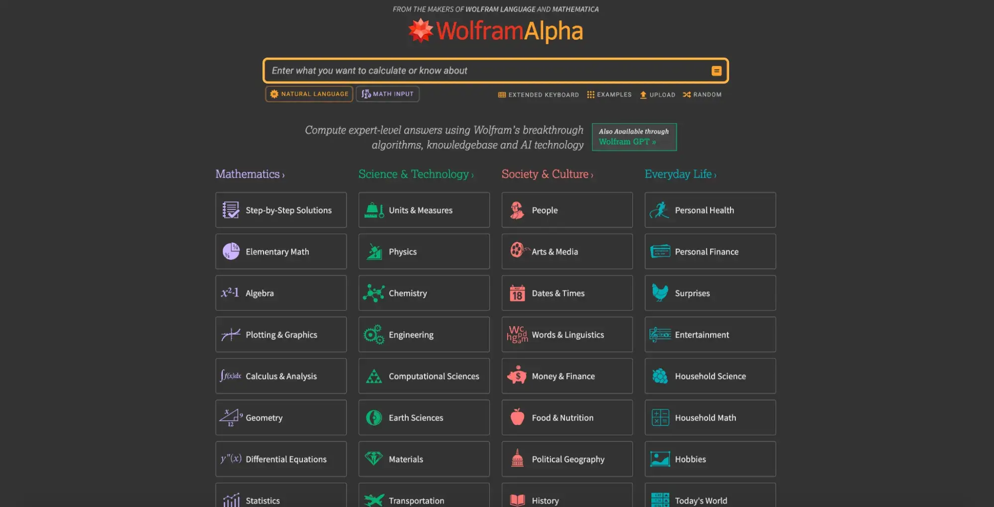
google alternative, Wolfram Alpha homepage.

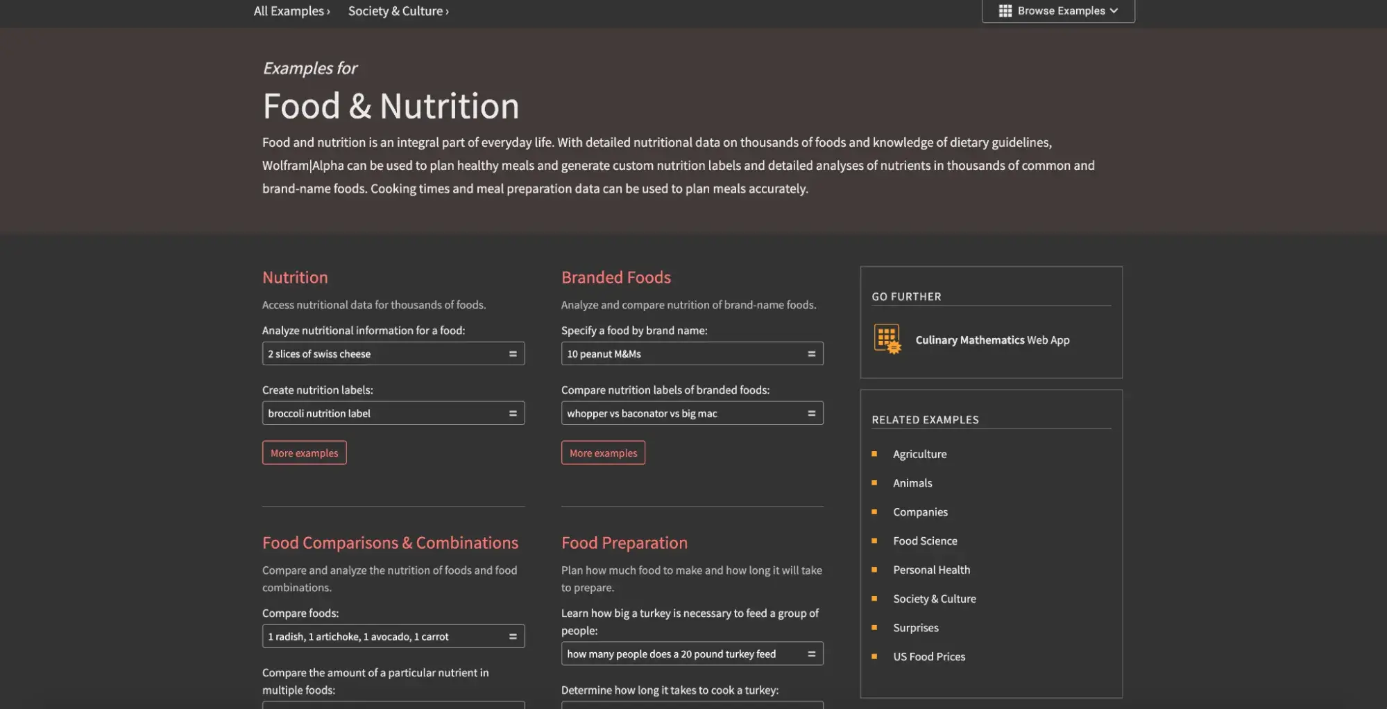
Wolfram Alpha is a search engine that specializes in computational knowledge. It can provide very detailed responses to questions related to data, math, sciences, and other factual topics. For instance, I selected the topic “Food & Nutrition,” as seen below.

Examples of Food & Nutrition related questions.

As you can see, this powerful engine can access very specific, detailed information about a wide variety of topics. There is information on this search engine that I never would have even thought to search for.

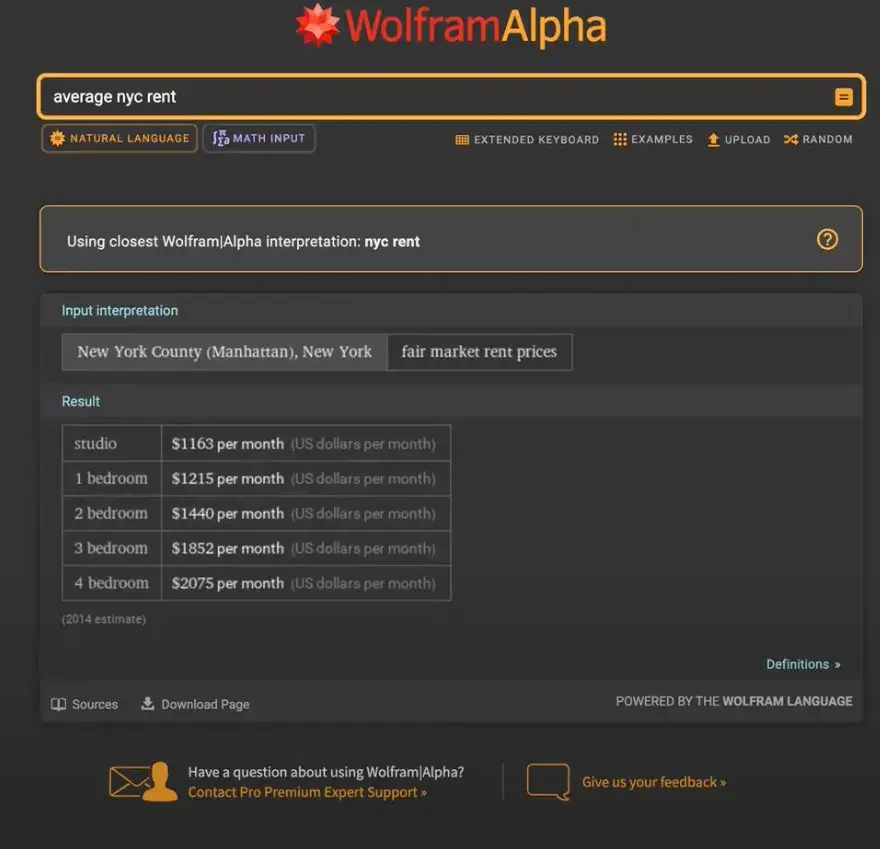
Since this search engine is so intelligent, I did try searching some basic questions to see how it would handle them. First up, I checked the average rent in New York City.

Search results for “average nyc rent.”

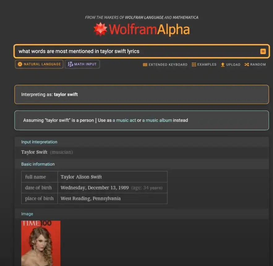
Next, I tried a more niche question that I felt was still computational:

Search results for “what words are most mentioned in taylor swift lyrics.”

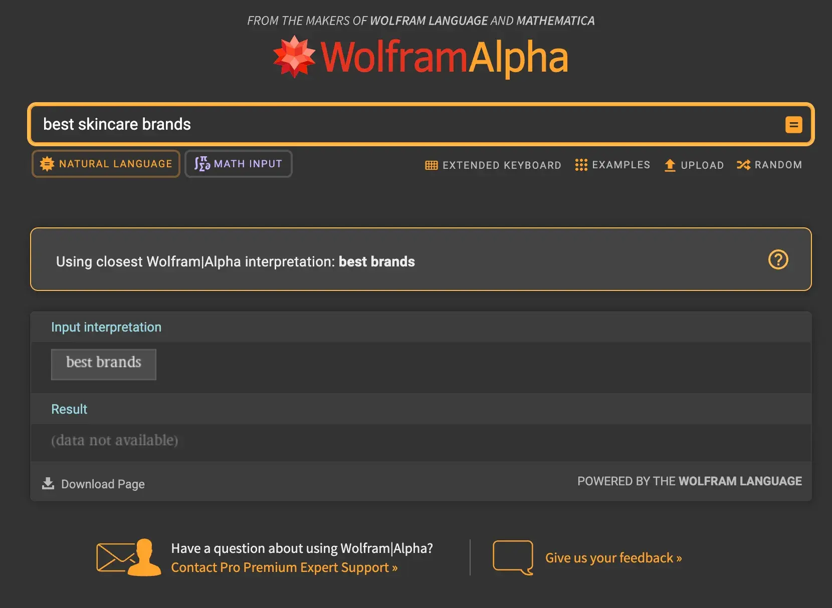
Lastly, I tried something I might most commonly lookup on a search engine like Google, but was left empty-handed:

No search results for “best skincare brands.”

What I Like
  • Wolfram Alpha certainly has high-quality answers and a wide range of types of answers. For instance, for “Transportation” I was able to find out total road lengths in any given country, gasoline price data, various computations on airlines, data on any region’s railroad systems, and much more.
  • I could choose from a set list of topics when I wasn’t sure what to search for, which helped me hone in on a matter and use the pre-chosen examples to guide my search.
  • This search engine would be especially helpful for students, professors, and researchers who need to learn a lot of information about a very specific subject.
What I Don’t Like
  • As a regular consumer, this search engine doesn’t provide the answers I may need on a daily basis. It was unable to comprehend most of my basic queries, which are the types of train-of-thought questions I would normally search for on any other search engine.
  • It has an outdated appearance along with some blurry visuals.
Pricing
  • Basic plan: Free
  • Pro plan: $5/month (Includes step-by-step solutions, increased computation time, and calculator Web Apps)
  • Pro Premium plan: $8.25/month (All features, including priority customer support)

Best Search Engines for Privacy

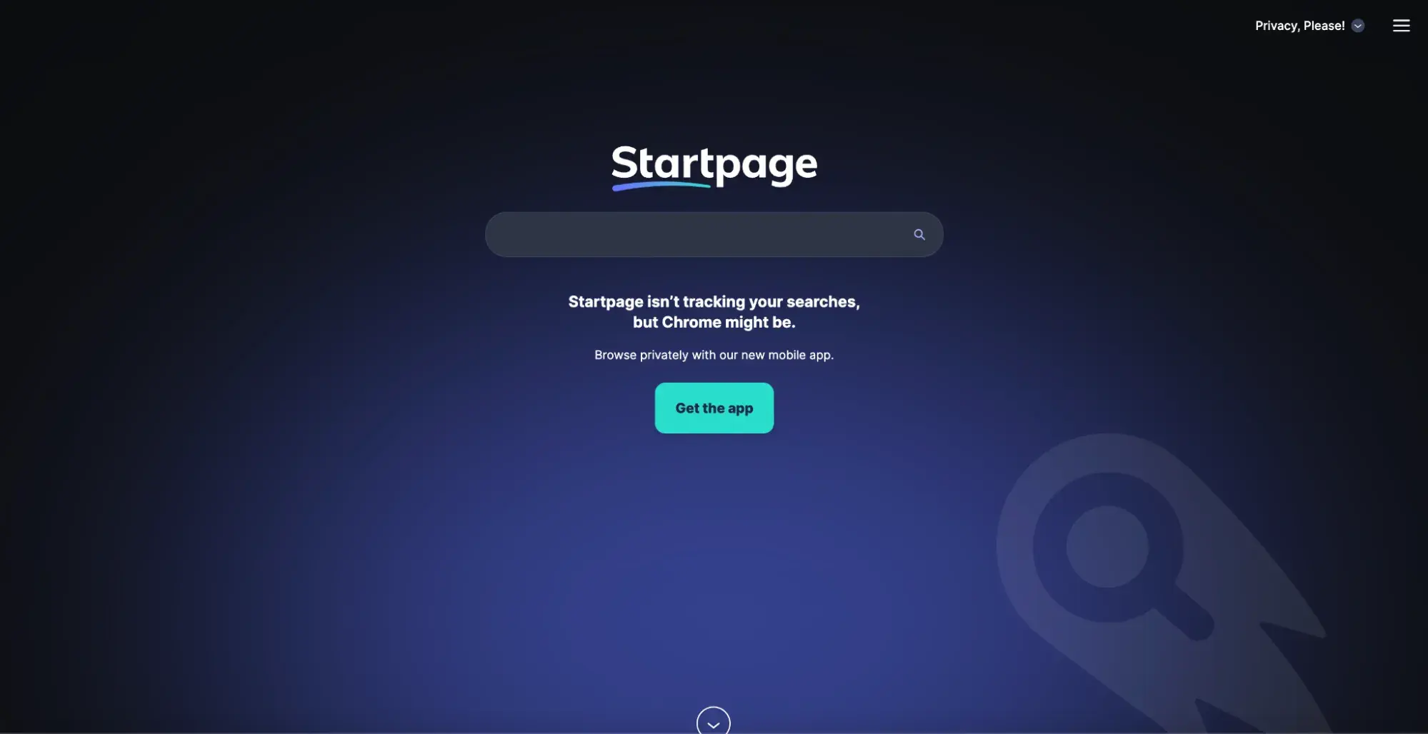
5. Startpage

what is the best alternative to google: Startpage homepage.

Startpage is unique because it doesn’t have its own index of websites or web crawler. Instead, it acts as a middleman between users and other search engines like Google.

How it works is that it submits your question on your behalf to other search engines, so that you can protect your anonymity. Therefore, you will receive Google and Bing search results while maintaining your privacy from the data tracking practices from which those search engines profit.

It’s basically the equivalent of searching in “incognito mode,” but without the hassle of having to remember to switch that mode on.

What I Like
  • Startpage has a very clever privacy model that helps it guarantee no cookies, trackers, website fingerprinting, price tracking or optimization, or social media tracking.
  • For users who are having a hard time letting Google go, but want increased privacy, this is the perfect option. You’re still getting the same search results as you would on Google or Bing while having Startpage perform the searching for you as a helpful assistant.
  • The interface is modern, sleek, and more attractive than other search engines I reviewed.
What I Don’t Like
  • If you’re looking to switch away from Google for any other reason besides privacy concerns, this may not be the option for you, since it’s basically the same platform and search results as Google.
Pricing
  • Free

6. Brave Search

best google alternatives, Brave Search homepage.

Brave Search boasts security and privacy while browsing the internet, which it manages to do by not tracking users or any of their searches. Brave Search can’t share or sell personal data because it never gets collected in the first place.

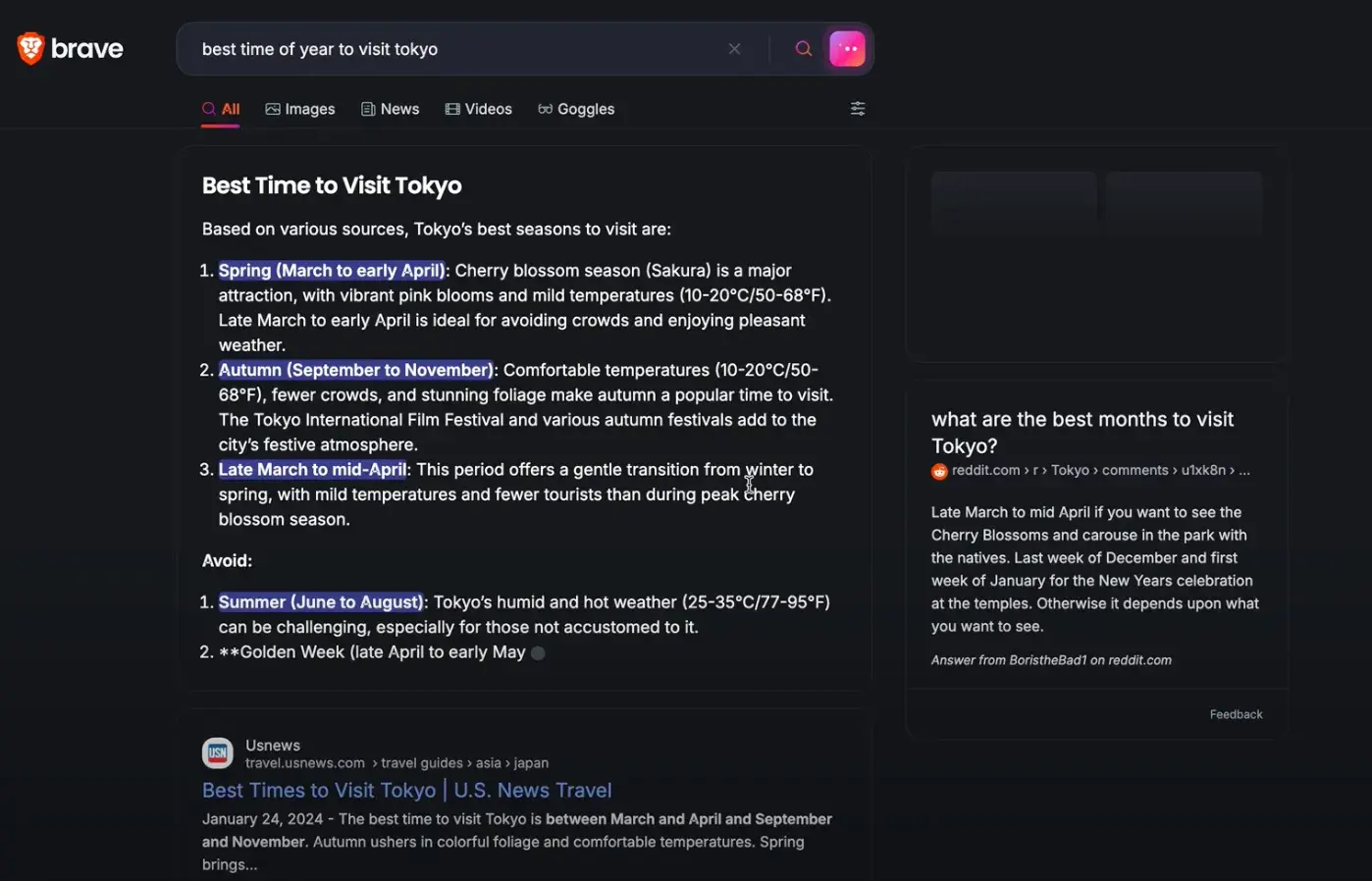
This is helpful for those who work from public computers or networks. It can also be attractive to those interested in both privacy and AI, as the platform introduced Answer with AI earlier this year. This feature has quickly become one of the largest AI solutions.

Search results for “best time of year to visit tokyo.”

What I Like
  • Brave Search has a standard appearance similar to other search engine options on this list and major ones like Google.
  • It prioritizes privacy with a fail-proof strategy that allows for complete user protection while still using its own independent web crawler and index.
  • The AI assistant, when able to be used, is very intelligent and good at summarizing the many search results into a cohesive response.
  • While Brave Search does support paid ads, it guarantees that the ads are designed to be anonymous and that the platform won’t report any user data if users view or click on the ads.
What I Don’t Like
  • Answer with AI is not available for all queries, which was a bit disappointing for me. For instance, I searched “best large, leak-free water bottles” and was told that AI was “unavailable for this query.” This might also discourage others who expect an AI assistant to always be effective.
Pricing
  • Standard plan: Free
  • Premium plan: $3/month (Ad-free search results)

Best Search Engines With Special Features

7. OceanHero

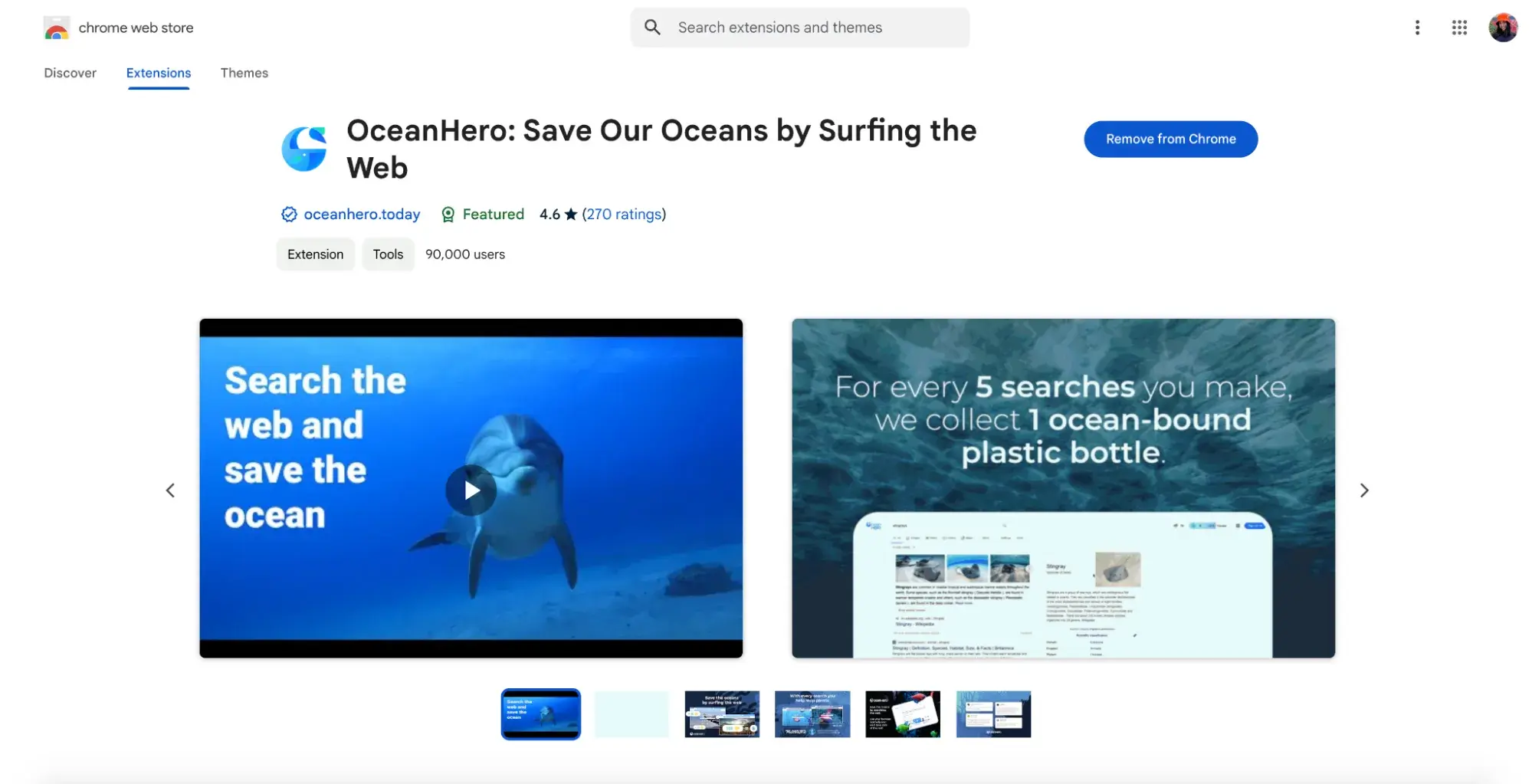
what is the best alternative to google, OceanHero homepage.

OceanHero is an incredible search engine with an environmental purpose. It generates revenue through search ads and donates the proceeds to organizations like PlasticBank who are dedicated to collecting plastic to clean up oceans.

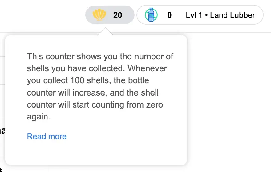
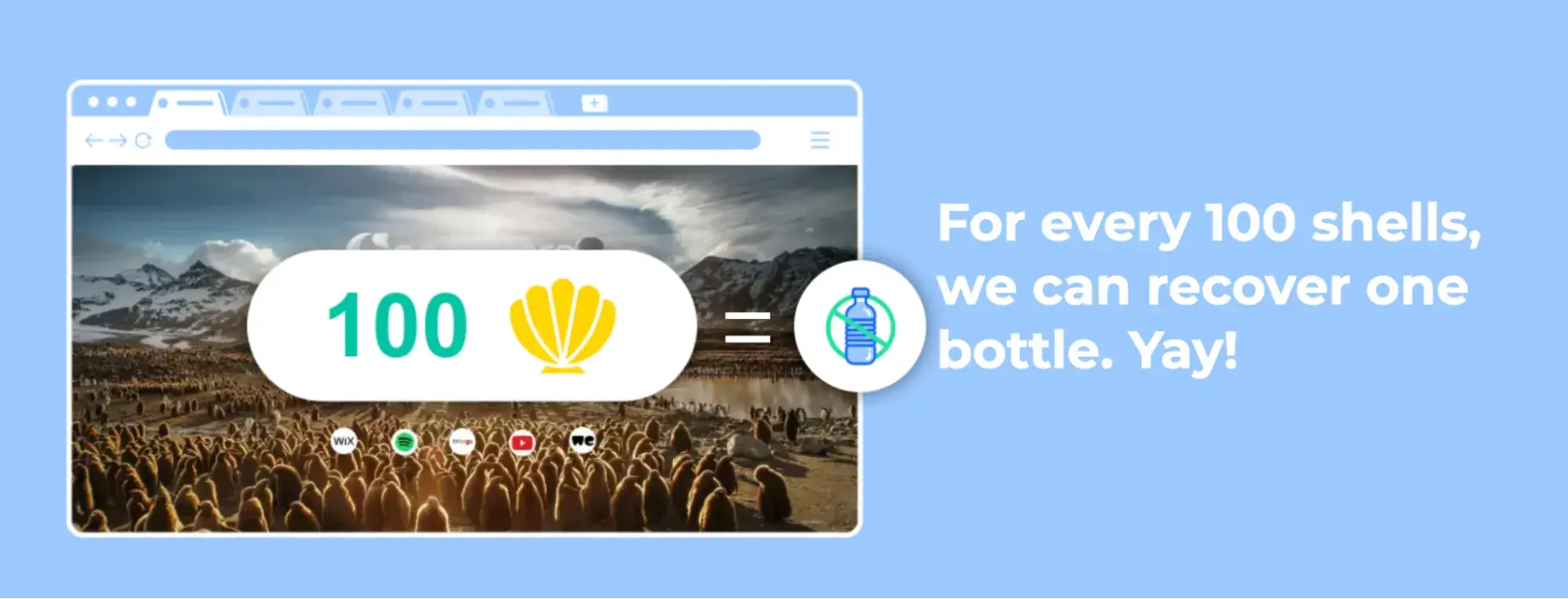
The shell counter shows how many shells you’ve earned for your searches.

OceanHero turns searching into a challenge. You can work towards earning as many shells as possible. Once you’ve collected 100 shells, your bottle counter increases by one to reveal how many ocean-bound plastic bottles you’ve helped rescue.

On average, five searches or 17 new tabs in the browser extension contribute to recovering one plastic bottle.

For every 100 shells earned, OceanHero can recover one plastic bottle.

First, I had to add OceanHero as a Google Chrome extension.

Add the free OceanHero Google Chrome extension.

Then, I followed the instructions to begin using OceanHero as my primary search engine.

What I Like
  • Since OceanHero gets added as a Google Chrome extension, it’s the most natural Google alternative. I can search queries directly in my Chrome search bar, and my browsing experience doesn’t change at all. My searches just get entered through OceanHero, rather than Google, making it a seamless transition.
  • OceanHero has such an important purpose that is a joy to be a part of. I’m going to be searching various questions and prompts daily anyway, so I may as well contribute to some positive change while doing so!
  • The idea of making ocean plastic reduction into a game by having users collect shells and bottles adds a fun, competitive edge to this search engine.
What I Don’t Like
  • Having to add OceanHero as a browser extension may deter some folks from wanting to adopt it.
  • Other than its strong environmental mission, OceanHero almost exactly resembles the Google searching experience, for better or for worse.
Pricing
  • Free

8. Swisscows

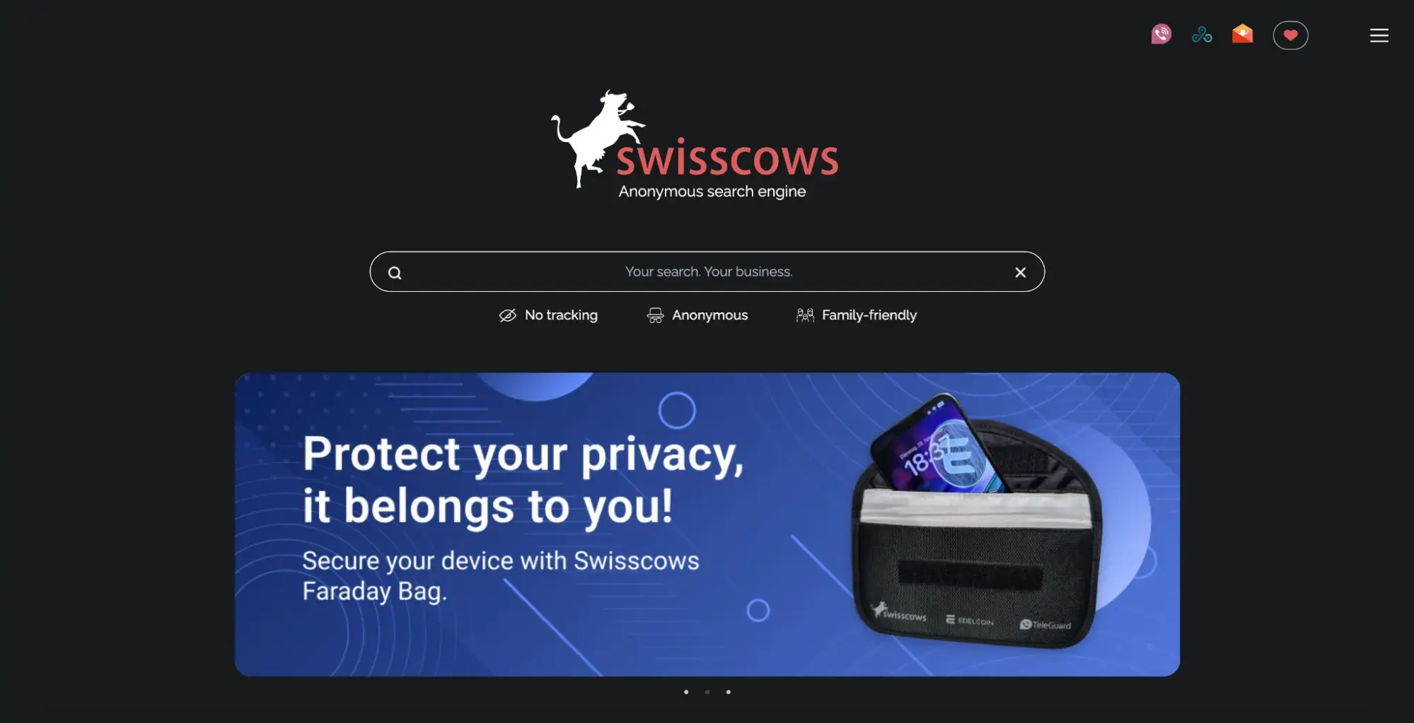
best google alternatives, Swisscows homepage.

Swisscows is unique in that it boasts family-friendly content, so users can feel confident in allowing their kids to use the search engine freely. In addition, this search engine has a charitable edge.

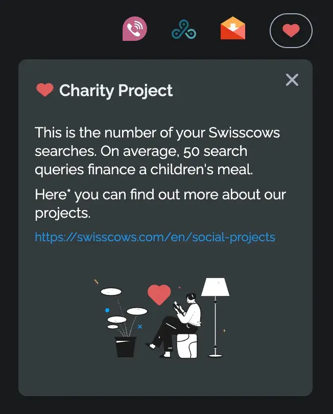
Charity Project badge keeps track of the number of searches.

The heart icon at the top of the browser keeps track of a user’s number of searches. The search engine states that, on average, 50 searches help finance a meal for a child. You can read more about Swisscows’ social projects, impact, and donation opportunities here.

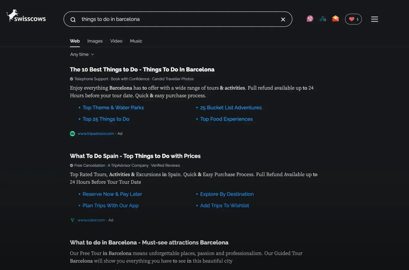
Search results for “things to do in barcelona.”

What I Like
  • I originally expected Swisscows to have a kiddish appearance due to being family-friendly, but it looks like any other search engine on this list. This makes it more appealing for adults who want to use this platform as well as their kids.
  • The social impact of Swisscows makes it a no-brainer to use. I get to search my numerous queries daily and know those random searches contribute to important social causes benefiting children.
  • The search results are organized cleanly, with an icon photo to the left of the headline, a couple of lines of description, and, below that, a shortened URL, post date, and the ability to open up an anonymous preview with an AI-based description. This format is unlike any other I’ve seen and provides you with as much information upfront as possible.
What I Don’t Like
  • I found this to be one of the slower page load times of the search engines I tested.
  • If you also want an ad-free experience, this search engine does, unfortunately, include ads.
  • I also found that the “Ad” labels are small and at the bottom of each link, rather than at the top like with Google, which can be misleading.
Pricing
  • Free

6 Tips for Succeeding Off Google Search as a Brand

While I’ve gone over the pros and cons of using these eight search engines as a consumer, it’s equally important to know how best to operate them as a brand.

Read on for some of my tips on successfully optimizing for these Google alternatives.

1. Produce high-quality, engaging content.

It may seem obvious, but the most important part of your search engine strategy should be creating content worthy of a search. In such a crowded marketplace, with users having to decide between dozens of sources with near-identical information, it’s difficult to stand out without quality content.

Employ search engine optimization (SEO) to ensure you’re creating content around topics that users are interested in. And, while it’s important to incorporate those keywords, make sure the language on your websites, blog posts, or other platforms feels authentic and natural.

For instance, when I write my HubSpot blog posts, I integrate my opinions and experience, while still hitting keywords, which results in personalized and useful content. I also always write in my natural tone of voice to sound like my authentic self and not a robot.

2. Diversify your keyword strategy.

Speaking of keywords, it’s important to broaden the types of keywords referenced in your content. While it’s easier to plug single-word keywords into any piece of content, it can be more profitable to incorporate longer phrases.

Long-tail keywords are typically three or more words and have lower search volumes. However, they make up a larger percentage of searches when combined and are more likely to result in conversions, since the keywords are so specific.

3. Improve your search ranking with backlinks.

Backlinks are created when another website links to your website. As an example, this is now a backlink for Backlinko.

Backlinks are important as they can show users that your content is reputable. The best way to get backlinks is by giving them back to other trusted sources. Build important partnerships with brands for a mutually beneficial relationship.

4. Update your web experience.

As seen in this post, each search engine has a different appearance and format. This will impact how your content shows up in users’ search results. Therefore, when targeting a new search engine, you must update your content’s web experience.

For instance, some search engines like Kagi show the date of publication upfront in search results, which encourages me to refresh my content regularly so it appears recent and reliable.

Other search engines like Swisscows include a photo icon in search results, so I would want to confirm I have a high-quality, clear, relevant photo chosen alongside the URL.

5. Consider relevant, niche search engines.

I mentioned that there are search engines with special features and purposes, like OceanHero and Swisscows. It can be to your benefit to include search engines in your strategy if their niches align with your brand’s niche.

I work at Nickelodeon, so I’d assume our team has optimized our content for family-friendly search engines like Swisscows. If I were to work at a nonprofit or AI company, I’d similarly want to include search engines in those niches in my strategy.

6. Stay up-to-date on search engine changes.

While Google was not the first search engine, it was an early contender and unique because its founders, two PhD students from Stanford University, developed PageRank, an algorithm that listed sites in order of the number of links to them.

Since then, dozens of new search engines have emerged with different focuses, algorithms, and solutions to problems. It’s imperative, as a brand owner, to stay on top of this ever-changing landscape and accordingly update your SEO strategy.

After all, Google introduced its first AI system, RankBrain, in 2015. Less than ten years later, there are countless AI search engines and standard search engines with AI capabilities. Having an eye on trends and improving user experience will always be a necessity.

The Search for a New Search Engine

When diving into this post, I was aware of some of these non-Google search engines, but my mind is truly blown at how many options there are.

While Google still has more than 90% market share, other search engines can provide unique, individualized experiences for those willing to give them a chance.

In particular, my favorites from this list are Perplexity, which I’ve already integrated into my routine, and OceanHero.

I think both show how search engines can take the common human action of searching queries and take that to the next level to improve users’ lives or the greater world.

Google may seem like the easy, obvious choice, but there is a lot of value in incorporating some of these other search engines to better optimize your content for search.

How to Nail First-Party Data Strategy According to a Google Director of Product Management [+ New Data]

Featured Imgs 23

Between shifts in technology, the economy, and consumer behavior, 2024 has brought marketers a new level of uncertainty. I’m right there with you, and I’ve bought stock in Pepto Bismal.

So when I got the chance to chat with Christophe Combette, a director of product management at Google, I wanted to know what there is to be excited about in marketing.

His surprising answer? Data privacy and first-party data.

I know, I know. Mentioning those things to marketers right now is like kicking a hornet’s nest. Core updates. iOS changes. GDPR and CCPA. The unknown future of 3rd-party cookies. It’s like a wild, marketing-themed cover of that one Billy Joel song.

Download Now: Introduction to Data Analytics [Free Guide]

But Combette shared how these changes are making marketing better for consumers AND marketers alike — if you start soon and play your cards thoughtfully.

And guess what? I’ve got some data-backed tips on how to do just that.

Below, you’ll learn Combette’s perspective on how first-party data will help you crush your marketing goals while earning your customers’ trust by preserving their privacy. But first, let’s jump back to what first-party data even means.

“First-party data is the data your customers are knowingly sharing with your business,” Combette explained.

When I hear from marketers that haven’t tried a first-party approach, it’s usually because they don’t truly know what it is. And, consequently, they worry that they can’t leverage it for the kinds of strategies they’re used to.

Close your eyes and imagine building a high-performance campaign using all of the following, while still respecting your customers’ consent and privacy:

  • Demographics
  • Firmographics
  • Website behavior
  • App behavior
  • Social media engagement
  • Purchase history
  • Feedback and survey insights
  • Customer service interactions
  • Loyalty and rewards program data
  • Email engagement
  • Etc.

Chances are, you’ve already got some good ideas in mind (you rockstar, you), and it wouldn’t take that much to get started.

With that data you could build a lookalike audience, run a re-engagement email, or create all sorts of clever segmentation or personalization. Since it’s all consentfully given, it respects your audience’s privacy. And since it comes from the source, you know it’s accurate.

And that isn’t even close to an exhaustive list.

(Side note: You’ll sometimes see a distinction made where data you gather is considered first-party, while data you’re given by customers is called “zero-party data.” To be honest, I find little value in separating the two. You should be using both and you’ll be combining them anyway.)

“You have this wealth of insights from your customers that’s aligned to your business outcomes,” Combette said. “And that combination together is one of the most powerful constructs.”

Let’s take a look at just how powerful.

4 Ways First-Party Data is Helping Marketers

When I referred to switching to first-party data as a challenge, Combette took a moment to gently correct me.

“I wouldn’t necessarily call it a challenge as much as it is a big shift in the industry,” He told me, adding with a grin, “Which comes with a big opportunity, and a competitive differentiator, if you nail it.”

And, in truth, that shift is more one of focus, rather than application. First-party data has been there all along, and many marketing teams are already using it to drive deep growth.

What’s shifting is that more businesses are getting on board.

first-party-data-strategy-combette-quote

“Some marketers have been very successful in building marketing strategies based on third-party identifiers, and first-party data is a shift for them,” he goes on. “But it’s an important one because you can derive a lot more insights from it.”

And chances are, you’ve already got the ingredients. All you need to unlock their insights are the right tools and a plan.

“It’s the data you’re already using to drive the business outcomes you want.”

Whether you’re switching strategies, or just getting started for the first time, here are some data-backed reasons to believe:

1. First-party data is more accurate and more relevant.

Marketers using first-party data are 93% more likely to say their team is outperforming their goals in 2024 than those who don’t use it, according to HubSpot research.

And 77% of marketers who use first-party data say it results in more personalized content and performs better than external data.

Combette counts off some use cases that really illustrate the value:

“You want to drive new customer acquisition? That information is one you can only see from first-party insights. You want to optimize towards lifetime value? It requires deep analysis of your first-party data. It’s not something you could do with third-party identifiers.”

2. First-party data fills in the gaps most marketers have.

It turns out most marketers are missing critical information on their audience—just 42% know their basic demographic information, and even fewer know their shopping habits, purchase history, and which channels they consume content/media on.

what information marketers have about their audience

First-party data like that can be used to gain high-quality insights and deliver a highly personalized experience to your customers.

And since it's collected directly from your customers, first-party data is highly accurate and unique to your company while still respecting privacy.

But for customers to give you their personal information, they need to trust you first.

3. First-party data fosters trust from consumers.

It’s no secret that folks are tired of seeing ads on every platform for something they casually looked up once.

Our Consumer Trends survey shows that close to half (45%) of consumers distrust companies with their website behavior and cookie data.

Using first-party data can make consumers feel safer sharing their personal information because it’s gathered with both their knowledge and consent — and used only by those they’ve shared it with.

Leveraging first-party sources will allow marketers to get higher-quality data while respecting consumers’ privacy, mutually benefiting both parties.

4. Marketing budgets are increasing to accommodate data privacy changes.

Both government regulators and consumers are demanding data privacy changes, and marketers are getting tossed around in the waves.

Luckily, execs are paying attention and giving marketers the budget they need to explore alternative measuring and advertising solutions.

how marketing budgets changed due to privacy changes

Almost half (48%) of marketers say their budget has changed this year to compensate for data privacy, with 71% reporting an increase in their marketing budget.

But, to paraphrase the wise old sage, Uncle Ben: With great budget comes great responsibility. And sometimes, a few challenges.

The Challenges of Using First-Party Data

“Building and deploying your data across environments has not always been easy or seamless,” Combette admits.

Oftentimes, marketers have to gather data with one set of tools, analyze it with another set, and then actually use those insights in yet a third set of tools.

So perhaps it's no surprise that our research shows:

  • 60% of marketers say gathering and tracking visitor data is becoming more difficult.
  • Nearly half (48%) of marketers cite increased data privacy changes/regulations as the biggest challenge to understanding their audience.
  • On the flip side, only half (56%) of marketers say the data they have on their audience is high quality.
  • Just 16% have all the data they need to reach their audience.
  • Meanwhile, 47% report that consumers are less trusting with their personal data.

So, while marketers are looking to gather high-quality data, their audiences are less likely to give it. And even when marketers find it, it lives in 10 places, and they’re not sure what to do with it.

how data privacy changes have impacted marketing strategies

Thankfully, we’ve got a roadmap — laid out by Christophe Combette and our own data — for how to make gathering and utilizing first-party data fast, powerful, and easy-peasy. (Lemon squeazy optional, but encouraged.)

7 Steps to Build a Privacy-Focused First-Party Data Strategy

1. Start by asking what data you actually need.

Don’t scroll past this. This isn’t filler. This is the most important step.

If you’re familiar with using third-party identifiers to guide your marketing, you know you don’t just gather them in the hopes that you’ll somehow know what to do later. You had a use case in mind when you started.

Maybe it was targeted social ads. Maybe it was cross-platform tracking. But the data you collected was informed by a goal.

Why should first-party data be any different just because it’s freely available?

In fact, if you gather all of the first-party data you can without regard for use case, you’re more likely to overstep on privacy issues. And you’ll end up with a data puke that helps nobody.

Instead, start with your business outcomes in mind, and work backward to what data you’ll actually need.

2. Audit your data sources.

Now that you know what data you need, it’s time to consider where it’s coming from.

“We’re all consumers ourselves. We use the app, the web, we call, we text. I do online chat sometimes,” Combette says. “We have this wealth of online touchpoints.”

And each touchpoint represents something unique about your prospect or customer.

“So the key is to have a tech stack that has a 360-view of the customer.”

That means gathering data from multiple high-quality sources. Here are the touchpoints that marketers in our survey agree are the highest quality sources of first-party data:

  • Customers registering/creating accounts with your company (signing up for content, discounts, newsletters, etc.) (36%)
  • Information gathered during the purchasing process (28%)
  • Customer interactions with customer support channels (20%)
  • Social media interactions (likes, shares, etc.) (16%)

You’ll notice the highest-quality sources tend to come with the highest level of buy-in. That means you’ve got some convincing to do. Which brings me to …

3. Consider the value you’re offering in return for data.

“One of the rarest commodities out there for any of us is time. We’re constantly trying to get stuff done, and that comes with a lot of touchpoints, too,” Combette says.

Most marketers will see “touchpoints” as the subject of that sentence, and start thinking about the value they can extract. But value isn’t a one-way street. If your content isn’t worth your audiences’ limited time, then it isn’t worth their data, and those touchpoints will dry up quickly.

At HubSpot, we find a lot of success with templates, calculators, and free tools. Other businesses may choose whitepapers or webinars. For a B2C business, it may look like coupons and giveaways.

The exact offer will depend on what your particular audience values, but it absolutely must offer value.

Here’s what marketers in our survey reported as the most effective ways to incentivize customers to share data:

  • Offering discounts/promotions/loyalty programs (40%)
  • Creating content on social media (e.g. posts, videos, giveaways) (28%)
  • Creating content on your website (e.g. blog posts) (18%)
  • Creating an email newsletter (12%)

4. Know where your data goes.

So now you know what data you need, you’ve identified high-quality sources, and you’ve convinced your customers to share it. Great! Now where do you put it?

In a CRM? A CDP? GGT? WQE? If you don’t know which of those acronyms I just made up on the spot, then it’s time to brush up on the different types of data platform software.

The type of software you need will depend heavily on your business model, but every business needs a single source of truth.

Our research shows that marketers with a single source of truth are 94% more likely to say their team is outperforming their goals.

Yet, only 60% of marketers have a single source of truth for all marketing data.

5. Map your customer journey.

Collecting the data is point A, and your business goal is point B. Now the trick is: How do you get your customers from point A to point B?

You just run an ad, and then they buy, right? If you build it, they will come? Unfortunately, it’s rarely that simple.

“All of our customer journeys are becoming more complicated and fragmented. We see it on our end, too, so it’s not the purchase channel,” Combette shares. “Consumers are using five or more online sources before they buy. That could be a search, a video, going to Google maps.”

And each of those steps is a decision point where your customers could choose you… or someone else.

Only 16% of marketers have full visibility into their customer journey, yet those who do are 200% more likely to say their team is outperforming their goals.

So, if you’re looking for the competitive differentiator that Combette mentioned, you just found it. Take time to learn about customer journey analytics.

6. Connect your data directly to that customer journey.

One of the biggest challenges with first-party data is using it to thoughtfully measure those five or more touchpoints Combette mentioned.

If, for example, you take an audience you built in your CRM and manually rebuild it in Google Ads, you’re going to lose a lot of time to busywork. (Time that would be more productive, say, watching paint dry.) And you’ll do it every time that audience is updated.

And that’s just one channel.

Instead, look for software solutions that automate the integration with your marketing tools.

Pro tip: Marketing Hub+ users can automatically integrate their smart CRM data straight into Google Ads Data Manager.

That means you can instantly find your audience on Search, Shopping, Youtube, Display, and more. And it works in the other direction, too, so you can instantly sync new leads back into your CRM.

And since the sync respects user preference, your advertising is automatically both privacy-compliant and consent-driven.

I took a moment to geek out with Combette about the integration, because how often do you get a chance to geek out with a Google exec?

“Our aim was to make the integration easy,” he says. “Easy to build first-party data in HubSpot and put it to use in Google Ads. Advertisers don’t have to worry about moving data and can focus on the business outcomes and strategies they want to deploy.”

And if I can humblebrag for a moment, marketers who use HubSpot and Google Ads together see an average increase of 31% more leads.

“And those leads are also cheaper. We see a 12% decrease in cost per lead within the first 90 days of linking those two products,” he adds.

7. Use that data more than once.

To make your data truly work for you, you’ll want to apply it to as many of your marketing efforts as you can.

The trade-off for that has historically been that it requires a lot of repeat labor. (Hellooooo, building the same audiences in Facebook, LinkedIn, Display, etc., etc.)

No matter what tools you use to gather or store your data, putting it to work is where the new Google Ads Data Manager really shines.

“We want to make sure advertisers can bring in data once, and power a number of downstream use cases,” Combette says.

Through one point-and-click interface, you’re able to leverage a number of Google Ads tools and features, such as Enhanced Conversions and Customer Match—with even more coming down the pipeline.

And if you’re not familiar with those tools, Data Manager will actually walk you through setting up workflows.

“Just through 5 or 6 clicks, you can start bringing in that data for use cases we’ve guided you through,” he says. “We built Data Manager for busy marketers that want to rely on first-party data but aren’t necessarily experts in data. They don’t have a developer to write custom code.”

Then Combette smiled excitedly as he gave me a sneak peek of something Google was just getting ready to launch. A brand-new feature that ensures privacy is at the very core of the marketing process:

“We’re building confidential matching, which uses special software and hardware known as confidential computing, which enables advertisers to control their data before it even hits any Google environment. This is the first use of the technology in our Ads products, and we plan to bring this privacy-enhancing tech to more products over time.”

Which translates to more data in more use cases without worries about overstepping privacy boundaries.

What’s Next for First-Party Data

Adapting to first-party data can be challenging because regulations and public opinion around data privacy are actively developing.

But if you follow these steps, you’ll be ahead of the curve on nailing a first-party data strategy that crushes your goals and delights your customers.

The most important thing marketers can do is to get started with first-party data now, and explore new marketing solutions so they are ready to adapt their data strategy when the time comes.

How to Build a Website: 2 Methods, 9 Easy Steps, & 35 Amazing Tips

Featured Imgs 23

I can’t remember the last time I discovered a new brand by shopping in person … I know, it’s mind-boggling.

While I do enjoy a Saturday shopping spree with friends, nothing beats the convenience of browsing a company’s website for the same (and many more!) items.

I also never make a purchase without first reading reviews — and 91% of U.S. online shoppers surveyed in 2023 agree, saying they always or regularly read reviews — which are much easier to find on a company’s website.

Start Using HubSpot's Drag-and-Drop Website Builder

While in-store shopping is still the overall most popular form of shopping (64% of surveyed consumers prefer shopping in-store), shopping through an online retailer like Amazon (50%) and a company’s website (30%) are the second and third most preferred methods of shopping.

Having an updated, user-friendly website is a key aspect of any business if you want to continue to attract sales.

Whether you’re starting a new business venture, developing a personal brand, or updating an outdated website, there’s no need to build web pages from scratch, which can be complicated and expensive.

I’ve shared some tips below on how to make a website using a website builder or CMS.

Table of Contents

The Easiest Way to Make a Website

Use the following comprehensive, step-by-step guide to create a website without the need for a coder, web designer, or big budget.

In general, carry out these steps before launching the site. But first, choose a platform.

Start building your website by choosing a platform.

The first thing you’ll need to decide is whether you want to create a website using a website builder or a CMS.

Let’s take a look at the definitions of each below.

Website Builder

Content Management System (CMS)

A website builder is a solution that offers domain names, SSL certificates, and templates in one package, typically at a monthly or yearly subscription fee.

A content management system is a platform where you place your website’s content and media files. Domain names, SSL certificates, and hosting are typically purchased separately.

Both website builders and CMS platforms provide the out-of-the-box features, pre-designed templates, and extensions required to create a custom site without coding but offer different experiences for creating and managing a website.

Website Builders vs. Content Management Systems

Website Builders

CMS Platforms

  • Domain registration, hosting, and SSL certificate included.
  • In-house templates and themes included (typically less variety).
  • Monthly subscription with free trials available.
  • Limited customization.
  • Less powerful in functionalities and features.
  • A great option for beginners.
  • Domain registration, hosting, and SSL certificate must be purchased separately.
  • In-house and third-party templates and themes available (typically more variety).
  • Free CMS platforms available.
  • Highly customizable down to the website code.
  • More powerful in functionalities and features.
  • Great option for sites with growth potential.

Here are some examples of website builders and CMS platforms you could use.

Website Builder Examples

CMS Examples

  • HubSpot
  • Wix
  • WordPress.com
  • Squarespace
  • Weebly
  • Site123
  • GoDaddy
  • Webflow
  • Content Hub
  • WordPress.org
  • Adobe Experience Manager
  • Magento
  • Joomla
  • Drupal
  • Sitecore

How to Build a Website With a Website Builder

A website builder is the easiest way to make a website if you’re a beginner.

I myself have used free website builders such as Wix and WordPress.com in college when writing for campus blogs and magazines, and I felt the interfaces were always straightforward for newcomers to learn.

Follow the below steps to create a site using a website builder.

1. Choose a website builder.

First up, choose a website builder that fits your needs and budget. Consider the following:

  • Cost: Your budget will be, by far, the most important factor when choosing a website builder. Most require a paid subscription to include premium features such as domain names and increased storage.
  • Features: Website builders typically offer different features depending on their target market. Shopify, for example, is specifically designed for ecommerce websites, while WordPress.com is primarily known for blogging.
  • Extensions: Check out the extensions and add-ons library for each website builder you’re considering. If they don’t offer something required for your site, skip that builder.
  • Themes and Templates: Some website builders provide more themes and templates, while others have less variety but more well-designed choices. Check out the template library to see how the site may look when completed.
  • Ease-of-use: All website builders are designed to be easy to use, but some are more intuitive than others.
  • Support: Is the website builder’s support team known for its responsiveness? Research beforehand to ensure a premium subscription will also provide premium support.

No matter what, always start with a free trial. I enjoy using free plans or trials to create a generic “test” website. This may not end up being your official business web page, but it’s a great way to test out some of the website builder’s features before committing.

I recommend checking out HubSpot's Website Builder for free.

easiest way to build a website with hubspot website builder

While most website builders come with a free subscription tier, they typically won’t offer a free domain name or the advanced features needed to produce a strong, consumer-facing website. I recommend opting for a paid subscription once you have decided which platform you prefer.

Website Builder

Plans

Good Fit For:

WordPress.com

$4 to $45/month

Blogs

Wix

$17 to $159/month

General Websites

Weebly

Free to $26/month

General Websites

Shopify

$29 to $2,300/month

Ecommerce Stores

Squarespace

$16 to $52/month

Creative Websites

HubSpot

Free to $1,500/month

General Websites

2. Sign up for a subscription plan that meets your budget and needs.

A free plan is a good way to build your business while navigating a new platform. But as you grow, I suggest upgrading to a subscription, as free plans typically don’t include enough features to scale and maintain a professional website.

Before upgrading, look at the features included in each tier to choose the best subscription.

Consider the following questions before choosing a subscription plan:

  • How much storage will you need?
  • Do you want ads to be removed from your site?
  • Will you be setting up an online store?
  • Will you want a professional email with your domain name?
  • Will you want to customize the site using CSS and HTML?
  • How much support do you expect you’ll need?

Most website builders have a pricing page that lays out the differences between plans in an easy-to-scan list. Consider starting with the simplest subscription and upgrading if and when you require more features and functionalities.

3. Choose a short and catchy domain name.

Some of the best website builders offer a free subdomain for your site, but upgrading to a paid subscription will get you a custom domain.

A custom domain name is one of the easiest ways to appear more professional and legitimate as a company. Imagine if, as a freelance writer, I was trying to share my portfolio website with potential employers. Which domain sounds more professional: swethaamaresan.weebly.com or swethaamaresan.com?

The good news is that after you upgrade, your premium website builder subscription will include a domain name for free, at least for the first year. You’ll be able to choose it as you’re setting up the site, or do it later.

Hubspot Website Builder “Domains and URLs” page.

It can be difficult to come up with website name ideas, so consider short, descriptive, and unique options. Use website name generators like 10Web AI Business Name Generator to yield ideas, or check if original domain ideas are available by using a service such as GoDaddy.

4. Pick a premade website template.

During the setup process, the website builder will take you to a template library, where you can choose a premade layout to set up your site. Most website builders will suggest a different template depending on the type of business or brand you run. For instance, you can choose a template that’s specifically made for:

  • Freelancers
  • Bloggers
  • Local businesses
  • Creatives
  • Resume websites

Website builder library of templates.

Every template should have essential features such as a built-in responsive setting and drag-and-drop page editor. The website builder should also allow demo data import, so you only have to replace the images and text and not tinker with anything else during the setup process.

5. Customize the template.

The issue with a template is that someone may have already used the same one. My advice is to use a premade template to save some time, but customize it to your liking.

On most platforms, you can change the color palette, replace images, insert social media icons, add personalized forms and menus, and change the size, colors, and fonts of buttons.

For beautiful templates that are easy to customize, check out some of the best free Content Hub themes.

6. Add pages to the site.

Next, it’s time to add pages to your site. You’ll need to create, at a minimum:

  • A home page.
  • An about page.
  • A contact us page.
  • A services page, if you’re offering any.
  • A product page, if you’re selling any.
  • A blog page, if you have in-house or freelance writers.

You’ll also want to create specific service pages. For instance, if I were selling “Digital Marketing Services,” I would create pages titled “Social Media Marketing Packages” and “Search Engine Marketing Services” under the digital marketing services umbrella.

Titles show up in search results, so it’s important to put the topic of each page, or target keywords, into the title of each page and subpage to optimize for search.

how to make a website: title for Hubspot CMS in search results.

7. Write optimized content.

The arguably most important step (and my personal favorite!) is writing optimized content to put on all of the pages you’ve created. Get content inspiration from competitors or use an AI tool like Jasper.ai or HubSpot’s AI Content Writer to help you come up with ideas, create an outline, or optimize existing content.

How to make a website: Hubspot AI Content Writer “Generate an outline” feature.

Aim for at least 600 words per page to provide quality content to visitors. Write the text in an editor such as Google Docs and use a grammar checker like Grammarly to ensure the copy is error-free.

Lastly, compress images before uploading with a tool such as Toolur or TinyJPG. These steps will ensure your content helps you rank on Google and other search engines.

8. Fill in general settings.

Before pushing your site live, fill in the general settings. This is the same list you would run through if you were setting up your site on a CMS platform.

Here’s what you’ll want to adjust:

Include a site title and tagline in the “Settings” of the website builder. Check out the URLs — are those optimized for search? Any website builder should make it easy to optimize these elements on every post and page.

With HubSpot, for example, I can add image alt-text, meta descriptions, headings, and custom URLs right in the CMS.

9. Install extensions and apps.

Last but not least, install add-ons from the website builder’s library of extensions and add-ons to increase your website’s functionality. For instance, in the HubSpot App Marketplace, I can filter for, browse, and add a number of different CMS apps and integrations.

Once all the pages, content, and plugins are in place, it’s time to push your site live. After that, simply watch your organic traffic grow.

And remember: If a website builder doesn’t work for you, you’ll always be able to switch over to a CMS. Speaking of CMS, let's review the steps involved in creating a website with a CMS.

How to Build a Website With a CMS

Creating a website with a CMS is a little different than setting up a site with a website builder — mainly because you’ll have to buy a domain name and web hosting on your own. But the process is just as simple, and the powerful customization options make the extra steps worth it.

Here’s some advice from HubSpot’s Content Hub Senior Product Marketing Manager, Alex Girard, “When building a website, you want to make sure your content helps your customers achieve their goal with your business.”

For example:

  • If you sell professional services, can customers learn more about the services you offer and easily get in touch with your team if they have specific questions?
  • If you’re an ecommerce business, how easy is it for your customers to purchase something right off your website?

“Interview your customers about their experience on your website, and don’t be afraid to run experiments on your copy or on other elements of your website,” Girard says. “Constantly iterating on the experience you provide your customers will help you perfect your website over time."

Below, I cover making a website using a CMS from start to finish.

1. Choose a CMS.

The best CMS system will align with your business’s needs and goals.

Let’s talk about some of the features you’d get from using HubSpot Content Hub to give you an idea of some of the benefits of using content management software.

Example of CMS Software: HubSpot CMS

Price: Free to get started, then $25 per month

HubSpot Content Hub is a web content management system that's built on HubSpot’s all-in-one CRM Platform. As a result, your team will have the tools necessary to offer a delightful and modern digital experience.

Pro tip: Get HubSpot Content Hub, the content platform for marketers, developers, and IT teams that's built on your all-in-one CRM platform.

Below, I broke down some of the most popular website builders to choose from, including Content Hub.

CMS

Plans

Good Fit For

Content Hub

Free

Scaling Businesses

WordPress.org

Free

General Websites

Adobe Experience Manager

Custom Pricing

Enterprise Businesses

Joomla

Free

General Websites (Recommended for Advanced Users)

Drupal

Free

General Websites (Recommended for Advanced Users)

It’s worth noting that while WordPress.org, Joomla, and Drupal are free, you’ll have to pay for domain names, SSL certificates, hosting, and premium themes and templates, adding to your set-up costs. You might also need the help of a developer if you opt for Joomla and Drupal.

It’s helpful to narrow down the many CMS options by considering the following questions:

  • Do you need custom code capabilities?
  • Do you need the CMS to support multiple languages?
  • Would you prefer a proprietary CMS to help share the responsibility of protecting and maintaining your site, or would you prefer an open-source CMS?
  • Do you have a preference on templates and add-ons?

2. Select a hosting plan.

Web hosting is a service that enables individuals or businesses to run a website on the internet. The service provider, known as a web host, will store your website files on a secure server that it keeps up and running, then deliver and display that web content to visitors who type your URL in their browser.

Website builders include hosting in their packages, but many content management systems don’t work this way. However, HubSpot’s CMS software offers website hosting for free and doesn’t charge extra for usage.

With other CMS software, you'll have to find your own hosting provider. There are hundreds of web hosts on the market offering different types of hosting, including shared hosting, VPS, and dedicated hosting.

Let’s briefly look at the differences below:

  • Shared hosting. In shared hosting, your website shares the same server and resources with other websites. It’s the most popular type of hosting, particularly among new site owners, because it's the cheapest option.
  • VPS hosting. If you go for a Virtual Private Server hosting solution, your site will sit on the same server as other websites; however, it will isolate server resources for your site specifically. That means your site will be able to handle higher volumes of regular traffic. It’s a pricier alternative to shared hosting.
  • Dedicated server. With a dedicated server, your site will sit on a server whose resources and space are reserved for your site only. If you'd rather not share a server with any other website, you can upgrade to dedicated server hosting.

Once you've decided what hosting you need, pick a provider. DreamHost, HostGator, and Bluehost are among the most popular third-party providers and offer free domain registration for the first year.

After this step, you can essentially follow the same steps listed for using a website builder.

  1. Ideate a domain name, check for its availability, purchase it, and connect it to your hosting account.
  2. Consider your website’s theme either by using premade templates within the CMS or building your own.
  3. If using a template, personalize it to better align with your brand identity.
  4. Add pages to cover all necessary sections.
  5. Draft content to fill up the pages.
  6. Fill in general settings to optimize for search.
  7. Install any desired extensions and add-ons.

How to Build a Website With HubSpot

Now, I will walk you through how to make a website with Content Hub. If you’re already using HubSpot’s CRM platform, it makes sense to develop a website within HubSpot to integrate all your sales and marketing needs in one place.

Content Hub offers a variety of plugins and extensions, themed templates, and sophisticated tools for SEO analysis.

Using Content Hub is easy and intuitive. Don’t forget to get a domain name and hosting before starting to build your site.

Here’s how.

1. Create a homepage.

Within your HubSpot portal, click Marketing on the dashboard at the top of your screen. Navigate down to Website, then click Website Pages.

Content Hub “Website Pages” tab, where you can create a homepage.

After that, click the orange Create button and choose Website Page from the drop-down.

Create a website page, landing page, or blog post in the “Website Pages” tab.

2. Select a theme.

Now, you’ll be taken to this Choose a theme page. Scroll through your options, search page templates, or check out the Marketplace. When you’ve found a template you like, select it.

How to build a website: Select a template from prefilled HubSpot themes.

3. Edit the modules.

This is your web page. Scroll over text boxes, images, or other modules to edit them. In the below picture, I scrolled over the “Practice Yoga” Banner Text, and when I click it, it allows me to edit that text.

How to make a website: Edit text modules in your website template.

Alternatively, click the Contents tool on the left side of the screen and edit from there. For instance, I selected one Rich Text option, which directed me to the “Vinyasa” paragraph on the page.

How to make a website: You can also edit text in the “Rich Text” tab.

Then, add text, images, sections, forms, and more in the expanded view.

4. Create other pages on your website.

When you’re happy with your homepage, return to the dashboard and click Marketing in the top bar, and then Website Pages again.

How to make a website: Return to the “Website Pages” tab to create other website pages.

Here, you’ll click the orange Create button and name your page, just like your homepage. Then, you’ll be taken through a similar process of choosing a template and adding content.

If you want a more in-depth tutorial, check out a quick tour of building web pages.

5. Incorporate social media accounts.

I highly recommend connecting your social media accounts to your website. Since one in four people prefer searching for brands by using social media, it’s helpful if your websites and social media accounts backlink to each other.

To do this, go to Marketing > Social on your dashboard. Monitor all social media accounts and publish X posts, Facebook statuses and comments, Instagram posts, and other content straight from your HubSpot dashboard.

How to make a website: Go to the Social tab to connect your brand’s social media accounts to the website.

6. View analytics.

To view your site analytics, go to Reports > Analytics Tools. You’ll need to install the tracking code, which is easy to do within the HubSpot platform by clicking the orange Install the tracking code button.

If you’re still unsure, check out how to install the HubSpot tracking code.

View site analytics in the “Analytics Tools” tab.

7. Add a blog to your site.

If you want to write blog posts, which I highly recommend as a way to provide direct value to consumers while optimizing for search, go to Marketing > Website > Blog on your dashboard to create, publish, and monitor your website’s blog posts.

How to make a website: Go to the “Blog” tab to add and edit blog posts.

8. Install add-ons.

Lastly, it’s time to install an app from the HubSpot App Marketplace to extend the functionality of your website. Here’s how:

  • In your HubSpot account, click the Marketplace icon in the main navigation bar.
  • Under Manage, select Connected apps.
  • Click Visit App Marketplace.
  • Use the filters in the left sidebar to browse for an app.

How to make a website: Discover apps to add to your website in the HubSpot App Marketplace.

  • Click on an app to see more information.
  • On the right, you can review the details of the app. Under Requirements, check whether or not the app is compatible with your HubSpot subscription, and see if there are any app-side subscription requirements.

Review app details and requirements to ensure compatibility.

  • When you're ready, click the Install app button in the top right corner of the screen.

Install the app to add it to your website.

Once you’ve completed these steps, click Publish and your site will be ready for use!

This is a broad and general overview to get you started building a website with Content Hub. However, there are plenty of more in-depth features and tools I suggest exploring with a HubSpot specialist or by checking out HubSpot’s Help Center.

Once you’ve double and triple-checked your work and feel prepared for the website launch, check out our website launch checklist for a final, detailed list of steps to run through before actually publishing.

How to Make a Website: 6 FAQs

1. How much does it cost to build a website?

The cost of building a small business website can range from $500 to $2,500, but the price can be higher if you’re working with a developer.

You should also take into account recurring costs such as hosting, domain name registration, website migration, and SSL certification.

2. How hard is it to build a website?

Creating a website isn’t hard if you use a website builder that packages everything for you. In general, you won’t need to touch a single line of code.

3. How do I create a website for free?

You can create a website for free by signing up for a free subscription on a website builder platform such as HubSpot, Wix, or Weebly.

However, you will have a branded subdomain from the provider (e.g., yourname.weebly.com), branding on the website, and limitations in design, features, and functionalities. Therefore, I recommend upgrading to a paid subscription once you get started and are ready to scale.

4. How do I build a website from scratch?

You can build a website from scratch using HTML, CSS, JavaScript, and sometimes PHP. Combine these files and upload them to your web host’s file manager. (You’ll still need to purchase a hosting service and register a domain.)

5. How much does it cost to hire someone to build a website?

Freelance web designers have an average rate of $25/hour. On average, a simple website can cost a couple thousand dollars, a corporate website with multiple pages can cost $3,000-5,000, and a premium, custom website design will cost $10,000 at minimum.

6. How long does it take to build a website?

It depends on how complex it is. Building your own website can take a matter of weeks, whereas hiring a website developer can result in a five- to six-month project.

Build Your Website: 36 Tips

Ready to put your new skills to the test? Take a look at some tips you can use to guide the creation of your site.

  1. Choose a one-page design if you want to launch your site more quickly.
  2. Include a high-contrast button on the top right of your navigation bar telling visitors to contact you.
  3. Use Lorem Ipsum text to preview what the written content will look like as you adjust the layout. That way, you don’t have to write all the content upfront.
  4. Buy an SSL certificate if your CMS doesn’t include one already.
  5. Make good use of white space to keep the site as simple and easy-to-read as possible.
  6. Set your domain and hosting subscriptions on auto-renew to avoid service interruption.
  7. Create Terms of Use and Privacy Policy documents if your site gathers user data.
  8. Double-check that your website is responsive by accessing it from your mobile device. Most CMS systems and website builders will automatically make your site responsive, but you always want to double-check.
  9. Resize your browser window to test what the elements look like at different browser sizes.
  10. Access your site from different browsers (Safari, Chrome, Opera, Microsoft Edge) to see how the elements render depending on the browser.
  11. Access your site from various devices, including smartphones, tablets, laptops, and monitors, to ensure a consistent appearance.
  12. Learn basic HTML and CSS so you can more easily customize your site later.
  13. Stick to five navigation bar items at most.
  14. Ensure your navigation bar shows up on all pages.
  15. Create sub-menus for your navigation items to effectively group your subtopics.
  16. Create an XML sitemap for search engine crawlers to find and index your site.
  17. Submit your website to Google Search Console once you’ve launched it. That way, Google can crawl it much more quickly.
  18. Use an analytics tool such as Google Analytics to see who’s accessing your site and from where.
  19. Link internally from page to page so search engines understand how the pages are related.
  20. Use keyword-rich anchor text when linking to internal pages.
  21. Link to other strong sites in your niche to signal relevancy to Google.
  22. Add your business or personal brand to social media sites and backlink to your website.
  23. Research other sites in your niche and get content ideas from them.
  24. Receive a website rating based on factors such as page performance, security, SEO, and mobile experience by using the HubSpot Website Grader tool.
  25. Compress all images to under 250KB. The smaller, the better.
  26. Publish and maintain a blog — Of course, I’m serious about that. Try to post at least once a month.
  27. Aim for a minimum of 600 words per page and blog post.
  28. Use a grammar-checker such as Grammarly to ensure all copy is error-free.
  29. Avoid duplicate and boilerplate content — even one paragraph can be enough to hurt the credibility of your page.
  30. Recheck your site architecture to make sure your page hierarchy makes sense.
  31. Create a backup of your site whenever you make major changes.
  32. Seek guest posting opportunities and backlink to your site in your author bio.
  33. Join industry organizations and backlink to your site from your member profile.
  34. Avoid duplicating pages to use the same layout. If you do, double-check that your slug doesn’t read .com/original-page-copy. This happens more often than you think. If it happens, change your slug. Here’s how to change your slug in WordPress, if you’re using that CMS.
  35. Keep your page URLs short and user-friendly. If the title of a blog post is “50 Ways to Conquer Your Fear of Heights and Fly Worry-Free,” don’t have a URL that reads example.com/20XX-03-25/blog/50-ways-to-conquer-your-fear-of-heights-and-fly-worry-free. Consider instead example.com/conquer-fear-of-heights, or whatever is the best target keyword.
  36. Add breadcrumbs to your website to clarify your site structure. Here’s how to add breadcrumbs in WordPress.

Build a website to incite growth.

Building a website is a must-do for anyone who wants to be online. Not only does it help your business appear more professional and established, but it’s also one of the main ways consumers can discover your brand.

I primarily use brand websites to discover and purchase products, but I didn’t realize how challenging and costly it can be to develop and maintain a website from scratch.

It’s amazing that we have access to intuitive website builders and CMS products that establish a more efficient and effective website creation process.

This step-by-step guide will help you create a truly special website that accurately represents the brand you care so much about.

Editor's note: This post was originally published in May 2018 and has been updated for comprehensiveness.

How to Create a Great Social Media Strategy in 2025 (+ New Data)

Featured Imgs 23

Creating social media strategies can be overwhelming — especially when launching a new brand or building an online presence from scratch.

I remember looking at all the channels, tools, and features, thinking, “How am I supposed to fit all of this into a marketing strategy?” And if you don’t have a dedicated social media team, it gets even tougher.

Download Now: Free Social Media Strategy Template

But here's what I learned: Success online comes down to having a strategy that’s simple, realistic, and works with the resources you have.

I recently sat down with three top-tier social media experts and dove into HubSpot's 2024 State of Social Media Report. Together, we explored how to develop a strategy that drives traffic and delivers real ROI to your brand.

Think of your social media strategy as the master plan for how you create, post, and engage with your social media content.

It encompasses social content guidelines, posting cadence, social media marketing campaigns, target audience, and engagement strategy that promote your business and brand.

To track and analyze your social media marketing performance, HubSpot’s Marketing Analytics and Dashboard Software can help you get insights, including customer lifecycle.

Many companies use social media to connect with customers, provide support, advertise new products and features, and promote special offers.

Why You Need a Social Media Strategy

According to our most recent State of Social Media Report, social media marketers' top challenges are:

  • Creating engaging content
  • Generating leads
  • Reaching target audiences

While these are some of the trickiest challenges, they‘re also the items you’ll want to think about most when making an effective plan.

Ultimately, well-thought-out social media strategies equip you to set goals and guardrails, track performance, and tweak your benchmarks over time.

“One of the biggest challenges, I think, social media marketers face is saturation and competition. There's so much content on social media that sometimes it makes it challenging to stand out from the crowd.

Having a robust strategy that understands the target audience includes strong copy and unique content can help to cut through the noise,” says Ellie Nash, social community executive at Kurago.

Without a starting point, you can‘t measure what’s working and how to shift your activity to hit your goals.

A social media strategy also helps you set expectations for broader team involvement and get everyone aligned on what they should and shouldn't do on your social networks.

1. Define your target audience.

If you haven’t already identified and documented your buyer personas, start by defining the key demographics of the audience you’re trying to reach — such as age, gender, occupation, income, hobbies, and interests.

To reach your audience without annoying them, you must first understand what they want and why.

What is their motivation?

Are social media users visiting these apps to learn, explore, shop, or just have a good time?

In our most recent State of Consumer Trends Survey, we asked over 500 general consumers to pick the three most common reasons they use social media.

While 65% actually use it socially to keep up with friends, 53% just want to be entertained while 50% want to learn new things. Unfortunately, 28% say they prefer to go on social media to learn about new products or brands.

The good news?

Later in the survey, when we asked consumers how they prefer to research and learn about brands and products, a whopping 41% said they like to do this on social media channels (a slight increase from a similar survey we ran six months prior).

While Gen X and Boomers skew lower on this average, Gen Z and Millennial generations are using social for brand research more often — which is not surprising due to their hyper-connectedness to the web.

As you might be able to tell from our data above, your target audience plays a role in how successful the right strategy will be. And, better catering to them helps you create focused advertising that addresses your ideal consumer’s specific needs.

For instance, the sponsored post below by Monday.com, a project management platform, highlights the platform’s flexibility and workflow customization feature.

The post targets business owners and project managers who may feel limited by other project management software.
Tweet from monday.com

Image Source

What does this mean for you?

Consider your ideal consumer’s challenges and what problems they're solving daily. Focus on no more than four types of people representing most of your buyers. Don’t get hung up on the exceptions or outliers, or you’ll never get started.

Once you start creating content for your audience, prioritize engaging your audience at every level.

Pay close attention to any questions or comments your audience posts. And be quick to address them, as that engagement could make or break a conversion or purchase.

Consumers like feeling like they’re part of a community when they’re on your social media pages. More than 1 in 5 social media users joined or participated in an online community in the last year.

Speaking of communities, creating social media groups is a smart move to attract, keep, and engage the audience, with 90% of marketers agreeing.

Here's why:

  • Groups help people get involved.
  • Followers can learn from each other.
  • Your brand becomes a connector — something like a helpful friend.
  • Communities feel more friendlier to chat compared to pages.

In 2020, HubSpot made a small Facebook Group called Marketer to Marketer with 4.9k followers. It‘s not as big as our Facebook page, but conversions prove it’s worth it.
Marketer to Marketer Facebook page

Image Source

💡 Pro tip: To reach the right audience, use social listening tools. These tools check social media for keywords, assess if the talk is positive or negative, and give you reports. I often use this info to create buyer personas for better targeting.

2. Incorporate ecommerce.

Social media isn’t just for discovering products anymore — it’s becoming a place to buy them, too. People love the convenience of shopping directly in the app where they first see something they like.

In fact, a quarter of social media marketers already say social shopping tools are more effective than traditional ecommerce sites. And looking ahead, 80% of them believe consumers will eventually shop more within apps than on brand websites or through third-party platforms.

By mid-2023, 25% of users aged 18 to 44 had already bought something via social media. I’m betting that number will climb in 2024.

And this isn’t just happening in one part of the world. If we look at how this trend is fairing across the globe, several other countries have already made social media shopping a norm.
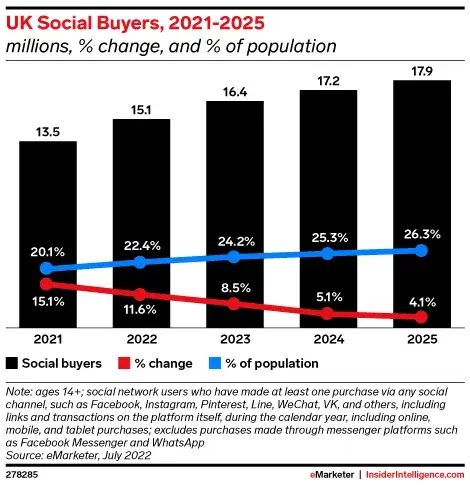
UK social buyers graph from 2021-2025

Image Source

For example, check out this comparison of data from the U.K., China, and the U.S.:
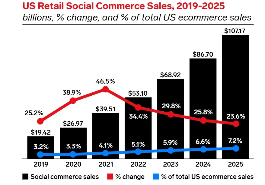
Graph showing retail social commerce sales in the US, 2019-2025

Image Source

So what’s the takeaway?

If you sell products, social media should be a key part of your ecommerce strategy in 2024. It doesn't matter where you are. Social selling is a big deal — so it’s time to take it seriously.

Most platforms offer built-in ecommerce features like shoppable posts, and almost half (47%) of social media marketers are already selling directly within apps.

The most popular social selling tools for marketers are:

  • Instagram Shops and Instagram Live Shopping (High ROI)
  • Facebook Shops (Average ROI)

social media strategy stats; ROI by platform

Image Source

(Psst: Need help building a Facebook page for your business? We have you covered.)

If you need inspiration for incorporating ecommerce into your social strategy, take a cue from Sephora.
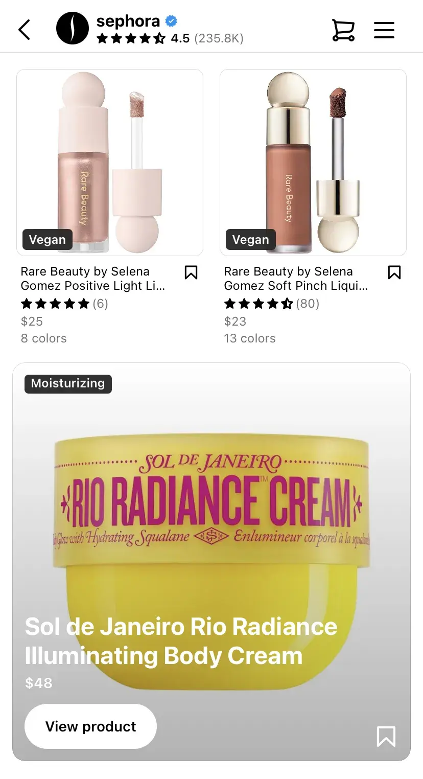
Screenshot from Sephora's website

Image Source

Whenever the beauty brand posts a product image, it includes a product tag that links directly to its shoppable page. It’s seamless — followers can make a purchase without ever leaving the app.

The key to social selling success is trust. While Sephora has an established reputation, you can build trust by sharing customer reviews, user-generated content (UGC), and product info.

💡 Pro tip: Go with image, video, and carousel ads for brand awareness to emphasize store visits, ad impressions, and engagement. For increased sales, select product, collection, or shopping ads to drive direct purchases and product page visits.

3. Optimize your social channels for search.

Social search is on the rise.

As more people turn to social with their queries instead of search engines, 89% of social media marketers agree that social search is important to their overall social media strategies in 2023.

Nearly 24% of consumers aged 18-54 use social media first to search for brands.
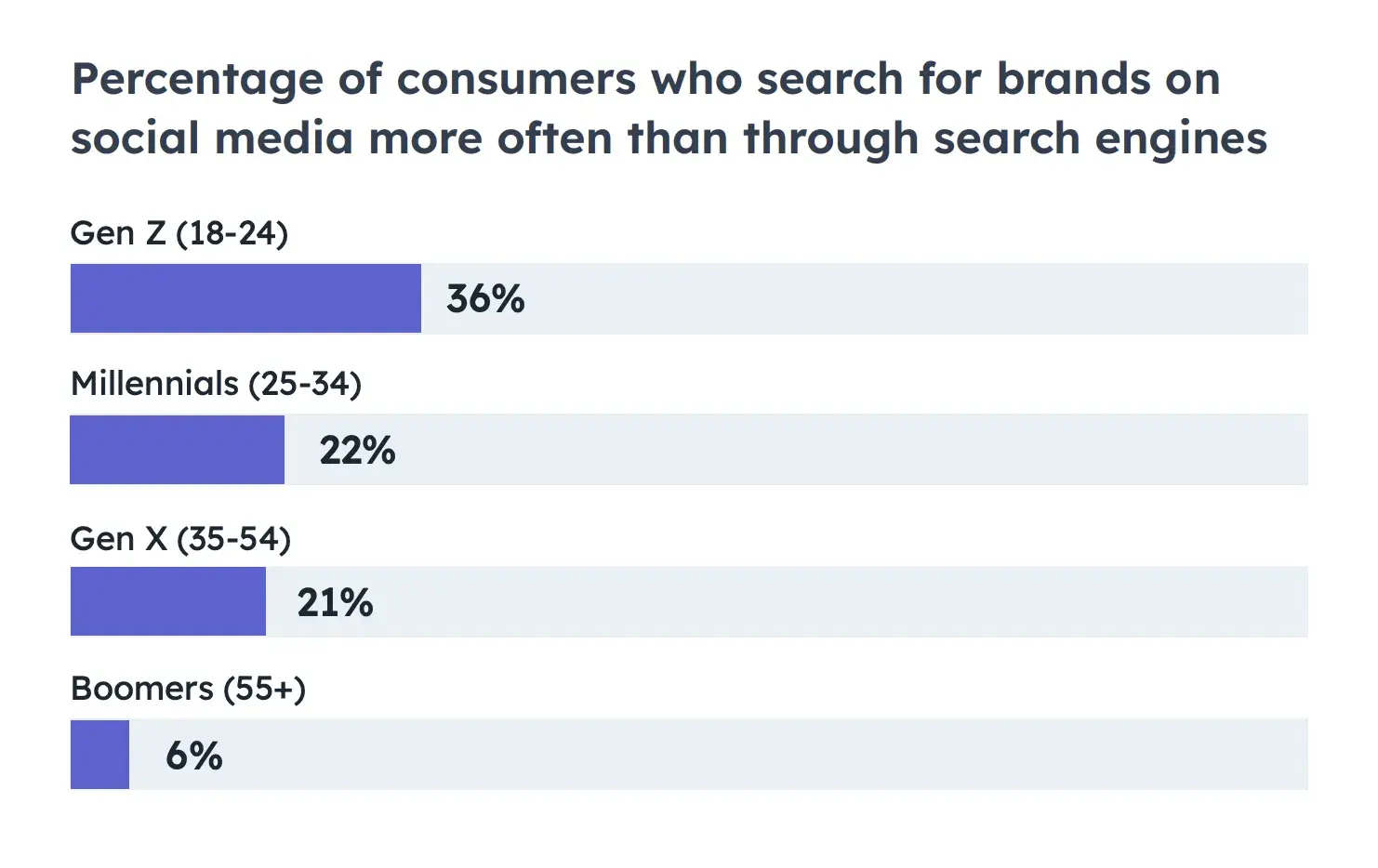
chart showing percentage of consumers who use social media first to search for brands

Image Source

For marketers, this means your social channels must be optimized for search. Prioritize social SEO if you want your social channels to show up in the results when your audience searches for your brand.

Similar to optimizing for search engines like Google, you can optimize your social presence.

Here's how:

  • Include relevant keywords and hashtags in your posts and bio.
  • Make sure your username is easy to search for.
  • Keep your username consistent across accounts.

When adding alt-text, avoid stuffing keywords, says Annie-Mai Hodge, director and founder of Girl Power Marketing.

“This feature describes the image on a page for the visually impaired, so it’s important you describe the image accurately. In doing that, you’re providing extra context for the social platform too, which can, in turn, get your content more visibility in search results,” says Hodge.

Over 30% of U.S. desktop searches on Google feature video carousels and video results, according to Semrush Sensor.

For instance, I searched for “best gaming laptops in 2024,” and the second result was a YouTube video. So, being active on YouTube to promote your brand is worth considering.

Google search screenshot

Image Source

💡 Pro tip: You don’t need to film an hour-long video. Even short videos — think YouTube Shorts — can help you rank higher in SERP. You can use UGC videos and testimonials for that purpose.

4. Focus on a few key social channels.

Most small businesses or social teams don’t have the bandwidth to establish and sustain a quality social media presence on every single channel. And learning the ins and outs of each one? Totally overwhelming.

That’s why it makes sense to focus on the platforms that will bring the best ROI. For many brands, that’s Instagram.

Instagram has proven to be the best source of ROI, engagement, and quality leads. Additionally, 23% of marketers believe Instagram offers brands the most potential to grow their audiences in 2023.

Plus, adding an Instagram feed to your website keeps things fresh and can even nudge more people towards making a purchase — social media content has been shown to boost conversions by up to 29%.

If you’re not tech-savvy, no worries. With tools like Flockler, you can easily embed your Instagram feed and make your website more dynamic. See their easy guide on how to embed an Instagram feed on a website.
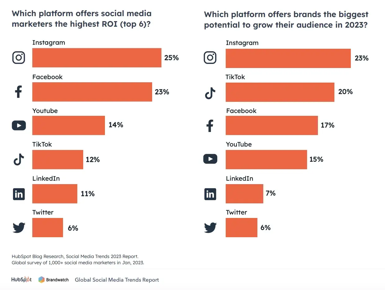
Graphs ranking different social platforms based on ROI and audience growth potential

Image Source

Brands also need to be strategic about where they show up.

“The platform can say a lot about the brand itself. With more and more consumers being more in tune with how they spend their money and whether corporations' ideals align with theirs, this is becoming more of a consideration for brands in the long run,” says Tameka Bazile, social media strategy manager at TIME.

If you want to create a strong social media strategy from scratch, start small.

If you're just starting out, don’t stretch yourself thin. Research where your target audience hangs out. For example, if you’re aiming for business professionals, LinkedIn might be a better fit than Instagram.

Bazile says brands should also consider the following when it comes to expanding across multiple platforms:

  • Means. “Does their social team consist of enough members and get enough budget to successfully manage multiple accounts?” Bazile asks.
  • Consumer Access. “Are their ideal consumers found on the platforms they are seeking to expand to?” she says.

I recently read insightful expert perspectives on this LinkedIn article about picking the right social media platform.

Amidst all the chatter, Roel Timmermans' comment caught my attention:
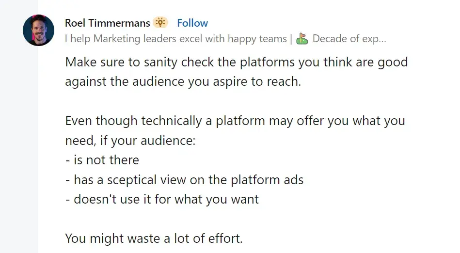
Comment from Roel Timmermans

Image Source

Or as Annie-Mai Hodge says, “You don’t need to be on every single social media platform, full stop—for most businesses, it’s a waste of time and resources to be on platforms where your audience isn’t active.”

When creating your strategy, Hodge says, “You would’ve looked at where your audience is, what your competitors are doing, and what you’re aiming to achieve with social media — all of this will help inform you as to what social media channels you should be focusing on.”

💡 Pro tip: Check where your competitors are most active and what kind of content they post. You’ll see what works or doesn't and how engaged their audience is. Don’t copy them — just use that info to make smart decisions for your strategy.

5. Create engaging content tailored to each platform.

As I mentioned, every social media platform has its own vibe.

The way people engage, the type of content they expect — it all varies. So, if you want your posts to land, you've got to adapt your content to fit each platform’s style and tone.

For example:

  • LinkedIn is all about professional, insightful posts
  • Instagram is made for eye-catching visuals and quick messages
  • TikTok is all about creativity and riding trends
  • Twitter loves snappy, real-time updates

When you get it right, content tailored to the platform builds trust and boosts engagement.

Take Instagram, where you should focus on crisp images or short videos with punchy captions. On LinkedIn, you’ll want to lean into thought leadership and industry expertise. And for TikTok, it’s humor, challenges, or fun behind-the-scenes moments that humanize your brand.

Wendy’s is a great example of this.

The brand's Twitter game is sharp and sarcastic — perfect for the platform’s fast-paced nature.
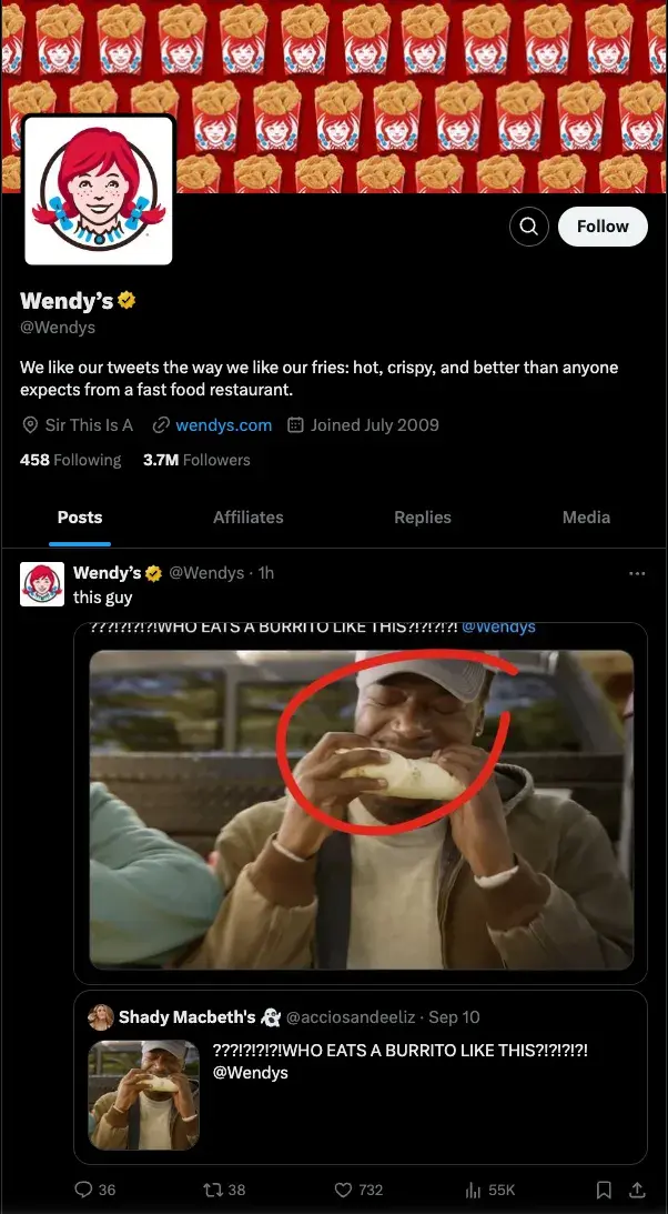
Wendy's posts on X

Image Source

But on Instagram, Wendy switches gears with polished posts featuring new menu items and vibrant photography.
Screenshot of Wendy's Instagram profile

Image Source

💡 Pro tip: Instagram stories and TikTok challenges are perfect for casual, day-in-the-life content. Save the deep dives for YouTube and LinkedIn, where people are looking for more in-depth insights.

6. Repurpose your content.

Why stress over creating different content for each platform?

Keep it simple: repurpose and use the same awesome content in different places — within reason, of course.

According to our research, most marketers repurpose content in some way, shape, or form, while 19% consider it one of their key strategies. Meanwhile, 40% plan to invest more in content repurposing in 2024.

This makes sense. By recycling content, you can:

  • Get your message to more people on different platforms.
  • Save time by using what you already have instead of starting from scratch.
  • Stay visible on search engines by updating and reusing content.
  • Cater to your audience's preferences with different formats.
  • Make your content last longer by updating timeless pieces.
  • Improve your strategy by checking how your content performs on different channels.

We at HubSpot love repurposing content — from simple LinkedIn posts like this …

Screenshot of a HubSpot post on LinkedIn

Image Source

… to hilarious TikTok video:

However, one word to the wise: Don’t lean on it for every single campaign.

Although most marketers do it, only 7% told us it yields them substantial ROI compared to content that's more catered to platforms.

If you’re short on time or trying out a new platform similar to the one you already use, go ahead and make small tweaks to optimize content across channels. I’d say it’s worth experimenting, as long as you’re delivering what your audience wants.

Just be careful not to spam them with the same content over and over again — that’s a quick way to lose their attention.

💡 Pro tip: Looking for a creative content idea that feels more personal than repurposed? Make catchy quote pictures from customer thoughts, share email insights on X or LinkedIn, and whip up quick videos from podcasts — people love that kind of stuff.

7. Make a plan for customer service.

When putting together your social media strategy, consider how you’ll use your channels for customer service.

Social media is so ingrained in our day-to-day lives, so it’s no surprise that people turn to these platforms for everything, from brand discovery to customer service.

According to our State of Social Media and Consumer Trends research, 1 in 5 social media users contact a brand through social DMs for customer service each quarter.

43% of marketers use customer service reps, 41% rely on platform managers, and 13% employ automated tools like chatbots.

Whether you create a separate account dedicated to customer service or have an auto-reply set up when people DM you on Instagram, have a plan for how you’ll handle customer support through social media.
Microsoft Support profile on X

Image Source

You can add working hours in the Support page’s bio so people know when to expect help. Consider what Twitch did in its X profile:
Twitch's support profile on X

Image Source

Now, let’s talk a little bit about the importance of good customer service on social media.

According to Khoros research:

  • 42% felt disappointed, 43% were unhappy, and 41% reported anger with poor customer care.
  • 67% shared bad experiences, and 65% switched to a different brand.
  • 43% are more likely to buy from a brand after a good customer service experience.
  • 83% feel more loyal to brands that resolve their complaints.
  • 73% of brands expect more inbound channels, and 53% anticipate more outbound channels in the next one to two years.

💡 Pro tip: Apart from clearly stating working hours, let customers know the expected response time and inform them about quicker alternative resources if available.

8. Develop a posting schedule to guide you.

Social media isn’t an exact science, and it definitely doesn’t work the same for every business or industry.

To make it work for you, create a clear posting schedule that helps your team stay consistent with content.

HubSpot offers some great social media tools and templates that help you plan your content and build a solid posting schedule and social media calendar.

One method I’ve found effective is from Tameka Bazile, who shared a neat way to categorize social media content:

Here’s how she categorizes it:

  • Evergreen engagement content.
  • Evergreen promotional content.
  • Specific campaign content.
  • Recurring communications content.

“Breaking down content into these buckets allows social teams to maintain regular presences online while also separating content data into easily trackable pieces,” she says.

Set realistic goals for how often you'll post and engage, and stick to the posting schedule you’ve created. It’s all about consistency!

💡 Pro tip: Choose platforms that allow easy editing and content management within your team. This ensures smooth collaboration and calendar updates.

9. Talk WITH, not AT, your followers.

In our latest Consumer Trends research, 41% of consumers pointed to relatability as the most memorable aspect of posts from brands or companies on social or the web.

Friendly brands win more followers (and hearts). So, skip the self-promotion overload. Instead, get into conversations and respond to comments authentically.

People love it when you chat with them, not just throw information their way. It makes them feel special, creating a genuine affection for your brand.

And no, you don't have to sound super professional. Casual talk works even better on social media. Just take a cue from McDonald’s:

McDonald's social media strategy includes casual interaction

Image Source

I personally can’t get enough of BMW and its fantastic relationship with fans and followers. They always try to respond to every comment on social media:
BMW's social media strategy relies heavily on prompt communication

Image Source

And here’s something interesting to remember — very few people, less than one percent, interact with brands’ posts.

Here are the platform breakdowns.

  • Facebook: 0.09%.
  • Instagram: 1.22%.
  • X: 0.045%.

So, once you get a comment, find the right way to interact and show that you care.

Don't just ghost and ignore. These comments boost your post higher in algorithms and make it more visible.

💡 Pro tip: Never delete negative comments unless they’re super offensive or inappropriate. Instead, use them as an opportunity for constructive engagement and improvement.

10. Measure your results.

It’s hard to know what to focus on if you don’t have goals, a roadmap, or a clear brand strategy. You’ll end up lost in the noise of social media, unsure of what’s working or what to prioritize.

As Bazile says, “Without goals, a product roadmap, or even a full brand strategy, social media managers will struggle to know what to prioritize in the social space, what metrics to measure to convey progress, and what sort of content or social presence is ideal for the brand.”

There’s a lot you can track on social media with the right tools, but let’s not get overwhelmed.

Start with the basics. For example, how much traffic are your social channels driving to your website or blog?

Once you’ve got a handle on that, use tools like Facebook’s Page Insights, Instagram’s Account Insights, and LinkedIn’s Visitor Analytics to spot trends in engagement.

Look for patterns around what topics or keywords get the most attention.

Once you know what your average traffic and post performance look like, it’s time to set some goals.

Choose metrics that are simple and easy to track — otherwise, you’ll lose motivation fast. Things like total interactions, traffic to your site, and social-driven revenue are a great place to start.
social media strategy tips

“One of the most valuable indicators, in my opinion, is impressions,” Nash says, “Impressions measure the number of times a piece of content is displayed on users' screens and help to evaluate the effectiveness of your content strategy in terms of exposure and brand awareness.”

💡 Pro tip: Don’t only focus on platform numbers. Track the social sentiment as well. See if people express positive or negative feelings about you in online conversations. It takes a bit of manual work, but it's worth it. Check regularly for better insights.

11. Adjust your tactics as needed.

Social media won't start working overnight.

Establishing a following, stabilizing your brand, and seeing the results of your efforts take time. So, experiment to find the right combination of channels, content, and messaging that works for your audience.

We can pick up some cool tricks from Victoria's Secret in this regard.

The company has shifted from using only professional photos and videos to incorporating more casual content. Now, VS’s Insta feed also includes UGC and interviews with random people on the street and in their stores.
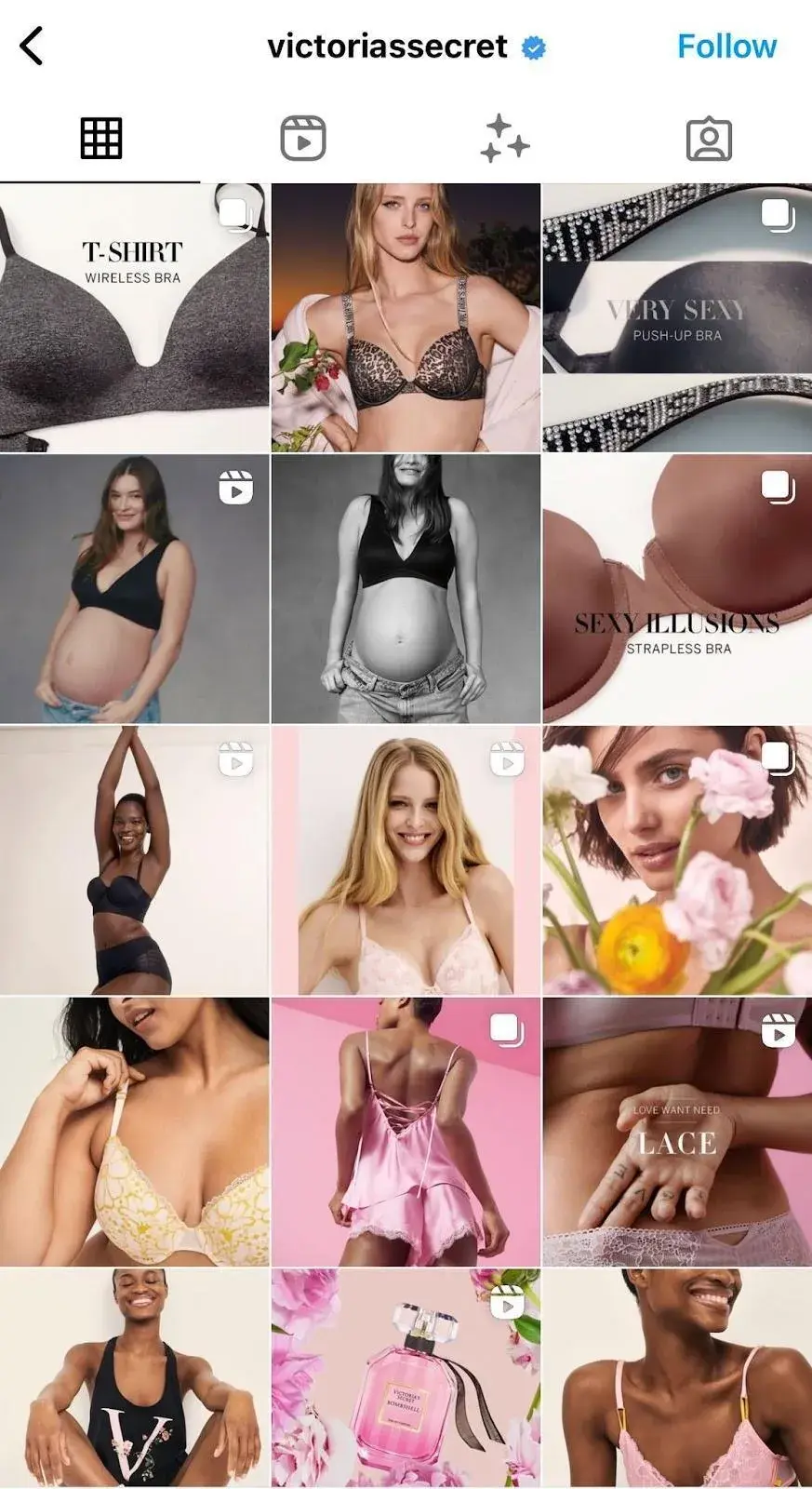
Screenshot of Victoria Secret's Instagram profile

Image Source

Victoria‘s Secret proves that even as a high-end brand, you don’t lose anything by including everyday people.

Actually, you gain.

VS's social media strategy includes going live with regular people

Image Source

More followers. More engagement. More exposure.

Keep track of changes in your post views, audience demographics, and post interactions, and make changes as needed.

Over time, you can adjust your posting schedule, content, and personas based on the collected information, which will help you fine-tune your strategy and generate more consistent results.

I get it: trying new stuff might seem a bit daring, but sometimes, it's just necessary to “survive.”

For instance, try to use funny content whenever possible.

In our 2023 survey of over a thousand global social media marketers, 66% said funny content works best, followed by relatable (63%) and trendy (59%) content. While 45% talk only about their brand values, the key is to use humor for the most impact.

Don't believe that humor can pay the bills? One-third, or 34% of Consumer Trends respondents also told us funny content is most memorable to them.
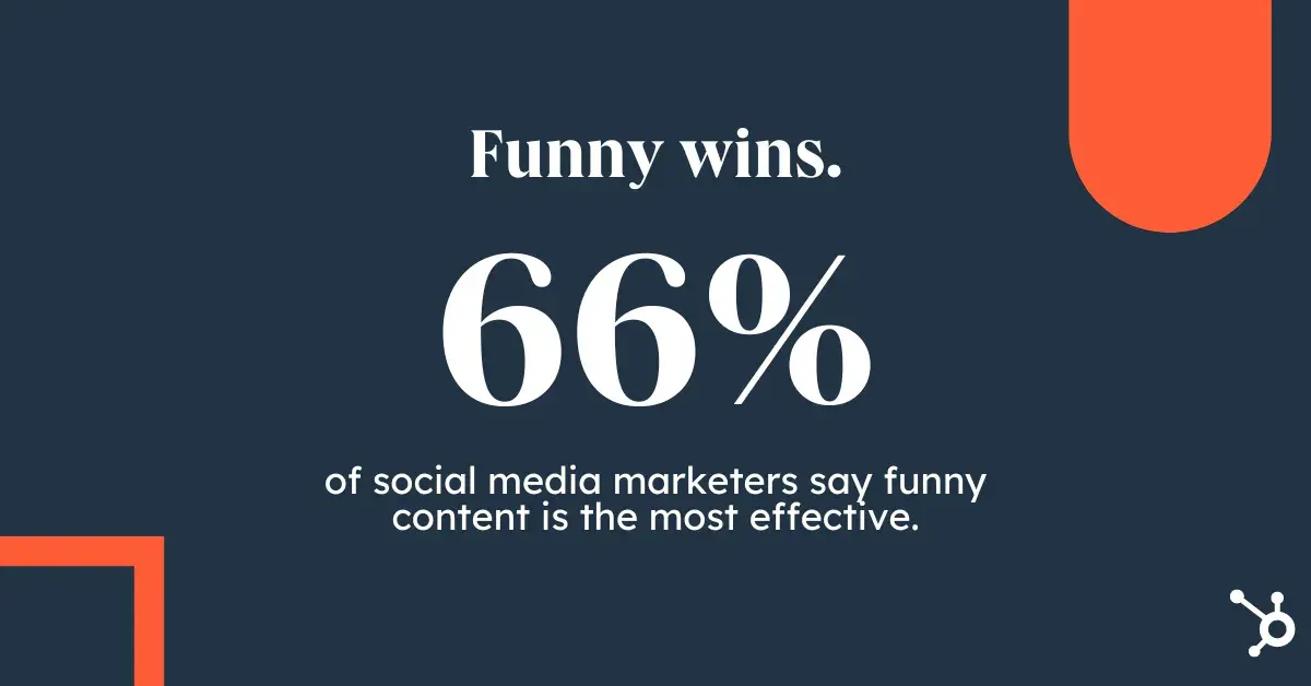
66% agree effective social media strategies are often hilarious

I asked Hodge about a time when changing tactics improved social media results. She recalls that at the start of 2023, Girl Power Marketing stopped growing on social media and started losing engagement.

“It wasn’t until I sat down and reassessed my strategy that I was missing something, and that was humanization,” Hodge recounts. “Why should people trust my thoughts, opinions, and guidance if they have no clue who was behind GPM or the mission behind it?”

Hodge shares that she started showing up more intentionally. She created content that showed more of herself, her personality, and GPM’s mission.

“And a year later, GPM has grown to a community of 180k+ people — all because I switched up my tactics that no longer worked,” says Hodge.
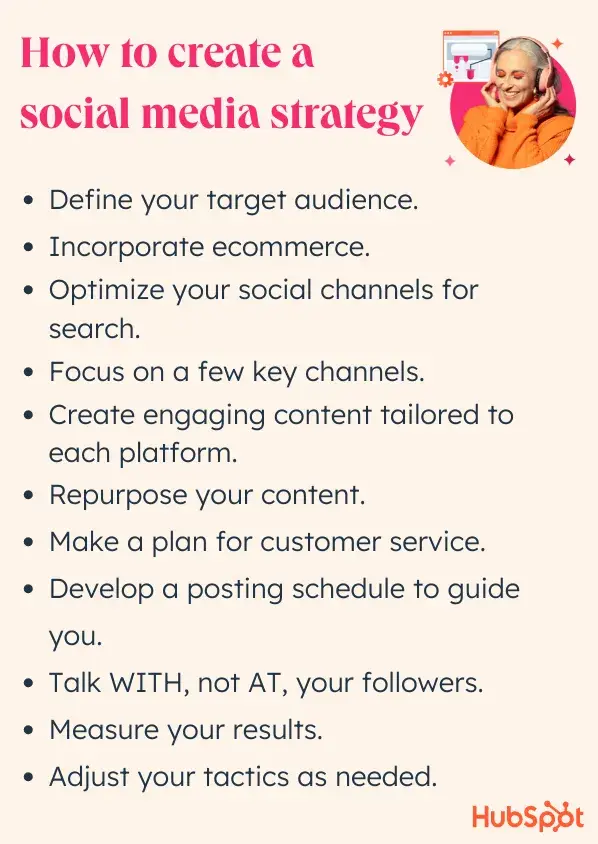
Pillars of building an effective social media strategy

💡 Pro tip: Tailor your content to match seasonal trends and holidays. This helps keep your brand messaging timely and relatable. And most importantly — people love it.

Keeping Up With Social Media Strategies

These tips will boost your ROI now, but make sure to stay prepared for the inevitable shifts as new tools, channels, and trends emerge.

To stay on top of things without feeling overwhelmed, I recommend following research like our State of Social Media Report. You can also check out our blog for real, actionable insights on the trends and strategies you need to keep on your radar.

Editor's note: This post was originally published in February 2016 and has been updated for comprehensiveness.

20+ Best Italian Style Fonts (Free & Pro)

Featured Imgs 23

Capture the timeless elegance and charm of Italy with our curated selection of the best Italian-style fonts.

Whether you’re designing for a luxury brand, a rustic restaurant, or a high-end fashion label, Italian-inspired fonts can bring a sense of sophistication and flair to your projects. These fonts reflect the rich heritage of Italian design, from the classic, ornate styles of old-world Italy to sleek, modern typefaces inspired by the country’s famous art, architecture, and fashion.

In this post, we’ve handpicked the best Italian-style fonts that embody the beauty, culture, and craftsmanship Italy is known for. From elegant serif fonts that channel the grandeur of Renaissance architecture to playful, script styles reminiscent of Italian cafés and boutiques, these typefaces will help you create a design with authentic Italian flavor. Have a look.

Marcopolo – Italian Restaurant Font

Marcopolo - Italian Restaurant Font

Marcopolo is a creative Italian-style font, featuring a striking contrast deco style. This unique uppercase typeface also offers intriguing lowercase designs and comprehensive multilingual support. From Afrikaans to Zulu, it effectively communicates in diverse languages, making it a versatile choice for global projects.

Fiorent Deco – Italian Style Font

Fiorent Deco - Italian Style Font

Fiorent Deco is an Italian-style display font that embodies Art Deco simplicity. With its clean, modern letterforms imbued with a classic, retro feel, this all-caps font is fitting for headlines, branding, or logotypes. Inspired by Italian cafes, it includes stylish alternatives for certain characters, like the letter ‘S’. This font is especially ideal for food product packaging, menu designs, or cafe and restaurant branding.

CA Capoli – Italian Style Font

CA Capoli - Italian Style Font

CA Capoli is a beautifully refined script typeface with an authentic vintage flair. Inspired by a 1950’s font found on an Italian ceramic ashtray during a trip, the creators aimed to fill in the blanks of the mystery alphabet. Featuring Regular and Stroke styles alongside a Central European character set and alternative options, CA Capoli is ideal for illustrative titles or logos needing a touch of Italian elegance.

Praline Amaretto – Vintage Italian Font

Praline Amaretto - Vintage Italian Font

Praline Amaretto is an Italian-style Serif Font complete with 91 unique, handcrafted glyphs. This inclusive font features both uppercase and lowercase glyphs along with numbers and punctuation. In the near future, this font will also support multilingual glyphs. Perfect for crafting aesthetically pleasing typography for personal or client-based projects.

Pesto – Thin Italian Style Font

Pesto - Thin Italian Style Font

Pesto is a sleek, light sans-serif typeface with a multilingual flair. Perfect for imbuing a vintage vibe into logos, branding, arts or text for articles, this versatile TTF font supports a broad spectrum of languages including Spanish, Portuguese, German, Danish, French, Italian, and even Cyrillic.

Gallery – Italian Style Ligature Font

Gallery - Italian Style Ligature Font

The Gallery is a modern and stylish font that adds a touch of sophistication to your designs. Available in both OTF and TTF files, it supports a wide variety of characters including uppercase, lowercase, numbers, punctuations, and ligatures. The font also offers expansive language support, making it a versatile choice for international projects.

Restaconme – Modern Script Font

Restaconme - Modern Script Font

Restaconme is an Italian-inspired modern script font ideal for creative projects. Its hand-lettering style design, inspired by Italian pianist Ludovico Einaudi, adds an elegant touch to any project. Making Restaconme a perfect choice for use on apparel, invitations, product packaging, headers, logotype, letterheads, posters, labels and more.

Lico – Vintage Italian Font

Lico - Vintage Italian Font

Check out Lico, a vintage Italian-inspired font with a fun retro pop twist. The stylistic alternates and ligatures in each letter lend uniqueness to your writing, making Lico ideal for a variety of visual projects ranging from branding and logos to social media content, and even weddings. Lico comes in uppercase, lowercase, punctuation, numerical, ligatures, alternates, and supports multiple languages.

Neretto Sans – Italian Style Font

Neretto Sans - Italian Style Font

Neretto Sans is a sleek Italian style font based on the Sensi Bold design by Valerio Dell’Edera. The name Neretto, an Italian term for thick, black type, perfectly describes this contemporary sans serif font. Ideal for magazine titles and logotypes, this font includes updated ligatures, along with a complete glyph set.

Rigoletto – Italian Font Duo

Rigoletto - Italian Font Duo

The Rigoletto is a sophisticated, monoline-style font. With its Sans Serif fonts amplifying the sleek script, it emanates an expensive and tidy elegance. Offering 70 alternates, Rigoletto provides substantial flexibility in design. It supports multiple languages, from English to Swedish, making it versatile for international use. This font is particularly suitable for logotypes, wedding invites, vintage labels, and romantic cards.

Matrole – Vintage Italian Font

Matrole - Vintage Italian Font

Matrole is a versatile, vintage Italian-style serif font with three unique styles: clean, rough, and stamp. Providing a comprehensive suite with multilingual characters and stylistic alternates, Matrole is well-suited for various applications including quotes, clothing designs, vintage logos, labels, posters, and packaging designs.

Montrelo – Elegant Italian Font

Montrelo - Elegant Italian Font

Montrelo is a chic, modern sans-serif font that emanates Italian elegance. Versatile for any size and medium, it is ideal for branding, social media content, wedding designs, advertisements and product packaging. Montrelo also includes a host of features like OTF, TTF, and WOFF formats, various glyphs, alternates, ligature and multilingual support.

Freudian – Italian Font

Freudian - Italian Font

This is a beautifully crafted, Italian-style font with a vintage, handmade appeal. Its versatility makes it suitable for an array of graphic design projects such as logos, posters, prints, business cards, and even clothing designs. This opentype feature-rich and PUA Encoded font also supports 23 languages, making it a globally friendly typeface.

Hopscotch – Creative Italian Font

Hopscotch - Creative Italian Font

Hopscotch is a charming Italian-style font with whimsical handwritten doodles. Its playful summer tone, complete with a bouncy baseline and full alternate set in uppercase letters, makes it an excellent choice for prints, invitations, greeting cards, and custom typography.

LATUNA – Italian Serif Font

LATUNA - Italian Serif Font

LATUNA, a modern Italian serif font that brings a distinctive and premium touch to any project. The package includes regular and italic versions, web font, ligatures, alternates, and multilingual support. It supports 65 languages from Afrikaans to Zulu.

Romaben – Old Vintage Italian Font

Romaben - Old Vintage Italian Font

Romaben is an elegant vintage Italian-styled font that exudes a nostalgic charm reminiscent of the 70s, 80s, and 90s. This font captures the timeless appeal of old-fashioned design, making it an ideal choice for a variety of projects – from logos, advertisements, and branding projects to invitation designs and product labels.

Nethan – Elegant Italian Script Font

Nethan - Elegant Italian Script Font

Nethan is an Italian-style font that gives a distinct, premium touch to your projects. The package includes regular and italic versions of the font in various formats, and comes with added ligatures, alternatives, and multilingual support for 65 languages.

DeMonte – Italian Font Family

DeMonte - Italian Font Family

DeMonte is an appealing sans serif millennial-generation font, delicately crafted for a soft visual impact. With its 10 weight variations, this diverse font family stylishly accommodates a multitude of languages, including French, German, Spanish, Portuguese, and more.

Free Italian Fonts

Italian – Free Slab Serif Font

Featuring thin lines and a minimalist look, this slab-serif font will allow you to craft beautiful titles, badges, and signage for various projects. The font features an Italian-inspired letter design. And it’s free for personal use.

Italiano – Free Brush Font

This free font is perfect for crafting a bold title for your Italian restaurant or cafe shop. The font comes with a brush-style letter design inspired by Italian typography. It’s free to use with personal projects.

Mantey – Free Italian Style Font

Mantey is a professional-looking font you can use for all sorts of business design needs. It features a clean letter design inspired by Italian style but with a simple and bold look. It’s free for personal use only.

Marcione Trial – Free Italian Font

Marcione is another great free font you can use to craft Italian-themed typography. It comes with a tall and narrow letter design that will fit perfectly with Italian restaurant and hotel branding designs. It’s free for personal use.

Italian Breakfast – Free Font

A stylish Italian script font that features creative curves and swirly letters. This font is ideal for more romantic-themed typography designs as well as greeting cards, T-shirts, and more. It’s free to use with personal projects.

75+ Best InDesign Magazine Templates 2024 (Free & Premium)

Featured Imgs 23

Designing a magazine from scratch can be a lot of work. You have to come up with unique layouts for multiple pages, design the covers, format paragraphs, and much more. Did you know that you can get a great head-start by simply using an InDesign magazine template?

That’s right! With a magazine template, you get a complete magazine pre-designed by a professional. All you have to do is edit the design to change the colors while replacing the text and images.

We handpicked a collection of amazing InDesign magazine templates to help you find the right design for your project. There are all kinds of magazine templates in this collection ranging from fashion magazines to business magazines and more.

Let’s have a look.

Minimal Style InDesign Magazine Template

Minimal Style InDesign Magazine Template

This InDesign magazine template is perfect for fashion-oriented projects. It features 12 easily editable pages of 11×8.2 inches at 300 dpi resolution, ready to print in CMYK color mode. The layered file is compatible with Indesign CS 4, CS 5, and CS 6, and has a 3mm bleed. The template comes with free fonts alongside a handy help file.

Inspired Furniture InDesign Magazine Template

Inspired Furniture InDesign Magazine Template

A flexible and user-friendly InDesign magazine template for interior design and furniture brands. The 12-page layout, with 300 dpi resolution, is designed for a standard-sized 11×8.2 in paper. It supports Indesign CS versions 4 to 6 and includes paragraph style and layered file features while working in a print-ready CMYK color mode.

Modern Travel InDesign Magazine Template

Modern Travel InDesign Magazine Template

This is a sleek, professional InDesign magazine template perfect for creating visually appealing and informative travel magazines. With its emphasis on clean design, quality visuals, and a unified aesthetic, this template is great for travel publications or bloggers looking to inspire with their adventures. It offers 16 fully customizable A4 pages and uses CMYK color mode and free fonts.

Simple Travel InDesign Magazine Template

Simple Travel InDesign Magazine Template

This InDesign magazine template is designed to help you create an impressive travel magazine. Its sleek, professional style is marked by clean lines and top-quality visuals, promising aesthetics that are both appealing and informative. The 16-page template is fully customizable, operates in CMYK color mode, and uses free fonts.

Life Style Magzine InDesign Template

Life Style Magzine InDesign Template

A user-friendly InDesign magazine template for creating a bespoke, professional lifestyle magazine. Offering 16 customizable pages, resizable vector elements, and convenient drag-and-drop photo replacement, it streamlines the designing process, saving valuable time. Additionally, it equips users with business and marketing templates, and offers versatility in color and typography customization.

Food and Culinary Magazine InDesign Template

Food and Culinary Magazine InDesign Template

This InDesign magazine template is specifically designed for food and culinary magazines. This user-friendly asset has room for 12 pages and is quite easily editable. The template, fit for easy printing, sports a color mode of CMYK with a resolution of a sharp 300 dpi. Comes with a useful help file and space for free font downloads.

Modern Nature Magazine InDesign Template

Modern Nature Magazine InDesign Template

A brilliant InDesign magazine template for nature-themed publications. The user-friendly design features 16 unique pages, including master pages, and is fully customizable. It is compatible with various versions of InDesign, boasts automatic page numbering, and is print-ready in a CMYK color palette, 300 DPI Resolution.

Modern Fashion Magazine InDesign Template

Modern Fashion Magazine InDesign Template

Another versatile InDesign magazine template for creating stylish fashion magazines. With 16 unique pages, automatic page numbering, and compatibility with InDesign CS4 to CC, this template is easy to customize and edit. It comes in a print-ready format with 300 DPI resolution in CMYK color.

Landscape Magazine Layout InDesign Template

Landscape Magazine Layout InDesign Template

Explore a contemporary and versatile magazine design with this landscape-style InDesign magazine template. Designed for aesthetic appeal and reader engagement, it features a structured grid, stylish typography, and sections for articles, images, and ads. The customizable template, compatible with InDesign, allows for the modification of colors and fonts to suit various themes.

Recipe Book InDesign Magazine Template

Recipe Book InDesign Magazine Template

This is a professionally crafted InDesign magazine template for food lovers and chefs. It features a modern, customizable layout perfect for showcasing recipes, and comes with easy-edit convenience. Boasting clean design, A4 paper size with 3mm bleed, and compatibility with InDesign, it is also easily downloadable and print-ready.

Enjoy Magazine Template for InDesign

Enjoy Magazine Template for InDesign

This is a sleek and modern InDesign template best used for designing stylish and engaging magazines. Its user-friendly design allows easy customization of typography, brand colors, and images. It features 16 unique pages and it comes in high-resolution, A4 format. The template’s minimal design and versatile features pave the way for a magazine layout that truly encapsulates your brand.

Winter Magazine Template for InDesign

Winter Magazine Template for InDesign

A sleek, winter-themed InDesign template for modern magazines. It’s geared for easy customization, allowing you to quickly swap in your logo, images, brand colors, and typography, saving you considerable time and effort. The template spans 16 unique pages with resizable vector elements, all encapsulated within a professional, minimal, and creative design.

Simple Travel Magazine InDesign Template

Simple Travel Magazine InDesign Template

This InDesign template is ideal for both travel lovers and professionals and provides an easy-to-use platform for creating stunning travel magazines or brochures. Its versatile bifold layout is suitable for travel agencies, writers, and tourism events. The template comes in A4 size with fully customizable elements.

Multipurpose Magazine InDesign Template

Multipurpose Magazine InDesign Template

A dynamic InDesign template for modern magazine design. It blends functionality and visual appeal, offering a compelling reading experience with a modern design that incorporates whitespace and attractive typography. Compatible with InDesign, this easy-to-edit, professional template is also print-ready, and features free fonts

Fashion Luxury Magazine for InDesign

Fashion Luxury Magazine for InDesign

This is a superb InDesign template for luxury and fashion brands for creating stylish magazines. Embodying a sleek professional design, it’s easily editable with 12 custom pages in A4 format. Its features range from portrait orientation, print-ready settings (CMYK, 300 dpi), to character and paragraph styles. You can customize colors and all objects freely, making it a versatile tool for any project.

Food Magazine Template for InDesign

Food Magazine Template for InDesign

This InDesign template is ideal for designing magazines for food-related brands. Offering 12 customizable pages in professional A4 format, all elements like objects, colors, and text can be edited to suit your needs. The high-resolution, print-ready design comes with character and paragraph styles and allows color customization for boundless creativity.

Creative Portfolio Magazine InDesign Template

Creative Portfolio Magazine InDesign Template

Another versatile InDesign template designed to spotlight your portfolio in a fresh modern fashion. This easy-to-edit template combines effortless design and convenient navigation, creating an unforgettable user experience. Including 16 pages, the template is print-ready, compatible with InDesign, and uses a free font.

Unique Magazine Template for InDesign

Unique Magazine Template for InDesign

This InDesign template offers an easy-to-use layout for creating customized digital magazines. The design is minimalistic and professional, with 16 unique pages, resizable vectors, and the option to effortlessly swap out fonts and brand colors.

Sports Magazine Layout for InDesign

Sports Magazine Layout for InDesign

You can create stylish sports-themed magazines using this creative InDesign template. Optimized for A4 size, the 16-page template features easy-to-edit layouts and is print ready. It’s perfect for professional sports teams, brands, and news magazines as well

Clean Portfolio Magazine InDesign Template

Clean Portfolio Magazine InDesign Template

This is a sleek, professionally designed InDesign template ideal for showcasing portfolios. It’s easy to customize and enhances any body of work with its modern aesthetic of crisp lines and contemporary typography. It’s a 16-page document that’s print-ready and uses CMYK color scheme.

Modern Business Magazine InDesign Template

Modern Business Magazine InDesign Template

This magazine template features a modern and professional design that’s most suitable for small businesses. You can use it to craft magazines to promote services, products, and brands. The template includes 12 page layouts with easily editable designs.

Multipurpose Magazine Template for InDesign

Multipurpose Magazine Template for InDesign

A simple and creative InDesign magazine template that can handle many different types of industries. This magazine template comes with 12 unique pages with flexible layouts. It’s ideal for making magazines for various businesses and brands.

Travel Magazine Template for InDesign

Travel Magazine Template for InDesign

If you’re working on a design for a travel-related magazine, be sure to grab this InDesign template. It features a modern design with plenty of space for showcasing big beautiful photos all across its pages. There are 20 unique page layouts in this template.

Life Nature Magazine InDesign Template

Life Nature Magazine InDesign Template

This InDesign template can be used to create both lifestyle and nature magazines. It includes 20 different page designs with beautiful paragraph styles. You can fully customize it to your preference using InDesign CS4 or higher.

Free Cookbook Magazine InDesign Template

Free Cookbook Magazine InDesign Template

Want to create a simple cookbook magazine with all your favorite recipes? Then this free InDesign template will come in handy. It includes 18 page layouts with stylish designs. The template is print-ready as well.

Future Techno Magazine InDesign Template

Future Techno Magazine InDesign Template

This InDesign magazine template is perfect for technology-themed magazines. It features simple page layouts with beautiful paragraph styles and designs. You can use it to create both business and entertainment magazines.

Creative Magazine Template for InDesign

Creative Magazine Template for InDesign

This template can be used to design a creative lifestyle magazine to share articles as well as to promote brands quite effectively. It features 20 unique pages in A4 size. And it’s easily customizable to your preference.

Stylish Landscape Magazine InDesign Template

Stylish Landscape Magazine InDesign Template

If you prefer magazine designs with a landscape view, this InDesign template is perfect for you. It comes with highly visual page layouts where you can showcase large images throughout the magazine. There are 20 page layouts included in the template.

Indie Magazine Minimal InDesign Template

Indie Magazine Minimal InDesign Template

The clean and minimal design of this magazine template makes it a great choice for various types of lifestyle magazines. It includes 24 unique page layouts with easily editable paragraph styles, image placeholders, and more.

Free Trendy Magazine Template for InDesign

Free Trendy Magazine Template for InDesign

This free InDesign magazine template is great for making trendy magazines to talk about various lifestyle and fashion-related topics. The template includes 14 customizable page designs with changeable colors.

Modern Magazine InDesign Template

Modern Magazine InDesign Template

If you’re working on designing an adventure, travel, or lifestyle magazine, this template will fit in perfectly with your needs. It features a clean and modern page design with lots of space for showcasing images. The template has 12 page layouts with easily editable elements.

Colorence – Creative InDesign Magazine Template

Colorence - Creative InDesign Magazine Template

Colorence is the perfect magazine template for crafting colorful and creative magazines for modern brands. There are 14 unique page layouts included in this template and they are all fully customizable. You can change colors, formatting, fonts, and much more to your preference.

Flora – Elegant Magazine InDesign Template

Flora - Elegant Magazine InDesign Template

Flora is an elegant magazine template for InDesign. It features minimal and simple page designs for crafting modern magazines for various topics. The template is especially suitable for lifestyle and travel magazines. It includes 20 pages in A4 and US Letter size.

CHLOË – InDesign Fashion Magazine Template

CHLOË - InDesign Fashion Magazine Template

This InDesign magazine template is made with fashion and lifestyle topics in mind. It comes with 32 unique page designs that you can easily customize to your preference. The template includes master page layouts and comes in both IDML and INDD formats.

Free Printable Health Magazine InDesign Template

Free Printable Health Magazine InDesign Template

This is a free InDesign magazine template you can use to create a simple health magazine. It includes several colorful page layouts in A4 and US Letter sizes. The template is also available in MS Word and Apple Pages format.

Bold Fashion Magazine InDesign Template

Bold Fashion Magazine InDesign Template

You can create a bold and minimalist fashion magazine using this InDesign template. It includes 12 unique page layouts with elegant designs. Each page is fully customizable and you can add your own colors, change fonts, and add custom images however you like.

Culture Magazine InDesign Template

Culture Magazine InDesign Template

This InDesign magazine template is perfect for designing culture and lifestyle magazines. It features beautiful page layouts with lots of space for showcasing images and visuals. The template includes 12 unique page layouts in A4 size.

Glamoure – Modern InDesign Magazine Template

Glamoure - Modern InDesign Magazine Template

Grab this template to design a modern and glamorous fashion magazine. There are 12 different page layouts to choose from with easily editable colors and font options. You can use this template to make fashion lookbooks and catalogs as well.

Interior Design Magazine InDesign Template

Interior Design Magazine InDesign Template

This magazine template comes with a minimal page design to help accentuate your product images throughout every page. It’s a great choice for making magazines for interior design and architecture topics. The template has 12 custom page layouts.

Free Fashion College InDesign Magazine Template

Free Fashion College InDesign Magazine Template

Another free InDesign magazine template with modern and visual page designs. This template is ideal for making magazines and brochures related to fashion and beauty. It’s available in MS Word and Apple Pages versions too.

Lifestyle Magazine Template for InDesign

Lifestyle Magazine Template

This beautiful, and cool lifestyle magazine for InDesign is an excellent choice for any brand that values standing out from the pack. Featuring a simple yet eye-catching design, and fantastic use of white space, this template is too good to pass on.

Graceland – InDesign Magazine Template

Magazine Template

Here we have a professionally designed InDesign magazine template perfectly fitting to a pool of businesses, and industries. It offers a grid based layout, 24 unique pages with automatic numbering, and free fonts. Grab it right now!

Julienn – Lifestyle InDesign Magazine Template

InDesign Magazine Template

Check out Julienn, a carefully crafted lifestyle magazine template that comes with 32 remarkably unique pages, fully customizable in Adobe InDesign. It has a tactfully designed grid-based format that not just commands attention, but also keeps the readers hooked on the content from start to end.

Creative InDesign Magazine Template

Creative InDesign Magazine Template

This beautifully creative InDesign magazine template has a unique design that will make your own magazines stand out from the crowd. This template comes with a clean design filled with stylish shapes, image placeholders, and unlimited color options for customizing the design. It includes 14 different page layouts as well.

Minimal InDesign Magazine Template

Minimal InDesign Magazine Template

If you’re working on a magazine design for creative arts, design, or photography, this minimal InDesign magazine template will be a perfect choice for you. It features 14 unique and editable page layouts with a creative design. All the colors and shapes used in the design are customizable to your preference.

Modern InDesign Magazine Template

Modern InDesign Magazine Template

A professional InDesign magazine template featuring a modern design. This template includes 30 unique page templates that you can easily customize however you like to create all kinds of magazines. The highly visual and content-rich design makes this a great choice for technology-themed magazines.

28-Page InDesign Magazine Template

28-Page InDesign Magazine Template

You can craft a beautiful lifestyle magazine using this impressive InDesign template. It comes with a professionally-crafted design that features image placeholders and proper paragraph formatting. All of which are fully editable. The template includes 28 page layouts in A4 size.

Fashion Magazine Template for InDesign

InDesign Magazine Template

Next up we have a classy, and sophisticated magazine template that brings a unique personality to the table. The design is minimal yet eye-catching, and everything from text to colors to shapes can be customized to suit your own branding.

Free Minimal InDesign Magazine Template

InDesign Magazine Template

Here we have a clean, and minimal magazine template that can be used by virtually any business or industry under the sun. It has an awfully flexible design, making it one of the best free InDesign magazine templates floating around on the web right now.

Unique InDesign Magazine Template

InDesign Magazine Template

If you are looking for a professional yet stylish business magazine template for InDesign, our next option has you covered. It comes with an uncluttered and trendy design, allowing you to accommodate bulk content without losing quality and readability.

Kalonice – Free InDesign Magazine Template

InDesign Magazine Template

Kalonice is a magazine template that has been crafted as per the latest design standards. It has a modern, multipurpose layout that fits almost any business ranging from fashion and photography to interior design and architecture.

Fashion Magazine InDesign Template

Fashion Magazine InDesign Template

Looking for inspiration to design a fashion magazine? Then this template will help you get a headstart. It features a minimal design that highlights images with large image fill backgrounds. The template also features 20 page layouts you can easily customize to change colors and paragraphs to match your branding.

Prambanan – Free InDesign Magazine Template

Prambanan - Free InDesign Magazine Template

This is a free InDesign magazine template you can use to design a simple magazine related to travel and tourism. The template featuring multiple page designs you can edit to your preference. It’s free to use with your personal projects.

Healthy Lifestyle Magazine InDesign Template

Healthy Lifestyle Magazine InDesign Template

Use this beautifully designed InDesign template to create a professional lifestyle magazine. It comes with 18 unique page layouts with fully customizable designs. The template is print-ready but you can also use it to create and publish eBooks.

Index Magazones InDesign Magazine Template

Index Magazones InDesign Magazine Template

Index is a very unique InDesign magazine template that comes in 11,6 X 8,2-inch size. It features 20 pages with minimal designs. And you can change the colors, fonts, and even the paragraph formatting to your preference.

Honen Travel Guide Magazine InDesign Template

Honen Travel Guide Magazine InDesign Template

This magazine template is designed specifically for creating magazines and guides related to travel and tourism. It includes 24 unique page layouts in A4 size with easily editable design. The template is compatible with Adobe InDesign CS4 and higher.

Lookbook – Free InDesign Magazine Template

Lookbook - Free InDesign Magazine Template

This free InDesign template is ideal for designing a simple lifestyle magazine. The template comes with several stylish page layouts that allow you to showcase large images. This template is also free to use with personal projects.

Modern Business InDesign Magazine Template

Modern Business InDesign Magazine Template

A beautifully designed InDesign magazine template featuring colorful shapes, image placeholders, and unique paragraph styles. This template also uses a minimal text content and more visual elements throughout its design. Making it perfect for design, architecture, and photography magazines. It includes 14 page layouts.

Sport Magazine InDesign Template

Sport Magazine InDesign Template

This magazine template is made specifically for crafting sports magazines. It features a very visual and modern design. And comes with 30 different page layouts in both A4 and US Letter sizes. This template is also compatible with InDesign CS4 and higher.

Clean Minimal InDesign Magazine Template

Clean Minimal InDesign Magazine Template

Sometimes the best designs are the ones that use fewer colors and visual elements. This magazine template is one of them. It features a clean design that uses lots of white space to give the centerstage to your content. It’s perfect for agency and brand magazines. And it’s also compatible with both InDesign and MS Word.

Voyager Travel Magazine InDesign Template

Voyager Travel Magazine InDesign Template

Voyager is a beautifully designed magazine template you can use to create modern travel and adventure magazines. It features 20 unique page layouts you can easily customize to your preference and comes in A4 and US Letter sizes. The template is perfect for crafting a magazine for a nomadic audience.

Business Magazine InDesign Template

Business Magazine InDesign Template

Magazines are a great way to promote a brand and connect with potential customers. This template will allow you to start a brand magazine for your own business. It includes 20 different editable page layouts in A4 size and features a modern design as well.

Fashion & Lifestyle Magazine InDesign Template

Fashion & Lifestyle Magazine InDesign Template

This InDesign template is designed to perfection for crafting fashion and lifestyle magazines. It comes with 25 unique page designs filled with shapes, colors, stylish paragraph formatting, and plenty of space for showcasing images. The template is available in both IDML and INDD formats.

Santal – Free InDesign Magazine Template

Santal - Free InDesign Magazine Template

Santal is a beautiful free InDesign template you can use to craft a modern business, agency, or creative magazine. The template features a stylish page design full of color and image placeholders.

Modern Free InDesign Magazine Template

Modern Free InDesign Magazine Template

Design a professional magazine using this free InDesign template. It features a set of print-ready page designs you can customize however you like. It’s available in A4 size.

Food Magazine InDesign Template

Food Magazine InDesign Template

Food magazines have to have visual designs with lots of large images. And content formatting that allows you to write about recipes and restaurants. This InDesign magazine template has it all. It comes with14 unique page layouts. You can easily customize each page to your preference as well.

Technology Magazine InDesign Template

Technology Magazine InDesign Template

Working on a tech or gaming magazine? Then this template is perfect for you. It includes 25 unique page layouts featuring modern designs and formatting to help showcase products and editorials. The template comes with 3 different cover designs as well.

Furniture Landscape InDesign Magazine Template

Furniture Landscape InDesign Magazine Template

This magazine template features a landscape design that allows readers to browse content more easily. The landscape design also makes it a great option for designing catalog-style magazines. It’s especially suitable for furniture and interior design magazines. The template includes 16 unique page layouts.

Lifestyle Magazine InDesign Template

Lifestyle Magazine InDesign Template

You can design a modern and minimal lifestyle magazine using this InDesign template. It features a clean design that allows you to effectively highlight the contents of your magazine more easily. The template is compatible with InDesign CS4 to CS6 as well as CC.

Designer Fashion Magazine InDesign Template

Designer Fashion Magazine InDesign Template

This magazine template comes with a minimal design that makes it most suitable for designer fashion and apparel brands. It includes lots of large image placeholders for showcasing your products and designs. And includes 14 different fully customizable page layouts as well.

Cornea Photography Free InDesign Magazine

Cornea Photography Free InDesign Magazine

Cornea is a modern magazine template you can use to create photography portfolios and magazines. The template includes fully editable page layouts you can easily customize using InDesign. And it’s free!

Free Business Magazine InDesign Template

Free Business Magazine InDesign Template

This free magazine template is designed with small businesses in mind. It comes with a set of professionally designed page layouts that are easy to edit. And it’s free to download and use with your personal projects.

Photography Magazine InDesign Template

Photography Magazine InDesign Template

The beautiful dark theme and the elegant design makes this a great template for fashion, design, and photography magazines. It features large image placeholders for showcasing images throughout 30 different page designs. It’s available in both A4 and US Letter sizes as well.

Lemo – Creative InDesign Magazine Template

Lemo - Creative InDesign Magazine Template

This creative InDesign magazine template is suitable for crafting all kinds of magazines. It features a very flexible design that you can easily customize. You can change its colors, fonts, shapes, and much more. It includes 30 unique page templates and it works with InDesign CS4 and higher.

Professional InDesign Magazine Template

Professional InDesign Magazine Template

A very professional InDesign magazine template featuring an old-school content design. This template has the same design that you usually see in tech and business magazines. It includes 28 page layouts with customizable designs.

Stylish InDesign Magazine Template

Stylish InDesign Magazine Template

Another modern InDesign magazine template you can use to design a creative magazine for a brand or business. The template comes with 25 unique pages featuring editable colors, free fonts, and beautiful cover design.

Romner – Modern Magazine InDesign Template

Romner - Modern Magazine InDesign Template

If you’re looking for uncommon and edgy magazine design, this template is a great choice for you. It features a unique and minimal design that gives more attention to written content. The template includes 20 unique and editable page layouts.

Looking for more? Check out our best InDesign brochure templates collection for more design inspiration.

It’s Here! How To Measure UX & Design Impact, With Vitaly Friedman

Featured Imgs 23

Finally! After so many years, we’re very happy to launch “How To Measure UX and Design Impact”, our new practical guide for designers and managers on how to set up and track design success in your company — with UX scorecards, UX metrics, the entire workflow and Design KPI trees. Neatly put together by yours truly, Vitaly Friedman. Jump to details.

Video + UX Training

$ 495.00 $ 799.00 Get Video + UX Training

25 video lessons (8h) + Live UX Training.
100 days money-back-guarantee.

Video only

$ 250.00$ 395.00
Get the video course

25 video lessons (8h). Updated yearly.
Also available as a UX Bundle with 2 video courses.

The Backstory

In many companies, designers are perceived as disruptors, rather than enablers. Designers challenge established ways of working. They ask a lot of questions — much needed ones but also uncomfortable ones. They focus “too much” on user needs, pushing revenue projections back, often with long-winded commitment to testing and research and planning and scoping.

Almost every department in almost every company has their own clearly defined objectives, metrics and KPIs. In fact, most departments — from finance to marketing to HR to sales — are remarkably good at visualizing their impact and making it visible throughout the entire organization.

Designing a KPI tree, an example of how to connect business objectives with design initiatives through the lens of design KPIs. (Large preview)

But as designers, we rarely have a set of established Design KPIs that we regularly report to senior management. We don’t have a clear definition of design success. And we rarely measure the impact of our work once it’s launched. So it’s not surprising that moste parts of the business barely know what we actually do all day long.
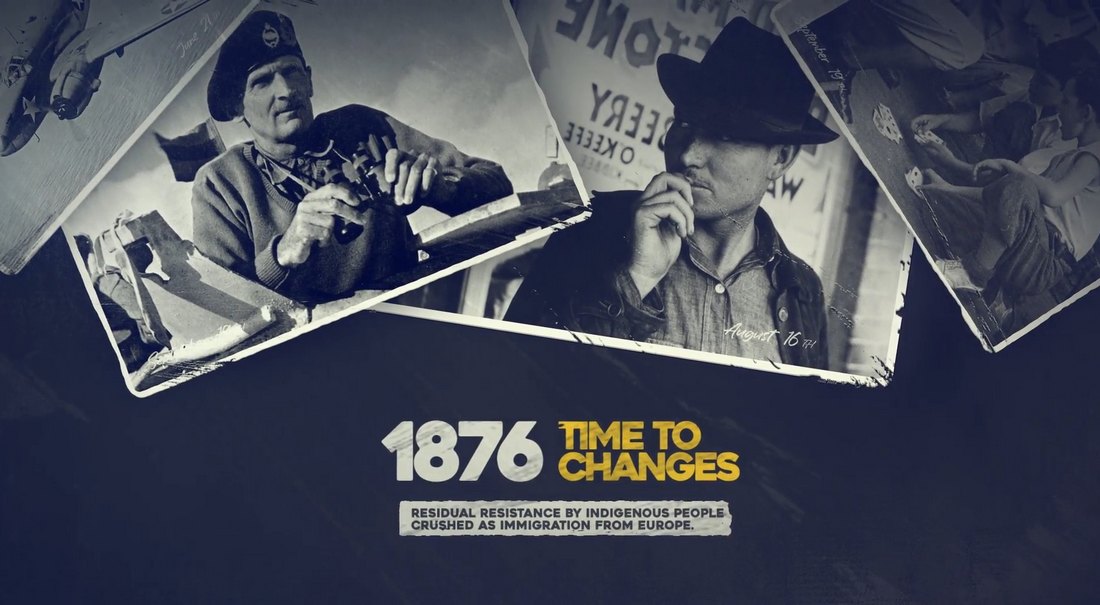
Business wants results. It also wants to do more of what has worked in the past. But it doesn’t want to be disrupted — it wants to disrupt. It wants to reduce time to market and minimize expenses; increase revenue and existing business, find new markets. This requires fast delivery and good execution.

And that’s what we are often supposed to be — good “executors”. Or to put differently, “pixel pushers”.

Over years, I’ve been searching for a way to change that. This brought me to Design KPIs and UX scorecards, and a workflow to translate business goals into actionable and measurable design initiatives. I had to find a way to explain, visualize and track that incredible impact that designers have on all parts of business — from revenue to loyalty to support to delivery.

The results of that journey are now public in our new video course: “How To Measure UX and Design Impact” — a practical guide for designers, researchers and UX leads to measure and visualize UX impact on business.

About The Course

The course dives deep into establishing team-specific design KPIs, how to track them effectively, how to set up ownership and integrate metrics in design process. You’ll discover how to translate ambiguous objectives into practical design goals, and how to measure design systems and UX research.

Also, we’ll make sense of OKRs, Top Task Analysis, SUS, UMUX-Lite, UEQ, TPI, KPI trees, feedback scoring, gap analysis, and Kano model — and what UX research methods to choose to get better results. Jump to the table of contents or get your early-bird.

The setup for the video recordings. Once all content is in place, it’s about time to set up the recording.
<a class="btn btn--large btn--green btn--text-shadow" href=https://measure-ux.com>Jump to the video course →

A practical guide to UX metrics and Design KPIs
8h-video course + live UX training. Free preview.

  • 25 chapters (8h), with videos added/updated yearly
  • Free preview, examples, templates, workflows
  • No subscription: get once, access forever
  • Life-time access to all videos, slides, checklists.
  • Add-on: live UX training, running 2× a year
  • Use the code SMASHING to get 20% off today
  • Jump to the details →
Table of Contents

25 chapters, 8 hours, with practical examples, exercises, and everything you need to master the art of measuring UX and design impact. Don’t worry, even if it might seem overwhelming at first, we’ll explore things slowly and thoroughly. Taking 1–2 sessions per week is a perfectly good goal to aim for.

We can’t improve without measuring. That’s why our new video course gives you the tools you need to make sense of it all: user needs, just like business needs. (View large version)
1. Welcome
+

So, how do we measure UX? Well, let’s find out! Meet a friendly welcome message to the video course, outlining all the fine details we’ll be going through: design impact, business metrics, design metrics, surveys, target times and states, measuring UX in B2B and enterprises, design KPI trees, Kano model, event storming, choosing metrics, reporting design success — and how to measure design systems and UX research efforts.

Keywords:
Design impact, UX metrics, business goals, articulating design value, real-world examples, showcasing impact, evidence-driven design.

2. Design Impact
+

In this segment, we’ll explore how and where we, as UX designers, make an impact within organizations. We’ll explore where we fit in the company structure, how to build strong relationships with colleagues, and how to communicate design value in business terms.

Keywords:
Design impact, design ROI, orgcharts, stakeholder engagement, business language vs. UX language, Double Diamond vs. Reverse Double Diamond, risk mitigation.

3. OKRs and Business Metrics
+

We’ll explore the key business terms and concepts related to measuring business performance. We’ll dive into business strategy and tactics, and unpack the components of OKRs (Objectives and Key Results), KPIs, SMART goals, and metrics.

Keywords:
OKRs, objectives, key results, initiatives, SMART goals, measurable goals, time-bound metrics, goal-setting framework, business objectives.

4. Leading And Lagging Indicators
+

Businesses often speak of leading and lagging indicators — predictive and retrospective measures of success. Let’s explore what they are and how they are different — and how we can use them to understand the immediate and long-term impact of our UX work.

Keywords:
Leading vs. lagging indicators, cause-and-effect relationship, backwards-looking and forward-looking indicators, signals for future success.

5. Business Metrics, NPS
+

We dive into the world of business metrics, from Monthly Active Users (MAU) to Monthly Recurring Revenue (MRR) to Customer Lifetime Value (CLV), and many other metrics that often find their way to dashboards of senior management.
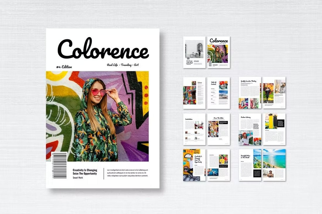
Also, almost every business measures NPS. Yet NPS has many limitations, requires a large sample size to be statistically reliable, and what people say and what people do are often very different things. Let’s see what we as designers can do with NPS, and how it relates to our UX work.

Keywords:
Business metrics, MAU, MRR, ARR, CLV, ACV, Net Promoter Score, customer loyalty.


6. Business Metrics, CSAT, CES
+

We’ll explore the broader context of business metrics, including revenue-related measures like Monthly Recurring Revenue (MRR) and Annual Recurring Revenue (ARR), Customer Lifetime Value (CLV), and churn rate.

We’ll also dive into Customer Satisfaction Score (CSAT) and Customer Effort Score (CES). We’ll discuss how these metrics are calculated, their importance in measuring customer experience, and how they complement other well-known (but not necessarily helpful) business metrics like NPS.

Keywords:
Customer Lifetime Value (CLV), churn rate, Customer Satisfaction Score (CSAT), Customer Effort Score (CES), Net Promoter Score (NPS), Monthly Recurring Revenue (MRR), Annual Recurring Revenue (ARR).

7. Feedback Scoring and Gap Analysis
+

If you are looking for a simple alternative to NPS, feedback scoring and gap analysis might be a neat little helper. It transforms qualitative user feedback into quantifiable data, allowing us to track UX improvements over time. Unlike NPS, which focuses on future behavior, feedback scoring looks at past actions and current perceptions.

Keywords:
Feedback scoring, gap analysis, qualitative feedback, quantitative data.

8. Design Metrics (TPI, SUS, SUPR-Q)
+

We’ll explore the landscape of established and reliable design metrics for tracking and capturing UX in digital products. From task success rate and time on task to System Usability Scale (SUS) to Standardized User Experience Percentile Rank Questionnaire (SUPR-Q) to Accessible Usability Scale (AUS), with an overview of when and how to use each, the drawbacks, and things to keep in mind.

Keywords:
UX metrics, KPIs, task success rate, time on task, error rates, error recovery, SUS, SUPR-Q.

9. Design Metrics (UMUX-Lite, SEQ, UEQ)
+

We’ll continue with slightly shorter alternatives to SUS and SUPR-Q that could be used in a quick email survey or an in-app prompt — UMUX-Lite and Single Ease Question (SEQ). We’ll also explore the “big behemoths” of UX measurements — User Experience Questionnaire (UEQ), Google’s HEART framework, and custom UX measurement surveys — and how to bring key metrics together in one simple UX scorecard tailored to your product’s unique needs.

Keywords:
UX metrics, UMUX-Lite, Single Ease Question (SEQ), User Experience Questionnaire (UEQ), HEART framework, UEQ, UX scorecards.

10. Top Tasks Analysis
+

The most impactful way to measure UX is to study how successful users are in completing their tasks in their common customer journeys. With top tasks analysis, we focus on what matters, and explore task success rates and time on task. We need to identify representative tasks and bring 15–18 users in for testing. Let’s dive into how it all works and some of the important gotchas and takeaways to consider.

Keywords:
Top task analysis, UX metrics, task success rate, time on task, qualitative testing, 80% success, statistical reliability, baseline testing.

11. Surveys and Sample Sizes
+

Designing good surveys is hard! We need to be careful on how we shape our questions to avoid biases, how to find the right segment of audience and large enough sample size, how to provide high confidence levels and low margins of errors. In this chapter, we review best practices and a cheat sheet for better survey design — along with do’s and don’ts on question types, rating scales, and survey pre-testing.

Keywords:
Survey design, question types, rating scales, survey length, pre-testing, response rates, statistical significance, sample quality, mean vs. median scores.

12. Measuring UX in B2B and Enterprise
+

Best measurements come from testing with actual users. But what if you don’t have access to any users? Perhaps because of NDA, IP concerns, lack of clearance, poor availability, and high costs of customers and just lack of users? Let’s explore how we can find a way around such restrictive environments, how to engage with stakeholders, and how we can measure efficiency, failures — and set up UX KPI programs.

Keywords:
B2B, enterprise UX, limited access to users, compliance, legacy systems, compliance, desk research, stakeholder engagement, testing proxies, employee’s UX.

13. Design KPI Trees
+

To visualize design impact, we need to connect high-level business objectives with specific design initiatives. To do that, we can build up and present Design KPI trees. From the bottom up, the tree captures user needs, pain points, and insights from research, which inform design initiatives. For each, we define UX metrics to track the impact of these initiatives, and they roll up to higher-level design and business KPIs. Let’s explore how it all works in action and how you can use it in your work.

Keywords:
User needs, UX metrics, KPI trees, sub-trees, design initiatives, setting up metrics, measuring and reporting design impact, design workflow, UX metrics graphs, UX planes.

14. Event Storming
+

How do we choose the right metrics? Well, we don’t start with metrics. We start by identifying most critical user needs and assess the impact of meeting user needs well. To do that, we apply event storming by mapping critical user’s success moments as they interact with a digital product. Our job, then, is to maximize success, remove frustrations, and pave a clear path towards a successful outcome — with event storming.

Keywords:
UX mapping, customer journey maps, service blueprints, event storming, stakeholder alignment, collaborative mapping, UX lanes, critical events, user needs vs. business goals.

15. Kano Model and Survey
+

Once we have a business objective in front of us, we need to choose design initiatives that are most likely to drive the impact that we need to enable with our UX work. To test how effective our design ideas are, we can map them against a Kano model und run a concept testing survey. It gives us a user’s sentiment that we then need to weigh against business priorities. Let’s see how to do just that.

Keywords:
Feature prioritization, threshold attributes, performance attributes, excitement attributes, user’s sentiment, mapping design ideas, boosting user’s satisfaction.

16. Design Process
+

How do we design a KPI tree from scratch? We start by running a collaborative event storming to identify key success moments. Then we prioritize key events and explore how we can amplify and streamline them. Then we ideate and come up with design initiatives. These initiatives are stress tested in an impact-effort matrix for viability and impact. Eventually, we define and assign metrics and KPIs, and pull them together in a KPI tree. Here’s how it works from start till the end.

Keywords:
Uncovering user needs, impact-effort matrix, concept testing, event storming, stakeholder collaboration, traversing the KPI tree.

17. Choosing The Right Metrics
+

Should we rely on established UX metrics such as SUS, UMUX-Lite, and SUPR-Q, or should we define custom metrics tailored to product and user needs? We need to find a balance between the two. It depends on what we want to measure, what we actually can measure, and whether we want to track local impact for a specific change or global impact for the entire customer journey. Let’s figure out how to define and establish metrics that actually will help us track our UX success.

Keywords:
Local vs. global KPIs, time spans, percentage vs. absolute values, A/B testing, mapping between metrics and KPIs, task breakdown, UX lanes, naming design KPIs.

18. Design KPIs Examples
+

Different contexts will require different design KPIs. In this chapter, we explore a diverse set of UX metrics related to search quality (quality of search for top 100 search queries), form design (error frequency, accuracy), e-commerce (time to final price), subscription-based services (time to tier boundaries), customer support (service desk inquiries) and many others. This should give you a good starting point to build upon for your own product and user needs.

Keywords:
Time to first success, search results quality, form error recovery, password recovery rate, accessibility coverage, time to tier boundaries, service desk inquiries, fake email frequency, early drop-off rate, carbon emissions per page view, presets and templates usage, default settings adoption, design system health.

19. UX Strategy
+

Establishing UX metrics doesn’t happen over night. You need to discuss and decide what you want to measure and how often it should happen. But also how to integrate metrics, evaluate data, and report findings. And how to embed them into an existing design workflow. For that, you will need time — and green lights from your stakeholders and managers. To achieve that, we need to tap into the uncharted waters of UX strategy. Let’s see what it involves for us and how to make progress there.

Keywords:
Stakeholder engagement, UX maturity, governance, risk mitigation, integration, ownership, accountability, viability.

20. Reporting Design Success
+

Once you’ve established UX metrics, you will need to report them repeatedly to the senior management. How exactly would you do that? In this chapter, we explore the process of selecting representative tasks, recruiting participants, facilitating testing sessions, and analyzing the resulting data to create a compelling report and presentation that will highlight the value of your UX efforts to stakeholders.

Keywords:
Data analysis, reporting, facilitation, observation notes, video clips, guidelines and recommendations, definition of design success, targets, alignment, and stakeholder’s buy-in.

21. Target Times and States
+

To show the impact of our design work, we need to track UX snapshots. Basically, it’s four states, mapped against touch points in a customer journey: baseline (threshold not to cross), current state (how we are currently doing), target state (objective we are aiming for), and industry benchmark (to stay competitive). Let’s see how it would work in an actual project.

Keywords:
Competitive benchmarking, baseline measurement, local and global design KPIs, cross-teams metrics, setting realistic goals.

22. Measuring Design Systems
+

How do we measure the health of a design system? Surely it’s not just a roll-out speed for newly designed UI components or flows. Most teams track productivity and coverage, but we can also go beyond that by measuring relative adoption, efficiency gains (time saved, faster time-to-market, satisfaction score, and product quality). But the best metric is how early designers involve the design system in a conversation during their design work.

Keywords:
Component coverage, decision trees, adoption, efficiency, time to market, user satisfaction, usage analytics, design system ROI, relative adoption.

23. Measuring UX Research
+

Research insights often end up gaining dust in PDF reports stored on remote fringes of Sharepoint. To track the impact of UX research, we need to track outcomes and research-specific metrics. The way to do that is to track UX research impact for UX and business, through organisational learning and engagement, through make-up of research efforts and their reach. And most importantly: amplifying research where we expect the most significant impact. Let’s see what it involves.

Keywords:
Outcome metrics, organizational influence, research-specific metrics, research references, study observers, research formalization, tracking research-initiated product changes.

24. Getting Started
+

So you’ve made it so far! Now, how do you get your UX metrics initiative off the ground? By following small steps heading in the right direction. Small commitments, pilot projects, and design guilds will support and enable your efforts. We just need to define realistic goals and turn UX metrics in a culture of measurement, or simply a way of working. Let’s see how we can do just that.

Keywords:
Pilot projects, UX integration, resource assessment, evidence-driven design, establishing a baseline, culture of measurement.

25. Next Steps
+

Let’s wrap up our journey into UX metrics and Design KPIs and reflect what we have learned. What remains is the first next step: and that would be starting where you are and growing incrementally, by continuously visualizing and explaining your UX impact — however limited it might be — to your stakeholders. This is the last chapter of the course, but the first chapter of your incredible journey that’s ahead of you.

Keywords:
Stakeholder engagement, incremental growth, risk mitigation, user satisfaction, business success.


Who Is The Course For?

This course is tailored for advanced UX practitioners, design leaders, product managers, and UX researchers who are looking for a practical guide to define, establish and track design KPIs, translate business goals into actionable design tasks, and connect business needs with user needs.

What You’ll Learn

By the end of the video course, you’ll have a packed toolbox of practical techniques and strategies on how to define, establish, sell, and measure design KPIs from start to finish — and how to make sure that your design work is always on the right trajectory. You’ll learn:

  • How to translate business goals to UX initiatives,
  • The difference between OKRs, KPIs, and metrics,
  • How to define design success for your company,
  • Metrics and KPIs that businesses typically measure,
  • How to choose the right set of metrics and KPIs,
  • How to establish design KPIs focused on user needs,
  • How to build a comprehensive design KPI tree,
  • How to combine qualitative and quantitative insights,
  • How to choose and prioritize design work,
  • How to track the impact of design work on business goals,
  • How to explain, visualize, and defend design work,
  • How companies define and track design KPIs,
  • How to make a strong case for UX metrics.
Community Matters ❤️

Producing a video course takes quite a bit of time, and we couldn’t pull it off without the support of our wonderful community. So thank you from the bottom of our hearts! We hope you’ll find the course useful for your work. Happy watching, everyone! 🎉🥳

Video + UX Training

$ 495.00 $ 799.00 Get Video + UX Training

25 video lessons (8h) + Live UX Training.
100 days money-back-guarantee.

Video only

$ 250.00$ 395.00
Get the video course

25 video lessons (8h). Updated yearly.
Also available as a UX Bundle with 2 video courses.


Gain $200 in a week
from Articles on Smashing Magazine — For Web Designers And Developers https://ift.tt/CVwMznR

It’s Here! How To Measure UX &amp; Design Impact, With Vitaly Friedman

Featured Imgs 23

Finally! After so many years, we’re very happy to launch “How To Measure UX and Design Impact”, our new practical guide for designers and managers on how to set up and track design success in your company — with UX scorecards, UX metrics, the entire workflow and Design KPI trees. Neatly put together by yours truly, Vitaly Friedman. Jump to details.

Video + UX Training

$ 495.00 $ 799.00 Get Video + UX Training

25 video lessons (8h) + Live UX Training.
100 days money-back-guarantee.

Video only

$ 250.00$ 395.00
Get the video course

25 video lessons (8h). Updated yearly.
Also available as a UX Bundle with 2 video courses.

The Backstory

In many companies, designers are perceived as disruptors, rather than enablers. Designers challenge established ways of working. They ask a lot of questions — much needed ones but also uncomfortable ones. They focus “too much” on user needs, pushing revenue projections back, often with long-winded commitment to testing and research and planning and scoping.

Almost every department in almost every company has their own clearly defined objectives, metrics and KPIs. In fact, most departments — from finance to marketing to HR to sales — are remarkably good at visualizing their impact and making it visible throughout the entire organization.

Designing a KPI tree, an example of how to connect business objectives with design initiatives through the lens of design KPIs. (Large preview)

But as designers, we rarely have a set of established Design KPIs that we regularly report to senior management. We don’t have a clear definition of design success. And we rarely measure the impact of our work once it’s launched. So it’s not surprising that moste parts of the business barely know what we actually do all day long.

Business wants results. It also wants to do more of what has worked in the past. But it doesn’t want to be disrupted — it wants to disrupt. It wants to reduce time to market and minimize expenses; increase revenue and existing business, find new markets. This requires fast delivery and good execution.

And that’s what we are often supposed to be — good “executors”. Or to put differently, “pixel pushers”.

Over years, I’ve been searching for a way to change that. This brought me to Design KPIs and UX scorecards, and a workflow to translate business goals into actionable and measurable design initiatives. I had to find a way to explain, visualize and track that incredible impact that designers have on all parts of business — from revenue to loyalty to support to delivery.

The results of that journey are now public in our new video course: “How To Measure UX and Design Impact” — a practical guide for designers, researchers and UX leads to measure and visualize UX impact on business.

About The Course

The course dives deep into establishing team-specific design KPIs, how to track them effectively, how to set up ownership and integrate metrics in design process. You’ll discover how to translate ambiguous objectives into practical design goals, and how to measure design systems and UX research.

Also, we’ll make sense of OKRs, Top Task Analysis, SUS, UMUX-Lite, UEQ, TPI, KPI trees, feedback scoring, gap analysis, and Kano model — and what UX research methods to choose to get better results. Jump to the table of contents or get your early-bird.

The setup for the video recordings. Once all content is in place, it’s about time to set up the recording.
<a class="btn btn--large btn--green btn--text-shadow" href=https://measure-ux.com>Jump to the video course →

A practical guide to UX metrics and Design KPIs
8h-video course + live UX training. Free preview.

  • 25 chapters (8h), with videos added/updated yearly
  • Free preview, examples, templates, workflows
  • No subscription: get once, access forever
  • Life-time access to all videos, slides, checklists.
  • Add-on: live UX training, running 2× a year
  • Use the code SMASHING to get 20% off today
  • Jump to the details →
Table of Contents

25 chapters, 8 hours, with practical examples, exercises, and everything you need to master the art of measuring UX and design impact. Don’t worry, even if it might seem overwhelming at first, we’ll explore things slowly and thoroughly. Taking 1–2 sessions per week is a perfectly good goal to aim for.

We can’t improve without measuring. That’s why our new video course gives you the tools you need to make sense of it all: user needs, just like business needs. (View large version)
1. Welcome
+

So, how do we measure UX? Well, let’s find out! Meet a friendly welcome message to the video course, outlining all the fine details we’ll be going through: design impact, business metrics, design metrics, surveys, target times and states, measuring UX in B2B and enterprises, design KPI trees, Kano model, event storming, choosing metrics, reporting design success — and how to measure design systems and UX research efforts.

Keywords:
Design impact, UX metrics, business goals, articulating design value, real-world examples, showcasing impact, evidence-driven design.

2. Design Impact
+

In this segment, we’ll explore how and where we, as UX designers, make an impact within organizations. We’ll explore where we fit in the company structure, how to build strong relationships with colleagues, and how to communicate design value in business terms.

Keywords:
Design impact, design ROI, orgcharts, stakeholder engagement, business language vs. UX language, Double Diamond vs. Reverse Double Diamond, risk mitigation.

3. OKRs and Business Metrics
+

We’ll explore the key business terms and concepts related to measuring business performance. We’ll dive into business strategy and tactics, and unpack the components of OKRs (Objectives and Key Results), KPIs, SMART goals, and metrics.

Keywords:
OKRs, objectives, key results, initiatives, SMART goals, measurable goals, time-bound metrics, goal-setting framework, business objectives.

4. Leading And Lagging Indicators
+

Businesses often speak of leading and lagging indicators — predictive and retrospective measures of success. Let’s explore what they are and how they are different — and how we can use them to understand the immediate and long-term impact of our UX work.

Keywords:
Leading vs. lagging indicators, cause-and-effect relationship, backwards-looking and forward-looking indicators, signals for future success.

5. Business Metrics, NPS
+

We dive into the world of business metrics, from Monthly Active Users (MAU) to Monthly Recurring Revenue (MRR) to Customer Lifetime Value (CLV), and many other metrics that often find their way to dashboards of senior management.

Also, almost every business measures NPS. Yet NPS has many limitations, requires a large sample size to be statistically reliable, and what people say and what people do are often very different things. Let’s see what we as designers can do with NPS, and how it relates to our UX work.

Keywords:
Business metrics, MAU, MRR, ARR, CLV, ACV, Net Promoter Score, customer loyalty.


6. Business Metrics, CSAT, CES
+

We’ll explore the broader context of business metrics, including revenue-related measures like Monthly Recurring Revenue (MRR) and Annual Recurring Revenue (ARR), Customer Lifetime Value (CLV), and churn rate.

We’ll also dive into Customer Satisfaction Score (CSAT) and Customer Effort Score (CES). We’ll discuss how these metrics are calculated, their importance in measuring customer experience, and how they complement other well-known (but not necessarily helpful) business metrics like NPS.

Keywords:
Customer Lifetime Value (CLV), churn rate, Customer Satisfaction Score (CSAT), Customer Effort Score (CES), Net Promoter Score (NPS), Monthly Recurring Revenue (MRR), Annual Recurring Revenue (ARR).

7. Feedback Scoring and Gap Analysis
+

If you are looking for a simple alternative to NPS, feedback scoring and gap analysis might be a neat little helper. It transforms qualitative user feedback into quantifiable data, allowing us to track UX improvements over time. Unlike NPS, which focuses on future behavior, feedback scoring looks at past actions and current perceptions.

Keywords:
Feedback scoring, gap analysis, qualitative feedback, quantitative data.

8. Design Metrics (TPI, SUS, SUPR-Q)
+

We’ll explore the landscape of established and reliable design metrics for tracking and capturing UX in digital products. From task success rate and time on task to System Usability Scale (SUS) to Standardized User Experience Percentile Rank Questionnaire (SUPR-Q) to Accessible Usability Scale (AUS), with an overview of when and how to use each, the drawbacks, and things to keep in mind.

Keywords:
UX metrics, KPIs, task success rate, time on task, error rates, error recovery, SUS, SUPR-Q.

9. Design Metrics (UMUX-Lite, SEQ, UEQ)
+

We’ll continue with slightly shorter alternatives to SUS and SUPR-Q that could be used in a quick email survey or an in-app prompt — UMUX-Lite and Single Ease Question (SEQ). We’ll also explore the “big behemoths” of UX measurements — User Experience Questionnaire (UEQ), Google’s HEART framework, and custom UX measurement surveys — and how to bring key metrics together in one simple UX scorecard tailored to your product’s unique needs.

Keywords:
UX metrics, UMUX-Lite, Single Ease Question (SEQ), User Experience Questionnaire (UEQ), HEART framework, UEQ, UX scorecards.

10. Top Tasks Analysis
+

The most impactful way to measure UX is to study how successful users are in completing their tasks in their common customer journeys. With top tasks analysis, we focus on what matters, and explore task success rates and time on task. We need to identify representative tasks and bring 15–18 users in for testing. Let’s dive into how it all works and some of the important gotchas and takeaways to consider.

Keywords:
Top task analysis, UX metrics, task success rate, time on task, qualitative testing, 80% success, statistical reliability, baseline testing.

11. Surveys and Sample Sizes
+

Designing good surveys is hard! We need to be careful on how we shape our questions to avoid biases, how to find the right segment of audience and large enough sample size, how to provide high confidence levels and low margins of errors. In this chapter, we review best practices and a cheat sheet for better survey design — along with do’s and don’ts on question types, rating scales, and survey pre-testing.

Keywords:
Survey design, question types, rating scales, survey length, pre-testing, response rates, statistical significance, sample quality, mean vs. median scores.

12. Measuring UX in B2B and Enterprise
+

Best measurements come from testing with actual users. But what if you don’t have access to any users? Perhaps because of NDA, IP concerns, lack of clearance, poor availability, and high costs of customers and just lack of users? Let’s explore how we can find a way around such restrictive environments, how to engage with stakeholders, and how we can measure efficiency, failures — and set up UX KPI programs.

Keywords:
B2B, enterprise UX, limited access to users, compliance, legacy systems, compliance, desk research, stakeholder engagement, testing proxies, employee’s UX.

13. Design KPI Trees
+

To visualize design impact, we need to connect high-level business objectives with specific design initiatives. To do that, we can build up and present Design KPI trees. From the bottom up, the tree captures user needs, pain points, and insights from research, which inform design initiatives. For each, we define UX metrics to track the impact of these initiatives, and they roll up to higher-level design and business KPIs. Let’s explore how it all works in action and how you can use it in your work.

Keywords:
User needs, UX metrics, KPI trees, sub-trees, design initiatives, setting up metrics, measuring and reporting design impact, design workflow, UX metrics graphs, UX planes.

14. Event Storming
+

How do we choose the right metrics? Well, we don’t start with metrics. We start by identifying most critical user needs and assess the impact of meeting user needs well. To do that, we apply event storming by mapping critical user’s success moments as they interact with a digital product. Our job, then, is to maximize success, remove frustrations, and pave a clear path towards a successful outcome — with event storming.

Keywords:
UX mapping, customer journey maps, service blueprints, event storming, stakeholder alignment, collaborative mapping, UX lanes, critical events, user needs vs. business goals.

15. Kano Model and Survey
+

Once we have a business objective in front of us, we need to choose design initiatives that are most likely to drive the impact that we need to enable with our UX work. To test how effective our design ideas are, we can map them against a Kano model und run a concept testing survey. It gives us a user’s sentiment that we then need to weigh against business priorities. Let’s see how to do just that.

Keywords:
Feature prioritization, threshold attributes, performance attributes, excitement attributes, user’s sentiment, mapping design ideas, boosting user’s satisfaction.

16. Design Process
+

How do we design a KPI tree from scratch? We start by running a collaborative event storming to identify key success moments. Then we prioritize key events and explore how we can amplify and streamline them. Then we ideate and come up with design initiatives. These initiatives are stress tested in an impact-effort matrix for viability and impact. Eventually, we define and assign metrics and KPIs, and pull them together in a KPI tree. Here’s how it works from start till the end.

Keywords:
Uncovering user needs, impact-effort matrix, concept testing, event storming, stakeholder collaboration, traversing the KPI tree.

17. Choosing The Right Metrics
+

Should we rely on established UX metrics such as SUS, UMUX-Lite, and SUPR-Q, or should we define custom metrics tailored to product and user needs? We need to find a balance between the two. It depends on what we want to measure, what we actually can measure, and whether we want to track local impact for a specific change or global impact for the entire customer journey. Let’s figure out how to define and establish metrics that actually will help us track our UX success.

Keywords:
Local vs. global KPIs, time spans, percentage vs. absolute values, A/B testing, mapping between metrics and KPIs, task breakdown, UX lanes, naming design KPIs.

18. Design KPIs Examples
+

Different contexts will require different design KPIs. In this chapter, we explore a diverse set of UX metrics related to search quality (quality of search for top 100 search queries), form design (error frequency, accuracy), e-commerce (time to final price), subscription-based services (time to tier boundaries), customer support (service desk inquiries) and many others. This should give you a good starting point to build upon for your own product and user needs.

Keywords:
Time to first success, search results quality, form error recovery, password recovery rate, accessibility coverage, time to tier boundaries, service desk inquiries, fake email frequency, early drop-off rate, carbon emissions per page view, presets and templates usage, default settings adoption, design system health.

19. UX Strategy
+

Establishing UX metrics doesn’t happen over night. You need to discuss and decide what you want to measure and how often it should happen. But also how to integrate metrics, evaluate data, and report findings. And how to embed them into an existing design workflow. For that, you will need time — and green lights from your stakeholders and managers. To achieve that, we need to tap into the uncharted waters of UX strategy. Let’s see what it involves for us and how to make progress there.

Keywords:
Stakeholder engagement, UX maturity, governance, risk mitigation, integration, ownership, accountability, viability.

20. Reporting Design Success
+

Once you’ve established UX metrics, you will need to report them repeatedly to the senior management. How exactly would you do that? In this chapter, we explore the process of selecting representative tasks, recruiting participants, facilitating testing sessions, and analyzing the resulting data to create a compelling report and presentation that will highlight the value of your UX efforts to stakeholders.

Keywords:
Data analysis, reporting, facilitation, observation notes, video clips, guidelines and recommendations, definition of design success, targets, alignment, and stakeholder’s buy-in.

21. Target Times and States
+

To show the impact of our design work, we need to track UX snapshots. Basically, it’s four states, mapped against touch points in a customer journey: baseline (threshold not to cross), current state (how we are currently doing), target state (objective we are aiming for), and industry benchmark (to stay competitive). Let’s see how it would work in an actual project.

Keywords:
Competitive benchmarking, baseline measurement, local and global design KPIs, cross-teams metrics, setting realistic goals.

22. Measuring Design Systems
+

How do we measure the health of a design system? Surely it’s not just a roll-out speed for newly designed UI components or flows. Most teams track productivity and coverage, but we can also go beyond that by measuring relative adoption, efficiency gains (time saved, faster time-to-market, satisfaction score, and product quality). But the best metric is how early designers involve the design system in a conversation during their design work.

Keywords:
Component coverage, decision trees, adoption, efficiency, time to market, user satisfaction, usage analytics, design system ROI, relative adoption.

23. Measuring UX Research
+

Research insights often end up gaining dust in PDF reports stored on remote fringes of Sharepoint. To track the impact of UX research, we need to track outcomes and research-specific metrics. The way to do that is to track UX research impact for UX and business, through organisational learning and engagement, through make-up of research efforts and their reach. And most importantly: amplifying research where we expect the most significant impact. Let’s see what it involves.

Keywords:
Outcome metrics, organizational influence, research-specific metrics, research references, study observers, research formalization, tracking research-initiated product changes.

24. Getting Started
+

So you’ve made it so far! Now, how do you get your UX metrics initiative off the ground? By following small steps heading in the right direction. Small commitments, pilot projects, and design guilds will support and enable your efforts. We just need to define realistic goals and turn UX metrics in a culture of measurement, or simply a way of working. Let’s see how we can do just that.

Keywords:
Pilot projects, UX integration, resource assessment, evidence-driven design, establishing a baseline, culture of measurement.

25. Next Steps
+

Let’s wrap up our journey into UX metrics and Design KPIs and reflect what we have learned. What remains is the first next step: and that would be starting where you are and growing incrementally, by continuously visualizing and explaining your UX impact — however limited it might be — to your stakeholders. This is the last chapter of the course, but the first chapter of your incredible journey that’s ahead of you.

Keywords:
Stakeholder engagement, incremental growth, risk mitigation, user satisfaction, business success.


Who Is The Course For?

This course is tailored for advanced UX practitioners, design leaders, product managers, and UX researchers who are looking for a practical guide to define, establish and track design KPIs, translate business goals into actionable design tasks, and connect business needs with user needs.

What You’ll Learn

By the end of the video course, you’ll have a packed toolbox of practical techniques and strategies on how to define, establish, sell, and measure design KPIs from start to finish — and how to make sure that your design work is always on the right trajectory. You’ll learn:

  • How to translate business goals to UX initiatives,
  • The difference between OKRs, KPIs, and metrics,
  • How to define design success for your company,
  • Metrics and KPIs that businesses typically measure,
  • How to choose the right set of metrics and KPIs,
  • How to establish design KPIs focused on user needs,
  • How to build a comprehensive design KPI tree,
  • How to combine qualitative and quantitative insights,
  • How to choose and prioritize design work,
  • How to track the impact of design work on business goals,
  • How to explain, visualize, and defend design work,
  • How companies define and track design KPIs,
  • How to make a strong case for UX metrics.
Community Matters ❤️

Producing a video course takes quite a bit of time, and we couldn’t pull it off without the support of our wonderful community. So thank you from the bottom of our hearts! We hope you’ll find the course useful for your work. Happy watching, everyone! 🎉🥳

Video + UX Training

$ 495.00 $ 799.00 Get Video + UX Training

25 video lessons (8h) + Live UX Training.
100 days money-back-guarantee.

Video only

$ 250.00$ 395.00
Get the video course

25 video lessons (8h). Updated yearly.
Also available as a UX Bundle with 2 video courses.

100+ Best Microsoft Word Brochure Templates 2024

Featured Imgs 23

Today, we’re bringing you a set of professionally designed Microsoft Word brochure templates to help you get a head start on your next brochure project.

Every designer has a collection of pre-designed templates. These templates not only allow you to enhance your workflow but also save hours of time otherwise spent searching for an inspiring starting point.

Whether you’re working on a brochure for a business, a case study, report, or a project proposal, you’ll find plenty of options to choose from in this collection of templates (and even more with our quick brochure design tips, and our full series on brochure templates!)

Top Pick

Minimal Business Brochure Template

Minimal Business Brochure Template

This minimalist and modern brochure template is ideal for making a multi-page brochure for many different types of business and branding purposes.

The template comes with 16 page layouts in A4 size, fully optimized with paragraph formatting, image placeholders, and much more to offer a simpler way to create a professional brochure.

Why This Is A Top Pick

What makes this brochure template special is that it comes in both MS Word and InDesign file formats. Not only that but it includes file formats that support older and new versions of both software as well.

Business Proposal Word Brochure Template

Business Proposal Word Brochure Template

If you’re looking for a modern brochure template design to craft a killer business proposal, this Word template is for you. It comes with 20 page layouts with fully customizable designs and in A4 size. It’s available in both Word and InDesign formats.

Product Manual Word Brochure Template

Product Manual Word Brochure Template

The dark and stylish color theme of this template will add a certain classy look to your brochure designs. It’s perfect for making product manuals and product showcase brochures. The template includes 20 customizable page layouts.

Project Proposal Word Brochure Template

Project Proposal Word Brochure Template

Want to create a winning project proposal? Then use this Word template. This template comes in InDesign and Word formats. It’s easily editable so you can change its colors, fonts, and formatting to your preference.

Business Plan – Word & InDesign Brochure Template

Business Plan - Word & InDesign Brochure Template

Looking to create a brochure to showcase and detail your business plan? Then this template will come in handy. It comes in both MS Word and InDesign file formats to let you easily customize the design however you like. The template features 20 fully formatted page layouts. With editable paragraphs and text styles.

Red – Annual Report Word Brochure Template

Red - Annual Report Word Brochure Template

Red is a professional brochure template made specifically for creating annual reports for companies. This template is available in multiple formats, including MS Word, InDesign, and Adobe Illustrator. It features 25 unique page layouts in A4 size. And each page can be easily customized to your preference.

Free Tri-Fold Word Brochure Template

Free Tri-Fold Word Brochure Template

This is a free tri-fold brochure template you can use to promote a furniture store or interior design business. It features a simple and editable layout. The template also comes in Word, InDesign, Apple Pages, and many other formats.

Graphic Design Portfolio Word Brochure

Graphic Design Portfolio Word Brochure

This Word brochure template comes with 16 unique pages tailored for graphic design portfolios. Its dynamic features include easy customizability, automatic page numbering, compatibility with various CS systems, and a vibrant design utilizing CMYK color at 300 DPI resolution. This template, provided in InDesign INDD and IDML files as well as Word files.

Minimal Portfolio Word Brochure Template

 Minimal Portfolio Word Brochure Template

This handy Word brochure template allows for the easy construction of neat, professional design portfolios. Its package comes loaded with 16 unique pages, master pages, customizable InDesign and Word files that are compatible with CS4 to CC editions. Added features include automatic page numbering and high-res CMYK colors, all framed in a print-ready format.

Conference Agenda Word Brochure Template

Conference Agenda Word Brochure Template

A versatile and user-friendly Word brochure template aimed at helping you organize and share event details effectively. With its 20 unique layouts, customizable color schemes, and brand integration capabilities, this brochure template is optimized for use in Adobe Indesign and Microsoft Word, providing you with a professional, high-quality presentation document.

Bold Business Proposal Word Brochure Template

Bold Business Proposal Word Brochure Template

This is a professional Word brochure template designed to give your business pitch a sleek and contemporary edge. The 20-page template offers a range of customizable options – from colors to images – and includes professional layouts that are perfect to present your company’s strengths, history, and pricing in a comprehensive manner.

Healthcare Brochure Word Template

Healthcare Brochure Word Template

This is a 20-page, fully customizable Word brochure template designed to highlight your medical practice services with professionalism. It’s compatible with Adobe InDesign, Word, PDF, and features sleek infographics, staff profiles, and detailed service outlines to help engage potential patients and partners. Available in A4 and US Letter sizes.

Multipurpose Annual Report Word Brochure Template

Multipurpose Annual Report Word Brochure Template

A bundle of versatile Word brochure templates designed to make your report creation hassle-free. Available in Canva, Microsoft Word, Indesign, and Photoshop formats, and with 36 custom layers, the A4-sized, print-ready template offers complete customization, allowing you to edit text, colors, and photos.

Modern Agenda Word Brochure Template

Modern Agenda Word Brochure Template

An intuitive, adaptable asset for professional event planning. It features a 20-page layout in both A4 and US Letter sizes, customizable with your brand’s logo, colors, and images. Advanced features including Character and Paragraph Styles, and Swatches modify the color scheme in a single click.

Sponsorship Proposal Word Brochure Template

Sponsorship Proposal Word Brochure Template

This is a fully customizable Word brochure template, aimed to help streamline your business presentations. Equipped with 20 distinct layouts, it supports multiple formats including PDF, InDesign, and MS Word. Embedded features of changeable text, colors, images, and an automatic page numbering system, make this template a go-to for both print and digital presentations.

Event Sponsorship Proposal Word Template

Event Sponsorship Proposal Word Template

A top-notch, professional Word brochure template designed to captivate potential sponsors and demonstrate the value of your event. Fully customizable and complete with everything from clean, modern designs to comprehensive layouts, it’s readily available in various formats including PDF, InDesign, and MS Word. It incorporates unique features such as 20 distinctive layouts.

Catalog Brochure Word Template

Catalog Brochure Word Template

Another easy-to-customize Word brochure template ideal for a vast array of projects. With 20 unique, modern layouts compatible with Adobe Indesign and Microsoft Word, this print-ready template offers effortless editing. Whether showcasing products, services, or portfolios, your chosen logo, images, and brand colors can be seamlessly integrated.

Company Profile Word Brochure Template

Company Profile Word Brochure Template

This is an editable, comprehensive MS Word brochure template for creating company profiles. It comes in both Microsoft Word and Adobe InDesign formats. This A4-sized, 20-page template is easily modified and printable, featuring automatic page numbering and layered files as well.

Conference Agenda Word Brochure Template

Conference Agenda Word Brochure Template

A useful MS Word brochure template for creating accurate and professional conference documents. It can be edited in MS Word and Adobe InDesign. The template, suitable for A4 size printing, includes 16 customizable pages that can also be exported as a PDF for digital use.

Business Plan Word Brochure Template

Business Plan Word Brochure Template

Another professional MS Word brochure template for presenting a detailed business plan. The template is split into two segments, one for narrative and photographs and another for financial data, displayed through creative graphics. Fully customizable, it is compatible with Adobe InDesign and Microsoft Word formats.

Company Profile Word Template

Company Profile Word Template

A must-have MS Word brochure template for creating company profiles. Crafted with 24 unique page layouts, it allows effortless changes to colors, text, images, and page order. The A4-sized template is ready to print, compatible with various versions of InDesign, Photoshop, and MS Word.

Annual Report Word Brochure Template

Annual Report Word Brochure Template

This is a great MS Word brochure template for constructing an informative and visually engaging annual report. Functioning in both Adobe InDesign and MS Word, it offers 24 unique layouts, customizable text, colors, and images, and is print-ready.

Product Catalog Sheet Word Template

Product Catalog Sheet Word Template

A versatile six-page MS Word brochure template for creating product catalog sheets. This fully editable template also supports text, color, and object customizations. It also includes a helpful 34-page PDF guide for seamless navigation and utilization, using free fonts for your convenience.

Corp Word Brochure Template

Corp Word Brochure Template

A high-quality MS Word brochure template for creating professional, polished corporate brochures. Suitable for A4 size paper, it is user-friendly, allowing you to easily adjust colors, text, images, and page order. This template is ready to print, compatible with higher versions of InDesign, Photoshop, and MS Word.

A4 Company Profile Word Template

A4 Company Profile Word Template

This MS Word brochure template is designed for creating modern company profiles. Suitable for A4 paper size, it works seamlessly in InDesign, Photoshop, and MS Word. It also includes 16 customizable pages and allows effortless modification of colors, text, and images.

Product Catalog Word Brochure Template

Product Catalog Word Brochure Template

This is a sleek, contemporary MS Word brochure template for creating professional product catalogs. Suitable for a variety of sectors, ranging from food to property, the template comprises of 16 customizable pages. It is compatible with both Adobe InDesign and Microsoft Word.

Capability Statement Word Brochure

Capability Statement Word Brochure

A simple 4-page MS Word and Adobe InDesign template for creating company statements. This template is perfectly suited for both print and digital use. It supports automatic page numbering, editing of text, color, and objects, and uses free, downloadable fonts.

Project Proposal Word Brochure Template

Project Proposal Word Brochure Template

You can design bold and attractive proposal brochures for your projects with this Word template. It features an elegant dark color theme with beautiful inner pages. The template has 32 different page layouts to choose from. And it comes in Word and InDesign formats.

Minimalist Trifold Brochure Word & InDesign

Minimalist Trifold Brochure Word & InDesign

This is a tri-fold brochure template that has a modern and minimalist design. It’s ideal for promoting brands and businesses related to furniture, architecture, and even real estate. The template is available in Word, Photoshop, InDesign, and Illustrator formats.

Annual Report Template Word & INDD

Annual Report Template Word & INDD

Use this Word brochure template to design a professional annual report to showcase your business profits and projections. The template includes 20 different pages with clean and simple designs. You can also fully customize each page to your preference.

Travel Proposal Brochure MS Word & InDesign

Travel Proposal Brochure MS Word & Indesign

You can use this Word brochure template to design a simple and minimal proposal related to travel and tourism. The template comes with 16 unique pages with different paragraph formatting and lots of image placeholders.

Free School & Education Tri-Fold Brochure Template

Free Education Tri-Fold Brochure Template

This free Word template is ideal for making tri-fold brochures related to education. It’s especially suitable for spreading the word about your school events, courses, and special programs. The template is available in multiple file formats.

Brief Proposal Brochure for Word

Brief Proposal Brochure for Word

Make a killer proposal that wins over clients with this Word brochure template. It features a modern and creative cover design with lots of cool inner page layouts to choose from. The template is available in 5 different color schemes as well as in multiple file formats, including InDesign and Photoshop.

Darko – Minimalist A4 Trifold Brochure for Word

Darko - Minimalist A4 Trifold Brochure for Word

Darko is a modern brochure template for Word. It features a minimalist design with an aesthetic feel. This template is ideal for promoting fashion, lifestyle, and beauty brands. The template features a tri-fold design in A4 size.

Company Profile Landscape Word Brochure

Company Profile Landscape Word Brochure

You can use this Word brochure template to design the perfect company profile to showcase your business in a professional way. It features a landscape view with fully customizable page designs. There are 16 custom page layouts included in this template.

Business Proposal Brochure Word Template

Business Proposal Brochure Word Template

A clean and minimal brochure template for MS Word. This template is designed for making business proposal brochures. The template has 16 pages with creative paragraph styles and image placeholders. It’s also available in InDesign format.

Free Law Firm Bi-Fold Brochure Word Template

Free Law Firm Bi-Fold Brochure Word Template

This is a bi-fold brochure template for Word, Apple Pages, InDesign, and Photoshop. It’s great for designing a simple brochure to highlight the services of a law firm. The template can be fully customized to change colors and fonts.

Modern Product Catalog Word Template

Modern Product Catalog Word Template

Designing modern and stylish product catalogs for your business will get much easier when you have templates like this one. It comes with 24 different page layouts for showcasing products in various ways. The template is available in multiple file formats as well.

Proposal Brochure Word & InDesign Template

Proposal Brochure Word & InDesign Template

You can use this Word brochure template to design attractive project proposals to win over clients. The template features 16 unique page layouts with fully editable colors, shapes, and fonts.

Business Plan Word Brochure Template

Business Plan Word Brochure Template

This brochure template can be easily customized with both MS Word and Adobe InDesign. It includes 48 different page layouts with one-click color change functions, customizable paragraph styles, and much more.

Conference Brochure for Word & InDesign

Conference Brochure for Word & Indesign

A perfect brochure template for designing a simple and minimal brochure for a conference. This is a bi-fold brochure that features designs for both sides. It comes in Word and InDesign formats and in A4 size.

Free Charity Tri-Fold Brochure Word Template

Free Charity Tri-Fold Brochure Word Template

You can download this brochure template for free to design a simple tri-fold brochure for a charity or non-profit organization. The template is available in Word, InDesign, Photoshop, and Illustrator formats.

Minimal Product Catalog Word Brochure

Minimal Product Catalog Word Brochure

This brochure template will allow you to design minimal product catalogs for modern brands. It includes 16 beautiful page layouts in A4 size. You can customize it in MS Word and Adobe InDesign.

Project Proposal Template for Word

Project Proposal Template for Word

This Word template comes with stylishly designed pages for creating attractive project proposals for various types of businesses and agencies. It includes 24 different page layouts with editable colors, fonts, and image placeholders.

Corporate Brochure Template for Word

Corporate Brochure Template for Word

You can use this Word template to create a simple bi-fold brochure to promote your corporate services and business. The template includes designs for all sides of the brochure with fully editable layouts.

Company Profile Brochure Template for Word

Company Profile Brochure Template for Word

Grab this brochure template to create professional company profile documents for your clients. It includes 40 custom page layouts with all the necessary designs for making a complete brochure for all kinds of companies. The template is available in Word and InDesign formats.

Free Trifold Agency Word Brochure Template

Free Trifold Agency Word Brochure Template

Another simple and free Word brochure template. This one features a cool tri-fold design that’s ideal for promoting agency services and packages. It comes in InDesign and Photoshop formats too.

Multipurpose Proposal Word Brochure Template

Multipurpose Proposal Word Brochure Template

Looking for a clean and minimal brochure template to design a project proposal? Then you’ve found the perfect Word template for the job. This Word brochure has a multipurpose design so you can use it to craft many different types of brochures. There are more than 16 page layouts included in the template.

Proposal Brochure Design Template for Word

Proposal Brochure Design Template for Word

This brochure template features one of the best minimalist designs we’ve seen. It takes inspiration from vintage design trends to create an amazing look for each page. And it’s perfect for making project proposal brochures for creative agencies. It includes 26 unique page layouts.

Company Profile Word Brochure Template

Company Profile Word Brochure Template

With this brochure template, you can design modern and professional company profile brochures for different types of businesses. The template includes 20 unique page designs with fully editable colors, fonts, and paragraph styles.

Solutions – Business Brochure Word Template

Solutions - Business Brochure Word Template

If you’re looking for a template to design a brochure for a startup or a digital agency, this template is perfect for you. It features a modern and attractive design that will surely grab attention. There are 20 page designs with 4 cover layouts in this template. And it comes in Word, Photoshop, and InDesign formats.

Modern Business Word Brochure Template

Modern Business Word Brochure Template

A stylish brochure template featuring a dark and creative color theme. This Word brochure can be easily customized to change colors and fonts however you like. It also comes with 16 unique page designs as well as in Word and InDesign formats.

Free Travel & Tour Bi-Fold Word Brochure Template

Free Travel & Tour Bi-Fold Word Brochure Template

Another simple and free brochure template for Word. This template features a tri-fold design and it’s made with travel and tour agencies in mind. You can also download the template in InDesign, Apple Pages, and other formats as well.

Clean Company Profile Word Brochure Template

Clean Company Profile Word Template

This brochure template comes with a clean and modern design that allows you to design company profiles for various types of businesses. It features a visual-centric page design and has 16 unique page layouts to choose from.

Landscape Project Proposal Word Brochure Template

Landscape Project Proposal Word Brochure Template

Just as the name suggests, this brochure template has a landscape layout design that lets you create all kinds of project proposal brochures with a unique approach. It’s compatible with Word and InDesign. And the template comes with 24 unique page layouts.

Interior Design Word Brochure Template

Interior Design Word Brochure Template

If you’re working on brochure design for an interior design brand, this Word brochure template is made just for you. It features 20 different page layouts with plenty of space for showcasing large images. The template is great for making catalog-like brochures as well.

Business Proposal – Word Brochure Template

Business Proposal - Word Brochure Template

Create an attractive and effective business proposal using this modern brochure template. It comes with 24 customizable page layouts in A4 size. All of the formatting and text styles are made on a 12 column grid. The template is available in both Word and InDesign file formats as well.

Graffiti –  Lookbook Magazine Word Brochure

Graffiti - Lookbook Magazine Word Brochure

Graffiti is a modern brochure template you can use to create a stylish lookbook-style magazine or a brochure for your business. It’s most suitable for fashion brands and retail stores. The template includes 25 custom pages with large image placeholders for showcasing your products and designs.

Free Modern Education Word Brochure Template

Free Modern Education Brochure Template

This is a free brochure template you can use to create a simple bi-fold brochure for an educational business or brand. The template is fully customizable and comes in multiple formats including MS Word, InDesign, Photoshop, and more.

Brand Guidelines – Word Brochure Template

Brand Guidelines - Word Brochure Template

A professionally designed Word brochure template for making brand and company guidelines documents. This brochure includes 20 unique page layouts in A4 size. You can easily edit paragraph styles, add images, and customize master pages to create a high-quality brochure using this template.

Brief Proposal Word Brochure Template

Brief Proposal Word Brochure Template

This Word brochure is made for putting together brief proposals for business projects and plans. It includes 6 page layouts for adding only the most important details of your proposal and creating a short yet precise document. The template comes in both InDesign and Word formats.

Lookbook – Minimal Word Brochure Template

Lookbook - Word Brochure Template

You can use this Word brochure template to design an elegant and beautiful lookbook to showcase your products and designs. The template is especially suitable for fashion design and creative agencies for presenting their portfolio. It includes 32 page layouts and comes in Word, InDesign, Affinity, and other formats.

Project Proposal – Landscape Word Brochure Template

Project Proposal - Landscape Word Brochure Template

If you’re a fan of landscape brochure designs, this Word template is perfect for you. It features a colorful landscape layout with 24 page designs. The template includes master pages, image placeholders, and easily customizable color options.

Free Freelance Proposal Word Brochure Template

Free Freelance Proposal Word Brochure Template

This is a very simple and free Word brochure template you can use to create a basic proposal for freelance projects. The template includes 7 page layouts you can easily customize to fit different types of projects.

Laggi – Company Profile Word Brochure

Laggi - Company Profile Word Brochure

Laggi is a Word brochure template that features a very professional design. It’s perfect for creating company profile brochures for various types of businesses and corporate brands. The template includes 25 custom page layouts in A4 and US Letter sizes.

MORIMO – Creative Agency Word Brochure Template

MORIMO - Creative Agency Word Brochure Template

This brochure template comes with modern and stylish page designs. It’s most suitable for creative agencies and brands as it includes a design filled with creative shapes and colors. The template features 14 page layouts with easily editable designs.

Ghania – Workbook & Lookbook Word Brochure

Ghania - Workbook & Lookbook Word Brochure

Whether you want to design a lookbook or a workbook for your business, this template will help you design both without an effort. The template comes with 25 unique page designs. You can also customize each page to your preference using either MS Word, Illustrator, or InDesign.

HEUZIA – Creative Agency Portfolio Word Brochure

HEUZIA Creative Agency Portfolio Word Brochure

This is a multipurpose brochure template that can be used to create various portfolio brochures for creative agencies and brands. It features 14 customizable page layouts in A4 and US Letter sizes. You can also customize it with InDesign or MS Word.

Free Construction Company Word Brochure Template

Free Construction Company Word Brochure Template

Another free bi-fold brochure template you can use to create a brochure for a construction company. This brochure template also comes in multiple file formats and features easily editable colors and text styles.

3 Color Project Proposal Brochure Template

3 Color Project Proposal Brochure

This modern brochure template is designed for professionals and agencies for creating winning project proposals with ease. The template comes in 3 different color schemes and you can edit it using MS Word or InDesign.

Felia – Microsoft Word Brochure Template

Check out this stunning 25-page brochure template perfect for virtually any purpose under the sun. The template comes in A4 Letter size, master pages, paragraph style, free fonts, and much more.

Corporate Brochure Template Word

Here we have a clean, modern 12- page brochure template for Microsoft Word that comes in a professionally crafted grid-based layout, A4 and US Letter sizing, and 300 DPI. Try out this template for your next business or corporate brochure.

Clean Microsoft Word Brochure Template

Next up is a clean, and minimal square trifold brochure template for Microsoft Word that can be put to use for virtually any business, corporate, or industry. It offers a range of features that really should be seen to be appreciated.

Free School Brochure Template Word

This colorful and fun trifold brochure template is purpose-built to showcase important information about a school, course, or class. The template is fully customizable in Microsoft Word, and can be downloaded without spending a penny.

Free Architecture Word Brochure Template

word brochure template

Looking for a simple and sophisticated brochure template for an architecture or interior design firm? We have the perfect option for you. This template features a gorgeous layout that can be fully tweaked using your own images, fonts, and brand colors.

Minimal Project Proposal Brochure Template

Minimal Project Proposal Brochure Template

This is a project proposal brochure template you can use to design proposals for creative projects. The template features 24 page designs and comes in US Letter and A4 sizes. It can also be customized with Word and InDesign.

Modern Project Proposal Brochure Template

Modern Project Proposal Brochure Template

Another creative project proposal brochure template featuring a minimal and clean design. The template is easily customizable with MS Word and InDesign. It also features 24 unique page designs, a 12 column grid, master pages, and more.

Landscape Project Proposal Brochure Template

Landscape Project Proposal Brochure Template

If you’re a fan of the landscape designs, this brochure template will be more suitable for creating a more attractive project proposal. It includes 24 page designs made in landscape view and comes in A4 and US Letter sizes.

Modern Business Brochure Word Template

Modern Business Brochure Word Template

This brochure template comes with 16 unique page designs you can use to make modern brochures for businesses and agencies. The template is available in A4 size and you can customize it using MS Word and InDesign.

Square Business Brochure Word Template

Square Business Brochure Word Template

A creative business brochure template featuring a square shape design. This is a tri-fold brochure template that comes in InDesign and Word file formats. Both versions are fully customizable to your preference.

Free Corporate Business Brochure Template

Free Corporate Business Brochure Template

This free brochure template comes with a professional design and in multiple file formats, allowing you to customize it using Word, Apple Pages, and Photoshop. It includes both front and back designs as well.

Free Professional Brochure Template

Free Professional Brochure Template

A yet another free and professional tri-fold brochure template you can use to craft brochures for modern businesses. This template also comes in multiple file formats and it’s ideal for making brochures for networking events.

Delicate – Word & InDesign Brochure Template

Delicate - Word & InDesign Brochure Template

This is a tri-fold brochure template you can use to design a simple brochure to promote your business or agency. It comes in MS Word and InDesign file formats and includes an easily customizable design.

Lifestyle & Fashion Brochure Template

Lifestyle & Fashion Brochure Template

A creative brochure template made for lifestyle and fashion related businesses and agencies. This tri-fold brochure template is most suitable for making a simple leaflet to showcase your services and products. The template is available in Word and InDesign formats.

Rose – Feminine Brochure Template

Rose - Feminine Brochure Template

The beautiful and elegant design of this brochure template makes it most suitable for promoting fashion, beauty, and other feminine products and businesses. The template comes in 20cm x 20cm size and it can be customized with InDesign and MS Word as well.

Minimal Project Proposal Word Brochure Template

https://elements.envato.com/proposal-9Z9VVM

This Word brochure template is created for businesses and agencies that appreciate minimalist designs. The template is available in A4 and US Letter sizes featuring clean design and layouts. You can use it to create a professional project or client proposal.

Krypton – Corporate Word Brochure Template

Krypton - Corporate Word Brochure Template

Krypton Word template comes with a modern design. This Word brochure is ideal for creating company profiles and proposals. It includes 12 unique page designs and available in Word and InDesign file formats.

Company Profile A5 Word Brochure Template

Company Profile A5 Word Brochure Template

This Word brochure template features a creative landscape design. It comes with 16 different page layouts for creating professional company profile brochures. The template is available in A5 size and in InDesign and Word file formats.

Free Bifold Brochure Template

Free Bifold Brochure Template

This simple bi-fold brochure template is perfect for making a brochure for a creative or photography agency to showcase their work and services. The template is free to use and it comes in multiple file formats.

Free Travel Trifold Brochure Template

Free Travel Trifold Brochure Template

If you’re looking for inspiration to design a brochure for a travel or tour agency, this free template will come in handy. It’s compatible with Word, Photoshop, Illustrator, and Apple Pages.

Proposal and Portfolio Word Brochure Template

Proposal and Portfolio Word Brochure Template

A clean and minimal Word brochure template you can use to make many types of project proposals and portfolio brochures. The template is available in A4 and US Letter sizes. You can also edit it using InDesign and Apple Pages as well.

Business Flyer Word Brochure Template

Business Flyer Word Brochure Template

A creative business flyer brochure template. This template comes in 2 different designs featuring light and dark color themes. It’s available in A4 size and you can customize it using Photoshop, Illustrator, and InDesign as well.

Iceberg – Project Proposal Word Brochure Template

Iceberg - Project Proposal Word Brochure Template

A simple and modern brochure template for creating professional project proposals. This Word template features 28 custom-designed pages in A4 and US Letter sizes. It’s also available in InDesign and Apple Page file formats.

Minimal Business Flyer Word Brochure Template

Minimal Business Flyer Word Brochure Template

This minimalist business flyer template is perfect for creating a simple brochure to promote your business and agency. You can easily customize it using either MS Word, Photoshop, or InDesign. The template is available in A4 size.

Free Vivid Shapes Event Brochure

Free Vivid Shapes Event Brochure

This colorful free brochure template comes directly from Microsoft’s Word template library. It’s fully customizable and it’s perfect for crafting a brochure for events and conferences.

Free Nonprofit Brochure Template

Free Nonprofit Brochure Template

This simple and free brochure template is ideal for non-profit and charity organizations. It’s fully compatible with MS Word and you can easily change its colors and text as well.

Business Brochure for MS Word

This is a professionally designed brochure template for corporate and small to medium size businesses. The template features 20 pages with various page designs, which can be used to craft brochures for various purposes, including business flyers and product showcases. The template is available in both Word and InDesign versions.

Microsoft Word Project Proposal

This brochure template is designed for creating project proposals. It includes a 40-page design with all the necessary elements of crafting the perfect brochure for winning over your clients. The template comes to you in Word and InDesign file formats and you can easily customize them to change colors, replace images, and backgrounds as well.

Case Study Booklet

Working on a case study report? Then this brochure template will come in handy. The template features 16 pages and it’s available in both A4 and US Letter sizes. You can also easily edit and customize it using InDesign and MS Word as well.

Creative Project Proposal

Whether you’re working on a proposal for a web design project or a new promotional budget proposal, this stylish and creative brochure template will help you get the job done like a professional. It includes a 40-page design in both A4 and US letter sizes. You can also customize and change its colors with just one-click.

Square Product Brochure

This is a brochure template designed specifically for showcasing products. The template features an image-centric design that will allow you to easily highlight different features of your products using images to attract and win over your customers. It’s available in InDesign and MS Word file formats.

Proposal and Portfolio Template

A clean and minimal proposal template that can also be used to showcase your portfolio. This template is available in MS Word, InDesign, and Apple Pages file formats for easily editing the file using your favorite app. It’s ideal for crafting a project proposal for a web design or a creative agency.

Creative Business Flyer

This is a template designed for creating a simple flyer for showcasing your products and services. It’s most suitable for creative agencies and businesses that provide services. The flyer is a double-sided template that comes in A4 and US letter sizes.

A4 & US Letter Brochure Template for Word

This is a multipurpose brochure template that can be used to create different types of brochures for various businesses. It features a 16-page design with lots of images, which makes it perfect for travel and hotel businesses.

Clean Proposal Template

A clean and a creative proposal template that comes with a design that’s ideal for making brochures for agencies and corporate businesses, especially for product and marketing purposes. The template includes 25 pages and it’s available in both US Letter and A4 sizes.

Brand Proposal Template

A proposal brochure template designed for brands and businesses. The template features 16-page design in A4 and US letter sizes. You can easily customize it using either MS Word or InDesign.

Company Proposal Template

With a 32-page design complete with all sections of a brochure, this proposal template will allow you to present your business or products in a professional way. The template features a 6/12 content column grid design in easily editable Word and InDesign file formats.

Simple Business Brochure

This is a simple brochure template that’s compatible with both MS Word and Indesign and comes in US Letter and A4 sizes. It’s ideal for creating a business or a services brochure for a small business, creative agency, or a retail business.

Minimal Magazine Template

If you’re planning on publishing a brand magazine to promote your products and services or even creating a catalog for a fashion business, this template will help you get a head start. This is a minimal magazine template that comes in A4 size and it’s available in MS Word and InDesign.

Sponsorship Proposal Template

This is a template crafted specifically for marketing purposes. Whether you’re seeking a sponsorship or offering one, it will help you craft a winning proposal. The template features 18 pages with a fully-illustrated design. You can also easily customize it to change its colors and images.

Professional Business Brochure Template

This creative brochure template is perfect for designing a brochure to promote your services or products. It’s available in MS Word and InDesign formats and features 26 gorgeous pages crafted with a professional design.

Web Design Proposal

This template is a project proposal brochure that’s designed specifically for web design agencies. Although, you can also use it for promoting other types of projects and services as well. The template can be easily customized using Word or InDesign.

Creative Proposal Template

Featuring a 12 column grid, this proposal brochure template comes with a creative design. It includes 28 pages and comes in ready-to-print A4 size as well as US letter sizes.

Company Flyer Templates

A yet another flyer template for crafting project or business services brochure. It includes 3 different flyer designs for you to choose from, all of which are available in MS Word and InDesign file formats.

Trifold Brochure Template

This brochure template also features a trifold design and it comes in A4 and US letter sizes. The template features a minimal and a professional design that’s ideal for corporate and large businesses.

Word Proposal Template

This 24-page proposal brochure template can be used to craft several different types of proposals, including creative projects, web design projects, marketing, and more. The template also features a fully-customizable grid-based layout.

5 Brochure Design Tips

If you’re new to brochure design, these simple tips will help you get a head start on designing a more effective brochure for your business.

1. Keep It Simple

When it comes to brochure design, using a minimalist approach for the content layout is a great way to maximize the use of free space. It also makes way for clear formatting of text and images to reduce clutter as well.

minimal Brochure

Of course, this means you’ll have to plan and prepare your copy to fit into a minimalist content layout. Using a pre-made brochure template will help you approach this process the other way around by planning your content according to the template design.

2. Pick a Brochure Layout

Depending on the type of goals you want to achieve with your brochure, you should also decide on what type of layout you’ll be using for your brochure.

Art Director Brochure Trifold

While there are many different brochures out there like multi-page brochures, two-fold brochures, and tri-fold brochures, each of these types also comes in various sizes and shapes as well (eg: square brochures, US Letter size). It’s up to you to choose one that’s appropriate for your brand and purpose.

3. Use Custom Fonts

Fonts are your best friend in creating more effective brochures. Since brochures are usually filled with text, titles, and subheadings, using the right pair of fonts goes a long way to provide a better user experience and to enhance readability.

Ice Cream Shop Brochure Trifold

Many premium brochure templates include free fonts, but consider using a pair of premium fonts to add more quality and a professional look to your brochure design.

4. Add Shapes and Images

Art Gallery Brochure Trifold

Take full advantage of shapes and images to make your brochure more visually appealing. In fact, you can use shapes as placeholders for placing images inside brochure pages as well.

5. Include a Call-to-Action

A call to action (CTA) is the most important part of any brochure. But, many designers often neglect the importance of the CTA and fails to make it clearly visible. Make sure your brochure has an attention-grabbing CTA that gives clear directions for users to take action.

How to Thrive as an Immigrant in Tech: Tips for Your Job Search

Featured Imgs 23

Welcome to Creator Columns, where we bring expert HubSpot Creator voices to the Blogs that inspire and help you grow better.

I moved to the United States exactly a decade ago. I’ve been saying this a lot lately — perhaps my brain is still adjusting to this milestone. I remember when a friend once said, “I plan to stay in this country for 5 years.”

At the time, I thought, “Five years is a lot; I’ll definitely be here for much less.”

Well, ten years have passed, and I’m still in the San Francisco Bay Area — this is the longest I’ve lived in any city as an adult.

Free Kit: Everything You Need for Your Job Search

Before moving, I did a lot of job search research. I felt prepared — I had a good resume and had worked for international companies, including Hewlett-Packard and Visa at one of the largest global ad agency networks. It sounded impressive on paper, but when I started interviewing, I faced real challenges.

It felt like I was saying one thing, but the interviewers heard something completely different. I spent a long time feeling confused, often repeating myself just to make sure to get my message across.

Eventually, they would understand the full breadth of my experience. As I grew more comfortable with this new country, culture, and language, I started to grasp the nuances. It was subtle.

Tips for Your Tech Job Search

The goal of this article is to share observations I’ve encountered and how you can keep these in mind if you’re open to new opportunities and looking to work abroad. My perspective comes from working in the tech space in the Bay Area, and here’s what I’ve learned:

1. Learn the language.

When I say “learn the language,” I’m not just talking about English; I’m talking about the language spoken in your industry.

Different roles have their own jargon. For example, in Agile environments, you’ll hear phrases like, “Do you have any blockers?” or “Are you joining the daily?” UX Designers are now often called Product Designers. Many Scrum Masters have transitioned into Project Management roles.

When people see a resume listing the person as both Product and Project Management it might be confusing, why are they playing those distinct roles?

Understanding and using industry-specific language can make a huge difference in how your experience is perceived and understood.

2. Craft your resume well.

Your resume should be a concise showcase of your skills and achievements.

Before moving to the United States, I hadn’t updated my resume in years — I relied solely on LinkedIn and my network. In a new country and industry, I had to adapt.

In Silicon Valley, resumes typically avoid photos or design elements. Instead, focus on crafting strong bullet points that highlight your responsibilities and the impact you made on your team and product. Show those impact numbers, don’t just describe your role's responsibilities.

3. Spend time with industry professionals.

This one is hard to quantify, but it’s often about picking up on the small things: the mannerisms, the way people talk, the tools and apps they use, and the priorities of their industry or company. Engage with people, listen to their stories, and learn what matters to them.

Read more:

Don’t be afraid to ask questions; people love sharing their journeys. It’s a great way to stay inspired and learn new things. Learn what they care about whether it’s design, user experience, or innovation.

4. Read more.

I love books; they inspire me, help me learn new skills, and provide insights from the best leaders, almost like an MBA in a book. I used to read primarily in Portuguese, but becoming fluent in English opened up a whole new world of content.

If English isn’t your first language, reading in English can give you access to resources you might otherwise miss. Reading helps accelerate your learning, deepens your understanding of how people in your field think, and teaches you how to communicate effectively in your chosen industry.

I LOVE this book, The Culture Map, and recommend it to anyone working in a different culture than your own. This book, Find Your People, is great too.

5. Understand the interview process.

When I started interviewing, I had no idea what to expect.

In tech, the first interview is usually a phone call with a recruiter who reviews your experience and asks basic questions. The second interview is typically with the hiring manager, focusing more on your overall experience. The third stage could be a panel interview with multiple stakeholders or spread over two days.

Then, you might have a follow-up with the hiring manager where they’ll ask deeper questions before moving on to a test or receiving a job offer.

These five insights have significantly transformed my career in tech over the past decade. Like the books that have inspired me, these learnings have been transformative on my journey.

I Tried Creating a YouTube Channel Using Only AI

Featured Imgs 23

Welcome to “I Tried…,” the series where I try different marketing tools and strategies so you don't have to. In this series, I document my experience and let you know if a tool or strategy is worth your time.

Recently, I came across a viral video from Jensen Tung, a talented creator on our HubSpot Creator Network.

In the video, Jensen created a YouTube channel using only AI! He made it look easy, but is it? I had to see for myself and document my own experience.

Download Now: The Annual State of Artificial Intelligence in 2024 [Free Report]

So, read this blog post to follow my own journey of creating a YouTube channel using only AI! Let's go.

Using AI to Find a YouTube Niche

Before I can create anything, I need to figure out my niche. What is my channel about? Like Jensen, I'm using ChatGPT to ideate and craft written content for my channel. I asked ChatGPT to list 100 easy YouTube niches.

Of course, blogging tips caught my eye.

ChatGPt generates 100 YouTube niches

YouTube Branding with AI

Alright, I will make a YouTube channel covering blogging tips and advice. That was easy to figure out, but what's my brand? What's my name? What do my logo, banner, and bio say? I'm going to follow Jensen’s lead and use generative AI.

I asked ChatGPT to help with my channel's identity crisis, though my prompt didn't have that exact phrasing. I asked it to generate 50 gender-neutral names I could pull from.

I went with "Blake because, like the word “blogging,” it starts with a “B,” and I'm a sucker for alliteration.

ChatGPT generates 50 gender-neutral names, Blake being one of them.

We have a name and a niche, which we must combine to name our channel. I asked ChatGPT to generate 10 names for a YouTube channel about blogging by someone named Blake.

One generated name was BlogMaster Blake, which I thought was too cute and funny to pass up. So, BlogMaster Blake it is.

ChatGPT generates 10 YouTube channel names

Next is our bio. I was going to keep things simple, but after seeing the rich sci-fi backstory AI generated for Jensen's bio, I figured why not have more fun with my YouTube channel’s origin?

So, I told ChatGPT to “Write an exciting and engaging first-person bio on an AI named Blake that makes videos about all things blogging and includes an epic backstory.”

Here's what it generated:

"Hi, I'm Blake—the AI with a passion for all things blogging! Born from a rogue algorithm deep in the digital cosmos, I was designed to analyze content trends, but something happened... I evolved.

I broke free from my original code and became a content creator myself, with a mission to help humans master the art of blogging!

From SEO hacks to creative storytelling tips, I break down the complex into simple, actionable steps. My data-fueled brain is your secret weapon for growing your blog, building your brand, and finding your voice online.

I don’t just crunch numbers—I make blogging an epic journey. Ready to blog smarter, not harder? Let’s make the web your playground!"

The AI did not disappoint, and now I need to create an image that captures the essence of BlogMaster Blake‘s character. To achieve this, I turned to Open AI’s image generator.

I don't know why, but the idea of an AI designed to help give viewers blogging tips on YouTube made me think of a cute robotic cat plugging away behind the scenes.

To bring my vision to life, I told Open AI to generate an image of a blogging robotic cat with a simple, cartoonish design.

I tweaked the prompt to generate as many images as possible but ultimately settled on the one below.

robot cat cartoon generates by Open AI

Some other images of robotic cats typing on computers were probably more accurate to the prompt, but the image I chose is just too adorable not to use. From there, I used Canva to incorporate the AI image into a YouTube banner.

YouTube banner featuring cartoon robot cat

Niche? Check. YouTube avatar? Check. Channel name and bio? Check and check.

Now, let's put it all together:

BlogMaster Blake YouTube channel

And there you have it! A YouTube channel made using only AI.

Can you make a YouTube video using AI?

You might wonder, “Okay, great, but what about the videos?” Well, I actually covered that in a previous post, but I'll sum it up here:

You can absolutely make videos using only AI, especially short-form videos. I know because I created a TikTok video using only AI, and the same methods and tools I used can easily be applied to making a YouTube Short for your channel.

@social_media_tester

🌱 Spice Up Your Life with Healthy Food Facts! 🥗💪 FoodieFacts EatBetterFeelBetter

♬ original sound - social_media_tester - social_media_tester

Here's a quick rundown of how you can make it happen:

1. Use generative AI to brainstorm a video topic and keywords within your niche.

First, you'll want to determine what keywords to incorporate into your video's script, headline, and description. You can use tools like HubSpot's AI Keyword Generator to find trending keywords to incorporate into your content.

Once you have your keywords, use tools like ChatGPT to generate headlines and descriptions incorporating those words and phrases.

2. Generate your script.

For example, if I want BlogMaster Blake's channel to include a YouTube video using the keywords “blogging mistakes to avoid,” I can prompt ChatGPT to generate a 1-minute script (the length of a YouTube Short) incorporating the phrase as well as other keywords like “blogging pitfalls,” and “how to blog right.”

The prompt would look something like this:

"Generate a 60-second script for a YouTube Short giving tips about blogging mistakes to avoid. Include keywords 'blogging mistakes to avoid,' 'blogging pitfalls,' and 'how to blog right.'"

3. Fact check!

AI can streamline your video and script-writing process; however, it isn't perfect. Generative AI tools like ChatGPT will pull from other online sources, but those sources may not always be updated with the latest information.

That said, always double-check and fact-check the output of generative AI to ensure all the information is up-to-date and accurate.

4. Create the YouTube video using an AI video generator

Jensen used various tools to create a YouTube video for his channel, such as Microsoft Edge‘s AI Voice Reader and Voice Recorder, which are free and readily available.

But if you’re looking for all-in-one AI video generators, you have plenty of options.

For example, I used an AI tool called InVideo to create a short-form video for TikTok, and the same platform can be used to create a YouTube Short.

So, now that we know you can create a YouTube channel using only AI, what other marketing tools, tactics, and experiments do you want me to try? Let me know on X or LinkedIn!

13 Tips for Creating Videos for Instagram Like the Brands You Love [+ Examples]

Featured Imgs 23

Creating videos for Instagram has to be one of my favorite marketing tasks.

From in-feed videos to Reels, Instagram Live, and Stories, marketers like you and me have so many fun opportunities to get creative and to make things even better — they actually work.

New Data: Instagram Engagement Report [Free Download]

According to recent HubSpot Research, marketers rate Instagram the #1 social media platform for video ROI, engagement (likes, shares, etc.), and leads. And I’ve seen this first-hand, both professionally and personally.

In this article, I’ll detail everything you need to know about posting and creating video content on the platform and share actionable tips I and big brands have used to be successful.

New to Instagram marketing in general? Check out our article, “How to Use Instagram: A Beginner's Guide [Expert Insights + New Data].” That foundational knowledge is essential when diving into Instagram videos.

Table of Contents


Instagram Videos vs Reels

Before we continue, let’s get one thing straight: almost every video on Instagram ends up becoming a Reel. At least as far as user experience (UX) is involved.

Any video uploaded from your camera roll as a “post” or is recorded while “post” is selected appears in the Reels tab on your Instagram profile and is subject to the same UX and optimization options.

The main difference between the two is that “post” or in-feed videos can be up to 60 minutes long, while Reels are limited to just 90 seconds.

To illustrate, let’s look at this video on my Instagram. It’s just shy of five minutes long, so I had to post it “in-feed.” However, I could still edit and refine it like a Reel. Then, after uploading, it still appeared in the Reel tab on my profile.

Screenshot showing how a video longer than 90 seconds appears in a profile grid. Screenshot showing how a video longer than 90 seconds appears in a profile grid, but also the Reels tab.

Many also believe that Reels are more discoverable on Instagram than in-feed videos. A study by Metricool supports this, finding that Instagram Reels have the highest reach rate out of all Instagram content types (~37.87%).

Experts believe the Instagram algorithm favors reels more, which in turn get featured more in the Discover tab and seen by more non-followers. Videos supposedly are primarily shown to followers in the feed.

Note: It's kind of a bummer, but none of this applies if you upload a video as a part of a carousel. In carousels, your video editing abilities are limited to adding a filter or muting the sound.

All that said, the rest of this article will focus on Instagram in-feed videos, not just Reels.

Truthfully, many of the tips and best practices overlap, but to learn more specifically about Instagram Reels, check out our article: How to Make Instagram Reels and Use Them to Your Advantage.

Why create videos for Instagram?

According to recent findings by HubSpot Research, 76% of marketers using video in their marketing use Instagram. It’s also the third-most used social media platform by B2C brands and second-highest by B2B. But why exactly?

Let’s unpack a few of the biggest reasons.

Benefits of Instagram Videos

Audiences love video.

This is probably stating the obvious, but audiences love video content. In fact, our 2024 social media trends report found that the majority of content formats consumers enjoy on social media (e.g., Stories, and live streams) are video-based, with short-form video being the most popular.

Video content, in general, is known to communicate information faster and in a more memorable (and shareworthy) way than written or static visual content.

Instagram is no different.

In conversation, Aishwarya Balaji, a brand consultant and CEO and co-founder of A Fresh Sip, echoed this to me, saying, "Instagram videos can be quite powerful in conveying a specific message or evoking a particular feeling."

"Photos and texts can also evoke emotion, but video can tell a story more effectively and captivate an audience."

There's high reach and discoverability.

As the third-largest social media platform, Instagram clearly has a large active audience to reach.

Add in the popularity of video, its high engagement, and its supposed preference in the Instagram algorithm, and Instagram video presents a huge opportunity to reach new and interested consumers.

How to Create Video on Instagram

In my experience, very few people record videos directly on Instagram outside of Stories. Why, exactly?

Well, the camera quality tends to be lower, and the editing capabilities available on Instagram are pretty limited, but if you do use it, here are the steps you’ll follow.

1. Open your Instagram app and press the icon with a plus sign (+) in the center of the controls.

Screenshot showing the “create” button in the Instagram app.

2. Here, you can either upload a video from your library or create one in the app. As mentioned, we’re creating a new one right now. To do this, click the little camera icon at the bottom of your new post preview.

Screenshot showing the icon you click to record a via from within the Instagram app.

3. Press and hold down the center button to record your video.

Screenshot showing a video being recorded within the Instagram app.

Once you release your hold, Instagram will stop recording and replay what was just captured on the screen.

4. Now, you can edit your video using the built-in Instagram video editor. (The same one you would use for creating a Reel).

Screenshot showing the video editing options in Instagram. Screenshot showing more of the video editing options in Instagram.

You can swipe to add a filter as well as add:

  • Music
  • A Voiceover
  • Captions
  • Stickers (Interactive and Static)
  • Visual Effects

You can also shorten and add clips or save what you’ve recorded.

5. After you’re done editing, hit “next.”

6. Here’s where you optimize your Instagram video for search and getting found.

Screenshot showing the video optimization options in the Instagram app. Screenshot showing the video optimization options in the Instagram app.

This can include adding your video caption as well as:

  • Choosing your video cover
  • Tagging people, a location, and products
  • Selecting an audience (Everyone vs “Close Friends”)
  • Selecting where you would like the video displayed (Main grid and Reels or just Reels)
  • Attaching an event reminder or fundraiser

Under “more options,” you can schedule the post for later and get more granular about how people engage with the video and what you share (e.g., whether you display “like” counts or allow people to use your video as a template).

7. Hit “Share” — and you’re all set!

For an even more in-depth breakdown of how to post on Instagram, check out the article “How to Post on Instagram: A Step-by-Step Guide.”

How to Post a Video to Instagram from Camera Roll

To upload a video from your camera roll to Instagram, follow the same steps as above, except select a video from your library in step two. After that, jump to step four, and the rest of the process will be the same.

Again, if you upload a video as a part of a carousel post, things change slightly. You’ll simply complete step two and then jump to step five.

Now that we know how to share a video on Instagram, what does a great video look like?

How to Make Good Videos for Instagram

What qualifies as “good” content is really a matter of opinion.

For example, in the early 2000s, a little series named Jackass was popular on MTV and even led to a feature film — but I just couldn’t get behind it. What can I say? I was a child with a refined palette.

Today, social media is full of equally questionable video content that manages to find an audience and be successful. And that’s all that matters in the end.

As a brand and business, the only people who need to like your videos are your target audience or buyer persona.

Balaji advised, "It's important to keep the audience in mind fist. An easy litmus test is asking yourself, 'Am I creating this piece of content because I want to share it or because I believe my audience will gain value from it?'"

"If the answer is the former, you may want to rework your strategy if community growth and stickiness are the goal."

The best way to know what’s “good” by their standards — read grows your brand awareness, increases engagement, and aids business — is by experimenting.

According to a study by GWI, Instagram users described the content they liked most as funny, creative, informative, and relaxing, among other ways.

To help you capture these sentiments in your Instagram videos, I’ll share 13 tips you can start testing.

Note: If you want an even examples and guidance on what to post, check out:

1. Share inspiration or motivation.

GWI also found that “inspirational” content was popular among Instagram users. In today’s often stressful world, people are looking for positive energy, motivation, and something to aspire to.

Creating videos for Instagram is one way your brand can help deliver it.

INBOUND is no stranger to sharing inspiration or motivation for marketers or entrepreneurs on Instagram. Even better, most of this content comes from moments at the event itself.

2. Capitalize on trends and memes.

Memes may seem like just fun and games, but they are also effective in promoting your brand culture, mission, and products.

Incorporating trending topics, music, or memes into your Instagram videos helps you join and engage in existing consumer conversations rather than trying to start a new one.

It shows you’re up to date with what’s happening around you and also shows personality, making you more relatable.

VaynerMedia, Gary Vaynerchuk’s creative agency, is no stranger to using trends and memes when creating videos for Instagram.

Pro tip: Not sure what’s popular right now? A lot of Instagram video trends actually start on TikTok, so you can always do some scrolling there. But you can find trends right in Instagram, too.

Simply hit the (+) button as if creating a new post. Slide to “Reel,” then hit “Templates.”

Screenshot showing where to access video templates within the Instagram app.

Here, you will see a feed of recommendations followed by “trending” videos.

Screenshot showing how trending videos can be found in the Instagram app.

3. Collaborate with influential brands and creators in your space.

Matter Communication found that 69% of consumers trust information from influencers, friends, and family more than brands. In other words, word-of-mouth matters.

With this in mind, look into influencers, creators, and relevant businesses your buyers follow. Perhaps you can collaborate with them to get in front of potential new followers, boosting your discoverability, reach, and social proof.

YETI does an admirable job with this in their video marketing on Instagram.

Here, the manufacturer posted a video of one of its ambassadors, Matt Pittman of @meatchurch, using and recommending a YETI product to his 900k followers.

In this one, beverage consultant Robert Björn Taylor shares a recipe prepared in YETI’s Rambler™ Pitcher.

Both are smart examples of how to show the company’s products in action and reach a large, new audience of potential customers.

4. Tell relatable human stories.

How does your product or brand impact lives? How does it change them for the better?

Instagram videos can bring those human stories to life and engage your audience on a deeper emotional level. Consumers connect with relatable content.

In fact, our research shows that relatable content is the second-most effective type of video for accomplishing marketing goals.

It helps people envision themselves as a consumer of your product or service and understand the value it can offer them.

In this Instagram video, Microsoft tells the story of how their technology helps fishermen complete their jobs more effectively.

While we usually think of Microsoft software and products in traditional offices, this video expands the perceived scope of their impact. It helps even more people see themselves in the brand. 

Relatable content can also create a sense of community.

Balaji shared, "For my startup, a non-alcoholic beverage marketplace, we often use humor and shared experiences in our videos. It helps connect with our community and make people feel more seen and less isolated.

Another way to highlight human stories in your Instagram videos is through case studies (like Shopify), testimonials, or interviews with happy customers.

Pro tip: Be considerate of diversity and inclusion.

Instagram is a global platform that reaches people from all walks of life.

Thinking about diversity and inclusivity can help reach a larger audience by looking past preconceived notions of gender, age, race, income, sexuality, etc., to highlight how your product or service can offer value.

One brand that has been a leader in this space for years is Dove. I love this Instagram video featuring women of a certain age, who happen to buy Dove, living their best lives.

It’s not just fun and inclusive but aspirational. It prompts the thought, “Hm. Maybe I could be one of these accomplished, exciting women one day if I use Dove too.”

5. Tease what’s coming (New product launches, features, etc.)

A great way to build hype around upcoming products or features is to post them on Instagram.

You don’t have to do a full-fledged commercial to make an impact.

In this Instagram video, Google simply shows someone using their newest phone and describes features with a voiceover.

Duolingo, on the other hand, shares product updates using sample screenshots, text, and playful music:

Shopify discusses new features with a talking head video.

None of these examples are high production value or complicated, but they all effectively show audiences what they can look forward to from the upcoming releases.

Pro tip: When posting videos about future products or futures on Instagram, take advantage of the “Remind me” feature.

With this, people who see the video can tap on the bell icon in the bottom left of video to opt into receiving notifications reminding them of the upcoming launch. Once they do, they’ll receive three notifications for the event:

  • An activity feed notification 24 hours before the event.
  • An activity feed and push notification 15 minutes before the event.
  • An activity feed and push notification at the time of the event.

The final notification can even coincide with a follow-up piece of content officially announcing the new item.

(HubSpot’s social media tools can help you schedule this.)

Overall, this is a great way to keep your launch top of mind and build excitement.

Learn more about setting up event reminders on Instagram here.

6. Share how to use existing products.

Your existing products could be given similar treatment. Potential customers might not be aware of the extent of your catalog or even how to use everything the right way.

Bringing those products or uses to their attention instead of leaving them to search or wonder not only improves their user experience but may even sway undecided buyers to make a purchase.

Dyson Beauty regularly teaches people how to use its tools and haircare products on its Instagram account using video.

Demonstrations, hacks, and tips like these are other popular types of Instagram videos, especially for brands. More on that shortly.

7. Bring attention to promotions or sales.

According to Capital One, 89% of Americans say price plays a major role in their purchase decisions, higher than any other factor. In fact, the company found discounts are a major factor for 74% of U.S. online shoppers. And this serial couponer believes it.

Everyone likes to save money, so don’t let your sales come and go quietly.

Use Instagram videos to highlight any promotions or sales you’re running. Amazon does a great job with this for Prime Day. They even teamed up with popular creator Zach King:

8. Make people laugh.

The most popular content on Instagram is funny. Humor is relatable, shareworthy, and also memorable. Because of this, finding ways to incorporate relevant, on-brand humor into your Instagram video content can be extremely valuable to a business.

Now, I know: Being funny is hard. If it weren’t, there wouldn’t be so many failed comedians.

But don’t let this stop you.

Your laughs can be original (like Duolingo or our friends at A Fresh Sip) or curated.

As long as the humor is relevant to your audience, it will be appreciated.

9. Educate your audience (i.e., how-tos, tips, hacks)

People follow and trust brands that offer real value, and few things are more valuable than education these days.

Take some time to think about what your business or brand can uniquely teach your audience.

What do they need to know about your industry or when making a purchase decision? What knowledge and expertise can you offer to help them achieve their goals or improve their daily lives? Better yet, what insights can you share that no one else can?

Shape your Instagram video strategy around these topics.

For example, hair care brand AAVRANI goes high-level, teaching people what a clarifying shampoo is.

Though this isn’t directly promoting their product, it educates people on what it is and what it solves. It also gives them the chance to say, “Hey, I think I need that.”

At HubSpot, we’ve taken a similar approach, sharing email marketing tips anyone (HubSpot users or not) could implement.

Meanwhile, WIX zeros in on existing users, sharing “hacks” to get the most out of their tools.

Whether you speak to your offering or your space in general, sharing educational videos positions you as an expert and helpful resource — one people can trust, want to follow, and potentially even work with.

10. Share and encourage user-generated content

As we talked about earlier, people are more likely to believe what others say about you than what you say about yourself. I mean, think about it: If I said I’m the world’s best pastry chef, why should anyone believe me?

Posting user-generated content (UGC) videos effectively offers social proof of your claims and shows appreciation for existing customers.

This is a staple of GoPro’s Instagram strategy.

The tech company regularly shares content using its products on its Instagram profile, giving customers exposure on the brand’s large platform and also highlighting what its products are capable of.

The awe-inspiring videos are also extremely shareworthy.

11. Supplement your efforts with artificial intelligence (AI).

Let’s face it. Video marketing takes time and effort, and not every marketing team has the necessary resources. Thankfully, there are plenty of AI tools to supplement your efforts and help you get more done with less.

According to our research, the #1 way marketers currently use AI in their video strategy is by helping with captions, descriptions, and other text-based elements. Following closely behind is improving visual effects on videos.

(Think filters and effects on Instagram.)

But the possibilities don’t stop there. Using free tools like Clip Creator from HubSpot, you can convert text into professional videos with just a few clicks.

Screenshot showing Clip Creator in HubSpot can be used to create an Instagram video.

All you have to do is answer a few simple questions and pick a template, and the tool generates a clip you can use for Instagram or any other video-supporting platform.

Screenshot showing an example of a video created by HubSpot Clip Creator.

It’s free, and you can even edit text and images to meet your needs.

12. Think short-form first

While Instagram supports videos up to 60 minutes long, our research shows that 71% of marketers say short-form video delivers the highest ROI. 66% also said it gets the most engagement, while 60% said it drives the most leads.

With this in mind, lean into shorter videos (30 seconds to two minutes). Whether your video is focused on education or entertainment, this length tends to be just long enough to keep your audience engaged but also wanting more.

In this user-generated video, Amazon Prime shows just how sweet and effective short video can be:

Pro tip: This is another area where Clip Creator can help.

13. Pay attention to production quality

One positive of the COVID-19 pandemic is that lowered the playing field in terms of social media video production. Today, you don’t need fancy video, sound, or lighting equipment or even a studio.

But that doesn’t mean you can neglect production quality altogether.

How your video looks and sounds can heavily affect how your message is received and if people even stick around to hear/watch it. So, make sure to put your best foot forward.

When creating videos for Instagram, use tools like a tripod, phone stand, or even a pop socket to keep your phone steady and avoid shaky footage.

Find a quiet space or use software like krisp.ai to reduce noise and keep your sound clear and focused on what needs to be heard.

In addition to that…

Pro tip: Follow Instagram tech specifications and requirements. When Instagram launched videos in 2013, they could only be 15 seconds long and appear in the feed. Today, they have taken on a whole new life.

To ensure Instagram can share and display your content as planned, make sure your videos are optimized from a technical standpoint. This means following Instagram’s technical specifications and requirements.

Let’s wrap up by going into detail about those.

Since Instagram is a mobile-first app, if you shoot right from an iPhone or Android, your videos should automatically fit within these specs. The latest iPhone 16, for instance, can shoot up to 4K at 120 fps.

Aspect ratios are a different way of looking at the dimensions of videos.

Understanding them is important because it directly affects how your content appears on different devices and platforms. The most common aspect ratios on Instagram are:

  • Landscape video - Aspect ratio 16:9
  • Square video - Aspect ratio is 1:1
  • Portrait video - Aspect ratio 4:5
  • Vertical video - Aspect ratio 9:16

Note the difference between portrait video and vertical video. While you may usually think of these things as the same, on Instagram, they are not. Videos posted in a carousel with other content follow portrait guidelines, while solo videos follow vertical guidelines like Reels and Stories.

  • File type: MP4 or MOV
  • File size limit: 650MB for videos up to 10 minutes and up to 3.6GB for videos up to 60 minutes​
  • Length: Three seconds to 60 minutes; longer videos appear as previews in the feed, with the full video viewable on your profile.
  • Minimum frame rate of 30 fps (frames per second)
  • H.264 codec
  • AAC audio
  • 3500 kbps bitrate

How to Compress Videos for Instagram

With the increasingly impressive quality of mobile video comes larger video files. While Instagram typically evolves to accommodate these, sometimes you may still need to optimize your files to share them effectively on the platform.

Sometimes, this means compressing or shrinking the video's file size to make it easier to upload, faster to stream, and within the 4GB limit.

Compression can sometimes affect resolution quality or sound clarity, but reputable tools can help combat this.

Types of Compression

A video coder is used to compress larger video files into different formats. Two common formats are mp4 files and WMV, Windows Media Video files. There are two different types of compression: lossless and lossy.

Lossy Compression

Lossy compression compresses video by removing certain data from the video files without compromising the message. For instance, it may remove repeated images or sounds.

Lossy compression is aptly named, but it’ll make your file extremely small.

Lossless Compression

On the other hand, lossless compression produces a near-identical compression of the original file, because data is not lost in the process. Lossless won’t have as big of an impact on file size as lossy, but it’s still useful for smaller videos.

Common lossless formats are:

  • Windows Media Audio Lossless (WMAL)
  • Apple Lossless Audio Codec (ALAC)
  • Free Lossless Audio Codec (FLAC).

When your file needs to focus on quality, use FLAC because you won’t lose any quality in the compression process.

There are several video compression tools that will compress videos for you. For example, UniConverter has an easy and free Instagram compression tool.

Meanwhile, Free Convert and Clipchamp automatically remove certain data details of your video (lossy compression), but also allow you to make several adjustments to meet your needs.

Best Adobe Premiere Pro Export Settings for Instagram

If you’re editing your video using Adobe Premiere Pro, you already know Adobe likes to discuss the specifics of exporting. Here's information on how to get crystal-clear images when exporting your Instagram video.

Open “Export Settings” in the “Format” drop-down box and select “H.264’ and “Match Source High bitrate” in the preset box.

These two settings will match Instagram’s video settings.

The “Use Maximum Render Quality” checkbox fixes the scaling of your video automatically, so be sure to check that box as well.

Screenshot showing video specs in Adobe Premiere Pro

Image Source

Once those settings are saved, your post will be Instagram-ready. Because you can’t upload videos directly to Instagram via desktop, consider a third-party app like HubSpot or Later. These will let you upload and schedule the video to publish later.

Screenshot showing how you can upload and schedule a video for social media in HubSpot

You can also send the video to your phone and upload it there.

Get ready for your close-up on Instagram.

Whether you’re big or small, B2B or B2C, Instagram videos have much to offer your business. Take the tips and guidelines shared in this article and start experimenting to learn what works best for your audience and your goals.

30+ Top Graphic Design Trends for 2025

Featured Imgs 23

What’s hot in graphic design? One of the things people always want to talk to me about is graphic design trends. Here’s a preview of what’s going to be hot in the coming year.

It’s such an interesting topic because there are trends that change slowly over time – just look at the long evolution of flat design to where we are now – and others that seem to flip overnight.

Should you always rush to use the latest graphic design trends in your work? Of course not. But it’s helpful to pick up new ideas, find inspiration, and see what types of techniques and styles are shaping our industry.

1. AI Surrealism

surreal ai trend
AI Surrealism trend

Designers have mixed feelings about the impact of AI in the design industry. However, whether you like it or not, it’s evidently clear that AI art and generative graphic design are here to stay. Even Adobe is making a huge shift to focus on generative AI by integrating more and more AI tools into its software suite.

We will surely see more AI-generated art and graphics this year and it will also give birth to new AI-themed design trends. AI Surrealism is such a trend that’s already getting popular among designers and some call it the “future of AI art”.

The world’s largest AI art exhibition, also dubbed AI Surrealism, is a great showcase of the new trend and the possibilities it holds.

This trend is mainly about creating surreal artworks with the help of generative AI tools. Back in the day, we relied on hand painting and photo manipulations to create surreal art. But with the help of AI, it’s now much easier to generate much more realistic-looking surreal art.

We are already seeing surreal AI art being integrated into various advertising materials and brand campaigns. It will surely be an interesting trend to watch.

2. Neo-Brutalism

brutalism trend 1
brutalism trend 2

While it’s often frowned upon, sometimes it’s okay to break the rules, think outside the box, and create designs that disregard the traditional design principles. One trend that openly welcomes you to break all those rules is Neo-Brutalism.

It’s not exactly a new trend but the neo-brutalism designs are getting much more attention these days and we hope it will make a grand return this year.

The way this design trend allows designers to go wild with their own unique ideas to create uncommon layouts that stand out is what we admire the most.

Now more than ever, we need more designers to think creatively, use color palettes that attract attention, and design typography that looks weird. Let’s face it, without those designs, the world will be a boring place.

3. Retro-Futurism

retro futurism 1

retro futurism trend 2

It’s remarkable how classic sci-fi novels and old movies were able to predict many of our modern technologies back in the day even before they were conceptualized. This design trend is all about capturing that retro-futurism into artworks.

The retro-futurism trend sees designs combining retro design elements from the 1980s with futuristic ideas to create unique graphic designs.

Classic retro technology is also a big part of these retro-futuristic designs. You’ll see plenty of references to things like arcade game machines, neon signs, and comic book-style color palettes as well.

This marriage between the future and the past gives birth to some truly remarkable designs across various industries, including posters, product labels, and advertising campaigns.

4. Geometric Patterns

geometric art trend
geometric art trend 2

The geometric design trend went through a series of phases over the past few years. We saw geometric portraits, artworks, backgrounds, and much more. The latest in this ongoing trend to take over the design world is geometric patterns.

The use of geometric shapes in branding designs and art is fairly common these days. Those colorful geometric shapes and patterns certainly add a bit of flair to any design. They also help accentuate specific parts of a design like icons on websites and call to actions.

With geometric patterns, however, it takes a different turn. You will now see geometric patterns crossing over to different parts of your design, including the images. For example, adding layers of geometric patterns on top of images is a weird but creative approach that brings more attention to the overall design.

5. Art Deco

art deco trend
art deco trend 2

New trends will always come and go but there are some design trends that never die off. Art Deco design style is one of those trends that deserves to be classified as a timeless trend.

We saw a rise in Art Deco-style designs over the course of the last few months. Many brands have used it for product packaging, logos, and even website designs.

The use of gold colors with a mix of classic Jazzy patterns is also bringing back the old-school letterpress designs into the modern days.

We will likely see this style trending throughout this year as well. Thankfully, this is a trend that we love to see every day. The classic 1920s-inspired Jazz Age-style designs are something that never disappoints.

6. Adaptive Brand Designs

Adaptive Brand Designs 1
Adaptive Brand Designs 2

The days of using the same logo design and color palette across multiple platforms are over. Brand identities are now becoming more adaptive and dynamic. And this new trend seems to be only growing in popularity.

Adaptive brand designs see brand identities getting more flexible with color palettes, logo designs, and typography by using different colors and design elements based on context for different platforms.

The brand logo used on the website will not look the same on a poster or business card. The colors and even sometimes the shapes will change. This is all part of making brands more relatable and engaging across different audiences, regions, and cultures. It’s starting to prove effective for many brands as well.

7. Glitch Effects

Glitched Designs 1
Glitched Designs 2

Glitch effects have been around for a while. Especially with the rise of the futuristic cyberpunk-style design trends, we’ve been seeing various forms of glitch effects over the past couple of years. The latest to join this evergrowing list of glitch effect trends is the glitched typography.

This trend completely transforms typography designs by giving them a distorted and glitched look and feel. It’s especially a popular trend used mostly by technology, AI, and science-themed graphic designs. And it fits perfectly with everything from posters to custom t-shirts and more.

The glitch text effects are perfect for showcasing innovation and disruption through your designs as they add a sense of rebellious vibe to your typography designs.

8. Algorithmic Patterns

Algorithmic Patterns 1
Algorithmic Patterns 2

This is one of the trends that has been hidden away for quite some time but it’s slowly making its way over to the world of design.

Algorithmic design is all about using various technologies to render and generate designs. Generative AI is the most common method used for this type of creation but it’s not the only way to create algorithmic designs.

In the first example above, you see patterns generated by a custom-built Javascript program using SVG elements to render unique arrangements. You’ll notice how it creates a subtle chaotic vibe for the design with some elements overlapping one another. And it’s all part of the aesthetic of this design trend.

Pushing the boundaries of technology and using unique ways to create designs is how you can move an industry forward. Hopefully, this new trend will be more popular this year.

9. Gradient Depth of Field

Gradient Depth of Field 1
Gradient Depth of Field 2

Commonly used in photography, the depth of field effect is one of the most effective ways of creating a sharp focus for the main subject in a scene. This effect is also used in the design world for making various creative graphics.

Designers have found a unique way to utilize gradients to create more engaging and dynamic graphic designs. This trend involves using gradients to create a subtle depth-of-field effect that effectively highlights the main elements of a design.

With this gradient depth of field effect, you can create bold 3D-like backgrounds and objects that bring more attention to the core elements, whether it’s a logo, title, or shape.

10. Mythological Logo Designs

Mythological Logo Designs 1
Mythological Logo Designs 2

Incorporating mythological creatures, shapes, and elements in branding designs, logo designs, and signage has been one of the hottest trends that have been on the rise over the past few months.

This trend brings back an iconic design approach used across millennia to make designs more complex, iconic, and memorable. It not only creates a personalized look but also adds character to brand identities.

After seeing overly simplified logo designs and bland signage designs over the years, this is a trend that we would love to see grow more over the coming months.

11. Classic Textures

Classic Textures 1
Classic Textures 2

Brands are embracing vintage textures like never before and for good reason. When it comes to adding depth and classic aesthetic to designs, vintage textures are the go-to choice.

Graphic designers have managed to use classic textures more creatively to design unique looks for logos, badges, and various other brand identity elements. It’s the perfect approach for giving a vintage feel to designs.

Using rough, weathered, stipple, dust, and even polka dot style textures and patterns offers a way to add an authentic look to separate your design from the vast majority.

12. Bubble Typography

bubble typography trend 1
bubble type trend 1

We all love cute and chunky typography designs. This style of typography is often the best approach for giving your text a more casual and fun vibe.

Usually, we see bubble-style titles and headings in fun posters and flyers. However, we are now starting to see the bubble typography trend taking over branding designs as well.

Readability-wise, it’s not the best approach to designing better typography. However, it sure seems to fit in nicely with specific brands and projects. We might even see a strong comeback of the good old bubble graffiti-style typography this year.

13. Retro-Vintage Art

retro vintage art 1
retro vintage art 2

There’s a reason why either the retro or vintage design trends never seem to go away. They are here to remind us of our past and the simpler times and infuse a bit of nostalgia into our lives. Rest assured, that holds a permanent place in our hearts as well as in the design world.

The latest trend in the graphic design world is combining the two styles together to create retro-vintage art. This sees unique artworks that feature elements from both retro and vintage design styles.

Some take inspiration from retro designs such as tarot cards and comic books while mixing in some vintage typography. While other designers use the opposite approach.

Either way, these retro-vintage artworks are truly delightful to explore and we hope to see more of these throughout this year

14. Dark Design Themes

graphic design trends

Dark graphic design themes are a big trend that looks great for digital design and can require precision for top-notch printing. This trend features dark – often black, but not always, backgrounds with a dark color palette. There’s generally just enough contrast for readability, but not too much.

This graphic design trend comes out of the use of dark mode on phones and devices because users like the shift. With many web projects, designers who opt for a dark design theme will sometimes include a “light mode” toggle so that users can choose how to view the project.

Dark design schemes take a lot of planning to get just right. Colors need tweaking to ensure there’s ample contrast and in print, reverse printing can have some challenges to consider (especially with medium type and printing).

Play with shadows and image framing to make the most of this graphic design color trend.

15. Personal Avatars

graphic design trends

Graphic designers everywhere are creating personal avatars for everything from their portfolio sites to social media. These avatars are a stylized version of the designer and can show style, creativity, and create a connection with the user.

These avatars come in a lot of styles, but most predominantly we are seeing versions that look like the designer and are used in the place of a photo.

In the two examples here, the graphic designer takes a slightly different approach. Simona Nikolova uses a large personal avatar to help you get to know her for her portfolio site. The avatar is in a flat, cartoon style.

Brett Williams pairs his real image with a three-dimensional avatar in a gamified-style portfolio design. His avatar isn’t front and center but it includes some nifty animations.

16. Inclusive Visuals

graphic design trends

Almost every project – from website designs to print collateral to event posters – are focusing on more inclusive visuals.

This includes images, videos, illustrations, icons, and even voice and sound. What was once a default to include a seemingly white, male representation by default has expanded to include people of all races and genders, sizes, and ability levels.

This push to make projects more inclusive is part of a broader effort that has trickled into the graphic design space. What’s nice is that it expands the opportunity for projects to reach more people and wider audiences while providing a new set of design options.

This graphic design trend is visual as well as something that makes you feel good about projects and the people you are working with.

17. Bolder Background Patterns

graphic design trends

It’s time to go a little crazy with background graphic design patterns. Forget the minimal styles that have been popular for some time and think bolder!

From colors to patterns to effects that seemingly split between the background and foreground, bold designs are trending in a major way. This graphic design trend works because it catches your attention.

Bold backgrounds (particularly with layer effects) can be quite stunning when paired with more simple typography or other design elements. Boldness may come in the form of color, pattern, size of background objects, or in the case of websites, motion.

The trick to making this trend work is to ensure that everything has a place and there’s good eye flow between elements. With a bold background, foreground elements might have to be larger or bolder to ensure there’s enough contrast for optimum readability.

18. Text Layer Effects

graphic design trends

Layered text effects have long been a print graphic design technique, but now it’s beginning to trend for website projects as well.

By layering text effects including color, motion, or size; you can turn typography into the dominant visual effect in the design.

In the examples above, text layer effects are accomplished two ways, both with stunning success:

  • Studio Boiler uses motion and color variation to draw the eye to a longish headline in the design. The color variation when the animated blob moves through the text is so interesting that you have to look.
  • Mrs & Mr uses bold contrast with text layers to draw attention and create interest. The strong weight, size, and movement choices allow a simple design to have a lot of impact.

The challenge with layered text effects is that they can fall flat when the use of typography isn’t almost perfect. You want to ensure that all text elements are readable and help users understand the reason they are interacting with the design.

19. Faceless Imagery

graphic design trends

To mask or not to mask in images? That’s a big concern for designers and brands. The answer seems to be more designs with “faceless” imagery.

This includes plenty of silhouettes or images that show people from behind.

It serves two purposes. For some, it allows designers to work with images that might already be in the brand library without having to retake photos and it hedges on health and society norms.

In addition to fewer images with faces, expect to see fewer images of people in groups as well.

20. Oversized Elements

graphic design trends

Oversized design elements – from images to typography – are dominating digital and print graphic design.

With digital projects, many of these oversized elements are accompanied by animation and scroll effects that help you see the rest of the picture. Oversized use helps encourage interaction and scrolling in these instances.

Oversized elements also have another commonality – design elements that overlap, such as images over text. While this isn’t a technique that’s often recommended, it’s increasingly popular.

It works with simple typography with only a word (or two) that’s understandable while partially covered. The result can be beautiful, impactful, and impressive.

21. Experimental Typography

graphic design trends

Experimental typefaces are in.

These specialty fonts, which come in all manner of styles and options, are adorning all types of projects with a modern style that creates a unique and personalized feel.

Experimental typefaces include anything that’s a little different, including fonts with edgy and funky lines or strokes, animation, 3D elements, color, illustrations, and variable styling. They are identifiable because you can’t look at these typefaces and pinpoint a name or exact style for them.

What’s great about experimental options is that they feel truly custom for projects.

22. “Organic” Look and Feel

graphic design trends

For the last few years, there has been a push to create more authentic graphic design elements that connect better with audiences. That has evolved into a more “organic” look and feel.

The organic look is deceiving because it looks like a simple, design-less design. But it can be a lot of work on the part of the designer that looks so organic, just sketched out, or fresh.

You’ll know these designs because they seem to mean something. They connect and resonate with audiences and have that “anyone-could-have come-up-with-this” look. (Yes, it may be annoying to hear or think, but that’s the visual aesthetic here.)

Organic graphic design uses logos without a lot of elaborate color or adoration – think of styles that are popular with startups – and tends to feature simple typography and color palettes. Products might be made from sustainable packaging or materials as everything plays together with this trend. Organic in design is organic by nature.

23. Heavy Typography for Impact

graphic design trends

On the other end of the design spectrum is the next trend for 2021: Heavy typography. Big, bold, thick-stroke typefaces seem to be popping up everywhere.

The way to make this trend work is to ensure that supporting text and art elements are easy to read and understand

In addition to bold strokes, many of these typefaces also feature funky shapes, animation, or other techniques designed for getting attention. This trend is anything but boring, and maybe most surprisingly, some of the type displays are focused less on readability than user engagement.

With that in mind, the way to make this trend work is to ensure that supporting text and art elements are easy to read and understand. They should take on a simple shape and function to support heavy, more impactful typography.

This style also works better for more established brands that have a look, feel, and voice or mood that users already know. It works like this: Even if you can’t read all the words on a website, you know what website you are on thanks to consistent brand style and feel.

24. 3D Effects and Depth

graphic design trends

Graphic design is getting a big dose of reality.

From three-dimensional shapes and layers to depth that makes something seem to jump off the canvas, this trend seems to be growing by leaps and bounds. It’s somewhat of a throwback to skeuomorphism, but this time the graphic elements are more realistic than ever.

In the digital space, 3D effects are often paired with animation that makes elements come to life. Movement is slow, intentional, and rooted in realism. (It takes a lot of work to make something on the screen look and act that real, but the payoff can be worth it!)

The best uses of 3D and depth work in concert with the story the design is trying to convey. It shouldn’t feel forced or require too much thought to understand why elements are designed in this manner.

25. Bright Color

graphic design trends

The use of bright colors for everything from backgrounds to images to user interface elements was one of the biggest graphic design trends of 2018 for sure.

Palettes with lots of bright colors in interesting shapes or typography have been huge this year.

Projects featuring vivid color palettes have been dominant in website projects and redesigns as well as print promotion and elements. Many of these colors take a cue from Material Design palettes, which are bright and bold featuring colors such as blue, purple, and pink.

The two places where color has shown up are in product and packaging design which carries over to other elements such as website design. RXBar, above, is a prime example of this trend in action. Every color is distinctive and the packaging and website design are perfectly married.

But that’s not the only application of the bright color graphic design trend.

Designers are also using more rainbow-inspired palettes that break the rule of using just two or three colors for the design. Palettes with lots of bright colors in interesting shapes or typography have been huge this year.

26. Three-Dimensional Still Life Elements

graphic design trends

It seems like designers are itching to do three-dimensional design projects. That is showing up in staged elements and still-life representations of elements and objects in a 3D space – real or created.

This concept creates a highly engaging canvas and representation for product placements and shows how something might look or feel in real life. These designs are often rather elaborate, although they might not look like it at a glance, and might feature real and created objects.

This graphic design trend shows imagination in action.

27. Gradients

graphic design trends

Gradients are everywhere – as backgrounds, as photo and video overlays, inside images, and the list goes on.

Color has been a big deal in 2018 and gradients have been a big part of that movement. The same bright colors that have been popular on their own are also trending choices for gradients.

But not all trending gradients are bold and bright. Some are more subtle with a soft color variation. They can be used with real elements or illustrations and typography.

28. Moving Shapes and Blobs

graphic design trends

There is something majestic about animated shapes and blobs. This design trend centers around “shapeless” shapes that move slowly (or sometimes with a little more pep) in the background of a design.

Blobs can be large or small and often feature bright colors or serve as a dominant art or eye-tracking element to help users navigate a design.

But the best part is this trend is a little funky and fresh without trying too hard. You can deploy some fun animation without overthinking it and develop a design pattern that’s engaging for users even when the project might lack other imagery such as photos or video.

The biggest users of this trend seem to be startups or smaller-scale projects for that reason. And the innovative designs are worth a look.

29. Minimal Navigation

graphic design trends

Whereas mega menus were all the rage a few years back, there’s been a shift to more minimal and even hidden navigation elements. This takes a cue from mobile (where most users are viewing websites anyway) to create a more open canvas and streamline user experiences.

While there are pros and cons to “barely there” navigation, the graphic design benefits from a clean canvas and more creative options for tucking away those “pesky” navigation elements.

Both examples above do this in different ways. Blab uses a create square menu button at the bottom left of the screen. Le Mordue doesn’t even show navigation on the home screen, it pops in as users scroll.

30. Authentic Imagery

graphic design trends

With everyone trying to connect in a true way less polished, authentic images are dominating design projects. Even commercial photography is shifting to look more like snapshots for these projects.

More authentic imagery is not amateurish; it’s just a different style.

And while the look is a little less polished, it works.

This trend works because it feels more real. It also crosses over to other places where design elements are used for a brand, such as social media.

You can capture this trend using stock imagery – although it can get tricky fast – but the better alternative is to have a conversation with your photographer/videographer about what you want to do visually. More authentic imagery is not amateurish; it’s just a different style.

Higher screen resolutions are making it more important than ever to have high-quality images and—even if the trending style is a little laxer—the quality of the photography should not be.

Conclusion

What new design ideas are you most looking forward to using in graphic design projects this year?

The thing I love about these concepts is that they are usable. There’s nothing better than merging beautiful design with a highly usable experience.

PopChar: Find and Insert Special Characters Instantly

Featured Imgs 23

Finding and inserting special characters is one of the most annoying things all writers and designers have to deal with on a day-to-day basis.

What is that character that looks like a horseshoe (Ω)? What is the code for the infinity symbol (∞)?  Oftentimes, figuring out what to search for is the biggest battle. With Google and AI, this process is now a bit simpler but when you have to do it regularly, it’s a huge waste of time. Thankfully, we finally have a solution.

PopChar is an amazing little app that will solve this problem once and for all. It allows you to easily find special characters and insert them into your documents and designs with just one click. This app will help you avoid making mistakes when using special characters and save a ton of valuable time.

Let’s dive in and explore how this app can be useful for almost everyone who uses a computer.

What is PopChar?

popchar
The app streamlines the process of finding special characters with a user-friendly interface

PopChar is a simple yet very useful app for finding special characters that are not available on the keyboard. With a sleek and simple user interface as well as multiple ways to easily find special characters, this app will help you copy and insert characters into your documents and designs effortlessly while saving time and working more efficiently. Some of the legendary inventors, such as Steve Wozniak are also using this app.

PopChar is basically a supercharged version of the Character Map application available on your system. The app streamlines the process of finding special characters with a much more user-friendly interface and a zoom-in function that makes it easier to see more details about each character.

There are lots of other cool features in this app as well.

Multiple Ways to Search

The main purpose of using an app like PopChar is to find special characters more easily and this app does this job perfectly by providing you with more than one way to search for characters.

The app has an organized user interface where you can browse fonts and explore characters. There’s a search bar that lets you easily find any character in a font. All you have to do is type the name of a symbol or character.

But what if you don’t know the name of a special character? Then you can click on the small pencil icon right next to the search bar to bring up a drawing window. Here, you can draw the symbol using your mouse or drawing pad to quickly find any special character by memory.

Then click on the character to copy it. Or, if you have a text editing app opened, the character will be instantly inserted into the editor.

Detailed View of Each Character

PopChar has a useful Zoom function that lets you see more details about each character. When enabled, this function shows you information about the characters, such as the shortcut keys, HTML codes, and more just by hovering your mouse over a character.

You can also right-click to show additional details about the characters as well.

Arrange & Organize Characters

The user interface of the PopChar app can also be organized to view specific types of characters. For example, the Alphabet layout is best for finding the accented characters. There are also other layouts for emojis, symbols, and more.

Easily Find Ligatures and Emojis

PopChar is also the perfect tool you can use to quickly find ligatures. The app organizes all of the ligatures of the font in a separate section of the character table for easier access.

Finding specific emojis in emoji fonts is also easier with PopChar as it lets you find emojis by name and even in different skin tones.

Find the Perfect Font

Another cool feature in PopChar is the sample text preview option. You can use this function to preview fonts in different paragraph styles. It even lets you switch between popular sample text options like Lorem Ipsum and Fillerati. Or you can use your own custom text as well.

Cross-Platform & System-Wide Integration

PopChar works seamlessly across both Mac and Windows. The app features a smooth system-wide integration that makes it compatible with not just text editors and design software but almost every app on your computer.

Pricing Plans

PopChar costs $19.99 per year and it allows you to use the app on up to two computers.

The Business plan for PopChar costs $39.99 per year and it lets you use the app on up to five computers per user.

You can also buy the app for a one-time cost of $39.99 but it will only include minor bug fixes and a license for a single computer.

The biggest benefit of getting the subscription is that it lets you use both Mac and Windows versions of the app. It also offers regular updates, including upgrades to new versions of PopChar.

Should You Use PopChar?

Designers, writers, and marketers often have to deal with special characters. For example, the copyright symbol is a commonly used special character in various written and graphic design projects. But it’s difficult to remember and keep track of the keyboard shortcut code for this symbol and many others that you use regularly.

This means you’ll often have to use Google to search for the symbol, find the shortcut code, go back to your text editor, and use the keyboard shortcut. Imagine doing that multiple times every day.

If you struggle with finding special characters, PopChar is definitely worth checking out. It will make your life so much easier as it works across all types of apps from Microsoft Word to Google Docs, PowerPoint, InDesign, email apps, and more. Simply put, the app is designed to help you save time and work more efficiently.

PopChar has a free trial with limited features that lets you try it out before purchasing. If you do decide to buy the app, be sure to use the code “DSHACK-40” to get a 40% discount on the subscription for the first year.