I Tested 7 AI Tools for Graphic Design, Here Are My Favorites

Featured Imgs 23

Graphic design has come a long way since I started in the arts nearly a decade and a half ago.

Improvements in tools like Photoshop or my personal favorite, Procreate, from then to now have helped remove creative roadblocks and speed up the design process. Then, user-friendly design tools like Canva have made design more accessible to non-specialists.

Download Now: 150+ Content Creation Templates [Free Kit]

Now, it’s 2024, and we find ourselves in the throes of the “AI revolution.” We’re met with a ton of AI tools for graphic design that promise to streamline our creative workflows and more.

But is the juice really worth the squeeze with these tools? Today, we find out.

Table of Contents

Why use AI for graphic design?

From removing creative blocks to saving time, here are three reasons to consider adding AI to your graphic design process.

Remove Creative Blocks

One of the main benefits I’ve found by using AI is that it helps me remove creative blocks.

So, when I’m writing and hit a wall, rather than staring at a blank screen, I might ask ChatGPT to generate an example use case for something. Even if the text it generates is clunky and unusable, it at least gives me a starting point.

When it comes to design, specifically, the same goes for something like color pairing. Without AI assistance or pre-created palettes, I struggle to choose more than one color for a design. (As you’ll see later, a specific AI tool for graphic design can help remove that creative block.)

Creative Experimentation

As an Illustration graduate who specialized in printmaking, I can tell you first-hand that creative experimentation in real life gets messy.

Not only is the process often messy, but it can take up a lot of space. Before you know it, multiple physical versions of your experimentations are mounting up, and the next issue is where to store them.

Aside from that, non-digital creative experimentation is often riskier. Without the faithful “Ctrl Z” or equivalent at your disposal, you’re always one move away from ruining a design. The crux? It’s enough to put you off even trying, and that’s not good for business.

But I’m not just some random ex-art grad on a soap box lecturing you about creative expression without just cause. I’m also a business owner shouting from the rooftops about one key fact: Experimentation is the driving force behind innovation.

So, the more you can encourage it in yourself and, if relevant, your organization, the better.

Save Yourself Time

There’s a reason 95% of professionals using AI say it helps them spend less time on manual tasks. And a further 83% say it helps them focus on the creative aspects of their role.

Through automation, AI can help you simplify your creative workflow, be it through bulk edits or generating designs in a few prompts. Also, by removing creative blocks and providing a way to experiment at speed, you can get from a concept to a final design much quicker.

That said, there’s something magical about creating a physical piece that you can hold in your hands. And without all those years spent in the print room or experimenting with different mediums — from textiles to gloopy oil paints — I don’t think I’d understand how to use AI to achieve my desired outcome.

How I Tested the Best AI Graphic Design Tools

I tested each tool against the following criteria:

  • Price. I wanted to know if you could get started with the tool for free. (As a side note, it’s worth exploring how much it will cost you to actually download and use the end product for commercial purposes.)
  • Ease of use. I wanted to test how intuitive and user-friendly the design platform was.
  • Design capabilities. I wanted to know how broad each tool’s design capabilities were. More specifically, I tried to understand whether the tools’ AI elements were overhyped or genuinely helpful.
  • Licenses and copyright. I wanted to know if you could use the end products commercially. Bonus points if the companies behind the tools actively protect people from potential legal action after using designs created through the platform.
  • Ethics. As a creative, I was curious about how each company trained the AI models. I personally would prefer not to use a tool that didn’t work with creatives fairly or didn’t openly state how it trained the models.

AI Tools for Graphic Design

I road-tested six tools for graphic design. Here’s what I found.

1. Adobe Express

Adobe Express is an all-in-one AI content creation app that allows users to make stunning social posts, marketing images, flyers, and more.

Its AI tools are powered by Adobe Firefly, a generative machine-learning model specifically for design. 

Though Adobe Express is available for everyone,  HubSpot's newest integration allows HubSpot users to use the AI content creation app to make aesthetically pleasing marketing materials without leaving HubSpot.

A popular use case for Adobe Express is to “create stunning, life-like images.” However, you can also use the tool for AI photo editing (i.e., changing backgrounds and removing unwanted elements from your images).

I decided to try Adobe Express for generating images from scratch. For context, remember what I said earlier about having an Illustration degree and spending a lot of time in a printmaking studio. So, I’d definitely say my bias is toward the more painterly/illustrative side of graphic design.

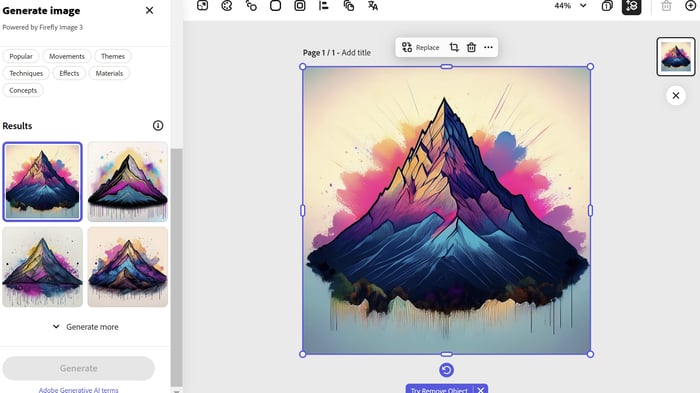
My prompt:A simple black outline of a mountain drawn in the style of Tolkien's Lord of the Rings drawings colored with random splotches of drawing ink in magenta, blue, purple, and gold.

Adobe Express AI image generator

Image Source

I was actually quite impressed with the output, especially considering I only prompted the tool and didn’t configure any of the settings initially.

But how does Adobe Express stack up when you get more specific with the settings? I chose Art as the content type to find out.

In my opinion, the setting change didn’t make that much difference to the output. But that could be because the original prompt was biased towards an “art” type of output anyway.

Adobe Express AI image ART-1

Image Source

As a further experiment, I also adjusted the prompt to bring more whitespace into the mountain portion of the design. Adobe Express interpreted that as more whitespace, in general, rather than in the mountain section itself. Long story short, that didn’t work out as I envisioned, so I ditched that portion of the prompt.

I will say that with something like this (personal work), it’s often about the journey as much as the destination. And even though it took mere seconds to produce, it wasn’t as fun to create this digitally as it would’ve been by using traditional printing or even with biro and drawing ink.

What I like: Adobe Firefly, which powers Adobe Express, first piqued my interest in 2023 when Sarah Rogers, a Contributing Artist at Cricut, posted about the tool on LinkedIn.

Best for: Adobe Express is best for individual graphic designers, design teams, students, students and teachers. And anyone looking to improve their design skills using a responsible AI tool.

Pricing: Get started for free.

A graphic designer comments on Adobe Firefly AI

Image Source

I’d followed Sarah’s thoughtful LinkedIn posts about AI for a while. And we both seemed to have a similar mindset regarding its use within creative endeavors. I don’t want to speak for Sarah, but as for me, here’s my mindset:

  • Yes, you might be able to speed up your creative process with AI — if you know how to use it.
  • No, you shouldn’t fire all of your creative team and replace them with AI.
  • And yes, you should keep a healthy level of skepticism regarding the application of AI within your business. (A healthy level of skepticism, specifically about the output of the tools, legal issues like licensing, and how the models are trained.)

So, what caught my eye the most about Sarah’s endorsement of Adobe Firefly was that Adobe is, seemingly at least, acting responsibly in this space.

AI tools for graphic design, Adobe Firefly AI comments on the responsible use of AI

Image Source

They’re arguably the most responsible folks in the design tool world regarding AI. That makes me feel more confident about any potential licensing issues and that “no creatives were harmed” in training the models.

2. Canva

Canva is a free online graphic design tool. You can use it to create a range of designs, such as social media posts, logos, and presentations.

Canva has integrated AI into its platform in several different ways, including Magic Design, a text-to-image generator, and Magic Studio, which includes AI-driven photo editing features and text-to-video generation.

AI for graphic design, exploring Magic Studio via Canva

Image Source

These days, I mostly use Canva to make (some might say, hilarious) memes for my LinkedIn.

However, I used the tool a lot when I offered social media marketing services, so I wanted to use Magic Studio to create a social media image.

I started with a time-saving social media template — an Instagram post specifically.

AI tools for graphic design, exploring Instagram post templates in Magic Studio via Canva

Image Source

I chose Cream Minimalist New Collection Instagram Post by Kinley Creative.

Cream Minimalist New Collection Instagram Post in Magic Studio via Canva best ai for graphic design

Image Source

I wanted to customize the image, so I uploaded a picture of some of my own artwork.

AI for graphic design, customizing an Instagram post in Magic Studio via Canva

Image Source

I also wanted to upload a font I’d recently downloaded from Type Colony. (This is TC Kuareen if you’re interested.)

Uploading a custom font in Canva ai for graphic design

Image Source

To upload the font, I clicked on the “new collection” templated text, selected the font drop-down menu, and clicked “Upload a font.”

best ai tools for graphic design, using a custom font in Canva

Image Source

Once I’d come this far, I realized I’d not used any AI features. So my next task was to try to find some. But, try as I might, I could only find two noticeable AI features within the image editor.

One of them was “Magic Write.” I could see that being helpful for designers or business owners who need help writing copy. That said, if you don’t know how to use AI well, it’s no replacement for working with a trained copywriter. Of course, the same goes for design.

The other AI feature was “Translate.” Once again, I could see this being helpful. However, like copy and design, AI translation is no replacement for having an actual translator to safeguard against translation mishaps.

The Translate feature in Canva

Image Source

This could be my misunderstanding of the tool, but I found it hard to see a specific AI use case for social media graphic creation.

But I think the tool could be really handy for AI image editing. For example, the “Magic Eraser” edit feature gets rid of unwanted design elements, and “Magic Edit” adds to, replaces, or edits an image in a few clicks.

AI image editing features in Canva, ai for graphic design

Image Source

What I like: Canva is really user-friendly. I feel like people with varying levels of design knowledge, and even those with little experience using design tools could use it.

I also like that the platform has introduced an “industry-leading collection of robust trust, safety, and privacy tools” through Canva Shield.

It seems like Canva is also safeguarding against intellectual property claims for Enterprise customers. Plus, they’re compensating Canva creatives for their work through an AI royalty program.

Best for: Individual graphic designers, design teams, and small to enterprise businesses.

Pricing: Get started for free.

3. Designs.ai

Designs.ai is an integrated Agency-as-a-Service platform powered by AI technology. It’s a one-stop shop for everything from logo design to social media and image generation.

You can even convert text to speech for voice-over content.

I tried creating a social media image to see how Designs.ai compares to Canva, mainly because I wanted to know if the AI aspects of this tool were more prominent.

Designs.ai social media image design

Image Source

My first thought was that if you’ve used Canva before, it won’t take you long to get to grips with the layout for this section of the tool. But even if you haven’t, the Designs.ai platform is straightforward and intuitive. I can see most people being able to pick up this tool and run with it to some degree.

Designs.ai social media image Wizard option - best ai tools for graphic design

Image Source

At first glance, the social media section is very similar to Canva in terms of picking templates to customize based on the channel (Facebook, Instagram, etc.). So, it’s pretty standard stuff, really. The “Wizard” option, however, caught my eye.

Inputting the variables into Designs.ai social media image creator

Image Source

The default format is “Business Card,” but you can choose from different options, such as “Quotes,” “Product Listings,” and “YouTube Thumbnail.” I picked “Instagram Post” to compare the results to Canva.

Choosing a predetermined category for Designs.ai social media image creator

Image Source

In addition to the different design format options, you can also choose from predetermined categories like “Events & Celebrations,” “Business, Legal & Finance,” and “Animal & Pet.” I selected “Art, Design & Inspiration.”

ai for graphic design, adding more variables into Designs.ai social media image creator

Image Source

As a side note, I had to sign up/sign in to upload my own title image. But I did everything until that point via the website without signing up for the platform.

After inputting the design variables, I hit Generate. The options the tool spat out weren’t standout designs, but they were better than I expected — a pleasant surprise!

ai tools for graphic design, the output from Designs.ai social media image creator

Image Source

Next, I selected one of the suggested designs to see what the image editor was like. As with much of Designs.ai, the layout is similar to Canva.

Testing Designs.ai social media image editor

Image Source

For the sake of continuity, I could’ve missed something, but unlike Canva, as far as I’m aware, you can’t upload your own fonts to Designs.ai.

Testing fonts in Designs.ai social media image editor, best ai for social media

Image Source

Overall, I found the platform easy to navigate and use. That said, I don’t think this would serve your needs if you wanted to create complex designs.

I also couldn’t find any information about how Designs.ai trained its models, so I’m wary of that aspect.

There is information about licensing, though. Generally, “finished projects made with our creative AI tools can be distributed to promote and advertise your business.” Still, there are specific Do’s and Don’ts segmented by each aspect of the tool (Logo, Social Media, Video, etc.) that you might want to pay attention to.

What I like: In terms of AI, Designs.ai goes a step beyond Canva. I can also see the “Bulk Edit” function coming in handy if you want to automate mass edits.

ai for graphic design, Designs.ai social media image editor Bulk Edit

Image Source

Best for: Small businesses at the start of their journey who don’t have the budget for a designer. Individual graphic designers or design teams specializing in holistic marketing.

Pricing: Get started for free.

4. AutoDraw

AutoDraw is an AI tool that combines machine learning and drawings from artists. You can use the tool to “draw stuff fast.” In terms of graphic design use cases, you could use AutoDraw to make learning materials and custom graphics.

And for any design that requires a quick outline, I can see Autodraw speeding up the process.

A warning: I don’t have my graphics tablet set up. So everything you’re about to witness — hilarious though it may be — was done with just a mouse. I’m guessing the tool’s capabilities are far greater with a tablet or a stylus at hand.

However, without giving too much away, it proves that you can input a terrible drawing into AutoDraw and get something better back.

ai for graphic design, a blank canvas in AutoDraw

Image Source

I decided to keep things simple with a good old smiley face. First, I used the “Shape” tool to create a circle outline, and then I used “AutoDraw” for the eyes and nose. As you can see, the AutoDraw elements inputted by me are … lacking finesse, shall we say.

Testing the AutoDraw feature in AutoDraw

Image Source

But that’s not a problem. The “Do you mean” section on the top toolbar gives various options to finesse your drawing. So even if your attempt to draw a smiley face with just a mouse didn’t turn out so well, one click on a smiley face up top, and you’re golden.

Testing the AutoDraw Do you mean feature in AutoDraw

Image Source

As you can see the smiley face is now a little less unbearable to behold. Next I used Select to select and then delete the initial circle shape I added. (It turned out to be unnecessary.) Et voila! A shiny happy clipart style person laughing … or something.

The end result of the AutoDraw Do you mean feature in AutoDraw, ai tools for graphic design

Image Source

Regarding training the models, Google usedthe same technology to guess what you’re trying to draw,” as Quick, Draw!, which relied upon “artists, designers, illustrators, and friends of Google” to add drawings to the doodling data set.

I doubt the artists were compensated for their work. Still, at least they shared designs willingly rather than having them scraped by AI without their consent.

What I like: I really like that the tool is simple to use, free, and, let’s be honest, fun! However, it wouldn’t be ideal for complex design work. That said, if you don’t have a lot of time and need to visualize an idea quickly, AutoDraw can help.

Best for: Anyone who needs to convey ideas and concepts at speed.

Pricing: Get started for free.

5. Khroma

Khroma is an AI graphic design tool that helps you match your favorite colors into a series of palettes. The tool also blocks the colors you don’t like, so they’ll never find their way into your palettes.

I love that this tool is so specialized for a specific purpose. And I can see this being a big time saver if you struggle with color pairing like me.

For context, I can pick a few colors that I like, no problem. But I’m not always confident they go together and can get lost in analysis paralysis. As a result, I tend to buy pre-made color palettes for my go-to illustrative tool, Procreate.

After I clicked Generate, I was prompted to choose 50 colors “to train a color generator algorithm” personalized to me. I dove right in and picked the colors that stood out to me at a glance.

Choosing colors in Khroma

Image Source

As I picked the colors, the “likes to go” section counted how many colors I still had to choose. The color bar also started filling up with the ones I’d selected so far.

best ai for graphic design, colors left to go in Khroma

Image Source

After picking my 50 colors, I hit Start Training.

Start Training in Khroma

Image Source

Then, the results came in. The layout for the color pairings is beautiful, and I see a lot of potential in this tool.

ai tools for graphic design, Khroma color pairings layout

Image Source

Another interesting element of Khroma is that you can visualize your color pairings in different ways, including “Type” (the view above) and “Gradient” (the view below). You can also see how your color choices look as posters, images, and within broader color palettes.

Exploring further Khroma color pairings layouts

Image Source

Since Khroma helps you pair colors already in existence, I can’t see it being exploitative to creators or needing specific licenses for commercial use. But I can’t say that for certain, so do your due diligence.

What I like: When you click the information icon against each color pairing, Khroma provides you with the color codes. That will be such a time saver if you want to color match in another design tool.

ai for graphic design, exploring further Khroma color pairings with codes

Image Source

Best for: Individual designers and design teams looking to save time on color selection and pairing.

Pricing: Get started for free.

6. Looka

Looka is a platform specifically for logo and brand design. It uses artificial intelligence and machine learning to create designs based on your input.

I started my test by entering an example company name and clicking Get started. From then on, Looka took me through a series of steps to help me create a logo.

Adding a company name to Looka, ai tools for graphic design

Image Source

The first step was to pick my industry. As you can see, there is a range of sectors to choose from.

Picking an industry in Looka

Image Source

I was then prompted to select some logos I liked, followed by some colors.

Picking logo examples and colors in Looka, ai for graphic design

Image Source

The following steps were to add a company name (again, for some reason?) accompanied by a slogan and then to choose some symbol types.

An observation: I liked that Looka gave me notes about my company name and slogan choices as I inputted them. This could be handy advice for beginners. Plus, you can also pick your own symbols if you want to be more hands-on with the design.

ai for graphic design, picking symbol types in Looka

Image Source

After that, Looka generated a few different logos for me. While they were competent logos, they were too “out of the box” for me and lacked the creative flair needed for brand differentiation. That said, I didn’t go too deep into customizing the logo.

Logos generated by Looka, ai for graphic design

Image Source

This tool shines more in the presentation of the designs than in the designs themselves. For example, I like that Looka provides design mock-ups so you can see how your logo will look on a business card, website, social media, and more.

Examples of logos generated by Looka added to mock-ups

Image Source

I couldn’t find any specifics about how Looka trained its AI models, but they at least address the potential negative impact on human designers here:

Looka mission statement

Image Source

In terms of licensing and copyright, Looka says:

You may not use any of Looka’s End Products outside of the Site, whether for commercial or personal use, without paying all applicable and respective Fees in advance. This includes both digital and physical use of the End Products.”

What I like: Overall, the platform is intuitive and easy to use. I like that Looka doesn’t use templates; rather, it generates each design based on your specific input. There is also a wide range of font, layout, and color options.

Best for: New businesses without the budget to work with a designer. Individual designers and design teams working specifically in branding.

Pricing: Get started for free.

Looking to pair your designs with AI-powered text? Get started with HubSpot AI today.

7. Kittl

Kittl is a free, easy-to-use online design platform that lets you create high-quality designs without the steep learning curve of traditional graphic design software.

Because it's web-based, Kittl is perfect for designers on the go or those seeking a simple design solution without the hassle of installations, updates, and storage space.

One of Kittl's most notable qualities is its emphasis on "quick and easy creation of professional designs," which makes it especially well-liked by users who need to quickly and easily create visually appealing social media images, typography, and logos.

But don't be fooled by its simplicity — Kittl provides sophisticated customization options that allow you to adjust every layout element with precision.

kittl graphic design

Image Source

Kittl offers several AI-based tools such as an AI logo generator, AI vectorizer, AI product background generator, and more. To have a better sense of the platform, I decided to specifically investigate their AI Image Generator.

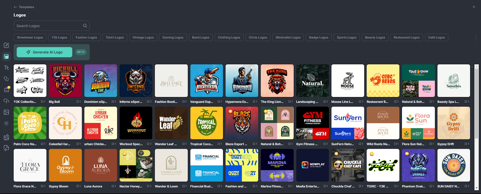
While choosing what to create, I discovered tons of free templates for specific projects such as T-shirt designs, business cards, POD products, and more. I settled on designing a logo and aimed to create a modern yet natural look using a pre-made template, an AI image, and Kittl's extensive collection of fonts.

After logging in to Kittl, I started a New Project, navigated to templates, and selected a pre-made logo design from a pretty hefty template library. This added a new artboard to my project with a customizable design.
kittl graphic design template

Image Source

With my template selected, I needed to create my AI image. The Image Generator was very straightforward and even if you don’t have much experience using AI design tools, you should be able to navigate the features with ease. 

The concept for my logo design was, "a sleek, nature-inspired logo in muted earth tones, with elegant typography." The prompt I entered into the image generator was “a dreamy desert oasis.”

I was pleasantly surprised that I could choose from a variety of styles such as “cartoon,” and even “synthwave.” I settled on the “watercolor” style. 

Using the AI Background Remover, I got rid of the resulting image's white background with a click - and viola! I was left with the image below…which is pretty awesome.

kittl AI vectorizerImage Source

I didn’t think the bright image matched the natural look I wanted so I tried another AI tool: the AI Vectorizer. This was surprisingly easy to use and I was able to choose how many colors would remain in the vector image.

From here I tweaked some things, like the artboard color, text color, and font. The amount of unique fonts Kittl has made it difficult to choose! I even duplicated the artboard to experiment with other brand colors.

kittl graphic mockup

Image Source

After I finished the graphic I went to the mockup section and chose the sticker mockup how real does that look? The text wraps around the contours of the image!

kittl custom logoImage Source

All in all, creating a custom logo on Kittl was super straightforward. What stood out with Kittl was just the ease of navigation and use. It was incredibly easy to adjust each aspect with precision in just a few clicks.

What I like: If we’re thinking of AI tools, then I like how Kittl strikes a mix between ease of use and advanced capabilities. Because the design tools are simple to use, I could explore and make adjustments without any hassle.

Best for: Beginner or expert-level graphic designers, design teams, and POD creators. Kitt’s particularly good for individuals wanting professional quality designs without the steep learning curve of other design software. 

Pricing: Get started for free.

The Bottom Line on AI Tools for Graphic Design

Let’s be honest: A tool is only as good as the person wielding it. So, if you don’t know much about graphic design concepts to begin with, it’s unlikely you’ll create a brand-differentiating end product.

However, if you know your way around your colors, typography, alignment, visual hierarchy, balance, and the rest, AI can speed up your creative process.

Personally, I loved testing out Adobe Firefly. The end output exceeded that sterile “out of the box” template, which feels common with other tools. I also liked that you could create something painterly in style.

Plus, I love Adobe’s ethical approach to using AI. They are working with creatives to train their models responsibly and protecting product users against potential licensing and legal issues.

What is Marketing, and What’s Its Purpose?

Featured Imgs 23

If you’d asked me early in my career to define what marketing is, I would have no doubts. “Marketing is about promoting products,” I’d say. But today, it’s one of the toughest questions to answer. 

The term is so broad and flexible that it’s hard to pin down.

Marketing is present in all stages of the business, beginning to end. Without marketing, you can’t truly understand your audience, create a product that fits their needs, or successfully bring it to market.

→ Click here to download our free guide to digital marketing fundamentals  [Download Now].

Marketers have the firmest finger on the pulse of your consumer persona.

In this guide, I’ll show you in practice what marketing is, its different types, the 4 P's, and how it differs from advertising.

Plus, I’ll spice things up with some expert tips. Whether you’re a pro looking for a refresher or a newbie trying to get the hang of things, I’ve got you covered.

Table of Contents

Modern marketing began in the 1950s when people started to use more than just print media to endorse a product. As TV — and soon, the internet — entered households, marketers could conduct entire campaigns across multiple platforms.

And as you might expect, over the last 70 years, marketers have become increasingly important in fine-tuning how a business sells a product to consumers to optimize success.

In fact, the fundamental purpose of marketing is to attract consumers to your brand through messaging. Ideally, that messaging will be helpful and educational to your target audience so you can convert consumers into leads.

Today, there are literally dozens of places to carry out a marketing campaign — where does one even start?

3 Pillar Types of Marketing

Where your marketing campaigns live depends entirely on where your customers spend their time. It's up to you to conduct market research that determines which types of marketing — and which mix of tools within each type — is best for building your brand.

We have two main categories of marketing: digital and traditional. The third one, which isn’t so popular but extremely effective, also deserves a standalone place: neuromarketing. Let’s find out what comes with each.

1. Digital Marketing

Digital marketing is the use of online channels and platforms, like social media, email, and search engines, to promote and sell products or services.

The main parts of it are:

Search Engine Optimization

Abbreviated as “SEO,” this is the process of optimizing content on a website so that it appears in search engine results.

It‘s used by marketers to attract people who perform searches that imply they’re interested in learning about a particular industry.

29% of marketers consider SEO one of the leading trends they use. And just like in other areas, AI has made significant strides here too, greatly aiding in SEO.

Actually, 54% of marketers use AI tools for automating SEO tasks such as meta tags, link descriptions, and alt text.

Also, 45% of marketers believe AI/automation tools are best for optimizing websites, 40% say they improve the user experience, and 37% value them for saving time.

Blog Marketing

Blogs are no longer exclusive to the individual writer. Brands now publish blogs to write about their industry and nurture the interest of potential customers who browse the internet for information.

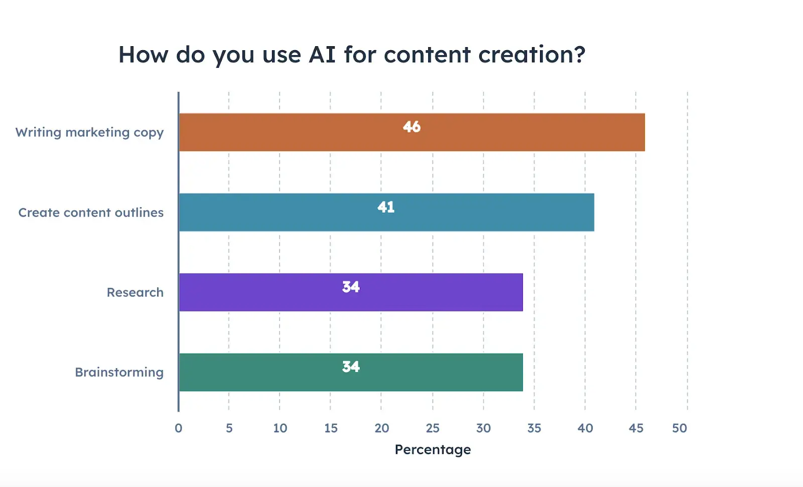
Today, most marketers use AI to assist with content creation. Nearly half (46%) rely on it for writing marketing copy, and over 40% use it to create outlines.

Personally, I love using it for proofreading — a time-saver for writers.

How marketers use AI for content creation

Social Media Marketing

Businesses can use Facebook, Instagram, Twitter, LinkedIn, and similar social networks to create impressions on their audience over time.

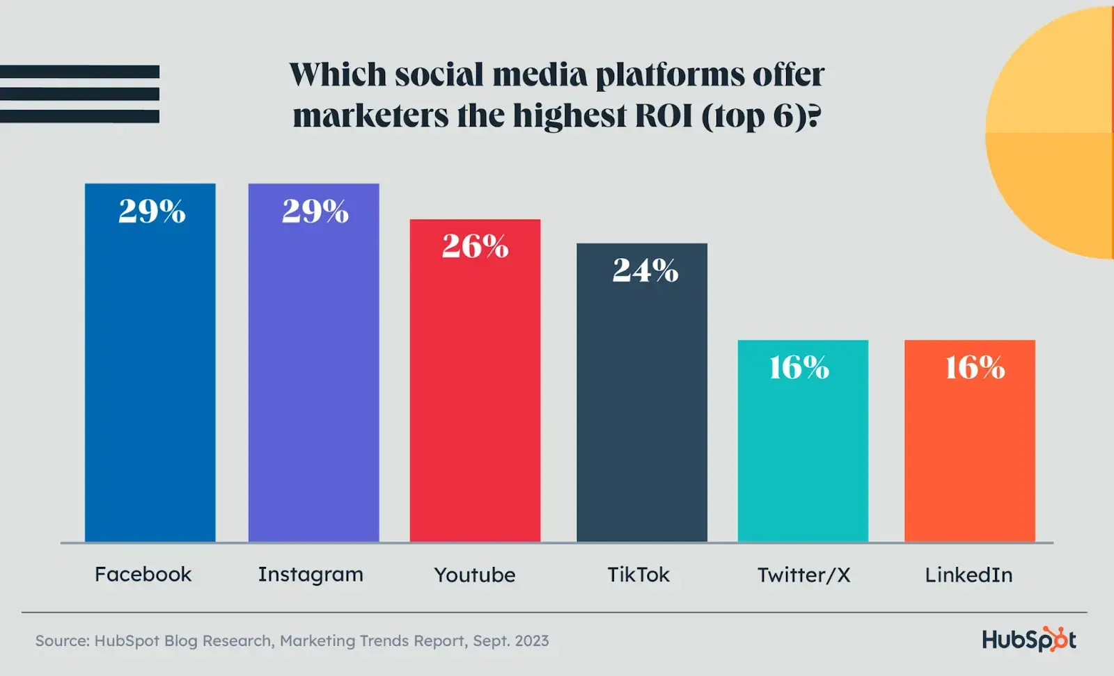
Social media platforms with the highest ROI

Social media is the top place where Gen Z and Millennials discover products, with 31% of people using it to find answers.

Additionally, 17% of users buy products on social media, and most sellers find it effective, with 59% seeing more sales in 2023 than in 2022.

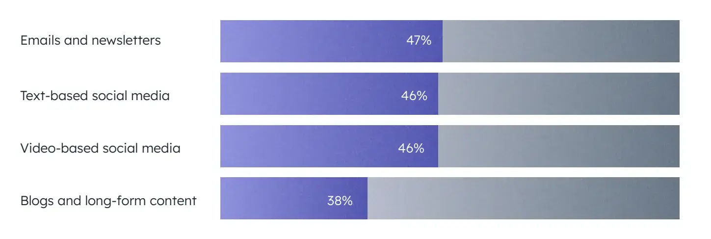
It’s clear that investing time and energy in social media is worth it, and one of the best ways to speed things up is by, you guessed it — incorporating AI. In fact, 46% of marketers use AI to write social media posts.

Marketers using AI for different types of content

Download our free step-by-step guide and create your digital strategy.

Search Engine Marketing

This type of marketing is a bit different than SEO, which is described above. Businesses can now pay a search engine to place links on pages of its index that get high exposure to their audience. (It‘s a concept called "pay-per-click." I’ll show you an example of this in the next section.

Recent data shows that spending on SEM is expected to reach $306.7 billion in 2024 as businesses recognize its potential for targeting and converting high-intent customers.

SEM can deliver a strong ROI, especially with well-targeted strategies. On average, businesses get $2 back for every $1 spent on Google Ads, showing how powerful SEM can be when done right.

Video Marketing

While there were once just commercials, marketers now put money into creating and publishing all kinds of videos that entertain and educate their core customers.

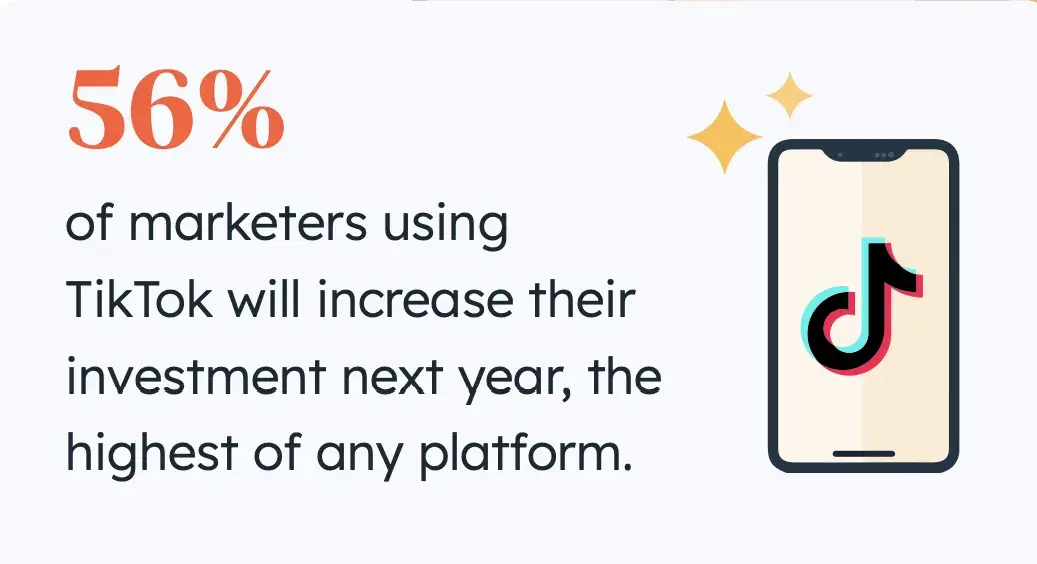
Marketers are turning to TikTok, YouTube, and Instagram to connect with younger audiences who favor social video over search engines.

Short-form video is delivering the best ROI and is expected to grow the most in 2024, with a quarter of marketers planning to invest heavily in it.

marketing trends 2024: TikTok is leading platform for marketers

“Use social listening tools to identify key questions from prospects and customers, and then create content to answer them, or let brand advocates do it,” suggests Aja Frost, Senior Director of Global Growth at HubSpot.

P.S. If you’re interested in blending human and AI content for your social media, I recommend this podcast where Nathan Lands and Matt Wolfe dive into the latest AI video generators, like Gen 2 and Leonardo Motion, and how they’re changing the game for all of us:

2. Traditional Marketing

Compared to digital marketing, which is all online, traditional marketing focuses on offline connections with people.

Let’s break it down.

Print Marketing

As newspapers and magazines get better at understanding who subscribes to their print material, businesses continue to sponsor articles, photography, and similar content in the publications their customers are reading.

However, we must admit that print marketing is nowhere near what it used to be.

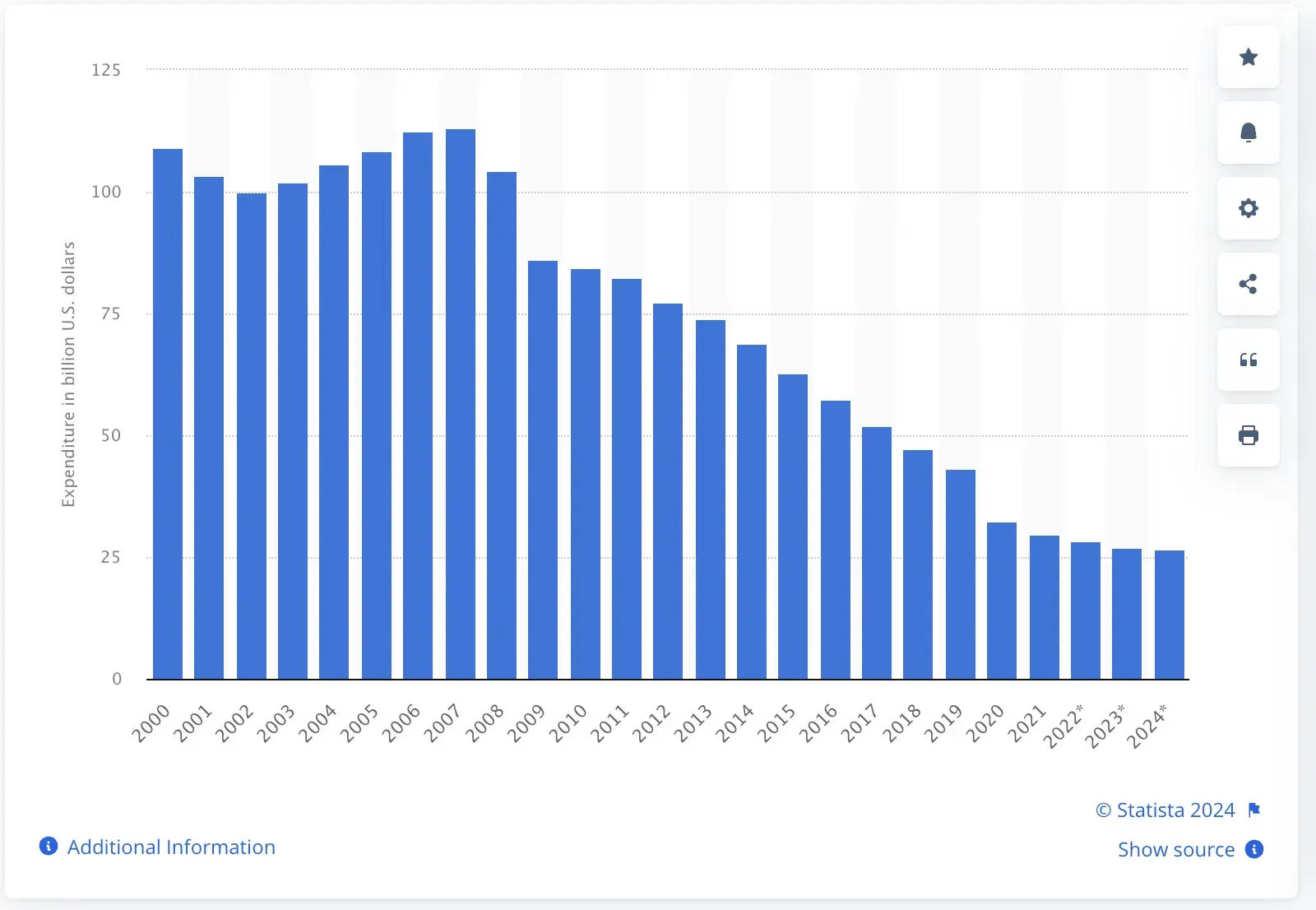
Digital marketing has totally shaken its dominance. According to Statista, global newspaper advertising spending was forecast to reach around $28.3 billion in 2022 — a major drop from its height in 2007 at $113 billion.

Newspaper advertising expenditure worldwide from 2000 to 2024

Image Source

Broadcast Marketing

38% of consumers discovered new products through TV ads, suggesting that broadcast marketing is still alive and way more popular than print ads.

TV spots hit the right audience during popular shows at peak times, while radio ads catch people in their daily groove, especially on the road.

Telemarketing

Telemarketing uses phone calls to reach potential or existing customers directly. It involves two main types:

  1. Outbound telemarketing: Businesses initiate cold calls to promote products, services, or gather feedback from customers.

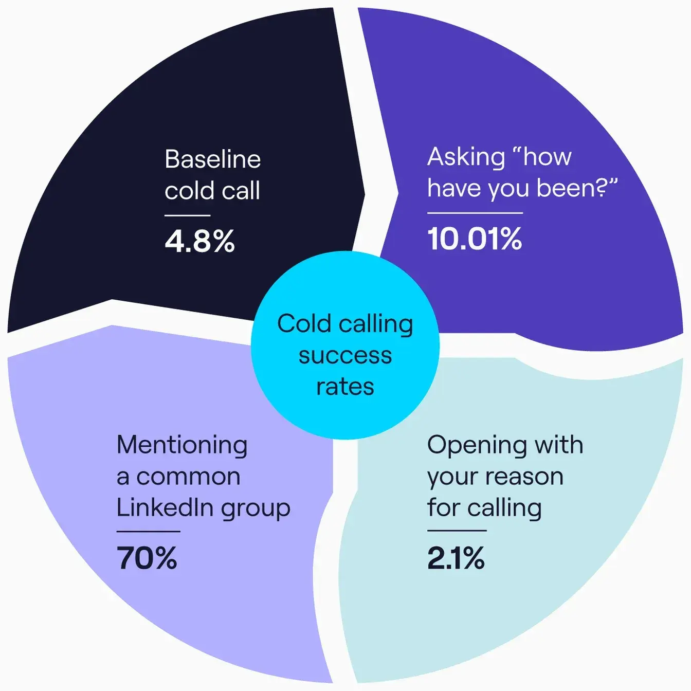
However, based on Cognism research, the average success rate for cold calling is only 4.8%. This figure is significantly lower compared to other sales methods.

Cold calling success rates

Image Source

2. Inbound telemarketing: Customers call businesses in response to ads or promotions for inquiries, orders, or support.

Honestly, I don’t like telemarketing, especially cold calling. It often feels too pushy and irrelevant. However, it’s still a part of marketing, so we simply can’t ignore its existence. 🙂

3. Neuromarketing

Neuromarketing blends neuroscience with digital and traditional marketing to understand how people make choices and react to ads. It’s one of the most fascinating things I’ve been into lately, so let me show you how it works:

  • Brain Scans. Track brain activity with fMRI and PET to see reactions to marketing.
  • Electrical Brain Activity. Use EEG and ERP to measure real-time responses to ads.
  • Body Reactions. Measure stress and emotional responses with tools like skin conductance and heart rate monitors.
  • Eye Tracking. Follow where people look and for how long to gauge ad impact.
  • Behavior Tracking. Analyze decision speed and choices to understand preferences.
  • Neuroeconomics: Study decision-making by combining brain science, psychology, and economics.

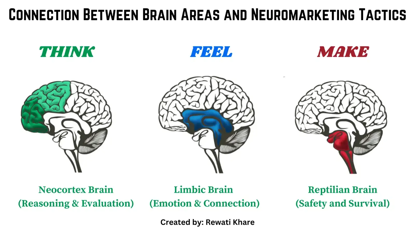
Connection between brain areas and neuromarketing tactics

Image Source

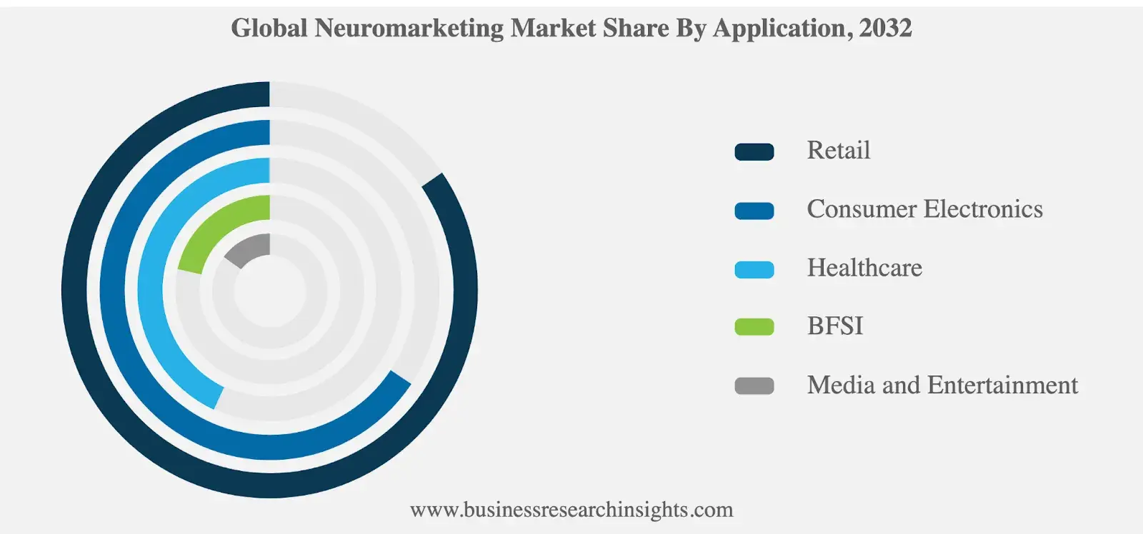
Neuromarketing improves various sectors by enhancing customer experiences in retail, shaping perceptions in consumer electronics, boosting patient engagement in healthcare, understanding trust in BFSI, and tailoring content in media and entertainment, according to Business Research Insights,

Global neuromarketing market share by application

Image Source

Click here to get your free introductory ebook on marketing psychology.

Why is marketing important?

I could write a book on this because marketing is important for so many reasons. But here are the top six, according to the experts I’ve talked to.

1. Marketing builds brand loyalty and customer relationships.

“Focusing solely on short-term sales shouldn’t come at the expense of long-term customer relationships,” highlights Rosario Maccarrone, director and head of student services at OPIT.

Instead, focus on a strong marketing strategy that supports ongoing growth and builds brand loyalty. Rosario points out:

"One of the successful campaigns I led at OPIT involved the revision and promotion of our course offerings. Having noted a decline in subscribing to our advanced tech courses, we launched a campaign focused on showcasing real-life applications and success stories of past students."

He continues, "This drove immediate course registrations (short-term goal) while also building a strong alumni-student network, fostering huge potential for long-term engagement and brand loyalty."

Free Download: How Best In Class Companies Build Customer Loyalty

Marta Romaniak, VP of global branding at Avenga, agrees with Rosario, explaining that the commitment should not end once the service is delivered:

“We continue providing insights that could benefit them, which helps build long-term trust. On the same note, if a customer purchases a short-term service or solution, we send them personalized recommendations regarding services they might need in the future. So, a short-term cooperation turns into a long-term relationship.”

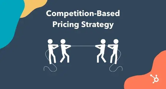
2. Marketing guides smart pricing decisions.

Marketing reveals what customers want and how much they’ll pay. It helps you get a read on customer behavior, keep tabs on competitors, and spot trends so you can set prices that attract customers.

“We once re-priced our master's degree in Data Science based on market feedback and competitor benchmarking. We reduced the cost by 15%, which resulted in a 25% increase in enrollment for the subsequent batch,” shares Greta Maiocchi, head of marketing & admissions at OPIT.

Competition-based pricing strategy

Debbie Moran, marketing manager at RecurPost, also shared one successful story from her company:

“One of the most impactful examples of re-pricing was with our ‘Enterprise Plan.’ Initially, it was priced too high for the features offered, leading to slow adoption. After restructuring based on user feedback, we saw a 50% increase in enterprise sign-ups within three months.”

3. Marketing builds brand recognition.

Marketing helps companies connect with new audiences and enter new markets. Through targeted advertising, social media campaigns, and partnerships, it can attract potential customers who might not have heard of the business before.

Ally Moisse from Pearl Lemon Group illustrates this through a recent multi-channel campaign — emails, cold calling, cold email outreach, and marketing activity on X:

“We engaged in industry conversations and shared insights, which helped us connect with leads in a more organic, non-intrusive way.”

The best thing about marketing is that it's not strictly tied to just one channel and opens up the possibility to spread the word about a business far and wide. Moise backs this up:

“The success of our campaign came from how these channels worked together. Each approach reinforced the other, creating a consistent presence that resulted in higher engagement and better conversions overall.”

4. Marketing helps you understand customer behavior.

Marketing often reveals why your customers might hesitate to buy. What concerns or objections do people have? Worries about price or fit? Through surveys, feedback, and watching their behavior, you can learn a lot.

By identifying these issues, you can improve products and make changes that help turn hesitations into sales.

Here’s what Elisa Montanari, head of organic growth at Wrike has to say about it:

“If customers are holding back because they can’t afford your products, that’s a whole different issue than them not seeing the value in your product. Dig deep into your marketing data to understand why people are hesitating — if it’s an issue with perceived value, you can change that with the right messaging.”

5. Marketing sells the experience and JTBDs.

We use marketing to sell, but marketing isn’t about selling products or services.

It’s about selling experiences and emotions. It helps shape how customers perceive and interact with a brand. Through storytelling, visuals, and messaging, marketing creates an emotional connection that encourages repeat business and builds a strong brand identity.

Moreover, smart marketing gives potential customers a feel for the jobs to be done (JTBDs). With that, consumers will find themselves easily signing up for your services or products.

When I promoted my freelance writing services on LinkedIn, I didn’t post something like “Look at my articles, work with me.” Nobody cares about it.

Instead, my posts were tailored to the JTBDs of content marketers, my target persona. For example, I shared how one of my articles went viral and ended up in dozens of high-quality links. Or my approach to editing or spicing up content with expert tips, and so on.

This type of marketing is all about sales and improving my personal brand, but the influence is indirect. I just show my potential clients that I’ll take a great deal of burden off their shoulders by providing content that ranks and is picked up by their target persona.

6. Marketing gives a competitive edge.

Marketing helps businesses shine in a super-crowded marketplace. But this won’t happen with one good ad going viral. Sure, people will notice your brand at that moment, but a lasting impression won’t happen.

I chatted about this with the amazing Marta Romaniak, who says, “Business owners sometimes mix up advertising with marketing.” She emphasizes that advertising is just a piece of the bigger marketing puzzle.

A solid marketing strategy is what really sets your brand apart from the competition.

But getting a competitive edge through marketing doesn’t happen overnight. You can’t expect instant results from a single campaign.

It’s about consistently pushing your message, connecting with your audience, and adjusting your strategy as you go. Real, lasting success comes from sticking with it and putting in the work over time.

Let’s now dive a bit deeper into marketing and advertising differences.

Marketing vs. Advertising: What’s the Difference?

If marketing is a wheel, advertising is one spoke of that wheel.

Marketing entails product development, market research, product distribution, sales strategy, public relations, and customer support.

Marketing is necessary in all stages of a business's selling journey, and it can use numerous platforms, social media channels, and teams within the organization to identify its audience, communicate with it, amplify its voice, and build brand loyalty over time.

On the other hand, advertising is just one component of marketing. It‘s a strategic effort, usually paid for, to spread awareness of a product or service as a part of the more holistic goals outlined above.

Put simply, it’s not the only method used by marketers to sell a product.

"If you just want to create ads when you hire a marketing specialist or set goals for your marketing team, that‘s fine, you are making their job easier. But don’t be surprised when the results turn out to be not what you expected," insists Romaniak.

"Advertisements are good for short-term solutions as part of your marketing strategy. Marketing, though, is a key to the long-term success of your brand."

Here‘s an example (keep reading — there’s a quiz at the end of it):

Let‘s say a business is rolling out a brand-new product and wants to create a campaign promoting that product to its customer base.

This company’s channels of choice are Facebook, Instagram, Google, and its company website. It uses all of these spaces to support its various campaigns every quarter and generate leads through those campaigns.

To broadcast its new product launch, it publishes a downloadable product guide to its website, posts a video to Instagram demonstrating its new product, and invests in a series of sponsored search results on Google directing traffic to a new product page on its website.

Now, which of the above decisions was marketing, and which was advertising?

The advertising took place on Instagram and Google. Instagram generally isn‘t an advertising channel, but when used for branding, you can develop a base of followers that’s primed for a gentle product announcement every now and again.

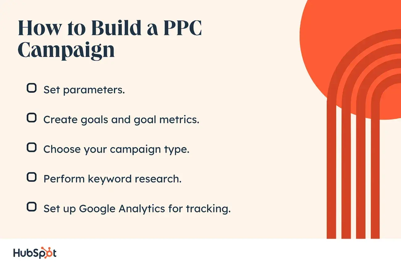
Google was definitely used for advertising in this example; the company paid for space on Google — a program known as pay-per-click (PPC) — on which to drive traffic to a specific page focused on its product. A classic online ad.

How to build a PPC campaign

Where did the marketing take place? This was a bit of a trick question, as the marketing was the entire process.

By aligning Instagram, Google, and its own website around a customer-focused initiative, the company ran a three-part marketing campaign that identified its audience, created a message for that audience, and delivered it across the industry to maximize its impact.

It’s important to know that this type of marketing campaign requires proper coordination and monitoring of multiple channels. You need to adapt your approach to each specific channel yet get them to yield the same results: to generate revenue.

This is where a unified marketing software solution can come in handy. It includes the tools necessary to monitor and manage campaigns across multiple channels — from websites to emails and online advertisements.

The 4 Ps of Marketing

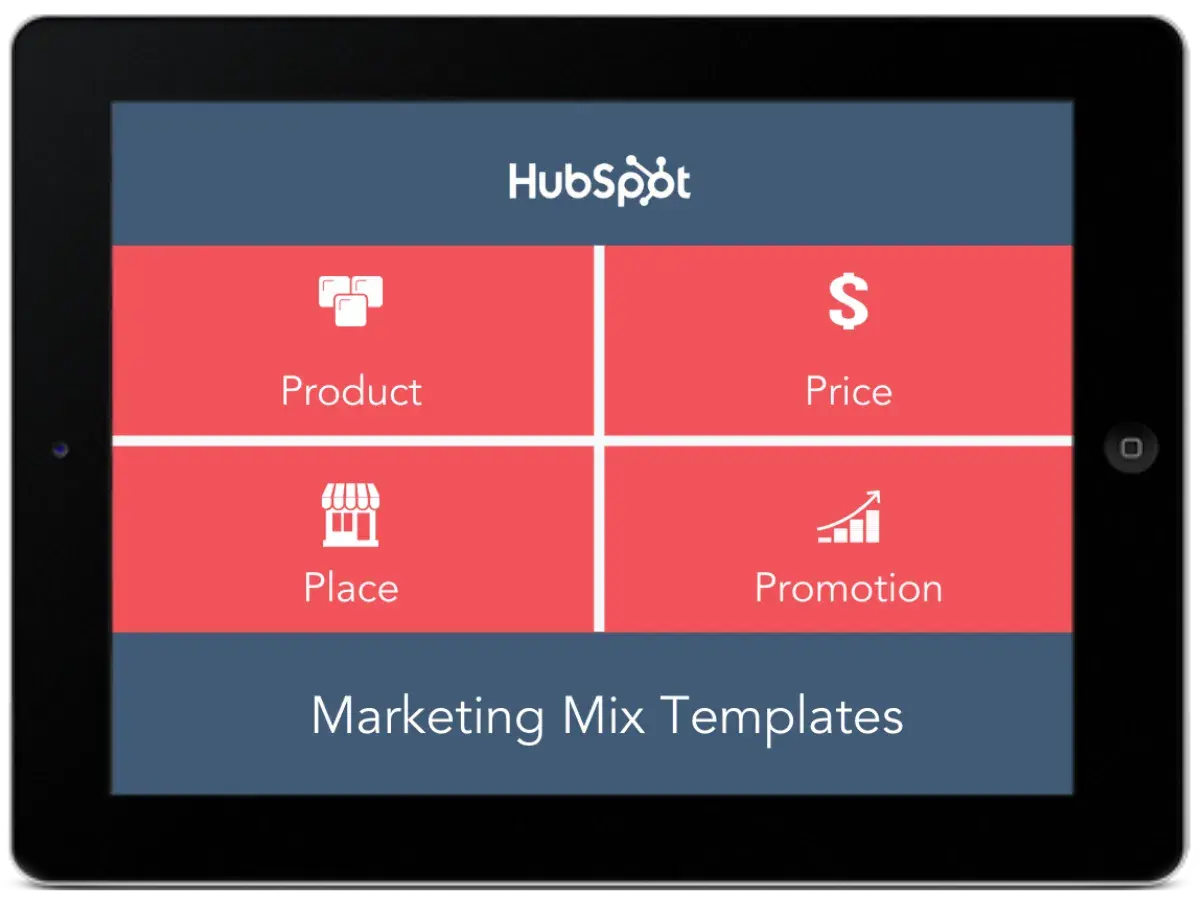
In the 1960s, E Jerome McCarthy came up with the 4 Ps of marketing: Product, Price, Place, and Promotion.

Essentially, these 4 Ps explain how marketing interacts with each stage of the business.

Download Now: Free Marketing Mix Templates

Product

Let‘s say you come up with an idea for a product you want your business to sell. What’s next? You probably won't be successful if you just start selling it.

Instead, you need your marketing team to do market research, interpret marketing analytics data into actionable insights, and answer some critical questions: Who's your target audience? Is there a market fit for this product?

What messaging will increase product sales, and on which platforms? How should your product developers modify the product to increase likelihood of success? What do focus groups think of the product, and what questions or hesitations do they have?

Marketers use the answers to these questions to help businesses understand the demand for the product and increase product quality by mentioning concerns stemming from focus groups or survey participants.

Price

Your marketing team will check out competitors‘ product prices, or use focus groups and surveys, to estimate how much your ideal customer is willing to pay.

Price it too high, and you’ll lose out on a solid customer base. If you price it too low, you might lose more money than you gain. Fortunately, marketers can use industry research and consumer analysis to gauge a good price range.

Place

It‘s critical that your marketing department uses their understanding and analysis of your business’s consumers to offer suggestions for how and where to sell your product.

Perhaps they believe an ecommerce site works better than a retail location, or vice versa. Or, maybe they can offer insights into which locations would be most viable to sell your product, either nationally and internationally.

Promotion

This P is likely the one you expected from the get-go: promotion entails any online or print advertisement, event, or discount your marketing team creates to increase awareness and interest in your product and, ultimately, lead to more sales.

During this stage, you'll likely see methods like public relations campaigns, advertisements, or social media promotions.

Hopefully, our definition and the four Ps help you understand marketing‘s purpose and how to define it. Marketing intersects with all areas of a business, so it’s important you understand how to use marketing to increase your business's efficiency and success.

Marketing is your eyes and ears.

While we can sum up the definition of marketing in one sentence, it will always feel incomplete. That’s because marketing is a mix of everything and the core of every business.

Without marketing, you don’t exist. No one will see you. No one will hear you. No one will recognize you. Without marketing, you won’t understand your audience's needs. You won’t create the products or services they are looking for.

That’s why you need a smart marketing strategy that targets where your audience is, what they need, and shapes everything around that.

If they’re on LinkedIn, spend most of your time and effort there. If they’re on TikTok, make videos. Entertain them. Educate them. Give them what they want, and chances are, they’ll give you what you want in return.

Editor's note: This post was originally published in May 2018 and has been updated for comprehensiveness.

The Future of WordPress: Trends, Developments, and Innovations

Featured Imgs 23

WordPress has come a long way since its inception in 2003 as a simple blogging platform. Today, it powers over 40% of the web, making it the world’s most popular content management system (CMS). As technology evolves, so does WordPress, with new updates, features, and tools being introduced regularly.  In this article, we will explore […]

The post The Future of WordPress: Trends, Developments, and Innovations first appeared on WPArena and is written by Ghulam.

30+ Photography Trends for 2025

Featured Imgs 23

Photography trends can be a major influence on how print and digital designs come together. From filters to styles to photo angles that are trending, this part of the visual aesthetic can greatly impact how a project comes together.

Photography trends are dictated by a few things. The visual style of photographers, techniques that are gaining popularity in projects, the ability for images to work with other design elements, and even things such as social media filters.

The same photography trends that you might see in stock images (which we use as examples here) have parallels with custom photos as well. Understanding photography trends is important for any designer because you’ll want to discuss photo options (and looks) before you begin a photo shoot for any design project to ensure that your visions are on the same page.

1. AI-Assisted Editing

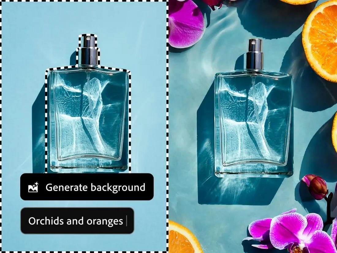
ai photo editing adobe

(Credit: Adobe)

Artificial Intelligence (AI) revolutionized the way we edit photos. The tasks that took hours to complete can now be done instantly with a single click of a button or writing a text prompt. And that’s been the biggest game-changer in photography in this decade.

Whether you’re using Photoshop or Lightroom, AI-powered tools are now a core part of almost every photographer’s workflow. Especially when it comes to making selections and removing unwanted objects, AI tools are helping photographers be more productive and work more efficiently.

AI-assisted photo editing will only get better with time and we can’t wait to see what will come next.

2. Sustainable Photography

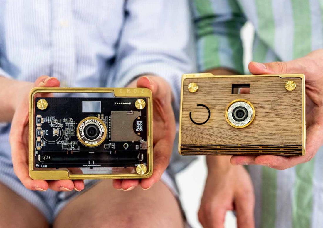
paper shoot camera

(Credit: Paper Shoot Camera)

When was the last time you held an actual photograph in print format? Or put a film into an analog camera? Probably not in a long time, right? Well, there’s a reason for that.

Even though using analog cameras, films, and polaroids are still part of photography, they are slowly being replaced by more sustainable practices. Photographers now prefer digital cameras that consume less power, rechargeable batteries that last longer, digital photo formats that take less space, and avoid print formats as much as possible.

Using eco-conscious practices in photography is slowly becoming the norm among not just photographers but also clients. It’s inspiring to see people seeking and hiring photographers who use more sustainable gear to help save our planet in any and every way they can.

3. Cinematic Storytelling

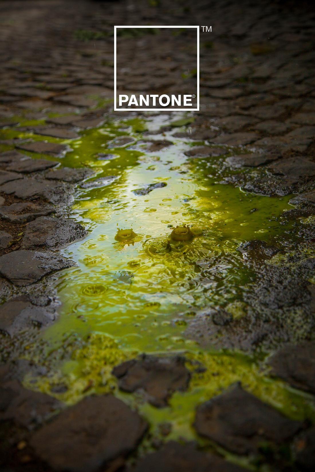
Pantone rain editing poster

(Credit: Pantone)

Photography has always been an art form and it’s exciting to see photographers keep it alive with incredible photographs that look even more mesmerizing than cinematic scenes from movies.

Rather than using photos with the same stock look and feel, many designers are now using more cinematic-looking photos in their designs. Whether it’s a minimalist poster design, billboard ad, or website background, using cinematic photos that tell a story is one of the most effective methods of attracting attention.

These cinematic photographs are not just about visuals, they are mainly focused on storytelling that gives a meaningful message through art.

4. Bold Colors

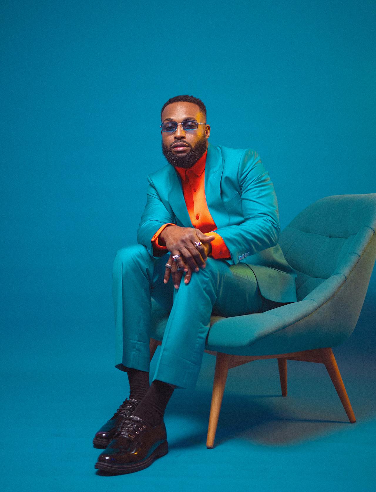
Bold Colors

This vibrant, creative, and colorful photography trend allows you to be bold by using high-contrasting and bright color compositions. The goal of this trend is to create an unexpected look with a futuristic approach that instantly grabs attention.

As a result, you’ll likely see this trend being used by popular brands, especially in fashion, to make bold statements, which also allows them to stand out. It also provides photographers with an opportunity to get creative and experiment with different color combinations.

5. Old Money Aesthetic

Old Money Aesthetic

This is one of the new trends popularized by social media, where you use subtle, mute color palettes in combination with formal-looking attire to create a “quiet luxury” vibe. In this type of photography, you avoid using luxury backdrops and expensive jewelry. Instead, you create that classic luxury look through a combination of subtle scenery, colors, and lighting.

There’s no wonder why this trend became so popular among influencers as it allows them to create breathtakingly luxurious vibes with minimal effort. We also saw many brands adopt this photography trend to promote their new clothing lines, jewelry, and even vehicles.

6. Unique Perspectives

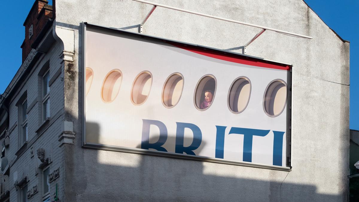
British Airways ad

(Credit: British Airways)

Photographers are always seeking unique perspectives to capture images that go beyond the lens of their cameras. With drone photography, we saw a significant change that allowed photographers to reach amazing perspective views beyond their wildest dreams.

However, not having a drone or the most expensive camera has never limited the capabilities of a creative photographer. They always find a way to capture scenes from unique perspectives and we’ve been seeing many examples of that through the photos used by recent promotional campaigns, like the ad campaign by British Airways.

7. Drone Shots

drone shots

We’ve been seeing beautiful aerial views of cities and iconic locations thanks to drone photography for a while. But that was before drones were so cheap and affordable. Now, almost every aspiring and amateur photographer and content creator has a drone capable of shooting beautiful aerial shots.

Even when browsing sites like Instagram and TikTok, more often than not you now see photos and videos shot with drones. Drones allow content creators and photographers to reach new heights (literally) and take shots at angles that were otherwise impossible to achieve.

So, don’t be surprised if you see lots of drone photography and videography throughout this year as well.

8. Retro and Vintage

Retro and Vintage

Modern photography with retro and vintage aesthetics is on the rise again. This style encourages photographers to explore various styles from various eras to create classic 90s-style film looks, beautiful early 1900s looks, Victorian-era gothic vibes, classic retro looks from the 80s, and more.

Creating a nostalgic feel is the ultimate goal of this trend and it’s achieved through a perfect combination of faded colors, lighting, and other effects such as film grains and light leaks.

9. Modern Aesthetic

Modern Aesthetic

This is a trend that was popular in stock photography but now almost every product photo, fashion photoshoot, and even the Instagram photo of everyone’s breakfast looks much more modern with an aesthetic feel.

New filters and effects developed by apps like VSCO, Instagram, and the iPhone camera app are responsible for making this new modern aesthetic look more popular than it ever was.

In a way, it’s a style that adds a beautifully calm, simple, and minimalist look to photography that we can all appreciate. Especially when the focus is on a single subject, this style does wonders to create a bold aesthetic feel.

10. Cinematic

Cinematic

Taking photos that look like a still from a movie is something that every photographer strives for. While it’s not exactly a new trend, many photographers are now turning a new spin on this photography style by adding movement.

Capturing a photo when the subject is in motion is quite difficult. And making that shot look more cinematic is even more difficult. That’s exactly why this is a trend that’s hard to master but one we hope will catch on this year and beyond.

11. High Contrast

High Contrast

The timeless, dramatic, and classic high contrast look, or the black and white look, is a trend that stood the test of time and it will continue to survive through many more years.

This trend is all about balancing light and darkness to create compositions that are more than just a pretty picture but also tell a deep meaningful story. The high contrast look is capable of depicting a wide range of emotional looks ranging from melancholy to nostalgia. And it’s a style that not many can master.

12. Experimental

Experimental

The experimental photography trend sees a new tradition of breaking the rules to create unique, weird, and uncommon looks. Photographers create these experimental shots by playing around with camera focus, lenses, effects, and filters.

We always love seeing trends that encourage photographers to create art through their photography as it allows them to express their creativity and emotions even more openly.

13. Pattern-Focused

Pattern-Focused

You may have noticed weird patterns in some photos. Whether it’s a photo of a building, a desert after a sandstorm, or even a dress worn by a model, it’s like this trend is everywhere.

Photography that focuses on patterns and textures is a new trend where photographers deliberately capture photos that create semi-abstract looks. The world is full of these patterns. If you look closely, you’ll see them too.

14. Golden Hour Lighting

photography trends

Photographers love two hours of the day because of the amazing lighting they create for photos. The “golden hour” is the last hour before sunset and the first hour after sunrise and photos during that time can have stunning color.

These photos are showing up in everything with a focus on natural photography, rather than some of the over-filtered, highly-Photoshopped images that have been popular in recent years.

You can take almost any image during the golden hour, but the most jaw-dropping photos are scenes and portraits in beautiful locations.

15. Faceless Stock

photography trends

Everyone has to use stock photos at some point and the way to keep the images from looking too unlike your brand is to opt for faceless stock. These photos feature people doing things but are composed in such a way that you don’t see the faces of the subjects.

Faceless stock allows designers to work with a variety of images that work for projects without looking too artificial or posed. The best faceless stock images are rich in detail, such as the example above where there is action, you can tell the age of the person, and there’s a rich color for strong visual interest.

16. Rustic Backgrounds

photography trends

Backgrounds that have a rustic, natural appeal set the scene for many generated photos for everything from food photography to product placements.

These more rustic backgrounds provide a neutral backdrop that’s generally harmonious and appealing and has nice color and texture without getting in the way of the key elements of the photo itself.

To qualify for this rustic look that background will likely have an organic feel and be an item from nature.

Options for rustic backgrounds for photos include:

  • Rock elements such as slate (pictured above)
  • Wood grains
  • Grass
  • Trees/grass
  • Stumps or logs

17. High Drama

photography trends

High-drama photos can have a big impact on projects. These stunning images are trending in a major way and can be taken naturally, but for the most part, dramatic elements are edited in.

High drama photography includes:

  • Something that almost doesn’t look real
  • Striking or unusual color
  • Super close zooms
  • Beautiful natural elements such as colorful skies
  • High contrast elements such as color on black and white
  • Lighting effects
  • Emphasized elements that are bigger or seem bigger than life

18. Science Inspired

photography trends

Maybe it’s all the conversation about vaccines that have people thinking from a scientific mindset. That concept is beginning to be the framework for a photography trend as well.

You are likely to see more images of people wearing aprons, masks, or gloves in a more sterile setting. You may also see more beakers or test tubes or measured items that feel detailed and specific. Space themes may also apply here.

This trend is rooted in the idea of hypotheses and exploration and what could be possible.

19. Silhouettes

photography trends

Silhouettes are back in a major way.

Think of them in a few different ways. You might see a closeup of a person framed in light or a more wide-angle scene where the background is really the focal point and the silhouetted person (or people) serves as more of an accent in the image.

What’s nice about these images is that they can provide different areas of focus, such as a scene, without highlighting the individual in the image. This makes silhouette options great if you are working with stock photos or don’t want to show specific individuals or worry about elements such as style trends (clothing options on models can quickly date photos).

20. Masks and Distance

photography trends

Much of the world has adopted mask-wearing and more socially distant practices due to the pandemic. That’s something that’s showing in photography as well.

Good, timely photography accurately portrays reality and the use of masks in photos is a representation of the time period we live in. Images may show full masks on people in the photos or people partially wearing them, which is also a thing in some circles.

Showing people who aren’t close together or in big crowds is another element of this photography trend because it is representative of the current environment.

21. Solo Outdoors

photography trends

The COVID-19 pandemic has spurred another photography trend – images of solo outdoor adventures. From images of amazing hikes to jogging to bike adventures, people are getting outside more than ever and these beautiful images show it.

Solo outdoor photography may also be the result of booms in some outdoor-based product lines and businesses (also somewhat pandemic related).

Regardless of the how and why of these images, this photo trend is awe-inspiring and beautiful.

22. Subtle Filters

photography trends

The impact of social media is evident in the use of subtle filters, even for photos that aren’t on Instagram.

The most popular use of the trend is with a softening of the light in images that create a bit of a color cast. The almost-muted tone is subtle and creates a distinct feel for the image.

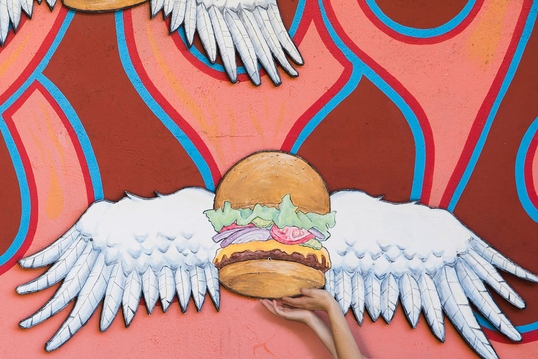
23. Imagery with Art

photography trends

This is another trend that’s carrying over from social media: A mashup of reality in images against art.

These photos are often bright and fun with a lot of focus on an art element, such as a mural or graffiti. The subject of the photo might be clearly defined or just provide a hint of human connection, such as the image above that features only hands against a strong artistic background.

Color, depth, and a sense of creativity power these images.

24. Bird’s Eye View

photography trends

Thanks to drone photography, more projects are using images that feature a bird-eye-view of something. It’s a popular technique with images that capture events or places.

What makes this trend work most stunningly is a solid composition. Not any old drone photo will do. It takes the right eye to create a birds-eye-view image that demands attention.

Look for images with strong shapes, identifiable markers, and an overall sense of creativity. It’s hard to explain but you’ll know it when you see it here. The images will draw you in, such as the photo above, as you try to take in all the details of the scene.

25. Authentic Imagery

photography trends

Photos that look like they are being used without retouching or overdone effects resonate with users and help them connect better to the design. This is because the imagery is more relatable and authentic.

Authentic images also seem to lack the stage or posed quality that is often associated with commercial photography. The models aren’t overly made up and the background isn’t exactly flawless (although it still looks good).

This photo trend applies to photos for websites, brands, and printed brochures and projects. (You won’t see it so much when it comes to weddings or portraits.)

What’s nice about this more authentic photo style is that images do create a connection between the design and the user.

26. Cinematographs

photography trends

Cinemagraphs are still images with a hint of motion. (In the image above, the water moves although there is no other motion.)

What’s cool about this photo — or video? — trend is that images surprise the user just enough to keep them engaged with the design. Photos have plenty of depth, balance, and visual interest in this style that only works with digital design projects.

27. Color

photography trends

The same bright colors that are dominating design projects are also creeping into more photos as well. Color can be used in very much the same way with photography as in general design.

Backgrounds, foregrounds, and bright accents can help draw users into photos and help them understand the content even better. It can also make images stand out so that they are more visually intriguing as a design element on their own.

28. Staged Still Life

photography trends

Staged still-life photos have become quite popular for website hero header design and are beginning to grow in popularity for printed designs as well.

This photography trend involves a photographer gathering items to stage an image — often for a product or brand — that showcases a scene of items arranged neatly or in a specific way. While there’s no rule as to what angle the image is taken from, most of these images seem to be photographed from above so that you are looking down into the scene.

Many of these photos feature a simple table or background that you almost don’t see with a focus on the textured and colorful elements in the foreground.

29. Vertical Photos

photography trends

Are you noticing more vertical photos in projects? While vertical photography is not new, most projects have focused on horizontal or more square images.

Thanks to native social media formats and mobile usage, that’s changing. And photographers are jumping on the trend with more vertical photo options.

The trick to this photography trend is that the photo and design teams need to have a conversation about photo shapes before images are commissioned. There are a lot of considerations that go into photo shape, including print medium or usage.

30. Selfie Style

photography trends


Not only is the “selfie” photo a trending element, but it also has a look of its own. (Note that the image isn’t actually a selfie, but rather a photo of people taking a selfie.)

In this trend, the style is often exemplified by a group of young people smiling at a camera phone. The twist is that the person in the photo is trying to create some distance among themselves or with much smaller groups than in the past.

This style of photo is practically everywhere and is on the verge of becoming a cliche in itself.

Seamless HubSpot and QuickBooks Integration: A Guide to Financial Efficiency

Featured Imgs 23

In today’s fast-paced business environment, integrating your CRM with your accounting software is crucial for maintaining operational efficiency and ensuring accurate financial management. For many businesses, HubSpot and QuickBooks are central to their marketing, sales, and financial operations. Seamlessly connecting these two platforms can streamline processes, reduce manual data entry, and enhance overall productivity. In …

The post Seamless HubSpot and QuickBooks Integration: A Guide to Financial Efficiency first appeared on Lucid Softech.

How to Effectively Promote a Cleaning Service Business in the USA

Featured Imgs 23

Hi everyone, I'm helping a cleaning service business thats been running for 4 years in the USA, and were looking to boost its online presence. Weve tried some basic strategies like Google My Business and social media, but I feel theres more we can do through digital marketing to really grow the business.

Does anyone have advice on the most effective digital marketing strategies for promoting cleaning services? Things like PPC, SEO, or even local partnerships? Id love to hear whats worked for you or others in this industry. Thanks.

Solving Background Overflow With Inherited Border Radii

Featured Imgs 23

One of the interesting (but annoying) things about CSS is the background of children’s elements can bleed out of the border radius of the parent element. Here’s an example of a card with an inner element. If the inner element is given a background, it can bleed out of the card’s border.

The easiest way to resolve this problem is to add overflow: hidden to the card element. I’m sure that’s the go-to solution most of us reach for when this happens.

But doing this creates a new problem — content outside the card element gets clipped off — so you can’t use negative margins or position: absolute to shift the children’s content out of the card.

There is a slightly more tedious — but more effective — way to prevent a child’s background from bleeding out of the parent’s border-radius. And that is to add the same border-radius to the child element.

The easiest way to do this is allowing the child to inherit the parent’s border-radius:

.child {
  border-radius: inherit;
}

If the border-radius shorthand is too much, you can still inherit the radius for each of the four corners on a case-by-case basis:

.child {
  border-top-left-radius: inherit;
  border-top-right-radius: inherit;
  border-bottom-left-radius: inherit;
  border-bottom-right-radius: inherit;
}

Or, for those of you who’re willing to use logical properties, here’s the equivalent. (For an easier way to understand logical properties, replace top and left with start, and bottom and right with end.)

.child {
  border-start-start-radius: inherit;
  border-top-end-radius: inherit;
  border-end-start-radius: inherit;
  border-end-end-radius: inherit;
}

Can’t we just apply a background on the card?

If you have a background directly on the .card that contains the border-radius, you will achieve the same effect. So, why not?

Well, sometimes you can’t do that. One situation is when you have a .card that’s split into two, and only one part is colored in.

So, why should we do this?

Peace of mind is probably the best reason. At the very least, you know you won’t be creating problems down the road with the radius manipulation solution.

This pattern is going to be especially helpful when CSS Anchor Positioning gains full support. I expect that would become the norm popover positioning soon in about 1-2 years.

That said, for popovers, I personally prefer to move the popover content out of the document flow and into the <body> element as a direct descendant. By doing this, I prevent overflow: hidden from cutting off any of my popovers when I use anchor positioning.


Solving Background Overflow With Inherited Border Radii originally published on CSS-Tricks, which is part of the DigitalOcean family. You should get the newsletter.


from CSS-Tricks https://ift.tt/7CBzw1r
Gain $200 in a week
via Read more

20+ Best Pirate Fonts in 2024 (Free & Pro)

Featured Imgs 23

When it comes to adding a sense of adventure, whimsy, and excitement, a pirate font is a perfect choice for your designs.

From Peter Pan to Sinbad and Pirates of the Caribbean, there are many pirate-themed movies, books, and cartoons loved by people of all ages. Mainly because we love to feel that same freedom and imagine ourselves exploring the high seas battling ships and occasional sea monsters.

A great pirate font will help you bring out that same feeling with a bit of nostalgia in people through your designs. Whether it’s a book cover, poster, or even a YouTube thumbnail, pirate fonts fit perfectly with many different designs.

Look through our handpicked collection of pirate fonts to find the perfect typeface for your projects.

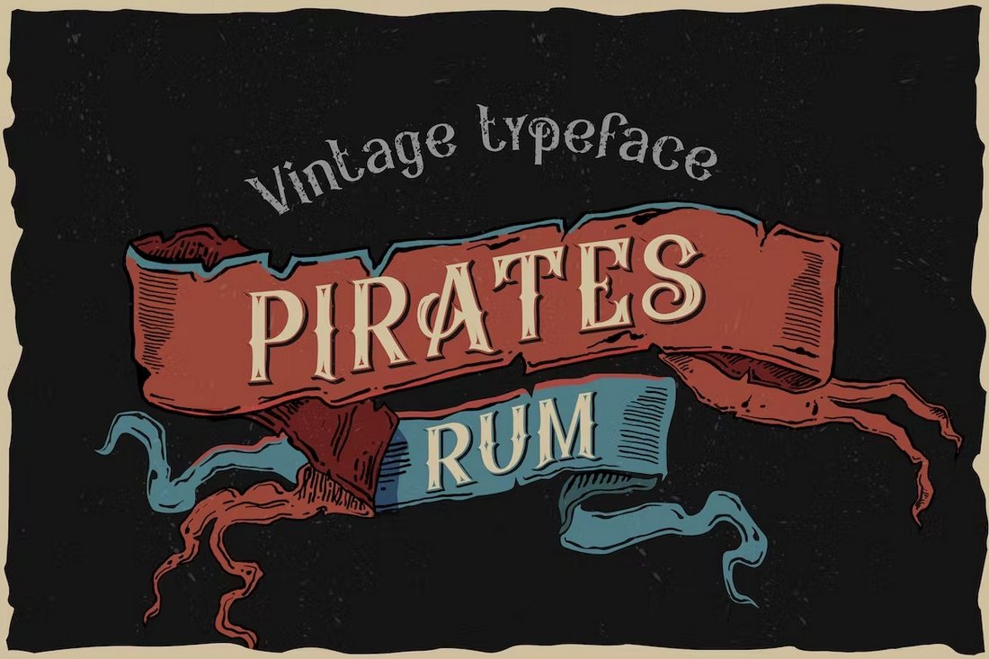
Pirates Rum – Vintage Pirate Font

Pirates Rum - Vintage Pirate Font

Pirates Rum is the ideal pirate font for various designs as it comes with all the right features that represent pirate life on the high seas. It has a vintage letter design that will take you back in time to the days of Black Beard. And each letter comes with stylish decorative elements to give your typography a bold look and feel. The font is available in 4 different styles as well.

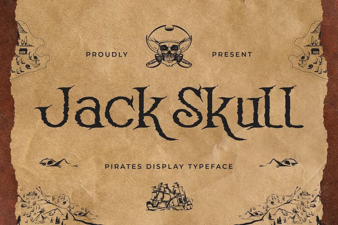
Jack Skull – Creative Pirates Display Font

Jack Skull - Creative Pirates Display Font

Jack Skull is a font you can use to design pirate-themed typography that will stand out from the crowd. This font comes with a spooky letter design that looks as if they were carved out by a sword. It’s the perfect look for a pirate font. The font includes both uppercase and lowercase letters with a few cool ligatures.

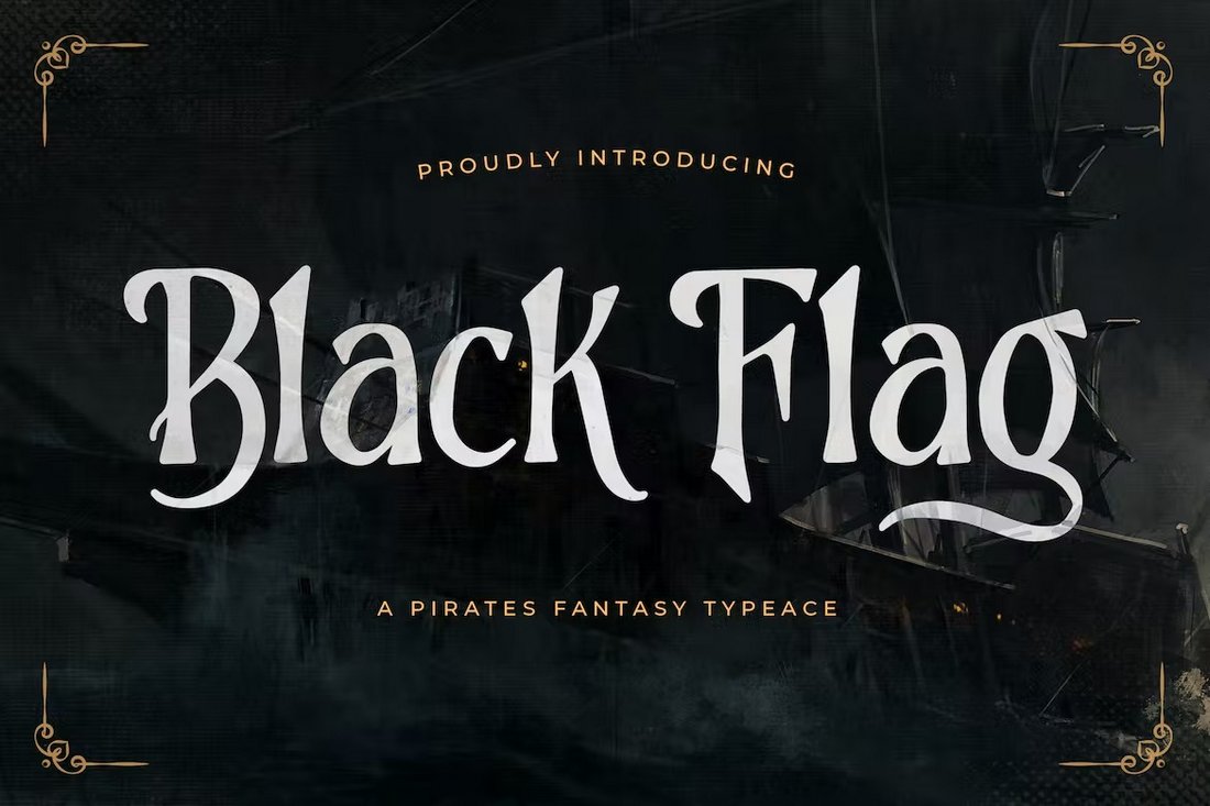
Black Flag – Pirates Fantasy Font

Black Flag - Pirates Fantasy Font

This pirate font combines some of the best elements from both pirate-themed designs and fantasy designs to create an adventurous look for the typeface. It will fit in perfectly with movie posters, product labels, packaging design, and more. You’ll have plenty of alternate characters and ligatures to experiment with as well.

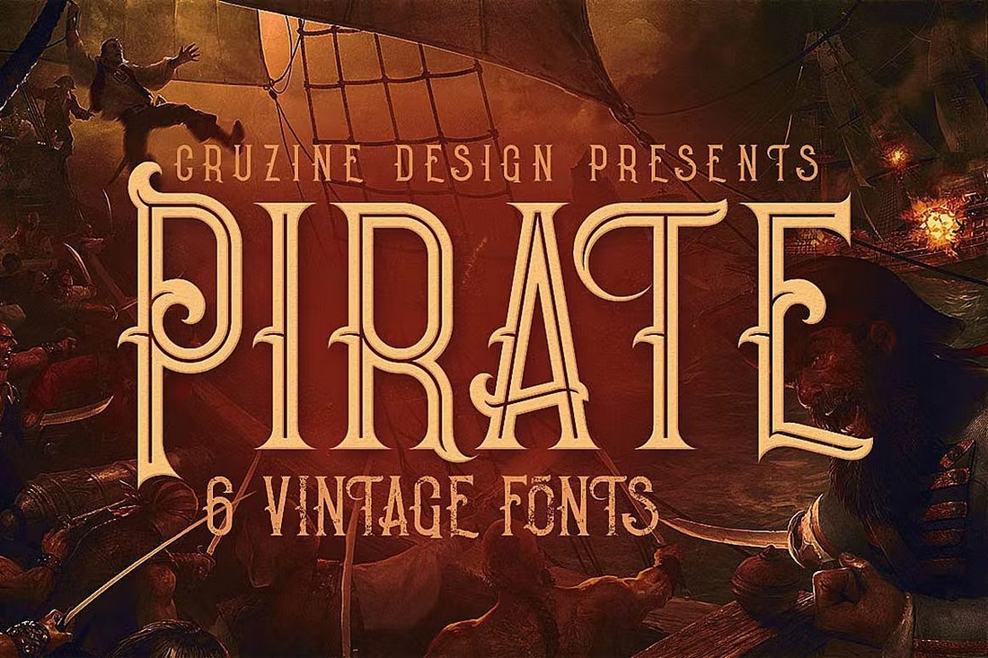
Pirate – Vintage Pirate Font Family

Pirate- Vintage Pirate Font Family

This font comes with a pirate-style letter design with vintage vibes. The bold and creative letter design of the font truly speaks for itself. But that’s not all you get with this typeface. It comes in 6 different styles, including inline, shadow, and grunge font styles. There are so many ways you can use this font to add more exciting typography to your designs.

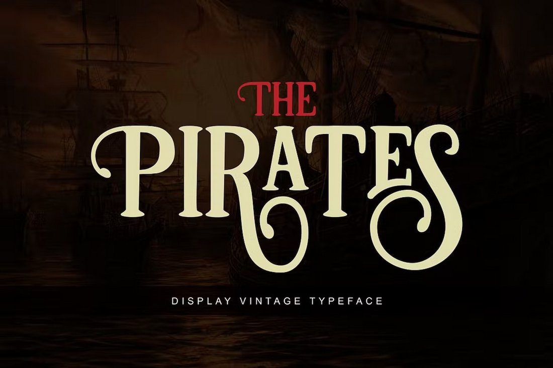
The Pirates – Vintage Adventure Font

The Pirates - Vintage Adventure Font

With this font, you can add a classical look to your text and titles with only a bit of pirate-themed elements. This subtle pirate font design makes it perfect for even logo designs, badges, labels, poster titles, and much more. The font includes lots of different alternate characters, stylistic sets, and ligatures suitable for all sorts of design projects.

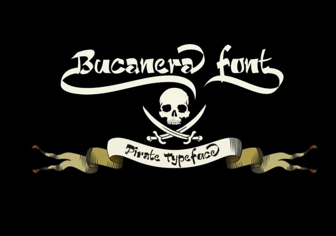
Bucanera – Free Pirate Font

Bucanera - Free Pirate Font

This is a free pirate font you can use to craft vintage typography for various types of design projects. The font features several ornaments you can experiment with. It’s free to use with personal projects.

Treasurehunt – Free Pirate Font

Treasurehunt - Free Pirate Font

Treasurehunt is a rough display font with a vintage pirate-themed letter design. This font is ideal for everything from poster titles to flyers, YouTube thumbnails, website headers, and more. This font is also free for personal use.

Blackbeard – Vintage Bold Pirate Font

Blackbeard - Vintage Bold Pirate Font

This font looks just as fierce and bold as the Black Beard himself. It features a vintage decorative letter design that will add that same bold look to your modern design projects. There are both uppercase and lowercase letters included in this font. And it’s ideal for drink label and product packaging designs, as well as many other types of projects.

Capitan Mura – Whimsical Pirate Font

Capitan Mura - Whimsical Pirate Font

Capitan Mura is a pirate-themed font with a fun and whimsical letter design. It has chunky letters with creative decorative elements. The font looks great for YouTube thumbnails, social media posts, book covers, and kids designs. It includes all-caps letters with a set of stylistic alternates.

The Simbiod – Classic Adventure Pirate Font

The Simbiod - Classic Adventure Pirate Font

It’s Simbiod not Sinbad but it has the same adventurous look and feel. This font has one of the most creative letter designs we’ve seen in a pirate font. It includes a set of all-caps letters with a set of alternate characters, ligatures, and multilingual support.

Coaster Ghost – Unique Pirate Font

Coaster Ghost - Unique Pirate Font

Coaster Ghost is another unique pirate font with a stylish design. This all-caps font has a mix of both vintage and modern design elements to make it suitable for all kinds of modern design projects. It will fit in nicely with logo designs, badges, labels, and everything in between.

Bogus Jack – Pirates Blackletter Font

Bogus Jack - Pirates Blackletter Font

At first glance, it looks just like a pirate font. But this is actually a blackletter font that features a similar letter design to pirate fonts. It has decorative letter designs that will make your titles look luxurious with a classic vintage look and feel. The font is especially great for posters, CD covers, labels, and more.

Black Rose – Free Pirate Font

Black Rose - Free Pirate Font

This free font is perfect for all kinds of print and digital design projects. It has a rough textured letter design that will help you create a cool pirate look for text and titles. The font is free to use with personal projects.

Battlesbridge – Free Pirate Display Font

Battlesbridge - Free Pirate Display Font

If you’re looking for a pirate font with a classic letter design, give this font a try. It includes elegant serif letters with decorative elements. It’s free to use in personal projects.

EL PIRATOS – Pirate Sailor Tattoo Font

EL PIRATOS - Pirate Sailor Tattoo Font

This font has a different style of pirate-themed letter design. It uses tall and minimal letters with decorative elements to help you craft unique titles for your projects. The font is especially great for tattoo-style typography. It features all-caps letters and is available in 3 weights.

Chervels – Old Fashioned Pirate Font

Chervels - Old Fashioned Pirate Font

Chervels is a classic font that will instantly remind you of vintage signs and posters. It comes with an old-school letter design with creative and decorative elements to make your label and product packaging designs stand out. The font has extensive multilingual support as well.

Pirate Hunter – Pirates Fantasy Font

Pirate Hunter - Pirates Fantasy Font

Pirate Hunter is another fantasy-style pirate font you can use to design beautiful titles for your book covers, CD covers, and even logos. The font has a certain elegant look that makes it quite mesmerizing to look at. It includes uppercase and lowercase letters along with some ligatures.

White Pearl – Fun Pirate font

White Pearl - Fun Pirate font

A fun and creative pirate font for making all kinds of typography designs for kids. This font has a playful letter design with a pirate-themed look and feel. It will especially go great with video games, cartoons, and educational designs. The font features all-caps letters with a stylistic character set.

Dark Seas – Pirate Font Family

Dark Seas - Pirate Font Family

Dark Seas is a classic font family that includes several unique pirate-themed typefaces. There are 6 different fonts in this family featuring different weights. They are all great for designing labels, product packaging, branding, and even stationery designs.

Black Mild – Free Classic Pirate Letter Font

Black Mild - Free Classic Pirate Letter Font

Black Milk is a classic pirate-style font featuring a blackletter design. It has a beautiful letter design with gorgeous decorative elements. You can download and use this font for free with personal designs and projects.

Beast & Baron – Free Blackletter Pirate Font

Beast & Baron - Free Blackletter Pirate Font

Another free pirate font with a blackletter look and feel. This font comes with a grunge-style hand-crafter letter design. And it’s completely free to use with your personal and commercial projects.

Galley – Hand-Drawn Pirate Font

Galley - Hand-Drawn Pirate Font

Galley is a nautical-themed font that also looks perfect for pirate-themed designs. It has a classic hand-drawn character design with both uppercase and lowercase letters. The font is most suitable for labels and badges but you can use it for various other projects as well.

Derphace – Retro Script Pirate Font

Derphace - Retro Display Pirate Font

This is a font bundle that includes 4 different pirate-style fonts. It comes in regular, round, rough, and stamp font styles. You will also be able to select from script and serif fonts to craft unique titles and typography. As a bonus, there are 26 illustrations in dingbats for you to use in your designs.

For more cool fonts, be sure to check out the best nautical fonts collection.

CSS min() All The Things

Featured Imgs 23

Did you see this post that Chris Coyier published back in August? He experimented with CSS container query units, going all in and using them for every single numeric value in a demo he put together. And the result was… not too bad, actually.

See the Pen Container Units for All Units [forked] by Chris Coyier.

What I found interesting about this is how it demonstrates the complexity of sizing things. We’re constrained to absolute and relative units in CSS, so we’re either stuck at a specific size (e.g., px) or computing the size based on sizing declared on another element (e.g., %, em, rem, vw, vh, and so on). Both come with compromises, so it’s not like there is a “correct” way to go about things — it’s about the element’s context — and leaning heavily in any one direction doesn’t remedy that.

I thought I’d try my own experiment but with the CSS min() function instead of container query units. Why? Well, first off, we can supply the function with any type of length unit we want, which makes the approach a little more flexible than working with one type of unit. But the real reason I wanted to do this is personal interest more than anything else.

The Demo

I won’t make you wait for the end to see how my min() experiment went:

Taking website responsiveness to a whole new level 🌐 pic.twitter.com/pKmHl5d0Dy

— Vayo (@vayospot) March 1, 2023


We’ll talk about that more after we walk through the details.

A Little About min()

The min() function takes two values and applies the smallest one, whichever one happens to be in the element’s context. For example, we can say we want an element to be as wide as 50% of whatever container it is in. And if 50% is greater than, say 200px, cap the width there instead.

See the Pen [forked] by Geoff Graham.

So, min() is sort of like container query units in the sense that it is aware of how much available space it has in its container. But it’s different in that min() isn’t querying its container dimensions to compute the final value. We supply it with two acceptable lengths, and it determines which is best given the context. That makes min() (and max() for that matter) a useful tool for responsive layouts that adapt to the viewport’s size. It uses conditional logic to determine the “best” match, which means it can help adapt layouts without needing to reach for CSS media queries.

.element {
  width: min(200px, 50%);
}

/* Close to this: */
.element {
  width: 200px;

  @media (min-width: 600px) {
    width: 50%;
  }
}

The difference between min() and @media in that example is that we’re telling the browser to set the element’s width to 50% at a specific breakpoint of 600px. With min(), it switches things up automatically as the amount of available space changes, whatever viewport size that happens to be.

When I use the min(), I think of it as having the ability to make smart decisions based on context. We don’t have to do the thinking or calculations to determine which value is used. However, using min() coupled with just any CSS unit isn’t enough. For instance, relative units work better for responsiveness than absolute units. You might even think of min() as setting a maximum value in that it never goes below the first value but also caps itself at the second value.

I mentioned earlier that we could use any type of unit in min(). Let’s take the same approach that Chris did and lean heavily into a type of unit to see how min() behaves when it is used exclusively for a responsive layout. Specifically, we’ll use viewport units as they are directly relative to the size of the viewport.

Now, there are different flavors of viewport units. We can use the viewport’s width (vw) and height (vh). We also have the vmin and vmax units that are slightly more intelligent in that they evaluate an element’s width and height and apply either the smaller (vmin) or larger (vmax) of the two. So, if we declare 100vmax on an element, and that element is 500px wide by 250px tall, the unit computes to 500px.

That is how I am approaching this experiment. What happens if we eschew media queries in favor of only using min() to establish a responsive layout and lean into viewport units to make it happen? We’ll take it one piece at a time.

Font Sizing

There are various approaches for responsive type. Media queries are quickly becoming the “old school” way of doing it:

p { font-size: 1.1rem; }

@media (min-width: 1200px) {
  p { font-size: 1.2rem; }
}

@media (max-width: 350px) {
  p { font-size: 0.9rem; }
}

Sure, this works, but what happens when the user uses a 4K monitor? Or a foldable phone? There are other tried and true approaches; in fact, clamp() is the prevailing go-to. But we’re leaning all-in on min(). As it happens, just one line of code is all we need to wipe out all of those media queries, substantially reducing our code:

p { font-size: min(6vmin, calc(1rem + 0.23vmax)); }

I’ll walk you through those values…

  1. 6vmin is essentially 6% of the browser’s width or height, whichever is smallest. This allows the font size to shrink as much as needed for smaller contexts.
  2. For calc(1rem + 0.23vmax), 1rem is the base font size, and 0.23vmax is a tiny fraction of the viewport‘s width or height, whichever happens to be the largest.
  3. The calc() function adds those two values together. Since 0.23vmax is evaluated differently depending on which viewport edge is the largest, it’s crucial when it comes to scaling the font size between the two arguments. I’ve tweaked it into something that scales gradually one way or the other rather than blowing things up as the viewport size increases.
  4. Finally, the min() returns the smallest value suitable for the font size of the current screen size.

And speaking of how flexible the min() approach is, it can restrict how far the text grows. For example, we can cap this at a maximum font-size equal to 2rem as a third function parameter:

p { font-size: min(6vmin, calc(1rem + 0.23vmax), 2rem); }

This isn’t a silver bullet tactic. I’d say it’s probably best used for body text, like paragraphs. We might want to adjust things a smidge for headings, e.g., <h1>:

h1 { font-size: min(7.5vmin, calc(2rem + 1.2vmax)); }

We’ve bumped up the minimum size from 6vmin to 7.5vmin so that it stays larger than the body text at any viewport size. Also, in the calc(), the base size is now 2rem, which is smaller than the default UA styles for <h1>. We’re using 1.2vmax as the multiplier this time, meaning it grows more than the body text, which is multiplied by a smaller value, .023vmax.

This works for me. You can always tweak these values and see which works best for your use. Whatever the case, the font-size for this experiment is completely fluid and completely based on the min() function, adhering to my self-imposed constraint.

Margin And Padding

Spacing is a big part of layout, responsive or not. We need margin and padding to properly situate elements alongside other elements and give them breathing room, both inside and outside their box.

We’re going all-in with min() for this, too. We could use absolute units, like pixels, but those aren’t exactly responsive.

min() can combine relative and absolute units so they are more effective. Let’s pair vmin with px this time:

div { margin: min(10vmin, 30px); }

10vmin is likely to be smaller than 30px when viewed on a small viewport. That’s why I’m allowing the margin to shrink dynamically this time around. As the viewport size increases, whereby 10vmin exceeds 30px, min() caps the value at 30px, going no higher than that.

Notice, too, that I didn’t reach for calc() this time. Margins don’t really need to grow indefinitely with screen size, as too much spacing between containers or elements generally looks awkward on larger screens. This concept also works extremely well for padding, but we don’t have to go there. Instead, it might be better to stick with a single unit, preferably em, since it is relative to the element’s font-size. We can essentially “pass” the work that min() is doing on the font-size to the margin and padding properties because of that.

.card-info {
  font-size: min(6vmin, calc(1rem + 0.12vmax));
  padding: 1.2em;
}

Now, padding scales with the font-size, which is powered by min().

Widths

Setting width for a responsive design doesn’t have to be complicated, right? We could simply use a single percentage or viewport unit value to specify how much available horizontal space we want to take up, and the element will adjust accordingly. Though, container query units could be a happy path outside of this experiment.

But we’re min() all the way!

min() comes in handy when setting constraints on how much an element responds to changes. We can set an upper limit of 650px and, if the computed width tries to go larger, have the element settle at a full width of 100%:

.container { width: min(100%, 650px); }

Things get interesting with text width. When the width of a text box is too long, it becomes uncomfortable to read through the texts. There are competing theories about how many characters per line of text is best for an optimal reading experience. For the sake of argument, let’s say that number should be between 50-75 characters. In other words, we ought to pack no more than 75 characters on a line, and we can do that with the ch unit, which is based on the 0 character’s size for whatever font is in use.

p {
  width: min(100%, 75ch);
}

This code basically says: get as wide as needed but never wider than 75 characters.

Sizing Recipes Based On min()

Over time, with a lot of tweaking and modifying of values, I have drafted a list of pre-defined values that I find work well for responsively styling different properties:

:root {
  --font-size-6x: min(7.5vmin, calc(2rem + 1.2vmax));
  --font-size-5x: min(6.5vmin, calc(1.1rem + 1.2vmax));
  --font-size-4x: min(4vmin, calc(0.8rem + 1.2vmax));
  --font-size-3x: min(6vmin, calc(1rem + 0.12vmax));
  --font-size-2x: min(4vmin, calc(0.85rem + 0.12vmax));
  --font-size-1x: min(2vmin, calc(0.65rem + 0.12vmax));
  --width-2x: min(100vw, 1300px);
  --width-1x: min(100%, 1200px);
  --gap-3x: min(5vmin, 1.5rem);
  --gap-2x: min(4.5vmin, 1rem);
  --size-10x: min(15vmin, 5.5rem);
  --size-9x: min(10vmin, 5rem);
  --size-8x: min(10vmin, 4rem);
  --size-7x: min(10vmin, 3rem);
  --size-6x: min(8.5vmin, 2.5rem);
  --size-5x: min(8vmin, 2rem);
  --size-4x: min(8vmin, 1.5rem);
  --size-3x: min(7vmin, 1rem);
  --size-2x: min(5vmin, 1rem);
  --size-1x: min(2.5vmin, 0.5rem);
}

This is how I approached my experiment because it helps me know what to reach for in a given situation:

h1 { font-size: var(--font-size-6x); }

.container {
  width: var(--width-2x);
  margin: var(--size-2x);
}

.card-grid { gap: var(--gap-3x); }

There we go! We have a heading that scales flawlessly, a container that’s responsive and never too wide, and a grid with dynamic spacing — all without a single media query. The --size- properties declared in the variable list are the most versatile, as they can be used for properties that require scaling, e.g., margins, paddings, and so on.

The Final Result, Again

I shared a video of the result, but here’s a link to the demo.

See the Pen min() website [forked] by Vayo.

So, is min() the be-all, end-all for responsiveness? Absolutely not. Neither is a diet consisting entirely of container query units. I mean, it’s cool that we can scale an entire webpage like this, but the web is never a one-size-fits-all beanie.

If anything, I think this and what Chris demoed are warnings against dogmatic approaches to web design as a whole, not solely unique to responsive design. CSS features, including length units and functions, are tools in a larger virtual toolshed. Rather than getting too cozy with one feature or technique, explore the shed because you might find a better tool for the job.


Gain $200 in a week
from Articles on Smashing Magazine — For Web Designers And Developers https://ift.tt/5aRKjwJ

AI in Graphic Design: The Pros, Cons and What it Means for Designers [+ Expert Insight]

Featured Imgs 23

Several months ago, I tested several AI logo generators and documented my experience. Then my friend Michael Randall, a graphic designer, read the post, and I‘ll just say he wasn’t thrilled about it.

“[Expletive] logo generators? We're doomed,” were his exact words.

I ended that blog post by clarifying that businesses should use actual graphic designers when designing their logos to stand out. And I stand by that, so hopefully, that gave him more faith in humanity and our friendship.

Download Now: 100 ChatGPT Prompts for Marketers [Free Guide]

That said, I wanted to ask my friend for his perspective on AI in graphic design. So, here are some of Michael’s thoughts mixed in with my findings from other sources.

After reading, if you're curious about integrating AI into your own workflow, check out our various HubSpot AI tools to see if any can help with your next big campaign. 

AI Graphic Design: What is it?

AI graphic design is exactly as it sounds. It's the use of artificial intelligence to generate graphics such as infographics, ads, logos, and other forms of visual art.

The logos I created in my previous post via AI generators are examples of AI graphic designs.

@erikeepswriting

Watch me make a logo using AI! Want to learn more? Check out blog.hubspot.com/marketing #marketing #AI #logo #adobe

♬ Feel Good - Tundra Beats

How will AI affect graphic design?

According to Randall, many graphic designers already see AI's negative impacts on the industry and fear it could cause more future problems for artists and designers.

“Designers are getting pretty stressed,” he says. “Since the pandemic, there has been a shift. Many freelancers and independent business owners have lost work in a way you would expect because of the pandemic, but then AI started to really explode.”

Randall says AI is seen as more accessible or cheaper to business owners than hiring an actual graphic designer.

“Creating a brand identity for less than $5 is something most people would jump at compared to hiring a professional for hundreds of dollars—and the latter price is justified because graphic design is labor, but people don't think of it like this.”

Therefore, there‘s a concern that AI’s promises of accessible, affordable, and fast graphic designs could further devalue artists in the design industry.

However, some designers say the future of AI in graphic design is less clear and maybe even less dystopian. In a YouTube video, graphic artist Will Paterson said whether AI could replace designers is tricky, and no one truly has the answer.

“All I can say for certain is that despite your beliefs of generative AI—whether it's good or bad—to say competitive and to be in the industries that we want to be in, we need to see it as a tool that can change the art and design process,” he explains.

Paterson then sites new AI graphic tools and platforms like Adobe Firefly, which only uses licensed images as its data model.

“Adobe is, thankfully, turning the conversation to more of 'How can I make AI help creators create?' instead of 'How can I make AI create for us?'” he says. “I don't know whether we're being replaced in the future. I believe we won't be, but we'll just have to find out.”

The Pros and Cons of Using AI in Graphic Design

The future of AI in graphic design is a bit ambiguous, but one clear thing is that AI is here to stay.

According to Marq, last year saw an unprecedented surge in demand for AI design tools, with the search volume for AI design-related tools and software increasing by 1700% from 2022 to 2023.

Furthermore, a recent Canva survey found that 75% of global marketing and creative leaders agree that AI is essential to their creative toolset.

So, designers and business owners must weigh the pros and cons of using AI when integrating it into their marketing or designs.

One benefit of AI in graphic design is that it can help artists speed through repetitive or tedious tasks. Even my friend Michael has found a use for it in his work.

“I work in architecture, particularly signage and wayfinding,” he explains. “I take photos of existing spaces and do mock-ups. Instead of doing the hard task of removing a person or other existing elements in the photo I took, I can use the generative fill to cut through that task pretty easily.”

He stresses, "That's the only context in which I use AI in graphic design."

Another pro is that it can make graphic design more accessible for newbies and small business owners.

For example, I'm not the most design-savvy person. I like to think I have an eye for color and a strong enough sense of style to know how to fit different elements together like puzzle pieces.

However, I lack the expertise to make gorgeous designs like those of trained artists like my friend or other graphic designers.

So, I benefit greatly from platforms like Canva that boast various AI-driven design tools that help me create featured images, YouTube thumbnails, and high-quality social media graphics that are easy on the eyes.

I'm especially fond of its Resize and Magic Switch tool, which allows me to swap formats, languages, and dimensions in my designs in seconds.

However, one con is that an overreliance on AI in graphic design can result in materials devoid of creativity or originality. For example, I tested five AI logo generators and found that all their designs yielded similar results and created ultimately uninspired logos.

Another major con is that AI is flawed and can generate images that are, for lack of a better term, wonky. My colleague Ramona Sukhraj tested AI image generators recently, and they created some hilarious (and creepy) images.

When to Avoid Using AI in Graphic Designs

My friend Michael is pretty straightforward regarding the use of AI.

“It can only be ethical when you are using it to do a task that is not particularly skill-based, you're shortening tedious work, or you're using it to do things that are impossible for a human to accomplish,” he says.

In other words, avoid using AI to replace human work. Instead, use it as an assistive tool that helps designers work efficiently.

So, what does the future hold for AI in graphic design? Who really knows? I believe AI will eventually become a commonplace tool for designers, like tablets and digital pens. But I don't believe it will be able to fully replace real graphic artists.

AI can generate but doesn‘t host creativity the same way the human mind can, and we’ll always need designers' creativity to craft images that will stand out against competitors.

That said, Paterson was right in that artists should use it as a tool to remain competitive.

AI Conversion Rate Optimization: How AI Is Transforming CRO Strategies

Featured Imgs 23

The future of conversion rate optimization is here — and it’s driven by AI. From personalized video to scalable email outreach, learn how to maximize conversions with AI CRO.

If Kieran and I were to invest our marketing budget anywhere in the next 6-12 months, it would be in AI Conversion Rate Optimization (AI CRO).

In fact, we believe in AI CRO so strongly, that we easily rank it above other marketing growth strategies like organic search, paid performance, brand marketing — even product marketing. The return potential is simply unmatched, with some experiments seeing conversion rate increases of 50-100%.

Download the Advanced Guide to Scaling a Conversion Optimization Program

Now, I know what you’re thinking: CRO has been a marketing staple for decades.

And you’re right. But AI has turned the process completely on its head, offering new levels of personalization, scaling, and automation that weren’t even fathomable a year ago. The result? A faster, smarter way to turn curious visitors into loyal customers.

In a recent Marketing Against the Grain episode, Kieran and I break down what AI CRO is, key areas where it’s transforming marketing, and advice for integrating it into your marketing strategy.

What is AI conversion rate optimization and why does it matter?

AI-powered Conversion Rate Optimization (AI CRO) uses artificial intelligence to increase conversion rates by analyzing massive amounts of data and identifying key customer patterns, like recurring behaviors or connections between different touchpoints.

Based on these insights, AI then identifies conversion opportunities — like adjusting landing page content, email messaging, or the sequence of campaign interactions — to better match user behaviors and preferences.

In our opinion, what makes AI CRO a particularly potent strategy is the scale of its impact. For example, at HubSpot, our AI-generated email campaigns delivered a 94% higher conversion rate than the non-AI test control. Now that’s what Kieran and I call a game changer.

3 Key Areas Where AI is Transforming CRO + Tool Recommendations

You’re probably already using Generative AI for marketing to some extent — but we’re here to tell you that you should be doing it more. Here’s how.

Chatbots and the User Journey

When it comes to delivering real-time, personalized support, AI chatbots are one of the most powerful tools in AI-powered CRO. These bots simulate human-like interactions, provide 24/7 assistance, and offer users the exact information they need, when they need it, in a way that feels personal and efficient.

For example, features like HubSpot’s AI Chatbot can handle everything from answering customer questions to making personalized content recommendations, all in real time, which ultimately improves the overall user experience.

While some companies worry that chatbots might feel impersonal, our AI chat experiment at HubSpot actually showed the opposite, with a >50% improvement in the value per chat, customer satisfaction (CSAT) scores that matched human-led interactions, and a 43% boost in chat conversion rates.

Email Personalization at Scale

“Personalization of messaging — and at scale — is a great AI CRO application,” says Kieran, explaining how AI helps marketers draft and tailor marketing and sales messages for different audiences. “Whenever you’re able to message customers in a personal way always works really well.”

Generative AI tools like GPT-4 and Claude AI make it easy to scale personalized email campaigns with minimal manual effort, ensuring that each message feels relevant and timely to the recipient.

Video Content Generation

We’ve often discussed how AI video is disrupting the marketing industry. So it should be no surprise that using AI video marketing tools to create and customize video content is a leading strategy in AI-powered CRO.

For example, tools like HeyGen and Infinity AI help marketers quickly create videos for campaign or product pages that lack them — or to personalize existing videos for different customer segments. Video content keeps visitors on your pages longer, leading to higher user engagement and conversion rates.

Our Advice for Navigating AI CRO

AI CRO has enormous potential, but without the right approach, it can fall flat. Here’s what Kieran and I have learned about harnessing AI to drive real conversion results.

1. Act early to gain an edge.

Incorporating AI into your CRO strategy now — not tomorrow or next week — gives you valuable time to experiment, iterate, and fine-tune your approach while others are still playing catch-up.

“If you look at companies that were truly early AI adopters and integrated it into their outbound prospecting systems … their growth has been pretty meaningful,” says Kieran. “But as AI becomes more mainstream, things will get saturated, and companies will all reach the same sort of level."

Get in early, and you won’t just be learning; you’ll also be defining how AI-driven CRO will shape your industry.

2. Think like Spielberg: Be a creative problem solver.

Things won’t always go as planned with your AI CRO strategy, especially in the early experimentation phases, so being able to pivot and creatively problem-solve is key.

Kieran shared an example of how Steven Spielberg faced a major setback when the mechanical shark broke while filming Jaws. Rather than letting the problem halt production, Spielberg rewrote the script overnight, using yellow barrels to represent the shark’s presence — a creative solution that is now an iconic part of cinematic history.

“So are you a problem solver?” asks Kieran. “Or do you let problems stop you from doing the thing you truly want to do?”

By staying agile, testing different strategies, and pushing forward, you’ll discover new — and sometimes, even better — solutions. 

3. Study the future and the past.

As marketers, it's easy to get caught up in the day-to-day and lose sight of long-term strategy. But if you really want to grow your AI CRO efforts, you need to focus on the future and the past — and not get stuck in the minutiae of the day-to-day.

Studying the great marketers from history can reveal patterns that inform your future strategy. For example, Kieran and I often discuss how Dietrich Mateschitz, founder of Red Bull, turned an energy drink into a $16 billion empire.

History tends to repeat itself, and those who understand the past will be better equipped to anticipate where the next big opportunities lie in an AI-powered future.

To learn more about how you can use AI to optimize CRO, check out the full episode of Marketing Against the Grain below:

This blog series is in partnership with Marketing Against the Grain, the video podcast. It digs deeper into ideas shared by marketing leaders Kipp Bodnar (HubSpot’s CMO) and Kieran Flanagan (SVP, Marketing at HubSpot) as they unpack growth strategies and learn from standout founders and peers.

25+ Pin & Badge Mockup Templates

Featured Imgs 23

Today, we are bringing you a collection of the best pin, button, and badge mockup templates to help you showcase your designs in a professional and polished way.

From enamel pins to button badges, these mockup templates allow you to customize and experiment with different designs effortlessly. Featuring various backgrounds, lighting, and perspectives, they’re perfect for making your pin and badge designs stand out.

Whether you want to create a playful and colorful presentation or something sleek and minimal, these templates will help you highlight your designs with style and precision. Have a look.

Circle Pin Badge Mockup

Circle Pin Badge Mockup

This is a highly versatile pin mockup with a realistic design. It provides two PSD files, a user-friendly interface, and a customizable color scheme, coupled with an impressive 4500 x 3000 pixel high-resolution output. Ideal for designers and marketers, this mockup offers an efficient platform to exhibit their designs and concepts with professional finesse.

Bold Pin Badge Mockup

Bold Pin Badge Mockup

A dynamic pin mockup featuring a chic, bold design. Powered by Smart Object, updates are seamlessly easy: just double-click, edit, save, and the settings automatically adapt. The package includes five 4K resolution PSD files and allows badge design customization.

Brand Pin Mockup Template

Brand Pin Mockup Template

This is a highly customizable and organized pin mockup that includes four PSD files, along with their respective backgrounds. Perfect for playing around with your own designs, logos, and colors using a smart object system, this package even comes with a help file in PDF format.

Sweatshirt with Pins Mockup Scene

Sweatshirt with Pins Mockup Scene

This is the perfect creative pin mockup for adding that final touch to your designs. This customizable, well-organized layered PSD scene allows you to add personalized logos or monograms to the pin badges. Adjust contour thickness and metallic color to suit your concept, all in a high-resolution format of 3600 x 2400 px at 300 dpi.

Glossy Flying Pin Button Badge Mockup

Glossy Flying Pin Button Badge Mockup

This is a highly realistic, adaptable badge mockup for previewing your pin or badge designs. Packaged as a user-friendly Photoshop file, it comes with handy features like smart object placement, object color and background color customization, and separate layers for closer control of object highlights and shadows.

Pin Button Badge Mockup Scene

Pin Button Badge Mockup Scene

A fantastic badge mockup scene for displaying multiple design concepts simultaneously. It boasts a photorealistic presentation and a professional, clean aesthetic that enhances your work spectacularly. Offered in three PSD files (4000 x 3000 pixels) with customizable background color, it effortlessly adapts to suit your style, and includes four photo filters.

Square Pin Badge Mockup

Square Pin Badge Mockup

This is a high-quality, customizable pin mockup. With its meticulously organized layers, the package is user-friendly and integrates seamlessly with Smart-Objects—making it a cinch to swap out designs. The package includes a comprehensive help file and boasts a stunning resolution of 3000 x 2000 px at 300 DPI.

Metal Pin Mockup Scene

Metal Pin Mockup Scene

This is a customizable badge mockup that lets you design your own metallic pin badges. You can adjust every detail, from the contour thickness and color of the pins, to the design of your backing card or even remove the background if you wish. The well-organized and layered PSD scene ensures a high-quality result at 3600 x 2400 px and 300 dpi.

Editable Badge Button Mockup

Editable Badge Button Mockup

A versatile and easy-to-use pin mockup for customizing your own badge designs. The asset provides four well-organized PSD files with an inclusive smart object system, where you can conveniently insert your logo, illustration, adjust the background color, and more. It’s compatible with Photoshop CC 2021, and includes a helpful PDF guide.

Custom Domed Badge Logo Mockup

Custom Domed Badge Logo Mockup

Check out this stunning custom domed badge mockup featuring a horizontal design, perfect for flaunting a range of branding designs from logos to brand labels. This easy-to-use, fully customizable PSD mockup provides adjustable backgrounds, organized layers, and custom effects.

Metal Pin Text and Logo Mockups

Metal Pin Text and Logo Mockups

This bundle offer high-quality, premium Photoshop mockup templates ideal for creating shiny, cool metal pins in a variety of contexts such as on a table, wood surface, or jeans texture. Offering 3 views, 3 types of metals, and 5 different color paints, this set provides 9 PSD in total for a highly detailed end result.

Stylish Pin Mockup Scene

Stylish Pin Mockup Scene

This is a customizable pin badge mockup perfect for showcasing your unique pin designs or logos. It features 8 editable metal pins, allowing the adjustment of color, hue, and rotation. It comes in a PSD file format with a 3000 x 2000 px resolution and well-organized layers for easy editing.

Pin Button Badge Mockup Set

Pin Button Badge Mockup Set

This is a high-quality, photorealistic mockup representation of your badge designs. This professional set, consisting of 3 PSD files at a 4000 x 3000 px resolution, allows for a changeable background color and comes with four photo filters, creating a realistic look on your website or portfolio.

Modern Pin Mockup Template

Modern Pin Mockup Template

A contemporary and minimalist pin mockup that can effectively display your design on a pin badge. This clean and easily editable template comes complete with Smart Objects for simple editing. Other key features include a customizable background color and well-organized layers for swift changes.

Cutomizable Pin Button Mockup

Cutomizable Pin Button Mockup

Featuring a customizable pin button, this polished mockup, provided in three PSD files at a crisp resolution of 400 x 3000 px, offers a photo-realistic presentation of your work. It comes with a changeable background color, clean design, and four photo filters. It’s perfect for impressing clients and enhancing your website or portfolio.

Square Pin Button Badge Mockup

Square Pin Button Badge Mockup

This is a photorealistic, professional-grade pin mockup perfect for showcasing your unique works. This high-quality mock-up can seamlessly elevate presentations for clients and enhance the aesthetic of your website or portfolio. The pack comes with 3 PSD files, a customizable background color, a clear instruction manual, and offers 4 photo filters for versatility.

Vitnage Button Badge Mockup Set

Vitnage Button Badge Mockup Set

A high-quality pin mockup pack to elevate your projects. With high-resolution images taken in a professional studio, and separate light and shadow layers, you can effortlessly create a vintage style pin badge that impresses. Background easily changeable, and integrating your own images is made simple through Photoshop Smart Objects.

Square Pin Badge Mockup Scene

Square Pin Badge Mockup Scene

This is a photorealistic professional mockup ideal for showcasing your incredible square pin badges. Offered with three PSD files of 4000 x 3000px, it boasts a changeable background color, a sleek design, and four photo filters, promising a realistic depiction of your badges. It’s not only client-pleasing but also a visually stunning addition to your website or portfolio.

Perspective Pin Mockup

Perspective Pin Mockup

This is a creative pin mockup offering a high-quality, 300 dpi, perspective view of a pin badge. Thanks to a smart object, you can easily adjust your design with a simple drag and drop, and even recolor effortlessly using solid color layers. Ideal for commercial use, this mockup combines simplicity with supreme quality.

Creative Pin Mockup Template

Creative Pin Mockup Template

A unique mockup package that includes three items each with well-organized PSD files and intelligently arranged layers. Fully customizable, you can easily replace existing designs with your own in just seconds, thanks to its seamless integration with smart objects. With a high resolution of 3000 x 2000 px at 300 DPI, this pin badge mockup guarantees immaculate quality.

Assortment of Pin Badges Mockup

Assortment of Pin Badges Mockup

This is a creative pin mockup offering a selection of pin designs for customization. Its user-friendly Smart Object feature lets you seamlessly adjust and recolor your designs. With a high resolution of 300 dpi, this mockup is ideal for commercial use.

Editable Pin Mockup Set

Editable Pin Mockup Set

A highly realistic and luxurious collection perfect for showcasing logo designs by graphic designers. The set, made available in Photoshop files (PSD), offers a high resolution, realistic texture, and organized layers. The editable files, equipped with a smart object, make it easy for users to paste, save, and preview their designs in a user-friendly way.

A Bunch of Pin Badges Mockup

A Bunch of Pin Badges Mockup

Check out this creative bundle featuring multiple pin mockups with a smart object, making design adjustments a breeze. Recoloring is easy using solid color layers. Its high resolution (300 dpi) makes it perfect for commercial use. Enjoy the premium quality of this simple and easy-to-use mockup.

Free Pin & Badge Mockups

Free Realistic Pin Button Badge Mockup (PSD)

You can download this pin mockup to showcase your design in a clean and realistic-looking scene. The mockup features a modern design with an easily editable layout and smart objects.

Free Round Button Pin Badge Mockup

Another beautiful and free button mockup you can use to present your designs. The template includes a round button mockup that works perfectly for showcasing both sides.

Free Glossy Button Pin Mockup

This free button mockup is ideal for showcasing your designs in a realistic way. It includes multiple styles of pin and button mockups that you can easily edit and customize to your preference.

Free Round Pin Badge Button Mockup

A simple yet effective pin badge mockup for showcasing designs in a simple and minimalist way. The mockup features gold and silver button mockups with a high-quality glossy look. It’s easily customizable as well.

Meet the Experts: Julio Diaz

Featured Imgs 23

WP Engine has more than 1,000 employees worldwide. From our award-winning customer support team to the engineers who keep our platform fast and performant, each role is as unique as the person who fills it. We take pride in our teams’ expertise, whether in technical troubleshooting, driving relentless innovation across our fully managed platform, or

The post Meet the Experts: Julio Diaz appeared first on WP Engine.

Data storage and retrieval – cache or database

Featured Imgs 23

When my app loads I need to establish the membership "status" of a user. Their "status" will determine how the app behaves. Do I query the database for the "status" value each time the app loads, or can it be sourced from cache? The "status" could change for a user, not not very often. Thanks.

Celebrating Certification Nation Day—WP Engine is a Great Place to Work!

Featured Imgs 23

At WP Engine, we believe that creating a positive workplace environment is crucial for driving innovation, fostering growth, and building community. Our many recognitions by Great Place to Work (GPTW), the global authority on workplace culture, underscore our commitment to this goal.  Each of WP Engine’s global locations has earned GPTW certification for 2024, and

The post Celebrating Certification Nation Day—WP Engine is a Great Place to Work! appeared first on WP Engine.

Close, Exit, Cancel: How to End User Interactions Well

Featured Imgs 23

What’s in a word? Actions. In the realm of user interfaces, a word is construed as the telltale of a control’s action. Sometimes it points us in the correct direction, and sometimes it leads us astray. We talk a lot about semantics in front-end web development, but outside of code, semantics are at the heart of copywriting where each word we convey can mean different things to different people. Words, if done right, add clarity and direction.

As a web user, I’ve come across words in user interfaces that have misled me. And not necessarily by design, either. Some words are synonymous with others and their true meaning depends entirely on context. Some words are easy to mistake for an unintended meaning because they are packed with so much meaning. A word might belong to a fellowship of interchangeable words.

Although I’m quite riled up when I misread content on a page — upset at the lack of clarity more than anything — as a developer, I can’t say I’ve always chosen the best possible words or combination of words for all the user interfaces I’ve ever made. But experience, both as a user and a developer, has elevated my commonsense when it comes to some of the literary choices I make while coding.

This article covers the words I choose for endings, to help users move away, and move on, without any confusion from the current process they are at on the screen. I went down this rabbit hole because I often find that ending something can mean many things — whether it be canceling an action, quitting an application, closing an element, navigating back, exiting a chat interaction… You get the idea. There are many ways to say that something is done, complete, and ready to move on to something else. I want to add clarity to that.

Screenshots of “ending” controls and navigation from Google Cloud, Gov.uk, and New York Times

Getting Canceled

If there’s a Hall of Fame for button labels, this is the Babe Ruth of them all. “Cancel” is a widely used word to indicate an action that ends something. Cancel is a sharp, tenacious action. The person wants to bail on some process that didn’t go the way they expected it to. Maybe the page reveals a form that the person didn’t realize would be so long, so they want to back off. It could be something you have no control over whatsoever, like that person realizing they do not have their credit card information handy during checkout and they have to come back another time.

Cancel can feel personal at times, right? Don’t like the shipping costs calculated at checkout? Cancel the payment. Don’t like the newsletter? Cancel The Subscription. But really, the person only wants to undo an incorrect action or decision leaving no trace of it behind in favor of a clean slate to try again… or not.

The only times I feel betrayed by the word cancel is when the process I’m trying to end continues anyway. That comes up most when submitting forms with incorrect information. I enter something inadvertently, hit a big red Cancel button, yet the information I’ve “saved” persists to the extent that I either need to contact customer support or start looking for alternatives.

That’s the bottom line: Use “cancel” as an opportunity to confirm. It’s the person telling you, “Hey, that’s not actually what I meant to do,” and you get to step in and be the hero to wipe the mistake clean and set things up for a second chance. We’re not technically “ending” anything but rather starting clean and picking things back up for a better go. Think about that the next time you find yourself needing a label that encourages the user to try again. You might even consider synonyms that are less closely associated with closed endings, such as reset or retry.

“Cancel Subscription” mock-up

Quitting or Exiting?

Quit window, quit tab, quit app — now we’re talking about finality. When we “quit” or “exit” something, we’re changing course. We’ve made progress in one direction and decide it’s time to chart a different path. If we’re thinking about it in terms of freeway traffic, you might say that “quitting” is akin to pulling over and killing the engine, and “exiting” is taking leaving the freeway for another road. There’s a difference, although the two terms are closely related.

As far as we’re concerned as developers, quit and exit are hard stop points in an application. It’s been put to rest. Nothing else beyond this should be possible except its rebirth when the service is restarted or reopened. So, if your page is capable of nuking the current experience and the user takes it, then quit is the better label to make that point. We’re quitting and have no plans to restart or re-engage. If you were to “quit” your job, it’s not like your employer is expecting you to report for duty on Monday… or any other day for that matter.

But here’s my general advice about the word quit: only use it if you have to. I see very few use cases where we actually want to offer someone a true way to quit something. It’s so effective at conveying finality in web interfaces that it shuts the door on any future actions. For instance, I find that cancel often works in its place. And, personally, I find that saying “cancel payment” is more widely applicable. It’s softer and less rigid in the sense that it leaves the possibility to resume a process down the road.

Quit is also a simple process. Just clear everything and be gone. But if quitting means the user might lose some valuable data or progress, then that’s something they have to be warned about. In that case, exit and save may be better guidance.

I consider Exit the gentler twin of Quit. I prefer Quit just for the ultimatum of it. I see Exit used less frequently in interfaces than I see Quit. In rare cases, I might see Exit used specifically because of its softer nature to Quit even though “quitting” is the correct semantic choice given that the user really wants to wipe things clean and the assurance that nothing is left behind. Sometimes a “tougher” term is more reassuring.

Exit, however, is an excellent choice for actions that represent the end of human-to-human interactions — things like Exit Group, Exit Chat, Exit Streaming, Exit Class. If this person is kindly saying goodbye to someone or something but open to future interactions, allow them to exit when they’re done. They’re not quitting anything and we aren’t shoving them out the door.

“Exit Class” mock-up

Going Back (and Forth)

Let’s talk about navigation. That’s the way we describe moving around the internet. We navigate from one place to another, to another, to another, and so on. It’s a journey of putting one digital foot in front of the other on the way to somewhere. That journey comes to an end when we get to our destination… or when we “quit” or “exit” the journey as we discussed above.

But the journey may take twists and turns. Not all movement is linear on the web. That’s why we often leave breadcrumbs in interfaces, right? It’s wayfinding on the web and provides people with a way to go “back” where they came from. Maybe that person forgot a step and needs to head back in order to move forward again.

In other words, back displaces people — laterally and hierarchically. Laterally, back (and its synonym, previous), backtracks across the same level in a process, for instance, between two sections of the same form, or two pages of the same document. Hierarchically, back — not to mention more explicit variants like “home” — is a level above that in the navigation hierarchy.

I like the explicit nature of saying something like “Home” when it comes to navigating someone “back” to a location or state. There’s no ambiguity there: hey, let’s go back home. Being explicit opens you up to more verbose labels but brevity isn’t always the goal. Even in iconography, adding more detail to a visual can help add clarity. The same is true with content in user interfaces. My favorite example is the classic “Back to Top” button on many pages that navigate you to the “top” of the page. We’re going “back to the top” which would not have been clear if we had used “Back” alone. Back where? That’s an important question — particularly when working with in-page anchors — and the answer may not be as obvious to others as it is to you. Communicating that level of hierarchy explicitly is a navigational feature.

While the “Back to Top” example I gave is a better illustration of lateral displacement than hierarchical displacement, I tend to avoid the label back with any sort of lateral navigation because moving laterally typically involves navigating between states more than navigating between pages. For example, the user may be navigating from a “logged in” state to a “logged out” state. In this case, I prefer being even more explicit — e.g., Save and Go Back, or Cancel and Go Home — than hierarchical navigation because we’re changing states on top of moving away from something.

Navigation mock-up

Closing Down

Close is yet another term you’ll find in the wild for conveying the “end” of something. It’s quite similar to Back in the sense that it serves dual purposes. It can be for navigation — close the current page and go back — or it can be for canceling an action — close the current page, and either discard or save all the data entered so far.

I prefer Close for neither of those cases. If we’re in the context of navigation, I like the clarity of the more explicit guidance we discussed above, e.g., Go Back, Previous, or Go Home. Giving someone an instruction to Close doesn’t say where that person is going to land once navigating away from the current page. And if we’re dealing with actions, Save and Close affirms the person that their data will be saved, rather than simply “closing” it out. If we were to simply say “cancel” instead, the insinuation is that the user is quitting the action and can expect to lose their work.

The one time I do feel that “Close” is the ideal label is working with pop-up dialogues and modals. Placing “Close” at the top-right (or the block-start, inline-end edge if we’re talking logical directions) corner is more than clear enough about what happens to the pop-up or modal when clicking it. We can afford to be a little less explicit with our semantics when someone’s focus is trapped in a specific context.

The End.

I’ve saved the best for last, right? There’s no better way to connote an ending than simply calling it the “end”. It works well when we pair it with what’s ending.

End Chat. End Stream. End Webinar.

You’re terminating an established connection, not with a process, but with a human. And this is not some abrupt termination like Quit or Cancel. It’s more of a proper goodbye. Consider it also a synonym to Exit because the person ending the interaction may simply be taking a break. They’re not necessarily quitting something for good. Let’s leave the light on the front patio for them to return later and pick things back up..


And speaking of end, we’ve reached the end of this article. That’s the tricky, but liberating, thing about content semantics — some words may technically be correct but still mislead site visitors. It’s not that we’re ever trying to give someone bad directions, but it can still happen because this is a world where there are many ways of saying the same thing. Our goal is to be unambiguous and the milestone is clarity. Settling on the right word or combination of words takes effort. Anyone who has struggled with naming things in code knows about this. It’s the same for naming things outside of code.

I did not make an attempt to cover each and every word or way to convey endings. The point is that our words matter and we have all the choice and freedom in the world to find the best fit. But maybe you’ve recently run into a situation where you needed to “end” something and communicate that in an interface. Did you rely on something definitive and permanent (e.g. quit) or did you find that softer language (e.g. exit) was the better direction? What other synonyms did you consider? I’d love to know!

End Article.


Close, Exit, Cancel: How to End User Interactions Well originally published on CSS-Tricks, which is part of the DigitalOcean family. You should get the newsletter.


from CSS-Tricks https://ift.tt/1lKxmeX
Gain $200 in a week
via Read more