20+ Professional Doctor Letterhead Formats and Templates for Immediate Use

Featured Imgs 23

In the medical world, it’s not just about what you say but how you say it—right down to the letterhead you use. Think of your letterhead as your professional handshake; it’s often the first visual cue patients, hospitals, and partners receive. Done well, it radiates trust and competence. Done poorly? Let’s just say it might be a case of “wrong prescription.”

Whether you’re introducing new services, sending patient reports, or communicating with other healthcare professionals, your letterhead is an extension of your practice’s reputation. So, how do you strike the right balance between sleek professionalism and that touch of approachability? It all starts with the design basics—getting your doctor letterhead format just right and possibly exploring a free doctor letterhead template if you’re just dipping a toe in. But more than just visuals, your letterhead should reflect your brand’s unique pulse.

In this guide, we’ll dive into some practical steps to make sure every document that leaves your office is on-brand and on-point. Because at the end of the day, your letterhead isn’t just paper. It’s your practice, distilled.

Free Gradient Doctor’s Prescription Template

Free Gradient Doctor's Prescription Template

Source

Free Doctor Letterhead Templates

Free Doctor Letterhead Templates

Source

Doctor’s Letterhead Template

Doctor's Letterhead Template

Source

Doctor’s Letterhead Templates

Doctor’s Letterhead Templates

Source

Free Medical Letterhead Template

Free Medical Letterhead Template

Source

Abstract Hospital Doctor Letterhead Template

Abstract Hospital Doctor Letterhead Template

Source

Pharmacist Prescription Template

Pharmacist Prescription Template

Source

Medical Healthy Letterhead (Premium)

Medical Healthy Letterhead

Source

Medical Doctor Healthcare Service Letterhead Template

Medical Doctor Healthcare Service Letterhead Template

Source

Black White Medical Classy Noble Caduceus Letterhead (Premium)

Black White Medical Classy Noble Caduceus Letterhead

Source

Medical Professionals Letterhead Template

Medical Professionals Letterhead Template

Source

Medical Letterhead (Premium)

Medical Letterhead

Source

Doctor Prescription Letterhead Template

Doctor-Prescription-Letterhead-Template

Source

Blue Modern Doctor Letterhead Template (Premium)

Blue Modern Doctor Letterhead Template

Source

The post 20+ Professional Doctor Letterhead Formats and Templates for Immediate Use appeared first on CSS Author.

The Best Free SEO Tools for 2024: Essential Resources for Optimal Performance

Featured Imgs 23

Search Engine Optimization (SEO) is crucial for driving organic traffic to your website and improving your online visibility. While premium SEO tools can be powerful, there are many free tools available that offer significant value and can help you optimize your website effectively. In 2024, leveraging these free resources can help you stay competitive without …

The post The Best Free SEO Tools for 2024: Essential Resources for Optimal Performance first appeared on Lucid Softech.

Elementor Review

Featured Imgs 23

If you’re aiming to create a professional-looking website without diving into complex coding, Elementor is a widely popular choice. This WordPress page builder comes packed with features that make web design accessible to everyone, from complete beginners to experienced developers. With its drag-and-drop functionality, pre-built templates, and endless customisation options, Elementor Pro makes it easy […]

The post Elementor Review first appeared on WPArena and is written by Editorial Staff.

The Best Business Letterhead Examples to Make a Lasting Impression

Featured Imgs 23

Every first impression counts, and when it comes to business correspondence, a thoughtfully crafted letterhead is like a firm handshake. It’s not just decoration; it’s a visual ambassador for your brand, setting the tone for every piece of communication that comes through. Picture it: a sleek, branded letterhead landing on your desk, already whispering professionalism, trust, and creativity before you even begin reading. That’s the power of a well-designed letterhead. It frames your words with a professional edge and, most importantly, a memorable personality.

So, why does letterhead matter so much? A good letterhead subtly communicates the essence of your brand. For a law firm, it might convey a sense of reliability and clarity, while a hotel’s letterhead might feel inviting and sophisticated, nodding to the hospitality it represents. For each industry, the design can emphasize distinct qualities, whether it’s a clean, corporate style for consultancy firms or a splash of color and flair for creative agencies.

And here’s the best part—finding inspiration isn’t hard. To make the process easier, we’ve curated some of the best examples across various industries, blending style with function. You’ll find two free-to-download templates in each category for those who want something stylish without breaking the bank, along with one premium option for those looking to invest a bit more in a unique touch.

Let’s get into the list, where each example shows how letterhead design can be more than just a header—it can become an extension of your brand’s voice.

Law Firm

Free Simple Global Law Firm Letterhead Template

Free Simple Global Law Firm Letterhead Template

Source

Free Flat Law Firm Letterhead Template

Free Flat Law Firm Letterhead Template

Source

Free Law Firm Letterhead Template

Free Law Firm Letterhead Template

Source

Code of Laws and Gavel Letterhead Template

Code of Laws and gavel Letterhead Template

Source

Simple Law Firm Letterhead Template (Premium)

Simple Law Firm Letterhead Template

Source

Law Firm Branding (Premium)

Law Firm Branding

Source

Hotel , Restaurant

Hotel Letterhead Format Template

Hotel Letterhead Format Template

Source

Modern Hotel Letterhead Templates

Modern Hotel Letterhead Templates

Source

Food & Restaurant Letterhead Template

Restaurant Letterhead Template

Source

Luxury Hotel Letterhead Template

Luxury Hotel Letterhead Template

Source

Light Taupe Minimalist Hotel Letterhead Template (Premium)

Light Taupe Minimalist Hotel Letterhead Template

Source

Charity and Nonprofit Organizations

Free Minimalist Charity NGO Letterhead Template

Free Minimalist Charity NGO Letterhead Template

Source

Free Nonprofit Letterhead Template

Free Nonprofit Letterhead Template

Source

Free Charity Letterhead Template

Free Charity Letterhead Template

Source

Church Stationery Branding Template (Premium)

Church Stationery Branding Template

Source

Furniture

Free Flat Interior Design Company Letterhead Template

Free Flat Interior Design Company Letterhead Template

Source

Comfort Chair Letterhead Template

Comfort Chair Letterhead Template

Source

Furnibest – Furniture Corporate Identity (Premium)

Furnibest

Source

Construction

Free Gradient Construction Project Letterhead Template

Free Gradient Construction Project Letterhead Template

Source

Building Construction Letterhead Template

Building Construction Letterhead Template

Source

Sample Construction Letterhead Templates

Sample Construction Letterhead Templates

Source

Construct – Minimalist Word Letterhead (Premium)

Construct

Source

Fashion Designer

Free Minimal Clothing Boutique Letterhead Template

Free Minimal Clothing Boutique Letterhead Template

Source

Modern Fashion Clothing Store Letterhead Template

Modern Fashion Clothing Store Letterhead Template

Source

Floral – Minimal Fashion Stationery (Premium)

Floral

Source

Real Estate

Free Real Estate Letterhead Templates

Free Real Estate Letterhead Templates

Source

Real Estate Letterhead Design Template

Real Estate Letterhead Design Template

Source

Real Estate Agency Letterhead Template (Premium)

Real Estate Agency Letterhead Template

Source

Security Systems

Cyber Security Tech Company Letterhead Template

Cyber Security Tech Company Letterhead Template

Source

Letterhead Design for Hawk Security Services (Premium)

Letterhead Design for Hawk Security Services

Source

Educational

Free Realistic Private School Letterhead Template

Free Realistic Private School Letterhead Template

Source

Free University Letterhead Template

Free University Letterhead Template

Source

Graduates Letterhead Template

Graduates Letterhead Template

Source

Elementary School Principal Letterhead Template (Premium)

Elementary School Principal Letterhead Template

Source

Hospital

Free Flat Design Hospital Care Letterhead Template

Free Flat Design Hospital Care Letterhead Template

Source

Minimalist Linear Medical Center Letterhead Template

Minimalist Linear Medical Center Letterhead Template

Source

Monochrome Modern Hospital Letterhead Template (Premium)

Monochrome Modern Hospital Letterhead Template

Source

Accountant

Free Financial Accounting Letterhead Template

Free Financial Accounting Letterhead Template

Source

Computation Letterhead Template

Computation Letterhead Template

Source

Letterhead Design for Accounting (Premium)

Letterhead Design for Accounting

Source

Gardening & Landscaping

Garden and Landscaping Services Company Letterhead Template

Garden and Landscaping Services Company Letterhead Template

Source

Gardening Business Letterhead Template

Gardening Business Letterhead Template

Source

Garden & Landscape Design Letterhead Template (Premium)

Garden Landscape Design Letterhead Template

Source

Digital Marketing

Digital Marketing Agency Letterhead Template

Digital Marketing

Source

Marketing Agency Letterhead Template

Marketing Agency Letterhead Template

Source

Digital Marketing Agency Corporate Business Letterhead Template (Premium)

Digital Marketing Agency Corporate Business Letterhead Template

Source

Medical Practice

Medical Letterhead Template

Medical Letterhead Template

Source

Realistic Medical Center Letterhead Template

Realistic Medical Center Letterhead Template

Source

Blue Modern Doctor Letterhead Template (Premium)

Blue Modern Doctor Letterhead Template

Source

Graphic Designer

Free Flat Design Graphic Designer Template

Free Flat Design Graphic Designer Template

Source

Free Graphic Design Letterhead Template

Free Graphic Design Letterhead Template

Source

Consultancy

Free Flat Design Consultancy Letterhead Template

Free Flat Design Consultancy Letterhead Template

Source

Tax Consulting Service Letterhead Template

Tax Consulting Service Letterhead Template

Source

Small Business Consulting Letterhead Template (Premium)

Small Business Consulting Letterhead Template

Source

Architectural Firm

Articbuilt Architecture Studio Letterhead Template

Articbuilt Architecture Studio Letterhead Template

Source

Architect Service Letterhead Template

Architect Service Letterhead Template

Source

Corporate Letterhead

Free Corporate Letterhead Design PSD

Free Corporate Letterhead Design PSD

Source

Free Letterhead Template

Free Letterhead Template

Source

The post The Best Business Letterhead Examples to Make a Lasting Impression appeared first on CSS Author.

Image Analysis Using Llama 3.2 Vision Instruct Model

Featured Imgs 23

On September 25, 2024, Meta released the Llama 3.2 series of multimodal models. The models are lightweight yet extremely powerful for image-to-text and text-to-text tasks.

In this article, you will learn how to use the Llama 3.2 Vision Instruct model for general image analysis, graph analysis, and facial sentiment prediction. You will see how to use the Hugging Face Inference API to call the Llama 3.2 Vision Instruct model.

The results are comparable with the proprietary Claude 3.5 Sonnet model as explained in this article.

So, let's begin without ado.

Importing Required Libraries

We will call the Llama 3.2 Vision Instruct model using the Hugging Face Inference API. To access the API, you need to install the following library.

pip install huggingface_hub==0.24.7

The following script imports the required libraries into your Python application.

import os
import base64
from IPython.display import display, HTML
from IPython.display import Image
from huggingface_hub import InferenceClient
import requests
from PIL import Image
from io import BytesIO
import matplotlib.pyplot as plt
A Basic Image Analysis Example with Llama 3.2 Vision Instruct Model

Let's first see how to analyze an image using the Llama 3.2 vision instruct model using the Hugging Face Inference API.

We will analyze the following image.

image_url = r"https://healthier.stanfordchildrens.org/wp-content/uploads/2021/04/Child-climbing-window-scaled.jpg"
Image(url=image_url, width=600, height=600)

Output:

image-1.png

To analyze an image using the Hugging Face Inference, you must first create an object of the InferenceClient class from the huggingface_hub module. You must pass your Hugging Face access token to the InferenceClient class constructor.

Next, call the chat_completion() method on the InferenceClient object (llama3_2_model_client in the following script) and pass it the Hugging Face model ID, the model temperature, and the list of messages.

In the following script, we pass one user message with the image we want to analyze and the text query.

The chat_completion() function returns the response based on the image and the query, which you can retrieve using the response.choices[0].message.content.

In the script below, we simply ask the Meta Llama 3.2 Vision Instruct model to describe the image in a single line.


hf_token = os.environ.get('HF_TOKEN')
llama3_2_model_client = InferenceClient(token=hf_token)

model_id = "meta-llama/Llama-3.2-11B-Vision-Instruct"
query = "Describe the image please in one line please!"

response =  llama3_2_model_client.chat_completion(
    model=model_id,
    temperature = 0,
    messages=[
        {
            "role": "user",
            "content": [
                {"type": "image_url", "image_url": {"url": image_url}},
                {"type": "text", "text": query},
                ],
        }
    ],
    max_tokens=1024,
)
print(response.choices[0].message.content)

Output:

A young child with blonde hair and blue striped pajamas is climbing on a wicker chair in front of a window.

The above output shows that the model describes the image precisely.

Now that you know how to analyze an image using the Meta Llama 3.2 Vision Instruct model and the Hugging Face Inference API, let's define a utility function analyze_image() that takes in the user query and the image_url and returns the response answering the query related to the image.

In the script below, we ask the model if he sees any potentially dangerous situation in the image and how to prevent it. The response shows that the model correctly analyzes the image and suggests potential prevention measures.


def analyze_image(query, image_url):


    response =  llama3_2_model_client.chat_completion(
        model=model_id,
        temperature = 0,
        messages=[
            {
                "role": "user",
                "content": [
                    {"type": "image_url", "image_url": {"url": image_url}},
                    {"type": "text", "text": query},
                    ],
            }
        ],
        max_tokens=1024,
    )
    return response.choices[0].message.content


query = "You are a baby sitter. Do you see any dangerous sitation in the image? If yes, how to prevent it?"
image_url = r"https://healthier.stanfordchildrens.org/wp-content/uploads/2021/04/Child-climbing-window-scaled.jpg"

response = analyze_image(query, image_url)
print(response)

Output:

image-2.png

Overall, the Meta Llama 3.2 Vision Instruct seems capable of general image analysis and performs at par with advanced proprietary models such as GPT-4o and Claude 3.5 Sonnet.

Graph Analysis

Let's see how well the llama 3.2 Vision Instruct performs for graph analysis tasks.

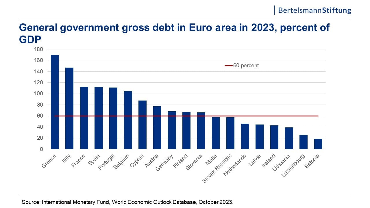
We will analyze the following bar plot, which displays Government gross debts as a percentage of GDPs for the European countries in 2023.


image_url = r"https://globaleurope.eu/wp-content/uploads/sites/24/2023/12/Folie2.jpg"
Image(url=image_url, width=600, height=600)

Output:

image-3.jpg

Let's just ask the model to summarize the plot.


query =  "You are an expert graph and visualization expert. Can you summarize the graph?"
response = analyze_image(query, image_url)
print(response)

Output:

image-4.png

The above output shows that the model provides detailed insights into different aspects of the information in the bar plot.

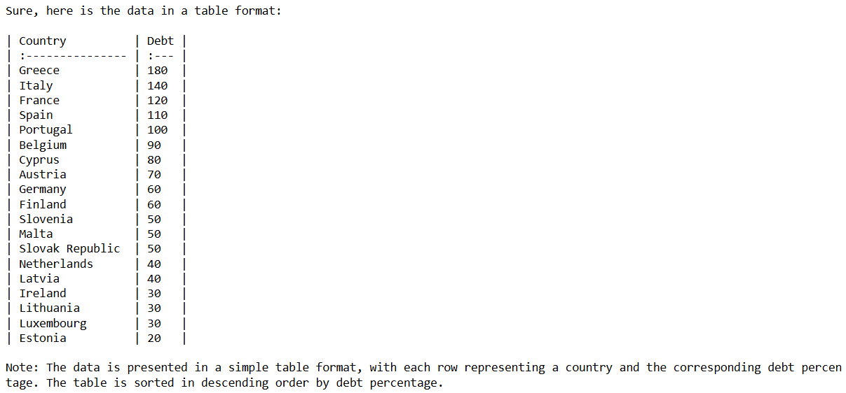
Let's ask a slightly tricky question. We will ask the model to convert the bar plot into a table.


query =  "You are an expert graph and visualization expert. Can you convert the graph to table such as Country -> Debt?"
response = analyze_image(query, image_url)
print(response)

Output:

image-5.png

The above output shows that the model's conversions were not precise. For example, the plot shows that Greece's GDP debt percentage is around 170%. However, the model shows it as 180%. In fact, the model shows the values in units of 10s.

On the other hand, the Claude 3.5 sonnet provided exact values.

Image Sentiment Prediction

Let's test the Llama 3.2 Vision Instruct model for the image sentiment prediction task. We will predict the facial sentiment expressed in the following image.

image_url = r"https://www.allprodad.com/wp-content/uploads/2021/03/05-12-21-happy-people.jpg"
Image(url=image_url, width=600, height=600)

Output:

image-6.jpg

Run the following script to print the facial sentiment.

query =  "You are helpful psychologist. Can you predict facial sentiment from the input image"
response = analyze_image(query, image_url)
print(response)

Output:


Based on the image, the individual appears to be smiling, which is a common indicator of happiness or positive sentiment. The person's facial expression suggests that they are feeling content or joyful.

The above output shows that the model correctly predicted the facial sentiment in the image.

Analyzing Multiple Images

Like the advanced vision models like GPT-4o and Claude 3.5 Sonnet, you can also analyze multiple images using the Llama 3.2 Vision Instruct model.

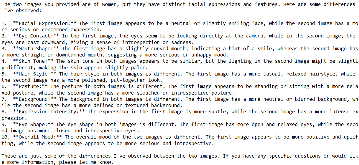
We will compare the following two images using the Llama 3.2 Vision Instruct model.


# URLs of the images
image_url1 = r"https://www.allprodad.com/wp-content/uploads/2021/03/05-12-21-happy-people.jpg"
image_url2 = r"https://www.shortform.com/blog/wp-content/uploads/2023/12/sad-woman-looking-down-eyes-slightly-closed-750x350.jpg"

# Fetch the images from the URLs
response1 = requests.get(image_url1)
response2 = requests.get(image_url2)

# Open the images using Pillow
img1 = Image.open(BytesIO(response1.content))
img2 = Image.open(BytesIO(response2.content))

# Create a figure to display the images side by side
fig, axes = plt.subplots(1, 2, figsize=(10, 5))

# Display the first image
axes[0].imshow(img1)
axes[0].axis('off')  # Hide axes

# Display the second image
axes[1].imshow(img2)
axes[1].axis('off')  # Hide axes

# Show the plot
plt.tight_layout()
plt.show()

Output:

image-7.png

To analyze multiple images, you must add the images to the content list of the user messages, as shown in the following script.

The script below defines the analyze_multiple_images() function that accepts a text query and two images and answers the query related to both images.


def analyze_multiple_images(query, image1_url, image2_url):


    response =  llama3_2_model_client.chat_completion(
        model=model_id,
        temperature = 0,
        messages=[
            {
                "role": "user",
                "content": [
                    {"type": "image_url", "image_url": {"url": image1_url}},
                    {"type": "image_url", "image_url": {"url": image2_url}},
                    {"type": "text", "text": query},
                    ],
            }
        ],
        max_tokens=1024,
    )
    return response.choices[0].message.content

query =  "You are helpful psychologist. Can you explain all the differences in the two images?"
response = analyze_multiple_images(query, image_url1, image_url2)
print(response)

The above script attempts to find all the differences between the two input images.

Output:

image-8.png

The output shows that Llama 3.2 Vision Instruct can find most of the differences between the two images, and its findings are very close to those of the Claude 3.5 sonnet model.

Conclusion

Meta Llama 3.2 Vision Instruct is a lightweight yet extremely powerful model for text-to-text and image-to-text tasks. It is open-source, and you can use it for free using the Hugging Face Inference API.

In this article, you saw how to use the Llama 3.2 Vision Instruct model for image analysis tasks such as graph analysis, sentiment prediction, etc. I suggest you try the Llama 3.2 Vision Instruct model for your image-to-text and text-to-text tasks and share your feedback.

One Question That Will Reinvigorate Your Approach to Marketing

Featured Imgs 23

The 2023 We❤️NYC campaign was intended to encourage New Yorkers, still pessimistic in a post-pandemic world, to show love for their city.

And boy, did it ever.

Last year, Maryam Banikarim royally pissed off the Olsen twins and the Jonas Brothers with her We❤️NYC campaign. But that same campaign earned twice the impressions of a Super Bowl ad … in 48 hours.

I caught up with Banikarim to get her top marketing lessons, and it was immediately clear that she’s the embodiment of “do what you love” — and it all stems from asking herself, "What if I did that?"

So we talked about purpose-driven work, how to use curiosity to power your marketing campaigns, and the best way to stay on top of new tech.

Click Here to Subscribe to Masters in Marketing

“What if I did that?”

1. Good campaigns have tension. That’s what gets people talking.

I can see Banikarim’s eyes sparkle through my computer monitor as she tells me how she ruffled the feathers of two sets of celebrity siblings. She’s relishing the memory of it.

Her agency worked on the city-wide ad campaign, which was funded by members of the Partnership for New York City to encourage civic action and community engagement. It capitalized on something New Yorkers care very, very deeply about: New York.

Once “We❤️NYC” began appearing on bus stop signs, at Barclays Center, and across Times Square, “everybody thought we were trying to get rid of the I❤️NYmark,” she says. They weren’t, but “communication isn’t what I say, it’s what you hear.”


So once somebody (incorrectly, angrily) posted that the new campaign was trying to oust Milton Glaser’s iconic I❤️NY, it became a reality of sorts. A reality that was picked up by talk shows, Mary-Kate and Ashley, and the Jonas Brothers — “it was just a whole thing,” Banikarim says with a laugh.

There’s no putting the toothpaste back in the tube: We❤️NYC was now a putative threat to New Yorkers’ identity and their iconography. Tension built up; tweets rolled in. “Milton Glaser would be so mad.” “Can we please let Milton Glaser rest in the peace he deserves?” “Milton Glaser got it right the first time.”

Banikarim is delighted by this. “We couldn’t have bought that media,“ she says.

Your next campaign probably won’t pique the ire of the Olsen twins (though a girl can dream). But know what your target audience feels ownership over, and where to tease out the tension in your marketing campaign.

Click Here to Subscribe to Masters in Marketing

2. DIY — with curiosity.

“I always seem to have a side hustle these days,” she tells me. (One gets the sense that Banikarim has always had to have a side hustle.)

It’s just that Banikarim’s side hustles would make most primary hustles envious. Last weekend, she celebrated the third year of The Longest Table, a community-building event born out of a need for human connection back when everyone was masking up and sharing tips on finding Lysol wipes.

She saw a neighbor put a folding table outside so they could eat dinner with a few friends. She introduced herself and thought, “What if I did that?”

One also gets the sense that Banikarim doesn’t do rhetorical questions. She started with a few posts on Next Door and an eight-person outdoor potluck on her street in Chelsea. On October 6, 2024, over a thousand people showed up for dinner.


Together they cobbled together a Squarespace website, and “we use HubSpot to email people.” (We did not bribe, pay, or threaten her to say that.—ed.) Banikarim doesn’t complain about DIY marketing tech; on the contrary, she refuses to be outpaced by evolving technology.

“Marketing has always been for people who are curious. And in order to constantly be learning, it’s really helpful to be touching the tools yourself and not just directing from up high.”—Maryam Banikarim, Managing director, Fortune Media

“Marketing has always been for people who are curious,” Banikarim says. And “in order to constantly be learning, it’s really helpful to be touching the tools yourself and not just directing from up high.”

Click Here to Subscribe to Masters in Marketing

3. Move sideways, move quickly. And take small bets.

Moving sideways means that sometimes you take a job that feels like a lateral move, or even a step backward. That’s not unusual now, but Banikarim jokes that she was a millennial before her time, because she’s had so many jobs for somebody in her 50s.

“But I was always looking for purpose in the job.” Like millennials, she’s “looking for impact.”

Your marketing career “doesn't have to always be moving up. You can move sideways. You can move off, you can move in.”

Of course, millennials don’t need Banikarim to tell them that it’s okay to have a non-linear career. But are you moping about it or are you learning from it? (No judgment; glass houses and all that.)

“I think there‘s a lot of lip service given to this idea that if you fail, it’s ‘okay,’” she tells me. And then she says what so many of us feel in those moments: “but it's not really okay.”

“We all have to be better at finding things that we can test and learn from — and we have to stop thinking that if those tests don’t work, then they’re a mistake or a waste of time.”

When I ask her what the biggest waste of money is across the marketing landscape, she says that it isn’t a tool. It’s that “we all have to be better at finding things that we can test and learn from” — and we have to stop thinking that if those tests don’t work, then they’re a mistake or a waste of time.

Her advice: Move quickly. Take the small bets. See where you get signal — and then go big.

Click Here to Subscribe to Masters in Marketing

Benefits of DevOps for Modern Software Development

Featured Imgs 23
DevOps for Modern Software

Over the last ten years, software development has seen significant changes. These were mostly driven by advancements in technology and increasing demands for faster and more efficient delivery.

The adoption of cloud computing has been a key factor in this transformation, as it provided developers with scalable resources that allow for faster iterations and quicker market entry without heavy initial investment.

Additionally, the introduction of virtual private networks and the possibility to use VPN free trial have become crucial for improving security, especially for global teams. Such tools have enabled developers to protect data by encrypting transfers and masking IP addresses.

Among all these advances, the introduction of DevOps seems to have brought the biggest changes. This system merges development and operations teams, breaking down traditional silos and significantly shortening the development lifecycle.

Accordingly, it would be interesting to take a better look at how software development has been changed and improved by DevOps.

The Shift to DevOps

The Shift to DevOps

DevOps facilitates a cohesive work environment where code changes are perfectly integrated and deployed.

This system leverages automation for continuous integration and continuous delivery (CI/CD), ensuring that new code is rigorously tested and promptly released into production environments. The result is a reduction in the time required to move from coding to deployment.

With DevOps, software updates and new features are deployed with greater frequency. This responsiveness is critical in adapting quickly to market changes or user feedback.

Such practices integrate well with agile methodologies, which focus on iterative development, frequent feedback, and the flexibility to adapt to changing requirements.

Key Technologies in DevOps

Docker is a foundational platform in this respect. This technology ensures that applications are packaged in containers, allowing them to be deployed consistently across various computing environments.

In the realm of automation, Jenkins and GitLab CI stand out. These tools automate the steps in software building, testing, and deployment workflows, which is something that enables frequent updates and maintaining high standards of quality without sacrificing speed.

Version control systems like Git are indispensable in DevOps environments. Git allows multiple developers to work on the same codebase without interfering with each other’s tasks. It tracks every change by each contributor and merges changes in a controlled manner.

The Benefits of DevOps

Having in mind what was mentioned above, it has become pretty clear that DevOps has introduced numerous benefits. Some of them, however, stand out more than others.

Reduced Development Cycles

By integrating development and operations teams, DevOps eliminates many traditional bottlenecks, facilitating a smoother, faster workflow. Automation of repetitive tasks further speeds up this process, freeing developers to focus on more strategic work that adds value to the project.

Improved Quality Assurance

Quality assurance gains a new dimension in DevOps environments. Automated testing ensures continuous scrutiny of the code as it is developed. This allows teams to identify and address bugs much earlier than traditional methods.

Enhanced Team Collaboration

This approach fosters a culture of shared responsibilities and goals. The enhanced collaboration leads to better communication, more innovative problem-solving, and a cohesive team environment.

Challenges and Considerations

The transition to this methodology might also involve certain challenges and considerations that organizations must address to fully harness its potential.

  • Cultural Resistance : Adopting DevOps can meet resistance from teams accustomed to traditional development and operations models.
  • Solution : Organizations can mitigate this resistance through effective communication and comprehensive training programs.
  • Security concerns : The accelerated development cycles in DevOps can sometimes result in security oversights, as rapid deployment may prioritize speed over thorough security checks
  • Solution : To address this, integrating security practices directly into the DevOps pipeline is essential. This approach ensures that security considerations are embedded from the outset and throughout the lifecycle of the project, rather than being an afterthought.
  • Continuous integration and deployment issues: Continuous integration and deployment are central to DevOps but can introduce complexities, especially in larger projects with multiple dependencies.
  • Solution : Regularly reviewing and updating deployment practices can help in identifying and resolving potential issues early on.

Conclusion

DevOps has truly transformed software development. By promoting collaboration, automation, and continuous improvement, it addresses the demands of modern software projects. While challenges exist, the benefits of faster delivery, improved quality, and enhanced teamwork make DevOps an essential strategy for today’s development teams

The post Benefits of DevOps for Modern Software Development appeared first on CSS Author.

Left Half and Right Half Layout – Many Different Ways

Featured Imgs 23

A whole bunch of years ago, we posted on this idea here on CSS-Tricks. We figured it was time to update that and do the subject justice.

Imagine a scenario where you need to split a layout in half. Content on the left and content on the right. Basically two equal height columns are needed inside of a container. Each side takes up exactly half of the container, creating a distinct break between one. Like many things in CSS, there are a number of ways to go about this and we’re going to go over many of them right now!

Update (Oct. 25, 2024): Added an example that uses CSS Anchor Positioning.

Using Background Gradient

One simple way we can create the appearance of a changing background is to use gradients. Half of the background is set to one color and the other half another color. Rather than fade from one color to another, a zero-space color stop is set in the middle.

.container {
  background: linear-gradient(
    to right, 
    #ff9e2c 0%, 
    #ff9e2c 50%, 
    #b6701e 50%, 
    #b6701e 100%
  );
}

This works with a single container element. However, that also means that it will take working with floats or possibly some other layout method if content needs to fill both sides of the container.

Using Absolute Positioning

Another route might be to set up two containers inside of a parent container, position them absolutely, split them up in halves using percentages, then apply the backgrounds. The benefit here is that now we have two separate containers that can hold their own content.

Absolute positioning is sometimes a perfect solution, and sometimes untenable. The parent container here will need to have a set height, and setting heights is often bad news for content (content changes!). Not to mention absolute positioned elements are out of the document flow. So it would be hard to get this to work while, say, pushing down other content below it.

Using (fake) Tables

Yeah, yeah, tables are so old school (not to mention fraught with accessibility issues and layout inflexibility). Well, using the display: table-cell; property can actually be a handy way to create this layout without writing table markup in HTML. In short, we turn our semantic parent container into a table, then the child containers into cells inside the table — all in CSS!

You could even change the display properties at breakpoints pretty easily here, making the sides stack on smaller screens. display: table; (and friends) is supported as far back as IE 8 and even old Android, so it’s pretty safe!

Using Floats

We can use our good friend the float to arrange the containers beside each other. The benefit here is that it avoids absolute positioning (which as we noted, can be messy).

In this example, we’re explicitly setting heights to get them to be even. But you don’t really get that ability with floats by default. You could use the background gradient trick we already covered so they just look even. Or look at fancy negative margin tricks and the like.

Also, remember you may need to clear the floats on the parent element to keep the document flow happy.

Using Inline-Block

If clearing elements after floats seems like a burden, then using display: inline-block is another option. The trick here is to make sure that the elements for the individual sides have no breaks or whitespace in between them in the HTML. Otherwise, that space will be rendered as a literal space and the second half will break and fall.

Again there is nothing about inline-block that helps us equalize the heights of the sides, so you’ll have to be explicit about that.

There are also other potential ways to deal with that spacing problem described above.

Using Flexbox

Flexbox is a pretty fantastic way to do this, just note that it’s limited to IE 10 and up and you may need to get fancy with the prefixes and values to get the best support.

Using this method, we turn our parent container into a flexible box with the child containers taking up an equal share of the space. No need to set widths or heights! Flexbox just knows what to do, because the defaults are set up perfectly for this. For instance, flex-direction: row; and align-items: stretch; is what we’re after, but those are the defaults so we don’t have to set them. To make sure they are even though, setting flex: 1; on the sides is a good plan. That forces them to take up equal shares of the space.

In this demo we’re making the side flex containers as well, just for fun, to handle the vertical and horizontal centering.

Using Grid Layout

For those living on the bleeding edge, the CSS Grid Layout technique is like the Flexbox and Table methods merged into one. In other words, a container is defined, then split into columns and cells which can be filled flexibly with child elements.

CSS Anchor Positioning

This started rolling out in 2024 and we’re still waiting for full browser support. But we can use CSS Anchor Positioning to “attach” one element to another — even if those two elements are completely unrelated in the markup.

The idea is that we have one element that’s registered as an “anchor” and another element that’s the “target” of that anchor. It’s like the target element is pinned to the anchor. And we get to control where we pin it!

.anchor {
  anchor-name: --anchor;
}

.target {
  anchor-position: --anchor;
  position: absolute; /* required */
}

This sets up an .anchor and establishes a relationship with a .target element. From here, we can tell the target which side of the anchor it should pin to.

.anchor {
  anchor-name: --anchor;
}

.target {
  anchor-position: --anchor;
  position: absolute; /* required */
  left: anchor(right);
}

Isn’t it cool how many ways there are to do things in CSS?


Left Half and Right Half Layout – Many Different Ways originally published on CSS-Tricks, which is part of the DigitalOcean family. You should get the newsletter.


from CSS-Tricks https://ift.tt/Cru3PaJ
Gain $200 in a week
via Read more

Come to the light-dark() Side

Featured Imgs 23

You’d be forgiven for thinking coding up both a dark and a light mode at once is a lot of work. You have to remember @media queries based on prefers-color-scheme as well as extra complications that arise when letting visitors choose whether they want light or dark mode separately from the OS setting. And let’s not forget the color palette itself! Switching from a “light” mode to a “dark” mode may involve new variations to get the right amount of contrast for an accessible experience.

It is indeed a lot of work. But I’m here to tell you it’s now a lot simpler with modern CSS!

Default HTML color scheme(s)

We all know the “naked” HTML theme even if we rarely see it as we’ve already applied a CSS reset or our favorite boilerplate CSS before we even open localhost. But here’s a news flash: HTML doesn’t only have the standard black-on-white theme, there is also a native white-on-black version.

Screenshot of two bare-HTML mini-sites, one light, one dark
We have two color schemes available to use right out of the box!

If you want to create a dark mode interface, this is a great base to work with and saves you from having to account for annoying details, like dark inputs, buttons, and other interactive elements.

Screenshot of two forms, one with elements and background on light mode, the other all in dark mode.
Live Demo on CodePen

Switching color schemes automatically based on OS preference

Without any @media queries — or any other CSS at all — if all we did was declare color-scheme: light dark on the root element, the page will apply either the light or dark color scheme automatically by looking at the visitor’s operating system (OS) preferences. Most OSes have a built-in accessibility setting for your preferred color scheme — “light”, “dark”, or even “auto” — and browsers respect that setting.

html {
  color-scheme: light dark;
}

We can even accomplish this without CSS directly in the HTML document in a <meta> tag:

<meta name="color-scheme" content="light dark">

Whether you go with CSS or the HTML route, it doesn’t matter — they both work the same way: telling the browser to make both light and dark schemes available and apply the one that matches the visitor’s preferences. We don’t even need to litter our styles with prefers-color-scheme instances simply to swap colors because the logic is built right in!

You can apply light or dark values to the color-scheme property. At the same time, I’d say that setting color-scheme: light is redundant, as this is the default color scheme with or without declaring it.

You can, of course, control the <meta> tag or the CSS property with JavaScript.

There’s also the possibility of applying the color-scheme property on specific elements instead of the entire page in one fell swoop. Then again, that means you are required to explicitly declare an element’s color and background-color properties; otherwise the element is transparent and inherits its text color from its parent element.

What values should you give it? Try:

Default text and background color variables

The “black” colors of these native themes aren’t always completely black but are often off-black, making the contrast a little easier on the eyes. It’s worth noting, too, that there’s variation in the blackness of “black” between browsers.

What is very useful is that this default not-pure-black and maybe-not-pure-white background-color and text color are available as <system-color> variables. They also flip their color values automatically with color-scheme!

They are: Canvas and CanvasText.

These two variables can be used anywhere in your CSS to call up the current default background color (Canvas) or text color (CanvasText) based on the current color scheme. If you’re familiar with the currentColor value in CSS, it seems to function similarly. CanvasText, meanwhile, remains the default text color in that it can’t be changed the way currentColor changes when you assign something to color.

In the following examples, the only change is the color-scheme property:

Screenshot of code and output area with color-scheme set to light, a large div of background color Canvas with text within set to color CanvasText, and a div within that with the Canvas and CanvasText switched.
Screenshot of code and output area with color-scheme set to dark, the rest of the code is all the same, and the light and dark areas have switched.

Not bad! There are many, many more of these system variables. They are case-insensitive, often written in camelCase or PascalCase for readability. MDN lists 19 <system-color> variables and I’m dropping them in below for reference.

Open to view 19 system color names and descriptions
  • AccentColor: The background color for accented user interface controls
  • AccentColorText: The text color for accented user interface controls
  • ActiveText: The text color of active links
  • ButtonBorder: The base border color for controls
  • ButtonFace: The background color for controls
  • ButtonText: The text color for controls
  • Canvas: The background color of an application’s content or documents
  • CanvasText: The text color used in an application’s content or documents
  • Field: The background color for input fields
  • FieldText: The text color inside form input fields
  • GrayText: The text color for disabled items (e.g., a disabled control)
  • Highlight: The background color for selected items
  • HighlightText: The text color for selected items
  • LinkText: The text color used for non-active, non-visited links
  • Mark: The background color for text marked up in a <mark> element
  • MarkText: The text color for text marked up in a <mark> element
  • SelectedItem: The background color for selected items (e.g., a selected checkbox)
  • SelectedItemText: The text color for selected items
  • VisitedText: The text visited links

Cool, right? There are many of them! There are, unfortunately, also discrepancies as far as how these color keywords are used and rendered between different OSes and browsers. Even though “evergreen” browsers arguably support all of them, they don’t all actually match what they’re supposed to, and fail to flip with the CSS color-scheme property as they should.

Egor Kloos (also known as dutchcelt) is keeping an eye on the current status of system colors, including which ones exist and the browsers that support them, something he does as part of a classless CSS framework cleverly called system.css.

Declaring colors for both modes together

OK good, so now you have a page that auto-magically flips dark and light colors according to system preferences. Whether you choose to use these system colors or not is up to you. I just like to point out that “dark” doesn’t always have to mean pure “black” just as “light” doesn’t have to mean pure “white.” There are lots more colors to pair together!

But what’s the best or simplest way to declare colors so they work in both light and dark mode?

In my subjective reverse-best order:

Third place: Declare color opacity

You could keep all the same background colors in dark and light modes, but declare them with an opacity (i.e. rgb(128 0 0 / 0.5) or #80000080). Then they’ll have the Canvas color shine through.

It’s unusable in this way for text colors, and you may end up with somewhat muted colors. But it is a nice easy way to get some theming done fast. I did this for the code blocks on this old light and dark mode demo.

Screenshot of a website split into its dark and light modes, showing code blocks with gentle background colors split across both

Second place: Use color-mix()

Like this:

color-mix(in oklab, Canvas 75%, RebeccaPurple);

Similar (but also different) to using opacity to mute a color is mixing colors in CSS. We can even mix the system color variables! For example, one of the colors can be either Canvas or CanvasText so that the background color always mixes with Canvas and the text color always mixes with CanvasText.

We now have the CSS color-mix() function to help us with this. The first argument in the function defines the color space where the color mixing happens. For example, we can tell the function that we are working in the OKLAB color space, which is a rectangular color space like sRGB making it ideal to mix with sRGB color values for predictable results. You can certainly mix colors from different color spaces — the OKLAB/sRGB combination happens to work for me in this instance.

The second and third arguments are the colors you want to mix, and in what proportion. Proportions are optional but expressed in percentages. Without declaring a proportion, the mix is an even 50%-50% split. If you add percentages for both colors and they don’t match up to 100%, it does a little math for you to prevent breakages.

The color-mix() approach is useful if you’re happy to keep the same hues and color saturations regardless of whether the mode is light or dark.

A screenshot of whimsica11y.net, where the color-mix() method for making the theme is in use

In this example, as you change the value of the hue slider, you’ll see color changes in the themed boxes, following the theme color but mixed with Canvas and CanvasText:

You may have noticed that I used OKLCH and HSL color spaces in that last example. You may also have noticed that the HSL-based theme color and the themed paragraph were a lot more “flashy” as you moved the hue slider.

I’ve declared colors using a polar color space, like HSL, for years, loving that you can easily take a hue and go up or down the saturation and lightness scales based on need. But, I concede that it’s problematic if you’re working with multiple hues while trying to achieve consistent perceived lightness and saturation across them all. It can be difficult to provide ample contrast across a spectrum of colors with HSL.

The OKLCH color space is also polar just like HSL, with the same benefits. You can pick your hue and use the chroma value (which is a bit like saturation in HSL) and the lightness scales accurately in the same way. Both OKLCH and OKLAB are designed to better match what our eyes perceive in terms of brightness and color compared to transitioning between colors in the sRGB space.

While these color spaces may not explicitly answer the age-old question, Is my blue the same as your blue? the colors are much more consistent and require less finicking when you decide to base your whole website’s palette on a different theme color. With these color spaces, the contrasts between the computed colors remain much the same.

First place (winner!): Use light-dark()

Like this:

light-dark(lavender, saddlebrown);

With the previous color-mix() example, if you choose a pale lavender in light mode, its dark mode counterpart is very dark lavender.

The light-dark() function, conversely, provides complete control. You might want that element to be pale lavender in light mode and a deep burnt sienna brown in dark mode. Why not? You can still use color-mix() within light-dark() if you like — declare the colors however you like, and gain much more fine-grained control over your colors.

Feel free to experiment in the following editable demo:

Using color-scheme: light dark; — or the corresponding meta tag in HTML on your page —is a prerequisite for the light-dark() function because it allows the function to respect a person’s system preference, or whichever single light or dark value you have set on color-scheme.

Another consideration is that light-dark() is newly available across browsers, with just over 80% coverage across all users at the time I’m writing this. So, you might consider including a fallback in your CSS for browsers that lack support for the function.

What makes using color-scheme and light-dark() better than using @media queries?

@media queries have been excellent tools, but using them to query prefers-color-scheme only ever follows the preference set within the person’s operating system. This is fine until you (rightfully) want to offer the visitor more choices, decoupled from whether they prefer the UI on their device to be dark or light.

We’re already capable of doing that, of course. We’ve become used to a lot of jiggery-pokery with extra CSS classes, using duplicated styles, or employing custom properties to make it happen.

The joy of using color-scheme is threefold:

  • It gives you the basic monochrome dark mode for free!
  • It can natively do the mode switching based on OS mode preference.
  • You can use JavaScript to toggle between light and dark mode, and the colors declared in the light-dark() functions will follow it.

Light, dark, and auto mode controls

Essentially, all we are doing is setting one of three options for whether the color-scheme is light, dark, or updates auto-matically.

I advise offering all three as discrete options, as it removes some complications for you! Any new visitor to the site will likely be in auto mode because accepting the visitor’s OS setting is the least jarring default state. You then give that person the choice to stay with that or swap it out for a different color scheme. This way, there’s no need to sniff out what mode someone prefers to, for example, display the correct icon on a toggle and make it perform the correct action. There is also no need to keep an event listener on prefers-color-scheme in case of changes — your color-scheme: light dark declaration in CSS handles that for you.

Three examples of mode switches, each with the three options of Auto, Light and Dark. Buttons, a fieldset with radio buttons, and a select element.

Adjusting color-scheme in pure CSS

Yes, this is totally possible! But the approach comes with a few caveats:

  • You can’t use <button> — only radio inputs, or <options> in a <select> element.
  • It only works on a per page basis, not per website, which means changes are lost on reload or refresh.
  • The browser needs to support the :has() pseudo-selector. Most modern browsers do, but some folks using older devices might miss out on the experience.

Using the :has() pseudo-selector

This approach is almost alarmingly simple and is fantastic for a simple one-pager! Most of the heavy lifting is done with this:

/* default, or 'auto' */
html {
  color-scheme: light dark;
}

html:has([value="light"]:checked {
  color-scheme: light;
}

html:has([value="dark"]:checked {
  color-scheme: dark;
}

The second and third rulesets above look for an attribute called value on any element that has “light” or “dark” assigned to it, then change the color-scheme to match only if that element is :checked.

This approach is not very efficient if you have a huge page full of elements. In those cases, it’s better to be more specific. In the following two examples, the CSS selectors check for value only within an element containing id="mode-switcher".

html:has(#mode-switcher [value="light"]:checked) { color-scheme: light }
/* Did you know you don't need the ";" for a one-liner? Now you do! */

Using a <select> element:

Using <input type="radio">:

We could theoretically use checkboxes for this, but since checkboxes are not supposed to be used for mutually exclusive options, I won’t provide an example here. What happens in the case of more than one option being checked? The last matching CSS declaration wins (which is dark in the examples above).

Adjusting color-scheme in HTML with JavaScript

I subscribe to Jeremy Keith’s maxim when it comes to reaching for JavaScript:

JavaScript should only do what only JavaScript can do.

This is exactly that kind of situation.

If you want to allow visitors to change the color scheme using buttons, or you would like the option to be saved the next time the visitor comes to the site, then we do need at least some JavaScript. Rather than using the :has() pseudo-selector in CSS, we have a few alternative approaches for changing the color-scheme when we add JavaScript to the mix.

Using <meta> tags

If you have set your color-scheme within a meta tag in the <head> of your HTML:

<meta name="color-scheme" content="light dark">

…you might start by making a useful constant like so:

const colorScheme = document.querySelector('meta[name="color-scheme"]');

And then you can manipulate that, assigning it light or dark as you see fit:

colorScheme.setAttribute("content", "light"); // to light mode
colorScheme.setAttribute("content", "dark"); // to dark mode
colorScheme.setAttribute("content", "light dark"); // to auto mode

This is a very similar approach to using <meta> tags but is different if you are setting the color-scheme property in CSS:

html { color-scheme: light dark; }

Instead of setting a colorScheme constant as we just did in the last example with the <meta> tag, you might select the <html> element instead:

const html = document.querySelector('html');

Now your manipulations look like this:

html.style.setProperty("color-scheme", "light"); // to light mode
html.style.setProperty("color-scheme", "dark"); // to dark mode
html.style.setProperty("color-scheme", "light dark"); // to auto mode

I like to turn those manipulations into functions so that I can reuse them:

function switchAuto() {
  html.style.setProperty("color-scheme", "light dark");
}
function switchLight() {
  html.style.setProperty("color-scheme", "light");
}
function switchDark() {
  html.style.setProperty("color-scheme", "dark");
}

Alternatively, you might like to stay as DRY as possible and do something like this:

function switchMode(mode) {
  html.style.setProperty("color-scheme", mode === "auto" ? "light dark" : mode);
}

The following demo shows how this JavaScript-based approach can be used with buttons, radio buttons, and a <select> element. Please note that not all of the controls are hooked up to update the UI — the demo would end up too complicated since there’s no world where all three types of controls would be used in the same UI!

I opted to use onchange and onclick in the HTML elements mainly because I find them readable and neat. There’s nothing wrong with instead attaching a change event listener to your controls, especially if you need to trigger other actions when the options change. Using onclick on a button doesn’t only work for clicks, the button is still keyboard-focusable and can be triggered with Spacebar and Enter too, as usual.

Remembering the selection for repeat visits

The biggest caveat to everything we’ve covered so far is that this only works once. In other words, once the visitor has left the site, we’re doing nothing to remember their color scheme preference. It would be a better user experience to store that preference and respect it anytime the visitor returns.

The Web Storage API is our go-to for this. And there are two available ways for us to store someone’s color scheme preference for future visits.

localStorage

Local storage saves values directly on the visitor’s device. This makes it a nice way to keep things off your server, as the stored data never expires, allowing us to call it anytime. That said, we’re prone to losing that data whenever the visitor clears cookies and cache and they’ll have to make a new selection that is freshly stored in localStorage.

You pick a key name and give it a value with .setItem():

localStorage.setItem("mode", "dark");

The key and value are saved by the browser, and can be called up again for future visits:

const mode = localStorage.getItem("mode");

You can then use the value stored in this key to apply the person’s preferred color scheme.

sessionStorage

Session storage is thrown away as soon as a visitor browses away to another site or closes the current window/tab. However, the data we capture in sessionStorage persists while the visitor navigates between pages or views on the same domain.

It looks a lot like localStorage:

sessionStorage.setItem("mode", "dark");
const mode = sessionStorage.getItem("mode");

Which storage method should I use?

Personally, I started with sessionStorage because I wanted my site to be as simple as possible, and to avoid anything that would trigger the need for a GDPR-compliant cookie banner if we were holding onto the person’s preference after their session ends. If most of your traffic comes from new visitors, then I suggest using sessionStorage to prevent having to do extra work on the GDPR side of things.

That said, if your traffic is mostly made up of people who return to the site again and again, then localStorage is likely a better approach. The convenience benefits your visitors, making it worth the GDPR work.

The following example shows the localStorage approach. Open it up in a new window or tab, pick a theme other than what’s set in your operating system’s preferences, close the window or tab, then re-open the demo in a new window or tab. Does the demo respect the color scheme you selected? It should!

Choose the “Auto” option to go back to normal.

If you want to look more closely at what is going on, you can open up the developer tools in your browser (F12 for Windows, CTRL+ click and select “Inspect” for macOS). From there, go into the “Application” tab and locate https://cdpn.io in the list of items stored in localStorage. You should see the saved key (mode) and the value (dark or light). Then start clicking on the color scheme options again and watch the mode update in real-time.

Screenshot of the top of Edge devtools, with Application tab open. The key “mode” and value “dark” saved in cdpn.io’s local storage is shown.

Accessibility

Congratulations! If you have got this far, you are considering or already providing versions of your website that are more comfortable for different people to use.

For example:

  • People with strong floaters in their eyes may prefer to use dark mode.
  • People with astigmatism may be able to focus more easily in light mode.

So, providing both versions leaves fewer people straining their eyes to access the content.

Contrast levels

I want to include a small addendum to this provision of a light and dark mode. An easy temptation is to go full monochrome black-on-white or white-on-black. It’s striking and punchy! I get it. But that’s just it — striking and punchy can also trigger migraines for some people who do a lot better with lower contrasts.

Providing high contrast is great for the people who need it. Some visual impairments do make it impossible to focus and get a sharp image, and a high contrast level can help people to better make out the word shapes through a blur. Minimum contrast levels are important and should be exceeded.

Thankfully, alongside other media queries, we can also query prefers-contrast which accepts values for no-preference, more, less, or custom.

In the following example (which uses :has() and color-mix()), a <select> element is displayed to offer contrast settings. When “Low” is selected, a filter of contrast(75%) is placed across the page. When “High” is selected, CanvasText and Canvas are used unmixed for text color and background color:

Adding a quick high and low contrast theme gives your visitors even more choice for their reading comfort. Look at that — now you have three contrast levels in both dark and light modes — six color schemes to choose from!

ARIA-pressed

ARIA stands for Accessible Rich Internet Applications and is designed for adding a bit of extra info where needed to screen readers and other assistive tech.

The words “where needed” do heavy lifting here. It has been said that, like apostrophes, no ARIA is better than bad ARIA. So, best practice is to avoid putting it everywhere. For the most part (with only a few exceptions) native HTML elements are good to go out of the box, especially if you put useful text in your buttons!

The little bit of ARIA I use in this demo is for adding the aria-pressed attribute to the buttons, as unlike a radio group or select element, it’s otherwise unclear to anyone which button is the “active” one, and ARIA helps nicely with this use case. Now a screen reader will announce both its accessible name and whether it is in a pressed or unpressed state along with a button.

Following is an example code snippet with all the ARIA code bolded — yes, suddenly there’s lots more! You may find more elegant (or DRY-er) ways to do this, but showing it this way first makes it more clear to demonstrate what’s happening.

Our buttons have ids, which we have used to target them with some more handy consts at the top. Each time we switch mode, we make the button’s aria-pressed value for the selected mode true, and the other two false:

const html = document.querySelector("html");
const mode = localStorage.getItem("mode");
const lightSwitch = document.querySelector('#lightSwitch');
const darkSwitch = document.querySelector('#darkSwitch');
const autoSwitch = document.querySelector('#autoSwitch');

if (mode === "light") switchLight();
if (mode === "dark") switchDark();

function switchAuto() {
  html.style.setProperty("color-scheme", "light dark");
  localStorage.removeItem("mode");
  lightSwitch.setAttribute("aria-pressed","false");
  darkSwitch.setAttribute("aria-pressed","false");
  autoSwitch.setAttribute("aria-pressed","true");
}

function switchLight() {
  html.style.setProperty("color-scheme", "light");
  localStorage.setItem("mode", "light");
  lightSwitch.setAttribute("aria-pressed","true");
  darkSwitch.setAttribute("aria-pressed","false");
  autoSwitch.setAttribute("aria-pressed","false");
}

function switchDark() {
  html.style.setProperty("color-scheme", "dark");
  localStorage.setItem("mode", "dark");
  lightSwitch.setAttribute("aria-pressed","false");
  darkSwitch.setAttribute("aria-pressed","true");
  autoSwitch.setAttribute("aria-pressed","false");
}

On load, the buttons have a default setting, which is when the “Auto” mode button is active. Should there be any other mode in the localStorage, we pick it up immediately and run either switchLight() or switchDark(), both of which contain the aria-pressed changes relevant to that mode.

<button id="autoSwitch" aria-pressed="true" type="button" onclick="switchAuto()">Auto</button>
<button id="lightSwitch" aria-pressed="false" type="button" onclick="switchLight()">Light</button>
<button id="darkSwitch" aria-pressed="false" type="button" onclick="switchDark()">Dark</button>

The last benefit of aria-pressed is that we can also target it for styling purposes:

button[aria-pressed="true"] {
  background-color: transparent;
  border-width: 2px;
}

Finally, we have a nice little button switcher, with its state clearly shown and announced, that remembers your choice when you come back to it. Done!

Outroduction

Or whatever the opposite of an introduction is…

…don’t let yourself get dragged into the old dark vs light mode argument. Both are good. Both are great! And both modes are now easy to create at once. At the start of your next project, work or hobby, do not give in to fear and pick a side — give both a try, and give in to choice.

Darth Vader clenching his fist, saying “If you only knew the power of the Dark Side.”

Come to the light-dark() Side originally published on CSS-Tricks, which is part of the DigitalOcean family. You should get the newsletter.


from CSS-Tricks https://ift.tt/gEwbKxq
Gain $200 in a week
via Read more

Goals vs Objectives: The Simple Breakdown

Featured Imgs 23

Everyone on your team should understand the difference between a goal and an objective. I know it sounds simple, but terminology confusion is one of the biggest causes of misalignment in business strategy.

Whether you use the OKR model, the KPI framework, the Golden Circle, or another methodology, the difference between goals and objectives must be made abundantly clear. Without this shared knowledge, teams could risk wasting time on irrelevant activities, at best, or working against a common purpose, at worst.

Download your free marketing goal-setting template here. 

In this post I'll explain the difference between goals and objectives and discuss some of the most effective goal-setting frameworks used by marketing professionals today.

I’ll also discuss measurement tactics to track your progress. By the end of this post, you can wave goodbye to ambiguity when it comes to your long-term and short-term marketing plans.

Table of Contents

Goals are undoubtedly critical to your business‘s success. Ultimately, your company’s goals should align with your vision and mission in order for employees to best guide their own actions and decisions.

goal vs. objective definitions

For instance, let's say this year your leadership team has outlined four broad goals for your company:

  1. Create a more inclusive workplace culture.
  2. Grow international brand awareness.
  3. Increase customer retention by 40%.
  4. Help staff achieve a professional goal.

Great … now what?

Here's where objectives come into play — objectives are essentially the measurable actions you can take to achieve your overall goals.

Pro tip: I suggest using the popular SMART criteria. This helps set impactful objectives by ensuring they are specific, measurable, attainable, relevant, and time-bound.

Featured Resource: Free SMART Goal Template

smart goal template https://offers.hubspot.com/how-to-determine-your-smart-marketing-goals

Download this Template for Free

“Create a more inclusive workplace culture” is an admirable and important goal to have, but it's vague and too broad to measure. Does “more inclusive” mean one diversity and inclusion panel discussion, or does it mean a 10% increase in women in leadership positions?

Ultimately, your objectives will help your employees understand exactly what you expect from them.

In another example, let's say you inform your marketing department that your overall goal is to “grow international brand awareness.”

Now, when your social media marketing manager is crafting her quarterly video campaign, she'll think to herself, “Hmm, how can I increase international brand awareness?”

She can cater her objectives to fit company goals, as well as her own personal vision. Perhaps she decides, "To demonstrate my success at increasing international brand awareness, my objectives for my video marketing campaign will be:

  1. 10% of all form submissions come from outside the U.S.
  2. An increase in engagement from Spanish-speaking Facebook fans by 5%."

Your social media marketing manager can then use her unique objectives to measure whether or not she's contributing to the larger company goal of increasing international brand awareness.

As you can see, objectives can be uniquely tailored to fit each departments' needs, and allow for a large amount of autonomy.

By instilling clear and firm company goals, you can feel confident that your employees are all working in the same direction, but taking largely different steps (e.g. objectives) to end up at the same finish line.

There's one more term differentiation to know: objectives versus strategy.

Referencing our example above, let's say your social media marketing manager decides one of her objectives will be “an increase in engagement from Spanish-speaking Facebook fans by 5%.”

This is aligned with your company's goal to increase international brand awareness.

A strategy, then, tells your employee or team how she can accomplish her objectives. For instance, your social media marketing manager might decide to focus her paid efforts on Spanish-speaking countries, using Facebook's location targeting features.

Alternatively, maybe she decides to cultivate partnerships with international companies and posts videos in Spanish on Facebook specifically highlighting the work of those international organizations.

Both of these options are examples of strategies.

Her strategy might change over time. She might decide her paid efforts aren't working, and try something else.

Ultimately, however, her objective (increase engagement from Spanish-speaking Facebook fans by 5%) should remain the same.

Types of Goals and Objectives

Through my experience as a content marketer, I’ve learned that there isn’t a one-size-fits-all approach to communicating goals and objectives.

There are many things businesses want to measure, especially from a marketing perspective, so it’s important to have several types to choose from when setting the course for the year ahead.

Types of Goals

Time-Based Goals

time-based goals, goal vs objective

The first type of goal that businesses use to set a strategic direction is the time-based goal. This goal type provides a high-level explanation for what teams or individuals should be striving toward within a certain timeframe.

Time-based goals can be short-term or long-term depending on the needs of your organization. They help teams and individuals plan and execute urgent tasks.

Some goals are time-sensitive and the primary outcome of achieving these types of goals is that they’re completed on time. Depending on the needs of an organization, one can track these goals in a variety of ways such as note-taking software, and visualize them using timeline maker software.

Example of a time-based goal: “Increase revenue by 10% to qualify for the best-in-class awards ceremony in August.”

As the award’s ceremony has a fixed date and the action stated in the goal is a requirement of the ceremony, this goal should be time-bound to increase the likelihood of reaching it.

Suitable for: I’d recommend this goal type for time-sensitive situations where there is an end date by which the goal must be attained (this can be in three months or ten years). A time-based goal helps keep stakeholders accountable and on track.

Outcome-Oriented Goals

outcome-oriented goals, goal vs objective

Outcome-oriented goals are independent of a specific timeframe and typically outline what the business is aiming to achieve at some point in the future. The objectives for outcome-oriented goals provide more context around when this goal should be completed and how to measure the success of the goal.

For big picture changes, leadership transitions, and other types of major business milestones, outcome-oriented goals are used to communicate a new vision and era within a company.

Objectives for this type of goal communicate actionable changes for employees, and therefore, pair well with process-oriented goals which we talk about next.

Example of an outcome-oriented goal: “Reduce average customer acquisition cost (CAC) from $29 to $22.”

Suitable for: I’d recommend this goal type for scenarios where getting a particular result really matters. It suits goals that prioritize success, allowing for flexibility in the methods (and sometimes time) needed to achieve the required result.

Process-Oriented Goals

process-oriented goals, goal vs objective

If a business is aiming to set the direction for new workflows, a process-oriented goal is the best choice. A process-oriented goal does not explain what outcome is being achieved. Instead, this goal type is prescriptive and explains what the team is responsible for doing in order to achieve an outcome.

Breaking it down further, there are also process-oriented objectives that can provide the tactical guidance employees need to do their day-to-day work.

Process-oriented goals may be short-term or even temporary because once they’ve been achieved, the new and improved processes can be put into action on a regular basis.

Example of a process-oriented goal: “Roll out a department-wise suggestion portal, ‘Your Voice, Your Impact,’ encouraging employees to propose operational micro-improvements that can be implemented in under a month. The top idea in each department every quarter receives a reward.”

Suitable for: I’d recommend this goal type when novel processes or workflows are to be implemented, or during transition periods where change management is underway in a company.

Types of Objectives

Strategic Objectives

goals vs objectives, definition of strategic objectives

These are high-level objectives with a longer outlook that provide guidance for a business to achieve an overarching goal.

Strategic objectives are sometimes confused with goals as both have a long-term perspective. However, a key difference is that strategic objectives convert a goal from “a vague ambition we want to attain” into something more tangible. Think of it as a two-tier pyramid with a goal at the top and strategic objectives at the bottom.

Example of a strategic objective: For a goal to boost an organization’s social involvement within the local community, a strategic objective could be to “build 70 affordable housing units in disadvantaged neighborhoods over the next three years.”

Suitable for: I’d recommend this objective type to give shape to a goal.

Operational Objectives

goals vs objectives, definition of operational objectives

Operational objectives transform a larger goal into bite-sized actionable steps that can usually be ticked off on a daily, weekly, or monthly basis. They can be visualized as the nuts and bolts of a machine, ​​ensuring that each part runs smoothly to achieve the big-picture goal.

The SMART framework, mentioned earlier in the article, is a handy acronym to develop good operational objectives.

Example of an operational objective: For a goal to grow a museum’s YouTube channel subscribers by 35% in one year, an operational objective could be to “publish two new videos every week.”

Suitable for: I’d recommend this objective type for situations where short-term activities or SOPs have to be spelled out. It helps ensure that all stakeholders are on the same page on the near-term work that needs to be completed, by what time, and by whom, to achieve the larger goal.

Financial Objectives

goals vs objectives, definition of financial objectives

The importance of finance for an organization cannot be understated. It’s akin to a breeze for a kite, letting the business stay aloft.

Financial objectives are money-related targets that an organization defines to help solidify its monetary well-being.

These objectives can cover areas such as revenue, profitability, cash flow, investment, liquidity, costs, debt and risk management, return on investment (ROI), taxes, shares and dividends, sales, accounting, and budgeting.

Example of a financial objective: For a goal to boost a company’s creditworthiness, a financial objective could be to “increase quarterly loan payments by $50,000 to clear off debt faster.”

Suitable for: I’d recommend this objective type when a business has to set any finance-related targets.

How to Measure Goals

Measurement is a key component of any SMART goal, but how exactly do you measure one? I’ve got you. There are a few ways to determine if your actions yielded the desired outcome of your goals. Let’s take a look at them below.

1. Ask a closed-ended question.

First, the simplest way to measure a goal is by asking whether or not you met it. If your goal was written clearly, this should be fairly simple. Process-oriented goals are the easiest to measure in this way because they’re usually yes or no answers.

Example: If my goal was to hold a quarterly alignment meeting between my department and another, I’d answer either:

  • “Yes, the two teams had a quarterly alignment meeting.”
  • “No, the quarterly alignment meeting didn’t happen.”

For goals that weren’t met, I’d be sure to note the reason why so that I can revisit the goal at the next planning session and determine if it’s worth trying again in the future.

2. Use a points system.

Multi-faceted goals can be difficult to measure, but if you have a guideline to follow when writing the goal, you can use that same guideline to measure it.

Example: If my goal was to launch a new website by Q3, I’d split this goal into two measurable parts:

  • The action
  • The deadline

If the team launches the website on time, the goal can be measured by awarding it two points — one for the action, and one for completing the action on time. If the website was launched late, the goal can be measured by awarding it only one point for completing the action and none for the deadline.

Pro tip: The points system should be specific to your organization and align with a larger measurement system that is connected to performance or revenue. Don’t forget to communicate the points system before you begin planning goals so that everyone is aware of how the goals will be measured.

3. Follow a rubric.

Qualitative goals and goals without strict deadlines are difficult to measure because there are fewer numbers involved. In this case, a rubric system can be useful to measure these types of goals. A rubric provides an opportunity to evaluate the context surrounding the goal and adjust the way it is measured.

Example: Imagine that a team was working toward a process-oriented goal that, unfortunately, didn’t make the process easier. Instead, the team has reported longer workflows and more bottlenecks than they had before. In this case, a rubric can help determine what you expected the outcome of this goal to be and document what actually happened in order to report this goal as unsuccessful.

How to Measure Objectives

Because objectives are more specific than goals, they’re more straightforward to measure. To measure objectives, you can use one of the following concepts.

1. Measure attainment.

Most objectives will feature quantitative data like units, numbers, and figures. This means you can measure the progress you’ve made toward the outcome you expected to achieve.

Example: Let’s say your team wanted to generate 500 leads from a marketing campaign, and they managed to get 475. The attainment of that original 500-lead goal is 95%.

(475/500*100) = 95% Goal Attainment

As with any measurement, your organization can determine what is below average, average, and exceptional attainment which may differ by team or department.

2. Measure qualitative data with surveys.

For objectives that aim to change behavior or are affected by people in another way, quantitative measurements may not tell the full story of whether or not you met your objective. Surveys, focus groups, and other behavior measurements can provide the data you need to measure success.

Example: In HR functions, the team may want to improve employee satisfaction within the sales team. There isn’t a sole quantitative metric that can be used to measure this objective. Surveys like the eNPS can be a great way to measure a shift in culture that leads to changes in the company culture.

3. Measure past performance versus current performance.

There are certain objectives that hold valuable insight but are tough to measure. What’s the solution? Get creative and define your own metrics which you can then use to compare previous performance with current results.

Example: Let’s consider brand awareness. Can you name a company that doesn’t want to improve it? Neither can I. This is one of the most common objectives to measure on marketing teams, but it’s also one of the most difficult to calculate.

Everyone tracks it differently, so how do you know for sure if you’re measuring it correctly? How do you know if someone is aware of your brand now compared to a month ago without asking every single person in your target audience?

One way to measure it is by comparing how many direct searches or branded search terms you’re receiving now compared to a point in time in the past. Sure, it’s not perfect, but it is constant — that means you’ll have a fixed number to compare against.

As long as your stakeholders agree on what metrics and numbers to compare, you’ll find that measuring these types of objectives isn’t so hard after all.

Pro tip: I’d be mindful of biases that can crop in when measuring goals and objectives — things like selection bias, survey bias, and confirmation bias, among others. This can skew results and present a much different image than ground reality.

Examples of Goals and Objectives

Scenario 1: A Milestone Goal

Goal: Open a new company HQ in Phoenix, AZ by Q4.

Objective: Obtain all licensing and permit documents by Q2.

In order to open a new HQ, you’ll need to do a lot of planning before Q4 to achieve the goal. Objectives will help keep you on track so that every step of the way is accounted for.

How to Measure a Milestone Goal

To measure the goal and objective in this example, I’d use either the “closed-ended question” framework or the “points” framework.

Did you open the new HQ? If so, you’ve met the goal according to the “closed-ended question” measurement. Did you open the new HQ on time? If not, award yourself one point for completing the activity and zero points for completing it late.

By the end of Q4, each objective will have been built upon one another to reach the overall goal of opening the new HQ.

Scenario 2: A Growth Goal

Goal: Increase company market share by 10%.

Objective: Grow customer base by 22% month-over-month for the next 12 months.

We see that the goal and the objective are dependent on one another, and one way to grow market share is to acquire new customers.

How to Measure a Growth Goal

Because this goal is high-level and slightly vague, you may try to measure it by itself using the “closed-ended question” framework, but I’d suggest you don’t — here’s why.

A goal like this can be affected by several other factors that aren’t outlined in your objectives. Those factors may even be outside of your organization’s control.

When Popeye’s launched its chicken sandwich campaign, it didn’t expect to gain market share in the chicken sandwich category so quickly. Due to factors outside of its control, the company met its goal, but that success probably had little to do with the objectives the company originally set to achieve that goal.

While it’s not a bad thing that the company achieved its goal, it’s important that your objectives explain why that goal was achieved.

Measuring the objective in this example using the attainment framework will not only give your stakeholders an idea of how closely you met the goal due to activities within your control, it’ll highlight any factors that affected your goal but weren’t included as objectives.

This will inform your team on what to include during the next goal-planning session.

Scenario 3: A Quantitative Goal

Goal: Reduce donut cost by 18% in the next five years.

Objective: Switch to a lower-cost sugar provider in the next six months.

The goal in this example is outcome-based and time-based while the objective is process-oriented. The goal and objective are closely related to one another, but the two will need to be assessed differently in order to measure success.

How to Measure a Quantitative Goal

Use the attainment framework to measure the goal and the past vs. present metric for the objective. As each objective focuses on lowering the cost of the materials that make up the product referenced in the goal, the closer you’ll be to achieving the goal.

Therefore, you’ll want to make sure to compare the new vendor’s price of sugar, in this case, to the previous vendor’s price. At the five-year mark, measure attainment to the goal of 18% to determine if you met or exceeded the goal.

Set effective goals and objectives for your team this quarter.

Goals and objectives are often used interchangeably, but they serve different purposes in business. Using the same language to describe the direction and progress within your organization will keep everyone on the same page and working toward the same outcome.

Although these two terms have specific definitions, I’ve learned to not get too caught up in the semantics — remember the most important part of goal-setting is getting the work done and showing results.

If you’re not sure where to start, I’ve got you covered. Download the free marketing goal-setting template below to get your team moving in the right direction.

Editor's note: This post was originally published in April 2019 and has been updated for comprehensiveness.

60 Best Online Local Business Directories & Listing Sites

Featured Imgs 23

Promoting a local business can be challenging these days. Whether it’s because of oversaturation or complicated search engine algorithms, it’s all too easy to feel like no one will find your business in the local search results.

It’s even more frustrating when you offer great products and services, but customers just can’t seem to find you online.

→ Download Now: SEO Starter Pack [Free Kit]

Online local business directories and listing sites can change your situation and put your business front and center where your potential customers are already looking. As a local SEO specialist at my previous company, I know the ins and outs of how to get in front of your local target audience.

In this post, I’ll go over everything you need to know about creating business listings and why they’re so valuable, even in the age of social media and other marketing tactics.

Table of Contents

When you list your business in these directories, you build citations, a critical part of a local marketing strategy.

Today, Google is inserting itself between consumer and local business websites more often than ever before.

For proof, you need to look no further than Accelerated Mobile Pages (AMP), featured snippets, and, most importantly, local packs.

Local packs are the top or featured results Google displays when users make a location-based query.

The result typically shows three business listings with details such as the business name, customer reviews and ratings, physical location, opening and closing times, and phone number.

local business listings online through Google

You can improve visibility in local packs by listing your local business' NAP (Name, Address, Phone Number) on directories, online business listing sites, and citation sites. Aside from improving your local SEO, these can also improve your rankings on search engines because the listings usually link back to your site.

But what is a business listing, and what does it look like?

When I was a local SEO specialist, I spent much of my time finding new business listing opportunities to build citations and generate backlinks for our local websites. These links allowed us to rank not only in the local packs but also in the main SERPs.

I have a few tips to help you make the most of your listing. Make sure your company listing has the following information once you add it to a directory:

  • Consistent NAP. If you add or update your business on multiple business listing sites, ensure you provide the same company information across each directory. For instance, don’t use HubSpot in one listing and HubSpot Marketing in another.
  • A link to your website. Backlinks or inbound links are crucial to your company website's domain rating. I recommend adding a tracking link at the end of URLs from directories to see how much traffic your website specifically gets from the business directories linking to it.
  • A company description. Ensure you have a detailed description of your business that reflects your organization's mission, culture, and values. Such descriptions can help you attract the specific type of customers you serve.
  • Multimedia. Give company searchers a visual taste of your business with a picture or video of your office, employees, or daily business operations.

While there are plenty of location-specific and industry-specific business listing sites, I recommend starting with bigger sites and working your way toward the more niche directories to promote your local business.

Before I share my list of the best local directories, let’s discuss the methodology I used to choose the sites.

How I Chose the Best Online Directories

I used to build citations for my former company, and I can confidently tell you that there are many, many business directories out there — and not all of them are good.

I used two simple parameters to curate the best business listing sites you can sign up for right now.

Domain Rating

Domain rating is a score given to websites to reflect how well they rank on Google based on their backlink profile. The minimum score is 0, and the maximum score is 100. Domain rating is similar to domain authority.

The minimum required domain rating for the directories on this list was 50. I gathered the data from Ahrefs (September 2024), but you can also double-check using your preferred SEO tool.

Category

Most of the directories on this list work for any industry or target market. However, I made some reservations for super popular directories that work for specific industries, such as healthcare and real estate.

I’ve included traffic numbers for your reference, but I don’t consider it the most important factor in choosing where to list your business. Any local citation helps you build consistent references to your NAP information online.

With that, let’s go over the top free business directories you can join right now.

The business listing sites below made the list because they are free and offer an easy process for claiming or creating a profile.

Some online business directories require phone verification or extra steps, but the options below are simple to sign up for. These ten business listings are a great place to start before signing up on more industry-specific listing sites.

1. Google Business Profile

Domain Rating: 92
Monthly Organic Traffic: 3.5B Visits

Google Business Profile (formerly Google My Business) lists you directly on Google’s local pack and search results. A Google Business Profile includes your NAP, business hours, services, customer reviews, photos, and more.

free business directory listings: google business profile

Claim your free Google Business Profile.

With over 22 billion daily Google searches, you’d be doing your business a great disservice if you don’t create a Google Business Profile.

2. Yellow Pages

Domain Rating: 90
Monthly Organic Traffic: 2.1M Visits

An oldie but a goodie, Yellow Pages is perhaps the most well-known local directory. A Yellow Pages listing includes your NAP, parking information, business hours, and customer reviews.

Free business directory listings: Yellow Pages

Claim your free business listing on Yellow Pages.

Given that Yellow Pages has been around for over 25 years, the site has built a reputation people trust.

3. Foursquare

Domain Rating: 91
Monthly Organic Traffic: 6.2M Visits

Foursquare is a general online directory for a wide variety of local business categories. A Foursquare listing includes your NAP, business hours, logo, and customer reviews.

free business directory listings: foursquare

Claim your free business listing on Foursquare.

When building citations at my previous company, Foursquare was one of my favorite business listing sites. It’s quick, easy, and painless to add your online listing, and it includes all essential information without many frills.

4. Better Business Bureau

Domain Rating: 93
Monthly Organic Traffic: 7.2M Visits

Better Business Bureau is an online directory site for a wide variety of local business categories. A Better Business Bureau listing includes your NAP, company history, email, and website. You may also apply for optional accreditation.

free business directory listings: Better Business Bureau

Claim your free business listing on BBB.

BBB accreditations add credibility to your listings and help you attract more customers. I also like that you can manage customer reviews and resolve complaints on BBB.

5. Superpages

Domain Rating: 85
Monthly Organic Traffic: 60K Visits

Superpages is a general online directory site for a wide variety of local business categories. A Superpages listing includes your NAP, business hours, and website.

free business directory listings: Superpages

Claim your free business listing on Superpages.

The listings here are super detailed. You can pay for targeted ads to have your listing reach the right people at the right time.

6. Hotfrog

Domain Rating: 80
Monthly Organic Traffic: 6.2K Visits

Hotfrog is a general online directory site. A Hotfrog listing includes your NAP, business hours, business description, and website.

free business directory listings: Hotfrog

Claim your free business listing on Hotfrog.

Hotfrog’s user interface is simple, so users can quickly find the businesses they’re looking for. You also get valuable insights from Hotfrog about how users find your business.

7. Merchant Circle

Domain Rating: 85
Monthly Organic Traffic: 12.6K Visits

Merchant Circle is a general online listing site. A Merchant Circle listing includes your NAP, logo, payment options, business hours, business description, and website.

free business directory listings: merchant circle

Claim your free business listing on MerchantCircle.

What’s great about Merchant Circle is that you can network with other business owners with listings on the site.

8. EZLocal

Domain Rating: 80
Monthly Organic Traffic: 8.6K Visits

EZLocal is a general online directory for a wide variety of local business categories. An EZLocal listing includes your NAP, parking information, business hours, and website.

free business directory listings: EZlocal

Claim your free business listing on EZLocal.

Business listings on EZLocal are often synchronized with other directories, thus improving your visibility on search engines like Google and Bing.

9. eLocal

Domain Rating: 77
Monthly Organic Traffic: 20.1K Visits

eLocal is a general local directory. An eLocal listing includes your NAP, business description, website, and payment options.

free business directory listings: elocal

Claim your free business listing on eLocal.

In addition to free listings, you can pay to have eLocal boost your business to potential customers.

10. Manta

Domain Rating: 87
Monthly Organic Traffic: 412K Visits

A Manta listing includes your NAP, business hours, services, website, business description, and social media links. You may also apply for Manta verification.

free business directory listings: manta

Claim your free business listing on Manta.

Aside from listing websites, Manta has an all-in-one business management software to help small businesses grow online.

Best Online Directories for Local Businesses

When listing your business online, you aren‘t limited to using the free sites above.

I’ve compiled the best directories on the web for listing your business, whether paid or unpaid (most, however, should be free).

In my years as a local SEO and citation builder, I found most of these relatively easy to sign up on, but a few sites may require additional verification or a pending period. The good news is that there is little to no chance that these sites will reject your listing.

1. Facebook Pages

Domain Rating: 100
Monthly Organic Traffic: 1.7B (Facebook.com)

Facebook Pages is one of the best places to list your business online and get visibility through both organic search and Facebook’s internal search feature.

A Facebook Page includes both basic NAP information and updates from your business. With 31% of people preferring to use social media for search, you don’t want to neglect your presence there!

Online business directory: Facebook page

Create your free business listing on Facebook Pages.

2. Instagram for Business

Domain Rating: 99
Monthly Organic Traffic: 1.6B (Instagram.com)

Like Facebook, Instagram is another valuable place to list your business’ NAP information for visibility, local SEO, and social media marketing. An Instagram profile will include your business’ NAP information, photos, and updates that you post directly.

Online business listing: Instagram business page

Create your free business listing on Instagram.

3. LinkedIn Company Directory

Domain Rating: 98
Monthly Organic Traffic: 7.1K

LinkedIn offers a directory of business pages (called LinkedIn Pages), where most companies and businesses can add a profile for free. Like Facebook and Instagram, you can list your NAP and publish updates and jobs.

Companies are listed alphabetically on the Company Directory landing page, and users can find your business by navigating to “Browse By” and selecting the first letter of your business name.

Online business directory: LinkedIn

Create your free business listing on LinkedIn.

You can also post directly from your LinkedIn business account and get found by over 1 billion LinkedIn users.

4. Apple Maps

Domain Rating: 97
Monthly Organic Traffic: 125K

If people visit your business in person, adding it to navigation apps and services is always a good idea. Apple Maps isn’t technically a business listing site, but it’s still an essential citation. You can now easily get started by using Apple’s new Business Connect portal.

local online business directory: Apple Maps

Create your free business listing on Apple Maps.

5. Yelp

Domain Rating: 95
Monthly Organic Traffic: 98M

Whether you run a restaurant, a local boutique, or a repair shop, Yelp is an invaluable directory to list your business online. It boosts your credibility with customer reviews and provides one more citation with your NAP, business hours, services, and more.

Online business directory: Yelp

Create your free business listing on Yelp.

6. Bing Places

Domain Rating: 82
Monthly Organic Traffic: 413K

Bing may not feel as essential as Google, but it’s still an important citation, especially because some of your customers might use Bing as their primary search engine. For instance, in China, where Google is banned, Bing is the primary search engine.

Adding your business to Bing also allows users to navigate directly to you using Bing Maps.

Local online business directory: Bing Places

Create your free business listing on Bing Places.

7. Angi

Domain Rating: 90
Monthly Organic Traffic: 4.3M

Formerly known as Angie’s List, Angi is a valuable citation for home services — from plumbing to landscaping to maintenance and renovations.

Online business directory: Angi

Create your free business listing on Angi.

8. Thumbtack

Domain Rating: 90
Monthly Organic Traffic: 1M

Thumbtack is another excellent business directory for providers of home renovation and maintenance services. Other industries that could add a business listing to Thumbtack include electronics repair specialists and web designers.

Online local business listing: Thumbtack

Create your free business listing on Thumbtack.

9. Nextdoor

Domain Rating: 90
Monthly Organic Traffic: 3.8M

Nextdoor is a neighborhood guide and a free online business directory for local businesses of any category. I especially recommend it if you offer home services or products at a local shop.

Online business directory: Nextdoor

Create your free business listing on Nextdoor.

10. Zocdoc

Domain Rating: 88
Monthly Organic Traffic: 2.1M

Zocdoc is an online directory that makes it easy to book appointments with healthcare specialists. I recommend it if you provide healthcare services.

You can set your availability on the website and receive and manage client reviews. The only drawback is that this site is only available in the United States.

Online business directory: Zocdoc

Create your business listing on Zocdoc.

Best Business Listing Sites

Those aren’t all the online directories you can join. Below are some of the best options for businesses of any category.

You’ll notice that some of them have low organic traffic numbers. Remember: The main benefit of adding your company to business listing sites is to build citations with your NAP information.

Even if an online directory only receives a few organic visits per month, that’s okay — the main value is having a listing with your correct name, address, and phone number (NAP).

Don’t worry about upgrading any of these listings. I never did when I was building citations. Most people no longer visit online business directories; instead, they use Google or other popular websites like Yelp.

1. HubSpot Solutions Online Directory

Domain Rating: 93
Monthly Organic Traffic: 100 Visits

HubSpot offers an online directory for marketing and advertising agencies. If you fall into this category, I highly recommend signing up for free.

Add your free business listing to HubSpot’s Solutions directory.

While the traffic numbers here are low, people who visit this directory know precisely what they’re looking for.

2. City-Data

Domain Rating: 84
Monthly Organic Traffic: 730K

City-Data is a neighborhood forum and online directory covering the entire U.S. I like how City-Data provides demographic and statistical data. Here, you can find stats like median household income and unemployment percentages.

Create your free business listing on City-data.com.

3. Chamber of Commerce

Domain Rating: 82
Monthly Organic Traffic: 23.8K

Chamber of Commerce is an online directory with a membership and an accreditation option. Membership on the Chamber of Commerce website adds credibility to your business and makes you more attractive to potential customers.

Create your free business listing on ChamberofCommerce.com.

4. Brownbook.net

Domain Rating: 79
Monthly Organic Traffic: 2.6K

Brownbook.net is a Yellow Pages alternative for businesses of any category. It's one of my favorite citations, and it’s very easy to sign up.

With a presence in over 200 countries, a Brownbook listing opens your business to global exposure.

Create your free business listing on Brownbook.net.

5. Sales Spider

Domain Rating: 70
Monthly Organic Traffic: 617

Sales Spider is an online business directory with over 80 million global businesses. The site’s filtering capabilities allow users to quickly connect with businesses offering the services they want.

Create your free business listing on Sales Spider.

6. Kompass.com

Domain Rating: 77
Monthly Organic Traffic: 844K

Kompass is a B2B online business directory that also allows you to respond to public proposal requests. Kompass supports multiple languages, allowing businesses to penetrate international markets.

Create your business listing on Kompass.com.

7. Storeboard

Domain Rating: 77
Monthly Organic Traffic: 3.2K

Storeboard is an online business directory with a homepage “feed,” like a social media site. This social media element makes it easy for users to find your business and can potentially increase your reach.

Create your free business listing on Storeboard.

8. eBusinessPages

Domain Rating: 77
Monthly Organic Traffic: 231

eBusinessPages may have low traffic numbers, but it’s an easy and simple citation to add to your roster.

Create your free business listing on eBusinessPages.

9. City Squares

Domain Rating: 74
Monthly Organic Traffic: 27K

CitySquares is an online business directory with a handy partner program for companies with multiple locations. You can easily customize your listing and integrate multiple payment methods.

Create your free business listing on City Squares.

10. BOTW

Domain Rating: 74
Monthly Organic Traffic: 8.1K

Best of the Web (BOTW) is an online business directory with advertising and upgrade options. BOTW analytics can help you optimize your listing and attract more customers.

Create your free business listing on BOTW.

11. Infobel

Domain Rating: 74
Monthly Organic Traffic: 148K

Infobel is an EU-based business listing site with a local U.S. directory for companies of any category.

Create your free business listing on Infobel.

12. iBegin

Domain Rating: 73
Monthly Organic Traffic: 4.9K

iBegin is a simple online directory where you can submit your business and blog posts. Listing your site here increases your chances of appearing in relevant search queries in your area.

Create your free business listing on iBegin.

13. Neustar Localeze

Domain Rating: 73
Monthly Organic Traffic: 69K

Neustar Localeze is a business listing service that also includes an online directory. This one is paid, and sign-up can be a little more complicated than other options, but it’s still worth it, in my opinion.

Create your business listing on Neustar Localeze.

14. GoLocal247

Domain Rating: 73
Monthly Organic Traffic: 600

GoLocal247 is an online business directory where you can also post free classified ads. You can easily customize your listing on GoLocal247 so users always get the most accurate information about your business.

Create your free business listing on GoLocal247.

15. Cybo

Domain Rating: 74
Monthly Organic Traffic: 660K

Cybo is a global business listing site for companies of any category. You get to improve customer engagement as Cybo allows you to interact with customers right on the website.

Create your free business listing on Cybo.

16. Just Landed

Domain Rating: 71
Monthly Organic Traffic: 5.9K

Just Landed is an online business directory that includes an expat community and an area for classified ads. If you own a business that caters to this community, you should definitely get listed on Just Landed.

Create your free business listing on Just Landed.

17. Yellow.Place

Domain Rating: 73
Monthly Organic Traffic: 30K

Yellow.Place is a Yellow Pages alternative with advertising options. It focuses on the accuracy of business listings, which makes its verification process a bit more lengthy than other business directories.

Create your free business listing on Yellow.Place.

18. Hub.biz

Domain Rating: 72
Monthly Organic Traffic: 133K

Hub.biz is an online directory with a text-based “feed” that includes updates from local businesses.

Create your free business listing on Hub.biz.

19. Dun & Bradstreet Business Directory

Domain Rating: 79
Monthly Organic Traffic: 6.9K

Dun & Bradstreet (D&B) is a famous online directory with an accreditation option. D&B does more than connect you with potential customers. You can also expand your business opportunities by networking with possible partners and investors.

Create your free business listing on Dun & Bradstreet.

20. Turbify

Domain Rating: 86
Monthly Organic Traffic: 11.8K

Turbify is an online local listing provider that gives you a free report and lists you online. It also offers other tools and services, like a website builder and domain name registration, that help small businesses thrive.

Create your free business listing on Turbify.

21. n49

Domain Rating: 74
Monthly Organic Traffic: 3.5K

n49 is a Canada-based directory with a U.S. arm. It’s simple to sign up, and editing your listing is easy through its portal.

Create your free business listing on n49.

22. Cylex US

Domain Rating: 75
Monthly Organic Traffic: 25K

Cylex US is an online directory that offers premium listings and the ability to post special offers. If your business gets plenty of searches, there’s a chance to get featured on Cylex’s homepage and gain even more traffic.

Create your free business listing on Cylex.us.

23. Fyple

Domain Rating: 68
Monthly Organic Traffic: 1.2K

Fyple is a local directory for businesses of any category. It also allows customers to post reviews.

Create your free business listing on Fyple.

24. Opendi

Domain Rating: 68
Monthly Organic Traffic: 6.8K
Opendi is a business directory with international arms in Europe and South America. Opendi has a long pending period for new listings, but I believe it’s worth submitting.

Create your free business listing on Opendi.us.

25. Show Me Local

Domain Rating: 79
Monthly Organic Traffic: 29.9K

Show Me Local helps businesses improve their local visibility through optimized listings. The site also has tools for running time-sensitive promotions and discounts.

Create your free business listing on Show Me Local.

26. My Huckleberry

Domain Rating: 64
Monthly Organic Traffic: 50

My Huckleberry is an online business directory with an online forum and a coupon marketplace.

Create your free business listing on My Huckleberry.

27. Bizhwy

Domain Rating: 67
Monthly Organic Traffic: 284

Bizhwy is a simple online business directory that also allows you to submit a press release. Since it has low traffic numbers, I recommend sticking to a free listing.

Create your free business listing on Bizhwy.

28. DirJournal

Domain Rating: 65
Monthly Organic Traffic: 221

DirJournal is an online business directory that also offers advertising options. Although DirJournal’s traffic is low, it has a thorough listing review process that ensures only credible listings.

Create your free business listing on Dirjournal.

29. USdirectory

Domain Rating: 59
Monthly Organic Traffic: 800

USdirectory.com is a business listing site that offers advertising options. Although it attracts slightly higher traffic than DirJournal and Bizhwy, I still recommend sticking to a free listing for this one.

Create your business listing on USdirectory.

30. FindUSlocal

Domain Rating: 61
Monthly Organic Traffic: 700

FindUSlocal is an online business directory with a feed-like homepage. In addition to listings, the site contains information about local news, concerts, and sports events.

Create your free business listing on FindUSLocal.

31. MapQuest

Domain Rating: 91
Monthly Organic Traffic: 20M

MapQuest has a long history as a reputable navigation tool. Like Google Maps and Apple Maps, MapQuest has features that make it easy for shoppers to discover local businesses.

Create your business listing on MapQuest.

32. PennySaver USA

Domain Rating: 57
Monthly Organic Traffic: 2.9K

PennySaver USA focuses on helping local businesses reach more people — especially those in their area.

Create your free business listing on PennySaver USA.

33. Ailoq

Domain Rating: 66
Monthly Organic Traffic: 300

Ailoq uses artificial intelligence to help businesses improve their marketing efforts. Ailoq’s AI business listings come with self-management advertising and SEO tools.

Create your free business listing on Ailoq.

34. Tupalo

Domain Rating: 51
Monthly Organic Traffic: 200

Tupalo allows businesses (especially those in hospitality, such as restaurants, hotels, cafes, nightlife, etc.) to create listings. The site’s social interaction element allows users to recommend businesses to others in their network.

Create your business listing on Tupalo.

35. Who Do You

Domain Rating: 73
Monthly Organic Traffic: 1.8K

Who Do You’s mission is to help users find the best local businesses to meet their needs. Aside from allowing you to make a listing, Who Do You aggregates recommendations shared on social media.

Create your business listing on Who Do You.

36. Good Firms

Domain Rating: 85
Monthly Organic Traffic: 308K

Good Firms is an excellent option if you offer B2B services. The site’s listings are often ranked based on thorough research to maintain credibility and reliability.

Create your business listing on Good Firms.

37. Clutch

Domain Rating: 90
Monthly Organic Traffic: 1.3M

Clutch is another directory website that lists businesses that service other businesses. Using AI, Clutch can quickly match your business with users looking for your services.

Create your free business listing on Clutch.

38. Scoot

Domain Rating: 75
Monthly Organic Traffic: 29.3K

Scoot is a directory website specifically for business owners in the United Kingdom. Scoot is part of the Scoot Network, which includes the newspaper website The Mirror (which has millions of daily readers), giving business owners more opportunities to get in front of more people.

Create your free business listing on Scoot.

39. Zumper

Domain Rating: 76
Monthly Organic Traffic: 381K

Zumper is a user-friendly online directory for real estate businesses. You can easily create listings and manage offers and rent applications.

Create your business listing on Zumper.

40. LocalStack

Domain Rating: 67
Monthly Organic Traffic: 1.5K

LocalStack is an online business directory that allows businesses to create listings so locals can find them. The site ranks business listings based on a social score (calculated from tweets, likes, and shares).

Create your business listing on LocalStack.

Benefits of Listing Your Business in Local Directories

As mentioned, the value of listing your business in directories isn’t about visibility in the directories themselves (although that’s certainly helpful); it’s more about building citations with your business information.

Here are some of the benefits of listing your business online. I know it’s a lot of work, but it’s endlessly invaluable.

1. Rank higher in local packs.

You’ve seen local packs before — they’re the groups of local businesses that appear when you make a location-based search, such as “pizza near me.” Here's an example of a local pack for that search in my area:

local business listing benefits

(Making a mental note to try these restaurants).

By listing your business in local directories, you’re reinforcing your company’s NAP information repeatedly. This constant and consistent record of citations (really, make sure your information is consistent!) can improve your chances of ranking higher in Google’s local packs.

You’ll, therefore, increase visibility and exposure in your area, which can result in more website visits and foot traffic.

2. Get white-hat backlinks to your website.

We can’t forget the big benefit: Backlinks. Most local directories let you link to your website, helping you bring in traffic from interested users. Some might be no-follow links, but it’s still worth the mention.

Most directories are authoritative websites with high domain authority or domain rating. So, by listing your business on these directories, you can indirectly increase your website's domain authority by getting a “vote,” so to speak, from an authoritative site.

In turn, getting backlinks or “votes” from directories can improve your search engine rankings and increase your website’s visibility and traffic.

3. Boost company legitimacy.

Creating business listings can also improve your legitimacy. Local directories are trusted sources of information, and being listed on these directories can boost your company's credibility and reputation.

Imagine if people looked up my business and the first SERPs were filled with random URLs that happened to share my business name. It definitely wouldn’t help me look established. But if the SERPs are all filled with listings from directories, users will feel like my company is real and worth their investment.

No matter what, being listed in local directories will improve your online reputation and increase your brand visibility.

Before You List Your Site

I’m sure you’re already excited about building citations by adding your business to relevant online directories on this list.

In addition to listing your site, you can improve your business’s visibility by making sure your website is up to snuff and optimizing your website for AI-driven search results.

Today, more people are using AI tools like ChatGPT and Perplexity to find answers and businesses. Even search engines like Google have started using AI in search results.

To see how well your website shows up in these results, use HubSpot’s AI Search Grader.

HubSpot’s AI search grader can help improve your site

AI Search Grader helps you unlock valuable insights into your brand and pinpoint areas for improvement. You can also compare your performance with your competitors to see what works for your audience.

Grade your brand using AI Search Grader and Website Grader today — for free.

Add your local business to online directories.

Having a presence where potential customers might find you is critical to any local marketing plan. Building citations enhances your website visibility and adds SEO benefits.

Get started with SEO, add your local business to some of these business listings and directories today, and watch your business and customer base grow.

Editor's note: This post was originally published in March 2013 and has been updated for comprehensiveness.

A Deep Dive Into Concept Maps: What They Are and How to Use Them

Featured Imgs 23

Before Anna and I started contentki, we went to a cafe, pulled out a notepad, and began brainstorming all the services we could offer given our skills and experience.

We came up with content writing, SEO optimization, and content strategy. From there we dived even deeper into each category adding SEO blog writing, thought leadership, landing page copy, and social media to our list.

Download Now: Free Content Marketing Planning Templates

I’m glad we took the time to break this down early on, as it gave us a clear sense of who we were right from the start, rather than figuring out our services on the go.

The rough sketch in our notebook was what’s professionally known as a concept map. It’s a tool you can use not only when starting a business but also to ideate and thoroughly research new concepts before bringing them to market.

Table of Contents

What is a concept map?

A concept map is a visual representation, often in the form of a diagram, that shows the relationship between various ideas or concepts. It’s a great tool for structuring and organizing knowledge. It typically includes two elements:

  • Nodes. These represent concepts and come in the shape of circles, ovals, or boxes.
  • Arrows. These connect ideas. They might include a connecting word or verb to explain the relationship between concepts, for example, “leads to” or “is part of.”

A concept map helps break complex topics/ideas into more digestible components.

Types of Concept Maps

Before I discuss the types of concept maps, here is a list of the best mind-mapping software you can check out to help you create your own concept map.

Spider Maps

I’m sure it won’t surprise you to hear that these concept maps resemble a spider web. The main concept is in the middle, with related subtopics branching outward. This structure lets you explore multiple aspects of the central idea.

how to make a concept map; example of a spider map generated by chatgpt

How to create it:

  • Put your main idea in the middle of the diagram.
  • Draw lines coming out from the center to represent a key subtopic linked to the main idea.
  • Add sub-branches from each subtopic to dive even deeper into the topic.
  • Use labels or short words to better show the relationship between concepts.

When to use it: Use it to analyze a broad topic in detail.

Flowcharts

A flowchart represents a linear or sequential process or workflow. It uses symbols and arrows to show how information flows, often including decisions or actions.

how to make a concept map; example of a flowchart generated by chatgpt

How to create it:

  • Define the process or task you want to illustrate.
  • Draw arrows to show the flow of steps. Use boxes or other shapes to represent each step or action.
  • Use a diamond shape for decision points, and demonstrate different branches based on yes/no or any other criteria of your choice.
  • Continue until you conclude.

When to use it: I find flowcharts are great for explaining processes, like the onboarding of new employees.

System Maps

Instead of focusing on the main idea, system maps highlight the relationships and interactions between different concepts. They lack a hierarchical structure and emphasize how various parts work together.

what is a concept map; example of a system map generated by chatgpt

How to create it:

  • Define the key system components.
  • Arrange them based on how they are interrelated instead of in a hierarchical order.
  • Draw lines between components to show how they are linked. I think it’s helpful to add words like “influences” and “depends on” to better explain the type of relationship.
  • Expand each part of the system by spotting feedback loops, inputs, and outputs.

When to use it: Use system maps to understand and analyze complex systems, such as supply chains or organizational networks.

Hierarchy Maps

A hierarchy map illustrates how elements are interconnected in a hierarchical structure, showing their relative status. This means that ideas have a higher status while others, a lower status. The main concept or the highest ranking element is at the top, while the lower-ranking ones are positioned beneath it.

what is a concept map; example of a hierarchy map generated by chatgpt

How to create it:

  • Put the main concept or the highest-ranking one at the top of the map.
  • Define the major subtopics that fall under the main idea and place them directly below. Connect them by lines.
  • Branch downward to show lower-ranking concepts while keeping a clear hierarchical structure.

When to use it: I think it’s useful for showing information with multiple authority levels or importance, for example, government structures or Maslow’s Hierarchy of Needs.

How to Create a Concept Map

Before you start working on your concept map, I suggest downloading HubSpot's concept map template — it will make the process a whole lot easier.

1. Define your main topic.

Begin by choosing the main idea or topic that you want to analyze. It should be broad enough to allow a few subtopics to branch out.

Put the primary concept either at the top or middle of your map, depending on the type of map you’re using. It will act as the foundation from which all your other ideas will be developed.

2. Identify essential concepts.

Once you’ve figured out the main idea, start brainstorming additional topics you’d like to explore. Think of as many as you can, but instead of placing them directly on the map, list them first — this is known as the “parking lot” method.

After your list is ready, organize the concepts from the most general or broad to the most specific. I think it’s best to create a hierarchy with the most important/broad ideas at the top and the more detailed ones beneath them.

3. Move concepts from the parking lot to the map.

Now, you can move your concepts from the parking lot to the map.

Put the main idea in the center or at the top, with related subtopics branching out from it. Each additional topic should be linked to a specific category, eventually forming a hierarchy.

While arranging the concepts, I suggest using linking words to clarify the relationship between ideas. This will enhance the understanding of how each concept connects to the others.

4. Verify accuracy and coherence.

The more connecting ideas you have, the greater the chance of making a mistake. So, it’s best to review each connection to ensure it links to the correct concept.

Use cross-links to find ideas located in a different part of your map. This approach may help you connect them to additional concepts, creating a more comprehensive and interconnected structure that reveals even more insights.

5. Expand and revise.

Your concept map isn’t set in stone. As new ideas emerge, you can keep adding them to the map to create new connections.

I appreciate that the map is flexible, letting you rearrange, remove, or add new sections as you gain a deeper understanding of the topic.

The process doesn’t end with the first version; I suggest you regularly check if your map is complete and relevant. Make revisions when necessary.

Creating My Own Concept Map

Let’s get down to practice. I will now create a concept map for my own freelance business.

Step 1: Identify my primary topic.

Since I am a freelance content marketer, one of the areas that I deal with is SEO optimization, which will be my primary topic.

Step 2: Identify essential concepts.

I’ll break it down into a few subcategories: on-page SEO, technical SEO, and use of SEO tools. For the sake of this example, I’ll only mention three, but feel free to come up with as many as possible, like off-page SEO and local SEO.

Write them all down.

Step 3: Move concepts to the map.

Once I’ve listed the main concepts, it’s time for me to zero in on each of them and list relevant subcategories. For example, on-page SEO can be broken down into substeps like “keywords” and “content optimization.”

If I wanted to go even deeper, I could add “keyword research,” “long-tail keywords,” and other smaller concepts under the “keywords” subtopic.

how to make a concept map; move your concepts to the map

I’ve done this with all three main topics and wrote two subcategories for each, along with ideas for further branching.

how to make a concept map; a finalized content map

Notice how the map helps us understand that SEO is a multifaceted concept and that — while it’s most often an area handled by marketing — it overlaps with areas like technical website/app performance.

Step 4: Double-check for accuracy and coherence.

In this step, I review if I’ve assigned each idea to the correct category.

For example, I ensured that “user intent” is placed under “content optimization” rather than “website speed.” Bear in mind that some concepts like “keyword research” might fit in more than one category.

Step 5: Expand and revise.

I’ll treat this concept map as my first version. The more time I spend brainstorming ideas, the more subcategories I can add.

I could expand my map to include “URL structure,” “internal linking,” “indexing,” and “security” — all of which relate to SEO optimization.

Also, as mentioned earlier, it’s important to identify relationships between different categories. For example, I could create a link between “SEO tools” and “keywords,” as the data from the SEO tools I use will influence my keyword selection and inform my overall SEO strategy.

If you’re a content marketer like I am, here is a content mapping template to help you organize your work.

The best way to create a concept map is to use a ready-made template.

I love brainstorming, but sometimes I generate so many ideas that I get lost, and within five minutes, I’ve forgotten half of what I came up with.

A concept map is a great tool for organizing your thoughts and ideas. It helps with exploring a specific topic in detail, ensuring a deep understanding. You can start small, and expand on your map as you generate more ideas.

60+ Best Website Color Schemes for 2025

Featured Imgs 23

Does it ever seem like certain website color schemes just get all the attention? As with every other aspect of web design, there are color schemes that tend to trend more than others. Bright colors, stark palettes, and even some mismatching schemes are elements of color that are trending.

Here’s a look at some of the best website color schemes (in no particular order). For each, we’re also sharing the color codes that make up the key elements of the design, so it’s easy to play around with these color schemes yourself too!

One of the biggest trends in color schemes that you might notice is the use of dark dominant colors and backgrounds and shades of gold and bright red or pink hues for accents. This dark/light combo is an evolution of black and red in many minimal designs from a few years ago with a more modern touch.

Here are some great examples of color choices done right, to inspire your next project.

1. ORKEN

#FF6B01#FFFFFF#353535
ORKEN

It’s incredible to see what you can truly achieve with a simple color scheme consisting of just three basic colors. The key here is choosing high-contrasting colors that complement each other and allow you to highlight specific objects and text more effectively.  In this example, the orange does an impressive job of highlighting the other two colors. And it achieves that goal without sacrificing the allure or overall aesthetic of the website.

2. Mana Yerba Mate

#FFD372#F15B42#F49CC4#2C3D73#7CAADC
Mana Yerba Mate

This website shows that you don’t have to restrict yourself to a limited color palette to create an aesthetically pleasing design. Simply put, this color scheme is all over the place with multiple shades of blue and red colors. But the real hero is the bright yellow background that brings them all together by offering all the other colors an effective canvas.

3. Mammut Expedition Baikal

#6793AC#114AB1#E4580B
Mammut Expedition

If you add a bright color, like orange in this example, to a relatively dark background, it will instantly pop. Designers used to hate this approach to creating websites that unnecessarily highlight one object above all else. However, it works wonders for specific types of websites that aim to do just that. Like highlighting the importance of safety and even safety products, as you can see throughout this website.

4. Kaffestuggu

#F5E7DE#F2BFA4
Kaffestuggu

The subtle, soft pastel color schemes have been a popular trend over the past few years and it’s websites like this that show why it’s so effective. For this website, showcasing its long traditional ways of its business was an important part of the overall aesthetic and the designer achieves that through this soft and subtle color scheme. You will immediately feel a sense of calm and peacefulness when exploring websites like this and it can only be done with this style of color scheme.

5. Advillains

#ECC232#FFE900#BDBCB8
Advillains

When it comes to marketing, advertising, and showcasing creativity in general, nothing works better than the color yellow. In this example, the marketing agency Advillains has picked to follow that same traditional path by choosing just yellow, gray, and black to create a stunningly attractive and edgy look for their website. The site uses this same color scheme across the entire website and it works perfectly.

6. Adobe X Bowie

#F02F34#E7D3BB
Adobe X Bowie

Big brand websites, like Adobe, often go for very bold and edgy looks with highly contrasting vibes. At first sight, this may seem like a website promoting a horror movie or video game, and the color scheme works for that type of design too. However, it also works well for creating immersion, especially when the goal is to give the audience a sense of going back in time and exploring an entirely different era.

7. History of Blockchain

#6552D0#17203D
History of Blockchain

For technology-centric websites and designs, darker color schemes are often the go-to choice. This website uses just two colors and does a brilliant job of creating a well-balanced website design with plenty of contrast between the background and the foreground objects. Especially on some sections of the website that feature bright neon-colored animations, this color scheme shines in giving the spotlight away to those objects when needed. And that should be the main goal of an effective color scheme.

8. Deduxer Studio

#6552D0#A5A5A5
Deduxer Studio

When in doubt, you can never go wrong with the classic black and gray look. It’s a timeless look that will last a lifetime and never go out of style. The subtle, aesthetic, and high-end vibe this color scheme is able to create can’t be achieved with any other color combination. The Deduxer Studio website is a great example that shows how to use this color scheme correctly.

9. TikTok Marketing Partners

#000000#74f0ed#ea445a
best website color

Have you ever looked at a brand or website and thought, “those colors don’t match?” … but it is ok? That’s exactly what you get with this trendy color scheme from TikTok. It’s trendy in part because of the brand itself and the dominant usage of the platform. But we are also starting to see a lot of other websites and companies adopt similar color patterns.

10. Bold by Nature

#172d13#d76f30#6bb77b
best website color

With a dark green background, this is a twist on dark mode. The pair of accent colors, lighter green and orange are a good balance that keeps this color combination light and easy to read and understand. It’s a good idea to use brighter colors when you choose a dark background for ease of readability and to set the right tone for the project.

11. Amour

#5ac3b0#de5935#f7cd46
best website color

Amour has another interesting trio of colors that you might not expect together, but work exceptionally well. Not the similarity between the red and green to TikTok, but with a golden yellow and white background to really change the entire feel of how these colors come into play. If you click through to this site, you’ll see this grouping of colors shift and change in the animation to match the cans, but the design never loses its core color palette.

12. The Authentic Brief

#fdf5df#5ebec4#f92c85
best website color

Pastel color palettes are making a return with soft, yet engaging, hues that create balance and harmony. Here, the beige and blue are delightful with a few brighter accent colors to help move the eye around the design. Just be aware that you can run into contrast issues with softer palettes so make sure your background and foreground colors have enough variation.

13. Transform Festival

#abf62d#d6a3fb
best website color

Bright, almost garish neons, can have quite an impact as this color scheme shows. While lime green is considered by some as a neutral color, it is anything but when paired with a bright purple and bold, slab typography. Everything about this color and aesthetic screams “look at me!”

14. Bankyfy

#fecd45#2568fb
best website color

Golden hues with brighter blues are an in-demand color scheme because of the bright light feel that’s easy to read and understand. (This color scheme can be inverted as well for a different, but equally interesting palette.) The nice thing here is that the blue helps instill a sense of trust with the inviting tone of yellow.
15. Sigurd Lewerentz

#a0aecd#000000#ffffff
best website color

The design for Sigurd Lewerentz is subtle and interesting. It pulls the foundational black and white elements together with a gray blue that serves as both a background color and overlay for elements that aren’t activated on the screen. This modern color scheme merges a couple of recent color trends – black and white palettes and a muted or pastel theme.

16. GolfSpace

#6e6e6e#bcfd4c
best website color

Another beautiful color scheme with black and white (and gray) elements combines them with a lime green accent for emphasis and a modern touch. The deep gray background with bright green isn’t something you might immediately put together, but once you see it in action these colors are a brilliant pair. (It’s the new twist on the yellow and gray options that were the Pantone Colors of the Year in 2021.)

17. Studio Simpatico

#1a2238#9daaf2#ff6a3d#f4db7d
best website color

Studio Simpatico takes navy and red to the next level with additional accent colors for a wider palette that’s striking. Each color has a purpose – key for palettes with a lot of options – and similar color saturation makes it all mesh. Each of the accent colors has a similar feel that’s in the mid-tone range without being too dull or bright.

18. I Weigh Community

#9cf6fb#e1fcfd#394f8a#4a5fc1#e5b9a8#ead6cd
best website color

Bright and brilliant might be the best ways to describe this website color scheme from I Weigh Community. The three-color scheme explodes into six great options with the use of tints of each shade. The result is simply stunning without overwhelming you with color. This is a technique that more designs could take advantage of for a modern look with plenty of colors.

19. Persoo

#490b3d#bd1e51#f1b814
best website color

Persoo uses a color combination that you probably wouldn’t try without seeing it first. The distinct color trio has a somewhat feminine vibe and feels kind of light at the same time. The color choices are disruptive for the website because financial and e-commerce-based tools often stick to a safe color palette based on blue tones.

20. Ugly Drinks

#00abe1#161f6d
best website color

Mono-blue schemes never fade out of fashion. This dark-on-light blue combination from Ugly Drinks shows that blue can be fun, too. The simple color background is fun and makes the rest of the design easy to read and understand. It’s also a distinct look that differs from a proliferation of white or photo backgrounds and hero headers among many website designs.

21. Taproot Foundation

#00a9d8#0d9edf#259b9a
best website color

Taproot Foundation uses one of the best, most colorful website color schemes out there. The combination of yellow, blue, and kelly green work together to explain the different facets of the group that helps nonprofits. It’s not a website color scheme that you see that often but bright color with a white background is a majorly trendy option.

22. Omega Yeast

#f7f7f7#7da2a9
best website color

Omega Yeast doesn’t look like it has a color palette beyond black and white at first glance, but this website design does something that is a big idea in color trends. The color scheme is rooted in the main image – in this case, a video – rather than a background or colorful user interface elements. This trend in color is becoming more common because designers are using full-screen images to tell a brand story.

23. Farm Food

#ffffff#a7bc5b#8da242
best website color

Farm Food uses a simple, natural palette with a white minimal style background with bright olive greens to draw attention. Further, the palette has a monotone feature with light and dark olive elements. (It is easiest to see this color change in the hover state of the button.) This might not be a color pair that you come to first, but it’s striking.

24. Jebsen Careers

#3fd2c7#99ddff#00458b
best website color

Jebsen Careers uses muted blues and greens to create amazing color overlays and design elements with more saturated colors. The combination works great on a white background and shows what you can do by working with variations of the same color. The navy used for text elements and the logo further enhances overall color use.

25. IC Creative

#fb8122#1d2228#e1e2e2
best website color

IC Creative uses a dark color overlay – black that isn’t truly black – with a bright accent color and plenty of white to create an inviting scene. Color overlays in almost every hue are a major trend in website color and a rich black option such as the one here is a nice way to give other content plenty of room on the screen. Just note the oversized headline and bright accents and calls to action.

26. Mangrove Hotel

#d48166#373a36##e6e2dd
best website color

While bright color palettes have practically ruled website design for a few years, there’s a shift back to more muted palettes for some projects. The fleshy tone of Mangrove Hotel is warm and compliments the content well. (This same color has also been appearing in some Twitter marketing communications.)

27. Slumber

#051622#1ba098#deb992
best website color

Slumber makes great use of Pantone’s color of the year – Classic Blue – in-app imagery and dark tones in the background and logo. The pairing with gold and green is super trendy, and elegant, and follows along with the night and sleep theme.

28. Atlanta Brewing

#e40c2b#1d1d2c#f7f4e9#3cbcc3#eba63f#438945

Atlanta Brewing also uses a dominant red with plenty of other accent colors. Note that the palette is not only part of the website design, but also extends to the product packaging as well. They have a pretty wide palette with primary colors as the base and a rich black-and-white background.

29. Sunny Street Cafe

#5c6e58#8aa899#f2d349
best website color

Sunny Street Café is bright with a color palette that perfectly matches the images and language in the design. Greens and yellows together are an unusual combination, but it feels friendly and just right to the design of this breakfast and lunch spot. The color theme also brings out the food imagery nicely.

30. Distinction

#000000#181818#2cccc3#facd3d#5626c4#e60576
best website color

Distinction uses the same all-black base for its color palette with a rainbow of accent colors. If you want a wide-ranging color palette, this is the way to use the trend effectively.

31. Pittori di Cinema

#fdd935#000000
best website color

Minimalism can be in full color as well, as evidenced by Pittori di Cinema. The bright yellow scheme with black is a common high-color minimalism option. The brighter the color palette for this style, the more on-trend it seems to be.

32. We (Heart) UX

#e1f2f7#ef0d50#eb3a70#e5bace
best website color

We (Heart) UX uses a simple color palette with a pale blue background – a lovely choice – and shades of pinkish red for the main art element. Pulling together these colors with a funky geo style is trendy, modern, and just plain fun to look at.

33. Proud & Torn

#1f3044#fb9039#646c79
best website color

Proud & Torn uses the same jewel-tone concept with a slightly more muted color combination. The more subtle color palette helps create visual interest for a website that features a lot of colorless images.

34. Baobla

#56642a#849531#92a332
best website color

Baobla features a fun gradient in a monotone color scheme. This style of color palette is ideal for new brands or product identities or if you are looking to make a lot of impact with a bold hue.

35. Women’s and Girls’ Emergency Centre

#faf0dc#0b4141#ff6864
best website color

Women’s and Girls’ Emergency Centre picked a color palette that isn’t overly feminine, helping give more strength to its message with bold color. The color choices are high in contrast and easy on the eyes and in terms of readability. The bright accent choice is trendy and adds emphasis to that element.

36. Jean-Baptiste Kaloya Portfolio

#150734#0f2557#28559a#3778c2#4b9fe1#63bce5#7ed5ea
best website color

Jean-Baptiste Kaloya turns probably the most popular color in website design into a monotone palette of its own with varying degrees of blue. Also, note the soft gradients on the lighter blues.

37. Igor

#000000#fefefe#fdee30
best website color

Igor showcases what is probably the most popular website color palette of 2019 – black, white, and yellow. This color palette, although seen in varying hues, is widely popular. This combination is probably one of the most appealing.

38. Cowboy Bike

#000000#fa255e#c39ea0#f8e5e5
best website color

Cowboy Bike uses a black and bright color palette that’s an immediate attention-getter. While most sites use black only for text, this design actually incorporates it into the bright, monotone palette.

39. Gabrielle Dolan

#e8eae3 #373833 #fa2742
best website color

Gabrielle Dolan’s website uses the gray-white-bright color palette trend. With a distinct lack of color for most of the design, the bright color seems to jump off the screen. It creates just the right focal area and amount of contrast, which is why this is a trending color scheme option.

40. Pixel Pantry

#9e15bf#4ac6d2
best website color

Pixel Pantry uses a distinct color pair to show off this trend – purple and teal. The combination of these two colors to create a palette is nearly unreal. You’ll find variations of this scheme almost everywhere you turn.

41. Eleven Plants

#5daa68#3f6844#faf1cf
best website color

Eleven Plants uses an all-neutral color scheme that’s harmonious and easy to look at. The green matches the content well and the color combinations are simple and charming.

42. Qvartz

#ee7879#2a3166#f4abaa#cae7df
best website color

Qvartz uses one of the most unexpected trending colors of the year in a way that mimics many other projects. With pink text, pink color blocks, and a mashup of bold and softer colors, this palette is somewhat feminine but not too much so.

43. Sheerlink by RTX

#4a2c40#e9bd43#7d3780
best website color

Sheelink By RTX uses a modern gradient and bold coloring to bring attention to its product. The colors are deep and moody and the maroon-purple has a distinct sense of regality and mystery.

44. Puerto Mate

#5ce0d8#01345b#ffcf43
best website color

Puerto Mate uses trending colors that are bold without being overpowering. Because the center panel is navy the outside bright colors feel a little less “in your face”. (Just imagine flipping these hues into different locations in the design.)

45. Loic Sciampagna Portfolio

#141824 #ffb600#0049ff
best website color

Loic Sciampagna’s portfolio uses one of the best combinations of blue and yellow you’ll find. The contrasting hues are simple, elegant, and engaging with the simple touch of light, brighter blue.

46. Canatal

#182978 #6688cc #acbfe6
best website color

Canatal uses its triple blue brand colors well in this design. It’s an example of how to use a monotone color palette without being boring.

47. FFWD Digital

#f1e821#487afa#23c0ad
best website color

FFWD Digital uses brights stylishly and classically. On paper, using this trio of colors on a dark and light background might seem awkward, but here, it’s seamless and lovely.

48. Tappezzeria Novecento

#191919#fab162
best website color

Tappezzeria Novecento uses a color scheme that most would shy away from – and it works. The bright combination of orange and black is simple and engaging. The colors contrast just enough so that everything is easy to read. It’s also a nice touch that the brand colors are also in the images.

49. Tev

#252669#4ecb4a
best website color

Tev is anything but boring with a lime background and duotone color overlay. It’s bold and the green makes you think money – just what the site is designed to do.

50. Niche & Cult

#4e3883#ffddcc
best website color

Niche & Cult uses soft hues for a beauty brand with a more feminine feel. The soft pink is reminiscent of some skin tones and a blank canvas for makeup while the bright purple matches the mood of the site.

51. Sysdoc

#001730#4ad7d1#fe4a49
best website color

Sysdoc creates a new spin on a basic palette of red, blue, and green with brighter, less saturated options for red and green. The palette is strong and soft and matches almost any other set of elements.

52. Veneziano Coffee Roasters

#f6f4f2#425664#c6ad8f
best website color

Veneziano Coffee Roasters goes back to a more muted palette with a gray-blue and gold combination that’s subtle and classy. The colors pair well with the website’s imagery and create just the right feel.

53. Better Energy

#11abc1#df3062#f5b935#4bac3f
best website color

Better Energy uses bright colors associated with nature – taken from corresponding imagery – to create a fun palette to tell the story of something that might not be super interesting to talk about.

54. Blast Galaxy

#0f0c24#a350a3#c1436d
best website color

We couldn’t get through a roundup of cool color trends without looking at an 80s palette. Everything from the 1980s seems to be trending and that includes the colors used for Blast Galaxy, a commonly observed combination of blue, purple, and pink with a neon glow.

55. Kyle Decker Portfolio

#f5f5f5#8db48e#4d724d
best website color

Kyle Decker’s portfolio is another website with a color scheme that shines because it is so simple. It uses a combination of neutrals and only one true color to focus the eyes of the user.

56. Awink

#212221#1181b2#ddedf4#44449b
best website color

Awink Websolutions also uses a monotone color schedule with varying hues of blue. (Blues are a popular option when it comes to monotone options.) This one is just a little different thanks to the deeper, darker accents. Plus, dark and light screen areas almost play an optical illusion, making you think there are more colors here than there are.

57. Archibald Microbrewery

#d81c23#4fa8c2#d97441#d29849
best website color

Archibald Microbrewery uses a rainbow of colors, but the palette is surprisingly beautiful. With colors all in similar saturations and following a theme visually, it comes together pretty seamlessly.

58. Indegy

#45af2a#3fddc1#d56c06
best website color

Indegy uses a bright green against plenty of photos and high color. The simple color, paired mostly with gray and white, adds a modern touch to the design and helps direct users through the content. (There are also teal and orange accents for subtle pops of brightness in other places.)

59. Knapsack

#ad4328#b65741
best website color

Knapsack uses a bright red color scheme with gradients to add interest to a color that can be tough to use. This works because there aren’t a lot of high-energy visuals competing with the bright palette.

60. Demisol

#16519f#f07e74#f8dd2e#4fcbe9
best website color

Demisol uses too many colors and too many big elements, and it’s fabulous anyway. Sometimes playing with color is an experiment; test it out and see if it works.

61. Dropbox

#61082b#b4d0e7
best website color

Dropbox has another one of those color schemes that shouldn’t work … but it does. The contrast between the deep maroon and baby blue establishes great eye movement across the split screen. The colors work equally well as text elements on the opposite color. Once more, it proves that sometimes you just have to try color options out and see how they work.

You can use text-wrap: balance; on icons

Featured Imgs 23

Terence Eden on using text-wrap: balance for more than headings:

But the name is, I think, slightly misleading. It doesn’t only work on text. It will work on any content. For example – I have a row of icons at the bottom of this page. If the viewport is too narrow, a single icon might drop to the next line. That can look a bit weird.

Heck yeah. I may have reached for some sort of auto-fitting grid approach, but hey, may as well go with a one-liner if you can! And while we’re on the topic, I just wanna mention that, yes, text-wrap: balance will work on any content. — just know that the spec is a little opinionated on this and make sure that the content is fewer than five lines.

There’s likely more nuance to come if the note for Issue 6 in the spec is any indication about possibly allowing for a line length minimum:

Suggestion for value space is match-indent | <length> | <percentage> (with Xch given as an example to make that use case clear). Alternately <integer> could actually count the characters.


You can use text-wrap: balance; on icons originally published on CSS-Tricks, which is part of the DigitalOcean family. You should get the newsletter.

20+ Halloween Pumpkin Carving Ideas for Graphic Designers

Featured Imgs 23

The spookiest day of the year is right around the corner. Take your Halloween pumpkin game up a notch by showing off your graphic design skills with a custom carving, and get inspired with these Halloween pumpkin ideas!

It’s not too late to find the perfect pumpkin at a local patch and spend some quality time (along or with your family) crafting a carving that no one else on your street will have. Not sure where to start? Here’s we’ve collected 20 creative Halloween pumpkin carving ideas, from simple scenes to iconic graphic design elements to a few customized spooks.

1. Show Off Your Skills

pumpkin carving idea

Design a carving that isn’t a traditional Jack-o-Lantern. You can carve almost any scene that strikes your fancy with the right tools.

2. Pantone Pumpkin

pumpkin carving idea

Show off a little design humor with a Pantone-inspired carving that shows your favorite orange hue.

3. Geek Out

pumpkin carving idea

Show your code humor with a clever line that only designers and developers will understand.

4. Group Gourds

pumpkin carving idea

Come up with a creative way to create multiple carvings that connect using several pumpkins together.

5. Carve a Logo

pumpkin carving idea

Show your love for Adobe or WordPress with a logo carving.

6. Dedicate to a Special Character

pumpkin carving idea

Everyone has a favorite letterform or type element — mine is the ampersand — carve it creatively or using your favorite font.

7. Try a Trendy Element

pumpkin carving idea

It seems like sugar skull images are everywhere this season. Go trendy and carve one of your own.

8. Craft a Fictional Character

pumpkin carving idea

From star of horror movies to video game heroes, use your pumpkin carving skills to create a replica of your favorite fictional character.

9. Try Something Unexpected

pumpkin carving idea

Most pumpkin carvings feature designs on a round, head-on canvas. Turn the pumpkin around and cut out parts of it to create new shapes for a different spin on the carving, such as the fish, above.

10. Be Silly

pumpkin carving idea

Try a silly pumpkin carving design instead of creepers. This more family- and kid-friendly option might just be a hit at your house.

11. Take Advantage of Mistakes

pumpkin carving idea

Admit it, there’s been a time or two when you dropped the pumpkin and smashed it a little or when the carving just went a bit awry. Make the most of it with a double-pumpkin design and turn that mishap into a happy accident.

12. Pumpkins Plus Other Elements

pumpkin carving idea

Take your carving to the next level with add-ons. Organic elements are a natural fit, such as the greenery above. But you can also add lights or other materials for a mixed-media Halloween decoration.

13. Tattoo-Style Carving

pumpkin carving idea

One of the more recent trends in pumpkin carving is to create a design with cuts all the way through the flesh of the pumpkin as well as carving partially through the outer shell. (This can allow varying amounts of light to shine through and accommodate more intricate patterns.)

14. Make It Scary

pumpkin carving idea

Get in the holiday spirit with an absolutely scary design, such as the homage to Comic Sans above.

15. Use a Creepy Character

pumpkin carving idea

Or you can highlight the scary season with a character that’s actually creepy, such as a ghoul, goblin or less-than-friendly face.

16. Carve a Cool Pattern

pumpkin carving idea

Rather than focusing on just one side of the pumpkin, develop a pattern or texture that can be incorporated all the way around. (It’s a great chance to use a trendy geometric shape.)

17. Think in Theory

pumpkin carving idea

Go beyond a simple carving with a pumpkin concept that uses a lot of imagination. Note how the example above mimics the golden ratio in the shape of a nautilus.

18. Highlight a Fav Font

pumpkin carving idea

Show off your design skills with a special message featuring your favorite font. Who said a carving has to be a picture? Words are OK, too.

19. Think About Lighting

pumpkin carving idea

If you plan to put a candle your pumpkin make sure the carving is designed to let that light shine through. Create a design that will look great in the dark, even if you can’t see the pumpkin itself.

20. Stick with a Classic

pumpkin carving idea

Just because you can go crazy with pumpkin carving doesn’t mean you have to. Sometimes the best idea is the most simple, classic one. Carve a classic Jack O Lantern with and put a candle inside to light the way for trick or treaters.

How Do You Carve a Custom Pumpkin Design?

Turn your design into a template for a custom Halloween pumpkin graphic design carving. Here’s how you do it:

  • Create the design in Photoshop or Illustrator. Make sure to use plenty of thick lines between cut areas or you might end up with a butchered pumpkin. The easiest designs include full cutouts. The most complicated entail carvings that require more detailed cuts on thin lines or elements.
  • Print the design at a size to match your pumpkin. An outline design is sufficient and easiest to work with.
  • Transfer the design to the pumpkin for carving by covering the back of the paper with graphic or charcoal, taping the paper to the pumpkin and then tracing the design. Other options include adding a sheet of tracing paper between the printed design and pumpkin before tracing or attaching the design to the pumpkin and then “tracing” the design to the orange orb by poking holes in the paper through to the pumpkin as a carving guide.
  • Remove the paper from the pumpkin and then carve it using the outline guide you’ve created. Just make sure to cut the top off and scoop all the seeds out first. It will make for much easier (and cleaner) carving.

Images from Google search. Design Shack did not actually carve these pumpkins (all our fingers are intact). Click the images for source links, information and more.

The Power of Silence in Negotiation

Featured Imgs 23

Welcome to Creator Columns, where we bring expert HubSpot Creator voices to the Blogs that inspire and help you grow better.

A few months ago, on my podcast Nudge, Jonah Berger told me about the power of pausing.

Download Now: Negotiate Like a Pro [Free Guide]

The act of pausing seems like a small thing. But recent studies show that pausing can make you more persuasive and can improve outcomes.

In this blog, I'll share some of the science behind this phenomenon and how to apply it to your next negotiation.

Pausing shows confidence.

He shared how highly successful speakers often use a surprising amount of pauses when they talk.

Jonah shared this clip from an Obama speech and told me to listen for pauses. You can see the speech here:

That clip is just 45 seconds long, yet Obama pauses for one second or more eight times.

Jonah says this isn’t by accident. Obama has taught himself to slow down and pause more often. Why? Well, according to Jonah, it makes the former president sound more confident.

Jonah has conducted studies that prove this (cited in his book Magic Words).

He and his colleagues showed a group of participants a speech recording. 50% of the participants heard the presenter talk without pauses. The other 50% of participants listened to the exact same presentation but with pauses included.

The two different groups of participants were then asked what they thought of the speaker, how they rated the content, and how positively they felt about the talk.

Jonah Berger discovered that the pausing speaker received better scores across all different questions.

Remember, the content of the speech was identical — the tone, the style, the accent — it was all the same. The only difference between the two speeches was the pauses, and those pauses dramatically changed how the speech was perceived.

Pauses can be strategic.

Pausing won’t just help political candidates. It has helped one of the world’s greatest footballers, Lionel Messi.

Pausing is one counterintuitive thing Lionel Messi does that makes him great. Unlike his peers, Messi spends the first three minutes of a match doing nothing. He doesn’t sprint, tackle, or pass; he strolls around the pitch.

But why?

Power of silence in negotiation example: Messi video

Image Source

Adam Alter shared the reason while chatting with me on a recent episode of Nudge.

He explained that Messi struggled as a youngster. He was extremely anxious when he first set foot on the pitch. Often, he was physically sick as the game started and had to leave the field to recover. His anxiety made it impossible for Messi to play to the best of his ability.

Maradona famously said Messi would never succeed because he’s too anxious and too nervous.

It seemed like Messi was destined for a career of missed opportunities until one Barcelona youth coach gave him some advice.

He told him to pause at the start of the game, not feel pressure to run or tackle, and not start playing the game until minute three. Just amble around, take in your surroundings, watch the opponents, and calm yourself down.

Pausing worked. Rather than frantically starting the game like every other player, Messi took the time to settle his nerves. And this inaction became a surprising advantage.

Having time to pause gave Messi the space to analyze his opponents quickly. Is there a weakness in their set-up? Is there space somewhere in the defense? Usually, there is, and Messi, after settling his nerves, would have no trouble taking advantage of it.

The Power of Silence in Negotiation

Pausing has a strategic benefit for Lionel Messi and Barack Obama, helping both reach the top of their game.

But is it useful for the rest of us? Can we apply it if we don’t play professional football or deliver professional pitches?

Well yes. Evidence suggests it might be worthwhile to try this approach during your next negotiation.

In one study (cited in Anatomy of a Breakthrough), a team of psychologists studied the value of pauses during negotiations. Specifically, the researchers focused on wage negotiations. They hypothesized that pausing could persuade hiring managers to offer higher wages.

For the test, the researchers recruited 60 pairs of university students. Students were assigned one of two roles. Half were hiring managers, half were job candidates. All were given 45 minutes to negotiate over pay for the hypothetical jobs.

But here’s the twist. 50% of the job candidates were explicitly directed to pause during the negotiation.

So, half negotiated as normal, but the other half were forced to pause.

Power of silence in negotiation graphic on the power of pausing

The pausing worked. The job candidates who paused received a larger pay packet offer from the hiring manager.

Those who paused negotiated better deals (for both parties). According to Adam Alter:

“They inspired superior outcomes for both parties and encouraged negotiators to see that some issues could be negotiated to the benefit of both parties rather than competitively.”

It’s common to feel like Messi at the start of his career — anxious and sick with energy. In a negotiation, we feel a need to showcase our strength quickly and dismiss problems promptly, fueled by a rush of adrenaline that makes us speak louder, faster, and without pauses.

Yet studies in the lab find that this natural response has notable downsides. Those who energetically rattle off points will get worse negotiation outcomes than those who take their time.

Pausing might feel counterintuitive or wrong, but if it works for Barack Obama and Lionel Messi, it should work for you.