33 Ways to Drive Traffic to Your Website

Featured Imgs 23

“If you build it, they will come” may have worked for Kevin Costner, but I think we all know that marketing a cornfield baseball diamond would take just a little more work.

Websites are no different. Even the best content needs readers, and if you’ve struggled to increase your website traffic, you're in good company.

According to 2024 research from Content Marketing Institute, more than half of B2B content marketers say it’s a challenge to consistently create the right content for their audience.

→ Download Now: SEO Starter Pack [Free Kit]

We’ve got a list of 33 ways to increase website traffic, generate more leads, and improve ROI (and none of them involve waiting in a cornfield for ghost baseball players).

Table of Contents

1. Content Creation

Inbound marketing focuses on attracting the right people to your company. One of the best ways to do this is by creating content through blogging.

To brainstorm content that will attract the right visitors to your website, you must first understand the buyer persona you’re targeting. Once you know your audience, you can create content that naturally attracts them to your website.

But how do you write a good blog post that will draw in the right audience? Follow these five steps:

  • Identify your buyer persona: Find out more about your target market. Understand everything from job title to pain points.
  • Conduct keyword research: Learn what your audience is searching for on search engines so you can provide the best content.
  • Ideate topics: Identify topics that appeal to your audience’s pain points and experience high search volumes. Tools like our Blog Ideas Generator can help with the brainstorming process.
  • Write a draft: Begin by drafting a post that answers your audience's questions. Use interesting angles to make your post stand out.
  • Publish: Publish your post on your blog site. Use SEO tools to optimize your content.
  • Promote: Promote your blog post on social media and email newsletters to generate traffic. The more traffic your post generates, the higher it will rank in search engines.

Pro tip: Learn how to implement a blogging strategy with our step-by-step guide and templates.

Want to take your blogging to the next level? Explore our Free AI Blog Writer to streamline your content creation process with the power of artificial intelligence.

2. Topic Expertise

Ranking higher in Google will increase your site's organic traffic. At HubSpot, we do this by using the pillar/topic cluster model. Google favors sites known to be topic experts on the subject matter they're writing about.

To be seen as an expert, you can create a pillar page, which is essentially a longer blog post that broadly covers all aspects of a topic.

Then, you write “cluster content,” or supporting blog posts, targeting long tail keywords that show you've covered a topic exhaustively. Focusing on long-term traffic will help you rank higher on search engines.

Christina Perricone, a former senior blog manager at HubSpot, says, "The pillar cluster model organizes content on your site around a single topic and search term through internal linking. This organization helps search engines easily crawl and categorize all of the content that you have on a particular topic, thereby making it easier for you to rank for that search term."

She continues, "When the model is done right, it also helps visitors navigate your site and move through related pages, boosting traffic for all of the pages in your topic cluster."

3. Organic Social Media

Organic social media is not a new strategy, but it's still something marketers should pay attention to. Besides posting on social media platforms, you can also use Instagram Stories, live video on Instagram or TikTok, or Facebook Messenger.

It's important to have a diverse social media strategy and use the right social media platforms — not just Facebook, Instagram, and X. Platforms like YouTube and even Pinterest can generate a lot of traffic to your site.

And as we saw during the transformation of Twitter into X, users can jump ship during major platform changes — so don’t put all your eggs in one basket.

Henry Franco, a former HubSpot marketing manager, recommends two things regarding organic social media.

“First, don't spam your audience — it costs a user nothing to scroll past your post, and if you don't offer them any value, that's exactly what they'll do. Know your audience, and craft content that speaks directly to them,” Franco says.

“Second, stay active with community management. People love when brands like and reply to them — it'll humanize your business, and keep people coming back for more content.”

For instance, HubSpot uses fun carousels on Instagram about your office personality, a lighthearted way of engaging our audience (I am a bi-coastal baddie only by virtue of constantly mixing up time zones.)

Screencap of a HubSpot Instagram post about what your office personality is.

Image Source

Pro tip: Check out our social media marketing guide to learn more.

4. Website Analysis

Let‘s do a little reverse-engineering of our thought process. Before you drive traffic to your website, it’s important to learn about your audience.

To do this, analyze your website to see where you're losing and gaining visitors. There are plenty of third-party tools, like Crazy Egg, and HubSpot has a free website grader you can use.

With this information at your disposal, you can create the right content to drive the right traffic to your website.

5. Influencers

We know that customers are more likely to buy from organizations with excellent word of mouth, but how do you create great word of mouth marketing?

First, delight your customers. Second, work with influencers.

Influencer marketing isn‘t a passing fad. In fact, it’s a budget-friendly option to drive traffic to your website. When influencers post discount codes, links, reviews, or giveaways, you are tapping into their audience to drive traffic to your website.

6. Email List Building

Using your current readers and customers is a great way to drive traffic to your website. When you post a new blog or content offer, you can promote it to your followers/subscribers for a quick traffic boost. With content-heavy websites, repeat readership is helpful for traffic goals, conversions, and lead generation.

To get started, build an email list or grow your current list. Below are a few strategies you can use:

  • Content offers: Publish content that requires visitors to share their email to access it. Include CTAs for content offers on your website.
  • Easy-access newsletter sign-up: Include sign-up forms on your website, from your homepage to your about page. If a visitor has a delightful experience on your site, they’re more likely to sign up for your newsletter.

Use HubSpot’s free forms tool to easily add a form to your site and start growing your email list.

  • Social media: Promoting your email newsletter on social media, whether through a post or contest/giveaway, is a great way to convert your current followers into subscribers.

Pro tip: Learn how to build an email list from scratch or grow your email list.

7. Community Engagement

The more brand recognition you have, the more traffic you will drive to your website. One way to achieve brand recognition is to be active and engaged within the market.

You can implement an engagement strategy today by participating in Facebook group discussions in your industry, answering questions on public forum websites, and interacting with your followers on social media.

One of my favorite brands on social media is Taco Bell. Taco Bell delights its customers on social media just about every day. See a couple of examples from the company’s X account below.

Screencap of X user @usagiibunz saying, “I WANT TACO BELL 😭😭😭.” @tacobel responds, “you know what to do.”

Image Source

In the example above, Taco Bell uses a simple tweet from a customer to engage with them and build community organically. The brand also just likes to have fun:

Screencap of @tacobell on X. “tell us your favorite fictional villain and we’ll tell you what to order from taco bell.” X user @Conway_Jenkins responds, “Original Maleficent,” and @tacobell responds, “black bean crunchwrap.”

Image Source

Just remember to be helpful and human. No one likes spammy links or self-serving rhetoric when they're asking a quick question online.

8. On-Page SEO

On-page SEO can help your website rank higher in search engines and bring in more traffic. Some on-page SEO elements include the page title, header, meta description, image alt-text, and the URL (plus more). Showing up in search engines will generate more traffic for your site.

Pro tip: To get started, check out our ultimate guide to on-page SEO.

9. Quality Backlinks

In order to drive traffic to your site, you need to rank high in search engines. In order to rank higher in search engines, you need to be an authority in your industry.

One way to do that, besides the topic/cluster model described above, is by acquiring quality backlinks. If websites with high authority link to your site, that gives you more credibility.

Irina Nica, senior product marketing manager at HubSpot says, "There are two main ways in which high-quality backlinks can help drive more traffic to a website: boosting ranking and driving referral traffic."

She continues, "Backlinks are one of the most important ranking factors for every major search engine out there. By constantly earning high-quality backlinks from relevant websites, you'll improve your rankings in SERP and, as a result, see a lift in your organic traffic."

“By constantly earning high-quality backlinks from relevant websites, you’ll improve your rankings in SERP and, as a result, see a lift in your organic traffic.”—Irina Nica, Senior product marketing manager, HubSpot

Nica adds, "Backlinks can also drive a substantial amount of referral traffic. That‘s something to be expected if you get mentioned on a popular news website. You can also see referral traffic coming through if you’re mentioned (and linked to) in an article that's already ranking well for high search volume keywords and is getting a constant flow of traffic.”

Pro tip: Want to learn how to earn backlinks? We’ve got 10 creative ways.

10. Video Marketing

Screencap of HubSpot’s YouTube channel, with three videos about email marketing strategies.

Image Source

If video marketing isn’t already part of your content strategy, you’re missing out on a huge potential audience. Statista reports that Google Sites, which owns YouTube, reaches 258 million U.S. viewers.

It’s predicted that by 2028, digital video advertising spending will increase to nearly $90 million, up from $59 million in 2024. And those numbers are just for mobile.

You can create videos for Instagram Stories or Reels, do live videos, start a YouTube channel, etc. Want to get started today? Learn everything you need to know in our ultimate guide to video marketing.

11. Content Repurposing

Need content to drive traffic to your site but struggling to come up with ideas? I get it. A great way to overcome this hurdle is to repurpose old content. Take a well-performing blog post and repurpose that into a video.

Or if you have a podcast that did really well, write up a blog post on that topic. Using content that has already performed well will continue to drive traffic to your site.

You can also repurpose written content by taking advantage of industry trends. If you have a handful of older content about AI, for instance, you could freshen them up with recent statistics and quotes, package the blog posts together, and promote it as an ultimate topic guide.

12. LinkedIn Creator

LinkedIn is actually more popular with millennials than other social networks. And with millennials now in their 30s and early 40s, there’s a good chance they form a significant part of your target market.

Unlike LinkedIn Influencers, anybody can become a LinkedIn creator. You can repurpose blog posts (or write new ones!), host live audio events, and even start on-platform newsletters.

LinkedIn has great resources for anybody looking to boost their reach, like its content best practices, which suggest that you post at least four times per week and treat each post as the start of a conversation.

Screencap of four of LinkedIn’s content best practices. Treat each post as a conversation. Diversity your content types. Post frequently. Focus on niche topics.

Image Source

13. SEO Tools

To drive traffic to your website, it's important to be a student of SEO. Learning how to use SEO tools like Google Analytics, Ahrefs, and SEMrush will help you develop a strategy to generate traffic to your website.

These tools will help you learn and analyze what‘s working on your site and what isn’t. Plus, these help you come up with ideas for content that has the potential to generate high traffic. Check out our roundup of the best SEO tools to monitor your website.

14. Historical Optimization

Historical optimization is the process we use at HubSpot to update old blog content and generate more traffic and leads. If you're anything like us, a majority of your monthly blog views and leads come from older posts.

Pamela Vaughan, a marketing fellow who works on web strategy at HubSpot — and the person who introduced us to the concept of historical optimization — has written about this extensively.

She says, “Historical optimization is a tactic best-suited for a blog that's been around for several years because you need to 1) be generating a significant amount of organic search traffic, 2) have built up a critical mass of blog subscribers and social media followers, and 3) have a sizable repository of old posts at your disposal.”

Vaughan adds, “Historical optimization should be a piece of your overall blogging strategy — not the whole strategy.”

Pro tip: Follow her step-by-step process for historical optimization.

15. Voice Search Optimization

Remember in “The Little Mermaid” when Ariel wanted to go where the people were? That same principle applies to digital marketing. In order to drive traffic to your website, it's important to show up where people are searching.

Voice search is an increasingly important area in which to rank, especially with the advancements in AI we’ve seen in just the last year or two. According to eMarketer, the number of U.S. users who use voice assistants like Siri, Alexa, and Google Assistant will grow from 145.1 million in 2023 to 170.3 million in 2028.

Here are a few tips to get started:

  • Research long-tail keywords: When people use voice search, they speak in full sentences rather than short phrases. To optimize for voice search, start researching longer-tail keywords.
  • Write answer-focused content: The content you write should answer your audience's questions.
  • Optimize for snippets: Smart speakers like Alexa and Google Home look for short, concise answers. Writing quick summaries in your posts makes it easier for search engines and smart speakers to find the answer they need.

16. Local SEO

If your company is a brick-and-mortar store, local SEO is an important factor to consider. In her comprehensive guide to local SEO, former HubSpotter Kelsey Smith wrote that search engines gather information for local search by “[relying] on signals such as local content, social profile pages, links, and citations to provide the most relevant local results."

For example, when someone types in “best soul food restaurant” on Google, the results are generated by the user's location. Tools like Google My Business and Moz Local help businesses manage their directory listings and citations so they show up in local searches.

Here’s a restaurant that shows up for that search in Chicago:

Screencap of Google listing for Bronzeville Soul.

Image Source

To rank for local search:

  • Ensure your name, address, and phone number (NAP) is consistent on your Google My Business and social media pages.
  • Use a directory management tool to monitor directories like Yelp, Foursquare, Best of the Web, etc.
  • Research and use location-based search terms on sites like Google Trends, which analyzes popular search terms across various regions.

17. QR Codes

Marketers love a good QR code. And now that smartphones can natively scan them, so do consumers.

QR codes can drive trackable traffic to your website, but you have to give the user a reason to scan them.

Think of it as creating a real-life CTA button. If you make it enticing and accessible enough, people will scan it, and you’ll get to assess the success of that QR code’s placement in real-time.

When you use a dynamic QR code generator, your QR code will remain the same and still be accessible even if your web address changes later.

18. A/B Testing

You know you're a marketer when your motto is “Test, test, and test again.”

A/B testing is a split test that helps you determine what version of a campaign performs best. These tests can give you key information about your audience so you can create tailored content and offers that drive traffic to your site. There are a lot of tools you can use to get started.

Pro tip: Check out our roundup of the best A/B testing tools.

19. Internal Linking

When a visitor comes to your blog, your goal is to keep them there.

That‘s why internal links — links to other pages on your site — are very important. When visitors continue to other pages of your website, they’re more likely to convert and become brand enthusiasts.

For example, you can create an internal linking structure using the pillar/cluster model described above. Pillar and cluster pages link back and forth, which boosts your site's credibility on search engines, while also increasing the likelihood of a conversion.

20. Technical SEO

Technical SEO focuses on the backend of your website to see how the pages are technically set up and organized.

Factors include elements like page speed, crawling, indexing, and more. Matthew Howells-Barby, HubSpot's former director of acquisition, has written about how updating our technical SEO gave HubSpot more than a 50% increase in organic traffic.

To get started with your technical SEO, use some of the tips from Howells-Barby's article, including:

  • Fix broken links and redirects.
  • Create an XML sitemap for your subdomains.
  • Set up language meta tags.
  • Add custom H1 and introductions to topic pages.

21. E-E-A-T

Google has long prioritized content it deems the most helpful to users. For many years that was summed up in the acronym E-A-T, or expertise, authority, and trust.

In 2022, it added an “E” for “experience,” meaning that content should be produced by people with firsthand, real-world experience with the topic.

“E-E-A-T is hands-down one of the most underrated content SEO practices,” says Amanda Sellers, the manager of EN blog strategy at HubSpot.

“E-E-A-T is, hands-down, one of the most underrated content SEO practices.”—Amanda Sellers, Manager, EN Blog Strategy, HubSpot

If you have an established blog or large content library, take the time to audit for these E-E-A-T best practices:

  • It’s helpful content.
  • Experts created it.
  • It’s trustworthy.
  • It’s regularly updated.

Simply adding a personal perspective and expert quotes to existing content can go a long way toward boosting your content in the SERPs.

Pro tip: Here’s how adding “experience” to a HubSpot blog post increased clicks by 724%.

22. Community Building

Building a community of brand enthusiasts is a great way to continuously drive traffic to your website. You can build a Facebook group, Instagram Live events, a LinkedIn Group, or Quora Space specifically for your followers and others in your industry where you create value, while also linking back to your site.

You can even do this from your own website — think about Apple’s support community, which I have used more than a few times to diagnose something on my iPhone or laptop. Lego’s online community lets users of all ages participate in activities and challenges and even submit their ideas to Lego designers.

Screencap of Lego’s user challenges.

Image Source

23. Content Offers

Content offers, sometimes referred to as lead magnets, are a way to use content to drive traffic to your site and generate leads. Content offers vary depending on what stage of the buyer's journey your customer is in, but can include webinars, guides, reports, trials, demos, checklists, and more.

Pro tip: Learn about different types of content offers and find the best one for you and your business.

24. Media Coverage and Public Relations

Earned media coverage is a great way to drive brand awareness for your company and traffic to your website. If your marketing and public relations teams work together, you can generate traffic to your site and create excellent word of mouth.

Ellie Flanagan, a former HubSpot senior corporate communications manager, says, "Although most outlets these days try to stay away from including backlinks in their stories (it‘s usually against their editorial guidelines), that doesn’t mean that a good story won't drive folks back to your site.

Media coverage provides great third-party validation for your company. Stories about new products or services, your company culture, or even industry thought leadership can all be great drivers for a reader who maybe hadn't heard of your company before and wants to learn more."

25. Social Share Buttons

Social share buttons are links that make it easy for your readers to share your content on social media. When your readers become promoters of your content, your traffic will increase. Here's a quick cheat sheet on creating social share buttons.

Once you've created your social share buttons, how do you get people to share your content? Here are a few tips to get started:

  • Ask people to share on social media.
  • Create strong content.
  • Include quotable content.
  • Add multimedia such as images, videos, infographics, etc.

26. CTR Optimization

Once your content is posted and you begin ranking on search engines, make sure people are clicking through to read your posts.

Your click-through rate (CTR) measures who clicked on your post and read it against the number of people who viewed the link to your post (e.g., the landing page, email, or advertisement) in total.

A great tool to measure your organic CTR is Google Search Console. To get more people to click through and drive traffic to your site, it's important to write compelling and apt meta descriptions and titles.

To write quality meta tags that are click-worthy, make sure your titles are short and snappy, and your description leaves visitors wanting more. This ties into on-page SEO, described above.

27. Academy and Knowledge Base Posts

One form of content that can drive traffic to your website is educational content. If you create courses, certifications, or educational posts that are helpful to your audience, you'll likely see an increase in traffic.

For example, HubSpot uses HubSpot Academy to generate content that is helpful to our audience. We provide videos, certification courses, and knowledge base articles to answer questions. See an example of a knowledge base article below.

Screencap of HubSpot Knowledge Base article “Create and assign marketing tasks in the campaigns tool.”

Image Source

28. Social News Sites

Reddit is no longer a playground for internet trolls — it’s a hugely valuable resource for knowledge and information. I often use it while researching HubSpot articles to see what the hot topics are or what questions users are asking about a certain subject.

Reddit and similar sites, like Quora, are social news sites, and they can be great traffic-drivers. By nature, these platforms are similar to social media because they foster asynchronous connections between users.

The difference is that these types of sites engage people around a question or topic, and external content can be shared to help explain the users’ points of view.

Another way external sites benefit from increased traffic via social news sites is when they’re shared in popular channels. You can share your website’s content on these sites yourself if you’re just starting out, but do so carefully.

Just like on traditional social sites, too much self-promotion is frowned upon in the Reddit and Quora communities. You’ll fare best when you share your content in context of the topic and when it’s the best information to answer the user’s question.

1. Paid Advertising

You can drive traffic to your website quickly with paid advertising. With search engines, you can run pay-per-click or retargeting ads. With social media you can run display ads or sponsored posts.

Your strategy will most likely include a combination of different types of advertising like social media, display, and search ads.

The 2024 CMO Survey from Deloitte says that marketers are anticipating a 12.1% increase in social media spending in 2025.

Pro tip: Get started with our step-by-step guide on paid advertising.

2. Contests and Giveaways

A simple way to drive traffic to your website is through contests and giveaways. This can give you a quick boost, while also rewarding your followers. You can host giveaways on social media, through your email list, or both.

Perhaps start with something smaller than beverage company Liquid Death, which ran a giveaway in summer 2024 for … a jet. A real one. (Pilot not included.)

Screencap: Photo of an L-39 Aero Jet decorated with Liquid Death stickers.

Image Source

Implementing a strategy like this can be simple. Just follow these six steps:

  • Decide what platform on which to host your giveaway. (You can use multiple.)
  • Choose a prize. (Free tickets, discount, etc … )
  • Select the criteria. (Website comments, email sign up, etc … )
  • Write the ad copy.
  • Create the graphics.
  • Post and promote the contest or giveaway.

3. Guest Posting

In that same vein, writing guest posts can generate traffic to your site. Guest posting shows you're active in your community, while also linking to your website (and I’ve got more on generating backlinks below).

To implement a guest posting strategy, you need to find a site that’s a good fit for your company, draft a blog post, and then write a pitch.

Caroline Forsey, a marketing manager on HubSpot’s content growth team, says, "I'm always particularly intrigued with a guest pitch if it shows me the writer has done their research ahead of time.”

“For instance, I‘d pay much closer attention to a pitch if it tells me how this piece could appeal to my readers. Additionally, I’m impressed when a writer can recognize gaps in our content and how their piece will fill those gaps, rather than competing with existing content."

As an example, here’s what HubSpot looks for in guest posts on the Marketing Blog.

4. Guest Podcasting

Similar to guest posting, being a guest on a popular podcast can raise brand awareness and drive traffic to your website.

You may already have some favorite podcasts that would be a great fit; you can also use a “matchmaking” company specifically for podcast guests, like Interview Connections and PodMatch.

Just make sure you do your own research. Listen to a few episodes to get a sense of the tone and subject matter, research the host(s), read reviews, and see if the podcast has published numbers like subscribers or downloads.

5. Thought Leadership

According to Edelman’s and LinkedIn’s research, more than half of decision-makers and C-level executives spend an hour or more each week reading thought-leadership content.

If that’s your audience, it’s time to dedicate more of your editorial calendar to thought leadership. (And even if your target audience isn’t in the C-suite yet, sharing thought-leadership content can boost your brand’s credibility and visibility — and help you create genuinely useful content.)

When choosing a thought leader, don’t limit yourself to your own industry. Influential thought leaders often have transferable knowledge that can help your readers, regardless of their industry and experience.

And although “leader” suggests somebody well-established in their career, there are lots of younger professionals who are disrupting industries, trying out new tactics, and catching the attention of their peers. More than anything, look for a good storyteller — somebody you are excited to sit down and talk to.

Website Traffic Is Waiting For You

Driving traffic is a never-ending task, but it’s one that can yield long-term results.

There are so many paths your future customers can take to reach your website — all you have to do is find the one that works best for your business.

Try one of these methods in your next quarter’s demand generation strategy to see a significant traffic boost.

8 Best Free Website Builders to Check Out in 2024 [+ Pros & Cons]

Featured Imgs 23

In my half-decade as an SEO content marketer, I’ve spent a good chunk of my time either testing or working with any number of free website builders: Content Hub, WordPress.com, WordPress.org, Wix, Weebly, Webflow, you name it.

Start Using HubSpot's Drag-and-Drop Website Builder

These website builder tools have been essential for me to publish content, either for my current employer or for my side projects. I’ve, therefore, become well acquainted with their capabilities over time.

But if you’re new to the website builder game, you might be confused about where to start. What is the best choice if you don’t know how to code? And which is budget-friendly? I’m going to cover that and more. First, let’s go over the basics.

Table of Contents

If you’ve been considering building a website for some time, you’re likely familiar with your options. The most common method is buying a web hosting plan and domain name and installing your preferred CMS, such as WordPress.org or Joomla, on your website.

From my experience, the problem with this option is that when you install WordPress or Joomla out of the box, it doesn’t come with a handbook or page content.

With this method, my websites started as blank pages, which meant that unless I hired a developer or spent a lot of time building it, the result would look unfinished and unprofessional.

When testing out free website builders such as Content Hub or WordPress.com, I could considerably shorten my workflow. For instance, the themes came with placeholder text and images, making my website feel more complete than if I had started with an out-of-the-box CMS.

How I Tested the Best Website Builders

Workflow was the most important factor when finding the best website builders for this post. Is it easy to set up a website from the start, or do you need extensive time and experience?

Chances are, if you’re looking for a free website builder, you’d like the setup to be painless and seamless. For that reason, I chose tools that had:

  • The standard required features: placeholder content, blogging tools, SEO tools, mobile-optimized and responsive, and templates and themes
  • An entirely free option with solid capabilities out of the box — no need to upgrade at every turn
  • A relatively easy workflow from signup to completion

With that, let’s go over the absolute best website builders I’ve used and tested before.

1. Best Free Website Builder for Growing Businesses: HubSpot Drag-and-Drop Website Builder

Pros
  • Includes web hosting
  • Personalization (thanks to HubSpot’s CRM)
  • Security
  • Responsive themes and templates
Cons
  • The free version displays HubSpot's branding
  • You’ll need to learn HuBL, HubSpot’s templating language, to build custom modules and templates.

Get started with HubSpot's free drag-and-drop builder!

I use HubSpot’s drag-and-drop website builder (inside Content Hub) as a content marketer on the HubSpot blog team and have used it for two of my side website projects.
Hands down, this is one of the best website builders available for free — not only because of the ease of signing up but also because it includes built-in tools for a handful of other functions, such as marketing and sales.

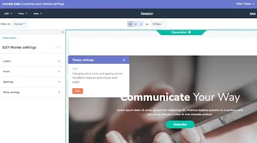
The website creation process is so easy, anyone could do it — mainly because the setup dashboard includes an interactive checklist for you to build your site step-by-step.

I loved this signup workflow when I was building a few side projects. It’s one of the best in terms of user- and beginner-friendliness.

Once you install a free theme, you start customizing the site immediately with your preferred colors and fonts.

The bar at the top of the page shows you where you are on the setup workflow, which is useful for skipping between tasks. Note that this is only active during the onboarding phase.

After you’re finished, you’re taken right back to the user guide, where you can begin exploring HubSpot’s suite of tools for business. You also have the option of connecting a custom domain, which is free.

You can buy a domain through a domain registrar such as GoDaddy and then proceed through the domain connection process.

This might be the most difficult part of signup due to the verification step. But you can always move forward with a free HubSpot domain name, which looks like this:

[randomly generated token].hs-sites.com

It’s not beautiful and is my least favorite feature, so I’d recommend moving forward with a custom-branded domain.

Now, it’s time to edit our site. The website editing process is a little more compartmentalized than in other tools.

Others might take you to the page editor right away. Still, HubSpot takes you to the entirety of its suite dashboard, allowing you to access its marketing, sales, and service tools in addition to its website tools (located under the “Marketing” menu).

To access it, simply go to Marketing > Website > Website Pages.

Then, click Create. I loved the option to create either a website page or a landing page. This makes HubSpot a great fit if you’re using your site to drive leads in any capacity.

The process is easy and familiar after you create your first page. You can choose a template, but be sure to install a theme first (which is part of the setup workflow).

The free themes and templates are perfect, and the HubSpot marketplace offers many options.

Most themes are business-oriented; if you’d like to build an artsy or eclectic website, other website builders include more “fun” designs.

I loved that you can switch between themes and mix and match them. Other tools don’t allow you to use different themes on the same site, so Content Hub is an excellent choice for limited design options.

Once you’ve chosen your template, you’re ready to begin editing. Content Hub pulls in demo content so you can see your page's look when you’re finished.

I can’t tell you how many times I’ve used a template on WordPress only to get a fully blank page with the “Hello World!” heading. The demo content is a definite plus.

Finally, the drag-and-drop page builder is nothing to scoff at. It works based on modules, which you drag onto the page.

It then creates a live element you can edit directly, allowing you to see your changes in real-time instead of having to open a preview tab.

Another thing I loved is that it’s easy enough for a beginner to use but also gives developers the ability to create advanced custom modules and tinker with the site’s source code.

For instance, you can upload a custom CSS stylesheet in your settings.

Here’s the impressive part: Because of its simplicity and user-friendliness, HubSpot’s website builder is more than equipped to handle business-level demands, with marketing, sales, and service software already built-in.

Most of those are free to use at the basic tier, allowing you to send an email monthly, for example, and use HubSpot CRM without paying a single cent.

Of course, it comes with everything you need to build a website, including content management system (CMS) tools, themes and templates, security features, and a built-in content delivery network (CDN) to ensure pages load quickly.

Overall, I can’t recommend this tool enough for any type of business that wants more than a basic website builder.

Core Features
Pricing

A limited free plan is available. The premium CMS plans with additional features start at $23 a month when billed annually.

Brands Using HubSpot

2. Best Free Website Builder for Beginners: WordPress.com

Pros
  • Customizable
  • Flexible
  • Mobile and desktop apps available
Cons
  • The free version displays ads
  • More limitations compared to WordPress.org
  • Although intuitive, it’s more difficult to learn than other drag-and-drop builders

I can’t count the number of WordPress.com sites I’ve built for fun. It’s easy to sign up, it’s free, and its included domain name is not as ugly (and more recognizable) than others on this list. “Brandname.wordpress.com” has a nice ring to it, right?

First, though, I’d like to point out that WordPress.comis different from WordPress.org. WordPress.com is a free, fully-hosted website-building service, whereas WordPress.org is a content management system you can install on your website.

If you’re looking for a simple, free website builder, WordPress.com is the way to go. But if you have a little bit of website development knowledge and are willing to learn the ins and outs of WordPress hosting, WordPress.org is a great choice.

For this list, though, I recommend WordPress.com. Why? It’s an all-in-one option that doesn’t require you to buy separate WordPress hosting or test out different WordPress page builders.

It’s not as customizable as WordPress.org, but it’s more than sufficient for beginners, bloggers, and hobbyists. Due to the free tier’s limitations on bandwidth and lack of CDN, business owners should probably consider another tool.

Just like Content Hub, setting up your website on WordPress.com is very easy. As it guides you through the setup process, WordPress will ask you about your goals and immediately prompt you to choose a free theme for your website.

The themes are modern and mobile-optimized — I was surprised to find that I liked quite a few of the designs. When I’ve used WordPress in the past, I found the themes lackluster, but it seems to have updated its library.

From there, WordPress will take you to an abbreviated checklist that’s similar to HubSpot’s. By the time you’ve picked your theme, you’ve already completed the first three steps.

All you have to do is publish your first blog post, edit the website’s design, and launch your site.

Keep in mind that the site is still in the bare minimum stages — you still need to go into the dashboard and add pages and content.

Unfortunately, on the free version, you can’t install plugins, including the HubSpot WordPress marketing plugin.

Now, let’s talk about the drag-and-drop page builder. WordPress.com is much more minimal than other options on this list, and that’s because it primarily includes plain content formats such as paragraphs, headings, lists, and tables.

A drawback for me is that it’s not a live editor, so you can’t see your changes on the page without previewing it on another tab.

If you want live changes and previews, I’d recommend looking into a free website builder with a WYSIWYG editor like Webflow (discussed further below).

That said, its simplicity makes it a great option for beginners just starting to build their first website — no need to fiddle with complicated modules.

If you are looking for more built-out modules — such as banners, headers, pre-built sections, and more — you’d be better off with a website builder that offers these options on the free tier, such as HubSpot’s Content Hub or Webflow.

Core Features
  • Large collection of themes
  • Mobile-friendly and optimized for SEO
  • Managed website hosting and security
Pricing

A limited free plan is available. Premium plans start at $4 a month when billed annually.

Brands Using WordPress.com

3. Best Free Website Builder for Ecommerce Websites: Weebly

Pros
  • Helpful SEO resource tools
  • Good selection of paid and free apps in the app center
  • The free plan has e-commerce functionality
Cons
  • Limited choice of themes
  • The free and basic paid plans display ads
  • Limited SEO functionality

Weebly is a classic website builder that offers a unique bundle of web hosting, domain registration, web design, and built-in e-commerce functions.

This last feature is of note because, with other tools on this list, like WordPress, you’d have to install an e-commerce plugin to start a shop, and even on Content Hub, you’d need a third-party integration.

On Weebly, you can open a store as part of the sign-up process. Because of this, I highly recommend it if you’d like to build an ecommerce website. This website builder already integrates with Square, a popular online payment gateway.

As part of my test, I created a website for an online store. What I liked about this part of Weebly’s setup is that it’s so simple — you don’t have to go on and on about your goals or the type of website you’d like to build.

During the next few phases, you’ll choose a name for your store and designate the type of products you’ll be sell. I’m not sure what this step is for — it must be for metadata or for Wix’s tracking purposes, but it’s good to fill out either way.

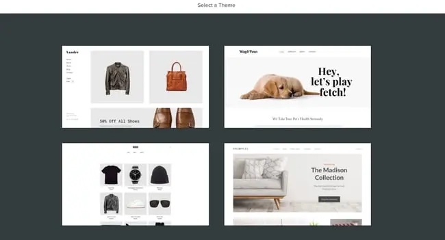
As with Content Hub and WordPress.com, you’ll be prompted to choose a theme. If you’re setting up an e-commerce website, Weebly will automatically sort the themes so that you get storefront options first — there is no need to go hunting for them.

I found the theme selection a little less diverse than other options on this list, but the options are reasonable free e-commerce site builders.

While testing this website builder, I also found that it offers a nifty product listing tool that allows you to set up your inventory for sale immediately.

I loved how easy and simple this was, and it's a great fit for someone who’s trying out e-commerce for the first time.

And, great news: Weebly, like the previous tools, includes a checklist to work through to set up your store correctly.

I’ve used Weebly before but have abandoned it due to its laggy page editor.

During my test this time, I found that the drag-and-drop editor is still somewhat laggy but more serviceable than when I was using Weebly for fun.

It includes the standard text, image, and rich content modules, with more variety and complexity than WordPress.com’s options.

It also features helpful SEO tools and resources to get you started with an SEO strategy, which is a crucial and unavoidable part of having a website because, without it, people might never know your page exists.

Core Features
  • Drag-and-drop editor
  • Integrated CMS solution
  • Free SSL certificate
  • SEO tools
  • Analytics and Reporting
Pricing

A limited free plan is available. Premium plans start at $6 a month when billed annually.

Brands Using Weebly

4. Best Free Website Builder for Web Developers: Webflow

Pros
  • Offers complete control over your site’s design
  • Drag-and-drop what-you-see-is-what-you-get (WYSIWYG) builder
  • Responsive interface
Cons
  • After building a website on Webflow, you need to transfer it to a content management system.
  • Requires some knowledge of HTML and CSS to access full features
  • It has a complex free and paid plan structure
  • You need to sign up for both a Site and Workspace plan

Webflow is a fantastic free website builder for those with more coding experience and who’d like a more customizable website builder tool.

Because of its ability to include multiple workspaces and multiple websites for clients, I especially recommend it for freelance web developers and agencies.

(And if you happen to be a fan of Adobe Creative Cloud, you’ll find that Webflow has a similar UX — another plus.)

Webflow is a winner when it comes to the setup workflow. Straightaway, you’ll have the option to build a website for your company, your clients, or yourself. I chose “Clients” to test its capabilities for freelancers and agencies.

Next, you’ll be asked to identify the type of website you’re building. Blog websites are an option, but if you’re planning to start a blog, I recommend Content Hub or WordPress.com instead.

Both of those offer powerful blogging options and a much more beginner-friendly interface.

I was surprised to see that Webflow includes different workspaces, something I didn’t run across in other tools (except Content Hub, which allows you to have access to different portals).

This makes Webflow an excellent choice for large teams where you might have different workspaces depending on permissions or job functions.

The free theme selection in Webflow is, though limited, very good. I told the tool I wanted to create a portfolio website, and it automatically suggested a portfolio theme for me to try.

After you choose a theme, you’ll be taken straight away to the website builder. Webflow’s page builder is complicated, and the learning curve is steep. While the tool includes a setup checklist, it’s not as simple as others on this list.

For instance, you’ll be prompted to change CSS classes right away — which can be daunting if you’re new to web development.

The actual page builder, though, is pretty familiar. You can add HTML elements such as sections, containers, divs, lists, buttons, headings, and so on.

The tool does include more technical language, so you’ll encounter terms such as “V Flex,” which refers to a vertical flexbox.

I can see this being difficult for beginners and even intermediate users, so if you identify as either, you might want to opt for another tool. (Or you can use Webflow to learn web development terms!)

One thing I love about Webflow that makes it a good fit for beginners is its inclusion of “Libraries.”

If you’re at all intimidated by the language and the learning curve, you can simply import pre-designed components and sections without needing to tinker excessively with the tool itself.

Webflow includes a free domain for you to use, but it only publishes to a staging environment — another reason this tool is such a great fit for developers.

The only thing you’ll need to purchase when using Webflow is a domain you can publish your site.

Core Features
  • A drag-and-drop website builder
  • Widgets to add features like maps and media
  • Third-party integrations
Pricing

A limited free plan is available. Premium plans start at $12 a month when billed annually.

Brands Using Webflow

5. Best Free Website Builder for Local Business Owners: Wix

Pros
  • Easy to use
  • Large collection of apps and templates
  • Optimized for mobile
Cons
  • The free version displays prominent ads
  • The premium plans are pricey when compared to others on this list
  • The only way to change templates is by creating a new site and transferring your premium plan to it

Wix is one of the most popular free website builders and probably one of the first options you thought of when you started researching tools.

The easy-to-use, fully hosted platform offers a drag-and-drop editor, an extensive collection of apps, and professional-looking templates.

I first used Wix from 2010 to 2013, when it was a simple website builder with a reputation for being laggy and poorly optimized. It’s now become one of the most robust options on the market.

Wix’s most noteworthy feature is its focus on providing all the tools necessary for business owners to get their businesses up and running online.

When setting up your site, you can choose your business type.

Unlike other website builders, which use this information for internal cataloging purposes, Wix creates a customized dashboard depending on the type of business you choose.

I set up a blog, an online store, and a brick-and-mortar shop, and all three had different checklists and integrated apps on their dashboards.

For this test, I chose to set up a local shop. Instead of taking me to the website builder right away, the Wix setup assistant tried to get as much information about “my business” as possible.

I was thoroughly impressed by the effort to get my business information in a beginner-friendly questionnaire. The information would later be used for Wix’s Point of Sale tool and on my website.

This makes Wix an especially good fit for local businesses who want to set up a robust online presence but don’t want to mess with different tools to do so.

Depending on your answers to some of the questionnaire questions, Wix will include different widgets, tools, and checklist items on your dashboard.

For instance, below, I told the tool I wanted to accept online and in-person payments, send automated emails, and more—

—and when I went to my dashboard, Wix created a checklist that helped me through a step-by-step set up process, including signing up on its Point of Sale tool.

This is extremely convenient and seamless for a local business owner, but the list can be overwhelming to look at.

I was maybe half an hour into the setup, and Wix had yet to prompt me to start designing my website. The first few steps in the checklist, in fact, all have to do with internal administration and finance.

That tells me that Wix wants to be the one administration portal for business owners to manage their online presence beyond designing a website.

When you finally begin to set up your site, Wix gives you the option of manually choosing a template or using Wix’s creation assistant.

This is a unique feature I’ve yet to run into in my tests, and it can be a game changer for local business owners that are short on time.

I chose to have Wix to create a site for me. It then prompted me to pick a theme and begin preparing home page designs based on my preferred aesthetic.

Since I chose “Fresh” it delivered earthy and clean designs. The selection is limited but good for a local business.

Afterward, you can add pages to your site with pre-imported demo content.

My least favorite aspect of Wix is the page builder itself. It’s cluttered, difficult to navigate, and overly complicated, which could potentially lengthen the learning curve for this tool.

Another aspect I found strange is that inserting a new element doesn’t snap to the grid.

Instead, it stays right where you place it, meaning it might be difficult to reliably use the exact same amount of padding and margin to align elements on your page.

But if you don’t need additional elements beyond the demo content, simply edit what's already there, and it shouldn’t be much of a problem.

Core Features
  • A drag-and-drop editor
  • A large collection of apps and templates
  • Analytics and Reporting
Pricing

A limited free plan is available. Premium plans start at $16 a month when billed annually.

Brands Using Wix

6. Best Free Website Builder for No-Fuss, Short-Term Websites: Google Sites

Pros
  • Very, very easy to use
  • Simple to set up for current Google users
  • Optimized for mobile
Cons
  • This is a limited tool for any sort of business need
  • The templates skew toward outdated
  • Custom domains can’t be connected via Google Sites; 301-redirect needed

Google Sites is Google’s proprietary website builder and is absolutely worth a spot on this list, if only for its ease of use and for the fact that it’s 100% free — no upgrade required.

You can use it just as you would Google Docs, Google Sheets, or Google Slides. Simply go to sites.google.com, choose a template from the list, and start editing.

Google Sites offers templates for employees, individuals, and students.

Even though you could use it for a business website, I wouldn’t recommend this website builder for any type of business, whether freelance, local, small, or enterprise, because of the limited features and lack of integrations.

Google Sites is simply too limited for a business’ demanding needs.

If you’d like to build a website for any other reason, though — for a project, a personal update, or an FAQ — Google Sites is a fantastic choice.

For example, it’s a great option for a job seeker looking to create a simple portfolio to attach to job applications. Once you choose a template, you’re taken right to the editor, where you can start editing the demo content.

The interface is as seamless and familiar as you’d expect from Google. No overly complicated jargon and no overabundance of options, but still exactly what you need to build a strong site with a mild learning curve.

(In fact, the learning curve is so mild that I would actually not recommend this as a learning tool for those building a site for the first time. To truly learn how to create a website, consider a more robust tool that includes traditional web design elements.)

As with any other Google tool, you can collaborate with others and limit permissions. That makes it a great option if you need to build a team site for any reason.

Once you hit publish, it will be published to a subdirectory of a subdirectory on Google’s domain. For instance, here’s the URL I published my site to when I was doing my test:

https://sites.google.com/hubspot.com/tinasmithphdtest/about

You can't connect a custom domain through the Google Sites portal, but you can always purchase a custom domain (I recommend using Google’s own domain buying service, domains.google.com) and setting up a 301 redirect.

Core Features
  • A drag-and-drop editor
  • The traditional Google Workspace interface
  • Analytics and reporting (through Google Analytics)
Pricing

Free.

Brands Using Google Sites

No brands that I know of use Google Sites — this tool is best for personal projects.

7. Best Free Website Builder for Solopreneurs: Dorik

Pros
  • Easy for users without coding or design experience
  • Comprehensive and easily customizable AI-generated website
  • Intuitive interface
Cons
  • Very few e-commerce features

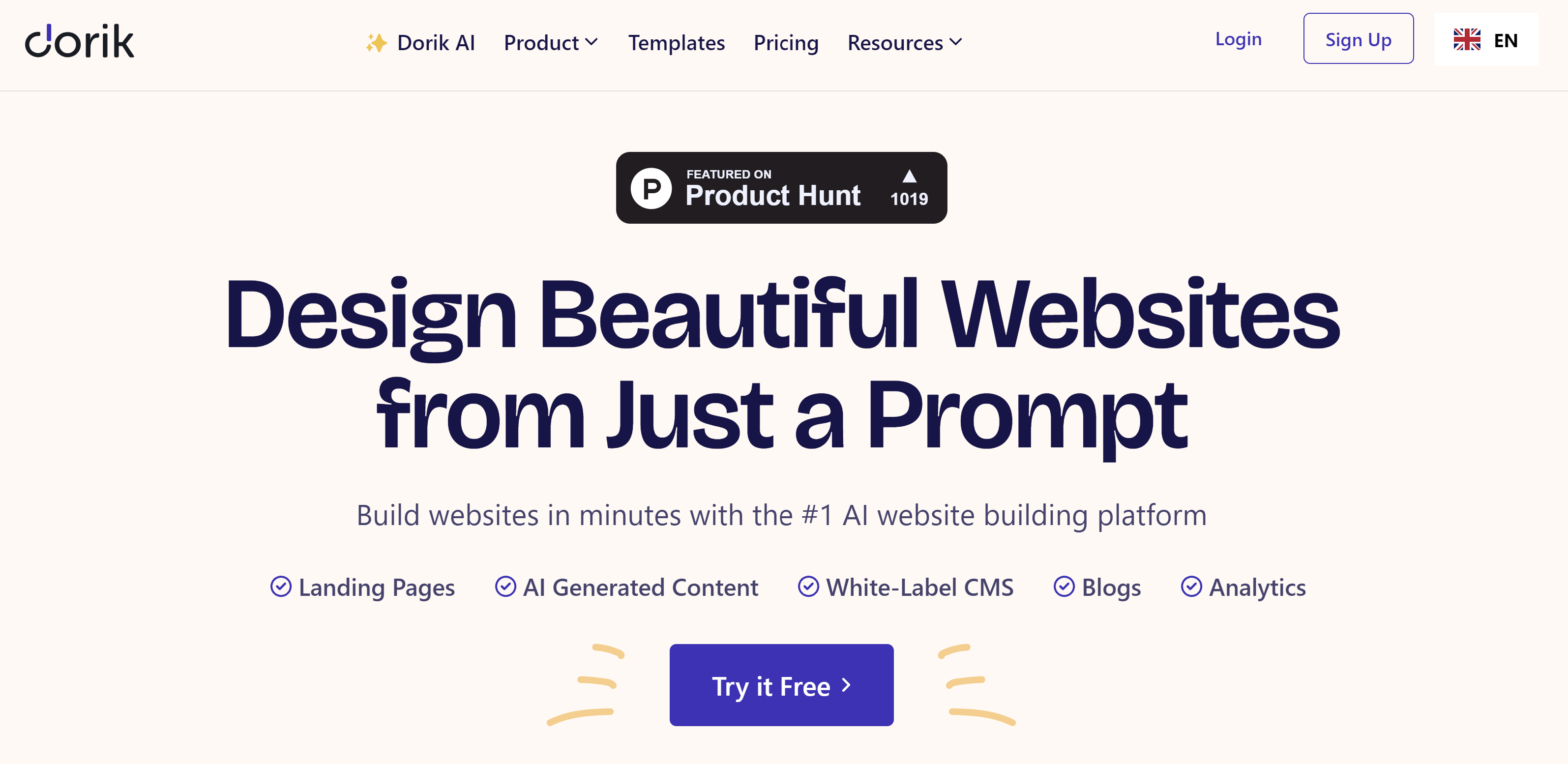
Dorik is a website builder that boasts users can create excellent websites in just minutes thanks to its myriad of features, including AI tools. Moreover, users don't need any coding or design experience to design their site, according to Dorik.

I find Dorik‘s AI features to be the most impressive and unique compared to other website builders. Dorik’s website says it can generate a complete website in seconds with a single prompt. So, naturally, I put it to the test.

After clicking “Create New Site With AI,” I'm greeted with a pop-up showing I only have to enter the name of my website, type a prompt describing the site, and select the language.

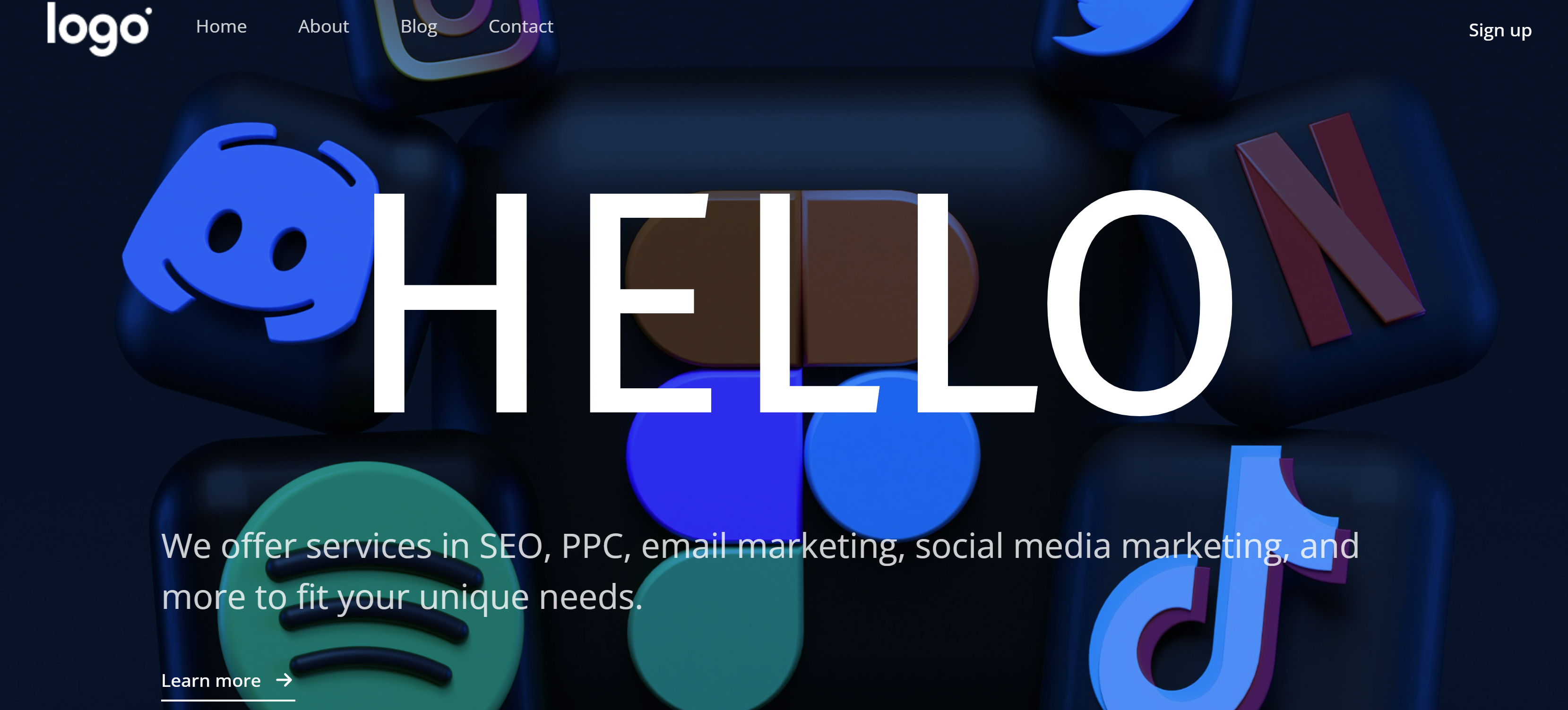
This is the landing page Dorik's AI tool designed for my “Jane Doe Marketing” website. I love how the page includes the following tabs in the top left corner.

  • Home
  • About
  • Blog
  • Contact

I also appreciate the imagery, which features 3-D figures of social media and entertainment apps.

And though the opening sentence is a bit dry in terms of tone, it includes important marketing keywords and is a strong start to improve upon.

I‘m blown away by the details of this AI-generated website. As I continue to scroll down, I see a section explaining what Jane Doe Marketing is an how it works. There’s even a “Learn More” button.

If I scroll a little further, I'll find a spot for our location and contact information. Of course, Dorik provides a sidebar complete with tools to customize and edit the site to my liking.

Based on the ease of its AI tool alone, I think Dorik is an excellent website builder if you're a freelancer, content creator, or solopreneur who wants a beautifully designed website with all the fixings without having to design or code.

Core Features
  • AI website generator
  • AI text and Image Generator
  • Robust blog editor with built-in SEO tools
  • Airtable integration
Pricing

Free features are available. Plans start at $15 per month.

Brands Using Dorik

I don't know of any major brands using Dorik, likely due to its lack of e-commerce features.

8. Best Website Builder for Using Your Own Domain: Ucraft

Pros:

  • Free domain
  • Modern and diverse template designs
  • Easy drag-and-drop editor

Cons:

  • No free blogging options
  • Limited e-commerce feature

Ucraft is excellent for organizations that want to use their domains for free and build a website without coding or having to have coding experience. This website builder also includes a logo maker and blogging platform.

My only issue with Ucraft is that there are no free blogging features, though you can add a blog for an extra $10 per month.

Core Features
  • AI logo generator
  • Easy-to-use templates
  • Free logo maker
  • Visual and content editor
Pricing

Free with paid plans available starting at $21 per month

Brands Using Ucraft

I don't know of any major brands using Ucraft

Website Builder Features You Need

Choosing a website builder tool is easier when you know what you want. Here are the features to look out for.

1. Themes and Templates

The above drag-and-drop themes are available in Content Hub — sign up for free.

Website builders should have theme options that cater to specific niches so users don't waste time creating new templates from scratch. For example, the website builders on our list have options for blogs, portfolios, e-commerce websites, and more.

Templates should be easy to customize and include pre-structured and pre-populated images, text, and other elements commonly found on websites. For example, every site needs a home page, an about page, and a contact page. All you need to do is pick one and replace the sample content with your own.

2. Media (Video, Photo, Audio, and Graphics)

Solely having text on your website can be monotonous, so including different forms of media helps break up text and can help information stick. I suggest filling your website with highly engaging multimedia content and graphics to support vital information and engage users.

You can easily bring your website to life using visual aids and mediums like stock photos, vector images, background images, stock video footage, sound effects, and video editing templates. Many websites provide free media resources for content.

Freepik is a well-known website that provides illustrations and images. Many sites also incorporate icons within the call-to-actions and resources sections. Flaticon is a great source of icons.

3. WYSIWYG Editor

The best website builder tools make it easy for users to customize their websites with drag-and-drop tools and what-you-see-is-what-you-get (WYSIWYG) editors. It’s great for beginners because you don’t need to learn how to code—simply design your site in a few clicks by dragging and dropping elements onto your page and seeing how it will look.

I also predict that using a WYSIWYG editor will save you a lot of time making changes after you publish your site because you can see how everything will look while you’re designing it. This is an important feature to consider when choosing the best website builder for you, one that meets your needs.

4. Malware Scanning

Security is a top consideration when choosing a website builder.

Security features vary depending on the website builder tool you select, but consider it a keeper if it offers malware scanning. Automated malware scanning allows you to address threats before they progress into something catastrophic.

5. Web Application Firewall (WAF)

WAFs sit between your web server and the internet to protect your website from common attacks.

You’ll be able to avoid SQL injections (where a hacker gets the ability to view your site database and access secure data) and cross-site scripting (XSS) (when a hacker injects malicious code into your site) by filtering, monitoring, and blocking malicious traffic from entering the network.

WAFs can come in the form of software-as-a-service (SaaS), and you can customize them to meet your website’s unique needs. If you create your website with HubSpot, you’ll get access to 24/7 enterprise-grade security tools like malware scanning and WAF.

6. Content Delivery Network (CDN)

Besides site security, I strongly recommend optimizing for page speed. The amount of time it takes for your site to load significantly impacts customer experience, conversions, and revenue, and whether your site is even usable on mobile devices.

There are many ways to improve page speed, and a content delivery network (CDN) is one way to do so. CDNs store heavy and static content on distributed servers located worldwide and load the cached content from a location nearest to the user to speed up its delivery.

7. Web Hosting

The best website builders make it convenient to start your websites by offering free web hosting. In some cases, you might need to provide your own web hosting for your platform or use something like WordPress hosting.

Free website builders offer limited bandwidth and storage just for personal use. You can upgrade to shared, dedicated, or managed hosting for an additional fee.

8. Storage

Web hosting provides two services: bandwidth and disk space (or storage).

Most free website builders offer ample (limited) storage for a beginner site but require you to purchase additional storage should you need it.

9. Blogs

Blogs can help your website by:

  • Increasing visibility through SEO.
  • Generating new leads.
  • Building trust and loyalty.
  • Creating brand awareness.

Most free website builders come with basic blogging tools, like AI blog writers and other content management features.

10. SEO Capabilities

According to our 2023 Web Traffic & Analytics Report, organic search is the second-highest driver of website traffic. With this, I can’t stress enough the importance of SEO optimization. If you want to bring in more traffic and views, your website needs to be search engine-optimized.

Most website builders help with technical SEO by offering free SSL certificates and supporting schema markup and XML sitemaps. They also support on-page SEO by allowing you to enter and modify URLs, meta tags, and image alt attributes.

11. Customer Support

While testing the website builder tools listed above, I encountered a few issues that I couldn’t troubleshoot on my own, which leads me to my next point: choose a tool that offers customer support.

Customer support assists you with anything you need help with — technical, sales, billing, payments, or experiences. Depending on the website builder, assistance can come in any (or a mix) of the following channels:

  • FAQs.
  • Chatbot support.
  • Live support.
  • A knowledge base.
  • Video tutorials.

The best website builders keep a mix of channels and answer inquiries promptly.

12. E-commerce Capabilities

If you plan to sell physical or digital products in the future, consider choosing a website builder with e-commerce capabilities. There are dedicated e-commerce website builders, but these are often paid solutions with robust functionality, such as apps for payment and shipping.

Free website builders often integrate with a third-party e-commerce application or support a simple built-in store.

13. Third-party Integrations

Your website builder should integrate with external tools, such as email marketing, e-commerce, and social software, so you can add any functions you need, like live chat, to your website.

HubSpot, for example, offers 1,400+ third-party apps and tools for integrations, and WordPress.com offers extended functionality for your website in the form of Plugins.

14. Analytics and Reporting

Your website builder should also have a web analytics and reporting function to measure important metrics like the site’s popular pages, bounce rate, average duration per visit, and more.

Alternatively, you can track your website metrics in an analytics and reporting tool. When you bring your web analytics together with other key funnel metrics like trials or activation rate onto a dashboard, you give everyone on your team the ability to explore your data and uncover insights.

Picking Your Website Builder

There you have it! Since most of these website builders are free, try out a couple if you're unsure of the best fit. In particular, take note of what you really want to get out of your site to ensure your needs will be met by one of these builders.

Editor's Note: This post was originally published in November 2018 but has been updated for comprehensiveness.

SEO Step-by-Step Tutorial: 3 Essentials for Beginners [+ Next Steps]

Featured Imgs 23

You want to learn about search engine optimization (SEO), but where do you start? We were all SEO beginners once, so take heart: There’s lots to learn, but I’ve got plenty of expert advice and a step-by-step guide to get you started.

→ Download Now: SEO Starter Pack [Free Kit]

We’ll start with some basic SEO vocabulary, review a step-by-step SEO tutorial to help you get your SEO strategy off the ground, and get tips from HubSpot SEO pro Victor Pan and SEOFOMO newsletter founder (and one of the world’s best-known SEO experts) Aleyda Solís.

Table of Contents

SEO Basics

Understanding the foundational SEO vocabulary is important. Let’s dive into a few key terms:

  • Search Engine Optimization (SEO): Tactics to optimize your website to provide the high-quality information searchers look for. Good SEO also helps you rank higher in search results for specific keywords so people can find your content.
  • On-page SEO: Any website optimizations that improve search rankings, like the keywords used in your content or back-end elements like site structure.
  • Off-page SEO: Any actions that improve your search engine rankings outside your website, like backlinks from other websites.
  • Link building: Links to your website from other high-quality websites that build authority and credibility.
  • SERPs: Search Engine Result Pages are the results page you see when you conduct a search on Google or another search engine.
  • White-hat SEO: Optimization tactics that align with accepted and recognized best practices.
  • Black-hat SEO: Optimization tactics that manipulate search engine algorithms to rank websites higher in SERPs. These tactics are often unethical.
  • E-E-A-T: E-E-A-T stands for experience, expertise, authoritativeness, and trust. It’s part of Google’s search quality rater guidelines and one of the factors Google uses to determine a page's relevance and authority.
  • Keyword: Words or phrases users type into a search engine to find content related to their search. As an SEO, you want to include relevant keywords in your content that align with search intent so your site appears in related searches.
  • Keyword research: The process of finding keywords people enter into search results related to your business to help you inform the words to use in your website pages and content.
  • Organic/organic results: Any results in SERP that are unpaid and that appear because of a page’s relevance to the search query.
  • Organic traffic: Organic traffic is traffic that comes from organic results.
  • Rank/page ranking: Where your site falls in SERPs for a specific keyword.
  • Ranking factor: A ranking factor is an element that impacts where your site may fall in search results, like your page authority.
  • Search intent: Search intent is why a user conducts a search.

How to Learn SEO

Learning SEO is a big task, and because SEO best practices change over time, international SEO consultant Aleyda Solís “highly, highly recommends that you don’t go to a single source.” It’s why on her own site, LearningSEO.io, she’s compiled guides and information from many different resources.

Solís offers this pro tip: “See what works for you within your context,” because even if the information is accurate, “it might not be right for your circumstances.”

Here’s a few ways you can accomplish that:

1. Read and watch reliable resources.

There are a lot of educational resources out there to read and watch that will help you build your knowledge of SEO. Here are some of my recommendations.

Google still has a little more than 90% of the search market worldwide, so add its Search Central Blog and Search Quality Rater Guidelines to your list.

AI-powered search engines are a fast-growing segment of the search landscape, so if you want to see how AI perceives your website and brand, take HubSpot’s AI Search Grader tool for a spin (it’s pretty cool).

2. Take free courses.

If you benefit from structured and guided learning, an SEO course is another option to build on your SEO skills. A bonus is that many courses offer certificates upon completion. These are some high-quality options:

3. Stay on top of the trends.

Especially with the advent of AI-powered search, SEO changes and evolves on a sometimes daily basis. Algorithms get updated, new trends surface, and consumer behaviors change.

For example, in December 2022, Google added an E for experience to the old E-A-T guidelines. Experience ensures that content is helpful, relevant, and created by someone with experience in the subject at hand.

(And it’s a key differentiator between computers and humans, as AI-generated content scrambles to get a robotic foot in the door.)

One of the most important factors in becoming an SEO expert is staying on top of the trends so you can pivot when major industry shifts happen. We cover changes in the SEO landscape on the HubSpot Blog, and Google also maintains a running list of major updates that can impact your SEO success.

4. Study your competitors.

Learning from your competitors is a great way to understand the keys to their success.

Pan suggests looking at websites that are doing well and seeing what other pages they link to, so that when you’re “thinking about creating content, it’s not just a single piece of content you’re creating, but the whole journey that a user might go through.” Your content should cover a natural progression of topics.

You can conduct a competitor analysis to uncover new keywords, where competitors get backlinks (also called inbound links) from, and other new opportunities to capitalize on.

Featured Resource: Our free Competitive Analysis Templates help you conduct a thorough analysis of competitors in your niche, and this step-by-step guide walks you through how to use the template for an SEO competitive analysis.

5. Learn by doing.

Once you feel confident, you can take a hands-on approach and enact some SEO strategies.

Solís says to adopt “a mindset of being proactive — always testing, always curious, always skeptical, and always thinking from a strategic perspective.”

“Adopt a mindset of being proactive — always testing, always curious, always skeptical, and always thinking from a strategic perspective.”—Aleyda Solís, International SEO consultant

If you already have a website, you can practice by doing a competitor analysis and updating your current strategy based on your findings. If you don’t have a website, consider building one, implementing your new SEO knowledge, and monitoring metrics.

One of the best things about SEO is that a wide variety of tools are available to help you along every step of the way.

6. Use SEO tools.

Considering the breadth and depth of the internet, it would be a nightmare to do some of the essential SEO functions by hand — this is where SEO tools come in to save the day. They’ve saved me significant time and energy and quickly brought me the results I’m looking for.

Here’s a list of tools I recommend:

  • HubSpot’s SEO Marketing Software offers SEO recommendations to improve your site, optimize page content, and measure ROI.
  • AI Search Grader, another HubSpot tool, analyzes how visible your brand is to AI search engines.
  • Our Website Grader scores your site based on factors like mobile friendliness and SEO optimization.
  • Google’s Search Console can help you measure your site traffic and fix SEO performance issues.
  • Google Analytics helps you view important metrics to understand your SEO efforts, like the measure of organic vs non-organic traffic.
  • Ahrefs is a favorite of HubSpot bloggers. It helps you conduct keyword research and stats their important stats like search volume and CTR.
  • Jasper is an AI writing assistant that can help write SEO-optimized blog posts with target keywords.

Once you’re more fluent in the vocabulary of SEO, it’s time to jump in and get hands-on. Since I’ve promised you the shortest SEO tutorial ever, I’ve broken it down into three very broad categories for beginners: content, technical, and sharing.

As you get more familiar and comfortable with SEO, you can build out strategies in each of these categories using the links I’ve provided below.

1. Content SEO: Write great content.

My number one tip for content SEO is simple, if not entirely straightforward: Write really good content.

There are caveats, of course. What Google deems “really good” has changed over the years, sometimes dramatically and sometimes subtly, so this advice still requires at least a passing interest in industry trends.

And no matter how great it is, if your content covers a topic that not many people are asking questions about, you’re not going to see a flood of traffic.

So I’ve got some tools and roadmaps to help you structure your SEO — but even as you incorporate these tips, writing great content should be your north star.

5 Key Elements of Content SEO: Keyword research, search intent, media richness, internal linking, historical optimization.

Keyword Research

Keyword research is a cornerstone of good content SEO. It’s a great starting point for SEO beginners, so we’ll spend the most time here.

A dedicated tool like Ahrefs or SemRush can be useful for SEOs whether you’re a newbie or a pro, but you can also begin by simply listing words and phrases relevant to your business.

For instance, if you sell roasted coffee, you might opt for “roasted coffee,” “Colombian coffee,” and “local coffee roaster.”

List these keywords in a spreadsheet or document for you to keep track of.

Then, pick one word or phrase to use on one page of your site. In other words, you don’t want to target different keywords on one page. You want to target one keyword, as well as any keywords it’s semantically related to, so that you’re capturing user intent.

Continuing with the example from above, I might create a page for “local coffee roaster.” That would be my main keyword, but I can also target semantically related terms such as “local coffee,” “coffee roaster near me,” “coffee roaster [city name],” and “locally roasted coffee.”

This begins with keyword research, but Pan says not to stress out about it too much: Start by making a list of what the natural things people would search for. Put some of those keywords into Google and see what else people search for.

I asked Google, “is Jurassic Park real,” and here are some related common search terms, heaven help us:

“People also ask” section of Google’s SERPs for the query “is Jurassic Park real.”

Image Source

You’ll do better as a beginner to try to rank higher on keywords that have a lower search volume — trying to outrank well established sites on keywords with high difficulty is not going to earn you a lot of visitors. But if you’re an expert on a somewhat more niche topic, it’s your time to shine.

Once you’ve got some keywords in hand, here’s a few ways to use them to your advantage:

  1. Use the keywords in the page title
  2. Use them in your URL
  3. Use them in your meta description
  4. Use them in your H1
  5. Use them in your page content — naturally. If you’re trying to force it, you may have chosen the wrong keywords for your content.

Consider this:

“We have seen some indie publications close because of overreliance on Google traffic. More than ever, this is a good reminder for SEOs to not necessarily rely only on Google. Try to diversify through all the channels and platforms that people are now using to search.” —Aleyda Solís

“We have seen some indie publications close because of overreliance on Google traffic. This is a good reminder for SEOs to not rely only on Google. Diversify through all the channels and platforms that people are now using to search.”—Aleyda Solís, International SEO consultant

Search Intent

Why a user types a specific query into Google or another search engine is as important as the term itself.

For instance, if I search for “is Jurassic Park real” because I want a job training velociraptors, I’m expecting very different results from somebody using the same query to find out whether the movies were filmed at real-life nature parks that I could go visit.

Generally speaking, users want to learn something, to investigate a brand or product, to complete an action like buying a certain product, or to find a specific website.

Media Richness

Rich media includes audio, graphics, video, polls, or other interactive features. Think like a user: Do you want to read a 4,000-word block of text, or do you want animations or graphics to help break that up?

By structuring this data in the backend, you can optimize your content to make it more appealing in the SERPs.

Internal Linking

As you build out your content library, it’s important to link to your own content, which can help boost traffic and, over time, build your page authority.

The HubSpot blogs have thousands (and thousands) of posts that predate me, so to find relevant blog content to link to, I type “site:blog.hubspot.com” into Google, followed by the term or phrase I’m looking for.

From there, I can decide what to link to based on recency and relevancy. (And thank goodness for this, because my brain is too full of old song lyrics to remember anything useful.)

Screencap of search results for “site:blog.hubspot.com internal linking.”

Image Source

Historical Optimization

If you’re doing SEO for a property that has a large content library, chances are good that some of that content is outdated. But that doesn’t mean it’s useless — far from it.

At a previous job, I reorganized and rewrote event recaps that were no longer serving their original purpose. Because each event centered around a specific topic or theme, it was easy enough to update the titles, headings, and images. I also updated statistics, the content itself, and the publish date.

It didn’t happen overnight, but those pages crept back up in Google’s rankings once they became relevant to our audience again.

Another way to optimize older content is to add more examples and make sure any existing examples are still correct. Double-check links and anything else that may have changed, like step-by-step instructions.

2. Technical SEO: Improve the technical elements of your website.

Even the best content on the internet won’t get any readers if Google can’t find it.

I once worked on a website relaunch that began with an audit of our URL structure. We had to create a logical way of structuring our URLs before we could think about things like redesigning graphics.

The Ultimate Guide to Technical SEO. 1. Technical SEO audit fundamentals. 2. Crawlability checklist. 3. Indexability checklist. 4. Renderability checklist. 5. Rankability checklist. 6. Clickability checklist.

Technical SEO can seem complicated if you don’t have a lot of technical experience. Don’t try to do everything at once — the goal here is to set a strong technical foundation so that Google and other search engines can easily find and crawl your website so that it shows up in search results.

Pro tip: Choose a good CMS — like, ahem, HubSpot — that will take care of the more technical aspects so you don’t have to.

Go deeper into technical SEO with our technical SEO guide, which begins with the fundamentals you’ll need to run an audit. It also takes you through crawlability, indexability, renderability, rankability, and clickability.

3. Sharing and Backlinking: Make sure that users can find your website.

Because your content is great, people want to share it. Congratulations! Now let’s talk about how to build those backlinks.

Pan says to ask yourself, “Why do people want to share what you created?”

He identifies three simple answers to that question. “One, you’re super local, so it’s very relevant. You might even be the only person talking about it.”

“Two, you could have data or a perspective that only your site can share, because of access that you have,” like original research or other proprietary data.

And lastly, “your content triggers an emotional response.”

3 Ways to Make Highly Shareable Content. 1. Create hyper-local, relevant content. 2. Publish proprietary data or a unique perspective users can’t get anywhere else. 3. Trigger an emotional response.

One simple thing I do for HubSpot articles is provide quote cards to the subject matter experts I’ve talked to. It’s an easy way to encourage link sharing beyond your own network, and it doesn’t take much time.

It’s also important to understand the different types of backlinks — for instance, you might be able to write a guest blog on another high-quality website and link back to your own.

We’ve got a complete guide on backlinking when you’re ready to give it a shot.

This SEO Step-by-Step Tutorial is Just the Beginning

Your learning doesn’t have to stop here. With the SEO 101 vocabulary I mentioned above and the step-by-step tutorial, you can easily start creating an effective search engine optimization strategy.

Our starter pack, linked below, will help you ramp up your SEO plans and boost the likelihood of your website ranking on the first page of SERPs.

Editor's note: This post was originally published in March 2013 and has been updated for comprehensiveness.

25+ Dust Brushes, Textures & Effects for Photoshop & More

Featured Imgs 23

Add a gritty, textured feel to your designs with our collection of dust brushes and effects for Photoshop.

Whether you’re aiming to create a vintage look, enhance your artwork with subtle imperfections, or add a layer of realism to your designs, dust textures and effects can make all the difference. These elements bring depth, character, and a raw, weathered quality that elevates everything from photo edits to poster designs.

In this post, we bring you some of the best dust brushes and textures for Photoshop, perfect for creating everything from cinematic photo effects to distressed typography. Have a look.

Dust Photoshop Actions & Effects

Dust Explosion Photoshop Action

Dust Explosion Photoshop Action

This is a dust explosion Photoshop action for designers and photographers needing a fresh and appealing approach to their creations. It can enhance various projects, including CD covers, posters, flyers, and advertising campaigns. Compatible with Photoshop CS3 and newer versions, the action lets you create a non-destructive effect.

Sand Dust Powder Explosion Photoshop Action

Sand Dust Powder Explosion Photoshop Action

This is a high-quality Photoshop action that adds a unique sand dust animation effect to your images. Developed with great care and precision, it’s compatible with Photoshop CC+ and is most effective in its English version.

Dust Storm Animation Photoshop Action

Dust Storm Animation Photoshop Action

This is a high-quality Photoshop dust storm action that can transform your images instantly. Easy to use, it adds an animated dust storm effect and works only with the English version of Photoshop CC+. A handy video tutorial is included with the download for set-up and customization pointers.

Color Dust Photoshop Action

Color Dust Photoshop Action

This Photoshop action can instantly add a vibrant burst of color dust to your images. It works best with photos of figures and models. In addition to creating eye-catching effects, the action also includes 10 color presets for quick customization. Final compositions are fully layered for further editing.

Dust Powder Explosion Effect PSD

Dust Powder Explosion Effect PSD

This is a Photoshop template designed to add drama to your images with a dynamic, explosive dust powder effect. It can convert photos into caricature effects with an energetic, oily, painting oil, glamour oil, portrait oil, or cartoon feel. Best used with photos of 1000px to 3000px resolution, the filters work well with a range of images, including fashion, lifestyle, and product shots.

Dust and Scratch Photo Effect PSD

Dust and Scratch Photo Effect PSD

Another Photoshop template that facilitates high-quality dust and scratches visual effects with just a few clicks. With a 4500 x 3000 resolution and 300 DPI, it ensures sharp, well-organized layers for easy editing. This tool involves a simple process of a double click on the smart object, editing, and saving.

Stardust Glitter Dust Transparent Overlay

Stardust Glitter Dust Transparent Overlay

This pack offers 20 high-resolution celestial dust overlays compatible with Photoshop. Perfect for enhancing outdoor photography, studio photoshoots, and social media images, these overlays come in both PNG and JPG files.

30 Vintage Film Grain Dust Photo Overlays

30 Vintage Film Grain Dust Photo Overlays

This is a professional overlay collection for adding a dreamy, vintage effect to your photos. With 30 high-quality overlays offered, simply place these on your photo and tweak the blending mode. It’s compatible with mobile and desktop platforms, including Adobe Photoshop, Gimp, Snapseed, and Picsart, and more.

Dust Photoshop Brushes

15 Real Dust Photoshop Brushes

15 Real Dust Photoshop Brushes

Explore the artistic potential offered by this collection of unique dust Photoshop brushes. Of high quality and 5000px, these brushes provide realistic dust and hair textures, enhancing any digital art or design project. Conveniently provided in ABR format, the collection is skillfully crafted and sure to enrich your Photoshop toolkit.

Dust Particles Brushes for Photoshop

Dust Particles Brushes for Photoshop

A creative set of Photoshop brushes featuring 8 distinctive dust particle brushes for adding a touch of magic to your digital works. This carefully crafted tool comes with an ABR file and comprehensive instructions. It works best when used with the “Screen” or “Color Dodge” blend mode.

45 Ash Dust Photoshop Stamp Brushes

45 Ash Dust Photoshop Stamp Brushes

Check out this set of 45 ash dust photoshop brushes, compatible with Photoshop CS6 – CC. The high-resolution texture brushes, with over 3000 pixels size, elevate your digital projects with their versatility. Great for photo overlays, digital manipulation, adding special effects in games, or enhancing your artwork, these brushes can transform your creations, injecting a unique aesthetic quality into them.

60 Grunge Dust Photoshop Stamp Brushes

60 Grunge Dust Photoshop Stamp Brushes

Looking for a unique finishing touch for your digital project? Then this grunge dust brushes collection is perfect for you. It’s compatible with all Photoshop versions from CS2 to CC. With 60 high-resolution brushes up to 2500 pixels, you can add intriguing texture to your photos, create eye-catching visual effects for games or artwork, or simply add some grungy charm to your designs.

Dust Explosion Brushes for Photoshop

Dust Explosion Brushes for Photoshop

This collection of Photoshop brushes can help you design splendid dust and powder explosion effects with ease. This high-resolution set includes eight distinct brush styles, with pixel dimensions ranging from 3805 – 4968 px. The brushes are user-friendly and compatible with numerous CS6 to CC 2023+ Photoshop versions.

Stardust Brushes for Photoshop

Stardust Brushes for Photoshop

Stardust brushes for Photoshop is a brush pack designed to add sparkly celestial dust effects to your work. This pack features 20 high-resolution (4096 x 4096 px) brushes that are simple to use. The brushes are perfect for various types of creative digital design projects.

90 Fractal Dust Stamp Brushes

90 Fractal Dust Stamp Brushes

Fractal dust brushes is an expansive brush collection of intricate fractal shapes and textures specifically crafted for Photoshop CS6 – CC. Housing a robust eruption of 90 high-resolution brushes, this universal pack allows compatibility with any application that opens .ABR files. Its distinctive designs can add an instant flair to web constructs, art pieces, presentation design, and various print essentials like cards, covers, and posters.

Flour Dust Brushes for Photoshop

Flour Dust Brushes for Photoshop

This is a unique brush pack that breathes life into your designs with incredible powder, explosion, and dispersion effects. This set includes eight high-quality, high-resolution brushes, all simple and user-friendly. Compatible with multiple Photoshop versions (CS6 and all CC versions).

Dust Textures & Backgrounds

10 Dust Texture Overlays

10 Dust Texture Overlays

Add a touch of nostalgia with this dust texture overlays pack, which offers ten unique vintage dust textures in high resolution (6000 x 4500 px, 600 dpi). Compatible with Photoshop, Photoshop Elements, and any graphics program that can read JPG files, this asset is a fantastic tool for breathing life into your creative projects with a vintage touch.

Light Bokeh Dust Textures

Ligh Bokeh Dust Textures

This is a set of 20 distinct model overlays designed to add an artistic touch to your visuals. Each model is available in a 6000x4000px size with 300 DPI, packaged in a JPG format. Ideal for any creative project, these textures, full of fine detail and depth, are sure to elevate your imagery.

Vintage Dust Texture Pack

Vintage Dust Texture Pack

Explore the charm of bygone eras with this vintage dust texture pack. This creative asset brings authenticity to your designs with high-resolution texture images featuring subtle dust particles and delicate scratches—hallmarks of classic photos and memorabilia. Easily integrated into a range of design projects, it’s perfect for photo overlays, digital artworks, or evocative backgrounds. The pack includes 10 textures in both JPG and PNG format.

10 Dust & Scratches Textures

10 Dust & Scratches Textures

A versatile collection of high-resolution JPG files with dust textures, perfect for enhancing your design projects. Ideal for use as overlays, backgrounds, masks, and more, these 4000x4000px files can be adapted for any creative work. Compatible with Photoshop or any program capable of reading JPG files, these textures offer endless possibilities for bringing your ideas to life.

Colorful Dust Explosion Backgrounds

Colorful Dust Explosion Backgrounds

A collection of high-quality, dynamic backgrounds featuring colorful dust explosions. With a variety of 10 colors available in a 3000×2000 pixel JPG format, these backgrounds offer a vibrant explosion of dust reminiscent of India’s Holi Festival. Suitable for use in numerous settings, ranging from yoga studios to social media platforms, these textures can inject life into a dull design or enhance a presentation.

10 Dust & Grunge Textures

10 Dust & Grunge Textures

This pack offers a collection of high-resolution dirty wall textures featuring dust, grains, speckles, and more. Ideal for digital artworks, these textures can be used as backgrounds for graphics, texts, business cards, websites, and social media banners among others. Available in both JPG and PNG formats, they are compatible with Adobe Photoshop CC or higher versions.

Free Dust Photoshop Brushes & Effects

Free Dust Photoshop Text Effect

Free Dust Photoshop Text Effect

This is a text effect template you can download for free to craft cool titles for your design projects. It features a stylish dust dispersion-style effect. The text is easily customizable as well.

Free Dust Dispersion Photoshop Effect

Free Dust Dispersion Photoshop Effect

This PSD template is also free to download and it comes with a creative dispersion effect that you can instantly apply to your photos. The template features smart object layers for easy editing as well.

Free 68 Dust Brushes for Photoshop

Free 68 Dust Brushes for Photoshop

This is a big collection of dust brushes for Photoshop. You can download it for free to use in your personal projects. The brushes come in both Photoshop and Affinity Photo formats.

Free Sand Dust Photoshop Brushes

Free Sand Dust Photoshop Brushes

Another collection of dust-themed Photoshop brushes. This pack includes 15 brushes that feature sand dust-style brush designs. They are perfect for adding grain and texture to your designs.

Free Powder Dust Photoshop Brushes

Free Powder Dust Photoshop Brushes

This free Photoshop brush pack also includes 15 different high-quality brushes in 2500px size. The brushes feature powder dust-style brush designs with a realistic look and feel.

You’re Not The Hero — Your Customer Is

Featured Imgs 23

April Sunshine Hawkins is a StoryBrand workshop facilitator, keynote speaker, and co-host of the Marketing Made Simple podcast (which has 2M downloads). 

She helps businesses streamline their messaging, and loves teaching business leaders to leverage the StoryBrand framework to simplify what they're trying to say. 

Keep reading to learn her three tips when it comes to storytelling, selling what you love, and making the customer the hero. 

Click Here to Subscribe to Masters in Marketing

1. Lead with what you love.

If this sounds a little too similar to the preachings of Liz Gilbert in Eat Pray Love, bear with me; it connects to marketing.

Don’t "do what brings you the most money"... Just do something for the joy of it. Plain and simple. 

"You need to be selling the products that bring you the most joy. Why are you pushing something you hate doing? Don't do that," Hawkins tells me. 

"I know so many people, especially in the SMB space, who are in a rut because they've backed themselves into selling something they don't actually like selling," she says. 

That doesn’t mean you need to stop offering those products entirely, especially if they’re keeping the lights on. 

But when you care about what you’re selling, Hawkins says, your customers can feel it. Lean into the stories or values that matter most to you, and you'll find yourself connecting more deeply with your audience.

Now how do I make a career out of reading rom-coms and drinking frozen margs? 

2. Your customer is the hero. Not you. 

Hawkins sees too many marketers position their brand as the heroes, and she says it's one of the biggest mistakes marketers can make.

"Everybody wakes up the hero of their own story. Your customers, the people you're trying to draw in… The story needs to be about them."

In other words, you’re not Batman — you’re Alfred.

Take a recent example: Hawkins was working with a jewelry brand that creates products in Malawi and pays their workers 3-5X the minimum wage. Naturally, they wanted to shout that from the rooftops. Who wouldn't?

But Hawkins stepped in and pointed out that the brand isn't supposed to be the hero. The customer is. 

"We rewrote the campaign to ask, 'How can these pieces help people celebrate a milestone — like a promotion, an anniversary, a birthday?" 

Suddenly, the jewelry wasn’t just jewelry; it became a badge of a customer's big (and small) life moments.

Have you ever landed on a website and read the first few sentences and thought, Wow, is this person in my head? That's the end-game: For your customers to feel like you get them. 

"When we can position our products to align with what our customers are feeling, it creates that 'ding, ding, ding' moment — 'That's me! This is for me!'" Hawkins says. "That's what we're looking for." 

3. Marketing is just storytelling. 

April Sunshine Hawkins is, as it turns out, exactly what you'd expect — bright, warm, and exceptionally joyful. 

She also loves a good story, which is why she works for a company (StoryBrand) that helps businesses sharpen their messaging through a provided framework. 

"It's just nice to have a framework to go to, so when you're like, 'Oh no, there's a blinking cursor again. What am I supposed to say?' You have a framework to work off of," she tells me. 

Here's the nugget of wisdom: As marketers, we don't always have to reinvent the wheel. If marketing is really just storytelling, then it's vital to treat your messaging the same way you'd write a novel — with a hero, a surmountable challenge, and a triumphant ending. 

Click Here to Subscribe to Masters in Marketing

50+ Best Spooky Halloween Fonts 2024

Featured Imgs 23

Halloween is a busy time. Not just for the kids, but also for professional designers. It’s that time of the year you start looking for Halloween-themed fonts, templates, vectors, and icons for designing all those spooky posters and greeting cards.

Well, this year you won’t have to spend hours searching for creative fonts for your Halloween designs. Because we already did the work for you and picked out the best spooky Halloween fonts that will make your work stand out from the crowd.

In this collection, we feature a collection of the best Halloween fonts that are suitable for all kinds of designs from posters, greeting cards, social media designs, and other Halloween and horror-themed designs. Have a look.

Hereday – Horror Halloween Font

Hereday - Horror Halloween Font

Hereday provides a premium, spiky typography design ideal for attention-grabbing titles for flyers, posters, packages, or logotypes. It is versatile, offering uppercase, lowercase, numbers, punctuation, and multilingual options. It comes in OTF, TTF, and WOFF formats, ensuring versatility for your Halloween project needs.

Horror Mansion – Halloween Font

Horror Mansion - Halloween Font

Horror Mansion is a whimsical and genuine Halloween font ideal for livening up blogs, logos, ads, or even personal projects like greeting cards or photo albums. Delivered in both OTF and TTF files, this decorative font brings an extra dash of Halloween spirit to any design it enhances.

Haunted House – Halloween Font

Haunted House - Halloween Font

Haunted House is an eye-catching decorative typeface that infuses any design with a touch of Halloween. The playful, authentic font lends itself to various projects, from blog posts to decorations, enhancing your creativity. The zip includes both OTF and TTF files, making it easy for you to incorporate it into your favorite designs.

Weird Thorny – Spooky Halloween Font

Weird Thorny - Spooky Halloween Font

Weird Thorny is a delightfully eerie, hand-drawn Halloween font that lends an air of the macabre to your projects. Ideal for creepy branding or unique social media posts, this typeface plays off the unsettling imagery of a twisted, thorny landscape. It comes in various forms such as regular, outline, italic, and outline italic.

Gravella – Halloween Horror Font

Gravella - Halloween Horror Font

Gravella is a hand-drawn typeface that delivers the ultimate creepy and scary feel. Perfect for Halloween-themed projects, social media posts, book covers, and merchandise, this font possesses an eerie charm and intriguing letterforms. With multilingual support, Gravella is a creepy yet fascinating font for anyone with a love for frightening atmospheres.

Spooky Laboratory – Halloween Font

Spooky Laboratory - Halloween Font

Spooky Laboratory is a delightfully eerie Halloween font. With its playful authenticity, it brings an element of spooky fun to various projects like blog posts, logos, branding, ads and more. Whether you’re decorating greeting cards or enhancing photo albums, this font is a superb addition that guarantees intriguing results.

Silly Creature – Cute Halloween Font

Silly Creature - Cute Halloween Font

This is a whimsical, all-caps font that adds a playful touch to any Halloween theme. Its condensed style comes with a variety of alternate characters and ligatures. This fun typography is enhanced by the addition of silly Ccreature doodles with quirky decorations for the letters.

Howdy Pumpkin – Halloween Font

Howdy Pumpkin - Halloween Font

Howdy Pumpkin is a festive, all-caps Halloween font infused with the aesthetics of autumn. This package features a straightforward OpenType version, along with two OpenType-SVG formats laden with alternating letter doodles. Experiment with these alternating styles to perfect your design.

Spooky Vibes – Halloween Font

Spooky Vibes - Halloween Font

Spooky Vibes is a unique Halloween-themed font that captures a playful and authentic atmosphere. Ideal for various projects like blog posts, branding, invitations, or photo albums, this decoration font adds a fun touch to your designs. Available in both OTF and TTF formats, Spooky Vibes font breathes life into your Halloween-themed designs.

Vision Of Sorrow – Halloween Font

Vision Of Sorrow - Halloween Font

Vision Of Sorrow is a chilling Halloween font that screams dread and mystery. Designed with strokes resembling shadows out of the dark, this spooky asset features numbers, symbols, ligatures, alternate punctuation, and multilingual support. Perfect for horror-themed designs, each letter is intricately fashioned to evoke a sense of terror making it an unforgettable choice for movie posters and terror-filled game designs.

Scary and Spicy – Creepy Halloween Font

Scary and Spicy - Creepy Halloween Font

This font has the perfect look of a Halloween font with bold and spooky letters. It also looks fun and creative enough to make your Halloween-themed designs look more joyful. The font is especially perfect for greeting cards, spooky posters, banners, and more.

Vampire Zone – Spooky Scary Halloween Font

Vampire Zone - Spooky Scary Halloween Font

The creatively decorated design gives this font a very unique look and feel. It comes with both uppercase and lowercase characters. You can use this font to craft scary-looking titles for Halloween-themed social media posts, posters, and flyers.

Lonely Dripping – Halloween Display Font

Lonely Dripping Halloween Display Font

Lonely Dripping Halloween font has a stylish paint-dripping effect that will add an extra spooky look to your title designs. The font includes uppercase and lowercase characters with multilingual support.

Furious Night – Scary Halloween Font

Furious Night - Scary Halloween Font

Inspired by gothic-style designs, this spooky Halloween font comes with a very scary-looking letter design. It includes lots of stylistic alternates, stylistic sets, and ligatures as well.

Nosy Ghost – Free Halloween Font

Nosy Ghost - Free Halloween Font

Nosy Ghost is a fun and joyful Halloween font you can download for free. It has a chunky letter design that’s been made for big and bold titles. You can use it for free with your personal projects.

Side Of Monster – Free Halloween Font

Side Of Monster - Free Halloween Font

Another free Halloween font with a spooky letter design. The letters of this font have unique decorative elements that make your typography look much more creative. It’s free for personal use.

Endless Sorrow – Halloween Font

Endless Sorrow - Halloween Font

Making your Halloween designs look both scary and fun will be much easier when using this creative font. It features elements of both a quirky and a spooky design. The font comes with a hand-drawn look and in two styles: Regular and a bonus Catchwords typeface.

Monsteria – Spooky Script Font

spooky font

Monsteria is a horror fantasy font with a handwritten look guaranteed to freak the shit out of your audience. Great for Halloween-themed projects, Monsteria will look good on t-shirt designs, party posters, invitations, coffee mugs, logos, and more.

The Graveyard – Fun Halloween Font

spooky font

The Graveyard is a fun and playful typeface with an incredibly remarkable bouncy style sure to give your Halloween designs a spooky appearance. It comes packed with a full set of standard uppercase, and lowercase characters, and so much more.

Renold – Cute Spooky Font

spooky font

Renold is a cute, and cuddly halloween-themed font that will look awfully beautiful on posters, flyers, invitations, greeting cards, logos, and many more branding designs. It’s a kids friendly typeface sure to be loved by the little ones.

The Witch – Creepy Halloween Font

spooky font

The Witch is a creepy, and ominous font perfect for bringing that Halloween vibe into your design projects. It comes with uppercase, and lowercase letters, numerals, symbols, and seamless multilingual support. It’s certainly one of the best Halloween fonts out there.

Halloween Spooky – Free Halloween Font

Halloween Spooky - Free Halloween Font

Halloween Spooky has the perfect look for designing fun-looking typography for Halloween-themed greeting cards and posters. It comes with a set of extra graphic elements as well. You can use it for free with personal projects.

Cipitillo – Free Halloween Font

Cipitillo - Free Halloween Font

This Halloween font has a bold character design that fits perfectly with both horror and Halloween-themed designs. The font is completely free to use with your personal and commercial projects.

Spooky Finger – Halloween Font

spooky font

Spooky Finger is a scary font that is sure to draw your audience in at a glance. It will give an eerie twist to your branding designs, and make them look more fun, and appealing. It comes with uppercase, and lowercase characters, numbers, punctuation, and dingbats.

Brain Melt – Halloween Font

Spooky Halloween Font

Check out Brain Melt, a spooky font that oozes with the lure of Halloween. It has a melted design, perfectly fitting for any project needing an eerie and scary feel. We wholeheartedly recommend you try out Brain Melt for your upcoming Halloween project.

Pumpkin’s Brush – Halloween Font

Pumpkin's Brush - Halloween Font

Pumpkin’s Brush is a Halloween-themed font that comes with a classic design. It features a unique hand-painted design that’ll give a more creative look to your print and digital design works. The font comes in 3 different versions: Normal, slant, and a special character typeface.

Fright Night – Vintage Horror Font

Fright Night - Vintage Horror Font

Fright Night is a horror-themed font that comes with a vintage design. This is the kind of font that you usually see in classic horror movie posters. It’s perfect for crafting a poster or a flyer for a Halloween-themed event. The font comes in 12 different styles and more than 300 glyphs.

Hallowen – Creative Halloween Fonts

Hallowen - Creative Halloween Fonts

This retro-themed Halloween font features a true horror-filled design that makes it most suitable for designing flyers and posters for horror theme parks and carnivals. You can also use it for greeting card designs as well. The font is available in 6 different styles, including grunge and inline.

Gallow Tree – Spooky Halloween Font

Gallow Tree - Halloween Font

Gallow Tree is a creative Halloween-themed brush font featuring a spooky design. It features a natural hand-drawn design, which has been drawn using a Faber Castell brush pen and the font includes 370 glyphs as well.

Halloween Nightmare – Free Halloween Font

Halloween Nightmare - Free Halloween Font

Another free Halloween font that includes both uppercase and lowercase characters. This font has a very spooky vibe that adds a haunted look to your designs. It’s free for personal use only.

Halloween House – Free Spooky Font

Halloween House - Free Spooky Font

Halloween House is a simple Halloween-themed font that has a mellow-looking character design. Since it doesn’t look too spooky, the font is a great choice for many Halloween advertisements and promo campaigns. It’s free to use with personal projects.

Story Brush – Halloween Font

Story Brush - Halloween Font

Another horror-themed font that’s ideal for designing both Halloween and horror-themed designs such as greeting cards, posters, flyers, and even title pages. The font comes in 2 styles: Regular and slanted. It also includes 240 glyphs.

Kreature – Halloween Horror Font

Spooky Halloween Font

If you want to nail the perfect Halloween horror look in your designs, Kreature is well worth checking out. It features a ghostly design that will look great on Halloween-themed posters, flyers, social media posts, t-shirts, mobile covers, and invitations.

Mukadua Font Duo – Halloween Font

Mukadua Font Duo - Halloween Font

Mukadua is a unique font that comes with two different styles of fonts. One version of the font features a horror-filled spooky design while the other has an enchanted and delightful design. It’s sort of like two fonts with designs for heaven and hell.

Another Danger – Halloween Font

Another Danger - Halloween Font

Featuring a true horror design, this Halloween font gives out a scary vibe that will allow you to create terrifying titles for movie posters, book covers, and various other design projects. The font is available in regular and slanted versions with all-caps letters.

Jack Reacher – Halloween Font

Jack Reacher - Halloween Font

Jack Reacher is a display font that comes with a unique spooky design. Even though it has no relation to the books or the movie series of the same name, the font does have an interesting design that will add a scary look to your Halloween-themed greeting cards and posters.

Butter Haunted – Halloween Font

Butter Haunted - Halloween Font

This handmade horror-themed font will probably remind you of the old movie titles from the 1960s Alfred Hitchcock movies. The font includes multilingual support and it’s ideal for designing posters, titles, greeting cards, and even T-shirt designs.

Ghoul – Spooky Halloween Font

Ghoul - Spooky Halloween Font

Ghoul is a creative Halloween-themed font that features a unique design with modern elements. The rounded edges and the quirky look of the font make it less scary and more suitable for kid’s themed poster and greeting card designs.

Herald – Halloween Font

Herald is a modern serif font with a quirky design. While it doesn’t have a spooky or a horror look, this font will fit in nicely with your Halloween greeting cards, posters, and flyers for children and fun occasions. It also comes bundled with a bunch of vector graphics and elements too.

Babadook – Halloween Font

Spooky Halloween Font

Next up we have Babadook, a Halloween font that is guaranteed to send chills down the spine of your audience. It comes bundled with a range of amazing features, and is compatible with Adobe Photoshop, Adobe InDesign, Adobe Illustrator, and Microsoft Word.

Lunar Tundra – Halloween Brush Font

Lunar Tundra - Halloween Brush Font

Lunar Tundra is a creative brush font that features a spooky design. It’s ideal for designing posters, T-shirts, social media posts, and various other designs related to Halloween. The font will also look great with a horror-themed design with the right mix of colors.

Savath – Halloween Font

Savath - Halloween Font

This spooky font features a gothic horror-themed design that makes it most suitable for designing posters, flyers, and titles for horror-themed designs. The font comes in 6 different versions, including regular, rust, rough, and variations with shadows.

The Crow – Vintage Halloween Font

The Crow - Vintage Style Halloween Font

The Crow is another font that features a gothic-era inspired design. It comes with 6 different fonts featuring grunge, inline, and shadowed versions. You can use this font to give a unique look to your designs.

Croak – Halloween Font

Croak - Halloween Font

Croak is a spooky Halloween font with a withered design. The font features 2 different designs including a rough version of the font. It also features multilingual characters, numbers, and punctuations.

Grooving – Vintage Halloween Font

Grooving - Vintage Halloween Font

This creative font comes in two attractive designs, solid and textured, for designing unique posters, greeting cards, and T-shirts for your Halloween-themed design projects. The font also comes with lots of alternates, swashes, and ligatures as well.

Vermillion – Bold Halloween Font

Spooky Halloween Font

Vermillion is a bold, and spine-chilling Halloween font featuring a puff-paint design with sharp edges. It comes in 3 styles namely regular, outline and grunge. Vermillion is one of the most unique spooky font on our list, and you should definitely try it out.

Silent Scream – Creative Halloween Fonts

Silent Scream - Creative Halloween Fonts

Silent Scream is a creative brush font with a Halloween-themed design. It comes in two versions: Regular and italic. You can use the font with various types of spooky designs.

Covenant – Halloween Font

Covenant - Halloween Font

Covenant is a modern horror-themed font that features a spooky design. The narrow design of the font just makes it look even scarier. This font is perfect for crafting movie posters, book titles, and other horror designs.

Stranglethorn – Spooky Halloween Font

Stranglethorn - Spooky Halloween Font

Another spooky Halloween font with a creative design. This font features a handmade design and includes both OTF and TTF formats. You can use it to design posters, book covers, greeting cards, and more.

Glaive – Halloween Font

Glaive - Halloween Font

Glaive is a bold font with a creative design. This font is most suitable for designing posters, titles, book covers, and social media posts with a subtle spooky design. The font includes all-uppercase letters with alternates.

Afterlife Handmade – Halloween Font

Afterlife Handmade - Halloween Font

Afterlife is a unique handmade font that features a spooky design. It comes in both OpenType and TrueType formats. You can use the font to craft unique posters and flyers for various Halloween-themed events.

If you’re working on a different style of a poster, check out our collection of the best fonts for posters.

Convert Vb.net to C++

Featured Imgs 23

Greetings, I'm having an issue, I want to set my form to display at the very top right hand side corner of a screen, I've achieved this in vb.net using this code

Location = New Point(Screen.PrimaryScreen.WorkingArea.Width - Width, 0)

Does anyone know how I can do this in VC++?

20+ Best Hotel Presentation Templates (PowerPoint, Google Slides + More)

Featured Imgs 23

Creating a professional, visually captivating presentation is essential when promoting a hotel or hospitality business. Whether you’re pitching to investors, presenting to potential clients, or showcasing your brand to partners, the right presentation can make all the difference.

In this blog post, we’ve curated a collection of the best hotel presentation templates designed to help you deliver stunning and polished presentations with ease.

Whether you’re showcasing room amenities, event spaces, or the overall guest experience, these templates provide a structured, easy-to-edit framework to bring your vision to life. They offer everything you need to highlight key features of your hotel—beautiful imagery, engaging content layouts, and professional design elements that will impress any audience.

Hotellia – Hotel PowerPoint Template

Hotellia - Hotel PowerPoint Template

Hotellia is a stylish hotel PowerPoint template with a versatile and elegant design created for a variety of business needs. It features 30 unique, clean slides in HD widescreen format and offers a range of customizable infographics such as bar charts and circles. Its user-friendly nature requires no additional image editing software and allows for fully editable text, fitting any business’s style and need.

Hotel – PowerPoint Presentation Template

Hotel - PowerPoint Presentation Template

This is a superbly organized pitch deck template ideal for professionals intending to create an impressive presentation. It comprises 30 easily adjustable slides and a craft infographic feature. The asset is remarkable for its customization ability; you can change colors, resize, recolor, and more.

Hotel & Resort PowerPoint Template

Hotel & Resort PowerPoint Template

This hotel PowerPoint template offers a professional, contemporary design with a focus on detail. Perfectly suited for diverse presentations, from business and branding to advertising, it features over 38 unique slides, easy color change, and full HD quality. Its strength lies in its carefully crafted typography, usability, and extensive mockup capabilities.

California Hotel – PowerPoint Presentation Template

This hotel PowerPoint template is ideal for those in the hospitality and travel sectors. Boasting a clean, minimalist design, this template includes 100 uniquely creative slides, fully animated with resizable vector elements. The template supports retina and full HD display, and supports a variety of file types including pdf.

Travotel – Travel & Hotel PowerPoint Template

Travotel - Travel & Hotel PowerPoint Template

The Travotel is a comprehensive and professionally designed template ideal for a visual representation of offerings within the hotel or travel industry. With 20 modifiable slides and easy drag and drop features, it allows for captivating and customizable presentations. Designed to fit in a 16:9 Wide Screen Ratio and needing only free web fonts, its user-friendliness is commendable.

Hotel & Villa – PowerPoint Template

Hotel & Villa - PowerPoint Template

This is a sleek and modern hotel PowerPoint template, designed with detail and professionalism. It includes 10 completely customizable slides, featuring resizable and editable graphics, free recommended web fonts, and a widescreen ratio. The template is based on master slides and has a convenient drag-and-drop picture placeholder.

The Neuville – Luxury Hotel PowerPoint Template

The Neuville - Luxury Hotel PowerPoint Template

The Neuville is a versatile template—ideal for a range of uses from real estate or hotel presentations to company profiles or personal portfolios. With 30 slides, over 500 icons, and handy features like easy-to-edit graphics and simple drag and drop, creating an engaging, professional presentation is a breeze.

Hotel Management PowerPoint Template

Hotel Management PowerPoint Template

This is an excellent hotel PowerPoint template for hotel industry professionals looking to highlight strategies for optimizing operations and service. With its pleasing aesthetics and organized design, the template provides 20 slides with master slides and image placeholders included.

Hoteliano – Luxury Hotel PowerPoint Template

Hoteliano - Luxury Hotel PowerPoint Template

The Hoteliano is an elegantly designed tool for any presentation purpose, particularly within the luxury hospitality industry. The template features over 40 unique slides, all designed with careful attention to detail, usable typography, and modern aesthetics. The template package includes easy-to-use PPTX and PDF files.

Solace – Hotel & Travel PowerPoint Template

Solace - Hotel & Travel PowerPoint Template

Solace is a multipurpose, professional presentation tool ideal for various sectors like business, creative agencies, and portfolio presentations. The clean, modern design is easy to edit and customize. With over 30 slides, an HD aspect ratio, and a high resolution of 1920×1080 pixels, this template is adaptable and user-friendly.

Gracia – Luxury Hotel PowerPoint Template

Gracia - Luxury Hotel PowerPoint Template

Gracia hotel PowerPoint template offers a professional, ultra-modern design ideal for any presentation purpose. With over 40 unique slides, this template promises attention to detail, usability, and strong typography. The set includes PowerPoint PPT & PPTX files and PDF documentation, editable on master slides.

Holux – Hotel Marketing Presentation

Holux - Hotel Marketing Presentation

Holux is a brilliant tool designed to elevate your hotel’s marketing strategy. It’s developed as a PowerPoint presentation template equipped with unique layouts, high resolution, and easy customization for showcasing your brand and services.

De Luna – Hotel Marketing Presentation

De Luna - Hotel Marketing Presentation

The De Luna is a versatile PowerPoint template ideal for creating engaging and professional marketing presentations. Its clean, modern design offers ample room for creativity, with 50+ unique slides and various features such as easy-to-edit vector icons, drag-and-drop placeholders, and a selection of world map vectors.

Luxury Hotel Marketing PowerPoint Template

Luxury Hotel Marketing PowerPoint Template

This is a user-friendly, highly customizable hotel PowerPoint template perfect for showcasing your luxury hotel. It’s versatile, suitable for various businesses and promotional purposes. The template includes 20 pages in 1920px x 1080px size, with 72 DPI in RGB color, and utilizes free fonts.

Luxury Hotel & Resort PowerPoint Template

Luxury Hotel & Resort PowerPoint Template

This is a versatile, creatively designed hotel PowerPoint template perfect for businesses, corporate bodies, and agencies. Easy to use and fully customizable, its highlights include a size of 1920px x 1080px, 72 DPI, RGB color, and 16 pages. Free fonts are utilized and it comes with a Powerpoint PPTX file and a readme text.

D’Lux – Luxury Hotel Presentation Template

D'Lux - Luxury Hotel Presentation Template

D’Lux  is an exquisite asset that provides a sleek and modern design for presenting your luxury hotel brand. Containing flexible and fully editable elements – from infographics to vector icons, it’s suited for various business purposes, be it financial reviews, marketing strategies or training sessions. Its wide 16:9 screen ratio and free recommended fonts contribute to functionality, creating a visually compelling tool for your hotel’s success.

Toproom – Luxury Hotel PowerPoint

Toproom - Luxury Hotel PowerPoint

Toproom is a stylish yet professional hotel PowerPoint template for crafting compelling presentations. With 30 customizable slides, easy-to-use picture placeholders, and free recommended web fonts, it offers a multitude of options to highlight your unique designs. And don’t forget, mastering the art of visually striking and engaging presentations is made simple with its drag-and-drop feature and a 16:9 widescreen ratio.

Gold Hotel – PowerPoint Presentation Template

Gold Hotel - PowerPoint Presentation Template

This hotel PowerPoint template is ideal for a range of uses from corporate business to digital marketing. It features 22 master slides, all resizable and customizable, with a picture placeholder. This user-friendly template makes editing a breeze – simply drag and drop. It uses and recommends free web fonts.

Free Hotel Presentations Templates (Google Slides)

Free Hotel Pitch Deck Google Slides Template

Free Hotel Pitch Deck Google Slides Template

A beautifully elegant and stylish pitch deck template for your hotel presentations. This template is completely free to download and use. It comes with 31 slides and in both Google Slides and PowerPoint formats.

Free Hotel Marketing Plan Presentation

Free Hotel Marketing Plan Presentation

You can use this free hotel marketing plan presentation to create an effective slideshow to plan a campaign for your hotel marketing efforts. The template includes 27 editable slides and it comes in Google Slides format.

Free Luxury Hotel Company Profile Presentation

Free Luxury Hotel Company Profile Presentation

This free Google Slides template is ideal for crafting an elegant and high-end presentation for promoting your luxury hotel. It’s designed for making company profile slideshows and includes 28 slides.

Free Hotel Business Plan Presentation

Free Hotel Business Plan Presenation

Create an effective business plan for your hotel and resort business using this free Google Slides template. It comes with a colorful design with 35 customizable slide layouts.

Free Resort Hotel Marketing Plan Presentation

Free Resort Hotel Marketing Plan Presentation

This Google Slides template is also free to download. It’s designed specifically for making hotel marketing plan presentations. The template includes highly visual slide layouts with fully customizable design elements.

Brand Strategy 101: 7 Important Elements of a Company Branding Plan

Featured Imgs 23

We’re bombarded with tens of thousands of messages everyday — and most of them are extensions of brand strategies.

Instagram influencers tell us how to book a free first-class flight, the city bus is wrapped with an Apple ad, your favorite TV show has been interrupted by commercials ever since the streaming service raised prices.

Free Kit: How to Build a Brand [Download Now]

Vying for a place among these thousands and thousands of messages is a daunting task, but spending some time on strategic branding will help set you apart from the competition and build customer loyalty.

In this article, you’ll learn all about the branding methods and essential elements of a branding strategy you need to grow a brand that’ll stand the test of time. And then one day your brand will be wrapped on a city bus.

Table of Contents

A well-defined and -executed brand strategy affects all aspects of a business and is directly connected to consumer needs, emotions, and competitive environments.

First, let's clear up one of the biggest misconceptions about brand strategy: Your brand is not solely your product, your logo, your website, or your name.

Your brand is all that and more — it's the stuff that feels intangible, the hard-to-pin-down feelings that separate powerhouse brands from forgettable brands.

To understand a subjective matter that many marketers consider more art than science, we've broken down seven essential components of a comprehensive brand strategy that will help keep your company relevant for decades.

Elements of a brand strategy include:

  • Purpose
  • Consistency
  • Emotion
  • Flexibility
  • Employee Involvement
  • Loyalty
  • Competitive Awareness

The Elements of a Brand Strategy. Purpose, consistency, emotion, flexibility, employee involvement, loyalty, competitive awareness.

1. Purpose

Although your brand promise is necessary to your brand positioning, knowing why you wake up every day and go to work is also essential.

In other words, your purpose is more specific in that it serves as a differentiator between you and your competitors.

How can you define your business' purpose? According to Business Strategy Insider, purpose can be viewed in two ways:

  • Functional: This concept focuses on the evaluations of success in terms of immediate and commercial reasons — i.e., the purpose of the business is to make money.
  • Intentional: This concept focuses on success as it relates to the ability to make money and do good in the world.

While making money is part of almost every business, we admire brands that emphasize their willingness to achieve more than just profitability, like Patagonia:

Screencap of Patagonia’s website. “We guarantee everything we make. We take responsibility for our impact. We support grassroots activism. We keep your gear going. We give our profits to the planet.”

Image Source

Patagonia’s brand strategy isn’t just about profit, it’s about sustainability and responsibility.

This approach appeals to potential customers who share these values.

Key Takeaway

When defining your business' purpose, keep this example in mind. While making money is a priority, operating under that notion alone does little to set your brand apart from others in your industry.

Our advice? Dig a little deeper. If you need inspiration, check out the brands you admire, and see how they frame their mission and vision statements.

Pro Tips

In a 2022 interview with Cannabis Drinks Expo, marketer Rachel Boykins said that brands can “get a little too lofty” with respect to the roles they play in consumers’ lives. Boykins, who’s now the head of brand strategy at Pangea Money Transfer, got on Zoom with me to talk about this in more detail.

“When people look for examples of good branding,” she tells me, they often bring up big brands like Apple, Amazon, or Disney — “brands you can easily name off the top of your head because they’re so groundbreaking.”

Problem is, “there‘s really only one Apple. That’s not something that all brands should aspire or expect to be.”

“Work with your internal teams to understand your business’ objectives. These are what your bonuses and budgets are made off of. And those are obtainable goals.”—Rachel Boykins, Head of brand strategy, Pangea Money Transfer

Boykins’ advice: “Not every brand has to hit those heights to be successful. Work with your internal teams to really understand your business’ objectives. These are what your budgets and bonuses are made off of. And those are obtainable.”

2. Consistency

The key to consistency is to avoid talking about things that don’t relate to or enhance your brand.

For instance, if you add a photo to your business’ Facebook page, make sure it aligns with your message. If you’re just sharing the latest meme that made you laugh, you risk confusing or alienating your audience.

To give your brand a platform to stand on, you need to ensure your messaging is cohesive. Ultimately, consistency contributes to brand recognition, which fuels customer loyalty. (No pressure, right?)

To see a great example of consistency, let's look at Apple, the most recognizable brand in the world in 2024. As a result of its commitment to consistency, every element of the brand's marketing works harmoniously together.

Even though Apple’s Instagram account has nary a product photo in sight, the iPhone-shot photography tells the brand story.

Nine photos on Apple’s Instagram account.

Image Source

Compare that to product photos of the Apple Watch and AirPods on its website, which both feature the same bold, mysterious, colorful photography.

Screencap of Apple.com. On the right, the Apple Watch. On the left, AirPods 4.

Image Source

Key Takeaway

To make sure potential customers don’t struggle to put the disconnected pieces of your business together, consider the benefits of creating an internal style guide.

A style guide can encompass everything from the tone of voice you‘ll use to the color scheme you’ll employ to the way you'll position certain products or services.

By taking the time to define and agree upon these considerations, your brand will benefit as a whole.

3. Emotion

Emotion is a powerful branding tool.

Brand consultant Cornelis Jacobs tells me, “A brand is really a person’s gut feeling about a product or service or organization. It’s really emotional — it’s what someone feels.”

Harley-Davidson, for example, uses emotional branding by creating a community around the H-D brand. It founded HOG — Harley Owners Group — to connect its customers with the brand and with each other.

Screencap of Harley Owners Group.

Image Source

By providing customers with an opportunity to feel like they‘re part of a larger group that’s more tight-knit than just a bunch of motorcycle riders, Harley-Davidson positions itself as an obvious choice for someone looking to purchase a bike.

If you buy a Harley, you’re also buying into a community.

Research from psychologists Roy Baumeister and Mark Leary describes this need in their belongingness hypothesis, which states: “People have a basic psychological need to feel closely connected to others, and that caring, affectionate bonds from close relationships are a major part of human behavior.”

Not to mention that belongingness — the need for love, affection, and being part of groups — falls directly in the middle of Maslow's hierarchy of needs.

Key Takeaway

Find a way to connect with your customers on a deeper, more emotional level. Do you give them peace of mind? Make them feel like part of the family? Do you make life easier? Use emotional triggers like these to strengthen your relationship and foster loyalty.

4. Flexibility

In this fast-changing world, marketers must remain flexible to stay relevant. On the plus side, this frees you to be creative with your campaigns.

You may be thinking, “Wait a minute, how am I supposed to remain consistent while also being flexible?”

Good question. While consistency aims to set the standard for your brand, flexibility enables you to make adjustments that build interest and distinguish your approach from your competition.

A great example of this type of strategic balance comes from Old Spice. These days, Old Spice is one of the best examples of successful marketing across the board.

Up until recently, wearing Old Spice was pretty much an unspoken requirement for dads everywhere. Today, however, it's one of the most popular brands for men of all ages.

The secret? Flexibility.

Aware that it needed to do something to secure its place in the market, Old Spice teamed up with Wieden+Kennedy to position its brand for a new customer base.

Old Spice’s old branding on the left; its new branding on the right.

Image Source

Between new commercials, a new website, new packaging, and new product names, Old Spice attracted the attention of a younger generation by making strategic enhancements to its already strong brand.

Key Takeaway

If your old tactics aren’t working anymore, don’t be afraid to change. Just because it worked in the past doesn‘t mean it’s working now.

Take the opportunity to engage your followers in fresh, new ways. Are there some out-of-the-box partnerships your brand can make? Are there attributes about your product you never highlighted? Use those to connect with new customers and remind your old ones why they love you.

5. Employee Involvement

As we mentioned before, consistency is vital to brand recognition. And while a style guide can help you achieve a cohesive digital experience, it's equally essential for your employees to be well-versed in communicating with customers and representing the brand.

As Jacobs puts it, “Everyone should be a brand champion.”

If your brand is playful and bubbly on social media, you’ll send mixed messages if a customer calls in and is connected with a grumpy, monotone representative, right?

To avoid this type of mismatched experience, take note of Zappos' approach.

If you‘ve ever been on the line with a customer service representative from Zappos, you know what I’m talking about. If you haven't, check out this SlideShare, which details some of its most inspiring customer support stories.

Pro Tips

Boykins advocates for more diversity in corporate spaces. She tells me that she’s been in many meetings where she’s “the only Black person, and maybe only 10% of the time there’s another woman.”

“Consumers have high hopes and expectations” for diversity to be reflected in their favorite brands, she says. Every year, it seems that another brand releases a marketing campaign “and everybody is shocked about how culturally or racially insensitive it is. People are wondering how this is still happening.”

Tackling that requires more than superficial diversity — employees have to feel comfortable speaking up at every level of the company. Boykins is blunt about the stakes: “If brands are not concerned about diversity, they should be concerned about cancel culture. You don’t get a lot of chances.”

“If brands are not concerned about diversity, they should be concerned about cancel culture. You don’t get a lot of chances.”—Rachel Boykins, Head of brand strategy, Pangea Money Transfer

Key Takeaway

Your brand strategy should exemplify your core values, and potential employees should be able to easily discern whether their own values align. Every touch point with stakeholders should be consistent and cohesive.

6. Loyalty

If you already have customers who are deeply loyal to your brand, don’t sit back and take it for granted — reward them.

These customers have gone out of their way to write about you, tell their friends about you, and act as your brand ambassadors.

Cultivating loyalty from these people early on will yield more returning customers — and more profit for your business.

Sometimes, just a thank you is all that‘s needed. Other times, it’s better to go above and beyond. Write them a personalized letter. Send them some special swag. Ask them to write a review and feature them prominently on your website. (Or all of the above!)

When we reached 15,000 customers here at HubSpot, we wanted to say thank you in a big way while remaining true to our brand ... so we dropped 15,000 orange ping pong balls from our fourth-floor balcony and spelled out thank you in big metallic balloons.

And while it may have seemed a little out of the ordinary to some, the gesture made perfect sense for those who know our brand.

Key Takeaway

Loyalty is critical to your brand strategy, especially to support sales organizations.

Highlighting a positive relationship between you and your existing customers sets the tone for what potential customers can expect if they choose to do business with you.

7. Competitive Awareness

Take the competition as a challenge to improve your own strategy and create greater value in your overall brand. You are in the same business and going after the same customers, right? So watch what they do.

Do some of their tactics succeed? Do some fail? Tailor your brand positioning based on their experience to better your company.

Keeping tabs on your competitor's social mentions is easy with HubSpot’s social media management software. Check out this article to learn more about setting up custom social streams.

Key Takeaway

While staying in tune with your competitor‘s strategies is essential if you want to enhance your brand, don’t let them dictate every move you make.

Sure, you probably sell a similar product or service as many other companies, but you're in business because your brand is unique. By harping on every move your competitor makes, you lose that differentiation.

Let’s discuss each branding method.

1. Attitude Branding

This form of branding refers to a feeling or attitude that customers associate with your brand.

Nike’s “Just Do It” slogan promotes a lifestyle that customers can enjoy by wearing this brand of products.

With such a slogan, Nike promotes the idea that all customers are athletes when they're wearing Nike products.

2. Individual Branding

This type of branding is when a product or service gets a unique identity, perhaps in a different brand name to attract new customers in the market.

Unilever is an excellent example of a brand that uses individual branding. The company has three divisions, each creating some of the best-known brands in its niche.

Screencap of some of Unilever's brands. Dove, Hellmann’s, Knorr, Lifebuoy, LUX, and Magnum.

Image Source

3. Product Branding

Product branding is perhaps the most popular type of branding. Here, the brand associates a logo, name, color, and design with a product to create a unique identity for the product.

It’s one of the best branding methods because it gives life to products and increases uniqueness.

A great example is Apple’s MacBook offerings. “Air,” “Pro,” and “Mac” each convey a specific message that reinforces the quality of the product offering.

Image Source

4. Co-Branding

In co-branding, also known as a brand partnership, different brands contribute their identity to create a fused brand.

The advantage of this method is that it combines market strength, customer bases, and perceived value.

One of the most popular co-branding examples is the Nike and Michael Jordan collaboration. This collaboration has made Air Jordans some of the most sought-after and most recognizable footwear around the globe.

Screencap of the Air Jordan Collection from Nike.

Image Source

This type of branding is usually used by brands that prefer to let products speak for themselves.

5. Minimalist Branding

Mastercard is an excellent example of a brand that uses minimalist branding.

Screencap of Mastercard’s branding guidelines.

Image Source

Even without the word “Mastercard,” the overlapping red and yellow circles are instantly recognizable.

Pro tip: Need a logo your customers can recognize at a glance? Try our free logo creator and brand identity design tool.

6. Brand Extension

This unique branding method is when a company uses one of its popular or established brand names on a new product. The idea behind this method is to use the already existing brand equity to boost the latest product.

Companies that use it hope customers will be more receptive to the new offering because of the brand extension.

The Importance of Strategic Branding

Managing a brand is hard work, and it’s more challenging when you’re in an oversaturated market where every brand looks the same.

One of the crucial steps to growing in an oversaturated market is highlighting what makes your brand unique — which is what strategic branding is all about.

With strategic branding, you future-proof your brand and develop it in a way that differentiates you from others. By communicating uniqueness to customers, you strengthen your selling power, brand value, and customer loyalty.

How to Choose a Marketing Team Structure That Doesn’t Just Look Good on Paper

Featured Imgs 23

Most things in life are only as good as their foundation. Houses, ice cream sundaes, sand castles … marketing teams.

It’s true. A good marketing team structure is what helps you weather the storm when you’re facing the pressure to grow marketing revenue — all while keeping headcount to a minimum.

Not to toot our own horn, but HubSpot’s marketing team is pretty dang good.

Since we’ve cracked the code, I’m here to help you pick a team structure that’s built for growth and give you the tools to make the most out of your first (or next) marketing hire.

→ Download Now: The Illustrated Guide to Org Charts [Free Guide + Templates]

Table of Contents

But what do we do, exactly? Ah yes, the age-old question we as marketers try to answer any time someone asks what we do for a living.

At HubSpot, we’re essentially a bunch of marketers who market marketing software to other marketers. It’s a little bigger than that, but you get it.

What size should my marketing team be?

The size of your marketing team will depend on the size of your business.

When I worked for a small consulting firm of about 100 people, our marketing team consisted of about eight of us.

Now that I work at HubSpot with 7,000+ employees, you can probably imagine the proportion of marketers we have spread across functions.

As a general reference point:

  • Less than 25 employees = one kick-ass marketer
  • 25 to 49 employees = about three marketers
  • 50–249 employees = about eight marketers
  • 250+ employees = about 30 to 100+ marketers

But your marketing team size will also be informed by your goals and your budget.

If I had a cupcake business (big sweet treat fan over here) and I wanted to increase leads from TikTok, I’d focus on hiring more social media specialists.

And as a consumer packaged goods company, I’d aim to spend about 25% of my revenue on marketing based on the average marketing budgets by industry.

Then, I’d have to break that down further to determine where hiring fits into my overall marketing spend.

The bottom line: I’ll always argue quality over quantity. The quantity will come as you scale, but you’ll need to establish a high-quality structure from the start to support it.

How to Structure a Marketing Department

So, I can’t tell you exactly how to structure your marketing department. There are way too many factors to consider.

But what I can do is outline three of the most common types of structures: by function, by discipline, and by product.

1. Marketing Department Structure by Function

Best for: SMBs (5 to 100 employees) with a marketing “team” of one who wears many hats and small teams that have limited headcount, resources, budget, and bandwidth.

marketing team structure by functio, best for small to medium sized businesses, operations, creative, project management

The functional department structure is similar to that of a bare-bones agency and includes the pillars of taking a campaign from ideation to completion.

A team like this may be made up of a few full-time folks, part-time people, or it could be staffed completely by contractors.

Common teams within marketing departments that are structured by function include:

  • Operations
  • Creative
  • Project management

2. Marketing Department Structure by Discipline

Best for: Midsized companies (100 to 1,000 employees) where marketing owns a revenue number and is responsible for driving leads and contributing to the pipeline of the business.

marketing team structure by discipline, best for midsized businesses, social media, content, product, SEO, website

Marketing departments that are structured by discipline are the most common.

These teams will collaborate to execute campaigns frequently throughout the year in order to hit the company's revenue goals.

Common teams within marketing departments that are structured by discipline include:

  • Social media
  • Content marketing
  • Product
  • Search engine optimization (SEO)
  • Website

3. Marketing Department Structure by Product

Best for: Enterprise businesses (1,000+ employees) with predictable revenue patterns that don't need to run frequent, stand-alone marketing campaigns to generate business.

marketing team structure by product, best for enterprise businesses, brand, growth, acquisition, media

This marketing department structure organizes marketing teams by product.

If you have a proven marketing system in place to generate demand for the business, you can leverage a product-style marketing structure to grow in new, innovative ways.

Global teams may also appreciate this structure because it reduces role redundancy across regions and gives hiring managers an opportunity to recruit talent globally.

Common teams within marketing departments that are structured by product include:

  • Brand
  • Growth
  • Acquisition
  • Media

Types of Marketing Teams

I mentioned the marketing department structure by discipline is the most common structure, so I’ll break down some of the most common teams in that category.

Social Media

Your social media team will create and execute social media marketing efforts.

This team will need to have knowledge of how to make engaging content to drive brand awareness, generate leads, and connect with audiences.

Potential roles: Head Account Manager, Social Media Specialist, Content Creator, Social Media Analyst

Skills needed: Content creation, graphic design, social media management, project management, data analytics, and storytelling

General responsibilities:

  • Create, schedule, and measure the performance of social content
  • Develop social media images and videos using tools like Canva or Adobe
  • Using social media management tools to track success
  • Responding to customers who engage through social media tags or posts.

Making the most of your social media team structure:

  • SMBs: Your dedicated marketing team member should have a general comfortability with basic marketing practices and social media experience to build an online presence.
  • Midsized businesses: If you can afford multiple marketing roles, start specializing in marketing functions like social media manager, which can be its own role.
  • Enterprise businesses: Consider structuring your social media team by having specialists and managers to lead and oversee social media strategy, as well as roles for day-to-day social media activities.

Pro tip: To help small teams, social media management software provides marketers with the tools they need to execute an entire social media strategy, such as the tools within HubSpot's Marketing Hub.

Content Marketing

Your content creators (read: me) will be the ones making sure your brand has enough content to tell a cohesive, compelling story. The content they produce will be useful in every facet of your marketing functions, from video to blog posts.

Potential roles: Head of Content, Video Producer, Staff Writer, Content Creator, Jr. Content Creator

Skills needed: Writing, editing, organization, graphic design, project management, SEO, HTML, and storytelling

General responsibilities:

  • Create and edit content like blog posts, social media, and ebooks
  • Product high-quality multimedia assets like podcasts, videos, and webinars
  • Collaborate with creative teams and ensure messaging consistency across materials

Making the most of your content team structure:

  • SMBs: Your content creation team might also be your social media and product team, so make sure they have good organization and time-management skills in a fast-paced environment.
  • Midsized businesses: Take the time to hire a content creator who understands the story of your brand and brand voice.
  • Enterprise businesses: Larger companies hiring for a content creation team can hire by skill or by the needs of other teams. For example, social media agencies need content creators for every client or group of clients.

Product

The product team communicates the features and benefits of your product to the customer. They'll organize and drive the messages of a product and how it connects to your brand and your target audience.

Potential roles: Brand Specialist, Product Marketing Specialist

Skills needed: Research, analysis, strategic planning, cross-functionality, writing, customer service, a creative problem-solving mindset, technical knowledge, pricing strategy, and solving for the customer

General responsibilities:

  • Identify target audiences to communicate with through product pages and ad copy
  • Plan campaigns for new and existing products or services
  • Build product pages and strategize product promotion
  • Research, analyze metrics, use that knowledge to plan future campaigns
  • Demonstrate a deep understanding of overall marketing functions

Making the most of your product team structure:

  • SMBs: The product marketer you hire as a small business owner is likely your only marketer, so hire someone with a background or demonstrated knowledge in writing, presenting marketing, and business.
  • Midsized and enterprise businesses: Consider hiring product marketers by product stack (e.g., phones for a tech company) or by speciality (e.g., a role based solely on developing copy or producing strategy).

Search Engine Optimization

The SEO team will mainly be driving traffic to your webpages by optimizing content and ensuring your brand is ranking on the SERPs for topics related to your product or service.

To accomplish these goals, you need people with strong technical, programming, and writing skills.

Potential roles: SEO Strategist, Senior SEO Strategist, Historical Optimization Writer

Skills needed: Writing, editing, problem-solving, experience with programming and technical thinking, analytics, spreadsheets, drive, and the ability to adapt

General responsibilities:

  • Write, edit, and proofread content
  • Optimize content for search engines and key audiences
  • Conduct keyword research and identity ranking opportunities
  • Analyze content performance to inform future keyword strategies

Making the most of your SEO team structure:

  • SMBs: Make sure your SEO functions are being carried out by someone who has an understanding of analytics, optimizing content for search engines, and keyword research.
  • Midsized businesses: Consider hiring for different specialties within SEO like historical optimization, link-building management, and raising webpage traffic.
  • Enterprise businesses: Consider hiring managers who are SEO experts that can offer seasoned advice to other team members and manage multiple SEO projects at once.

Website

Of course, any business needs a website. And as your company grows, you may find the need to hire someone full-time to maintain your website.

This team will be responsible for all things dot com, so you should hire a creative proficient in web design, web strategy, and optimization.

Potential roles: Web Developer, Senior Web Developer, UX/UI Designer, Front-end Web Developer, Web Designer, Visual UX Developer, Graphic Design Specialist

Skills needed: Programming, Creative Suite programs, interpersonal communication, website and email design, UX orientation, content management software, understanding of web standards and best practices, and SEO

General responsibilities:

  • Demonstrate a mastery of programming and web design
  • Develop new web pages and refresh existing content
  • Build new web experiences and refine customer touchpoints
  • Improve user experience across the website
  • Serve as the point of contact for web-related issues

Making the most of your website team structure:

  • Businesses of all sizes: I’d recommend structuring your web design by need. If you can afford to build out an entire team, you can start hiring Senior Web Developers to bring your site up to current standards and maintain it.

Other Types of Marketing Teams

Here’s a quick and dirty rundown of the other types of teams I called out in the function and product structure categories.

Operations

Your operations team is responsible for managing the technical aspects of your marketing efforts. They'll maintain the tech stack, handle marketing automation, manage email marketing workflows, and schedule and produce webinars.

Skills needed: Workflows, automation, written and verbal communication skills, problem-solving, team-building

Creative

The creative team is in charge of what your clients or customers see when they come across your brand. This team will take on graphic design, copywriting, video production, and some web design.

Skills needed: Graphic design, written communication, video production, photography, copywriting, front-end web design

Project Management

To keep everything on schedule, within budget, and within scope, the project management team will step in. The individuals in this role will typically coordinate with both operations and creative in order to keep things moving.

Skills needed: Organization, project management, agile framework, budgeting, time management, written and verbal communication

Brand

Your brand team knows everything about your business and distills it in such a way that potential, new, and existing customers can relate to it and external entities can appreciate it.

Skills needed: Strategic thinking, written and verbal communication, creativity, copywriting, social media management, customer journey mapping, and buyer journey mapping

Growth

Your growth marketing team is responsible for generating demand and leads for the business either in existing or new markets.

Skills needed: Content marketing, content strategy, SEO, copywriting, web design, UI/UX design, and HTML

Acquisition

Your acquisition team will be made up of people who live and breathe methods for delighting the customer through every step of their buyer‘s journey. You’ll look to your acquisition-ers to secure leads and fill the pipeline for sales.

Skills needed: Conversion rate optimization, UI / UX design, HTML, content development, content design, and data analysis

Media

Your media team should encompass many of the functions listed above, but it does so with an emphasis on the audience experience. Your media team understands that media products are best built when your brand has a strong foothold in the market.

Skills needed: Video production, video editing, public speaking, creative writing, research, data analysis, and journalism

Common Marketing Team Roles

Any successful marketing department structure needs a leadership and individual contributor hierarchy.

How deep or wide you choose to organize your team is up to you, but here are the primary roles you can expect to see in any marketing team.

Marketing People Leader Roles

marketing team structure, common marketing team roles, marketing people leader roles, CMO, VP of Marketing, Director of Marketing, Marketing Manager

  • Chief Marketing Officer (CMO): Decision maker, owns the vision and champions the team culture. Reports to the CEO.
  • Vice President (VP) of Marketing: Sets the strategy for the marketing department at a high level. Reports to the CMO.
  • Director of Marketing: Sometimes referred to as the “Head” of Marketing. Puts the strategy from the VP into an actionable plan that managers can rally their teams around.
  • Marketing Manager: People leaders on the front lines who manage individual contributors and are responsible for guiding their team toward meeting the goals of the larger strategy.

Marketing Individual Contributor Roles

marketing team structure, common marketing team roles, marketing individual contributor roles, Marketing Consultant, Principal Marketer, Senior Marketer, Marketing Specialist, Marketing Coordinator or Associate, Marketing Intern

  • Marketing Consultant: Typically an expert in a specific discipline like SEO or content creation. They are hired as a freelancer, contractor, or even on a part-time basis to help marketing teams reach their goals.
  • Principal Marketer: Highest-level full-time roles an individual contributor can attain in their career. Masters of their discipline rather than a jack of all trades.
  • Senior Marketer: Actively honing their skills in a specific discipline, but may take on projects with a wider scope to build other soft and hard skills.
  • Marketing Specialist: Plays more of a generalist role on the team. Encouraged to explore marketing disciplines to gain an understanding of how tactics work together to achieve the strategy.
  • Marketing Coordinator or Associate: Entry level position for recent graduates or new marketing professionals who want to change careers. They'll take on ad-hoc assignments in various marketing departments and begin to build relationships with more senior team members.
  • Marketing Intern: Temporary employee that is completing a degree of some kind, usually in an area of marketing or communications. May be offered a full-time position as a marketing associate or coordinator upon graduation.

How to Build a Marketing Team

Now that we’ve covered marketing team sizes, department structures, and common roles, it’s time to dive into what you’ve all been waiting for … the how.

1. Create a hiring strategy.

Start here: Before you can hire anyone, you need to put a strategy in place for building your marketing team. To do this, you‘ll need a clear understanding of your organization’s hierarchy.

You’ll also need to consider the needs of the business.

Are there specific areas where you need additional support? Maybe you have a social media specialist that’s great at the day-to-day, but you need someone at the manager level to really drive your strategy.

Are there any gaps in your marketing department? If you’re focused on bringing in leads but don’t have a dedicated acquisition expert, this is your opportunity to bring one on.

More often than not, hiring without a strategy leads to redundancy and role confusion.

2. Write the job descriptions.

Once you nail down your strategy, it’s time to write the job descriptions and begin recruiting.

Luckily, we have an entire post dedicated to job description best practices.

However, I believe the most important way to write a good job description is to make sure you have a clear understanding of your target candidate.

I’ve written several marketing job descriptions in the past, and this understanding always mapped back to the needs our team identified in step one.

Once you know who you’re looking to hire, this will make it easier to create a job description that’s concise, realistic, and free of any bias.

3. Source candidates.

Before you begin recruiting candidates from external sources, try looking for interest internally first.

Internal candidates give you an opportunity to help an employee progress their career. Plus, it saves you time and resources that you'd otherwise spend looking for external talent.

If you've exhausted your internal talent pool or you need a more specialized skill set, there are several resources available to make this happen.

You can look to recruiters, headhunters, and candidate sources to help with the search. You can also browse candidate collectives or private membership groups like Black Marketers Association of America to list your job posting.

LinkedIn is also a great place for sourcing and vetting candidates. Why not work with your mutual connections to find your next great hire?

I’m sure you’ve seen the #OpenToWork and #Hiring photo frames by now. Read here to see if they actually work.

4. Extend an offer.

There's a lot of discourse about how to interview for top marketing talent. How many interviews are too many? How do you know which candidate is the right fit? How long should the process take?

We know that can be a challenge for small and large companies alike, so use this free resource to understand what you need to ask to evaluate your candidates objectively.

Once you're ready to extend an offer, consider all the variables: their experience, their interview performance, their formal marketing training (courses, degrees, certifications), and any special skills that will help round out your team.

Use this information to craft a fair offer that aligns what they bring to the table with what the market demands.

Be prepared for negotiations and questions about commonly overlooked benefits like insurance, on-call responsibilities, and professional development allowances.

5. Onboard your new hires.

After you‘ve done the hiring, you aren’t done building a great team. The work continues long after the offer letter is signed.

Create or refine your onboarding process so it helps your new employees understand the business, the team culture, and their role. Both parties (you and the new hire) should feel like they made the right decision by joining the company.

Plus, research shows that organizations with strong onboarding processes increase new hire retention by 82% and improve productivity by 70%. Win.

One Step Closer to Your Marketing Dream Team

Hiring the best talent will require knowing the best skills for each role. Even if you only have the capacity to hire for one or two marketing roles right now, it's a good idea to invest in people with the potential to grow into new roles in the future.

When you start with the right structure for your business type, put the right steps in place for hiring, and get the team aligned on a common vision, you'll have a marketing team that will make even the Fortune 100 companies jealous.

Editor's note: This post was originally published in November 2014 and has been updated for comprehensiveness.

The Ultimate Guide to Instagram for Business [+ Data From 650+ Marketers]

Featured Imgs 23

More companies than ever are using Instagram for business — over 200 million businesses, to be exact. 

Download Now: How to Use Instagram for Business [Free Guide + Templates]

Instagram has proven to be a worthwhile investment for marketing purposes. We surveyed 650+ global marketers in Jan. 2024, and they were more likely to rate Instagram as having high ROI than any other platform, and it’s the platform that will get the most investment from them in 2024. 

If you’ve only ever used Instagram for personal use, it might seem daunting to start using it for business purposes. Here, we’re going to explore how you can be using Instagram for business to promote your business on Instagram. 

Table of Contents

How to Use Instagram for Business

Let's delve into the six strategies you'll need to employ to get the most out of Instagram.

1. Add value with your content.

First and foremost, Instagram is a visual platform. To attract an audience, it's critical you spend time delivering high-quality, thoughtful content.

To succeed on Instagram, it's essential you create valuable content that attracts an audience and encourages them to engage with your business. Consider how you can delight your customers while staying true to your brand.

For instance, Hot Pockets sells microwaveable pocket sandwiches. Admittedly, I wasn't much of a fan of Hot Pockets — until I began following their business's Instagram account.

There are only so many times you can post a picture of a sandwich. Hot Pockets goes in a different direction. Instead, it appeals to its audience through humor, often posting relevant memes or funny quotes.

For instance, in response to @ShallowDivers' claim that Hot Pockets aren't sandwiches, Hot Pockets responded with this:

using instagram for business: hot pockets instagram posting "hot pockets are sandwiches" multiple times

Ultimately, it might take trial and error to find the content that works best for your business.

While Hot Pockets relies on humor, other brands like The North Face use impressive adventure images to appeal to its demographic.

The point is, brands need to add value to Instagram's community rather than using the platform for advertisements alone. This is critical for your long-term success.

Looking for a few more tips on how to use Instagram to positively impact your business? Check out these Instagram hacks in the video below.

Put these tips to work, and update your marketing mantra from "content is king" to "valuable content is king."

2. Maintain a consistent theme.

Imagine each Instagram post as an individual page of your website.

While each post should be good on its own, ideally, you'll need to create a cohesive theme to maintain an audience's loyalty. In fact, using a consistent voice and aesthetic across your Instagram page is the #3 strategy Instagram marketers are leveraging this year. 

stop instagram strategies of 2024

It's important to note, I mean "theme" in the broad sense, as it relates to everything from hashtags and captions to pictures and videos. You'll need to create a consistent tone of voice and a unified feed aesthetic.

Ultimately, the more specific and consistent you are with your posts, the more likely you are to attract your most authentic audience.

You might think it's better to appeal to more people through various themes, but ultimately, staking your claim in a specific niche will help you create stronger, more genuine connections.

For instance, consider MVMT. Its feed is undoubtedly consistent, with similar filters and color palette, and an emphasis on darker, edgier images:

using instagram for business: mvmt instagram showing edgy theme

Its consistency is equally obvious in its captions, with phrases like "Create a life you can't wait to wake up to," and "Unexplored paths lead to undiscovered stories." In every post, you'll see the same hashtag: #jointhemvmt.

Undoubtedly, its followers both expect and prefer this type of content, or they wouldn't have followed in the first place. To continue delighting customers, it's essential MVMT keeps true to its theme.

3. Engage with your audience.

Engaging with your audience helps your followers feel valued and, as a result, more connected to your business.

There are plenty of ways to engage with your audience. You might reply to comments on your posts, participate in comment threads, run contests or giveaways, use Instagram Stories polls feature, or give shout-outs to followers on your Stories, particularly if they post something relevant to your brand.

Halo Top Creamery does a fantastic job of engaging with its audience.

It frequently posts cute ice cream pictures with the caption "Ice cream is better with friends. Tag a friend you'd like to eat this with."

A simple "tag a friend" caption is an effective strategy for growing your audience since your followers will then tag friends who might not know about you yet.

Additionally, Halo Top often does contests and giveaways, like this one:

using instagram for business: Halo Top giveaway post on Instagram

By tagging winners in its posts, Halo Top incentivizes other followers to engage with the brand in the future. Additionally, Halo Top's giveaways demonstrate genuine commitment to connecting with its audience.

4. Consider influencer marketing.

As a consumer, you've likely seen the recent influx of influencer marketers on Instagram — and for good reason.

Social media marketers we surveyed in 2024 said that Instagram offers the second-highest ROI of all platforms when working with influencers/creators. 

By leveraging the power of an influencer, who is already authentically connected with her audience and seen as a trusted source of information, you're able to spread brand awareness and drive sales.

Micro-influencing in particular is a strong opportunity for brand endorsement.

You could use your budget and resources to invest in traditional advertising, but it's often easier to create a more targeted, effective marketing campaign through influencer marketing.

Ultimately, influencers have already cultivated an engaged, loyal following — by identifying the right influencers for your niche, you're much more likely to find followers who will truly enjoy and support your products or services.

5. Build an ad campaign.

There are two reasons you might use Instagram ads: to spread brand awareness or to increase sales.

It's critical you focus on one goal when creating an effective ad campaign. An Instagram ad aiming to sell a product will look vastly different from one intending to attract followers.

For instance, consider this Greenchef ad that showed up on my Instagram feed.

With various images of delicious food and an enticing "$40 OFF" discount, it's likely a high-converting ad. It's very clear what Greenchef's goal is: to get people to buy their product.

using instagram for business: greenchef in-feed ad

YouTube, on the other hand, invested in Instagram ads for an entirely different reason.

Its advertisements, featuring well-known singers like Camila Cabello, entice followers to simply follow YouTube Music's Instagram channel (and, ideally, YouTube's music channel itself).

using instagram for business: YouTube sponsored ad on Instagram

To implement an effective campaign, it's essential you decide what you're hoping to achieve before you begin creating it.

Once you've chosen a goal, you'll want to create the ad creative. Similar to what we discussed in strategy one, you'll need to create high-value visual content if you want your ad to be successful. Take a look at other ads on Instagram and consider how you might emulate them.

Additionally, A/B test multiple variations of the same ad (changing the copy, image, or targeted audience for each version), to figure out what works best for your business.

When you're ready to create your ad, you'll need to use Facebook Ads Manager. Among other things, Ads Manager lets you narrow in on your target audience (including location, age, and various interests of your ideal demographic), choose your ad objective, and analyze ad performance.

6. Utilize shoppable posts.

If you’re using Instagram for business, then, Shoppable Posts is one feature you’ll want to know well.

It allows you to create posts and tag your products and/services to create a seamless shopping experience directly on the platform. It creates less friction for your followers, increasing the odds of turning them into customers.

using instagram for business: shoppable post example

Before you begin executing these strategies, you’ll need one thing: an Instagram Business Profile.


A business profile legitimizes your Instagram account and enables you to add critical information like your company's business hours, location, and phone number.

Pros and Cons of an Instagram Business Profile

Whoa, whoa, whoa,” you might be thinking. “I don’t know how I feel about committing to all that.”

Here are some helpful pros and cons so you can determine if a business profile is right for you before jumping in:

Pros

  • Access to metrics on how your posts and stories perform.
  • Ability to track how your followers engage with your content.
  • Access to features necessary to run ad campaigns.
  • Gain feature for adding URLs to Stories so you can send warm traffic to your site.

Cons

  • Being labeled as a business.
  • May experience less organic reach and visibility.
  • Must also have a Facebook account to access ad features.

For most brands, the benefits of a business profile outweigh the cons due to the additional features and analytics. However, it’s important to consider your goals before taking action.

How to Create a Business Instagram Profile

In order to create a business profile on Instagram, you must first create a personal Instagram account and then switch it to a business profile.

If you already have an Instagram account, skip to the next section for instructions on making the switch.

If you don’t already have an Instagram account, there are two ways to get one:

  • From the computer
  • From a mobile device (IOS and Android)

For detailed steps, check out our comprehensive article on how to create a business account on Instagram.

How to Switch to Your Business Profile

When you have an Instagram set up, follow these easy steps when you’re ready to make the switch:

1. Go to your profile on the mobile app and select the hamburger menu (three stacked horizontal bars) in the top right corner.

how to switch to Instagram business profile

2. Scroll down to “Your insights and tools” and tap “Account type and tools.”

account-type

3. Under “Account type,” select “Switch to a professional account.”

switch-to-professional

4. Click “Continue” in the pop-up menu.

continue

5. Select the best category descriptor for your account, like blogger or digital creator, then click “Done.”

category-descriptor

You can also toggle the “Display on profile” button so the category you choose is visible to your profile visitors. The button is pictured below. 

display-on-profile

And here’s what the button looks like on a profile:

cailee

6. Next, choose whether you’re a creator or a business. 

The descriptions under each type let you know what’s most applicable to you based on the category you chose. Once selected, click “Next.”

creator-or-business

If you do not have a Facebook Business Page, you will need to create one before completing this step. If your Facebook page is already linked, move on to the next step.

7. Follow the prompts to continue setting up your account and customizing your profile. 

set-up-account

8. Select Done.

You’re now ready to begin implementing your social media strategy on Instagram.

From here, you’ll want to determine the audience you want to target, the aesthetic and tone you want to convey, and the content you want to create.

Top Instagram Promotion Tactics of 2024 [Data]

Here, we’ll review some of the top Instagram promotion tactics gleaned from our 2024 Instagram Engagement Report report.

Audience Interaction

Marketers' primary goal on Instagram in 2024 is increasing engagement, so it makes sense that the most popular Instagram marketing strategy is interacting with audiences. 

instagram-strategies copy-1

Interacting with your audience offers so much more than just engagement. It helps build a sense of community with your followers and allows you to get to know them better.

Content Engagement

Audience interaction takes the #1 spot for the most popular strategy, but survey respondents say they plan to invest the most money in creating content that encourages engagement on the platform. 

strategies-most-investment copy

What’s more is that 44% of marketers say that creating content that encourages engagement offers the highest ROI. 

Engagement on social media signals that your content is resonating with your audience. Whether it’s an in-feed post, a Story, or a live stream, engagement can be a great indicator of your page’s health.

Wondering how to make your content more engaging? Try creating content that champions your products/services. Our research shows that this type of content performs the best on the platform. 

content-with-high-performance copy

You can also try the funny route. It offers the second-highest performance, which adds up because funny content tends to be relatable and usually gets someone to stop scrolling and pay attention. 

The format also influences engagement, with most marketers posting images more than anything else. Seventy percent of marketers surveyed post Images on the platform saying it has the highest ROI of all content formats. 

roi-of-instagram-formats copy

Videos are another effective tool, and the data shows that sharing video content brings in the most reach/impressions of all other formats.

Product Advertising

As Instagram shopping continues to grow, it’s no surprise that marketers' #2 goal for 2024 is advertising their products/services. 

Our research shows that running advertisement campaigns is among the top five Instagram strategies, getting the most investment in 2024. And, as mentioned above, sharing content that showcases products/services offers the highest ROI of any content type 

Instagram shopping tools are still evolving, but 71% of social media marketers who sell products in the Instagram app say the features have high ROI. Most survey respondents also say that 25-50% of clicks on shoppable and linked posts lead to purchases. 

shoppable-clicks copy

Over to You

Whatever your goal is, whether it's increasing brand awareness or generating more revenue, using Instagram for business gets you one step closer to achieving it. While not all of Instagram's tools will offer a high ROI, they are all worth trying to see what works best for your audience. 

Editor's Note: This post was originally published in May 2020 and has been updated for comprehensiveness.

Maximizing Data Efficiency in Manufacturing with Cloud Computing

Featured Imgs 23

In the fast-evolving manufacturing sector, leveraging data effectively is crucial for staying competitive. Cloud computing offers transformative capabilities that can significantly enhance data efficiency in manufacturing operations. By migrating to the cloud, manufacturers can achieve better scalability, improved data analysis, and streamlined operations. This blog explores how cloud computing can maximize data efficiency in manufacturing …

The post Maximizing Data Efficiency in Manufacturing with Cloud Computing first appeared on Lucid Softech.