70+ Best Portrait Photoshop Actions & Effects

Featured Imgs 23

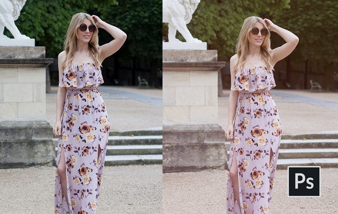
Retouching and enhancing portrait photos is a time-consuming task, and starting from scratch with every photo can be frustrating. Using a portrait Photoshop Action can save time, and give you a beautiful result with a few clicks. Let’s dive into some of the best portrait Photoshop Actions available today.

These Photoshop Actions help you save time and improve your workflow when editing a portrait photo. You can use them to instantly retouch photos, add makeup, enhance colors, add effects, adjust toning, and much more with just a single click.

Say hello to a faster, simpler workflow (and some impressive end results!). And if you’re looking for more advice and guidance on using these, our Photoshop Actions feature is a great place to start.

We’re also sharing our tips for editing portrait photos to help give you a head start.

Top Pick

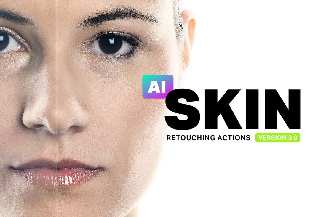
Skin Retouching Photoshop Actions

Skin Retouching Photoshop Actions

Skin retouching is a complicated process. You can’t get that job done with just one Photoshop action. Which is why this pack comes bundled up with 34 retouching Photoshop actions.

It includes PS actions for everything from airbrushing to skin toning, enhancing lips, teeth whitening, and much more.

Why This Is A Top Pick

This complete bundle is a must-have for portrait photo editors as it’ll drastically improve your workflow of enhancing photos and all levels of skin retouching with simple, one-click Photoshop actions.

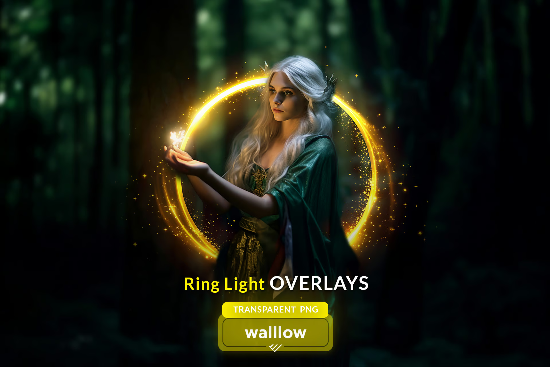
Shine Ring Light Effect Photo Overlays

Shine Ring Light Effect Photo Overlays

This is a distinct set of 15 high-resolution gold ring light overlays designed to add flawless shine and bokeh effects to your photos. Ideal for maternity portraits, holiday snaps, and more, these overlays are compatible with any software that supports layering, including Photoshop and Canva.

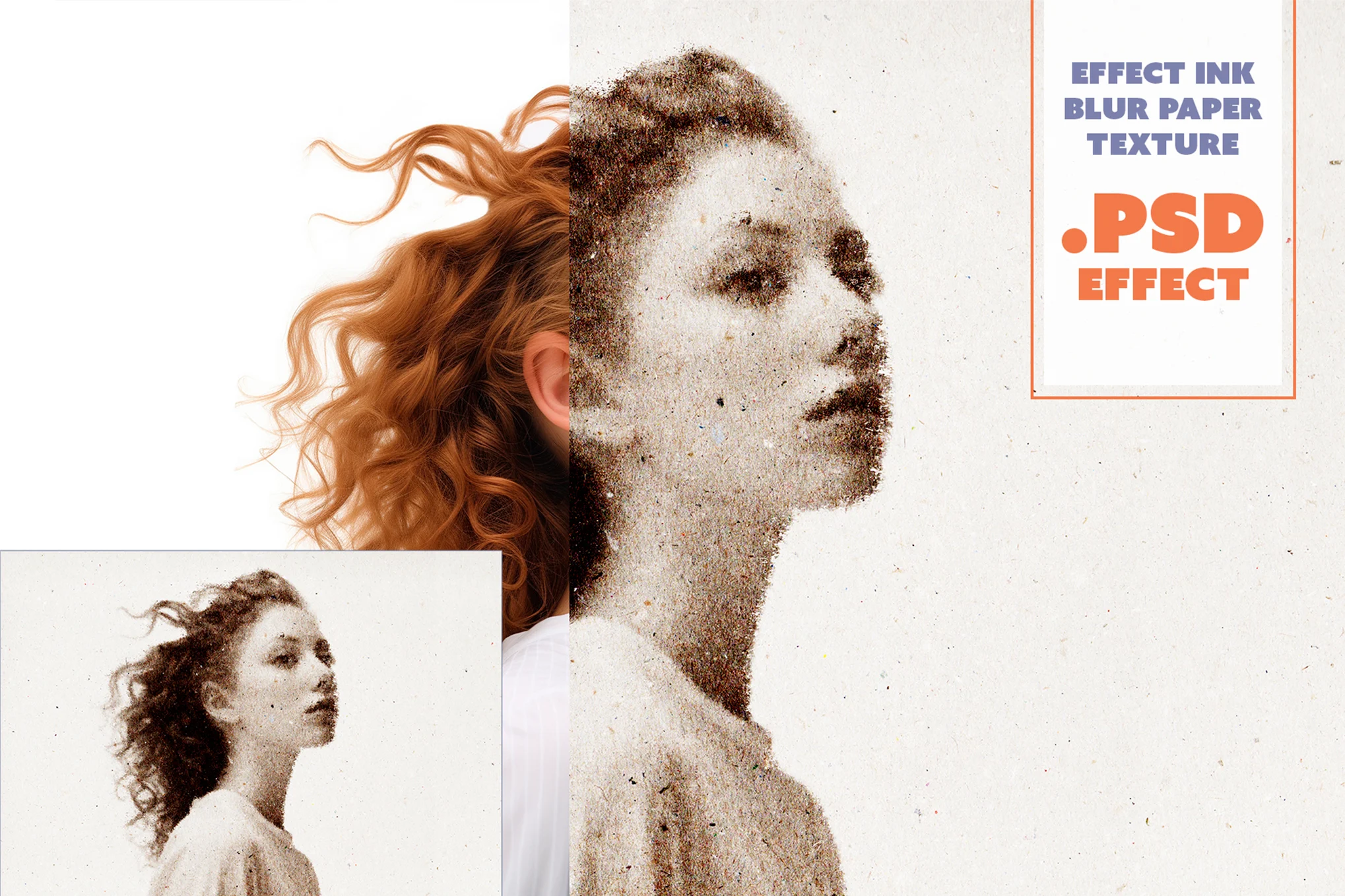
Ink Blur Paper Texture Photo Effect

Ink Blur Paper Texture Photo Effect

Ink Blur is a versatile Photoshop portrait effect perfect for graphic designers, photographers, and digital artists. It elevates your photos with a unique paper texture effect adding a unique aesthetic. This high-resolution layered PSD file, requiring nothing more than Photoshop CS6 or higher, allows for easy customization on its smart object layers.

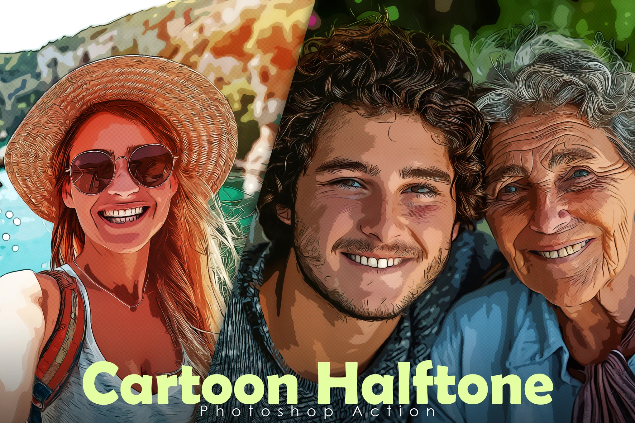
Cartoon Halftone Portrait Photoshop Action

Cartoon Halftone Portrait Photoshop Action

A creative cartoon-style halftone portrait effect for Photoshop. It allows you to apply impressive effects to your photographs with just one click. Ideal for Photoshop CC and higher, it let’s you easily customize the effect to match different types of photos.

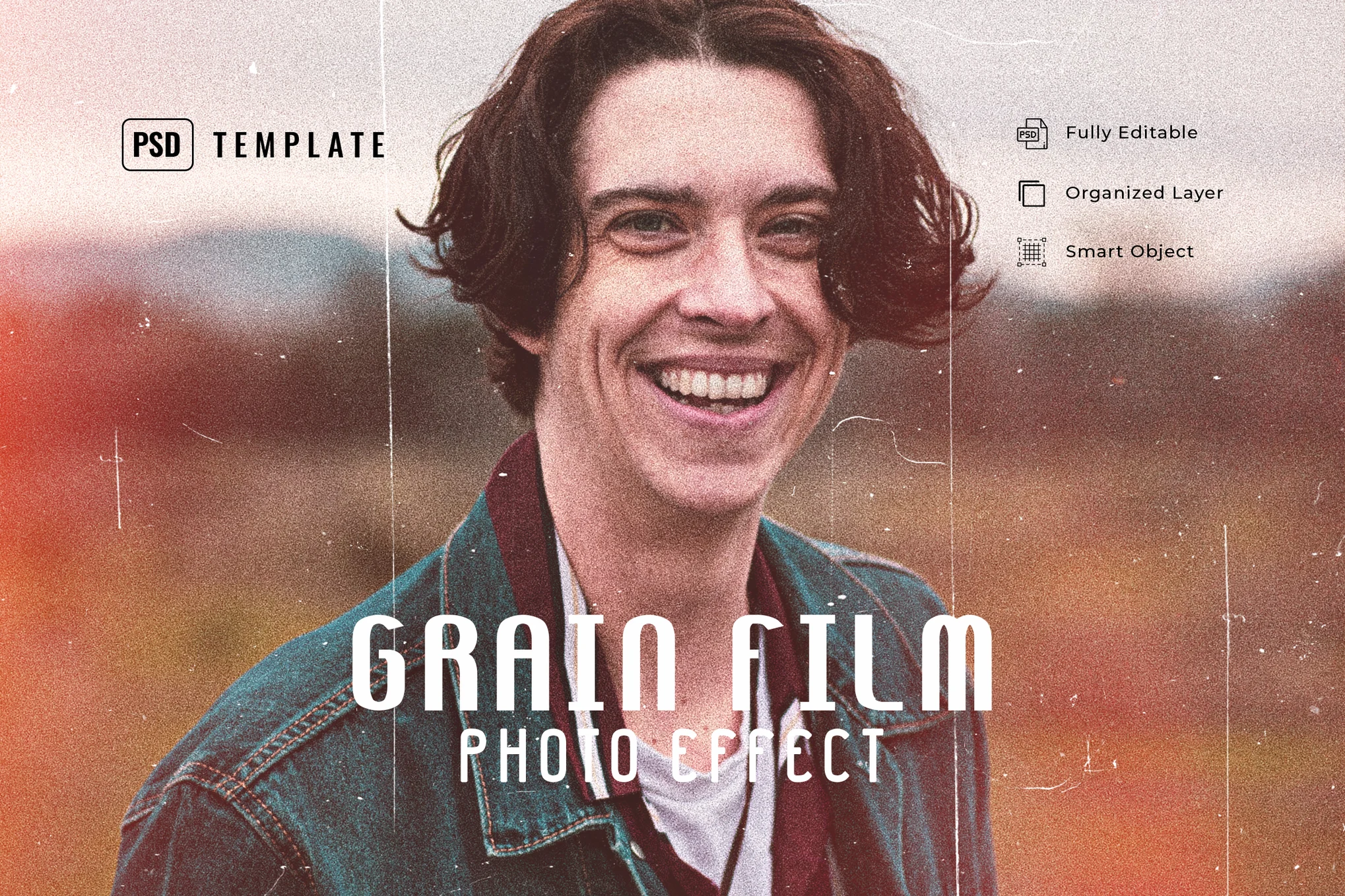
Grain Film Photo Effect PSD

Grain Film Photo Effect PSD

An innovative Photoshop template that transforms your portrait photos with a vivid and classic vintage look. This PSD template excellently incorporates grain film effects into your photos. It caters to diverse shots, be it fashion, lifestyle, blogging, or moody product images.

Light Leaks Effect for Portraits

Light Leaks Effect for Portraits

This is a versatile Photoshop effect meant to give images a distinctive look to your photos. It’s great for injecting energy and glamour into photos, with realistic-looking light leak effects. The template is especially effective on photos with a resolution of 1000px to 3000px and works beautifully on a variety of photo types, from fashion to blogging.

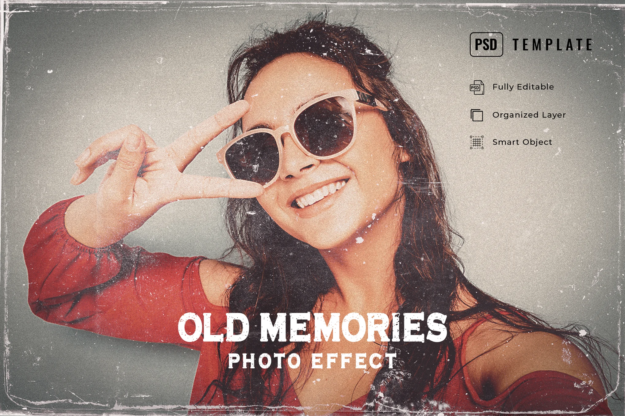
Old Memories Photo Effect PSD

Old Memories Photo Effect PSD

This is a versatile Photoshop template designed to give your photos a vintage effect. Ideal for shots ranging from 1000 px – 3000 px resolution, this effect can be easily customized as well. It’s perfect for giving your graphic designs and photos a classic and old-school look and feel.

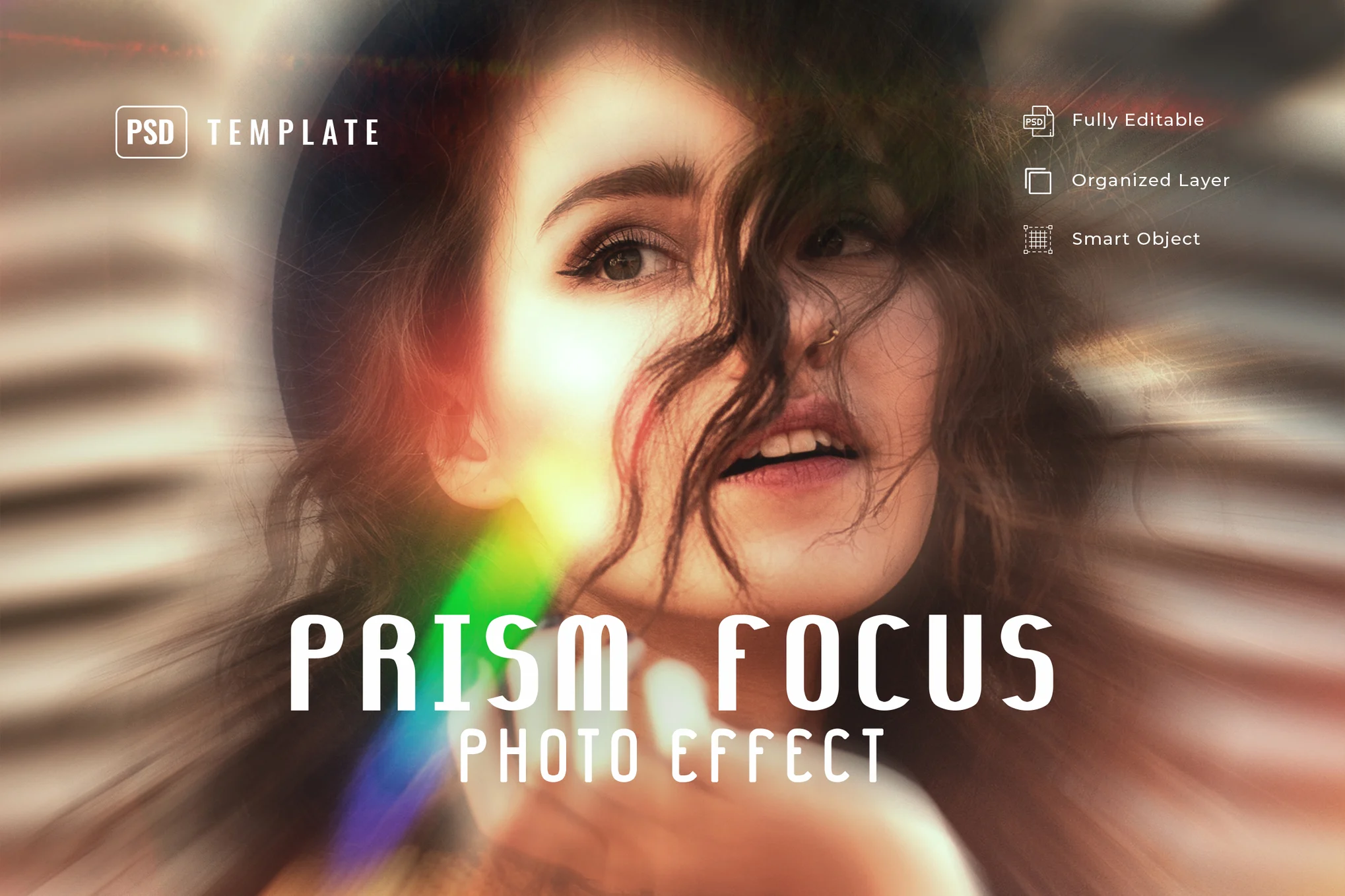
Prism Focus Photo Effect for Photoshop

Prism Focus Photo Effect for Photoshop

The prism focus PSD effect enhances your photos with an energetic prism focus effect. This versatile feature transforms your images into a unique effect that’s perfect for fashion, lifestyle, blogging, and product photography. The effect is best used on photos between 1000 px and 3000 px.

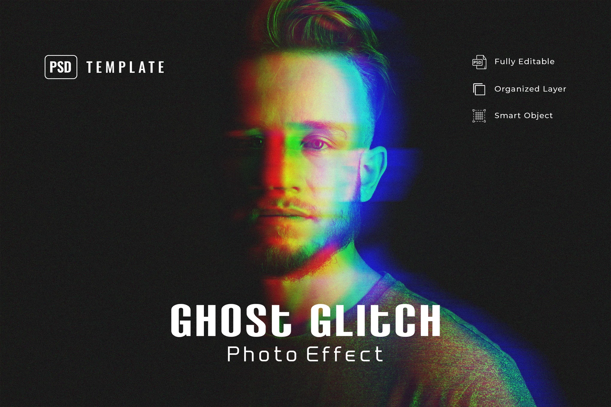
Ghost Glitch Photo Effect PSD Template

Ghost Glitch Photo Effect PSD Template

This is a dynamic Photoshop template intended to transform photos with a ghost-like glitching effect. It’s versatile, effective for various photos ranging from fashion to moody product shots. For optimal results, use with photos of 1000 px – 3000 px resolution.

HDR Portrait Photo Effect PSD

HDR Portrait Photo Effect PSD

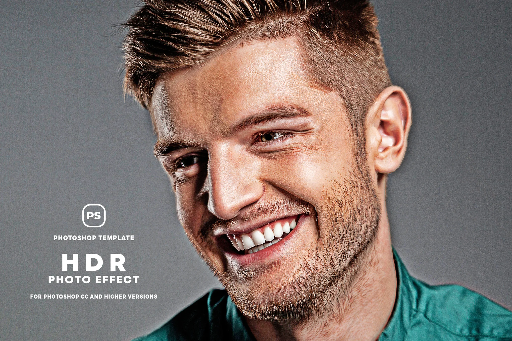
A dynamic Photoshop template designed to convert your pictures into vibrant, HDR photographs. It allows you to easily add an HDR-like look to your portrait to give a more professional look and feel. For best results, apply it to photos between 1000 to 3000 px resolution.

Hotspot Remover AI Photoshop Action

Hotspot Remover AI Photoshop Action

This is a handy tool for photo editing and retouching. Using AI, it quickly identifies and removes any bright spots or glare from your photos, offering flawless results. Ideal for photographers and designers, it enhances the quality and speed of your work process. The effect requires the ‘Generative Fill’ feature in Adobe Photoshop versions CC 2023 and later.

Happies – Bright Portrait Photoshop Action

Happies - Bright Portrait Photoshop Action

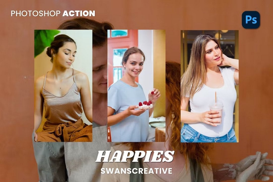
This collection of Photoshop actions allows you to transform your ordinary portrait photos with a bright and vibrant look. There are 10 different PS actions in this bundle especially optimized to enhance the exposure and colors of your photos with just a single click.

Fuji – Vintage Photoshop Action for Portraits

Fuji - Vintage Photoshop Action

This pack also comes with high-quality Photoshop actions especially made for portrait photos. It has 10 actions that are compatible with Photoshop CS3 and higher. These effects have subtle Fuji film-style vintage looks that are ideal for classic portraits and selfies.

Movietic Aesthetic Portrait Photoshop Action

Movietic Aesthetic Portrait Photoshop Action

If you want to add a vintage movie-style look to your photos, this Photoshop actions bundle is for you. It instantly adds a color filter that turns your photos into stills from a vintage film. These are great for Instagram selfies as well.

Republic Aesthetic Photoshop Action for Portraits

Republic Aesthetic Photoshop Action for Portraits

Add a classic aesthetic look to your selfies and portrait photos with this collection of Photoshop actions. It includes 10 actions with subtle effects that will make your photos look more professional and creative.

Film Wash – Free Portrait Photoshop Action

Film Wash - Free Portrait Photoshop Action

This free Photoshop action does exactly what its name suggests. It adds a nostalgic look to your portrait photos with a washed-out film effect. The action is most suitable for outdoor photos.

Warmer – Photoshop Action for Portraits

Warmer - Photoshop Action for Portraits

This Photoshop action features a very bright and warm effect that completely changes the way your portraits look. It seems to work surprisingly well for outdoor portraits, especially for sunny and beach-themed photos.

Color Glitch PSD Photo Effect for Portraits

Color Glitch PSD Photo Effect for Portraits

This Photoshop photo effect allows you to easily add a glitching effect to your portrait photos. It comes as a PSD template with smart object layers for easy editing. This template will help you craft amazing effects for graphic design projects.

Nostalgic – Portrait Photoshop Action

Nostalgic - Portrait Photoshop Action

The amazing vintage-style effect features in this Photoshop action are designed by a group of professional photographers. It lets you apply an instant filter to give a nostalgic look and feel to your portrait photos.

Dreamy Haze PSD Photo Effect for Portraits

Dreamy Haze PSD Photo Effect for Portraits

Another Photoshop photo effect template with a unique design. This effect features an effect that combines glitching and hazy effects to create a beautiful dreamy look for portraits. The PSD template is very easy to customize as well.

Free Warm & Airy Portrait Photoshop Actions

Free Warm & Airy Photoshop Actions

You can download this Photoshop actions pack for free to easily enhance your portraits, selfies, and Instagram photos. It includes multiple PS actions with warm and airy effects. They are ideal for optimizing outdoor photos.

Oceania – Portrait Photoshop Actions

Oceania - Portrait Photoshop Actions

Oceania is a collection of professionally crafted Photoshop actions you can use to optimize your portraits, travel, and social media photos. It includes 5 different actions with various color styles and effects. The actions work with Photoshop CS4 and higher.

Glamour Photography  – Portrait Photoshop Actions

Glamour Photography - Portrait Photoshop Actions

This is a set of 15 different Photoshop actions that are designed for improving your fashion photography and portraits. The actions create non-destructive effects that are also easily customizable to your preference.

10 Portrait Photoshop Actions

Portrait Photoshop Action

Check out this set of 10 orange and teal Photoshop actions for portrait photography that will help you create memorable pictures in just a matter of a few minutes. It’s. a great time-saving tool that deserves a spot in your Photoshop toolkit.

Digital Portrait Photoshop Action

Portrait Photoshop Action

This digital portrait Photoshop action is a must-have for every graphic designer and photographer. It will bring out your artistic side, and help you create stunning artwork. Grab it right now!

Black & White Portrait Photoshop Actions

Portrait Photoshop Action

Our next option provides you with 10 black and white Photoshop actions that will add a touch of vintage charm to your portraits. The product comes with a step-by-step instruction manual helping you make the most of the effects.

Portrait Series Photoshop Actions

Portrait Photoshop Actions

Whether you are looking to add a subtle touch or a more dramatic effect to your portraits, this collection of 10 Photoshop actions can be of great help. The actions are non-destructive and compatible with Photoshop CS4 and newer. A great collection worth having in your arsenal!

Freya – Portrait Photoshop Actions

Perfectly suited for portrait, wedding and event photography, Freya is a fully-automated set of five photoshop actions designed to improve the overall appearance and mood of your pictures. It offers gorgeous non-destructive and customizable skin tones with soft matte touch tranforming your images into stellar shots.

Master – Portrait Photoshop Action

Kickstart editing portraits with this fine-tuned and one-of-a-kind Photoshop action. It converts your photos into amazing-looking portraits in just one click and is non-destructive enabling you to get back 100% of your original photo.

Sketch Portrait Photoshop Action

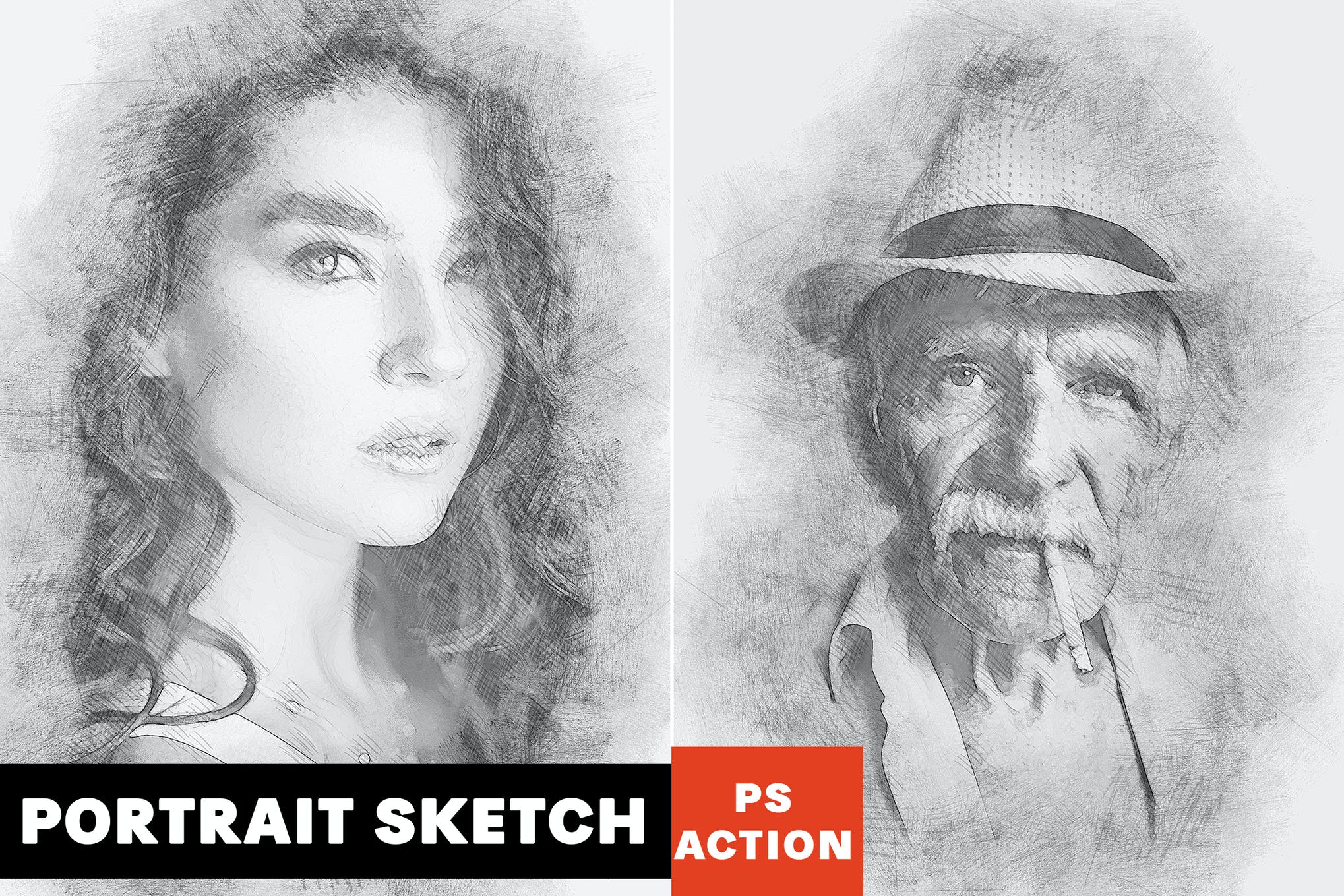
Wanting to achieve a professional artistic sketch effect for your images? Look no further than our next option featuring fully customizable colors, layers and other elements. It also comes with a video tutorial to help you make the most of the pencil sketch effect.

50 Free Portrait Photoshop Actions

Give your images a beautiful finish with the collection of 50 Photoshop actions in just a couple of minutes. Its not just super easy to create stunning portrait effects but also a lot of fun to play around with all the customizable features.

Portrait Into Text Photoshop Actions

Portrait Photoshop Actions

Tranform and pin your portraits to lines of relevant wording in just a couple of seconds, thanks to this remarkably unique Portrait Photoshop action that does a great job with both black and white and colored images. A great choice for people looking to go bold, and fearless with their next visual project.

6 Free Grainy Portrait Photoshop Actions

Next up we have a fantastic set of six portrait Photoshop actions that will give a nice grainy touch to your photos. These are fast editing actions and will change the mood of your images in just a few seconds. This set of actions is compatible with Photoshop CS3 to CC.

50 High Contrast Portrait Photoshop Actions

50 High Contrast Portrait Photoshop Actions

A massive bundle full of 50 different Photoshop actions. This pack includes many types of effects that help you adjust and optimize the contrast of your photos while giving them a unique look. The actions work with RAW and JPEG images.

Infrared IR – Portrait Photoshop Actions

Infrared IR - Portrait Photoshop Actions

Another collection of unique portrait Photoshop actions that feature a stylish infrared effect. This pack comes with 12 different effects that give your photos a gothic vibe with an infrared effect.

HDR Portrait Photoshop Action

Portrait Photoshop Actions

Give your photos an HDR effect without sweating over endless hours to create the look from scratch. This Photoshop action allows you to bring nice HDR effects to your images in just a few clicks of the mouse. Plus, with a range of customization options you get at your fingertips, you’ll have a great time playing around with all the amazing features.

Duotone Portrait Photoshop Action

Portrait Photoshop Actions

Want to make your Insta feed interesting and scroll-worthy? Check out this collection of modern, and trendy duotone Photoshop actions perfectly suited for portrait, street, and closeup photography. This freebie is up for grabs on CreativeTacos.

Oil Painting – Portrait Photoshop Actions

Oil Painting - Portrait Photoshop Actions

This collection of Photoshop actions lets you turn your photos into oil paintings. It includes 10 different Photoshop actions featuring all kinds of oil painting effects for giving a comic-book look to your portrait photos.

Free Matte Film Photoshop Actions

Free Matte Film Photoshop Actions

The film look is a popular effect widely used in portrait photography. This bundle comes with a set of Photoshop actions that features a mix of both film and matte effects that create a unique look in portraits.

The pack includes 3 different Photoshop actions with various strengths of the effect. You can apply the action with just one click and customize the effect to your preference afterward as well.

High-quality free portrait Photoshop actions are hard to find. This is one of the actions that truly stand out from the crowd as it features a professional-quality effect you can download and use with both personal and commercial projects for free.

10 Free Matte Photoshop Actions

10 Free Matte Photoshop Actions

This is a bundle of free Photoshop actions featuring matte effects. It includes 10 different effects you can use to improve the tone and mood of your portraits.

Scarlet – Fantasy Photoshop Actions

Scarlet Fantasy Photoshop Action

Scarlet is a creative duo of Photoshop actions that will allow you to create a fantasy film-like effect in your portrait photos. The actions work best with outdoor photos with natural sunlight. And they are compatible with Photoshop CS4 and higher.

Nighty – Portrait Photoshop Actions

Nighty Photoshop Actions

Give your photos a dark and gritty look and feel using this set of Photoshop actions. This pack includes 9 different actions featuring various effects. They are perfect for improving all types of photography.

Wanderlust – Portrait & Lifestyle Photoshop Actions

Wanderlust - Portrait & Lifestyle Photoshop Action

Wanderlust is a set of 3 unique Photoshop actions that are designed to help enhance portraits and lifestyle photos. These actions will optimize your photos to adjust the mood and tone and make them look more professional.

Free Christmas Portait Photoshop Actions

Portrait Photoshop Actions

Brighten up your Christmas portraits, and winter photographs in just one click with the help of this carefully crafted set of Photoshop actions. The actions are high-quality, and non-destructive allowing you to retain 100% of the original photo.

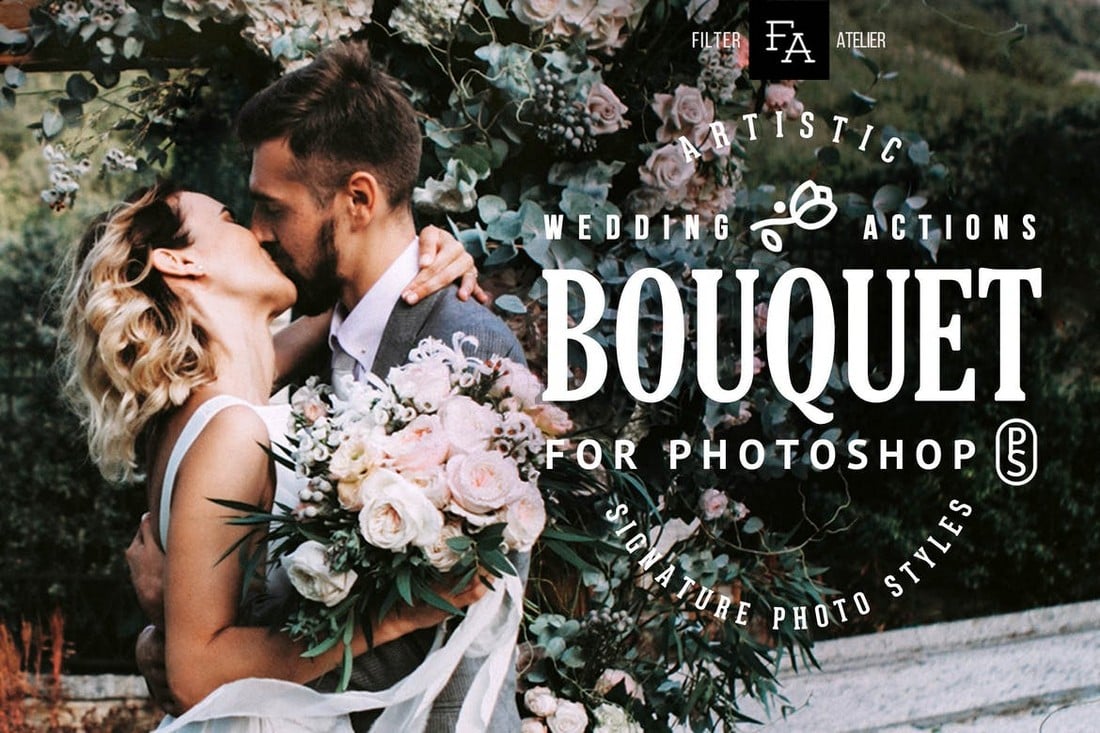
Bouquet – Wedding Actions for Photoshop

Bouquet Wedding Actions for Photoshop

Bouquet is a set of Photoshop actions specially designed for wedding photography. They work well with all types of wedding photos, including outdoor landscapes and portraits. It features 6 different actions with various effects.

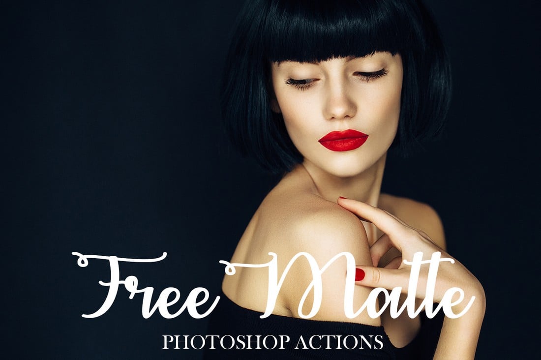
Free Matte Photoshop Actions

Free Matte Photoshop Actions

This is a free Photoshop action that allows you to give a stylish film-like matte look to your portrait photos. This action works with Photoshop CS3 and higher, including Photoshop CC.

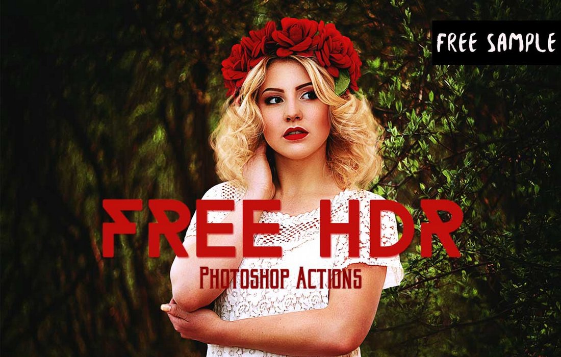
Free HDR Photoshop Actions

Free HDR Photoshop Actions

A bundle of free HDR Photoshop actions that will make your portraits look as if they were shot with a high-quality DSLR camera. It includes 3 different presets you can apply with just one-click.

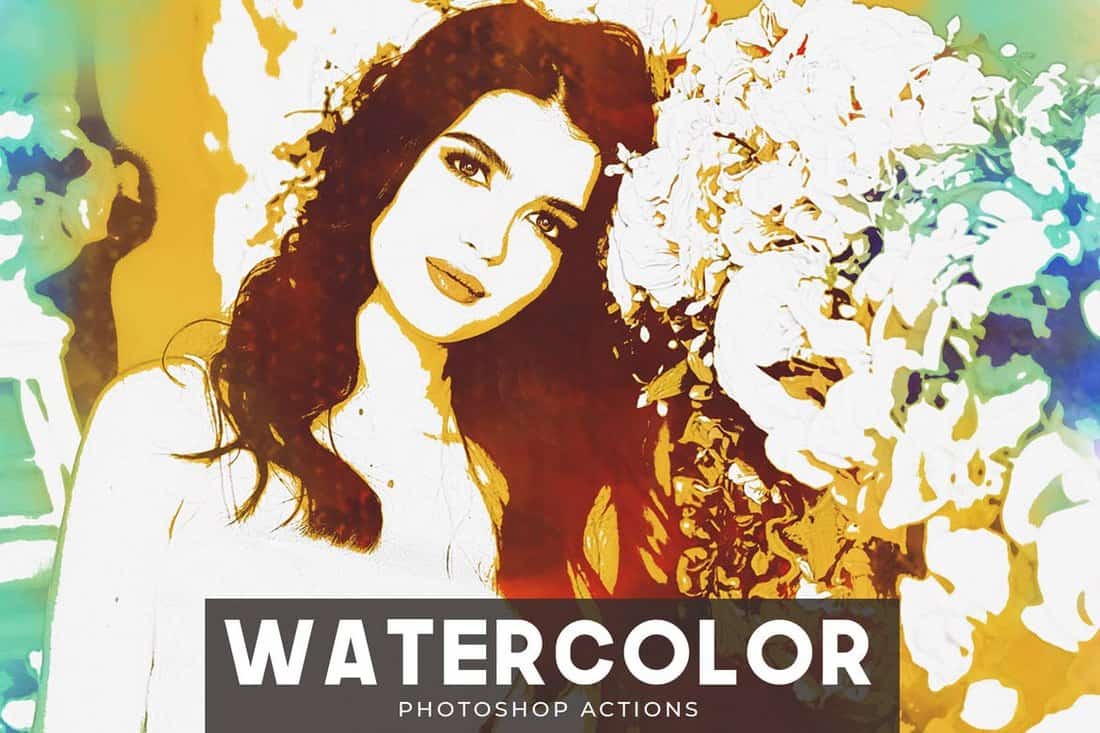
Watercolor – Portrait Photoshop Actions

Watercolor - Portrait Photoshop Actions

If you’re not a fan of oil painting effects, you can use this pack of Photoshop actions to make your photos look like watercolor paintings. The actions are compatible with Photoshop CS3 and higher.

Pinhole Halftone – Portrait Photoshop Actions

Pinhole Halftone - Portrait Photoshop Actions

This collection of Photoshop actions comes with 2 different versions you can use for both low and high-resolution images. The actions create an old-school pinhole halftone effect.

Duotone  – Portrait Photoshop Actions

Duotone - Portrait Photoshop Actions

The duotone effect is quite popular among all kinds of graphic designers. This pack comes with multiple duotone effects you can use to give an authentic duotone look to your photos almost instantly.

Free Moody Portrait Photoshop Actions

free portrait actions

Warm, chocolaty, and moody, these Photoshop actions will add high-contrast, and professional tones to your pictures, taking them to a new level of brilliance. The actions are non-destructive and provide you with an excellent way to perfect your everyday photos.

Free Soft Bright Portrait Photoshop Actions

free portrait actions

Here we have a set of Photoshop actions for portrait photography that will brighten up your shots, and give them a soft, dream-like glowy look. The actions can be fully customized to match your vision, and are computable with Photoshop CS3, CS4, CS5, CS6, and CC.

Tone Collection – CameraRaw Portrait Photoshop Actions

Tone Collection CameraRaw Portrait Photoshop Actions

This is a set of filters you can use to quickly adjust and optimize the toning of your portrait photos. The pack includes presets for Photoshop actions as well as Camera RAW. It’s compatible with Photoshop CS5 and higher.

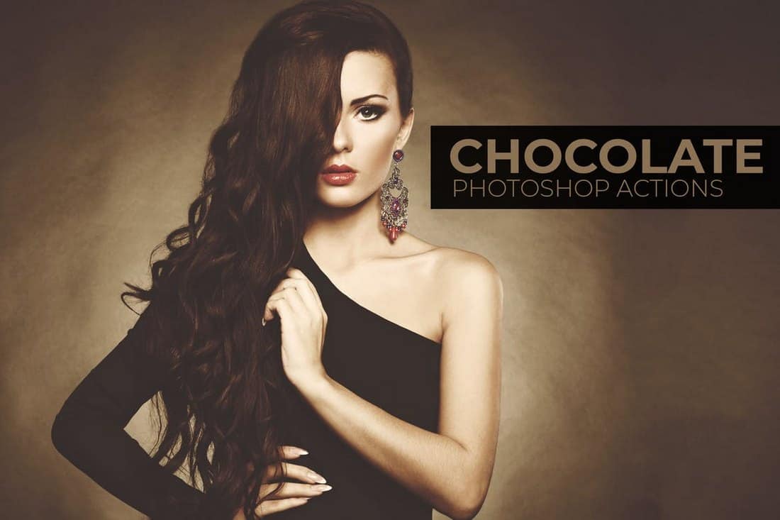
Chocolate – Portrait Photoshop Actions

Chocolate - Portrait Photoshop Actions

This bundle of Photoshop actions is perfect for fashion and glamor portraits and photoshoots. It comes with a set of 10 unique Photoshop actions that create unique filter effects.

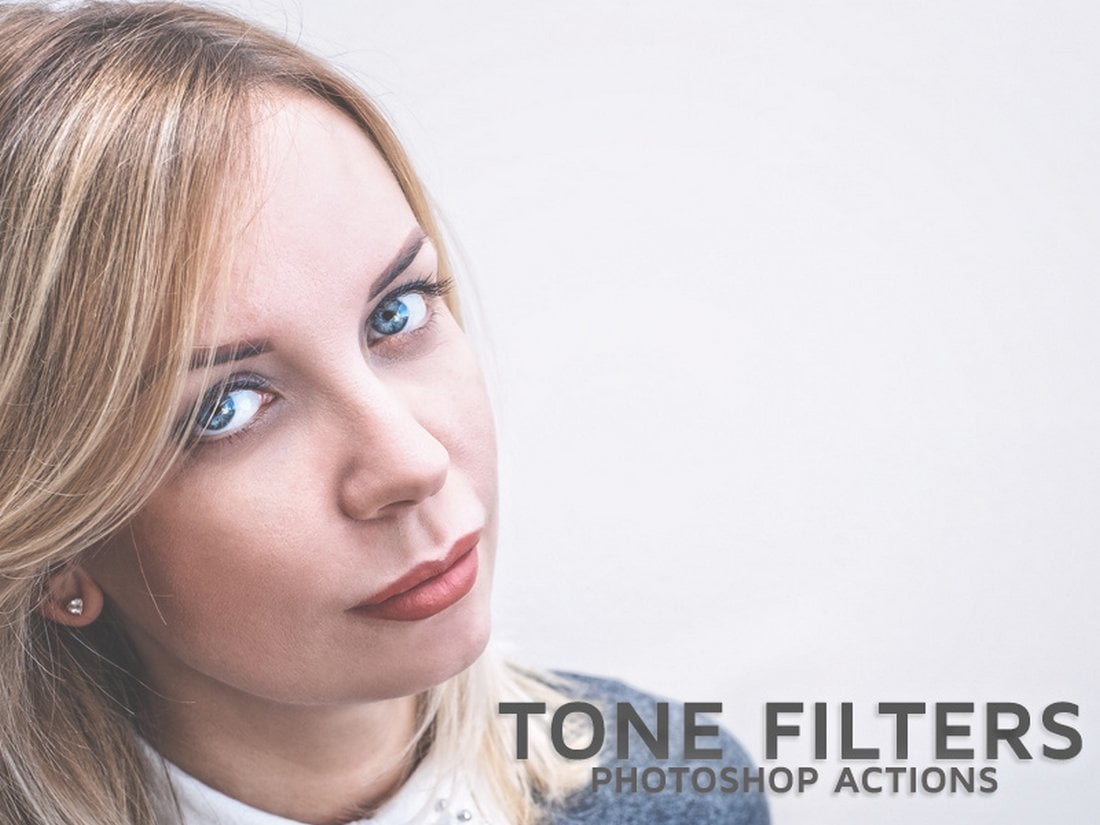
Free Tone Filter Photoshop Actions

Free Matte Tone Filter Photoshop Actions

A set of 3 unique Photoshop actions that feature high-quality toning effects. These will help you instantly improve the tone of your portraits without an effort.

Film Look Free Photoshop Action

Film Look Free Photoshop Action

With this free Photoshop action, you’ll be able to make your portrait photos look like a scene out of a movie. The action is compatible with all types of images and its customizable as well.

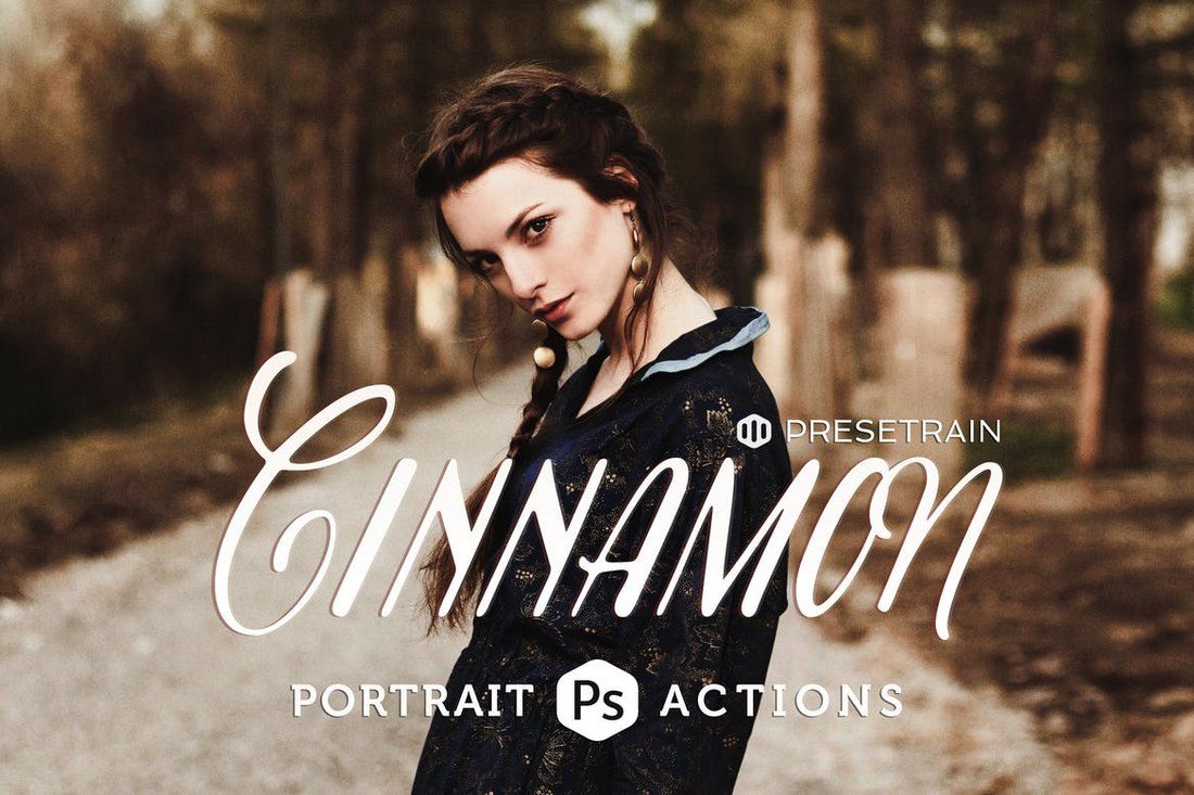
Cinnamon Portrait Actions

This bundle comes with a set of 6 unique toning Photoshop actions with a fantasy effect. It’s ideal to be used with portrait and fashion photos taken in outdoor natural light settings. You can the actions to adjust the photos taken in low-contrast settings, adding an atmospheric tone, and more.

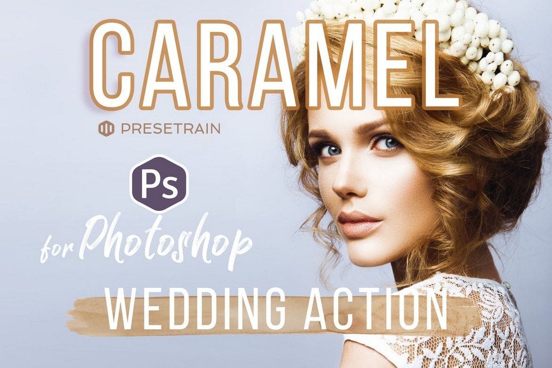
Caramel Wedding Photoshop Action

Caramel is a pack of Photoshop actions especially designed for wedding portraits. It comes with 2 different actions to improve your post-processing workflow by quickly adjusting the photos taken in natural light and outdoors. The actions also generate adjustment layers for customizing the effects to your preference.

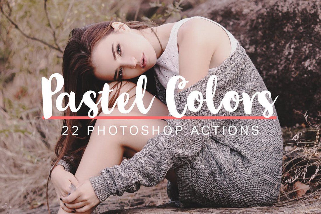
22 Soft Pastel Photoshop Actions

This bundle of Photoshop actions includes several stylish pastel effects for adding a colorful and hipster vibe to your portrait photos. It comes with 22 actions, all of which are non-destructive and fully-customizable.

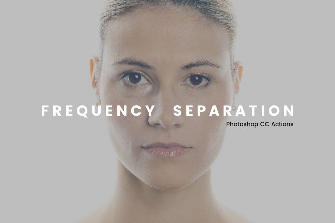
Frequency Separation Photoshop Actions

Frequency separation is a technique used in Photoshop when airbrushing the skin of portrait photographs. This actions pack automate that process to get it done with just one-click. The frequency separation action is available in several different styles and versions, including 8-Bit, 16-Bit, and 32-Bit versions.

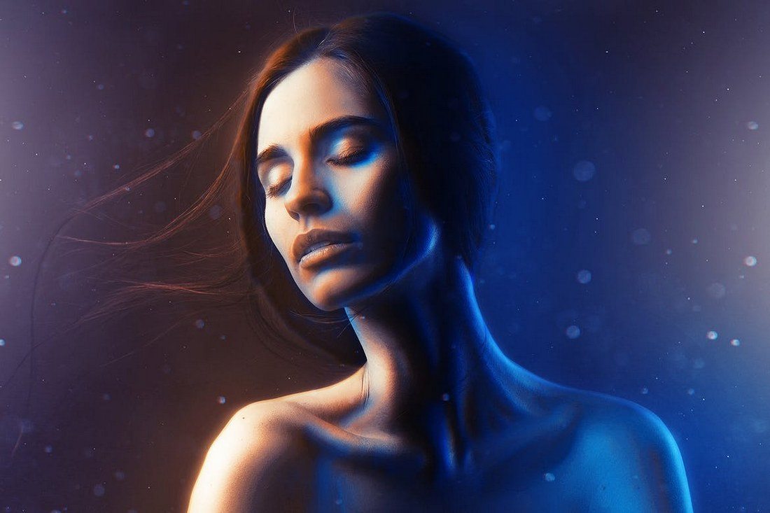
Double Light Photoshop Action

This stunning Photoshop action is perfect for adding a unique visual effect to your portrait photos and posters. The double light effect mixes two colors to give your portraits a sci-fi themed vibe. The action allows you to choose from 10 different color FX settings as well.

Hello Baby! Collection

When talking about portrait photography, baby portraits is something we can never forget. This pack of Photoshop actions is made specifically for making your baby photos extra adorable. It includes over 40 unique Photoshop actions for enhancing your baby photos, including foundation actions, retouching actions, workflow actions, artistic toning, and more.

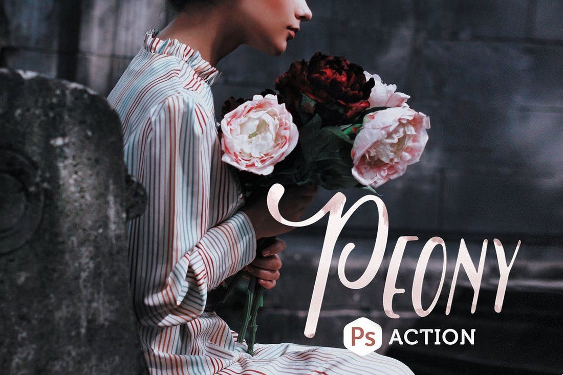
Peony Photoshop Action

Peony is a set of 2 Photoshop actions made for outdoor and fashion portraits. It allows you to instantly adjust and enhance photos by giving them a rich toning effect. It will even give your dull photos a better color depth, especially for greens and flowers.

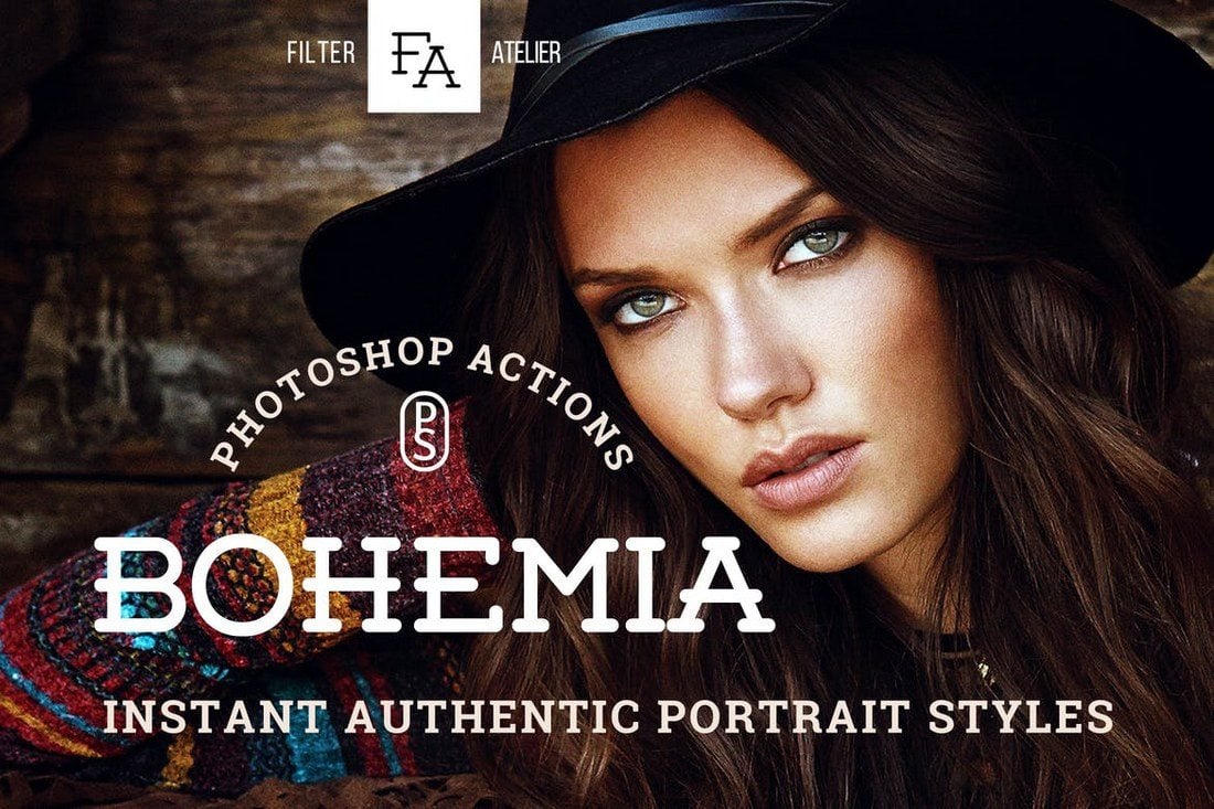
Bohemia Photoshop Actions

This bundle of Photoshop actions includes 5 unique actions that help you to achieve a boho-style effect for your portrait and fashion photos. It’s perfect for giving your photos a hipster look.

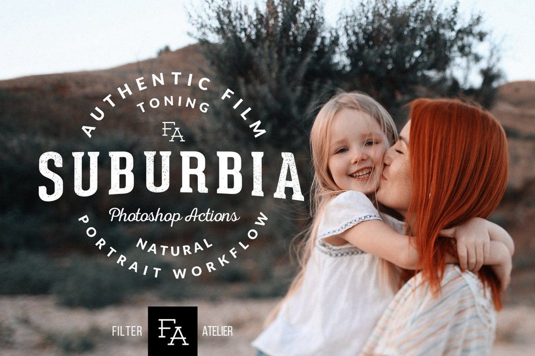
Suburbia Photoshop Actions

Suburbia is a collection of Photoshop actions that will help adjust the toning of your portrait and outdoor photos. It includes 6 different actions for giving rustic, soft, contrast, and other styles of effects for your photography.

Beach Vibes Photoshop Actions

If you’re a photographer or a designer who works with lots of beach photography, this bundle of Photoshop actions will come in handy. It includes 21 presets for enhancing and adding visual effects for your beach and bright light outdoor photos.

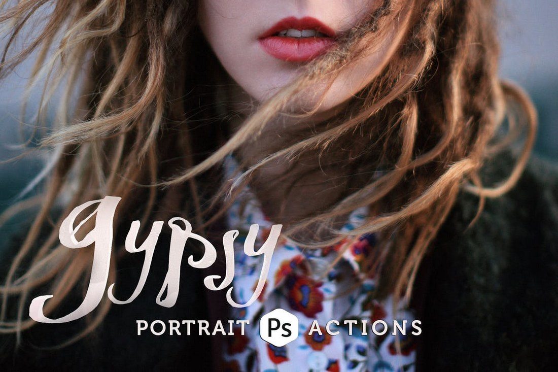
Gypsy Portrait Photoshop Actions

This collection comes with 4 different Photoshop actions for giving cinematic effects for your portrait photos. You can use the actions to give moody and cold effects as well as adjusting the tone of your photos.

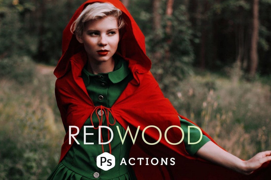
Redwood Fairytale Photoshop Actions

Redwood is a set of 3 unique Photoshop actions designed to give your outdoor portrait photos a fantasy-themed effect. It includes a morning haze effect, a twilight haze effect, and an evening sunset effect.

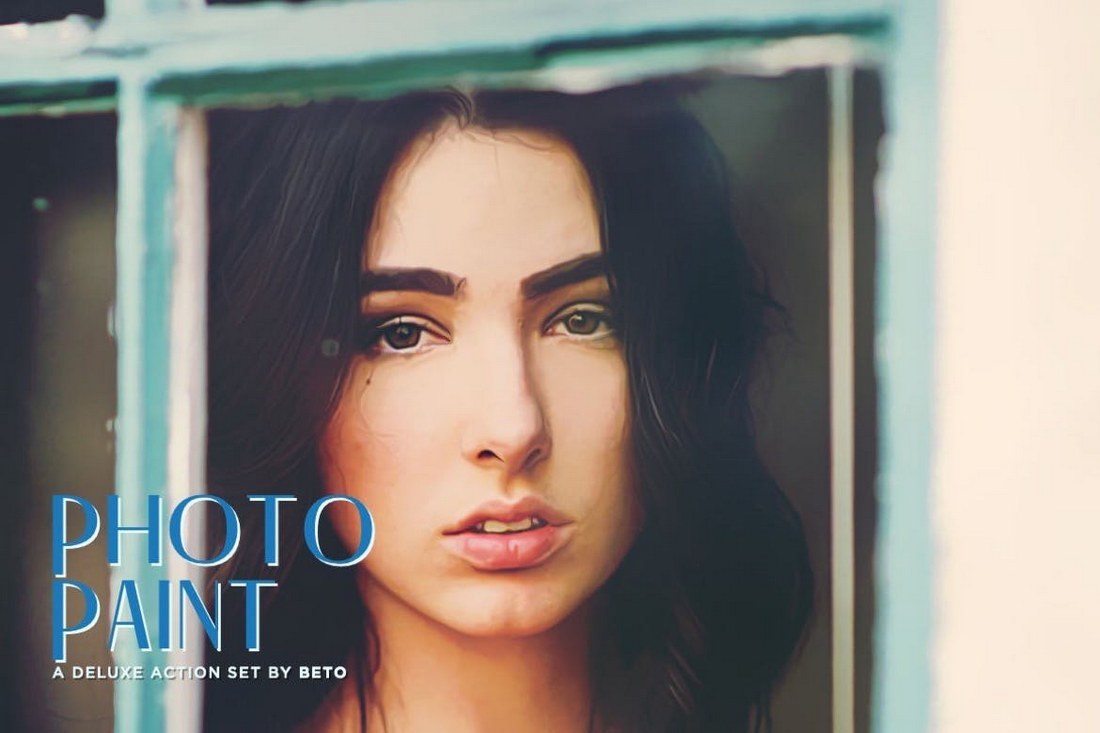
Photo Paint Action

This is a collection of 5 Photoshop actions that allows you to turn your portrait photos into paintings. Each action in this pack will give a different style of a painting effect with various brush stroke intensity. It also includes a sharpening action and 3 noise actions as an added bonus.

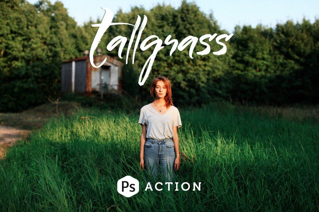
Tallgrass Photoshop Action

Tallgrass comes with 2 Photoshop actions for enhancing your portrait photos, especially outdoor and travel photography. It will help enhance the color depth and tune the greens to achieve a stunning visual effect.

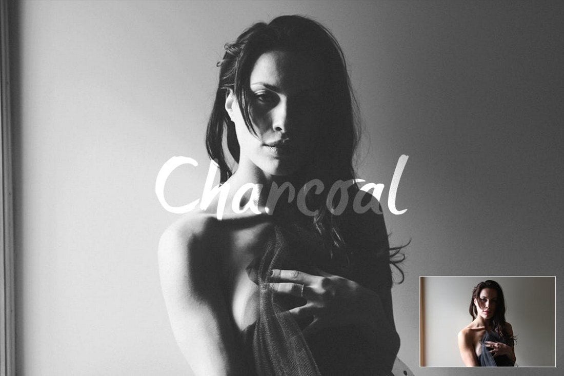
Charcoal Action

This Photoshop action pack includes 3 different actions for achieving the perfect black and white effect for your portrait photos. It will allow you to enhance your photos with a soft charcoal black and white effect to give them a retro and classic vibe.

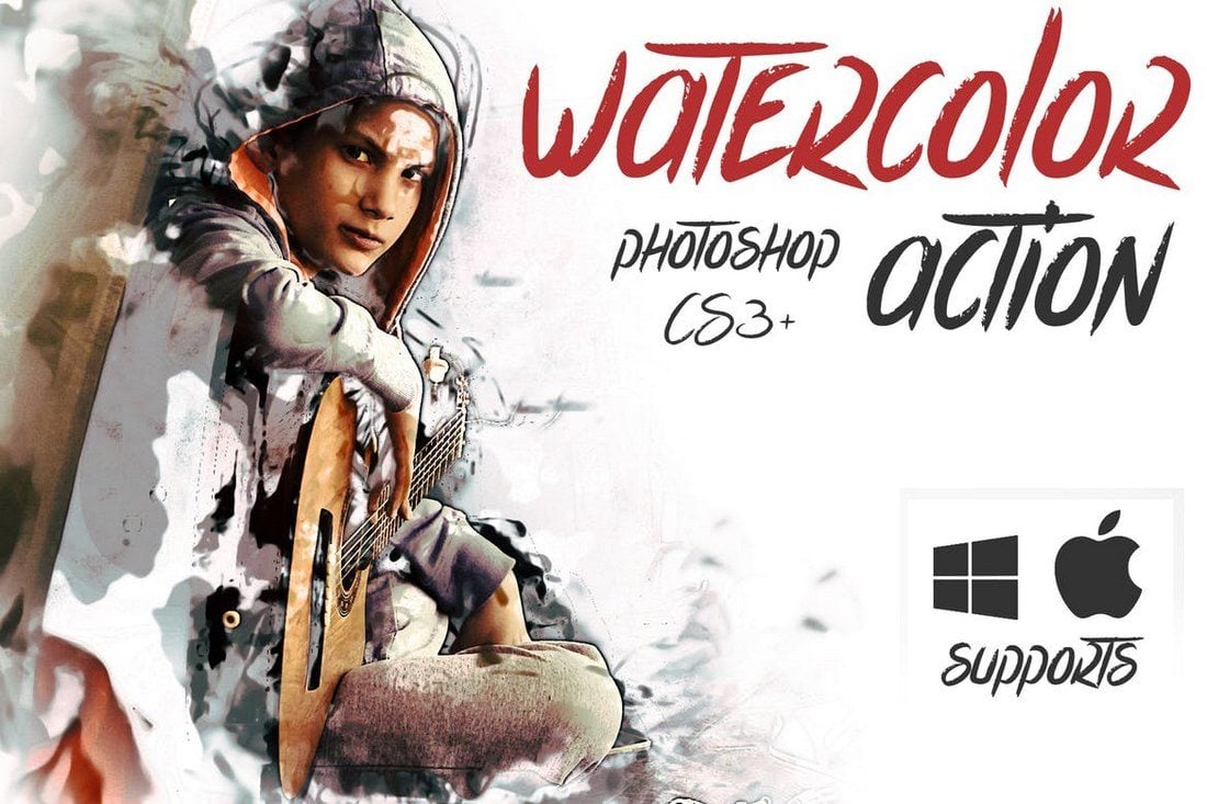
Watercolor Action

Another Photoshop action that turns turn your photos into watercolor paintings. This action allows you to choose from 5 different color options to give a realistic watercolor painting effect to your portrait photos.

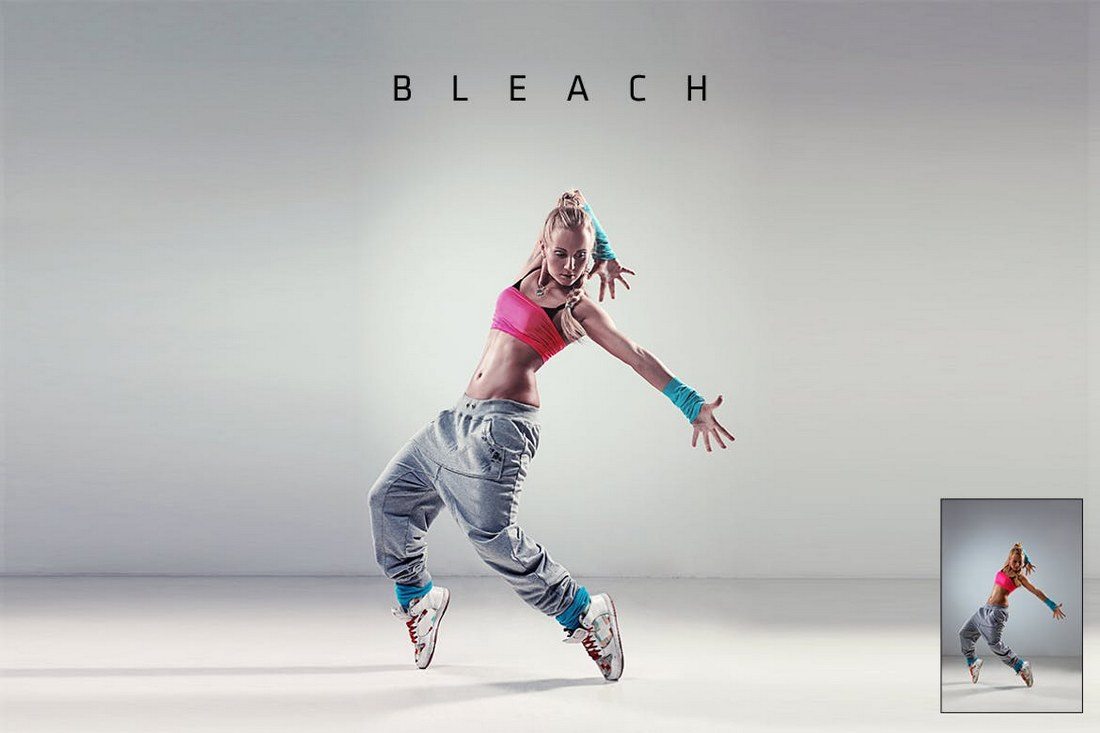
Bleach Action

Bleach action comes in 2 variations that allow you to instantly improve your portrait photos to bring out more detail and color. It’s specially designed for photos taken in studios and photos with low exposure.

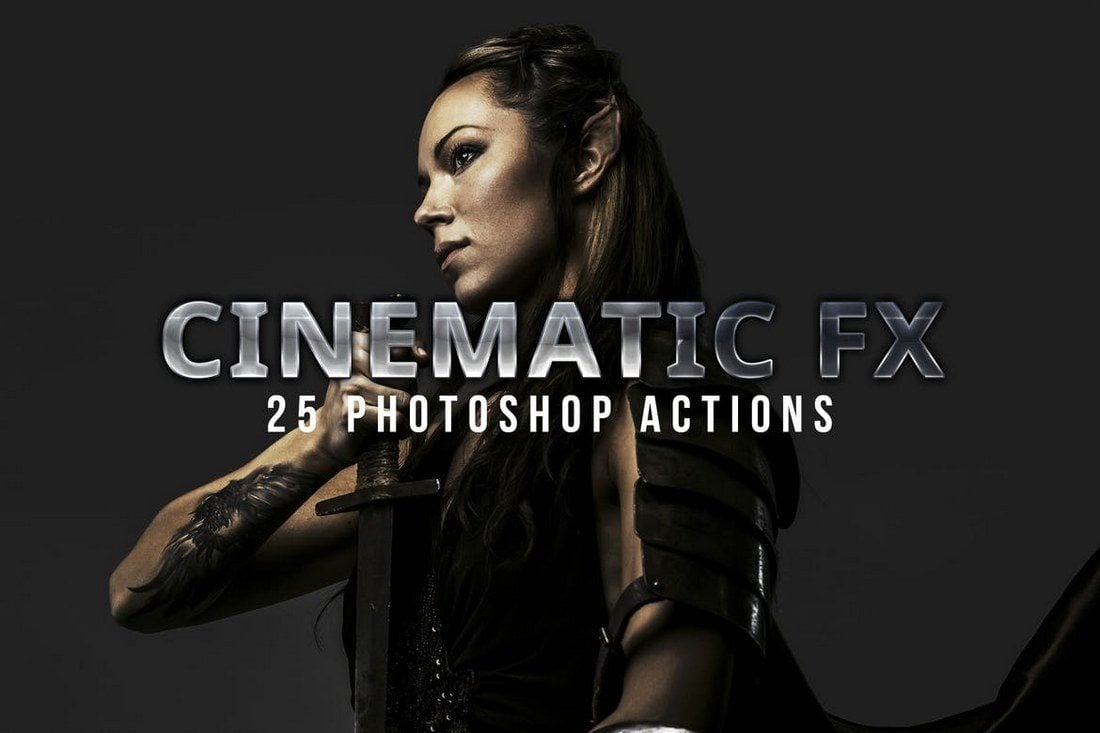
Cinematic Photoshop Actions

This is a bundle of 25 Photoshop actions, which includes 19 cinematic effects actions and 6 toning adjustment actions. The effects in this pack have been designed inspired by movies such as the 300, Life Of Pi, Matrix, and Skyfall to help you achieve the same movie-like effects.

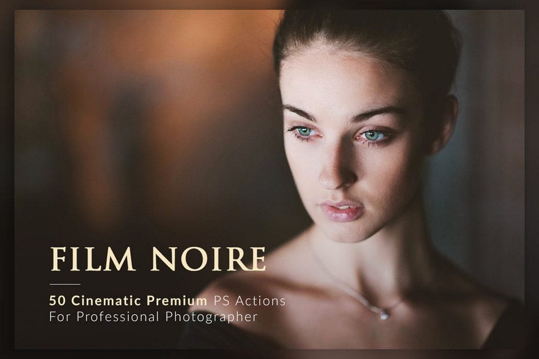
50 Film Noir PS Actions Bundle

A massive bundle of 50 different Photoshop actions containing different styles of cinematic and film noir effects. All of the actions in this pack are crafted to perfection by an award-winning photographer. It includes 30 cinematic color enhancing actions and 20 B&W color actions.

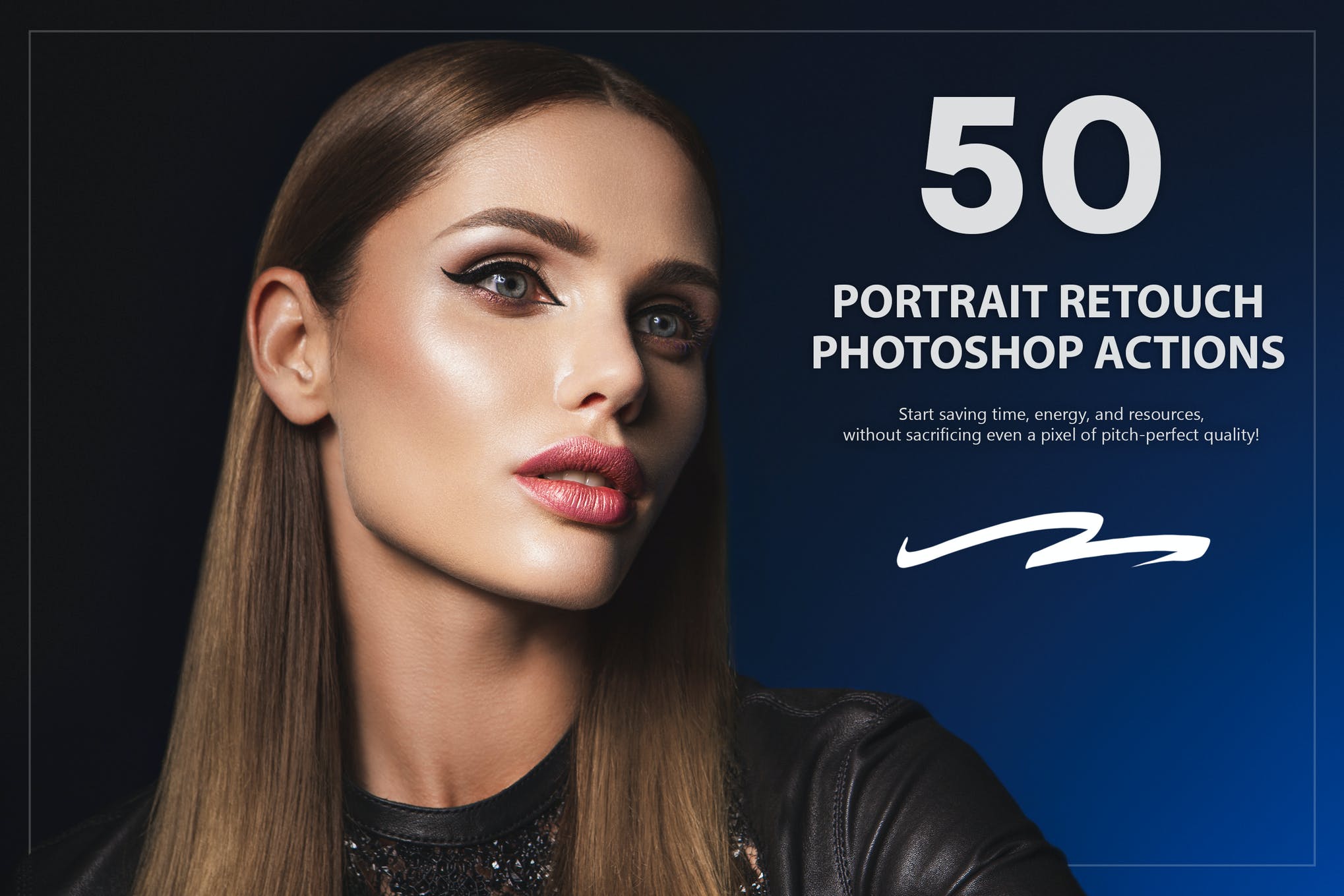
Retouch – Portrait Effects Photoshop Action

portrait photoshop action

Wanting an all-in-one Photoshop Action that can meet all your photo editing needs? The Retouch Bundle has you covered. With 50 Portrait Photoshop Actions, you can adjust tone, soften skin, refine details, and much more without having any prior experience with the software.

Golden – Photoshop Portrait Actions

portrait photoshop action

If you are a blogger looking for a set of Photoshop Actions that can help your everyday pictures make an impression, our next option is your best bet. This bundle of actions and presets has virtually everything you might need to achieve with your portraits. It’s compatible with both Photoshop and Lightroom.

Flowerage – Photoshop Portrait Actions

portrait photoshop action

Here we have a set of 24 portrait effects Photoshop Actions that are exclusively created for natural light portraiture, wedding, and art photography. The presets are fully customizable and compatible with both Adobe Lightroom and Photoshop.

Digital Painting – Portrait Effects Photoshop Action

portrait photoshop action

Transform your photos into digital paintings with our next Photoshop Action that contains exhaustive techniques and brushes, editable masks, canvas colors, backgrounds, and a range of other super amazing features.

3 Tips for Editing Portrait Photos

If you’re new to editing portrait photos, these tips will help you get a better understanding of how the editing process works.

1. Try to Use RAW Images

As you know, JPG is a file format that uses compression to try and reduce the size of your images while preserving the quality of the image. As a result, the JPG file format sacrifices some data and quality elements captured by the sensor of your camera in exchange for convenience.

This is why most professional photographers use the RAW file format. This format captures photos in much higher quality without affecting the quality of the image whatsoever. Even most modern smartphones now have the option to enable RAW file format.

Use it whenever you can to capture high-quality images so when you edit them in Photoshop, you’ll have a much better and uncompressed image to work with.

2. Master the Art of Toning

Toning is the process of adjusting the color balance, brightness, and contrast, and saturation levels to achieve the perfect balance in your photos. This process usually differs from one photo to another based on certain conditions like lighting conditions and camera settings. When it comes to portraits, this also applies to skin toning as well.

Whichever process you follow to set the mood with toning, always remember to use adjustment layers in Photoshop to create non-destructive adjustments. This way you’ll be able to easily edit or revert your changes however you like.

3. Don’t Overuse the Healing Brush

Healing brush is a handy tool in Photoshop that is widely used when editing portrait photos to get rid of things like pimples, freckles, and more. However, most designers make the mistake of taking it too far and using these tools to make photos look unrealistically flawless.

This is not what Photoshop is made for. Remember to preserve the natural look of the portraits while you improve the photos. Know your limits especially when using tools like healing brush and clone stamp.

The Photoshop actions in our list are designed to automate some of these basic adjustments. They are quite useful if you’re new to photo editing.

Tooltip Best Practices

Featured Imgs 23

In this article, I try to summarize the best practices mentioned by various accessibility experts and their work (like this, this, and this) into a single article that’s easy to read, understand, and apply.

Let’s begin.

What are tooltips?

Tooltips are used to provide simple text hints for UI controls. Think of them as tips for tools. They’re basically little bubbles of text content that pop up when you hover over an unnamed control (like the bell icon in Stripe).

Hovering on top of a bell icon in Stripe's navigation. Clicking the icon triggers a notification displayed underneath it.
The “Notifications” text that pops up when you hover over Stripe’s bell icon is a tooltip.

If you prefer more of a formal definition, Sarah Highley provides us with a pretty good one:

A “tooltip” is a non-modal (or non-blocking) overlay containing text-only content that provides supplemental information about an existing UI control. It is hidden by default, and becomes available on hover or focus of the control it describes.

She further goes on to say:

That definition could even be narrowed down even further by saying tooltips must provide only descriptive text.

This narrowed definition is basically (in my experience) how every accessibility expert defines tooltips:

Heydon Pickering takes things even further, saying: If you’re thinking of adding interactive content (even an ok button), you should be using dialog instead.

In his words:

You’re thinking of dialogs. Use a dialog.

Two kinds of tooltips

Tooltips are basically only used for two things:

  1. Labeling an icon
  2. Providing a contextual description of an icon

Heydon separates these cleanly into two categories, “Primary Label” and “Auxiliary description” in his Inclusive Components article on tooltips and toggletips).

Two examples of a bell icon with content displayed beneath them, one as a primary label and one as an auxiliary description.

Labeling

If your tooltip is used to label an icon — using only one or two words — you should use the aria-labelledby attribute to properly label it since it is attached to nothing else on the page that would help identify it.

<button aria-labelledby="notifications"> ... </button>
<div role="tooltip" id="notifications">Notifications</div> 

You could provide contextual information, like stating the number of notifications, by giving a space-separated list of ids to aria-labelledby.

Bell icon with a badge indicating three notifications and a tooltip displayed to the right.
<button aria-labelledby="notifications-count notifications-label">  
  <!-- bell icon here --> 
  <span id="notifications-count">3</span>
</button>  

<div role="tooltip" id="notifications-label">Notifications</div>

Providing contextual description

If your tooltip provides a contextual description of the icon, you should use aria-describedby. But, when you do this, you also need to provide an accessible name for the icon.

In this case, Heydon recommends including the label as the text content of the button. This label would be hidden visually from sighted users but read for screen readers.

Then, you can add aria-describedby to include the auxiliary description.

<button class="notifications" aria-describedby="notifications-desc">  
  <!-- icon for bell here --> 
  <span id="notifications-count">3</span> 
  <span class="visually-hidden">Notifications</span>
</button>  

<div role="tooltip" id="notifications-desc">View and manage notifications settings</div> 

Here, screen readers would say “3 notifications” first, followed by “view and manage notifications settings” after a brief pause.

Additional tooltip dos and don’ts

Here are a couple of additional points you should be aware of:

Do:

Don’t:

  • Don’t use the title attribute. Much has been said about this so I shall not repeat them.
  • Don’t use the aria-haspopup attribute with the tooltip role because aria-haspopup signifies interactive content while tooltip should contain non-interactive content.
  • Don’t include essential content inside tooltips because some screen readers may ignore aria-labelledby or aria-describedby. (It’s rare, but possible.)

Tooltip limitations and alternatives

Tooltips are inaccessible to most touch devices because:

  • users cannot hover over a button on a touch device, and
  • users cannot focus on a button on a touch device.

The best alternative is not to use tooltips, and instead, find a way to include the label or descriptive text in the design.

If the “tooltip” contains a lot of content — including interactive content — you may want to display that information with a Toggletip (or just use a <dialog> element).

Heydon explains toggletips nicely and concisely:

Toggletips exist to reveal information balloons. Often they take the form of little “i” icons.

Information icon with a message displayed to its right as a notification.

These informational icons should be wrapped within a <button> element. When opened, screen readers can announce the text contained in it through a live region with the status role.

<span class="tooltip-container"> 
  <button type="button" aria-label="more info">i</button> 
  <span role="status">This clarifies whatever needs clarifying</span>
</span>

Speaking anymore about toggletips detracts this article from tooltips so I’ll point you to Heydon’s “Tooltips and Toggletips” article if you’re interested in chasing this short rabbit hole.

That’s all you need to know about tooltips and their current best practices!

Further reading


Tooltip Best Practices originally published on CSS-Tricks, which is part of the DigitalOcean family. You should get the newsletter.


from CSS-Tricks https://ift.tt/g4QyuXm
Gain $200 in a week
via Read more

Top 10 Intro Templates for Premiere Pro to Boost Your Videos

Featured Imgs 23

Ever notice how a standout video starts strong, pulling you in within those first few seconds? That’s the power of a well-crafted intro. For anyone on a mission to up their video game—be it editors, YouTubers, influencers, or marketers—your choice of intro templates for Premiere Pro is a golden ticket to making an impression that sticks. And here’s the thing: crafting an effective video intro is less about intricate animations and more about hooking your audience right from the get-go.

Whether you’re after free intro templates for Premiere Pro or exploring some next-level options, the perfect intro template sets the tone, adds consistency to your brand, and builds that initial connection with viewers. Just picture your intro as the warm handshake before the deep dive into your content.

In this list, you’ll find a mix of visually striking and adaptable templates designed to make your content stand out—without overcomplicating things. From sleek typography-driven designs to high-energy motion graphics, these templates aim to elevate your content in a way that’s simple, effective, and easy to use.

Underlined Animation Title Premiere Pro Template

Underlined Animation Title Premiere Pro Template

Download

Corporate Opener Premiere Pro Template

Corporate Opener Premiere Pro Template

Download

Travel Vlog Intro Title Template

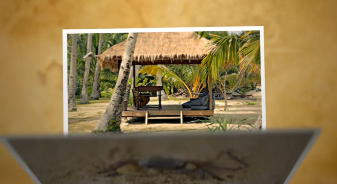
Travel Vlog Intro Title Template

Download

Fashion Glitch Opener

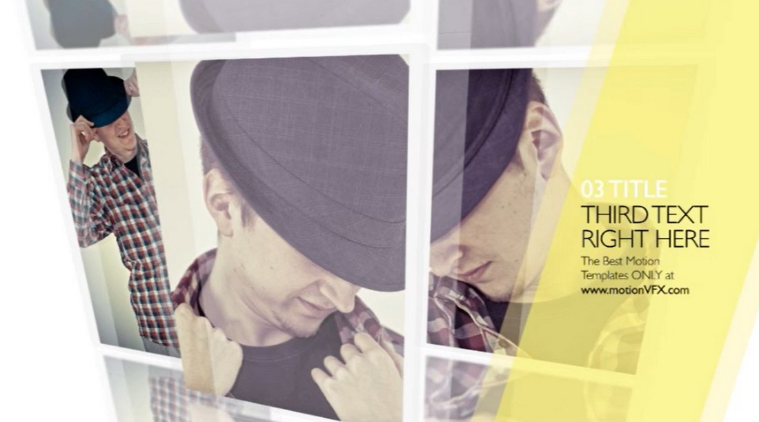
Fashion Glitch Opener

Download

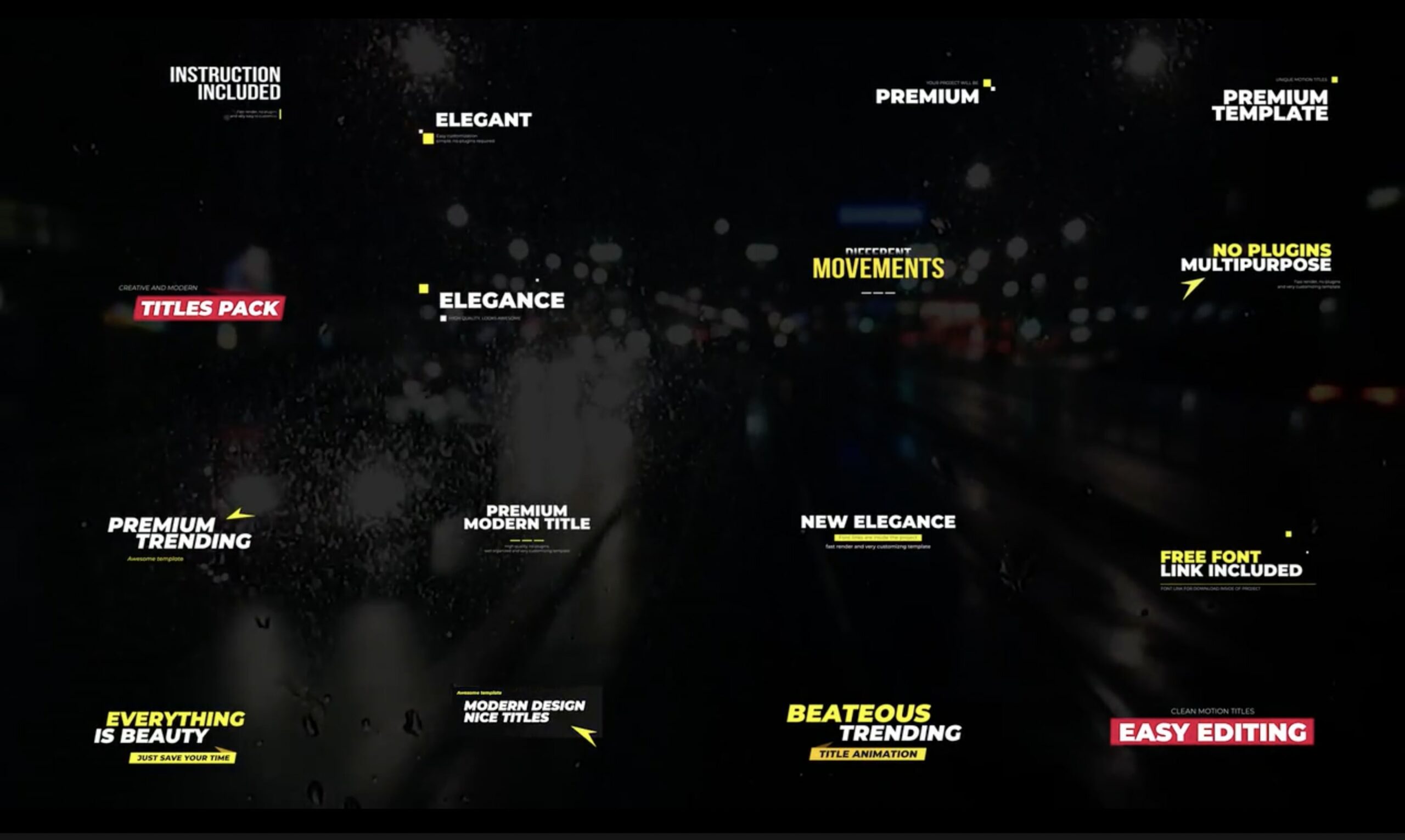
Premiere Pro Title Template

Premiere Pro Title Template

Download

Advance Titles Mogrt Template for Adobe Premiere

Advance Titles Mogrt Template for Adobe Premiere

Download

Split Frame Opener

Split Frame Opener

Download

Lyrics Titles Premiere Pro Template

Lyrics Titles Premiere Pro Template

Download

Clean Title Animation Pack for Premiere Pro

Clean Title Animation Pack for Premiere Pro

Download

Intro Showreel for Premiere Pro Template (Premium)

Intro Showreel for Premiere Pro Template

Download

Animated Titles Templates for Premiere Pro

Animated Titles Templates for Premiere Pro

Download

Titles Kinetic Typography Premiere Pro Template

Titles Kinetic Typography Premiere Pro Template

Download

Modern Intro Premiere Pro Template (Premium)

Modern Intro Premiere Pro Template

Download

Nature Intro Transition Template

Nature Intro Transition Template

Download

Premiere Pro Sports Intro Template (Premium)

Premiere Pro Sports Intro Template

Download

Street Opener

Street Opener

Download

Intro – Paper Cut Premiere Pro Templates (Premium)

Intro

Download

Media Replacement Fitness Intro Template

Media Replacement Fitness Intro Template

Download

Halloween Intro Skeleton Dance for Premiere Pro (Premium)

Halloween Intro Skeleton Dance  for Premiere Pro

Download

Sport Action Opener

Sport Action Opener

Download

The post Top 10 Intro Templates for Premiere Pro to Boost Your Videos appeared first on CSS Author.

75+ Best Free Final Cut Pro (FCP) Templates, Plugins, Titles & Transitions

Featured Imgs 23

Final Cut Pro is one of the best tools you can use for video editing, especially if you’re a Mac user. With the help of templates and plugins, you can create amazing video projects using the software.

There are so many amazing Final Cut Pro templates and plugins out there. And we handpicked some of the best templates for this list. You’ll find many different types of plugins, title templates, transition effects, social media templates, and much more in the collection.

We’ve included a couple of premium options, but the best part is that almost all these templates and plugins are free to download. You can even use some of the templates with commercial projects for free. Most of the templates are also compatible with Apple Motion as well.

Have a look and start downloading.

Modern Typography Titles Pack for FCPX

Modern Typography Titles Pack for FCPX

Whether you’re a professional video editor or a YouTuber working on vlogs, you’ll often have to work with different styles of videos. These videos also require different types of title designs. This bundle is made just for creators like you to help you tackle different types of projects. It includes many different types of title scenes that are compatible with both Final Cut and Apple Motion.

Dynamic Opener – Final Cut Pro Intro Template

Dynamic Opener - Final Cut Pro Intro Template

Looking for a modern and dynamic opener for a client project? Then this template is perfect for you. It features multiple styles of dynamic openers with attractive animations you can use to add creative title scenes to your video projects.

30 Motion Titles – Apple Motion & Final Cut Pro Templates

30 Motion Titles - Apple Motion & Final Cut Pro Templates

If you’re looking to create a more professional title scene with a minimalist design, this bundle of templates will be a better choice for you. It includes 30 different title designs that can be customized to your preference. They will work great on both Apple Motion and Final Cut Pro X.

30 Corporate Titles – Final Cut Pro X Templates

30 Corporate Titles - Final Cut Pro X Templates

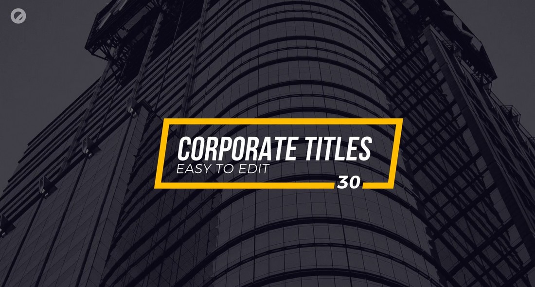
Featuring a collection of minimal and clean title designs, this Final Cut Pro title templates collection is made to cover all sorts of business and corporate videos. It includes 30 different title scenes with various animation styles. As well as lower-thirds templates. You can easily change the colors, text, and parameters however you like.

Colorful Liquid Slideshow Final Cut Pro Template

Colorful Liquid Slideshow Final Cut Pro Template

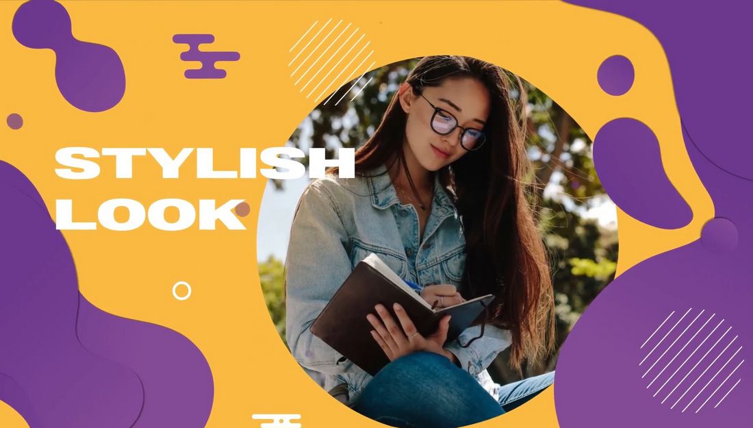
This colorful Final Cut Pro slideshow template will help you design beautiful presentations for various types of video projects from adverts to social media promos and more. There are multiple styles of slide layouts in this template with liquid-style shapes and animations. And you can fully customize them to your preference.

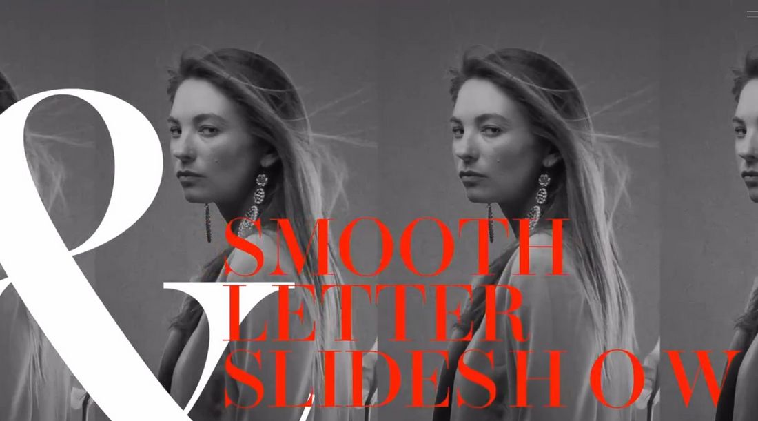
Smooth Letter Slideshow Free Final Cut Pro Template

Smooth Letter Slideshow Free Final Cut Pro Template

You can download this Final Cut Pro template for free to design elegant and stylish slideshows for modern businesses. It has a set of dynamic slides with 14 placeholders for images or videos. There are also placeholders for text and titles too.

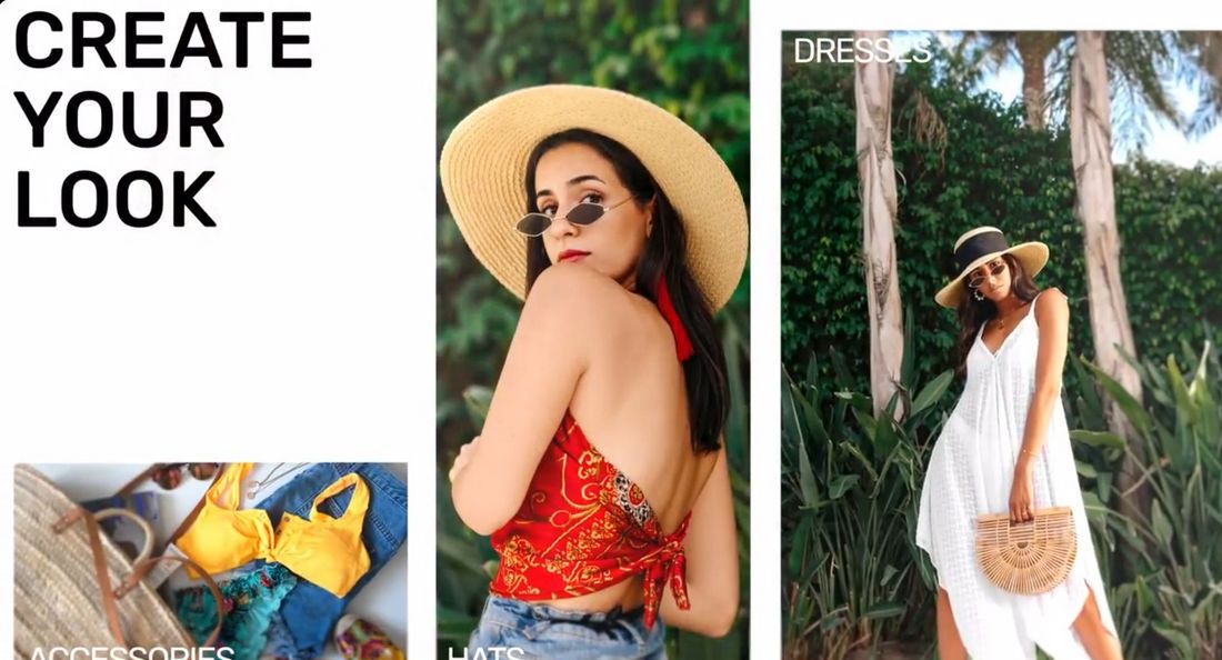
Fashion Photo Slideshow Free Final Cut Pro Template

Fashion Photo Slideshow Free Final Cut Pro Template

This FCP slideshow template can be used to design modern and cool presentations for fashion and design-related topics. You can use it to make quick promo videos for social media as well. The template is free to download and use.

Web Promotions Free Final Cut Pro Template

Web Promotions Free Final Cut Pro Template

If you’re working on a promotional video to advertise your brand or product online, this free Final Cut Pro template will help you make an attractive video. It features 8 unique scenes with trendy animations, 12 media placeholders, and 48 text placeholders.

Ransom Notes – Free Final Cut Pro Title Template

Ransom Notes - Free Final Cut Pro Title Template

This is a fun and creative title template for Final Cut Pro that features letters with paper cutout styles. It makes the title look like a ransom note. The template is free to download.

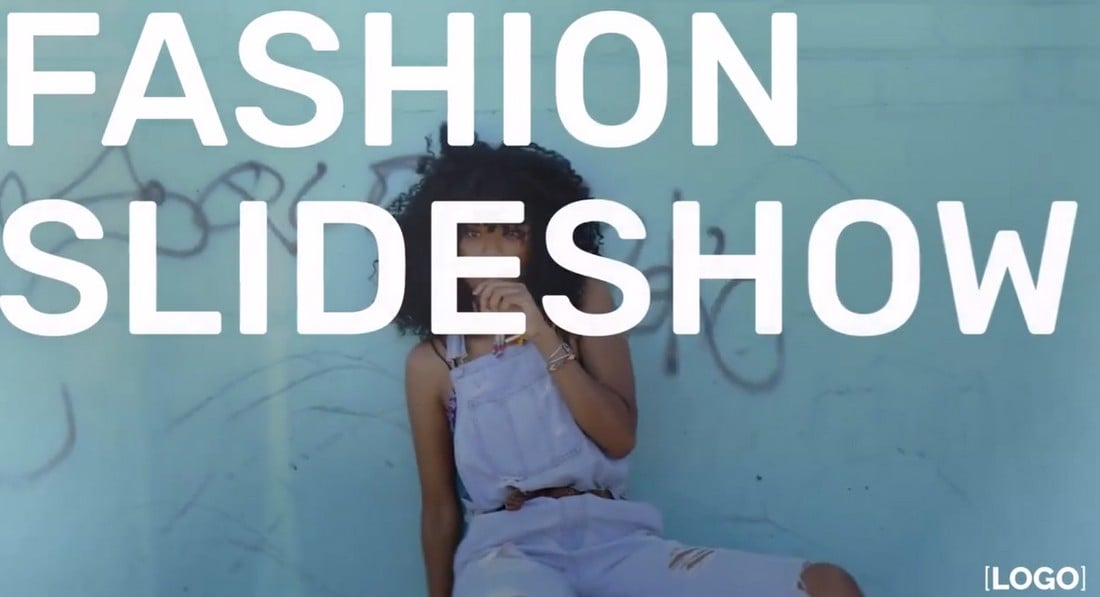
Free Fashion Type Photo Presentation FCPX

Free Fashion Type Photo Presentation FCPX

This is a stylish slideshow template for Final Cut Pro that allows you to create trendy photo slideshow videos to promote fashion and apparel brands. It’s ideal for other types of videos too. You just have to make a few adjustments here and there.

Free Dynamic Title Final Cut Pro Template

Free Dynamic Title Final Cut Pro Template

This is a dynamic and creative title template for Final Cut Pro. It features several different styles of bold and attractive title designs available in multiple aspect ratios. All free to download and use.

Free Gradient Shape Title for Final Cut Pro

Free Gradient Shape Title for Final Cut Pro

Another colorful and stylish title template for Final Cut Pro. This template is also free to download and it features a modern design filled with shapes and colors. It’s ideal for business promo videos.

Free Painter Style Lower Third FCPX

Free Painter Style Lower Third FCPX

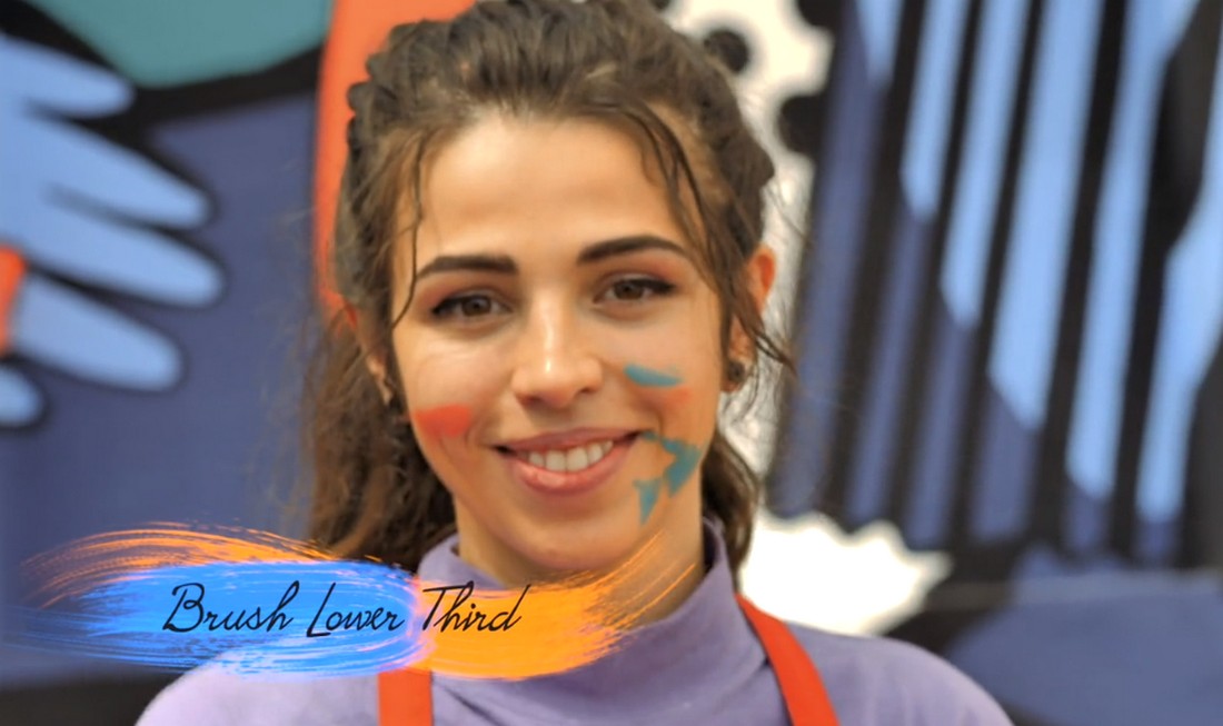
This is a free lower-third template for Final Cut Pro. It features a creative design with painting-themed elements. The background of the text has a paint-brush-like texture to give it a more unique look and feel.

Free Cut-Off Title Box for Final Cut Pro

Free Cut-Off Title Box for Final Cut Pro

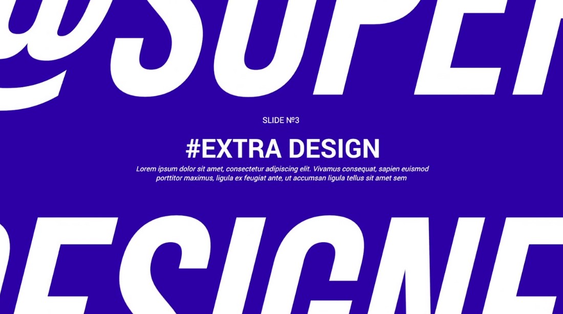
This title template for Final Cut Pro comes with a modern design with a full-screen layout. It shows your title as if it’s been cut off by the screen. And you get to fully customize the text, font, and colors to your preference too.

Free Polaroid Style Slideshow FCPX

Free Polaroid Style Slideshow FCPX

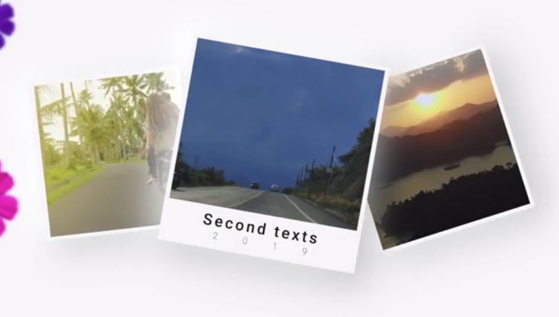
This free Final Cut Pro slideshow template is perfect for creating a simple and fun photo slideshow. It features a polaroid-style slide design with multiple variations to choose from.

Free Creative Text Line Story FCPX

Free Creative Text Line Story FCPX

With this free Final Cut Pro template, you can create a stylish and modern Story to promote your Instagram channel. It features an easily editable layout with a text and video placeholder.

Free Boxed Shape Logo Reveal FCPX

Free Boxed Shape Logo Reveal FCPX

Another free Final Cut Pro template for adding a simple logo reveal to your videos. It has a minimalist design with a boxed-shaped text logo placeholder. It’s perfect for business and creative videos.

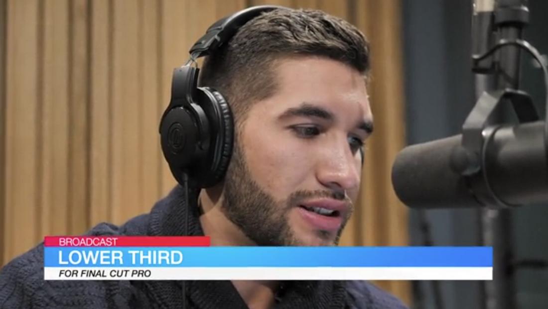
Free Broadcaster Style Lower Third

Free Broadcaster Style Lower Third

If you want to add simple lower-thirds to your videos to add a professional look, this free Final Cut Pro lower-third template is perfect for you. It has three lines of text with editable colors and fonts.

Free Colorful Glitch Opener FCPX

Free Colorful Glitch Opener FCPX

Use this free Final Cut Pro template to create a trendy opener for your videos with a glitching effect. You can easily replace the background video and customize the text as well.

Handwriting Titles – Free Final Cut Pro Title Template

Handwriting Titles Free Final Cut Pro Title Template

Make your video titles look like handwritten text with the help of this free Final Cut Pro template. It features a creative lettering design and animations to make intros and title scenes look more creative.

Free Lyrics Video Creator 2 For Final Cut Pro

Free Lyrics Video Creator 2 For Final Cut Pro

This is a must-have template for creating music videos and lyric videos in Final Cut Pro. It makes things much easier to add lyrics to your music videos. And it’s free to use.

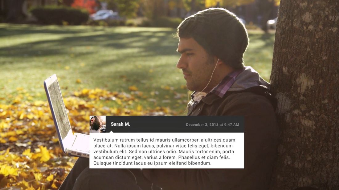
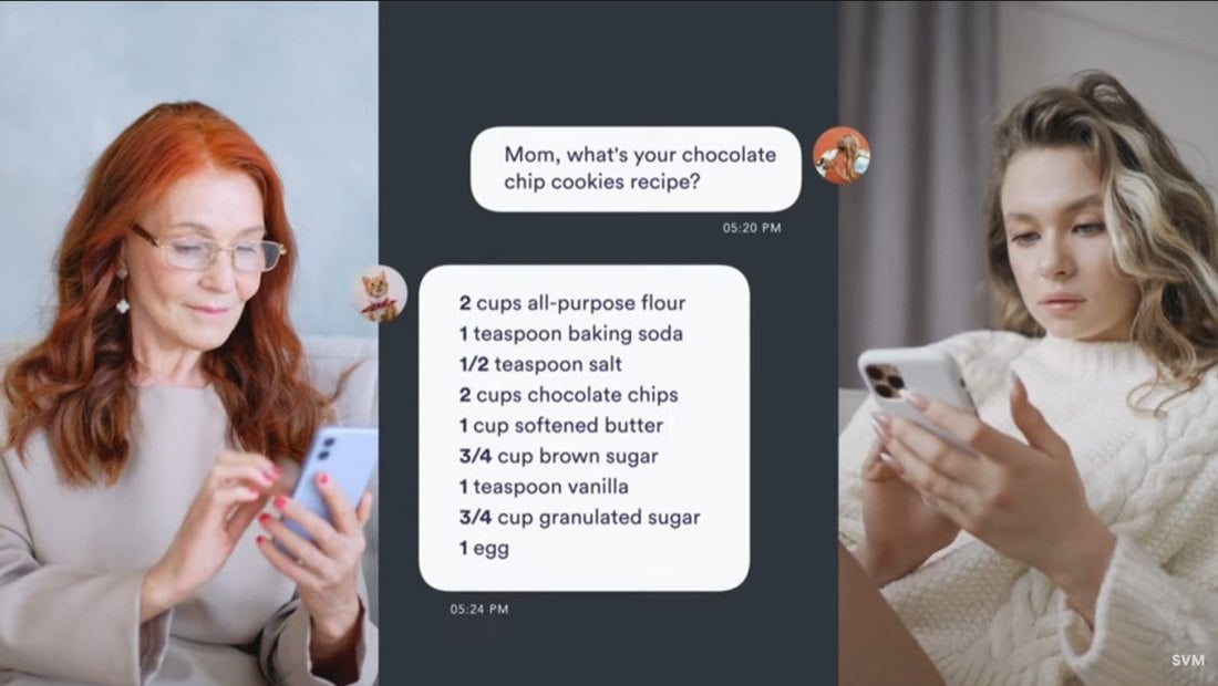
Free Text Message Plugin For Final Cut Pro

Free Text Message Plugin For Final Cut Pro

Add text blocks to your videos in the style of text messages. This free Final Cut Pro template lets you add simple text blocks that look like messages popping up on the screen.

Camera Movements – Free Final Cut Pro Template

Camera Movements - Free Final Cut Pro Template

This free Final Cut Pro template includes multiple studio-quality camera movement effects to make your videos look more professional and unique. They are easy to use and perfect for enhancing all types of videography.

Snap To It – Free Final Cut Pro Instagram Story Templates

Snap To It - Free Final Cut Pro Instagram Story Templates

You can use this FCP template to design amazing Instagram Story clips to attract more attention. It includes 5 unique Instagram Story templates with creative animations, effects, and colorful designs. You can fully customize them to change colors and media too.

Wet Ink Opener – Free Final Cut Pro Template

Wet Ink Opener - Free Final Cut Pro Template

This is a unique opener template for Final Cut Pro that features creative wet ink-style transition effects. It will allow you to create beautiful openers for photo album videos as well as for making channel intros and logo stings.

Light Leak Motion – Free Final Cut Pro Opener Template

Light Leak Motion - Free Final Cut Pro Opener Template

Want to add a unique opener to your social media promo video? Then be sure to grab this free Final Cut Pro template. It features a simple design with a light leak effect that opens to titles and logo reveals.

Shape Filter Opener – Free Final Cut Pro Template

Shape Filter Opener - Free Final Cut Pro Template

This free Final Cut Pro template is perfect for making openers for corporate business and event promo videos. It features a stylish animated shape with bold headings.

Fullscreen Glitch – Free Final Cut Pro Title Template

Fullscreen Glitch - Free Final Cut Pro Title Template

Make a big and bold title scene for your YouTube and creative videos with this free Final Cut Pro title template. It includes a fullscreen title design featuring a glitch effect.

YouTube Subscribe – Free Final Cut Pro Template

YouTube Subscribe - Free Final Cut Pro Template

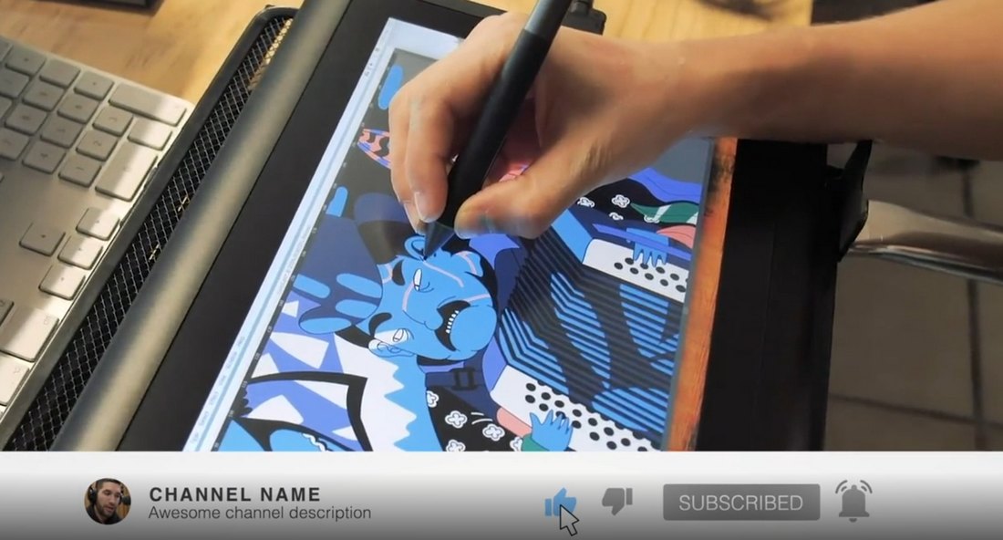
You can use this free Final Cut Pro template to add a subscribe notification bar to your YouTube videos. It’s fully animated and includes space for adding channel branding and profile icons as well.

10 Free Openers for Final Cut Pro X

10 Free Openers for Final Cut Pro X

This is a collection of 10 openers for Final Cut Pro X. It includes several attractive intro designs you can use to create title scenes for your videos. Each opener can be easily customized to your preference. And the templates are compatible with FCPX 10.4.7 and higher.

Company Profiles Free Final Cut Pro Template

Company Profiles Free Final Cut Pro Template

This free Final Cut Pro template includes 6 fully animated slides for showcasing your company and team. It’s ideal for making company profile videos for startups and small businesses.

Free Lightning Elements Pack for Final Cut Pro

Free Lightning Elements Pack for Final Cut Pro

Lightning effects are commonly used in YouTube and social media videos to make content more entertaining. This free Final Cut Pro template pack gives you 12 different lightning effects to help make your video more fun and entertaining.

Free Creative Instagram Stories Final Cut Pro Templates

Free Creative Instagram Stories Final Cut Pro Templates

You can use this Final Cut Pro template pack to create professional-looking Instagram stories to generate more engagement. It includes 8 free Instagram story templates with animations and editable designs.

Free App Promo Video Template for Final Cut Pro

Free App Promo Video Template for Final Cut Pro

This free Final Cut Pro template is perfect for making promo videos for showcasing your mobile apps and features. The video template includes multiple slides with different styles of animations.

Free Animated YouTube End Screen for Final Cut Pro

Free Animated YouTube End Screen for Final Cut Pro

Add a simple and animated end screen for your YouTube videos with this free Final Cut Pro template. It features a gradient color background with an easily customizable design.

mVertical Free Final Cut Pro Plugin

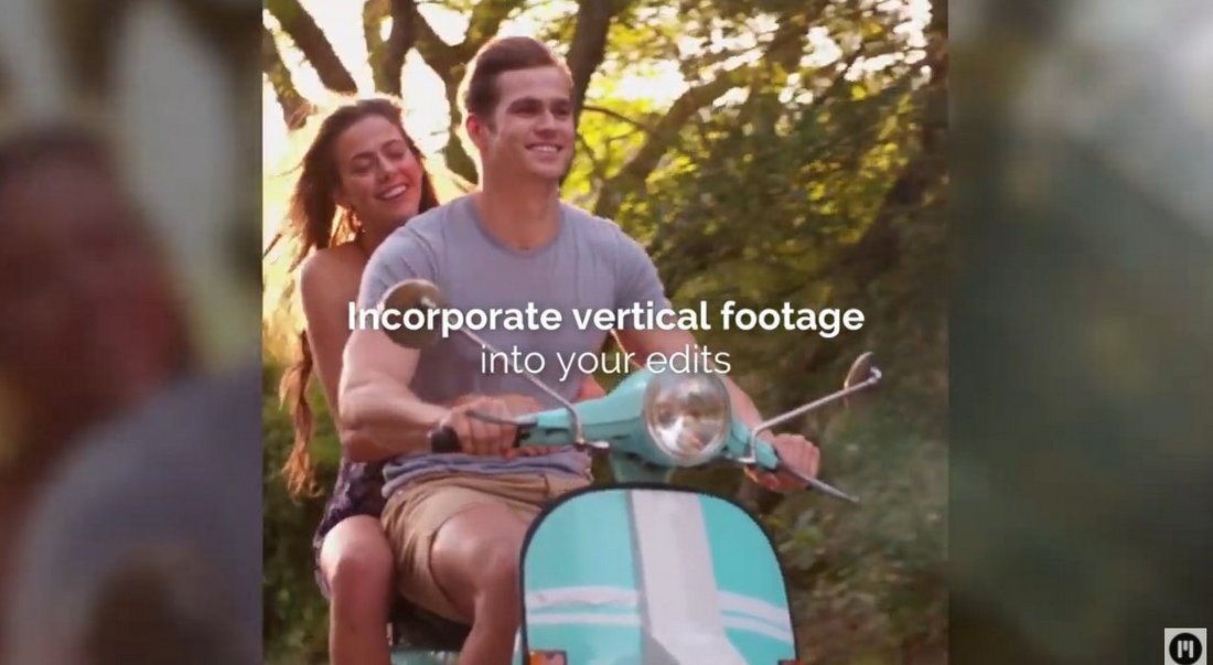
mVertical Free Final Cut Pro Plugin

This Final Cut Pro plugin will be quite useful for social media content creators. It allows you to easily adjust your vertically shot videos for a wide-angle view by adding a blurred background.

mVertigo Free Dolly Zoom Effects for FCPX

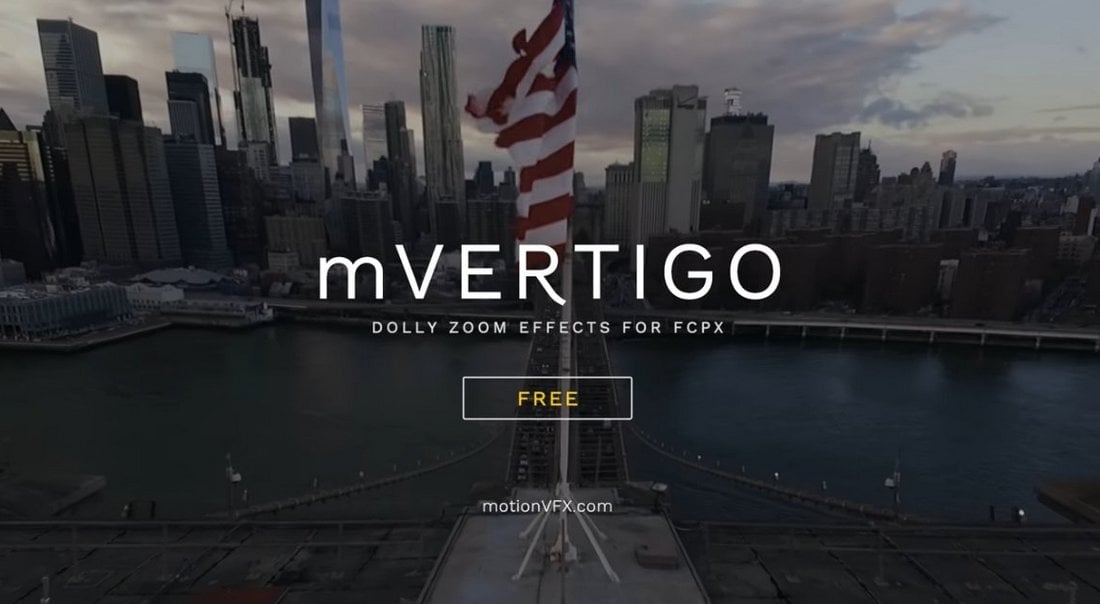
mVertigo Free Dolly Zoom Effects for FCPX

With this free Final Cut Pro effect, you can add a cool dolly zoom effect to your videos. You can even use it on photos to create amazing animations. It works simply by drag and drop and offers controls for customization as well.

Free Adjustment Layer Plugin for Final Cut Pro X

Free Adjustment Layer Plugin for Final Cut Pro X

A free adjustment layer kit for Final Cut Pro. Using this freebie, you can easily color grade videos to add a cinematic visual style to stock footage. It works with Final Cut Pro X 10.4 and higher.

10 Free Smooth Final Cut Pro Transitions

10 Free Smooth Final Cut Pro Transitions

This is a collection of free transitions for Final Cut Pro. It features 10 different transition effects with a variety of styles. You can use them with both professional and creative videos.

Free Final Cut Pro Slideshow Template

Free Final Cut Pro Slideshow Template

If you’re working on a slideshow design in Final Cut Pro, this free template will help you design a professional slide without effort. It features a clean and modern design with fully customizable elements.

Free Pixel Grid Glitch Promo Final Cut Pro Template

Free Pixel Grid Glitch Promo Final Cut Pro Template

You can use this free Final Cut Pro template to create a cool promo video. It features a colorful glitch effect with unique transition animations. Of course, you can fully customize the design to your preference as well.

Free Social Media Links for Final Cut Pro X

final cut pro template

Direct your audience to your Instagram, Twitter, Tumblr and Youtube handles, and boost your social media presence with the help of this remarkably unique Final Cut Pro template available for you to download at no cost at all. Grab it now!

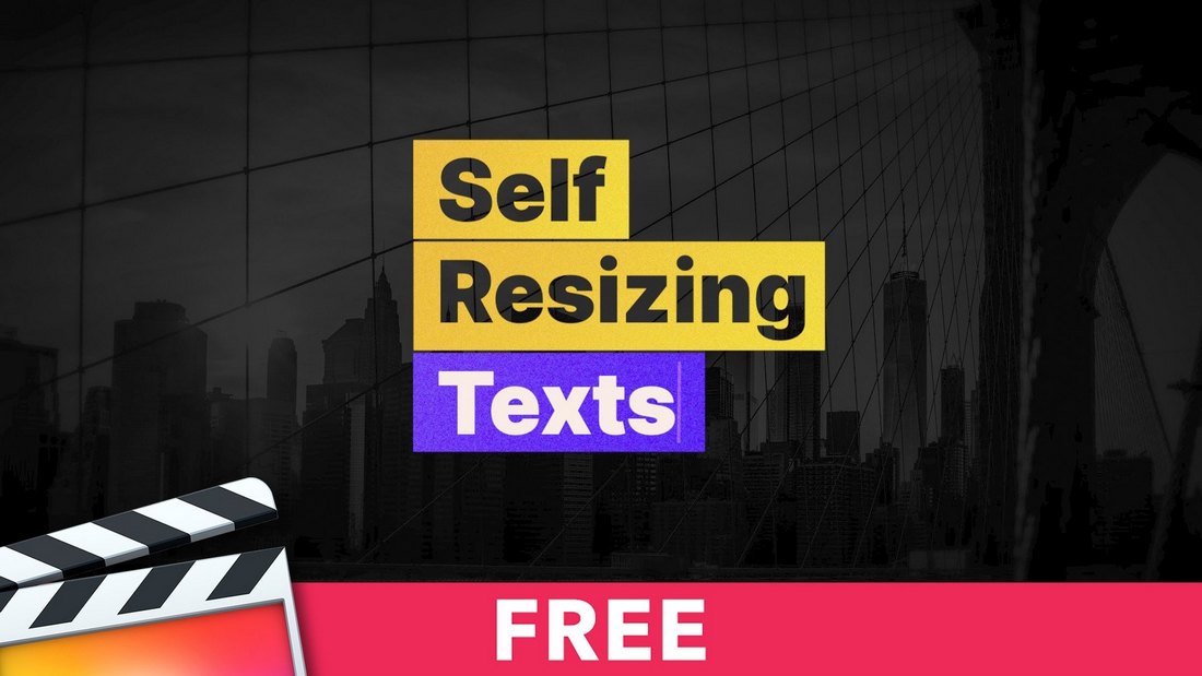
Self Resizing Texts – Free FCPX Templates

Self Resizing Texts - Free FCPX Templates

A creatively animated text template featuring a text resizing effect. This template is perfect for showcasing quotes and descriptions, especially for social media videos. It’s compatible with all video sizes including square, portrait, and Instagram stories as well.

Cyberpunk Effects – Free Final Cut Pro Template

Cyberpunk Effects - Free Final Cut Pro Template

This bundle includes 4 unique transition effects featuring various Cyberpunk-style designs. There are glitch animations, neon lights, and everything you need to add a futuristic Cyberpunk vibe to your videos.

Free Animated Grids Final Cut Pro Template

Free Animated Grids Final Cut Pro Template

You can use this free FCP template to create a grid animation scene for your video. It includes 20 grid animations that are ideal for everything from photo slideshows to business showcase videos and much more.

Free Final Cut Pro Bouncy Text Animations

final cut pro template

Next up, we have a free Final Cut Pro template that equips you with 30 in and out bouncy text animations, ensuring you never run out of choices when it comes to sprucing up your footage. This template is a must-have in an FCPX editor’s toolkit.

Sketch Reveal Free Final Cut Pro Template

Sketch Reveal Free Final Cut Pro Template

Add a cartoon sketch-style transition animation to your videos using this free FCP template. It also comes with 7 title placeholders, 7 logo reveals, and 6 transition effects packed into one bundle. All for free.

Free Text Message Templates for Final Cut Pro

Free Text Message Templates for Final Cut Pro

You can use this free template to create a text messaging scene with creative animations and video content. It’s perfect for creating fun and entertaining videos for social media content and promotions.

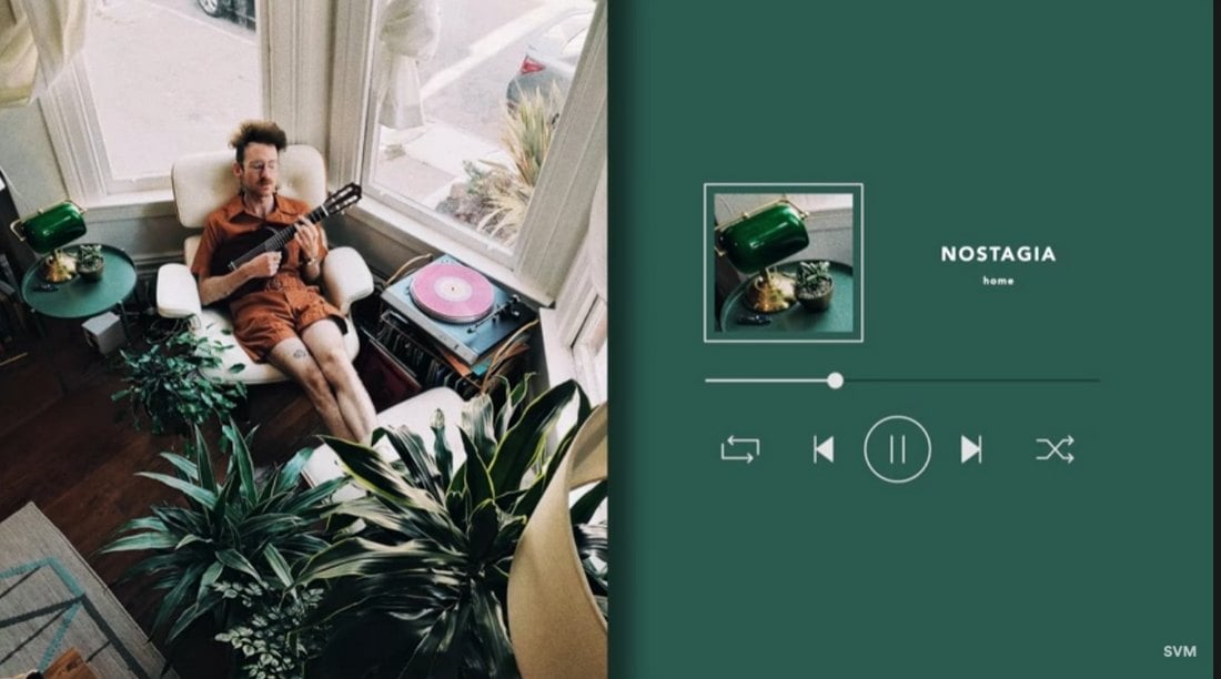
Music Player – Free Final Cut Pro Template

Music Player - Free Final Cut Pro Template

If you upload audio content on video platforms like YouTube and Tiktok, use this template to add a video player to your song compilations and soundtrack videos. It’s free to use and easily customizable with Final Cut Pro X.

Free Final Cut Pro Fast Zoom Transitions

final cut pro template

If you’re looking for some cool zoom transitions to add to your videos, this free Final Cut Pro template is well worth checking out. It comes with 7 dynamic zoom rotation in and out transitions with incredibly unique filters that are sure to boost the overall appeal of your promo, movie, or presentation.

Silhouette Openings – Free FCPX Templates

Silhouette Openings - Free FCPX Templates

Create a stylish silhouette-style title scene with this free FCP template. It comes in 3 different aspect ratios including portrait and square. You can use it in both Final Cut Pro X and Apple Motion 5.

Simple Transitions – Free Final Cut Pro Template

Simple Transitions - Free Final Cut Pro Template

If you’re tired of using the same old default transitions in Final Cut Pro, these transition effects will definitely come in handy. This pack features a set of creative transition effects you can add to your own video projects. The effect is customizable and it’s available in different styles as well.

Free Final Cut Pro Unique Typography

Final Cut Pro Template

Ideal for fashion events, promos, slideshows, and Youtube videos, this bundle of 14 stylishly designed animated titles should be at the top of your list when looking for the best free Final Cut Pro templates. We recommend you take this resource for a spin!

Free Final Cut Pro 3D White Logo

Final Cut Pro Template

If you’re after a neat, and minimal logo template that comes without any bells and whistles, this 3D design is the one to go for. This template can be used as a quick introduction to your videos and comes with various placeholders making customization a piece of cake for you.

MixKit Final Cut Logo Reveal Templates

Give your brand the attention it deserves in your next video project, by incorporating a logo reveal from this collection of 9 free logo templates for Final Cut Pro. Professionally designed by talented creators, each template on Mixkit is free to download and use in your next commercial project. Simply add your logo and brand colors to easily make these templates your own.

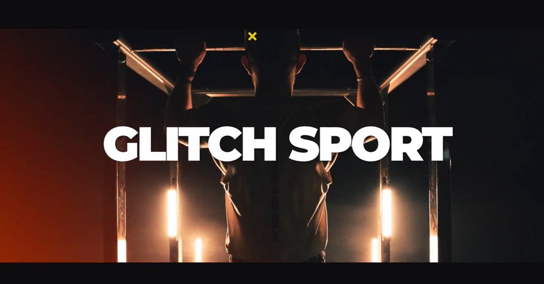
Glitch Sport – Free Final Cut Pro Transitions

Glitch Sport - Free Final Cut Pro Transitions

Sports and workout videos need to feature more energetic and trendy transitions that attract the right audience. This is a pack of free transitions you can use in Final Cut Pro to achieve that goal. The bundle includes a set of stylish transitions with 10 editable layers covered with a glitching effect. Perfect for your YouTube videos.

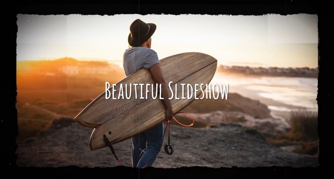
Beautiful Slideshow – Free Final Cut Pro Template

Beautiful Slideshow - Free Final Cut Pro Template

Sometimes a simple slideshow design can go a long way to make your video albums and photo slideshows look more unique and professional. This template has the same vibe. It features a simple slideshow design featuring light leaks. There are 10 image placeholders and 10 text layers you can easily edit to your preference.

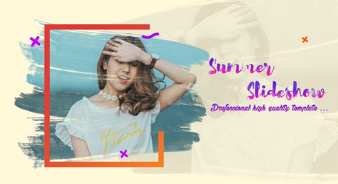
Bright Summer – Free Final Cut Pro Slideshow

Bright Summer - Free Final Cut Pro Slideshow

Looking for a more colorful and trendy slideshow template? Then grab this free Final Cut Pro template. It comes with 17 media placeholders where you can feature both photos and videos. It’s easily customizable and it’s perfect for making clips and slideshows for social media.

Movie Pop – Free Final Cut Pro X Title Plugin

Movie Pop - Free Final Cut Pro X Title Plugin

Movie Pop is an amazing free plugin you can use with Final Cut Pro X. Using the plugin, you can create incredible title scenes for your videos, just like the ones you see in Hollywood movies. The plugin is also quite easy to use. The download page has links to tutorials as well.

Template Pop – 24 Free Final Cut Pro X Titles

Template Pop - 24 Free Final Cut Pro X Titles

Template Pop is a collection of Final Cut Pro title templates you can use for free with your video projects. This bundle includes 24 different title designs featuring various styles of scenes, angles, and styles. You can edit each template to change text and colors to your preference.

Sign Pop – 50 Free Animated Icons for FCP

Sign Pop - 50 Free Animated Icons for FCP

This is a bundle full of creative and animated icons for Final Cut Pro. These adorable icons are perfect for adding a bit of creativity and quirkiness to your YouTube and Instagram clips. They are also great for making kid-friendly videos. This pack includes 50 different animated icons.

Photo Slideshow – Free Final Cut Pro Template

Photo Slideshow - Free Final Cut Pro Template

Using this free Final Cut Pro template, you’ll be able to create an old-school photo slideshow. It features Polaroid-style media placeholders that flip down to reveal the next slide. It includes 14 media placeholders and it works with both FCP and Apple Motion.

Free Final Cut Pro Intro Templates

Free Final Cut Pro Intro Templates

Looking for an intro template to create a modern opening scene for your videos? Then this template is perfect for you. It features a stylish design with a creative animation. You can use it as an intro scene or even a title scene. It’s suitable for corporate and business videos as well.

12 Free Animated Call-Outs for FCP & Apple Motion

12 Free Animated Call-Outs for FCP & Apple Motion

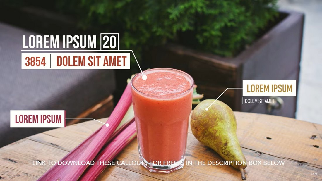
Callouts can be a great feature you can add to your product promotion videos to describe product features. With this free Final Cut Pro template, you can add professional-looking callouts to your own videos without an effort. It actually comes with 12 different styles of callout designs and you can use them in Apple Motion or FCP.

Live – Free Title & Lower Thirds for Final Cut Pro

live title and lower thirds

With this collection of Final Cut Pro templates, you’ll be able to craft both titles and lower-thirds for your videos with ease. It includes a stylish title template and a lower-third template. Both feature modern designs with easily customizable text and colors.

Cartoon FX – Free Final Cut Pro Effects

Cartoon FX - Free Final Cut Pro Effects

This is a bundle full of amazing effects you can add to your videos in Final Cut Pro. It features a set of cartoon-style visual effects. When used properly, they’ll add a unique look to your videos. It includes multiple styles of effects suitable for different types of videos.

Social Media Slideshow – Final Cut Pro Template Free

Social-Media-Slideshow-Final-Cut-Pro-Template-Free

Just as the name suggests, this Final Cut Pro template features a slideshow design that’s most suitable for social media videos. It includes a stylish slideshow with multiple image placeholders for featuring your photos. You can customize it using FCP or Apple Motion.

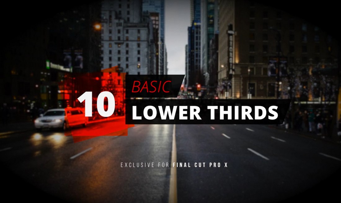
10 Basic Lower Thirds – Free Final Cut Pro Templates

10 Basic Lower Thirds - Free Final Cut Pro Templates

If you’re a YouTuber or a social media influencer, you’ll find this collection of lower thirds templates to be quite useful. This pack includes 10 lower-third templates with various styles of designs. They are perfect for adding simple titles for different kinds of videos.

10 Free Flat Transitions for Final Cut Pro

10 Free Flat Transitions for Final Cut Pro

This bundle includes a collection of very colorful and beautiful transition effects featuring flat color designs. There are circles, squares, and many other styles of transition styles. You can use them with various videos to add more entertaining transitions.

Tile Pop – Flipping Tile Free FCP Transition

Tile Pop - Flipping Tile Free FCP Transition

Tile Pop is a free transitions template for Final Cut Pro. It features a very stylish effect that uses a tile flipping animation to transition from one scene to the next. The effect is available in multiple styles as well.

50 Free Animated Backgrounds for Final Cut Pro

50 Free Animated Backgrounds for Final Cut Pro

Coming up with a stylish background for various scenes in your videos can be tough when you have a blank canvas. But, with the help of this pack of backgrounds, you won’t have to worry about it again. This bundle includes 50 unique backgrounds with animated gradients. And it’s totally free.

4 Essential Free Titles & Lower Thirds for FCP

4-Essential-Titles-_-Lower-Thirds-for-FCP

Whether you’re working on a corporate video, a casual social media clip, YouTube video, or even a hipster-style fashion video, this pack of Final Cut Pro templates has titles and lower-thirds to cover all those types of videos and more. It’s fully customizable and comes with in and out animations as well.

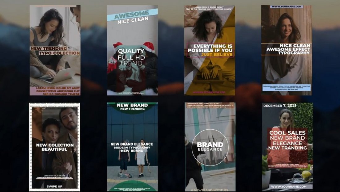
Free Instagram Stories Final Cut Pro Templates

Free Instagram Stories Final Cut Pro Templates

Looking for a way to create unique Instagram stories to stand out from the crowd? Then use this free Final Cut Pro template kit to create attractive Instagram stories. This pack includes multiple Insta story templates in different aspect ratios to fit all types of screens.

Super Starter Kit – Free Final Cut Pro Templates

Super Starter Kit - Free Final Cut Pro Templates

If you’re new to video editing or just getting started on YouTube, this starter kit is perfect for you. It’s a complete kit that includes many different kinds of Final Cut Pro templates. Such as transitions, titles, lower-thirds, Instagram stories, and much more for creating all kinds of videos.

Social Titles – Free FCP Title Templates

Social Titles - Free FCP Title Templates

This is a collection of modern title templates for Final Cut Pro. It includes 12 different title scenes fully animated to fit modern videos. The titles are especially suitable for social media video clips for adding quotes as well as for YouTube videos.

YouTube Like Notification – Free FCP Template

Youtube Like Notification - Free FCP Template

Getting your viewers to click subscribe and hit the notification bell on YouTube is not easy. Maybe adding small visual aid could help convince your fans. Use this template to add a YouTube Like and subscribe animation to your videos. You can easily remove the background of this clip to add the icons as an overlay on your videos.

Check out our best Final Cut Pro title templates collection to create a great title scene for your videos.

Getting B2B Ecommerce Right — Here’s What I Learned From Experts

Featured Imgs 23

B2B ecommerce is a thriving industry. Growing at a rate of over 10% each year, B2B ecommerce will generate over $3 billion in sales by 2027.

However, no matter how familiar you are with B2C (business-to-consumer) ecommerce, selling to businesses is an entirely different beast.

Download Now: Ecommerce Planning Templates + Kit

I wanted to find out how exactly B2B ecommerce strategies differ from B2C ones, the different types of B2B ecommerce channels, and how to successfully market a B2B business, so I talked to the people who know it best.

Here’s how to get your B2B ecommerce strategy right, according to industry experts.

Table of Contents

B2B Ecommerce vs. B2C Ecommerce

There’s more than just a single-letter difference between B2B and B2C ecommerce. Everything from sales to customer acquisition to ecommerce trends is different when you’re selling to businesses online.

To better understand how B2B ecommerce differs — and can be more challenging — I spoke to a few experts.

Buying Cycle

For starters, the B2B ecommerce buying cycle is much longer than B2C.

Steve Hutt, the founder of eCommerceFastlane, suggests the process can stretch anywhere from three to nine months, depending on the industry. There are several reasons for this.

For one, B2B ecommerce involves multiple decision-makers. Even if you’re only in contact with one person, they need to get buy-in from their team.

Instead of selling to a single customer with a single need, you’re essentially selling to a team of people who may have multiple challenges to address. The approval process can take time on their end, which means B2B sellers also need to be flexible.

“This extended timeline requires patience and a strategic approach to nurturing leads,” says Hutt.

Order Value

Another key difference is the average order value (AOV). When you’re dealing with higher-priced goods or services or bulk orders through wholesale, each sale carries more weight. Where sales volume might be the goal in B2C ecommerce, order value is prioritized in B2B ecommerce sales.

“According to recent industry data, the average B2B order value sits at $491, compared to the average B2C order of $147,” explains Hutt. “This higher value reflects the bulk purchasing common in B2B transactions and underscores the importance of each sale.”

Pricing

Similarly, pricing is also a major difference between B2B ecommerce and B2C. B2C customers typically expect a straightforward, fixed price on whatever they’re purchasing, whereas B2B pricing structures are more fluid, suggests Gianluca Ferruggia, the general manager at online B2B marketplace DesignRush.

“We're often adjusting prices based on volume, specific contract terms, or ongoing negotiations,” says Ferruggia. “This makes transparent pricing a real challenge, and is a stark difference from the B2C world.”

Onboarding Process

Another difference I heard from ecommerce experts is the onboarding process. B2B products often have greater technical complexity, which leads to longer onboarding processes.

“In some industries, this can extend up to three months,” says Hutt. “However, this complexity also allows businesses to showcase their expertise and provide value through comprehensive support.”

Customer Retention

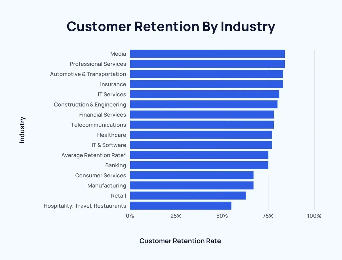
Customer retention also tends to be higher for B2B companies compared to B2C. When you consider how long the sales and onboarding processes are, not to mention the AOV being higher, it makes sense that customers invest longer.

“This higher retention rate emphasizes the long-term nature of B2B relationships,” says Hutt.

Data from SaaS Capital found that B2B SaaS companies have a median gross retention rate of 91%. Another report found that B2B industries like manufacturing have a 67% customer retention rate.

b2b ecommerce, customer retention rates by industry

Image Source

Before you can venture into B2B digital commerce, it’s important to understand how the industry is broken down. There are several types of B2B ecommerce channels. I want to highlight the most common types here.

1. Wholesale

B2B wholesale is a model where businesses sell goods or services in bulk to other businesses. Wholesale prices are typically offered at a discount for bulk purchases.

The goods are then sold to consumers at retail price for a profit. Businesses can sell wholesale from their own ecommerce site or use a B2B marketplace like Alibaba or Amazon Business.

2. Manufacturers

Manufacturers are businesses that create goods and products from raw materials, usually at their own factory or warehouse.

Manufacturers can sell directly to customers or work with a partner, like a distributor, to help them sell their products.

3. Distributors

Distributors work with manufacturers to sell the manufactured product to customers. Distributors use ecommerce marketing channels to promote the manufacturer’s goods in an effort to increase sales.

4. B2B Marketplace

B2B marketplaces are a growing (and thriving) sector of B2B ecommerce.

These marketplaces are online platforms that allow businesses to sell to each other. Think of them as retail platforms designed just for businesses rather than consumers.

According to Statista, Amazon Business and Alibaba are leading platforms among generalist B2B marketplaces. There are also specialized B2B marketplaces, such as DesignRush, which connects service providers with companies.

5. Software-as-a-Service (SaaS)

Software-as-a-Service (SaaS) is another popular type of B2B ecommerce. This business model involves companies paying a fee, either monthly or annually, to another company for access to the latter’s software.

Companies like HubSpot, Microsoft, and Dropbox are just a few examples of B2B SaaS platforms.

3 Top B2B Ecommerce Marketing Strategies

If you’re in the B2B digital commerce space and curious about how to improve your marketing, I asked the experts for their top ecommerce marketing strategies for B2B companies.

Strategy #1: Email Nurture Campaigns

As I mentioned earlier, the B2B sales cycle is much longer than the typical B2C process. Sellers must be actively engaged with prospects throughout the cycle if they want to stay on their radar.

This is where email nurture campaigns can be beneficial.

Tools like Opensend and Retention can help you identify potential customers after they’ve visited your website, i.e., when buyers are in their research phase, and target them with personalized outreach.

“Once we identify these potential leads, we initiate a personalized ‘Thanks for visiting’ campaign,” says Hutt. “We integrate the newly discovered email addresses into our email service provider (ESP), like Klaviyo, to start nurturing campaigns. This approach helps maintain brand visibility throughout the longer B2B sales cycle.”

3 Top B2B Ecommerce Marketing Strategies

Strategy #2: Account-Based Marketing (ABM)

Account-based marketing (ABM) has also gained a lot of traction in B2B ecommerce, and for a good reason.

Personalization in sales is more important than ever, especially when 75% of B2B buyers prefer a self-service experience over working directly with a sales rep.

This means that when you do have an opportunity to meet with a prospect, your pitch must be tailored to their business needs to make the most of their time.

B2B sellers must show their commitment by regularly engaging with customers, offering tailored insights, adapting to their evolving needs, and giving buyers personalized marketing content that speaks to their pain points.

Being proactive with your marketing fosters loyalty and creates opportunities to add value to the relationship.

“For high-value accounts, ABM is a great way to provide value through a personalized content cadence that speaks directly to each stakeholder's unique challenges,” says Belinda Conde, head of marketing at Datos, a Semrush Company.

“One thing I’ve found especially important in B2B is focusing on problem-solving rather than feature-selling. It’s about providing value first — helping your audience tackle their pain points before you even ask for anything in return.”

gartner chart showing 75% of B2B buyers prefer a self-service experience over working directly with a sales rep

Image Source

Strategy #3: Educational Content

I heard from a lot of experts that educational, hyper-relevant content is essential for any B2B ecommerce marketing strategy.

A B2B buyer wants to see evidence such as case studies, ROI calculators, and industry-specific guides. They want proof that your solution doesn’t just sound good but works in practice and for businesses like theirs, shares Paul Drecksler, an ecommerce expert and the founder of Shopifreaks.

“B2B ecommerce marketing is about meeting [customers] where they are and saying, ‘We get your world, and here’s exactly how we fit into it,’” he says.

Drecksler shares one marketing campaign that stuck out to him. “I remember one campaign that focused on segmented landing pages with tailored messaging for each industry,” he recalls.

“Each page had its own set of statistics, examples, and testimonials specific to that sector — whether it was healthcare, finance, or logistics — and each vertical got a narrative that showed an understanding of their unique challenges and priorities.”

B2B Ecommerce Examples

If you’re looking for inspiration for your ecommerce business, I’ve collected a few B2B ecommerce examples that I found helpful.

In my opinion, these companies showcase how to tailor content, landing pages, and user experience to a B2B buyer in an impactful way.

Microsoft

Microsoft showcases its use cases for different industries by creating industry-specific landing pages. They outline their solutions for healthcare, education, finance, and more.

B2B ecommerce example, Microsoft’s industry landing pages

Image Source

What I like most is the way Microsoft markets its AI solutions. They have a section on their website that is tailored to business leaders.

I like that this campaign speaks to a specific buyer and breaks down the AI use cases that business leaders seek, like boosting productivity, optimizing efficiency, and driving more value across the business.

Faire

Faire is a B2B wholesale platform that connects independent retailers and brands. Even though I’m neither a retailer nor do I sell products, I’ve been a longtime fan of the Faire platform. I personally love its branding and messaging.

To me, it’s clear Faire knows its target market and tailors everything from its imagery to its copy to that customer.

Faire is a B2B ecommerce site for wholesale businesses

Image Source

I especially like how the website is organized. Wholesale customers can browse different products by categories, bestsellers, or even based on the values that align with their brand.

Grainger

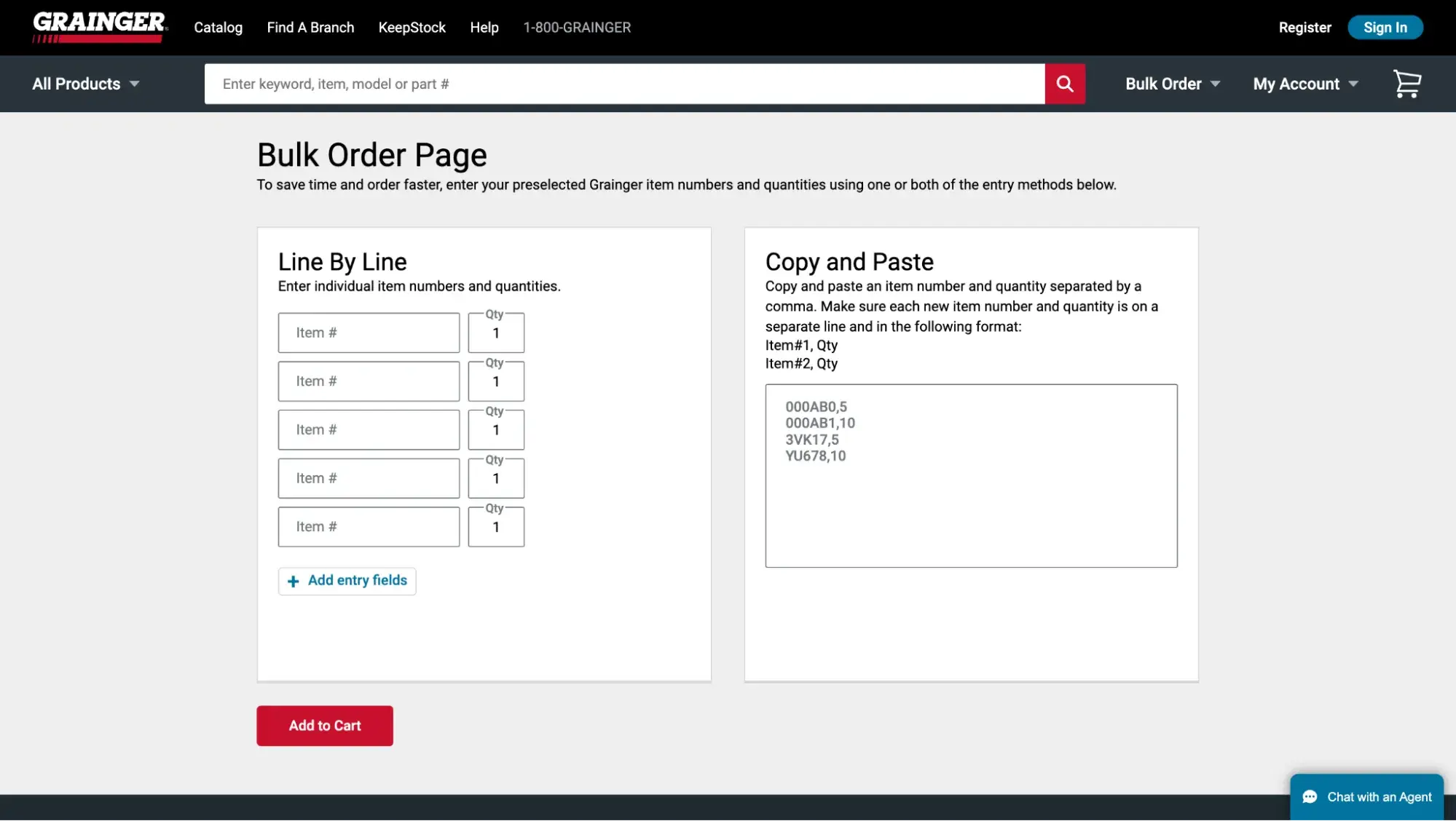
Grainger is a leading distributor of industrial supplies and equipment. The business operates retail stores and an ecommerce site for businesses of all sizes to shop for the tools and parts they need for a job.

B2B ecommerce distributor example, Grainger

Image Source

My favorite part about Grainger’s ecommerce experience is the bulk order process. The simple feature is straightforward and mimics an order pad you’d see a salesperson use in-store. Buyers can easily browse the product catalog, add the item numbers and quantities to their bulk orders, and make their purchases.

Grainger’s B2B ecommerce website

Image Source

Shopify

Shopify regularly shares educational content for sellers across its blog and social media. This marketing content showcases Shopify’s deep industry knowledge and how its specific features can help businesses improve their sales.

For example, this LinkedIn carousel from Shopify breaks down three platform features that Shopify merchants can use to optimize their shipping strategy during Black Friday shopping.

This speaks to one of their customer’s pain points — keeping up with the influx of sales during the holiday season — and showcases how Shopify can help.

Shopify’s B2B ecommerce marketing content on LinkedIn

Image Source

Check out HubSpot’s Commerce Software to launch your B2B ecommerce business online.

What I Learned About B2B Ecommerce

While I initially began this article thinking B2B ecommerce was wildly different from B2C ecommerce, I learned that they have a lot in common.

B2B ecommerce is built off of the same principles as any other ecommerce — selling products or services — but the channels, processes, pricing, and marketing strategies are different.

Like consumer ecommerce, it’s critical to understand your audience when you’re in the B2B ecommerce space. When you understand their pain points, perceived value, and what they’re looking for in a partner, you can optimize your ecommerce experience to suit their needs.

Are AI Agents Worth It? HubSpot’s CMO and VP Weigh In

Featured Imgs 23

On a recent Marketing Against the Grain podcast episode, HubSpot founder and CTO Dharmesh Shah sat down with hosts Kipp Bodnar and Kieran Flanagan to discuss the rise of AI agents.

When I heard the term “AI agents,” I thought of little robots sneaking around like spies, completing tasks for marketers.

Download Now: The Annual State of Artificial Intelligence in 2024 [Free Report]

Obviously, that‘s not completely true (they don’t wear suits), but they are very helpful to marketers and are predicted to greatly improve their efficiency and productivity.

AI agents are the latest AI trends to crop in sales and marketing, but are they worth it? Let's get into some of the points covered in the episode:

What is an AI agent?

According to Shah, an AI agent is a piece of software that uses AI to accomplish a multi-step goal.

“There are varying definitions of what an AI agent actually is,” he says. “There is a spectrum of capabilities. You have very simple agents and sophisticated agents that do multi-agent things and reasoning.”

But whether we're talking about simple AI agents or more complex ones, the standout feature is their ability to carry out multistep goals that require different functions. According to Shah, this capability separates them from AI tools such as ChatGPT.

Think of it like this: When I use an AI tool like ChaGPT, it's a simple back-and-forth interaction. I make a request, and the chatbot responds.

“Whereas with an agent, you're giving it a higher order goal, and it may need to invoke Language Modeling (LM) or multiple LMs and use other AI tools and some classic tools to pull together whatever goal you're trying to accomplish.”

A simple way to think about it is that AI agents are the next generation of automation tools to streamline marketing workflows and tasks.

When to Use AI Agents

So, when should you use an AI agent instead of a standard AI tool like a chatbot? This is actually what I find most interesting about the podcast‘s discussion of AI agents.

When we think of AI, it’s hard to banish the thought (fear) of it replacing humans. However, Shah explains that an AI agent is most helpful when a human is needed to kick off the task, but many steps can be taken without human intervention.

For example, let's say a small business owner wants to route leads in their CRM using ChatGPT. They could plug customer data into ChatGPT to see what the chatbot generates.

However, if they want to take things a step further, they could use an AI Agent to bring them the most recent company numbers added to the CRM to conduct research.

They could then write rules about how they want the lead writing to happen.

“This is all doable with today's technology and AI agents,” Shah says.

Essentially, AI agents should be used when “you know what to do manually, and you could do it manually—but you want to automate some of those steps instead of trying to do this kind of one-off shot with ChatGPT,” according to Shah.

AI Agents in Content Marketing

If you‘re a content creator and marketer like him, you’re probably curious about how AI agents can help in the realm of content marketing, such as creating blog content, social media posts, videos, and graphics.

I‘ve said in the past that marketers should think of AI as a digital assistant. If that’s the case (and it is), think of AI agents as your digital team.

“The really exciting thing about these agents is that they can actually use each other,” Shah explains.

Shah mentions generative AI tools as an example and the need for images generated for your business to adhere to a style and color palette specific to your brand.

“So, I built an agent called a Color Palette Extractor,” he says. “It's a very simple agent. All you do is give it the home page or any web page. It will take a screenshot of that web page, determine which colors are used, and give you a palette proportional to the percentage of real estate that color took.”

In other words, the AI agent will generate a color palette based on the web page you fed it.

You can then take the color palette that the agent produced and pass it to another agent that will incorporate that palette to generate images or other content.

“So that's the composing two agents that didn't know anything about each other until you glued them together creatively,” he says.

From there, you can take the image and run it through a LinkedIn post generator, incorporating the results of the previous two agents. That's three agents working together as a team to generate content for your business.

Concerns with AI Agents

Listening to the podcast, Shah, Bodnar, and Flanagan's excitement about the possibilities presented by AI agents was impossible to ignore.

Shan event mentions a future where AI agents could be treated almost as salaried employees and a natural part of marketing teams.

“Some day, agents are going to have a salary that is, say, $2.00 a month, or whatever the price tag happens to be,” he says.

While I mentioned earlier that humans are still needed when using AI agents, there are concerns about what a human‘s role could look like if we’re talking about teams of AI agents.

Personally, I think an explanation would be that human marketers will still be integral to the marketing process even with the addition of AI agents, they just need to amp up their skills and consider a supervising role.

Think about it: Even the greatest teams need a leader and supervisor.

Jeremy Kahn, AI editor at Fortune Magazine, seems to share my sentiment in an interview with Fortunate Magazine.

“We need to redefine human roles, focusing on higher-level skills for supervising systems. I anticipate people will oversee multiple AI systems simultaneously, serving as both guides and judges of these systems' outputs,” Kahn says.

So, are AI agents worth the investment?

I think any technological advances that can streamline processes, free up time for marketers, and keep their businesses competitive are worth the investment. However, with great AI advancements comes great responsibility. 

In pretty much every post I’ve ever written about AI (and I‘ve written a lot), I've said that AI best practices include overlooking, proofing, and adding a human touch to every AI-generated output. And that doesn’t change with the use of AI agents.

In fact, I think it's even more important to supervise your team of AI agents and tools because more machines involved means more cooks in the kitchen.

So, yes, look into AI agents and consider ways they can make your life easier as a marketer or business owner. Just make sure you're supervising your team of agents. 

The Ultimate Guide to Successfully Rebranding in 2024

Featured Imgs 23

While I’m not a business owner and haven’t branded my own business, I’ve been an employee at companies that have undergone large-scale rebrands.

Most recently, Nickelodeon, where I work full-time in marketing, pulled off a rebranding strategy in 2023 for the first time in 14 years.

We brought back the “splat,” a shape inspired by Nickelodeon’s iconic green slime, as a tactic to tap into both kids and their nostalgic parents who are former 90s Nick Kids themselves. This was part of an effort to position Nickelodeon as a brand that brings families across generations together to enjoy quality time.

Free Kit: How to Build a Brand [Download Now]

In my opinion, this is an example of a company rebranding correctly and out of necessity. In a competitive entertainment landscape fighting for kids’ attention, Nickelodeon knew we couldn’t keep doing more of the same.

Sometimes (but not all the time!), one of the best ways to move forward is by leaning on and adapting past successes.

It’s not easy to know when is the right time to invest in a rebrand and how to handle that rebrand successfully, so I‘ve prepared this post to help guide the process, plus examples of other brands who’ve successfully rebranded their website, name, logo, mission, and purpose.

Table of Contents

Understanding what rebranding is is only part of the battle. Now, you must ensure you have the right reasons to rebrand.

The Right (and Wrong) Reasons to Rebrand

Rebrands are complicated and carry big risks.

Even big brands aren't immune — just look at X, which is considered one of the biggest recent rebranding fails. Elon Musk rebranded Twitter as X in 2023 by renaming and restyling the entire brand.

As a result, 78% of U.S. iOS users gave the app 1-star reviews, compared to 50% two weeks prior. Most of the negative reviews mentioned disliking the new name and logo.

While it will take time to see the true long-term effects of this rebranding, it’s clear that abrupt, random changes to brands with generally positive sentiments and long-standing reputations can be incredibly detrimental.

That’s why knowing the risks of rebranding can help determine whether or not you're jumping into a rebrand for the right reasons.

If sales have been slow or brand awareness efforts don't seem to be paying off, rebranding may not be the best immediate step.

These issues can potentially be solved with a new content marketing strategy or by conducting market research to identify the underlying cause.

But if you‘re considering a rebrand because your company’s vision, mission, values, and market are no longer reflected in your brand, then a rebrand might be the right decision.

There are a few other major reasons you might consider a rebrand. I will demonstrate these reasons using my fictitious indoor cycling business, Psyched 2 Cyc.

4 Right Reasons for Rebranding

New Locations

Psyched 2 Cyc started as a singular, local studio in New York City, so I selected a punny name that likely only works in English.

After growing throughout NYC and the country, my business is now looking to expand to non-English, international markets that may not identify with the business name. This could be a good time to consider a full brand rename.

Market Repositioning

The name Psyched 2 Cyc was chosen with young fitness enthusiasts at heart — hence the abbreviated word “Cyc” and the use of “2” instead of “to.”

But I’d now like to target older consumers interested in improving their fitness with a low-impact workout like indoor cycling.

Thus, I may need to refresh my brand name (or consider rewriting it in full as Psyched to Cycle) to better resonate with people of all ages.

New Philosophy

I started my business as primarily an indoor cycling studio. Thus, our mission, vision, and values all surround the idea of fitness, health, and wellness through the use of an indoor bike.

If I want to expand my business to include another modality, such as strength, yoga, or running, it makes sense to want to reevaluate my brand. That way, I can build new MVVs that align with the growing business offerings.

Mergers and Acquisitions

To grow my business, audience, and offerings, I have partnered with a strength training studio, Sweat Power.

Combining our two brands either means that we agree to adopt the branding of one of the studios, or we must work together to come up with a new name, logo, and positioning that best reflects our new brand.

Additionally, here are a few reasons not to rebrand.

4 Wrong Reasons for Rebranding

Boredom

It’s been more than two decades, and I’m feeling uninspired by the logo and slogan I selected back when I first launched Psyched 2 Cyc. I’m itching for some change that will refresh my business and make it look more elevated.

However, my customers (who see my branding much less frequently) might love — or quickly recognize — the signature color and logo I’ve come to loathe. I should consider how a sudden change to my branding could leave consumers confused or disappointed.

Covering Up a Crisis

One of my business’s executives recently received bad press that has reflected badly on Psyched 2 Cyc. I’m desperate for a big rebranding shift that will help us move past this period of negativity.

However, most consumers and employees are smart enough to see right through my rebrand and recognize it for what it is — a cover-up. It’s best to handle bad press with respect, authenticity, and actionable change.

Impact and Ego

I’ve recently hired some new leaders who are excited about a rebranding as they feel they were brought in to help freshen up Psyched 2 Cyc’s brand. They want to refresh our mission statement and values.

However, the kind of institutional change they want to implement doesn’t justify a rebrand. It’s more about them making their mark and producing radical change.

Looking for Attention

Classes have been half-full at best, and several instructors have recently quit. I’m tempted to execute a rebrand to bring life back to the brand and encourage new instructors to want to teach at Psyched 2 Cyc.

At best, this may generate some short-term buzz without any sales and marketing strategy to sustain it. At worst, I could lose brand recognition and set back sales and marketing efforts even more.

If you've determined a rebrand is still the right choice for you, keep reading to learn how to devise a rebranding strategy.

Rebranding efforts may include:

1. Creating a new logo.

One of the main strategies of rebranding is creating a new logo. A new logo is a clear sign to consumers that your brand's identity is different. A new logo can involve new colors, modern typography, or a new icon that better represents your brand.

Pro tip: Use your brand's vision, mission, and values to inspire your new aesthetic. For instance, Pepsi rebranded in 2023 for the first time in 14 years for its 125th anniversary.

Pepsi previous logo (left) and updated logo (right).

Image Source

The logo still uses the essence of the past logo, which helps maintain consistency and brand recognition with loyal customers. However, the new logo incorporates bolder colors and a vintage appearance that ties back to the company’s long heritage.

I also appreciate that the logo is now more compact, making it easier to place on products and ads. Lastly, Pepsi has made its brand name much easier to read in the new logo, in all-caps and bold black font, rather than the blue, wavy, lower-case previous version.

2. Shifting brand position.

Unfortunately, rebranding isn’t as easy as hiring an agency to redesign your logo. It’s essential to shift your brand positioning.

The products, services, or content being marketed need to communicate a certain message, whether that's a mission, values, or vision.

This is the best way to set your brand apart from competitors and draw in consumers aligned with these beliefs.

Pro tip: Chances are, you'll need to reestablish a unique selling proposition and take stock of what distinguishes your brand from the crowd. This will help you better connect with you target audience and understand your position in the market.

In 2015, Gucci shifted its brand positioning to appeal to younger generations. To do this, they pivoted from polished and provocative to quirky and contemporary. They also focused more on communication that would resonate on Instagram and adopted a progressive stance on gender fluidity.

Gucci's Instagram post from June 18, 2024 showcases a quirky, colorful, gender-neutral clothing line for men.

Image Source

These changes significantly increased sales with Millennial and Gen Z consumers who were able to better resonate with Gucci’s mission, values, and vision.

3. Creating new ads.

Once the logo and messaging are locked, it's time to create new advertisements and content with this messaging in mind.

These ads should communicate the changes to your brand and what they mean for customers. This can help draw in a new demographic and reach larger audiences.

Pro tip: New logos and messaging will only go far if you can invest in marketing to show the world these rebranding changes. For instance, Eurostar rebranded in 2023 after merging with Thalys, a French-Belgian high-speed train operator, as part of a goal to reach 30 million passengers by 2030.

After updating visual elements, the brand, now Eurostar Group, created an ad campaign around the slogan “Together We Go Further,” involving a promo, out-of-home, and digital.

The campaign highlighted the brand’s key traits — European, inclusive, unique, and sustainable — to emphasize the excitement of discovering a vibrant world of travel through Europe.

Eurostar Group’s “Together We Go Further” 60-second promo from 2023.

Image Source

The overall rebranding strategy resulted in route growth in 2023 in major routes, such as Paris to London and Paris to Amsterdam, as well as an increase in online sales, website conversions, and mobile app downloads.

4. Changing your brand's voice.

The last step of a solid rebranding strategy is changing the brand‘s voice.

This is the perspective from which you write all your marketing content. Your voice can be formal, casual, witty, or whatever tone best reflects your brand. Change your brand’s voice accordingly and announce your rebrand in this new tone.

Pro tip: Think of your brand as a person. When they walk into a party, are they cracking jokes and the life of the party, or are they professional and no-nonsense? Use your brand personality to inform this brand voice.

Duolingo began as a traditional language learning app and has since evolved into a silly, humorously-aggressive brand. Users started creating memes in 2019 about the evil owl mascot, Duo, who would berate them to practice.

The brand leaned into this personality and adapted its brand voice to fit this new persona.

Duolingo’s Instagram post from July 19, 2024 which jokingly shows evil Duo unplugging a PC because Microsoft didn’t complete their language lesson.

Image Source

The brand voice is now very quirky, personable, and young, and, at times, leans into the “evil Duo” voice which has made it ultra-popular on social media.

Embracing this brand voice has aided Duolingo’s entire rebranding strategy, as it now leans on the voice to dictate its brand identity, marketing methods, goals, and target audience.

Not all rebrands are created equal, so let's first consider whether a partial or total rebrand is the best option for your business.

Partial vs. Total Rebrand

The more established your business and brand, the more you have to lose from a rebrand. If your business is more mature, a partial rebrand can help you retain the brand loyalty you've built, while refreshing your image to keep up with the times.

Think of a partial rebrand as an adjustment focused on visual brand identity to suit new offerings or markets, as opposed to a complete identity crisis.

That‘s not to say that a partial rebrand can’t be effective. Just look at Pringles.

They redesigned their mascot, Mr. P, in 2021 with a more simple, contemporary look. This partial rebrand helped them maintain their iconic brand identity while giving their mascot a bold, refreshed appearance.

Pringles previous logo (left) and updated logo (right).

Image Source

However, if the goal is a complete identity shift involving your company's mission, vision, and values, a total rebrand might be necessary.

This option is typically suited to situations like mergers, product overhauls, and other similarly foundational shifts.

If a partial rebrand is a quick touch-up, the total rebrand is a complete makeover.

Take a look at the following five steps to successfully implement a rebrand.

1. Reestablish your brand's audience and market.

Let’s return to my fictional indoor cycling business, Psyched 2 Cyc. When I got into this business, I expected my target audience to be in their 20s and early 30s, since that is the most common demographic for other cycling studios like SoulCycle.

However, after extensive market research, I realized my target market was different from what I had assumed.

Key research found that 50% of respondents spend less than 10 minutes traveling to cycling classes, and 92% complete the trip in under 30 minutes. That means only 8% of participants are willing to travel more than 30 minutes to my studio.

This has changed my entire philosophy since the neighborhood my studio launched in has a slightly older demographic (30s-40s adults with families).

Now, I can re-establish my brand’s audience and market, knowing I will have the most luck drawing in new members who live within 30 (or ideally 10!) minutes of the studio.

Pro tip: Focus groups are a great way to discover (or re-discover) your target market. You may be surprised to find that your audience isn’t who you thought it was.

2. Redefine your company's vision, mission, and values.

What am I doing? How am I doing it? Why am I doing it?

These are the three questions I will ask myself when reevaluating my vision, mission, and values for Psyched 2 Cyc’s rebrand. These messaging foundations will likely change as my company grows.

New products, priorities, services, or stakeholders can completely undo what once seemed like a given.

Here is how I will analyze the following factors to gauge which parts of my brand will need some TLC.

Vision

Vision is the “What am I doing?” of the puzzle. It’s the North Star for every action my company undertakes, and it's critical to have a firm understanding of my vision before moving forward.

Originally when I founded Psyched 2 Cyc, I simply wanted to build a new cycling studio since it’s a modality I love. Now that I have established my brand in this way, I can adapt my vision to be more specific or forward-thinking.

I founded the studio originally to target women since women are a large portion of indoor cycling participants. After all, 67% of U.S. Peloton owners are women, and women are the fastest-growing demographic in indoor cycling in 2024, with a 9% increase in cycling activities.

However, now that I’ve established my brand in the eyes of women, I’d like to rebrand to be more inclusive to both men and women.

Just because women are a large percentage of indoor cycling enthusiasts doesn’t mean there isn’t a place for men here, too.

Mission

The mission is the “How am I doing it?” component. This is my company's roadmap for how we will achieve the vision of drawing in more males to my brand.

I’m interested in adding a virtual component to my brand since 26% of Les Mills survey respondents regularly attend virtual indoor cycling classes. On top of that, data found that men are more likely to attend virtual classes than women.

This could be a great way to draw in men who may not be as inclined to take classes in a live studio but would be interested in doing so at home.

My mission is to incorporate virtual classes to target more men in a predominantly female space.

Values

Values are the “Why am I doing this” element. It’s why I’m working towards my vision and dedicated to my mission.

Now that I have adapted my vision and mission, I should accordingly adapt my values to align with this new strategy. For example, I will incorporate the following new values:

  • Raise the bar. This is both a play on words (since the handlebar is a key part of any bike) and a commitment to continuously compete with yesterday’s performance.
  • Room for all. This again has a dual meaning: as I embark on a journey to create a more inclusive space for all people in a predominantly young, female environment, this value will be essential. But it also indicates that Psyched 2 Cyc will create a literal “room” for all; whether in our studio room or your room at home taking a virtual class.

Understandably, some of my founding values might become unsustainable. It’s more effective to prioritize new values rather than cling to past ones, which may limit change.

Brand Voice

Now that I’ve shifted my vision, mission, and values while rebranding, how I convey these aspects of my company will also have to change. What I’m saying is changing, so how I say it will also need to change.

For instance, I have been using a tone of voice that’s young, modern, and feminine. Now that I’m shifting to target a slightly older demographic and males, I will want to adapt my language to be more attractive to these audiences.

3. Rename your company during a rebrand.

Changing names is a big undertaking and can cost brand recognition and organic search traffic in one fell swoop. I would only rename Psyched 2 Cyc if it’s a dire need and I had a plan for recovery as part of my post-rebrand strategy.

As mentioned earlier, I selected the name to attract a younger audience, which is why I used “2” instead of “to” and the shortened term “Cyc.”

Perhaps, in wanting to rebrand to attract my slightly older target audience, I may reconsider changing the name to resonate better with the residents in the surrounding area.

Ideally, the best course of action is to keep the same name to retain brand recognition, but if I want to better align with my new company identity, I can return to the drawing board.

Pro tip: It can be difficult to begin your brainstorming session. Some starter ideas for the renaming process are:

  • Make a new word
  • Use an old word in new ways
  • Say what I do (literally)
  • Modify a word's spelling
  • Add a prefix or suffix
  • Look to other languages
  • Bring two words together
  • Create an acronym
  • Use a location

4. Reconsider your brand's slogan.

A good slogan is catchy and will capture my company's mission and vision. Unlike changing names, changing slogans is a little easier for my marketing efforts, so I won’t lose sight of my existing customers tied to the Psyched 2 Cyc brand.

That doesn’t mean I won’t still consider this carefully and ensure I’m changing the slogan for the right reasons.

Repetition builds recognition, and I don’t want to change too many aspects of my brand that people have come to love and remember.

An idea for a new slogan for Psyched 2 Cyc that can better represent my new mission and vision would be “Spin, Your Way.”

This highlights the purpose (an indoor cycling studio) and emphasizes that we are trying to be more inclusive and that there is space for anyone, regardless of age, ability, or class style preference.

Pro tip: Slogans can be equally as difficult to come up with as brand names. Some ways to discover new ideas for slogans are:

  • Make a claim
  • Get metaphorical
  • Use poetic language
  • Provide instructions
  • Leverage labels
  • Compliment customers

5. Rebuild your brand identity.

The tangible elements I use to communicate the Psyched 2 Cyc brand have been in play for several years, which has given me plenty of time to reconsider their strengths and weaknesses before deciding to replace some of them.

Refreshing some of the visual components of my brand could be a great way to rebrand without changing something as drastic as the company name or slogan.

I can consider redesigning my logo, using new colors in my brand material, or even creating new brand guidelines.

Logo

When I selected my initial logo, I had little budget and couldn’t invest dollars into hiring an external agency to design some options. Instead, I had the help of an artist friend who designed my idea for me.

Unfortunately, I don’t think my logo has a real impact on customers. It’s very generic and doesn’t reflect what is unique about Psyched 2 Cyc. So, I will return to the basics of what makes a good logo to help me get it right this time.

  • Stay simple. Jamming as much symbolism as possible into a logo generally doesn't work well and can become too complex or confusing for customers to understand. Now that my brand is more established, I can show confidence with a simple, clean logo.
  • Make an impact. While it’s important to be simple, I still want to make my logo memorable. There are a lot of indoor cycling brands out there, and I want my logo to be bold enough to stand out amongst competitors.
  • Be adaptable. I didn’t initially consider the limitations of my original logo. Now that I know all the places my logo lives — digitally on my website, app, and social media; in print on products like fitness apparel, water bottles, and our cycling shoes; and in a huge, neon sign in the studio — I can keep these channels in mind during the redesign.
  • Aim for appropriate. I designed the logo for a younger, female audience, and now that I’m expanding my target market, I might want a logo that better attracts this audience.
  • Look to the long term. This rebrand will likely cost me a lot of money, so I don’t want to do another one anytime soon. Therefore, I will consider my vision, mission, values, and purpose to ensure my new logo can support them in the long run.
  • Maintain through-lines. The logo, while not as much as the name, is still one of my brand's most memorable components. I want to avoid losing brand recognition by maintaining the parts of my old logo that worked.

Take a look at the Nickelodeon logo change from 2023 below. We retained the same iconic orange color and font but re-incorporated the “splat,” which would be memorable with parents.

Nickelodeon previous logo (left) and updated logo (right).

Image Source

Color Palette

I know color is very impactful in branding — some colors are now synonymous with the brands that use them, like McDonald's yellow. However, choosing the right color can be difficult, so I might consider changing the color to reflect Psyched 2 Cyc’s rebrand.

For example, our brand logo is currently red, which I chose since red is a vibrant, powerful color that reflects fitness well. However, I now see how many competitors also have red logos, such as CycleBar, and want to choose a new color that can stand out.

According to the psychology of color, green can represent growth, freshness, and health, which resonates with fitness well. It also has an adventurous, competitive personality, which ties fairly well with cycling.

Therefore, I might consider changing my logo to dark green, especially since I don’t know many fitness brands with a green logo.

Before making any drastic changes, I will check how the color shows up on-screen and in print to ensure consistency and that I like the look.

Typography

I chose an expressive, regal font for my original logo to help it pop and appear elevated against competitors. However, I now realize that it doesn’t represent my brand well — too much sophistication can make the brand come across as elite and inaccessible to the average person, which is not what Psyched 2 Cyc is about.

When reevaluating fonts, I will ensure the font is consistent with my target market and messaging uncovered in the rebrand. A more traditional serif or sans-serif font may be better suited when trying to attract a slightly older demographic.

I will also ensure that the font is easily accessible for web design and offers various weights and cuts for different channels.

Take the 2023 Minute Maid logo rebrand, for instance, in which they adopted a softer, bolder, and more inviting new font.

Minute Maid previous logo (left) and updated logo (right).

Image Source

Shapes and Imagery Revisited

Like logo, color palette, and typography, my imagery and shapes play a vital role in Psyched 2 Cyc’s brand identity. In changing those other visual elements, it makes sense to reconsider my imagery and shapes to keep everything cohesive in the rebrand.

Since I want my studio to be more approachable to new demographics, such as older people and men, I might consider softer lines and rounder shapes that provide a more welcoming appearance to new customers.

Of course, having everything visually aligned isn’t enough. These visual elements must support the core messages of my brand, too.

Brand Guidelines

After going through all the trouble of creating a new brand identity for my business, I want to use all these elements correctly.

Having brand guidelines will help guide me in the rebranding process to ensure consistency in this new stage for Psyched 2 Cyc.

Brand guidelines will be especially critical when showcasing my new logo. These guidelines will make it as easy as possible for customers to see, recognize, and remember my logo, making up for any lost familiarity from the original logo.

When writing my logo guidelines, I will consider the following:

  • Logo elements. What visual elements make up my logo? When and how are each of them used?
  • Color variations. What does the colored version of my logo look like? What about black and white? When are each of these used?
  • Clear space. Also called padding, this is the space around my logo that prevents overlap or obscuring. I will aim for at least 10% of width at all times.
  • Unacceptable uses. What can never be done to my logo? What color variations, rotations, scaling, etc. do I want to avoid?

These guidelines will be essential for me to distribute to my team so everyone has the information they need to handle the rebrand effortlessly.

It will be important for my team members and external agencies we hire to help us with the website and app redesign, building out our rebrand campaign, and creating new marketing materials.

6. Track brand sentiment along the way.

Though part of the reason for my rebrand is to attract new customers, my current customers are loyal and trusted. Therefore, I will get feedback from them on the rebrand elements I am considering.

I plan to conduct focus groups to see if the new branding images and messages communicate my new mission, values, and vision. If I don't receive positive feedback, I may need to go back to the drawing board.

I know one of the most crucial steps in rebranding is tracking brand sentiment before, during, and after a rebrand launch, so I will look at brand sentiment before the rebrand to see what current or potential customers like and dislike about Psyched 2 Cyc’s branding.

Is it clear what our brand offers? Is the branding consistent? How does it compare to similar indoor cycling studios? What is something about our branding that either drew them in or made them reconsider joining our studio?

With these answers in mind, I can conduct my rebrand strategically, adding new messaging that aligns with my audience. As a plus, this also helps my current customers feel valued since their thoughts will be taken into consideration.

7. Plan a successful launch.

The rebrand will only be successful and meaningful if people actually know it’s happening. Therefore, I know that I can’t simply change the colors, fonts, and logo on our Psyched 2 Cyc website, app, and social media. I need to communicate what the rebrand means and let people know we’ve made intentional growth.

First, I plan to run a marketing campaign involving digital display banners, print ads, and a short promo that can run on TV and social media.

I will also organize a press release to announce the launch of our rebrand that will sit on our website and social channels. This allows me to share exactly why Psyched 2 Cyc needed a rebrand and what it means for our future.

This will be the perfect way for us to reset and remain consistent and on-brand in all marketing efforts moving forward.

We’ve lost our way over the past few years as priorities changed to membership retention, but I believe a solid rebrand will help redefine our branding.

Now that we‘ve explored various aspects of rebranding regarding my fictional brand Psyched 2 Cyc, let’s take a look at some real-world examples for further inspiration.

1. 7UP

7UP’s new brand identity is showcased in this collage of images.

Image Source

7UP’s new identity was inspired by the soda itself. The company wanted to create a new visual identity that captures the soda’s effervescent essence while modernizing with changing times.

They first handled this with a new “UPliftment” positioning, based on its history of being enjoyed in joyful moments with loved ones. This new strategy promises to “offer light relief from the mundanities of daily life.”

To feed into this “UP” movement, the brand angled its new logo up to focus on upward movement. 7UP also wanted to embrace its global audience, so the packaging logo was designed to be translated into various languages for worldwide unification.

The “UP” in the 7UP logo can be translated across cultures and languages.

Image Source

These changes, and the new citrus colors in the palette, have helped 7UP create a bolder, brighter, more confident, and “bubbly” persona, while still staying true to its green color. This rebrand has been widely applauded for its simplistic, minimalistic, and modern execution.

2. LG

LG vision board promo showcasing its rebrand.

Image Source

LG first hinted at its upcoming rebrand in April 2023 with the debut of its new and improved logo — maintaining the same icon but transitioning it from 3D to 2D. The new logo is also animated and expressive and can perform eight motions (including nodding and winking).

Beyond the logo change, LG introduced a younger and more playful appearance in August 2023 with new brand characters, Joy and Ryder, that showcase LG’s fun side while playing into the company’s heritage and Korean culture.

To add even more energy to their rebrand, LG also integrated a brighter, bolder shade of red into their color palette.

Characters Joy and Ryder have been introduced into LG’s marketing.

Image Source

They even incorporated new values, such as “Warmth to Power a Smile,” and made their “Life’s Good” slogan more prominent in marketing. These changes were part of an effort to attract Millennial and Gen Z audiences and redefine the brand as innovative, modern, and people-centric.

3. Reddit

Reddit mascot Snoo received a makeover in the 2023 rebrand.

Image Source

The biggest change in Reddit’s 2023 rebrand was bringing their iconic mascot Snoo to life with a new dynamic 3D look. Snoo is less robotic and more a playful creature who can perform eight motions, such as spinning.

The brand repositioned Reddit as “the heart of the internet” to highlight its role in society as a space for communication and discourse. This repositioning is also evident in the frame around Snoo and the “d” in the Reddit logo, which are now speech bubbles to emphasize the same point.

Reddit previous logo (left) vs. updated logo (right).

Image Source

Reddit’s new brand identity also involves four pillars: “inherently eclectic”, “positively different”, “delightfully absurd”, and “genuinely candid”, which help tie all these changes and refreshes together.

The rebrand was done to modernize Reddit’s look with changes such as 3D design elements, a simplified color palette, and new typefaces, while re-emphasizing what people already know and love Reddit for — being a hub for community and conversation.

4. Jell-O

New Jell-O packaging showcases fun, playful imagery and the new blocky logo.

Image Source

The 2023 Jell-O rebrand involved a change in logo and packaging for all products. The goal was to attract younger parents and kids with playful, simple, colorful imagery and bring back some of the “jiggly fun and...wonder” that has always been associated with the brand.

This new positioning played into the new designs by incorporating a modern aesthetic while showcasing the many fun flavors Jell-O has to offer. The logo shifted to a blockier sans serif font against a white background for a 3D effect, with the “O” resting slightly above.

The packaging also now includes cartoonish images of pudding swirls and jelly fruit instead of the more realistic images previously shown. This helps the brand target younger parents with fruit images that reveal healthier options while making the packaging more eccentric and light-hearted.

Jell-O original packaging (left) vs. updated packaging (right).

Image Source

This rebrand was well-received as consumers saw it as a way to significantly modernize the branding while maintaining some of its classic, beloved traits.

5. WhatsApp

Animated graphic showcasing new visual elements of WhatsApp.

Image Source

As part of the parent company Meta, which faced significant backlash for its 2021 rebrand, WhatsApp has remained relatively scandal-free. Thus, it seems the 2023 rebrand was aimed at helping set WhatsApp apart from the rest of Meta’s brands.

The goal was to evolve the brand from a social media tool to a “secure, intimate product designed to give anyone … the ability to connect and enact change.” The team worked to further the notion of “Forward. Together” based on WhatsApp being a trusted platform for safe, reliable global connection.

The color palette aligns with various product touchpoints, and new graphic modules allow for flexible storytelling. They also capture the spirit of WhatsApp by visually showcasing how back and forth communication looks.

The WhatsApp rebrand campaign played with the visualization of a back-and-forth conversation.

Image Source

Since WhatsApp has nearly three billion global active users, the rebrand created a unified look that would resonate with people everywhere, regardless of age, region, literacy, or bandwidth.

It successfully established itself as a communication tool while prioritizing brand recognition with an unchanged logo and commitment to the brand’s iconic green color.

Bad Rebranding Examples

1. Comcast

Original Comcast logo (left) vs. updated Xfinity logo (right).

Image Source

Comcast has been known to have the most hated customer service in the United States. So, the company changed its name and rebranded its logo to Xfinity. However, the company didn't change its history of bad practices.

While the company could have worked on improving customer support, they spent money on a cosmetic upgrade, which didn't help them earn back the trust of their customers. Superficial updates like a name and logo change can’t help a company unless followed by brand identity and reputation changes.

Beyond this, the name change itself is perplexing and, frankly, a waste of money and time. Many customers were confused about whether Comcast and Xfinity were the same thing, or if one owned the other. This is the exact fear in an abrupt brand name change — causing audience confusion or ridicule which can lead to a loss in current and potential customers.

2. Gap

Current Gap logo (left) vs. briefly updated logo (right).

Image Source

Remember that list of reasons to and not to rebrand above? Gap made the mistake of rebranding for seemingly no reason. The company changed its logo and caused outrage among its customers. Just six days later, the company returned to its original logo.

The new logo didn't communicate anything new about the brand and took the personality out of Gap’s logo. Additionally, customers had an emotional bond with the logo, and changing it for no reason caused upset customers.

Rather than immediately coming clean, Gap tried to justify the new logo as a deliberate move to crowdsource new ideas for a logo. As this was met with even more criticism, the brand quickly reinstated its original logo and finally acknowledged its error.

Overall, the urge to quickly modernize a logo has been seen as a panic strategy, rather than one rooted in a true desire to shift a brand’s positioning or perception. If there’s nothing to back up a move this big (and expensive), it is more than likely to receive negative backlash.

3. Weight Watchers

Weight Watchers new logo with updated brand name “WW.”

Image Source

Weight Watchers changed its name and logo to shift its focus from weight loss and dieting to wellness. However, the new name WW left consumers confused. People didn’t know what it stood for, and it erased brand recognition.

The rebrand was also handled rather abruptly. There wasn’t enough lead time to prepare consumers for the name and strategy change. To add to it, the "Wellness that Works” slogan didn’t inform consumers of what was going to change about the brand.

While the reasoning behind the rebrand was positive, the follow-through left people wanting more. Weight Watchers should have better explained why it was making this shift and how it would handle this change — preferably with new product or service offerings.

Are you ready to rebrand?

From the examples shared above, it’s clear that the most successful rebrands were ones that were centered around customers in some way.

Whether it was LG aligning with the interests of younger consumers or Jell-O returning to its playful roots, these brands made necessary changes to restate their presence in either the same or a new market.

The important thing to keep in mind if your business is ready to tackle a rebrand is that clear intentions and brand consistency are key. This post taught me that you need legitimate reasons for seeing a rebrand through.

But you also need to be able to handle the time and budget it will take to make all the changes and launch a marketing campaign to reveal the rebrand to your audience.

When you’re ready to make these changes, make them count.

Editor's note: This post was originally published in August 2014 and has been updated for comprehensiveness.

30+ Video Marketing Trends for 2025

Featured Imgs 23

Almost every marketing prediction, resource, or how-to guide includes the same advice: video needs to be part of your strategy. But what type of video marketing is most important right now?

From super-short (micro) video clips, to live video on social media, to full-production ads and stories, we’re going to look at some of the top video marketing trends for the year and how you can incorporate them into your design and marketing plans.

And here’s why it matters, U.S. adults spent 149 minutes per day watching digital video in 2021 and that number is only expected to rise.

Let’s dive in, and embrace video as the new marketing channel you need to get right!

1. AI-Assisted Videos

The entire marketing industry was revolutionized within a few months with the rise of AI-powered tools. A video production that took days or weeks to complete now only takes a few hours. A video that required a thousand-dollar budget now only requires a subscription to a couple of AI tools.

The entire process of creating videos can now be done with the help of AI. From creating the script with ChatGPT to generating voiceovers, stock videos, music, images, and even editing can be done with AI.

chat gpt video marketing

Some aspects of this process are not perfect. For example, generating stock videos still needs a little bit of improvement. But you won’t have to wait too long. Even Adobe is working on its next-gen generative AI that supports creating entire videos with text prompts, which will be available this year.

With the help of AI tools, every marketer will be capable of taking on bigger projects and be more efficient than ever before. It will surely have a big impact on the video marketing industry in 2024.

2. Branded Video Podcasts

Podcasts have been growing in popularity over the years very slowly and today they are one of the most effective mediums of marketing and promotions. As a result, they soon transitioned from audio-only medium to video format, especially with Spotify and YouTube introducing support for video podcasts.

Brands are now taking advantage of this new video marketing format by producing their own branded video podcasts. Wix, Shopify, and Microsoft Xbox are among the many brands that now have active podcasts to talk about their products, services, and success stories.

These long-form video podcasts are more than just about promotions. They are also about sharing deep and meaningful conversations with the people in charge of the company and giving the audience insights into what goes behind the scenes in an entertaining way.

3. Podcast Clips

A side benefit of producing a video podcast is how you can repurpose it to create content for other platforms like TikTok, Instagram, and YouTube. Some of the most popular and successful types of content on these platforms have been short clips taken from podcast interviews as they make people stop and listen to tips and advice from influential people.

If you look closer, you’ll notice that every podcast channel now has a separate clips channel where they share short-form clips from their podcast episodes in the form of TikToks, Instagram stories, or YouTube shorts. This offers a simple, low-effort way to reach audiences on different platforms while also boosting engagement.

4. Event Livestreams

For a long time, annual conferences, product reveals, and special events from big companies were limited to the press. If we wanted to know what the new iPhone looked like or what kind of new features we could expect to see in the new Photoshop update, we had to wait until a press outlet published a story about it. But not anymore.

Event live streams were popularized by Apple a few years ago. Their over-the-stop and engaging style of live-streaming events were watched by millions of people around the world. Many other companies followed this strategy to livestream their own events online for everyone to see.

Now, even small startups and brands host special events to announce their latest products and updates. This has proven to be an effective approach to reach a wider audience across different platforms.

5. Personal Interviews and Tours

Exclusive office tours and behind-the-scenes videos are nothing new. Many big corporations have been doing it for years. Recently we saw a new trend in this marketing strategy where key employees and CEOs give more meaningful interviews and tours of their personal lives.

Mark Zuckerberg gave a very personal interview where he not only shared insights into his day-to-day life and his newfound hobbies but also detailed his plans for future products. IBM also offered influencers a tour of its innovative quantum computer. Elon Musk continued to provide tours of SpaceX to content creators. And it looks like more brands and companies are starting to follow this trend, now more than ever.

6. Daily Life Vlogs

Encouraging employees to share their daily life around the office environment is another effective video marketing strategy that promotes brands in a subtly indirect but more meaningful way.

Typing “day in my life” into the search bar on any video-based social media platform will show you thousands of videos created by employees of various types of companies. While most of these videos aren’t produced by brands, giving employees the freedom to create these videos helps promote brands and their work culture to the world.

This style of indirect marketing videos is much more effective at connecting with an audience than even Superbowl ads. As they help build trust, loyalty, and confidence on a personal level.

7. Edgy Brand Videos

Videos revealing the deepest secrets of brands and their marketing strategies are one of the most refreshingly unique video marketing trends we’ve been seeing over the past few months.

Popularized by independent and smaller startups, like Nothing, these edgy videos skip the traditional formats of “official” and “professional” video content to build trust and connect with audiences in a creative way.

One of the videos made by Nothing, the UK-based smartphone maker, revealed how they tricked the media to reveal their latest product by pretending to leak information. Their YouTube channel has many other videos challenging the practices used by competitors and comparing products as well.

8. Short Film Commercials

.embed-container { position: relative; padding-bottom: 56.25%; height: 0; overflow: hidden; max-width: 100%; margin-bottom:20px; } .embed-container iframe, .embed-container object, .embed-container embed { position: absolute; top: 0; left: 0; width: 100%; height: 100%; }

Many brands have been making adverts disguised as short films. For a long time, these were only made by big corporations and brands such as BMW, Marriot, Coca-Cola, and Porsche. Today, it’s much easier and cheaper to develop such short film commercials.

Brands are now commissioning influencers and content creators to make long-form adverts disguised as short film-style videos. These influencers create interesting, engaging, and entertaining videos that seamlessly integrate products and brands within the story.

Rather than buying ad spots in YouTube videos or blatantly sponsoring TikTok videos, funding a short film-style video makes sense for a brand to promote products in a more natural and seamless way, while also supporting content creators at the same time.

9. Seamless Loop

.embed-container { position: relative; padding-bottom: 56.25%; height: 0; overflow: hidden; max-width: 100%; margin-bottom:20px; } .embed-container iframe, .embed-container object, .embed-container embed { position: absolute; top: 0; left: 0; width: 100%; height: 100%; }

Contrary to popular belief, TikTok and YouTube shorts aren’t always about recreating awkward dances and reacting to funny videos. Content creators are now much smarter and more creative when it comes to making more entertaining videos.

One of the popular trends on these short video platforms is the seamless looping video. These videos are brilliantly designed to make the clip playable endlessly, over and over again. And they are quite mesmerizing to watch.

A few brands have been utilizing this trend to their advantage by making seamless loop videos that have users staring at the screen for a long time. And we will likely see more marketers incorporating this strategy into their video marketing campaigns this year.

10. Behind-the-scenes videos

The behind-the-scenes videos are one of the tried and true methods of marketing and promoting a brand. However, most marketers aren’t taking advantage of this video marketing method.

Giving your audience and customers a behind-the-scenes look at a brand and how it operates is an effective way of building trust, loyalty, and transparency. Many big brands have done this in the past. However, that old approach no longer interests the younger audiences.

Now, you have to be more creative and engaging when creating quick behind-the-scenes videos for platforms like TikTok, YouTube shorts, and Instagram Reels. There’s plenty of opportunity here for marketers to capitalize on.

11. Influencer Explainer Videos

.embed-container { position: relative; padding-bottom: 56.25%; height: 0; overflow: hidden; max-width: 100%; margin-bottom:20px; } .embed-container iframe, .embed-container object, .embed-container embed { position: absolute; top: 0; left: 0; width: 100%; height: 100%; }

We went through a series of trends related to explainer videos in the past, from whiteboard explainers to animation explainers, motion graphics explainers, and more. The latest trend, however, may not surprise you at all.

The newest trend in explainer videos is influencer explainers. These videos involve getting influencers to create more in-depth explainer videos that dive deep into a product and its features.

These are not product reviews or feature overviews. These explainers are more focused and detailed, similar to online courses and tutorials. Influencers such as Thomas Frank does these types of videos quite brilliantly. Some of his videos are an hour long and yet they get millions of views.

It’s an effective video marketing strategy for two reasons: They don’t push a product forcefully, instead, they promote how to use it. The second benefit is these videos are more authentic than paid reviews or adverts.

12. “Shorts”

YouTube Shorts launched in late 2020 and has been steadily growing in popularity. It’s the vertical format, short form answer to video with a style that’s a lot like TikTok or Instagram Reels.

Shorts have more than 5 trillion views. So, it’s pretty obvious that this style is trending.

These videos are only a few seconds and tell a quick story. Much of the content is user generated but it has some value for marketing as well. Common video topics include pranks, silly animals, and how-tos. The latter might be the most useful for video marketing.

13. Trending Audio

Another video marketing trend that’s been fueled by TikTok and Instagram is trending audio clips on videos. These sound clips might include popular songs, voiceovers, or other sound effects that the video tries to match.

These videos can get a lot of play and may also trend with other elements such as hashtags.

For video marketing purposes, trending sound can be a quick way to hop on a trend and generate engagement, but you will have a very limited time window to act and get your video posted before the trend fades again.

14. Sequential Storytelling

YouTube, a Google company, has put a lot of time and effort into what makes great video content. Their research shows that videos with sequential storytelling – something with a beginning, middle, and end – perform better and create more effective ads.

It’s not that surprising when you think about it. With the rise of streaming television and YouTube as an entertainment platform where users watch more and longer-form videos, the narrative format is more important than ever.

This is a trend that works for YouTube and almost anywhere else you plan to use video content. It works for short and long videos as well. The common denominator is that you just have to remember to tell a story that will resonate with audiences.

From YouTube:

“Video ad sequencing updates the traditional model, allowing you to serve up a planned sequence of ads that tell a story to customers across their purchase journey. New technology makes sequencing manageable and offers gains for marketers. It’s proven to be more memorable than the 30-second ad spot.”

So what does this mean? You can tell a single story across multiple videos, picking up where you left off in one and starting again in another. Keep building the video story over time.

15. User-Generated Video

User-generated video has long been popular with social media but it is everywhere you look. Even video that’s not user-generated often has that authentic look to it.

Think about many of the videos you’ve watched recently – from dances on TikTok to commercials – almost every other video looks like something someone did on the fly. There’s less perceived production and more of a look-at-what-I-just-made feel to it.

Even one of the most famous “user-generated” movies is making a comeback with a Blair Witch sequel (Escape Blair Witch) in late 2021.

16. Interactive Video

Interactive video comes in a lot of forms. It could be virtual reality or a game or accompanying elements, links, or options on a website or with a shared post.

One thing is trending though – you have to give users something to do once they’ve watched the video. Continue the engagement. Don’t let it stop with a view. Users who stick with you and watch a video are already engaged with your brand and content and are even more likely to continue that engagement. Keep the connection with an interactive opportunity.

The key to making interactivity work is to ensure that it aligns with the video itself. The link or next action should be intuitive and interesting.

Take note of how Maybelline, above, layers video behind a box that includes a call to action. This simple layering of elements can help keep users engaging with content longer thanks to a video hook. When you think of videos and interactivity, consider ways outside of AR and VR to implement them.

17. TikTok Style

graphic design trends

If you have scrolled any social media feed, almost every video is using the fun, fast, energetic style made popular on TikTok. These short videos explain or tell about one thing with crazy dance moves, funny jingles, and stunts or pranks.

This silly and fun style is carrying over into marketing as well. (The Washington Post has a popular TikTok account that “sells” the news in this format.)

The trick to this video style is a marriage of information and entertainment. And it’s harder than it looks. To make the most of it for true marketing purposes, you should plan to storyboard ideas first.

18. Longer-Format Video

Some videos seem to be getting shorter and shorter, but longer format videos are on the rise. People are getting more used to watching full-length videos online, from social media clips and interviews that last several minutes to full episodic videos on YouTube.

The trick to longer-format video is that it has to be good. (Think of getting sucked into those recipe demos on Facebook. They might last 2 minutes but you want to see the finished food.)

Did you know that longer videos can actually result in higher engagement rates? A study by Twentythree.net found that videos longer than 15 minutes account for 50 percent of all video engagement, but only 8 percent of content. Think about that for a minute. You can produce fewer, longer videos and get greater results.

Subaru took its popular “Dog Tested” campaign to YouTube, showing outtakes from the ad campaign. The behind-the-scenes video is one minute long and the channel has more than 318,000 subscribers. (Think about it: These are people that looked for a commercial to watch online.)

19. Educational and Training Content

From FAQs to learning how to use a new product to online learning in a university setting, educational and training content is one of the most in-demand types of video content.

According to a report by Wyzowl, 68% of consumers prefer watching videos to learn about new products or services. That is more than reading articles, infographics, ebooks, and manuals, or seeing presentations combined.

If you are struggling with what type of video content to produce, this is the place to start. Create something that helps users better understand who you are, what you do, or your service or product offerings. And share it!

20. More Live “Stories”

Live “stories” aren’t just for Instagram. They are taking over all kinds of video formats in public and more private spaces, such as web chatting or conferences.

In-the-moment video creates an authentic connection with users that they like.

According to Livestream, 80% of audiences said they would rather watch live video from a brand than read a blog post, and 82% preferred live video to social media posts.

So, if you aren’t going live, it might be time to think about it. Just remember to keep the video succinct and to the point and make sure the video and audio quality is good. The No. 1 reason viewers turn away from live video is poor quality.

And if the video includes timeless content, consider flagging or highlighting it so that it can be replayed later.

21. More Personal Video Interactions

graphic design trends

You can thank the pandemic for this video marketing trend, but more people are interacting individually or in groups using live video chat.

Zooming has become a verb that refers to this type of video. And it will spill over to person-to-person marketing. From styles and recorded videos that look like video chats to actually scheduling chats for sales purposes, expect a lot more person-to-person interaction using video.

22. Soundless Optimization

Captioning and on-screen instructions or information are vital to ensure that video content fully reaches the audience.

Social media has changed the game when it comes to video marketing. A significant number of users are watching without sound.

There are plenty of reasons for this from not wanting co-workers to hear what’s on the screen next to them, to watching a video in public places on phones, to general annoyance at audio. But you need to create video for those who don’t want to listen.

Captioning and on-screen instructions or information are vital to ensure that video content fully reaches the audience. This can impact the way you record video for marketing and how you edit for playback.

The good news is that optimizing for soundless playback can actually help make video content accessible to more people. We’ve got a guide to accessibility for you here, and it includes some tools for captioning video.

23. Less Production

Highly produced video is out – unless you are making a movie – and quick action, blog-style video is in. The rise in video on social media and YouTube has changed the value of production for viewers.

The other reason for this trending video marketing technique? It’s fast, agile, and adaptable.

Rather than sending a simple tweet, people can engage with each other online using video messaging. Think of how many more video requests you are getting, though direct message feeds (such as LinkedIn) to public channels (Facebook and Instagram).

24. Vlogging vs. Blogging

Vlogging on YouTube (and other video sources) is the new blogging. Video diaries, reviews, and tutorials are a great way to help people find your product or service.

Plus, it is a growing marketing segment.

Vlogging is getting more mainstream all the time with tools such as Instagram TV and the do-it-yourself nature of these videos. You don’t have to have high-end equipment to tell a video story online, just a phone, an inexpensive microphone, editing software (or an app), and YouTube.

25. Vertical Video

Some of you are going to cringe: vertical video is here to stay (for a while anyway).

You can thank Instagram Stories and TV for that. But Facebook and YouTube also support vertical video. And think about how you actually hold your phone – it’s vertically.

Square videos are also gaining some popularity, although not to the same degree.

It’s all about where you plan to post and share. Horizontal video is still best for websites being viewed on wide-screen monitors and video ad formats (although some of those are more square). Vertical video is the thing for social media.

26. Super Short Video Ads

What if your video ad finishes playing before the “skip” option pops up? It kind of ensures that all the content will be seen.

Super short (or micro) video ads are catching on.

The challenge is creating something cool enough to click in 6 to 10 seconds. But short-form video ads can tease users just enough to make them want more. Use fast-paced or highly engaging visuals to grab users and lure them to your website with this video marketing trend.

27. Searchable Video

If you are creating video, make sure Google can find it. The search engine giant is crawling video and results will show in search and video search results.

The better information you provide, the better it will look when people find video content from search. Google has plenty of information on how to structure video content to make the most of search.

While this trend has less to do with video content, it has a great impact on your overall marketing efforts. If you are spending the time to create video, take a few extra minutes to make sure it will get seen by as many people as possible.

28. Shoppable Video Content

Create a video showcasing a product or service and then allow users to swipe-to-buy.

Videos have slowly been creeping into e-commerce. And not just for online reviewers.

Shoppable videos are short video clips that allow users to click (tap) and buy instantly. They don’t have to leave the video to make the conversion.

You essentially mimic the experience of a website (think about your hero header or key b-roll elements) so shoppers can make a purchase without leaving social media or the website they are on. You are probably seeing these videos all the time — they commonly pop up in between Instagram Stories from people you follow.

Shoppable content is growing. The format is simple: Create a video showcasing a product or service and then allow users to swipe-to-buy using Instagram or Snapchat ads.

29. Less Production

Video marketing trends used to always focus on production and cinematography. Not anymore.

Today’s video marketing is all about creating authentic content that people trust. They should think it is real – overly polished video might not seem as approachable or realistic.

The good news is that this is easier for you. Much of the video content on social media is actually produced on tablets and phones. Plus, you won’t feel bad about using a low-budget option only a handful of times before moving on to something else.

30. Optimize for Different Channels

The days where you can create one clip and use it everywhere are gone.

The type, size, and format of video can impact how engaging it is to different sets of users. The days where you can create one clip and use it everywhere are gone.

Think about it: Sound vs. no sound, horizontal vs. vertical orientation, shoppable link or not, and the list goes on. You need a clip for each specific platform to get the best results possible.

Editing software will be your best friend here because you can take the same basic piece of video and crop, edit, and export by channel. It’s worth the time to get the highest engagement rates possible.

Conclusion

Even if you aren’t a videographer, figuring out how video will incorporate into marketing and design plans is important. It will likely continue to grow as part of your online strategy.

Use video in website designs, in social media, and as stand-alone advertising to engage with users in a way that they find highly engaging.