Icons might be one of the most important – and underrated – examples of design in your portfolio. Here’s a look at icon design with some inspiring examples.
Icon elements are shown almost everywhere, but sometimes get produced as an afterthought. That shouldn’t be the case. Great icon design can be distinctive and add finesse and flair to a project.
Let’s take a look at what’s new, and what’s hot in icon design!
Y2K Icons
Y2K icons draw inspiration from the late ’90s and early 2000s, incorporating elements like metallic textures, vibrant gradients, and iridescent effects. The style often combines 3D shapes, futuristic typography, and playful motifs, evoking a sense of nostalgia for the digital culture of that era.
This trend appeals to a younger audience that finds nostalgia in the early digital age, but it can also be used to add a quirky or dynamic look to branding, apps, and websites. The juxtaposition of early internet culture with contemporary design techniques offers endless possibilities for creative expression.
For effective Y2K icon design, focus on balancing nostalgia with contemporary usability. While the style is visually distinct, it’s essential to keep icons recognizable and functional, especially for digital interfaces. Incorporate familiar shapes and symbols but give them a futuristic update through textures and lighting effects.
Pixel Art Icons
Pixel art icons bring back the charm of vintage video games and retro digital aesthetics, appealing to those who appreciate the lo-fi, pixelated look of early computer graphics. This trend embraces the limitations of pixel-based designs to create playful, nostalgic icons that feel authentic and relatable.
The pixel art style often features a limited color palette and chunky, grid-like shapes that are easy to recognize, making it ideal for applications, games, and even websites that want to add a touch of retro fun.
The resurgence of pixel art icons is partly due to the ongoing fascination with retro gaming and vintage computing. It provides an opportunity to infuse a sense of nostalgia into contemporary digital experiences.
With careful planning and creativity, pixel art icons can stand out as a fresh, vintage-inspired trend while adding a playful and nostalgic touch to modern digital designs.
Glassmorphism Icons
Glassmorphism, characterized by its frosted glass-like appearance, continues to gain traction in the icon design world. Glassmorphic icons often feature semi-transparent layers, subtle blurs, and reflective surfaces that mimic the look of glass. The trend creates a sense of depth and elegance, making icons appear to float on the screen.
Incorporating gradients and light reflections can further amplify the glassmorphism effect, making icons appear dynamic and visually captivating. Designers can use a variety of colors, from soft pastels to bold neon tones, layered over frosted backgrounds to achieve different visual impacts.
To implement glassmorphism effectively, you should focus on maintaining balance and contrast to ensure icons remain clear and distinguishable. Too much transparency or excessive layering can make icons difficult to understand, especially for users with visual impairments.
Retro Groovy Icons
Retro groovy icons take inspiration from the bold and colorful styles of the ’60s and ’70s, featuring curved shapes, psychedelic patterns, and playful illustrations. This trend brings a fun, vibrant vibe to icon design, using bright colors and swirling patterns that evoke the spirit of the era.
You can experiment with lively color schemes, combining pastel tones with saturated hues to create eye-catching icons. Adding textured details or hand-drawn elements can also enhance the groovy effect, making icons feel more authentic and dynamic.
This trend works especially well when paired with organic shapes and fluid lines, giving the icons a sense of movement and life. The style’s playful nature can help communicate a brand’s personality while still delivering functional iconography. When creating retro groovy icons, it’s important to balance vintage inspiration with modern usability.
Isometric Icons
Isometric icons offer a unique, three-dimensional perspective by using angled viewpoints to represent objects or scenes. This style gives icons a sense of depth and realism, while still maintaining a clean, graphic look. Isometric icons are perfect for illustrating complex concepts, technical subjects, or even entire environments in a compact, easy-to-understand format.
The trend is often used in infographics, mobile apps, and dashboards to convey detailed information with a visually appealing approach. This style allows you to create miniature worlds or detailed objects with precision, making the icons suitable for projects that require more than flat graphics can offer.
To maximize the impact of isometric icons, focus on using consistent angles and lighting to maintain a cohesive look. Too much variation can make the icons feel disjointed or chaotic.
Thick Line Icons
Line icons have been a big trend for quite some time. It’s something you see almost daily when browsing the web. The new take on this design trend is line icons with thick lines, as opposed to the thin styles that have been dominant.
Thick line icons are a little big trickier to work with because they need some space and size to render well. You can use them as a single color design element or filled with color and for almost any type of design need.
Thick line icons are probably best suited for oversized use and can be a fun theme option for a design project.
3D Icons
Everywhere you look, there are big, bold bubble-style three-dimensional icons in web projects. We like this icon trend because it is a lot of fun and includes a great deal of personality.
You can create 3D icons in almost any style, but the illustrated bubbles are the ones that are drawing a lot of attention as a design trend that we expect to see a lot more of.
These icons can be almost any size – from small to giant – and include animation (or not). What’s great about icons in this 3D style is that they are pretty flexible and can integrate with the rest of your planned design scheme.
The one thing to keep in mind is that this style has a light feel, so it might not work with super serious content.
Google-Style Icons

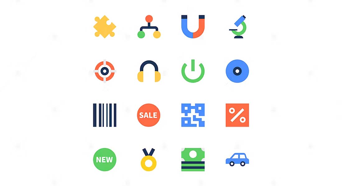
You probably recognize the look and feel of icons using primary colors and simple shapes as being a lot like the icons for Google’s family of products. And that style is trending for other projects as well.
These icons feature a flat style with a distinct color family that’s used throughout the icon set. Most icons use a few colors, although some are single color.
This icon style works for any size element, but is actually most effective for smaller icons because the design can be a little flat – literally – in oversized usage.
Fully-Illustrated Icons
Icons have been pretty simple for the most part for a while, but more designers are experimenting with fully-illustrated icon styles that are beautiful and engaging. These more complex icon elements are often used at larger sizes and contribute even more to the overall story of a design.
As with the example above, this style is perfect for a design with a more childlike tone or for icon elements that can show more of a creative flair.
Color, scale, size, and design consistency are important to keep in mind with this style so that your icon set looks like it is should go together.
Icon Doodles
Those stray doodles in the corner of your notebook might just be your next neat icon set. Doodle-style icons that have imperfect styles feel authentic and interesting and are a great accent for a project such as a personal portfolio.
The fun thing about doodle icons is that they can make a design feel a little more unique. Just the visual element of a doodle implies spontaneity and individuality. Use these concepts to your advantage when thinking about how to use this style best.
Don’t forget to play with colors and subtle adjustments between icons as well to really play up the unique, individualized nature of this design trend.
Pop-Art Style Icons
On the other end of the icon design spectrum is pop-art style icons, which are colorful, elaborate, and a little over-the-top.
Pop-art elements are a lot of fun and can inject plenty of personality into a project. The trickiest thing here is to not let color overwhelm the icon set individually or collectively. These icons can work best in a design without a lot of other dramatic color or effects.
The other trick to using this style of icon is to consider oversized usage with plenty of space around them. Let the art of each icon shine through.
Hand Drawn Icons
Hand drawn icons are not only a trendy style, but they also create a more intimate, authentic feel for a design project. Styles for these icons can vary widely, from simple shapes and lines to full-color icons.
The best part of hand drawn styles is that you don’t actually have to draw them yourself. There are plenty of hand drawn icon sets available so you can find just the right style, even if you aren’t feeling overly artistic.
Icons with Depth
Creating depth in icon design is somewhat tricky, but more designers are using this trend with oversized icon sets. Using shadows and geometry to create just the right shape combinations with an element that adds an almost three-dimensional effect.
These styles are quite fun and sometimes use hints of trends that have come and gone such as long shadows.
These icons tend to be on the more complex side and are best suited for use where the icons are fairly large or work in combination with another element, such as text for a logo.
Icons with Hover States
When it comes to icons for the web, one of the most popular techniques is to pair a set of icons in such a way that creates a hover state or animation. This might include using an icon that with a color fill and then not or almost creating a button around an icon.
If you plan to use some sort of hover state with an icon, it is important to think about this in the icon design phase. Not all icons or icon sets are optimized for this technique. Look for a complete icon set with variations that make creating a hover state that much easier.
And don’t try to get too complicated here. An elaborate icon can get lost with a hover state. This works best for simple icon pairs.
Simplified Icons
Even websites and designs that previously featured complex icon styles are moving to more stripped down and simplified icons.
What’s nice about them is that each icon portrays an identifiable thing, but the representation isn’t always 100% literal. Icon designers may take liberty with shapes or lines to create icon shapes that are the most simple version of the item it represents.
Line Icons with Color Shapes
Line icons are always a popular choice, thanks to a versatile style that looks good with almost any other design element. The trend adds just a little more visual interest with a pop of color, often in the form of a circle or square, behind the line icon.
The color shape might fill a part of the line icon design, but more often than not it’s just floating in the background. This tiny bit of visual interest can tie an icon set together, emphasize a brand color, or just freshen up an older site of line icons.
The tricky part of the icon design is placement and size of the color shape element. If it’s too big or too bright in color, it can take away from the icon. If the shape is too small, you risk it looking like a mistake.
While there’s no perfect size, most of the icons using this trend keep the color shape to about one-quarter of the full size of the icon.
Abstract Icon Shapes
Not sure what icon represents your content? An abstract icon shape might be the answer.
More designers are creating abstract style icons for use across websites. The nice thing about this style – and trend in general – is that abstract styles create a sense of whimsy and wonder that matches some of the bigger overall trends in design.
The key to working with abstract shapes is to make sure you aren’t replicating something by mistake and that icons truly are abstract. (Don’t try to create icons that are similar to your logo, for example, they might just look like errors.) For something that really matches, use the same color palette for icons and brand materials.
Icons with Background Icons
Some trending icons have icons of their own. Seriously!
For more elaborate uses of icons – we’re not taking tiny favicons here – icons can be stacked and layered to create more of an art element.
This trend often uses color and shading to differentiate between the main focal icon and background icons. The primary icon is often full color or a filled icon. The background icons are almost always line style and might have light color palettes.
You can create this effect with many premade icon kits by mixing and matching icons in different ways. Create depth and visual interest with icons of a similar theme and stick to just a handful of elements to keep the scene from getting too busy. Don’t be afraid to use and reuse elements and use the same icons (alternating line and filled) in backgrounds and foregrounds.
Two-Color Icons
Another icon design trend that builds on popular line icon styles is to create two-color elements.
Two-color icons can build on your existing color palette or brand colors or combine almost any other color pair. When designing using the icon trend, look for color pairs that will stand out from the background on which you plan to use them.
When it comes to the design, pick a primary color for most of the icon. Use a secondary color to accent an element of the icon. (Think of using the primary color for 70% to 80% of the design and the secondary color for the rest.)
This creates an accent in the icon design that will help draw the eye into the design element, and hopefully, surrounding content as well.
Bright Color
Bright color choices have been a big deal in all aspects of design. That is no different with icons. A bright color is an enticing way to draw the eye to the icon.
Color is being used in a few different ways when it comes to the icon design trend:
- As a background with a white or black line-style icon
- For full color icon elements with a more realistic look
- For icon elements with a more flat, gradient or super-bright design
Popular color choices in the bright family include yellows, blues, greens, and purples. These colors tend to be on the bright side and crafting a color palette with three to five hues for an icon set is popular.
Not sure where to start? Material Palette showcases colors that are a big part if the color icon design trend.
Icons in Logos
Take note of how many logos feature icons. Once you start thinking about it, not seeing all the little icons in logo design will be tough.
What’s nice about an icon in a logo is that it works with the brand name, and with some time and brand equity can stand alone. Think about the example above, Spotify. Even though the music provider hasn’t been around all that long (in the scope of brands), the circle with three lines is highly identifiable.
The icon works in color and without – a key of a strong icon – and can stand alone or with lettering. This versatility makes it easy to see why icons are a popular element in logo design.
Circles

Circles are one of the most harmonious shapes. And when it comes to icon design, they are rather popular. From icons that are contained inside a sphere to circles within objects, creating a design mark using circles can establish just the right feel for users.
(Want to know more about circles in design? We’ve got that here.)
Part of the influence of circle in icon design might connect back to some of the guidelines set forth by Google with Material Design. All those circular buttons are perfect for tapping on mobile phones. And that same philosophy applies to icon design. (Just think how often an icon is a touchable or clickable element.)
The part that can be a little trick about this icon trend is meshing circles in all the places where other shapes are used. App icons tend to be square; social media profiles are circular (and square).
When creating a round icon, make sure that the content of the icon design is easy to understand at small sizes, because you must shrink it often to fit in other places.
Line Style Icon Design
Line style icons seem to be the trend that never gets old.
Part of the reason is that this icon style can work practically anywhere on any background type. Many of the popular, downloadable icon packs often include a line style design because of this versatility.
It’s easy to see this in the example above. Each icon is easy to see and understand at practically any size.
Simple Elements and Representations
As with most other design trends in 2025, simplicity is part of icon design as well. Simple shapes and geography combine to create almost over simplistic representations for icons.
The result is a quite an artful design that makes users look.
In the example using food icons above, each icon uses the common thread of a circle in the icon. This can be the overall shape of the icon itself or a part of the icon design. This shape connects each icon to one another in the project.
Icons with Gradients
The gradient color trend that has become one of the dominant themes of 2019 is a factor in icon design as well. From simple gradients in line strokes (such as the example above) to full gradient coloring to white icons on a gradient background, this color scheme is popular.
That might be what’s so appealing about the use of gradients in icons (and overall) – there are so many different ways to use the trend. You can add a gradient and still not have a project that looks just like something else.
Focus on Simple Coloring
Icon designers are taking the opposite approach with color as well and sticking to simple, more limited, more basic color palettes for these small design elements.
Using a limited palette is a great idea. With a design that’s so small, too much color or detail can overwhelm the space quickly and cause strain on the eye.
You don’t want users to have to think about what the icon is or what color means. Limiting the amount of detail – including elaborate coloring – can make each individual icon a little easier to see and understand. This is most important with icons that will be used at the smallest sizes.
Everything App Style

One of the reasons that icons have grown in popularity so much is that we are already designing them for almost everything. From app icons to app-style icons for favicons or desktop icons, this style is practically everywhere.
App-style icons have a distinct style almost of their own. This includes:
- Square in shape
- Rounded edges
- Colored background (usually one color)
- Simple shape inside icon
- Plenty of contrast between icon and background color
- No text or lettering
Thick, Uniform Strokes
Not only are line-style icons popular, but icons with thick line strokes are especially popular.
Designed often for single-color applications, these icons are frequently used in white or black on top of color or photo backgrounds.
Icons with thick, uniform strokes are most frequently used on their own, such as a cart icon or contact icon. They aren’t often used in a collection of icons.
Flat Icons Remain Popular
While much of the hard focus on flat design has evaporated, icon design is still pretty flat (or at least almost flat).
This is likely due to the super-simple nature of flat design and the idea that this look can integrate with a number of other styles fairly easily.
Even looking at some of the icon design examples and trends featured here, you’ll see that many of them are flat. (Line style icons are almost always flat, for example.)
Emoji Icons
Emojis have almost become their own language – a more visual form of communication that’s getting more generally accepted all the time.
Icons design is also taking on an emoji-esque flair. These icons are identifiable because of a focus on the head shape of a person or creature. (The Star Wars-inspired emoji icons above are a great example of how to have fun with icon design.)
This style of the icon could work great for a contact page or for representing people or personas in a design.
How to Design a Better Icon
Crafting a good icon or set of icons is more than just hopping on to some of the latest trends in icon design. Because of the small size of icons, attention to detail and precision are an important part of the design process.
Simple rules still hold true for icon design in 2019. Pair these guidelines with some of the trending ideas above to create something you’ll love:
- Start with a grid
- Build with geometry
- Create a unique shape
- Give icons plenty of room
- Stick to your brand colors
- Use consistent divots
- Design for the smallest size you need
- Don’t decorate
Icon Design Guidelines
A good way to keep up with what’s “in” is by looking at graphics standards and style guides. Each time Apple or Google changes their approach so does everyone else. Partially because they have to and partially because the new style is often reflective of the times and trends in icon design.
You can find guidelines here:
Conclusion
Icons are a useful design tool. From use as app icons to website marks or favicons to divots that can be used in a logo or throughout a design project, the icon is a mark that’s here to stay.
Approach icon design in the same way you would almost any other project, but really think about simplicity and size. Icons are made to look at quickly and are often small. This can have a great impact on the design.

