You can use text-wrap: balance; on icons
Terence Eden on using text-wrap: balance for more than headings:
But the name is, I think, slightly misleading. It doesn’t only work on text. It will work on any content. For example – I have a row of icons at the bottom of this page. If the viewport is too narrow, a single icon might drop to the next line. That can look a bit weird.
Heck yeah. I may have reached for some sort of auto-fitting grid approach, but hey, may as well go with a one-liner if you can! And while we’re on the topic, I just wanna mention that, yes, text-wrap: balance will work on any content. — just know that the spec is a little opinionated on this and make sure that the content is fewer than five lines.
There’s likely more nuance to come if the note for Issue 6 in the spec is any indication about possibly allowing for a line length minimum:
Suggestion for value space is
match-indent|<length>|<percentage>(with Xch given as an example to make that use case clear). Alternately<integer>could actually count the characters.
You can use text-wrap: balance; on icons originally published on CSS-Tricks, which is part of the DigitalOcean family. You should get the newsletter.
20+ Halloween Pumpkin Carving Ideas for Graphic Designers
The spookiest day of the year is right around the corner. Take your Halloween pumpkin game up a notch by showing off your graphic design skills with a custom carving, and get inspired with these Halloween pumpkin ideas!
It’s not too late to find the perfect pumpkin at a local patch and spend some quality time (along or with your family) crafting a carving that no one else on your street will have. Not sure where to start? Here’s we’ve collected 20 creative Halloween pumpkin carving ideas, from simple scenes to iconic graphic design elements to a few customized spooks.
1. Show Off Your Skills

Design a carving that isn’t a traditional Jack-o-Lantern. You can carve almost any scene that strikes your fancy with the right tools.
2. Pantone Pumpkin

Show off a little design humor with a Pantone-inspired carving that shows your favorite orange hue.
3. Geek Out

Show your code humor with a clever line that only designers and developers will understand.
4. Group Gourds

Come up with a creative way to create multiple carvings that connect using several pumpkins together.
5. Carve a Logo

Show your love for Adobe or WordPress with a logo carving.
6. Dedicate to a Special Character

Everyone has a favorite letterform or type element — mine is the ampersand — carve it creatively or using your favorite font.
7. Try a Trendy Element

It seems like sugar skull images are everywhere this season. Go trendy and carve one of your own.
8. Craft a Fictional Character

From star of horror movies to video game heroes, use your pumpkin carving skills to create a replica of your favorite fictional character.
9. Try Something Unexpected
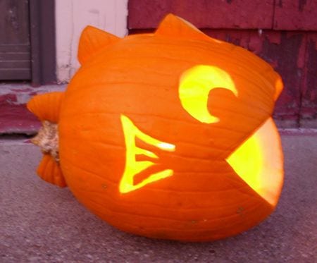
Most pumpkin carvings feature designs on a round, head-on canvas. Turn the pumpkin around and cut out parts of it to create new shapes for a different spin on the carving, such as the fish, above.
10. Be Silly

Try a silly pumpkin carving design instead of creepers. This more family- and kid-friendly option might just be a hit at your house.
11. Take Advantage of Mistakes

Admit it, there’s been a time or two when you dropped the pumpkin and smashed it a little or when the carving just went a bit awry. Make the most of it with a double-pumpkin design and turn that mishap into a happy accident.
12. Pumpkins Plus Other Elements

Take your carving to the next level with add-ons. Organic elements are a natural fit, such as the greenery above. But you can also add lights or other materials for a mixed-media Halloween decoration.
13. Tattoo-Style Carving

One of the more recent trends in pumpkin carving is to create a design with cuts all the way through the flesh of the pumpkin as well as carving partially through the outer shell. (This can allow varying amounts of light to shine through and accommodate more intricate patterns.)
14. Make It Scary
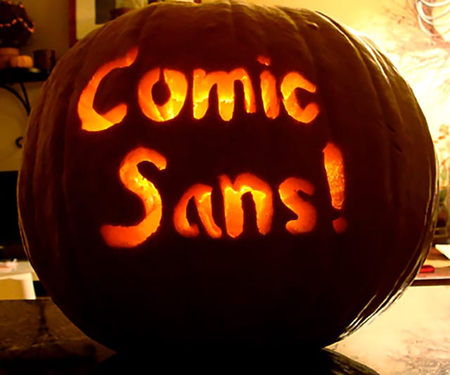
Get in the holiday spirit with an absolutely scary design, such as the homage to Comic Sans above.
15. Use a Creepy Character

Or you can highlight the scary season with a character that’s actually creepy, such as a ghoul, goblin or less-than-friendly face.
16. Carve a Cool Pattern

Rather than focusing on just one side of the pumpkin, develop a pattern or texture that can be incorporated all the way around. (It’s a great chance to use a trendy geometric shape.)
17. Think in Theory

Go beyond a simple carving with a pumpkin concept that uses a lot of imagination. Note how the example above mimics the golden ratio in the shape of a nautilus.
18. Highlight a Fav Font

Show off your design skills with a special message featuring your favorite font. Who said a carving has to be a picture? Words are OK, too.
19. Think About Lighting

If you plan to put a candle your pumpkin make sure the carving is designed to let that light shine through. Create a design that will look great in the dark, even if you can’t see the pumpkin itself.
20. Stick with a Classic

Just because you can go crazy with pumpkin carving doesn’t mean you have to. Sometimes the best idea is the most simple, classic one. Carve a classic Jack O Lantern with and put a candle inside to light the way for trick or treaters.
How Do You Carve a Custom Pumpkin Design?
Turn your design into a template for a custom Halloween pumpkin graphic design carving. Here’s how you do it:
- Create the design in Photoshop or Illustrator. Make sure to use plenty of thick lines between cut areas or you might end up with a butchered pumpkin. The easiest designs include full cutouts. The most complicated entail carvings that require more detailed cuts on thin lines or elements.
- Print the design at a size to match your pumpkin. An outline design is sufficient and easiest to work with.
- Transfer the design to the pumpkin for carving by covering the back of the paper with graphic or charcoal, taping the paper to the pumpkin and then tracing the design. Other options include adding a sheet of tracing paper between the printed design and pumpkin before tracing or attaching the design to the pumpkin and then “tracing” the design to the orange orb by poking holes in the paper through to the pumpkin as a carving guide.
- Remove the paper from the pumpkin and then carve it using the outline guide you’ve created. Just make sure to cut the top off and scoop all the seeds out first. It will make for much easier (and cleaner) carving.
Images from Google search. Design Shack did not actually carve these pumpkins (all our fingers are intact). Click the images for source links, information and more.
The Power of Silence in Negotiation
Welcome to Creator Columns, where we bring expert HubSpot Creator voices to the Blogs that inspire and help you grow better.
A few months ago, on my podcast Nudge, Jonah Berger told me about the power of pausing.
The act of pausing seems like a small thing. But recent studies show that pausing can make you more persuasive and can improve outcomes.
In this blog, I'll share some of the science behind this phenomenon and how to apply it to your next negotiation.
Pausing shows confidence.
He shared how highly successful speakers often use a surprising amount of pauses when they talk.
Jonah shared this clip from an Obama speech and told me to listen for pauses. You can see the speech here:
That clip is just 45 seconds long, yet Obama pauses for one second or more eight times.
Jonah says this isn’t by accident. Obama has taught himself to slow down and pause more often. Why? Well, according to Jonah, it makes the former president sound more confident.
Jonah has conducted studies that prove this (cited in his book Magic Words).
He and his colleagues showed a group of participants a speech recording. 50% of the participants heard the presenter talk without pauses. The other 50% of participants listened to the exact same presentation but with pauses included.
The two different groups of participants were then asked what they thought of the speaker, how they rated the content, and how positively they felt about the talk.
Jonah Berger discovered that the pausing speaker received better scores across all different questions.
Remember, the content of the speech was identical — the tone, the style, the accent — it was all the same. The only difference between the two speeches was the pauses, and those pauses dramatically changed how the speech was perceived.
Pauses can be strategic.
Pausing won’t just help political candidates. It has helped one of the world’s greatest footballers, Lionel Messi.
Pausing is one counterintuitive thing Lionel Messi does that makes him great. Unlike his peers, Messi spends the first three minutes of a match doing nothing. He doesn’t sprint, tackle, or pass; he strolls around the pitch.
But why?

Adam Alter shared the reason while chatting with me on a recent episode of Nudge.
He explained that Messi struggled as a youngster. He was extremely anxious when he first set foot on the pitch. Often, he was physically sick as the game started and had to leave the field to recover. His anxiety made it impossible for Messi to play to the best of his ability.
Maradona famously said Messi would never succeed because he’s too anxious and too nervous.
It seemed like Messi was destined for a career of missed opportunities until one Barcelona youth coach gave him some advice.
He told him to pause at the start of the game, not feel pressure to run or tackle, and not start playing the game until minute three. Just amble around, take in your surroundings, watch the opponents, and calm yourself down.
Pausing worked. Rather than frantically starting the game like every other player, Messi took the time to settle his nerves. And this inaction became a surprising advantage.
Having time to pause gave Messi the space to analyze his opponents quickly. Is there a weakness in their set-up? Is there space somewhere in the defense? Usually, there is, and Messi, after settling his nerves, would have no trouble taking advantage of it.
The Power of Silence in Negotiation
Pausing has a strategic benefit for Lionel Messi and Barack Obama, helping both reach the top of their game.
But is it useful for the rest of us? Can we apply it if we don’t play professional football or deliver professional pitches?
Well yes. Evidence suggests it might be worthwhile to try this approach during your next negotiation.
In one study (cited in Anatomy of a Breakthrough), a team of psychologists studied the value of pauses during negotiations. Specifically, the researchers focused on wage negotiations. They hypothesized that pausing could persuade hiring managers to offer higher wages.
For the test, the researchers recruited 60 pairs of university students. Students were assigned one of two roles. Half were hiring managers, half were job candidates. All were given 45 minutes to negotiate over pay for the hypothetical jobs.
But here’s the twist. 50% of the job candidates were explicitly directed to pause during the negotiation.
So, half negotiated as normal, but the other half were forced to pause.
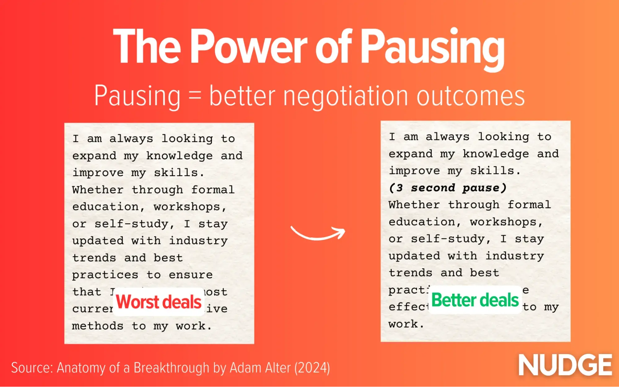
The pausing worked. The job candidates who paused received a larger pay packet offer from the hiring manager.
Those who paused negotiated better deals (for both parties). According to Adam Alter:
“They inspired superior outcomes for both parties and encouraged negotiators to see that some issues could be negotiated to the benefit of both parties rather than competitively.”
It’s common to feel like Messi at the start of his career — anxious and sick with energy. In a negotiation, we feel a need to showcase our strength quickly and dismiss problems promptly, fueled by a rush of adrenaline that makes us speak louder, faster, and without pauses.
Yet studies in the lab find that this natural response has notable downsides. Those who energetically rattle off points will get worse negotiation outcomes than those who take their time.
Pausing might feel counterintuitive or wrong, but if it works for Barack Obama and Lionel Messi, it should work for you.
The Story Curve: How to Use Storytelling Techniques for Your Marketing
You can have the best product, the most data, and the biggest advertising budget, but if you can’t tell a compelling story, none of it matters.
One of my favorite quotes on storytelling comes from Morgan Housel's book Same as Ever, where he says, “Storytelling is leverage.”
It’s such a simple yet powerful idea: no matter how great your marketing plan is, it’s always the best story that wins. Just look at companies like Nike, Apple, Disney, and Dove, whose storytelling has turned products into household names for decades.
But how do you craft the types of narratives that emotionally resonate and stick with your audience?
In a recent episode of Marketing Against the Grain, I break down Vonnegut’s three story arcs and give brand storytelling examples of how you can apply them to your marketing strategy. I also dig into popular story archetypes and tactics for keeping your brand narrative authentic and compelling.
What is a Story Curve and Why is it Important for Marketing?
A story curve, also known as a story arc, maps the emotional highs and lows of a narrative.
While commonly used by novelists and screenwriters, marketers use story arcs to create content, campaigns, and messaging that engage audiences by tapping into their emotions at key moments.
Kurt Vonnegut famously mapped out three of the most popular story arcs:

Vonnegut’s three story curves show how different narratives flow from one emotional point to another.
Let’s break down these three story curves in more detail.
Story Curve #1: Man in a Hole
In this arc, the main character starts in a good situation, but something goes wrong, and they fall into trouble (“the hole”). After struggling to overcome the challenge, they emerge not just back to where they started — but in an even better position than before.
This story curve is particularly popular in marketing due to its universal theme of overcoming adversity. For example, Nike’s first commercial in 1988 featured Walt Stack, an 80-year-old marathon and ultramarathon runner, reinforcing the message of pushing past limits to achieve greatness.
Story Curve #2: Boy Meets Girl
This arc begins with a person in an ordinary situation. They encounter something wonderful — whether a person, opportunity, or experience — but then they lose it. Through persistence, they eventually regain it, leaving the hero in a permanently improved state.
Story Curve #3: Cinderella
This arc follows a person who begins in a very low or oppressive state. Through a series of fortunate events, often involving luck or external help (ex: a fairy godmother), they rise dramatically to infinite happiness or success.
Also referred to as the “rags to riches” arc, this is one of the most enduring and popular narratives in Western storytelling.
Choosing the Right Story Curve for Your Brand
The key to effective storytelling in marketing is deciding which curve best aligns with your audience, industry, and company mission.
For example, one of the most iconic examples of the “Man in a Hole” narrative is Apple’s “Think Different” campaign, which positioned Apple as the brand for misfits and rebels.
At the time, Apple was a misfit, facing a challenging market that was dominated by traditional tech companies like Microsoft and IBM. Instead of emphasizing technical features of their product like everyone else was, Apple’s marketing team went the opposite direction, leaned into their underdog status, and embraced an emotional narrative: if you’re different, Apple is for you.
By turning adversity into strength and elevating it into a story, Apple went from being the brand for the overlooked to becoming synonymous with innovation and creativity.
Tips for Improving Your Marketing Story Curve
Once you’ve identified the right story curve for your brand, the next step is to expand and refine it. Here are 4 tips to get you started.
1. Follow a Story Archetype
A story archetype is an expanded narrative structure that forms the more detailed backbone of your story. Think of it as the key plot points in a novel or the major beats of a film, which can then be mapped against the emotional journey of your story arc.
While there are seven major story archetypes, the two most commonly used in marketing are:
- The Quest: this archetype frames the customer as the hero, on a mission to achieve something valuable, like a new skill or growth, with the brand as the “guide” or tool that helps them along the way.
- Rebirth: commonly used in B2B campaigns, this archetype shows a customer undergoing a significant transformation, like turning their business around or improving their team, using the brand’s product for success.

2. Sharpen Your Core Message
Your core message is the single most important takeaway you want your audience to remember. It should be a short, clear statement that conveys the emotion or belief you want to evoke.
Take Nike’s “Just Do It” campaign, for example. They didn’t bog down their messaging with product specifications or details — they gave you three simple words that perfectly captured the spirit of determination, while also pushing people to take action.
3. Check Emotional Resonance
Cross-check that your story arc, archetype, and core message align with your audience’s needs, emotions, and values.
For example, Dove’s Real Beauty campaign didn’t just sell soap. It tapped into a deeper conversation about beauty standards and self-esteem. By rejecting unrealistic stereotypes and highlighting real women, Dove made its audience feel seen and understood.
4. Double Down on Authenticity
Audiences can spot a contrived narrative from a mile away, so you need to tell them a story that your brand is qualified to tell.
Patagonia is a great example of authentic brand storytelling. They don’t just talk about environmental sustainability; it’s built into everything they do, from their products to their activism. That’s why their environmental stories resonate: they live their values.
To learn more about how to build an outstanding brand story, check out the full episode of Marketing Against the Grain below:
This blog series is in partnership with Marketing Against the Grain, the video podcast. It digs deeper into ideas shared by marketing leaders Kipp Bodnar (HubSpot’s CMO) and Kieran Flanagan (SVP, Marketing at HubSpot) as they unpack growth strategies and learn from standout founders and peers.
I Discovered 9 Experts Tips for Creating a How-To Guide [+ Examples]
The irony doesn‘t escape me that I’m currently writing a how-to guide on … how-to guides.
But I've had my fair share of experiences writing them for HubSpot, like How to Give a Persuasive Presentation, How to Develop a Content Strategy: A Start-to-Finish Guide, and How to Write a Request for Proposal. So, it came naturally.
If you’ve never written a how-to guide, however, they can be pretty intimidating. They’re meant to be tactical and usually must be very detailed and specific to be effective. But this doesn’t mean they have to be hard to create.
In this article, we‘ll explore how to structure and write a comprehensive how-to guide. We’ll also look at some impressive examples of how-to guides for inspiration and tips to take yours to the next level. Let's dive in.
Table of Contents
- What is a how-to guide?
- How to Make a How-to Guide
- 9 Tips for Writing Effective How-to Guides
- Why Creating a How-to Guide Is Important
- How-to Guide Template
- How-to Guide Creator
- How-to Guide Examples
A great how-to guide comes with many benefits for businesses. You can use them internally to train staff and standardize operations or as part of your content marketing. In this article, we’re focusing on the latter.
Why Creating a How-to Guide Is Important
Today, people have more access to information than ever before.
They expect to find everything they need with a few clicks on their smartphones, and businesses are no exception to this expectation.
Here are some of the biggest benefits that come with it for businesses.
Benefits of How-to Guides
They support and empower customers.
People want to be able to do things on their own (make a purchase, set up a product, learn a skill, etc.) without asking for guidance. In fact, 44% of B2B customers opt for self-service channels, according to a report by Heretto.
This is one of the areas a well-crafted how-to guide can help.
How-to guides can help customers troubleshoot issues and answer common questions on their own. For example, I recently found this guide from Apple super helpful when trading in an old iPhone.

By providing these resources, customers don’t have to wait in line for a live chat or phone call or sit in frustration. They can simply visit your website and access the information they need when they need it.
They offer 24/7 access to help.
Your customer service and tech support staff can’t be available 24/7, especially if you’re a small business. Thankfully, how-to guides can provide help even when a person can’t. Customers don’t have to wait around and can solve their issues faster.
They save your support team time.
In my experience, having how-to guides available also helps free up your support team to focus on issues that really require their attention.
Rather than answering simple questions like “How do I set up my new computer?” or “How do I use the automation tool?” they can send along a guide to hopefully help and then move on to solving more difficult, user-specific problems.
Some of these guides can even be used for sales enablement, but that’s another topic to cover. Learn more about it here.
They educate your audience.
How-to guides are also valuable opportunities to reach new audiences with applicable, high-quality content. Consider how many people search “How to…” on Google each day:

These search queries alone demonstrate just how vast the opportunities to reach an audience with “how-tos” is.
If your business can reach your consumers with informative, relevant answers to their questions, those users will begin to see your brand as an authority on the topic.
You’ll offer them valuable knowledge and help build their trust in your brand in the process. Down the road, those readers could become customers and loyal brand advocates who spread the word about your products or services.
Challenges of How-to Guides
Clearly, how-to guides offer brands a wealth of opportunity, but they are not without their challenges. Here are some potential drawbacks to consider.
They need to be detailed and specific.
One glance at the bookshelf by my desk and I have angry flashbacks to how vague and incomplete the assembly instructions were. I’m sure many of us have had similar experiences, so don’t let your brand be the one to cause them.
When creating a how-to guide, be as specific and detailed as possible. Include visual descriptions or, better yet, images or examples for people to follow. You may even want to opt for a video over text, depending on the topic.
The more precise you can be with your instructions in a how-to guide, the more effective it will likely be. This is all part of having a good customer experience.
They can be time-consuming to create.
Because great how-to guides need to be so thorough, they can be extremely time-consuming to create. If your team is going to create one make sure they allocate enough time and resources.
They need to be easily accessible.
A how-to guide is only valuable if it can be easily found and consumed by your audience when they need it. That means you have to publish and promote it effectively.
Will you include a link or QR code in related materials? Will you have a section on your website dedicated to how-to guides? Have a plan in place for how you will get your how-to guides in front of the people who need them.
Popular ways to share your guide include:
They can become dated quickly.
Lastly, how-to guides can quickly become dated, especially if they are related to tech or software. I can’t tell you how many social media how-to guides I’ve written that have become obsolete in months as the apps made updates and best practices evolved.
If you invest in how-to guides, ensure your team is ready to make the necessary updates as needed.
Now that you know what you’re getting into when creating a how-to guide, let’s break down the steps involved.
Note: If you still need assistance, HubSpot’s Guide Creator is here. It’s a new tool providing a quick, easy-to-use solution for creating how-to guides. The Guide Creator is excellent for documenting your business's products, systems, and processes — and it’s free.

1. Identify your topic.
Start with online community forums like Quora or feedback from your community to figure out the top concerns or challenges your target audience might have.
That information will help you determine what content to include in your guide.
For instance, if you're writing “How to Create a Content Marketing Strategy,” for example, you could follow these steps:
- Start by looking at responses to "What is content marketing?" on Quora and other online forums. These user-generated responses can help you identify common themes, misconceptions, or confusion around content marketing.
- Contact your network for common pain points about content marketing. For example, you might find that most of your audience says content marketing is their priority — but they don't know how to do it on a budget.
This research will give you the information you need to create a how-to guide that addresses relevant concerns about your topic. The video below is an example of a how-to guide for content marketing that addresses specific audience pain points.
2. Understand your target audience.
Who’s reading this guide? Are they a new customer or user? Are they a beginner in the subject matter? You audience and what they want to accomplish will inform everything else about your how-to guide, so make sure you fully understand them. It’s their behavior you need to replicate and influence.
Reviewing your buyer persona with your topic in mind is a good place to start.
3. Research your topic thoroughly.
Even if you know a topic incredibly well, do your external research. Understanding a topic well can make writing a how-to guide on the subject more difficult, as you might make assumptions about what to cover. Challenge your bias.
Follow these tips for your research:
- Look at your competitors to see how they write their guides.
- Conduct keyword research to see the words people who want to learn this skill use to search for instructions.
- Use Ahrefs, SEMrush, or another SEO tool to find more similar keywords and queries. This can help you create a well-rounded piece that will answer all your readers' questions and help you rank on Google.
- Seek out expert opinions, popular books, and other resources that can give you details to make your how-to guide stand out.
To illustrate, say you're writing a blog post on “How to Make an Omelette.” Upon researching, you will find Simply Recipe's post at the top of your Google search.

Diving into the post, you'll see Simply Recipe has sections including:
- French Vs. American Omelettes
- The Best Pan for Making Omelettes
- Ideas for Omelette Fillings
If you want your how-to guide on omelettes to be the best, you'll want to cover as much as — if not more — than what Simply Recipe has in its post. This may mean including more omelette types, approaches to making them, or expert tips from well-known chefs.
As you research, remember to fact-check your sources. You want to ensure that your guide is trustworthy and will not cause you legal or other challenges later.
4. Create a step-by-step outline.
Now that you‘ve researched, it’s time to organize your ideas.
If you know the process well, write down all the steps you would take from memory. Then, combine this with any new ideas you learned during research to create a step-by-step outline for your guide.
Remember: Many readers will use your how-to guide as a list of instructions. So, you may need to revise your outline several times to ensure that each step in your strategy is straightforward.
But what do you do if things aren’t so clear-cut?
For example, according to this how-to guide from CNET, there are several four different ways to take a screenshot on a Mac computer.

The proper instructions for the user will depend on their computer and operating system. In situations like this, you need to decide which approach your focus on and make it clear to the reader or be prepared to cover all of the options.
5. Add valuable images, videos, and descriptions.
Use visuals like GIFs, images, screenshots, and videos to supplement your instructions.
The best visuals make your instructions more straightforward and quicker to understand.
For example, in the Great British Bake Off technical competitions, bakers are often asked to bake recipes they’ve never seen before.
If a baker isn’t sure what the final product should look like, they rely on instructions to get it right.

Written instructions can be interpreted differently, and if they get something wrong, they have to start over, which takes up more of their time.
This is an excellent example of what can happen when users can’t picture what they should do. Images and videos can help avoid this confusion.
This is even easier if you opt for a video like Purple does here:
Pro tip: Save screenshots as you go.
You can save yourself a lot of time and trouble by taking screenshots of your steps as you test them out, rather than trying to go back and do it later.
You can save even more time and trouble by automating the process. Tools like HubSpot's free Guide Creator can automatically capture both the steps and the images as you complete the task.
Make sure you include one for each step, and think about what image would most accurately represent that step. Remember that a minor task that may be obvious to you, a seasoned user, may not be obvious to everyone.
6. Review your outline and research from the reader's point of view.
Ask yourself: “Why do my readers need, or want to know, this?”
Understanding the high-level purpose behind a topic can encourage you to write with empathy. Additionally, it will help you create content that accurately meets your reader's expectations and needs.
For instance, when writing "How to Create a Facebook Group for Your Business," I took some time to learn that readers might search this topic if:
- They are seeking out new ways to connect with customers
- They want to create a stronger sense of brand community
- They want to raise awareness about their products or services
As a result, I wrote:
“A group is a good idea if you‘re interested in connecting your customers or leads to one another, you want to facilitate a sense of community surrounding your brand, or you’re hoping to showcase your brand as a thought leader in the industry.
However, a group is not a good idea if you want to use it to raise awareness about your products or services or simply use it to post company announcements.”
In the example above, I targeted a few different segments of readers with diverse purposes to help them determine whether this how-to guide would even help them meet their goals.
Ultimately, understanding the purpose behind your how-to guide is critical for ensuring you target all the various components or angles of the topic.
7. Test the process.
Once you‘ve finished writing your guide, it’s time to test it out. Follow the instructions exactly as written and look for opportunities to add more clarity.
Pro tip: If you can, have someone else test the process out for you. You never know how a word choice or set of instructions will impact another person, so it’s wise to test it with a small group of friends or colleagues.
Clearly state what you’re looking for, expect questions and critical feedback, and connect with a diverse group of people for the most valuable insights.
8. Link to other resources.
It's also a good idea to point readers to other valuable resources if they want to learn more. Link to other relevant blog posts, pillar pages, or ebooks so readers can find follow-up information on topics mentioned in your how-to guide.
They can be by you or from other creators so long as your cite your source. This is another way to build trust and authority with your audience.
How-to Guide Template
If you’re unsure how to structure your how-to guide, here is a simple template you can follow.
Section 1: Overview
This is a summary/introduction to what your guide will cover. Include the purpose of the guide, why the information matters, and what the reader can accomplish after reading it.
You can also use this part of the guide to go into background information like I did with pros and cons.
Section 2: Materials Needed
List any materials or tools that will be needed to complete the process outlined in your guide. They could be digital or tangible.
Section 3: Step-by-Step Instructions
Break down the process into clear, concise steps. Include formatting to make it easy to follow and images or videos to help you explain further.
Optional Section 4: Tips
Know some extra tips, tricks, or hacks that can help someone get the most out of your process? Share them here for added value.
Optional Section 5: Troubleshooting/FAQs
What are some common questions or issues people run into when going through this process? Address them here.
Optional Section 6: Additional Resources
Are there any other educational resources someone going through this guide would find valuable? Share them here.
Section 7: Conclusion
Sum up the guide and reiterate the benefits of following the steps outlined. Use this time to build your audience’s confidence in their ability to act after completing this guide and also give them next steps or a call-to-action, if relevant.
How-to Guide Creator
If the process you’re covering is web-based, HubSpot’s Guide Creator takes all the busy work out of creating guides.
Whether they be for customers, prospects, or colleagues, all you have to do is install the free Chrome extension, click “start capturing,” and go through your process. The tool will automatically take screenshots and document the steps you take.
When you hit “finish capturing,” you will be taken to a page where you can edit the instructions and publish the guide.
Once you're ready to start writing your how-to guide, you might wonder if your tone or style should differ from other kinds of writing.
In short: Yes, it should.
Here are some more tips and best practices to keep in mind when writing a how-to guide:
1. Open with an overview.
A great how-to guide begins with a clear overview or description of what the audience can expect from it. This overview should include:
- A quick summary of your guide
- What your audience will need to use it
- What they'll achieve once they follow the directions
- Why it's worth doing
Pro tip: It's usually easier to write the first paragraph of any piece of content last — including how-to guides. This way, all the details are complete and you just need a few quick attention-grabbing sentences to attract your readers.
Check out this post if you need help writing introductions.
2. Start each step with a verb.
Verbs put your instructions in motion. These active words can help your readers visualize themselves doing the task as you teach them how to do it. They are also direct and require less thought by the reader.
Consider, for example, “Write a company background” versus “Your RFP should start with a brief background on your company.”
The first is very clear about what you need to do. The second takes a little longer to digest.
As you write, you’ll avoid passive verbs like the examples below:
- “Flour and water were stirred together.”
- “The page tab has been opened, so we can click the box at the top.”
Rather, go for active alternatives:
- “Stir together flour and water.”
- “Open the page tab and click the box at the top.”
If you often slip into passive voice as you write, use a grammar-checking tool to catch and fix your errors.
3. Show examples all the way.
You can make your instructions clearer if you include images or examples.
Of course, you want to use sensory details and action to create a picture in their head as you write your how-to guide. But from there, pair images with the written text so your audience doesn’t have to guess or interpret what you meant.
We regularly include examples in articles here at HubSpot. You can even find several in this article.
4. Keep the steps simple and concise.
Simplicity will make your guide easier to understand and execute, but how do you ensure you’re not overcomplicating things?
A good best practice is to think of your process in stages — the beginning, the middle, and the end — and then define the steps within those. This will help you get specific and be wary of combining multiple actions into one step.
Pro tip: Don’t hold back in your first draft. Write out every detail, then go back and scan for extra content that could be distracting and can be removed.
Also, aim to remove extra words. Writing concise copy takes a lot of practice. If your guide is longer than it needs to be and you're not sure how to cut the extra text, these tips can help:
- Cut “the” and “that” when it makes sense
- Limit adverbs and adjectives like very, really, and literally
- Replace three and four-syllable words with shorter alternatives
5. Make your how-to guide easy to skim.
In my experience, many people skim guides. This means they quickly skip text that includes stories, data, or more extended details and look for the actions.
Catering to this habit can create a more delightful user experience.
People tend to pay attention to introductions, summaries, or a paragraph’s first and last sentences, so focus on these areas. Also, use bolded, underlined, or highlighted text to guide their eye to key information.
Numbered lists, headers, and bullet points can also help summarize text, making your guide easier and faster to digest.
6. Write for a specific skill level.
If you're a subject expert, you might combine beginner and advanced terms in your writing without realizing it. This creates inconsistency that can confuse your audience and make your guide tough to understand.
If this concerns you, scan your how-to guide for jargon as you proofread. You can also ask proofreaders from other niches and industries to check that your vocabulary is appropriate for the target audience throughout.
7. Tell an exciting story.
The best how-to guides are more than just practical; they are fun to read. To keep your guide engaging, tell a story. Ensure you have a clear message throughout the guide, add personal experiences, and use conflict to add interest.
For example, say you‘re writing a how-to guide about adding software to a computer. A potential point of conflict could be not having enough disk space to finish installing.
That doesn‘t sound like a big deal, but it can be frustrating if you’ve ever experienced it. If you can paint that picture vividly for your audience, they'll be more likely to follow your directions.
8. Write with empathy.
People who turn to how-to guides are looking for help. So, be sure to acknowledge that you understand where they are coming from. Doing this will help you resonate with your audience and build trust.
You’re saying you know it can be frustrating when learning or refining a new skill and you are there to help.
For example, in the how-to guide "How to Plan Your Facebook Ads Budget (And Make The Biggest Impact),” HubSpot Principal Marketing Manager Ramona Sukhraj immediately connects with her audience, saying, “If budgeting stresses you out, we have a lot in common, my friend.”
9. Stay positive.
Anyone seeking a how-to guide is trying to expand their knowledge about the world. That seems straightforward, but it‘s also a considerable risk.
Many people stop trying new things because they don’t want to look foolish. So, as you write, remember that learning is exciting, but it's often uncomfortable, too.
Keeping your writing positive can help make your readers feel more at ease as they venture into the unknown. Uplifting stories, word choices, and tone can make complex instructions seem more manageable. They can inspire and motivate.
You can also add some positivity by softening negative information. For example, instead of saying, “You‘ll probably fail at this the first time,” try saying something like, “This skill may take some practice before you’re an expert.”
How-to Guide Examples
B2B How-to Guide Examples
“How to Write the Perfect 90-Day Plan”

Why I like this example: This B2B how-to guide offers important contextual details to the 90-day plan, including “What is a 90-day plan?” and “What should be included in a 90-day plan?” The piece is well-researched and written with empathy.
The guide provides a downloadable 90-day plan PDF so readers can immediately use Atlassian's program with their team.
Takeaway: Consider what ebooks, PDFs, charts, Canva designs, or Google Sheets you can create internally and offer to readers to download. Readers will appreciate the option to apply what they've learned immediately.
"How to Build Brand Consistency"

Why I like this example: Partnering with complementary businesses and services can add depth and perspective to your how-to guide. This example is comprehensive and packed with valuable resources from HubSpot and Brandfolder. It also uses relevant data to highlight key sections.
Takeaway: Look for creative ways to add value to your how-to guide, especially when writing about a topic your audience already knows.
“How To Drive More High-Quality Leads With Google Ads”

Why I like this example: When creating guides for more advanced topics, creating a foundation for your readers is essential.
This guide begins with a detailed introduction to the case that cites current statistics and trends. Then, it covers relevant topics at each stage in the buyer journey. Next, it offers a helpful checklist, links, and resources to implement this learning.
Takeaway: A clear structure makes challenging topics easier to understand. So, consider the ideal start and end points for your expert readers when writing about specific and advanced topics.
B2C How-to Guide Examples
“How to Master Lead Generation in HubSpot”
Why I like this example: This video takes a popular topic relevant to our buyers, lead generation, and delivers all of the foundational knowledge someone needs to get started with it.
It then uses the video format to show viewers exactly how to complete common lead generation tasks like creating landing pages, within the HubSpot tool.
Software tutorials are one of the best use cases for video how-to guides.
“How to Become a Freelancer”

Why I like this example: This guide does an excellent job of providing relevant links and data to create a comprehensive overview of what freelancing is. Additionally, the post uses action verbs to inspire the reader.
Under “How to Start a Freelance Business,” you'll see tips such as “Do Your Homework,” “Create a Brand,” and “Plan Ahead.” The language used in this post goes a long way toward encouraging readers to get started quickly.
Takeaway: Use action verbs and concise language to keep a reader engaged. Start with a verb instead of a noun when listing out steps.
“How to Start a Successful Blog”

Why I like this example: This is an excellent guide for beginners because it includes resources that offer multiple ways to take in the material. This guide is packed with checklists, links to courses, templates, and tools that can help anyone start a blog.
Takeaway: There are many different learning styles. The more choices you give your students to take in the information you share, the more likely they will get value from your guide.
“How to Be a Leader”

Why I like this example: This example offers a personal perspective on leadership that goes beyond typical advice.
It also uses creative headers like “Beyond the Paycheck: What We Wish For,” “Doubtliers: Dangers Learning From the Exceptional,” and “Great companies don’t always make great decisions” to engage the reader in the content.
Takeaway: Teach broad how-to topics from a unique perspective and add interest with relevant stories.
Lifestyle How-to Guide Examples
“11 Ways to Quickly Stop Stress in Your Life”

Why I like this example: I clicked on this post expecting a few quick, easy tips for stopping stress. Instead, I was engrossed in the first section of the post, “The Effects of Stress in Your Life.”
While I previously mentioned the importance of starting with a quick answer to the searcher's how-to question, there are exceptions to that rule. In this case, readers must understand the why before the how.
Takeaway: Play around with structure. Consider what your readers need to know for the rest of the post to matter to them.
For instance, you might start with a section, “What is XYZ?” and “Why XYZ matters” before diving into “How to do XYZ.” This way, your readers are fully invested in discovering how these tips can improve their lives in some small (or big) way.
“How To Make Honey Pie”

Why I like this example: This guide is neatly organized so readers can quickly determine a) what makes this recipe unique, b) the ingredients they'll need, and c) how to make it.
If a reader already knows the ingredients necessary for honey pie, they can click “Jump to Recipe” immediately.
Takeaway: As you're structuring your how-to guide, consider best organizing it so readers can jump straight to what they need.
“How to Be More Productive”

Why I like this example: How-to guides are more than written instructions. Useful images, break-out pages highlighting external links, and infographics are potent additions to this example.
Its outstanding balance of features and white space makes this guide easy on the eyes and quick to skim.
Takeaway: It doesn't matter how great your how-to guide writing is if it needs to be well-designed. Take a look at how-to guide examples to get inspiration for the look and feel of your guide design.
Create a how-to guide worth sharing.
The right how-to guide can change someone's life. It can also significantly boost your business, improve the customer experience, and more.
Creating a great step-by-step guide takes some planning, research, and know-how. Your experience can help someone make a difference; just create a direction that makes your knowledge worth sharing.
Editor's note: This post was originally published in March 2021. It has been updated for freshness and accuracy.
How Often to Post on Social Media for Business? A HubSpot Experiment
With how quickly the internet changes, people can argue all day about how often to post on social media. Which networks should you use? How frequently should you post? And does the time you post really matter?
Read on to get the answers to key questions about how often to post on social media for business, or jump to the topic or network you’re curious about:
- Should I publish more or less often on social media?
- When’s the best time to post on Facebook?
- When’s the best time to post on Instagram?
- When's the best time to post on TikTok?
- When’s the best time to post on X (Twitter)?
- When’s the best time to post on LinkedIn?
- When’s the best time to post on Pinterest?
Should I publish more or less often on social media?
How frequently you post on social media will depend on a number of factors, namely, how the platform works and the ecosystem on each platform you choose.
When algorithms were chronological, it used to be that a higher frequency was always better. However, as algorithms have evolved, higher frequency doesn’t always equal high performance, and too many posts can also cannibalize performance.
This rule of thumb corresponds with how businesses have adapted their social media publishing schedules to meet audience demands.
According to HubSpot's 2024 State of Social Media Report, marketers post a different amount on each platform they use.

In this post, I’ll explore different social media platforms and share the ideal number of times to post each week and the best times to share content when you do post.
Pro tip: When you know what frequency works for your business, Social Inbox can help you stay on top of your schedule. You can plan out content for each channel, schedule it, and it’ll automatically go live exactly when you want it to.
When is the best time to post on Facebook?
Facebook is the most used platform among social media marketers. So, it’s safe to assume they’re actively posting on it.
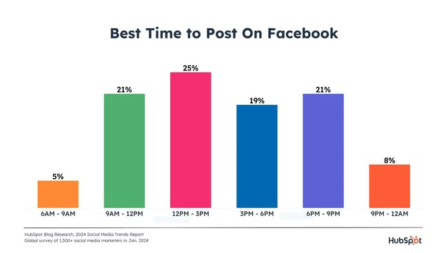
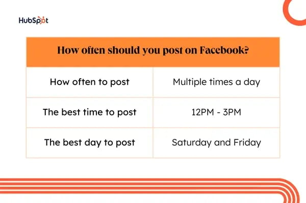
Our survey results showed that the best time to post on Facebook is between 12 and 3PM. 9AM-12PM and 6-9PM tie for the second-best times to post.
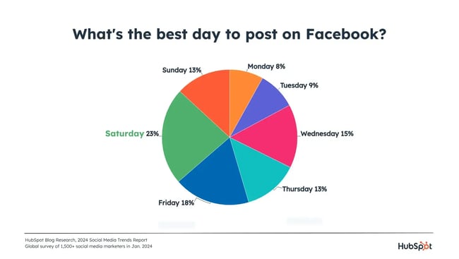
Which is the best day to post on Facebook?
Social media marketers report that Saturday is the best day to post on Facebook. It’s 24% more popular than Friday, the second-best day.
How often should you post on Facebook?
Most social media marketers (35%) post on Facebook multiple times per day, and a quarter post multiple times per week.
I have to mention that engagement is an important factor in the Facebook algorithm, which can impact how visible your content is. However often you post, I recommend taking the time to engage with people who interact with your content (like replying to and liking comments).
Why publish on Facebook at all?
There are three big reasons to keep publishing on Facebook:
1. Publishing on Facebook shows leads and potential customers that you’re actively in business.
Many people go to Facebook simply to research companies and look for thought leadership. If your Facebook page is incomplete and inactive, they may go with a competitor who is more prominent on the platform.
2. Facebook is leading in social shopping.
Social shopping is on the rise — more than 50% of marketers told us they’re increasing their investments in selling products directly on social media apps in 2024. And for good reason:
- Facebook offers the highest ROI when selling products in-app.
- Consumers who have made a purchase on a social media app in the last three months are more likely to have done so on Facebook.
- Consumers say Facebook offers the best in-app shopping experience, and they trust it the most when it comes to social shopping.
3. Facebook offers some of the best ROI across multiple areas like paid ads, engagement, and community building.
Social media marketers also told us that Facebook has brought in some of the highest ROI for them this year. They also say that:
- Facebook is the most effective platform for building an active community on social media.
- Facebook offers the second-highest engagement levels, which is crucial in a world where consumers expect more interaction with their favorite brands.
- Facebook has the second-best audience targeting tools for running paid ads.
This is especially true if you are doing any retargeting. And once you’ve published on Facebook, it's the easiest platform to boost posts and get more distribution (and followers).
When’s the best time to post on Instagram?
I pick up my phone to scroll through Instagram multiple times throughout the day. (Don’t roll your eyes at me; I know you do it too…)
Given this, it makes sense that there are multiple windows that social media marketers post on Instagram to get the best results. Our data shows lunchtime and post-workday hours are the most popular time frames. (12-3PM and 6-9PM, respectively).

I recommend avoiding posting in the early morning (before 9AM) and late evening (after 9PM), as the data show these periods are less effective.
Which is the best day to post on Instagram?
Social media marketers' use of Instagram peaks towards the end of the week. More specifically, 22% of survey respondents say Saturday is the best day to post on Instagram. Friday takes second place.

How often should you post on Instagram?
More is best on Instagram—social media marketers who leverage the app post multiple times per day and use a mix of content formats (Stories, in-feed posts, etc.).

This makes sense to me because the Instagram feed has long since been chronological, so posting more often helps with visibility. However, a balance is essential. If you go buck wild, you risk annoying your followers.
In 2021, Adam Mosseri, head of Instagram, suggested sharing a couple of in-feed posts per week and a couple of stories per day. You can also test out a mix of different formats and frequencies and monitor your analytics to see what works best.
When’s the best time to post on TikTok?
The best time to post on TikTok is between six and nine PM, which aligns with users having more time to scroll freely at the end of the day. 3-6PM is the second-best time frame.

Which is the best day to post on TikTok?
People have more time to scroll after work and more time to scroll when they’re not working at all, so it’s no surprise that social media marketers find the most success on Saturday (26%), then Friday (20%).

How often should you post on TikTok?
TikTok’s algorithm isn’t chronological, and social media marketers share content multiple times daily.

When’s the best time to post on X (Twitter)?
The best time to post on X (Twitter) is between 12 and 3PM. Survey respondents also indicated getting good results between 3 and 9PM.

Which is the best day to post on X (Twitter)?
There isn’t a significant difference between the best days to post on X. 19% of social media marketers say Saturday, and 18% say Friday. 
How often should you post on X (Twitter)?
Most of our survey respondents are posting on X multiple times a day. More posts mean more visibility, awareness, and clicks.

I don’t want to say that X is an unserious platform, but it really does run on memes and jokes. I would say that, of all the platforms you might leverage, it’s not as important to have perfectly polished prose or images as it is on other social apps.
I recommend capitalizing on the app's “unserious” vibe and showing a bit more of your brand personality, regardless of how often you post.
When’s the best time to post on LinkedIn?
LinkedIn is a business networking side, so it doesn’t surprise me that the best time to post on LinkedIn is during business hours. 24% of marketers say 3-6PM is the best time frame, and 22% say 9AM-12PM. 
Which is the best day to post on LinkedIn?
Monday is the best day to post on LinkedIn, as working professionals log back on after a weekend break. Friday also brings good results, as working professionals do end-of-week check-ins before logging off for a few days. 
How often should you post on LinkedIn?
Social media marketers are more likely to post on LinkedIn multiple times per week, which makes sense. Most users probably aren’t logging in for daily check-ins like they do on other platforms. This gives you more time to create high-quality content for maximum value.

When’s the best time to post on Pinterest?
The best time to post on Pinterest to reach its 522 million+ monthly active users is between 12 and 3PM. 
Which is the best day to post on Pinterest?
The best day to post on Pinterest is Saturday. Thursday is the second best.

How often should you post on Pinterest?
Social media marketers using Pinterest are pinning content multiple times per day. 
What does this mean for your social media strategy?
Maintaining a daily presence is essential for most social media platforms, unless you use LinkedIn, where posting multiple times per week is ideal.
While optimizing the time and days you post is important, it means nothing if your content isn’t relevant and exciting for your target audience.
My main takeaway for you is to create your high-quality content, and then optimize for best results by sharing it on the days and times that social media marketers told us were the best.
Editor's note: This post was originally published in June 2020 and has been updated for comprehensiveness.
20+ Best Fonts Similar to Comic Sans
Love it or hate it, Comic Sans is one of the most iconic and recognizable fonts out there. Known for its casual, playful style, it’s often used in informal settings or for designs that need a touch of fun.
However, while its charm is undeniable, Comic Sans isn’t always the perfect fit for every project. If you’re looking for a similar font that captures the same lighthearted vibe but with a more refined touch, you’ve come to the right place.
In this post, we’ve rounded up the best fonts similar to Comic Sans to give you the same playful feel while adding a bit more style and versatility. These fonts maintain the friendly, approachable look of Comic Sans but offer variations that are better suited for professional designs, children’s projects, educational materials, and more.
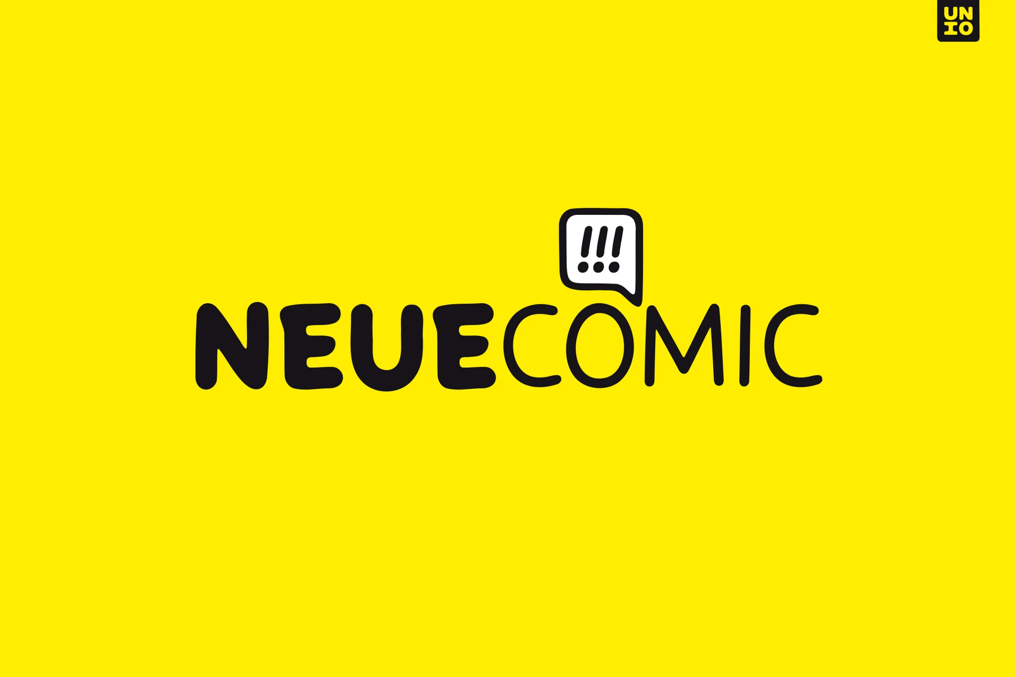
Neue Comic
Neue Comic is a rounded typeface that reinterprets the whimsical charm of Comic Sans with a fresh, modern twist. Designed to optimize both fun and functionality, Neue Comic boasts seven weight options and corresponding obliques. This new font, with its rhythmic, legible design, strikes a harmonious balance between whimsical ’90s nostalgia and contemporary sophistication, challenging the notion that playfulness can’t be refined in typography.
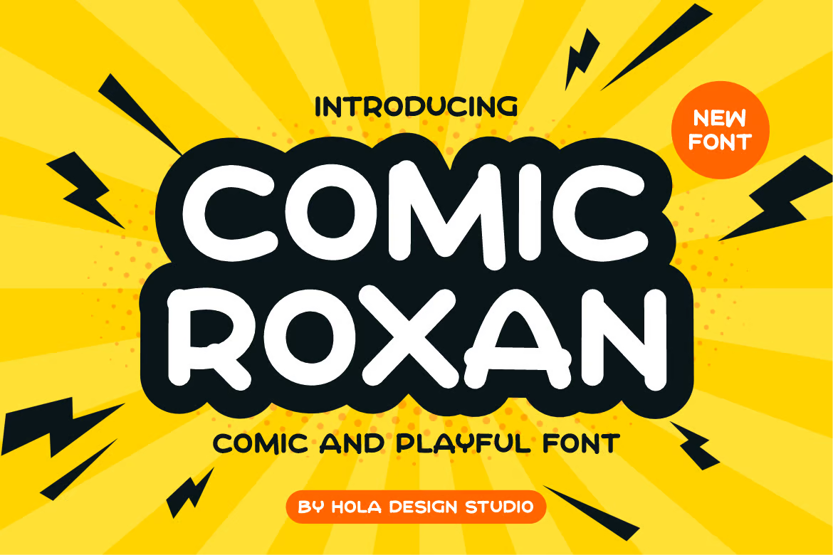
Comic Roxan
Check out Comic Roxan, an engaging and versatile font similar to Comic Sans. This distinctive typeface is ideal for a myriad of designs including movie scenes, posters, album covers, logos, and more. With OTF, TTF, and WOFF formats included, Comic Roxan is a flexible tool, ready to add fresh creativity to your design palette.
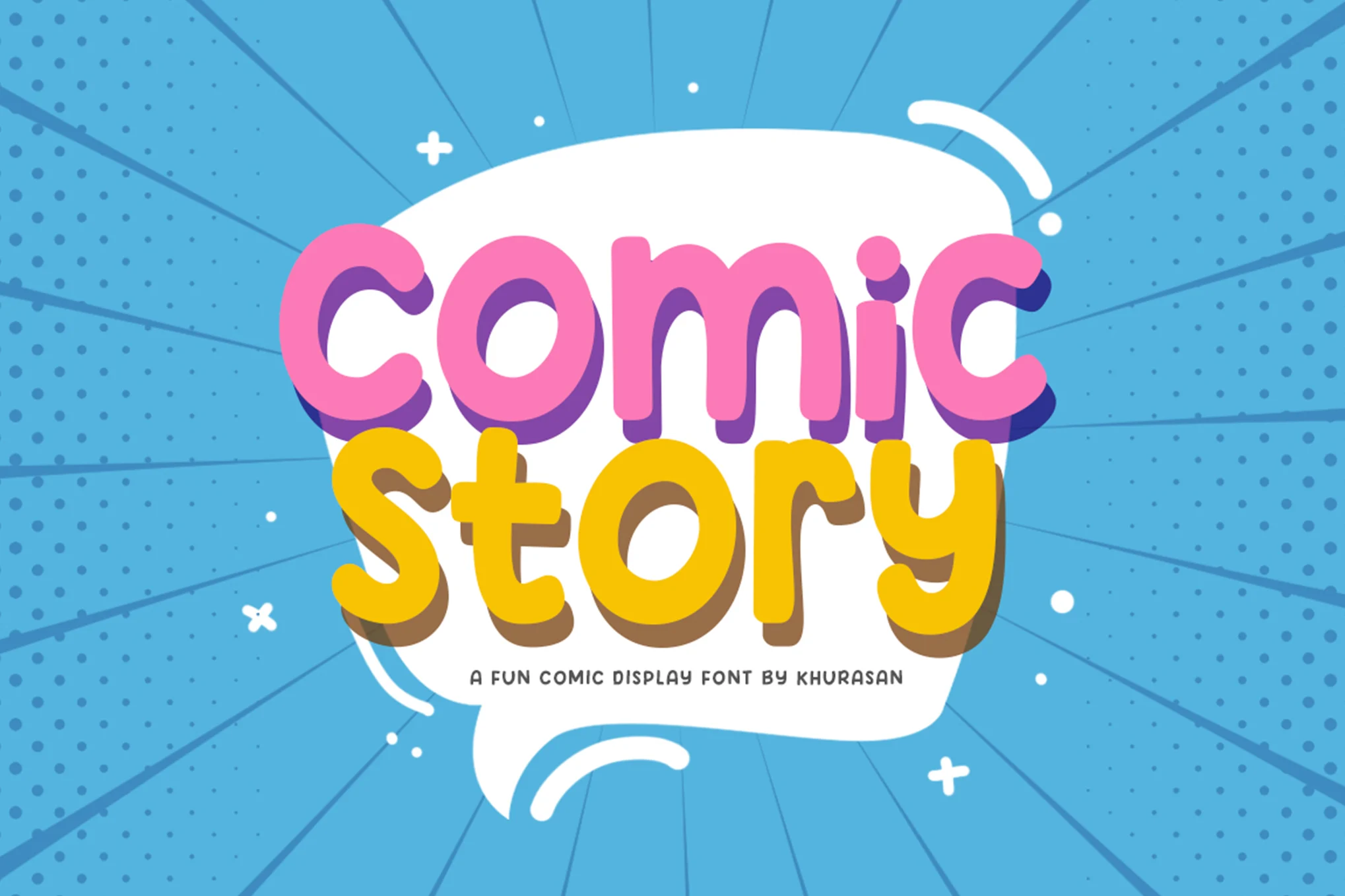
Comic Story
Comic Story is a lively display typeface perfect for fun, light-hearted projects. Its cheerfulness adds a certain charm to logos, branding, greeting cards, posters, and other designs. The files include Comic Story.ttf and Comic Story.otf. This engaging typeface encourages you to put your heart into your work and enjoy the creative process.
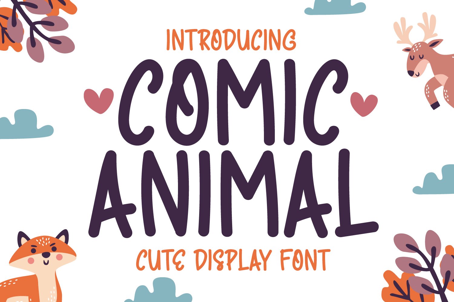
Comic Animal
Comic Animal is a whimsical handwriting display font. Perfectly adaptable for any design project, this font exudes a charming simplicity and trends. Available in OTF, TTF, WOFF, and WOFF2 formats, it’s a versatile favorite that could quickly become your standard choice across various design occasions.
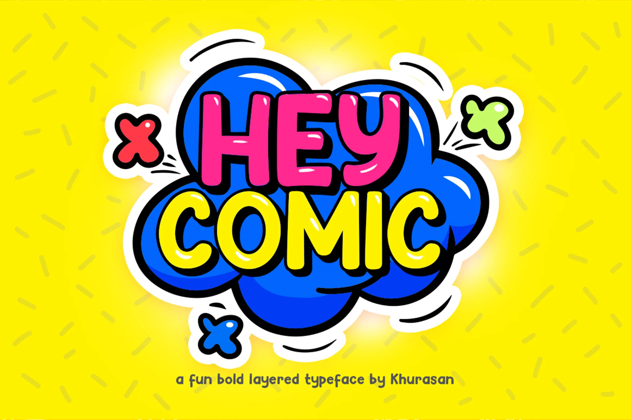
Hey Comic
Hey Comic is a bold, cheerful font perfect for creating a fun, engaging atmosphere in your projects. Ideal for logos, branding, greeting cards, or posters, this versatile font offers multilingual support. Both standard and extrude versions are included. Created with heart and passion by Khurasan, it adds a playful touch to any design.
Comic Mode
Comic Mode is a whimsical yet formal sans serif font that comes in nine weight variations. Perfect as a refined alternative to Comic Sans, its distinctive style is shaped by a blend of technical typography and relaxed handwriting. From thin and round to black and elliptical shapes, its diversity is extended with the addition of oblique styles, culminating in 18 different styles.
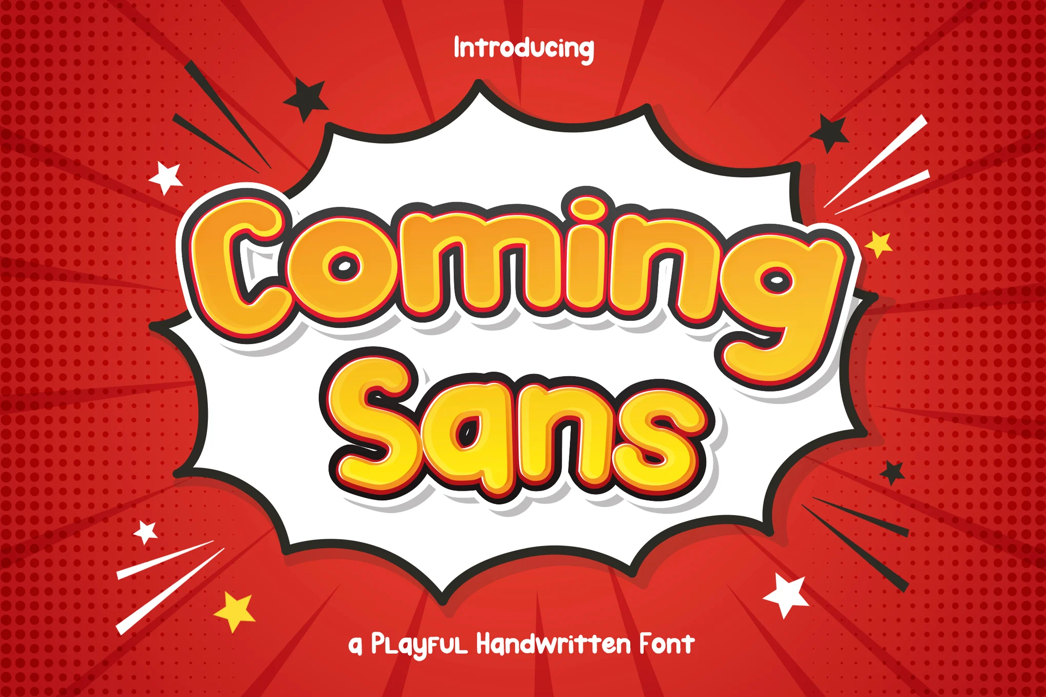
Coming Sans
Coming Sans is a cheerful, versatile font that evokes a playful comic book feel. Ideal for a range of uses such as children’s storybooks, comic-themed designs, and catchy headlines, this font inspires lighthearted creativity. It includes uppercase, lowercase, symbols, punctuation, numerals, ligature, alternate, and multilingual support, available in OTF, TTF, WOFF, and WOFF2 formats.
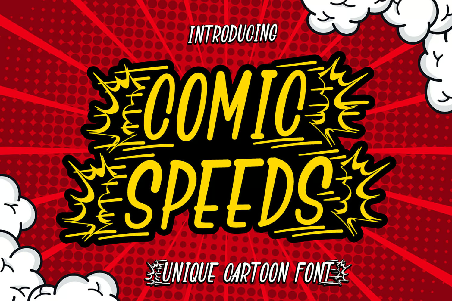
Comic Speeds
Comic Speeds is a playful, distinctive display font reminiscent of comic sans. What sets it apart are the alternate characters featuring ‘speed’ effects that make it perfect for cartoon-based creative endeavors. It’s recommended for logos, social media posts, product packaging, special events, and more.
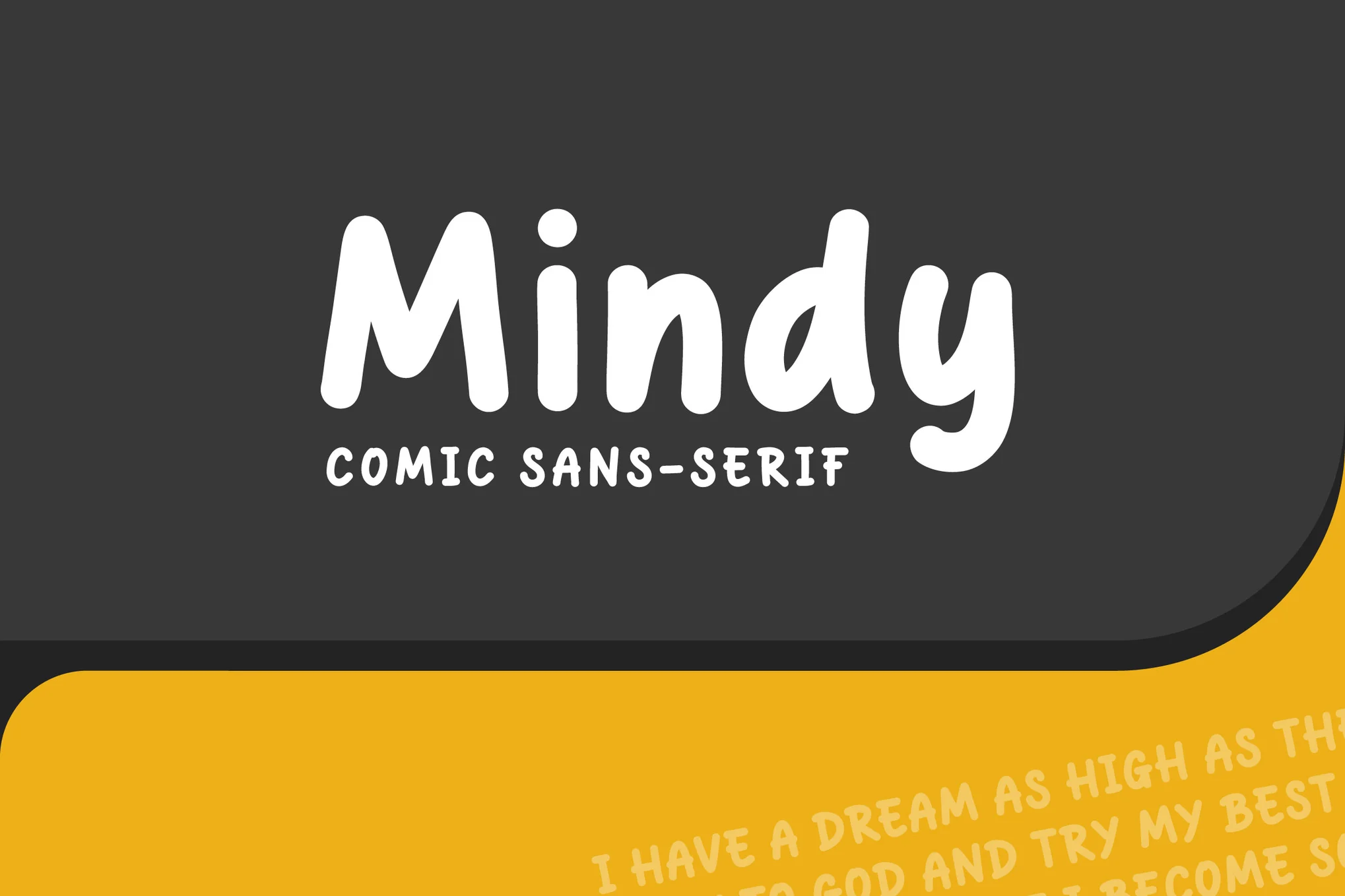
Mindy
Meet Mindy, a comic display font with a rounded, bold style reminiscent of Comic Sans. This versatile font is ideal for everything from children’s book titles and comic books to posters, social media content, and branding for kids’ items. The zip file includes Mindy in OTF, TTF, WOFF and WOFF2 formats, perfect for all your creative needs.
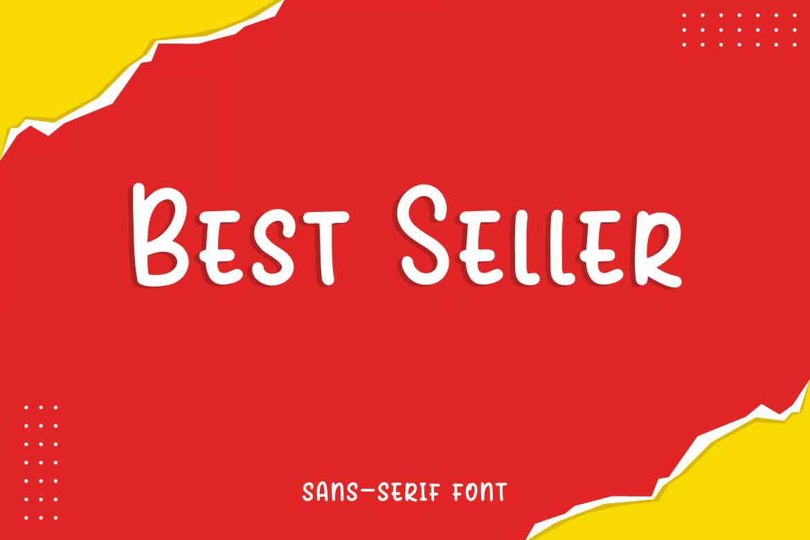
Best Seller
Best Seller, a minimalist sans serif font, serves as a valuable creative asset. Reminiscent of Comic Sans in style, it can enhance everything from children’s books and flyers to book titles, advertisements, and so much more. The download includes useable formats such as OTF, TTF, WOFF, and WOFF2, making it a versatile choice for your design project needs.
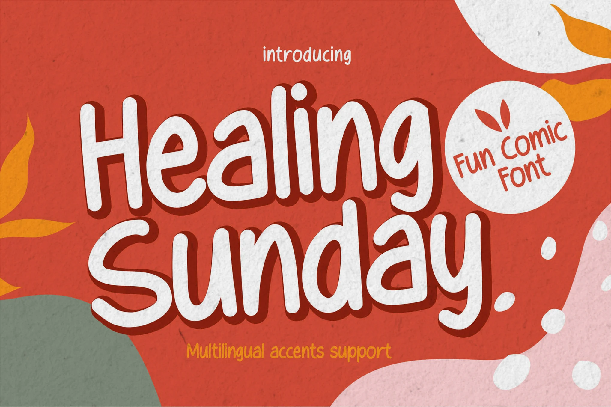
Healing Sunday
Healing Sunday is a playful, textured font reminiscent of handwriting that adds authenticity to any creative project. Perfect for logos, invitations, advertisements, or packaging, this hand-drawn font brings a natural touch and detailed beauty to designs. It’s accessible in most design software, including Adobe Illustrator and Microsoft Word.
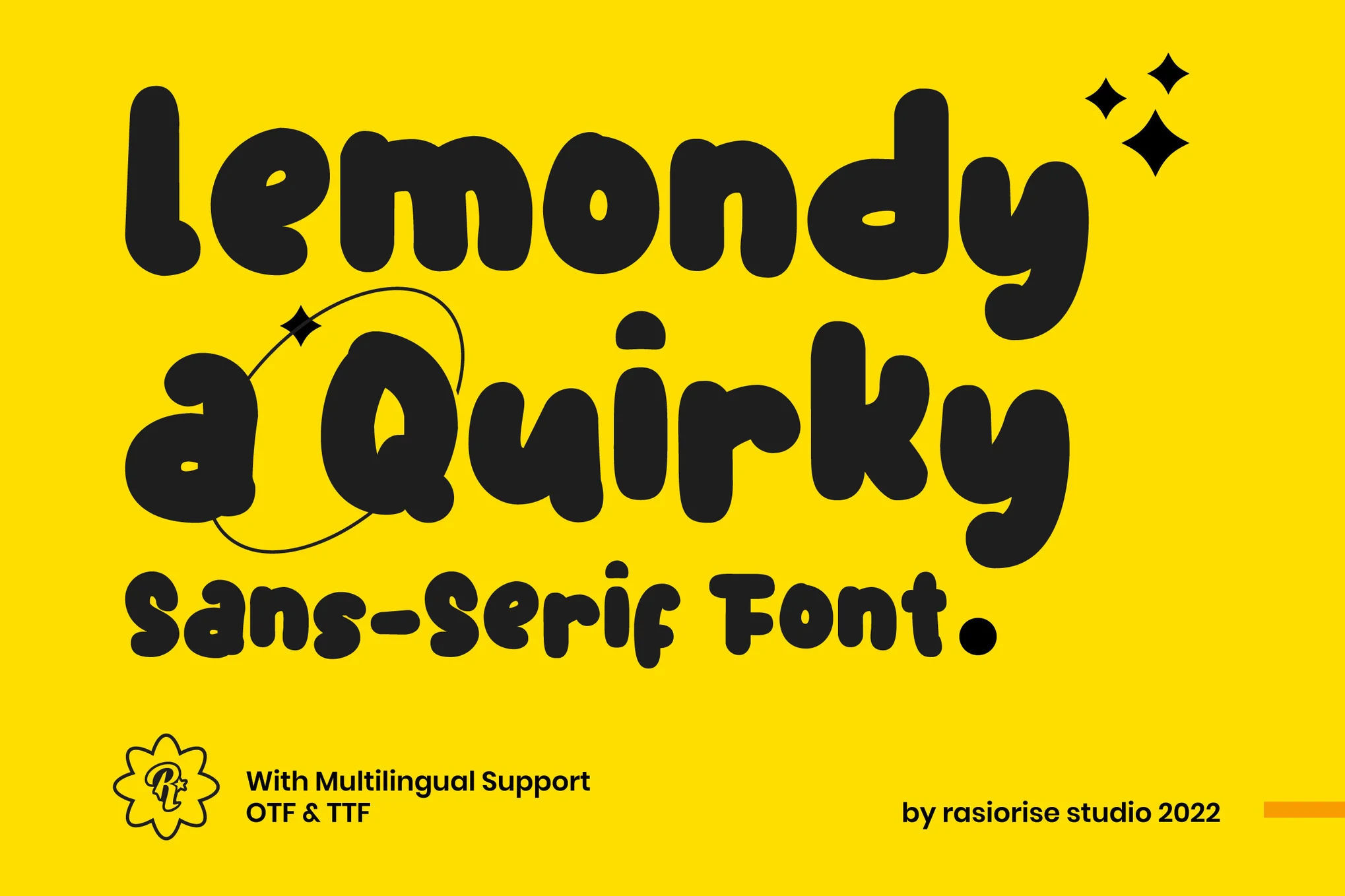
Lemondy
Experience the quirkiness of Lemondy, a playful font inspired by hand-drawn sketches. Excellent for headlines and titles, it adds a dash of fun to book covers, comic texts, packaging labels, merchandise, and children’s books. It features uppercase letters, numbers, punctuation and supports multiple languages.
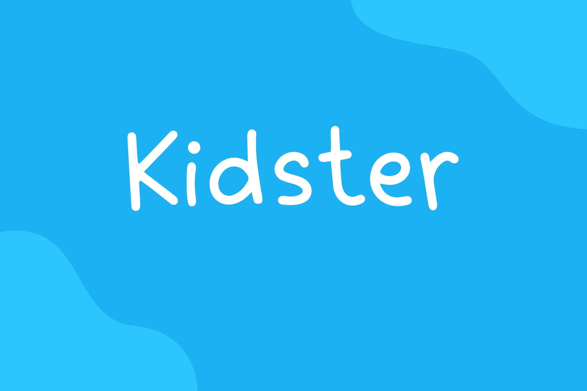
Kidster
Kidster is a captivating comic display font that emulates a handmade look, similar to Comic Sans. This versatile font can be used on a variety of platforms from book titles and news headlines to posters, cards, banners and flyers. Appreciated for its scalability, Kidster comes in a convenient zip file with four formats: OTF, TTF, WOFF and WOFF2.
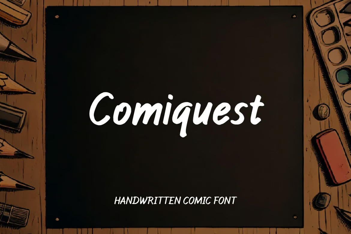
Comiquest
Comiquest is a delightfully versatile handwritten comic font. Perfectly blending casual charm with modern simplicity, this font gives your creative endeavors a unique, personal touch. It suits branding, logos, invitations, and posters impeccably and maintains a polished appearance. With its accessible and stylish feel, Comiquest is sure to enhance your design work.
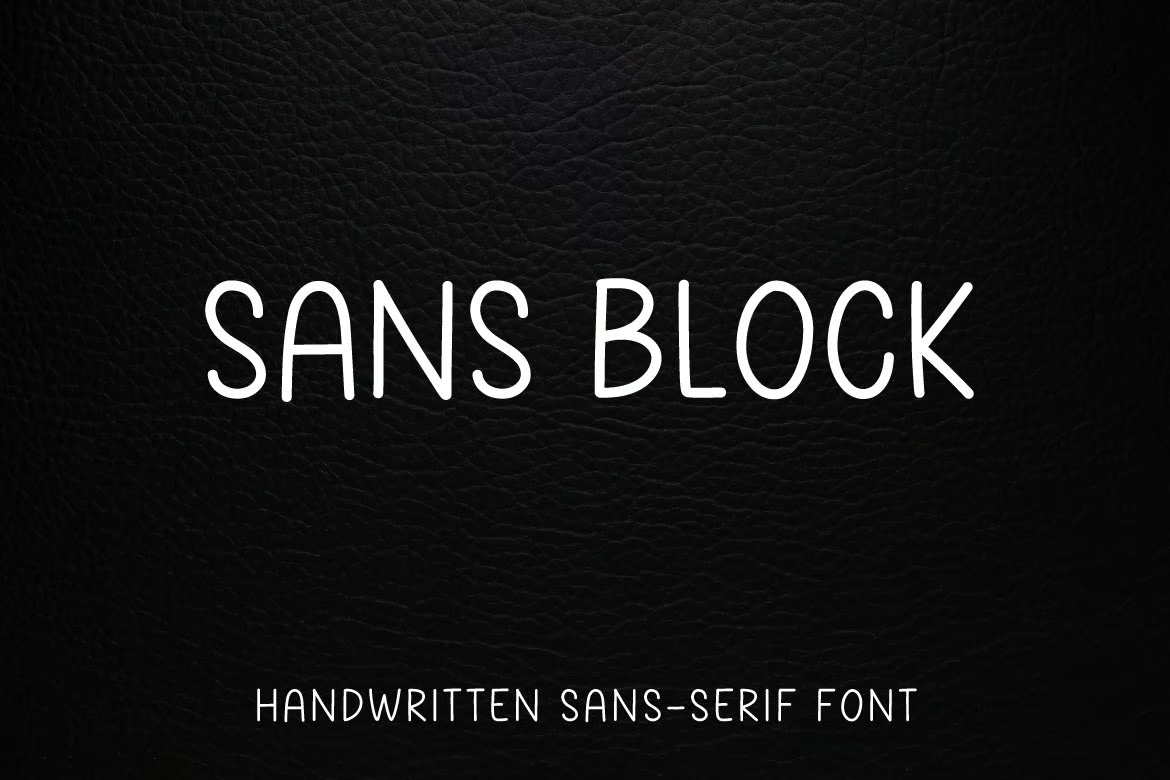
Sans Block
Sans Block is a delightfully casual handwritten font! Use it to infuse a fun, laid-back vibe into anything – from comic books to advertisements, posters, book titles, school flyers and even social media content. The downloadable zip file comes packed with Sans Block OTF, TTF, and a webfont-TT. It’s your perfect partner to design something truly awesome!
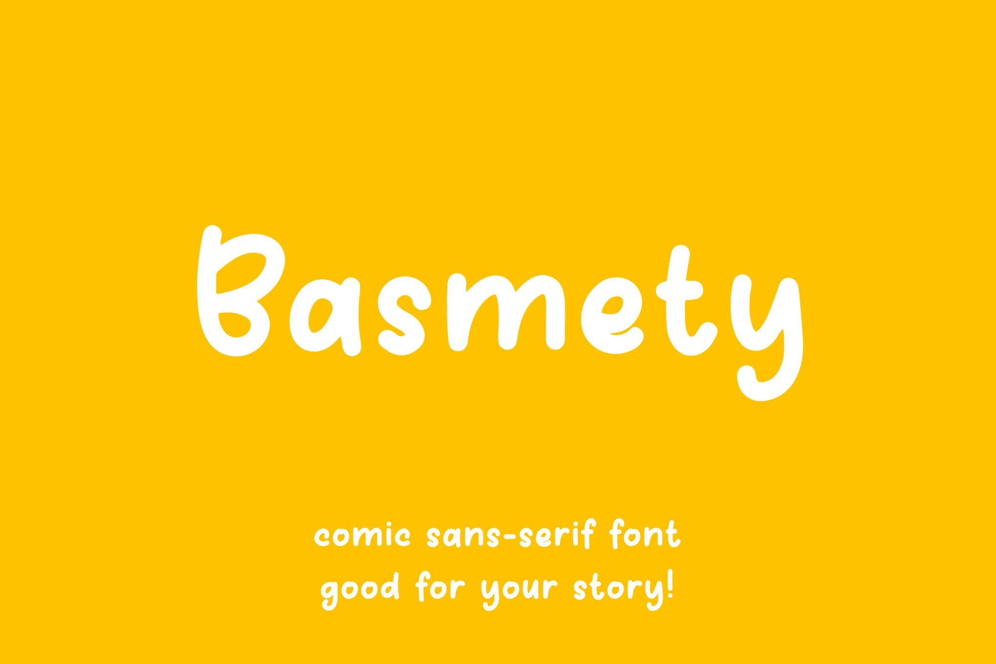
Basmety
Meet Basmety, a cheerful comic display font that brings joy to every word. Ideal for a range of uses from comic books and classroom settings, to kids’ products and social media content, Basmety livens up any text with its playful style. The downloadable zip file comes with OTF, TTF, WOFF, and WOFF2 formats.
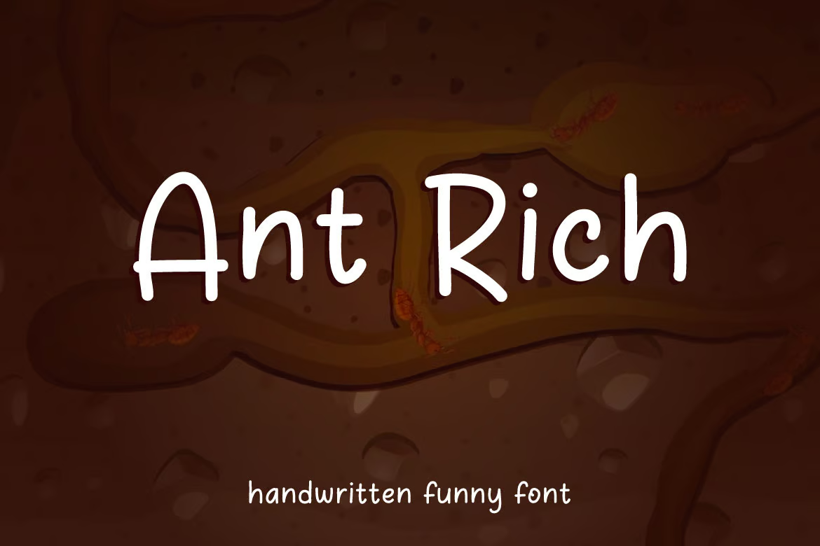
Ant Rich
Ant Rich is a whimsical comic font that’s perfect for lending an air of playful simplicity to your work. Ideal for projects ranging from flyers and book titles to social media content and logos, it’s easily incorporated into your design due to the included OTF, TTF, WOFF, and WOFF2 formats.
Free Fonts Like Comic Sans
Comic Story
This creative and playful font also features a letter design similar to Comic Sans. It is designed with fun and children’s designs in mind. You can use it to add beautiful titles to your packaging designs, posters, book covers, and much more.
Comic Cheese
Comic Cheese is another creative font similar to Comic Sans. This font also has a playful letter design inspired by comic books. The font is most suitable for designing titles and headings for all kinds of fun, entertaining, and playful design projects.
GOLDSTEP
Featuring tall and condensed letterforms, this free font shares many similarities with the iconic Comic Sans font. It has the same playful and funny-looking letter design as the Comic Sans and comes with a set of all-caps letters.
Comic Panels
If you prefer to use a unique font with a playful look, this free font is perfect for your projects. Comic Panels is a free font inspired by Comic Sans and it features playful letters with a handwriting style.
Erik Sans
Erik Sans is another free font similar to Comic Sans. It features the same playful and quirky letter design as the Comic Sans font but with its own unique decorative elements. This font will surely add a creative look to your designs.


![Download Now: Negotiate Like a Pro [Free Guide]](https://no-cache.hubspot.com/cta/default/53/a3e6022e-8457-4a1e-8a5f-335ee56050c4.png)
![Download Now: 150+ Content Creation Templates [Free Kit]](https://no-cache.hubspot.com/cta/default/53/5478fa12-4cc3-4140-ba96-bc103eeb873e.png)


![→ Free Download: Social Media Calendar Template [Access Now]](https://no-cache.hubspot.com/cta/default/53/3e56e15d-47bd-46c9-a256-99fde52abfe7.png)
