Clarifying the Relationship Between Popovers and Dialogs

Featured Imgs 23

The difference between Popovers (i.e., the popover attribute) and Dialogs (i.e., both the <dialog> element and the dialog accessible role) is incredibly confusing — so much that many articles (like this, this, and this) have tried to shed some light on the issue.

If you’re still feeling confused, I hope this one clears up that confusion once and for all.

Distinguishing Popovers From Dialogs

Let’s pull back on the technical implementations and consider the greater picture that makes more sense and puts everything into perspective.

Line diagram connecting the popover attribute to six types of accessible roles, including dialog.

The reason for this categorization comes from a couple of noteworthy points.

First, we know that a popover is content that “pops” up when a user clicks a button (or hovers over it, or focuses on it). In the ARIA world, there is a useful attribute called aria-haspopup that categorizes such popups into five different roles:

  • menu
  • listbox
  • tree
  • grid
  • dialog

Strictly speaking, there’s a sixth value, true, that evaluates to menu. I didn’t include it above since it’s effectively just menu.

By virtue of dialog being on this list, we already know that dialog is a type of popover. But there’s more evidence behind this too.

The Three Types of Dialogues

Since we’re already talking about the dialog role, let’s further expand that into its subcategories:

Lone diagram connecting the popover attribute to six accessible roles, including dialog, which is broken out into three categories.

Dialogs can be categorized into three main kinds:

  • Modal: A dialog with an overlay and focus trapping
  • Non-Modal: A dialog with neither an overlay nor focus trapping
  • Alert Dialog: A dialog that alerts screen readers when shown. It can be either modal or non-modal.

This brings us to another reason why a dialog is considered a popover.

Some people may say that popovers are strictly non-modal, but this seems to be a major misunderstanding — because popovers have a ::backdrop pseudo-element on the top layer. The presence of ::backdrop indicates that popovers are modal. Quoting the CSS-Tricks almanac:

The ::backdrop CSS pseudo-element creates a backdrop that covers the entire viewport and is rendered immediately below a <dialog>, an element with the popup attribute, or any element that enters fullscreen mode using the Fullscreen API.

That said, I don’t recommend using the Popover API for modality because it doesn’t have a showModal() method (that <dialog> has) that creates inertness, focus trapping, and other necessary features to make it a real modal. If you only use the Popover API, you’ll need to build those features from scratch.

So, the fact that popovers can be modal means that a dialog is simply one kind of popover.

A Popover Needs an Accessible Role

Popovers need a role to be accessible. Hidde has a great article on selecting the right role, but I’m going to provide some points in this article as well.

To start, you can use one of the aria-haspopup roles mentioned above:

  • menu
  • listbox
  • tree
  • grid
  • dialog

You could also use one of the more complex roles like:

  • treegrid
  • alertdialog

There are two additional roles that are slightly more contentious but may do just fine.

  • tooltip
  • status

To understand why tooltip and status could be valid popover roles, we need to take a detour into the world of tooltips.

A Note on Tooltips

From a visual perspective, a tooltip is a popover because it contains a tiny window that pops up when the tooltip is displayed.

I included tooltip in the mental model because it is reasonable to implement tooltip with the Popover API.

<div popver role="tooltip">...</div>

The tooltip role doesn’t do much in screen readers today so you need to use aria-describedby to create accessible tooltips. But it is still important because it may extend accessibility support for some software.

But, from an accessibility standpoint, tooltips are not popovers. In the accessibility world, tooltips must not contain interactive content. If they contain interactive content, you’re not looking at a tooltip, but a dialog.

You’re thinking of dialogs. Use a dialog.

Heydon Pickering, “Your Tooltips are Bogus”

This is also why aria-haspopup doesn’t include tooltiparia-haspopup is supposed to signify interactive content but a tooltip must not contain interactive content.

With that, let’s move on to status which is an interesting role that requires some explanation.

Why status?

Tooltips have a pretty complex history in the world of accessible interfaces so there’s a lot of discussion and contention over it.

To keep things short (again), there’s an accessibility issue with tooltips since tooltips should only show on hover. This means screen readers and mobile phone users won’t be able to see those tooltips (since they can’t hover on the interface).

Steve Faulkner created an alternative — toggletips — to fill the gap. In doing so, he explained that toggletip content must be announced by screen readers through live regions.

When initially displayed content is announced by (most) screen readers that support aria-live

Heydon Pickering later added that status can be used in his article on toggletips.

We can supply an empty live region, and populate it with the toggletip “bubble” when it is invoked. This will both make the bubble appear visually and cause the live region to announce the tooltip’s information.

<!-- Code example by Heydon -->
<span class="tooltip-container"> 
  <button type="button" aria-label="more info" data-toggletip-content="This clarifies whatever needs clarifying">i</button> 
  <span role="status"> 
    <span class="toggletip-bubble">This clarifies whatever needs clarifying</span> 
  </span>
</span>

This is why status can be a potential role for a popover, but you must use discretion when creating it.

That said, I’ve chosen not to include the status role in the Popover mental model because status is a live region role and hence different from the rest.

In Summary

Here’s a quick summary of the mental model:

  • Popover is an umbrella term for any kind of on-demand popup.
  • Dialog is one type of popover — a kind that creates a new window (or card) to contain some content.

When you internalize this, it’s not hard to see why the Popover API can be used with the dialog element.

<!-- Uses the popover API. Role needs to be determined manually -->
<div popover>...</div>

<!-- Dialog with the popover API. Role is dialog -->
<dialog popover>...</dialog>

<!-- Dialog that doesn't use the popover API. Role is dialog -->
<dialog>...</dialog>

When choosing a role for your popover, you can use one of these roles safely.

  • menu
  • listbox
  • tree
  • grid
  • treegrid
  • dialog
  • alertdialog

The added benefit is most of these roles work together with aria-haspopup which gained decent support in screen readers last year.

Of course, there are a couple more you can use like status and tooltip, but you won’t be able to use them together with aria-haspopup.

Further Reading


Clarifying the Relationship Between Popovers and Dialogs originally published on CSS-Tricks, which is part of the DigitalOcean family. You should get the newsletter.

Clamp it! VS Code extension

Featured Imgs 23

There’s a lot of math behind fluid typography. CSS does make the math a lot easier these days, but even if you’re comfortable with that, writing the full declaration can be verbose and tough to remember. I know I often have to look it back up, despite having written it maybe a hundred times.

Silvestar made a little VS Code helper to abstract all that. Type in the target values you’re aiming for and the helper expands it on the spot.

He says ChatGPT did the initial lifting before he refined it. I can get behind this sort of AI-flavored usage. Start with an idea, find a starting point, look deeper at it, and shape it into something incredibly useful for a small, single purpose.


Clamp it! VS Code extension originally published on CSS-Tricks, which is part of the DigitalOcean family. You should get the newsletter.

35+ Text Effects and Animated Typography Templates for Premiere Pro

Featured Imgs 23

If you’re looking for ways to make your titles and headings look good in your video projects, you’ve come to the right place.

Today, we bring you a collection of Premiere Pro text effects and animated typography templates that you can use to create mind-blowing text animations.

The best part is that these templates and presets are made by professional designers. So you don’t have to spend hours trying to find the right combinations. All you have to do is download the template, import it in Premiere Pro, and add the effect to your project timeline.

You’ll find some cool and creative Premiere Pro text effects in this collection, unlike anything you’ve seen before. Be sure to download them all below.

Top Pick

Trendy Premiere Pro Text Effect Templates

Trendy Premiere Pro Text Effect Templates

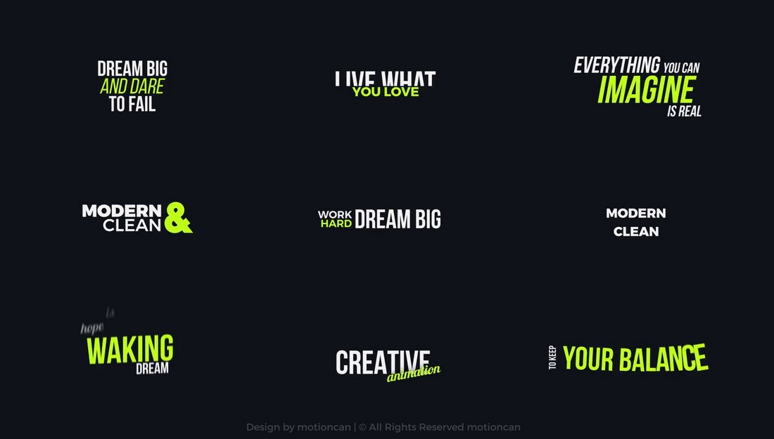
This is a bundle full of trendy and stylish text effects you can use to add attention-grabbing animations to your titles and headings to make more professional-looking videos.

There are multiple styles of text animations in this pack that are most suitable for fashion and lifestyle-themed videos, as well as many other types of videos.

Why This Is A Top Pick

The typography animations in this template kit have modern and trendy designs that will instantly attract the attention of your viewers. They are quite easy to customize as well.

100 Cinematic Titles for Premiere Pro

This is a massive collection of Premiere Pro title templates that offers a hundred unique cinematic-style text animation templates. Ideal for adding a professional touch to your videos, these templates are designed to help make your editing process quicker and easier. Utilize these to enhance storytelling in your projects.

Retro 80s Text Animations for Premiere Pro

Another creative collection of text templates for Premiere Pro that adds a retro touch to your work. These stylish animations help breathe life into your text, taking your video project back to the vibrant 80s era. It’s a fun and easy way to enhance your visual storytelling.

Cyber Tech Title Animations for Premiere Pro

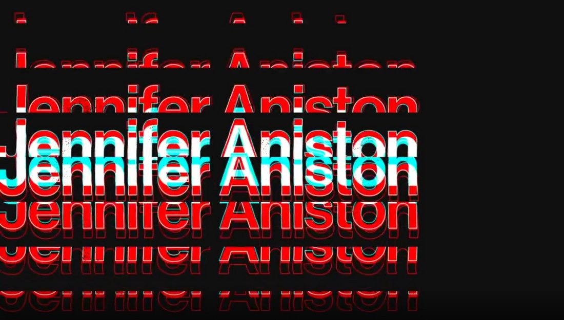
A stylish text template for Premiere Pro that unveils your title through high-end, cyberpunk-style animations. With full-controller features, you can easily personalize aspects like position and scale. No need for After Effects, just import the “MOGRT” file and you’re set. Ideal for Esports videos, tech shows and sci-fi films.

9 Sale Promo Typography Animations for Premiere Pro

This Premiere Pro template kit makes creating text animations seamless, especially for beginners. This user-friendly package includes a helpful video tutorial and offers a full HD resolution. It’s easily customizable and compatible with Premiere Pro CC 2018 and higher, as well as After Effects CC 2022.

Liquid Text Animations for Premiere Pro

Another captivating Premiere Pro template featuring liquid-style animations. It incorporates fluid-like animations to enhance your text, transforming it into an engaging visual experience. This template is ideal for those looking to give their Premiere Pro projects a unique touch without being overly sales-centric.

Trendy Kinetic Typography Premiere Pro Templates

This Premiere Pro template pack offers dynamic text animations to enrich your content with lively visuals. These templates work wonders for various purposes, such as marketing, education, entertainment, travel, and music videos. With ten kinetic titles, 4K resolution, color controls, and a fast render, these templates require no plugins.

Titles With 3D Elements Premiere Pro Text Effects

Titles With 3D Elements Premiere Pro Text Effects

This is a unique template kit for Premiere Pro that features stylish text effects with 3D elements. There are multiple title scenes in this template pack for you to add cool and creative intros for your videos. They all feature adaptive designs with up to 4K resolution.

Stylish Titles Premiere Pro Text Effect Templates

Stylish Titles Premiere Pro Text Effect Templates

If you’re looking for a title template with a minimal and clean design, this Premiere Pro template is perfect for your project. It includes multiple text effects with modern animations and easily customizable elements.

Original Text Styles for Premiere Pro

Original Text Styles for Premiere Pro

Choose from 5 cool Premiere Pro text effects to add colorful and attractive titles to your videos. Each text effect in this template kit is different from the others. They are perfect for promo videos, social media videos, YouTube intros, and much more.

Kinetic Animated Premiere Pro Text Effects

Kinetic Animated Premiere Pro Text Effects

This Premiere Pro template features some of the coolest text effects we’ve seen. It includes 10 different animated text effects with editable colors and text. You can also adjust the duration and animation effects to your preference.

Free Large Text Block Premiere Pro Text Effect

Free Large Text Block Premiere Pro Text Effect

Another free text effect for Premiere Pro. This template comes with a big text block with simple transition animations. It’s ideal for adding attractive intros and titles for your videos.

8 Modern Premiere Pro Text Effect Templates

8 Modern Premiere Pro Text Effect Templates

With 8 different text effects to choose from, this Premiere Pro template kit will help you craft the best titles for your video projects. Each text effect in this bundle has fully customizable elements and is compatible with up to 4K resolution.

Miscellaneous Text Animations for Premiere Pro

Miscellaneous Text Animations for Premiere Pro

A collection of modern text effects for Premiere Pro. There are 10 trendy text animations included in this template pack for you to use in your social media promos, YouTube videos, and business videos. It includes free fonts and a tutorial as well.

Shadow Lower Thirds for Premiere Pro

Shadow Lower Thirds for Premiere Pro

These Premiere Pro text effects are ideal for crafting unique lower-thirds for documentaries, movie credits, and various other videos. It comes with 7 different lower thirds designs with easily customizable text, colors, and fonts.

Adaptive Premiere Pro Text Effect Templates

Adaptive Premiere Pro Text Effect Templates

Using text effects and titles with adaptive designs is important when you are designing content for multiple platforms. The Premiere Pro templates in this bundle are designed with that goal in mind. They feature stylish text effects and animation with smooth adaptive layouts.

Free Burning Animation Premiere Pro Text Effect

Free Burning Animation Premiere Pro Text Effect

This free animated text effect is perfect for adding a cool title for your fun and playful videos. It features a fire blast effect for in-and-out animations with animated cartoon flames on the text.

Monochrome Animated Typography Slides for Premiere Pro

Monochrome Animated Typography Slides for Premiere Pro

With this Premiere Pro template kit, you get a two-in-one kind of deal. It includes a set of typography slide designs that also features cool text animations. The template will allow you to instantly add a cool-looking title scene or opening scene to your videos with just a few clicks.

Motion Type – Premiere Pro Text Effects

Motion Type - Premiere Pro Text Effects

The text effects in this template kit have some of the most amazing designs we’ve seen. There are many different types of effects, including cyberpunk-style text animations, colorful typography effects, subtle text animations, and more. There is a total of 20 different text effects in this pack for any type of project you have.

Motion Styles – Text Effects & Animations For Premiere Pro

Motion Styles - Text Effects & Animations For Premiere Pro

If you’re looking for colorful and creative text effects to add a bit of style to your videos, then this Premiere Pro template pack is for you. It includes 54 trendy text effects with vibrant designs and attractive animations. They are perfect for social media videos as well as YouTube vlogs and business promos as well. You can use them by simply dragging and dropping them into your timeline.

Text Animation Toolkit – 122 Premiere Pro Text Effects

Text Animation Toolkit - 122 Premiere Pro Text Effects

This is a complete text animation toolkit that features more than 120 different text effects. The effects in this pack have simple and subtle animations. And they are ideal for business and professional video projects. The best part is that these animations are fully compatible with any type of font or language. And it includes both in and out animations.

10 Free Texture Title Animations for Premiere Pro

10 Free Texture Title Animations for Premiere Pro

If you’re low on budget, you can grab this text animations pack for free. It includes a set of unique title animations with textured designs. Perfect for making your YouTube vlogs and social videos look more creative.

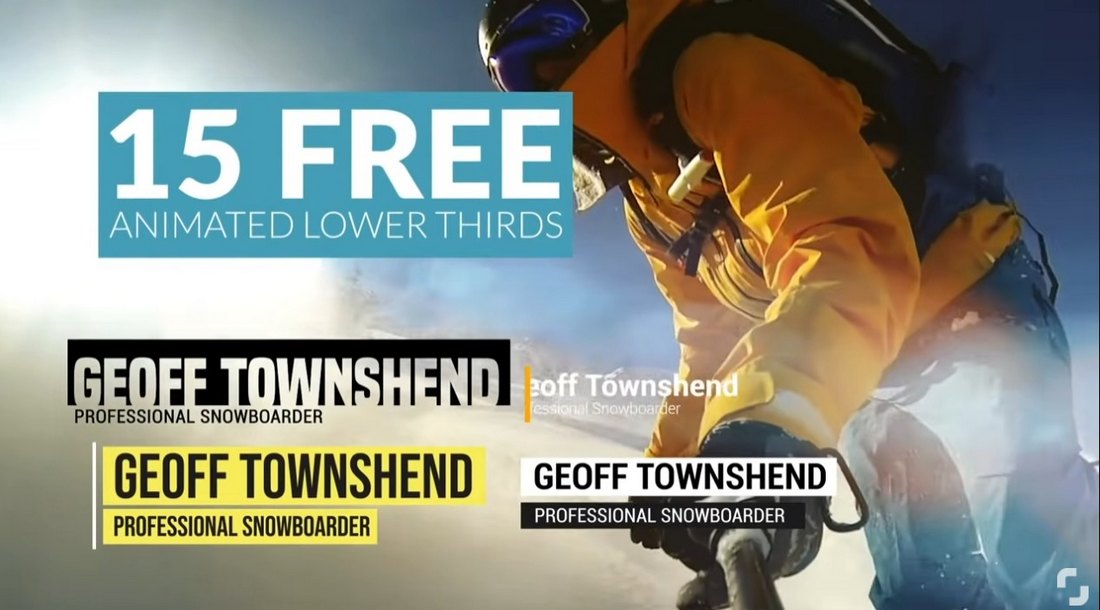
15 Free Animated Lower-Third Premiere Pro Templates

15 Free Animated Lower-Third Premiere Pro Templates

With these free Premiere Pro text animations, you can create stylish lower-thirds for your videos. They are especially useful when making documentary-style videos as well as for adding credits and titles too.

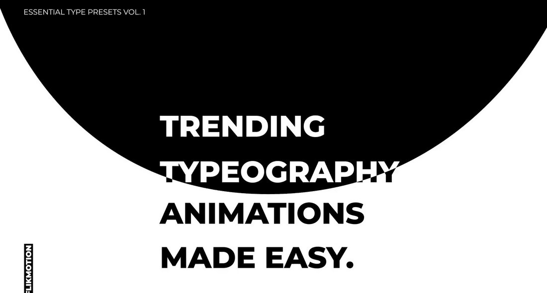
Essential Typography Premiere Pro Text Effects

Essential Typography Premiere Pro Text Effects

You’ll find clean and professional typography animations in this bundle of Premiere Pro text effects. You can use them to create titles for promo videos, lower thirds for business videos, social media clips, and more. Each text animation preset is easily customizable so you can adjust settings to your preference as well.

Stomp Typography – Fast Premiere Pro Text Animations

Stomp Typography - Fast Premiere Pro Text Animations

This Premiere Pro text animations pack comes with a set of fast-paced text effects. They feature stomp-style text animations that allow you to create titles and text with quick animations. You can choose from multiple styles of effects. These are especially suitable for short Instagram and TikTok videos and YouTube videos.

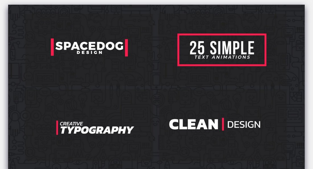
25 Simple Motion Text Animations for Premiere Pro

25 Simple Motion Text Animations for Premiere Pro

Looking for simple and classy text animations for business videos? Then this bundle of Premiere Pro templates is for you. There are 25 different text effects included in this pack. They all feature simple and professional text animations suitable for business events and promo videos.

40 Kinetic Titles & Text Effects for Premiere Pro

40 Kinetic Titles & Text Effects for Premiere Pro

Another collection of simple text effects. The text effects in this collection feature kinetic-style animations. There are 40 unique animations with different styles of effects to choose from. Of course, they are easily customizable to your preference as well.

Project-x – Glitch & Distortion Text Effects for Premiere Pro

Project-x - Glitch & Distortion Text Effects for Premiere Pro

The glitch text effect is one of the most popular effects used in modern videos, especially in YouTube videos. If you want to add the same stylish effects to your text and titles, grab this bundle. It includes 30 different glitch and distortion text effects that are perfect for technology, gaming, and many other trendy videos.

Free Paint Splash Premiere Pro Text Effect Animation

Free Paint Splash Premiere Pro Text Effect Animation

A creative text effect animation featuring colorful paint splash design. This simple yet beautiful animation will fit in perfectly with your creative DIY and educational videos. It’s free to download as well.

Free Faded Glitch Title Animation for Premiere Pro

Free Faded Glitch Title Animation for Premiere Pro

Another simple glitching text effect. You can use this one for free with your personal and professional videos. The template can also be customized and used to create title scenes or typography slides.

Fresh Typography – Premiere Pro Text Effects & Slides

Fresh Typography - Premiere Pro Text Effects & Slides

This Premiere Pro template kit features typography slides that you can use to add stylish titles and typography scenes to your videos. They also come with unique text effects and animations as well. The dynamic design of these templates offers an opportunity for you to experiment with different styles of text animations.

Abstract Typography – Unique Premiere Pro Text Effects

Abstract Typography - Unique Premiere Pro Text Effects

If you’re looking for unique and uncommon text animations to make your videos stand out, this text effects toolkit is perfect for you. It comes with lots of cool animations with 3D-like text effects. With these text effects, your videos will definitely grab the attention of your audience.

Premiere Pro Text Transitions with Animated Titles

Premiere Pro Text Transitions with Animated Titles

These text effect templates allow you to create modern transitions with text and titles. The text transition effect is a commonly used animation in social media videos, especially on Instagram. There are many different styles of effects in this pack for you to make all kinds of social media promos and videos.

Just Typography – Premiere Pro Text Effects Pack

Just Typography - Premiere Pro Text Effects Pack

This bundle lets you choose from many different text effects to create professional and business videos. The effects feature simple and clean text animations. And they can be easily customized to your preference to create your own text effects as well.

Chaotic Typography – Premiere Pro Text Effect Templates

Chaotic Typography - Premiere Pro Text Effect Templates

Just as the name suggests, this Premiere Pro text effects bundle includes some chaotic and unusual text animations, unlike anything we’ve seen before. The weirdness of the animations actually makes them quite unique and interesting to look at. So they might help you get the attention of your viewers.

This is Black – Premiere Pro Typography Animations

This is Black - Premiere Pro Typography Animations

This Premiere Pro text effect template features cool animations with 3D-like designs. They are easily editable and you can use them to create eye-catching text animations for social media videos, as well as corporate and business videos.

Free Colorful Glitch Text Animation for Premiere Pro

Free Colorful Glitch Text Animation for Premiere Pro

If you can’t get enough of the glitch text animations, be sure to grab this one too. It features a unique glitching effect with a colorful design. You can easily customize the text and animation effect to your preference.

Free Typing Text Effect Premiere Pro Template

Free Typing Text Effect Premiere Pro Template

This is a simple and free text effect for Premiere Pro. It features a minimal animation that makes your text appear with a typing effect. The animation is most suitable for corporate and business videos.

How To Animate Text in Premiere Pro

Premiere Pro comes with a set of default presets in the Effects library you can use to animate text and titles. These are easy to use and feature simple animations.

But the problem is these animations and effects are used by everyone. So if you want to make your videos stand out, you need to find unique text effects for Premiere Pro.

We recommend grabbing a unique Premiere Pro text effect from our collection above. It doesn’t matter if it’s a free template or a premium one, you just need to find a preset with a cool animation.

Import that preset in Premiere Pro and you can animate your text quite easily.

Or, if you prefer to create your own text effects, you can follow this step-by-step tutorial to learn how to craft Premiere Pro text effects.

How to Generate Video Scripts With AI

Featured Imgs 23

I write for a living. While I love allowing creative work space to breathe, grow, and develop, deadlines don‘t allow me the luxury of writer’s block. At some point in the project timeline, I‘ve got to get moving beyond that blank page.

It doesn’t happen often, but when I'm really struggling to do this, I'll enlist AI to help me ideate and get the juices flowing.

→ Access Now: Video Marketing Starter Pack [Free Kit]

I think in the case of writing something as extensive as a video script, AI should — at least in theory — help speed up the process when you‘ve hit a wall. But the real art is to balance production speed with overall quality. (That’s not always easy!)

Hopefully, the process I've outlined for generating video scripts with AI should help you do just that. I get into all that and more below.

Table of Contents

How to Write Video Scripts With AI

Here’s some inside baseball for you: To learn how to get AI to write a video script first-hand, I tested a bunch of tools first. That way, I could show you everything you need to know to use the tech with absolute confidence.

Why do I bring this up? Well, the article layout doesn’t reflect this order of events. But I think it’s important for you to know that everything I’ve outlined below is based on my genuine experience using AI tools for this context.

Hopefully, the lessons I learned along the way will save you some time and reduce your own learning curve.

Anywho, enough preamble. In the true spirit of AI, let’s “dive” in.

1. Get specific about the goal(s) of your video script.

I picked up this lil’ tidbit while experimenting with a bunch of AI video script writers for this piece (see below!). I noticed that when I specified the purpose of the video during the input stage, the AI’s output was better. By “better,” I mean more specific to what I actually needed from the video script.

This step may seem kinda obvious. However, your chosen tool might not prompt you to input the purpose of your video at all. And if the tool works based on an open-ended prompt from yourself, you might forget to state the video's objective. That will negatively impact the output.

Having a goal in mind from the start will also make you more focused on what you want the video to achieve. In turn, the instructions you give the AI tool will be more tailored towards achieving that end goal. This will save you a lot of time refining your prompts and/or editing the AI output.

Example: In my testing scenario, I wanted to create a video sharing the best skincare routine for oily skin. More specifically, I wanted my video script to:

  • Educate young people and adults with oily, acne-prone skin about the best skincare routine to follow.
  • Sell our moisturizer with zinc PCA to regulate oily skin.

how to get ai to write a video script: Inputting the video script’s goal into Synthesia

Image Source

2. Choose your target audience(s).

Aside from being specific about the actual goal of your video script, you want to get specific about your target audience, too. As with the purpose of your video, this will frame your thinking and, as a result, frame how you instruct the AI.

In general, when writing a video script, your target audience can dictate things like:

  • The length and format of your video.
  • Stage directions, lighting, set design.
  • The tone of your script.

The above suggestions are just some elements your chosen AI video script generator will likely tweak based on your target audience. Plus, many of these tools (at least in my experience) may not have an input box for your target audience. In that case, you need to come prepared with this in your prompt.

Example: In my testing scenario, I set my target audience as young people and adults with oily, acne-prone skin.

how to get ai to write a video script: Inputting the video script’s target audience into Writesonic

Image Source

3. Decide on the tone of your video.

I tested five tools; three had a “tone” input option. So, there’s a high chance the AI tool you use will require you to add your preferred tone in a specific input field. If your chosen tool doesn’t instruct you to do this, you can add your preferred tone within your prompt.

Aside from being a preset feature in many AI tools, why is choosing the right tone for a video script important? Your tone can dictate how your reader feels when viewing your content. How your reader feels can influence their actions (i.e., purchasing, finding out more, etc.).

Pro tip: In my experience using AI video script writers, tone options can range anywhere from “professional” and “engaging” to “inspirational” and more. If you’re unsure what tone you’d like to use, try a simple test prompt to see what each tone looks like in practice.

Example: In my testing scenario, I chose “empathetic” as my desired tone. In one case, I picked “friendly” because it was the closest option available within that tool.

how to write a video script with ai: Inputting the tone ‘empathetic’ into Ahrefs video script generator

Image Source

4. Define any key points you want to cover.

Only one of the AI tools I tested had a dedicated input field where I could add any key points for the video script. That worked well in terms of the AI output.

In short, the output reflected the specific points I wanted the video script to highlight. Luckily, it was the first tool I tested, so I added these “key points” when prompting the rest of the tools.

Example: In my testing scenario, I wanted to cover the following key points:

  1. Find the right products for your skin type, including a moisturizer with zinc PCA to regulate oily skin.
  2. Avoid products with ingredients that increase oil production.
  3. Double-cleanse to remove dirt and excess oil at the deeper layers of the skin.

how to get ai to write a video script: Inputting key points into Writesonic’s AI video script generator

5. Craft your prompt.

Every AI video script generator is different. Some require you to fill out a simple blank box with your prompt. Others require you to fill in specific input fields. In any case, it’s best to draft a prompt factoring in:

  • The topic of your video.
  • The goal(s) of your video.
  • Your target audience(s).
  • Your preferred tone.
  • Any key points you’d like the video script to cover.

Pro tip: I’d recommend being somewhat fluid with your prompt. Because each tool is different, there might not be a specific place to add some information specified above.

For example, I encountered a character limit for one tool, so I had to cut out some of the information. Then, other tools didn’t have specific input fields for some elements outlined above. But it will save you some time to have a prompt in the hopper if needed.

Plus, in my experience, having a prompt covering the above is helpful when working with AI video script writers that start with a blank box. (See image below.) It’ll also provide a checklist to cross reference when editing, refining, or regenerating your script.

how to write a video script with ai: An example of Ahref’s video script generator’s prompt box

Example: In my testing scenario, I used variants of the following prompt:

how to write a video script with ai: An example of the prompt I used to generate an AI video script

6. Find the right AI video script writer.

Before you start generating AI scripts with a single tool, I highly recommend testing what’s available on the market first.

You’ll want to get a feel for how easy the tool is to use, what the AI output is like, and whether it genuinely meets your needs. The good news is that most of these tools will allow you to test them out for free first.

Pro tip: Need some tooling inspo? No worries! I test-drove a bunch of AI video scriptwriters to give you a head start. Check out what I found in the next section.

Example: I tested five AI video script writers (see below), and each one was different in its own way. For example, Synthesia was the only tool that specifically required an objective for the video. That definitely enhanced the AI video script output.

Then, some tools like Writesonic had a specific input option for video duration; others didn’t. Some of the tools also gave detailed stage directions. Some reverted the narration portion only.

My point? It’s super important to test the tools first to find exactly what you need.

7. Input your instructions, review, and refine.

Once you‘ve covered the above and (hopefully!) found the best AI video script generator for your needs, it’s time to input your instructions.

As I highlighted above, the input options for each tool will be different. So, you'll likely need to switch up your prompt to suit your chosen tool.

After the tool provides the script output, you‘ll want to double-check it for accuracy. You’ll also want to make sure that the script reflects the goals you set, the target audience, and any other specifics you input.

If you want to make any amendments, you can refine your prompt and try again, edit it manually, or work with any edit/regeneration options the tool provides.

Example: The video script output example below is from my test using CoCoClip.AI. If I were to re-prompt this for a better result, I‘d ask for it to add stage directions like lighting or instructions for the camera.

I’d also edit out the “Shine on!” sign-off. As we’re targeting folks with oily skin, I don‘t think that’s appropriate.

how to write a video script with ai: An example of an AI generated video script

Image Source

Best AI Video Script Generators

Now it’s time to road-test five AI video script writers.

To make it fair, I’m going to use the same video concept for each tool. The specific inputs, however, may change depending on the layout of each tool.

Because of this, I might not be able to use all of the information below, but the general topic will always remain the same.

Here’s what I’m running with:

Topic

A video script about following the best skincare routine for oily skin.

Goals

  • Educate young people and adults with oily, acne-prone skin about the best skincare routine to follow.
  • Sell our moisturizer with zinc PCA to regulate oily skin.

Key points

  • Find the right products for your skin type, including a moisturizer with zinc PCA to regulate oily skin.
  • Avoid products with ingredients that increase oil production.
  • Double-cleanse to remove dirt and excess oil at the deeper layers of the skin.

Target audience

  • Young people and adults with oily, acne-prone skin

CTA

  • Try our Zinc PCA moisturizer at 20% off.

Duration

  • 2 minutes

Tone

  • Empathetic

Let’s get into it!

1. Writesonic

Writesonic is an AI content-creation platform for marketers, agencies, and enterprise organizations.

To get started with Writesonic’s AI video script writer, you only need to input any key details (think topic, tone, and content length), click Generate, and get your script.

The platform also allows you to edit the content after, which is a big time saver.

Writesonic’s AI video script writer

What I like: Because of the straightforward layout, I found the Writesonic platform easy to use. I also like that you don’t have to sign up to test the tool. That’s ideal if you want to get a feel for what’s on the market before committing to a specific platform.

Inputting instructions into Writesonic’s AI video script generator

That said, the AI script Writesonic generated cut off mid-way. I’m guessing you have to sign up to get a full script? I still think even a short script is enough to get a feel for the content capabilities of the tool, though.

An example of an AI generated script from Writesonic

It’s pretty impressive how Writesonic’s AI has taken key points from the instructions and ran with them to create a more fleshed-out script. I would definitely want to edit and expand upon this. But the video script text itself is a good jumping-off point. I especially like the addition of stage directions.

2. Ahrefs

Ahrefs is an all-in-one marketing intelligence platform. Marketers use the tool to create data-backed digital strategies. I predominantly know Ahrefs as an SEO tool. So when I saw that they offered an AI video script generator, too, I was curious to test it out.

Ahref’s AI video script writer

What I like: Ahref’s AI video script generator was pretty easy to use. But I think if I hadn’t experimented with Writesonic first, I wouldn’t have known where to start.

Because Writesonic had specific input boxes, I’d already thought about key points to include and the target audience. Otherwise, I’d be staring at an open-ended, blank screen. And with my basic prompting skills, that might’ve been a disaster.

Inputting instructions into Ahref’s AI video script generator

That said, I actually prefer Ahref’s video script output to Writesonic’s. It’s more fleshed out, and the tone of the writing is better suited to the purpose of the video.

It also comes across as more educational than promotional. But the script still includes a naturally placed CTA directing folks to get 20% off the zinc PCA moisturizer.

An example of an AI generated script from Ahrefs

A second example of an AI generated video script from Ahrefs

Note: I did prompt Writesonic and Ahrefs slightly differently. Here’s how:

  • Writesonic’s topic description = “Skincare routine for oily skin.”
  • Ahref’s topic description = “Following the best skincare routine for oily skin.”

I think the “following” in my topic prompt for Ahrefs could’ve made the difference because it added further context to the instructions.

3. Synthesia

Synthesia is an AI video generator that helps you turn text into video. The tool has different AI avatars and the option to voice over your content in over 140 languages. Synthesia’s target audience includes businesses of all sizes who use video for multiple purposes.

Synthesia’s AI video script writer

What I like: As with Writesonic and Ahrefs, Synthesia’s AI video script-writing platform was intuitive, making it super easy to use. That’s a big plus, as getting to grips with the tool takes less time.

Inputting instructions into Synthesia’s AI video script writer

I also love how Synthesia had an input option to share the objective of the video script. That’s a nifty input field that helped focus the tone and content of the AI output.

Here's what I wrote in that field: “To educate young people and adults with oily, acne-prone skin about the best routine to follow. Sell our moisturizer with zinc PCA to regulate oily skin.”

Regarding the actual script, the writing is competent for a first draft. I like how conversational the text is. I also think this is the most natural product placement of the zinc PCA moisturizer so far. That could be the “What is the objective of your script?” input field making the difference there!

An example of an AI generated video script from Synthesia

Note: Synthesia doesn’t have “empathetic” as a tone, so I picked “friendly,” which was the next closest option. This slight change could also be why the product placement was slightly more natural.

4. Edworking

Edworking is predominantly a project management tool that connects remote teams. In that context, I’m guessing the AI video script generator would be helpful for educational content about completing specific tasks.

(Kinda like how you might create a Loom video and attach it to a relevant Asana task, but you can do that all in one tool.)

Edworking seems to be marketing the AI video script writer aspect of the tool to filmmakers, YouTubers, marketers, and content creators. That seems like disparate audiences and use cases compared to the tool's main focus.

Edworking’s AI video script writer

What I like: I love how easy it is to get started with Edworking. Still, I have similar feedback to what I mentioned when testing Ahrefs.

Long story short? If I hadn’t used other AI script generators that had specific input fields first, I don’t think I’d hit the ground running because it’d take me longer to tailor the prompt to be specific enough.

Inputting instructions into Edworking’s AI video script generator

I’ll level with you; with Edworking being a project management tool first and foremost, I was a little skeptical about the platform’s AI-video capabilities.

Despite my skepticism, the output is a lot better than I expected. I like the clear and thorough stage directions. Unlike other AI tools, the output is really in-depth for this element, rather than just providing the verbal script.

An example of an AI generated script from Edworking

An example of an AI generated script from Edworking continued

The final section of the AI generated video script from Edworking

5. CoCoClip.AI

CoCoClip.AI is an AI video editor for YouTube Shorts, TikTok, and Instagram Reels. You can also use the platform to generate AI images and create scripts.

CoCoClip.AI is aimed at beginner, intermediate, and advanced social media content creators.

CoCoClip.AI’s video script writer

What I like: It’s quick to get started, and you don’t need to sign up to test the tool. However, this is the only AI video script generator I’ve tried with a character limit for the prompt. So, I had to cut out a few aspects from the prompt, like asking for a specific duration and CTA.

Inputting instructions into CoCoClip.AI’s video script generator

While the steps in the skincare routine aren’t as detailed as other AI outputs, the text itself reads okay, and the tone works.

The tool has also included the key points I specified, like mentioning double-cleansing and choosing the right product ingredients while avoiding harmful ones.

An example of an AI generated video script from CoCoClip.AI

Is an AI video script writer right for you?

After testing the tools first-hand and creating a process based on this experience, I’m struggling to think of an instance when an AI video script writer wouldn’t at least save you time.

If you’ve been following any of my other content about AI, you might appreciate the gravity of that statement. And if you haven’t, know that I’ve typically remained skeptical about most (but not all!) use cases for the tech.

In this instance, I’m picturing a busy content marketer. Maybe they’re working for an agency and have a lot of projects on the go at once. If that were me, I’d 100% be reaching for a tool like this.

I don’t think I’d use the output exactly as is. Still, I’d massively appreciate having a jumping-off point. Overall, I think that’s the main benefit of these tools.

So, rather than asking if AI video script writers are right for you, ask yourself: Would you rather be staring at a blank screen watching your project timeline evaporate in real time?

Or would you rather have something to expand upon and improve?

‘Not Your Mom’s Facebook’ — Is It Enough to Attract Gen Z?

Featured Imgs 23

Welcome to The Perspective, a series where HubSpotters weigh in on the latest business and marketing trends.

“We are not your mom’s Facebook.”

This bold statement was passed around at Facebook’s event for younger creators in NYC earlier this summer.

As the social giant turns 20 this year, they know a big chunk of their future relies on Gen Z. Especially considering only 52% currently rank Facebook as their favorite platform, and only 33% of teens aged 13-17 use it at all.

(By comparison — 72% of Gen Z rank TikTok as their favorite platform, and 63% of teens are actively using it.)

Download Now: The 2024 State of Social Media Trends [Free Report]

Can Facebook actually show younger generations there’s more to it than “old” people and outdated memes?

To find the answer to that question, we have to start by unpacking why Gen Z decides to spend their social energy elsewhere.

And who better to ask than a member of HubSpot’s fantastic social team and one of my amazing Gen Z colleagues.

Featured Voices:

Here’s Why Gen Z Isn’t on Facebook

“I think it comes down to the type of content on Facebook,” says Reece Callaway, Brand and Social Content Manager at HubSpot.

“Since Facebook is one of the oldest social media platforms still around, we see a lot of Millennials and Gen X on Facebook who regularly post content that doesn’t resonate with Gen Z. Gen Z wants to see the latest culturally relevant content on their feeds, and Facebook just isn’t the place for that.”

Why Gen Z isn’t on Facebook, quote graphic, Gen Z wants to see the latest culturally relevant content on their feeds, and Facebook just isn’t the place for that, Reece Callaway, Brand and Social Content Manager at HubSpot

And Callaway brings up a great point. The other part of Facebook’s attempted rebrand is to position themselves as a “hub for all things culturally happening” in the platform's underground.

Creating a culturally relevant space for younger generations is an important first step — but it's not necessarily an easy one to accomplish.

The Gen Z Perspective

Justina Thompson, Associate Marketing Manager at HubSpot (and Gen Z baddie herself), feels like Gen Z isn't on Facebook like other generations because it has a reputation for being family-focused rather than a true social platform.

“When I was growing up, my Facebook was monitored by my mom and I primarily used it to stay connected with aunts, uncles, and middle school friends whose profiles were also monitored by their parents,” says Thompson.

“Over time, I began to crave more autonomy over my online presence, which I couldn't do through Facebook.”

Why Gen Z isn’t on Facebook, quote graphic, Over time, I began to crave more autonomy over my online presence, which I couldn't do through Facebook, Justina Thompson, Associate Marketing Manager at HubSpot

These are also reasons why I no longer have Facebook, and I'm a millennial.

My timeline was a mix of random posts from family members along with the occasional “hbd” from someone I haven’t interacted with since elementary school.

It became hard to curate my timeline and my following to align with my interests.

Thompson also says that Gen Z wants to excavate their own identities online — especially where no one they know is watching. That’s why TikTok is so popular for this age group.

“People from anywhere can interact with your content and not have to know you IRL. There's no pre-existing impression that they have of you.”

Thompson continues, “Facebook represents having an attachment to communities that already know you. Places like Instagram and TikTok have proven that you don't have to come bearing proximity to anyone you know in order to build connections. That's the hurdle I think Facebook has yet to overcome.”

Why Gen Z isn’t on Facebook, quote graphic, Instagram and TikTok have proven that you don't have to come bearing proximity to anyone you know to build connections, Justina Thompson, Associate Marketing Manager at HubSpot

I second that — Facebook has to make that leap in order to compete. Channels like Instagram and TikTok have high-quality algorithms that make it easy for users to curate their feeds and find new people.

So, now, this all begs the question ... 

Can a ‘rebrand’ work … or is it too late?

In theory, Thompson thinks a Facebook revamp could work. And I'm inclined to agree. But she says it’s going to take a lot more than shifting what we see on our feeds to get Gen Z back there.

“I do think investing in what's already on the platform, like Facebook Marketplace, is a good place to start — especially because I have personally had positive experiences with that part of Facebook,” says Thompson.

And she’s not alone. Our research shows that social media is Gen Z’s #1 channel for product discovery, and 43% have bought something via social media in the past three months.

Plus, Facebook Marketplace is in fact Gen Z's big draw to the platform right now.

“However, Facebook isn‘t just its Marketplace. It’s an amalgamation of many things, and all of those pieces have to speak to each other in a way that makes sense,” says Thompson.

She continues, “I think TikTok does a great job at this. Although I‘m not the biggest fan of TikTok’s monetization efforts, they‘re done well because they’re integrated into the content you see as you scroll.”

And because other channels like TikTok are already so popular among Gen Z, Callaway says it’s going to be difficult to reroute their attention.

“It’s going to be very hard to take Gen Z off of other platforms that they are already on,” he argues. “I think there is an opportunity for [Facebook] to rebrand themselves. However, they have 20 years of reputation to work against.”

Can Facebook attract Gen Z, quote graphic, I think there is an opportunity for [Facebook] to rebrand themselves. However, they have 20 years of reputation to work against, Reece Callaway, Brand and Social Content Manager at HubSpot

He's right — Gen Z still sees Facebook as the social channel for older generations, filled with inspirational quotes and boomer humor. It’s not impossible, but that rep is going to be pretty hard to shake.

So, what’s the key to bringing Gen Z back?

Facebook says they’re focusing on three key features to get Gen Z to buy in: the feed, reels, and creators.

They plan to highlight more relevant content including Facebook Marketplace, Facebook Dating, and groups and events to attract younger audiences.

From my perspective, this isn’t a bad strategy. Earlier, Thompson called out Facebook Marketplace as a positive, and serving tailored, audience-driven content always wins.

Callaway says, “I think they would need to get a lot of the biggest creators that Gen Z enjoys to consistently post content on Facebook and do it in a way that makes Gen Z choose Facebook to watch that content over a different platform.”

He continues, “Along with that, Facebook needs features that are unique to Facebook, not just a copy of a popular feature from a different platform.”

Thompson echoes the need for unique features to draw in younger users. Here are three ideas she thinks Gen Z would be interested in:

  • A customizable timeline: “Make the timeline more customizable so Gen Z can filter through random posts from family while also getting the information we actually want.”
  • Easier content monetization: “TikTok has the Creator Fund but it's incredibly hard to get into ... maybe Facebook could make some of those guidelines more accessible.”
  • App integrations: “I love that Tiktok has become more integrated with other apps — like CapCut — to make it easier for folks to produce quick, ready-to-post content. I think some sort of integration like that would be awesome.”

Someone at Facebook, probably:

Image Source

Facebook + Gen Z = 🫶🏽?

As Thompson shared, “Facebook has to understand that Gen Z‘s priorities are rapidly changing. We’re interested in getting uncensored access to the information we need to problem solve and live life enjoyably.”

It's an uphill battle, and not a guaranteed win, but I think Facebook can take steps to bring Gen Z back — as long as they take notes from the competition and refine the platform to meet their social needs.

Want to hear our thoughts about a specific topic? Drop your idea in this form, and we may just feature it in an upcoming post.

What Is Content Writing? Plus 15 Tips to Take Your Content to the Next Level

Featured Imgs 23

Recently, a good friend came to me for advice on hiring. She was unsure how to start looking for content writing talent. And, honestly, even as someone in the industry for about 12 years, I can say she was right to be a little lost.

Content writing can mean many different things to different companies. Crafting social media copy, drafting press releases, posting opinionated essays — they all have their little nuances but fall under the umbrella of content writing with a shared purpose.

→ Download Now: 6 Free Blog Post Templates

Content in marketing is anything we create for our target audience to consume and deepen their connection with our brand. But great content writing is crucial to setting this all in motion.

Table of Contents

In a recent report, Semrush found 90% of businesses worldwide have a content marketing strategy in place — ninety percent.

This means the role of a content writer is more in demand than ever before.

However, what it actually entails depends on both industry and business needs. In fact, my first question to my friend was, “Well, what do you want them to write?”

Some businesses invest heavily in a social media strategy, while other companies prefer creating content in the format of blog posts or ebooks. Content writing is a wide spectrum, including:

  • Long-form articles
  • Video scripts
  • Video descriptions
  • Email newsletters
  • Keynote speeches
  • Social media posts
  • Podcast titles or show notes
  • White papers, ebooks, and guides
  • Web and landing page copy
  • Product descriptions
  • Ad copy
  • Press releases

Regardless of format, however, high-quality content that represents and strengthens a brand's voice can help:

  • Build brand awareness
  • Increase website traffic
  • Generate leads
  • Improve search engine rankings
  • Establish credibility and trust
  • Delight customers

Overall, content writing is your opportunity to tell your brand’s story. Great content writers convey meaningful, helpful, and insightful messages to inspire and move an audience to take action.

When done right, that action is marketing a purchase. Content writing can convert readers into prospects and prospects into paying customers. But that’s easier said than done.

Getting Started with Content Writing

Before writing content for your marketing, your team must have a few foundational pieces in place.

There’s no way to cover it all in one article, but here are some resources to review if you’re just starting out:

Now, let's explore some of my favorite content-writing tips.

Content Writing Tips to Level Up Your Work

graphic with content writing tips

1. Answer your audience’s questions.

Effective content is rooted in helping people fulfill a need. And more often than not, that need is an answer to a question. I mean, there’s a reason they call them search “queries.”

When writing content, aim to answer people's questions about your product, service, industry, or any relevant topic you choose to discuss. Addressing these concerns (good or bad) helps you stand out as a trustworthy, honest resource.

It also makes your brand appear more helpful and, in turn, makes people more inclined to buy from you.

Don’t believe me? An experiment by Conductor has found consumers who read early-stage educational content are 131% more likely to buy from a brand immediately after than those who don’t.

Point of sale company Toast does a great job of answering common questions for restauranteurs on its blog.

screenshot showing how toast answering buyer questions in its content

Pro tip: Not sure what questions your buyers are asking?

When it comes to shopping, most audiences are looking for pricing information, product comparisons, and reviews — just think about your own buying behavior.

But the best way to find out what questions your specific audience is asking is to talk to your salespeople and front-line team members.

You can also try social listening to see what questions or concerns come up in conversation. (HubSpot’s social inbox can help here.)

2. Offer a unique perspective and voice.

Whenever I write a blog article, I do online research — even if it’s a topic I know well, like “content writing.” However, content will never rank, let alone keep people engaged if you just rehash the same information that already exists online.

(That’s part of why AI content writing can be dangerous, but more on that later.)

For content writing to be successful, it needs your unique perspective, expertise, and voice. This is what your audience can’t find anywhere else.

That said, when I know a topic well, I start by outlining everything I would discuss off the top of my head. Then, I’ll search the topic to see what’s already out there and if perhaps there are any ideas I missed worth mentioning.

It’ll also give me insight into how I can approach my content differently, even if there is overlap.

But of course, I don’t know every topic well. In those cases, I‘ll contact internal HubSpotters who are experts on the subject or conduct external outreach via social media to find a reputable source willing to provide tips, quotes, or original examples.

Additionally, I‘ll research sources like YouTube, LinkedIn, Reddit, Quora, and even podcasts, then reflect on and explain the ideas from my point of view.

Bottomline: I always come back to my personal knowledge and tips. I try to give my audience something original, even if it’s simply my opinion or a twist on common advice.

This is your differentiator. It’s what gives people a reason to stay on the page rather than go elsewhere.

Neil Patel is a master of this in content writing. For instance, this article on getting YouTube subscribers does not reinvent the wheel, but Patel leaves no stone unturned when leaving his signature voice (and face) throughout the piece.

screenshot showing how neil patel adds his brand to his content

3. Be thorough.

Great content doesn’t scratch the surface of a topic; it goes in-depth to address all of the questions someone may have.

As an editor at a previous employer, this was always my criteria when determining whether an article was ready for publication.

This didn’t mean every piece of content had to be a novel, but it did have to offer clarity or guidance via a link or additional resource.

This is something we do commonly at HubSpot:

screenshot showing how hubspot links to resources in articles

In this snippet from one of my articles, you see I overtly recognize that the reader may want even more than what is covered in this piece and give them suggestions on where to turn.

This is all about creating a good user experience. Quality content writing anticipates a user’s needs and intentions and ensures it delivers that value.

Internal linking also keeps people on our website and signals to search engines that these pages are related.

4. Aim for clarity.

Listen, I love wordplay. The center of my universe is the pun, not the sun.

(I’ll pause for your laughter.)

But despite this deep-rooted love, I know clarity is non-negotiable when it comes to content writing.

To effectively offer value to an audience and have them grasp a message, they need to understand it. So, minimize the jargon and complicated sentence structure.

Whenever possible, write in the simplest terms so that anyone — familiar with your industry or not — can understand what you’re trying to say.

Complicated writing risks your message not being received and can even frustrate a potential buyer to the point of bouncing off your website and to a competitor.

But hey, it can be powerful if you can find the happy balance between clever and clear. Few brands do this better than Apple, in my opinion.

screenshot showing apple's clear but clever content writing

5. Use a hook to grab your reader's attention.

The introduction and hook of your content are often your best opportunity to inspire, move, surprise, and delight your readers. Moreover, it’s your only chance to convince them to stick around and keep reading. To “hook” them if you will.

Sometimes, writing a good hook is easy — particularly if the topic is intriguing or exciting to you, but what about more boring, mundane topics?

My HubSpot teammate Caroline Forsey explains, “Sometimes, writing a good hook requires pulling back and looking at the bigger picture.”

She continues, “For instance, while rel=nofollow isn‘t the most fascinating topic (in my opinion), what is interesting to me is SEO and how SEO can directly impact a company’s ability to reach new audiences — plus how Google has needed to change regulations in recent years due to an increase in illegitimate sites.”

“This means when I started writing 3 Reasons Why SEOs Are Upset About Google's Rel=nofollow Announcement, I used that angle to inspire my hook and painted a picture: Myself as a Wikipedia editor, writing about zebras, and getting paid $500 to link to a fake news website.

(Now you‘re interested, aren’t you?)

My creative writing background helps in this case, and I'm willing to bet your passion for writing will also help you create exciting hooks.”

6. Use formatting to your advantage.

Like complicated language, how you present your content can make it more difficult to digest, especially on mobile devices. Fortunately, formatting and hierarchy can help.

Effective formatting can also make your content easier for search engines to understand what your page offers.

Here are some formatting best practices to keep in mind:

  • Opt for short paragraphs. This is a hard one for traditional or academic writers, but shorter paragraphs help eliminate walls of text and are easier on a reader's eyes. At HubSpot, we try not to have paragraphs exceeding three visual lines, even if this ends up being just one sentence.
  • Break up content with headings. This makes it easier for readers to find the information they need and helps Google better understand the information on the page.
  • Use numbered or bulleted lists (like this one) to organize and draw eyes to key information.
  • Use bolding, italics, and underlining to emphasize important information. These also help key points stand out and make it easier for readers to find the good stuff.
  • Add visual or interactive elements. Videos, images, charts, GIFs, quizzes, and other aids can help drive home your messages and offer readers a break from text.

Litmus does a great job of using formatting to improve its content writing.

screenshot showing how litmus uses formatting in its articles

7. Optimize for search engines.

Your writing can be genius, but it may never get read if it’s not optimized for search engines. That’s why, as a content writer, you must become familiar with search engine optimization (SEO).

Even if your content is posted on social media, search engines can crawl and index it, so pay attention to your use of keywords and technical aspects like file size, SCHEMA, and more.

If you are new to SEO or just want to brush up on the basics, read:

8. Diversify your mediums and platforms

While SEO is critical for ensuring your content ranks on search engines like Google, it's not the only way people can become aware of your brand.

Nowadays, discovery is actually more frequently happening on social media, especially with the rise of explore and “for you” tabs. In fact, our research shows that social media is the preferred product discovery channel for members of Gen Z, Millennials, and Gen X.

Plus, different people enjoy consuming information in different ways, so if you’re only creating one type of content you may be getting ignored by many in your target audience.

To reach a wider audience, you need to write content for a variety of platforms and mediums. That means not just blogs and website content but also email newsletters, social media, and even videos, depending on your business needs and audience.

Not sure where to start? Here are some resources to check out:

9. Incorporate multimedia components to break up the text.

As I mentioned earlier, incorporating videos, images, graphs, or other multimedia content into your text can make it easier for your readers to consume.

Consider, for instance, take the article, “The Ultimate Guide to Product Marketing: How to Market a Product.”

screenshot of product marketing article by hubspot

That blog post is long — nearly 6,000 words. But, I broke it up by embedding videos and other multimedia elements (like images) to keep the reader engaged. I also use things like a table of contents to make it easier to find what you need.

Pro tip: Use this as an opportunity to promote your additional resources. For instance, if you have a new company podcast, try embedding episodes in relevant blog posts to drive listeners while providing additional value for your readers. It’s a win-win.

10. Include timely and relevant calls-to-action (CTA).

As a content writer, your job isn't just to create good content; it’s also to convert readers, listeners, or viewers into prospects and customers. That said, you must learn how and when to include CTAs throughout your content.

Now, a call to action can be anything. It can be a reminder to subscribe to your YouTube channel, to read a page on your website for more information, or to download an offer.

Whatever it is, you want to make sure the ask is relevant to what you’re talking about and appropriate for where your audience is in their buyer’s journey.

Consider, for instance, the relevant CTAs embedded in the description of HubSpot's YouTube video, "How to Understand Facebook Video Insights (Guide)":

screenshot showing how hubspot includes ctas in its youtube video descriptions

These in-text CTAs direct YouTube viewers to explore other HubSpot offerings, including HubSpot Academy social media courses.

They aren't jarring or off-putting. The content writer did a good job ensuring the CTAs were relevant to the video and made sense for what viewers would want to do next after watching it.

11. Edit!

When I finish a first draft, I always try to set it aside for some time and then come back to it. With a fresh perspective, I can edit for minor grammatical errors, fix structural issues, and improve the piece overall.

Good content writing is impossible without good content editing.

Grammatical errors can make you look careless or even unprofessional, while poor writing can hurt your brand’s reputation as an authority in its space.

We‘re all human and can make mistakes, and that’s okay. But, you should still do your due diligence to review any content before hitting publish.

You can also run your content through tools like Grammarly or Hemmingway App when you’re under a time crunch. These can miss things too, but an extra pair of eyes can’t hurt, even if they’re AI.

12. Cut the fluff.

Most of your readers are busy. Try to make your point as quickly as possible to avoid taking up too much of their time. Cut filler words, redundancies, cliches, or anything that may weaken or distract from your key message.

HubSpot contributor Clifford Chi shares some useful tips in the article “8 Writing Tips I Wish I Knew Before I Started Blogging.

13. Incorporate original quotes from popular thought leaders or experts.

No matter how good your writing is, readers won’t necessarily want to hear your advice on particular topics.

For example, Forsey remembers writing an article on protecting your mental health while working from home. She explains, “I didn't try to tackle the topic myself. Instead, I found a psychologist to provide well-researched, helpful tips to take my piece to the next level.”

She advises, “Even if you‘re an expert, consider how you might provide alternative opinions to create a more well-rounded argument.”

“If you’re writing a blog post like ‘Video vs. Podcast: Which Is Better For Your Business?’ — see if you can get quotes from podcasters and video producers (or your internal colleagues who feel passionate about the subject).

Expert quotes or original insights will impress readers and show them that what they‘re finding on your website they won’t find elsewhere on the web. And that’s powerful.”

14. Make it about the reader.

Let’s be real: As empathetic as someone might be, nothing gets their attention more than hearing what’s in it for them.

In content writing, this means framing your topic or point around your reader.

Let‘s say you’re creating an ebook: “A Comprehensive Guide to Excel,” for example.

This likely isn’t something super exciting for your audience to read. They’re reading because they have to, but you can make it more engaging (and, in turn, delight your readers) by explaining why the information is important to them.

Consider how critical Excel is for specific functions or how it can help make certain tasks easier.

Excel can help a company's financial department analyze year-over-year performance to determine how much budgeting a marketing team will receive in the upcoming year.

That budget contributes to critical growth and the business‘s ability to reach and convert new customers. Without it, the marketing team won’t be able to increase brand awareness as effectively as they’d like — and the business will suffer.

When you recognize that Excel can be tied to job security, it suddenly becomes much more fascinating, doesn’t it?

Content writing is about more than just stringing together a coherent sentence. It's about telling readers why a topic matters to them.

15. Support your claims with examples and data.

Even if you’re an expert in your field, people won’t always take you at your word.

Details like examples and data can help ground your advice and drive a message home. They show you’re not just making things up and can also illustrate how readers can apply tactical advice. It’s about showing, not telling.

That being said, let's dive into some examples of powerful content writing.

Examples of Great Content Writing

1. “The Code” - Dove

What I like:

In this video, Dove stays true to its brand of promoting “real beauty” and makes it relevant to today by discussing how that brand is affected by generative AI.

But I don’t just love the video's writing (which is simple and clear); I love the video description, which implements many of the tips I shared.

screenshot showing an example of a good video description from dove

It details Dove’s unique commitment to its audience, pulls in data, and incorporates calls to action.

2. “The Player Series Players: Haim Discusses Their Fender Love” - Fender

screenshot of an article by fender

Image Source

What I like:

Fender's blog post is smart because it highlights their product, but also tells a human story and offers social proof.

It’s short but engaging with its use of an embedded video and colorful imagery and smartly links to the products featured in the content.

3. ”The 5 Best Morning Routine Ideas Of Highly-Productive People" - Trello

screenshot of an artcile by trello

Image Source

What I like:

Trello’s article never discusses or promotes its product. Yet, it shows their marketing muscle by discussing a topic their audience cares about — being more productive and effective. Helpful content like this helps to drive SEO and aligns with the brand’s story.

4. “Retailers, No Need to Spend a Fortune on Voice AI to See Results” - SoundHound

screenshot showing an example of an article by soundhound

Image Source

What I like:

SoundHound’s blog post focuses on a particular segment of their customers: retailers. Great content writers craft each piece with a purpose and audience in mind. This post exemplifies that.

They also make use of statistics and specific examples to drive home the value that their product delivers:

screenshot showing how soundhound uses formatting

Image Source

5. "Holy Basil: Our Antioxidant Friend" - Parallel Health

example of an article by parallel health

Image Source

What I like:

Parallel Health is a startup that creates custom skincare solutions based on your personal skin microbiome. The above blog post focuses on the reader and explains the benefits of the antioxidant-rich natural ingredient that happens to be in their products.

This post speaks to skincare connoisseurs with a penchant for science, which accurately describes their target audience. It also makes readers feel good about using the product, which is always how you want to make your customers think.

Generative AI in Content Writing

Generative AI is here, and it's not going anywhere anytime soon. Using tools like ChatGPT, Google’s Gemini, and our free AI Content Assistant, content writers can generate blog posts, titles, captions, and other content ideas just by asking.

However, this doesn't mean generative AI does the content writing for you. Generative AI is best used to help you along in the writing process. In other words, outlining, researching, and brainstorming.

You’ll still need to personalize the AI’s output and align it with your voice and needs.

Here are some tips for effectively implementing Gen AI in your content writing strategy.

1. Give context.

When prompting your generative AI of choice, give it the context of what your content will be about, your goals, and who your target audience is. Be as clear and descriptive as possible when prompting your AI.

2. Be specific.

Tell the AI about specific keywords you want to hit, the length of your post, and any other structural information relevant to the type of content you want to create. Do you want a bulleted list of points as opposed to whole paragraphs? The more detailed instructions you can give, the more on-target the results will be.

3. Workshop your prompts.

If your AI didn’t output what you sought on the first try, reiterate, rewrite, and adjust your prompts to get the best results. You can ask your gen AI to review and expand on specific segments until you are happy with the results.

4. Use AI to summarize.

Let’s say you are researching an upcoming post, which requires you to read many other articles for inspiration and fact-finding. You can use generative AI to summarize a lengthy passage.

Copy and paste your source text and ask the AI to summarize the input as a bulleted list.

Just like that, you’ve saved time and have access to key takeaways and points that will inform your content writing process.

5. Be you.

Generative AI is exciting and convenient but does not replace human content writing. Remember, AI is trained on existing content, but only humans can create something out of nothing.

Use AI for inspiration and jumpstart your writing process, but don’t copy and paste the output verbatim, or your content will end up generic and lacking your personal touch.

Start doing content write.

At the end of the day, everyone has their own writing style, and every brand’s audience likely responds to different things.

Use everything in this article to start experimenting to see which ultimately can help take your content writing results to the next level.

20+ Best Fonts Similar to Roboto

Featured Imgs 23

Roboto’s clean, modern, and highly readable style has made it a popular choice for digital and print designs alike. But sometimes, you might want a font that offers a similar vibe with a slightly different character or a unique twist to make your projects stand out.

In this collection, we’ve rounded up the best fonts that are similar to Roboto and capture the same sleek and versatile appeal while bringing their own distinct qualities.

Whether you’re working on a website, mobile app, or branding project, these fonts provide the same professional and contemporary look that Roboto is known for, but with subtle variations in letterforms and styles.

You’ll find fonts that are ideal for body text, headlines, and user interfaces, offering plenty of options to match the tone and feel of your design. Have a look.

Futuru

Futuru

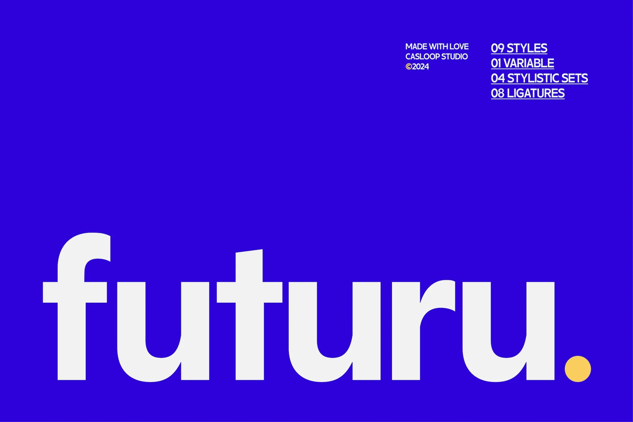
Futuru, a geometric sans-serif font, combines classic elegance with modern design to provide a unique solution for multiple design needs. This distinctive font delivers a sleek, professional feel perfect for branding or digital projects. With its legibility, versatility, and multilingual support, Futuru is ideal for both corporate use and creative projects.

Physis

Physis is a refined neo-grotesk typeface, reminiscent of Switzerland’s Golden Age of graphic design. Cleaner, elegant, and featuring generous spacing, Physis serves as a versatile font option for both screen and editorial projects. Its flexible family offers five weights from Light to Black, coupled with matching slanted forms for added variety.

Helixa

Helixa

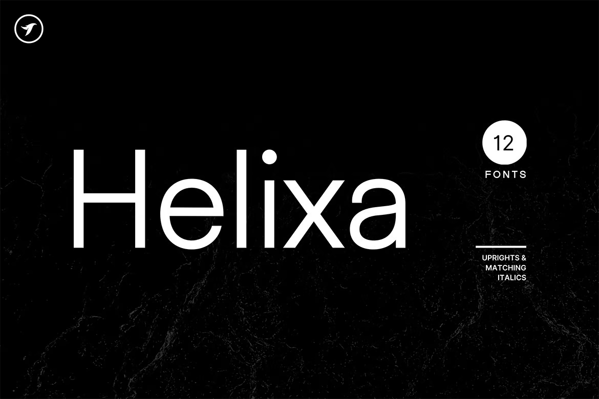
Helixa is a stylish and versatile neo-grotesque typeface, perfect for making an impact in branding, logotypes and marketing materials, both in print and online. With 12 fonts, each with seven upright weights and Italic equivalents, and a total of 300 glyphs, it offers extensive language support. Its clean design and modern look make it an enduring choice for all design needs.

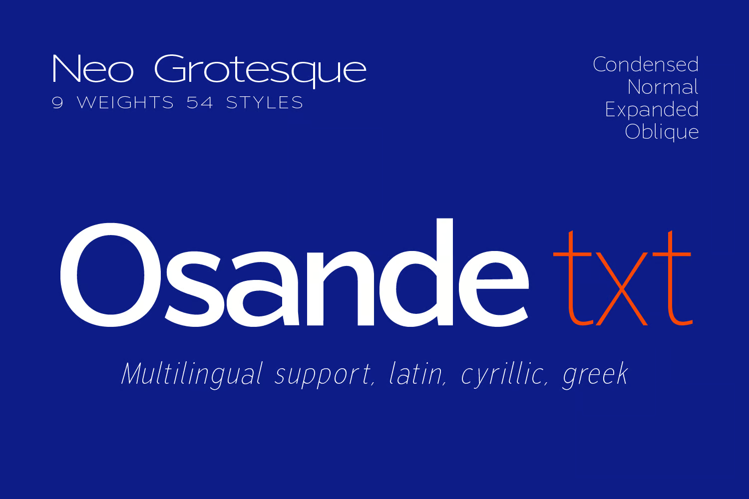
Osande TXT

Osande TXT

Osande TXT is a dynamic neo-Grotesque Sans font family, inspired by the modern Osande Pro. Its features include a large x-height, intriguing yet simple forms, and a low contrast with a condensed width. Offering enhanced characters and comprehensive language support, it’s an adaptable choice for assorted body text or display designs.

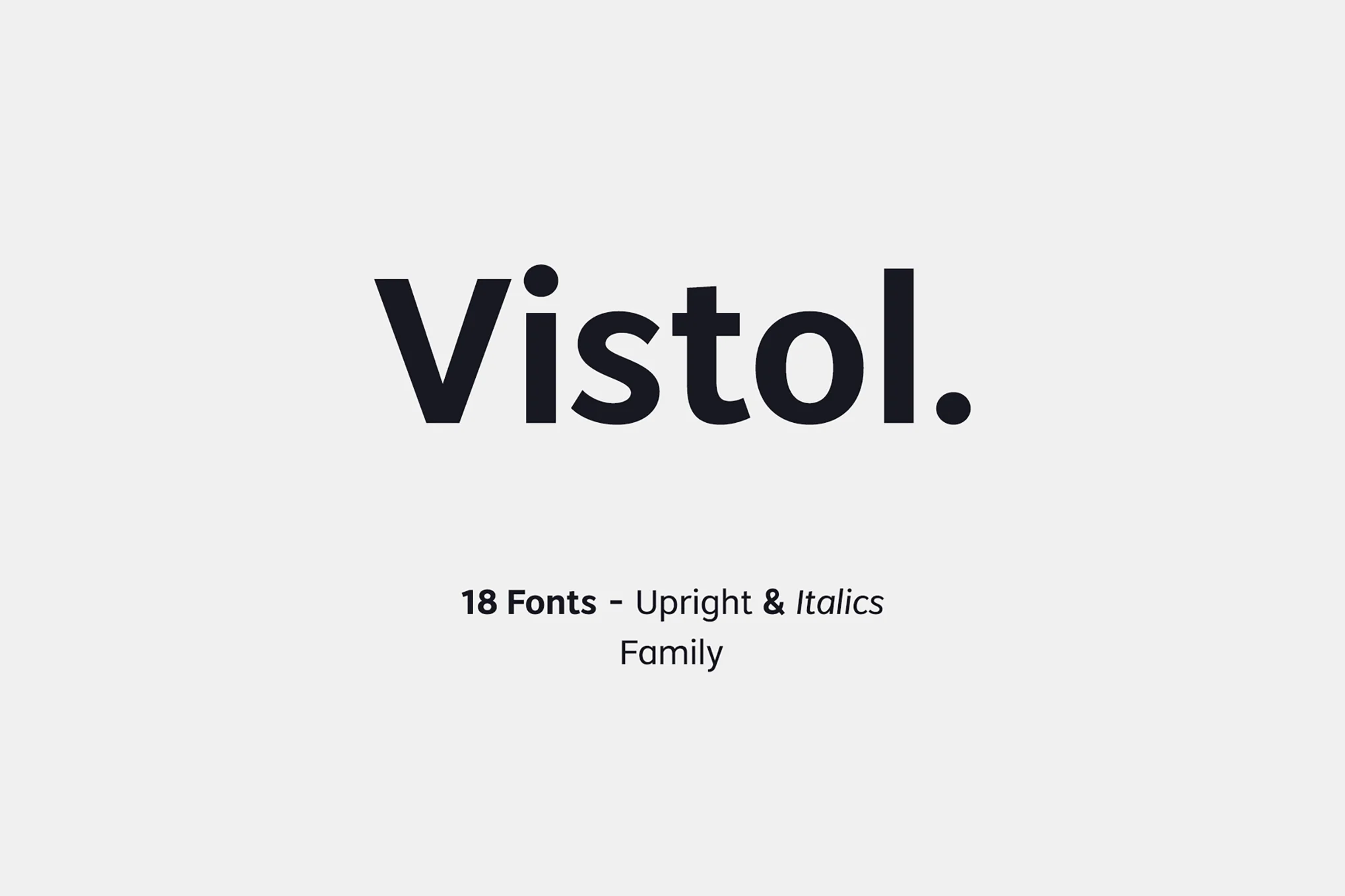
Vistol

Vistol

Vistol, with its Roboto-like style, presents a neo-grotesque sans-serif font family perfect for various applications. It boasts 18 weights, European language support, and features an array of symbols. Exceptional for print, packaging, editorial and branding needs, its low-stroke contrast ensures readability even in smaller sizes. The font family comes with 18 OTF fonts, including upright and italic versions.

Orion Pro

Orion Pro

Orion Pro, a modern Sans-Serif typeface, is inspired by celebrated Swiss fonts. This versatile pack, produced by Fontastica and distributed by Designova, comes with 12 diverse fonts. With its sleek style, it’s perfect for branding, logotypes, and other print and web purposes.

Black Pro

Black Pro

Explore the adaptable and geometric nature of the Black Pro sans serif font family. This modern typeface, with its clean lines and professional aesthetic, is perfect for branding, headlines, and editorial design. Its various weights and styles improve readability and aesthetics, making it suitable for a wide range of design projects, from corporate branding to creative pursuits.

VISIA Duo

VISIA Duo

VISIA Duo is an elegant font family consisting of 8 font weights, including outline version. It shares similarities with the Roboto font and consists of ‘Natural’ and ‘Outline’ versions of the VISIA Pro Geometric Sans-Serif typeface, each in four variations: Regular, Bold, Italic, and Bold Italic. The files come in OTF, TTF, and Web Font formats.

Kinetica

Kinetica

Kinetica is a dynamic typeface, influenced by movement and globalization. It’s a versatile font with two weights – Light and Bold, each with matching obliques. Ideal for headlines or large-format prints, Kinetica easily adapts to branding, social media, or editorial design tasks. With built-in support for multiple languages based on the Latin alphabet, it’s a minimalistic, yet eye-catching addition to your font library.

Osande Pro

Osande Pro

Osande Pro, inspired by the modern sans serif design, mirrors the simplicity of Roboto with a unique neo-Grotesque touch. It boasts a total of three forms – italics, obliques, and upright – each offering seven distinct weights for flexibility. This versatile font, compatible with a broad range of projects, comes packed with 245 glyphs and supports Basic Latin, English letters, West European diacritics, and more.

JUST Sans

JUST Sans

JUST Sans is a versatile and modern geometric sans serif typeface boasting endearing warmth. It fuses neutrality and expressiveness, sophistication and approachability. With its wide, open-air characters and sharp, gripping terminals, the font embodies a contemporary elegance. The package offers seven weights, extensive Latin language support, adjusted kerning, and clear web fonts suitable for various design-based applications.

Progress Pro

Progress Pro

Explore your creativity with Progress Pro, a contemporary sans-serif typeface designed by Richard Mayer. Perfect for film posters, headlines, logo designs, and big banners, this font is a modern twist on classic, decorative typography. With the inclusion of OTF, TTF, and web fonts, it offers versatility for all your design needs.

Neosande

Neosande

Neosande, designed by Faldykudo in 2023, is a versatile, sleek, and legible neo-grotesque sans serif typeface. Offering a range of weights, high legibility, and support for multiple languages, it’s ideal for various applications like branding, web design, advertising, and editorial design. The typeface’s simple, clean lines give it a professional, stylish, and modern appeal.
Linear Grotesk

Linear Grotesk

Linear Grotesk is a beautifully handcrafted, classic sans-serif typeface available in 16 variations. Ideal for graphic and web design, print or display, this typeface also suits branding, marketing graphics, and editorial design. This comprehensive package is designed for simplicity and readability and includes OTF, TTF, and Web Fonts, as well as an HTML and CSS WebFont preset and demo.
Nobel Uno

Nobel Uno

Nobel Uno is a clean, modern sans-serif typeface ideal for contemporary design projects. As the fourth font from the advanced Uno class families, it presents 16 fonts with upright weights and matching italics. Equipped with an extended character set featuring 386 glyphs, Nobel Uno supports over 120 languages which makes it suitable for diverse applications including graphic design, branding, web, and editorial design.

Optika

Optika

Optika is a sleek, modern Sans-Serif typeface perfect for all design needs. This all-around typeface stands out in logotypes, headlines, and branding. Handcrafted with Western European, Central European, and South Eastern European sets, Optika includes 394 glyphs and 14 fonts, coming in seven weights for both upright and italic.

Univa Nova

Univa Nova

Univa Nova, a minimalist typeface, offers elegant design and superior usability. Ideal for graphic and web design, textual presentations, and various marketing graphics, its attributes extend to enhanced letter-spacing optimal for headlines and logotypes. Developed with OpenType features, it supports Western and Central European language sets.

Catesque

Catesque

Catesque, a versatile and dynamic font, is excellent for both large-scale designs and smaller text applications. Its five weights range from light to black, accommodated by matching italics and various alternate characters that add unique characters to your design work. This font further supports numeric designs with specialized numeral features.

Quadran

Quadran

Quadran is a modern, geometric grotesque type family with a tailored character, suited for today’s design trends. The unique double storey “g” adds a classic touch. With weights ranging from ExtraLight to Black, extensive language support, and a variety of OpenType features, Quadran is versatile across small and medium text sizes. It’s perfect for editorial fashion magazines, website headings, signage, logos, and more.

Free Fonts Like Roboto

Roboto Flex

Roboto Flex is a unique, free font you can use to design stylish titles and headings. It comes with minimal and stylistic characters that improve upon the design of Roboto’s original design. The font is free for commercial use.

Roboto Serif

What if Roboto was a serif font? Well, you don’t have to imagine it. With this free font, you can craft serif typography with letterforms that are quite similar to Roboto. This font is completely free for commercial use.

Phlatt Grotesk

Phlatt Grotesk is another free font that is inspired by Roboto. It features a simple and professional letter design that will fit perfectly with your business and corporate-themed design projects. It’s free for commercial use.

Host Grotesk

This free font is also perfect for designers looking for a Roboto alternative. It comes with a clean and simple letter design with subtle stylistic elements. You can use this font for free with both personal and commercial projects.