2024: More CSS At-Rules Than the Past Decade Combined

Featured Imgs 23

More times than I can count, while writing, I get myself into random but interesting topics with little relation to the original post. In the end, I have to make the simple but painful choice of deleting or archiving hours of research and writing because I know most people click on a post with a certain expectation of what they’ll get, and I know it isn’t me bombing them with unrelated rants about CSS.

This happened to me while working on Monday’s article about at-rules. All I did there was focus on a number of recipes to test browser support for CSS at-rules. In the process, I began to realize, geez we have so many new at-rules — I wonder how many of them are from this year alone. That’s the rabbit hole I found myself in once I wrapped up the article I was working on.

And guess what, my hunch was right: 2024 has brought more at-rules than an entire decade of CSS.

It all started when I asked myself why we got a selector() wrapper function for the @supports at-rule but are still waiting for an at-rule() version. I can’t pinpoint the exact reasoning there, but I’m certain rthere wasn’t much of a need to check the support of at-rules because, well, there weren’t that many of them — it’s just recently that we got a windfall of at-rules.

Some historical context

So, right around 1998 when the CSS 2 recommendation was released, @import and @page were the only at-rules that made it into the CSS spec. That’s pretty much how things remained until the CSS 2.1 recommendation in 2011 introduced @media. Of course, there were other at-rules like — @font-face, @namespace and @keyframes to name a few — that had already debuted in their own respective modules. By this time, CSS dropped semantic versioning, and the specification didn’t give a true picture of the whole, but rather individual modules organized by feature.

Random tangent: The last accepted consensus says we are at “CSS 3”, but that was a decade ago and some even say we should start getting into CSS 5. Wherever we are is beside the point, although it’s certainly a topic of discussion happening. Is it even useful to have a named version?

The @supports at-rule was released in 2011 in CSS Conditional Rules Module Level 3 — Levels 1 and 2 don’t formally exist but refer to the original CSS 1 and 2 recommendations. We didn’t actually get support for it in most browsers until 2015, and at that time, the existing at-rules already had widespread support. The @supports was only geared towards new properties and values, designed to test browser support for CSS features before attempting to apply styles.

The numbers

As of today, we have a grand total of 18 at-rules in CSS that are supported by at least one major browser. If we look at the year each at-rule was initially defined in a CSSWG Working Draft, we can see they all have been published at a fairly consistent rate:

Number of at-rules per year in FWPD. They all have been added at an average rate of 1 per year, with the highest being 4 in 2021

If we check the number of at-rules supported on each browser per year, however, we can see the massive difference in browser activity:

Number of at-rules per year in FWPD visualized by the browsers that implemented them in a colorful vertical bar chart.

If we just focus on the last year a major browser shipped each at-rule, we will notice that 2024 has brought us a whopping seven at-rules to date!

Numbers of at-rules with support in at least one major browsers. There have been seven that gained support in 2024
Data collected from caniuse.

I like little thought experiments like this. Something you’re researching leads to researching about the same topic; out of scope, but tangentially related. It may not be the sort of thing you bookmark and reference daily, but it is good cocktail chatter. If nothing else, it’s affirming the feeling that CSS is moving fast, like really fast in a way we haven’t seen since CSS 3 first landed.

It also adds context for the CSS features we have — and don’t have. There was no at-rule() function initially because there weren’t many at-rules to begin with. Now that we’ve exploded with more new at-rules than the past decade combined, it may be no coincidence that just last week the Chrome Team updated the function’s status from New to Assigned!

One last note: the reason I’m even thinking about at-rules at all is that we’ve updated the CSS Almanac, expanding it to include more CSS features including at-rules. I’m trying to fill it up and you can always help by becoming a guest writer.


2024: More CSS At-Rules Than the Past Decade Combined originally published on CSS-Tricks, which is part of the DigitalOcean family. You should get the newsletter.


from CSS-Tricks https://ift.tt/oVO67Fg
Gain $200 in a week
via Read more

80+ Best Watercolor Photoshop Actions & Effects 2024

Featured Imgs 23

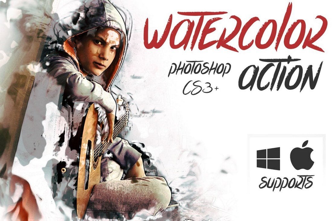
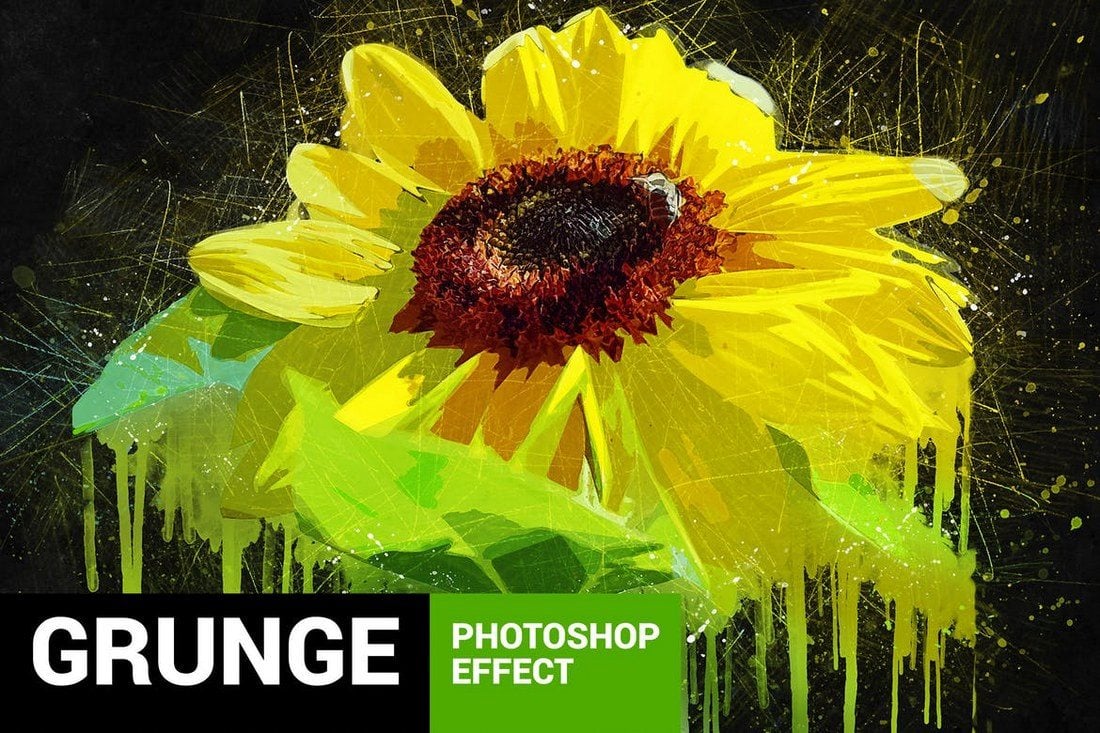
Whether you’re designing a unique website background, a poster, sketch, or creating an artistic photo composition, using a watercolor Photoshop action can make your design stand out from the crowd.

A watercolor effect it’s not an easy effect to master when created from scratch. It takes a lot of work, time, and skill to achieve a realistic watercolor effect in Photoshop. The good news is that using a watercolor Photoshop action can help you skip the learning curve and experiment with a watercolor effect in just a few clicks!

In this collection, we’re featuring some of the best watercolor Photoshop actions you can use to turn your photos into watercolor art, craft amazing backgrounds, and do much more.

We’ve also collected a set of tips for choosing watercolor Photoshop actions to help you make a decision on what type of action you need.

Top Pick

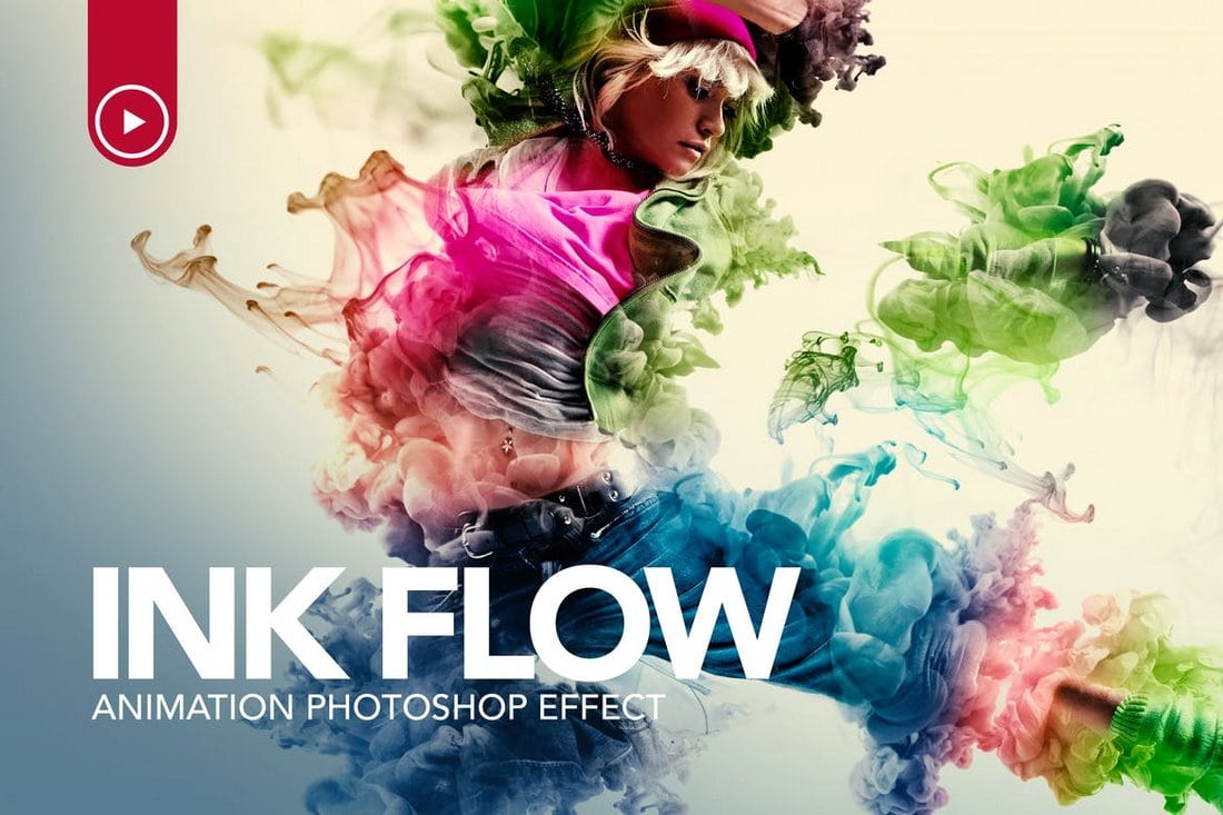
Ink Flow Animation Photoshop Action

Ink Flow Animation Photoshop Action

This is a unique Photoshop action you can use to create an animated effect using your photos. The action adds a stylish watercolor-themed flowing ink animation to create a stunning visual.

The action is fairly easy to use and comes with a video tutorial to teach you how to apply the effect. It’s ideal for making animated GIF and videos for Instagram as well. You can preview the effect here.

Why This Is A Top Pick

While there are many creative watercolor Photoshop actions on our list, this action deserves more attention as it features an animated effect that’ll make your designs stand out from the crowd.

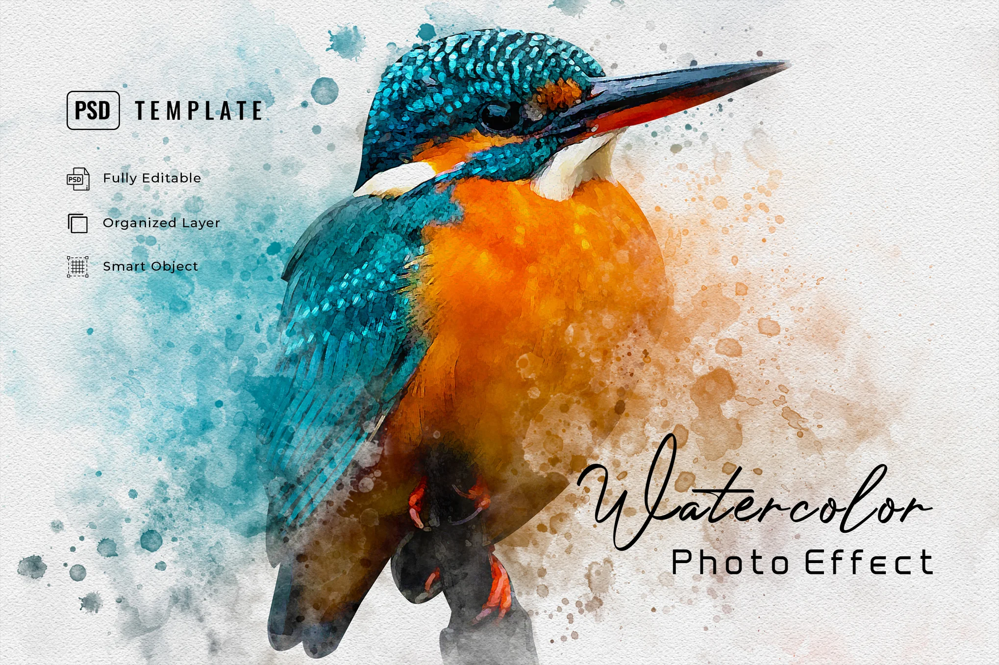
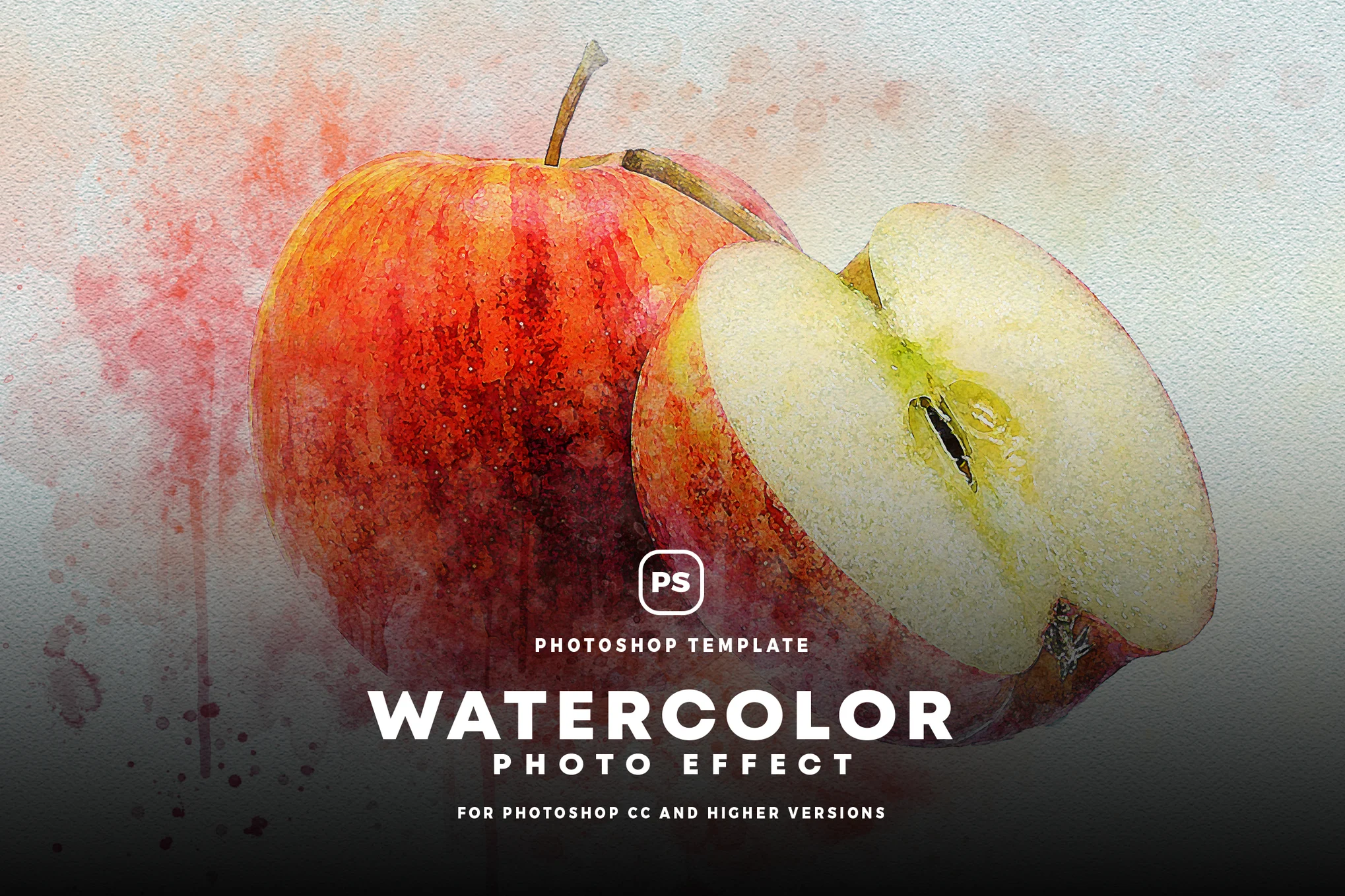
Watercolor Printing Photo Effect PSD

This is a high-quality watercolor photo effect for Photoshop that enables users to generate stunning, high-quality images with just a few clicks. Offering Smart Object layers, this template offers customizable ease and versatility. By replacing the placeholder, you can add your unique graphics and refine the final composition with adjustment features.

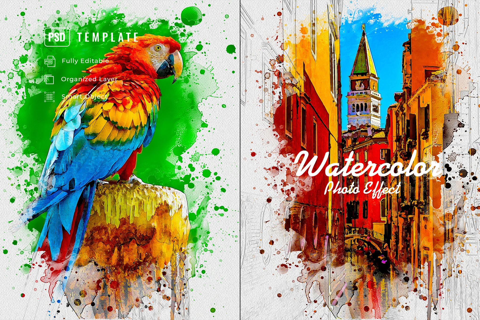
Creative Watercolor Photo Effect PSD

Creative Watercolor Photo Effect PSD

Another watercolor photo effect designed to transform your images into exciting paintings. It offers specific functionalities such as easily editable adjustments, smart object layers, and much more. The effect works best on photos ranging from 1000px to 3000px resolution.

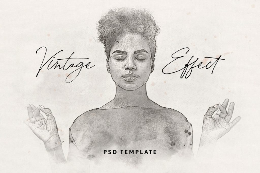
Vintage Painting Photo Effect PSD

Vintage Painting Photo Effect PSD

A high-quality, vintage-style watercolor photo effect for Photoshop. With the ease of smart-object layers, you can transform your graphics magically with only a few clicks. Alongside two PSD files (4500 x 3000 px and 3000 x 4500 px, both 300 dpi), this creative template includes a helpful guide for additional tweaks and finer adjustments.

Watercolor Splash Photo Effect PSD

Watercolor Splash Photo Effect PSD

Explore the world of visual arts with this watercolor photo effect for Photoshop. With this PSD template, you can easily transform your images into high-quality, mesmerizing artwork featuring the unique flair of watercolor splashes. From altering the smart object layers to adjusting the final settings, you get to control every aspect of your design.

Colorful Watercolor Photo Effect

Colorful Watercolor Photo Effect

A dynamic watercolor photo effect for Photoshop for instantly transforming photos. It converts your regular photos into lively caricature effects, adding an energy-filled, oily painting appearance. It’s ideal for photos with a resolution between 1000px and 3000px, and adds a creative touch to various photos.

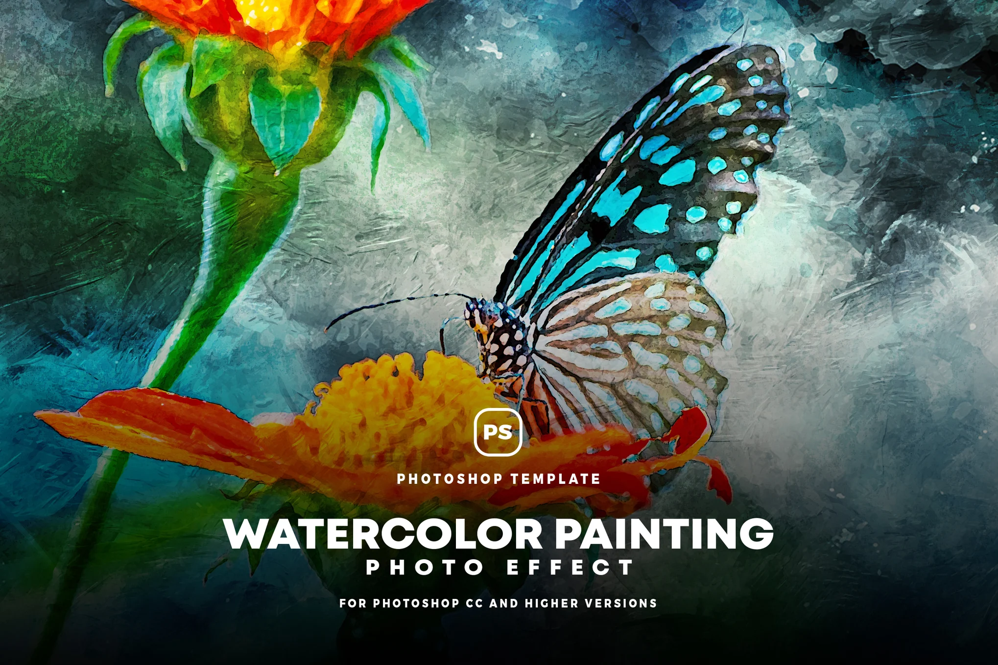
Watercolor Painting Effect for Photoshop

Watercolor Painting Effect for Photoshop

This is a creative watercolor photo effect that transforms your photos into vibrant, oil-style caricatures. It provides a range of effects including energetic, glamour, portrait, and cartoon styles. Ideal for fashion, lifestyle, or product photos with resolutions between 1000 – 3000 px, it includes a PSD file and help file.

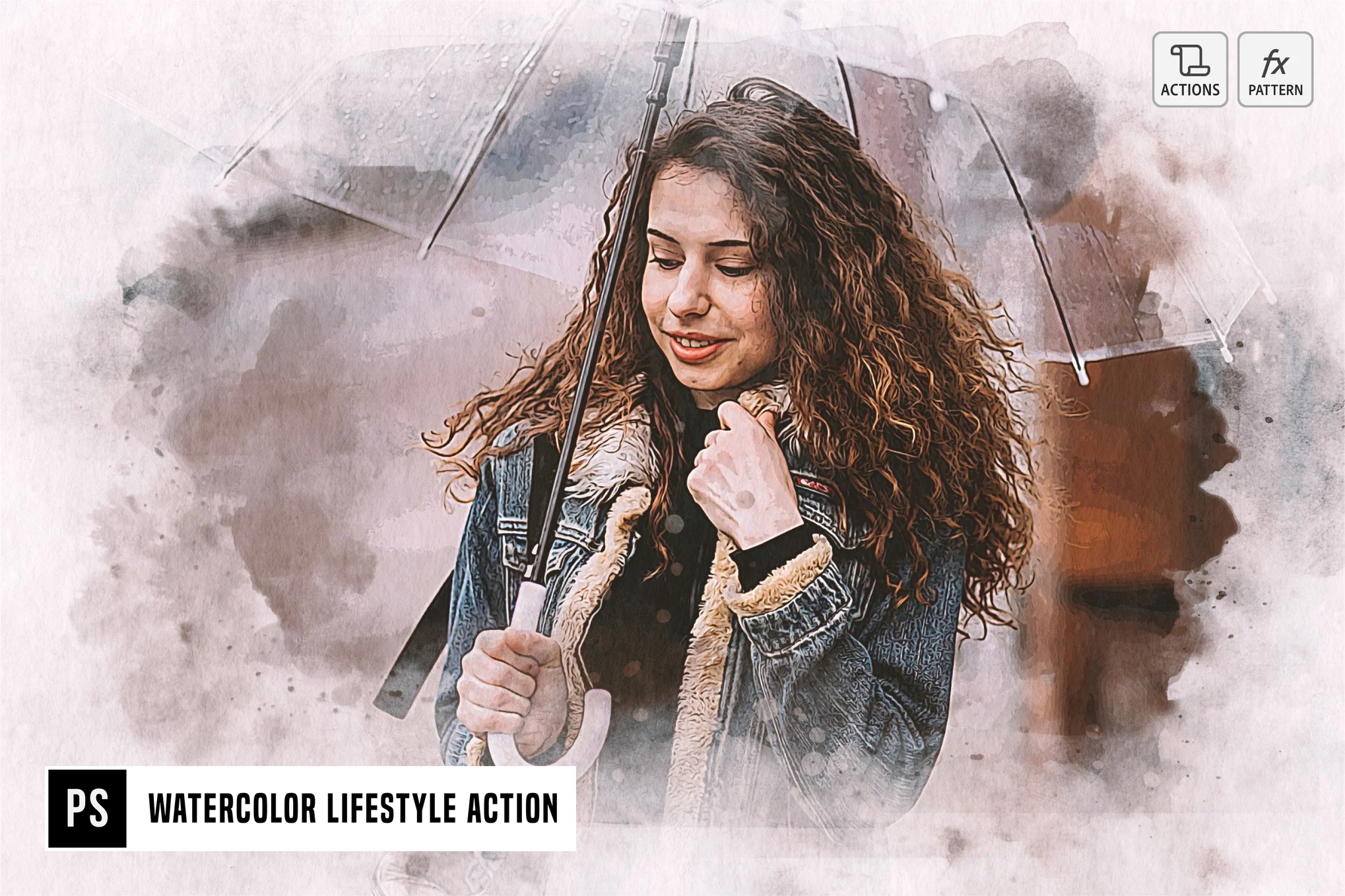
Watercolor Lifestyle Photoshop Action

Watercolor Lifestyle Photoshop Action

A highly useful watercolor-themed Photoshop action designed for photographers and graphic designers. It’s compatible with all photoshop CC versions and greater, offering users an simple way to bring an aesthetic, watercolor look to their photographs with just a click.

Bold Watercolor Photo Effect PSD

Bold Watercolor Photo Effect PSD

This is a stunning watercolor photo effect for Photoshop. In this template, you’ll gain access to a unique, glamorous and realistic watercolor effect that can be applied to any photo or graphic instantly. Provided with clean, well-organized layers and compatibility with 300 DPI projects, it’s extremely user-friendly.

Classic Watercolor Photo Effect

Classic Watercolor Photo Effect

An exceptional Photoshop template that transforms your ordinary photos into beautiful, classic painting-like images in just a few easy clicks. With Smart Object layers for full customization, 2 high-quality PSD files, versatile dimensions, and simple adjustment features to fine-tune your composition, crafting breathtaking designs has never been easier.

Simple Watercolor Photo Effect PSD

Simple Watercolor Photo Effect PSD

This Photoshop template artfully transforms your ordinary pictures into stunning watercolor paintings. Ideal for photos with resolutions from 1000px – 3000px, its filters add a realistic watercolor-themed effect to various image types.

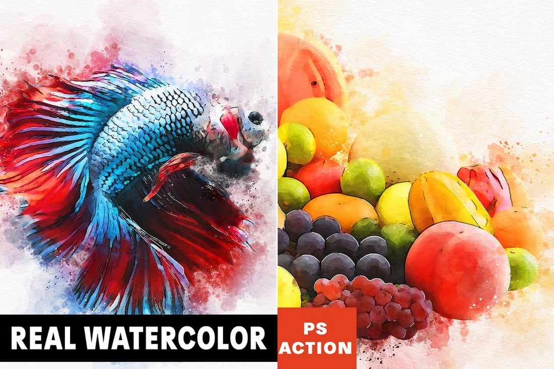
Real Watercolor Photoshop Action

Real Watercolor Photoshop Action

This Photoshop action transforms photos into paintings with a realistic watercolor effect. The action works instantly with just a few clicks. And it comes bundled with brushes and patterns necessary for creating the effect as well.

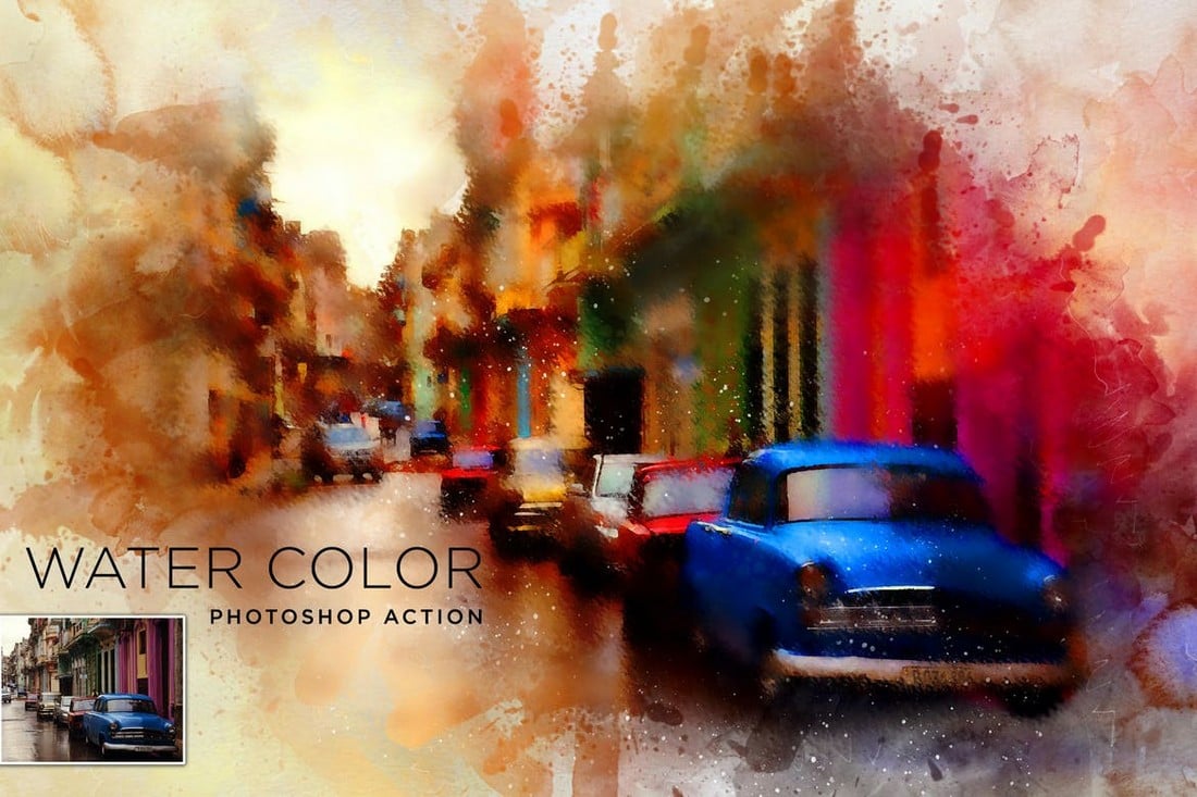
Water Color Painting Photoshop Action

Water Color Painting Photoshop Action

Once you apply this Photoshop action, you’ll have a hard time telling whether your photo is actually a painting or not. This effect works great for making outdoor landscape photos look like watercolor paintings. It’s compatible with Photoshop CS3 and higher.

Portrait Watercolor Photoshop Action

Portrait Watercolor Photoshop Action

If you’re looking for a watercolor effect to add to your portrait photos, this PS action will come in handy. It features a realistic watercolor effect that’s been specially optimized for portrait photos. It comes in 9 different color variations as well.

Watercolor Effect Photoshop Template

Watercolor Effect Photoshop Template

This is a PSD template you can use to easily apply a watercolor effect to your photos and graphics. The effect is already prepared in the organized layers, all you have to do is replace the photo. No need to apply or configure a PS action.

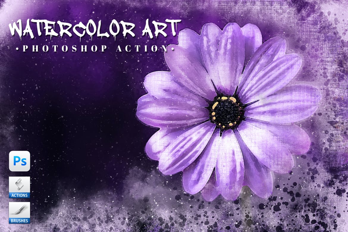
Watercolor Art – Free Photoshop Action

Watercolor Art - Free Photoshop Action

A free Photoshop action for adding a subtle watercolor effect to your photos. This watercolor effect is simple and most suitable for fashion and wedding photography.

Watercolor from Photo PSD Template

Watercolor from Photo PSD Template

With this Photoshop PSD template, you can add a watercolor effect to any photo with just a few clicks. It comes with organized layers and with smart object layers. It’s simple, easy, and works instantly.

Painto – Watercolor Photoshop Action

Painto Watercolor Photoshop Action

If you want to create abstract art-style watercolor effects for your graphic design projects, this Photoshop action is a must-have for you. It allows you to apply a colorful watercolor effect with only a few clicks.

Simple Watercolor Photoshop Effect

Simple Watercolor Photoshop Effect

This watercolor effect features a subtle and clean look that gives a minimalist painting look to your photos. It’ll work best for interior design, furniture, and modern art-style photography.

Portrait Painting Photoshop Action

Portrait Painting Photoshop Action

This Photoshop action allows you to convert your portrait photos into paintings. It features a fully editable painting effect you can adjust and customize to match your photos to even create a cartoon effect.

Brush Drawing – Free Watercolor PS Action

Brush Drawing - Free Watercolor PS Action

Another free Photoshop action that creates a brush drawing effect. It’s great for giving a watercolor painting-like effect to your portrait photos.

Photo Into Watercolor Photoshop Effect

Photo Into Watercolor Photoshop Effect

This is a convenient, one-click PS template that allows you to effortlessly apply a watercolor effect to your photos, saving time with quick results. Compatible with all Photoshop Versions cc and higher, and every language, all you need to do is replace the smart object with your subject in the provided PSD file.

Watercolor Photo Effect PSD Template

Watercolor Photo Effect PSD Template

This PSD template can make your pictures look like amazing caricatures. This action provides a range of effects such as energetic, oily, painting oil, glamour oil, portrait oil, oil retouch, and cartoon. It’s recommended for photos with 1000px-3000px resolution and can enhance images from fashion, lifestyle, and blogging to moody product shots.

Sketch Watercolor Photo Effect

Sketch Watercolor Photo Effect

This is a versatile PSD template providing a gorgeous watercolor aesthetic for your photos with just a simple click.  It includes a PSD file (3000*2000 px) and a PDF help file and offers easy photo replacement using the smart object feature.

Abstract Oil Painting Photoshop Action

Abstract Oil Painting Photoshop Action

A professional, versatile Photoshop action ideal for photographers and graphic designers. Compatible with all CC Photoshop versions and higher, it effortlessly enhances your photo posts or everyday shots with a simple click to achieve a beautiful aesthetic watercolor look. The pack comes with a .ATN action file, .PAT pattern file, and a helpful .txt file.

Watercolor Canvas Photo Effect

Watercolor Canvas Photo Effect

This is a high-quality watercolor photo effect that comes with a resolution of 5,000 x 3,000 pixels. It’s user-friendly due to easy customization via Smart Object Layers. The background is editable and the PSD file is well-organized with named layers.

Mixed Watercolor Photo Effect PSD

Mixed Watercolor Photo Effect PSD

This PSD template instantly adds a glamorous watercolor effect to your photos or logos. Adjustable to your preference, it works perfectly with 300 DPI projects and even on print. Neatly categorized across layers, it’s user-friendly and easy to navigate.

Painting Photo Effect PSD Template

Painting Photo Effect PSD Template

This is an ingenious PSD template designed to revolutionize your photos with an awe-inspiring watercolor painting effect. It works best with images ranging from 1000 px – 3000 px resolution and adapts well to diverse styles including fashion, lifestyle, blogging, and product shots, ensuring dynamism and flair for your visual content.

Ink Splatter Photo Effect PSD

Ink Splatter Photo Effect PSD

This PSD template will help you craft energetic, oily, and glamorous painting effects for retouching portraits or creating cartoon renditions of your photos. Ideal for photos with 1000 px – 3000 px resolution, it works wonders on a variety of photos, from fashion and lifestyle to moody product shots.

Colorful Watercolor Painting Effect

Colorful Watercolor Painting Effect

This is a creative PSD template designed to revolutionize your photos with its uniquely energetic, caricature, and watercolor painting effects. Especially effective in high-resolution photos, it’s immensely versatile and suitable for various themes including fashion, lifestyle, and product photography.

Watercolor Pro Photoshop Action

Watercolor Pro Photoshop Action

This is an easy-to-use, fully editable Photoshop action created for Photoshop CC 2023+. The PS action features a customizable effect that instantly transforms your photos and designs with a stylish watercolor painting look and feel.

Realistic Watercolor Painting Photoshop Action

Realistic Watercolor Painting Photoshop Action

This simple watercolor painting effect works beautifully with portrait photos. It will allow you to easily transform your photos with a realistic watercolor look and feel. The PS action is compatible with all Photoshop CC versions.

Oil Painter Photoshop Action

Oil Painter Photoshop Action

If you want to change the pace from watercolor designs and add an oil painting look, this PS action is for you. It features a smooth oil painting effect that will make your photos look like a masterpiece.

Watercolor Effect Photoshop Template PSD

Watercolor Effect Photoshop Template PSD

With this Photoshop template, you can instantly add a watercolor look to your photos with just a few clicks. It comes as a PSD template with organized layers. All you have to do is place your photo using the smart objects to apply the watercolor effect.

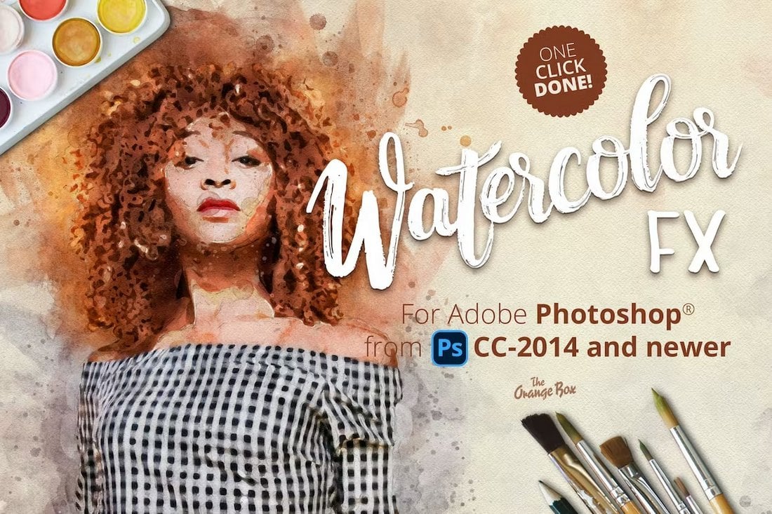
Watercolor FX – Photo Effect Photoshop Plugin

Watercolor FX - Photo Effect Photoshop Plugin

If you prefer to experiment with effects and craft your own unique watercolor effects, this Photoshop plugin will come in handy. It has all the tools you need to craft different styles of watercolor effects for various types of photos.

Free Wet Watercolor Effect Photoshop Action

Free Wet Watercolor Effect Photoshop Action

This free Photoshop action is ideal for applying simple watercolor effects to your everyday photos. It works best with portrait photos but you can try using it with other photos as well.

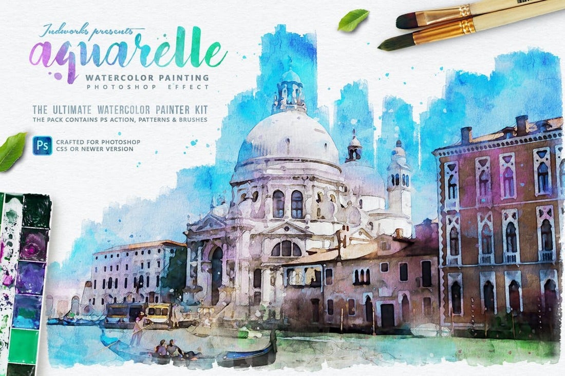
Aquarelle Watercolor Painting Photoshop Action

Aquarelle Watercolor Painting Photoshop Action

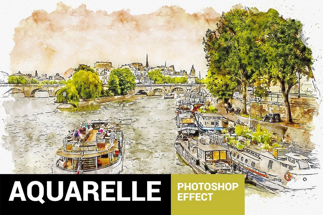
This is one of the most authentic watercolor Photoshop actions on our list. It allows you to create a watercolor effect in your own photos that will make them look just like a real-life watercolor painting. It works best with landscape photos as well as photos of structures, buildings, and nature.

Contemporary Watercolor Photoshop Action

Transform your photos into realistic watercolor artworks in the drop of a hat with our next photoshop action. The action is specifically designed for absolute beginners, is super simple and fun to use, and allows you to create 30 preset color looks. Creating watercolor photo effects has never been easier.

Iconic Watercolor Photoshop Action

Perfect for creating artworks including, posters, ad campaigns, flyers, and social media posts, our next photoshop watercolor action has something for every purpose under the sun. It’s fully layered which allows you a lot of creative control plus it’s interesting experimenting with all the layers.

Aquarelle Watercolor Photoshop Action

Wanting to achieve that grungy, messy and distressed watercolor look in your pictures? Look no further than the Aquarelle Photoshop action. No professional skills required to create attractive and eye-catching images. Truly a gold standard in the world of watercolor photo effects.

Vintage Watercolor Photoshop Action

With the vintage watercolor photoshop effect, you no longer have to wait years and decades for your photographs to achieve that rough worn-out look. Experiement with the stains, unclear edges and water splatters as you see fit and obtain that retro watercolor-like photograph in a couple of minutes.

Free Watercolor Sketch Photoshop Action

Transform your images into red watercolor sketch drawings using this unique photoshop action without spending a penny. Get your hands on this freebie, use this filter on your pictures and get ready to receive compliments from friends, family, clients and whosoever sees your beautiful artwork.

True Watercolor – Unique Photoshop Action

True Watercolor Photoshop Action

If you’re looking for a smooth and creative watercolor effect for your portrait photos, this Photoshop action is perfect for you. It features a realistic watercolor effect that uses its own brushes and patterns to create the watercolor look and feel. It includes a video tutorial as well.

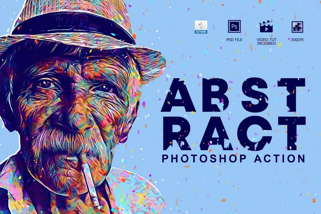
Abstract Art – Watercolor Photoshop Action

Abstract Art Photoshop Action

Even though this is not a watercolor effect, it actually creates a watercolor-inspired abstract art effect. This action is most suitable for improving portrait photos and selfies. The action uses the Photoshop oil paint filter to create the effect.

Palette – Watercolor Painting Photoshop Action

Palette Photoshop Action

This Photoshop action is ideal for turning your landscape and nature photos into works of art. It allows you to create a watercolor-themed painting effect using your photos. The Photoshop action also lets you choose from 30 different color schemes of the effect.

Jazzman – Free Watercolor Photoshop Action

Jazzman - Free Watercolor Photoshop Action

Jazzman is a free watercolor Photoshop action that features a creative effect that transforms your photos. The effect this action creates is fully customizable. You can adjust and edit the effect using its layers.

Painting – Watercolor Photoshop Action

Painting Photoshop Action

Inspired by traditional painting styles, this Photoshop action comes with a stylish effect that converts your photos into paintings. The effect uses watercolor-themed brush strokes. The effect can be customized to your preference as well.

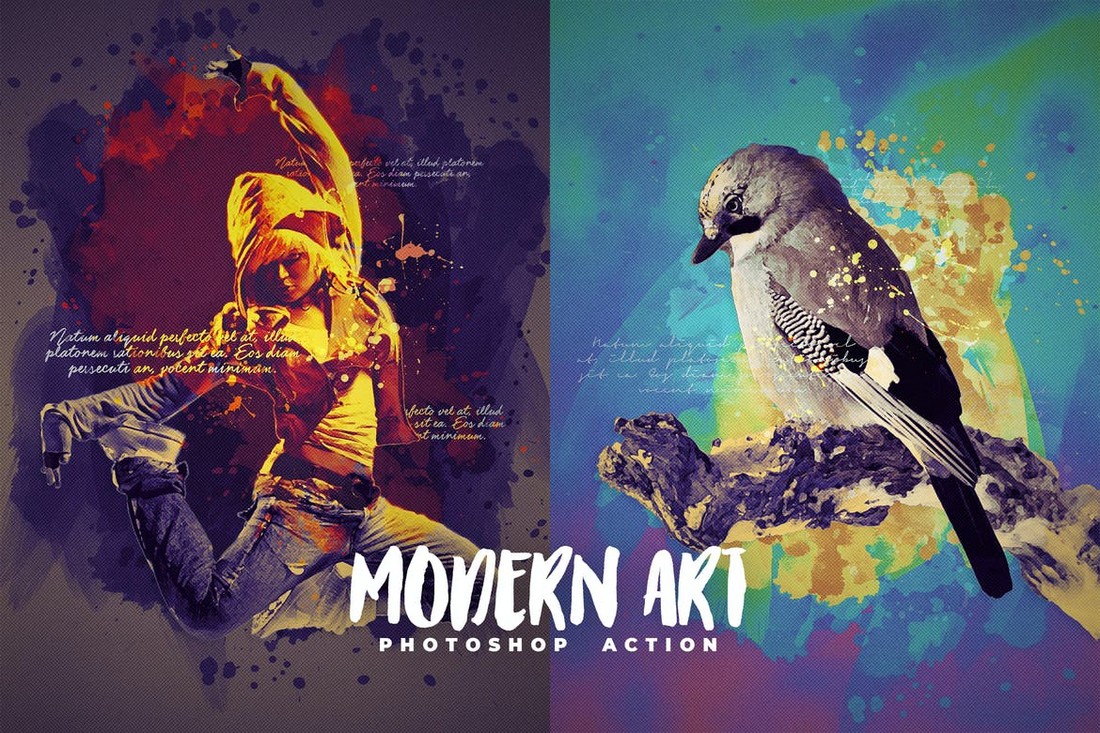
Modern Art – Watercolor Photoshop Action

Modern Art Photoshop Action

This Photoshop action allows you to create a watercolor-inspired modern art effect. It will be most useful to designers who work with flyers, posters, and banner designs for adding colorful effects to artworks.

MixArt 4 – Watercolor Photoshop Action

MixArt 4 Photoshop Action

You can use this Photoshop action to create a realistic watercolor effect for portrait photos. It features an effect that makes it look like a half-done painting. The action is compatible with Photoshop CS3 and higher.

Oil Paint Animation Photoshop Action

Oil Paint Animation Photoshop Action

Another unique Photoshop action that allows you to create an animated effect. This action features an oil-painting inspired effect. You can use it to even animate your photos to create video clips and GIFs.

3 Free Photoshop Watercolor Actions

3 Free Photoshop Watercolor Actions

This is a collection of 3 creative watercolor Photoshop actions. Each action is designed for enhancing portrait photos and they feature different styles of watercolor effects. All three actions are free to download.

Oil Painting Photoshop Actions

Oil Painting Photoshop Actions

Even though oil painting and watercolor are two separate mediums, you can still use this professional Photoshop action to create a unique watercolor-like effect with your photos and graphics. It includes 10 different effects with various painting-themed designs.

Oil Painting Photoshop Action 2

Oil Painting Photoshop Action 2

Another high-quality Photoshop action you can use to create an authentic painting effect. This action can be applied with just one-click and also allows you to customize the effect to your preference. The action works with Photoshop CS3 and higher.

Real Paint FX Photoshop Action

Real Paint FX Photoshop Action

This is a unique Photoshop action featuring an effect that makes your photos and graphics look as if they were drawn with real-paint. The bundle comes with the effect in multiple formats, including patterns and textures.

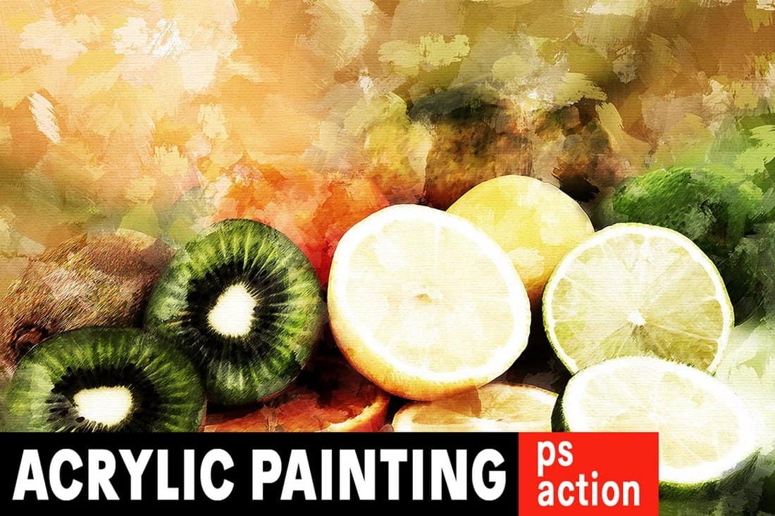
Acrylic Painting Photoshop Action

Acrylic Painting Photoshop Action

If you’re a fan of acrylic painting effects, this Photoshop action will allow you to apply that same look and feel to your own photos. The action is fully customizable and comes with a set of brushes as well.

Concepter – Plein Air Sketch Photoshop Action

Concepter - Plein Air Sketch Photoshop Action

Concepter is a unique Photoshop action that completely transforms your photos into outdoor painting-style sketches (plein air). The effect includes 20 color options to choose from, brushes, and patterns as well. The action works with Photoshop CC 2015 or higher.

18th Century Painting Photoshop Action

18th Century Painting Photoshop Action

This creative Photoshop action allows you to add a vintage painting effect to your photos and images. The action creates an editable effect with organized layers and comes with an additional patterns file as well.

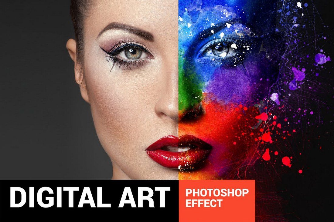
Digital Art Creative Photoshop Action

Digital Art Creative Photoshop Action

A creative Photoshop action that’s ideal for making digital art effects to stylize your photos and illustrations. The action comes with 15 different color styles for you to experiment with and it works with Photoshop CS5 and higher.

6 Free Photoshop Oil Painting Actions

6 Free Photoshop Oil Painting Actions

This is a collection of free Photoshop actions that includes 6 unique oil painting effects. The actions are designed to create various styles of effects including digital painting, drawing on canvas, paint strokes, and more.

Free Oil Painting Photoshop Actions

Free Oil Painting Photoshop Actions

A set of creative oil painting Photoshop actions you can use with your creative and commercial projects. This action is most suitable for adding an oil painting effect to your portrait photos.

Mix Art 3 – Watercolor Photoshop Action

Mix Art 3 - Watercolor Photoshop Action

Mix Art is a creative Photoshop action that combines several different styles such as sketch, painting, and watercolor to create a unique effect. This action is perfect for giving an artistic look to your poster and banner designs.

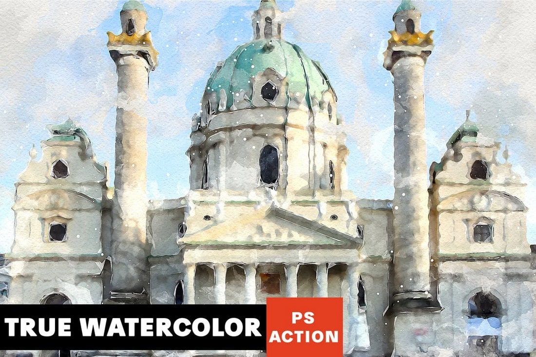
True Watercolor Photoshop Action

True Watercolor Photoshop Action

If you want to add a truly natural watercolor look to your designs and images, this action will come in handy. It features an authentic watercolor effect that’ll make it hard to tell whether it’s a digital image or a real painting.

Vibrant Watercolor Effect – Photoshop Action

Vibrant Watercolor Effect - Photoshop Action

This Photoshop action allows you to create a stylish watercolor effect to make your photos look more creative. It’s especially more suitable for designing photo albums and wedding albums. The action works with Photoshop CS3 and higher.

Vintage Painter Photoshop Action

Vintage Painter Photoshop Action

Another high-quality Photoshop action featuring a natural watercolor effect. This action creates an amazing watercolor effect by using its own patterns and brushes. It’ll make your photos and graphics look like real-life paintings.

Painterly – Free Watercolor Photoshop Action

Painterly - Free Watercolor Photoshop Action

Painterly is an amazing watercolor painting Photoshop action that allows you to transform your images with just one click. This action is unlike any other action on our list and it’s free to download and use.

Retro Illustration Photoshop Action

Retro Illustration Photoshop Action

Want to give a classic old-school look to your modern photos? Then this action is for you. It allows you to add a vintage look to your photos with just one-click by adding a washed out watercolor effect.

Sensation – Watercolor Photoshop Action

Sensation - Watercolor Photoshop Action

Sensation is a stylish watercolor Photoshop action that features a modern art-style effect. This action creates an effect using natural brush strokes to make your photos look like real paintings.

Aquarelleum – Urban Sketch Photoshop Action

Aquarelleum - Urban Sketch Photoshop Action

This Photoshop action is designed for transforming landscape and scenery photos into watercolor paintings. The action comes with 20 different presets for enhancing many different types of outdoor photos featuring nature and urban scenes.

Color Sketch – Artistic Photoshop Action

Color Sketch - Artistic Photoshop Action

Color sketch is a creative Photoshop action that gives your photos an artistic look. It features an effect featuring a mixed design of sketching and watercolor brush strokes. It’s perfect for portraits and poster designs.

Watercolor Artist – Free Watercolor Photoshop Actions

Here we have a set of modern Photoshop actions that allows you to convert your digital photographs into authentic watercolor artworks. These are ideal for a wide range of creative applications.

Creative Watercolor Photoshop Actions

Creative Watercolor Photoshop Actions

This is a creative Photoshop action that allows you to create authentic watercolor effects with your photos and graphics. The action is easily customizable and works with Photoshop CS3 and higher.

Artistic Watercolor Photoshop Action

Artistic Watercolor Photoshop Action

A modern watercolor Photoshop action you can use to add a little bit of artistic touch to your photos. This action will be quite useful in enhancing your portrait photos.

Watercolor Painting Photoshop Actions

Watercolor Painting Photoshop Actions

If you’re looking for a simple Photoshop action to transform your ordinary photos into paintings, then this action will help you get the job done. It creates a fully layered painting effect, which you can easily adjust and customize to your preference.

Plasticum – Polygonal Art Photoshop Action

Plasticum - Polygonal Art Photoshop Action

Plasticum is a unique Photoshop action that creates an artistic effect with polygonal shapes. With a few customizations and color adjustments, you can use this action to create an attractive watercolor effect as well.

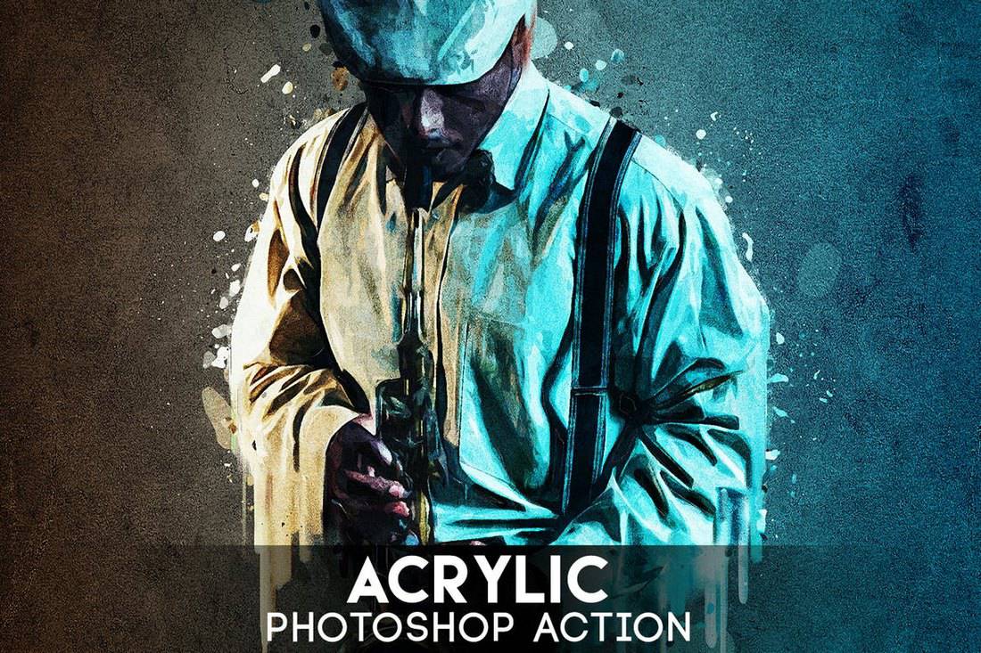
Acrylic Photoshop Action

Acrylic Photoshop Action

Another professional Photoshop action featuring an acrylic painting effect. This action is most suitable for adding an additional effect to your portraits. It works with Photoshop CS3 and higher.

Free Glass Painting Photoshop Actions

Free Glass Painting Photoshop Actions

This free Photoshop action creates a unique glass painting effect. It includes 2 different actions that create non-destructive and editable effects.

Free Oil Painting Photoshop Actions 2

Free Oil Painting Photoshop Actions 2

Another set of Photoshop actions featuring oil painting effects. This pack also includes creative Photoshop actions you can use to add a realistic painting effect to your photos.

Photo Painter Photoshop Actions

This is a bundle of 5 different Photoshop actions that includes different actions for transforming many types of images, graphics, and designs into artworks. The actions feature unique effects that will make your design look like watercolor and hand-drawn paintings.

ModernArt 4 Photoshop Action

This is another unique watercolor Photoshop action that blends the effects of a painting with your real-life photos for achieving the perfectly artistic look. Getting this effect to work is as simple as brushing over the areas for applying the effect and playing the action.

Perfectum 2 – Watercolor Artist Photoshop Action

One of the most attractive features of the watercolor effect is how it adds more vibrance and color to your designs and photos. This Photoshop action helps you achieve that with its colorful one-click process. It also includes a video tutorial on how to customize the effect as well.

Miniaturum – Watercolor Sketch Photoshop Action

Miniaturum is another professional Photoshop action that creates a realistic watercolor sketch effect. This action is best used with your landscape and outdoor photos. But it will also work well with portraits as well. The best part is this action is that it’s compatible with Photoshop CS3 and above.


ModernArt 3 Photoshop Action

This Photoshop action is designed specifically for modern portraits and street photos. The effect adds a watercolor effect with a slightly modern touch for giving your photos a mixed look full of both artistic and modern elements.

Perfectum – Vintage Watercolor Photoshop Action

When it comes to watercolor effects, most Photoshop actions try to make your designs look too much like a painting. This effect, however, is not one of those PS actions. This effect gives an authentic look to your artworks and designs to make them look like true watercolor and pencil art. The effect is also customizable and features 20 color presets and options.

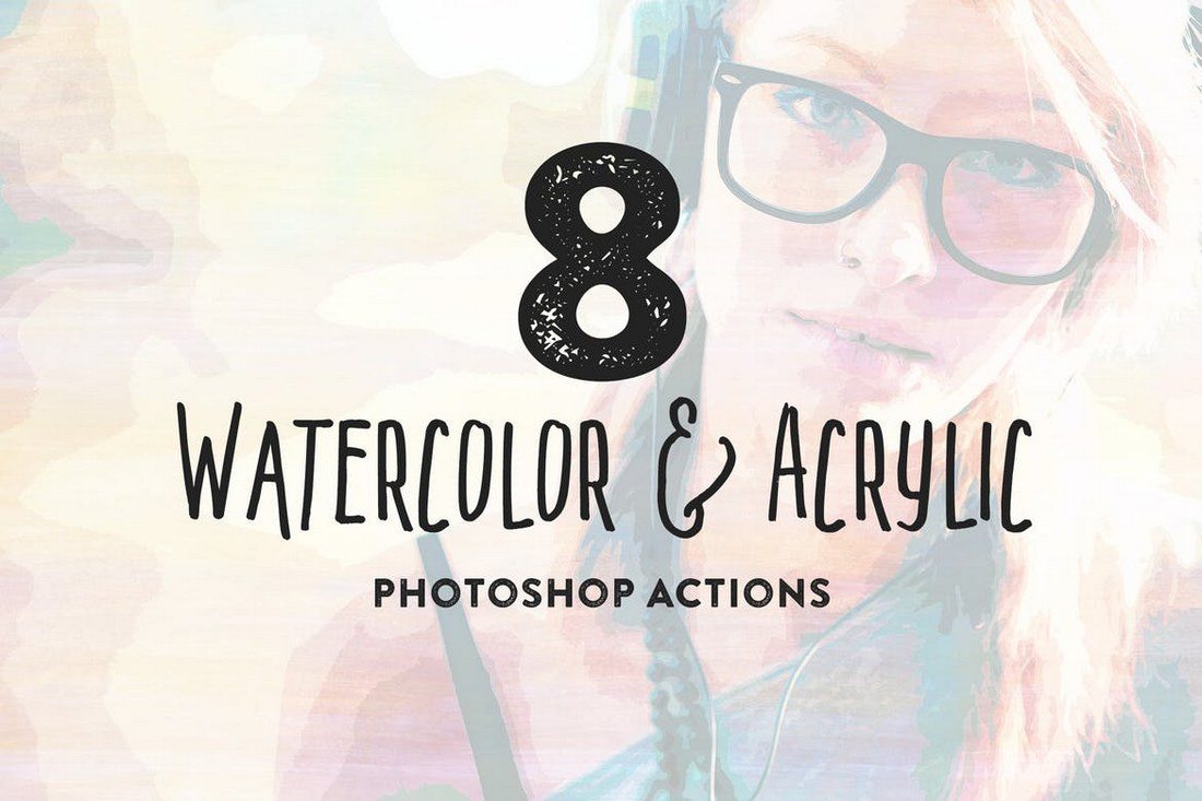
8 Watercolor and Acrylic Painting FX

A bundle of watercolor effects. This pack comes with 8 different Photoshop actions featuring watercolor effects and acrylic painting effects. It includes textures made with real watercolor paintings. Each action creates effects with non-destructive layers so you can easily edit the effect to your preference.

Creative Watercolor Action

This creative watercolor Photoshop action comes with 5 different color options for using with different types of your designs and artworks. The effects mix watercolor and photo effects to give a unique look to your images. The actions are compatible with Photoshop CS3 and above.

Watercolor and Pencil Action for Photoshop

An accurately designed Photoshop action that allows you to transform your portrait photos and designs into pieces of art. This action has been crafted by a professional designer to make it as authentic as possible. The effect will give your photos an artistic watercolor painting look like none other.

Modern Watercolor Photoshop Action

This is a watercolor Photoshop action that will work with almost any type of an image or design. It simply adds a basic watercolor effect to your designs to specific areas of your preference. All you have to do is brush over the areas you want to apply the effect and play the action.

Modernum – Watercolor Art Photoshop Action

Modernum Photoshop action creates a unique watercolor effect full of color and vibrance. The effect features a modern design and even allows you to customize it with using 10 different colors presets and other options.

Papyrum – Vintage Grunge Photoshop Action

If you’re looking for a Photoshop action to give your designs an old-school vintage art look, this action will come in handy. It features a watercolor effect that gives a grunge like vintage look to your designs and photos. The action supports 20 colors presets and generates the effect in organized layers.

Palette Knife Photoshop Action

This Photoshop action is truly one of a kind. It transforms your photos and graphic designs into palette knife artworks. The amazing part is how accurate and realistic this effect really looks. The effect is also fully editable to your preference.

Canvas Photoshop Action

Another simple watercolor Photoshop action that creates a canvas-like effect to make your designs look more like authentic paintings. The effect can be easily customized and it even comes with a tutorial video. The action is compatible with Photoshop CS3 and better.

Impressionist Photoshop Action

If you’re looking for a more artistic watercolor effect, this is the best Photoshop action you can use. It completely transforms your photos into paintings by giving them a realistic look. Although, it may not work with all types of photos, especially family and group photos.

Ultimatum 2 – Oil Knife Painting Photoshop Action

Watercolor and oil paintings have a close relationship. This Photoshop action is a one that seems to do justice for both. This action features an oil and knife painting effect that gives an amazingly colorful look to designs and photos. It comes with 20 colors presets.

Posterum – Grunge Painting Photoshop Action

This watercolor Photoshop action seems to work well with object and product based photos. It adds a natural watercolor effect to your photos that will wow your clients and audience.

Uniqum – Sketch Painting Photoshop Action

Uniqum is Photoshop action that comes with a mix of both a sketch and painting effect. It adds a unique look to your photos with a mix of sketch and painting to give them an authentic and unfinished look. The effect is fully customizable with adjustment layers and it includes 10 color presets as well.

Sketch Art Photoshop Action

Even though this Photoshop action creates a sketch art effect, it also seems to add certain watercolor painting-like effect to photos as well. You can use this Photoshop action to create unique portrait photo designs, backgrounds, textures, and more.

Artista – Mixed Media Art Photoshop Action

Is it a watercolor painting? Digital art? Or a real photo? No one will be able to tell the difference once you apply this effect to your photos. This Photoshop action combines lots of graphical elements to create a unique artistic effect that will make your designs look more original.

Ultimatum – Digital Art Photoshop Action

This is technically not a watercolor Photoshop action, but the effect it creates is truly original and it will definitely be helpful for your design work. The one-click Photoshop action creates a unique effect that will make your photos look like digital artworks.

Photoshop Watercolor Brushes Set

45 Watercolor Brushes

Create a unique design and get fun when you paint. You can use these brushes to realize your wildest ideas in design. Brushes are perfect for creating posters, branding and packaging, business cards, logo design, invitations, social media design, greetings cards, pattern design and more.

Cloudy Watercolor Decorations Set

Cloudy Watercolor Decorations Set

The artistic collection includes 40 brushes for Photoshop and 9 bloomy vector illustrations, and we are sure you will have lots of fun having them on your invitations, stationery, cards, t-shirts and so much more!

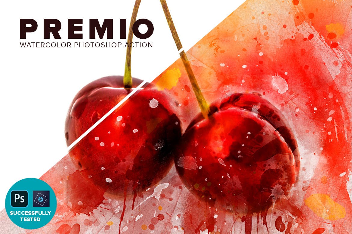
Premio – Watercolor Photoshop Action

photoshop watercolor effects

Here we have Premio, a Photoshop Action helping you transform your photos into a watercolor masterpiece. It runs perfectly on both PC and Mac and comes with a video tutorial to help you make the most of the watercolor effect.

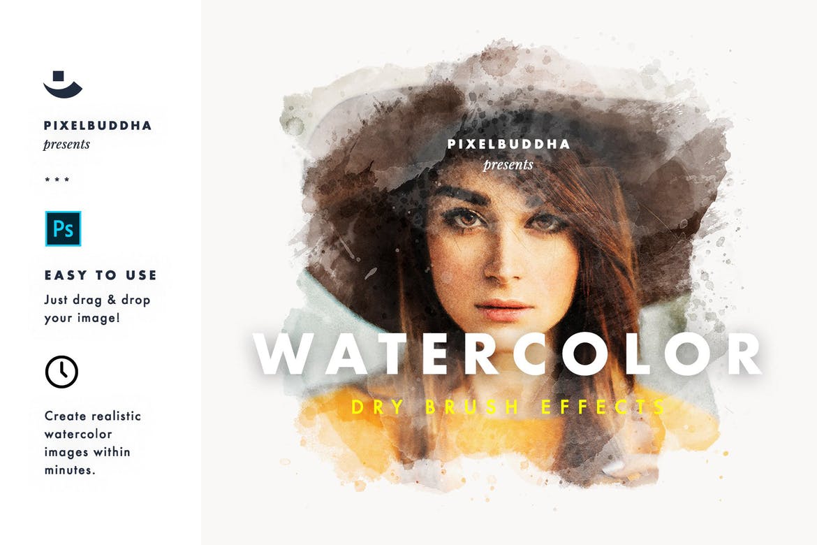
Dry Brush Watercolor Photoshop Action

photoshop watercolor effects

For a strong and vibrant watercolor effect, you can’t go wrong with the Dry Brush collection of watercolor Photoshop actions. Featuring three individual filters that can be applied to your images instantly with drag and drop functionality, it promises a realistic look that can be used with any kind of photo.

Mixart – Photoshop Watercolor Effects

photoshop watercolor effects

Here we have a series of fully layered and easy-to-use watercolor Photoshop actions that are compatible with Photoshop versions CS3 and higher and feature a non-destructive workflow, plus full supporting documentation to make editing a breeze even if you have no design experience.

Art Watercolor Photoshop Action

photoshop watercolor effects

Next in our selection of the best watercolor Photoshop actions is this super professional action that will turn any photo into a stunning watercolor masterpiece in a single click, and comes with a range of color effects, background textures, and black and white control options to help you achieve the perfect result.

Architecture Watercolor Photoshop Action

photoshop watercolor effects

If you’re looking for a brilliant watercolor Photoshop action to bring your architectural sketches to life, look no further. This amazing Photoshop action has been specifically designed as an architectural design tool and features fully editable layers with customizable colors and textures.

4 Tips for Choosing Watercolor Photoshop Actions

Before you start browsing our collection of watercolor actions, be sure to follow these tips to find the best Photoshop actions for your project.

1. Different Types of Watercolor Photoshop Actions

There are many different types of watercolor Photoshop actions you can use to create various effects and designs. For example, there are actions that create oil painting effects, grunge watercolor effects, sketch effects, and much more.

Depending on the style of the watercolor effect you want to create in your designs, you’ll have to be careful to pick the right actions for your images and illustrations.

2. Pick the Right Action for Your Designs

Picking the right action for your design is also a challenge when it comes to watercolor actions. Mostly because different watercolor actions are made for different types of images and photos.

You won’t be able to use the same Photoshop action to add a watercolor effect to a portrait photo and turn an ordinary landscape photo into a watercolor painting. You’ll need to find the appropriate action for each design.

3. Check for the Additional Resources

A Photoshop action alone can’t create an authentic watercolor effect. Usually, it requires many additional files such as unique patterns, textures, and brushes that aren’t available on Photoshop by default.

In such cases, your Photoshop action files will come bundled with additional resources. Make sure to install these extra files as well. Otherwise, your watercolor action won’t work as intended.

4. Is the Effect Customizable?

The most important feature to look for when downloading Photoshop actions is to check to see whether the effect is customizable. You should be able to customize the colors and adjust the strength of the watercolor effect after applying it to your photos.

Check to see if your Photoshop action creates a non-destructive effect with adjustment layers for easier customization.

Looking for cool backgrounds? Check out our watercolor background textures collection for more.

25 Top-Notch Product Landing Page Templates

Featured Imgs 23

Over the course of my career as a marketing executive, I’ve found that landing page templates can be a vital resource. After all, a landing page is a great way to turn traffic into conversions — but not all pages are created equal.

According to research, the average conversion rate for landing pages is only 2.35%, but about a quarter of all accounts have a conversion rate of less than 1%.

So, if your goal is to be in the top 25% of accounts with 5.31% or more, in my experience, there are many factors you have to focus on to make a good landing page. However, a template makes it much easier to start.

You shouldn’t just aim to create just one: Our research has shown having more landing pages frequently results in higher lead and conversion rates. Businesses with 10-15 landing pages got a 55% increase in conversions compared to those who had fewer.

That’s why I’m sharing some of my favorite, tried-and-true best practices for creating a winning landing page below, after we examine 25 top-notch templates.

Learn More About HubSpot's Free Landing Page Builder

hubspot landing page templates

Table of Contents

25 Free Professionally-Designed Landing Page Templates

A well-designed landing page is a key contributing factor in increasing conversion.

In fact, in one of our surveys, we found 91% of marketing and advertising professionals were satisfied with their conversion rates after implementing their landing page(s).

Ready to get started? Below, I’ve compiled a list of 25 of my favorite free, professionally-designed landing page templates that you can use to build your next landing page.

Next, you might want to check out these great landing page examples.

Let’s dive in.

1. Royce

Available on Squarespace

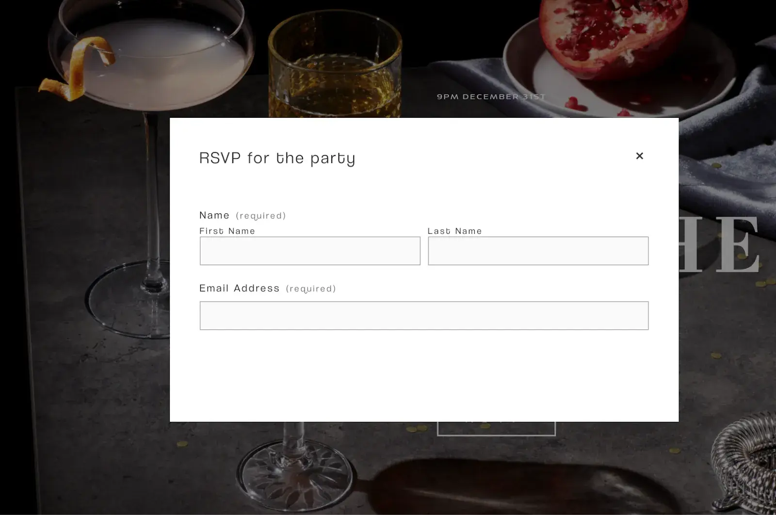
Royce is a template designed specifically for event reservations. It doesn’t include a navigation bar, sticking to a clean layout that features a customizable background image, a headline, and a call-to-action (CTA) button that says “RSVP.”

event reservation landing page template

Image Source

What I like: To fill out the form and reserve a spot, visitors can either click the RSVP button to see a form appear or simply scroll down below the fold to see a static reservation form, offering visitors two ways to convert.

RSVP form field landing page template

Image Source

2. Click Through

Exclusively Available With HubSpot’s Free Landing Page Builder

The Click Through landing page template is ideal for capturing blog subscribers.

It includes an attractive hero image at the top, space to provide context about what users can expect if they subscribe, and a module for past content right below.

blog subscription landing page template

Image Source

Pro tip: This template can also be customized with your brand and edited with HubSpot’s drag-and-drop interface.

3. Simple Conversion

Available on HubSpot

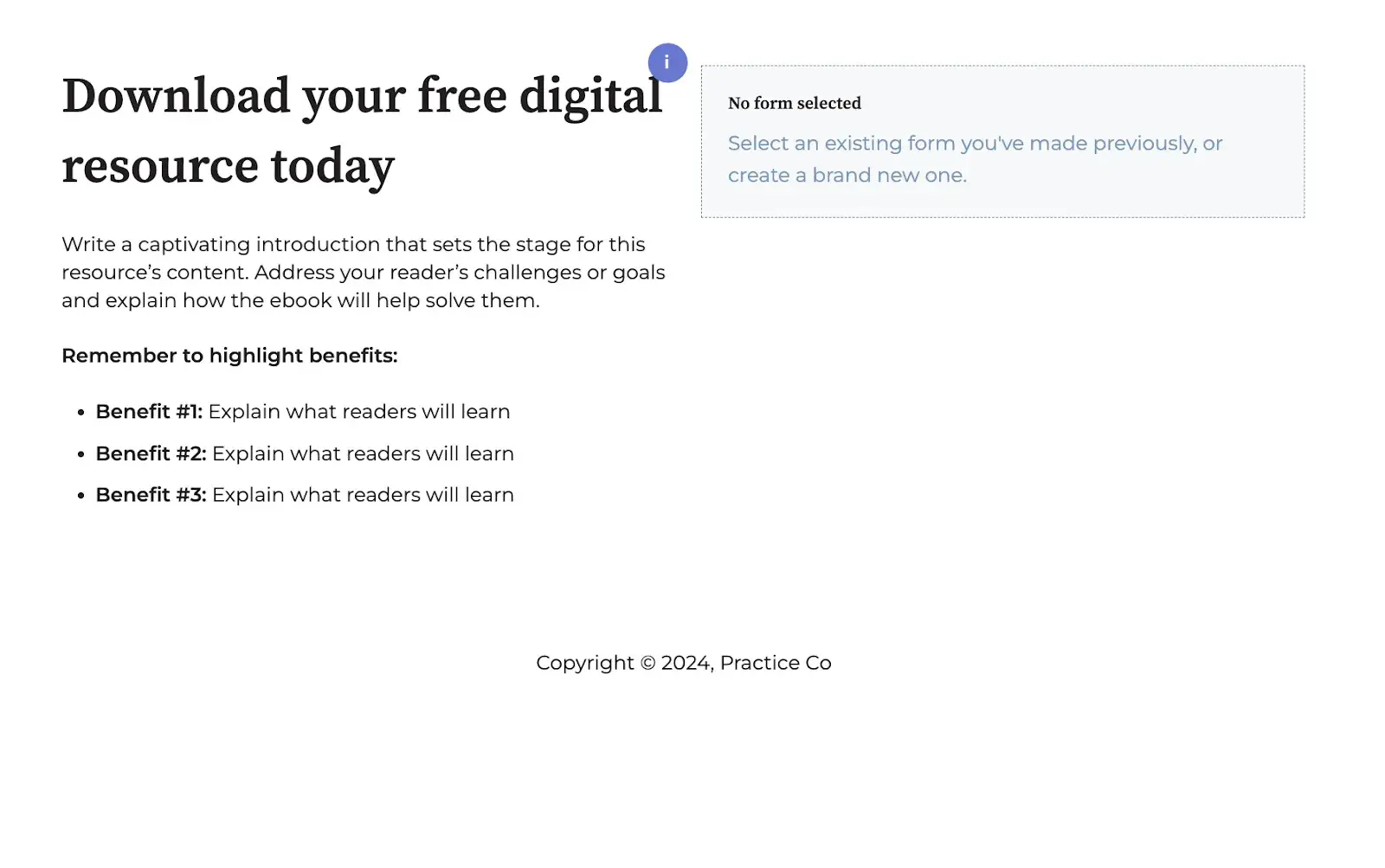
This design includes a photo, customizable text, and a short form. It has no navigation bar, keeping visitors focused on your offering, and you can also customize and add other elements, such as the icons below the form.

Below the fold, you can also add more information about your offering or company.

landing page template for a downloadable resource

Image Source

Best for: I think this template is a great option if you’re looking to add some custom elements to your landing page.

4. Blank

Available on HubSpot

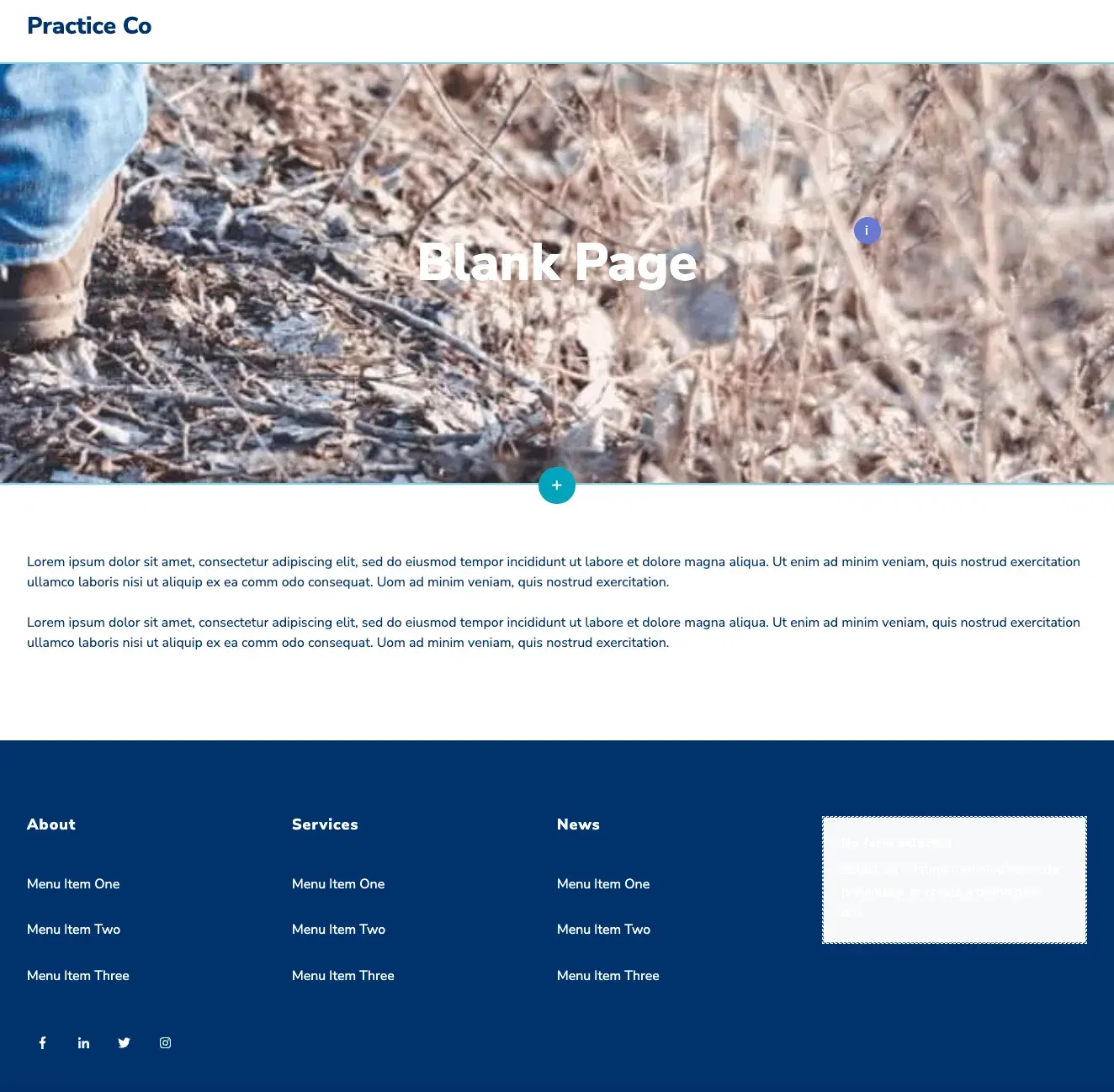
The Blank template has a simplistic look and feel, but it devotes a bit more room to text than some of the other templates on this list. As such, Hubstrap might be a good option if your content offer doesn’t need as much imagery.

For example, you might use this page to describe an offer, such as a long whitepaper on a topic related to your industry. As with other templates, you can also personalize the design and add drag-and-drop sections to the page.

simple landing page template with navigation bar

Image Source

What I like: Unlike the landing page templates above, this example does include a navigation bar. However, it’s simple enough that I think it doesn’t distract from the offer, making this a great option if you’re looking to include navigation.

5. Video

Exclusively Available With HubSpot’s Free Landing Page Builder

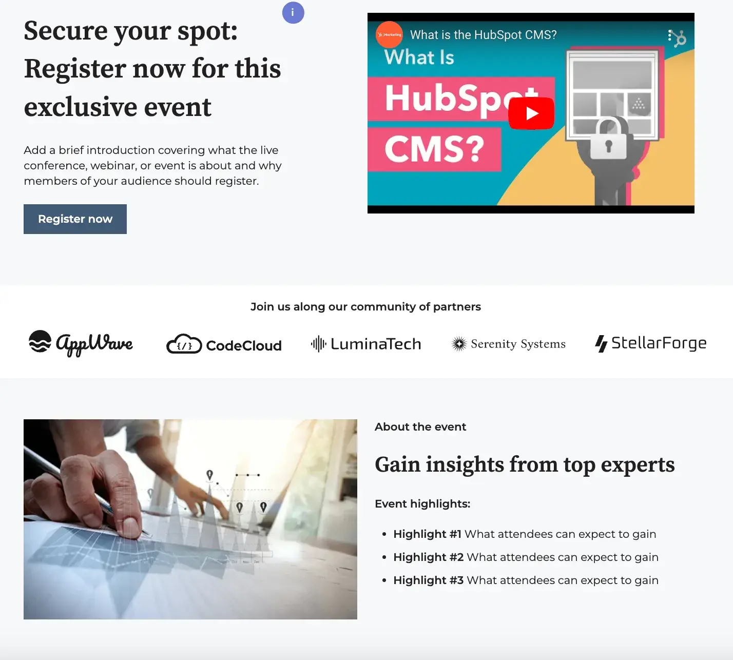
If you don’t want your conversion elements at the top of the page, a longer-form sales page might be your best bet. Video is a modern, minimalist-looking template that you can customize with your detail-rich sales copy.

minimalistic landing page template with videos

Image Source

Pro tip: Pairing each section of text with a compelling video is a great way to create a user experience your prospects will love.

6. Session

Available on HubSpot

This template includes a hero image, a headline, text, bright CTA buttons, and a form. I love how it eliminates the navigation bar but still includes a button at the top of the page.

The image keeps information visible but less distracting. As you scroll below the fold, this template also includes places for more imagery and details that could relate to your product or offering.

ebook landing page template

Image Source

Best for: The single button at the top of the page makes this template a great option for marketers looking to direct visitors’ attention directly to a CTA.

7. Focus

Available on HubSpot

Focus is a sleek, modern design for a content-based offer. It has a simple layout with a form, headline, description text, photo, and logo, and as with many of the other templates I’ve shared, it has no navigation element.

I especially like how this template enables you to add a photo or product shot. I also like the bright background that keeps me engaged.

modern colorful landing page template

Image Source

Pro tip: For extra customization, this template allows you to adjust or change the color of the background.

8. University

Available on Wix

I’d recommend this layout for marketers seeking leads for an educational event, course, or similar service.

The form is more detailed than some of the other templates on this list, and the layout itself also allows room for more text and imagery.

Above the fold, you can see a headline, supporting images, and a form. Then, if you keep scrolling down, there are additional sections where you can place even more text and imagery.

educational landing page template

Image Source

What I like: This template includes some great components specifically designed for educational offerings.

9. Skyline

Available on Wix

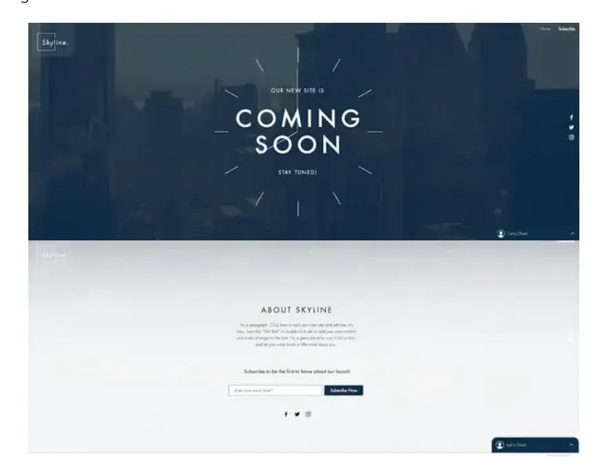
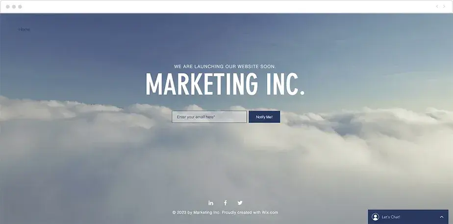
This template is a good option for a company or individual that hasn’t yet launched their website or product but still wants to gain some leads in the meantime.

Above the fold, there’s a giant headline area with the text “Coming Soon.”

When you scroll down, you can see a place for a short description of the company and a box where visitors can add their email. In addition, this template also lets you add a photo or video to the background.

Matter of fact, a Wyzwol study showed that 87% of marketers claim that using video has improved lead generation, which inevitably increases conversion rates.

Pre-launch website landing page template

Image Source

Best for: If you’re promoting an offering that isn’t yet available, Skyline is definitely a great template to consider.

10. Sprocket

Exclusively Available With HubSpot’s Free Landing Page Builder

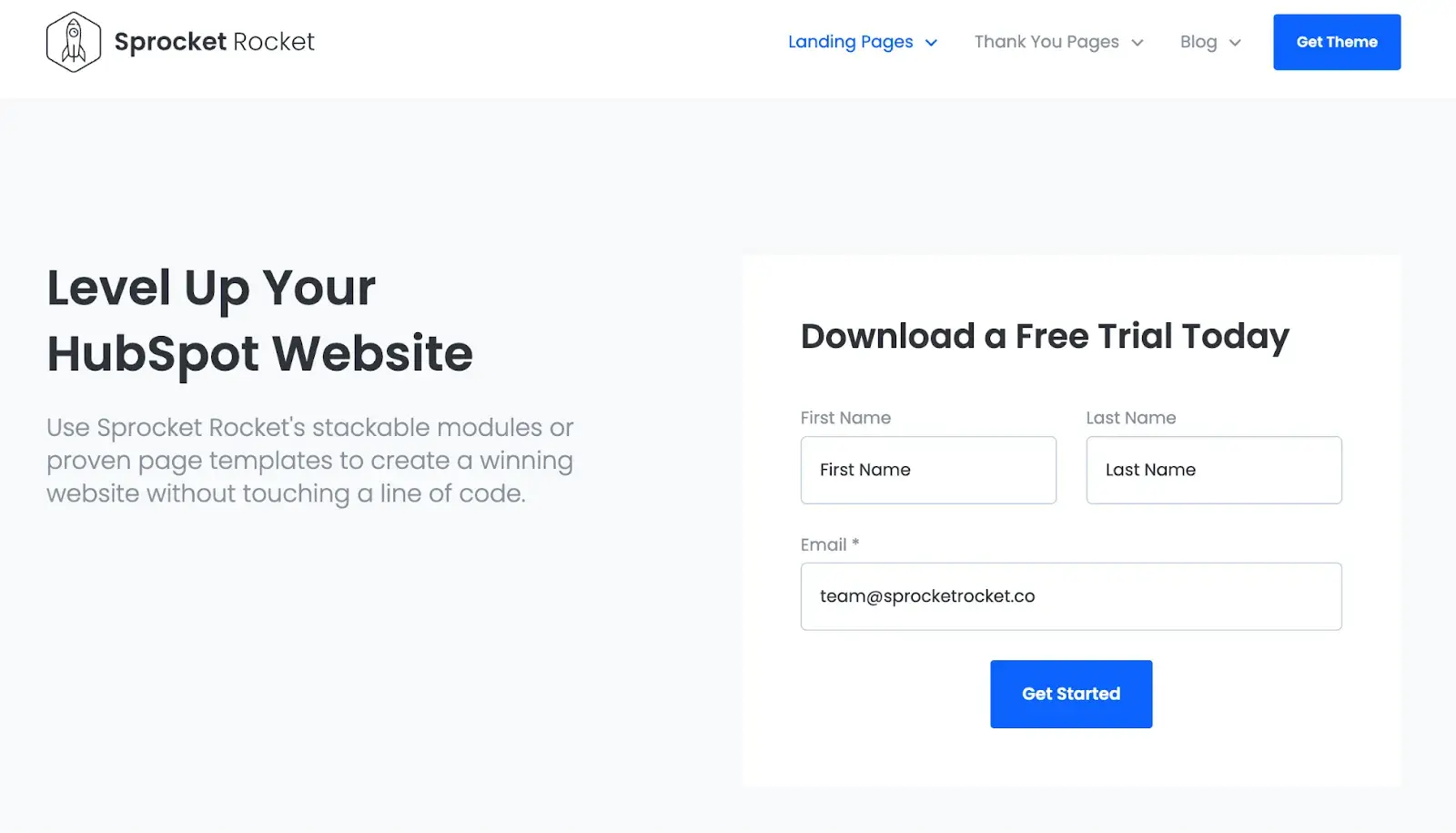
With a big headline, a short subtitle, and a conversion element above the fold, Sprocket helps you make your point concretely and succinctly.

I think this makes it a great landing page for nearly any piece of gated content, from ebooks to newsletters and tools.

product landing page templates

Image Source

What I like: Sometimes, less is more. This template doesn’t have too much going on, and that makes it one of my favorite options for a clear, straightforward offering.

11. Online Store Coming Soon

Available on Wix

This template is very simple. Like the “Coming Soon” template I shared above, this template allows you to edit the text, so you can use this layout for a range of different purposes.

There is no navigation element, and information about the company is off in the corners, keeping the prime real estate of the page clear and focused.

This layout includes space for a strong product shot (in the example below, it’s an image of a pair of shoes), as well as headline text, a small amount of descriptive text, an email box, and a simple CTA button.

The Unbounce Conversion Benchmark Report revealed that these click-through CTAs are more effective in the ecommerce industry.

landing page template with social media links

Image Source

Pro tip: This template also lets you link your social media accounts to the icons under the “Notify Me” button.

12. Lead-Gen Landing Page

Available on Wix

In my experience, this template is especially effective for B2B products. It allows you to edit and customize the text and images, as well as enabling you to place background videos into the layout.

The page is designed to be on the longer side, with a form and CTA above the fold, followed by sections that can detail different aspects of your company, such as staff information, below.

lead generation landing page template

Image Source

Best for: If you’re focused on B2B offerings, I definitely recommend taking a look at this template.

13. Proland

Available on Envato Elements

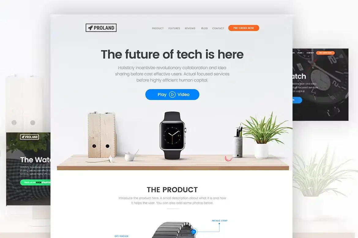
This template has a little more going on than some of the other ones I’ve shared, but I think it’s a great option for marketers looking to include some more detailed information alongside their CTA.

The template includes a minimal navigation bar, a headline and subtitle, and a button you can use to launch a video.

Envato does require a paid subscription to access this template, but it offers a 30% discount for students and unlimited downloads once you become a member.

tech product landing page template

Image Source

What I like: With its clean design and minimalist aesthetic, this is a great template for a modern brand looking to share some more details about its offering.

14. Atlas

Exclusively Available With HubSpot’s Free Landing Page Builder

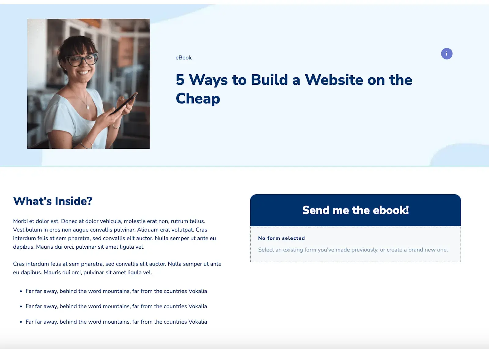
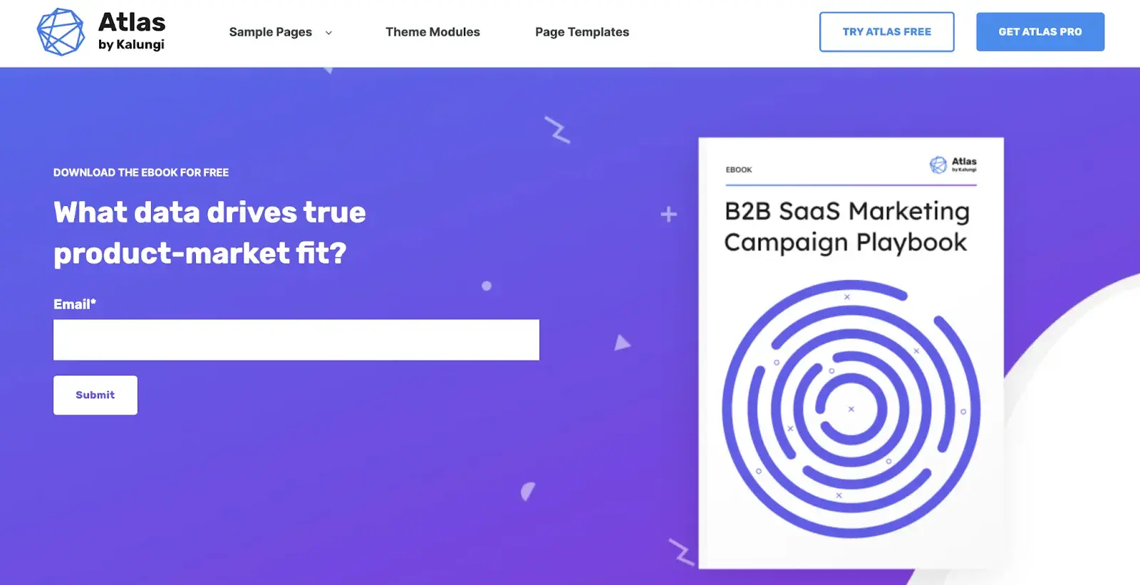
Specifically designed for ebooks, Atlas establishes a simple format to help your website visitors visualize the offer, digest what it’s about, and convert above the fold.

If they need more information — for example, if you’re offering an in-depth white paper or report — additional modules can be added to further persuade them to opt in.

ebook landing page template

Image Source

Best for: I’ve found that Atlas is an especially effective template for landing pages promoting an ebook or similar content offering. Plus, we’ve found that offering ebooks in exchange for signing up works 55% of the time — at least, it does for HubSpot.

15. Real Estate Landing Page

Available on Wix

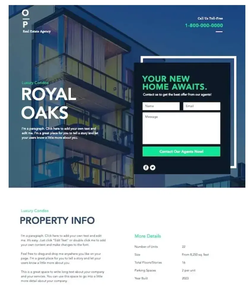
The focus of this template is to invite visitors to contact the company. While it doesn’t offer a resource for information by default, it can be edited and customized to include such an offering.

In addition, as you scroll down the page, the background image remains static, and there is room to add company information below the fold.

real estate landing page template

Image Source

Pro tip: You can use the second form at the very bottom of the page to give visitors another chance to convert.

16. Construction and Lawyer Landing Pages

Available on WordPress.org

While the Lawyer Landing Page and Construction Landing Page templates target two different industries, their designs are very similar.

Both have a header image, overlaid text, and an arrow pointing to a decently sized form above the fold.

Furthermore, both these templates have a place to offer visitors a free quote.

free quote landing page template

Image Source

What I like: Although these templates are designed for the legal and construction fields, they can easily be customized to fit other brands and industries.

17. Accelerator

Exclusively Available With HubSpot’s Free Landing Page Builder

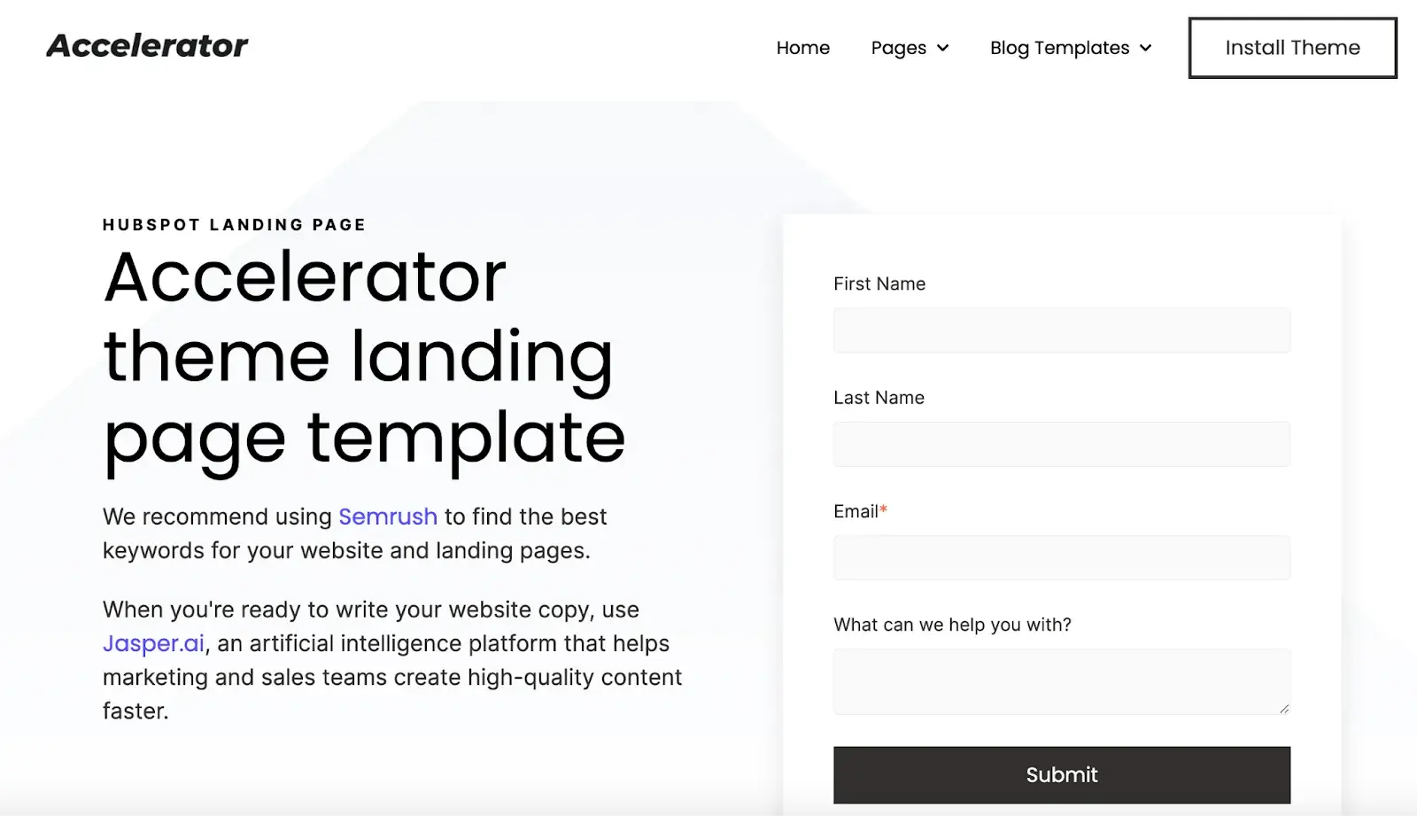
Another landing page that combines versatility with a flexible layout, Accelerator is a great option if you want to create a gripping narrative around your copy.

I appreciate that this template gives you plenty of room to provide additional context about your offering before presenting visitors with a conversion element, and you can also add extra modules with its simple, drag-and-drop interface.

long-form or short-form landing page template

Image Source

Best for: This template can be adapted for either long-form content or short, snappy, hard-hitting copy.

18. Gardenhouse

Available on MailChimp

This template does not include a navigation bar, which ensures that your visitors will be focused on your offering and CTA. In addition, like all landing page templates from MailChimp, this layout is optimized for mobile.

That means it will automatically adjust to different screen sizes — a feature that I’ve found especially important in recent years, as more and more traffic comes from mobile devices.

Even Statista reported that around 7 billion people will be using mobile phones in 2024, which further cements the need for mobile-optimized landing page templates.

mobile-optimized landing page template

Image Source

Pro tip: You can customize this template with your company’s logo and/or other company information toward the bottom of the page.

19. Bandmates

Available on MailChimp

This template is also pretty simple, but it’s got plenty of room for customization.

As with many of the other templates I’ve highlighted, it has no navigation bar, but it does have space for a company logo, text description, and a subscribe form above the fold.

With Bandmates, you can also drag more elements, like text or form boxes, into the design. In addition, just below the form, you can include either a product shot or another image.

highly customizable landing page template

Image Source

What I like: The default blue background allows the form and CTA button to pop, but you can also customize the colors to fit your brand.

20. O-Book

Available on Unbounce

Unbounce requires a subscription, but you can test out layouts like O-Book for a free, 14-day trial period.

As such, this template would be a good option for a company that has already gained revenue from existing landing pages and is looking to test out a more detailed (though still affordable) design.

This template includes a clear spot for a product image, headlines, and detailed description text, as well as a form box to collect visitors’ contact information.

In addition, O-Book’s top navigation bar is minimal, but it does include social media buttons.

Long-form content landing page template

Image Source

Best for: This template is designed for lead generation specific to ebooks, making it a great option for marketers looking to promote a longer-form content offering.

21. Webinar

Available on Wix

This template is specifically designed for marketers looking to promote a webinar or similar event-based offering.

With its limited navigation elements and prominently displayed headline and CTA, this is a great option if you’re looking for a more minimalist approach.

webinar landing page template

Image Source

Pro tip: Below the fold, this template has space for you to add some more detail about the event, including background information and a testimonial.

22. Essex

Available on Squarespace

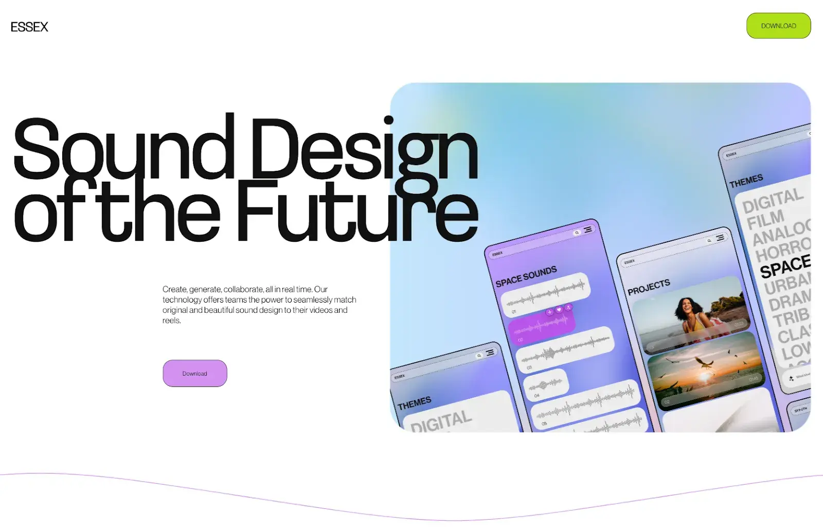
This template is another fun, minimalist option. Essex has no navigation bar. Instead, it includes a single, brightly colored CTA at the top corner of the page.

It includes a massive heading and image above the fold, as well as space for more details if you scroll down the page.

minimalist landing page template

Image Source

What I like: I especially love the unique color schemes available with this template, from its default purple and green to a range of additional options you can choose from.

23. Marketing Launch

Available on Wix

Another solid option for promoting an offering that is not yet available is the Marketing Launch template, which has a sleek yet engaging layout.

It includes space for a prominent headline, a box to collect visitors’ email addresses, and a full-page background image or video.

At the bottom of the page, this template includes small social media icons, keeping viewers focused on the main CTA in the center of the page.

launch landing page template

Image Source

Best for: I’ve found that simple landing pages like this one can be a great way to build excitement about an offering that’s still “coming soon,” while also enabling you to collect contact information from potential customers.

24. Product Landing Page

Available on Wix

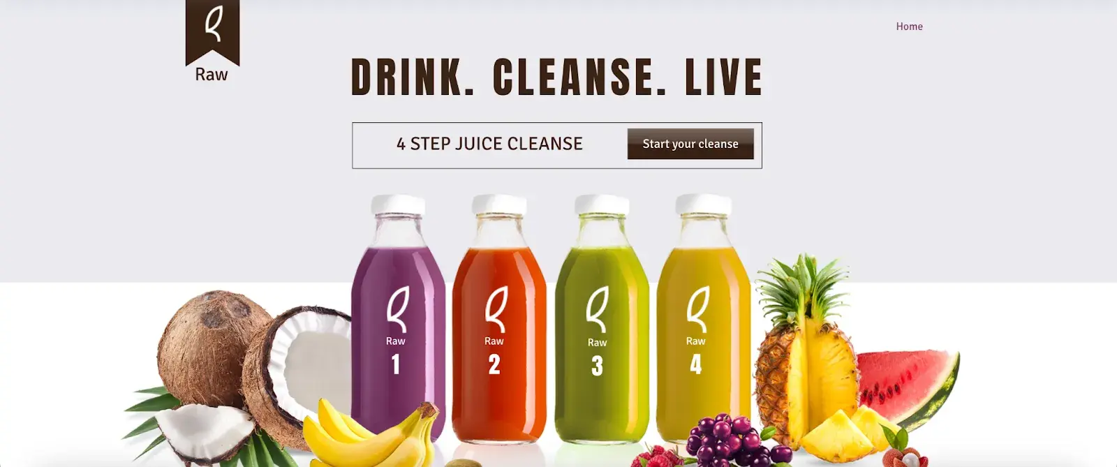
This brightly-colored template is one of my favorite layouts from Wix. Starting off with a short headline and CTA, this template keeps the CTA front and center.

Scrolling down past the fold, it includes a series of panels with different colored backgrounds, ensuring that the information and pictures pop while consistently directing viewers toward CTA buttons.

Finally, at the very bottom of the page, there’s a place where you can add social media links, as well as a box to collect visitors’ email addresses.

visual product landing page template

Image Source

Pro tip: In my experience, fun imagery and colors like the ones included in this template are a great way to keep visitors engaged.

25. Consultant Landing Page

Available on Wix

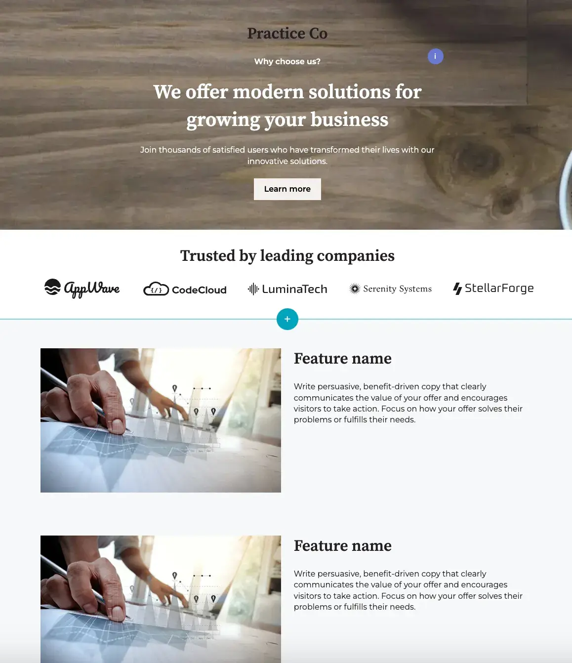
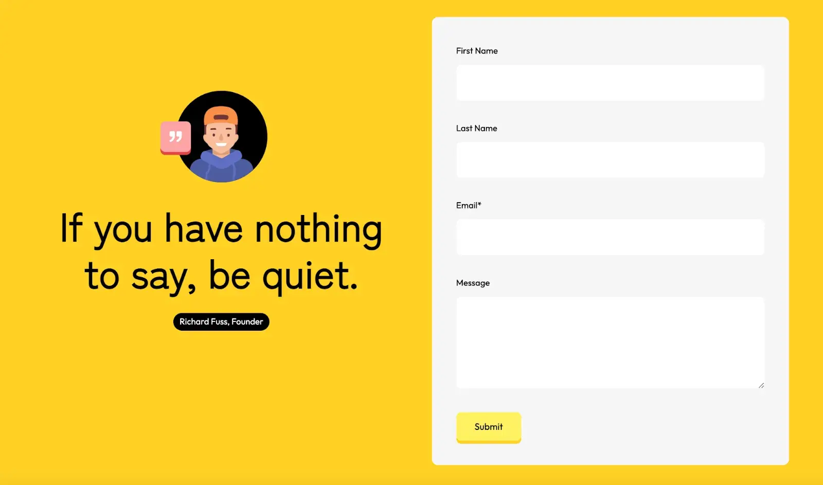
This template is specifically designed to help consultants promote their business and gather contact information from prospective customers.

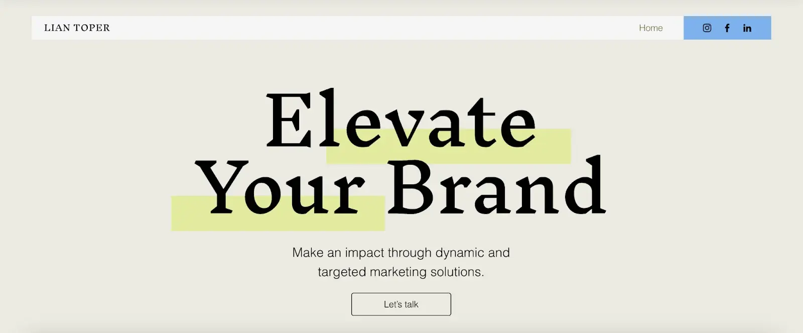
While many of the other templates in this list start off with a lot of imagery or videos, this template keeps it clean with a plain background, headline, and simple “Let’s talk” CTA above the fold.

If you scroll down, the template includes space to present a short bio, an overview of services provided, and a carousel to display some testimonials. Then, at the very bottom of the page, there’s a short contact form.

Sticking to its minimalist principles, this form includes text boxes for just a first and last name, an email address, and a message.

landing page template for consultants

Image Source

What I like: This template sets itself apart with its innovative highlighter animation effect, instantly drawing visitors’ attention to the main headline at the top of the page.

Landing Page Best Practices

The templates above illustrate many important landing page best practices. But if you’d like more options, why don’t you check out some landing page examples here?

Now, take a look at this landing page example from HubSpot:

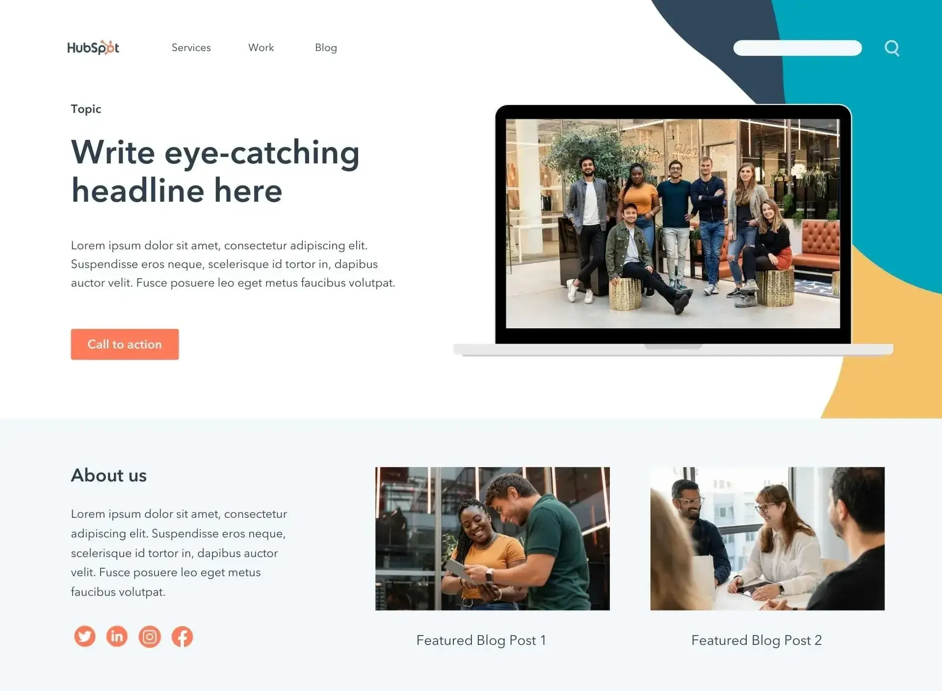
HubSpot product landing page example

Image Source

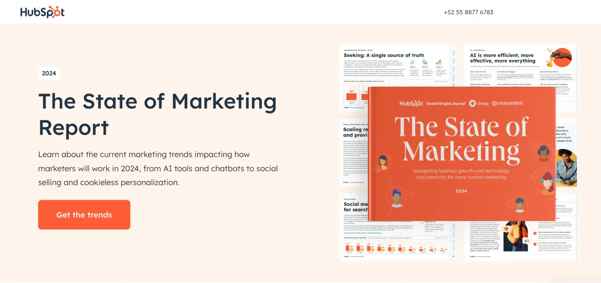
This page starts off with a place to add an eye-catching headline and featured image. It also includes a prominently displayed CTA, which can be used to link to a contact information form.

It offers space to describe the content offering with enough detail to entice viewers without bogging them down in unnecessarily lengthy text.

In fact, this example landing page illustrates several critical best practices to keep in mind when designing your own pages:

  • Avoid navigation bars. Many of the templates I’ve listed have no navigation bar, as a navigation bar can detract attention or clicks away from the offer on the page.
  • Use visuals. Most of them also have room for a photo or video, which are great ways to boost engagement.
  • Offer a resource. An effective landing page offers visitors a helpful resource, such as a white paper, exclusive video, or other piece of content, in exchange for their contact information.
  • Avoid complexity. Landing pages are important, but they don’t have to be complicated. Aim for a page that’s concise and inviting rather than complex and overwhelming.
  • Don’t ask for too much. Rather than just placing a long contact form on your page, tease an interesting offer or a free resource in exchange for just a small amount of contact information.
  • Leverage AI. Generative AI tools like HubSpot’s Campaign Assistant can help you quickly write your first draft, getting you up and running in minutes. I think it‘s reasonable to assume that this technology is here to stay and won’t go away any time soon, given that one-third of companies are already using AI. So don’t fall behind, and let AI kickstart your landing page process.
  • Embrace templates. Finally, even if you know what you’re going to offer and what information you’d like to receive from visitors, building a landing page from scratch can feel daunting. So, if you don’t have the bandwidth to build a page yourself, and if you don’t have the resources to hire a designer, using a pre-designed website template can be a great way to launch a professional-looking page quickly and effectively.

To learn about other landing page best practices, check out this comprehensive guide.

Craft the Best Landing Page for Your Business

At the end of the day, every business is different. The best landing page for one organization may be utterly ineffective for another — and vice versa.

What I’ve realized is that you should focus on key factors such as visual content, color design, and short and to-the-point CTAs to create landing pages that resonate with today’s customers.

I also realized there are always options to tweak your page, even if you use a template. Don’t be scared to switch up elements or colors to best suit your goal.

But I believe that armed with the landing page templates and best practices I’ve shared in this article, you’ll be on your way to crafting the best landing page for your unique company, offering, and customers.

Editor’s note: This post was originally published in May, 2019 and has been updated for comprehensiveness.

The 16 Best Blogging Platforms for 2024 (& How to Pick One)

Featured Imgs 23

I wrote my first blog about 10 years ago. I started on the Blogger platform and tried (and failed) at blogging for years. Now, I manage my own successful blog on the WordPress platform, and I love blogging. As an SEO consultant, I also manage clients' blogs and use many platforms.

Truthfully, the best blogging platform is the one that works for you.

There’s a lot out there, and in this article, I’m rounding up the 16 best blogging platforms, including pro tips from people using the blogging platform to help you pick the best blogging platform.

Blogging is powerful, and I want you to find one that inspires you to write.

Build your website with HubSpot's Free CMS Software

The HubSpot blog generates leads for HubSpot, and 90% of the leads come from older blog posts, including those published years ago.

Publishing blog content offers many benefits in addition to procuring leads.

Blogging can help you establish authority in an industry. It can drive brand awareness, share company news, and better convert website traffic into leads.

But the wrong platform can also limit your returns. It can restrict your ability to gather leads, improve SEO, monetize your blog, and more.

There are many great choices for blogs that come at little or no cost, with a ton of valuable features that can bring you results for your efforts. To find the best platform for your new blog, keep reading or jump to the section you’re looking for.

Table of Contents

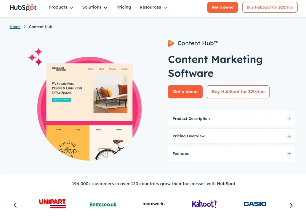
1. Content Hub

Best For: Content Marketers

Best blog platform: HubSpot CMS Hub

Blog Software Cost: Free, with premium options

Content Hub Ideal Users

I love Content Hub. I feel like it really sets itself apart from other blogging platforms because it seamlessly integrates with the rest of HubSpot's CRM platform, making it ideal for business bloggers.

It has the tools, technologies, and workflows you need to create and distribute your blog content. At the same time, it offers a great user experience with easy access to features that drive conversions.

Plus, Content Hub has AI capabilities baked right into the platform. I like using HubSpot’s free Blog Ideas Generator to gather ideas, and you can also leverage the Free AI Blog Writer to create blog posts.

Content Hub Pros

In my opinion, the biggest advantage of this free blog software is that it's powerful but still easy to use. You can start by choosing a pre-designed theme or building your own custom theme with the drag-and-drop website builder.

Content Hub includes free web hosting and it's easy to connect a custom domain.

Then, using HubSpot's blog editor and built-in SEO tools, you can create blog posts with CTAs, forms, and other interactive elements.

You can even create multi-language variations of your blog posts and run A/B tests on them to reach a global audience. Before you publish, you can preview how your posts and pages look on different types of devices.

Once you're ready to start promoting, you can connect your blog to your social media accounts. That way, you can automatically share new blog posts on your social networks in the same place that you wrote them.

As you publish more content, you can analyze your blog performance. This can help you understand what topics and types of content are resonating with your readers. That's because Content Hub is part of HubSpot's CRM platform.

Content Hub Cons

Since Content Hub is an all-in-one solution for marketers and developers, it has lots of rich functionality and a ton of attractive themes. This is a good thing for most bloggers and G2 gives HubSpot a 4.5/5 rating with over 1,500 reviews.

But, if you're an individual or small business just starting to blog, then you may not have the time or expertise to leverage the full power of Content Hub. In that case, you might be better off with a simpler alternative to start.

As I said in the intro, I started on the Blogger platform and later switched. I think the key is not to overwhelm yourself. It’s easy to switch to Content Hub later if that’s what you want.

Content Hub Website Example

Below you can take a look at this company's feature-rich blog built on Content Hub.
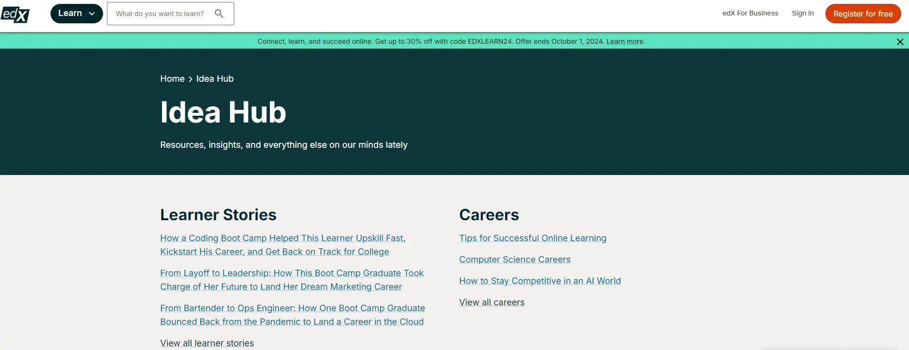
EdX using content hub, one of the best blogging platforms

Pro tip: For me, a major plus for Content Hub is the AI content features. Use the AI to help generate ideas (no more staring at a blank page). The AI will undoubtedly save you time, too. If your site starts serving multiple locations, the AI translator can also be useful.

Content Hub Key Takeaways

  • Meets the needs of both developers and marketers.
  • Fully-integrated CRM to streamline sales and marketing processes.
  • AI tools to help with ideation and content creation.
  • Built-in multilingual support, SEO recommendations, and more.

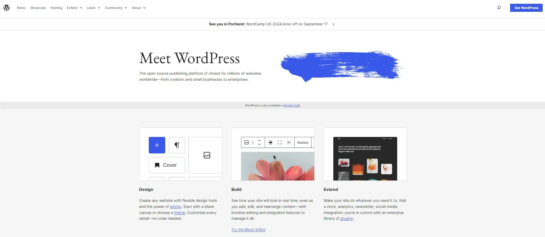
2. WordPress

Best For: Themes and Plugins

Best blogging platform: WordPress

Blog Software Cost: Free, with premium options

WordPress Ideal Users

Creating and managing a blog on WordPress could mean more maintenance than other platforms, but it will offer the extensibility and content management features publishers and other businesses need to create a complex blog.

I now use WordPress for my blog and love how much I can customize it to meet my needs and vision.

WordPress Pros

WordPress was originally created as a blogging platform and it has a 4.4/5 rating on G2 with over 8,000 reviews. Though it has evolved into a multi-purpose content management system, it still has many features and themes for blogging.

WordPress enables you to not only purchase a custom domain and download one of 3,500+ themes specifically designed for blogs — it also lets you add social media buttons, forms, affiliate links, and other features with plugins.

I love that the customization options are virtually limitless with the 60,000+ free plugins available.

WordPress Cons

You will have to make sure your theme and plugins are compatible and up-to-date. Otherwise, they can disrupt the user experience or break your site.

Other maintenance tasks like finding and fixing broken links, updating the core software, and optimizing your database will also be your responsibility. This can be difficult for site owners who don't have the time or technical expertise to regularly maintain their sites.

WordPress Blog Example

Tech Crunch, one of the largest and most popular technology news blogs, is powered by WordPress. Take a look at this WordPress website example below.
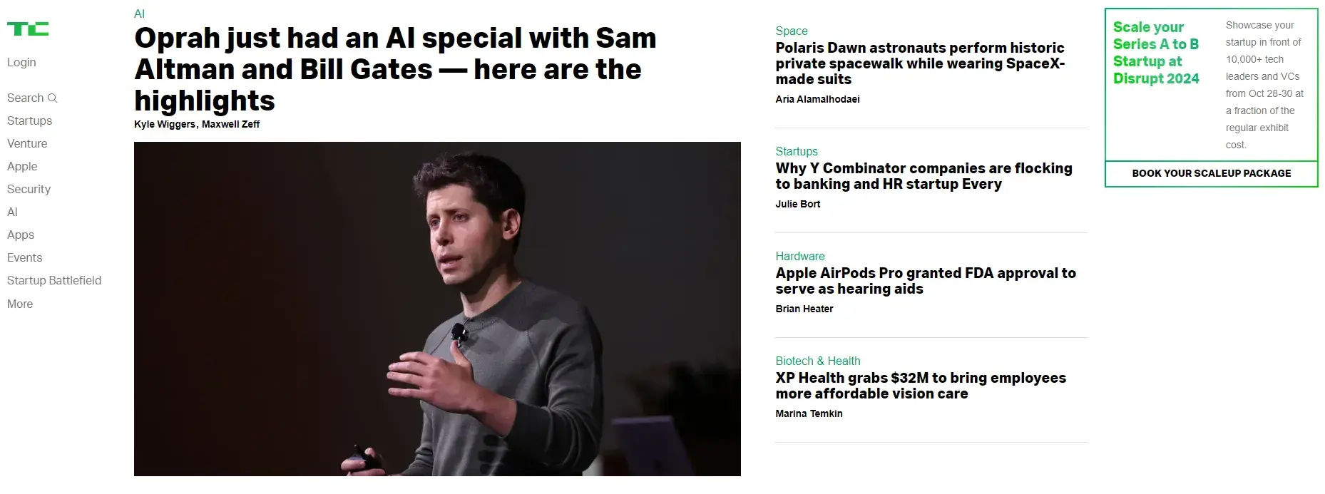
Best blogging platform examples: WordPress and TechCrunch

Pro tip: WordPress is open source, so if you work with a WordPress developer, you can customize your blog and its functionality in every way possible. My blog is customized to make repetitive tasks somewhat automated.

For example, whenever an FAQ is added to my blog, I can use my custom FAQ module that automatically adds some code to the website to save me adding it each time. Another good example is content blocks. You can create blocks that you can easily add to the blog.

WordPress Key Takeaways

  • Ideal for publishers and others who want to extend the platform with plugins.
  • Over 3,500 free blogging themes.
  • Website maintenance can be time-consuming.

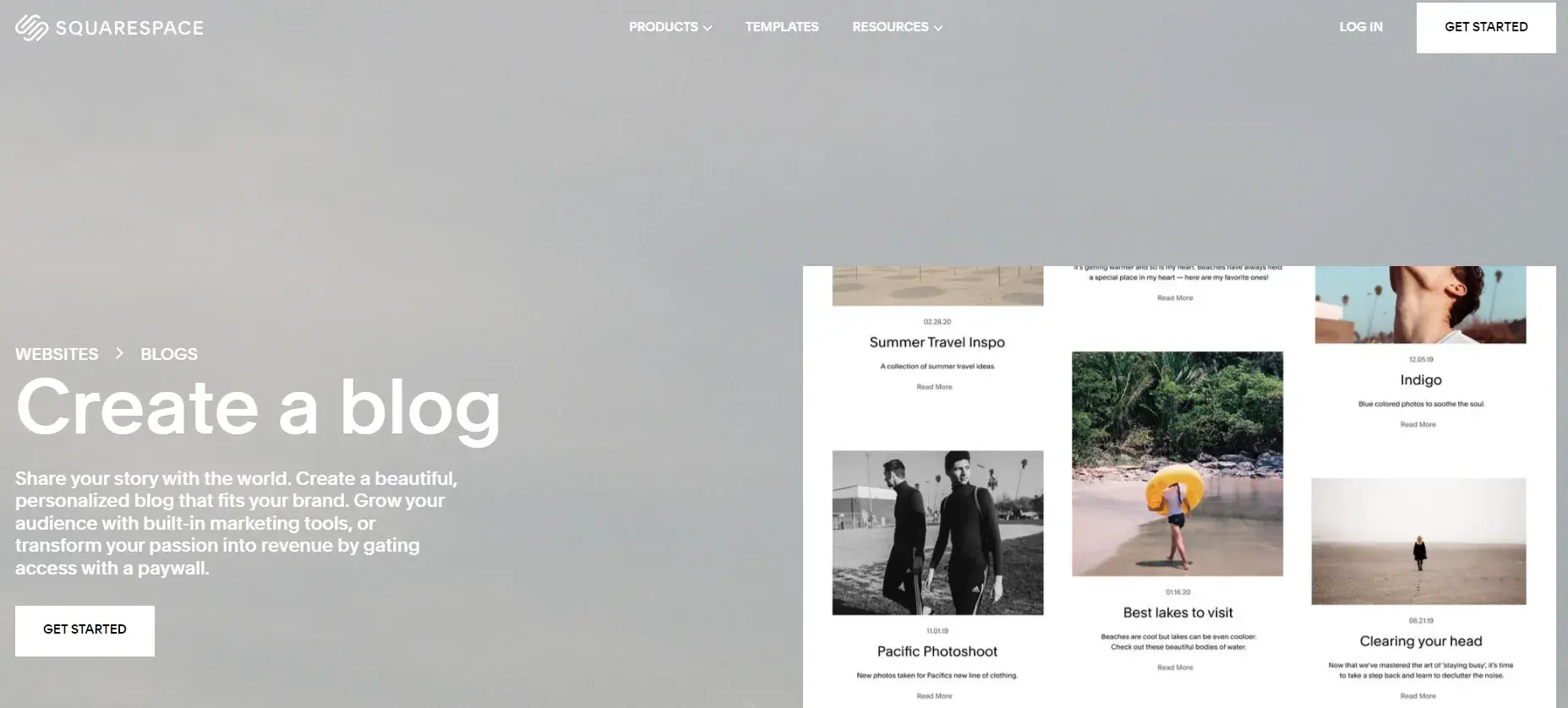
3. Squarespace

Best For: Design

Best blogging platform: Squarespace

Blog Software Cost: Paid, with plans from $16-65 per month

Squarespace Ideal Users

I’ve used Squarespace for two different client sites and had no problems with it at all.

Squarespace is an ideal blogging platform for businesses and individuals creating image-rich content. It also has a 4.4 rating on G2. With Squarespace‘s award-winning designer templates and integrations with Getty Images, Unsplash, and Google AMP, you can create visual content that’s engaging and shareable.

Although this is likely true for many platforms, my experience with Squarespace as an SEO was great! I was working with two small clients, and both had no problem writing little (but very good and in-depth content), and they ranked in no time.

Squarespace Pros

While Squarespace only offers about 140 templates, they are all mobile-optimized and fully customizable so you can create a blog that looks the way you want it to. Once you've designed your pages, you can use Squarespace’s blogging and SEO tools to create and optimize your content.

Finally, after publishing your blog posts, you can connect your social media accounts to easily promote them. Then, use the built-in analytics tool to learn where your traffic is coming from, what your visitors are looking for, and how they’re interacting with your content.

Squarespace Cons

Squarespace offers even more features, from audio file support to newsletter signup forms, but ultimately, it‘s limited in functionality. That’s because it supports around 30 extensions, so you're mostly limited to the features Squarespace offers out-of-the-box.

Since they lack some features that bloggers need — like an auto-save feature, for example — Squarespace isn’t the ideal platform for everyone.

Squarespace Blog Example

Squarespace allows some bloggers to create beautiful sites, such as the lifestyle blog below.

Best blogging platform example: Squarespace, Lauren Saylor

Squarespace Key Takeaways

  • Best suited for individuals and brands who want to customize a blog to their personal style.
  • Small but high-quality selection of templates.
  • Limited to features and few extensions that Squarespace offers.

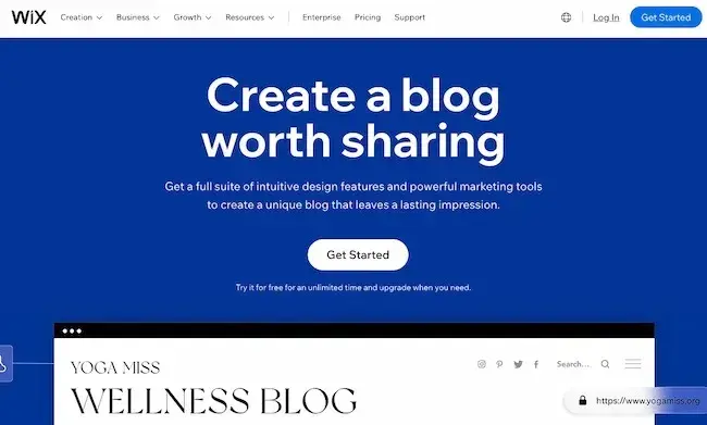
4. Wix

Best For: Beginners

Best blogging platform examples: Wix

Blog Software Cost: Paid, with plans from $16-59 per month

Wix Ideal Users

Wix is a popular blogging platform for beginners who are looking for hosting and blogging tools in one place and who prioritize speed and design over functionality.

Wix Pros

Wix has a 4.2 G2 rating and gives you two choices for creating your blog within the Wix Editor.

You can start by choosing from over 800 pre-designed templates that any blogger can use, whether you own a retail business or run a food review website.

You can also use Wix ADI by filling out a quick questionnaire to have a blog created for you.

Then, you can begin writing and editing posts on desktop or mobile, embed Wix's stock photos and videos or your own media, and organize them into topics.

Once you‘re done writing, you can configure your SEO settings to boost your organic reach, push your content to your subscribers with Wix’s email tool, and share them through your social media accounts. I like that you can further foster a sense of community among your readers by letting them become members.

Wix Cons

While Wix is more versatile than other hosted website builders, it lacks customization options and content management features, particularly when comparing Wix versus WordPress or another CMS.

For example, to add more advanced elements to the page, like music or maps, you’ll have to add HTML code. This process can be intimidating for beginners.

Wix Blog Example

Take a look at this Wix blogger's site below for an example of a stylish but relatively simple blog.

Best blogging platform example: Wix and Bella & Bloom

Pro tip: My friend Crystal Waddell uses Wix for her podcast website, Simple and Smart SEO. She loves the blogging function because it’s got functionality that she’s used to with Google Docs or Word.

Better than that, though, Waddell says, “[Wix] also lets you insert GIFs (like in this blog) and pretty much anything else without having to worry about code.

When you‘re done, it has a ton of SEO prompts to make sure that you’ve got everything taken care… You can ‘monetize’ posts, so if you want to have a blog just for site members, you can put it behind a paywall. Very cool.”

Wix Key Takeaways

  • Ideal for bloggers who prioritize speed and design over functionality.
  • Can use pre-designed templates or start from scratch.
  • Editor lacks drag-and-drop functionality.

5. Pixpa

Best For: Bloggers, designers, and creatives

blogging platforms: pixpa

Blog Software Cost: Paid, with plans from $6 to $25 monthly

Pixpa Ideal Users

Pixpa is a great option for bloggers in creative fields who want to showcase their work and share their ideas through attractive and professionally designed blogs.

The platform offers a user-friendly interface and a wide range of templates, allowing bloggers to customize their blogs to match their own style and branding.

Pixpa Pros

Pixpa's integrated blogging feature provides bloggers with a convenient and user-friendly platform to create, manage, and optimize their blogs.

With Pixpa’s wide range of 150+ professionally designed templates, bloggers can easily customize their blog layouts, colors, fonts, and more to create a unique and engaging online presence.

Pixpa offers essential features for content organization, customization, SEO optimization, and social sharing, making it a comprehensive solution for bloggers.

Pixpa's ecommerce integration and 100+ built-in apps enable bloggers to power up their blog, website, and online store — all in one place.

Pixpa Cons

While Pixpa offers easy-to-use, out-of-the-box blogging capabilities, it may not provide the advanced customizations and features available in dedicated blogging platforms such as Wordpress.

No built-in traffic analytics are available. You need to use Google Analytics or any other similar tool to measure traffic analytics.

Pixpa Template Example

Pixpa offers a diverse range of blog templates to cater to various blogging styles and aesthetics. Whether bloggers prefer a minimalistic and clean design or a bold and vibrant look, Pixpa's collection of blog templates offers options to suit diverse preferences.

blogging platforms: pixpa template example

Pro tip: If you’re tempted to try Pixpa, you can try free and fast track your website by importing another website template from your existing website.

Pixpa Key Takeaways

  • User-friendly interface for easy blog creation and management.
  • Customizable templates to match the blogger's unique style.
  • Responsive design for optimal viewing on different devices.
  • SEO-friendly features to improve search engine visibility.
  • Integration with social media for easy content sharing.
  • Limited third-party integrations compared to other platforms.
  • Advanced coding customization may have limitations.

6. Craft CMS

Best For: Customization

Best blogging platform: Craft CMS.

Blog Software Cost: Free, with premium options

Craft CMS Ideal Users

Craft CMS is a blogging platform designed for developers, designers, and web professionals.

Craft CMS Pros

I love that with Craft's personalized content modeling, powerful templating, and the option to edit your source code, you can completely control the appearance and functionality of your site — if you have the necessary experience.

Craft CMS also offers an image editor, collaboration tools, and a localization feature that can translate your content to specific languages. You can now also manage multiple blogs from within a single Craft install.

To analyze your content‘s performance, you can integrate Craft CMS’ dashboard with Google Analytics and also get familiar with Craft CMS Hosting. This blog platform has a 4.2 G2 rating.

Craft CMS Blog Example

If you have the web development experience to fully leverage the power of Craft CMS, you'll be able to create a complex blog with custom post types, like this travel blog below.

Best blogging platform example: Craft CMS and Tiny Shiny Home

Pro tip: Within Craft CMS, you can hook up Google Analytics which gives you all your data within the CMS.

Jonathan Longnecker, who switched his blog to Craft CMS, says:

“[Analytics integration] comes with dashboard widgets. This lets you create custom reports for your dashboard using your analytics data. We’ve already used it to identify how our traffic spikes for each article we post as well as what our top visited pages are.”

Craft CMS Key Takeaways

  • Advanced functionality including personalized content modeling and localization feature.
  • Free version for single admin accounts.
  • Requires some web development experience.

7. Contently

Best For: Enterprises

Best blogging platform: Contently

Blog Software Cost: Paid, with quote-based pricing

Contently Ideal Users

Contently is a robust blogging platform that's ideal for enterprise companies with large budgets but few internal editorial resources. It has a 4.6/5 G2 rating with just over 80 reviews.

Contently Pros

Contently allows you to manage your entire content creation process in one place. You can create and visualize your editorial strategy with their customizable production calendar tool or organize your blog posts with their tagging tool.

It can also help you effectively collaborate with your team on projects by leveraging their advanced workflow tools. You can even pay for Contently's well-vetted freelancers to write some of this content for you.

Before publishing your content, Contently‘s smart content review tools will ensure your content is aligned with your brand, optimized for search, and legally compliant.

Finally, to refine your content strategy, Contently enables you to compare your content’s performance against industry benchmarks, quantify its ROI, and measure its performance by topic, format, and sources directly in your dashboard.

Contently Cons

The biggest drawback of Contently is that it‘s beyond many small businesses’ and individuals’ budgets. Contently can be expensive and could be a better fit for enterprise companies.

They offer quote-based pricing that varies for each client. Their costs factor in editing, strategy, and help from their content creators, as well as visual assets.

Contently Blog Example

The Royal Bank of Canada, one of North America’s largest banks, uses Contently to streamline content creation across 14 marketing departments. Check out its blog below.
Best blogging platform example: Contently and RBC Royal Bank

Contently Key Takeaways

  • Can manage the entire content creation process.
  • Deep-dive analytics.
  • Pricing is mainly for enterprise companies.

8. Joomla

Best For: Community Building

Best blogging platform: Joomla

Blog Software Cost: Paid, with plans from $8-33 per month

Joomla Ideal Users

Joomla is an open-source CMS with advanced content and user management features built directly into the platform. I think this makes it an excellent choice for creating community-centric blogs.

Joomla Pros

Joomla offers rich built-in functionality and thousands of extensions. For example, Joomla allows you to create custom post types, manage hundreds of users, and publish content in multiple languages right out of the box.

It also offers some great extensions for blogging. EasyBlog by StackIdeas, for example, has a much cleaner drag-and-drop editor than Joomla's built-in editor.

You can also enable star ratings on your blog and automatically publish posts to your social media platforms with this extension. Joomla’s G2 rating is 4/5.

Joomla Cons

Because of its robust built-in functionality, Joomla does have a steeper learning curve than a CMS, so it'll take more time to set up. It also offers a smaller selection of themes and extensions, which can limit your customization options.

Joomla Blog Example

Below is an example of a Joomla blog built with EasyBlog.

Best blogging platform example: Joomla and The Grid

Joomla Key Takeaways

  • Advanced content management features.
  • Steep learning curve due to robust built-in functionality.
  • May need a blogging extension.

9. Hostinger Website Builder

Best For: AI-Powered Website Creation

blogging platforms: Hostinger

Blog Software Cost: Paid, with a single plan costing $2.99 per month

Hostinger Website Builder Ideal Users

Hostinger Website Builder is a drag-and-drop, intuitive builder for multiple purposes, including blogs. It’s excellent for first-time website owners and established bloggers alike. It has a G2 rating of 4.4 with over 500 reviews.

Hostinger Website Builder Pros

With a user-friendly interface, Hostinger Website Builder ensures a smooth and intuitive experience. The platform’s standout feature is the AI builder. It can instantly generate a fully functioning website only by having you answer three questions about the blog you want to create.

You can also choose to build a website with pre-made templates. With 20 blog-related templates available, it’s easy to pick a blog template that suits your brand the best.

Since it’s an all-in-one website-building solution with built-in SEO and ecommerce features, most users won’t need to install additional plugins or integrations.

As a scalable platform, you can easily upgrade your hosting plan to support your blog's growth with the necessary resources.

Hostinger Website Builder Cons

Currently, the builder has no blog search functionality. This feature is under development and will soon be available to users.

Hostinger Website Builder Website Example

Below is a blog example built with Hostinger Website Builder that features a clean background with a simple layout.
Hostinger blog example

Pro tip: Danilo Miranda, Managing Director at Presenteverso, uses widgets to engage readers.

He says, “[With Hostinger’s custom widgets,] I get to make [readers] stop on my site and engage with what they are reading, rather than just reading, getting an answer, and then leaving for the next recommendation. You break out of the shackles of a blog ‘feed’/‘layout’/‘page’, and start creating a destination for your customers.”

Hostinger Website Builder Key Takeaways

  • 20 fully-customizable and responsive blog templates.
  • Upgradable web hosting plans.
  • 24/7 customer support via live chat and email.

10. btw

Best For: Minimalistic, Personal Blogs

btw best blogging platform 2023

Blog Software Cost: Free, with premium options

btw Ideal Users

btw is a minimalistic blogging platform ideal for personal blogs, with a focus on writing. It is also open-source, so it is popular with technologists and product folks.

btw Pros

I love the clean, minimalistic editor that inspires you to write. btw also features a writing assistant that helps you understand the readability of your content and simplify if required. It highlights unnecessary adverbs and hard-to-read/monotonous sentences to help make your writing flow.

You can also see your analytics on a dedicated analytics dashboard to understand who‘s reading your content, how long they’re spending, and which countries your readers are from.

btw Cons

With btw, the focus is on writing. So if you're looking to build a portfolio or an image-heavy blog, btw might not be the best choice for you.

btw Blog Example

Check out an example of a personal blog built with btw below.
btw blog example

btw Key Takeaways

  • Best for creating a minimalistic personal blog.
  • Open-source.
  • Free to use, no ads.

11. Drupal

Best For: Advanced Bloggers

Best blogging platform: Drupal

Blog Software Cost: Free, open-source software

Drupal Ideal Users

Drupal is a highly flexible open-source CMS that's best suited for advanced users, as well as enterprise companies, with complex blogging needs who are looking for a self-hosted solution. It has a G2 rating of 3.8.

Drupal Pros

Drupal has hundreds of out-of-the-box features and modules. If you know how to use them or have the time to learn, then Drupal will give you more power than other open-source platforms.

Specifically, Drupal supports a wide selection of content types, page templates, blocks, and more for creating and managing content. It also has advanced user permissions so you can give site admins, content editors, and other stakeholders personalized access to specific content.

This — along with its multilingual capabilities, Layout Builder, and other modules — will allow you to create and manage large, complex blogs.

Drupal Cons

If you don’t know how to use Drupal‘s out-of-the-box features and modules, and you don’t have the time to learn, they can be confusing and hinder your blogging efforts. In that case, you might be better off with a simpler platform.

Drupal Blog Example

Below is a Drupal blog that features add-ons and modules.
Best blogging platform example: Drupal and SmartSheet

Drupal Key Takeaways

  • Best suited for technical users with complex blogging needs.
  • Powerful content management features.
  • Advanced user permissions.

12. LinkedIn

Best For: Thought Leadership

Best blogging platform: LinkedIn

Blog Software Cost: Free

LinkedIn Ideal Users

LinkedIn lets users directly share blog posts, helping users reach some of the 1 billion people on the platform. This gives businesses with new blogs an audience for thought leadership and to drive site traffic.

In my opinion, every single B2B professional should be on LinkedIn. In fact, I’d go as far to say that many professionals should have a blog on LinkedIn as well as their website.

LinkedIn Pros

LinkedIn is an excellent choice for blogging to build brand awareness and drive site traffic. It's also a valuable tool to develop thought leadership. The built-in audience on LinkedIn can help generate conversations about your content that can boost growth.

It's also an excellent choice to supplement an on-site blog. Creating a LinkedIn blog can help you create insightful content specifically for niche users. This can build industry awareness of your brand and products. It can also help your blog generate more authority.

LinkedIn Cons

Because LinkedIn blogs live on their platform, you won‘t get the SEO benefits of an on-site blog. So I think it’s important to optimize your blogs for search on their platform as well as search engines. Without this investment, it’s possible that only your current connections will see your content.

You also may want to look for another platform if you're blogging for lead generation. Blogs are a great way to collect new contacts for your newsletter and sales team. But, blogging on LinkedIn can mean a longer journey to your lead generation forms, which can decrease conversions.

LinkedIn Blog Example

These blog examples are from the COO of L'Oréal and the Chief Customer and Commercial Officer at Coca-Cola. They show how this platform can build awareness and engagement for brand initiatives.

Best blogging platform example: LinkedIn and L’Oreal

Pro tip: I love LinkedIn; I’m there every single day. If you start writing articles on LinkedIn, invite people to follow you there so they’ll get updates! As an SEO I often get asked about LinkedIn blogs, website blogs, and duplicate content.

I think you should blog on both platforms and have a different blog strategy for each platform. If you don’t want to do that, I’d post content onto your website, then repurpose it for LinkedIn.

LinkedIn Key Takeaways

  • A good pick for new thought leaders.
  • Easy-to-use interface.
  • Offers potential access to a large and immediate audience.

13. Write. as

Best For: Privacy

Best blogging platform: Write.as

Blog Software Cost: Free, with premium options

Write.as Ideal Users

Write.as is a lightweight blogging platform that's ideal for individuals looking to create simple blogs with minimal design. It’s popular with its user base, with a 4.4 rating and almost 30 reviews on G2.

Write.as Pros

Offering a stripped-down editor with nothing but an auto-save feature, Write.as offers the experience of writing in a virtual journal. This makes it one of the best blogging platforms for writers. Write.as is also free to use and doesn't support ads.

Teams can also use it like Google Docs to share updates, proposals, and works-in-progress (for a monthly subscription).

Write.as Cons

Write.as requires you to use Markdown, a syntax that uses special characters to format text. For example, you'd type in asterisks to create bullet points, hashtags to create headers, and [Link] to add a link.

The syntax isn’t difficult to learn, but it might take some practice. If you‘d prefer to simply click a button to create bullet lists or add hyperlinks, then I’d say you’d be better off with another blogging platform.

Write.as Blog Example

Check out an example of a writing blog below.
Best blogging platform example: Write.as and Imaginary Gardens

Write.as Key Takeaways

  • Best for individuals who want a minimalist interface and design.
  • Requires you to learn and use Markdown syntax.
  • Free version is ad-free.

14. Blogger

Best For: Lifestyle Bloggers

Best blogging platform: Blogger

Blog Software Cost: Free

Blogger Ideal Users

My first ever blog was on Blogger, and back then, I had zero experience in SEO, blogging, and to be honest, using any kind of digital software. If I could create a blog on Blogger, you can do it, too!

Blogger is a free platform designed for newbie bloggers. It’s a great platform if you’re starting a blog. That said, Blogger lacks many content management features, but it is more feature-rich than most free blogging platforms. For that reason, Blogger is perfect for individuals looking to create blogs as a hobby.

Blogger Pros

In my opinion, the biggest advantage of Blogger is how easy it is to create and customize a relatively basic blog.

To get started, you just need to create an account with Google, choose a template, and get publishing.

You can purchase a custom domain, optimize your SEO settings, connect your blog to Google Analytics, optimize your posts with Adsense, and even edit the HTML and CSS of your site — but you won't be able to do much beyond that.

Blogger Cons

To get a better sense of the platform's limitations, you can compare Blogger versus WordPress or another CMS.

With Blogger, you can‘t install plugins to extend the functionality of your site. You can’t create different content types, like portfolio pages. And you can't change the default display of your content from reverse-chronological order to, say, your most popular posts.

In short, if you need the content management features and customization options of a CMS, then look into alternatives to Blogger.

Blogger Blog Example

Take a look at this personal blog below for an example.
Best blogging platform example: Blogger and Adam’s Apples

Key Takeaways

  • Best for lifestyle bloggers.
  • More feature-rich than other free blogging platforms.
  • Can't create custom post types or change the display of posts.

15. Medium

Best For: Writers

Best blogging platform for writers: Medium

Blog Software Cost: Free, with premium options

Medium Ideal Users

Medium is often called the best blogging platform for writers. It gives businesses a chance to build a blog and connect with a wide range of industry-specific users.

Storytelling is popular on Medium, and many businesses use this to their advantage to build a blog audience.

Medium Pros

This blogging platform is easy to use for publishing content.

Another pro is Medium's readership. The site also features a reader recommendation engine that can generate an audience for new blogs.

Since on-site blogs can often take six months or more to generate traffic, a site like Medium can be an attractive alternative.

Medium also has community publications. Each user on the platform can create up to seven publications. Users can also submit blogs to Medium publications to build a larger audience. For example, the Towards Data Science publication has over 645,000 followers.

If you're just starting out, Medium publications can help draw attention and followers to your new blog. This blogging platform can also complement a website blog, and some businesses republish their on-site blog content here without worrying about penalties.

Medium Cons

Like LinkedIn, a Medium blog won’t help you get the SEO benefits of an on-site blog. It also has a large community that can favor trends or long-time members over newcomers. While you can use Medium to generate traffic for an on-site blog, it may present a duplicate content risk if you don't properly set up your website.

Medium Blog Example

Both businesses and government agencies use Medium to promote their brand content.
Best blog platform example: Medium and GG Shops

Pro tip: Medium is a bit like LinkedIn in that businesses sometimes publish on their own blog and Medium. In this case, you need to be mindful of duplicate content. I would aim to get the SEO-heavy pieces onto your website first, then repurpose them for Medium or potentially have a Medium strategy.

Medium Key Takeaways

  • Ideal for writers and others who want to connect with an existing audience.
  • Clean and simple interface.
  • Less likely to offer the SEO and lead generation benefits of an on-site blog.

16. Tumblr

Best For: Multimedia

Best blog platform: Tumblr

Blog Software Cost: Free

Ideal Users

Tumblr appeals to personal bloggers and brands alike. While bloggers might be able to use this as their only platform, brands tend to use it as one platform among many to show their personality.

Tumblr Pros

Tumblr combines the power of blogging and social networking in one highly-visual publishing platform.

Tumblr offers everything you need to create a professional-looking site. You can select from hundreds of free and premium themes and add multiple pages, sidebars, social sharing buttons, comment sections, and more.

You can also buy a custom domain name from a domain name registrar rather than use the free subdomain: yourusername.tumblr.com. If you have HTML coding skills, you can further customize your site.

When you’re satisfied with your site's design, you can start creating and publishing multimedia post types. Featuring photos, GIFs, links, chat dialogue, audio files, and video in your content makes it more engaging, memorable, and shareable.

Since other users can easily like, reply, and reblog your posts on their Tumblr as well as their other social accounts, right from their dashboard, this is an excellent platform for engaging and fostering an online community.

Tumblr Cons

There are restrictions on the site that can frustrate users. For example, you can only schedule (or “queue”) 50 posts in a day, which might limit your ability to plan and execute a long-term content strategy.

You can also only upload videos under 500MB and only track 20 tags at a time.

Furthermore, your site can be suspended at any time if you’re found in violation of Tumblr’s community guidelines.

Tumblr Blog Example

Vogue has a highly visual and multimedia-rich site on Tumblr. Check it out below.
: Best blog platform example: Tumblr and Vogue

Key Takeaways

  • Ideal for publishing multimedia posts.
  • Restrictions on what you post, when, and how often.
  • Ideal for individuals and brands to engage with followers.

What is the best blogging platform for you?

Building a blog takes time and dedication. It's a long-term investment, and that includes the platform you use to create it.

This means that no matter how great a blog platform is, it needs to be right for you. It's challenging to move a blog to a new site after it gets going, so the better you prepare before you start blogging, the more likely you are to have lasting results.

So, before I cover the most popular choices, let's talk about what you need in a platform for your blog.

If you're just starting out, you‘ll want a platform that’s easy to set up and use. If you don‘t have coding experience, it’s important to find a platform for your blog that doesn‘t need you to code. Developing a blog isn’t simple, and you'll have more than enough to do without adding new skills to your to-do list.

Next, you‘ll want to do some big-picture thinking about the type of blog you want to make. This means drawing inspiration from the blogs you admire. It’s a good idea to create a list of layouts and features you like, and take note of blog tools you may need as your blog grows.

Below are a few questions you'll want to ask yourself to prepare:

  • Do you plan to monetize your blog with a newsletter now or in the future?
  • Is a multimedia experience with lots of images and videos your goal?
  • Are you starting a blog to build SEO for your small business site?
  • Or are you hoping it can build your reputation as a thought leader?
  • What skills do you need to learn to build your blog?
  • How many of those skills can a blogging platform help with?

Once you have a clear plan for your blog, you're ready to choose the best blogging platform for you.

How to Choose a Blogging Platform

For many, choosing a blog platform starts with cost. Some of the best blog software is free. So, check what plans each provider offers and how many tiers there are. Then, look into their primary and unique features.

I suggest paying special attention to the value that out-of-the-box features offer in comparison to add-ons.
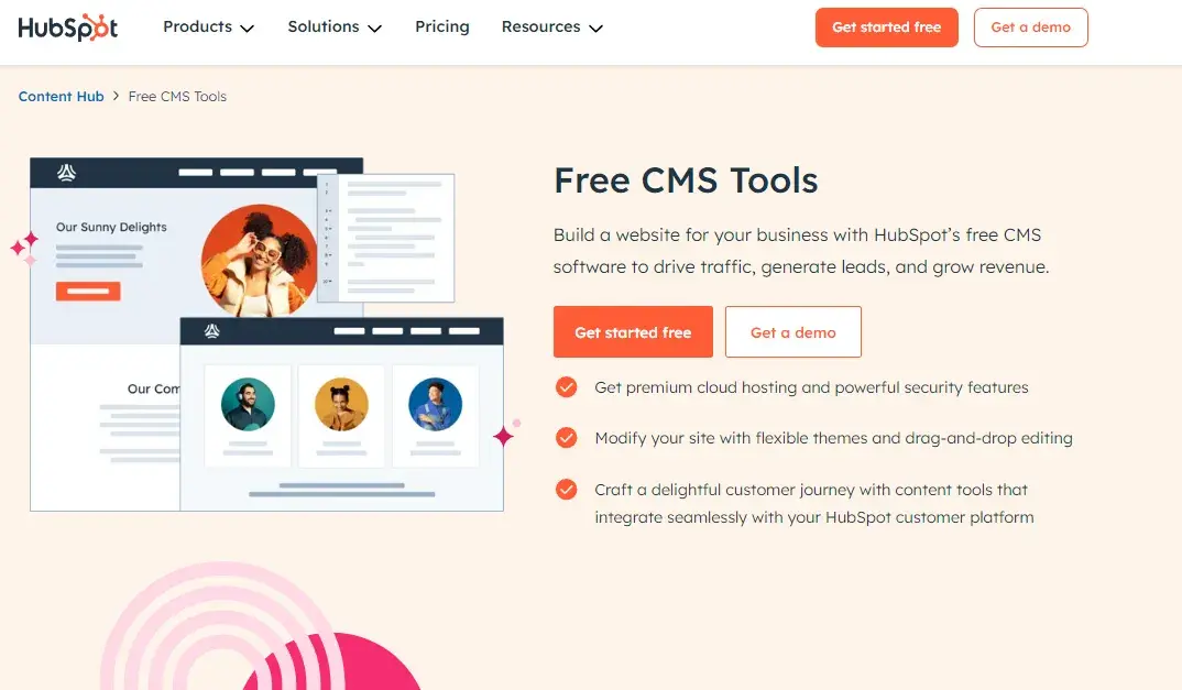
Blog software, free, examples: HubSpot CMS

Start blogging with HubSpot's Content Management System.

But what you're willing and able to pay is just the first of many important decisions. I’ll share some other features you might need for your blog. This can help you compare different blogging platforms.

Themes and Templates

Themes and templates allow you to customize a blog quickly and easily. When looking at different blogging platforms, check out their selection of themes and templates.
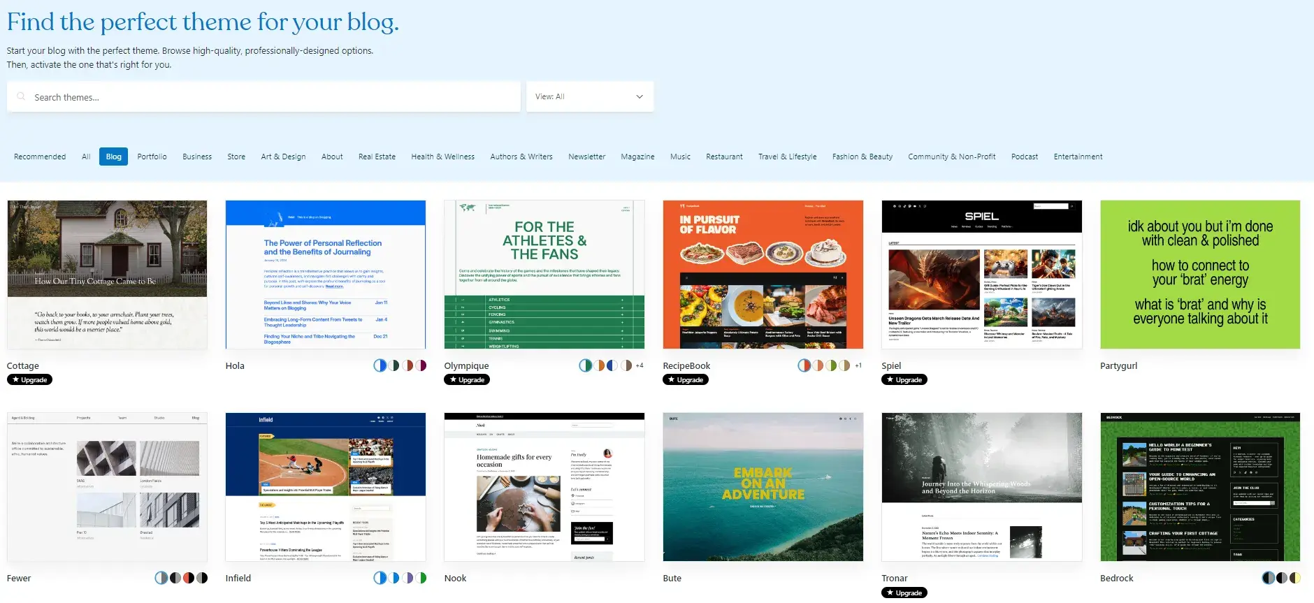
screenshot from WordPress’ theme library showing some of the best options for bloggers.https://wordpress.com/themes/filter/blog

Ask yourself:

  • Do they have a lot of templates for blogging specifically?
  • Do they have a variety of free and premium templates and themes?
  • Can you edit the themes and templates to create a truly customized look for your site?
  • Do you want to create your blog from scratch instead of a pre-designed theme?

These are just a few questions that can help you choose a platform with the design and customization options you need.

There‘s also a strong chance that you’ll fall in love with a blog theme and want to start building your blog right away. But if you‘re blogging for your business, it’s about more than aesthetics.

Content Editor

The content editor is the core of every blogging platform. As a blogger, you might be working with this editor every day, so make sure you pick a platform with an editor you like.

Think about ease of use. You want to be able to set up a blog and start adding content to it quickly. And you should be able to get a sense of the functionality and flexibility of the tool.

To test this, I recommend creating a complex blog draft. Be sure to add internal links, videos, and different images. Anything you think you might want to include in your final blog should be ready to test on each platform.

As you start comparing platforms, you'll start to get stuck on specific details. It can help to break your list of desired features into must-haves and nice-to-haves.

For example, maybe your editor must have drag-and-drop functionality and an auto-save feature. But it'd be nice to have the option to preview how your post looks on different devices.

Finding the Best Blogging Platform for SEO

As a passionate SEO, I would say this — but it’s not biased — SEO is another really important factor in your blogging journey. You want your blogging platform‘s SEO capabilities to align with your goals and needs.

For example, if you need to boost your visibility in SERPs, but you’re not very SEO-savvy, you’ll need a platform with built-in SEO tools.

Optimizing your content for search is essential to driving traffic to your blog.

According to a Backlinko study, sites listed on the first SERP in Google get 27% of all clicks for a keyword or phrase.

It's well-established that blogging can improve SEO if it‘s a useful resource for your customers. But SEO takes time to learn if you’re just beginning your content marketing journey.

On-page SEO, off-page SEO, and technical SEO are all important strategies that take time and effort to learn.

SEO Features and Tools

So, to get on that first page, you ideally want a platform with built-in tools to help you optimize your content.

Many blogging platforms offer plugins or add-ons to help with SEO. But, the features that will be most useful to you will depend on your current know-how.

For example, some platforms can help you build a site map or manage your blog URLs.

Many SEO techniques are repetitive processes full of details. So, it's also ideal to have a platform for your blog that can remind you to optimize for search as you build each blog.

For example, HubSpot SEO software offers on-page tips like reminding you to add alt text to blog images.

Best blogging platform for SEO example: HubSpot CMS

If a platform doesn‘t have this type of advanced functionality, then check if you can install a third-party SEO tool. Otherwise, you’ll have to get up to speed on SEO best practices and make sure to add them to your blog.

Extensions and Integrations

In my experience, no blogging platform can offer every single feature every single blogger wants out of the box. Besides, your blogging needs and goals will likely change over time as your audience grows or strategy shifts.

That‘s why it’s important to choose a blogging platform that offers extensions or integrations with third-party tools. Platforms with an ecosystem of apps will be able to scale with you over time. This helps make sure that you don't have to migrate to a more flexible alternative in the future.

Get Started Blogging

Once you figure out your blogging goals and needs, you can choose the right blogging platform. With a little focus, you can find a tool with the functionality and flexibility you're looking for.

I loved hearing pro tips from brilliant businesses and bloggers using some of the best blogging platforms. It shows that if you pick a platform and stick with it, you can create a great and meaningful blog.

Whichever platform you decide on should combine ease of use and power to propel your business. So get choosing and start blogging to reap the SEO and traffic benefits.

Editor's note: This post was originally published in April 2019 and has been updated for comprehensiveness.

The Ultimate Guide to Event Marketing for Business in 2025

Featured Imgs 23

At the start of the COVID-19 lockdown, my previous employer was just weeks away from its annual conference, and our event marketing efforts were in full swing.

After a year of promotion, we never expected our plans, let alone the entire world, to get shut down. But if I learned anything during that time, it’s just how valuable those events were.

While we can see people’s faces through video calls and hear their voices over the phone, there’s something about being in the same room IRL (or in real life, if you will) that just hits differently. And that’s why event marketing is so powerful.

Download Now: Event Planning Checklist [Free Download]

Today, 80.4% of businesses hold in-person events as their most impactful marketing channel. In fact, Forrester found that 48% of teams say events are more important today than before the pandemic.

Conferences, galas, tradeshows, happy hours — they’re all different, but they all help businesses better understand and connect with their audience and customers.

According to our 2024 State of Marketing Report, 16% of marketers plan to try experiential marketing this year, while many others are increasing their event budgets or trying to get more out of their event marketing strategies.

If you’re one of them, this guide is for you.

(But for the purposes of this guide, we’ll focus on being a host.)

Events of all kinds can be considered “event marketing.”

You can organize a small roundtable of seven to 10 guests, partner with another brand to sponsor a 5K, set up an exhibit at a major trade show — or even host one online as a virtual event.

Take HubSpot’s INBOUND, for example.

hubspot's inbound is a great example of event marketing done well

Image Source

INBOUND is a multi-day event that just celebrated its 12th year.

2024 was sold out, bringing together thousands of people around the globe with their interest in digital marketing and HubSpot.

It included live-streamed spotlights and keynotes on YouTube as well as in-person sessions, entertainment, and interactive experiences.

But the size or platform for your event doesn’t have to be big.

Brand Strategist Bridget Poetker explains, “Smaller, more intimate events are all the rage right now. These can even be more powerful (read: ROI positive) than large-scale conferences. You get more face time with a hyper-targeted list of attendees.”

So long as you bring value to attendees — customers, potential customers, and even employees — event marketing can be extremely valuable for your business.

Benefits of Event Marketing

According to Bizzabo, 76.6% of organizers consider in-person conferences critical to their organization’s overall success, and there are many reasons why.

Event marketing has a long list of tangible and intangible benefits, many coming back to increased brand awareness and customer connection.

Generating Brand Awareness and Recognition

Hosting or participating in events is a powerful way to introduce your brand to new people. In fact, 64% of event marketers reported that the primary reason for hosting events is brand awareness for their company or products.

When you think about it, this makes a lot of sense.

Online, there’s so much noise. You're basically competing with anyone with a web presence to rank in search engines or get eyes on social media.

But at in-person events, there are only so many people in the room. That means there are fewer brands to compete with for your audience's attention. Plus, people want to learn more about brands in these environments.

According to Freeman, 87% of event attendees say discovering new products and solutions is the most important element of a valuable in-person experience.

Furthermore, 80% of say in-person events are the most trusted way to discover new products and services.

So, use this to your advantage.

Read: How Experiential Marketing Works: 7 Enlightening Tips

Brainstorm exciting ways to showcase your expertise or enable attendees to touch, feel, and fully engage with your product or service.

For example, one of my former employers was a marketing and web design agency and at live events, we would host live website critiques with attendees.

These critiques allowed us to share some of the strategic knowledge someone would get if they worked with us and also give them the opportunity to meet some of the people they’d work with.

If you’re a chef or caterer, you can give our samples or do a live cooking demonstration like my friend Chef Devan Rajkumar did at Food & Drink Fest 2024 in Toronto.

If you’re a clothing designer, you can display some of your outfits or host a mini fashion show.

Event marketing allows you to bring all of the value and culture your brand promises to life. And the more creative your exhibit, the more people are to talk and spread word of your brand even further.

Building Deeper, Trusting Relationships

The internet has created a global digital marketplace, meaning many businesses never meet their customers or clients in person.

I mean, think about it. Unless you’re in the service industry or run a brick-and-mortar store, it’s not uncommon for all your interactions with customers to happen online or even asynchronously.

That’s where event marketing can be a game changer.

In-person events allow you to have personal, one-on-one interactions with customers and potential customers.

You can shake each other’s hands, hear each other’s voices, and even share a laugh. You can see a customer’s body language and expressions and better understand their concerns and goals to better serve them.

In return, they can better understand you, too.

Overall, there is less room for ambiguity, unknowns, or getting “catfished” by a business in person. Rather, you can form a real-life, trustworthy connection.

Don’t believe me? Freeman found that 77% of consumers say their trust increased after interacting with a brand at a live event.

Fostering Memorable Engagement

Kenny Nguyen, CEO of the creative agency ThreeSixtyEight shared with us, “The key to any great event strategy is very simple — identify the memory you want attendees to walk away with and work backward." And he’s not wrong.

According to Freeman, 64% of consumers retain positive impressions of brands they interact with at live events. And these positive memories automatically make consumers more inclined to want to recommend and even work with you in the future.

As Nguyen continued, “Human experiences will be how companies choose to differentiate themselves, especially those that can’t do so through technologies.”

In-person events are built to foster them.

Generating Leads and Sales

Ultimately, the goal of all this improved awareness and engagement is to nurture leads and generate sales.

While there’s no guarantee of deals closing on the floor at your event — and frankly, that shouldn’t be your focus — the unique relationships and interactions established at your events are often much warmer and ready to act than those who just discovered you online.

Types of Event Marketing

The umbrella of event marketing is wide and includes many different options with different benefits. Let’s discuss some of the biggest.

Conferences

When you think of event marketing, your mind likely immediately goes to conferences.

Conferences are large events typically organized and hosted by one major company and sponsored by many other brands and businesses. They can be valuable for both B2B and B2C organizations.

These events typically offer the most dynamic agendas, filled with speakers, workshops, and exhibit halls. Plus, Bizzabo found that 77.7% of attendees agree that in-person B2B conferences offer the best networking opportunities.

One example of a conference done well is Adobe Max.

adobe's Adobe.Max is a great example of event marketing done well

Image Source

Touted as “The Creativity Conference,” Adobe MAX promises to ignite attendees' imaginations, help them explore the latest creative tools and trends, and connect and collaborate with like-minded individuals.

For a brand with such a large share of both the B2B and B2C creative markets, this conference is an extremely memorable and on-brand way for Adobe to connect with its audience.

Trade Shows and Expositions

Trade shows or expositions (expos) are large events organized around a specific industry or type of product, such as sales technology or medical devices.

Whereas conferences are typically open to the general public, trade show attendees tend to be pre-qualified buyers, company representatives, and salespeople from their specific industry.

Because of that, trade shows and expos tend to give companies the best chance to show off their products and services and bring in the highest number of qualified leads.

One tradeshow you may be familiar with is the Consumer Electronics Show or CES.

CES is held annually in Las Vegas, Nevada, and features the latest technology in the IT, communications, and multimedia industries.

However, trade shows are also frequently much smaller and niche, like the New Jersey Bridal & Wedding Expo.

Educational Events (i.e. Seminar, Webinars, Lectures)

Seminars (often called webinars when hosted online) are valuable, education-centric events attended by a small number of people.

They typically involve discussions, lectures, and group activities and can also serve as intimate networking opportunities.

Roundtables are similar to seminars but usually involve individuals from different levels and departments within their companies.

Meanwhile, masterminds tend to involve individuals in similar roles (but different industries) and focus more on brainstorming ideas and sharing feedback.

All variations typically last no more than one day, with most lasting only a few hours. Educational events are also commonly held online to make them easier for people to attend during the workday.

HubSpot is no stranger to webinars, hosting them in our community and as gated offers.

example of webinar hosted by hubspot

The same can be said for the Marketing AI Institute.

example of a webinar landing page hosted by marketing ai institute

During these webinars, we often party with industry experts from other companies to share their knowledge with our audience and to also promote the event.

Want to learn more about running a successful webinar for event marketing? Check out “The Ultimate Guide to Creating Compelling Webinars.”

Workshops

Workshops are similar to seminars and roundtables in that they’re focused on sharing knowledge and educating attendees. But unlike seminars and roundtables, they’re typically open to the public.

Workshops can be offered both virtually and in-person, and while they aren’t traditionally promotional, they’re usually centered around a topic relevant to the host.

This is a “thought leadership” play, intended to make a company appear more credible in their field.

Popular Indian-American poet Rupi Kaur recently held a poetry writing workshop at The New York Public Library, for example.

example of a workshop hosted by NYPL with poet rupi kaur

The event was free and focused on Kaur sharing her writing expertise and spending time with some of her fans. Not to mention, it sold out in less than 10 minutes — while I was in the middle of checkout. Ugh.

The writing workshop is also a good example of a branded celebration.

Parties and Celebrations

Parties or celebrations are small, personal marketing events that can be held for a variety of reasons, including:

  • The launch of a new business or product
  • An exciting company announcement
  • Another success or milestone

Kaur’s workshop was limited to a small group of attendees and was held in celebration of the 10th anniversary of her first book, Milk and Honey.

While these types of events shouldn’t be centered on promoting a product or brand, a simple speech or presentation can help align the event with a company and remind attendees why they’re there.

But heck, even if they don’t have something new going on, some companies organize a yearly party simply to bring together and entertain customers or clients.

Gatherings like this can do wonders for showing appreciation for your customers and building brand loyalty.

Brand and Product Pop-Ups

Pop-ups are temporary retail spaces or experiences where companies can showcase and sell their products in a controlled environment.

Initially, they were mostly held by e-commerce brands that don’t have a full-time brick-and-mortar storefront, but today, they are increasingly common with businesses of all kinds. But why exactly?

Businesses love that pop-ups can bring their brand and products to life in memorable, immersive settings that customers want to share on social media. And customers love the unique experiences.

Typically, pop-ups are limited-time engagements (ranging from a few hours to a few weeks) that feature detailed, branded environments, interactive displays or activities, and even freebies.

This makes them feel exclusive and, in turn, even more appealing.

Setups like these are popular with beauty brands like Dior.

But can also be arranged for tech products like the game Fortnite:

Or to promote content like this one I attended for the Netflix series “Stranger Things”:

See more examples and learn how to plan a memorable pop-up.

Networking Events

graphic illustrating statistic of how popular networking at conferences is

Networking events are any occasions people attend hoping to make professional connections — and, honestly, they are arguably the most valuable events a business can offer.

In addition, they are also one of the least demanding events a business can host.

Now, don’t get me wrong. That doesn’t mean you can phone it in, but networking events certainly require less detailed planning than pop-ups, parties, conferences, or educational workshops.

As a host of a networking event, it’s your responsibility to create a comfortable space — 64.6% of event attendees say this can make or break an event — perhaps provide some refreshments and, of course, get people in the door.

Otherwise, a networking event can be as structured or casual as you like.

Several years ago, I attended a speed networking event during INBOUND, for example.

The hosts provided the space (a private room at Harpoon Brewery), a drink ticket, and a few snacks, then led a structured rotation of introductions/meetings.

In this setup, every attendee was guaranteed an audience with everyone else in the room, but only for a pre-determined amount of time. This was great for someone like me who had trouble breaking the ice when networking.

Some other popular networking formats include:

  • Happy Hours
  • Career Fairs
  • Business Brunches or Lunches
  • Industry Meet-ups

Poetker continued, “I‘m a big fan of the more casual happy hours and ‘dinner on our dime’ marketing events. They get people out of their work mindset and help them connect on a deeper level."

"Marketing is human to human; it’s about empathy. Those experiences you create together are invaluable to long-term relationship building.”

Charity Galas and Fundraisers

Galas and fundraisers, in some ways, are similar to parties and celebrations.

Attendees enjoy entertainment, but rather than celebrating a brand accomplishment, these events are centered around the goal of raising money and awareness for charitable causes.

For example, Travelers Insurance annually holds a golf tournament in Hartford, Connecticut.

It’s a multi-day event that welcomes celebrities, athletes, and thousands of patrons for some fun on the golf course, but it also raises millions for hundreds of nonprofits.

screenshot of the travelers championship website homepage

Image Source

Similarly, since 1995, the Academy for Motion Picture Arts & Sciences (the organization behind The Oscars) has hosted a viewing party supporting the Elton John AIDS Foundation.

screenshot of elton john's charity AIDS gala

Image Source

According to YouGov, more than two in five consumers (45%) are more likely to buy from a brand that supports charitable causes.

Meanwhile, a whopping 82% prefer when a brand’s values align with their own, according to a Harris Poll commissioned by Google Cloud.

Knowing this, fundraisers and galas are another great opportunity to connect with your buyers and supporters.

But remember: Make sure your support is genuine. Consumers can sense performative activism from a mile away.

How to Develop Your Event Marketing Strategies

Now that you know your options for event marketing, here are some steps to lay the foundation for your event marketing strategies and plans.

Note: From planning to follow-up, our comprehensive event planning checklist covers everything you need to know to plan, promote, and seamlessly execute any marketing event. Get your free checklist here.

1. Define your event goals.

Before starting any strategy, you need to know what you’re trying to achieve. So, first and foremost, ask yourself, “What are my goals with event marketing?”

Perhaps you’re trying to generate more qualified leads like one of my former employers, or you want to build brand awareness. Whatever your mission, sit down with your stakeholders and frame them in the SMART methodology.

SMART stands for specific, measurable, attainable, relevant, and timely — and the format helps keep your goals clear and actionable. It also gives you something specific to gauge whether your event succeeded.

An example of a SMART event marketing goal could be “Grow our prospective leads list for our new product by 100 names by the end of the event.”

This goal is specific (prospective leads for only the new product), measurable (100 names), attainable and relevant (assuming the event is relevant and there are more than enough attendees to get 100 names), and timely (by the end of the event).

Note: Don’t limit your event to one single goal. You should also set intangible goals like “strengthen relationships” and “engage prospective customers,” but in terms of creative and fiscal decisions, use your SMART goals to guide you and measure on the backend.

2. Set your budget.

Next, take some time to define your event marketing budget.

This is crucial as it can frequently be a deciding factor in your options for the venue, food, speakers, entertainment, swag, and other important pieces of your event. But how much should you plan to spend?

That will depend very much on your goals and event type, but Bauer Entertainment Marketing suggests allocating 15% to 20% of your total potential gross revenue if your event sells out.

It explains, “If an event has 2,500 tickets to sell at an average price of $40 per ticket, hosts stand to collect a total of $100k if all tickets are sold. After applying the 15%-20% principle, the resulting budget is between $15k and $20k.”

3. Identify your target audience.

Who do you want to attend your event? What kinds of people do you want to engage with and introduce your brand to? Establishing your audience will help you target and invest in the proper marketing channels and plan your speakers, activities, etc.

If your business has buyer personas, this should be a fairly quick step in the event marketing strategy process. But if it doesn’t, learn more about creating detailed buyer personas and download our free template here.

4. Pick your event type and theme.

To market your event, you obviously need to know what you’re marketing — Is it a conference? A gala? Will there be breakout sessions? Happy hours?

Before moving further with your event marketing, establish the key information your audience needs before buying a ticket. This includes:

  • Event Name
  • Venue
  • Date and Time
  • Purpose/Value Proposition (a.k.a. What will people get by attending?)
  • Who Should Attend
  • Schedule/Itinerary (i.e. Happy Hours, Workshops, Seminars, Keynotes)
  • Ticket Price

You don’t have to have all the little specifics figured out before you start promoting your event (i.e. exact keynote speakers), but you should at least have an idea of what you’ll offer attendees, who the event is catered for, and the location and date.

For example, while we didn’t know the specifics of INBOUND 2025 at the close of INBOUND 2024, we did know the date and location (in San Francisco, CA for the first time) and a general idea of what attendees would experience.

This was enough to early bird registration:

screenshot showing INBOUND 2025 early bird registration page

Finalizing foundational details like these will also help determine parameters for the rest of your marketing, such as your promotion timeline.

Pro tip: Branding your event is an important part of developing your theme. Read “What Is Event Branding? + 5 Examples to Inspire You” to help you get it right.

5. Determine your promotion timeline.

When it comes to in-person events, people often need time to plan, especially if they’re professional events. They may need to clear their schedule, arrange travel accommodations, or even convince their boss to pay for their ticket.

Considering this, it’s best to give your business an extended runway to promote any event.

In my experience, you should give yourself at least one month to market any event, but if it’s a multi-day, high-investment event like INBOUND, this timeline should ideally extend to at least three months.

If I didn’t emphasize it enough, “at least” are the keywords here. It’s really never too early to start promoting a multi-day event or one with a higher price tag.

Marketing dangerously with a shorter timeline can set you up for failure or objections like “I already had plans.”

From here, start outlining your promotion and when you’ll release what. Keep in mind holidays or special occasions when you may want to offer a sale or even an opportunity to win tickets.

It’s also wise to organize a multi-touch marketing campaign for your events. Use a variety of mediums and outlets (e.g., email, social media, direct mail, phone calls, print ads, and paid ads). But more on that in the next section.

A consistent, well-thought-out promotion timeline will help pique and maintain your audience’s curiosity, ultimately nurturing them toward a purchase.

Pro tip: Poetker suggests breaking your timeline into three big buckets: pre-event, during, and post-event activities.

She explains, “This is your mission control for everything from designing swag and staffing a booth to ABM dinners and drip campaigns.

The real benefit here is you can easily see your bandwidth and resources right next to clearly defined next steps.”

Need specifics? Our free event planning checklist has you covered.

6. Outline your plan for marketing and promotion.

How are you going to get people to attend your event?

Social media and an event website are important channels in today's digital market. However, if your event is local, you may also want to consider print advertisements or media coverage.

(Note: Need help designing your event website? Check out the article “The 22 Best Conference Website Designs You'll Want to Copy.” The tips are easily adaptable to other event types.)

You can also capitalize on event listing websites like Eventful, Hey Event, and 10times to reach more people. Let’s quickly dive into a few other popular forms of event marketing promotion.

Event Marketing with Email

39% of marketers found that email marketing tools were the greatest contributor to event success.

Email information is easy to collect at registration, and checking email is part of most people’s daily routine, so, in theory, there’s a higher chance of getting your messages noticed.

Like this email I received promoting a webinar from the Marketing AI Institute, for instance.

example of email event marketing from ai marketing institute

Pro tip: Often, companies will create separate email addresses and newsletters for their events to keep communication and promotion separate from their other marketing efforts.

This helps ensure you’re not spamming uninterested parties and also keeps the deliverability of your event emails unaffected by other variables.

Read: Email Marketing: The Ultimate Guide (Expert Tips + Data to Know)

Content Marketing and Blogging

Whether it was promoting workshops at a marketing agency or musical productions at a regional theatre, content marketing and blogging has always been a staple of my event marketing strategies.

These long-form types of content allow you to go into greater detail about the specifics of your event, whether it be a particular speaker, session, or experience taking place.

It also creates an additional page to be shared on social media and indexed in search engines.

INBOUND has an entire blog dedicated to the annual event.

example of a blog written by INBOUND to market the event

It shares tips on getting the most out of your attendance, announcements of what to expect, and even session recaps, and profiles of past and future speakers.

Promoting your event doesn’t stop at email or content. Check out these resources for even more tips on how event marketing:

7. Plan for content creation during the event.

Marketing your event shouldn’t stop when your event begins.

Dedicate some resources to promoting your event as it’s happening. Attendees may learn something new about what’s offered, and those who didn’t register will be curious about what they’re missing.

Over the years, I’ve been in charge of real-time content during dozens of events. This primarily involved managing a small team that:

Here’s a peek at one of my teams from back in 2016:

instagram image from ramona sukhraj's event marketing days

It also meant creating a hashtag dedicated to the event and finding ways to boost engagement through contests and games (as seen below) — and none of this is uncommon.

screenshot showing results of event hashtag on instagram

According to Sweap’s 2023 State of Event Marketing Report, 78% of marketers said social media had the most positive impact on events. So, plan accordingly.

What kind of content should you post?

  • Photos of attendees engaging
  • Powerful clips from sessions and keynotes
  • Quote graphics
  • Attendee-generated content
  • Helpful tips
  • Updates and reminders on different events

Pro tip: Dive into your buyer personas to see what platforms your audience is using most frequently. However, remember that not all platforms are suited to real-time publishing.

I recommend focusing on X and Instagram for live posting and looking into live-streaming on Facebook, YouTube, or LinkedIn, depending on your audience’s preferences.

8. Outline your technology needs.

Selecting the right event technology for your specific needs is essential for the success of your event. The right tech simplifies event marketing and event management for a seamless attendee experience.

Aim for a comprehensive event platform capable of handling everything from registration, check-in, and badging to attendee management while also supporting your event marketing goals.

Additionally, if you use HubSpot, choosing software that integrates smoothly with your HubSpot CRM is critical for the timely execution of your marketing campaigns.

For tips on how to pick the best event management software, visit the detailed Event Management Software Guide by Accelevents, our certified HubSpot app partner. They also have a great post on integrating event registrations with HubSpot.

9. Determine how you will measure success.

During a bustling event, it’s easy to look around and feel good about your attendance and engagement. But is that gut check really the best way to evaluate whether your event was a success? Probably not.

As Mike Piddock, Founder of event hosting platform Glisser, shared:

“Events need to be assessed with hard metrics, rather than just ‘gut-feel’ opinions and feedback forms to rate the coffee. Measure attendee engagement, rather than simply counting who registered and who showed up, as this is a great proxy for the effectiveness of the event.”

Like every other marketing investment, it’s wise to set key performance indicators (KPIs) against which to measure and evaluate your event's performance. Here are a few common KPIs for event marketing.

Registrations and Check-ins

Not everyone who registers for your event will attend. So, make sure to compare your registrations to your actual attendance and consider reaching out to a few who registered but didn’t check in.

Take a look at your registration data to see when the most and fewest tickets were purchased, what kinds of tickets were purchased, and if you offered a variety of ticket packages or options.

Revenue and Cost-to-Revenue Ratio

If your event requires a paid ticket, gross revenue is an important measure of success.

How much money did your event bring in? How does that amount compare to what you spent on the event?

This comparison will help you better understand the value of your event and the resources offered. Events are expensive, but they’re not worth going into debt for.

Social Media Mentions/Engagement

How often was your event discussed on social media? What was the general consensus around the event? Did your attendees share content that engaged non-attendees?

In today’s digital world, social media is a great measure of event success and reach. Take a look at your event mentions on Facebook, X, Instagram, and more.

I’m a big fan of using event hashtags (both professionally and personally) to keep attendee content easy to find, share, and, in this case, measure.

Pro tip: If you’re a HubSpot user, you can set up streams in your social inbox to monitor your specific event hashtag or handle mentions. This makes engaging and resharing content much easier.

Lead Acquisition and Customer Conversion

Acquiring leads and converting customers are key benefits of event marketing, so it’d make sense to measure these KPIs for your event.

Note how many qualified leads you gain from your event and then track how many of those leads are converted into paying customers.

This can help reveal the direct ROI of your event and see which tactics worked for lead collection and conversion.

Attendee Satisfaction

Maybe you hit your sales goals, but did your attendees actually enjoy your event? What did they participate in and enjoy the most?

“Satisfaction” may seem like an obscure metric, but understanding the opinions and perspectives of your event attendees can help you better understand where your event was a success — and where you could improve.

Consider building a survey to ask your attendees about their experience, takeaways, and to calculate a Net Promoter Score (NPS) for your event.

Speaking of attendee satisfaction …

10. Establish your plan for collecting feedback.

graphic showing statistic on event attendee follow-up

As mentioned earlier, you could hit all your registration and attendance goals, but if people didn’t actually have a good experience at your event, they are unlikely to recommend it, buy from you, or return in the future.

So, good or bad, make sure you have a plan in place for collecting feedback from attendees.

Of course, we hope people will remember their event experiences for years to come, but that’s unlikely, so it’s best to request feedback immediately after or within the week following your event.

One popular option is emailing a link to a survey to everyone who attended the day after the event. You can include questions like:

  • What was your favorite experience or moment of the event?
  • What could we improve on?
  • Did the event meet your expectations?
  • Would you want to attend this event again in the future?

Dig deeper into these and 21 other questions you should ask in your post-event survey.

Pro tip: To add a little extra incentive to fill out your survey, try offering a small discount code to attend a future event as a thank you. After completing the survey, you can deliver the code on your thank you page or in a follow-up email.

Scale your event marketing IRL.

Organizing and implementing an event can feel like a daunting task, but crafting your event marketing strategy with the steps we outlined will help you put your best foot forward for success.

Whether your event entertains new clients, builds your contact list, or raises money for your favorite charity, event marketing can help you meet, engage, and truly connect with your audience unlike ever before.

Editor's note: This post was originally published in April 2015 and has been updated for comprehensiveness.

Phases of Website Redesign: The Ultimate Guide for Marketers

Featured Imgs 23

The first website redesign project I led was a six-month-long baptism by fire. I learned everything on the fly, which is a great way to grow and get hands-on experience — and also a highly effective way to breed stress and anxiety.

To save you some of the latter without sacrificing any of the former, I’ve written a guide with tips on building a successful redesign strategy, whether you’re working with an agency, doing an in-house redesign, or proposing a redesign to company stakeholders.

Free Workbook: How to Plan a Successful Website Redesign

I’ve spearheaded multiple website redesign projects, and I can tell you firsthand: The more clearly you define your vision at the very beginning, the smoother the entire process will be — and you’ll see better results, to boot.

Many organizations decide to redesign their website in order to drive more traffic as their business grows. Others invest in a website redesign as part of a larger rebranding initiative.

In one redesign project I led, an in-house product team worked for six months to make significant structural updates to an existing CMS to accommodate my team’s complex needs.

In another project, we decided to scrap the existing CMS and rebuild and redesign it from the ground up.

For that project, we took extra time to consider the foundation and structure of the redesigned site so that it would be usable for many years. We built it to be structurally sound and exceptionally flexible, making it easier (and cheaper) to handle future refreshes.

Regardless of why your company is interested in a website redesign plan, it's likely to be a massive project.

It’s also an endeavor that’s vital to get right, considering the critical role your website plays in your marketing and brand image. If consumers can’t quickly and easily find the info they’re looking for on your site, you’ve already lost them.

How Often Should You Redesign Your Website?

It may be tempting to give in to changing design trends and advancing technology. But your website may last longer than you think.

I asked Simon Strande, the CEO and CTO of Webnorth, a Denmark-based web development company, what the average website lifespan was. Strande has been building websites for nearly 15 years, and he says that in general, “the lifespan is actually increasing.”

Although he says that the standard lifespan is two to four years, “looking at our clients, it can be quite a bit longer, depending on the initial development of the platform and how flexible it is.” If the site has built-in flexibility and room to scale, you probably won’t need a completely new website every two or so years.

There are two big caveats to that: maintenance and technology.

Strande says that “if the system has been very poorly maintained, then the lifespan won’t be as long. And sometimes the client doesn’t even know it’s poorly maintained — the system just gets slower and slower.”

“If the system has been very poorly maintained, then the lifespan won’t be as long. And sometimes the client doesn’t even know it’s poorly maintained — the system just gets slower and slower.”—Simon Strande, CEO and CTO, Webnorth

And sometimes, technology shifts so significantly that you need a full redesign just to keep up. Strande says that he started working in web development before responsive websites — mobile-friendly websites that adapt to the user’s device — were necessary.

“That was a big period in development,” he says. “Often we could accommodate existing designs to be responsive, but many times the website was just never designed in the beginning to be responsive.”

If your website works for both you and your users and has been appropriately maintained, but the branding or design feel dated, you may want to consider a website refresh instead.

How to Determine if You Need a Website Refresh

A website refresh updates non-structural elements like graphics, fonts, and brand colors — which may be enough to stave off a full-scale redesign for another year (or more), or until you have functional reasons to do a full redesign (more on those later).

Redesign or refresh? Use these questions to determine whether you need a fully redesigned website or a visual refresh. Has traffic to your website plateaued or significantly decreased? Is your site functional and fast? Does your current URL structure follow best practices for technical SEO? Have your brand or goals changed? How much budget can you allot to design and development? Are your internal stakeholders aligned? Has the industry changed since the last redesign?

The following questions can help you determine whether you need a redesign or a refresh:

  • Has traffic to your website plateaued or significantly decreased? Dips in traffic can be a complicated problem to untangle, and a major slowdown in page views is often due to a variety of factors.

But if your site is no longer converting the same amount of traffic, if users bounce after only a few seconds, or if pages-per-visit numbers decrease, your website may have outlived its functionality.

  • Is your site functional and fast? Step into your customers’ shoes and see if you can easily navigate the site and find what you’re looking for without encountering errors or long page load times.

In our 2024 survey of 300+ web strategists, HubSpot found that 20% of websites get between four and six page views per visit — and over 50% receive six views or more per visit. (We’ll publish the findings of that survey later this month, so stay tuned.)

All that browsing means that your site’s navigation and speed really do matter.

  • Does your current URL structure follow best practices for technical SEO? If you’re not thinking about this from the beginning, says Strande, “you can have big problems later, not just with the structure of the content and data, but with search engines.”

This can have devastating implications: “The worst thing that can happen is that you have to rebuild the entirety of the search engine presence that you had before.” Strande’s next words are chilling. “For some businesses, that has been an unrecoverable loss.”

“The worst thing that can happen is that you have to rebuild the entirety of the search engine presence that you had before. For some businesses, that has been an unrecoverable loss.”—Simon Strande, CEO and CTO, Webnorth

  • Have your brand or goals changed? If you’ve materially altered course since your last site redesign — maybe your business has adjusted its value proposition or mission, or maybe you’ve exploded in growth — your website may no longer represent who you are as a company.

Strande says, “What we see a lot is websites that were made when the company was not that mature. And now that the company has evolved, can the website evolve with the new demands?”

Sometimes you can “put a kind of dressing on it without having to change it overall. But sometimes the brand change is so big that you have to ask yourself whether a refresh makes financial sense.”

  • How much budget can you allot to design and development? Can you put in the resources and budget required to deliver an outstanding redesign? Also consider whether you’ll strain internal resources if people are reallocated to a major redesign.
  • Are your internal stakeholders aligned? It takes a village, as they say. This particular village includes designers, developers, SEOs, online marketers, content creators, and more. Take stock of different pain points and what problems everybody is trying to solve. This can be a great indicator for how extensive the redesign needs to be.
  • Has the industry changed since the last redesign? For example, when Google announced that it would be changing to mobile-first indexing, websites had to become mobile-friendly or risk losing organic traffic from Google.

If your site still functions properly and just looks a little dusty, you can address design elements like colors, fonts, and branded photo treatments without going back to square one.

I’ve found that building the plan can take as long or longer than the actual redesign process. Think of it like laying the foundation for a house — if you don’t get it right the first time, it can’t support the internal infrastructure, much less design details.

If you’re wondering what should go into your website redesign strategy, start with the following steps.

Below, I’ll unpack these 10 critical website redesign tips to think about when planning and completing your redesign.

1. Benchmark your current performance metrics.

Before you begin planning your website redesign, it’s important to document your current performance metrics. This will give you a good idea of where your current website stands and what metrics you can improve upon through your redesign.

This also lets you measure growth (or any other metrics) that the redesign is directly responsible for.

If you’re not sure where to start, I recommend analyzing your existing website’s monthly performance in the following areas. The importance and relevance of each may vary depending on your website redesign goals, but I’ve found that it can be helpful to look at many of these metrics before diving into a redesign:

  • Number of visits, visitors, and unique visitors.
  • Bounce rate.
  • Time on site.
  • Top-performing keywords in terms of rank, traffic, and lead generation.
  • Number of inbound linking domains.
  • Total new leads and form submissions.
  • Total sales generated.
  • Total pages indexed.
  • Total pages that receive traffic.

If you don’t currently have access to this information, tools like Google Analytics and HubSpot’s Marketing Analytics can provide data.

Screencap of charts from HubSpot’s marketing analytics software.

Image Source

Pro tip: Remember to note which tools you use to measure each of these benchmarks. That way, you can use those same tools again when collecting your post-redesign metrics and thus avoid comparing apples to oranges.

2. Determine your website redesign goals.

What’s the “why” behind your website redesign?

If your answer is, “Well, it’s been a while since we’ve done one,” or “My competitor just redesigned their site,” you’re not likely to be happy with the result. When it comes to investing in a website redesign, there should always be a good reason to do it.

Some basic user testing can go a long way if you have the time and resources — you’ll start to note patterns after five or so tests, so this doesn’t have to be extensive.

But word to the wise: If you’re only testing a small number of users, be mindful of how you interpret and use the results. They may confirm your hunches or give you guidance, but avoid making a huge structural change to your site based on just a few user opinions.

If you’re able to talk to users, record the sessions and have the users share their screen with you, so you can watch how they navigate your site. Ask them to talk you through their thought process as they answer the questions.

I also find it helpful to write up a brief recap immediately after each user interview — it helps me find patterns more efficiently.

Whether you’re doing the audit yourself or interviewing users, here’s a few questions I’ve used in the past that you can adapt to your specific needs:

  • Ask the user to find a specific page on your site. Take note of the path they take. Was it different from what you expected?
  • If you’re testing a specific feature, like a button or new navigational tool, ask why the user clicked on one element instead of another.
  • If you’re testing new editorial features, ask what kind of content the user would expect to see under a certain topic or theme.
  • Ask what other websites the user frequents, specific to your product or service. For example, if you sell budget travel packages for Gen Xers, ask where else they look for similar experiences.

Again, if you’re doing this yourself for the first time or are on a shoestring budget, the answers to these questions shouldn’t be the sole determining factors for any redesign changes.

If you get surprising results, you may find it useful to partner with UX pros to do more structured, extensive testing. But even a small-scale audit can give you some supporting data or quotes to augment your recommendations for a redesign.

Remember: It’s not just about how your site looks but also how it works. Be crystal clear about why you’re doing a website redesign, and tie those goals to measurable results. Then, communicate your goals with your team, designer, or agency.

Consider the following data-driven objectives for your own website:

  • To increase the number of visits and visitors (both are important, as one visitor could visit more than once).
  • To reduce bounce rate.
  • To increase time on site.
  • To improve domain authority.
  • To increase new leads and form submissions.
  • To increase total sales generated.
  • To enhance SEO rankings for important keywords.

Many of these goals are dependent on one another. For example, in order to generate more conversions, you may need to increase traffic while also decreasing your site’s bounce rate.

Take a look at the metrics you pulled out in the previous step. Are there any that you can improve upon with your new website? Perhaps you can use your old website metrics to inspire new goals.

Screencap of charts from HubSpot’s dashboard and reporting software.

Image Source

What I like: You can use HubSpot’s custom dashboards to track performance on the metrics that matter most to you — and then use that past performance data to inform your forward-looking goals.

3. Define your branding and messaging.

Back to our house analogy: You need to have a floor plan before you can lay the foundation. And while you don’t need to pick out paint colors at this stage, you do need to know things like architectural style and where the plumbing will go.

Similarly, before you can redesign your website, you’ll want to be crystal clear about desired branding, messaging, and unique value proposition.

If this is likely to be a source of friction with other stakeholders, resist the temptation to forge ahead with the redesign. Your site will be more successful and have a longer life if the stakeholders are aligned.

First-time visitors to your site should immediately understand what you do, how it may benefit them, and why they should stay on your site. Otherwise, you’ve just given them a reason to flee to your competitors.

For example, take a look at HubSpot’s homepage below. It’s immediately clear what the company does, what it offers its customers, and how any visitor can get started:

Screencap of HubSpot’s homepage.

Image Source

Think about whether you plan to change your branding and/or messaging in the near future or if you expect it will stay the same for a while. If you do plan to change it, what will you need to change? Keep these changes top-of-mind as you redesign your website.

Download this free workbook for guidance and templates to simplify your next website redesign project.

Additionally, as you develop your company branding, consider which visual aspects of your website need to be redesigned and what can stay the same. Have you created a new logo, style guide, or color palette? Make sure these are applied to your new website, so it remains consistent with other parts of your brand.

Pro tip: For some more inspiration, check out this roundup of B2B website examples:

4. Define your buyer persona(s).

Your website is not just about you. In fact, it’s hardly about you at all.

When your visitors land on your website, they’re asking themselves, “What’s in it for me? How could this company help me?”

So don’t make your website all about you. Instead, speak to your visitors in their language by crafting your website design and content around your buyer or user personas.

For instance, if you’re a marketing manager at a hotel looking to bring in new business, you might target five different buyer personas: an independent business traveler, a corporate travel manager, an event planner, a vacationing family, and a couple planning their wedding reception.

Screencap of HubSpot’s Make My Persona tool.

Image Source

Make sure you clearly identify your buyer personas, so you can shape your website redesign strategy around the kinds of website visitors that matter most to you.

What I like: Check out HubSpot’s handy buyer persona builder to help you create detailed buyer personas.

Finally, ask yourself: Is your target audience changing as part of your website redesign? And if so, do your branding and content align with this new audience?

Answering these questions will be vital as you’re strategizing about your website redesign.

5. Protect your search-engine-optimized pages.

Getting discovered online is essential to improving your website’s metrics. After all, if no one is able to find and visit your site, how can you increase new leads, conversions, or sales?

Here are three of my top tips for designing your new website with search engine optimization (SEO) in mind:

Document your most search-valued pages.

First, use marketing analytics to figure out which of your website’s pages currently receive the most traffic and inbound links, convert the most leads, and cover the most influential topics in your industry.

Write down a list of these highly valuable pages, and if you plan to move any of them, make sure you create the proper 301 redirects.

Create a 301 redirect strategy.

Next, speaking of 301 redirects, these are extremely important in terms of retaining the traffic and link value associated with a given page.

Create a spreadsheet to record and map out your 301 redirects (old URLs vs. new URLs). Then, hand this document over to a technical expert to make sure all the necessary redirects are properly implemented.

Do your keyword research.

Finally, when crafting your newly designed website, pick one keyword or topic for each page to focus on. Once you identify these keywords, use on-page SEO best practices to optimize your website pages.

You can also consider adding new content and pages to your website that address keywords or topics that may be neglected on your current site.

Save time and rank higher on Google with our free on-page SEO template.

Pro tip: HubSpot’s SEO Marketing Software can give you insights into your website’s current SEO performance, helping you optimize your website redesign plan.

Screencap of HubSpot’s SEO software.

Image Source

6. Analyze the competition.

While I don’t recommend obsessing over your competitors, knowing how you compare can be helpful. To that end, I’d suggest running your website through HubSpot's free website grader tool to generate a report card on how well your website is performing.

You can then use this diagnostic tool to evaluate your competitors’ websites, so you’re aware of their strengths and weaknesses as well as your own.

Pro tip: HubSpot’s AI search grader tool is a great way to gain insight into how AI search engines perceive you — and your competitors.

Next, take a look at your competitors' websites, and take note of what you like — and what you don’t.

Once you conduct these competitive analyses, you can use the insights you’ve uncovered to put together a list of action items highlighting some areas for improvement and ways you can use your website to set yourself apart from your competitors.

7. Take inventory of your high-performing content.

While a redesign is a great way to improve the performance of your website, it’s not without risk: In fact, if you’re not careful, it can end up harming your website’s performance.

This is because your existing website likely contains many high-performing content assets that you’ve already built up, and if your redesign causes them to become less effective, it can severely damage your marketing results.

Pro tip: HubSpot’s SEO Marketing Software can help you identify your existing top-performing pages, so you don’t end up harming your performance through your website redesign.

Screencap of HubSpot’s SEO marketing software.

Image Source

For instance, these high-performing assets might include your:

  • Most-shared or most-viewed content.
  • High-traffic pages.
  • Best performing or ranking keywords and associated pages.
  • Number of inbound links to individual pages.

For example, if you end up removing a page from your site that has accumulated a high number of inbound links, you could potentially lose a lot of SEO credit, which would make it harder for your site to be found on search engine results pages (SERPs).

Don’t hesitate to remind stakeholders about SEO considerations and help them along by auditing your site and providing them with a list of critical pages to be sure to maintain or update.

8. Choose the right software.

One of the most important steps in the website redesign process is choosing the right software to create and host your website. This software is typically called a content management system (CMS), and it’s used to develop, design, and publish your website for the world to see.

Whether you’re a novice digital marketer or a pro web developer, a CMS can help you build a gorgeous, functional website with ease. Of course, determining which CMS is right for your needs will depend on your unique business, the features your website redesign will require, and your level of familiarity with different CMS tools.

Strande says that he’s seeing more clients choose a headless CMS, which he says allows you to “change the entirety of the front end without having to change the backend.” The pro is that “it can really increase the lifespan of the platform.” On the other hand, “it’s often a higher initial investment.”

There are hundreds of CMSs to choose from, including HubSpot’s Content Hub. You can also review some of the best CMS platforms to learn more about the range of available options.

What I like: HubSpot’s Content Hub gives you the tools you need to get your website redesign off the ground.

Screencap of HubSpot’s Content Hub.

Image Source

9. Migrate your content.

If you’re working with a technical partner, ask them early in the process how they typically handle content migration. This can be a huge — and hugely expensive — job, and it’s not always included in the redesign quote.

If you have a small amount of content, or are building a site for the first time, this may be something you can handle on your own. But if you have even a moderate amount of content, trying to do a manual migration is a daunting, time-consuming task.

10. Make a post-launch checklist.

The period immediately after a website relaunch is a critical time: You’ll find bugs or other glitches, a stakeholder will ask why a logo is purple when they thought it would be green, or links will be broken.

Don’t panic! Even the best-laid plans always have a hiccup or two. I like to allow an extra two weeks after a relaunch to find all the bugs. (Then I take a long vacation; web relaunches are a lot of work.)

Here are a few things to keep in mind after a relaunch:

  • Implement a bug-reporting system. Stakeholders should know how to report any bugs they find, whether that’s using an automated system or simply Slacking a single person who can track everything.
  • Spot-check your new site for broken links and images. Look at some of your highest-performing pages. Are there any glaring errors, like broken links, broken images, or formatting issues?
  • Check for 404 errors. After leading a web relaunch that involved significant changes to URL structure, I found that a number of pages were still returning 404 errors. Solutions to 404 errors can get somewhat technical, so consult with your tech or product team before setting up redirect links yourself.
  • Have a plan for your old website. If you’ve built a brand new website and migrated your old content, you may effectively have a duplicate of your entire website. In most cases, this won’t turn into a problem — your tech or product team will follow best practices to make sure the transition is seamless.

But in one redesign I worked on, this became an issue because we migrated the content in stages — meaning that we needed two active websites for a period of time.

Google doesn’t like duplicate content (even if it’s all under the same domain), so we had to implement some technical solutions to minimize any SEO damage.

Budget for a maintenance plan. Properly maintaining your website is one of the most important factors in its lifespan, so don’t cut corners here.

Testing It Out: Designing a Digital Portfolio

HubSpot contributor Allie Decker put these steps into action and helped program manager and content editor Katilin Milliken redesign her personal website.

This is Milliken’s online portfolio, showcasing her work throughout her career. However, it hadn’t been updated in a few years. Here’s how Decker approached this project.
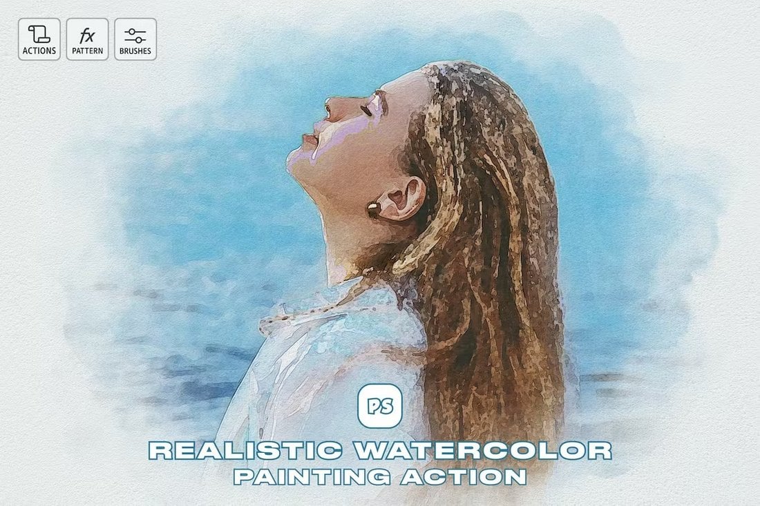
Screencap of homepage of Kaitlin Milliken’s old website.

Discovery: The Goals of the Site

Before actually making changes to the site, Decker talked to Milliken about goals. She sent the following questions:

  • What are the goals of your website design?
  • What’s the vision for or purpose of your site?
  • Who is your audience?
  • Are there any specific changes you would like to see?

Here’s how Milliken responded.

What are the goals of your website design?

“I initially created this site when I was a business journalist to capture the different articles and multimedia stories I worked on. I’ve since switched over into program management and working in tech. I want my site to tell the story of that career shift and to explain how the skills from my past career have transferred to my new one,” Milliken says.

What’s the vision for or purpose of your site?

“This site should showcase my professional accomplishments and the past positions I’ve held. Think of it like a digital resume with more examples. I also want to highlight metrics that demonstrate the impact of my initiatives,” Milliken says.

Who is your audience?

“The audience should be people who want to work with me in the future. I run a freelance program at HubSpot. People who want to join should be able to learn how from my site,” Milliken says.

Are there any specific changes you would like to see?

“The current site’s color scheme is very colorful and fun. While I loved this at the time, I want my site to feature a more sleek design. I also want to update the images. These pictures are from over six years ago,” she says.

She continues, “I also want to remove the portion about my personal art projects and zine. I’ve migrated that to a different site.”

Screencap of About page on Kaitlin Milliken’s old website.

With those goals and instructions in mind, Decker was able to start the redesign process.

Rebranding and Rewriting

While many of Milliken’s asks relate to the design of the site, refreshing the text offers a better place to start. This involves reshaping the messaging of her site so it reflects her current goals — telling her career story to people who may want to work with her in the future.

Let’s start on the home page.

Screencap of homepage of Kaitlin Milliken’s old website.

Now, let’s turn to her about page. The copy focuses too much on her previous experience, so Decker rewrote it to emphasize her more recent accomplishments and to tell the story of her career transition.

Screencap of About page on Kaitlin Milliken’s old website.

Making Design Changes

Milliken explicitly asked Decker to change the color scheme and theme of the site. Since they were using Wix, Decker started with the prebuilt themes that were most compatible with her website.

Screencap of six templates on Wix.com.

Image Source

Decker settled on a theme with a limited color scheme. Primary colors are used to highlight specific areas of the site, and all photographs are in black and white.

(If you, like me, struggle to find cohesive color schemes, I like Khroma and HubSpot’s Brand Kit Generator. They’re both fun to play with and will give you lots of ideas.)

Screencap of a Wix template.

Image Source

Beyond that, Decker built a limited menu and merged the audio and stories section into one page called “Projects.” This aligns better with her current program manager role and focuses more on initiatives built than individual stories completed.

Screencap of Kaitlin Milliken’s redesigned website, featuring a black-and-white headshot and three colored circles, labeled “About,” “Projects,” and “Contact.”

From there, Decker copied the new text and swapped out her older pictures for new ones, as requested.

For a larger relaunch project, this step will look very different. If you need to migrate old content onto the new site, take another look at my section on content migration — and don’t underestimate the time and technical know-how that this step can take.

Screencap of Kaitlin Milliken’s About page.

Outcomes

Decker says, “Creating a simpler site allowed the purpose of the site to shine. I was able to capture the evolution of Milliken’s career and find an aesthetic that suits her preferences.”

Get Started on Your Website Redesign Today

Whew! Now you're ready to plan, design, build, optimize, launch, and analyze your new website. Apply these seven steps to redesign a website that attracts more consumers, wows more visitors, and converts more customers.

Designing for Armistice, Remembrance, and Veterans Day: Tips & Resources

Featured Imgs 23

Designing for Veterans Day requires a thoughtful approach to honor those who have served and sacrificed. And the designs that accompany them should reflect that sentiment.

In this post, we’ll explore tips and resources to help you craft respectful, poignant designs for these important days of remembrance. Whether you’re creating posters, social media graphics, or event materials, it’s essential to strike the right balance between visual impact and meaningful messaging. These templates will help you achieve that goal.

We also included a few tips to help you create materials that not only catch the eye but also evoke a sense of honor and gratitude. Have a look.

Veteran Day Flyer Templates Set

Veteran Day Flyer Templates Set

This template kit offers easy-to-customize layouts that are well-organized and designed for Veterans Day events. With separate layers for texts, images, and graphics, these templates ensure flexibility and quality. They are perfect for flyers, posters, and Instagram posts as well as stories.

Bold Veterans Day Flyer Template

Bold Veterans Day Flyer Template

Highlight your Veterans Day celebration with these bold flyer templates. This easily editable template is designed to effortlessly deliver your information to your audience. Available in AI and EPS formats, the package includes flyer-sized A4 templates, Instagram post, and story templates.

Simple Veterans Day Flyer Template

Simple Veterans Day Flyer Template

This flyer template is ideal for promoting any event or business on Veterans Day. The design is uncomplicated, ensuring high-quality color output and aesthetic appeal. This ready-to-print A4 size flyer comes with well-organized layers permitting easy customizations in color, image, text, and elements.

Minimal Veterans Day Flyer Template

Minimal Veterans Day Flyer Template

An elegantly streamlined flyer template for Veterans Day. This template, fully editable and available in both AI and PSD files, is meticulously organized with high-quality resolution (CMYK 300 DPI). The print-ready format, sized at 8.27″ x 11.69″, maintains a 100% vector design.

US Veterans Day Flyer Template

US Veterans Day Flyer Template

A user-friendly flyer template that allows easy design and customization. Its package includes PSD and Ai files with a flyer size of 8.27×11.69 inches. It features a fully layered Ai & PSD file that is customizable, editable, and print-ready at a resolution of 300 DPI.

Creative Veterans Day Flyer Template

Creative Veterans Day Flyer Template

This is an adaptable and professionally designed flyer template available in both PSD and AI formats. With its A4 size and 300 DPI CMYK ready-to-print quality, you can conveniently personalize it, tweaking text, images, and colors as needed.

Modern Veterans Day Flyer Set

Modern Veterans Day Flyer Set

A collection of easy-to-customize templates featuring a contemporary design. Included are 3 Adobe Illustrator files (Ai) and 3 Photoshop files (PSD) that create flyers and Instagram posts and stories. They offer adjustable layers and are ready for both print (300 DPI) and social media (72 DPI).

Veterans Day Event Flyer Template

Veterans Day Event Flyer Template

Spotlight your Veterans Day celebration with this military-themed flyer template. Ideal for any armed forces commemoration or memorial events, it’s adaptable for community leaders or military establishments. Available in easy-to-customize Illustrator Ai, Photoshop PSD, and Vector EPS formats, this flyer, poster, or banner template facilitates the promotion of respect and recognition for our valorous veterans.

US Veterans Day Celebration Flyer & Poster

US Veterans Day Celebration Flyer & Poster

This is an easy-to-customize flyer template, perfect for planning your event. The package includes both PSD and Ai files, with a flyer size of 8.27×11.69 inches. Fully layered and editable, it accommodates an A4 artboard size.

Veterans Day Flyer & Poster Template

Veterans Day Flyer & Poster Template

This is a versatile flyer template perfect for honoring military heroes in commemorative events and memorial services. Available in Illustrator Ai, Photoshop PSD, and Vector EPS formats, it lets you create dynamic posters or flyers. The template uses A4 size in CMYK color space.

Vintage Veterans Day Flyer Template

Vintage Veterans Day Flyer Template

This vintage Veterans Day flyer template makes creating a nostalgic, patriotic design simple and easy. The dimensions of this PSD file are 8.27 x 11.69 inches, including bleeds, and it comes with a high print-ready resolution of 300 dpi CMYK. Offering editable text, changeable colors, and well-organized layers.

Unique Veterans Day Flyer Template

Unique Veterans Day Flyer Template

A beautifully designed, easy-to-customize flyer template for Veterans Day. It comes as a well-organized file, facilitating a seamless design experience. Specifications include Ai CS 6, CS 3, and Eps Files, size of 8.27 x 11.69 inches with bleeds, a resolution of 300 dpi CMYK that’s print-ready, editable fonts and text, and easy-to-change colors.

Red & Blue Veteran Day Celebration Flyer Set

Red & Blue Veteran Day Celebration Flyer Set

Highlight your Veterans Day event with this beautiful flyer template kit. This set comes with easy-to-edit templates compatible with Adobe Illustrator and Photoshop. Graphics, text and images are separated into different layers for easy customization.

Classic Veteran’s Day Flyer Template

Classic Veteran's Day Flyer Template

An ideal choice for all veteran-related events or occasions. It comes with a well-organized, customizable PSD and Ai files which are user-friendly. The template has an A4 artboard size and is CMYK-ready for printing.

Veterans Day Flyer and Poster Templates

Veterans Day Flyer and Poster Templates

This template kit offers a collection of minimalistic and professional designs suitable for an array of uses, including promotional events, invitations, businesses, and more. With four flyer and two poster formats available, these templates are easily editable and well-structured, allowing for customizable and efficient use.

Veteran Day Vector Poster Templates

Veteran Day Vector Poster Templates

An excellent template kit designed specifically for Veterans Day announcements. The package includes a single-sided A3 high-res flyer template in both .ai and .eps formats, which is also mirrored in Instagram-friendly story and feed sizes. The templates are customizable in text and color, ensuring your message is presented just the way you want.

Stylish Veterans Day Flyer Template Set

Stylish Veterans Day Flyer Template Set

This is a modern, professionally created flyer template that fits a broad range of projects. Ideal for various businesses, agencies or corporations, it also works for other promotional publishing. The set includes an A4 sized flyer and Instagram post and story sizes. Editable with text tools, the set features organized layers, CMYK 300 DPI, only using free fonts.

Risograph Veterans Day Flyer Set

Risograph Veterans Day Flyer Set

This flyer template kit is perfect for promoting your events and campaigns. This kit includes a unique flyer template, as well as Instagram and Facebook post templates to improve your social media reach. The file is fully customizable with separated text, images, and graphic layers.

Free Veterans Day Templates & Graphics

Free Veterans Day Flyer Template

This simple yet professional flyer template is ideal for creating a modern Veterans Day flyer for your events. It comes in PSD format with fully editable elements, including editable text, colors, and backgrounds.

Free Veterans Day Invitation Template

You can use this free template to design the perfect invitation for Veterans Day-related events and conferences. The template has a simple design with an illustration of a soldier and editable text.

Free Modern Veterans Day Invitation

This Veterans Day template is also designed for creating invitations for your events. It features a classic-themed design with customizable fonts, colors, and placeholders for images.

Free Veterans Day Instagram Post Template

You can use this free template to create a bright and colorful Instagram post to celebrate Veterans Day with your followers. The template is available in PSD format and it’s easily customizable.

Free Veterans Day Instagram Posts Set

This bundle has multiple Instagram post layouts to help you find the perfect design to celebrate Veterans Day. It includes 5 different post designs for you to choose from and they are also fully customizable.

10 Tips for Designing for Veterans Day

1. Use Patriotic Colors

Incorporate the traditional patriotic color palette of red, white, and blue. These colors are strongly associated with the American flag and help immediately convey the theme of Veterans Day. Keep the colors balanced and respectful, avoiding overly bright or playful tones.

2. Choose Respectful Imagery

Use images that honor veterans, such as flags, military personnel, or memorial symbols like stars or eagles. Be mindful of selecting images that reflect dignity and respect for the service and sacrifice of veterans, avoiding anything too commercial or trivial.

3. Focus on a Minimalistic Design

Veterans Day designs should be clean, focused, and respectful. A minimalistic approach ensures the design is dignified and easy to read. Too many flashy elements or busy designs can detract from the significance of the message.

4. Use Strong Typography

Opt for classic, bold, and clear fonts. Serif fonts often evoke a sense of tradition and formality, making them a good choice for Veterans Day materials. Keep the text easy to read and avoid overly decorative or casual fonts that might undermine the seriousness of the occasion.

5. Add a Personal Touch

Incorporate personal stories, quotes from veterans, or powerful statements about honor, duty, and sacrifice. This can create an emotional connection and enhance the impact of your design. Adding a meaningful quote is a great way to make the design more thoughtful and inspiring.

6. Incorporate Symbols of Remembrance

Consider adding symbols like poppies (widely used to honor fallen soldiers) or military medals to your designs. These elements can help convey a message of remembrance and respect. Ensure they are used appropriately and with an understanding of their significance.

7. Balance Text and Imagery

Ensure your design strikes a balance between text and imagery. Veterans Day designs should deliver a clear message while also giving visual prominence to images of veterans, the American flag, or military symbols. Avoid overcrowding your design with too much text.

8. Design for Accessibility

Ensure your Veterans Day designs are accessible to all audiences. Use high-contrast colors for text and background, readable font sizes, and clear visuals. This will ensure that your message reaches as wide an audience as possible, especially on social media platforms.

9. Avoid Commercialization

Veterans Day is about honoring service and sacrifice, so avoid overly promotional or sales-driven messaging in your designs. Focus on gratitude, remembrance, and the values that Veterans Day represents, rather than using the day as a marketing opportunity.

10. Be Culturally Sensitive

When designing for Veterans Day, be mindful of cultural sensitivities. Veterans come from diverse backgrounds, so ensure your designs reflect inclusivity and avoid stereotypes. Keep the tone respectful and thoughtful, highlighting unity and honor for all who served.

Top Figma Plugins Every Webflow Designer Should Use

Featured Imgs 23

If you’re like most web designers, you know the constant dance between Figma and Webflow. They’re both essential tools in the design world—one for whipping up UI magic and the other for bringing it all to life. But here’s the thing: even though both are powerful on their own, when they work together seamlessly, that’s when the real magic happens. Enter Figma plugins—your secret sauce to not only save time but to keep your workflow breezy.

Now, if you’ve ever found yourself staring at your screen, mentally preparing for the jump from Figma to Webflow, you’re not alone. That gap? It can feel like a canyon some days. And that’s exactly why the right plugins are a game-changer.

Think of them as the backstage crew at a concert—they handle the nitty-gritty so you can focus on delivering the main performance. Whether you’re crafting a custom button design or tweaking your responsive layouts, these plugins take care of the heavy lifting, letting you zero in on what really matters: a streamlined, speedy workflow.But, before you dive headfirst into plugin-land, let me answer a quick question you might have: Do these plugins really make a difference? Short answer: Absolutely.

Long answer: With Figma plugins, you’re not just speeding things up, you’re removing the friction that typically bogs down the design-to-development process. You’ll shave off minutes, maybe even hours, from your workflow. And when those precious minutes add up? Suddenly, you’ve got more time to focus on the creative stuff rather than the tedious grunt work.

It’s also worth mentioning that, whether you’re a seasoned pro with eight-plus years of design under your belt or a student just learning the ropes, these plugins are like adding NOS to your design engine. They help you work smarter, not harder—so you can focus on those brilliant, pixel-perfect details that truly make your designs stand out.

Now, instead of going through the long-winded “how-to” instructions (we’ve all been there, done that), we’ll jump straight into the best plugins you should have on your radar.

Figma to Webflow

Figma to Webflow

Source

Flowbase Component Library

Flowbase Component Library

Source

Relume

Relume

Source

Colors to Webflow

Colors to Webflow

Source

Webflow Color Importer

Webflow Color Importer

Source

Copy to Webflow

Copy to Webflow

Source

Text to Webflow

Text to Webflow

Source

Webflow Favicon

Webflow favicon

Source

The post Top Figma Plugins Every Webflow Designer Should Use appeared first on CSS Author.