The Future of Inventory Management: Harnessing IoT for Manufacturing Efficiency

Featured Imgs 23

In the fast-evolving landscape of manufacturing, staying ahead of the competition means constantly adapting and improving. One of the most transformative advancements in recent years is the Internet of Things (IoT). By integrating IoT technologies into inventory management systems, manufacturers can achieve unprecedented levels of efficiency and accuracy. In this blog, we’ll explore how IoT …

The post The Future of Inventory Management: Harnessing IoT for Manufacturing Efficiency first appeared on Lucid Softech.

Recipes for Detecting Support for CSS At-Rules

Featured Imgs 23

The @supports at-rule has been extended several times since its initial release. Once only capable of checking support for property/value pairs, it can now check for a selector using the selector() wrapper function and different font formats and techs using font-format() and font-tech(), respectively. However, one feature the community still longs for is testing other at-rules support.

@supports at-rule(@new-rule) {
  /* @new-rule is supported */
}

The CSSWG decided in 2022 to add the prior at-rule() wrapper function. While this is welcome and wonderful news, here we are two years later and we don’t have a lot of updates on when it will be added to browsers. So, how can we check for support in the meantime?

Funny coincidence: Just yesterday the Chrome team changed the status from “new” to “assigned” as if they knew I was thinking about it.

Looking for an answer, I found this post by Bramus that offers a workaround: while we can’t check for a CSS at-rule in the @supports at-rule, we can test a property that was shipped with a particular at-rule as a substitute, the thinking being that if a related feature was released that we can test and it is supported, then the feature that we’re unable to test is likely to be supported as well… and vice versa. Bramus provides an example that checks support for the animation-timeline property to check if the @scroll-timeline at-rule (which has been discontinued) is supported since the two were shipped together.

@supports (animation-timeline: works) {
  /* @scroll-timeline is supported*/
}

/* Note: @scroll-timeline doesn't exist anymore */

Bramus calls these “telltale” properties, which is a fun way to think about this because it resembles a puzzle of deduction, where we have to find a related property to check if its at-rule is supported.

I wanted to see how many of these puzzles I could solve, and in the process, know which at-rules we can reliably test today. So, I’ve identified a full list of supportable at-rules that I could find.

I’ve excluded at-rules that offer no browser support, like @color-profile, @when, and @else, as well as deprecated at-rules, like @document. Similarly, I’m excluding older at-rules that have enjoyed wide browser support for years — like @page, @import, @media, @font-face, @namespace and @keyframes — since those are more obvious.

@container size queries (baseline support)

Testing support for size queries is fairly trivial since the module introduces several telltale properties, notably container-type, container-name and container. Choose your favorite because they should all evaluate the same. And if that property is supported, then @container should be supported, too, since it was introduced at the same time.

@supports (container-type: size) {
  /* Size queries are supported! */
}

You can combine both of them by nesting a @supports query inside a @container and vice versa.

@supports (container-type: size) {
  @container (width > 800px) {
    /* Styles */
  }
}

@container style queries (partial support)

Size queries give us a lot of telltale properties to work with, but the same can’t be said about style queries. Since each element has a style containment by default, there isn’t a property or value specific to them. We can work around that by forgetting about @supports and writing the styles inside a style query instead. Style queries work in supporting browsers but otherwise are ignored, so we’re able to write some base styles for older browsers that will be overridden by modern ones.

.container {
  --supports-style-queries: true;
}

.container .child {
  /* Base styles */
}

@container style(--supports-style-queries: true) {
  /* Container queries are supported! */
  .child {
    /* We can override the base styles here */
  }
}

@counter-style (partial support)

The @counter-style at-rule allows us to make custom counters for lists. The styles are defined inside a @counter-style with custom name.

@counter-style triangle {
  system: cyclic;
  symbols: ‣;
  suffix: " ";
}

ul {
  list-style: triangle;
}

We don’t have a telltale property to help us solve this puzzle, but rather a telltale value. The list-style-type property used to accept a few predefined keyword values, but now supports additional values since @counter-style was introduced. That means we should be able to check if the browser supports <custom-ident> values for list-style-type.

@supports (list-style: custom-ident) {
  /* @counter-style is supported! */
}

@font-feature-values (baseline support)

Some fonts include alternate glyphs in the font file that can be customized using the @font-feature-values at-rule. These custom glyphs can be displayed using the font-variant-alternatesl, so that’s our telltale property for checking support on this one:

@supports (font-variant-alternates: swash(custom-ident)) {
  /* @font-feature-values is supported! */
}

@font-palette-values (baseline support)

The same concept can be applied to the @font-palette-values at-rule, which allows us to modify multicolor fonts using the font-palette property that we can use as its telltale property.

@supports (font-palette: normal) {
  /* @font-palette-values is supported! */
}

@position-try (partial support)

The @position-try at-rule is used to create custom anchor fallback positions in anchor positioning. It’s probably the one at-rule in this list that needs more support since it is such a new feature. Fortunately, there are many telltale properties in the same module that we can reach for. Be careful, though, because some properties have been renamed since they were initially introduced. I recommend testing support for @position-try using anchor-name or position-try as telltale properties.

@supports (position-try: flip-block) {
  /* @position-try is supported! */
}

@scope (partial support)

The @scope at-rule seems tricky to test at first, but it turns out can apply the same strategy we did with style queries. Create a base style for browsers that don’t support @scope and then override those styles inside a @scope block that will only be valid in supporting browsers. A progressive enhancement strategy if there ever was one!

.foo .element {
  /* Base style */
}

@scope (.foo) to (.bar) {
  :scope .element {
    /* @scope is supported, override base style */
  }
}

@view-transition (partial support)

The last at-rule in this list is @view-transition. It’s another feature making quick strides into browser implementations, but it’s still a little ways out from being considered baseline support.

The easiest way would be to use its related view-transition-name property since they released close together:

@supports (view-transition-name: custom-ident) {
  /* @view-transition is supported! */
}

But we may as well use the selector() function to check for one of its many pseudo-elements support:

@supports selector(::view-transition-group(transition-name)) {
  /* @view-transition is supported! */
}

A little resource

I put this list into a demo that uses @supports to style different at-rules based on the test recipes we covered:

The unsolved ones

Even though I feel like I put a solid list together, there are three at-rules that I couldn’t figure out how to test: @layer, @property, and @starting-style.

Thankfully, each one is pretty decently supported in modern browsers. But that doesn’t mean we shouldn’t test for support. My hunch is that we can text @layer support similar to the approaches for testing support for style() queries with @container where we set a base style and use progressive enhancement where there’s support.

The other two? I have no idea. But please do let me know how you’re checking support for @property and @starting-style — or how you’re checking support for any other feature differently than what I have here. This is a tricky puzzle!


Recipes for Detecting Support for CSS At-Rules originally published on CSS-Tricks, which is part of the DigitalOcean family. You should get the newsletter.


from CSS-Tricks https://ift.tt/tnlDHm4
Gain $200 in a week
via Read more

Searching for a New CSS Logo

Featured Imgs 23

There is an amazing community effort happening in search of a new logo for CSS. I was a bit skeptical at first, as I never really considered CSS a “brand.” Why does it need a logo? For starters, the current logo seems… a bit dated.

The current CSS logo based on CSS version 3.

Displayed quite prominently is the number 3. As in CSS version 3, or simply CSS3. Depending on your IDE’s selected icon pack of choice, CSS file icons are often only the number 3.

VS Code file browser displaying a styles folder decorated with the CSS3 logo, as well as a CSS file with the CSS3 logo as it's file icon.

To give an incredibly glossed-over history of CSS3:

  • Earliest draft specification was in 1999!
  • Adoption began in 2011, when it was published as the W3C Recommendation.
  • It’s been used ever since? That can’t be right…

CSS is certainly not stuck in 2011. Take a look at all the features added to CSS in the past five years (warning, scrolling animation ahead):

(Courtesy of Alex Riviere)

Seems like this stems mainly from the discontinuation of version numbering for CSS. These days, we mostly reference newer CSS features by their individual specification level, such as Selectors Level 4 being the current Selectors specification, for example.

A far more general observation on the “progress” of CSS could be taking a look at features being implemented — things like Caniuse and Baseline are great for seeing when certain browsers implemented certain features. Similarly, the Interop Project is a group consisting of browsers figuring out what to implement next.

There are ongoing discussions about the “eras” of CSS, though, and how those may be a way of framing the way we refer to CSS features.

Chris posted about CSS4 here on CSS-Tricks (five years ago!), discussing how successful CSS3 was from a marketing perspective. Jen Simmons also started a discussion back in 2020 on the CSS Working Group’s GitHub about defining CSS4. Knowing that, are you at least somewhat surprised that we have blown right by CSS4 and are technically using CSS5?

The CSS-Next Community Group is leading the charge here, something that member Brecht de Ruyte introduced earlier this year at Smashing Magazine. The purpose of this group is to, well, determine what’s next for CSS! The group defines the CSS versions as:

  • CSS3 (~2009-2012): Level 3 CSS specs as defined by the CSSWG
  • CSS4 (~2013-2018): Essential features that were not part of CSS3, but are already a fundamental part of CSS.
  • CSS5 (~2019-2024): Newer features whose adoption is steadily growing.
  • CSS6 (~2025+): Early-stage features that are planned for future CSS.

Check out this slide deck from November 2023 detailing the need for defining stronger versioning. Their goals are clear in my opinion:

  1. Help developers learn CSS.
  2. Help educators teach CSS.
  3. Help employers define modern web skil…
  4. Help the community understand the progression of CSS capabilities over time.

Circling back around to the logo, I have to agree: Yes, it’s time for a change.

Back in August, Adam Argyle opened an issue on the CSS-Next project on GitHub to drum up ideas. The thread is active and ongoing, though appears to be honing in on a release candidate. Let’s take a look at some proposals!

Nils Binder, from 9elements, proposed this lovely design, riffing on the “cascade.” Note the river-like “S” shape flowing through the design.

two-by-two grid displaying a proposed CSS logo in various colors. Top left: black logo on white background. Top Right: white logo on black background. Bottom Left: light green logo on dark purple background. Bottom Right: dark purple logo on light green background.

Chris Kirk-Nielson pitched a neat interactive logo concept he put together a while back. The suggestion plays into the “CSS is Awesome” meme, where the content overflows the wrapper. While playful and recognizable, Nils raised an excellent point:

Regarding the reference to the ‘CSS IS AWESOME’ meme, I initially chuckled, of course. However, at the same time, the meme also represents CSS as something quirky, unpredictable, and full of bugs. I’m not sure if that’s the exact message that needs to be repeated in the logo. It feels like it reinforces the recurring ‘CSS is broken’ mantra. To exaggerate: CSS is subordinate to JS and somehow broken.

Wow, is this the end of an era for the familiar meme? 

It’s looking that way, as the current candidate builds off of Javi Aguilar’s proposal. Javi’s design is being iterated upon by the group, it’s shaping up and looks great hanging with friends:

new CSS logo placed next to the JavaScript, Typescript, and Web Assembly logos

Javi describes the design considerations in the thread. Personally, I’m a fan of the color choice, and the softer shape differentiates it from the more rigid JavaScript and Typescript logos.

As mentioned, the discussion is ongoing and the design is actively being worked on. You can check out the latest versions in Adam’s CodePen demo:

Or if checking out design files is more your speed, take a look in Figma.

I think the thing that impresses me most about community initiatives like this is the collaboration involved. If you have opinions on the design of the logo, feel free to chime in on the discussion thread!

Once the versions are defined and the logo finalized, the only thing left to decide on will be a mascot for CSS. A chameleon? A peacock? I’m sure the community will choose wisely.


Searching for a New CSS Logo originally published on CSS-Tricks, which is part of the DigitalOcean family. You should get the newsletter.


from CSS-Tricks https://ift.tt/LRqmO2T
Gain $200 in a week
via Read more

25+ Día De Los Muertos Mockups, Graphics & Resources (Day of the Dead)

Featured Imgs 23

Día de los Muertos, or the Day of the Dead, is a vibrant celebration of life, memory, and heritage.

If you’re looking to capture the energy and deep cultural significance of this holiday in your designs, our collection of Día de los Muertos mockups, graphics, and resources is exactly what you need.

Whether you’re designing posters, invitations, or social media content, these ready-to-use templates and graphics will make your work come alive with authenticity. The collection includes a variety of customizable elements that you can easily incorporate into your creative projects.

These Día de los Muertos templates and graphics will surely embody the rich traditions of this beloved Mexican holiday.

Dia De Los Muertos Flyer Template

Dia De Los Muertos Flyer Template

This flyer template is adorned with an eye-catching, half-page illustration of a lucha libre-styled calacas skull – perfect for any Day Of The Dead celebrations or other Mexican events. Provided in both Photoshop PSD and Illustrator AI files, the template is easily customizable. to your preference.

Day of the Dead Flyer Template

Day of the Dead Flyer Template

This is a versatile and well-organized flyer template for promoting your Day of the Dead events. It incorporates free Google Fonts and CC0 images and offers editable text, image, and color options. This fully layered template can be easily adjusted to fit different social media sizes.

Dia De Los Muertos Day of the Dead Flyer Template

Dia De Los Muertos Day of the Dead Flyer Template

A striking set of customizable flyers and posters, available in Photoshop and Illustrator format. Boasting hand-drawn La Calavera Catrina illustrations, these vibrant designs perfectly encapsulate the spirit of the Mexican Day of the Dead festivities. Ideal for promoting a host of events, from Mexican-themed parties to community shindigs.

Creative Day Of The Dead Flyer Template

Creative Day Of The Dead Flyer Template

This is a vibrant and colorful flyer template supplied in multiple formats like AI, EPS, and PSD. It features well-organized layers for easy customization, perfect A4 printing size with bleed settings, and matches the visual appeal with a high-resolution print setting of CMYK 300 DPI.

Halloween – Day Of The Dead Flyer Template

Halloween - Day Of The Dead Flyer Template

An eye-catching, editable flyer template ideal for promoting your Day of the Dead campaigns. The A4 size template, which includes downloadable AI, EPS and PSD files, is easily adjustable using Adobe CS6 and is print-ready in a high quality 300 DPI CMYK format.

Cartoon Dia De Los Muertos Flyer Template

Cartoon Dia De Los Muertos Flyer Template

This flyer template offers a fun, animated design perfect for endorsing Day of The Dead gatherings to everyone. Accommodating different formats like Photoshop PSD, Illustrator Ai, and Vector EPS, this A4 sized flyer is a flexible and versatile tool for your event advertising needs.

Day of The Dead Flyer & Poster Template

Day of The Dead Flyer & Poster Template

This flyer template offers a vibrant and dynamic design for your Dia De Los Muertos festivities. Customizable in Photoshop, it comes as a 5×7” flyer and 3.9” x 8.2″ DL Rack Card, with a high 300 dpi quality in CMYK. It utilizes free fonts like AlphaEcho, Selima, Bebas, Teko, and Akrobat that are easy to edit.

Day of the Dead Flyer AI & EPS Template

Day of the Dead Flyer AI & EPS Template

A versatile and user-friendly flyer template for conveying your information effectively. The template has well-arranged layouts that are easy to edit, and includes neat organization of layers. It is ready in Ai and EPS format, and customizable in A3 and A4 international sizes.

Unique Dia De Los Muertos Flyer Template

Unique Dia De Los Muertos Flyer Template

This is a captivating flyer template with its rustic-inspired design, echoing traditional Mexican themes. The flyer showcases a sombrero-adorned calcaca skull amidst red roses, complemented by the colours of the Mexican flag. Available in Photoshop PSD, EPS, and Illustrator AI files, it prints to a standard A4 size.

Minimal Dia De Los Muertos Flyer Template

Minimal Dia De Los Muertos Flyer Template

This flyer template is wonderfully designed for advertising Day of the Dead parties with its fun, yet professional design. The template is compact and well-organized, making it easy to customize even in a rush. It features editable text, free fonts, and boasts a high 300 dpi resolution, suitable for A4 and A5 sizes.

Dia de Muertos Festival Day of the Dead Banner Ads

Dia de Muertos Festival Day of the Dead Banner Ads

Ideal for creators and designers promoting the Day of the Dead Festival, this template kit feels festive with its vibrant colors and skulls. This multipurpose pack includes 8 different sized, fully editable banners suitable for Google Ads, web, and social media platforms like Instagram, LinkedIn, Facebook, and Twitter. It offers organized layers and a high resolution of 300 DPI as well as modifiable colors and text.

Day Of The Dead Roll-up Banner Template

Day Of The Dead Roll-up Banner Template

This is a roll-up banner template, perfect for eye-catching displays. With neat AI, EPS, PSD files included and well-organized layers, you can easily customize this 32×74 inch banner. Created with the latest Adobe Cs6, the template is set with 1-inch bleed, CMYK at 300 DPI, ensuring excellent print quality.

Hidun – Dia de los Muertos Instagram Stories

Hidun - Dia de los Muertos Instagram Stories

The Hidun is a set of sophisticated, clear, and elegant promotion templates for the Day of the Dead. Suitable for any business or promotion, these templates are easy to customize on Adobe Photoshop or Illustrator, with changeable photos, fonts, and background colors.

Bulon – Dia de los Muertos Instagram Stories

Bulon - Dia de los Muertos Instagram Stories

Bulon is a perfect set of Instagram story templates that celebrate the Mexican Day of the Dead. With its professional, yet elegant design, these templates are extremely versatile, suitable for any business promotion or event. Easy to customise with high-res quality, it can be edited through Adobe Photoshop or Illustrator, making your posts stand out with ease.

Dia De Muertos 3D Icons Pack

Dia De Muertos 3D Icons Pack

This is a Day of the Dead-themed icon pack that provides visually striking icons inspired by the Day of the Dead celebration. Including PNG, SVG, and PSD files, this set is versatile for various design projects. With its unique aesthetics and beautiful imagery, it’s an excellent tool for designers.

Day of the Dead Icon Set

Day of the Dead Icon Set

A collection of 35 high-quality, vector icons. These easily customizable assets are suitable for embellishing a wide array of platforms from websites, mobile apps, books, to social media, infographics, flyers, banners, and posters. This AI, EPS, PNG, JPEG inclusive pack is specifically prepared for an effortless drag and drop process.

Simple Day Of The Dead Icons Set

Simple Day Of The Dead Icons Set

This is a uniquely curated array of 25 distinctive icons, conveniently prepared for instant usage. Featuring three eye-catching styles – Line, Solid, Line Two-tone Color – it offers a total of 75 icons for a diverse application in print, web, apps, and infographics.

Mexico Day of the Dead Icon Set

Mexico Day of the Dead Icon Set

This is a vibrant collection of vector icons celebrating Mexican culture. It features a range of uniquely styled icons, including a sombrero, guacamole, an Aztec temple, and Day of the Dead imagery. The set includes 18 differentiated icons in EPS, AI, PNG, SVG, and JPG formats, each reflecting the distinctive charm of Mexico.

Day of the Dead Vector Illustrations

Day of the Dead Vector Illustrations

A set of illustrations transports you to the heart of Mexican culture. Available in Illustrator Ai, Vector EPS, Clipart PNG, and SVG formats, these dynamic illustrations embody Dia de Muertos and Cinco de Mayo with iconic skulls, calaveras, cacti, and sombreros. Ideal for adding a splash of Mexican heritage to your design projects, it boasts 16 vibrant elements, a 3000 x 2000px artboard size, and uses RGB color space.

Day of the Dead Patterns Set

Day of the Dead Patterns Set

A set of vector patterns that captures the spirit of the vibrant Mexican holiday, Dia de los Muertos. The set contains repeatable illustrations and icons, perfect for parties, events, or graphic design projects. Supplied in Illustrator Ai, Vector EPS, Clipart PNG, and Vector SVG formats, these festive, Mexican themed patterns bring the iconic celebration to life.

Sugar Skull Illustrations & Elements

Sugar Skull Illustrations & Elements

Another collection of illustrations inspired by traditional Mexican Calaca designs. These playful, cartoon-style, vector-based assets boast customizable size and color. They serve as remarkable decor for various events such as Cinco de Mayo fiestas, Mexican Day festivals, and Day of the Dead or Dia De Los Muertos parties.

Mexican Sugar Skull Illustration Set

Mexican Sugar Skull Illustration Set

This illustration pack offers a vibrant array of colorfully decorated sugar skulls or ‘calacas’, ideal for adding special touches to invitations, posters and other projects. This range of illustrations, suited for Cinco De Mayo and Day of The Dead celebrations, comes in a variety of formats including EPS, PNG, and Illustrator AI.

Free Day of the Dead Mockup Templates

Free Day of the Dead Mockup with Skeletons

This creative and colorful mockup template is perfect for showcasing your Day of the Dead greeting cards, invites, and various other designs. The template is free to use and it comes in PSD format.

Free Halloween & Day of the Dead Mockup

You can download this mockup template for free to create a spooky presentation for your Day of the Dead designs. The template is available in Photoshop PSD format with smart objects that allows you to easily insert your design into the mockup.

Free Day of the Dead Frame Mockup

This is a free frame mockup featuring spooky skeletons and Halloween-themed elements. It’s ideal for all kinds of Halloween and Day of the Dead design presentations. It also comes in PSD format.

Free Day of the Dead with Skull Mockup

This free mockup template comes surrounded with spider webs, skeletons, and other spooky elements to create the perfect scene for your Day of the Dead designs. It comes in JPG format but you can easily turn it into a mockup using Photoshop.

Free Day of the Dead Mockup with Slate

This mockup is perfect for your Day of the Dead and Halloween designs. It features a creative and playful scene with a skull and bones. The template comes in PSD format with easily editable smart objects.

Build A Static RSS Reader To Fight Your Inner FOMO

Featured Imgs 23

In a fast-paced industry like tech, it can be hard to deal with the fear of missing out on important news. But, as many of us know, there’s an absolutely huge amount of information coming in daily, and finding the right time and balance to keep up can be difficult, if not stressful. A classic piece of technology like an RSS feed is a delightful way of taking back ownership of our own time. In this article, we will create a static Really Simple Syndication (RSS) reader that will bring you the latest curated news only once (yes: once) a day.

We’ll obviously work with RSS technology in the process, but we’re also going to combine it with some things that maybe you haven’t tried before, including Astro (the static site framework), TypeScript (for JavaScript goodies), a package called rss-parser (for connecting things together), as well as scheduled functions and build hooks provided by Netlify (although there are other services that do this).

I chose these technologies purely because I really, really enjoy them! There may be other solutions out there that are more performant, come with more features, or are simply more comfortable to you — and in those cases, I encourage you to swap in whatever you’d like. The most important thing is getting the end result!

The Plan

Here’s how this will go. Astro generates the website. I made the intentional decision to use a static site because I want the different RSS feeds to be fetched only once during build time, and that’s something we can control each time the site is “rebuilt” and redeployed with updates. That’s where Netlify’s scheduled functions come into play, as they let us trigger rebuilds automatically at specific times. There is no need to manually check for updates and deploy them! Cron jobs can just as readily do this if you prefer a server-side solution.

During the triggered rebuild, we’ll let the rss-parser package do exactly what it says it does: parse a list of RSS feeds that are contained in an array. The package also allows us to set a filter for the fetched results so that we only get ones from the past day, week, and so on. Personally, I only render the news from the last seven days to prevent content overload. We’ll get there!

But first...

What Is RSS?

RSS is a web feed technology that you can feed into a reader or news aggregator. Because RSS is standardized, you know what to expect when it comes to the feed’s format. That means we have a ton of fun possibilities when it comes to handling the data that the feed provides. Most news websites have their own RSS feed that you can subscribe to (this is Smashing Magazine’s RSS feed: https://www.smashingmagazine.com/feed/). An RSS feed is capable of updating every time a site publishes new content, which means it can be a quick source of the latest news, but we can tailor that frequency as well.

RSS feeds are written in an Extensible Markup Language (XML) format and have specific elements that can be used within it. Instead of focusing too much on the technicalities here, I’ll give you a link to the RSS specification. Don’t worry; that page should be scannable enough for you to find the most pertinent information you need, like the kinds of elements that are supported and what they represent. For this tutorial, we’re only using the following elements: <title>, <link>, <description>, <item>, and <pubDate>. We’ll also let our RSS parser package do some of the work for us.

Creating The State Site

We’ll start by creating our Astro site! In your terminal run pnpm create astro@latest. You can use any package manager you want — I’m simply trying out pnpm for myself.

After running the command, Astro’s chat-based helper, Houston, walks through some setup questions to get things started.

 astro   Launch sequence initiated.

   dir   Where should we create your new project?
         ./rss-buddy

  tmpl   How would you like to start your new project?
         Include sample files

    ts   Do you plan to write TypeScript?
         Yes

   use   How strict should TypeScript be?
         Strict

  deps   Install dependencies?
         Yes

   git   Initialize a new git repository?
         Yes

I like to use Astro’s sample files so I can get started quickly, but we’re going to clean them up a bit in the process. Let’s clean up the src/pages/index.astro file by removing everything inside of the <main></main> tags. Then we’re good to go!

From there, we can spin things by running pnpm start. Your terminal will tell you which localhost address you can find your site at.

Pulling Information From RSS feeds

The src/pages/index.astro file is where we will make an array of RSS feeds we want to follow. We will be using Astro’s template syntax, so between the two code fences (---), create an array of feedSources and add some feeds. If you need inspiration, you can copy this:

const feedSources = [
  'https://www.smashingmagazine.com/feed/',
  'https://developer.mozilla.org/en-US/blog/rss.xml',
  // etc.
]

Now we’ll install the rss-parser package in our project by running pnpm install rss-parser. This package is a small library that turns the XML that we get from fetching an RSS feed into JavaScript objects. This makes it easy for us to read our RSS feeds and manipulate the data any way we want.

Once the package is installed, open the src/pages/index.astro file, and at the top, we’ll import the rss-parser and instantiate the Partner class.

import Parser from 'rss-parser';
const parser = new Parser();

We use this parser to read our RSS feeds and (surprise!) parse them to JavaScript. We’re going to be dealing with a list of promises here. Normally, I would probably use Promise.all(), but the thing is, this is supposed to be a complicated experience. If one of the feeds doesn’t work for some reason, I’d prefer to simply ignore it.

Why? Well, because Promise.all() rejects everything even if only one of its promises is rejected. That might mean that if one feed doesn’t behave the way I’d expect it to, my entire page would be blank when I grab my hot beverage to read the news in the morning. I do not want to start my day confronted by an error.

Instead, I’ll opt to use Promise.allSettled(). This method will actually let all promises complete even if one of them fails. In our case, this means any feed that errors will just be ignored, which is perfect.

Let’s add this to the src/pages/index.astro file:

interface FeedItem {
  feed?: string;
  title?: string;
  link?: string;
  date?: Date;
}

const feedItems: FeedItem[] = [];

await Promise.allSettled(
  feedSources.map(async (source) => {
    try {
      const feed = await parser.parseURL(source);
      feed.items.forEach((item) => {
        const date = item.pubDate ? new Date(item.pubDate) : undefined;

          feedItems.push({
            feed: feed.title,
            title: item.title,
            link: item.link,
            date,
          });
      });
    } catch (error) {
      console.error(Error fetching feed from ${source}:, error);
    }
  })
);

This creates an array (or more) named feedItems. For each URL in the feedSources array we created earlier, the rss-parser retrieves the items and, yes, parses them into JavaScript. Then, we return whatever data we want! We’ll keep it simple for now and only return the following:

  • The feed title,
  • The title of the feed item,
  • The link to the item,
  • And the item’s published date.

The next step is to ensure that all items are sorted by date so we’ll truly get the “latest” news. Add this small piece of code to our work:

const sortedFeedItems = feedItems.sort((a, b) => (b.date ?? new Date()).getTime() - (a.date ?? new Date()).getTime());

Oh, and... remember when I said I didn’t want this RSS reader to render anything older than seven days? Let’s tackle that right now since we’re already in this code.

We’ll make a new variable called sevenDaysAgo and assign it a date. We’ll then set that date to seven days ago and use that logic before we add a new item to our feedItems array.

This is what the src/pages/index.astro file should now look like at this point:

---
import Layout from '../layouts/Layout.astro';
import Parser from 'rss-parser';
const parser = new Parser();

const sevenDaysAgo = new Date();
sevenDaysAgo.setDate(sevenDaysAgo.getDate() - 7);

const feedSources = [
  'https://www.smashingmagazine.com/feed/',
  'https://developer.mozilla.org/en-US/blog/rss.xml',
]

interface FeedItem {
  feed?: string;
  title?: string;
  link?: string;
  date?: Date;
}

const feedItems: FeedItem[] = [];

await Promise.allSettled(
  feedSources.map(async (source) => {
    try {
      const feed = await parser.parseURL(source);
      feed.items.forEach((item) => {
        const date = item.pubDate ? new Date(item.pubDate) : undefined;
        if (date && date >= sevenDaysAgo) {
          feedItems.push({
            feed: feed.title,
            title: item.title,
            link: item.link,
            date,
          });
        }
      });
    } catch (error) {
      console.error(Error fetching feed from ${source}:, error);
    }
  })
);

const sortedFeedItems = feedItems.sort((a, b) => (b.date ?? new Date()).getTime() - (a.date ?? new Date()).getTime());

---

<Layout title="Welcome to Astro.">
  <main>
  </main>
</Layout>
Rendering XML Data

It’s time to show our news articles on the Astro site! To keep this simple, we’ll format the items in an unordered list rather than some other fancy layout.

All we need to do is update the <Layout> element in the file with the XML objects sprinkled in for a feed item’s title, URL, and publish date.

<Layout title="Welcome to Astro.">
  <main>
  {sortedFeedItems.map(item => (
    <ul>
      <li>
        <a href={item.link}>{item.title}</a>
        <p>{item.feed}</p>
        <p>{item.date}</p>
      </li>
    </ul>
  ))}
  </main>
</Layout>

Go ahead and run pnpm start from the terminal. The page should display an unordered list of feed items. Of course, everything is styled at the moment, but luckily for you, you can make it look exactly like you want with CSS!

And remember that there are even more fields available in the XML for each item if you want to display more information. If you run the following snippet in your DevTools console, you’ll see all of the fields you have at your disposal:

feed.items.forEach(item => {}
Scheduling Daily Static Site Builds

We’re nearly done! The feeds are being fetched, and they are returning data back to us in JavaScript for use in our Astro page template. Since feeds are updated whenever new content is published, we need a way to fetch the latest items from it.

We want to avoid doing any of this manually. So, let’s set this site on Netlify to gain access to their scheduled functions that trigger a rebuild and their build hooks that do the building. Again, other services do this, and you’re welcome to roll this work with another provider — I’m just partial to Netlify since I work there. In any case, you can follow Netlify’s documentation for setting up a new site.

Once your site is hosted and live, you are ready to schedule your rebuilds. A build hook gives you a URL to use to trigger the new build, looking something like this:

https://api.netlify.com/build_hooks/your-build-hook-id

Let’s trigger builds every day at midnight. We’ll use Netlify’s scheduled functions. That’s really why I’m using Netlify to host this in the first place. Having them at the ready via the host greatly simplifies things since there’s no server work or complicated configurations to get this going. Set it and forget it!

We’ll install @netlify/functions (instructions) to the project and then create the following file in the project’s root directory: netlify/functions/deploy.ts.

This is what we want to add to that file:

// netlify/functions/deploy.ts

import type { Config } from '@netlify/functions';

const BUILD_HOOK =
  'https://api.netlify.com/build_hooks/your-build-hook-id'; // replace me!

export default async (req: Request) => {
  await fetch(BUILD_HOOK, {
    method: 'POST',
  }).then((response) => {
    console.log('Build hook response:', response.json());
  });

  return {
    statusCode: 200,
  };
};

export const config: Config = {
  schedule: '0 0 * * *',
};

If you commit your code and push it, your site should re-deploy automatically. From that point on, it follows a schedule that rebuilds the site every day at midnight, ready for you to take your morning brew and catch up on everything that you think is important.


Gain $200 in a week
from Articles on Smashing Magazine — For Web Designers And Developers https://ift.tt/R5SEY48

35+ Halloween Flyer Templates (For Spooky 2024 Flyers)

Featured Imgs 23

With Halloween just around the corner, everyone is busy preparing for fun costume parties, festivals, and events. We picked out some of the best Halloween flyer templates to help you promote those events like a pro.

In this collection, we’re featuring a set of professionally designed Halloween-themed flyer templates you can use to quickly design a flyer to promote Halloween parties, festivals, movie nights, music events, and more.

We made sure to mix a collection of flyer templates that are both spooky and scary so that you can design flyers that appeal to both kids and grown-ups of all ages. The templates are available in Photoshop and Illustrator formats so you can easily customize them to your preference as well.

Halloween Candy Party Flyer Template

Halloween Candy Party Flyer Template

This Halloween flyer has a vibrant, easy-to-use design perfect for any event. The template has a colorful design with spooky illustrations and creative elements. Its features include 8.27 x 11.69 in size with 3mm bleeds, 300 dpi CMYK resolution, editable fonts and text, and easily changeable colors. It comes in AI, PSD, PDF, and EPS.

Halloween Party Night Flyer Template

Halloween Party Night Flyer Template

Another highly customizable, print-ready Halloween flyer for your spooky-themed event promotions. Ideal for any project, this monstrous design comes in 8.27 x 11.69 inch size with 300 dpi resolution for high-quality prints. Boasting well-organized layers and editable texts, colors, it includes AI, PSD, PDF, PNG, and EPS files.

Cool Halloween Flyer Template

Cool Halloween Flyer Template

This is a sleek and modern Halloween flyer for your Halloween event. This easy-to-edit A4 size flyer boasts well-organized layers. Its full editability allows you to modify all colors and text. Top-notch with a CMYK 300 DPI resolution, this print-ready template ensures an eye-catching end result.

Cute Halloween Flyer Template

Cute Halloween Flyer Template

This Halloween flyer presents an adorable pink design perfect for any Halloween event. This modern and elegantly designed flyer is size A4 and is fully editable, offering easy-to-edit text and image replacement via smart objects.

Creepy Halloween Party Flyer Set

An easy-to-use flyer template perfect for any Halloween event. Fully customizable to fit your brand, the flyer comes in A4 size with a resolution of 300DPI, ensuring quality prints. The package includes organized layers in Adobe Photoshop and Illustrator formats.

Happy Halloween Flyer Template

Happy Halloween Flyer Template

A versatile and customizable Halloween flyer with a timeless, vintage theme. Ideal for businesses of any size, it’s perfect for Halloween-themed marketing or events. The A4 flyer features well-organized layers, is fully editable with adjustable fonts, colors, and objects, and is print-ready at CMYK 300 DPI.

Trick or Treat Halloween Flyer Template

Trick or Treat Halloween Flyer Template

This Halloween flyer is ideal for businesses, design firms, and party planners looking to advertise Halloween parties or events. It follows a corporate theme and color, but is still fully customizable from the font to the photos. The flyer, sized at A4, is readily printable at 300 DPI in CMYK.

Halloween Party Flyer Template

Halloween Party Flyer Template

This Halloween flyer offers an eye-catching design that can be customized to fit any brand or business. It’s simple to use with structured files and layers, and compatible with Adobe Photoshop and Illustrator. At A4 size and print-ready, it offers CMYK 300DPI quality. It also includes free fonts.

Creative Happy Halloween Flyer Templates

Creative Happy Halloween Flyer Templates

Another Halloween flyer template that is perfect for any spooky event you’re planning. These templates sport a modern, elegant design that can be easily customized. You can edit text, change images via smart objects and tweak colors. They come in an A4 format, are print-ready, and well-organized with fully editable layered features in CMYK 300 DPI.

Zombie Halloween Flyer Template

Zombie Halloween Flyer Template

A modern and creative Halloween-themed flyer template that’s ideal for your events. Its A4 format (8.268×11.693 inch) + 3mm bleed, coupled with well-organized layers, makes it completely editable and print-ready with CMYK 300 DPI. What’s most impressive is that all colors and text can be modified to suit your personal preferences.

Creative Halloween Flyer Template

Creative Halloween Flyer Tempate

This is a versatile flyer template that can be used across various types of Halloween event promotions. It comes in a festive-themed A4 size format and features easily editable elements such as color, font, objects, and photos. It’s fully customizable, print-ready, and organized in identifiable layers.

Cool Halloween Party Flyer

Cool Halloween Party Flyer

This Halloween party flyer is perfect for promoting Halloween-themed events. Crafted in Photoshop, it boasts high resolution, print-ready capabilities, and allows for font/text editing. Change colors with ease to match your theme and appreciate its well-organized layering.

Colorful Halloween Flyer Template

Colorful Halloween Flyer Template

Embrace the festive spirit with this Halloween flyer template. It’s professionally crafted using simple shapes, providing you with the flexibility to alter colors, dimensions, objects, fonts, and photos. The template maintains a corporate theme and can be used across different platforms. Other notable features include it being print-ready, fully editable, and well-organized layers.

Simple Halloween Kids Party Flyer

Simple Halloween Kids Party Flyer

This Halloween flyer template is perfect for spreading the word about kid’s parties. Coming in AI, EPS and PSD file formats, it features well-structured layers and is fully editable. It comes in a print-ready A4 sizing (210mm x 297mm with 3mm bleed) and a high-resolution CMYK 300 DPI.

Modern Halloween Flyer Template

Modern Halloween Flyer Tempate

This flyer is perfect for a variety of uses, including for promoting Halloween-themed parties and events. With its creative color and theme, it comes in A4 size and fully editable design.  You can easily change the color, fonts, images, and other items. You can add your own images as well.

Spooky Halloween Movie Party Flyer

Spooky Halloween Movie Party Flyer

This spooky Halloween flyer template is perfect for whipping up impressive flyers for any event. This easy-to-use, A4 design template comes with editable text tools, multiple shapes, backgrounds, and titles. It is equipped with PSD, AI, EPS files, and a help file.

Unique Halloween Flyer Template

Unique Halloween Flyer Tempate

This is a creative mockup for creating fun and entertaining Halloween-themed flyer designs. It comes with a simple design with fully customizable colors, fonts, objects, and photos. The A4-sized template includes well-organized layers and it’s print-ready with CMYK 300 DPI quality.

Fun Halloween Party Flyer

Fun Halloween Party Flyer

This is an enthusiastic, festive creative Halloween flyer perfect for promoting your upcoming party. This print-ready flyer comes in AI, EPS, and PSD formats making it easily editable. Noteworthy features include well-organized layers, full CMYK 300 DPI quality, and a versatile A4 size. This flyer will certainly add an extra touch of fun to your Halloween event.

Stylish Halloween Party Flyer Template

Stylish Halloween Party Flyer Template

Grab this stylish Halloween party flyer template for quick and easy event promotion. It’s user-friendly, featuring an organized PSD file with editable layers, and is ready to print in A4 size with a high resolution of 300 DPI. It’s especially great for promoting grown-up Halloween events.

Minimal Halloween Flyer Template

Minimal Halloween Flyer Tempate

This is a highly customizable Halloween party flyer perfect for all sorts of parties, events, and promotions. It includes a single A4 format flyer with editable colors, fonts, and objects. It is print-ready, organized, and fully modifiable with a resolution of 300 DPI in CMYK color.

Halloween Party Flyer Template

Halloween Party Flyer Template

This stylish flyer template comes with a colorful and a fun design made specifically for spreading the word about your Halloween-themed parties. It features an easily customizable layout that can be used to promote club events, festivals, and more. The template is available in A4 and A5 sizes.

Creative Halloween Flyer Template

Creative Halloween Flyer Template

This is a Halloween party flyer template that comes with a creative design that will surely attract the attention of your audience. You can use it to create flyers for parties, festivals, events, and more. The template comes in an editable PSD file with organized layers and vector shapes.

Halloween Trick Or Treat Flyer Template

Halloween Trick Or Treat Flyer Template

If you’re looking for inspiration to design a Halloween flyer or a poster for a kids event, this flyer template will come in handy. The template features an adorable design with cute illustrations for promoting Halloween-themed parties, trick or treats, and other events. The template comes in both Illustrator and Photoshop file formats.

Halloween Rock Party Flyer Template

Halloween Rock Party Flyer Template

Halloween is also a time where you see lots of fun music festivals and events. This is a flyer template designed to help promote those music events and DJ parties. The template comes with a unique Halloween-themed design for promoting Rock music events. All the items in the design are available as vectors for easily editing them to your preference.

Halloween Live Music Flyer

Halloween Live Music Flyer

This Halloween flyer template features a minimalist design with colors that clearly highlight its message. The template comes in a print-ready PSD file that you can easily customize however you like. It’s perfect for promoting Halloween live music events, parties, and other events as well.

Halloween Music Night Flyer

Halloween Music Night Flyer

With this creative flyer template, you’ll be able to promote your Halloween music events, open-mic parties, and other fun activities using a clever and humorous design. The flyer template is fully customizable as it comes in AI and PSD formats featuring vector objects. You can easily edit text and change colors to match your own themes.

Monster Mash Halloween Flyer Template

Monster Mash Halloween Flyer Template

This colorful flyer template has a cute monster-theme that is perfect for promoting all kinds of Halloween events and even special Halloween-themed sales and business promotions. The template features vector objects and comes in AI and PSD formats to let you edit the file using your favorite editor.

Modern Halloween Party Flyer

Modern Halloween Party Flyer

This creative Halloween party flyer template comes with a design that makes it easier to highlight the important details of your events. It’s ideal for promoting live music events, festivals, parties, and much more. The template comes with organized layers and it’s easily customizable. You’ll need Photoshop CS5 or higher to edit this file.

Spooky Halloween Flyer Template

Spooky Halloween Flyer Template

The use of real images and spooky black and white colors make this flyer template a more suitable choice for designing flyers and posters for grown-ups. The template comes to you in a customizable PSD file in A4 size. It features organized layers for easy editing and customizing the design.

Halloween Pumpkin Party Flyer Template

Halloween Pumpkin Party Flyer Template

Halloween is the only time of the year when pumpkins look scary. This flyer truly captures that into its design with a creepy pumpkin. The template comes in both A4 and A5 sizes as well.

Halloween Zombie Party Flyer Template

Halloween Zombie Party Flyer Template

Everyone loves zombies. This flyer template comes with a creative zombie-themed design that makes it suitable for both kids and grownups. The template is available in PSD, AI, and EPS formats.

Halloween Club Party Flyer

Halloween Club Party Flyer

A modern Halloween flyer template that’s most suitable for promoting Halloween-themed club events and parties. It comes with fully organized layers and in PSD file format.

Something Wicked Halloween Flyer Template

Something Wicked Halloween Flyer Template

A Halloween flyer template featuring a classic design. This template will give your flyer and poster designs a unique and a scary look. You can easily customize the PSD file to change colors and text as well.

Colorful Halloween Party Flyer Template

Colorful Halloween Party Flyer Template

Featuring lots of colors and adorable illustrations, this flyer template will help you design the perfect promotional flyer or poster for kids. It comes in A4 and A5 sizes and in both AI and PSD file formats to let you customize the template to your preference.

Halloween Skull Party Flyer Template

Halloween Skull Party Flyer Template

Another spooky Halloween party flyer template you can use to promote special events, club parties, house parties, and more. This flyer is more suitable for grownups as well. It comes in an easily customizable PSD file.

Halloween House Party Flyer

Halloween House Party Flyer

This fun and colorful party flyer template will make your Halloween flyers look like a poster from a movie. You can use it to promote club events, house parties, and much more.

Minimal Halloween Flyer Template

Minimal Halloween Flyer Template

A Halloween flyer template with a dark theme. This template uses minimal colors to create a truly spooky design. It’s ideal for promoting all grown-up parties, events, and festivals. It’s available in A4 size.

Halloween Flyer Template PSD

Halloween Flyer Template PSD

This colorful Halloween flyer template comes in 2 different versions with different colors. It’s available in PSD format with fully organized layers. It’s perfect for promoting Halloween festivals and parties.

Scary Halloween Flyer Template

Scary Halloween Flyer Template

This spooky Halloween flyer template features a design that gives out a scary Stephen King IT vibe. It will surely grab anyone’s attention and effectively promote your events at the same time.

You can also check out our best Halloween fonts collection to find a typeface to design your own spooky flyers.

16 Social Media Video Examples to Inspire Your Next Video Marketing Campaign

Featured Imgs 23

Social media and video content are integral to any marketing strategy in 2024. 91% of businesses use video as a marketing tool, and 35% are committed to making more social media videos in 2024.

New Data: Instagram Engagement Report [Free Download]

If you want to leverage social media videos in your marketing efforts but are unsure how you've reached the right blog. I gathered 16 social media video examples from different platforms to help inspire you and motivate you to create your own.

After reading and you‘re ready to create your own, check out HubSpot’s free AI-powers video maker, Clip Creator, which can convert text into professional videos.

Without further ado, let's dive in.

4 Instagram Reels Examples

1. Cecred

One of my favorite Instagram Reels to come out recently features my favorite icon — Beyonce!

Beyonce recently started a hair care line called Cecred, and to prove to the naysayers that the brand's products work, she walked viewers through her usual hair wash day.

The video shows her using the Cecred products in her hair while her voiceover explains her process.

Video is a great opportunity to show you product at work, so think of ways to film people using your products. And get some employees or founders involved, showing your audience that you also trust your products.

IMG_4232

Image source

What I like: I love that Beyonce, founder of Cecred, is using her own products. It adds legitimacy to her brand. I also enjoy the friendly, confident, and conversational tone she uses to make the video more personable.

2. Nike

Nike‘s video marketing almost always incorporates aspects of emotional storytelling, and its Instagram Reel "When I’m Hit, I Always Get Up," is no different.

The Reel features professional basketball player Ja Morant through a normal day off the court. Morant can be seen playing street ball with his friends, planning dinners with family, getting his hair retwisted at the local salon, and hanging with neighborhood kids.

He narrates his story of being competitive and resilient since childhood. Throughout the video, everyone wears Nike shoes, showing that the brand has pairs for adults and children for sports and playtime.

IMG_4233

Image source

What I like: Nike‘s very good at what I like to call "I’m-not-selling-to-you" marketing. I‘m sure there’s a proper term for it, but I mean that despite the Nike products displayed throughout the video, it doesn't feel like Nike is trying to sell to me.

Instead, it appeals to my emotions by showing a driven person surrounded by the community he loves and who supports him.

It tells a story while also letting me know that Nike shoes are built for every part of the human journey, from childhood playtime to professional athleticism.

3. Victoria‘s Secret 

Tyra Mail! If you‘ve ever binged America’s Next Top Model like I have, then you know the reference. Contestants on the reality show would always buzz with excitement when super model Tyra Banks left letter for them detailing a challenge.

And that same level of excitement was captured when Victoria‘s Secret asked it’s models how they felt about the return of Tyra Banks to the Victoria's Secret runway.

IMG_4234

Image source

What I like: Victoria‘s Secret interviewed models participating in this year’s fashion show and got their genuine reaction. Consider sharing big news about your brand via a peek behind the curtain and genuine reactions to big news involving your company.

4. GoPro

The video below was shot using a GoPro camera and is from the perspective of Kilian Bron. The video shows how clear and high-quality GoPro videos can be, and subtly shows they're incredibly portable and easy to use.

I mean, think about it: how many cameras out there are so easy to use that you can film with them while riding a dirt bike along the edge of a cliff?

IMG_4236

Image source

What I like: I‘m always a fan of social media videos that show the product in use, so this video gets major praise from me for that reason. However, I also enjoy this video because the angle and POV provide an immersive experience.

If I wobble around a bit, I’ll feel like I'm the one bike riding along the cliff.

4 TikTok Video Examples

1. Golloria

I am a huge fan of Golloria and her videos that tackle inclusivity (or the lack thereof) in the makeup industry. In her videos, Golloria tests products from popular makeup brands to see if they're suitable for women with darker complexions.

Some brands fail the test and some pass with flying colors. Though Golloria herself isn't a brand, your brand can take inspiration with how she quickly and simply demonstrates how the products work with real people.

IMG_4240Image source

Brand's also send Golloria their products specifically for her to review.

Think about an influencer or creator whose content aligns with your brand, and consider sending them samples to test. Just make sure they're of the right quality because knowledgeable creators like Golloria will be very honest if your product isn't up to standards.

What I like: Golloria is a trusted influencer in the makeup space, so when brand's pass her test it establishes legitimacy and trust in the products.

2. DuoLingo

If there is one brand that rules TikTok, it‘s DuoLingo. The language learning app knows how to market itself by hopping onto the latest trends and adding its own flare.

For example, the song "MAPS" by Yeah Yeah Yeahs is seeing a resurgence on the app thanks to a new dance trend. The trend has only been going on for a few days at the time of publishing, but DuoLingo already made a short animation of its green owl mascot dancing along.

The caption of the video is a reference to Duolinger users often falling off and on their language learning habit.

IMG_4241Image source

What I like: The video is short, humorous, and perfectly captures the latest TikTok trend while tying it back to the app's mission, which is to get people committed to learning new languages.

3. Viz Media

Viz Media recently started a weekly series that provides a brief recap and roundup of the latest chapters of the series it distributes. It‘s been a hit among fans who may read multiple Viz Media titles and have a hard time remembering what’s out and what's next.

IMG_4242Image source

What I like: I included this video in my list due to its simplicity. It‘s not a high budget TikTok with a lot of bells and whistles. It’s straightforward, cost effective, and can be made in minutes.

4. Scrub Daddy

Some of Scrub Daddy's most popular TikTok videos feature a narrator explaining new products in a straightforward, candid way with a sprinkle of dry humor. The video featuring its fall lineup of sponges is a great example.

IMG_4243Image source

What I like: Similar to Viz Media‘s, the video is simple and has no frills, proving that you don’t have to have a heavy budget or high production value to create a great video that engages your audience.

4 YouTube Shorts Video Examples

1. Beardbrand

Beardbrand is a men's grooming company that sells various products for beard and hair care. The company promotes its products via YouTube Shorts by showing how drastically a consumers look can change by using the products.


What I like: Beardbrand gets real consumers to participate in its videos and gives viewers a look at their hair before and after using the products. I also love that they pack genuine, candic reactions and moments into such short videos.

2. Tiffany & Co

This YouTube Short from Tiffany and Co is the perfect example of “show and don't tell.” There is no narrator and hardly words on the screen. Just actress Elaine Zhong trying on Tiffany jewelry and marveling as the bracelets, necklaces, and rings sparkle in the light.

What I like: I love that the products speak for themselves. Sometimes, less is more, and you just need to allow your products and services to shine.

3. R.E.M. Beauty

This YouTube Short from R.E.M. Beauty behind the scenes of the launch of the brand‘s collaboration with the film "Wicked," which stars the brand’s founder, pop star Ariana Grande.

What I like: The Short is very candid and shows the work that goes into promotion shoots. It also shows raw, unedited footage of how the makeup looks on the models.

4. UCLA

UCLA promoted its institution by interviewing its graduating class and asking students what they'll miss about their time at the university.

What I like: As you can probably tell by now, I love videos that capture candid, genuine reactions and moments.


4 Facebook Reels Video Examples

1. Netflix

This Facebook Reel from Netflix announces the return of their live-action adaptation of Avatar: The Last Airbender. The video shows cast members passing around a phone as they film their reunion on set.

netflixImage source

What I like: I love this video because it's simple and shows the cast members filming it themselves. It seems genuine and fun and is a great way to get fans excited, too.

2. Red Bull

Red Bull's famous slogan is “Red Bull gives you wings!” And they took that quote to new heights (pun intended) with the Reel posted to Facebook. The Reel shows a Red Bull helicopter lifting someone from the water and that person dropping from the helicopter and doing a flip back into the ocean.

red bull Image source

What I like: To be honest, there isn't much in this video that can be replicated (unless you have the budget for a customized helicopter), making this video unique.

3. Ultimate Ears

Ultimate Ears is a brand specializing in in-ear monitors. In this Reel, a representative explains how to insert them.

ultimate earsImage source

What I like: The brand explains how to use the product and others like it, establishing it as an authority on the subject.

4. Adobe

This Facebook Reel features an interview with actor, director, and producer Daniel Dae Kim, who discusses the mission of his company, 3AD, to provide mentorship opportunities for marginalized communities in the film industry.

adobe Image source

What I like: The full interview with Kim is longer, but the Reel highlights the most compelling quote. If you have a great interview with someone affiliated with your brand, convert the most interesting parts into short-form videos.

Pretty inspiring, right? Many of these videos show that you don‘t need a super high budget to create exciting content that shines a light on your brand’s products and services. Sometimes, less is more.

How to Advertise on LinkedIn (+ Research, Expert Tips)

Featured Imgs 23

I love LinkedIn. It’s one of the best tools for my B2B business. Truly, I think everyone working in the B2B world should be on there.

I use the organic features of LinkedIn, but my brilliant co-founder, Leigh Buttrey, a PPC specialist, knows all about paid ads on LinkedIn.

Leigh would be the first to describe LinkedIn as a powerful ad platform. She’s not the only one reaping the benefits of paid LinkedIn, either. According to the State of Marketing survey, 37% of marketers use LinkedIn.

Download Now: How to Run LinkedIn Ads

If you‘re already using pay-per-click (PPC) techniques to power your presence on Facebook, X, or Google, consider yourself lucky — you can add LinkedIn to that list, too. Advertising on LinkedIn is easy if you’re using the HubSpot ads tool.

For this article, I interviewed Leigh because I knew she’d teach us all a thing or two about advertising on LinkedIn. I asked her about LinkedIn’s ad targeting options, ad best practices, and how to start advertising on LinkedIn.

First, let's review how LinkedIn Ads work.

In the above definition, LinkedIn targeting options are mentioned. Here's some more information on how LinkedIn targeting actually works and what those targeting options are.

LinkedIn Targeting Options

I would credit LinkedIn for its targeting; it’s fantastic. You can narrow down your audiences to specific companies, locations, job titles, and so much more.

How does LinkedIn targeting work?

Screenshot from my LinkedIn advertising campaign showing how LinkedIn advertising works when targeting specific audiences.

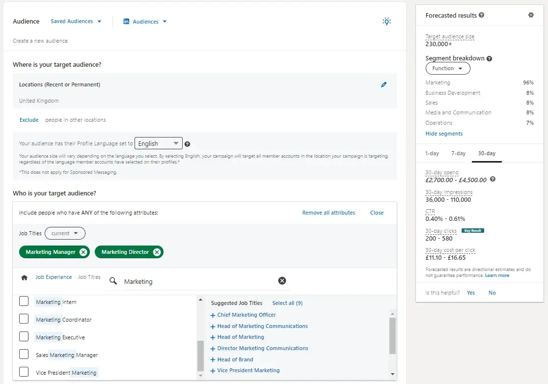
In the screenshot above, you can see what LinkedIn targeting looks like.

For the purpose of taking this screenshot, I’ve created an audience of people living in the U.K. who are also senior marketing personnel, Marketing Manager, and Marketing Director.

Ad targeting in LinkedIn helps you run a successful advertising campaign — that's because when you target the right people, it leads to greater engagement and more conversions.

With LinkedIn, the process of selecting the audience you're going to target works the same way, no matter which type of ad you select.

When establishing who it is you're going to target, LinkedIn provides over 20 different audience attributes and targeting categories that you can select from — examples include company name, company size, member groups, member interests, member schools, job title, job seniority, and skills.

Top tips on targeting from LinkedIn paid ads expert Leigh Buttrey: “When you’re running a prospecting campaign, make sure you use relevant demographics to your target audience.

Consider things like the job title, industry, seniority, skills, and the company's size. The beauty of LinkedIn is that you can get very targeted; there’s no point in showing ads to small companies, for example, if you don’t want to attract them.”

Advertising on LinkedIn is a two-step process: 1) setting up your LinkedIn campaign and 2) creating your LinkedIn ad(s).

In this section, I’ll walk through how to set up a campaign and build your ad(s) — plus some best practices and tips for each.

1. Create your LinkedIn ad campaign.

Your LinkedIn advertising campaigns live on the campaign manager section of LinkedIn. You can access your advertising platform via your personal LinkedIn account.

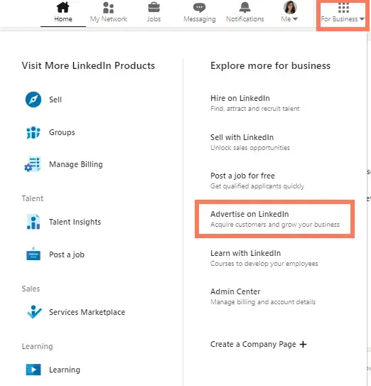
As pictured below, in the top right, you’ll see “for business,” click that, then click, “Advertise on LinkedIn.”

screenshot from my LinkedIn profile showing where you navigate for the “Advertise on LinkedIn” menu item.

From there, you'll be prompted to create a LinkedIn campaign. You’ll need to associate your ads with a LinkedIn company page.

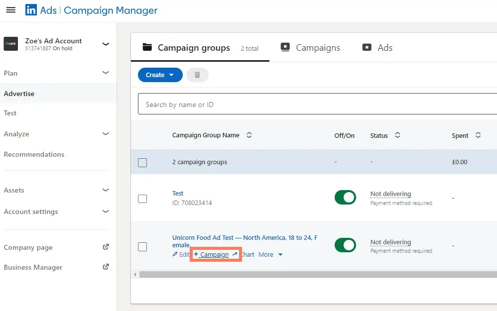
The manager account can hold multiple accounts. As you can see in the screenshot below, I have three accounts: my own and two clients.

how does linkedin advertising work: screenshot is my campaign manager with three accounts for three different LinkedIn company pages.

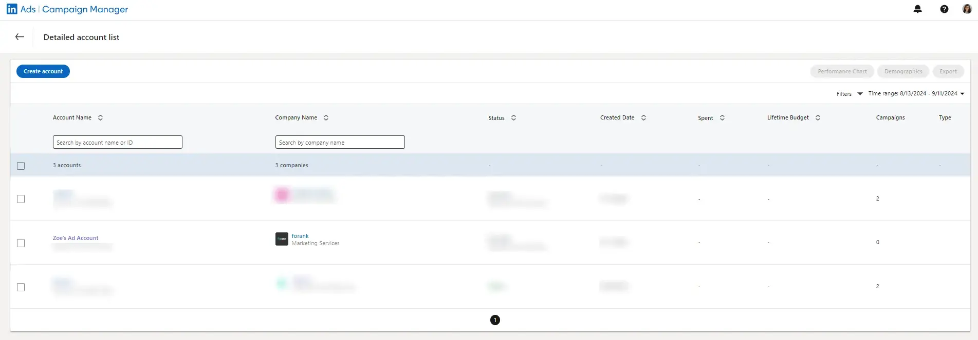
Next, you can start creating campaigns. You just need to select which account you want to create the campaign on.

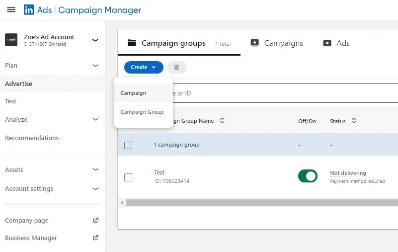
Back to creating the campaign. On your dashboard — or “Campaign Manager,” as it‘s formally called — you’ll see a Create button. Click that button, and you'll see options to create a campaign or campaign group.

Screenshot from my LinkedIn advertising account showing where the create campaign button is so readers can understand how LinkedIn advertising works.

Note: LinkedIn also has an “objective-based campaign creation experience.” I’ll cover that process in this article — to learn more, check out this page.

In most cases, I recommend setting up a campaign group because this will help you manage your campaign hierarchy. Leigh Buttrey, a LinkedIn expert, has already written a full article on campaign groups.

She says, “Start by organizing your campaigns into logical categories or objectives. Each campaign should represent a specific goal or outcome you want to achieve, such as lead generation, brand awareness, or website traffic.

“For example, you might create separate campaigns to promote different product lines, target different audience segments, or test different ad formats.”

Think of your campaign group as your category.

Next, click Campaign Group and name your campaign. Campaign Groups help you organize your campaign. You can leave the “Default Campaign Group” as-is or create a new Group.

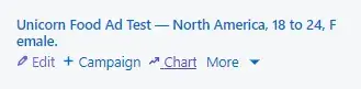
The campaign name is only visible internally. I recommend you choose a highly informative name, especially if you have several different folks working on the campaign.

For example, if I was running a test to determine the best type of demographic targeting, I might use the title “Unicorn Food Ad Test — North America, 18 to 24, Female.”

That name describes exactly who I‘m targeting without having to view its details. Compare this to something like "Unicorn Food Test 1," which doesn’t indicate anything about who the ad is targeting.

Once you choose your Campaign Group and name, you can start setting up your LinkedIn campaign.

A note on billing: Eventually, if you haven’t already, you’ll be prompted to enter your billing information, but you can play with the campaign setup without adding billing details. I really like this about LinkedIn because you can feel safe playing with the campaign manager and setting up targeting without feeling afraid of triggering an expensive bill.

That said, once you enter your billing details, you don’t need to worry, you won‘t be charged until your campaign is live — from there, you’ll be charged periodically for ad clicks and other engagements.

2. Set your LinkedIn ad campaign objective.

Next, choose your campaign objective.

how does linkedin advertising work, choosing your group objective

Your objective is what you want people to do when they see your ads.

According to LinkedIn, choosing an objective helps them "customize your campaign creation, deliver the best ROI for your stated goal, and show you relevant reporting.”

There are three overarching campaign themes: Awareness, Consideration, and Conversions. Under those themes, some available campaign objectives are:

  • Brand awareness will reach more people with your post. It would be great if visibility and boosting brand awareness were your goal.
  • Website visits will drive traffic to your website and landing pages.
  • Engagement will increase actions on your content and boost followers on your LinkedIn Company Page.
  • Video views will increase the exposure of your videos to people who are likely to engage with them.
  • Messaging will engage with your audience through messaging.
  • Lead generation will show a LinkedIn lead generation form with pre-filled LinkedIn profile data to those LinkedIn users most likely to engage with the form.
  • Website conversions capture leads and drive action on your website.
  • Job applicants will help you drive more job applications.

3. Designate your LinkedIn ad audience.

Next, choose the parameters of your target audience. Targeting who sees your ad can help it fulfill its campaign objective — the more specific and relevant it is to your audience, the better it’ll perform.

LinkedIn allows you to target according to a few different categories — refer to the points on targeting options reviewed above.

You don't have to use all of LinkedIn‘s targeting options — but the more specific the targeting criteria, the more relevant it’s likely to be to the audience you select.

And, therefore, the more likely you are to have a better ROI.

linkedin paid ads: Screenshot from my LinkedIn advertising campaign showing how LinkedIn advertising works when targeting specific audiences.

4. Set your ad budget and schedule.

Next, set up the budget, scheduling, and bidding options that work best for you.

This is a screenshot from my test LinkedIn paid ad. It shows how I would set up a budget and schedule.

You have a few options when it comes to setting up the LinkedIn budget and schedule.

First, let’s talk about budget optimization. I asked Leigh Buttrey about this. She said, “When you turn the Budget Optimization on, you’re handing over the control of the campaign’s group ad spend to LinkedIn’s algorithms. It will give more budget to your best-performing campaigns for better ROI.

“It sounds good, and in many cases, it is, but I prefer more control over my paid ads. Having set budgets per campaign allows me to give equal budgets to all campaigns, which in turn allows me to see which campaign has a lower CPC, engagement rate, or conversions.

In most cases, I’d recommend leaving ‘Budget Optimization’ off. Instead, you should closely monitor your ads and get a feel for what works for your company. You can switch ‘Budget Optimization’ on later and compare the ROI of campaigns with it on versus off.”

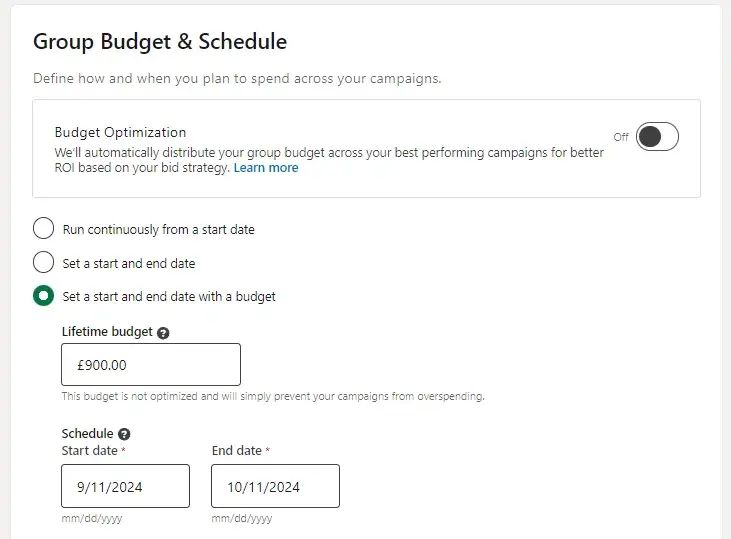
You can set schedules to:

  • Run continuously from a start date.
  • Set a start and end date.
  • Set a start and end date with a budget.

As you can see in the screenshot above, I clicked “Set a start and end date with a budget.” LinkedIn recommends a budget of £30/day (or $40/day).

Budget

Regardless of LinkedIn’s recommendations, you set a daily budget for what works best for your company's marketing spending. Before investing a lot into one campaign, I recommend testing and measuring the success of each campaign and ad variation.

You don‘t want to put thousands of dollars, for example, into an ad that doesn’t resonate with your target audience.

Let‘s say you’re the VP of Marketing at a high-end floral company. You assume that most of your target market is made up of soon-to-be brides, so you direct your LinkedIn Ads to bridal groups.

But after spending thousands of dollars, you only generate 10% of the leads you were hoping for.

Your subsequent research shows this was the wrong move, and you later learn that people near your store who are on LinkedIn are actually looking for flowers for corporate events.

It would have been nice to know that before spending a large amount of your budget on LinkedIn Ads, right?

That said, because of its extensive targeting opportunities, LinkedIn Ads can successfully target niche markets.

But cautionary experimentation is crucial to do early on — if you observe a campaign performing well, then you can put a larger budget toward it.

Top tips on budget according to LinkedIn paid ads expert, Leigh: “Start your budget small, then grow. Your aim is to see an ROI with a smaller budget. As soon as you get that ROI, you can confidently scale.”

Schedule

Choose a date for your campaign to start. You can indicate whether you want your campaign to be shown continuously until an end date.

5. Decide on your LinkedIn ad format.

Next, you need to add a campaign to your campaign group.

how does linkedin advertising work: screenshot of my dashboard on LinkedIn’s advertising platform. The annotation highlights where you can add a campaign to a campaign group.

Once you’ve clicked this, you’ll basically repeat the steps above. You will name your campaign and set your audience.

Now, you get to choose your ad format. In the next section, I’ll unpack the different types of LinkedIn Ads you can create as part of your campaign.

When you toggle between the ad types, you’ll see that the Forecasted Results box on the right-hand side will change.

linkedin paid ads: This screenshot from my LinkedIn paid ads shows ad formats and forecasted results.

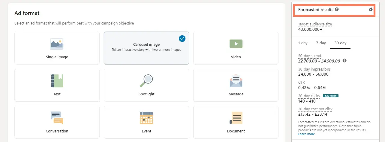
This feature analyzes your campaign parameters (objective, budget, targeting, start/end dates, etc.) and takes into account similar campaigns and advertisers. It also stimulates the ad auction to generate the numbers displayed.

Keep an eye on this box as you choose your LinkedIn ad type. If you're first starting out, deciding on which ad type you want to choose may come down to budget.

Outline your priorities, and then you can decide which type works best for you.

Additionally, some ad types require you to link your LinkedIn Company Page and some tap into LinkedIn translation services.

6. Set your URL parameter if you’re using one.

URL parameters help you track traffic acquisition in your analytical tools, GA4, for example.

You decide what you want your URL parameter to be and drop it into the campaign tracking parameter in the box, as pictured below.

screenshot from the process of setting up a LinkedIn advertising campaign showing the step where you set up a URL parameter.

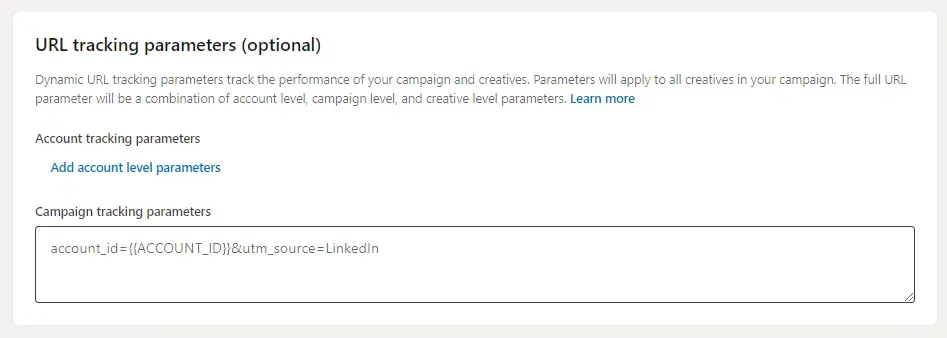
On tracking URLs, Leigh says, “Analytical tools do a good job of showing you where traffic is coming from, but with this functionality, you can track exactly which campaign traffic is coming from where. This will help you analyze which campaign is driving the most engagement, conversions, ROI, etc.”

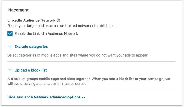
7. Choose your LinkedIn ad placement.

Next, decide whether you want your ad to be displayed on the LinkedIn Audience Network, which gives your campaign more reach and exposure among LinkedIn’s third-party platforms and sites.
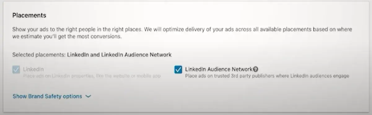
linkedin ad placement page

Image Source

Note: This option isn’t available for every ad type.

You can also choose to exclude or block certain categories, applications, and sites in the Network if you so choose.

linkedin paid ads: choosing your target audience

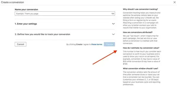
8. Don't forget conversion tracking.

You have the option to set up conversion tracking for your LinkedIn campaign, which will track and measure the actions people take after clicking on your ads.

Conversion tracking is an optional part of setting up your LinkedIn advertising campaign but is highly valuable for your business.

If you choose to set up conversion tracking, click + Add conversions.

A new window will pop up, where you’ll name your conversion, choose your conversion settings, and decide how you’ll track the conversions.

Note: The information on the right-hand side of the window is super helpful — it’ll answer any questions you have and walk you through the process.

For more help implementing and managing your LinkedIn Conversions, visit this help page.

how does linkedin advertising work: creating a conversion for ad campaign

Bravo! You’ve officially set up your LinkedIn advertising campaign … but you’re not done yet. When you’re ready to move on, be sure to click Save.

Beware: Your objective and ad format cannot be changed once you save, so be sure about your choices before moving forward.

9. Build your LinkedIn ad.

This section corresponds to what type of LinkedIn ad you chose for your campaign.

Once you establish the basic parameters for your ad in step one, you'll be prompted to start building it and choose how LinkedIn will display and rotate your ad variations — if you create more than one.

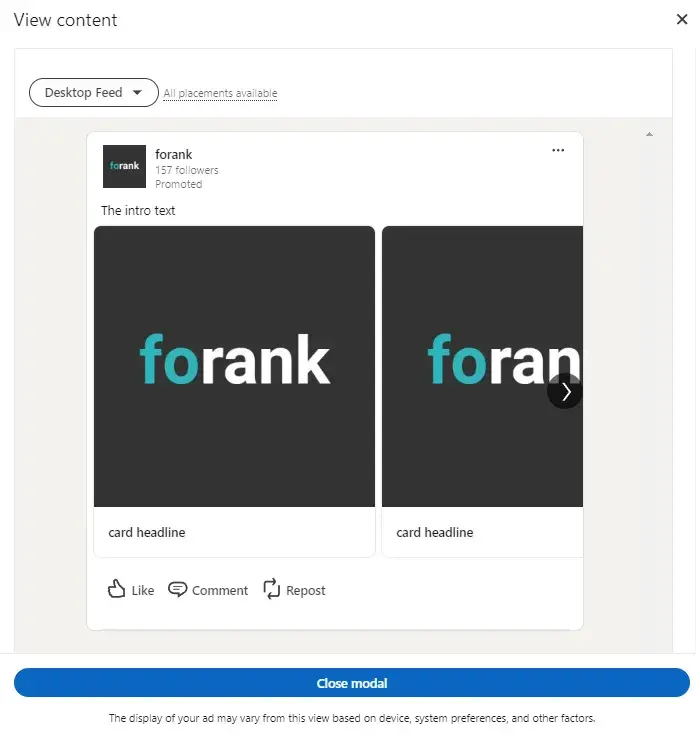
To get started, click Create new ad.

screenshot of the create a new campaign step in the process of setting up a LinkedIn paid ads campaign.

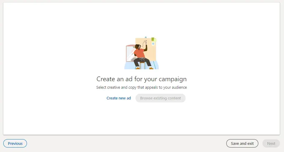
A screen will pop up with the title “Create a new [Your chosen ad type] for this campaign,” on which you'll create the copy for your ad, pair it with an image, and preview the different layout options.

You can see what that looks like below. I clicked “carousel ad,” and I can also add “cards.” Each card represents a slide of my carousel.

linkedin paid ads: creating a new ad in a campaign

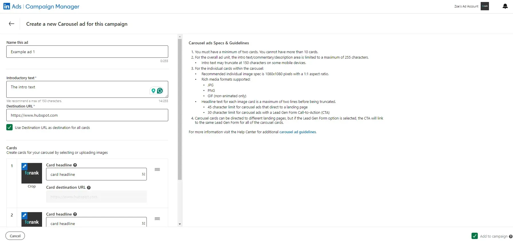
Here are a few guidelines around the copy:

  • Ad image is the artwork or graphic that your audience will see for your ad. It must be 100x100 pixels and uploaded as a .jpg or .png file that is 2MB or smaller.
  • Ad name is the main message your audience will see. You can write 255 characters but I recommend 60-100.
  • Ad introductory text is the body of your ad. It can be up to 255 characters long, but I recommend 150. The text should be relevant both to the person viewing the ad and the offer or page to which you're sending them.
  • Destination URL is where your audience will go when they click your ad. Double check that the URL is accurate.

Once you input this information, and hit Save, you’ll be able to view your post.

linkedin paid ads: screenshot shows how LinkedIn’s paid carousel ads look once they’re set up.

Once you click Create, you’ll be directed back to the previous Campaign Manager screen. From there, you can create more ads and, eventually, review and submit your order.

Note: LinkedIn does review every submitted campaign order, so don’t expect to see your ads published right away.

To see the best results for your ads, consider creating a different ad for each of your buyer personas and tweak the copy accordingly.

For example, when promoting a book to college professors, leading the title with the words "College Professor's Guide to…” may generate a higher click-through rate (CTR) than generic, un-targeted headlines and copy.

Here are a few copywriting tips for LinkedIn Ads.

CTA

Including an actionable CTA within your ad copy will also help you improve your ad‘s CTR. Consider asking people to "Download your ebook now," or "Click now for free samples" instead of writing copy that’s devoid of actionable next steps.

Value

Incorporate your value proposition into your ad copy — this can make people more likely to click on your ad. By boasting something like “20% off your first purchase” or “Clearance sale ends today — Shop now,” you're sending a clear signal of what someone will specifically gain when he or she clicks your ad.

Testing

Don't be afraid to test your ad copy. You can create multiple variations of your ad in each campaign, which allow you to test different images and copy within ads to find what works best for your audience.

Pro tip: LinkedIn Ads is available within all HubSpot Marketing Hub Professional and Enterprise accounts! Track visitor and contact engagement, run reports on closed-loop marketing, sync leads from LinkedIn lead generation forms, and MORE — all within your HubSpot account.

As I said above, deciding on what type of LinkedIn ad is best for your campaign can come down to many factors: budget, audience, campaign objective — just to name a few.

When building your LinkedIn Ads, you have four main types from which to choose. Within those formats, you can choose different formats based on your ad content and purpose.

1. Sponsored Content

Sponsored Content shows up in your audience's news feed among organic LinkedIn content.
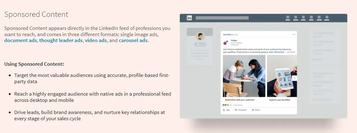
how does linkedin advertising work: screenshot taken from LinkedIn’s guide shows what the sponsored content looks like and provides more data about how to use this paid ad type.

Image Source

These ads are similar to promoted posts that blend into social media feeds. Sponsored Content is available in three formats:

  • Single image ads, which feature one image.
  • Carousel ads, which feature two or more images.
  • Video ads, which feature one video.

This type of LinkedIn ad typically has the highest average cost-per-click (CPC).

(Learn more about the advertising specifications for Sponsored Content, according to LinkedIn.)

Leigh recommends LinkedIn’s paid sponsored content ads for “increasing visibility and engagement for your brand, generating leads, or driving traffic to valuable content. Use these types of ads if you want to create single-image, carousel, or video ads.”

2. Message Ads

Message ads are delivered to your target audience’s LinkedIn inbox.
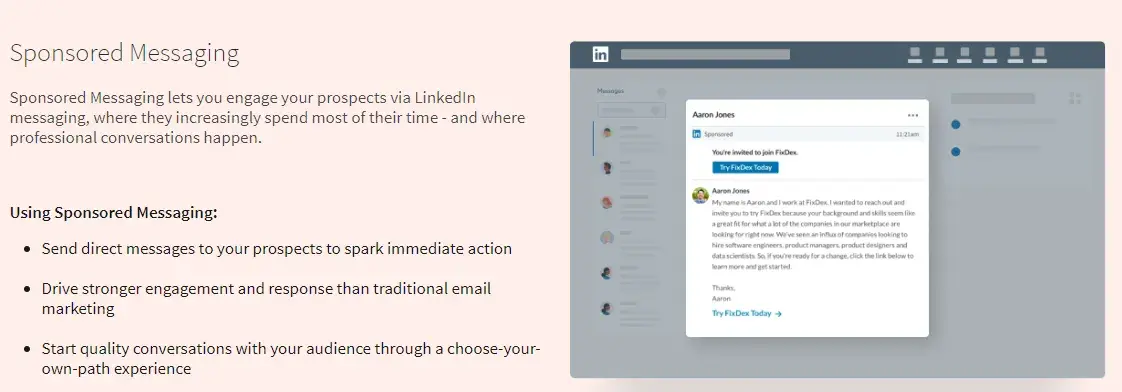
screenshot taken from LinkedIn’s guide shows what the messaging ads look like and provides more data about how to use this paid ad type.

Image Source

With this type of LinkedIn ad, you can send your content directly to your audience from a personal account and better measure engagement based on recipient response and action.

(Learn more about the advertising specifications for Message Ads, according to LinkedIn.)

Leigh recommends LinkedIn’s paid sponsored messaging ads (or conversation ads) to “deliver personalized, direct messaging to specific target audiences. You may want to use these if you’re driving for event registrations, product demos, or time-sensitive offers.”

3. Dynamic Ads

Dynamic Ads are personalized ads that change content based on which audience member is viewing them. This type of LinkedIn ad uses member personal data to tailor its creative content.
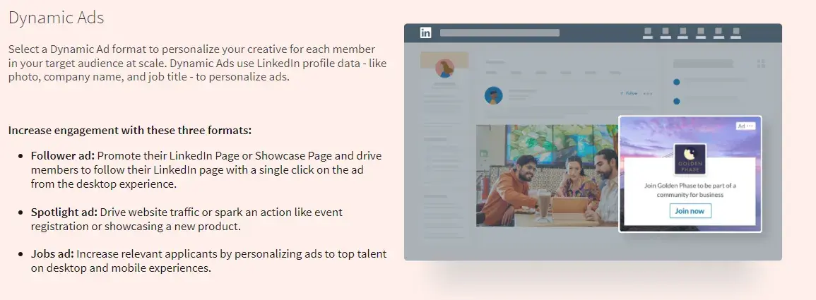
linkedin paid ads: screenshot taken from LinkedIn’s guide shows what the dynamic ads look like and provides more data about how to use this paid ad type.

Image Source

(Each LinkedIn member sees his or her own personal data; data isn't shared with other members.)

Dynamic Ads are available in three formats, which are only available on the LinkedIn desktop platform:

  • Follower ads, which promote your LinkedIn Company Page.
  • Spotlight ads, which promote a special offering.
  • Job ads, which promote open jobs.

(Learn more about advertising specifications for Dynamic Ads, according to LinkedIn.)

Leigh recommends LinkedIn’s paid dynamic ads for “offering hyper-personalized ad creation that automatically customizes the ad per viewer based on their profile details, such as name, photo, company or job title. These are ideal for campaigns focusing on brand awareness, event promotion, content downloads, or gaining followers.”

4. Text Ads

Text Ads show up on the right column or at the top of the page on LinkedIn.
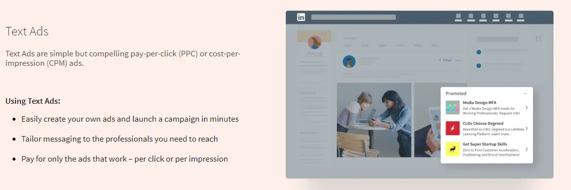
how does linkedin advertising work: screenshot taken from LinkedIn’s guide shows what the text ads look like and provides more data about how to use this paid ad type.

Image Source

They're the simplest type of LinkedIn ad but are still effective for boosting awareness and reaching your audience. Pay per click or per impression for Text Ads.

(Learn more about advertising specifications for Text Ads, according to LinkedIn.)

Leigh recommends LinkedIn’s paid text ads as a “simple and cost-effective approach for driving traffic, increasing brand awareness or generating leads. These ads are made up of a headline, description, and small image. They usually appear on the right-hand sidebar.”

Social ad campaigns can always be improved. Remember, your audience and content are always changing — as well as the platform itself. Here are some best practices to optimize your LinkedIn ad campaign.

[List Snippet]

Before we dive in, here's a quick tip: Set a reminder for yourself to analyze and optimize your campaigns each month.

1. Know your audience and the customer journey.

As your business grows, your audience also evolves and so does the customer journey.

It‘s crucial that you know and update your buyer personas and the customer journey map regularly — this will allow you to effectively target your personas at the right point in time (a.k.a. when they’re most likely to convert).

You may do this on a quarterly basis.

To help with the process, check out our buyer persona guide, free buyer personas templates, free Make My Persona tool, customer journey map guide, and free customer journey map template.

I also recommend considering your customer journey when deciding on which type of ads (more on this best practice in #4 below) you'll create and share — not every type of ad is ideal for every part of the customer journey.

For instance, you may use a sponsored ad for audience members who have already engaged with your brand/content before rather than that being their first touchpoint with you.

2. Segment your customers.

On a similar token, segmenting your customers is a great way to prepare for effective and tailored ad targeting, whether on LinkedIn or any other platform.

You can segment your customers so that you know exactly how you're going to target specific audiences on LinkedIn in order to increase engagement and chances of conversion.

For instance, you might know that specific audience segments are going to need a certain type of LinkedIn Ad at a certain point in the buyer's journey — having your customers ready in segments makes this part of the ad targeting process easy and efficient.

3. Refer to your social ads on other platforms as well as your competitors' LinkedIn Ads.

Getting some inspiration and gleaning information from your other social ads as well as the LinkedIn Ads of your competitors is a great way to help you navigate the process of creating and sharing your ads on LinkedIn.

Although LinkedIn is a unique platform, and your audience may not be the same across social platforms — it's still good to take some inspiration from and, at the very least, identify which ads perform best on other social platforms like Google and Facebook.

Not only can this be a good starting point when planning your LinkedIn Ads, but it can also help you save time — maybe you want to repurpose content that's on a Google Ad already for LinkedIn.

Additionally, you may not have the analytics to prove which of your competitors' LinkedIn Ads are performing best.

However, you can at least identify which types of ads are getting a lot of engagement by looking at metrics like comments and reactions.

I think this is a helpful reference point when planning and creating your LinkedIn paid ads since you're likely going to have a similar audience on the platform as your competitors do.

4. Carefully select the content you share based on the type of ad you're creating.

As I mentioned earlier, you‘ll want to determine what content you’re sharing with audience members based on the type of ad you're creating.

Refer to your customer segments here to help you effectively tailor content to those audience members and where they are in the customer journey when working through this step.

As a recap, here are the types of LinkedIn Ads you can create, along with examples of the content you may include:

  • Sponsored content: Single image ads, video ads, carousel ads, and event ads; ideal for highly-engaged audiences in the LinkedIn Newsfeed.
  • Sponsored messaging: Conversation Ads, Message Ads; ideal for engaging audience members in LinkedIn Messaging.
  • Lead generation forms: Lead generation forms; ideal for creating pre-filled forms for LinkedIn Ads.
  • Text and dynamic ads: Text ads, spotlight ads, follower ads; ideal for running ads in the LinkedIn right rail.

5. Use eye-catching and attention-grabbing visuals and language.

This content you‘re sharing shouldn't just be selected by ensuring it works with the type of ad you’re creating, though.

It also needs to bring your audience members in and make them want to engage with it (e.g., read/watch more, click on it, open your gated offer, etc.).

Think about ad elements like:

  • Colors
  • Font
  • Language and text
  • CTA placement and style
  • Images
  • Videos
  • GIFs

For more inspiration, take a look at these great LinkedIn Ad examples.

6. A/B test your LinkedIn Ads (and tweak one variable at a time).

Don't be afraid to test different visuals, language, and text to determine what your unique audience on LinkedIn finds eye-catching and attention-grabbing.

You can test different versions of the same ad to see what factor is contributing to or hindering its success.

For instance, change the copy in your headline, change your featured image, or tweak the target audience attributes — just don’t do these all at the same time or you won’t know which one is the fix.

I find A/B testing makes this process easy and ensures you're just changing one factor at a time.

7. Create gated offers using LinkedIn Lead Gen Forms.

Gated offers are those that require some sort of information in return for that offer — for instance, an audience member gets a free template or an ebook in return for sharing their email address.

To do this with your LinkedIn Ads, you'll have to use their Lead Gen Forms.

linkedin paid ads: linkedin lead gen form

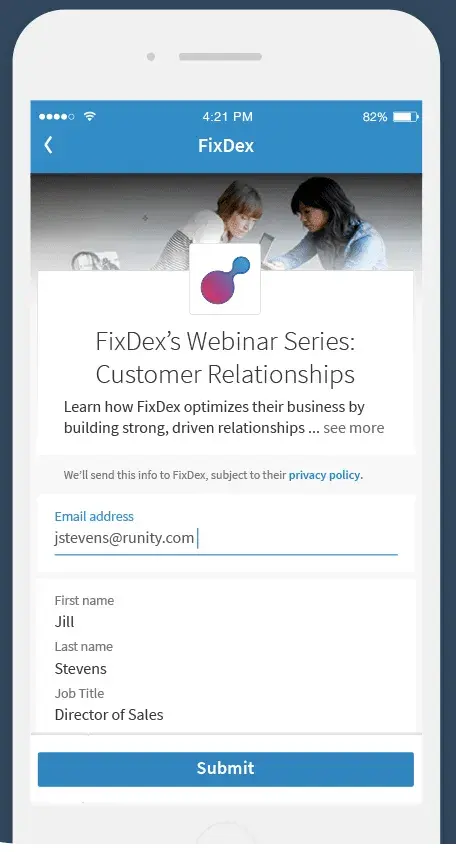
LinkedIn allows you to create Lead Gen Forms for both Sponsored Content and Message Ads. They come pre-filled with LinkedIn profile data, so members are able to share their information with you in seconds.

Additionally, I like that the forms allow you to track important metrics such as campaign cost per lead, lead form fill rate, and how many leads you get certain audience segments.

8. Keep your budget in mind when creating LinkedIn Ads.

Like anything in business, you're going to want to keep your budget in mind. LinkedIn uses objective-based pricing when it comes to advertising — meaning you only pay to achieve the specific marketing goals you have.

In other words, you're charged based on your campaign objective.

You'll select the activity you want to pay for, and then the campaign objective you picked will determine which ad formats and optimization goals you can focus on.

9. Determine each campaign's click-through rate (CTR).

Is one campaign outperforming the other(s)? If so, you may want to pause the less successful campaign(s).

LinkedIn will automatically display less successful campaigns with lower frequency, so it makes sense to minimize any resources spent on them.

Instead, putting more resources into successful ad variations and campaigns is more likely to accomplish your marketing goals.

10. Measure and analyze your LinkedIn Ad campaign's success.

LinkedIn makes it easy to track your progress in the Campaign Manager dashboard (under “Chart”), where you'll see various charts that measure performance like clicks, expenditures, and CTR.

You can also keep track of conversions in the graphs toward the bottom of the dashboard.

linkedin paid ads: screenshot of the campaign performance tracker, which can be found by clicking “chart.” Chart is highlighted to show exactly where it is.

When you finish setting up your first campaign, you‘ll see a lot of "0"s at first. Don’t worry; that’s only because your campaign is new (and don’t forget that LinkedIn usually has to approve your ads before they go live).

More advanced performance tracking is also possible, but you need to export data to third-party analytics software or databases, like LinkedIn Ads to BigQuery.

Ready to try a LinkedIn Ad strategy?

Now you’re equipped with a complete guide on how LinkedIn advertising works, you’re ready to start your own LinkedIn Ads strategy.

Remember: No harm can come from exploring the campaign options, setting up groups, and creating ads. Nothing happens until the ad is live, and you’re in complete control of that.

Unlike Leigh, I don’t run LinkedIn campaigns daily, but with her advice, even I feel comfortable using LinkedIn’s campaign manager! It is really good.

LinkedIn has a very powerful advertising platform; don’t leave this off your social campaign marketing list. A well-researched, optimized campaign has the potential to bring in thousands of new leads — and sales.

Editor’s Note: This post was originally published in January 2013 and has been updated for accuracy and comprehensiveness.

X (formerly Twitter) Marketing in 2024: The Ultimate Guide

Featured Imgs 23

Twitter, now rebranded as X, stands out from all other social media platforms. At least, that’s what my experience of helping dozens of brands with their social media strategy tells me.

Download Now: How to Use Twitter for Business [Free Kit]

At its core, X marketing requires conveying ideas in the fewest words, publishing multiple times a day, and actively engaging your audience.

As you grow, more dimensions are added to this equation. It gets more challenging and complicated. That’s why I’ve created this guide to help you crack the code for X marketing.

What is an X (formerly Twitter) marketing strategy?

An X marketing strategy is a plan centered around creating, publishing, and distributing content for your buyer personas, audience, and followers through X.

The goal of this type of strategy is to attract new followers and leads, boost conversions, improve brand recognition, and increase sales.

Creating an X marketing strategy will require you to follow the same steps you would if you were creating any other social media marketing strategy:

  1. Research your buyer personas and audience.
  2. Create unique and engaging content.
  3. Organize a schedule for your posts.
  4. Analyze your impact and results.

So, you might be wondering what makes X unique. Why would you want to actually invest the time in creating a profile and content for the platform? I’ll answer that below.

What makes X unique?

X is a great marketing tool for a number of reasons.

The platform:

  • Is free to use.
  • Expands your reach.
  • Lets you provide quick customer service and support.
  • Allows you to share and promote branded content in seconds
  • Works as a search engine tool for you to search for your competitors.
  • Can be used as a search engine tool for prospects to find and learn about your company.
  • Allows you to converse with your followers, share the latest updates about your company, and address your audience.

Now that I’ve reviewed what an X marketing strategy is and what makes the platform unique, let’s cover the ways in which you can use X for your business.

These tips will help you boost conversions, create lasting relationships with your followers, and improve your brand awareness.

As you begin using X for your business, there are some steps you’ll want to take to ensure you reach your target audience.

Depending on your goals, company size, and industry, you may or may not choose to work through each of the following steps (or you may have already completed some of them), so tailor them to your needs.

Let’s learn how to use X for business to better share, engage, and market on the platform.

1. Customize and brand your profile.

When someone looks at your company’s X profile, you want them to automatically know it’s yours.

You should customize and brand your X profile with your logo, colors, and other recognizable and memorable details you want to incorporate.

Here are a few ways to customize your profile:

  • Handle. Your X handle is your username (for example, our handle is @hubspot) — this should include your company’s name so your followers, customers, and fans can easily search and find you on the platform. You create your X handle when you sign up for an account.
  • Header. The header on your X profile is your background image. You might choose to create a unique image for your header, use your logo, or another branded image.
  • Profile picture. Your X profile picture represents your company’s every move, interaction, and post on the platform. It’s the image that sits above your bio and might include a picture of your logo, company’s initials, or CEO.
  • Bio. An X bio provides everyone who visits your profile with a brief synopsis of what they’re about to see in 160 characters or less. It might include your mission statement, a blurb about what your company does, or something humorous and engaging.
  • Website URL. Beneath your profile picture and bio, there’s a location where you can include your URL to direct traffic straight to your website.
  • Birthday. In the same location as your URL, you can insert your company’s birthday — or the day when the company was founded — so your audience gets to know your business on a more personal level.

HubSpot’s X page with logo, handle, and bio

Image Source

2. Create X Lists.

An X List — which any user has the ability to create and view — is an organized group of X accounts you’ve selected and put together in specific categories.

For example, at HubSpot, lists include Leadership Experts, Top Marketing Experts, Top Business Podcasters, and more. When you open an X List, you only see posts by the accounts on the list.

X Lists are great if you want to follow only specific accounts. You might segment your lists into groups such as business inspiration, competitors, and target audience so you’re able to easily review their posts, interactions, and content.

Here are a few lists available on HubSpot’s X profile:

HubSpot’s X list

3. Host an X Chat.

You can schedule and host an X chat to:

  • Discuss a topic.
  • Engage your followers.
  • Create a sense of community.
  • Ask your audience for their opinions.
  • Get feedback on something you’re working on.

To host an X Chat (previously TweetChat), you’ll need to choose a topic, set a time and date for the chat to occur, and create a hashtag for the chat. Share this information with your followers in a post, on your website, in your X bio, and wherever else you choose.

Here’s an example by The SAS Collective. The post mentions what this chat is about, who will be participating, and a hashtag to track all conversations.

X TweetChat announcement post from the SAS collective

Image Source

Everyone who wants to participate in the chat should be able to view all responses, questions, and comments regarding your topic by searching this unique hashtag.

Plus, they can share their comments and thoughts by adding this hashtag to their posts.

4. Advertise on X.

Advertising through X is a great way to reach your audience. This will make your posts easily discoverable by thousands of people, helping you increase your influence and following. You can do this through Promoted Ads or X Ads.

Promoted Ads (formerly Promoted Tweets)

Promoted ads or tweets make your regular posts appear in the X streams or search results of specific users.

This is a great option for anyone looking to increase the number of people on a specific webpage. Your business will pay a monthly fee if you promote a post.

X will use your promoted posts in a daily campaign targeting the type of audience you want to reach, as previously indicated in your settings. All X users can interact and engage with promoted posts like your organic content.

Here’s a glimpse at a promoted posts:

X sponsored post example from Oracle including markup on “Promoted” tag

Image Source

X Ads

X Ads is a great option if you’re using different types of tweets/posts to achieve one goal for your business. It’s ideal if you’re looking to grow your base of followers and brand awareness significantly through the platform.

Your business can decide between different objectives regarding your X ads, including app installs, video views, website conversions, and audience targeting for your campaigns. This decision will impact the price you’ll need to pay to run your ad.

Here’s an X Ad by the car manufacturer Kia:

X ads example from Kia India with “ad” marked in post

Image Source

5. Drive traffic to your website.

X can help you direct traffic to your website. There are several ways to include your website’s URL on your profile and add links to your web pages and blogs in your posts.

Here are some ways to use the platform to direct traffic to your website and increase conversions:

  • Incorporate links to your website in your posts.
  • Embed posts on your website with an X Timeline.
  • Add your website URL beneath your bio on your X profile.
  • Repost any content that includes links to your website and blogs others have shared.

6. Buy a premium subscription to get verified.

Depending on the size of your company and industry, you might choose to get your X profile verified.

Previously, businesses and public figures applied for a verified blue checkmark, but now you can get a similar checkmark by subscribing to X Premium.

Anyone can get an X subscription, but X will double-check your account to ensure you meet the eligibility criteria.

Once the platform verifies your profile, a badge with a checkmark will appear next to your handle. This symbolizes an authentic account.

Hubspot’s X premium verified account with gold check mark

Image Source

Being verified prevents your audience members from following and being confused by impersonator accounts or accounts with similar content, usernames, and handles to yours. A verified account also makes your business look more legitimate and trustworthy.

7. Focus on building your follower count.

Needless to say, the more X followers you have, the more people there are looking at and interacting with your content. You’ll have a better chance to improve brand awareness and direct more traffic to your website when you build your follower count on X.

There are a number of ways you can increase your follower count on X — here are some to get you started:

  • Ensure your content is shareable.
  • Create engaging content (giveaways, contests, questions, surveys).
  • Enlist the help of social media influencers.
  • Include links to your X profile on your website.
  • Interact with your current followers and repost their content so they’re more likely to do the same for you.

Now that we’ve reviewed how to use X for business, let’s cover some tips and tricks you can apply to your profile to improve your marketing efforts on the platform.

The following X marketing tips are universal, meaning they’re applicable to any type of business, in every industry.

1. Use keyword targeting in X Ads.

Keyword targeting on X is a critical component of X Ads.

Keyword targeting allows you to engage X users through the different words and phrases you've included in your content and they’ve searched for on the platform.

This means you’re able to reach your target audience at the exact time your business, content, and services are most relevant to them.

On X, there are two types of keyword targeting you can use including search and timeline.

Search Keyword Targeting

Search keyword targeting allows you to make your posts show up for users who are searching for the topics that you determined relate to your business.

For example, if you sell gluten-free cookies, you can target users searching for content about baking, cookies, gluten intolerance, or Celiac Disease.

Timeline Keyword Targeting

Timeline keyword targeting allows you to act on users’ specific feelings, thoughts, actions, and emotions they’ve posted about.

For example, if you’re a running gear company, you might target keywords and phrases users post about such as, “running a race,” “race day tips,” or “training for a marathon.”

2. Implement hashtags.

Posts (previously Tweets) with hashtags generate more engagement than ones without them.

Adding hashtags to your posts is a great way to expand your influence on X. However, there are some guidelines you’ll want to stick to when using hashtags to ensure that you reach the largest number of people possible.

  • Create a hashtag unique to your business so your followers and target audience can easily find you and your content.
  • Make relevant and memorable hashtags for other groups of posts, such as those related to a specific campaign you’re running.
  • Use X Analytics to review your most successful hashtags so you can ensure their use in future posts.
  • Don’t overuse hashtags. This may feel and look spammy to your audience (not to mention it isn’t aesthetically pleasing).

3. Design a content publishing schedule.

As you grow your base of followers, you’ll need to post on a regular basis to ensure they stay engaged with your business and content.

Not only do you want to post regularly, but you also want to post at the right times of the day.

Here are some details about the best times (on average) for businesses to share their X content:

  • Between 8–10 AM and 6–9 PM (in correlation with commuter schedules) on weekdays.
  • Around noon or between 5–6 PM on any day of the week.
  • For B2C companies, the best days to post are weekends.
  • For B2B companies, the best days to post are weekdays.

Here’s an X content calendar template I use to plan my posts:

X (formerly twitter) marketing tool, schedule for planning content

Image Source

You can review X Analytics to examine your engagement on the days you post more or less content to determine what’s working well for your specific audience.

Once you’ve determined when and how often you’ll post your content, you can use a social media management tool. This will allow you to both create your posts and schedule them in advance so you can focus on other tasks you have to complete.

HubSpot’s social media management tool lets you:

  • Schedule posts in advance.
  • Connect directly with your audience.
  • Understand how your X interactions help your brand.

HubSpot’s social media marketing tool

4. Create an X campaign.

Social media marketing campaigns of any kind are a great way to reach your audience, drive sales, and increase your website traffic.

You can create a social media marketing campaign specifically for X to target users, increase your base of followers, and raise your brand awareness through the platform.

To create an X marketing campaign, you’ll want to follow the same steps you would with any type of social media marketing campaign:

  • Research your competition.
  • Determine how you’ll appeal to your target audience.
  • Choose the type of content you’ll create.
  • Share and promote your content.
  • Analyze your results.

5. Write a strong profile bio.

Writing a strong and memorable bio for your X profile is crucial.

This is because your X bio is the first thing a profile visitor will read about your company — it’s your written introduction and should briefly explain what visitors can expect from your page and content.

You only have 160 characters to do this, so choose your words wisely to ensure your bio successfully represents your brand and reflects who you are as a company.

Here’s a great example of an X bio by beauty brand Rare Beauty.

X marketing bio from rare beauty

Image Source

6. Use images and videos.

When possible, try to include quality videos and photos in your posts. It’s been proven that posts with images outperform posts strictly made of text.

Photos and images provide an eye-catching and engaging element in your content as X users scroll through their feeds.

Videos are proven to outperform posts with images as well. In fact, posts with videos are likely to get an average of six times the amount of engagement than posts without them.

Videos and images are a great way to show your audience your product line or how to use an item you sell as well as make your content feel more personal.

Plus, images and videos in posts are proven to help you increase your engagement — and who wouldn’t want that?

7. Interact with your followers.

Remembering to engage with your followers as your business grows and X follower count increases is crucial.

This will help you create experiences for your followers and audience members that feel personal and keep them coming back to your profile all while fostering a sense of brand loyalty.

For example, if someone reposts your post or comments on your posts, you can “Like” that person’s interaction or even reply back to them.

In some cases, you might have a ton of ghost followers who follow your account, but never interact with your content. If your interaction rates are low, it may make sense to use unfollow tools to clean your followers list from ghost followers.

8. Share media mentions.

If your business is mentioned in the media, share the article, video, URL, or image on X.

This will make your business feel more legitimate to anyone checking out your profile and show prospective followers how many other people already know about your company and are enjoying your products and services.

This is an exciting way to broadcast your success to your audience.

Take a look at how Scribe posts all media mentions of the brand and its founders.

X marketing tips, example of company promotion

Image Source

It also provides you with a way to incorporate backlinks in your posts which, when clicked, take your audience members to the original source of the mention.

Meaning you’ll also drive traffic to the website of the media outlet that mentioned you, likely boosting their follower count and/ or brand recognition.

This could potentially help you become mentioned, shared, or featured in one of their pieces of content again in the future.

9. Keep an eye on your competitors’ X accounts.

X is a great way to keep an eye on your competitors’ marketing efforts. You can follow them or simply search them to see what they’re posting.

You can also view basic details about their engagement such as their number of reposts, comments, and responses.

This is a simple way to see some of the X marketing strategies your competitors are implementing and whether or not they’re working.

10. Focus on followers’ interests when creating content.

If you want to reach your audience members and ensure your content resonates with them, you’ll need to focus on their interests and needs — whether that’s in relation to the way you share content, what you share, or how you present it.

When you meet the needs of your target audience and buyer personas, they’ll be more likely to continue to follow and interact with your company. You can build buyer personas with HubSpot’s free tool, Make My Persona.

buyer personas tool from HubSpot you can use for X marketing

Image Source

As you study your buyer personas and target audience, you’ll be able to determine the type of content they’re likely looking for you to share.

Additionally, you can always post questions, send out surveys, ask for feedback, or even create an X Chat to get more ideas about the type of content your audience is looking for from your business and X profile.

11. Promote your events.

X is a great way to promote your business’ events.

Similar to the way you might for an X campaign, you can create a unique hashtag for various events (such as launch parties, giveaways, and contests) or schedule a variety of posts (using one of your social media management tools) to promote any special occasion your company is hosting.

This way, audience members — whether or not they’re your followers — will have the opportunity to learn about your event and get all of the details they need to sign up, be in attendance, or participate.

12. Check your direct messages regularly.

Like other social media platforms, X provides users with a Direct Message inbox where they can contact you in a private message regarding any questions, concerns, or comments they have.

So, be sure to check your inbox regularly as this can contribute to the type of customer service and support your business is known for, as well as the type of care you provide your followers and customers.

X direct messages interface

Image Source

13. Keep track of your analytics.

With all of the work you’re putting into your business’ X marketing, you’ll want to ensure your efforts are successful in reaching your goals, whether they’re related to directing more traffic to your website, increasing conversions, or improving brand awareness.

You can determine your X marketing success in these areas (and many more) by analyzing your work. To do this, you’ll want to consider which metrics matter to you and then determine how you’re going to track them.

Which Metrics to Track on X

Due to every business being unique and having different goals, you might not be interested in tracking all of the following X metrics (or you might be looking to track additional metrics).

However, we’ve compiled the following list of possible metrics for you to consider to get you started.

  • Engagement. Look at the number of reposts, follows, replies, favorites, and click-throughs your posts get (including all hashtags and links they include).
  • Impressions. Review the number of times your posts appeared on one of your audience members’ timelines (whether or not they’re actually following you).
  • Hashtags. Look at which of your hashtags are being used most frequently by your audience and followers.
  • Top posts. Review your posts with the most engagement.
  • Contributors. Keep up with the level of success each of your contributors — the people you give admin access to on your account — are having with their posts so you can implement some of their tactics more regularly or remove them completely.

How to Track X Analytics

You’ll find several social media management tools with analytics features that are automatically built in. This is convenient for those of you who were already planning on choosing a management tool to assist with scheduling your posts.

However, one of the most common analytics tools for X is the one created specifically for the platform: X Analytics.

X Analytics

X Analytics helps you understand how your content impacts your audience and the ways in which your activity on the platform can help you grow your business. The tool is free, accessible to all users, and shares information about:

  • Engagement rate.
  • Post activity.
  • Impressions.
  • Followers.

X analytics dashboard exmaple

Image Source

Depending on your business’ needs, you have the ability to incorporate X Ads (if you pay for the option) data in X Analytics as well.

Lastly, there are a number of other third-party resources and apps you can download and use along with X Analytics to take a deeper look at specific types of data such as detailed hashtag performance information or how other X handles in your industry are doing.

4 X (formerly Twitter) Marketing Tools to Level Up Your Strategy

Ready to make the best out of X? Here are my top four X marketing tools to drive results for your business.

1. Hypefury: Best for scheduling and managing posts.

X (formerly twitter) marketing tools, Hypefury

Hypefury lets you automate your X posting schedule and plan posts in advance. The tool is purpose-built for creators and marketers looking to build consistency on X and grow their audience.

One of Hypefury’s standout features is the ability to schedule threads. Create a sequence of posts to share long-form content through an X thread with an automated posting schedule.

X (formerly twitter) marketing tools, creating a content thread with Hypefury

Hypefury also reposts some of your most popular posts at optimal times when you don’t have any posts scheduled. You can enable the option to share evergreen posts, and the tool will take care of the rest.

Besides, the tool can even automate product promotion. If you sell a product/service, Hypefury will add a post promoting your business under your best-performing posts.

What I Like

  • Advanced automation saves time and effort in managing a posting schedule.
  • Allows cross-posting content across multiple platforms like Instagram, LinkedIn, etc.
  • Shares suggestions and writing prompts to inspire new posts when you’re out of ideas.

Pricing

7-day free trial. Paid plans start at $29/month. Check pricing here.

2. Audiense: Best for understanding your audience.

X (formerly twitter) marketing tools, Audiense

Audiense, a customer intelligence platform, collects real-time insights from multiple sources to help you understand the target audience.

You can create highly targeted audience segments based on demographics, psychographics, and behavioral data. The tool will use this segmentation to share specific information about each group for tailored X marketing campaigns.

X (formerly twitter) marketing tools, Audiense showing segment distribution

You can also use Audiense to find the influencers your audience follows. This will help you connect with the right people and opinion leads to amplify your brand and grow your followers.

What I Like

  • Built-in social listening tool to track brand mentions, conversations, and trends.
  • In-depth reports on audience behavior to understand preferences and expectations.
  • Updated data about audience segments with the latest insights to strategize your approach.

Pricing

Free forever plan. Paid plans start at £23/month. Check pricing here.

3. Tweet Hunter: Best for creating content and engaging with posts.

X (formerly twitter) marketing tools, Tweet Hunter view of scheduled posts

Tweet Hunter is an AI-powered content creation and publishing tool for X.

You’ll find personalized content ideas based on trending topics and your preferences. Use these suggestions to write new posts and predict their performance with TweetPredict. This feature analyzes a post in real-time and assesses how it will perform once published.

You can also automate the process of liking, commenting, and reposting. The tool puts engagement on auto-pilot and makes it easy to connect with your followers.

What I Like

  • Easily ideate new content and schedule posts beforehand in a calendar.
  • User-friendly interface with a minimal learning curve to get started.
  • Integrates with your CRM tool to optimize X outreach.

Pricing

Paid plans start at $23/month. Check pricing here.

4. Circleboom: Best for accessing analytics and follower insights.

X (formerly twitter) marketing tools, Circleboom analytics dashboard

Circlebloom is an X management tool to manage your post archives and perform bulk actions like deleting posts. It also offers options for content scheduling and automation to post on X and other platforms.

What makes Circleboom a must-have X marketing tool is its advanced analytics.

You can get a pulse of your audience and understand exactly who you are targeting.

X (formerly twitter) marketing tools, Circleboom follower analytics dashboard view

You can also discover articles and content ideas that resonate with your audience. These curated ideas help build a repository of new posts to maintain consistency.

What I Like

  • Multi-platform management to integrate your X marketing efforts.
  • Get detailed insights on follower activity and engagement like active/inactive followers.
  • Access advanced search to find users via their bio and identify influencers in your niche.

Pricing

Free forever plan. Paid plans start at $9.99/month. Check pricing here.

Kickstart X Marketing Effortlessly

X is a powerful marketing tool and social media platform any business can take advantage of.

I’ve leveraged the platform to gain website traffic, boost brand awareness, and engage my target audience. I believe the key to succeeding on X is in building a data-informed strategy keeping your customers at the core.

Bookmark this guide to get a strong start with X marketing.

Editor's note: This post was originally published in March 2013 and has been updated for comprehensiveness.

Halloween Graphic Design: 15 Spooky Tips & Ideas for 2024

Featured Imgs 23

Witches, goblins, and ghouls can make for some pretty amazing design projects. While Halloween might not be top of mind when it comes to design, it’s an opportunity to do something a little different with projects.

Halloween graphic design centers around something that will be around for a short time. It might be different than the typical vibe of a brand or project and often has a theme that’s fun and friendly.

Adding a spooky element to a design can delight users and show that the design is new and timely. It gives users reasons to come back to your projects because they know that it will change again after the holiday. You can use holiday-themed graphic design as a trick to keep users coming back!

1. Create a Themed Design

Create a Themed Design

Using a theme for the overall look of your design is one of the best ways to make it more relatable. For example, you can take inspiration from a popular horror movie to create a themed Halloween graphic design.

They don’t have to be scary, not at all. You can easily create cute, fun graphic designs using those scary movies as inspiration. The above illustration is a good example of that. If you want to go a step further, use urban legends to create a spooky vibe for your designs that your local audiences can relate to.

Using a theme for your Halloween graphics will help create consistency across all your seasonal designs. All your posters, flyers, banners, and even the online promo graphics will look more familiar, attractive, and memorable.

2. Zombies vs Monsters

Zombies vs Monsters

When in doubt, go with a zombie or monster theme! These two iconic Halloween themes never fail to impress. Whether it’s a flyer design for a Halloween party or a fun greeting card for children, a zombie or monster theme is always acceptable.

Frankenstein’s monster, Count Dracula, the Grim Reaper, as well as witches, and mummies are just a few of the monsters loved by children and adults alike. And as always, everyone loves a fun slow-walking, brain-eating zombie design.

If you’re struggling to find a theme or an approach for your graphic design, a zombie or monster theme is the safest and most widely recognized trend to use.

3. Use Grungy Textures

Use Grungy Textures

Creating a spooky, old, and scary vibe for a graphic design takes a lot of work. One of the most important elements of such a design is textures.

Adding a subtle distressed and grunge-style texture is often the perfect way to create a weird and ghostly look for your design. They will simply transform your designs with a haunted feel.

You can also use other similar textures like dust and scratches to create more eerie-looking backgrounds and designs.

4. Add Overlay Effects

Add Overlay Effects

Overlay effects are one of the easiest ways to instantly transform your photos and graphics into all kinds of unique creations. You can also use them to give a Halloween look to your designs as well.

Whether you want to cover your images with a spooky spider web or add a horror-themed border, there are many different types of overlays you can use to achieve a supernatural look for your graphics.

5. Make Use of Text Effects

Make Use of Text Effects

Crafting a spooky-looking title for your design can be a challenge. It will take you a good amount of time to design a creative title with a Halloween-themed effect. A great way to skip this process is to use a pre-made text effect.

You can find loads of Halloween and horror-themed text effects on the web. These text effect templates are super easy to use and allow you to transform your text with just a few clicks.

6. Use Halloween Patterns

Use Halloween Patterns

A Halloween-themed pattern is a great choice for designing a cool background for all your Halloween graphic designs, especially for packaging designs, posters, and social media posts.

Patterns filled with spooky pumpkins, friendly ghosts, and cute witches will always grab the attention of kids and audiences of all ages.

7. Create Halloween-themed Characters

Create Halloween-themed Characters

A fun way to give a personality to your graphics is to use a Halloween-themed character across all your designs. If your business has a mascot, give it a Halloween-themed spooky makeover. Or use a character from a Horror movie and give them a cute and funny cartoon look.

When designed with bright colors and cartoon effects, these characters will fit right in with your invitations, greeting cards, and even promo campaigns for your brand.

8. Add Halloween Imagery

halloween design

The easiest way to create a Halloween graphic design is to substitute some of your typical imagery for something with a holiday feel.

  • Add images of people in costumes
  • Create a Halloween scene for the homepage
  • Design a special animation
  • Promote a product or service with a spooky special that you can show

9. Switch to a Seasonal Font

halloween design

halloween design

halloween design

Halloween is the perfect time to use one of those crazy novelty fonts that you just can’t find another excuse for. From scratchy hand-drawn typefaces to lettering that looks like it could be ripped from a horror movie poster, a spooky font option is a less obvious way to create a Halloween scene.

If you are really feeling like tricks and treats, use matching language to create a fun and unique holiday complication.

Here are three Halloween fonts that are a good starting point.

10. Mix Up Your Color Palette

halloween design

Halloween provides a great opportunity to switch up a color palette for warmer, deeper hues with more jewel tones and dark schemes.

While most people jump right to a bright orange, you don’t have to use a pumpkin-colored palette. Consider deeper oranges and sage greens. Purples, navy and black are equally popular. Don’t discount a deep maroon or brighter blues or greens either.

When in doubt, opt for something that has roots in nature – fall leaves, the night sky, and full moon or even a green-eyed black cat.

11. Substitute Fun Icons or Hover States

halloween design

Trade some of your more common design elements for icons with a seasonal theme.

When it comes to making tweaks to your design theme for Halloween, consider adjustments to some of the smallest website elements or divots in print projects.

Starting in October, switch the icons to something with a more Halloween look. Add a witch hat to the cart icon or a pumpkin to the phone button. The nice thing is that you don’t have to change every icon in the design to achieve this look. Just subbing a few small elements can create the right amount of charm.

Or surprise users with a simple hover state: Don’t change the icon itself, just adjust the hover action so that that cart magically pops into a bat or ghoul.

The same idea can work on printed materials as well – just make sure not to give them out post-holiday. Trade some of your more common design elements for icons with a seasonal theme.

12. Include a Spooky CTA

halloween design

Even the smallest bits of a design can be traded for Halloween elements. Adjust the micro-copy in your call to action button to include a spooky message.

Another idea? A simple pop-up that says “BOO!” and leads website visitors to complete an action.

Sometimes the smallest and simplest changes can be the most effective.

13. Add a Fall Theme

halloween design

So here’s the biggest issue with a Halloween graphic design theme – it’s short-lived. Most designers don’t want to switch over to holiday elements until October. (And I don’t blame you.)

So do you really want to go through all this fuss for a design change that only lasts 30 days?

Rather than an all-out light-up jack o lanterns theme, try a more fall aesthetic instead. Lump Halloween, the season change and even Thanksgiving into one design cluster. You’ll get a lot more bang for your buck and can switch it now and leave it until the end of November without feeling silly.

14. Have Fun with About Pages

halloween design

Here’s my go-to Halloween graphic design trick. Have staff (or pets) dress in costumes and change their photos on the About Us page of your website.

Include a promo or social media campaign to drive users to this seasonal content that’s fun and interesting.

Simple, right? Now schedule that staff dress up day!

15. Add an Animation

It might seem old-school but a simple “Happy Halloween” banner or animation can be just the right element to create a holiday theme. Not every project is designed in a way that an all-out change can work effectively.

A simple animation won’t take over the design and can set a nice tone without overwhelming users.

Another option is to incorporate a Halloween message or image into your homepage slider if that’s the type of website design you have. This is another easy change that won’t take a lot of time or planning but can still provide a timely holiday element.

16. Create a Holiday Hero

halloween design

If you can go all out on your website homepage or for a printed project, do it. Use photos, video or illustration to create a Halloween-theme hero header.

This is a pretty large and possibly elaborate use of space so scale back on any other Halloween themed ideas that you might have. Remember one big trick in the design is enough; any type of special imagery or themed design element counts as that trick.

17. Skip the Gore

Finally, Halloween graphic design should be fun and a bit spooky. But avoid gory scenes.

Too much gore or horror-themed elements can turn off some users. (If you know your audience well, there might be a case for using this type of imagery, but those cases are pretty rare.)

When planning for Halloween elements, opt for more friendly characters, skip the horror movie soundtrack or blood and guts and create something that holiday appropriate for the entire audience.

Conclusion

Have you considered swapping out elements for a Halloween graphic design? From small elements like icons or a hover state to full-scale spookiness, this is an opportunity to have fun with the project.

Hopefully, these tricks (and treats) will help jumpstart your imagination. Happy Halloween!