CSS Anchor Positioning Guide

Featured Imgs 23

Not long ago, if we wanted a tooltip or popover positioned on top of another element, we would have to set our tooltip’s position to something other than static and use its inset/transform properties to place it exactly where we want. This works, but the element’s position is susceptible to user scrolls, zooming, or animations since the tooltip could overflow off of the screen or wind up in an awkward position. The only way to solve this was using JavaScript to check whenever the tooltip goes out of bounds so we can correct it… again in JavaScript.

CSS Anchor Positioning gives us a simple interface to attach elements next to others just by saying which sides to connect — directly in CSS. It also lets us set a fallback position so that we can avoid the overflow issues we just described. For example, we might set a tooltip element above its anchor but allow it to fold underneath the anchor when it runs out of room to show it above.

Anchor positioning is different from a lot of other features as far as how quickly it’s gained browser support: its first draft was published on June 2023 and, just a year later, it was released on Chrome 125. To put it into perspective, the first draft specification for CSS variables was published in 2012, but it took four years for them to gain wide browser support.

So, let’s dig in and learn about things like attaching target elements to anchor elements and positioning and sizing them.

Quick reference

/* Define an anchor element */
.anchor {
  anchor-name: --my-anchor;
}
/* Anchor a target element */
.target {
  position: absolute;
  position-anchor: --my-anchor;
}
/* Position a target element */
.target { 
  position-area: start end;
}

Basics and terminology

At its most basic, CSS Anchor Positioning introduces a completely new way of placing elements on the page relative to one another. To make our lives easier, we’re going to use specific names to clarify which element is connecting to which:

  • Anchor: This is the element used as a reference for positioning other elements, hence the anchor name.
  • Target: This is an absolutely positioned element placed relative to one or more anchors. The target is the name we will use from now on, but you will often find it as just an “absolutely positioned element” in the spec.

For the following code examples and demos, you can think of these as just two <div> elements next to one another.

<div class="anchor">anchor</div>
<div class="target">target</div>

CSS Anchor Positioning is all about elements with absolute positioning (i.e., display: absolute), so there are also some concepts we have to review before diving in.

  • Containing Block: This is the box that contains the elements. For an absolute element, the containing block is the viewport the closest ancestor with a position other than static or certain values in properties like contain or filter.
  • Inset-Modified Containing Block (IMCB): For an absolute element, inset properties (top, right, bottom, left, etc.) reduce the size of the containing block into which it is sized and positioned, resulting in a new box called the inset-modified containing block, or IMCB for short. This is a vital concept to know since properties we’re covering in this guide — like position-area and position-try-order — rely on this concept.

Attaching targets to anchors

We’ll first look at the two properties that establish anchor positioning. The first, anchor-name, establishes the anchor element, while the second, position-anchor, attaches a target element to the anchor element.

Square labeled as "anchor"

anchor-name

A normal element isn’t an anchor by default — we have to explicitly make an element an anchor. The most common way is by giving it a name, which we can do with the anchor-name property.

anchor-name: none | <dashed-ident>#

The name must be a <dashed-ident>, that is, a custom name prefixed with two dashes (--), like --my-anchor or --MyAnchor.

.anchor {
  anchor-name: --my-anchor;
}

This gives us an anchor element. All it needs is something anchored to it. That’s what we call the “target” element which is set with the position-anchor property.

Square labeled as "target"

position-anchor

The target element is an element with an absolute position linked to an anchor element matching what’s declared on the anchor-name property. This attaches the target element to the anchor element.

position-anchor: auto | <anchor-element>

It takes a valid <anchor-element>. So, if we establish another element as the “anchor” we can set the target with the position-anchor property:

.target {
  position: absolute;
  position-anchor: --my-anchor;
}

Normally, if a valid anchor element isn’t found, then other anchor properties and functions will be ignored.

Positioning targets

Now that we know how to establish an anchor-target relationship, we can work on positioning the target element in relation to the anchor element. The following two properties are used to set which side of the anchor element the target is positioned on (position-area) and conditions for hiding the target element when it runs out of room (position-visibility).

Anchor element with target elements spanning around it.

position-area

The next step is positioning our target relative to its anchor. The easiest way is to use the position-area property, which creates an imaginary 3×3 grid around the anchor element and lets us place the target in one or more regions of the grid.

position-area: auto | <position-area>

It works by setting the row and column of the grid using logical values like start and end (dependent on the writing mode); physical values like topleftrightbottom and the center shared value, then it will shrink the target’s IMCB into the region of the grid we chose.

.target {
  position-area: top right;
  /* or */
  position-area: start end;
}

Logical values refer to the containing block’s writing mode, but if we want to position our target relative to its writing mode we would prefix it with the self value.

.target {
  position-area: self-start self-end;
}

There is also the center value that can be used in every axis.

.target {
  position-area: center right;
  /* or */
  position-area: start center;
}

To place a target across two adjacent grid regions, we can use the prefix span- on any value (that isn’t center) a row or column at a time.

.target {
  position-area: span-top left;
  /* or */
  position-area: span-start start;
}

Finally, we can span a target across three adjacent grid regions using the span-all value.

.target {
  position-area: bottom span-all;
  /* or */
  position-area: end span-all;
}

You may have noticed that the position-area property doesn’t have a strict order for physical values; writing position-area: top left is the same as position-area: left top, but the order is important for logical value since position-area: start end is completely opposite to position-area: end start.

We can make logical values interchangeable by prefixing them with the desired axis using y-, x-, inline- or block-.

.target {
  position-area: inline-end block-start;
  /* or */
  position-area: y-start x-end;
}
Examples on each position-visibility value: always showing the target, anchors-visible hiding it when the anchor goes out of screen and no-overflow hiding it when the target overflows

position-visibility

It provides certain conditions to hide the target from the viewport.

position-visibility: always | anchors-visible | no-overflow
  • always: The target is always displayed without regard for its anchors or its overflowing status.
  • no-overflow: If even after applying the position fallbacks, the target element is still overflowing its containing block, then it is strongly hidden.
  • anchors-visible: If the anchor (not the target) has completely overflowed its containing block or is completely covered by other elements, then the target is strongly hidden.
position-visibility: always | anchors-visible | no-overflow

Setting fallback positions

Once the target element is positioned against its anchor, we can give the target additional instructions that tell it what to do if it runs out of space. We’ve already looked at the position-visibility property as one way of doing that — we simply tell the element to hide. The following two properties, however, give us more control to re-position the target by trying other sides of the anchor (position-try-fallbacks) and the order in which it attempts to re-position itself (position-try-order).

The two properties can be declared together with the position-try shorthand property — we’ll touch on that after we look at the two constituent properties.

Examples on each try-tactic: flip-block flipping the target from the top to the bottom, flip-inline from left to right and flip-start from left to top (single value) and top right to left bottom (two values)

position-try-fallbacks

This property accepts a list of comma-separated position fallbacks that are tried whenever the target overflows out of space in its containing block. The property attempts to reposition itself using each fallback value until it finds a fit or runs out of options.

position-try-fallbacks: none | [ [<dashed-ident> || <try-tactic>] | <'inset-area'>  ]#
  • none: Leaves the target’s position options list empty.
  • <dashed-ident>: Adds to the options list a custom @position-try fallback with the given name. If there isn’t a matching @position-try, the value is ignored.
  • <try-tactic>: Creates an option list by flipping the target’s current position on one of three axes, each defined by a distinct keyword. They can also be combined to add up their effects.
    • The flip-block keyword swaps the values in the block axis.
    • The flip-inline keyword swaps the values in the inline axis.
    • The flip-start keyword swaps the values diagonally.
  • <dashed-ident> || <try-tactic>: Combines a custom @try-option and a <try-tactic> to create a single-position fallback. The <try-tactic> keywords can also be combined to sum up their effects.
  • <"position-area"> Uses the position-area syntax to move the anchor to a new position.
.target {
  position-try-fallbacks:
    --my-custom-position,
    --my-custom-position flip-inline,
    bottom left;
}
two targets sorrounding an anchor, positioned where the IMCB is the largest.

position-try-order

This property chooses a new position from the fallback values defined in the position-try-fallbacks property based on which position gives the target the most space. The rest of the options are reordered with the largest available space coming first.

position-try-order: normal | most-width | most-height | most-block-size | most-inline-size

What exactly does “more space” mean? For each position fallback, it finds the IMCB size for the target. Then it chooses the value that gives the IMCB the widest or tallest size, depending on which option is selected:

  • most-width
  • most-height
  • most-block-size
  • most-inline-size
.target {
  position-try-fallbacks: --custom-position, flip-start;
  position-try-order: most-width;
}

position-try

This is a shorthand property that combines the position-try-fallbacks and position-try-order properties into a single declaration. It accepts first the order and then the list of possible position fallbacks.

position-try: < "position-try-order" >? < "position-try-fallbacks" >;

So, we can combine both properties into a single style rule:

.target {
  position-try: most-width --my-custom-position, flip-inline, bottom left;
}

Custom position and size fallbacks

@position-try

This at-rule defines a custom position fallback for the position-try-fallbacks property.

@position-try <dashed-ident> {
  <declaration-list>
}

It takes various properties for changing a target element’s position and size and grouping them as a new position fallback for the element to try.

Imagine a scenario where you’ve established an anchor-target relationship. You want to position the target element against the anchor’s top-right edge, which is easy enough using the position-area property we saw earlier:

.target {
  position: absolute;
  position-area: top right;
  width: 100px;
}

See how the .target is sized at 100px? Maybe it runs out of room on some screens and is no longer able to be displayed at anchor’s the top-right edge. We can supply the .target with the fallbacks we looked at earlier so that it attempts to re-position itself on an edge with more space:

.target {
  position: absolute;
  position-area: top right;
  position-try-fallbacks: top left;
  position-try-order: most-width;
  width: 100px;
}

And since we’re being good CSSer’s who strive for clean code, we may as well combine those two properties with the position-try shorthand property:

.target {
  position: absolute;
  position-area: top right;
  position-try: most-width, flip-inline, bottom left;
  width: 100px;
}

So far, so good. We have an anchored target element that starts at the top-right corner of the anchor at 100px. If it runs out of space there, it will look at the position-try property and decide whether to reposition the target to the anchor’s top-left corner (declared as flip-inline) or the anchor’s bottom-left corner — whichever offers the most width.

But what if we want to simulataneously re-size the target element when it is re-positioned? Maybe the target is simply too dang big to display at 100px at either fallback position and we need it to be 50px instead. We can use the @position-try to do exactly that:

@position-try --my-custom-position {
  position-area: top left;
  width: 50px;
}

With that done, we now have a custom property called --my-custom-position that we can use on the position-try shorthand property. In this case, @position-try can replace the flip-inline value since it is the equivalent of top left:

@position-try --my-custom-position {
  position-area: top left;
  width: 50px;
}

.target {
  position: absolute;
  position-area: top right;
  position-try: most-width, --my-custom-position, bottom left;
  width: 100px;
}

This way, the .target element’s width is re-sized from 100px to 50px when it attempts to re-position itself to the anchor’s top-right edge. That’s a nice bit of flexibility that gives us a better chance to make things fit together in any layout.

Anchor functions

anchor()

You might think of the CSS anchor() function as a shortcut for attaching a target element to an anchor element — specify the anchor, the side we want to attach to, and how large we want the target to be in one fell swoop. But, as we’ll see, the function also opens up the possibility of attaching one target element to multiple anchor elements.

This is the function’s formal syntax, which takes up to three arguments:

anchor( <anchor-element>? && <anchor-side>, <length-percentage>? )

So, we’re identifying an anchor element, saying which side we want the target to be positioned on, and how big we want it to be. It’s worth noting that anchor() can only be declared on inset-related properties (e.g. top, left, inset-block-end, etc.)

.target {
  top: anchor(--my-anchor bottom);
  left: anchor(--my-anchor end, 50%);
}

Let’s break down the function’s arguments.

<anchor-element>

This argument specifies which anchor element we want to attach the target to. We can supply it with either the anchor’s name (see “Attaching targets to anchors”).

We also have the choice of not supplying an anchor at all. In that case, the target element uses an implicit anchor element defined in position-anchor. If there isn’t an implicit anchor, the function resolves to its fallback. Otherwise, it is invalid and ignored.

<anchor-side>

This argument sets which side of the anchor we want to position the target element to, e.g. the anchor’s top, left, bottom, right, etc.

But we have more options than that, including logical side keywords (inside, outside), logical direction arguments relative to the user’s writing mode (start, end, self-start, self-end) and, of course, center.

  • <anchor-side>: Resolves to the <length> of the corresponding side of the anchor element. It has physical arguments (top, left, bottom right), logical side arguments (inside, outside), logical direction arguments relative to the user’s writing mode (start, end, self-start, self-end) and the center argument.
  • <percentage>: Refers to the position between the start (0%) and end (100%). Values below 0% and above 100% are allowed.
<length-percentage>

This argument is totally optional, so you can leave it out if you’d like. Otherwise, use it as a way of re-sizing the target elemenrt whenever it doesn’t have a valid anchor or position. It positions the target to a fixed <length> or <percentage> relative to its containing block.

Let’s look at examples using different types of arguments because they all do something a little different.

Using physical arguments
targets sorrounding the anchor. each with a different position

Physical arguments (top, right, bottom, left) can be used to position the target regardless of the user’s writing mode. For example, we can position the right and bottom inset properties of the target at the anchor(top) and anchor(left) sides of the anchor, effectively positioning the target at the anchor’s top-left corner:

.target {
  bottom: anchor(top);
  right: anchor(left);
}

Using logical side keywords
targets sorrounding the anchor. each with a different position

Logical side arguments (i.e., insideoutside), are dependent on the inset property they are in. The inside argument will choose the same side as its inset property, while the outside argument will choose the opposite. For example:

.target {
  left: anchor(outside);
  /* is the same as */
  left: anchor(right);

  top: anchor(inside);
  /* is the same as */
  top: anchor(top);
}

Using logical directions

targets sorrounding the anchor. each with a different position

Logical direction arguments are dependent on two factors:

  1. The user’s writing mode: they can follow the writing mode of the containing block (start, end) or the target’s own writing mode (self-start, self-end).
  2. The inset property they are used in: they will choose the same axis of their inset property.

So for example, using physical inset properties in a left-to-right horizontal writing would look like this:

.target {
  left: anchor(start);
  /* is the same as */
  left: anchor(left);

  top: anchor(end);
  /* is the same as */
  top: anchor(bottom);
}

In a right-to-left writing mode, we’d do this:

.target {
  left: anchor(start);
  /* is the same as */
  left: anchor(right);

  top: anchor(end);
  /* is the same as */
  top: anchor(bottom);
}

That can quickly get confusing, so we should also use logical arguments with logical inset properties so the writing mode is respected in the first place:

.target {
  inset-inline-start: anchor(end);
  inset-block-start: anchor(end);
}

Using percentage values
targets sorrounding the anchor. each with a different position

Percentages can be used to position the target from any point between the start (0%) and end (100% ) sides. Since percentages are relative to the user writing mode, is preferable to use them with logical inset properties.

.target {
  inset-inline-start: anchor(100%);
  /* is the same as */
  inset-inline-start: anchor(end);

  inset-block-end: anchor(0%);
  /* is the same as */
  inset-block-end: anchor(start);
}

Values smaller than 0% and bigger than 100% are accepted, so -100% will move the target towards the start and 200% towards the end.

.target {
  inset-inline-start: anchor(200%);
  inset-block-end: anchor(-100%);
}

Using the center keyword
targets sorrounding the anchor. each with a different position

The center argument is equivalent to 50%. You could say that it’s “immune” to direction, so there is no problem if we use it with physical or logical inset properties.

.target {
  position: absolute;
  position-anchor: --my-anchor;

  left: anchor(center);
  bottom: anchor(top);
}

anchor-size()

The anchor-size() function is unique in that it sizes the target element relative to the size of the anchor element. This can be super useful for ensuring a target scales in size with its anchor, particularly in responsive designs where elements tend to get shifted, re-sized, or obscured from overflowing a container.

The function takes an anchor’s side and resolves to its <length>, essentially returning the anchor’s width, height, inline-size or block-size.

anchor-size( [ <anchor-element> || <anchor-size> ]? , <length-percentage>? )
anchor with an anchor-size() function on each side

Here are the arguments that can be used in the anchor-size() function:

  • <anchor-size>: Refers to the side of the anchor element.
  • <length-percentage>: This optional argument can be used as a fallback whenever the target doesn’t have a valid anchor or size. It returns a fixed <length> or <percentage> relative to its containing block.

And we can declare the function on the target element’s width and height properties to size it with the anchor — or both at the same time!

.target {
  width: anchor-size(width, 20%); /* uses default anchor */`
  height: anchor-size(--other-anchor inline-size, 100px);
}

Multiple anchors

We learned about the anchor() function in the last section. One of the function’s quirks is that we can only declare it on inset-based properties, and all of the examples we saw show that. That might sound like a constraint of working with the function, but it’s actually what gives anchor() a superpower that anchor positioning properties don’t: we can declare it on more than one inset-based property at a time. As a result, we can set the function multiple anchors on the same target element!

Here’s one of the first examples of the anchor() function we looked at in the last section:

.target {
  top: anchor(--my-anchor bottom);
  left: anchor(--my-anchor end, 50%);
}

We’re declaring the same anchor element named --my-anchor on both the top and left inset properties. That doesn’t have to be the case. Instead, we can attach the target element to multiple anchor elements.

.anchor-1 { anchor-name: --anchor-1; }
.anchor-2 { anchor-name: --anchor-2; }
.anchor-3 { anchor-name: --anchor-3; }
.anchor-4 { anchor-name: --anchor-4; }

.target {
  position: absolute;
  inset-block-start: anchor(--anchor-1);
  inset-inline-end: anchor(--anchor-2);
  inset-block-end: anchor(--anchor-3);
  inset-inline-start: anchor(--anchor-4);
}

Or, perhaps more succintly:

.anchor-1 { anchor-name: --anchor-1; }
.anchor-2 { anchor-name: --anchor-2; }
.anchor-3 { anchor-name: --anchor-3; }
.anchor-4 { anchor-name: --anchor-4; }

.target {
  position: absolute;
  inset: anchor(--anchor-1) anchor(--anchor-2) anchor(--anchor-3) anchor(--anchor-4);
}

The following demo shows a target element attached to two <textarea> elements that are registered anchors. A <textarea> allows you to click and drag it to change its dimensions. The two of them are absolutely positioned in opposite corners of the page. If we attach the target to each anchor, we can create an effect where resizing the anchors stretches the target all over the place almost like a tug-o-war between the two anchors.

The demo is only supported in Chrome at the time we’re writing this guide, so let’s drop in a video so you can see how it works.

Accessibility

The most straightforward use case for anchor positioning is for making tooltips, info boxes, and popovers, but it can also be used for decorative stuff. That means anchor positioning doesn’t have to establish a semantic relationship between the anchor and target elements. You can probably spot the issue right away: non-visual devices, like screen readers, are left in the dark about how to interpret two seemingly unrelated elements.

As an example, let’s say we have an element called .tooltip that we’ve set up as a target element anchored to another element called .anchor.

<div class="anchor">anchor</div>
<div class="toolip">toolip</div>
.anchor {
  anchor-name: --my-anchor;
}

.toolip {
  position: absolute;
  position-anchor: --my-anchor;
  position-area: top;
}

We need to set up a connection between the two elements in the DOM so that they share a context that assistive technologies can interpret and understand. The general rule of thumb for using ARIA attributes to describe elements is generally: don’t do it. Or at least avoid doing it unless you have no other semantic way of doing it.

This is one of those cases where it makes sense to reach for ARIA atributes. Before we do anything else, a screen reader currently sees the two elements next to one another without any remarking relationship. That’s a bummer for accessibility, but we can easily fix it using the corresponding ARIA attribute:

<div class="anchor" aria-describedby="tooltipInfo">anchor</div>
<div class="toolip" role="tooltip" id="tooltipInfo">toolip</div>

And now they are both visually and semantically linked together! If you’re new to ARIA attributes, you ought to check out Adam Silver’s “Why, How, and When to Use Semantic HTML and ARIA” for a great introduction.

Browser support

This browser support data is from Caniuse, which has more detail. A number indicates that browser supports the feature at that version and up.

Desktop

ChromeFirefoxIEEdgeSafari
125NoNo125No

Mobile / Tablet

Android ChromeAndroid FirefoxAndroidiOS Safari
129No129No

Spec changes

CSS Anchor Positioning has undergone several changes since it was introduced as an Editor’s Draft. The Chrome browser team was quick to hop on board and implement anchor positioning even though the feature was still being defined. That’s caused confusion because Chromium-based browsers implemented some pieces of anchor positioning while the specification was being actively edited.

We are going to outline specific cases for you where browsers had to update their implementations in response to spec changes. It’s a bit confusing, but as of Chrome 129+, this is the stuff that was shipped but changed:

position-area

The inset-area property was renamed to position-area (#10209), but it will be supported until Chrome 131.

.target {
  /* from */
  inset-area: top right;

  /* to */
  position-area: top right;
}

position-try-fallbacks

The position-try-options was renamed to position-try-fallbacks (#10395).

.target {
  /* from */
  position-try-options: flip-block, --smaller-target;

  /* to */
  position-try-fallbacks: flip-block, --smaller-target;
}

inset-area()

The inset-area() wrapper function doesn’t exist anymore for the position-try-fallbacks (#10320), you can just write the values without the wrapper:

.target {
  /* from */
  position-try-options: inset-area(top left);

  /* to */
  position-try-fallbacks: top left;
}

anchor(center)

In the beginning, if we wanted to center a target from the center, we would have to write this convoluted syntax:

.target {
  --center: anchor(--x 50%);
  --half-distance: min(abs(0% - var(--center)), abs(100% - var(--center)));

  left: calc(var(--center) - var(--half-distance));
  right: calc(var(--center) - var(--half-distance));
}

The CWSSG working group resolved (#8979) to add the anchor(center) argument to prevent us from having to do all that mental juggling:

.target {
  left: anchor(center);
}

Known bugs

Yes, there are some bugs with CSS Anchor Positioning, at least at the time this guide is being written. For example, the specification says that if an element doesn’t have a default anchor element, then the position-area does nothing. This is a known issue (#10500), but it’s still possible to replicate.

So, the following code…

.container {
  position: relative;
}

.element {
  position: absolute;
  position-area: center;
  margin: auto;
}

…will center the .element inside its container, at least in Chrome:

Credit to Afif13 for that great demo!

Another example involves the position-visibility property. If your anchor element is out of sight or off-screen, you typically want the target element to be hidden as well. The specification says that property’s the default value is anchors-visible, but browsers default to always instead.

The current implemenation in Chrome isn’t reflecting the spec; it indeed is using always as the initial value. But the spec is intentional: if your anchor is off-screen or otherwise scrolled off, you usually want it to hide. (#10425)

Almanac references

Anchor position properties

Anchor position functions

Anchor position at-rules

Further reading


CSS Anchor Positioning Guide originally published on CSS-Tricks, which is part of the DigitalOcean family. You should get the newsletter.

30+ Best Fall & Thanksgiving Fonts for Seasonal Designs

Featured Imgs 23

With Thanksgiving just around the corner, it’s time to prepare for the delicious Thanksgiving dinners and big bellies. And of course, it’s also time to bring out your fall and Thanksgiving fonts for all the banners, flyers, posters, and greeting card designs.

In this roundup, you’ll find a blend of free and premium fonts ready for your festive designs. Whether you’re working on a Thanksgiving dinner invitation, an autumn-themed blog post, or a fall sale advertisement, these fall and Thanksgiving fonts will add a seasonal touch to your projects, helping your designs stand out with a seasonal vibe.

From elegant serifs to playful scripts, each Thanksgiving font selection has been crafted to give your designs a stunning aesthetic appeal, enhance readability, and engage your audience. So dive in, and let’s get ready to transform your autumn and Thanksgiving design projects with these beautiful and versatile fall fonts.

Gratefully – Slab Serif Thanksgiving Font

Gratefully - Slab Serif Thanksgiving Font

Gratefully is an exciting slab serif font with a unique ‘fall’ theme, ideal for creative Thanksgiving projects. Its bouncy, handmade letters deliver a fun and unique result, perfect for cutting, printing, greeting cards, and merchandise. Offering standard uppercase, lowercase, numerals, symbols, and select ligatures, it fits various software formats including otf, ttf, and woff (Web Font).

Thankful Sunday – Thanksgiving Font Duo

Thankful Sunday - Thanksgiving Font Duo

Thankful Sunday is a unique, hand-written font duo, perfect for your Thanksgiving-themed designs. It includes a primary font and an additional doodle font packed with charming illustrations. Available in otf, ttf, and woff file types, this third-party design tool is excellent for adding a personal and festive touch to your projects.

Fall Pies – Modern Handwritten Fall Font

Fall Pies - Modern Handwritten Fall Font

Fall Pies is a modern, handwritten font that is perfect for a variety of uses. Whether you’re designing greeting cards, invitations, posters, or logos, Fall Pies adds a charming, autumnal touch to your work. The font, provided in .otf and .ttf formats, includes both uppercase and lowercase varieties. Try it out for a fresh, seasonal look.

Hello Thankies – Thanksgiving Themed Font

Hello Thankies - Thanksgiving Themed Font

Check out Hello Thankies, a delightful Thanksgiving-themed font duo that’s designed to infuse warm, festive vibes into any project. This unique collection includes two fonts, along with an exclusive ‘Thankies Doodle’ for an added touch of creativity. Whether it’s for branding, posters, clothing, or for that special Thanksgiving decoration, Hello Thankies is a charming solution.

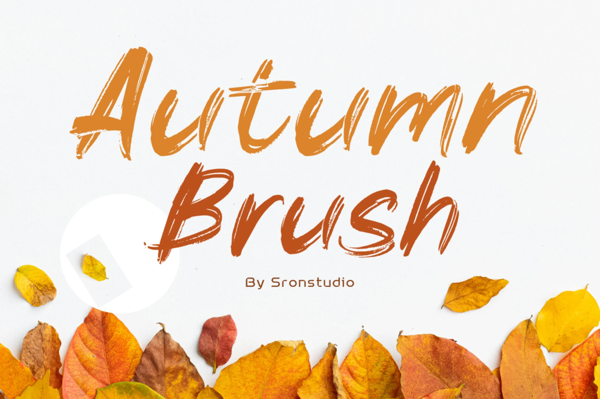
Autumn Brush – Thanksgiving Font

Autumn Brush - Thanksgiving Font

Autumn Brush is a colorful, handcrafted font that brings an energetic and realistic touch to your design projects. With its lively, textured character set, it’s ideal for logos, posters, invites and anything requiring a dash of creativity and warmth.

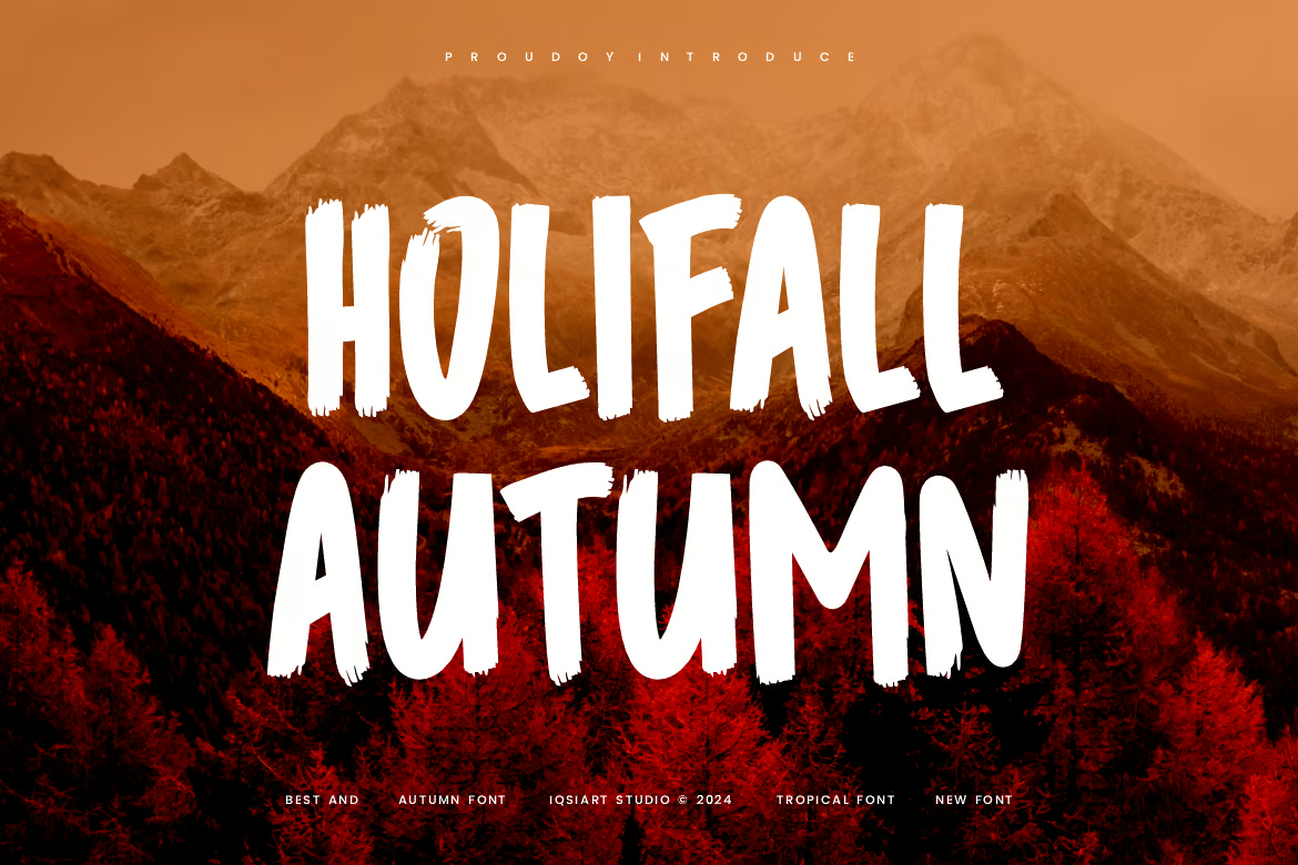
Holifall Autumn – Tropical Fall Font

Holifall Autumn - Tropical Fall Font

Holifall Autumn is a unique and authentic display font perfect for diverse needs. Offering a variety of themes and font styles, it comes in regular OTF, TTF, and WOFF formats. This font is perfect for giving a simple and creative fall vibe to your various seasonal design projects.

Golden Harvest – Fall Font

Golden Harvest - Fall Font

Golden Harvest is a contemporary, handwritten style font that provides a captivating touch to your designs. It includes upper and lower case letters, numerals, and standard punctuations. It also showcases accents, stunning ligatures, and stylistic sets.

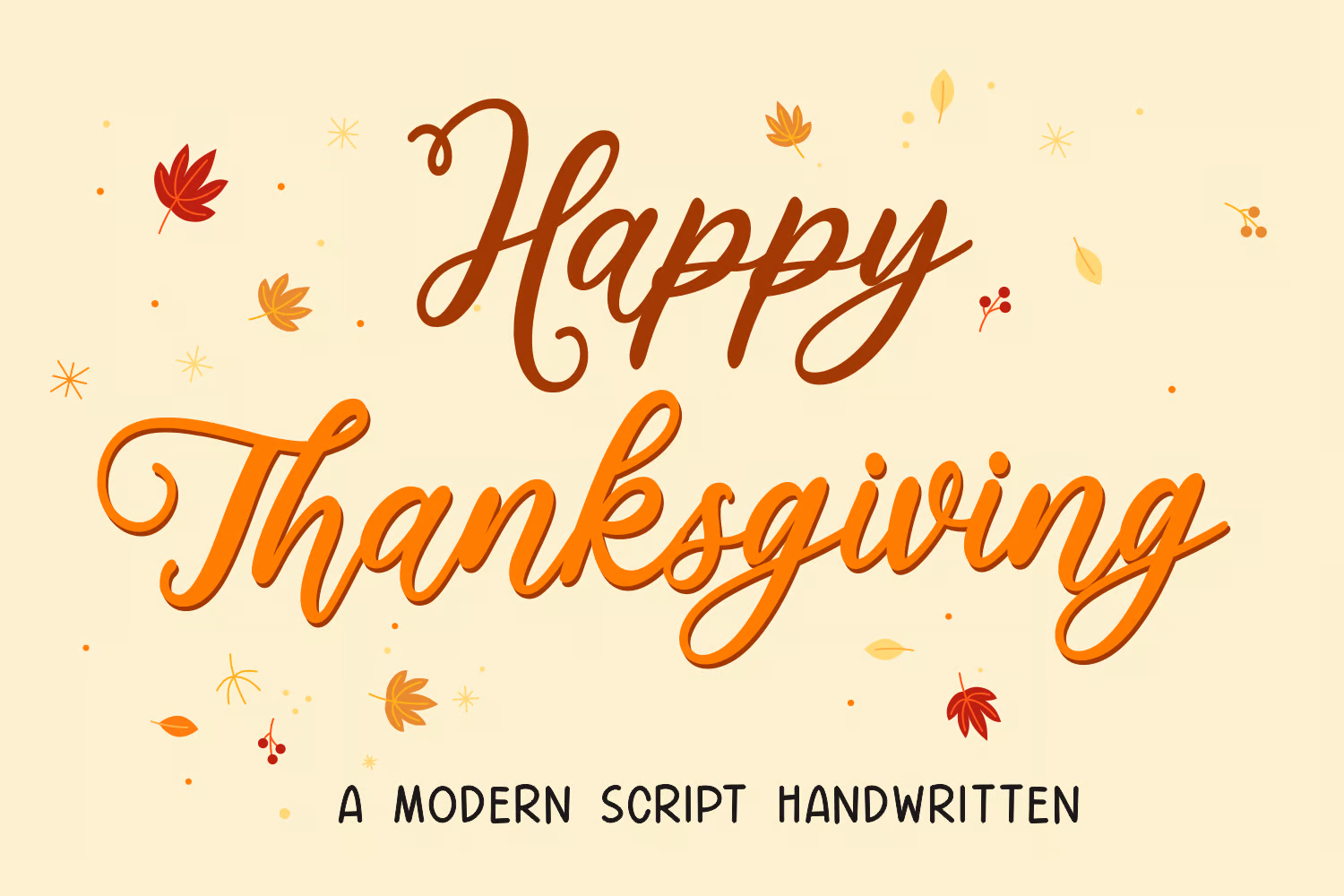
Happy Thanksgiving – Handwritten Script Font

Happy Thanksgiving - Handwritten Script Font

Happy Thanksgiving is a charming handwritten script font that seamlessly melds the warm, festive ambiance of numerous holidays. Beautifully encapsulating the essence of autumn and the cheer of the holiday season, this versatile font adds a touch of artful creativity to your projects.

Beauty Autumn – Simple Handwritten Font

Beauty Autumn - Simple Handwritten Font

Beauty Autumn is a versatile font perfect for sprucing up your digital and printed materials. Its handwritten style brings an intimate, personal touch to your projects, whether it’s for branding, posters, or social media posts. With included OTF, WOFF, and TTF files, it meets diverse design needs effortlessly.

Autumn Silent – Modern Handwritten Script Font

Autumn Silent - Modern Handwritten Script Font

Autumn Silent, a modern handwritten script font, is an elegant addition to your digital and printed creations. With its stylistic appeal, it’s an incredible choice for enhancing posters, social media posts, branding, and personal projects. It is conveniently offered in OTF, WOFF, TTF and italic versions.

Retro Fall – Cute Fall Font

Retro Fall - Cute Fall Font

Retro Fall is a groovy, vintage-inspired font well-suited for various creative ventures. Its playful and authentic vibe makes it ideal for blog posts, logos, greeting cards, branding, or even planners and photo albums. The zip file includes both OTF and TTF files, allowing diverse usage for this unique typeface guaranteed to enhance your designs with a touch of nostalgia.

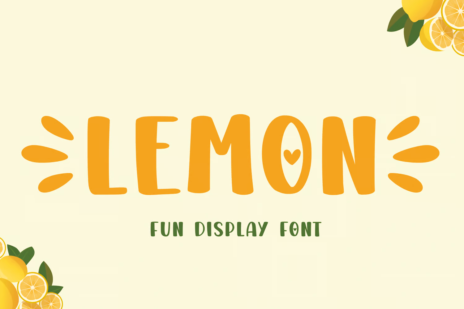
Lemon – Fall Thanksgiving Font

Lemon - Fall Thanksgiving Font

Lemon Font is a fun, refreshing blend of display and cute styles that add a burst of lively color to your creations. Ideal for seasonal and fun occasions, this whimsical font is perfect for projects that radiate positivity. Lemon Font brings the vibrant spirit of changing seasons to your crafting, decor, and embroidery projects.

Wonderland – Christmas & Thanksgiving Font

Wonderland - Christmas & Thanksgiving Font

Wonderland is an elegantly designed, handwritten font that adds a touch of warmth and sophistication to various projects. Ideally suited for special occasions and festive themes, its graceful style enhances creations from wedding invitations and greeting cards to embroidery designs and unique crafts.

Thanksgiving Joy – Playful Font

Thanksgiving Joy - Playful Font

Thanksgiving Joy is a cheerful, playful font that’s perfect for celebrating the festive season. The font comes with nine decorative options, all inspired by classic Thanksgiving motifs. Easy to install and use, it’s great for designing invitations, decorations, or logos for the holiday season.

Orange Leafy – Autumn Themed Font

Orange Leafy - Autumn Themed Font

Orange Leafy is a captivating Autumn-themed font. Its playful and vibrant style is great for Autumn branding, logos, invitations, stationery, social media posts, product packaging, merchandise, and more. Offering otf and ttf formats, ligatures, and multilingual support.

Falling Dried – Modern Fall Sans Serif Font

Falling Dried - Modern Fall Sans Serif Font

Falling Dried is a beautifully modern sans serif font exuding warmth and recalling the natural splendor of autumn. Its clean and minimal design gives letters a tranquil, soft look, making it perfect for projects that capture the season’s charm. The font, which comes in several formats including otf and ttf, works well for invitations, posters and more.

Fall Season – Handwritten Font

Fall Season - Handwritten Font

Fall Season is a somewhat wistful, handwritten font with a relaxed vibe that gives each design a unique and captivating touch. It’s perfect for logos, branding, and quotes, offering uppercase, lowercase, symbols, numerals, ligatures, alternates, and multilingual support. The font comes in OTF, TTF, WOFF, and WOFF2 files, making it versatile for various projects.

Gobbie Gobble – Fun Thanksgiving Font

Gobbie Gobble - Fun Thanksgiving Font

The Gobbie Gobble font evokes the playful spirit of Thanksgiving with its endearing handwritten style. Available in uppercase and lowercase, along with numerics and symbols, it offers versatility for your creative designs. Alongside, it includes 26 unique Thanksgiving-themed doodles accessible by typing A-Z, enhancing your artwork further. File formats include otf, ttf, and woff for the font and doodles.

Thanks Autumn – Handwritten Fall Font

Thanks Autumn - Handwritten Fall Font

Thanks Autumn handwritten font is an appealing, artistically crafted font that embodies the heart and warmth of the fall season. Displayed entirely in caps, it includes two different heights, numbers, symbols, and multilingual support. The asset provides OTF, TTF, WOFF files to suit your project needs. Perfect for any charming autumn-inspired project.

Barthley – Handlettering Fall Font

Barthley - Handlettering Fall Font

Barthley is an appealing handwritten font with a unique, natural style. Its versatility makes it ideal for a wide variety of designs. The font is user-friendly, easy to install on both PC & Mac and works seamlessly with popular software like Adobe Illustrator, Photoshop, Microsoft Word, and more. It’s PUA encoded which allows for easy access to all its glyphs and swashes.

Gratefully – Slab Serif Thanksgiving Font

Gratefully - Slab Serif Thanksgiving Font

Gratefully is a playful, fall-themed slab serif font with a unique, handmade feel. Its bouncy and scribbled characteristics make it perfect for a range of creative projects like Thanksgiving invitations, greeting cards, and posters. Offering a variety of features, including standard uppercase, lowercase, numerals, symbols, and some ligatures, this font is compatible with most software platforms and comes in .otf, .ttf, and web font formats.

Savor Fall – Modern Fall Font

Savor Fall - Modern Fall Font

Savor Fall is a modern display typeface that captures the spirit of fall through its distinctive style that instills a warm sense of nostalgia. With delicate lines and gentle curves, the font lends softness and tranquility to your designs. Ideal for invitations, greeting cards, or posters, it infuses every project with an irresistibly natural touch. Available in both otf and ttf formats, with uppercase and lowercase options.

Maple Memories – Fall & Thanksgiving Font

Maple Memories - Fall & Thanksgiving Font

Maple Memories is a beautifully intricate handwritten font that enhances any design with its versatile style. Offered in three formats (.otf, .ttf, .woff) and featuring multilingual support, from English to Zulu, it’s perfect for beginners and experts alike. The additional beginning and ending swash augment its elegance. Designed by Attype Studio, this creative asset is sure to bring your Fall and Thanksgiving projects to life!

Autumn Atmosphere – Creative Fall Font

Autumn Atmosphere - Creative Fall Font

Autumn Atmosphere is a distinctive and genuine display font, perfect for various branding projects like logos, seasonal decorations, greeting cards, and beyond. Its bold and adaptive style stands out in numerous contexts. The package includes OTF, TTF, and WOFF formats.

Happy Fall – Modern Handwritten Font

Happy Fall - Modern Handwritten Font

Step into Autumn with the Happy Fall handwritten font. Perfect for projects that want to carry the enchanting essence of fall, like invitations, greeting cards, or posters. This charming font features uppercase and lowercase versions along with multilingual support. It will sprinkle a natural and captivating touch on your design, wrapping it in a cozy autumn ambiance. Available in otf and ttf formats.

Turning Leaf – Fall Themed Font

Turning Leaf - Fall Themed Font

The Turning Leaf is a charming fall-themed creative font. Its delicate lines and gentle curves evoke nostalgia for changing leaves and autumn tranquility, adding a dimension of softness to any design. This font, available in both uppercase and lowercase, is perfect for any project needing a warm, natural touch. It works beautifully on invitations, greeting cards, and posters, and supports multiple languages.

Warm Autumn – Fall & Thanksgiving Font

Warm Autumn - Fall & Thanksgiving Font

Warm Autumn is a distinctive, genuine display font with bold characters. It’s versatile enough for a variety of branding tasks, such as creating logos, greeting cards, and other projects that embrace the spirit of Autumn or summer. Available in OTF, TTF, and WOFF formats, Warm Autumn is a standout choice for a broad set of scenarios.

Lord de Ayodilla – Thanksgiving Style Font

Lord de Ayodilla - Thanksgiving Style Font

The Lord de Ayodilla is a delightful font for livening up your holiday or spring-themed projects. Its dazzling serif-script style uniquely compliments any cheerful occasion. Perfect for creating engaging social media posts or holiday greeting cards, it even includes foreign language glyphs for added versatility. This font is available in .OTF and .TTF formats.

Autumn Orange – Fall Themed Font

Autumn Orange - Fall Themed Font

Autumn Orange is a standout, genuine display font that lends a bold finish to various branding projects, including logos, greeting cards, and seasonal-themed graphics. Its versatility is unmatched as it stands out in myriad contexts. Available in OTF, TTF, and WOFF formats, Autumn Orange is perfect for injecting vibrant, fall-inspired creativity into your designs.

Happy Today – Fall & Thanksgiving Font

Happy Today - Fall & Thanksgiving Font

The Happy Today font is a versatile, bold display font. Great for branding projects such as logos or greeting cards and perfect for seasonal Autumn and Summer themes, it stands out in various contexts. It comes in OTF, TTF, and WOFF formats, offering practicality for multiple use cases.

Best Free Thanksgiving Fonts

Free Thanksgiving Font

Free Thanksgiving Font

This free font is designed with Thanksgiving-themed projects in mind. It features a beautiful script-style letter design that will add a more modern and more festive look to your typography designs. It’s free to use with personal projects.

Free Script Fall Font

Free Script Fall Font

Another free script font. This font is made for fall-themed design projects. It comes with a set of creative characters suitable for greeting cards, logos, and social media posts. The font is free for personal use only.

With Farmhouse – Free Fall Font

With Farmhouse - Free Fall Font

You can use this font to craft beautiful greeting cards and packaging designs for your fall-themed projects. It’s free to download and use with your personal projects.

Sweet November – Free Fall Themed Font

Sweet November - Free Fall Themed Font

This font has a sweet romantic vibe with a mix of fall-season looks. It’s perfect for designing titles for greeting cards as well as for flyers and posters. The font is free for personal use.

Blushing – Free Fall Font

Blushing - Free Fall Font

Blushing is a free fall-themed font that comes with a handwritten-style letter design. The font is ideal for custom prints such as t-shirts, mugs, and greeting cards. It’s free to use with personal projects.

Interview With Björn Ottosson, Creator Of The Oklab Color Space

Featured Imgs 23

Oklab is a new perceptual color space supported in all major browsers created by the Swedish engineer Björn Ottosson. In this interview, Philip Jägenstedt explores how and why Björn created Oklab and how it spread across the ecosystem.

Note: The original interview was conducted in Swedish and is available to watch.

About Björn

Philip Jägenstedt: Tell me a little about yourself, Björn.

Björn Ottosson: I worked for many years in the game industry on game engines and games like FIFA, Battlefield, and Need for Speed. I've always been interested in technology and its interaction with the arts. I’m an engineer, but I’ve always held both of these interests.

On Working With Color

Philip: For someone who hasn’t dug into colors much, what’s so hard about working with them?

Björn: Intuitively, colors can seem quite simple. A color can be lighter or darker, it can be more blue or more green, and so on. Everyone with typical color vision has a fairly similar experience of color, and this can be modeled.

However, the way we manipulate colors in software usually doesn’t align with human perception of colors. The most common color space is sRGB. There’s also HSL, which is common for choosing colors, but it’s also based on sRGB.

One problem with sRGB is that in a gradient between blue and white, it becomes a bit purple in the middle of the transition. That’s because sRGB really isn’t created to mimic how the eye sees colors; rather, it is based on how CRT monitors work. That means it works with certain frequencies of red, green, and blue, and also the non-linear coding called gamma. It’s a miracle it works as well as it does, but it’s not connected to color perception. When using those tools, you sometimes get surprising results, like purple in the gradient.

On Color Perception

Philip: How do humans perceive color?

Björn: When light enters the eye and hits the retina, it’s processed in many layers of neurons and creates a mental impression. It’s unlikely that the process would be simple and linear, and it’s not. But incredibly enough, most people still perceive colors similarly.

People have been trying to understand colors and have created color wheels and similar visualizations for hundreds of years. During the 20th century, a lot of research and modeling went into color vision. For example, the CIE XYZ model is based on how sensitive our photoreceptor cells are to different frequencies of light. CIE XYZ is still a foundational color space on which all other color spaces are based.

There were also attempts to create simple models matching human perception based on XYZ, but as it turned out, it’s not possible to model all color vision that way. Perception of color is incredibly complex and depends, among other things, on whether it is dark or light in the room and the background color it is against. When you look at a photograph, it also depends on what you think the color of the light source is. The dress is a typical example of color vision being very context-dependent. It is almost impossible to model this perfectly.

Models that try to take all of this complexity into account are called color appearance models. Although they have many applications, they’re not that useful if you don’t know if the viewer is in a light or bright room or other viewing conditions.

The odd thing is that there’s a gap between the tools we typically use — such as sRGB and HSL — and the findings of this much older research. To an extent, this makes sense because when HSL was developed in the 1970s, we didn’t have much computing power, so it’s a fairly simple translation of RGB. However, not much has changed since then.

We have a lot more processing power now, but we’ve settled for fairly simple tools for handling colors in software.

Display technology has also improved. Many displays now have different RGB primaries, i.e., a redder red, greener green, or bluer blue. sRGB cannot reach all colors available on these displays. The new P3 color space can, but it's very similar to sRGB, just a little wider.

On Creating Oklab

Philip: What, then, is Oklab, and how did you create it?

Björn: When working in the game industry, sometimes I wanted to do simple color manipulations like making a color darker or changing the hue. I researched existing color spaces and how good they are at these simple tasks and concluded that all of them are problematic in some way.

Many people know about CIE Lab. It’s quite close to human perception of color, but the handling of hue is not great. For example, a gradient between blue and white turns out purple in CIE Lab, similar to in sRGB. Some color spaces handle hue well but have other issues to consider.

When I left my job in gaming to pursue education and consulting, I had a bit of time to tackle this problem. Oklab is my attempt to find a better balance, something Lab-like but “okay”.

I based Oklab on two other color spaces, CIECAM16 and IPT. I used the lightness and saturation prediction from CIECAM16, which is a color appearance model, as a target. I actually wanted to use the datasets used to create CIECAM16, but I couldn’t find them.

IPT was designed to have better hue uniformity. In experiments, they asked people to match light and dark colors, saturated and unsaturated colors, which resulted in a dataset for which colors, subjectively, have the same hue. IPT has a few other issues but is the basis for hue in Oklab.

Using these three datasets, I set out to create a simple color space that would be “okay”. I used an approach quite similar to IPT but combined it with the lightness and saturation estimates from CIECAM16. The resulting Oklab still has good hue uniformity but also handles lightness and saturation well.

Philip: How about the name Oklab? Why is it just okay?

Björn: This is a bit tongue-in-cheek and some amount of humility.

For the tasks I had in mind, existing color spaces weren’t okay, and my goal was to make one that is. At the same time, it is possible to delve deeper. If a university had worked on this, they could have run studies with many participants. For a color space intended mainly for use on computer and phone screens, you could run studies in typical environments where they are used. It’s possible to go deeper.

Nevertheless, I took the datasets I could find and made the best of what I had. The objective was to make a very simple model that’s okay to use. And I think it is okay, and I couldn’t come up with anything better. I didn’t want to call it Björn Ottosson Lab or something like that, so I went with Oklab.

Philip: Does the name follow a tradition of calling things okay? I know there’s also a Quite OK Image format.

Björn: No, I didn’t follow any tradition here. Oklab was just the name I came up with.

On Oklab Adoption

Philip: I discovered Oklab when it suddenly appeared in all browsers. Things often move slowly on the web, but in this case, things moved very quickly. How did it happen?

Björn: I was surprised, too! I wrote a blog post and shared it on Twitter.

I have a lot of contacts in the gaming industry and some contacts in the Visual Effects (VFX) industry. I expected that people working with shaders or visual effects might try this out, and maybe it would be used in some games, perhaps as an effect for a smooth color transition.

But the blog post was spread much more widely than I thought. It was on Hacker News, and many people read it.

The code for Oklab is only 10 lines long, so many open-source libraries have adopted it. This all happened very quickly.

Chris Lilley from the W3C got in touch and asked me some questions about Oklab. We discussed it a bit, and I explained how it works and why I created it. He gave a presentation at a conference about it, and then he pushed for it to be added to CSS.

Photoshop also changed its gradients to use Oklab. All of this happened organically without me having to cheer it on.

On Okhsl

Philip: In another blog post, you introduced two other color spaces, Okhsv and Okhsl. You’ve already talked about HSL, so what is Okhsl?

Björn: When picking colors, HSL has a big advantage, which is that the parameter space is simple. Any value 0-360 for hue (H) together with any values 0-1 for saturation (S) and lightness (L) are valid combinations and result in different colors on screen. The geometry of HSL is a cylinder, and there’s no way to end up outside that cylinder accidentally.

By contrast, Oklab contains all physically possible colors, but there are combinations of values that don’t work where you reach colors that don’t exist. For example, starting from light and saturated yellow in Oklab and rotating the hue to blue, that blue color does not exist in sRGB; there are only darker and less saturated blues. That’s because sRGB in Oklab has a strange shape, so it’s easy to end up going outside it. This makes it difficult to select and manipulate colors with Oklab or Oklch.

Okhsl was an attempt at compromise. It maintains Oklab’s behavior for colors that are not very saturated, close to gray, and beyond that, stretches out to a cylinder that contains all of sRGB. Another way to put it is that the strange shape of sRGB in Oklab has been stretched into a cylinder with reasonably smooth transitions.

The result is similar to HSL, where all parameters can be changed independently without ending up outside sRGB. It also makes Okhsl more complicated than Oklab. There are unavoidable compromises to get something with the characteristics that HSL has.

Everything with color is about compromises. Color vision is so complex that it's about making practical compromises.

This is an area where I wish there were more research. If I have a white background and want to pick some nice colors to put on it, then you can make a lot of assumptions. Okhsl solves many things, but is it possible to do even better?

On Color Compromises

Philip: Some people who have tried Oklab say there are too many dark shades. You changed that in Okhsl with a new lightness estimate.

Björn: This is because Oklab is exposure invariant and doesn’t account for viewing conditions, such as the background color. On the web, there’s usually a white background, which makes it harder to see the difference between black and other dark colors. But if you look at the same gradient on a black background, the difference is more apparent.

CIE Lab handles this, and I tried to handle it in Okhsl, too. So, gradients in Okhsl look better on a white background, but there will be other issues on a black background. It’s always a compromise.

And, Finally…

Philip: Final question: What’s your favorite color?

Björn: I would have to say Burgundy. Burgundy, dark greens, and navy blues are favorites.

Philip: Thank you for your time, Björn. I hope our readers have learned something, and I’ll remind them of your excellent blog, where you go into more depth about Oklab and Okhsl.

Björn: Thank you!


Gain $200 in a week
from Articles on Smashing Magazine — For Web Designers And Developers https://ift.tt/p0n1ylf

33 Ways to Drive Traffic to Your Website

Featured Imgs 23

“If you build it, they will come” may have worked for Kevin Costner, but I think we all know that marketing a cornfield baseball diamond would take just a little more work.

Websites are no different. Even the best content needs readers, and if you’ve struggled to increase your website traffic, you're in good company.

According to 2024 research from Content Marketing Institute, more than half of B2B content marketers say it’s a challenge to consistently create the right content for their audience.

→ Download Now: SEO Starter Pack [Free Kit]

We’ve got a list of 33 ways to increase website traffic, generate more leads, and improve ROI (and none of them involve waiting in a cornfield for ghost baseball players).

Table of Contents

1. Content Creation

Inbound marketing focuses on attracting the right people to your company. One of the best ways to do this is by creating content through blogging.

To brainstorm content that will attract the right visitors to your website, you must first understand the buyer persona you’re targeting. Once you know your audience, you can create content that naturally attracts them to your website.

But how do you write a good blog post that will draw in the right audience? Follow these five steps:

  • Identify your buyer persona: Find out more about your target market. Understand everything from job title to pain points.
  • Conduct keyword research: Learn what your audience is searching for on search engines so you can provide the best content.
  • Ideate topics: Identify topics that appeal to your audience’s pain points and experience high search volumes. Tools like our Blog Ideas Generator can help with the brainstorming process.
  • Write a draft: Begin by drafting a post that answers your audience's questions. Use interesting angles to make your post stand out.
  • Publish: Publish your post on your blog site. Use SEO tools to optimize your content.
  • Promote: Promote your blog post on social media and email newsletters to generate traffic. The more traffic your post generates, the higher it will rank in search engines.

Pro tip: Learn how to implement a blogging strategy with our step-by-step guide and templates.

Want to take your blogging to the next level? Explore our Free AI Blog Writer to streamline your content creation process with the power of artificial intelligence.

2. Topic Expertise

Ranking higher in Google will increase your site's organic traffic. At HubSpot, we do this by using the pillar/topic cluster model. Google favors sites known to be topic experts on the subject matter they're writing about.

To be seen as an expert, you can create a pillar page, which is essentially a longer blog post that broadly covers all aspects of a topic.

Then, you write “cluster content,” or supporting blog posts, targeting long tail keywords that show you've covered a topic exhaustively. Focusing on long-term traffic will help you rank higher on search engines.

Christina Perricone, a former senior blog manager at HubSpot, says, "The pillar cluster model organizes content on your site around a single topic and search term through internal linking. This organization helps search engines easily crawl and categorize all of the content that you have on a particular topic, thereby making it easier for you to rank for that search term."

She continues, "When the model is done right, it also helps visitors navigate your site and move through related pages, boosting traffic for all of the pages in your topic cluster."

3. Organic Social Media

Organic social media is not a new strategy, but it's still something marketers should pay attention to. Besides posting on social media platforms, you can also use Instagram Stories, live video on Instagram or TikTok, or Facebook Messenger.

It's important to have a diverse social media strategy and use the right social media platforms — not just Facebook, Instagram, and X. Platforms like YouTube and even Pinterest can generate a lot of traffic to your site.

And as we saw during the transformation of Twitter into X, users can jump ship during major platform changes — so don’t put all your eggs in one basket.

Henry Franco, a former HubSpot marketing manager, recommends two things regarding organic social media.

“First, don't spam your audience — it costs a user nothing to scroll past your post, and if you don't offer them any value, that's exactly what they'll do. Know your audience, and craft content that speaks directly to them,” Franco says.

“Second, stay active with community management. People love when brands like and reply to them — it'll humanize your business, and keep people coming back for more content.”

For instance, HubSpot uses fun carousels on Instagram about your office personality, a lighthearted way of engaging our audience (I am a bi-coastal baddie only by virtue of constantly mixing up time zones.)

Screencap of a HubSpot Instagram post about what your office personality is.

Image Source

Pro tip: Check out our social media marketing guide to learn more.

4. Website Analysis

Let‘s do a little reverse-engineering of our thought process. Before you drive traffic to your website, it’s important to learn about your audience.

To do this, analyze your website to see where you're losing and gaining visitors. There are plenty of third-party tools, like Crazy Egg, and HubSpot has a free website grader you can use.

With this information at your disposal, you can create the right content to drive the right traffic to your website.

5. Influencers

We know that customers are more likely to buy from organizations with excellent word of mouth, but how do you create great word of mouth marketing?

First, delight your customers. Second, work with influencers.

Influencer marketing isn‘t a passing fad. In fact, it’s a budget-friendly option to drive traffic to your website. When influencers post discount codes, links, reviews, or giveaways, you are tapping into their audience to drive traffic to your website.

6. Email List Building

Using your current readers and customers is a great way to drive traffic to your website. When you post a new blog or content offer, you can promote it to your followers/subscribers for a quick traffic boost. With content-heavy websites, repeat readership is helpful for traffic goals, conversions, and lead generation.

To get started, build an email list or grow your current list. Below are a few strategies you can use:

  • Content offers: Publish content that requires visitors to share their email to access it. Include CTAs for content offers on your website.
  • Easy-access newsletter sign-up: Include sign-up forms on your website, from your homepage to your about page. If a visitor has a delightful experience on your site, they’re more likely to sign up for your newsletter.

Use HubSpot’s free forms tool to easily add a form to your site and start growing your email list.

  • Social media: Promoting your email newsletter on social media, whether through a post or contest/giveaway, is a great way to convert your current followers into subscribers.

Pro tip: Learn how to build an email list from scratch or grow your email list.

7. Community Engagement

The more brand recognition you have, the more traffic you will drive to your website. One way to achieve brand recognition is to be active and engaged within the market.

You can implement an engagement strategy today by participating in Facebook group discussions in your industry, answering questions on public forum websites, and interacting with your followers on social media.

One of my favorite brands on social media is Taco Bell. Taco Bell delights its customers on social media just about every day. See a couple of examples from the company’s X account below.

Screencap of X user @usagiibunz saying, “I WANT TACO BELL 😭😭😭.” @tacobel responds, “you know what to do.”

Image Source

In the example above, Taco Bell uses a simple tweet from a customer to engage with them and build community organically. The brand also just likes to have fun:

Screencap of @tacobell on X. “tell us your favorite fictional villain and we’ll tell you what to order from taco bell.” X user @Conway_Jenkins responds, “Original Maleficent,” and @tacobell responds, “black bean crunchwrap.”

Image Source

Just remember to be helpful and human. No one likes spammy links or self-serving rhetoric when they're asking a quick question online.

8. On-Page SEO

On-page SEO can help your website rank higher in search engines and bring in more traffic. Some on-page SEO elements include the page title, header, meta description, image alt-text, and the URL (plus more). Showing up in search engines will generate more traffic for your site.

Pro tip: To get started, check out our ultimate guide to on-page SEO.

9. Quality Backlinks

In order to drive traffic to your site, you need to rank high in search engines. In order to rank higher in search engines, you need to be an authority in your industry.

One way to do that, besides the topic/cluster model described above, is by acquiring quality backlinks. If websites with high authority link to your site, that gives you more credibility.

Irina Nica, senior product marketing manager at HubSpot says, "There are two main ways in which high-quality backlinks can help drive more traffic to a website: boosting ranking and driving referral traffic."

She continues, "Backlinks are one of the most important ranking factors for every major search engine out there. By constantly earning high-quality backlinks from relevant websites, you'll improve your rankings in SERP and, as a result, see a lift in your organic traffic."

“By constantly earning high-quality backlinks from relevant websites, you’ll improve your rankings in SERP and, as a result, see a lift in your organic traffic.”—Irina Nica, Senior product marketing manager, HubSpot

Nica adds, "Backlinks can also drive a substantial amount of referral traffic. That‘s something to be expected if you get mentioned on a popular news website. You can also see referral traffic coming through if you’re mentioned (and linked to) in an article that's already ranking well for high search volume keywords and is getting a constant flow of traffic.”

Pro tip: Want to learn how to earn backlinks? We’ve got 10 creative ways.

10. Video Marketing

Screencap of HubSpot’s YouTube channel, with three videos about email marketing strategies.

Image Source

If video marketing isn’t already part of your content strategy, you’re missing out on a huge potential audience. Statista reports that Google Sites, which owns YouTube, reaches 258 million U.S. viewers.

It’s predicted that by 2028, digital video advertising spending will increase to nearly $90 million, up from $59 million in 2024. And those numbers are just for mobile.

You can create videos for Instagram Stories or Reels, do live videos, start a YouTube channel, etc. Want to get started today? Learn everything you need to know in our ultimate guide to video marketing.

11. Content Repurposing

Need content to drive traffic to your site but struggling to come up with ideas? I get it. A great way to overcome this hurdle is to repurpose old content. Take a well-performing blog post and repurpose that into a video.

Or if you have a podcast that did really well, write up a blog post on that topic. Using content that has already performed well will continue to drive traffic to your site.

You can also repurpose written content by taking advantage of industry trends. If you have a handful of older content about AI, for instance, you could freshen them up with recent statistics and quotes, package the blog posts together, and promote it as an ultimate topic guide.

12. LinkedIn Creator

LinkedIn is actually more popular with millennials than other social networks. And with millennials now in their 30s and early 40s, there’s a good chance they form a significant part of your target market.

Unlike LinkedIn Influencers, anybody can become a LinkedIn creator. You can repurpose blog posts (or write new ones!), host live audio events, and even start on-platform newsletters.

LinkedIn has great resources for anybody looking to boost their reach, like its content best practices, which suggest that you post at least four times per week and treat each post as the start of a conversation.

Screencap of four of LinkedIn’s content best practices. Treat each post as a conversation. Diversity your content types. Post frequently. Focus on niche topics.

Image Source

13. SEO Tools

To drive traffic to your website, it's important to be a student of SEO. Learning how to use SEO tools like Google Analytics, Ahrefs, and SEMrush will help you develop a strategy to generate traffic to your website.

These tools will help you learn and analyze what‘s working on your site and what isn’t. Plus, these help you come up with ideas for content that has the potential to generate high traffic. Check out our roundup of the best SEO tools to monitor your website.

14. Historical Optimization

Historical optimization is the process we use at HubSpot to update old blog content and generate more traffic and leads. If you're anything like us, a majority of your monthly blog views and leads come from older posts.

Pamela Vaughan, a marketing fellow who works on web strategy at HubSpot — and the person who introduced us to the concept of historical optimization — has written about this extensively.

She says, “Historical optimization is a tactic best-suited for a blog that's been around for several years because you need to 1) be generating a significant amount of organic search traffic, 2) have built up a critical mass of blog subscribers and social media followers, and 3) have a sizable repository of old posts at your disposal.”

Vaughan adds, “Historical optimization should be a piece of your overall blogging strategy — not the whole strategy.”

Pro tip: Follow her step-by-step process for historical optimization.

15. Voice Search Optimization

Remember in “The Little Mermaid” when Ariel wanted to go where the people were? That same principle applies to digital marketing. In order to drive traffic to your website, it's important to show up where people are searching.

Voice search is an increasingly important area in which to rank, especially with the advancements in AI we’ve seen in just the last year or two. According to eMarketer, the number of U.S. users who use voice assistants like Siri, Alexa, and Google Assistant will grow from 145.1 million in 2023 to 170.3 million in 2028.

Here are a few tips to get started:

  • Research long-tail keywords: When people use voice search, they speak in full sentences rather than short phrases. To optimize for voice search, start researching longer-tail keywords.
  • Write answer-focused content: The content you write should answer your audience's questions.
  • Optimize for snippets: Smart speakers like Alexa and Google Home look for short, concise answers. Writing quick summaries in your posts makes it easier for search engines and smart speakers to find the answer they need.

16. Local SEO

If your company is a brick-and-mortar store, local SEO is an important factor to consider. In her comprehensive guide to local SEO, former HubSpotter Kelsey Smith wrote that search engines gather information for local search by “[relying] on signals such as local content, social profile pages, links, and citations to provide the most relevant local results."

For example, when someone types in “best soul food restaurant” on Google, the results are generated by the user's location. Tools like Google My Business and Moz Local help businesses manage their directory listings and citations so they show up in local searches.

Here’s a restaurant that shows up for that search in Chicago:

Screencap of Google listing for Bronzeville Soul.

Image Source

To rank for local search:

  • Ensure your name, address, and phone number (NAP) is consistent on your Google My Business and social media pages.
  • Use a directory management tool to monitor directories like Yelp, Foursquare, Best of the Web, etc.
  • Research and use location-based search terms on sites like Google Trends, which analyzes popular search terms across various regions.

17. QR Codes

Marketers love a good QR code. And now that smartphones can natively scan them, so do consumers.

QR codes can drive trackable traffic to your website, but you have to give the user a reason to scan them.

Think of it as creating a real-life CTA button. If you make it enticing and accessible enough, people will scan it, and you’ll get to assess the success of that QR code’s placement in real-time.

When you use a dynamic QR code generator, your QR code will remain the same and still be accessible even if your web address changes later.

18. A/B Testing

You know you're a marketer when your motto is “Test, test, and test again.”

A/B testing is a split test that helps you determine what version of a campaign performs best. These tests can give you key information about your audience so you can create tailored content and offers that drive traffic to your site. There are a lot of tools you can use to get started.

Pro tip: Check out our roundup of the best A/B testing tools.

19. Internal Linking

When a visitor comes to your blog, your goal is to keep them there.

That‘s why internal links — links to other pages on your site — are very important. When visitors continue to other pages of your website, they’re more likely to convert and become brand enthusiasts.

For example, you can create an internal linking structure using the pillar/cluster model described above. Pillar and cluster pages link back and forth, which boosts your site's credibility on search engines, while also increasing the likelihood of a conversion.

20. Technical SEO

Technical SEO focuses on the backend of your website to see how the pages are technically set up and organized.

Factors include elements like page speed, crawling, indexing, and more. Matthew Howells-Barby, HubSpot's former director of acquisition, has written about how updating our technical SEO gave HubSpot more than a 50% increase in organic traffic.

To get started with your technical SEO, use some of the tips from Howells-Barby's article, including:

  • Fix broken links and redirects.
  • Create an XML sitemap for your subdomains.
  • Set up language meta tags.
  • Add custom H1 and introductions to topic pages.

21. E-E-A-T

Google has long prioritized content it deems the most helpful to users. For many years that was summed up in the acronym E-A-T, or expertise, authority, and trust.

In 2022, it added an “E” for “experience,” meaning that content should be produced by people with firsthand, real-world experience with the topic.

“E-E-A-T is hands-down one of the most underrated content SEO practices,” says Amanda Sellers, the manager of EN blog strategy at HubSpot.

“E-E-A-T is, hands-down, one of the most underrated content SEO practices.”—Amanda Sellers, Manager, EN Blog Strategy, HubSpot

If you have an established blog or large content library, take the time to audit for these E-E-A-T best practices:

  • It’s helpful content.
  • Experts created it.
  • It’s trustworthy.
  • It’s regularly updated.

Simply adding a personal perspective and expert quotes to existing content can go a long way toward boosting your content in the SERPs.

Pro tip: Here’s how adding “experience” to a HubSpot blog post increased clicks by 724%.

22. Community Building

Building a community of brand enthusiasts is a great way to continuously drive traffic to your website. You can build a Facebook group, Instagram Live events, a LinkedIn Group, or Quora Space specifically for your followers and others in your industry where you create value, while also linking back to your site.

You can even do this from your own website — think about Apple’s support community, which I have used more than a few times to diagnose something on my iPhone or laptop. Lego’s online community lets users of all ages participate in activities and challenges and even submit their ideas to Lego designers.

Screencap of Lego’s user challenges.

Image Source

23. Content Offers

Content offers, sometimes referred to as lead magnets, are a way to use content to drive traffic to your site and generate leads. Content offers vary depending on what stage of the buyer's journey your customer is in, but can include webinars, guides, reports, trials, demos, checklists, and more.

Pro tip: Learn about different types of content offers and find the best one for you and your business.

24. Media Coverage and Public Relations

Earned media coverage is a great way to drive brand awareness for your company and traffic to your website. If your marketing and public relations teams work together, you can generate traffic to your site and create excellent word of mouth.

Ellie Flanagan, a former HubSpot senior corporate communications manager, says, "Although most outlets these days try to stay away from including backlinks in their stories (it‘s usually against their editorial guidelines), that doesn’t mean that a good story won't drive folks back to your site.

Media coverage provides great third-party validation for your company. Stories about new products or services, your company culture, or even industry thought leadership can all be great drivers for a reader who maybe hadn't heard of your company before and wants to learn more."

25. Social Share Buttons

Social share buttons are links that make it easy for your readers to share your content on social media. When your readers become promoters of your content, your traffic will increase. Here's a quick cheat sheet on creating social share buttons.

Once you've created your social share buttons, how do you get people to share your content? Here are a few tips to get started:

  • Ask people to share on social media.
  • Create strong content.
  • Include quotable content.
  • Add multimedia such as images, videos, infographics, etc.

26. CTR Optimization

Once your content is posted and you begin ranking on search engines, make sure people are clicking through to read your posts.

Your click-through rate (CTR) measures who clicked on your post and read it against the number of people who viewed the link to your post (e.g., the landing page, email, or advertisement) in total.

A great tool to measure your organic CTR is Google Search Console. To get more people to click through and drive traffic to your site, it's important to write compelling and apt meta descriptions and titles.

To write quality meta tags that are click-worthy, make sure your titles are short and snappy, and your description leaves visitors wanting more. This ties into on-page SEO, described above.

27. Academy and Knowledge Base Posts

One form of content that can drive traffic to your website is educational content. If you create courses, certifications, or educational posts that are helpful to your audience, you'll likely see an increase in traffic.

For example, HubSpot uses HubSpot Academy to generate content that is helpful to our audience. We provide videos, certification courses, and knowledge base articles to answer questions. See an example of a knowledge base article below.

Screencap of HubSpot Knowledge Base article “Create and assign marketing tasks in the campaigns tool.”

Image Source

28. Social News Sites

Reddit is no longer a playground for internet trolls — it’s a hugely valuable resource for knowledge and information. I often use it while researching HubSpot articles to see what the hot topics are or what questions users are asking about a certain subject.

Reddit and similar sites, like Quora, are social news sites, and they can be great traffic-drivers. By nature, these platforms are similar to social media because they foster asynchronous connections between users.

The difference is that these types of sites engage people around a question or topic, and external content can be shared to help explain the users’ points of view.

Another way external sites benefit from increased traffic via social news sites is when they’re shared in popular channels. You can share your website’s content on these sites yourself if you’re just starting out, but do so carefully.

Just like on traditional social sites, too much self-promotion is frowned upon in the Reddit and Quora communities. You’ll fare best when you share your content in context of the topic and when it’s the best information to answer the user’s question.

1. Paid Advertising

You can drive traffic to your website quickly with paid advertising. With search engines, you can run pay-per-click or retargeting ads. With social media you can run display ads or sponsored posts.

Your strategy will most likely include a combination of different types of advertising like social media, display, and search ads.

The 2024 CMO Survey from Deloitte says that marketers are anticipating a 12.1% increase in social media spending in 2025.

Pro tip: Get started with our step-by-step guide on paid advertising.

2. Contests and Giveaways

A simple way to drive traffic to your website is through contests and giveaways. This can give you a quick boost, while also rewarding your followers. You can host giveaways on social media, through your email list, or both.

Perhaps start with something smaller than beverage company Liquid Death, which ran a giveaway in summer 2024 for … a jet. A real one. (Pilot not included.)

Screencap: Photo of an L-39 Aero Jet decorated with Liquid Death stickers.

Image Source

Implementing a strategy like this can be simple. Just follow these six steps:

  • Decide what platform on which to host your giveaway. (You can use multiple.)
  • Choose a prize. (Free tickets, discount, etc … )
  • Select the criteria. (Website comments, email sign up, etc … )
  • Write the ad copy.
  • Create the graphics.
  • Post and promote the contest or giveaway.

3. Guest Posting

In that same vein, writing guest posts can generate traffic to your site. Guest posting shows you're active in your community, while also linking to your website (and I’ve got more on generating backlinks below).

To implement a guest posting strategy, you need to find a site that’s a good fit for your company, draft a blog post, and then write a pitch.

Caroline Forsey, a marketing manager on HubSpot’s content growth team, says, "I'm always particularly intrigued with a guest pitch if it shows me the writer has done their research ahead of time.”

“For instance, I‘d pay much closer attention to a pitch if it tells me how this piece could appeal to my readers. Additionally, I’m impressed when a writer can recognize gaps in our content and how their piece will fill those gaps, rather than competing with existing content."

As an example, here’s what HubSpot looks for in guest posts on the Marketing Blog.

4. Guest Podcasting

Similar to guest posting, being a guest on a popular podcast can raise brand awareness and drive traffic to your website.

You may already have some favorite podcasts that would be a great fit; you can also use a “matchmaking” company specifically for podcast guests, like Interview Connections and PodMatch.

Just make sure you do your own research. Listen to a few episodes to get a sense of the tone and subject matter, research the host(s), read reviews, and see if the podcast has published numbers like subscribers or downloads.

5. Thought Leadership

According to Edelman’s and LinkedIn’s research, more than half of decision-makers and C-level executives spend an hour or more each week reading thought-leadership content.

If that’s your audience, it’s time to dedicate more of your editorial calendar to thought leadership. (And even if your target audience isn’t in the C-suite yet, sharing thought-leadership content can boost your brand’s credibility and visibility — and help you create genuinely useful content.)

When choosing a thought leader, don’t limit yourself to your own industry. Influential thought leaders often have transferable knowledge that can help your readers, regardless of their industry and experience.

And although “leader” suggests somebody well-established in their career, there are lots of younger professionals who are disrupting industries, trying out new tactics, and catching the attention of their peers. More than anything, look for a good storyteller — somebody you are excited to sit down and talk to.

Website Traffic Is Waiting For You

Driving traffic is a never-ending task, but it’s one that can yield long-term results.

There are so many paths your future customers can take to reach your website — all you have to do is find the one that works best for your business.

Try one of these methods in your next quarter’s demand generation strategy to see a significant traffic boost.

8 Best Free Website Builders to Check Out in 2024 [+ Pros & Cons]

Featured Imgs 23

In my half-decade as an SEO content marketer, I’ve spent a good chunk of my time either testing or working with any number of free website builders: Content Hub, WordPress.com, WordPress.org, Wix, Weebly, Webflow, you name it.

Start Using HubSpot's Drag-and-Drop Website Builder

These website builder tools have been essential for me to publish content, either for my current employer or for my side projects. I’ve, therefore, become well acquainted with their capabilities over time.

But if you’re new to the website builder game, you might be confused about where to start. What is the best choice if you don’t know how to code? And which is budget-friendly? I’m going to cover that and more. First, let’s go over the basics.

Table of Contents

If you’ve been considering building a website for some time, you’re likely familiar with your options. The most common method is buying a web hosting plan and domain name and installing your preferred CMS, such as WordPress.org or Joomla, on your website.

From my experience, the problem with this option is that when you install WordPress or Joomla out of the box, it doesn’t come with a handbook or page content.

With this method, my websites started as blank pages, which meant that unless I hired a developer or spent a lot of time building it, the result would look unfinished and unprofessional.

When testing out free website builders such as Content Hub or WordPress.com, I could considerably shorten my workflow. For instance, the themes came with placeholder text and images, making my website feel more complete than if I had started with an out-of-the-box CMS.

How I Tested the Best Website Builders

Workflow was the most important factor when finding the best website builders for this post. Is it easy to set up a website from the start, or do you need extensive time and experience?

Chances are, if you’re looking for a free website builder, you’d like the setup to be painless and seamless. For that reason, I chose tools that had:

  • The standard required features: placeholder content, blogging tools, SEO tools, mobile-optimized and responsive, and templates and themes
  • An entirely free option with solid capabilities out of the box — no need to upgrade at every turn
  • A relatively easy workflow from signup to completion

With that, let’s go over the absolute best website builders I’ve used and tested before.

1. Best Free Website Builder for Growing Businesses: HubSpot Drag-and-Drop Website Builder

Pros
  • Includes web hosting
  • Personalization (thanks to HubSpot’s CRM)
  • Security
  • Responsive themes and templates
Cons
  • The free version displays HubSpot's branding
  • You’ll need to learn HuBL, HubSpot’s templating language, to build custom modules and templates.

Get started with HubSpot's free drag-and-drop builder!

I use HubSpot’s drag-and-drop website builder (inside Content Hub) as a content marketer on the HubSpot blog team and have used it for two of my side website projects.

Hands down, this is one of the best website builders available for free — not only because of the ease of signing up but also because it includes built-in tools for a handful of other functions, such as marketing and sales.

The website creation process is so easy, anyone could do it — mainly because the setup dashboard includes an interactive checklist for you to build your site step-by-step.

I loved this signup workflow when I was building a few side projects. It’s one of the best in terms of user- and beginner-friendliness.

Once you install a free theme, you start customizing the site immediately with your preferred colors and fonts.

The bar at the top of the page shows you where you are on the setup workflow, which is useful for skipping between tasks. Note that this is only active during the onboarding phase.

After you’re finished, you’re taken right back to the user guide, where you can begin exploring HubSpot’s suite of tools for business. You also have the option of connecting a custom domain, which is free.

You can buy a domain through a domain registrar such as GoDaddy and then proceed through the domain connection process.

This might be the most difficult part of signup due to the verification step. But you can always move forward with a free HubSpot domain name, which looks like this:

[randomly generated token].hs-sites.com

It’s not beautiful and is my least favorite feature, so I’d recommend moving forward with a custom-branded domain.

Now, it’s time to edit our site. The website editing process is a little more compartmentalized than in other tools.

Others might take you to the page editor right away. Still, HubSpot takes you to the entirety of its suite dashboard, allowing you to access its marketing, sales, and service tools in addition to its website tools (located under the “Marketing” menu).

To access it, simply go to Marketing > Website > Website Pages.

Then, click Create. I loved the option to create either a website page or a landing page. This makes HubSpot a great fit if you’re using your site to drive leads in any capacity.

The process is easy and familiar after you create your first page. You can choose a template, but be sure to install a theme first (which is part of the setup workflow).

The free themes and templates are perfect, and the HubSpot marketplace offers many options.

Most themes are business-oriented; if you’d like to build an artsy or eclectic website, other website builders include more “fun” designs.

I loved that you can switch between themes and mix and match them. Other tools don’t allow you to use different themes on the same site, so Content Hub is an excellent choice for limited design options.

Once you’ve chosen your template, you’re ready to begin editing. Content Hub pulls in demo content so you can see your page's look when you’re finished.

I can’t tell you how many times I’ve used a template on WordPress only to get a fully blank page with the “Hello World!” heading. The demo content is a definite plus.

Finally, the drag-and-drop page builder is nothing to scoff at. It works based on modules, which you drag onto the page.

It then creates a live element you can edit directly, allowing you to see your changes in real-time instead of having to open a preview tab.

Another thing I loved is that it’s easy enough for a beginner to use but also gives developers the ability to create advanced custom modules and tinker with the site’s source code.

For instance, you can upload a custom CSS stylesheet in your settings.

Here’s the impressive part: Because of its simplicity and user-friendliness, HubSpot’s website builder is more than equipped to handle business-level demands, with marketing, sales, and service software already built-in.

Most of those are free to use at the basic tier, allowing you to send an email monthly, for example, and use HubSpot CRM without paying a single cent.

Of course, it comes with everything you need to build a website, including content management system (CMS) tools, themes and templates, security features, and a built-in content delivery network (CDN) to ensure pages load quickly.

Overall, I can’t recommend this tool enough for any type of business that wants more than a basic website builder.

Core Features
Pricing

A limited free plan is available. The premium CMS plans with additional features start at $23 a month when billed annually.

Brands Using HubSpot

2. Best Free Website Builder for Beginners: WordPress.com

Pros
  • Customizable
  • Flexible
  • Mobile and desktop apps available
Cons
  • The free version displays ads
  • More limitations compared to WordPress.org
  • Although intuitive, it’s more difficult to learn than other drag-and-drop builders

I can’t count the number of WordPress.com sites I’ve built for fun. It’s easy to sign up, it’s free, and its included domain name is not as ugly (and more recognizable) than others on this list. “Brandname.wordpress.com” has a nice ring to it, right?

First, though, I’d like to point out that WordPress.comis different from WordPress.org. WordPress.com is a free, fully-hosted website-building service, whereas WordPress.org is a content management system you can install on your website.

If you’re looking for a simple, free website builder, WordPress.com is the way to go. But if you have a little bit of website development knowledge and are willing to learn the ins and outs of WordPress hosting, WordPress.org is a great choice.

For this list, though, I recommend WordPress.com. Why? It’s an all-in-one option that doesn’t require you to buy separate WordPress hosting or test out different WordPress page builders.

It’s not as customizable as WordPress.org, but it’s more than sufficient for beginners, bloggers, and hobbyists. Due to the free tier’s limitations on bandwidth and lack of CDN, business owners should probably consider another tool.

Just like Content Hub, setting up your website on WordPress.com is very easy. As it guides you through the setup process, WordPress will ask you about your goals and immediately prompt you to choose a free theme for your website.

The themes are modern and mobile-optimized — I was surprised to find that I liked quite a few of the designs. When I’ve used WordPress in the past, I found the themes lackluster, but it seems to have updated its library.

From there, WordPress will take you to an abbreviated checklist that’s similar to HubSpot’s. By the time you’ve picked your theme, you’ve already completed the first three steps.

All you have to do is publish your first blog post, edit the website’s design, and launch your site.

Keep in mind that the site is still in the bare minimum stages — you still need to go into the dashboard and add pages and content.

Unfortunately, on the free version, you can’t install plugins, including the HubSpot WordPress marketing plugin.

Now, let’s talk about the drag-and-drop page builder. WordPress.com is much more minimal than other options on this list, and that’s because it primarily includes plain content formats such as paragraphs, headings, lists, and tables.

A drawback for me is that it’s not a live editor, so you can’t see your changes on the page without previewing it on another tab.

If you want live changes and previews, I’d recommend looking into a free website builder with a WYSIWYG editor like Webflow (discussed further below).

That said, its simplicity makes it a great option for beginners just starting to build their first website — no need to fiddle with complicated modules.

If you are looking for more built-out modules — such as banners, headers, pre-built sections, and more — you’d be better off with a website builder that offers these options on the free tier, such as HubSpot’s Content Hub or Webflow.

Core Features
  • Large collection of themes
  • Mobile-friendly and optimized for SEO
  • Managed website hosting and security
Pricing

A limited free plan is available. Premium plans start at $4 a month when billed annually.

Brands Using WordPress.com

3. Best Free Website Builder for Ecommerce Websites: Weebly

Pros
  • Helpful SEO resource tools
  • Good selection of paid and free apps in the app center
  • The free plan has e-commerce functionality
Cons
  • Limited choice of themes
  • The free and basic paid plans display ads
  • Limited SEO functionality

Weebly is a classic website builder that offers a unique bundle of web hosting, domain registration, web design, and built-in e-commerce functions.

This last feature is of note because, with other tools on this list, like WordPress, you’d have to install an e-commerce plugin to start a shop, and even on Content Hub, you’d need a third-party integration.

On Weebly, you can open a store as part of the sign-up process. Because of this, I highly recommend it if you’d like to build an ecommerce website. This website builder already integrates with Square, a popular online payment gateway.

As part of my test, I created a website for an online store. What I liked about this part of Weebly’s setup is that it’s so simple — you don’t have to go on and on about your goals or the type of website you’d like to build.

During the next few phases, you’ll choose a name for your store and designate the type of products you’ll be sell. I’m not sure what this step is for — it must be for metadata or for Wix’s tracking purposes, but it’s good to fill out either way.

As with Content Hub and WordPress.com, you’ll be prompted to choose a theme. If you’re setting up an e-commerce website, Weebly will automatically sort the themes so that you get storefront options first — there is no need to go hunting for them.

I found the theme selection a little less diverse than other options on this list, but the options are reasonable free e-commerce site builders.

While testing this website builder, I also found that it offers a nifty product listing tool that allows you to set up your inventory for sale immediately.

I loved how easy and simple this was, and it's a great fit for someone who’s trying out e-commerce for the first time.

And, great news: Weebly, like the previous tools, includes a checklist to work through to set up your store correctly.

I’ve used Weebly before but have abandoned it due to its laggy page editor.

During my test this time, I found that the drag-and-drop editor is still somewhat laggy but more serviceable than when I was using Weebly for fun.

It includes the standard text, image, and rich content modules, with more variety and complexity than WordPress.com’s options.

It also features helpful SEO tools and resources to get you started with an SEO strategy, which is a crucial and unavoidable part of having a website because, without it, people might never know your page exists.

Core Features
  • Drag-and-drop editor
  • Integrated CMS solution
  • Free SSL certificate
  • SEO tools
  • Analytics and Reporting
Pricing

A limited free plan is available. Premium plans start at $6 a month when billed annually.

Brands Using Weebly

4. Best Free Website Builder for Web Developers: Webflow

Pros
  • Offers complete control over your site’s design
  • Drag-and-drop what-you-see-is-what-you-get (WYSIWYG) builder
  • Responsive interface
Cons
  • After building a website on Webflow, you need to transfer it to a content management system.
  • Requires some knowledge of HTML and CSS to access full features
  • It has a complex free and paid plan structure
  • You need to sign up for both a Site and Workspace plan

Webflow is a fantastic free website builder for those with more coding experience and who’d like a more customizable website builder tool.

Because of its ability to include multiple workspaces and multiple websites for clients, I especially recommend it for freelance web developers and agencies.

(And if you happen to be a fan of Adobe Creative Cloud, you’ll find that Webflow has a similar UX — another plus.)

Webflow is a winner when it comes to the setup workflow. Straightaway, you’ll have the option to build a website for your company, your clients, or yourself. I chose “Clients” to test its capabilities for freelancers and agencies.

Next, you’ll be asked to identify the type of website you’re building. Blog websites are an option, but if you’re planning to start a blog, I recommend Content Hub or WordPress.com instead.

Both of those offer powerful blogging options and a much more beginner-friendly interface.

I was surprised to see that Webflow includes different workspaces, something I didn’t run across in other tools (except Content Hub, which allows you to have access to different portals).

This makes Webflow an excellent choice for large teams where you might have different workspaces depending on permissions or job functions.

The free theme selection in Webflow is, though limited, very good. I told the tool I wanted to create a portfolio website, and it automatically suggested a portfolio theme for me to try.

After you choose a theme, you’ll be taken straight away to the website builder. Webflow’s page builder is complicated, and the learning curve is steep. While the tool includes a setup checklist, it’s not as simple as others on this list.

For instance, you’ll be prompted to change CSS classes right away — which can be daunting if you’re new to web development.

The actual page builder, though, is pretty familiar. You can add HTML elements such as sections, containers, divs, lists, buttons, headings, and so on.

The tool does include more technical language, so you’ll encounter terms such as “V Flex,” which refers to a vertical flexbox.

I can see this being difficult for beginners and even intermediate users, so if you identify as either, you might want to opt for another tool. (Or you can use Webflow to learn web development terms!)

One thing I love about Webflow that makes it a good fit for beginners is its inclusion of “Libraries.”

If you’re at all intimidated by the language and the learning curve, you can simply import pre-designed components and sections without needing to tinker excessively with the tool itself.

Webflow includes a free domain for you to use, but it only publishes to a staging environment — another reason this tool is such a great fit for developers.

The only thing you’ll need to purchase when using Webflow is a domain you can publish your site.

Core Features
  • A drag-and-drop website builder
  • Widgets to add features like maps and media
  • Third-party integrations
Pricing

A limited free plan is available. Premium plans start at $12 a month when billed annually.

Brands Using Webflow

5. Best Free Website Builder for Local Business Owners: Wix

Pros
  • Easy to use
  • Large collection of apps and templates
  • Optimized for mobile
Cons
  • The free version displays prominent ads
  • The premium plans are pricey when compared to others on this list
  • The only way to change templates is by creating a new site and transferring your premium plan to it

Wix is one of the most popular free website builders and probably one of the first options you thought of when you started researching tools.

The easy-to-use, fully hosted platform offers a drag-and-drop editor, an extensive collection of apps, and professional-looking templates.

I first used Wix from 2010 to 2013, when it was a simple website builder with a reputation for being laggy and poorly optimized. It’s now become one of the most robust options on the market.

Wix’s most noteworthy feature is its focus on providing all the tools necessary for business owners to get their businesses up and running online.

When setting up your site, you can choose your business type.

Unlike other website builders, which use this information for internal cataloging purposes, Wix creates a customized dashboard depending on the type of business you choose.

I set up a blog, an online store, and a brick-and-mortar shop, and all three had different checklists and integrated apps on their dashboards.

For this test, I chose to set up a local shop. Instead of taking me to the website builder right away, the Wix setup assistant tried to get as much information about “my business” as possible.

I was thoroughly impressed by the effort to get my business information in a beginner-friendly questionnaire. The information would later be used for Wix’s Point of Sale tool and on my website.

This makes Wix an especially good fit for local businesses who want to set up a robust online presence but don’t want to mess with different tools to do so.

Depending on your answers to some of the questionnaire questions, Wix will include different widgets, tools, and checklist items on your dashboard.

For instance, below, I told the tool I wanted to accept online and in-person payments, send automated emails, and more—

—and when I went to my dashboard, Wix created a checklist that helped me through a step-by-step set up process, including signing up on its Point of Sale tool.

This is extremely convenient and seamless for a local business owner, but the list can be overwhelming to look at.

I was maybe half an hour into the setup, and Wix had yet to prompt me to start designing my website. The first few steps in the checklist, in fact, all have to do with internal administration and finance.

That tells me that Wix wants to be the one administration portal for business owners to manage their online presence beyond designing a website.

When you finally begin to set up your site, Wix gives you the option of manually choosing a template or using Wix’s creation assistant.

This is a unique feature I’ve yet to run into in my tests, and it can be a game changer for local business owners that are short on time.

I chose to have Wix to create a site for me. It then prompted me to pick a theme and begin preparing home page designs based on my preferred aesthetic.

Since I chose “Fresh” it delivered earthy and clean designs. The selection is limited but good for a local business.

Afterward, you can add pages to your site with pre-imported demo content.

My least favorite aspect of Wix is the page builder itself. It’s cluttered, difficult to navigate, and overly complicated, which could potentially lengthen the learning curve for this tool.

Another aspect I found strange is that inserting a new element doesn’t snap to the grid.

Instead, it stays right where you place it, meaning it might be difficult to reliably use the exact same amount of padding and margin to align elements on your page.

But if you don’t need additional elements beyond the demo content, simply edit what's already there, and it shouldn’t be much of a problem.

Core Features
  • A drag-and-drop editor
  • A large collection of apps and templates
  • Analytics and Reporting
Pricing

A limited free plan is available. Premium plans start at $16 a month when billed annually.

Brands Using Wix

6. Best Free Website Builder for No-Fuss, Short-Term Websites: Google Sites

Pros
  • Very, very easy to use
  • Simple to set up for current Google users
  • Optimized for mobile
Cons
  • This is a limited tool for any sort of business need
  • The templates skew toward outdated
  • Custom domains can’t be connected via Google Sites; 301-redirect needed

Google Sites is Google’s proprietary website builder and is absolutely worth a spot on this list, if only for its ease of use and for the fact that it’s 100% free — no upgrade required.

You can use it just as you would Google Docs, Google Sheets, or Google Slides. Simply go to sites.google.com, choose a template from the list, and start editing.

Google Sites offers templates for employees, individuals, and students.

Even though you could use it for a business website, I wouldn’t recommend this website builder for any type of business, whether freelance, local, small, or enterprise, because of the limited features and lack of integrations.

Google Sites is simply too limited for a business’ demanding needs.

If you’d like to build a website for any other reason, though — for a project, a personal update, or an FAQ — Google Sites is a fantastic choice.

For example, it’s a great option for a job seeker looking to create a simple portfolio to attach to job applications. Once you choose a template, you’re taken right to the editor, where you can start editing the demo content.

The interface is as seamless and familiar as you’d expect from Google. No overly complicated jargon and no overabundance of options, but still exactly what you need to build a strong site with a mild learning curve.

(In fact, the learning curve is so mild that I would actually not recommend this as a learning tool for those building a site for the first time. To truly learn how to create a website, consider a more robust tool that includes traditional web design elements.)

As with any other Google tool, you can collaborate with others and limit permissions. That makes it a great option if you need to build a team site for any reason.

Once you hit publish, it will be published to a subdirectory of a subdirectory on Google’s domain. For instance, here’s the URL I published my site to when I was doing my test:

https://sites.google.com/hubspot.com/tinasmithphdtest/about

You can't connect a custom domain through the Google Sites portal, but you can always purchase a custom domain (I recommend using Google’s own domain buying service, domains.google.com) and setting up a 301 redirect.

Core Features
  • A drag-and-drop editor
  • The traditional Google Workspace interface
  • Analytics and reporting (through Google Analytics)
Pricing

Free.

Brands Using Google Sites

No brands that I know of use Google Sites — this tool is best for personal projects.

7. Best Free Website Builder for Solopreneurs: Dorik

Pros
  • Easy for users without coding or design experience
  • Comprehensive and easily customizable AI-generated website
  • Intuitive interface
Cons
  • Very few e-commerce features

Dorik is a website builder that boasts users can create excellent websites in just minutes thanks to its myriad of features, including AI tools. Moreover, users don't need any coding or design experience to design their site, according to Dorik.

I find Dorik‘s AI features to be the most impressive and unique compared to other website builders. Dorik’s website says it can generate a complete website in seconds with a single prompt. So, naturally, I put it to the test.

After clicking “Create New Site With AI,” I'm greeted with a pop-up showing I only have to enter the name of my website, type a prompt describing the site, and select the language.

This is the landing page Dorik's AI tool designed for my “Jane Doe Marketing” website. I love how the page includes the following tabs in the top left corner.

  • Home
  • About
  • Blog
  • Contact

I also appreciate the imagery, which features 3-D figures of social media and entertainment apps.

And though the opening sentence is a bit dry in terms of tone, it includes important marketing keywords and is a strong start to improve upon.

I‘m blown away by the details of this AI-generated website. As I continue to scroll down, I see a section explaining what Jane Doe Marketing is an how it works. There’s even a “Learn More” button.

If I scroll a little further, I'll find a spot for our location and contact information. Of course, Dorik provides a sidebar complete with tools to customize and edit the site to my liking.

Based on the ease of its AI tool alone, I think Dorik is an excellent website builder if you're a freelancer, content creator, or solopreneur who wants a beautifully designed website with all the fixings without having to design or code.

Core Features
  • AI website generator
  • AI text and Image Generator
  • Robust blog editor with built-in SEO tools
  • Airtable integration
Pricing

Free features are available. Plans start at $15 per month.

Brands Using Dorik

I don't know of any major brands using Dorik, likely due to its lack of e-commerce features.

8. Best Website Builder for Using Your Own Domain: Ucraft

Pros:

  • Free domain
  • Modern and diverse template designs
  • Easy drag-and-drop editor

Cons:

  • No free blogging options
  • Limited e-commerce feature

Ucraft is excellent for organizations that want to use their domains for free and build a website without coding or having to have coding experience. This website builder also includes a logo maker and blogging platform.

My only issue with Ucraft is that there are no free blogging features, though you can add a blog for an extra $10 per month.

Core Features
  • AI logo generator
  • Easy-to-use templates
  • Free logo maker
  • Visual and content editor
Pricing

Free with paid plans available starting at $21 per month

Brands Using Ucraft

I don't know of any major brands using Ucraft

Website Builder Features You Need

Choosing a website builder tool is easier when you know what you want. Here are the features to look out for.

1. Themes and Templates

The above drag-and-drop themes are available in Content Hub — sign up for free.

Website builders should have theme options that cater to specific niches so users don't waste time creating new templates from scratch. For example, the website builders on our list have options for blogs, portfolios, e-commerce websites, and more.

Templates should be easy to customize and include pre-structured and pre-populated images, text, and other elements commonly found on websites. For example, every site needs a home page, an about page, and a contact page. All you need to do is pick one and replace the sample content with your own.

2. Media (Video, Photo, Audio, and Graphics)

Solely having text on your website can be monotonous, so including different forms of media helps break up text and can help information stick. I suggest filling your website with highly engaging multimedia content and graphics to support vital information and engage users.

You can easily bring your website to life using visual aids and mediums like stock photos, vector images, background images, stock video footage, sound effects, and video editing templates. Many websites provide free media resources for content.

Freepik is a well-known website that provides illustrations and images. Many sites also incorporate icons within the call-to-actions and resources sections. Flaticon is a great source of icons.

3. WYSIWYG Editor

The best website builder tools make it easy for users to customize their websites with drag-and-drop tools and what-you-see-is-what-you-get (WYSIWYG) editors. It’s great for beginners because you don’t need to learn how to code—simply design your site in a few clicks by dragging and dropping elements onto your page and seeing how it will look.

I also predict that using a WYSIWYG editor will save you a lot of time making changes after you publish your site because you can see how everything will look while you’re designing it. This is an important feature to consider when choosing the best website builder for you, one that meets your needs.

4. Malware Scanning

Security is a top consideration when choosing a website builder.

Security features vary depending on the website builder tool you select, but consider it a keeper if it offers malware scanning. Automated malware scanning allows you to address threats before they progress into something catastrophic.

5. Web Application Firewall (WAF)

WAFs sit between your web server and the internet to protect your website from common attacks.

You’ll be able to avoid SQL injections (where a hacker gets the ability to view your site database and access secure data) and cross-site scripting (XSS) (when a hacker injects malicious code into your site) by filtering, monitoring, and blocking malicious traffic from entering the network.

WAFs can come in the form of software-as-a-service (SaaS), and you can customize them to meet your website’s unique needs. If you create your website with HubSpot, you’ll get access to 24/7 enterprise-grade security tools like malware scanning and WAF.

6. Content Delivery Network (CDN)

Besides site security, I strongly recommend optimizing for page speed. The amount of time it takes for your site to load significantly impacts customer experience, conversions, and revenue, and whether your site is even usable on mobile devices.

There are many ways to improve page speed, and a content delivery network (CDN) is one way to do so. CDNs store heavy and static content on distributed servers located worldwide and load the cached content from a location nearest to the user to speed up its delivery.

7. Web Hosting

The best website builders make it convenient to start your websites by offering free web hosting. In some cases, you might need to provide your own web hosting for your platform or use something like WordPress hosting.

Free website builders offer limited bandwidth and storage just for personal use. You can upgrade to shared, dedicated, or managed hosting for an additional fee.

8. Storage

Web hosting provides two services: bandwidth and disk space (or storage).

Most free website builders offer ample (limited) storage for a beginner site but require you to purchase additional storage should you need it.

9. Blogs

Blogs can help your website by:

  • Increasing visibility through SEO.
  • Generating new leads.
  • Building trust and loyalty.
  • Creating brand awareness.

Most free website builders come with basic blogging tools, like AI blog writers and other content management features.

10. SEO Capabilities

According to our 2023 Web Traffic & Analytics Report, organic search is the second-highest driver of website traffic. With this, I can’t stress enough the importance of SEO optimization. If you want to bring in more traffic and views, your website needs to be search engine-optimized.

Most website builders help with technical SEO by offering free SSL certificates and supporting schema markup and XML sitemaps. They also support on-page SEO by allowing you to enter and modify URLs, meta tags, and image alt attributes.

11. Customer Support

While testing the website builder tools listed above, I encountered a few issues that I couldn’t troubleshoot on my own, which leads me to my next point: choose a tool that offers customer support.

Customer support assists you with anything you need help with — technical, sales, billing, payments, or experiences. Depending on the website builder, assistance can come in any (or a mix) of the following channels:

  • FAQs.
  • Chatbot support.
  • Live support.
  • A knowledge base.
  • Video tutorials.

The best website builders keep a mix of channels and answer inquiries promptly.

12. E-commerce Capabilities

If you plan to sell physical or digital products in the future, consider choosing a website builder with e-commerce capabilities. There are dedicated e-commerce website builders, but these are often paid solutions with robust functionality, such as apps for payment and shipping.

Free website builders often integrate with a third-party e-commerce application or support a simple built-in store.

13. Third-party Integrations

Your website builder should integrate with external tools, such as email marketing, e-commerce, and social software, so you can add any functions you need, like live chat, to your website.

HubSpot, for example, offers 1,400+ third-party apps and tools for integrations, and WordPress.com offers extended functionality for your website in the form of Plugins.

14. Analytics and Reporting

Your website builder should also have a web analytics and reporting function to measure important metrics like the site’s popular pages, bounce rate, average duration per visit, and more.

Alternatively, you can track your website metrics in an analytics and reporting tool. When you bring your web analytics together with other key funnel metrics like trials or activation rate onto a dashboard, you give everyone on your team the ability to explore your data and uncover insights.

Picking Your Website Builder

There you have it! Since most of these website builders are free, try out a couple if you're unsure of the best fit. In particular, take note of what you really want to get out of your site to ensure your needs will be met by one of these builders.

Editor's Note: This post was originally published in November 2018 but has been updated for comprehensiveness.

SEO Step-by-Step Tutorial: 3 Essentials for Beginners [+ Next Steps]

Featured Imgs 23

You want to learn about search engine optimization (SEO), but where do you start? We were all SEO beginners once, so take heart: There’s lots to learn, but I’ve got plenty of expert advice and a step-by-step guide to get you started.

→ Download Now: SEO Starter Pack [Free Kit]

We’ll start with some basic SEO vocabulary, review a step-by-step SEO tutorial to help you get your SEO strategy off the ground, and get tips from HubSpot SEO pro Victor Pan and SEOFOMO newsletter founder (and one of the world’s best-known SEO experts) Aleyda Solís.

Table of Contents

SEO Basics

Understanding the foundational SEO vocabulary is important. Let’s dive into a few key terms:

  • Search Engine Optimization (SEO): Tactics to optimize your website to provide the high-quality information searchers look for. Good SEO also helps you rank higher in search results for specific keywords so people can find your content.
  • On-page SEO: Any website optimizations that improve search rankings, like the keywords used in your content or back-end elements like site structure.
  • Off-page SEO: Any actions that improve your search engine rankings outside your website, like backlinks from other websites.
  • Link building: Links to your website from other high-quality websites that build authority and credibility.
  • SERPs: Search Engine Result Pages are the results page you see when you conduct a search on Google or another search engine.
  • White-hat SEO: Optimization tactics that align with accepted and recognized best practices.
  • Black-hat SEO: Optimization tactics that manipulate search engine algorithms to rank websites higher in SERPs. These tactics are often unethical.
  • E-E-A-T: E-E-A-T stands for experience, expertise, authoritativeness, and trust. It’s part of Google’s search quality rater guidelines and one of the factors Google uses to determine a page's relevance and authority.
  • Keyword: Words or phrases users type into a search engine to find content related to their search. As an SEO, you want to include relevant keywords in your content that align with search intent so your site appears in related searches.
  • Keyword research: The process of finding keywords people enter into search results related to your business to help you inform the words to use in your website pages and content.
  • Organic/organic results: Any results in SERP that are unpaid and that appear because of a page’s relevance to the search query.
  • Organic traffic: Organic traffic is traffic that comes from organic results.
  • Rank/page ranking: Where your site falls in SERPs for a specific keyword.
  • Ranking factor: A ranking factor is an element that impacts where your site may fall in search results, like your page authority.
  • Search intent: Search intent is why a user conducts a search.

How to Learn SEO

Learning SEO is a big task, and because SEO best practices change over time, international SEO consultant Aleyda Solís “highly, highly recommends that you don’t go to a single source.” It’s why on her own site, LearningSEO.io, she’s compiled guides and information from many different resources.

Solís offers this pro tip: “See what works for you within your context,” because even if the information is accurate, “it might not be right for your circumstances.”

Here’s a few ways you can accomplish that:

1. Read and watch reliable resources.

There are a lot of educational resources out there to read and watch that will help you build your knowledge of SEO. Here are some of my recommendations.

Google still has a little more than 90% of the search market worldwide, so add its Search Central Blog and Search Quality Rater Guidelines to your list.

AI-powered search engines are a fast-growing segment of the search landscape, so if you want to see how AI perceives your website and brand, take HubSpot’s AI Search Grader tool for a spin (it’s pretty cool).

2. Take free courses.

If you benefit from structured and guided learning, an SEO course is another option to build on your SEO skills. A bonus is that many courses offer certificates upon completion. These are some high-quality options:

3. Stay on top of the trends.

Especially with the advent of AI-powered search, SEO changes and evolves on a sometimes daily basis. Algorithms get updated, new trends surface, and consumer behaviors change.

For example, in December 2022, Google added an E for experience to the old E-A-T guidelines. Experience ensures that content is helpful, relevant, and created by someone with experience in the subject at hand.

(And it’s a key differentiator between computers and humans, as AI-generated content scrambles to get a robotic foot in the door.)

One of the most important factors in becoming an SEO expert is staying on top of the trends so you can pivot when major industry shifts happen. We cover changes in the SEO landscape on the HubSpot Blog, and Google also maintains a running list of major updates that can impact your SEO success.

4. Study your competitors.

Learning from your competitors is a great way to understand the keys to their success.

Pan suggests looking at websites that are doing well and seeing what other pages they link to, so that when you’re “thinking about creating content, it’s not just a single piece of content you’re creating, but the whole journey that a user might go through.” Your content should cover a natural progression of topics.

You can conduct a competitor analysis to uncover new keywords, where competitors get backlinks (also called inbound links) from, and other new opportunities to capitalize on.

Featured Resource: Our free Competitive Analysis Templates help you conduct a thorough analysis of competitors in your niche, and this step-by-step guide walks you through how to use the template for an SEO competitive analysis.

5. Learn by doing.

Once you feel confident, you can take a hands-on approach and enact some SEO strategies.

Solís says to adopt “a mindset of being proactive — always testing, always curious, always skeptical, and always thinking from a strategic perspective.”

“Adopt a mindset of being proactive — always testing, always curious, always skeptical, and always thinking from a strategic perspective.”—Aleyda Solís, International SEO consultant

If you already have a website, you can practice by doing a competitor analysis and updating your current strategy based on your findings. If you don’t have a website, consider building one, implementing your new SEO knowledge, and monitoring metrics.

One of the best things about SEO is that a wide variety of tools are available to help you along every step of the way.

6. Use SEO tools.

Considering the breadth and depth of the internet, it would be a nightmare to do some of the essential SEO functions by hand — this is where SEO tools come in to save the day. They’ve saved me significant time and energy and quickly brought me the results I’m looking for.

Here’s a list of tools I recommend:

  • HubSpot’s SEO Marketing Software offers SEO recommendations to improve your site, optimize page content, and measure ROI.
  • AI Search Grader, another HubSpot tool, analyzes how visible your brand is to AI search engines.
  • Our Website Grader scores your site based on factors like mobile friendliness and SEO optimization.
  • Google’s Search Console can help you measure your site traffic and fix SEO performance issues.
  • Google Analytics helps you view important metrics to understand your SEO efforts, like the measure of organic vs non-organic traffic.
  • Ahrefs is a favorite of HubSpot bloggers. It helps you conduct keyword research and stats their important stats like search volume and CTR.
  • Jasper is an AI writing assistant that can help write SEO-optimized blog posts with target keywords.

Once you’re more fluent in the vocabulary of SEO, it’s time to jump in and get hands-on. Since I’ve promised you the shortest SEO tutorial ever, I’ve broken it down into three very broad categories for beginners: content, technical, and sharing.

As you get more familiar and comfortable with SEO, you can build out strategies in each of these categories using the links I’ve provided below.

1. Content SEO: Write great content.

My number one tip for content SEO is simple, if not entirely straightforward: Write really good content.

There are caveats, of course. What Google deems “really good” has changed over the years, sometimes dramatically and sometimes subtly, so this advice still requires at least a passing interest in industry trends.

And no matter how great it is, if your content covers a topic that not many people are asking questions about, you’re not going to see a flood of traffic.

So I’ve got some tools and roadmaps to help you structure your SEO — but even as you incorporate these tips, writing great content should be your north star.

5 Key Elements of Content SEO: Keyword research, search intent, media richness, internal linking, historical optimization.

Keyword Research

Keyword research is a cornerstone of good content SEO. It’s a great starting point for SEO beginners, so we’ll spend the most time here.

A dedicated tool like Ahrefs or SemRush can be useful for SEOs whether you’re a newbie or a pro, but you can also begin by simply listing words and phrases relevant to your business.

For instance, if you sell roasted coffee, you might opt for “roasted coffee,” “Colombian coffee,” and “local coffee roaster.”

List these keywords in a spreadsheet or document for you to keep track of.

Then, pick one word or phrase to use on one page of your site. In other words, you don’t want to target different keywords on one page. You want to target one keyword, as well as any keywords it’s semantically related to, so that you’re capturing user intent.

Continuing with the example from above, I might create a page for “local coffee roaster.” That would be my main keyword, but I can also target semantically related terms such as “local coffee,” “coffee roaster near me,” “coffee roaster [city name],” and “locally roasted coffee.”

This begins with keyword research, but Pan says not to stress out about it too much: Start by making a list of what the natural things people would search for. Put some of those keywords into Google and see what else people search for.

I asked Google, “is Jurassic Park real,” and here are some related common search terms, heaven help us:

“People also ask” section of Google’s SERPs for the query “is Jurassic Park real.”

Image Source

You’ll do better as a beginner to try to rank higher on keywords that have a lower search volume — trying to outrank well established sites on keywords with high difficulty is not going to earn you a lot of visitors. But if you’re an expert on a somewhat more niche topic, it’s your time to shine.

Once you’ve got some keywords in hand, here’s a few ways to use them to your advantage:

  1. Use the keywords in the page title
  2. Use them in your URL
  3. Use them in your meta description
  4. Use them in your H1
  5. Use them in your page content — naturally. If you’re trying to force it, you may have chosen the wrong keywords for your content.

Consider this:

“We have seen some indie publications close because of overreliance on Google traffic. More than ever, this is a good reminder for SEOs to not necessarily rely only on Google. Try to diversify through all the channels and platforms that people are now using to search.” —Aleyda Solís

“We have seen some indie publications close because of overreliance on Google traffic. This is a good reminder for SEOs to not rely only on Google. Diversify through all the channels and platforms that people are now using to search.”—Aleyda Solís, International SEO consultant

Search Intent

Why a user types a specific query into Google or another search engine is as important as the term itself.

For instance, if I search for “is Jurassic Park real” because I want a job training velociraptors, I’m expecting very different results from somebody using the same query to find out whether the movies were filmed at real-life nature parks that I could go visit.

Generally speaking, users want to learn something, to investigate a brand or product, to complete an action like buying a certain product, or to find a specific website.

Media Richness

Rich media includes audio, graphics, video, polls, or other interactive features. Think like a user: Do you want to read a 4,000-word block of text, or do you want animations or graphics to help break that up?

By structuring this data in the backend, you can optimize your content to make it more appealing in the SERPs.

Internal Linking

As you build out your content library, it’s important to link to your own content, which can help boost traffic and, over time, build your page authority.

The HubSpot blogs have thousands (and thousands) of posts that predate me, so to find relevant blog content to link to, I type “site:blog.hubspot.com” into Google, followed by the term or phrase I’m looking for.

From there, I can decide what to link to based on recency and relevancy. (And thank goodness for this, because my brain is too full of old song lyrics to remember anything useful.)

Screencap of search results for “site:blog.hubspot.com internal linking.”

Image Source

Historical Optimization

If you’re doing SEO for a property that has a large content library, chances are good that some of that content is outdated. But that doesn’t mean it’s useless — far from it.

At a previous job, I reorganized and rewrote event recaps that were no longer serving their original purpose. Because each event centered around a specific topic or theme, it was easy enough to update the titles, headings, and images. I also updated statistics, the content itself, and the publish date.

It didn’t happen overnight, but those pages crept back up in Google’s rankings once they became relevant to our audience again.

Another way to optimize older content is to add more examples and make sure any existing examples are still correct. Double-check links and anything else that may have changed, like step-by-step instructions.

2. Technical SEO: Improve the technical elements of your website.

Even the best content on the internet won’t get any readers if Google can’t find it.

I once worked on a website relaunch that began with an audit of our URL structure. We had to create a logical way of structuring our URLs before we could think about things like redesigning graphics.

The Ultimate Guide to Technical SEO. 1. Technical SEO audit fundamentals. 2. Crawlability checklist. 3. Indexability checklist. 4. Renderability checklist. 5. Rankability checklist. 6. Clickability checklist.

Technical SEO can seem complicated if you don’t have a lot of technical experience. Don’t try to do everything at once — the goal here is to set a strong technical foundation so that Google and other search engines can easily find and crawl your website so that it shows up in search results.

Pro tip: Choose a good CMS — like, ahem, HubSpot — that will take care of the more technical aspects so you don’t have to.

Go deeper into technical SEO with our technical SEO guide, which begins with the fundamentals you’ll need to run an audit. It also takes you through crawlability, indexability, renderability, rankability, and clickability.

3. Sharing and Backlinking: Make sure that users can find your website.

Because your content is great, people want to share it. Congratulations! Now let’s talk about how to build those backlinks.

Pan says to ask yourself, “Why do people want to share what you created?”

He identifies three simple answers to that question. “One, you’re super local, so it’s very relevant. You might even be the only person talking about it.”

“Two, you could have data or a perspective that only your site can share, because of access that you have,” like original research or other proprietary data.

And lastly, “your content triggers an emotional response.”

3 Ways to Make Highly Shareable Content. 1. Create hyper-local, relevant content. 2. Publish proprietary data or a unique perspective users can’t get anywhere else. 3. Trigger an emotional response.

One simple thing I do for HubSpot articles is provide quote cards to the subject matter experts I’ve talked to. It’s an easy way to encourage link sharing beyond your own network, and it doesn’t take much time.

It’s also important to understand the different types of backlinks — for instance, you might be able to write a guest blog on another high-quality website and link back to your own.

We’ve got a complete guide on backlinking when you’re ready to give it a shot.

This SEO Step-by-Step Tutorial is Just the Beginning

Your learning doesn’t have to stop here. With the SEO 101 vocabulary I mentioned above and the step-by-step tutorial, you can easily start creating an effective search engine optimization strategy.

Our starter pack, linked below, will help you ramp up your SEO plans and boost the likelihood of your website ranking on the first page of SERPs.

Editor's note: This post was originally published in March 2013 and has been updated for comprehensiveness.

25+ Dust Brushes, Textures & Effects for Photoshop & More

Featured Imgs 23

Add a gritty, textured feel to your designs with our collection of dust brushes and effects for Photoshop.

Whether you’re aiming to create a vintage look, enhance your artwork with subtle imperfections, or add a layer of realism to your designs, dust textures and effects can make all the difference. These elements bring depth, character, and a raw, weathered quality that elevates everything from photo edits to poster designs.

In this post, we bring you some of the best dust brushes and textures for Photoshop, perfect for creating everything from cinematic photo effects to distressed typography. Have a look.

Dust Photoshop Actions & Effects

Dust Explosion Photoshop Action

Dust Explosion Photoshop Action

This is a dust explosion Photoshop action for designers and photographers needing a fresh and appealing approach to their creations. It can enhance various projects, including CD covers, posters, flyers, and advertising campaigns. Compatible with Photoshop CS3 and newer versions, the action lets you create a non-destructive effect.

Sand Dust Powder Explosion Photoshop Action

Sand Dust Powder Explosion Photoshop Action

This is a high-quality Photoshop action that adds a unique sand dust animation effect to your images. Developed with great care and precision, it’s compatible with Photoshop CC+ and is most effective in its English version.

Dust Storm Animation Photoshop Action

Dust Storm Animation Photoshop Action

This is a high-quality Photoshop dust storm action that can transform your images instantly. Easy to use, it adds an animated dust storm effect and works only with the English version of Photoshop CC+. A handy video tutorial is included with the download for set-up and customization pointers.

Color Dust Photoshop Action

Color Dust Photoshop Action

This Photoshop action can instantly add a vibrant burst of color dust to your images. It works best with photos of figures and models. In addition to creating eye-catching effects, the action also includes 10 color presets for quick customization. Final compositions are fully layered for further editing.

Dust Powder Explosion Effect PSD

Dust Powder Explosion Effect PSD

This is a Photoshop template designed to add drama to your images with a dynamic, explosive dust powder effect. It can convert photos into caricature effects with an energetic, oily, painting oil, glamour oil, portrait oil, or cartoon feel. Best used with photos of 1000px to 3000px resolution, the filters work well with a range of images, including fashion, lifestyle, and product shots.

Dust and Scratch Photo Effect PSD

Dust and Scratch Photo Effect PSD

Another Photoshop template that facilitates high-quality dust and scratches visual effects with just a few clicks. With a 4500 x 3000 resolution and 300 DPI, it ensures sharp, well-organized layers for easy editing. This tool involves a simple process of a double click on the smart object, editing, and saving.

Stardust Glitter Dust Transparent Overlay

Stardust Glitter Dust Transparent Overlay

This pack offers 20 high-resolution celestial dust overlays compatible with Photoshop. Perfect for enhancing outdoor photography, studio photoshoots, and social media images, these overlays come in both PNG and JPG files.

30 Vintage Film Grain Dust Photo Overlays

30 Vintage Film Grain Dust Photo Overlays

This is a professional overlay collection for adding a dreamy, vintage effect to your photos. With 30 high-quality overlays offered, simply place these on your photo and tweak the blending mode. It’s compatible with mobile and desktop platforms, including Adobe Photoshop, Gimp, Snapseed, and Picsart, and more.

Dust Photoshop Brushes

15 Real Dust Photoshop Brushes

15 Real Dust Photoshop Brushes

Explore the artistic potential offered by this collection of unique dust Photoshop brushes. Of high quality and 5000px, these brushes provide realistic dust and hair textures, enhancing any digital art or design project. Conveniently provided in ABR format, the collection is skillfully crafted and sure to enrich your Photoshop toolkit.

Dust Particles Brushes for Photoshop

Dust Particles Brushes for Photoshop

A creative set of Photoshop brushes featuring 8 distinctive dust particle brushes for adding a touch of magic to your digital works. This carefully crafted tool comes with an ABR file and comprehensive instructions. It works best when used with the “Screen” or “Color Dodge” blend mode.

45 Ash Dust Photoshop Stamp Brushes

45 Ash Dust Photoshop Stamp Brushes

Check out this set of 45 ash dust photoshop brushes, compatible with Photoshop CS6 – CC. The high-resolution texture brushes, with over 3000 pixels size, elevate your digital projects with their versatility. Great for photo overlays, digital manipulation, adding special effects in games, or enhancing your artwork, these brushes can transform your creations, injecting a unique aesthetic quality into them.

60 Grunge Dust Photoshop Stamp Brushes

60 Grunge Dust Photoshop Stamp Brushes

Looking for a unique finishing touch for your digital project? Then this grunge dust brushes collection is perfect for you. It’s compatible with all Photoshop versions from CS2 to CC. With 60 high-resolution brushes up to 2500 pixels, you can add intriguing texture to your photos, create eye-catching visual effects for games or artwork, or simply add some grungy charm to your designs.

Dust Explosion Brushes for Photoshop

Dust Explosion Brushes for Photoshop

This collection of Photoshop brushes can help you design splendid dust and powder explosion effects with ease. This high-resolution set includes eight distinct brush styles, with pixel dimensions ranging from 3805 – 4968 px. The brushes are user-friendly and compatible with numerous CS6 to CC 2023+ Photoshop versions.

Stardust Brushes for Photoshop

Stardust Brushes for Photoshop

Stardust brushes for Photoshop is a brush pack designed to add sparkly celestial dust effects to your work. This pack features 20 high-resolution (4096 x 4096 px) brushes that are simple to use. The brushes are perfect for various types of creative digital design projects.

90 Fractal Dust Stamp Brushes

90 Fractal Dust Stamp Brushes

Fractal dust brushes is an expansive brush collection of intricate fractal shapes and textures specifically crafted for Photoshop CS6 – CC. Housing a robust eruption of 90 high-resolution brushes, this universal pack allows compatibility with any application that opens .ABR files. Its distinctive designs can add an instant flair to web constructs, art pieces, presentation design, and various print essentials like cards, covers, and posters.

Flour Dust Brushes for Photoshop

Flour Dust Brushes for Photoshop

This is a unique brush pack that breathes life into your designs with incredible powder, explosion, and dispersion effects. This set includes eight high-quality, high-resolution brushes, all simple and user-friendly. Compatible with multiple Photoshop versions (CS6 and all CC versions).

Dust Textures & Backgrounds

10 Dust Texture Overlays

10 Dust Texture Overlays

Add a touch of nostalgia with this dust texture overlays pack, which offers ten unique vintage dust textures in high resolution (6000 x 4500 px, 600 dpi). Compatible with Photoshop, Photoshop Elements, and any graphics program that can read JPG files, this asset is a fantastic tool for breathing life into your creative projects with a vintage touch.

Light Bokeh Dust Textures

Ligh Bokeh Dust Textures

This is a set of 20 distinct model overlays designed to add an artistic touch to your visuals. Each model is available in a 6000x4000px size with 300 DPI, packaged in a JPG format. Ideal for any creative project, these textures, full of fine detail and depth, are sure to elevate your imagery.

Vintage Dust Texture Pack

Vintage Dust Texture Pack

Explore the charm of bygone eras with this vintage dust texture pack. This creative asset brings authenticity to your designs with high-resolution texture images featuring subtle dust particles and delicate scratches—hallmarks of classic photos and memorabilia. Easily integrated into a range of design projects, it’s perfect for photo overlays, digital artworks, or evocative backgrounds. The pack includes 10 textures in both JPG and PNG format.

10 Dust & Scratches Textures

10 Dust & Scratches Textures

A versatile collection of high-resolution JPG files with dust textures, perfect for enhancing your design projects. Ideal for use as overlays, backgrounds, masks, and more, these 4000x4000px files can be adapted for any creative work. Compatible with Photoshop or any program capable of reading JPG files, these textures offer endless possibilities for bringing your ideas to life.

Colorful Dust Explosion Backgrounds

Colorful Dust Explosion Backgrounds

A collection of high-quality, dynamic backgrounds featuring colorful dust explosions. With a variety of 10 colors available in a 3000×2000 pixel JPG format, these backgrounds offer a vibrant explosion of dust reminiscent of India’s Holi Festival. Suitable for use in numerous settings, ranging from yoga studios to social media platforms, these textures can inject life into a dull design or enhance a presentation.

10 Dust & Grunge Textures

10 Dust & Grunge Textures

This pack offers a collection of high-resolution dirty wall textures featuring dust, grains, speckles, and more. Ideal for digital artworks, these textures can be used as backgrounds for graphics, texts, business cards, websites, and social media banners among others. Available in both JPG and PNG formats, they are compatible with Adobe Photoshop CC or higher versions.

Free Dust Photoshop Brushes & Effects

Free Dust Photoshop Text Effect

Free Dust Photoshop Text Effect

This is a text effect template you can download for free to craft cool titles for your design projects. It features a stylish dust dispersion-style effect. The text is easily customizable as well.

Free Dust Dispersion Photoshop Effect

Free Dust Dispersion Photoshop Effect

This PSD template is also free to download and it comes with a creative dispersion effect that you can instantly apply to your photos. The template features smart object layers for easy editing as well.

Free 68 Dust Brushes for Photoshop

Free 68 Dust Brushes for Photoshop

This is a big collection of dust brushes for Photoshop. You can download it for free to use in your personal projects. The brushes come in both Photoshop and Affinity Photo formats.

Free Sand Dust Photoshop Brushes

Free Sand Dust Photoshop Brushes

Another collection of dust-themed Photoshop brushes. This pack includes 15 brushes that feature sand dust-style brush designs. They are perfect for adding grain and texture to your designs.

Free Powder Dust Photoshop Brushes

Free Powder Dust Photoshop Brushes

This free Photoshop brush pack also includes 15 different high-quality brushes in 2500px size. The brushes feature powder dust-style brush designs with a realistic look and feel.