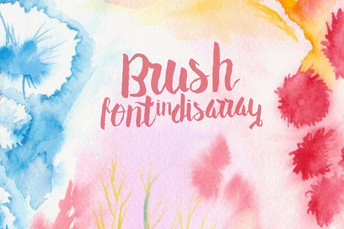
Brush, script, and calligraphy fonts can add a touch of elegance to your design. They’re stylish, flowing, and full of character! We’ve picked some of the best examples of these typefaces to add to your collection.
Whether you’re looking for a precise and decorative script font or a bold brush typeface that needs to grab the reader’s attention, we’ll have something for you here.
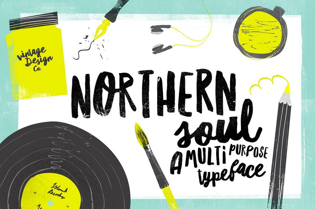
Each of these fonts is beautifully crafted to add character to your next design project, perfect for logos, lettering, clothing design, posters, flyers, quotes, and so much more.
What Are Script, Brush & Calligraphy Fonts?
All these typefaces have similarities, but each of these styles is unique in a different way. Before we dive into the fonts themselves, let’s quickly outline the difference between them.
Calligraphy Fonts
Calligraphic script fonts aim to mimic the style of traditional calligraphy writing. Some have connecting letter designs, and some don’t, but they all have the type of character you’d expect from a hand-written piece of calligraphy.
Script Fonts
Script fonts are a traditional typeface choice, referencing back to formally written styling in the 17th century. They have a flowing, connected style, and most characters adjoin another with a connecting stroke. They can roughly be separated into formal script fonts and casual script fonts. The former is more traditional, and the latter mimic a more quickly written, informal style.
Brush Fonts
These often have a much heavier weight, to look similar to letterforms that have been painted with a brush. They have the same connected, flowing style as calligraphy or script fonts, but their block-style makes them more suited for uses where you need a bigger impact!
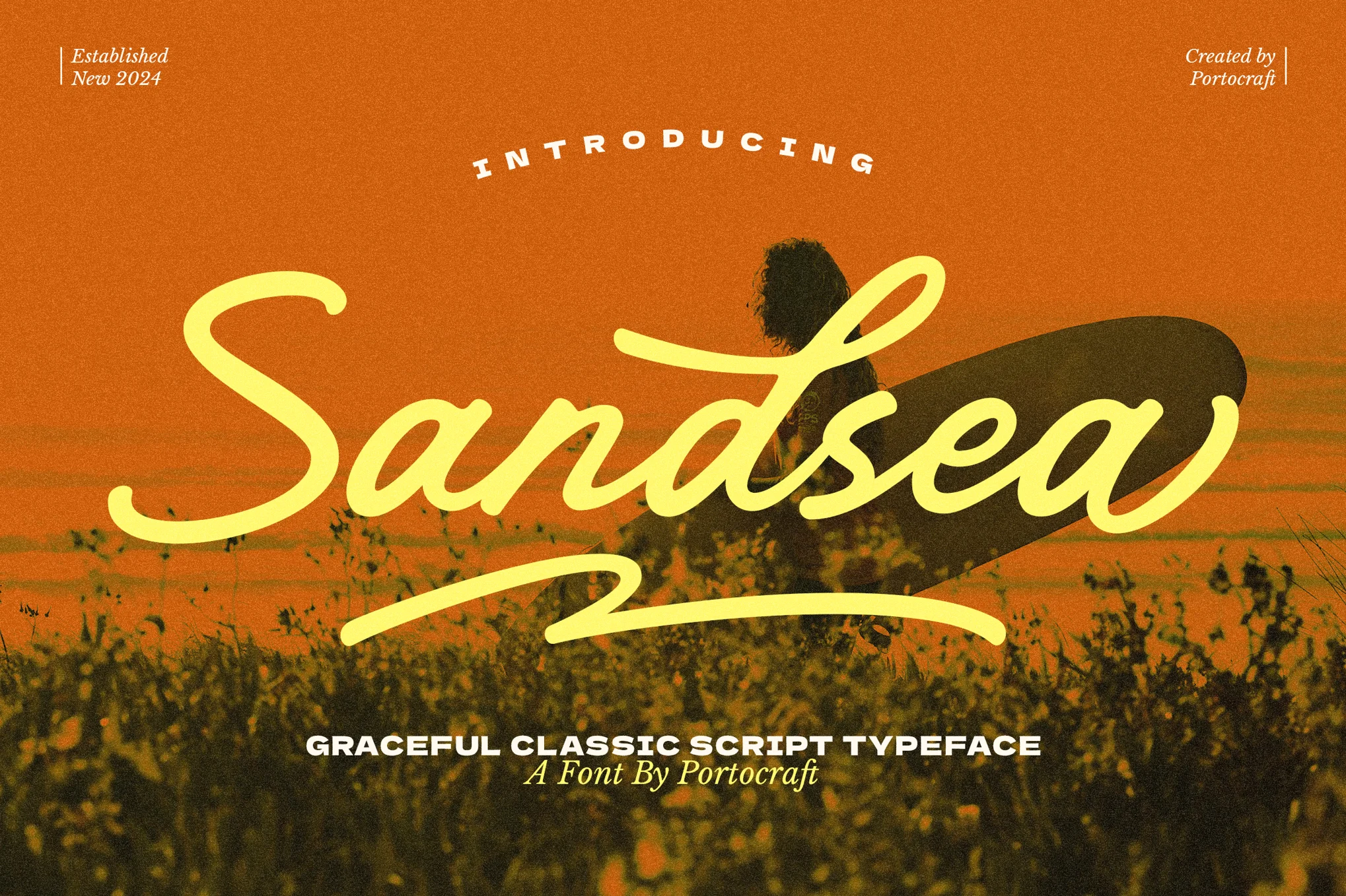
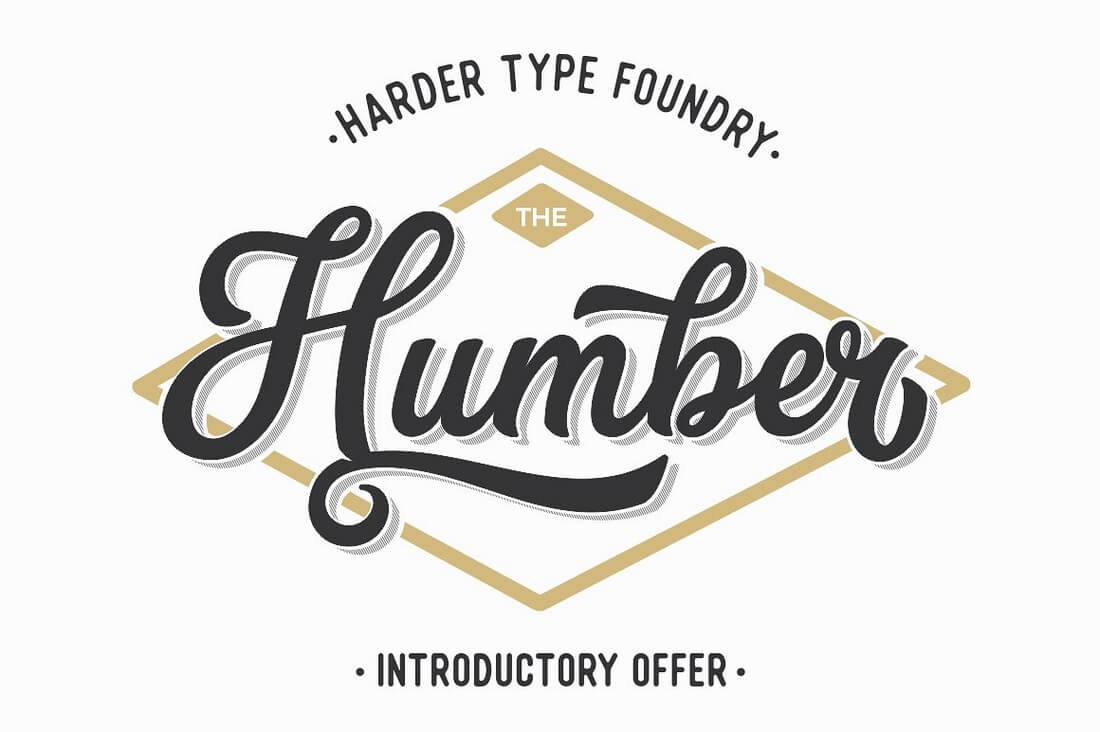
Sandsea is a chic-style script font offering unique letterforms in TTF, OTF, and WOFF formats. Ideal for wedding invitations, sophisticated handwritten logos and branding, social media quotes, and more.
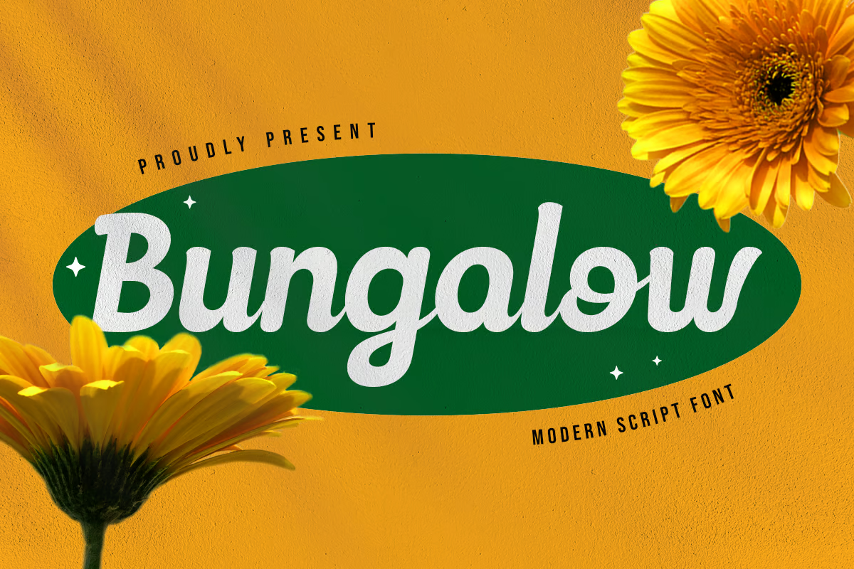
Bungalow script font brings a touch of elegance and modern sophistication to your designs. Designed with smooth strokes and artistic characters, this font is ideal for chic logos, stylish branding or elegant invitations. The beautiful calligraphy-inspired curves give a personal and refined touch to your work, making it stand out.
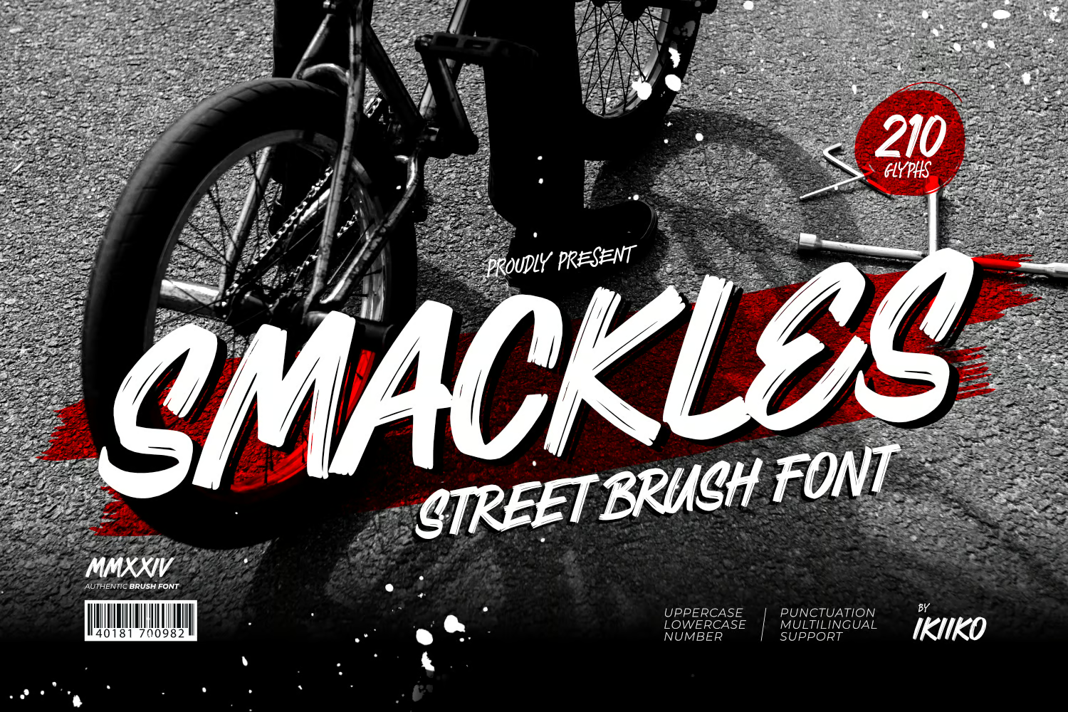
The Smackles brush font packs a punch with its spirited, streetwise appeal. Influenced by the raw energy of street culture, it boasts rough brush strokes for an authentically handmade feel, ideal for bold, eye-catching headlines and titles.
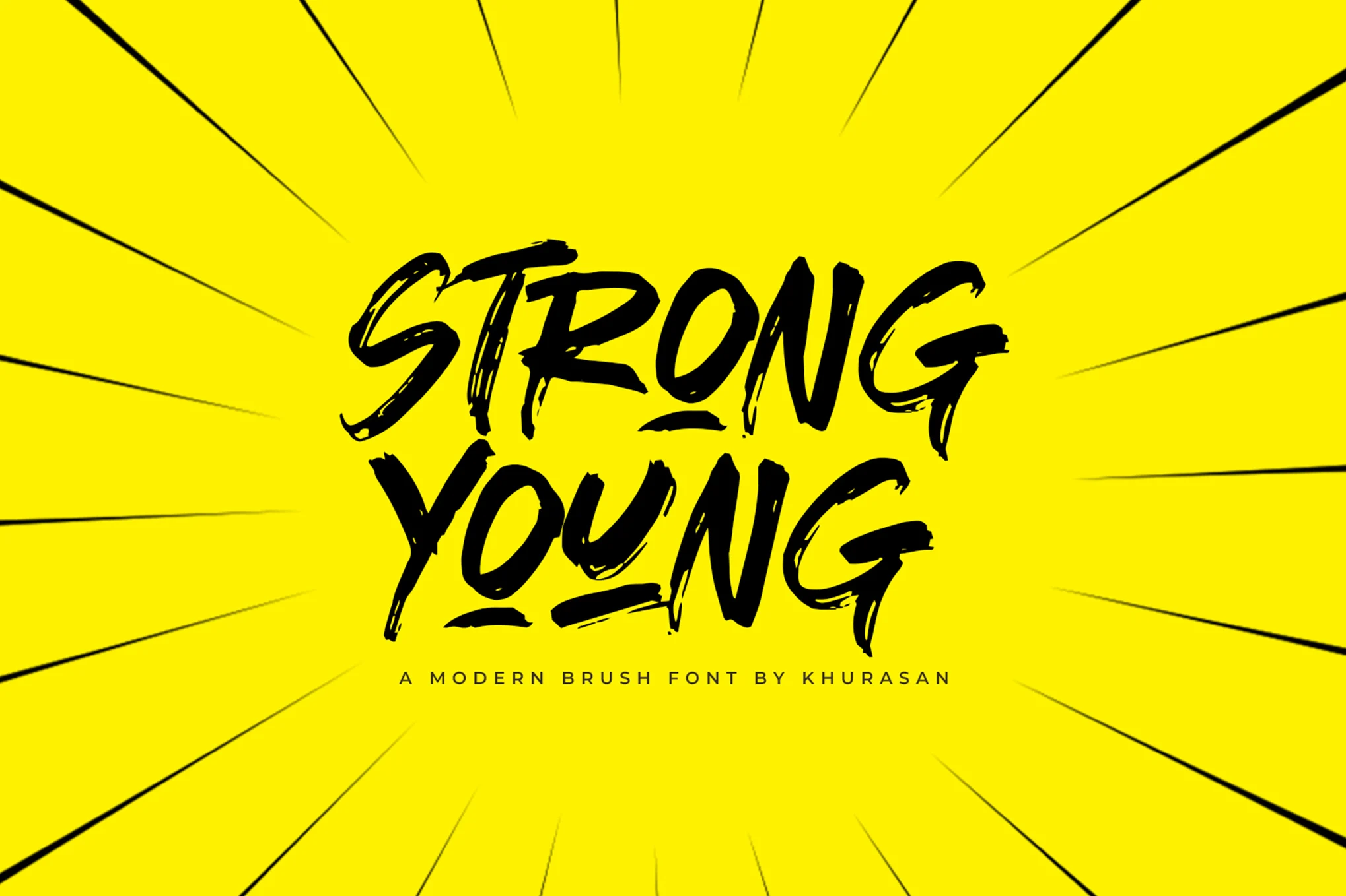
Strong Young is a contemporary brush font offering a sophisticated and modern feel. Its versatile character set also boasts multi-lingual support, making it well-suited for various global projects. Equipped with both TTF and OTF files, it’s a breeze to use.
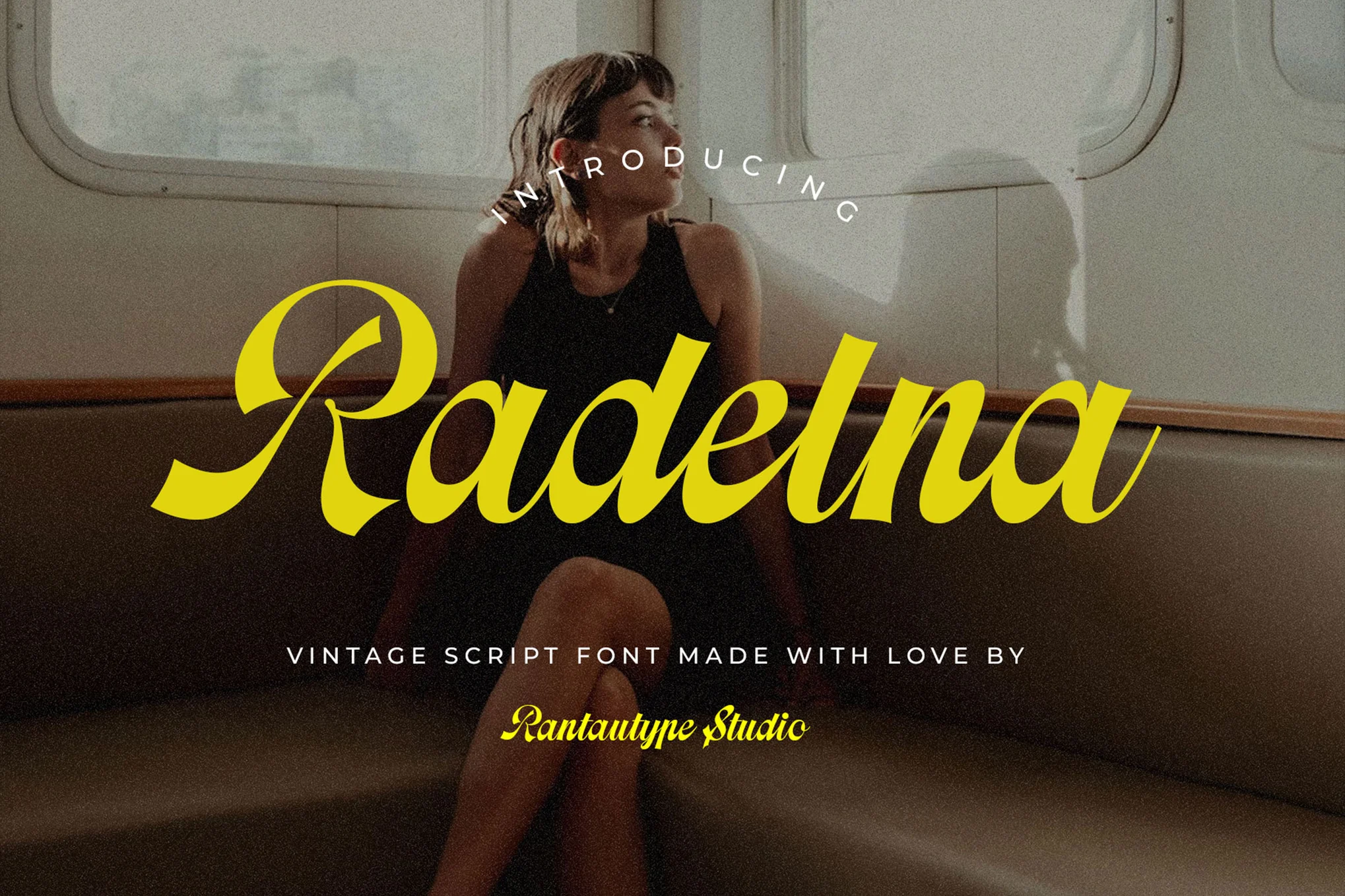
Radelna is a vintage script font inspired by classic visual design. It’s a versatile and elegant choice for a wide range of creative projects, including branding, invitations, social media posts, and product packaging. The font offers standard glyphs, numerical and functional, as well as alternates and ligatures.
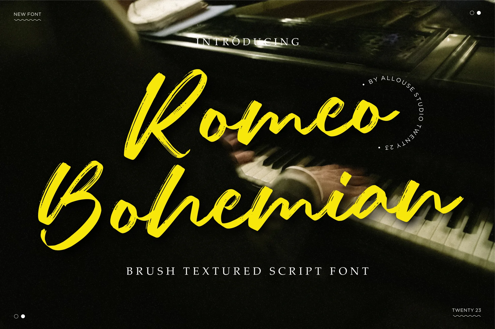
Romeo Bohemian is a textured brush script font that brims with rustic charm. Offering OTF, TTF, and WOFF formats, this versatile typography asset caters to a diverse range of projects, including branding, packaging, magazine layouts, or even social media and wedding embellishments.
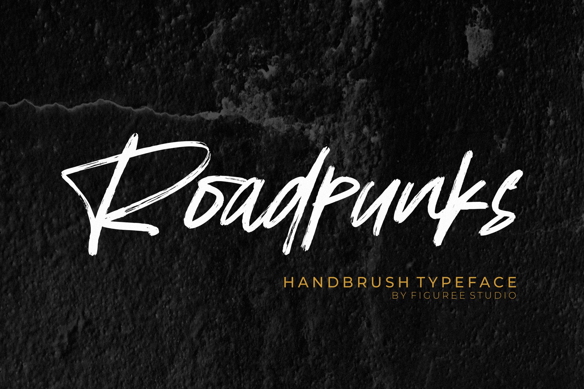
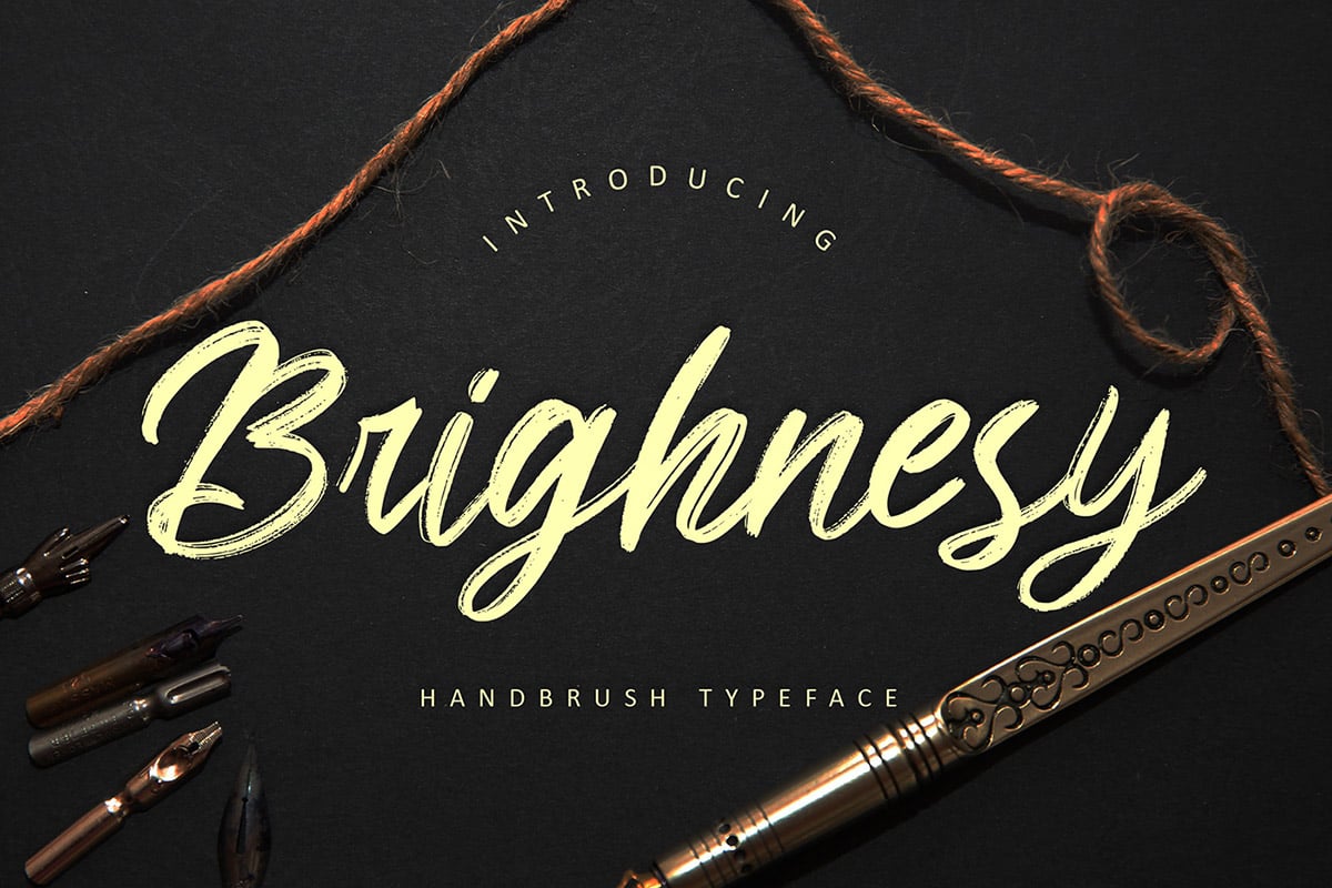
Imbue your projects with an urban, artistic flair using Roadpunks, a handbrush typeface renowned for its authentic construction and stylish appeal. Meticulously crafted to replicate natural brush strokes, this font is perfect for designs that require a personal yet rebellious touch.
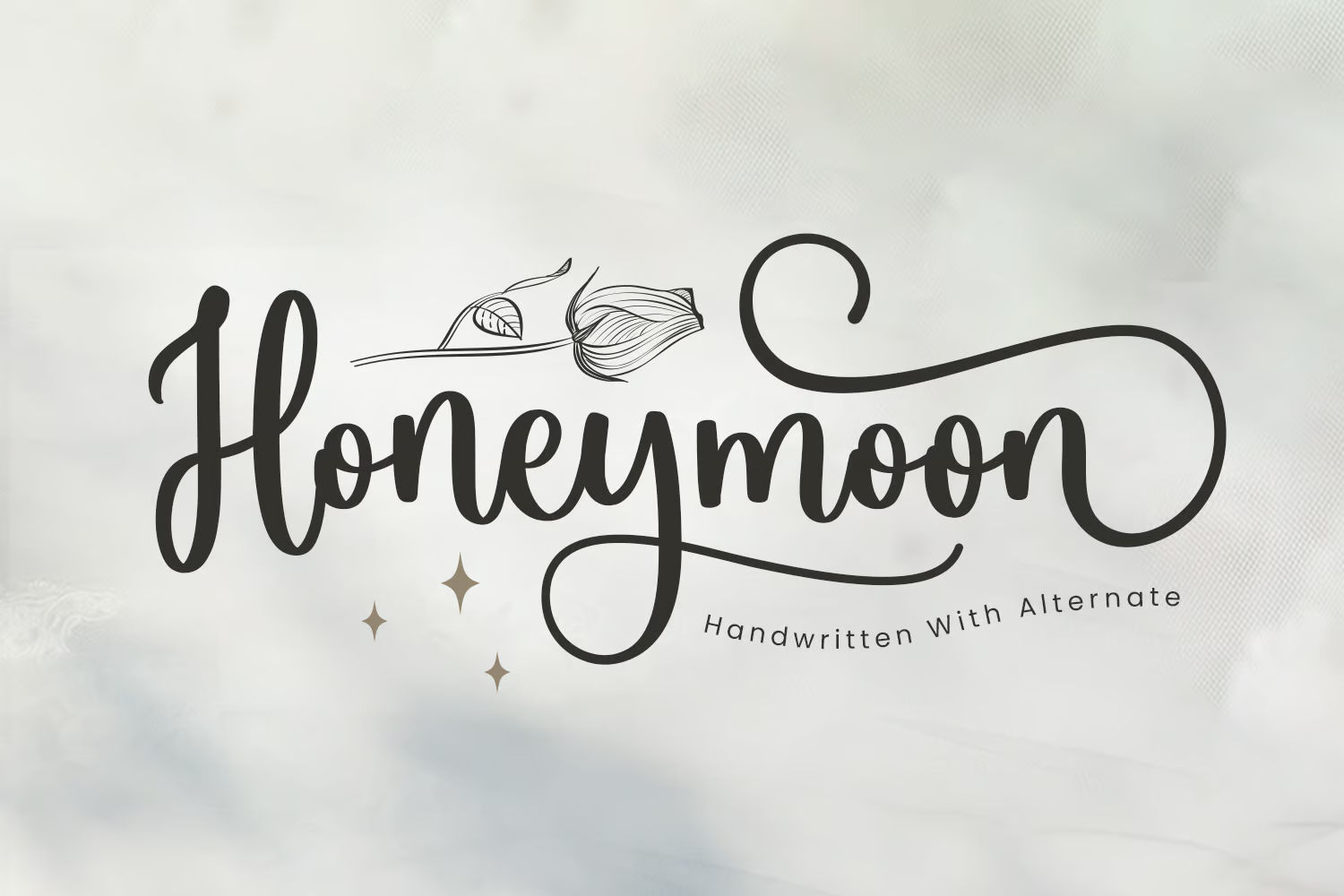
Honeymoon is a sophisticated script wedding font that adds an air of romance to your creative projects. With beautiful curves and elegant wash tails, it is perfect for crafting wedding invitations or ornate holiday decorations. Featuring alternate characters and multilingual support, Honeymoon offers flexibility and endless design possibilities.
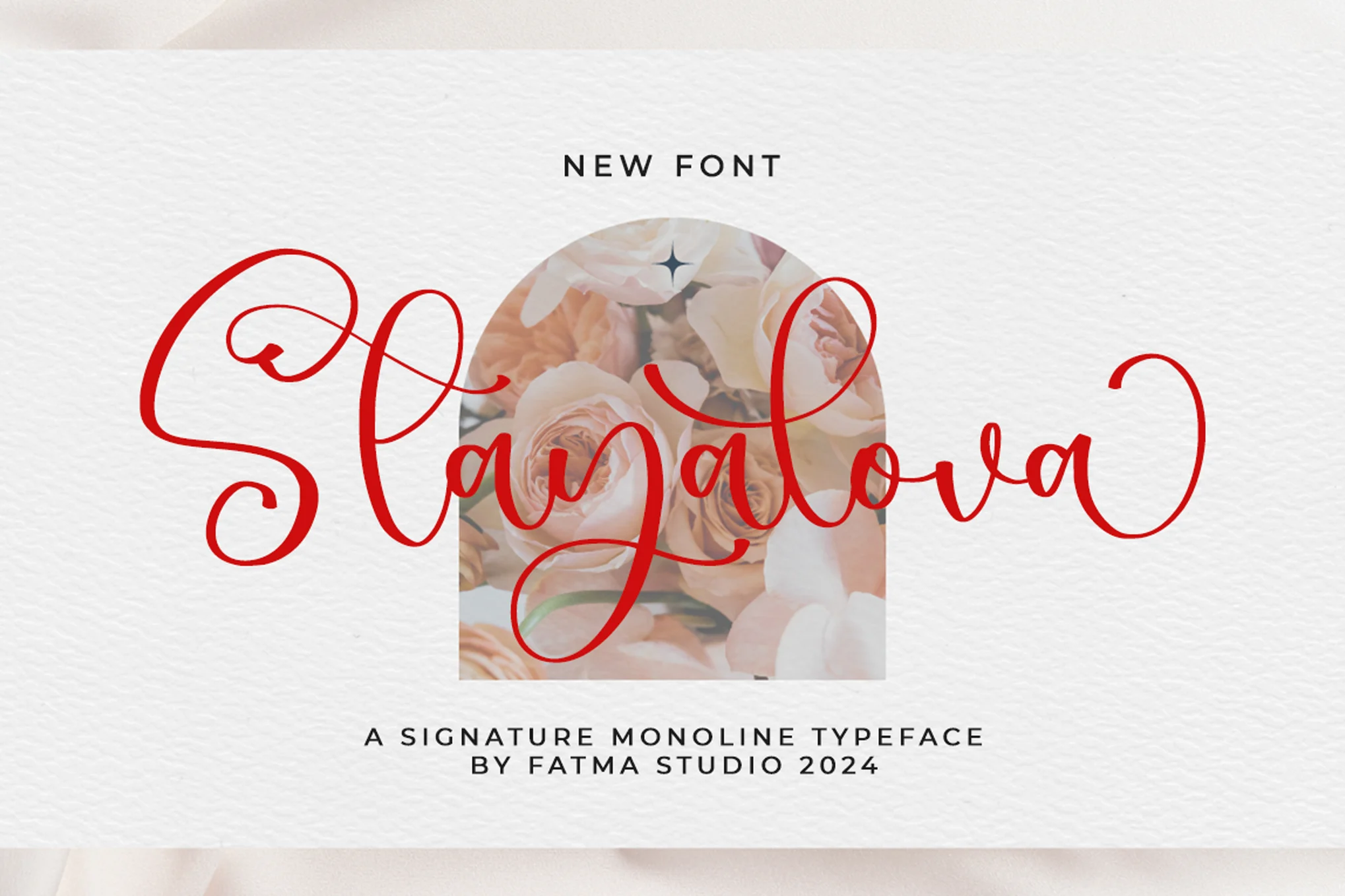
Stayalova is a chic and gentle monoline script font perfect for adding a touch of elegance to your designs. Handcrafted for a fresh and beautiful appeal, it comes in OTF, TTF, and WOFF formats, and includes multiple options such as ligatures, swash, and alternates.
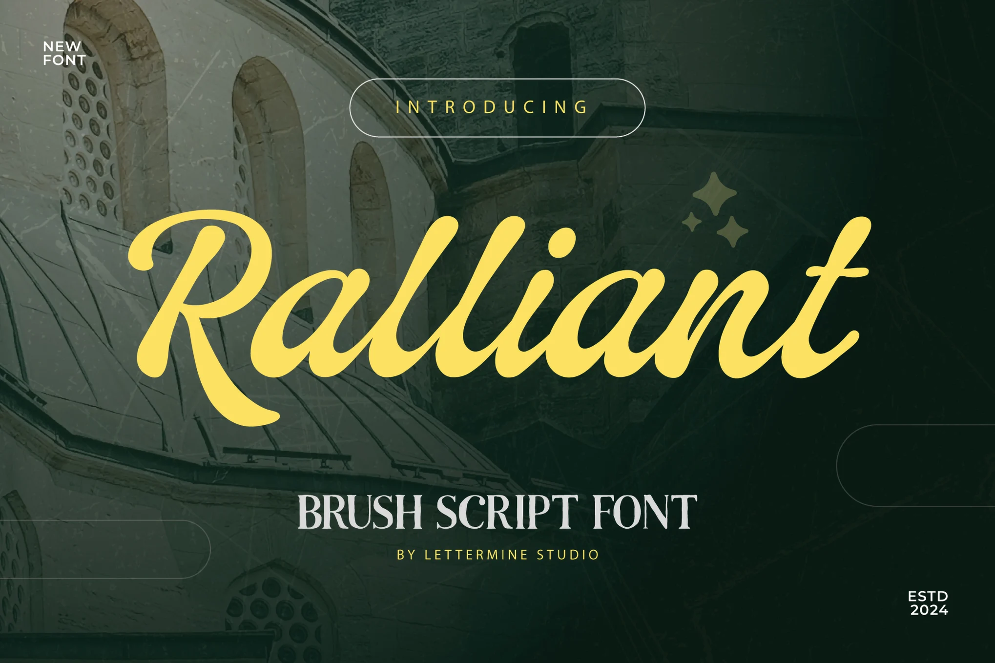
Ralliant is a script handwritten font that offers versatility with uppercase, lowercase, punctuation, ligatures, and alternates. Ideal for a range of uses, from branding and logos to social media posts, packaging design, posters, flyers, and handwritten quotes.
Saekana is a modern script font featuring a stylish calligraphy-style design. The bold and wavy letters of this font make it a great choice for designing logos for modern brands. It includes lots of swashes and borders for decorating your designs.
A clean and creative brush font with a sharp letter design. This font will fit in perfectly with almost all types of title and heading designs, including posters, flyers, book covers, and more. You can use it for product packaging and label designs too.
Scoutdale is a beautiful brush font featuring a set of handwritten-style characters. This font has the perfect look for crafting branding designs for feminine brands, custom T-shirts, greeting cards, and social media posts.
Pink Lemonade is another cute calligraphy-style font with a feminine design. It comes with uppercase and lowercase letters with a beautiful curvy character design. The font is ideal for product packaging and logo design.
This is a free calligraphy font with a modern letter design. This font has a certain elegant look that makes it much more suitable for fashion and lifestyle-themed designs. You can use it for free with personal and commercial projects.
Looking for a brush font with a comic book-style letter design? Then we’ve found the perfect font for you. This font has all the characteristics of a classic comic book font and it comes in solid and textured font styles as well.
Ahmedy is a beautiful brush script font featuring a rustic texture and handwriting letter design. This font is perfect for designing modern titles for posters and flyers. It’s great for social media posts as well.
Roughsweep is another creative brush font with handwritten characters. This font is most suitable for labels and product packaging designs. Just as its name suggests, it has rough textured designs for each letter of the font.
Alegarde is a modern script font with a subtle vintage look and feel. It also has decorative elements in each letter to add more style to its characters. You can use it for all kinds of branding and print designs.
This font has a classic monoline script letter design. It will make your business cards and branding designs look much more attractive. The font is free for personal and commercial use.
This unique brush font comes with a hand-lettered design that is guaranteed to add a personal touch to various types of designs, including greeting cards, website designs, social media posts, and much more.
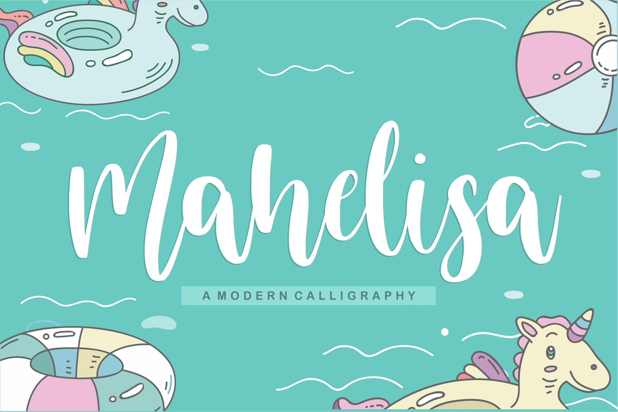
Suitable for all your design needs, Mahelisa is a modern and stunning calligraphy font ideal for wedding invitations, greeting cards, product packaging, and branding projects. It comes with TTF and OTF and offers multilingual support.
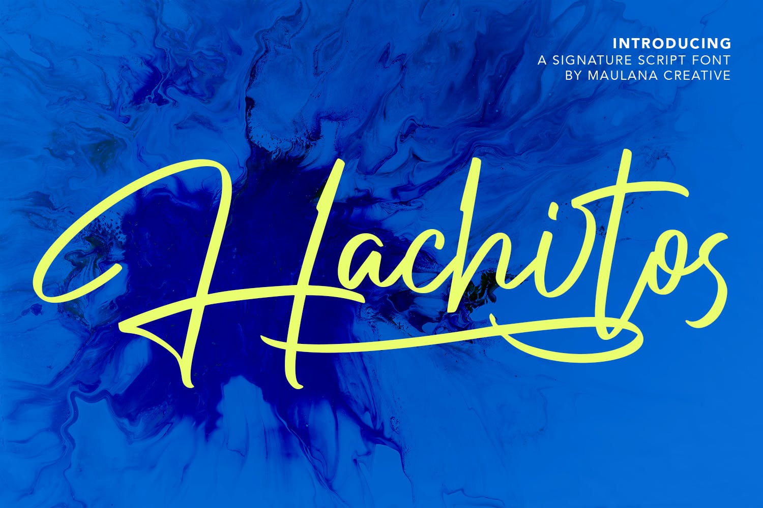
Create gorgeous artworks with Hachitos, a casual and stylish script font that stands out from the daily flood of fonts we see on our screens. It supports more than 100 languages and comes with a wide range of amazing features for you to take advantage of.
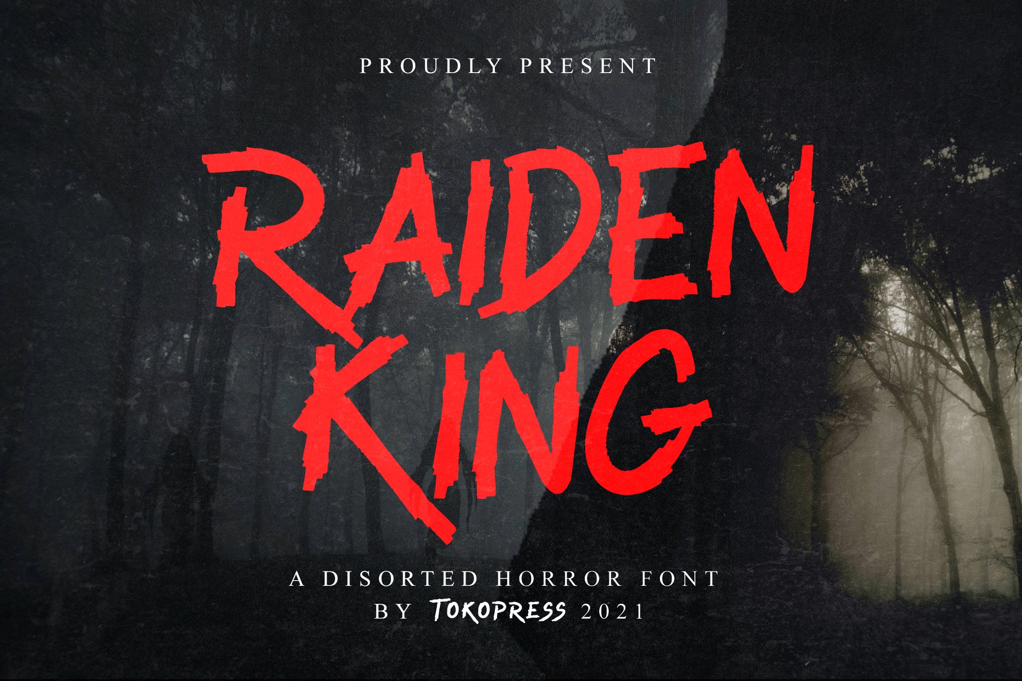
Next up we have Raiden King, a distorted brush font that screams horror and fear. It’s a great choice for mystery, Halloween apparel, and other terror-themed branding projects. It works on both Mac and PC, and compatible with Adobe InDesign, Photoshop, Illustrator, and Microsoft Word.
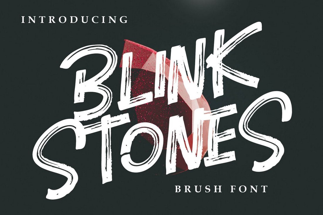
Blink Stones is one of a kind creative and quirky brush font that is perfect for creating book covers, greeting cards, and many other creative designs. The font can also be used to create T-shirt designs and mug prints as well.
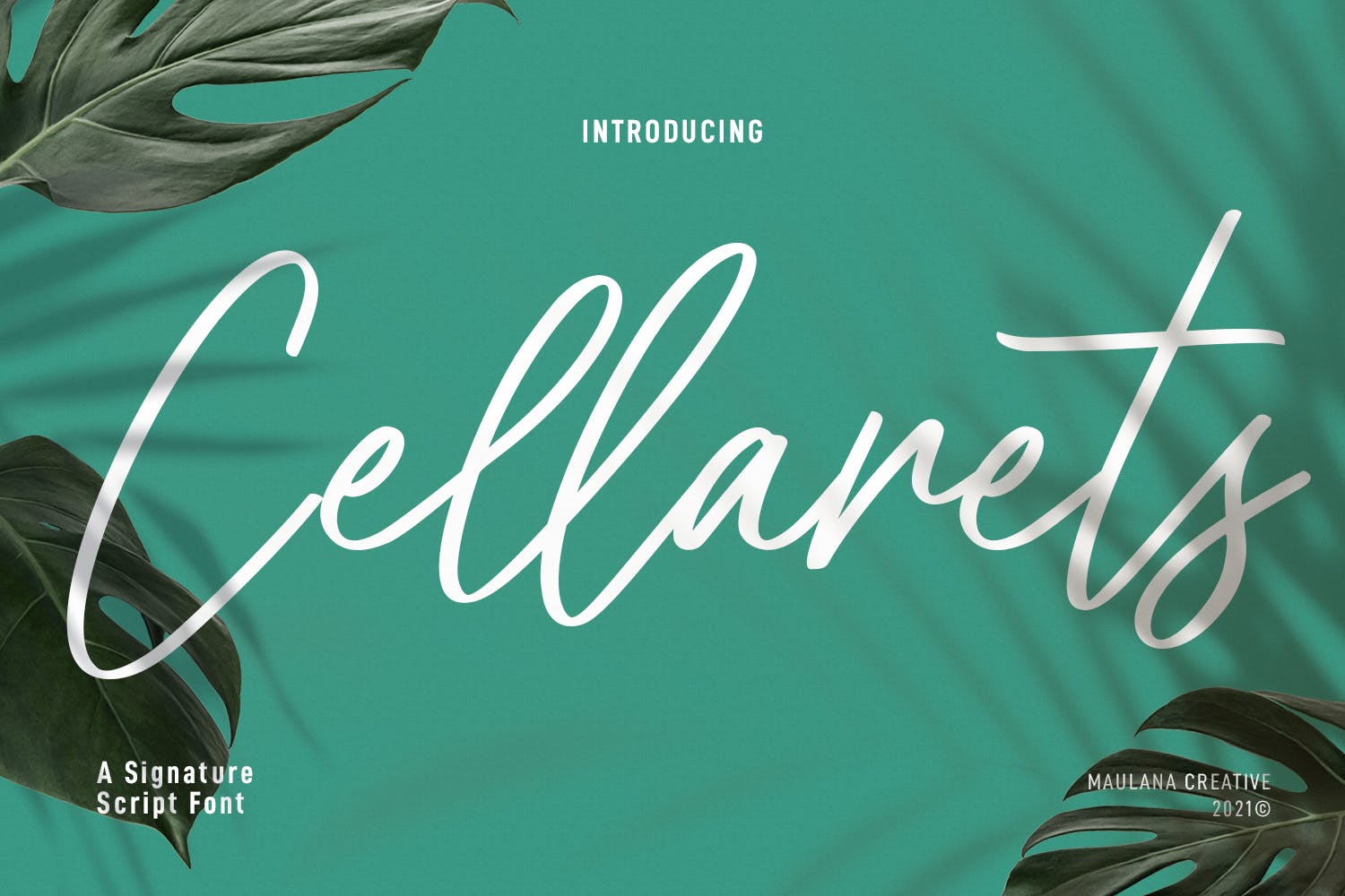
Cellarets is a slanted signature script font with clean regular stroke, fun character with a bit of ligatures. To give you an extra creative work, Cellarets font support multilingual more than 100+ language.
Whisper is a stunning hand-lettered dry brush font. This typeface is very unique! It has an unique natural dry-brush feel which will outstand your project with ease! Combine it with its remarkable swashes which you can choose dozens of them!
Husein is natural handwritten Ramadan themed script font, which support OpenType features and includes, numeral, punctuation ligatures, and it also supports multi-languages.
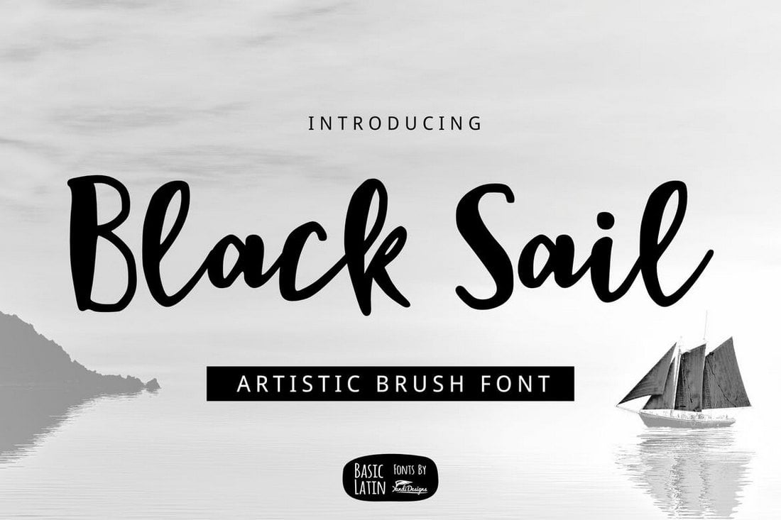
Black Sail is a modern brush script font that comes in both OpenType and TrueType formats. The font is perfect for creating luxury brand logotypes, business cards, invitations, letterheads, and much more.
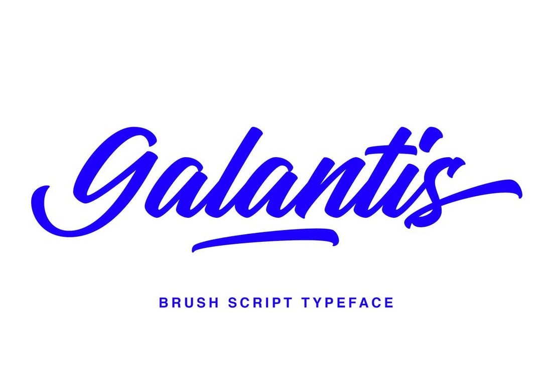
Galantis is another brush script font that features a unique design of its own. This font also includes OpenType and TrueType formats as well as alternatives and swashes.
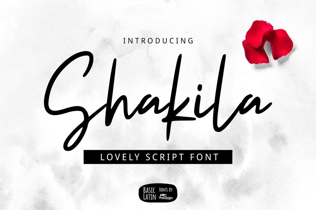
Shakila is the perfect font you can use to design modern greeting cards and wedding invitation designs. The font features a creative script design and includes the standards alphabet, numbers, and symbols.
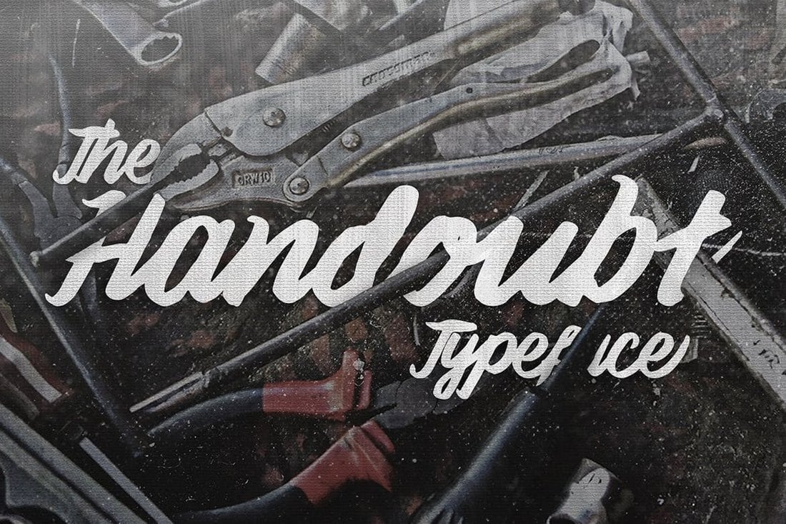
Handoubt is a creative brush script font that features a modern and stylish design. You can use it to design unique website headers, posters, greeting cards, and various other designs.
This bundle includes 2 families of script fonts featuring script and sans serif typefaces. These fonts are ideal for all types of greeting cards, invitations, and other print designs.
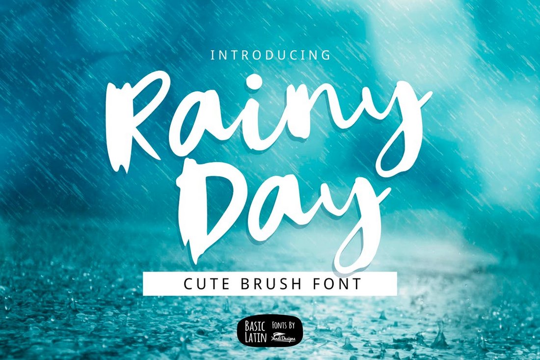
Rainy Day is a creative brush font that comes with a unique design. The font is most suitable for book covers, greeting cards, logos, titles, especially related to kids and children.
This creative font comes with a brush design featuring transparent textures and unique ligatures. The font is available in SVG format and requires Photoshop CC or Illustrator CC to function.
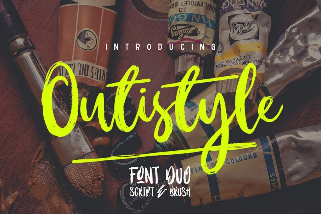
Outistyle is a unique script font that features a handwritten design. The font is available in 2 styles, Script and Brush. You can use the fonts to craft greeting cards, posters, banners, product packaging, and more.
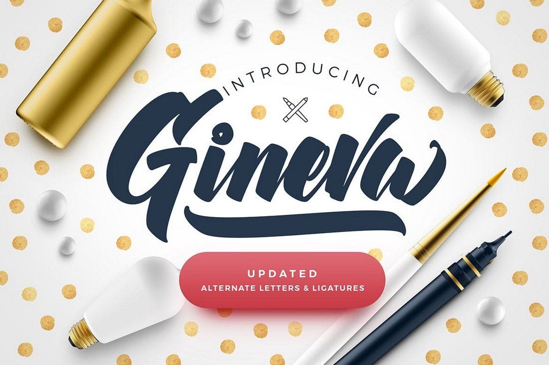
Gineva is a hand lettering script font created in the style of a brush font. Which makes it the perfect font for fans of both script and brush fonts. It’s also great for designing website headers, signage, and logos as well.
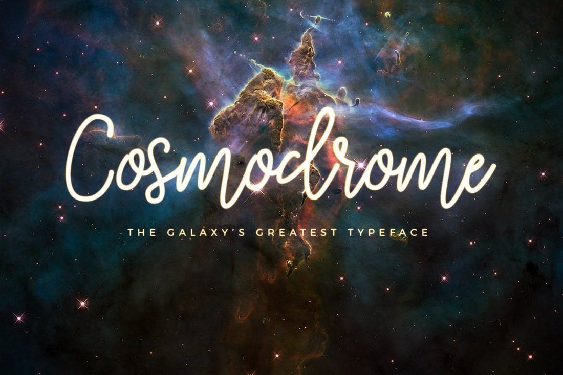
Cosmodrome is a script calligraphy style font that’s most suitable for designing book covers, posters, music album covers, and much more. It also comes with a web font version for online use.
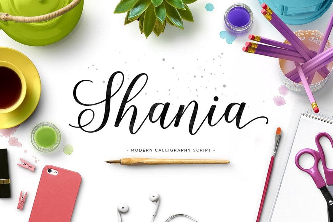
Shania is yet another calligraphy script font that features a modern design. It also includes 432 glyphs and 194 alternate characters for crafting unique logotypes, greeting cards, logotypes, and more.
This script font features a modern retro design that makes it truly unique and ideal for designing T-shirt designs, signage, posters, and more. It also features 400 glyphs and 190 alternate characters.
A handwritten brush font that comes with a dancing baseline. The font features a design that’s ideal for luxury and fashion related branding and designs as well as wedding and other stationary works.
This brush font comes with a slightly scary design that makes it more suitable for movie posters and Halloween themed designs. It comes in regular and slanted versions of the font, which also includes 240 glyphs.
Yet another brush font for crafting posters, T-shirt designs, and greeting cards. This font also includes 216 Glyphs and comes in two formats, OpenType and TrueType.
This brush font features a bold and a natural look that makes it the best choice for designing website headers, posters, and social media posts. It comes in both sans and sans-serif versions as well.
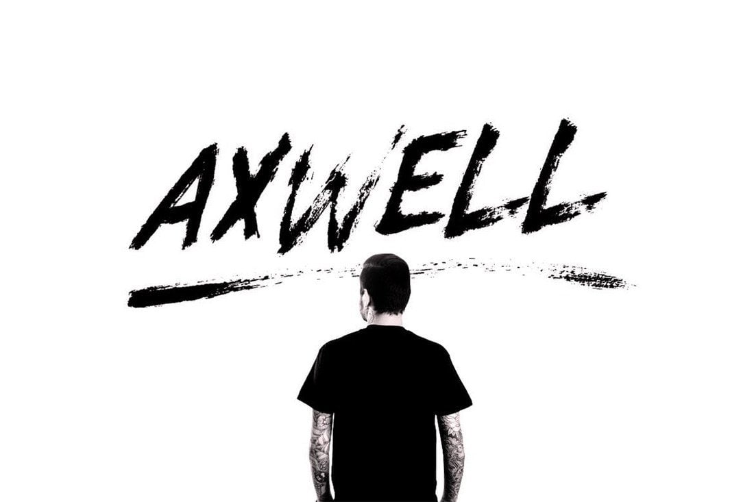
Axwell is a handmade brush font that comes with a rough natural look. It’s most suitable for modern website header designs, posters, flyer designs, and other print and digital designs.
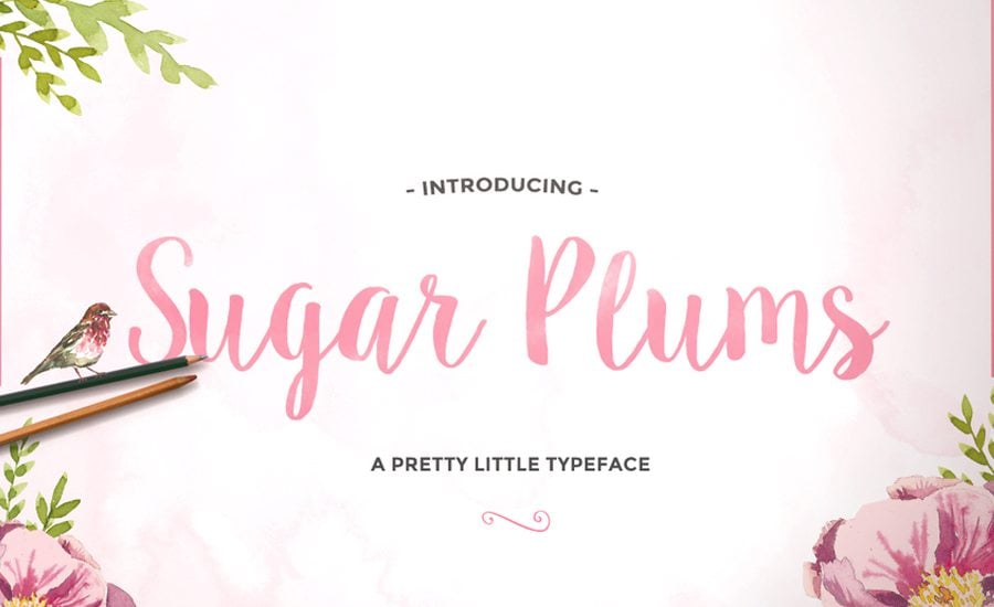
Sugar Plums Script
Sugar Plums is a new hand made font. Available for both personal and commercial use. Download and use Sugar Plums Script for anything and everything. Including over 400 different hand drawn characters for a range of languages and dialects. As well as an Italic version and over 60 hand drawn ornaments, including leaves & flowers, catchwords, frames, doodles and swirls.
Check out this beautiful calligraphy font that you’ll fall in love with in no time. The design is all about class and elegance, and is suitable for a wide variety of projects from quotes and thank you notes to logos and business cards.
Here we have a bold handbrush font that is sure to make an impression. It has a nice, modern design and contains everything you’d expect in a natural textured brush typeface. Best of all, its available for free download.
A massive bundle of over 20 beautiful calligraphy fonts that comes in both OpenType and TrueType formats. Perfect for your logo, card, and wedding invitation designs.
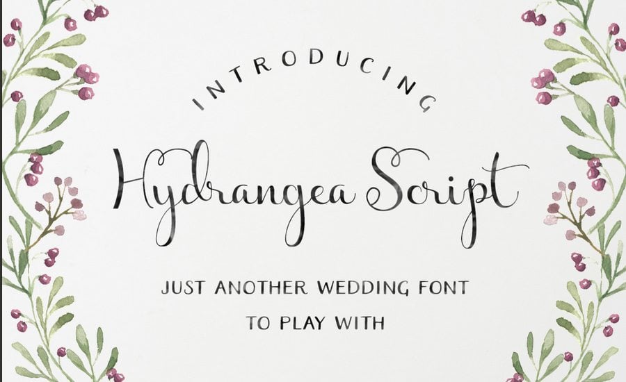
Hydrangea Script – Wedding Font
Hydrangea Script is a Regular script font with a clean calligraphy feel for wedding invitation design, logo, cards, etc.
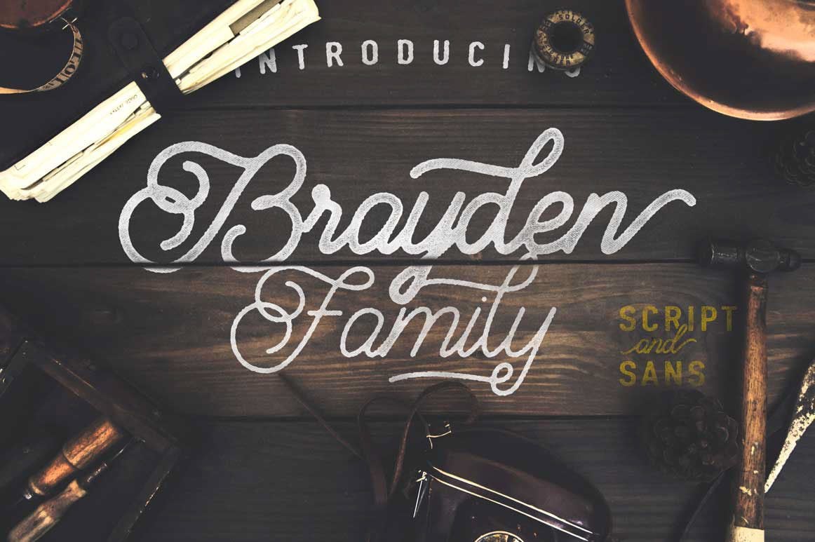
Brayden Family Typefaces
Brayden Family is Family font that include 3 weight on script fonts + 1 Sans serif fonts to create the beautiful combination. This Fonts is Great for Logos, Lettering, Clothing Design, Poster, Label, Quotes, etc.
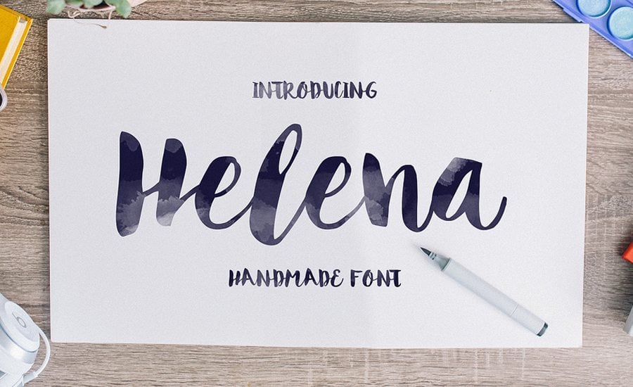
Helena Font
Give your designs an authentic handcrafted feel. Helena is perfectly suited to stationery, logos and much more. It’s available at $10 for 1 User License.
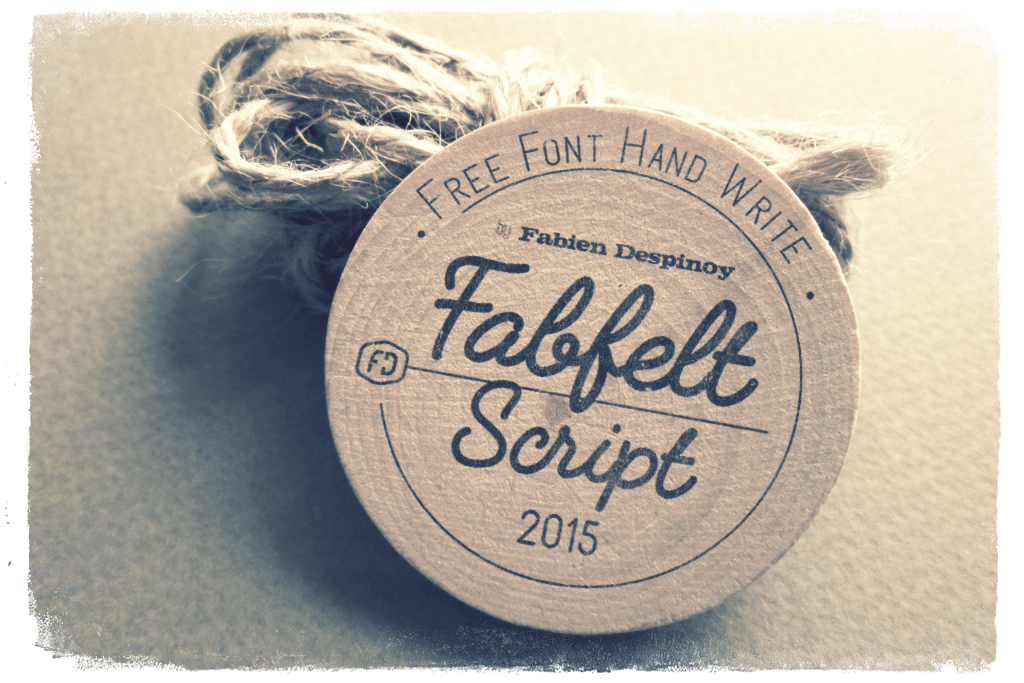
Fabfelt Script
A gorgeous hand-written script font which you can use perfectly on vintage designs. Fabfelt is available for free without any license restrictions.
Dankita Script
Dankita is a beautiful hand painted script that comes with a set of extras. All letters have been carefully painted giving your words a wonderful flow. Dankita can be used for fashion, apparel, stationery, magazines, film, books and marketing.
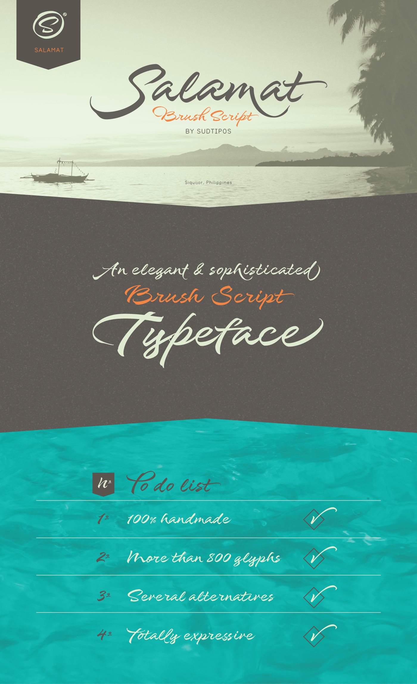
Salamat Typeface
Salamat is an elegant and sophisticated brush script typeface created by Joluvian & Ale Paul. The strokes are mesmerizing and the font will look perfect on your next design project.
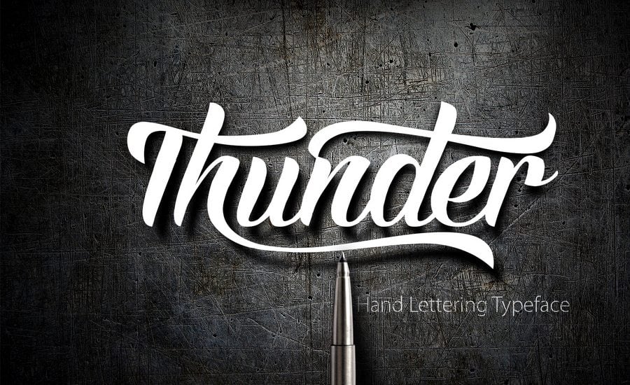
Thunder Script
Thunder is a beautiful hand typeface that comes with a set of Beautiful extras. Highly Suitable for a variety of media design , logo, fashion, poster and all design product
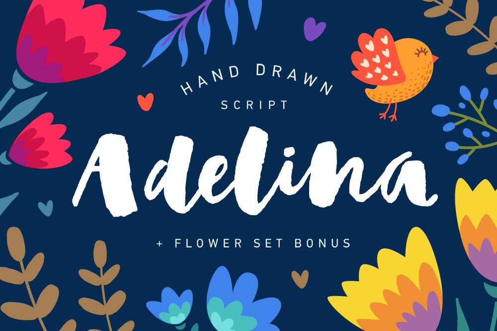
Adelina Script
Adelina is modern calligraphy script that was painted in watercolor by soft brush. The basic principle of creation is striping of thick and thin lines. It can be used in different goals: romantic cards lettering, t-shirt design, package design and others.
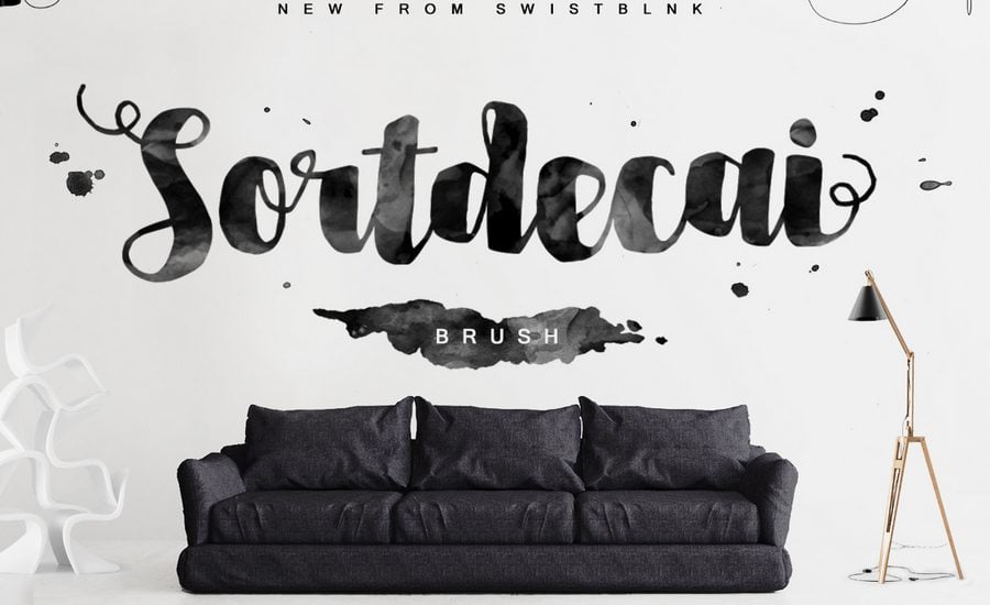
Sortdecai Brush Script
Sortdecai Brush Script is a hand lettered modern brush script typefaces, which is combining the style of classic calligraphy with an modern style. Sortdecai Brush Script is a part of Sortdecai Family.
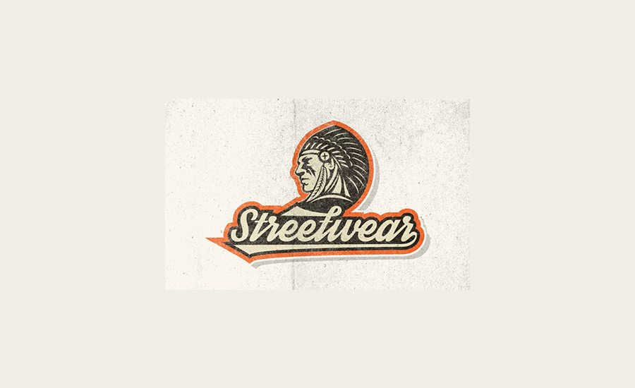
Streetwear Script Font
Streetwear is bold and stylish retro inspired script typeface suitable for logo, poster, branding, packaging and t-shirt design. It looks like 1960s and 70s fashion and sport related typeface, unique and fun at the same time.
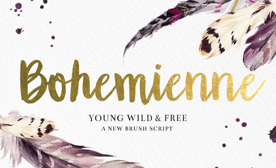
Bohemienne Brush Script Font
Bohemienne us a fun and flirty hand-drawn brush script. It’s tousled and chic, and will add a beautiful touch of handmade love to your projects- use it for wedding invitations, posters, logos and more.
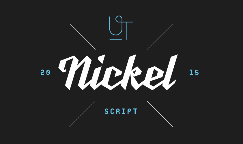
UT Nickel Script
UT Nickel is a geometric script font inspired by the Milwaukee Tool company logo. This complete typeface includes accents, punctuation, mathematics symbols etc. It also contains a few alternates, contextual alternates for some disturbing letters such as r,s,x,z and few ligatures too for all the problematic pairs.
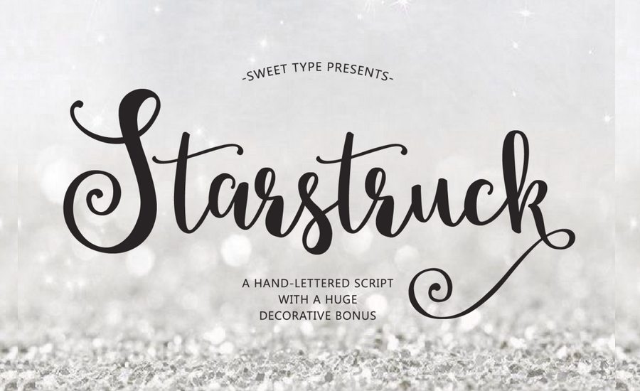
Starstruck Hand-Lettered Script
Starstruck is a hand-lettered script with tons of characters. It’s sparkling, charming, feminine, sophistacted, and super swirly and perfect for your next design project.
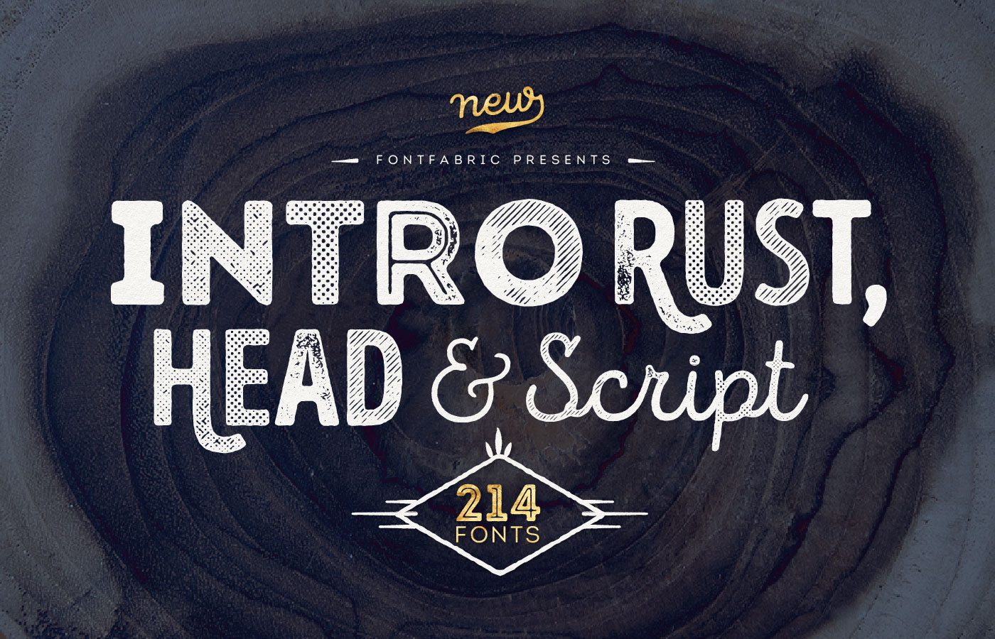
Intro Rust Script
Intro Rust is one of the biggest packages on the market, including 214 fonts. The font family is a rough version of the famous Intro and includes 4 sub-families – Intro Rust, Intro Script, Intro Head and Intro Goodies. You can download the sample version of 3 fonts including the script version for free.
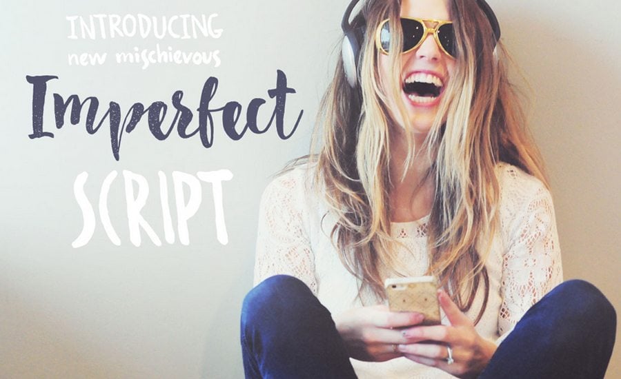
Imperfect Calligraphy Script
Imperfect is a bright mischievous lovely modern calligraphy typefaces. Imperfect is good for both short texts and headlines.
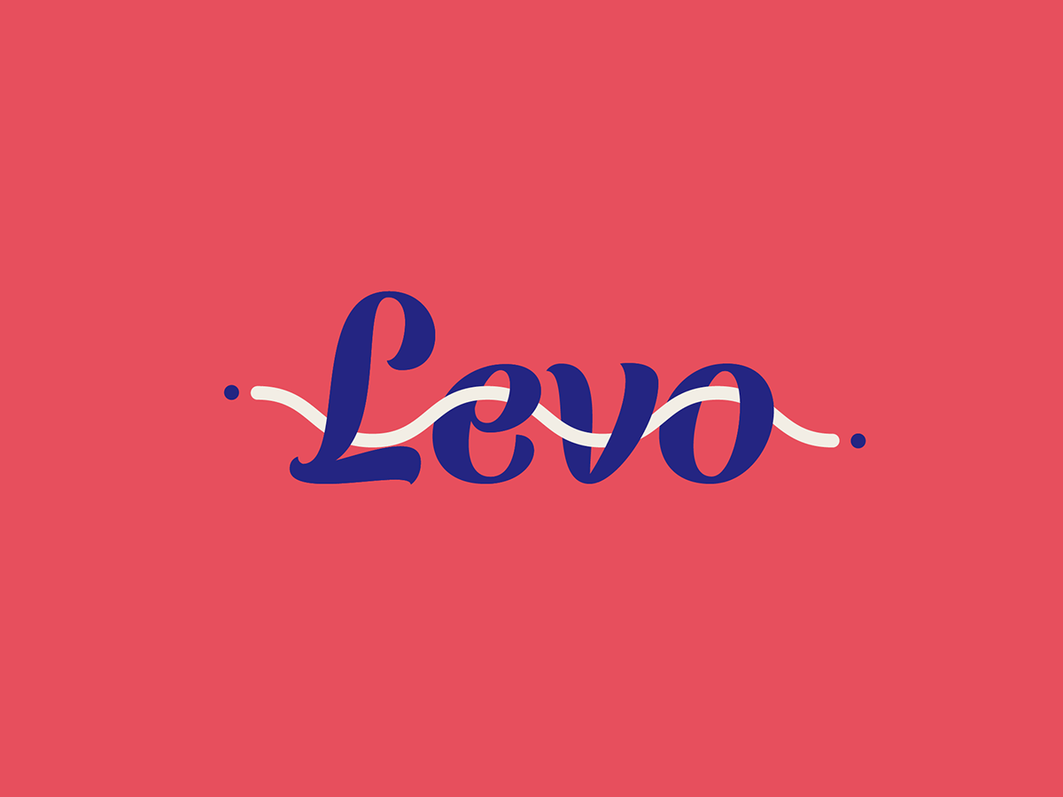
Levo Typeface
Levo is a collaboration with illustrator and graphic designer Rutger Paulusse a.k.a. Gwer. It’s packed with flavour, bold characters and full of his signature straight handles on curves. There are several of lively swashes, alternates and ligatures for you to discover. Perfectly suitable for logo design, packaging and web headings.
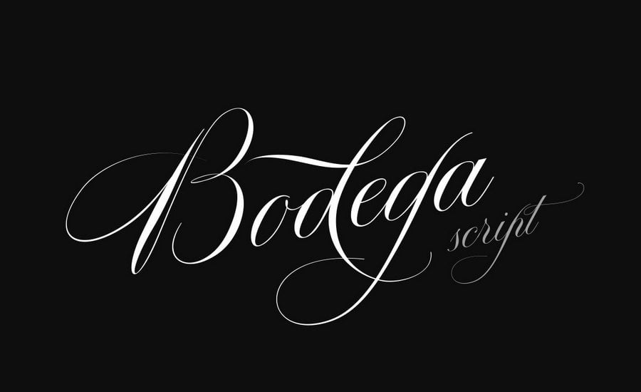
Bodega Script Font
Bodega Scrip is a classic decorative copperplate script with a modern twist. It is a display font meant for vintage logos, fashion labels, badges, food packaging designs, especially wine labels.
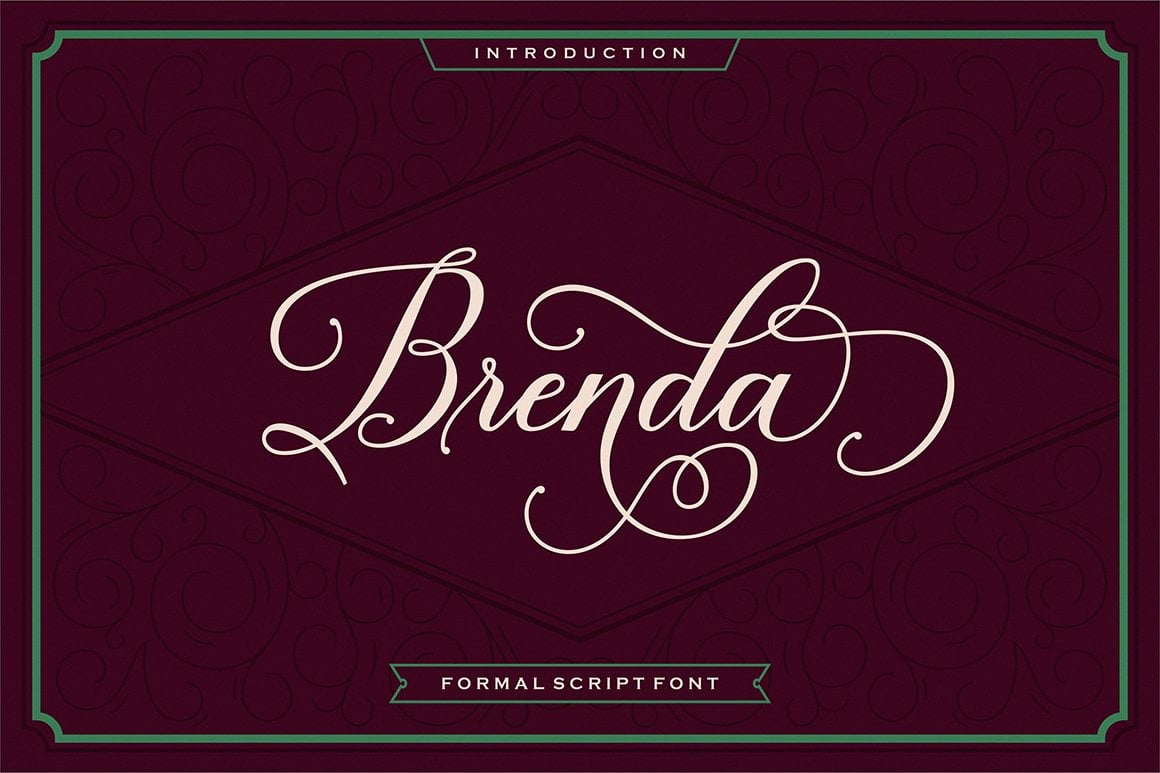
Brenda Script
Brenda Script is a beautiful formal script, contemporary typeface with classic root and elegant touch. Can be used for various purposes.such as logos, wedding invitation, heading, t-shirt, letterhead, signage, lable, news, posters, badges etc.
Dope Script
Dope Script is a rough around the edges, hand-made paint brush font with bags of personality. It comes with a large range of characters including capitals, lower-case, numerals, punctuation, currency and accents.
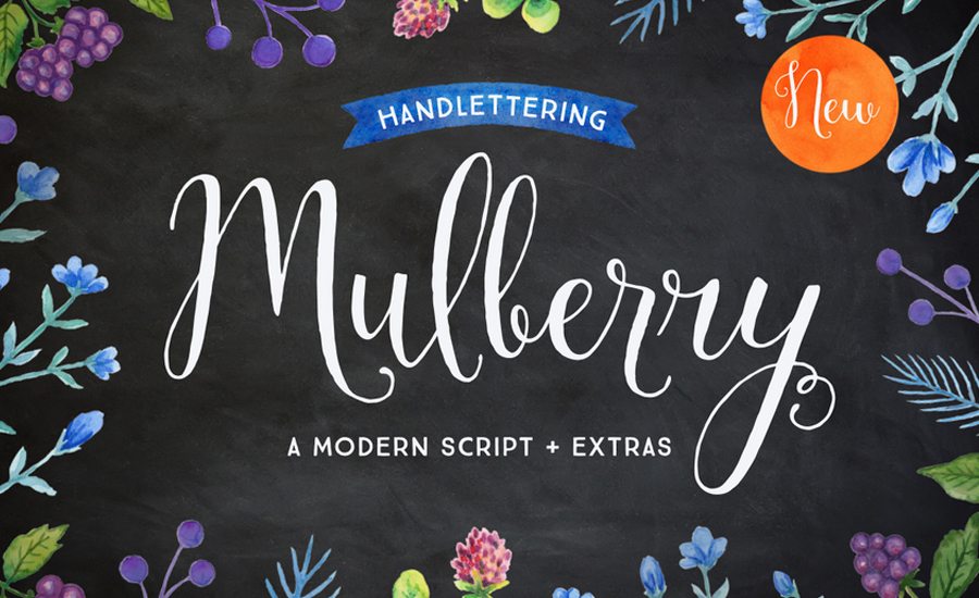
Mulberry Script
Mulberry Script is a lovely handwritten calligraphy script. Mulberry is whimsical and modern with a lot of character. This typeface comes with pretty flourished alternate letters, ligatures, extras and watercolor art. Mulberry works great for stationery, letterpress, weddings, magazines and marketing.
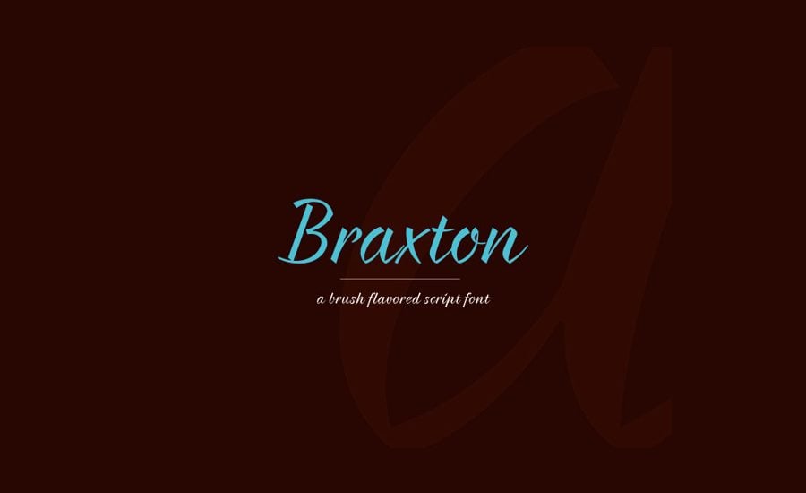
Braxton – Free Font
Braxton is a brush flavored script free font. One style (Normal) available for direct free download.
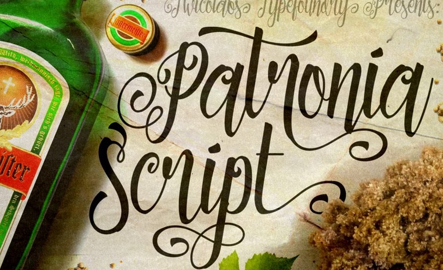
Patronia Script
Patronia Script is a brush-lettering inspired script typeface that combined thick and thin lines, loose and tight kerning and unique baseline combinations for genuine hand-writing feels. Suits best for almost all of your designing project; wedding invitation, t-shirt design, fancy logotype, etc.
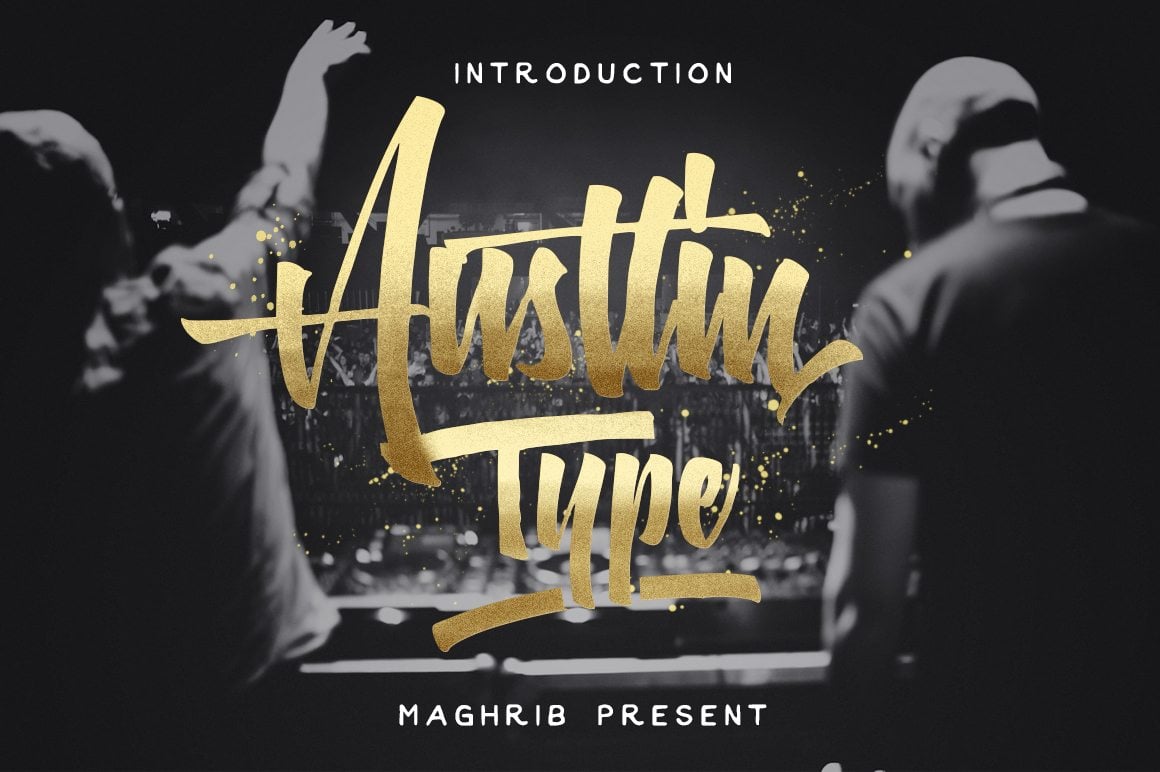
Austtin Type
Austtin type is a hand painted typeface designed to help you create the look of stunning custom hand-lettering.
It comes with upper and lowercase characters, punctuation, numerals, and swashes.
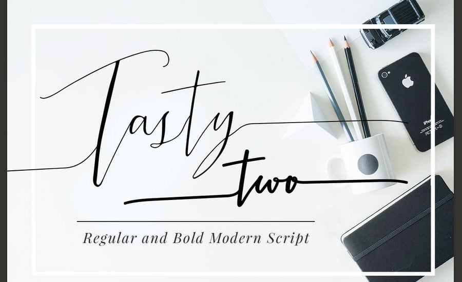
Tasty Two, Modern Script Typeface
Charming Modern typeface can beautify your design. The pack includes 335 glyphs, with swashes letters and alternative characters, suitable for any design needs, modern design, branding, stationery design, blog design, modern advertising design, invitation, wedding, special events, any lettering needs and more.
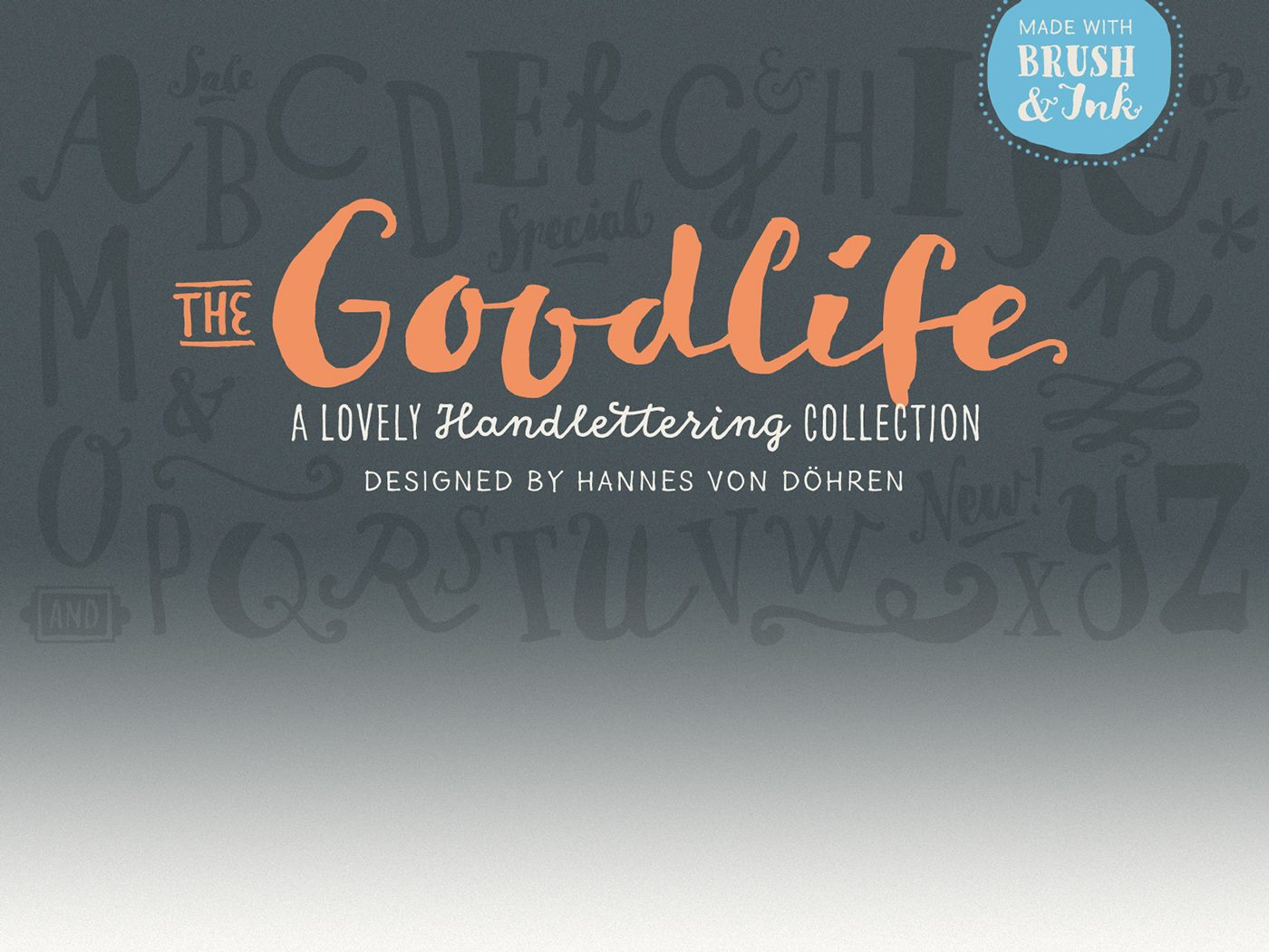
Goodlife Type Family
The Goodlife type family is a lovely handlettering collection designed by Hannes von Döhren. It contains six different hand drawn fonts with loads of features and a set of extras such as catchwords, arrows, ornaments & more. With this set and a little bit of love and care it is possible to create beautiful “handmade” graphics.
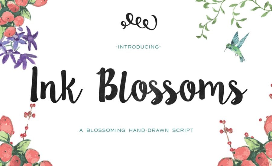
Ink Blossoms Script
Introducing Ink Blossoms! Sweet Types latest hand drawn typeface. Felt-tipped characters resemble hand-lettered, hand-inked strokes. Use your imagination with this fonts fill to create watercolor, marker, or painted characters.
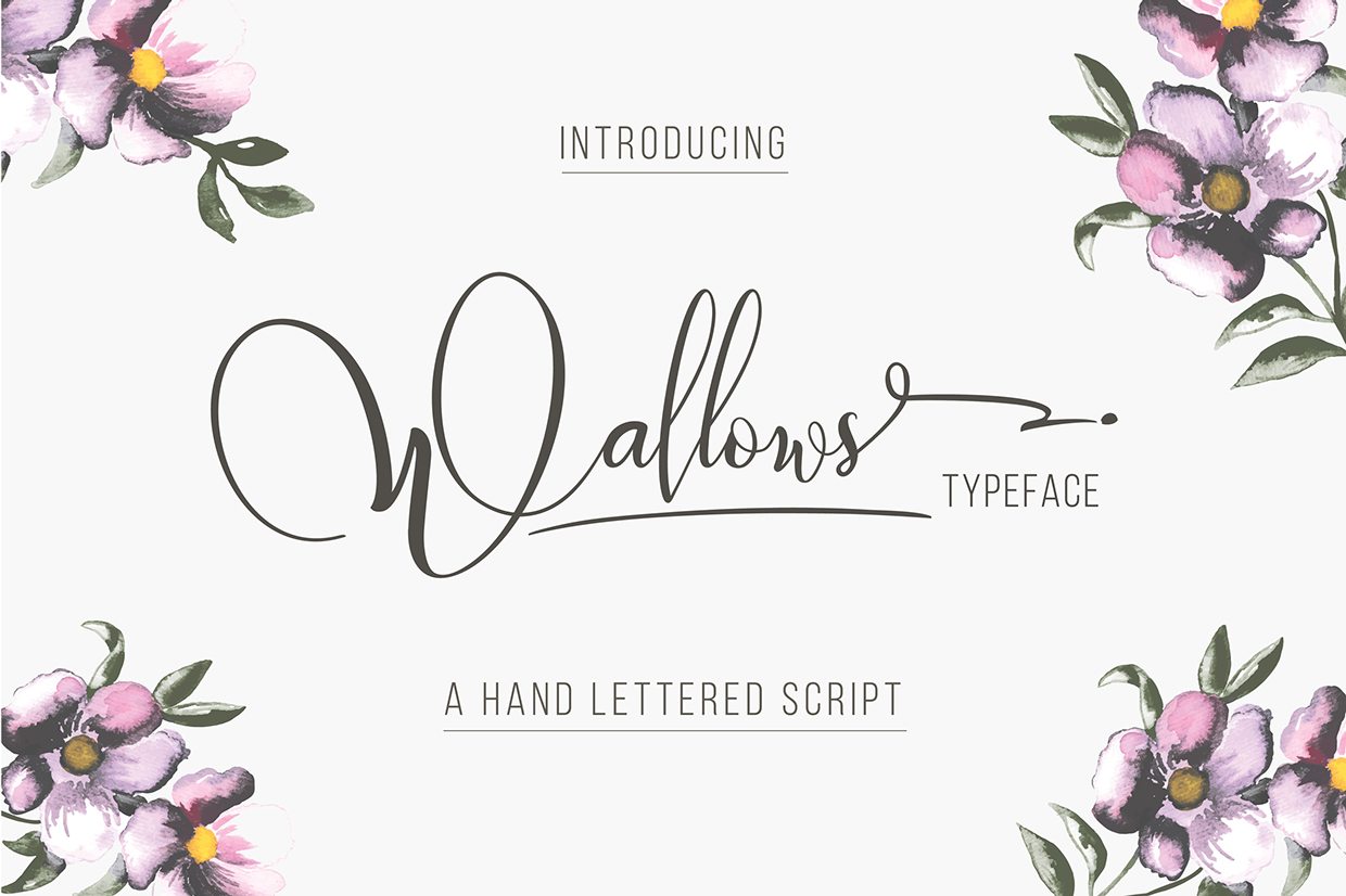
Wallows Typeface
Wallows Typeface is a beautiful handwriting script. Suitable for wedding invitations, greeting cards, design of water-based paints, correspondence, and a variety of other purposes.
Country Chic Script
Country Chic Script is a new hand crafted modern vintage style typeface. She’s chic, she’s sweet, and she’s a little shabby. This script doesn’t miss a single detail in her sweet and shabby lines. Even her ornaments are a bit worn.
Sanelma Typeface
Sanelma is a brush script inspired by Hot Rod lettering and sign painting. Sanelma is a very versatile script: It includes two different styles of end swashes, swash caps, small caps, lots of alternate characters and underline option.
Portabello Script Font Trio Pack
Portabello is a sophisticated hand drawn typeface in 3 styles. Hand made characters replicate hand lettered artwork. Just the right amount of messy mixed up with a stylish script, making it completely legible.
Awesome Script
A simple and cleanly designed brush font family. It is designed to easily create logos, headlines and text phrases within a blink of an eye.
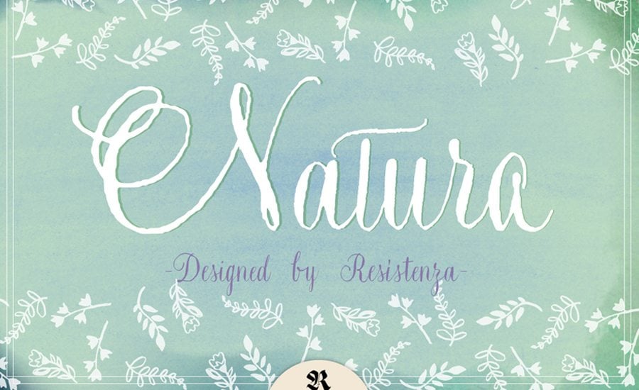
Natura Script Font
Inspired by old nature field notebooks, Natura was born out of the passion for new modern hand-calligraphy, designed first with a flexible fountain pen and then digitalized glyph by glyph to get the natural feeling of the dry ink on smooth paper.
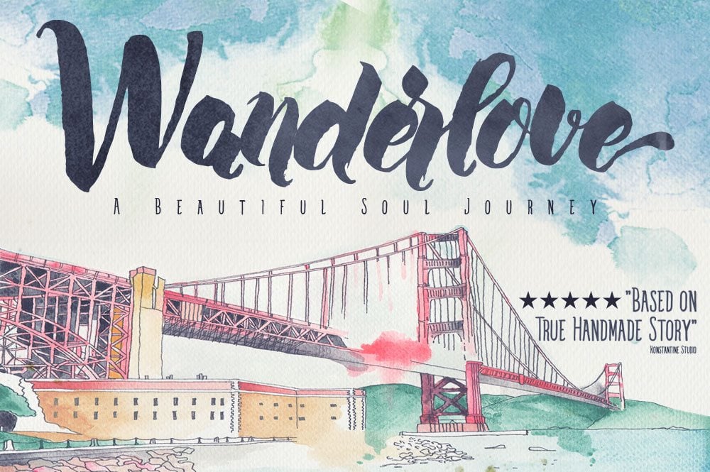
Wanderlove Script Font
Wanderlove is a solo dance of the brush script typeface with the interprentation from the freedomness and humble thing about the natural and beautiful sight from the traveler’s journey. It’s super fit for the design project such as wedding invitation, scrapbook, novel, notebook, gift card, or anything that you need to touch with love.
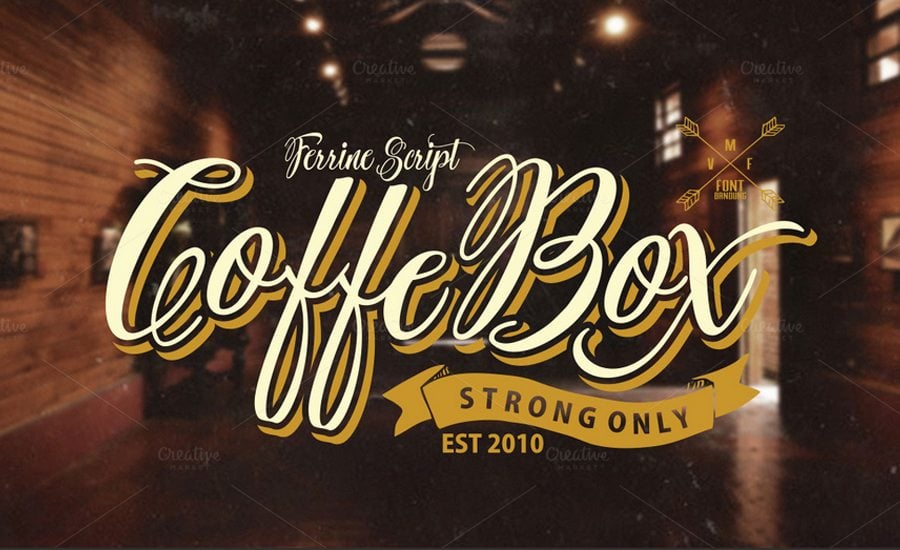
Ferrine Script Font
Ferrine Script is a beautiful handwritten stylish. It’s a multi-purpose font with two alternates (different style in lowercase) lowercase and one uppercase.
Bethlehem Handmade Script Font
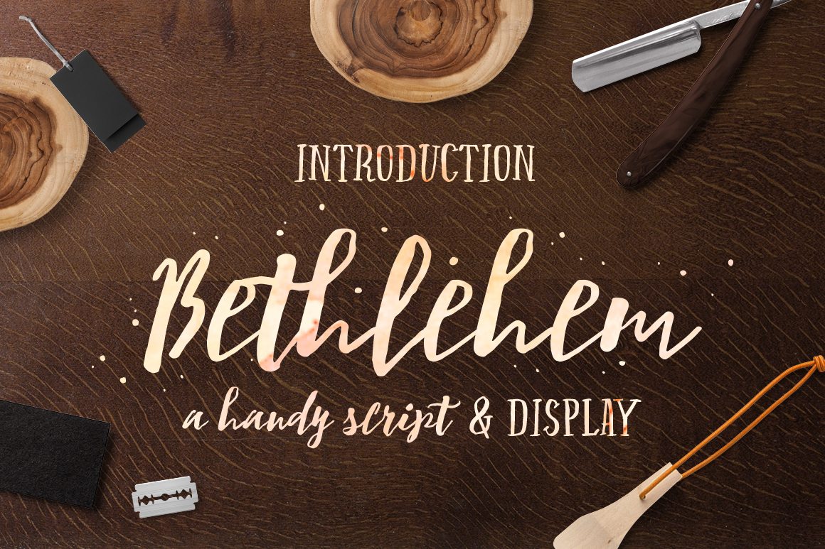
Bethlehem is an illustrative typeface designed to be real and natural to look like hand-lettered script. The scattered ink you seen in the preview are also included as alternative characters. So you can play with it to create a beautiful illustrative lettering.
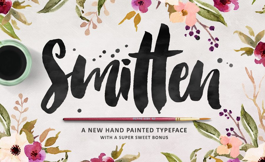
Smitten Script Font
Smitten Typeface is a hand-inked, ‘semi-script’ font with tight kerning, and a fun, imperfect baseline. It’s nice and bold, plus a little gritty – Perfect for creating organic, fluid typography on products, branding, invitations, fliers, posters and more.
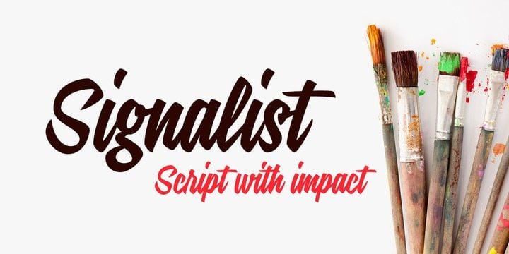
Signalist Typeface
Signalist is a contemporary brush script. It is condensed and tight but still legible.
Dankita Script
Dankita is a beautiful hand painted script that comes with a set of extras. All letters have been carefully painted giving your words a wonderful flow. It can be used for fashion, apparel, stationery, magazines, film, books and marketing.
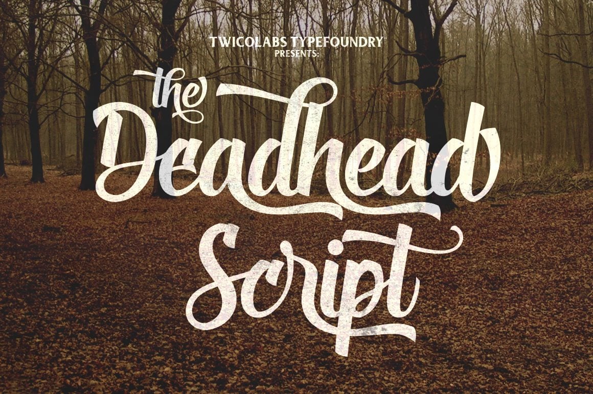
Deadhead Script Typeface
Deadhead Script is playful typeface that inspired from brush lettering. Made with high attention to the details that will bring your design to the next level. Suits best for almost all design themes; vintage, modern, gothic, dangdut pantura etc.
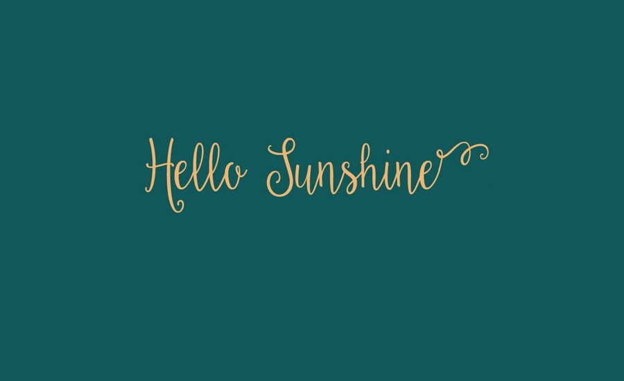
Hello Sunshine Script
Hello Sunshine is a new bright and sunny Script. Hand Drawn letters are both elegant and funky. Contains 2 terminal ornaments to add on to any lower case letter to finish off your word or phrase with a end character swirl.
Abbie Script
Abbie Script is a beautiful handwritten script font that has been hand drawn, scanned, and digitized for you to enjoy for free. Abbie Script is available in three different weights (Light, Regular & Bold)
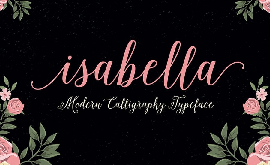
Isabella Script
Sabella Script is handwritten stylish copperplate calligraphy fonts, combines from copperplate to contemporary typeface with a dancing baseline, classic and elegant touch. Can be used for various purposes.such as headings, signature, logos, wedding invitation, t-shirt, letterhead, signage, lable, news, posters, badges etc.
Hollie Script Font
A typeface that pays tribute to all letterers that created amazing signs in magazines, walls and windows through the brush lettering during many years, especially in the 50s and 60s. This font is 100% based on the brush traces, it has 2100 glyphs, contextual ligatures from two to four characters and alternates for each ligature.
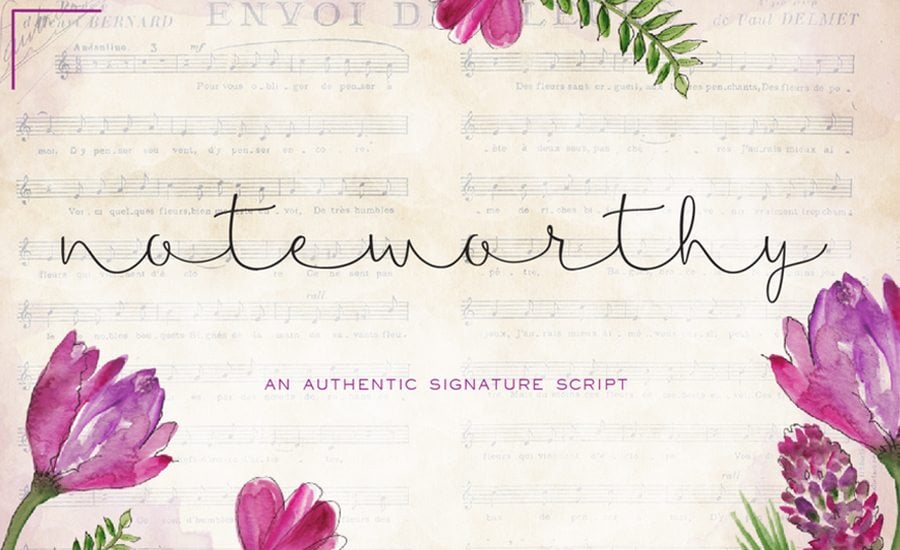
Noteworthy Script
The Noteworthy Script is a new hand scripted authentic signature style typeface. Use this decorative typeface for stationary, logos, invitations, and more! Available for both personal and commercial use.
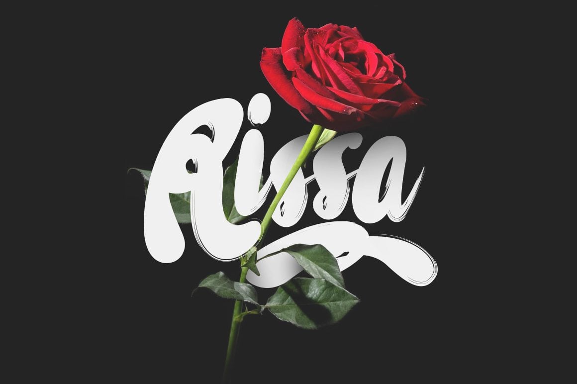
Rissa Typeface
Give your designs an authentic brush handcrafted feel. “Rissa Typeface” is perfectly suited to stationery, logos and much more.
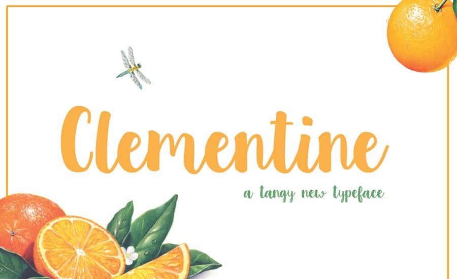
Clementine Script
Clementine Script is a tangy new hand crafted typeface. Available for both personal and commercial use. This script was inspired and designed with a large chisel felt marker. Bold characters make your logo stand out. Perfect for signage, posters, logos, headlines, and more.
Sarrah And Claire Brush Land
“Sarah and Claire” is a typeface inspired by the letters brush. It’s made in a little untidy way that brings your designs to the level of the wild yet natural look.
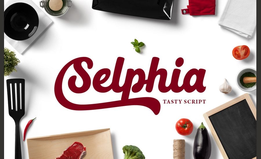
Selphia Script
Selphia is a new script typeface designed with deliciously taste, so fruity, and milky. But you can be used for various purposes like tagline, t-shirt design, logos, quotes design etc.
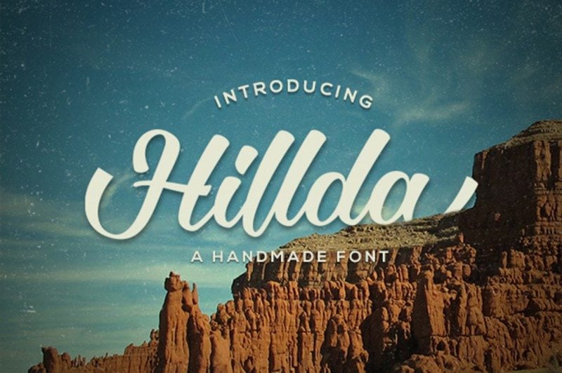
Hillda Script Font
Hillda Script is bold, modern, and multi-purpose typeface that combines brush lettering with natural handwriting. It was designed as a display typeface that alternative characters to improve your design. It is suitable for logo, packaging, headline, poster, t-shirt, etc.
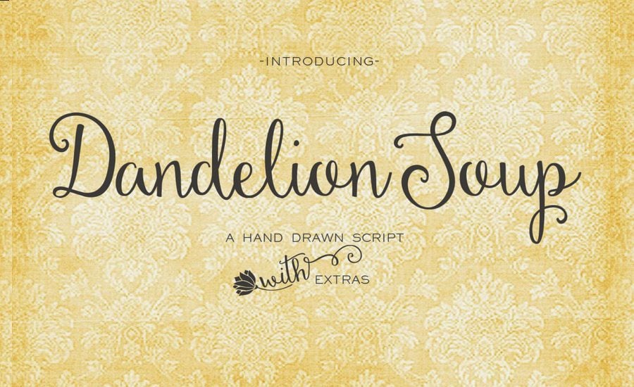
Dandelion Soup Script Font
The Dandelion Soup Script is a new hand drawn script typeface. Available for both personal and commercial use. Download and use The Dandelion Soup Script for anything and everything.
Handsome Script Font
This font is perfect for luxury products and special occasions such a weddings or parties. For added affect have it letter pressed into a beautiful cotton paper stock. It is best used as a headline, however, it more than pulls its weight as body copy.
Happy Day Script
Happy Day is a bright cheerful lovely modern calligraphy typefaces. It can be used for a variety of purposes including posters, book covers, and even logo designs.
Stubborn Faith Script
Stubborn Faith is a perfect, bright and wayward font. It’s highly useful for calligraphic and vinyl artwork and can be used for a variety of purposes. The urban nature of this font will be ideal for t-shirts design.
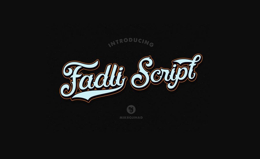
Fadli Script
Fadli Script is a script font with a touch of tattoo lettering style. Highly usable to create Custom Logotype, Band Logos, Brand, clothing company, Indie Flyer/Poster or it can be anything.
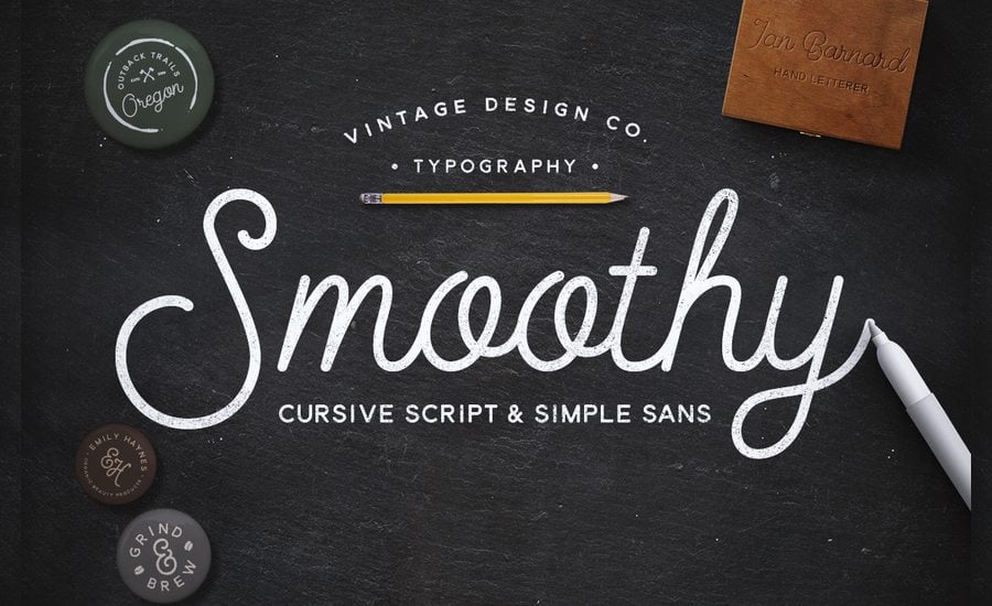
Smoothy – Cursive Script & Sans
This is an amazing set of 2 font family with a mono weight cursive script and a complementary subtly rounded sans-serif. Based on popular hand lettered style, give your work that stylish hand rendered look with no effort. It works great with logos, prints, quotes, magazine headers, clothing and all design mediums.
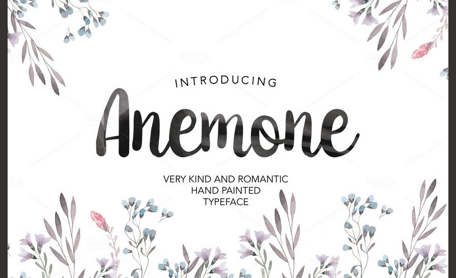
Anemone Script Font
Anemone is a stunning font with 100% hand painting. It’s highly suitable for the design of logos, creation of invitations, greeting card and more.
Layla Script Mini Bundle
Layla is a great font hand lettering brush, there are two different fonts, font layla brush and font layla painted, very good for your product advertising, invitation, brocure, poster, etc
Margherite Script
Margherite is sweet feminine typeface, hand drawn characters dance decoratively along the baseline. Available for both personal and commercial use.
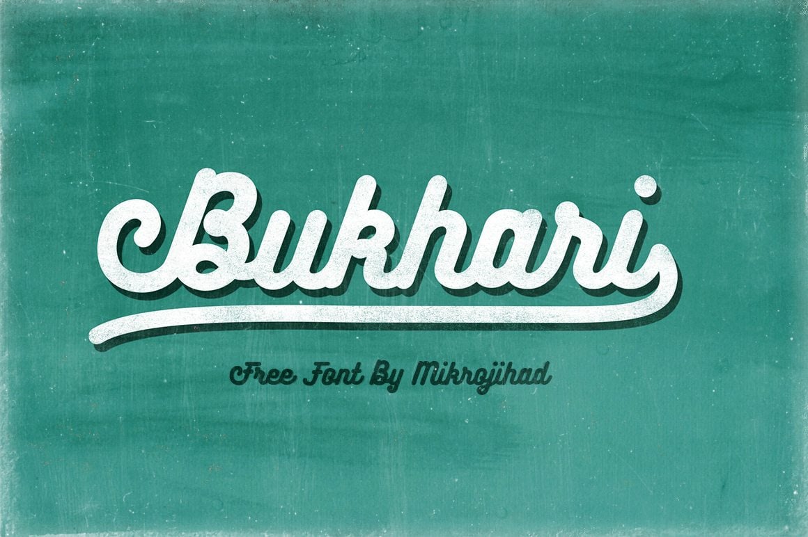
Bukhari Script Font
Bukhari Script is a bold monoline cursive font. It’s very useful for various design project, for web or printing, such as a Logotype, Posters, Badges, Signage, Business Card, T-shirt Design, or it can be anything.
Alisandra Script
Alisandra is a smooth but with sharp edges brush typeface. With almost 500 glyphs and with the magic of OpenType, this font is well playful for an artistic typography.
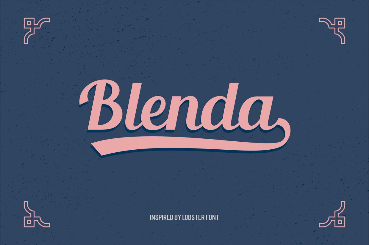
Blenda Script
Blenda Script is a free experimental font inspired by lobster font, a bold vintage script. can be used for various purposes. Such as news, posters, logos, badges etc.
Variane Script Font
A simple and cleanly designed font that you can use for a variety of purposes. Variane is a perfect font for your next logo or poster design and is available to use for free.
Seren Script
Seren is a retro font that contains 430 glyph, the OpenType feature can be used to create your own custom typo and design. Very useful for t-shirts, banners, posters, etc.
Sant’Elia Script Font Family
Sant’Elia Script from Yellow Design Studio is a robust modern type family with regular and rough versions in six weights. Its forms are crisp and welcoming with a splash of verve. Alternate versions feature angled strokes that inject drama and energy.
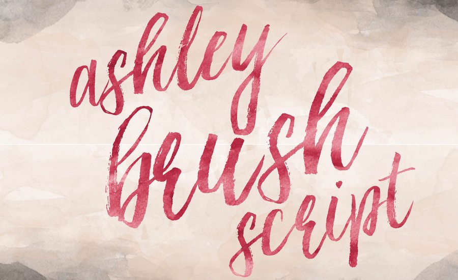
Ashley Brush Script
“Ashley Brush Script” was completely handwritten using watercolors and a calligraphy brush. Rough edges and imperfect lines give this brush lettered font a unique and trendy look. Perfect for wedding invitations, adding design accents, and giving your projects a coveted hand-crafted look.
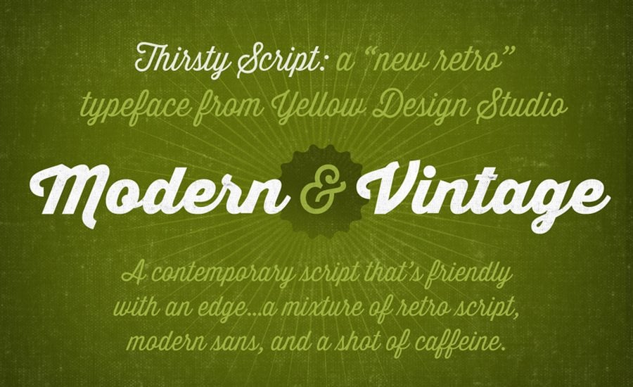
Thirsty Script Fonts
Thirsty Script from Yellow Design Studio is a contemporary script conceived as a marriage of elements from vintage signage scripts, Wisdom Script, Deftone Stylus, and Lobster. The result is a typeface with a ‘new meets vintage’ vibe. It’s friendly with an edge, a mixture of retro script, modern sans serif, and a shot of caffeine.
Octavia Script Font
Octavia Script is another lovely modern calligraphy typefaces, which is combining the style of classic calligraphy with an modern style.
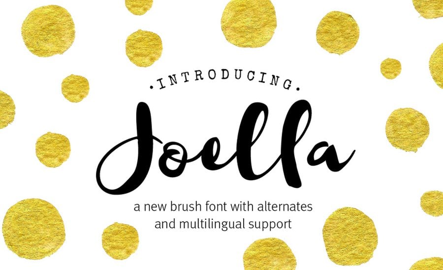
Joella Brush Script Font
Joella is a bold, clear and full of character script typeface. The thickness of this font makes it great for use with fills such as gold, watercolor, glitter, etc. This font is extremely versatile and can be used for such things as beauty, make up, typographic designs for t-shirts and fashion, etc, organic products or any kind of food and drinks products. There are many possibilities where this font will work very well.
Script Bundle – 4 Handmade Fonts
This Handmade Script Bundle contains 4 amazing script fonts that would be very handy for your new logotype, wedding invitation or poster. You can have your hands on this amazing set for just $22.
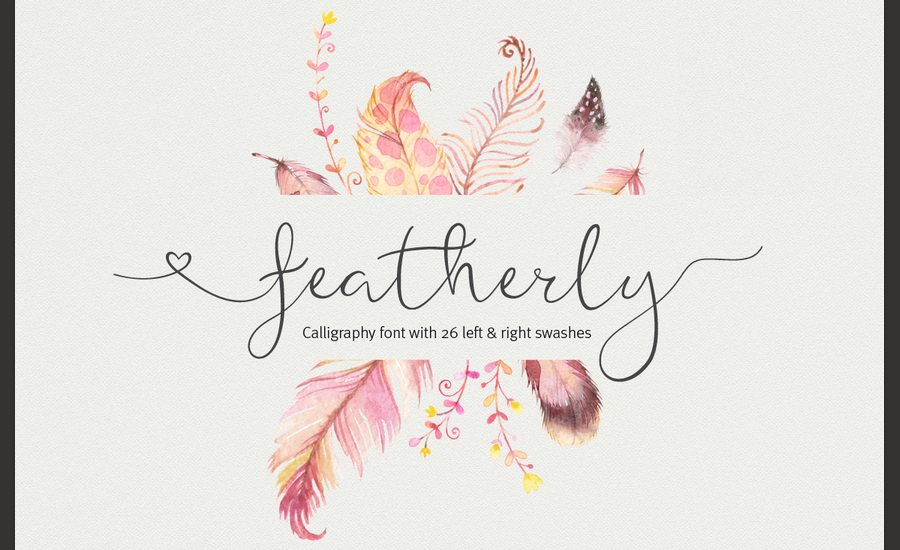
Featherly Wedding Font
Featherly is a hand drawn, elegant, modern calligraphic font perfect for wedding design projects, invitations, greeting cards, signatures, watermarks, logos, handwriting and more.
Faith & Glory
Faith and Glory is a set of 2 hand-painted brush fonts, designed to perfectly combine with one another and allow you to create beautiful typography with a personal touch. It comes with upper and lowercase characters as two separate fonts, punctuation, numerals, and supports international languages. Alternates are available for key characters, you can access these by switching between upper & lower case characters within the 2 fonts.
Last Paradise Script
Last Paradise script font comes with upper and lowercase characters, punctuation, numerals, and supports international languages. It’s perfect for attention-grabbing header text, logos, clothing designs. or anything which needs a bold & loud text with a personal touch.
Fresh Script
Fresh Script is hand-painted typeface designed to help you create the look of stunning custom hand-lettering. It comes with upper and lowercase characters, punctuation, numerals, and supports international languages.
Can’t decide whether you need a brush or script font? Then grab this bundle, which comes with 12 different brush and script font collections with a total of 56 vintage-style typefaces.
A modern and a hand-drawn script font with a natural flaw featuring a bonus set of 14 swashes and arrows. The font pack includes 3 unique styles.
This beautiful hand brushed typeface comes with a set of 52 bonus ornaments for adding more style to your design. The font is ideal for your invitation and greeting card designs.
A beautifully free-flowing handmade brush font that includes 3 different font styles. It’s great for your quotes, product packaging, and branding work. According to its creator, the font looks more amazing in all-caps.
A beautiful handwritten style font that makes your text look like a signature. It comes with additional 32 hand-drawn doodles and a separate typeface for all-caps letters.
This font pack comes with both script and sans font styles featuring a vintage design. It can be used for designing various types of graphics including logos, wedding cards, clothing brand logos, and more.
A unique pack of two fonts, an all-caps font and a script font, that will make your book covers, stationery, marketing, magazines, and film designs stand out from the crowd.
A handmade brush font that mimics a marker pen. This font comes in 2 styles and with 12 bonus swashes. It also supports international languages.
Make your text look as if it’s written with a ballpoint pen using this stylish font. This font will go along nicely with your signatures, quotes, badges, labels, and many other types of designs.
This beautiful brush font looks simply perfect for designing a cover for a music album. It comes in 2 font styles, and with 11 swashes, and 4 paint-splatters.
A unique script font for your greeting and wedding invitation card designs. The font also includes 4 bonus standard characters and 7 swashes.
A unique and a modern font featuring 250 glyphs. The style of this brush script font makes it more suitable for designing clothing and fashion brand logos.
This font is just what you need for your logo design, badges, and poster design work. The font comes with swashes, alternative styles, symbols, and more.
A unique hand lettered dry brush script font suitable for all kinds of design work from branding to logos and even wedding and stationery designs.
This is a multi-purpose typeface that has a mixed design of brush lettering with natural handwriting. It also features 350 glyphs and 155 alternatives characters.
A bundle of stylish script and bold style fonts that includes 5 styles. This font will definitely make your logo designs, social media posts, and badge design look phenomenal.
A unique brush typeface for designing realistic hand-crafted artworks. The font comes in both desktop and web font versions.
This modern script font will help add a feminine touch to your design. The font comes with over 400 stylistic sets and swash characters.
A font for designing bold logos, invitations, greeting cards, and website headers. This font pack includes both sans serif and irregular script font styles, as well as 85 catchwords and ornaments.


![→ Download Now: The Beginner's Guide to Email Marketing [Free Ebook]](https://no-cache.hubspot.com/cta/default/53/53e8428a-29a5-4225-a6ea-bca8ef991c19.png)


