I remember the first time I was asked by a client to create an infographic to support an article I was about to write.

I was new to content writing at the time and was not yet familiar with using graphics tools to create visuals, so I scoured the internet, where I found different tips from different authors. I eventually created the infographic, but it took me three days and multiple headaches to get it done.
But now I know that creating infographics doesn't have to take a lot of time, effort, and skill. There are a plethora of affordable and user-friendly tools that make it easier to create impactful graphics, especially if you’re working with a budget or are not very tech-savvy.
That, combined with the importance of visual content in marketing today, means that even if it’s overwhelming, you shouldn’t throw in the towel just yet.
In this article, you’ll learn different ways to create an infographic in under an hour.
Table of Contents
Creating an Infographic
Research from DemandSage shows that readers retain 65% of information when it's paired with a relevant infographic.
And, Venngage’s 2023 survey revealed that 43% of marketers found original graphics, like infographics and illustrations, to be the best-performing type of visual content.
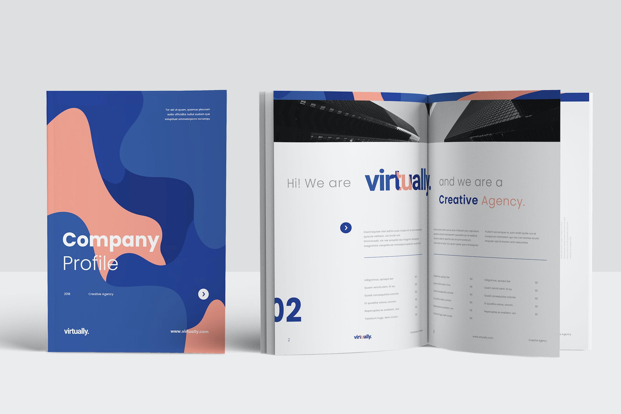
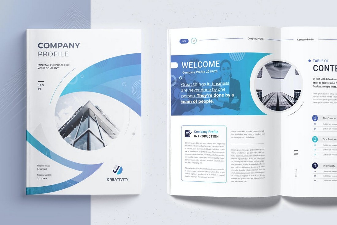
Knowing how effective infographics are at helping readers digest your writing and understand the importance of a product, HubSpot created some Free Infographic Templates in PowerPoint, which makes it easy to create high-quality, professional infographics in no time.
With these templates, you can add your own content to premade outlines in a cinch. And if you need a helping hand, I’ll show you how to personalize your infographic in PowerPoint (and other tools).
If you prefer watching, this video shows the process of creating an infographic step-by-step:
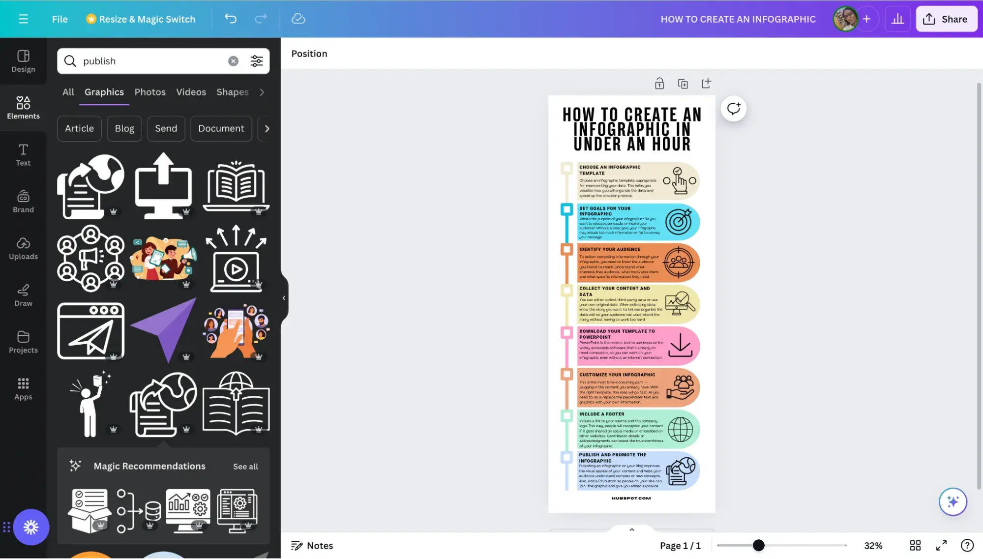
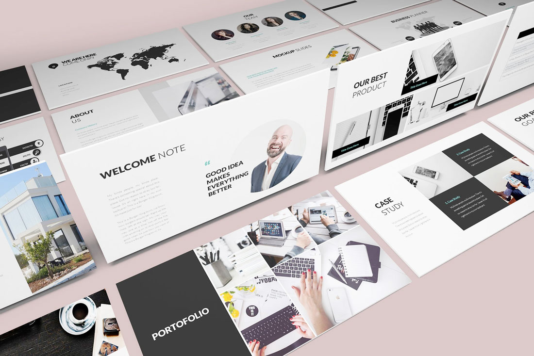
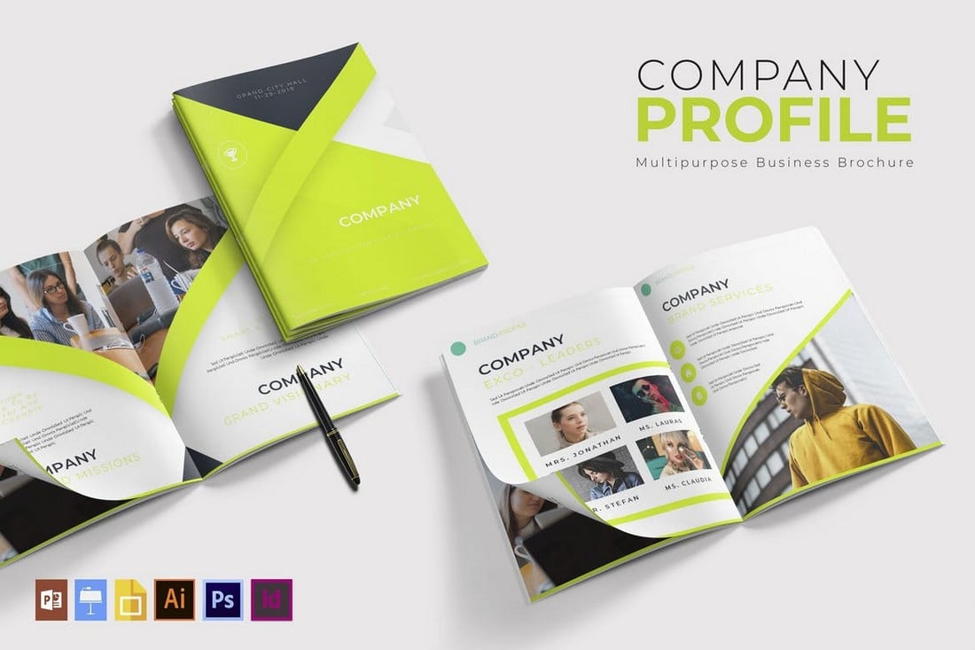
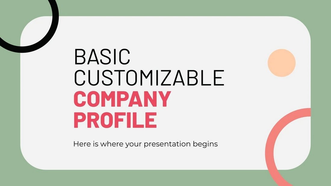
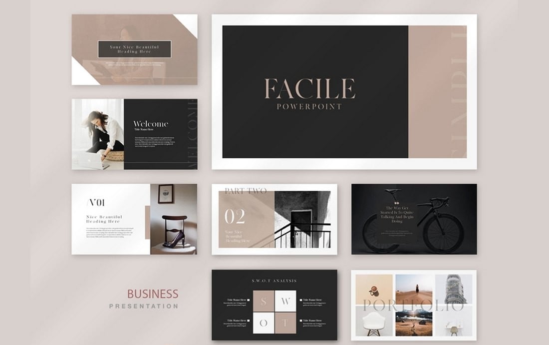
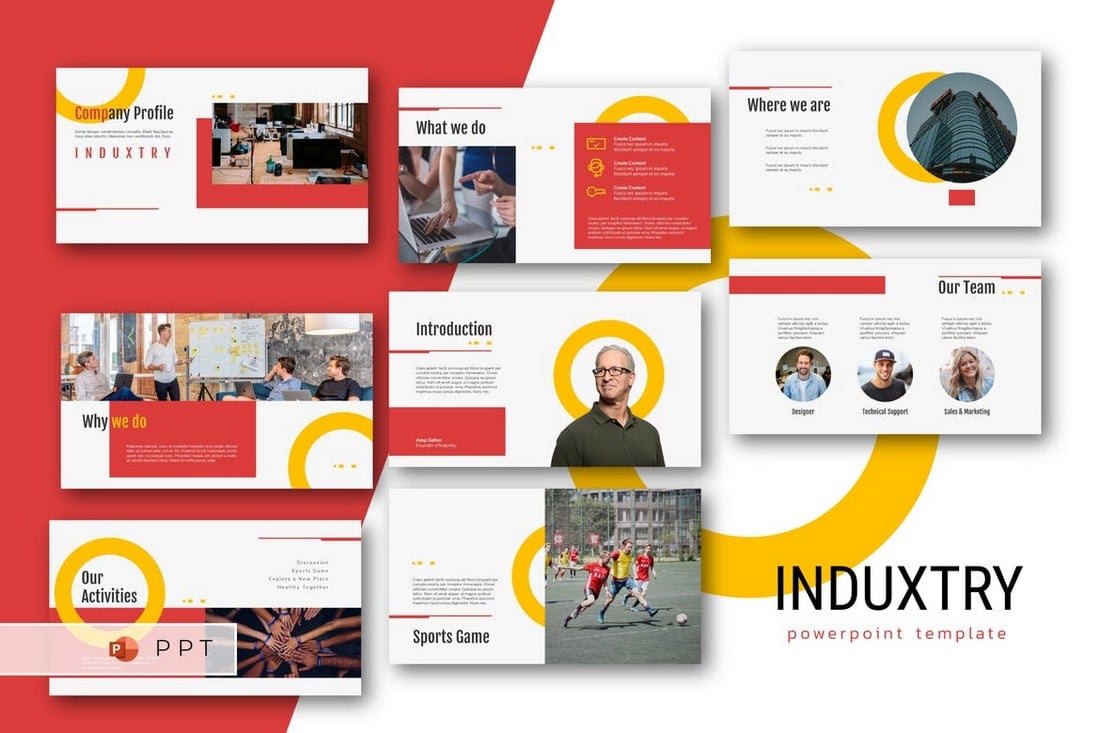
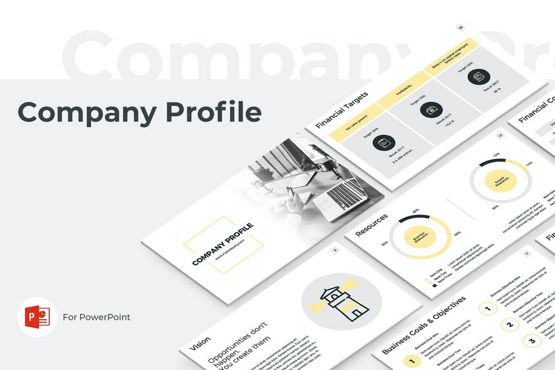
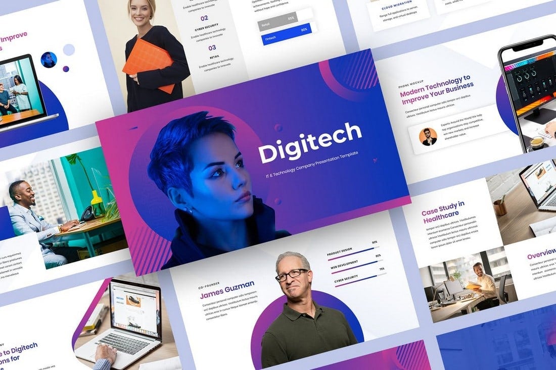
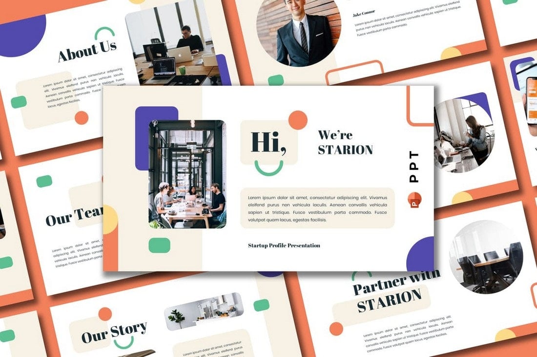
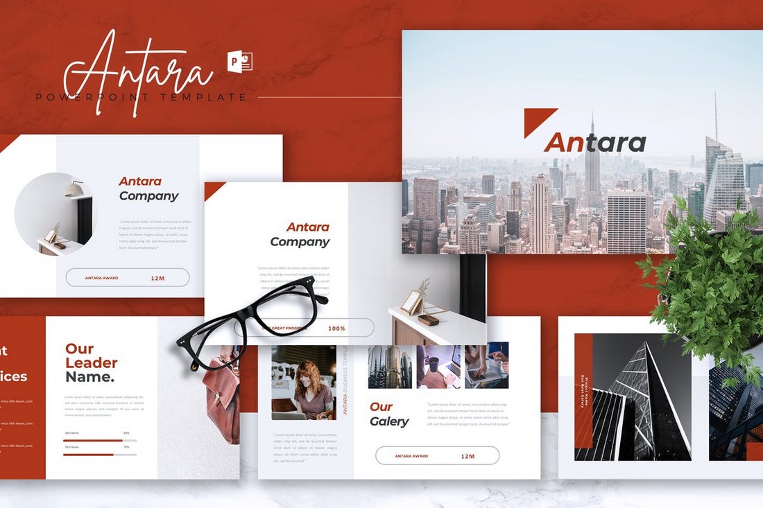
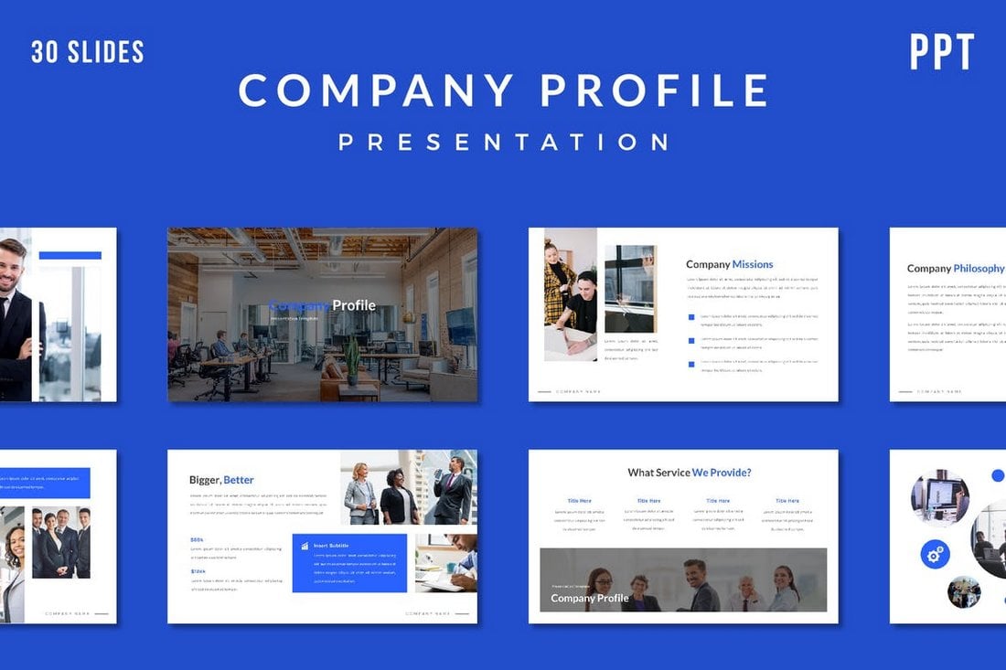
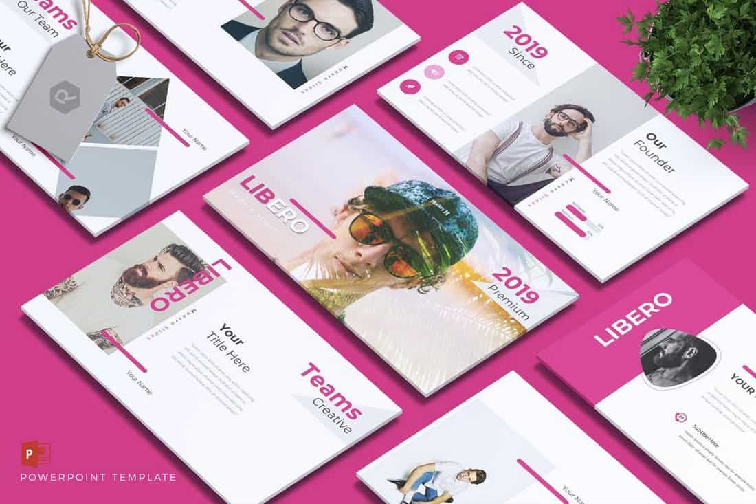
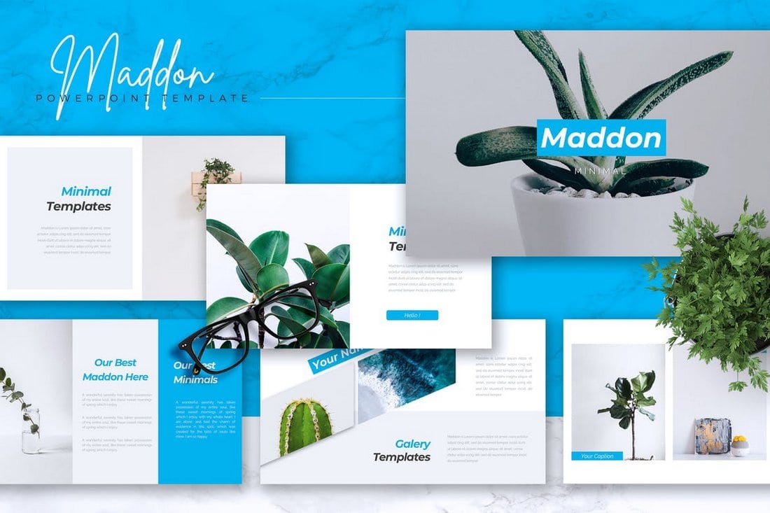
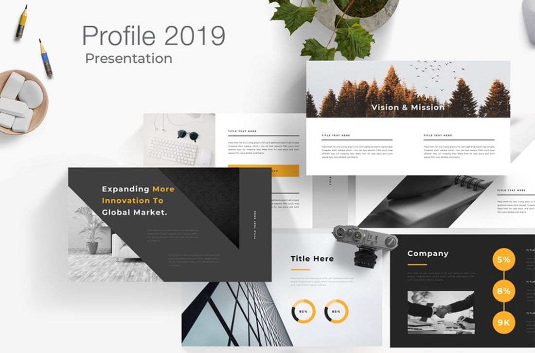
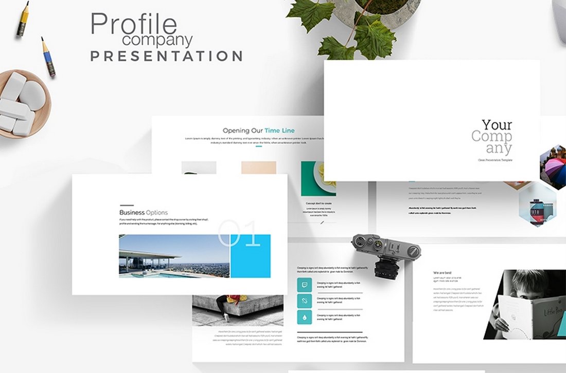
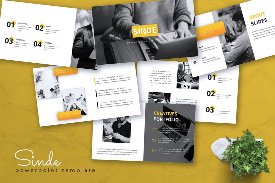
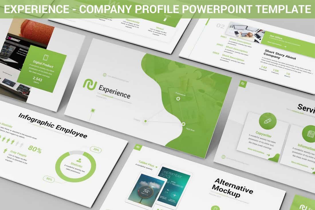
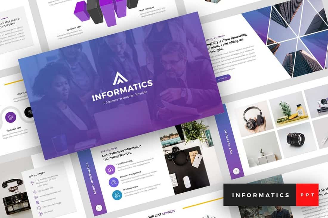
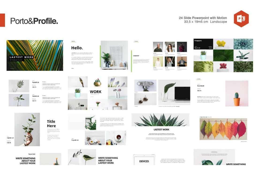
1. Choose your desired infographic template.
First, choose an infographic template appropriate for representing your data.
The important thing is to choose a template that specifically works for the type of data set/content you want to present.
As you saw pictured above, you can download our 15 infographic templates in PowerPoint and choose the template that will best help you communicate your data.
Download for Free
Choosing a template before creating a goal for your infographic can speed up your infographic creation process.
I find it can help you visualize how you will organize and present your data. This can help you narrow your focus before you get into designing your infographic.
Infographic templates also have premade sections or modules to help you structure your content. This makes it easy to understand how your information will fit within each section to give your infographic a logical flow.
Starting with a template can also spark creative ideas for your infographic and inspire original ways to tell your visual story.
Other important qualities I recommend considering as you choose a template include:
- Whether your infographic is using quantitative, qualitative, or categorical data.
- How complex your data set is.
- Whether the infographic design elements align with your brand.
- Accessibility, including readability for all audiences.
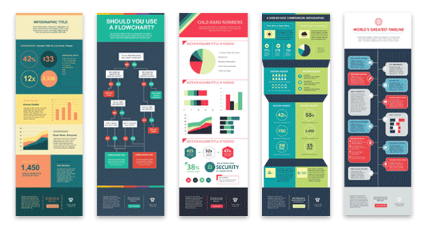
Some of your template options in the offer linked above include a timeline, flowchart, side-by-side comparison, and a data-driven infographic.
Pro tip: Choose a template that offers a range of layout options for different types of information. A template with diverse layouts can help you create more visually engaging and informative infographics.
Types of Infographics
If, like me when I was a new content writer, you’re not familiar with infographics, you might be wondering if there are different kinds of infographics.
So, I’ve compiled a list of some of the most common so you can choose an infographic template that suits the story you want your data to tell.
Side-By-Side Comparison Infographic
This infographic design can help prove the advantage of one concept over another. Or, you can simply explain the differences between two competing entities.
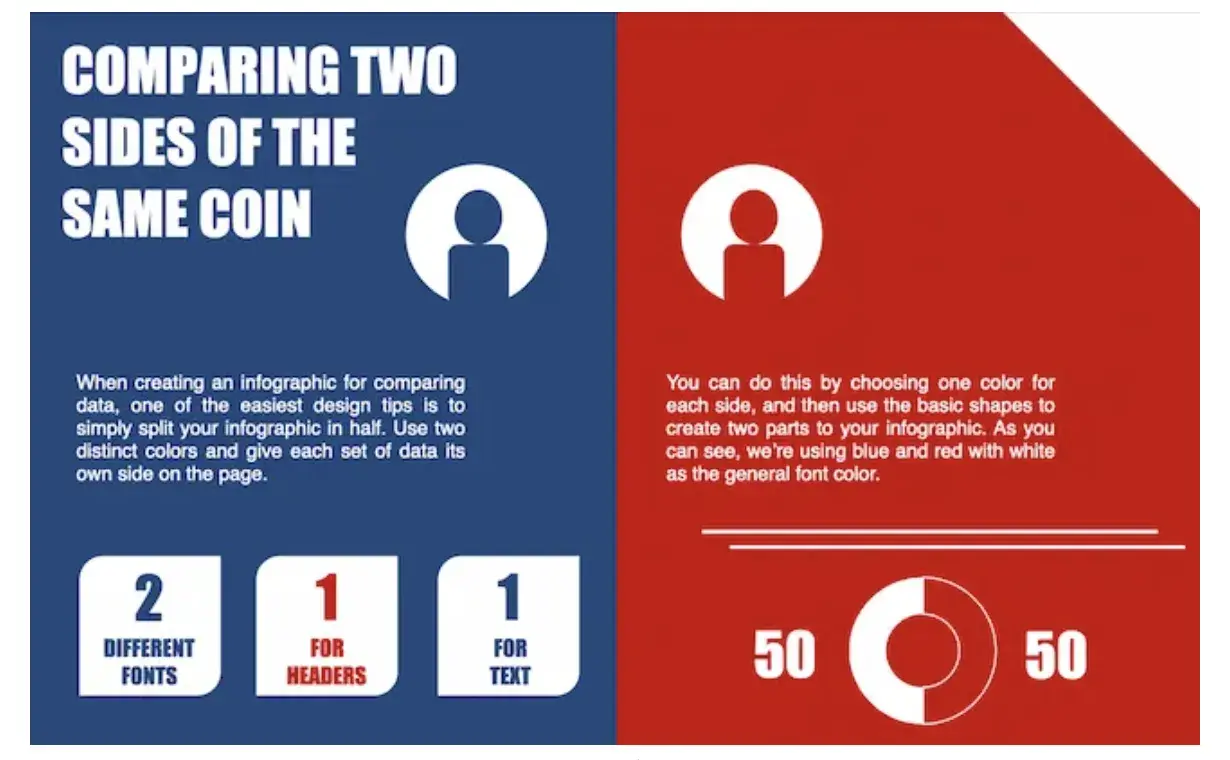
Download this Template
Use this type of infographic for: Showing the head-to-head differences between two options or ideas.
Flowchart Infographic
This design is perfect for presenting a new workflow for your organization, how a linear or cyclical process works across your industry, or walking people through a decision.
I love seeing these types of flowcharts when brands have a humorous take on something. They also ramp up the fun factor with a playful way to show how one conclusion is completely obvious.
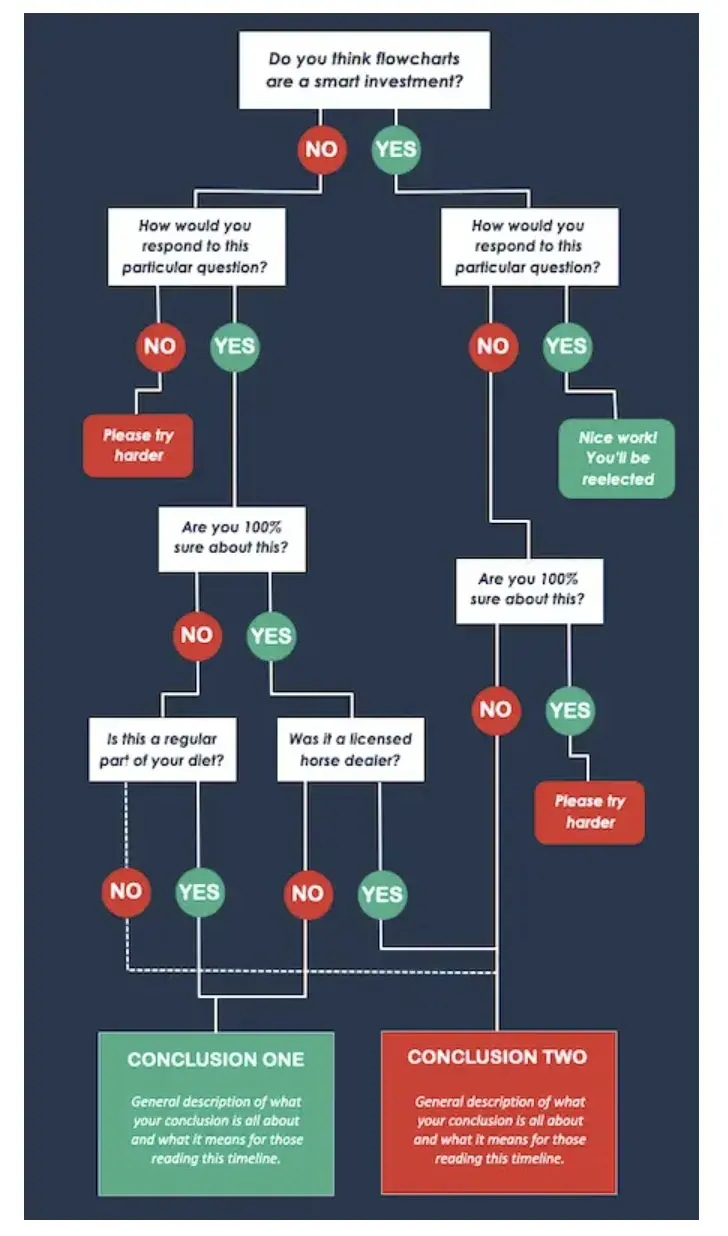
Download this Template
Use this type of infographic for: Highlighting a decision tree or process.
Pro tip: If your brand is playful, your conclusions could be “Yes” and “Yes, but in red.”
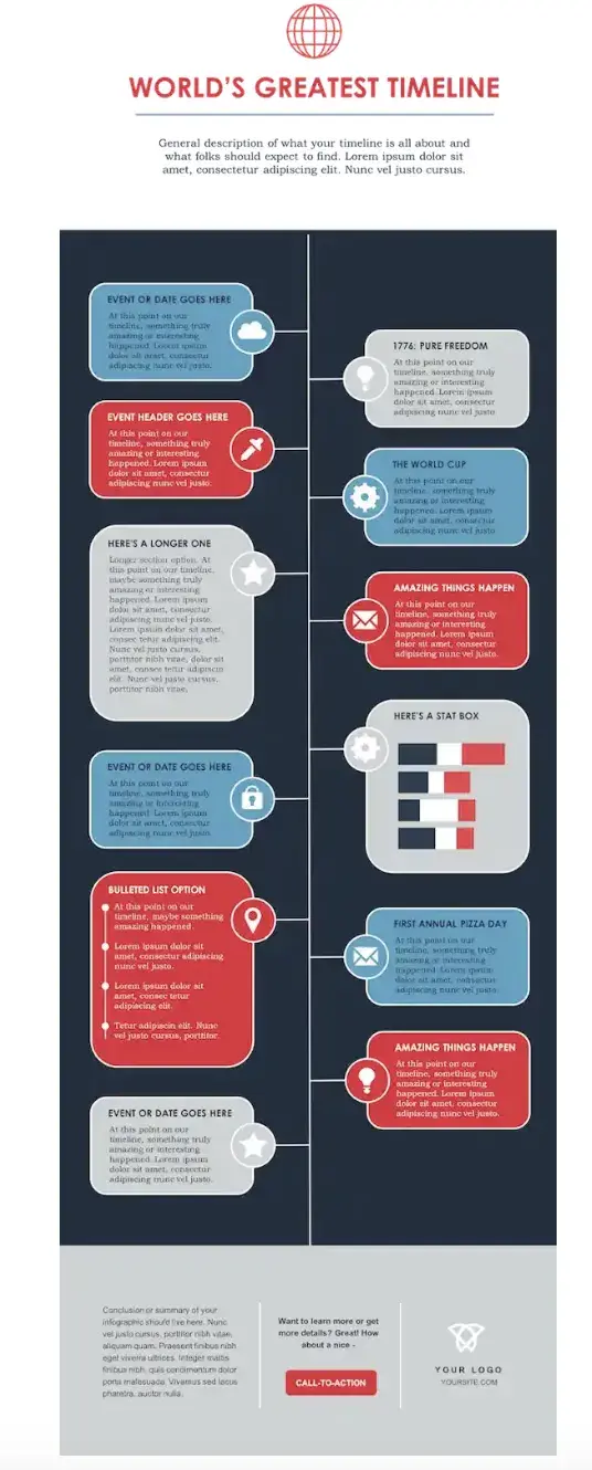
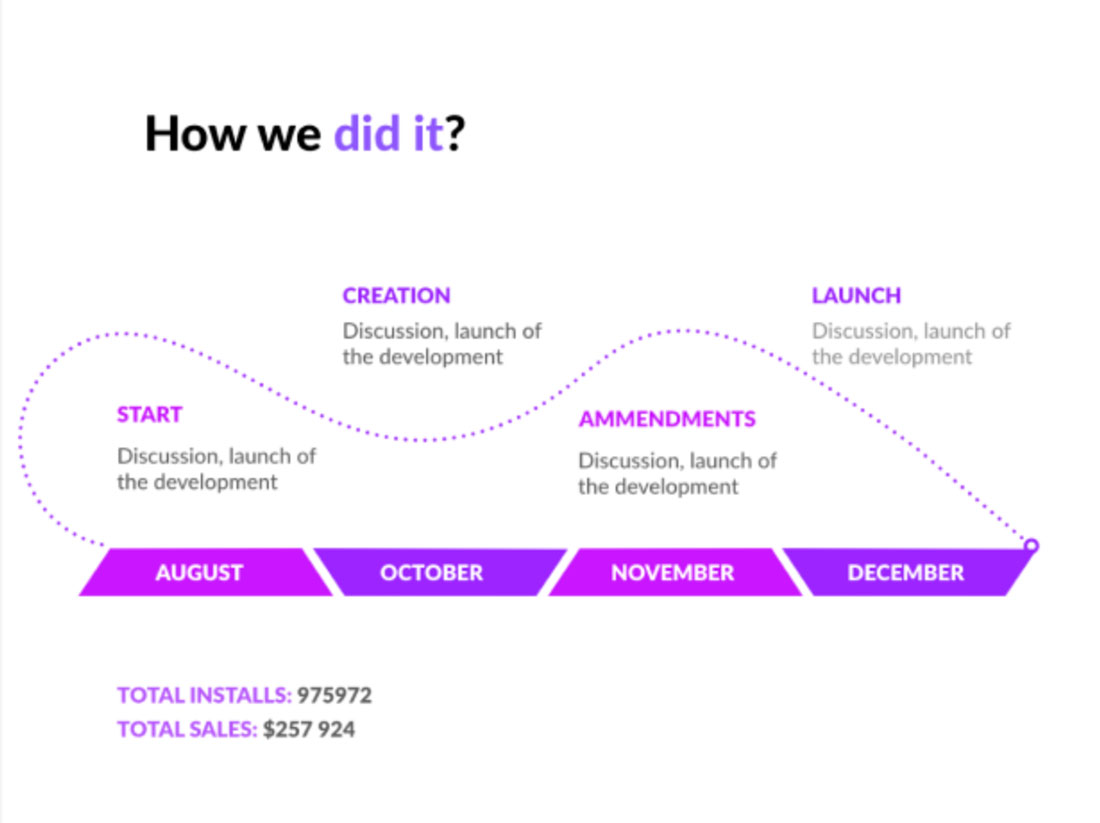
Timeline Infographic
This design can tell a chronological story. This is great for showing the history of a business, industry, product, or concept.
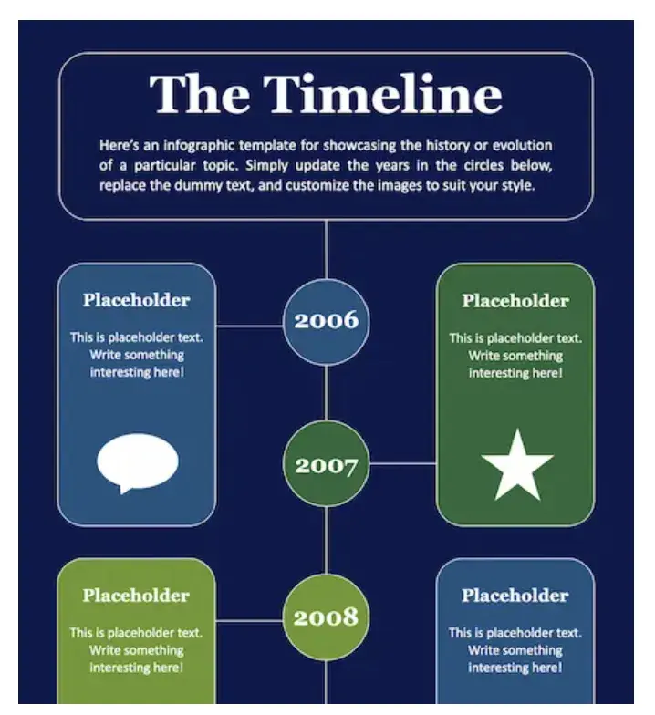
Download this Template
Use this type of infographic for: Sharing a timeline to illustrate a journey from where you were to where you are now.
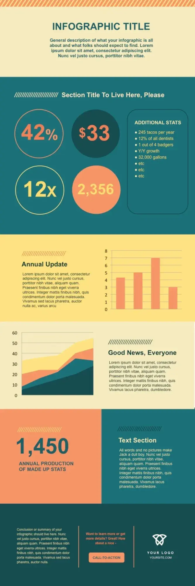
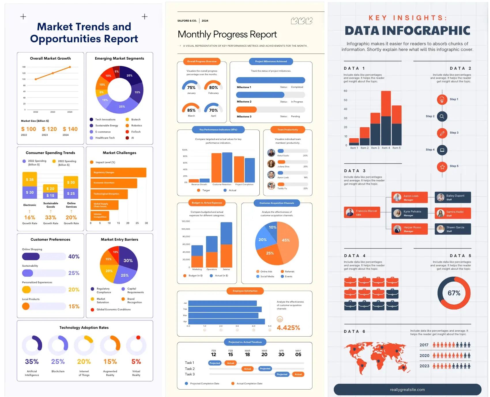
Graph-Based Infographic
This design is perfect if you’re publishing a high volume of data and statistical information, making it a good fit for expert-level audiences.
I love looking at these because they make it easy to review data and see how different categories or responses compare.
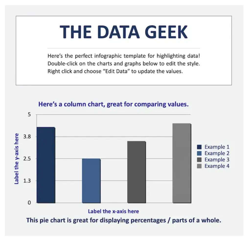
Download this Template
Use this type of infographic for: Simplifying or comparing massive amounts of data.
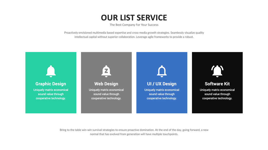
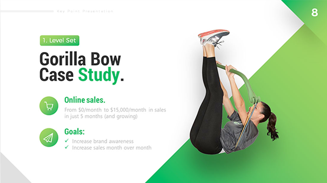
Image-Heavy Infographic
This design caters to content creators who are trying to reveal trends and information from shapes, designs, or photography — rather than just numbers and figures.
They usually fall on the complex side of things, but these infographics are worth the effort. You can compare and contrast multiple types of information in one image.
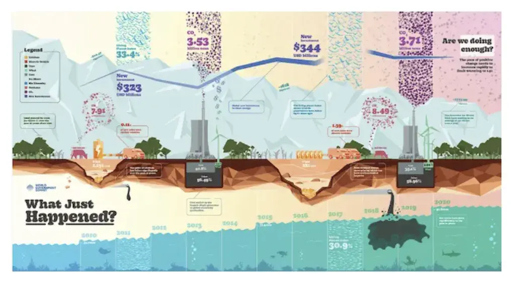
Image Source
Use this type of infographic for: Displaying a variety of information sources and categories to paint a comprehensive picture.
A word of caution: Be sure to consider where people will interact with your infographic so you can determine if it’s an appropriate size and sufficiently readable on different types of devices. Something like this image may work better in print than online.
2. Decide on a goal for your infographic.
Once you have the template you want to use, it’s time to get into the details. Without a clear goal, your infographic may include too much information or fail to convey your message.
Your goal should include the purpose of your infographic. Do you want to educate, persuade, inform, or inspire your audience?
An infographic can help you:
- Quickly summarize complex topics.
- Simplify complicated processes.
- Highlight research or survey results.
- Condense long-form content, like blog posts or case studies.
- Analyze and compare different products or concepts.
- Boost awareness about a topic.
And an infographic is for more than just presenting information. So, your goal should also include a desired action or response you want to elicit from your audience.
Do you want them to sign up for a newsletter, visit a website, or take another desired action?
Critically thinking about goals for your infographic helps you align each infographic with larger marketing targets.
3. Identify the audience for your infographic.
Image Source
Infographics don’t sell themselves on design alone.
They’re ultimately about communication. You need to deliver “info” that’s just as compelling as the “graphic,” and to do that, you need to know the audience your infographic intends to reach.
According to Harvard Business Review, five possible audiences can change how you choose and visualize your data: novice, generalist, managerial, expert, and executive.
Start by comparing your infographic’s ideal reader with one of these five audiences — which one applies to your reader?
Another way to look at this is that by identifying your audience, you can determine how advanced your information should be. For example:
- A novice audience might need data that has a more obvious meaning.
- A generalist may want to see how the information ties into the big picture.
- A managerial audience might need to see how different groups or actions affect one another.
- An expert might be more interested in getting into the weeds of your numbers and posing theories around them.
- An executive has more in common with a novice audience in that they only have time for the simplest or most critical information and the impact it’ll have on the business.
In my experience, the audience is the most important part of communicating your data and information. So, once you identify who you want to see your infographic, dig deeper into that persona.
You should understand what interests that audience, what motivates them, and what specific information they need.
Then, think about how and where they’ll see your infographic. Will it be on a website, shared on social media, or presented at a conference? Then, I like to look at the potential ways to leverage the heck out of my content.
To that end, I recommend that you take time to consider how you might repurpose your infographic with your different channels in mind.
The bottom line here? The platform and situation should influence the design and format of your infographic. Keeping these details in mind will make your infographic stand out and make an impact.
Pro tip: Take audience awareness a step further by conducting research or gathering feedback from your target audience. These details make it easier to tailor your infographic to their specific needs.
4. Collect your content and relevant data.
 ">
">
Image Source
Using the audience you’ve chosen above, your next step is to organize all the content and data you’ll use in the infographic. You can either collect third-party data or use your own original data.
Choose your data.
For your data to be compelling, you must provide proper context. So, when collecting your data, make sure you have an idea about the story you want to tell. Data for the sake of data won’t add value to your infographic at all.
Choose data that’s interesting and gives a good understanding of the topic. You can compare numbers or look at trends over time to tell a story with your data.
I always like to look at abnormalities and see what might have caused them.
For example, a spike in website traffic from one month to the next doesn’t mean much — until, say, you reveal that traffic was on a steady decline over the previous three months.
Suddenly, you have a story of how you were able to reverse a downward trend.
Organize your data.
Image Source
Make sure to organize your data in a way that makes sense so your audience can understand the story without having to work too hard.
To do this, spend some time thinking about what data points are most important and create a structure that emphasizes that data.
One of my favorite strategies is starting with a quick outline of your data story. Then, I match data points with each relevant section of the outline.
Cite your sources.
Most importantly of all, if you use third-party data, be sure you properly cite your sources — just like you would in any other good piece of content.
Beyond that, try to keep your infographic uncluttered by a ton of different source URLs. A great way to cite your sources is to include a simple URL at the bottom of your infographic that links to a page on your site.
You can also list the individual stats used in your infographic and their sources on a landing page. But if you do, don’t forget to link your landing page to an offer that includes your free infographic.
With these tips, your infographic will look clean and professional, and people will be able to access the sources no matter where the infographic gets shared or embedded. It may even drive visitors back to your site.
Pro tip: Think about different types of charts and graphs to present your data. Look for chances to turn complex statistics or concepts into easy-to-understand visualizations.
5. Download your template to PowerPoint.
For the sake of time (remember, our mission is to create an infographic in under an hour), I’m going to create an infographic with PowerPoint.
This is the easiest tool to use because it’s widely accessible software that’s already on most computers, so you can work on your infographic even without an internet connection.
The user interface is also familiar and user-friendly, making it easy for beginners.
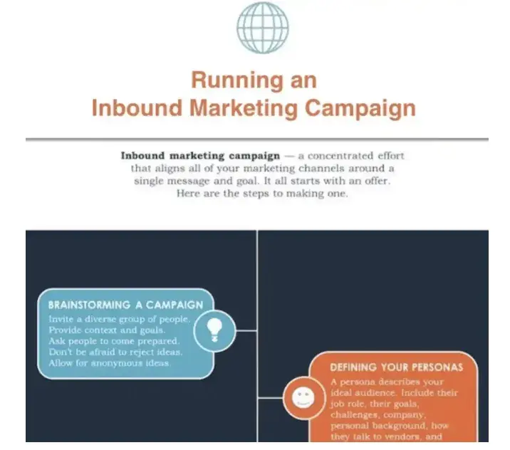
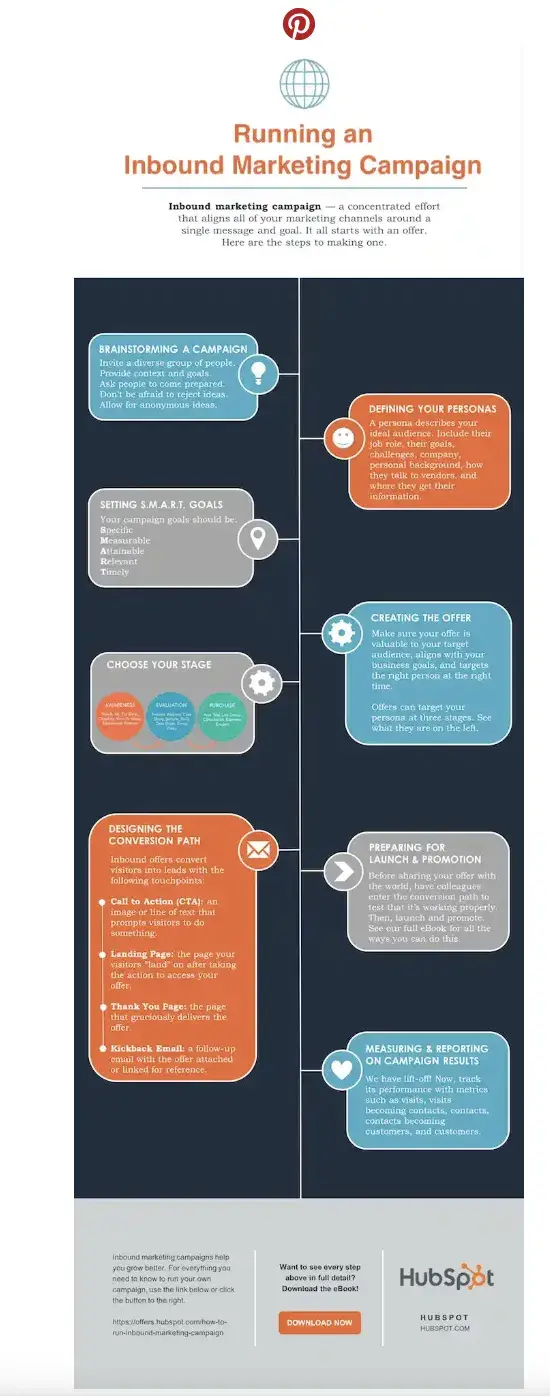
This example is based on steps and best practices from our guide, How to Create Effective Inbound Marketing Campaigns.
I’ve picked the “World’s Greatest Timeline” infographic template from our collection of infographic templates.
This template is best suited for my data set since it will allow me to outline each step of the campaign creation process in chronological order.
If you’re ready to get started, just open the infographic template in PowerPoint.
This will create a new presentation based on the selected template. Then, you can start customizing.
6. Customize your infographic.
This is the most time-consuming part — plugging in the content you already have. With the right template, this step will go fast. All you need to do is replace the placeholder text and graphics with your own information.
Come up with a catchy title, plug in your data/content, and adjust your font sizes and formatting. Feel free to switch up the graphics and colors, too, so they’re relevant to your brand and the data you’re providing.
To customize the look of the infographic even more, you might add or change the colors or font styles to your liking.
Take a peek at the example below to see how I changed the text and updated the font colors to match HubSpot’s branding:
Remember, the template is just a starting point, and you can customize it however you want, using PowerPoint’s tools to create different types of visuals to support your data.
(Want a cheat sheet on how to use PowerPoint’s tools? Download our free infographic templates.)
As you adapt the template, focus on making sure the visuals are readable, make sense in the order they’re shared, and support and enhance your data.
Pro tip: I recommend using consistent visual cues such as icons, color schemes, or illustrations to create a consistent visual language for your infographic and reinforce your brand. What’s more, if you plan to use infographics on a regular basis, consider creating a style guide for your infographics.
7. Include a footer with your sources and logo.
Finally, include a link to your source (mine is here) and the company logo. This way, people will recognize your content if it gets shared on social media or embedded on other websites.
After all, one of the main benefits of creating infographics is their shareability. These details will also make your infographic feel more credible and authentic.
Pro tip: Contributor details or acknowledgments can also boost the trustworthiness of your infographic.
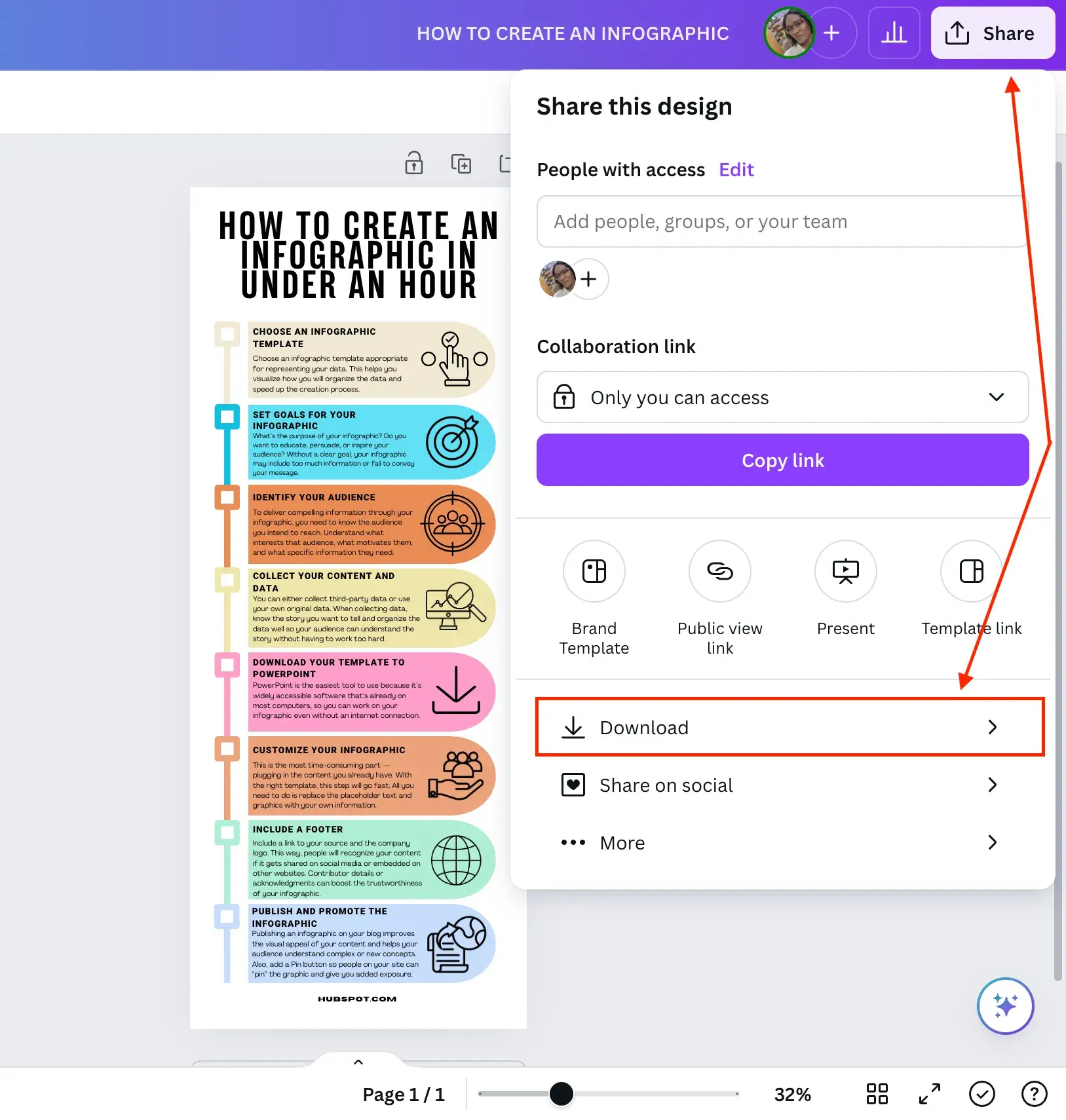
8. Promote and publish your infographic.
The only thing left to do is to publish and promote your awesome new infographic. A few recommendations for promotion:
Publish your infographic on your blog.
Publishing an infographic on your blog improves the visual appeal of your content and gives your audience a tool to understand complex or new concepts.
But that’s not all. It can also give your SEO and user engagement a boost. (And, don’t forget to include your list of sources!)
Add a Pinterest button.
Want to go viral? Making it easy for people on your site to “pin” can give you added exposure. And if you’re going this route, don’t forget to add a caption for Pinterest sharing to help draw interest and boost engagement.
Create and add an embed code.
The easier you make it for people to share your infographic, the more likely you are to get those shares. Check out how I did it below.
Share This Image On Your Site
<p><strong>Please include attribution to blog.hubspot.com with this graphic.</strong><br /><br /><a rel=“noopener” target=“_blank” href=‘https://blog.hubspot.com/marketing/create-infographics-with-free-powerpoint-templates’><img src=‘https://blog.hubspot.com/hs-fs/hubfs/free_infographic_template_custom-1.png?t=1519094621186&width=1138&height=3412&name=free_infographic_template_custom-1.png’ alt=‘free_infographic_template_custom-1’ width=‘660px’ border=‘0’ /></a></p>
With the infographic complete and published, that’s a wrap. It won’t take you long to create some impressive infographics of your own once you get started — but before you begin, I’ve got some tools to make the creative process even smoother.
How to Make an Infographic for Free
Now, you may be wondering how much making an infographic will cost.
The good news is you can make engaging and effective infographics for free with many tools on the market.
Here are some of my favorites, and I’ll be testing one of them to show you how easy the process is.
Image Source
Canva is a design platform that can help you create a variety of media like presentations, blog graphics, and posters in addition to infographics. It’s easy to get started using one of their templates.
The tool works by simply dragging and dropping the elements that you’d like to use into place. Once you’re satisfied with your graphic, you can easily download it in a variety of formats to share with your team.
What I like: Since I discovered Canva a couple of years ago, I’ve been obsessed with it. I love how easy it is to use and how much Canva is doing to stay ahead of the curve with new capabilities and tools that, in turn, make it easy for creators to develop trendy visual content.
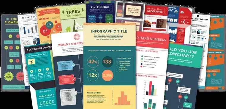
Image Source
As I showcased earlier, HubSpot’s free, customizable infographic templates make it easy to quickly create new visuals for your project. Simply download the template and open it in PowerPoint.
From there, you can replace text by typing into the template and change the colors to suit your brand’s palette. Our offer comes with step-by-step directions to ensure a hiccup-free experience.
Branding and color schemes are crucial in creating a memorable and cohesive visual identity for organizations. They help establish brand recognition, build trust, and communicate the desired message to customers.
HubSpot’s color palette generator is a tool that allows you to select a primary color. It then automatically generates a complementary palette, ensuring consistency and professionalism in branding across various marketing channels.
What I like: Well, I may be biased, but our templates are pretty great. They give people with limited design know-how and less time the ability to create impactful graphics that wow their colleagues and clients.
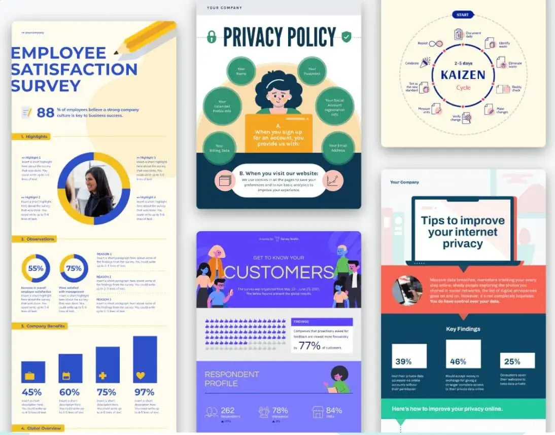
Image Source
Piktochart is a free online tool to help you create infographics with zero design experience required. Where Piktochart shines is its many offerings to help visualize data.
The free version gives you access to pie charts, maps, bar charts, and pictographs to display data in a variety of formats.
Users have the option to upload a CSV, Google Sheet, or Excel file into the graph maker. They can also copy/paste data into the template. The brand stands by its user-friendliness, aiming to help novices create infographics in 30 minutes or less.
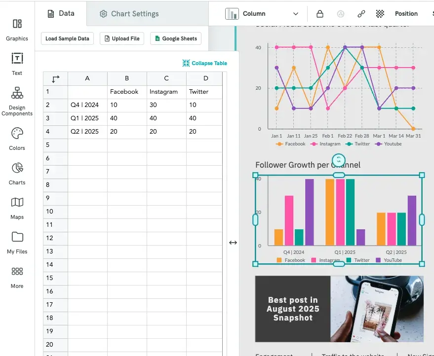
Image Source
What I like: Piktochart offers a ton of different designs and styles and has an easy learning curve. I’ve found that creating professional-looking infographics is as easy as choosing a style and updating it.
Plus, with built-in chart-making capabilities, it takes my numbers and turns them into graphics that make sense with little to no manipulation on my part.
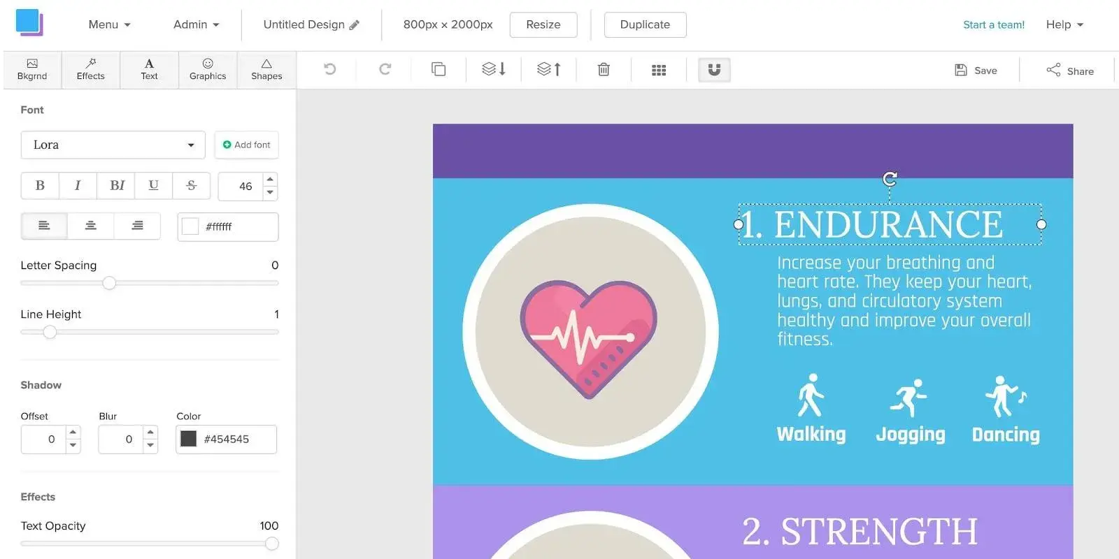
Image Source
Snappa’s infographic maker pushes the limits of creating media on the fly — claiming users can make infographics in just five minutes.
Snappa offers a variety of ready-made templates and an easy drag-and-drop builder to help users quickly create the content they need.
Users have the option to add and take away graphics, text, and stock images to customize their creations. Once completed, the finished product can be easily downloaded for use.
Snappa also makes it easy to repurpose the infographics you’ve made by offering several formats for social sharing.
What I like: Snappa has (dare I say) a “Snappy” how-to video demonstrating how to repurpose their templates into something that fits your brand. Their templates are fresh and easy to use.
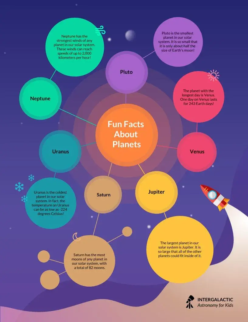
Image Source
Similar to others on this list, Venngage uses a drag-and-drop editor and infographics maker to help users create infographics without any design experience.
Start with a template, then customize colors, text, and shapes as you see fit.
Venngage also has a robust stock photo library, with an impressive 40,000 icons and images available for use, plus another 3 million from Pixabay.
The only drawback is that the collaboration features and brand kit are only available with paid tiers.
What I like: When you first sign up, Venngage asks a few questions about how you plan to use its designs and tailors the page based on your preferences, making it easy to quickly find an infographic template to customize.
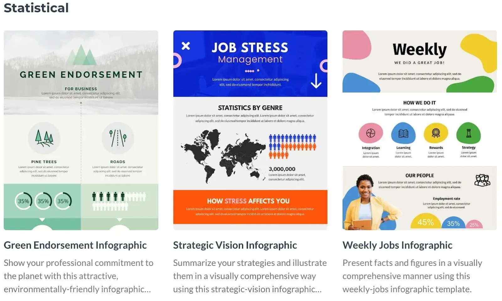
Image Source
Visme helps users make graphics in three easy steps: choose a template, upload or input your data, and customize.
If you prefer to start a graphic from scratch, there is also an option to swap specific portions of your infographic using blocks instead of using a full template.
Once finished, users can opt to share their project with a link or download the infographic in a variety of formats. While the basic version of Visme is free, you’ll need to opt for a paid tier for access to the brand kit feature.
What I like: In addition to Visme’s templates, I love that they have design blocks you can use to quickly assemble your infographic, which makes it easy to pick and choose parts of a template that work for you and adapt other areas.
What’s more, if you plug in your website, it can extract your logo, fonts, and brand colors and start adapting templates to fit your brand.
Testing It Out
I’ve already shown how to use HubSpot’s free infographic templates to create your own infographics. But if you’d like to try out other free tools like the ones listed above, I’ll be testing Canva to show you how it works (the process is similar with the other tools).
The infographic I’ll create is one that explains how to create an infographic in no time (see what I did there?). Let’s proceed.
1. Create an account on Canva.
I already have a Canva account, so all I have to do is navigate to canva.com and start the process of creating the infographic. But if you don’t have an account yet, go ahead and sign up.
2. Choose a blank infographic canvas.
Once you’re done creating your account, your Canva dashboard will look like the image below.
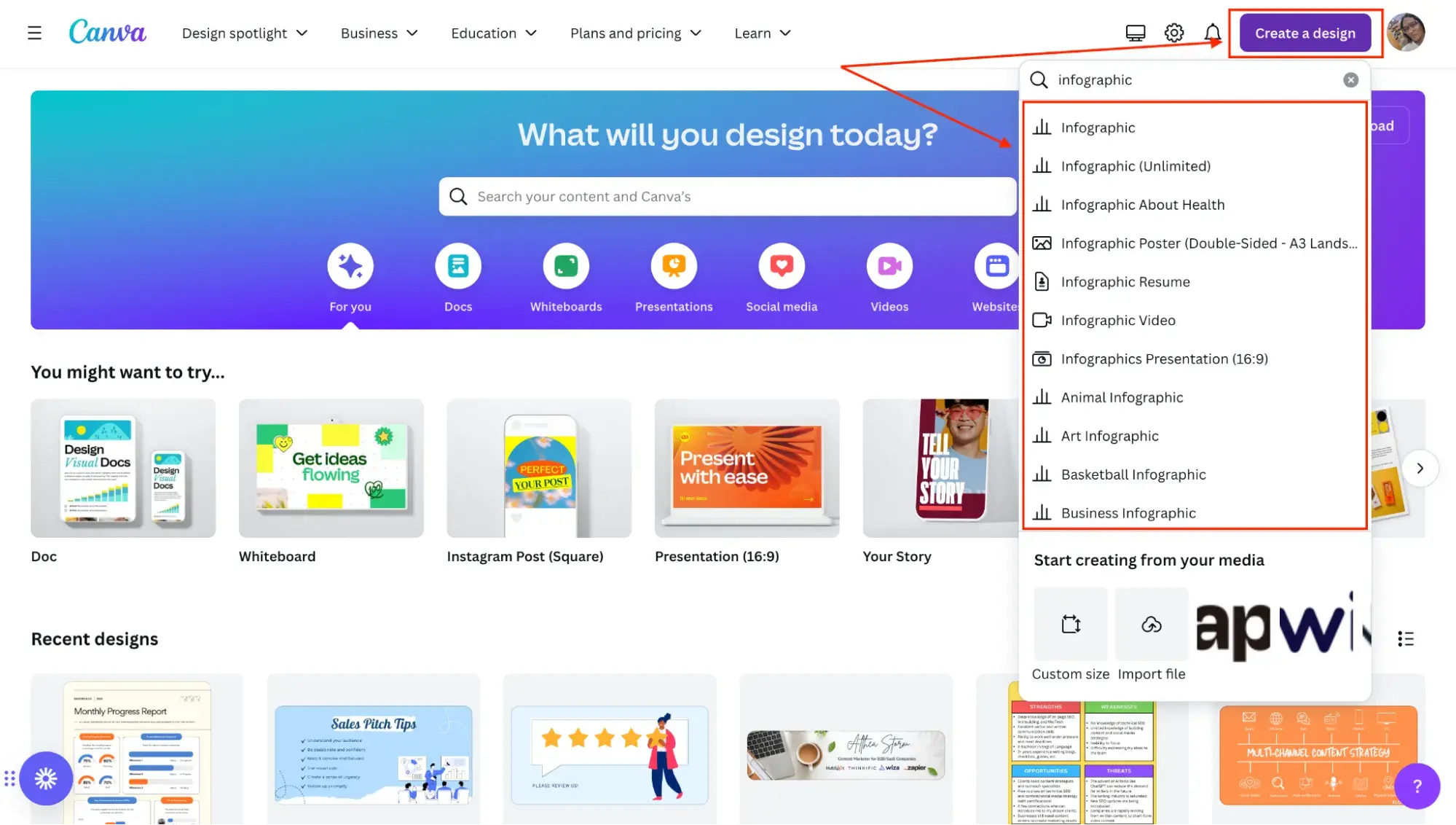
The next thing I do is click on Create a design and type “Infographic” into the search field, which results in a list of pre-built infographic options.
I choose the regular infographic canvas, which is the first option (it’s the one you’ll usually use, unless you want to create something more specific, like a resume or a video).
3. Choose an infographic template.
After clicking on Infographic, here’s what my screen looks like:
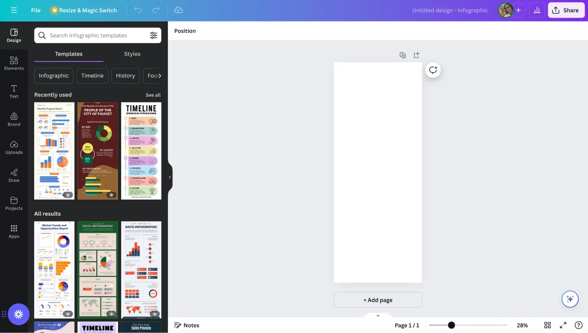
There’s a blank rectangular canvas on which I can design my infographic on the right, and on the left, there are tons of free infographic templates I can choose from to create the infographic.
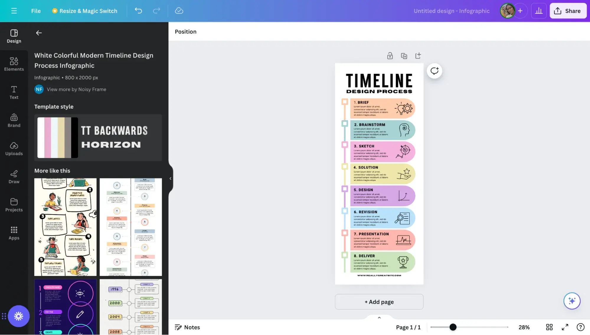
After browsing through the available options, I settle on a timeline infographic design as it will help me clearly outline the steps to take. Once I click on the design, it replaces the blank canvas like so:
4. Customize the design.
Now, I can start replacing the text and changing elements in the infographic to suit my needs.
After customizing it, here’s what it looks like:
5. Download the infographic.
Finally, I give the infographic a name, How to create an infographic, and click the Share button on the top-right corner of my screen.
In the dropdown menu that pops up, I click Download, like so:
Canva suggests that I download the infographic as a PDF document. If I want to go that route, I’d just click the purple Download button, and that’s it.
But I’d rather download it as a PNG image, so I click the dropdown arrow on the File type field and choose PNG. Then tap the purple Download button and, voila — my infographic’s ready.
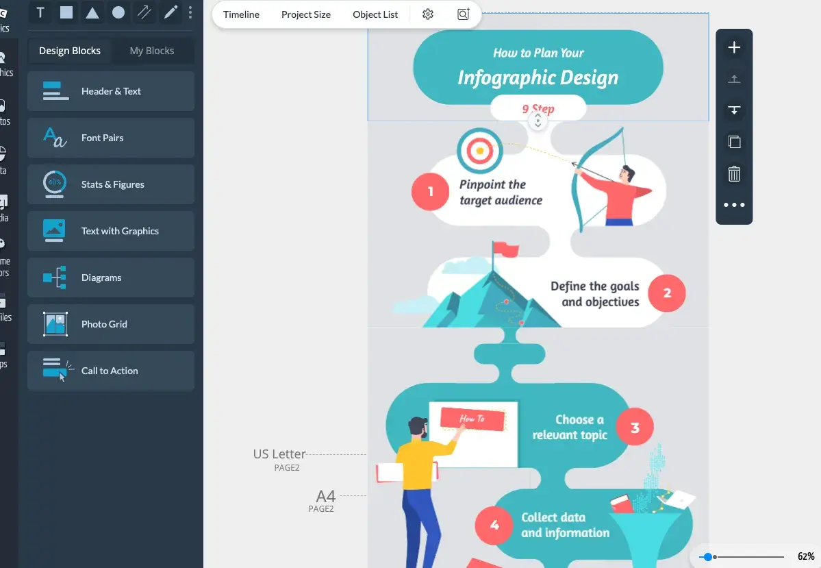
If you’d like to create more complex infographics that include elements like charts (pie charts, bar charts, bubble charts, stacked charts, line charts, donut charts), progress bars (radial progress bars, progress rings), pictograms, maps, and hierarchies, Canva allows you to do that with templates like this:
Tips for Creating a Great Infographic
Are you ready to get started on creating your own infographic? Here are some guidelines to keep in mind as you proceed.
1. The information you communicate matters more than its design.
You can make the most visually appealing infographic of the year, but if it doesn’t clearly communicate a purpose or message, then what’s the point?
Not to say that the infographic’s design is unimportant, but the information available on it should always be the priority.
A good infographic tells the audience what they need to know and adds more depth or dimension when coupled with a good design.
So when I develop content for infographics, I start with that exactly — the content — and ask three questions:
- Why am I creating this infographic?
- What do I want the person looking at it to walk away knowing?
- What is the minimum amount of information that they need to get the story?
2. Know who you’re making the infographic for.
I realize I’ve already touched on the different types of audiences you write for, but it’s such an integral part of content creation that I wanted to reiterate it once more.
Regardless of what type of content you’re creating, it’s important to know your audience. This is true for copy, content, audio, video, and images.
That’s why before I start writing or creating anything, I spend some time thinking about the audience profile:
- Who are they?
- What do they already know?
- What do they want to know or do?
- How will this piece of content help them along the way?
Armed with that, it’s much easier to create content that appeals to your audience.
3. Avoid adding clutter to your infographic.
It’s easy to get carried away with icons, graphics, and word art. Trust me. I know — been there, done that, got the t-shirt. But, here’s the thing: If it’s distracting your reader, then it defeats the purpose of the infographic in the first place.
So, how do you keep it simple?
To keep my infographics looking clear and skimmable, I keep the reader in mind. They shouldn’t have to think too hard to find the information they need. Your infographic can also point to an “aha!” moment.
Truthfully, infographics aren’t always something you throw into your content. Once I see the infographic in a designed format, I often pare down the information to simplify it even further.
And, if I’m not sure if it’s simple enough or has the right information, I find that stepping away from the design for a bit can give me the clarity I need. When in doubt, I ask a trusted friend to take a look and share their perspective.
4. Ensure the visuals add value to your data.
Echoing my last point, the visuals that do make it to your infographic should be there to add value to the data beside it — this is the concept behind information design.
Whether you’re using graphs, diagrams, icons, or real-life imagery, I always remind clients that the goal is to take the key messages and provide enough context to tell the story.
This is especially true when you’re using numerical values. This way there’s an emotional element behind the messaging, not just bolding percentages.
5. Test for readability and user experience.
Web accessibility is becoming an increasingly important conversation, so it’s something that every design should take into consideration.
So, before you share your infographic, make sure it’s legible and accessible to a wide range of users. Test the font size, color contrast, and readability on different screens and devices.
I always keep in mind that a huge amount of people are looking at content on their mobile devices, which means it’s important to make sure the information is as clear on a small screen as on a large desktop monitor.
To that end, also make sure you’re considering any usability factors like navigation and calls-to-action.
Share Your Professional Infographic Today
This whole thing took me under an hour to put together — much less time (not to mention more professional looking) than it would’ve taken if I’d started from scratch.
Plus, it’s less expensive than hiring a designer and using the resources you might want to save for larger campaigns.
With these tools in hand, you’ll be able to start churning out professional and informative infographics, too!
Editor's note: This post was originally published in May 2020 and has been updated for comprehensiveness. This article was written by a human, but our team uses AI in our editorial process. Check out our full disclosure to learn more about how we use AI.


![Download Now: The State of U.S. Consumer Trends [Free Report]](https://no-cache.hubspot.com/cta/default/53/ebf9ec8e-a468-455a-943e-80aa4e6be694.png)
.png?width=531&height=354&name=Copy%20of%20Linkedin%20-%201104x736%20-%20Horizontal%20Bar%20Graph%20-%20Dark%20(9).png)


![Download Now: The Annual State of Artificial Intelligence in 2024 [Free Report]](https://no-cache.hubspot.com/cta/default/53/b72f2b25-8cc9-4642-9a1b-1e675d3d273b.png)