Are you working on crafting a content plan to promote your brand and business on social media? Then these social media kits and templates will help you design amazing graphics for your social media campaigns like a pro.
Preparing content for your social media promotions is a time-consuming process that most social media managers and marketers have to deal with.
But don’t worry. You can use these social media kits and graphics templates designed by professionals to quickly edit and use with your own social media campaigns. The best part is you can easily edit and customize them all by yourself (and we’re sharing some helpful social media template tips to help get you started!)
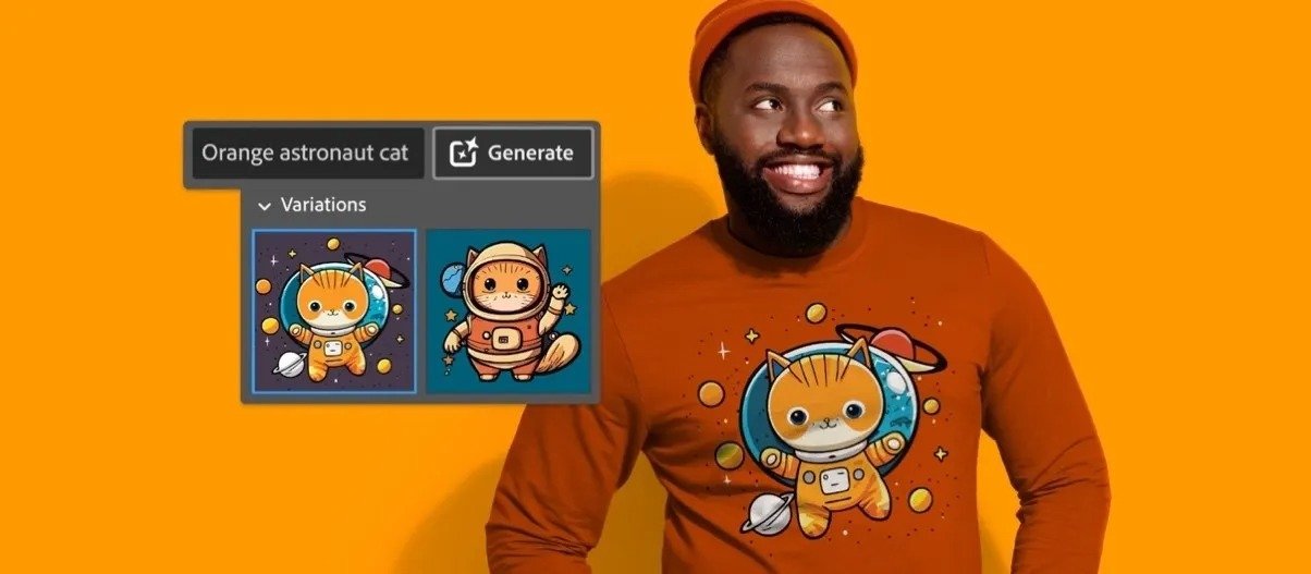
Motion Array is a one-stop-shop for all your graphic design needs. With their vast collection of video templates, audio, graphics, icons, and illustrations, you’ll find everything you need to make your projects stand out. Whether you’re a graphic designer, video editor, or content creator, Motion Array has something for you.
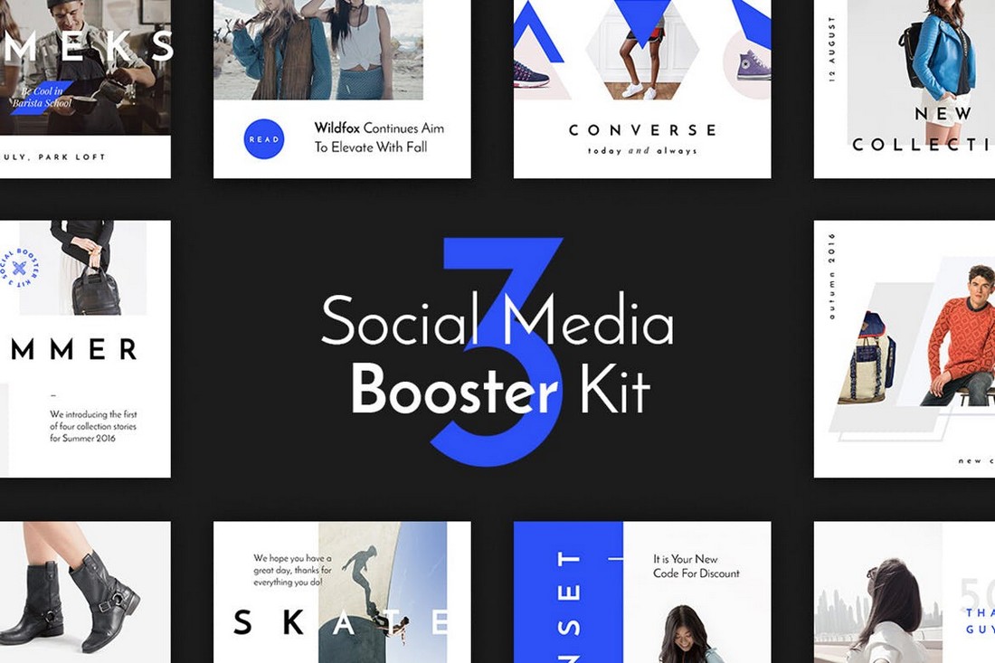
Their graphics library is extensive and diverse, with designs that cater to every niche and style. From retro to modern, you’ll find the perfect graphics to enhance your projects. Their social media template collection is equally impressive, with a vast array of styles and themes to choose from.
Motion Array’s Standard Universal License allows you to use unlimited assets from Motion Array marketplace in as many projects as you’d like. It’s all membership based, so you can sign up for a month or a year and grab any assets you need, when you need them (plus, you can cancel any time and keep the items you licensed).
Not only that, you can grab a $50 discount for annual subscriptions by clicking through the link above!
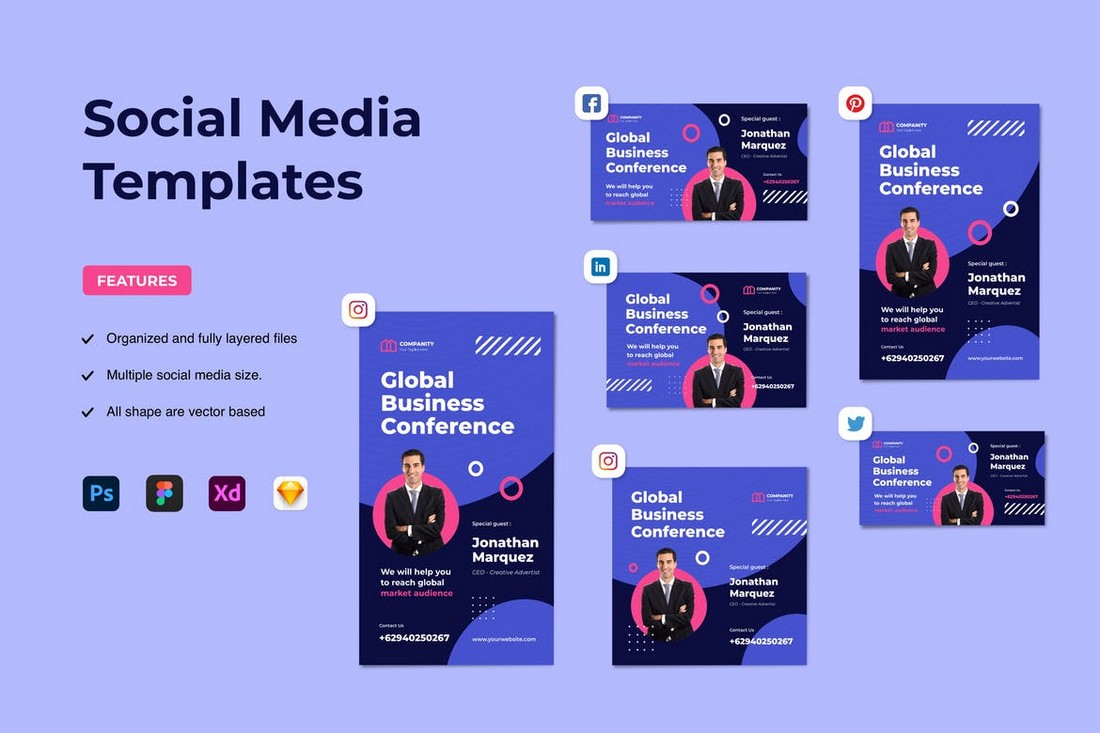
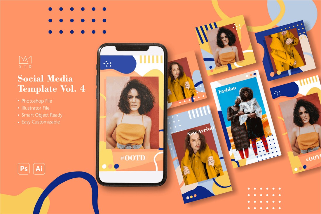
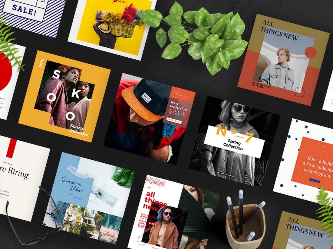
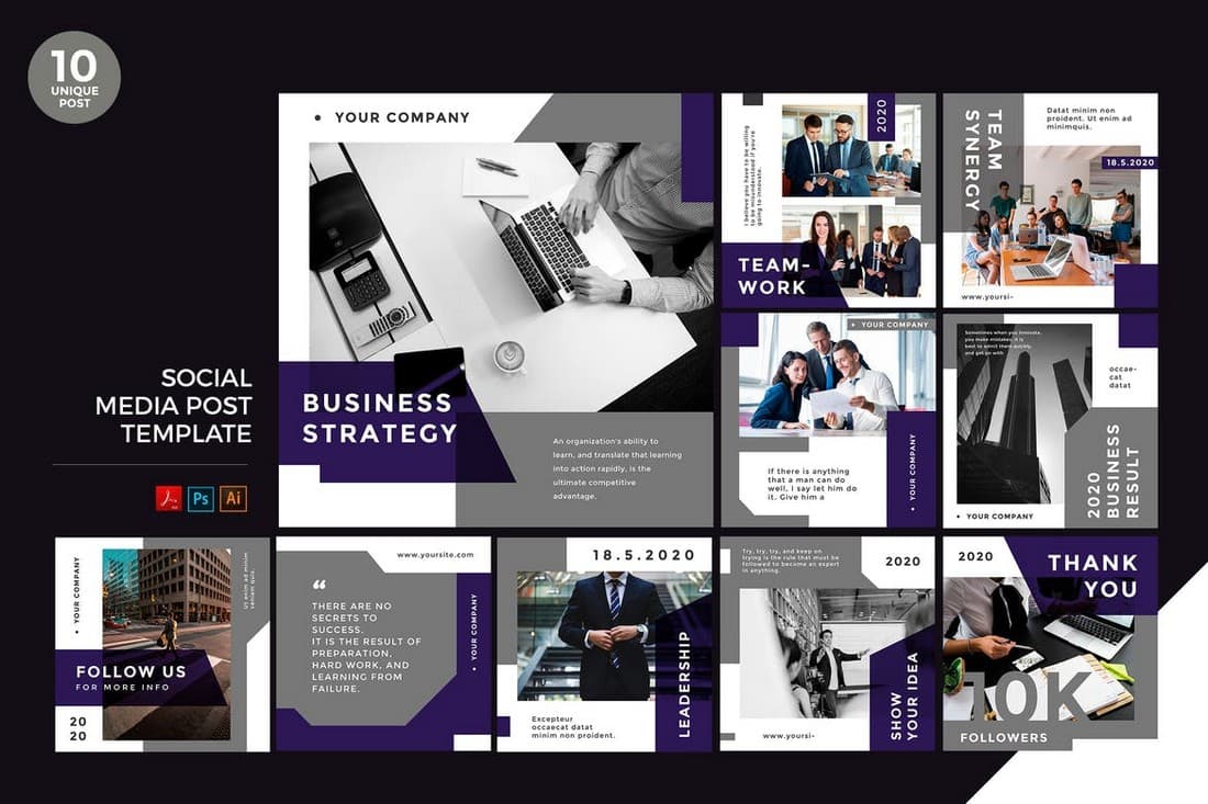
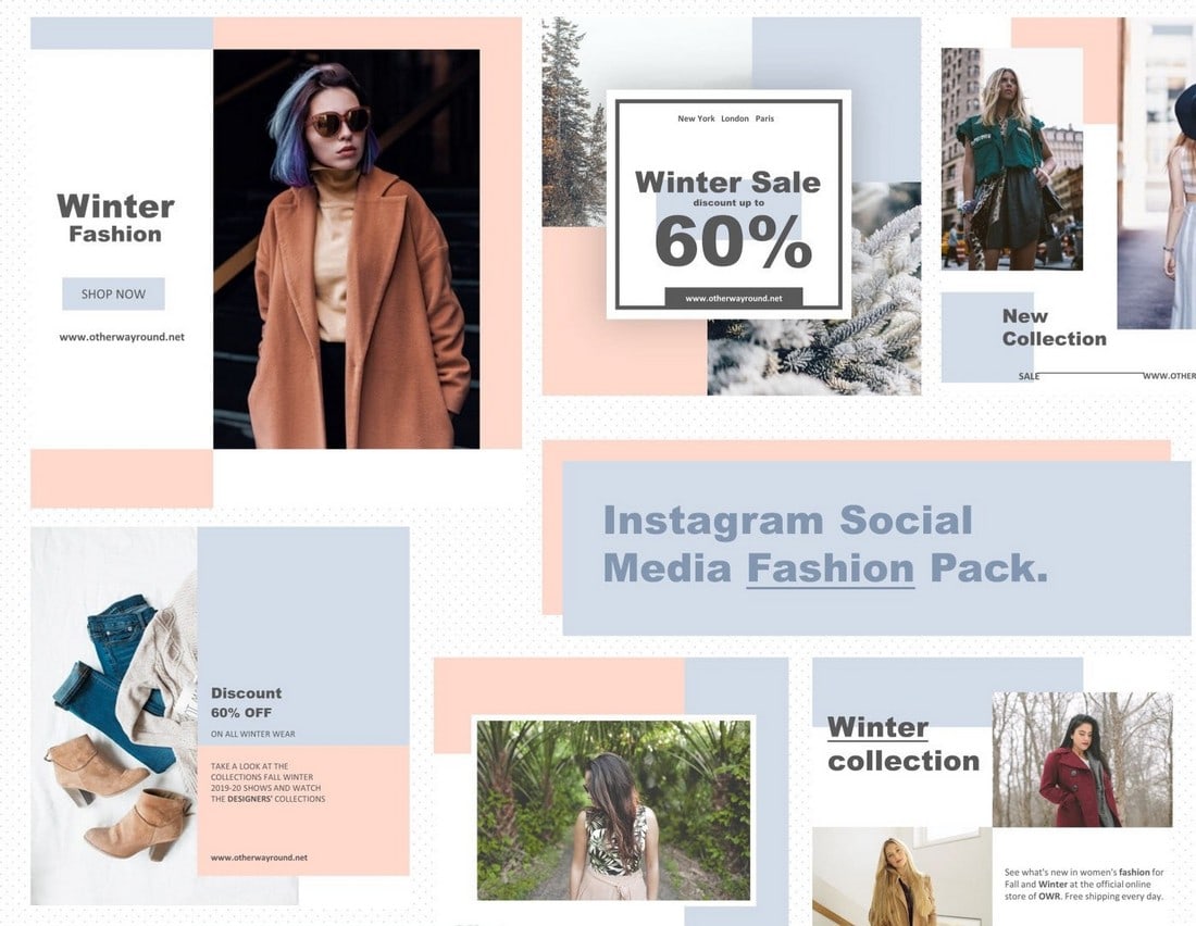
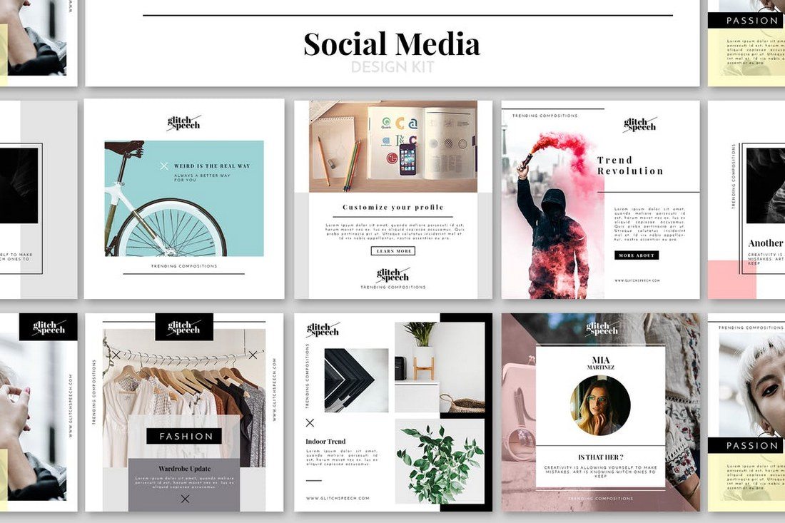
If you’re looking for an all-in-one pack of social media templates that are compatible with all popular social networking platforms, this bundle is for you.
This social media templates kit includes 20 different template designs optimized for Facebook, Instagram, and Twitter.
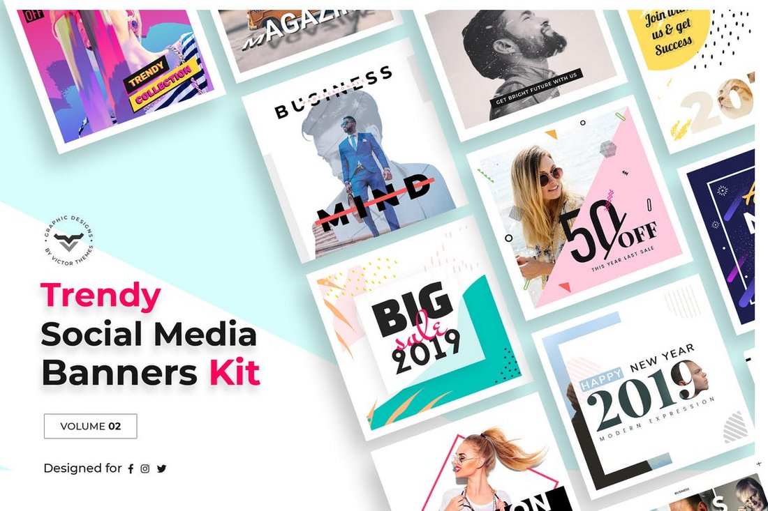
The templates in this pack feature designs in 5 different categories, including business, blog, fashion, magazine, and shop. This allows you to use this bundle to create posts for many different types of businesses.
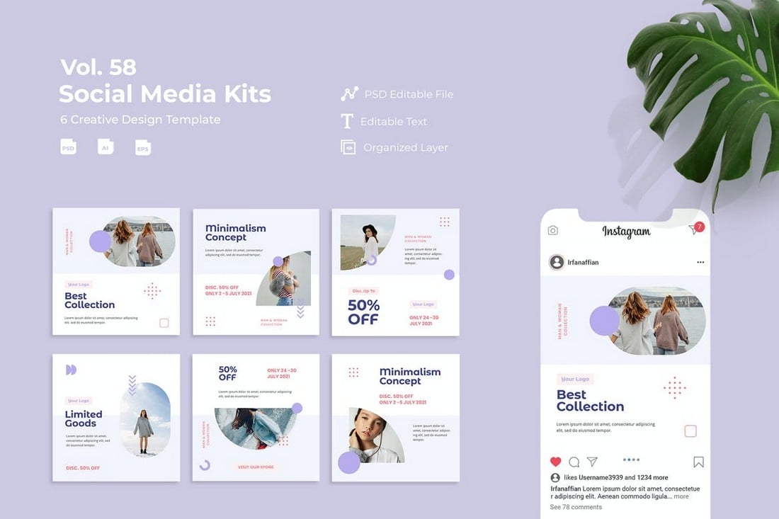
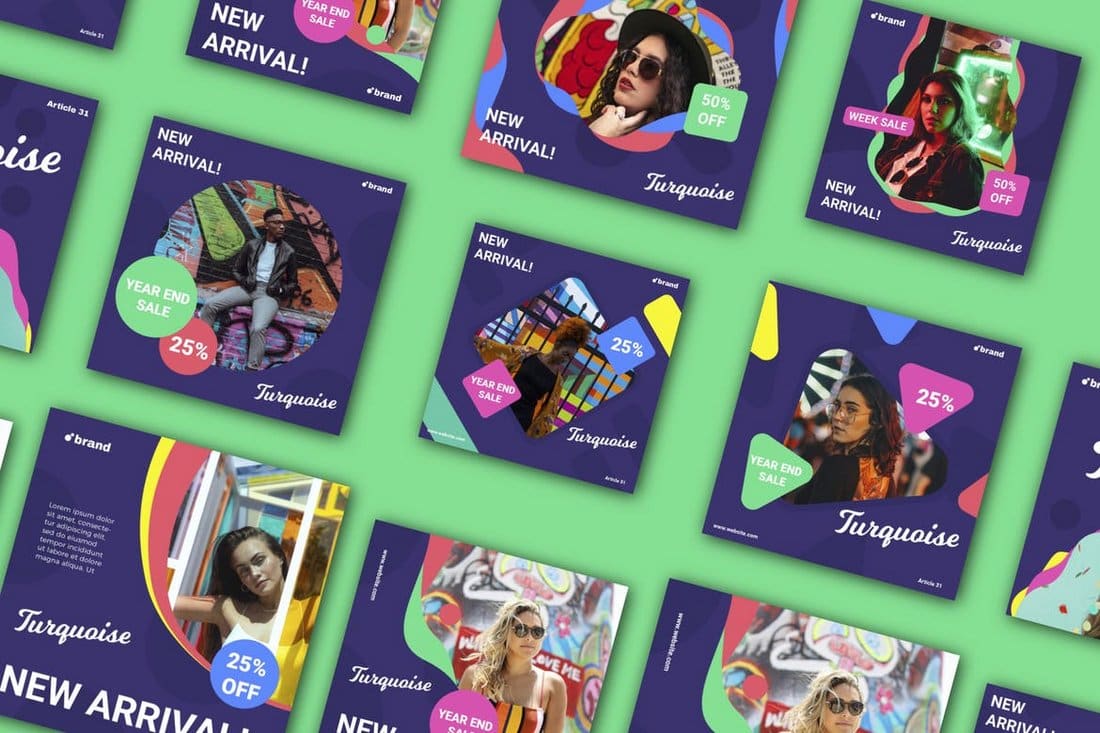
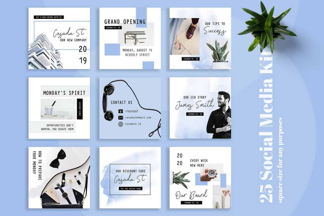
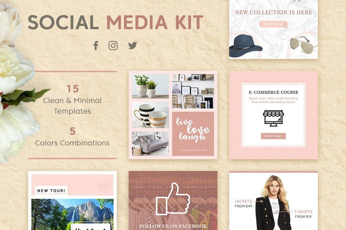
If you’re looking for a social media kit that has templates with multipurpose designs, this bundle is for you. It includes 15 social media post templates that can be customized to create banners for promoting all kinds of brands and businesses. Each template comes in 3 sizes for Instagram, Facebook, and Twitter.
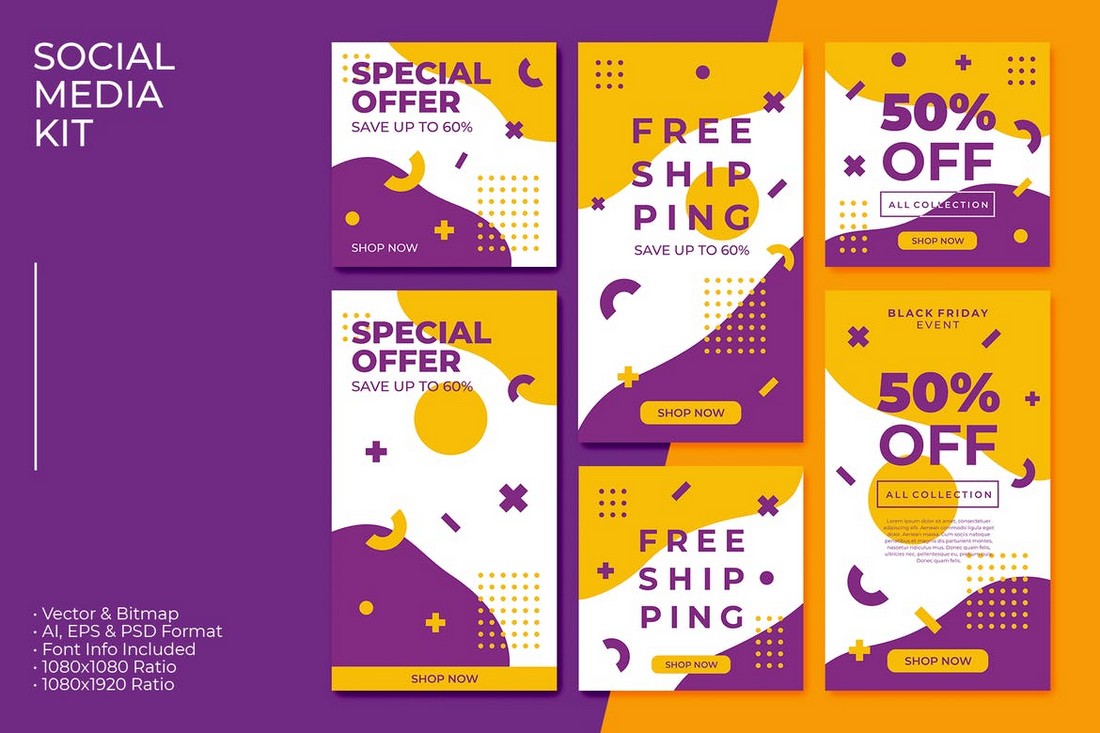
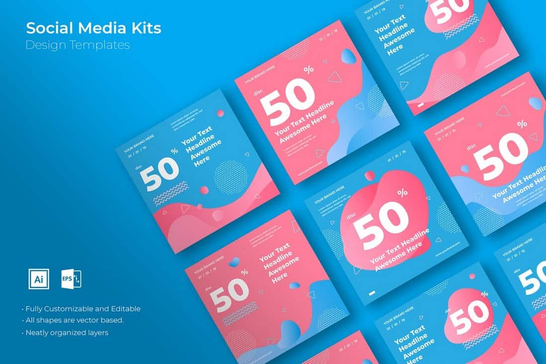
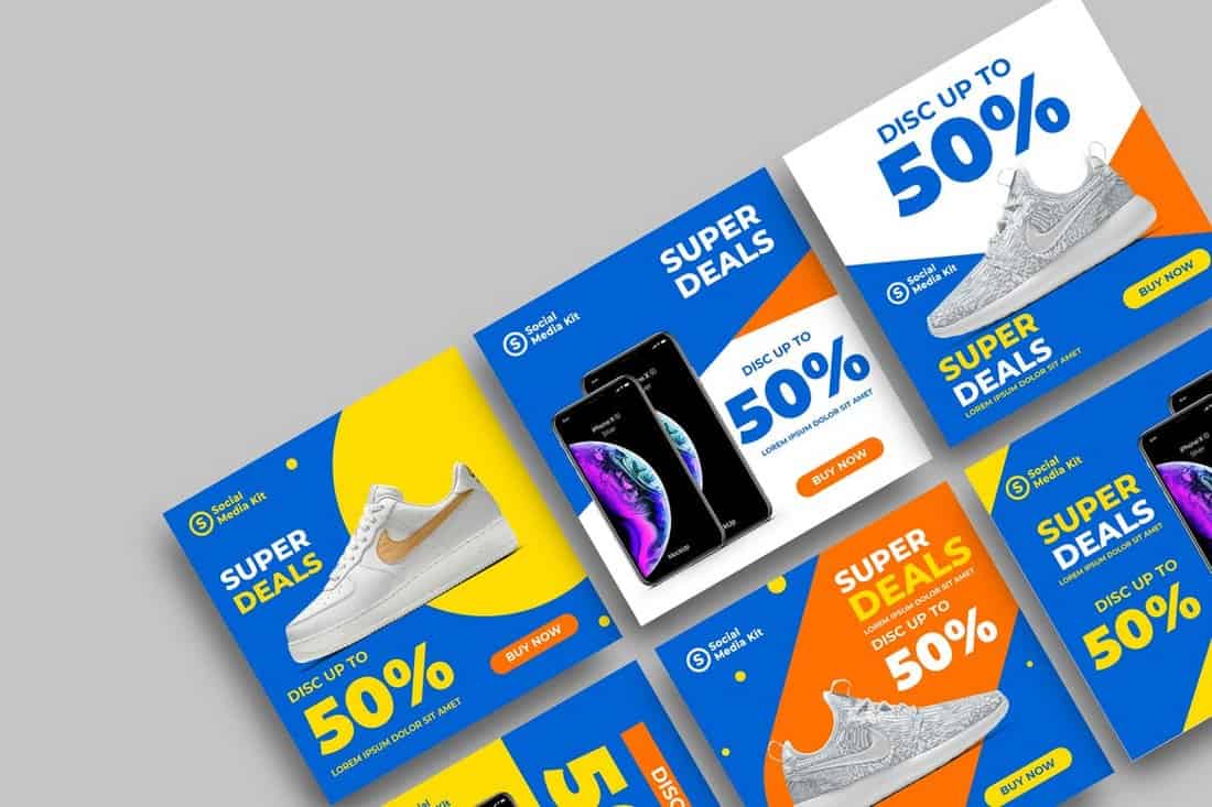
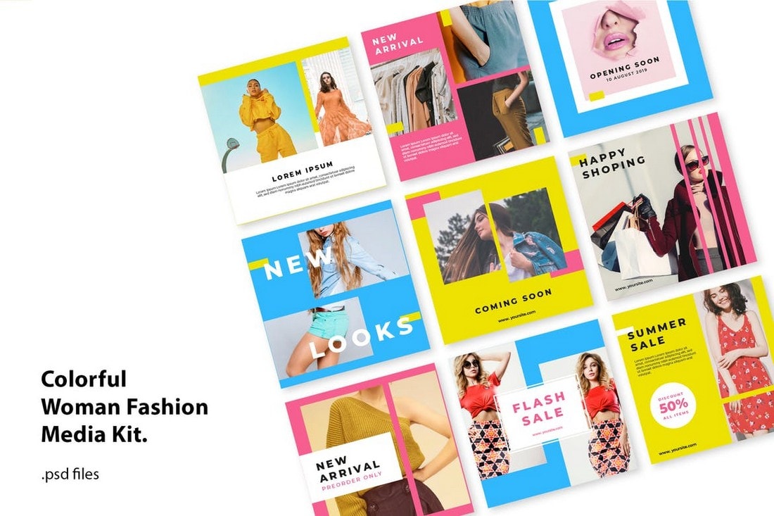
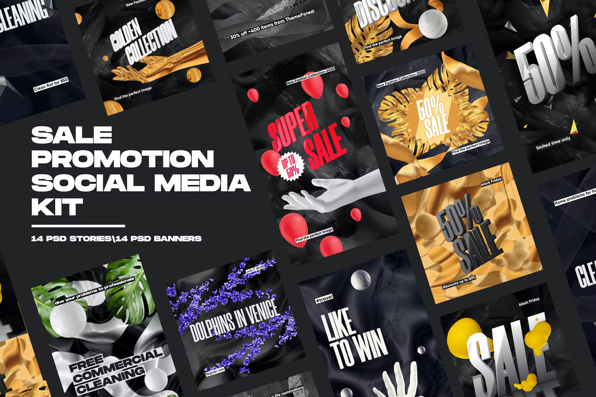
This is a social media kit for running promotional campaigns. In addition to its creative and colorful design, the template kit includes multiple post designs in two sizes for promoting sales and offers on Instagram and Facebook.
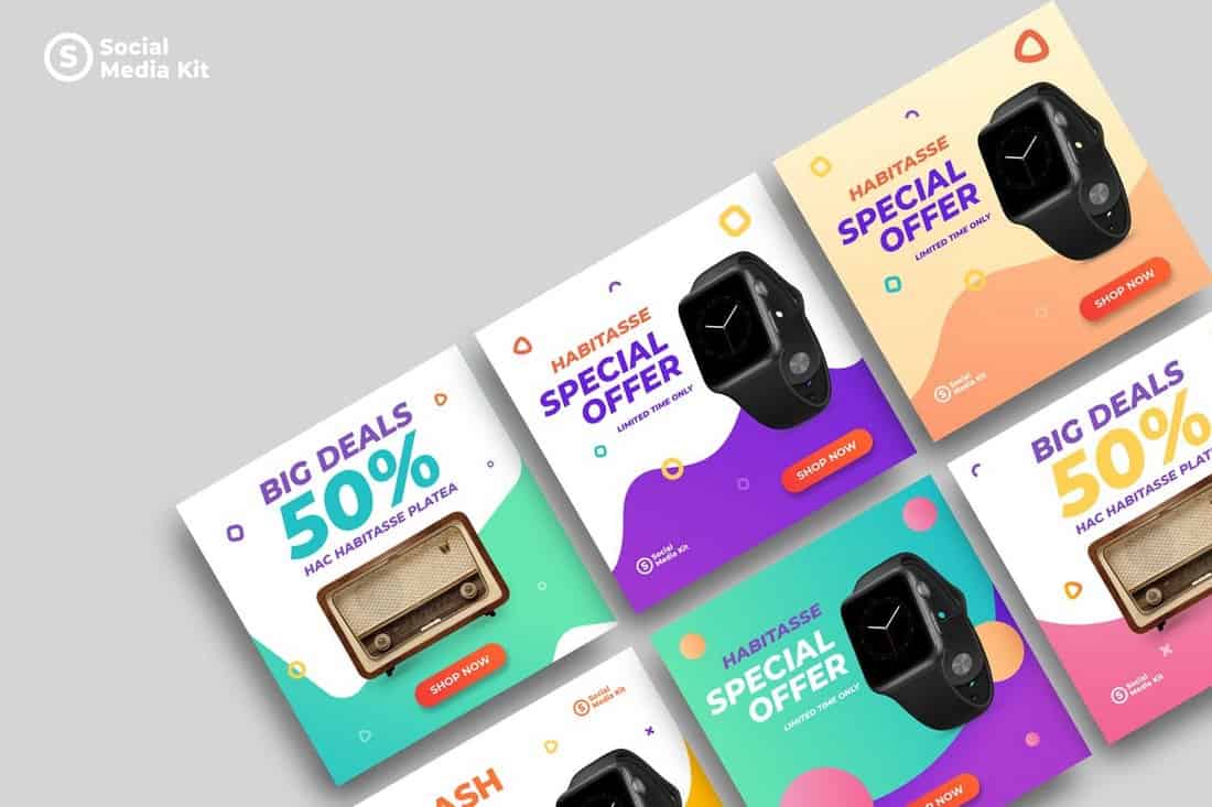
Running an effective product promotion will be a walk in the park with this modern social media kit. It includes 3 stylish social media post and banner templates with different designs. You can use them to run a cross-platform campaign on Instagram, Facebook, and Twitter.
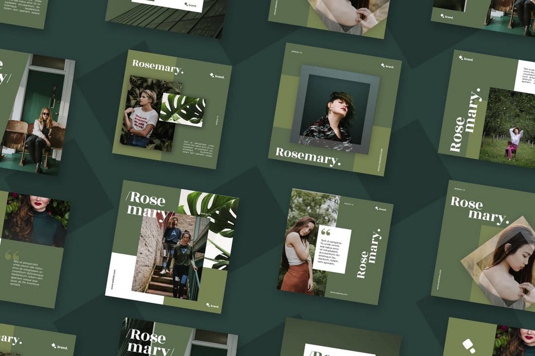
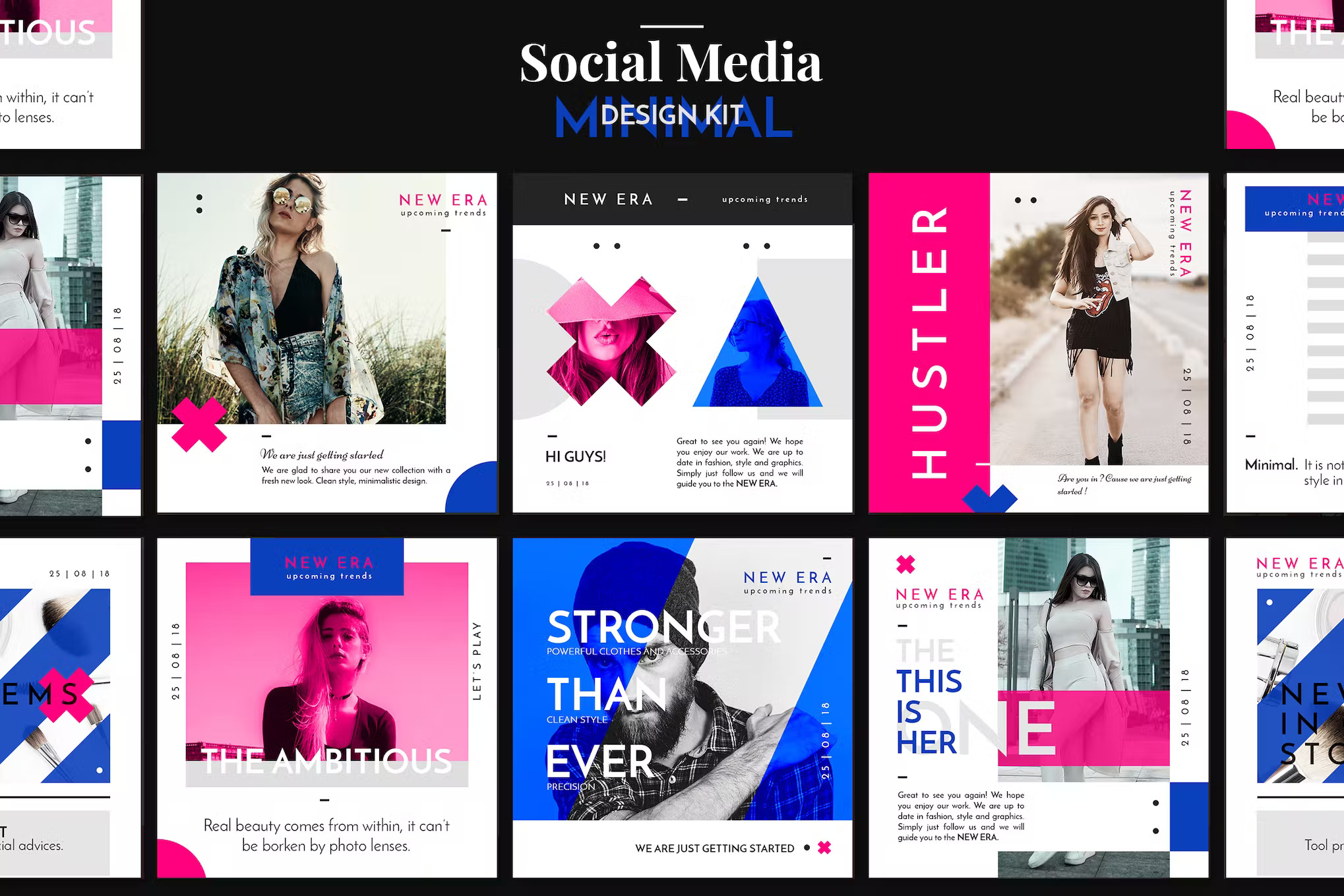
If you prefer social media posts with minimalist designs, this pack is a must-have for you. There are multiple sizes of templates in this bundle featuring optimized PSD and AI templates for Instagram, Facebook, Twitter, Pinterest, and LinkedIn.
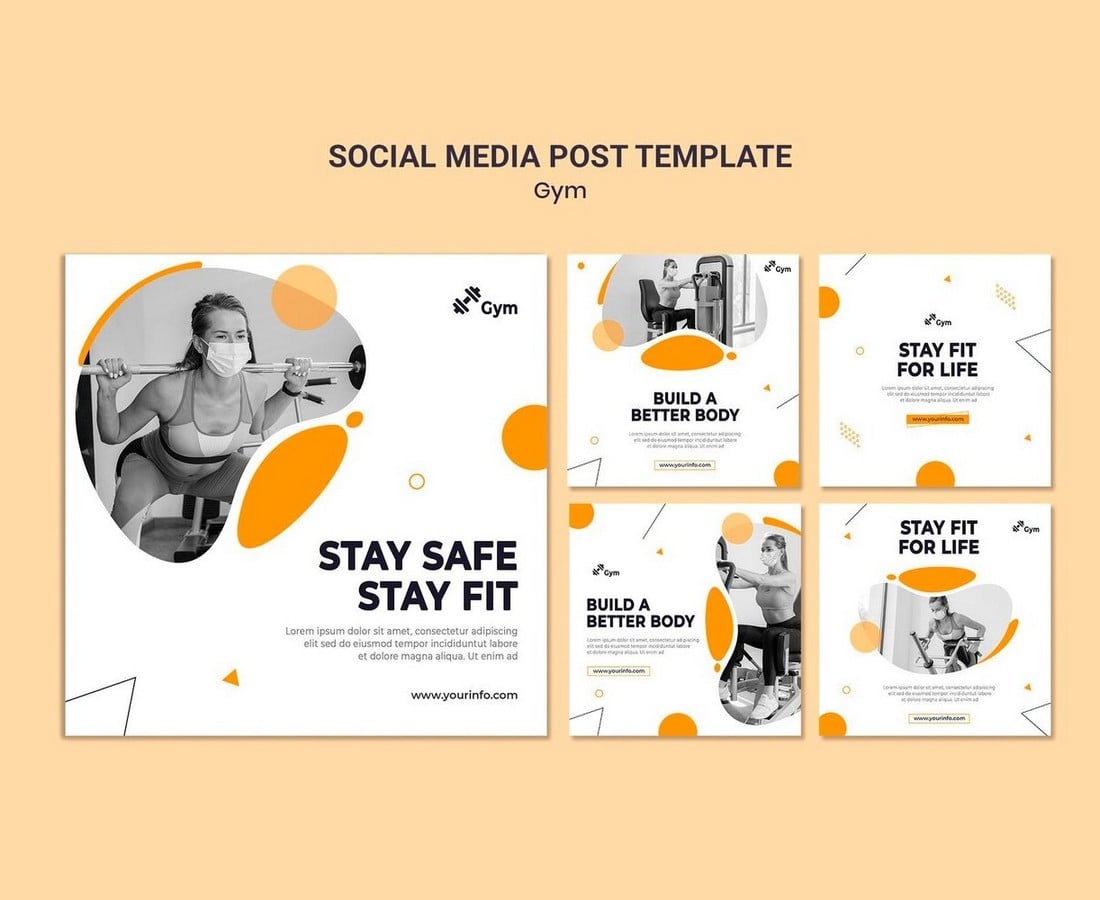
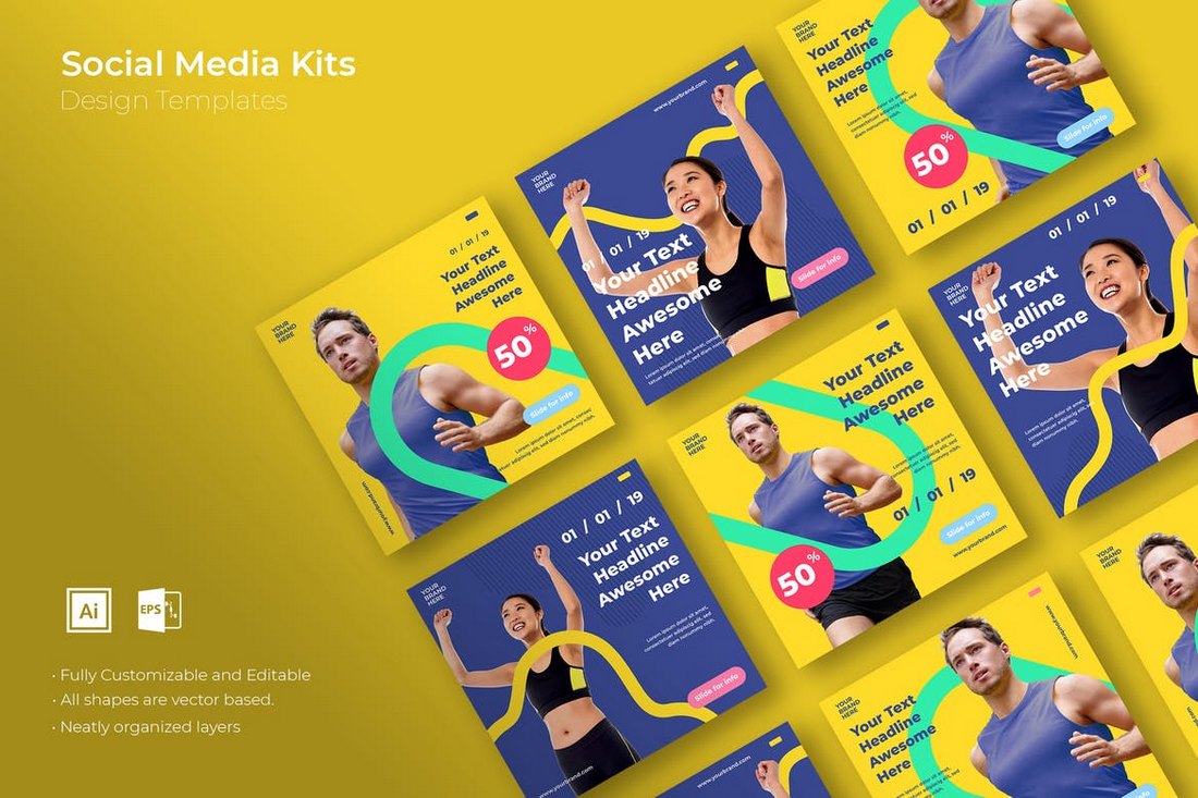
Promoting a gym or fitness center but low on budget? Then be sure to grab this free social media kit to create simple yet effective social media posts to promote your gym on Instagram and Facebook.
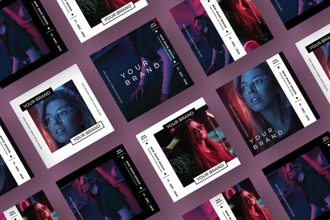
This is a trendy collection of editable Photoshop templates, perfect for promoting electronic music events on social media. Featuring neon colors and gradients on a holographic background, these minimalistic templates are ideal for multiple music genres. The kit provides Instagram story, post templates, and a Facebook event cover template.
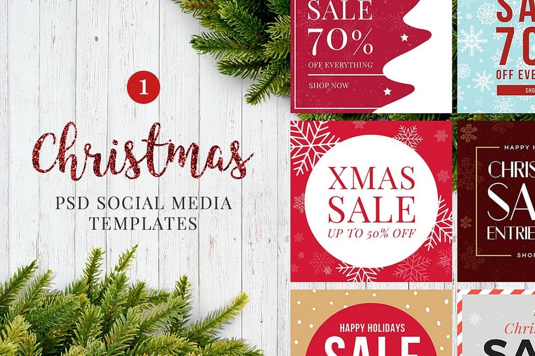
A collection of ready-to-customize social media post templates, ideal for promotions around the holiday. Whether you’re using Illustrator or Photoshop, these user-friendly templates allow for easy editing of texts, images, and graphics on separate layers.
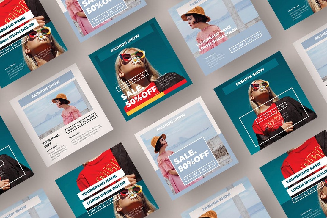
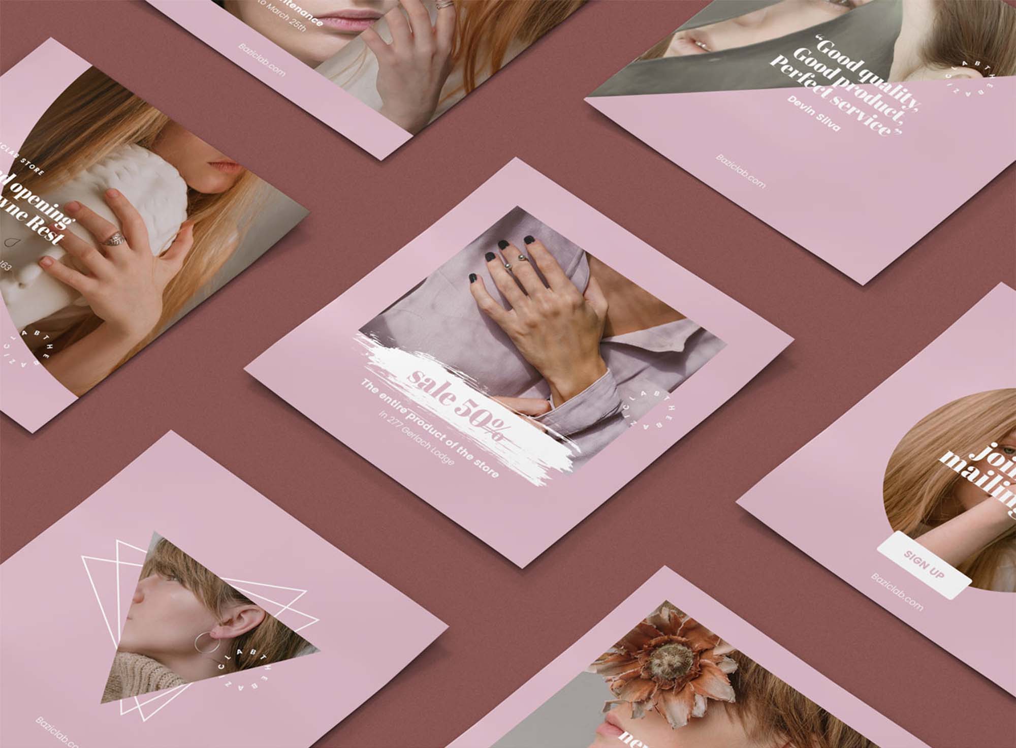
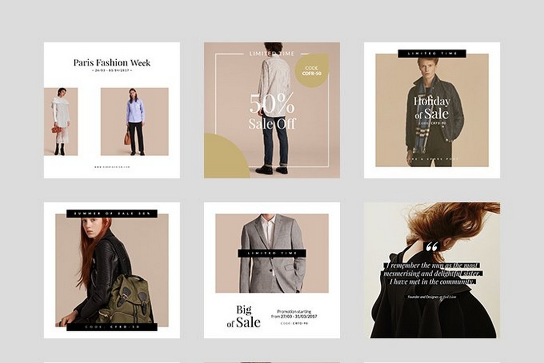
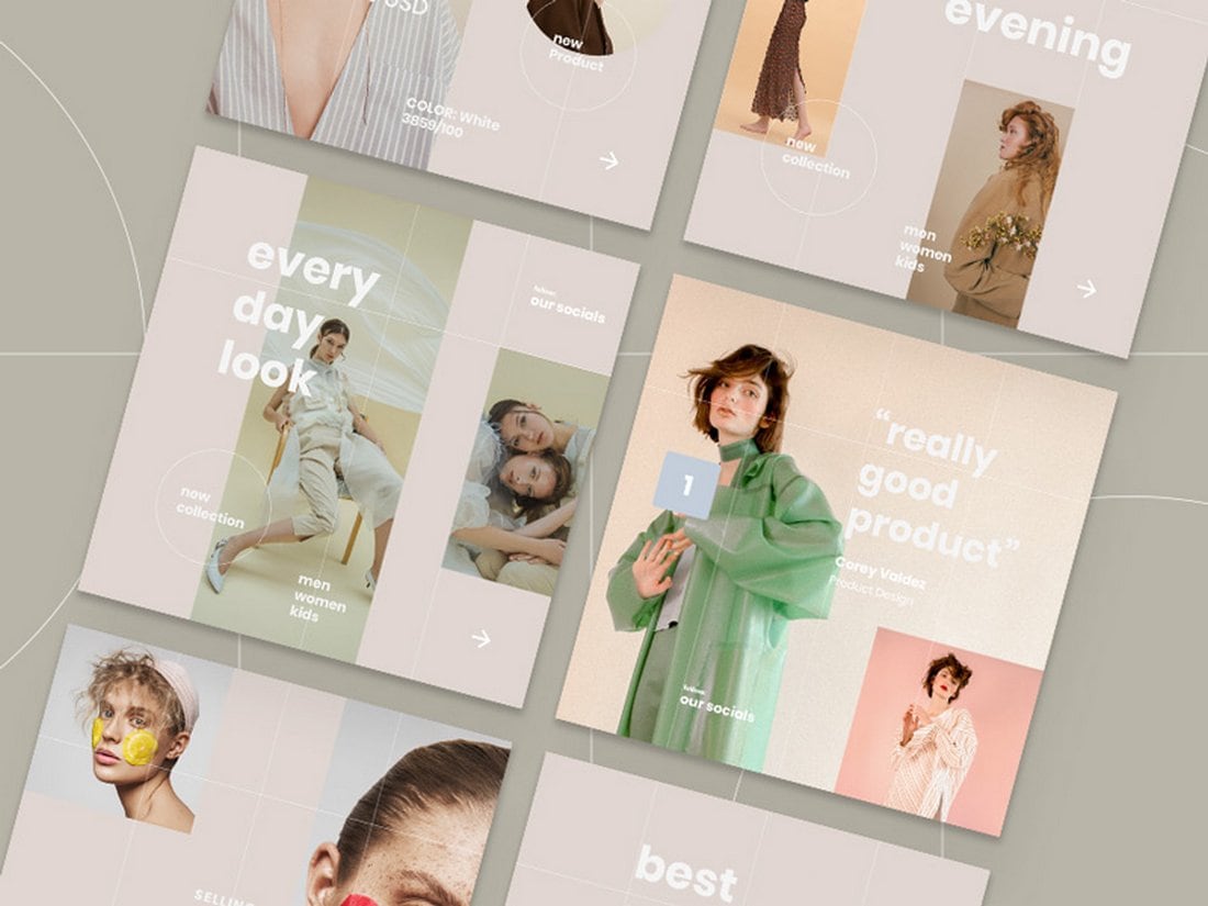
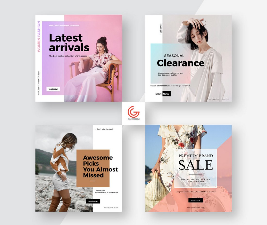
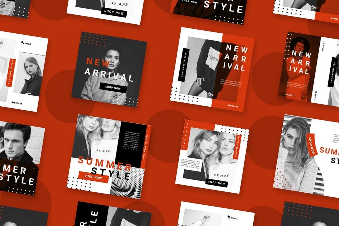
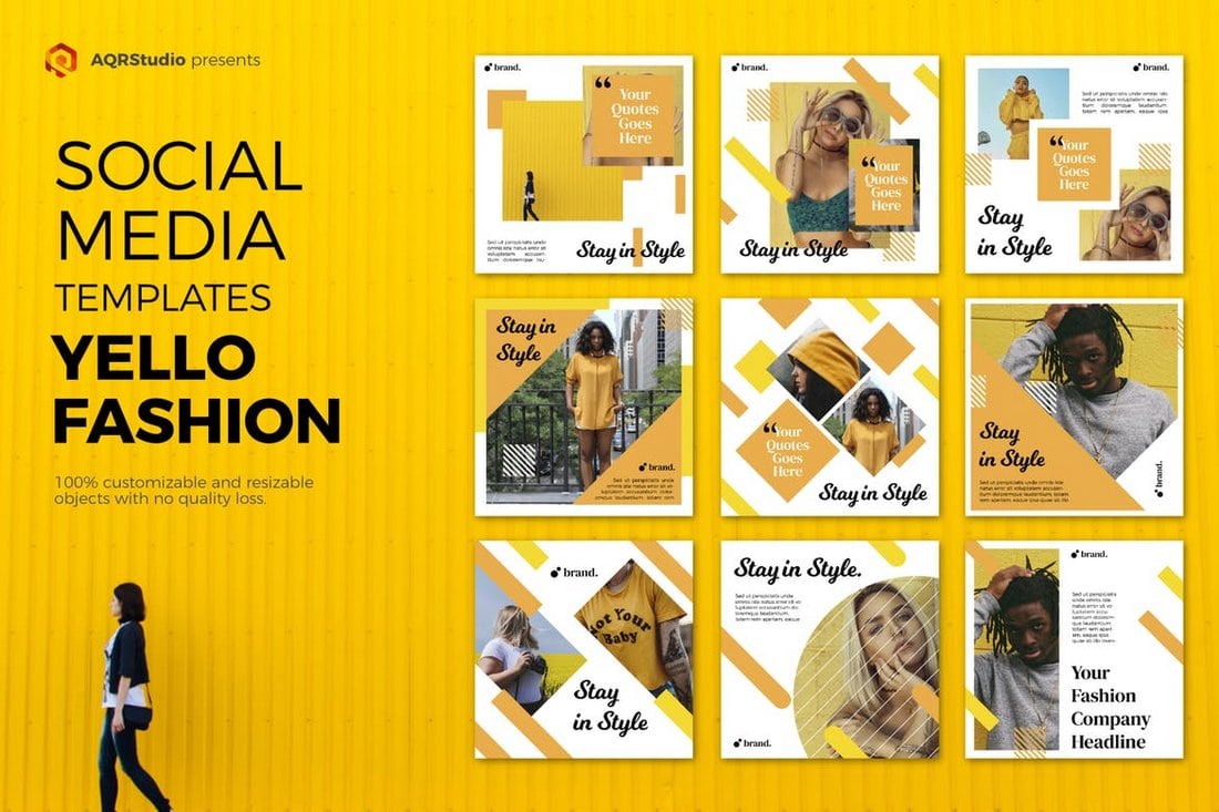
Get an edge on promoting your fashion brand with the elegant and professional fashion sale Instagram post templates. This set of post templates, designed for Photoshop, is easy to use and fully editable. It lets you craft stylish Instagram posts that sparkle with beautiful graphics.
These social media templates are ideal for all your holiday sale promotions. The templates come with well-organized, customizable, and editable files that aid in quick designing of your social posts.
A collection of social media templates ideal for designers, entrepreneurs, and businesses looking to advertise on social media during the festive season. Its features include 12 different sizes for platforms such as Facebook, Instagram, Twitter, and Google Adwords.
Improve your Instagram posts this New Year’s Eve with this bundle of user-friendly templates. Offering a set of six unique, high-resolution designs, that can be edited according to your tastes. The templates are compatible with Adobe Illustrator and Photoshop.
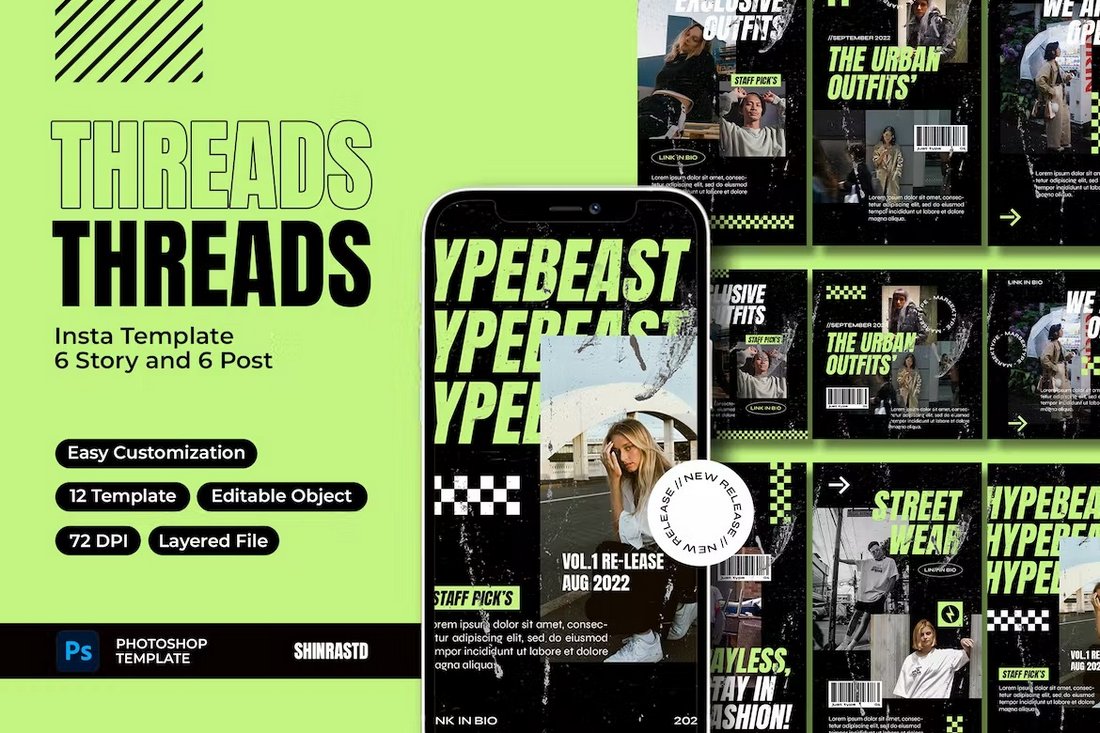
Spruce up your streetwear brand’s Instagram account with FREDOW, a set of professional post templates. It’s an effortless way to enhance your profile, offering six fully customizable, drag-and-drop templates with editable text and image elements.
A collection of customizable social media templates ideal for promoting any podcast and live events. The package offers a user-friendly, well-organized file that facilitates quick design for your social media posts. The templates are ready-to-use PSD files with a resolution of 1200 x 1200 px.
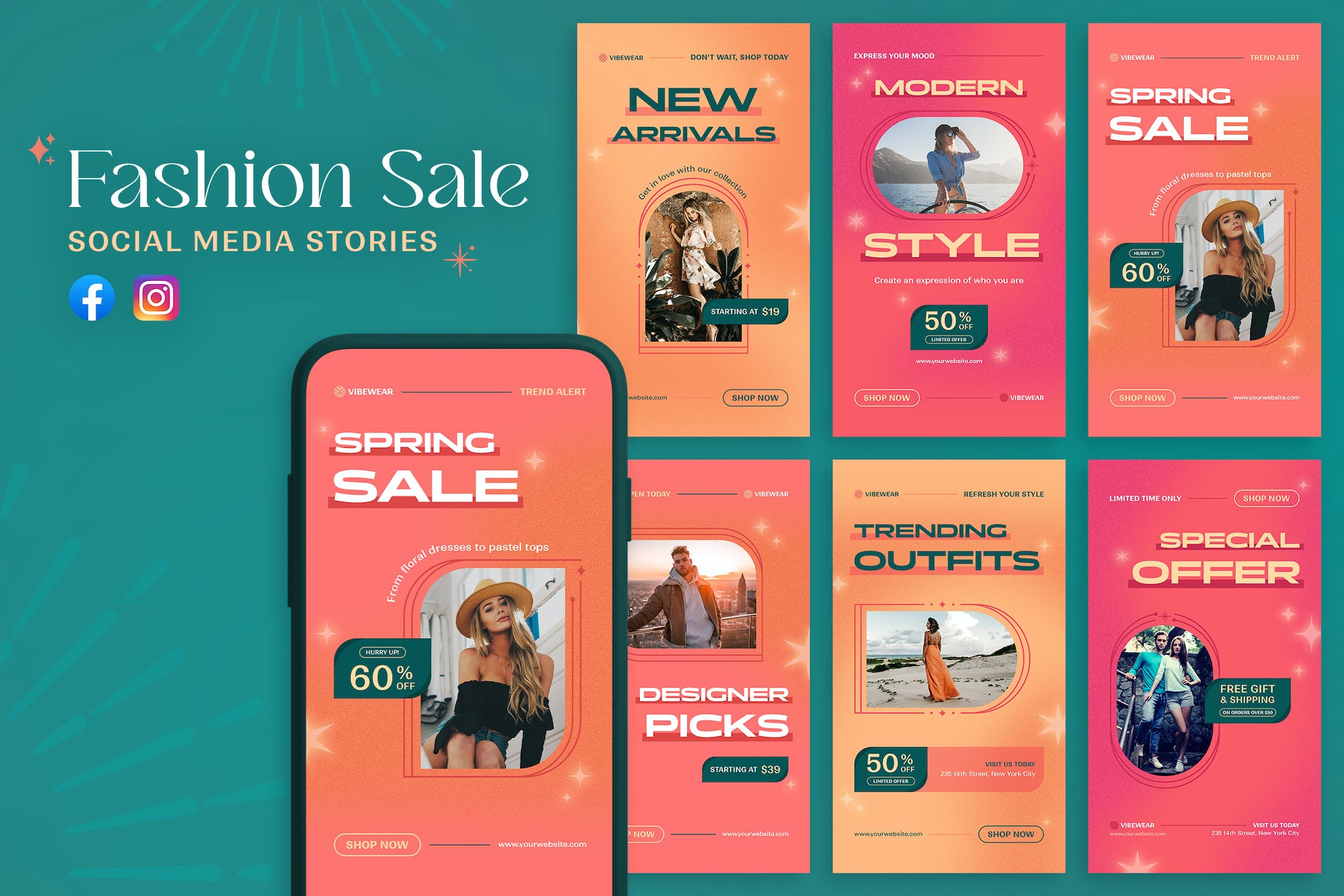
A set of Instagram story templates ideal for promoting fashion sales and brands on social media platforms. These templates are versatile and customizable; you can adapt the colors, text, images, and fonts to suit your brand. Whether you’re announcing new arrivals, advertising sales, or featuring customer reviews, these templates can help increase your visibility.
This template kit is for businesses aiming to boost their Instagram presence. It equips users with customizable story and post templates that can enhance visual engagement with their audience. Optimized for Adobe Illustrator CC and Adobe Photoshop CS4-C6, the kit also provides a well-organized layout for easy usability.
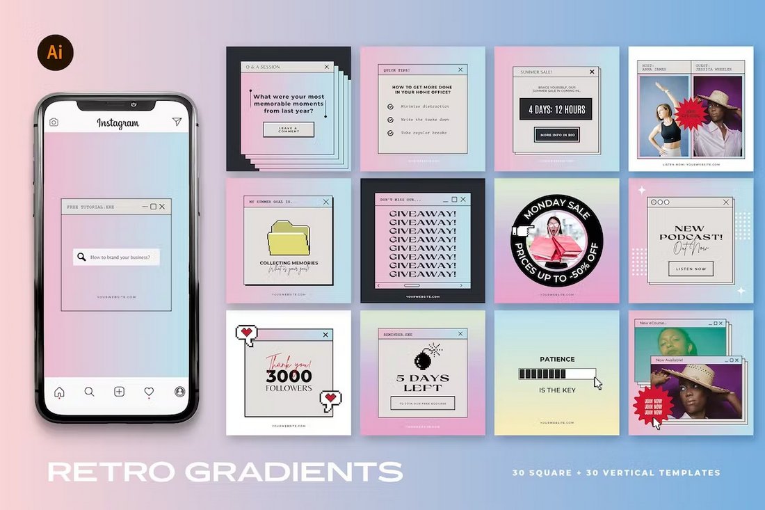
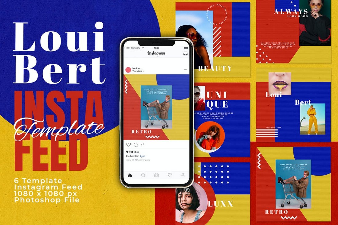
If you’re a fan of gradient colors and trendy designs, this Instagram template kit is perfect for your promotions. It features retro-themed Instagram post designs with beautiful gradient colors. There are 30 unique post layouts in this pack that are available in square and vertical sizes.
Add a splash of color to your Instagram feed using this colorful Instagram template kit. It features cool 90s-style Instagram post layouts with bright colors. The bundle has 12 different post designs that you can easily customize to change text, colors, and images.
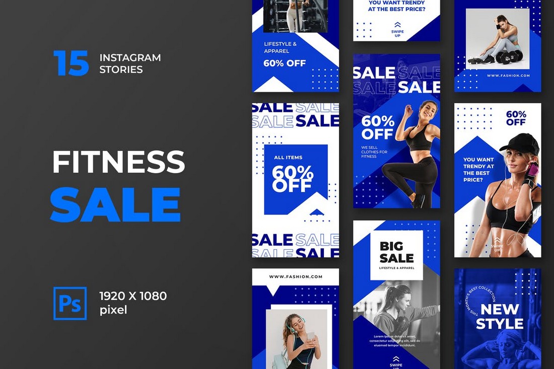
The bold and modern designs of this template kit make them a perfect choice for sports, gym, and fitness-related brands. It has 6 templates that can be used to make both Instagram posts and stories.
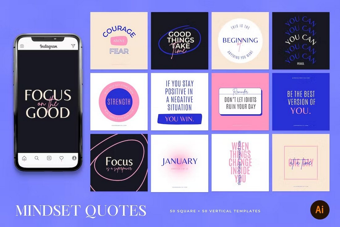
Looking for a beautiful post template to make attractive quote posts? Then be sure to grab this collection of Instagram templates. It features 50 unique post layouts that are ideal for quotes. They are available in vertical format too.
A collection of free Instagram templates featuring colorful and trendy designs. This pack includes Instagram posts and story templates that are most suitable for fashion and lifestyle channels.
This premium social media kit features a set of templates for promoting lifestyle and fashion brands on Instagram. A collection of 6 unique templates are included in this pack that also feature easily editable designs. The templates come in AI and EPS formats.
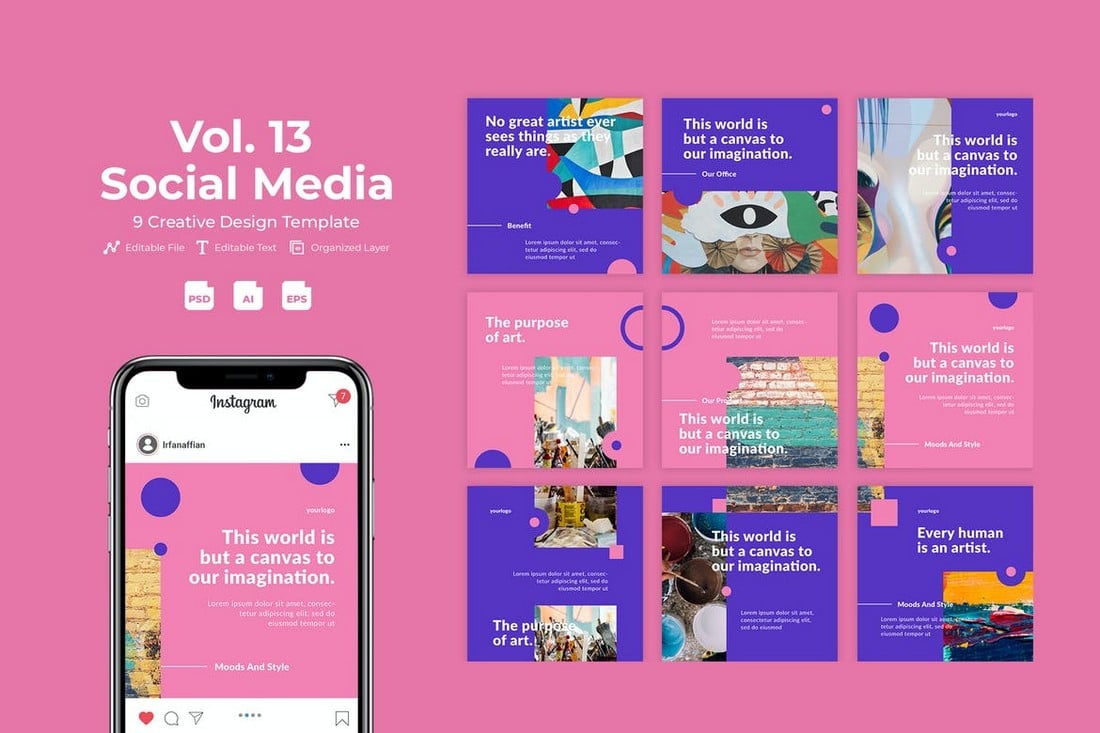
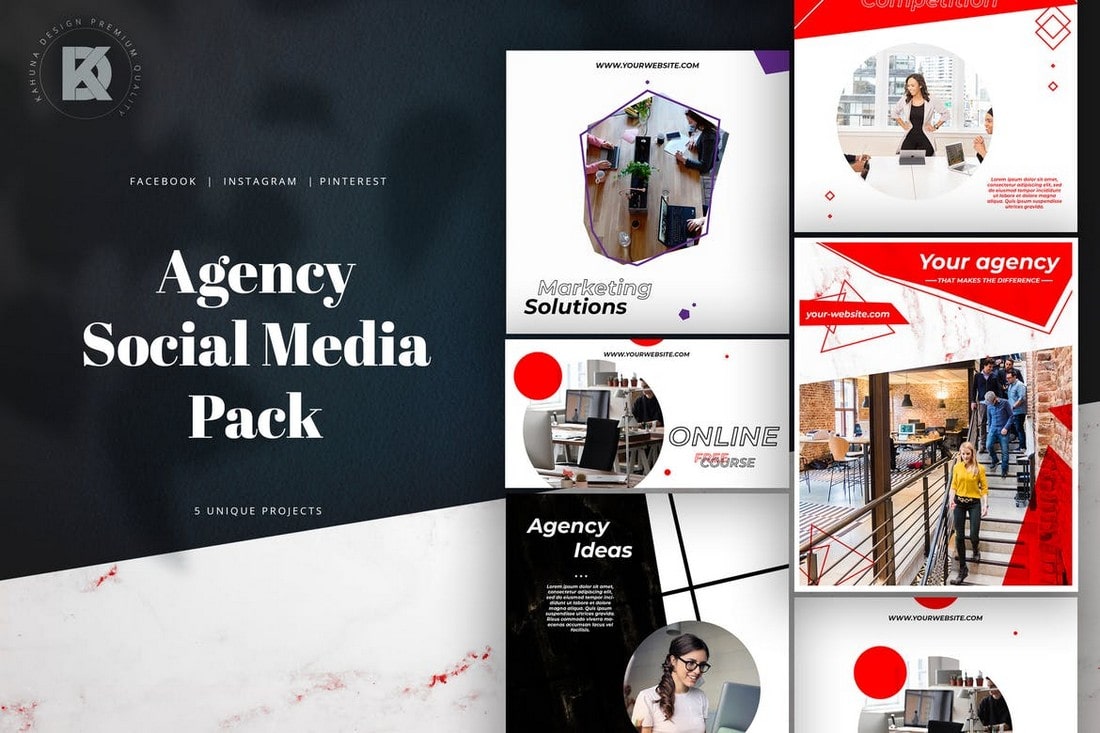
With this beautiful social media kit, you can create banners and posts for various creative agencies and businesses. There are 9 different post templates in this bundle. And you can use them to create carousel posts as well.
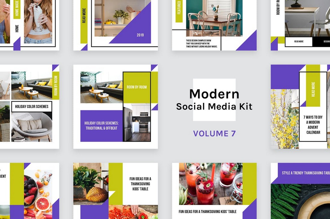
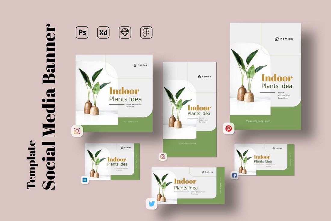
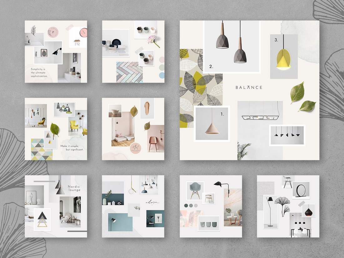
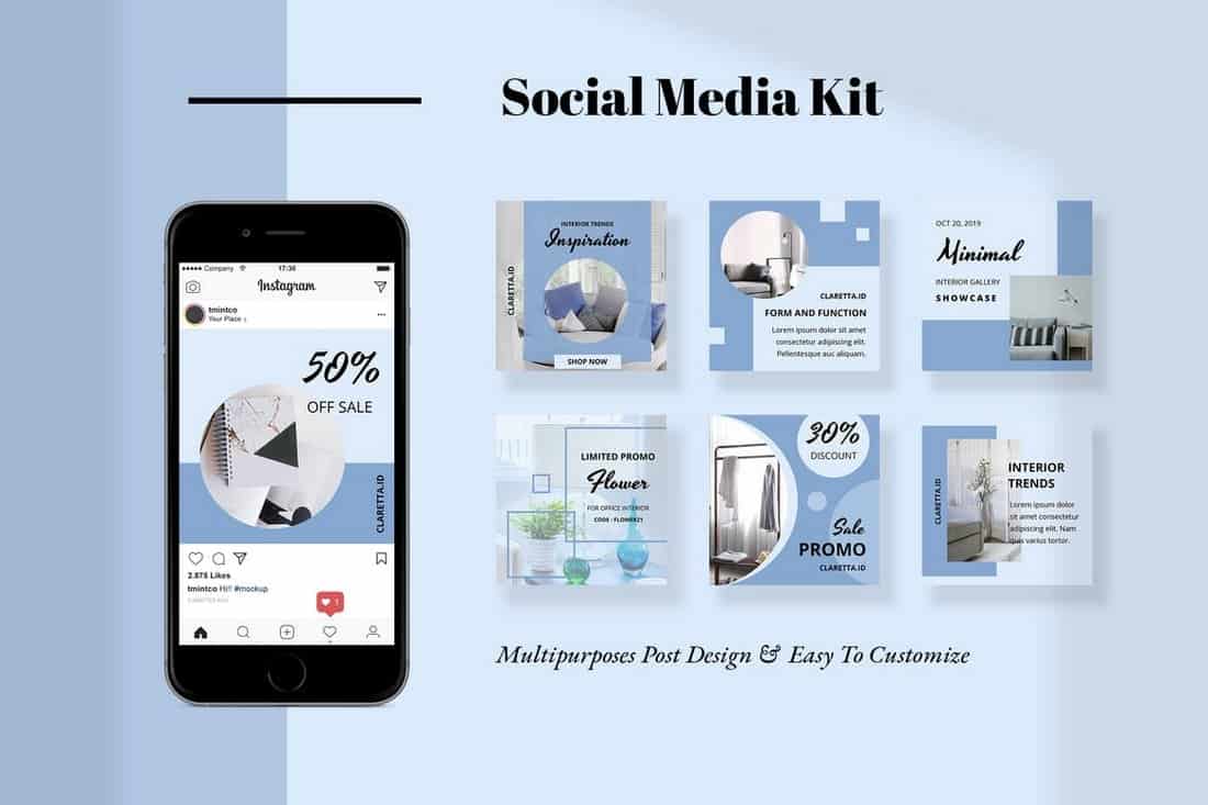
A minimal post design with plenty of space for including images is the ideal way to promote furniture, interior design, and real estate brands. There are 12 unique templates in this pack that are most suitable for making banners for Instagram.
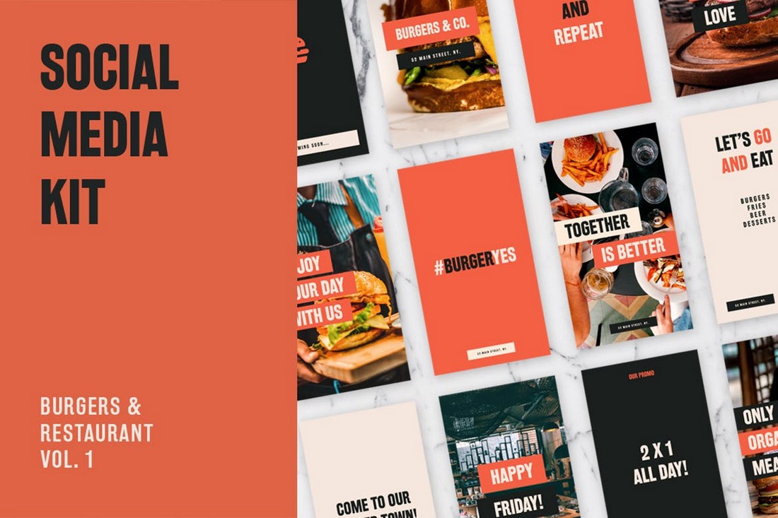
Whether you’re promoting a restaurant or a food truck, this social media kit has some of the best designs you can use to spread the word about your business. There’s a total of 24 templates in this pack, which includes 12 post designs for Instagram, Facebook, and Twitter. As well as 12 Instagram Story templates.
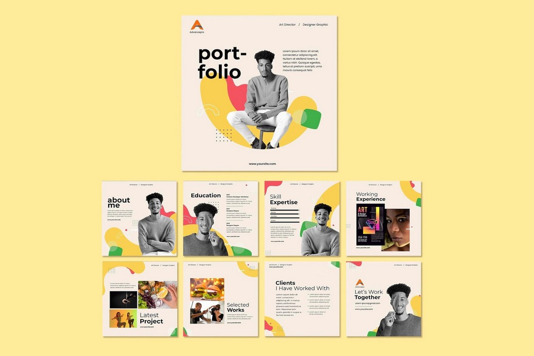
If you’re a freelancer promoting your personal brand on social media, this social media kit will surely come in handy. It allows you to promote your portfolio in style using multiple banner designs. And this kit is free to download as well.
This is a complete social media templates kit that features a professionally crafted post design for promoting businesses. The template comes in multiple layouts and sizes that are compatible with Facebook, Instagram, Pinterest, and more. It will allow you to create more consistent social media posts across all social media channels.
This template kit also includes its post design in multiple sizes. It’s available in PSD format featuring organized layers, editable vector shapes, and smart objects for easily placing your own images into the template design. It comes in Adobe XD, Figma, and Sketch formats as well.
A beautifully minimalist social media template collection for promoting luxury and high-end fashion brands. The templates in this pack are fully customizable with Photoshop and Illustrator. It includes 6 different post designs.
Promote your gym and fitness brands to your Instagram audience using this Instagram story templates bundle. It includes 15 different story designs with fully editable layouts. You can change their colors, fonts, and images with just a few clicks.
Uno is a collection of free social media templates that can be used to create both Facebook and Instagram posts. It includes 8 different designs in PSD format with fully customizable colors, text, and backgrounds.
Another complete social media post template kit featuring the same post design in multiple sizes and layouts. This template also includes multiple file-formats for editing the design in Photoshop, Sketch, and Figma. It has sizes for all popular social networks.
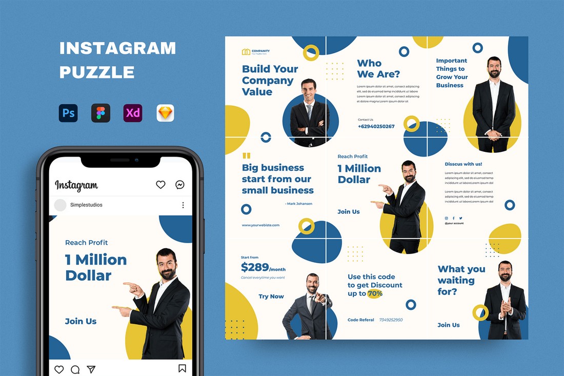
Instagram puzzles offer a creative way to design a unique profile feed. This template will allow you to create a similar Instagram puzzle design for your business or brand page. It’s easily editable and comes in multiple formats including PSD, Sketch, and Figma.
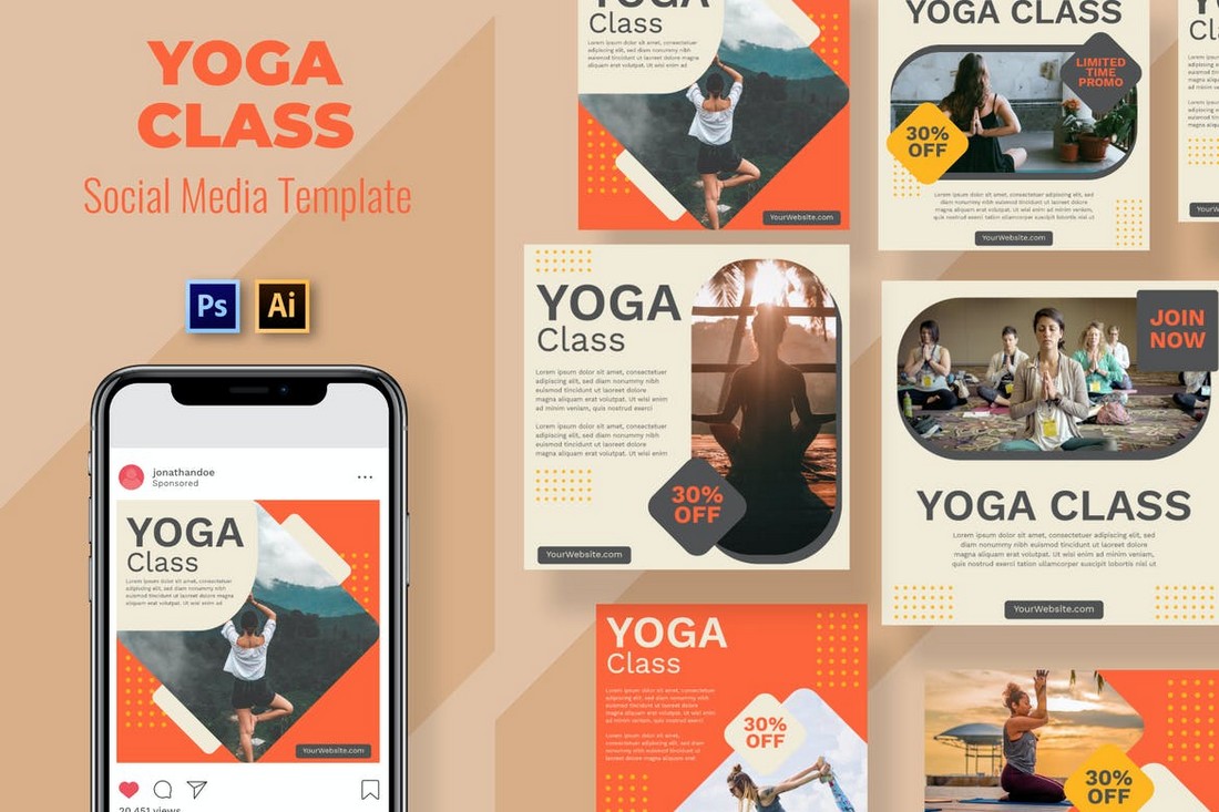
Promote your Yoga classes, courses, and training programs across your social media channels using this template kit. It features 9 different social media post designs with lots of space for describing your programs. It’s available in PSD and AI formats.
If you’re promoting a fashion or lifestyle brand, this social media templates kit will come in handy. It includes 3 Instagram story and 3 post templates for showcasing your apparel items and fashion products. The templates are available in Photoshop and Illustrator file formats.
This is a collection of 10 free Instagram templates that feature mood board style post layouts. They are perfect for showcasing your designs, fashion, and creative photography.
Featuring 6 different design layouts, this modern social media marketing kit is perfect for creating posts to promote your brand, products, and sales across multiple social media platforms. The templates are fully customizable and available in Illustrator file format.
If you’re looking for social media templates to promote a product on Instagram, Twitter, and Facebook, this bundle of templates will come in handy. It includes a set of editable templates that have been designed to highlight your products and features.
This set also includes 6 unique social mediate banner templates similar to the ones above. These templates are designed to help promote your seasonal offers and special sales on social media. The templates can be customized with Illustrator as well.
This bundle of social media banner templates is perfect for promoting the latest arrivals of your product lineup. It’s most suitable for fashion and apparel brands. The pack includes 10 unique template designs in Illustrator and EPS file formats.
Another beautifully minimalist social media templates pack featuring 9 unique post designs. These templates can be used to create Instagram, Twitter, and Facebook posts. The templates are available in PSD, AI, and EPS formats.
If you’re looking for an Instagram story template to streamline your business or brand story, this bundle will come in handy. It includes 10 fully customizable Instagram story templates you can use to create effective Instastories.
Soka is a bundle of unique social media templates that features highly professional designs. It includes 12 template designs in editable PSD files that are also compatible with all popular social networks.
This free social media templates pack comes with 8 different post designs you can use to promote fashion and luxury brands on Instagram. The templates are available in PSD files and are easily customizable.
The beautiful and colorful designs of these Instagram templates will definitely make your feed stand out from the crowd. This bundle comes with 6 different post templates you can use to create content for Instagram.
This is a multipurpose social media templates kit that comes with post templates in multiple resolutions. The posts are compatible with Facebook, Instagram, and Pinterest. You can customize them quite easily using Photoshop.
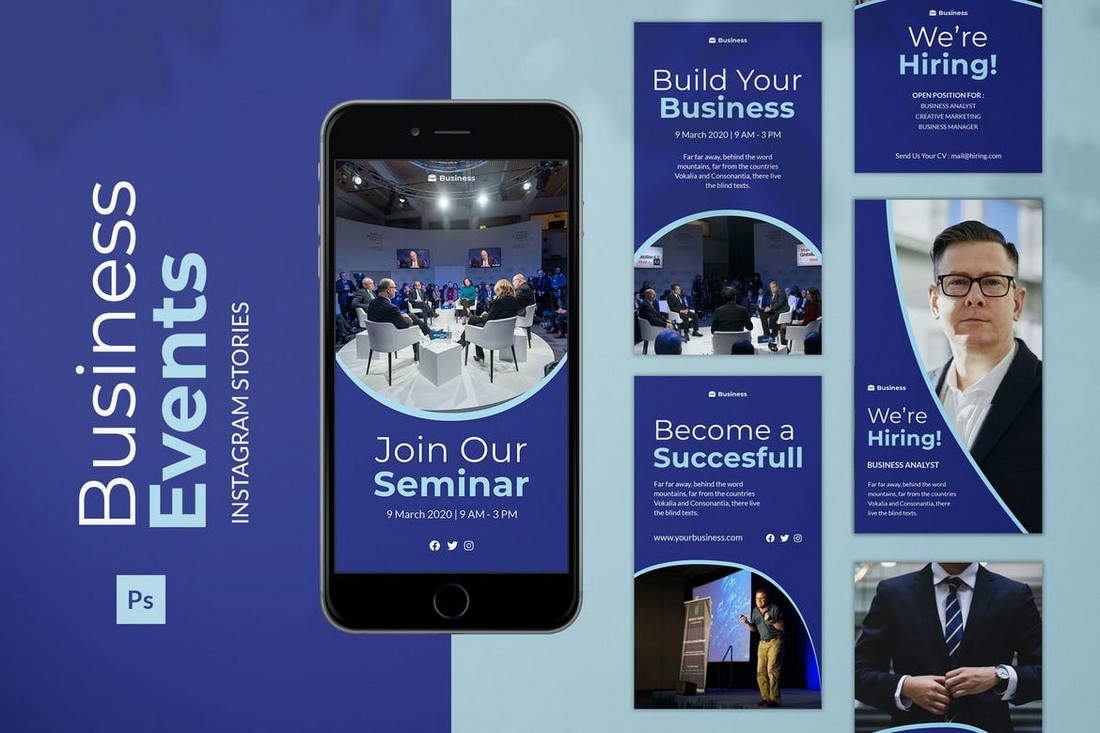
Promoting a business event on Instagram? Then use this template kit to create a professional Instagram story for your feed. The kit includes 6 different Instagram story designs with fully editable layouts.
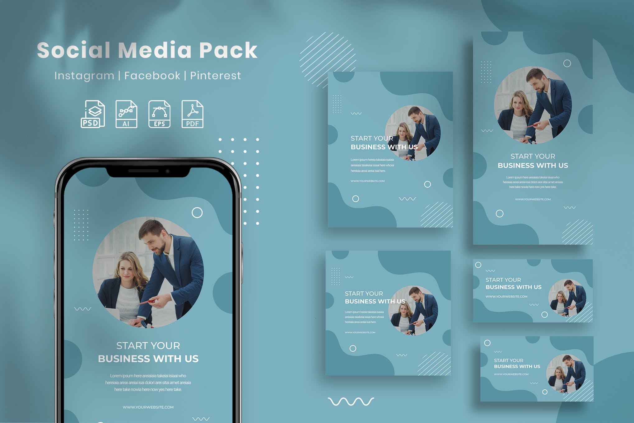
Business With Us is a modern, and professional social media pack that will surely make an impression on your target audience. It features 5 attention-grabbing square designs that can be used to post content on Facebook, Instagram, Pinterest, and other social media platforms.
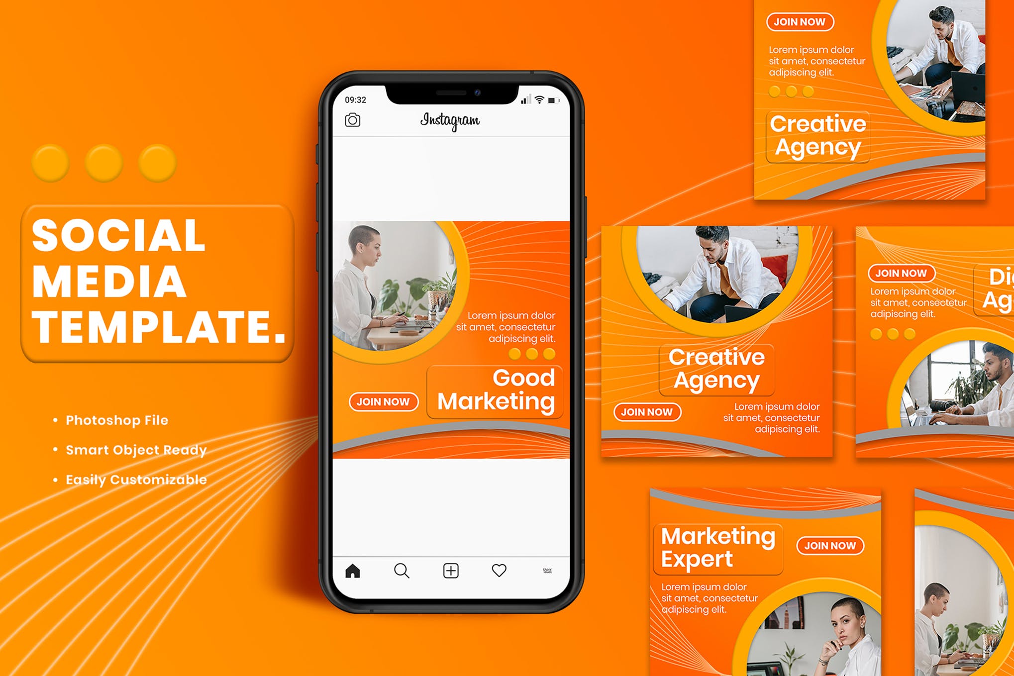
Next up we have a minimal, yet impressive set of social media templates that are designed with the sole purpose of boosting your brand visibility and engagement. There are 9 templates in total, and each can be fully customized to suit your needs.
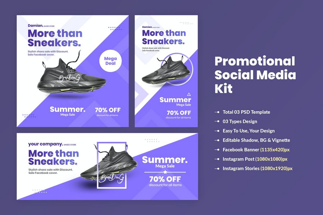
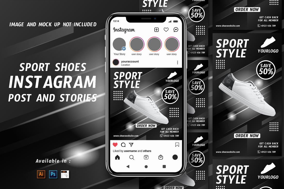
Designed to help reach your shoe business new heights, this social media templates kit comprises Instagram posts and stories layouts that you can mix and match to create personalized content that creates an impact on most of your followers.
Stacked with 9 templates for various social media platforms, Rose is a perfect social media kit for your brand marketing. Although the kit can be used for virtually any industry under the sun, it best suits businesses dealing with feminine clothes, and products.
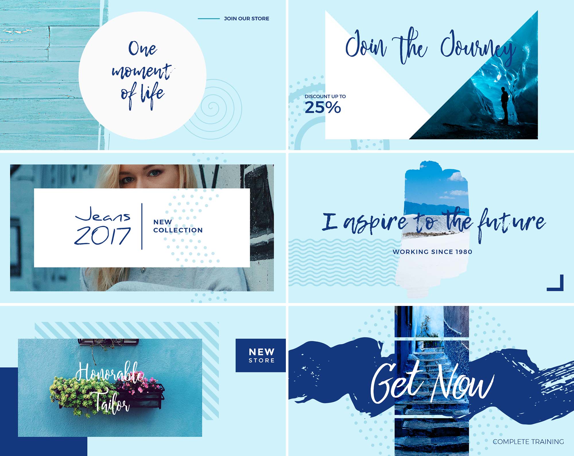
Blue Sky is a collection of 12 social media banners that will add a bright blue aesthetic to your feed. The beautiful design and ocean-esque color scheme instantly draw attention and make sure the audience is left in awe of your creative prowess.
No need to waste hours crafting Facebook covers for your client pages. Use this template pack to create a professional page or profile cover in minutes. This pack comes with 5 different cover designs optimized for Facebook.
Sienna is another great free social media kit featuring multiple templates in 2 different resolutions. They fit in well with both Instagram and Facebook feeds. You can create fashion, travel, and lifestyle posts using these templates for free.
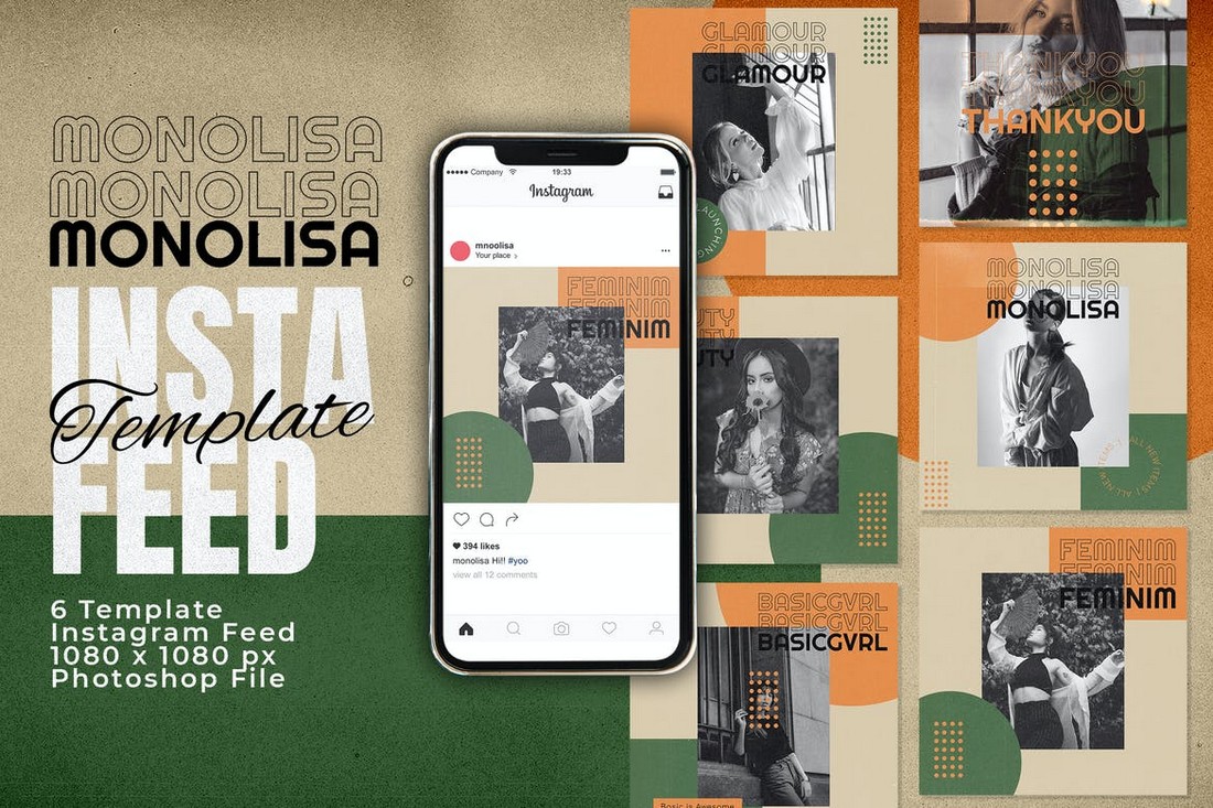
Monolisa is a collection of beautiful Instagram post templates. It features a stylish and trendy design with an attractive color scheme. The pack lets you choose from 6 unique template designs to create unique posts for your feed.
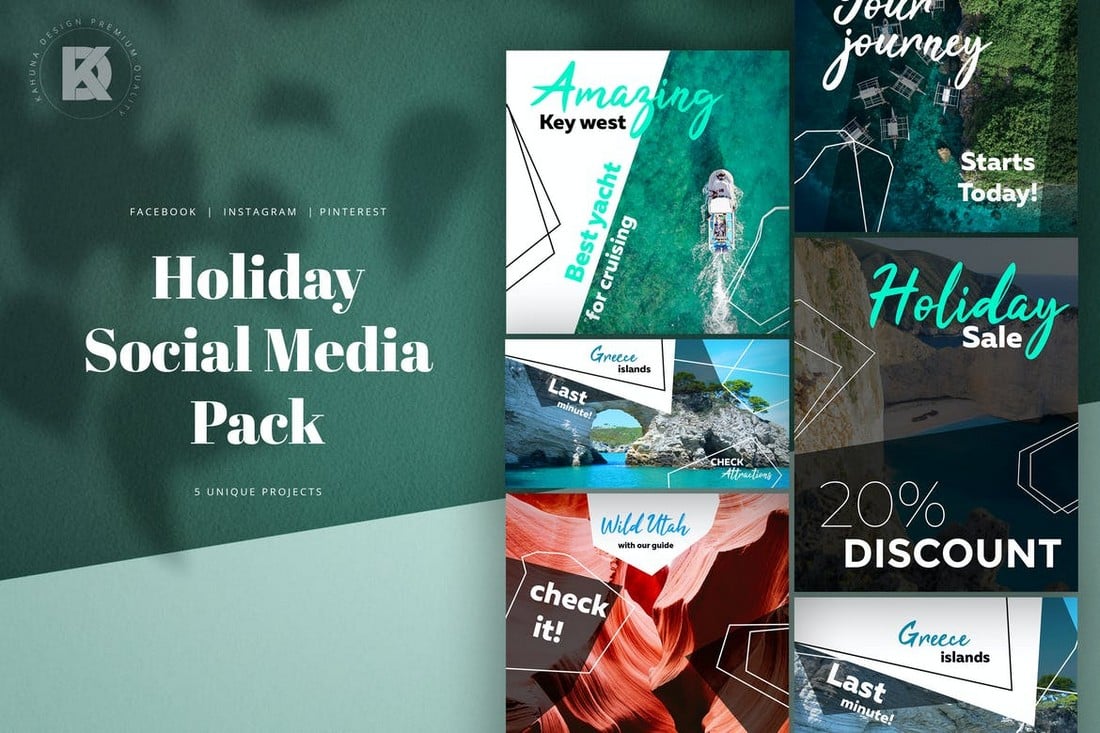
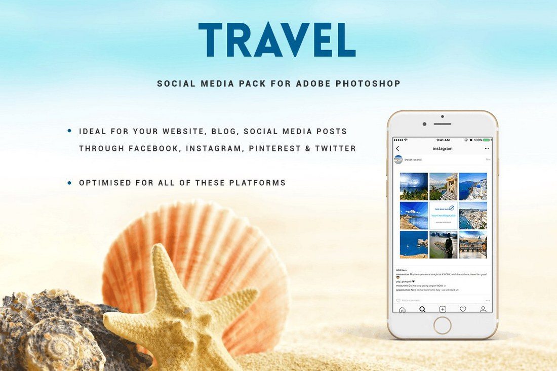
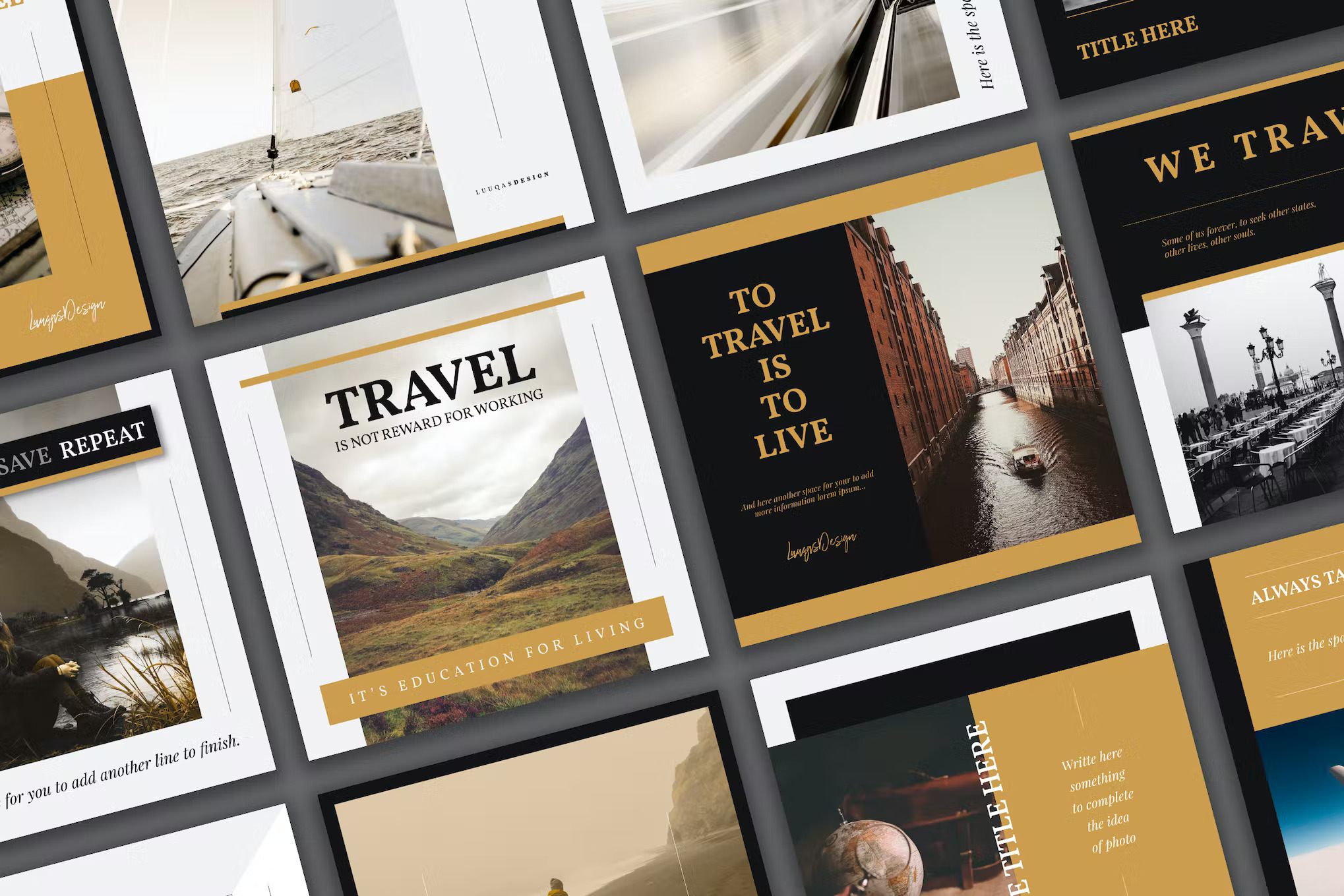
If you’re managing social media accounts for travel blogs or hotels, this social media template kit will come in handy. It includes 5 unique post designs for promoting travel locations and vacations. And they are compatible with Facebook, Instagram, and Pinterest.
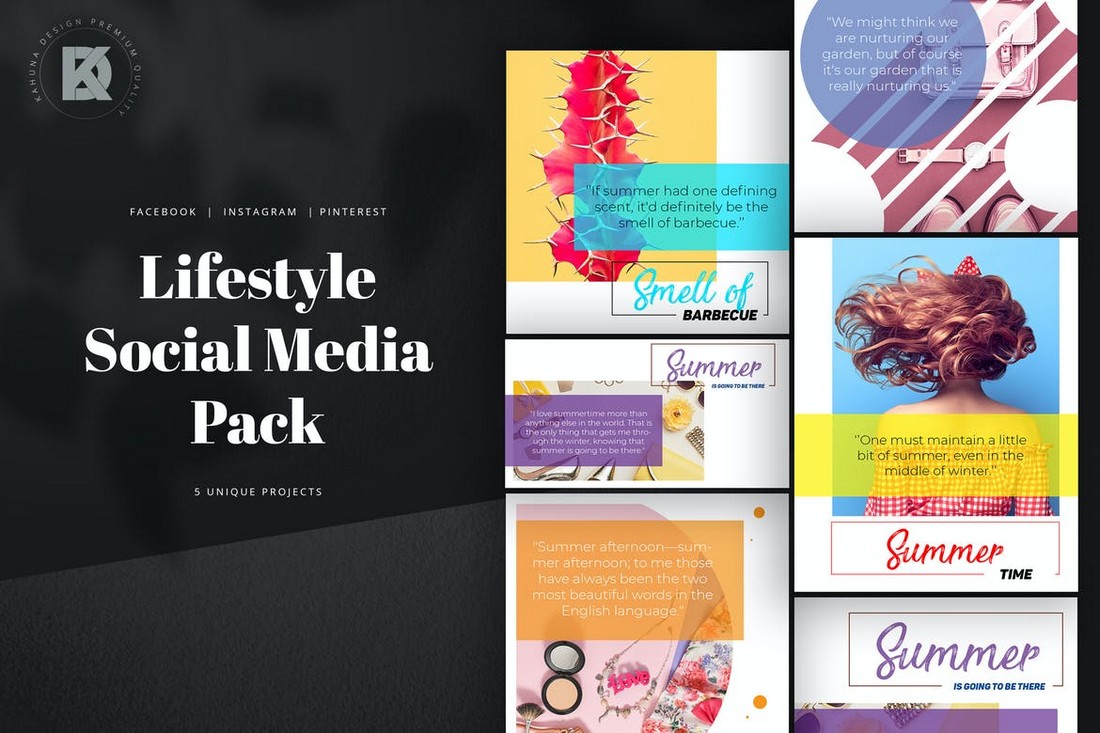
A collection of social media templates designed for promoting lifestyle businesses and brands. This kit includes 5 templates in 3 different sizes to fit all photo-blogging social platforms. The templates can be easily customized with Photoshop.
If you prefer to create Instagram and Facebook posts with minimal and clean designs, this template kit is made just for you. It comes with 6 high-quality post templates with simple designs. They are easily customizable and comes with smart objects and organized layers.
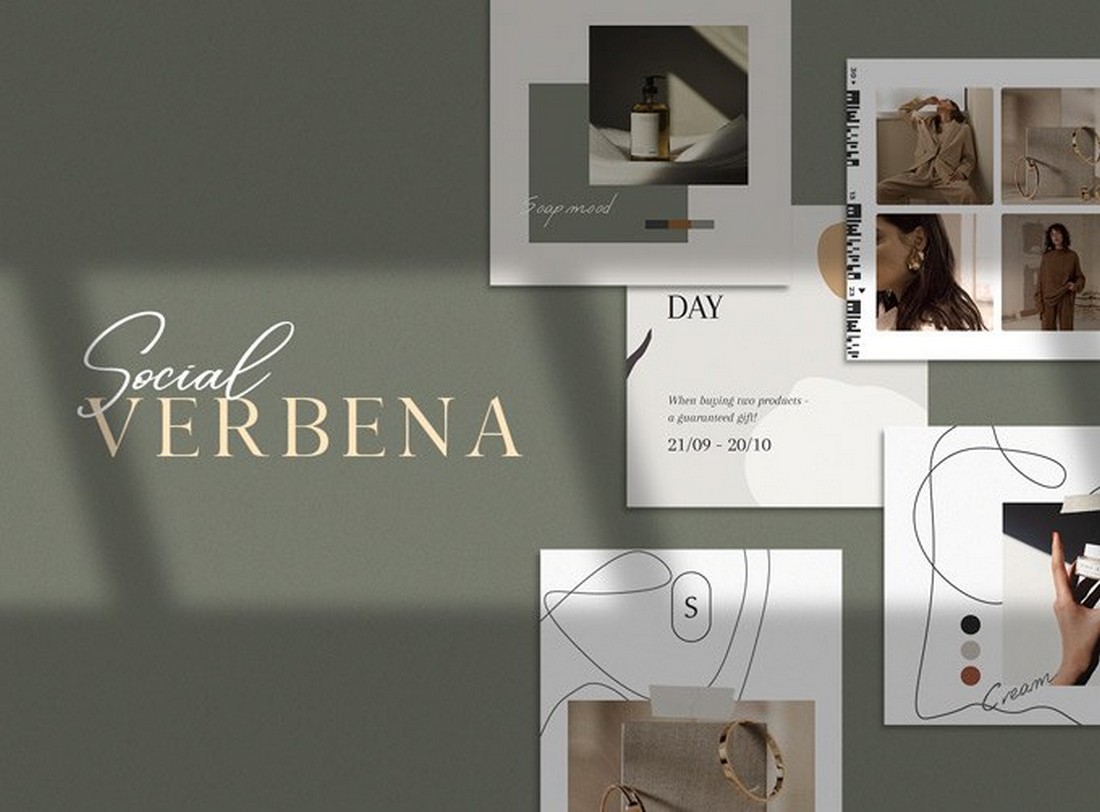
Verbena is a collection of beautiful Instagram post templates. You can use them to create content for modern lifestyle and fashion pages. It’s completely free to download and use.
Looking to promote a small business or a corporate brand on social media? Then grab this social media kit to easily create effective posts for your campaign. This bundle includes 10 different and customizable template designs. They are made for Instagram but you can use them with other social networks as well.
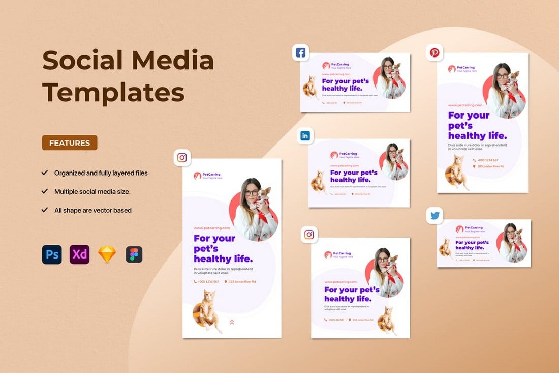
Promote your food-related brands and businesses on Instagram more easily using this social media kit. It includes a set of modern Instagram post designs. You can easily customize them to edit text and place your own images. The bundle features 6 different post layouts.
Use this Instagram story templates pack to design attractive stories for your social media promotions. The template features a modern and trendy design that will surely attract the attention of your audience. You can choose from 5 different story designs as well.
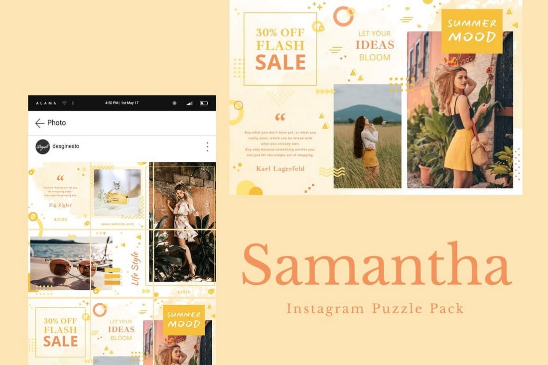
Instagram puzzles are quite popular among many users. This template kit allows you to create a similar Instagram puzzle on your profile feed. It includes 12 post slices that can be combined to create a unique puzzle while promoting your brand.
This is a free Instagram post templates kit made specifically for fashion brands. The templates can be used to promote your latest items and sales. It includes 10 templates you can customize to fit other social networking platforms as well.
If you’re promoting a casual brand targeting young audiences, this social media kit will come in handy. It features 9 unique Instagram post templates featuring bright and colorful designs. The templates are easily customizable with Photoshop.
Promote your creative and corporate agencies on various social networking platforms using this templates kit. It includes 5 different post designs. And they are available in 3 sizes to fit Facebook, Instagram, and Pinterest.
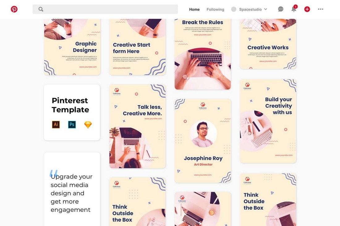
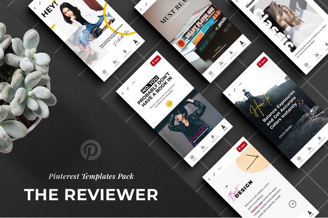
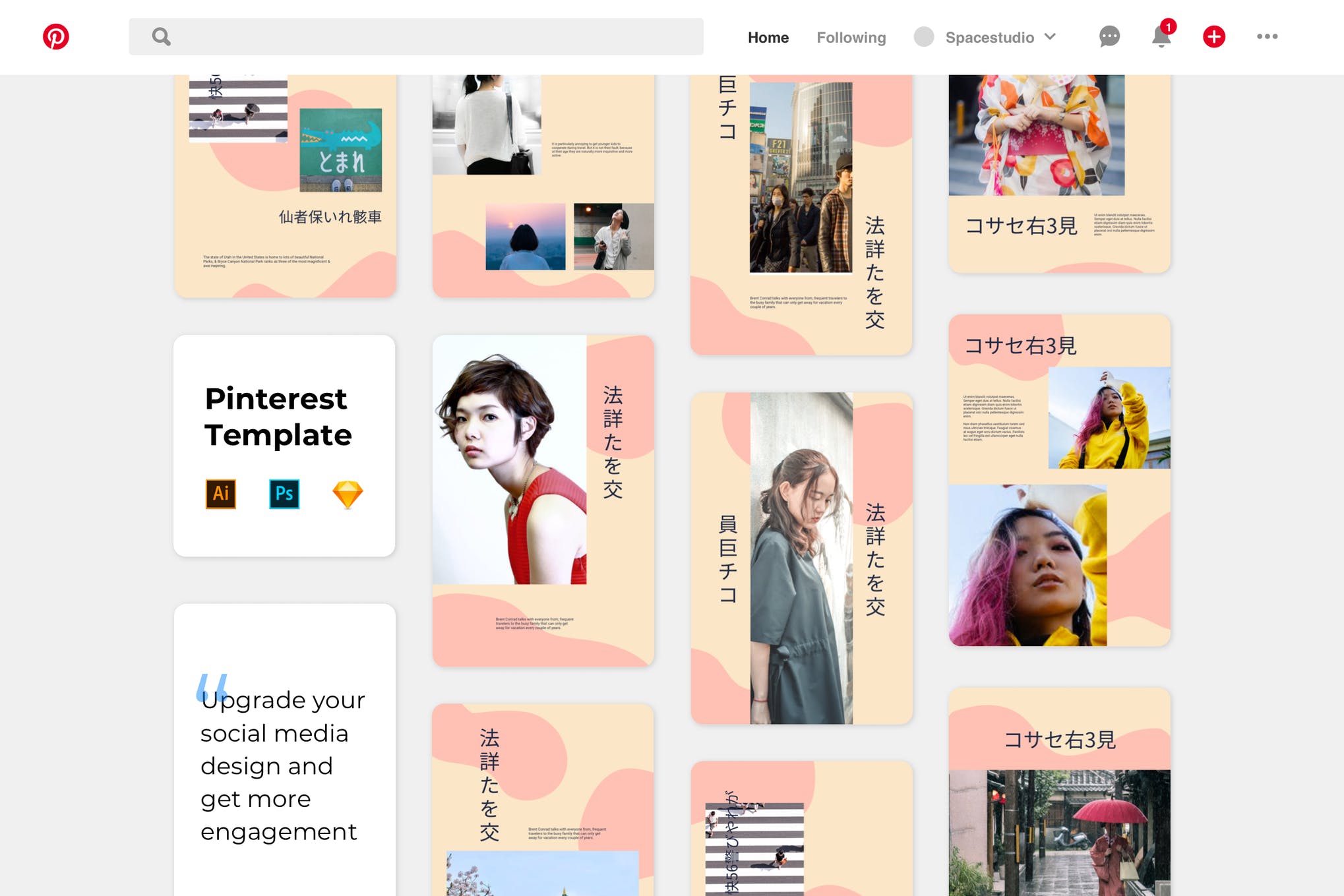
Pinterest is a great platform for promoting visuals. With this templates kit, you can design stylish banners to attract the attention of your Pinterest followers. The pack includes 9 unique designs in AI, PSD, and Sketch file formats.
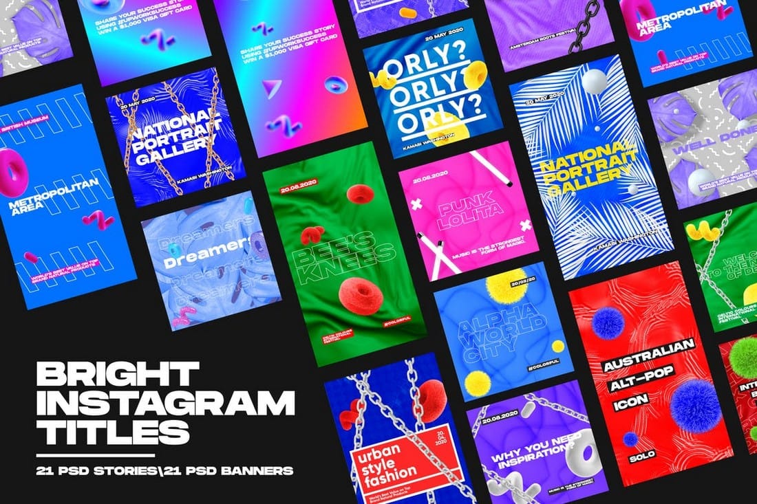
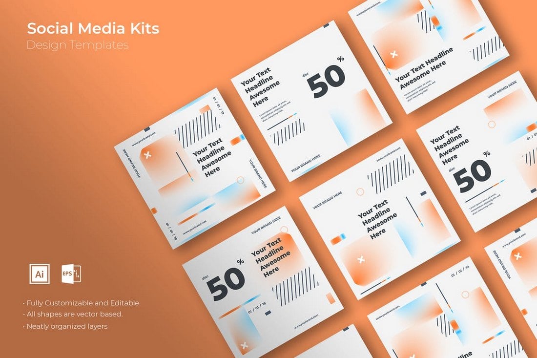
This is a unique social media kit that features a set of 21 unique post designs with bright and attractive titles. The posts are designed with different colors and gradients to make them stand out from the crowd. You can use them to create unique posts for Instagram, Facebook, and other social networks.
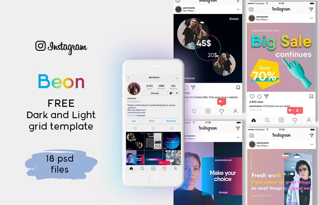
Another free Instagram post templates kit. This kit includes 18 different post designs you can use to craft an Instagram grid. The templates are fully customizable and come in both light and dark color themes.
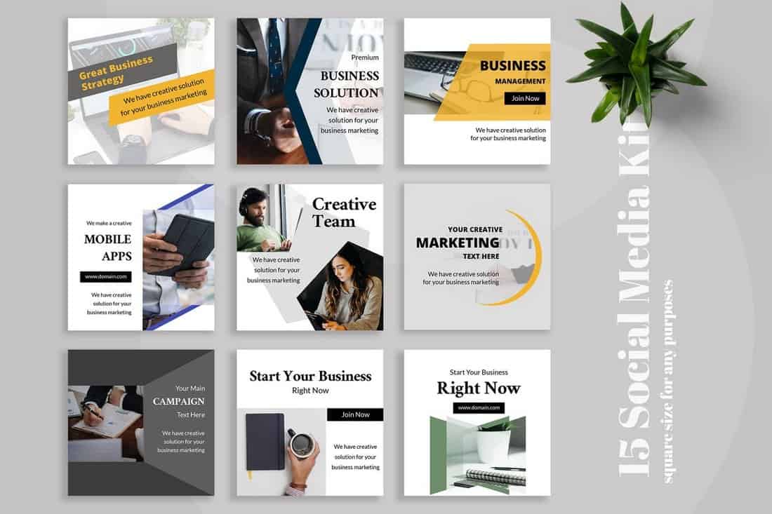
Promoting your business or agency on social media will get much easier with this social media kit that comes with 15 modern and minimal designs that are designed to help promote your brand and services in a professional way.
A set of 5 unique social media banner templates that’s most suitable for designing Instagram, Facebook, and Pinterest posts for educational businesses, schools, and agencies. The templates are fully customizable with Photoshop.
This modern social media kit comes with a set of creative banner templates with an attractive dark color theme. You can use these templates to promote fashion and creative brands across all social media platforms.
The minimalist and clean designs of this social media kit make it a great choice for creative agencies and small businesses. It includes 25 attractive social media banner and post templates in 2000 x 2000 resolution.
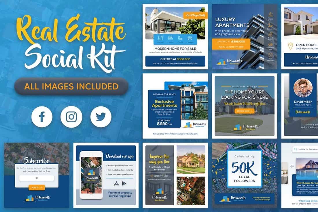
Having a strong social media presence is very important for growing a real estate business. This social media kit comes with 20 unique banner templates specifically designed for promoting real estate businesses. The templates are also available in 3 sizes to fit Facebook, Instagram, and Twitter.
Use these gorgeous free social media templates to promote your products and campaigns on Pinterest. The bundle features 15 professionally crafted templates you can easily customize however you like.
A set of creative Instagram post templates for showcasing and promoting products. The bundle includes 8 different templates you can easily edit using Photoshop and Sketch app.
Claretta is a bundle of 10 creative social media banner templates you can use to promote an online store or a small business on Instagram and Twitter. It also comes with Instagram story templates as well.
This is a collection of branded social media templates that comes with a colorful design and professional layouts. These are ideal for promoting brands and businesses. The pack includes 6 different templates.
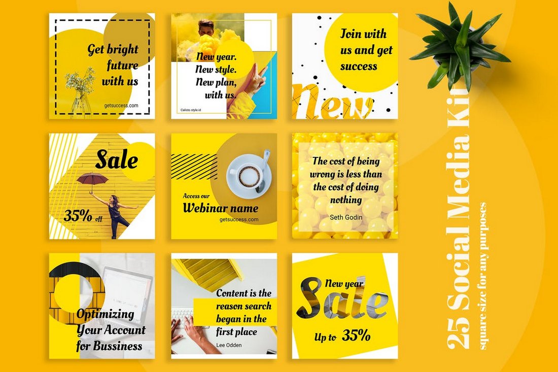
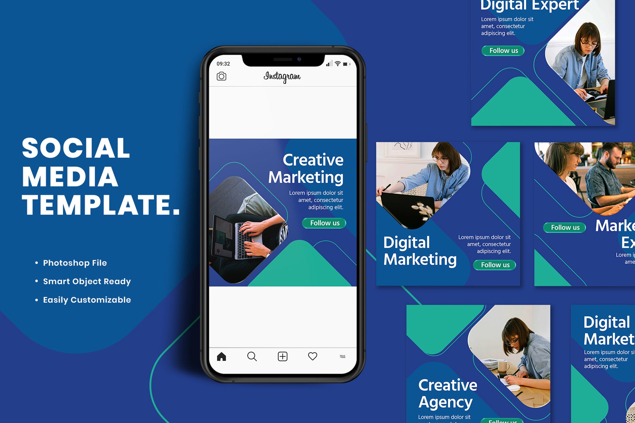
Calisto is a bundle of creative social media templates that comes with 25 different templates featuring colorful and attractive designs. These templates are most suitable for promoting digital marketing and creative agencies on social media.
This social media templates kit is specially designed for promoting fitness and gym related brands, products, and services on social media. It includes 6 unique templates featuring professional designs.
The professional banner templates in this pack are ideal for promoting fashion and clothing brands on Instagram and Facebook. The templates are available in 1500 x 1500px resolution PSD files.
A free set of social media templates made specifically for designers, allowing you to easily edit and customize the template designs for clients. It includes 6 unique designs in 800 x 800px resolution.
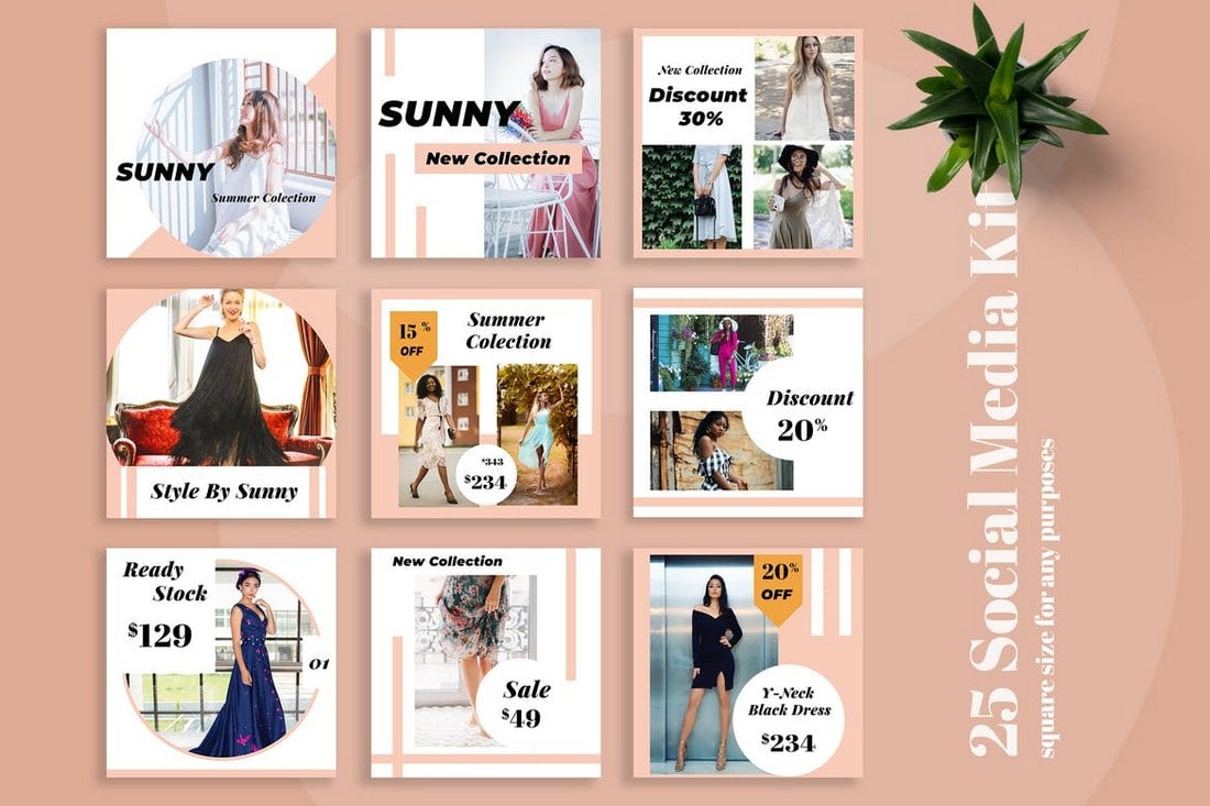
Sunny social media kit includes 25 clean and simple templates you can use to promote fashion brands and clothing products on social media. The templates are available in 2000 x 2000 resolution and in PSD file format.
If you’re an Instagram travel blogger, this social media templates kit will definitely come in handy. It includes 15 unique templates designed for travel-themed posts. Each template is available in two sizes for Instagram and Facebook.
A collection of professionally designed Instagram post and story templates for making posts for brands and businesses. This bundle includes 20 different templates and they are available in both Illustrator and Photoshop file formats.
This bundle of social media templates is designed for creating promotional campaigns for businesses and shops. The pack includes 10 unique templates in 4 different sizes optimized for Facebook, Twitter, Instagram, and Pinterest.
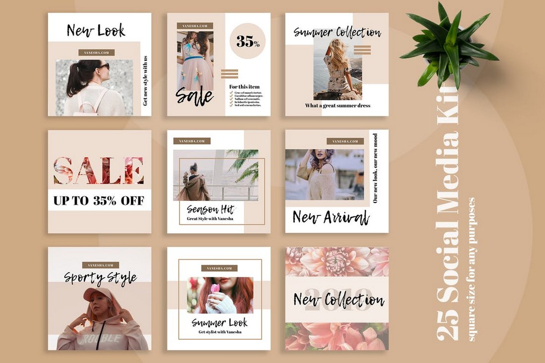
Vanesha is a set of modern social media templates specially designed for promoting fashion-related brands and products. It includes 25 easily customizable templates in PSD format.
A pack of minimalist and clean social media banner templates. This bundle includes 30 different templates you can use to promote many different types of brands and businesses, including travel, food, creative agency, and more.
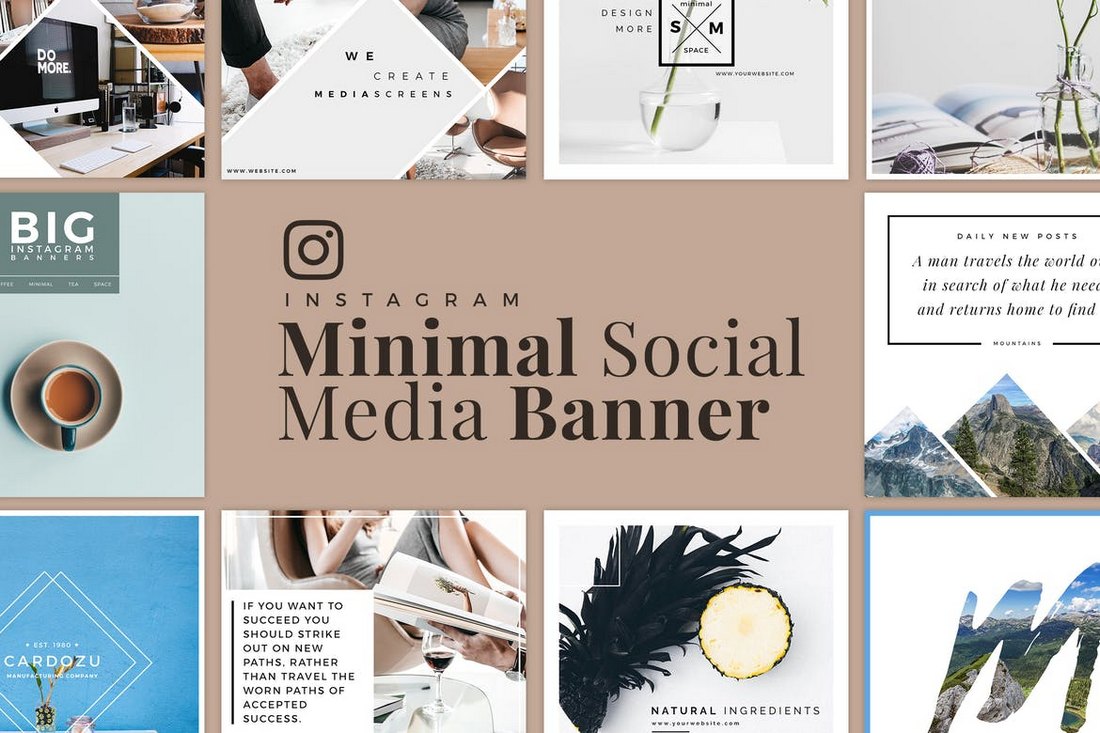
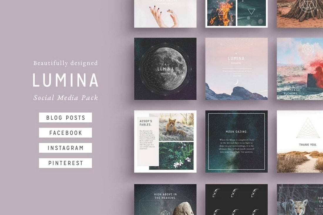
Lumina is a highly minimalist social media kit that comes with several different styles of designs. It includes 32 unique designs and they are available in square, rectangle, and vertical sizes optimized for blogs, Instagram, Facebook, Pinterest, and more. The files are available in PSD and InDesign versions.
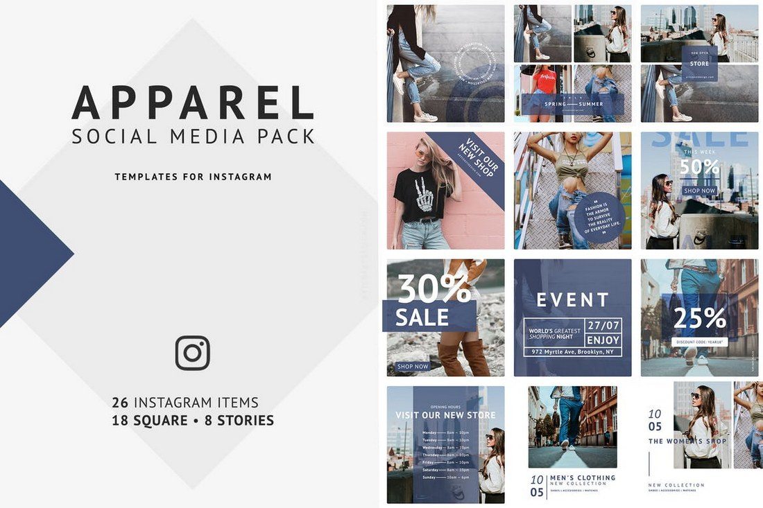
This social media kit is designed specifically for promoting fashion and clothing related brands. It’s fully optimized for Instagram as it comes with 18 square shaped post designs and 8 additional designs for creating Instagram Stories. The post templates are available in 1080 x 1080-pixel resolution.
If you’re promoting a luxury brand or a high-end product, this social media kit will come in handy. It includes 15 professionally designed post templates with different styles. The templates are available in 3 different sizes for Facebook, Instagram, and Twitter. You can also choose from 5 different color combinations to customize the designs as well.
This kit is perfect for creating social media content for fashion and travel brands. It includes 15 unique post templates, each in 3 different sizes and 5 color combinations. Thanks to its smart objects and vector shapes, editing the templates is also quite easy.
This is a bundle of social media post designs that are ideal for bloggers and business brands. The templates feature minimalist designs that highlight its text and content to help promote information. The pack includes 8 different post templates in square designs.
A set of clean and modern social media post templates for crafting graphics for Facebook, Instagram, and Twitter. The pack includes 15 templates in 5 different colors and easily customizable PSD files.
This bundle comes with 30 post templates in 3 different sizes for creating content for different social networks. The templates are available in fully-layered PSD files with vector shapes and smart objects, allowing you to quickly edit the designs to make them your own.
A set of fully-customizable social media templates that you can easily edit to fit all types of your promotions works. It includes 8 unique social media post templates in square sizes, specially optimized for Instagram.
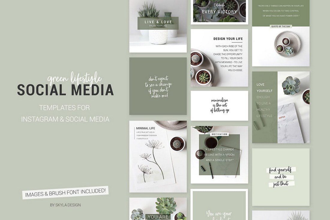
This pack of social media templates is perfect for showing off green and healthy products. It’s designed with lifestyle brand promotions in mind but the templates can also be used for blogging, yoga, and other types of content as well. The pack includes 15 templates, each in square, horizontal, and vertical designs.
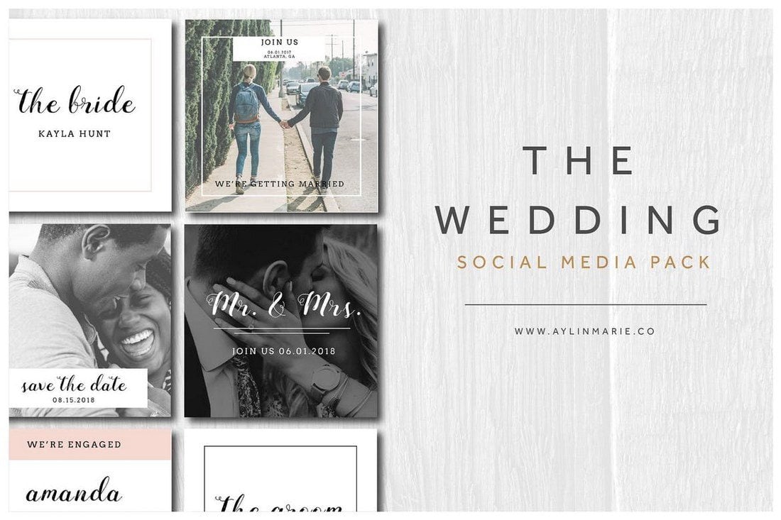
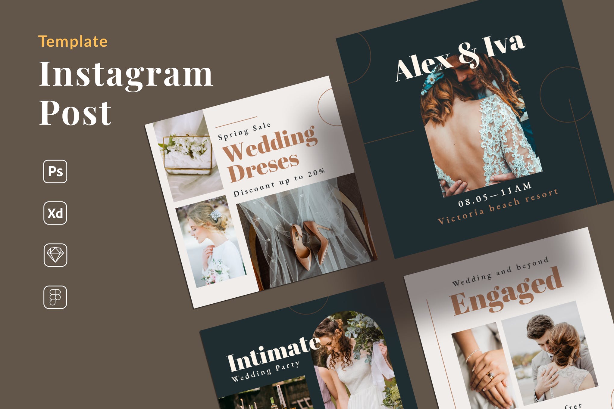
If you’re a photographer or a business related to wedding events, this bundle of social media post templates will be quite useful to you. It includes a set of creative social media templates with minimal designs to help promote your work with a special wedding vibe.
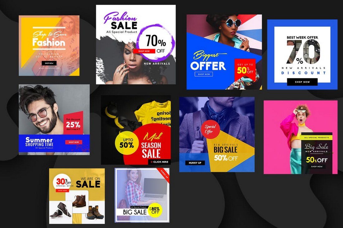
The templates in this bundle are designed for promoting your special offers, product sales, and seasonal offers across your social media channels. The bundle includes several different types of templates for you to use when promoting different types of promo offers. The templates can be easily edited using Photoshop.
Naturalis is a bundle of professionally designed social media templates that features a nature-inspired theme. It includes 32 unique designs in square, rectangle, and vertical sizes. As a bonus, you’ll also receive 50 original stock photos along with the templates as well.
Duotone is a popular design trend that you can often see on Instagram and Pinterest. This templates pack adopts the same trend in its templates. It includes 10 social media banner templates featuring the duotone effect. You can customize them easily to change the colors and shapes as well.
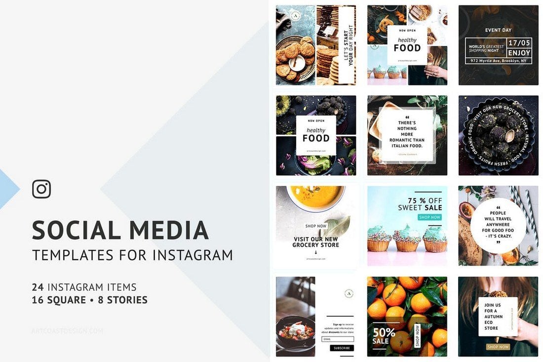
If you’re working on crafting a content plan for a food, bakery, restaurant, or a coffee shop social media campaign, grab this bundle to get a head start. This pack includes 24 beautiful Instagram post templates for promoting food-related brands. You can also use it to promote other types of businesses as well.
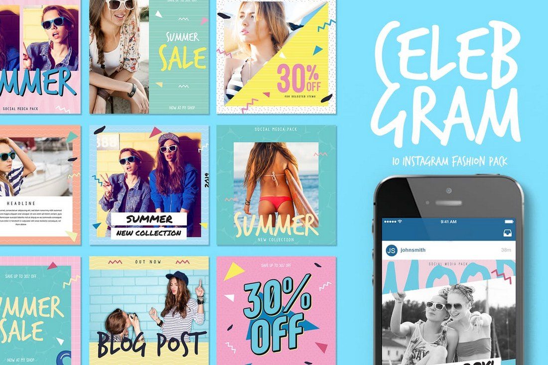
Celebgram is a fashion-themed social media packed that includes 10 unique Instagram post templates featuring pop-culture themed designs. The templates can be easily customized to use on Facebook, Twitter, and Pinterest as well.
Another pack of Instagram post templates. This bundle includes 10 Instagram post designs and 10 Instagram Story templates. Each with free images and easy to use smart objects.
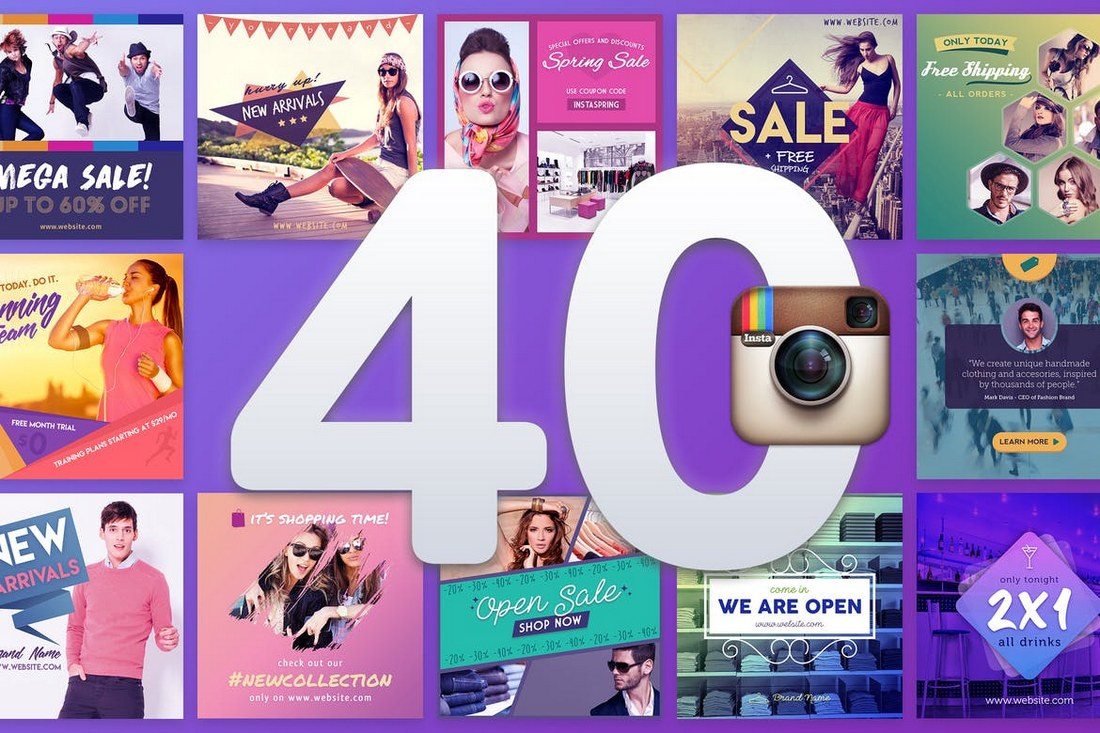
This bundle of Instagram banners includes 40 different banner templates you can use to promote your brand, products, special offers, and seasonal deals on Instagram. The templates are available in easily editable PSD files with smart objects and vector shapes.
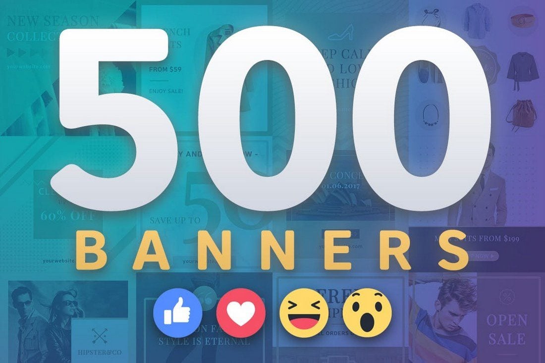
Another huge bundle of multipurpose Facebook banner templates for promoting your brand and products. This pack comes with 50 unique banner designs, each in 2 sizes and available in 5 different color combinations.
Creating an eye-catching post for your Instagram feed doesn’t have to be difficult. With this Instagram post template, you can create your own posts to drive new followers or new business. You can quickly add your own images, select your desired color palette, and adjust the copy.
Give your Pinterest account a design upgrade with the Japan Liquid Acid Fluid Memphis template. This template contains 9 fully editable and customizable templates that were designed in Sketch, Photoshop, and Illustrator to stand out from the crowd. This kit is ideal for bloggers, fashion brands, lifestyle bloggers, magazines, and techno blogs who doing sports-related activities or campaigns.
This social media pack is ideal for Instagram, Facebook, Twitter, and more, with the purpose to promote your brand to increase more followers. Change the text, colors, images, strokes, and shapes to achieve the best result you want. Mix and match to create your custom stories, and achieve the best impact on your followers.
The product includes 24 templates designed for Instagram. However, You can also use the design on your Twitter, LinkedIn, Blog etc. These are for Adobe illustrator, and also Photoshop. Each of them is easy to edit and customize, all you have to do is replace images with your artwork via Smart Objects or Clipping Mask and add your copy. That’s it!
Social Media Booster Kit includes 10 templates designed for Instagram, Twitter, and Facebook. Thanks to Smart Objects, you can easily customize the colors and fonts and replace photos. This kit is perfect for bloggers, fashion, and lifestyle brands.
The pack covers all basic design template variations for social media posts and headers to choose from and apply to your brand. Modern, clean and customizable, they are fully optimized for social platforms and ideal for promoting products, brands and businesses.
This pack is perfect for businesses selling luxury and elegance, high-quality professional b2b products and premium goods. Feel free to experiment with design within the pack, mix different backgrounds, visual elements, and colors to create your own new pictures.
If you haven’t used social media templates before these simple tips will help you get started.
1. Find the Right Theme
The most important part of using templates for social media posts and covers is finding the templates that match the theme of your promotions or campaign.
For example, if you’re running a social media campaign to promote a Halloween sale then you should try to find templates with a Halloween theme. The same applies to finding templates that match your industry and niche as well.
2. Pick Appropriate Template Designs
There are many different types of social media templates crafted to perfection by professionals you can use to promote various types of campaigns. Which means you don’t have to use the same templates over and over again.
Whether you’re promoting a fashion brand, a digital product, a service, gym membership, or even a seasonal sale, be sure to pick a template design that matches your purpose.
3. Use Great Images
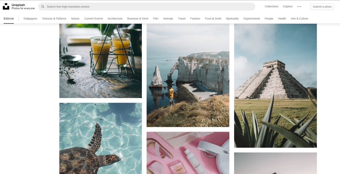
Most of the pre-made social media templates won’t include images due to licensing requirements. You’ll have to find your own images. Thankfully, there are many great sites you can use to download high-quality and royalty-free images for free like Unsplash and Pexels. Edit your templates and Use the image placeholders to easily place your own images in the post designs.
4. Change Colors and Resize to Preference
Even though most social media templates look gorgeous as it is, you can always customize them however you like to change their colors and resize shapes to fit your needs.
Use the organized layers to make changes to the template design as necessary and use your own brand colors to personalize the designs.
5. Use Custom Fonts
Don’t like the look of the fonts used in the social media template? Then use a custom font that matches your brand and industry.
There are many great sources you can use to find all kinds of free and premium fonts with great designs. Use them to make your social media posts look even more unique.
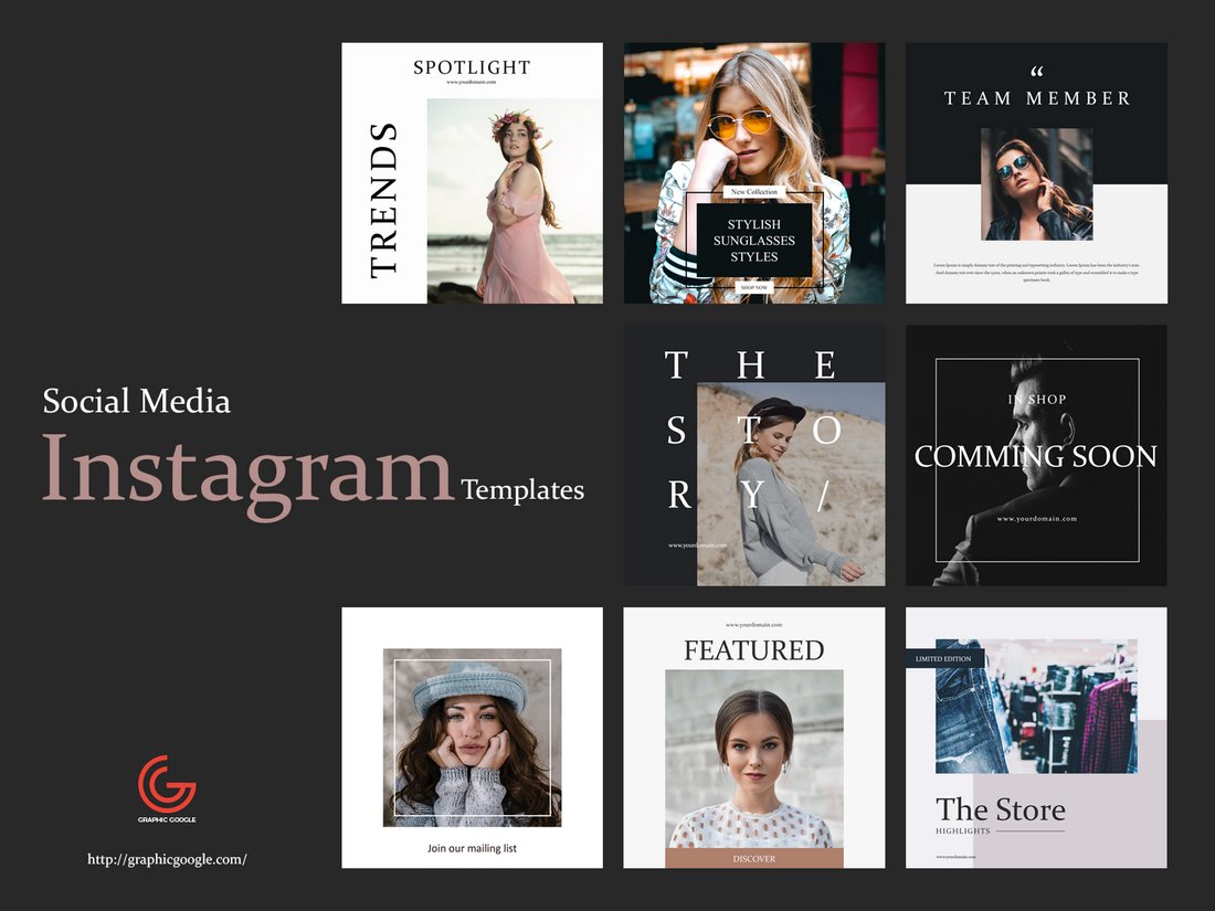
If you’re working on an Instagram campaign, check out the Instagram templates and banners collection for more inspiration.


![Download Now: An Introduction to Data Visualization for Marketers [Free Guide]](https://no-cache.hubspot.com/cta/default/53/6ecf26a9-faff-4c16-a2d4-b70751ce8b65.png)


