

Have you noticed how logo designs have gotten progressively simpler lately? Even some of the biggest brands with iconic logos revamped their logos by making them simpler and more minimal.
If you look closer, you’ll also notice that most brands now have multiple logos. The logo you see on the website is not the same one used on a mobile app. This is all part of the responsive logo design practice, which is an important aspect of designing logos today.
In this quick 101 intro, we introduce you to the concept of responsive logo design and why every logo designer must follow this practice when creating logos.
What is Responsive Logo Design?
Responsive logo design is a practice designers use to create simple, scalable, and flexible logos that come in multiple forms and can be used across various platforms. A responsive logo looks good whether it’s used on a website, packaging design, large billboard, or even a small mobile device.
With a responsive logo, brands are able to create multiple variants of their logo that are dedicated to serving different audiences on various platforms. Most brands these days have at least three or four logo variants that are served across digital and print mediums.
Why it’s Important
The main goal of making a logo design responsive is to make the logos clearly visible on smaller platforms like mobile devices.
When you create complex logos with so many intricate details, it’s too difficult to transform the logo into a tiny icon on a small mobile screen. Most of the details, colors, and typography get lost and often make the logos look distorted.
This is why responsive logo designs utilize simpler designs and come in multiple variants.
Examples of Responsive Logo Design
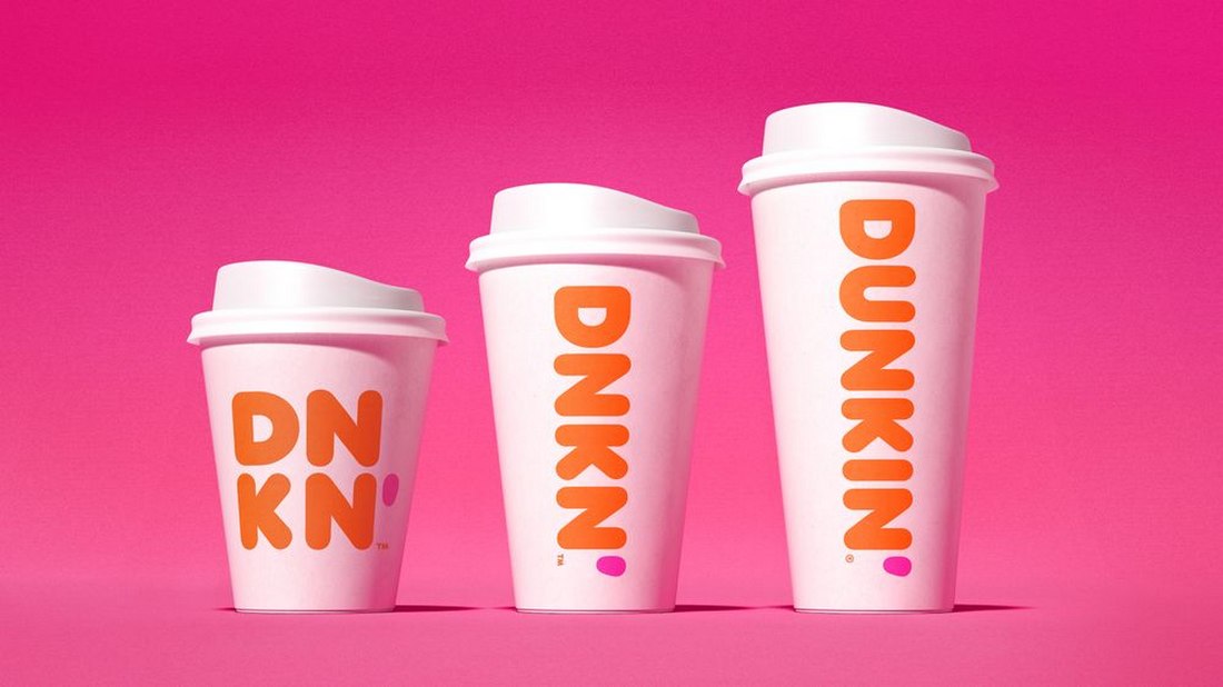
In this image from 99Designs, you can see the different logo variants used by popular brands, starting with the full-scale logo and all the way down to a tiny icon.
You’ll notice how the logo design gets simpler with each variant with fewer design elements and details. Even the most complex wordmarks get stripped down into a simple symbol.
The Responsive Logos website has more great examples. It’s an interactive website you can explore to see some of the best and most popular responsive logo designs. You can see the logos change by resizing the browser screen.
How to Design Responsive Logos
There are four important aspects every responsive logo design needs to cover: scalability, flexibility, adaptability, and consistency. Here’s how you design a logo that fits all those key aspects.
1. Understand the Use Cases
Understating how and where you use your logo is the first step to creating an effective responsive logo. It’s crucial to design a logo that’s consistent across different platforms. To do that, you must explore the many use cases of your brand and products as well as where your audience comes from.
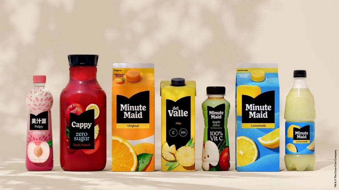
Designing a responsive logo that looks great on mobile platforms and social media is not enough. If your brand has a physical product, you also have to make sure the logo fits perfectly with the packaging designs.
There are many aspects to figuring out the use cases of your logo. And that is also the key to knowing how many logo variants you need to create in order to make it responsive.
2. Create Logo Variants
A responsive logo comes in multiple variants. The logo you create for the packaging design won’t look the same as an icon in the mobile app. Creating multiple styles of logos for each platform is the solution.
Think responsive-first when designing a logo. Know how many variants you need to create and understand where the logos will be used. It will help create a much more consistent logo design, rather than creating a logo first and then trying to convert it into a responsive design.
3. Scalability is Key
A responsive logo can be scaled up or scaled down without losing its quality and clarity. That’s not just about designing logos in vector format. It also involves creating logo variants that can be used anywhere.

For example, a logo variant you create for a mobile app icon should also be able to be used on a large billboard to promote that app. And it’s your job to ensure that the logo variant looks good when enlarged as it does when shrunk down to a small favicon.
4. Colors and Fonts Matter
The color palette you use for your responsive logo is also important. Ensuring the logo looks consistent across different digital platforms can be tough, especially when different devices have different types of displays and graphical settings. The same applies to typography.
It’s one of the reasons why most brands nowadays use highly minimalist and simplified logo designs using a very limited color palette.
5. Use a Minimalist Design
A simple, minimalist logo design is much easier to scale. It will provide you with more opportunities to create logo variants that look great no matter how small or big it gets. A simple logo will also look more consistent and they are easier to recognize.
10 Tips for Effective Responsive Logo Design
Follow these tips to create better responsive logos that will stand the test of time.
1. Prioritize Legibility
Ensure your logo remains legible at smaller sizes. Avoid intricate details or overly complex typography that may become difficult to read when the logo is scaled down. Test your logo at various sizes to confirm that text and symbols remain clear.
2. Consider Horizontal and Vertical Variants
Create both horizontal and vertical versions of your logo to accommodate different layouts. A horizontal logo might work better in a website header, while a vertical version could be more suitable for a mobile app icon or social media profile.
3. Focus on the Core Symbol or Icon
When designing a responsive logo, consider how the core symbol or icon can stand alone without text. This approach is especially useful for creating icons or favicons that need to be recognizable even without accompanying brand text.
4. Use Adaptive Color Palettes
Consider how your logo’s colors will adapt to different backgrounds and environments. A responsive logo should work well in both color and monochrome formats. Ensure the logo remains visually appealing and recognizable in various color schemes.
5. Incorporate Fluid Design Principles
Fluid design allows logos to adjust naturally to different contexts. Consider how your logo’s elements can shift, resize, or rearrange based on screen size. This flexibility ensures your logo looks great on any platform without compromising its integrity.
6. Maintain Brand Consistency
While adapting your logo for different sizes and formats, ensure it remains consistent with your brand identity. All versions of the logo should share the same color palette, typography, and core design elements to maintain a cohesive brand image across all touchpoints.
7. Simplify Typography
When incorporating text into your logo, choose fonts that are clean and easily readable at smaller sizes. Avoid overly decorative fonts that may lose clarity when scaled down. Consider using a single, bold typeface that aligns with your brand’s aesthetic.
8. Leverage Negative Space
Negative space can enhance the adaptability of your logo. Clever use of negative space can help simplify your design while maintaining its visual impact. This can be particularly effective in creating a logo that remains striking, even when reduced in size.
9. Use Grid Systems
Designing your logo within a grid system can help maintain balance and proportion, making it easier to create responsive versions. Grids ensure that elements align perfectly, which is crucial when resizing your logo for different screen sizes.
10. Adapt for Social Media
Your responsive logo should be optimized for social media platforms, where square and circular formats are common. Ensure your logo looks great as a profile picture or icon by testing it within these shapes and making necessary adjustments.
Conclusion
This is only the beginning of a new evolution for logo design. As new devices like mixed reality headsets and new technologies are introduced, you will have to adopt new ways to create logo designs even for the virtual worlds and beyond.
Who knows, you might even have to create 3D versions of logos with interactive elements in the near future. As long as you create simple logos that are adaptable, you will make each logo design future-proof.