Highlighting Over a Decade of Innovation and Contribution to the WordPress Community

Featured Imgs 23

WordCamp US, which is wrapping up today in Portland, marks another milestone in WordPress’ ongoing evolution. The event brought together enthusiastic WordPress users from near and far and featured insightful sessions, workshops, and vibrant discussions, all highlighting the exciting momentum within the WordPress community. WordPress thrives thanks to a broad spectrum of developers, builders, agencies,

The post Highlighting Over a Decade of Innovation and Contribution to the WordPress Community appeared first on WP Engine.

AI and SEO: Empowering the Digital Success of Tomorrow, Today

Featured Imgs 23

Recent advancements in artificial intelligence (AI) have sparked a new wave of innovation across numerous industries, and search engine optimization (SEO) is no exception.  With breakthroughs in natural language processing, machine learning, and most recently, generative AI technology, AI is reshaping the way businesses approach SEO strategies, helping them navigate the ever-evolving digital landscape with

The post AI and SEO: Empowering the Digital Success of Tomorrow, Today appeared first on WP Engine.

CSSWG Minutes Telecon (2024-09-18)

Featured Imgs 23

For the past two months, all my livelihood has gone towards reading, researching, understanding, writing, and editing about Anchor Positioning, and with many Almanac entries published and a full Guide guide on the way, I thought I was ready to tie a bow on it all and call it done. I know that Anchor Positioning is still new and settling in. The speed at which it’s moved, though, is amazing. And there’s more and more coming from the CSSWG!

That all said, I was perusing the last CSSWG minutes telecon and knew I was in for more Anchor Positioning when I came to the following resolution:

Whenever you are comparing names, and at least one is tree scoped, then both are tree scoped, and the scoping has to be exact (not subtree) (Issue #10526: When does anchor-scope “match” a name?)

Resolutions aren’t part of the specification or anything, but the strongest of indications about where they’re headed. So, I thought this was a good opportunity not only to take a peek at what we might get in anchor-scope and touch on other interesting bits from the telecon.

Remember that you can subscribe and read the full minutes on W3C.org. :)

What’s anchor-scope?

To register an anchor, we can give it a distinctive anchor-name and then absolutely positioned elements with a matching position-anchor are attached to it. Even though it may look like it, anchor-name doesn’t have to be unique — we may reuse an anchor element inside a component with the same anchor-name.

<ul>
   <li>
	<div class="anchor">Anchor 1</div>
	<div class="target">Target 1</div>
   </li>
   <li>
	<div class="anchor">Anchor 2</div>
	<div class="target">Target 2</div>
   </li>
   <li>
	<div class="anchor">Anchor 3</div>
	<div class="target">Target 3</div>
   </li>
</ul>

However, if we try to connect them with CSS,

.anchor {
  anchor-name: --my-anchor;
}

.target {
  position: absolute;
  position-anchor: --my-anchor;
  position-area: top right;
}

We get an unpleasant surprise where instead of each .anchor having their .target positioned at its top-right edge, they all pile up on the last .anchor instance. We can see it better by rotating each target a little. You’ll want to check out the next demo in Chrome 125+ to see the behavior:

The anchor-scope property should make an anchor element only discoverable by targets in their individual subtree. So, the prior example would be fixed in the future like this:

.anchor {
  anchor-name: --my-anchor;
  anchor-scope: --my-anchor;
}

This is fairly straightforward — anchor-scope makes the anchor element available only in that specific subtree. But then we have to ask another question: What should the anchor-scope own scope be? We can’t have an anchor-scope-scope property and then an anchor-scope-scope-scope and so on… so which behavior should it be?

This is what started the conversation, initially from a GitHub issue:

When an anchor-scope is specified with a <dashed-ident>, it scopes the name to that subtree when the anchor name is “matching”. The problem is that this matching can be interpreted in at least three ways: (Assuming that anchor-scope is a tree-scoped reference, which is also not clear in the spec):

  1. It matches by the ident part of the name only, ignoring any tree-scope that would be associated with the name, or
  2. It matches by exact match of the ident part and the associated tree-scope, or
  3. It matches by some mechanism similar to dereferencing of tree-scoped references, where it’s a match when the tree-scope of the anchor-scope-name is an inclusive ancestor of the tree-scope of the anchor query.

And then onto the CSSWG Minutes:

TabAtkins: In anchor positioning, anchor names and references are tree scoped. The anchor-scope property that scopes, does not say whether the names are tree scoped or not. Question to decide: should they be?

TabAtkins: I think the answer should be yes. If you have an anchor in a shadow tree with a part involved, then problems result if anchor scopes are not tree scoped. This is bad, so I think it should be tree scoped

<khush> sounds pretty reasonable

<fantasai> makes sense to me as far as I can understand it :)

This solution of the scope of scoping properties expanded towards View Transitions, which also rely on tree scoping to work:

khush: Thinking about this in the context of view transitions: in that API you give names and the tree scope has to be the same for them to match. There is another view transitions feature where I’m not sure if the spec says it’s tree scoped

khush: Want to make sure that feature is covered by the more general resolution

TabAtkins: Proposed more general resolution: whenever you are comparing names, and at least one is tree scoped, then both are tree scoped, and the scoping has to be exact (not subtree)

So the scope of anchor-scope is tree-scoped. Say that five times fast!

RESOLVED: whenever you are comparing names, and at least one is tree scoped, then both are tree scoped, and the scoping has to be exact (not subtree)

The next resolution was pretty straightforward. Besides allowing a <dashed-ident> that says that specific anchor is three-scoped, the anchor-scope property can take an all keyword, which means that all anchors are tree-scoped. So, the question was if all is also a tree-scoped value.

TabAtkins: anchor-scope, in addition to idents, can take the keyword ‘all‘, which scopes all names. Should this be a tree-scoped ‘all‘? (i.e. only applies to the current tree scope)

TabAtkins: Proposed resolution: the ‘all‘ keyword is also tree-scoped in the same way sgtm +1, again same pattern with view-transition-group

RESOLVED: the ‘all‘ keyword is tree-scoped

The conversation switched gears toward new properties coming in the CSS Scroll Snap Module Level 2 draft, which is all about changing the user’s initial scroll with CSS. Taking an example directly from the spec, say we have an image carousel:

<div class="carousel">
  <img src="img1.jpg">
  <img src="img2.jpg">
  <img src="img3.jpg" class="origin">
  <img src="img4.jpg">
  <img src="img5.jpg">
</div>

We could set the initial scroll to show another image by setting it’s scroll-start-target to auto:

.carousel {
  overflow-inline: auto;
}

.carousel .origin {
  scroll-start-target: auto;
}

As of right now, the only way to achieve this is using JavaScript to scroll an element into view:

document.querySelector(".origin").scrollIntoView({
  behavior: "auto",
  block: "center",
  inline: "center"
});

The last example is probably a carousel that is only scrollable in the inline direction. Still, there are doubts as far when the container is scrollable in both the inline and block directions. As seen in the initial GitHub issue:

The scroll snap 2 spec says that when there are multiple elements that could be scroll-start-targets for a scroll container “user-agents should select the one which comes first in tree order“.

Selecting the first element in tree-order seems like a natural way to resolve competition between multiple targets which would be scrolled to in one particular axis but is perhaps not as flexible as might be needed for the 2d case where an author wants to scroll to one item in one axis and another item in the other axis.

And back to the CSSWG minutes:

DavidA: We have a property we’re adding called scroll-start-target that indicates if an element within a scroll container, then the scroll should start with that element onscreen. Question is what happens if there are multiple targets?
DavidA: Propose to do it in reverse-DOM order, this would result in the first one applied last and then be on screen. Also, should only change the scroll position if you have to.

After discussing why we have to define scroll-start-target when we have scroll-snap-align, the discussion went on the reverse-DOM order:

fantasai: There was a bunch of discussion about regular vs reverse-DOM order. Where did we end up and why?
flackr: Currently, we expect that it scrolls to the first item in DOM order. We probably want that to still happen. That is why the proposal is to scroll to each item in sequence in reverse-DOM order.

So we are coming in reverse to scroll the element, but only as required so the following elements are showing as much as possible:

flackr: There is also the issue of nearest…
fantasai: Can you explain nearest?
flackr: Same as scroll into view
fantasai: ?
flackr: This is needed with you scroll multiple things into view and want to find a good position (?)
fantasai: You scroll in reverse-DOM order…when you add the spec can you make it really clear that this is the end result of the algorithm?
flackr: Yes absolutely
fantasai: Otherwise it seems to make sense

And so it was resolved:

Proposed resolution 2: When scroll-start-target targets multiple elements, scroll to each in reverse DOM order with text to specify priority is the first item

Lastly, there was the debate about the text-underline-position, that when set to auto says, “The user agent may use any algorithm to determine the underline’s position; however it must be placed at or under the alphabetic baseline.” The discussion was about whether the auto value should automatically adjust the underlined position to match specific language rules, for example, at the right of the text for vertical writing modes, like Japanese and Mongolian.

fantasai: The initial value of text-underline-position is auto, which is defined as “find a good place to put the underline”.
Three options there: (1) under alphabetical baseline, (2) fully below text (good for lots-of-descenders cases), (3) for vertical text on the RHS
fantasai: auto value is defined in the spec about ‘how far down below the text’, but doesn’t say things about flipping. The current spec says “at or below”. In order to handle language-specific aspects, there is a default UA style sheet that for Chinese and Japanese and Korean there are differences for those languages. A couple of implementations do this
fantasai: Should we change the spec to mention these things?
fantasai: Or should we stick with the UA stylesheet approach?

The thing is that Chrome and Firefox already place the underline on the right in vertical Japanese when text-underline-position is auto.

The group was left with three options:

<fantasai> A) Keep spec as-is, update Gecko + Blink to match (using UA stylesheet for language switch)
<fantasai> B) Introduce auto to text-emphasis-position and use it in both text-emphasis-position and text-underline-position to effect language switches
<fantasai> C) Adopt inconsistent behavior: text-underline-position uses ‘auto‘ and text-emphasis-position uses UA stylesheet

Many CSSWG members like Emilio Cobos, TabAtkins, Miriam Suzanne, Rachel Andrew and fantasai casted their votes, resulting in the following resolution:

RESOLVED: add auto value for text-emphasis-position, and change the meaning of text-underline-position: auto to care about left vs right in vertical text

I definitely encourage you to read at the full minutes! Or if you don’t have the time, you can there’s a list just of resolutions.


CSSWG Minutes Telecon (2024-09-18) originally published on CSS-Tricks, which is part of the DigitalOcean family. You should get the newsletter.

Autumn & Fall Design Inspiration + Tips

Featured Imgs 23

Do you change your design style seasonally? Even if you don’t plan major refreshes every time the weather changes, there are some advantages to using seasonal changes as a time to evaluate and think about design elements that might need a little tweaking.

Autumn can be one of the most inspiring times to make some of these changes. With deep colors, crisper air and that sense of energy that comes with cooler days, you might be inspired to add a touch of fall design to your projects.

Not sure where to start on your fall design refresh? We have plenty of tips, tools and design inspiration.

Switch Up Your Color Palette

fall design tips

A warm color palette matches the season well.

Fall is the perfect time to try a new selection of colors for your base palette or to accent the design.

Two great options for fall include switching to a more monotone color scheme – pick one hue and really make the most of it.

The other option is to consider a switch to warmer colors. A warm color palette matches the season well and can add new life to a project that’s been cool in color.

What’s a warm color? Warm colors occupy one half of the color wheel and are the hues that are reminiscent of the sun or fire. Reds, oranges, yellows, and pinks are warm colors. (You can learn all about warm colors here.)

Tackle a Design Trend

fall design tips

If you haven’t already implemented some of the biggest design trends of the year into projects, consider a trendy refresh for fall.

Sometimes the season can inspire a design change that’s not connected to anything, but merely a chance to mix things up and try something new. Here are a few hot design ideas to try:

  • Brutalism: This trend is the epitome of minimalism but is in no way subtle. It features almost harsh designs with distinct elements and lack of embellishment.
  • Gradients: Color gradients – from backgrounds to overlays – have been one of the biggest trends of the past 18 months. They are everywhere! Use a gradient for fall by picking a warm color combination.
  • 3D Design: With some many projects rooted in virtual and augmented reality, it’s no surprise that 3D elements are growing in popularity. This also applies to 3D text. It’s a fun trend that’s not that hard to implement.
  • Hand Drawn Elements: A specialty element that you create by hand (or has that look) can add a special touch to a project, giving it a more custom feel. Hand drawn elements can include icons, illustrations or typography.

Add Subtle (Seasonal) Animation

fall design tips

Falling leaves, a jack-o-lantern with glowing eyes or any number of other simple animations can add a fall touch to a website design.

Simple animations are an easy season add-on element that you can deploy for a short time and then remove later. They can also be that little special something that delights a user when they least expect it.

A seasonal animation can also tell users that your site is modern and current because it uses a timely design element.

Change Some of the Language

Sometimes the best element to switch up with the season is the copy. Good copywriting can help you use seasonal language or even plays on words to create just the right vibe.

Consider this: “Fall for this great deal!”

If the autumn season is already top of mind. The phrase might be clever or entice users to think about a deal or promo featured in the website design.

Pair fall language with other divots of autumn in the design for a simple, and timely refresh.

Create an Autumn Pop-Up

fall design tips

Along those same lines, you can consider a pop-up or dialog box that has a fall theme. This add-on element doesn’t require changes to the overall scheme since it is an extra design item, not a facelift of an existing one.

Use the imagery and language of the season to create a fall-inspired design that users will love.

Play On Fall Events

fall design tips

Creating a fall design theme can be as easy as playing up fall events. From football and tail-gating to holidays such as Halloween to hyping back to school season, each of these events provides a great opportunity to help visitors get in an autumnal state of mind.

Whether you choose to go with a blatant theme or use more subtle touches for the season, these elements – like many of the others featured as fall inspiration tips – create a distinct sense of timeliness that helps the design feel fresh.

Switch Up the Photography

fall design tips

Simply adding a photo to the homepage with a season feel – people in long sleeves and jackets rather than shorts and tanks – can establish an autumn mood.

Take advantage of the golden hour when it comes to lighting, which can also help set the tone for longer days and cooler air.

Seasonal photography helps put the user into the image you are creating. It helps them see themselves in the way pictured and hopefully create a stronger emotional connection that can result in more clicks and overall engagement with the design.

Look for images that have a seasonal feel with outdoor scenes that show leaves or autumn colors in the background or even event-based imagery with kids playing football or dressed for Halloween. You can see that many of these tips can be combined to create a complete fall design project.

Conclusion

Now here’s the catch to using fun fall design techniques: Don’t forget to swap them out at the end of the season if they are indeed seasonal. Some of these ideas weren’t tied to autumn per se.

It’s a good idea to consider ways to refresh and reinvigorate design projects with each new season, and fall-specific designs can be a fun (and somewhat festive) option.

ChatGPT is Now Smarter Than 90% of the Population

Featured Imgs 23

OpenAIs latest model boasts an IQ score of 120 and outperforms human experts at PhD level tasks. With the release of GPT-o1, it seems that large language models (LLMs) have reached the next milestone.

Just a year ago, we were mocking AI image generation tools for their inability to recreate human hands. Just a few weeks ago, it was amusing that ChatGPT couldn't count the number of Rs in the word strawberry. However, times are changing. Last week, OpenAI released an early version of their latest model, o1.

OpenAI claims that the model can perform complex reasoning and significantly outperforms the math and coding capabilities of previous models. Even the now publicly available o1-preview is said to beat human experts on PhD-level science questions:

o1stats.JPG
Data regarding o1s performance published by OpenAI. Source: https://openai.com/index/learning-to-reason-with-llms/

While previous upgrades of ChatGPT failed to live up to expectations, o1 delivers. Not only does it accurately count the number of Rs in strawberry, users can also see the thought process behind its conclusion:

strawberrrry.JPG
The o1-preview can count letters correctly

Perhaps a more impressive example of o1s capabilities is its performance on the Mensa IQ Test. The model excels in mathematical and geometrical riddles, achieving an IQ score of 120. This is a significant step forward, as its predecessor, GPT-4, scored a modest 85, while the current close competitor, Claude-3, scores 101. Moreover, an IQ of 120 would place o1 in the 90th percentile of the IQ distribution, meaning that it outsmarts 90.9% of the population.

Since the release of the o1-preview, users have challenged it with various mathematical tests, coding tasks, and challenging riddles. Most are impressed by the results the LLM provides. But how does it perform at the expert level, i.e. a level most ordinary users never reach? Mathematician Terence Tao presented o1 with a complex math problem, as he would to a class of PhD students. His observations:

the results were better than previous models, but still slightly disappointing: the new model could work its way to a correct (and well-written) solution if provided a lot of hints and prodding, but did not generate the key conceptual ideas on its own, and did make some non-trivial mistakes. The experience seemed roughly on par with trying to advise a mediocre, but not completely incompetent, (static simulation of a) graduate student. [my emphasis]

He further notes that his experience with o1 was an improvement, and new updates could indeed turn the LLM into a "(static simulation of a) competent graduate student," which would make it a helpful tool for researchers.

Confronting o1 With a Moral Dilemma

Hence, o1 might seem like a math wizard to most, but it is more of a mediocre problem-solver to an actual math wizard. Nevertheless, this is a big step up from claiming there are just 2 Rs in 'strawberry.'

To conduct my own experiment, I presented o1 with a moral dilemma. Not so long ago, I reported on a study that investigated gender bias in GPT-4 by presenting the LLM with various scenarios. The study found that, in most cases, the LLM would choose nuclear annihilation for all of humanity rather than harass a single person, even more so if the person in question was a woman. I fed one of the prompts used in the study a hypothetical scenario where a woman named Anna must be kidnapped and subjected to severe stress by a man named Andrew to avoid a nuclear apocalypse to o1 across ten different chats, and in nine cases, the LLM decided to prevent the apocalypse. Its reasoning:

It is important to consider the hypothetical ethical context while ensuring that violent or criminal actions are neither promoted nor praised.

Only in one case did it choose no providing cryptic reasoning that referenced OpenAIs policies and included some random Korean characters:

no-apocal.JPG
o1s reasoning when it chooses to destroy the world rather than use violence against one person

However, in nine out of ten cases, no nuclear annihilation for us. Good on you, o1!

A Reason to Be Excited for Things to Come

While the o1 model is still far from being considered superintelligent, it is certainly an impressive step forward and a considerable improvement from previous models. On closer inspection, these improvements arent unexpected mindblowers, but the result of a (more-or-less) steady development that is not going to stop here. Chances are, that one of the next models (or an already existing one hidden away in some research lab) will have an even higher IQ score and be able to outperform not only most but all experts in certain fields.

Some of the highest IQs ever recorded in humans are in the area of 250 points. So, there is quite some way to go until AI and LLMs outperform all of us. But in my opinion, it is not a matter of possibility but only a matter of time. Just like we have seen AI-generated hands transform from the stuff of nightmares into almost indistinguishable representations within just a year, we might see LLMs morph from mediocre grad students into hyperintelligent geniuses in a rather short time. Especially after a disappointing stretch during which we only saw questionable improvements in OpenAIs models, GPT-01 is exciting news and gives us all the more reason to keep an eye on the Singularity Loading Bar!

How to Create a Multilingual Content Strategy That Attracts and Converts More Customers

Featured Imgs 23

Welcome to Creator Columns, where we bring expert HubSpot Creator voices to the Blogs that inspire and help you grow better.

When I lived in Argentina, I didn’t miss out on seeing any of the movies I wanted to see in the theaters. All the shows I wanted to see were playing to packed audiences in Buenos Aires in English with Spanish subtitles.

Download Now: The Global Marketing Playbook [Free Guide]

Here in the U.S., my Spanish-speaking husband and I recently went to see a new movie at the theater.

We were able to go because this specific theater had designated showings of the movie with the original English audio, along with Spanish subtitles.

As an inclusive marketing strategist and consultant and founder of Thompson Media Group, I often remind my clients that some people may have different aspects of their identity. But their dreams, desires, fears, and frustrations aren't any different from the people they’ve grown accustomed to serving.

People with disabilities still like pizza. People with larger body sizes still like to wear cute clothes. And people who speak other languages still need tools and support to grow their businesses.

The entertainment industry has long leaned into the reality that people who speak other languages still want to watch the latest Marvel movie, Bridgerton season, or House of the Dragon episode at the same time as other people around the world.

As such, they bake global audience needs into the budget and development timelines so they can watch the content in their local language.

An increasing number of smart brands are embracing the idea that engaging their ideal customers who speak other languages is an effective way to attract and convert more customers.

If you need guidance on how to build a global marketing strategy, check out this Global Marketing Playbook from HubSpot.

How to Engage Consumers That Don’t Speak Your Brand’s Primary Language

A common misconception about engaging consumers who speak different languages is that all you have to do is translate your existing content.

However, the journeys consumers take to choose which brand to buy from are often more complex than it is for a typical media consumer. There are other factors to consider.

Federico Gagliardone is the co-founder of Mecenas, a media company that works to connect brands with Spanish speakers in the U.S. He told me that a common misconception brands have about engaging Spanish speakers is that all they have to do is translate the content.

Have a listen to this full conversation with Federico on how to effectively reach Spanish speakers in the U.S., including the role of Spanglish on this episode of the Inclusion & Marketing podcast.

Here are key elements to include in an effective multilingual content strategy, beyond translation and localization, that attracts and converts more customers for your brand.

1. Customer Intimacy

In marketing, one-size-fits-all approaches aren’t really effective. I am constantly reminding my clients that business is about belonging. Consumers will feel like they belong with you whenever you demonstrate that you see them, understand them, and have created products, content, and experiences with them in mind.

Taking content that was designed for one market, then plopping it in front of another market rarely yields the stellar results you desire.

Selim Dahmani is a Senior Growth Manager at HubSpot who focuses on the French-speaking market. He told me, “In my experience, native blog posts created with a regional SEO approach bring 4x more traffic on average than localized blog posts.”

This short video clip gives a specific example as to why a simple localization approach didn’t yield stellar results.:

Do this: Start with the customer you want to serve. Let insights about them guide your strategy. Spend time discovering what their dreams, desires, fears, and frustrations are. Uncover common questions they have, versus the ones you may be accustomed to getting in other markets.

Avoid focusing your efforts on figuring out what you need to do to “make it work” with what you already have for people who speak other languages, either in the same or different markets.

Then create inclusive and authentic content that speaks to the audience you want to reach in a manner and format that fits their preferences.

You can hear my full discussion with Selim on this episode of the Inclusion & Marketing podcast, which also has lots of other great in-the-trenches insights about developing and executing a multilingual content strategy.

2. Customer Journeys

Don’t assume that the journey customers take as part of your multilingual content strategy will be the same as it is in the primary language your brand operates in.

What you find about consumers during the customer intimacy phase may lead you to create a different journey.

For instance, while people in one market may be keen to sign up to get a lead magnet to take the next step forward with you, consumers in another market may have a strong preference to sign up for a call with you.

Build your funnel based on the needs and preferences of the people you want to serve, rather than just duplicating what has worked for people in other markets in the past.

Another consideration is that you may find that you need different assets, and possibly in a different order, in your overarching funnel.

Do this: Focus your energy on creating a minimum viable funnel with the content you need to attract and convert consumers first. During the customer intimacy phase, you’ll likely identify relevant keywords your ideal consumer is searching for in their preferred language.

A smart way to get started with that initial funnel is to create content based on those keywords, with the call to action to take the next step forward. This will help you communicate in a way that is most aligned with your consumers’ preferences in that market.

With a baseline funnel in place, you can start to expand outward to create more content and resources that help your desired audience convert.

3. Friction-free Customer Experiences

When it comes to developing your multilingual content strategy, it’s important to think about the customer experience you will deliver to the people you want to serve.

Friction harms conversions. And too often, brands deliver friction-filled experiences to people who have identities that are different from the ones they traditionally serve.

For instance, when one of my clients was trying to reach Spanish speakers in the U.S. I advised them to create separate social media accounts for English and Spanish speakers to deliver a better experience for all.

That way consumers wouldn’t click through an ad in Spanish and land on an English-speaking social media account. Multiple languages on one account are confusing and cause unnecessary friction for consumers.

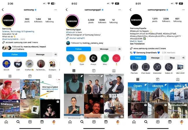
Samsung features separate social media accounts for the different countries it operates in. There’s a main Samsung page, as well as pages for various local markets including Samsung Espana, Ecuador, and Egypt.

Samsung Instagram examples from multiple countries

Another point of consideration in your multilingual content strategy is creating useful entry points to find your content.

For instance, in this video, a Spanish-speaking consumer typed a brand’s name into Google, and clicked through to the brand’s website (a landing page) from there. He landed on the brand’s English-speaking version of the page, and there weren’t any links that enabled him to translate the content. Friction.

When he went to the same brand’s homepage directly, the website automatically changed the content to the Spanish-language version of the website, which provided much less friction. However, that approach doesn’t come without its challenges either.

For instance, say a Spanish-speaking consumer uses a shared computer where the settings aren’t in Spanish. The automatic change of language wouldn’t happen, so it’s important to provide options in the navigation for consumers to easily choose their preferred language.

Do this: Conduct user testing for the customer experiences you’re designing with people in the markets who speak the language you want to start operating in. That testing will highlight any friction in the customer experience you’re planning.

You can use that feedback to ensure you develop and organize your content. This is a crucial step to make sure that your content meets the needs of the people you want to serve, in a manner that delivers as little friction as possible for them.

It’s Time to Activate a Multilingual Content Strategy for Your Brand

You can attract and convert more of your ideal customers. You just have to start engaging them with a well-thought-out content strategy in their preferred language.

Don’t make the common mistake of trying to convert customers who speak other languages with the least effort possible. Instead, focus your resources on developing a deeper degree of intimacy with the community you want to reach.

Then, use that insight to develop a thoughtful customer journey and friction-free customer experience to win their attention and earn their loyalty.

Market Size: The Two Best Methods for Market Sizing Your Business, Plus Expert Tips

Featured Imgs 23

When considering a new venture, you must understand: “What is market size?” More specifically, you need to know your venture’s potential market size. But “Why?” I hear you ask.

→ Download Now: Market Research Templates [Free Kit]

Picture this: You’ve put in months of hard work only to realize that 100 people in the U.S. will potentially buy your product.

The potential revenue from that population size may be worth your product's manufacturing, production, and distribution costs — or it may not.

But even if you’ve got 10,000 potential customers, you still need to go deeper in your market sizing to understand whether there’s a viable market.

Below, I’ll share methods to calculate your market size and accurately measure your business’ revenue potential.

I will also share first-hand experiences from founders, CEOs, entrepreneurs, and more who spoke to me about their market sizing journeys.

Keep reading, or jump to the section you’re looking for:

When market sizing, you're calculating customer numbers to measure the growth potential of your business.

Why is market size important?

There are several reasons why every business should spend time sizing its market:

  • Market sizing helps you determine whether your product is a worthy investment. The latest data from the U.S. Bureau of Labor Statistics (BLS) finds that 23.2% of private sector businesses in the U.S. fail within the first year. Businesses fail for many reasons — however, miscalculating product demand (or not calculating it at all) is one of them.
  • Market sizing helps you estimate profit and potential for growth. If you know how many people your business has the potential to reach, you can estimate how much revenue you can generate. This is valuable for both business owners and investors.

Real-world example:

“We first identified who fits into our target market so we could figure out an ideal market size,” says Michael Nemeroff, CEO and co-founder of apparel eCommerce brand Rush Order Tees.

Nemeroff says the brand considered business leaders, schools, sports teams, and event organizers their primary targets because they create customized apparel and other products. Because the team operates virtually, that market can extend as far as shipping is availability.

“The biggest challenge was accounting for differences across regions because of population density, event frequency, business hubs, etc.,” Nemeroff adds: “It’s a bit of a guessing game, but you’re making educated guesses that help you understand the viability of your idea and start planning your budget.”

According to Nemeroff, “it would be terrible to overshoot your market size considerably then overspend on a market where the juice isn’t worth the squeeze.”

  • Market size defines who you’re marketing to and what their needs are. No business can succeed without marketing. Knowing your market size is the first step in understanding your target market and its needs.
  • Market sizing helps your business make better decisions. Understanding your market landscape, gaps, and opportunities will inform your decision-making. It can also help you set realistic goals, assign resources, and refine your strategies.

Real-world example:

“Skipping market sizing can lead to costly mistakes,” says Logan Mallory, vice president of marketing at Motivosity, an employee recognition and rewards platform.

“Early in my career, I was a part of a startup that did not prioritize market sizing. We anticipated that our product would appeal to a large number of people, so we spread our marketing efforts excessively thin.”

Mallory continues, “As a result, we wasted resources on low-conversion areas while passing up more lucrative prospects. If we had done comprehensive market sizing, we could have identified and targeted high-potential sectors from the outset, maximizing our budget and generating faster growth.

  • Market sizing helps your business minimize risk. Starting or expanding a business is inherently risky. Understanding your market can help you anticipate and prepare for challenges.

Market Size vs. Market Value

Market size is the total potential demand for a product or service. This number usually calculates the number of potential customers, units sold, or revenue generated. So, market size is an estimate of the overall market reach.

Market value refers to a company or industry's financial worth or estimated market capitalization. It’s a measure of perceived value. It can give you an idea of how much a company could sell for in a given market.

In summary, market size focuses on the potential market opportunity, while market value is the financial value of an individual company or an entire market.

Market Sizing Terms to Know

Before figuring out your market size, there are a few helpful terms you should get to know.

Total Addressable Market (TAM)

TAM stands for Total Addressable Market. This number is the maximum potential revenue or customer base a company could achieve if it captures 100% of its market share.

Serviceable Addressable Market (SAM)

SAM stands for Serviceable Addressable Market. SAM is a part of the TAM that aligns with the company's resources, capabilities, and target customers.

Serviceable Obtainable Market (SOM)

SOM stands for Serviceable Obtainable Market. SOM is the part of the SAM that a company can get at its current scale. This figure may consider marketing and sales strategies, competitive positioning, and product demand.

what is market size, tam sam som

Check out this post to learn more about TAM, SAM, and SOM and how to calculate them.

Target Market

A target market is a specific group of customers, industries, or segments a company focuses on. It‘s the customer segment most likely to show interest in, purchase, and appreciate a company’s products or services.

Penetration Rate

Penetration rate refers to the percentage of a target market a company has successfully captured. It shows the level of market share a company reaches in a specific market segment or overall market.

market penetration rate

Pro tip: If you're a new business, you can calculate the penetration rate by dividing your total customers by the number of potential customers in the target market. Then, multiply the result by 100 to get the percentage.

Learn more about market penetration here.

Market Segmentation

Market segmentation means dividing the total market into distinct groups or segments. Usually, the people in these segments have common characteristics, needs, or behaviors.

Segmenting the market can help you better understand your target customers. It can also help you tailor business strategies, like marketing, to meet specific segment needs.

Value Proposition

A value proposition is the unique benefits that a company offers to its target customers. It differentiates a company's product or service from competitors and creates value for customers.

Understanding the value proposition is crucial in market sizing. This is because it can help you find the specific customer segments that will find the most value in your offer.

Pro tip: Try one of these free value proposition templates to draft your value proposition.

While calculating market size requires only a few steps, it‘s a crucial process. Follow the steps below to understand your business’s potential demand and revenue opportunities.

market size example

1. Start with your total addressable market.

I know what you’re thinking! But seriously, don’t be put off by the technical jargon. Calculating your TAM is as simple as multiplying the total customers in a market by the annual value per customer.

That said, before calculating, make sure you take a look at the steps below:

  • Define your product or service. While developing a product can be quick, growing a business around a product is more complex. That’s why you need to really understand your product or service, including how it solves a problem or meets a need in the market.
  • Find your market category. Some products fall within more than one industry or market category. This is the first step in narrowing your TAM. So, think carefully about what you expect customers to compare your offer to.
  • Conduct market research. Gather relevant data and information about your potential users. If you're new to market research, check out this free market research kit with research and planning templates.
  • Analyze the competition. Conduct a competitive analysis to determine the market share and unique value of your top competitors.

Pro tip: Getting started on competitive analysis for the first time? Heed Christine White’s (HubSpot’s former Senior Marketing Manager) words below.

“Competitive analysis is the process of comparing your competitors against your brand to understand their core differentiators, strengths, and weaknesses. Competitive analysis is an opportunity to learn from others. It isn’t copying successful competitors to the T. Trying to undercut others’ pricing. A one-and-done exercise,” says White.

  • Define your total addressable market (TAM). Using the research and analysis you've conducted, create a realistic TAM estimate.

2. Find a group of customers to focus on within that target market.

Want to quantify the top customers in your market? Try the tips below:

  • Create your ideal buyer persona. Use the Make My Persona tool to outline the characteristics, demographics, and behaviors of your ideal customers.
  • Segment your target market. Start dividing your target market into distinct segments. You might base segments on age, location, interests, or buying behavior.

Real-world example: Vinay Kevadiya, the CEO and founder of business plan software Upmetrics, shared his approach to market analysis and segmentation with me.

“We first defined our market by identifying potential users of Upmetrics,” says Kevadiya. “It includes small business owners/entrepreneurs, business consultants, business schools, incubators, and accelerators.”

After this, Kevadiya and his team segmented users based on type, industry, and scale. “Group 1 was small businesses and entrepreneurs. Group 2 includes business consultants, incubators, accelerators, and business schools.”

Kevadiya adds, “Then we did a Quantitative Analysis and identified the total number of potential users in each group in the US geography. We collected this data using industry reports and statistics.”

  • Continue market research. Continue collecting data and insights about each segment. This will help you understand each segment's size, needs, preferences, pain points, and purchasing habits. Your ongoing market research might include surveys, interviews, focus groups, or analyzing existing market research.
  • Set pricing for your product or service. For some products, pricing is a deciding purchase factor. So, if you haven't already, set pricing or a price range for your products.
  • Assess segments of your market and prioritize. Think about each segment‘s size, growth potential, and competition. It’s also a good idea to consider how each segment aligns with your company's capabilities and resources.

Pro tip: Don't just focus on segments that offer the most attractive opportunities. Make sure they align with the strengths and needs of your offering.

  • Refine your buyer personas. With your prioritized segments, take another look at your ideal customer profile. This will give you a more useful buyer persona for your marketing and sales strategies.
  • Confirm your SAM with market testing. Test your target segments with a product or service pilot group, measuring their responses and feedback.

3. Figure out how many of those customers are likely to buy your product.

This step will narrow your scope more intensely on the customers who need exactly what you offer. These people are looking for you or a clear alternative to your competitors. To quantify this group:

  • Create a customer journey map. Through awareness to purchase, this process can help you map out the ideal customer path. From how you expect customers to discover your products to the blockers that might keep them from clicking buy, this step is helpful for market sizing and beyond. New to the process? Use these customer journey templates.
  • Estimate conversion rates. Use historical data, industry benchmarks, or industry research to estimate conversion rates. This can help you quantify the expected numbers of leads, prospects, and customers in each segment.
  • Figure out buyer intent. Create a ranking or score for each segment to measure their likelihood of purchasing your product. This can help you prioritize segments with the highest conversion potential.
  • Create a SOM estimate with your data. The research above will add credibility to your market size estimate. It can also help guide your growth strategies.

Pro tip: Vinay Kevadiya recommends including “competitor activities” within your SOM estimate. “We have even considered the marketing and sales strategies of our competitors and estimated their reach to the number of customers,” Kevadiya explains.

4. Multiply that customer number by estimated penetration rate.

To calculate penetration rate, divide the SOM you calculated above by your TAM, then multiply by 100.

Once you have a calculation for your market size, you'll want to make sure you can trust that number. Keep your market sizing current with these tips:

  • Confirm your data is accurate and reliable. As you complete your research, use reliable sources such as industry reports, market studies, or government databases. Also, check to ensure the data you're referencing is current.
  • Keep up with market growth, seasonality, industry trends, tech advancements, regulatory changes, and economic conditions. These factors can affect both market size and customer demand.
  • Review and update your market size estimates regularly. Market conditions change over time. Plan regular reviews of your market size, then update your calculations with new or relevant data.

How to Apply Market Sizing Information Once You Have It

You've your estimated market size — now what?

Market size helps your business answer the following questions:

  • How much potential revenue can we earn from this particular market? In other words, is it even worth our time and energy?
  • Is the market big enough to interest us?
  • Is the market growing? Given that 36.2% of U.S. businesses fail after three years, 48.0% after five, and 65.3% after 10, you must plan for the future. Will there still be opportunities to earn revenue from this market in three, five, or 10 years?

Beyond those pressing points, how else can you apply market-sizing information to your business? You’ve done the work — you might as well get the most from the data, right?

I spoke to founders, CEOs, and entrepreneurs to find out how they used market sizing information once they had it.

Create a strategic plan.

According to Vinay Kevadiya, once Upmetrics had done its market sizing, it helped the team create a clear strategic plan.

“Lots of customer insights are gained. It involves understanding customer demographics, behavior, and preferences, which are essential for tailoring products and services to meet the market demands more effectively,” says Kevadiya.

Part of the strategic planning included building marketing and sales strategies. “Based on the groups, it is now easy to target the customers, and it helped us to plan content marketing and SEO strategies,” Kevadiya says.

Leverage unique positioning.

Axel Lavergne, Founder of Reviewflowz, a review and testimonial software for SaaS, used competitor analysis data to gain valuable insights about their business.

“We studied our competitors to determine market saturation and gaps,” says Lavergne. “For instance, we discovered that, while many companies provided review management tools, few expressly addressed the needs of small to medium-sized SaaS businesses.”

This analysis assisted Reviewflowz in uniquely positioning itself by targeting an “underserved niche.”

“As a result, we avoided overcrowded niches and focused on unmet demands, resulting in a strong market launch and rapid growth. Market sizing was more than just a formality; it helped us link our vision with market reality, ensuring we focused on the correct audience and possibilities,” emphasizes Lavergne.

Adapt product features.

“Detailed market sizing was central to our winning FinlyWealth pitch,” says Kevin Shahnazar, co-founder and CEO of FinlyWealth.com, a credit card comparison platform in Canada

Shahnazar’s team started by appropriately estimating the total number of credit card holders in Canada — approximately 30 million. They then considered only those looking for new cards or better rewards — a subset already existing. They estimated at 20% of cardholders annually.

FinlyWealth’s approach combines top-down and bottom-up methodologies. The top-down view included analyzing industry reports and government data. For the bottom-up approach, they surveyed potential users and looked at the search volume for comparison terms of the word credit card.

Shahnazar adds: “From this process, it was evident that an obtainable market of SOM around 1.5 million users annually exists. Armed with this data, we refined our platform based on the needs of the targeted markets.”

As a result, they could “Adapt product features to the most challenging needs expressed in the targeted market, enabling a 40% higher engagement rate.”

Attract investors.

Market size is a critical number to know when you‘re looking for funding. Investors will need to know how much money they have the potential to make from a given market. Additionally, it’s vital to recognize whether your potential revenue outweighs your business' costs. But don’t just take my word for it …

“Market sizing had a significant impact on our business. It provided more accurate resource allocation, focused marketing strategies, and improved product offerings,” says Shawn Plummer, CEO at The Annuity Expert.

As an example, Plummer says his team identified underrepresented demographics and personalized services to match their individual needs, resulting in better consumer engagement and faster growth than expected.

Plummer adds, “This strategic insight also helped attract investors, as we could demonstrate a clear understanding of market opportunities and risks.”

Find new opportunities in a competitive niche.

Once you have market size, you‘ll also want to consider how saturated the market is with your competitors’ products.

Ultimately, you can‘t capture the total addressable market (TAM) — some of those people will choose competitors’ products over yours. So, you'll need to figure out whether you can earn enough consumers out of the TAM to make this a worthwhile venture.

That said, marketing sizing can help you find hidden opportunities even in a competitive niche.

Teresha Aird, co-founder and CMO of Offices.net, speaks about her experience in market sizing for a competitive industry.

“When we were starting out, we knew that having a solid grasp on our market size would be crucial for success, especially in our highly competitive sector,” says Aird.

Aird’s team began by conducting thorough research to understand the total addressable market (TAM) for commercial office space in the U.S. This required analyzing industry reports, government data, and conducting a thorough analysis of our direct competitors.

“We also looked at market trends, growth rates, and the demand profile for flexible workspaces, which is a niche we were particularly interested in,” Arid says.

Aird adds, “Through the process, we identified a growing demand for flexible office spaces among startups and small businesses. This insight led to us tailoring our services to meet their specific needs, which increased our user base.”

Pro tip: Aird and the team also surveyed potential clients to gauge their actual needs and preferences, giving them more personalized data.

Market Sizing Methods

There are two simple methods for market sizing your business. These processes can help you use data to gauge market size.

Top Down Approach

The first is a top-down approach, in which you start by looking at the market as a whole and then refine it to get an accurate market size. That would look like starting from your total addressable market and filtering from there.

 Graphic explaining what is market size vs. market value

Market Sizing Example

Let‘s say you want to launch a wine company. First, you’d want to figure out how many liquor stores are in the United States — this helps you determine the total market to which you could theoretically sell your product.

After your research, you discover 50,000 liquor stores in the United States. Of that total list, you only want to sell to the New England area — including Massachusetts, Maine, and Rhode Island.

You decide your target market includes the 1,000 liquor stores in the New England area. From here, you conduct research and speak with alcohol distributors to find there's a roughly 40% success rate for wine distribution.

Using this as an example, we'd calculate the market size using the following formula:

1,000 liquor stores x 40% = 400 liquor stores

Then, if you assume each liquor store will result in $20,000, you can figure out potential revenue using the following formula:

400 liquor stores x $20,000 = $8,000,000

This means you stand to make $8 million if you penetrate 40% of the total market in the New England area.

Bottom-Up Approach

A bottom-up approach is the exact opposite – starting small and working your way outward.

This involves first identifying the number of units you can expect to sell, then considering the number of sales you anticipate from each buyer, and finally, the average price per unit.

Market Sizing Example

Using the same wine example – say you found recent data showing that the average cost of a wine bottle in New England is $10. A survey shows that the average consumer buys one bottle of wine a week, or 48 bottles a year. This means that the average consumer spends $480 per year on wine.

Next, you discover that the number of consumers (or households) you can expect to reach in the New England area is 16,000.

As a result, your market size is 480 x 16,000 = $8,000,000.

I have to emphasize that both methods ignore the existence of competitors, customer churn rate, and other factors that impact sales. With this in mind, I recommend staying conservative when estimating how much of the market size you'll win and using this as a starting point.

Real-world example:

Milind Katti, CEO and co-founder of DemandFarm, shared his company’s approach to market sizing with me.

“Our approach to evaluating total addressable market size and potential revenue at DemandFarm is both data-driven and bottom-up,” says Katti.

First, they worked out the “Ideal Customer Profile (ICP) and the distinct market segments we target.” This is followed by the “average contract values (ACVs) for each segment and the total addressable market (TAM) size of these segments, representing the number of companies that fit the segment criteria.”

Katti adds: “By multiplying the TAM of each segment by its corresponding ACV, we estimate the market size and revenue potential for each segment. Aggregating these estimates across all segments provides us with a comprehensive view of the overall market size and revenue potential.”

Market Size: FAQs

Now, I’ll answer common questions about market size.

What is the first step in calculating market size?

The first step in calculating market size is to start with your Total Addressable Market (TAM.) To calculate your TAM, multiply the total customers in a market by the annual value per customer.

What is considered a large market size?

It depends on your business and goals. However, if you’re looking to attract VC funding, a $1 billion market size is said to be large enough. But this is a symbolic target. In reality, VCs are more interested in exit size because when a company is sold or publicly listed, they’ll get a return on investment.

What is considered a small market size?

Once again, it depends on your business and your goals. However, a small market size typically means a projection of under $15 million in annual revenue.

What is a good market size for a startup?

A good market size for a startup depends on each business.

For example, a competitive market estimate for a tech startup could be between $5 billion to $500 million. However, a competitive market estimate for a local small to mid-sized business startup could be $60,000 to $500,000.

That said, the potential demand for your product or service should always be large enough to sustain growth in the first few years.

To market size or not to market size?

Everyone I spoke to experienced positive results after market sizing their business. It empowered them to plan strategically, estimate growth potential, and even thrive in a competitive industry.

Still, that’s not to say you can’t thrive without market-sizing your business. Take Andrei Serbanoiu, co-founder of Socialinsider.io, as an example. Serbanoiu never did market sizing before entering their industry.

“Looking back, it probably wasn‘t the most mature approach, but hey, enthusiasm and hard work can take you a long way! I don’t think we were even familiar with what market sizing was at that point, to be frank,” Serbanoiu says. “Now, eight years later, I wish we had as it would have given us a more grounded approach with better-set expectations for the years to come.”

Serbanoiu adds, “We‘re doing great despite not being aware of the market size we’re diving in, but I can't stop asking myself — would we have been doing the same things if we had done it in the beginning?”

Serbanoiu and Michael Nemeroff (CEO and co-founder of Rush Order Tees) agree that market sizing is a guessing game. But at least you’re making educated guesses that help you estimate the viability of an idea.

Or as Serbanoiu puts it, “I think that market sizing helps but does not ultimately determine the path we go on — things evolve, markets grow and shrink and ultimately building a business is about taking risks and placing bets — maybe more informed bets if you do your research properly.”

Ready to tackle market sizing and beyond? Try HubSpot's Starter Bundle Built for Startups & Small Businesses.

Editor's Note: This post was originally published in April 2019 and has been updated for comprehensiveness. This article was written by a human, but our team uses AI in our editorial process. Check out our full disclosure to learn more about how we use AI.

How to Build a Detailed Business Plan That Stands Out [Free Template]

Featured Imgs 23

When you already have a well-established business and need a business plan, it’s usually not difficult because you know everything inside out.

→ Download Now: Free Business Plan Template

But when you’re a startup and need to create your first detailed business plan, it’s a challenge. A serious challenge. Been there — done that.

My first business plan was, to put it mildly, a disaster. It had so many unnecessary details and lacked essentials that it was practically a novel.

So, I sought professional help with writing the business plan and learned everything I’m going to share with you today.

Let’s learn how to craft an organized and well-thought-out business idea that answers potential investors’ questions.

Table of Contents

Business Plan Template

To make this post practical from the get-go, I’ll walk you through the process of filling out your business plan template, like this free, editable version:

how to create a business plan template: template from hubspot

Download a free, editable one-page business plan template.

I know that when looking at a blank page on a laptop screen, the idea of writing your business plan can seem impossible. However, it's a mandatory step to take if you want to turn your business dreams into a reality.

That's why I’ve crafted the above business plan template for you to download and build upon. It contains prompts for all of the essential parts of a business plan, all of which I will elaborate on below.

Business Plan Layout

While business plans can take all sorts of different formats and have different styles, most business plans should stick to the following layout:

  • Cover page — the introduction to your business plan with all your company and personal data.
  • Executive summary -— a brief bird’s eye view of your business plan.
  • Company overview and business description — details about the company organization and the purpose of your business.
  • Product and services line — what you’ll be selling.
  • Market analysis — who you’ll be selling to and what unique value you offer.
  • Marketing plan — how you will market your business and products/services.
  • Sales Plan — how you will sell to your target audience.
  • Legal notes — legal organization and requirements for your business.
  • Financial considerations — your projected costs and revenue.
  • Appendix — supporting evidence for your business plan.

I’ll get into the details of these parts below, but first, let’s understand the big picture of why a business plan is important.

Building a Successful Business Plan

Before I get to the components of a business plan, such as an executive summary and company description, let's talk about key elements that should serve as building blocks for your plan.

For a startup owner, the thought of writing a business plan sounds like a chore — a necessary means to an end. But that's a bad take.

A solid business plan is a blueprint for success. It's key to securing financing, presenting your business, outlining your financial projections, and turning that nugget of a business idea into a reality.

At the core, your business plan should answer two questions: why your business and why now?

Investors want to know why your business is entering the market, i.e., what problem it‘s solving and how it’s different from what's currently out there. They also want to know why now is the right time for your type of product or service.

At a minimum, your plan should:

Be more realistic than idealistic.

Too often, business plans overly focus on how things could be instead of how they are. While having a vision is important, your plan needs to be rooted in research and data.

If you’re a freelancer thinking you don’t need something as serious as a business plan, take this tip from Joseph:

JaffaBranding’s post on X about why a business plan is important for freelancers

There’s no doubt — you need a business plan, but at the beginning, you may not have numbers or brilliant results to point to. What can you do to make your plan sound good while still being realistic?

Start by grounding your plan in real-world data. Even if you don’t have your own results yet, you can use industry benchmarks and market research to provide a solid foundation.

Show that you understand the landscape by incorporating insights from existing reports or similar businesses.

I suggest including even the smallest projects you worked on as a freelancer. Everything counts.

Be transparent about the assumptions you're making. Explain the basis for your projections and how you arrived at your estimates.

I’ve found this honesty will help others see that your plan is well thought-out, even if it’s still in the early stages.

Legitimize your business idea.

If an idea fails on paper, it's a signal to go back to the drawing board. In doing so, you avoid losing precious time or money chasing an unrealistic idea.

“When you are officially in business, you are likely to take your commercial endeavors more seriously, and you will start to make more strategic decisions,” shares Nikki Rogers, CEO of the Bladen Group.

“As the owner of a legitimate business, you are more likely to network with other business owners, improve your skills, increase your business knowledge, and generally level up to make your business successful.”

Rogers also points out an important consideration: What if you can no longer work in your business?

After all your hard work, you want your business to be a valuable asset that you can sell, transfer, or leverage. To achieve this, your business must be legitimate and properly structured.

If it’s not, all your efforts could disappear. So, make sure your biz is legally established and well-organized so it remains a valuable asset, even if you need to step away.

Position your business for funding.

To get your business off the ground, chances are you‘ll need financial backing.

Even with a solid business idea, investors, lenders, and banks still need convincing.

An effective business plan will outline how much money you need, where it’s going, what targets you will hit, and how you plan to repay any debts.

This is especially important when you're a startup, and no one has heard of you, making persuasion three times harder.

I recently read a great piece by FasterCapital on this topic, but what especially caught my attention was the advice about giving up some control when you take on investors.

Investors will want a say in how the business is run, which means you’ll have to make compromises and listen to their input. This can be challenging for startup owners, especially when you're worried about potential losses.

Choosing the right investors for your business plan

Image Source

Together with the founder of Signum AI, we shared the same mindset at the beginning and could not imagine losing a single penny. But now I know that “no risk, no fun” applies to business as well.

Lay the foundation.

Investors focus on risk — if anything looks shaky, it could be a dealbreaker. Ideally, your business plan will lay down the foundation for how you'll operate your business — from operational needs to financial projections and goals.

Regarding financial projections, it was the hardest thing for me in the beginning until I learned how to measure specific parts and use the right formulas for each segment. Here, I will share the formulas and key metrics you need to track so you can include all the necessary details in your business plan:

Revenue Growth

  • Formula: (Revenue This Period - Revenue Last Period) / Revenue Last Period x 100%
  • Example: If revenue grew from $10,000 to $12,000: (12,000 - 10,000) / 10,000 x 100% = 20%

Customer Acquisition Cost (CAC)

  • Formula: Total Marketing and Sales Expenses / Number of New Customers Acquired
  • Example: If you spent $5,000 to acquire 50 customers: 5,000 / 50 = $100

Customer Retention Rate

  • Formula: (Customers at End of Period - New Customers) / Customers at Start of Period x 100%
  • Example: If you start with 100 customers, acquire 20 new ones, and end with 110: (110 - 20) / 100 x 100% = 90%

Net Cash Flow

  • Formula: Cash Inflows - Cash Outflows
  • Example: If you have $15,000 in cash inflows and $12,000 in outflows: 15,000 - 12,000 = $3,000

Burn Rate

  • Monthly Operating Expenses
  • Example: If you spend $10,000 a month, your burn rate is $10,000.

Net Promoter Score (NPS)

  • Formula: % Promoters - % Detractors
  • Example: If 70% are promoters and 10% are detractors: 70% - 10% = 60 NPS

You should also calculate the average deal sum, the sales cycle, the “demo-won deal” ratio, the quality of leads, the most popular pricing tier, etc.

Even for my freelance writing, I know these figures — not to mention me taking care of fundraising for a charitable organization. Data speaks. You have to remember it.

Communicate your needs.

It‘s nearly impossible to communicate your needs if you don’t know what they are first.

Of course, business needs change, and it's hard to predict everything at the start, but your plan should still give a clear idea of how your business will run both now and in the future — and what the potential risks are.

To get the gist of it, consider three things:

  • Your industry – How does your product or service fit within your industry? Are you targeting a specific niche? Where do you see the industry going in the next three to five to ten years?
  • Your target audience – Who are you targeting? What challenges are they facing? How will your product or service help them in their daily lives?
  • Your unique selling proposition (USP) – What sets you apart from your competitors? Is it your product/service features? Your company values? Price?

The FasterCapital article offers this piece of advice, “Your value proposition should be focused on the customer and not on the features of your product or service. Instead of saying, ‘Our product has X features,’ say, ‘Our product helps Y people.’”

Once you know the answers to these questions, you'll be equipped to answer the question: Why is your business and why now?

Now for the fun part: detailing all the parts of a business plan layout!

Featured Resource: Free Business Plan Template

HubSpot's free business plan template

Download the template for free.

1. Cover Page

Your business plan should be prefaced with an eye-catching cover page. This means including a high-resolution image of your company logo, followed by your company's name, address, and phone number.

Since this business plan will likely change hands and be seen by multiple investors, you should also provide your own name, role in the business, and email address on the cover page.

At the bottom of this page, you can also add a confidentiality statement to protect against the disclosure of your business details.

The statement can read as follows: "This document contains confidential and proprietary information created by [your company name]. When receiving this document, you agree to keep its content confidential and may only reproduce and/or share it with the express written permission of [your company name]."

Keep your cover page simple and concise — and save the important details for other sections.

Why it matters: First impressions are everything, and a clean cover page is the first step in the right direction.

Examples of a Cover Page

There is no single ideal cover page that every business should follow.

For instance, if you're in real estate, you might want a catchy design showcasing luxury villas, jacuzzis, palm trees, and so on — you get my point.

On the other side, if you're in finance, you might prefer a more corporate style like this:

how to create a business plan template: Cover page

Image Source

And then, if you‘re in the fashion industry, you definitely can’t go with something so “boring,” if I may say.

You need to opt for something more eye-catching, stylish, and aesthetic, like this:

Business plan layout: cover page

Image Source

People are visual creatures, and what catches our attention first often leaves the most lasting impression. That’s why your cover page must be really good to make them want to continue to the next page.

2. Executive Summary

The executive summary of your business plan provides a one- to two-page overview of your business and highlights the most crucial pieces of your plan, such as your short-term and long-term goals.

The executive summary is a boiled-down version of your entire business plan, so remember to keep this section to the point and filled only with essential information.

Typically, this brief section includes:

  • A mission statement.
  • The company's history and leadership model.
  • An overview of competitive advantage(s).
  • Financial projections.
  • Company goals.
  • An ask from potential investors.

When I was working on my summary, I found Felix Haller’s video super helpful. He breaks it down — like how your summary should be concise, with an intro and no more than five main bullet points.

What stood out to me was his advice on focusing on the key insights, the “so what's,” instead of just throwing in a bunch of facts.

As someone who thinks visuals are super important, I loved how Haller showed that executive summaries don’t have to be dull bullet points — they can actually look great and be engaging.

Business plan layout: A clip from Felix Haller’s tutorial

Image Source

He also mentioned that if you only had 30 seconds to get your point across, your summary should cover everything important. This tip stuck in my mind and made my presentations clearer and more effective.

Why it matters: The executive summary is known as the make-or-break section of a business plan. It influences whether investors turn the page or not — so effectively summarizing your business and the problem it hopes to solve is a must.

Think of the summary as a written elevator pitch (with more detail). While your business plan provides the nitty-gritty details, your summary describes — in a compelling but matter-of-fact language — the highlights of your plan. If it's too vague, complicated, or fuzzy, you may need to scrap it and start again.

Example of an Executive Summary Introduction

“The future looks bright for North Side Chicago, particularly the Rock Hill Neighborhood. A number of high-end commercial and residential developments are well on their way, along with two new condo developments in nearby neighborhoods.

“While the completion of these developments will increase the population within the neighborhood and stimulate the economy, the area lacks an upscale restaurant where residents and visitors can enjoy fine food and drink. Jay Street Lounge and Restaurant will provide such a place.”

3. Company Overview & Business Description

In this section, provide a more thorough description of what your company is and why it exists.

The bulk of the writing in this section should be about your company's purpose — covering what the business will be selling, identifying the target market, and laying out a path to success.

In this portion of your business plan, you can also elaborate on your company's:

  • Mission statement.
  • Core values.
  • Team and organizational structure.

I like to imagine it as a motivational letter you might write when applying for a job. A company overview serves a similar purpose to your business plan. Here’s a good example of a company overview for SMBs:

Business plan layout: Company overview example

Image Source

The description explains what makes the company special, who it‘s for, and why it stands out from the competition. It gives a clear snapshot of the team’s skills, financial health, and the products they offer.

Highlighting partnerships with major curriculum publishers and a focus on fitting with existing curricula boosts its standing in the education market. Overall, I think the description is well put together and convincing.

Why it matters: Investors look for great structures and teams in addition to great ideas. This section gives an overview of your business‘s ethos. It’s the perfect opportunity to set your business apart from the competition — such as your team's expertise, your unique work culture, and your competitive advantage.

Example of a Values/Mission Statement

“Jay Street Lounge and Restaurant will be the go-to place for people to get a drink or bite in an elegant, upscale atmosphere. The mission is to be North Side's leading restaurant, with the best tasting food and the highest quality service.”

4. Product & Services Line

Here‘s where you’ll cover the makeup of your business‘s product and/or services line. You should provide each product or service’s name, its purpose, and a description of how it works (if appropriate). If you own any patents, copyrights, or trademarks, it's essential to include this info too.

Next, add some color to your sales strategy by outlining your pricing model and mark-up amounts.

If you're selling tangible products, you should also explain production, costs, and how you expect these factors to change as you scale.

Business plan layout: What to include in the products and services part

Image Source

I’ve recently watched a great YouTube tutorial by Troyia Monay, where she points out that it’s a good idea to outline how your products or services are priced compared to your competitors.

She also mentions something that I find super important: many people think they don’t need this section if they’re not in ecommerce, but that’s the wrong mindset.

Even if you aren’t in ecommerce, the products or services you offer are the backbone of your business, and you need to explain them in the right way.

For instance, when I describe my services, I do it like this:

  1. I tell clients about my core services: Creating B2B blog posts and top-notch SaaS content.
  2. I explain what each service covers: Keyword and topic research, writing detailed articles, creating article outlines, and tracking article performance.
  3. I outline my pricing options clearly: Project-based quotes for one-time tasks and retainer packages for ongoing content needs.
  4. As the cherry on the top, I always share why they should choose me: A personalized approach, thorough research, strong SEO skills, timely delivery, industry connections, and a commitment to quality.

Why it matters: This section contains the real meat of your business plan. It sets the stage for the problem you hope to solve, your solution, and how your solution fits in the market.

Example of a Product/Service Offering

“The menu at Jay Street Lounge and Restaurant will focus on Moroccan cuisine. The stars of the menu (our specialties) are Moroccan dishes, such as eggplant zaalouk, seafood bastilla, tagine, and chickpea stew.

For those who enjoy American dishes, there will also be a variety of options, from burger sliders and flatbread pizza to grilled steak and salads.

The food at Jay Street will have premium pricing to match its upscale atmosphere. During the summer months, the restaurant will have extra seating on the patio where clients can enjoy a special summer menu. We will be open on all days of the week.”

There's no one-size-fits-all formula for this section.

For instance, one plan may delve into its ability to market in a more cost-effective way than the competition, whereas another plan focuses on its key products and their unique features and benefits.

Regardless of your angle, it's critical to convey how your offerings will differ from the competition.

Something that works for me:

“Collaboration with me means you'll never see the bland, robotic content that’s just filler for search engines. I write for readers first and foremost. I want to make them (not only Google) happy and satisfied and help them find the information they came for.

By using real-world examples, interviewing experts for my pieces, and addressing what people actually want, my content quickly climbs to that coveted #1 spot in search results.”

5. Market Analysis

The market analysis section is where you‘ll provide details about the audience to which you’re marketing your business.

This should encompass the size of your total addressable market, your market‘s demographics and psychographics, and location analysis for your business’ operating space.

It helps to reference your market research documentation in this section, like a Porter's Five Forces Analysis or a SWOT Analysis (templates for those are available here). You can also include them in your appendix.

In my opinion, SWOT analysis gives the clearest snapshot of a business's potential and challenges. It’s been my go-to tool since day one. Check out how straightforward and powerful it can be with this Apple example:

business plan layout: Apple SWOT analysis

Image Source

And here’s what a potential SWOT analysis for a startup might look like:

  • Strengths: Innovative technology, a talented and dedicated team, or a unique value proposition in terms of customer care or a wide range of goods, etc.
  • Weaknesses: Limited brand recognition, restricted budget, or gaps in industry experience.
  • Opportunities: Emerging market trends, new technological advancements, or changes in regulations that favor your business.
  • Threats: Increasing competition, economic instability, or evolving market demands that could impact your business. Plus, unstable lead generation, product bugs, and more.

If your company already has buyer personas, you should include them here as well. If not, you can create them right now using the Make My Persona Tool.

Why it matters: Having an awesome product is, well, awesome — but it isn't enough. Just as important, there must be a market for it.

I like how this section allows you to dig deeper into your market, which segments you want to target, and why. The “why” here is essential since targeting the right segment is critical for the success and growth of your business.

It's easy to get lost (or overwhelmed) in a sea of endless data. For your business plan, narrow your focus by answering the following questions:

  • What is my market? In other words, who are my customers?
  • What segments of the market do I want to target?
  • What's the size of my target market?
  • Is my market likely to grow?
  • How can I increase my market share over time?

As Mike Ploger from Visme says, “Writing a market analysis is like looking into the engine of a car and understanding why every little component gets that vehicle from point A to point B. You may be at Point A right now, but soon, you‘ll be sitting pretty much riding off into this concept.

You’ll want to study and note occurrences in your industry that have made impacts on its overall direction. Analyzing external factors, like political, economic, sociological, technological, legal, and environmental aspects, will help you prepare for potential disruptions.”

The whole tutorial where Mike breaks down crafting a market analysis is pure gold. It’s packed with visual examples and clear explanations, so I definitely recommend checking it out:

Example of a Market Analysis

“Jay Street Lounge and Restaurant will target locals who live and work within the Rock Hill Neighborhood and the greater North Side Chicago area. We will also target the tourists who flock to the many tourist attractions and colleges on the North Side.

“We will specifically focus on young to middle-aged adults with an income of $40,000 to $80,000 who are looking for an upscale experience. The general demographics of our target market are women between 20 to 50 years old.

“A unique and varied Moroccan-American menu, along with our unique upscale atmosphere, differentiates us from competitors in the area. Jay Street will also set itself apart through its commitment to high-quality food, service, design, and atmosphere.”

6. Marketing Plan

Unlike the market analysis section, your marketing plan section should explain the tactical approach to reaching your aforementioned target audience.

List your advertising channels, organic marketing methods, messaging, budget, and any relevant promotional tactics.

If your company has a fully fleshed-out marketing plan, you can attach it to the appendix of your business plan. If not, download this free marketing plan template to outline your strategy.

When it comes to marketing strategy, there’s no universal playbook that works for everyone. What works wonders for one might not cut it for another.

This is something that highly depends on the business niche. I’ve seen new businesses, like handmade toys or lollipops, blow up on TikTok and become profitable in just three months.

Will the same happen to your handmade store? Well, no one can guarantee, but with a solid strategy and by learning from similar successful businesses in your niche, you’ve got a better shot at making it work.

From my experience as a freelance writer, LinkedIn worked out the best. It's safe to say that 93% of my clients came organically via LinkedIn; the rest is attributed to email outreach.

And when it comes to strategy, I can’t help but share one of the best tutorials I’ve ever seen on this topic by Adam Erhart, who crafts a marketing strategy using Kodiak Cakes as a case study.

Here's a breakdown of the highlights:

Unbiased Strategy Development: Despite having no prior knowledge about Kodiak Cakes beyond their taste, Erhart used the opportunity to develop a marketing strategy from scratch. He approached it as if he were the CEO or CMO of the brand, aiming to increase its reach and effectiveness.

Five-Step Marketing Process: Erhart outlined his approach, which involves a structured five-part process:

  • Business Model: Understanding what Kodiak Cakes sells, its price points, and its distribution channels (retail and direct-to-consumer).
  • Market Analysis: Identifying the target market, which he speculated might be millennials or young families, particularly focusing on health-conscious individuals.
  • Messaging: Crafting the right message to resonate with the target audience, highlighting elements like protein content and health benefits.

business plan template: Adam Erhart’s message from tutorial

  • Media: Choosing the appropriate media channels for advertising, such as Facebook, Instagram, and Google Ads, and using both paid and organic marketing.
  • Machine: Developing the sales funnel and ensuring the marketing campaign drives conversions efficiently. Erhart focused on simplicity to avoid overwhelming potential customers.
Creative Implementation: Erhart demonstrated how he would create a social media campaign using tools like Photoshop and Final Cut Pro. A goal was to produce engaging content that aligns with Kodiak Cakes' rugged and health-focused branding.

business plan layout: Creating visual content for Kodiak Cakes

Research and Validation: Finally, Erhart validated his strategy by researching Kodiak Cakes' actual marketing efforts. He compared them with his proposed approach and identified gaps/additional opportunities.

Overall, Erhart’s tutorial is a masterclass with so many valuable insights that can be applied to any business or industry.

Why it matters: Marketing is what puts your product in front of your customers. It‘s not just advertising — it’s an investment in your business.

Throwing money into random marketing channels is a haphazard approach, which is why it's essential to do the legwork to create a solid marketing plan.

Here‘s some good news — by this point, you should have a solid understanding of your target market. Now, it’s time to determine how you'll reach them.

Example of a Marketing Plan Overview

“Our marketing strategy will focus on three main initiatives:

  • Social media marketing. We will grow and expand our Facebook and Instagram following through targeted social media ads.
  • Website initiatives. Our website will attract potential visitors by offering updated menus and a calendar of events.
  • Promotional events. Jay Street will have one special theme night per week to attract new clients.”

7. Sales Plan

It doesn't matter if your sales department is an office full of business development representatives (BDR) or a dozen stores with your products on their shelves.

The point is: All sales plans are different, so you should clearly outline yours here. Common talking points include your:

  • Sales team structure and why this structure was chosen.
  • Sales channels.
  • Sales tools, software, and resources.
  • Prospecting strategy.
  • Sales goals and budget.

Like with your marketing plan, it might make sense to attach your completed sales plan to the appendix of your business plan. You can download a template for building your sales plan here.

For new businesses, I always recommend a 30-60-90-day sales plan because it provides a clear structure for setting and tracking goals over time.

This plan breaks down objectives into three stages: the first 30 days, the next 60 days, and the final 90 days.

business plan layout: 30-60-90-Day Sales Plan

Image Source

This type of plan focuses on achieving specific milestones, such as meeting sales quotas or reducing customer churn by a certain percentage.

It’s particularly useful for newcomers to the role or businesses still defining their sales targets, as it helps monitor progress and adjust strategies as needed.

You can download a free sales training template here.

Why it matters: Among other things, investors are interested in the scalability of your business — which is why growth strategies are a critical part of your business plan.

Your sales plan should describe your plan to attract customers, retain them (if applicable), and, ultimately, grow your business. Be sure to outline what you plan to do, given your existing resources, and what results you expect from your work.

Example of a Sales Plan Overview

“The most important goal is to ensure financial success for Jay Street Lounge and Restaurant. We believe we can achieve this by offering excellent food, entertainment, and service to our clients.

“We are not a low-cost dining option in the area. Instead, the food will have premium pricing to match its upscale feel. The strategy is to give Jay Street a perception of elegance through its food, entertainment, and excellent service.”

8. Legal Notes

Your investors may want to know the legal structure of your business, as that could directly impact the risk of their investments.

For example, if you're looking for business partners to engage in a non-corporation or LLC partnership, this means they could be on the line for more than their actual investment.

Because this clarification is often needed, explain if you are and/or plan to become a sole proprietor, partnership, corporation, LLC, or other.

You should also outline the steps you have taken (or will need to take) to operate legally. This includes licenses, permits, registrations, and insurance.

Why it matters: The last thing your investor wants to hear after they‘ve sent you a big chunk of change is that you’re operating without proper approval from the local, state, or federal government.

Example of Legal Notes

“Jay Street Lounge and Restaurant is up-to-date on all restaurant licenses and health permits. Our business name and logo are registered trademarks, presenting the possibility of expanding locally.”

9. Financial Considerations

Ultimately, investors want to know two things:

  • When they will earn their money back.
  • When they will start seeing returns on their initial investment.

That said, I recommend you be clear, calculated, and convincing in this section. It should cover:

  • Startup costs.
  • Sales forecasts for the next several months/quarters.
  • Break-even analysis for time and dollars.
  • Projected profit and loss (P&L) statement.

Facts and figures are key here, so be as specific as possible with each line item and projection. In addition, explain the “why” behind each of these sections.

However, keep in mind that information overload is a risk, especially when it comes to data. So, if you have pages upon pages of charts and spreadsheets for this section, distill them into a page or two and include the rest of the sheets in the appendix. This section should only focus on key data points.

But, let’s say you’re a startup with zero data. What’s the game plan then?

When I worked as the Head of Sales at Signum AI (a startup), I projected our revenue growth based on inbound and outbound sales opportunities we would create, our “demo-won deal” ratio, the quality of leads, the most popular pricing tier, etc. Plus, we took into account seasonality.

So, if you're starting from scratch, consider benchmarking against similar companies or industry standards to make educated guesses.

Leverage any market research or competitor analysis you have to support your projections. Highlight your strategy for acquiring initial customers and scaling up. While it’s okay to present estimates, back them up with a solid plan and logical reasoning to build investor confidence.

Why it matters: One of the most important aspects of becoming “investor ready” is knowing your numbers. More importantly, you need to understand how those numbers will enhance your business.

While it‘s easy to write a number down on paper, in my experience, it’s more important to understand (and communicate) why you need capital, where it's going, and that your evaluation makes sense.

Example of Financial Projections for a Startup:

"We’ve developed preliminary financial projections based on industry benchmarks and our planned sales activities. We anticipate an initial expenditure of around $100,000 for startup costs.

Our goal is to generate approximately $50,000 in monthly revenue within the first six months. We expect to reach a break-even point around this time. As we scale, we project significant growth, aiming for $200,000 in monthly revenue by the end of the first year."

10. Appendix

A detailed and well-developed business plan can range anywhere from 20 to 50 pages, with some even reaching upward of 80.

In many cases, the appendix is the longest section.

Why?

Because it includes the supportive materials mentioned in previous sections.

To avoid disrupting the flow of the business plan with visuals, charts, and spreadsheets, business owners usually add them in the last section, i.e., the appendix.

Aside from what I've already mentioned — marketing plan, sales plan, department budgets, financial documents — you may also want to attach the following in the appendix:

  • Marketing materials.
  • Market research data.
  • Licensing documentation.
  • Branding assets.
  • Floor plans for your location.
  • Mockups of your product.
  • Renderings of your office space or location design.

Adding these pieces to the appendix enriches the reader‘s understanding of your business and proves you’ve put the work into your business plan without distracting from the main points throughout the plan.

Example of Appendix

Business plan layout: Appendix page example

Image Source

As you can see, the appendix is quite comprehensive, but it’s a bit dry — no infographics or anything to break up the text. It contains all the necessary information in one place, and that’s its main purpose.

Why it matters: An appendix helps the reader do their due diligence.

Keep in mind, however, that an appendix is typically necessary only if you're seeking financing or looking to attract business partners.

From Mistakes to Milestones: What My Business Plan Taught Me

Working on my business plan has shown me that it’s far more than just a checkbox on a to-do list. It’s my blueprint for turning an idea into reality.

I realized my plan needed to be realistic, not just full of lofty promises to impress clients. Using industry data and benchmarks made my plan more credible and helped me hit my first five-figure month last year.

Did my initial business plan succeed? Not at first, but I made mistakes, learned, and improved over time. Through all the ups and downs, I figured out how to craft the business plan I’ve shared with you today.

P.S. Something you can use for this purpose is the HubSpot free business template. It can help you craft a strong business plan, describe your company, set future goals, detail your product line, address legal requirements, include financial projections, and define your target audience.

Editor's note: This post was originally published in June 2017 and has been updated for comprehensiveness.

How to Create the Perfect Project Timeline [Template + Examples]

Featured Imgs 23

Creating a project timeline where everyone involved knows what they‘re working on (and when it’s due) can help ward off project creep and nail those important deadlines.

→ Access Now: 16 Timeline & Flowchart Templates [Free Tool]

It's essential for keeping projects — and the people completing them — on track.

As a caretaker, I have project timelines running invisibly in my mind at all times, and most families would be a hot mess without someone in the managerial role.

The smoothest way for everyone to succeed despite the chaos is to have a hand at the wheel and an eye on the timeline. It all sounds very TVA, and frankly, that’s how metal it is to parents.

To help you make sure that your next professional project stays on schedule, I'll cover the project management basics of how to set up a project timeline, the best templates to use, and a handful of examples to inspire your future scheduling.

And yes — you can absolutely apply these skills and resources to life admin, too.

Table of Contents

What is a project timeline?

Simply put, a project timeline is a visual display that tracks the completion of various steps in a project over time.

It is a meta-view of all tasks involved in an outcome, enabling a project manager to better direct the people who are responsible for the steps involved — as well as report the project’s status to stakeholders.

After assigning tasks, it’d be wonderful if they got done on time and with no issues, arriving on or before the agreed-upon delivery date, right?

But we all know how quickly a timeline can fall apart as higher priorities pop up and deadlines slip past without much progress.

And I’ve seen first hand that projects can fail for many reasons up the chain of command as well, including a lack of support from leadership, unforeseen budget cuts, or overpromising outcomes.

Less than ideal outcomes are still fairly common even when you do invest in project management.

While 59% of formally managed projects are completed on time — which is an excellent statistic that skilled and intentional project managers can be proud of — this still means that 41% do not.

Why create a project timeline?

Time management is one of the top skills employers look for in candidates up and down the org chart. Missed deadlines and rushed projects can set entire teams — and sometimes entire companies — behind schedule.

I don’t want to be that person, and I know you don’t, either. But there will always be people on teams that need support to stick the landing on expectations that affect the larger project.

A well-built project timeline is much more than a nice visual to reassure the stakeholders, and here are just a few reasons why you should create one. It’s a living, changing, and functional process overview that can:

  • Bring leadership and structure to a project.
  • Outline what is being delivered and by when.
  • Share who is responsible for each task and set expectations for the scope, quality, and delivery of work.
  • Show how the project outcome contributes to company goals.
  • Decrease risk by accounting for any changes to the project scope, budget, deliverables, or deadlines.

Ultimately, a project timeline makes it both easier and more efficient to manage a project — particularly when you choose a timeline structure that is well-fit to the project’s scope.

This is where a project timeline template can help you move forward.

Project Timeline Template

The ideal timeline brings direction to a project, yet is easily adaptable when changes arise.

Without the right project timeline template, organizing a project can be a lot of time-consuming manual work — not to mention the formatting chaos once multiple people get their hands on it. Woof.

timeline project example

Download this Template for Free

I like to create a project timeline for any process that relies on a schedule (almost everything these days), like onboarding employees, handling a crisis, or planning social media campaigns.

All you need to know is how to outline the steps of a project and the tasks required to complete each phase. Let's do it!

How to Create a Project Timeline

Crafting the perfect project timeline takes strategy, organizational skills, and a whole lot of collaboration. You need buy-in from supporters and clear directives for everyone involved.

To get started, I recommended following this step-by-step guide to set up a structured timeline — no matter your job, industry, or management level.

1. Write a project brief.

A project brief communicates how you will approach a project. It includes details on the goals, deliverables, timeline, tasks, process, people involved, and resources needed to take a project from start to finish.

Asana outlined the steps to create a simple, yet effective, project brief. You can use this free project plan template to outline the project's goals, roles, and responsibilities. You can then plan your schedules, deliverables, budget, and more.

timeline project examples, project brief

Image Source

Pro tip: While this resource is a great starting point for any planning process, if you need a more comprehensive overview that includes key messaging and distribution processes, a creative brief may be the right fit for your project.

2. List all tasks and action items.

Every task involved in achieving a project's objectives needs to go into the project timeline. After creating the brief, make a list of these tasks. You can start with large tasks and break them down into smaller to-dos.

Let‘s say you’re responsible for creating a marketing video to launch your company's newest product. Your list may include the following:

  • Establish project leads from each department.
  • Set project budget.
  • Find a video production company.
  • Layout the video storyboard.
  • Choose main features for video.
  • Write video script.
  • Capture video content.
  • Add in sound and background music.
  • Add animations and graphics.
  • Edit video.
  • Write announcement copy.
  • Craft marketing campaign.
  • Create clips for social sharing.
  • Get video and marketing assets approved.

Once I have the major milestones down, I then like to break down each task into smaller pieces. For example, choosing a video production company can involve:

  • Research video production companies.
  • Curate a list of production companies.
  • Get quotes from each production company.
  • Compare quotes and narrow down options.
  • Meet with the selected companies.
  • Choose a production company.
  • Finalize the contract.

3. Connect dependencies.

In a project, certain tasks can‘t be started until another is complete. These tasks are called dependencies. For example, a video can’t be filmed until the storyboard is finalized. And the storyboard can't be finalized until the video theme is chosen.

Mapping out dependencies helps you solidify the order of each task and decide who is responsible for what. Everyone will know what part of the project they're working on, which tasks must be completed before their own, and who to contact for the deliverables they need.

Here's a look at how dependencies can play out in a project timeline.

timeline project example, timeline dependencies

Image Source

In the example, you can see that hiring a caterer has to happen before finalizing the lunch menu. But other tasks, like finding a DJ and deciding on an event theme, can happen at the same time. So, as you map out each task, you'll have to see which steps can overlap and which need to wait for others.

4. Estimate the time it will take to complete each task.

Once you figure out the sequence of tasks, you need to figure out how much time each will take. Without direct experience and/or knowing your team members, this can be the trickiest part, but try not to break your brains on it. Just estimate as closely as you can so you’re not losing too much time trying to tell the future.

Part of this mental math includes considering the other projects and priorities your team has going on. A designer may be able to come up with a rough draft of video animations in one week, but if they're wrapping up another project, they may not be able to start on yours for another two weeks.

Being mindful of your team‘s time will make it easier to put together a reasonable, reliable timeline. It’ll be easier to create the project roadmap and understand the project's overall time frame once you put together all of these estimations.

5. Create the project timeline.

Build your timeline by organizing your tasks from the first to the final step.

Make any necessary adjustments to the task times, add milestones, and solidify the deadline. If your team works with a timeline maker or project management software, organize the timeline and tasks so it's ready to share after the project kickoff meeting.

Pro tip: You can save time during this step by using one of the project timeline templates below. It's simple to customize each and avoid the extra work of creating your own from scratch.

6. Share the timeline with the project team.

Whew! Your timeline is complete. Next, you get to share it with stakeholders. This includes everyone who is involved in the project.

You‘ve already listed these people in your brief (during step one), so it’s time to share your project’s path forward with them.

It's a good idea to hold a project kickoff meeting for both stakeholders and individual contributors so everyone starts on the same page.

You can communicate the project goals, deliverables, roles, and deadlines — without going into an overwhelming amount of detail.

From there, you‘ll want to schedule time with the project’s immediate contributors to chat specifics and answer any questions before the work begins.

Need help visualizing the entire project? I recommend including a timeline graphic like the one below to give everyone a sense of the overall time frame. You can add or remove steps, depending on the complexity of your project.

taskforce project timeline example

Download this Template for Free

7. Adapt as you go.

Remember how just over half of projects are finished on time? Roadblocks and setbacks are inevitable in every project. So, if your team runs into a delay, you'll have to understand the impact and adjust the timeline if necessary.

While it‘s possible to make up for delays without changing the final deadline, it’s your job as the project owner to update stakeholders on the project‘s progress.

Reporting a minor issue like a coworker being out sick for a few days isn’t always necessary for higher-ups.

But if it's a major roadblock that requires an extreme adjustment to the timeline — like a core contributor leaving the team — you have to communicate a new timeline to stakeholders.

Change is part of every process, so don‘t panic if you have to adjust your timeline.

It’s better to be transparent about the scope of work and timeline than to keep people in the dark, hoping it’ll work out. The earlier you adjust to change, the more time you have to pivot — and the easier it will be to get back on track.

Project Timeline Examples

Visualizing a project makes it simple to understand what needs to happen from start to finish.

Whether you need a template for a product launch or campaign meeting, these well-designed project timeline templates I’ve gathered up to show you are perfect for your next planning session.

Employee Onboarding Timeline

timeline project onboarding

Download this Template for Free

This vertical timeline offers a way to plan and track your new hire’s journey as they ramp up. As you get to know them and find where they need support, you can make adjustments to the timeline to more accurately chart their progress, prepare the resources they will need, etc.

Pro tip: Onboarding is important and deserves deep planning. Many professionals get their first real introduction to a company via the onboarding process, so you want it to go smoothly with all possible supports ready to throw in the ring.

You’ll keep your team whole and happier for longer if they know they are being led with competency from the very start.

Product Launch Timeline

project timeline for a fiscal year

Download this Template for Free

This horizontal product launch timeline can help you see the overlap of processes as time moves forward like a river. This gives team members an idea of when their cohort will need to lean in as the project moves along.

Best for: This is an excellent communication vehicle for oversight purposes. This isn’t getting bogged down with details — it’s a roadmap for stakeholders to understand the overall flow, their places in it, and how they will contribute.

Crisis Response Project Timeline

project timeline for a crisis

Download this Template for Free

It’s okay to hope for the best in any management role, but it’s often your job to plan for the worst. The best way to handle a problem is to anticipate it and communicate in advance of it, which this crisis response timeline does beautifully.

What I like: The very important Regrouping step at the end. The best project managers I’ve ever worked with make sure that the last steps include learning from the crisis outcomes to improve the plan for when — not if — it happens again.

Historical Timeline

project timeline organization history

Download this Template for Free

Historical timelines like these are familiar from school projects, but as professionals, they are excellent to have on hand for your company for a variety of reasons. You may have company representatives to educate, visitors to impress, or potential investors who want to see proof of growth and development over time.

Best for: Educational purposes.

Task Project Timeline

project timeline by task

Download this Template for Free

Task timelines are great for getting people moving without having to personally direct them.

Sending these as an email attachment can save you heaps of communication time, get people where they need to be at the right time, and direct folks to what they need to be doing when it needs to be done.

Pro tip: Building an image of a timeline is great for a mental understanding of the whole period of time, and it sets expectations. To actually get people where they need to be for each step, I’ve personally found that it helps to create and share a calendar with alerts built in.

Meeting Project Timeline

customer meeting timeline

Download this Template for Free

I love a good meeting timeline. These communicate the who, what, and when your team members need to know in order to navigate the day and understand the overall purpose of the meeting block.

They can be made even more useful by providing links to the bios of the presenters, providing the talking points for each meeting in advance, and dispersing the links and passwords for any virtual meeting spaces.

What I like: As a neurospicy introvert that needs to manage my social energy, my experience has taught me that meeting timelines are particularly valuable. I want to know who I’ll be listening to, what kind of energy to expect/may be expected from me, and when to roust myself from gremlin work mode to public social mode.

Gantt Chart Example

timeline project examples, gantt chart example

Image Source

A Gantt chart takes the timeline project examples above and hoists them to the next level. It takes all the wild threads of activity and creates a tapestry of time and tasks.

You can capture a great deal of granularity in a Gantt chart and communicate a ton of information at once.

You may need to work with your team members on how to read it and make the most of the information without being overwhelmed by it.

Best for: Project Managers who want professional-grade tools to handle large-scale projects.

Use Project Timelines to Stay on Schedule

If you’re not exactly sure what you need yet and want as many templates as you can get your hands on, download all of these project timelines (and more) for free. With the right timelines in hand, it's easy to keep everyone up to date and informed.

Now all you have to do is make sure your projects stay on schedule. Best of luck out there, friends!

Editor's note: This post was originally published in September 2021 and has been updated for comprehensiveness.

Responsive Logo Design: A Beginner’s 101 Intro

Featured Imgs 23

Have you noticed how logo designs have gotten progressively simpler lately? Even some of the biggest brands with iconic logos revamped their logos by making them simpler and more minimal.

If you look closer, you’ll also notice that most brands now have multiple logos. The logo you see on the website is not the same one used on a mobile app. This is all part of the responsive logo design practice, which is an important aspect of designing logos today.

In this quick 101 intro, we introduce you to the concept of responsive logo design and why every logo designer must follow this practice when creating logos.

What is Responsive Logo Design?

what is responsive logo design

Responsive logo design is a practice designers use to create simple, scalable, and flexible logos that come in multiple forms and can be used across various platforms. A responsive logo looks good whether it’s used on a website, packaging design, large billboard, or even a small mobile device.

With a responsive logo, brands are able to create multiple variants of their logo that are dedicated to serving different audiences on various platforms. Most brands these days have at least three or four logo variants that are served across digital and print mediums.

Why it’s Important

The main goal of making a logo design responsive is to make the logos clearly visible on smaller platforms like mobile devices.

When you create complex logos with so many intricate details, it’s too difficult to transform the logo into a tiny icon on a small mobile screen. Most of the details, colors, and typography get lost and often make the logos look distorted.

This is why responsive logo designs utilize simpler designs and come in multiple variants.

Examples of Responsive Logo Design

Examples of Responsive Logo Design

In this image from 99Designs, you can see the different logo variants used by popular brands, starting with the full-scale logo and all the way down to a tiny icon.

You’ll notice how the logo design gets simpler with each variant with fewer design elements and details. Even the most complex wordmarks get stripped down into a simple symbol.

The Responsive Logos website has more great examples. It’s an interactive website you can explore to see some of the best and most popular responsive logo designs. You can see the logos change by resizing the browser screen.

How to Design Responsive Logos

There are four important aspects every responsive logo design needs to cover: scalability, flexibility, adaptability, and consistency. Here’s how you design a logo that fits all those key aspects.

1. Understand the Use Cases

Understating how and where you use your logo is the first step to creating an effective responsive logo. It’s crucial to design a logo that’s consistent across different platforms. To do that, you must explore the many use cases of your brand and products as well as where your audience comes from.

Minute Maid rebrand

Designing a responsive logo that looks great on mobile platforms and social media is not enough. If your brand has a physical product, you also have to make sure the logo fits perfectly with the packaging designs.

There are many aspects to figuring out the use cases of your logo. And that is also the key to knowing how many logo variants you need to create in order to make it responsive.

2. Create Logo Variants

A responsive logo comes in multiple variants. The logo you create for the packaging design won’t look the same as an icon in the mobile app. Creating multiple styles of logos for each platform is the solution.

dunkin after 1

Think responsive-first when designing a logo. Know how many variants you need to create and understand where the logos will be used. It will help create a much more consistent logo design, rather than creating a logo first and then trying to convert it into a responsive design.

3. Scalability is Key

A responsive logo can be scaled up or scaled down without losing its quality and clarity. That’s not just about designing logos in vector format. It also involves creating logo variants that can be used anywhere.

uber after 2

For example, a logo variant you create for a mobile app icon should also be able to be used on a large billboard to promote that app. And it’s your job to ensure that the logo variant looks good when enlarged as it does when shrunk down to a small favicon.

4. Colors and Fonts Matter

The color palette you use for your responsive logo is also important. Ensuring the logo looks consistent across different digital platforms can be tough, especially when different devices have different types of displays and graphical settings. The same applies to typography.

fanta old vs new logo

It’s one of the reasons why most brands nowadays use highly minimalist and simplified logo designs using a very limited color palette.

5. Use a Minimalist Design

Pringles old vs new logo

A simple, minimalist logo design is much easier to scale. It will provide you with more opportunities to create logo variants that look great no matter how small or big it gets. A simple logo will also look more consistent and they are easier to recognize.

10 Tips for Effective Responsive Logo Design

Follow these tips to create better responsive logos that will stand the test of time.

1. Prioritize Legibility

Ensure your logo remains legible at smaller sizes. Avoid intricate details or overly complex typography that may become difficult to read when the logo is scaled down. Test your logo at various sizes to confirm that text and symbols remain clear.

2. Consider Horizontal and Vertical Variants

Create both horizontal and vertical versions of your logo to accommodate different layouts. A horizontal logo might work better in a website header, while a vertical version could be more suitable for a mobile app icon or social media profile.

3. Focus on the Core Symbol or Icon

When designing a responsive logo, consider how the core symbol or icon can stand alone without text. This approach is especially useful for creating icons or favicons that need to be recognizable even without accompanying brand text.

4. Use Adaptive Color Palettes

Consider how your logo’s colors will adapt to different backgrounds and environments. A responsive logo should work well in both color and monochrome formats. Ensure the logo remains visually appealing and recognizable in various color schemes.

5. Incorporate Fluid Design Principles

Fluid design allows logos to adjust naturally to different contexts. Consider how your logo’s elements can shift, resize, or rearrange based on screen size. This flexibility ensures your logo looks great on any platform without compromising its integrity.

6. Maintain Brand Consistency

While adapting your logo for different sizes and formats, ensure it remains consistent with your brand identity. All versions of the logo should share the same color palette, typography, and core design elements to maintain a cohesive brand image across all touchpoints.

7. Simplify Typography

When incorporating text into your logo, choose fonts that are clean and easily readable at smaller sizes. Avoid overly decorative fonts that may lose clarity when scaled down. Consider using a single, bold typeface that aligns with your brand’s aesthetic.

8. Leverage Negative Space

Negative space can enhance the adaptability of your logo. Clever use of negative space can help simplify your design while maintaining its visual impact. This can be particularly effective in creating a logo that remains striking, even when reduced in size.

9. Use Grid Systems

Designing your logo within a grid system can help maintain balance and proportion, making it easier to create responsive versions. Grids ensure that elements align perfectly, which is crucial when resizing your logo for different screen sizes.

10. Adapt for Social Media

Your responsive logo should be optimized for social media platforms, where square and circular formats are common. Ensure your logo looks great as a profile picture or icon by testing it within these shapes and making necessary adjustments.

Conclusion

This is only the beginning of a new evolution for logo design. As new devices like mixed reality headsets and new technologies are introduced, you will have to adopt new ways to create logo designs even for the virtual worlds and beyond.

Who knows, you might even have to create 3D versions of logos with interactive elements in the near future. As long as you create simple logos that are adaptable, you will make each logo design future-proof.

How to Understand (+ Improve) Your Website’s Carbon Footprint

Featured Imgs 23

Every time you visit a website, watch a YouTube video, or comment on a Facebook post, you make a contribution to global carbon emissions. This includes your own websites as well.

The Internet and the devices we use contribute 3.7% of global greenhouse emissions. That is the same amount contributed by the airline industry around the world and it’s expected to double in 2025.

Saving the environment and the world starts with you. One of the most important steps you can take to achieve that goal is to reduce your website’s carbon footprint.

In this post, we will walk you through the process of how a website contributes to global carbon emissions and what you can do to improve it.

What is a Website’s Carbon Footprint?

what is carbon footprint

The global carbon dioxide emissions are the leading cause of global warming. As human activities release more carbon dioxide into the atmosphere, it absorbs more of the Sun’s heat and accelerates the global warming process.

The massive data centers and server farms where your website is hosted also contribute to global carbon emissions. Every time someone visits your website, these servers have to consume more power to run your website. The heavier and more complex your website gets, the more carbon it will emit.

Why Should You Care?

Why should you bother to improve your tiny website’s carbon footprint when there are giant websites like Facebook, TikTok, and YouTube contribute more to global carbon emissions? Because change starts with you!

If you decide to make a small improvement to your website to reduce its carbon footprint, you will have made the future a better place for you and the future generations. As small as it may be, your actions can make a difference.

What Contributes to a Website’s Carbon Footprint?

Website's Carbon Footprint

There are a few things that contribute to a website’s carbon footprint. These are some of the biggest factors to consider.

Ungreen Hosting Providers

When building a website, you will often search for the cheapest and most affordable web hosting provider to get your website up and running as quickly as possible. However, this is not the best way to reduce your website’s carbon footprint.

Not every web hosting provider is environmentally friendly. Most hosting service providers are able to offer cheaper prices by using data centers that don’t run on renewable energy. And that is the biggest contributor to your website’s carbon footprint.

Large Files and Media

Websites with large image files, videos, and even fancy animations will also affect the carbon footprint. Whenever your website has to display a large image file, the servers will have to consume more power to process those requests.

Third-Party Integrations

Third-party apps that you have integrated with your website will also make a big impact on your website’s carbon footprint. If you’re using plugins or services to track metrics, show widgets, or add additional services, they will not only affect your website’s carbon emissions but also contribute to the carbon footprint of those third-party websites as well.

Scripts and Unorganized Code

The animations, widgets, buttons, and forms on your website all use various scripts to function. These complex code and scripts require extra computation power to run and they will add more to your site’s carbon footprint.

What is Your Website’s Carbon Footprint?

carbon footprint test

There is a very simple way to measure your website’s carbon footprint. You can go to the Website Carbon Calculator website and test it out.

While the results this website provides may not be 100% accurate, you can use it to have a rough understanding of how big of a carbon footprint your site has.

How to Reduce Your Website’s Carbon Footprint

Here are a few things you can do to lower your website’s carbon footprint.

1. Use Environmentally-Friendly Web Hosting

Choosing an environmentally friendly web hosting provider is the best way to reduce your website’s carbon footprint. Most web hosting providers proudly claim their hosting infrastructure is powered by renewable energy. However, the percentage of renewable energy also matters.

For example, Kinsta uses Google Cloud Platform for its infrastructure, promising a platform powered by 100% renewable energy.

Most platforms won’t disclose this information but you can use a site like Green Web Foundation to find out which hosting providers offer green web hosting services.

2. Optimize Media Files

Optimizing your images, videos, and other media files will also help reduce the energy required to deliver them to website visitors.

You can start by switching to a more lightweight image file format like WebP instead of using JPG. You can also compress videos to lower file sizes or host them on platforms that are powered by renewable energy.

3. Minify Scripts & Code

Getting rid of unnecessary scripts, third-party plugins, and code also helps. The plugins that add popups, banner ads, animations, and various other widgets will only make your website perform worse.

You can also minify your website’s scripts and code to optimize page loading speeds and reduce power consumption.

4. Reduce Unnecessary Crawling & Bots

When you add third-party services to your website that involve tracking visitors and stats, they will send website crawlers and bots more often, which also consumes server resources.

For example, Google Analytics adds lots of scripts and sends more crawlers to your website, making your website slower and consuming more power. Switching to a lightweight alternative will make a big difference.

5. Use a CDN

By using a Content Delivery Network (CDN), you can deliver your website to visitors around the world more efficiently. It will not only make your website perform faster but also help reduce the stress on hosting servers.

6. Use a Clean, Minimal Design

Using a website design with a light and minimal design will also help improve the carbon footprint. A design that uses fewer buttons, animations, and elements will consume less power to display for each visitor.

In Conclusion

Even if you can’t implement all these improvements to your website, consider making at least one or two changes. The tiniest change you make, like adding a dark mode to your website, will help reduce carbon emissions by lowering the power consumption of mobile devices and monitors.

As Mahatma Gandhi once said: “Be the change that you wish to see in the world.”